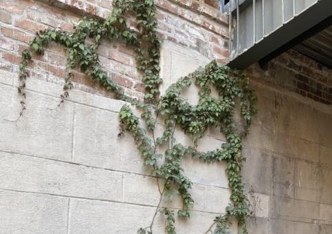
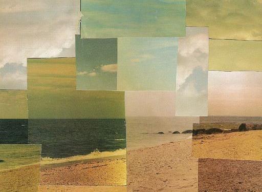
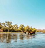
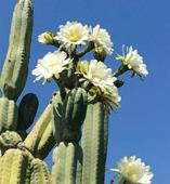
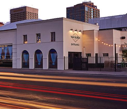
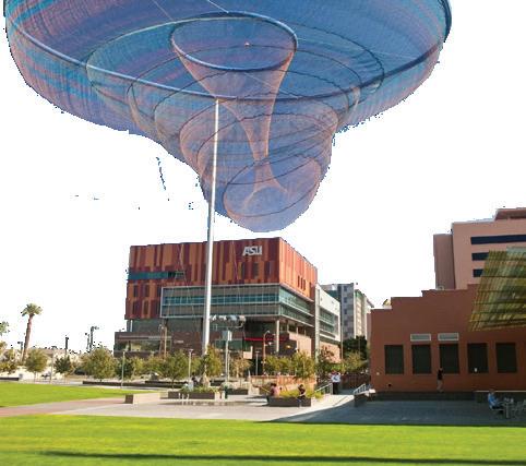
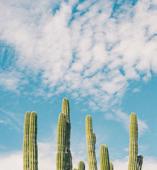
i was born and raised in phoenix, arizona by two mexican parents. i am in my final year of studying interior design at arizona state university’s CIDA accredited program. i am also pursuing a minor in sustainability because i aim to create thoughtful designs with the future of our world in mind. i am greatly inspired by the arizona desert landscape and my heritage. my passion for design began when i started to play video games at a very young age, i became enthralled with the idea of being able to create something that was my own.
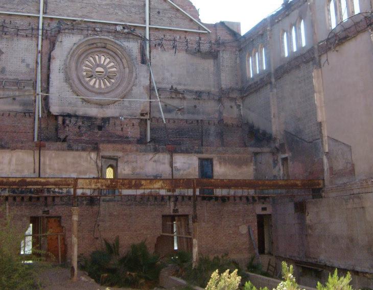
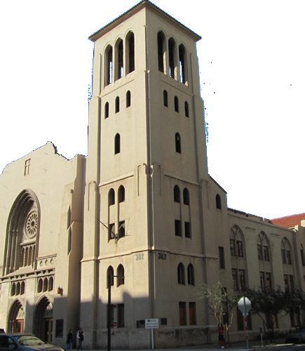
the monroe street abbey 302 w. monroe st. phoenix, az
SOFTWARE: revit
enscape
adobe indesign adobe photoshop
COLLABORATORS:
marissa acosta + melea triplett + kylee whitmer
ABOUT THE PROJECT:
the hida art therapy & design school is a historical preservation project carried out by phoenix-based firm, kámm interiors.
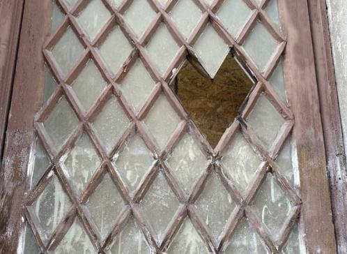
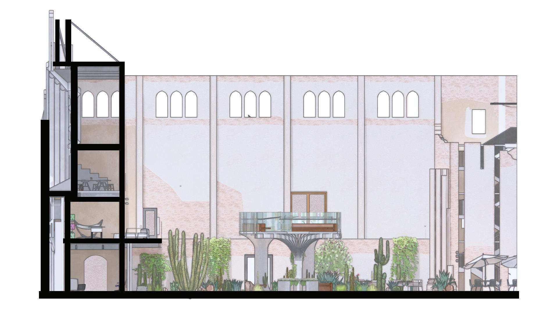
this concept explores the intricate layers of personal identity and self-healing through the transformative power of art therapy. by preserving and honoring the 'layers of history' the monroe street abbey holds; users are invited to reconnect with the layers of their own identity.
VENEGAS PORTFOLIO
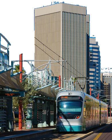
the phoenix metro light rail runs through downtown phoenix, making the city accessible to a diverse range of people.
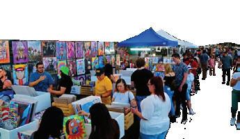
downtown phoenix offers a multitude of avenues to explore various art forms, for example, galleries, theatres, and first fridays.
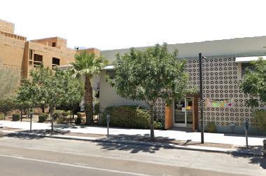
various forms of therapy surround the abbey, one of these facilities being resilient health.
CONCEPTUAL DIAGRAMS
the abbey is a 10-minute walk from the downtown arizona state university campus, student housing, and nearby parks.
to establish of a sense of place within the building; our color palette stems from 'layers of arizona'. we honor each layer of the state through each floor using each color as a wayfinding technique.
to respect the abbey and her history as a prominent religious institution, we incorporated a layering strategy, taking inspiration from the emotions and concepts reflected within the church's walls. each floor is assigned a word that pertains to the function of that floor.
desert river vegetation sky sun
kitchen
pebble + glaze
THE BRIDGE
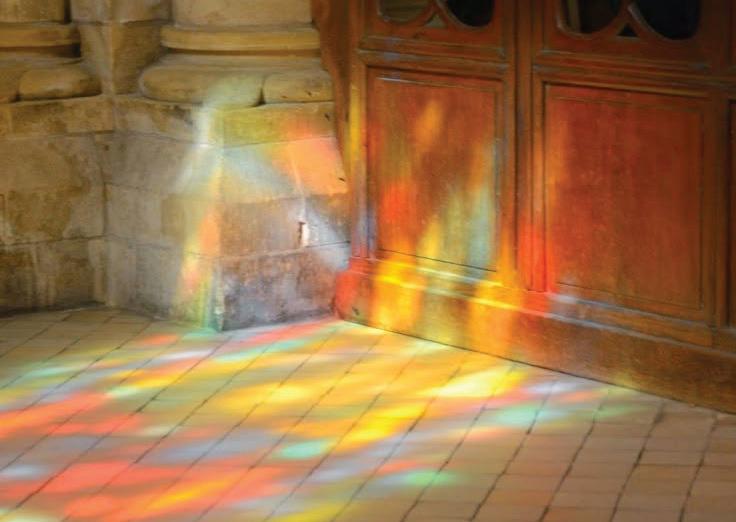
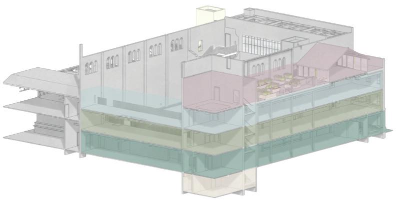
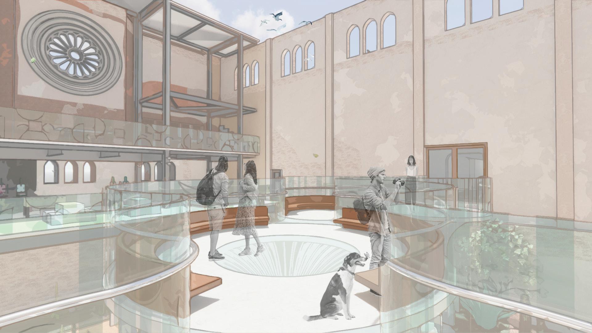
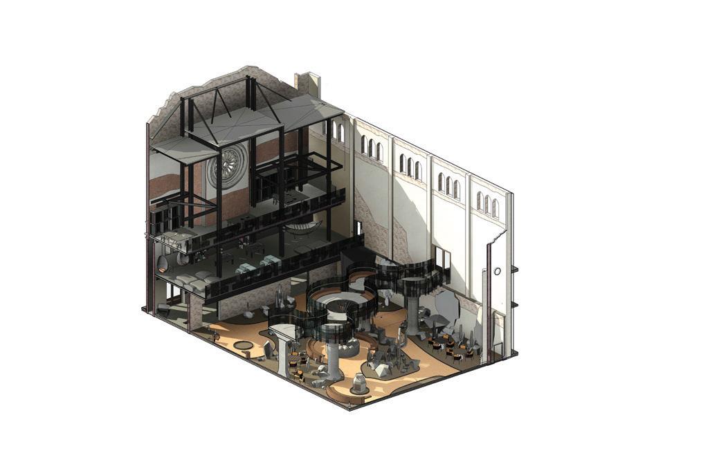
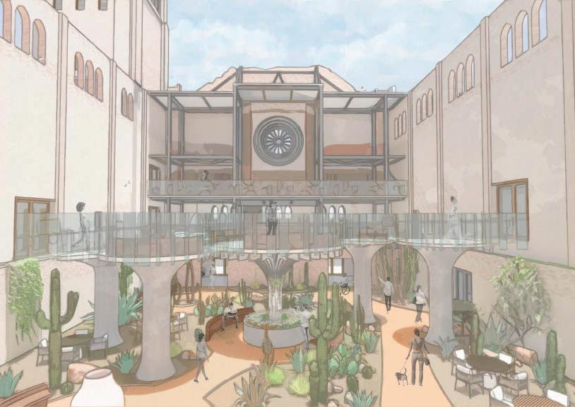
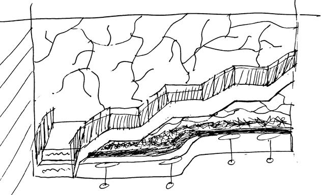
the bridge located on level 02 adds an architectural layer to the abbey and connects each side of the second floor from the original building to the west addition. the purpose of the bridge is to highlight views looking toward the fount, where an art piece will be showcased, and the rose window, where light casts through the petal openings. it invites users to mingle and connect with each other by offering multiple seating areas and viewing platforms.
the bridge is a spectacle for users of the abbey, acting as the art piece. concrete columns and a revolved steel structure lift the bridge, supporting you on your journey. it features uniquely designed railing with distinctive shapes and vibrant colors.
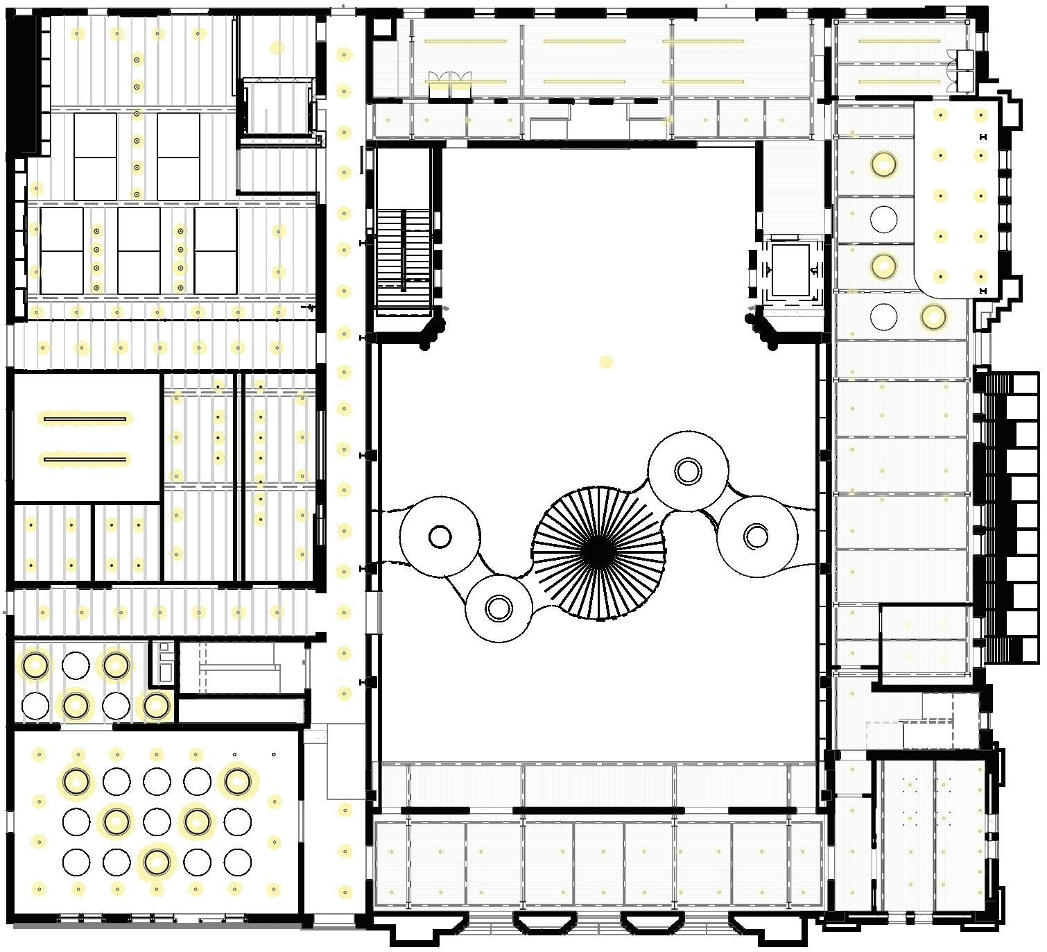
SECTION - LIGHT PROJECTIONS
SUN STUDY - 11 AM
VIEW ON THE BRIDGE
WIDE VIEW OF THE BRIDGE
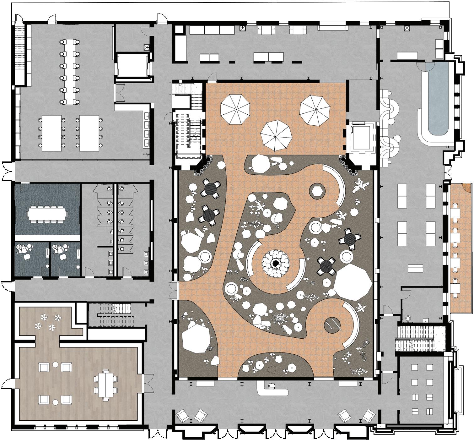
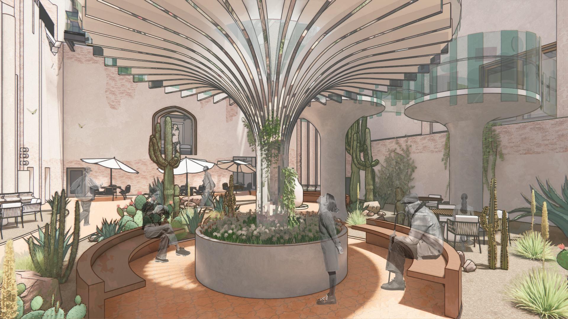
each pocket in the sculpture garden offers plenty of seating for the users to interact and reflect on art pieces
features sculptures made by art therapists, local artists, and students alike
the presence of natural materials, native desert plants, and wildlife creates a soothing atmosphere
VENEGAS PORTFOLIO
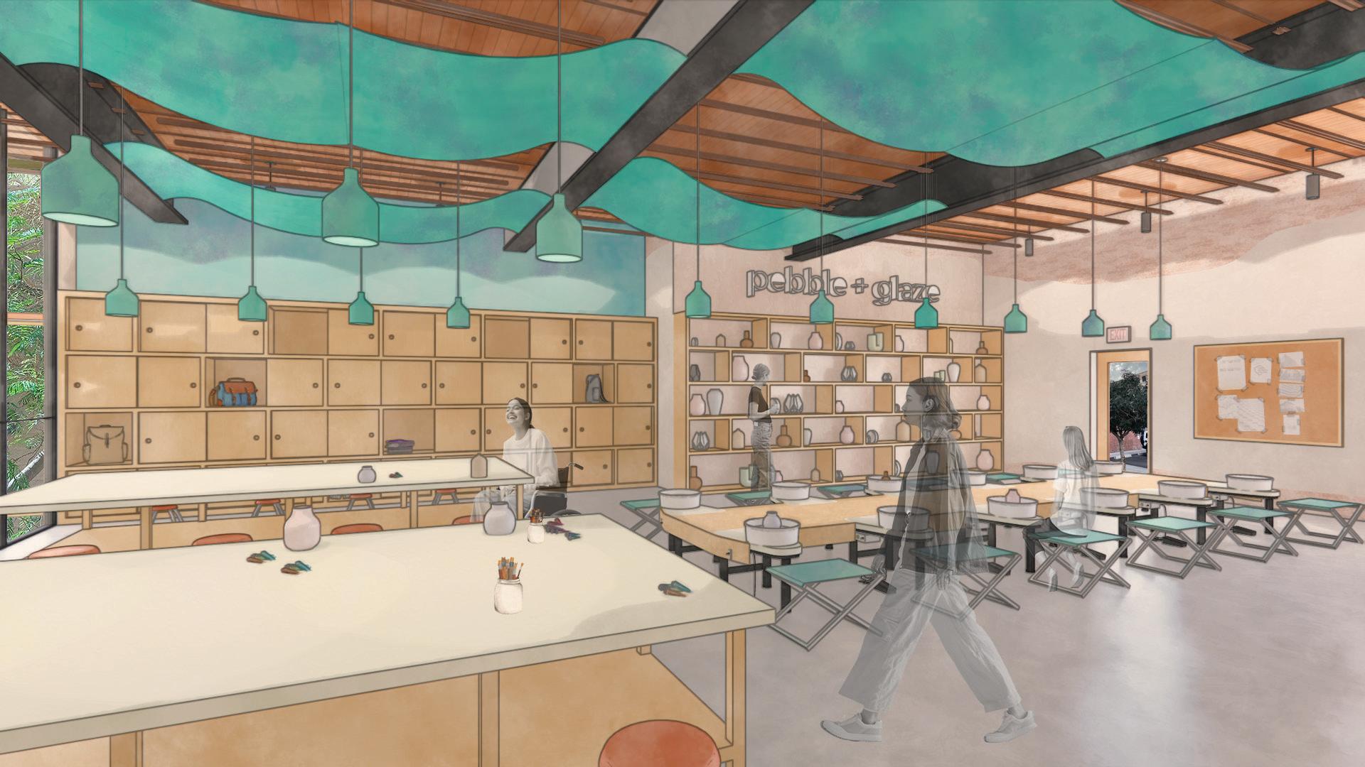
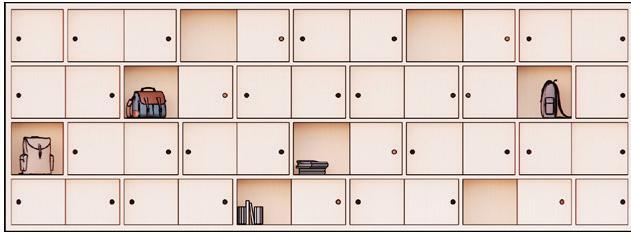
cubbies are provided for users to store their belongings while utilizing the pottery studio bulletin board for announcements regarding classes, events, and availability
community-style surface areas to encourage collaboration and interaction between users
VENEGAS PORTFOLIO
CLASS:
int 464 - interior design studio v
PROJECT TYPE: advertising agency
SITE:
811 w. fulton market
chicago, il
SOFTWARE: revit
enscape adobe indesign adobe photoshop
ABOUT THE PROJECT:
NEXT is a global advertising agency dedicated to embrace the idea and complexity of “being more human”. the design is inspired by the all-encompassing idea, “the beauty of the unconventional” derived from the three pillars of chicago’s culture as a city: art, activism, and industry.
NEXT NEXT NEXT NEXT
VENEGAS
PROCESS
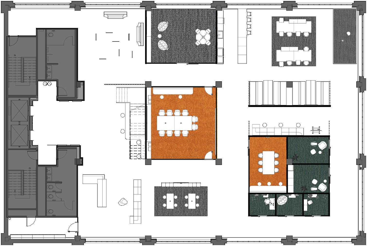
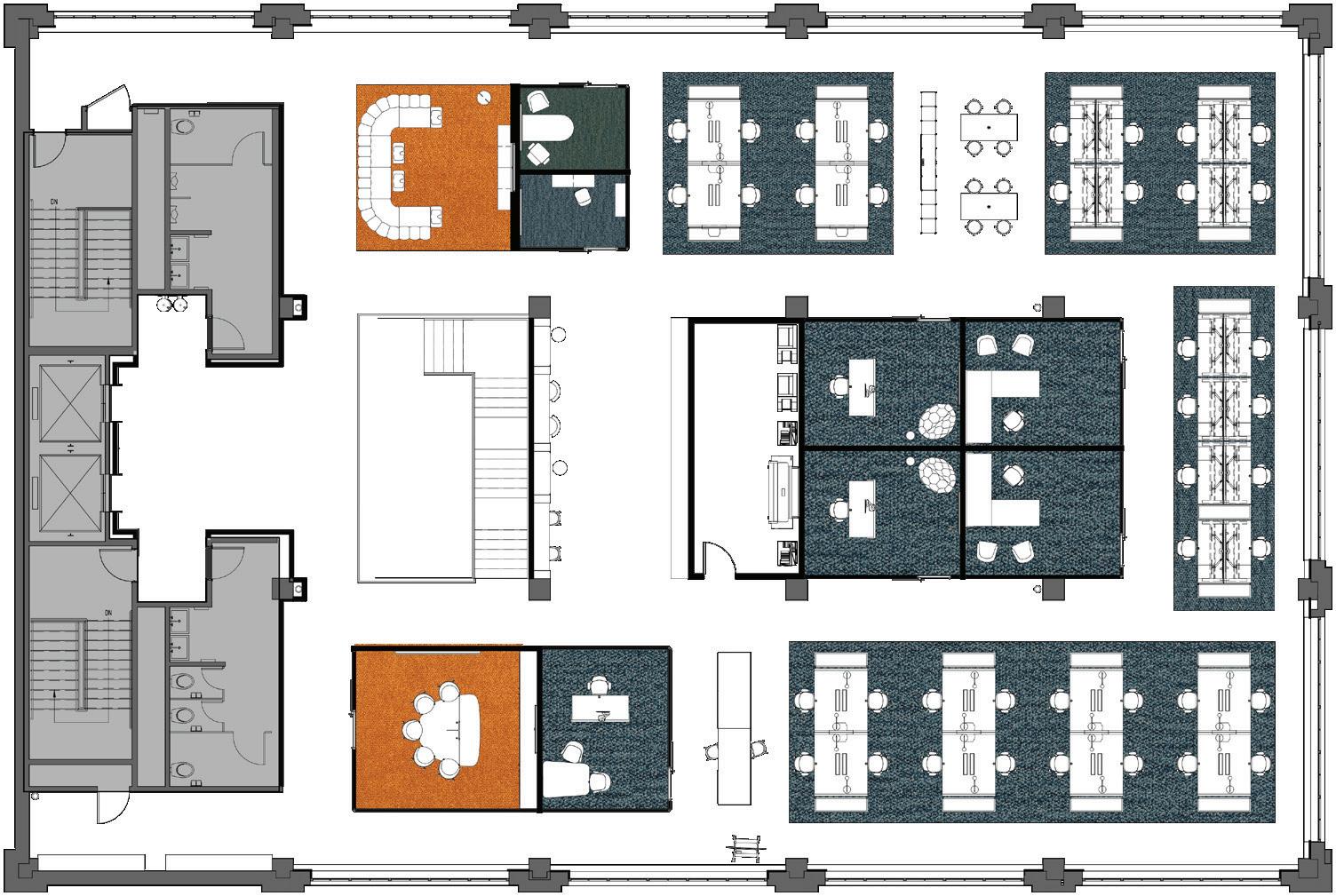
orange is used in collaborative spaces
blue is used in focus spaces and workstations
green is used in respite spaces
gray is used in social spaces
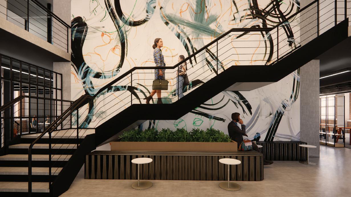
idea for monumental stair originated from the idea of an expansive, interactive graffiti wall
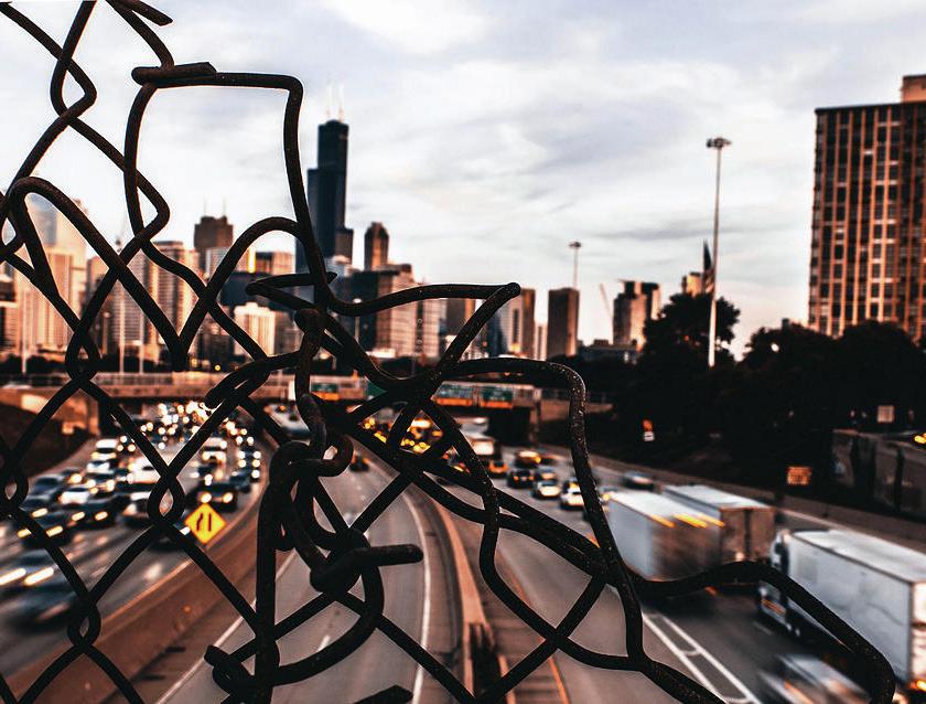
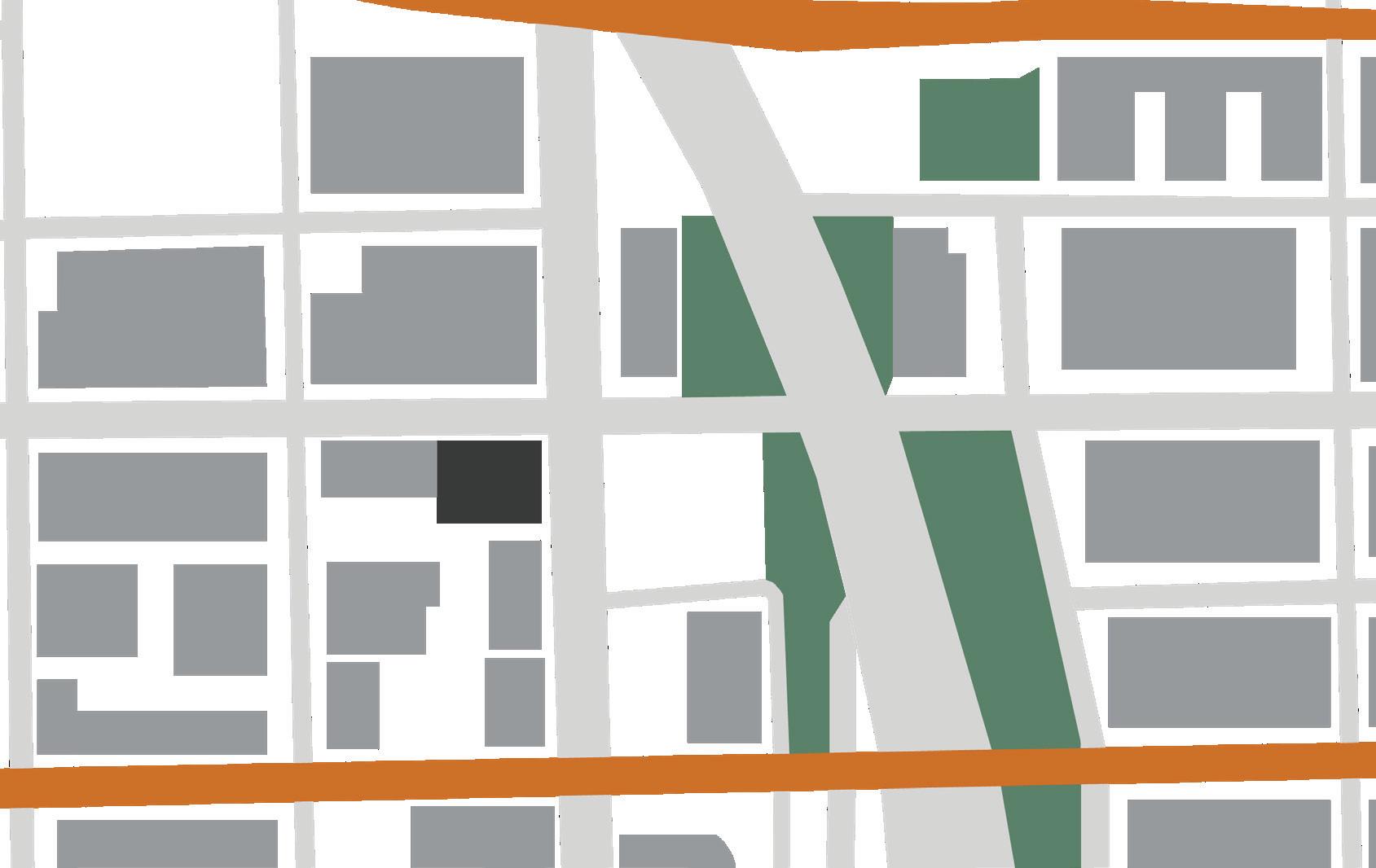
although the fulton market district is home to a selection of high-end restaurants, retail stores, and corporate headquarters - there are also spaces that are accessible for anyone to use as well. a multitude of community centers, parks, and service centers surround the area all within 10-15 minutes.
green spaces transit site street art
w fulton market n halsted st
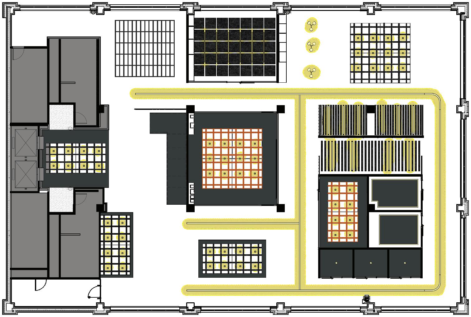
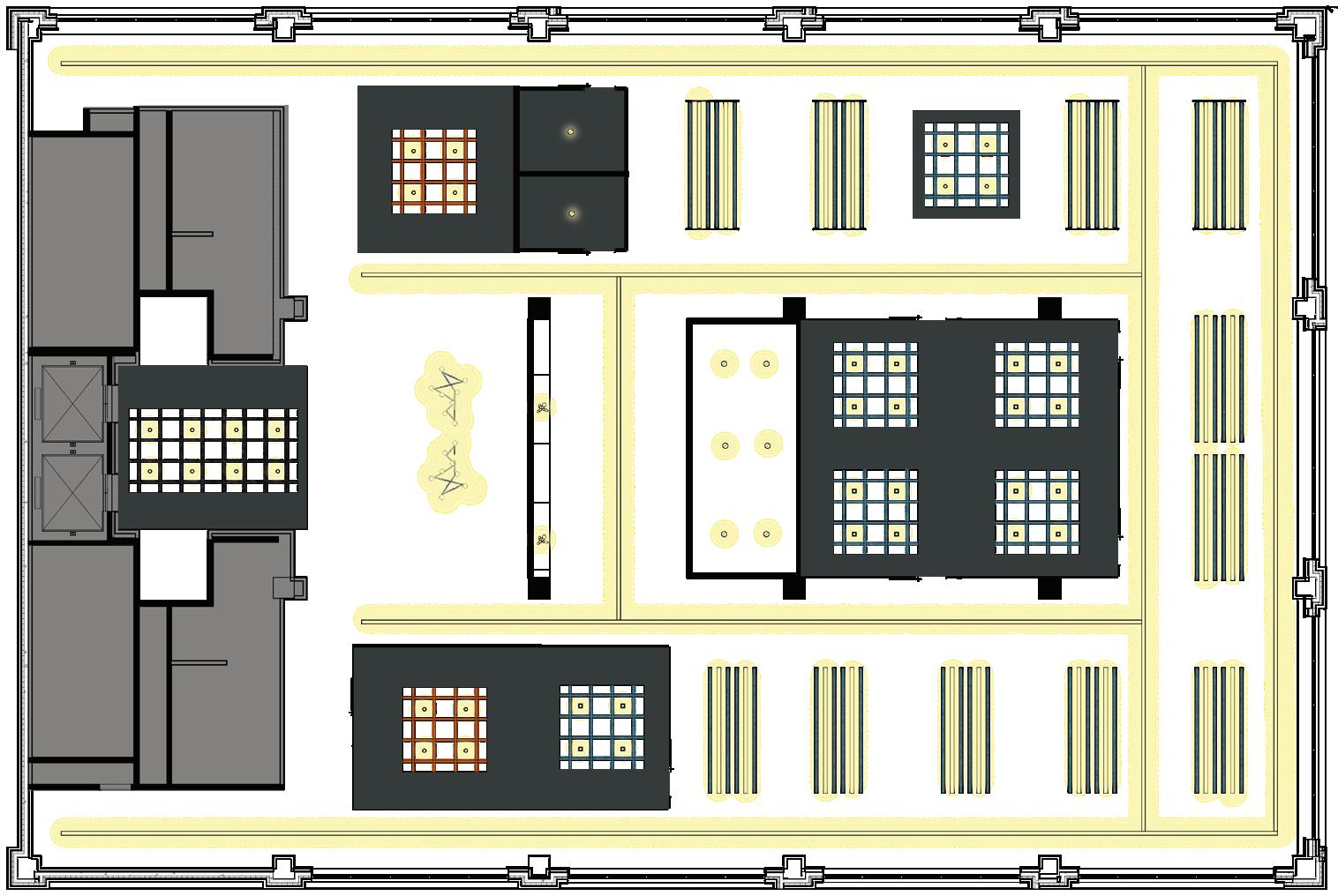
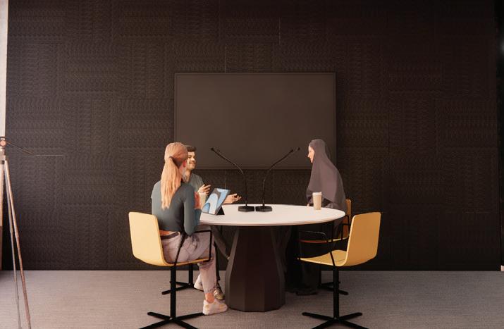
barrisol acoustic panels are fixed directly to the podcast room’s ceiling for optimal sound absorption in the podcast room.
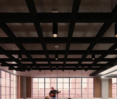
softspan®’s grid system not only proves proficient in acoustic quality but also mimic chicago’s streets and blocks.
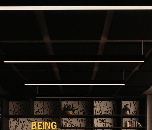
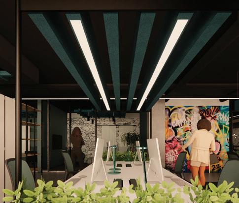
soundbar®’s linear system defines focus areas by creating the idea of a scaffolding structure where colleagues are more productive.
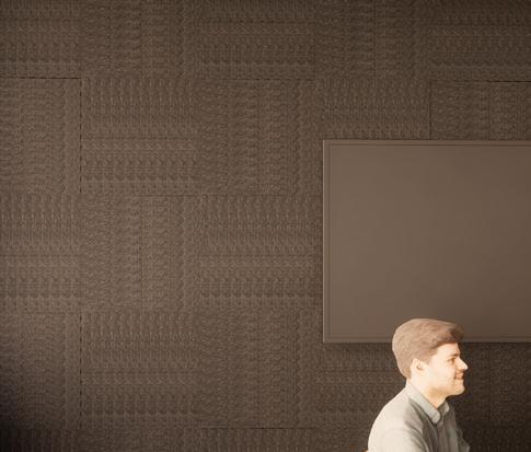
accoufelt solid, square wall panels are placed directly on the wall that is adjacent to the work cafe to minimize sound transfer.
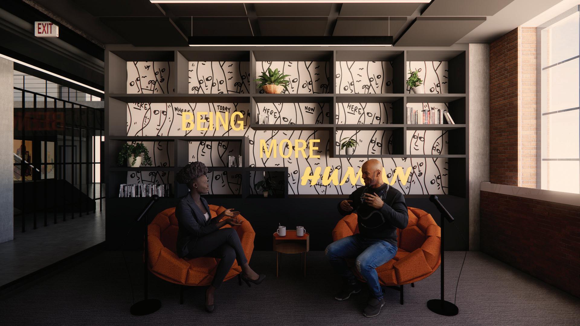
a feature wall is implemented to display activist art and literature and promote inclusion within the office
the color orange is used to symbolize change and energy
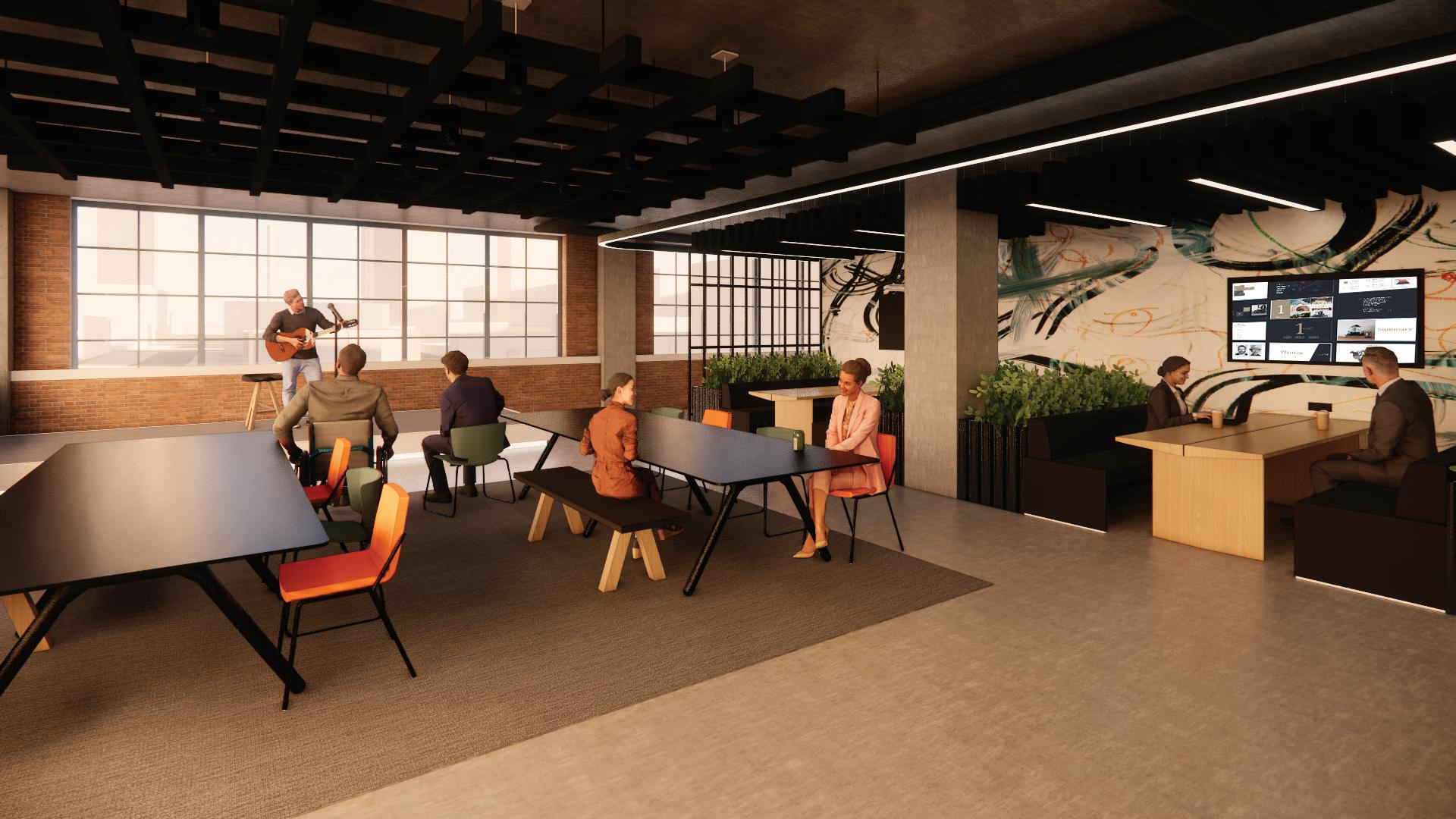
the room offers different seating arrangements, welcoming a diverse set of conversations
VENEGAS PORTFOLIO
stage designed for “beats & bites, NEXT invites local musicians and comedians for entertainment to end the work week
huddle spaces offer balance between open and enclosed spaces multiple seating options to accommodate a palette of posture
VENEGAS PORTFOLIO
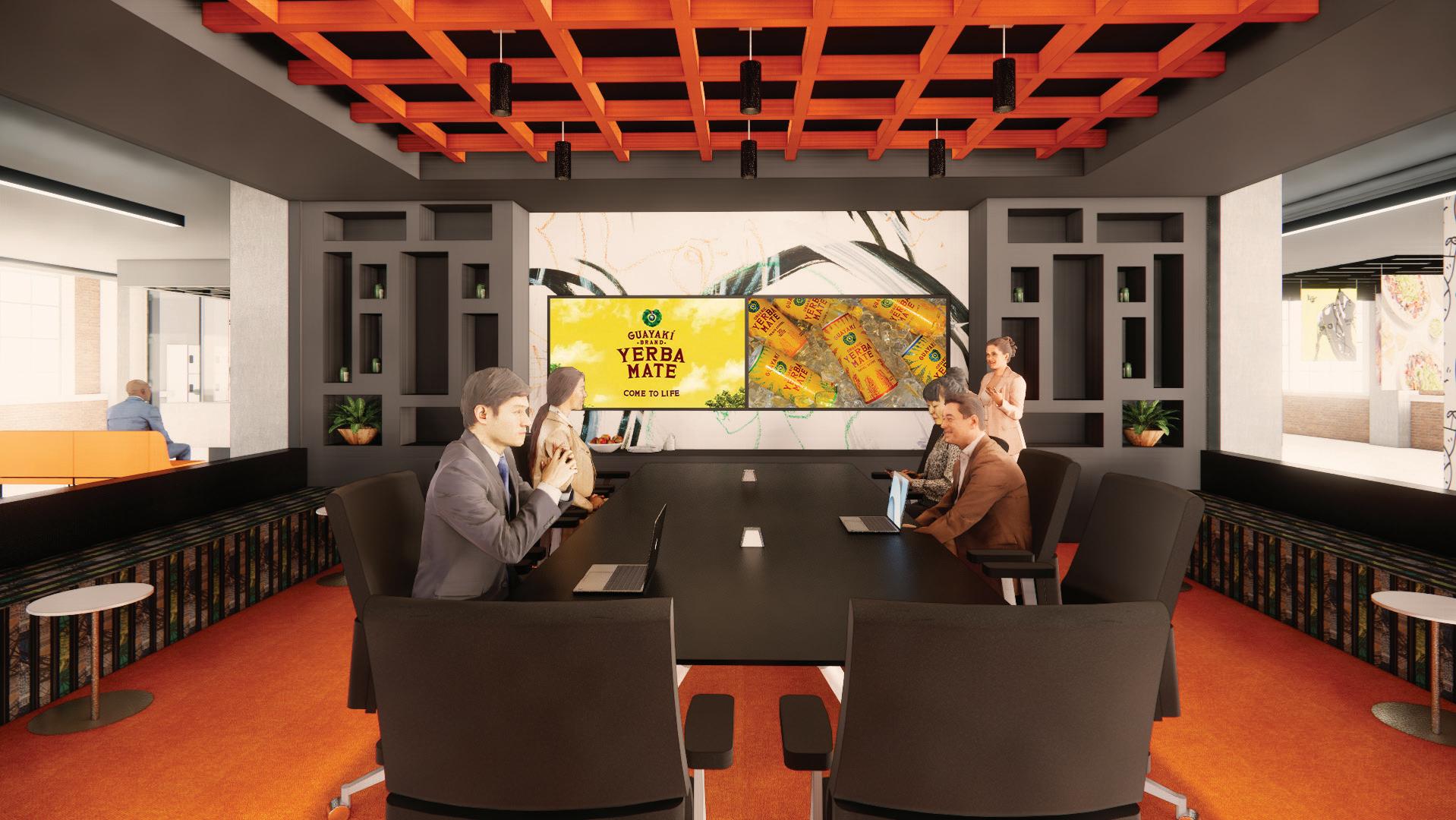
different seating arrangements to accommodate the size of the audience
built in display with personalization capabilities to accommodate each client
VENEGAS PORTFOLIO
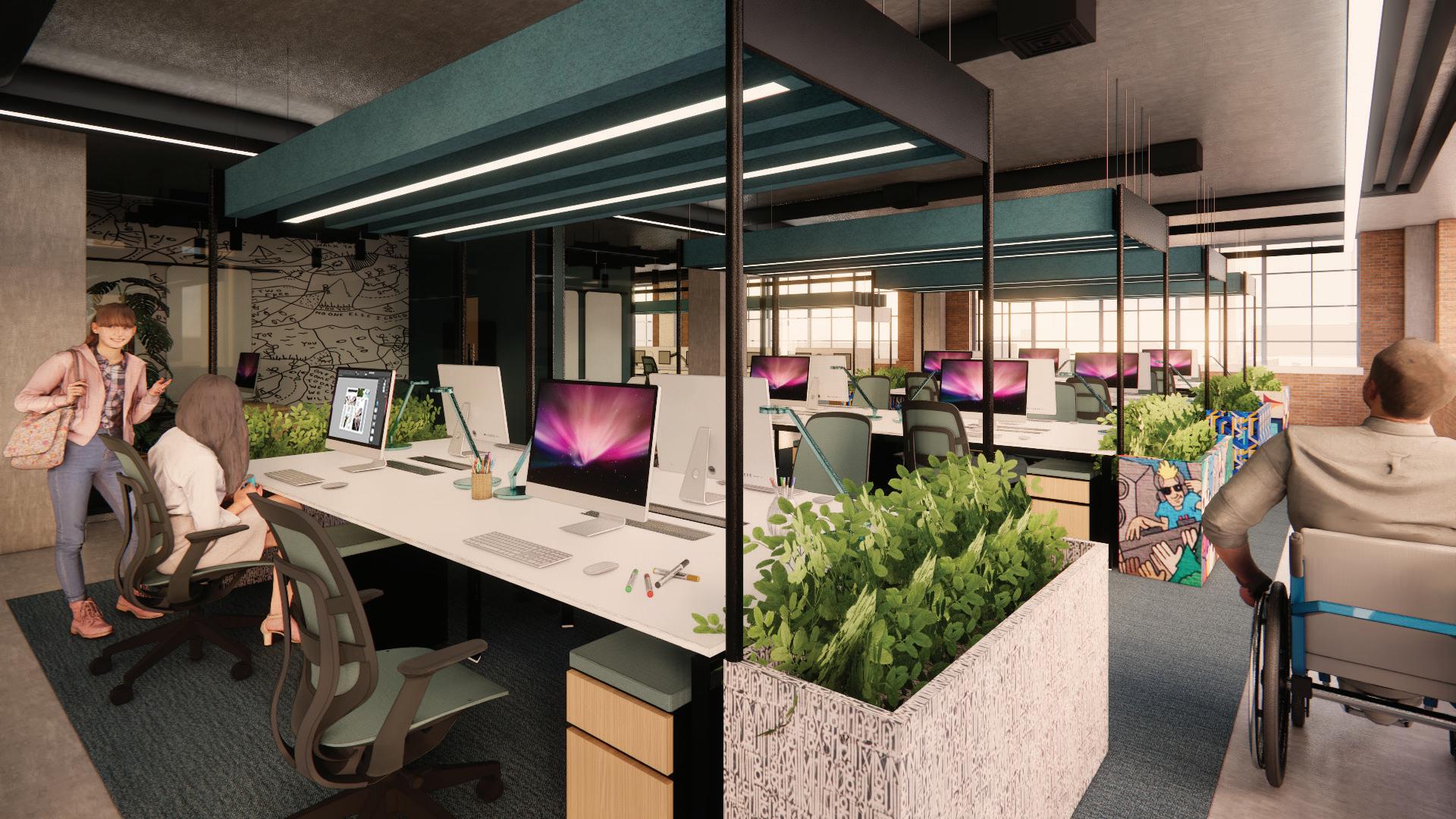
the scaffolding-like structures not only have acoustic properties, but they also incorporate elements of the city
each workstation is equipped with its own portable, lockable storage to encourage an open office culture
the planters are inspired by utility box art pieces located across the city
VENEGAS PORTFOLIO
CLASS:
int 464 - interior design studio iv
PROJECT TYPE: transitional housing
SITE:
833 w broadway rd. tempe, az, 85285
SOFTWARE: revit
enscape adobe indesign adobe photoshop
COLLABORATORS: marissa acosta + melea triplett
ABOUT THE PROJECT:
W LLOW’S PLACE
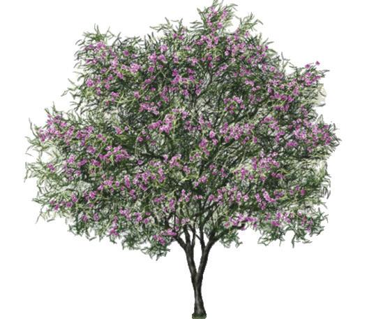
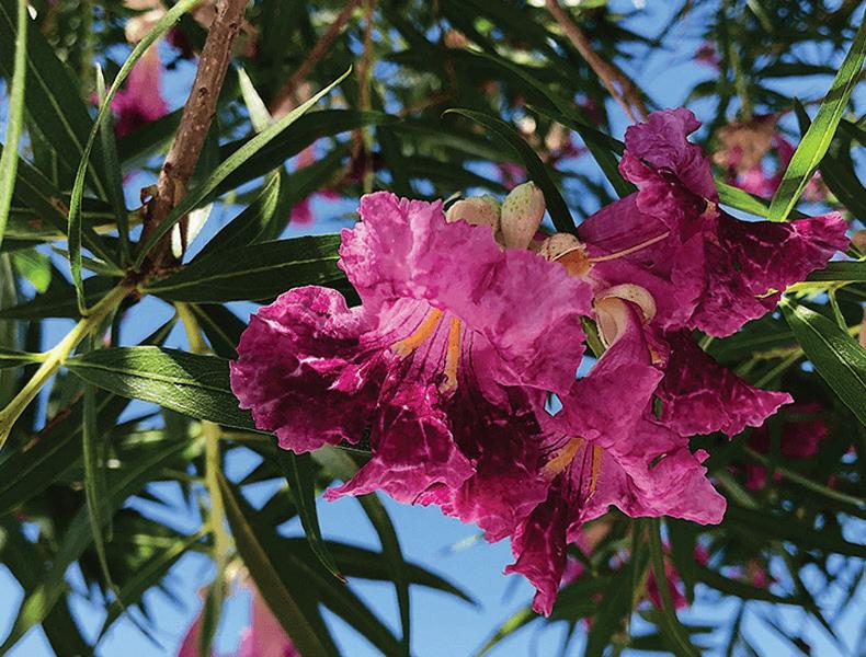
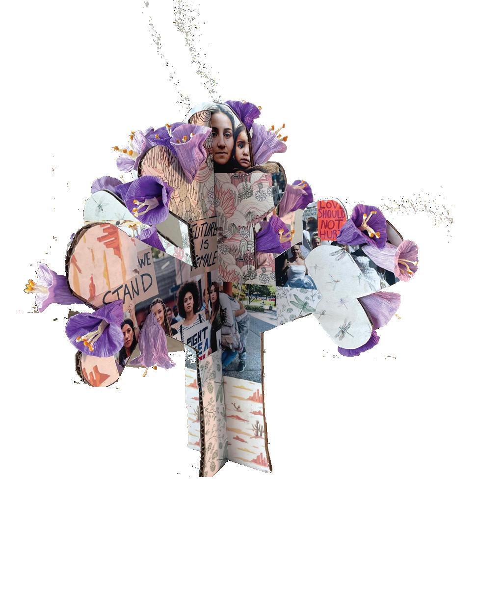
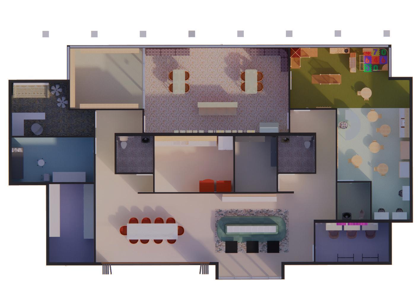
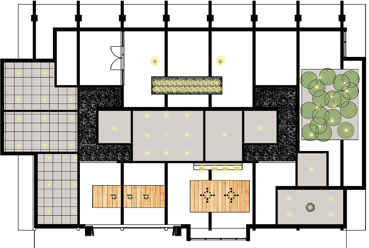
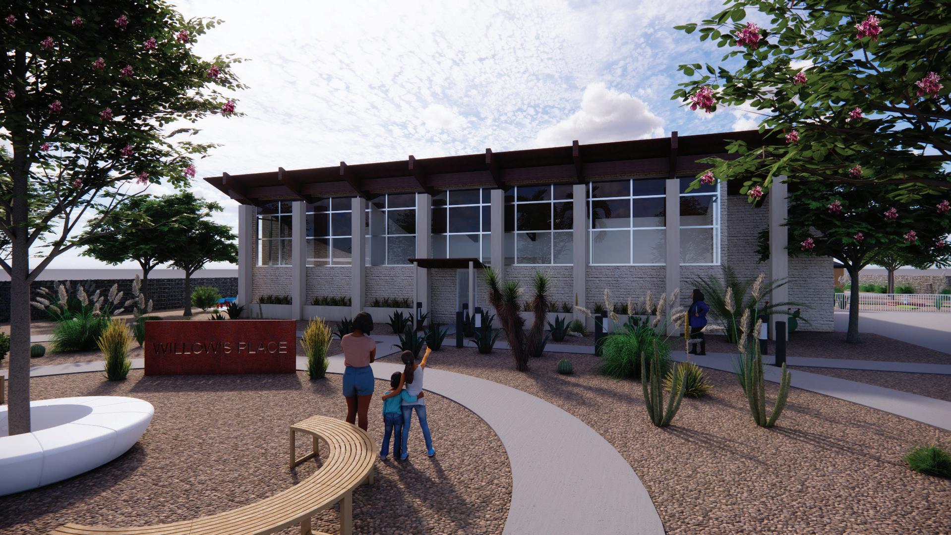
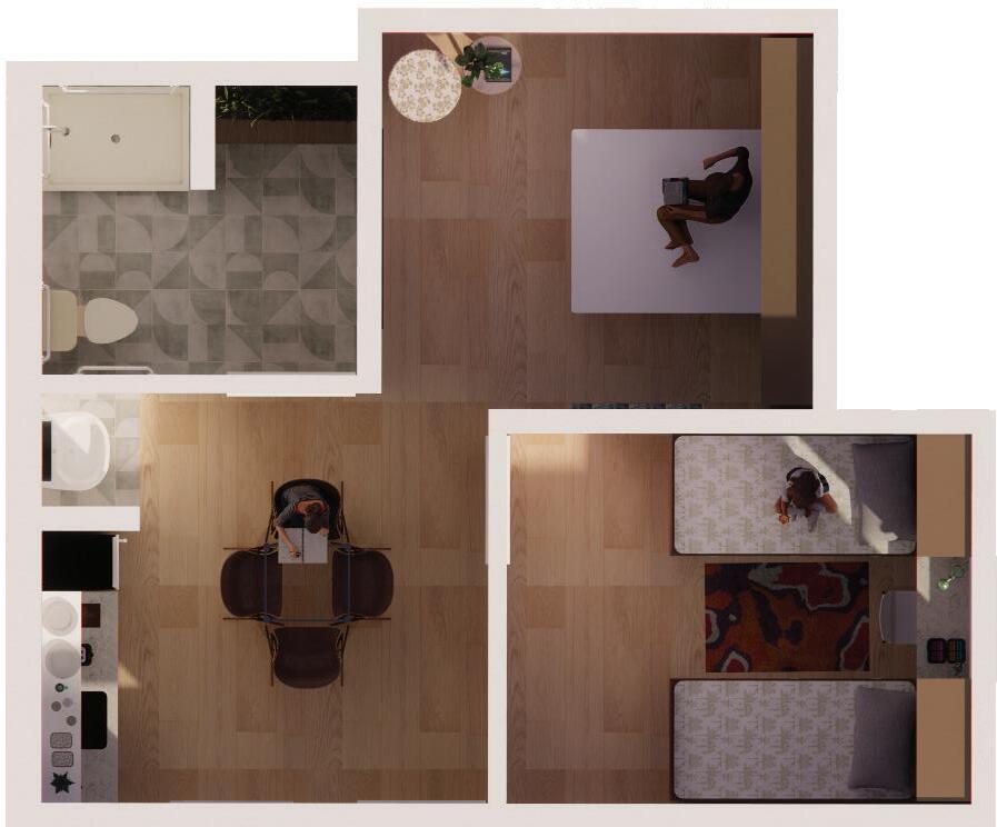
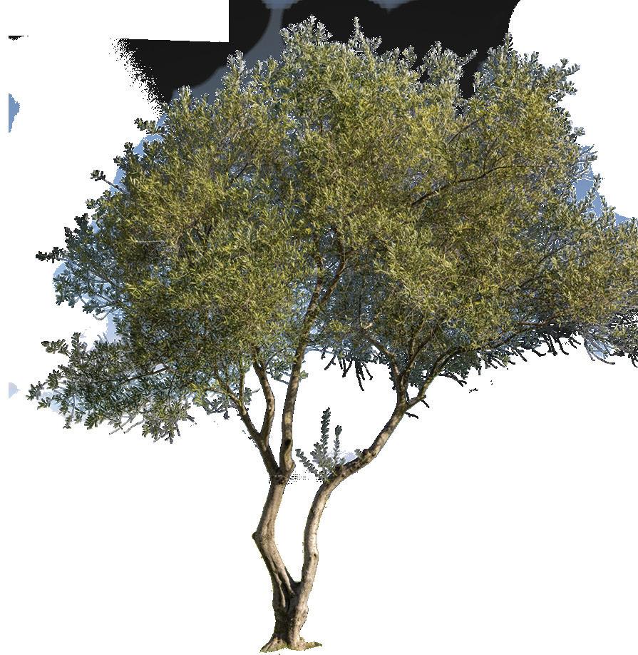
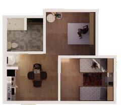
willow’s place is a transitional housing facility centered around women and children. the desert willow is native to the sonoran desert and a symbol of resilience. the design reflects three key principles: nature, empowerment, and healing.
the resilient and hopeful, desert willow tree, is what residents first see upon entering the community facilities
implemented a structure showing our clear entrance to the community facilities
the landscape features all desert plants native to the sonoran desert enforcing a sense of place
VENEGAS PORTFOLIO
key card access upon entrance to the resident facing portion of the facility to enforce security
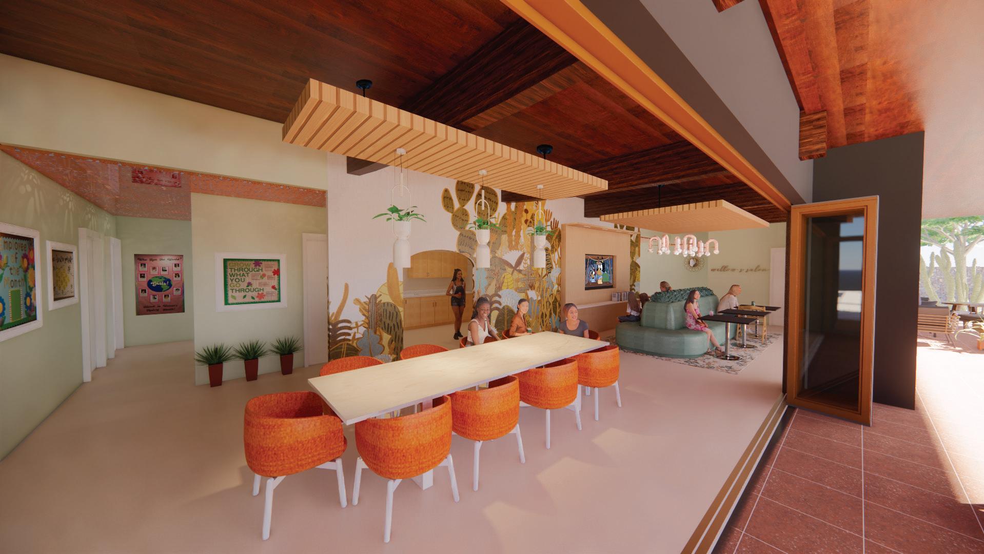
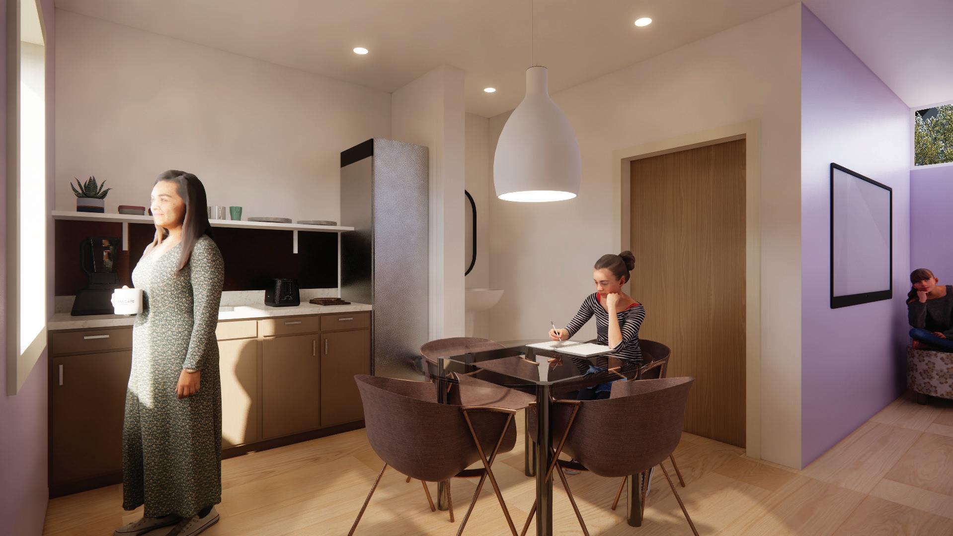
soft color palette ensures residents are not overwhelmed by patterns
different modes of seating offered for residents to emphasize choice
VENEGAS PORTFOLIO
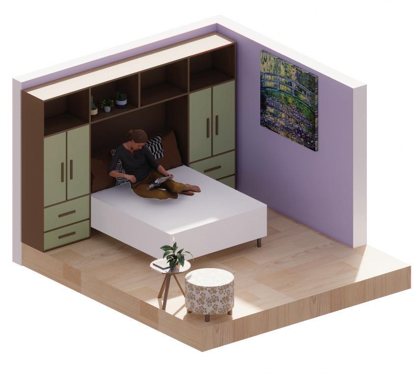
AXON - BEDROOM 1
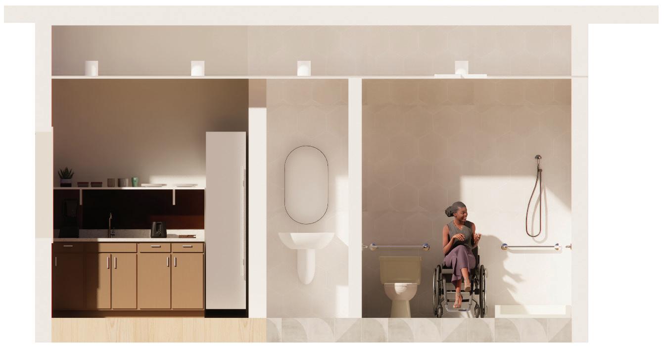
SECTON A
SECTON A
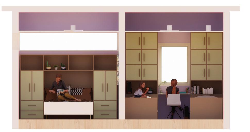
soft color pallete to create a calming and soothing environment that does not overwhelm the members of the household
sink located outside of bathroom to allow other members of the household to utilize it without waiting for it to become available
VENEGAS PORTFOLIO
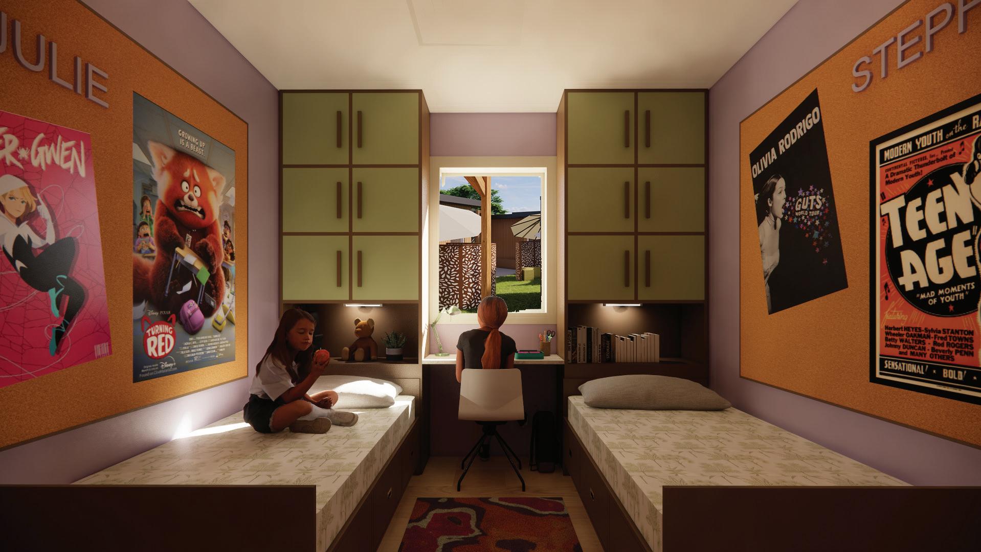
customizable wall surface to allow for personalization
custom cabinetry with lockable features to reinforce resident’s security and privacy
VENEGAS PORTFOLIO
CLASS:
int 362 - interior design studio iii
PROJECT TYPE: zero waste store
SITE:
1215 e. missouri ave phoenix, az, 85014
SOFTWARE: revit
enscape adobe indesign adobe photoshop
ABOUT THE PROJECT:
plastic packaging waste reaches over 120 billion units per year. with that in mind, radica’s mission ultimately strives to reduce waste in the beauty industry all while providing the highest quality of skincare and makeup products to their clients.
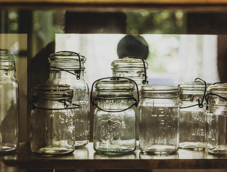
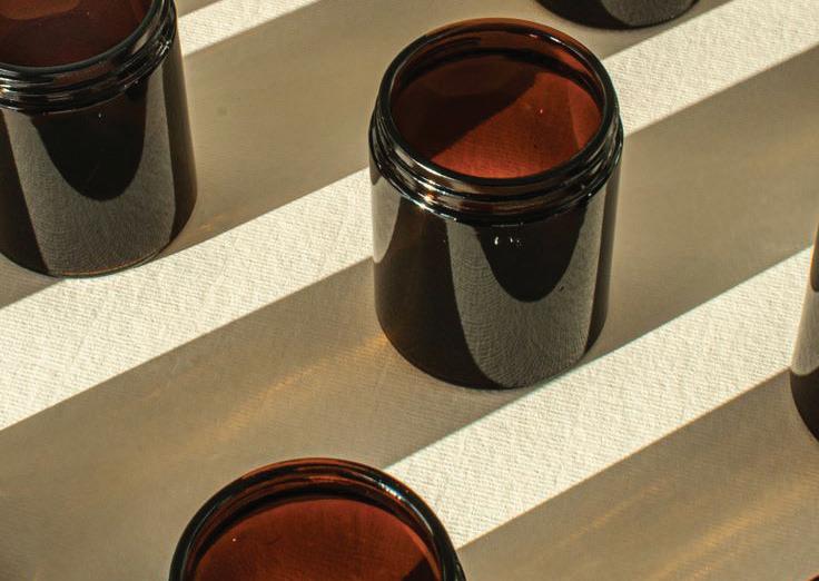
radica delivers a wide array of all-natural, eco-friendly skincare and makeup products that are meticulously crafted to nurture your skin. the option to purchase reusable jars and containers, tote bags, and baskets are also available for those who would like to further their zero-waste journeys.
VENEGAS PORTFOLIO
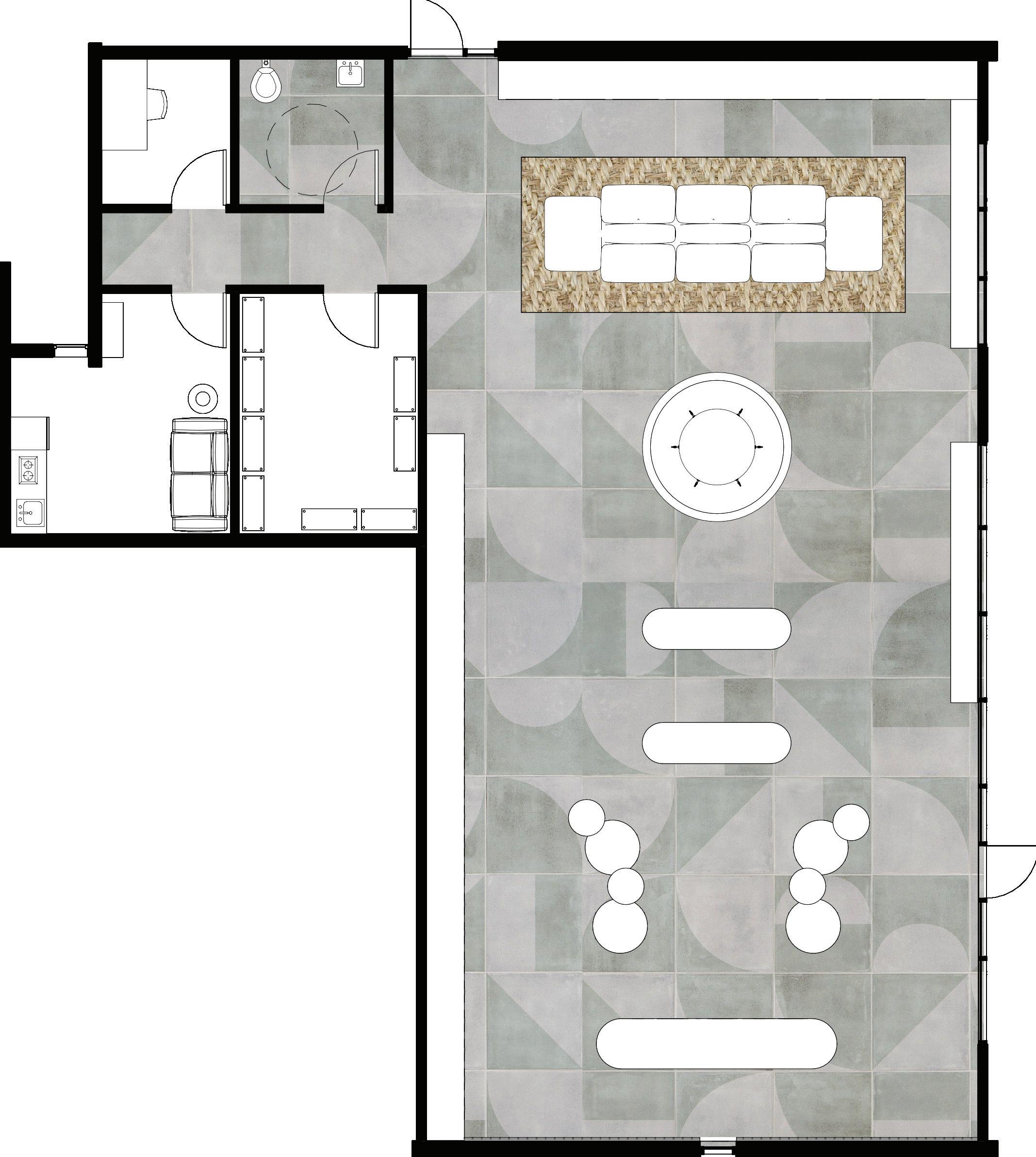
LEGEND
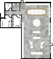
1. cash wrap
2. bulking machines
3. sink 4. seating area 5. restroom 6. storage room
private office
break room
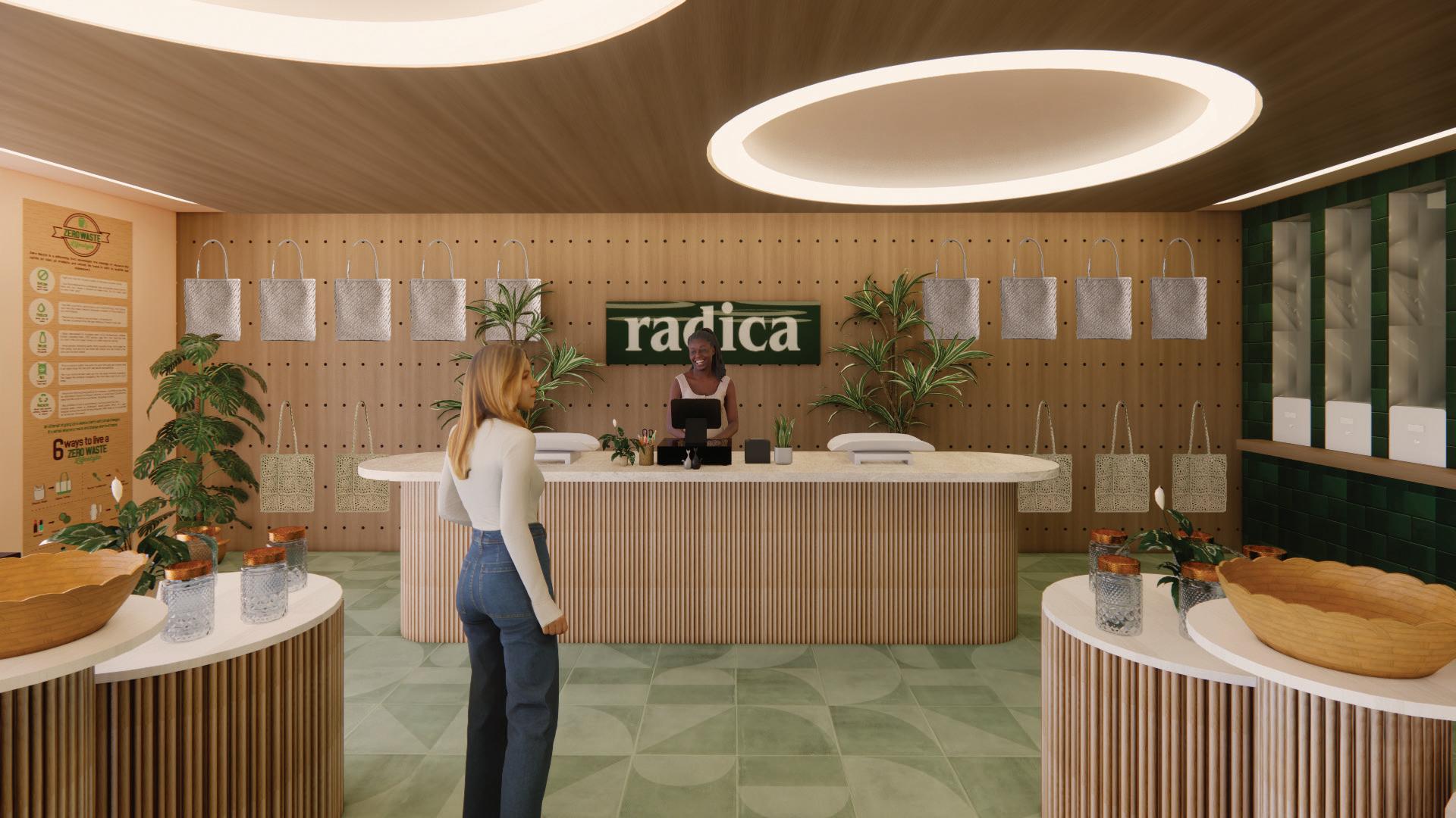
peg board to display handmade products created through recycled materials
cash wrap is visible upon walkin which sets the friendly and welcoming tone throughout the space
VENEGAS PORTFOLIO
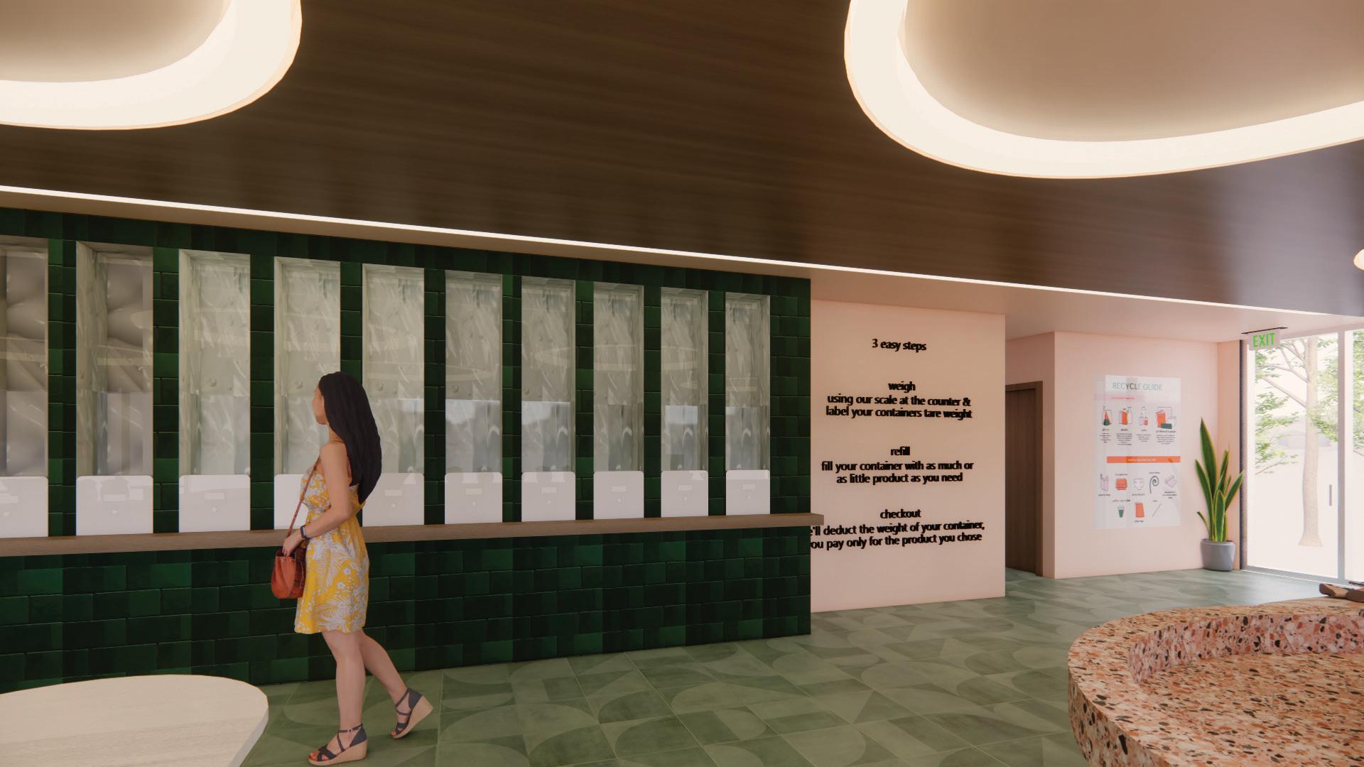
primarily built in displays to allow for large gatherings such as informational meetings and community events
signage to instruct new customers on the process of the zero waste system
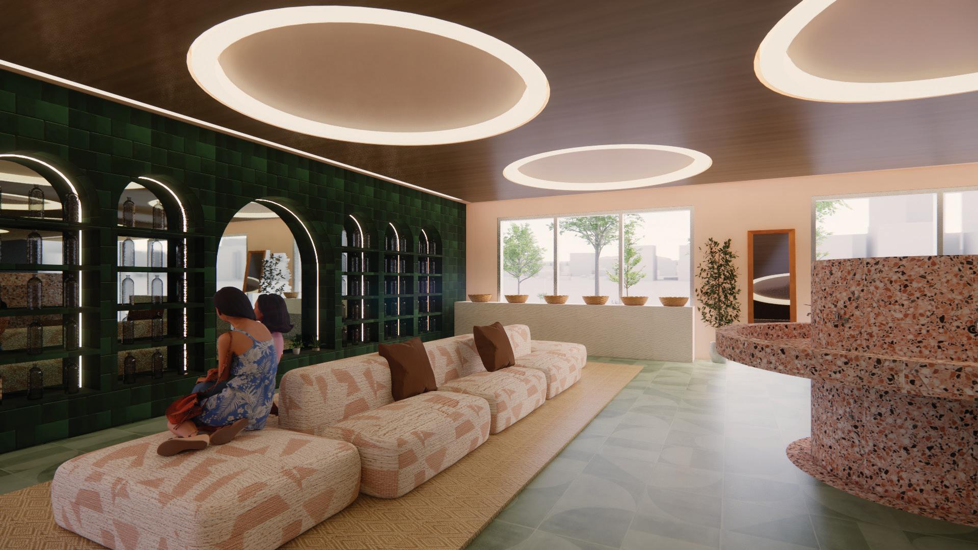
radica is a store for the community and it was important to offer seating for clients to connect with each other
centrally located sink with multiple faucets for easy access
VENEGAS
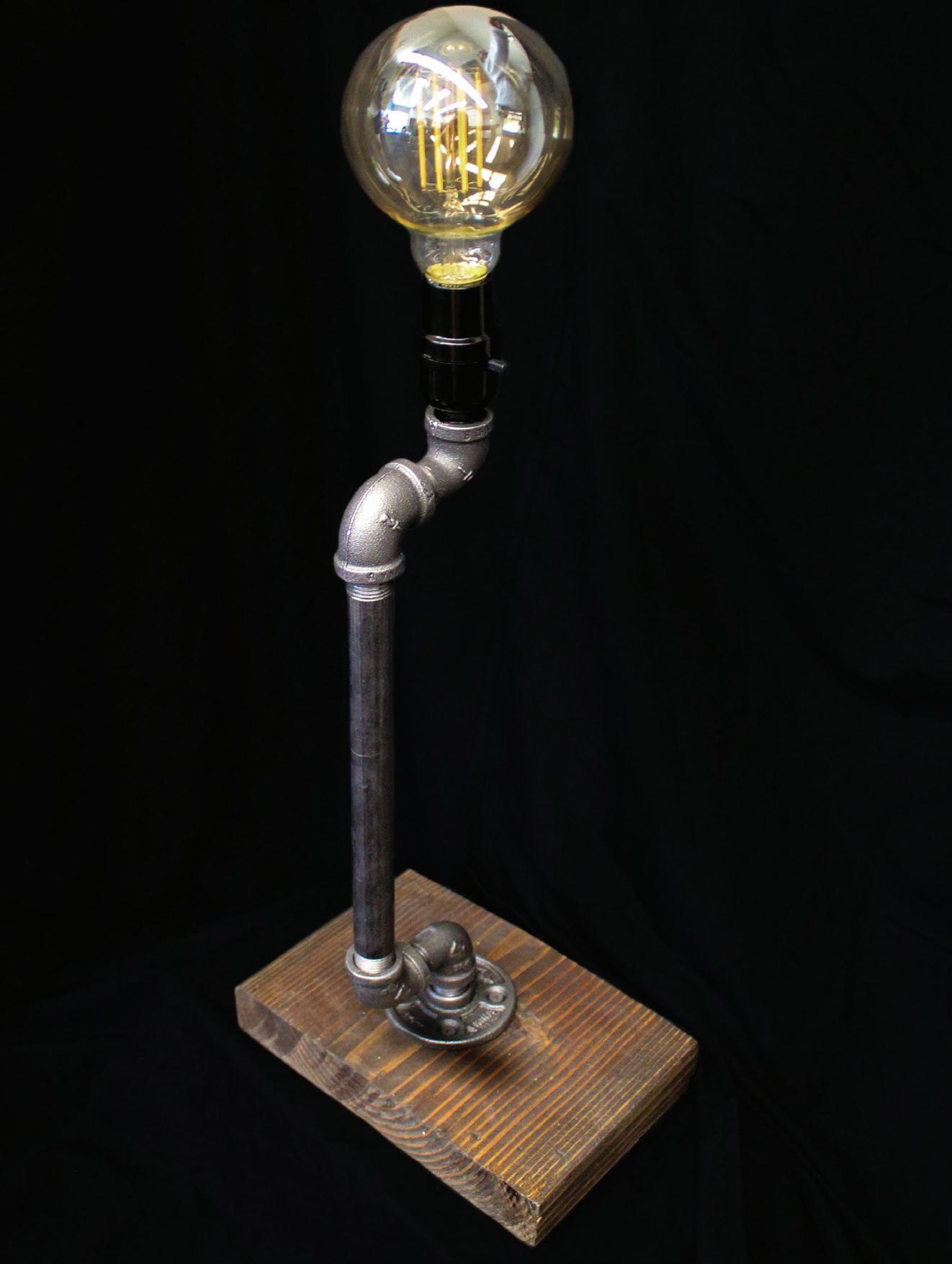
NORA
lamp
MATERIALS:
scrap wood
various black steel pipes
light bulb
recycled socket and cord
PURPOSE:
light for hope is fundraising event hosted by the interiors student alliance for free arts az. free arts az is a non-profit organization dedicated to transform children’s trauma into resilience through the arts. students from all majors of the design school participate to create a light in support of this cause.
ABOUT THE PROJECT:
nora is the name of my mother who adores all industrial aesthetics. the light embodies the essence of an industrial style space. the base is made of scrap wood - cut, stained, and polished to dark brown. the body is composed of dark, steel pipes from home depot, creating a sense of ruggedness and a nod to exposed ceilings often found in the industrial style. finally, the socket and cord were recycled from a local estate sale.
VENEGAS
arcosanti arcosanti
arcosanti
desert botanical gardens
desert botanical gardens
phx art museum
desert botanical gardens
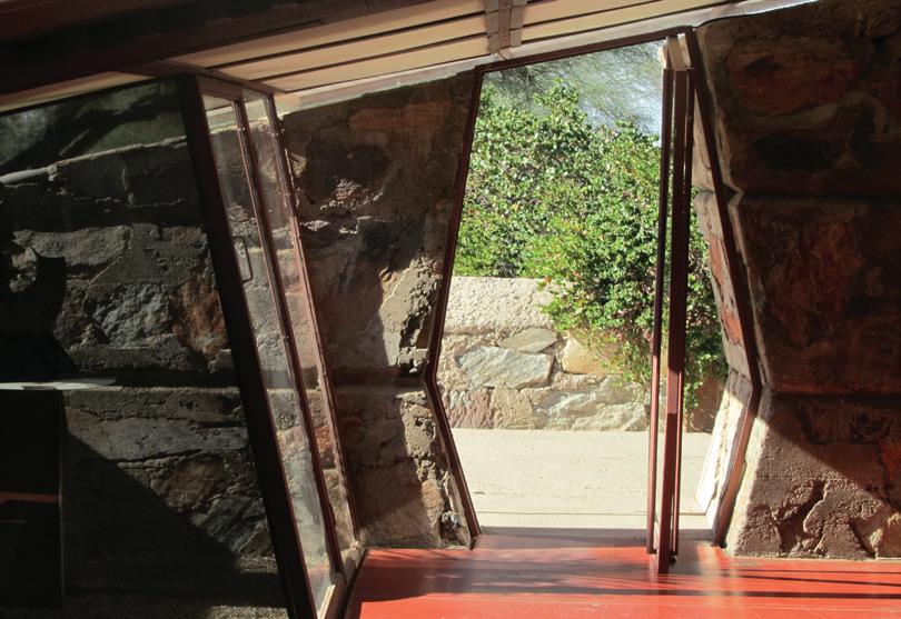
taliesin west
taliesin west
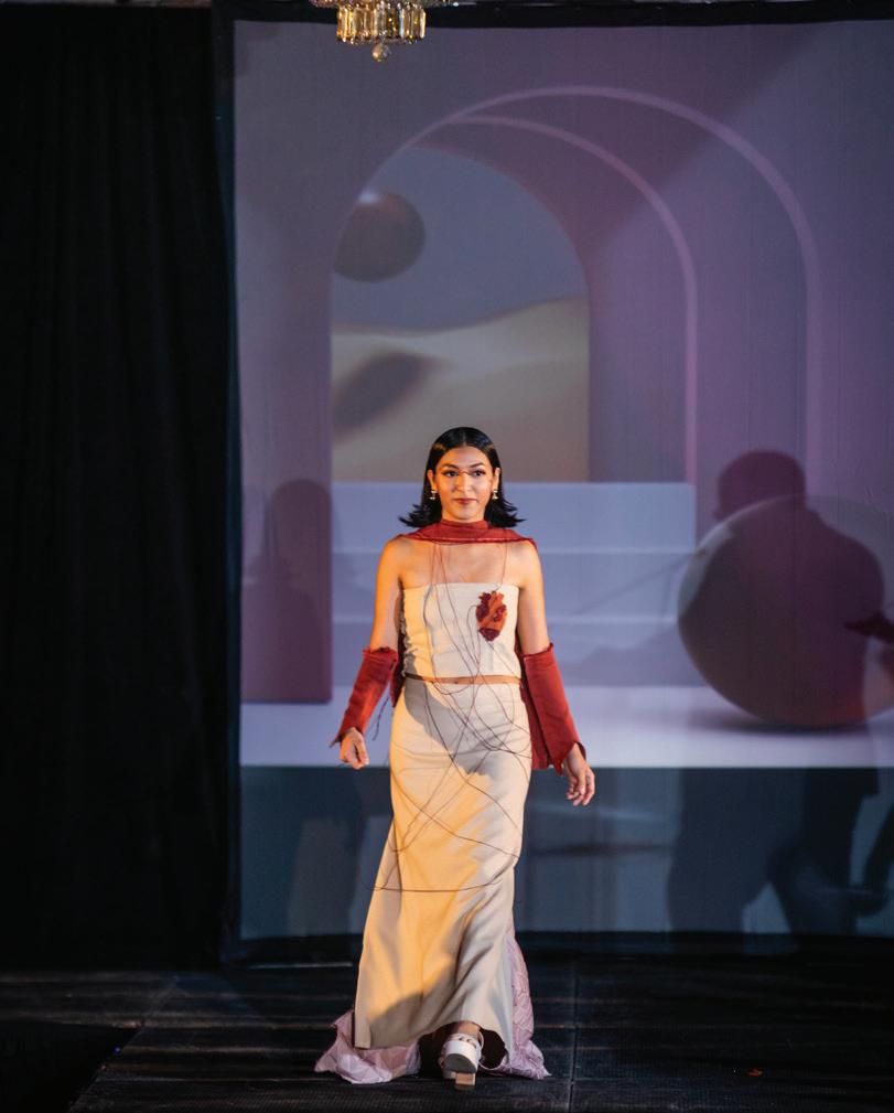
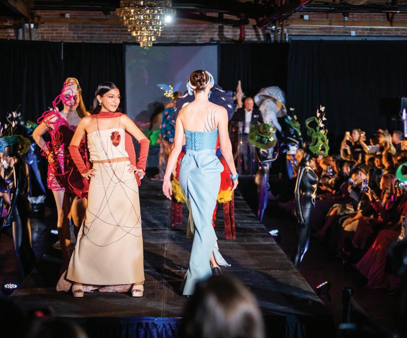
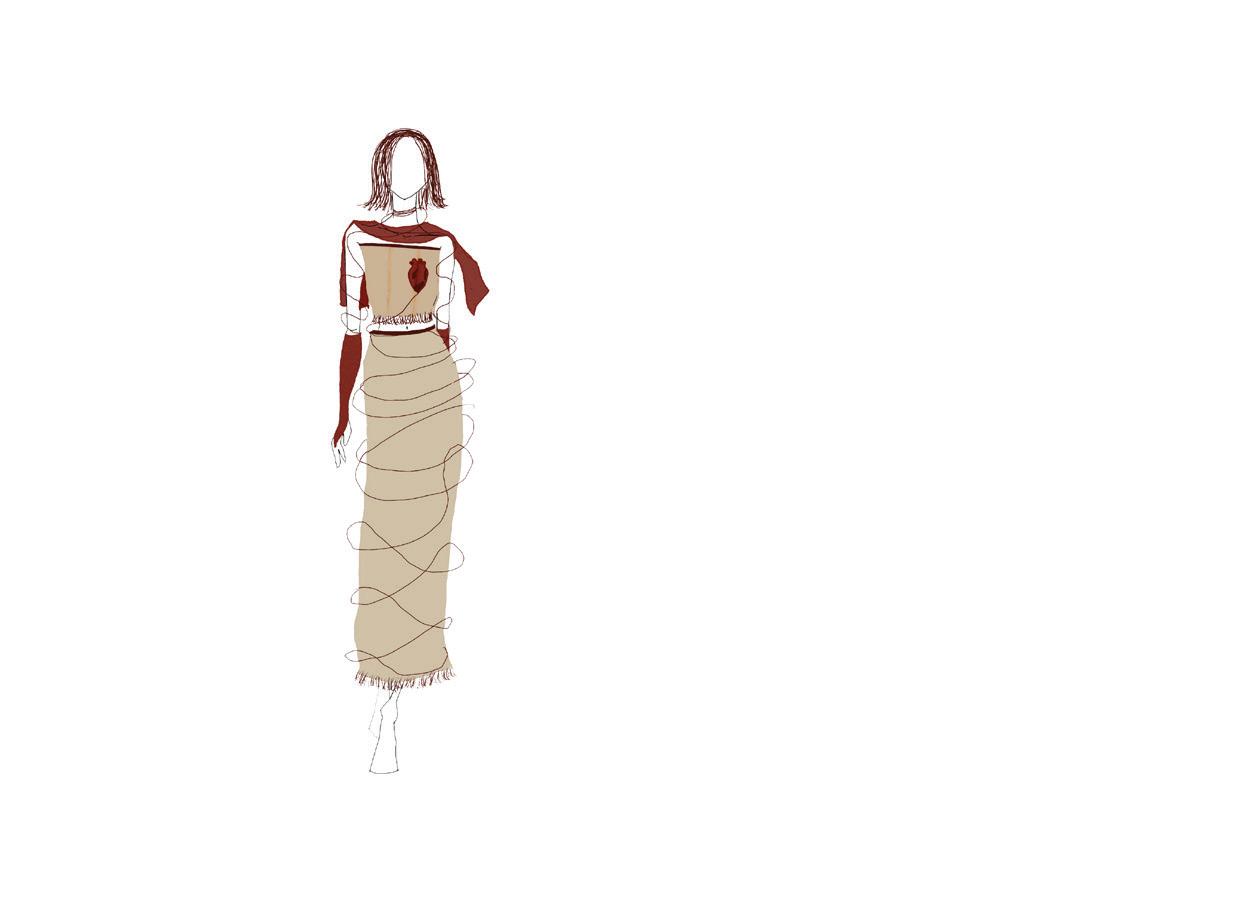
TUGGING AT YOUR HEART STRINGS
top, skirt, gloves, sash
COLLABORATORS: marissa acosta
MATERIALS: designtex fashion tape
PURPOSE:
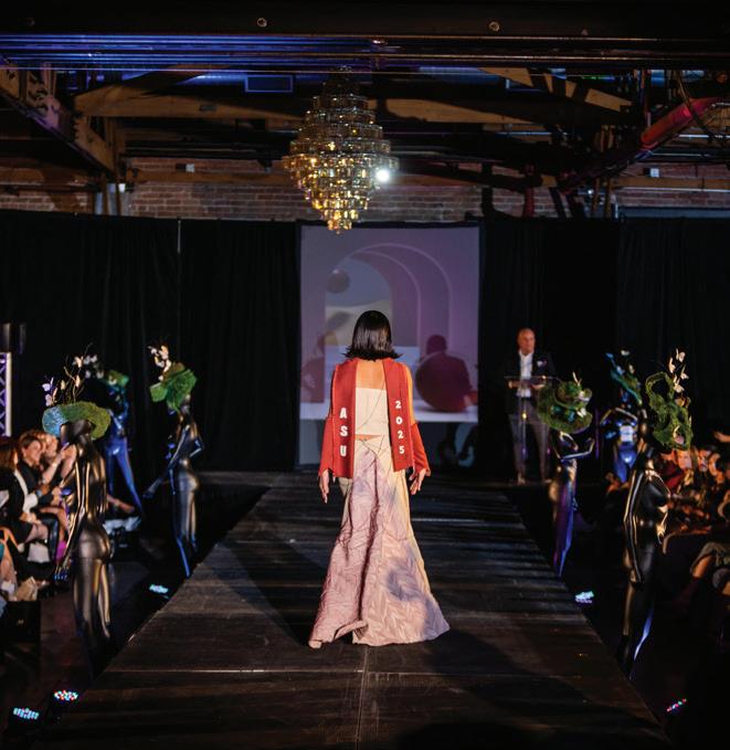
the iida southwest chapter’s holds a biennial fashion show event called couture. the main goal of couture is to successfully pair up product representatives and design firms so that they can work closely together. each group is assigned a color from sherwin williams - in our case, we received a red-brown called ‘fireweed’.
ABOUT THE PROJECT:
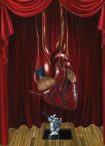
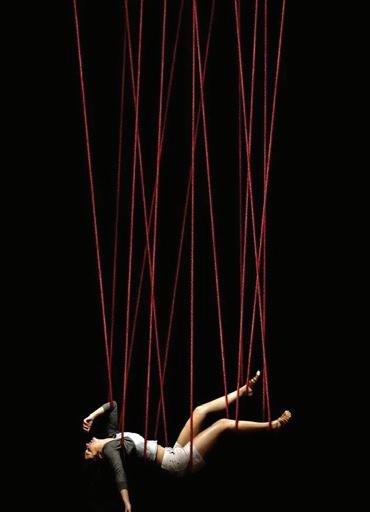
the theme for 2024 was surrealism. since ‘fireweed’ is a reddish brown color, our team came up with a concept that derived from the human heart. we blended the fabrics we received from designtex and created a two-piece set with gloves and a sash using different methods of fabric tape and sewing.
“tugging at your heartstrings” a surrealistic approach to the anatomy of the human heart
andrea venegas | interior design andreavenegas012@gmail.com| alvenega@asu.edu | 623.251.8390