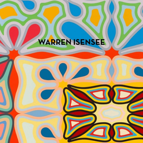
WARREN ISENSEE
511 West 22nd Street
515 West 22nd Street
525 West 22nd Street
520 West 21st Street
New York NY 10011
New York NY 10011
New York NY 10011
New York NY 10011
2
WHAT EMERGES Stephen Westfall Warren Isensee’s paintings combine impeccable craft with an animated … let’s call it “post” psychedelic vision of mandalic energies that thrive off pulse and vibration. They emulate hard-edge painting in their process, but their chromatic throb functions as a kind of blurring effect, converting the hard edge into chromatic pillows while hewing to a rigorous assertion of design and pattern.
3
Thomas Downing, Untitled, 1962, Acrylic on canvas, 25 5⁄8 x 26 inches (65.1 x 66.0 cm). Smithsonian American Art Museum, Washington, D.C., Gift of Benjamin P. Nicolette.
Paul Feeley, Achernar, 1963, Oil-based enamel on canvas, 60 x 60 inches (152.4 x 152.4 cm).
Within that rigor, Isensee is constantly discovering and renewing dynamics, breaking the chromatic and compositional symmetries that a viewer would anticipate by adducing his more eccentric color-field antecedents, Thomas Downing and Paul Feeley. Both artists restrain their own mandalic compositions to create unified color progressions through forms—circles in Downing’s case and a springy shape like the silhouette of a jack (the sort used in the childhood game) in Feeley’s. And both wonderfully introduce the folkish and feminine circle and quatrefoil into the spare field of minimalism. They maintain a playful respectability by limiting the number of their forms and positioning them so they can be plotted along concentric or gridded symmetries. But
their playfulness connotes an emerging pop sensibility as well—as though a painting could find its meaning through rhyming with patterns of everyday life and use. Curves and circles will do that. Well, here we are, decades later. Something has had to give, and Isensee is just the artist to open things up. So many strains of American myth-making thread their way into his artistic development that sorting them out is almost beside the point. But they collectively produce a picture of a certain inevitability, as if it were ordained that Isensee would not only become an artist, but that he would become a certain kind of painter. He grew up in an evangelical family in a Maryland suburb of Washington, D.C., that had been set aside for Korean War veterans and their families. His grandfather, a craftsperson, skilled in carpentry, built the family home from stones. Isensee’s father was also interested in painting, and he enrolled in a class at a local community arts center. Isensee shared his father’s penchant for crafts and woodworking. He was also inspired to take up drawing and painting, relying mostly on comic books for source material. 4
Perhaps his most telling craft-based activity was painting the plastic models that many boys of his age (and older) assembled and then detailed with Testors brand enamel paints. To do so successfully required a genuine feel for the flat application of quick-drying and impossibly sticky paint to the insignias of military vehicles and the clothes and features of monsters. Along with an even application of paint to the flat areas of shapes, there must be an attendant control at the edge of an area. Isensee’s standout high school craft effort was constructing a scale-model Taj Mahal from sugar cubes, which helped convince his family that he had a real talent for architecture. (Being a full-time artist wasn’t to be considered, even though trips to the Washington museums were encouraged.) But a lot of what we now see in Isensee’s paintings was already there: obsessive technical challenges met with aplomb, the boyish conflation of pop culture with museum culture, even a road trip approach to college. Isensee chose to attend the University of Oklahoma to study architecture after he stayed on the university campus overnight on a Boy Scout backpacking trip to the Rockies and slipped out with a friend to see the Joe Cocker movie Mad Dogs and Englishmen (1971). Of course, he wound up studying art and listening to Frank Zappa. Even before
devoting himself to abstraction, he saw, through looking at the paintings of Georges Seurat, the possibilities of color in his own artwork. Once Isensee was out of school, he took up house painting, where the craft of filling an area and holding an edge is everything. That served as an introduction to spreading paint on a large scale. He became a technical illustrator for a nuclear utility systems company, and he subsequently supported himself doing freelance graphic and illustration jobs while painting in his spare time. There is a 1982 picture of him on his knees working on a roughly 30-by-40-inch canvas in his one-bedroom apartment. The image is a grid of partially overlapping circles, like enlarged BenDay dots floating across a horizontally divided background of orange on top and grey on the bottom. When he made this painting, he hadn’t yet encountered Thomas Downing’s work, which “surprised and delighted”1 him, but you can see the influence of Roy Lichtenstein in the dots, and Andy Warhol in the misregistration suggested by the overlapping shapes. Isensee had already met Warhol in 1980 at an opening for Warhol’s painting show “Ten Portraits of Jews.” The nuclear power industry collapsed in the wake of a partial nuclear meltdown at Three Mile Island, near Harrisburg, Pennsylvania, in 1979, when Isensee began working at the start-up newspaper USA Today in 1983. He worked there first as an illustrator and then as a designer of charts, maps, and graphs, where scales and measures of differing colors or values of gray would convey complex information. In 1985, looking for a studio in the Washington area, he found one being rented out by Robin Rose, a superb painter of encaustic abstractions. By the late 1980s, Isensee was fully engaged in the technical challenges of encaustic, and he devoted several years to mastering that heartbreakingly brittle and volatile medium. The imagery in his paintings moved from radiant symbolist suns, moons, and mandorlas to interlocking patterns of a more pop flavor. Encaustic is a medium that produces rich color resonances through careful ton sur ton overlays, and during this period of Isensee’s development you can see him mastering color subtleties. Isensee moved with his wife to New York in 1988, and in 1991 he started working for the painter Jonathan Lasker. (Isensee counts Rose and Lasker as his two real mentors.) Over time, Lasker’s 1 From an email conversation with the artist, November 2025.
5
Robin Rose, Flutter, 2019-2024, Encaustic on linen on aluminum Hexcel panel, 36 x 48 inches (91.4 x 121.9 cm).
6
almost shockingly direct manner with paint helped clarify Isensee’s own approach. After Isensee passed through an overtly pop phase of patterns and floating dingbats, he saw that he could adopt a more direct approach to laying bands or filling shapes of color next to each other, much like a housepainter laying in a trim. The first shapes recalled the rounded river stones that his grandfather used in building the family home in Texas—or the pebble bathmats most of us have had at one time or another. The shapes array themselves in grids or concentric radii that have been the lingua franca of post-minimalist painting, but their bunching produces an impact on the picture plane, a kind of splat that has become more pronounced in Isensee’s more recent work. Artists rarely develop along a single straight line, and there was to be at least one more significant diversion from the evolution of Isensee’s packed curved shapes. His mats of rounded forms gave way in the late aughts to interlocking, sharply rectilinear shapes with interior concentric bands of even width marking gradations of color and value. In these works, first exhibited at the Danese Gallery in 2008, the blurring effect I describe in the opening paragraph makes its first appearance. The blurring uses the sort of complementary shades that a hard-edge painter might use when shadow-modeling amebic shapes. These paintings are warm and lean toward earth reds, rich browns, and warm yellows. The blue that is used is the powdery blue on top of a mesa under a cloud. I’m reminded a bit of op art, but there’s also a weathered quality to the color in these paintings—like fading striped awnings or serapes.
James Siena, Cephaelin, 2025, Acrylic on linen, 70 x 56 inches (177.8 x 142.2 cm).
Dan Walsh, Expo I, 2018, Acrylic on canvas, 96 x 96 inches (243.8 x 243.8 cm).
Isensee has brought his structured banding to the extruded and bent globular shapes that have marked his work since the late aughts. The only thing that has been really pop about his work over the last twenty years is its whiff of psychedelia, which is partly a holdover from his love of Zap Comix and partly a result of his coming of age in the late 1960s and early ’70s. But the craft of his paintings is embedded in a formal rigor that feels deeper and more enigmatic than most pop—which may be the point of pop abstraction. It’s the abstraction that remains resistant to quick identification and codification, that points to the uncanny. Since Nicholas Krushenick, there has been an unacknowledged cohort of painters who toggle between controlled doses of psychedelia and freehand formal rigor with paint. James Siena and Dan Walsh are two. These painters can’t be called a school, but they might enjoy being in proximity to each other. Isensee’s own craft isn’t just visible in the subtle shifts in shapes mirroring each other from opposite sides of the canvas, but also in the small changes from the Prismacolor pencil studies that serve as launching pads for the larger paintings. Isensee’s new paintings strike me as more complex overall in their spatial connotations, and freer in their willingness to break the bottom-to-top chromatic certainties of where colors should go to complete patterns. A great example is Crepuscule Plot (2025), where negative and positive shapes interlace in a radiant, now softly rectilinear, mandalic organization without any rectilinear shapes at all. The banding is most pronounced in the negative shapes and is darker along the
7
Roy Lichtenstein, Haystack Series, 1969, Series of six lithograph and screenprints, and one relief print. The Museum of Modern Art, New York, NY. Gift of the Lily Auchincloss Fund in honor of Joanne Stern.
8
bottom exterior row, moving in stages of softening contrast from the middle to the top. At no place do the interior colors in the positive shapes change their color, but the Albersian effect of simultaneous contrast suggests that they move from shadow to light. Pointedly, this entire effect is a path out of chromatic symmetry, or mirroring, and into a freeing dynamism. Where colors are still symmetrically mirroring each other around the painting, there is a greater spatial dynamism as they change in value. An example is the spatial drop-backs created by the organization of lighter-hued shapes interspersed among the mostly larger darker-hued ones in Really Real (2025) and Honeypot (2025). The lighter, low-contrast shapes enlarge in the center of both paintings, creating an atmospheric spatial pocket. Dream Tableau (2025) reverses this order and pushes the lighter values to the outside, and the five soft diamonds of darker-hued shapes constellate in the center. There’s a perceptual conundrum, though, because the spatial illusion cancels out once we perceive that all of the shapes are emphatically next to each other. At least, that’s how we see it before it winks back in again when we are persuaded by the color to fall back into an optical spatial daze. Only painting can oscillate on and off in a material dematerialization like this. Isensee’s paintings satisfy because they deliver a cluster of perceptual events that keep on giving while they work in concert.
Another crucial perceptual event is the reading of time. We don’t know where the action begins or ends, but we can follow Isensee’s phenomenally controlled yet inevitably (if subtly) imperfect free brush application of the bands of color. In a sense, we watch his paintings being made by following the evidence of the process. In a few paintings, a sinuous band frees itself and winds a path around groups of his pulsating shapes, like the dark, wending band in Runaway (2025). The path is a closed arabesque that we can follow in time (like tracking a car on a racetrack) or perceive as another completed shape. Again, there is the switch from seeing it one way to seeing it another way that is folded into imagery that is already reverberating with on/off spatiality. Then there is the flicker of representational content: a hallucinatory godhead that emerges in paintings such as Really Real, The New Normal (2025), and Head Charge (2025). Here is a kind of grotesquerie embedded in what masquerades as a straightforward, if virtuosic, painting process—an upwelling of the subconscious if you will. The painting grins back, reminding us that a ghost resides in this very human machine. Even the five pillowing diamonds of Dream Tableau appear to have a lidless horizontal oval eye staring quietly from each of their centers. The gods don’t blink. It is as if a creature were unexpectedly found in the heart of a labyrinth—the sort of labyrinth from which one might emerge while conjuring an abstract design.
Stephen Westfall is a painter and writer living in the Hudson Valley. He is a Professor Emeritus of the Mason Gross School of the Arts, Rutgers University.
9
10
11
12
Runaway, 2024 Oil on canvas 40 x 40 inches 102 x 102 cm
14
All Day Sucker, 2025 Oil on canvas 60 x 60 inches 152 x 152 cm
16
Balancing Act, 2025 Oil on canvas 45 x 60 inches 114 x 152 cm
18
BRB, 2025
Oil on canvas 30 x 30 inches 76 x 76 cm
20
Crepuscule Plot, 2025 Oil on linen 75 x 100 inches 191 x 254 cm
22
Dream Tableau, 2025
Oil on linen 75 x 100 inches 191 x 254 cm
24
Flippy Floppy, 2025 Oil on canvas 55 x 45 inches 140 x 114 cm
26
Head Charge, 2025
Oil on canvas 45 x 60 inches 114 x 152 cm
28
Honeypot, 2025 Oil on canvas 60 x 60 inches 152 x 152 cm
30
New Normal, 2025 Oil on canvas 45 x 60 inches 114 x 152 cm
32
Really Real, 2025 Oil on canvas 50 x 50 inches 127 x 127 cm
Published on the occasion of the exhibition
WARREN INSENSEE 8 January – 14 February 2026 Miles McEnery Gallery 511 West 22nd Street New York NY 10011 tel +1 212 445 0051 www.milesmcenery.com Publication © 2026 Miles McEnery Gallery All rights reserved Essay © 2025 Stephen Westfall Photo Credits p. 3: © Thomas Downing / Digital image courtesy Smithsonian American Art Museum, Washington, D.C. / Art Resource, New York, NY p. 3: Image courtesy the estate of the artist and Garth Greenan Gallery, New York, NY p. 6: Image courtesy of Robin Rose/HEMPHILL Artworks, Washington, D.C. p. 7: © Dan Walsh / Courtesy Paula Cooper Gallery, New York, NY, photo by Steven Probert p. 8: © 2025 Roy Lichtenstein Foundation / Digital Image © The Museum of Modern Art, New York, NY / Licensed by SCALA / Art Resource, New York, NY Associate Director Julia Schlank, New York, NY Photography by Dan Bradica, New York, NY Christopher Burke Studios, New York, NY Catalogue layout by Allison Leung ISBN: 979-8-3507-5905-1 Cover: Crepuscule Plot, (detail), 2025