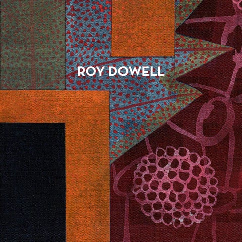
ROY DOWELL
ROY DOWELL
511 West 22nd Street
515 West 22nd Street
525 West 22nd Street
520 West 21st Street
New York NY 10011
New York NY 10011
New York NY 10011
New York NY 10011
4
AN INVENTORY OF DESIRE On Roy Dowell’s Evidence to the Contrary Geun-jun Chungwoo-Michael Lim Roy Dowell has confessed to a recurring worry: that his solo exhibitions might read as group shows. Stand at the threshold of this one, and you will see what he means. Twenty-five paintings share a single format — vinyl emulsion on linen over panel, twenty-four by eighteen inches — and, with a handful of exceptions, inventory numbers in place of titles. Within that discipline, nothing repeats. Five black discs in a pale dotted field, a thicket of thorned line winding around a mosaic cross, two checkered ovals ringed in yellow. No signature look binds them because Dowell refuses seriality on principle: Each painting is built as an independent proposition, and what he trusts to unify his paintings is nothing visible at all — only, as he puts it, his intention. His worry, in other words, is our instruction. The first impression of dispersal is not a misreading to be corrected but the intended entrance. And it defines what an essay can honestly do here. Dowell states that decoding, deciphering, and deconstructing the work is the viewer’s labor; that whatever more a viewer finds is the viewer’s own achievement; that there is no finish line and no correct answer. He withholds titles for the same reason — not coyness, but a refusal to steer. A critic who “solves” these paintings is stealing on the viewer’s behalf. What follows is instead a way of looking: four habits to switch off or on before the walls, in the order the exhibition itself teaches them. First, stop looking for a hierarchy Western pictures train us to triage: figure against ground, center against margin, subject against ornament. Bring that habit to a Dowell panel and it spins without traction. Take untitled #1276 (2024) — five black discs, two black L-forms, a frame of red-and-green striped blocks around a cream field. Which element is the image, and which is the decoration? Is the striped border a frame for the discs, or are the discs punctuation inside a striped picture? The question stalls, and the stalling is the point: No element outranks another, and none surrenders.
3
4
Dowell has a name for this condition, and it is borrowed from an unlikely ancestor. Edward Hicks was a Quaker preacher in early-nineteenth-century Pennsylvania who paid his bills as a sign and coach painter — lettering, borders, ornament — and who, for the last three decades of his life, painted one biblical scene over and over: Isaiah’s prophecy of the predator lying down with the prey, the wolf with the lamb, the leopard with the kid, and a child leading them. Sixty-two versions survive, each done in the flat, frontal manner of the sign trade, many with William Penn signing his treaty with the Lenape in the background — peace between species in front, peace between peoples behind. Hicks called the subject the “peaceable kingdom,” and Dowell has taken the phrase for his own studio law: Every new form entering his vocabulary, he says, must find its place within a peaceable kingdom. The borrowed phrase names both a source and a politics of form. Modernist collage, from its Cubist founding, staged the meeting of unlike things as collision — shock, rupture, dialectical charge. Dowell, for whom collage is less a technique than an epistemology (it is, he says, how he sees the world and how he thinks), stages it as cohabitation: a basket-weave lattice, a modernist grid, a folk-ceramic glyph, and a scrap of signage holding adjacent ground without rank. Read the painting, then, not by finding its subject but by tracking its treaties — which patterns touch, which colors mediate, where a border consents to be crossed. Second, read the surface as presence, not as past The second habit concerns time, and it requires staying longer than a scan. Dowell begins with no preparatory drawings and only the vaguest of ideas. The work happens, he says, as a conversation between painter and panel, and a painting’s origins are routinely buried in its own process. Notice, though, what his medium does to that burial. Thinned vinyl emulsion dries matte and semi-translucent, so earlier decisions stay legible beneath later ones. Consider how unusual that is. In the Renaissance order of picture-making, the idea preceded the hand, the drawing preceded the color, and the finished surface was designed to entomb its own preparation. When the Arno River flooded Florence in November 1966 and restorers had to strip ruined frescoes from church walls, what emerged beneath them were the sinopie — the red-earth underdrawings, hidden for five centuries. It took a catastrophe to make the preparation visible again. Dowell paints as if that entire order had been quietly retired: His surfaces cover without entombing, keeping the preparatory intelligence of the hand permanently in view, no flood required.
And this is why the archaic passages in his panels — the frontal symmetry of a votive object, the punched repetition of a stamped textile — do not read as excavated. Painting has renewed itself through antiquity before, and the relay is worth spelling out. Peter Paul Rubens and Nicolas Poussin, in the seventeenth century, drew from Roman ruins and ancient sculpture to rebuild painting from the ground up. Two centuries later, Paul Cézanne rerouted through both of them on his way to the great unfinished Large Bathers (1900–1906). Henri Matisse then reached past antiquity altogether toward the cave painters in Le Bonheur de vivre (1905–06), and Pablo Picasso answered him within the year with Les Demoiselles d’Avignon (1907). But that whole relay ran through Europe’s own basement, and it ran on reverence — each generation approaching the old forms as authority. Dowell’s route bypasses the Mediterranean entirely, and its tense is different. Nothing here arrives from the past. The ancient is summoned to the present and set running. Each panel is a pocket Mnemosyne atlas, kept switched on rather than archived.1 Not excavation but invocation; not survival but reactivation. The distance between then, now, and next does not shorten on these panels; it fails to exist. Even Dowell’s American lineage obeys this tense. He builds emblematic, frontal fields in the tradition of Marsden Hartley and Arthur Dove — the early moderns who trusted a flag, a mountain, a leaf-form to carry feeling without narrative. But where those founders painted toward the spirit, Dowell states his position without hedging: He does not aim to reside in the spiritual, and he admits its imagery only insofar as it is simultaneously secular. Citation without faith — yet nothing about it is taxidermy, and the reason is the engine this essay keeps circling: He brings the old forms in not because he reveres them but because he wants them, and desire conjugates everything it touches in the present tense. Third, read the motifs as belongings Before turning eighteen, Dowell had moved some sixteen times. One thing traveled anyway: making ran in the female line — grandmother, great-aunt, mother, cousin: four of them, across three generations, trained at the same California art school — so place could not be inherited, but the habit of the hand was. A painter raised inside a single vernacular inherits it; raised inside none, he must choose his ancestors. Dowell chose two, and both sit outside the academy’s bloodline: the homegrown American moderns — Hicks the sign-painter, Hartley, Dove — and the deep arts of Mexico, beside which he
5
literally lives, dividing his time between Los Angeles and Mexico City. An elective inheritance of traditions that were themselves never inherited from Europe.
6
The choosing was learned early and against the grain. Trained at CalArts under Allan Kaprow, at the citadel of an art whose idea was to precede and command execution, he defected there to the handmade object — his painting post-conceptual from its first stroke, its standard of completion a strict, indefinable sense of “rightness” felt as a nerve being touched: an exacting rule with no rulebook. The collection came with the defection. The ceramics, masks, and carved figures that fill the home he shares with the artist Lari Pittman — his partner since their CalArts years, fifty-two years now — are, he says plainly, autobiography: We reveal who we are by what we surround ourselves with. He calls them his objects of virtue, and adds that the virtue is defined by his own lights and nobody else’s — a sovereignty asserted, not argued. Then the sentence that unlocks the panels: Sometimes, knowing he can never physically possess an object he has seen, he paints it — because by using and commemorating it in the work, he can have it. Description as ownership; each panel a ledger of the unpossessable. That maneuver — possessing by depicting — has a queer American pedigree, and it is worth walking through slowly, because Dowell descends from it. Call it the salon lineage. It begins with Gertrude Stein, the American writer who settled in Paris and, with her brother Leo, spent a modest inheritance buying Cézannes, Matisses, and Picassos before almost anyone else wanted them. Her apartment at 27 rue de Fleurus, its walls packed with the collection, became the Saturday salon where young American modernists learned what the new art looked like. Stein’s own art was made of words: her “word portraits” rendered friends — Picasso and Matisse among them — with no likeness at all, only the rhythm and repetition of language, a portrait you could not see but could not mistake. And when she finally wrote her memoir, she wrote it as The Autobiography of Alice B. Toklas — her own life told through the person she loved. Collecting as self-portrait; possession by description: The grammar was hers first.
The painters took it up. Charles Demuth, a Pennsylvania precisionist and a friend of Stein’s circle, built a series of “poster portraits” of the people he loved and admired — portraits made not of faces but of letters, numbers, and emblems. The most famous, I Saw the Figure 5 in Gold (1928), condenses his friend William Carlos Williams into the poem Williams wrote about a fire engine flashing through the rainy night — a gold 5 blazing three times out of the dark, the poet present only as “BILL” and “CARLO[S]” in fragments of signage. A person, held entirely in cipher. Marsden Hartley then carried the method into grief. In Berlin, he had loved a young Prussian officer, Karl von Freyburg, who was killed in October 1914, at age twenty-four, early in the First World War. Hartley could not name that love publicly, so he painted it: Portrait of a German Officer (1914) assembles the initials K.v.F., the number 24, the regiment’s 4, epaulettes, spurs, the Iron Cross — a man rebuilt as an arrangement of insignia, mourning encrypted as pattern. To possess by commemorating; to hold the unsayable in cipher. And the lineage kept renewing itself, self-consciously. Robert Indiana — who was born Robert Clark, who was adopted as an infant and raised in Depression-era Indiana, and who moved twenty-one times before he turned seventeen — traced his lifelong obsession with numbers and letters to precisely that instability: A child who kept losing addresses learned to hold onto the signs. Indiana discovered Stein when he was an art student through a recording of her opera Four Saints in Three Acts. He called himself “an American painter of signs,” and in 1963 he painted The Demuth American Dream No. 5. It was Demuth’s golden 5 reset in Indiana’s own hard-edge language: one painter in the lineage repainting another, inheritance performed in public. Displacement into signs; signs into belongings — the pattern that opens this section, run twice. Dowell, who allows that the idea of a sigil — a desire encoded past recognition — interests him, descends from this school and extends it. Where Stein possessed by describing and Hartley by commemorating, Dowell paints the objects he cannot own, and owns them. Fourth, walk it as a street of windows The ledger has a second, humbler genealogy, and it supplies the last habit. If there is a suburban avant-garde of the shopping mall, there is an older American avant-garde of the shop window — and
7
it, too, comes with names and dates. Frederick Kiesler, the Viennese visionary designer transplanted to New York, published Contemporary Art Applied to the Store and Its Display in 1930, arguing that the department-store window was a laboratory where advanced art could meet the street. Salvador Dalí tested the proposition in 1939: He was commissioned to dress two windows at Bonwit Teller on Fifth Avenue and found his tableau altered by the store. He climbed into the display to overturn a fur-lined bathtub and crashed with it through the plate glass — an arrest, a headline, and proof of how seriously a window could be meant. In the mid-1950s, two unknown painters named Jasper Johns and Robert Rauschenberg earned their living building windows for Tiffany and Bonwit Teller under a shared pseudonym, “Matson Jones” — a false name adopted precisely to keep their commercial craft from touching their artistic reputations. The alias is the tell: Display work was a trade one did but did not sign, for decades a discreet harbor for gay men who banked their aesthetics in ornament — a workshop of ensembles built to make the unowned wanted, run by men trained in wanting what could not be said. 8
Dowell’s panels are that school’s direct descendants, with one revision that changes everything: The merchandise has been deposed. Window dressing with nothing for sale; seduction with no transaction to close. What Dowell calls decorating an idea — making it more persuasive, better able to draw the viewer in and seduce — is the window dresser’s art promoted to the condition of painting. The fate of the lineage’s most famous image shows what is at stake in that revision. Robert Indiana’s LOVE — four letters first devised in 1964 and adopted for a Museum of Modern Art Christmas card in 1965 — escaped him: It was never copyrighted, it was endlessly reproduced, and the most intimate of his coded works was converted into the century’s most exhausted commodity. In Dowell’s windows there is nothing the market can carry off, because nothing is for sale. And where the museum vitrine manufactures temporal distance — do not touch; this belongs to then — the shop window promises its abolition: Soon this could be yours. Dowell displays the deep past in the window’s tense, not the vitrine’s. The peaceable kingdom, read from this side, is simply the shop window after the commodity has abdicated. So take the habit literally on your way through: walk the room as a street of windows, display to display, unhurried, wanting — and notice that nothing here asks to be bought.
Return The exhibition’s last lesson arrives on the way out, when the twenty-five propositions begin talking to one another — an echoed disc, a shared palette — and the group show resolves into a single, plural self-portrait. Lately, Dowell has taken to quoting himself, revisiting motifs from his earlier work. His own past has entered the collection, one more vernacular among the others. As Indiana once repainted Demuth, Dowell now repaints Dowell, which means the present paintings are already patterns for paintings to come. The inventory stays open at both ends. Nor did the transmission stay inward. For twenty-six years, Dowell built and chaired the graduate fine-arts program at Otis College of Art and Design — modeled, he says, on the best of CalArts and on what CalArts lacked; the school he had wished for, constructed and then handed on — insisting throughout that he was of no use to students unless he remained a working artist. A man who could not inherit a lineage spent a quarter of a century being one. Evidence to the Contrary, then — contrary to what? To the reflexive oppositions this work quietly retires: that decoration excludes intelligence, that seduction excludes rigor, that a conceptual education forecloses the handmade, that a shop window cannot be a school, that twenty-five stubborn singularities cannot amount to one autobiography. Dowell files his numbered exhibits and attaches no verdict. He cites a fellow painter, Charline von Heyl, and her hope for painting that stays ahead of the sentence, carrying the viewer past definitions to the place where looking feels like thinking. These four habits are only a map to that place. The paintings are the territory, and the verdict — as the artist insists — is yours. Note 1. The reference is to Aby Warburg’s unfinished Bilderatlas Mnemosyne (1924–29), which mounted images across widely separated epochs on black panels, so that a gesture from antiquity might be found surviving, transformed, in a Renaissance painting or a contemporary photograph — what Warburg called Nachleben, the afterlife of the antique. Dowell’s panels invite the comparison because each compresses that cross-temporal juxtaposition into a single surface rather than a wall of plates. But the borrowing is also a correction: Warburg’s atlas maps survival, the persistence of a form as trace; Dowell’s paintings stage reactivation, the archaic switched on in the present tense. Where the atlas archives, the panel runs.
9
10
11
12
untitled #1273, 2024 Vinyl emulsion on linen over panel 24 x 18 inches 61 x 46 cm
13
untitled #1274, 2024
Vinyl emulsion on linen over panel 24 x 18 inches 61 x 46 cm
14
untitled #1275, 2024 Vinyl emulsion on linen over panel 24 x 18 inches 61 x 46 cm
15
untitled #1276, 2024
Vinyl emulsion on linen over panel 24 x 18 inches 61 x 46 cm
16
untitled #1277, 2024 Vinyl emulsion on linen over panel 24 x 18 inches 61 x 46 cm
17
untitled #1278, 2024 Vinyl emulsion on linen over panel 24 x 18 inches 61 x 46 cm
18
untitled #1281, 2024 Vinyl emulsion on linen over panel 24 x 18 inches 61 x 46 cm
19
untitled #1282, 2024
Vinyl emulsion on linen over panel 24 x 18 inches 61 x 46 cm
20
untitled #1283, 2024 Vinyl emulsion on linen over panel 24 x 18 inches 61 x 46 cm
21
untitled #1292, 2024 Vinyl emulsion on linen over panel 24 x 18 inches 61 x 46 cm
22
untitled #1296, 2024
Vinyl emulsion on linen over panel 24 x 18 inches 61 x 46 cm
23
untitled #1298, 2024
Vinyl emulsion on linen over panel 24 x 18 inches 61 x 46 cm
24
untitled #1299, 2024
Vinyl emulsion on linen over panel 24 x 18 inches 61 x 46 cm
25
balancing act, 2025
Vinyl emulsion on linen over panel 24 x 18 inches 61 x 46 cm
26
carried in a procession, 2025 Vinyl emulsion on linen over panel 24 x 18 inches 61 x 46 cm
27
carried into battle, 2025 Vinyl emulsion on linen over panel 24 x 18 inches 61 x 46 cm
28
performed for a live audience, 2025
Vinyl emulsion on linen over panel 24 x 18 inches 61 x 46 cm
29
untitled #1305, 2025
Vinyl emulsion on linen over panel 24 x 18 inches 61 x 46 cm
30
untitled #1307, 2025
Vinyl emulsion on linen over panel 24 x 18 inches 61 x 46 cm
31
untitled #1308, 2025
Vinyl emulsion on linen over panel 24 x 18 inches 61 x 46 cm
32
untitled #1318, 2025 Vinyl emulsion on linen over panel 24 x 18 inches 61 x 46 cm
33
untitled #1319, 2025
Vinyl emulsion on linen over panel 24 x 18 inches 61 x 46 cm
34
good or bad, 2026
Vinyl emulsion on linen over panel 24 x 18 inches 61 x 46 cm
35
untitled #1333, 2026 Vinyl emulsion on linen over panel 24 x 18 inches 61 x 46 cm
36
untitled #1335, 2026
Vinyl emulsion on linen over panel 24 x 18 inches 61 x 46 cm
37
38
TWENTY-FIVE WAYS IN: NOTES ON EIGHT PAINTINGS An appendix to An Inventory of Desire Geun-jun Chungwoo-Michael Lim The essay ended at a threshold: four habits of looking, and a wall of paintings on which to try them. This appendix walks up to eight of the twenty-five and looks — out loud, and slowly. The readings run two to a habit. None is the reading; each is a way in, and most of these paintings, as will become clear, open onto several at once — some of them contradicting the one I follow here. I drafted these readings from reproductions, then tested them against high-resolution photographs of the surfaces — close enough to catch a pencil rule left unerased, a wash left translucent, a dot-grain hiding in a blank. The paintings themselves keep the last word, and should. Two paintings without a hierarchy untitled #1276 (2024). Black discs on a cream field; a black L-form turning at top and bottom; striped panels down either side and across the foot. Ask the ordinary question — which element is the subject? — and the picture declines to answer. The discs read as punctuation, but they punctuate no sentence; the L reads as a letterform, but it resolves into no word; the stripes read as decorative border, yet they hold the field more firmly than anything they frame. One way through: Take the stripes as the true structure and the discs as incident, in which case the painting is a study in how ornament can carry the load a figure usually carries. But the reverse is just as available — hold the discs as the event and the stripes as mere edge, and the picture becomes a syncopation, five beats against a ruled ground. The painting does not adjudicate between these, and the refusal is the content: No element has been given rank. What the essay called tracking the treaties is, concretely, this — watching which zone yields to which and noticing that the yielding never settles. Up close, the cream is not empty: Rows of hand-dabbed yellow dots bend around each disc, and the pencil rules that bound the field are still there, unerased. Even the black is thin — the linen breathes through it.
39
untitled #1299 (2024). More crowded and harder. A green dotted structure seems to open left and right like shutters; vertical units stack at the center; yellow discs and striped margins push in from the sides. Here, the coexistence the essay named as “peaceable kingdom” is visibly strained; this is the kingdom as negotiation rather than as calm. A viewer might enter through the green armature, reading it as the room the other forms furnish; another might refuse it any priority and read the picture as four or five districts, each with its own logic, meeting at contested borders. I lean to the second, because nothing in the color or scale elects the green as host. But the first reading is not wrong, only differently weighted, and nothing in the surface, even seen close, settles which weight it proposes. What matters either way is that no reading arrives at a single center. The picture has districts, not a capital. The surface votes for districts: The pale green is a translucent scumble through which the woven ground keeps reading, one zone visible inside another, and every green dot wears a thin pencil ring — the drawing still on duty.
40
Two paintings whose surface is present, not past untitled #1335 (2026). Four circular structures set in a square; inside each, the ghost of a grid — in one, an ochre T that flickers toward a cross; gray curves wrapping the circles; a darker patterned layer behind. The format all but says mandala — a fourfold figure, a meditative lock on the eye. But the artist says he does not aim to reside in the spiritual and admits such imagery only where it is simultaneously secular. So read this, if you like, as a mandala with the devotion drained out — a fourfold not for contemplation but for inspection, the eye moving disc to disc checking differences rather than dissolving into a center. That is one route. Another declines the religious frame entirely and sees four windows, or four specimen dishes, or a contact sheet of one motif shot four ways. The picture supports all of them; what it withholds is any instruction to kneel. The archaic order is quoted and switched on in the present tense, not exhumed from a past — you are not looking back at a mandala, you are watching one run now, emptied of its creed. At touching distance, each pale field turns out to be a thin skin dragged over a fine perforated grain — a dot-raster lodged inside the “empty” circle — and the black lines were ruled freehand over everything, corners overshooting. Even the blankness here is made.
untitled #1319 (2025). Over a dark repeating pattern, a bell-shaped or reliquary form above, an oval form below, holding blue, yellow, and black circles and lines. It looks like a retablo; it looks like a mask; it looks like an instrument — and it is none, fixed to no category. One reading lets it hover as “an object behaving devotionally,” a picture that keeps the frontal, presented bearing of a sacred thing while naming no faith. But a flatly secular reading is equally open: Read the bell as a lamp, the oval as a dish, the whole as still life, and the sacral charge evaporates without loss. I find the devotional-withoutdevotion reading richer, but I can’t prove that the picture prefers it, and a viewer who sees only a lit lamp has not misread the painting — the object was built to sit at exactly that threshold. Close in, the round form is crowded with small drawn signs — rings, hooks, a serifed “I,” something close to a “5,” a stemmed cup — a lexicon kept just under legibility: sigils, if you want them. In the oval below, a footedcup silhouette stands between the two dark discs (which are bottle-green up close), and the reliquary reading gains a piece of furniture. Two paintings as belongings untitled #1305 (2025). At the center, a form that reads at once as woven basketry, as a tree, and as the body of an insect; dense brown and beige lines suggest handwork; a red contour rings it; a red stem descends. It has the frontal presentation of a collected object set out to be seen — but the object it depicts cannot be named, and that is the point of putting it here. The essay’s key was the artist’s own: Unable to own a thing, he paints it, and so has it. Read this, then, as a portrait of wanting rather than of any one possessed object. What survives on the panel is the shape of desire, not the identity of its target. A different viewer will insist on specifying the object — basket, beetle, bush — and the picture rewards that, too, up to the moment specification fails. The failure is where the painting keeps its charge. Which of these two attitudes you take — name it, or let it stay unnamed — is itself a choice the picture leaves to you. In the flesh, the red ring is not drawn but breathed (a sprayed blush gathering toward the silhouette’s edge), and the dark spots are soft starbursts, small detonations blurred at the rim. The hatching carries a fine screen-grain, as if the handwork had been strained through a net. Whether that makes the thing more woven, more grown, or more printed stays open.
41
untitled #1318 (2025). More directly frontal: a jar or basket rendered in a dense black-and-gray pattern, flanked by structural blocks of yellow and blue. One reading takes it straight — a single collected vessel promoted to the center of a painting — ownership by depiction at its plainest. But look again, and the vessel is not any real object; it is a compression of several remembered ones, with no single source recoverable. So, a second reading holds it as a composite, a memory of the category “vessel” rather than a portrait of one — the artist’s “objects of virtue” shifting from particular things to the structure of what makes a thing worth keeping. I prefer the composite reading, but the straight reading is not defeated by it. A viewer who sees one pot has simply stopped where the picture also permits stopping. The gray teeth are stamped or dragged rather than drawn — some skip, some tear at the edge — and beneath the hard yellow and blue, a layer of leaf-like silhouettes survives, pale shapes cut out of the dark. Whatever the vessel is, the geometry arrived last.
42
Two paintings as windows after the merchandise untitled #1273 (2024). Cool and near-minimal: four compartments, each holding an oval or wingform, each with small circles and lines. It reads, at first, as a specimen case — small things stored in labeled cells. It reads equally as an abstract grid, four bays of one motif. Here, the museum vitrine and the shop window, which the essay set in opposition, become almost indistinguishable: the case that manufactures distance (do not touch) and the window that abolishes it (soon yours) laid onto one plane. One route reads the compartments as storage, the picture as a reliquary of forms held in reserve; another reads them as display, the picture as a window dressed with nothing for sale. The painting lets the two collapse together, and the collapse is the argument: Showing and keeping are the same gesture here. The white-dot grids are stenciled, and they sit slightly proud of the surface — lace or punch-card, according to taste. The amber discs are glazes, and where one crosses a maroon block both colors stay legible inside the overlap, like cellophane. Under the pale field, the contour of at least one earlier circle sleeps in plain sight. untitled #1283 (2024). Theatrical where untitled #1273 (2024) is cool. A serrated black triangle pattern along the top; a strong red band and black zigzag below; a black structure at center (trapezoids around a small green square, a red wedge dropping to the band) reading as a stage set, with washy blue
fragments at the sides that might be figures or objects. It presents less as a painting than as a scene arranged behind glass. But what is on display cannot be identified, and the withholding is deliberate. Read it as a shop window emptied of its commodity: the full apparatus of seduction — the framing, the spotlighting, the invitation to want — with nothing offered for purchase. Or refuse the retail frame and read it as a stage before the actors enter, the drama held at the instant before it begins. Both hold. What neither yields is a product or an event: The picture stops just short, at the threshold the essay named as this work’s first location. Nor are the bands blank: Under the gray, earlier shapes show faintly through their veil, and inside the red, close up, large rosettes (fireworks, rose windows) surface like watermarks. The stage dressing hides a pyrotechnics it never quite sets off. Coda: the five titles Five of the twenty-five break the silence of the numbers. balancing act (2025). carried in a procession (2025). carried into battle (2025). performed for a live audience (2025). good or bad (2026). Say them in a row and notice they are all verbs waiting to happen — something is balanced, borne, marched, staged, weighed. Not a caption under a picture but a stage whisper before the curtain: not this is what you see but this is what you are about to do. A procession with no icon on the litter, only the litter; a battle reduced to the blazon on the shield; an audience — live — that turns out to be us, already seated, already looking. And good or bad holds up its two pans and lets them hang there, the verdict scattered into dots and grids and the exact weight of a red mark against a black one, the scale forever trembling and never tipping. The title points the way a signpost points down a road that stops at the horizon. The number paintings withhold even the signpost; these five relent, and in relenting they confess what the other twenty were doing all along — waiting for someone to finish them. Eight ways in, out of twenty-five doors, out of however many rooms lie behind each. The artist has left the latch off. The rest of the walking is yours.
Geun-jun Chungwoo-Michael Lim is a critic, curator, and historian of contemporary art and design. He also works as a meta-dramaturg for artists’ new projects.
43
Published on the occasion of the exhibition
ROY DOWELL EVIDENCE TO THE CONTRARY 10 September – 31 October 2026 Miles McEnery Gallery 520 West 21st Street New York NY 10011 tel +1 212 445 0051 www.milesmcenery.com Publication © 2026 Miles McEnery Gallery All rights reserved Essay © 2026 Geun-jun Chungwoo-Michael Lim
44
Associate Director Julia Schlank, New York, NY Catalogue Design Laurie Mullowney, New York, NY Photography by Evan Bedford, Los Angeles, CA Christopher Burke Studios, Los Angeles, CA ISBN: 979-8-3507-6620-2 Cover: untitled #1333, (detail), 2026