Graphic Design Amanda McGillvery
Color Swatch & Inspo This case study favors warm earth tones with a hint of whimsy and eclecticism. The main problem is a dull sign, storefront and an unaligned typeface. All of this needs to change, and so I did just that… Many hand drawn typefaces are drafted to marry eclecticism and whimsy.
We agreed on two typefaces and one main logo for signage purposes.
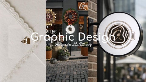
Signage Shown here is the main logo used for exterior signage. Inside of the cup in plan view is the letter “C” and a coffee bean with warm brown coffee inside the cup. The handle of the cup is to the right of the cup’s silhouette. Shown here is the main signature with the logo in the center. Inside of the cup in plan view is the letter “C” and a coffee bean with warm brown coffee inside the cup. The handle of the cup is to the right of the cup’s silhouette.
Typography The prior typography lacked character and warmth.
Stationary
I fixed those problems by upgrading their color palette from off-white to toffee and mocha brown colors. I then added the secondary icon in elevation view on the front of the business cards. The top card is the front and the bottom card is the back.
Business stationery is created. The plan view and side profile of the coffee cup is displayed both on the note cards and the back of the envelope.
Storefront Both of the logo and sign are displayed on the storefront and standing sign.
Soap Haven Co. Case Study for luxury soap from the heavens has been such a fun project. From deckled edge paper details to decorated doilies to modern pop swirl typography, this project has all the details from above. Modern Pop married with Renaissance detailing really make the logo and emblem stand out.
Merchandise Swag like note cards, shopping bags, soap bars and screen images are very important to this project. The upper left image includes a wonderful collage of a cloudy painted sky with a white logo emblem over it. The bottom left image is the screen saver with a green logo emblem and the middle image is a note card and the far right image are stamped bars of soap.
Exteriors The left image is how I’d decorate the Soap Haven Co. storefront during spring time with planters, wreaths and garland with the logo on center for the entrance door.
The far right image is a building sign directing shoppers into the store. Here the main logo is used and paired with the Soap Haven’s bold typography.
AJM Designs I created a logo for my own design business that embodies all three of my initials. The far right image is an exterior building sign with the logo and business details on it. The far left image on top .is a sconce global with the emblem etched onto it. Below that is our shopping bags. Lastly to the left are my sketches.
AJM Designs I created a logo for my own design business that embodies all three of my initials. The far right image is an exterior building sign with the logo and business details on it.