
10 Year Anniversary
Poster Design Project
Alice Reyes
GRC 278
6 March 2024
The Dr. Shirley Linzy Young Artists OrchestraINTRODUCTION
When I first learned of the Young Artists Orchestra, our professor tasked us to learn everything about the non-profit. I discovered classical and modern music performances directed by Mr. Yunior Lopez. The performances were professionally executed with resounding applauses from the audience. It took me back to my youth when I was trained classically on the piano. As a student, there was no greater accomplishment than receiving a congratulatory applause. For this project, I aimed to reflect a modern, yet prideful organization whose accomplishments create success for all the students, faculty, and family.
When selecting themes for each poster, I wanted each one to feel unique and representative of a different aspect the YAO. Some of the themes explored include: musical sound frequencies, seating charts, and the feeling of accomplishment.
For the scope of this project, six (6) posters and two (2) logos were created.
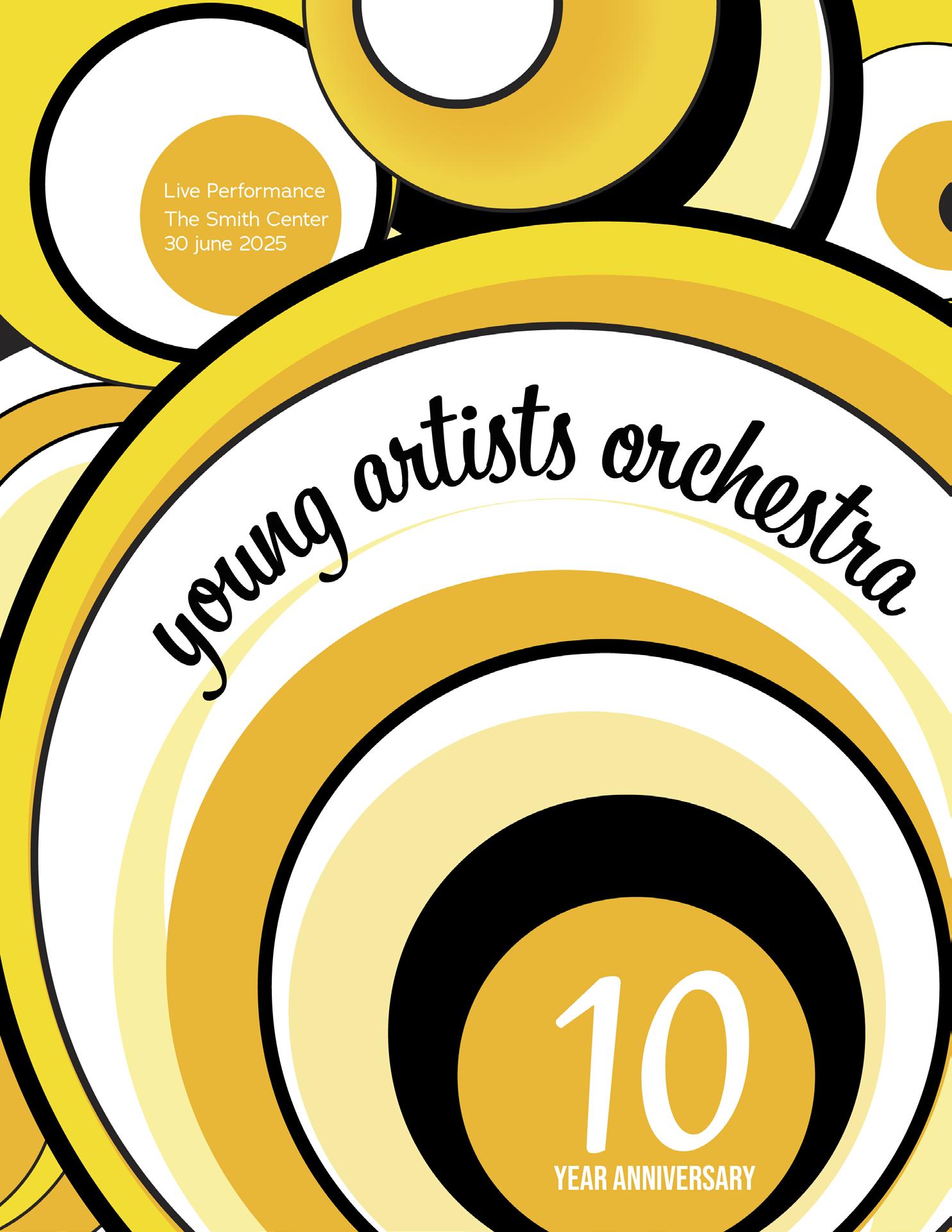
FIRST POSTER
This poster design was inspired by the rhythmic movement one feels when playing a musical instrument. The feeling while playing an instrument combined with the tempo, creates a pattern of everlasting balance. Yellow and oranges were used to create a cheerful rhythmic design.
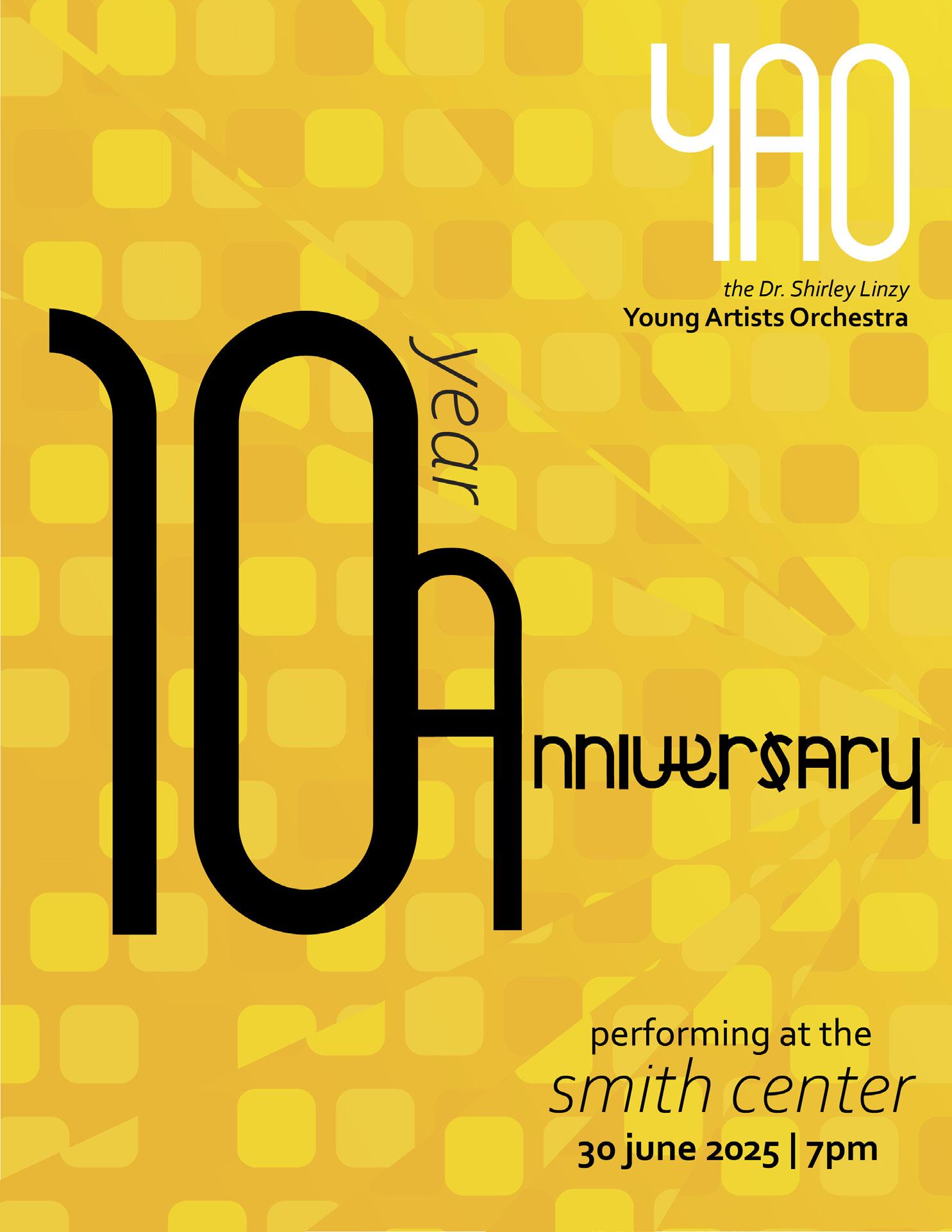
SECOND POSTER
This poster design emphasis the 10 year anniversary while introducing a new logo. The simplistic nature of the design creates an eye flow from the “10” to the YAO logo. The background pattern is an homage to the seating at a venue and the lights which beam on the stage.
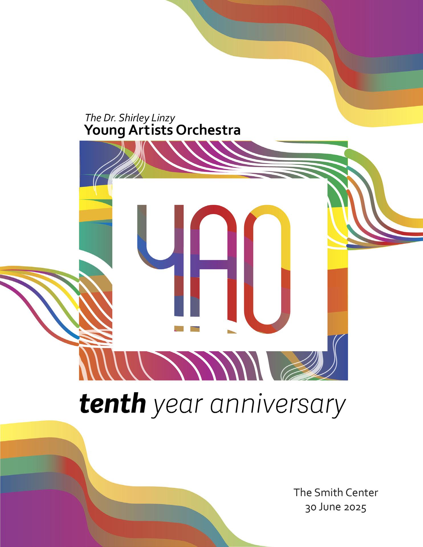
THIRD POSTER
Before every performance, artists study and practice their music piece from the music sheet. In order to read the music notes, the notes themselves must sit on the 5 horizontal lines, staffs. These staffs are present in every piece of music ever created. This designs pays tribute to the musical sheets.
FOURTH POSTER
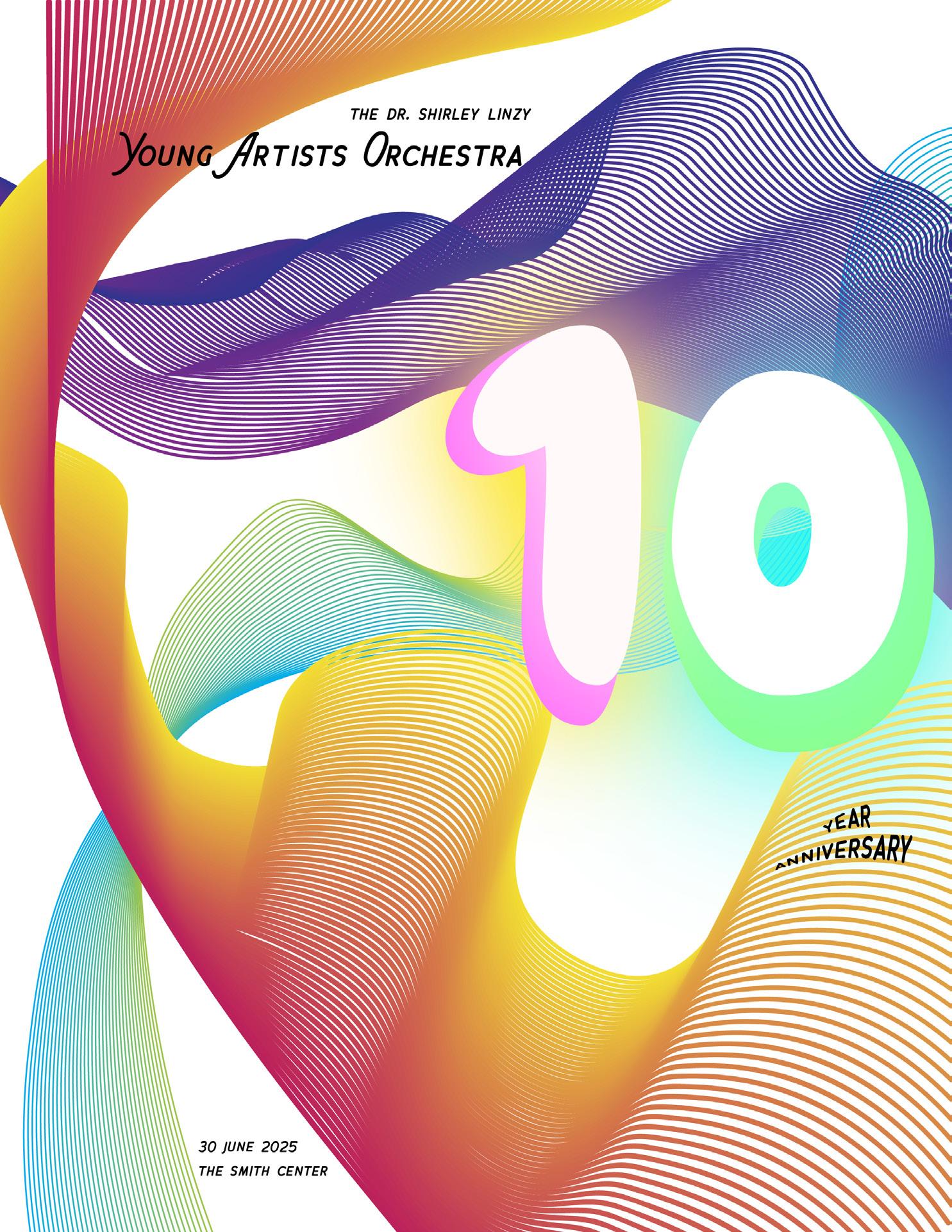
This poster design was inspired by the sound waves created by musical instruments. After all, what is a concert without the sound? Multiple sound frequencies from all the instruments harmonize to create a beautiful concert.
FIFTH POSTER
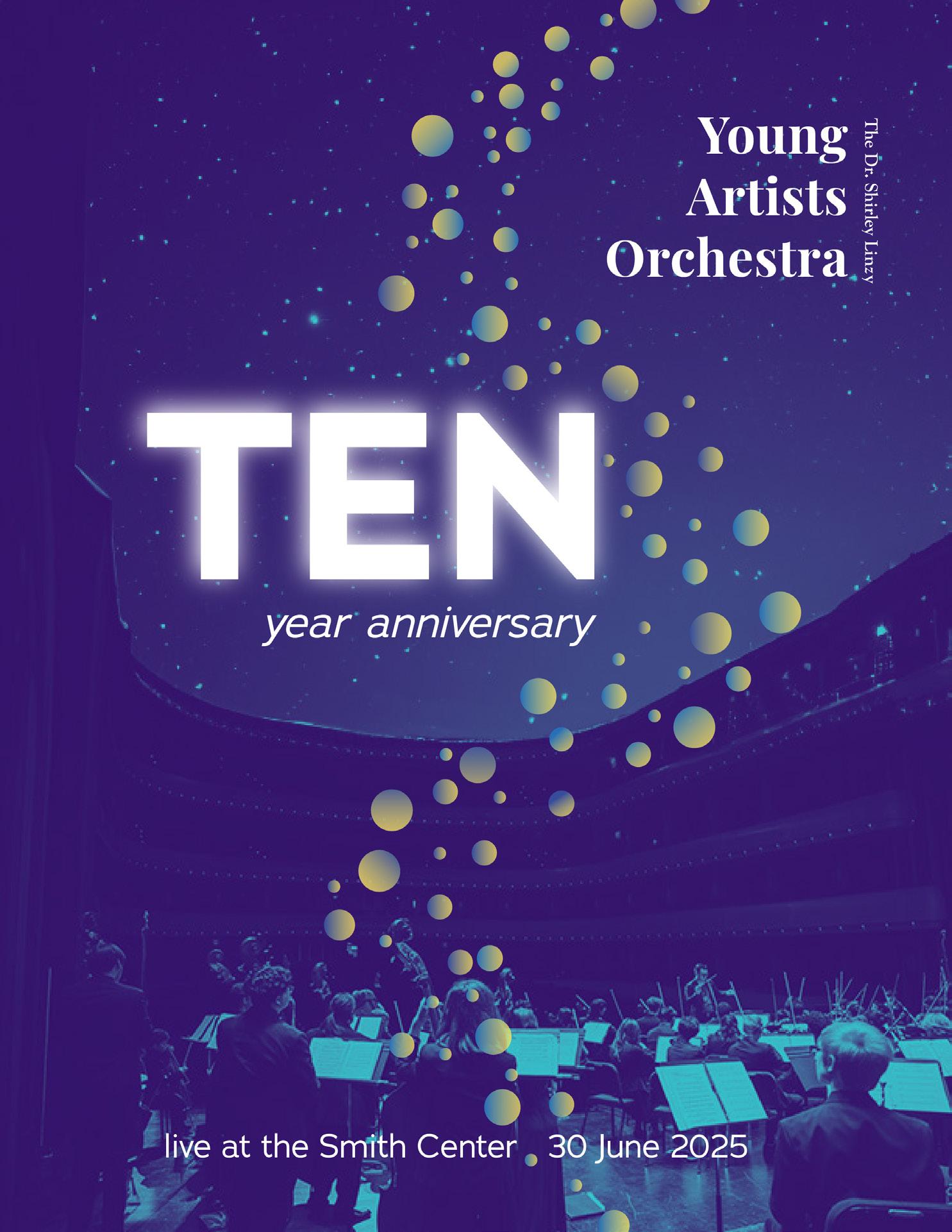
This poster was inspired by a venue and the calm of a night sky. The bubbles create a flow from the night sky to the bottom where the artists are performing.
SIXTH POSTER
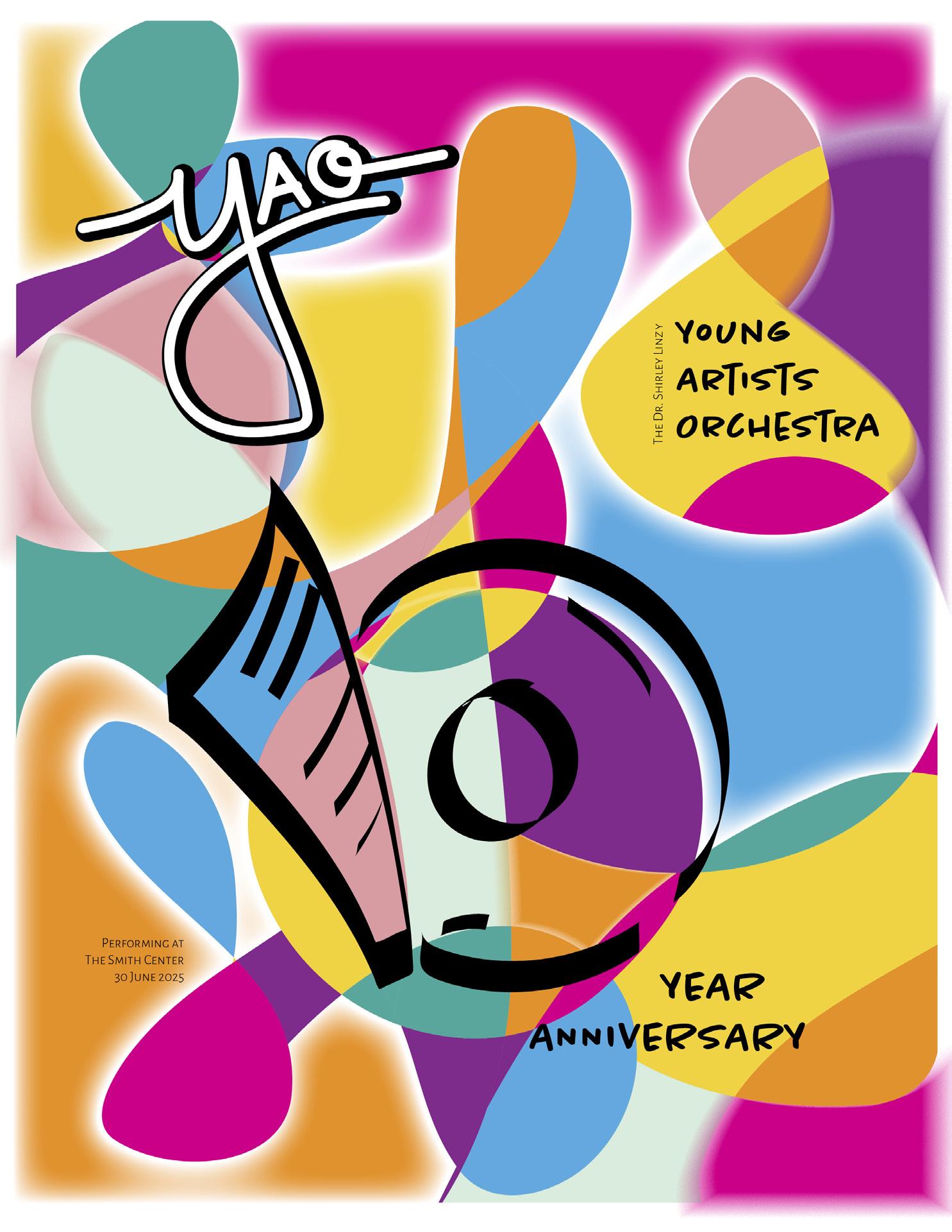
A script logo with a distinct style for each letter inspired the funky background. Treble Clefs and Bass Clefs created silhouttes that were filled with bright colors.
FIRST LOGO ADAPTATION
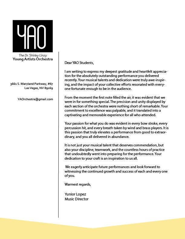
This logo being an abbreviation YAO, is simplistic with its sans-serif nature. Formulated to stand tall, it reflects the tall hopes,dreams, and perseverance the students and faculty aim for.
The inverse of the main logo, is using the negative space to account for the YAO. It is bold and can fit to any theme, color, and texture. Both its positive space and negative space can be changed to accommodate any design.
SECOND LOGO ADAPTATION
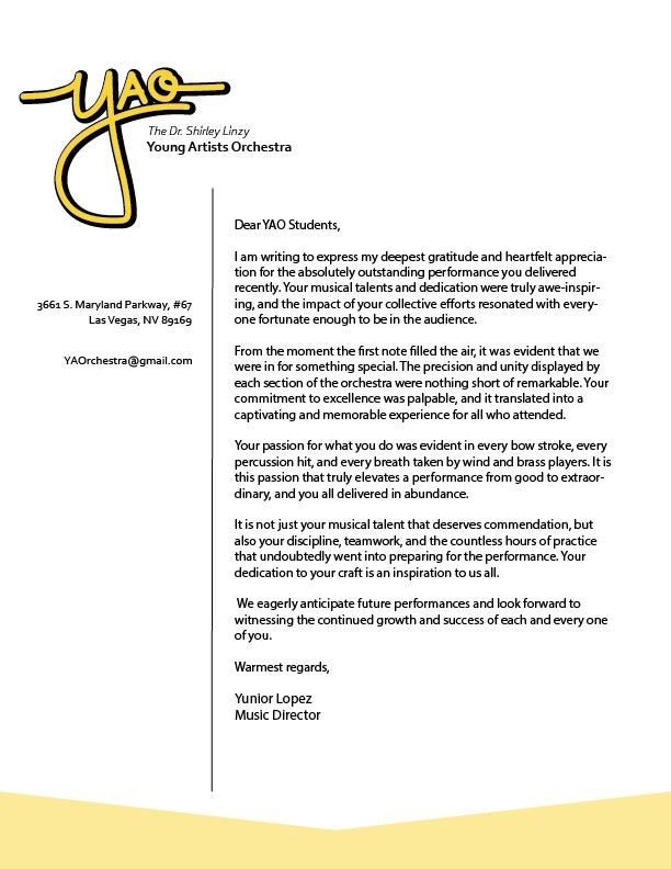
This logo is playful and was inspired by cursive/script type. It uses both lower and upper case to create a bit of emphasis on each individual letter.
The Dr. Shirley Linzy Young Artists Orchestra Front Cover Photo Credit: Photo by Andrey Konstantinov on Unsplash