GRAPHIC DESIGN
Alexandra Kison Portfolio
About Me
Hello! I’m Alexandra Kison, or Alex for short. I was born in Manila, Philippines and moved to New Jersey in 2006. My family later moved to Las Vegas in 2008 and we have lived here ever since.
Growing up, I’ve always had an interest in art. I used to follow Bob Ross videos and doodle during my classes. I figured it was only right for me to pursue a career in graphic design.
I love creating logos and illustrations that are unique to represent clients’ needs, and I would love to do more in the future.
As a graphic designer who is new to the game, I’m committed to working harder to gaining more and valuable experience in the field.
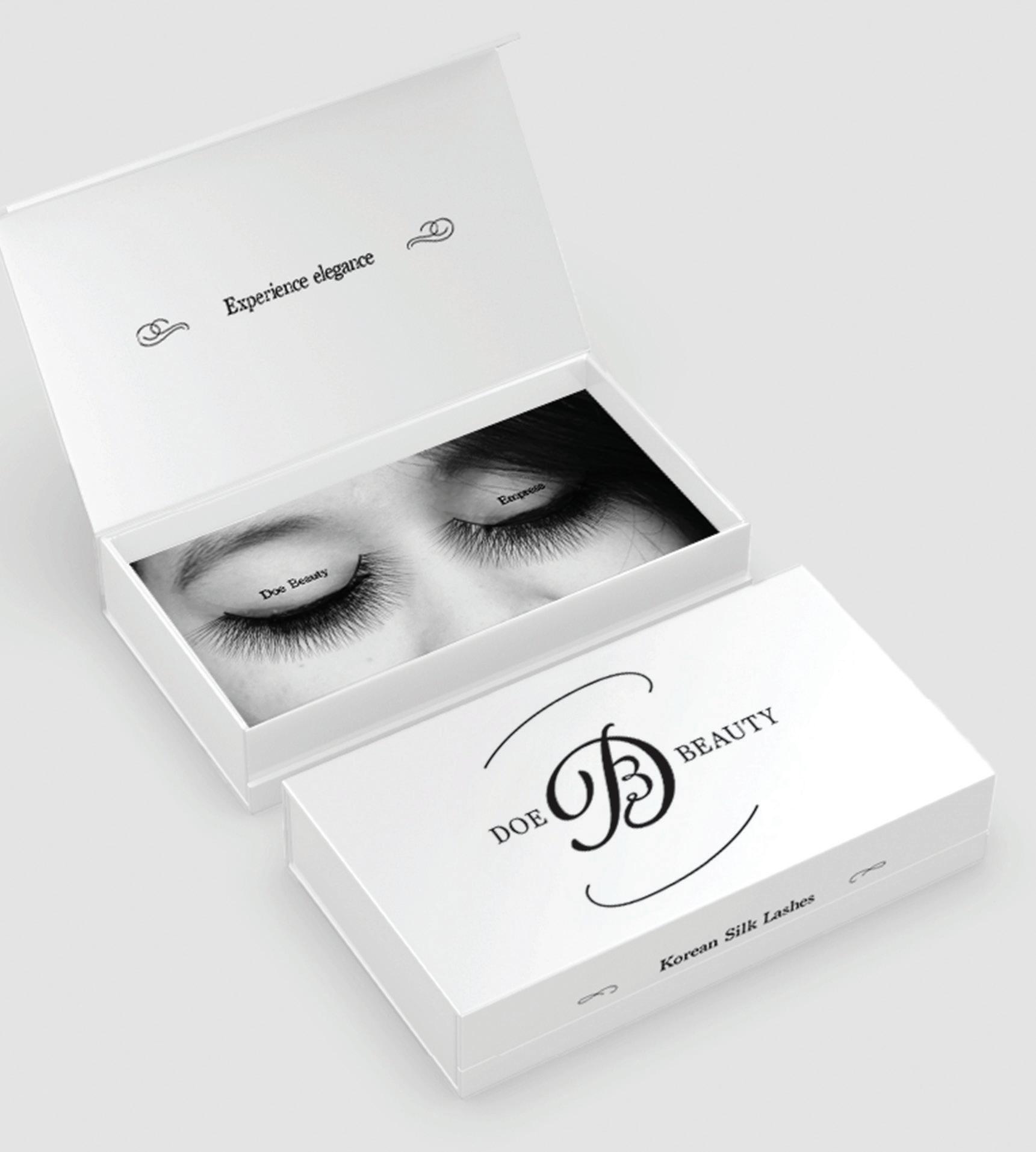
Doe Beauty is a brand that sells lashes and lash accessories. This was my take on making their logo and packaging look more high end.
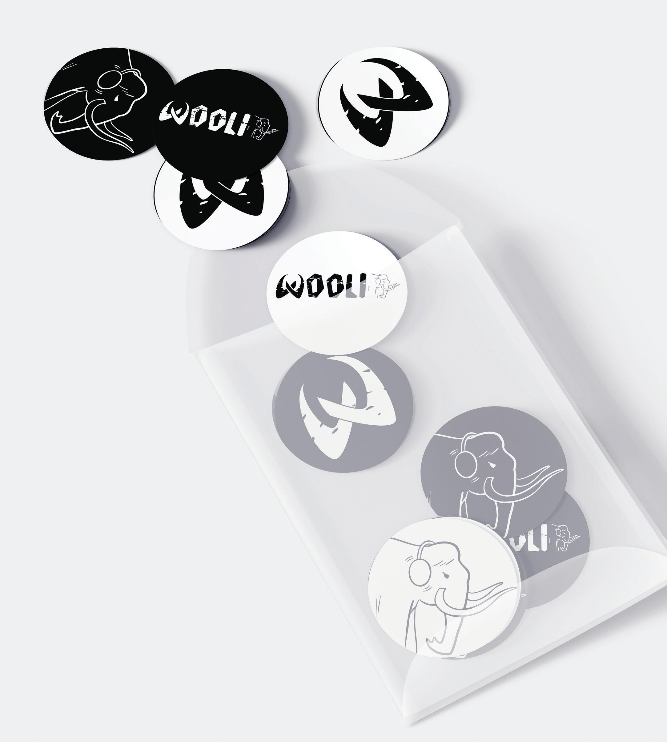
Wooli is a DJ whose mascot is a woolly mammoth. This logo was given a rough texture to look like cave drawings from before the extinction of woolly mammoths. His mammoth icon was also given headphones to represent Wooli’s love for making music.
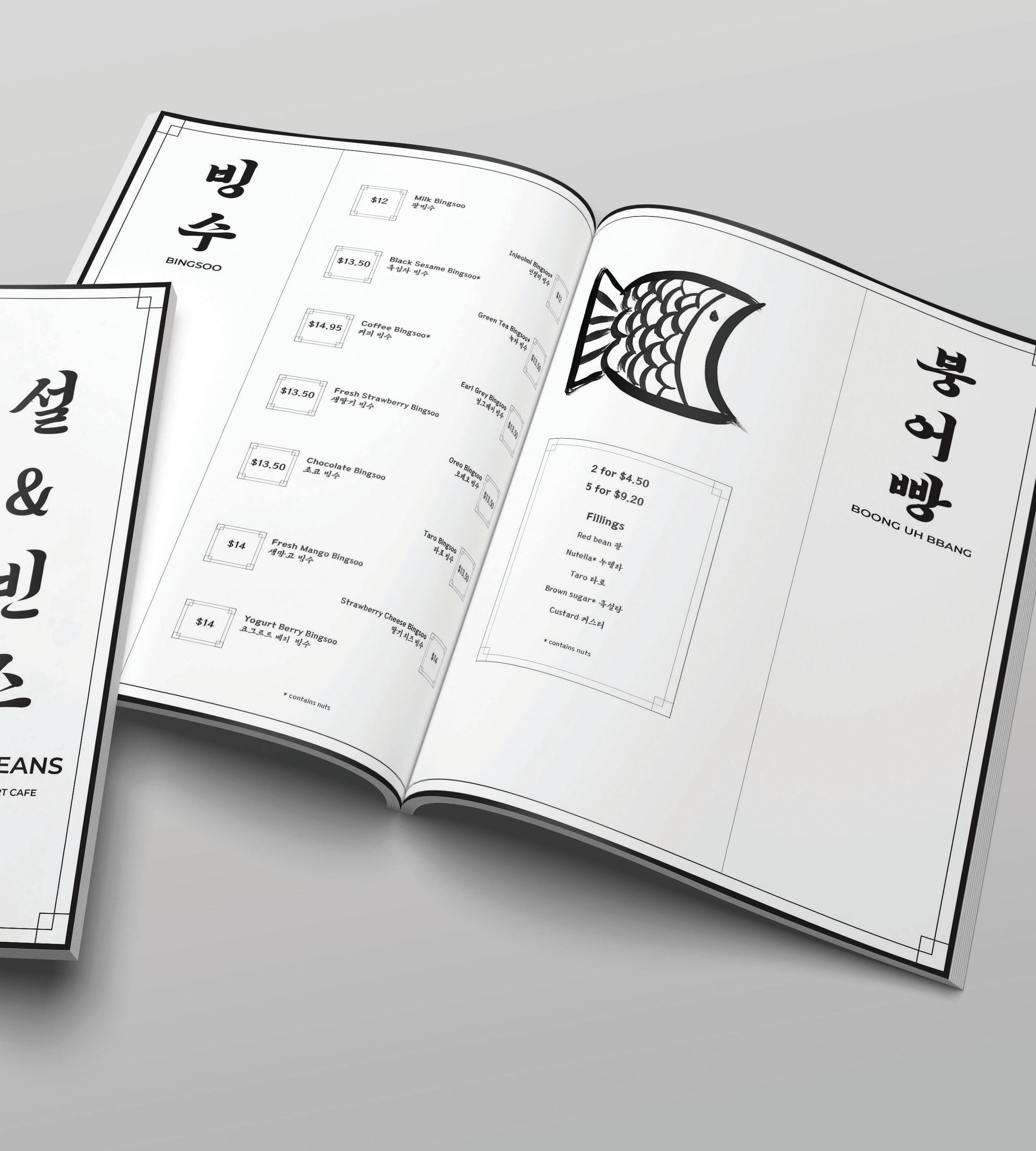
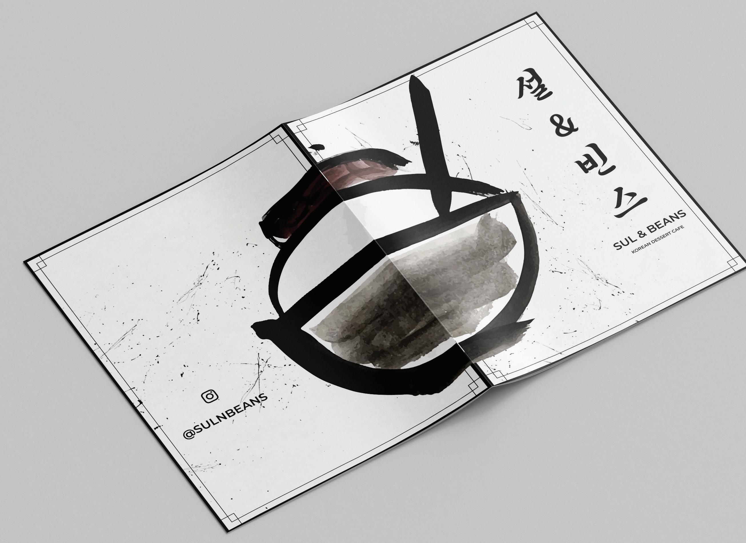
Sul n Beans is a Korean Dessert Cafe that mainly sells bingsoo, or shaved ice. This menu was heavily inspired by the art style of South Korea’s Joseon Dynasty, where bingsoo originated. Watercolor was used to replicate traditional calligraphy on a scroll.
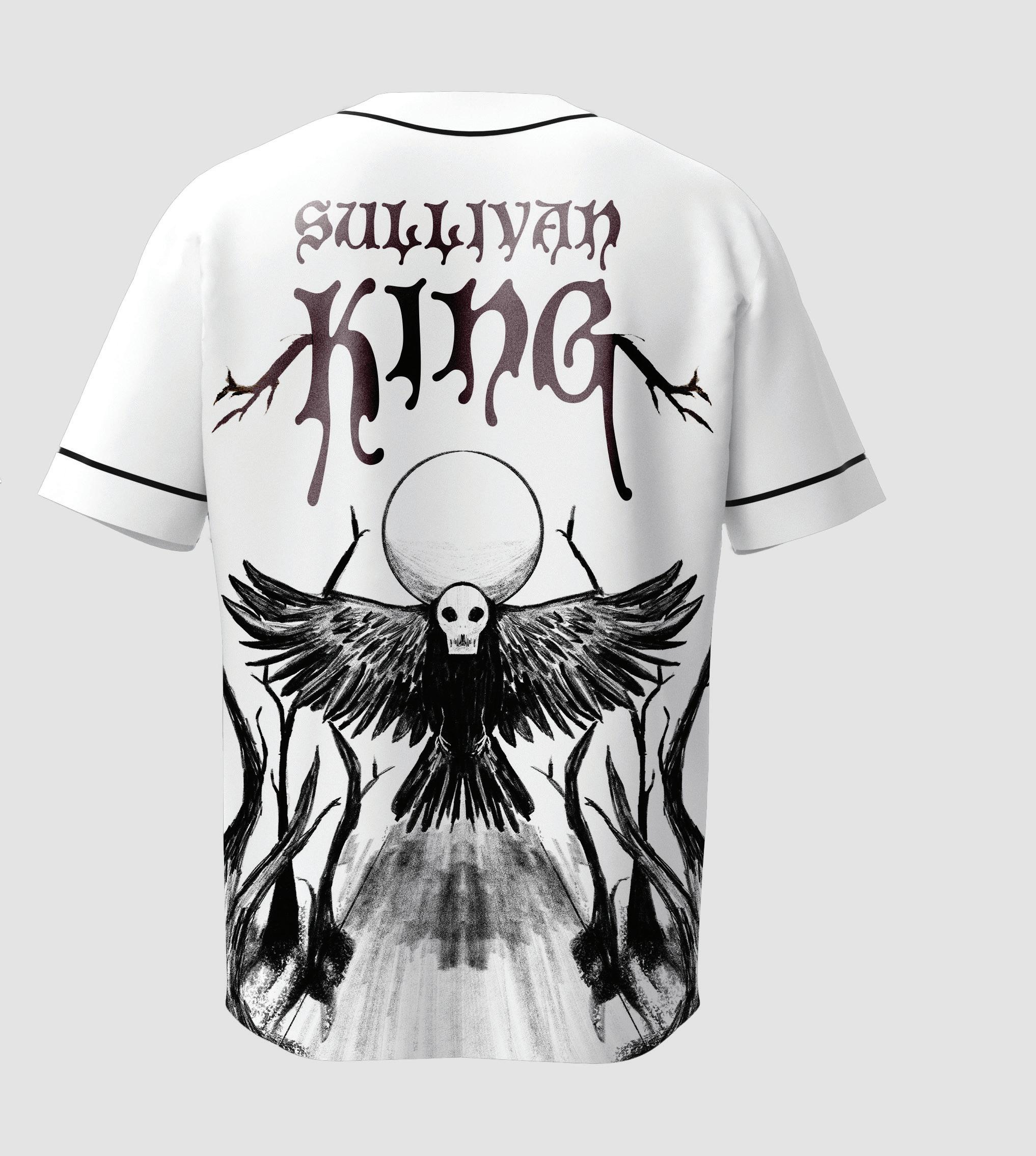
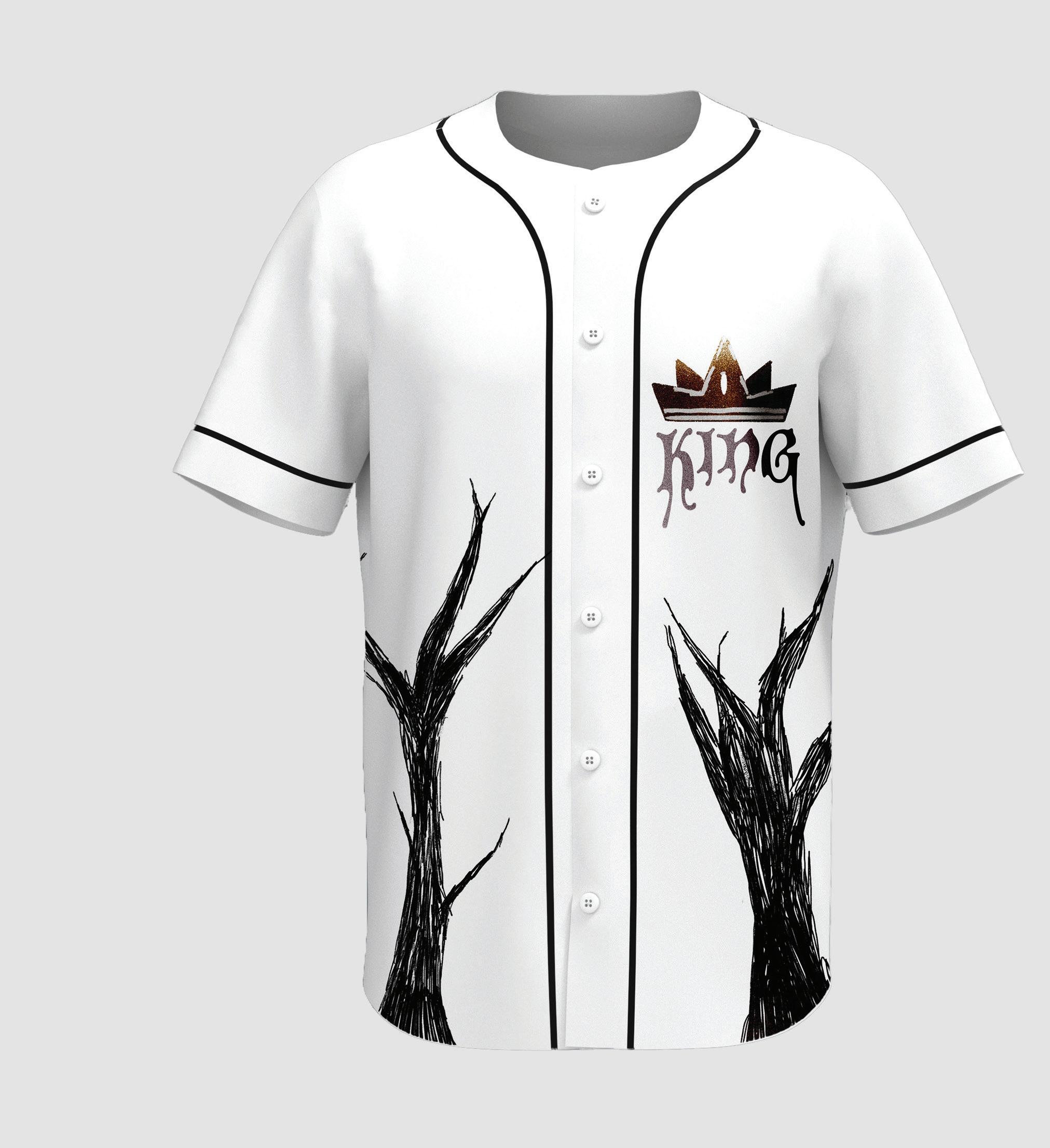
Sullivan King is a DJ who combines dubstep and heavy metal. His aesthetic when it comes to clothing is very dark and creepy. This jersey was designed to represent him. It features a crow with a skull flying through a dead forest and to the moon.
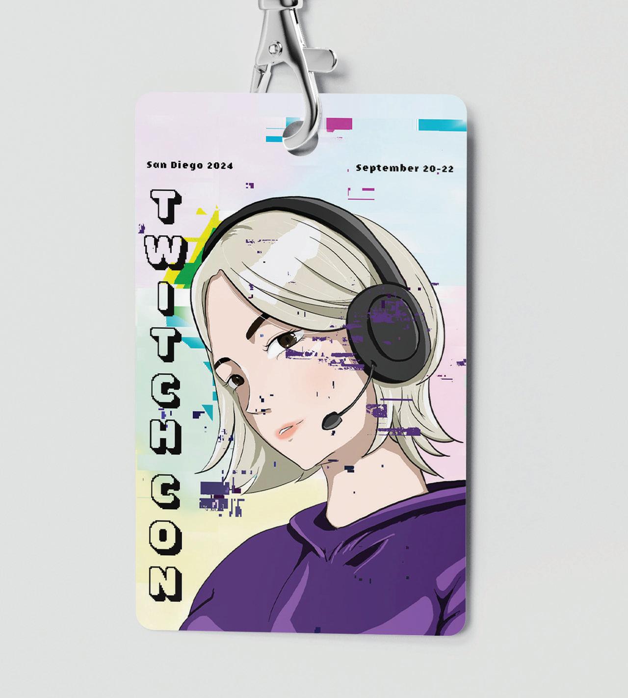
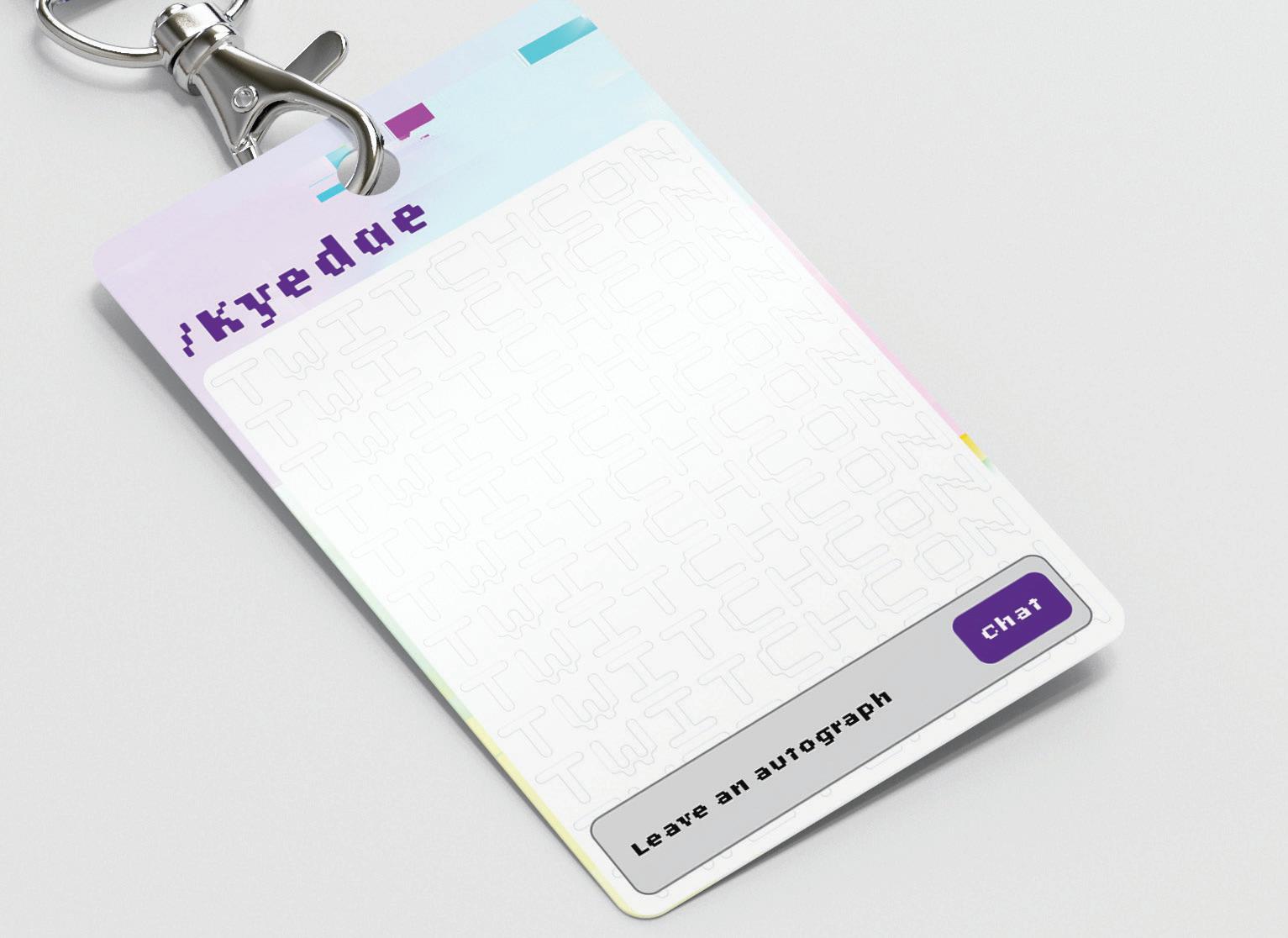
Twitch Con Badge
A badge design for one of the biggest conventions in America. It features an illustration for a very well known streamer on the platform. On the back is a space left for autographs or stickers, inspired by a Twitch chat.
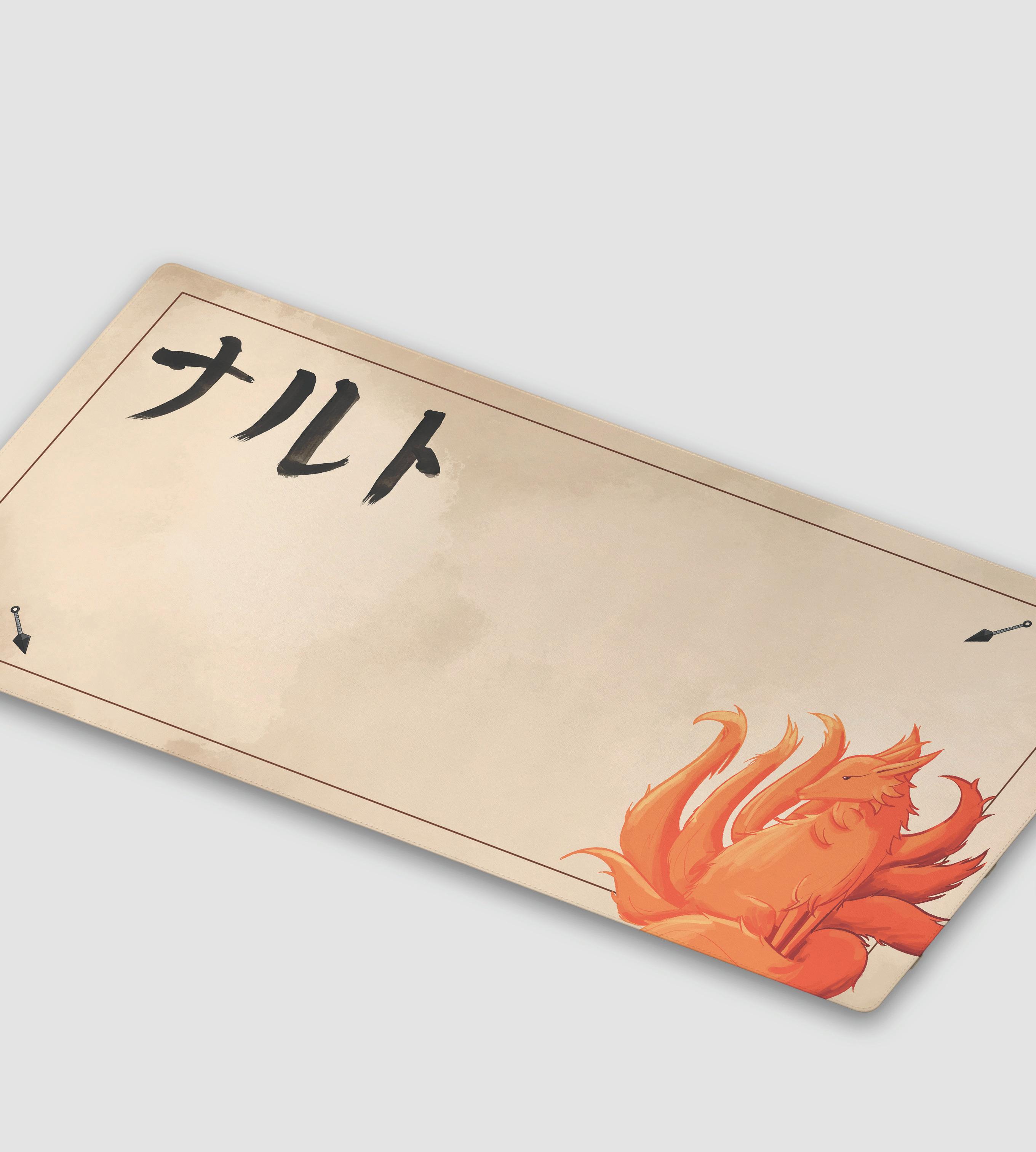
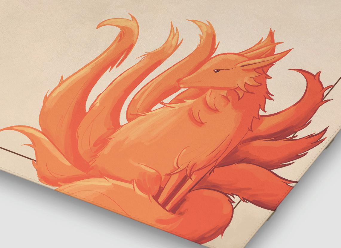
The nine tailed fox named Kurama, from the show Naruto, was illustrated in my own style. This desk mat was focused around the edges to make room for the space the keyboard and mouse takes up.
This is a soundtrack album for the Korean drama “Our Beloved Summer.” It uses the red string theory to describe the relationship of the two main characters: an invisible red string ties two people who are destined to be together. The music is of this soundtrack is very soft, melodic, and mellow, so I used muted colors and soft type to describe that.
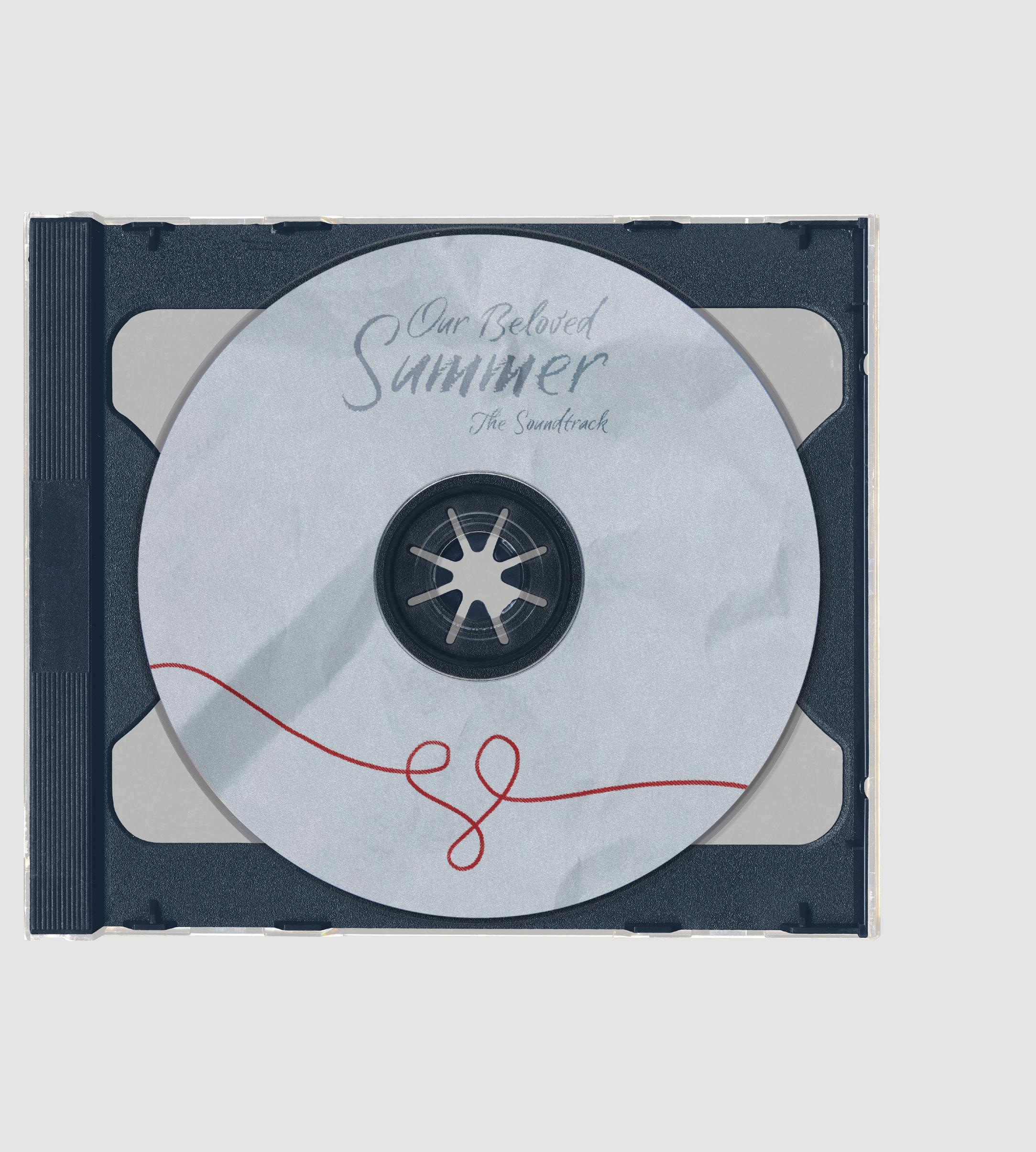
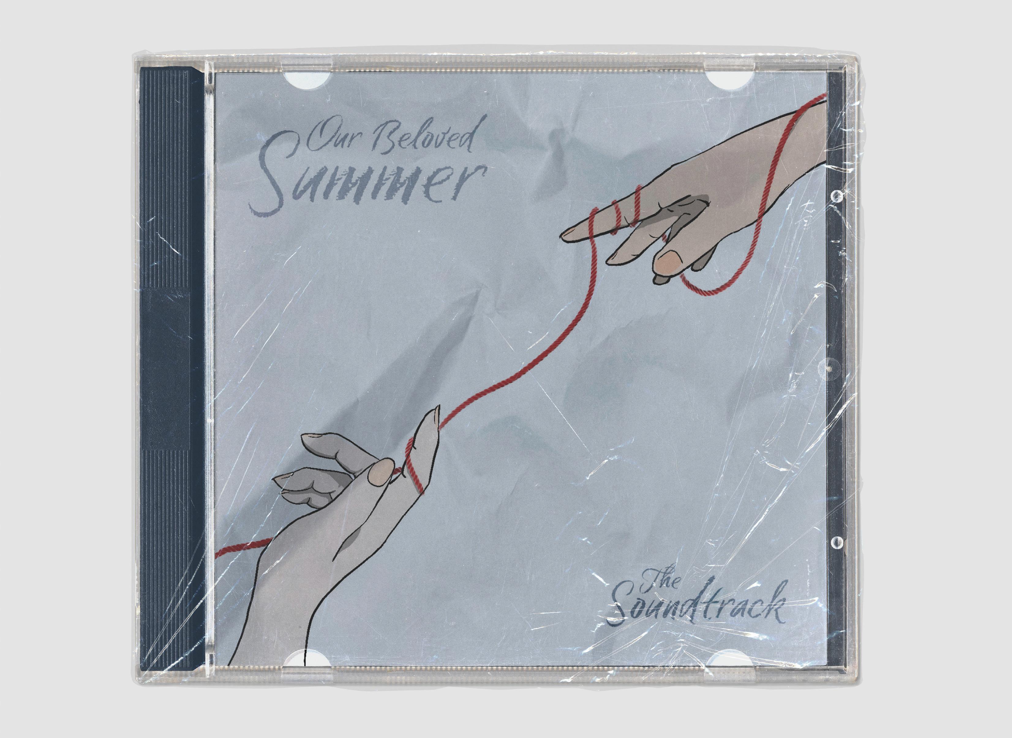
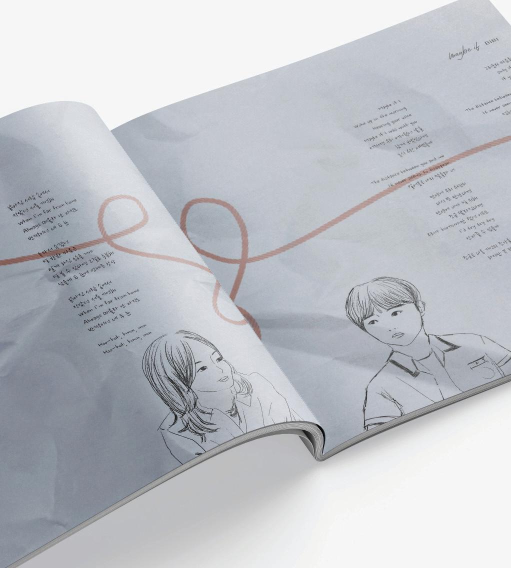
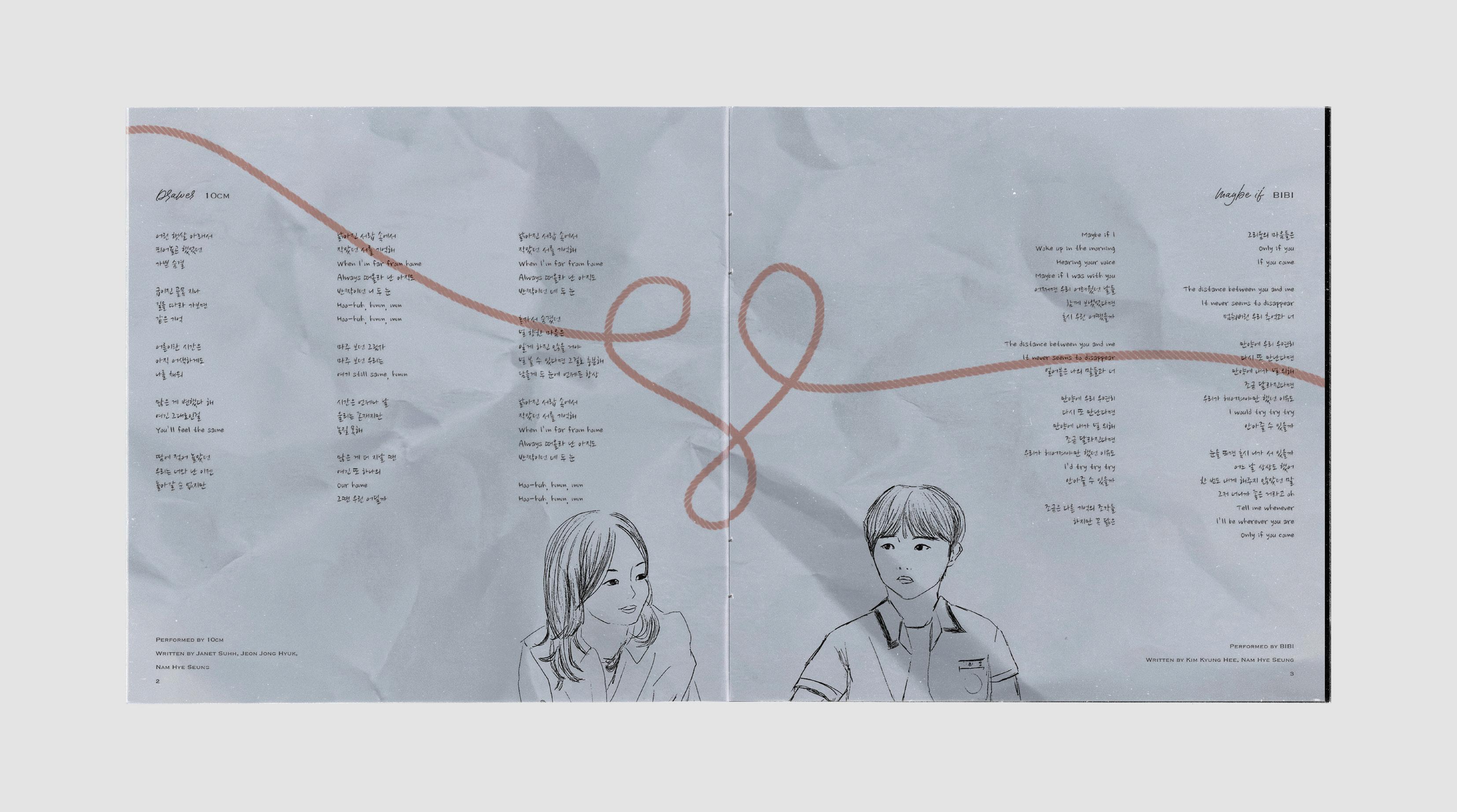
This lyric features illustrations of the two main characters of the show. It also shows the red string coming forming a heart shape in between the pages where they connect. The characters represent half a heart coming together to be one.
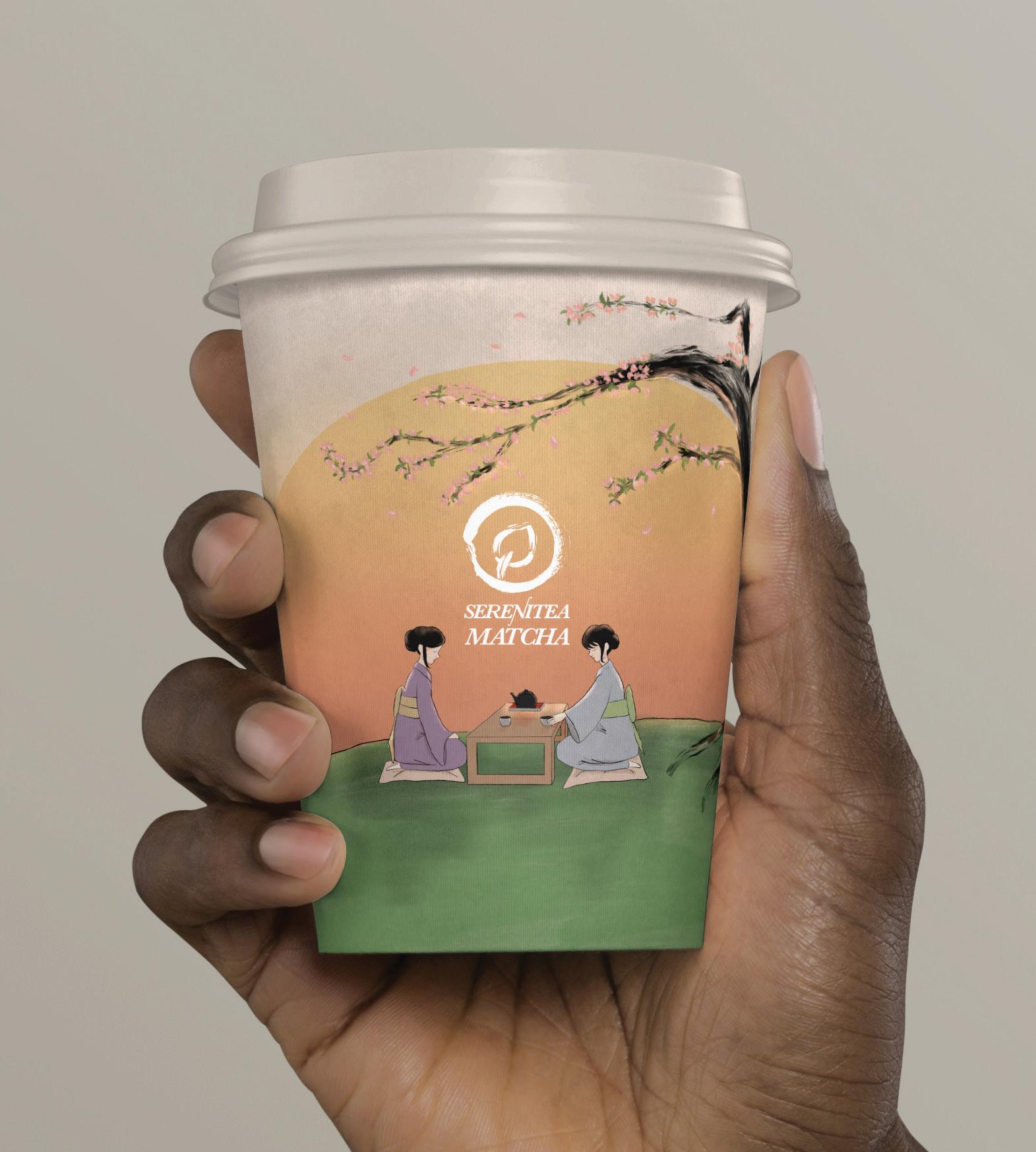
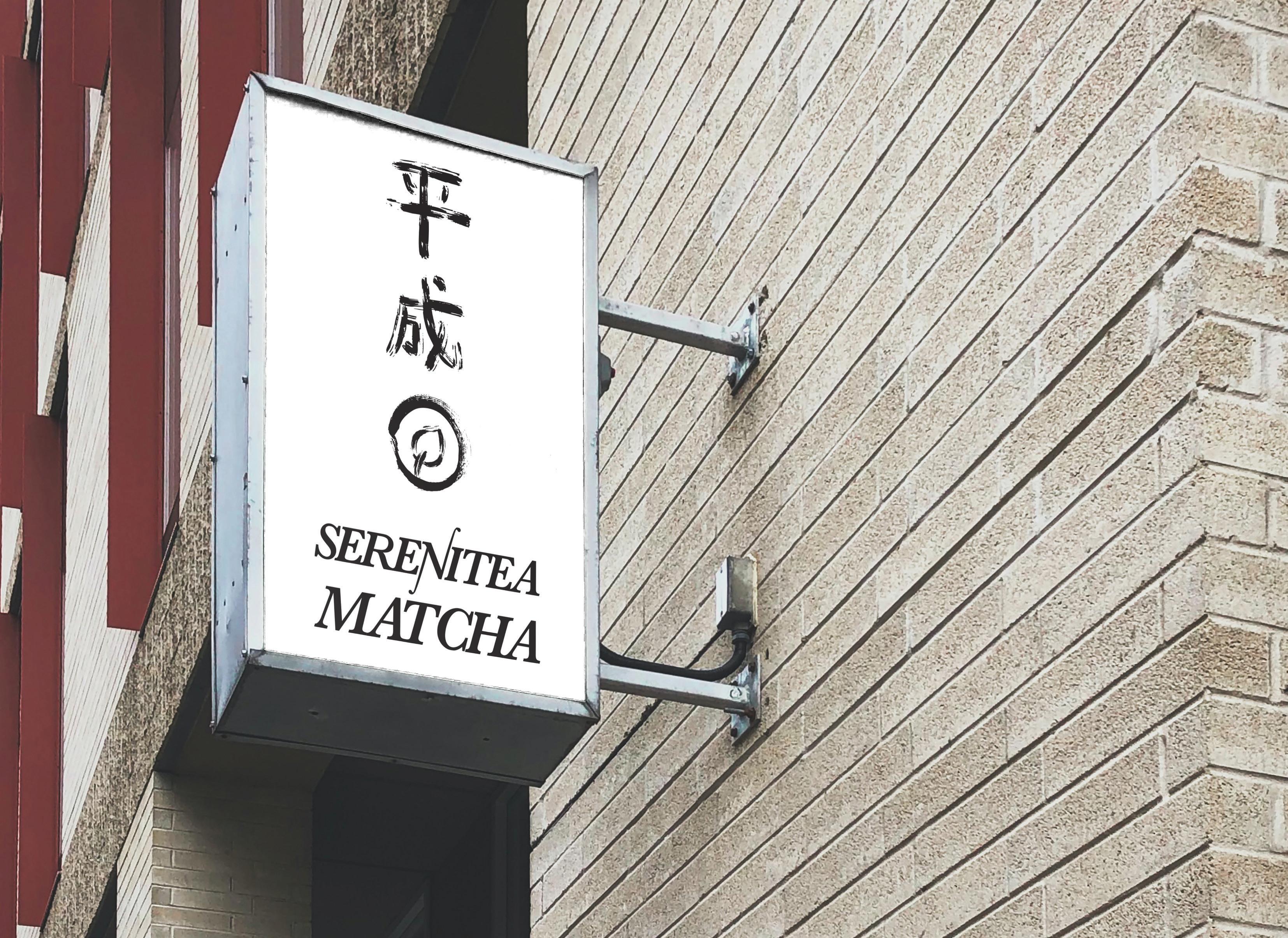
The cup and logo were both inspired by traditional Japanese art of tea ceremonies and calligraphy. The branding shows that this matcha cafe prepares matcha the traditional and most authentic way.
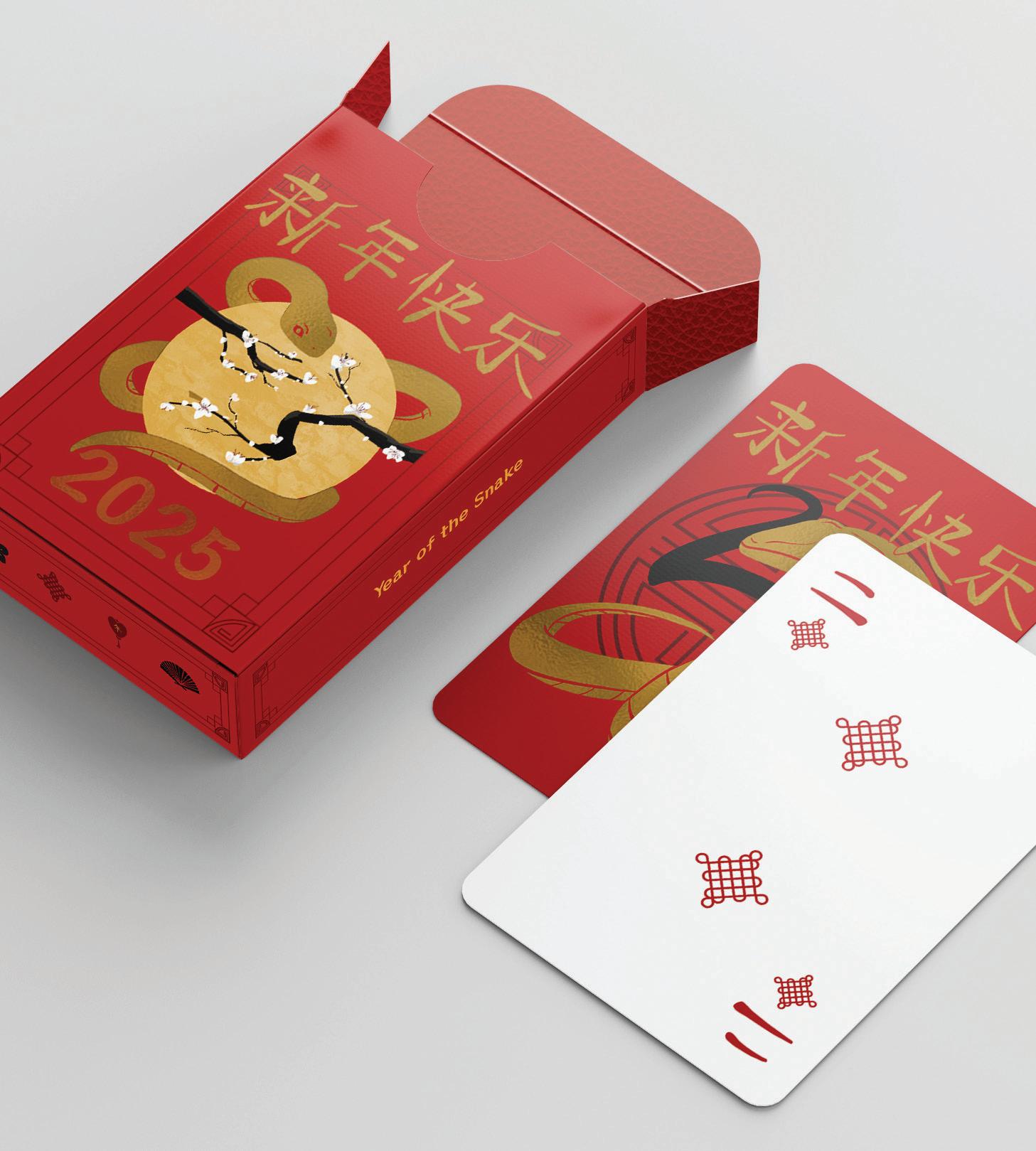
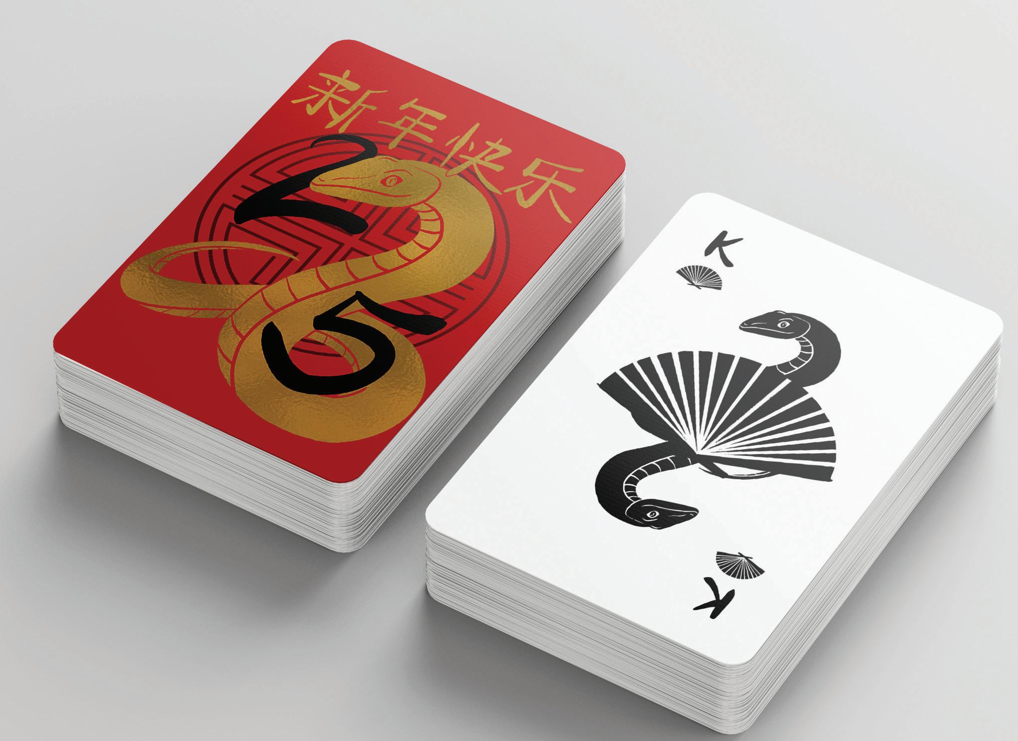
Chinese New Year Playing Cards
These playing cards were created to celebrate the upcoming year of the snake. I created my own suits inspired by things that represent Chinese New Year, like the good luck knot as a diamond and the fan as a spade.