12 minute read
A Conversation with Chip Kidd


Interview by: Maya Burdick ('25), Layout & Design/Social Media Chair
Note: This interview has been edited for brevity and clarity
Maya Burdick: We read your book Go in my digital illustration class!
Chip Kidd: Oh great!
MB: Yeah! I guess I’ll start with that. You marketed that book to readers as young as 10 years old. What prompted you to speak to such a range of audiences and how did you keep it applicable to such a large group of people?
CK: So, the story behind that is that I got a phone call one day by a woman who is an author who goes by R.J. Palacio [author of bestselling children’s novel Wonder]. The book jacket “community” is remarkably small. She’s very, very good— very talented.
I get a call from her one day, and she says, “Do you want to have lunch to talk about something?” and I said, “Sure.” I just assumed she wanted me to design a book cover for her. Instead, she said, “As far as I know there is no book to teach graphic design to kids” and as soon as she said it this ‘idea bomb’ went off in my head and I thought, she’s right! I can’t think of one! That part of it was very appealing to me—scary, but appealing. It completely put me out of my comfort zone, as did making a book for kids. So I said, how can I say no to this?
We determined: who is our audience? My soundbite was, “I don’t know kids, I don’t have any kids, and I don’t like kids.” So, these are barriers to overcome—the last one being sort of sarcastic. Talking to a child, usually, what I do is just talk like they’re grown up, which is the way I approached the writing in this.
The last sentence in The Cheese Monkeys [Kidd’s debut novel, an autobiographical coming-of-age book]—the teacher is telling his students, they are about to graduate—the last sentence is, “Ready, go.” I liked that idea of, okay— you’ve learned all you’re going to learn here, so go and use it. I can’t even remember thinking about considering another title. I was going to interview the brilliant Milton Glaser [legendary graphic designer behind the ‘I NY’ logo] at the Cooper Hewitt Museum, and backstage, I told him that I was working on this. His face just lit up and he said, “That is such a great idea.” And I said, “Well when we have a first draft, can I send it to you, and could you give me a quote?” Usually, you don’t put quotes on the front— you put them on the back—but I was definitely going to lead with that because, in the graphic design world, he is Picasso. It was tough to figure out what goes in it, but also what doesn’t go in it. There's a lot of examples of uses of graphic design that I did not want to introduce to a ten-year-old. Which was fine. That freed me up to concentrate on what graphic design is, how it works, the history of typography, how images work with text, etc. I think we did fine without any of that.
MB: You said about what not to introduce to kids. I remember you talking in a lecture about the many covers you submitted for the book You Better Not Cry and their critique of Santa looking inappropriate for readers. I wonder if you have a collection of covers that weren’t accepted or didn’t make it to print?
CK: Oh my god yes! I show rejected stuff if I think it should not have been rejected. There are times when something gets rejected, and then you have to really be resilient and bounce back from that and decide, alright, I’m going to start over and do something better than what I initially did. That’s the goal. And I think sometimes I attained it, and a lot of times, I didn’t. I hate to give up—I really hate to give up. [You Better Not Cry] is a perfect example, I thought a lot of those covers were really funny—
MB: I did too!
CK: —and smart, and there’s a lot of them, and they just ended up not using any of them. It’s disappointing, but you just have to soldier on. One thing I’ve been very, very fortunate about in my career is that, because I’m on staff at Knopf Doubleday Publishing, there’s always a next thing to work on. In fact, there’s always about six next things to work on, and that, over the years, I have found really sustaining and helpful. Sometimes you do feel like you’re on a hamster wheel, but I bring it up because it makes failure a little easier to accept. It’s like, okay, I didn’t get You Better Not Cry, so what’s next?
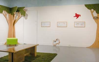
MB: That’s a great way of looking at things. Circling back to getting involved with content for young audiences. You did the poster on Walt Whitman for National Poetry Month. It connects so physically with those seeing it and I wonder if you have any other work that you feel relates so substantially to the physical world?
CK: This is probably a cop-out answer, but the book is a physical thing that you hold, so I’ve always approached it that way. The interesting thing with the Whitman poster is I had given that cast of Whitmans hand to my husband as a Christmas present one year.It seemed natural then to use it on the poster. This is how big his hand really was; this is at 100% size, and you can compare his to yours. It seemed like a natural, involving idea.
Semi-non sequitur—
What I wanted to emphasize about Go is that I was also really, really conscious of that fact that I didn’t want to make this about teaching kids how to sell things. If a kid reads this and they major in graphic design and they go work for an ad agency. Fine. Good for them if they enjoy that. But I didn’t want to make it about designing something so that somebody buys something so that a company makes more money. I mean, that is our society, but that’s not what
the book is about. It’s about getting your ideas across in the most interesting and direct way.
MB: You talk about clarity a lot and I read your book Judge This [Kidd’s book on visual clarity and graphic design] too. You also mention your “psychic Drano” and the way you find inspiration around New York. Could you share the most recent thing you’ve found around you to set off creative inspiration during a creative block?
CK: That is a really good question. New York is a very different place than it was when I wrote that. As everywhere is. It all depends on the project.
This isn’t quite the same thing, but I saw an illustrator’s work in a magazine, and I thought this might be right for this book I’m working on, which is a novel about intrigue in the opera world. And I went on his website, and I contacted him. I just explained what it was and what I was looking for, and he did it. That’s always like magic to me—working with an illustrator or photographer and saying, this is what I’d like to see, and then they make it.
MB: Definitely! I’m often inspired by other artists I discover!
CK: Yes! And it’s also very important that they get credit for it. I always look for the name. There was this designer who I’ve known forever. He started making these photo collages that have line art over them. His name is Eric Baker. He made a physical mailer; he made a book out of these things and sent them to his friends. I looked at it, and I was absolutely blown away. They were really, really smart and interesting.
I designed books for Haruki Murakami [internationally acclaimed author of Norwegian Wood and 1Q84] for over 30 years, and there was a new novel coming up, The City and Its Uncertain Walls. And I thought of him. I said, here, here is the manuscript. Read it and see what you think. See what comes to mind. And long story short, we got it done, and I think it looks great. But he’s so grateful, and I said, well, I never would’ve called you had you not sent me that sample of what you were doing. It just never would’ve occurred to me.
So I guess the takeaway there is it doesn’t hurt to send out mailers of your work, or the equivalent these days is, here is a link to my website, which is totally understandable.
By the way, if you read Judge This, there’s also a TED Talk linked to that. They wanted to start an in-print, and the concept was: what if a TED Talk was a book and you could sit and read it and be done with it in like a half an hour and get all these ideas from it? For me it was a challenge. The editor there was great too. Initially, I wanted to make it about failure and how to bounce back from it, but she said, and I think wisely, that there’s a lot of that out there. This really should be something more unique and moreoriginal. And so, it became what you see. I don’t even know how I came up with it. Some things are clear, and some things are not. And what should be clear and what should be mysterious, and what happens when they switch—there seemed to be a book there.
I also very much wanted it to be a visual book, so it’s divided the way it is. The first half is, Here are some objects and things that I think are beautifully designed and here’s why. Then the second half is the inspiration thing—the, here’s what I had to do. I looked at this thing. It inspired me. And then you turn the page and see what I did. When I do a slide lecture, you throw up a slide, usually with just the title of the book on it, and talk about what it’s about, what’s required, etc., etc., and let the audience think in their minds, So what would I do? Then click on what it came out to be.
My point being, that whole thing in the first TED Talk of the drawing of the apple and the word—I’ve really tried to apply that as much as possible to what I’m doing.
MB: "Say it or show it" is such a great thing to carry through all your work— and for anyone reading the book to apply to their creations.
CK: I think graphic designers pay attention to things in a different way than non-graphic designers. We look at typefaces, we look at the spacing of the typefaces, we look at—oh look, somebody stretched this on a computer—that looks terrible, but no one seems to care.
MB: Do you have a certain typeface you typically gravitate toward?
CK: I keep my options open. When I first started working in 1986/87, there were a couple of graphic designers that became like superstars because of their innovation of typography—Neville Brody in England and David Carson in the States. I would look at their work with envy because I just thought, I can’t design that way. My brain just doesn’t work this way.
My typography, for the most part, is pretty straightforward. I want it to be elegant and do what it has to do. It can be very loud when it needs to be loud, and it can be quiet when it needs to be quiet. But I’m looking at typefaces all the time. Very often, the default serif font is Bodoni, and the default sans-serif font is Futura. There are a lot of variations of both. But that said, I don’t only use Bodoni and Futura. If you’re starting out and you’re learning, those are good places to start because, in their own way, they are both classic.
Part of the other thing about being very experimental with typography is that most of the time, my project is a hard cover book. I would think, okay how is this going to look in five years? How is this going to look in ten years? How is this going to look in fifteen years? Because people don’t throw hardcover books away. They’ll give them to somebody, or they’ll donate them, but it feels wrong to throw a hardcover book into the trash. It just does, to me anyway. So I think that’s why, typographically, I’m a little bit more—I guess you’d call conservative—because I don’t want it to look like, Oh that’s so 2002. Sometimes it’s hard to escape that, but I try to transcend that if I can.
MB: And they do. I guess to finish up the interview, is there anything you want to design or that you wish you could design in the future that you haven’t gotten the chance to yet?
CK: I think where I’ve “branched out creatively” is writing. Most writers have a love-hate relationship with it, although some claim to love getting up at six in the morning and writing for three hours.
I’ve been very fortunate to publish books of my own where I’m the author and designer, and it’s always about something that I’m very passionate about. I’ve written an Avengers graphic novel for Marvel that’s going to come out in August. It’s drawn by a guy named Michael Cho. It’s called The Veracity Trap. If you’re a fan, you’ll be familiar with all the characters in it and their distinct personalities, and there’s this sort of existential element to it.
It’s been a tough slog— it’s been four-and-a-half years in the making—but I think it’s pretty much exactly what I want it to be and what the artist wants it to be. I’m excited about that. We’re wrapping up Fall of ‘25 books at Knopf, and we’re about to launch Spring of ‘26. “And the world goes ‘round” as Kander and Ebb said.
MB: Well, I look forward to reading your Marvel graphic novel. Thank you so, so much for taking the time to talk to me.
CK: Thank you.