4 minute read
Transit-oriented and equity

A case in Washington DC
Aishwarya Vanmali
Advertisement
May 2, 2023
Preface
This study looks into the distribution of equity by the means of transit system in Washington DC. North America, in general was designed for cars and that dictated the majority of it's landscape. There are few cities that have a strong transit system, light rail, bus and even bike. However there are a couple of cities that have been planned along with it's transit, namely, Portland, Newyork, Washington DC and to an extend San fransisco.
This project looks into the transit-oriented development and equity in Washington DC. As an urban designer, a successful TOD can be measure by it's urban characteristics. A transit oriented development is generally the neighborhood within a quarter mile radius around transit stop. According to known urban designers, a successful transit oriented system has the following urban characteristics such as access to multimodal transit, walkable sidewalks, density, public parks and space, thus making it safer to walk. Overall a good walkability is https://storymaps.arcgis.com/stories/7a7ad09d6f484c3aa4e96e3e7ee5836c/print https://storymaps.arcgis.com/stories/7a7ad09d6f484c3aa4e96e3e7ee5836c/print
The following map looks into the density of people. Visually, the central zone is densely populated, which is a good sign as it is around transit.
Map showing the density of population in Washington Dc Area
Description: The Dot-density map shows the spread of population in the Washington Dc area. the central region is densely populated served with transit. However, the region to the south east, though populated, has fewer access to transit.
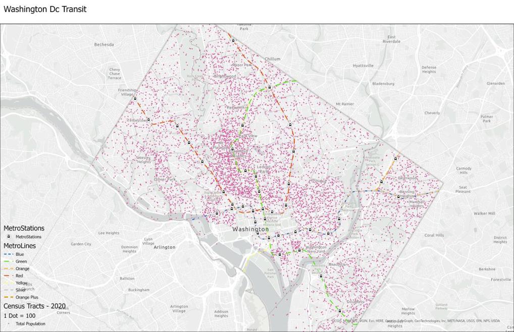
Source for Census Tract 2020: https://maps2.dcgis.dc.gov/dcgis/rest/services/DCGIS_DATA/De mographic_WebMercator/MapServer
Source for transit stops: https://services1.arcgis.com/HmwnYiJTBZ4UkySc/arcgis/rest/se rvices/Transit_Access_and_Poverty_in_DC_WFL1/FeatureServe r https://storymaps.arcgis.com/stories/7a7ad09d6f484c3aa4e96e3e7ee5836c/print
Map showing the population served within a quarter mile of transit station
This map Shows the intensity of population served by transit within a quarter mile radius of a transit stop. The central region shows higher density, whereas the area to the south west shows lesser number of people served with transit. (Make a chart showing the mean population served with transit in each station)
Methodology- Spatial join tool was created using this map. The target layers were the population census tract within a 0/25 miles radius of metro station.

What more can be done - To find the total population served with transit (Count of grey dots and pink dots) https://storymaps.arcgis.com/stories/7a7ad09d6f484c3aa4e96e3e7ee5836c/print
Population access to transit (Population below 185% poverty line)
This map shows that the area in green, which is below 185% of the poverty line, has less access to transit, not limited to only trains but also included buses. Does that mean the areas that have access to public transit are wealthier?

Let us further see, if transit oriented and pedestrian friendly characteristic interpret equity?
This can be done by seeing the walk score that is between 70 and hundred.
Source of Map for Poverty Ratio: https://services1.arcgis.com/HmwnYiJTBZ4UkySc/arcgis/rest/se rvices/Transit_Access_and_Poverty_in_DC_WFL1/FeatureServe https://storymaps.arcgis.com/stories/7a7ad09d6f484c3aa4e96e3e7ee5836c/print https://storymaps.arcgis.com/stories/7a7ad09d6f484c3aa4e96e3e7ee5836c/print
The darker shades are more walkable. Generally area with the score 70 and higher are highly walkable.

Side walk score and pedestrian friendliness and equity
The map above shows the red area with a walk score of more than 70. This sidewalk score is based on the pedestrian friendliness index and depends on various characteristics like having safe sidewalks, trees, and access to multimodal transit. However, this information can be found in further research to investigate the walk score. But the motive of this map is to show that the area with a poverty of more than 185% has fewer pedestrian friendliness index. We can see that the poorer neighborhoods need walkable sidewalks just as much as the city core.

Source of the map for pedestrian friendliness index: https://maps2.dcgis.dc.gov/dcgis/rest/services/DCGIS_DATA/Mo veDC/MapServer https://storymaps.arcgis.com/stories/7a7ad09d6f484c3aa4e96e3e7ee5836c/print
Density of population below 185% and access to transit
This Histogram shows the ratio of pedestrian friendliness served to the population below 185% of poverty

Density of population below 185% and access to transit https://storymaps.arcgis.com/stories/7a7ad09d6f484c3aa4e96e3e7ee5836c/print

This Scattered graph shows the disparity of distribution of transit. Fewer transit options are available to region with higher population under poverty of 185% https://storymaps.arcgis.com/stories/7a7ad09d6f484c3aa4e96e3e7ee5836c/print https://storymaps.arcgis.com/stories/7a7ad09d6f484c3aa4e96e3e7ee5836c/print


Distribution of car owners.
This map shows the car ownership. This map is a little ambiguous because both the region with or without poverty below 185% show a similar distribution of cars. Although, this can also mean that transit-oriented development can reduce the requirement for cars because of walkability. And can reduce the burden of the cost of cars.
This also suggests, that the densely populated region in the center, does not need cars and proves the point that the area around a transit stop is beneficial for the environment.
Instinctively, having a solid transit system would reduce car dependency, which is true. But residents in poorer neighborhoods, without walkable sidewalks and strong transit, are more car-dependent, which adds to the cost of living.

This map shows the sidewalk score and distribution of public schools within quarter-mile radius of the metro station. Even though some of the schools in the south east are near transit, the walkability index is low., whereas, in the central region, the walkability index is high.
Source of maps : https://maps2.dcgis.dc.gov/dcgis/rest/services/DCGIS_DATA/Edu cation_WebMercator/MapServer
Conclusion:
Access to public transit means a better lifestyle and access to amenities and schools is easier. Moreover, as per the urban design principles, walkability also caters to street safety. t is evident on the maps that the poorer demographical regions lack this infrastructure. However, the burden of car ownership increases in these regions because of the lack of public transit, walkability, and occupations. Even though we plan amenities near transit, are they walkable?
Future Steps
Finding the ratio and footfall of people to each transit stop within the quarter-mile radius of each stop. This will give more clarity on how walkable it is.
Finding out the rent-cost of housing around each transit top compared to median income of population around those stops https://storymaps.arcgis.com/stories/7a7ad09d6f484c3aa4e96e3e7ee5836c/print
Finding public spaces and green spaces within the quarter mile radius of each transit stop.
Finding the proportion of retail around the transit stop and does that promote walkability and is it walkable?