It has been an absolute honor to collaborate on your project, and we genuinely enjoyed every moment of it. Crafting the visuals and headlines was an exciting journey, and we are thrilled to present the culmination of our efforts to you.
Please take your time to explore the following pages and acquaint yourself with your new brand, which embodies the essence of your company and the spirit of your journey ahead.
At the same time we extend our warmest wishes and blessings for the growth and success of your new venture. May it flourish beautifully and exceed your expectations with abundant luck and prosperity.
Description Constant y push ng the boundaries of music production with cutting-edge techniques and creative so utions
Impact Ensures that every project is unique ref ect ng the latest trends and techno og ca advancements n the music industry
Description: Foster ng a co laborative env ronment where artists and producers work together seamlessly
Impact Encourages creat ve synergy resulting n h gh-qua ity music that resonates w th both creators and l steners
Descr ption Comm tment to de iver ng the h ghest standards of mus c production and record ng
Impact Bu lds a reputat on for qua ity and profess ona ism, attracting top talent and d scerning c ients
Description: Ma nta n ng a friend y and welcom ng atmosphere for al c ients
mpact: Creates a comfortab e and support ve environment, making t easy or artists to express their creat v ty
Integrity
Def nition: Upho d ng honesty and transparency n a l bus ness practices
mpact: Estab ishes trust with c ients ensur ng long-term relationships and a oya customer base
Modern Creative Friendly Professional Passionate
Vo ce Sleek contemporary design elements that ref ect the atest n visual and mus ca aesthetics
Behav or Embraces new trends and technolog es staying ahead of the curve in the music industry
Voice Vibrant dynam c graph cs that insp re creativ ty and innovat on
Behavior Encourages out-of-thebox th nking and unique musical expressions
Vo ce nviting and access b e des gn with e ements that convey warmth and openness
Behavior nteracts with c ients and partners n a personable and engaging manner
Voice Clean organized and po ished des gn that re lects re iab l ty and expert se
Behavior Mainta ns h gh standards of profess ona ism n every aspect of the business
Voice Energet c and insp r ng v suals that convey a deep-seated passion for mus c
Behav or Demonstrates a deep love for mus c and a comm tment to produc ng the best poss ble work
PRODUCE. RECORD. INSPIRE.
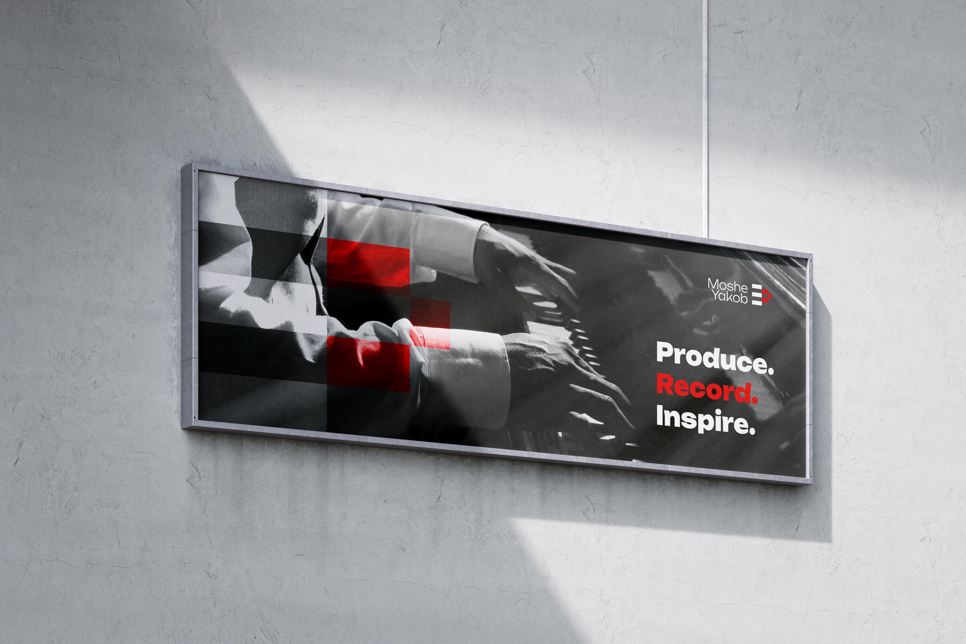
"Produce. Record. Inspire." encapsulates the comprehensive and dynamic approach of Moishe Yakob Music Production and Recording Studio, highlighting its dedication to excellence in production, its technical prowess in recording, and its passion for inspiring creativity in artists.
Concise and Clear:
Each word in the slogan is powerful and to the point, making it easy to remember and understand. It clearly outlines the key services and values of the studio.
End-to-End Process:
he three words cover the entire music production journey from the creation of music ("Produce"), capturing the sound ("Record"), to motivating and influencing artists and audiences ("Inspire"). This highlights the studio's comprehensive capabilities.
Focused Messaging:
The slogan succinctly communicates the primary activities of the studio, ensuring that potential clients immediately understand what the studio offers.
Holistic Approach:
By addressing different stages of the music production process, the slogan showcases the studio's ability to support artists throughout their creative journey.
Inspiration and Motivation:
"Inspire" taps into the emotional aspect of music creation, suggesting that the studio is not just a place to produce and record music but also a source of creative energy and inspiration for artists.
Focused
Messaging: Reflects Brand Values:
The word "Inspire" implies that the studio's work has a broader impact on both the artists and their audiences, fostering a deeper connection and engagement.
Each word aligns with the core values of the brand innovation (Produce), professionalism (Record), and creativity (Inspire). This creates a strong, coherent brand identity.
Modern and Professional:
The slogan conveys a sense of modernity and professionalism, appealing to contemporary musicians who seek highquality production and recording services.
The logo
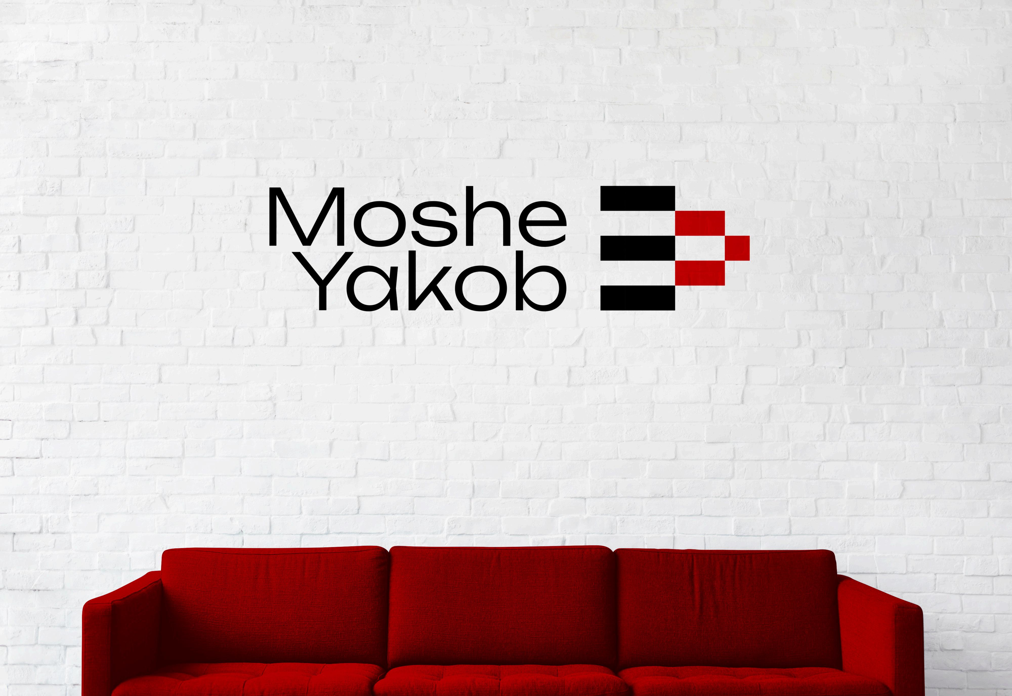
The logo mark features a series of black and red rectangles and squares arranged in a visually appealing pattern. These geometric shapes symbolize the structured and methodical approach the studio takes towards music production, ensuring precision and clarity in every project.
MOSHE YAKOB /
The geometric arrangement of black and red rectangles forms a forward-pointing arrow, subtly mimicking the shape of a play button. This is a clever visual cue that immediately associates the brand with music and media playback, signifying the start of a musical journey.
The forward-pointing arrangement symbolizes progress, movement, and action. It reflects the studio’s dynamic and forward-thinking approach, always pushing the boundaries of music production and encouraging artists to move forward in their creative endeavors.
The staggered rectangles can also be interpreted as sound waves or equalizer bars, common visual elements in music production that signify audio levels and frequency. This reinforces the brand’s focus on high-quality sound engineering and production.
The symmetry and balance in the logo’s design convey stability and professionalism, essential qualities for a music production studio. It ensures that the logo is visually appealing and gives a sense of reliability and trustworthiness.
Here’s a breakdown of its elements:
The use of a clean, modern font for the name "Moishe Yakob" reflects the studio's professional and contemporary approach. The typography is simple yet sophisticated, ensuring clarity and readability.
The balance in font weight between "Moishe" and "Yakob" provides a sense of unity and harmony, mirroring the collaborative nature of the studio.
UNBOUND REGULAR
A B C D E F G H I
J K L M N O P Q R
S T U V W X Y Z
a b c d e f g h i j
k l m n o p q r s t
u v w x y z
MOSHE YAKOB / WORDMARK
Moshe Yakob
The font characteristics and design of the Moishe Yakob logo are meticulously crafted to reflect the brand’s modern, professional, and creative identity. The clean, sans-serif typeface ensures clarity and legibility, while its balanced and minimalist design conveys sophistication and professionalism. The seamless integration of typography with the geometric logo mark creates a cohesive and visually appealing brand identity that effectively communicates the studio’s core values and industry focus.
Sans-Serif Typeface:
The use of a sans-serif typeface is a deliberate choice to convey a modern, clean, and streamlined aesthetic. Sansserif fonts are typically associated with contemporary design, simplicity, and readability.
Minimalist Design:
The font’s simplicity avoids unnecessary embellishments, aligning with the minimalist design principles that are often associated with modern and professional brands.
Weight and Proportion:
The font strikes a balance between being bold enough to stand out and subtle enough to convey professionalism. The proportional spacing between letters ensures a harmonious and aesthetically pleasing look.
Elegant Touch:
Despite its simplicity, the font carries an air of sophistication, making it suitable for a high-end music production studio.
Emphasis on the Name:
The use of a clear and bold typeface ensures that the name "Moishe Yakob" is the focal point, making it the first element that captures attention.
Black and Red Typography:
The use of black for the text ties in with the professional and authoritative aspects of the brand. The red accents in the logo mark add a touch of vibrancy and creativity, enhancing the overall visual appeal.
Secondary Elements:
The geometric play button mark, while secondary to the text, is still prominent and immediately reinforces the brand’s connection to music.
White Space Utilization: :
Ample white space around the text and logo mark ensures that the design remains uncluttered, maintaining its modern and sophisticated look.
The color palette for Moishe Yakob Music Production and Recording Studio is designed to reflect the brand's modern, professional, and creative essence. The selected colors work harmoniously to create a visually striking and memorable identity.
Characteristics: Symbolizes creativity passion, and energy It reflects the vibrant and inspiring environment of the studio
Usage: Used as an accent co or in the logo mark and other high ights, adding a dynamic and energetic touch
Characteristics: Represents sophisticat on author ty and professional sm It underscores the studios commitment to exce lence and high standards n music production.
Usage: Predom nantly used for typography and key design e ements providing a strong, clear foundation
Characteristics: Denotes purity, simp icity and modern ty It provides a clean backdrop that enhances the v s bil ty of the other colors
Usage: Utilized as the background color to provide a clean canvas that enhances the v s bil ty and impact of the primary colors
Bright Red HEX: #CC0000
Sub-Zero Black HEX: #54A1CC
Snow White #fffff
It’s time you take a deep breath
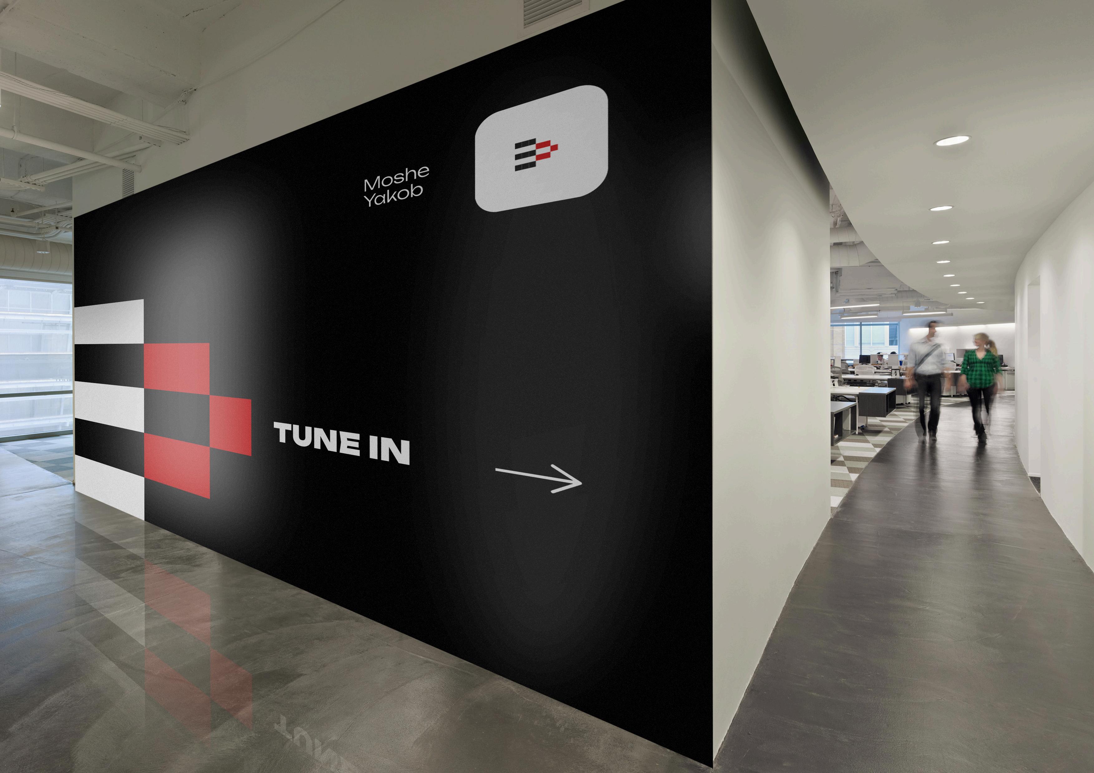
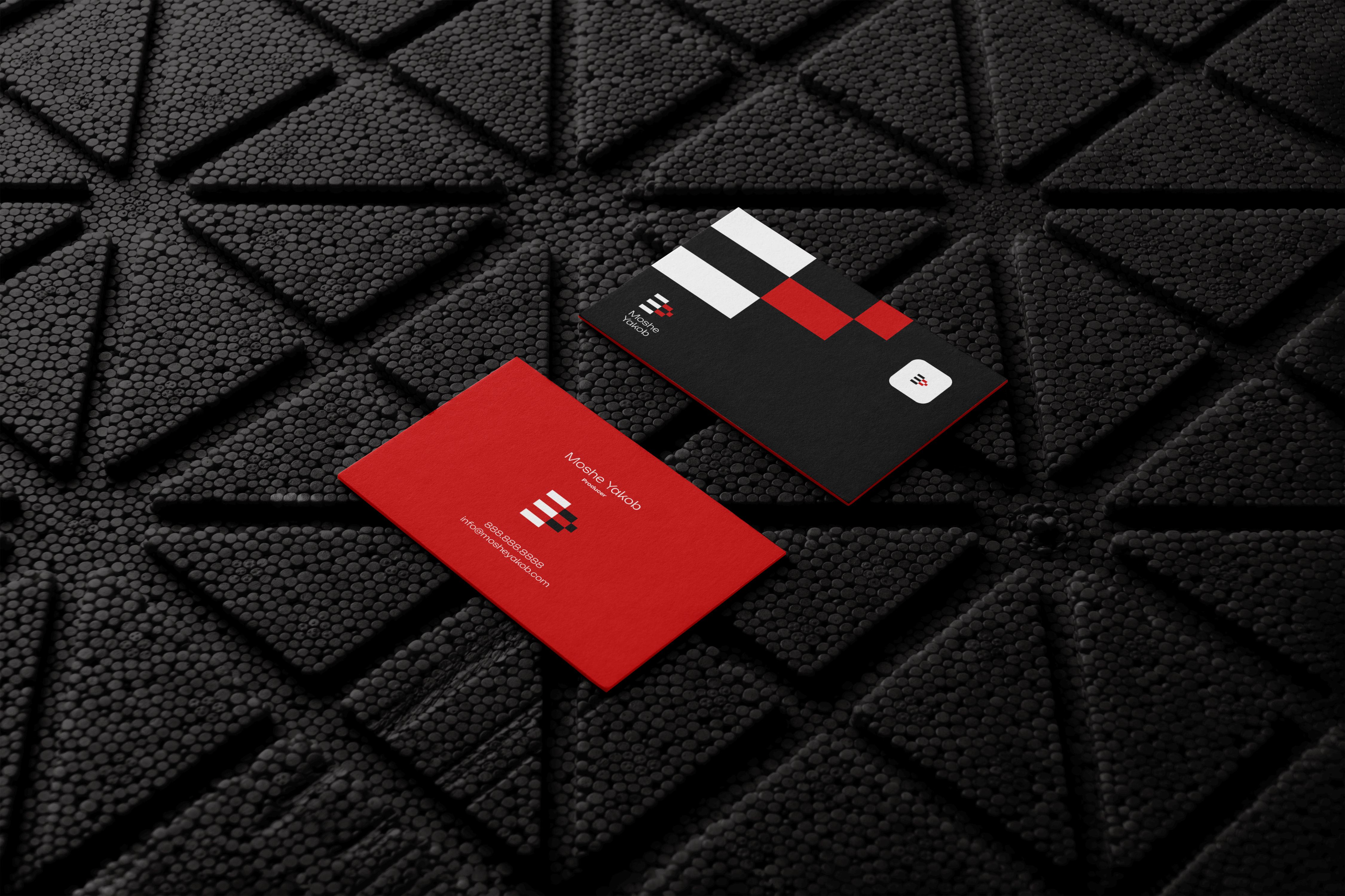
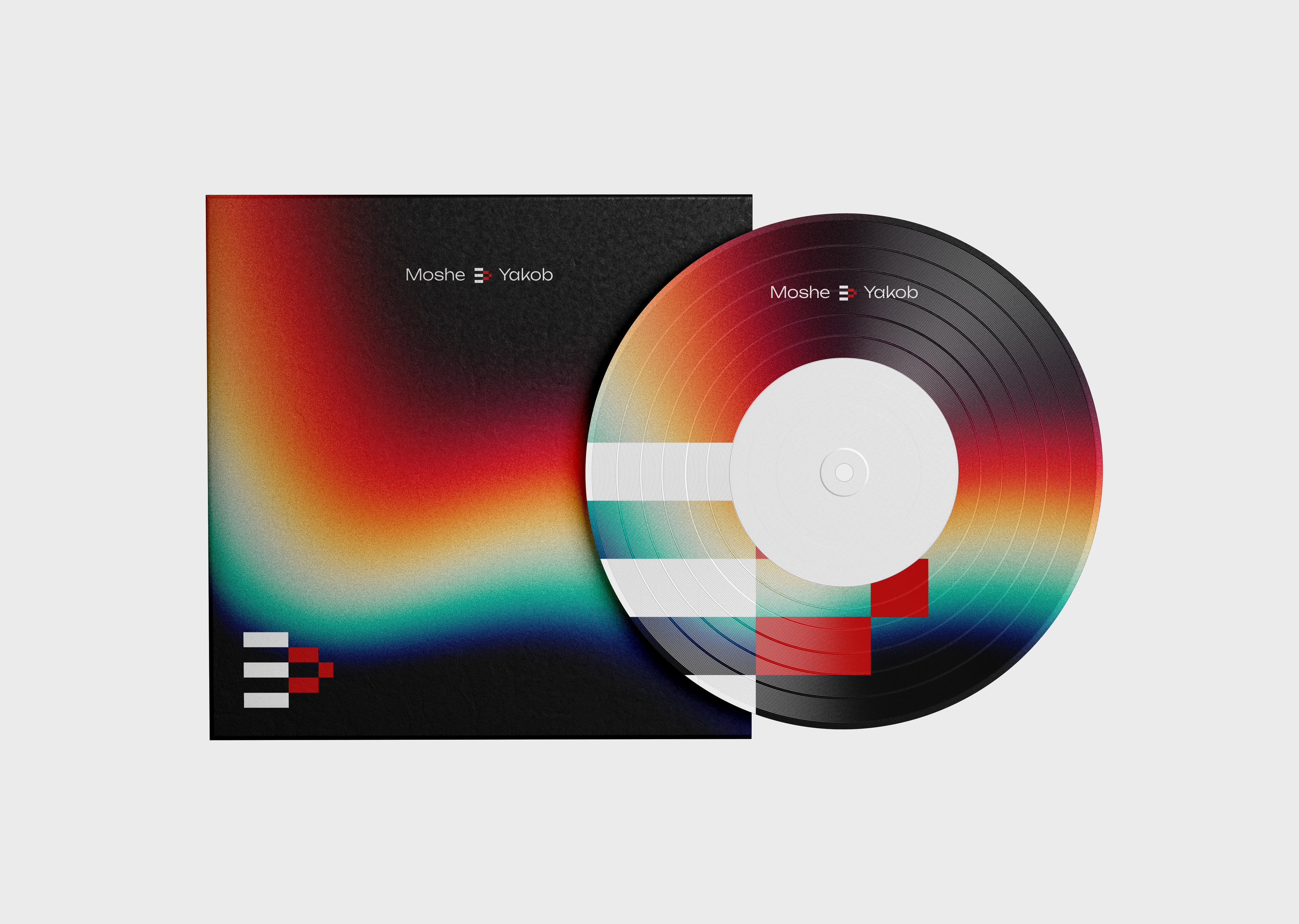
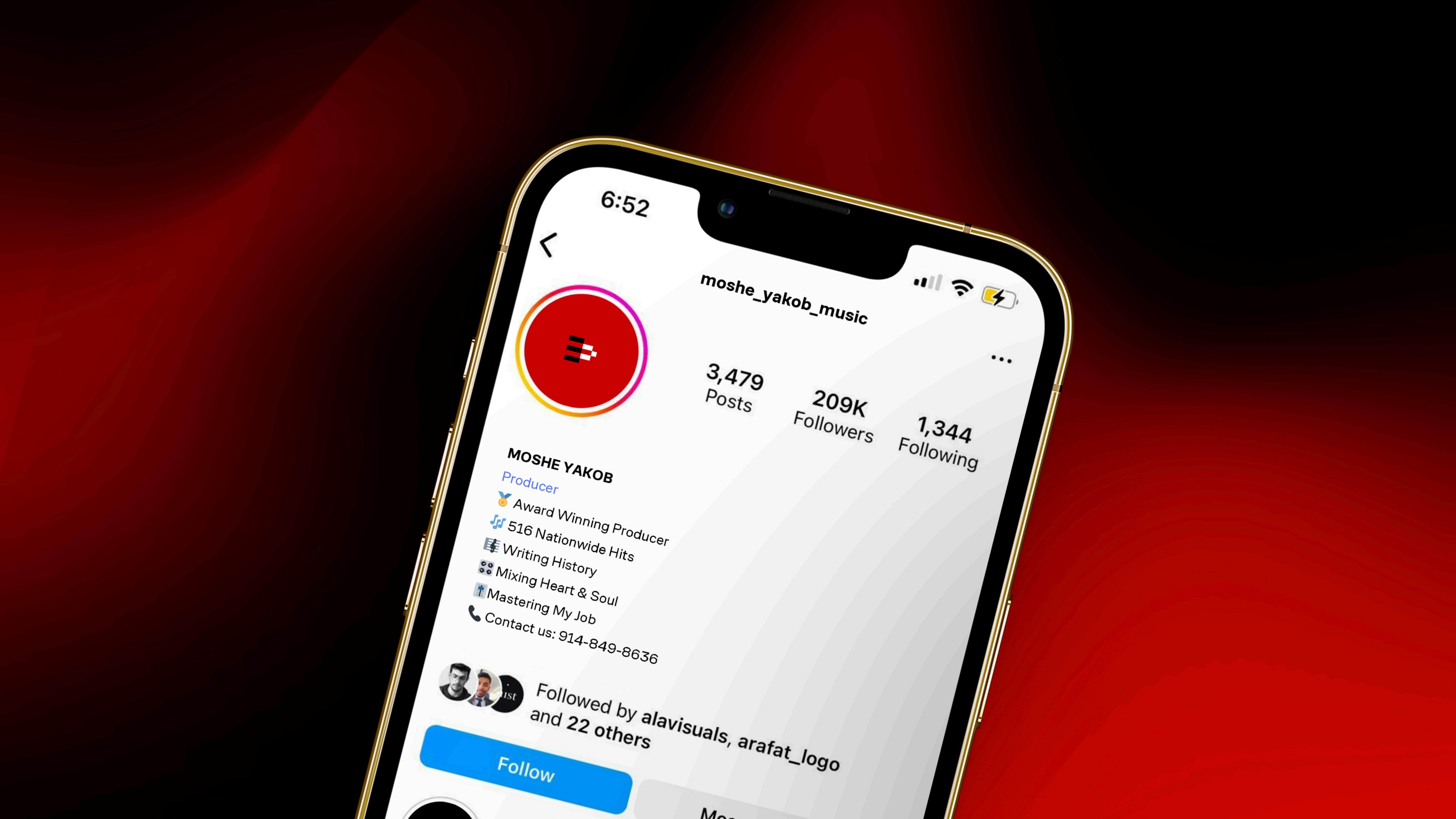
The brand materials for the Moishe Yakob Music Production and Recording Studio brand, business cards, letterheads, social media graphics, and signage reflect a modern and creative identity. Using clean typography, a dynamic geometric logo, and a black, red, and white color palette, these materials ensure a consistent, professional, and innovative brand presence.
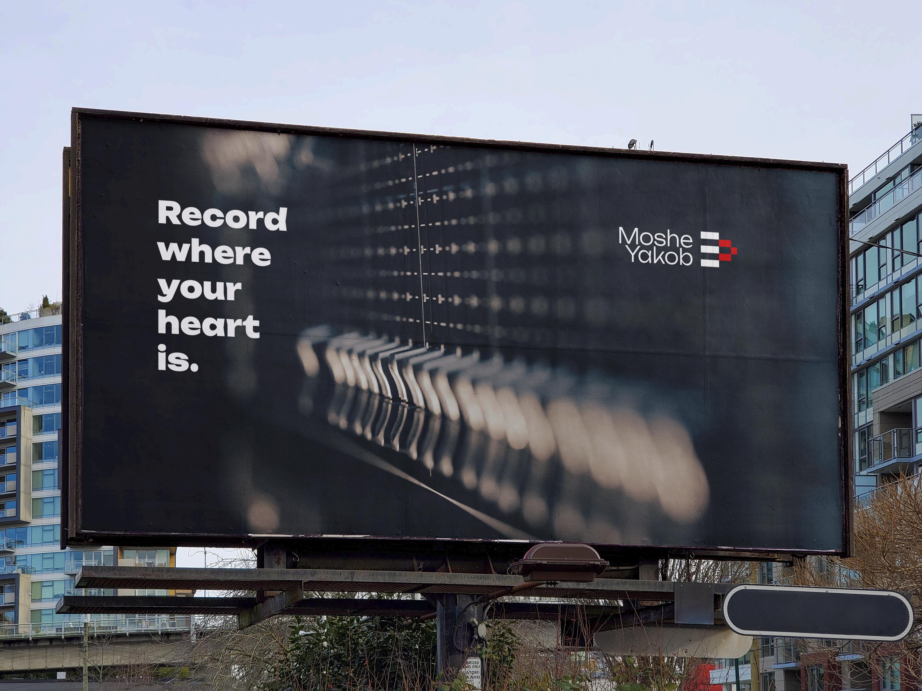
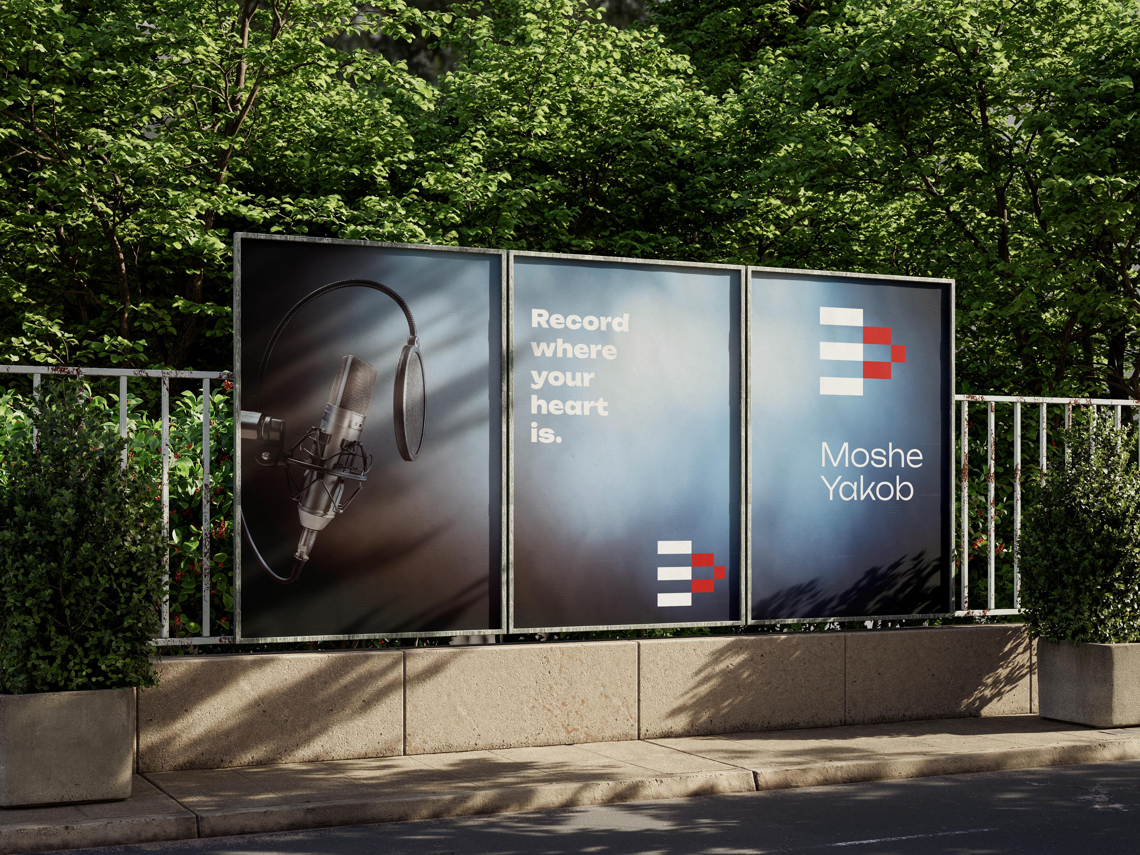
The outdoor advertising materials for the Moshe Yakob brand, including billboards, banners, and signage, are designed to reflect a modern and creative identity. Featuring clean typography, a dynamic geometric logo, and a striking black, red, and white color palette, these materials ensure a bold and professional brand presence. Each element is crafted to capture attention and convey the studio’s innovation and sophistication, making a strong impression in public spaces.
The brand guidelines for the Moishe Yakob brand ensure a consistent and cohesive identity. Covering logo usage, typography, color palette, and design elements, they maintain a modern and professional look across all materials. The clean typography, dynamic geometric logo, and black, red, and white color scheme reflect the studio's innovative and creative essence.
Logo
Do not change the transparancy
Do not change the size of the perportion
Do not use different colors
Do not distort the logo
Moshe Yakob
Do not use any other typeface
Do not outline the logo
Do not rotate any part of the logo
Do not use shaddows and effct s
Moshe Moshe Yakob Yakob
Moshe Yakob
Moshe Yakob
Conclusion
Your brand deserves a striking first impression and a lasting impact.