BRAND GUIDELINES
The Johannesburg International Comedy Festival logo
Minimum size of the logo
When to include the dotted background pattern
Applying the logo to images
Incorrect use of the logo
Primary fonts
Secondary fonts
Our colour palette

The Johannesburg International Comedy Festival logo
Minimum size of the logo
When to include the dotted background pattern
Applying the logo to images
Incorrect use of the logo
Primary fonts
Secondary fonts
Our colour palette
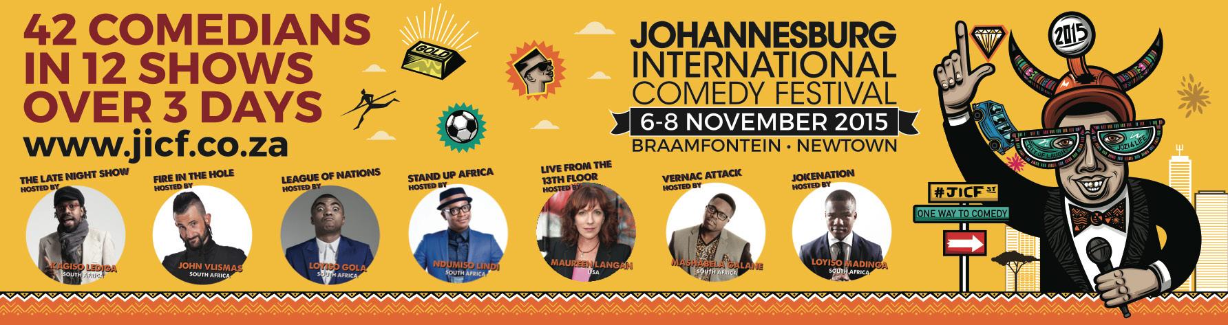
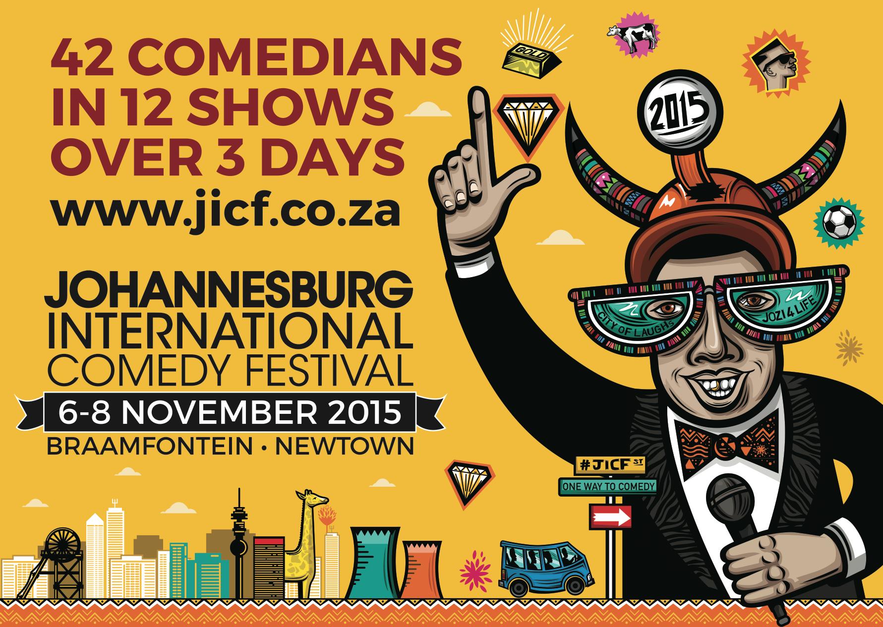
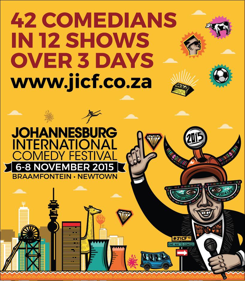
A company’s logo is its most important visual asset. As such, it is crucial that the Johannesburg International Comedy Festival logo always appears in the same way. It should never be retyped in a different font or be stretched or squeezed to fit a space. Likewise, the Johannesburg International Comedy Festival logo should always appear in colours (see page 9 for colour breakdown) on the preferred background colour of yellow. It should never be placed upon a pattern or an illustration not listed in this manual.
Logo Word Mark & Character
Including: full event details, bottom holding device and city skyline elements.
The Johannesburg International Comedy Festival logo needs to be clear on any medium it is applied to. Below are the minimum sizes the logo may be reduced to.
Logo Word Mark & Character
Logo Word Mark & Character
Including: full event details, bottom holding device and city skyline elements.
The Johannesburg International Comedy Festival logo needs to be clear on any medium it is applied to. Below are the minimum sizes the logo may be reduced to.
Logo Word Mark & Character
Logo Word Mark Including: full event details, bottom holding device and city skyline elements.
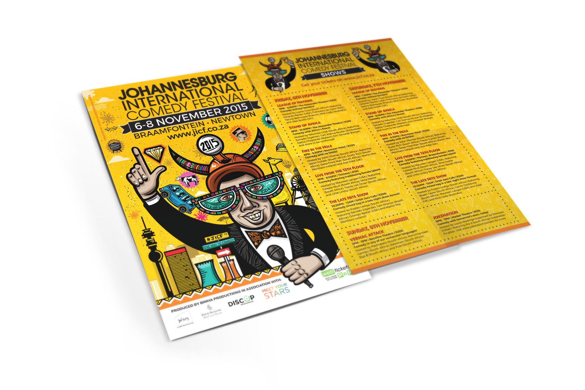
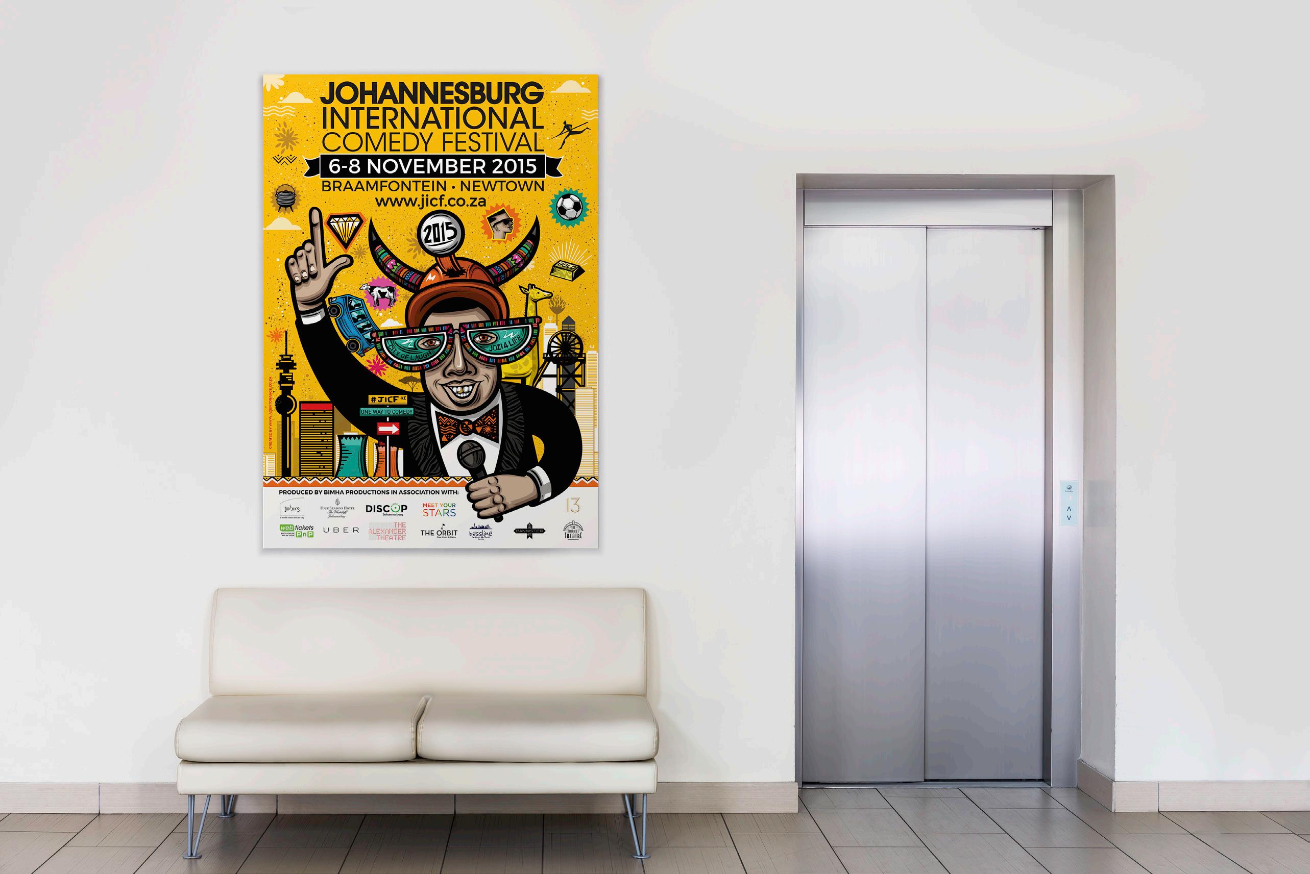
The dotted background pattern should be included in items that are A5 in size and larger, with exception to the letterhead. The general guideline would be to determine how much space the character is taking up within the medium it is applied to. If the character fills up a large portion of the space, then the dotted background pattern is excluded and a plain yellow background is used instead.
The below are examples of the background pattern application:
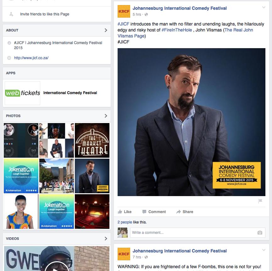
In case of uploading images via social media networks with branding purposes, the Johannesburg International Comedy Festival logo should contain the character as well as the word mark.
The below are examples of the proportions one should follow:
Avoiding the misrepresentation of the Johannesburg International Comedy Festival logo is actually very simple if a few basic rules are followed.
A few examples of poor practice and adequate practice are provided below:
Incorrect Use
Do not seperate the character from the word mark. Sizing proporations may not be altered.
Do not place any objects on top of the logo.
Do not alter the position of the word mark in relation to the character.
Correct Use
Do not place the logo on any other background other than yellow.
Logo word mark and character on standard yellow background.
Logo word mark and character including skyline elements and event details on standard yellow background.
Please note the bottom 2 options may only be used in instances where there is not enough space to accommodate the character, and therefore creating readability issues.
Primary font
The Johannesburg International Comedy Festival corporate font is ITC Avant Garde. This should not be changed or altered in any way and are shown purely as reference.
Primary font ITC Avant Garde Bold
Primary font ITC Avant Garde Medium
Primary font ITC Avant Garde Book
The layout and use of type is integral to the look and feel of Johannesurg International Comedy Festival and benefits by being set with care. The Johannesurg International Comedy Festival corporate fonts are “A love for Thunder” and “Montserrat”. Their simple, legible, straight forward nature helps communicate our brand values. These fonts should be used in all our communications, both external and internal, as it will ensure uniformity and that all-important recognition.
Headlines
A Love of Thunder to be used on Headings and short phrases.
Headlines and sub-headlines
Montserrat Bold to be used for Headlines and Sub-headlines.
Headlines and sub-headlines
Montserrat Regular to be used for Body Copy and Legal Copy.
Substitute Font
Helvetica to be used only in cases when our custom font cannot be integrated due to technical restrictions. For example, the HTML email signature.
Wherever possible, the Johannessburg International Comedy Festival logo should be shown in our brand colours on a plain yellow background (as shown on page 1) or dotted background depending on size restrictions (as shown on page 4).
Our brand colour palette consists of 2 primary colours and 3 secondary colours detailed below:
Differences between RGB, CMYK and Pantone
CMYK is used for printing on paper. While this method is more consistent than RGB, it can still differ from printer to printer depending on their equipment and the quality of their ink. RGB is the colour model used on screens. However, it is device dependent which means that the colour will look different on different devices as they will each detect and reproduce the given RGB code slightly differently. Pantone are specific colours and can be match to a standardised chart. Pantone colours will not differ from printer to printer but may differ slightly based on the medium it is applied to and whether it is coated or uncoated. CMYK,RGB and Pantone will differ slightly in their tone and hue from each other. Great care has been taken to match them as closely as possible to retain brand consistency.
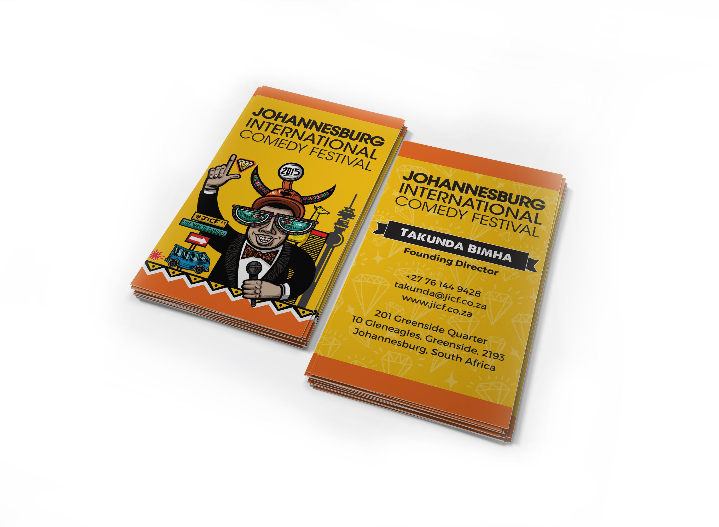
info@jicf.co.za
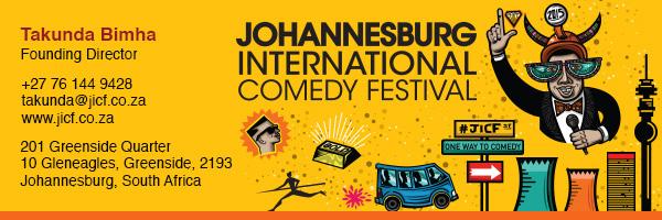
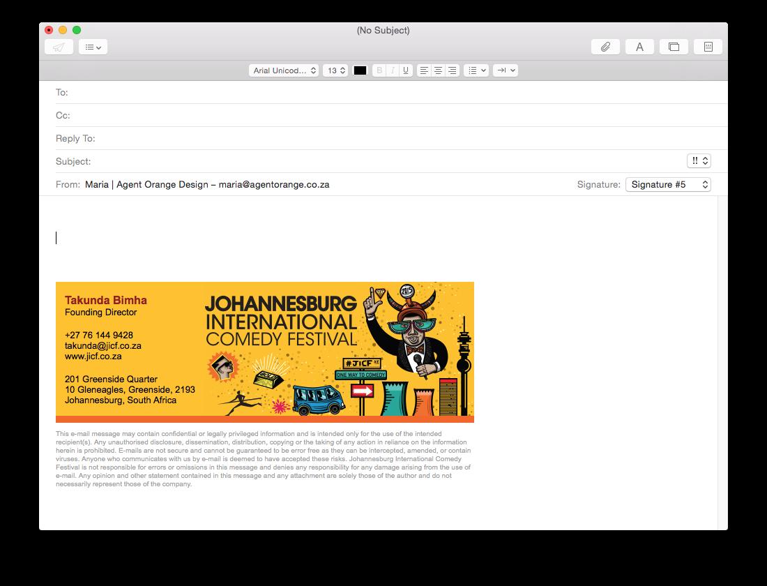
Johannesburg International Comedy Festival | Email Signature
info@jicf.co.za
Johannesburg International Comedy Festival email signature preview example
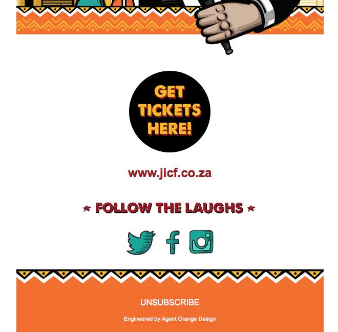
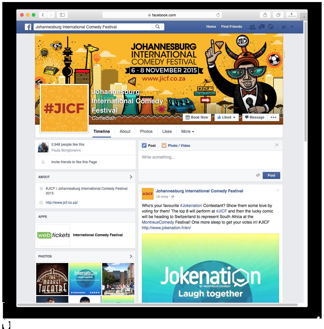
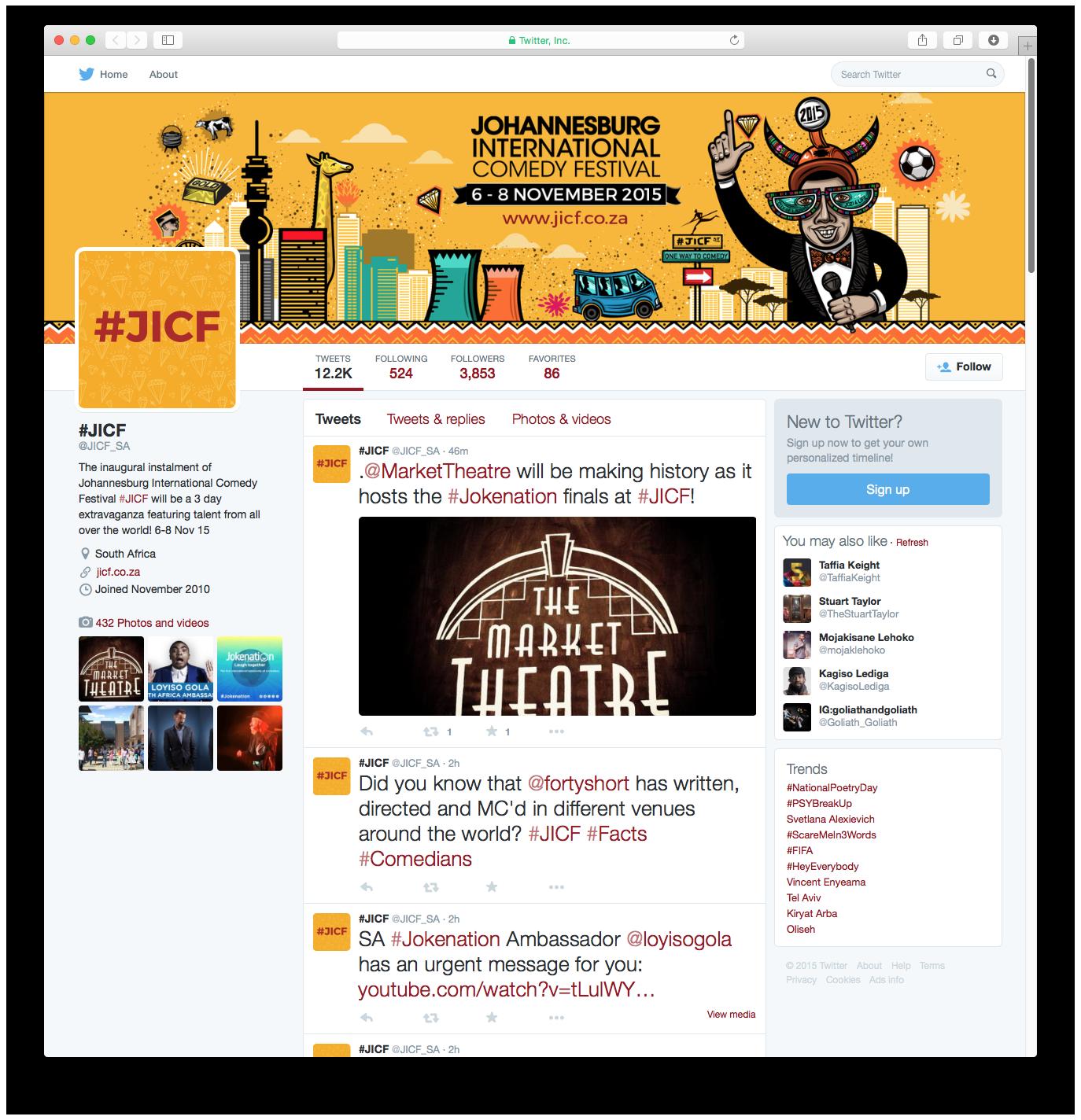
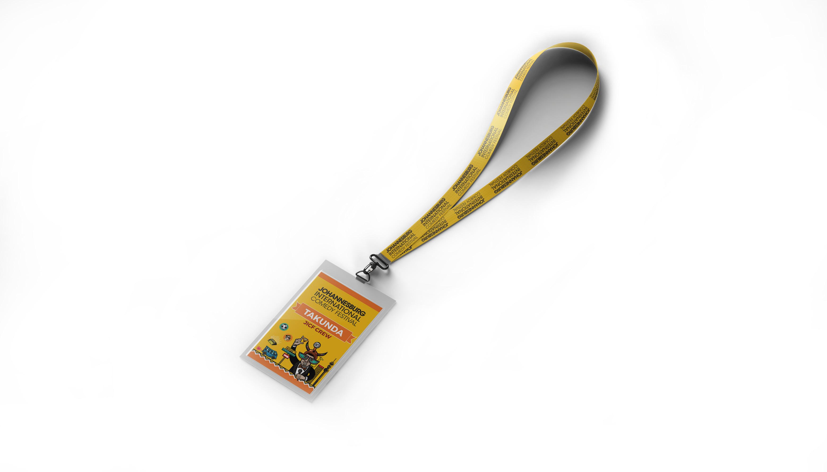
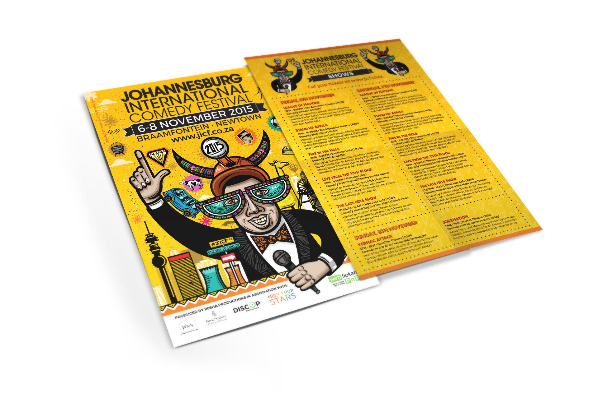
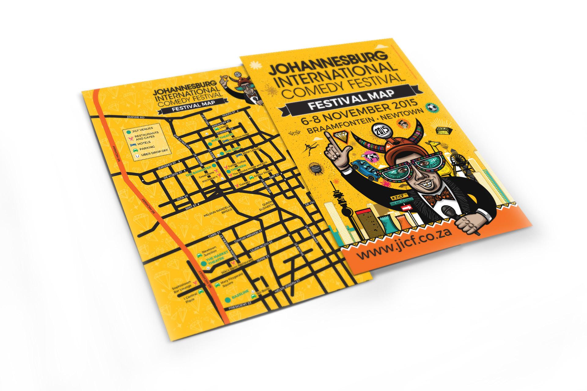
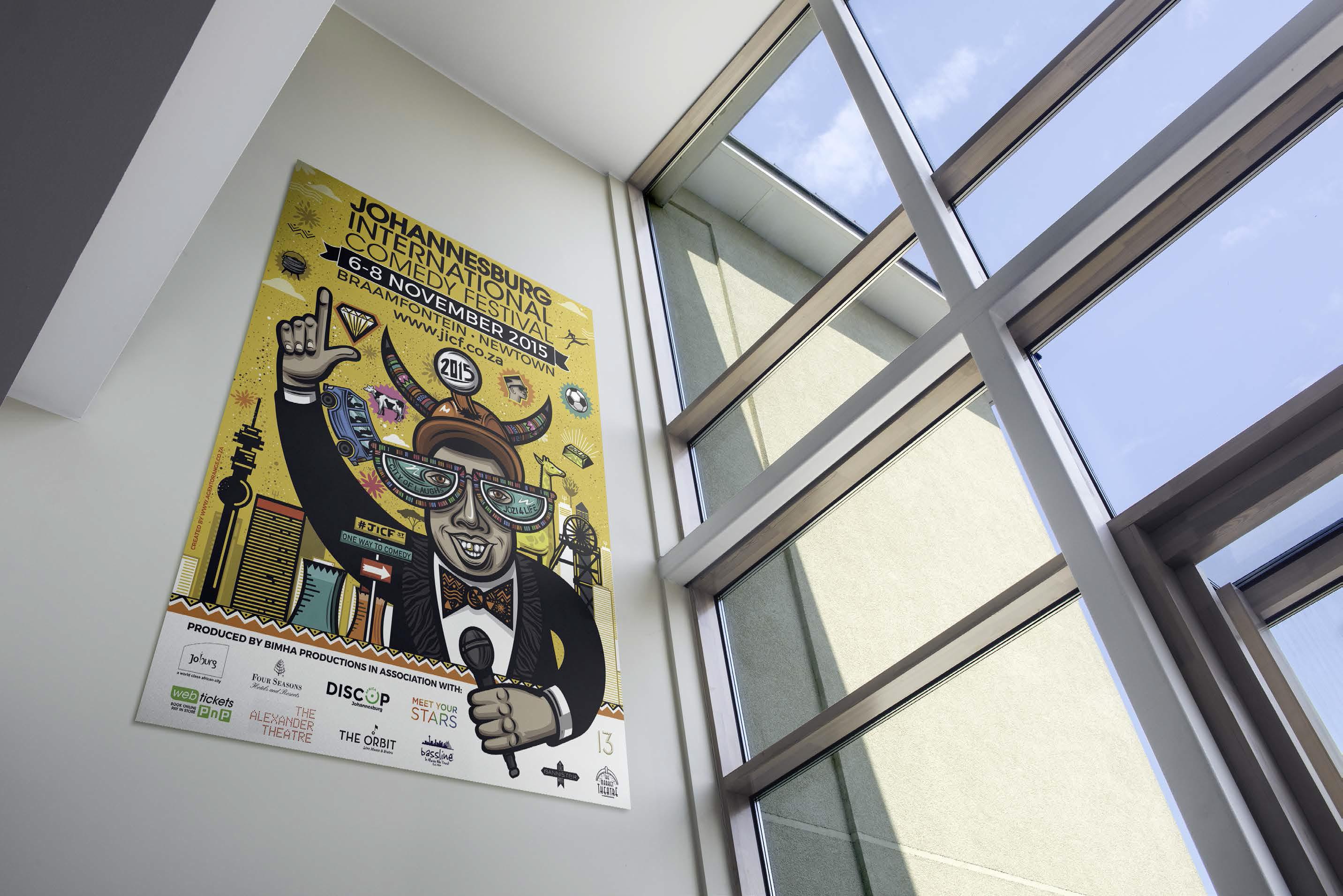
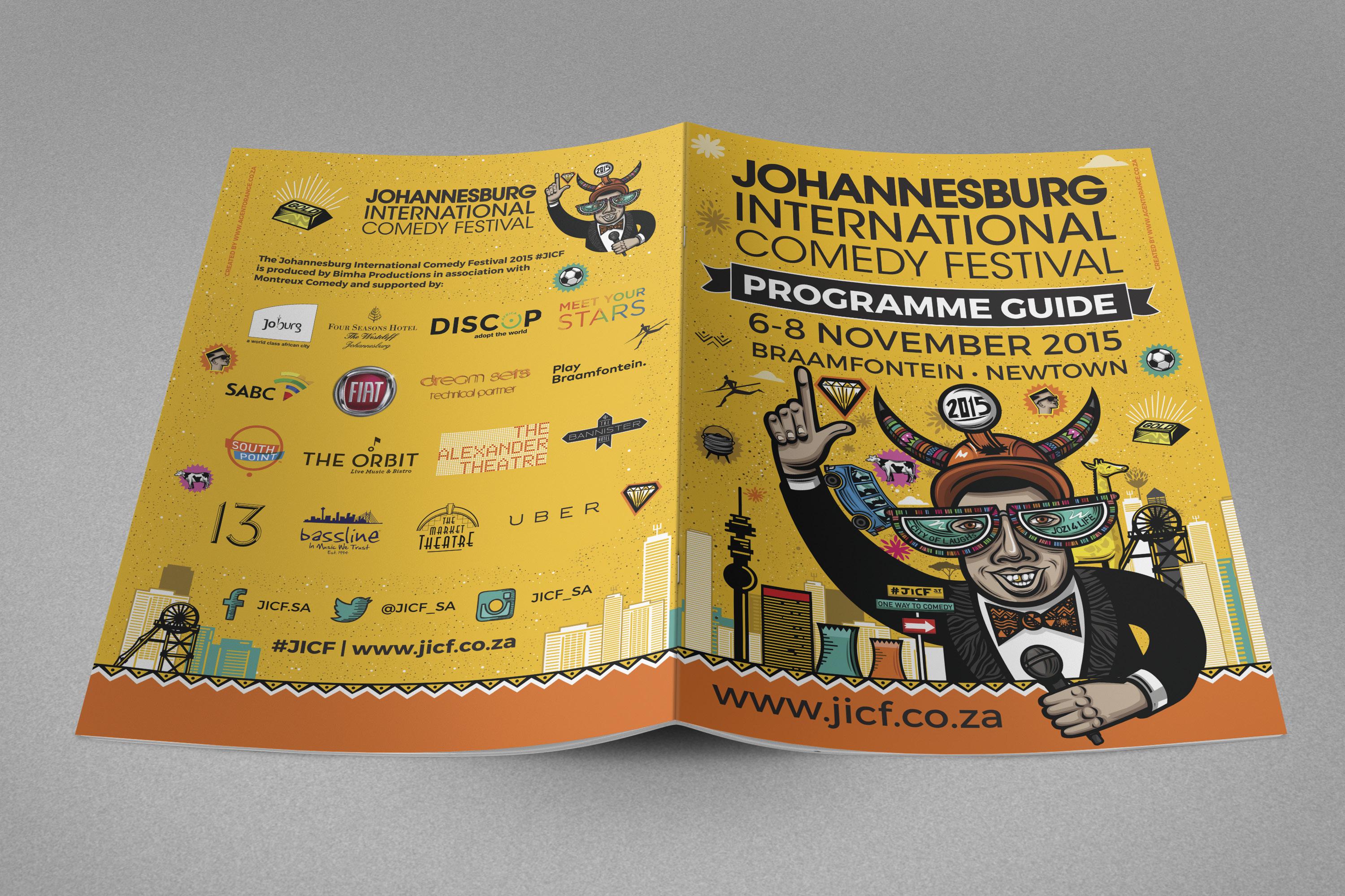
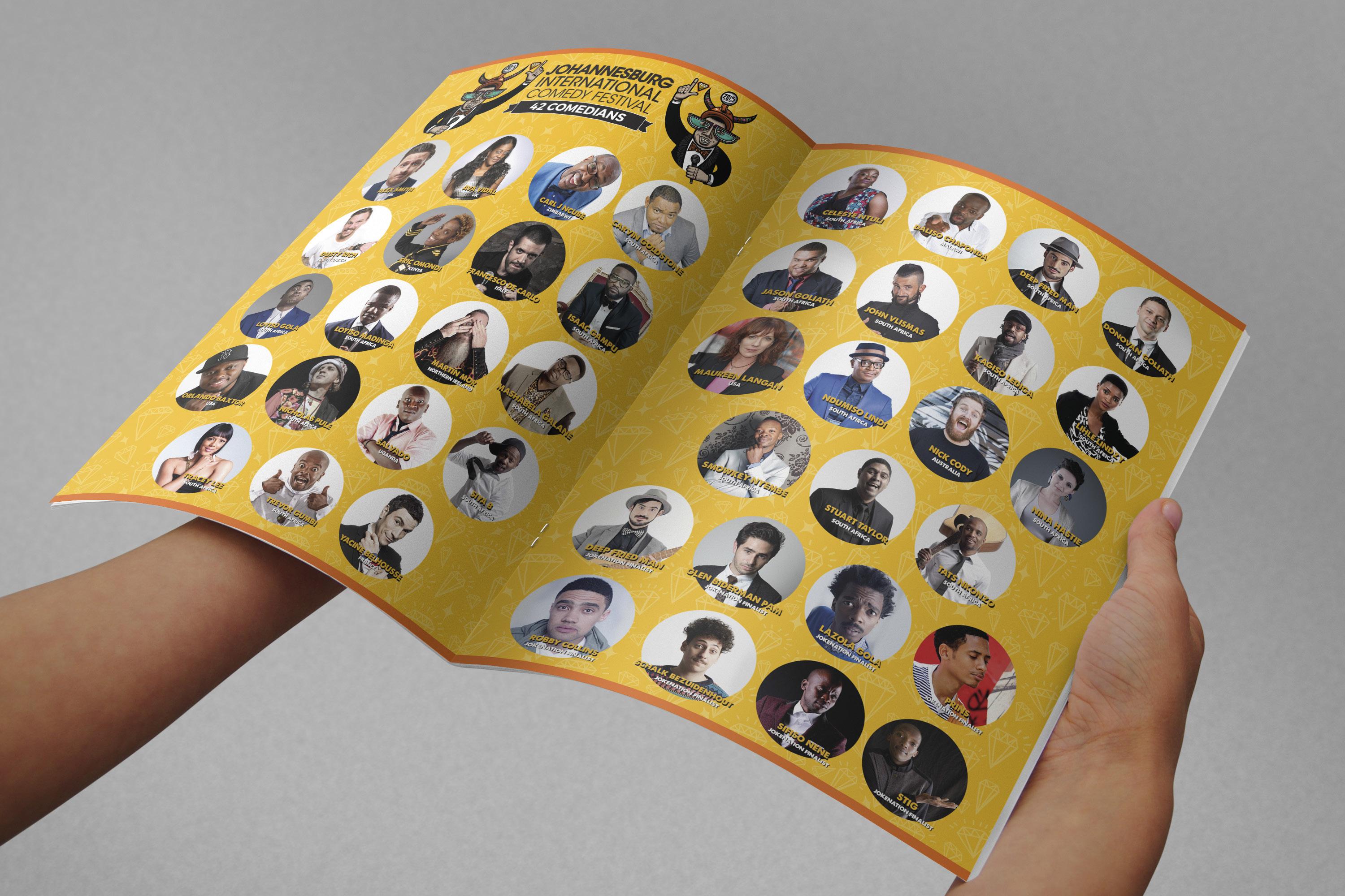
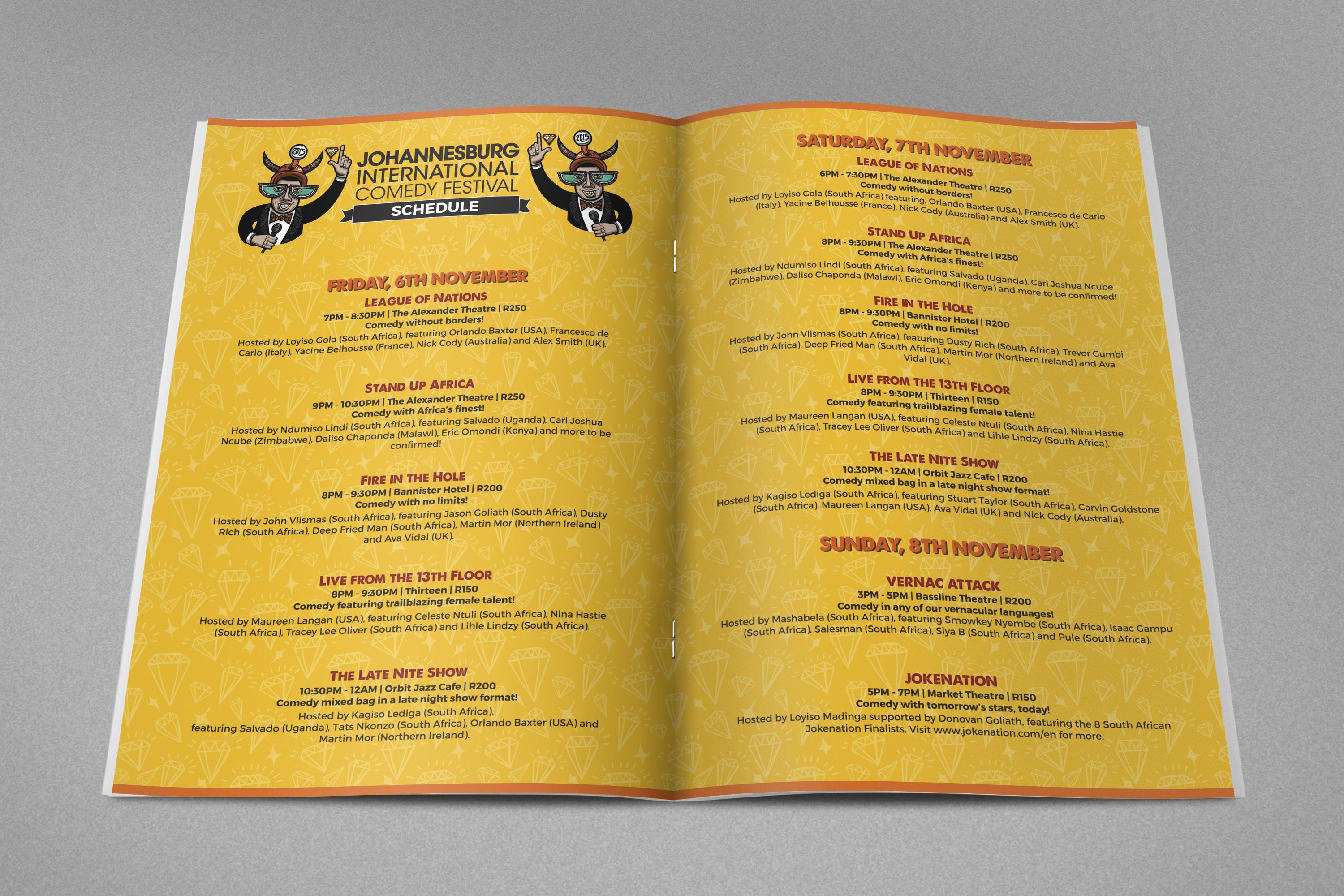
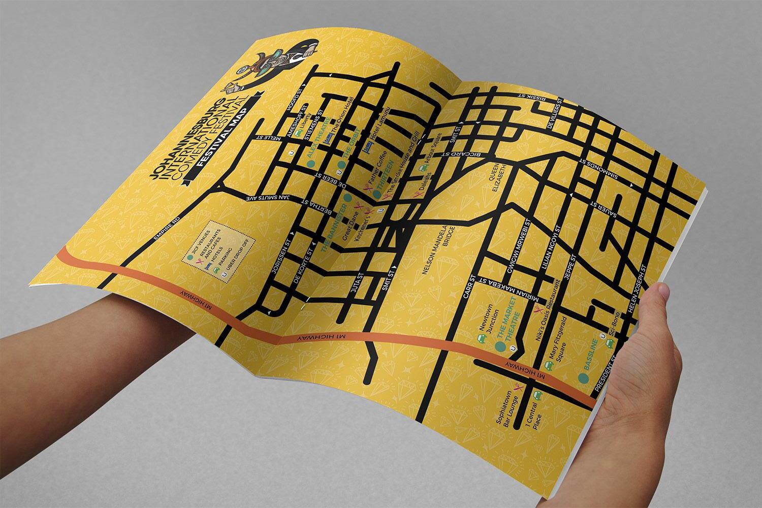
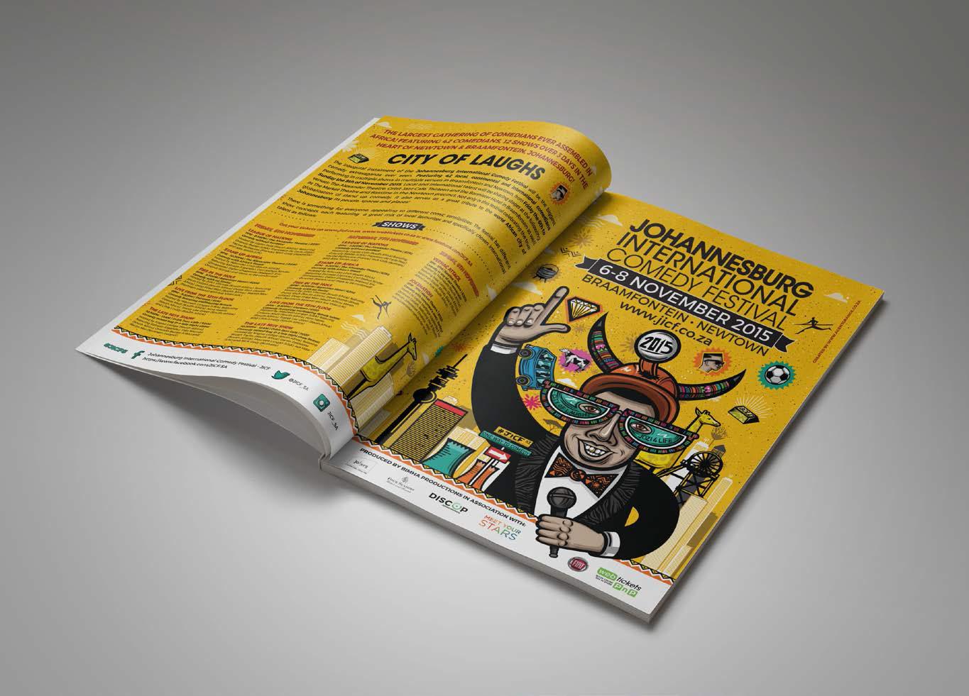
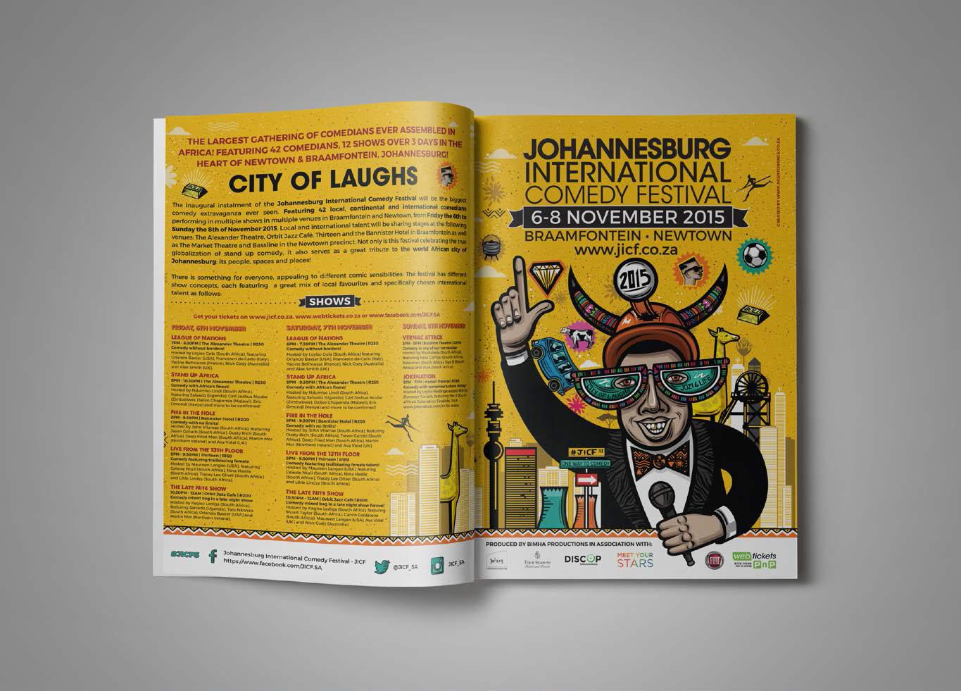
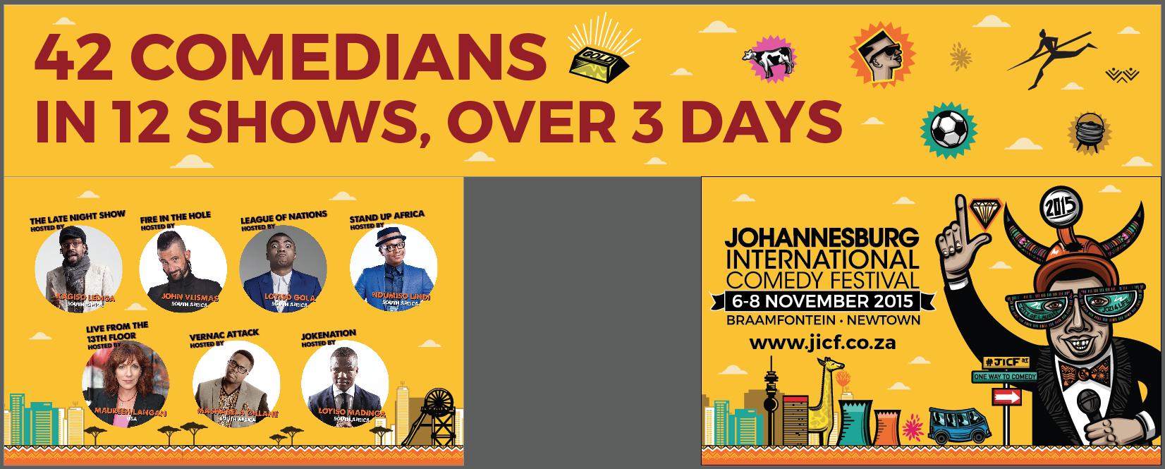
Double page spread advert