Charles joined Elliott in 1987 and quickly developed into one of the best and most knowledgeable executives in the moving industry. In 2003, Charles was appointed joint CEO of Elliott. In January 2007, Charles Luyckx and Brad Barker successfully concluded an MBO, purchasing the share capital from the Tom Ansley Trust. Charles is the ex president of SAIMA (South African International Movers Association) and is current president of OMNI (Overseas Moving Network International - based in London).
BRAD BARKER
JOINT CHIEF EXECUTIVE OFFICER
Brad joined Elliott in 1991 and a two year training program enabled him to become one of the industry’s leading executives. In 1995, Brad spearheaded the development of our Fine Art Relocation’s Division, which handles the moving of fine art, trade shows and valuable exhibitions. Today, Elliott is considered to be the only organisation in SA capable of handling specialised projects. In 1998, Brad joined the Elliott Board of Directors and, as Sales Director, was tasked with heading up our Sales Division. In 2003, Brad was appointed joint CEO.
CORALLIE PRINGLE
CHIEF EXECUTIVE | RELOCATION SERVICES
One of the founding partners of Corporate Relocations South Africa in 1993, Corallie, with her passion and commitment to the relocation industry and service excellence, leads an enviably strong team of relocation and immigration professionals. The entrepreneurial spirit, driving up performance, getting things done, providing relocating families with hightouch services and a positive experience, are cornerstones of Corallie’s philosophy.
Corallie holds a Bachelor of Social Science Degree; Diploma in Personnel Management; ERC Global Mobility Specialist certification and has served on a number of industry and chamber of commerce boards.
What is this Manual for?
This manual contains easy-to-follow rules that will help us all talk to our customers in the same way. We need to do this because customers seek brands that they understand, trust and connect with. It’s all about familiarity and instant recognition – and the key to familiarity and recognition is consistency.
Whenever you are preparing marketing activity or communication material for Elliott Mobility, please refer to this manual. The result will be that we communicate our unique approach to car rental more concisely and distinctively; in a single voice the world over – to build a stronger brand in which we can all take even greater pride.
The challenge for you to communicate our values in the most compelling way.
Key contacts
If you have any questions about working with the Elliott Mobility brand or require any additional logos or artwork, please contact:
Alexandra Pringle
Direct: +27 (0) 11 267 2132
Mobile: +27 (0) 79 257 3932
Switchboard: +27 (0) 11 267 2100
Email: Alexandra.P@elliottmobility.co.za
Moira Luyckx
Direct: +27 (0) 11 256 3086
Mobile: +27 (0) 83 677 7950
Switchboard: +27 (0) 11 256 3000
Email: Moira.L@elliottmobility.com
Our Brand Values
Our tagline “Trusted Solutions. Every Step of the Way” is an extension of our core brand values: Trust and honesty. Our brand values will help us maintain our position as a world-leading relocation company. With these values as the driving force behind everything we do, we will deliver our business goals while exceeding our customers’ expectations.
It is because of their importance that our values form the basis of these guidelines. Every aspect of our communications reflects them in some way or another, be it the suggested style of photography or the tone of voice of the copy. For this reason, it’s essential that the guidelines are followed as closely as possible.
The tone of voice used on any touch point, such as: Advertising, web and brochures, should convey trust, honesty, approachability, innovation, excellence and reliability.
Our Brand
The Elliott Mobility Logo
A company’s logo is its most important visual asset. As such, it is crucial that the Elliott Mobility logo always appears in the same way. It should never be retyped in a different font or be stretched or squeezed to fit a space. Likewise, the Elliott Mobility logo should always appear in colours (see page 6 for colour breakdown) on the preferred background colour of white. It should never be placed upon a dark background or on photography, a pattern or an illustration.
The Elliott Mobility logo comprises an icon (the African continent), the “Elliott Mobility” word mark and the “Trusted Solutions. Every Step of the way.” tagline. All these elements must be used as a unit and they must not be used separately. Only if there is a danger that the tagline may not be clear in it’s application, please revert to the basic Elliott Mobility logo.
The Elliott Mobility logo is a registered trademark and as such would have a ® symbol as part of the logo. For readability and clarity we do not show this when printing the Elliott Mobility logo.
Incorrect use of Logo
Avoiding the misrepresentation of the Elliott Mobility logo is actually very simple if a few basic rules are followed. A few examples of poor practice are provided below.
elliott MOBILITY
Correct logo colours
Our colour palette
Wherever possible, the Elliott Mobility logo should be shown in our brand colours on a plain white background. However, this is not totally inflexible – it may also be shown as white reversed out of our brand colours if this aids communication (e.g.: for branded articles application).
The layout and use of type is integral to the look and feel of Elliott Mobility communications and benefits by being set with care. The Elliott Mobility corporate fonts are Ubuntu and Verdana. Their simple, legible, straightforward nature helps communicate our brand values. These fonts should be used in all our communications, both external and internal, as it will aid uniformity and that all-important recognition.
Headlines and sub-headlines
Ubuntu
This font family is available in Light, Regular, Medium, Bold and Italics. Ubuntu Bold may be used for Headlines and sub-headlines.
• Create a distinctive and desirable personality for Elliott Mobility
• Bring dynamism and a positive feeling to relocation and moving
• Make Elliott Mobility feel like an enabler that moves and relocates the customers where they want to be.
• Provide images that can be used in many different contexts.
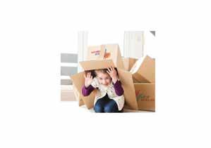
Elliott Mobility is about providing both corporate and private clients a seamless moving experience – efficiently and effortlessly. That’s why all shots should be fluid, dynamic and professional. What is more, by using imagery that looks like snapshots of everyday life, our literature should represent the trust honesty for which we are known. This will be helped further by making people the focus wherever possible rather than objects.
The overall feel should be optimistic, aspirational and contemporary – presenting Elliott Mobility as a company in-touch with its customers and their lives.
Do
• Include motion blur or suggested movement where possible
• Try interesting camera angles
• Experiment with unusual cropping
• Aim for unevenly lit subjects
• Look out for contemporary environments
• Try to make subjects look natural, real-life and carefree
• Make the shot look like a captured moment in time.
Don’t
• Choose contrived, boring or clichéd shots
• Choose evenly lit shots where possible
• Have carefully posed, symmetrical or staged compositions
• Select cartoon, clip art or graphics.
Templates and/or Applications
Business Card
Front
The front design of the business cards is the same for the 3 company divisions: Relocation Services, Moving Services and Immigration Services. Design elements include: Elliott Mobility logo, tagline, name and surname, job title and email address.
Note: Email addresses belonging to the Relocation and Immigration divisions end with “.co.za”, whereas email addresses belonging to the Moving division end with “.com”.
Back
Contact details vary for each division. The division where the company member belongs to must be specified below the company name (e.g.: Relocation Services, Moving Services and Immigration Services).
The company website address remains as www. elliottmobility.com in al circumstances.
Affiliate logos: These logos vary between divisions and should be applied accordingly.
Printing Specifications
• Size: 90x50mm landscape
• Paper: Magno matt, white, 350 gsm
• Printing: Full colour both sides
• Finishing: Matt laminated both sides and Spot UV Varnished applied on Elliott Mobility logo (front only).
descriptor
Joe Soap Title joe.soap@elliottmobility.co.za
Trusted Solutions. Ever y step of the way.
Letterhead
Letterhead footers vary for each division. The appropriate one should be applied to the relevant division.
Typing/Word Processing Guidelines
Verdana, 10pt with single line spacing, is the required typeface and size for word processing. Align the body of the letter, memo or fax flush left, ragged right. Make sure lines do not exceed the right margin and avoid hyphenation at the end of a line. Do not indent paragraphs; rather use double space, putting one blank line between them. If a paragraph
will not fit entirely on a page, start it on a new page. Do not print or type on the back of corporate stationery.
Second sheet guidelines are the same as guidelines for the letterhead or memo first sheet, with the exception of a top margin and footer. Use this format for all subsequent pages, until the end of the letter.
Size of Images, type, logo and object.
Leding space inbetween the imagery, type and logo used
Fax Cover
Fax Cover footers vary for each division. The appropriate one should be applied to the relevant division.
This page illustrates the approved layout for the fax transmittal cover sheet and includes specifications for contact details and guidelines for word processing.
Size of Images, type, logo and object.
Leding space inbetween the imagery, type and logo used
Typing/Word Processing Guidelines
Verdana, 10pt with single line spacing, is the required typeface and size for word processing. Align the body of the letter, memo or fax flush left, ragged right. Make sure lines do not exceed the right margin and avoid hyphenation at the end of a line.
TOTAL # OF PAGES INC LUDING COVER:
FAX NUMBER:
TEL NUMBER:
FAX NUMBER: RE: YOUR REFERENCE:
CD/DVD-ROM label
Final design of CD/DVD media disc label.
Key:
Size of Images, type, logo and object.
Leding space inbetween the imagery, type and logo used
PowerPoint Presentation
Each division has a different PowerPoint Presentation. The use of the provided templates is up to the presenter, but the graphics placed into the master slides should not be altered in any way. All type should be set in Ubuntu and Verdana.
Moving Services
Cover Slide
Title Slide Key:
Size of Images, type, logo and object.
Leding space inbetween the imagery, type and logo used
Insert Title Here
Presentation
PowerPoint Presentation
Relocation & Immigration Services
Cover Slide
Chapter / Title Slide
Key:
Size of Images, type, logo and object.
Leding space inbetween the imagery, type and logo used
PowerPoint Presentation
Relocation & Immigration Services
Content Slide
Key:
Size of Images, type, logo and object.
Leding space inbetween the imagery, type and logo used
A4 Generic Adverts
Lifestyle shots can be used in conjunction with a compelling message to help a communication live a little more. Try to leave space top and bottom of the image(s) for the headline. Take care with the copy, ensuring that it doesn’t sit over a busy part of the image(s). This image-text design can be applied to all other A sizes. Key:
Size of Images, type, logo and object.
Leding space inbetween the imagery, type and logo used
Moving Adverts
Landscape advert
Portrait advert
Double Page Spread Advert
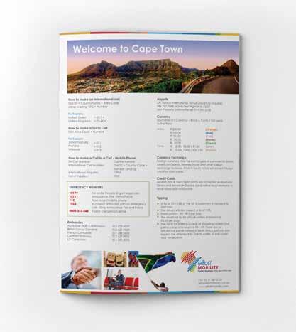
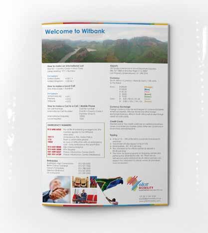
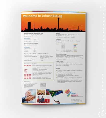
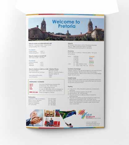
Orientation Maps
Each orientation map is specific to the region it applies to. All help lines and numbers need to be changed accordingly.
The images accross the bottom of the orientation maps need to remain consitent. Only the banner image alongside with the welcome message can be changed accordingly.
Crates and Boxes
All boxes and/or crates will feature the 2-colour (red and blue) Elliott Mobility logo.
Size of Images, type, logo and object.
Leding space inbetween the imagery, type and logo used
Visitor Tags
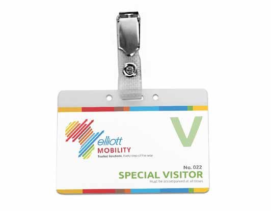
All visitor names tags must be printed on a white background. The letter “V” identifies all our Visitors. The preferred font is Verdana - 13 pt for the title in capital letters (e.g.: SPECIAL VISITOR) and 10 pt for the Visitor’s assigned number.
Pull up Banner
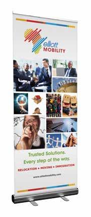
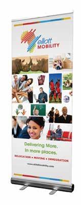
The pull up banner is used for functions and public events, to display and market the brand.
Pull Up Banner
The logo on the pull up banner needs to be clearly visible and should be free of elements around it by minimum a measurement of 1 X.
The blank spaces at the top and bottom of the pull up banner are intended for the mechanism to hold up the banner.
The colour bar is placed at the top and the bo om of the advert to show the vibrance of ellio . The colour bar is used to draw eye a en on as it is very a rac ve to the eye.
The imagery used in the advert shows how flexible and broad elliot is as it helps people move locally or interna onally. The sizing of the images gives the viewer a good idea on what ellio is about.
The placement of the ellio ’s slogan and catch fraze is placed about the logo as it catches the viewers a en on when they a er they are done looking at the logo and then read the catch fraze and slogan
The logo placement in the middle of the the advert is very a bar which helps cat a en on, which the audineces will look at the catch f service ellio has to off viewer a sense that elliot is capable of orming its job well and its is a bold and ong compan
Leding space inbetween the imagery type and
Size of Images, type, logo and object.
Leding space inbetween the imagery, type and logo used
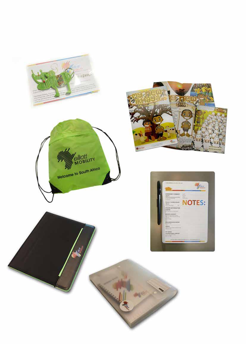
Branded Articles
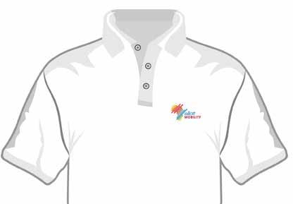
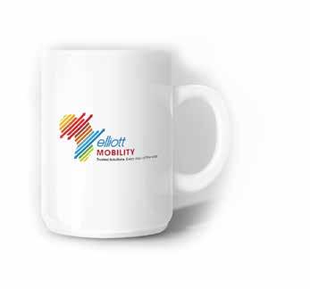
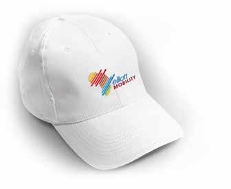
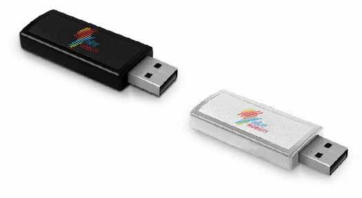
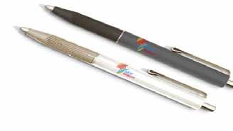
When applying the logo it is important to leave a clear space around the logo. This will allow the logo to be clearly visible.
Where possible, the full color logo is to be used. If there are cost restraints, the 2 tone logo may be applied or alternatively a solid colour that does not clash with the brand or the where it is being applied to.
Branded Articles
Branded Articles
Fridge Magnet
Header must remain constant throughout all regions.
Emergency / Important numbers will vary per region.
EMERGENCY CONNECT 10177
Greater Johannesburg 011 375 5911 emergencies
POLICE / FLYING SQUAD 10111
From a cell phone
POISON INFORMATION CENTRE 021 391 6129 / 021 689 5227
JOBURG CONNECT
Footer contact information will vary per region.
Size of Images, type, logo and object.
JOHANNESBURG WATER 011 688 1500
ESKOM Electrical Faults, Eskom Customers Only 086 003 7566
Customer care 24 Hour Services: Electricity, Water, Refuse for all areas in Joburg 011 375 5555 OR TAMBO
INTERNATIONAL AIRPORT 086 727 7888
Branded Articles
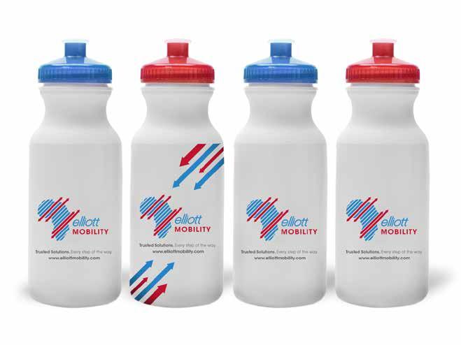
Water bottles
If there are cost implications then the 2 tone logo may be used as a substitute.
Tag line and web address must be present on all elements.
Fleet Branding
Size of Images, type, logo and object.
Leding space inbetween the imagery, type and logo used
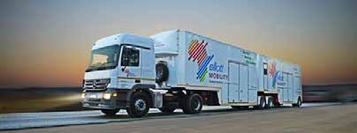
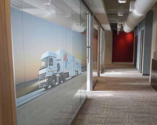
Delivery Trucks Sideview
Delivery Trucks Front and Rear Views
Leding space inbetween the imagery, type and logo used
Signage
Signage
Our signage helps convey our corporate identity, as well as helping people navigate our premises. The signage standards set out herein have been specifically developed to support and reflect the Elliott Mobility brand. In order to project and maintain a consistent image throughout our facilities, it is essential that adherence to these standards be maintained.
Logo sizing on signage will depend on the sign type, specific application and surrounding architectural elements. Proper scaling of the Logo and signage elements is essential to ensure maximum brand recognition and maintain architectural design integrity. In all cases, determination of proper signage proportions must be entrusted to signage and design professionals.
Prior approval required:
• Exterior building identification signage
• Logos on site directional signage
• Occupant designations interior signage
• Any proposed deviation
• Electronic signage.
External Building Mounted Signage
Basic Design Guidelines:
• Standard Elliott Mobility logo must be used
• Using materials that will allow our colour pallet display is the only option
• Scale logo / sign size to architectural elements
• Do not use building mounted signs to identify entrances
• Signs should be blocked left or right, not centered
• Signs should be located for maximum visibility
• Only one sign to be visible from any vantage point
• Installations to meet all local regulations.
Interior Identity Signage
Elliott Mobility Interior Identity Signage comprises common lobby entrances, elevator lobbies for full floor tenancies and suite entrances for partial floor tenancies. Use of interior identity signs is limited to the primary office access point. Use of the Elliott Mobility logo within the workplace proper is strictly limited. Specific design solutions for interior identity signage will vary based on architectural context, landlord restrictions, space limitations and type of Elliott Mobility office and/or division.
A high profile, client-facing facility will require a different approach than a support staff workplace. To ensure appropriate integration into a facility’s architectural context, an architect, interior or signage, design professional should always be engaged. Proposed signage solutions for high profile facilities require prior approval.
The preferred logo articulation is always the standard colour palette logo on a white background.
Basic Design Guidelines:
• Scale logo / sign size to surrounding elements
• Secondary entrance signing function driven
• Use vinyl appliqués on glass walls
• Primary solid wall entrances have plexi backing
• Backing plates are mounted with standoffs
• On solid walls, logos may be surface mounted
• Avoid mounting signage on doors directly
• Never use more than one logo on a double door
• Single door wall signs are always on strike side
• Installations to meet local and landlord regulations.
Glass Wall Primary Entrance
Site Panels
Entrance
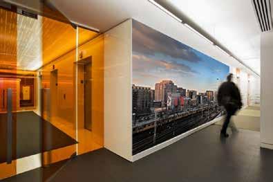
Environmental Graphics
The Environmental Graphics provide a means for interior workplace branding and focused, revolving delivery of marketing messages. They provide for a consistent visual means of integrating the Elliott Mobility brand with targeted messaging. Images and message can be localised, while the graphics provide an essential link to the brand for all Elliott Mobility workplaces.
Elliott Mobility’s Environmental Graphics provide for:
• Branding reception areas
• Brand messaging in client areas
• Focal points in the workspace
• Feature walls in common areas.
Informational Signage
Informational Signage comprises all functional fixed facility support signage:
Exterior
• Site directional signage
• Parking restriction signage
• Other required informational signage
• Code mandated signage.
Interior
• Cellular space identification signage
• Interior directional signage
• Support space identification
• Code mandated signage.
Note: The Elliott Mobility logo or other branding elements are not used in conjunction with Informational Signage unless there is a specific functional requirement.