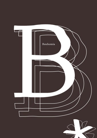
B B Bonhomia
Bonhomia by Ana Cecilia Bautista
font anatomy of the source font
Braketed serif Second vertical stroke curves inwards
Cap Height
Baseline
Rhap Upturned tail, emulates calligraphy
Expressive and elongated leg extending to next letter
Slanted strokes on most lowercase stems
Transitional braketed serif
Slight diagonal stress with overshoot
psody
Ascender
High stroke contrast
X-Height
Humanist serif
Descender
Teardrop Terminal
Bembo Std, Francesco Griffo, 1496
uppercase letters
C A B A B C D E F G H D EF G H II JJ KKLL M M R R
N OO PPQ Q N SS TT UU VV
Y WXXY W Z Z
lowercase letters
a b c d e f g h i j k l m n o p q r s t u v w x y z e af bg ch di j k l m n o p q r s t u v w x y z
numerals
0
0
9 0 9 1 8 1 8 2 7 2 7 3 6 3 6 4 5 4 5 5 4 5 4 6 3 6 3 7 2 7 2 8 1 8 1 9 0 9 0
88
0
symbols
.,:;!?'" “ ”« »}_&#@ ™©§%* +-™ =~ < >/(){}[]€
say, ha otha
brot
bro b
,
tha
evolution
g g bembo font & skeleton
serifs
applied brush
Bembo
Bonhomia
final letterform with small detail changes
brushes
-163° 35% 9pt
Stress on rounded shapes/ symbols: a,b,c,d,e,g,h,m,n,o,p, q,r,s,u,x,/(),{},<>,“” Stem: i,j,k,l
Stress, stems and shoulders: B,C,D, E,F,G,H,I,J,K,L,M,N,O,P,Q,R,T,U, X,Z,?,!,",&,@,
-21° 29% 10pt
Crossbar: A,F Arms: E,F,#,€
Crossbar: e,f,t Symbols:*,+,-,,=
-163° 35% 7.5 pt
Single stem: b,d,p,q,v,w,x,y Stroke basis: ™,©,§
Stems: A,D,N,M,Q,V,W,X,Y
-149° 4% 8pt
Hairline: w,5
-163° 35% 12pt
Diagonal stroke:
Crossbar: Z,2
font sizes in use 24pt/25pt
12.5pt/17pt
IMAGINE: The world's song October 11, 1971 sees the release of John Lennon’s “Imagine” one of the most influential songs of the 20 century. He began writing the song while still a member of the Beatles, at a time when the band had achieved unprecedented popularity but struggled to cope with their new reality. The song’s idealistic, utopian lyrics were heavily influenced by Lennon’s wife, conceptual artist Yoko Ono.
11pt/15pt
Imagine there‘s no heaven It‘s easy if you try (pause) No hell below us, no hell, Above us only sky (scales) Imagine all the people living for today (again) Imagine there‘s no countries It isn‘t hard to do (pause) Nothing to kill or die for And no religion too, uhuh Imagine all the people living life in peace, you huh You may say I‘m a dreamer But I‘m not the only one I hope some day you‘ll join us And the world will be as one
Imagine no possessions I wonder if you can (pause) No need for greed or hunger A brotherhood of man, man Imagine all the people (pause) sharing all the world, you huh You may say I‘m a dreamer But I‘m not the only one I hope some day you‘ll join us And the world will be as one Imagine all the people sharing all the world, you huh You may say I‘m a dreamer But I‘m not the only one I hope some day you‘ll join us And the world will be as one
7pt/14pt
The impact of the song is unquestionable. Unlike
lines such as "Imagine all the people/ sharing all
other Lennon releases from that era, such as
the world” embodied a radical utopian vision as
“Give Peace a Chance” “Power to the People”
well as the desire of Lennon and many others for
and “Happy Xmas (War is Over)” the song did not
an end to the Vietnam War and a return to the
contain an overt political message. But disgui-
optimistic humanism that had defined much of
sed within its message of peace and love and its
the previous decade. The song became a peace
flowing piano melody is a collection of edgy,
anthem all over the world and it's legacy remains
-dangerous- ideas that challenge society as we
till today.
know it. To make a clearer highlight ref.
“We live in a world where we have to hide to make love, while violence is practiced in broad daylight. Peace is not something you wish for; It’s something you make, something you do, something you are, and something you give away’’
11pt/17pt
typographic scale
Help!
13pt
Because
18pt
Blackbird
21pt
Something
Yesterday
Revolution
25pt
31pt
34pt
Terminals with strong calligraphic influence
Spur serif
Cap Height
Baseline
Strongly serif
Peacek Closed apertures
Teardrop Terminal
Open co curvatu
font anatomy braketed
Non tapered finial
Ear with ball terminal
Negative axis
<
keeper
Ascenderline
X-Height
>
Contrast between stokes and a moderate overshoot
ounter with strong ure on the inside part
Burly curved bowl
Descenderline
font characteristics Wavy details on most round letters or signs Teardrop terminal for a and f Long ears with round terminals for y, j and at stems of those related to n (m,h,r,u)
f u y
Strong distortion on capital letters and numbers, creating notorious but harmonic shapes (H,K,M,N,O,S,Z)
M
Creates unique details and gives the font a personallity
2
Inside-pulling distortion at bowls (d,b,p,q), g's loop, c,e and a's counter Also found on signs such as &,%,§,Š Angulations of 100 degrees for round shapes as well as free/ no cuts at terminals
g d
Ascender serifs Oldstyle serif with rounded edges (b,d,hk,l)
X-Height serifs Strong, bracketed serifs, more similar to transitional serifs. (v,w,x,y) Rounded edges and strongly pronounced arch at the base.
Baseline serifs Variation of bracketed and unbracketed base within the same serif (on most uppercase letters: A,E,F,H,I,K.../plus lowercase presenting stem, arcs and apertures: nm,n,h,r..)
Descender serifs Ball/ teardrop terminal at descenders tail (j,y) Braketed and showing sharp cuts. (p,q)
MAKE MAKE MAKE NO NO w aa w
E LOVE LOVE LOVE OT OT aa rr
font relations
BPR NM Inicial P shape, manipulated to fit letter
Initial stem and serifs, distorted diagonals
Z EF
Independent shape
Extra arm added to original shape
O QCG D Same roundness, size and proportions, wave creation from C to G
IJ HL Same stem, inverted serifs for H and L
SK
Independent letters
oo oec
"o“ shape as basis; little pull towards the inside for e and c
"b“ shape mirrored for "d“ shape; details on bowl and different line weight added afterwards to crate distinction, as well as various serifs
"n“ shape, shoulder line weight and cuts kept for m,h and u. Stem kept for r, but its shoulder became shorter and thicker
b p bdpq n nru nmh
"v“ as basis for w and y‘s creation, "w“ middle arm cut off diagonally. Added tail (descender) and terminal for "y.“
"i“ stem and tittle repeats at "j“, while stem is elongated for "l“. t and f‘s crossbar is identical in proportions
as g k xz
vv v wy
ilji tf unique/ independent letter shapes
*
** Faculty of Design and Art Free University of Bolzano - Bozen WUP 2020/21 Typeface designed by Ana Cecilia Bautista Prof. Antonino Benincasa Andreas Trenker Emilio Grazzi Font created with Illustrator & Fontself