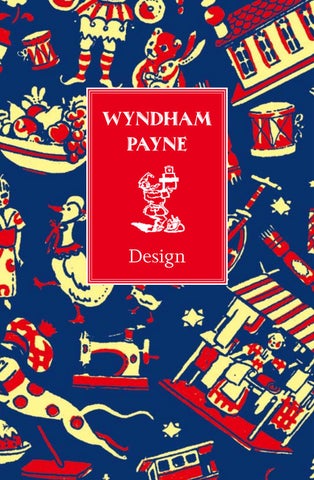
WYNDHAM PAYNE
Design
Design Wyndham Payne
I
n 1924 a young man, lately a representative of the biscuit manufacturer Huntley & Palmers, made his way to the shop of the publisher, bookseller, ballet historian and critic, Cyril W. Beaumont, at 75 Charing Cross Road, London. Beaumont recalled the meeting: ‘I received a visit from a young man in his late twenties or early thirties. He was tall and clean-shaven except for a small clipped moustache. The front of his hair had receded to give him a broad forehead, and he wore rimless pince-nez. His jerky manner was enthusiastic and eager, and he had a quaint trick of stressing his words which produced a slight hesitancy of speech. He was carrying a large attaché case and asked me if I could spare the time to look at some of his drawings. ‘I told him that I should be pleased to see his work, whereupon he deposited his case on to an adjacent table, smiled pleasantly, and raised the lid with the air of a conjurer about to perform a spectacular sleight of hand. ‘I had expected a score or more drawings at most, but there were hundreds, all shapes and sizes, and done on many varieties of paper. There were hands and busts and complete figures; animals, birds, and groups of people; trees, houses and cottages; suggestions for covers, labels, and notepaper headings. Many of them were washed with colour. There was a sense of freshness and good humour about them, which was quite exhilarating.
Payne produced all the illustrations for Methuen & Co.’s 1927 edition of Kenneth Grahame’s The Wind in the Willows.
‘He asked me if I had any publications in view which he might illustrate; and seemed a little downcast when I explained that my publications for the year were already issued or in hand. But I promised him that, when I had such a book, I should not fail to ask him to come and see me. He said at once: “Then may I leave my card?” A mutual good-morning and shake of the hand, and he was gone. I glanced at the piece of paste-board, the name on it was Wyndham Payne.’
5
Design – Wyndham Payne
Design – Wyndham Payne
Beaumont did not forget his promise to Payne and engaged him later in the year to decorate a small pamphlet on Burmese dances: ‘Then I remembered I had once had an idea for a children’s book, which I had begun but never finished and so set aside. Certainly it would lend itself admirably to such decorations as these… ‘I told [Wyndham Payne] that I should be happy for him to decorate the story. It would be called The Mysterious Toyshop and it would be something new in relation to my publications, and well-suited to the approach of Christmas.’
A
lbert Wyndham Payne was born on 2 February 1888, in Reading, Berkshire, to Fanny Elizabeth (1848-1930), daughter of James Gould, a wheelwright of Kingsland, Herefordshire, and William Henry Payne (1854-1912), a legal clerk. Wyndham was raised in a house of curiosities; his father collected furniture, pictures, local antiquities and found objects, all displayed in his private room – his cabinet. It was an environment that would shape Wyndham’s honed turn of imagination and later interests. He had two brothers: Reginald, who fought in the Boer War and then settled with his wife and family in Australia; and Cecil, who trained initially as an architect but later became a dealer in antiques.
Wyndham was educated at the Kendrick School, Queen’s Road, Reading. On leaving school he joined the biscuit manufacturing company Huntley & Palmers, at that time the largest biscuit maker in the country, employing 5,000 people. It was for many years the largest employer in Reading. (Today, significant collections of Huntley & Palmers biscuit tins are held at Reading Museum and Manderston House, Berwickshire.)
Huntley & Palmers’ biscuit tins may have inspired Payne’s work in illustration: the Showman tin dates from 1897, the Palette tin from 1903 and the Boating tin (opposite) from 1888 to 1890.
6
7
Design – Wyndham Payne
Design – Wyndham Payne
Wyndham had enlisted as a Trooper in the Royal Berkshire Imperial Yeomanry in 1913 but, undeterred by a near fatal aerial adventure, was commissioned 2nd Lt. Special Reserve, Royal Flying Corps (Military Wing) in 1916. His eyesight would not allow him to serve as a pilot, but as he had a talent for mechanical things, he was fortunate in being charged with supervising aeroplane maintenance. He was posted to 14 Wing BEF and, shortly after, appointed Wing Adjutant when 14 Wing moved to Italy with the Italian Expeditionary Force. Wyndham married Dorothy Constance Craven (1891-1977), daughter of Arthur Craven of Cullingworth, on 26 July 1917, at St Martin-in-the-Fields Church, Trafalgar Square. After their marriage, the couple settled in a rented cottage at Harmston while Wyndham was serving at nearby RFC Waddington, five miles south of the city of Lincoln. It was here that they published privately a book of Dorothy’s, Poems from the Fireside, with a cover decoration by Wyndham of a cat before a blazing fire; a scene of domestic comfort that would become a leitmotif of his later work. The design is executed in bold black line over grey paper, in a style which, with later refinement, he made his own. On demobilisation as Acting Captain, Royal Air Force, Wyndham resumed his position with Huntley & Palmers. He and Dorothy settled at 27 Guild Hill Road, Southbourne-on-Sea, Hampshire, where their son Paul was born in 1920. He was their only child. Wyndham had drawn constantly and made models since childhood but it was a step of some daring with a wife and child to decide, without training, to make art his career. It was Dorothy’s father who encouraged Wyndham to become a freelance artist. He left Huntley & Palmers, and started putting together a portfolio of illustrative and decorative work. The hunt for work began. No doubt his experience and confidence as a representative for Huntley & Palmers was a great asset in making himself known to publishers and agents.
The fireside cat, first used to illustrate Dorothy’s Poems from the Fireside, became a recurrent motif in Payne’s illustrations. This version was produced for a book of poems by Basildon, published by The Medici Society. Dorothy – ‘Dotty’ – diligently collected her husband’s work, filling scrapbooks with his drawings, watercolours and prints.
It makes for a good story but Cyril Beaumont was perhaps disingenuous to imply that Wyndham Payne’s reputation was unknown to him in 1924; such a man, au fait with the world of
8
9
Design – Wyndham Payne
Design – Wyndham Payne
‘This somewhat fantastic little device was not made as a toy to be played with & is therefore fixed in its box. The intention was that it should recall to “Grown-ups” something of their childhood delight in opening a box given as a present to find in all unused freshness a gaily painted toy.’ It may be, as with other models he made – for example, boxes of soldiers or crackers – that it had a commercial intent. Wyndham’s studio was on the upper floor of Waterden Cottage, where he worked at a flat deal table beneath a window. The white walls were covered in designs and posters and the furniture simple: a well-stocked bookcase and a cupboard filled with all kinds of paper. His son remembers that the studio floor was always strewn with crumpled, abandoned drawings. He worked like a ‘greyhound’, very speedily producing drawings with a quill or fine pen, which if liked were put aside, otherwise he threw them to the floor. To Dorothy’s irritation he wouldn’t want the floor cleared except by himself. His son was allowed into the studio, but had to sit quietly. Evidently, the studio was not always a comfortable workplace; his diary entry for 14 January 1928 reads: ‘It is impossible to write todays [sic] entry with ink as it is frozen solid in my inkwell… My studio work is at a complete standstill owing to the intense cold of my room…’ Always busy, he yet found time to indulge his fancy in schemes of seemingly little commercial worth. His charming paintings on glass were reported in the press; on 23 December 1933, The Sphere recorded: ‘The Fascination of the Silhouette – A New Technique… the latest exponent of this method is Mr Wyndham Payne whose work is well known to readers of The Sphere Christmas Numbers. He has developed a silhouette technique on glass. The painting is done on the inner surface, and gold is here and there allowed to show through the fine lines. Mr Wyndham Payne frames the glass at a little distance from the back piece so that a slight shadow is thrown from the black silhouette on the glass.’ In later life, when glaucoma limited his capacity for illustration, Payne created functioning painted models in wood, often for the entertainment of his grandchildren.
18
A 15-minute film about Wyndham’s glass painting, entitled Capturing Shadows (The Silhouette Art of Wyndham Payne), was made by GaumontBritish in 1934.
19
Design – Wyndham Payne
Design – Wyndham Payne
In the basement, Wyndham kept a small nipping press for printing. He printed from wood and lino blocks and also experimented with pulls from textured papers and Japanese leathers which he found in what he called ‘gubbins shops’, that is junk shops. Beaumont wrote: ‘[Payne was] forever experimenting with materials; the effect of various colours on different papers, silks and leathers; the combination of one material with another.’ Wyndham was an avid collector of patterned papers, textiles, scrap books (to the extent of advertising in the local paper for them), old paint boxes, pictures, ceramics and furniture. These he liked to display in the living rooms and in his studio, in a case resembling a shop window. He liked to show objects related in spirit or style and to add new finds and make rearrangements. He never bought from antique shops, preferring junk shops, and keeping many pieces for his collection, though much was sold on at auction. His great coup of connoisseurship came in 1943, in Cirencester, where he spotted on the floor of a junk shop what is now known as The Wyndham Payne Crucifixion, a miniature on vellum from a missal, painted by H. Scheerre in the early fifteenth century. The dealer claimed that he had bought it from a local clergyman, thinking it a reproduction, and Wyndham bought it as such. Later, on 5 December 1973, it was purchased at Christie’s with the aid of the National Art Collections Fund and The Pilgrim Trust, and is now in the British Library. Another important find was a John Constable watercolour bought at auction in Cheltenham in 1944: ‘The Mill’, after Rembrandt. The provenance of this painting was researched by Wyndham’s son Paul and sold in 1998 for £90,000.
W
yndham sought commissions directly from publishers, calling on them on his weekly trips to London, but at first soliciting their interest by letter. On 9 August 1923, he wrote to The Bodley Head: ‘I wonder if you are likely to be interested in an illustrated edition of “Robinson Crusoe”? If so I should be glad if you will consider the enclosed preliminary suggestions... I shall be pleased to submit further suggestions upon request.’
20
Paintings on glass; a silhouette was made on the inner surface of the glass, and then placed over the illustrated back piece. Above: A Cup of Tea; Below: The Way to the Chateau.
21
Design – Wyndham Payne
Design – Wyndham Payne
However, once a commission was secured, proof pages went back and forth and there could be detailed opinion from Wyndham on how the book should be made, such as the correspondence below relating to Peter Piper: 21 May 1926 to The Bodley Head: ‘I am very much obliged to you for sending me the printer’s specimen page for the “Peter Piper” book & I should like to make the following comments:- I do not think that the type used for the verse is sufficiently heavy & the effect is weak against the illustrations on the opposite page – A bolder type would “pad out” the somewhat sparse type script of the book & would of course be more legible for the use of the children – I think also that the verse should commence with a large initial letter, giving some indication that the verse runs through the Alphabet…’ and much else concerning captions, continuing: ‘The size of the book seems to me to be just right…’ The correspondence continued and on 14 August 1926 Wyndham wrote:
The board cover for Peter Piper’s Practical Principles (of Plain and Perfect Pronunciation), published by John Lane, The Bodley Head, 1926.
24
‘Since, as I think you will agree the success of this book must rest largely with the attractiveness of the illustrations, I trust you will be able to send all the coloured proofs to me for approval. I am glad you have noted the necessity for the black to be the final printing, for if this is done it gives considerably more brilliancy to the other colours. I do not like the red used in the proofs… it is too brownish… and should be brighter by the addition of a little, but not too much, vermilion…’ This gives a perspective on Cyril Beaumont’s gentle but constant suggestions to Wyndham, particularly as in this case Wyndham was also the author. Peter Piper’s Practical Principles (1926) turned out to be one of his most successful books, handsomely designed and with good sized illustrations that delighted reviewers, such as John O’London’s Weekly, which commented: ‘These amusing pictures should delight all children.’
25
Design – Wyndham Payne
Design – Wyndham Payne
Three original greetings cards in watercolour and ink, sent by Payne to his grandsons in his later years.
Traveller’s Verse, 1941.
84
Original sketches in biro and watercolour on paper, including a Heath Robinson-esque design for the ultimate lawn-care machine.
85
Design – Wyndham Payne
Design – Wyndham Payne
Three original greetings cards in watercolour and ink, sent by Payne to his grandsons in his later years.
Traveller’s Verse, 1941.
84
Original sketches in biro and watercolour on paper, including a Heath Robinson-esque design for the ultimate lawn-care machine.
85
DESIGN: WYNDHAM PAYNE presents and revives the work of this early twentieth-century artist, exploring the full breadth of his career as a book illustrator, printmaker, painter and model maker. The book features more than 100 works, including book jackets for early editions of Agatha Christie novels.
ISBN: 978-1-78884-065-1
Ă‹xHSLHSIy840651zv&:-:&:!:+
ÂŁ14.95/$25.00
www.accartbooks.com