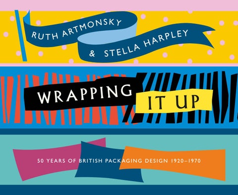
R U T H A RT
NSKY O M
&
A H A L L E ST
G N I P P A WR
EY L P R
IT UP
5 0 Y E A R S O F B R I T I S H P A C K A G I N G D E S I G N 19 2 0 – 19 7 0
G N I PP
A R W P U IT
a pa c k h s i B ri t
de s i g g i ng
f a rs o e p l ey y r a 0 5 H 0 Stella –197 & 0 2 y 9 k 1 mo n s t r A Ru t h
n
CONTENTS 9 Introduction 11 The Development of Packaging 19 Packaging Designers 37 Wrapping Chocolate 55 Own Brand Packaging 67 Packaging Designers 87 Advertising Agency Designers 97 Own Studio Designers 115 Epilogue 117 Bibliography
THE DEVLOPMENT OF PACK AGING ‘Among the many branches of commercial art one of the most fascinating, perhaps, is the developing of Wrappings and Packings. It is a field which is, at present, practically untouched and yet is very great and varied.’ Commercial Art 1924
P
ackaging, presumably, might be traced back to pre-
There are tales of early book publishers who, when
history, when primitive man turned to whatever was
unbound books were not selling well, passed the pages on to
at hand – a leaf, a gourd, tree bark or animals’
apothecaries and grocers as wrapping paper. Although there
innards – to wrap something he valued and wanted
was some formal packaging for such products as quack
to keep or carry from one place to another. Much
medicines, tobacco, tea, pins and playing cards
has been made of examples such as Egyptian
by the 18th century, for many goods, for many
pots for eye-shadow and Greek and Roman
well into the 20th century, it was a matter of
amphora and the likes, but Jankowski’s Shelf
their being delivered in bulk to a retailer. It
Life has ‘modern’ packaging, and one might
would then be the retailer’s job to cut or scoop
even say branding, dating to around 1550,
quantities to be weighed and carefully wrapped
when a German paper maker wrapped bundles
to the requirements of the customer. Even in
of his stock with paper –
the 1940s grocery assistants, in such chains as Lipton’s and Home & Colonial, would meticulously cut slices of cheese or butter from an anonymous block whilst the
‘with a printed design…a spirited woodcut of a horse,
customer waited patiently, meanwhile discussing some snippet of
his name, and his shop’s location’
neighbourhood news. It was only in the 19th century that manufacturers began
Opposite: Packaging becomes crucial with the coming of supermarkets
to appreciate, to any extent, that packaging could serve beyond
Above: Automatic packaging, an early packaging machine
11
Wr APPINg IT uP
Advertisments from Sales Appeal & Packaging Technology, 1961
12
PACK AGING DESIGN PROTECTION
W
riters on the history of packaging have became
or spillage of contents from the inside must be prevented.
increasingly interested in its service as a medium
Further the designer needs to consider how the package
for advertising, and have tended to put its protective
will be used in the shop and in the home – opened, resealed and
function to the background as an altogether less interesting and
stored; if the product is dangerous, is it sufficiently protected from
certainly less glamorous aspect, as with The Design Council’s
prying little hands, and so on. The designer Hulme-Chadwick
publication Packaging Design, 1991, almost entirely focused on
humorously addressed a Cake and Biscuit Alliance audience in
the marketing potential of a wrapping. But any product has to
1964 on the matter –
pass from the manufacturer to the wholesaler and/or retailer and on to the consumer in a pristine state and maintain it as long as is
‘the difficulty met by the consumer who first looks in
necessary. In such a journey, by road, rail, sea or air, its packaging
vain for a suitable opening, then immerses himself in
is exposed to a series of possible ‘dangers’, and it is to these that
several layers, ranging through cellophane and grease-
designers of packaging must initially address themselves.
proof paper to corrugated card, usually managing at
A package may be knocked, dropped, scratched, vibrated,
the end to break several biscuits or to stick his finger
and buffeted; may be permeated both biologically and climatically
through perfect icing.’
– by fungi, mould, bacteria, insects, vermin, light, heat, cold and And, as has been already noted, it was the breakability of
moisture. And along with these ‘dangers’ from the outside, leakage
biscuits that led to one of the early essays into packaging when the baker Thomas Huntley, swamped by demands from coaching
Opposite: Traditional packaging in the age of modernism, 1938
19
WR APPING IT UP
passengers, called in his brother, a tinsmith, to start on the design
for display, and stacking that is economical of space in the
of the biscuit tins that are now collectors’ items.
average home kitchen. This has led most packaging designers to resort to the simple cube or box shape with some kind of internal structure to hold the product tightly as with egg boxes, bottle
SHAPE
carrying packs or packets for light bulbs. Only the
Objects to be wrapped
more risk-taking designer
come in all shapes and sizes
would argue for a ‘novelty’
and the package designer
shape as de Majo with
has to accommodate this.
his pyramid for perfume
From golf and tennis balls
or Derek Mills with his
to cutlery and scent bottles
triangular ‘Tetra Pack’ for
and eggs, all have their
Express Dairy Milk.
challenge for the designer
A further aspect of
who has a range of three-
shape – size – is also key
dimensional possibilities
when it comes to stacking
from which to choose for
for economy of space.
a solution – pyramids,
Sometimes designers
spheres, cones, cylinders,
were tempted, or actually
and the more common
encouraged, to provide
cubes and rectangular
Cosmetics gift packaging by Willy de Majo, 1959
prisms (boxes); but the
a much larger pack than was necessary so that
more courageous could experiment with totally irregular shapes as
the product should not look insignificant when compared to its
one tightly silhouetting the product.
competitors. And height has continued to be a consideration
The key criterion when it comes to shape is ‘stacking’ –
with such products as breakfast cereals and olive oils when it
for moving products from factory to warehouse to retailer to home
comes to fitting into the standard kitchen cupboard shelving.
– stacking that is secure for protection, stacking that is attractive
Charlton in his The Art of Packaging played it safe when it
20
PA C k A g I N g D E S I g N
‘The average design for a moderate priced tea wrapper is out-of-date, completely lacking in selling power, ineffective in display…’ Only occasionally were there glimmers of hope as when Commercial Art, in 1931, reported – ‘…hard-hearted gentlemen of industry are growing weaker and weaker in their resistance to clothing their products in gay appeal. Once they seemed to feel it rather undignified to place their sterling products in boxes and cartons and to package wares which for generations have been sold on their merit and in spite of their painfully unattractive appearance.’ Other publications, not previously known for paying much attention to packaging, began to take note, as when the 1933 Penrose Annual declared – ‘a whole new field of work has opened up in the field of graphic arts by the growth in the use of packages, and it is a field which has not by any means yet reached its limits.’ Progress in the growth of packaging design as a profession was put on hold by the onset of war. It was not until the immediate post-war years that the Institute of Packaging was
Cover for Sales Appeal & Packaging Technology, 1962
33
WR APPING IT UP
founded (1947) initially with its own headquarters, providing club
1937 The Art of Packaging. That many concerned in different
facilities for members and putting on exhibitions. The Institute
ways with packaging were aware of its publication were the
established standards and developed educational programmes with
various hypes by William Crawford (advertising agent), F.N.
examinations; by the late 1950s there was an established qualified
Hepworth (Chairman of Metal Box), W.M. Larkins (of J.Walter
membership scheme.
Thompson), Norbert Dutton (then freelance) and Milner Gray in 1938 in Art & Industry, Crawford’s being in
Yet little was happening in the art colleges, which had
his grandiose style –
hardly got round to recognising the need for product design courses, let alone packaging ones. An exception was Manchester Education authority which not only combined with the Institute,
‘This book, by one of the most able exponents of
in 1961, to lay on a packaging conference at its College of Science
the subject, comes at a momentous stage in the
and Technology, but offered a £500 Packaging Design Fellowship
development of packaging. It reveals brilliantly
at its College of Art & Design.
the astonishing advances made in recent years.’
Meanwhile specialist publications were beginning to The Institute did not bring out its Fundamentals
appear. Shelf Appeal, which had been in existence prior to the war, was overtaken by Sales Appeal and similar titles – The British
of Packaging until 1962, some seven years after Britain’s own
Packer, Packaging, the Packer and Shipper, (all based in London),
packaging guru, Milner Gray, had published Packaging Design. So, by the late 1960s, Britain had its own professional
along with the Manchester based Packing Review. Packaging News came on to the market in 1957 and by the mid-60s the Society of
packaging design body, its own professional qualifications,
Industrial Artists newsletter described it as –
a range of related journals, and all of this ‘underwritten’, as it were, by relevant research and proselytising emerging
‘…the most comprehensive packaging newspaper
from the Printing, Packaging & Allied Trades Research
in the world sent free to anyone concerned with
Association at Leatherhead. The newly formed Design
companies’ packaging policy/execution.’
Council also offered support by laying on exhibitions and offering space for members of Society of Industrial Artists (SIA) to show off their work in packaging, which, for example,
When it came to textbooks the Americans, who were always a few steps ahead when it came to the technology and
Hans Schleger took up with his designs for the British Sugar
design of packaging, published an early ‘bible’ – DEA Charlton’s
Corporation.
34
pac k a g in g desi g ne r s
Milner Gray packaging for Needles Industries Ltd, 1940s
71
WR APPING IT UP
In the 1950s and 60s Grays name was appearing continuously in the design press for a variety of projects including his packaging work for the Mid-Sussex Canning Preserve Co., the Rolex Watch Company and Tate & Lyle. By 1955 his packaging experience was such that he felt sufficiently confident to put his ideas on the subject into what became a textbook Packaging Design. In this he not only placed packaging design firmly within a company’s marketing activities, but raised it from surface graphics to a matter of serious research, problem solving and validation – ‘design is a process of analysis, synthesis and genesis’. Well abreast of the technical as well as the aesthetic aspects of packaging design Gray had already noted in an article in the Penrose Annual for 1940 that – ‘designing for machine production has this difference from designing for handicraft, that it calls for not manipulative but for mental fecundity.’ In an address to the Royal Society of Arts in 1959 he summarised his opinions on the necessary talents of a designer – ‘He should be a creative artist, an experienced technician and a good organiser. He should be sensitive to the trends in world fashion. He should have the personality to get his opinions a hearing at management level; and the courage to fight his convictions.’
Milner Gray beer bottle labels for Courage & Co. Ltd, 1950s
72
OTHER BOOKS BY RUTH ARTMONSKY Jack Beddington, a footnote man, 2006 The School Prints, 2006 Art for Everyone, 2007 A Snapper up of Unconsidered Trifles, 2008 Bringers of Good Tidings, 2009 Shipboard Style, 2010 ‘Do you want it good or do you want it Tuesday?’, 2011 Designing Women, 2012 The Pleasures of Printing, 2013 Showing Off, 2013 Exhibiting Ourselves, 2014 Moving the Hearts and Minds of Men, 2014 Unashamed Artists, 2014 Art for the Ear, 2015 Here’s to Your Health, (with Stella Harpley), 2015
Tom Purvis: Art for the Sake of Money, 2015 The Best Advertising Course in Town, 2015 Powering the Home, 2016 From Palaces to Pre-Fabs, 2017 The Golden Age of British Advertising, 2018 P&O, a history, Shire Publications, 2012 P&O, across the oceans, across the years, Antique Collectors’ Club, 2012 The Design series with Brian Webb published by Antique Collector’s Club – Design, Lewitt-Him, 2008 Design, FHK Henrion, 2011 Design, Enid Marx, 2013