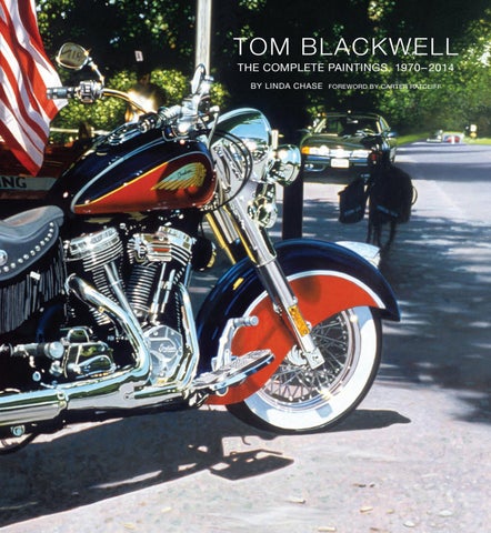
TOM BLACKWELL THE COMPLETE PAINTINGS, 1970 – 2014 BY LINDA CHASE
FOREWORD BY CARTER RATCLIFF
FOREWORD
THE REFLECTIVE SURFACE: ON THE ART OF TOM BLACKWELL TOM BLACKWELL is a major practitioner of Photorealism, one of the most important developments
in the history of American art. Its importance is two-fold. First, Photorealism takes to extremes the use of readymade imagery. That Blackwell and others who work in this style are often the authors of photographs they replicate on canvas—that is, they create their own readymades—should not distract us from a crucial point: Photorealism is a literalist transcription of found images, artifacts produced not by the artist’s hand but by the camera. The hand enters as the transcription begins and it is notable that each of the Photorealist painters has a distinctive touch and this distinctiveness points to the second reason for the style’s importance: Photorealism puts individual sensibilities in unmediated contact with photography, which is both a symbol and an agent of the impersonality that we encounter at every turn in contemporary life. Neither denying nor in any way qualifying this impersonality, the Photorealists accept it fully. They then redeem it and infuse it with life as they turn photographs into paintings. At a quick glance, a Photorealist painting is a snapshot transposed to canvas, a display of virtuosic skill. But a quick glance is never adequate. To an extended gaze, Blackwell’s paintings reveal the larger meanings of the moments he has chosen to picture. He gives us a vision of being, and in saying this I want to emphasize the word vision. The importance of Photorealism in general and in Blackwell’s version in particular is that, unlike so much art of the past century, it confronts us directly with the look of familiar things. No idealization, no stylization, no irony or evasion—just the world, its appearances mediated solely by the artist’s deliberately unobtrusive technique. Blackwell’s paintings are beautiful, they are absorbing, and, above all, they provide believable testimony about the environments we all share. His art invites us to delight, profoundly, in the truth. During the 1960s, he moved from abstraction to Pop-influenced mixtures of images gathered from various print mediums. In 1970, as he was working on one of these multi-image paintings, he found himself focusing on just one—a photograph of glittering tailpipes that he had torn from a motorcycle magazine. This, he saw, should constitute the entire image. Additional images would be distractions. Blackwell had become a Photorealist. Impressed by the clarity of his images, we assume that he must take a particular interest in the things he paints—that he pictures motorcycles, for example, because he is a motorcycle aficionado. But, as he says, he has never ridden one in his life. Nor do his paintings of shop windows on Madison Avenue or in Monaco signal a devotion to high-end consumer goods. His interest is in the visual complexity of his subjects: the chrome-plated intricacy of a motorcycle engine, the layered translucency of a window display. Because that complexity appears in the photographs Blackwell turns into paintings, a question arises: Why carry out this transformation? The question becomes all the more insistent when we note that he made only three paintings from photographs found in motorcycle magazines. Since 1971, he Opposite: Detail of North Beach Leather, 1983 (plate 73).
has been working from pictures he takes. He is a brilliant photographer. Why is he not satisfied with his mastery of that medium? The obvious answer: because he is a painter. But what does that mean?
11
To paint, for Blackwell, is not merely to mirror the look of things. It is to enter the world, to embrace it in a way that brings it alive for him not only as form but also as the reality he shares with his viewers—with everyone, potentially. Painting is the medium of his existence. He cannot claim this shared world for himself and yet his wet-on-wet brushwork infuses it with his distinctively acute attentiveness. Shaping objects with translucent glazes of color, he gives them solidity as well as luminosity. Drawn to the surface of the canvas, we see the understated elegance of his brushwork become equal in importance to the things he depicts. As a picture becomes indistinguishable from the process of picturing, we sense how completely Blackwell’s intention has captured some portion of our world. As he says, “to paint each area is to make it your own.” That is his purpose and it explains why he is not satisfied to be a photographer. No matter how carefully a photograph is planned, it contains much that is unintended, unmeant, and therefore no one’s responsibility. Blackwell, by contrast, wants to be responsible for every detail of an image. He wants everything we see to be thoroughly meant. He is a painter because painting allows him to realize this desire. With the unflagging responsiveness of his eye and painterly touch, Blackwell reveals what he calls “the ineffable in the commonplace.” He shows us nuances of light and atmosphere and quietly startling variety of surfaces: rough, smooth, powdery, slick, grainy, rubbery. Looking closely at his images, I feel my tactile responses intensified. What I am seeing acquires weight and heft. Realizing that I share my physical state with a pickup truck, for example, or a shop-window mannequin, I feel a sort of kinship with these objects. This is a connection made across an unbridgeable divide, for of course I am excluded from the scenes Blackwell depicts. Or, rather, he includes me in a manner almost too subtle to describe. I am helped here by one of his statements: “A common element of all my painting is the reflective surface.” Many have noted the reflectiveness of the chrome and the sheets of plate glass that appear in so many of Blackwell’s paintings. To extend the list, we could mention high-gloss automobile paint, the metallic exteriors of commercial buildings, and mirrors. As the artist says, these reflective surfaces “expand the space depicted to include things actually outside the scene encompassed by the canvas.” Thus the image of a person standing outside the frame can be seen, much distorted, on the curved form of a chromed exhaust pipe. And Bergdorf’s at Dusk (plate 107), 1992, shows a silhouette of the Pulitzer Fountain floating in the depths of a window display at Bergdorf Goodman’s. Introducing complexity into our everyday view of the world, these reflections sooner or later induce the same quality into the experience of looking at Blackwell’s paintings. We go from a simple recognition of things to an examination of the way they have been depicted and onward, to an intuition of meaning. Our interpretation of reflections becomes reflective, contemplative, even meditative. As sheer images, Blackwell’s pictures of shop windows are formally entrancing and yet we never read them as abstractions. They are images of real things, however elusive, and their complexities draw us into the imaginary space of the picture and beyond, into speculative realms where realities acquire symbolic overtones. We feel the ambiguities built into the promises made by the consumer goods on offer in his windows and we understand his pictures of motorcycles, automobiles, and trucks as invocations of a restless way of life. Fully conscious now that Blackwell’s images are much more than photographically accurate renderings of appearances, we begin to see that his art is alive with metaphor. So in retrospect, it seems inevitable that he would have made the montage paintings, for these works are explicitly metaphorical.
12
POST-POP TO PHOTOREALISM WINTER WAS APPROACHING . Life on the barge became untenable and Blackwell moved in with a
friend of a friend from his Woodstock days who had an apartment in the East Village and who would introduce him to the woman who would soon become his wife. This was 1968, just the beginning of the artist-loft era in Soho, and the Blackwells were able to purchase a floor in a co-op created out of what had been an abandoned doll factory on Prince Street. A dark, cavernous space filled with nine tons of industrial debris and rows of windows front and back that were all painted black, it did not look promising, but it offered 3,600 square feet of space and the excitement of being part of a still-nascent but lively and growing art community. The loft conversions had attracted a phalanx of hippie workers, among them the Hog Farm, an offshoot of Ken Kesey’s Merry Pranksters who Tom Wolf made famous in his best-selling book, The Electric Kool-Aid Acid Test. Armed with sledge hammers and crowbars, and impervious to the grime, the members of the Hog Farm took on the demolition, leaving as a memento over the doorway their signature graffiti of a winged pig. Six months later, with the help of artists and actors turned carpenters that Blackwell knew from Group 212, the loft had been become a sprawling living and workspace for Blackwell, his wife, and her 4-year-old daughter, Leila (fig. 8). As a young artist, Blackwell’s experimental work had been eclectic, from a VW bug covered in multicolored Styrofoam to carefully drawn Surrealist ink drawings and intensely colored abstractions, and his influences and the artists of the past he admired were eclectic, too—from revered Old Masters such as Caravaggio, Vermeer, Van Dyck, and Ingres, to Eakins and Sheeler, and the Surrealists, particularly Magritte. The influence of the Abstract Expressionists was impossible to escape for artists of his generation, but by this time it was the Pop artists’ embrace of both figuration and prerecorded imagery that made the greatest impression on him.
Fig. 8. Life Magazine photo spread, “Living Big in a Loft,” March 27, 1970. Tom, his wife Linda, and stepdaughter Leila (on bicycle).
25
take out wall plugs and lights @ prepress
Fig. 9. Gook, 1969. Oil on canvas with assemblage, 79 × 97 in. (200.6 × 246.4 cm). Private collection. Fig. 10. James Rosenquist, I Love You with My Ford, 1961. Oil on canvas, 34 × 36 in. (86.4 × 91.4 cm). Collection of Moderna Museet, Stockholm, Sweden. Photograph © Moderna Museet/Stockholm. Art © James Rosenquist/Licensed by VAGA, New York, NY.
By the end of 1967, Blackwell had become disenchanted with his abstract work, feeling he had done what he wanted to do in that genre and that it had become repetitive and uninteresting. Ensconced in his new, large studio, he began a series of Pop-influenced figurative paintings, combining images he had culled from newspapers and magazines. These works relied on unexpected juxtapositions that were often rife with social commentary. As with much of his very early experimental work, his goal was to push the bounds of perception and to test the limits of the physical constraints of painting as well. The pieces had radical shapes and images that asserted themselves beyond the confines of the canvas. Many of the works had assemblage elements. Recommended Dosage featured a pre-assassination Bobbie Kennedy, a Buddhist monk, a huge pill bottle spilling its contents and, in the bottom corner, fingers inserting a dime in a meter. In Gook (fig. 9), the most political of these paintings, Blackwell reproduced the iconic news photo of the Saigon street execution of a Viet Cong prisoner. The grainy newsprint photo of the prisoner becomes a serial image, leaning and falling, the gun against his temple. Extending out from the top of the canvas is an astronaut’s spacesuit, and along the bottom Blackwell depicted another serial image, this time from a cough medicine advertisement. A compelling expression of Vietnam-era angst, Gook was included in the 1969 Whitney Museum of American Art exhibition, Human Concern: Personal Torment, the first of Blackwell’s works to be shown in a major New York museum. At this point, Blackwell began to look for a New York gallery to represent him but found it impossible to get any major gallery to even look at his work. “In the late sixties, the art world was like a club that didn’t want new members,” he said. “You would buck yourself up to take your slides around only to be confronted by an icy receptionist who would inform you that they only looked
26
THE MANNEQUIN SERIES THE REFLECTIVE QUALITIES of chrome and metal have intrigued Blackwell since his first motor-
cycle paintings. In the mid-1970s, with Main Street (Keene, NH), Takashimaya, and GM Showroom, he turned his eye as well to the visual cornucopia of the urban environment and began exploring the complexities offered by the reflective qualities of plate glass as captured by the camera. The window paintings take advantage of the dual aspect of glass as both reflective and transparent to depict multiple realities simultaneously, and this contrapuntal interplay between interior and exterior imagery has increasingly intrigued him. His 1979 painting, Bendel’s (fig. 26), took this concept into a new arena, initiating a theme he would continue to pursue throughout his career. Like so many artistic leaps, this painting was partly the result of fortuitous happenstance. The somewhat scruffy male figure looking out at us from the center of the painting is Blackwell’s longtime friend, film director Hal Ashby, who was visiting New York for the premier of one of his movies. Ashby was staying at a nearby hotel and the two men were taking a walk down Fifty-seventh Street. Struck by the quality of the light hitting the rather extraordinary display in Bendel’s window, Blackwell stopped to look at it and, seeing his friend’s image in the reflection, snapped a roll of pictures. This became the first in a long series of paintings that concentrate on the contrast captured so compellingly here between mannequins posed in a glamorous store display and ordinary people whose reflections are caught in the window as they walk by. A watershed painting, Bendel’s introduces several of the painterly issues Blackwell would continue to explore: the perception of depth as it interacts with the essential flatness of the plate glass, the canvas, and the original photograph itself; the perception of light and its translation on film; and the contrast between artificial interior light and natural exterior light. “The mechanics of high-speed film allow me to freeze the complex serendipitous moments
Fig. 26. Bendel’s, 1980. Oil on canvas, 74 × 96 in. (187.9 × 243.8 cm). Private collection.
43
that comprise the urban pedestrian experience,” Blackwell stated, describing these works. “There is the static ‘still life’ of the window’s tableau with its artificially lighted, highly idealized mannequins. Ersatz people in a stagelike setting, the mannequins present a backdrop for the teeming urban world reflected on the plate-glass window.” In traditional Realist painting, the frame of the canvas was sometimes seen as a window. In Photorealist painting, the frame of the canvas becomes conflated with the image framed by the camera’s lens. Blackwell has taken this framing idea even further. In the mannequin paintings, the tableau in the interior of the store is framed by the window and by the architectural elements surrounding it. He depicts these store windows either straight on or at a slight angle, and often includes strips of awning along the top, sections of sidewalk along the bottom, and structural elements of the building. The varied textures of marble, steel, and concrete contrast with the glass, reinforcing our awareness of its reflectivity, and often serving to anchor the ephemeral, mysterious fusion of imagery, as in Saks (plate 71), Herald Square (plate 75), Sequined Mannequins (plate 82), and Sunday in New York (plate 85). In some paintings, the reflective quality of marble itself becomes an element, as in Cinema I and II (plate 65) and Lexington and 59th (plate 105). With the incorporation of photo blowups within the displays, Blackwell takes this idea of framing a step further, quite explicitly in the painting In the Frame (plate 118) in which the model peers out at us from a gilt frame, seemingly more “real” than the static, bald mannequin next to her, and more engaging than either the mannequin or the young man walking away from us down the street—a reminder perhaps of the riveting power of the photo image. The interplay of the real and the unreal has intrigued Blackwell since he first began photographing and painting the store windows. A paradox of these reflected scenes is the fact that the ersatz or artificial people in the paintings are real and the real, actual people are merely reflections. The photo blowups, which are real posters within the window, portray live models but at one remove, complicating and enriching this idea further. In The Red Door (fig. 27), the frames within the frame multiply. The frame of the blowup of the model on the left mimics the frame of the red door itself, while another female face peers out at us from deep within—or is she a reflection of a photo blowup from somewhere across the street? The circular windowed panels high above the door capture the reflection of a large male head, doubled by the layers of glass, which seems to hover mysteriously in space. The result verges on the metaphysical but is a particularly intriguing example of what Blackwell calls the “found surrealism” of everyday life. Perhaps no painting explores this better than Odalisque Express (fig. 28). Blackwell had been out taking pictures along Lexington Avenue and was on his way to the subway when he saw a huge blowup of Ingres’ iconic nineteenth-century painting, The Grand Odalisque, in the window of the Express store. He shot the few frames he had left in his camera knowing that he had struck visual gold. In his extremely complex, large-scale painting, the odalisque coolly peers out at us, challenging us with her sideways glance of apparent disdain, her nude figure contrasted with and overlaid by the objects for sale in the store, a nearly full garbage can, and people walking by on the busy street—what Blackwell has called the “riffraff of ordinary life”—a world that in this painting is reflected with a staccato-like doubling, the result of a protective plastic sun shield that covered the window. Caught by the camera, though barely noticeable to the naked eye, it is an effect that Blackwell chose to reproduce for the added complexity and energy it gives to the image. Art after art, a type of painting in which artists use or reference famous paintings or traditional themes from the past, has a long history going back at least as far as the nineteenth century and
44
IN THE ARTIST’S WORDS MY PAINTING PROCESS THE BEGINNING OF EACH PAINTING is the photograph, but perhaps it is more true to say that the
beginning of each painting is looking. I almost always have my camera with me and some paintings are the result of happenstance, something that caught my eye, whether it is an unusual and intriguing viewpoint, as in my painting Queens Boulevard, or a great window reflection, or something interesting in the contrast between a bike and the location where it’s parked, or maybe just the way the light is hitting the chrome. My photographs are snapshots—I don’t use a tripod or set them up in any formal way. I want to be able to move around easily and shoot from different angles and distances. I use a 35 mm handheld camera and when I see something that interests me, I snap many shots in quick succession. Originally I used slide film. I switched to digital about six years ago, but the process is the same. The nice thing about digital is you can see the results right away and you can take as many shots as you want without worrying about running out of film or the cost of developing it. It’s very freeing. If I think I have something I might want to paint, I take additional close-up shots of the window display and surrounding architecture for later reference, if it’s a window, and if it’s a bike, I take additional shots of anything that might show up in the reflections as well as close-ups of the reflections themselves. I find I can’t paint something properly unless I understand exactly what I’m looking at. There are a few cases where I have been asked to react to a particular city or location. The Monaco and Zurich locations are examples of this and I got some wonderful material in both places. Once in a while I set up a shot, as I did for the paintings The Blue Dress and A Life in Motion I. In both of these, I picked a location and angle, and had my wife take the shot because I wanted to be in the reflection myself—a riff on the artist self-portrait. Once in a while, I will combine aspects of two different shots to create a painting—perhaps the reflections are better in one shot but a figure walking by is more natural in another—but in general I prefer to accept the photo information as is and won’t add or change anything that compromises the “found” quality that is such an important aspect of this work for me. For every painting I make I have taken hundreds of shots. One of the wonderful things about photographs is that you never really know what you will get. I’ve taken thousands of pictures of store
67
The artist painting Queens Boulevard in 1974.
windows by now and there are some general principles that I have learned over the years: when interior light predominates, the reflections recede and the interior of the store becomes more dominant; when there is less interior light, the reflections become more evident. The time of day a photo is taken is crucial in this regard. The best shots are usually when the sun is hitting the stores or facades across the street; if the sun is hitting the window itself, it will often wipe out the reflections entirely. I love accidental juxtapositions and contrasts between the real and the artificial world that show up in the reflections, and the camera can often pick up strange or unexpected things. No matter what you think you are seeing in the viewfinder, the result will show you something unexpected. Sometimes I will blow up an image and be totally surprised by what is reflected on the glass. You think, “How on earth did the window reflect that building way off to the left from where I was standing and with the angle I had of the shot?” That can work both ways. Sometimes, the camera will reveal marvelous unexpected viewpoints, angles of reflection or passersby you didn’t notice. Other times, I can look at something—a great window or a bike parked in what seems a really interesting location—and take dozens of pictures, and when I blow them up back home I can’t see what I thought would be so great. Each of my paintings takes months to do, so I can only paint a very small portion of the images I take, even of those I really find interesting and hope to get to. So a lot of thought goes into the choice of an image. Once I’ve decided to paint something, the next decision is the scale. Some images just demand to be large and others work on a more intimate scale. I’ve done several very small pieces— six by nine inches—in recent years because I like seeing what effect miniaturization has on perception.
68
The artist working on Takashimaya, 1974.
I begin each painting with a very precise pencil drawing based on the photographic information. Originally I blew up the image with a slide projector; now I use a digital projector. The drawing is basically a map of what the painting will be. Over the years, I have developed a kind of personal shorthand— depending on the kind of pencil mark I make I can tell whether it is a hard or soft edge, whether I am indicating a tonal change or a color change.
69
I use a white preprimed canvas and then put on two or three additional coats of gesso, sanding in between to get a smooth surface but one that is not too glassy. I want to preserve a little of the canvas tooth for the paint to adhere to, but if the canvas is too rough or the weave isn’t smooth enough, it will be difficult to get the level of detail I want for the finish. As a general rule, I begin the painting on the left side, painting from left to right because I’m right-handed and I want to be painting away from wet areas. However, I often move around the canvas, working on different areas, sometimes to allow for drying time, or other times because I want to approach a different area of the painting, either to start to see how the different elements will work together or simply because it is what interests me the most at the moment. Color is for me the essence of painting and I build the image using primarily thin washes of transparent paint. I make as much use of transparent colors as possible to attain the greatest luminosity. In key areas, I add opaque pigment in a matching or related color. For me, the richest possibilities exist in a dialogue between opaque and translucent areas. I often work wet on wet to allow for a certain amount of blending of the colors, but working with the glazes, as I build them up, it is very important that the underlying layer of paint is dry so as not to mix with the overlaid applied glaze. In my earlier paintings, this approach required about a week of drying time for each layer. Today, I use Japan drier, a painter’s drying agent that I mix with the oil colors so that what I paint on one day is dry the next. In the finishing stages of a painting, I will sometimes use a clean, slightly moistened brush to remove paint from a specific area of a highlight to allow the underlying color to peek though. This effect is much richer than a plain opaque rendering of the area would be. I will give each area two or three layers to bring it up to a certain level of clarity and color. The image will be laid down then and might even seem finished. It’s at this point that for me the magic happens. I will spend a month or much more on a large painting refining the details, but even more important, making adjustments in the color and tonal relationships, often using transparent glazes as described. These sometimes seemingly slight adjustments complete the verisimilitude, clarifying the spatial relationships, the modulations of light—what I sometimes call in the window paintings “putting in the glass.” Unlike some of the other Photorealists, I am not interested in replicating the smooth, impersonal surface of the photograph. I like to maintain some awareness of the artist’s hand: from a distance, the painting may look like a photograph but close up the viewer is very aware of it as a painting. When I began working from photographs, I realized that it isn’t just the world we live in that I was interested in depicting but also our method of recording and perceiving it—the photograph itself. The camera enables me to confront freshly, as if seen for the first time, not only particular scenes, but also views and viewpoints we take for granted. But more than just a means of capturing the image, the photograph is part of the subject of the painting. Each of my paintings is the result of painstaking, analytical, and loving translation and transformation of that visual material into paint. My goal is to replicate the visual experience that impelled me to choose to paint the image in the first place. I try to create an illusion in much the same way that a good lawyer constructs an airtight legal case. I want the viewer to see what I saw, hopefully to feel the excitement and fascination I felt. My approach is perceptual rather than mimetic. I’m not interested in detail for its own sake or precision for its own sake, but rather in orchestrating all the elements to create a work that is illusionist yet painterly: work that speaks to the contemporary urban condition and is informed by the traditions of both realist and abstract painting.
70
92
93
PLATE 34
Shatzi, c. 1975. Oil on masonite, 17 × 22 in. (43.1 × 55.9 cm). Private collection.
PLATE 35
Escape II, 1973–1975. Oil on canvas, 15 ½ × 19 in. (39.3 × 48.3 cm). Private collection.
103
104
PLATE 55
Bendel’s, 1980. Oil on canvas, 74 × 96 in. (188 × 243.8 cm). Private collection.
113
PLATE 68
Broadway, 1982. Oil on canvas, 90 × 60 in. (229 × 152.4 cm). Private collection.
120
121
PLATE 161
Morning Walk, Hampstead High Street, London, 2012. Oil on canvas, 50 × 40 in. (127 × 101.6 cm). Private collection.
169
PLATE 162
The Blue Dress, Monte Carlo: Homage to Ingres’ Princesse de Broglie, 2011. Oil on canvas, 54 × 84 ¼ in. (137.2 × 213.9 cm). Private collection.
170
PLATE 168
Exiting Celine, Monaco, 2014. Oil on canvas, 52 × 80 in. (132.1 × 203.2 cm). Private collection.
177