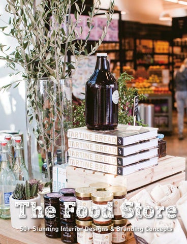
Front cover photography: © Project M Plus (Meiwen See) // Jayde's Market Back cover photography: © Hotel Daniel Vienna // Daniel Bakery
$30.00 [USA] £25.00 [GB]
Contents Foreword
4
148
RL
156
35 GRAMMI
152
Maison Marou Saigon
160
Motín
Ice-cream Parlors
Case Studies Bakeries & Pâtisseries
164
Maui Pops
180
Softsrve Ice Cream & Dessert Bar
168
ZERO-e ice cream café
184
Winter Milk
10
Gaudenti 1971—Vittorio Emanuele II
62
Mister Baker
172
Prossima Fermata—ice cream laboratory
188
Milk Land
14
Belle Époque
66
Gard’Ann Patisserie
176
Kinber Made
192
Spooning Cookie Dough Bar
18
Coconut Pastelería
70
Pâtisserie NUMOROUS
22
Flour and Salt Bakery
74
Tafelzier Patisserie
26
Home Bakery
80
PavoMea
30
Lust auf Vollkorn—concept store
86
Pâtisserie Es-T
34
M Tang
90
Yí PATISSERIE
38
Laura’s Bakery—Værnedamsvej
94
Temper Chocolate & Pastry
42
Ciambelleria Alonzi
98
Pâtisserie Alex
46
Daniel Bakery
102
BLANCHIR
50
Mökki
106
Mélimélo
56
Meet Mia
110
cadeau de rincotté
Delicatessens, Food Gifts & Grocery Stores 196
Choya Ume Specialty Shop
218
Kostarelos
202
Jayde’s Market
222
Sushi Bento—Kameari store
208
HI-LO Liquor
224
Villa de Patos
214
Abarrotes Delirio
228
Jugen
Conversations: The Designers 231
id inc.
236
kissmiklos
234
TOC. designstudio
239
Union Atelier
Cafés & Restaurants 114
Cafe Ki
132
Julieta, Pan & Café
120
Citizen Sprout
136
El Moro
124
Casca
140
Sabah
128
DON JUAN coffee & cakes
144
Maruzen Tea Roastery
Credits
242
Index
246
Foreword Text by Paolo Emilio
Founding member of NINE associati, Emilio Bellisario is an architect and designer located in Italy and professor
Bellisario
of the master’s degree course in Interior Design of IED Milano. He was also the co-founder and CEO of ZO_ loft architecture and design—an award-winning collective of designers focusing on innovative, iconic, and flexible design products—as well as Editor and Head of External Relationships at Cityvision magazine. Emilio has contributed articles to several books and magazines and organized events, exhibitions, workshops, and international competitions, referring to the topics of globalization, urban utopias, and additive technologies. Winner of a number of important international prizes and awards, he has also been invited to exhibit— as architect and designer—in many international exhibitions. His work has been documented by the most important specialized magazines and publishings worldwide.
“You can’t do the same thing in San Francisco [as] in Paris. What matters is
The first point is using the shop as a
the physical and conceptual context, which is why I need [to make] a very
medium to tell and involve in a learning
careful [analysis of the work], before designing: [by] studying history, literature, geography, even poetry and philosophy … We have to invent a new solution [each time] and books help us.”
path while shopping. The second point is enabling connections with the territory. On the one hand, then, retail designers must be able to interpret a project brief, analyzing brand’s competitors,
This quote was by Gae Aulenti—one of the few well-known female architects working in Italy, distinguished by her innovative creations both in Italy and abroad, following a proactive vision linked to the past, but always strongly projected towards the future— and I strongly agree with her sentiments. While having a brand identity is definitely important, having a retail identity is becoming increasingly vital. Having an identity—whatever it is—is the big deal. People want to identify themselves within a brand and that brand must have its own statement, a believing in which consumers can identify themselves. Similarly, the store must have its own identity that needs to coincide with that of the brand. The store space must express the same distinctiveness when customers are inside. As such, the brand identity needs to match
sensing the market changes focusing on the most flexible, exportable, and repeatable solution, too. On the other hand—as Gae Aulenti always stressed during her life and as I, too, believe—going back to the physical context, the history, the local materials, looking at local craftsmanship and typical workmanship, or simply
with the shopping experience.
analyzing the society, the people’s needs,
In an era in which Google, Pinterest, Instagram, Facebook, and other social media
starting point for designers who are
platforms have often replaced books and specialized magazines, the abuse of the
asked to create a retail project.
internet and social networks, as project inspiration platforms, has levelled out. The online phenomenon has improved the designers’ know-how, standardizing their concept, their mood-boards, their strategies, their design language, and their quality of projects, too. So retailers live within the paradox of being authentic and innovative and, at the
4
understanding the brand’s values, and
their habits, it becomes a fundamental
Being able to interpret or re-interpret both of these elements allows retail designers to develop a unique creative strategy, their
same time, it is much more challenging to emerge and stand out from competitors.
personal expressive language to describe
What to do then?
innovative way. This is a design attitude
the brand experience to customers in an
5
12
Bakeries & Pâtisseries
13
12
Bakeries & Pâtisseries
13
16
Bakeries & Pâtisseries
17
16
Bakeries & Pâtisseries
17
Flour and Salt Bakery Flour and Salt Bakery is a chain of
The name of the chain was derived from the
represented by custom shapes that suggest a flour particle
in the custom-designed tiles in the floor and the neon
stores based in Taipei offering local and
purity and authenticity of the baked goods
and a salt crystal. The two elements were connected by
pendant lamps in the ceiling. The branding was echoed
Taipei, China
international baked goods and specialty
and their ingredients. It works well in both
a looping symbol meaning “and,” influenced by Japanese
in environmental graphics that activate the space with
1668 square feet (155 square meters)
food and drinks prepared with a focus on
Chinese and English, and in the Chinese
handwriting, which is commonly used throughout Asia.
patterns. The designers created a system of food and
organic ingredients.
version, there is a double meaning in one
Pentagram
2017
Pentagram was appointed to design the branding for the market-style restaurant, which involved creating a name from its ingredients—“flour” and “salt”—to become an
22
Bakeries & Pâtisseries
drink pictograms, which were integrated into the custom
of the characters, which also stands for
The color palette chosen was a utilitarian black and white,
black-and-white wallpaper and etched into the wooden
“conversation.” The English typography was
which was also used on the packaging. The contemporary
panels. Signage was understated, with the logo on an
set in Sofia Pro Black and Chinese characters
look and feel stands out from other restaurants in the
exterior façade and a functional magnetic menu board at
were custom designed.
marketplace, which often employ an illustrative approach
the main counter.
and earth tones to appear organic.
iconic identity. Additionally, the project tackled
The straightforward construction of
the design of the interiors, the graphics, and
the name was complemented by a
The identity was integrated into the restaurant interiors,
layout of the restaurant. The interior of Flour and Salt was
creation of environmental packaging.
logo comprised of simple graphic icons
also designed by Pentagram. The shapes of the logo repeat
crafted to be a large and open market-style space loosely
As part of the interior design, the team developed the
23
32
Bakeries & Pâtisseries
33
32
Bakeries & Pâtisseries
33
Ciambelleria Alonzi NINE associati
Handing down the craft secret of food
the organoleptic qualities of the products
required over time, without adjusting the masonry or
and confectionary traditions since 1890—
cooked in its oven.
having to change the furniture.
Driven by the need to renew the old wood-
The concept of their trademark Sallecone biscuit (made
oven and baking spaces that were no longer
with legume and carob flours) was inspired by one of
adequate for the fast-paced retail shop that
the city’s little-known historic figures, Cardinal Cesare
complemented the bakery, NINE associati
Baronio. The biscuit worked as both a delightful product
worked with the limited area—269 square
for visitors to take away and a useful device for sharing a
Situated in the center of Sora—
feet (25 square meters)—to transform
unique aspect of the city’s cultural identity.
hometown of Cardinal Cesare Baronio—
the old workspace into more an optimal
the family-run artisan company of over
and flexible floorplan. The new shop was
six generations used limited machinery,
designed to be able to adapt to both baking
preferring manual techniques, to enhance
and sales and allow for reconfiguration if
Sora, Italy
including the secret processing the
269 square feet (25 square meters)
ciambella sorana bread—the historic
2015
Italian Ciambelleria Alonzi required a new look and enlisted NINE associati to help them achieve it.
42
Bakeries & Pâtisseries
43
Meet Mia Marita Bonačić, Negra Nigoević Zagreb, Croatia 861 square feet (80 square meters) 2015
A Croatian cake shop located in Zagreb,
large luminous “HEY” welcoming sign. This
even travel up the walls to create depth
designers Marita Bonačić and Negra Nigoević
lighting piece also dictated other lighting
and character. The furniture—including
were approached to create the name, visuals
elements in the interior, with frosted white
padded benches, fixed circular tables, and
and packaging, product design, interior,
LED bulbs evenly dispersed across the ceiling
upholstered seats—have the typology of a
styling, and photo shooting of the store,
over the two zones becoming the leitmotif.
1950s diner.
which needed to be unified to write the
Soft ambient lighting (apart from the “HEY”
branding story.
sign), pendants, and an oversized felt “hat”
Based on the catchphrase and name of the store—”Meet Mia”—the architects decided
56
Bakeries & Pâtisseries
chandelier was situated in one zone, with a copper “candlestick” in the other.
Copper was used as an accent color and to offer texture to the plush setting. Mainly found in the décor, it was also placed in the chandelier and seating, as well as plumbing
to approach the interior design from a
Wedding gray walls, oak flooring, and white
tubes used to hang vertical gardens, menus
meeting-place perspective, which lead
ceramic tile, hexagonal ceramic tile was
and daily offerings.
to the space’s first signature element: a
used to spill into the timber floors and 57
58
Bakeries & Pâtisseries
59
58
Bakeries & Pâtisseries
59
Tafelzier Patisserie TOC. designstudio
Tafelzier Patisserie first opened its doors
and corporate wording, everything came from
subtle tones. White and gray with copper details met
in 2017 when owner and pâtissier Jens
the hands of the interdisciplinary office.
the current colors of the season. For spring and summer,
Nuremberg, Germany
Brockerhof—who had always been
1184 square feet (110 square meters)
fascinated by the perfection and sensuality
The concept that TOC. designstudio
of French pastry making—decided to inspire
developed for the brand included the idea
the people of Nuremberg with “sweet works
of expressing the change of seasons, not
In addition to the large refrigerated counter for fresh
of art.”
only in the product, but also in the interior
pâtisserie products, the packaged goods were presented on
design and corporate design. The change
an oversized cake, atop of which a white gorilla winks. A
was treated similarly to the fashion industry,
tasting area in the store allows customers to enjoy the sweet
which changes the collection twice a year.
delicacies along with a coffee in soft lounge armchairs.
pâtisserie. From naming and interior design
The overall appearance of the brand was
In order to meet the high precision of the pâtissier’s
to corporate design, photos, packaging design,
minimalist and elegant—a style with soft,
craftsmanship, the counter and built-in components
2017
In intensive workshops with the pastry chef, the team of TOC. designstudio developed a unique concept around the world of the
74
Bakeries & Pâtisseries
these became orange and red tones, and dark green tones in winter.
75
84
Bakeries & Pâtisseries
85
84
Bakeries & Pâtisseries
85
88
Bakeries & Pâtisseries
89
88
Bakeries & Pâtisseries
89
96
Bakeries & Pâtisseries
97
96
Bakeries & Pâtisseries
97
100
Bakeries & Pâtisseries
101
100
Bakeries & Pâtisseries
101
DON JUAN coffee & cakes On Resavska Street in the center of the
reminiscent of childhood. A whitewashed
Belgrade, a refreshed new concept for
rustic timber floor that travels up the walls
Belgrade, Serbia
DON JUAN coffee & cakes was created by
and a logo made seemingly of chocolate
538 square feet (50 square meters)
Vladimir Paripovic. Rebelling against the
offer particular allure to visitors.
2016
façades of this famous city street, the cake
Vladimir Paripovic
stone and concrete, gray tones and old shop sought to bring something special to cake and coffee lovers.
Aspiring to create interesting shadows and patterns, the design team chose to hang cakes on the window. Specially placed lighting was situated to illuminate the table
Designed in retro pink, white, and yellow
and chairs and dozens of coffee cups were
with gold details, the colors worked to soften
hung on the wall, casting a captivating
the straight lines of the space and create
silhouette across the entire space.
an environment where “magic happens,” 128
Cafés & Restaurants
129
134
CafĂŠs & Restaurants
135
134
CafĂŠs & Restaurants
135
El Moro Cadena Concept Design
The brand El Moro has been one of the
products that have set El Moro apart and
unmistakable mosaics that gave the brand
today with the collective subconscious in a
most popular images of daily life in Mexico
delighted its customers for generations.
its personality, were contrasted with a white
new brand experience, which projects the
hue inspired by sugar.
true DNA of El Moro.
Mexico City, Mexico
City since 1935, captivating a variety
8805 square feet (818 square meters)
of audiences with its rich flavors, hot
2015
136
figurative relationship between such
Language and furniture aligned, forming a
elements and proposed a simplification
unique expression reminiscent of the Golden
in form, taking them to their minimalist
Age in Mexico—when an Art Deco style
The guiding principle in the design of the
expression to retain its essence but with a
dominated the city’s poster ads, movies,
project was in understanding their family
fresher and more dynamic form. This new
fonts, and architecture—providing sufficient
values and history in order to merge them
take on endless compositional possibilities
graphic elements, symbols, and even
into a new strategic vision. Classic wall tiles
significantly enhanced the brand’s identity,
communication through different artistic
became the main source of inspiration, along
communication, architecture, and interior
means, thus creating a new integrated
with stained-glass windows to backdrop the
design. The chromatic palette, born from the
concept that emotionally connects people
chocolates, and churros—claimed by some to be the best in the country’s capital.
Cafés & Restaurants
The new graphic system considered the
137
RL Situated in Taoyuan, China, RL is a
“dark and bright mystery.” As a result, the
The right side of the space belongs to the
restaurant serving pastry and fine cuisine.
fascinating visual impact works to trigger
cuisine chef where fine French burgers are
Taoyuan, China
Seeking a design with a subtle and stylish
customers’ curiosity.
served against a black backdrop. In order
1184 square feet (110 square meters)
flair for their branding and interior, the
2016
to be as simple as the name—which is
Union Atelier
design elements were ultimately decided comprised of two letters.
The left side of the space belongs to the pastry chef in shades of snowy white. Exquisite handmade French desserts are placed nicely inside the shiny showcase.
The space was divided into two parts with a
By using white glossy tiles, white painted
high contrast of black and white tones. The
bricks, stainless finishing, and beautiful
designers extended the materials from the
bright marble, the room is as elegant as the
ground to the ceiling with these two hues,
delicate desserts.
to create a powerful contrast within the space, the designers choose glossy black tiles, black painted bricks, blackened metal, and dark wood to not only try to create a conversation with the white space, but also to keep the space stylish.
creating, what they describe as a kind of 148
Cafés & Restaurants
149
Published in Australia in 2019 by The Images Publishing Group Pty Ltd ABN 89 059 734 431
Offices
Melbourne
New York
Shanghai
6 Bastow Place
6 West 18th Street 4B
6F, Building C, 838 Guangji Road
Mulgrave, Victoria 3170
New York, NY 10011
Hongkou District, Shanghai 200434
Australia
United States
China
Tel: +61 3 9561 5544
Tel: +1 212 645 1111
Tel: +86 021 31260822
books@imagespublishing.com www.imagespublishing.com Copyright Š The Images Publishing Group Pty Ltd 2019 The Images Publishing Group Reference Number: 1532
All rights reserved. Apart from any fair dealing for the purposes of private study, research, criticism or review as permitted under the Copyright Act, no part of this publication may be reproduced, stored in a retrieval system or transmitted in any form by any means, electronic, mechanical, photocopying, recording or otherwise, without the written permission of the publisher.
Title:
The Food Store: 50+ Stunning Interior Designs & Branding Concepts
Author:
Paolo Emilio Bellisario [Introduction text]
ISBN:
9781864708424
Printed by Everbest Printing Investment Limited, in Hong Kong/China
IMAGES has included on its website a page for special notices in relation to this and its other publications. Please visit www.imagespublishing.com
Every effort has been made to trace the original source of copyright material contained in this book. The publishers would be pleased to hear from copyright holders to rectify any errors or omissions. The information and illustrations in this publication have been prepared and supplied by Paolo Emilio Bellisario and the contributors. While all reasonable efforts have been made to ensure accuracy, the publishers do not, under any circumstances, accept responsibility for errors, omissions and representations, express or implied.