Part I: Play-scapes
Part II: Care-scapes
Part III: Action-scapes
Chapter 1
Author Essay
ground games
Joseph Altshuler and Nekita Thomas
■ If I were a basketball court…
I HAVE KNOWN THE WEIGHT OF FEET
I am not what you’d call permanent. Not in the way that buildings are, or streets, or even the older courts scattered through this city. My boundaries are drawn in paint that fades; my structures are built to invite change. Some things here last only as long as the sun allows, dissolving under the slow wear of weather. But for now, I am here. And I am alive.
My surface is a grid, but not the kind that locks things into place. No, this grid is loose, a shifting pattern of color and line, laid down by machines that move with a kind of mechanical grace. I remember the hum of them, the way they traced my skin, guided not by a steady human hand but by something more precise—something autonomous. It wasn’t like the
usual marking of a court. This wasn’t about defining rules, boundaries, or hierarchies. It was about possibility.
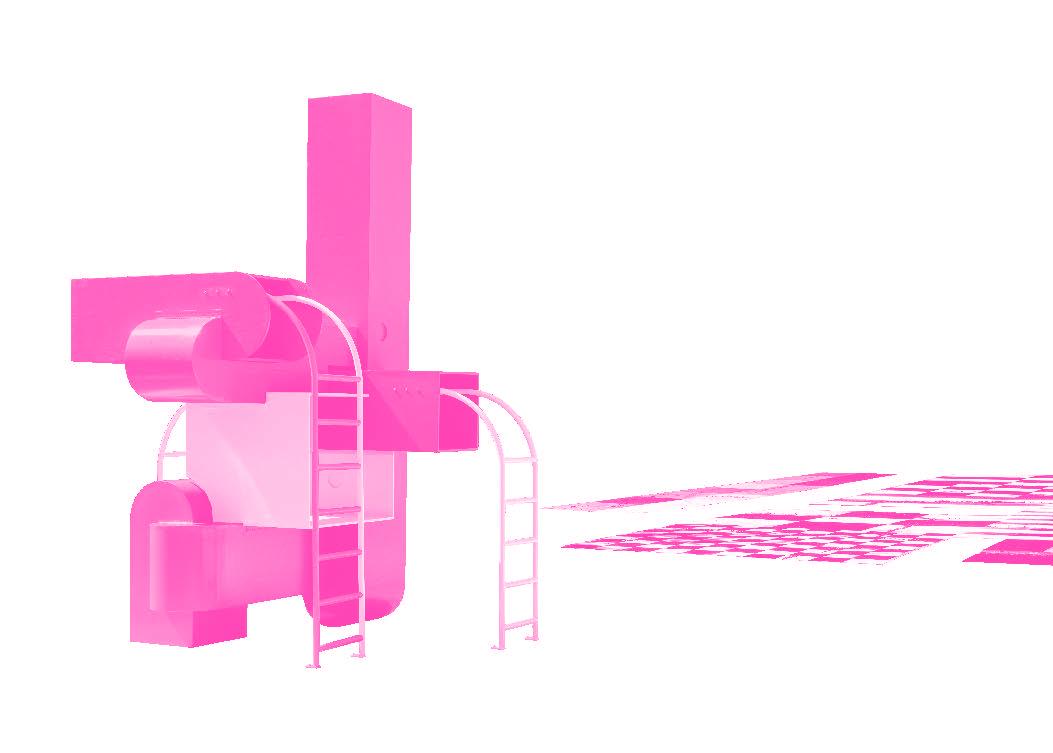
And then there was the structure. Block Party. It landed on my asphalt like an invitation, bright and voluminous, its forms recalling the bounce houses that rise and fall every summer weekend in this neighborhood. But this was different—solid and climbable, yet just as playful, just as much a signal that joy belongs in public space. It stood at my center, waiting.
I have known the weight of feet before. The squeak of sneakers, the echo of a ball hitting my surface, the breathless laughter of a game played into dusk. But with Cover the Grid and
SPECTRUMS OF PLAY
Surfaces / Volumes
A spectrum with surface interventions on one end and built environments organized by volumes on the other suggests one range of means with which Playscapes operate. Where surface interventions project graphic figures onto planes, volumes trace graphic figures into three-dimensional space.
Two-dimensional graphic patterns—sport courts and athletic fields, paver patterns and traffic stripes—play quintessential roles in organizing the human, nonhuman, and vehicular movement of everyday life. Athletic environments are a particularly instructive point of departure. Sports fields are generally composed of surface lines painted on turf or pavement. Like the lines of a floor-plan drawing that delineate wall partitions, doors, and window openings, these lines articulate thresholds for human movement on a horizontal field. They enact rules and establish roles for inhabitation and participation. The resulting graphic landscape accommodates a range of specific human actions and behaviors within a given set of rules, but it deliberately avoids prescribing or predetermining the outcomes—sports wouldn’t be any fun if it did.
The architect and theorist Sam Jacob is fascinated by the design of soccer fields, or football pitches, as he refers to them in his native British English. His research on the graphic design and landscape design of contemporary soccer fields traces the sport to a medieval “folk football” game played annually on Shrove Tuesday in the town of Ashbourne in Derbyshire, England, in the fourteenth and fifteenth centuries. As Jacob recounts in a 2008 blog post, “[The games] were tumultuous affairs in which village competed against village…in teams of unlimited number of players, kicking, throwing, and carrying a wooden or leather ball—an inflated animal bladder—across fields and over streams, through narrow lanes with a minimum of rules. The ‘goal’ was some kind of marker at each end of a town. Sometimes the goals would be the balcony of the opponents’ church. The whole landscape became transformed into game-space. Houses, agriculture, sites of worship lost their everyday meaning and became an abstract terrain whose qualities impact the possibilities of game play.…[Today’s] pitches have an extraordinary beauty that has evolved from chaotic vernacular origins.”
As an athletic design creation myth, Jacob’s catalog of redrawn variations on the regulation football pitch suggests how the sleek geometry of contemporary field design may have evolved as a graphic abstraction of the village layout and pastoral landscapes in which the early versions of the sport were played. Whether adjusting the outline of the field, the shape of penalty areas, the orientation of the halfway line, or the figuration of the center circle, Jacob’s edited sports fields suggest the plasticity of human rules, roles, and behaviors that architectural plans make possible and
that literal graphic lines on the ground enact. “Somewhere in that minimalist arrangement of rectangles, circles, and dots is a trace of the landscapes of folk football: centre circle as lake, penalty area as village gateway, and goal as church. This makes football—perhaps more than any other sport—a kind of essentialised urbanism,” Jacob writes.22
Multiple projects by Outpost Office, a practice based in Columbus, Ohio, demonstrate how purely two-dimensional, surface-based design approaches inspired by athletic fields and sport courts might reorganize movement in the everyday built environment. These intentionally superficial patterns recodify the rules of engagement in public spaces and intensify programmatic opportunities. One instance of Cover the Grid (2021) transforms an existing derelict basketball court in Chicago’s North Lawndale neighborhood into a playable color field, not only for basketball, but also for more open-ended modes of civic gathering. The designers describe the project as a series of “architectural-scale urban land paintings produced with GPS-guided robots.”23 It is not a coincidence that the semi-autonomous robots used to paint many of Outpost Office’s projects are typically used by city park departments to paint sports fields. Outpost Office
22 Sam Jacob, “Folk Football: Landscape, Space and Abstraction,” Strange Harvest (blog), February 5, 2008, archived March 25, 2016, at https://web.archive.org/ web/20160325084934/http://strangeharvest.com/folk-football-landscape-space-andabstraction. Jacob’s redesigns of familiar sports fields dramatize the behavioral power of lines inscribed on ground to suggest alternative narratives of participation.
23 Outpost Office, “Cover the Grid,” accessed July 7, 2025, https://www.outpost-office.com/ work/cover-the-grid
Sam Jacob, Folk Football, 2008. Courtesy of the artist.
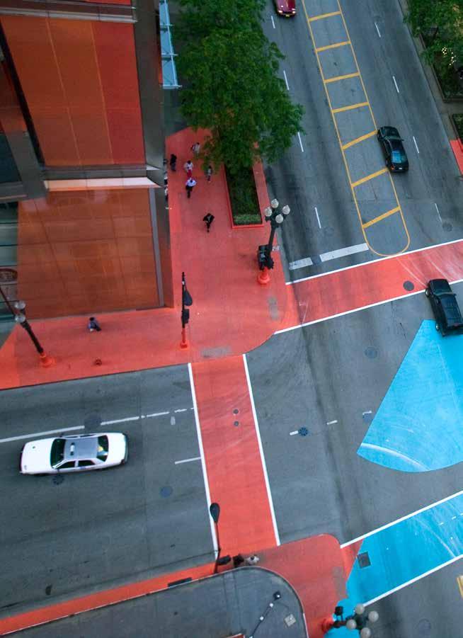
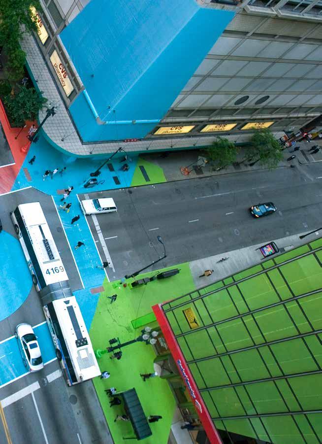
TIMEFUL REPRESENTATIONS
Upon reflection, our work shares many ambitions of the 1960s supergraphics projects—suggesting alternative ways of occupying space, transforming one’s perception of a space and time, bringing new life to mundane environments, bridging between the ephemeral and the permanent, blurring boundaries between architecture, art, and media, and applying technologies from outside architecture to the built environment. Furthermore, we carry on a legacy of nonrepresentational pattern exploration and employ inexpensive techniques to bridge the gap between highbrow and lowbrow culture.
Building upon this historical lineage, we find ourselves both indebted to and evolving the principles of supergraphics. While the original projects evoked movement and transformation through visual suggestion, our practice extends these ambitions further by considering the project’s timescale as an active design constraint (and opportunity). Supergraphics often suggest action: arrows and bold strokes; signs and wayfinding. A distinction in our work is that the implied movement and energy of the graphics becomes literal movement: graphics in action. This has produced a wellspring of new architectural avenues, particularly in relation to how our projects are experienced across time. As Barbara Stauffacher Solomon describes in an artist’s book on her own work: “Like Art vanishing into architecture, lines, colors, and shapes, called Art only because they are enclosed inside their rectangle frames, or the other side of the wall, vanishing out into the land.”8 This sense of ephemerality, metaphorical in Solomon’s description, becomes a literal phenomenon in our work. The larger question we face is how to harness this disappearance—this vanishing of the elusive object—to create meaningful experiences in architecture.
This temporal pursuit opens another dimension of inquiry: how architecture might engage not just with space and movement, but with time itself. Rather than syncing with static timelines, our work often reframes architectural duration, introducing alternative readings of temporality and material cycles. In the 1960s projects, supergraphics align with the timescale of the architecture
8 Barbara Stauffacher Solomon, Making the Invisible Visible (Owl Cave Books, 2019), 3. As quoted in Christopher Gortmaker, “‘Like art vanishing into architecture’: Barbara Stauffacher Solomon’s Modernist Supergraphics,” ASAP Review, July 28, 2015, https:// asapjournal.com/review/like-art-vanishing-intoarchitecture-barbara-stauffacher-solomons-modernistsupergraphics/.
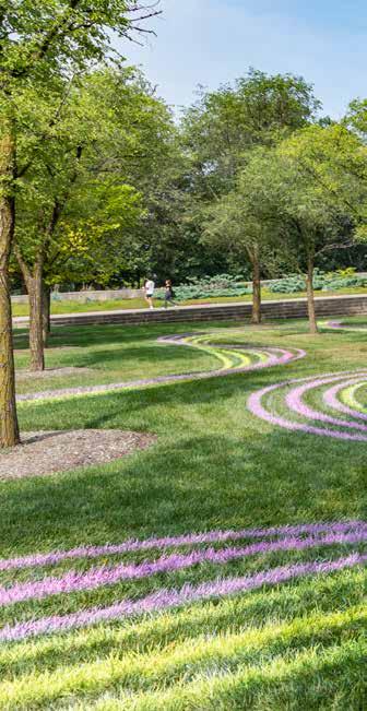
they inhabit. Our work, however, often contrasts the timescale of the surrounding environment or provides alternative readings of material life cycles. Central to our timeful practice is a reexamination of architectural procurement, production, and deconstruction, which we often refer to as “designing for obsolescence.” The duration of a work, its process, material procurement, staging, and deconstruction are not extra-architectural; they are the stuff of architecture.
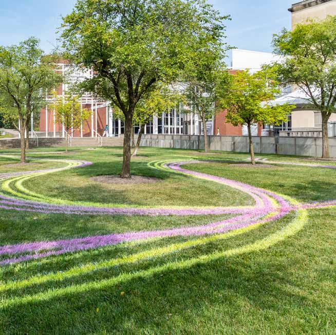
Outpost Office, Drawing Fields No. 7, Wexner Center for the Arts, Columbus, OH, 2023. Photo by Phil Arnold, Knowlton School of Architecture.
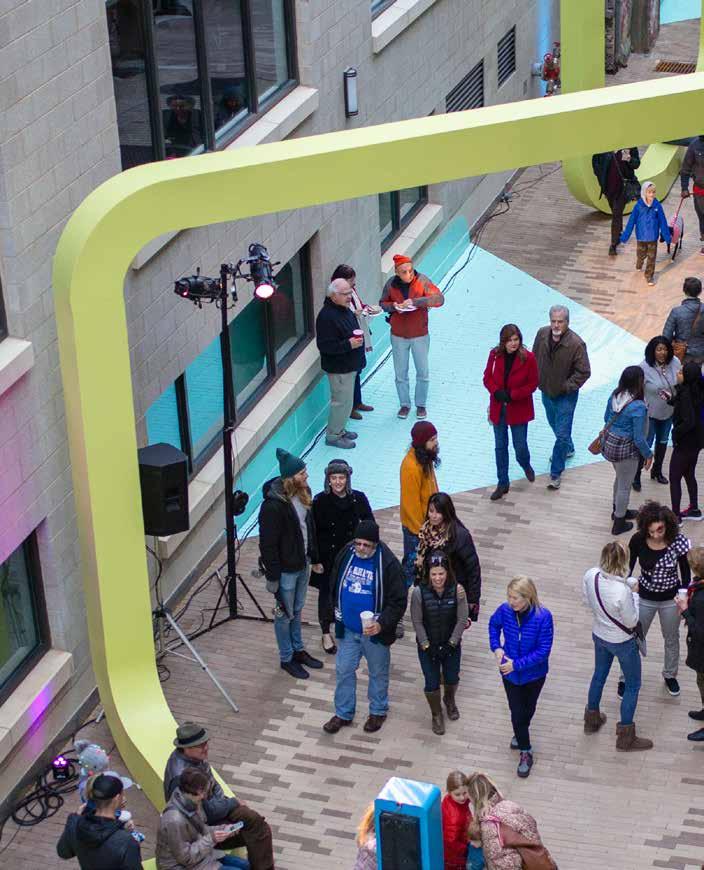
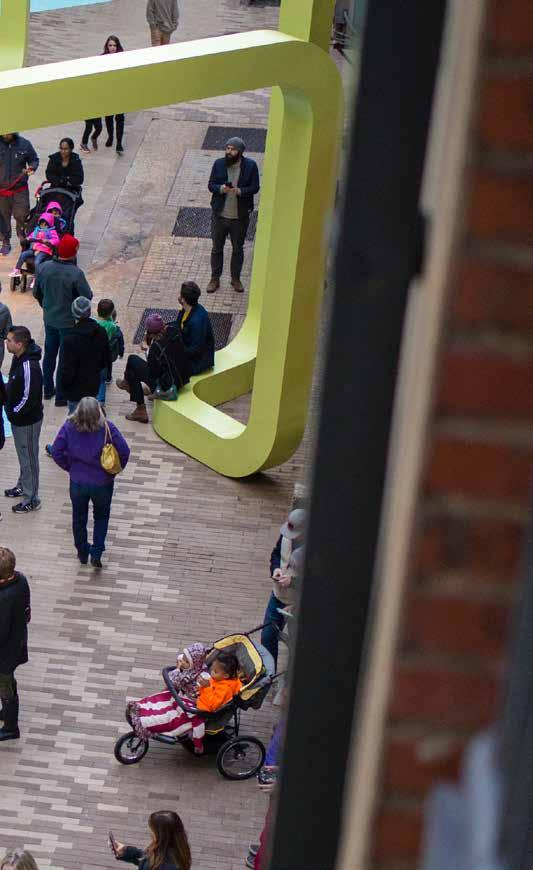
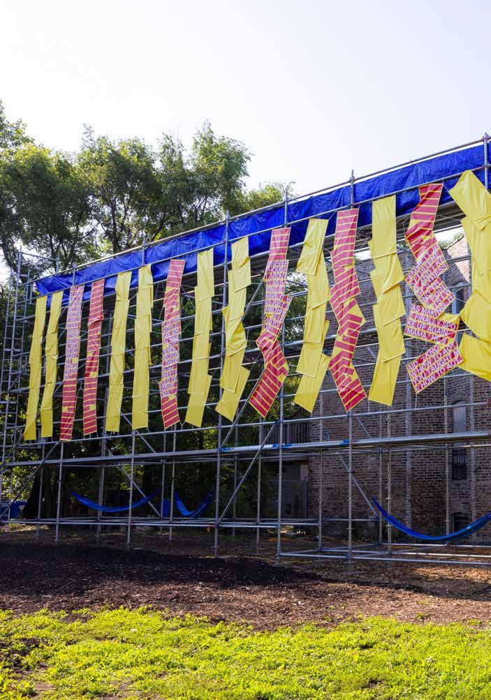
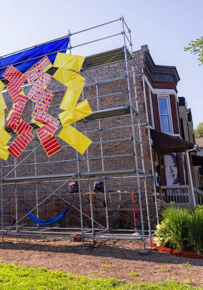
The design inserts simple geometries into athicklylayeredcontext,
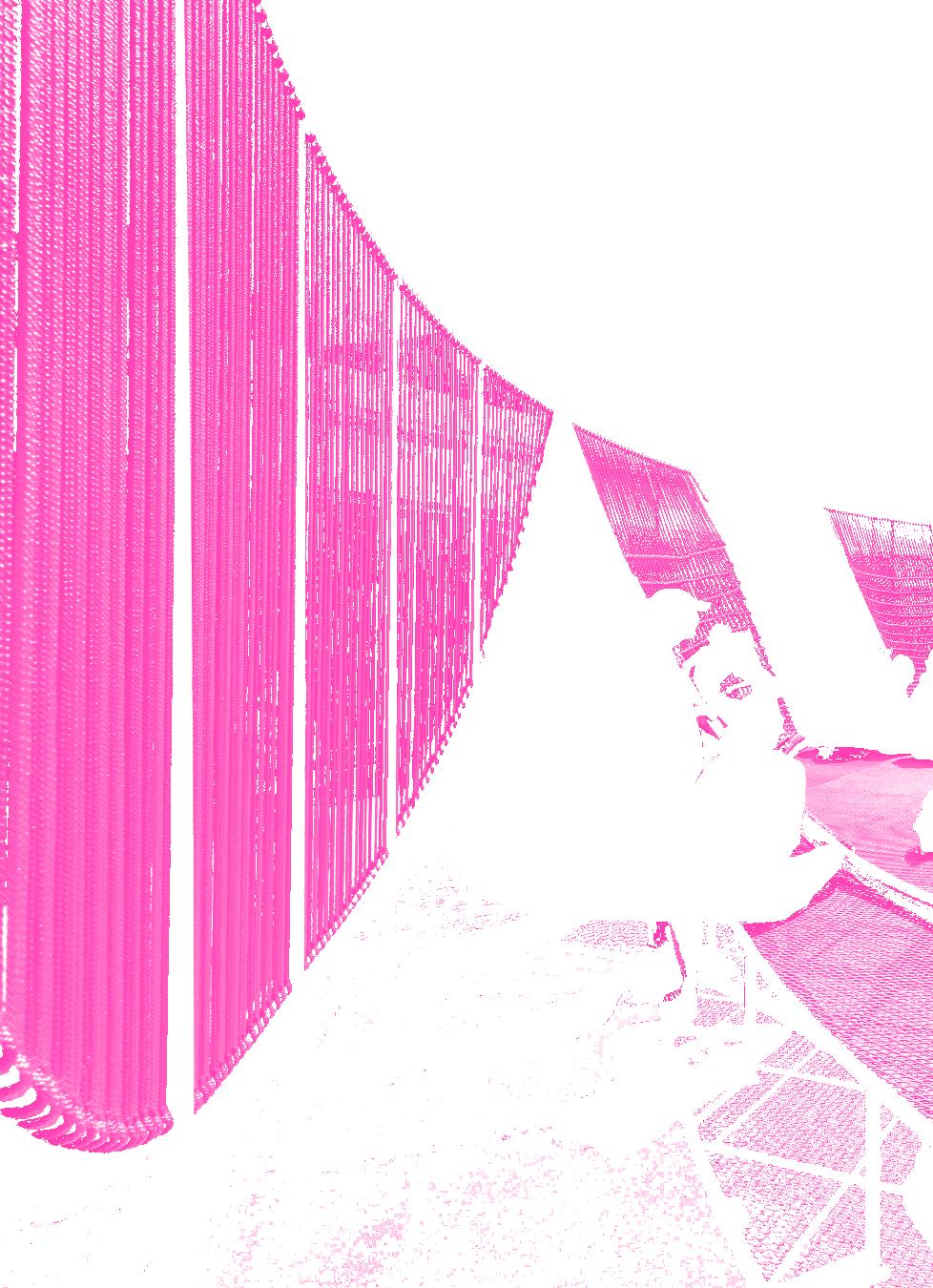
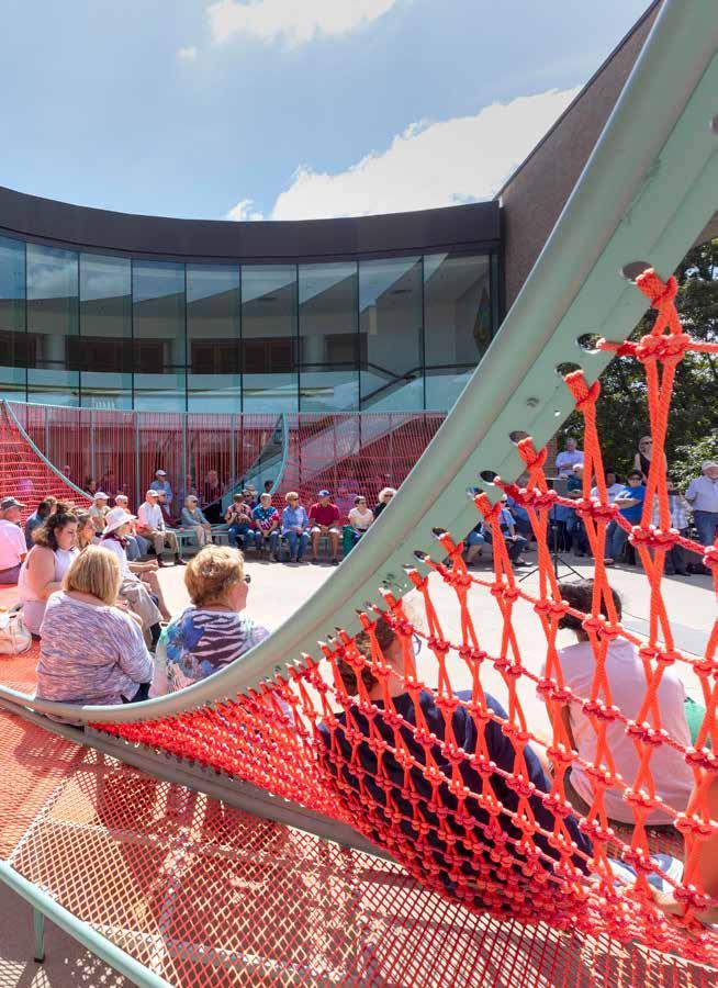
Scaffoldingis scalable andtem
p o r a r y . I t i s m al l e a b l e a n d r o b u s t . I t p r o v i d e s a p r e s