1. What Is A Regional Product?
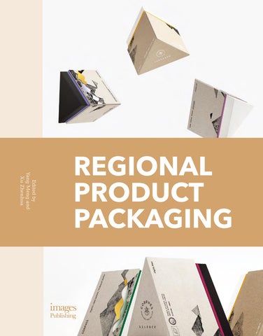
Every region around the world is endowed with different soil, vegetation, light, temperatures, and climate. Consequently, these differences mean each region has its own unique properties, and in many cases, they become famous for their characteristic produce or products; for example, black truffle in southern France; ginseng in southeast China; and olives in Crete. Regional products, such as fresh produce, crops, or processed foods, can become a distinctive commodity of a region. They also become part of local culture, as they are farmed or produced using traditional techniques, and enjoyed as part of established customs. This book showcases nearly 100 examples of outstanding regional product packaging designs from different countries, and includes wine, beverages, tea, coffee, rice, baked goods, olive oil, dried fruit, and farmed goods, plus other categories. In the context of globalization, these examples not only reflect the rich cultural characteristics of a region, but also take into account contemporary society’s consumption preferences, with a focus on natural health, environmental responsibility, and personal expression.
2. Regional Product Packaging
Packaging design is an important sales and marketing tool. In addition to containing and protecting the product and making it easier to transport, distribute, sell, and use, packaging provides a visual experience for consumers. It can effectively communicate the product’s attributes, as well as expressing the brand values. Product packaging should be appropriate for the strategic positioning of the brand, as it is a way for companies to differentiate their product from competitors, and a means of catching potential customers’ attention. For regional products, packaging can also convey the cultural traditions and customs of an area, and help to transmit knowledge of these traditions and customs to people in other regions of the world.
2.1 Expressing regional culture Regional products form part of a region’s cultural heritage and character, and for tourists or foreign customers, they are attractions and symbols of a region’s history, lifestyle, and customs. Furthermore, promoting the sales of local products can contribute positively to a region’s economy and image. Spain is famous around the world for its olive oil. San Sebastián el Romeral is a brand of olive oil in which the name refers to the location of the crops and the mountains of El Romeral in La Mancha, Spain (Fig. 1). The packaging design is intended to place San Sebastián Fig. 1
6
Fig. 2
Fig. 3
el Romeral on the map, and it presents a textured visual of a map with an X marking the treasure. To further this idea, the bottle size is represented with a cartographic scale, and various other elements, such as a compass, are stamped in gold. Georgia is considered the cultural birthplace of viticulture, with an 8000-year history of winemaking. Vinimport produces a series of wines, including Tbilisi and Georgian Friend, under the brand Sagandzuri, which in Georgian means ‘treasure’ (Fig. 2). To reflect this heritage, the packaging design of Tbilisi features illustrations, made with traditional engraving techniques, of the capital city of Georgia. The colorful scenes depict the historical architecture with the surrounding landscape in the background.
2.2 Exhibiting local people Fig. 4
Regional product packaging can exhibit the people of a place, and evoke feelings, emotions, and memories associated with particular products and people. By conveying or depicting the people and cultural associations of a product, a packaging design can tap into consumers’ emotions, encouraging them to purchase the product for reasons beyond the product itself. Nowadays, people are not just concentrate on the product itself, but the inner meaning of their dreams to show themselves through the merchandise. Doi Chaang Coffee works with local coffee growers in the north of Thailand, who are mostly hill tribe people (Fig. 3). In an effort to connect the consumer with the people who grow the coffee, the packaging depicts these highland people in traditional clothes, and each flavor shows a different group from the region. The images on the packaging change every year, which encourage the local families to collect the packaging for their children. Oitava Colina is a microbrewery in the neighborhood of Graça in Lisbon, Portugal (Fig. 4). The packaging design reflects this origin, with the bottles featuring imagery inspired by unusual characters that live on Graça Hill. Each beer bottle has an illustration and story of a local character and an explanation of how they relate to that particular style of beer. The design for
7
Fig. 5
Fig. 6
Florinda has a cloud pattern to symbolize the wind blowing through her hair; the design for Urraca Vendaval is covered in hops to reflect the style of beer. Finally, Zé Arnaldo’s pipeline imagery was inspired by the character’s own experience working at the docks.
2.3 Shaping cultural image Regions are not just a geographical place, but also a concept of folklore. People who live in the same area have, in general, common lifestyles, language, religious beliefs, aesthetic psychology, customs, and attitudes, which together form the unique character of a region. The packaging of a product is thus a distinctive way of shaping a region’s cultural image. Jasmine rice is a great pride of Thailand, and the packaging of ALL THAI Thai Hom Mali Rice is designed as a souvenir for foreign visitors (Fig. 5). The central visual element in the packaging is an ancient Thai wall painting that beautifully captures the distinctive feel of Thailand with a traditional Thai lodging in the background, yet still with a modern flare. Throughout the illustration, people are cooking jasmine rice and checking steamers to see if the rice is ready to eat. Fig. 7
Paceña is such an influential beer brand in Bolivia that it has become a fixture of Bolivian festivals, producing special-edition bottles for the festival season (Fig. 6). The designers collaborated with ethnographers to vividly capture the customs of local ethnic groups, from clothing to even facial expressions. The result is a bottle that uses Bolivian dancers as its primary focus, through a rich blend of color and culture. The Japanese aesthetic is typically simple, pared back, and minimalist to highlight natural and textured materials. Nanasai Nattō is no exception (Fig. 7). Nattō is a traditional Japanese food made from soybeans. The product packaging of Nanasai Nattō is a transparent box with a single strip of white tape and the minimal product information, such as name and ingredients. The only decoration is a black-and-white outer sleeve with red and gold accents. The simple packaging allows the richness of the nattō to stand out by way of contrast.
8
Regional Product Packaging
3. Conceptual Design
The conceptual development of a packaging design for a regional product is often a result of the local area's culture, history, and aesthetic style. For example, it may be considered that packaging design in Britain pays more attention to consumption traditions; German packaging has the traditional characteristics of rational design influenced by a functionalist way of thinking; French packaging has an artistic spirit; and Japanese packaging is both modern and timeless. The conceptual design of regional product packaging is often inspired by an area's characteristics and features. It has a distinctive style evocative of the region, and it taps into consumers’ emotional associations with a product or brand.
3.1 Local inspiration Designers can look to historical sites, legends, tribes, and cultural artifacts for inspiration. Dobroflot Canned Fish is produced on the floating fish cannery Vsevolod Sibirtsev (Fig. 8). The packaging design features black-and-white photographs as the background image of the cans, and they have been diligently collected from local history museums and personal archives of the staff. Simple geometric forms are based on the system of marine signal flags, and the slogan ‘Made in the Sea’ emphasizes the production and quality of the product. Oli Mare is an extra virgin olive oil without impurities from Mas Montseny in Spain (Fig. 9). The illustration on the label depicts the vital ingredients and process necessary for obtaining oil in the region: the landscape, trees, olives, fields, animals, mill, and family. This packaging design earned the designer a Liderpack 2016 Award for the best food packaging of the state. Fig. 8
Fig. 9
9
Fig. 10
3.2 Distinctive style An abundance of commodities can make it difficult for customers to choose a product. It is therefore important to make packaging design distinctive and representative of the product being sold. One distinction of regional products is that they may be scarce, rare, or produced in small quantities, and therefore more precious. This is particularly the case for produce grown on farms that are small or that do not use industrial or mass production techniques. With increasing urbanization and industrial production, people are yearning for a simpler more natural life, so in packaging design, a handcrafted style can evoke the farming life, homemade recipes, traditional production, or similar, which are unique to a region. Designers will often use traditional or handmade design techniques or natural materials to create packaging with a handcrafted aesthetic. Komisenka is a brand of Awashin, a long-established traditional Japanese rice cake shop in Osaka (Fig. 10). The packaging is made with washi , a traditional type of Japanese paper, which UNESCO declared in 2014 to be intangible cultural heritage. The material is easy to wrap and gives the packaging a warm homemade look. The simple material is complemented by a vibrant visual layout. The label is divided in half with one side awash in color and the other black and white, harkening to the style known as katami gawari , originating in sixteenth-century Japan. To accentuate the high quality and organic nature of products, designers will use transparent packaging or minimalist labels so that customers can see the actual product before they buy it. In this way, the product itself becomes part of the packaging design. Maida is an awardwinning bio-farm located in Capaccio in Southern Italy. Its products are made naturally without
Fig. 11
10
Conceptual Design
Fig. 12
Fig. 13
any chemical additives and in accordance with local tradition. Particulars is part of Maida’s top gourmet line, and the packaging is a glass jar with a simple black label, which allows the product to be visible and showcases its quality (Fig. 11).
3.3 Emotional associations Regional products often have emotional associations for people from the local area as they are symbols of home or celebrations and may hold a place in cherished memories. The packaging design of regional products can tap into these emotional associations, and evoke a sense of nostalgia, belonging, community, or festivity, with imagery of landscapes, people, events, customs, and similar. The classical and simple elegance of the packaging design of Grandma Ginger is intended to evoke a sense of nostalgia for the early era of the Republic of China (Fig. 12). The logo depicts a grandmother in her youth wearing a cheongsam (Chinese dress), and the concept is to convey the ancient skincare wisdom contained in the black sugar ginger being passed to the next generation. The packaging is made using corrugated paper rich in vegetable fiber, and the ink mottling is to express the fragrant ginger wafting through the air. Malaysian Festive Packaging Collection is designed for the Hari Raya Aidilfitri, and the illustrations depict the holiday’s traditions (Fig. 13). Balik kampung , which in Malay means ‘return to village’ and refers to the mass migration of people during Hari Raya, is reiterated throughout the design. Not only does the packaging have many illustrations showing families together doing activities connected to the holiday, but the collection also contains three essential Hari Raya dishes, making the collection a wonderful gift for the occasion. The packaging evokes nostalgia for being at home while sparking new life into the festival, all without losing its customary meaning.
4. Points of Difference
The consumer decision-making process follows awareness, interest, association, desire, comparison, belief, decision, and action. The packaging of a product needs to be distinctive in order to attract the awareness and interest of potential consumers and to provide information and value that will encourage the consumer to purchase it. These points of difference include the place of origin, product attributes, and added value.
11
4.1 Place of origin Place of origin is a core value of a regional product. With the abundance of mass-produced goods and processed foods in contemporary society, highlighting the origin of a regional product is a point of differentiation and distinction. Drawing attention to the origin can help consumers imagine the source of the product or raw material and the environment in which it is grown or produced. It can also strengthen the overall relationship between the product type and origin. This contributes to the reputation and image of the region, and enables consumers to form a positive correlation that highquality produce or products are characteristic of that region. Santorini Earth Goods is an agricultural product line produced by Nomikos Estate, and grown in the rocky and volcanic soil of Santorini in the Greek islands (Fig. 14). The aim of the packaging design is to show the unique soil conditions of the product’s origins in order to demonstrate its premium quality. The designer used the area’s soil as a core visual element by showing layers of various colors wrapping around the packaging in a clean geometric fashion, giving a distinctive appearance and separating it from similar products. The window design extends this idea, allowing the customer to see the product directly. With the window buried in the middle of the colored geometric layers, it looks like seeds growing in Santorini soil. Yukuhashi Miyako Gelato is an ice cream brand developed by Yukuhashi Tourism Association in Fukuoka, Japan (Fig. 15). The packaging design takes the local food elements of shōchū and fig as the main design symbols and combines them with motif of Yukuhashi scenery to express the characteristics of the origin.
4.2 Product attributes The packaging design of a product is a form of communication and it should be consistent with the brand and embody the attributes of the product. It should also express the unique distinctions of the regional product. This may relate to the natural conditions, such as soil, water, air, and nutrients, that have given rise to the produce or product; or it may be production and processing techniques, such as the methods of planting, picking, storage, and production. It can also be the attributes of the product itself, such as the taste and nutrition, or the symbolic and cultural associations of the product.
Fig. 14
12
Points of Difference
Fig. 15
Xitian Mi
102
- Client
Da Gu Factory - Design agency
Kun Design - Completion
2015 - Design statement
Xitian Mi originates from the so-called ‘last pure land’ of Formosa in Taiwan, between the Central and Coastal mountain ranges. Rivers run through the fertile land, carrying rich organic minerals with no industrial pollution. The fresh, clean air is beneficial for the growth of rice with no cause for pesticides. Xitian Mi selects only the top 20 grains in size per 100, to ensure quality rice that emphasizes the values of fresh ground and fresh made. The packaging is a transparent, vacuum-sealed bag with a simple belt wrapped around its center, and two bags are placed in a wooden box. An eco-friendly paper rope makes the box easy to carry, and contributes to the nostalgic and tactile feeling of the packaging.
103
Dong Grain
104
- Client
Guizhou Grain Industry - Design agency
Shanghai Yang Zhongli Marketing - Completion
2014 - Design statement
Dong Grain is a local brand in southeastern Guizhou. The traditional handicraft has become increasingly scarce, but the Dong people still adhere to their own methods of working to bring attention to the rice of the region. The designers witnessed the farming and lifestyle of the Dong and were deeply impressed by the difficult work of using a traditional plow, transplanting, harvesting, and threshing rice, and were moved by their customs of the Dong. They depicted these different scenes and themes on the packaging through painting, engraving, and rubbing techniques to demonstrate the simple and pure nature of the local rice.
105
Chinese New Year of Rooster Gift Box
106
- Client
From the Hills - Design agency
Would Design - Completion
2016 - Design statement
The red millet originating in the Liaoning province has higher nutritional value than ordinary millet and tastes soft and mellow due to the unique natural conditions of the area and the traditional farming methods. The Spring Festival is the traditional Chinese festival. This chicken eat rice gift box is the very special edition to celebrate the Year of Rooster. The rooster symbolizes luck in Chinese culture, and the typeface and abstracted images of chicken, ruyi, millet, pine, and cypress are used as design elements on the gift box and wrapping paper, giving traditional auspicious patterns a new design language. The same elements are also used on the packaging of the red envelopes and millet, so that the box becomes a Chinese New Year gift with a contemporary design taste.
107
Caiwang
108
Published in Australia in 2018 by The Images Publishing Group Pty Ltd Shanghai Office ABN 89 059 734 431 6 Bastow Place, Mulgrave, Victoria 3170, Australia Tel: +61 3 9561 5544 Fax: +61 3 9561 4860 books@imagespublishing.com www.imagespublishing.com Copyright © The Images Publishing Group Pty Ltd 2018 The Images Publishing Group Reference Number: 1447
All rights reserved. Apart from any fair dealing for the purposes of private study, research, criticism or review as permitted under the Copyright Act, no part of this publication may be reproduced, stored in a retrieval system or transmitted in any form by any means, electronic, mechanical, photocopying, recording or otherwise, without the written permission of the publisher.
Title:
Regional Product Packaging
Author:
Yang Meng and Xu Zhenhua (eds)
ISBN:
9781864707700
Production manager | Group art director: Nicole Boehringer Senior editor: Gina Tsarouhas Assisting editor: Rebecca Gross Printed by Toppan Leefung Printing Limited, in Hong Kong/China
IMAGES has included on its website a page for special notices in relation to this and its other publications. Please visit www.imagespublishing.com
Every effort has been made to trace the original source of copyright material contained in this book. The publishers would be pleased to hear from copyright holders to rectify any errors or omissions. The information and illustrations in this publication have been prepared and supplied by the authors and contributors. While all reasonable efforts have been made to ensure accuracy, the publishers do not, under any circumstances, accept responsibility for errors, omissions and representations, express or implied.