Refreshing Outdated Brands
Helsinki Philharmonic Orchestra
Helsinki Philharmonic Orchestra upholds the tradition of classical music and Jean Sibelius’ work in Helsinki. Its old visual identity was conventional, outdated, and inconsistent, and the brand needed repositioning and crystallizing. The design choices aimed at a holistic brand experience: the insight was based on the key element of the orchestra: the musicians. They are flesh and bones, and their whole bodies and emotions are present while playing on stage. There laid the core of the new brand: spreading out the musical energy to the citizens with the power of 102 musicians. Additionally, the logo was built around the orchestra name, surrounded by the names of all the musicians forming a living ensemble. Powerful one-shot images visually capture the power and energy of the music and highlight the key role of the
musicians. The brand communication focused on this energy—the big sound, the experience, where a concert is more than just a concert. As a result, the new visual identity brought to life the positioning and the musicians in both logo and photographic concept. What’s more, the identity differentiated the orchestra and communicated the positioning and core messages in a timeless and modern manner.
Client
Helsinki Philharmonic Orchestra Design agency
Bond Creative Agency Photography
Marko Rantanen Completion
2015
Orginal brand identity
24
25
Refreshing Outdated Brands
26
27
Refreshing Outdated Brands
26
27
Refreshing Outdated Brands
28
29
Refreshing Outdated Brands
28
29
Attracting More/New Audiences
Saint-Étienne Opera House
With more than 150 curtain lifts for around 60 performances throughout the 2014–15 season, the Saint-Étienne Opera House is a landmark of great cultural importance; a predominant player in the cultural life of the city. It specializes in French Romantic repertoire of the 19th century, also offering an expanded platform to other art forms (music, dance, etc.). In order to fulfill an essential mission to the young audience, offering a dedicated season, rich and varied, the objective stated by the sponsor was to restore a sense of closeness with the citizen of Saint-Étienne, through a simple and popular communication. The main innovation was the abandonment of the name “Opera Theater” in favor of “Opera of Saint-Étienne” to reflect an opera house image with its historic public, but also potential audiences.
This could be the movement of a body, of musical notes, or simply the emotions triggered by these two art forms. The emotion behind this logo comes from the optical framing trick between an “O” and the “accent.” The “O” looks as if it’s disappearing at the same time as the accent appears. That’s opera’s magic!
Client
Saint-Étienne Opera House Design agency
Graphéine Completion
2016
To inaugurate the new logo’s first season, the designers came up with a simple and accessible communication campaign that features, in photos, all the staff members who work at the opera. The
In this new logo, on the top of the “E” the accent stresses the syllable by increasing the intensity of the voice. It decks the word “opera” with the image of the building’s pagoda. The shape of the “O” brings to mind an open mouth singing an operatic aria. The “O” is used to show a strong emotion such as surprise, admiration, joy, etc. In opera, music and dance are intimately linked through movement. logo is there to finish off the smile of the person being photographed, as if a curious spectator had come to peek through the opera doors, wide-eyed at what they saw. So it’s about re-establishing a feeling of closeness between the people of Saint-Étienne and a popular cultural venue. The campaign comes with the slogan “Et la magie opéra …” (“And the magic opera …”), which is a pun in France between the word “operate” and “opera.” What is special about this program is that the start of each chapter serves as a divider. What designers have are small booklets less than four centimeters wide with a series of portraits inside. Because booklets are narrower, they are easier to read as people can find program chapters more swiftly. 166
167
Attracting More/New Audiences
Caption: The new logo’s inauguration campaign: the slogan “And the magic opera(te)…” is a pun in France between the word “operate” and “opera”. Caption: Conception of the stationery, the opera’s season program and posters.
168
169
Attracting More/New Audiences
Caption: The new logo’s inauguration campaign: the slogan “And the magic opera(te)…” is a pun in France between the word “operate” and “opera”. Caption: Conception of the stationery, the opera’s season program and posters.
168
169
Attracting More/New Audiences
Caption: Season graphic posters for the Opera’s upcoming events.
Caption: Campaign spreads around the city: special tramway livery and public displays.
170
171
Attracting More/New Audiences
Caption: Season graphic posters for the Opera’s upcoming events.
Caption: Campaign spreads around the city: special tramway livery and public displays.
170
171
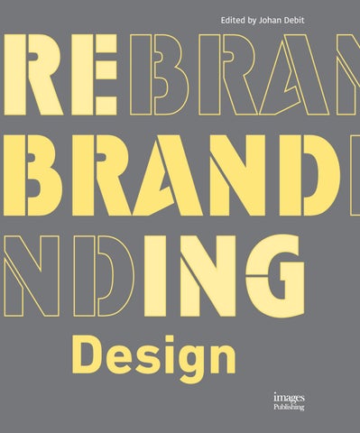
Rebranding Design Edited by Johan Debit Rebranding is a delicate exercise that can often have many pitfalls, both for the brand that ventures into such a project and for the agency who has been chosen to engage with this process. The business working through the concept of rebranding itself must ask the following questions: is this an appropriate time for such substantive work? Are we talking about a soft evolution or metamorphosis? Does this rebranding address a clearly identified problem, and can it represent a genuine asset for development?
For designers, even if these questions remain central, other issues also arise: how to produce a distinctive project in the face of a profusion of branding works available online? How to produce relevant and appreciated work in a challenging economic and social environment? This book brings together some of the best rebranding projects in the world and addresses these key issues formally and with real substance, and places the crucial—and sometimes underestimated—role of the brand design in the developmental processes of companies, institutions or associations.
ISBN 978 1 86470 721 2 Format 275mm x 215mm Binding Casebound with jacket Pages 304 Illustrations Full color In bookstores June 2017
For publicity information contact Merry Lovell: merry@imagespublishing.com +61 3 9561 5544 Distributed in North America by ACC Distribution www.accpublishinggroup.com/us To place an order contact ACC Distribution at+1 413 529 0861 or ussales@accpublishinggroup.com Distributed rest of world by ACC Distribution www.accpublishinggroup.com/uk To place an order contact ACC Distribution at +44 (0) 1394 389 950 or uksales@accpublishinggroup.com