Sommario / Contents
Lora Lamm graphic designer a Milano
Lora Lamm’s Graphic Designer in Milan
Nicoletta Ossanna Cavadini 28 La “terza via” di Lora Lamm all’immagine d’impresa
Lora Lamm’s Third Way to the Corporate Image
Carlo Vinti
Lo stile grafico di Lora Lamm
The Graphic Style of Lora Lamm
Mario Piazza 51 Tavole / Plates
150 Elenco delle opere esposte
List of Exhibited Works
Apparati / Appendices
162 Intervista a Lora Lamm
163 Interview with Lora Lamm
172 Testimonianze
173 Testimonies
Gillo Dorfles, Giancarlo Iliprandi, Mariarosa Toscani Ballo, Elsbeth Calabresi-Gumpfer, Serge Libiszewski, Italo Lupi, Emilio De Maddalena, Ruedi Külling, Aoi Huber-Kono, Silvia Latis, Heinz Waibl
di / by Nicoletta Ossanna Cavadini
190 Biografia
191 Biography
a cura di / edited by Sabrina Cerea
194 Bibliografia
Bibliography
a cura di / edited by Valeria Malito
perché Lora Lamm non padroneggiava ancora bene la lingua italiana, mentre il disegno semplice, spigliato e umoristico rivela già tutte le doti della giovane designer (si vedano pp. 170-171). Max Huber, che appare sul tavolo accanto, quale capo grafico dell’ufficio interno, è invece l’autore del celebre logotipo della Rinascente.
Lora Lamm si trova a lavorare in un clima particolarmente favorevole, comprende subito la libertà che le è concessa e dimostra tutta la sua preparazione e la sua dedizione al lavoro. Pochi mesi dopo viene assunta come grafica interna.
In quegli anni del “miracolo economico” la dirigenza della Rinascente fu particolarmente lungimirante; come nel caso di Adriano Olivetti a Ivrea, il grande magazzino milanese poteva vantare un imprenditore e intellettuale che incarnava “la perfetta fusione tra la capacità di essere attivatore, stimolatore di forze intellettuali”8 quale Cesare Brustio, affiancato da Aldo Borletti. Bisogna precisare che negli anni cinquanta e sessanta la Rinascente era molto di più di un grande magazzino. Era un luogo che produceva iniziative commerciali che avevano uno spirito di conoscenza e di diffusione della cultura. I prodotti nascevano da un’attenta scelta tematica o di design riferita a un gusto innovativo del costume sociale. La politica commerciale, inoltre, si apriva alle donne, che iniziavano a lavorare negli uffici ed erano presenze molto rilevanti. “Tutte le donne hanno la possibilità di vestire senza spendere capitali. […] La confezione in serie farà camminare le donne ben più rapidamente di ogni altra conquista del nostro tempo verso quella civiltà di massa che sembra essere la nostra meta più ambita, e cancellerà una quantità di differenze tra donna e donna”9. In questo senso la filosofia aziendale della Rinascente facilitò anche l’assunzione di donne negli apparati direttivi e creativi. Dopo Lora Lamm, nel 1955, viene nominata in qualità di art director dell’Ufficio Pubblicità Amneris Latis Liesering; sappiamo inoltre che capo reparto delle vetrine era Attilia Faggian, mentre la moglie di Roberto Sambonet curava le sfilate e tutti gli eventi collegati agli allestimenti.
Gianni Bordoli, capo dell’Ufficio Pubblicità, nell’articolo pubblicato su “Graphis” nel 1955, dal titolo La Rinascente, mette in risalto la missione di questo grande magazzino di rivolgersi ai giovani grafici italiani, offrendo loro la possibilità di conoscere le problematiche dell’arte pubblicitaria, dell’imballaggio, della vetrinistica e dell’allestimento, “così da acquisire le medesime capacità e la sicurezza dei più importanti designer di altri Paesi che avevano avuto l’occasione di frequentare le scuole d’arte che invece mancavano in Italia”10 Accanto allo staff interno vi erano collaboratori esterni di grande professionalità, come i fotografi Aldo Ballo, Ugo Mulas, il tedesco Gérard Herter e, dal 1956, in qualità di freelance, lo svizzero Serge Libiszewski. Va anche ricordato, per acume e cultura, il responsabile dell’Ufficio Marketing Augusto Morello, che dal 1955 divenne pure responsabile del “Compasso d’oro”; Lora Lamm impaginò in una importante occasione anche il catalogo di questo premio per la mostra al MoMA nel 1958. Il compito del graphic design era quello di creare la cosiddetta “grafica tecnica”, ossia tutti gli strumenti pubblicitari su carta quali manifesti, cataloghi pieghevoli, inviti speciali spediti più volte all’anno in occasione di sfilate, e distribuiti a tutta la loro clientela più selezionata, cui si aggiungeva la cartellonistica interna per le vetrine, i banchi, gli scaffali e la comunicazione logistica (soggetti merceologici per piani, etc.). Inoltre la grafica interna trattava

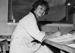
Lora Lamm con l’amica
Anja Storck nell’Ufficio
Pubblicità della Rinascente a Milano / Lora Lamm with her friend Anja Storck in the Advertising Office of la Rinascente in Milan, 1953
Lora Lamm al tavolo di lavoro nell’Ufficio
Pubblicità della Rinascente
Lora Lamm at her work table in the Advertising Office of la Rinascente
humorous, already reveals all the young designer’s talent (see pp. 170-171). Max Huber worked at the table next to hers as head artist of the inner office and the designer of la Rinascente’s celebrated logo.
Lora Lamm found herself working in a particularly favourable climate. She immediately realised the freedom she had been offered and revealed all her resources and dedication to work. A few months later she was taken on permanently.
In those years of the economic “miracle” la Rinascente’s management was particularly far-sighted. As in the case of Adriano Olivetti in Ivrea, the department store in Milan boasted an entrepreneur and intellectual who embodied “the perfect fusion between the ability to be an activator and a stimulator of intellectual forces. 8 At la Rinascente this figure was Cesere Brustio, assisted by Aldo Borletti. It should be noted that in the ‘50s and ‘60s la Rinascente was much more than a department store. Its retail initiatives sought to disseminate knowledge and culture. It presented products carefully chosen to reflect a topic or design theme related to some innovative aspect of modern living. Its retail policy was also responsive to women, who were beginning to work in offices and becoming a significant presence. “Women could all dress well without great expense. [...] Off the peg clothes have enabled women to progress far more rapidly than any other conquest of our time towards a mass civilization. This seems to be our most desirable goal, and it will efface a number of the differences between one woman and another.”9 La Rinascente’s corporate philosophy also facilitated the recruitment of women to managerial and creative jobs. After Lora Lamm, in 1955 Amneris Latis-Liesering, was appointed art director of the advertising office. The head of the window dressing department was Attilia Faggian, while Roberto Sambonet’s wife was in charge of the fashion shows and all special events and displays.
Gianni Bordoli, head of the advertising office, in an article published in the journal Graphis in 1955, entitled “La Rinascente”, described the store’s policy of working with young Italian graphic designers, offering them the opportunity to learn the various aspects of commercial art, packaging, window dressing, and designing displays, “so enabling them to acquire the same skills and confidence as the most important designers from other countries who have had the opportunity to attend the art schools that Italy lacked.”10 In addition to the internal staff there were some very professional external collaborators, such as the photographers Aldo Ballo, Ugo Mulas, the German Gérard Herter, and since 1956 the Swiss Serge Libiszweski, who worked freelance. The head of the marketing office was Augusto Morello, memorable for his shrewdness and breadth of culture. In 1955 he also became responsible for the “Compasso d’oro” design award. On an important occasion Lora Lamm designed the layout of the catalogue of the “Compasso d’oro” for the exhibition at the MoMA in 1960.
The task of graphic design was to create what were termed “technical graphics”, meaning all the advertising on paper, such as posters, catalogues and brochures, together with the special invitations mailed several times a year to the fashion shows and distributed to all the store’s select clientele. To this was added the internal signage for the window dressing, sales counters, shelving and the logistic communication (the merchandise sold by floor,
ricondotta alle regole apprese a Zurigo: i caratteri lineari sono preminenti, salvo qualche concessione, come il Bodoni amato anche da Huber. I progetti e le impaginazioni per i cataloghi del “Compasso d’oro” e le monografie su designer e architetti della fine degli anni cinquanta ne sono un esempio. Il formato quadrato lo ritroviamo anche per molti artefatti che accompagnano le prime grandi manifestazioni alla Rinascente. L‘immagine del 1956 per Il Giappone è costruita proprio su questo formato. Con un parsimonioso uso di elementi grafici, in quattro colori base ispirati alla tradizione giapponese e disposti secondo punti cardinali, Lamm riesce a trasmettere quella concezione della spazialità orientale opposta al punto di vista occidentale. I vuoti diventano pieni, oppure, come nelle pagine interne delle brochure, la reiterazione degli elementi geometrici ricorda gli antichi sigilli e ideogrammi, ma sono anche coordinati con l’allestimento nel grande magazzino fatto di quinte e fondali illustrati. Il tema del quadrato, legame, e forse debito, con le prove in precedenza svolte da Huber per la Rinascente, torna anche nella linea grafica per l’identità del settore arredamento del grande magazzino, disegnata a partire dal 1957 circa.
Si tratta innanzitutto del progetto di un marchio, che dovrà essere usato però in modo molto flessibile. Deve diventare un sistema, definire una continuità comunicativa, far riconoscere gli annunci pubblicitari, fungere da supporto ornamentale e da contenitore di messaggi. Il disegno del quadrato aperto per il marchio è una sintesi formale e astratta di una stanza vuota vista dall’alto, ma la perizia della Lamm si manifesta nel pensarlo anche come modulo compositivo.
Il marchio è identità del settore e dispositivo narrativo. Esso si può trasformare in una griglia per l’impaginazione di immagini e testi, o si può adattare a una funzione di texture, diventando un vibratile sfondo decorativo, o può essere ancora strumento per inquadrare un dettaglio e sottolineare una qualità del prodotto.
Già in queste prime prove, la Lamm fa intuire la sua personalità, che non si ferma alle regole apprese, ma dialoga con la necessità di costruire linee d’immagine diverse e per un pubblico molto variegato, dal consumatore consapevole e aggiornato al visitatore curioso. È una necessità che introduce l’uso variato e flessibile degli strumenti grafici: tipografia, fotografia, illustrazione, montaggio foto-grafica.
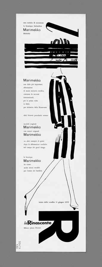
Molto mobile e sicura è la gestione tipografica nei progetti. Soprattutto negli annunci per i quotidiani da risolvere in bianco e nero, con formati spesso molto verticali, la Lamm riesce con la sola composizione tipografica a dare ritmo ed efficacia ai messaggi, alternando nei layout titolazioni in corpi elevati ed evidenti a una tessitura dinamica e ben impaginata dei testi di accompagnamento. Per la campagna Tessuti costano poco (circa 1957), la grande scritta “tessuti” in un corsivo Bodoni Poster scandisce e ordina lo spazio verticale (potremmo dire multipiano) dell’annuncio. La stessa impostazione la troviamo nella serie di annunci tipografici per il settore arredo degli anni 1958-1959. Nella campagna Campeggio (1959) tutti i testi hanno una disposizione secondo diagonali, la titolazione massiccia e scandita inclinata a 30 gradi e i testi orientati in direzione opposta a 60 gradi. Il risultato è una pagina dinamica e sincopata, che sembra riassumere e fondere le lezioni di Huber e quelle di Grignani. In questi annunci Lamm limita l’uso delle
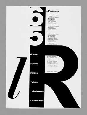
Lora Lamm, lR, la Rinascente 65, la Rinascente di Milano è ampliata di seimila metri quadrati lR, la Rinascente 65, la Rinascente in Milan has grown by six thousand square meters con la collaborazione collaborator Mario Trüeb cartoncino piegato e stampato / pasteboard folded and printed 55,6 x 40,6 cm committente / client: la Rinascente, Milano / Milan
followed the rules learned in Zurich: linear characters were paramount, with occasional indulgences like the Bodoni beloved of Huber.
The designs and layouts for the catalogues of the “Compasso d’oro” and monographs on designers and architects of the late fifties are examples of this. The square format was also found in many of the artefacts that accompanied the first major events at la Rinascente. The image from 1956 for “Japan” was built up on this format. With a sparing use of graphics in four basic colours inspired by the Japanese tradition and arranged in accordance with the cardinal points, Lamm was able to convey the conception of Oriental spatiality as opposed to the Western outlook. The voids become solids, or as on the inside pages of the brochure, the repetition of the geometric elements conjures up ancient seals and ideograms. But they are also coordinated with the setting in the department store made up of illustrated side screens and backdrops. The theme of the square, bond and debt perhaps with the experiments previously conducted by Huber for la Rinascente, returns in the graphic line for the identity of the furniture sector in the department store, designed starting in about 1957. It was first of all the design of a brand, but which had to be used in a very flexible manner. It had to become a system. To define a continuity in the communication, make the advertisements recognizable and act as an ornamental support and container for messages. The design of the open square for the brand was the formal and abstract synthesis of an empty room seen from above, but Lamm’s skill lay in devising it also as a compositional module. The brand is the identity of the sector and a narrative device. It can be transformed into a grid for the layout of images or texts, or adapted to a function of texture, becoming a vibrant decorative ground, or it can be an instrument for framing a detail and emphasizing the quality of the product.
Already in these early experiments, Lamm suggested her personality, which did not stop at the rules learned, but communicated with the need to build different lines of the image and for a very variegated public, from the aware and forward-looking consumer to the curious visitor. It is a necessity that introduces the use of varied and flexible graphic instruments: typography, photography, illustration, and the montage of photos and graphics.
The use of typography in the designs was very versatile and confident. Especially in ads for newspapers to be printed in black and white and often with sharply vertical formats, Lamm succeeded using typography alone to give the advertising rhythm and efficacy, alternating in the layout large and bold titles in a dynamic and effectively formatted tessitura of the accompanying texts. For the “Fabrics are cheap” campaign (c. 1957) the large word tessuti (“fabrics”) is presented in cursive Bodoni Poster which distributes and orders the vertical (we might say multi-level) space of the advert. The same arrangement is found in the series of typographical ads for the furniture industry in 1958-59. In the campaign “Camping” (1959), all the texts have a diagonal arrangement, the massive titles are given a marked 30° inclination with the text slanted 60° the opposite way. The result is a dynamic and syncopated page which seems to epitomize and fuse the influence of Huber with that of Grignani. In these ads Lamm used a narrow range of fonts, keeping to typefaces like Futura, Bodoni and a few Swiss linear fonts; but with time and the needs of communication the range expanded, but above all the typography communicated with the drawn image or photo.
18. Lora Lamm
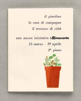
Il giardino, la casa di campagna, il terrazzo di città, una nuova iniziativa la Rinascente, 15 marzo - 19 aprile, 4° piano / The garden, the house in the country, the terrace in town, a new initiative la Rinascente, 15 March19 April, 4th floor, 1958, invito / invitation cartoncino pieghevole con busta di semi folded card with a bag of seeds, 20 x 27 cm
19. Lora Lamm
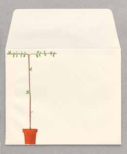
Il giardino, la casa di campagna, il terrazzo di città, una nuova iniziativa la Rinascente, 15 marzo - 19 aprile, 4° piano / The garden, the house in the country, the terrace in town, a new initiative la Rinascente, 15 March19 April, 4th floor, 1957, busta / envelope carta stampata / printed paper 11,9 x 14,4 cm
20. Lora Lamm
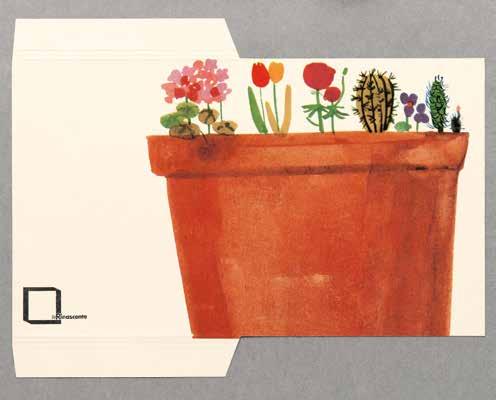
Il giardino, la casa di campagna, il terrazzo di città, una nuova iniziativa la Rinascente, 15 marzo - 19 aprile, 4° piano / The garden, the house in the country, the terrace in town, a new initiative la Rinascente, 15 March19 April, 4th floor, 1957, busta / envelope cartoncino / pasteboard, 13,5 x 10,5 cm
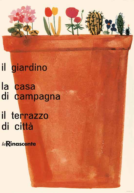
Il giardino, la casa di campagna, il terrazzo di città, la Rinascente
The garden, the country house, the terrace, in town, la Rinascente, 1957
manifesto / poster
stampa offset / offset print
100 x 69,5 cm
21. Lora Lamm
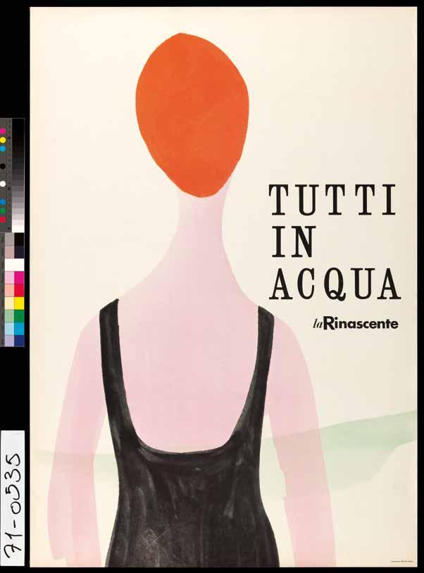
Everyone in the water, la Rinascente, 1956 manifesto / poster
stampa offset / offset print
99 x 68,5 cm
35. Lora Lamm
Tutti in acqua, la Rinascente
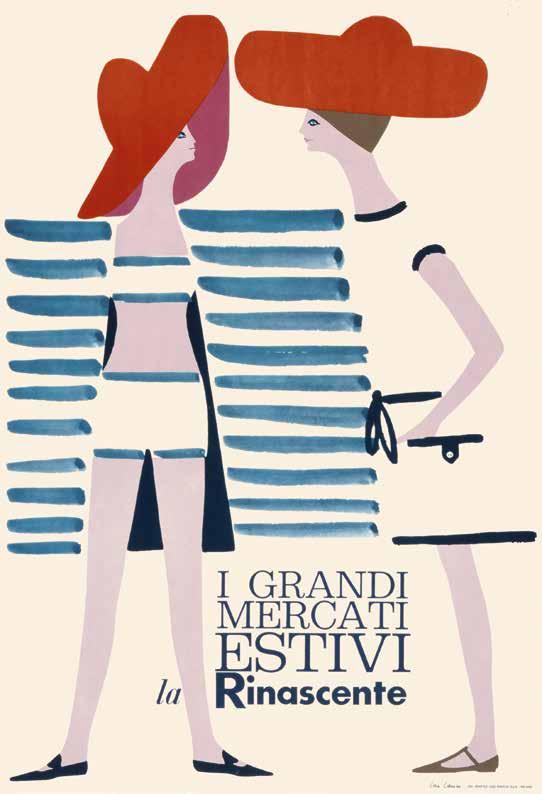
I grandi mercati estivi, la Rinascente
The big summer markets, la Rinascente, 1960 manifesto / poster
stampa offset / offset print
100 x 68,5 cm
36. Lora Lamm
44. Lora Lamm
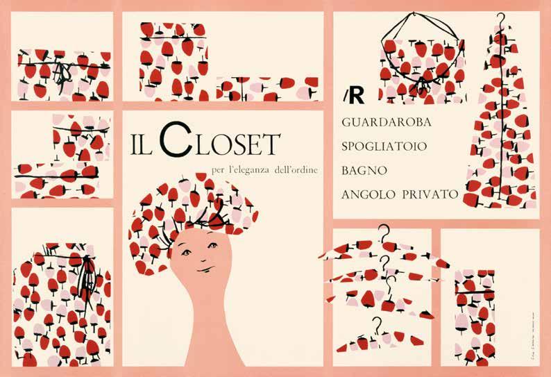
Il Closet, per l’eleganza dell’ordine, lR, guardaroba, spogliatoio, bagno, angolo privato / The Closet, for the elegance of order, wardrobe, dressing room, bathroom, private corner, 1958 manifesto / poster, stampa offset / offset print 68,5 x 99,5 cm
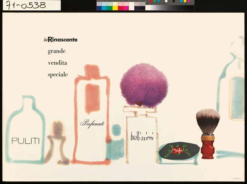
la Rinascente, grande vendita speciale, puliti, profumati, bellissimi
la Rinascente, big special sale, clean, scented, beautiful, 1956
manifesto / poster, stampa offset / offset print
70 x 100 cm
45. Lora Lamm
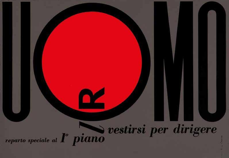
lR Uomo, vestirsi per dirigere, reparto speciale al 1° piano
lR Men, dressing for business special department on 1st floor, 1962 manifesto / poster, stampa offset / offset print
69 x 100 cm
64. Lora Lamm
65. Lora Lamm
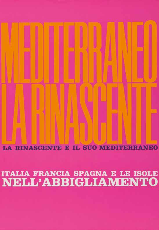
Mediterraneo la Rinascente, la Rinascente e il suo Mediterraneo, Italia Francia Spagna e le isole nell’abbigliamento / Mediterranean la Rinascente, la Rinascente and its Mediterranean, Italy France Spain and the islands in clothing, circa 1960 manifesto / poster stampa offset / offset print
100 x 68 cm
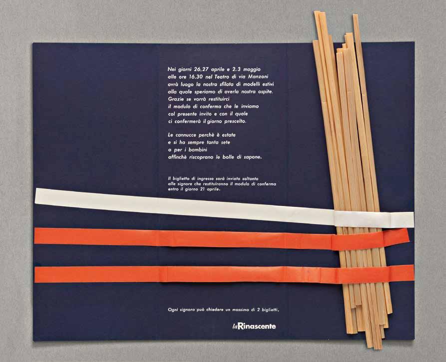
la Rinascente, sfilata di modelli estivi 1957, al Teatro di via Manzoni, Milano la Rinascente, summer fashion show 1957 at the Teatro Manzoni, Milan, 1957
brochure e biglietto d’invito per la sfilata brochure and invitation for the fashion show
cartoncino stampato / printed pasteboard
23 x 6 cm (carta piegata / folded paper)
23 x 23,8 cm (carta aperta / unfolded paper)
25 x 7,8 cm (busta / envelope)
85. Lora Lamm
86. Lora Lamm
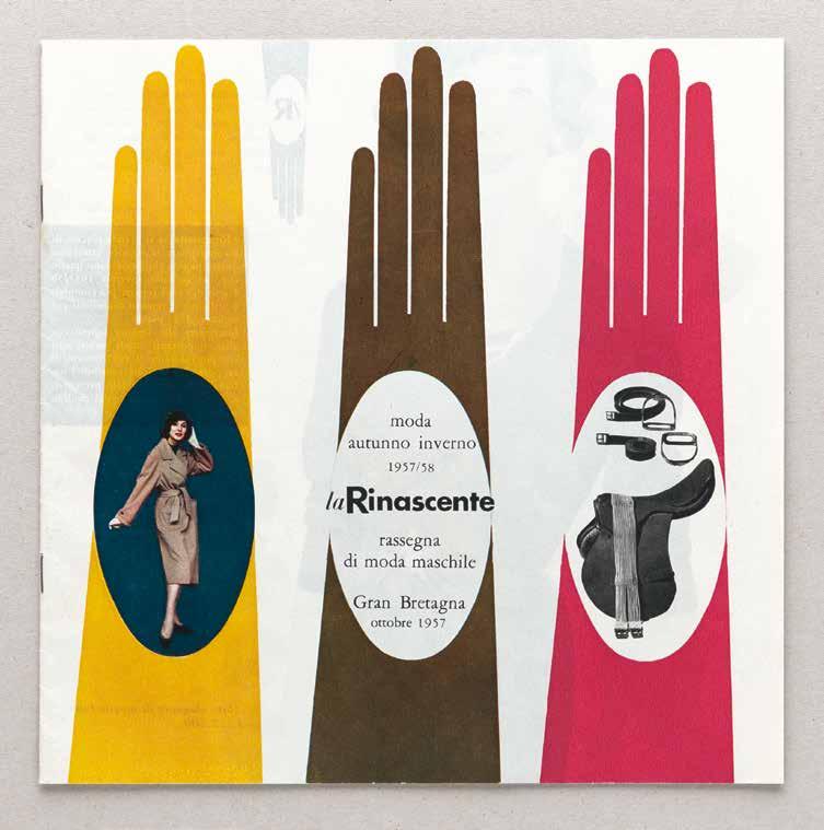
Moda autunno inverno 1957/58, la Rinascente, rassegna di moda maschile, Gran Bretagna, ottobre 1957, Gran Bretagna (tema) / Autumnwinter fashion 1957/58, la Rinascente, men’s fashion show Great Britain, October 1957, Great Britain (theme), 1957
catalogo / catalogue carta con colla, stampa rotocalco paper and glue, rotogravure printing circa 23 x 25 cm
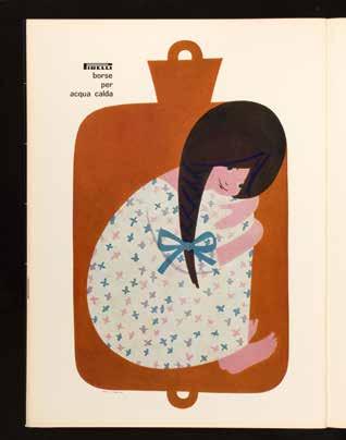
103. Lora Lamm
Pirelli borse per acqua calda Pirelli hot water bottles, 1962 pagina pubblicitaria / full page advertisement in “Pirelli. Rivista bimestrale d’informazione e di tecnica”, XV, circa 31 x 22,5 cm, stampa offset / offset print
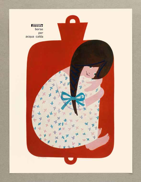
104. Lora Lamm
Pirelli borse per acqua calda
Pirelli hot water bottles, circa 1959-1963
annuncio promozionale / advertisement stampa offset / offset print
32 x 24 cm
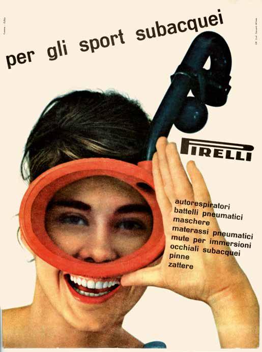
Per gli sport subacquei, Pirelli
For underwater sports, Pirelli, 1960
cartello / poster
stampa offset / offset print
40 x 29,8 cm
fotografia di / photo by Serge Libiszewski
105. Lora Lamm
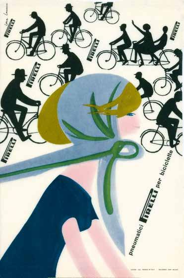
Pneumatici Pirelli per biciclette
Pirelli tyres for bicycles, 1960
vetrofania / window decal
21 x 13,7 cm
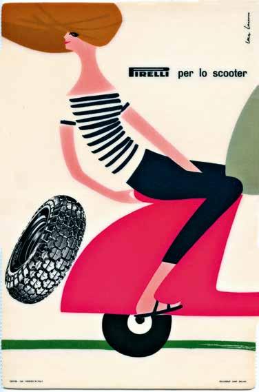
Pirelli per lo scooter
Pirelli for the scooter, 1960
vetrofania / window decal
20,7 x 13,8 cm
112. Lora Lamm
113. Lora Lamm
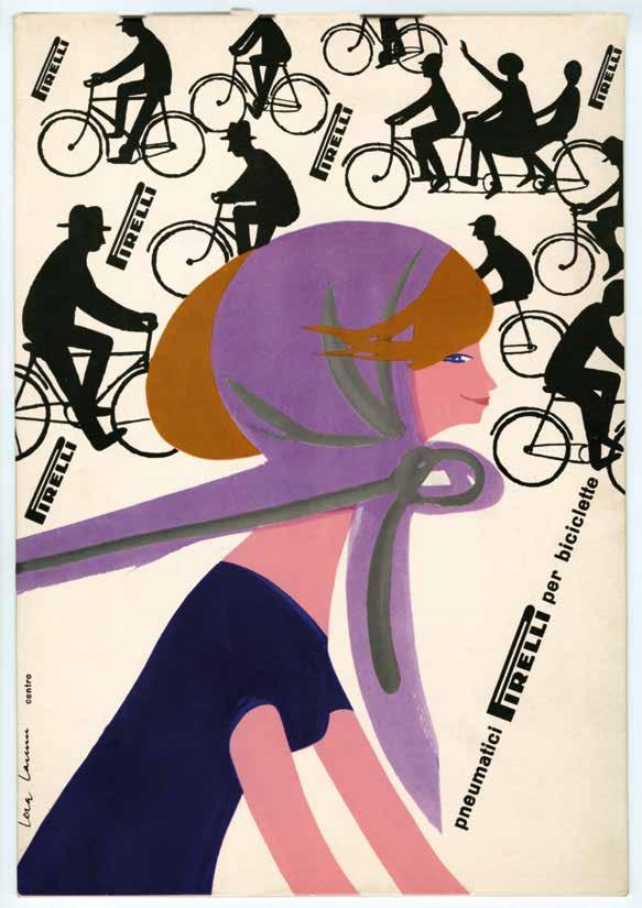
Pneumatici Pirelli per biciclette
Pirelli tyres for bicycles, 1960
cartello / poster
stampa offset / offset print
32,9 x 23 cm, 2 mm (spessore / thick)
114. Lora Lamm
Silvana Editoriale S.p.A.
via Margherita De Vizzi, 86 20092 Cinisello Balsamo, Milan
tel. 02 61 83 63 37 fax 02 61 72 464
www.silvanaeditoriale.it
Le riproduzioni, la stampa e la rilegatura sono state eseguite presso lo stabilimento
Arti Grafiche Amilcare Pizzi S.p.A.
Cinisello Balsamo, Milano
Reproductions, printing and binding by Arti Grafiche Amilcare Pizzi S.p.A.
Cinisello Balsamo, Milan
Finito di stampare nel mese di dicembre 2025
Printed December 2025