Interiors
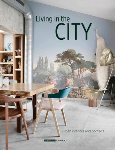
Throughout the centuries, cities have played a defining role in history. It was hard to do otherwise, because the vast majority of the population lived in urban areas. It was not until the mid20th century when many people acquired new material wealth and everyone suddenly owned a car for example, that we saw a turning point and people started moving en masse out of the cities so that they could build their own house with a garden. That meant that half a century later an awful lot of rural land is now almost completely built up. Fortunately, along with ecological consciousness, there is a growing awareness that we need to put a stop to building on undeveloped land. We find ourselves at a pivotal point in time and many cities are making great efforts to make urban living more attractive. Therefore, we found this to be a most propitious moment to compile this book. Many of the interiors that appear in our lifestyle magazines are urban dwellings. We have selected twenty, each unique in their own way and with their own story to tell.
Enjoy.
008
Milan Feast for the eyes
024
Eindhoven Pure colour
036
Berlin A tribute
050
Brussels Rough diamond
062
Mexico City Warm concrete
078
Amsterdam New vision
094
London Housework
108
Hasselt Haven
122
New York In balance
136
Haarlem Perfectly baked
152
Paris Laboratory in the ‘City of Light’
166
Brussels A la maniera di
178
Milan View of the city
194
Amsterdam Waterproof
210
Udine Resting point
224
Antwerp Just like in the film
240
Paris Room with a view
254
The Hague Big surprise
266
New York Double vision
278
Brussels Second time lucky
Portraits 020
Monica Mascheroni, Owner Photo Agency - Milan
088
Alain Gilles, Designer - Brussels
André Lafère
148
James Shaw, Designer- London
Editor in Chief Feeling Wonen / Gael Maison / Eigen Huis & Interieur
236
Paul Linse, Interior Architect - Amsterdam, Paris, Berlin
7
Interiors
Throughout the centuries, cities have played a defining role in history. It was hard to do otherwise, because the vast majority of the population lived in urban areas. It was not until the mid20th century when many people acquired new material wealth and everyone suddenly owned a car for example, that we saw a turning point and people started moving en masse out of the cities so that they could build their own house with a garden. That meant that half a century later an awful lot of rural land is now almost completely built up. Fortunately, along with ecological consciousness, there is a growing awareness that we need to put a stop to building on undeveloped land. We find ourselves at a pivotal point in time and many cities are making great efforts to make urban living more attractive. Therefore, we found this to be a most propitious moment to compile this book. Many of the interiors that appear in our lifestyle magazines are urban dwellings. We have selected twenty, each unique in their own way and with their own story to tell.
Enjoy.
008
Milan Feast for the eyes
024
Eindhoven Pure colour
036
Berlin A tribute
050
Brussels Rough diamond
062
Mexico City Warm concrete
078
Amsterdam New vision
094
London Housework
108
Hasselt Haven
122
New York In balance
136
Haarlem Perfectly baked
152
Paris Laboratory in the ‘City of Light’
166
Brussels A la maniera di
178
Milan View of the city
194
Amsterdam Waterproof
210
Udine Resting point
224
Antwerp Just like in the film
240
Paris Room with a view
254
The Hague Big surprise
266
New York Double vision
278
Brussels Second time lucky
Portraits 020
Monica Mascheroni, Owner Photo Agency - Milan
088
Alain Gilles, Designer - Brussels
André Lafère
148
James Shaw, Designer- London
Editor in Chief Feeling Wonen / Gael Maison / Eigen Huis & Interieur
236
Paul Linse, Interior Architect - Amsterdam, Paris, Berlin
7
|
MILAN
|
Feast for the eyes EN Mixing and matching is an art and you can’t just learn it in a snap of the fingers, but according to Nelcya and Fabrizio Cantoni the secret to it is to dare. “It may go wrong once in a while, but you learn from it. The only thing that counts, is that you feel good in your home. The more you have, the easier it gets”, says the duo behind the adventurous Italian carpet brand cc-tapis. Their triplex in Milan is a banquet of shapes and colours and reflects their lifestyle: exuberant and full of optimism. “We are lucky: my wife and I have the same taste. If we can find something beautiful and we can afford it, we buy it. Sometimes we find a spot for an object straight away, sometimes we need to change the layout in order to find the right place for it. Our interior is a mix of objects that we acquired recently or more than 20 years ago. Just like everyone else we started off with hand-me-downs from our parents and then it started to evolve into objects with a specific style.”
8
EN
Fabrizio taught himself art and design using his extensive book collection. A whole bunch of precious objects and works of art also found a spot on the bookshelves. The pink chairs are a reproduction of the 1955 model produced by the Italian brand Arflex.
NL
Fabrizio Cantoni leidde zichzelf op in kunst en design dankzij zijn uitgebreide boekencollectie. In de boekenkast vonden ook een heleboel dierbare objecten en werken een plaatsje. De roze fauteuils zijn heruitgaven uit 1955 van het Italiaanse merk Arflex.
FR
Fabrizio Cantoni aime se plonger dans l’art et le design grâce à sa collection de livres élargie. La bibliothèque accueille aussi une foule d’objets et d’œuvres précieuses aux habitants. Les fauteuils roses sont des rééditions d’un modèle édité par Arflex en 1955.
The couple both studied hospitality management. Their taste is purely intuitive, whether it is applied to furnishing their triplex or designing their carpets. For their interior, they consciously started with a neutral base so that their collection of comics and records, contemporary art and sharp design really stand out. “I think that you should always ‘listen” to what your house wants. In our case, that meant that we basically had to do the opposite of a conventional house renovation. This house had definitely been renovated before and all the typical features from the 20th century had been removed. We brought them all back, including the cornices, skirting boards and brass curtain rails, giving it a retro look. We wanted a good balance between old and new, otherwise you get the feeling that you are living in a showroom.” The duo describes the final result as classic and inviting. “Journalists have called it a ‘merry band’, but I find that our interior is very harmonious”, says Fabrizio. If there is one leitmotif that runs through the house then it is the hotel atmosphere: the dining room looks like a bistro, the bedroom is very similar to a hotel suite... “We did it subconsciously”, adds Fabrizio.
9
|
MILAN
|
Feast for the eyes EN Mixing and matching is an art and you can’t just learn it in a snap of the fingers, but according to Nelcya and Fabrizio Cantoni the secret to it is to dare. “It may go wrong once in a while, but you learn from it. The only thing that counts, is that you feel good in your home. The more you have, the easier it gets”, says the duo behind the adventurous Italian carpet brand cc-tapis. Their triplex in Milan is a banquet of shapes and colours and reflects their lifestyle: exuberant and full of optimism. “We are lucky: my wife and I have the same taste. If we can find something beautiful and we can afford it, we buy it. Sometimes we find a spot for an object straight away, sometimes we need to change the layout in order to find the right place for it. Our interior is a mix of objects that we acquired recently or more than 20 years ago. Just like everyone else we started off with hand-me-downs from our parents and then it started to evolve into objects with a specific style.”
8
EN
Fabrizio taught himself art and design using his extensive book collection. A whole bunch of precious objects and works of art also found a spot on the bookshelves. The pink chairs are a reproduction of the 1955 model produced by the Italian brand Arflex.
NL
Fabrizio Cantoni leidde zichzelf op in kunst en design dankzij zijn uitgebreide boekencollectie. In de boekenkast vonden ook een heleboel dierbare objecten en werken een plaatsje. De roze fauteuils zijn heruitgaven uit 1955 van het Italiaanse merk Arflex.
FR
Fabrizio Cantoni aime se plonger dans l’art et le design grâce à sa collection de livres élargie. La bibliothèque accueille aussi une foule d’objets et d’œuvres précieuses aux habitants. Les fauteuils roses sont des rééditions d’un modèle édité par Arflex en 1955.
The couple both studied hospitality management. Their taste is purely intuitive, whether it is applied to furnishing their triplex or designing their carpets. For their interior, they consciously started with a neutral base so that their collection of comics and records, contemporary art and sharp design really stand out. “I think that you should always ‘listen” to what your house wants. In our case, that meant that we basically had to do the opposite of a conventional house renovation. This house had definitely been renovated before and all the typical features from the 20th century had been removed. We brought them all back, including the cornices, skirting boards and brass curtain rails, giving it a retro look. We wanted a good balance between old and new, otherwise you get the feeling that you are living in a showroom.” The duo describes the final result as classic and inviting. “Journalists have called it a ‘merry band’, but I find that our interior is very harmonious”, says Fabrizio. If there is one leitmotif that runs through the house then it is the hotel atmosphere: the dining room looks like a bistro, the bedroom is very similar to a hotel suite... “We did it subconsciously”, adds Fabrizio.
9
10
11
EN
The sitting room looks like a mini museum filled with art and design. On the ground, there is a ‘Lost in the Fifties’ carpet by cc-tapis, the carpet brand that Nelcya and Fabrizio founded and that is known worldwide for its adventurous designs.
NL
De zithoek lijkt wel een minimuseum vol kunst en design. Op de grond ligt het tapijt ‘Lost in the Fifties’ van cc-tapis, het tapijtenlabel dat Nelcya en Fabrizio oprichtten en dat wereldwijd bekend staat om zijn avontuurlijke ontwerpen.
FR
Le salon a des airs de musée rempli d’art et de design. Au sol, le tapis ‘Lost in the Fifties’ est une édition de cc-tapis, le label des propriétaires Nelcya et Fabrizio Cantoni. Un label connu mondialement pour ses créations épiques.
10
11
EN
The sitting room looks like a mini museum filled with art and design. On the ground, there is a ‘Lost in the Fifties’ carpet by cc-tapis, the carpet brand that Nelcya and Fabrizio founded and that is known worldwide for its adventurous designs.
NL
De zithoek lijkt wel een minimuseum vol kunst en design. Op de grond ligt het tapijt ‘Lost in the Fifties’ van cc-tapis, het tapijtenlabel dat Nelcya en Fabrizio oprichtten en dat wereldwijd bekend staat om zijn avontuurlijke ontwerpen.
FR
Le salon a des airs de musée rempli d’art et de design. Au sol, le tapis ‘Lost in the Fifties’ est une édition de cc-tapis, le label des propriétaires Nelcya et Fabrizio Cantoni. Un label connu mondialement pour ses créations épiques.
FR Une énorme cuisine lumineuse où l’on peut manger et faire la fête avec beaucoup de gens ! Telle était l’envie de l’architecte d’intérieur Monique Stevens quand elle a entamé l’ambitieuse rénovation de cette ancienne boulangerie. Une vieille enseigne annonce encore “Boulangerie” en façade, mais cet édifice de la fin du XIXe siècle a tout d’abord été conçu comme un théâtre. Il est ensuite devenu cinéma avant d’être transformé en boulangerie en 1929 et d’hériter de sa vitrine actuelle. “J’ai tout de suite craqué pour cet endroit, tout en me disant que je n’aurai suffisamment de place que si je pouvais intégrer à l’espace de vie l’ancien garage à vélos situé à l’arrière. Mais la municipalité refusait que je change la forme du bâtiment. J’ai donc décidé d’isoler le garage à vélos et d’y installer la cuisine.” Pendant cinq mois et demi, Monique a travaillé d’arrache-pied avec son entrepreneur. “C’était très motivant. Je n’avais jamais tant réalisé à quel point un bel espace signifie bien plus qu’une collection de meubles. L’acoustique doit être bonne, mais aussi la lumière, et cela doit sentir bon ! Cela doit être une expérience sensorielle totale.”
146
Monique a longtemps a cherché la couleur de base idéale pour sa maison. “Ce gris-vert est vraiment magique ! Tout ce que vous placez à côté est tout de suite plus beau. Il permet en outre de faire le pont vers d’autres couleurs.” Pour contrebalancer le caractère imposant la cuisine en verre, acier et béton haute de près de quatre mètres, Monique a introduit des matériaux doux et délicats. Pour s’assurer suffisamment d’espace de rangement, elle a élevé les armoires jusqu’au plafond. La famille passant le plus clair de son temps en cuisine, il était logique d’en faire la plus grande pièce de la maison. Ils n’investissent le canapé que pour regarder un film. Avec ses murs argile aux teintes plus sombres, ce salon télé affiche d’emblée sa différence. Les éléments originels, telles ces poutres de 130 ans d’âge, ont été préservés partout où c’était possible. Des puits de lumière inondent littéralement l’intérieur. “Ce qui est plus durable également, car l’on a rarement besoin d’éclairer. Je ne vois pas les questions de durabilité comme une restriction. C’est plutôt un défi que je peux relever avec créativité.”
147
EN
No mess around the sink; everything disappears behind the mirrored doors that make the room look bigger. OPPOSITE Monique only used restful shades for the bedroom.
NL
Geen rommel rond de wastafel; alles verdwijnt achter de spiegeldeuren die de kleine ruimte optisch vergroten. HIERNAAST Voor de slaapkamer gebruikte Monique alleen maar rustige tinten.
FR
Dans la salle de bains, produits et ustensiles disparaissent derrière des miroirs coulissants. La pièce paraît ainsi plus grande. CI-CONTRE Monique a eu recours à plusieurs teintes calmes pour sa chambre à coucher.
FR Une énorme cuisine lumineuse où l’on peut manger et faire la fête avec beaucoup de gens ! Telle était l’envie de l’architecte d’intérieur Monique Stevens quand elle a entamé l’ambitieuse rénovation de cette ancienne boulangerie. Une vieille enseigne annonce encore “Boulangerie” en façade, mais cet édifice de la fin du XIXe siècle a tout d’abord été conçu comme un théâtre. Il est ensuite devenu cinéma avant d’être transformé en boulangerie en 1929 et d’hériter de sa vitrine actuelle. “J’ai tout de suite craqué pour cet endroit, tout en me disant que je n’aurai suffisamment de place que si je pouvais intégrer à l’espace de vie l’ancien garage à vélos situé à l’arrière. Mais la municipalité refusait que je change la forme du bâtiment. J’ai donc décidé d’isoler le garage à vélos et d’y installer la cuisine.” Pendant cinq mois et demi, Monique a travaillé d’arrache-pied avec son entrepreneur. “C’était très motivant. Je n’avais jamais tant réalisé à quel point un bel espace signifie bien plus qu’une collection de meubles. L’acoustique doit être bonne, mais aussi la lumière, et cela doit sentir bon ! Cela doit être une expérience sensorielle totale.”
146
Monique a longtemps a cherché la couleur de base idéale pour sa maison. “Ce gris-vert est vraiment magique ! Tout ce que vous placez à côté est tout de suite plus beau. Il permet en outre de faire le pont vers d’autres couleurs.” Pour contrebalancer le caractère imposant la cuisine en verre, acier et béton haute de près de quatre mètres, Monique a introduit des matériaux doux et délicats. Pour s’assurer suffisamment d’espace de rangement, elle a élevé les armoires jusqu’au plafond. La famille passant le plus clair de son temps en cuisine, il était logique d’en faire la plus grande pièce de la maison. Ils n’investissent le canapé que pour regarder un film. Avec ses murs argile aux teintes plus sombres, ce salon télé affiche d’emblée sa différence. Les éléments originels, telles ces poutres de 130 ans d’âge, ont été préservés partout où c’était possible. Des puits de lumière inondent littéralement l’intérieur. “Ce qui est plus durable également, car l’on a rarement besoin d’éclairer. Je ne vois pas les questions de durabilité comme une restriction. C’est plutôt un défi que je peux relever avec créativité.”
147
EN
No mess around the sink; everything disappears behind the mirrored doors that make the room look bigger. OPPOSITE Monique only used restful shades for the bedroom.
NL
Geen rommel rond de wastafel; alles verdwijnt achter de spiegeldeuren die de kleine ruimte optisch vergroten. HIERNAAST Voor de slaapkamer gebruikte Monique alleen maar rustige tinten.
FR
Dans la salle de bains, produits et ustensiles disparaissent derrière des miroirs coulissants. La pièce paraît ainsi plus grande. CI-CONTRE Monique a eu recours à plusieurs teintes calmes pour sa chambre à coucher.
“The street feels like a village, but it is on the edge of Shoreditch and not far from the City. That combination makes it really interesting.”
148
149
Welcome to… the London of designer James Shaw EN The work of the young British designer James Shaw revolves around experiments with materials: from wood shavings and natural resin, he makes stools, he uses a gun to spray recycled plastic to create tables, stools and candlesticks. His work is part of the permanent collection among others of the Vitra Design Museum and the MoMA. Shaw works in South London and lives in Bethnal Green, on the edge of the vibrant, ultrahip district of Shoreditch in East London.
“The street feels like a village, but it is on the edge of Shoreditch and not far from the City. That combination makes it really interesting.”
148
149
Welcome to… the London of designer James Shaw EN The work of the young British designer James Shaw revolves around experiments with materials: from wood shavings and natural resin, he makes stools, he uses a gun to spray recycled plastic to create tables, stools and candlesticks. His work is part of the permanent collection among others of the Vitra Design Museum and the MoMA. Shaw works in South London and lives in Bethnal Green, on the edge of the vibrant, ultrahip district of Shoreditch in East London.
|
PARIS
|
Laboratory in the ‘City of Light’ 152
EN
In the living room, Jean-Christophe Aumas mixes contemporary design such as the Vincenzo de Cotiis sofa with vintage finds. All over the house there are small graphic touches, like the blue tape that runs from the self-designed mirror onto the fireplace.
NL
In de zitruimte mixt Jean-Christophe Aumas hedendaags design, zoals de bank van Vincenzo de Cotiis, met vintage vondsten. Overal in huis vind je kleine grafische accenten, zoals de blauwe tape die van de zelf ontworpen spiegel over de schouwmantel loopt.
FR
Dans son salon, Jean-Christophe Aumas mêle trouvailles vintage et design contemporain, tel ce canapé de Vincenzo de Cotiis. L’appartement déborde de petits accents graphiques, telles ces bandes adhésives bleues longeant le miroir pour retomber sur la cheminée. Le miroir est une création personnelle.
EN A jungle garden in the middle of Paris? Yes indeed. Jean-Christophe Aumas prefers to describe his enormous apartment with its wild garden as a laboratory. “I hate the idea that everything should be fixed to one spot. I need to be able to move furniture around and change colours whenever I feel like it.” This is right up his alley, since in everyday life he is an art director with his own office called Singular that specialises in windows and event decoration for luxury brands such as Céline, Dior, Hermès and Galeries Lafayette. It is not surprising that he showcases his unbridled imagination in his house as well. The location is a reflection of everything that he loves: “It is graphic, happy, modern, serene, unexpected and inspiring.” The patio - which was just a neglected courtyard - was one of the main reasons that Aumas decided to sell his loft and move to the lively Pigalle neighbourhood. But the metres-high ceilings of the 18th century mansion in which the apartment is situated, the unique parquet flooring and lead windows also made him change his mind.
Short but essential renovation works ensured that the interior is generously bathed in daylight thanks to the new skylight in the living room and the glass doors at the back of the house. In fine weather, they are left wide open so that the lush greenery from outside can spill into the living room. Aumas loves blocks of colour: a lilac wall in the kitchen, a bright green built-in cupboard in the office, brownish-pink shower walls and brownish-red floor tiles in the bathroom all bring the rooms to life whilst remaining functional. Colourful Mediterranean tiles, classic vintage pieces from the 50s, 60s and 70s, modern art picked up in galleries or exhibitions, handmade furniture and finds from Paris’ iconic flea markets or second-hand shops are basically spread throughout the different rooms in the house. For Jean-Christophe Aumas they are an infinite source of inspiration for his interior and his work...
153
|
PARIS
|
Laboratory in the ‘City of Light’ 152
EN
In the living room, Jean-Christophe Aumas mixes contemporary design such as the Vincenzo de Cotiis sofa with vintage finds. All over the house there are small graphic touches, like the blue tape that runs from the self-designed mirror onto the fireplace.
NL
In de zitruimte mixt Jean-Christophe Aumas hedendaags design, zoals de bank van Vincenzo de Cotiis, met vintage vondsten. Overal in huis vind je kleine grafische accenten, zoals de blauwe tape die van de zelf ontworpen spiegel over de schouwmantel loopt.
FR
Dans son salon, Jean-Christophe Aumas mêle trouvailles vintage et design contemporain, tel ce canapé de Vincenzo de Cotiis. L’appartement déborde de petits accents graphiques, telles ces bandes adhésives bleues longeant le miroir pour retomber sur la cheminée. Le miroir est une création personnelle.
EN A jungle garden in the middle of Paris? Yes indeed. Jean-Christophe Aumas prefers to describe his enormous apartment with its wild garden as a laboratory. “I hate the idea that everything should be fixed to one spot. I need to be able to move furniture around and change colours whenever I feel like it.” This is right up his alley, since in everyday life he is an art director with his own office called Singular that specialises in windows and event decoration for luxury brands such as Céline, Dior, Hermès and Galeries Lafayette. It is not surprising that he showcases his unbridled imagination in his house as well. The location is a reflection of everything that he loves: “It is graphic, happy, modern, serene, unexpected and inspiring.” The patio - which was just a neglected courtyard - was one of the main reasons that Aumas decided to sell his loft and move to the lively Pigalle neighbourhood. But the metres-high ceilings of the 18th century mansion in which the apartment is situated, the unique parquet flooring and lead windows also made him change his mind.
Short but essential renovation works ensured that the interior is generously bathed in daylight thanks to the new skylight in the living room and the glass doors at the back of the house. In fine weather, they are left wide open so that the lush greenery from outside can spill into the living room. Aumas loves blocks of colour: a lilac wall in the kitchen, a bright green built-in cupboard in the office, brownish-pink shower walls and brownish-red floor tiles in the bathroom all bring the rooms to life whilst remaining functional. Colourful Mediterranean tiles, classic vintage pieces from the 50s, 60s and 70s, modern art picked up in galleries or exhibitions, handmade furniture and finds from Paris’ iconic flea markets or second-hand shops are basically spread throughout the different rooms in the house. For Jean-Christophe Aumas they are an infinite source of inspiration for his interior and his work...
153
|
BRUSSELS
|
Second time lucky 278
279 EN When Marta and her husband fell in love with this house in Brussels, they had hugely underestimated how much work would be necessary to meet modern living standards. They had been satisfied with the first part of the renovation works on the top floor. “But it was a terrible experience, both in terms of the construction company and the architect. I became afraid that building works were always a terrible experience.” Their new architect from the Auxau firm of architects found what was needed to guide this narrow Brussels house into the 21st century. On Marta’s new wish list she still had to tick off: a kitchen with a view of the garden, a separate dining room and a granny flat on the same floor as the garden for Marta’s mother. But often it is just a matter of adding the right details. The couple for instance thought that a whole extension would be necessary in order to end up with a pleasant living room, but it turned out that a couple of square meters was all that was needed.
EN
In the dining room there is just a long table and chairs, which makes the room look much bigger. Photo on the wall by Geert Kollau.
NL
In de eetkamer van Marta en haar gezin staat enkel een lange tafel met stoelen, waardoor de ruimte veel groter lijkt. Foto aan de wand van Geert Kollau.
FR
N’accueillant qu’une table et des chaises, l’étroite salle à manger semble suffisamment grande. Au mur photo de Geert Kollau.
One detail changed everything however: the new Hungarian point parquet, which turned the living room into one flowing entity including the kitchen. The refurbished basement was completely redesigned: now there is a cloakroom, a laundry room and a granny flat downstairs. It is Marta’s mother’s favourite place, she lives in the south of Italy but regularly comes to visit. During the renovations, Marta and her husband treated themselves to an en-suite bathroom in their new bedroom. For the interior design of their renovated house, the couple called on the services of an interior design office. It came up with an Italian-style interior with lots of marble, which fitted perfectly with the style of the Brussels town house, and included details like the meticulously finished decorative frames. This beautiful house is the result of an excellent collaboration between the architect and the specialists. And the terrible first experience was completely forgotten... just like that.
|
BRUSSELS
|
Second time lucky 278
279 EN When Marta and her husband fell in love with this house in Brussels, they had hugely underestimated how much work would be necessary to meet modern living standards. They had been satisfied with the first part of the renovation works on the top floor. “But it was a terrible experience, both in terms of the construction company and the architect. I became afraid that building works were always a terrible experience.” Their new architect from the Auxau firm of architects found what was needed to guide this narrow Brussels house into the 21st century. On Marta’s new wish list she still had to tick off: a kitchen with a view of the garden, a separate dining room and a granny flat on the same floor as the garden for Marta’s mother. But often it is just a matter of adding the right details. The couple for instance thought that a whole extension would be necessary in order to end up with a pleasant living room, but it turned out that a couple of square meters was all that was needed.
EN
In the dining room there is just a long table and chairs, which makes the room look much bigger. Photo on the wall by Geert Kollau.
NL
In de eetkamer van Marta en haar gezin staat enkel een lange tafel met stoelen, waardoor de ruimte veel groter lijkt. Foto aan de wand van Geert Kollau.
FR
N’accueillant qu’une table et des chaises, l’étroite salle à manger semble suffisamment grande. Au mur photo de Geert Kollau.
One detail changed everything however: the new Hungarian point parquet, which turned the living room into one flowing entity including the kitchen. The refurbished basement was completely redesigned: now there is a cloakroom, a laundry room and a granny flat downstairs. It is Marta’s mother’s favourite place, she lives in the south of Italy but regularly comes to visit. During the renovations, Marta and her husband treated themselves to an en-suite bathroom in their new bedroom. For the interior design of their renovated house, the couple called on the services of an interior design office. It came up with an Italian-style interior with lots of marble, which fitted perfectly with the style of the Brussels town house, and included details like the meticulously finished decorative frames. This beautiful house is the result of an excellent collaboration between the architect and the specialists. And the terrible first experience was completely forgotten... just like that.
280
281
EN
The kitchen and the rest of the living room are where they were before the renovation works were carried out, but they were extended. The ‘Aim’ lamp by the Bouroullec brothers adds a playful touch.
NL
De keuken en de rest van de leefruimte bleven waar ze zich voor de renovatie bevonden, maar werden uitgebreid. Lamp ‘Aim’ van de Bouroullecs zorgt voor een speels accent.
FR
La cuisine et les autres fonctions du séjour n’ont pas changé de place mais quelques mètres carrés en plus et un autre agencement ont tout changé. Les suspensions ‘Aim’ des Bouroullec ajoutent une touche ludique.
280
281
EN
The kitchen and the rest of the living room are where they were before the renovation works were carried out, but they were extended. The ‘Aim’ lamp by the Bouroullec brothers adds a playful touch.
NL
De keuken en de rest van de leefruimte bleven waar ze zich voor de renovatie bevonden, maar werden uitgebreid. Lamp ‘Aim’ van de Bouroullecs zorgt voor een speels accent.
FR
La cuisine et les autres fonctions du séjour n’ont pas changé de place mais quelques mètres carrés en plus et un autre agencement ont tout changé. Les suspensions ‘Aim’ des Bouroullec ajoutent une touche ludique.
286
287
FR Quand Marta et son mari sont tombés amoureux de cette maison, ils avaient totalement sous-estimé l’ampleur des travaux nécessaires pour la remettre au goût du jour. Aussi se sont-il contentés dans un premier temps de rénover les étages supérieurs. “Cette expérience, hélas, a été désastreuse, tant avec l’architecte qu’avec l’entrepreneur”, raconte-t-elle. “J’avais peur de recommencer tant je croyais que les rénovations se passaient forcément mal.” Heureusement, le couple rencontré le bureau Auxau, qui a su trouver la bonne formule pour faire entrer cette maison bruxelloise étroite dans le XXIe siècle. Les attentes de Marta incluaient pourtant de vrais défis, telle une cuisine avec vue sur le jardin, une salle à manger séparée et un appartement kangourou au rez-de-chaussée pour ses parents. Souvent, la solution réside non dans l’ampleur de l’intervention, mais dans sa précision. Marta et son mari croyaient ainsi qu’une nouvelle et grande annexe serait nécessaire pour disposer d’une pièce de vie spacieuse et agréable… Or quelques mètres carrés suffisaient. EN
The master bedroom on the first floor, with the original decorative frames. The spacious bathroom with a rain shower. OPPOSITE The hallway with the original cement tiles.
NL
De masterbedroom op de eerste verdieping, met oorspronkelijke sierlijsten. De ruime badkamer met regendouche. HIERNAAST De gang met oorspronkelijke cementen vloertegels.
FR
La chambre parentale au premier étage avec ses moulures d’origine. La salle de bains en suite. CI-CONTRE Le couloir arbore encore ses carreaux en ciment d’origine.
Autre détail qui change tout, le nouveau parquet en point de Hongrie qui réunit cuisine, salle à manger et salon en un tout fluide et cohérent. Le niveau des caves a été entièrement remanié pour inclure désormais un vestiaire, une buanderie et l’appartement kangourou destiné à la mère de Marta, qui habite dans le sud de l’Italie mais leur rend régulièrement visite. Marta et son mari se sont aussi offert une toute nouvelle chambre, avec salle de bains en suite. Pour la déco, le couple s’est tourné vers une agence qui l’a aidé à imaginer ce décor à l’italienne avec notamment beaucoup de marbre (une option qui sied aussi au style des maisons bruxelloises) et une délicate mise en couleur des moulures. La maison exprime en outre une belle collaboration entre architecte et les différents corps de métier… de quoi faire totalement oublier les expériences négatives du passé.
286
287
FR Quand Marta et son mari sont tombés amoureux de cette maison, ils avaient totalement sous-estimé l’ampleur des travaux nécessaires pour la remettre au goût du jour. Aussi se sont-il contentés dans un premier temps de rénover les étages supérieurs. “Cette expérience, hélas, a été désastreuse, tant avec l’architecte qu’avec l’entrepreneur”, raconte-t-elle. “J’avais peur de recommencer tant je croyais que les rénovations se passaient forcément mal.” Heureusement, le couple rencontré le bureau Auxau, qui a su trouver la bonne formule pour faire entrer cette maison bruxelloise étroite dans le XXIe siècle. Les attentes de Marta incluaient pourtant de vrais défis, telle une cuisine avec vue sur le jardin, une salle à manger séparée et un appartement kangourou au rez-de-chaussée pour ses parents. Souvent, la solution réside non dans l’ampleur de l’intervention, mais dans sa précision. Marta et son mari croyaient ainsi qu’une nouvelle et grande annexe serait nécessaire pour disposer d’une pièce de vie spacieuse et agréable… Or quelques mètres carrés suffisaient. EN
The master bedroom on the first floor, with the original decorative frames. The spacious bathroom with a rain shower. OPPOSITE The hallway with the original cement tiles.
NL
De masterbedroom op de eerste verdieping, met oorspronkelijke sierlijsten. De ruime badkamer met regendouche. HIERNAAST De gang met oorspronkelijke cementen vloertegels.
FR
La chambre parentale au premier étage avec ses moulures d’origine. La salle de bains en suite. CI-CONTRE Le couloir arbore encore ses carreaux en ciment d’origine.
Autre détail qui change tout, le nouveau parquet en point de Hongrie qui réunit cuisine, salle à manger et salon en un tout fluide et cohérent. Le niveau des caves a été entièrement remanié pour inclure désormais un vestiaire, une buanderie et l’appartement kangourou destiné à la mère de Marta, qui habite dans le sud de l’Italie mais leur rend régulièrement visite. Marta et son mari se sont aussi offert une toute nouvelle chambre, avec salle de bains en suite. Pour la déco, le couple s’est tourné vers une agence qui l’a aidé à imaginer ce décor à l’italienne avec notamment beaucoup de marbre (une option qui sied aussi au style des maisons bruxelloises) et une délicate mise en couleur des moulures. La maison exprime en outre une belle collaboration entre architecte et les différents corps de métier… de quoi faire totalement oublier les expériences négatives du passé.