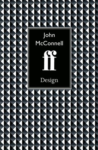
John McConnell
Design
Introduction I will probably never forget the moment in 1981 – a stuffy boardroom meeting – when John McConnell unveiled the future of Faber design. After two or three false starts elsewhere, and our list bursting with new young talent, from Kazuo Ishiguro to Marilynne Robinson, we were desperate for some contemporary artwork to mirror and promote the transformation we believed we were making. In the life of a great English publisher, this was a turning-point. The Faber board gave Pentagram the green light without much debate, but the decision was a bold one. For a blue-chip poetry publisher of Faber’s grandeur to delegate its design to an internationally renowned partnership was like a vintage Bentley deciding to enter a grand prix. Rarely, in its distinguished 20th-century history, had the publisher committed itself to such a radical initiative. As Editor-in-chief, I had a ringside seat at this transformation. Next to the ancient universities, the BBC, Fleet Street and the metropolitan clubs, Faber & Faber was a foundation stone in the edifice that housed a literary tradition. In post-war Britain, it was an influential part of the culture, badly in need of a face-lift. With the benefit of hindsight, the arrival of Pentagram at Queen Square was just part of a youthful creative insurrection, just as John McConnell was a leading member of a design revolution. After the bitter cultural crises of the 1970s, everything was about to change; and once the digital breakthrough began, there could be no going back. In retrospect, we who became part of the Pentagram revolution at Faber were Thatcher’s children, young, sleepless and slightly reckless. In 1983, when William Goldman published the Hollywood classic, Adventures in the Screen Trade, his mantra “nobody knows anything” seemed to capture perfectly the chaos, energy and irresponsibility of some exuberant times, the unintended consequence of a radical Conservative regime. This book will be devoured by students of graphic design, but it is also a portrait of a rare moment of creative innovation, a handbook to a great leap forward in which John McConnell and I were happy insurgents. What follows is his story and my part in it. Robert McCrum
5
Design John McConnell
When John McConnell, the great British designer who’s synonymous with Pentagram, was very small, his deaf-as-a-post grandfather, a printer’s reader, introduced the boy to hot metal, “three or four trays of type, and a thing called a composing stick”. However, the path to his vocation, and ultimately the design revolution of the 1980s, was not quite so simple. And nor, when you get to know him, is McConnell himself.
John McConnell is a designer who grew up with letterpress, thanks to his grandfather’s gift of a printing press. These objects illustrate the lost world of his childhood. The metal frame is a ‘chase’ and the packing surrounding the
letters is the ‘furniture’. Clamps were known as ‘quoins’ and the composing stick (above) was used for arranging lines of individual metal type.
I worked alongside John at the publishers, Faber & Faber, during the fabled Eighties. We were good colleagues and friends, who enjoyed each other’s company, but it’s only now, in retirement, that we have found the motive and opportunity to reflect on the fascinating story of a career devoted to ink and paper. In our digital and virtual world, John McConnell remains the master of ink and folios, an artist of Caxton’s craft. Possibly, this can be traced to his origins in wartime London. He was born in Balham, on the eve of World War Two, grew up in a flat next to the tube on Bedford Hill, sees himself, and still sounds like, a metropolitan, “an out-and-out Londoner”, cultivating what you might call a perky, demotic demeanour, like an artful dodger who’s about to sneak off to place an each-way bet on a good tip for the 2.15 at Kempton Park. His mother Enid Dimberline had taught at Manchester Grammar School. His father Don was a self-made accountant who loved to read. John’s childhood home was full of books, and a love of literature. His appreciation of these riches, however, was severely limited. “I fell in love with books,” he remembers, but his ardour was frustrated. Whenever he opened a book all he could do was “look at the pictures.” McConnell was – and still is – “extremely dyslexic”, an affliction he’s spent a lifetime disguising. As a young
7
Design – John McConnell
man, he admits, he was “silent and watchful”, puzzling over such things as the silent “h” in his first name. The quest for identity is always the discovery of a personal story. As a dyslexic, deprived of the language with which to conduct this exploration, John turned to icons of design in the search for meaning. In those far off days, to be severely dyslexic was to be classed as educationally backward, but John, a street-fighter who’s as sharp as a tack, learned to camouflage his handicap, and find another narrative. It was thus, I believe, that he discovered the mundane politics of everyday life. There’s no one I know who can better read a room: young/old McConnell possesses an uncanny grasp of almost any social or professional group-dynamic. Like many lads of that era, growing up in wartime London, the boy John was fascinated by toy soldiers, but his instinctive take-away was singular. He would go to a toyshop, and make a beeline for the glass case with its row of tin soldiers. “I’d get out my sixpence,” he recalls, “but they’d only give me one soldier.” It was at this point that a tiny insurrection would break out in his youthful, and visual, imagination. “I didn’t want just one soldier,” he says, “I wanted the whole lot.” Even at that early age, responding to the organisational signal of an army in uniform, he could see that visual authority derived inexorably from consistency and repetition, the thing we now call “branding”. “Visual signals,” he instructs, “are what the army and the church are really good at.” Curious to find a higher loyalty than ink or type, I ask if he’s a believer. “Is the church of any interest?” “No,” he replies. “I have no faith.” His mother, to whom he was close, was “absolutely anti-Church.” He recalls with pride that his sister, and all his brothers, were “never christened”. Today, John keeps a house in France in the Petites Pyrénées. “I go to mass about once a year,” he confesses, “because it’s so incredible what the church produces, the creativity out of all that discipline.” A resolutely secular man, McConnell has no appetite for the abstract torments of religious redemption.
8
Design – John McConnell
In 1940, there was a more immediate kind of jeopardy. “I can still hear my father complaining about the Ack-Ack guns in Hyde Park, and see people with helmets, and I remember those Morrison [bomb] shelters. You’d have a shelter in the front room, built like a dining-room table, and you’d hide underneath it.” These air-raid precautions became a kind of game. “It was a great excitement, as a child, to go to bed, hiding under a table,” he recalls. Perhaps this wartime play beneath the family furniture left its mark. As a boy, John proved to be outstanding at woodwork, a hobby he still practises in his workshop at home in Bayswater. It’s what he does, he jokes, “instead of golf”. Dogged by dyslexia, unable to compete in the 11 Plus exam that would have sent him to grammar school, he seemed destined for a more technical higher education. When the war ended, the family moved first to West Ruislip and then to Mereworth, a small village in the Weald of Kent. As a Londoner, with his brothers Dick and Tom, he felt “superior to the village kids, and I suspect we didn’t give them much regard”. Their parents ran the Mereworth store, the centre of village life, and John remembers his “first-ever commission”, using his printing press to print a bag for the shop known as “McConnell’s”. Even as a boy, he had begun to think about the art of a singular identity. Meanwhile, battling with dyslexia, and labelled “sub-normal”, John struggled into his teens. One turning-point came at 12. His mother sent him for an IQ test, which he passed with flying colours. “Perhaps that did change me,” he admits, “to find out I wasn’t the dunce of the class.” But he never ceased to feel like the odd man out: “I just wasn’t the same as everyone else,” he says. Next, young John was sent to Borough Green Secondary Modern. Looking back, he says he might have become “a tractor driver or something”, but his woodwork teacher spotted some artistic potential, and urged his parents to enroll their son at art school in Maidstone, where John remembers arriving for his interview “in short trousers”. Art school at 14 was the making of John McConnell. A bright boy, with an exceptional IQ, he was finally leaving the humiliations of full-time education behind him, but still, he says, “feeling pretty bad about myself”. Who can blame him? Throughout his
9
Design – John McConnell
Design – John McConnell
Pierre Le-Tan designed artwork for the covers of two Garrison Keillor titles, Happy to be Here (1981), and his bestseller, Lake Wobegone Days (1985).
60
61
Design – John McConnell
Design – John McConnell
Pierre Le-Tan designed artwork for the covers of two Garrison Keillor titles, Happy to be Here (1981), and his bestseller, Lake Wobegone Days (1985).
60
61
Design – John McConnell
Michael Dibdin was a successful Faber crime novelist who wanted massmarket covers to increase his appeal to a mass readership. These elegant paperbacks – Dead Lagoon and The Tryst – designed by McConnell himself,
62
Design – John McConnell
were his ingenious answer to author pressure for mass-market branding within a literary list such as Faber’s.
63
Design – John McConnell
These Pierre Le-Tan covers for Peter Carey’s acclaimed fiction became internationally renowned when Carey won the 1988 Booker Prize for Oscar and Lucinda. Actually, the first draft of this cover presented the two characters face-on in a way that Faber felt did not fully represent the charm
64
Design – John McConnell
and magic of the novel. Everything fell into place once Le-Tan added the playing cards. Subsequently, he designed artwork for much of Carey’s later fiction, and the two became friends.
65
Design – John McConnell
Danilo Kiš (1935–1989), a Yugoslav writer virtually unknown on publication in the UK, is now recognised as a European modern master. These covers by Paul Leith are a fine example of McConnell’s skill at
66
Design – John McConnell
commissioning artwork that created a series-identity within the Faber list. Kiš could take his place alongside Kundera, Vargas Llosa and Ishiguro, but be distinctive, too.
67
Design – John McConnell
These Pentagram covers for biographies of Philip Larkin and Henry Kissinger illustrate McConnell’s insistence on branding Faber books with the everpresent ff ‘box’. He now says that, in his opinion, the ‘discipline of the box’
68
Design – John McConnell
enhanced the effectiveness of the image. This was not a universal view in Faber at the time of publication.
69
Design – John McConnell
These Pentagram covers for biographies of Philip Larkin and Henry Kissinger illustrate McConnell’s insistence on branding Faber books with the everpresent ff ‘box’. He now says that, in his opinion, the ‘discipline of the box’
68
Design – John McConnell
enhanced the effectiveness of the image. This was not a universal view in Faber at the time of publication.
69
John McConnell is one of Britain’s most influential masters of graphic design. This survey of his life and work, DESIGN: John McConnell, describes the evolution of his creative vision during the 1960s and ’70s, especially his groundbreaking designs for Penguin, Biba and Clarks Shoes. It also focuses on the culmination of his career – the iconic book covers that reshaped the literary publisher Faber & Faber during the 1980s and ’90s.
ISBN: 978-1-78884-087-3
ËxHSLHSIy840873zv&:,:*:^:& £14.95/$19.95
www.accartbooks.com