DESIGN & VISUAL IDENTITY
FOR CHILDREN’S SPACES
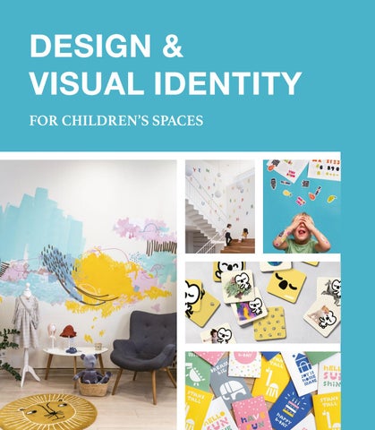
Children perceive the world around them differently from the rest of us, responding to specific sets of details. This book shares a variety of contemporary creative designs for children’s spaces collected from different countries. They combine children-friendly visual elements with smart space design to tailor comfortable and conducive environments for children, where they can learn, have fun, flourish, and simply be themselves. Over 35 projects focus on educational facilities, schools, enrichment centers, recreational clubs, play zones, concept stores, and children’s hospitals, to share concepts that transform bland spaces to make them more relatable for children. How? Through thoughtfully considered visual identity and interior layouts that resonate specifically with them. Designers dig deep, even consult with children, to create designs that call out to them in fun, inspiring spaces. As the pages reveal the rationales and inspirations behind these concepts that also unify aspects of the business with a cohesive brand identity, the reader is offered a host of thoughtful and creative solutions in designing children’s spaces, making this book a handy tool for anyone keen on designing children's spaces, or in the business of managing such facilities and spaces for children.
Cover images: Pie Pie Kids © Nikita Lagutin Photography; Blue Marine Sports Club © Tomooki Kengaku Photography; Maui Popsicle © Brandon Archibald Photography NUBEL © 1983ASIA Photography; Pica Pica Concept Store © we are two Photography; Noon Afterschool Care © Bienal Comunicación Photography $40.00 [USA] £30.00 [GB]
DESIGN & VISUAL IDENTITY FOR CHILDREN’S SPACES
Introduction Written by Carlos Martínez
Carlos Martínez Trujillo is the founder and principal of BIENAL, an art, design, and narrative studio
Trujillo, Founder and
specialized in the creation of concepts and brands that have won multiple awards internationally. As a visual
Principal of BIENAL
communicator, Carlos’ visual eclecticism is highly instinctual and individualistic, combining his formal education with his experimental and self-taught ideas. His passion for exploring turned him into an artifact and object collector, amassing pieces characterized by the presence of design, history, craftsmanship, and “soul.” His work is prominent, displaying the mark of his travels and his life in Mérida, his birth place; it is an aesthetic language filled with deep messages that go beyond the normal sense and intention of traditional reading. His art vision has been a deep component of his work both inside and outside of his studio, which have been presented in collective expos of photography, object-art, and fine art. However, most of his work is less publicly involved, created in private and in an intensely personal manner, working consciously and creatively inside his studio.
Health 116
Animals Playing Hide-and Seek
130
Pirogov's Children Ward
120
Grand Jardin de Sainte-Justine
136
The New Polyclinic
124
Parc d'Atencions
140
LOTOS Children's Clinic
A child is at the living room table drawing on a blank sheet of paper with an array of colored crayons that will shame a rainbow. Every other detail around the child fades away and child and crayons sit alone without distractions as the little artist perceives only the paper,
Culture 148
Arirang Public Library for Children
162 DǒNG DǒNG
152
Children’s Festival: Small Big Dreamers
168
the crayons and the drawing that is being created.
Stand IVAJ
The child maintains such great focus, face so close to the paper, it’s almost as if the child is trying to enter the paper. Strokes of colors overcome the paper and generate
Retail 174
Bin&Bông Shop
various shapes; some can be recognized, some cannot.
204
Petit Boo – Baby & Kids
178 Kidsmoment
210
Petit Roy
sometimes one color is used more than others (blue, it
186 Kindo
218
Pica Pica Concept Store
seems, is the color most in demand).
192
Little Stories
224
Pie Pie Kids
198
Maui Popsicle
The child uses all the colors in the box of crayons, but
Time is passing and the only way to tell if the clock is still ticking is to lay around the child all the colorful artwork that has been created. Even as an adult approaches, the child continues to draw without slowing down, crayon furiously blotting out the white of the paper.
Index
230 The adult speaks:
“What are you doing?”
6
7
Introduction Written by Carlos Martínez
Carlos Martínez Trujillo is the founder and principal of BIENAL, an art, design, and narrative studio
Trujillo, Founder and
specialized in the creation of concepts and brands that have won multiple awards internationally. As a visual
Principal of BIENAL
communicator, Carlos’ visual eclecticism is highly instinctual and individualistic, combining his formal education with his experimental and self-taught ideas. His passion for exploring turned him into an artifact and object collector, amassing pieces characterized by the presence of design, history, craftsmanship, and “soul.” His work is prominent, displaying the mark of his travels and his life in Mérida, his birth place; it is an aesthetic language filled with deep messages that go beyond the normal sense and intention of traditional reading. His art vision has been a deep component of his work both inside and outside of his studio, which have been presented in collective expos of photography, object-art, and fine art. However, most of his work is less publicly involved, created in private and in an intensely personal manner, working consciously and creatively inside his studio.
Health 116
Animals Playing Hide-and Seek
130
Pirogov's Children Ward
120
Grand Jardin de Sainte-Justine
136
The New Polyclinic
124
Parc d'Atencions
140
LOTOS Children's Clinic
A child is at the living room table drawing on a blank sheet of paper with an array of colored crayons that will shame a rainbow. Every other detail around the child fades away and child and crayons sit alone without distractions as the little artist perceives only the paper,
Culture 148
Arirang Public Library for Children
162 DǒNG DǒNG
152
Children’s Festival: Small Big Dreamers
168
the crayons and the drawing that is being created.
Stand IVAJ
The child maintains such great focus, face so close to the paper, it’s almost as if the child is trying to enter the paper. Strokes of colors overcome the paper and generate
Retail 174
Bin&Bông Shop
various shapes; some can be recognized, some cannot.
204
Petit Boo – Baby & Kids
178 Kidsmoment
210
Petit Roy
sometimes one color is used more than others (blue, it
186 Kindo
218
Pica Pica Concept Store
seems, is the color most in demand).
192
Little Stories
224
Pie Pie Kids
198
Maui Popsicle
The child uses all the colors in the box of crayons, but
Time is passing and the only way to tell if the clock is still ticking is to lay around the child all the colorful artwork that has been created. Even as an adult approaches, the child continues to draw without slowing down, crayon furiously blotting out the white of the paper.
Index
230 The adult speaks:
“What are you doing?”
6
7
“Draw pictures.”
To Bienal, a brand is a concept and an experience, but most importantly, it means that we have to participate in all possible disciplines to make the best project possible. We
“What are you drawing?”
believe that cooperation is essential, because only through cooperation can we create
“Whatever.”
a truly functional, aesthetic, homogeneous, and metaphysical experience. The core concept of the project is its own DNA.
“Are these drawings for someone?”
As a studio, we have access to numerous resources throughout the entire
“No.”
conceptualization and design of the project, such that we can fully understand each new job. This is why we strive to define and re -define ourselves. We prefer to think of
“Do you want to sell them?”
ourselves as a narrative, art and design studio rather than a brand studio. We think
“No.”
that the word “brand” points to a limited idea—it is a short list of items, including logos, stationery and selected applications. We believe in the importance of the basic
“Do you want to expose them?”
concept and we insist that experience, smell, music, and narrative can be integrated
“No.”
to become an important foundation of the brand; this is the most important element when generating the overall design.
“Then why do you draw them?”
Creation is incredible. It opens an extraordinary world to children and helps adults
“Because.”
learn. We can only regain our love for creation by feeling the same excitement that the child in the story feels, engrossed in wielding crayons. The power of these emotions
This story epitomizes the foundation
is often underestimated and, dismayingly, slowly lost as we strive to become more
of all good design and highlights the
academically inclined.
studio axiom we firmly pursue: create because you can create, for creation’s sake. Creation is not to surpass, nor to pursue remuneration. It is not for prize or money; we believe in the idea of creating “because.”
8
In the story, the child engages with only two physical elements: the colored crayons and the blank, white sheets of paper. With these materials, the child creates without expectation, making something without want of anything in return; no coveting of medals, applause, or money, but creating just because . Ignoring the notion that a reward of any kind may exist beyond the reward that is, which is the joy of creating, can be liberating to creativity. 9
“Draw pictures.”
To Bienal, a brand is a concept and an experience, but most importantly, it means that we have to participate in all possible disciplines to make the best project possible. We
“What are you drawing?”
believe that cooperation is essential, because only through cooperation can we create
“Whatever.”
a truly functional, aesthetic, homogeneous, and metaphysical experience. The core concept of the project is its own DNA.
“Are these drawings for someone?”
As a studio, we have access to numerous resources throughout the entire
“No.”
conceptualization and design of the project, such that we can fully understand each new job. This is why we strive to define and re -define ourselves. We prefer to think of
“Do you want to sell them?”
ourselves as a narrative, art and design studio rather than a brand studio. We think
“No.”
that the word “brand” points to a limited idea—it is a short list of items, including logos, stationery and selected applications. We believe in the importance of the basic
“Do you want to expose them?”
concept and we insist that experience, smell, music, and narrative can be integrated
“No.”
to become an important foundation of the brand; this is the most important element when generating the overall design.
“Then why do you draw them?”
Creation is incredible. It opens an extraordinary world to children and helps adults
“Because.”
learn. We can only regain our love for creation by feeling the same excitement that the child in the story feels, engrossed in wielding crayons. The power of these emotions
This story epitomizes the foundation
is often underestimated and, dismayingly, slowly lost as we strive to become more
of all good design and highlights the
academically inclined.
studio axiom we firmly pursue: create because you can create, for creation’s sake. Creation is not to surpass, nor to pursue remuneration. It is not for prize or money; we believe in the idea of creating “because.”
8
In the story, the child engages with only two physical elements: the colored crayons and the blank, white sheets of paper. With these materials, the child creates without expectation, making something without want of anything in return; no coveting of medals, applause, or money, but creating just because . Ignoring the notion that a reward of any kind may exist beyond the reward that is, which is the joy of creating, can be liberating to creativity. 9
Education
Only by freeing ourselves from these detractors, can we get rid of the burdens of perfectionism, inner expectations, and outer influences that risk of taking us away from our origin. These “dangerous” rewards are the implied shackles of an informed adult—a confined being unable to pursue a creative endeavor without a purpose or prize in mind. We believe that creativity occurs just because, as an instinct. Creation is in itself a reward. The projects featured in this book reference places that serve as havens for our young generations. These wee, unassuming, non-judgmental souls without apparent experience are the best examples to explain true passion to create. To understand the creative projects in these pages, one must become an unlearned adult so that one may recover the impetuous emotions of a child. Only then we can see through a child’s eyes and perceive these spaces and concepts as channels to creation. The spaces where children grow, experience, play, and create must be vehicles of beautiful creative detonations that contain the proper conditions for them to live, learn, and explore their creative capacities. We are honored to participate in this book as ushers of this experience, and also within the pages as a project feature, showcasing an engaging space that we designed. This book is full of unrestricted geniality and it is a notable compilation of over 35 projects focused on spaces tailored for the use of the most creative beings in the universe: children. They are surrounded by characters, spaces, colors, interventions, architecture, signages, games, landscapes, and applications that inspire and facilitate their ludic development on one common ground: motivating and exploring.
10
11
Education
Only by freeing ourselves from these detractors, can we get rid of the burdens of perfectionism, inner expectations, and outer influences that risk of taking us away from our origin. These “dangerous” rewards are the implied shackles of an informed adult—a confined being unable to pursue a creative endeavor without a purpose or prize in mind. We believe that creativity occurs just because, as an instinct. Creation is in itself a reward. The projects featured in this book reference places that serve as havens for our young generations. These wee, unassuming, non-judgmental souls without apparent experience are the best examples to explain true passion to create. To understand the creative projects in these pages, one must become an unlearned adult so that one may recover the impetuous emotions of a child. Only then we can see through a child’s eyes and perceive these spaces and concepts as channels to creation. The spaces where children grow, experience, play, and create must be vehicles of beautiful creative detonations that contain the proper conditions for them to live, learn, and explore their creative capacities. We are honored to participate in this book as ushers of this experience, and also within the pages as a project feature, showcasing an engaging space that we designed. This book is full of unrestricted geniality and it is a notable compilation of over 35 projects focused on spaces tailored for the use of the most creative beings in the universe: children. They are surrounded by characters, spaces, colors, interventions, architecture, signages, games, landscapes, and applications that inspire and facilitate their ludic development on one common ground: motivating and exploring.
10
11
144
145
144
145
Arirang Public Library for Children
Location: Seoul, Korea Completion: 2017 Design: form & function Photography: form & function
Yellow, pink, and sky-blue color each floor of the Arirang Public Library for Children located in Seongbuk-gu, Seoul. Given the depth and strong identity of these colors, as well as their wide application throughout the library, the logo is developed in black and white. The logo is a fun, cartoon-like face with focus on the eyes, which are supposed to represent a child reading a book. It is also an “active” key feature that changes its pupil direction to suit the logo’s application. Children are always observant of interesting things, viewing them with different perspectives from that of an adult; they are constantly curious and always asking “why?” The funny, friendly, logo face stimulates this curiosity and also kindles the fun of reading and learning, and in turn, the joy of visiting the library. The logo also wears a smile, subconsciously impressing the enjoyable activities that the library environment presents; the changing eye directions further reflect the inherent curious nature of a child. The wordmark in Hangeul characters is designed in a larger than normal ratio based on the physical proportions of a child, so that the characters look like life-size pictorials, which amuses the children. Navigation guides on the floor incorporate the logo and an image of the hill where the library is located. The smiling logo atop the hill reflects a happy child that is growing up enjoying the joys of reading. The repetition of the logo in different variations and on different components outlines a cohesive visual identity. However, avoiding the saturation of visual identity elements is crucial, especially in a small-scale library such as this. The use of the main logo in as many of the elements as possible gives it prominence and retains the character of the visual identity without overpowering a modest space.
148
149
Arirang Public Library for Children
Location: Seoul, Korea Completion: 2017 Design: form & function Photography: form & function
Yellow, pink, and sky-blue color each floor of the Arirang Public Library for Children located in Seongbuk-gu, Seoul. Given the depth and strong identity of these colors, as well as their wide application throughout the library, the logo is developed in black and white. The logo is a fun, cartoon-like face with focus on the eyes, which are supposed to represent a child reading a book. It is also an “active” key feature that changes its pupil direction to suit the logo’s application. Children are always observant of interesting things, viewing them with different perspectives from that of an adult; they are constantly curious and always asking “why?” The funny, friendly, logo face stimulates this curiosity and also kindles the fun of reading and learning, and in turn, the joy of visiting the library. The logo also wears a smile, subconsciously impressing the enjoyable activities that the library environment presents; the changing eye directions further reflect the inherent curious nature of a child. The wordmark in Hangeul characters is designed in a larger than normal ratio based on the physical proportions of a child, so that the characters look like life-size pictorials, which amuses the children. Navigation guides on the floor incorporate the logo and an image of the hill where the library is located. The smiling logo atop the hill reflects a happy child that is growing up enjoying the joys of reading. The repetition of the logo in different variations and on different components outlines a cohesive visual identity. However, avoiding the saturation of visual identity elements is crucial, especially in a small-scale library such as this. The use of the main logo in as many of the elements as possible gives it prominence and retains the character of the visual identity without overpowering a modest space.
148
149
150
151
150
151
154
155
154
155
156
157
156
157
Every effort has been made to trace the original source of copyright material contained in this book. The publishers would be pleased to hear from copyright holders to rectify any errors or omissions. The information and illustrations in this publication have been prepared and supplied by the contributors. While all reasonable efforts have been made to ensure accuracy, the publishers do not, under any circumstances, accept responsibility for errors, omissions and representations, express or implied.