Ali Smith
10
Face Value An Fonteyne
Tables 34 Rooms 72 Landscapes 102 Cities 16
Elke Schoonen
24 Refter, Bruges, Belgium in collaboration with noAarchitecten 38 Menen Town Hall, Belgium in collaboration with noAarchitecten 48 Amphora Care Home, Wingene, Belgium in collaboration with Sergison Bates architects 60 Plantin-Moretus Museum Depot, Antwerp, Belgium in collaboration with noAarchitecten 78 Liedekerke Law Firm, Brussels, Belgium in collaboration with jo taillieu architecten / advvt 90 Market Square, Deinze, Belgium in collaboration with Marie-José Van Hee architecten and Robbrecht en Daem architecten 108 Vlagger, Bruges, Belgium 116 Administrative Centre, ’s-Hertogenbosch, the Netherlands in collaboration with Kraaijvanger Architects 120 Maelbeek Metro Station, Brussels, Belgium in collaboration with De Smet Vermeulen architecten
Jan Florizoone
132
In the Clouds Philip Ursprung
140
Between the Lines Elke Schoonen
144
Tiled Works An Fonteyne
150
Building Giotto Elke Schoonen
182
A Life Paul Vermeulen
186
Encore
158
Benoît’s Spatial Oeuvre 7
8
Benoît in his studio, 2012
9
26
27
28
Preliminary study, tiles, watercolour and pencil on paper, 75 x 50 cm, 2008
‘Yellow, I think?’ Amphora Care Home, Wingene, Belgium in collaboration with Sergison Bates architects
A large house for a lot of people, that was the ambition from the outset. Away from the institutional, the impersonal. You can feel that. A building that manages to break down its scale both inside and out, that is large yet seems to meander lightly through a garden, that gives each of the 145 rooms something unique, even presenting its signage with a gentle touch. This care home is located in Wingene and combines two existing houses into a new building. The competition, organised through the Open Call procedure of the Flemish Government Architect, was won in 2011 by Sergison Bates architects. They had been working on the home for three years when project lead Kirsten Gabriëls contacted Pieter Ballegeer, manager of the Belgian company David & Goliath, which specialises in the production and distribution of artisan tiles. At that point, most of the home had been designed: its meandering shape, the layout with corridors as short as possible, the brick exterior walls, a large window for each room with a closed panel next to it. The architects thought of tiles for that closed panel. ‘Tiled curtains’ on either side of the window, with a wider and a narrower part. A panel that would have to be exactly one tile deep, so that the tile would also be visible from the inside. A rounded corner profile to mimic softness. “We found beautiful tiles with a stamped pattern,” says Kirsten. Glazed, white tiles with an elegant yellow motif. Pieter remembers it clearly and shows a picture he found in Kirsten’s email. He appreciated the question and the interest, but came up with a better proposal: why not use a contemporary variation on the artisanal tile, made by an artist? He knew someone. Benoît was mentioned and they knew the name. Stephen Bates, partner at Sergison Bates architects, says that around that time he became familiar with the work Benoît was doing in collaboration with other architects in Belgium, his work with tiles. Pieter and Benoît had previously worked together on a series of cement tiles and both were in contact with the Viúva Lamego factory in Portugal, where Benoît produced his tiles. After meeting Kirsten at Benoît’s studio, an invitation to come to London followed. “Within an hour, Benoît had charmed the architects,” says Pieter. He returned home to start work. Pieter and Benoît developed the concept of ‘tiled curtains’ in various options using different techniques, each with a different price tag. One option was to design one or more motifs, which would be used to machine the tiles’ pattern – a literal contemporary interpretation of the motif tile. Another option was to paint the tiles by hand, which meant more work and therefore higher costs. The hand-painted tiles immediately convinced Hans de Clerck, director of the non-profit care agency Amphora vzw. The variety that was possible would highlight the individuality of each resident through the hand of an artist. Each resident would have their own tile. “We had to invest in art,” says Hans, “to make it personal and integrated.” The management of Amphora vzw agreed and decided to allocate more of the budget to this customised art integration. And so the adventure began.
48
Working with Benoît was a completely different experience. Hans had worked in healthcare for more than twenty years and suddenly found himself in a new world of colours and designs. Benoît determined how colour would be applied. Stephen explains that, as architects, they discussed concepts of a more systemic nature with Benoît, such as a horizontal distribution of colour across the floors. Benoît brought a different perspective, giving each of the four arms of the building its own colour and thus bringing a sense of calm to the design. Colour was linked to orientation. “Red represents the setting sun and blue represents the south,” explains Hans. It is early summer when An Fonteyne and I visit the house. The garden that embraces the building is full of life. Hans remembers the pink blossoms in the garden at the entrance, with Benoît’s blue tiles as a backdrop: “An incredible effect.” Even a civil servant who visited Amphora for the first time, unaware of the history of the project, was struck by the entrance with its beautiful blue tiles. The building is present and solid. It is generous, welcoming. But reality can never be completely erased. When asked whether the residents appreciate the place, Hans describes their lives as “making the best of a bad situation.” Residents stay in this large home for an average of only two years, until the end of their lives. “Benoît respected the lives of these residents,” explains Stephen. It seems that he translated this respect into a willingness to do an incredible amount of work. Benoît handpainted 45,000 tiles at the Viúva Lamego factory in Portugal. Pieter visited him there twice. Photographs show Benoît on his knees, bent over the tiles, brush in hand. All the tiles were laid out in panels. Despite the repetitive pattern on each tile in the panel – a remnant of the motif technique, Kirsten explains – each tile was numbered by Benoît. It was not a case of designing one panel and copying it. Each panel, with its own width and height, was individually designed by the architects and Benoît. Kirsten calls it an enormous puzzle. She watched with admiration as Benoît worked with such accuracy and planning. Benoît’s system demanded that this precision be continued in the execution. A tile could not simply be moved or replaced. Francis Fraeyman, director of Construction and Technology at the GVO residential care group, who supervised the implementation of Amphora, suggested getting another box of tiles when the contractor told him that a van had crashed into a load of tiles. But none of the other boxes contained the same tiles. The only solution was for Benoît to travel to Portugal again to paint new tiles to replace the broken ones. When, after a few years, the tiles on the sunny side of the building began to fade, Francis called on Benoît to repair them. Benoît took responsibility and immediately travelled to Wingene. The repair work ultimately turned into a wonderful time, during which Francis and Benoît got to know each other better and to explore their shared love of football. It is said that a house breathes memories. This house certainly does. Prominently displayed upon entering is a frame containing some of the many preparatory watercolour studies
that Benoît made. A similar preliminary study hangs in Stephen’s office, and another at Kirsten’s home. Everyone remembers these watercolour studies scattered across the concrete floor of Benoît’s studio, arranged around large prints of the façade. During design meetings, Benoît drew the chosen patterns on large prints of the façade drawings by hand, Stephen recalls. The memories that are shared are infectious. But the nature of the residents – many of whom have dementia – also causes memories to fade. Or even prevents them from forming in the first place. Speaking loudly and close to her ear, Hans asks a resident what colour her tile is. “Yellow, I think?” she replies cautiously.
to work. They were Benoît’s tiles. Using them for outside walls in the Belgian climate made it impossible for Benoît to work with his usual tiles. The colours didn’t turn out as he was used to, which made him unhappy, he wrote in a letter to Kirsten. Benoît continued working until he was satisfied. On his last day at the construction site, Benoît walked through the building with a pot of black paint and a brush. Next to each door, he wrote what was behind it. Daycare centre, toilet, management. “The budget for signage was small,” says Stephen, “and Benoît was already committed.” Each room had a handwritten mark, each orientation had its own colour, each resident had their own tile. Benoît was the careful conductor of this large care home.
I think Benoît would have laughed. He made the tiles for the residents, but also for himself, I suspect. The architects trusted him in this, even deliberately letting go while Benoît continued
Dear Kirsten, Last summer when I did my first colour tests on the new tiles, I was a bit unhappy. The colours reacted differently than on the tiles I was used to working on. But we have now applied a few changes in the pigments and my way of working. The results are very interesting and hopeful.
Letter from Benoît to Kirsten Gabriëls, October 2014
49
54
55
82
Fragment of a preliminary study for a tiled wall, pencil and watercolour on cardboard, 152 x 26 cm, 2016
83
Preliminary study, ‘Spring’ colour square, oil and pencil on paper, dimensions unknown, 2011
94
Preliminary study, ‘Summer’ colour square, oil on paper, 84 x 42 cm, 2011
95
118
Two preliminary studies, Plexiglass and marker, 27 x 33 cm, 2002
Preliminary study, watercolour and marker on paper, 42 x 30 cm, 2002
119
138
Benoît working on his last spatial realisation, the sgrafitto in Zurich, 2021
139
The Olive Tree
Plantin-Moretus
2, house
Painted olive tree on tiles commemorating the victims of the terrorist attack on the Maelbeek metro station
Façade composition for the new depot and colour study for the ceiling of the reading room of the Plantin-Moretus Museum
Painted tiles for two bathrooms
Brussels, Belgium 2016 Addition to an existing building
Antwerp, Belgium 2008–2016 In collaboration with noAarchitecten
172
Private 2016 In collaboration with jo taillieu architecten
Maison des Médias
Amphora Wingene
GZA Kiel
Competition proposal for handwritten signage in a media building
Painted tiles for window panels and handwritten signage for a care home
Painted tiles for the kitchens of a care home
Brussels, Belgium 2017 In collaboration with XDGA (unrealised)
Wingene, Belgium 2013–2017 In collaboration with Sergison Bates architects
Antwerp, Belgium 2016–2017 In collaboration with XDGA
173
180
Benoît’s studio, 2025
181
Imprint Editors: An Fonteyne, Elke Schoonen Copy editing: Willem Schoonen (Dutch), Caroline Ellerby (English), Myriam Ochoa-Suel (French) Translation French edition: Brigitte Zwerver-Berret (Dutch and English to French), with thanks from the translator to Patrice Pinguet for his valuable support. Translation English edition: Michele Hutchison (Dutch to English, editorial work on English texts) Translation Dutch edition: Jeroen Duvillier (text Philip Ursprung) Translations captions: under own management Translation line of poetry of Federico García Lorca: Luc. Tournier (Dutch), Pablo Medina and Mark Statman (English), Guy Lévis Mano (French) Proofreading: Willem Schoonen (Dutch), Caroline Ellerby (English), Myriam Ochoa-Suel (French) Design: Casier / Fieuws, Brussels Printing and binding: Graphius, Ghent – Ilse Messiaen (supervision), Pascal Van Den Abbeele (image processing) Paper: Munken lynx rough 120 gr & Munken lynx rough 300 gr © 2026 An Fonteyne, Elke Schoonen and Verlag Scheidegger & Spiess AG, Zurich © for the texts: the authors © for the photographs: see photo credits © for the artwork by Benoît: Benoît Foundation Multiple drawings originally appeared in The New Yorker (copyright 1992, 1994, 2024). They are published here with the kind approval of The New Yorker. All efforts have been made to contact the rightful owners with regards to copyrights. If you believe you have not been mentioned when you should have been, please contact us. Verlag Scheidegger & Spiess AG Niederdorfstrasse 54 8001 Zurich Switzerland www.scheidegger-spiess.ch T +41 44 262 16 62 E info@scheidegger-spiess.ch Product safety: Responsible person pursuant to EU Regulation 2023/988 (GPSR): GVA Gemeinsame Verlagsauslieferung Göttingen GmbH & Co. KG Post Box 2021 37010 Göttingen Germany T +49 551 384 200 0 E info@gva-verlage.de Scheidegger & Spiess is being supported by the Federal Office of Culture with a general subsidy for the years 2026–2028. All rights reserved; no part of this publication may be reproduced, stored in a retrieval system or transmitted in any form or by any means, electronic, mechanical, photocopying, recording, or otherwise, without the prior written consent of the publisher. English edition – ISBN 978-3-03942-364-4 Dutch edition – ISBN 978-3-03942-366-8 French edition – ISBN 978-3-03942-365-1
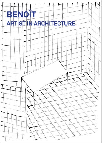
Cover image La Table, ink on paper, 42 x 59.4 cm, 2008