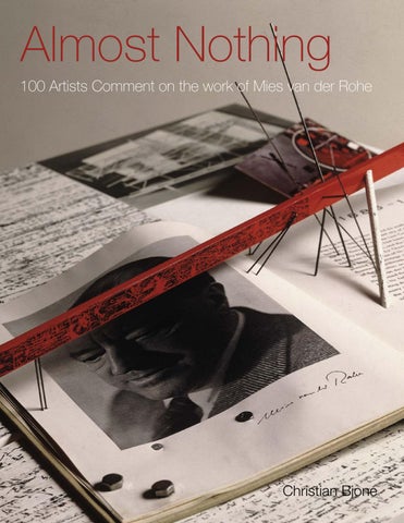
Almost Nothing 100 Artists Comment on the work of Mies van der Rohe
Christian Bjone
Almost Nothing Beinahe Nichts The simplicity of this particular architectural feature (i.e. stair) is characteristic of every campus building and symptomatic of the philosophy that shaped them. Mies expresses it in the German phrase beinahe nichts, ”almost nothing”. He does not want these buildings to be self-consciously architectural; he desires rather “the absence of architecture” and in its place he practices Baukunst, “the art of building”. The structures executed so far may strike the untrained eye as unnecessarily barren since they are units of a larger design, the subtle beauty of which will emerge only when the whole is completed.1 — Philip Johnson But the perfectly homogeneous, broad glassed expanse is also a mirror in the literal sense: the “almost nothing” has become a ”big glass”, although imprinted not with the hermetic surrealist ploys of Duchamp, but reflecting images of the urban chaos that surrounds the timeless Miesian purity.2 — Manfredo Tafuri Architects clearly felt driven to such attempts because of the obvious limitations in Mies’s intentions: beinahe nichts, indeed, as he said so often. His architecture cried on nobody’s lapel; it made perfect, technologically appropriate cages and pure, limpid volumes of air, and that was all.3 — Vincent Scully Mies described his architecture as “almost nothing” (beinahe nichts), and after almost nothing the only thing you can do is nothing, which is very difficult.4 — James Inigo Freed Most architects and critics think that Mies’s slogan of “beinahe nichts” (almost nothing) has gone so far that there is really nichts. I don’t know…History will tell us and tell us no doubt very soon.5 — Philip Johnson Nothing will come of nothing; speak again. — King Lear, Act I, Scene 1
16
Left: David Diao, Spoor: Tugendhat House, 2004, photograph with spray dye
3 The Purity of the Square Grid For many designers the square grid is the ultimate neutral framework without presumed aesthetic baggage or confusion, it is simply what it is. But to others the very nature of the grid is its association with the domain of modern art as Rosalind Krauss has noted; “… the grid is an emblem of modernity by being just that: the form that is ubiquitous in the art of our century, while appearing nowhere, nowhere at all, in the art of the last one.”7 The very choice of any system including the grid is an aesthetic decision and therefore a style like any other. The dominate grid system is first seen in the work of Mies in the Barcelona pavilion where columns, walls and even furniture have a defined unalterable relation to the square travertine floor pavers. But it is in the American half of Mies’ career that he established the primacy of a square grid system in every project for the ordering and placement of all elements of the building starting from the most general: buildings located in a site plan to the most specific: location of light fixtures in ceiling of a room, all pieces of the puzzle must align (or be centered) on the grid or else the game is lost. Satire and the Endless Grid The use of the omnipresent grid in many modern buildings has led to a few satirical comments from architects ranging from Saul Steinberg’s cartoon making a high rise façade from the collage of accountant’s grid paper to the obsession of the sixties Italian collective of designers and architects Archizoom where in their series of drawings titled: Discontinuous Cities (1970) the architect’s grid continues to extend over the edges of the paper to eventually cover and conquer the world. The ultimate image of the Miesian inspired grid is in the hallucinatory diorama, Consolidated Life (2011), made by the artists Lawrey and Middleton in which a dollhouse version of the typical open plan office layout is multiplied by enclosing mirrors that create a infinite series of reflections of the dreary office desk and swivel chair, this same perspective was used, with critical success, by the filmmaker Billy Wilder in two of his comedies: The Apartment (1960) and One Two Three (1961).
Top: Lawrey and Middleton, Consolidated Life, 2011, diorama Above: Archizoom, Discontinuous Cities,1970, ink on paper
24
Surprisingly the Levine portrait is relatively benign with the transposition of the accurately aged face of Mies onto a rectangular block representing one of his high rise towers. The face is a good likeness made in crosshatched line work and the victim’s expression seems slightly amused. But make no mistake the image is one that we are to chuckle upon if not scowl onto. At this time Mies, his image and all he built was there to criticize and attack. 2 X 4 Inc. The graphic design group, 2 x 4 Inc., has three founding partners: Michael Rock, Susan Sellers and Georgianna Stout. They have brought a frantic and visually dense sensibility to current American culture in which a museum would not have one logo but a dozen, a page of illustration would not have one image but several stacked and overlapping. And so with the assignment to produce a set of large scale portraits of important men, from the history of the Illinois Institute of Technology on the facade of a new student center by the architect Rem Koolhaas, they came upon the idea of making them from a set of small circular pictograms of varying tonal densities to produce a blurry pixilated approximated view of a face. It is almost too good to be true that the most recent portrait of Mies is one that is both unsteady and unfocused while located in a new building on the campus Mies had designed. The architect Rem Koolhaas, designer of the new student center which holds the Mies portrait, has debated, debased, and has been delighted by Miesian design. Koolhaas has been quoted as saying: “Mies’s work had an essence of formlessness, amorphousness, nothingness, perversion and anxiety behind a stealth shield of serenity.” So we now have a Mies portrait that is perfect for our own time: it is the result of digital technology and it presents a fragmented and piecemeal image of the man. The last item, which takes us to a new level of metaphorical interpretation, is that the some of the small diagrammatic figures that make up the individual circle units of the pictogram where found to be doing obscene things.
50
I Beam .................................................................................................................... ARTIST
Carl Andre
Tony Tasset
WORK
Scupture
Sculpture
DATE
1970
1996
TITLE Beam Ends I-Beam ....................................................................................................................
One of the most dramatic transitions of the career of Mies when he moved from avant-garde Europe to post war America is the almost exclusive use of steel construction. Gone were the experiments in concrete, masonry and timber. Mies had taken the humble rolled steel section that was labeled as an I-Beam to have an almost mythic power of representation on the façade of his buildings. The historian William Jordy has noted the symbolic status of Mies’ use of the I beam in the 860–890 Lake Shore Drive building: “In sum, the I beam is the functional member which builds the architecture; it is the aesthetic member which makes the harmonic order; it is the symbolic member which epitomizes a cultural situation.”1 And, of course, the I beam is a perfect substitute for the “iron rails” of the railroads. These are similar shapes running out to the distant horizon’s vanishing point. So it seems obvious that if an artist wishes to comment on the designs of Mies the I beam would be the perfect place to start, the next two artist play with the history of symbolism of this structural member. Carl Andre Carl Andre is one of the great artists of the Minimalist style in the 1960’s and one of his most famous works is a set of simple stacked dusty red bricks making an unstable column 10 bricks tall. The audacity of presenting art as a meager collection of discarded construction pieces was certainly part of the appeal of his work, but Andre also wove into his dramatically blank works ideas of architectural modularity that was so new to sculptural ideas.
Tony Tasset Tony Tasset is a multi media artist who has presented artwork with a sly sense of humor. The six foot long floor sculpture I-Beam is an aluminum extrusion in an “I-section” that has been painted a Golden Gate Bridge red. In its obtuse immobility and inarticulateness it makes a gesture of homage back to the early work of the minimalists like Donald Judd, Walter De Maria and Carl Andre. But also as a resident of Chicago, Tasset knows that his inert
The Beam Ends work simply stacks four steel construction
steel object has other associations in the world of architecture and Mies.
pieces in the same attitude as his famous brick stacks, while
As noted by the Mies biographer Franz Schulze, “The utilitarian wide flange
never as famous as the brick or floor constructions it predates
is transformed into a spiritual object, an expression of the potential of the
the use of out of the junk yard steel components by other artists.
industrial epoch.”2
68
the Anarchists, abandoned as the first modern ruin, taken apart and shipped to Berlin, reused as a locker room in the 1952 Olympics Games, and finally exchanged as a political prisoner with the East German government for a computer and missile plan. The entire production displayed in a short video playing in the installation. History of early modern architecture becomes first a Wagnerian tragedy, then is repeated as a children’s fairy tale.1 Video Bus Stop The second manipulation of the imagery of the Barcelona Pavilion is the Video Bus Stop in the Netherlands, which was part of an invited competition for several architects of note, Frank Gehry, Bernard Tschumi, et al were given a site for each to do a single unique structure to celebrate the music/video Festival in the city. Koolhaas sketched out an “abridged” Mies building represented by a squat marble wall and a single chrome cruciform column with both holding up a horizontal sheet of glass for the roof. Once again the Barcelona pavilion is reused by this architect in one of his fictional narratives to be reassembled for the use as a bus stop. A video monitor is installed in the marble wall for festival updates and as a technological update on this iconic building fragment. The side marble elevation has a list of topics in metal letters: Humor, Sentiments, Politics, Hi Tec, Dance, Erotics and Glamour, giving a preview of the programming shown on the embedded video player and an unconscious summary of the architect’s patented interests as well.2 All in all, Koolhaas makes references that scramble the severe ordering of the Barcelona Pavilion to show his intense desire to both reconstruct and demolish the memory of Mies as his private Hero and Villain.
102
Are you really sure that a floor can’t also be a ceiling? brings these
bird song, song of the forest, forest as site, site as utopia, utopia as white,
elements together in an architectural model loosely based on the
white for purity, purity of ideology. This artwork has been exhibited with
Farnsworth house. But here the model functions as the temporary
associations to the land forming sixties work of Robert Smithson’s Spiral
home for butterflies-ultimate agents of transformation, change and
Jetty, Walter de Maria’s Earth Room and others, but in my opinion it fits
recycling. Radical change is in their life cycle. Transforming from one
into a simpler contrast between man and nature.2
state to another, they never are what they appear to be.
The saving grace of the object is the indistinct confusion of its surrealist
Visitors can enter the house. The glass walls allow full view on the man-
mix up. Nature (dirty old birdseed) is inside of culture (machine precise
made greenhouse and its visitors inside, as actors on a stage set. The
architecture) and not what we know to be the correct order of the famous
transparent walls also protect the climate inside and create a membrane
glass box of Mies on its manicured lawn (violated by the continual flooding
between interior — and museum space. Both nature and audience
of the nearby Fox River). It is a theme that other artists have taken up as
become a spectacle inside the confinements of the museum wall.
a cause. It is my hope that the richness of artists critical voices will lead to
1
Mary Brogger The artist has established a simple contrast between the smooth white plastic scale model of the Farnsworth house and its infill with dark brown birdseed. It is a juxtaposition that links up a set of metaphors: bird seed,
154
visually richer and more nuanced ideas, other than the architectural critics black and white slicing judgments. It would be too simple to say this is a transformation of a cultural icon into a bird house; it is the emotive confusion that is the cryptic strength of the artwork.
860–880 Lake Shore Drive (1951) Seagram Building (1958) Twisted Sisters .................................................................................................................... ARTIST
James Angus
Alexander Arrechea
Monika Sosnowska
WORK
Sculpture
Sculpture
Sculpture
DATE
2001
2013
2014
TITLE
Lakeshore Drive Mobius Loop
Seagram
Tower
.................................................................................................................... The ordered rectangular right-angled reality of contemporary construction begs to be contradicted by the iconoclastic artist. This can be seen in the works of James Angus, Alexander Arrechea and Monika Sosnowska who have distorted and twisted the work of Mies for the effects both humorous and disturbing. James Angus What can be said on this dare devil act of making the most serve rectilinear volume of modernism, a Mies apartment block, and twisting it into more than a circle but a Mobius strip, a curved plan that folds back on to itself making a continuously connected plane. There is a surrealistic component to the artwork that matches that style’s use of transposed familiar items; the matchstick Eiffel Tower, the melting watch and the fur lined cup are examples. It is one more example of the projects of Mies van der Rohe standing in as the representative of modernism in its conservative dogmatic rules and regulations. The natural reaction of rebel artist is to show that the King has no clothes with a logic that is as bent as a pretzel. Alexander Arrechea Arrechea is a Cuban born artist who was once a member of the art collaborative, Los Carpinteros. He branched out on his own and continued with the themes of construction that occupied the collaborative. As part of New York City Parks Department and private organizations he was commissioned for a public art work, which he titled No Limits, and consisted of ten monumental metal sculptures along the median strip of Park Avenue and other locations. Each sculpture takes a famous building from the skyline and shrinks to a twelve foot tall metal sculpture that is mutated into something else. The motif of a metal firehouse that is coiled, rolling or unrolling was used for some of the pieces. The Seagram piece was installed one block north of its parent structure. The wavy tower is both a metaphor for the unstable stock markets of that year and a child’s transformative toy. 168
172
172
Seagram Building (1958) .................................................................................................................... ARTIST
Enoc Perez
Enoc Perez
WORK
Painting
Painting
DATE
2006
2010
TITLE
Seagram Building, New York
Seagram Building, New York
.................................................................................................................... The artist Enoc Perez has produced many painting series on modern buildings from those in midtown Manhattan to Puerto Rico and Brazil. He has written on how he is inspired by the utopian nature of the mid century modern buildings. But it is possible to see that in some of his paintings (the Seagram’s building is a good example) he uses the varied pixilated quality of the interior lights in individual offices to give a richness in color and pattern, such that his irregular reproduction of the gridded buildings gives an impressionist association, where each window becomes a single brush stroke of a larger composition. Mr. Perez is one of many artists who have used the surface graphic quality of modern architecture as a way to extend the tradition of abstract painting.
194
Barcelona, 2014, mixed media
Xavier Veilhan uses three different sized statues at 20 cm, 130 cm, and 180 cm, each made from a different material: bronze, aluminum, and steel with all three sitting on a plywood panel that starts from the center of the main pool and extends to the courtyard pool to the existing Kolbe statue.
214
Ludwig Mies Van Der Rohe Professional Biography Ludwig Mies van der Rohe ( birth name Maria Ludwig Michael Mies) was born at Aachen Germany in 1886 and died in Chicago USA on August 1969. His father owned a marble business consisting mostly of the production of headstones, which as a young man Mies would help with the lettering. Without a formal education in architecture (the same for the other giants of modernism as Frank Lloyd Wright and Le Corbusier) he was able to advance by dint of his ability as a draftsman from an ornamental plaster shop to apprenticeship in small architectural firms till his ambition drove him to move to Berlin at the age of nineteen. He worked for a succession of quality firms as Bruno Paul and Peter Behrens and by 1907, when he was twenty one, he was designing his first house in traditional style of the time. Later, swept up in the ferment of the avant garde, he produced several hypothetical projects in the modern style and although they had no hope of being built they were extensively published and made him his reputation; angular glass skyscrapers, horizontally banded concrete office building, and a pinwheel brick country home within the time frame of 1921–1924. He continued to the top of his profession by a number of unbuilt competitions, built homes and exhibitions which climaxed in the German Pavilion for the International Exposition in Spain of 1929 (forever renamed as the Barcelona Pavilion). With the rise of the National Socialist Party in Germany he reluctantly immigrated in 1937 to Chicago for a position as director of the architecture department at the Armour Institute of Technology (now the Illinois Institute of Technology). It was here that he started an almost separate career and identity from European artistic to American corporate. His work became rectangular and austere, dominated by a gridded organization. He reached new heights in his new American career with several influential buildings as the Farnsworth House of 1950, Crown Hall in 1956, the Seagram building in 1958. Finally, symbolically ending his work by returning to Berlin to design the New National Gallery Building completed just before his death in 1968.
226