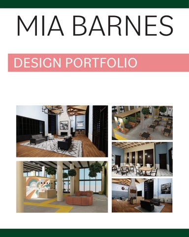
MIA BARNES DESIGN PORTFOLIO
INTRODUCTION My name is Mia Barnes, and I am a fourth year interior design student at Maryville University. Previously, I have interned at a firm called Moore Design Group in Dallas, Texas. At this firm, I worked on a large variety of projects from high end residiential, to multifamily, to hospitality. I also have three years of experience freelancing as graphic designer. As a designer, I have quite a bit of versatility when achieving certain styles. Some of my passions include universal design and sustainable design.
EDUCATION EDUCATION Maryville University of Saint Louis | St. Louis, MO | Expected in 05/2022 Bachelor of Fine Arts: Interior Design Glenbrook South High School | Glenview, IL | 6/2018 High School Diploma
WORK EXPERIENCE Interior Design Intern | Moore Design Group Dallas, TX | May 2021-Aug 2021 At Moore Design Group, I had many jobs. I mainly worked on building AutdoCAD and SketchUp models for the designers. Ontop of that, I picked out materials and color patterns that fit the clients needs and concept ideas. Freelance Graphic Designer | Self employed St Louis, MO | 2019-Current As a freelance graphic designer, there are many differet types of jobs that I take on. The majority of the clients I work with are starting a new business. Thus, they need help with not only creating products, but also establishing their brand.
acbarnes99@gmail.com 1311 Oxford Lane, Glenview IL, 60025
TABLE OF CONTENTS Interior Design Introduction ThreeSixFive Creative Offices Senior Living Behavioral Health Facility Capstone
Sketch Book Entries “Burning Bridges” “I’m Fine” “Lantern Light”
INTERIOR DESIGN
THREESIXFIVE CREATIVE OFFICES ThreeSixFive prides itself on having employees from many different ethnic backgrounds. And it allows for many different styles to come through in their portfolio. For this reason, the concept “urban expansion” is so fitting. In major cities, such as New York or Los Angeles, cultural diversity plays a huge role in their identity. COMMUNITY DEVELOPMENT I
A
B
C
9 4
5
6
7
8
design should incourage employees to interact with each other
BIOMORPHICS
includes natural elements throughout the interior natural textures and natural light
E
boosts mood and productivity
G
3
create strong sense of community
D
F
2
50 % of employees work from home half of the time
ERGONOMICS studies how movement impacts productivity create a design that is meant to promote movement
Reception
Furniture
Materials
THREESIXFIVE CREATIVE OFFICES Work Cafe
Furniture
Materials
Open Offices
Furniture
Materials
SENIOR LIVING PROJECT The Lodge is a senior living facility located in downtown Glenview, Illinois. It takes inspiration from rustic ski resorts, but with a twist. In the reception, there is a vaulted ceiling with exposed wood beams and trusses. Throughout the space, there are rustic wood accents. However, the furniture is more traditional, giving it a feminine Senior homes are designed not only for residents, but for visitors Flexibility in spaces is important Have enough space for mobility devices to move and park Space should encourage movement and activity It’s important to design for multiple generations Resort inspired design is trendy in multi-family settings
1. reception 2. main corridor 3. dining room
SENIOR LIVING PROJECT Reception
Materials
Furniture
SENIOR LIVING PROJECT Dining Room
Materials
Furniture
SENIOR LIVING PROJECT Main Corridor
Materials
Furniture
BEHAVIORAL HEALTH PROJECT The Danish concept of Hygge is difficult to explain, and there is no english translation for it. However, the people who try to explain it describe it as the feeling of comfort and warmth you get when surrounded by the people you love. Hygge is also often associated with wool socks, warm lighting, lit fireplaces, and indulgent foods.
Eight types of senses
Taste Touch Smell Sight Sound Proprioception Awareness of physical self in Vestibular Sense of movement Interoception Sense of whats happening in your body
Types of processing challenges Hypersensitive Avoiding sensory input Hyposensitive Causes kids to seek out sensations Can be hypo and Hypersensitive
1. waiting area 7.
7.
6.
6.
7.
8.
8.
7.
2. healing garden
10.
3. research consult room 4. vitals
9.
9.
14.
11. 12. 13. 13.
10. 15.
13. 13. 6. 3. 6. 5.
3.
2.
16.
17.
16. 4.
1. Not To Scale
18.
17.
North
5. exam room 6. small therapy room 7. large therapy room 8. office consult room 9. outpatient clinical consult room 10. clinician’s workroom 11. clean utility 12. soiled utility 13. bathroom 14. lockers 15. breakroom 16. managers office 17. administrative workroom 18. copy room
BEHAVIORAL HEALTH PROJECT Waiting Room
rendering 3
Materials
Furniture
BEHAVIORAL HEALTH PROJECT Clinical Consult
rendering 1
rendering 2
rendering 3
Materials
Furniture
BEHAVIORAL HEALTH PROJECT Large Therapy Room
rendering 1
rendering 2
rendering 3
Materials
Furniture
CAPSTONE Sustainability is obviously a very important principle of Jupiter Coffee. One of the ways in which we maintain sustainability is by growing our own food in local community gardens. Considering that this roastery will be serving as a hub where are coffee beans are roasted and distributed to our other locations, we would like sustainability to be represented in the design. Trends in Coffee Shops: Increasing popularity of sweet drinks Increasing popularity of cold brew Self serving coffee with coffee presses Ability to customize drinks Milk alternatives Family sized seating Partitions between tables to offer some element of privacy Heavy use of natural lighting Spot to sell brand’s merchandise
Floor Plan Key 1. Open Dining 2. Coffee Bar 3. Roaster 4. Kitchen 5. Public Bathroom 2nd floor
Not To Scale
North
6. Utility 7. Trash and compost receptacle 8. Storage 9. Mechanical 10. Staff breakroom 11. Staff bathroom
1st floor
12. Greenhouse dining
Not To Scale
North
13. Tool shed 14. Conference room 15. Private study rooms
0' - 3 25/32"
2nd floor RCP
Not To Scale
North
1st floor RCP
Not To Scale
North
CAPSTONE First Floor
rendering 3
Materials
Furniture
CAPSTONE Second Floor
Materials
Furniture
SKETCHBOOK ENTRIES
“BURNING BRIDGES” “Burning Bridges” was made in february of 2021. In the image, we see a hand extending an olive branch, and another hand burning the end of it. This piece is about trying to make amends with someone and come to a compromise, but they refuse.
“I’M FINE” “Im Fine” was made in December of 2021. This piece was based off the song “Fine Line” by Harry Styles. Both the song, and this piece are about holding on to something or someone that you love, but you know that it’s not good for you.
“LANTERN LIGHT” “Lantern Light” was created in February of 2021. In this piece, we see a hand in the darkness holding on to a lantern with a small flame inside it. This piece was about finding hope in a time of darkness