SÃO PAULO REGROUNDED
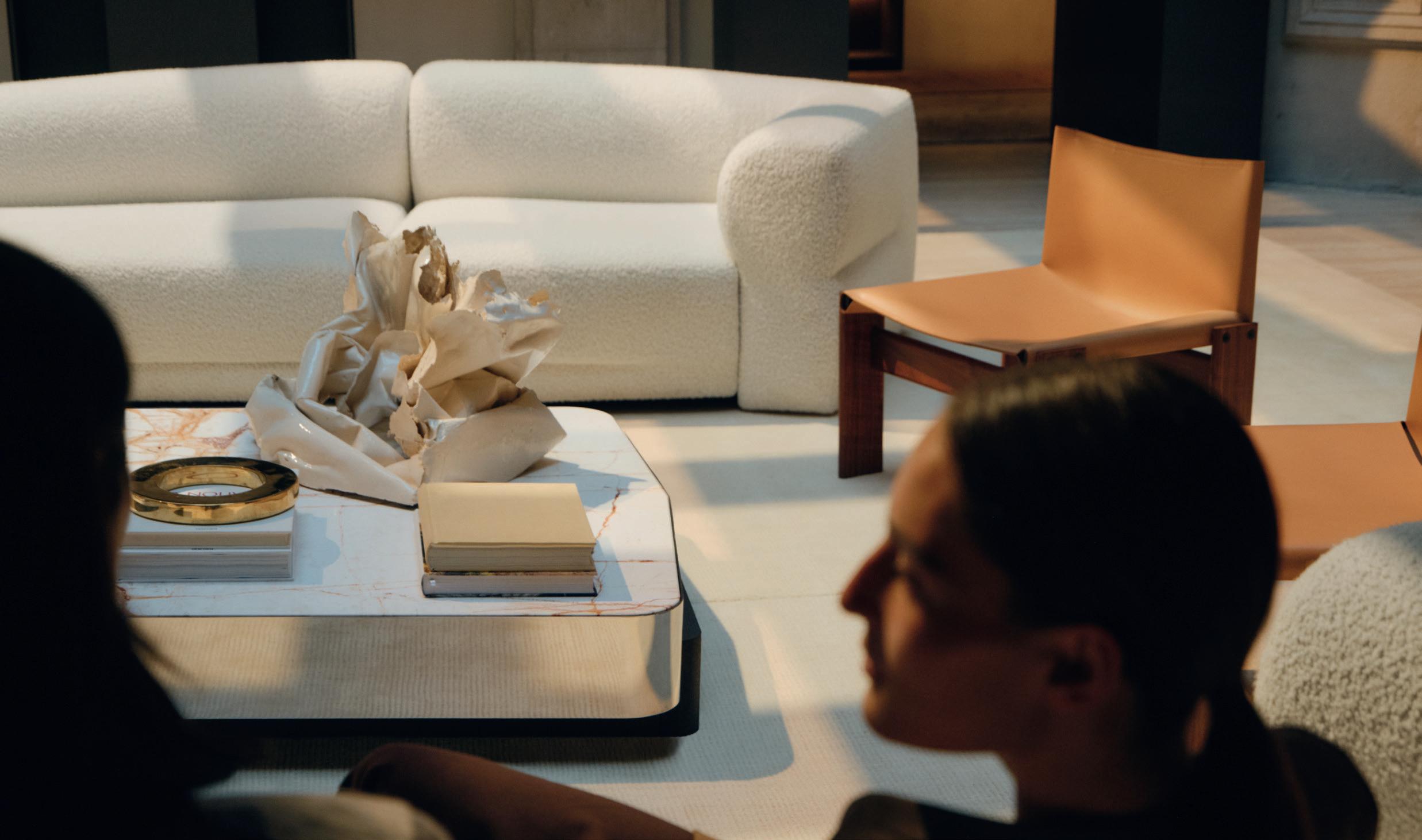
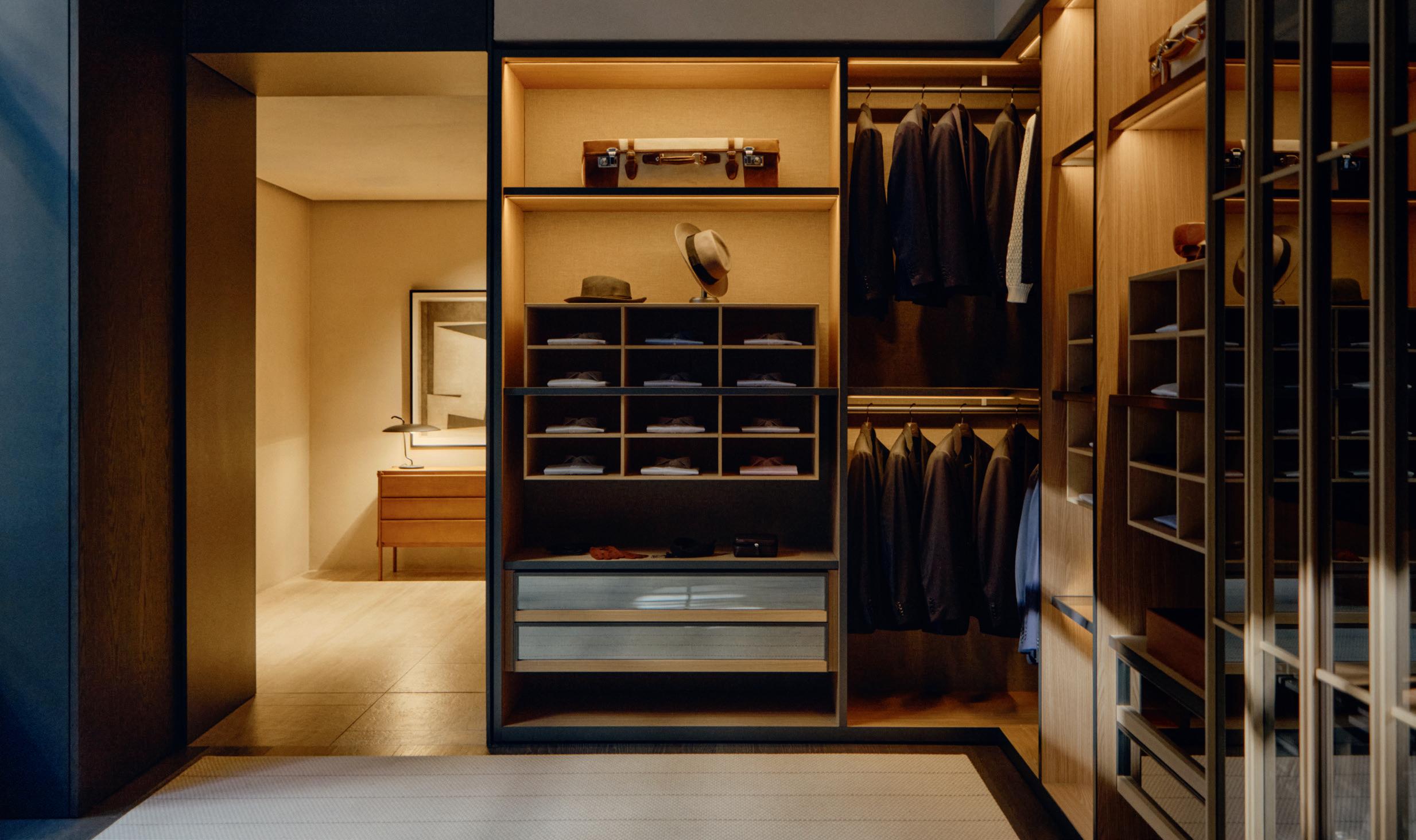
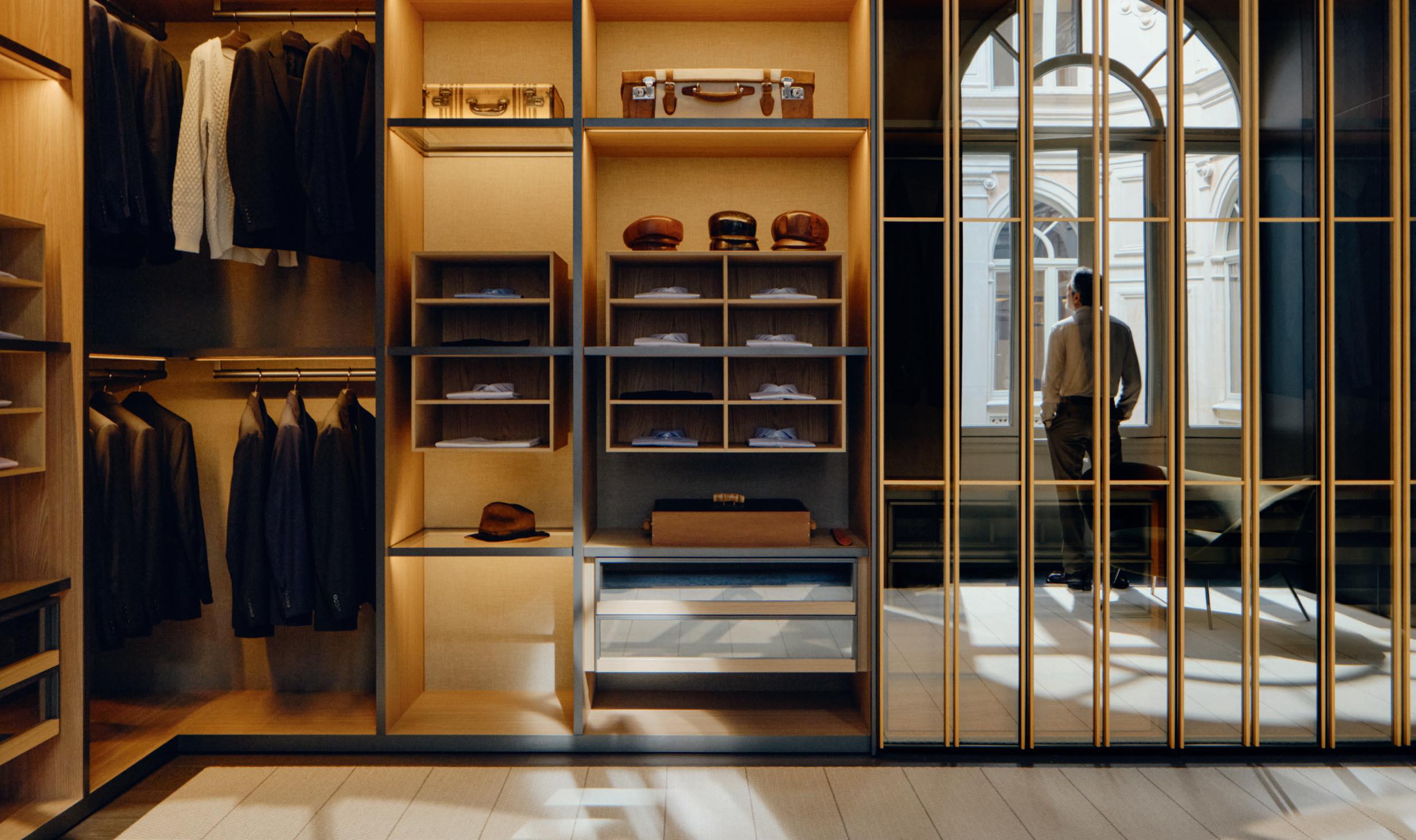
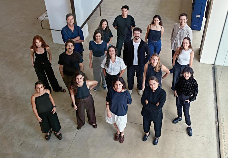
Marina Acayaba and Juan Pablo Rosenberg may well view their role in generational terms, as designers of a city they have both embraced and claimed. Over nearly two decades, their AR architecture studio has developed work firmly grounded in São Paulo’s architectural, cultural, and technological heritage, encompassing both Brazil’s historic ties to Portugal, its former colonizer, and the city’s connections to Japan, as the home to the largest Japanese diasporic community in the world. In AR’s projects, these lineages, tropical American, European, and Asian, manifest in a sustained engagement with both modern and traditional building materials and surfaces, as well as in the skillful composition of architectural elements and detailing. At the same time, this commitment to materiality and craftsmanship has actively shaped São Paulo’s emergence as a global center for architecture, art, and cultural economy in the twentyfirst century. Through productive alliances with key figures across diverse cultural fields, AR positions its work in dialogue with, and in service of, a rising network of São Paulo creators, makers, and entrepreneurs, spanning their own generation as well as younger cohorts. These collaborators, reinvesting in the city’s urban culture, operate across a wide spectrum of globally recognized creative fields: visual arts (Mendes Wood DM contemporary art gallery, 2021), fashion design (Haight Clothing flagship store, 2023), film production (Kana, 2012), gastronomy (Cha Cha Deli, 2005), contemporary and historical design manufacturing and exhibition (lamp designs for Ethel, 2025), and even landscape design and floriculture (Flower Bar, 2020). The studio remains attuned to and actively engaged with global currents, reflecting a commitment to projects that are grounded in the local context while resonating internationally.
The studio is keenly aware that its contribution to shaping São Paulo’s emergence as a contemporary global metropolis builds upon the city’s idiosyncratic
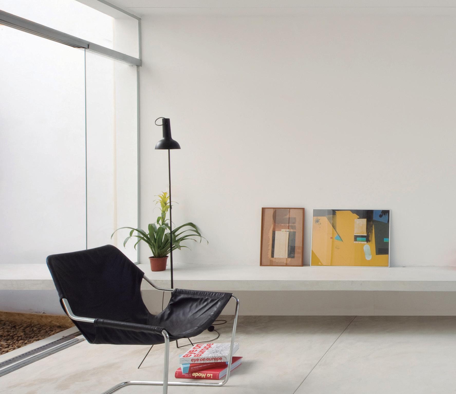
architectural legacy, which has positioned it as the capital of Brazilian culture since the mid-twentieth century. During this period, modern architecture not only guided the city’s urban ascent but also came to embody the key institutions that defined it, extending their influence nationally and, at times, worldwide. The establishment of the São Paulo Art Biennale in 1951, the second in the world after Venice, and the Museum of Art of São Paulo in 1947, designed by Italian-born Brazilian curator Pietro Maria Bardi and the pioneering Lina Bo Bardi, a rare woman architect of her generation, profoundly reshaped the city’s material landscape and cultural identity. Lina Bo Bardi’s designs at all scales, including the 1951 metal-and-leather Bola Chair, vividly inhabit AR’s interior design projects, forging a direct link between the studio’s contemporary interventions and this rich historical legacy.
Yet AR engages this inheritance without the constraints or moral imperatives that shaped the work of their immediate predecessors. Many of Acayaba’s and Rosenberg’s forebears, often their own professors, were preoccupied with reassessing architectural legacies under the weight of history and within a rigid formal and material repertoire, while guiding Brazil’s urban and architectural culture during the nation’s re-democratization after a quarter-century of military dictatorship. These predecessors sought to rehabilitate modern architecture compromised by political persecution, though some architects, including Lina Bo Bardi and members of the socalled Paulista School (sometimes labeled Paulista Brutalism), retained access to commissions. This movement coalesced around seminal works by João Vilanova Artigas and Paulo Mendes da Rocha, though many resisted the “brutalist” label. While this approach to modernism often emphasized the social potential of bold concrete, and occasionally steel, Bo Bardi’s work demonstrates a more
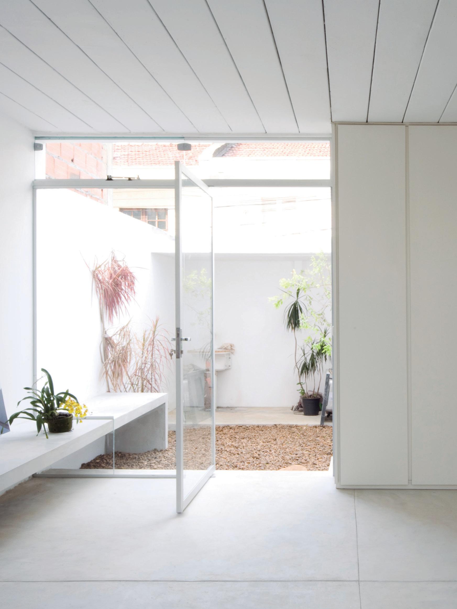
CUBE HOUSE
São Paulo, Brazil
Luana and Huber,
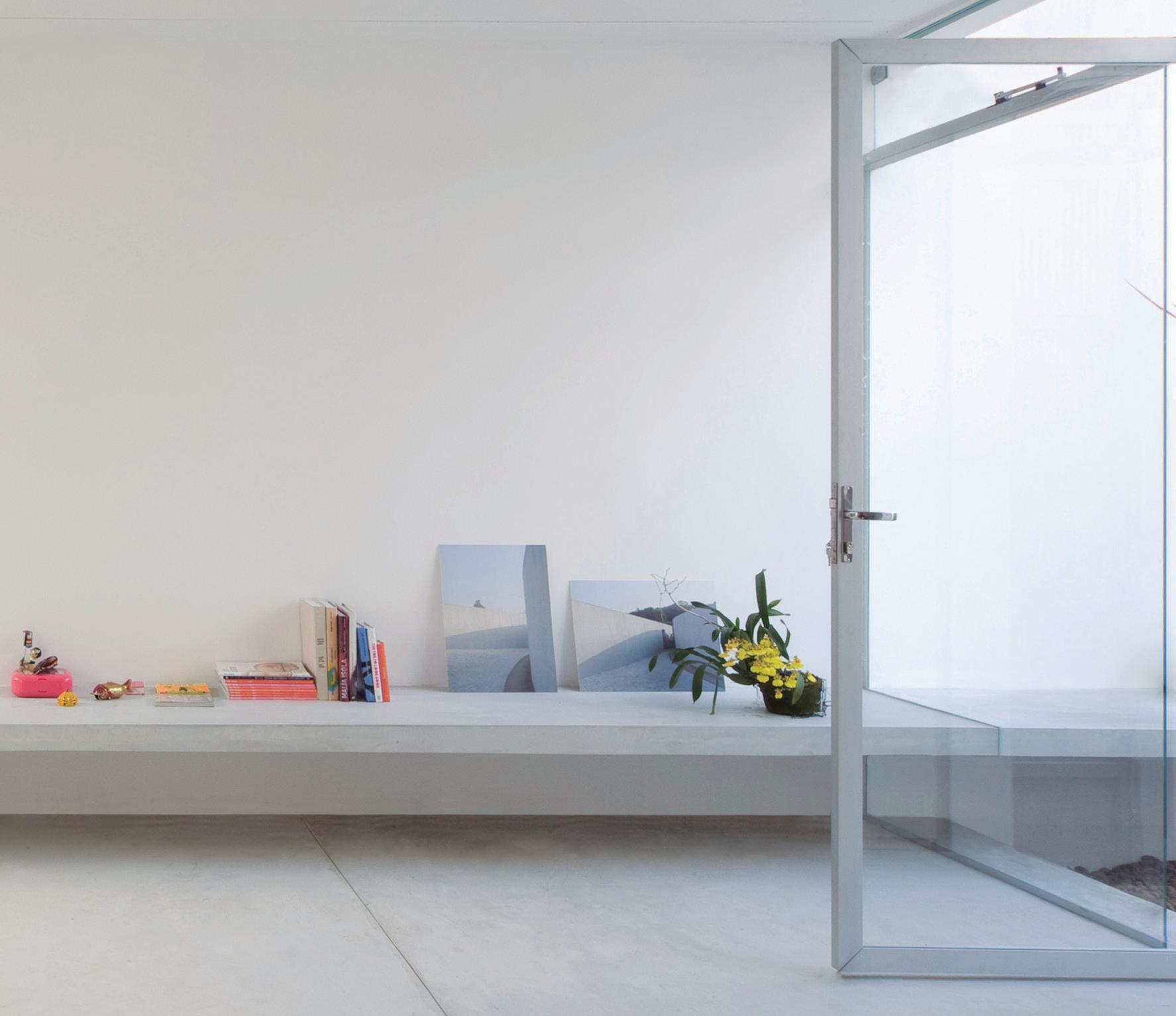
I have been reflecting carefully on how best to explain why the house should be white. I asked myself whether this might simply be a matter of personal preference, my taste versus yours, without any logical or rational justification. Yet if we were to rely solely on subjective arguments, we would never arrive at a decision; as the popular saying goes, taste is not open to debate.
For this reason, I sought explanations within the discipline of architecture itself that might substantiate the choice of white. Le Corbusier once stated that only good architecture can truly be painted white, because white reveals everything: it makes both the beautiful and the flawed unmistakably visible.
Borrowing his words:
“Whitewash exists wherever peoples have preserved intact the balanced construction of a harmonious culture.
…It has been linked to human habitation since the birth of humanity; stones are calcined, crushed, diluted with water, and the walls become the purest white, an extraordinarily beautiful white.
…If a house is entirely white, the design of the objects within it stands out without possible transgression; the volume of colour appears clearly; the colour of things becomes categorical. Lime white is absolute; everything stands out against it, written unmistakably, black on white; it is frank and loyal.
…Whitewash is the wealth of the poor and of the rich, of everyone, just as bread, milk, and water are the wealth of both slave and king.
…The work of our time, so bold, so adventurous, so combative, so conquering, seems to expect from us that we think against a white background.”
L’Art décoratif d’aujourd’hui, Paris, 1925.
Standing on the street in front of the house we have imagined and dreamed of, I would be happy to paint it white and show those who pass by how we, working together, as if with eight hands, arrived at a unique result. I do not wish to disguise it, nor to give it the tones of Tuscany, nor to conceal it behind vegetation. I want it to be visible, to be exhibited.
Throughout the evolution of the project, we struggled to keep that wall as “clean” as possible, without windows, without unnecessary information. What might appear to you as merely a large wall suitable for playing ball is, in our imagination, a gable wall, one of the principal elements of São Paulo’s architectural tradition. Architects such as João Batista Vilanova Artigas and Paulo Mendes da Rocha designed monumental gable walls, much like the great stone fortification walls of historic Portuguese cities.
This is our architectural lineage. By invoking these masters, I feel confident in saying that the white gable wall is not merely a matter of taste; it is part of our cultural inheritance. White is our history, but it is also the surface upon which the future may be written. If one day your child wishes to draw or play on that wall, it will be because there exists there a free and playful space: a white wall, an intentional void.
Yet if you still feel that white simply will not work, I would appeal to the philosophical perspective of Georg Wilhelm Friedrich Hegel. Hegel rejected taste as a criterion, considering it superficial, insufficient, and external to art. For him, taste does not imply technical knowledge of artistic creation. Consequently, an aesthetic based solely on taste should be replaced by an aesthetic of the expert or the specialist, thereby making art a more serious matter and allowing its substantial content to be understood.
Dear friends, the house is yours, and the final decision is yours as well. Yet we also feel it, in some measure, as our own, our first child, a project and a dream that you made possible.
Let us allow everything to remain visible.
Marina
*letter from Marina Acayaba to the clients
Luana e Huber, Fiquei pensando muito em como explicar para vocês porque a casa deve ser branca. Me perguntei se era apenas uma questão de gosto, ou seja, eu tenho o meu você tem o seu, ou seja não tem uma explicação lógica e racional. Mas se nos perdermos apenas nos argumentos subjetivos não poderíamos chegar a decisão alguma pois como já diz o ditado popular: gosto não se discute.
Por isso tentei buscar explicações dentro da arquitetura que sustentassem o branco. Le Corbusier já dizia que apenas a boa arquitetura podia ser pintada de branco, porque o branco denuncia
tudo, deixa evidente o belo e o feio. Emprestando as palavras de dele: “O leite de cal existe em todo lugar onde os povos conservaram intacto o edifício equilibrado de uma cultura harmoniosa. ...está vinculado à moradia do homem desde o nascimento da humanidade; calcinam-se pedras, trituram-se, diluem-se com água, e as paredes ficam do mais puro branco; um branco extraordinariamente belo.
...se a casa é totalmente branca, o desenho das coisas nela se destaca sem transgressão possível; nela o volume
da cor aparece nitidamente; nela a cor das coisas é categórica. O branco de cal é absoluto, tudo nele se destaca, escrevese absolutamente, preto no branco; é franco leal.
...o leite de cal é a riqueza do pobre e do rico, de todo mundo, como o pão, o leite e a água são a riqueza do escravo e do rei.
...a obra da época, tão ousada, tão aventureira, tão belicosa, tão conquistadora, parece esperar de nós que pensemos contra fundo branco.”
L’art décoratif d’aujourd’hui, Paris, 1925
Na rua em frente à casa que imaginamos e sonhamos, fico feliz de poder pintá-la de branco e mostrar para quem passa, como nós a oito mãos, chegamos num resultado único. Não quero disfarçar isso, não quero dar a ela tons da toscana, não quero esconde-la atrás das plantas, eu quero exibi-la. Durante toda a evolução do projeto nós lutamos por deixar aquela parede o mais “limpa” possível, sem janelas, sem informação. O que pode parecer para vocês um paredão de jogar bola, no nosso imaginário é uma empena, um dos elemento principais
da arquitetura paulista, Villanova Artigas, Mendes da rocha, todos eles fazem enormes empenas, como os grandes muros de pedra das antigas cidade portuguesas.
Essa é a nossa tradição e nomeando cada um dos nossos mestres tenho a segurança de dizer que a empena branca não é questão de gosto, mas faz parte da nossa cultura. O branco é a nossa história mas também o suporte para um futuro a ser escrito. Se algum dia o filho de vocês quiser brincar e desenhar na parede, será
porque ali esta um espaço livre, lúdico, uma parede branca, um vazio. Mas se ainda assim vocês estiverem pensando que não, que branco não dá.
Eu apelo a visão de Hegel que rejeita o critério do gosto, pois considera-o superficial, insuficiente e exterior à arte. Para ele o gosto não implica o conhecimento técnico da criação artística, consequentemente a estética do gosto deverá ser substituída por uma estética do expert ou do especialista, de modo a tornar a arte um assunto mais
sério e a compreender o seu conteúdo substancial...
É isso queridos a casa é de vocês e a decisão final também, mas nós a sentimos um pouco como nossa também, nosso primeiro filho, projeto e sonho que vocês tornaram possível.
Vamos deixar tudo evidente.
Marina
*carta de Marina Acayaba para os clientes
SCHENDEL HOUSE
São Paulo, Brazil
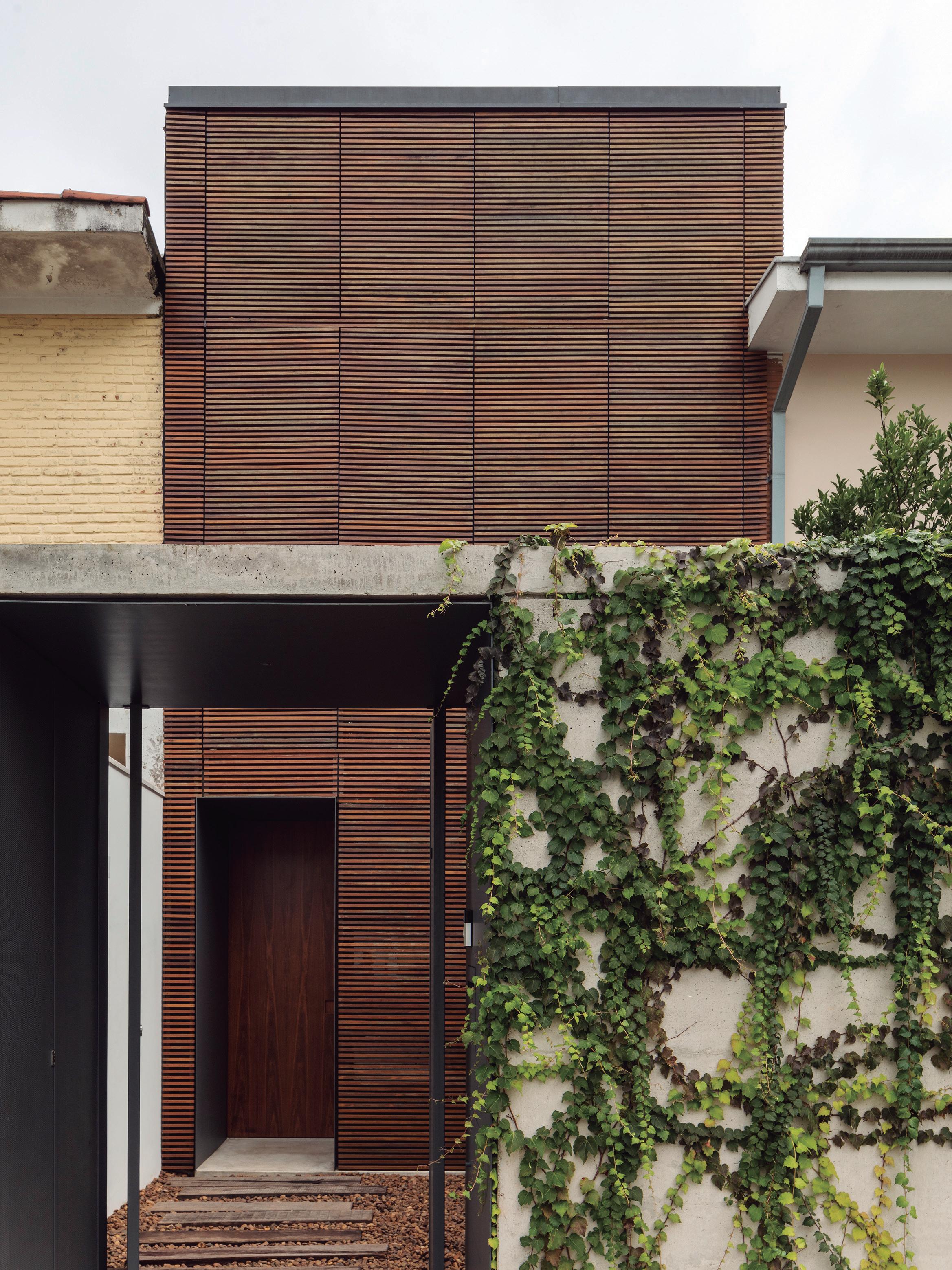
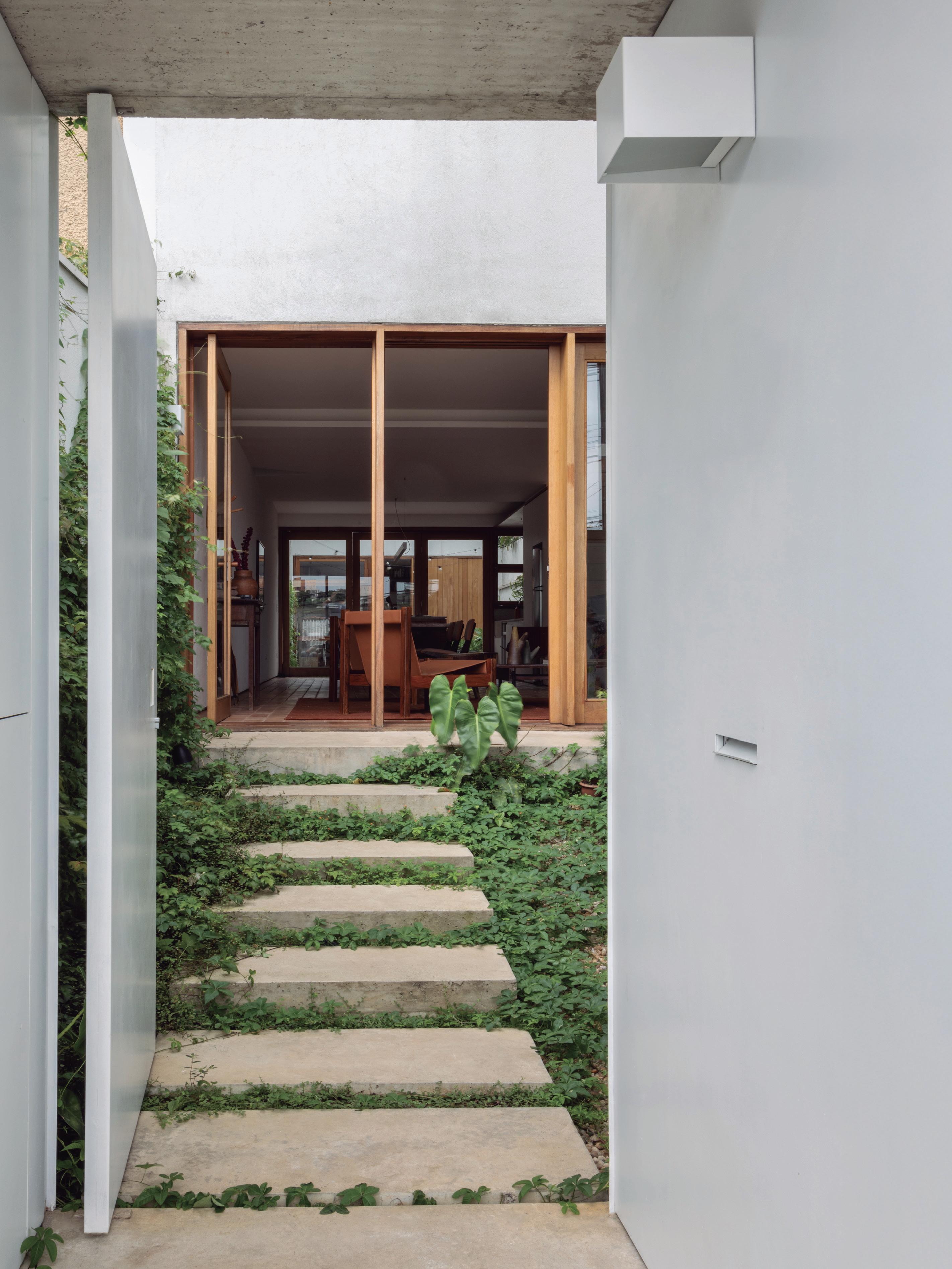
Intervention in a small residence 3.60 m wide, situated in an urban rowhouse ensemble typical of the 1940s in São Paulo.
The complete replacement of the house’s old façade with a new translucent lightweight envelope sought to expand and improve the usable interior area - entirely redesigning its spatial character and atmosphere -, while asserting its presence on the street by contrast, with the utmost respect for the surroundings.
From the original building, only the two existing slabs were kept, structurally tied to the neighbors’ slabs (as it is a single continuous construction). As an enclosure, a new independent solidwood structure runs autonomously around the perimeter between the party walls, rebuilding the façades and roof. Its height was raised by one meter relative to the preexisting roof to accommodate, in the attic above the bedroom, a study with access to the terrace and views over the neighborhood greenery.
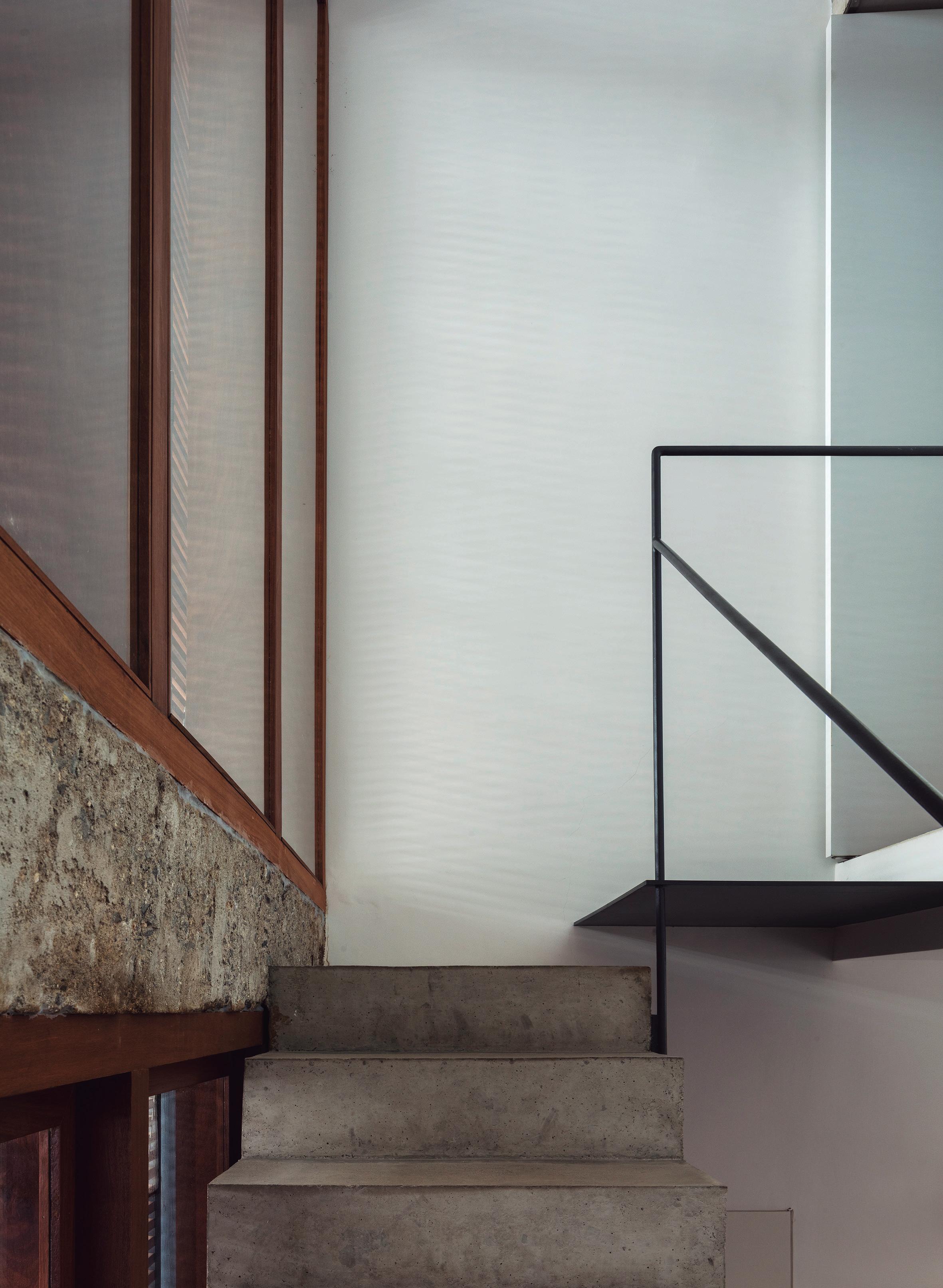
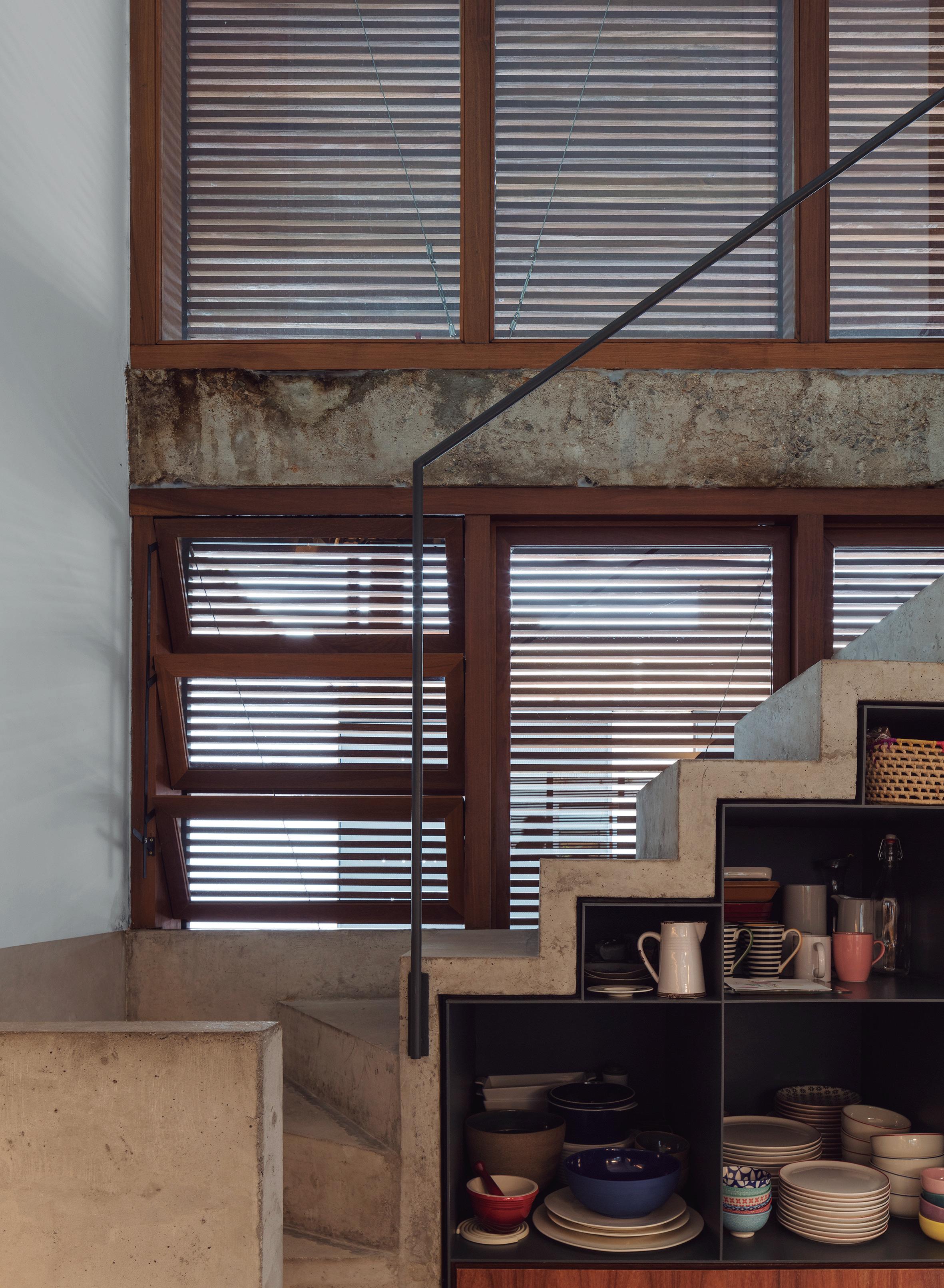
Next to the new front façade, a stairshelving unit occupies a triple-height void that adds verticality to the interior, allowing filtered sunlight and fresh air to circulate freely between floors.
The slatted party walls bathe the interiors in ethereal, soft, diffuse light. In the bedroom a metal frame trims the view. The folding “camarão” façade system, when opened, results in the full integration of the living room with the garden and the rear outbuilding, a separate suite, visually extending the domestic space across the full depth of the lot.
Intervenção numa pequena residência com 3,60m de largura, situada em um conjunto urbano de casas geminadas típico da década de 40 em São Paulo.
A substituição completa da antiga fachada da casa por uma nova envoltória leve translúcida, procurou ampliar e qualificar a área útil interior - recriando completamente sua espacialidade e atmosfera -, e, ao mesmo tempo, marcar sua presença na rua, por contraste, com máximo respeito ao entorno.
Do imóvel original foram mantidas apenas as duas lajes existentes, solidárias às dos vizinhos (pois trata-se de uma única construção). Como fechamento, uma nova estrutura independente, em madeira maciça, percorre de forma autônoma o perímetro entre as empenas laterais, refazendo fachadas e telhado. Sua altura foi elevada um metro em relação à cobertura pré-existente, de forma a agora abrigar no ático - sobre o dormitório - um escritório com saída para o terraço, com vista para o verde do bairro.
Junto à nova fachada frontal, a escadaestante ocupa um vazio de pé-direito triplo que adiciona verticalidade ao interior, deixando a luz filtrada do sol e o ar fresco circularem livremente pelo espaço entre pavimentos.
As empenas ripadas banham os interiores de uma luz etérea, suave e difusa. No quarto, a tapadeira metálica enquadra a vista. O sistema camarão das fachadas, quando aberto, resulta na integração total da sala com o jardim e a edícula ao fundo
- suíte independente -, o que faz ampliar visualmente a profundidade do espaço doméstico por toda a extensão do lote.
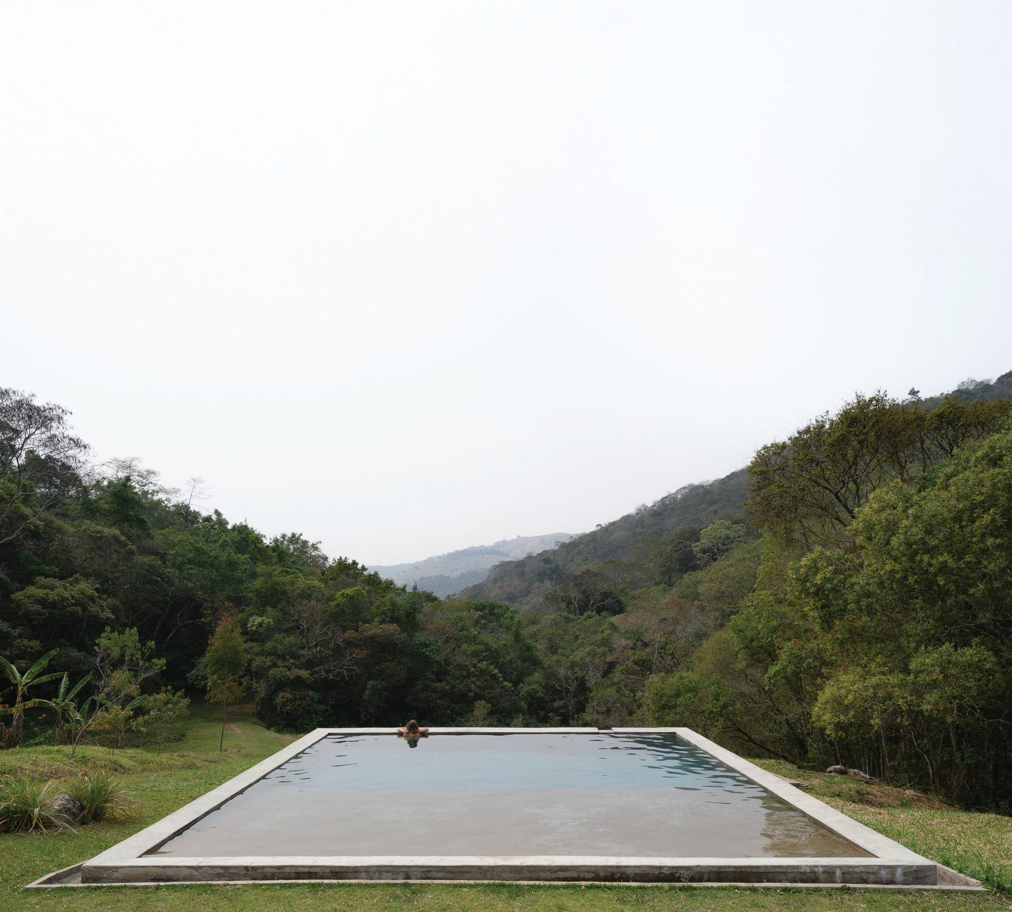
MATO DENTRO RANCH
Catuçaba, Brazil
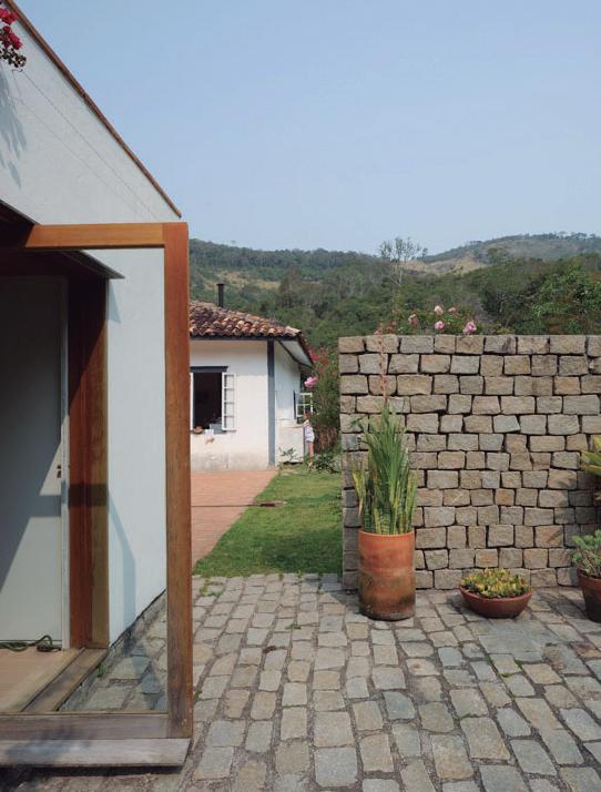
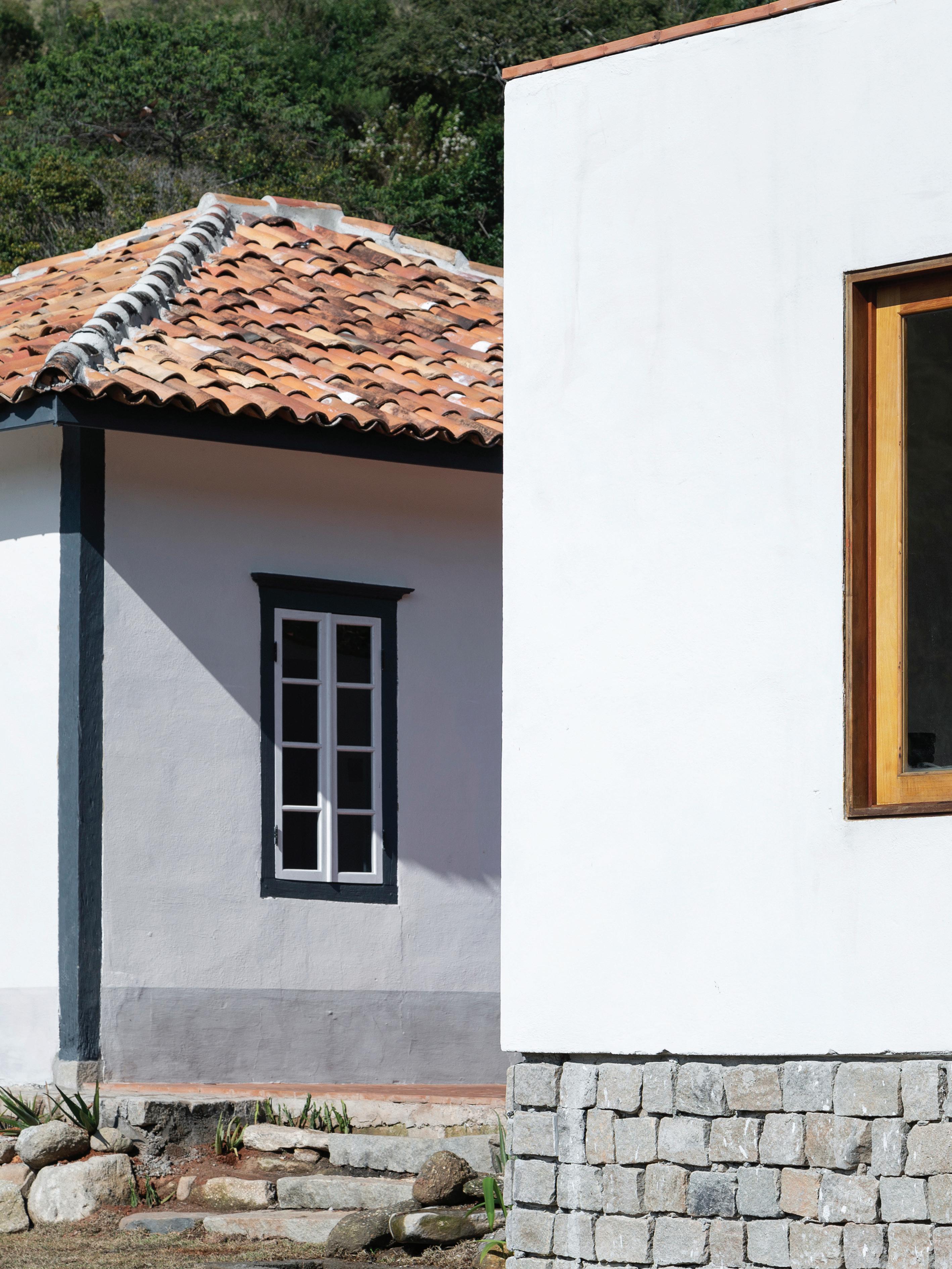
A pequena casa de pau-a-pique, construída no sec. XIX sobre um platô de pedra, foi restaurada e adequada para abrigar a família. Havia, no entanto - e sobretudo - a necessidade de domesticar o lugar, há muito desabitado junto à abundante mata de fundo de vale.
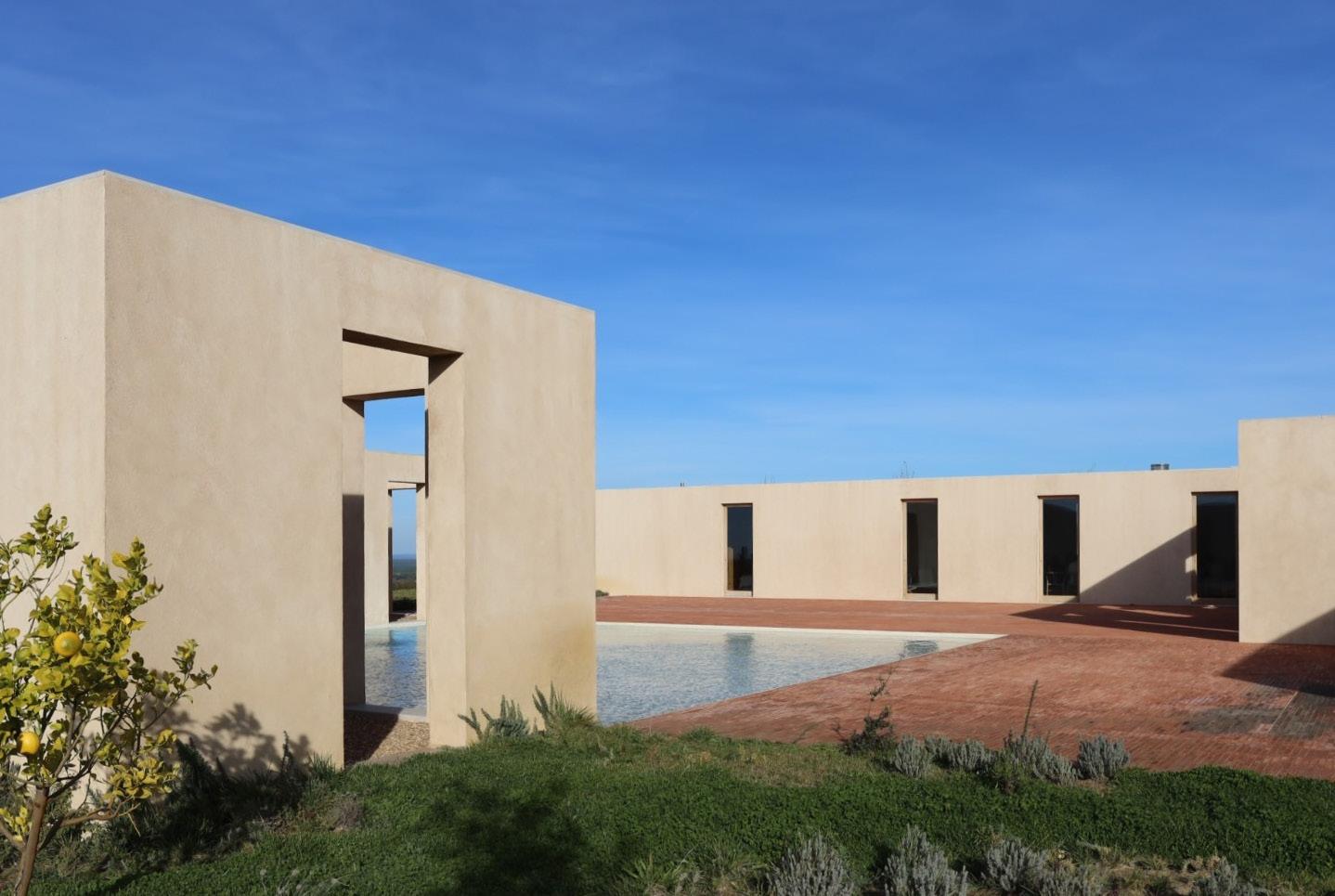
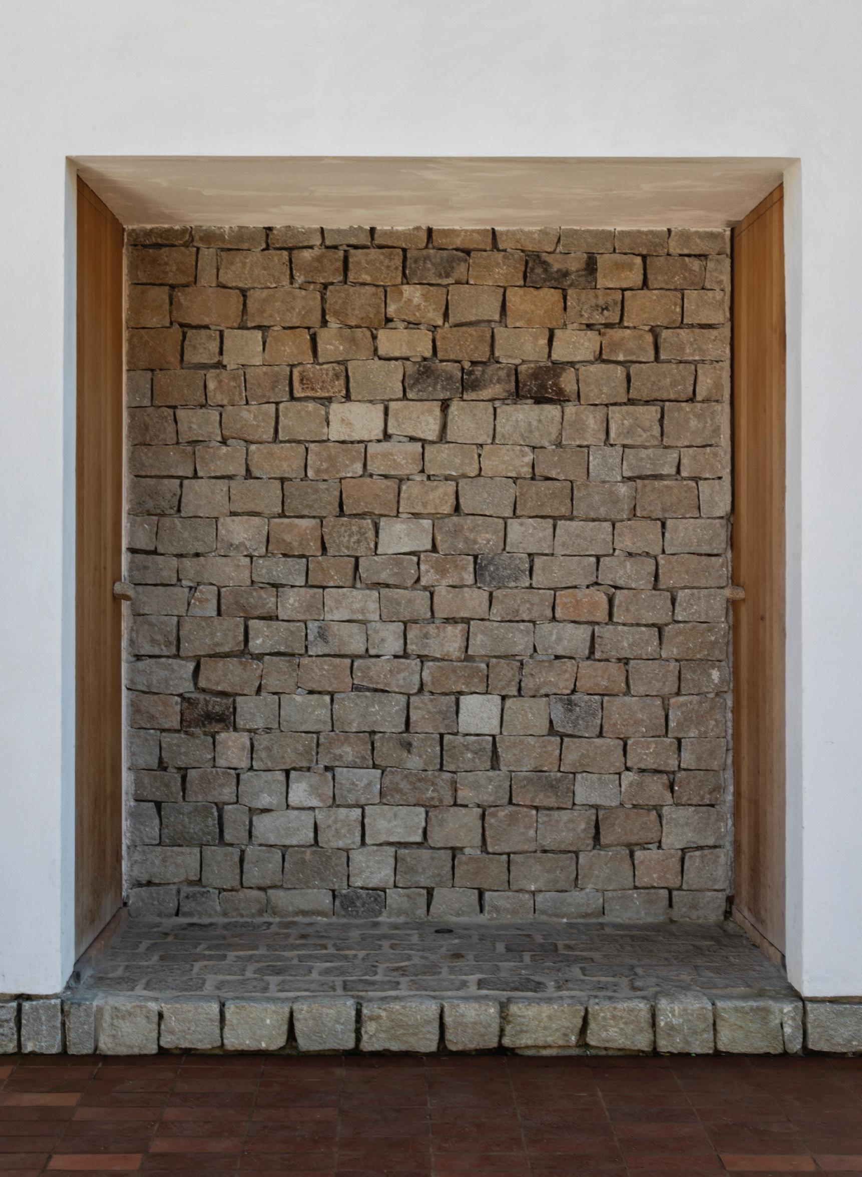
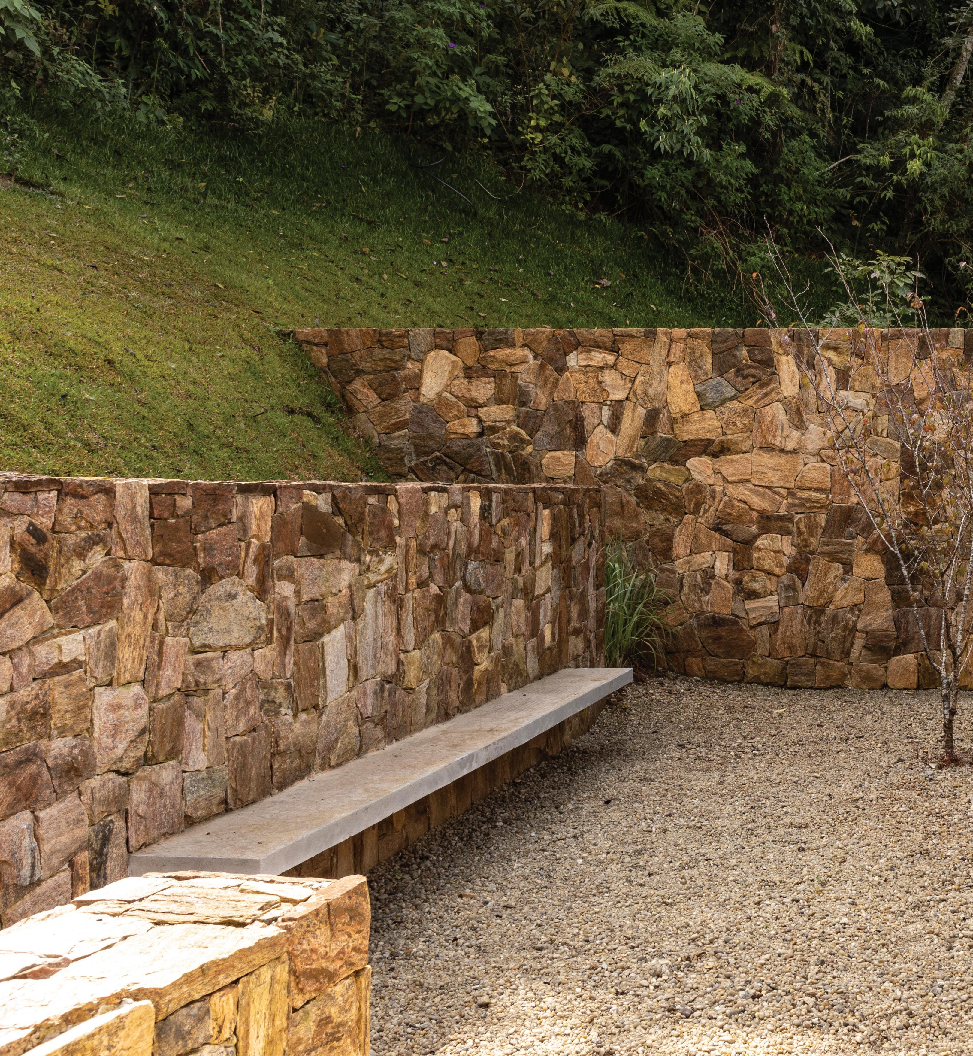
Atrás, um longo muro de arrimo, em paralelepípedo antigo comprado na região, foi construído para acomodar a lavanderia e a topografia, delimitando o espaço doméstico.
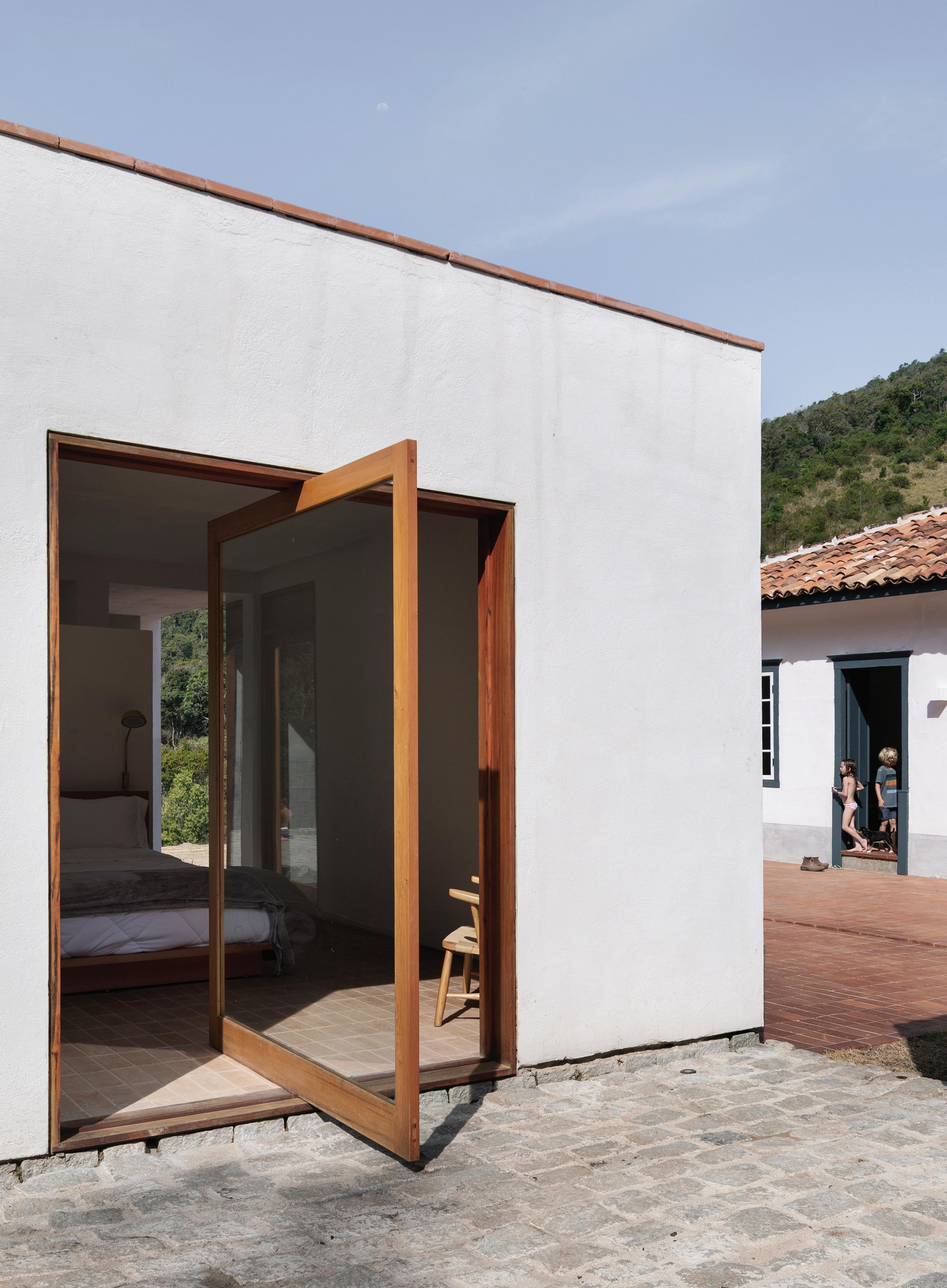
Paralelo à pré-existência, com suas telhas de coxa em quatro águas, implantou-se, em respeitoso contraste, um volume puro em laje plana, que abriga duas suítes de hóspedes. Seguindo a tradição (assim como o pau-a-pique), tem seu embasamento também feito em pedra - para afastar a umidade e os bichos - sobre o qual pousa, caiado de branco. Um pátio seco de 8x8m em tijolo-visto opõe e une as construções, cortado pelo som de um fio que conduz a água - e a vista - em direção ao vale, enquadrado entre estas.
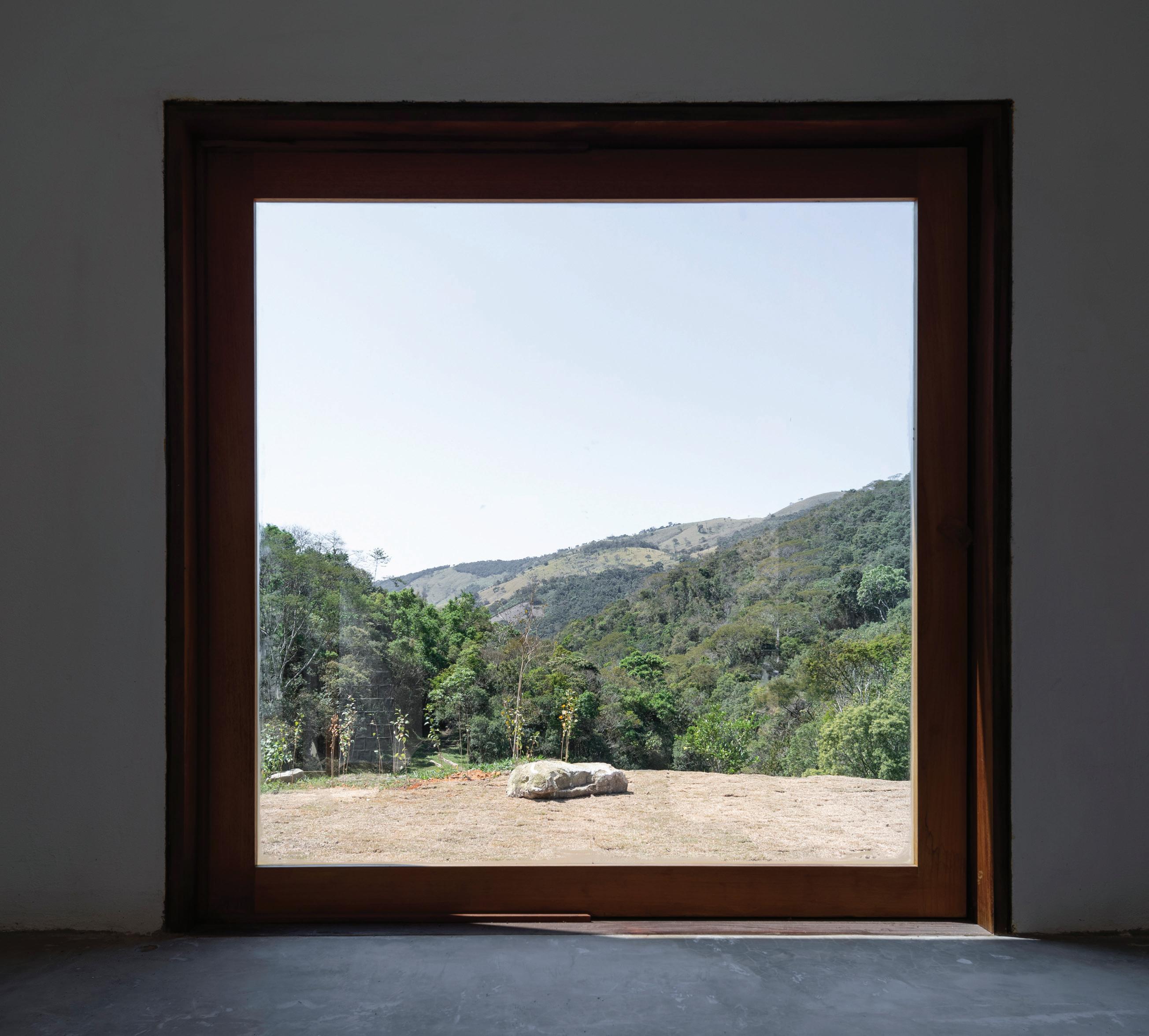
À frente, o gramado sob o pátio, e depois a piscina, convidam a o cotidiano a integrar-se à mata, à jusante.
The small pau-a-pique house, built in the nineteenth century on a stone plateau, was restored and adapted to accommodate the family. There was, however and above all, the need to domesticate the site, long left uninhabited beside the dense woodland of the valley floor.
To the rear, a long retaining wall built from reclaimed local stone blocks was constructed to contain the topography and accommodate the laundry, while at the same time defining the limits of the domestic ground.
Parallel to the existing building, with its four-sided pitched roof of traditional clay tiles, a pure volume with a flat concrete slab roof was introduced in respectful contrast, housing two guest suites. Following local tradition (as with the paua-pique construction), its base is also built in stone. Raising the structure above ground level to protect it from moisture and animals, upon which the whitewashed volume lightly rests.
An 8 × 8 metre dry courtyard in exposed brick both separates and connects the two buildings, crossed by the sound of a slender water channel that draws water and the gaze towards the valley, framed between them.
In front, the lawn beneath the courtyard, followed by the swimming pool, invites everyday life to extend towards the woodland further downhill.
ROSA BUILDING + GOMIDE & CO
São Paulo, Brazil
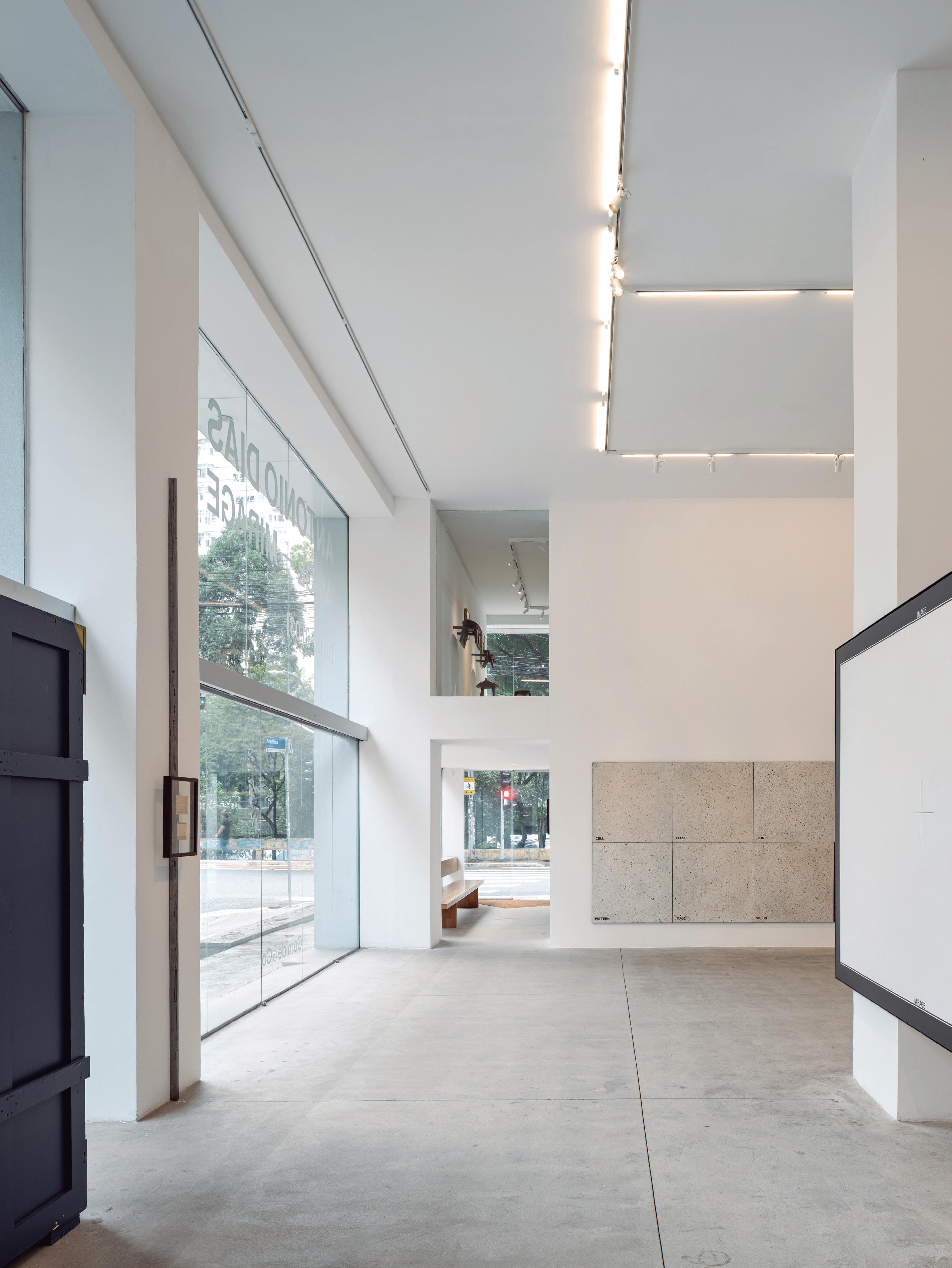
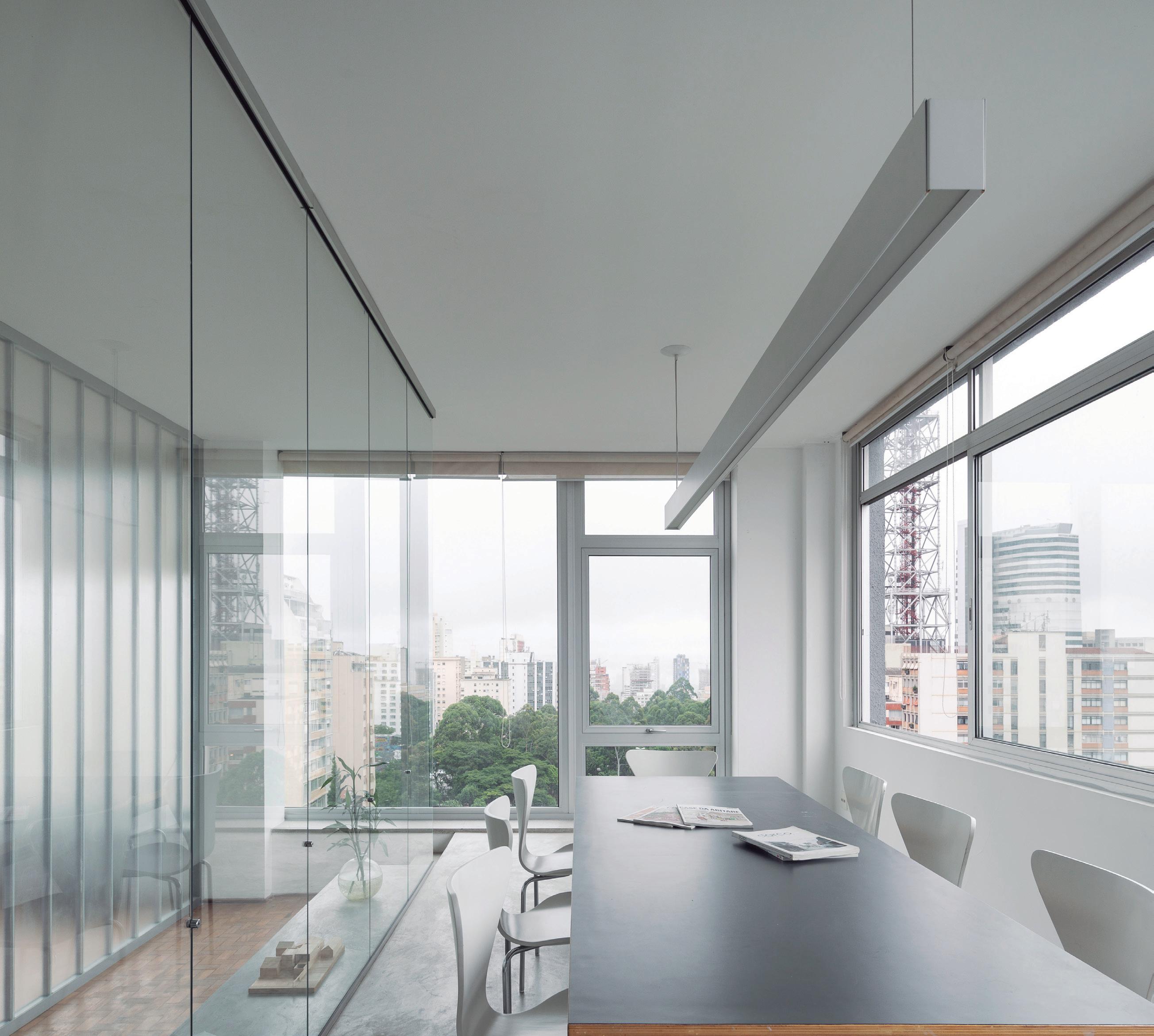
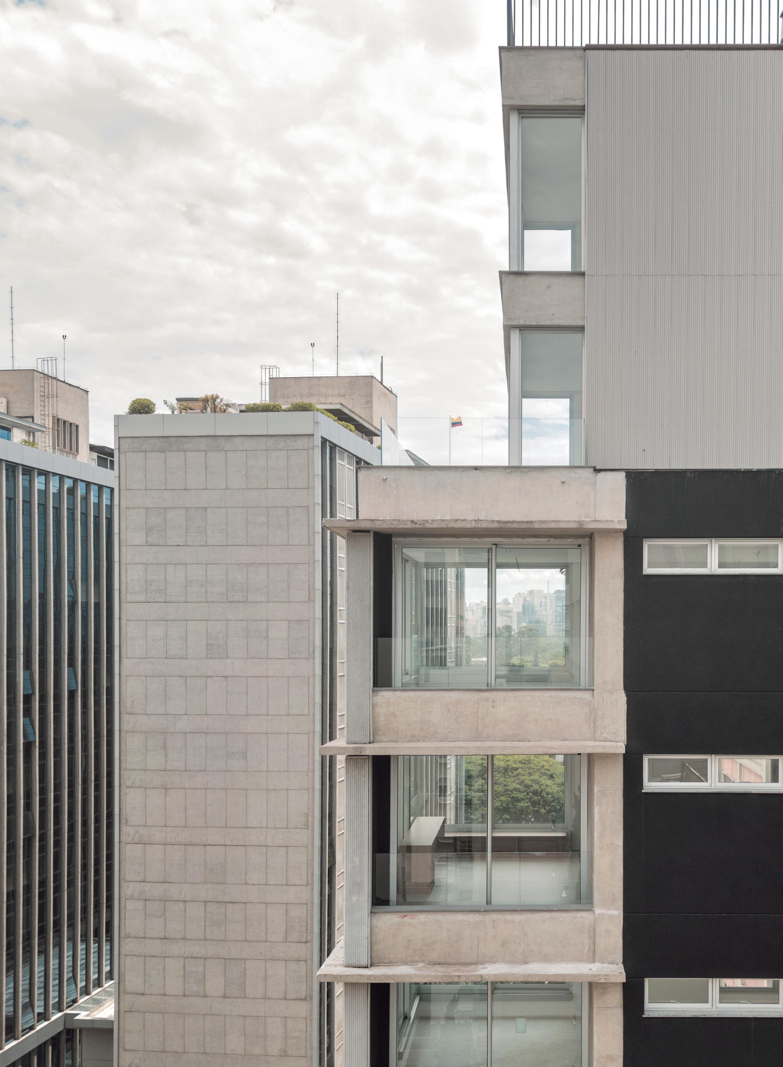
The commercial building from the 1970s, located on the corner of Avenida Angélica and Avenida Paulista and overlooking the Pacaembu valley, once imposing, had become degraded and largely stripped of its character. A generic new skin of mirrored glass would not suffice; what was required was a comprehensive renewal capable of bringing the building back into dialogue with the significance of its setting.
The former façade, haphazardly punctured by air-conditioning condensers that dripped onto pedestrians below, was replaced by a hybrid system combining large-format aluminium window frames with panels of self-supporting extraclear C-glass. Developed specifically for the building, the system lends a distinctive dynamism to the façade while significantly improving the thermal and acoustic performance of the envelope. The double C-glass panels are insulated and laminated with a high UV-reflective layer; combined with a new air-conditioning system, the solution achieved a 60 per cent reduction in the building’s energy load. From the interior, the visual effect alternates the blurred translucency of the C-glass with precise views and framed glimpses of the city through transparent glass modules.
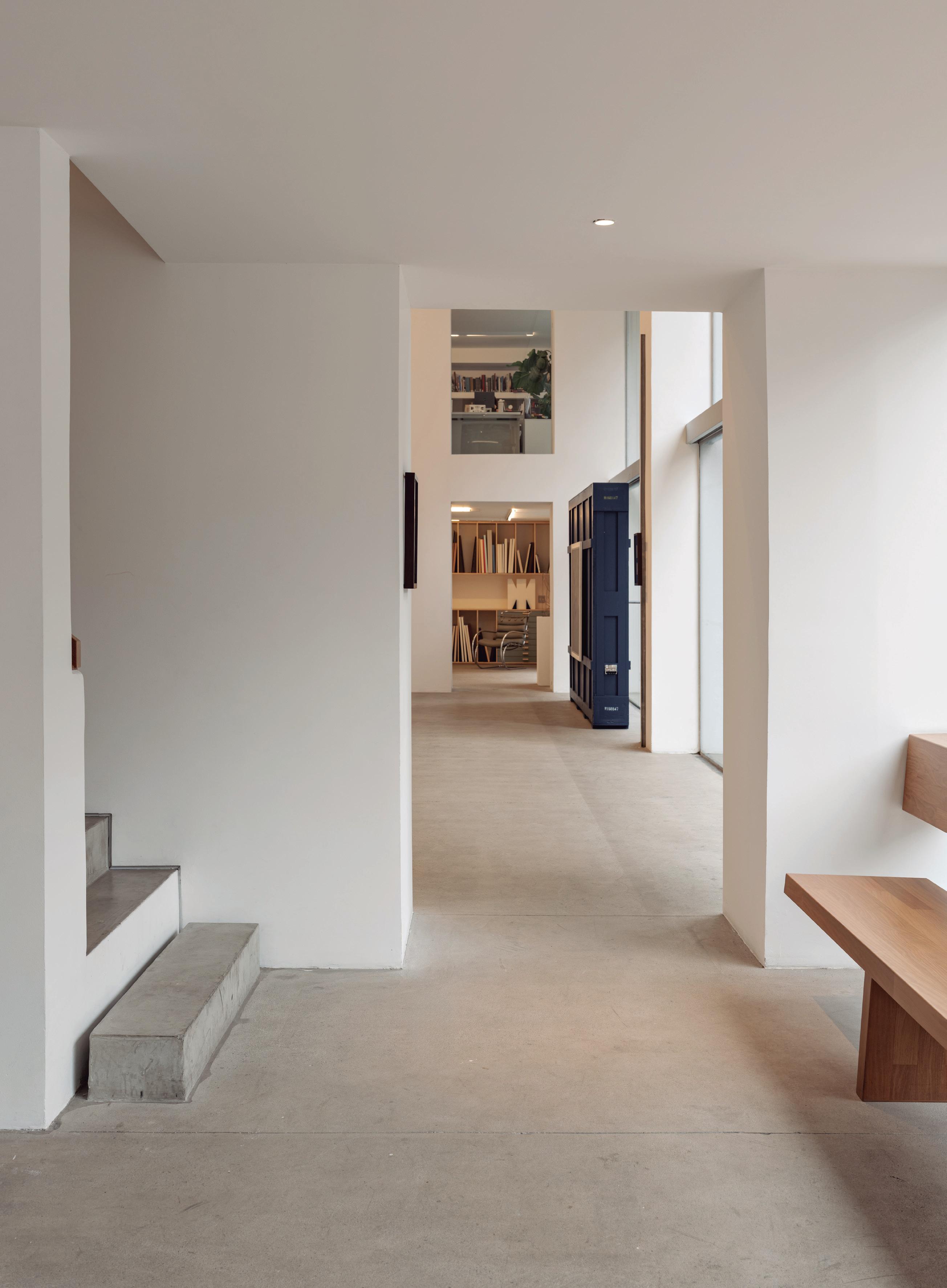
If the new façade reinstates the building as a visual landmark within the context of Avenida Paulista, at ground level the reconfiguration of the base restores an urban presence to the corner, long neglected behind a blind wall that once extended along the full frontage of Avenida Angélica. The former inhospitable gable wall along the avenue
has given way to the visual permeability of the new Gomide & Co. gallery. Set back and glazed, it is served by a hybrid element combining stair, bench and planter, which widens the pavement, reconciles the changes in level and ensures accessibility, leading to the forecourt that functions as a lively public place for sitting and resting, frequently used as an extension for events and exhibition openings. The retrofit thus restores quality both to the private property and to the city itself, which now operate in close synergy within the important urban context they share.
Localizado na esquina das avenidas Angélica e Paulista, debruçado sobre o vale do Pacaembu, o edifício comercial dos anos 1970, outrora imponente, encontrava-se degradado e descaracterizado. Não lhe bastava uma nova pele genérica de vidro espelhado, urgia uma renovação completa para colocá-lo à altura de sua localização.
A antiga fachada, aleatoriamente impregnada por condensadoras de arcondicionado, que pingavam sobre os transeuntes, foi substituída por um sistema misto que intercala esquadrias de grande formato em alumínio com panos de vidro autoportante tipo C-glass extra clear. Este sistema, desenvolvido especificamente para o edifício, além de conferir um dinamismo singular à fachada, aumentou sensivelmente a eficiência térmica e acústica do invólucro, visto que o C-glass duplo além de insulado
conta com laminação de alta reflexão UV. Associada ao novo sistema de ar-condicionado, a solução alcançou redução de 60% no passivo energético do imóvel. O efeito visual de dentro para fora, intercala o efeito blur do C-glass com visadas e enquadramentos precisos da cidade através dos marcos em vidro transparente.
Se a nova fachada recolocou o edifício como marco visual no contexto da Paulista, ao nível do chão a reconfiguração do térreo devolveu a urbanidade à esquina, há muito negligenciada por um paredão cego que ocupava toda a frente da Av. Angélica. A antiga empena inóspita no alinhamento da avenida deu lugar à permeabilidade visual da nova galeria Gomide & Co. Recuada e envidraçada, é servida pelo misto de escada-bancofloreira, que amplia a calçada, acerta os níveis e resolve a acessibilidade, ao paço que serve de animada área pública de estar e descanso, sendo muito utilizada como extensão em eventos e vernissages. O retrofit realizado devolve qualidade tanto ao imóvel privado quanto à cidade, que passaram a atuar em estreita sinergia, no importante contexto urbano em que se insere.
ATLANTIC HOUSE
São Paulo, Brazil
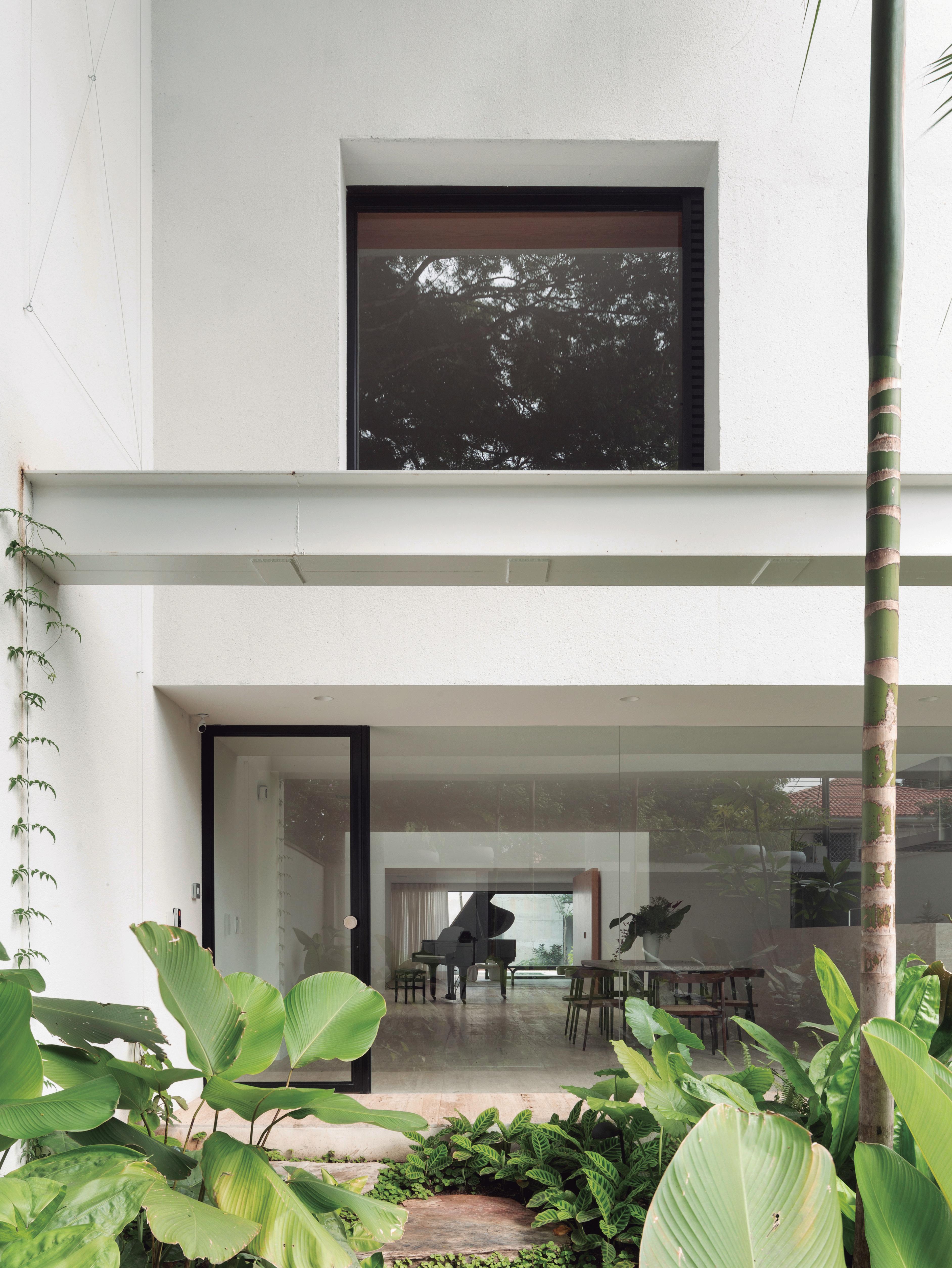
The house forms part of a row of terraced dwellings, attached on both sides on a typical plot along Rua Atlântica, and had already undergone refurbishment in the 1990s.
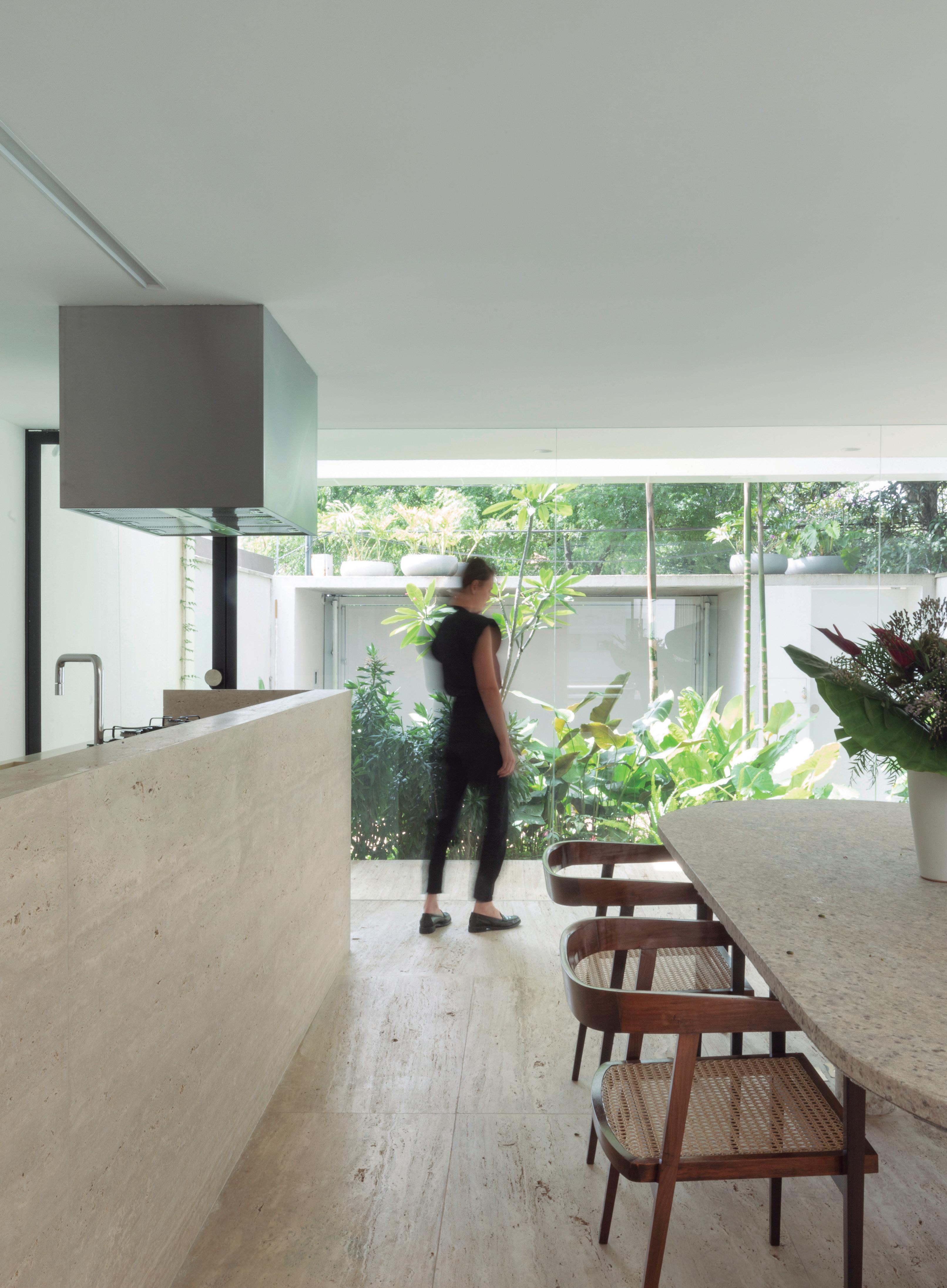
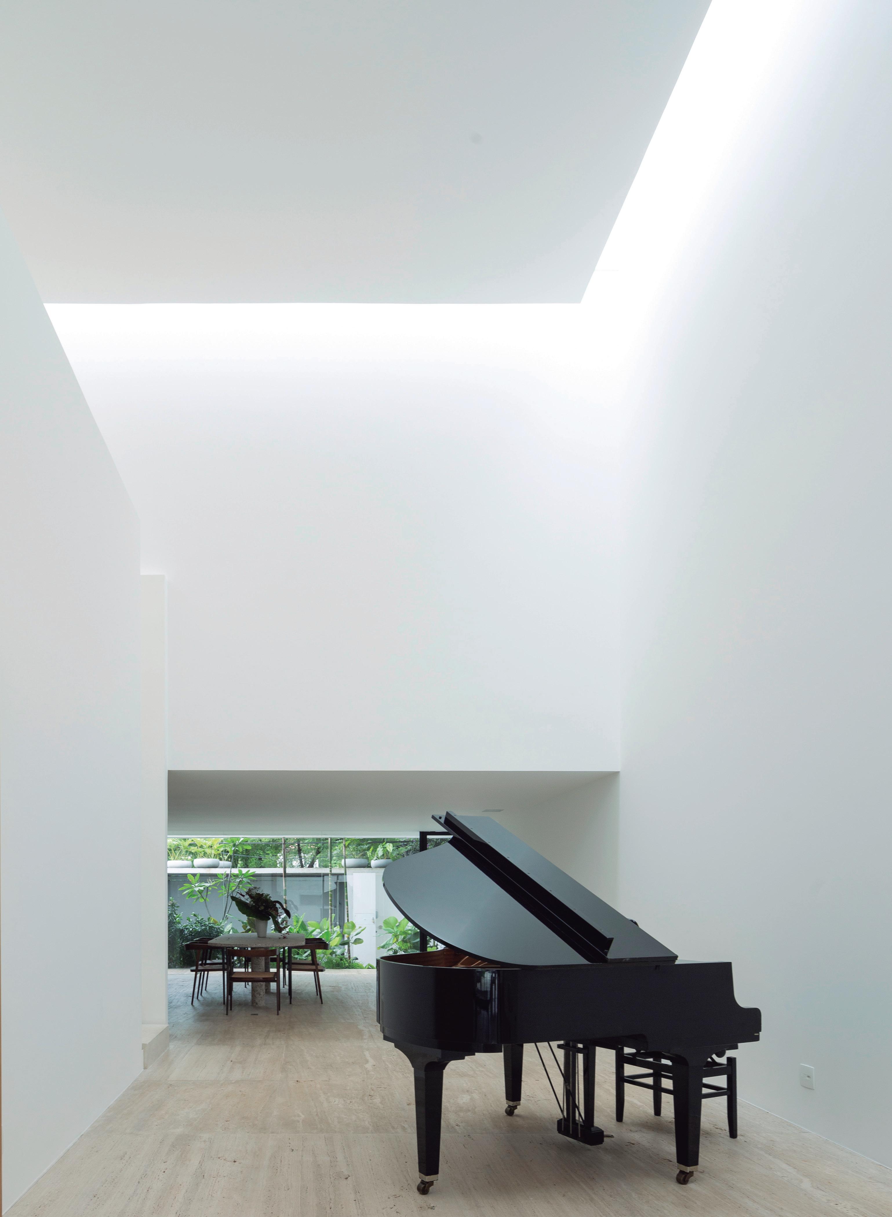
As the interior was markedly dark, the spatial organisation was rearticulated around a central void with doubleheight ceilings. Above it, a large, square and heavy solid volume appears to hover freely, outlined by a zenithal opening that bathes the interiors in a soft, homogeneous and ever-changing light. Within the void, where tones of white reverberate alongside the sound of the piano, two walls contain the staircase, revealing to the inhabitant a sequence of abstract framed views along the route between floors. On the upper level, a narrow bridge approaches the suspended mass, subtly altering the perception of scale as one accesses the bedrooms located at the front and rear of the house. Beneath the bedrooms, under a deliberately compressed ceiling height, the kitchen and dining area open towards the front garden through a large glazed panel, while the living room projects, through the veranda, towards the generous garden at the back of the plot.
The zenithal light that washes the walls transforms the white surfaces, and the space itself, according to weather and season. On sunny days the interior may assume a bluish tone; on rainy days, a muted grey; towards evening, warm orange hues emerge. In this constant mutation, the subtleties of the light spectrum and its varying intensities are revealed against the absence of colour.
The travertine flooring of the living room and the sumptuous bathrooms finished in noble marbles and gold were preserved intact, with only the addition of a new bathing room to the principal suite.
Trata-se de uma casa geminada de ambos os lados num lote típico da rua Atlântica, e que já havia sofrido reforma nos anos 90.
Visto que o interior da casa era escuro, seu espaço foi rearticulado com um vão central em pé-direito duplo, sobre o qual um grande maciço quadrado e espesso paira solto, contornado pela zenital que banha os interiores com uma luz suave, homogênea e mutante. No vazio que reverbera tons de branco e soar do piano, dois muros contém a escada, para revelar ao morador permanentes recortes abstratos no trajeto entre pavimentos. No piso superior, a passarela se aproxima ao sólido suspenso, alterando a percepção de escala no acesso aos dormitórios, localizados à frente e ao fundo da construção. Sob o quartos, em pé-direito mínimo, cozinha e jantar abrem-se para o jardim frontal por meio de um grande pano de vidro, enquanto a sala de estar se projeta, através da varanda, em direção ao grande jardim no fundo do lote.
A luz zenital que penetra lavando as paredes transforma radicalmente o branco e o espaço de acordo ao clima e às estações. O ambiente pode assumir uma tonalidade azulada em dias de sol, acinzentada em dias de chuva, alaranjados no fim da tarde, numa mutação constante que revela
as sutilezas do espectro luminoso e suas intensidades sobre a ausência de cor. O piso da sala em travertino romano e o os suntuosos banheiros em mármores nobres e dourado foram mantidos intactos, tendo apenas sido adicionada uma sala de banho à suite principal.
FLOWERBAR
São Paulo, Brazil
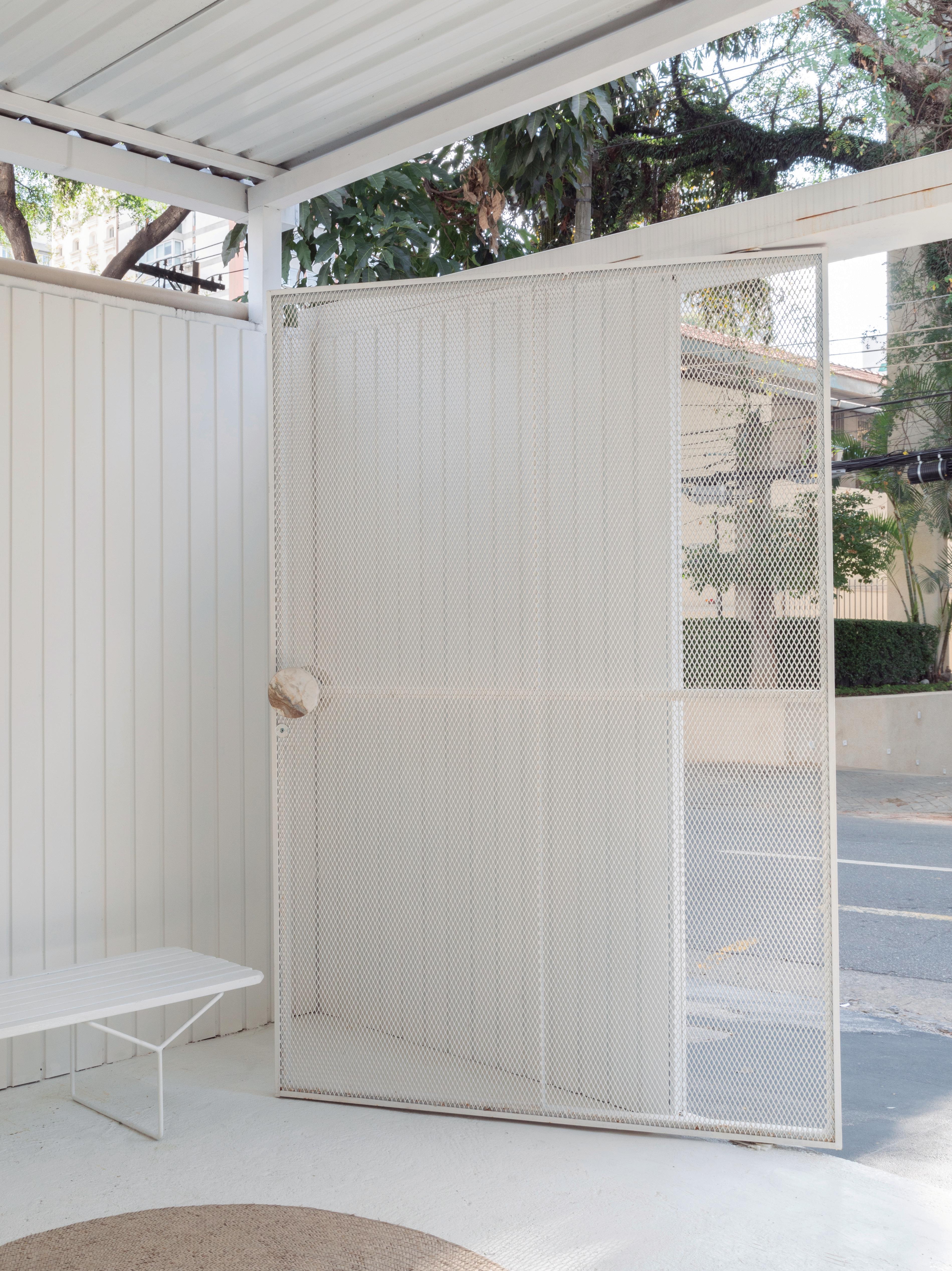
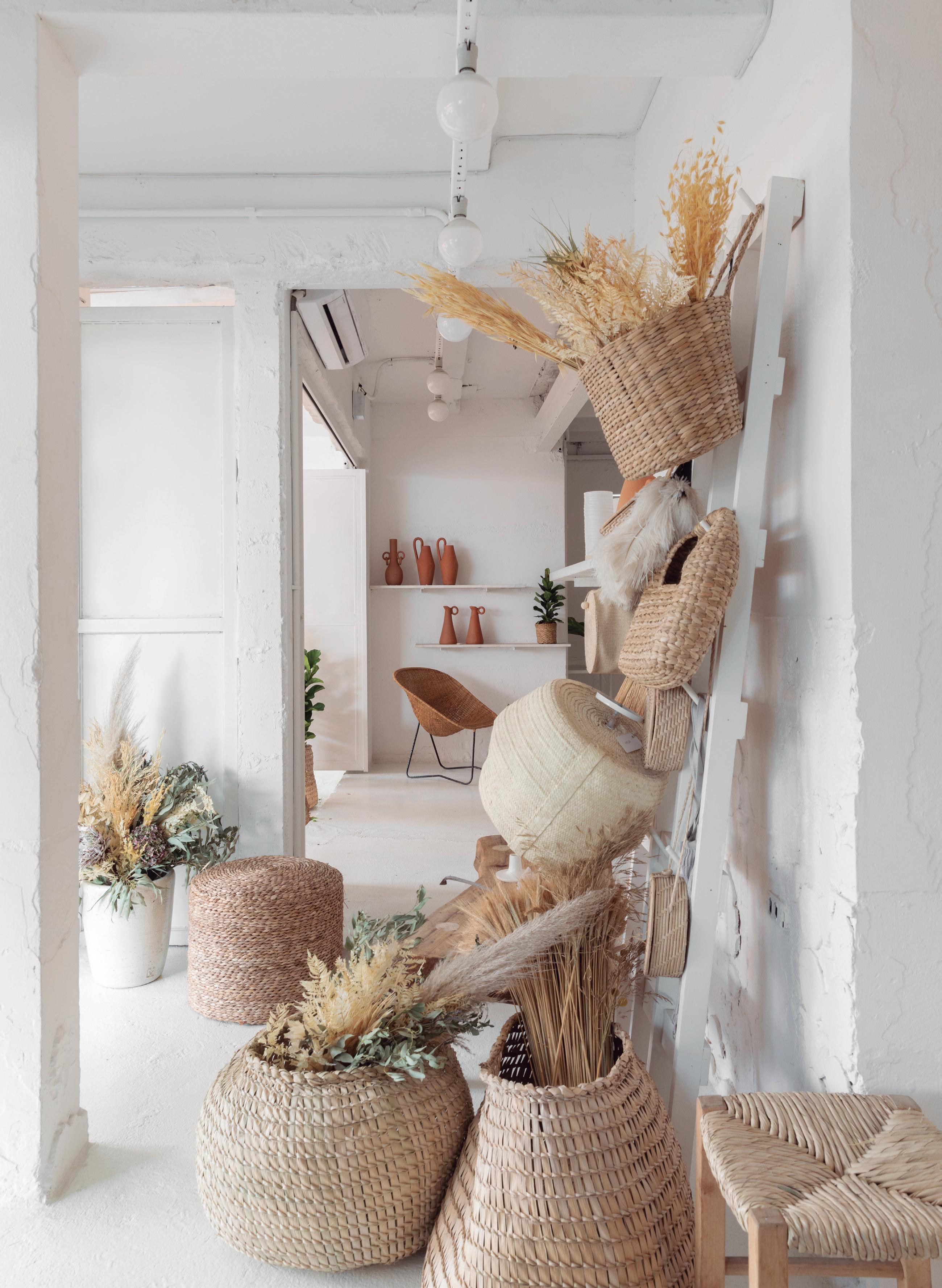
Flowerbar is a temporary flower shop located directly on the pavement in the Jardins district, a cosmopolitan area of São Paulo.
The brief was clear: low-cost solutions with rapid implementation.
The proposal began by occupying the garage of a small building, transforming it into a green oasis within the impermeable city. The existing metal roof was retained and repainted. Beneath it, a large monolithic structure in exposed concrete blocks was constructed, providing the space where floral arrangements are produced and displayed at varying heights, visible to passers-by on the street.
The floor of the space is entirely covered in loose, light-coloured gravel, a simple and practical solution that immediately conveys a shift in atmosphere underfoot. The sensation of walking on stone, the sound of footsteps, combined with the scent of flowers and their multiplicity of colours framed by abundant greenery, creates a multisensory environment, inviting immersion into a pocket of nature within the dense megalopolis.
The new façade along the pavement constitutes another decisive intervention. Detached from the roof, it forms an autonomous, well-proportioned and harmonious composition in expanded metal, which resolves access while giving Flowerbar an elegant presence through the precision of its detailing.
A Flowerbar é uma loja efêmera de flores situada junto à calçada no bairro dos Jardins, área cosmopolita de São Paulo.
A premissa era clara: soluções de baixo custo e rapidez na execução.
A proposta partiu da ocupação da garagem de um pequeno edifício, para transformá-la num oásis verde em meio à cidade impermeabilizada.
A cobertura metálica existente foi mantida e pintada. Sob esta, foi construído um grande monólito em blocos de concreto à vista, espaço onde os arranjos florais são produzidos e expostos em diferentes níveis, visíveis para os pedestres que circulam pela rua. O piso do espaço foi todo revestido em pedrisco solto e claro, solução simples e prática que imediatamente desperta ao caminhar a mudança de atmosfera. O sensação dos pés e o som dos passos sobre forração em pedra, aliados ao perfume das flores e sua multiplicidade de cores rodeadas de verde abundante, constroem uma atmosfera multissensorial, propícia à imersão num hiato de natureza em meio à densa megalópole.
A nova fachada sobre o passeio constitui outra intervenção determinante. Desligada da cobertura, estabelece uma composição autônoma, bem proporcionada e harmoniosa, em chapa expandida, que resolve o acesso e confere, no do rigor do detalhe, uma presença elegante ao Flowerbar.
MENDES WOOD DM
São Paulo, Brazil
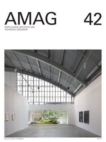
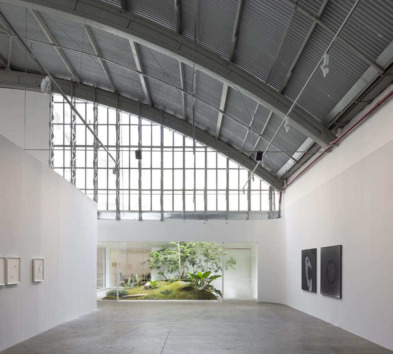
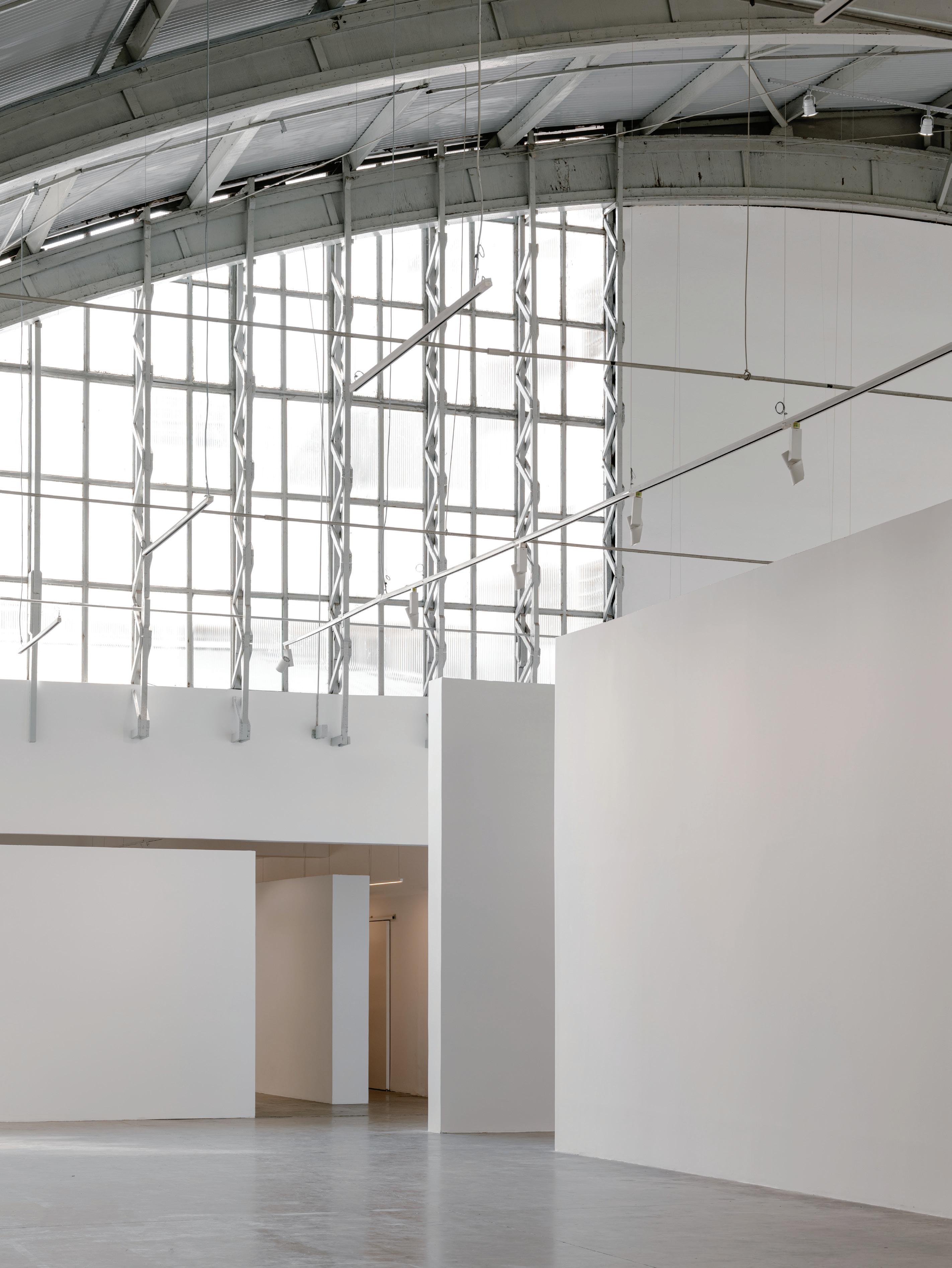
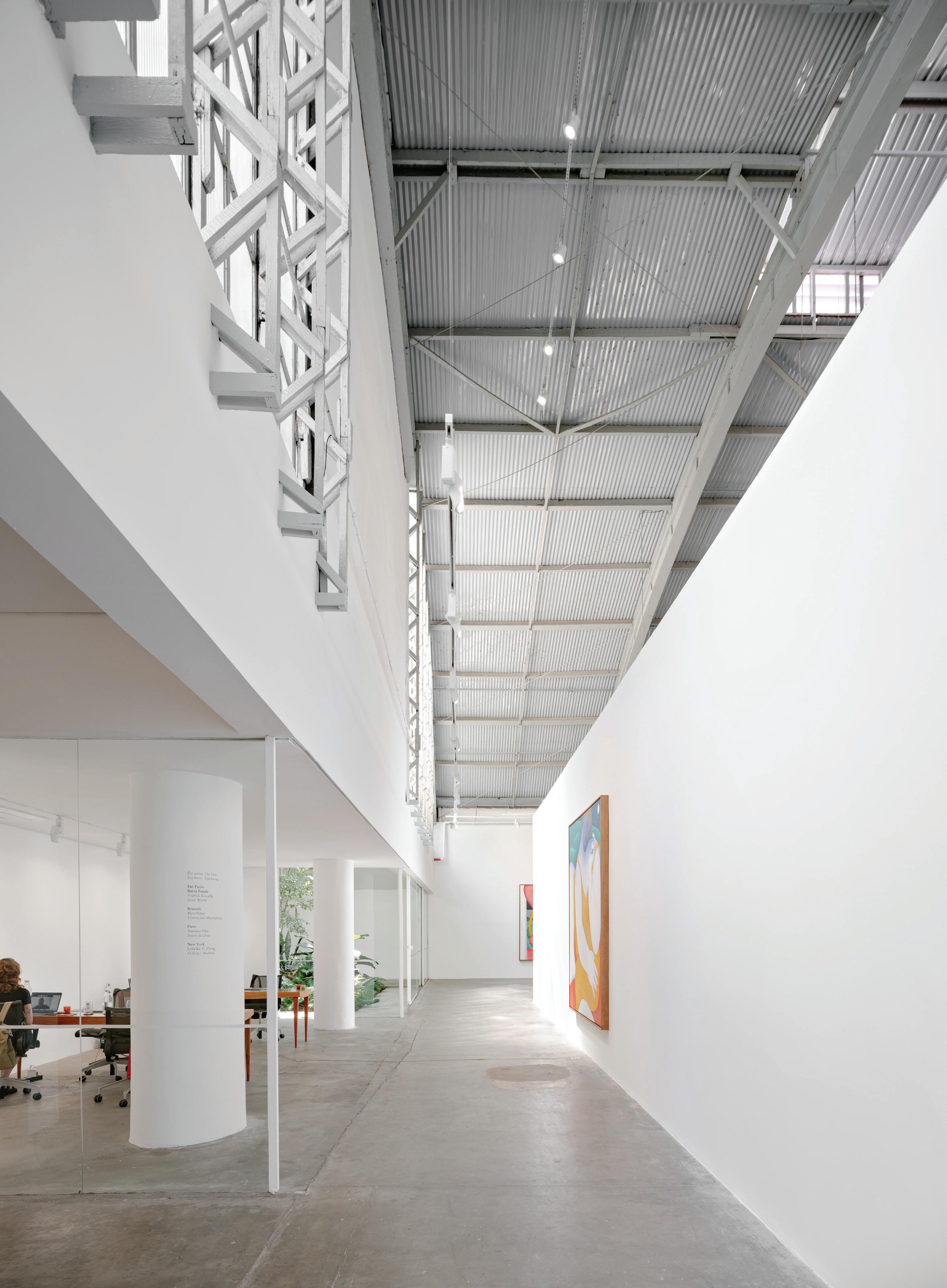
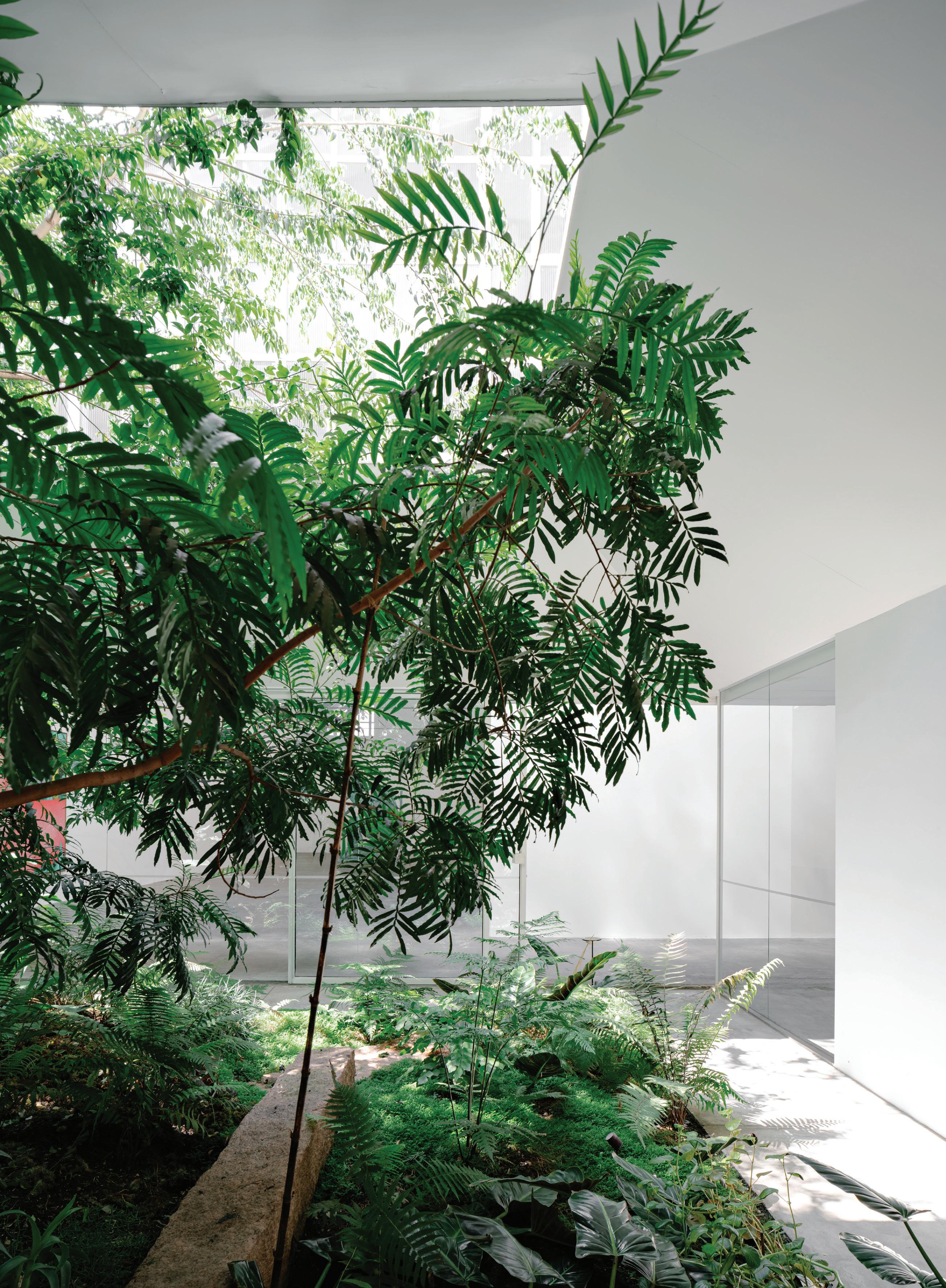
The occupation of a large, decommissioned industrial warehouse by the new Mendes Woods DM space in the Barra Funda district of São Paulo marks a new phase of growth and internationalisation for the gallery, while carefully preserving one of the most significant aspects of its former space: the presence of a garden.
As an industrial hall, the greenery had to be created. A topographic, humid interior garden, covered in mosses and succulents, was introduced to connect the internal areas with the exhibition hall. Like a small oasis, it manifests in two ways: from the main hall, it is seen at a distance, framed as a tropical landscape; in more intimate areas, it functions as a plaza, a central space for circulation, gathering, and rest, and is fundamental for natural light and ventilation throughout the complex.
The large free span afforded by the curved roof constructed with timber trusses and metal sheeting from the city’s industrialisation period provides a singular exhibition space, with generous ceiling heights and diffuse light, capable of accommodating large-scale works and installations.
Despite its size, the space had limitations: only two enormous walls, a monumental scale, and limited flexibility. To multiply the exhibition surface and accommodate smaller works, two new rooms were inserted within the void. A “white cube” is housed within the pre-existing industrial structure. In the first room, there is no ceiling, only the space defined by freestanding walls,
offering both scale and containment. The second, enclosed room has a lower ceiling and a controlled environment, with precision lighting for delicate works.
Through this central occupation, the space became fluid and highly flexible, able not only to host exhibitions of varying scale concurrently but also to adapt to different configurations and circulation paths depending on the curatorial programme.
A ocupação de um grande galpão industrial desativado pelo novo espaço da Mendes Woods DM, na região da Barra Funda em São Paulo, marca a nova fase de crescimento e internacionalização da galeria, ao mesmo tempo em que se preocupa em remontar o aspecto mais significativos de seu antigo espaço: a presença do jardim.
Por se tratar de um galpão industrial, o verde precisou ser criado. Um jardim interno topográfico, úmido, recoberto por musgos e suculentas foi aberto, articulando as áreas internas e a sala de exposições. Como um pequeno oásis, sua presença se dá de duas maneiras: do grande salão, se vê com distanciamento, emoldurado como paisagem tropical. Já para as áreas restritas, é praça, espaço central para a circulação, encontro e descanso, fundamental para a insolação e ventilação natural do conjunto.
O grande vão livre proporcionado pela cobertura curva executada em treliças
de madeira e chapa metálica, da época da industrialização da cidade, oferece um espaço expositivo singular, com generoso pé direito e luz difusa, capaz de acomodar obras e exposições de grande porte.
Apesar das dimensões, o espaço tinha suas limitações: apenas duas enormes paredes, escala monumental e pouca flexibilidade de uso.
A estratégia para multiplicar a superfície expositiva e acolher obras de menor porte, foi criar duas novas salas em meio ao vazio. Um ‘cubo branco’ abrigado pela pré-existência fabril. Na primeira, não há forro. Apenas o espaço circunscrito por paredes soltas que oferecem escala e contenção. A outra sala, fechada, com pé-direito mais baixo e ambiência controlada, conta com luz de precisão para expor obras delicadas.
Por meio da ocupação central, o espaço resultou fluido e de alta flexibilidade, não apenas para receber todo tipo de exposições de portes variados e concomitantes, mas também para assumir diferentes reconfigurações e percursos, a depender da expografia.
B HOUSE
São Paulo, Brazil
B house integrates into the surrounding square with subtlety and character.
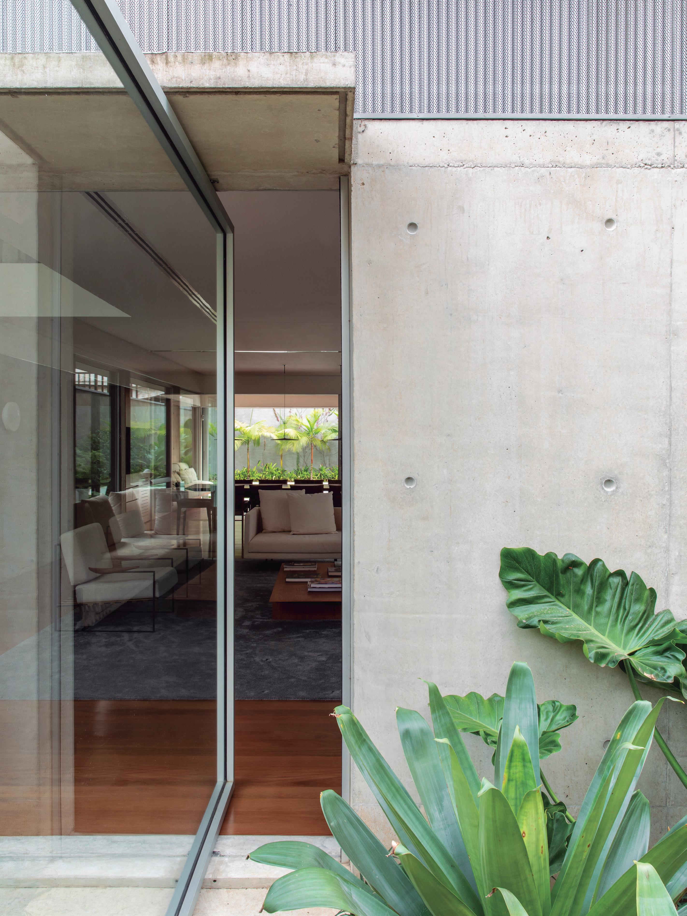
In a prismatic volume, the lower and upper floors are expressed through distinct materialities. The exposed in-situ concrete of the ground floor supports, defines, and penetrates the social and service spaces, organising uses that open onto multiple views of the garden. From the entrance, a long wall traverses both garden and building, marking a deliberate sense of permeability.
The upper floor, light and prefabricated, is clad in micro-perforated metal panels, punctuated by openings that frame views of the landscape within the private areas.
Concrete and natural aluminium coexist in a monochromatic contrast of materiality and texture, balancing density and precision, the artisanal and the technological.
Internally, suspended white surfaces articulate interior voids, creating varied ceiling heights, zenithal light entries, and carefully framed glimpses of the green square immediately beyond.
A Casa B se insere na paisagem do casario da praça com discrição e personalidade.
Num volume prismático, pavimentos inferior e superior se apresentam em materialidades distintas.
O concreto aparente do térreo, moldado in-loco, apoia, delimita e atravessa os espaços sociais de serviço, articulando
usos que se abrem para diferentes vistas do jardim. Desde a entrada, um longo muro atravessa o jardim e a construção, marcando a sua permeabilidade.
O pavimento superior, leve e préfabricado, tem sua pele em chapa micro-perfurada marcada por aberturas que emolduram a paisagem nas áreas íntimas.
Concreto e alumínio natural convivem justapostos no contraste monocromático de suas materialidades e texturas, contrapondo densidade e precisão, entre o artesanal e tecnológico.
Internamente, o branco suspenso desenha vazios interiores, criando alturas variadas, entradas de luz zenital e enquadramentos do verde da praça logo em frente.
PEDRO DO RIO HOUSE
Petrópolis, Brazil
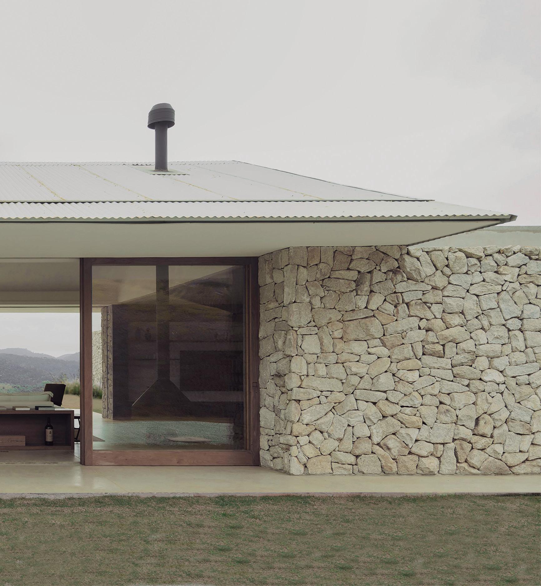
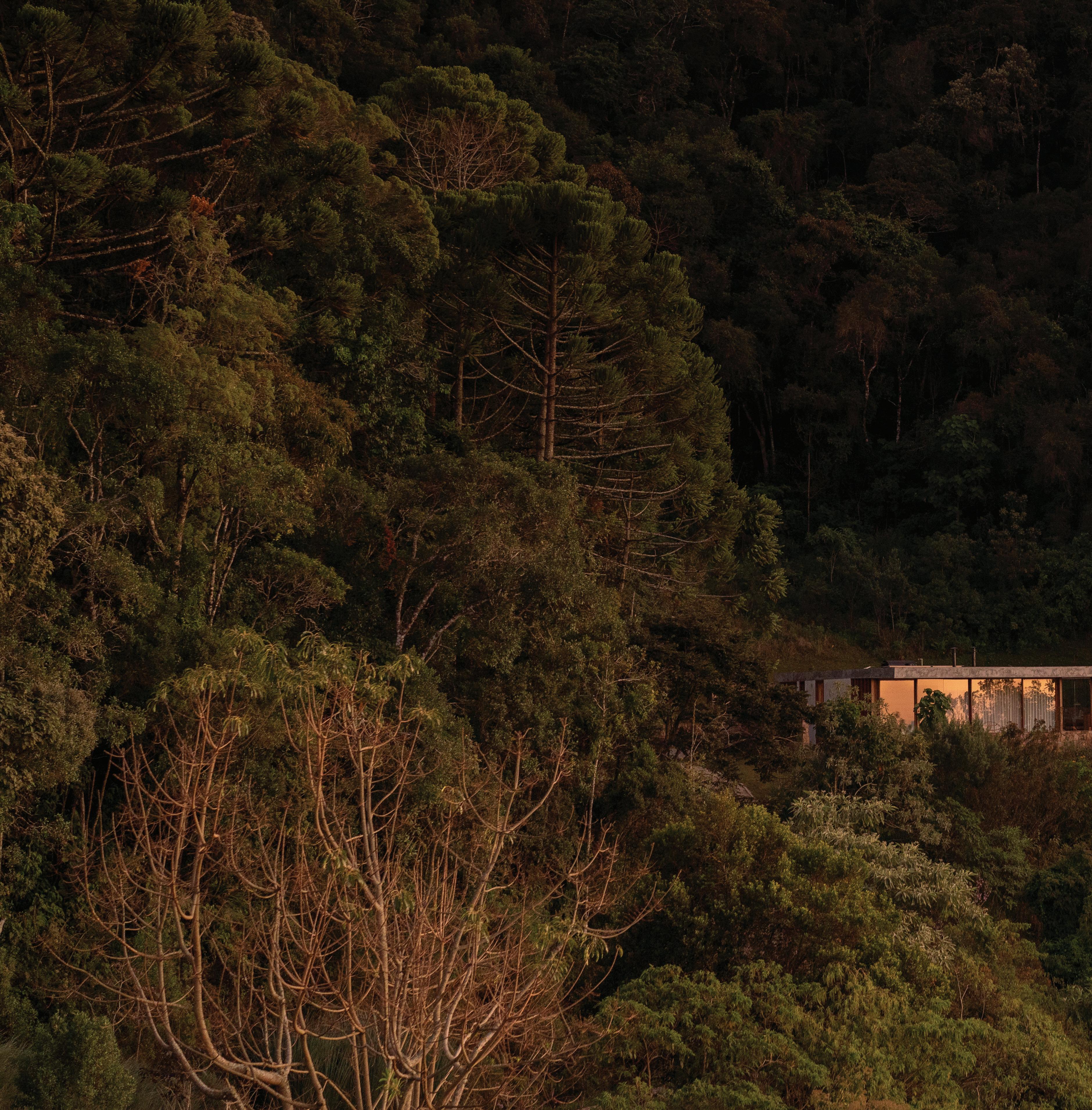
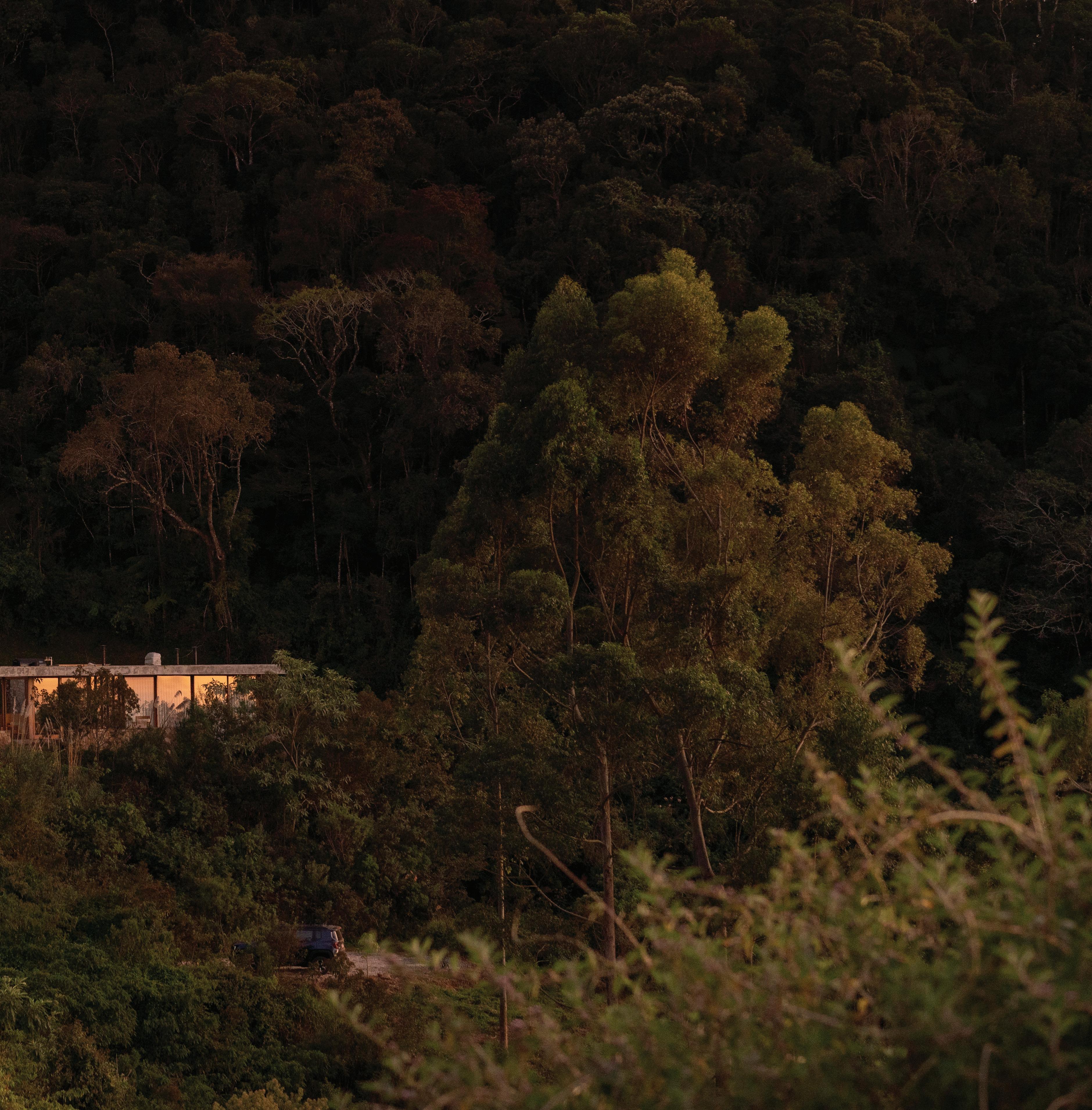
Located in Petrópolis, in the mountainous region of Rio de Janeiro, this weekend house was designed to accommodate the entire family, a tranquil retreat for grandparents, grandchildren, and friends of the couple.
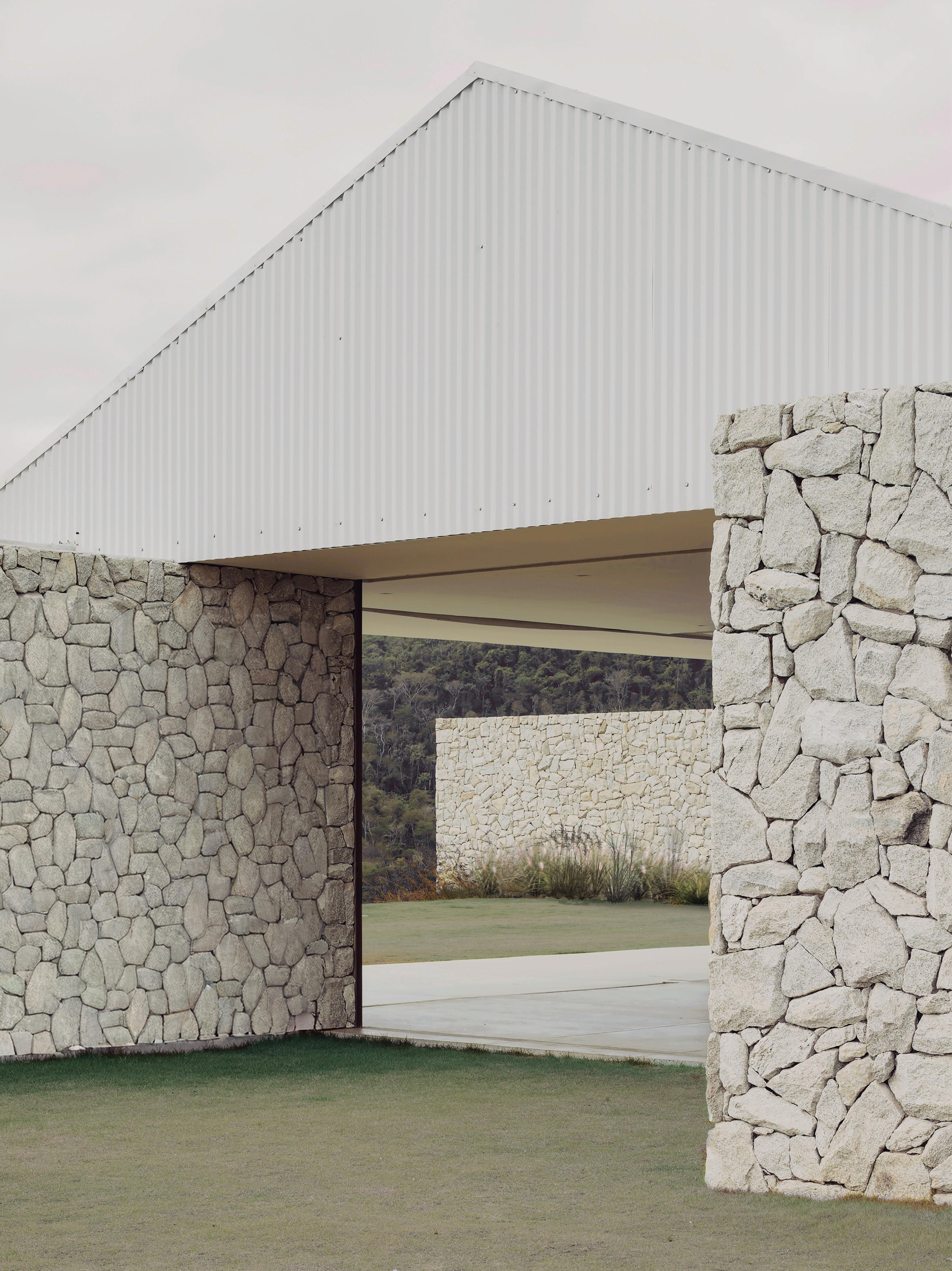
The initial brief was simple: images of metal roofs and stone-clad walls.
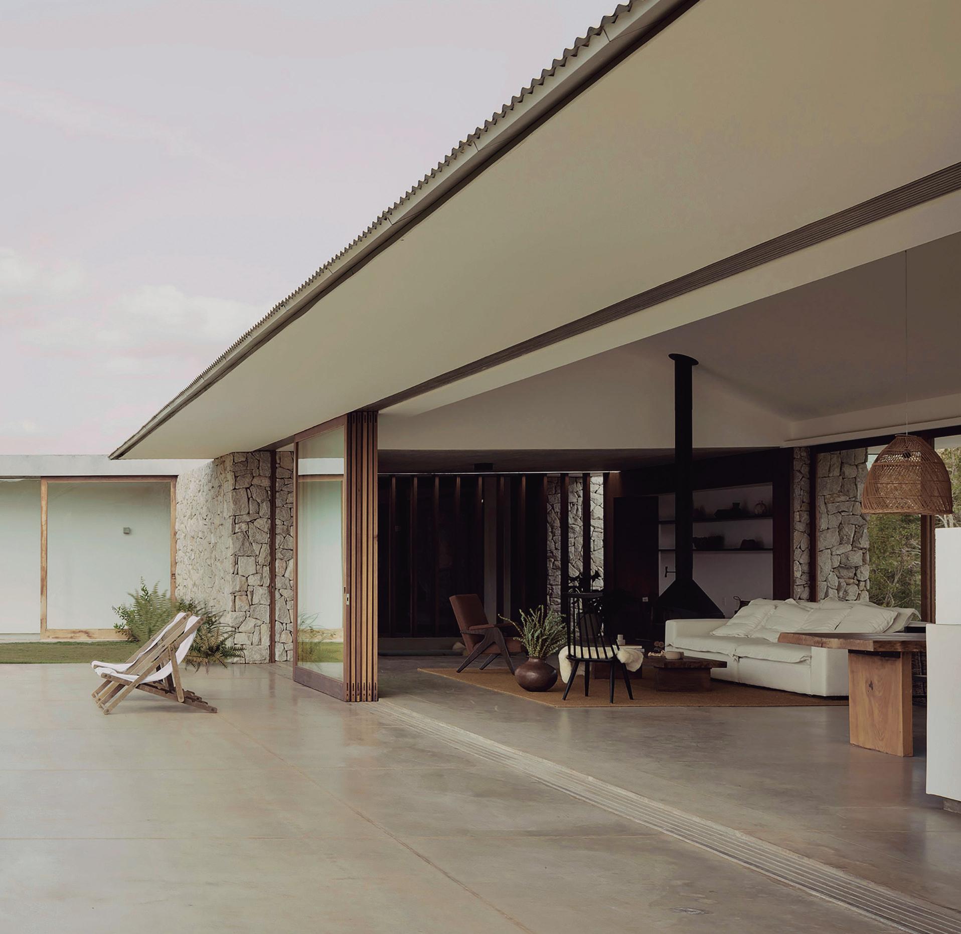
Taking orientation and programmatic needs as a starting point, the house was clearly organised into two L-shaped wings, forming a central garden plaza oriented towards the northern valley view.
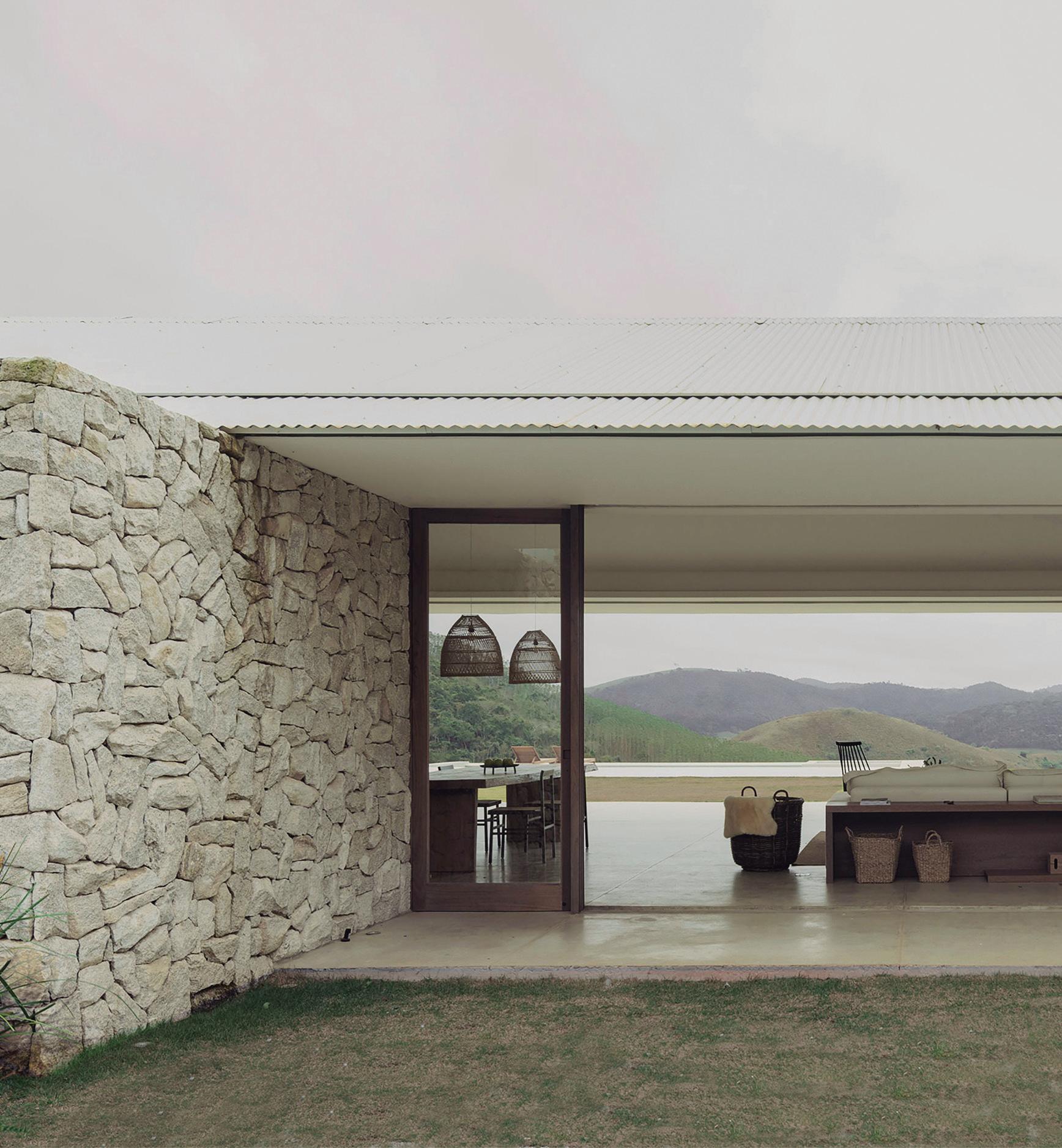
In the social zone, the large pitched metal roof, reduced to its essential expression, rests gently atop stone monoliths, providing a primordial shelter. With an integrated gutter and generous overhangs that provide cool shade rain or shine, it covers the living room, kitchen, and veranda, creating a continuous interior-exterior space protected from the elements. The house is open and airy in summer, yet cosy in the cold mountain winters.
The bedrooms face east, welcoming the morning sun, in a low, flat-roofed volume that subtly projects over the slope, giving the couple a sensation of floating above the valley mist at dawn.
The pool, perched on the terrain, defines the horizon against the valley mountains, visible from the living room through the garden.
Localizada em Petrópolis, região serrana do Rio de Janeiro, a casa de fim-desemana deveria comportar toda a família. Refúgio idílico para avós, netos e amigos do casal em confraternização.
O briefing inicial: fotos de telhados metálicos e paredes revestidas em pedra.
Tomando como ponto de partida a orientação e usos, o programa foi claramente dividido em duas alas em L, que conformam ao centro uma praçajardim, voltada para a vista do vale a norte.
Na área social, o grande telhado metálico em duas águas, reduzido à sua expressão mínima, pousa suavemente sobre monólitos em pedra – abrigo primordial. Com a calha embutida e grandes abas que dão sombra fresca, faça chuva ou faça sol, ele cobre sala, cozinha e varanda, num contínuo interior-exterior protegido da intempérie. Uma casa avarandada no verão e aconchegante no frio inverno da altitude na montanha.
Os quartos são voltados a leste, para o sol da manhã, numa edificação baixa em laje plana e bem assentada, que se projeta levemente no declive, dando ao casal a real sensação de flutuar sobre a névoa do vale ao amanhecer.
A piscina, debruçada na topografia, marca o horizonte na vista das montanhas do vale, para quem olha desde a sala para o jardim.
MANTIQUEIRA HOUSE
Minas Gerais, Brazil
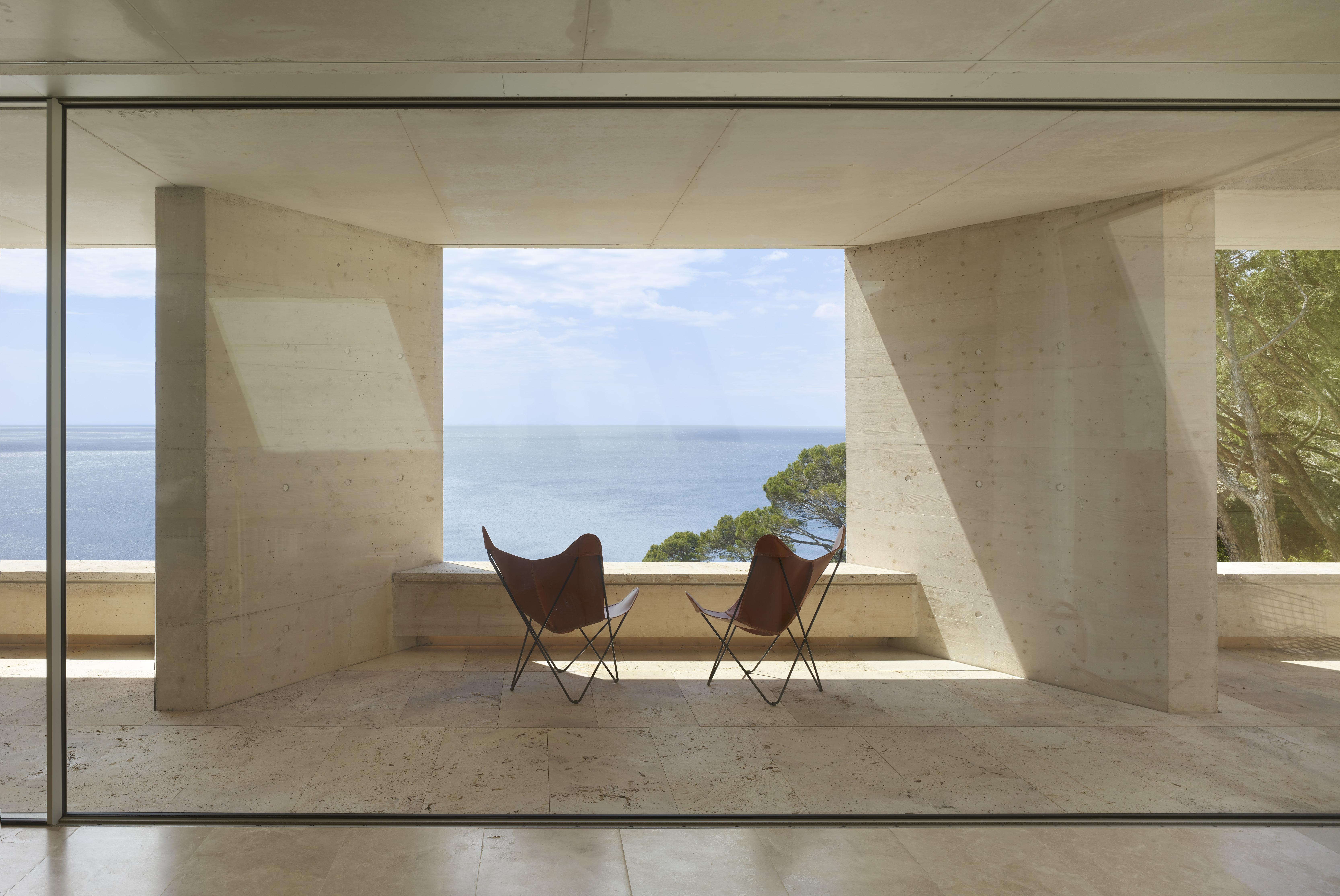
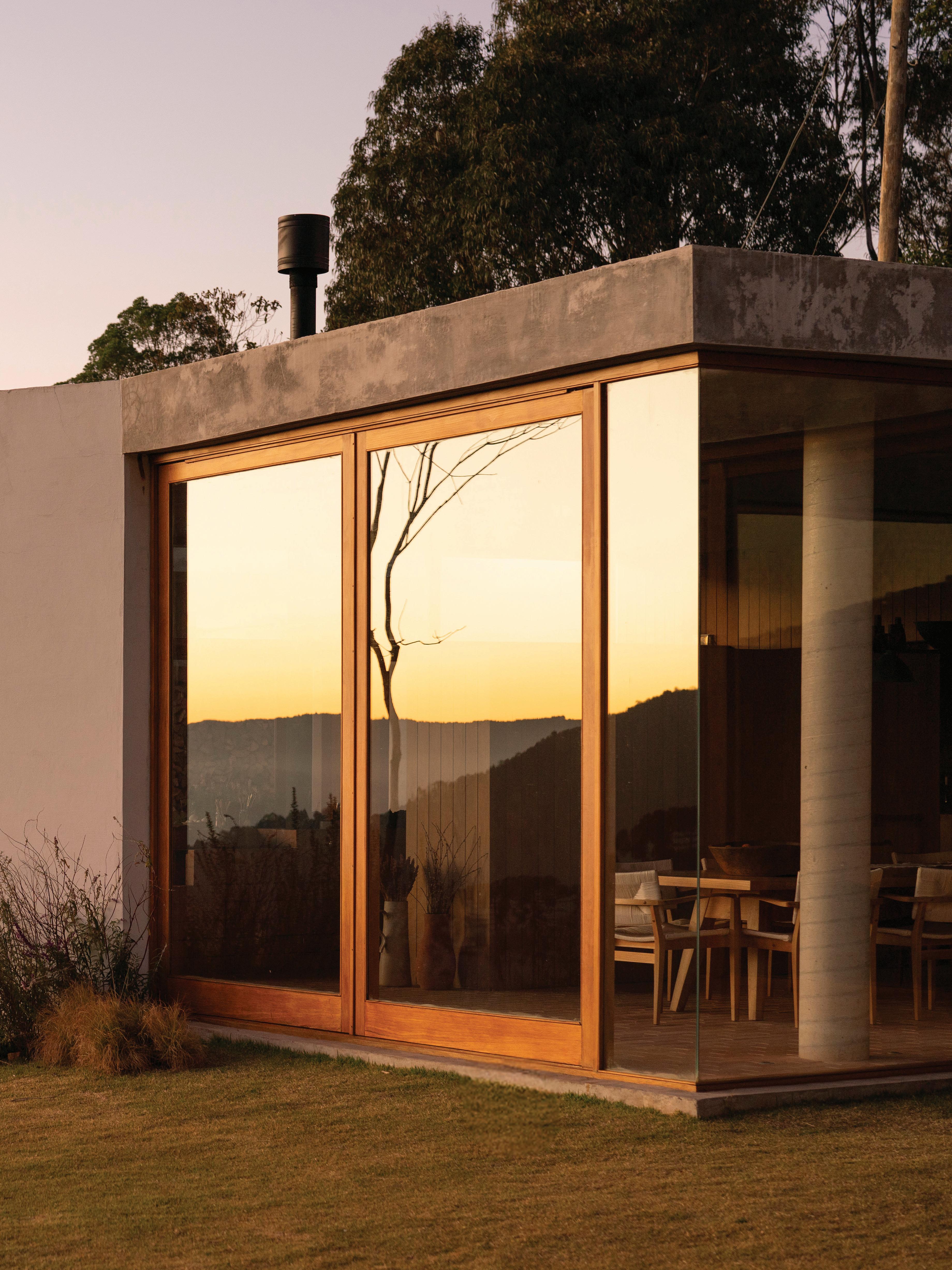
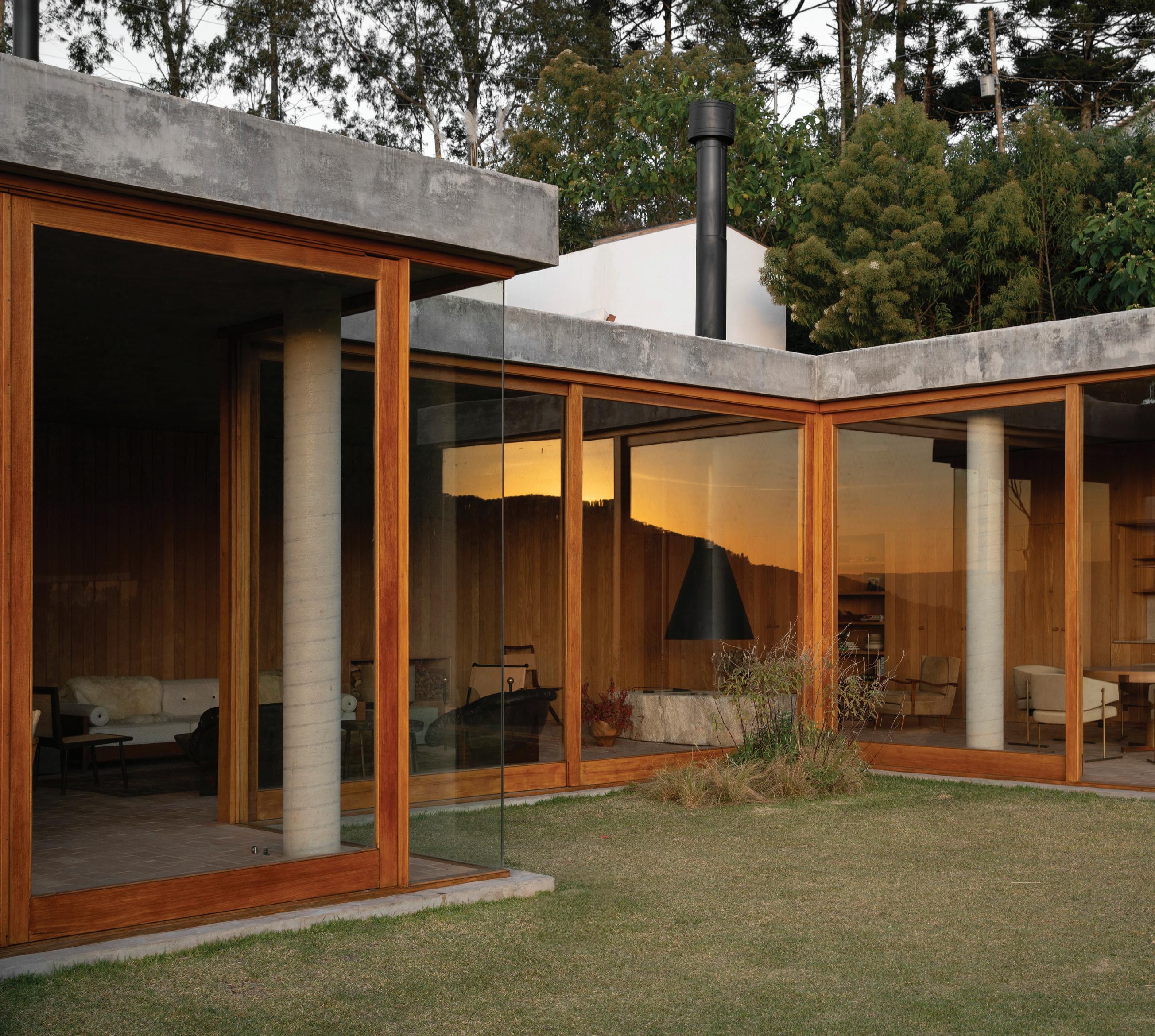
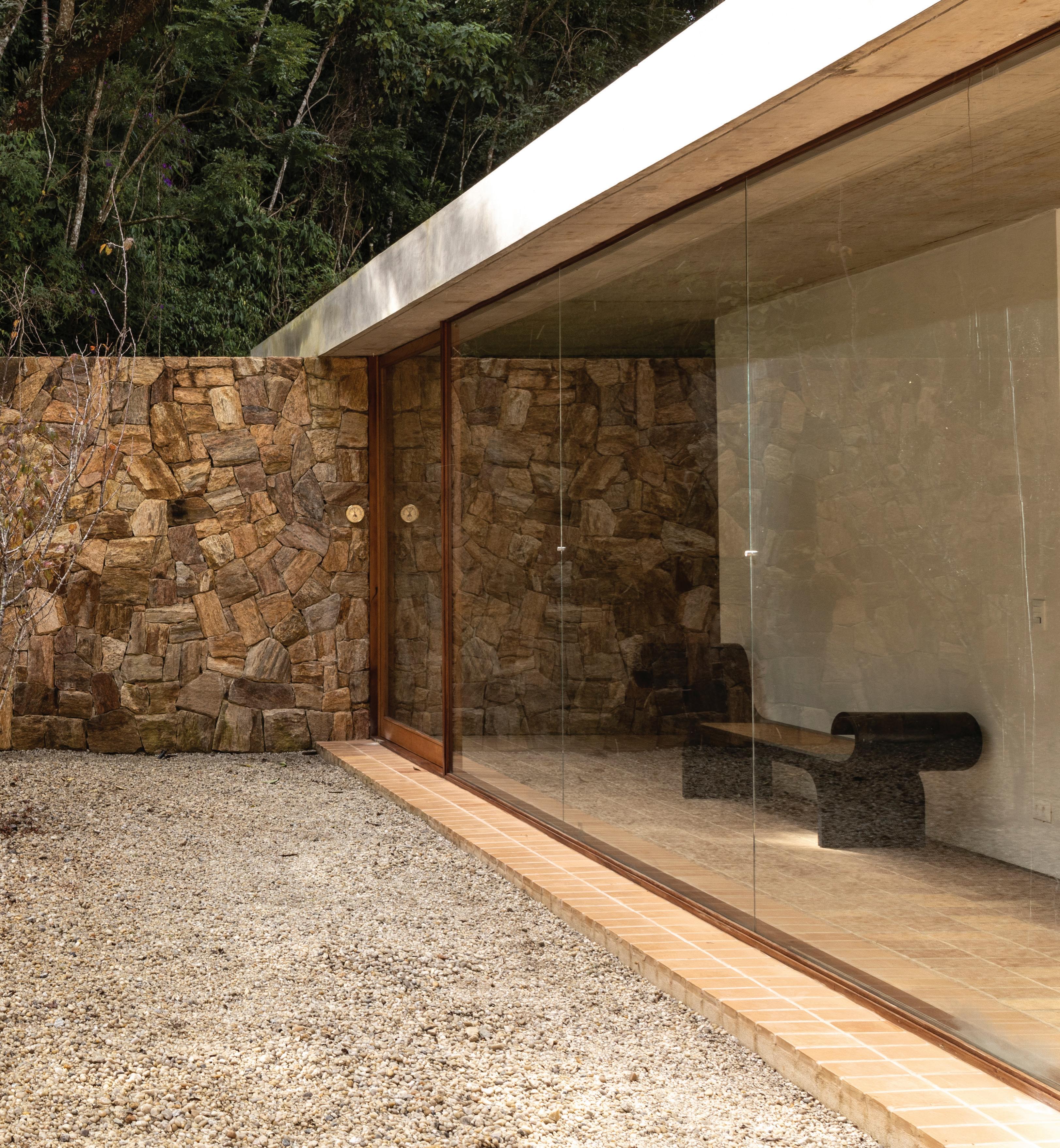
The family retreat is situated on the slope of a picturesque valley in the Serra da Mantiqueira, at an altitude of 1,300 m. Taking advantage of the narrow strip of land, the design divides the programme into three single-storey buildings, placed at different levels and integrated into the landscape as both landmarks and viewpoints.
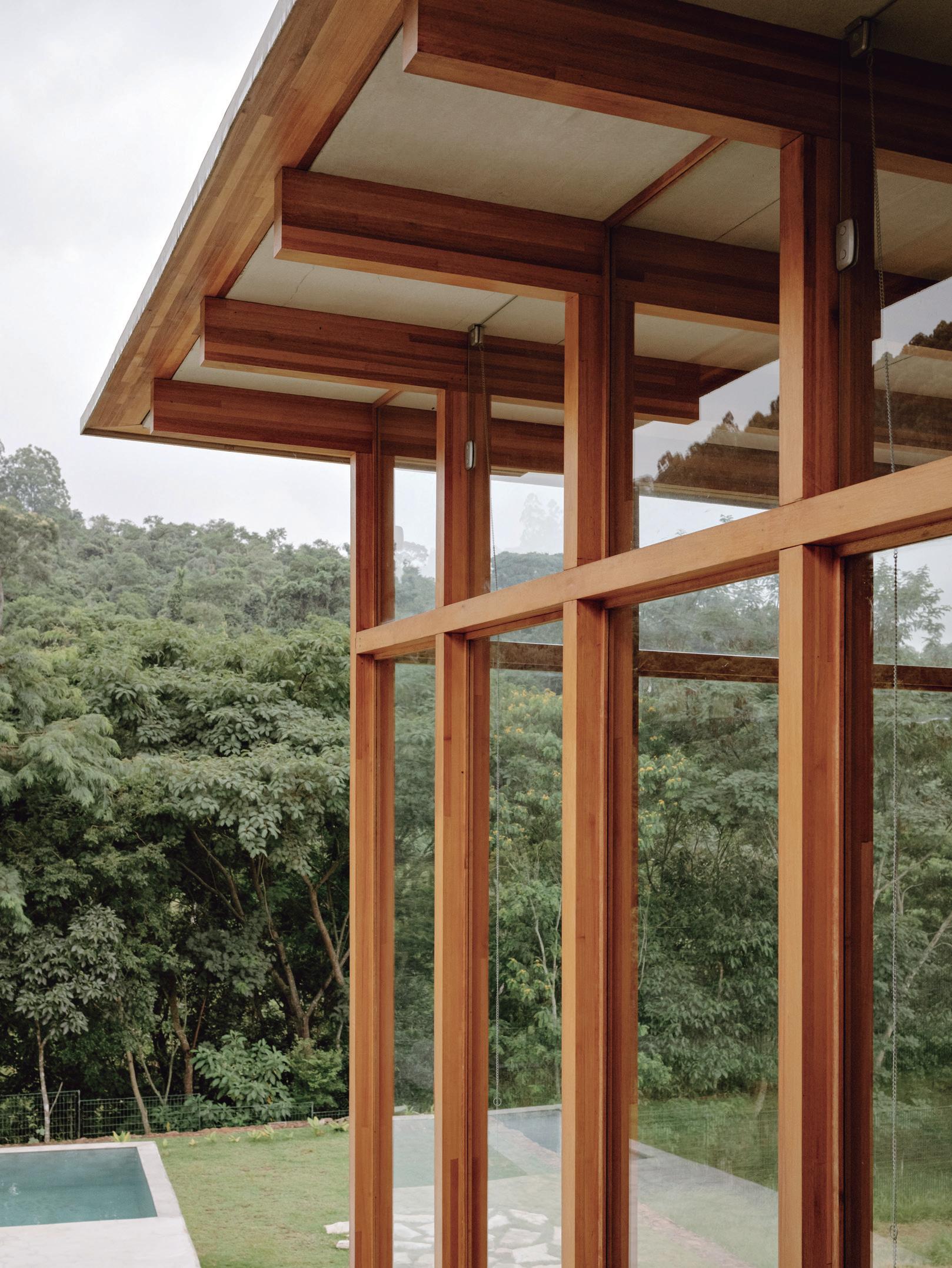
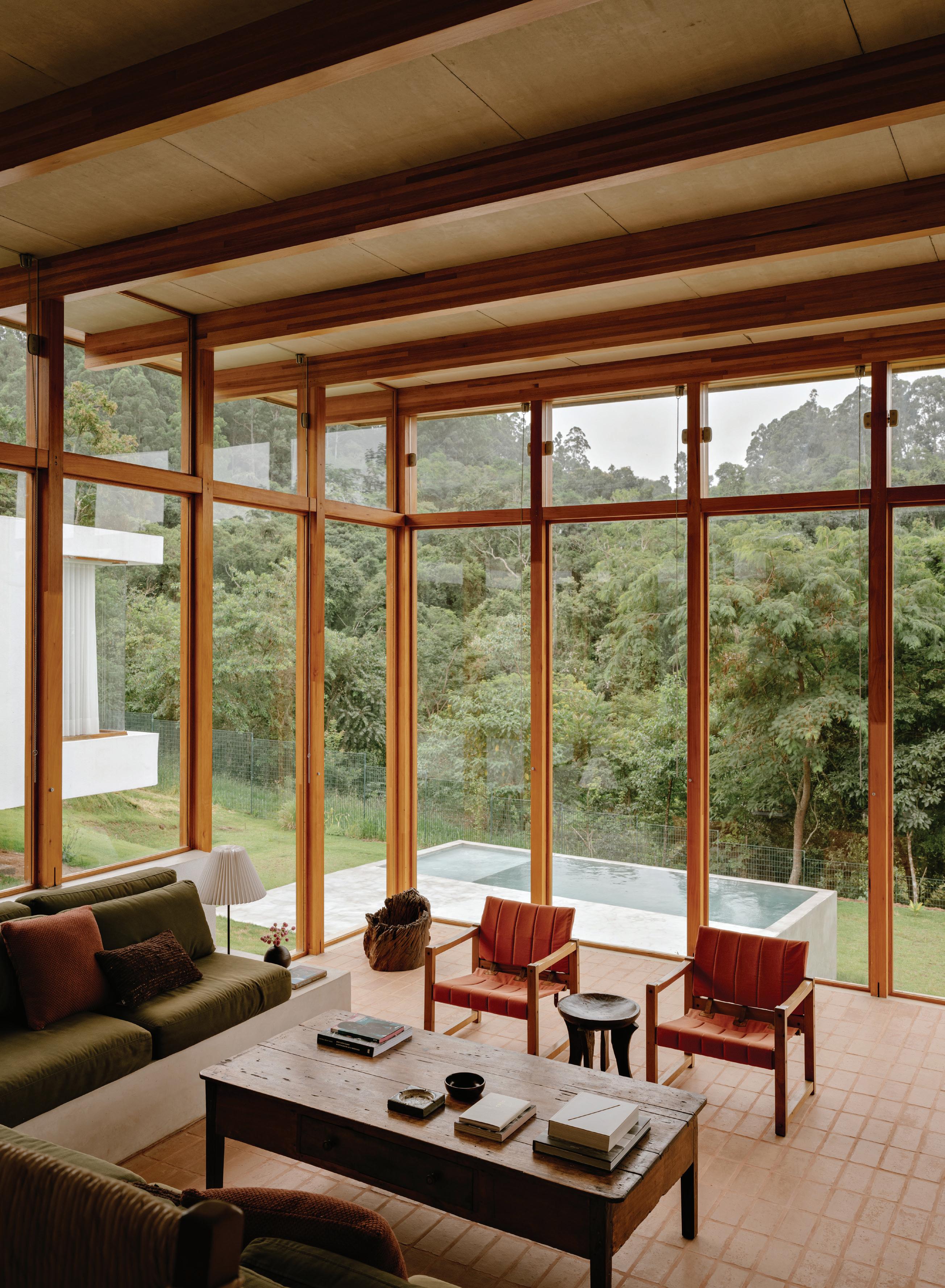
From the steep topography rise thick, whitewashed walls that enclose the social area. Large glass and timber panels freely define the perimeter, framing views while generating reflections that allow the surrounding greenery and sky to permeate the architecture. The flat roof also functions as a terrace, integrated with the higher terrain upstream.
On the plateau above, the matriarch’s house rises as an archetypal rural building with a square plan and a foursided pitched roof. This reinterpretation of vernacular architecture combines ancient local knowledge with a contemporary perspective. The traditional heavy white façade is interrupted by a large entrance at the southern corner of the plan, breaking the base’s logic to expand valley views while remaining shaded from the sun. At the centre, a generous skylight floods the circulation hall leading to the bedrooms with diffuse light; the skylight measures 8 × 16 bricks.
A key point: since the Fazenda Mato Dentro project, brick modules have been a consistent element in our designs. Following this principle, the houses and all their interiors were dimensioned not according to exact
measurements, but based on the 24 × 12 cm floor brick module, ensuring full units are used without cuts.
The house for the children and grandchildren is set further apart, nestled within the forest.
This linear pavilion of stone and concrete is bisected by a central garden, bringing the surrounding nature into the architecture and creating the necessary intimacy between living and private areas. In execution, the project prioritises local materials, techniques, and products: artisanal bricks from the region for the floors, cedar joinery from sustainable plantations, crafted by local master carpenters and filling the interiors with its natural scent, limewash on masonry, and stone walls built using ancestral techniques.
The project combines high design with low-technology craftsmanship, operating within a logic of cooperation between contemporary architecture and the promotion of local economic and cultural sustainability. It preserves artisanal knowledge while minimising costs and emissions associated with transporting materials.
O refúgio familiar está situado na encosta de um belo vale na Serra da Mantiqueira, a 1300m de altitude. Aproveitando a estreita faixa de terra, a solução propõe dividir o programa em três edificações térreas, implantadas em diferentes níveis - encaixadas na paisagem como marco e como mirante.
Da pronunciada topografia, nascem os muros espessos caiados de branco que acomodam a área social. Grandes painéis em vidro e madeira fecham livremente o perímetro, emoldurando vistas, e gerando reflexos que fazem o verde e o céu circundantes invadirem a arquitetura. Sua cobertura plana é também mirante incorporado à topografia à montante.
No platô acima, a casa da matriarca se eleva como uma construção rural arquetípica de planta quadrada e telhado de quatro águas. Arquitetura vernacular revisitada, faz uso conhecimentos locais antigos com um olhar atualizado. A tradicional fachada pesada e branca é interrompida por uma grande abertura de entrada na quina a sul da planta, que quebra a lógica do apoio para ampliar a vista do vale, protegida do sol. No centro, uma grande claraboia banha com luz difusa o vestíbulo de circulação para os dormitórios, com medida de 8 x 16 tijolos.
Ponto importante: desde a Fazenda Mato Dentro, o tijolo no piso tem sido uma constante em nossos projetos. A partir disso, as casas e todos seus ambientes foram dimensionadas, não em medidas exatas, mas baseadas do módulo do tijolo de piso, de 24x12cm, de forma que sempre tenham peças inteiras, sem recortes.
A casa dos filhos e dos netos, é mais afastada, situada em meio à floresta.
O pavilhão linear em pedra e concreto é seccionado por um jardim central, que introduz a natureza do entorno para dentro da arquitetura e cria a intimidade
VITA HOUSE
São Paulo, Brazil
The renovation of this small house in the western zone of São Paulo aimed to transform a compact space into a welcoming home for a young family.
Set within a row of terraced houses, like Casa Schendel, the project sought to maximise the interior of the narrow lot, completely reconfiguring the segmented floor plans to create continuity. The façades and two existing structural slabs were retained, while the old roof was replaced with a new flat slab, allowing for the creation of a generous external garden, which includes a vegetable patch.
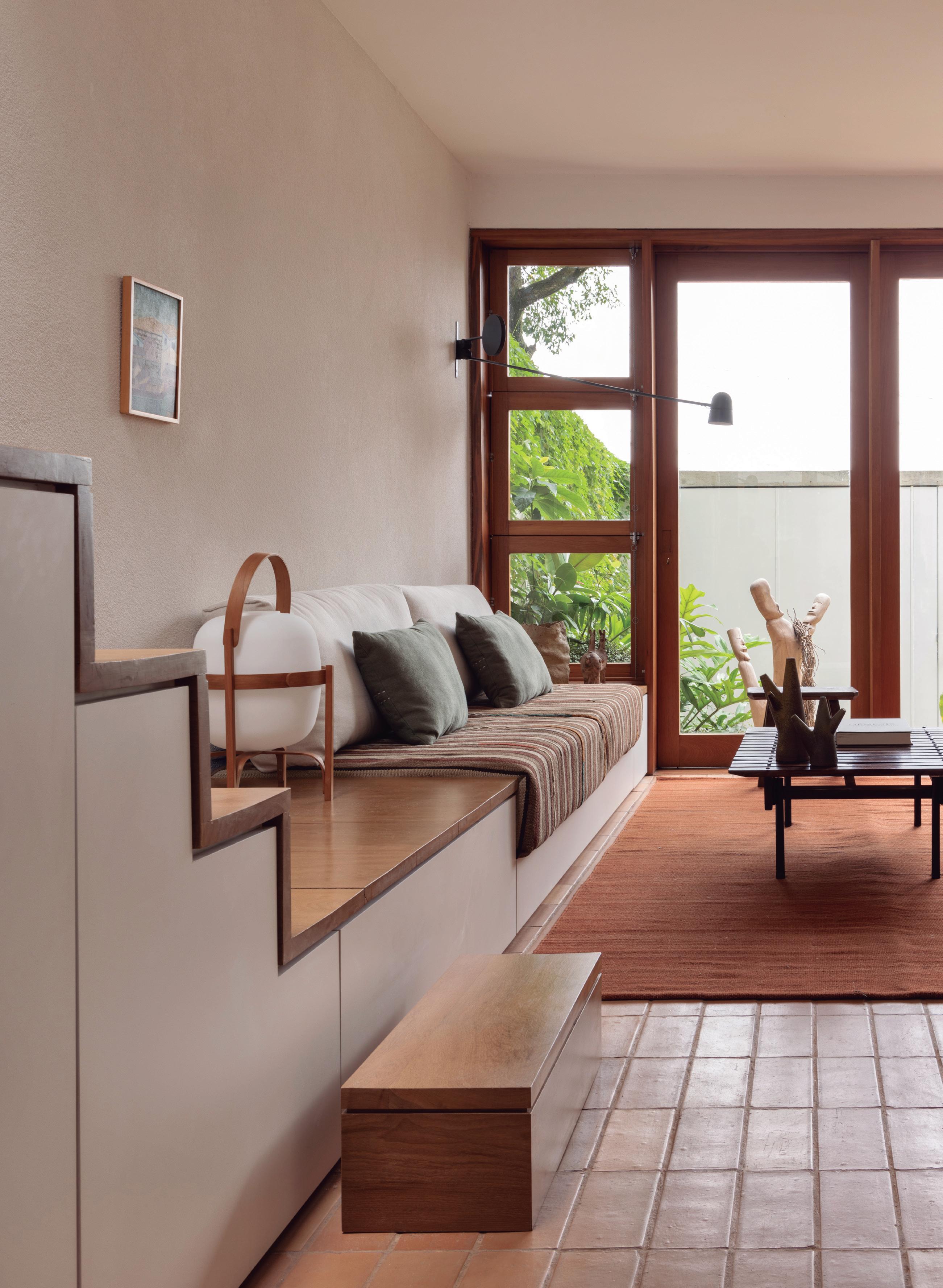
The plan was redesigned around the staircase, entirely executed in bespoke joinery and carefully planned to modularly organise all surrounding elements: the entrance frames, furniture across both floors, and even the hatch providing access to the roof.
On the ground floor, the staircase organises and integrates the house’s two principal spaces: the living room and kitchen. At 12 metres in length, it runs along one side in a continuous configuration, accommodating openings, the sofa, built-in cabinets, and the kitchen layout. Beyond it, the only fixed furniture is a freestanding bench-table, constructed with the same solid bricks as the floor. A notable detail is the precise alignment of bricks laid in different orientations.
The timber-and-glass joinery seamlessly integrates the spaces, giving the interior the full sense of the lot. At the rear, beyond the garden, is the annexoffice. Zenithal light, a central element
in the office’s work, takes on a playful triangular form here, utilising the shaft opening between the upstairs bathrooms to channel directed, moving light into the middle of the living room: sometimes hitting the floor with vertical precision at noon, then spilling diffusely across the wall, watching the afternoon fade, every day.
A reforma da pequena casa situada na zona oeste de São Paulo teve como objetivo transformar um espaço compacto em um lar acolhedor para uma jovem família.
Inserido em um conjunto de sobrados geminados, assim como a Casa Schendel, o projeto buscou aproveitar ao máximo o espaço interior do lote estreito, reconfigurando completamente as plantas segmentadas para dar continuidade. O projeto manteve as fachadas e duas lajes estruturais existentes substituiu o antigo telhado por uma nova laje de cobertura, criando um generoso jardim externo onde fica a horta.
A planta foi redesenhada a partir do volume da escada, totalmente executada em marcenaria, e cuidadosamente planejada para modular todos os elementos ao seu redor, da caixilharia da entrada, passando pelo mobiliário dos dois pavimentos, até escotilha que dá acesso à cobertura.
No pavimento térreo, ela organiza e integra os dois principais ambientes da casa: a sala e a cozinha. Com seus 12 metros de extensão, ela ocupa uma
das laterais, num desenho contínuo que acomoda as aberturas, o sofá da sala, os armários internos e modula a cozinha. Além dela, o único mobiliário fixo é a bancada-mesa, solta e executada com o mesmo tijolo maciço do piso. Aqui uma particularidade: o alinhamento perfeito entre os tijolos assentados em diferentes sentidos.
A caixilharia, desenhada em madeira maciça e vidro, integra completamente os ambientes, dando à casa a dimensão do lote. Ao fundo, depois do jardim, a edícula-escritório. A luz zenital, elemento central na produção do escritório, ganha aqui um contorno lúdico na forma triangular, que aproveita o a abertura do shaft entre os banheiros do andar de cima para levar uma luz desenhada e movente ao meio da sala. Ora no piso, vertical e precisa a marcar meio-dia, para depois esvairse na parede, difusa, vendo a tarde ir embora. Todos os dias.
BLACK HOUSE
São Francisco Xavier, Brazil
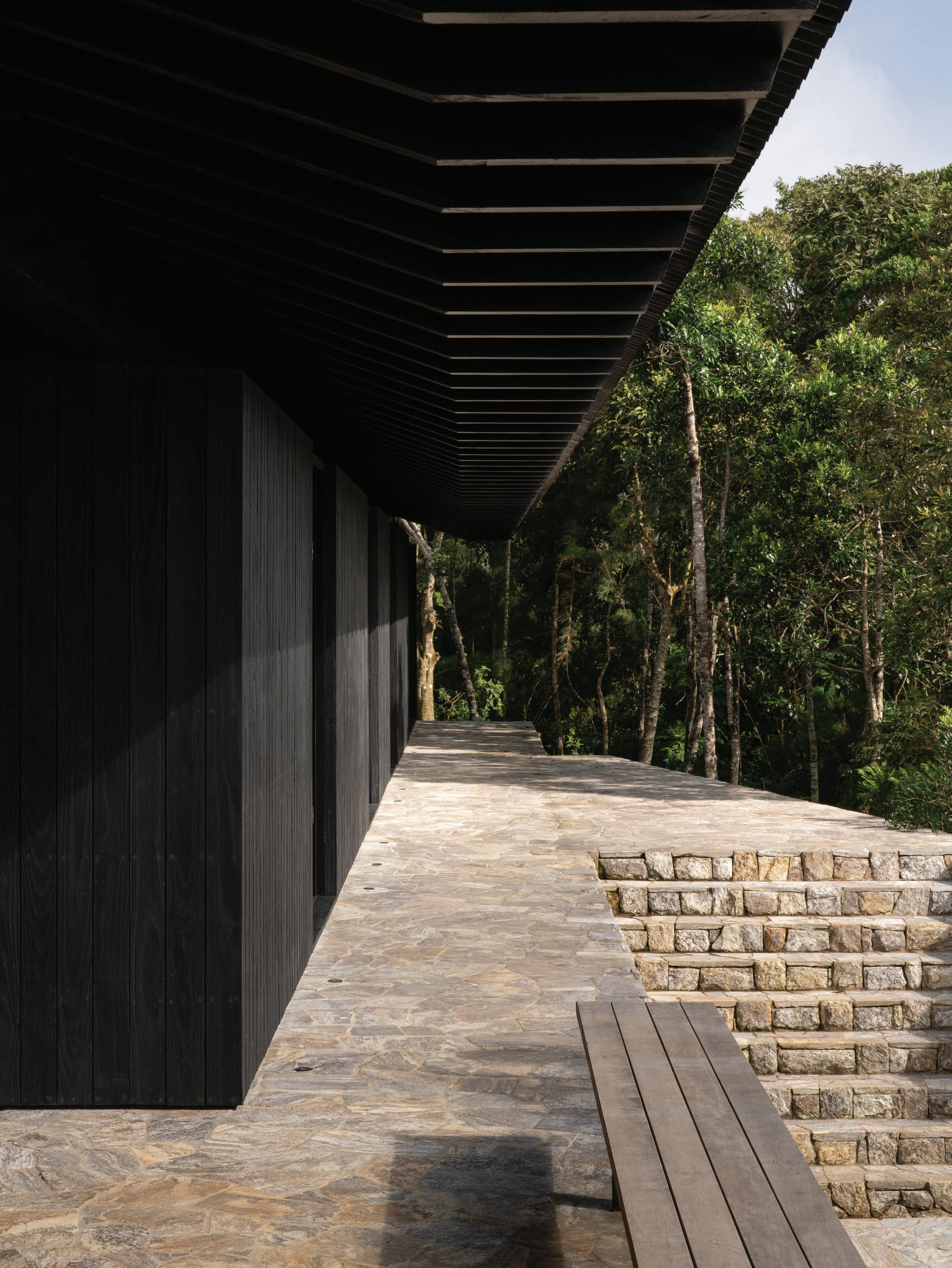
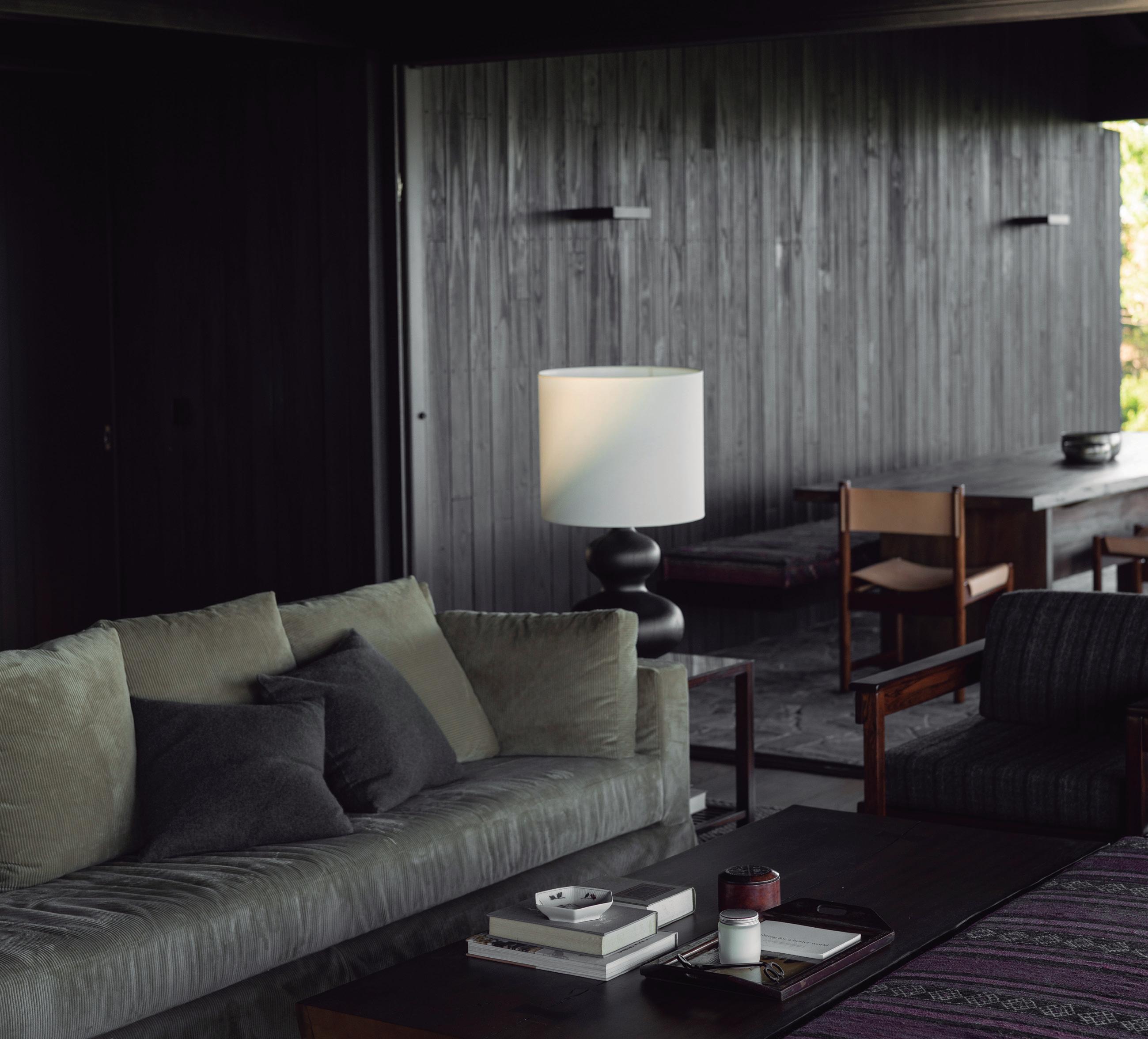
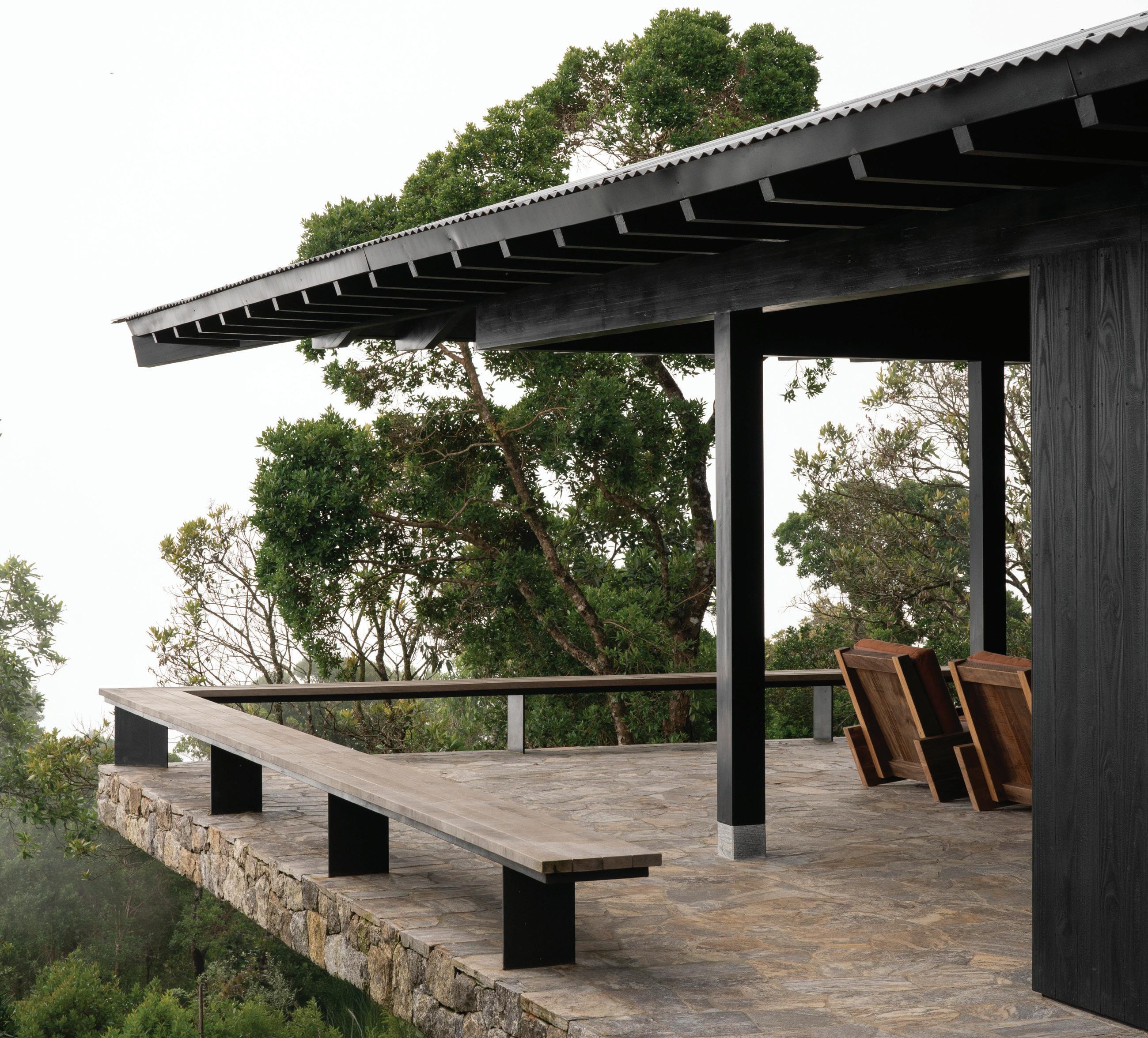
Situated high in the mountains of São Francisco Xavier, at 1,600 m altitude, where the climate is both beautiful and extreme, enveloped in mist and forest, the house chose to be black. Perhaps because, at certain moments, the landscape recalls distant mountains. It is cold. A dark, enveloping atmosphere was necessary, and all agreed.
Contemporary with Casa in Pedro do Rio, which is set at the rear, embracing the plateau that merges with the horizon, this time the L-shaped plan extends forward, cantilevered over the valley as an alternative mode of occupation. The balcony, projecting at the corner like a prow, leaves the domestic garden behind, protected between the two wings and the hill.
Constructed with prefabricated engineered timber stained dark, and a metal roof, the house’s external envelope is composed of insulated panels in shou sugi ban, glass, or stone, the latter continuing the base plinth.
This sober, dark atmosphere, illuminated by the diffuse light of highaltitude mist, gives delicate nuances to the black surfaces, producing shadows that are anything but trivial, adding depth and texture through the subtle veins of charred timber.
The design of the openings corresponds precisely to their use, regulating views and privacy. Variations in the apertures create shifting textures of light, as in the intimate corridor, as well as framed views of nature in the living room and bedrooms. The junctions
of materials are meticulously detailed. Likewise, the interiors are carefully designed and executed, complementing the quietude of the architecture.
Localizada no alto da montanha em São Francisco Xavier, a 1600m de altitude, onde o clima é belo e radical, em meio à névoa e à mata, a casa decidiu ser preta. Talvez porque a paisagem em certos momentos lembre montanhas longínquas. Faz frio. Era necessário uma atmosfera escura. Todos de acordo.
Contemporânea à Casa em Pedro do Rio - implantada ao fundo abraçando o platô fundido ao horizonte -, desta vez a planta em ‘L’ passa à frente, debruçada sobre o vale como alternativa de ocupação. A varanda em balanço na quina, como uma proa, deixa o jardim doméstico para trás, protegido entre as duas alas e o monte.
Executada em estrutura pré-fabricada em madeira engenheirada tingida e telhado metálico, a casa tem seus vedos externos executados em paineis insulados em shou sugi ban, vidro, ou em pedra, que dá continuidade ao embasamento.
Essa atmosfera sóbria e escura, banhada pela claridade difusa da bruma de altitude, dá nuances delicadas à luz sobre o preto, com sombras que deixam de ser triviais e ganham profundidade e textura, na sutileza dos veios da madeira carbonizada.
O desenho das aberturas corresponde ao uso, regulando vistas e intimidade. Sua variação oferece, por vezes, texturas de luz movente - como no corredor íntimo -, e também
enquadramentos de natureza - na sala e nos quartos. O encontro de materiais é rigoroso no detalhe. Assim como os interiores, desenhados e executados com esmero, em complemento ao silêncio da arquitetura.
01. Mexican terracotta screen panel
Render with finishing plaster coat
YOSHI HOUSE
Itatiba, Brazil
Taking advantage of the site’s slope towards the rear, adjacent to the forest, the ground plane was redesigned with stepped levels in solid brick to accommodate the social areas. Above this, supported by the slender engineered timber structure that gives rhythm to the ensemble, the horizontal roof plane rests lightly and continuously at street level. This approach ensures the family’s privacy from the entrance, while allowing the living room to gain height and open onto the natural landscape beyond.
Parallel to the living room and connected via the generous central veranda, the masonry and flat-slab bedroom block appears to emerge embedded in the earth, following the slope to cantilever the master suite, seemingly floating over the view.
The project thus employs two distinct strategies for engaging the sloping terrain: a white masonry solid that rises from the ground to project in cantilever, in dialogue with the redesigned brick base that accommodates the slender timber structure, over which the subtle roof plane floats.
Aproveitando a declividade do terreno em direção ao fundo junto à mata, o chão foi redesenhado em desníveis, em tijolo maciço, para acomodar os usos sociais. Sobre este, apoioado na esbelta estrutura de madeira engenheirada que dá ritmo ao conjunto, o plano horizontal de cobertura pousa leve e contínuo, ao nível da rua. Desta forma, foi garantida a necessária privacidade da família em relação ao acesso, enquanto a sala
ganha altura, aberta para a natureza ao fundo.
Paralelo à sala e conectado pela generosa varanda central, o bloco em alvenaria e laje plana dos quartos parece nascer encravado da terra, seguindo em nível de forma a projetar a suite do casal em balanço, flutuando sobre a vista.
São duas estratégias distintas de encarar o terreno em declive: um sólido branco em alvenaria, que nasce da terra para projetar-se em balanço, em diálogo com o chão redesenhado que acomoda a esbelta estrutura em madeira sobre a qual plana a sutil cobertura.
URI BUILDING
São Paulo, Brazil
On a narrow lot wedged between existing buildings in one of São Paulo’s densest neighbourhoods, the siting strategy sought to maximise unobstructed views from the corners of each apartment.
Reversing the typical floor plan for this type of context, the design prioritised the living room, the space where life unfolds, at the extremities, served by generous L-shaped windows, while the bedroom(s) are located closer to the entrance.
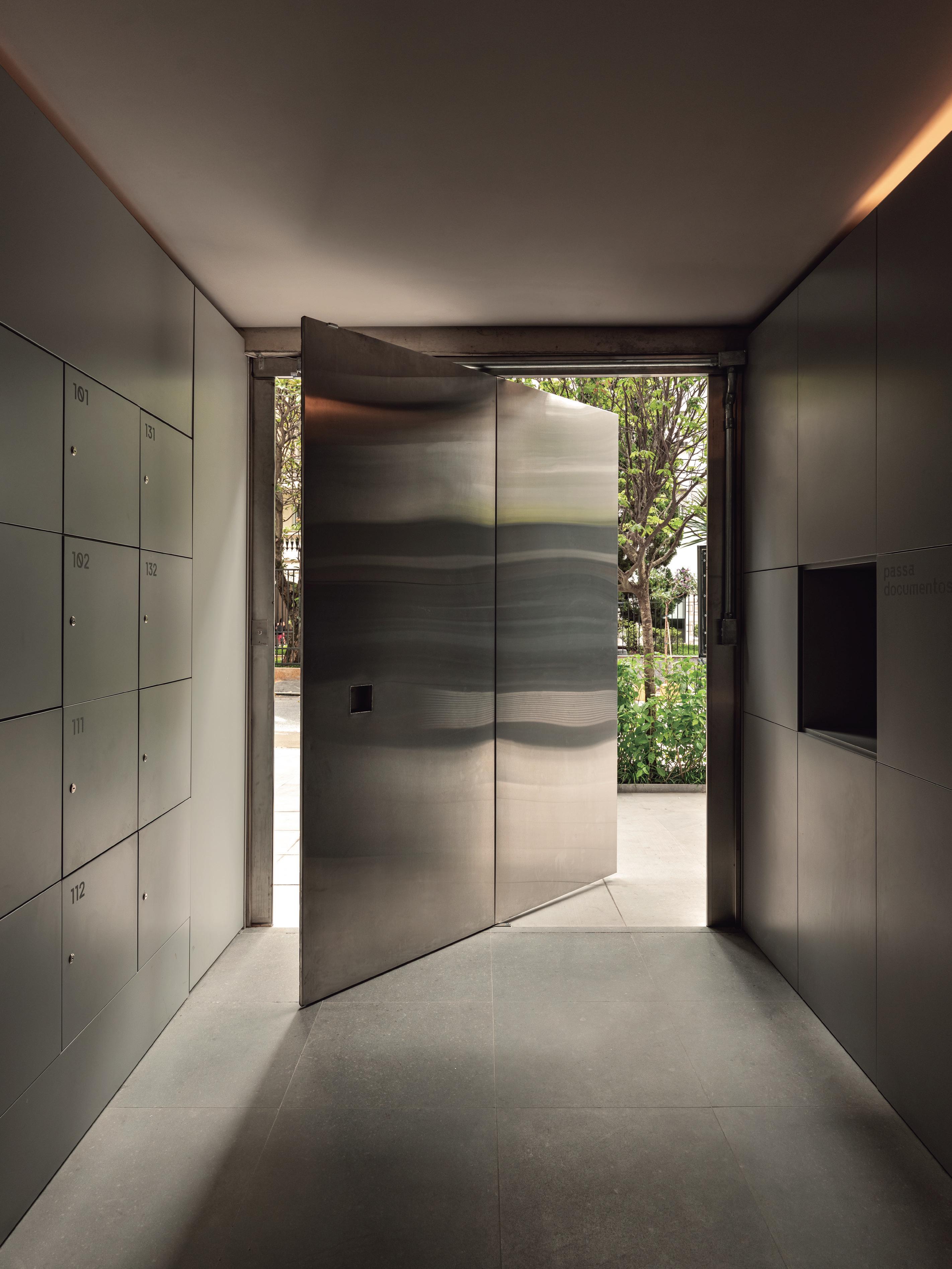
The building’s massing follows the zoning parameters: a base and a tower. To soften the perceived heaviness of the base along the street, the recessed polished stainless-steel façade extends the pavement and reflects passers-by. The tower rises above the concreteand-glass base with a precise design, featuring prefabricated ventilated panels and generously proportioned fenestration.
Upon entering, the lobby transforms unexpectedly. A monochromatic space in a nude-pink epoxy creates a luminous colour experience, echoed throughout the other communal areas: blue-toned garages and a greenpainted gym, connected to the garden.
No estreito lote encravado entre edifícios, num dos bairros mais densos de São Paulo, a estratégia de implantação buscou maximizar aos apartamentos as vistas livres das quinas.
Invertendo a planta clássica nesse tipo de situação, priorizou-se a sala, que é onde se passa a vida, nas pontas, servidas por generosas janelas em L;
com o(s) quarto(s) - local de dormir - junto à entrada.
O volumetria do edifício segue a ocupação desenhada pelo código: embasamento e torre. Para romper a dureza da base, junto à rua, a fachada recuada em inox polido amplia a calçada e espelha os transeuntes. A torre se projeta sobre a base em concreto e vidro, num desenho rigoroso com fechamentos em painéis ventilados pré-fabricados e esquadrias generosas.
Ao entrar, inadvertidamente o hall muda radicalmente. Espaço monocromático, num epóxi rosado-nude, feito de cor-luz. Assim como as demais áreas comuns: as garagens azuis e a academia verde, conectada ao jardim.
DOCOL + MEKAL CONCEPT STORE
São Paulo, Brazil
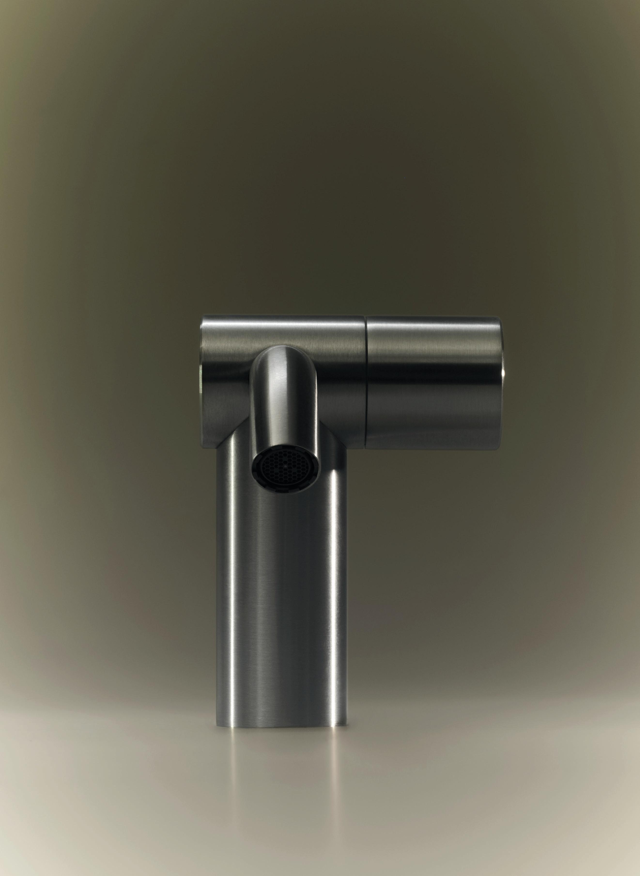
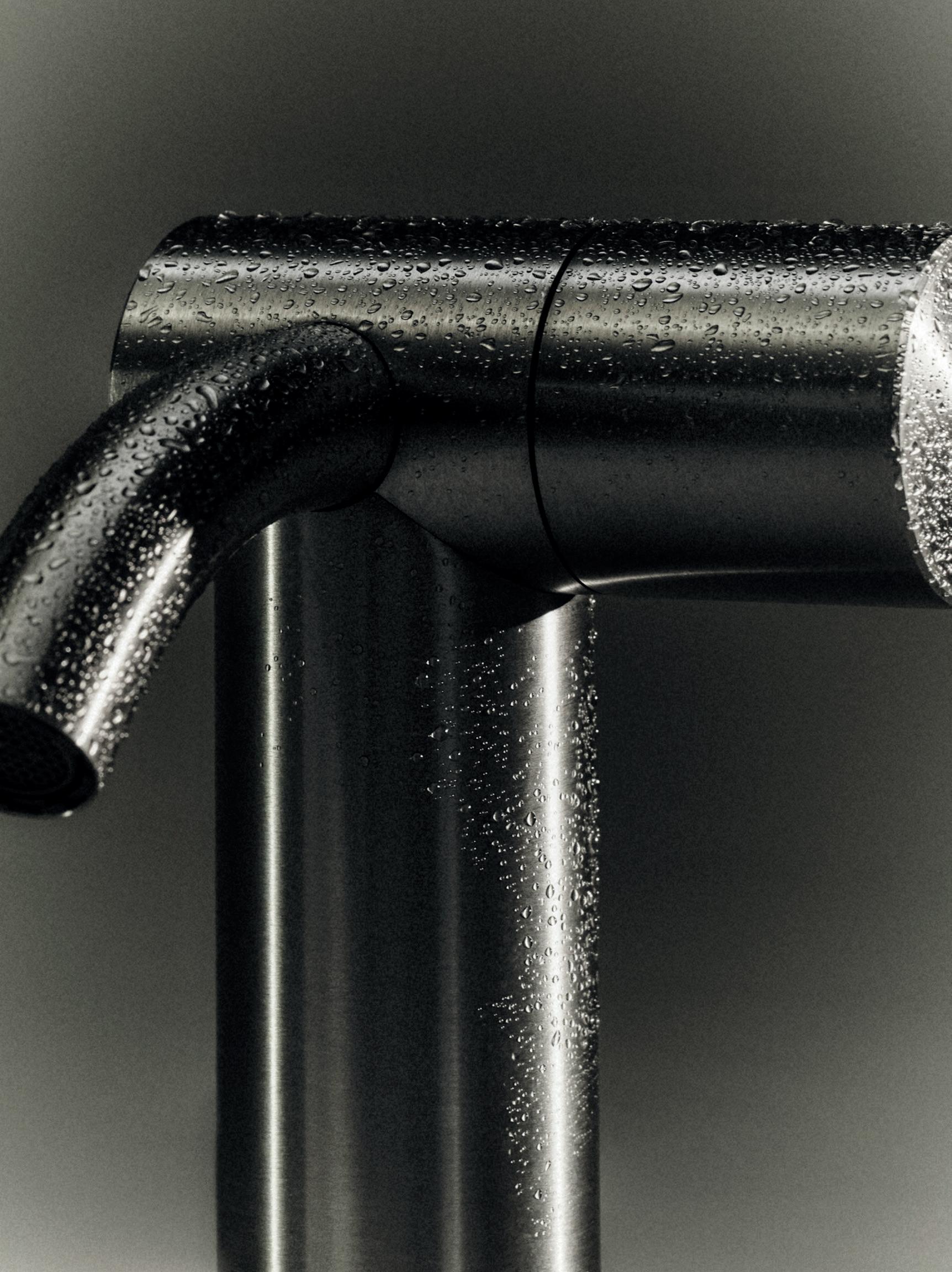
The flagship celebrates the union of two brands: Docol, specialising in metals and sanitaryware, and Mekal, focused on flat stainless-steel projects.
Water is the central motif. So too are sophistication and precision.
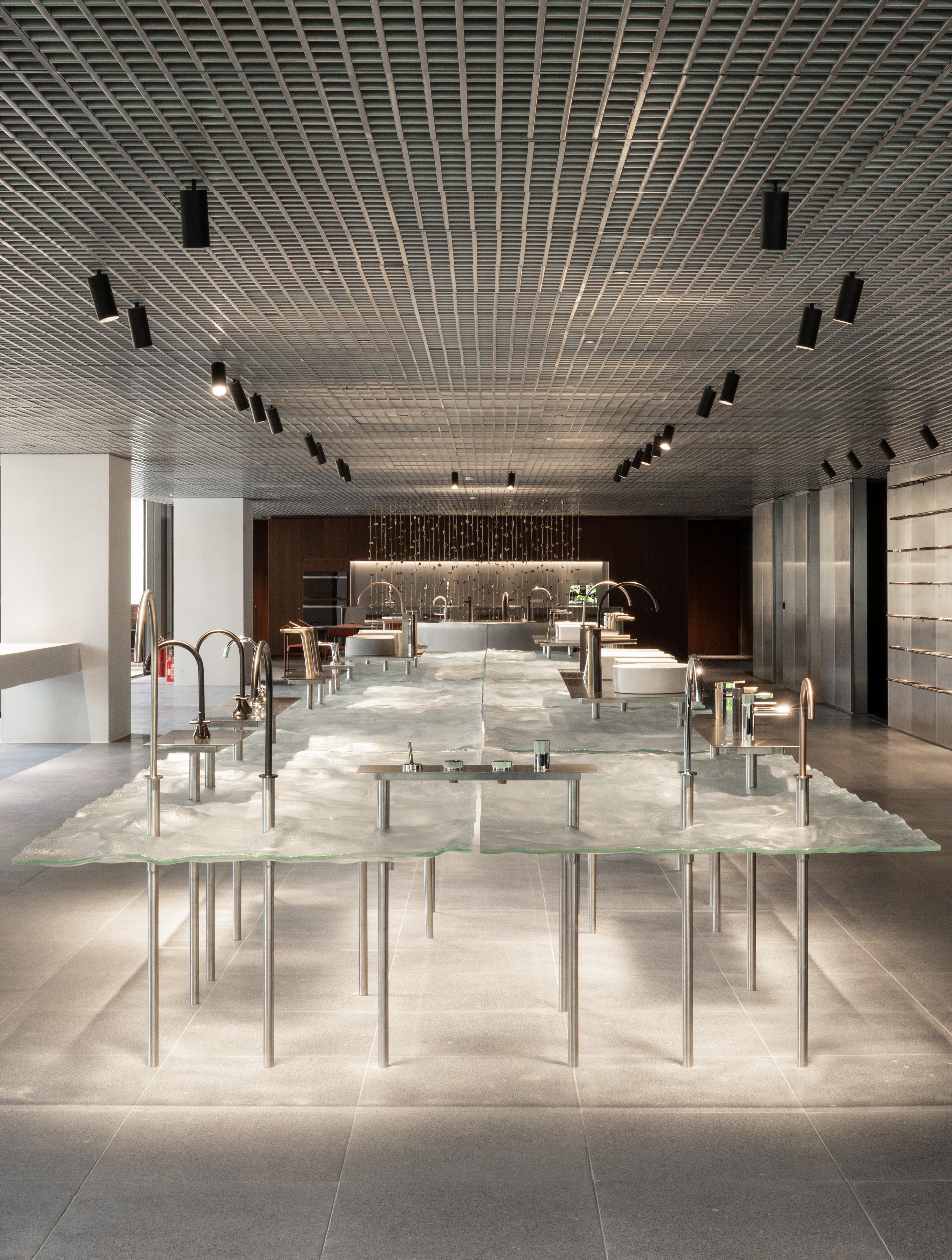
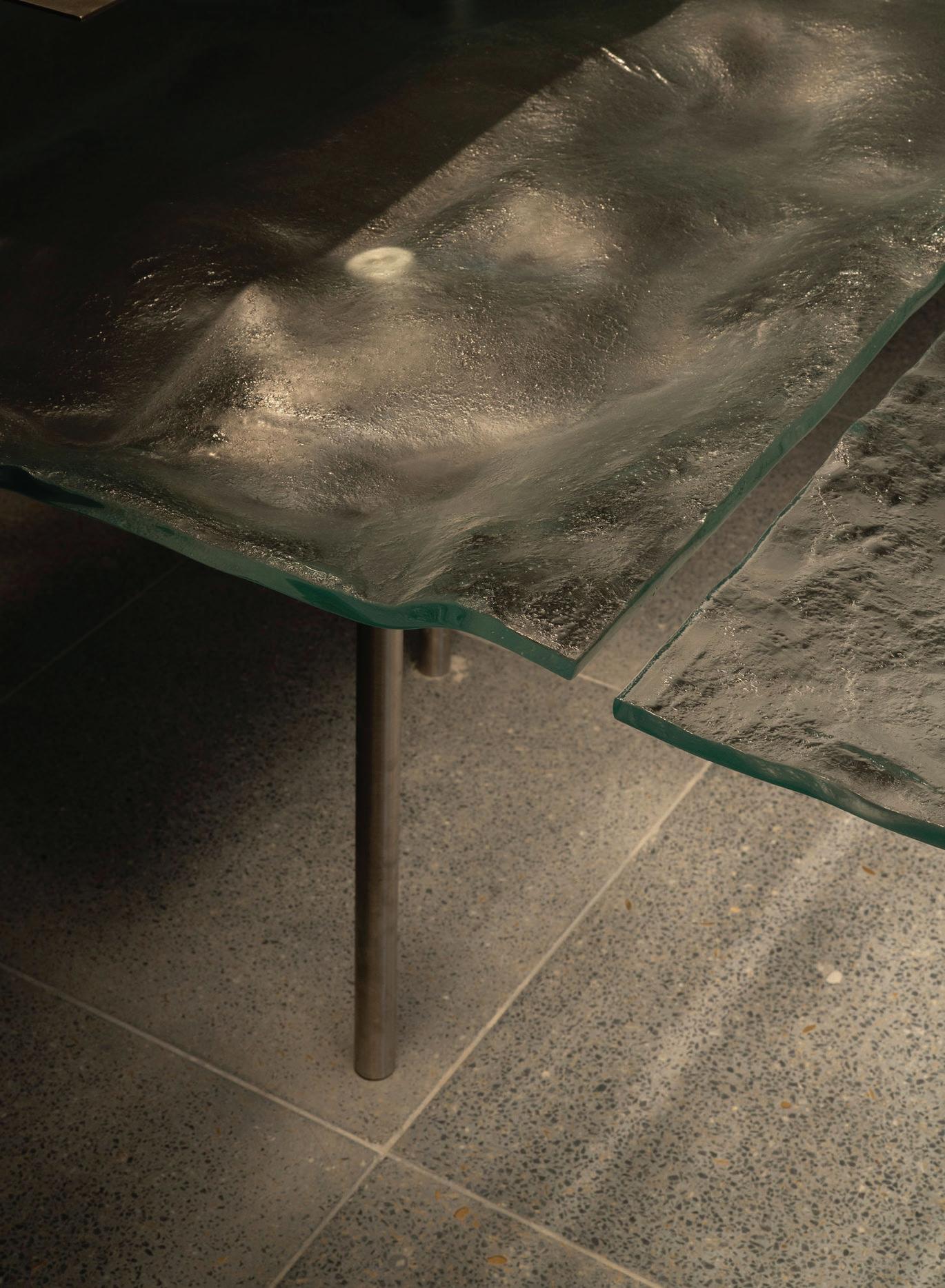
A cast-glass table occupies the centre of the space, resembling a vast surface of water frozen in solid form. On its sinuous, textured surface, millimetreprecise stainless-steel trays display the brand’s products under theatrical lighting.
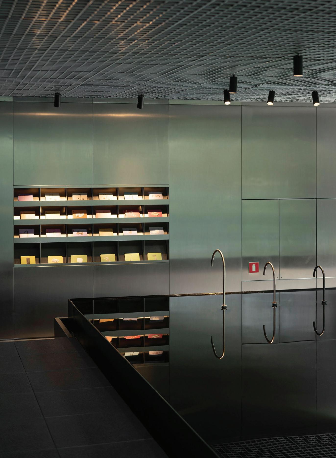
At one end, near the main entrance, a black reflecting pool acts as a fountain, composed of high-design sanitary fittings, a misty, almost ethereal presence. At the opposite end, where a secondary entrance is located, a cosy café features a generous stainless-steel counter, separated from the exhibition area by a subtle screen of brass slices that appear to float in mid-air, a carefully choreographed process.
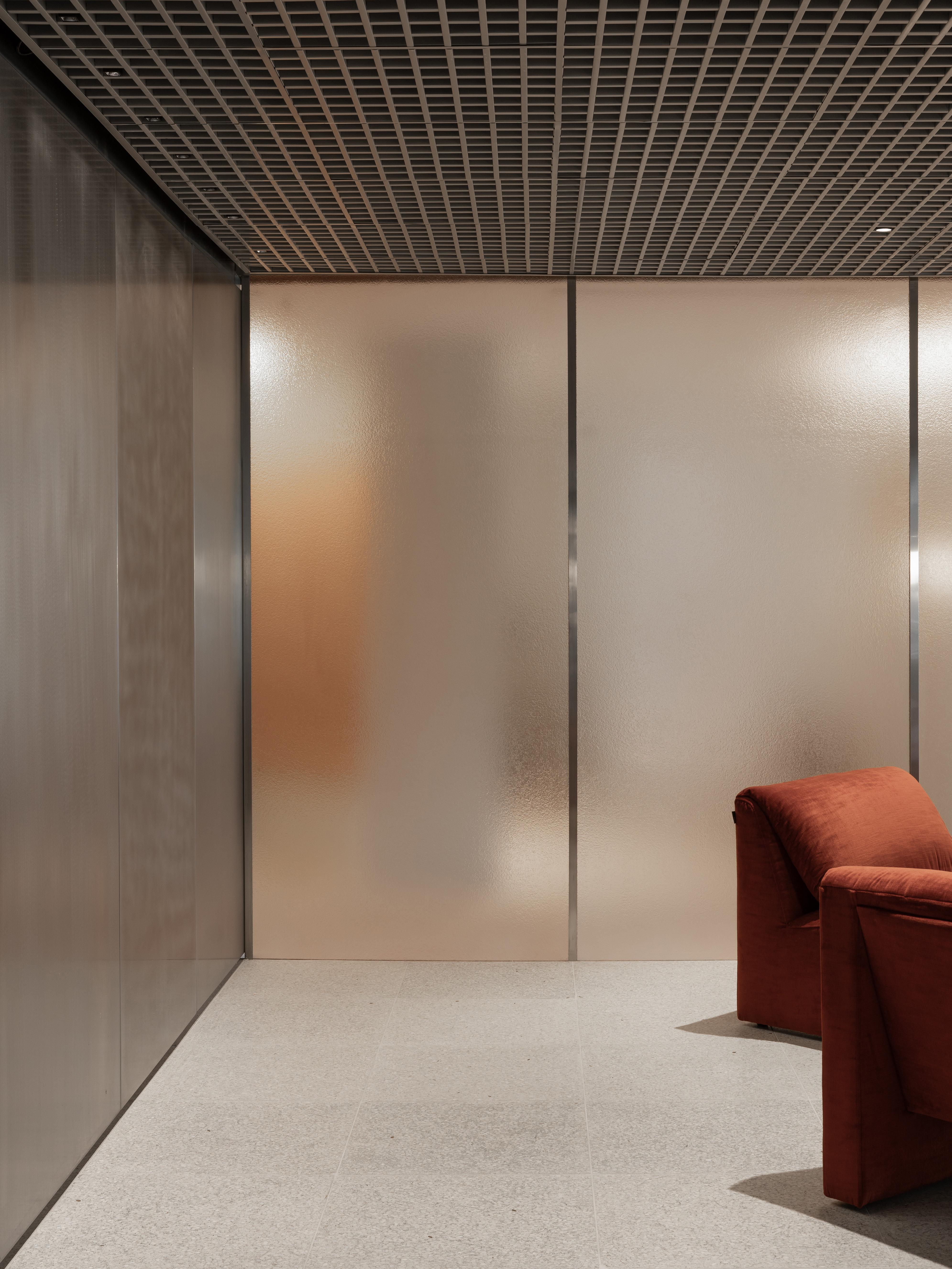
Throughout the space, floor and ceiling unite the two worlds. The flooring is a bespoke blue-gold concrete, developed by incorporating brass shavings, industrial offcuts from the production process directly into the mix. The modular stainless-steel ceiling, in a honeycomb pattern, forms a low-height plane that defines the minimalist atmosphere of the scene. Water is revisited in multiple states and materials: in the cloudy glass, in the reflections on the ceiling, in ultra-polished hammered aluminium, and in mirrored epoxy, all under dramatic, theatrical lighting.
The two-storey, 2,000 m² store is connected by a stepped staircase designed to host events year-round. On the upper level, stainless steel demonstrates its precision, beauty, and versatility, supporting pieces from its sister brand throughout.
Completing the programme, a white, welcoming spa is oriented towards relaxation and innovation, opening onto an exuberant garden listed as a historic heritage site.
A flagship celebra a junção de duas marcas: Docol - metais e louças sanitárias - e Mekal - especializada em projetos de aço inox plano.
A água é o mote. Sofisticação e precisão também.
Uma mesa em vidro fundido ocupa o centro do espaço como uma enorme superfície de água em estado sólido. Sobre sua textura sinuosa e rugosa, milimétricas bandejas em inox expõem, sob iluminação cênica, os produtos da marca.
De um lado, junto à entrada, o espelho d’água negro é fonte, composta por metais sanitários de alto design. Bruma.
Na outra ponta, ao fundo, onde há uma segunda entrada, está o aconchegante café, com sua bancada generosa em inox. É reservado da área de exposição por um biombo sutil, realizado com fatias de pesados componentes em latão que parecem flutuar no ar. Processo.
Ao longo de todo o lugar, chão e teto unem os dois mundos. O piso é feito em concreto azul-dourado, desenvolvido especialmente com a mistura à massa do cavaco, refugo do processo industrial do latão. O forro modular em inox, tipo colmeia, forma o grande plano em pé-direito baixo que dá a atmosfera minimalista à cena. A ‘água’ é revisitada em diferentes estados e materiais: no vidro turvo, reflexo do líquido em movimento no forro, no alumínio martelado ultra-brilhante, no epóxi especular. Luz teatral.
São dois mil metros quadrados, divididos em dois pavimentos, conectados pela escada-arquibancada que receberá eventos o ano todo. No piso superior, o inox mostra sua precisão, beleza, multiplicidade de usos e acabamentos, dando sempre suporte a peças de sua marca irmã.
Completa o programa o spa, espaço branco e acolhedor, destinado ao relaxamento e à inovação, aberto para um exuberante jardim tombado pelo Patrimônio histórico.
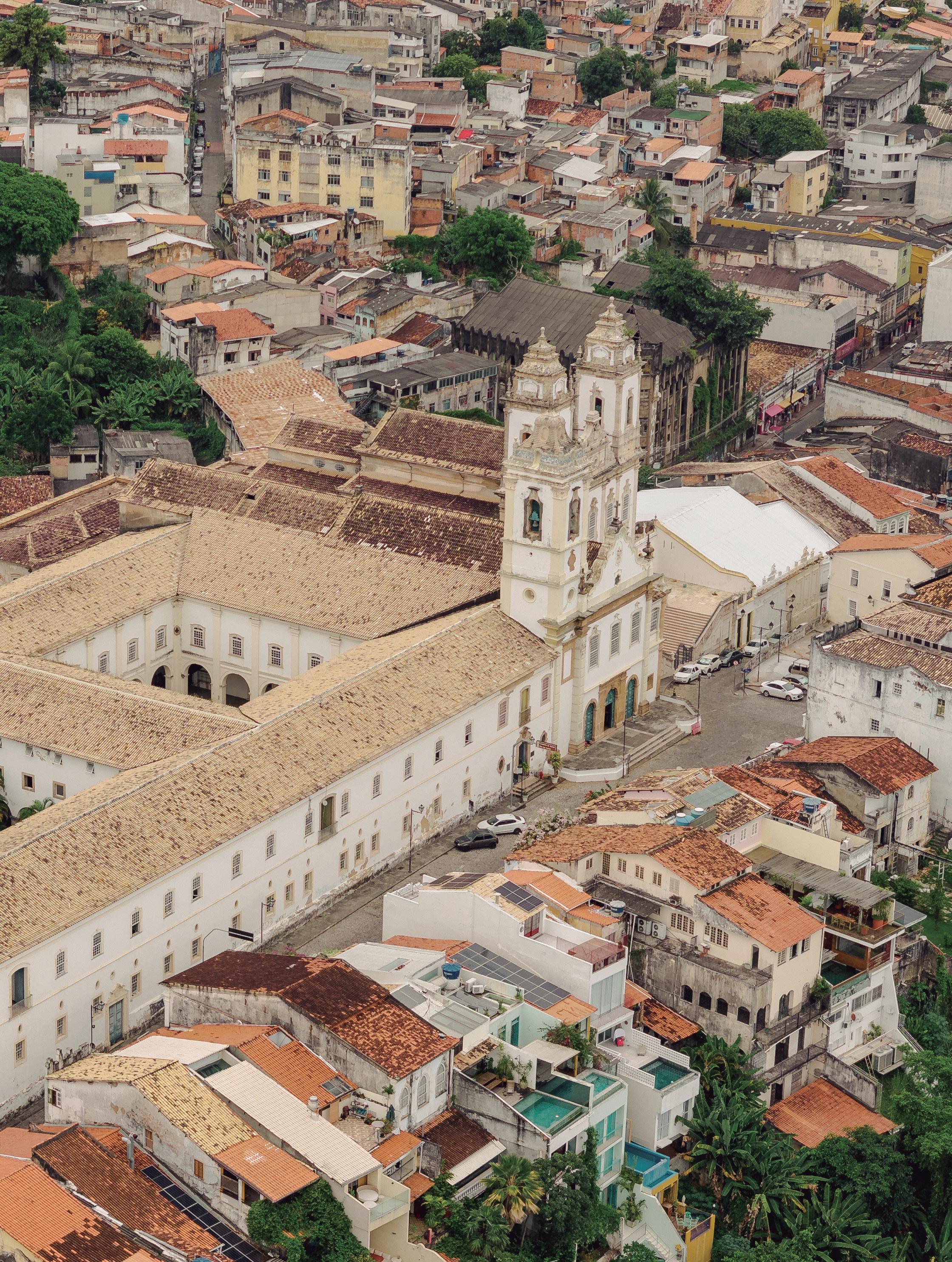
CARMO CONVENT
Salvador, Brazil
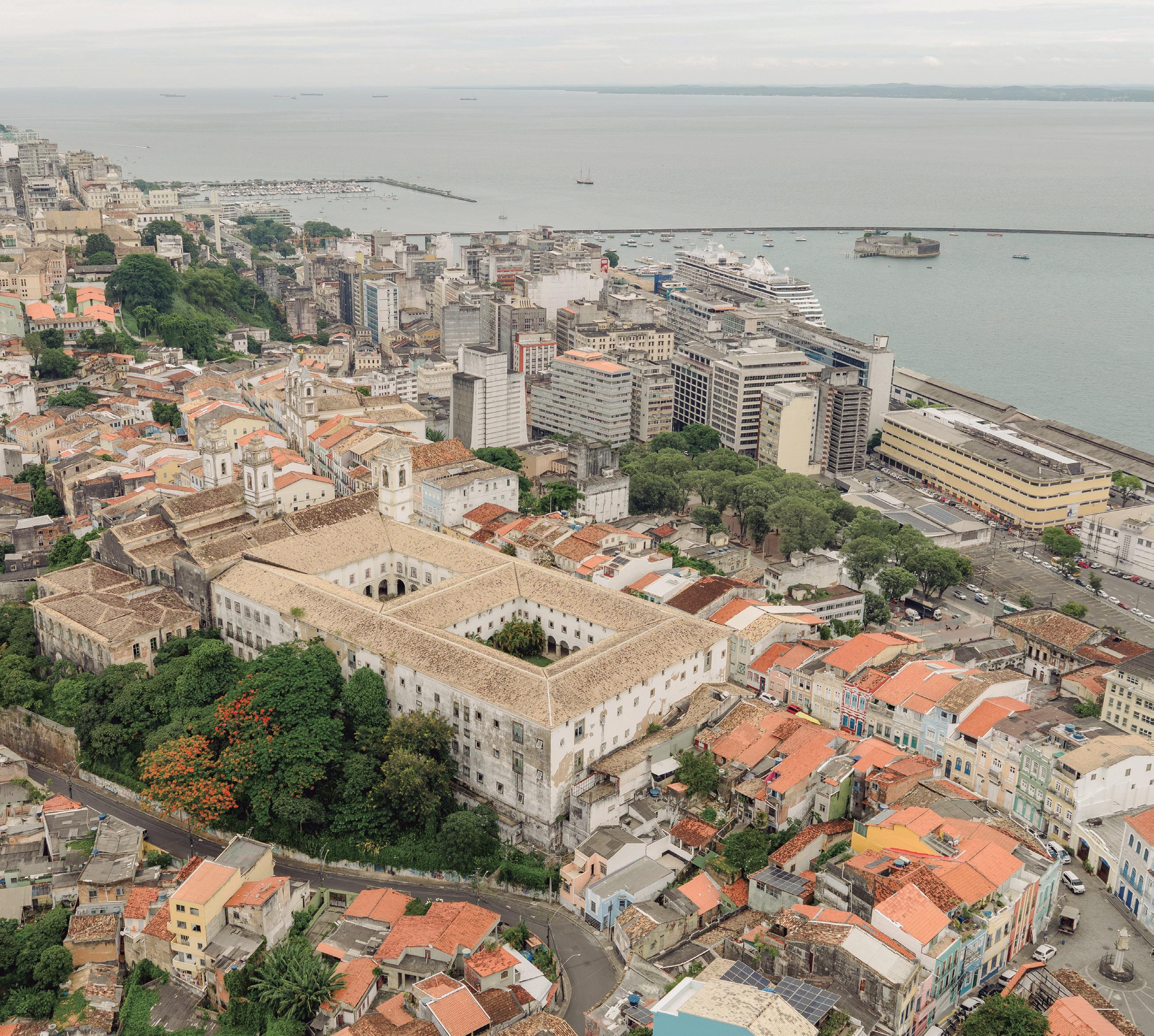
The Convento do Carmo in Salvador is one of Brazil’s largest and oldest religious buildings.
Located on Ladeira do Carmo, adjacent to the Pelourinho, its construction began in 1586 by the Carmelite friars, with the first cloister and church, followed by successive additions throughout the 16th and 17th centuries, culminating in the completion of the second cloister in the 18th century.
In the 1970s, the building underwent its first transformations for conversion into a hotel, which included two major renovations that significantly altered, and in many cases, compromised, large portions of the historic structure. The building was finally abandoned in 2020 at the onset of the pandemic.
By 2021, when the current project commenced, the monument had suffered considerable deterioration. Original features and spatial qualities had been altered, removed, or obscured by new walls, ceilings, and mortars, with historic elements neglected and, in some cases, falsified with inappropriate ornamentation.
The ongoing project for the new Hotel do Carmo aims to bring the iconic historic building back to life, preserving its singularity, cultural atmosphere, and spiritual presence, while incorporating contemporary interventions that are light, minimal, and easily reversible.
Following a meticulous survey, twenty tonnes of exogenous debris were removed from within the building, revealing hidden elements such as arcades, columns, stonework, masonry, and frescoes, all
of which are now reintegrated into the architecture. Recoverable finishes and surfaces will be restored to their original state. New additions, walls, panels, and doors, will be executed in lightweight partitions and natural light timber, clearly distinguishable from the historic fabric. No false-historical elements will be introduced. The heavy dark-red corridor carpets will be replaced with sisal.
The proposal seeks to create a space that is both simple and sophisticated, where visitors can simultaneously experience the Bahian and conventual atmosphere in a discreet and quiet environment.
All furniture will be of Brazilian design, complemented by vernacular and religious pieces, such as the old benches recovered from the storage areas beneath the building. New finishes will prioritise respect for the historic monument while using local Bahian materials, suppliers, and traditional techniques mostly from sustainable sources.
Following the surveying and demolition phases, the chapels are already in an advanced stage of restoration.
O Convento do Carmo de Salvador é um dos maiores e mais antigos edifícios religiosos do Brasil.
Localizado na Ladeira do Carmo, ao lado do Pelourinho, sua construção teve início em 1586 pelos frades da ordem carmelita (primeiro claustro e igreja), com acréscimos ao longo dos séculos XVI e XVII, até o século XVIII, quando o segundo claustro foi concluído.
Na década de 1970, iniciou-se a transformação do uso do edifício para hotel, passando por duas grandes reformas que alteraram, e descaracterizaram, diversas partes do edifício secular, abandonado definitivamente com o encerramento das atividades em 2020, no início da pandemia.
Em 2021, quando o projeto teve início, o monumento foi encontrado bastante deteriorado. Características originais do edifício e sua espacialidade haviam sido alteradas, removidas ou encobertas por novas paredes, forros e argamassas, a negligenciar elementos históricos valiosos e, por vezes, com adição ornamentos falsos.
O projeto em andamento para o novo Hotel do Carmo pretende devolver à vida o icônico edifício histórico em sua singularidade, restaurado em sua atmosfera cultural e espiritual, incorporado de intervenções contemporâneas, leves e minimalistas, de fácil reconversão.
Após um minucioso trabalho de prospecção, vinte toneladas de entulho exógeno foram removidas de dentro do edifício, trazendo à luz elementos ocultos como arcadas, colunas, cantarias, alvenarias e afrescos, agora reincorporados à arquitetura. Revestimentos e acabamentos passíveis de recuperação serão restituídos em sua originalidade. As novas adições necessárias, paredes, painéis e portas, serão executados em divisórias leves e madeira clara natural, claramente identificáveis. Sem falsoshistóricos. Os pesados tapetes vermelhoescuro dos corredores das celas serão substituídos por sisal. A proposta é oferecer um espaço simples e sofisticado, onde os visitantes possam sentir simultaneamente
a atmosfera baiana e conventual, em um ambiente discreto e silencioso; O mobiliário da decoração será todo de design brasileiro, combinado com peças vernaculares e religiosas, como os antigos bancos encontrados nos depósitos sob o edifício. Os novos revestimentos a serem incorporados tem como premissa, além do respeito ao monumento histórico, a utilização de materiais, fornecedores e técnicas tradicionais locais (da Bahia)em sua maioria de cadeias sustentáveis.
Passadas as fases de prospecção e demolição, as capelas já estão em fase avançada de restauro.
WALKWAY DETAIL
UNO BUILDING
Indaiatuba, Brazil
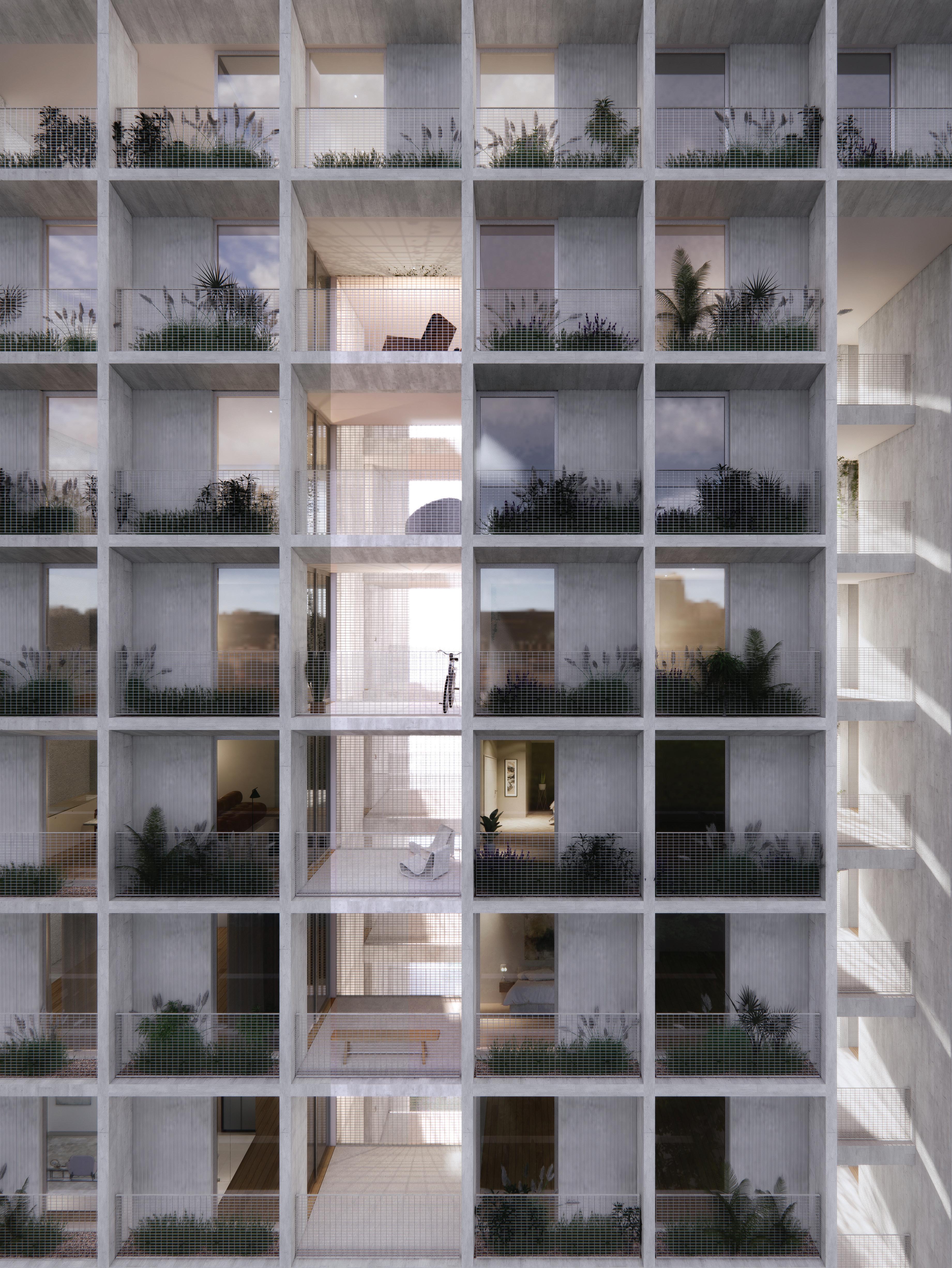
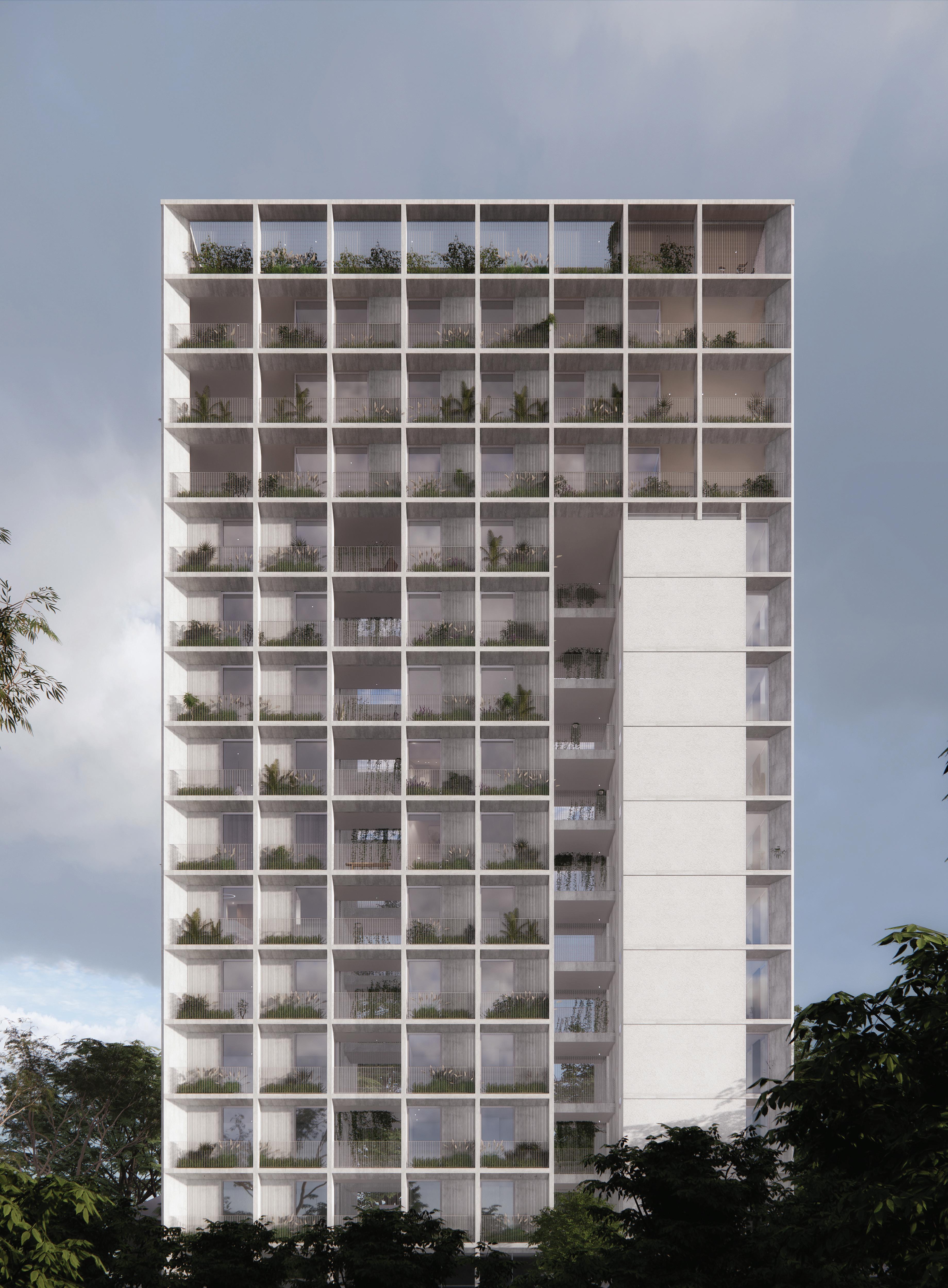
The concrete grid of the façades defines the tower’s presence within the landscape. The exoskeleton simultaneously simplifies openings, frames views, and acts as a brisesoleil for the sun-exposed elevations.
The building’s siting takes advantage of the greenery of the linear park immediately opposite, opening towards it. The northwest-facing façade is protected from the hot afternoon sun by the onemetre-deep brise-soleil structure, which also functions as a small balcony.
For enclosure, prefabricated concrete panels shade the interiors and accommodate the window frames, creating a rhythmic façade.
The building’s modular design, with 5,000 m² of constructed area, allows flexibility across two typical floor plans: Floors 1 to 9: Four units per floor, with two two-bedroom apartments (85 m²) at the ends and two one-bedroom apartments (45 m²) in the centre. Floors 10 to 13: Two L-shaped units per floor, each with three bedrooms (150 m²).
The roof hosts recreational facilities, including a solarium, pool, and gym, while the ground floor, raised on pilotis, accommodates a small event hall.
A grelha em concreto das fachadas define a presença da torre na paisagem. O exo-esqueleto ao mesmo tempo simplifica vãos, amplia a vista, e serve de brise-soleil para as faces expostas.
A implantação do edifício tira partido da presença do verde do parque linear logo em frente, para abrir-se para este. É, porém, uma face noroeste, protegida do sol quente da tarde pela estruturabrise com um metro de profundidade - e que também serve como pequena varanda.
Como vedação, painéis pré-fabricados de concreto sombreiam os ambientes e acomodam as esquadrias, dando ritmo à fachada.
A solução modular do edifício, com 5.000m2 construídos, dá flexibilidade às duas plantas tipo: Do 1º ao 9º, conta com quatro unidades, sendo duas de 2 dorm. (85m2) nas pontas e duas de 1 (45m2) ao centro. Do 10º ao 13º, são duas unidades em L por andar, com 3 dormitórios (150m2).
Na cobertura, o lazer: solarium, piscina e academia. No térreo, sob pilotis, um pequeno salão de festas.
CUBO HOUSE project: 2008 - 2009
location: São Paulo, Brazil
team: Marina Acayaba, Juan Pablo Rosenberg area: 92 m² images: © Maíra Acayaba
LAUSANNE
project: 2014
location: São Paulo, Brazil
team: Marina Acayaba, Juan Pablo Rosenberg, Andrea Helou, Cassiana Basso area: 177 m²
images: © Maíra Acayaba
SCHENDEL HOUSE
project: 2017 - 2018
location: São Paulo, Brazil
team: Marina Acayaba, Juan Pablo Rosenberg, Julia Galves, Livia Baldini area: 175 m²
images: © Leonardo Finotti
MATO DENTRO RANCH
project: 2018 - 2019
location: Catuçaba, Brazil
team: Marina Acayaba, Juan Pablo Rosenberg area: 150 m²
images: index page © Javier Agustin Rojas, page 53-54 © Ruy Teixeira and page 46, 48, 51, 52 © Federico Cairoli
ROSA BUILDING + GOMIDE & CO
project: 2013 - 2020
location: São Paulo, Brazil
team: Marina Acayaba, Juan Pablo Rosenberg, Adelmo Junior, Andrea Helou, Helena Meirelles, Julia Galves, Luciana Ligeiro area: 5.000 m²
images: page 60 © Federico Cairoli and page 56, 59, 64, 65-66 © Fran Parente
ATLANTIC HOUSE
project: 2018 - 2020
location: São Paulo, Brazil
team: Marina Acayaba, Juan Pablo Rosenberg, Helena Pessini area: 336 m²
images: © Federico Cairoli
FLOWERBAR
project: 2020
location: São Paulo, Brazil
team: Marina Acayaba, Ana Flávia Piacentini area: 150 m²
images: © Maíra Acayaba
MYFOTS
project: 2021
location: São Paulo, Brazil
team: Marina Acayaba, Juan Pablo Rosenberg, Franco Peviani, Tamara Silberfeld area: 150 m²
images: © Maíra Acayaba
MENDES WOOD MD
in collaboration with Fernando Pinheiro Guimarães
project: 2021
location: São Paulo, Brazil
team: Marina Acayaba, Juan Pablo Rosenberg, Franco Peviani area: 1.400 m²
images: page 91-92 © Javier Agustin Rojas and page 88, 90, 94 © Fran Parente
B HOUSE project: 2018 - 2021
location: São Paulo, Brazil
team: Marina Acayaba, Juan Pablo Rosenberg, Luciana Ligeiro, Vitor Endo area: 370 m²
images: © Maíra Acayaba
PEDRO DO RIO HOUSE
project: 2020 - 2022
location: Petrópolis, Brazil
team: Marina Acayaba, Juan Pablo Rosenberg, Renata Serio area: 735 m²
images: © Federico Cairoli
QUADRA GALLERY
project: 2022
location: São Paulo, Brazil
team: Marina Acayaba, Tamara Silberfeld area: 220 m²
images: © Bruno Leão
MANTIQUEIRA HOUSE
project: 2020 - 2023
location: Minas Gerais, Brazil
team:Marina Acayaba, Juan Pablo Rosenberg, Elisa Friedmann, Michelle Waisblut
area: 650 m²
images: page 124, 126-127, 129 © Ruy Teixeira, page 118 © Maíra Acayaba and page 119-120, 122, 130 © Fabian Martinez
VITA HOUSE
project: 2022 - 2023
location: São Paulo, Brazil
team: Marina Acayaba, Juan Pablo Rosenberg, Ana Flávia Piacentini
area: 130 m²
images: © Ruy Teixeira
HAIGHT project: 2023
location: São Paulo, Brazil
team: Marina Acayaba, Helena Pessini area: 60 m² images: © Federico Cairoli
BLACK HOUSE project: 2022 - 2025
location: São Francisco Xavier, Brazil
team: Marina Acayaba, Juan Pablo Rosenberg, Ana Flávia Piacentini, Ana Moura, Levy Marques Mendes, Murillo Felizardo area: 435 m² images: © Fabian Martinez
YOSHI HOUSE project: 2021 - 2023
location: Itatiba, Brazil
team: Marina Acayaba, Juan Pablo Rosenberg, Ana Flávia Piacentini, Bianca Rimer, Franco Peviani, Gabriela Araújo, Murillo Felizardo area: 407 m² images: © Fran Parente
URI BUILDING project: 2020 - 2024
location: São Paulo, Brazil team: Marina Acayaba, Juan Pablo Rosenberg, Ana Flávia Piacentini, Fernanda Mangini, Gabriela Araújo area: 3.900 m² images: © Fran Parente
DOCOL + MEKAL CONCEPT STORE project: 2025 - 2026
location: São Paulo, Brazil
team: Marina Acayaba, Juan Pablo Rosenberg, Ana Flávia Piacentini, Ana Luiza Zimmermann, Bianca Rimer, Candelaria Lacherre, Costanza Leoni, Gabriel Soubhia, Lorena Ávila area: 2.076 m² images: © Fabian Martinez
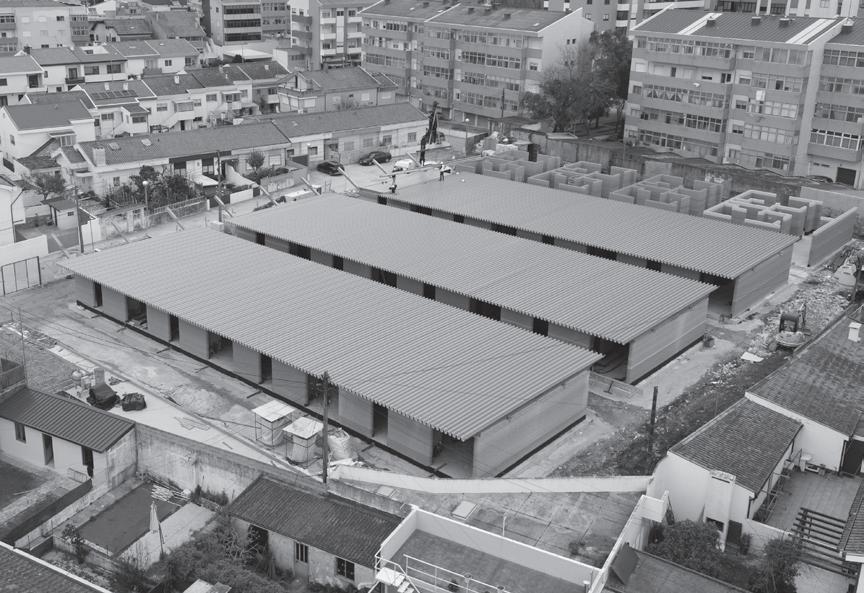
CARMO CONVENT project: 2021 - underconstruction location: Salvador, Brazil
team: Marina Acayaba, Juan Pablo Rosenberg, Marina Sabino, Kelly Yamashita area: 12.000 m² images: © Manoel Sá
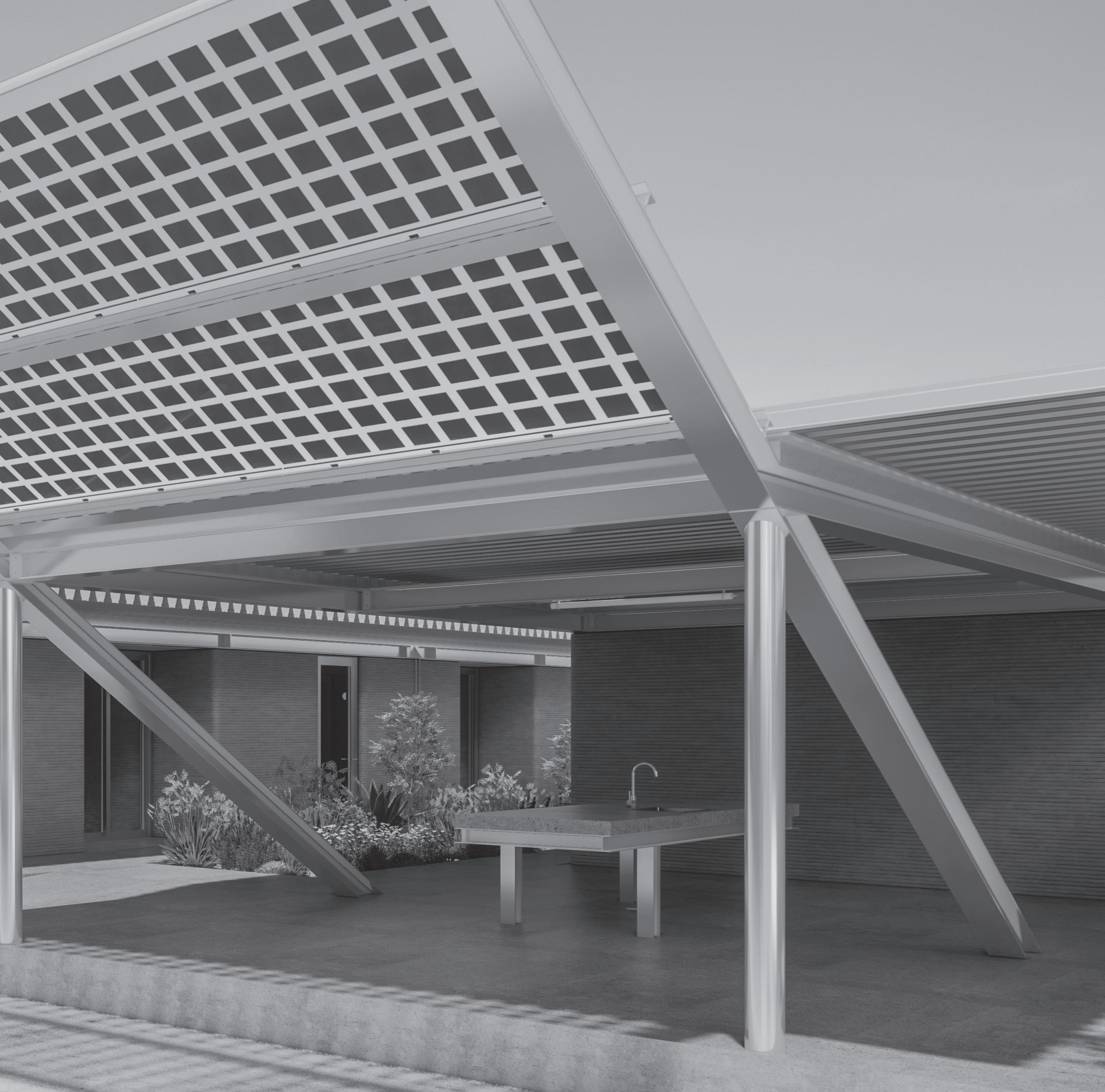
UNO BUILDING project: 2023 - underconstruction location: Indaiatuba, Brazil
team: Marina Acayaba, Juan Pablo Rosenberg, Daniel Soares, Guilherme Tedesco, Isabela Moura, Lorena Ávila, Nathalia Kuipers area: 5.287 m² images: © Thiago Buccieri
ACAYABA + ROSENBERG
Founded in 2008 in São Paulo, Brazil, Acayaba+ Rosenberg Arquitetos develops projects across a wide range of scales and programmes, operating from buildings to furniture, always guided by a strong commitment to experimentation and precisioninexecution. With a portfolio of over 150 projects, the practice seeks to reconcile craftsmanship and ancestral knowledge with contemporary technologies, inorder topropose an architecture that is at once minimal, assertive, and subtly nuanced, responding thoughtfully to the demands at hand.
Black and white articulate and modulate unexpected light conditions, while the use of construction techniques employing raw materials gives expression to either weight or lightness, depending on the context. This is consistently achieved through an acute attention to detail and inclose dialogue with the surrounding environment.
Over the years, the practice has received numerous awards, including the IAB Award (Instituto deArquitetos doBrasil) in 2025 for Casa em Pedrodo Rio, the Prix Versailles 2022 for the A Mafalda project, and the IAB Award 2021 for Edifício Rosa on Avenida Paulista, also nominated for the Mies Crown Hall Americas Prize (MCHAP). Additional IABSP awards were granted in 2019, 2017, 2011 and 2010, among others.
AMAG 42 presents a curated selection of the practice’s consistent body of work, bringing together large-scale buildings, small interventions, art galleries, and commercial spaces, inorder toreveal a continuous and coherent architectural trajectory. The poetic engagement with light and materiality, combined with acritical
awareness of modes of production, results in a language that is both solid and fluid capable of responding with precision and distinct identity todiverse contexts, whether urban or rural.
To this end, Acayaba + Rosenberg mobilises a broad repertoire of design strategies, drawing equally from vernacular knowledge and advanced technological processes, always with remarkable precision.
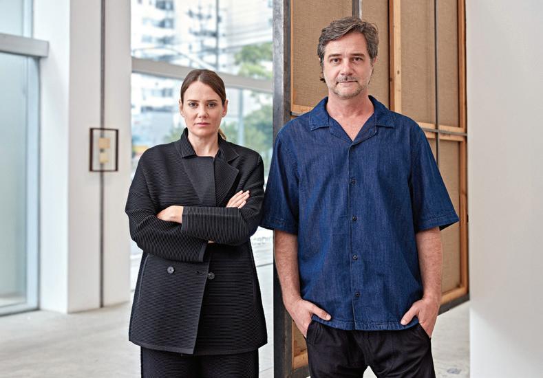
Juan Pablo Rosenberg
Bornin Buenos Aires in January 1976. Hegraduated in 1999 from FAU Mackenzie (Faculty of Architecture and Urbanism), Universidade Presbiteriana Mackenzie, with a final project awarded the national Ópera-Prima prize.
He completed his Master’s degree in 2016 at FAUUSP (Faculty of Architecture and Urbanism, University of São Paulo), with the dissertation The Construction of Territory, Abstraction and Nature in the Works of Luis Barragán, Álvaro Siza and Tadao Ando. Hetaught at the postgraduate programmeat FAU Mackenzie between 2010 and 2012.
Marina Acayaba
Bornin São Paulo in December 1980. Shegraduated in 2006 from FAUUSP (Faculty of Architecture and Urbanism University of São Paulo) where she also completed her Master’s degree in2019. Her dissertation was later published as the book Three Houses: Design Strategies by Romano Guerra Editora. Shewas an assistant design tutor at Escola da Cidade between 2009 and 2013.
AR has no fixed form; its particles disperse, occupying space. It is not astaticor finite substance, but fluid and inconstant motion.
The project emerges from this premise: a cultivated narrative, paced through spatial sequences, inwhich void and matter mutually shape one another to reveal, through framing or under shifting, diaphanous light, knowledge and sensory experience.
Architecture materialises through its everyday use, the body in space, through the rigorous handling of materiality and craft, and through a persistent re-examinationof the notion of boundary over time, contrast and fusion. Thedetail assumes a central and enduring role, approached with both rigour and obsession.
In the interplay between the stereotomic and the tectonic as the guiding thread of the narrative, technology and the vernacular are accorded equal value. Present and legacy remainin constant tension and dialogue.