At Valpo, we learn to cast our light on the world. We lead our communities in service of others, and we find our inner joy in reaching out. Our brand platform is designed to share that story, to show how being anchored in these aims allows us to shine brightly — for all.
No matter who we’re talking to, we want to tell our story to serve their needs. We’ll tell this story to prospective students seeking a program where they can find or fulfill their purpose; to transfer students looking to find their home at Valpo; to current students working in our community; and to the many advocates, influencers, and community members who interact with our University. This is our story to tell. It is their light to share.
With this guide, you’ll gain a deeper understanding of our brand platform and the tools you need to craft the materials, communications, and conversations that will help us tell the unique story of Valparaiso University.
Strategy 1
Overview
Without a beacon, it can be challenging work to uncover Valpo’s true essence. So that’s what this strategy is: a light that illuminates our mission and core values, so that we know how to express them to a variety of audiences. In a crowded marketplace clamoring for attention, it’s more important than ever that we know how to tell our story well. And that story starts here.
The strategy is:
• A hierarchy of critical ideas and concepts that define an unapologetic story that’s authentic to Valpo.
• A set of frameworks for creating alignment among stakeholders across the Valpo community.
• A blueprint for anyone who markets and communicates on behalf of the University.
The strategy is not:
• An outward expression of a campaign (like market-facing headlines, a tagline, or a slogan).
• Meant to communicate everything that Valpo is and does.
• Static and finished. It should be able to evolve as the market or the University changes.
About the Strategy
Our strategy has five main components. Our story becomes recognizably ours and we authentically connect with people when each is accounted for in our communications. Without all the components, our communications struggle to establish consistency and have the desired effect.
Audiences
Whom are we for?
Essence
What are we all about?
Positioning
What do we stand for?
Messages
What do we offer and why does it matter?
Personality
How do we look, sound, and feel?
Audiences
Our community is united by our values, but it also spans generations and perspectives. It’s important that our communications be relevant
and tailored to every audience — from future Beacons to our greatest supporters.
Current Beacons Prospective Beacons Prospective Supporters
BRAND OBJECTIVE
Align around a “one Valpo” message that can flex for all
Share the refreshed brand message and encourage their participation and ambassadorship
BRAND OBJECTIVE
Show relevance to drive interest and differentiate Valpo from competitors
Distill our messages to authentically reach each distinct segment
BRAND OBJECTIVE
Raise awareness to improve our reputation
Lay groundwork for new partners to enter the fold to help push Valpo forward
Audiences
Though we communicate with many stakeholders, prospective students are a priority audience, and it’s important to understand
Prospective Undergraduate Students
• High school students
• First-generation students
• Students from underrepresented populations
• Access College for Success students
• Bloom Scholars
• Transfer students
• Continuing education students
• SAGE (Senior Adult Growth through Education) students
Prospective Graduate Students
• Working adults
• Online and hybrid students
• Career up-skillers
• SAGE students
their identities and their needs so that we can capture their attention and serve them well.
• Career preparation
• Quality of faculty
• Affordability
• An education that doesn’t prepare you just for a job, but for a vocation
• Employability
• Affordability
• Flexibility
• Upward mobility (career and life)
• Program reputation
Brand Essence
Our brand essence is the pilot light of our brand, the first flame that keeps us consistent and authentic across all our materials. It also keeps us true to our core principles and guides our decisions as an institution.
At our core, Valpo facilitates fulfilling connections that shape servant leaders so they can: discover a deeper understanding in their lives, discover their vocation — to lead and make a difference, discover fulfillment in serving others, and discover joy in the success of others.
It’s a process to …
Discover Joy
Brand Positioning
Positioning is how we want to appear in the minds of our most important audiences. It’s not what we offer or how we express it: it’s what we want people to remember.
Brand Essence
Discover Joy
Statement
WHO WHAT HOW WHY
Humble and curious servant leaders come to Valparaiso University
to explore themselves, their vocation, and their place in the world through a multifaceted journey of academic and spiritual awakening to discover joy through making a positive impact on society.
Messaging
To communicate effectively, we organize our key messages into a hierarchy, helping to ensure we’re telling the brand story clearly. Grounded in the core value proposition, each point further proves and elaborates on what makes Valpo significant and distinct, while helping us decide what ideas to prioritize and when.
CORE VALUE PROPOSITION:
Our brand promise
The core value proposition is the higher-level offer that drives our brand it’s what Valpo is promising to the world.
ATTRIBUTES:
What we offer
An attribute is what we offer to our audiences. Attributes include things like programs, facilities, culture, and experiences.
BENEFITS:
Why it matters
A benefit is what our audiences get. It’s the value, outcome, or impact of the attributes that we offer.
Messaging
Personality
Think of the traits you love in the people of our community: those people and their values are what inspire our brand’s personality. Our traits lend authenticity to our communications and guide the use of our voice and visual language. Consistently abiding by our personality leads to greater recognition, trust, and emotional appeal.
Inquisitive
We seek the truth. We ask questions. We question answers.
Ethical Humble
We work for the cause, not the applause. Because we care.
We see humility as a beacon that shines, always — through all of us.
Compassionate
Our differences, similarities, and hardships are vehicles for connection.
Faithful
Regardless of faith, we loyally serve others, and that creates joy.
We seek many diverse interests, and we connect the dots.
Voice and Tone 2
Brand Narrative
Everything is a story, and our brand is no different. The narrative shown here represents the essence of our sound. It’s our messaging and personality in action. It kindles the emotions our brand strives to inspire. And ultimately, it’s here to lend its light to your headlines, to guide your ideas, and to illuminate the path to that perfect line.
As Beacons, we reflect God’s light. Even in darkness or without a path forward, we shine outward and onward, anchored in our values.
We project the image of goodness in which we are created. We cast compassion and bring truth to light: dedicated to doing what we can to bring a brighter future for all into view.
Whether we are students in pursuit of our passions, faculty in the field earning hard-won wisdom, athletes on the starting block, or servant-leaders in real communities — we illuminate our surroundings, uncovering the joy that’s right before us all: the human joy found in service of something greater.
We ground theory in practice and push ourselves to discover our true capabilities. Reaching further together. Leading compassionately for the good of society. At Valpo, our light is for everyone.
Grounded, we shine.
Grounded, we serve. Grounded, we radiate. Valparaiso University.
Brand Narrative Breakdown
Grounded in strategy and story, the brand narrative radiates a unique Valpo voice. Let’s outline the significance of each section.
Narrative
As Beacons, we reflect God’s light. Even in darkness or without a path forward, we shine outward and onward, anchored in our values.
We project the image of goodness in which we are created. We cast compassion and bring truth to light: dedicated to doing what we can to bring a brighter future for all into view.
Whether we are students in pursuit of our passions, faculty in the field earning hard-won wisdom, athletes on the starting block, or servant-leaders in real communities — we illuminate our surroundings, uncovering the joy that’s right before us all: the human joy found in service of something greater.
We ground theory in practice and push ourselves to discover our true capabilities. Reaching further together. Leading compassionately for the good of society. At Valpo, our light is for everyone.
Grounded, we shine.
Grounded, we serve.
Grounded, we radiate. Valparaiso University.
Breakdown
Inside every Beacon is a force that illuminates and guides. It begins within, but is always directed outward, toward others. Valpo offers a foundation, a common commitment to our core values, that grounds us even in the face of uncertainty or difficult decisions.
Our unshakable belief in the power of human potential informs our unique dedication to helping others. At Valpo, service is not a lowly pursuit: It is the ultimate aim of great leaders.
We believe that joy is found in acts of service, and true service is possible in every role and every environment. That’s why we insist on an interdisciplinary approach in all aspects of our lives, and that’s why we’re able to be exactly who we are, everywhere and in all of our complexity. Multiplicity is our strength. Service is our joy.
Beacons know that pursuing truth is equal parts study and experience. It’s a lifelong commitment to our effort and multifaceted curiosity that makes us powerful. And our power, like light, is meant for lending.
The hook for our brand platform speaks to the heart of our mission with compassion and fidelity, encapsulating both our personality and every Beacon’s power to shine brightly.
Constructing Headlines
Headlines can make a strong first impression, capture interest, and go a long way toward establishing our brand voice. They’re also often one of the biggest missed opportunities for expressing our voice, so don’t overlook them. Consider the following headline constructions as easy go-tos when writing for our brand. Remember, these are starting points, not the only ones we can use.
Grounded in [overarching value], we radiate [an outcome of holding that value].
Grounded in empathy, we radiate care.
Grounded in purpose, we radiate joy.
Grounded in community, we radiate collaboration.
Grounded in a love of photography, we radiate new ways of seeing the world.
This primary construction demonstrates how Valpo’s commitment to our values allows us to truly radiate in every space we enter. It offers flexibility for any audience, from prospective students to donors, by showing by showing the community in our common cause.
This headline pattern works especially well for showing the connection between a larger value and the observable outcome. It’s hard to see empathy, but the high-quality healthcare that stems from it is evident. So if we were referring to our nursing program, we might write a headline like “Grounded in empathy, we radiate care.” Ultimately, we’re seeking to show how more abstract values result in specific actions or qualities.
Radiate [a positive quality or value].
Radiate advocacy for the underserved.
Radiate integrity.
Radiate stewardship.
Radiate curiosity.
Radiate resilience.
Looking to evoke a strong call to action? Need something straightforward to head a complex piece? This is your construction. No frills, no complicated ideas. Just a powerful declaration that resonates with the Beacon inside each of us and challenges us to embrace the best parts of ourselves.
What’s useful about this headline pattern is how malleable it is: you can radiate light, but you can pretty much radiate anything else too (metaphorically speaking, of course). Also, this headline can be short — like, really short. Keep these benefits in mind when you’re working on a character count or need some latitude to express a big idea.
Beyond the Headline
Headlines are great, but they’re just one piece of the puzzle. So let’s take a look at some ways to voice our writing across different contexts, so that we always have a handle on our voice
and take full advantage of our story in every situation.
Radiate further. Ground your copy.
The brand narrative demonstrates how being grounded in our values leads us to radiate positive outcomes in every setting — in every industry, in every role, the world over. It’s what we do. But we are the Beacons after all, and if we aren’t careful, this radiating metaphor can get overused quickly. One solution is to find creative ways to take it even further, beyond the obvious.
When you’re writing a piece, consider how the subjects of your piece are interacting with others — what is their “light” doing for others? Is a community of Beacons working together to combine their light? What might this light illuminate? Check out some of these examples of extending the metaphor below.
EXAMPLES
“Lend your light.”
This phrase could be used as a call to action when communicating with donors or alumni. By giving gifts to the University, they are sharing their resources with future generations of Beacons, and we can extend our central metaphor to illustrate that generosity powerfully and succinctly.
“We know brilliant lights don’t just shine in one direction.”
This example extends our central metaphor to capture the way our students’ diverse, interdisciplinary interests are a natural result of their inherent greatness. The double meaning of “brilliant” as both smart and bright does the heavy lifting, but we can also deploy light-associated verbs like “shine” to great effect. We can then use this phrase to discuss any number of our responses as a University — our broad range of majors, our numerous student organizations — all through a powerful opening.
“Grounded, We Radiate” is the core of our brand, but that doesn’t mean every headline needs to have “grounded” in it. Not every line needs to be about light. In fact, it shouldn’t. Using too many explicitly branded metaphors is a surefire way to tire out the concept and diminish its power. Consider other ways to get at the messages behind the metaphor. Don’t forget the strategy: It’ll help you nail our voice and messaging every time.
EXAMPLES
“ Your education prepares you for a career. Valpo prepares you for a calling.”
As a University, we feel our values on a deep level, and pursue them for the benefits they bring to our communities and the joy and edification that come from service. Though we could convey this with metaphors, we can also illustrate this with more direct statements that evoke activeness and faithfulness — two of our strategic personality traits.
“Beacons don’t drift, and they don’t get lost.”
An example where “grounded” never appears, and yet we’ve conveyed the same message: Our students are grounded firmly, and it allows them to shine their brightest. This framing is our voice at its boldest, and yet we can temper that boldness with activeness and compassion by using it to discuss a topic like academic support — resources that help keep every Beacon steady during difficult seasons of learning.
Best Practices for Writing
Writing can feel overwhelming if you don’t know where to start, and even the most seasoned writers can use reminders. Keep these tips in mind for crafting inviting and inspiring content
Speak naturally.
Our audience is broad, and we want to make our University accessible to people of every background. And most of those people probably don’t know all of our insider acronyms and field-specific words. Reading your copy aloud can go a long way in helping you hear where you’re being conversational, and where you’ve fallen into formality. Academia is an important but small segment of society — let’s keep our doors open and the light on for everyone we communicate with.
Break it down.
Readers have increasingly short attention spans, so every word counts. Clarity usually comes with fewer words, not more, and perfection happens not when there’s nothing left to add, but when there’s nothing left to cut. Make your communications more digestible by employing bullet points, infographics, and clear content hierarchies with headlines, subheads, and body copy.
that moves your audience to keep on reading.
Prove it.
It’s easy to say that a donor’s gift will make a monumental difference on our campus, or that prospective Beacons will experience joy at Valpo. But asking people to consider giving their money or spending years of their life at Valpo isn’t insignificant. And just because we know all that Valpo has to offer doesn’t mean they do. So don’t just tell them — show them! Specificity is credible and convincing, so get into the details. A balance of statistics, examples, and stories brings any concept to life.
Keep it organized.
Arrange pieces so your reader can quickly find what they’re looking for. For example, when writing for our website, keep the most important information first. Dial up the brand voice on toplevel pages. As readers venture further into our site, we can dial back our voice, tailor content to specific proof points, and provide functional information.
It’s rare that your reader needs to know everything. With the exception of multi-page pieces like case statements and newsletters, make sure each communication focuses on a single message. Prioritizing the right information is the shortest path to being heard, understood, and remembered.
Keep it focused. Spark action.
Everything we create has a purpose and the potential to drive further engagement. On every piece, make sure to include a call to action to tell your reader what to do next, whether it’s attending an event, signing up for a newsletter, or applying for a program. There’s always a next step, but it can be hard to see in the dark — make sure your words light the way.
Voice and Tone
Checklist
You did it! You’ve used this brand guide to craft a beautiful, compelling communications piece. Now, take some time away. Then, reading out loud whenever possible, use this checklist to
Does this piece reinforce the “Grounded, We Radiate” concept?
give it one more pass. Or use these questions while you’re writing to make sure you’re checking all the boxes. After all, it’s your light now — we’re just living in it.
Is the message exemplified with a combination of proof points? Do you use narrative elements to resonate emotionally with our audiences?
Does it feel inquisitive, ethical, humble, compassionate, faithful, or active? Or some combination of those traits?
Is the piece tailored to a specific audience? Can you point to language that is crafted just for them? Are their unique needs being spoken to?
Can you identify its key message quickly? Have you avoided including too many messages?
Does the message align with our core value proposition?
Is it something you’re excited to share with your colleagues and audience?
Have you included a clear and direct call to action for your audience?
Logos 3
Our Primary Signature
Our primary signature represents us at the highest level. It’s critical to who we are as a brand. We have multiple versions of our mark that can be used in different applications.
HORIZONTAL
The horizontal version of the mark is the one we use the most. Use this logo when space allows.
HORIZONTAL STACKED VERTICAL
Use the vertical mark when horizontal space is limited.
Use the horizontal stacked mark when vertical space is limited.
Approved Color Combinations
PRIMARY
Our full-color logo is our primary color variation.
Depending on the background, the logo can appear in different color combinations. Our logos should only be placed on our primary colors, not secondary.
ONE-COLOR
Use the one-color brown logo when the full-color logo lacks sufficient contrast behind the yellow flame. Use the one-color white option when a reversed logo is needed for this variation.
PRIMARY LOGOS
REVERSED LOGOS
PRESTIGE
Use the prestige logo only with the prestige color palette. Use the one-color white option when a reversed logo is needed with the prestige color palette.
Approved Color Combinations
ONE-COLOR (GOLD)
The gold logo variation offers an alternative that evokes the inner light of every Beacon, while still achieving accessible contrast on full floods of brown. The gold version should only be used on brown or dark backgrounds.
ONE-COLOR (BLACK)
One-color logos are best used when full-color logos do not provide sufficient contrast with the background.
Black and gold palettes abound in higher education, but our brown and gold palette is a striking point of distinction. Whenever accessibility allows and whenever possible, use the one-color brown logo instead of this one.
GRAYSCALE
Use the grayscale logo rarely, in situations where color printing is limited, to ensure consistent and clear representation of the brand’s core visual identity.
Depending on the background, the logo can appear in different color combinations. Our logos should only be placed on our primary colors, not secondary.
PRIMARY LOGOS
REVERSED LOGOS
Primary Department
Co-branded Logos
Our primary co-branded logos come in a horizontal stacked or vertical format for use across many applications. While we should lead with our University logos on external communications or marketing materials, the primary signature co-branded logos can be useful for certain audiences and mediums.
Co-branded logos are only provided for colleges and departments, not majors, minors, or other programs
MULTICULTURAL PROGRAMS
MULTICULTURAL PROGRAMS
Primary College Co-branded Logos
Our primary co-branded logos come in a horizontal stacked or vertical format for use across many applications. While we should lead with our University logos on external communications or marketing materials, the primary signature co-branded logos can be useful for certain audiences and mediums.
Co-branded logos are only provided for colleges and departments, not majors, minors, or other programs NOTE:
Our Secondary Signature
Our secondary signature logo provides a more familiar iteration of the University logo, using our Valpo nickname. While we should lead with our primary signature logos for communications or marketing materials outside of the Midwest where audiences may not be as familiar with the University and nickname, the secondary signature can be used to establish a more friendly, informal connection with our audiences.
Secondary Department
Co-Branded Logos
Our secondary co-branded logos come in a vertical format for use across many applications. While we should lead with our University logos on external communications or marketing materials, the secondary signature co-branded logos can be useful for certain audiences and mediums.
MULTICULTURAL PROGRAMS
Secondary College Co-Branded Logos
Our secondary co-branded logos come in a vertical format for use across many applications. While we should lead with our University logos on external communications or marketing materials, the secondary signature co-branded logos can be useful for certain audiences and mediums.
NOTE: DEPARTMENTS WITH LONGER NAMES MAY SPLIT INTO TWO LINES
Athletics Logo
Our athletics logo includes the Valpo Shield and a collegiate font.
This combination of elements and typeface should only be used for athletics communications.
HORIZONTAL
Shield
The Shield of Character, one of Valpo’s long-established symbols, is made up of two major elements. At the center is the Light, the source of all truth, serving as a reminder of who we are and what we strive to be. The surrounding shield reflects our commitment to and our guardianship of the common values of all Beacons.
SHIELD
The shield is one component of the athletics logo, but it can also be used as a free-standing design element to signify the University.
CREST
The crest should never be used in any context other than as part of the full Valparaiso logo seen previously in this section.
Improper Logo Usage
DO NOT
add or remove text or graphic elements.
DO NOT
change the color of the logo’s elements or place the logo on a secondary color background.
To protect the integrity of the logo and to maintain its consistency, avoid any customizations (including drop shadows, glows, and strokes). Make sure to always use the official logo files.
These rules apply to the primary logos and all secondary marks. These are the only logos approved for use. The creation of any other mark must be approved by University Marketing.
stretch or change the proportions of the logo.
DO NOT DO NOT DO NOT DO NOT
add drop shadows or other effects.
change the placement of the logo’s elements.
change the typeface used in the logo.
EST. 1859
VALPARAISO UNIVERSITY
Improper Logo Usage
DO NOT
place other elements on top of the logo.
DO NOT
set the logo in unauthorized brand colors.
DO NOT
set the logo in non-brand colors.
DO NOT
position the logo on an angle.
DO NOT
use brand elements to create new logos.
DO NOT
use the crest on its own, separate from the primary logo.
Typography 4
Our Typefaces
Span is our primary typeface for headlines. It’s a serif typeface that features chiseled letterforms inspired by engraved lettering.
Span is available for download on Adobe Fonts
DM Sans is a low-contrast geometric sansserif typeface. It comes in a variety of weights and is legible at all sizes. We often use it for headlines, subheads, captions, and body copy.
DM Sans is available for download on Google Fonts .
DM Sans
Our Typefaces
Sweet Sans is a sans-serif typeface that features wide letterforms that are extremely legible even at small sizes. It works great for small callouts and subheads.
Sweet Sans is available for download on Adobe Fonts
SWEET SANS PRO
Our Typefaces
Sharpie is an informal family of display scripts. It has a sign-painterly and expressive look that’s best used where the tone is informal and expressive.
Sharpie is an open-source font that is available for download through fontshare.com.
Sharpie
Typesetting Examples
Sweet Sans Pro Heavy All Caps 8pt / 8pt
Tracking: 300
Span Bold 50pt / 50pt
Tracking: 0
DM Sans SemiBold 16pt / 22pt
Tracking: 0
DM Sans Regular 10pt / 15pt
Tracking: 0
Our typefaces blend tradition with a contemporary flair, striking a harmonious balance between timeless elegance and modern aesthetics. Their classic letterforms evoke a sense of heritage, while subtle design elements infuse a fresh, forward-looking vibe.
These are the only typefaces approved for use. No others may be used unless the approved typefaces are unavailable for use, such as in standard applications such as emails.
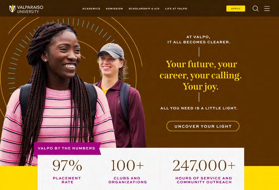
AT VALPO, IT ALL BECOMES CLEARER.
Your future, your career, your calling. Your joy.
Here, we come together: to learn more deeply, search more widely, and imagine more resourcefully.
Every early-morning class. Every late-night chat. Every experience you have at Valpo is just one more tether that grounds you in the values and knowledge you need to stretch further and go farther. And with a compassionate community, generous faculty, and an unshakable belief in human potential, we’re here to help you.
“My whole life, I thought I wanted to be an engineer. But I took one environmental science course, and I was hooked. The things I’ve learned here really opened up my eyes.”
Span SemiBold Italic 9pt / 12pt
Tracking: 0
Sweet Sans Pro Heavy 5pt / 7pt
Tracking: 300
Color 5
Institutional Color Palette
Our color palette is bold and distinctive. It relies primarily on our heritage colors of brown and gold. Secondary colors are used for deeper levels of content in layouts and for breaking up longer sections of copy.
By leaning on this diverse palette, along with plenty of negative space, we can create a modern look that still connects back to our traditions.
Primary Colors
Our primary palette consists of yellow, gold, brown, dark brown, and white. Our layouts lean heavily on these colors, mixing in the secondary palette to build color schemes that are complementary and balanced.
HEX #FFE300
RGB 255 227 0
CMYK 0 7 100 0
PMS C 107 C
Gold
HEX #F5B80A
RGB 245 184 10
CMYK 0 22 100 0
PMS C 1235 C
HEX #5C3000
RGB 92 48 0
CMYK 0 68 100 67
PMS C 1535 C
Dark Brown
Yellow Brown White
HEX #331A00
RGB 51 26 0
CMYK 33 66 76 68
PMS C 476 C
#FFFFFF RGB 255 255 255 CMYK 0 0 0 0
Secondary Colors
Our secondary palette is made up of rich, vibrant supporting colors. These colors work well to help establish hierarchy, and infuse layouts with a more youthful energy.
Sample Combinations
These color spectrums exemplify how we can use the brand palette to create different effects and inspire emotion in our designs. This is not an exact system but a guide to relative use; the combinations shown here are not the only possible ones, but generally color combinations should follow the spirit of these examples.
From formal to casual and from subtle to vibrant, we can combine our primary and secondary colors to create a variety of groupings appropriate for different audiences, occasions, and tactics.
Designing for Specific Audiences
The use of the secondary color palette is instrumental in shifting the tone of a piece. For more casual audiences like prospective undergraduate students, we can deploy more secondary colors to add excitement and visual interest. Pieces for more formal audiences that require a more sophisticated tone will have a much smaller presence of secondary colors.
Digital Color Matrix
In order for our communications to be effective, they must be inclusive. After all, our audiences are broad, and accessibility is important for serving everyone. Whenever possible, we want to remove barriers that prevent interaction with our messages.
This color matrix demonstrates the options available for applying text, using our brand colors, to achieve a AA level of accessibility compliance. The matrix is a quick and clear reference guide for combining foreground and background colors that are easy for everyone to read. Don’t forget that the size of the text will also influence the degree of legibility and compliance.
All text sizes can be used for this combination of colors.
Only use this combination for text that is 18-point or larger (14-point or larger if in a bold font).
Background Color
Prestige Color Palette
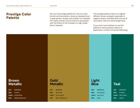
We use the prestige palette for only our most formal communications, where an elevated tone is appropriate, visually and verbally. For example, this might include communications associated with the Office of the President or high-dollar donor requests.
The prestige palette relies on a slightly different brown and gold, especially in negative space, and dials back the use of secondary colors to teal and light blue.
If you aren’t sure whether to use this palette or have questions about its application, contact University Marketing.
Photography 6
Our People
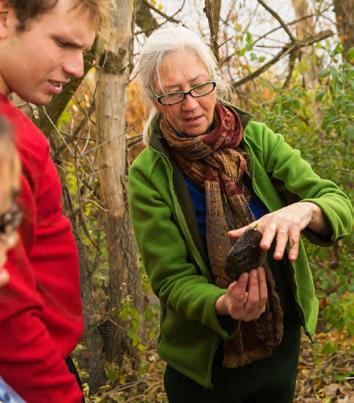
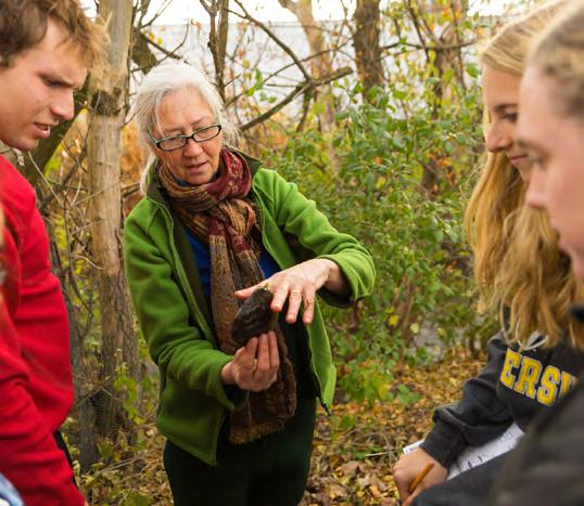
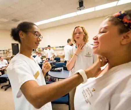
When using photos of Beacons, choose photos that capture natural movement, authentic interactions, and candid moments. The best photos capture a sense of story, so give
preference to images that highlight interesting interactions between Beacons in moments of collaboration, exploration, or celebration. Try to choose photos that feel light and airy, and keep the subjects in frame.
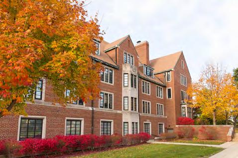
Our Campus
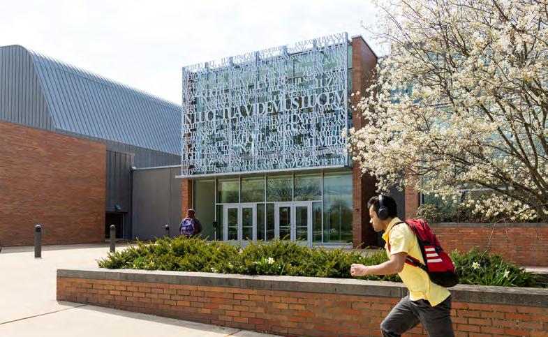
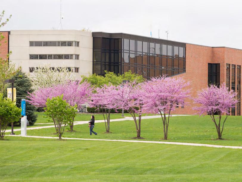
From the residence halls to the Chapel of the Resurrection, we showcase our campus in photographs that establish a sense of place in our pieces, allowing our audiences to anchor
themselves in the place we call home. Offer views of unique, significant campus locations, and give preference to photos that include people interacting with their environment.
Image Masking
Separating parts of an image from their backgrounds creates an easy stylized effect. We use these masked images on solid color backgrounds or layered with radiating lines. (See the following sections for more examples.)
Halftone Patterns
Turn Valpo photos into textural graphics by applying a halftone pattern. This technique should be used sparingly and on images without large amounts of detail. Our custom halftone pattern incorporates a circular, radiating motif that further echoes our brand narrative.
Creating custom linework halftones
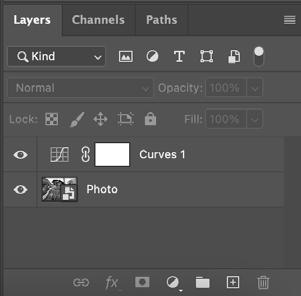
This effect is created with a photo layer, a pattern layer, and a few adjustment layers in a specific stack order in Photoshop.
Creating good halftone results takes some fine-tuning from image to image, depending on contrast, detail, and resolution. The steps listed here will always apply, but some values may require adjustment to achieve optimal results.
Creating your Photoshop effect stacks
1. Select the image you want to edit. Bring it into Photoshop. Convert it to a smart object.
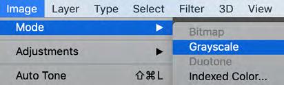
2. Convert the image to grayscale.
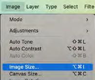
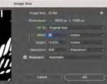
3. Set the image resolution to ~300 PPI for a smooth result.
4. Create a curves adjustment layer above your image. This can be done from the Adjustment Layer shortcut in the Layers panel, or from the top toolbar.
5. Place the concentric circle pattern provided in the brand assets or create your own in Illustrator. This layer should be placed as a smart object and should go above the image layer. Stretch the pattern to cover the majority of the photo.
6. Add a threshold adjustment layer at the top of your layer stack. Set the threshold to around 100. This may need to be adjusted based on your photo.
Setting up the effect
7. Turn off the threshold layer for now to see the following adjustments more clearly.
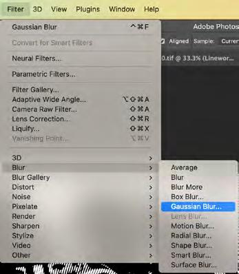
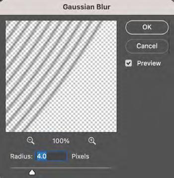
8. Select the pattern layer and add a Gaussian Blur from the Filter dropdown. Set the blur value to ~4 px.
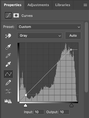
9. Select the curves layer and adjust the handles of the graph to approximately the position shown below. This will subdue the most black and white values, boost contrast, and ensure that the linework has the darkest value on the canvas.
10. Select the image layer and add a Gaussian Blur from the filter dropdown. Set the blur to a value where the image is still easily identifiable with the blur added. Pay close attention to facial features in photos with people (see step 8 for visuals).
Fine-tuning the effect
11. Reactivate your threshold layer. This turns the halftone effect back on. The contrast will likely feel off — that will be adjusted next.
12. To balance out the lights and darks of the photo and find the right amount of detail, select your curves layer again. Adjustments made to this layer will have the largest impact on the contrast of the effect.
• Adjusting the left handle vertically affects the thicker parts of the lines.
• Adjusting the right handle vertically affects the thinner parts of the lines.
• Moving either handle horizontally will effect how the thin and thick parts of the lines taper into each other.
• Don’t move them too close on the horizontal axis, or the effect will disappear.
Right handle
Left handle
Graphic Elements 7
Gradients
Gradients are used as background elements throughout our brand.
Inspired by the early morning light that swims across the floor of the Chapel of Resurrection, diffused through its towering stainedglass windows, these gradients embody that same warmth and subtle movement. They suggest the true nuance of our radiance, with iridescent colors that reflect in our interdisciplinary pursuits and our concern for all.
Approved Color Combinations
Creating gradients for our materials can take some tweaking and adjustments. Here are some color combos that are tried and true.
All instances of our gradients must include either Brown or Gold, or both.
Improper Gradient Usage
When using gradients in our brand materials, there are a few things to be mindful of. Here are some pitfalls to avoid.
Take care that overlapping colors don’t appear too muddy.
Do not use Valpo’s primary colors together as a gradient.
Do not use brand colors outside of the approved combinations on the previous page.
Do not use off-brand colors in gradients.
Stained Glass Graphic
If our gradients evoke the gentle light on the Chapel floor, this photo container recalls its iconic stained glass with its striking colors and radial angularity. The circular border creates a motif across our materials that suggests the radiance in every Beacon, succinctly representing our story in a single visual. And because this element incorporates several photos at once, it can provide a lasting impression of Valpo with powerful specificity.
When constructing your own stained glass graphic, try to strike a balance between photos, halftone textures, and solid colors. Shoot for about half of the graphic to be solid colors, and the other half to be photos or halftones.
For more subtle or formal applications, crop an area of a stained glass graphic into a narrow rectangle to accent your design.
Creating the Stained Glass Graphic
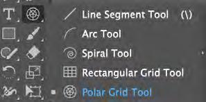
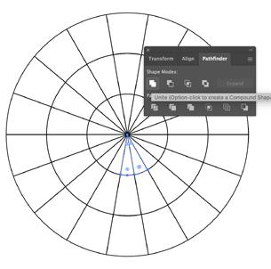
1. Start by selecting the polar grid tool from the toolbar. This is typically nested behind the line tool.
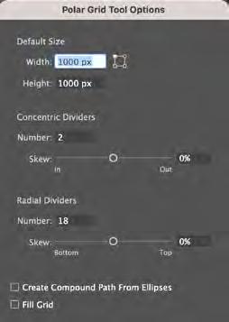
2. With the polar grid tool selected, click on your canvas and adjust the settings. The settings below are suggestions, but play around to find what works for your needs.
This element can be created in a few steps using Illustrator.
3. This will create a segmented circular grid on your canvas, like the image below.
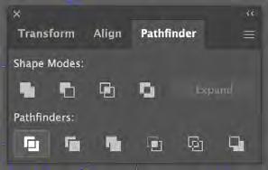
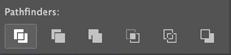
5. Exit the isolation mode and reselect the grid with the extended lines. With the grid selected, use the divide tool from the pathfinder panel. This will create individual shapes from all intersecting lines.
4. Double-click the circular grid to select the radiating lines that intersect the circles. Extend those lines slightly past the largest circle.
6. Ungroup the grid after dividing the shapes.
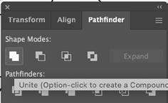
7. Select adjoining shapes and use the pathfinder tool to combine them.
8. Repeat step 7 until you have final mosaic that you’re happy with.
9. Use your final mosaic as a base for colors and graphics.
Radiating Graphic
Not every piece calls for something as visually prominent as the stained glass element, but we can still anchor pieces in our story with more delicate visuals. These radiating graphics can be used as accents with text or as framing devices with photos. They represent our outward impact on the world.
These elements are made with a combination of lines, typography, and starburst elements. There are several combinations here to play with, or you can create your own, using these as inspiration.
Putting It All Together
Visual Language Spectrum
All of the elements of the visual language we’ve covered work together to create a the overall look of the Valpo brand. The spectrum below shows how far we can flex our tone
using the elements discussed. Whether you’re creating pieces for the Office of the President or current students, you’re equipped with everything you need.
Viewbook
AS BEACONS, WE RADIATE.
At Valpo, it all becomes clearer.
YOUR FUTURE, YOUR CAREER, YOUR CALLING. YOUR JOY.
All you need is a little light.
eed is
Because that’s where we find a purpose that can sustain us all our lives. And because in that purpose, we find the joyous life we all crave.
Every early-morning class. Every late-night chat. Every experience you have at Valpo is just one more tether that grounds you in the values and knowledge you need to stretch further and go farther. And with a compassionate community, generous faculty, and an unshakable belief in human potential, we’re here to help you.
Here, we come together to learn more deeply, search more widely, and imagine more resourcefully — all in an effort to do more for others. STUDENT-FACULTY
These tactics are solely for the purpose of demonstrating the visual and verbal language, and should not be considered real-world applications.
WE GROUND YOU IN everything you need to radiate. to radiate.
These tactics are solely for the purpose of demonstrating the visual and verbal language, and should not be considered real-world applications.
Viewbook
These tactics are solely for the purpose of demonstrating the visual and verbal language, and should not be considered real-world applications.
GROUNDED
we radiate hopeful leadership.
Christ College, Valpo’s honors college, is a collective of Beacons seeking to ground themselves in a community of sustained inquiry. Immersed in long-standing traditions from the First-Year Production to the Senior Banquet, and rigorous courses that illuminate the human experience, students enrolled in our honors college form profound, lifelong connections while striving for substantive knowledge.
Everything you need to become everything you can.
Over four years of specialized courses, we’ll help you go deep — into the world around you, into yourself — and challenge you to ask the tough but rewarding questions that will ultimately make you the kind of leader that can serve your community confidently.
“What is a good life?”
“What are our responsibilities toward other human beings?”
During your first two years, you’ll experience approaches to knowledge and research. As you dig deeper, you’ll see that worthwhile wisdom is hard-won, but that all we can imagine is achievable.
Your final years will help you achieve intellectual self-reliance, offering you chances to undertake independent research projects and apply your knowledge to benefit others.
Beacons find the work that brings them fulfillmen: the work they were meant to do.
They make real differences in their communities because they pair powerful skills with an unshakable why. They hold high expectations and have the knowledge to make good on them. They are driven to lead because they pursue the needs of others. And they know what it takes to truly shine.
That’s why 99.1% of our 2022 graduates found jobs that bring them real satisfaction every day.
CLINICALS
CLINICALS
STUDENT TEACHING
STUDENT TEACHING
CO-OPS
CO-OPS
Hands on. Heart full.
Hands on, Heart full
CAPSTONE PROJECTS
CAPSTONE PROJECTS
INTERNSHIPS
INTERNSHIPS
Your education at Valpo is experiential to its core. You don’t have to imagine your future when you’re living it day after day, honing the skills you need to do the work you want.
Your education at Valpo is experiential to its core. You don’t have to imagine your future when you are living it day after day, honing the skills you need to do the work you want.
FACULTY-LED RESEARCH
FACULTY-LED RESEARCH
GRADUATE OUTCOMES
The Valpo alumni network helped 94% of 2022 graduates land their first jobs after graduating. Almost 98% of 2022 graduates are employed or continuing their education.
Graduates earn an average of $59,640 in their first position. Valpo graduates are employed in every region of the U.S. 80% of Beacons engage in experiential learning.
Viewbook
GROUNDED IN CURIOSITY,
we radiate knowledge.
Learning that illuminates others.
Ultimately, we believe that joy happens in the collective, from fulfilling the needs of a greater whole. The most worthwhile learning experiences — the ones that teach us about our value as well as our discipline — are the ones that connect us to others and that offer us an opportunity to enrich lives other than our own.
That’s why Valpo students dedicate almost 250,000 hours to public service each year, averaging nearly 100 hours per student. Our students know that their learning, their talent, and their passion find meaning when they are put to work creating a better world for us all.
We know brilliant lights don’t just shine in one direction. That means a Valpo education is an interdisciplinary education — inside the classroom and out. Beacons encourage each other to live inside the genuine curiosity inherent in all of us, resulting in a campus full of bioengineering majors who host book clubs and historians who code on the weekends. It’s just what we do.
You shine bright. We’ll hold you steady.
Our Institute for Leadership and Service centralizes our efforts on campus, giving new Beacons a clear place to find purpose through guest speakers, summer fellowships, reflection opportunities, and related coursework. But this is only the beginning: Beacons also engage in our Social Action Leadership Team, organizing over 30 years of World Relief Campaigns, and help support Café Manna, a weekly soup kitchen hosted by the St. Teresa of Avila
Catholic Student Center. Through your classes, organizations, and friends, you’ll have no shortage of opportunities to apply your skills in bettering our community.
Even a humble flame can provide comfort for others. With a Valpo education, your capacity to give only becomes greater. Everything you do at Valpo allows you to conserve our world, aid the ailing, and seek justice for the marginalized.
Beacons don’t drift, and they don’t get lost. They’re anchored by the kind of comprehensive academic support that allows them to strive for their goals and take the risks that matter. And they know there’s a community of learners behind them every step of the way.
Open to every Beacon, our academic success center can connect you to peer mentors, provide instruction in study skills, and offer the extra guidance we all need to burn our brightest. And if you need an extra hand with your writing, our writing center is here to help — wherever you are in the process, whatever your experience, there are accomplished peers here for you at every turn.
These tactics are solely for the purpose of demonstrating
DON’T JUST SHINE ANYWHERE.
These tactics are solely for the purpose of demonstrating the visual and verbal language, and should not be considered real-world applications.
Becoming a Beacon is about discovering the radiant light that lives inside you. And even though it’s always been there, we often learn how to protect it only after looking beyond ourselves. By working in the lives of those around us for the common good of our communities. By finding fascination with the wider world.
That’s why at Valpo, you’ll have every opportunity to explore your interests, realize new ones, and combine them in unique ways that bring you joy.
100+
STUDENT ORGANIZATIONS
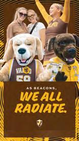
Social Media Stories
State One State Two
Valpo has always been dedicated to helping others shine through our commitments to learning well and leading through service
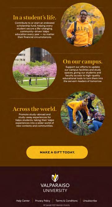
Your generosity helps our next generation of Beacons radiate ever brighter, ensuring communities are served by powerful servantleaders for years to come.
Valpo has always been dedicated to helping others shine through our commitments to learning well and leading through service
Your generosity helps our next generation of Beacons radiate ever brighter, ensuring communities are served by powerful servantleaders for years to come.
incredible work on our campus and in our community, and we’re so grateful for the ways you’ve contributed to that through your teaching, your research, your administration, and the myriad of other ways you make this university special.
With fall break approaching and the holidays just around the corner, we wanted to share some updates in University Marketing which we’ll be carrying forward after we return from break.
Questions? We’re happy to help. valpo.communications@valpo.edu
incredible work on our campus and in our community, and we’re so grateful for the ways you’ve contributed to that through your teaching, your research, your administration, and the myriad of other ways you make this university special.
With fall break approaching and the holidays just around the corner, we wanted to share some updates in University Marketing which we’ll be carrying forward after we return from break.
Questions? We’re happy to help. valpo.communications@valpo.edu
Hey Beacons,
This semester has been such an accomplishment. Our students are doing incredible work on our campus and in our community, and we’re so grateful for the ways you’ve contributed to that through your teaching, your research, your administration, and the myriad of other ways you make this university special.
With fall break approaching and the holidays just around the corner, we wanted to share some updates in University Marketing which we’ll be carrying forward after we return from break.
Questions? We’re happy to help. valpo.communications@valpo.edu
This semester has been such an accomplishment. Our students are doing incredible work on our campus and in our community, and we’re so grateful for the ways you’ve contributed to that through your teaching, your research, your administration, and the myriad of other ways you make this university special.
ways you’ve contributed to that through your break.
With fall break approaching and the holidays just around the corner, we wanted to share some updates in University Marketing which we’ll be carrying forward after we return from break.
Questions? We’re happy to help. valpo.communications@valpo.edu
Project Requests and Story Leads
Contacts
Beacons,
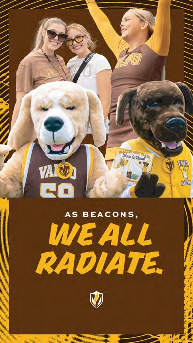
TOGETHER, WE RADIATE.
Portrait Sessions
Campaign Landing Page
These tactics are solely for the purpose of demonstrating the visual and verbal language, and should not be considered real-world applications.
MBA Brochure
It’s never been “just business.” It’s a calling.
Required Certificates
Elective Certificates
Business
DNP One-Sheet
GROUNDED IN SERVICE,
we radiate the highest level of care.
In our doctor of nursing program, Beacons become anchored in the hybrid coursework, advanced training, and clinical experiences they need to serve their communities extraordinarily
The DNP prepares professionals to take on imperative leadership roles that secure high-quality healthcare, whether in our local hospitals in Indiana or on a national stage.
Learn from expert faculty, with specialities ranging from neonatal and pediatric care to occupational medicine.
Study asynchronously and on a schedule that’s flexible enough for your already busy career.
Thrive in small classes with intimate mentorship suited to your professional goals and research interests.
Gain the credentials you need in a fast-growing field of advanced practice nurses.
TO GET STARTED ON YOUR FUTURE TODAY, VISIT VALPO.EDU/GRAD FOR MORE INFORMATION.
3
YEARS TO GRADUATE
100%
ALUMNI JOB AND GRADUATE SCHOOL PLACEMENT
100%
NURSE PRACTITIONER EXAM PASS RATE
“Valpo has taught me so much — from physical skills and critical thinking to my assessment skills. The faculty in the DNP program have been so supportive of me.”
ALESHA MCCLANAHAN ’19 DNP FAMILY NURSE PRACTITIONER, VALPARAISO, INDIANA
These tactics are solely for the purpose of demonstrating the visual and verbal language, and should not be considered real-world applications.