14
DESIGN ELEMENTS
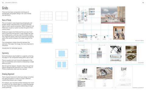
Grids There are two basic composition techniques in photography and graphic design: the rule of thirds and symmetry.
15
structural Glulam column
The manufacturing facilities are composed of Glulam column and beam. The beam and column are connected with steel connections. The 98’ long span beam is connected with steel connections. Steel tension wire truss is used to reduce the depth of the beam to provide more space for manufacturing.
CLT roof structure
The 23-story timber high-rise tower is consisted of four CLT (Cross Laminated Timber) structural cores and 12 glulam columns for vertical structure, and CLT floor panels for horizontal structure.
structural CLT cores MANUFACTURING: Glulam column and beam
The mixed-use block is a proposal for an active way of connecting manufacturing to arts, technology and further to housing. Timber is one of the best materials to connect different programs into one for actualizing the new identity of Redhook and the best way to build and sustain it.
BIKE SHARE + LEARNING CENTER: Heavy Timber column and beam
CLT floors
Rule of Thirds
RESIDENTIAL: 23 story timber high rise residential building: Glulam column and beam, Cross Laminated Timber walls, and structural cores
axonometric diagram
This is included in every beginning photography and graphic design class because it is a quick and easy way to create a good composition. (Both Instagram and VSCO Cam include an option to show this grid in their camera view.)
6 | PRODUCING HOUSING | academic work | spring 2013
Divide your layout into thirds and then put your focal point at grid line intersections. Large images will take up multiple points, and if you want to include smaller, less important pieces, they can be placed at remaining points. Be careful to balance the visual weight of the page.
mech. room
storage
loading
storage
CLT/GLULAM PRODUCTION LINE
7
loading
storage
on site training room / office
DIGITAL FABRICATION showroom
small scale wood fabrication
art + fabrication store (co-op)
lobby info center
cafe
seminar room
BIKE SHARE
BIKE SHOP
BIKE SHOP
0
N
ground floor plan
LEARNING PATHWAY
8
16
32
second floor plan
community gallery studio studio studio
class room
2bed
class room
2bed
N
0
8
16
32
typical residential tower floor plan
N
0
8
16
32
community gallery, residential tower
8 | PRODUCING HOUSING | academic work | spring 2013
This composition creates hierarchy between the elements. The larger the image, the more important it should be.
2
9
The Line | Danilo Udovicki and Larry Doll | Fall 2014
The Line | Danilo Udovicki and Larry Doll | Fall 2014
3
8
The Line | Danilo Udovicki and Larry Doll | Fall 2014
The Line | Danilo Udovicki and Larry Doll | Fall 2014 42.48
RULE OF THIRDS
9
42.08 41.83
47.00
41.70
Usually best for landscape layouts.
47.20 47.26
42.00
B 47.25 38.16
41.70 47.50
38.70
OFFICE
A 42.00 6AM-11AM
41.90
RETAIL
C
HOUSING
11AM-4PM
[ THE LINE ]
46.60
46.29 46.00
SCHOOL
4PM-7PM
Symmetry
VOID
GYM
7PM-6AM
6m=18ft
+
Symmetry places equal weight on a page by centering the object in the composition along either axis or both.
5m=15ft 4m=12ft 3m=9ft
0 height
height of each microprogram 15m 10m 5m
dŚĞ >ŝŶĞ ǁĂƐ Ă ƐĞǀĞŶͲǁĞĞŬ ŵƵůƟͲƵƐĞ ƉƌŽũĞĐƚ with the goal of designing a ZAC or a city block in the ninth arondissement of Paris, France, between a park and a railway line. The program included 300 units of housing, ĂŶ ĞůĞŵĞŶƚĂƌLJ ƐĐŚŽŽů͕ ĂŶ ŽĸĐĞ ďƵŝůĚŝŶŐ͕ ĂŶĚ retail. tŝƚŚŝŶ ƚŚĞƐĞ ůĂƌŐĞƌ ƉƌŽŐƌĂŵƐ ǁĞ ŝĚĞŶƟĮĞĚ microgroprams that were shared (such as ƐŽĐŝĂů͕ ŵĞĞƟŶŐ͕ ĐŽƉLJ͕ ĂŶĚ ďƌĞĂŬ ƌŽŽŵƐͿ and those which were more individual and ƌĞƉĞĂƚĞĚ ;ĂƉĂƌƚŵĞŶƚƐ͕ ŽĸĐĞƐ͕ ĐůĂƐƐƌŽŽŵƐͿ͘ We organized all of the shared programs into ŽŶĞ ĐŽŶƟŶƵŽƵƐ ƐŝŶŐůĞͲůŽĂĚĞĚ ůŝŶĞ͕ ĂŶĚ ƚŚĞŶ ǁƌĂƉƉĞĚ ƚŚŝƐ ůŝŶĞ ĂƌŽƵŶĚ ƚŚĞ ƐŝƚĞ͕ ĮƫŶŐ ŝƚ into a general massing plan we made based ŽŶ ƐŝƚĞ ŝŶŇƵĞŶĐĞƐ ƐƵĐŚ ĂƐ ƐƵŶ͕ ǁŝŶĚ͕ ĂŶĚ noise.
46.70
42.00
38.60
45.00 45.00 47.00
47.50
44.00
41.90 4% 43.00
0 10m
50m
100m
42.36
200m
N
0 width 5m
+
8m
10m 12.5m
12.5m 15m
15m
width of each microprogram
Partners: Bernardo Jimenez, David Castellano, Helene Mancaux
ƐĞĐƟŽŶ ͮ ƚŚƌŽƵŐŚ ŚŽƵƐŝŶŐ ĂŶĚ ƐĐŚŽŽů
There’s usually not much hierarchy displayed in this type of composition and is best for showcasing a single piece at a time.
ƐĞĐƟŽŶ ͮ ƚŚƌŽƵŐŚ ŽĸĐĞ
final model
CENTERED
Best for portrait layouts. However, notice how portrait layouts designed with symmetry can create a Rule of Thirds composition when seen as a spread.
Drawing Alignment There may be instances in which you design to eschew the rigid grid system in order to create a different relationship between your images. For instance, you may have section drawings that seem to unfold from the related edge of a model photograph. Or you may wish to imply other relationships through visual proximity.
Problem 1: CHANgE Located at the entry to Big Stacy Pool, the new changing rooms define the boundary between the city (street) and nature (park). While the proposed interior, defines the space of personal transformation from city dweller to swimmer.
Exercise 2+3: WAtEr (right) 1. Consider the flow of water. How can a surface shed water? Beading? Pooling? Rivulets? Attempt to create a specific character of water as it moves. 2. Consider the collection of water. How can water be held? Vessel? Bladder? Hold the same amount of water in different ways. 3. Combine water flow and collection. How can the initial experiments inspire water harvesting? 44
39
52
DRAWING ALIGNMENT