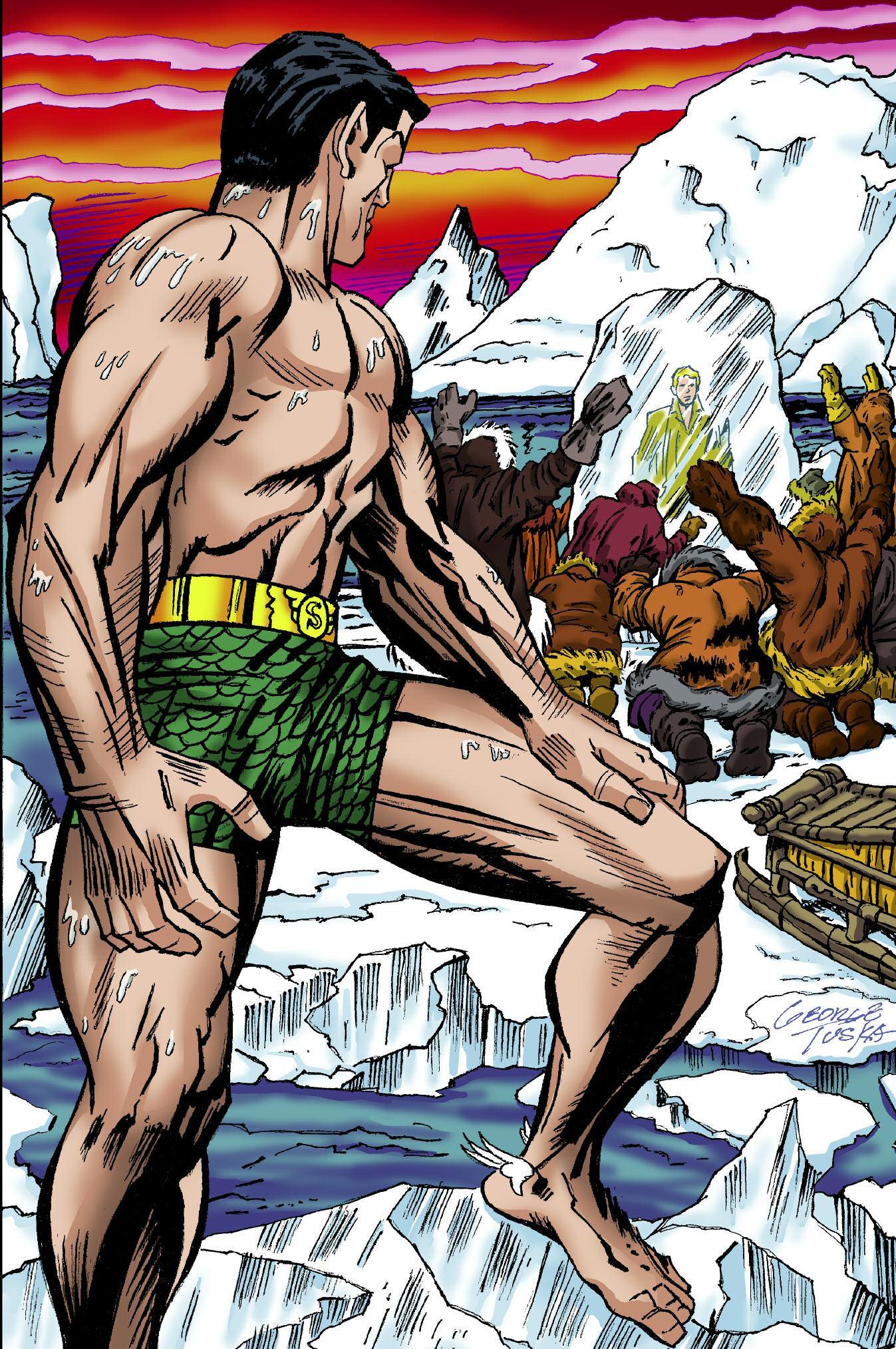
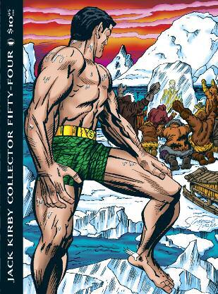
J A C K K I R B Y C O L L E C T O R F I F T YF O U R $ 1 90 5 I N T H E U S Sub-Mariner TM & ©2010 Marvel Characters, Inc
TheJackKirbyCollector,Vol.17,No.54, Spring2010.Publishedquarterlyby& ©2010TwoMorrowsPublishing,10407 BedfordtownDrive,Raleigh,NC27614, USA.919-449-0344.JohnMorrow, Editor/Publisher.Singleissues:$14postpaid($18elsewhere).Four-issuesubscriptions:$50US,$65Canada,$72elsewhere. Editorialpackage©2010TwoMorrows Publishing.Allcharactersaretrademarksof theirrespectivecompanies.Allartworkis ©2010JackKirbyEstateunlessotherwise noted.Alleditorialmatteris©2010the respectiveauthors.Firstprinting.PRINTED INCANADA.ISSN1932-6912

THENEW
Collector ISSUE#54,SPRING2010

Contents
TheMagicOfLEE& KIRBY,PartTWO!
OPENINGSHOT ................2 (ofMarvel&Kirby,andmiceandmen)
UNDERTHECOVERS ............4 (GeorgeTuska’sfinalinterview)
JACKF.A.Q.s ..................6 (MarkEvaniercluesusintoJack’s connectionwith WelcomeBack,Kotter)
THINKIN’’BOUTINKIN’ .........10 (VinceColletta’sthinblacklines,and detailsofournewbookonVinnie!)
IGODITKO ..................12 (examiningthedifferencebetweenDitko andKirby’sapproaches)
GALLERY1 ..................14 (morelooksatKirby’sincredibleinkers duringtheMarvelAge)
INCIDENTALICONOGRAPHY ....21 (KirbycapturesStanLee)
FOUNDATIONS ...............22 (themostboringKirbyworkever!)
RETROSPECTIVE ..............26 (theformativeFantasticFour!)
KIRBYOBSCURA .............40 (BarryForshawintheworldof3-D)
UNCOVERED .................42 (the“Lost”FFwrap-up)
JACKKIRBYMUSEUMPAGE ....49 (visit&joinwww.kirbymuseum.org)
NORSEODDITIES .............50 (justwhenyouthoughtitwassafeto readTHORagain...)
KIRBYASAGENRE ............52 (AdamMcGoverntakessomeCDsfora spin)
FISHOUTTAWATER ...........54 (takeadipwithKirby’sSub-Mariner)
THEOL’SWITCHEROO .........57 (transformers!)
GALLERY2 ..................59 (moreFantasticpenciling)
NUMEROLOGY ...............66 (themysteryofMarvelcoverdates)
TEAMSUPREME ..............68 (talkin’aboutthemosttalkedabout teamincomicdom)
COLLECTORCOMMENTS .......78
PARTINGSHOT ...............80 (onemoreshotoftheSurfer)
Frontcoverrecreation:
GEORGETUSKA
Backcoverinks: JOESINNOTT Covercolors: TOMZIUKO
COPYRIGHTS: Ant-Man,AsorbingMan,Attuma,Avengers,BlackPanther,CaptainAmerica,Crystal,Daredevil,Diablo,Dr.Doom,Dr.Strange,Ego,FantasticFour,Giant-Man,Gorgon,GreyGargoyle,HowardtheDuck,Hulk,HumanTorch,ImpossibleMan,Inhumans,Invaders,InvisibleGirl,IronMan,Janus, Karnak,Leader,Lockjaw,Lo-Karr,Magician,Medusa,MoleMan,Mr.Fantastic,Mr.Hyde,NickFury/Sgt.Fury,PrincessPython,RedGhost,Ringmaster,Sgt.Muldoon,SilverSurfer,Skrulls,Spider-Man,Sub-Mariner,Surtur,Thing,Thor,Wasp,Watcher,X-Men,YellowClawTM&©2010MarvelCharacters, Inc.•ChallengersoftheUnknown,Darkseid,FunkyFlashman,InferiorFive,JusticeLeagueofAmerica,KookieQuartet,PlasticMan,Shazam,Superman,Watchmen,WonderWomanTM&©2010DCComics.•BlackHoleTM&©2010WaltDisneyProductions.•WelcomeBack,KotterTM&©2010 ABCTelevision.•VampirellaTM&©2010HarrisComics.•CaptainGlory,SkyMastersTM&©2010JackKirbyEstate.•WorldAroundUs©GilbertonPublications.•Captain3-DTM&©HarveyPublications.
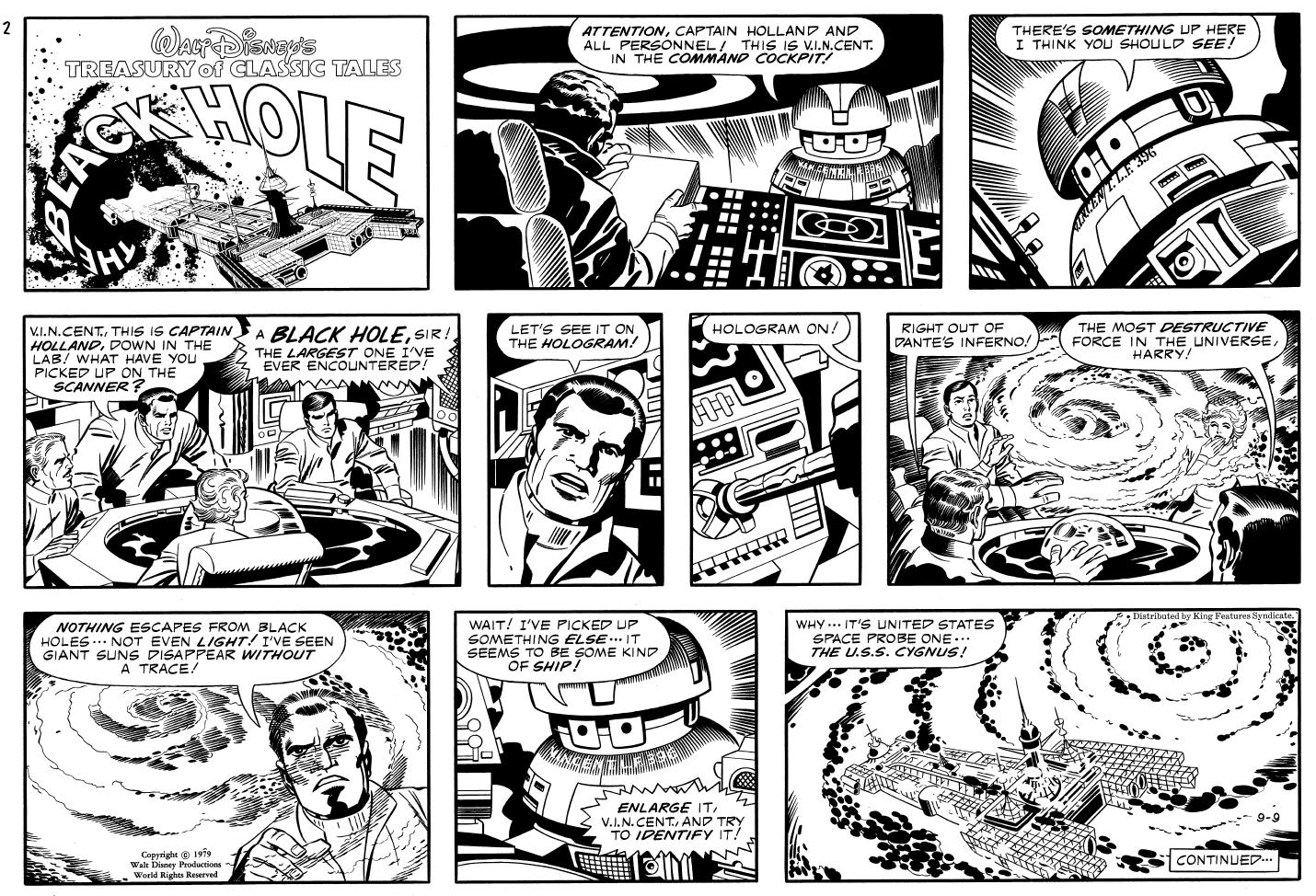
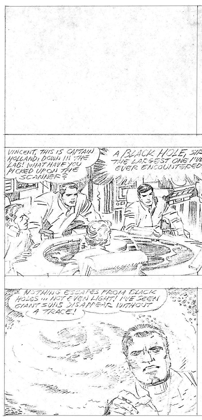
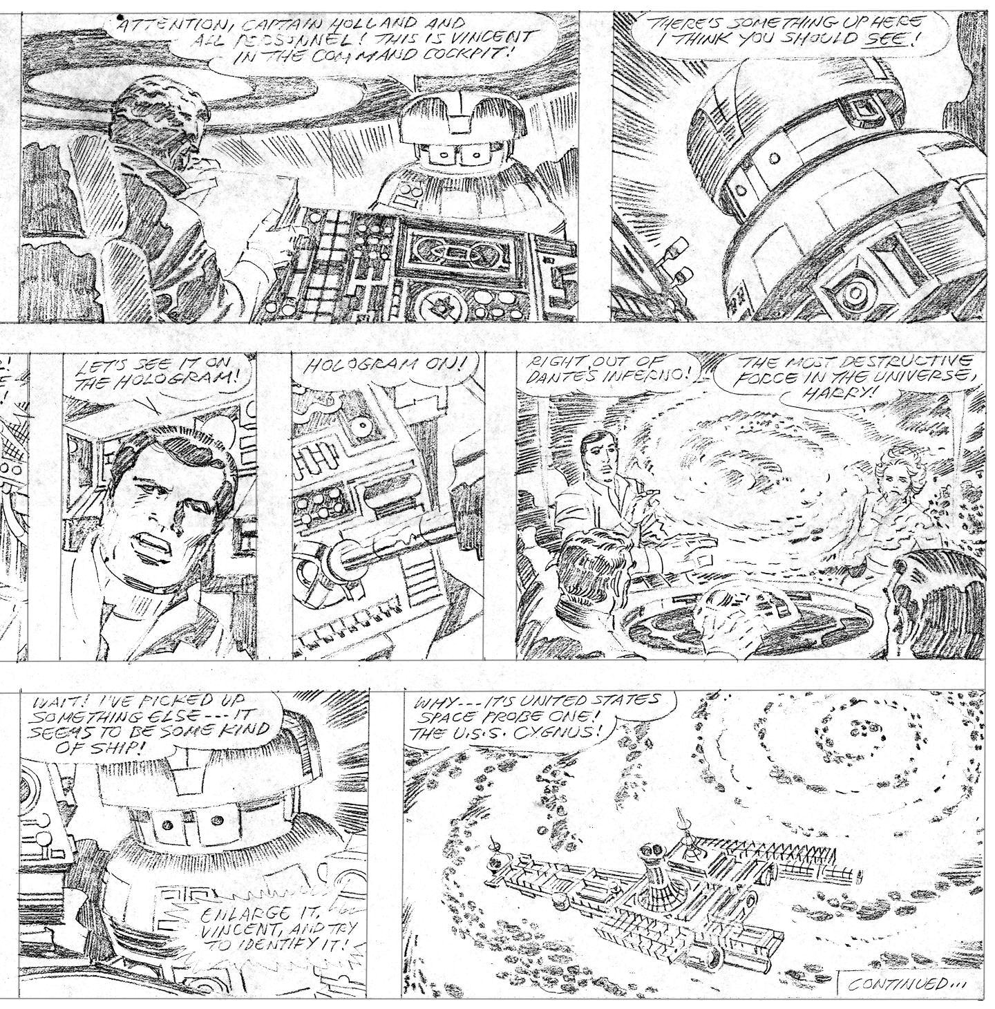
(above)MikeRoyerinks(andminorcorrectionstokeepthecharacters“onmodel”)fromtheSeptember9,1979 BlackHole Sundaystrip.Seethepencilsonpages2-3ofthisissue. BlackHoleTM&©2010WaltDisneyProductions.

Opening Shot


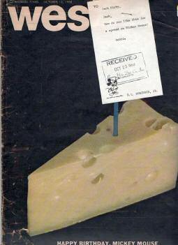
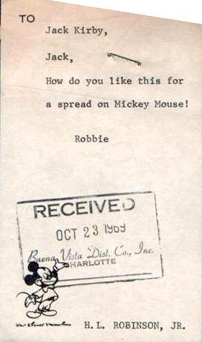
(below) Wesley C Winters, Jr , a dealer in paper memorabilia, came across this interesting artifact in a recent purchase It’s an issue of the Los Angeles Times’ Sunday West magazine supplement, dated October 13, 1968 But while we know Jack contributed an art/prose piece on the Pioneer 10 Jupiter probe to a 1972 issue of West, it’s not this issue that’s Kirbycentric Check out the note to “Jack Kirby” from H L “Robbie” Robinson, dated October 23, 1969 Jack was definitely living in the Los Angeles area by then; was he considering some work for Disney at that time? Or was this directed to a different “Jack Kirby”? If you have any clues, let us know!


 by John Morrow, editor of TJKC
Of Mice & Men A



lot s happened between this issue and last: d thanks for your patience during the y) The Kirby family made a legal filing to ck’s share of copyrights on 45 characters he created or co- created at Marvel Comics If approved by a judge, those rights would revert from Mar vel to Jack’s estate over the next decade The filing took place shortly after the late August announcement that the Walt Disney Company had agreed to buy Mar vel Comics for $4 billion ( Yes, BILLION, with a “B ” You’ve gotta figure Stan, Jack, Steve Ditko, and all the other Bullpen stalwarts had no idea what they were creating in the 1960s would ever garner that kind of a payoff for the company )
Let me clear up one ver y important distinction here: the Kirbys are not suing anyone This isn’t a lawsuit; it’s simply an author/co-author utilizing a contingency in copyright law (This “loophole,” by my understanding, was ironically brought about due to lobbying by Disney, who feared losing Mickey Mouse to Public Domain, and succeeded in getting copyright law changed in the late 1990s )
Jerr y Siegel’s family set a precedent by using this contingency to regain a share of the copyright on Superman, and the Kirbys have hired Marc Toberoff the same attorney the Siegels used for these proceedings Toberoff won or settled cases on Lassie, Get Smart, The Dukes of Hazzard, and The Wild Wild West And while I’m no lawyer, here’s my understanding of the situation




According to current copyright law, even if you ’ ve signed away your ownership rights to a publisher, you or your heirs can regain your share of ownership 56 years after the property’s first publication, as long as you file papers giving notice of your intentions up to 10 years before that 56 years is up So the Kirby family is eligible to claim Jack’s share of the Fantastic Four in 2017, Hulk in 2018, and X-Men in 2019 is Jack’s would have to be but let’s assume it’s ve is what the Siegels ce Superman was a co) The reclaimed copyn last 39 more years, at e characters (but not he trademarks) would Public Domain, theoanyone to use
Was it a coincidence that the Kirbys would file when they did? I’m not speaking with any firsthand knowledge, mon sense would dictate that, if you wanted to press your advantage in this situation, the perfect time to file e when such a huge business deal was about to go down, in hopes of a quick settlement A Disney spokesman ded to the news of the filing, saying that they had fully considered this happening when they decided to purMar vel, so they weren’t surprised (Although, as the Siegel case has shown, there’s not a lot a corporation can fight this legally; the law’s pretty clear, and it’s basically up to a judge to decide what exactly is covered, and it’s to be divided. But they can certainly tie it up with expensive legal maneuvers for a lot of years.)
Jack spent his life creating work to support his family But since Roz Kirby died, the Kirby family has not ceived one cent in royalties for the multitude of reprints of Jack’s work being produced Meanwhile, other riters and artists who followed Kirby on X-Men, Fantastic Four, etc. have continued getting royalty payments (as they should; I think all of them should profit for the continued use of their work, including the creator of the strips) This is because Marvel adopted a new policy after Roz’s passing, that heirs would only get royalties d number of years after a creator dies, and then nothing after that Nada Zilch So if Disney buys you out for y on the characters you created or co- created, Mar vel doesn’t feel your family’s entitled to even the measliest
© 2 0 1 0 L o s A n g e e s T i m e s
royalty payment on reprint books
Such is the way of corporate America, I know But such is the way of copyright law as well. I wish Mar vel had made a good faith effort to take care of one of its founding fathers long ago, rather than bullying Jack because they had the resources to do so Now, I guess it’s up to the courts to decide what’s right.
However it turns out, hopefully Mar vel (and thereby Disney) will learn from this experience, and see that taking care of the people that created your properties is not only ethical, it’s good business A simple thing like a generous ongoing pension and royalties for creators and their heirs particularly of someone as influential as Kirby would’ve gone a
long way toward circumventing this current situation I hope that, as he was in so many other areas, Jack can again be a pioneer, if this case causes companies to initiate new policies that will take care of their talent, and prevent the need for future filings that will only do much worse damage to their bottom lines
...but don’t hold your breath. Rather than settle this once and for all, as of this writing, Mar vel (now owned by Disney) has just filed suit in federal court, claiming Kirby’s contributions to Mar vel were “work-for-hire,” and that Mar vel is the sole owner of the copyrights that in spite of all those legal documents they had him sign over the years (in exchange for a meager loan payment to help his
family move to a healthier climate, or to get his rightful artwork back), he never had any rights to sign away to begin with. So it’s the same old stor y, but now it’s on Mar vel’s shoulders to prove that Jack working from home, with no company medical coverage or paid vacation time, or taxes taken from his check was somehow a Mar vel employee, just like the staff artists that worked in the bullpen in the 1940s, ’50s, and ’60s
I, for one, hope the courts can see through that argument, and finally reward the Kirbys for all the years of dedication and creativity Jack gave to Mar vel as a freelancer ★

3

Under The Covers

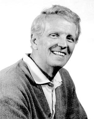
Talking With Tuska
[Editor’s Note: This issue’s front cover was originally planned to feature the Joe Sinnott-inked Silver Sur fer piece that’s on our back cover However, after reading the piece that follows, I decided that my sometimes grumpy, but always well-intentioned buddy Mike Gartland was dead-on; I screwed up So I swapped the t wo pieces, and used George Tuska’s recreation of the Captain America #112 Kirby page he originally inked, to adorn this issue’s frontispiece It’s too late to do right by George, but Mike, you ’ ve helped me remember that there’s a time when I need to take off my publisher’s hat, and put on my fanboy beanie, in order to do the right thing ]
The Last Interview George Gave
by Mike Gartland
(This was more of a ‘chat’ bet ween friends rather than a direct Q&A I knew George Tuska for many years and we were always comfortable in each other’s company In such instances of trust one tends to relate opinions “unedited” as it were, i e expressing your true feelings; with that in mind the following is unedited.)
MIKE GARTL AND: How’re ya feelin’, George?
GEORGE TUSK A: [Shakes his head “ no”]
MIKE: George, what do you remember about Kirby?
GEORGE: Ver y fast drawing, always fast!
MIKE: Did you ever watch how he would draw?
GEORGE: [Shakes his head “ yes”] Would always start in the upper left
MIKE: Like he already had the page laid out in his head?
GEORGE: [Shakes his head “ yes”]
Here I briefly reminded George of, while he was drawing Buck Rogers in the Sixties, that he was picking up extra work at Mar vel.
MIKE: Why did you go to Mar vel and not DC?
GEORGE: Stan wanted me; we golfed together and he was asking me to come up and work for him
MIKE: When you went back you were introduced to the way Stan was working at that time [I briefly covered the “Mar vel Method” with George ]
GEORGE: [Shakes his head “ yes”] I liked that; it freed you up
MIKE: You were given pages laid out by Kirby; do you remember working on those? [I show George stats of the layout pages followed by his finished ones]
GEORGE: Ver y loose layout
MIKE: D o you remember how you were given these layouts? Did you get them from Kirby?
GEORGE: No I went into the offices and got them
MIKE: When you would go in to get the pages, would you have a stor y conference with Stan?
GEORGE: D on’t remember; usually
MIKE: Did you follow those notes on the borders?
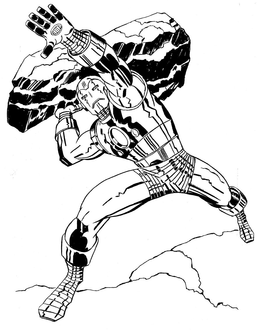
GEORGE: Sometimes
MIKE: You were being asked to draw using Kirby’s dynamics; did that bother you at all?
GEORGE: [Shakes his head “ no”] Kirby was always like that
MIKE: Even in his romance stories?
GEORGE: [Frowns] I hated romance stories
MIKE: You saw Kirby’s drawing style change over the years; what did you think of Kirby’s drawing?
GEORGE: A lot of foreshortening, always foreshortening, blocky and square
MIKE: It became more geometric than anatomical
GEORGE: [Shakes his head “ yes”] Square, flat fingers
MIKE: It wasn’t “true” anatomy?
GEORGE: Kirby never was It was action, not anatomy that was Kirby!
MIKE: What do you remember about Jack as a person?
GEORGE: [Smiles] Tough!
MIKE: Tough little guy!
GEORGE: [Shakes his head “ yes”]
MIKE: Will Eisner said he was the feisty little guy and you were the quiet giant!
GEORGE: [Smiles] I liked Eisner
MIKE: You lived on Long Island the same time as Jack; did you ever socialize?
GEORGE: [Shakes his head “ no”] I would see him in New York [City] sometimes
MIKE: D o you remember going out to lunch with Jack and other artists?
GEORGE: Whoever was around then, we would go out
MIKE: You used to golf with Stan?
GEORGE: [Shakes his head “ yes”] He was good!
MT: He says you always would beat him
GEORGE: I was being nice… [Both laugh].
4

Mark evanier

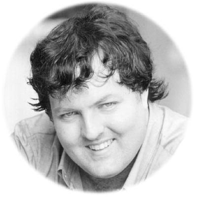
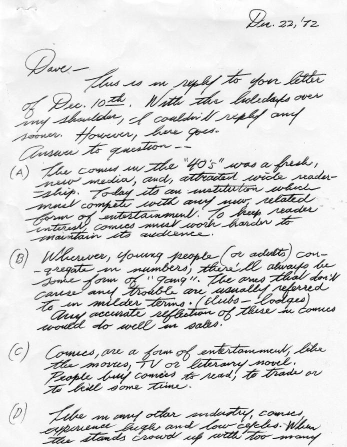
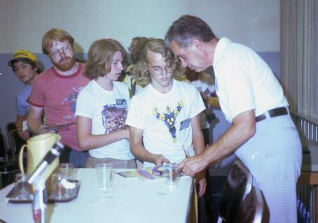
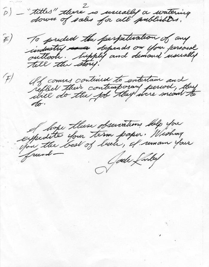
(this page) Jack always found time for his fans, including answering fan mail Here’s his response to questions a fan asked about a 1972 term paper he was writing Also shown is Jack signing autographs at the 1978 San Diego Comic-Con
(next page, top) Cover to Welcome Back, Kotter #4 (May 1977), which was both written by Mark Evanier, and featured an angr y gym teacher on the cover!
Jack F.A.Q.s
A column answering Frequently Asked Questions about Kirby
by Mark Evanier
Jim Williman writes to ask
I loved your book about Jack but longed for more stories about his relationships with his fans and with writers and artists who were inspired by him, and especially yours Could we have more stories about your relationship with Jack? Ver y few of the comic books you ’ ve worked on in y career have been of the Mar vel or super-hero variet y, which were his specialties How did he feel a fact that you didn’t follow ver y closely in his footsteps?
Well, I don’t think anyone could have followed t footsteps Whatever else Jack was, he was unique He his mind, a guy who specialized in Mar vel or super-he were merely the most commercial things he did for an He saw himself as a creator of ideas and concepts and as a guy who put pencil to paper to bring those
(nex bott the Mar had com cont “jam inclu can clos Kirb inks

Joe Simon also signed it, and other artists featured include Tom Sutton, Ernie Chan, Michael Golden, Curt Swan (inked by Wally Wood), Joe Staton, Dick Giordano, Gene Colan, John Byrne, Terr y Austin, Jim Steranko, and Jim Aparo





fans/friends not wind up, as he often felt, trapped in a situation where all you can do in the world is work for DC or Mar vel, Mar vel or DC Today, most of us who do comics also do other things movies, TV, animation, videogames, whatever Jack worked in a time and day where he did not have those opportunities He was quite happy to see that changing for subsequent generations
Here’s a stor y that may illuminate some of this, though I’m afraid it’s more about me than it is about him Still, telling it here solves a problem I’m having as I work on the long-promised “big” biography of the man In Kirby: King of Comics, I made a conscious



y figured the book was supposed to be about him, not me. He’s a lot more interesting, anyway
When I handed in what I thought was the final manuscript, my fine editor and friend (those don’t always go together) Charlie Kochman called He was ver y happy (he said) but, uh, why didn’t I say something about knowing Jack, working with him, being around him and so forth? I explained to him why I’d sidestepped the topic He said, “I understand but I think we need it We can squeeze in a few more pages. ” So that’s when I wrote the After word that’s in the book It really was an After word
For the bigger, forthcoming (don’t ask me when) bio, I’m including some anecdotes that involve me because they’re unavoidable when telling Jack’s life in fine detail Others I think are worth telling but since they’re not primarily about Jack, maybe not in that book This is one I’ve decided not to include
Hulk, Ant-M Sp de Man, Howa The D TM & ©201 Marve Chara nc P Man Super Wond TM & DC Co Welco Kotter ©201 Televi
6


I Go Ditko Stan & Steve & Jack
 by Robert L Br yant Jr


r y to write a book about Silver Age comics creators hout talking about Jack Kirby. You can’t do it. Kirby is always e; he’s always the giant sun whose gravity keeps pulling your m its original course
In 1996, Mar vel published an art book on John Romita Sr , and much of the inter view was about Kirby’s influence (“He really was like an explosion on paper”) In 2000, David Spurlock collaborated with Carmine Infantino on an Infantino art book, and parts of it were devoted to Kirby (“The artwork Jack was doing was just incredible”). In 2002, Daniel Herman published an art book on Gil Kane, and parts of the inter view were about Kirby (“He was so filled up with an intensity and heat so it just came out in his work”)
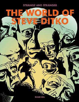
Now comes Blake B ell’s lavish and engrossing coffeetable book on Steve Ditko (Strange and Stranger: The World of Steve Ditko, Fantagraphics, 2008), and the Kirby Effect happens again pieces of the book are about how Ditko’s quirky, idiosyncratic style managed to find a following at a Mar vel Comics dominated by Kirby’s slamming fists and sculpted bodies
B ell doesn’t engage in Jack-bashing; he just makes it clear how different Ditko was from the Kirby model at Mar vel (X-Men artist Paul Smith is quoted: “I acknowledge that Kirby is the King, but when you draw B en Grimm reaching for the salt with the same intensity as you draw Armageddon, it lacks the impact Ditko could create ”)


Spider-Man became a sort of flashpoint for the two styles, each of which won and lost a battle over defining Spider-Man’s first appearance in Amazing Fantasy #15 in 1962
The basics of what happened are so well-known they have almost become dogma Somebody maybe Stan Lee, maybe Jack pitches an idea for a character called Spiderman (no hyphen yet) Stan decides Jack will draw it Jack draws about 5 pages of a stor y about a teenager whose magic ring turns him into an adult hero with spider-powers Stan doesn’t like it Maybe too similar to Jack’s earlier effort The Fly, or maybe not Stan tosses the Jack pages and gives the project to Steve, who takes it in a different direction. Stan likes it! Steve gets the project He turns in his full story and a cover Stan doesn’t like the cover He taps Jack to do a new cover The rest is Spidey histor y
This is a famous stor y in comics fandom, a game of fruitbasket turnover played out on one issue of one legendar y comic I want Kirby! No, Ditko! No, Kirby (just for the cover)! and it always mystified me. Ditko was good enough for the comic, but not the cover? Kirby was good enough for the cover, but not the comic? It seemed like madness
Until I read B ell’s Ditko book, and saw the cover Ditko did, the one Stan rejected in favor of the Kirby approach I’d never seen the original Ditko cover despite a lifetime of grasping after tattered comics histories It came as a little bit of a revelation, like the time Neal Adams drew Batman with chest hair and nipples, just like your old man ’s!
(“It’s not the first appearance [of the Ditko cover],” B ell told TJKC in an e-mail “I believe that distinction belongs to Mar velmania #2 (1970) I think that was in black-&-white, and then a color version appeared in an issue of Mar vel Tales in the 1980s.”)
Compare the Jack cover, which ran, to the Steve cover, which didn’t Compare the Kirby cover, wrapped around what is now one of the most valuable comics on Earth, and the Ditko cover, a rarely seen relic
On one, Spidey swings across the city, casually carr ying a thug under one arm like a bag of groceries, while making his vow: “ THOUGH THE WOR LD MAY MOCK PETER PAR KER , THE TIMID TEEN-AGER IT WILL SOON MARVEL AT THE AWESOME MIGHT OF SPIDER-MAN!” On the other, Spidey swings across the city, casually carr ying a thug under one arm
12
J
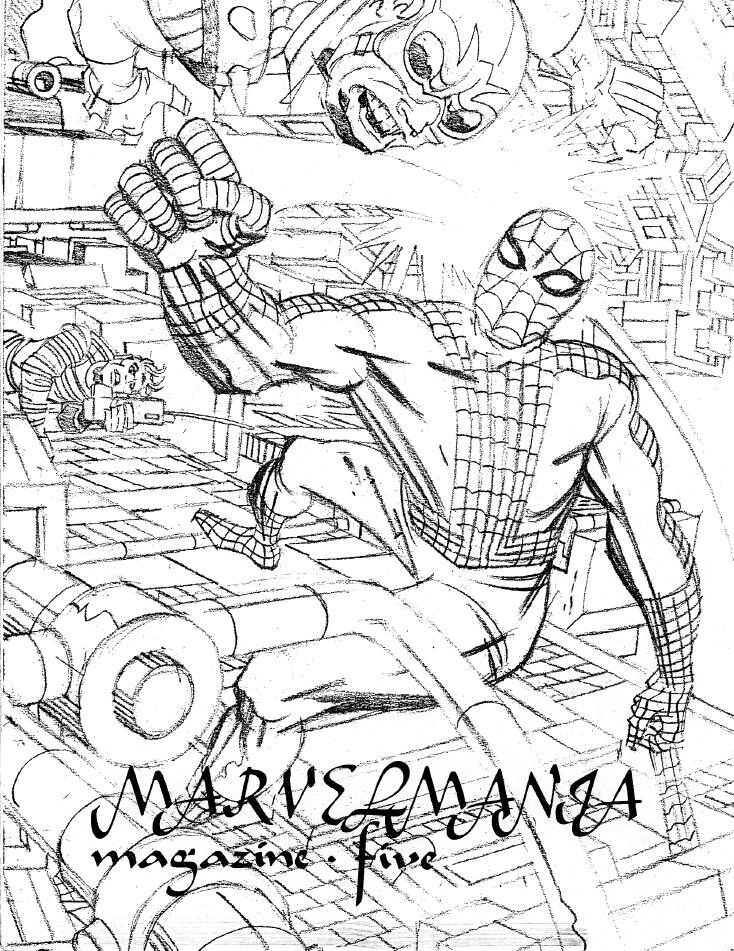
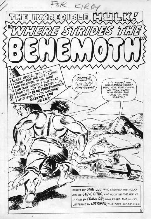
Most of Jack’s attempts at drawing Spider-Man, like the cover of Mar velmania Magazine #5 (1970, below), while dynamic, just don’t ring true The same can be said of Ditko’s Hulk, a character Kirby’s known for Full stats (right) from Tales to Astonish #67 (May 1965), were sent to Kirby, who was taking over the art with the next issue
Sp der-Man, Hu k TM & ©2010 Marve Characters, nc Capta n Glory TM & ©2010 Jack Kirby Estate

Gallery 1 M a r v e l A g e o f I n k E R S 2
Another
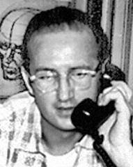
SDitko studied at the Cartoonists and Illustrators School in New York City under Jerr y Robinson and began professionally illustrating comic books in 1953 Much of his early work was for Charlton Comics (for whom he continued to work intermittently until the company’s demise in 1986), producing science-fiction, horror and myster y stories In the late 1950s, he also began working for Atlas Comics, the 1950s precursor of Mar vel Comics
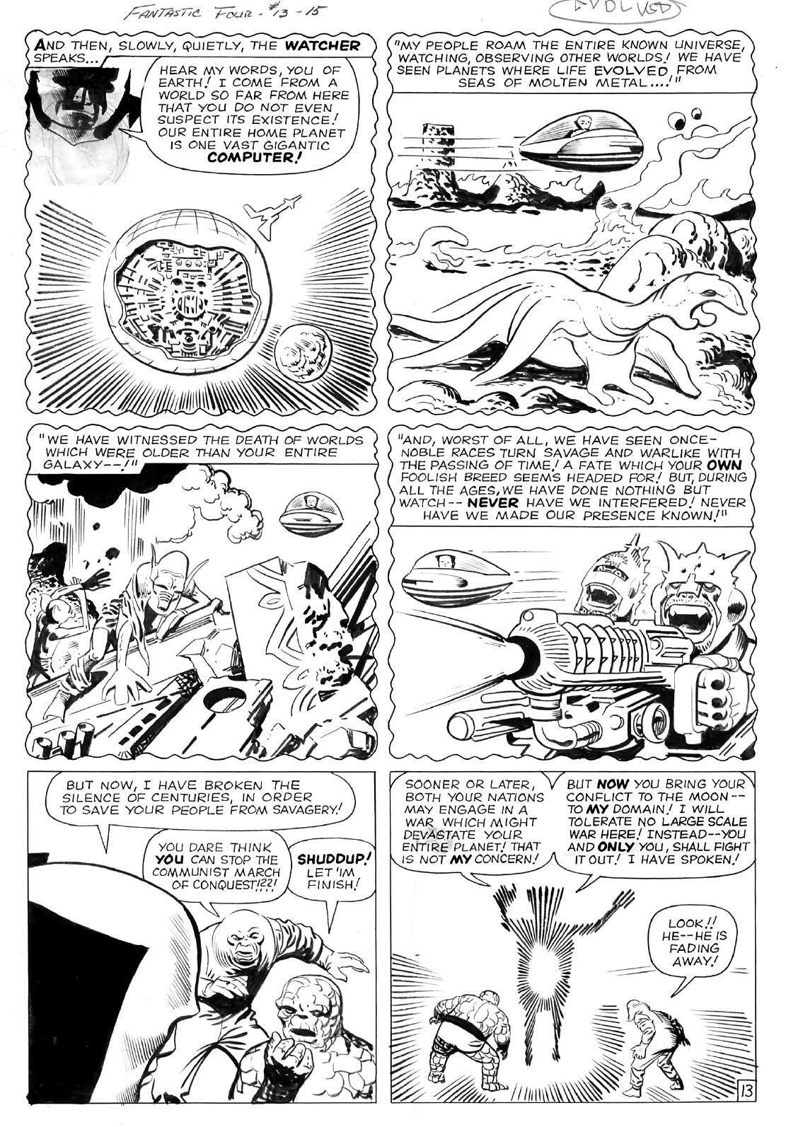
Ditko and writer-editor Stan Lee created Spider-Man in Amazing Fantasy #15 (Aug 1962), and shortly thereafter Doctor Strange, in Strange Tales #110 (July 1963) Ditko also drew many stories of the Hulk, first in the final issue of The Incredible Hulk (#6, March 1963), and then in Tales to Astonish, relaunching the character’s series in issue #60 (Oct 1964) and continuing through #67 (May 1965, succeeded by Jack Kirby)
After leaving Mar vel and Spider-Man in 1966, Ditko went to Charlton Comics, where he worked on Captain Atom, Blue Beetle, writer Joe Gill’s “Liberty Belle” (a backup feature in the comic E-Man), and Ditko’s own “Killjoy” (also in E-Man) and “The Question ” Also at Charlton, Ditko did much work on their sciencefiction and horror titles In addition, Ditko drew 16 stories for Warren Publishing’s horror-comic magazines, most of which were done using ink-wash
By 1968, Ditko was producing work for DC Comics, creating or co-creating the Creeper and The Hawk and the Dove, then going back to Charlton through the mid-1970s He returned to DC in the mid-1970s, then to Mar vel in 1979, taking over Kirby’s Machine Man title and working on such titles as Rom, Spaceknight and Speedball
Ditko retired from the mainstream in 1998 Since then, his strictly solo work has been published intermittently by independent publisher and long-time friend Robin Snyder, who was his editor at Charlton and Archie Comics The Snyder-published books have included Static, The Missing Man, The Mocker and, more recently, Avenging World,
 teve Ditko (born November 2, 1927)
a
essays spanning 30 years
www comicbookdb com]
Fantastic Four
as Ditko inks Kirby TM & ©2010 Marvel Characters Inc
giant collection of stories and
[source:
(this page)
#13 (April 1963),
Or gina art scans
of Heritage
14
round-up of some of the key inkers assigned by Stan Lee to work over Jack’s pencils during the 1960s “Mar vel Age ”
courtesy
Auctions
Dr Michael J Vassallo and Dewey Cassell

Sol Brodsky (April 22, 1923June 4, 1984)
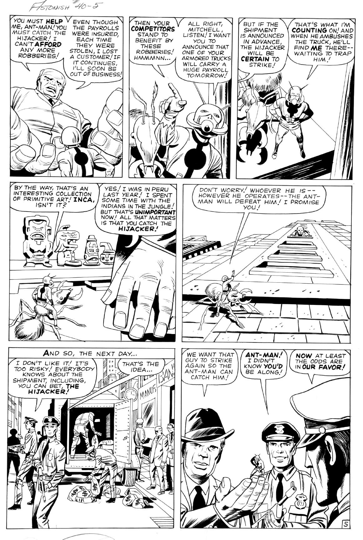
Sol Brodsky was born in Brooklyn and by age 17 was at Archie (MLJ) learning the ropes on house ads and production For most of the early 1940s he bounced around the industr y at Fox, Holyoke, and Lev Gleason, although Timely’s Comedy Comics #11 (Sept 42) sports an unidentified singular “Inky Dinky” feature mysteriously signed “Sol ” By the later 1940s Brodsky was on the Timely staff and spent most of his tenure on teen humor features like Millie and Patsy Walker, while simultaneously cranking out crime thrillers for the 1949-1950 crime titles
When the staff was let go, Sol freelanced primarily on war and spy titles for Atlas, was the artist on the “Clark Mason Spy Fighter” feature in Spy Fighters in 1951, and at some point mid-decade joined the production staff, becoming one of the handful of cover artists for Atlas, aligning with Joe Maneely, Bill Everett, Carl Burgos and Russ Heath for cover duties Brodsky also lined up commercial comic side products for the company like The Adventures of Big Boy and The Birds Eye Kids giveaway comics
After Atlas imploded, Sol launched Cracked magazine in 1958 and helped post-implosion Atlas artists secure work from Dick Giordano at Charlton before returning to Stan Lee in the early 1960s to do production work He designed the logos for many of the early Mar vel titles including the Fantastic Four and inked the title’s third and fourth issues By 1964 he was on staff again as production manager and drew the occasional teen feature and western filler, as well as inking the occasional cover, his last being John Buscema’s cover to Sub-Mariner #1 in 1968

In 1970 Brodsky left to form a new company called Skywald with Israel Waldman and returned to Mar vel in the mid-1970s to spend the rest of his career pushing Mar vel into new commercial endeavors outside the comic books, also appearing as the Human Torch in Jack
Kirby s What If? #11 in 1978 Well liked by ever yone in the industr y, he passed away in 1984, and according to his friend and fellow Timely alumnus Allen Bellman, “There was never a friend like Sol Brodsky ” [source: Dr Michael J Vassallo]
page) Tales to Astonish #40 (Feb 1963) Characters TM & ©2010 Marvel Characters, Inc 15
(this
featuring bios by

Foundations Kirbyworld Around Us
by John Morrow
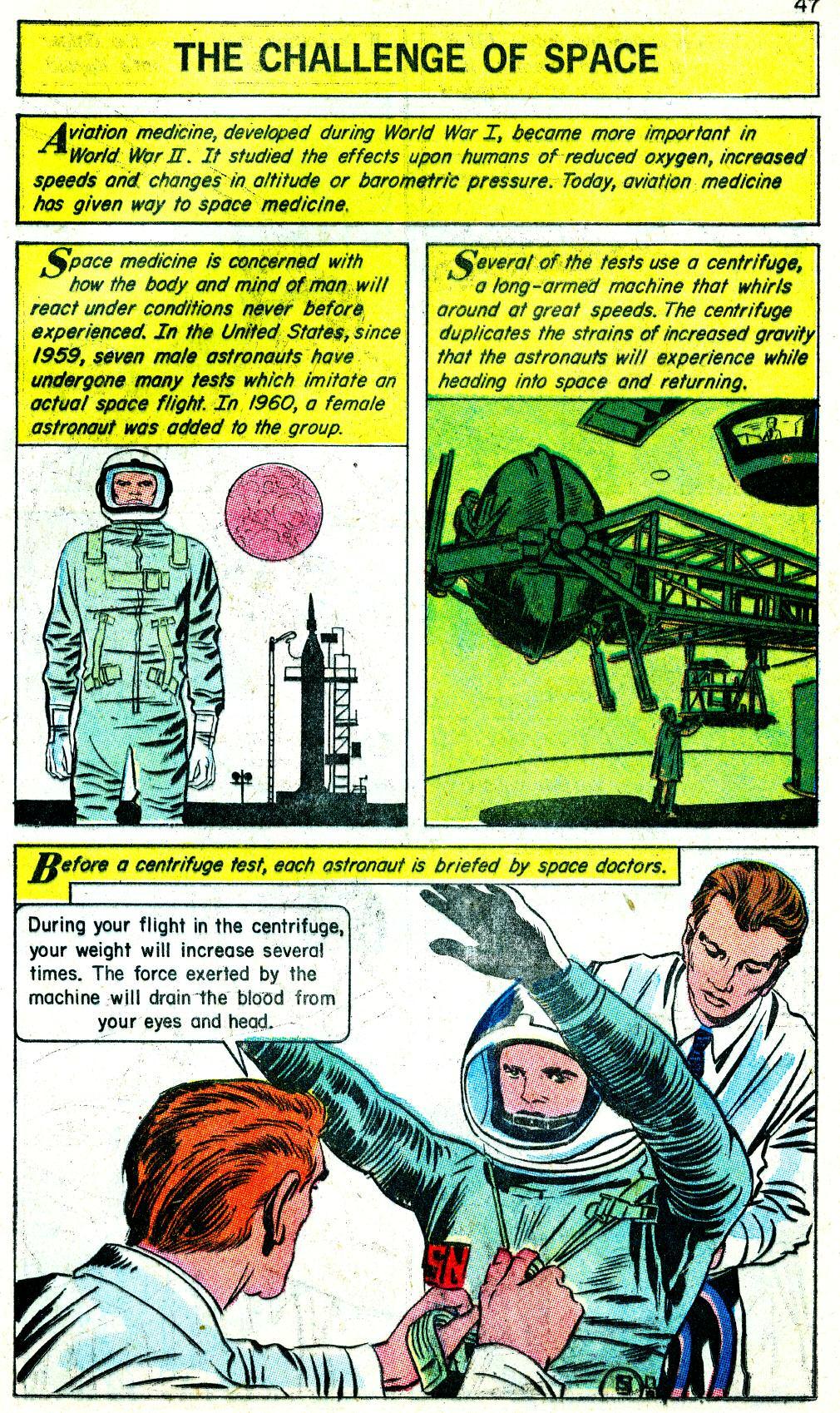




Iy this for Gilberton P ublications me of the long running Classics trated line of comic books): They did han their share to make the comics medium acceptable to parents and educators While ol’ Freddie Wertham was wailing away about the dangers of comics causing juvenile delinquency, Classics Illustrated was exposing the youth of America to er, the classics of literature Only thing was, not even an artist with the vim and ver ve of Jack Kirby could manage to make the Gilberton comics anything but boring!
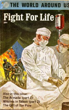
Take, for example, these pages from The World Around Us #36 (October 1961, subtitled “Fight For Life”), one of less than a dozen Gilberton issues Jack drew material for This one ’ s got it all: boring cover, boring theme, boring lettering, and unbelievably enough, boring Kirby art. Jack’s been quoted on how much he hated working for the company, due to their insistence on making him render the artistic details with minute historical accuracy For a “big picture” guy like Kirby, this must have been pure torture
Now, compare this material to another little four- color pamphlet that came out one month later, entitled Fantastic Four #1. Certainly, the art on the first FF issue is more crude than what’s shown here, but what it lacks in polish, it makes up for with about a zillion times the energy and excitement With the industr y in the doldrums at that point, and faced with the prospect of working on Gilberton material the rest of his career, it probably was sheer desperation that led Jack to put his heart and soul into the comic that started the Mar vel Age
So thanks, Gilberton! Your books not only helped educate a generation of kids, but you likely pushed Jack Kirby into his own “fight for life” and inadvertently nudged him into creating the best comics of his career ★

22 © 2 0 1 0 G i b e r t o n P u b c a i o n s TM & ©2010 Joe
&
Simon
Jack Kirby Estate

Retrospective
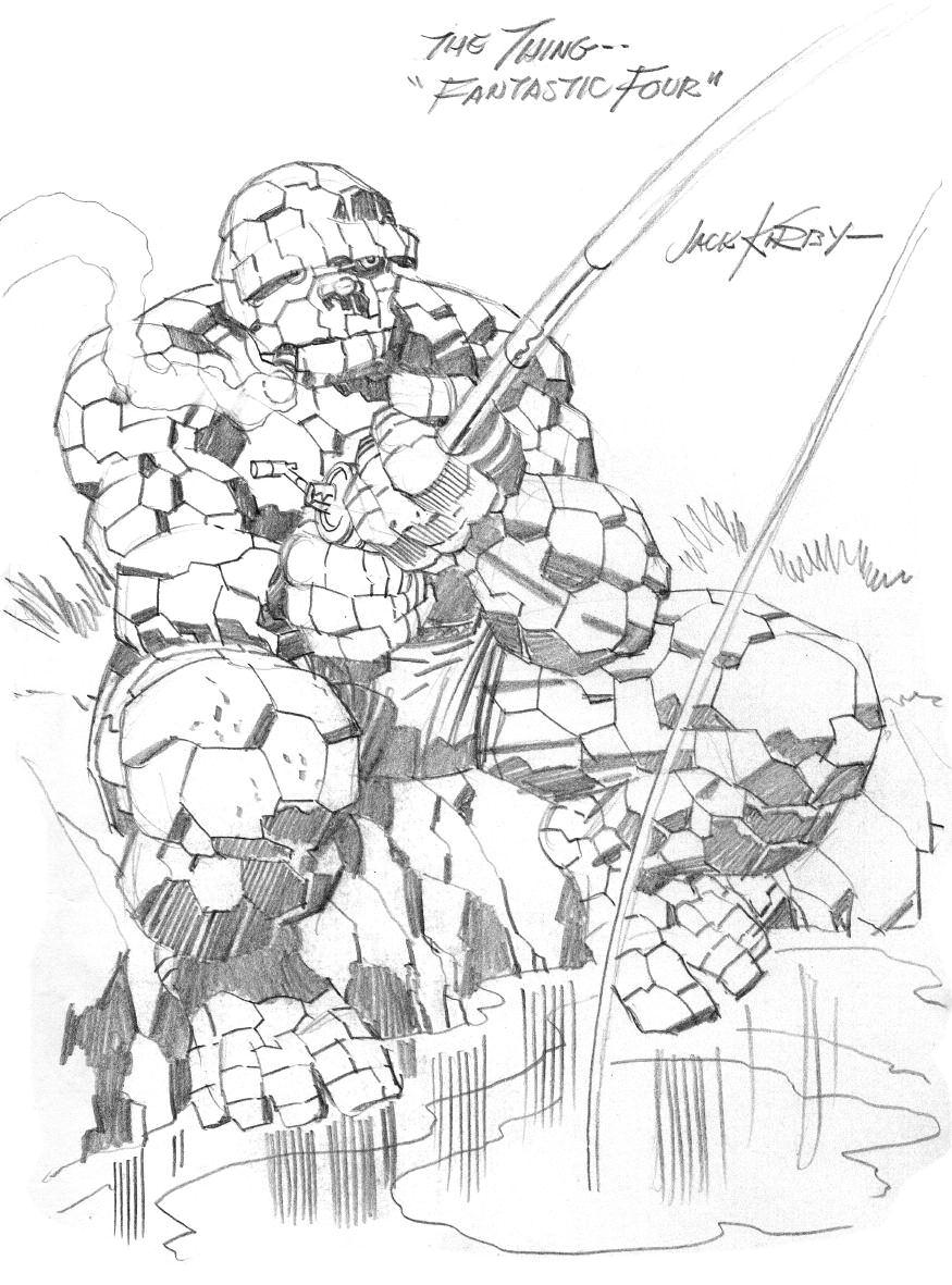
(below) Kirby’s signature character, The Thing, from the fabled “Black Book” Valentine’s Day sketchbook he drew for wife Roz
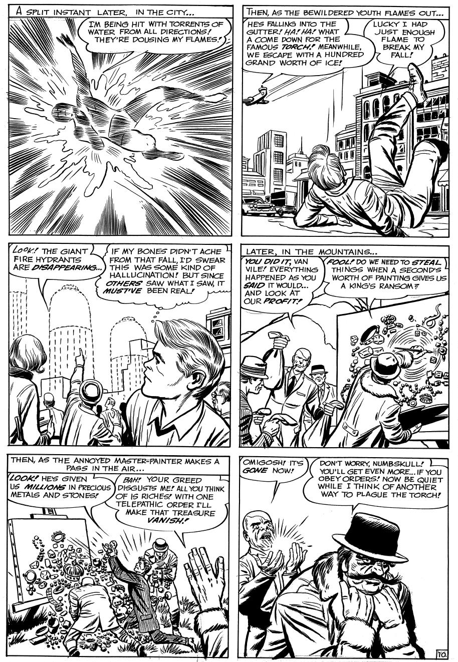
(next page) The early popularity of the FF led to the Torch getting his own series; here’s a page from it in Strange Tales #108 (May 1963)



Part 1: Cosmic Storm
could write them so that they didn’t remain static Mar vel was stagnant.”


TWorld’s Greatest Comic Magazine, nically, emerged from the ruins of a comic book company in such disrepair it didn’t even h name A titan of the Golden Age of Comics, what had been Timely Comics and later Atlas, was about to be reborn as Mar vel Comics. And its flagship title would be The Fantastic Four
Artist Jack Kirby had only just returned to the company after an absence of almost twenty years.
“Marvel had monster books, romance books, and westerns and all of those weren’t working any more, ” Kirby said of that time “They didn’t know what to do with them Nobody there
In fact, Mar vel sales had been dropping all through the last half of 1961
“Well, we didn’t have any super-hero books at the time,” recalled Stan Lee, the company ’ s editor and chief writer since 1941. “Primarily we were turning out a lot of monster magazines. Martin Goodman, who was the P ublisher, called me in and said, ‘ You know, Stan, I think that the super-heroes are coming back I was looking at the sales figures for DC’s Justice League Why don’t we do a team of super-heroes? They are really selling well ’ I had worked that way with Martin all the time He would say to me, ‘ Why don’t we do some westerns?’ So I turned out 50 westerns ‘ Why don’t we do funny little animated books?’ So I turned out 50 animated books. But by now after all those years I was really ready to quit I was unhappy and thought I was going nowhere, and my wife said to me, ‘Look, instead of quitting, why don’t you do the books the way you’d want to do them; just get it out of your system, and then quit For once, do what you want ’ And Martin really wasn’t paying too much attention at the time
“So I thought, okay, I’ll do a team of super-heroes which he wants. But it’ll be fun to tr y to do it in a different way They won’t always win at the end, they’ll fight amongst themselves, and they’ll talk like real people! And that was the Fantastic Four.”
Jack Kirby also claimed his stor ytelling ideas were maturing “I was beginning to find myself as a thinking human being,” he revealed “I began to think about things that were real I didn’t want to tell fair y tales I wanted to tell things as they are. But I wanted to tell them in an entertaining way, and I told it in the Fantastic Four ”
Whether it was a natural maturation both creators had entered middle age or the need to better compete with powerhouse rival DC, they were about to irrevocably alter the comic book landscape “I wasn’t tr ying to revolutionize comics or anything,” Lee admitted “I just wanted to get something out of my system and get the hell out of there ”
Kirby also wanted to escape the relentless rut of filling the pages of Strange Tales and Journey into Myster y with giant reptilian monsters like Grogg and Gargantus and the Two-Headed Thing ever y month “I had to do something different,” he once said “The monster stories have their limitations you can just do so many of them And then it becomes a monster book month after month So there had to be a switch, because the times weren’t exactly conducive to good sales So I felt the idea was to come up with new stuff all the time in other words, there had to be a blitz And I came up with this blitz I came up with the Fantastic Four I came up with Thor (I knew the Thor legends ver y well), and the Hulk, the X-Men and the Avengers I revived what I could and I came up with what I could I tried to blitz the stands with new stuff The new stuff seemed to gain momentum ”
Kirby insisted that the original Mar vel character concepts were birthed on his basement drawing board
The Formative
by Will Murray
A l characters shown TM & ©2010 Marve Characters nc
26
“I did presentations,” he asserted. “I’m not gonna wait around for conferences I said, ‘This is what you have to do ’ I came in with Spider-Man, the Hulk and the Fantastic Four. I didn’t fool around. I said ‘ you ’ ve got to do super-heroes ’”
According to Lee, they emerged white-hot from his poolside typewriter Lee remembered Goodman suggesting, “You could use our old Human Torch and Sub-Mariner and maybe Captain America That’ll save you from having to dream up any new characters ”
Lee demurred. “I really wanted to do something different,” he said “That’s why I didn’t want to do the Torch and the Sub-Mariner I wanted to create a new group I went home and wrote an outline, a synopsis for the Fantastic Four And I called Jack, handed him the outline, and said: ‘Read this. This is something I want to do And you should draw a team ’ But he never pushed me to do super-heroes Jack was home drawing these monster stories, until the day I called him and said, ‘Let’s do the Fantastic Four ’”
Speculation has persisted that the FF was originally planned as a lead feature in Strange Tales or one of the other fantasy titles, but Lee remains adamant that the strip was created for a title of its own from the beginning
One undeniable truth was that the FF was an outgrowth of the Atlas monster era “The monster phenomenon got started primarily just because people were concerned about radiation,” Kirby recalled, “and what would happen to animals and people who were exposed to that kind of thing... It was also a sign of the times What does radiation do to people? And I took this valid question, which I felt had to be done in comics, and we got our Fantastic Four ”
Although originally skeptical about new project Goodman’s last super-hero revival had flopped Lee was determined to make the most of what he planned as his comic book swan song.
“I figured, ‘All right, but this time I’m going to do it my way ’ Instead of the typical heroes that have secret identities and nobody knows who they are, I did the Fantastic Four where ever ybody knew who they were Instead of the typical junior sidekick, I had a teenager who was also the brother of the heroine and the hero would soon marr y the heroine, so they would be brothers-in-law. The fourth member of the team was a monstrouslooking guy, called the Thing, which was not a typical super-hero type in those days. I also tried to give them fairly realistic dialogue, and I didn’t have them wear colorful costumes ”
In 1961, the Cold War was morphing into the Space Race Cosmonaut Yuri Gagarin had just become the first man in space. U.S. astronaut Alan Shepard soon followed him up The Fantastic Four was torn from contemporar y headlines
Four ordinar y humans brave the dangers of space in a secret launch When their spacecraft encounters a cosmic-ray storm, they crashland back on Earth, forever changed. Scientist Reed Richards becomes the rubber y Mr Fantastic Sue Storm is the Invisible Girl Brother Johnny Storm turns into the Human Torch And pilot B en Grimm transforms into a brownish-orange brute the others dub The Thing.
“I got the idea about the cosmic rays after
reading about the space program, ” Kirby remembered “They were worried about what effect the Van Allen B elt radiation might have on astronauts It turns out that the radiation was easily shielded, but it had ever ybody worried for a while That’s the way the Fantastic Four began B en Grimm who was a college man and a fine-looking man suddenly became the Thing Susan Storm became invisible because of the atomic effects on her body. Reed Richards became flexible and became a character
Fantastic Four
27





Looking for inexpensive reprints of these issues?
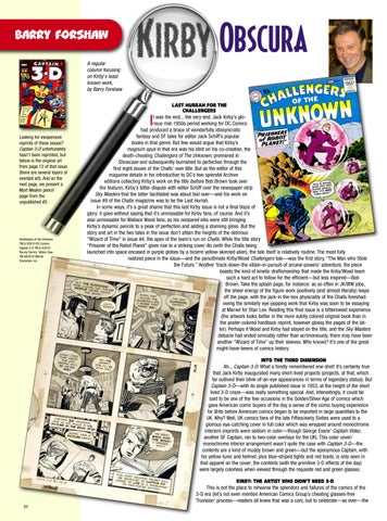
Captain 3-D unfortunately hasn’t been reprinted, but below is the original art from page 12 f th t i (there are overlaid a next page Mort Mesk page from unpublish





Obscura
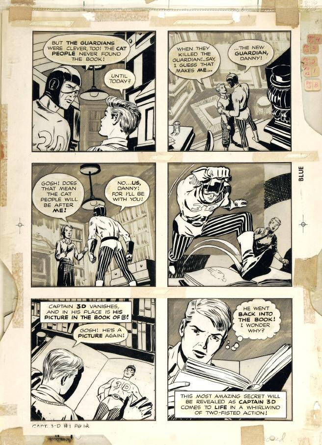



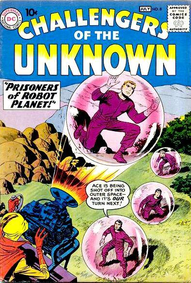

’s gloComics atic lar y’s tion, t in gh the this ve ok ove aper s work on nal bla And i inging ss Bu stor y and art in the two tales in the issue don’t attain the heights of the deliriou “Wizard of Time” in issue #4, the apex of the team’s run on Challs While the tit “Prisoner of the Robot Planet” gives rise to a striking cover illo (with the Challs launched into space encased in purple globes by a bizarre yellow-skinned alien), the tale itself is relatively routine The most fully li d i i h i d h l i t Kirby/Wood Challengers tale was the first stor y, “The Man who Stole k-down-the villain-in-pursuit-of arcane-powers’ adventure, the piece asts the kind of kinetic draftsmanship that made the Kirby/Wood team such a hard act to follow for the efficient but less inspired Bob Brown Take the splash page, for instance: as so often in JK/WW jobs, he sheer energy of the figure work positively (and almost literally) leaps ff the page, with the jack-in the-box physicality of the Challs foreshadwing the similarly eye-popping work that Kirby was soon to be essaying Mar vel for Stan Lee Reading this final issue is a bittersweet experience e artwork looks better in the more subtly colored original book than in e poster-colored hardback reprint, however glossy the pages of the latPerhaps if Wood and Kirby had stayed on the title, and the Sky Masters acle had ended amicably rather than acrimoniously, there may have been her “Wizard of Time” up their sleeves Who knows? It’s one of the great ht-have-beens of comics histor y
INTO THE THIRD DIMENSION
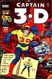
h Captain 3-D What a fondly remembered one-shot! It’s certainly true ack Kirby inaugurated many short-lived projects (projects, at that, which ived their blink-of-an-eye appearances in terms of legendar y status) But 3-D with its single published issue in 1953, at the height of the short D craze was really something special. And, interestingly, it could be be one of the few occasions in the Golden/Silver Age of comics which erican comic buyers of the day a sense of the comic buying experience before American comics began to be imported in large quantities to the Well, UK comics fans of the late Fifties/early Sixties were used to a ye-catching cover in full color which was wrapped around monochrome eprints were seldom in color though George Evans’ Captain Video, Captain, ran to two-color overlays for the UK) This color cover/ me interior arrangement wasn’t quite the case with Captain 3-D the e a kind of muddy brown and green but the eponymous Captain, with unic and helmet, plus blue-striped tights and red boots, is only seen in on the cover; the contents (with the primitive 3-D effects of the day) colorless when viewed through the requisite red and green glasses
KIRBY: THE ARTIST WHO DIDN’T NEED 3-D
t the place to rehearse the splendors and failures of the comics of the ot even mention American Comics Group’s cheating glasses-free ess readers all knew that was a con), but to celebrate as ever the
Barry F
Challengers of TM & ©2010 DC Comics Captain 3-D TM & ©2010 Harvey Comics Yellow Claw TM &©2010 Marvel Characters nc
40

Norse OddITIES

More Thor to Explore?
(right) Just who did draw that close-up face of Thor on the cover of issue #158?
We’ve heard Marie Severin, Vince Colletta, and even Tom Palmer Anybody out there know for sure?

NQuestions raised by Glen Gold and Tom Scioli that we ’ ve totally befuddled Kirby fandom about the “lost” Fantastic Four #108 stor y, it’s time to move on to examine Jack’s other in title of the 1960s, Thor In TJKC #52, we addressed the myster y surrounding Thor #168-170, and reassembled it into its premed original form
nk that’s the only Thor epic that was a patchwork job? Think again!
Our Thor reconstruction brought us a lot of mail, but none more interesting than an exchange with original art collector and author Glen Gold about an earlier hatchet job “Richard Howell [has] said, as if ever yone knew this already, that Thor #159 was in fact assembled from one or more unpublished “Tales of Asgard” stories,” Gold told us. “I said, ‘but the art is small.’ He said that the art in the Inhumans back-up stories was small, too Ooooh Interesting ” Glen is perplexed about the need for a fillin issue around then the obvious cause would’ve been the Kirbys’ move from New York to California, but that didn’t occur until 1969. Gold reasons, “The cover date is November 1968, which means he would have been drawing [#158] in May/June 1968 I always figured they were shopping for houses around FF #87-89 [cover-dated JuneAugust 1969], when the FF move into the Mole Man’s house ”
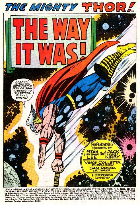
Was Thor #159 assembled from unused “Tales of Asgard” stories, left over when the “Inhumans” backups started in Thor #146? And were those “Inhumans” back-ups in issues #146152 originally meant to be the first two issues of a solo Inhumans series?
We must admit, before this, we never considered there was any kind of myster y surrounding Thor #158-159, similar to #168170 But after more consultation with Glen, we think it bears further scrutiny “The more I look at them the more I think something similar was going on, ” said Gold. “There’s a really strange feeling of recycled and rearranged pages with weird transitions
“Alas, I have no answers, only questions, about the incredible weirdness that is Thor #158-159 This would be Thor’s origin, reconsidered And from the ver y first page, it’s a bizarre mess I suspect it was Frankensteined from multiple sources, possibly rewritten at the last moment
“Oh wait, before the first page, ” Glen chimed, as he raised these valid questions to us about:
Thor #158


• “The cover [above right] There are three little Kirby/Colletta Thor vignettes that were drawn, I think, for this cover They certainly don’t appear anywhere in the previous dozen issues When else did Kirby do vignettes for a cover? Also: who the heck drew that big Thor head? And why? Isn’t this the first non-Kirby Thor on a Thor cover? Like, ever ?”
• “On the title page [ left], it says ‘Pandemoniously produced by Stan and Jack ’ Why Pandemonious? B ecause of some disaster during its creation? Or because of the quote on page 18? And what’s going on with the head of Thor’s hammer poking out of the bottom of the frame in the splash? That’s never happened before. Why didn’t Romita catch this?”
• “What’s weird about the beginning? Only that for the first time since Thor #142, there’s no attempt at continuity (Really ever y one of the previous 16 issues depends on you having purchased the prior one to figure out what’s going on ) They just averted Ragnarok, for cr ying out loud! Shouldn’t someone mention that? But no, this could have occurred any time Almost as if it’s a fill-in ”
• “Where would the missing pencil panel [below] fit? Page 4? Why didn’t Kirby finish this page?”
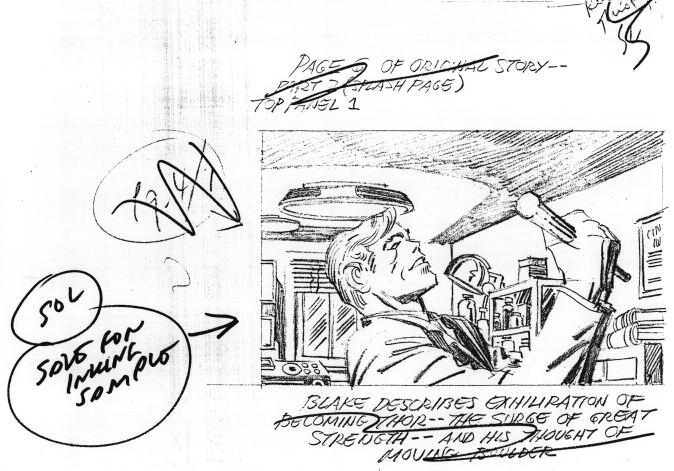
• “Thirteen pages of this is a reprint, which never happened in another Silver Age book by Mar vel If Jack needed to revisit an origin, he redrew it, as in FF #2, 3, 11, Cap #63, 100, 109, etc. Why the reprint here? Did he run out of time because he was also working on FF Annual #6?”
Thor #159
• “On page 2, Blake mentions Mangog (oh, finally!), suggesting to me that the continuity here was originally different Why skip an entire issue before mentioning him?”
• “What the heck is going on with the page 3 splash? [right] Thor, with his face turned away? Has Kirby ever drawn something so awkward, especially something that became a blacklight poster? And D on Blake dreams himself into Asgard? Huh? Has that ever happened before?”
• “On page 5 [next page, top], there’s Loki Why?”
• “Why exactly does Odin wake Blake up only to show him visions? That interaction
Characters TM & ©2010 Marvel Characters nc
50



Adam M cGovern As A Genre
Know of some Kirby-inspired work that should be covered here? Send to: Adam McGovern PO Box 257 Mt Tabor, NJ 07878
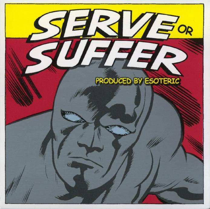
(right) Chrome Plated Man: Esoteric pours on the galactic bling ©2010 respective owner
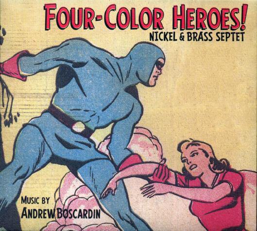
(below) Kind of Blue Beetle: the Nickel & Brass Septet jazz for Kirby
©2010 respective owner
(next page, top left) Ghost in the record machine: On the front cover of their CD, The Gear keep watch
©2010 Mike Allred
(next page, top right) Jam
Comic: On The Gear’s back cover Atom Bomb, Mikey Hahn, Michael Allred, Connor Bond, Mr Gum, Madman and the real-life Allred sons share space ©2010 Mike A lred
(next page, bottom) Courtesy of scanner Eric NolenWeathington, this unidentified Kirby concept has been dubbed “The Future of Countr y Music ”
©2010 Jack Kirby Estate

PLAY IT AGAIN, JACK
Our retrospective box-set on the Lee/Kirby team stretched to a second issue, and there is just as fast-growing a canon of Kirby-influenced and comic-centric music so it seemed right to give the last column’s sur ve closely-matched companion. The musicians covered here are colliding visions like Lee & K did, and collaborating with the King across sp time in a call-and-response of imager y and sensation that expands his creations to more the dimensions he meant you to meet them in
Straight Outta Cosmic
“Inspired by and dedicated to the genius of Jack Kirby,” New England rapper Esoteric’s fir all-instrumental disk Ser ve or Suffer neatly rearranges the ’60s Silver Surfer logo into an aphorism for Kirby’s cosmic morality play “Instrumental” doesn’t do it justice; these are dense yet lean grooves rich in sonic samples and pulp references, like a comic page with just the sound effects and pictures, telling its own essential stor y like Kirby could before you even looked at the words
Fans of the King will enjoy the magisterial “Shalla Ball” and the spirit-lifting “Steve Rodgers,” the latter of which works a muchneeded hip-hop beat makeover behind the old Captain America cartoon theme song
The whole collection is an audio pop-art collage of well-woven soundclips from those kitsch-classic ’60s Mar vel cartoons, which were often shot directly from Kirby’s pag toons were infamous for barely moving more than the pages themselves, so there’s rich humor in hearing them reprocessed for this most kinetic of albums A moving quote-sample from Kirby himself about how the characters he brings to life in this world “have already lived” endorses Esoteric’s method of creative re-scoring and opens a great thundering background anthem of spiritual persistence, “Galactus Trilogy ” And there’s sheer non-genre joy in the sonic

(Thanks to Rand Hoppe for cuing the turntable )

reprint-pile of found sounds and revealed grooves in tracks like “Silence Is Golden,” “Hero’s Plight” and “Go Ask Malice ”
Esoteric’s like a one-man compilation of all my formative obsessions, with raps, remixes, and activism about ever ything from comics and Japanese monsters to Gar y Numan and animal rights The generous cross-section I got from his geek-friendly publicist


g (featuring the much-banned “Kill Bill O’Reilly”); Esoteric vs Japan: Pterodactyl Takes Tokyo, with Gigantor and Mecha-Godzilla shooting it out in the audio arcade of kaiju heaven; and the turbulent soulbaring tour de force Saving Seamus Ryan (Esoteric’s non-codename), all from within about a year (along with Ser ve or Suffer) and all showing acrobatic production and the clever, credible white rap that’s more rare than Whiz Comics #1 Hear one disk and you may find yourself wanting to collect the whole stack
[www esoterichiphop com ]
Gotham After Hours
The Kirby references are literal on Four-Color Heroes!, the debut disk from the improvisational jazz ensemble Nickel & Brass Septet, led by Andrew Boscardin There’s “The Miracle of Thaddeus Brown,” “Grimm’s Waltz” and “The King of Yancy Street” for the first three tracks (with homages to many another supercreator from Siegel & Shuster to Steve Gerber filling out the rest), though these titles represent a kinship as much as a companion-piece Instrumental music will always by its nature be an abstract impression of its inspirations, though it’s satisfying to listen to these tunes in their own right and fun to complete the circuit of imagination with the Septet’s intent in ways which may be as varied as there are listeners and Kirby creations
“Thaddeus Brown” breathes a certain smooth midcentur y selfassurance as befits an extreme-stunt icon, and “Grimm’s Waltz” casts Aunt Petunia’s favorite boy as a kind of half-ton orange Pal
A regular feature examining Kirby-inspired work, by Adam McGovern
52

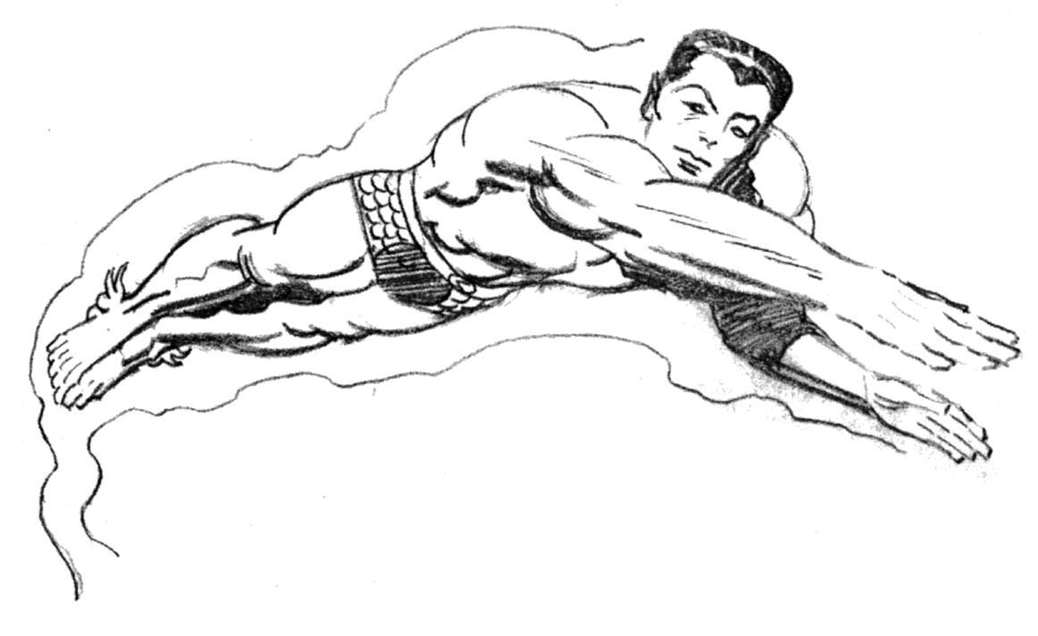
(top)Here’sPrince Namor,theAvenging Son,drawninpencilby Jack,insideoneofthe King’sownbooks.
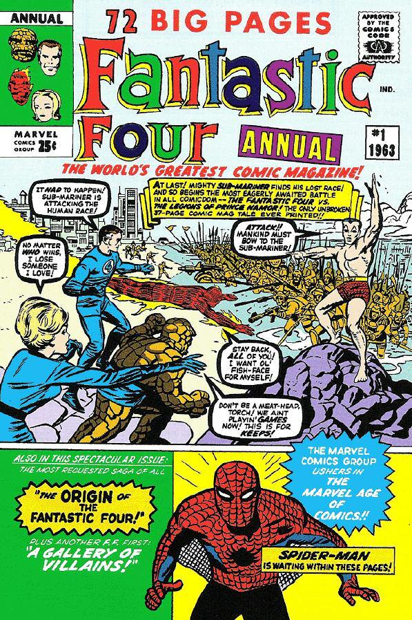
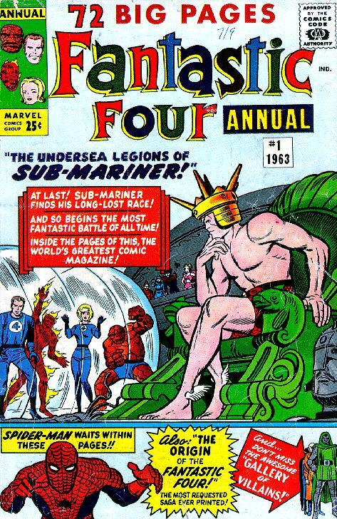
(below)Theoriginal cover(left)forthefirst FF Annual wasprobably rejectedbecauseitput Sub-Marinerandhis warriorstoofarintothe background.Thepublishedversion(right)is certainlymoredynamic.
(nextpage,top)Atlantis attacks!Subbyandhis loyalfollowerstrapthe FFonthisdramaticpage fromthefirst Annual.
(nextpage,bottom)
MightyMarvelreprinted FFAnnual #1inthesummerof1970.Jack’sfirst successorforthebook’s artchores,JohnRomita Sr.,didastupendous newcoverforthatissue. CharactersTM&©2010Marvel




JRaisingAtlantis
AFictionalReenactmentFollows:
ackKirbyenteredtheMarvelofficesat655MadisonAvenuebrightandearlyonthelastdayinFebruaryof1963.HisspiralsketchbookwasunderhisarmandFloSteinbergandSolBrodskysmiledwarmlyathimwhenhecamein. Theydidn’tbegintheirusualsmalltalkwithKirbybecausetheyknewhismeetingwithStanLeewouldbetakinguptheearlypart ofStan’sbusymorning.TherehadbeenafewrumorsaboutaveryspecialprojectaroundtheBullpen,sotherewasnosurprisewhenJack angledhiswaytowardStan’soffice,onlytoseeol’SmileystepoutwhenheheardJack’snamebeingmentioned.

STAN:Great! Jack’shere. C’monin,buddy. You’rerighton time.
JACK:Stan,how areyoudoing? MindifIlight up? (Kirbyproducesacigar.)
STAN:Naahh,go ahead.LikeIsaid inJanuary,I’d liketopushfor an FFAnnual,or specialissuethis summer. Martin’sbehind it.It’sgoingto betheSubMariner’sshow alltheway,as wediscussed.
JACK:Good.We candoit.I’ve beenkicking aroundsome ideasforthat guyNamor.Let’s makeAtlantis,

FishOuttaWater
Whenthelowerdepthsarose,byRobertKnuist
Characters,Inc.
54



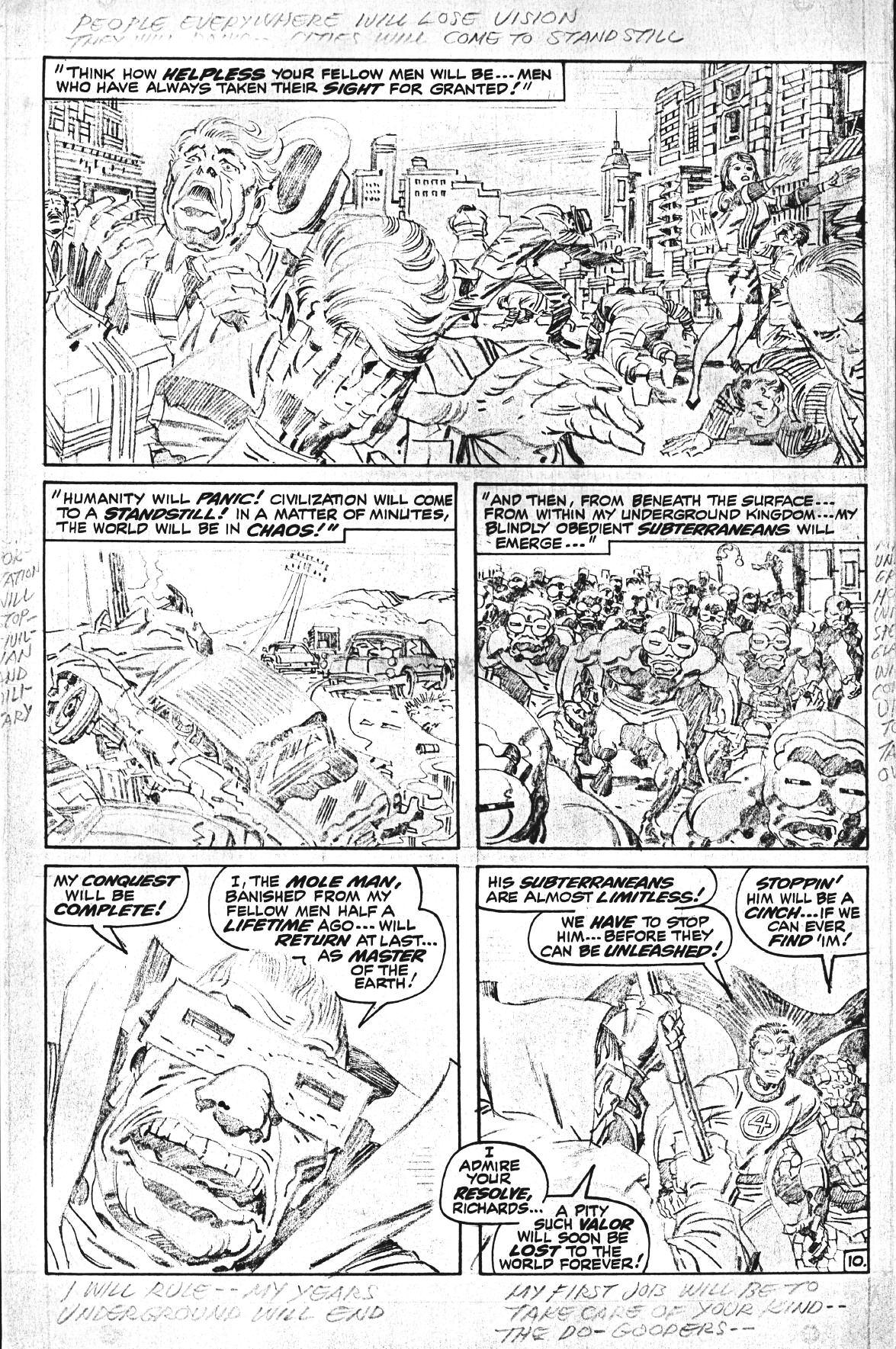
What would a Lee & Kirby issue be without the Fantastic Four being heavily represented? You won’t find out here, as we proudly present a batch of Jack’s penciling wizardr y from FF issues #89-91, complete with Kirby’s margin notes

Gallery 2 F a n t a s t i c P E n c i l i n g
Characters TM & ©2010 Marvel Characters Inc Fantastic Four #89, page 10 Characters TM & ©2010 Marvel Characters Inc 59

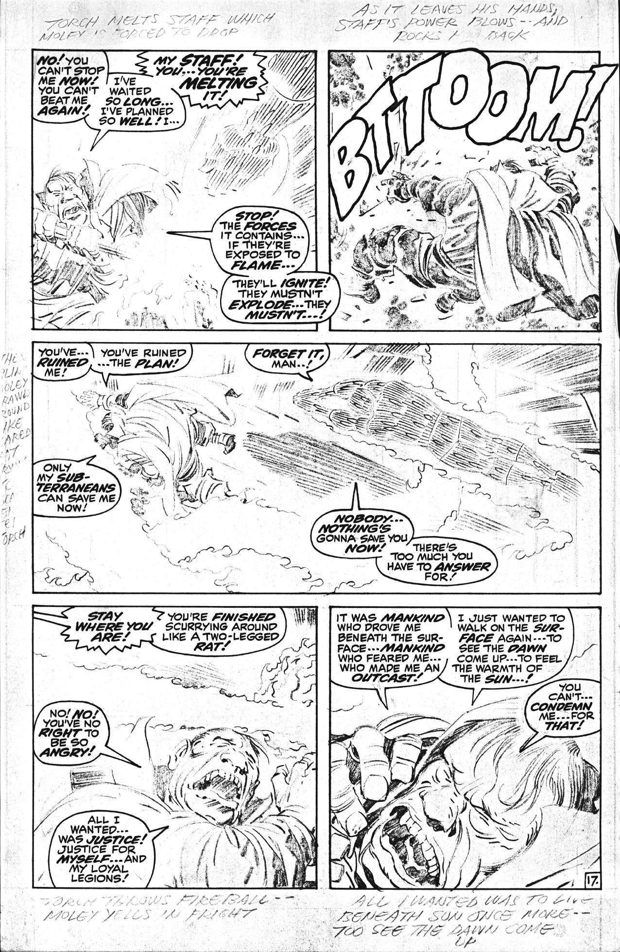
F a n t a s t i c F o u r # 8 9 , p a g e 1 7 . C h a r a c t e s T M & © 2 0 1 0 M a r v e C h a a c e r s , I n c 60


Talkin’ About The Most Team Supreme PART 1 1
Mar vel madmen and Mar velites talk Lee and Kirby and ’60s Mar vel Compiled by Jerr y Boyd
(The following comments were culled mostly by e-mail Talking points were ’60s Mar vel in general, your favorite Stan and Jack material, and impressions of the team’s ‘magic ’)
fantastic work I always thought that Thor, with their interpretations of mythology and the way they’d (do their) take on the old legends, was incredible And with the FF, they were so innovative with the depths of plots they’d come up with and spiral into
Michael Stewart TwoMorrows contributor
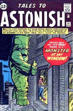
(right) Here’s Dick Ayers’ favorite Lee-Kirby-Ayers effort, from Tales to Astonish #34
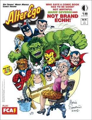
(bottom) ‘Mirthful’ Marie Severin is surrounded by some of her unforgettable Not Brand Echh takes on the Mar vel Super-Heroes in this 2001 self-portrait, which is featured on the cover of the upcoming Alter Ego #95, shipping this July from TwoMorrows It even includes “Rational Comics’ Gnatman” (top left)
(right) Thor battles Surtur in one of Jack and Stan’s most dramatic threeparters, as shown on this Kirby-Everett masterpiece for Thor #176 (May 1970)
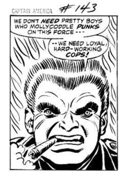
(next page, center) John Romita snuck a Kirby cameo into Captain America #143 (Nov 1971), by basing police Sgt Muldoon’s likeness on Jack
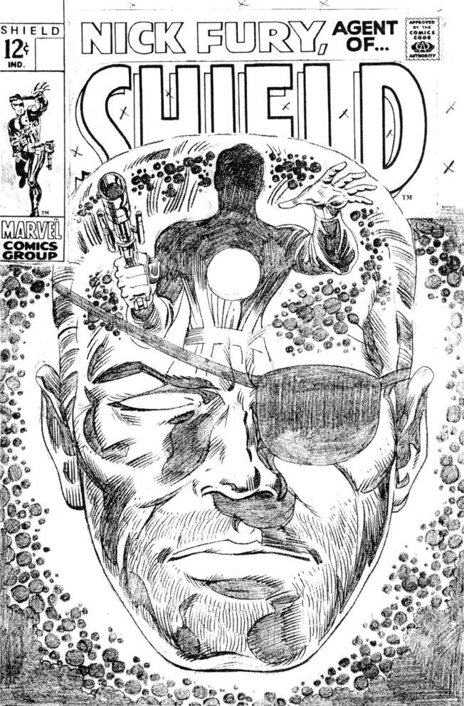
(next page, top) Herb Trimpe impressively penciled this unused SHIELD cover back in 1969
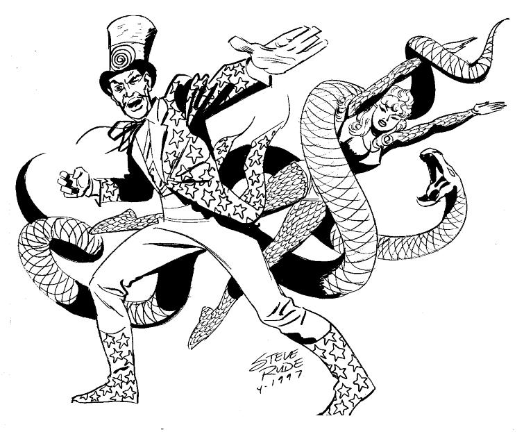
(net page, bottom) Bring on the bad guys in this case, The Ringmaster and Princess Python! Steve Rude did this commissioned portrait of the Lee-Kirby Circus of Crime members back in 1997

Dick Ayers
The one ( genre) that stands out in my memor y of (Stan Lee’s and) Jack Kirby’s penciled stories I did would be all of the monster stories One that jumps into my memor y is “Monster at My Window.” [Tales to Astonish #34, Aug 1962] Not many months ago the New Yorker, on its last page, [featured] a contest cartoon to have a caption sent in to win a prize A cartoonist chose to copy the cover Jack penciled and I inked: “Monster at My Window.” A fan e-mailed me and called my attention to it. Maybe Mar vel got an apology from the New Yorker ?! I applaud the choice of the cartoonist
Stan Goldberg
In 1949, when I was a ver y young man, I was ver y fortunate to get a job at Timely/Mar vel Comics working in their bullpen In two years I ran the coloring department and got to see all the art that came out of Timely I was always a big fan of the comics As a boy, my favorites were Captain America, Young Allies, etc ; needless to say, I loved Jack’s work.
In the late ’50s when I went freelance, I met the man Many times we would meet at Mar vel and a bunch of us would go out to lunch. They were fun times and Jack would entertain us with great new ideas for comic books (Excuse me, graphic novels ) As a colorist, Jack’s stories were the most fun to color When we became friends, he was always good company
There is not an artist in the business, who, when asked, “Who was their favorite comic book artist?” they will always tell you it was Jack Kirby Long live the King Jack Kirby and Stan Lee were a big part of what this industr y has become.
Marie Severin
I thought they were a dynamic team They both were ver y creative and ver y innovative It was ver y fortunate for the public that they did so well because it led to a resurgence in the industr y… and the art form They worked well together They both had big egos, but they did

Looking back on Thor #175-177, one could say; “Odin goes to sleep, Kirby prepares to leave Mar vel, and all hell breaks loose.”
This ‘hell’ would include a ‘devil’ more evil and powerful than Loki, the Executioner, and Ulik combined! Surtur, the flame demon, got Lee and Kirby’s ‘ultimate menace ’ treatment and the giant sent sheets of mountain-reducing fire at the outskirts and finally to the spires of Asgard
Mangog had been on a similar rampage (with the heat turned off ) in 1968, but Jack had an affinity for myths and Surt (using the Nor wegian pronunciation) was in on Ragnarok. Maybe Jack had thought of this stor y arc as an ‘ending’ of the Asgard Mar vel wouldn’t end in their comic reality Jack was dreaming of the ‘epilogue’ (that would be printed over at DC in New Gods #1) that would end the lives of the immortals of antiquity and set the stage for his new age of new gods
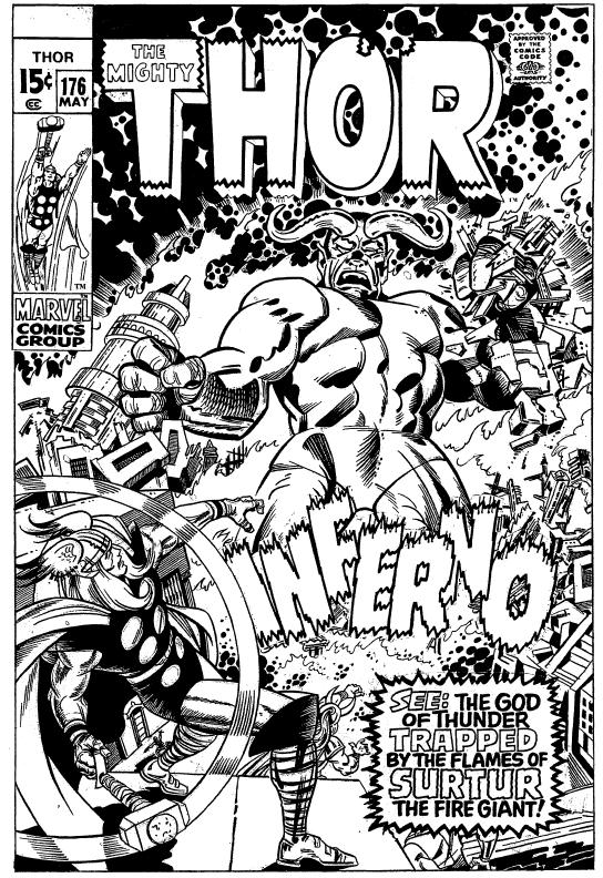
Loki sat on Odin’s throne but, in his cowardice, found it convenient to ‘ escape ’ to Earth when he learned Surtur was free of his Odin-forged bondage Thor, Balder, Sif, and friends fought valiantly, only causing the gigantic fire god (the King gave the monster Goliath-like proportions for this endgame) to slow his advance Loki had even, in his perfidy, jettisoned his stepfather into another dimension (!) to reclaim the throne Balder went after him, courting certain death, since the space-time continuum was one only the lord of the Aesir could sur vive Odin awakens from his Odin-Sleep, restores the godling’s youth and strength, and dispatches Surtur back into the bowels of his planet with a
68
Characters TM & ©2010 Marvel Characters, nc
Talked-About Team In Comicdom
mere command! Kirby and Lee do it again.
(You’ve got to clap after seeing an act like that!) The beaten and burned Asgardian warriors rose… but still found the strength to raise their enchanted weapons and voices in praise to All-Father Odin.
I praise Stan and Jack.
Marv Wolfman
The Stan Lee and Jack Kirby comics are still, to my thinking, the best superhero comics ever done. Together, they broke the stereotype of super-hero comics, added powerful, emotional stories and strong characterization to what had been a medium for 8-12 year olds, experimented with new ideas and ways to tell stories, and introduced readers to a sense of imagination we had never been exposed to in comics before. The sheer number of new ideas and new characters bombarding readers all at once has not been equaled since and probably never will be. Individually, Stan and Jack were both incredible talents. Together they were comic book genius.
Herb Trimpe
One of the fun things about Marvel in those beginning and middle years, when most of the Marvel characters became household names, was the option, when drawing a particular Kirby/Lee creation, to add one’s own “stamp” to the character. This allowed for a tremendous amount of creative leeway, making, in my opinion, not only the job easier, but more interest generated from the fans. It was exciting to see how each artist visualized the character they were bringing to life. No Kirby/Lee creation lent itself to this in a more dramatic way than Spider-Man. Steve Ditko, Jack himself, and John Romita presented three of the most distinct versions of the character. Kirby’s Spidey, with his blockish Kirby strength, Ditko with his nimble and almost pixie-like, angular Spidey, and Romita with his smooth-as-silk style Spidey effortlessly gliding from building top to lamppost, are images that tend to stick in my mind more than any other character.
Kirby could do more with a seemingly boring six equal-panel page than any artist who ever lived. He never needed to be tricky with his layouts—straightforward, no nonsense, but pure dynamic action spilling outside the confining lines of each panel.
Ditko had a movie director’s approach, breaking panels down or blowing them up to fit the situation. His sense of drama and movement were hypnotic.
IF YOU ENJOYED THIS PREVIEW,

KIRBY COLLECTOR #54
STAN & JACK PART TWO! More on the co-creators of the Marvel Universe, final interview (and cover inks) by GEORGE TUSKA, differences between KIRBY and DITKO’S approaches, WILL MURRAY on the origin of the FF, the mystery of Marvel cover dates, MARK EVANIER’s regular column, a Kirby pencil art gallery, a complete Golden Age Kirby story, and more, plus Kirby back cover inked by JOE SINNOTT!
(84-page tabloid magazine) $10.95
(Digital Edition) $3.95
http://twomorrows.com/index.php?main_page=product_info&cPath=98_57&products_id=846

There was an enchanted quality to his work.
Romita combined the elements of the two artists, while adding his own gift, beautifully executed figures, gracefully and accurately drawn, classically thought out. A brilliant draftsman and excellent story-teller, John gave the strip an authority that carried Spidey to the silver screen.
Steve Rude
Over many years, most of us have had the chance to distill what we feel are the best of the Stan and Jack years of the 1960s. Though it isn’t hard for me to recite specific examples, as with the 5-issue Thor #126-130 saga with Hercules, or such 10-page epics as the Cap WWII story in Tales of Suspense #86, their combined succession of achievements lay easily in the hundreds. (The Iron Man story in the same TOS issue had an equally powerful tale.)
Perhaps more important is what attributes each of these gents brought to their tales to make them more powerful as a whole, as a unit, and why Marvel’s more institutionalized and more powerful competitor at the time, National Periodicals, was unable to adjust to the times as their toehold monopoly began to loosen.
Stan brought flashy relevance and a parable underpinning of story. Jack brought pencil drawings that careened our senses while always maintaining a simple and easy to follow storytelling sense. As much as everyone today claims to revere his art, these two simple factors in Kirby’s art seem all but lost to current comic artists.
To me, the legacy of Stan Lee and Jack Kirby will always be the paragon of [the] 1960s.
69
LINK TO ORDER THIS ISSUE IN PRINT OR DIGITAL FORMAT!
CLICK THE