Condensed Brand Guidelines V 1.1
St Joseph’s College Internal Use Only
©St Joseph’s College 2022 1
2 3 4 4 4 4 4 4
Space to thrive 5
Visual identity 6 Brandmarks The crest Our brandmark Nomenclature Brandmark variants One colour variants Clear space Minimum size Brandmark Guidance Do not... Departments, houses and Icons Departments Icons Houses Typography Arpona Body copy Colour 28 Colour breakdowns
7 7 8 9 10 12 13 14 15 16
©St Joseph’s College 2021
Contents Brand and trademark protection Mission Vision Personality College values Motto We look
Condensed Brand Guidelines V 1.0
Contents
18 19 20 24 25 26 27 29
2
Brand and trademark protection
Our name and crest have trademarks to prevent misuse and protect our identity.
©St Joseph’s College 2022
The cornerstone of our visual identity is our brandmark. Maintaining its integrity is essential because it symbolises the integrity of our College.
Condensed Brand Guidelines V 1.1
Introduction
Our trademark will enable us to control the quality and supply of branded products such as stationery and school uniform. In the pursuit of brand integrity and to ensure consistency in brand application and communication, we have introduced a new sign-off process in which all communications are overseen and signed off by the brand guardian in our marketing department. We hope we have the commitment from everyone at St Joseph’s College to make this work. If you use any trademarks, logos, designs, and/or other brand features, you acknowledge your acceptance of the terms in the brand guidelines.
3
Mission
Vision
Fides Labore Et Tenacitate Faith, hard work and tenacity
We sound • Progressive
Continue to grow our nurturing environment, in which students are inspired to reach their full potential.
• Confident
Personality
We look
An all-round education that nourishes students’ minds, bodies and spirits.
College values
©St Joseph’s College 2022
At St Joseph’s College, academic achievement, ideas, intellectual curiosity, collaboration and resilience are of equal importance.
Motto
Condensed Brand Guidelines V 1.1
Our brand
• Inclusive
• Vibrant • Friendly • Modern
• Aspiration • Respect • Confidence
4
Condensed Brand Guidelines V 1.1
Our brand
Space to thrive Space
Thrive
• Energetic and forward-thinking
• Playing fields on site
• Full of promise
• Healthy, fresh air and room to move
• Prosper, be fortunate and successful
• All-age appropriate • Relaxed and happy
• Small classes
©St Joseph’s College 2022
Space to thrive
• Grow, develop and be positive • Thrive, academically and beyond
Statement
The independent school with Christian values that gives students space to thrive. In some circumstances we may adapt this line to read:
The independent school that gives students space to thrive. 5
Condensed Brand Guidelines V 1.0
©St Joseph’s College 2021
Visual identity
6
Brandmarks The crest
• An original feature of the College brand, the laurel wreath is an ancient and universal symbol of academic and sporting success and a representation of faith, which we feel is a positive association with our school
©St Joseph’s College 2022
The symbols we choose to represent our College are very important.
Condensed Brand Guidelines V 1.1
Visual identity
• The star is the ‘De La Salle’ star, which represents the De La Salle Brothers, the Catholic order which founded the school in 1937 • The oak leaf reflects the original grounds of the school, situated on Oak Hill The crest can be reproduced with or without the motto, dependent on the size of reproduction and material.
7
Our brandmark
The brandmark is our most recognisable brand asset.
©St Joseph’s College 2022
The St Joseph’s College logo consists of our name (wordmark) and our crest. Both our colour palette and our crest have been simplified and re-energised and we have proudly locked in our name, so that our crest and the wording ‘St Joseph’s College’ can appear together. The new design allows for better visibility and performance when used on multiple platforms.
Condensed Brand Guidelines V 1.1
Visual identity
8
All of the brand assets have a unique file name, which is constructed in several parts, to help tell what the graphic will look like and how it is intended to be used.
• StJos_C_V_M_4C_POS.ai. The name can tells us if it is a crest, what the alignment is vertical or horizontal, the colour mode – 4C - CMYK or RGB, it’s polarity – positive or reversed, amongst other things.
©St Joseph’s College 2022
Each section of the file name is separated with an underscore, eg.
Condensed Brand Guidelines V 1.1
Nomenclature
Visual identity
Vertical brand mark with motto. StJos_C_V_M_4C_POS.ai
Brand: StJos – St Joseph’s College
Polarity: This states whether the type is Positive – POS; or reversed out (white), REV
Category: C - Crest – This describes the type of graphic. This is also applied to houses and departments e.g. Prep, Orwell etc.
Colour Mode: 4C indicates that this has been set up for printing CMYK; RGB would indicate a digital file, and mono would indicate that it is one colour
Alignment: V = Vertical; H = Horizontal; L = Left Aligned; R = Right Aligned
Motto: M indicates that this crest has the School motto incorporated 9
Different versions of the brandmark exist - a stacked and single line option and mono colour design.
Vertical brand mark with motto.
Horizontal brand mark left aligned
©St Joseph’s College 2022
The format and medium should dictate what version of the brandmark is used and its final size. The crest can be used alone if required - for example, on digital application and signage. The logotype should be used in conjunction with the crest unless the size of application drops below 35mm (as indicated on page 18 - minimum size guide). It may also appear where material dictates, i.e. sports socks.
Condensed Brand Guidelines V 1.1
Brandmark variants
Visual identity
Vertical brand mark, no motto
Horizontal brand mark right aligned
Logotype
10
The brandmark has variants for use on dark backgrounds. When reversing the logo out the typography must always be white.
Condensed Brand Guidelines V 1.0
Our brandmark on dark backgrounds
Visual identity
©St Joseph’s College 2021
Vertical brand mark with motto
Horizontal brand mark left aligned
Vertical brand mark, no motto
Horizontal brand mark right aligned
Logotype
11
One colour variants The brandmark can be reproduced in one as well as full colour.
©St Joseph’s College 2022
When used in a mono application, the mark may be reproduced in either white or dark blue.
Condensed Brand Guidelines V 1.1
Visual identity
12
Clear space
The minimum clear space zone to other elements and page edges is always the size of two “HH” from the vertical brandmark and one ‘H’ from the horizontal brandmark.
Photography When used over a photographic image it is important the brandmark has it’s clear space respected. The image below illustrates how the brandmark can fit comfortably on an image.
©St Joseph’s College 2022
Clear space is included in all the brand collateral elements as a transparent non-printing element.
Condensed Brand Guidelines V 1.1
Visual identity
13
In order to ensure legibility, the logo and the symbol must, as a minimum, comply with the stated measurements widthwise. The logo must never be scaled outside the proportions.
The minimum size of the vertical logo without the motto is 30mm.
40mm
40mm
30mm
35mm
©St Joseph’s College 2022
The minimum size of the vertical brandmark with the motto is 40mm.
Condensed Brand Guidelines V 1.1
Minimum size
Visual identity
20mm
14
Brandmark Guidance It is important to look at each brandmark application carefully. Here is a check list of things to consider:
Size
Clear space Have you considered the clear space for the brandmark, this is important in all instance including photography.
©St Joseph’s College 2022
How big will the brandmark need to be in the application you’re considering? Is the version you are using larger than the minimum size requirement for that brandmark?
Condensed Brand Guidelines V 1.1
Visual identity
Colour Is the logotype the correct version for the application |you’re considering? Would the mono version work better or is full colour preferable?
Number of uses As a rule of thumb the brandmark should not appear more than twice in a piece of collateral. The brandmark should be used as a welcome point and a sign off. The obvious exception to this is when it appears in photography for example on a students uniform.
15
Condensed Brand Guidelines V 1.1
Do not...
Visual identity
©St Joseph’s College 2022
ST JOSEPH‛S COLLEGE Don’t rotate the brandmarks or use at an angle.
OSEPH‛S LLEGE
Don’t apply effects to the brandmarks.
S JOSEPH‛S COLLEGE T
Never use yellow typography in print. Yellow is only sanctioned for use when embroidered.
Don’t use the brandmarks over a busy image or where the content may clash.
S JOSEPH‛S COLLEGE ST JOSEPH‛S COLLEGE Never put it over someone’s face, always respect T the brandmark clears pace rules.
ST JOSEPH‛S COLLEGE
Don’t stretch the brandmarks.
Don’t use gradients, patterns or colour ways which have not been provided.
ST JOSEPH‛S COLLEGE Don’t change the typography of the logo, the relationship of the crest to the wordmark or use a non-approved typeface.
Don’t use images within the brandmarks.
16
Do not
Never use the college brandmark and department brandmark together.
©St Joseph’s College 2022
Never use two brandmarks or crests on the same page or layout. In a document or piece of collateral of more than one page a brandmark should be used at the start and as a sign-off only.
Condensed Brand Guidelines V 1.1
Visual identity
17
Condensed Brand Guidelines V 1.1
Departments, houses and Icons
Visual identity
©St Joseph’s College 2022
St Jo’s Nursery
St Jo’s Prep School
St Jo’s Senior School
Orwell (Blue)
HOUSES
Birkfield (Red)
Goldrood (Yellow)
La Salle (Green)
Core offering
St Jo’s Sixth form
St Jo’s Boarding
Enterprise
St Jo’s community
Holiday camps
Old Birkfeldians (Alumni)
Teacher training
Parents
Rugby festival
Families
Revision camps
Friends
Virtual Sixth Form Supplemental offering
18
Sub-brandmarks are used to designate specific departments across the College. These are intended to be used in marketing materials for these specific departments and in signage around the college. Full colour crest positive typography left aligned
There are eight variants for each lock-up: • Full colour crest positive typography left aligned • Full colour crest positive typography right aligned • Full colour crest reversed typography left aligned
©St Joseph’s College 2022
Full colour crest reversed typography left aligned
Condensed Brand Guidelines V 1.1
Departments
Visual identity
• Full colour crest reversed typography right aligned Full colour crest positive typography right aligned
Full colour crest reversed typography right aligned
• One colour crest positive typography left aligned • One colour crest positive typography right aligned • Reversed crest and typography left aligned • Reversed crest and typography right aligned
Reversed crest and typography left aligned
One colour crest positive typography left aligned
Sub-brandmarks should be treated in the same way as the main brandmark, as detailed in this guide. When using the department lock-ups you must not feature the school crest on the same page.
One colour crest positive typography right aligned
Reversed crest and typography right aligned
19
A full suite of icons has been created to work with our brand. Icons are unique to St Jo’s and have been designed within a bespoke grid. They are available in St Jo’s blue and white.
Condensed Brand Guidelines V 1.1
Icons
Visual identity
©St Joseph’s College 2022
Descriptor - this must always be used with the icon
Icon Grid - this is used to construct the Icons and should never be printed or seen
20
Condensed Brand Guidelines V 1.1
The full suite of icons Visual identity
©St Joseph’s College 2022 21
The icons can be used in many ways, but when the appear with the horizontal brand mark, they should either be placed in opposite corners of a document with the width of the icon approximately half the width of the brandmark. X
©St Joseph’s College 2022
0.5X
The icons can be locked up with the horixontal brandmark. When this is done a use a vertical line to separate the icon from the brandmark, using equal clearspace on either side of the pipe. The brandmark can be the left or right version but the crest must always be adjacent to the vertical line.
Condensed Brand Guidelines V 1.1
Icon usage and lock-ups
Visual identity
22
Condensed Brand Guidelines V 1.1
Icon usage do and do nots
Visual identity
©St Joseph’s College 2022
Icons may be used over photography where they will stand out.
Do not use icons over busy images, or images with high contrast where they will not be clear.
TENNIS Do not change the colour of the icons.
DANCE Do not stretch or change the proportions of the Icons.
TEXTILES Do not change the typography of the descripto.r
23
BIRKFIELD
GOLDROOD
Houses
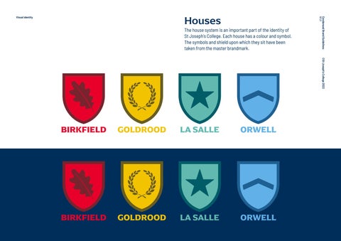
The house system is an important part of the identity of LA SALLE ORWELL St Joseph’s College. Each house has a colour and symbol. The symbols and shield upon which they sit have been taken from the master brandmark.
Condensed Brand Guidelines V 1.1
Visual identity
©St Joseph’s College 2022
BIRKFIELD BIRKFIELD
GOLDROOD GOLDROOD
LA SALLE LA SALLE
ORWELL ORWELL
BIRKFIELD
GOLDROOD
LA SALLE
ORWELL
24
Typography Our typography allows us to have our own voice. Our typefaces can be used consistently across digital, print and environmental applications.
©St Joseph’s College 2021
In our information-rich society, it is increasingly difficult to distinguish ourselves from the crowd.
Condensed Brand Guidelines V 1.0
Visual identity
25
Arpona • Identifiable
• Modern and progressive • Legible It is mainly to be used for headers, publication titles, quotes and other short texts that are to be graphically highlighted.
©St Joseph’s College 2022
• Won’t date with fashions and trends
Condensed Brand Guidelines V 1.1
Visual identity
ARPONA Medium
ABCDEFGHIJKLMNOPQRSYUVWXYZ abcdefghijklmnopqrstuvwxyz 1234567890 !@£$%^&*()_+[];’\,./{}:”|<>? 26
Body copy
Barlow Light
For longer pieces of body copy – articles, for example – the Google font Barlow is to be used. Barlow is a slightly rounded, low-contrast, grotesk type family.
Barlow Light Italic
ABCDEFGHIJKLMNOPQRSYUVWXYZ abcdefghijklmnopqrstuvwxyz 1234567890 !@£$%^&*()_+[];’\,./{}:”|<>?
Leading To maintain a uniform look and feel across typography, the leading should be consistent. The leading - the space between each line of text - should be consistent. The leading should be 25% greater in value than the type size: so if the type is 12pt the leading would be (12x1.25) = 15pt. Otherwise expressed as 12/15.
©St Joseph’s College 2022
ABCDEFGHIJKLMNOPQRSYUVWXYZ abcdefghijklmnopqrstuvwxyz 1234567890 !@£$%^&*()_+[];’\,./{}:”|<>?
Condensed Brand Guidelines V 1.1
Visual identity
Use Verdana for Word, PowerPoint, etc where a system font is required.
Barlow Semi-Bold
Verdana
ABCDEFGHIJKLMNOPQRSYUVWXYZ abcdefghijklmnopqrstuvwxyz 1234567890 !@£$%^&*()_+[];’\,./{}:”|<>?
ABCDEFGHIJKLMNOPQRSYUVWXYZ abcdefghijklmnopqrstuvwxyz 1234567890 !@£$%^&*()_+[];’\,./{}:”|<>?
27
Colour
BIRKFIELD
GOLDROOD
The red and white of our sports kits are retained, along with the gold and dark blue from our uniform. We have streamlined the supplementary colours to include the yellow of the Prep School building, the verdigris of our Chapel roof and the azure blue that features in the stained-glass window panels in the Chapel.
©St Joseph’s College 2022
Our College is full of colour and we have updated our brand palette to reflect this. All colour is emotive, and our colour palette is bright, optimistic and warm – it has been designed to reflect the values, energy and vitality of our College.
Condensed Brand Guidelines V 1.1
Visual identity
The colours are used for all contact interfaces that serve as identity carriers. Typography – Always use dark blue text on a white or light coloured background, and use red for headlines and highlighted text. Other primary colour palette combinations may be used sparingly as highlights: for example, in digital application, sign posting, House reference.
LA SALLE
ORWELL
28
Brand Guidelines V 1.0
Visual identity
PMS 295 100/69/08/54 #002855
©St Joseph’s College 2021
Colour breakdowns PMS 185 00/93/79/00 #E4002B
PMS 188 16/100/65/58 #76232F PMS 7406 00/20/100/02 #F1C400
PMS 3995 23/25/100/67 #685C20
PMS 563 54/0/29/02 #6BBBAE
PMS 5473 86/20/32/51 #115E67
PMS 292 59/11/00/00 #69B3E7
PMS 647 96/54/05/27 #236192
29