# 61 P R I VAT E R E S I D E N C E , P O L A N D L AU R E N C E L L E W E LY N - B OW E N TE RR A BY M ATE R 3D PRINTING
VOO Bespoke installation Biscuit porcelain ‘birds’, carbon rods, handpainted gold spheres
Enhancing Spaces with Porcelain and Light www.cordulakafka.de Model THINCUT
| 2/3
WELCOME
Sarah Cullen • Editor
Welcome back from what I hope was a sun-filled summer holiday for many! As we enter the next fluctuation of design events of the year, the darc team is already comparing clashing calendar schedules as we aim to check out as many shows and events as we can over the next few months. After our usual editorial break for the summer issue, 3d, we are excited to be back with our Sep/Oct edition that is jam-packed with inspirational content. This issue covers an array of topics, some of which we’ve not covered in the past, including insights into residential lighting for our ageing populations. Dive into an in-depth discussion on the topic by Dr Shelley James, where she uncovers lighting solutions that have been tried and tested in a care home environment, and how the developing technology is aiding not only the residents, but also the surrounding personnel and extending healthcare systems. Now you may recognise a familiar face in this feature... I was lucky enough to sit down with the interior designer turned celebrity Laurence Llewelyn-Bowen to chat about his general approaches to lighting in projects, but also to find out more about his recent role as Design Curator at Rangeford Villages and the projects they are collaborating on. Turning to our second feature, we look at the world of 3D printing within product design. I was recently asked to be a judge for LumiAdd’s competition to design a 3D printed lighting fixture. I caught up with Jamie Norris Green, Director of LumiAdd and their winner, Effie Polydouli, to find out more about the world of 3D printing and Polydouli’s winning design. Also, as part of this feature, we hear from Signify’s Leader of 3D printing, Bart Maeyens, about their manufacturing processes in this field and their journey into more sustainable lighting production. Elsewhere in this issue, we cover a variety of projects from the likes of ROAR and Studio N, Isla James Interiors and Lighting, Żurawicki Design, and Lightsphere and Markus Bischof. We also delve into the behind-the-scenes of Mater’s beautiful new sustainable collection, Terra, in our COVER: PRIVATE RESIDENCE, POLAND, BY ZURAWICKI DESIGN IMAGE: KRONIKI
Materials Focus, Astep’s collaboration with designer Luca Nichetto on their eco-conscious Upglas collection for our In Focus Q&A, and Tala’s collaboration with Thomas Heatherwick Studio to design and create a suninspired lamp, Wake, in our Design Evolution Part One. There is heaps more to get your teeth into, so sit back, relax, and enjoy the read. Now, before I sign off, it’s with regret that I have to announce that this is Rosie’s last issue with darc magazine as she moves on to new adventures and challenges. Rosie was fantastic to work with and such a fun travel companion for the darc team on the road. We will be sorry to see her go, but wish her all the best in her next endeavours! Thank you for all your hard work and day-to-day positive energy, Rosie! At least she’s staying in Manchester, so for us it’s not goodbye, but see you soon.
/darcmagazine |
@darc_mag
04/05 | CONTENTS
CONTENTS
FE ATURE D
PROJECTS
INSPIR ATION
016
006
028
Materials: Mater
Focal Point
On The Board: Joshua Welch, Hoare Lea
The Danish green-tech furnishing brand has
VLV Headquarters, Cordula Kafka
Check out Welch’s take on the impor tance of
released it s f irst ever lighting collec tion with
giving lighting design the respec t it warrant s in
Copenhagen-based, OEO Studio. CEO Ketil Ardel
008
and Designer Thomas Lykke discuss the journey
Global Management Consulting Firm, Dubai HQ
and vision of Terra Collec tion, a series of light s
Roar and Studio N have reimagined the of f ice
030
that are simple in form but radical in substance.
as an immersive, human-centred environment
Feature: 3D Printing
where colour, tex ture and light converge to
Design experts explore the latest developments in
inspire focus, collaboration and wellbeing.
3D printing within decorative lighting product design.
022 Interview: Laurence Llewelyn-Bowen
an interior space.
We hear from Signify about its product development, 044
LumiAdd and its latest product design competition,
Laurence Llewelyn-Bowen talks with darc about
Residential Lighting: Private Residence
plus a fascinating product installation for a historical
his new venture as Design Curator for Rangeford
In Bydgoszc z, Poland, a riverside apar tment
project in Lichtenstein.
Villages retirement accommodation, as well as
becomes a sanc tuar y where the spirit of flight
his approach to lighting design within residential
meet s the comfor t s of home. Inspired by their
040
projec t s.
client s’ love of gliding, designers Jakub Żurawicki
Design Evolution Part 1: Wake
British
TV
presenter
and
interior
designer
and Joanna Kubiak shaped an air y, light-f illed
Heather wick Studio has joined forces with Tala,
060
space that balances work , rest , and passion in
the British lighting brand renowned for it s
On Show: LiGHT 25 Preview
per fec t harmony.
precision engineering and sustainable design-
Returning to London in two months’ time, the UK’s
led approach, to launch Wake, a new kind of
only lighting dedicated event will once again be held
052
sleep light . Par t 1 of Design Evolution looks at
in the BDC, London, this November. Check out some
Residential Lighting: Radlett London
the team’s inspirations for the new produc t .
of this year’s highlights and new additions and plan
Isla James Lighting creates a luxurious yet
ahead for your visit.
homely lighting scheme for this private residence
043
based in London, UK . Founder, Jo Calver, walks
Comment: Residential Lighting
066
us through the projec t , detailing the lighting
We dive into the world of residential lighting with
In Focus: Upglas
considerations and the impor tance of a thought-
comment pieces from Tahlia Landrigan of Woods
A new, sustainable lighting collection by Luca Nichetto
out scheme for a residential space.
Bagot and Dr Shelley James of Age of Light Inovations.
THE M AGA ZINE
DESIGN
CORPOR ATE
Managing Editor | Helen Ankers
Artwork | Dan Seaton
Managing Director [d]arc media | Paul James
h.ankers@mondiale.co.uk
d.seaton@mondiale.co.uk
p.james@mondiale.co.uk
Editorial | Mel Capper
Marketing & Events [d]arc media | Moses Naeem
m.capper@mondiale.co.uk
m.naeem@mondiale.co.uk
for Astep.
Editor | Sarah Cullen s.cullen@mondiale.co.uk
Chairman Mondiale Publishing | Damian Walsh Junior Journalist | Ellie Walton e.walton@mondiale.co.uk
Contributing Editor | Matt Waring m.waring@mondiale.co.uk
FINANCE Finance Director | Amanda Giles a.giles@mondiale.co.uk
International Sales Manager | Rosie Jackson
[d]arc media ltd | Strawberry Studios, Watson Square, Stockport SK1 3AZ, UK | +44 161 464 4750
r.jackson@mondiale.co.uk
Credit Control | Lynette Levi
Printed by Buxton Press, Palace Road, Buxton, UK
+44 (0)161 464 4750
l.levi@mondiale.co.uk
ISSN 2052-9406
Cairo 8 Light Chandelier by Alora
See these products and much more on the Elstead Lighting booths this Autumn Decorex - Stand A16 | Light25 - Stand 32 | HIX - Stand 87/89 Scan for PDF Catalogue or
VISIT: QUINTIESSE.COM PART OF THE ELSTEAD LIGHTING GROUP
DARC FP - Setember 2025.indd 1
03/09/2025 09:00:56
06/07 | FOCAL POINT | VORARLBERGER LANDESVERSICHERUNG
FOCAL POINT
L E A V E S - V LV HE ADQUARTE RS BREGENZ, AUSTRIA
Studio Cordula Kafka, in collaboration with lighting designer Barbara Gilhaus-Sturn of Archilum, has planned and realised a new large-scale Leaves installation in Bregenz, Austria. The porcelain leaves unfold across two floors of
the
new
headquarters
of
Vorarlberger
Landesversicherung (VLV) – a regional Austrian insurance provider – designed by the architectural firm Dorner/Matt. A total of 750 delicate porcelain leaves gently visualise the nature of the work carried out within the building. They stand symbolically for insurance policies – documents that provide structure and security, yet often remain invisible in day-to-day life. Here, they become a visible element, quietly carrying the content and purpose of the institution into the space itself. The installation begins at the reception counter on the ground floor, from where the leaves seem to “fly” through the hall and continue outwards. The porcelain leaves are carefully illuminated by recessed ceiling spots, which enhance their fragile materiality and create a subtle interplay of light and shadow. This lighting design draws visitors’ attention and emphasises the symbolic significance of the documents. In the event space on the top floor, the leaves shift direction towards Lake Constance. The room opens up, and so does the view. The installation draws the eye outward – a gesture of openness, perhaps even foresight – while the ceiling lighting gently highlights the porcelain elements, enhancing the spatial experience. Visible from the outside as well, both installations are part of the building’s overall architectural expression. They form a continuous design element that links inside and out, function and form, content and meaning. www.cordulakafka.de
08/09 | PROJECT | GLOBAL MANAGEMENT CONSULTING FIRM, DUBAI HQ
PROJECT
GLOBAL M ANAGEME NT C O N S U LT I N G F I R M , D U B A I H Q Step inside one of Dubai’s newest offices and you won’t find a conventional workplace - you’ll embark on a journey through the UAE’s diverse landscapes. From tranquil mangroves to coral reefs, rugged wadis and serene desert dunes, Roar and Studio N have reimagined the office as an immersive, human-centred environment where colour, texture and light converge to inspire focus, collaboration and wellbeing.
Stepping into this new Dubai office is like journeying
Roar, an architectural and interior design firm that is
through the UAE itself – from the tranquillity of the
no stranger to blending functionality with creativity.
mangroves and coral reefs to the mountainous wadi
Together with Studio N, which tackled the lighting
and peaceful dunes. Far from a conventional corporate
challenges, they transform the 2320sqm space into
environment, this workplace boldly reimagines the
a sensory haven that can serve both the functional
contemporary office by drawing inspiration from the
needs of an office and the emotional wellbeing of its
nation’s natural phenomena, creating a setting that is
staff.
both immersive and purposeful. The responsibility of
The brief was clear but ambitious: create a human-
bringing this vision to life was given to the hands of
centred office that revolved around flexibility, wellbeing, and integration, working seamlessly with the building’s existing structure. The firm required a workspace that would accommodate agile working styles, with sit-stand desks, comfortable lounge areas, and spaces for video conferencing. In addition, there needed to be diverse meeting areas of various sizes, as well as a café and social hub for informal collaboration. Roar was also determined to create a design that was deeply connected to its roots in Dubai. “We wanted to create a workplace that makes people feel something. This isn’t a cookie-cutter office; it’s a celebration of identity and purpose,” say Lama Arouri, Managing Director of Roar. To achieve this, Roar introduced colour psychology, a strategy where colour-coded themes inspired by the Dubai landscapes foster navigation and functionality. Cool tones like blues and greens were inspired by the mangroves and sea and used in focused work zones aptly named blue zone and green zone, which promote calm and concentration. Meanwhile, warmer hues like orange and yellow help energise collaborative zones in the pink and terracotta zones. The strategic use of colour-coded zones allowed the spaces to be defined and made navigation effortless, encouraging engagement with the environment in the right ways at the right time. However, the challenge was to ensure all the diverse areas and elements fit seamlessly into a cohesive interior and lighting scheme as well as being practical and warm.
10/11 |
The journey begins with the oasis, i.e. the green zone, a striking entrance lounge that captures the mangroves of the UAE. Upon entrance, a tree grows through the custom-designed collaboration table, serving as both sculptural art and a symbol of growth and collaboration. Green acrylic accents, bronze exhibition pillars, a mosaic floor ground the palette of the design, while a mirrored ceiling amplifies light and movement to create a sense of serenity. Here Studio N’s carefully balanced lighting scheme allows the reflective surfaces to create the right amount of illumination and vibrancy while allowing the symbolism to speak for itself. In the blue zone, the calm of the Arabian Gulf informs the open-plan workspace. Overhead, gradient acoustic baffles ripple across the ceiling, mimicking the gentle movement of waves while softening the sound. The lighting here is fluid, with reflected light playing across mirrored stretch ceilings to create a sense of openness in areas, even with limited daylight. Private focus rooms and phone booths benefit from carefully calibrated task lighting, while flexible single offices balance functionality with comfort through layered illumination. Studio N’s approach ensured the zone retained a serene, oceanic quality, with cool colour temperatures of 4000K reinforcing the palette of blues and enhancing a sense of clarity and calm for focused work. The pink zone, inspired by the coral, is a playful yet sophisticated space for collaboration and houses café area standouts with ribbed and gradient mirrors, decorated in vibrant shades of pink, and a ceiling that layers bronze, pink and green elements. Socialising is encouraged in this area, which is deliberately reflected in its design choices, such as varied seating such as bench niches and bar tables. The lighting here is essential in enhancing both the aesthetic and functional aspects of the office. Making use of both architectural and decorative lighting
PROJECT | GLOBAL MANAGEMENT CONSULTING FIRM, DUBAI HQ
“We wanted to create a workplace that makes people feel something. This isn’t a cookie-cutter office; it’s a celebration of identity and purpose.” LAMA AROURI, MANAGING DIRECTOR, ROAR
elements, it brings warmth and humanises what could otherwise feel like a sterile corporate environment. Manoeuvring into the terracotta zone, drawing inspiration from the wadis, creates a sense of drama and intimacy in the workplace. Defined by its floating staircase with a base made of bronze and glass balustrade creates a dramatic focal point. The area is designed for both collaboration and quiet reflection. Lighting in this zone was carefully choreographed: ambient and accent layers by the likes of Flos, LEDFlex and Intra Lighting highlight the staircase and lounge areas, while decorative fixtures by Vibia and Flos bring warmth and character, reinforcing the natural, earthy palette. The final zone in the journey, evokes the serenity of the desert, offering a haven for focused work and quiet reflection. Soft beige tones, subtly layered across walls and furnishings, are complemented by overhead acoustic baffles that mimic the gentle contours of dunes. Workspaces are adaptable, with sit-stand desks, custom finishes, and thoughtfully chosen furniture that merges form with function. Lighting here is understated yet purposeful: warm ambient layers and carefully directed task lights from Flos, LEDFlex and Intra Lighting create a calm, even illumination, while decorative fixtures by Marset and Foscarini add subtle visual interest without disrupting the tranquil atmosphere. Commenting on their role in unifying these spaces, Josephine Schneider, Design Director at Studio N, says: “Roar envisioned a unique decorative lighting language for each area, which was carefully chosen to accentuate the theme of that space in terms of colour, finish, and form. Our challenge was to integrate these decorative pieces with the architectural lighting elements, ensuring a harmonious, visually interesting lighting scheme that was fully fit for purpose. Decorative lighting was also an essential contributer to this.”
12/13 | PROJECT | GLOBAL MANAGEMENT CONSULTING FIRM, DUBAI HQ
“We considered the natural circadian rhythms of the people who would be using the space, ensuring the lighting would adapt throughout the day to support productivity, reduce eye strain, and promote wellbeing.” LAMA AROURI, MANAGING DIRECTOR, ROAR
Achieving such a layered lighting scheme didn’t come
visually cohesive.”
without its challenges, with most of them being
While the architectural lighting softened the space
structural constraints. The office was part of an
with a welcoming tone and needed practicality,
expansion, which meant cutting through the existing
decorative lighting was added to combat the corporate
floor slab to create better connectivity, while the
feel but also improve visibility. The key considerations
building’s shallow ceilings and tinted glass created a
for this were to ensure task lighting for workspaces
naturally dim space. Studio N was then presented with
while creating pockets of mood lighting in the lounges
the task of brightening the space without overwhelming
and social spaces. A dramatic bespoke chandelier in
it. Reflective surfaces added more complexity to the
the terracotta zone added a visual focal point and a
mix, leaving the team to carefully consider how light
dash of luxury to the design.
would interact with the surface.
“In a workspace, the lighting must be tailored to its
Schneider says: “Roar envisaged an imaginative and
purpose – clear visibility for focused tasks, balanced
vibrant scheme using a dynamic palette, which was
with the need to foster collaboration and creativity.
further amplified by an eclectic mix of materials,
Unlike
ranging from opaque to translucent, from matte to
workspaces must cater to a wide range of activities,
reflective. We needed to evaluate each colour way
from high-energy meetings to quieter, more reflective
to see how it would respond to the lighting, which
moments,” explains Arouri. “We considered the
could dramatically alter the mood of the space, while
natural circadian rhythms of the people who would
ensuring that the spaces remain highly functional and
be using the space, ensuring the lighting would adapt
hospitality
or
residential
environments,
Lighting the way from concept to creation LiGHT 25 is the UK’s only trade show dedicated to high-end lighting specification
Featuring the…
ARCHITEC TUR AL ZONE D ECO R AT I V E ZO N E and new for 2025, the…
TECHNIC AL ZONE
Scan the QR code for future announcements and registration
lightexpo.london
From the publishers of:
14/15 | PROJECT | GLOBAL MANAGEMENT CONSULTING FIRM, DUBAI HQ
strain, and promote wellbeing. We also had to integrate lighting with the building’s acoustic features to create a harmonious, non-disruptive environment.” The completed office is a testament to the power of collaboration and a shared design vision. For Roar, it was about creating a space that celebrated culture while redefining what a workplace could be; for Studio N, it was about using light to translate that vision into something both functional and atmospheric. The result is an environment that feels rooted in Dubai yet looks firmly to the future, a workspace that is flexible, expressive, and deeply human. As Dean reflects: “The lighting and colour strategy came together beautifully, and the integration of natural elements really brought the whole design to life. It feels like the perfect blend of functionality, creativity and a bit of curiosity - exactly what we set out to achieve.” In this project, curiosity is sparked at every turn, with colour, texture, and light working together to transform the everyday into an experience. www.designbyroar.com www.studionlighting.com
GLOBAL MANAGEMENT CONSULTING FIRM, DUBAI HQ Client: Global Management Consulancy Firm, Dubai Project Manager: CBRE Interior Design: Roar Lighting Scheme: Studio N Lighting Specified: Flos, Foscarini, Intra Lighting, LEDFlex, Marset, Vibia Images: Yasser Ibrahim Designed by Roar, with lighting exper tise from Studio N, the new Dubai of fice draws inspiration from the UAE’s natural landscapes. The of fice is divided into distinct coloured zones each shaped through colour psychology. Studio N’s carefully layered lighting scheme played a central role in uniting these diverse spaces, balancing decorative and architectural elements to ensure functionalit y, mood, and cohesion.
COM MERCI A L | R ETA IL | HOSPITA LIT Y | PROJECT DE SIGN S
hello@franklite.co.uk | +44 (0)1908 691 818 | franklite.co.uk
Franklite-Sept-Oct_2025_Final.indd 1
25/07/2025 12:33
16/17 | MATERIALS | TERRA BY MATER
MATERIALS
T E R R A BY M AT E R T h e D a n i s h g r e e n -t e c h f u r n i s h i n g b r a n d h a s r e l e a s e d i t s fir s t e v e r l ig h tin g c o l l e c tio n w it h C o p e n h a g e n-b a s e d, O E O S t u d i o. C E O K e t il A r d e l a n d D e s i g n e r T h o m a s Ly k k e d i s c u s s t h e j o u r n e y a n d v i s i o n o f Te r r a C o l l e c t i o n , a s e r ie s o f l ig h t s t h at a r e si m p l e in f o r m b u t r a dic a l i n s u b s t a n c e.
Sustainability,
durability,
and
design
the material itself, which has a very natural, almost
- these are the buzzwords dominating today’s
earthy quality. That’s why we chose the name Terra,
design discourse. As the world grapples with the
meaning soil or earth. I have a fascination with stones,
environmental
their colours, shapes and textures – this fascination
consequences
conscious
of
overproduction
and overconsumption, the design industry is finally
also heavily inspired the Terra,” explains Lykke.
catching up with its responsibilities. The cynics of today
The lamp’s form is deliberately simple and understated
may dismiss the authenticity behind some brands’
with a utilitarian edge. However, the intrigue that
sustainable initiatives as nothing more than rebranding
Terra creates does not lie in its silhouettes but in
marketing ploys or fleeting trends - yet, Mater, the
the materials themselves. The material manages to
Danish green-tech design brand, has quietly and
feel both rooted in nature and unlike anything in the
consistently embodied eco-conscious innovation since
conventional material vocabulary. This is what Lykke
its inception in 2006.
refers to as ‘compelling minimalism’, when a design may
Decades before the rise of eco-friendly design, Mater
take on a simple yet familiar form, such as a traditional
was laying the groundwork for its patented material,
bedside table lamp, yet the eye is drawn to its depth
Matek – a waste-based material – that it integrated
and the tactility of the material.
into stylish furnishings. This year, Mater took that
The colour palette, coffee waste black, coffee waste red,
commitment a step further by introducing the Terra
and a neutral tone, is closely tied to Lykke’s passion for
Collection, where Matek has been integrated to create
stones. “The red, for example, is directly inspired by a
a series of strikingly crafted lamps.
specific stone I found on the Danish island of Anholt,”
Designed by Copenhagen-based OEO Studio, Terra
he explains. “It took a lot of experimentation to get the
offers versatility for both indoor and outdoor settings,
tone right. It couldn’t be just any red - it had to be that
comprising a pendant lamp, a wall lamp, and a
red!”
portable lamp. Its material blend is as innovative as it
The three shades complement each other beautifully,
is responsible: recycled post-consumer e-waste from
offering flexibility across different interiors and pairing
discarded electronics combined with coffee waste.
seamlessly with Mater’s broader portfolio, especially
Thomas Lykke, designer and co-founder of OEO Studio
its wood furniture. They are colours intended to endure
and early investor in Matek, drew inspiration directly
visually and stylistically, while the material’s texture
from the new material. “The inspiration comes through
adds to its appeal. Unlike the uniform surfaces of
18/19 |
MANUFACTURING PROCESSES
The fibre comes from coffee waste... while the binder is derived from recycled e-waste such as discarded keyboards and electronic componenets. The reresulting compound is heated around 200°C and the press moulded using a thermo-kinetic process.
MATERIALS | TERRA BY MATER
Once moulded, each lamp is handfinished: it’s sanded to smooth out any surface roughness, assembled with its lighting components, and carefully packaged. From start to finish, the process involves a significant amount of handcrafting, reflecting Mater’s commitment to both material innovation and tactile, human-centred design.
20/21 |
glass or metal, Matek’s finish subtly shifts in tone depending on light and shadow, creating a living, changeable surface. The production of the Terra, at its core, is Matek, a patented material composed of a unique mix of fibre and binder. The fibre comes from coffee waste, specifically the silver skins discarded during the roasting process, while the binder is derived from recycled e-waste such as discarded keyboards and electronic components, which are processed into pellets. These two elements are combined using Mater’s proprietary recipe, developed through extensive testing and refinement, and known only to a select few within the company. The resulting compound is heated to around 200°C and then press-moulded into shape using a thermo-kinetic process, a technique that differs from conventional injection moulding by applying heat and pressure simultaneously. Once moulded, each lamp is handfinished: it’s sanded to smooth out any surface roughness, assembled with its lighting components, and carefully packaged. From start to finish, the process involves a significant amount of handcrafting, reflecting Mater’s commitment to both material innovation and tactile, human-centred design. The development of the Terra Collection was not easy and took some convincing on Lykke’s part to Mater’s CEO Ketil Ardel, who was apprehensive about creating a lighting collection. “Initially, I didn’t want to go into lighting. I could see too many challenges. The big question was, ‘can we really make this material work for lighting?’” says Ardel. “For us, it wasn’t just about making a shape and adding conventional elements like metal frames or reflectors, which felt too traditional and against our ethos as a company. Instead, we wanted the material itself to be the star, to carry the light.” The project began with no formal brief other than a goal to push the material further. The aim was to create something more intricate and reduce the need for extra components such as screws and frames, relying on only on Matek’s ability to handle the structure and detail. “That meant refining it to a level of finesse we’d never attempted before,” adds Ardel. Making a light is always complex, for the Terra there was no exception on that either, from its inception to the manufacturing process. There were two main challenges the manufacturing process faced: the first was creating a mould with extremely fine detail, and the second was achieving natural organic colours
MATERIALS | TERRA BY MATER
without compromising the performance. Even the smallest addition or raw pigment - one or two percent – could completely alter how the material behaved, making the process as much science as it was design. Beyond this, the team challenged the conventional method. “Traditionally, you would make a mould, then press one piece for the top and one piece for the bottom of the product, meaning two moulds for one lamp. This would prove to be time-consuming and expensive. So, together with [Lykke], we created a new technology similar to an ice cube tray. That way we could create multiple in one press,” explains Ardel. “The mould itself was more costly, of course, but it pays off if you can produce in scale and scale matters, because if you want to have a real positive impact, you need industrialisation.” While Terra marks a milestone for Mater, it is far from the final destination. The next step is to adapt Matek for outdoor use. At present, the portable lamps can be carried onto balconies terraces, but they cannot yet withstand elements such as rain and frost. For Mater and OEO Studio, this challenge is less of an obstacle but an opportunity to transform the Terra collection into a durable range of lights and much of the Matek material. “If we make Matek truly outdoorsafe, it opens a completely new dimension of what we can achieve with the material, and that is a project that we are also working through our material innovation roadmap to ensure, okay, how do we solve that? Is it do-able? Yes. Then we just have to find a way,” says Ardel. This future-thinking approach reflects Mater’s broader
innovation
roadmap:
proving
Matek’s
viability in lighting, expanding its applications, and ultimately scaling production to make a measurable impact. New lighting collections are already in the works, not simply extensions of Terra but entirely fresh explorations of form and material. For both Mater and OEO Studio, the goal is clear: to continue advancing sustainable design through innovation that is not only functional but enduring, not only aesthetic but transformative. Terra may have begun as an experiment in pushing a material’s limits, but it now stands as the first chapter in a much larger story – one where waste is reimagined as a foundation for the future of design. www.materdesign.com www.oeo.dk Images: Mater, Thomas Lykke
22/23 | INTERVIEW | LAURENCE LLEWELYN-BOWEN
INTERVIEW
L A U R E N C E L L E W E LY N - B O W E N British TV presenter and interior designer Laurence Llewelyn-Bowen talks with darc about his new venture as Design Curator for Rangeford Villages retirement accommodation, as well as his approach to lighting design within residential projects. Laurence Llewlyn-Bowen is an internationally acclaimed interior
Siddington. “Working on a retirenment accommodation project is not
designer and television presenter, who is well-recognised for his
something I sought out to do. I was intrigued by it and really went in
beautifully outlandish wardrobe of patterned blazers and British
to play devil’s advocate more than anything. Here I am, a 60-year-
rom-com-esque mop of dark hair. In the 1990s and Noughties, his
old squire of Siddington,I’m not going to be forced into some sort
design expertise played a large role in creating a movement in British
of beige/oatmeal trailer park. I saw the Sex Pistols live! I want to go
interior design that encouraged personal expression and confidence
down fighting, with the ship!” And from those initial discussions with
in exploring colour and pattern in an era that had a tendency to lean
the Rangeford team, it was apparent to Llewelyn-Bowen that wasn’t
into neutral chromes and greys.
the case for these later-in-life residences. Instead, Rangeford drew
Llewelyn-Bowen has graced the British TV screens since the mid-
design inspiration from boutique hotels, which was what appealed
1990s, featuring on iconic interior design shows, including Changing
most to Llewelyn-Bowen. “I said to the Rangeford team I wouldn’t be
Rooms, which became a staple household viewing.
their poster boy; I’m not going to be involved in this unless I’ve got skin
Nowadays, Llewelyn-Bowen splits his time between escaping the
in the game. I want to be part of the design process. If they want my
claws of Bear Grylls’ treacherous Bear Pit (“Celebrity Bear Hunt”, Netflix
name, the cost is that they have to trust me as a designer. I think this is
2025) and designing a new generation of
why the project became so big, because there’s
retirement living accommodation.
a natural affinity there that you can’t license,
darc’s editor, Sarah Cullen, had the unique opportunity to sit down with the designer to discuss his relationship to lighting as well as one of his most recent projects for Rangeford Villages and the role that lighting plays in creating a safe and comfortable space for our older populations. In July last year, LlewelynBowen opened his first Rangeford design offering in its stunning Siddington Park
“Direct overhead lighting is something that will never be flattering to the room and deeply unflattering to anyone who occupies it as well. Try and create an environment where you are using as many points of light in as many different ways as possible.”
residence in Cirencester, Gloucestershire. As the appointed Design Curator, Llewelyn-
you can’t franchise, you can’t manufacture.” CEO of Rangeford Villages, Howard Nankivell, adds: “Laurence is the undisputed king of wild, spectacular and adventurous design. At Rangeford, we strive to really raise the bar for retirement living, creating thriving new communities that promote healthy, active lifestyles, hobbies, friendships, and wellbeing, so we are absolutely delighted with this partnership.” As
the
Creative
Curator
for
Blackpool
Illuminations for 15 years, Llewelyn-Bowen
Bowen brings his creativity, maximalist approach and fresh style
knows a thing or two about fun lighting. But when it comes to
to Rangeford’s developments, offering a sophisticated touch to the
considering its role in a residential setting, and especially for those
brand’s luxurious living spaces in their first collaboration. His passion
who may be hard of seeing, it was important to address suitable
for design innovation aligns with Rangeford’s vision to redefine
illumination considerations for Siddington Park.
retirement living and a mutual aim of setting a new standard for
“I still think people are not properly, thoroughly, and creatively getting
luxury and design in the retirement sector. Throughout the residential
to grips with the absolute basics of lighting a room, which is that it’s
spaces, the majority of fabrics, upholstery, furniture, artworks and
a very simple thing. It was drummed into me in the 1980s; lighting
accessories are handpicked and sourced from the Llewelyn-Bowen’s
should be in at least three, if not four, corners. Direct overhead
brand and patents. “As you get older, you must not stop being brave,
lighting is something that will never be flattering to the room and
you must not compromise, and you must not assume, ‘I’m old now, so
deeply unflattering to anyone who occupies it as well. Try and create
I’d better turn down the volume’,” he explains.
an environment where you are using as many points of light in as
Llewelyn-Bowen’s initial interest in retirement living began when
many different ways as possible.”
the Siddington complex was being built on the edge of his village,
Looking more closely at the Siddington Park project, Llewelyn-Bowen
24/25 | INTERVIEW | LAURENCE LLEWELYN-BOWEN
“One of the things I’ve seen is that people are getting more and more interested in anti-tech interiors. Six, seven, eight years ago, interiors were very much about slinky lighting solutions that were hidden in troughs with tech that meant you could click your fingers and it all changed colour.”
IMAGES: SIDDINGTON PARK BEDROOMS
explains that they completed all of the lighting schemes
predominantly, rather than showing off that we are using
in-house. “I didn’t want the scheme to become too
lighting in a clever way.”
contrived because ultimately, these residents need to
To achieve these lighting levels, Llewelyn-Bowen
be able to live there.
references the use of low-level light fixtures, such
“We’ve got a number of projects at the moment where
as table and floor lamps, as a key. Particularly for the
we are working with a variety of lighting companies,
Rangeford retirement projects, he was keen to interject
which are all lovely and marvellous. In contract setting,
a 1970s vibe through the low-level lighting; something
lighting for shops and restaurants etc. you can use as
he feels his generation will be able to connect with
many solutions as you need. In the B2B market, you’re
through a sense of nostalgia and familiarity. One way he
dealing with professionals. But I think, when you are
has incorporated this is through the use of table lamps
creating spaces for people to live in, presupposing that
within cabinetry and display shelves as opposed to track
they’re going to have a cupboard with eight or nine
or linear LED lighting. The act of switching a lamp on
different shelves, each of which is labelled with a specific
manually rather than through a connected automation
light source in various colour temperatures, is something
system is something he believes the residents will
that’s never going to work.
appreciate more in a world that is taking a step back
“So, one of the things I’ve seen is that people are getting
from technology. “I think people want design to stop
more and more interested in anti-tech interiors. Six,
being so technocentric and desire interiors that feel less
seven, eight years ago, interiors were very much about
like Big Brother, less digital,” he explains. “Particularly,
slinky lighting solutions that were hidden in troughs
a lot of our younger clients feel a lot of the big, showy
with tech that meant you could click your fingers and
tech that occurred in the 20th century has led to a lot of
it all changed colour. All of these are becoming less
environmental issues that we witness today. When you
interesting to people. They’re wanting an end result now.
look at the classic Noughties, spaces were enormous
An indicator of this is the way that the television has now
and minimalist with great big windows with concealed
become something that is incredibly discreet in most
lighting. These spaces are incredibly heavy on resources,
people’s lives. It is disguised as a picture or a mirror or
whether that’s heating or cooling. All of that glass is
just left as a television, but it’s not dominating the room
allowing for the energy that’s being expended on behalf
in the way that it did in the 1990s.
of that room to escape. It makes you feel embarrassed
“So, I think that it’s about trying to achieve schemes
for it. They’re terribly wasteful spaces.
that feel organically unlit in many ways and feel as if
“Look back at the Renaissance era when the super wealthy
they are creating an ambience and an atmosphere,
would express their wealth through ornamentation,
Bringing specifiers and suppliers of global lighting projects together
Asia
14 - 17 October 2025 Pelangi Beach Resort + Spa Langkawi, Malaysia
Europe
5 - 8 May 2026 Mangia’s Brucoli, Sicily, Italy, Autograph Collection
Americas
2 - 5 June 2026 Kempinski Hotel, Cancun, Mexico
[d]arc sessions is an intimate, relaxed event to share ideas, specify projects and network. Taking place three times per year, across three continents. The two-day programme comprises a series of meetings and seminars, interspersed with ample relaxed networking opportunities within beautiful surroundings. In an era when every business trip must be accounted for, the [d]arc sessions pledge is simple: suppliers will only meet top-quality specifiers actively working on international lighting projects.
www.darcsessions.com For more information contact Jason Pennington: j.pennington@mondiale.co.uk
26/27 |
decoration, gold leaf, and classical statues. Nowadays, people express
can choose to opt in or out of. “It’s about harnessing design, treating
their wealth solely by how much empty space they have.
it seriously and using it as an important part of making people feel
“For a lot of people, it feels politically, socially, ecologically, and
that they are still valued. They’re allowed to be surrounded by things
spiritually wrong to own a lot of space that you’re doing nothing with
that interests them rather than the traditional attitudes, which see the
other than spending planetary resources making it comfortable for you
dial turned right down and next thing you’re shuffling along a beige
on your own.”
corridor in your carpet slippers, passing pictures that were in shades of
Turning the conversation to the topic of natural daylight at the
euphemism. This sense of literally sucking the life out of an interior, and
Rangeford’s retirement villages, Llewelyn-Bowen explains that a main
in turn sucking the life out of the inhabitants of that interior.
ethos is very much about outdoor spaces. “Every apartment has
“Our work is about doing the absolute reverse; this is about breathing
incredible access to visual space, so you don’t get that feeling of cheek-
fire, life, chilli, excitement and rock and roll into areas that are occupied
by-jowl. Outdoor spaces are a very important part of the sociability of
by people that are all about that.”
the Rangeford lifestyle. And this is all linked with the idea of preserving
When asked whether imposing such a strong sense of design, colour
lifespan by creating interest, diversion, and excitement, while also
and pattern into a space that needs to cater for all tastes, Llewelyn
creating easy-going access to outdoor spaces.
explains how it is important not to like some things. “It’s always going
“One thing I can’t bear is over-lighting exterior spaces. You can end
to be marmite, isn’t it? It’s all about the fact that if you had absolutely
up with these golf course-type spaces with different coloured lights
everything in an interior, the right shade of pink, that shade of pink
springing up through conifers, randomly dotted around. Instead, I like
would be devalued. You need to have dissonance. You need to have
light sources to be visible in outdoor spaces, and to treat these areas in
some spice in there that makes if feel slightly different.”
the same way I would an indoor space, with occasional table lamps and
Some of the ways in which this spice and flair were incorporated into the
chandeliers hanging from trees.”
residences were through the decorative lighting fixtures. The Llewelyn-
Another key ethos for the residential brand is one that isn’t about
Bowen brand has thousands of patterns, colours and paintings created
downsizing, but instead about rightsizing. It’s about providing a
by the man himself. In addition to the specification of his in-house
stimulating environment in which you can continue to be yourself, while
fixtures, Llewelyn-Bowen also worked closely with Soho Lighting and
minimising the physical frictions that come with ageing, for example,
Pooky to interject added colour and points of interest. “We use Soho
difficulties in climbing stairs.
Lighting a lot, which I think is wonderful. I think there’s a real swing back
It removes any worries or concerns about the upkeep of old English
to being physically engaged with technology. The idea of the Siri control
houses and instead puts the focus back into a community that you
and the Lutron controls etc. are less favourable. There’s something
INTERVIEW | LAURENCE LLEWELYN-BOWEN
“One thing I can’t bear is overlighting exterior spaces...Instead, I like light sources to be visible in outdoor spaces, and to treat these areas in the same way I would an indoor space, with occasional table lamps and chandeliers hanging from trees.”
IMAGE: SIDDINGTON PARK LIVING ROOM
really nice about a light switch, and when it’s being configured
a hand in front of the light, making it move off to the sides. All
to work and feel perfect - it’s something Soho do so well. Also,
of these things are part of the sculpture of light play that you
I think for too long in Britain we’ve been settling for these
can be quite theatrical with. And I think this is something that
clumpy bits of white plastic on the wall. Something like a light
the Rangeford buyers are really responding to; the fact that
switch is an incredibly important part of that wall; it’s part of
they’ve got this very high-end, boutique, bougie idea of lighting
the pictures that you see, it’s part of the vase that you might be
in the apartments, which is not what you’d typically find in a
displaying on a table. So we’re building Soho Lighting into our
retirement context. That would usually be a lot of light. There
schemes more and more.
are times when we do need this - such as when picking out
“I’ve also had a really strong affinity to Pooky Lighting. I think
the perfect plush velvet tie to go with our flares - but most
they’re arty, crafty, 1960s/70s aesthetic chimes very well with
of the time we don’t. We want to be in a gentle, sultry, sexy
what we’re doing in terms of pattern and colour. One of the
environment.
best ways of making a real difference to the way that a space
“As you get older, you must not stop being brave, you must
feels when it’s lit is putting a pattern on lampshades. And I
not compromise, and you must not think, I’m old now, so I’d
think particularly when you are dealing with the LED lights
better turn down the volume. Rangeford has proven it’s about
nowadays, they do have a very flat light because they’re so
keeping the volume up, keeping up the rock ‘n’ roll, and keeping
diffused. A pattern shade, which is about light and colour,
the excitement. Design is there to help, it is there to make you
is a bit of a stained-glass window that brings some of the
feel a lot better about who you are, where you are and how you
romance, some of the mystery back to lighting that was lost
live - this collaboration is the perfect example of that.”
with the change to LED. Also, doing things like using foil inside
www.llb.co.uk
a lampshade also makes a big difference. And, controlling light
www.rangefordvillages.co.uk
through lampshades, which literally block the light, so it’s like
28/29 | ON THE BOARD | JOSHUA WELCH
ON THE BOARD
JOSHUA WE LC H Joshua Welch, senior lighting designer at Hoare Lea, regularly posts thought-provoking and industry-engaging topics for conversations on LinkedIn. darc asked him to expand on one of these popular posts for our next instalment of On the Board. Check out his take on the importance of giving lighting design the respect it warrants in an interior space.
4
YOUR ELECTRICIAN ISN’T YOUR LIGHTING DESIGNER. You wouldn’t ask your plumber to design the bathroom tiles. Or have your carpenter pick the sofa fabric. So why are we still letting electricians decide where lights go? It happens on almost every project; plans get sent out, someone draws a neat grid of downlights across the ceiling like a game of Battleships, job done. Except it isn’t. Because now every room looks like a Tesco car park at night. Electricians are brilliant at installing lighting. They make sure your home doesn’t burn down when you switch on the kettle. But design? That’s not their job. And it shouldn’t be. Here’s the thing. Interior designers obsess over colour palettes, furniture, and flooring, but lighting is what makes it all look expensive. Or not. The same sofa in bad lighting looks like you got it off Facebook Marketplace. Light it properly and suddenly it’s interior goals. Good lighting design thinks about mood, focus and function. Mood is how a space feels warm, cool, cosy, and dramatic. Focus is what you want people to actually notice. Function is about making sure you can cook, read, or work without shadows or annoying glare in the wrong places. Which isn’t the priority for an electrician. And the default layout they fall back on? The downlight grid. Perfectly spaced, mathematically neat, visually dead. It kills atmosphere. It flattens everything out. It gives you one kind of light, everywhere, all the time. That’s why so many open-plan kitchens feel like dentist waiting rooms after dark. Bright but lifeless. A living room needs layers: soft ambient light for evenings, accent lighting for artwork or shelving, and task lighting where you read or work. Without layers, spaces feel flat and cold no matter how much you spend on furniture. So what should happen instead? Interior designers should take control early. Mark on the plans where you want light and - more importantly why. Think about walls, furniture, and people. Not just the ceiling. Renovators should spend one evening looking at lighting ideas before handing plans to a builder. Decide what mood you want in each space. Cosy? Bright? Flexible? Write it down. Then give that to the electrician. They’ll still handle all the technical magic - cables, circuits, switches but now there’s a plan that makes sense for how you’ll actually live. Because when the lighting works, you don’t just see the difference. You feel it every time you walk through the door. www.hoarelea.com
30/31 | FEATURE | 3D PRINTING
THE FUTURE OF PRODUCT DESIGN? DIVING INTO THE WORLD OF 3D PRINTING 3D printing is rapidly gaining traction in the world of product design, and
and see what the designers could come up with.
specifically decorative lighting fixtures.
We believe 3D printing will have a transformative effect on the lighting industry.
British manufacturer, LumiAdd, recently launched a competition for designers to
It fosters local manufacturing, speeds up innovation, and minimises creative
create a brand new decorative fixture that would be suited to 3D printing.
constraints.
[d]arc media’s editors Matt Waring and Sarah Cullen were part of the initial
There are still perception hurdles to clear though, many have the mindset that
judging rounds before the shortlists were opened to the wider lighting industry
heavier luminaires made from lots of aluminium (much more than needed for heat
for voting. Find out more from co-founder Jamie Norris Green below.
dissipation) are better, while for some luminaire types this may be true, in general we don’t agree, its overkill. We prefer to use the right amount of carbon intense
LumiAdd is proud to announce the successful conclusion of its inaugural
materials and choose more sustainable materials where we can, incorporating
3D Unleashed design competition, a bold initiative created to give lighting
more freedom over colours, textures and finishes along the way. Whenever
designers, architects, and interior designers unprecedented creative freedom.
there is a new technology, material or approach in industry it’s met with some
The competition underscored LumiAdd’s commitment to two defining principles:
resistance, it is for us to prove it’s the future.
sustainability and design freedom.
The competition invited entrants to submit initial concepts without the constraints
Sustainability has always been central to LumiAdd’s mission - powered by plant-
of trying to develop a realised idea. LumiAdd wanted imaginative ideas that were
based polymers and additive manufacturing. The 3D Unleashed competition
not polished, which resulted in a remarkable array of imaginative proposals that
provided a unique opportunity to highlight not only the environmental benefits of
embraced both form, texture and the versatility that 3D printing can provide.
3D printing, but also the extraordinary design freedom it makes possible.
LumiAdd is now focused on bringing the winning concept ‘Flames of the Aegean’
Freed from the constraints of traditional tooling, designers can explore intricate
from Interior Architect and Lighting Designer - Effie Polydouli to life, with the
geometries, textures, organic forms, and one-off creations that would be
ultimate goal of launching the winning design as a new product range.
impossible or prohibitively expensive with conventional manufacturing.
LumiAdd will be running the competition every year, with the aim of building a
Additive manufacturing can quickly turn imagination into reality, not only enabling
‘creator series’.
fast concept realisation but also accelerating development and refinement.
www.lumiadd.com
We ran 3D Unleashed to spread word of this new design freedom we are offering
THE WINNER E F F I E P O LY D O U L I : FLAMES OF THE AEGEAN Effie Polydouli is an interior and lighting designer with an artistic and sustainable approach. Inspired by nature, art, history and ancient architecture, she aims to create designs that always hide a story. In recent years, she pivoted her creative path and started her research on new sustainable materials and how they could be combined in an artistic way within product and lighting design. She believes that comprehensive design must be based not only on the unique design but also on the sustainability and the daily experiences and stimuli of the user. Her winning design for the 3D Unleashed competition is based on the reckless use of raw materials, the exploitation and destruction of our natural resources, and unnecessary over-consumption. These sparked a volcano of despair, which unleashed the central idea of the luminaire series, Flames of Aegean. “The idea came from the sound of the word ‘explosion’. Essentially, the metaphor of the screaming volcano is the echo of Earth’s suffering, representing the unexpected and explosive despair. Subsequently, the sign of the volcano was connected with Aegean Sea’s Greek volcanoes, which were distinguished by their forms and unique natural, geological elements. “The original idea was to transfer all these elements, even down to the material of the collection, which was designed in detail in a 3D programme, as well as the forms of each luminaire. The uniqueness of the final form of the luminaires, and my aim to design sustainable lighting fixtures, led me to 3D printing, a method which has no boundaries. The use of Fused Filament Fabrication (FFF) 3D printing process works in horizontal layers, following a 3D model that we created and inserted into the printer. The result is a unique lighting sculpture that would be difficult to achieve with traditional manufacturing methods. In this process, I chose to use PLA material, a biodegradable and thermoplastic aliphatic polyester derived from corn starch and sugar cane. As a final result, the creation of a unique sustainable table/wall lamp named Milos is created with a special and unrefined character and a unique flavour of Greece.” www.pd4design.gr
32/33 | PROJECT | 3D PRINTING - PRINCE JOHANNES HALL
PROJECT
PRINCE JOHANNES HALL Liechtenstein’s government buildings have undergone a large renovation. As part of this, the Prince Johannes Hall features a brand new, 3D printed chandelier that brings a contemporary flair to the historic space.
At the end of the 19th century, there was a growing demand for new government buildings in Liechtenstein due to the country’s rapid development in the preceding decades. As a result, a new development was created to house the state parliament, the government, and all public offices. The aim of the development was to express the state’s new self-confidence and represent the centre of political life and administration. Applications were submitted to Prince Johann II, who, in turn, commissioned architect Gustav von Neumann in Vienna to draw up plans for the new space. In July 1900, plans and cost estimates were presented to the members of the state parliament, discussed and agreed upon. Taking great care of the design, von Neumann created a functional yet beautiful plan for the new building. Unfortunately, shortly before construction was set to begin, drastic changes to reduce costs were implemented. The vaulted corridors were considered superfluous, the offices too high, and the staircase too luxurious. The architect argued that the state should invest in a design that would be suitable for future generations, and should the cost-cutting changes go ahead, he would not accept responsibility for the project. The architect approached the prince, who quickly agreed to cover the additional costs in order to avoid the changes required by the building commission. After two properties on the site had to be acquired and
34/35 |
IMAGES: PREVIOUS PAGE BY JULIAN KONRAD. THIS PAGE BY JULIAN KONRAD. FROM LEFT TO RIGHT: JULIA HARTMANN, RC DANIEL RISCH, MARKUS BISCHOF
“For this project, it was only natural to combine our different areas of expertise in order to achieve the highest possible level of technology and aesthetics.” JULIA HARTMANN, FOUNDER LIGHTSPHERE
demolished as a preliminary step, construction of the government building could begin in the summer of 1903 and lasted until the end of 1905. The cost of constructing and furnishing the site amounted to 377,528 crowns, significantly exceeding the state budget at the time. Prince John II contributed 100,000 crowns, and the “Landschaftliche Sparkasse” granted a loan of 260,000 crowns. The state’s total income and expenditure amounted to just over 306,000 crowns in 1905 and approximately 240,000 crowns in 1906. Tax revenues in both these years amounted to just under 38,000 crowns each. This comparison demonstrates the importance that authorities at the time attached to the development. A centrepiece of the site is the former state parliament hall, the Prince Johannes Hall. Across 2024 and 2025, this hall underwent a contemporary renovation. Part of this was switching to an energy-efficient lighting scheme. A central part of this redesign is a new chandelier, which was created by Lighting Designer Julia Hartmann of lightsphere and Product Designer Markus Bischof. The new fixture takes inspiration from the movement of a spinning top, which maintains stability through rotation, symbolising the interplay of tradition and progress that guides the government’s actions. darc’s editor Sarah Cullen spoke with the designers to discover more about how they became involved in the project and how a 3D printed design was the winning choice for the space. “When I received the enquiry, I knew immediately that a standardised solution would not do justice to this project – at least not to any great extent,” describes
PROJECT | 3D PRINTING - PRINCE JOHANNES HALL
Hartmann. “Markus and I have known
original chandelier remain, meaning
each other since our student days at the
that the missing parts could only be
University of Applied Sciences Coburg
reconstructed based on photographs.
and have been close friends ever since.
But that wasn’t the point from the outset:
For this project, it was only natural to
the aim was to create a contemporary
combine our different areas of expertise
solution. Initially, there was the idea
in order to achieve the highest possible
of installing two chandeliers, but we
level of technology and aesthetics. In
quickly rejected this approach. Our goal
doing so, we constantly challenged each
was to create a powerful and central
other – driven by the desire to achieve
light source – an object that would
the best possible result for the space
define the space and at the same time
and the building.”
be visible from the outside through the
The
original
chandelier
was
three arched windows.
unfortunately beyond repair, which
“There was no requirement to use
encouraged the new design direction.
additive manufacturing to produce
The pair’s concept for the new fixture
the chandelier. Rather, this approach
took inspiration from von Neumann’s
resulted from an analysis of the
original
and
historical chandelier, parts of which are
symbolism. With a goal of capturing
fixture’s
proportions
now housed in the National Archives
its historical design and bringing it
of the Principality of Liechtenstein.
into the modern day, they created the
From the outset, we asked ourselves
new fixture with new manufacturing
the fundamental question of how
technology: 3D printing.
craftsmanship is defined in the 21st
“Unfortunately, only fragments of the
century and how this understanding
IMAGES: TOP AND BOTTOM LEFT BY MARTIN WALSER, BOTTOM RIGHT BY JULIAN KONRAD.
36/37 | PROJECT | 3D PRINTING - PRINCE JOHANNES HALL
can be applied to a core lighting element in such a significant space. “We spent a great deal of time examining the symbolism and architectural background of the building. This resulted in a large number of internal designs and intensive discussions, both about design details and the overall execution of the chandelier. It was important to us to present only one design that we were 100% convinced would meet all requirements, support every design decision, and ensure that this chandelier alone would be the new centrepiece of the historic hall.” According to Hartmann, this project was marked with challenges from the very beginning. “The material challenged us throughout the entire process. The original chandelier was made of forged iron, so it was clear to us that its successor should also be made of metal. We therefore looked for a 3D printing process that would meet both the structural and design requirements and allow for dimensions of 2.2-metres, without losing sight of the costs, of course. After a considerable number of production samples and a few setbacks, we opted for a special aluminium alloy that enabled weight and time optimisation and the necessary precision. The situation was similar with the lens: here, as well, we tested various processes, carried out light tests and optimised geometries until we achieved the desired lighting aesthetics and illumination. “Under the given circumstances, it was not possible to conduct a final trial run – we only had one attempt to bring all the components together on site. The schedule, choice of materials, coordination with suppliers, customs clearance, restricted access to the government building, coordination of the final hanging, and, last but not least, adherence to the deadline were all factors that had to be precise with disciplined coordination in order to achieve the desired quality and stay within the planned budget.” The final, installed fixture provides a powerful visual impact as well as a functional light source. It defines the ambience of the hall and contributes to ensuring the space remains a central location for official events and receptions. Reflecting on the experience, Bischof says: “Being able to work on such a meaningful project is a special privilege in itself. As I was unable to be present at the hanging, the head of government invited us to Liechtenstein a few weeks later to share his enthusiasm for the result with us.” Hartmann adds: “The moment when the chandelier was switched on for the first time was particularly impressive for me. You could literally feel how all the elements of the room came together in harmonious unity. For a moment, there was absolute silence – almost reverential – before a soft, collective murmur of enthusiasm swept through the room.” www.lightsphere.ch www.markusbischof.de
IMAGES: A COMPARISON OF HARTMANN AND BISCHOF’S NEW CHANDELIER (IMAGE BY MARTIN WALSER) AND THE ORIGINAL FIXTURE BY VON NEUMANN. HISTORICAL IMAGE BY BARON VON FALZ-FEIN, EDUARD. SOURCE: LIECHTENSTEINISCHES LANDESARCHIV, VADUZ
FIND OUT MORE
Nebula collection – Patrizia Volpato Winner of the 2024 KIT: Decorative award
CELEBRATING THE BEST IN LIGHTING DESIGN
www.darcawards.com
38/39 | COMMENT | 3D PRINTING - SIGNIFY
COMMENT
3D PRINTING IN LIGHTING: MAKING A SUS TA I N A B LE DIFFERENCE Bart Maeyens, Leader for 3D printing at Signify, dives into the world of additive manufacturing and takes us through the process and creation of Signify’s new, sustainable fixtures.
The UK and European Union, like all global
Part of a circular economy: 3D printing is a highly
communities,
pressing
flexible, more sustainable form of manufacturing,
challenges of environmental degradation and
in which luminaires can be made with raw
resource depletion. There is a growing imperative
material that has already been recycled, tailored
on manufacturers, government, and consumers
to the customer’s exact needs and recycled at the
to understand and minimise the environmental
end of their life. In 3D printed luminaires, nearly
impacts associated with the products they
every component may be reused or recycled
produce, regulate, and consume. This pursuit
– thanks to a consistent disassembly concept –
of environmental sustainability has sparked
supporting the concept of a circular economy,
a heightened demand for sustainable and
which means moving away from linear production
environmentally conscious choices.
and consumption models, models where things
For
grapple
stakeholders
with
and
the
customers
the
are used for a short time and thrown away after
lighting industry, the situation is no different.
use. Moving to 3D printing can, arguably, help us
Manufacturers,
accelerate the shift to an economy that reuses
designers,
of
installers,
and
specifiers are all looking for solutions that can
resources wherever possible.
help further the sustainability agenda while
Good for the environment: An elementary
ensuring lighting can speak to both style and
component
utility. Lighting has surely moved leaps from just
strategies is to move away from the use of virgin
illumination. Enter 3D printed lights.
materials to produce goods. Using fewer fossil
3D printing is a form of ‘additive manufacturing’
resources – and more recycled and bio-circular
that creates 3D objects from a digital file.
sources instead. 3D printing, be it constructing
Additive manufacturing is a process where an
a house or printing lights, is the response. The
object is created by laying down successive
answer lies in the transition to the exclusive use
layers of material until the object is fully formed.
of mass balanced bio-circular, post-industrial
Each layer is therefore a thinly sliced layer of the
recycled and post-consumer recycled material.
total object.
The combination of these three sources will be
3D printing is the opposite of ‘subtractive
required to meet the demand for sustainable raw
manufacturing’, which is the process of cutting
materials.
out or hollowing out a piece of material. 3D
At Signify, for instance, we produce all printed
printing
to
parts with at least 65% recycled or mass-
produce complex shapes using less material than
balanced bio-circular plastics. This includes
traditional manufacturing methods. It is believed
the use of recycled materials as well as bio-
that 3D printing can have a similar revolutionary
circular materials. For bio-circular materials, the
impact on the lighting market as LED did. A large
entire supply chain is ISCC³ Plus certified. For
part of this impact is achieved by producing
example, sheets for car ports, swimming pools
products more sustainably.
or illuminated advertising from the PIR waste
3D printed luminaires make a strong case for
stream. Or plastic bottles, aluminium cans,
sustainable business innovation. Let’s dive in.
packaging material, CDs, and nylon recycled
lights
enables
manufacturers
of
ecological
sustainability
from fishing nets from the PCR waste stream.
any projects can make any practice one of
In fact, it is possible to use least 55% renewable
choice, while also helping a business with its
or recycled content as input for the 3D printing
sustainability agenda.
process.
Drive brand identity: Lighting can play a crucial
All printed parts are reusable and recyclable.
role in creating an enjoyable shopping experience
We use no paint, no potting, no glue, and fewer
and a memorable recall for any store/location.
screws for easy disassembly and to simplify
3D printed lights can be uniquely designed with
recyclability. We cooperate with Collection
a bespoke design for any location be it a retail
& Recycling Operations (CRO) for end-of-life
store, a gym, showroom, a hotel or even an
management. At the end of the product’s
airport, bringing alive what a brand stands for,
lifecycle, the materials can be easily broken down
from luxury to mass appeal use.
then simply shredded and recycled. What’s more,
Scalable solution: Customers can order products
when compared with traditional luminaries,
at a minimum quantity of just one luminaire,
these innovative circular designs use no paint as
or scale up into the thousands for deployment
the lamps are already pigmented, as well as less
across various locations, making this an even
parts, and fewer screws.
more attractive offer.
Producing on demand instead of on stock:
Winning by practicality: 3D printing can allow
Make-to-stock (MTS) is a manufacturing method
architects or specifiers to design a space by using
based on forecasted product demand. Once
unique fittings, but it can also offer a functional
manufactured, products are kept in stock until
use too. For example, when organisations try
they are sold. The alternative is called Make-
to switch from conventional lighting to LED,
to-order (MTO) which allows consumers to
what can sometimes occur is that the fixture
purchase products that are customized to their
being replaced may not be the same size as an
specifications. No inventory of finished goods is
LED alternative. This can mean that additional
required, as only non 3D printed parts such as
items are required, such as adaptation rings
drivers or LEDs need to be stored – being able
or expensive changes to the ceiling. Using 3D
to use them for different products. This plays
printing, this problem can be solved. The size
a huge role lowering CO2 emission rates and in
of the housing can be changed at the point of
designing a sustainable supply chain.
ordering, meaning you can be sure it will fit the
3D printed lights for the specifier community
exact measurements of what you’re replacing.
As well as benefits relating to sustainability, a
This can also help shorten the time an installation
further benefit of 3D-printed luminaires is that
takes because there are no further adaptations
the solution can be tailored to your project,
to be made on site, which will, in turn, minimise
whether that be the shape, colour or texture of the
the disruption to your organisation and save on
product. Allowing co-creation and customisation
labour costs.
of products providing design freedom. This
In conclusion: Sustainability is by far one of
flexibility allows for an almost unlimited number
the most important issues of our time. The
of different luminaire shapes – an impossibility
fostering of long-term economic growth must
with traditional production methods, which is
not have a negative impact on other systems
always restricted by the mould release. With 3D
such as social or environmental. To achieve this
printing there is no such limitation.
goal, companies must address strategic and
Individualisation and Tailoring:
operational challenges. The message is clear:
Designing luminaries to suit personal tastes is
Future economic success must go hand in hand
one of the most alluring features of 3D printed
with sustainable thinking and action.
products. With 3D printing, you can create a
3D printing technology opens up unprecedented
luminaire that features a specific theme or one
simple, sustainable, and fast possibilities. This
that matches your decor style.
enables every company in every industry to
Business case: Today, customers want to work
illuminate their spaces as smartly, special and
with businesses and designers that design
sustainable as possible today. Creating a unique
projects with sustainability in mind. By now, we
brand and customer experience.
know that 3D printing is a more environmentally
www.signify.com
friendly option and choosing these lights for
40/41 | DESIGN EVOLUTION | WAKE BY TALA X HEATHERWICK STUDIO
DESIGN EVOLUTION
WA K E BY TA L A X H E AT H E RW I C K STUDIO
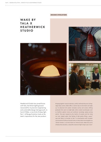
Heatherwick Studio has joined forces with Tala, the British lighting brand renowned for its precision engineering and sustainable design-led approach, to launch Wake, a new kind of sleep light. Part 1 of Design Evolution looks at the team’s inspirations for the new product.
Bringing together natural materials, careful craftsmanship and cuttingedge sleep science, Wake offers a serene way to wind down and wake up. Its advanced LED system simulates sunrise and sunset, shifting gradually from warm to bright light, while curated soundscapes such as rhythmic alphorn tones and rainforest recordings replace jarring alarms. “We were inspired by the rhythm of sunsets and the rising sun over rippled water, that feeling of light gently filling a space,” says Josh Ward, Co-Founder at Tala. “In conversations with circadian neuroscientist Professor Russell Foster, he described morning light as a “photon shower,” a cue that resets our internal clocks. Wake sets out to embody that sensation, a beautiful volume of light rising in your room.”
Crafted from hand-spun ceramic and pressed glass, Wake features
wreaking havoc. Instead of your bedroom being a calm, intimate
a tactile rotating dial for intuitive control. From the outset, the team
place for recuperation, your entire world of messaging, news and
wanted to work with natural, tactile materials. In a category so often
entertainment, is right next to you, beckoning for your attention.
dominated by injection moulded plastics, they deliberately took
Wake is our attempt to re-establish the sacredness of sleep and
another path, testing many options before settling on hand-glazed
bring back analogue calm into the digital age. It is an alternative
ceramic for the rippled body and glass for the base and light source.
form of bedside light and alarm, made from natural materials, that
The reactive glaze on the rotary dial proved especially rewarding,
uses light, touch, and sound to rid ourselves of yet more plasticky
turning the act of adjustment into a deeply satisfying, palm-led
tech devices, and instead conjure up nature to help restore sleep to
gesture.
its rightful place in our lives.”
Thomas Heatherwick, founder and design director of Heatherwick
www.tala.co.uk
Studio, says: “In the realm of sleep, the digital revolution has been
www.heatherwick.com
12 – 14 January 2026
Dubai World Trade Centre
MENA’s leading event for lighting and building technology
REGISTRATION OPENS SOON
COMMENT | RESIDENTIAL LIGHTING - TAHLIA LANDRIGAN | 42/43
COMMENT
WOODS BAGOT Tahlia Landrigan is an Associate at Woods Bagot, an Australian-based global design studio. Below, she discusses the topic of how light shapes our emotional connection to home. Light is more than illumination - it’s the invisible
that transforms static rooms into responsive, emotionally
thread that binds us to place. In interior design,
attuned places.
understanding
impact
This emotional sensitivity has staying power. It prompts
is essential to creating spaces that truly feel like home.
new questions for designers - especially when light must
Designers have long considered its functional aspects -
respond not just to mood, but to physical limitations.
brightness, energy efficiency, visual comfort - but the most
Layering Light at Emerald Place
transformative spaces use light as a tool for emotional
At Emerald Place in South Melbourne, a new mixed-use
connection.
development by Lowe Living, our design addresses varied
The relationship between light and place runs deeper than
spatial conditions across 38 apartments, ranging from two to
aesthetics. Light fundamentally shapes how we experience
four bedrooms. Constraints such as orientation, sightlines,
space, influencing everything from our circadian rhythms
daylight access, ventilation, and functional layout naturally
to our sense of safety and belonging. When used with
create differing experiences of natural light.
intent, lighting can transform even the most utilitarian
To counter this variability, each apartment incorporates a
environments into spaces that feel personal and alive.
curated lighting strategy - an additional layer that deepens
As homes become more fluid - doubling as offices, retreats,
the emotional connection to home. In collaboration
and social spaces - interior designers are rethinking how
with lighting designer Adrian Pizzey, the lighting design
light supports these shifting functions. A growing majority
introduces intentional layering across apartments and
of homeowners now see the design of their home as more
shared spaces. Light is treated as a material in its own right:
important than ever. Around a quarter of workdays in the
scaled, directed, and modulated to mirror the rhythms of
USA are still spent at home, and demand for flexible layouts
daily life and the memory of returning home.
- from wellness zones to home offices - continues to rise.
Adrian describes light as “a quiet but powerful part of the
Philosopher O.F. Bollnow described the emotional difference
design story,” one that’s often underestimated in its ability
between “dayspace” and “nightspace” - the transition that
to shape how we feel in a space - especially during the winter
light helps us navigate. Natural and artificial sources, layered
months, when natural light is limited and artificial light
and timed with care, influence how we arrive, how we rest,
becomes our primary source of connection and comfort.
and how we reconnect. The emotional dimension of lighting
His approach to Emerald Place focused on avoiding generic
is no longer a luxury - it’s foundational to feeling at home.
layouts in favour of lighting plans that respond directly to
Light and the Making of Place
the furniture and architectural features of each room. By
In interior design, place is never just physical. It’s a layered
introducing light at various levels - through wall washes,
experience - part spatial, part sensory, and deeply emotional.
concealed pelmets, lamps and floor-level fittings - the result
It holds memory, evokes feeling, and reflects how people live
is a scheme that brings rhythm, intimacy and warmth.
and move through their environments. Light is one of the
The experience begins in the entry lobby, softly illuminated
most powerful tools designers use to shape that experience,
by lamps and concealed pelmet lighting. Inside each
giving space rhythm, warmth, and depth.
residence, light shifts from task-focused kitchen zones to
Natural light brings a temporal quality to place. Its movement
intimate living spaces lit with low-level lamps and directional
across the day subtly shifts the mood and materiality of
lighting for artwork. Smart home upgrades offer residents
interiors - activating surfaces, softening edges, revealing
further control and personalisation - ensuring each home
colour in ways no artificial source can replicate. While
feels not only functional, but entirely their own.
unpredictable, it can be anticipated and harnessed through
Creating Emotional Sanctuary
spatial planning and material choice.
Light does more than illuminate - it frames a mood and
Artificial light, by contrast, offers precision and consistency.
creates space for life to unfold. By treating it as a dynamic
Designers can adjust intensity, tone, and distribution to
material, designers shape how people feel, move, and
support how a space is used - whether to energise, calm,
belong. It’s the final layer that turns structure into sanctuary.
focus or rest. Used together, natural and artificial light form
www.woodsbagot.com
light’s
psychological
an invisible architecture of their own: a shifting overlay
44/45 | PROJECT | RESIDENTIAL LIGHTING - PRIVATE RESIDENCE, BYDGOSZCZ
PROJECT
P R I VA T E R E S I D E N C E In Bydgoszcz, Poland, a riverside apartment becomes a sanctuary where the spirit of flight meets the comforts of home. Inspired by their clients’ love of gliding, designers Jakub Żurawicki and Joanna Kubiak shaped an airy, light-filled space that balances work, rest, and passion in perfect harmony.
In the heart of Bydgoszcz, Poland, an apartment perched on the Brda River became the home of two young professionals. Active enthusiasts of travelling, gliding and the great outdoors, the pair bought the designed apartment to gain more than just a place to call home but a sanctuary to pause, recharge, and find the balance between constant movement, work life, rest and rejuvenation. Interior designers Jakub Źurawicki and Joanna Kubiak were tasked with tailoring the apartment to every facet of the owner’s life, from work and studying, to spending quality time with loved ones, in turn creating a multifunctional open plan living area. The pair developed a concept rooted in the client’s passion for the sky, with their main hobby being open-air gliding. Rather than resorting to literal motifs to express the concept, the designers introduced subtle gestures of lightness and flight in the form of soft cloud-like fabrics, airy blue palettes, and above all, a considered lighting scheme that ties all the elements together. Źurawicki and Kubiak were hired through a recommendation from previous clients. The first objective was clear: to create an interior that would reflect their love for flying, while also functioning as a flexible home base. The first step of the project meant expanding the zone of the apartment to achieve an open living area. Ultimately leading to the elimination of a whole room by removing a wall to create the multifunctional space the owner’s desired. However, the space is still defined by a kitchen, a dining area, and a lounge, but is instead defined subtly through furniture arrangement, a shelving unit as a divider and zoned lighting rather than a large physical partition. Lighting played a crucial role in defining the zones and creating balance between the narrative of sky travel and creating a calming sanctuary. Flos architectural fixtures provide a calm, neutral base of illumination, while decorative lamps bring character, colour, and references to flight. This layered approach allowed the designers to inject the poetic resemblance of the sky without overwhelming the space, adding what the designers would call “the jewels of the décor”. The collaboration with the Flos Poland team was instrumental in achieving this harmony. Their expertise ensured the architectural lighting scheme was both
46/47 |
technically precise and discreet, allowing the decorative layer to take centre stage. Throughout, the sky became a guiding metaphor. Wisps of clouds are suggested in the round, organic shapes of the furniture and lighting fittings, while shifting tones appear in the palette of whites, beiges, browns and blues, contrasted with bold accents of burgundy, navy and cobalt. In nine months, the pair developed an interior that feels both expansive and cocooning, providing an atmosphere that is shaped as much by light as it is by materials and form. “In the early stages of the project, we dedicated a lot of time to carefully developing a functional layout that would fully meet the needs of the residents,” says Źurawicki. “As a result, we did not make any changes to the agreed-upon concept in the later stages of the project.” The overall concept of the sky and lightness came to no exception when selecting the decorative lighting and was in fact a key player in defining the overarching narrative of nature. Delicate, lightweight lamps with soft or spherical shapes in white or muted blue subtly expressed the sky theme. One standout feature was the Halo Edition lamp by Mandalaki Studio, which imitated the northern lights. To support this poetic layer, architectural lighting was kept deliberately understated. Flos fixtures provide a discreet, high-quality base of even illumination, their hidden LEDs casting soft, non-glare light. “The architectural lighting forms a neutral foundation,” adds Żurawicki. “It allowed the decorative lamps to become the real jewellery of the interior.” Together, the two systems work in harmony: architectural lighting ensures clarity and comfort, while decorative elements create mood, mark out zones within the open-plan space, and embody the theme of flight through form and atmosphere. The result is a scheme that is at once functional and deeply expressive – translating the sky into light. Kubiak comments: “We paid particular attention to the design of the decorative lighting. We aimed to create soft, diffused light that would enhance the atmosphere while also helping to define distinct zones within the open-plan space. The careful selection of lighting allowed us to subtly separate yet visually connect the dining, lounge, and home office areas.” The decorative lighting elements in this project were selected with two equal priorities: technical quality and atmospheric effect. A variety of pendants, floor lamps, table lamps, and accent LED lighting were chosen based on their colour temperature, light quality, and function relative to the layout, while aligning with the overall sky travel concept. A mix of Scandinavian classics and Polish designer pieces were incorporated, adding both international appeal and local character to the scheme. Statement pieces such as the New Works Tense pendant hang elegantly over the dining area with a cloud-like presence, creating a sense of suspension and weightlessness to the design. Meanwhile, &Tradition’s Flowerpot series in cobalt and stone blue echoes the sky palette, while introducing a retro flair in shape, complemented by a Muuto Leaf floor lamp in copper that not only enhances the retro aesthetic but offers gentle, adjustable task lighting for reading or work. The comprehensive lighting scheme includes fixtures from Flos, Halo Edition, &Tradition, New Works, Muuto, Wästberg, Labra, Artera, Chors, and Westwing. Together, this well-balanced mix enables the interior to transition seamlessly between moods – from soft, atmospheric glow in the lounge to brighter, more focused illumination in the kitchen and work areas. “For us, lighting is always a priority,” says Kubiak. “It not only defines zones and creates distinct scenes but also translates the main theme of the interior – in this case, the clients’ passion for flight – into something tangible. It becomes the jewellery of the space, highlighting textures, colours, and details.” The effects of the interior feel both calm and energised. Diffused glows of warmth to the lounge alongside the vibrant hues of the Halo Edition lamp
PROJECT | RESIDENTIAL LIGHTING - PRIVATE RESIDENCE, BYDGOSZCZ
introduce a vibrancy and an element of surprise. The lighting also directly influences the well-being of the occupants, thanks to the carefully selected high-quality fixtures, and close attention to colour temperature and diffusion ensures comfort in its daily use, from focused work to relaxation. “What truly surprised us in person was how beautifully the materials and lighting came together - even better than we had anticipated. They gained richness in colour, depth, and energy, while at the same time
PRIVATE RESIDENCE BYDGOSZCZ, POL AND Interior Design: Zurawicki Design Architectural Light: Flos Poland Lighting Specified: Ar tera,
the space offered a sense of calm and balance to those experiencing
&Tradition, Chors, Flos, Labra,
it,” says Żurawicki.
Mandalaki Studio, Muuto,
What makes the project exceptional, and the designers agree, is the collaboration with clients, who were receptive to bold material choices and the seamless integration of Polish and international design
New Works, Wästberg, West wing Images: kroniki In Bydgoszcz, Poland, an apar tment overlooking the Brda
pieces. The apartment feels timeless, energetic, and calm all at once,
River was reimagined by designers
and the clients’ needs, personalities and passions are perfectly met
Jakub Żurawicki and Joanna
without having to compromise on their original vision. By translating a love of flight into architectural and decorative lighting, furniture, and finishes, the designers created a space that is more than a home: it is
Kubiak as a sanctuar y inspired by the sky and the clients’ love of gliding. Open-plan living, subtle zoning, and a layered lighting scheme balance work, rest, and
a sanctuary, a stage for life in motion, and a story told in light.
leisure while evoking lightness and
As Kubiak notes: “The project is a story about the people living in it –
flight. Combining architectural
their passions, their habits, their way of experiencing the world. This apartment is exactly that story, expressed through materials, forms, and most importantly, light.” www.zurawickidesign.pl
precision with decorative statement pieces, the interior achieves both functionalit y and atmosphere - an elegant, timeless space where light tells the stor y of its owners’ passions.
48/49 | COMMENT | RESIDENTIAL LIGHTING
COMMENT
LIGHTING DESIGN FOR OUR FUTURE S E LV E S Dr Shelley James, Lighting Designer, Keynote and TEDx Speaker, WELL Light Advisor and Curator, and Founder of Age Of Light Inovations, explores the world of lighting for senior communities, diving into the health benefits of a well-thoughtout lighting scheme for senior living.
Until recently, lighting design for older adults
But, as our lifespan is increasing, our healthspan
was a gloomy, low-budget niche. Today, housing
is not. [5] So many of us will live longer, but
adapted to the needs of our parents - and our
need more physical and mental health support,
future selves - is considered one of the most
either through adaptations to our homes, or in
dynamic and attractive asset classes for
community-style developments, with others
investors, with a 19% increase in independent
going on to need more specialist residential
retirement community units delivered in the
care. [6]
past five years alone. [1] That makes sense
Designing for older eyes
when you look at the demographics - almost
From
one in five of us are over 65, and the number
population poses very technical demands.
of people aged 80+ worldwide is set to triple
Firstly, changes in the physiology of the eye
by 2050. [2]
and brain mean they require higher brightness
The financial appeal of the sector is clear too:
levels and better colour rendering to see clearly
almost two-thirds of over-75s live in medium to
and comfortably, and communicate with ease.
high-affluence households, with an estimated
At the same time, older adults are acutely
£1.8 trillion in housing equity among retired
sensitive to glare, as natural clouding and
households. The ‘grey pound’ is worth an
yellowing of the eye can generate the flares and
estimated £320bn in the UK, with older adults
distortions you might expect looking through
accounting for an estimated 50% of consumer
a greasy camera lens. This is exacerbated
spending. [3] Perhaps it’s time to listen to
by drugs that make it harder for the pupil to
insights from Boomer and Beyond’s research
adapt to sudden shifts in light levels, while
that invites us to rethink our preconceptions
degenerative diseases such as dementia
about wellbeing in later life, pointing out that
alter the connectivity between the visual,
this population is as diverse, discerning and
auditory and vestibular systems that are key to
demanding as we are, albeit with some unique
wayfinding and walking safely through a space.
challenges when it comes to physiological
Layered schemes that combine diffuse high-
needs. Their recent Grey Matters blog identifies
brightness ambient lighting with lower-level
six key pillars of wellbeing that offer a useful
task lights by the bed or reading area, and
framework to lighting design and controls:
fittings that focus on a feature such as an image
independence and autonomy, feeling safe and
or a vase without generating a bright point
secure, social connections with family and
source can offer comfort and variety without
friends, staying active and enjoying hobbies,
creating harsh and confusing shadows. Simple
maintaining a sense of purpose and lifelong
design choices, such as adding a shade to a
learning and being in the right place, which
bulkhead fitting, can create a more domestic
critically includes a low-maintenance home. [4]
look without compromising on technical
a
purely
visual
perspective,
this
performance. The choice of light source is often
an average of £1,000 per week, the return on
an afterthought but opting for frosted rather
investment is clear for those who can afford the
than a clear ‘filament’ style can transform the
capital cost. [8]
visual comfort of a scheme.
Changing brains
Although collaboration is essential for any
When it comes to the biological or ‘non-image-
successful project, it’s especially critical to work
forming’ effects of lighting, older adults need
closely with the client and interior designer
more support from the lighting too. Not only
to confirm a typical room layout to choose
through a natural decline in hormone signalling,
the location of switches, avoid overhead
but because older adults, especially those living
fittings directly over the bed, choosing ceiling
with mobility issues, anxiety or depression, tend
finishes with high surface reflectance to bring
to spend less time outside. Once our loved ones
daylight deeper into the space and choosing
move into residential care, access to sunshine is
colours and textures that meet standards for
even more limited - one study suggests that even
Light Reflectance Values. These can help with
for those who are physically able, less than one
orientation and a sense of safety creating clear
in three get outside more than once per month.
contrast and sight lines to vertical elements such
[9]
as door frames that help to maintain postural
There is growing evidence that a lack of bright
stability, linked to risk of falls. [7]
light during the day is linked to poor sleep, even
Controls
in ‘normal’ homes. Low daytime light levels are
One recent large-scale study with community-
often compounded by leaving the TV on at night, or
living adults found that most were living with
routine nighttime checks for those in residential
light levels well below these recommendations,
care. Fragmented sleep gives rise to a downward
noting that control is as important as the
spiral of distress from depression, memory
lighting itself. Many participants explained that
loss and agitation to increased vulnerability to
they do not use side lamps because of difficulty
infections. UTIs not only exacerbate confusion,
accessing the switch, while curtains and shades
they lead to increased need for bathroom visits,
often remained closed because of the difficulties
one of the leading causes of falls at night. [10]
reaching over furniture positioned in front of the
As well as pain and increased risk of mortality,
window. Older adults often experience stiffness
each hospitalisation costs the health and care
in their hands and other joints, making it harder
system an estimated £21,000. The NHS spends
to reach, grip or twist. A loss of moisture in the
around £2.3bn per year - that’s £6m per day on
skin means that touch screens can be hard to
falls-related care. [11]
use.
Falls management
While the sector has traditionally focused on
While the familiar call pendants and cords are
controls for lighting alone, a growing number of
common in independent and residential care
platforms are integrating automated shading,
settings, the evidence for their effectiveness is
thermal comfort, and occupancy sensing and
limited. [12]
security, including alerting loved ones to unusual
A growing number of technology-led solutions
patterns of behaviour.
are emerging to fill that gap, including mattress
This has implications for those targeting this
sensors and acoustic monitoring, with Nobi
population, with the need to design intuitive,
Lighting leveraging the lighting infrastructure
integrated user interfaces to meet complex
itself. This system combines a motion-activated
and changing needs while respecting privacy
night light with a monitoring and call protocol
and dignity. While most simply focus on control,
that alerts the care team to an unusual sound or
the innovators are harnessing this smart
movement. This strategy has not only reduced
infrastructure to harvest data and provide
the number of falls thanks to increased visibility
insights similar to an enterprise-level BMS but
but also slashed the time taken to respond to an
without the complexity. The software company
incident to less than four minutes at Hartland
Baulogic recently worked with an elderly couple
House in Derbyshire. The ability to review
to ‘future proof’ their home to allow them to
sensor data from the moments preceding the
live independently for as long as possible.
fall also facilitates identifying factors involved,
Considering that assisted living in the UK costs
facilitating tailored interventions and prevention.
50/51 | COMMENT | RESIDENTIAL LIGHTING
This solution is being adopted by a growing number of care providers in
Chief Executive Ed Russell describes the effects he has seen:
the USA as well as across Europe and in the UK. [13]
Measuring impacts after installation, using Bradford University’s
Circadian lighting
dementia care mapping tool, daytime sleeping dropped by an average
While these solutions target falls management, there is growing evidence
of 58% for the residents in the study group, and positive mood increased
that circadian lighting solutions can improve the quality and quantity of
by 330%, a shift sustained over many months. Negative mood dropped
sleep itself, tackling the root cause of nighttime falls in independent
by 94%, and sundowning symptoms stopped – 100%. Russell has also
living and residential healthcare settings. Lighting systems engineered
seen a dramatic reduction in antipsychotic medication use.
to deliver recommended levels during the day, warmer, dimmer light in
“It was massive stuff, we saw people chatting, residents chatting, dancing
the evening and darkness at night can effectively support the sleep-
and sociability, less aggression, less agitation, and less sundowning…
wake cycle. One Harvard study noted a reduction in falls of up to
Disagreements were much easier to de-escalate. Residents could
43%, reduced agitation and confusion, reduced cognitive decline and
identify their rooms more easily. Mealtime felt calmer and more
improved mood.
pleasant. They had fewer falls and fewer residents at nutritional risk
The team at Circadacare has developed a retrofit light source that aims to
because they were eating better.”
deliver recommended light levels for circadian entrainment, along with
Carers expressed they felt more relaxed and more connected to the
humidity and temperature monitoring and a falls detection algorithm,
people they support. One says: “I don’t go home exhausted, I go home
which triggers an alert to a designated contact. The affordability and
proud.” Another says: “The place feels calmer, residents are more
ease of this retrofit solution is delivering measurable benefits to NHS
themselves and so are we.”
Partnerships and providers such as Kyndi seeking to keep older adults
Russell is clear that the lighting complements and does not replace
living at home for as long as possible. [14]
time outside, and has implemented these changes alongside other
While there are a growing number of ‘circadian lighting’ products on
interventions such as acoustic monitoring and wide-awake clubs. He’s
the market, very few manufacturers or care providers have invested in
seeing the benefits to the bottom line, too, calculating that the increased
a systematic evaluation of the benefits for residents and staff. Given
cost can be recouped if it leads to selling just one room for a year.
the powerful biological effects of light, especially for this vulnerable
A successful lighting design takes a systems approach to the
population, a lack of evidence-led design risks causing real harm and
environment, integrating visual and non-visual needs as well as the
undermining confidence in the approach.
user experience, working with the client to create the ideal optimal
Evidence-led design
blend of simplicity and control.
WCS Care in Warwickshire is one healthcare provider that stands out in
To summarise, designing for an ageing population is a uniquely
the sector for its drive to focus on results in terms of quality of life for
rewarding challenge. It demands a sensitive user-led systems approach
residents and staff, working with Coventry University to measure the
that balances the needs for increased quality as well as quantity of
impact of their first circadian lighting installation over eight years ago.
light, a willingness to engage with the complex operational and financial
So when it came to evaluating a recent retrofit programme with lighting
constraints of a 24/7 setting, and the confidence to seek evidence and
designer John Bullock and Commercial Lighting Systems, the WCS team
fine-tune the solution. It’s time to design for our future selves.
chose a blend of strategies to capture objective and subjective results.
www.ageoflightinnovations.com
IMAGES: TOP: CHROMAVISO’S EVIDENCE-BASED CIRCADIAN LIGHTING AT LUNDTOFT CARE HOME, DENMARK, MIDDLE: WCS CARE WOODSIDE EVENING LIGHTING, BOTTOM LEFT: LIGHTING CALCULATIONS FOR WCS CARE, JOHN BULLOCK AND CHRIS FORDHAM, BOTTOM RIGHT: PORTHAVEN CARE HOMES CAVELL PARK CARE HOME AND CARE HOME INTERIORS COMPANY.
1.
www.cbre.com/press-releases/senior-housing-sector-poised-for-strong-rental-growth-in-2025-amid-strengthening-fundamentals#:~:text=More%20 than%2063%25%20of%20investors,rate%20indicating%20a%20higher%20value.
2.
www.ageing-better.org.uk/our-ageing-population-state-ageing-2025
3.
www.mercieca.co.uk/news/grey-pound-opportunity
4.
www.boomerandbeyond.co.uk/greymatters
5.
www.housinglin.org.uk/_assets/Resources/Housing/OtherOrganisation/jll-uk-seniors-housing-report-2024.pdf
6.
www.ilcuk.org.uk/urgent-paradigm-shift-from-lifespan-to-health-span-needed/
7.
www.designforsight.com/valuecontrast.html
8.
www.baulogic.com/
9.
van den Berg, M. E. L., Winsall, M., Dyer, S. M., Breen, F., Gresham, M., & Crotty, M. (2019). Understanding the Barriers and Enablers to Using Outdoor Spaces in Nursing Homes: A Systematic Review. The Gerontologist, 60(4), e254-e269. https://doi.org/10.1093/geront/gnz055
10.
Zou, M., Lu, R., Jiang, Y., Liu, P., Tian, B., Liang, Y., Wang, X., & Jiang, L. (2023). Association between toileting and falls in older adults admitted to the emergency department and hospitalised: a cross-sectional study. BMJ Open, 13(6), e065544. https://doi.org/10.1136/bmjopen-2022-065544
11. 12.
https://www.felgains.com/blog/how-much-do-falls-cost-the-nhs/ Wen, M. H., Chen, P. Y., Lin, S., Lien, C. W., Tu, S. H., Chueh, C. Y., Wu, Y. F., Tan Cheng Kian, K., Hsu, Y. L., & Bai, D. (2024). Enhancing Patient Safety Through an Integrated Internet of Things Patient Care System: Large Quasi-Experimental Study on Fall Prevention. J Med Internet Res, 26, e58380. https://doi. org/10.2196/58380
13.
www.nobi.life/en_GB/product
14.
www.circadacare.com/
52/53 | PROJECT | RESIDENTIAL LIGHTING - RADLETT LONDON
PROJECT
RADLETT LONDON Isla James Lighting creates a luxurious, yet homely lighting scheme for this private residence based in London, UK. Founder, Jo Calver walks us through the project, detailing the lighting considerations and the importance of a thought-out scheme for a residential space.
Isla James Interiors is a UK-based design studio founded by interior designer Jo Calver. In issue 57 of darc magazine, we sat down with Calver to discover her career journey into interior design, which rapidly expanded into a keen interest in lighting design. The studio has since branched into two, with Isla James Interiors remaining in its Pangbourne location, and Isla James Lighting based in London. We caught up with Calver to discuss one of her lighting team’s more recent residential projects, Radlett London, which features a beautiful blend of architectural and decorative lighting to create an elevated living experience for her clients. “The value lighting gives to a project is immeasurable - it is literally everything, the very heart and soul,” she tells darc. “It creates everything you feel about the home. Without lighting design (lights evenly over your ceiling), the light is thrust to the floor, drawing the eye to the exact size of the room. We move the lighting to the walls, lifting up the eye, making the room feel even larger than it is and use focused lighting to deliberately guide the eye to the details we want to be seen within the design. By lighting tabletops and surfaces and adding hidden lighting to joinery, we create a warm, lamp-like glow to spaces that need to feel warm and inviting. And then on top of all of this, we control all the circuits so that, like a play on a stage, you can create different moods and different feelings within the same
54/55 |
“The value lighting gives to a project is immeasurable - it is literally everything, the very heart and soul. It creates everything you feel about the home.”
room at different times of the day and based on how you feel. Lighting design is a critical tool that is far too often unrecognised and overlooked. We are trying to educate through our social media platforms just how much we can impact the finish with our designs.” The team initially became involved in the project after working on another for a construction company in London. “The project was a great success, and the construction company recommended us to their next client, which is how we became involved,” explains Calver. The brief for this private residence was to create a luxury, contemporary feel with traditional elements, which all combine to make the home feel warm and cosy. An added bonus for the project was the client’s pre-existing interest in lighting design, which meant they placed high value on the changing moods that Calver’s team could bring to the spaces. “We like to design for every room individually, but with a language that travels across the house,” she tells us. “This new build home is a Georgian style with grand features, so we wanted to highlight elements such as the sash windows and grand tall doors on the ground floor. We used tight downlights to pool light in front of the doors as a visual invitation to move through the space and invite the user into the next room. “As you arrive through the front door, the client can see all the way through the house and out to the garden. The lighting design was critical to this vision from the architect. The eye is meant to travel all the way through but at night glass becomes solid and black, and this is problematic. By adding lighting punctuations through the ground floor, we allowed the eye to travel through the glass screen between the hall and kitchen and then added subtle glowing lighting into the garden beyond the rear glass doors. The result is that the eye moves all the way through the glass, and actually, the effect is that at night, the space outside feels totally integrated with the space inside.”
PROJECT | RESIDENTIAL LIGHTING - RADLETT LONDON
We asked Calver to walk us through the various rooms in the home that the team paid particular attention to when it came to the lighting. “In the open plan space – including the kitchen, dining and seated area – it was important to combine these but treat each zone in terms of lighting as a separate room,” she says. “This is because there are often different demands on the lighting required for, say, a kitchen and the seated TV space. The kitchen needs far more task lighting and higher overall levels of light with the ability to turn it into an evening setting, while the seated area demands a softer lighting level with more of a lamp-like glow. Overly lighting areas with TVs can cause reflection and give the wrong feeling to the space. “Working closely with Isla James Interiors on the project, the approach was to create subtle hidden support for the feature lighting. For example, over the island in the kitchen, the milky glass globe pendants looked fabulous, but did not provide lighting to the surface of the island. By adding carefully placed and controlled beam width downlights, we were able to create the illusion of a warm and inviting surface while providing the option to increase the lighting required to complete tasks at the island. “When pendants are structurally beautiful on the exterior, I always feel as though, when they are on, the light comes out from the inside and throws the structure into shadow, defeating the object of their placement. I love to add supporting and discreet lighting that actually lights the outside of a feature pendant; the light not only shows its full beauty but also captures intricate details and qualities. “The library provided a room for quiet reflection. The joinery ran from wall to wall, so we used this to add LEDs to the open shelving to create a warm, lamp-like glow to the room. Wall lights positioned within the sofa and window recesses provided focused warm glows to encourage users to sit and relax. Minimal downlights were required but we did highlight surfaces. Controlled with a computerised system, there are several moods that can be created based around the changing times of day and natural light input. “We also used a stunning picture light within the joinery but supported this with hidden LEDS and opposite the joinery, we used downlights to deliberately target the centres of the three panels behind the desk. The combination and interaction of these elements provide complexity and interest to the space. “The drawing room is a formal and architectural space with a central fireplace. Creating warmth within this room was more challenging due to the dual aspect windows, which total four across the walls of the room. The joinery created to the rear wall had two differing sectionals - shelving and two large, tall niches. The taller niches were to house the client’s collection of vases, so we chose two different ways of lighting the shelving. The tall niches we hid vertical LEDs, which ensured an even light to the curved nature of the vases. The remaining shelves were lit with LEDs from the front of the shelves to highlight the accessories that complemented the interiors.
“For the hall and landings (times two, as three-storey), it was important to highlight the architectural features. A curved staircase as a sculptural feature dominates the space. On the ground floor, we used architectural lighting to highlight all door entries, a visual invitation to explore the room beyond. The arch to the cloakroom emulated the shapes from the curves to the staircase, so we accentuated this effect and lit the arch with small uplights picking up the arch’s reveals and meeting at the top. Large pendant lights fall through the centre of the staircase, and above, the natural light circular lantern is lit with a hidden LED to bring a warm glow at night. The lantern pendant, visible from the large first-floor windows of the house, was important to draw attention to. Not only did we control the light emitted from this fitting, but we also added architectural spotlights to illuminate the aged brass chain and frame of
56/57 |
“Delivery of a warm, cosy scheme was critical here, and we designed a holistic scheme that focused on the interplay of feature and architectural lighting with added practical, functional circuits for nighttime movement.”
the pendant fitting. This added another dimension. “In the master bedroom, there was a focus on ease of technology and combining many different zones. The bedside switches needed to control the lighting via a computerised system, and we added the blinds and curtains onto this so they could get into bed and, at the touch of a button, control the room’s functions. “We also added low-level floor lights on PIR that guide anyone getting up at night across the bedroom, sitting space, dressing room and into the bathroom so that at no point do the main lights have to be on. “Delivery of a warm, cosy scheme was critical here, and we designed a holistic scheme that focused on the interplay of feature and architectural lighting with added practical, functional circuits for nighttime movement.” The decorative lighting fixtures were selected by the Isla James Interior Design team, who also worked on the project. Calver elaborates: “The fitting choices were not just based upon their aesthetics, but upon the light they deliver to complement the lighting plan. For example, in the library, the IJI team chose wall lights within the window seats that had stunning linen shades and sent the light both up and down. The light that travels down is soft and throws light onto the bench seat, encouraging the user to sit but also providing the room with a warm glow. The lighting that travels out of the top (which is less) serves to travel up and around the reveal of the joinery, creating a ‘lit pocket’, which again helps make the window seat feel really cosy. “Within the landing on the first floor, the IJI team chose wall lights in marble, which have a stunning glow. As they don’t actually provide much light within this double-height space, other feature lights provide support. For example, the three huge linen pendants in the stairwell. These were chosen because we find that exposed light sources can often feel stark, so choosing a fitting that just glowed through curved fabric helped the space stay soft and inviting.” Lighting controls played a large role in this project, with various scenes highly encouraged by the design team. “More complex spaces with multifunctional needs have a
PROJECT | RESIDENTIAL LIGHTING - RADLETT LONDON
far higher demand on mood change. Within these spaces,
project and saw our lighting design capabilities first-
we created more circuits, giving the client more flexibility
hand, so was happy for us to take the lead for this home,
for mood-altering. With a computerised system, we are
where we were able to design without restriction. The only
able to set the scenes for the client, which allows them to
push back we had to overcome was that we would have
create the intended design with the touch of one button.
liked to have computerised all rooms within the home,
For example, in the kitchen, the ‘cooking’ scene would
but a compromise was made at the primary areas only.
bring the designated task lighting up to higher levels,
We were able to modify the switched rooms to bring the
and the ‘evening’ option would bring all the task lighting
number of circuits down to make it more user-friendly. It
down and increase the moodier, lamp-lit look, all at the
does mean that in secondary spaces there is a reduction
touch of one button.”
in lighting capability to create differing moods, but given
When it came to challenges within the project, an
that these spaces are children’s and guest bedrooms, it
abundance of natural light from various points in the
was a good compromise, as these areas can get away
home caused the central part to look much darker.
with less complexity.”
“We needed to balance this. Feature lighting was an
Reflecting on the project and general attitudes towards
important part of the scheme, but architectural lighting
thought-out lighting design within residential contexts,
was required to really bring the look together. To combat
Calver concludes: “I believe awareness is growing rapidly;
the darker areas of the ground-floor hallway, we added
we are seeing a rise in enquiries from people who
additional downlight support, throwing light onto the
appreciate how valuable this tool is. Saying that, there
walls centred on the panelling. We used uplights to
is always room for improvement. At IJL, we are starting a
highlight curved archways and feature openings, and
lighting clinic once per month, which is live on Instagram.
used the study joinery to provide borrowed light through
This is a chance for people to ask questions during the
the glass doors, which really worked well. On the first-
session about their lighting.”
floor landing, a huge lantern provided interest.
www.islajamesinteriors.com/lighting-design
“Additionally, the client had previously visited a London
R ADLE T T LONDON LONDON, UK Interior Design: Isla James Interiors Architecture: Dusek Design Associates (DDA) Construction: Griggs Homes Lighting Design: Isla James Lighting Lighting Specified: Astro Lighting, Flos, Heals, Hübsch, Isla James Interiors Direct, Ralph Lauren Images: Gavriil Papadiotis Combining the skills of both studios - Isla James Interiors and Isla James Lighting - the teams have created a stunning, luxurious, yet warm and inviting home for their clients in London. Using a variet y of architectural and decorative fixtures that are mostly linked to a controls system, the residence is a practical yet sophisticated space for its residents.
58/59 | CASE STUDY | RESIDENTIAL LIGHTING
VIBIA P R I VA T E R E S I D E N C E , S P A I N
Clysa interior design studio transforms an urban apartment
collaboration, Clysa - with its own studio and three
into a family retreat with the cosy touch of Vibia lighting
showrooms across Spain - has crafted a bespoke space
fixtures.
tailored for modern living and comfort.
This urban housing renovation in Barcelona creates spaces
The home features a seamless flow between areas -
that flow seamlessly with the rhythm of everyday family life,
interconnected yet clearly defined - where noble materials
featuring a welcoming lighting scheme complemented by
and refined finishes engage in harmonious dialogue.
pieces from the Tempo, Dots, and Pin collections by Vibia - a
Spaces and volumes intertwine subtly, creating pockets of
home designed for wellbeing.
privacy within a functional layout that adapts to the pace
The starting point for this residential renovation in
of everyday life.
Barcelona’s Sarrià district was to meet the daily needs of a
Lighting is essential in this interplay of transitions, adding
family, creating a functional yet welcoming home. The result
an extra layer of comfort that feels almost intangible yet
is a space with a refined, elegant, and understated aesthetic,
profoundly sensory. To accomplish this, Clysa has selected
designed for shared experiences and the enjoyment of life’s
luminaires from Vibia’s Pin, Dots, and Tempo series. These
simple pleasures.
designs enhance the atmosphere with their distinctive
True to its philosophy of holistic design and close client
“lighting personality” and sleek design.
In the master bedroom, a pair of pendant lamps from
partition elements. Designed to foster togetherness,
the Tempo collection shape the lighting with a delicate
this open-plan space adapts flexibly to different
contrast of effects.
moments of the day, even incorporating smart home
On one side of the bed, the semi-translucent blown glass
technology. While it may seem like a minor detail,
lamp casts a soft, diffused glow, while on the other, the
the Dots wall lamp contributes to this versatility:
reflector-shade version provides intimate, downward-
positioned above the corner of the sofa, its adjustable,
directed illumination, leaving the upper area in gentle
directional beam allows for an impromptu reading
shadow. Both pieces complement each other with their
nook. Its circular design, finished in oak, strikes a
evocative reinterpretation of classic lamp designs through
balance between geometric precision and artisanal
a minimalist lens.
warmth, complementing the surrounding surfaces and
In the entrance hall, the Pin wall lamp traces its slender
furnishings.
black silhouette against an oak-clad backdrop. Appearing
Ultimately, this urban home renovation is a masterclass
to float weightlessly above a patch of reflected light,
in comprehensive interior design, where every detail
the fixture adds a subtle yet striking decorative accent,
has been meticulously considered to optimise
enhancing a passageway that might otherwise be
space and enhance the wellbeing of its inhabitants.
overlooked.
Beyond shaping comfort, the lighting lends character
Finally, the “heart of the home” unfolds in a spacious
and harmony, enveloping each environment in an
communal area where the kitchen, dining, and living
atmosphere designed to be lived in and enjoyed.
spaces merge. Their boundaries are softened by subtle
www.vibia.com
60/61 | ON SHOW | LIGHT
ON SHOW
N o w j u s t t w o m o n t h s a w a y, e x c i t e m e n t i s b u il d i n g f o r L i G H T 2 5, t h e U K’s o n l y d e d i c a t e d e x h i b i t i o n f o r l i g h t i n g s p e c if i c a t i o n . B u il d i n g o n t h e s u c c e s s o f t h e 2 0 2 4 e d i t i o n , t h i s y e a r ’s e v e n t h a s e x p a n d e d f u r t h e r , w i t h t h e a d d t i o n o f a n a l l- n e w Te c h n i c a l Z o n e. Building on the success of the last four years, this
team has lined up some excellent speakers and topics
November, the Business Design Centre welcomes
for this year’s offering, with talk titles such as Is True
back LiGHT 25, the UK’s only trade show dedicated to
Inclusivity Achievable?, Beyond Light: Multisensory
high-end lighting specification.
Design in Practice, Bespoke Solutions in Lighting, and
Held at the Business Design Centre in Islington,
True Luxury is Handmade: Crafted for Connoisseurs
London, on 19 and 20 November, this year’s show
of Light, to name a few. This programme will bring
continues to evolve with a dynamic new addition
together some of the industry’s brightest minds to
to the layout. To reflect the scale and scope of the
explore the future of design, opportunities to gain
lighting industry today, LiGHT 25 will be divided
fresh insights, and earn recognised CPD credits that
into three distinct zones, helping visitors easily
support both career development and professional
explore the vast range of brands, technologies, and
standards.
innovations on display.
The exhibition also offers unrivalled opportunities
LiGHT 25 is about far more than just product displays.
for networking, branding, and social engagement.
Alongside hundreds of decorative and architectural
Visitors can connect with exhibitors directly on
lighting brands, attendees can enjoy an array
their stands, enjoy late-night welcome drinks on the
of engaging content, including the return of the
opening evening, and take part in the much-loved
dedicated two-day [d]arc thoughts talks programme,
LiGHT Lunch on day two. More informal catch-ups
which, for another year running, is in collaboration
can happen over coffee at Jacks, the on-site gallery-
with Lutron. Running alongside its main conference
level café, or in the LiGHT WORK co-working space, a
programme is the returning splinter programme held
quieter area designed for deeper conversations and
in the Associations Lounge. The [d]arc media editorial
collaborative meetings.
One of the new developments for 2025 is the
currently available to the UK market.
introduction of the Technical Zone, located in the
Helen Ankers, Managing Editor at [d]arc media, says:
Gallery Hall. The new zone will showcase brands
“We are delighted to bring the lighting and design
such as Casambi, Eldoled, Kvant, ProtoPixel, and
communities together for the most anticipated UK
TM Technologie, and is designed specifically for
event in the lighting industry for the fourth year
companies leading the way in urban and commercial
running. LiGHT 25 is not just for lighting designers
lighting, control systems, OEM components, lamps,
- we value bringing together inspiring leaders and
gear, and emergency lighting.
passionate people to share ideas and solutions to
A second new addition to this year’s show is an
grow the future of the entire industry. A common
exclusive VIP offering for interior design studios.
misconception is that trade shows dedicated to
A dedicated lighting tour is being held on the first
lighting specification are just for lighting specialists,
morning of the show before it is opened to general
yet
visitors, which will allow a select group of design
designers and other professionals in the community,
studios to go on a hosted tour around a chosen lineup
with innovative brands and suppliers, LiGHT 25 is the
of decorative lighting brands. The participating
perfect opportunity to network and seek inspiration,
brands will be able to present a more intimate insight
whatever role you play in a project.”
into their new products and collections to designers
Completely free to attend, LiGHT 25 continues to set
on the tour. This, in turn, provides an efficient way for
the standard for lighting exhibitions in the UK.
interior designers to utilise their precious time out
www.lightexpo.london
of the office to source and collect vital information
Images: Natalie Martinez Photography
on some of the newest decorative lighting offerings
by
bringing
together
architects,
interior
62/63 | ON SHOW | LIGHT
EXHIBITORS WITH DECOR ATIVE LIGHTING* Arkilight
26
Aromas Del Campo
42
Bega
38
Black Nova
D7
Cangini & Tucci
D8
Davide Groppi
D3
Elstead
D32
Estiluz
D23
formalighting
47
Franklite
22 2
Huda Lighting Il Fanale
D27
Indust ville
D21
Intra Lighting
D12
Italamp
D25
Knikerboker
D9
Kreon
44
Leds C4
U38
Lightingspiration
D14
Lodes
15
Lumen Loom
D31
Lumina
D13
Lux xbox
58
Nemo Lighting
19
Olev
D16
Orluna
3
Panzeri
58
Penta Light
55
Quasar
D14
Roger Pradier
D18
Rotalina
D6
Saas Instruments
D17
Tala
5
Tekna
D14
Tooy
D34
UFO Lighting
12
Vibia
D19
Zafferano
D28
Zambelis
D29
Zero
60
*EXHIBITOR LIST CORRECT AT TIME OF PUBLICATION. VISIT THE LIGHT 25 WEBSITE FOR THE MOST UP-TO-DATE INFO ON EXHIBITORS.
Trezzi Series
Lifting people’s quality of life with light. Find out more at: www.nordlux.com/en-gb/
AD INDEX
[d]arc awards
37
Franklite
15
[d]arc sessions
25
Intra Lighting
67
BDNY
65
LiGHT 25
13
Cordula Kafka
2
Light Middle East
42
David Village Lighting
68
Nordlux
64
Elstead Lighting
5
PORTFOLIO
PROUDLY SUPPORTING
REBEL MINDS WANTED This November, we’re rewriting the rules of boutique design. Are you in?
darc magazine readers enjoy a free expo pass with promo code DARC100* *Offer not valid for non-exhibiting manufacturers or manufacturer representatives
66/67 | IN FOCUS | UPGLAS
IN FOCUS
Upglas L u c a Nic h e t to Astep
What is the concept behind the Upglas collection?
Why is using recycled materials important?
When founder of Astep Alessandro Sarfatti asked
Half of the glass produced in Murano becomes
me to design a lamp made of recycled glass I
waste – about 1000 tonnes of non-recyclable glass
immediately accepted. Glass is part of my DNA,
that ends up in landfills. Using fragments of surplus
but this time I wanted to push the boundaries
glass, coming from a variety of products made in
furthermore. So, my research led me to a Venetian
Murano, means regenerating value, caring for the
start-up working with waste glass that cannot be
environment, celebrating this alchemic tradition
recycled in the traditional way coming from Murano
with an eye to the future.
- the island where I grew up, which is renowned worldwide as the home of glassmaking.
What kind of environments and projects is Upglas suitable for?
What was the most challenging aspect of producing
Upglas is suitable both for private residence
the products?
and public spaces, such as boutique hotels and
The most interesting aspect was going back to the
restaurants.
roots, to an artisanal way of working: no renders,
It stands out in ambiances thanks to its archetypal
direct contact with producers, many tests and risks.
shape and when switched on the light is softened
I rediscovered that sense of surprise that was typical
by the glass resembling honed stone brightens
of my job at the beginning of my career. Working with
environments without imposing.
a new material added that sense of experimentation and innovation that are the engines of my work:
What makes this piece different to others in your
when I first saw this new material I got the idea of
portfolio and other lighting products available on
rolling and spreading it by hand, like you would do
the wider market?
when making pizza. Its features definitely influenced
The material and the handcrafting production
the final shape of the lamp.
process make each Upglas lamp a unique product.
Tell us more about the 3D printing process.
Please describe the product in 3 words.
In this process, the paste coming out from upcycled
Craft, innovation, upcycling.
glass can be used when heated at 400°C, much lower than the typical 1200°C needed for traditional glass, making the production easier and sustainable. It can then be shaped through 3D printing, and all waste can be reintroduced into the cycle and therefore reprinted to give new life to upcycled glass.
www.astep.design
Biba T IN Y
Not only light
It’s emotion
S O P H ISTICATIO N
Elli Suspension
In Partnership With
The Old Cinema, 5-13 Ashgate Road, Broomhill, Sheffield, S10 3BZ
www.davidvillagelighting.co.uk