


www.sgmlighting.com
www.sgmlighting.com
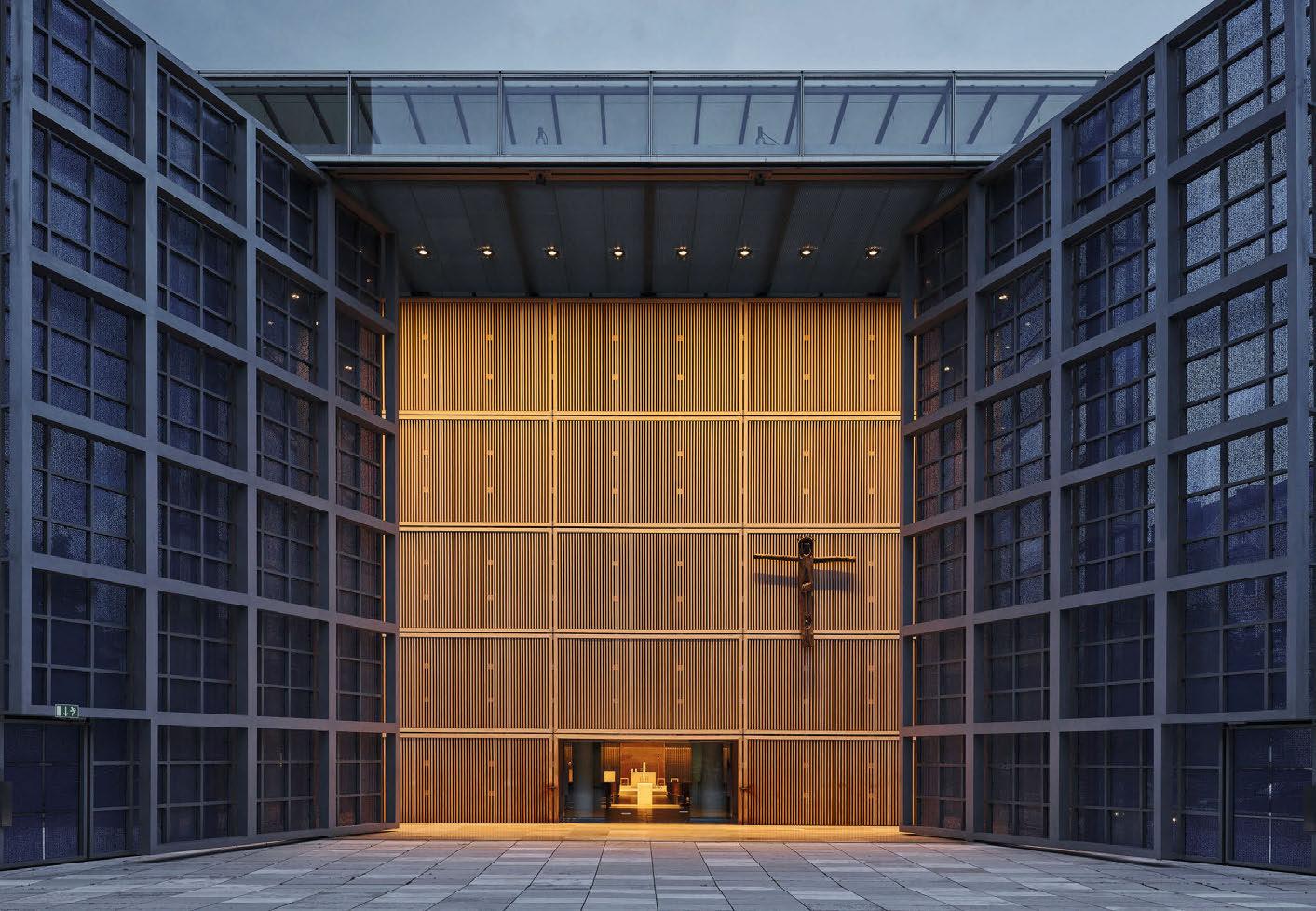
At ERCO’s Herz Jesu Church project in Munich, the original high-end halogen lighting has been respectfully upgraded to modern LED technology, preserving the architectural design intent while reducing energy consumption by up to 90%.
The project highlights ERCO’s ability to unite architectural sensitivity, sustainability and advanced lighting technology—maintaining the powerful interplay of light and space that defines Herz Jesu Church, while significantly lowering maintenance demands and environmental impact.
Photography: David Schreyer
Discover the full story
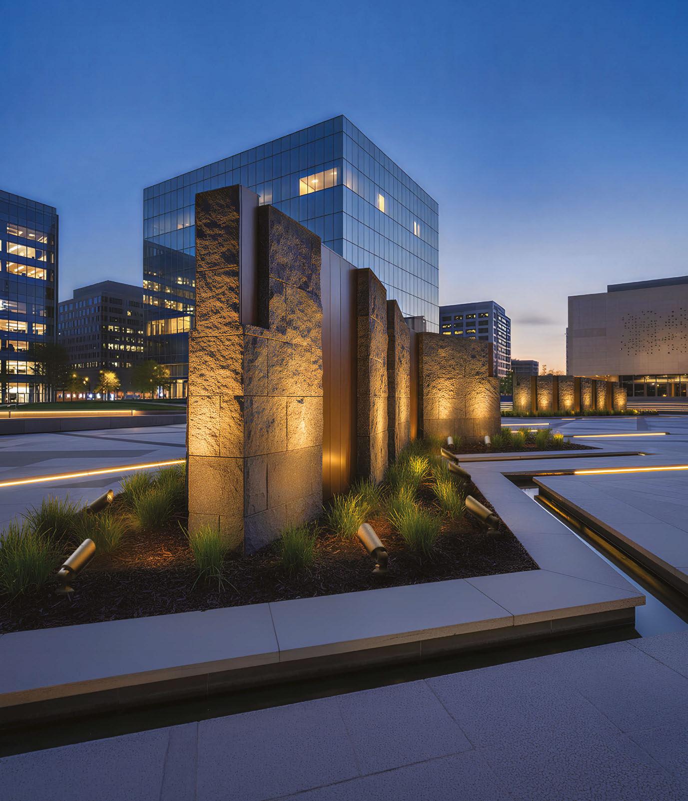
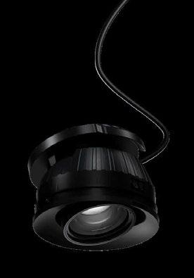
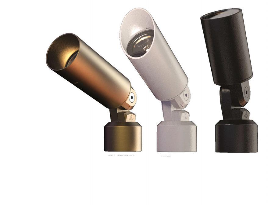
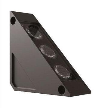
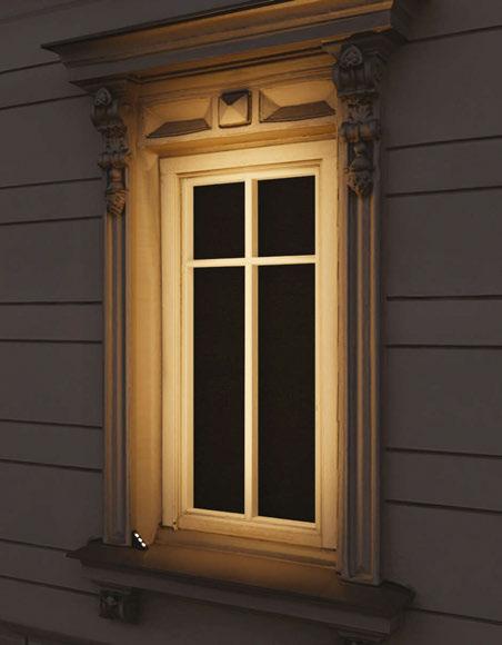
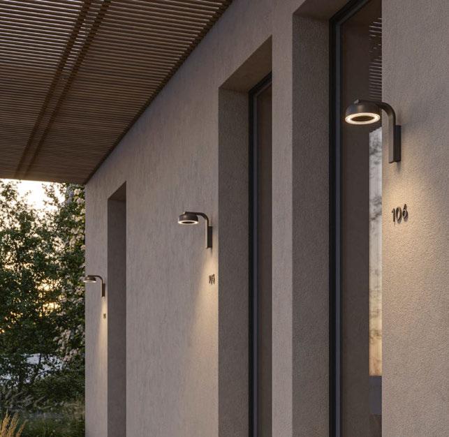
Introducing Dune, a compact architectural spotlight delivering up to 1,240 lumens from less than 13W of power from a highperformance LED light engine. Designed for demanding exterior environments, Dune features a seamless housing in solid brass for exceptional corrosion resistance, or powder-coated aluminium finishes with a marine-grade epoxy undercoat for architectural flexibility.















































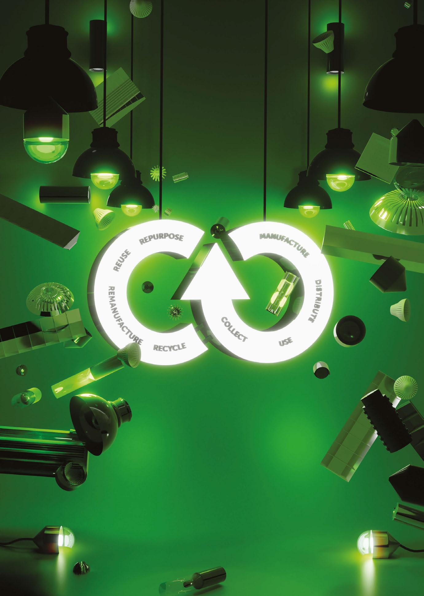
Recolight isn't just about recycling, we help the lighting industry take real steps toward a sustainable future. From our Reuse Hub and Circular Lighting Live Conference, to workshops, webinars, and Life Cycle Assessments, we support businesses in taking practical actions to embrace the Circular Economy. What’s more, we can provide carbon footprint data for every waste collection. Make your lighting more sustainable. Make it circular.







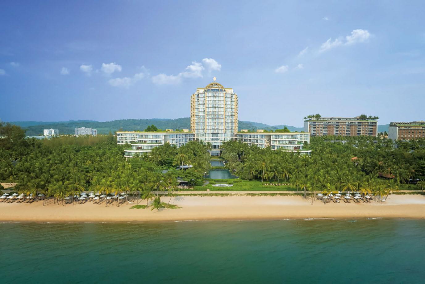
22 - 25 September 2026
Intercontinental, Phu Quoc, Vietnam
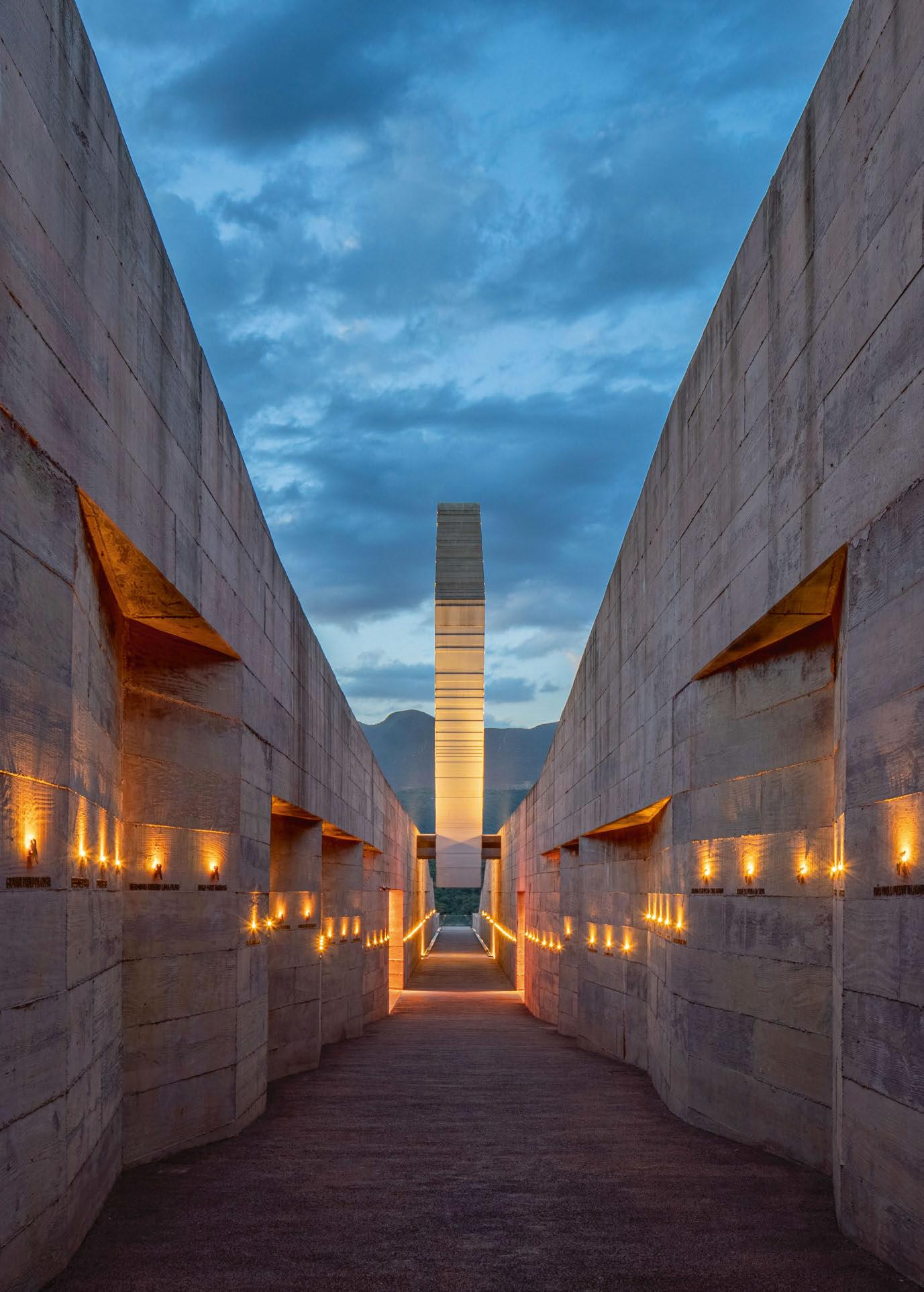
In our line of work here at [d]arc media, we are very lucky to be able to speak to amazing designers from around the world to learn more about the incredible work that they do, and through these conversations, we get to tell their stories to the broader design world. Each and every one of these stories is a privilege to tell, but every now and then, you come across one story in particular that leaves you truly floored. That was my experience during this issue, when I spoke to Brazilian designer Mariana Novaes about her [d]arc award-winning work on Memorial Brumadinho. The lighting design itself is remarkable in its understated, sombre, quiet, and most importantly, respectful beauty, but the story behind it, and Novaes’ wish to honour and pay tribute to the 272 people who tragically lost their lives following the collapse of an industrial dam is so deeply moving, that it was an honour to be able to bring it to you, our dear readers. The way the project fuses a minimalist lighting design with architect Gustavo Penna’s rugged concrete structure meant that it was also the obvious choice to grace the cover of this issue too.


As well as reading about this project in this issue, very soon, you will be able to watch an accompanying video interview with Novaes on our brand new [d]arc discussions YouTube channel! We already have some great content on there, with many more exciting videos in the pipeline, so give us a like and a subscribe, and keep your eyes peeled for more exciting content coming soon... I also wanted to take this opportunity to shout out the amazing work of my colleague Ellie Walton. Ellie has been with [d]arc media for nearly three years now, learning the ropes of this industry, and this year she has started to take on more editorial responsiblity, with great success. This time out, you can hear all about her findings from Milan Design Week; an exclusive visit to Bristol’s Clifton Suspension Bridge; and her sit down chat with David Chipperfield Design about their recent collaboration with iGuzzini.
You’ll no doubt see her around at industry events in the coming weeks and months too (starting with IALD Enlighten Europe in Paris), so be sure to say hello, as she is definitely well worth knowing!
Enjoy the issue!
Gary Thornton of Nulty talks about his new “Director of Education” role.
Snapshot
Marco Miglioli ArchiLight Studio
Manufacturer Case Studies
Exterior Lighting focus
Materials
Eolie Collection by Foscarini
Good Light Group
An exerpt from the paper: “Desigining lighting to promote better sleep: Why circadian-aware lighting is no longer optional.
David Morgan Product Review Wrapped by Fagerhult
My Light
Andrea Hartranft
Sabang Boardwalk Light Plan Inc
Drifting Lights
[d]arc sessions Review
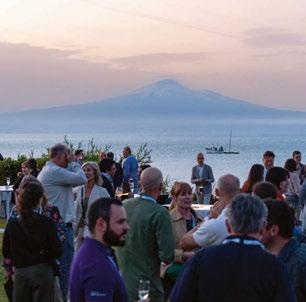
The 10th edition of [d]arc sessions took place in Sicily this May.
[d]arc awards Review
A look back at the winners and installations from this year’s [d]arc awards celebration.
David Chipperfield Design
Applying architectural thinking to industrial design, David Chipperfield Design talks of its recent collaboration with iGuzzini.
Milan Design Week Review
Ellie Walton shares her favourite findings from this year’s Milan Design Week.
LEDucation Review
Some of the best products on display at the 20th annual LEDucation event.
Memorial Brumadinho, Brazil Atiaîa Lighting Design
Clifton Suspension Bridge, UK Hoare Lea
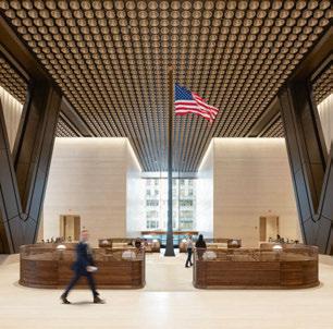
270 Park Avenue, USA Tillotson Design Associates
Yorkshire Roses, UK Artin Light, TLWS, & Jamie House
Castello di Miradolo, Italy Light Follows Behaviour


Comprehensive,
Coming soon: Fixture Status Monitoring
Remotely

Illuminate
8-10 June
Chicago, USA www.neocon.com
Cruise Ship Interiors Americas 9-10 June
Miami, USA www.cruiseshipinteriors-expo.com
Hotel & Resort Design South 9-10 June
Miami, USA www.hotelresortdesign-south.com
GILE
9-12 June
Guangzhou, China www.guangzhou-international-lighting-exhibition. hk.messefrankfurt.com
3 Days of Design 10-12 June Copenhagen, Denmark www.3daysofdesign.dk
IALD Enlighten Europe 17-19 June
Paris, France www.iald.org
Light! Design Expo
25 June
San Francisco, USA www.lightdesignexpo.com
IES26: The Lighting Conference 13-15 August
Denver, USA www.ies.org
PLASA
6-8 September
London, UK www.plasashow.com
Index Saudi Arabia 6-8 September
Riyadh, Saudi Arabia www.index-saudi.com
London Design Festival 12-20 September
London, UK
www.londondesignfestival.com
ArchLight Summit 15-16 September
Dallas, USA www.archlightsummit.com
Design London Shoreditch 15-17 September
London, UK www.designlondon.co.uk
Downtown Design 15-18 September Riyadh, Saudi Arabia www.downtowndesign.com
ASEAN Light + Design Expo 16-18 September Bangkok, Thailand www.aseanlightdesignexpo.com
[d]arc sessions asia 22-24 September Phu Quoc, Vietnam www.darcsessions.com
EDITORIAL
Managing Editor
Helen Ankers h.ankers@mondiale.co.uk
Editor Matt Waring m.waring@mondiale.co.uk
Junior Journalist
Ellie Walton e.walton@mondiale.co.uk
Contributing Editor
Sarah Cullen s.cullen@mondiale.co.uk
COMMERCIAL
Managing Director
Paul James p.james@mondiale.co.uk
Head of Business Development
Jason Pennington j.pennington@mondiale.co.uk
International Account Manager
Andrew Bousfield a.bousfield@mondiale.co.uk
International Account Manager
Ethan Holt e.holt@mondiale.co.uk
Events & Marketing Manager Moses Naeem m.naeem@mondiale.co.uk
Design Manager
David Bell d.bell@mondiale.co.uk
Design Jez Reid j.reid@mondiale.co.uk
Production Mel Capper m.capper@mondiale.co.uk
CORPORATE
Chairman
Damian Walsh d.walsh@mondiale.co.uk
Finance Director
Amanda Giles a.giles@mondiale.co.uk
Credit Control
Lynette Levi l.levi@mondiale.co.uk
[d]arc media ltd
Strawberry Studios, Watson Square, Stockport SK1 3AZ, United Kingdom T: +44 (0)161 464 4750 www.arc-magazine.com ISSN 1753-5875
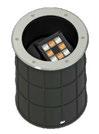
SLIMSOFT combines a refined cylindrical design with precisely controlled, low-glare illumination to deliver exceptional visual comfort for pedestrian and public spaces. Its advanced optics provide smooth, uniform lighting while blending seamlessly into architectural and landscape environments.
As a DarkSky Approved luminaire, SLIMSOFT helps minimise sky glow and reduce light pollution—supporting a more responsible approach to outdoor lighting.
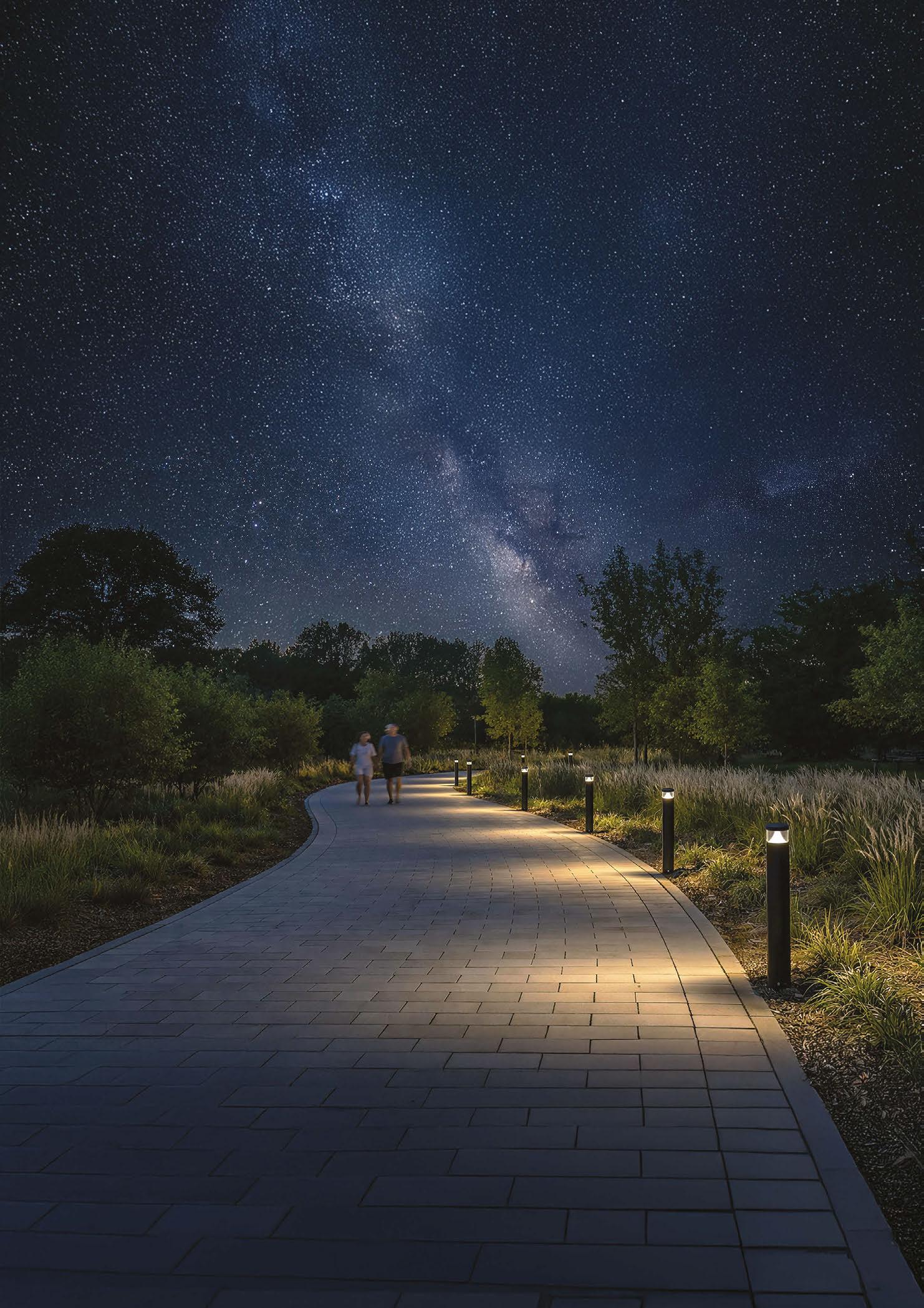
Residential category DarkSky approved
•CCT/CRI 2700K CRI80 and 3000K CRI80
•Dimming type: DALI
www.ligman.com/slimsoft



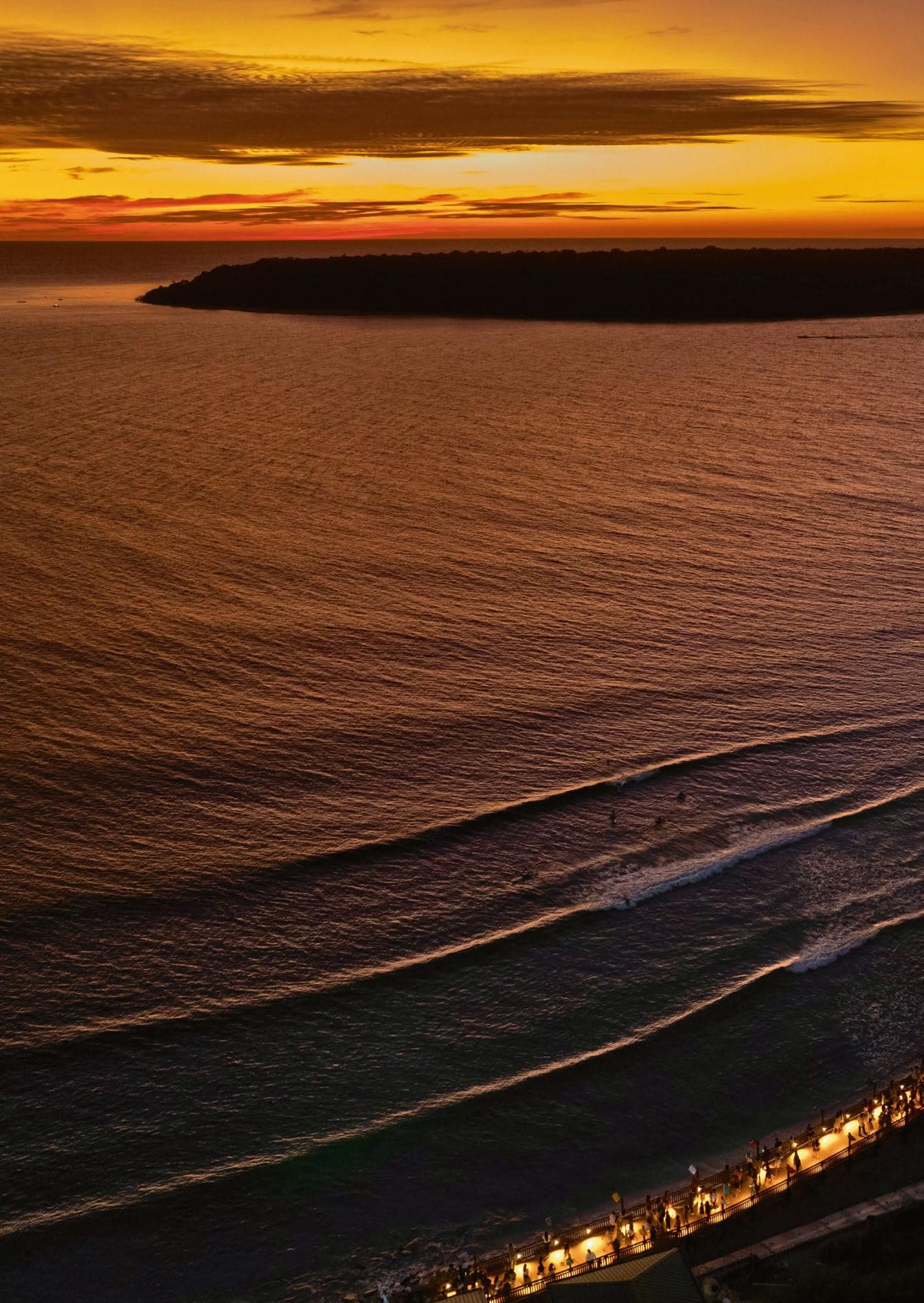
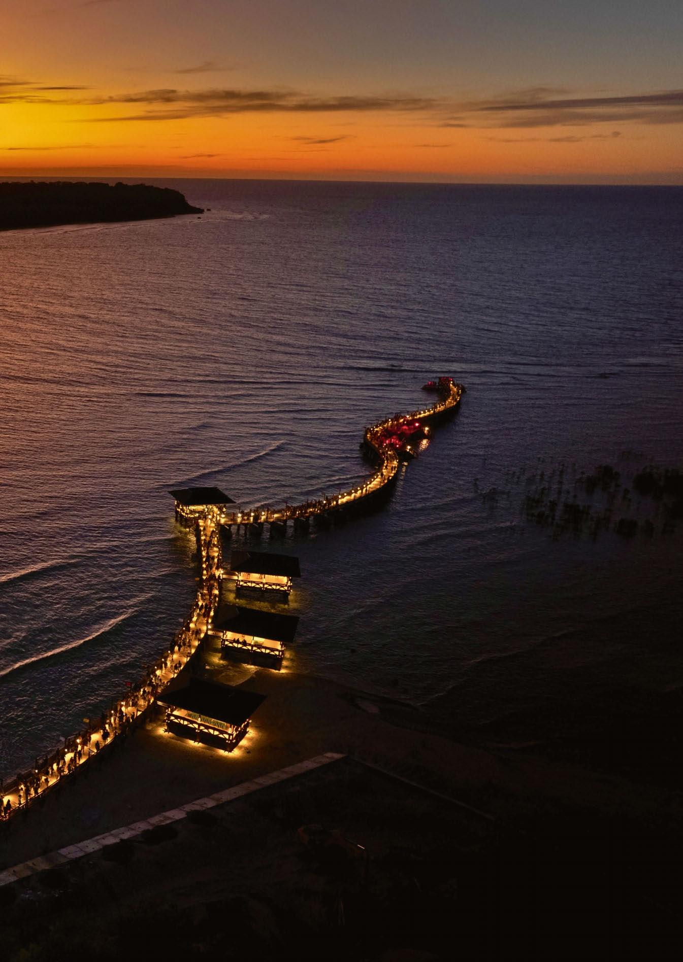
Light Plan Inc. was commissioned to work on the Sabang boardwalk lighting design – an ambitious vision spearheaded by Congressman Ronald Singson. Situated in Cabugao, Ilocos Sur, Philippines, and renowned for its stunning beaches and vibrant surf scene, the goal was to create a boardwalk that seamlessly blends with the area’s natural beauty, while offering a unique experience for both residents and visitors. Here, people can draw close to the water and enjoy leisurely strolls with thoughtfully designed illumination, enhancing Sabang’s charm well into the evening.
For the lighting design, Light Plan Inc’s objective was to create a vibrant and safe environment where people could have fun, take selfies, or just chill. To achieve this, the design team employed low level lighting integrated on posts for the circulation, creating soft rhythmic patterns on the floor. The team calculated the reflected light on vertical surfaces to ensure there is sufficient light when people take photographs.
“The Filipino’s love taking photos and posting on social media so we had to ensure the lighting on the space and people would be flattering from all angles,” said Jinkie De Jesus, Principal of Light Plan Inc.
“Resting cabanas spread throughout the boardwalk had indirect lighting integrated on benches to encourage gathering. We considered the love of festive colours in our culture and placed colour changing projectors on select platforms.”
Within a week of its opening, the Sabang boardwalk was trending across social media. Vloggers, travellers, and residents alike were abuzz and posting photos, especially in the evening. Recommendations came that it is best to visit the boardwalk from sunset onwards due to the lighting vibe at night. The Sabang boardwalk lighting project beautifully enhances the area’s natural appeal, inviting everyone to enjoy its vibrant atmosphere long after sunset. www.lightplaninc.com
Images: Gavriil Papadiotis
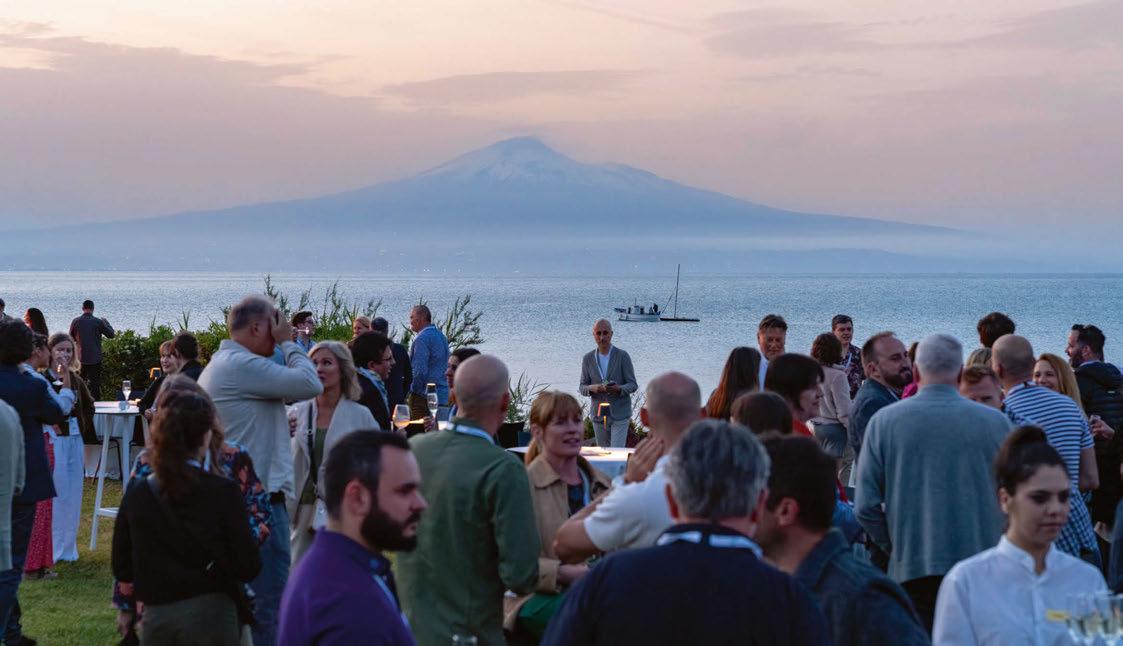
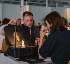
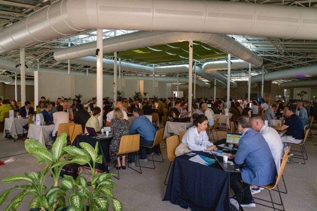
This May, [d]arc media hosted the 10th edition of [d]arc sessions, taking over Mangia’s Brucoli Resort on the beautiful Italian island of Sicily for its biggest edition yet.
With the stunning backdrop of Mount Etna in the distance, this May, the [d]arc media team travelled to the Italian island of Sicily for the landmark tenth edition of our highly-popular networking and specifying event, [d]arc sessions.
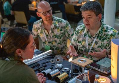
The largest edition of the event to date, around 200 lighting professionals took over the beautiful resort of Mangia’s Brucoli, on the east coast of Sicily, to once again meet, make new connections, rekindle old friendships, and discuss the latest developments in the lighting profession.
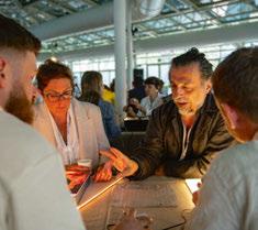
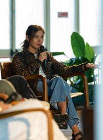
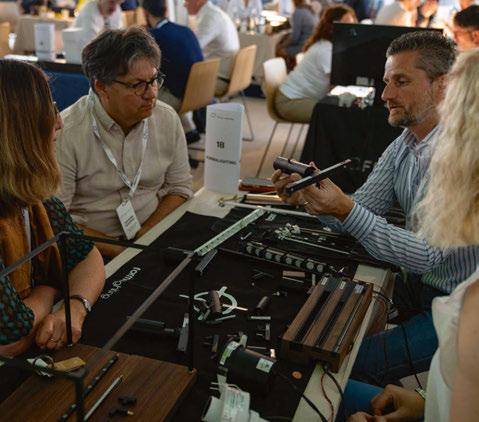
As a format, [d]arc sessions has built its success on its intimate and inviting atmosphere, putting delegates at ease compared to the frenetic energy of a typical trade show, and this year’s edition of [d]arc sessions Europe was no different. Once more, the event interspersed quick-fire, speed-dating-style 20-minute meetings between lighting suppliers and specifiers, with informal, yet informative panel discussions on some of the biggest issues in the lighting sphere at the moment.
Topics for these sessions included: “Will AI help or hinder the Lighting Design profession”, where panelists Anna Freiesleben of Michael Grubb Studio, Stephan Horn of O_pium, Daniel Green of Into Lighting, and Nicolas Houel of L’observatoire de la Nuit, talked about the “tidal wave” of AI, and the need to examine its uses and potential benefits, as it will soon become an inevitable part of our working lives.
Elsewhere, Krisjan Krisjannson of Hildiberg, Caroline Jonsson of Ideaworks, Graham Rollins of Lighting Design International, and Beth Harle of David Collins Studio took part in a fascinating discussion titled “Lighting is for People, Not for Buildings”. Another popular topic was raised in the event’s
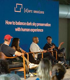
third panel discussion - “How to Blance Dark Sky Preservation with Human Experience”. Here, panelists Chiara Carucci of Noctua, Giovanni Traverso of Traverso Vighy Architetti, Sanjit Bahra of DesignPlusLight, and Andrea Nusser of Andrea Nusser Lighting & Interior Design provided a lively and engaging debate around dark skies, light equity and what takes priority when lighting exterior environments.
Alongside the panel discussions, Mohamed Medani of Delta Lighting Design delivered an inspiring keynote presentation all about the [d]arc awardwinning lighting design of the stunning Desert Rock resort in Saudi Arabia.
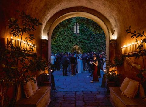
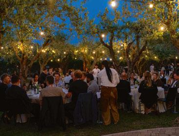
These talks each generated plenty of discussion among delegates, which continued into both mealtimes and the evening receptions that closed each day, each taking place in one of the resort’s picturesque locations.
Evening down time also allowed delegates to enjoy the resort’s facilities, from a swim in the pool (sadly the sea was too lively for an official “Swim Club” meeting), to a game of padel, or the inaugural [d]arc sessions five-a-side football match - slightly livelier and less “friendly” than this editor expected! On the closing night, delegates boarded a series of coaches to travel off-site to the beautiful, magical location of Castello Xirumi Serravelle for ‘Il Gran Fanale’. A location that gave off serious “wedding” vibes was the perfect, celebratory backdrop for attendees to dine together, enjoy a digestif and traditional Cannolo Siciliano (or two, or three), and reflect on another fun, informative, entertaining, and productive week of networking and connecting. www.darcsessions.com
This year’s [d]arc awards headed back to London’s Fireworks Factory for a celebration of the best in lighting design.
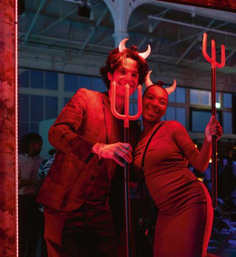
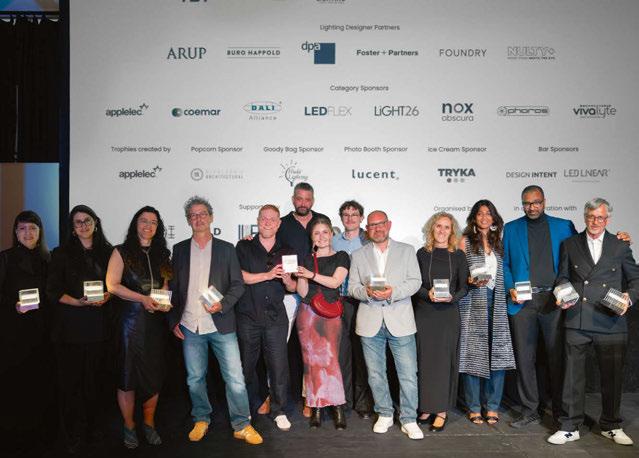
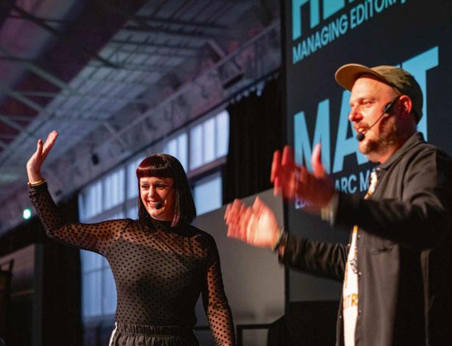
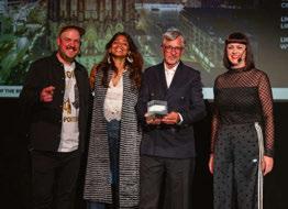
This year’s [d]arc awards party headed back to its new home of the Fireworks Factory in Woolwich, London at the end of April, where we welcomed almost 600 attendees for a creative, energetic celebration of light.
Adhering to the format adopted for last year’s event, guests were invited to sit down to watch the awards announcements, complete with popcorn, provided this year by Nicolaudie Architectural.
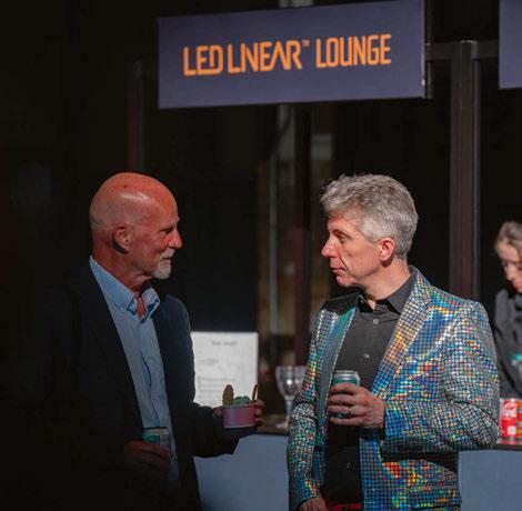
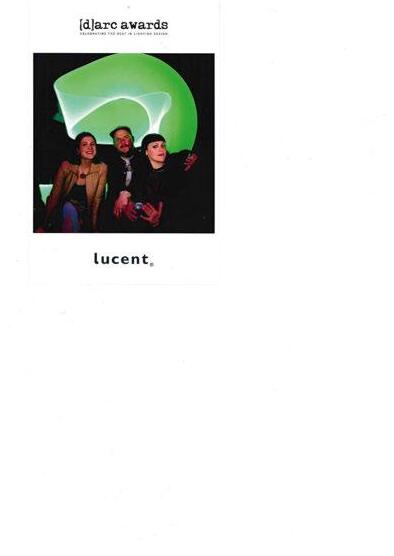
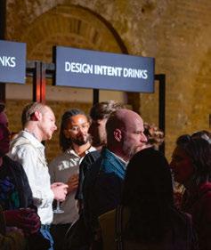
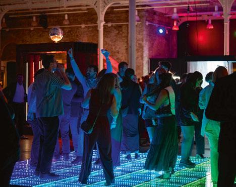
The party also included a variety of food vendors, infinity dancefloor, free bars sponsored by Design Intent and LED Linear, a light painting photo booth sponsored by Lucent, ice cream from Tryka and goodie bags for everyone to take home from Huda Lighting.
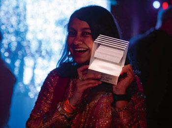
The awards trophies were once again supplied by Applelec, who this year, made the awards through remanufacturing previous awards materials.
Honouring projects and products completed throughout 2025, this year’s [d]arc awards saw 1,727 independent designers take part in voting, with a total of 11,199 individual votes cast across the awards’ 13 categories.
With 345 entries submitted from around the world, the programme’s global reach was once again demonstrated by the international scope of the winners, with winning projects spanning Brazil, France, Germany, Sweden, Saudi Arabia, the USA, and the UK. The coveted ‘Best of the Best’ award for 2025 was given to Cologne Cathedral in Germany, completed by Licht Kunst Licht, which also won the Structures High budget category. The Best of the Best award is given to the project that receives the most votes overall out of all of the project category winners, so a big congratulations to Licht Kunst Licht for this wonderful achievement.
The full list of awards winners is as follows:
· Structures Low Budget (sponsored by Pharos)
Doshi Retreat, Germany by Licht Kunst Licht
· Structures High Budget (sponsored by Pharos) Cologne Cathedral, Germany by Licht Kunst Licht
· Places Low Budget (sponsored by LEDFlex)
Vinyl Room - Ziggo Dome, Netherlands by Into Lighting
Places High Budget (sponsored by LEDFlex)
Desert Rock Resort, Saudi Arabia by Delta
Lighting Design
· Spaces (sponsored by Coemar)
Memorial Brumadinho, Brazil by Atiaîa
Lighting Design
· Art Low Budget (sponsored by Applelec) Hidden, UK by Artin Light
Art High Budget sponsored by Applelec
Pau - A Story of Light, France by Quartiers Lumières
· Art Bespoke (sponsored by Applelec)
Lightscape Weaver, USA by Lightexture
· Event (sponsored by LiGHT 26)
Nobel Week Lights 2025, Sweden
· Interior Lighting Product (sponsored by DALI Alliance) - Zero Mono Point, formalighting
· Exterior Lighting Product (sponsored by DALI Alliance) - Kinno, Lodes
· Decorative Lighting Product )sponsored by DALI Alliance) - Closer, Vibia Lighting
· Technology Product (sponsored by DALI Alliance)
- Revolution Display, Signify Dynalite
[d]arc media would like to say a huge thank you to all of our design partners, sponsors, and supporters, to everyone who entered a project or product into the awards, who voted, and who took part in the awards process this year. A special thank you also to production partners Streeem, photographer Gavriil Papadiotis, and to Light Collective, who have been integral to the success of the [d]arc awards since its inception.
www.darcawards.com



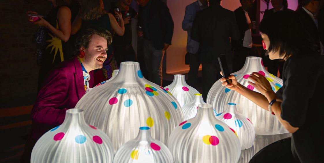
This year’s design teams were asked to find inspiration from the world of art for the awards party installations.
As with all our previous awards parties, this year saw the return of our incredible light art installations, created by supporting design teams.
Each year, the design teams – which pair a lighting design practice with a lighting manufacturer – are given a theme around which to create their installations.
For 2026, our six teams drew from the world of art for their inspiration. With such an open theme, the way that this was interpreted, and the creativity shown by each team, was incredibly impressive, with each installation taking its own, wildly unique approach. As ever, a vote was held among attendees for their favourite installation from the event –with Foster + Partners and 181 crowned as the winner on the night, so big congratulations to them for their impressive installation.
Arup x Signify
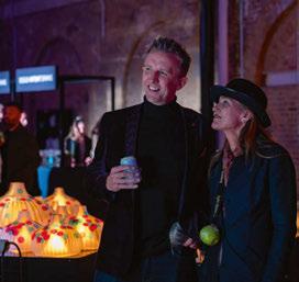
Chromatic Obliteration pays homage to the work of renowned pop artist Yayoi Kusama. Motifs she used throughout her career were adapted and combined to create an interactive installation that reflects on themes of art, nature, technology, light, colour, life, and chaos. Guests were free to walk through the ‘garden’ of 3D-printed, illuminated
pumpkins, where they were invited to apply translucent coloured dots to the glowing vegetables. Pumpkins were chosen because they are a key motif throughout Kusama’s work, where she uses them as reflections of her childhood.
The installation was highly interactive, with visitors having ultimate control over its final appearance. This was an intentional exploration of the role of the artist, where artistic responsibility shifted from Kusama herself, to the design team, and finally resting on the shoulders of visitors.
The coloured dots were designed to be cyan, magenta, and yellow. This invited guests to play and experiment with the concept of subtractive colour mixing by overlapping the translucent dots. The installation was fourdimensional; it transformed over the course of the evening as the volume of dots applied intensified. First, the pumpkins appeared in pure, bright white, then accumulated vibrant CMY colours as dots were applied. They then shifted to deeper RGB colours as dots overlap. Finally, as all three coloured dots overlapped to create black, the installation darkened and the pumpkins became fully “obliterated”. This transition of colour, saturation, and intensity intentionally reflects life cycles found throughout the natural world.
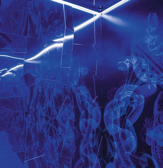
This installation created an immersive visual experience that explored our perception of colour and light. It invited reflection on how colour contrast shapes what we see, questioning the ways in which we perceive our visual environment and the world around us.
The work highlights how an artwork’s location, atmosphere, and mode of illumination profoundly affect its appearance. Art is often encountered in galleries under controlled lighting conditions; however, the context in which a work is created or displayed can dramatically alter how it is perceived.
Artists have long engaged with different forms of light when producing their work, recognising that the quality, colour temperature, and properties of light influence both the making and viewing of art. Daylight, in particular, varies significantly by geography. The French Impressionists, for example, embraced the warm, luminous light of southern France, reflected in their vibrant colour palettes. In contrast, the cooler, diffused light of northern regions such as Scandinavia presents different chromatic qualities, which in turn shape artistic expression.
Artificially illuminated environments introduce further layers of complexity. Throughout the history of art, light sources have evolved from candlelight and tungsten to compact fluorescent lamps and, more recently, LEDs. Each lighting technology carries its own
characteristics and variations, influencing colour perception and visual experience in distinct ways.
Within the installation, scrolling shifts of coloured light altered the frequency and quality of illumination, continuously transforming the artwork’s appearance and context. This changing perception referenced the work of the artist collective Carnovsky, whose practice demonstrates how colourfiltered light can reveal different images and create a sense of motion from static forms.
Mirror-clad walls expanded the spatial experience, generating an illusion of infinity and paying homage to the immersive installations of Yayoi Kusama. This repetition and reflection blurred the boundaries of the physical space, reinforcing the work’s exploration of perception and visual instability. The installation also embodied a commitment to sustainability. Wherever possible, existing products and material samples were reused, minimising embodied carbon and reflecting a core principle of circular economy practice. In doing so, the work aligned artistic exploration with environmental responsibility.
The brief of simply “Art” was explored through a wide range of interpretations, including more traditional art forms alongside architecture, sculpture, and literature. This exploration helped define key attributes
for the installation, with a strong focus on creating something highly interactive and visually distinctive.
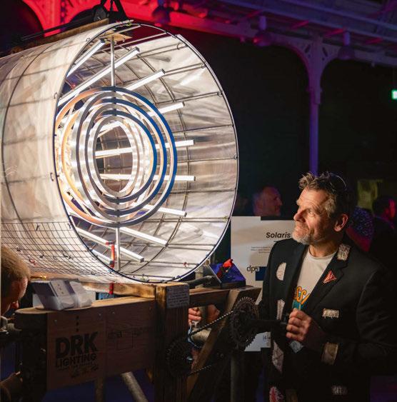
Inspiration was drawn from the whimsical mechanical inventions of William Heath Robinson; his eccentric, machine-like constructions lend themselves to playful, kinetic installations. The piece also captures the essence of Olafur Eliasson’s 2003 work, The Weather Project. The sun, a powerful and recurring motif throughout art history, became a core influence, acting as a visual focal point for the design.
Solaris took the form of a sun-shaped automaton powered by visitor interaction, encouraging active participation and creating the sense of stepping into a living artwork. Bright 2700K LEDs evoked a vibrant daytime sun, and as the handle turned, the installation gradually transformed, the centre shifted into a warm red glow while the surrounding rays faded into cool blue tones. Mirrored mosaic materials enhanced this transition by skewing and scattering the light, generating unique reflections that drew attention and sparked curiosity.
Sustainability played a significant role in the design, with the mechanism and structural components crafted entirely from recycled materials, offering an environmentally conscious, dynamic, and engaging experience for [d]arc awards visitors.
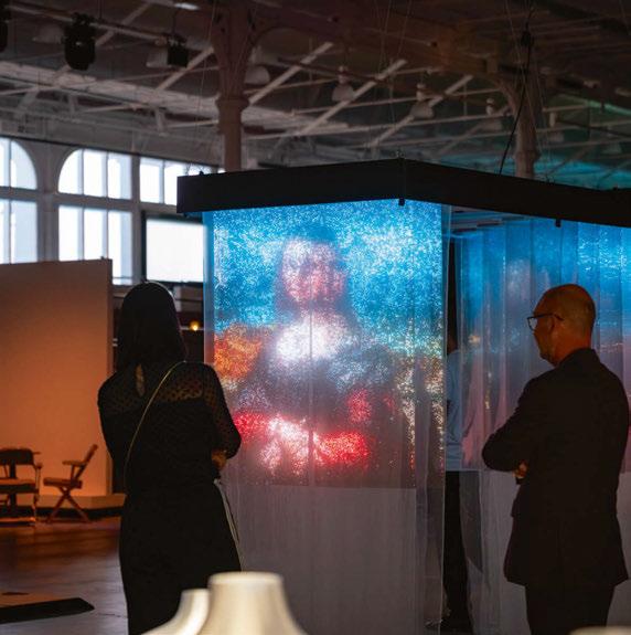
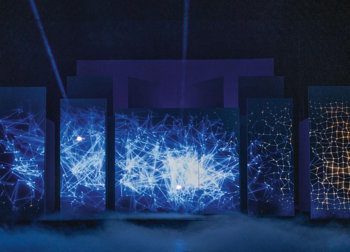
An immersive spatial installation exploring the relationship between light, perception, and artistic experience. Formed by a sequence of suspended fabric and LED mesh panels, precisely cut to allow passage, the structure created a permeable architectural volume that visitors could physically move through. Rather than standing before the work, viewers entered it.
Composed of parallel planes arranged at measured intervals, the installation functioned as a volumetric canvas. Light and projected media unfolded across translucent surfaces, generating shifting spatial compositions that surrounded the viewer in a 360º environment. As imagery moved from layer to layer, depth became activated, not as illusion alone, but as lived spatial experience.
Integrated lighting elements that were strategically placed to highlight the contours, reinforced the dialogue between physical material and ephemeral light.
Inspired by Marshall McLuhan’s proposition that “the medium is the message”, The Portal positioned light itself as the artistic medium. Here, light did not illuminate art, it was the art. Perception became the material, movement became composition, and the audience became an active participant in constructing meaning.
In this environment, art is not an object but a condition, an evolving interplay between body, space, and luminous information.
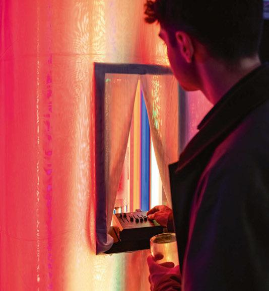
In response to this year’s theme, the team’s thoughts began by examining the idea of the moment: a fleeting, unrepeatable experience created through light.
They thought of the experience of a peep show, the intrigue and sense of risk was a feeling they thought would be interesting to recreate in their installation.
Equally, the team was interested in the historical development of light panels, in particular where light panels were made through fluorescent light tubes. They wanted to explore how contemporary LED tubes, such as the Artemide Alphabet, could be orchestrated to recreate an old fashioned light panel with RGBWW tubes.
As lighting designers, the team was fascinated not only by the finished effect but by the machinery and logic behind it. A choreography of drivers, optics, wiring, and reflective surfaces that combine to produce an apparently seamless outcome. This led them to think about the development of a moment inside the tubes, where the viewer pops their head into the Peep Show of light.
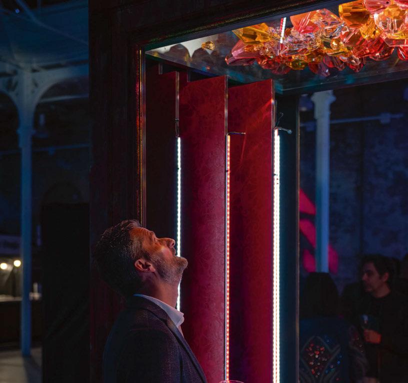
These questions led to the concept for Peep Show: an installation that appeared as a pure, glowing column from the outside, yet invited designers and visitors to literally place their head inside the piece and reveal the infrastructure that made the magic possible. Through a series of mirrors and repeated reflections, the internal LED tubes multiplied into an infinite light lattice.
Life is a dichotomy, Yin and Yang, Hot and Cold, Good and Evil. With this in mind the design team dared visitors to step into frame, choose their side, OR one could simply disco!
Art and light share an imbalanced relationship in which the light is either depicted overtly within the piece or used externally to highlight it. When considering light within the context of art, often the assumption is that the light is there to merely illuminate the art. Sculpted Waste aimed to explore the light-art relationship further by seeing how light can extend beyond the bounds of simple illumination and instead interact with it.
The installation also allowed light and art’s relationship to become symbiotic, as traditionally the artwork just has the light cast upon it, whereas this had the opportunity to impact the light as much as the light impacts the art. formalighting’s motorised fixture range allowed the light to move and change over time, allowing the installation’s perception to become more dynamic as it moved away from a static, amorphous monolith and became a characterful, playful being.
The inherent nature of the Sculpted Waste allowed it to be viewed from 360°. Orbital observation of the installation was a core principle of the light and object interaction, as the perceived interaction
changed as you moved around it. This further allowed the installation to change as the viewer circulated. The integration of motion sensors allowed the light, and in turn overall installation, to change once it was aware it was being observed, adding to its character.
Sustainable thinking meant extending considerations past the lifetime of the installation itself. The team’s use of scrap materials, broken fixtures and manufacturing waste to form the main body of the installation cut the use of virgin materials drastically. During the construction of Sculpted Waste, the team also actively engaged in the lifecycle of luminaires as they disassembled them into their component parts, easing their transition into their next purpose of re-use or recycling. The team also breathed new life into various supporting components that are only ever intended to sit behind the source by intentionally lighting them. The installation also, quite literally, shined a light on the waste rooted within our industry.
Sculpted Waste was an acknowledgement of the issues that persist beyond the bounds of a standalone art installation, while also proudly celebrating light’s key role within artwork perception. www.darcawards.com

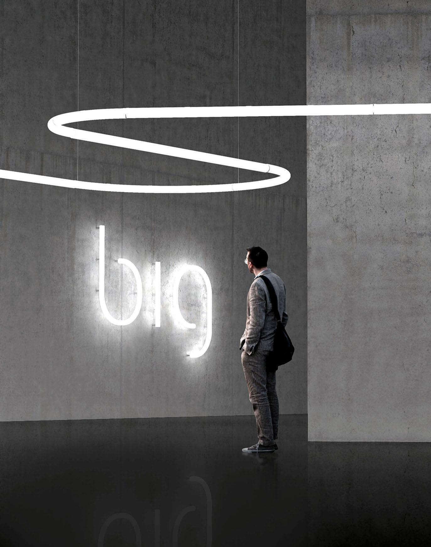


In March of this year, Nulty announced the appointment of a new Director of Education. Gary Thornton, who has been Director at Nulty since 2023, will assume the role, which will see him oversee professional development, technical excellence, and sustainable working practices across the firm’s global studios. Here, Thornton tells us more about the role and what it will entail.
Why did Nulty create this new role?
Creating a dedicated education role is about us putting our stake in the ground to cement how much we value learning and development.
The lighting design profession is changing. We are now so much more than a single discipline. Rather than sitting between art and science, designers need to understand technology, biology, psychology and physiology, alongside light and design. My role recognises that shift and bridges the gap between training, mentoring and thought leadership to ensure we continue to exceed expectations and deliver great work for our clients.
How did the opportunity arise?
The role developed organically. Education has always been central to our culture, and this is the next step in formalising that commitment. It also responds to the realities of a changing workplace. Junior designers are no longer surrounded by people for 40 hours a week, soaking everything up and learning from the more experienced designers around them. Hybrid working makes it harder to overhear conversations, bounce an idea around or ask a quick question. We want to create more meaningful ways to mentor people and link our studio’s experience with the juniors coming through.
What about the position appealed to you?
I’ve always enjoyed helping to educate people and pass on my knowledge, so it felt like a good fit. While I’ll be based in London, the remit is global, which gives me the opportunity to support teams across all our studios and create greater consistency in how we work and develop talent.
The role also plays to my strengths. I’ve always been a person who enjoys getting into the detail of something, such as an emerging piece of research or a new standard. I hope I
can help refine the way we do things by taking that knowledge and distilling it down into something clear and accessible for others.
What will the role entail for you?
I’ll lead both internal team development and external client engagement, covering training, research and CPD programmes, as well as early-career development through the apprenticeship scheme and student internships. The role will also focus on accreditation frameworks, technical standards and developing internal policies around them.
Why is having a Director of Education an important move for the studio?
We have a diverse pool of creative talent and experience across the practice, and our goal is to help everyone reach their full potential. By investing in education internally, we can raise the standard of our work and, in doing so, help raise the standard of our profession. It’s also about driving thought leadership and finding ways to communicate the value of great lighting design across the entire built environment industry.
What are the core pillars of Nulty’s “education movement”?
People are at the heart of Nulty’s educational movement. Internally, it’s about investing in our team and raising standards of excellence; externally, it’s about improving understanding about lighting design with our clients and project collaborators. Lighting design is still very intangible, and we frequently assume everyone speaks the same language when they don’t. By positioning ourselves at the forefront of knowledge and sharing that expertise, we can help address that. Innovation is another key pillar. We want to build on the work we’ve done around the circular economy and TM66 by expanding into other areas of sustainability, including embodied carbon. This role gives me more
time to dig deeper, stay informed and continue pushing us forward.
Is this position solely internal, or will you be working externally too?
Alongside mentoring and training, I’ll be engaging more with the wider industry. I’m already involved with the ILP Architectural Lighting Committee, the SLL and its Get Curious STEAM programme, and working with the team developing the TM66 methodology. It’s important to me that I play a more active role in shaping new ideas and initiatives.
What do you hope the benefits will be for this position, personally, internally at Nulty, and externally?
Externally, the aim is for Nulty to continue pushing boundaries. Ultimately, it’s about how we progress as a practice and design better spaces for people. Personally, I’m looking forward to having more time to lift people up and challenge the base line of what we currently consider great work. I want our team to be engaged, curious, creative, interested and pragmatic about how things are designed and built. If everyone who passes through our doors leaves as a stronger designer and a more informed individual because of the support we gave them, then our education movement has been a success. www.nultylighting.co.uk







At the Parco Archeologico di Pompei, leading designers from the UK, US, Japan, and Italy join forces with 25 students from the University of Naples Federico II. Together, they will illuminate the Villa Ara Massima and Villa Amorini Dorati, creating original installations that bridge the ancient and the modern.






To nurture the future of lighting design through education and voluntary participation.
4-day intensive workshop bridging global expertise & local talent with university students.
To register your interest in sponsoring a future Light Asia event or keen to participate as a lighting designer, please get in touch.
Sharing knowledge. Lighting the future.
The legendary UNESCO world heritage site at Parco Archeologico di Pompei.
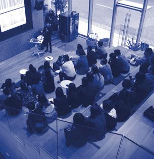
With more than 15 years of experience, Italian firm Marco Miglioli ArchiLight Studio crafts connections between art, theatre, and architecture, fusing the technical and artistic qualities of light across a wide variety of projects.
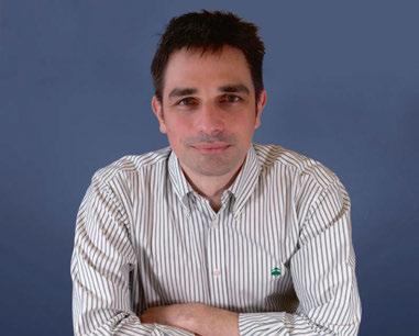
Marco Miglioli ArchiLight Studio is a design firm specialising in architectural, museum, and scenographic lighting, with more than 15 years of experience. The design process carried out within the studio aims to create coannections between art, theatre, architecture and the natural sciences, seeking to blend them through both an artistic and scenographic approach and a technical use of light.
The studio’s design activity is, on the one hand, based on a use of light intended as an expressive language and, on the other, on developing technological expertise through the creation of prototypes and investigating experimental solutions within its own laboratory. One of the cornerstones of the studio’s work is research in the field of lighting, exploring new frontiers (such as phosphorescence and bioluminescence) to develop sustainable, accessible and renewable lighting systems.
The studio’s projects have been presented at international conferences and have led to collaborations with museums, architects and cultural institutions. Over the years, the studio has won numerous international awards. www.marcomiglioli.com
The Raphael’s Cross Milan, Italy
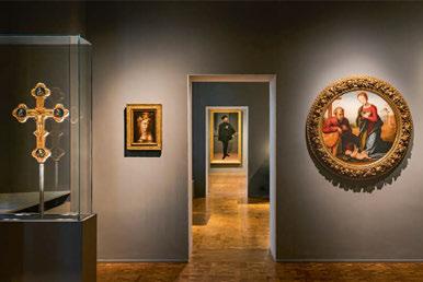
In 2022 Raffaello Sanzio’s “Processional Cross with Franciscan Saints” was relocated to a new display case within the renovated rooms of Milan’s Poldi Pezzoli Museum. Through the new lighting, as the colour rendering of the golden surface of the cross differed from that of the frames of the paintings displayed in its room, special colour filters were used to harmonise the warm tones of all the golds. The light sources have been hidden inside the case to avoid glare generated by any external fixtures. This allowed the surfaces of the cross to be lit with a soft grazing light so as to bring out details, reliefs and punchings that were barely visible in the old setup. Nevertheless, light close to the artwork would have led to an imbalance in the distribution of light between the foot and the upper terminal of the Cross. To overcome this problem, a translucent film was glued onto the apical surface of the case, which reflects part of the light on the Cross; in addition, holographic films, which concentrate almost all the luminous flux along the two arms, have been inserted inside the luminaires. Lighting an artwork primarily means preserving its condition. The projectors located very close to the Cross would have caused colour degradation over time. Further correction filters have thus enabled the
modification of the light spectrum, reducing the portion that cause the most photobiological damage to the pigments of the cross.
Photography: Andrea Ceriani
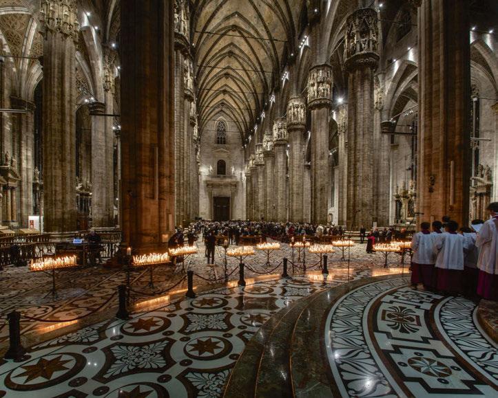
The studio was involved in the creation of the new lighting system for the Milan Cathedral by the firm “Ferrara Palladino Lightscape”, which was in charge of the entire lighting design project.
“We still remember walking in before the renovation. The atmosphere was dark, almost oppressive; harsh floodlights lit the floor brightly, but the vertical surfaces, statues and capitals were lost in shadow. Looking up, the glare made it impossible to see the vaults. The new project aimed to bring back to light the splendour of the Gothic cathedral, revealing its essence,” says Miglioli.
The new system highlighted the vertical thrust of the Gothic architecture and made the side aisles, the vaults and many details, friezes visible.
Hand-cut centuries ago, the marble pillars and capitals, where the luminaires are located, vary in shape. Since the designers couldn’t drill into the stone or design a one-size-fits-all support, they developed a flexible self-locking mount. Natural light through stained-glass windows is also part of the cathedral’s scenography. So, by day, the windows project coloured reflections onto the marble. By night, they glow outwards, turning the façade into a magical lantern thanks to special luminaires. The whole system is flexible. Each fixture was placed to support different lighting scenes remotely controlled.
The Duomo of Milan is a place of prayer, a historic and artistic monument and a venue for public events. The lighting was therefore designed to highlight, each time, its various functions.
Photography: Max Pintus
Gold Threads and Silk Paintings
Trento, Italy
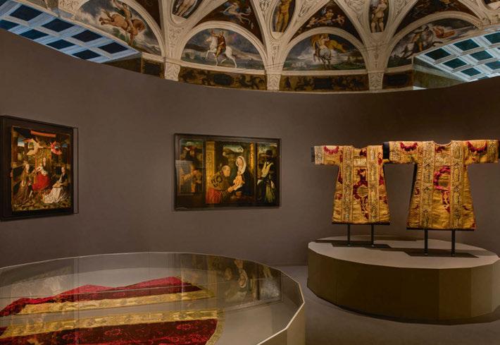
The lighting project for this exhibition has been designed to reveal, through a delicate play between light and shadows, the weft and the colours of the shown textile and painted artworks. Along the way of the exhibition, works of different nature were exhibited at the same time, some of which have been classified as highly sensitive to radiations of the light spectrum. For this reason, the lighting of each artwork required special precautions (a precise spectrum and illumination levels) while maintaining a constant balance and
atmosphere between the several rooms. The chasuble shown along the catwalks, like dresses in a fashion show, are lit by a grazing light on the fabrics so that textures and properties of the spun materials stand out. In order to achieve a perfect uniformity of illumination on textile surfaces, a double lighting system (from below and above) has been used, combined with reflective films. The exhibition paths, on the other hand, are lit thanks to the contribution of the reflected light by the frescoed vaults. The light here is adjusted to balance the illuminance values between background and artworks as well as to brighten frescoes and friezes of the rooms.
Photography: Andrea Ceriani
Phluò: Welcoming Light
New York, USA
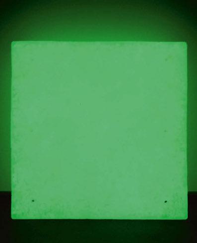
It needs no electricity, provides light for 12 hours, lasts over 25 years, and costs just €5. Phluò is a modular phosphorescent lamp, developed after winning winning an international competition promoted by the International Rescue Committee, aimed at making toilet facilities safer and more comfortable in refugee camps or settlements for internally displaced persons, through the use of new forms of lighting. The design conditions, imposed by the management and maintenance of refugee camps were: a very low cost ($5 per lamp); a minimum light duration of 12 hours, with a maximum charging time of eight hours without using electrical power sources (solar panels or batteries); ease of construction and installation using few tools; resistance to weather, vandalism and theft; a lifespan of more than five years and sufficient illumination to read a sheet of text. The final version of the lamp consists of four layers: the first made of a highly reflective compound; the second composed by a phosphorescent mixture; the third made of microparticles that redirect the light; the last layer made up of microlenses that concentrate the light. Its surface also prevents the proliferation of fungi and bacteria, making it perfectly suitable for use in sanitary facilities. What drove the team to create Phluò was, beyond the technical challenge, also its ethical and social dimension: the opportunity to work in a context where the lack of light would make survival and coexistence even more precarious. Phluò, initially conceived as a lighting system for latrines, can be further deployed and applied to shelters, schools, emergency medical facilities and outdoor pathways.
Photography: Marco Miglioli ArchiLight Studio
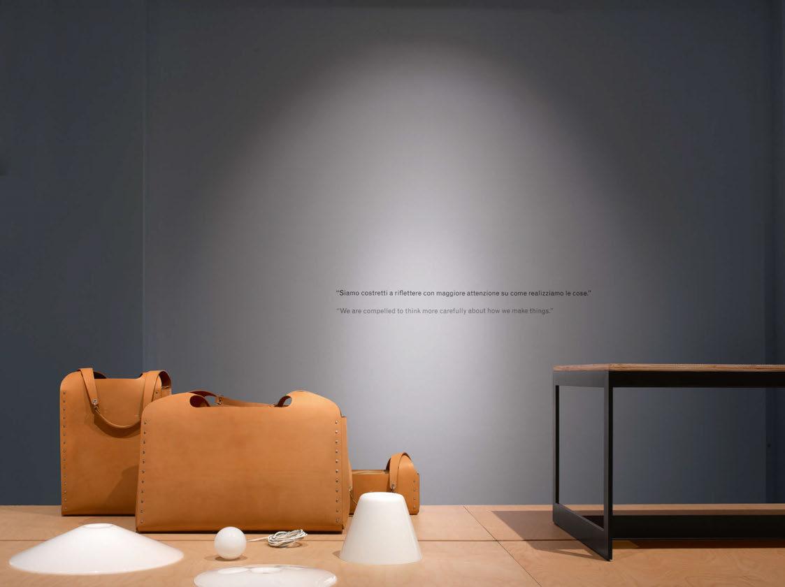
“To do something new, it’s just not sustainable. We are designing the next lamp and no one really needs the next lamp.”
David Chipperfield Design provides an inside look at how the studio applies architectural thinking to industrial design and discusses its new collaboration with iGuzzini on the Ribeira outdoor lighting family.
For many architects, the ideal luminaire is one you barely notice. “As an architect, normally you don’t want to see any light fittings,” says Dirk Gschwind Managing Director of David Chipperfield Design. “The less, the better.” Light, in this sense, is not conceived as decoration or spectacle, but as something quieter: a tool for shaping atmosphere, proportion, and the experience of space itself. Yet despite this instinct towards fewer luminaires, David Chipperfield Design continues to produce lighting objects with an unmistakable physical presence – luminaires that occupy a room with precision without overwhelming it. It is a tension that sits at the centre of the studio’s approach to design.
For Paolo Dell’Elce, Head of Design, this way of thinking begins by rejecting the idea of light as an applied layer altogether. “I don’t see light as something you add,” he explains. “Light is a natural phenomenon that you manipulate. You design around light: you try to control it.”
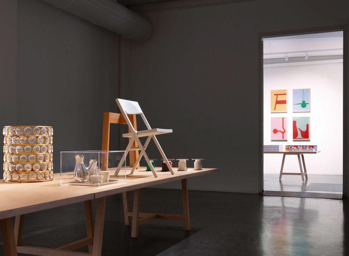
It is a perspective more commonly heard on the architectural side of the discussion rather than in product design, and perhaps that is precisely the point. Unlike many product studios operating independently from architectural practices, David Chipperfield Design exists as an extension of David Chipperfield Architects itself. Together, they work less as separate disciplines than as part of a shared design culture, carrying the same attention to context, materiality, construction, and experience. During Milan Design Week, the studio presented an exhibition in collaboration with Italian design magazine Casabella, showcasing a concise selection of David Chipperfield’s designs. Titled Cose Disegnate da Architetti, meaning “Things Designed by Architects”, the exhibition brought together furniture and lighting pieces developed by David Chipperfield Design over the last 35 years. Speaking to Dell’Elce at the exhibition, he explains that the core of the installation was to highlight Chipperfield’s distinct “architectonic” approach to industrial design – one that foregrounds structure, tectonics, and the broader architectural background.
“These objects were conceived from an architectural perspective, not as pure industrial design,” explains Dell’Elce. “Most of these things were designed in connection to a project, so we’re always thinking about the larger scale.”
The distinction is subtle but important. While David Chipperfield Design produces furniture, lighting, and domestic objects, the studio does not approach them as isolated products or exercises in styling. Instead, they emerge from the same methodology that underpins the architectural practice itself, one grounded in context and an understanding of how people inhabit or move through a space.
That relationship between architecture and product design is not theoretical either; it’s embedded in the structures of the studio. “Both Gschwind and I, and the people working at David Chipperfield Design, all work at David Chipperfield Architects too,” says Dell’Elce. “It’s not that we are a separate unit.”
Some members of the team come from architectural backgrounds, others may descend from interior design, and some, of course, from
industrial, but the exchange between disciplines remains constant. Gschwind himself started working at the company as an architect for David Chipperfield Architects, long before overseeing David Chipperfield Design. He describes the influence of David Chipperfield less as a rigid house style than a shared way of thinking: “You work together for a long time and, of course, you are influenced,” he says. “Not that you think like David Chipperfield, but there’s a common understanding we must share.”
That shared understanding always begins with context. Whether that’s designing a museum, a chair, or a luminaire, the process starts not with form but with observation and research. In architecture, this means understanding of the city, the public realms or the historical relevance of the building’s surroundings. In product design, the scale changes, but the principles should remain similar. Dell’Elce describes a process rooted equally in behaviour and use – studying how objects are handled, approached and touched during day-to-day life. “We start from the user perspective,” he explains.
“Light is a natural phenomenon that you manipulate. You design around light: you try to control it.”
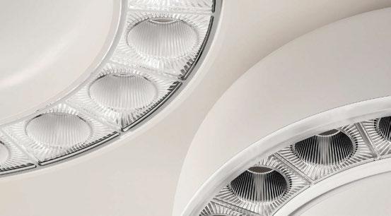
Together, these perspectives form the hybrid identity of David Chipperfield Design. Gschwind reiterates throughout the conversation about the architect’s wider social responsibility, the idea that buildings and objects exist not only for the client but within a larger public realm and environment. Dell’Elce, meanwhile, brings a sensitivity towards ergonomics and behavioural experience developed through years of product and retail design. The result is neither architecture reduced to furniture, nor industrial design dressed in architectural language. Instead, David Chipperfield Design’s objects occupy a space somewhere between the two – designed through architectural thinking and refined through the intimacy of use. That overlap becomes especially visible in the studio’s latest collaboration with iGuzzini on Ribeira, an outdoor lighting family that translates David Chipperfield Design’s architectural sensibility into an industrial product. Developed over a threeyear collaborative process between designers, engineers, and technical specialists, the collection reveals how architectural thinking can shape not only the appearance of a luminaire but the philosophy behind how light itself is understood. As with all David Chipperfield objects, it was born in tandem with a project. Architects at David Chipperfield Architects’ London studio were working on the Rolex Tower in New York. At the time, iGuzzini had already established a relationship with Rolex and created lighting that met the brand’s highly technical and aesthetic standards. The building demanded a particular circular lighting technology, one that could integrate seamlessly into the architecture and become almost invisible.
Together, they collaborated on creating a bespoke technology that reduces fixture height by distributing the light in a circle, maintaining a high level of performance for Rolex’s showrooms. With the success of this sophisticated lighting technology, iGuzzini wanted to take the technical solution further and develop a new product language in the form of an outdoor lighting series. For David Chipperfield Design, the proposal also represented a rare opportunity to enter a new territory. “We didn’t yet have much experience in outdoor lighting,” Gschwind admits. “But from a technical perspective, we considered iGuzzini to be one of the strongest companies in Europe, so it felt like the right collaboration to begin exploring that world.” Rather than starting from a purely aesthetic brief, the project evolved from a shared interest in translating an architectural lighting technology into a more refined and emotionally resonant object. The design began with shaping the entire family of luminaires around the existing technology, extending it across wall-mounted, pole, and ceiling applications. While the engineering already existed, Dell’Elce explains that the real challenge was transforming a highly technical system into something softer and more atmospheric.
The original optic relied on multiple LED cells and individual lenses, which produced a dotted appearance common in architectural luminaires. “We wanted to create a more homogeneous, diffused look,” he explains. To tackle this, the team developed a solution that would be known internally as “the no-dot optic” – a custom optical solution that was inspired by automotive lighting technology, particularly LDL (light transmission technology), taking the same phenomenon and technology used in car optics to create a seamless, more diffused projection of light.
“I think the no-dot optic is one of our greatest contributions as designers”, adds Dell’Elce proudly. Once the technology had been perfected, the next step was refining the form. The team recognised that most outdoor lamps, while functional, lack the aesthetic refinement, and decided to approach the fixture’s design with the same material quality as an emotional quality object, despite its technical outdoor performance. Gschwind notes that many outdoor luminaires succeed in functionality but remain visually cold or overly infrastructural.
Ribeira sought something different: an outdoor fixture with the same restraint and composition of domestic architecture.
This ambition becomes most visible in its domed form. Rather than filling the central cavity with additional technical components, the team deliberately preserved it as a void – a nod to something more architectural than industrial. Light is carefully directed back into this hollow centre, producing a faint internal glow that delivers a sense of depth and calmness. “It should also be like a void,” Gschwind explains. “Part of the form itself.” However, achieving this balance between refinement and performance was never straightforward. As the project progressed, increasing technical requirements began to reshape the object.


Not only light It’s following shapes
Tracker follows fluid architecture with a mobility of a spine.
Design: Intra lighting
“You work together for a long time and, of course, you are influenced. Not that you think like David Chipperfield, but there’s a common understanding we must share.”
The larger fixtures in particular had to address vandal-resistance and waterproofing standards, which called for structural reinforcement and visible fastening systems that shifted the character of the original concept. As Gschwind noted, this inevitably altered the original vision to some extent. In response, the team worked carefully to find a balanced solution: a larger version adopted the necessary protective detailing for public environments, while smaller fixtures remained more refined to suit hospitality and residential applications.
Ribeira’s form also reveals something fundamental about how David Chipperfield Design approaches lighting. During our conversation, Gschwind revealed that light occupies a strangely paradoxical role in architecture. It is essential for how a space is perceived, yet the source of illumination is expected to be hidden at all costs.
According to Gschwind, luminaires are treated as almost necessary intrusions for many architectural environments – technical devices that must support the space without competing with it. “The less is better,” Gschwind adds. Yet Ribeira is not invisible. Rather than dissolving in the architecture, it occupies a quiet middle ground between luminaire and architectural element.
For Dell’Elce, the issue begins with the language used around light itself: “I don’t see light as an added layer. Light is a natural phenomenon that you can manipulate and control.” This distinction is important; to “add” light suggests something supplementary, as though it is a final gesture applied after the architecture is complete.
David Chipperfield Design instead sees light as something inseparable from the architecture and part of the emotional and material constructions of a room from the outset.
This sensitivity towards atmosphere and perception is present throughout the conversation, particularly when discussing In Praise of Shadows, the influential 1933 essay by Japanese author Jun’ichirō Tanizaki. Both Gschwind and Dell’Elce reference the text when describing their understanding of light quality and spatial mood.
In the book, Tanizaki reflects on the shadows of traditional Japanese architecture and how objects transform under different cultural conditions of light. For example, a lacquer bowl glowing softly within a dim interior possesses a fundamentally different emotional quality when removed from that environment and placed beneath the brightness of a modern European room. For Dell’Elce, the text became formative during his design studies; for Gschwind, it remains a reminder that light is never neutral but deeply tied to atmosphere and cultural perception. This reference reveals why David Chipperfield Design is resistant to rigid distinctions between “architectural” lighting and “decorative” lighting. “That is just a commercial separation I don’t embrace,” says Dell’Elce. While the lighting industry often categorises products according to whether the fitting itself is visible or concealed, David Chipperfield Design’s perspective is less binary. A luminaire may quietly disappear into a ceiling or assert itself more clearly within a room; what matters is whether it contributes meaningfully to the experience of the space. Gschwind points towards hospitality environments, restaurants, and domestic interiors as examples where visible lighting objects can enrich the atmosphere without overwhelming architecture. “It’s not black and white,” he says. “There’s a lot of grey in between.”
That nuanced position perhaps explains why Ribeira feels less like a technical outdoor fitting and more like an architectural object scaled down into product form. The goal was never simply to illuminate space efficiently, but to create an outdoor luminaire with the refinement and emotional softness more commonly associated with interior environments.
Attention to detail also went beyond form and optics, and even to the assembly of the Ribeira. From the outset, both David Chipperfield Design and iGuzzini committed to eliminating adhesives and silicone sealing wherever possible, so that it could be fully disassembled.
“It was one of the main goals from the very beginning. We wanted the fixture to be totally recyclable.” However, avoiding glue-based assembly methods made the process considerably more complex, requiring components to be mechanically resolved rather than permanently sealed together. While the adhesive-free system posed challenges during the development, this complexity could not be compromised for the sake of David Chipperfield Design’s methodology and iGuzzini’s broader marketable expectations. “You cannot compete with entry-level products in that way. Companies like iGuzzini need to differentiate themselves through their approach as there are so many silicone-based optics already out there,” says Dell’Elce.
Like architecture itself, Ribeira was conceived not as a closed object, but as something capable of lasting over time. Components can be ultimately recycled or repaired, an approach that prioritises longevity over concealment.
While the adhesive-free system introduced additional challenges during development, both designers view it as inseparable from the project’s broader ambitions. “It makes everything much easier later, and it extends the lifespan of the product impressively,” says Dell’Elce, referring to maintenance and aftercare.
Sustainability is also critically important to David Chipperfield’s practice. Known for challenging today’s “throwaway” culture, David Chipperfield prioritises environmental responsibility through adaptive reuse and repairing of existing structures and favours long-lasting materials over wasteful rapid construction. However, this radical sustainable stance may come at the cost of a contradiction to its design arm.
Dell’Elce speaks about this tension with honest transparency: “Two do something new is already not sustainable,” he says. “We are designing the next lamp, and no one really needs the next lamp.”
Rather than avoiding the contradiction, David Chipperfield Design appears acutely conscious of it. Sustainability, in this sense, is not treated as a marketing layer added at the end of a project, but as an ongoing ethical negotiation embedded within the act of designing itself.
When asked how the studio navigates this paradox, Dell’Elce is careful not to offer easy resolutions. Instead, he describes a practice built on selectivity and self-awareness. David Chipperfield Design chooses carefully when developing products for long-term production, ensuring any addition to the market must offer something meaningful beyond stylistic novelty. In Ribeira’s case, that justification emerged through the development
of a range of optical solutions, including both the no-dot optic and more technical “dotted” systems. Rather than privileging a single approach, these complementary technologies provide different light effects, allowing the project to move beyond short-term visual consumption and inform future applications.
Equally as important is the desire to produce objects that can resist disposability altogether. Throughout the interview, both designers repeatedly return to the idea of reparability and longevity, so that users don’t feel the desire to replace them. In this sense, Ribeira was first and foremost created as an object that will be endured over years to come.
Ultimately, what emerges from the conversation between Gschwind and Dell’Elce is not simply a story about a lighting product, but a wider architectural attitude towards design itself. Throughout the discussion, lighting is rarely treated as decoration but as an extension of the architecture itself. Ribeira embodies this by sitting between disciplines: it is both technical yet atmospheric, discreet but physically present. In a sense, David Chipperfield Design’s approach feels less concerned with producing novelty and more concerned with producing products that can be endured over time. This is why the exhibition in Milan, Cose Disegnate da Architetti, resonates so truly because it is not a stylistic label but a way of thinking. For them, lighting is not something to be added to architecture but something architecture shapes.
www.davidchipperfield.com
Returning this April, Milan Design Week once again saw the Italian city awash with visitors eager to see the latest trends and innovations in design. Ellie Walton, reports back on her findings in an exclusive from Milan.
Milan Design Week is on everyone’s lips come Spring. For me, it’s my favourite event of the year. Ever since experiencing my first show last year, I’ve been counting down the days until my return to the capital of design. My colleagues have spent years singing its praises, and now I completely understand why. The city brims with energy, ideas and creativity; add glorious sunshine and a few well-earned aperitifs, and it hardly feels like work at all.
With Euroluce not taking place this year, I’d imagined a more leisurely pace this edition, wandering between exhibitions, perhaps even squeezing in a little sightseeing. But I couldn’t have been more mistaken. My schedule quickly filled up, back-to-back with exhibitions, interviews, product launches and installations. Factor in a few missteps navigating Milan’s streets with Google Maps, and time seemed to vanish entirely. No rest for the wicked, as they say.
This year, I saw Milan revealed not in brightness, but in glow. I dislike using the word “trends” because I think it carries connotations of being a momentary phase, and, from what I saw in Milan, I believe we are beyond fleeting trends, and focused instead on innovation and creating design that is symbiotic with our evolving lifestyles. Moving through Milan this year, it became clear that the larger consensus on light is that it is no longer just something to look at or see with; it is an active force in shaping atmosphere, a spatial tool, and a material that can be bent and shaped, taking on a role that extends far beyond simple illumination.
First on my list is that light shouldn’t be framed primarily as a functional tool, but as an atmospheric presence – something ambient, possibly mobile, and often sculptural. In the decorative lighting sphere, an influx of portable and freestanding luminaires has surged in the last year. A demand has clearly been heard from hospitality spaces wanting portable pieces for their tables, as well as residential homes, which now see the benefit of having a mobile source of light to take anywhere with them. Both Occhio’s Era and Moorgen’s latest collaboration with renowned interior design studio, Yabu Pushelberg, released less conventional lamps and more luminous artefacts.
Occhio’s Era premiered in their showroom in the infamous Corso Monteforte area (a hot spot for lighting design) under the title The Art of Reflection Crafted from a solid block of polished glass and controlled through subtle gesture via motion sensors, Era relies on reflection to produce a warm, enveloping glow. Presented in the showroom on a velvet table, Era was displayed like a jewel – almost like a metaphor for light being something precious and atmospheric, not just simply functional. A more restrained but equally evocative approach appeared in Yabu Pushelberg’s latest collaboration with the Chinese brand, Moorgen, on Moonbeam. Drawing on the form of the traditional lantern, the table map diffuses light evenly from within, avoiding directional performance altogether. Portable and sculptural, it continues the emotional and poetic idea of light.
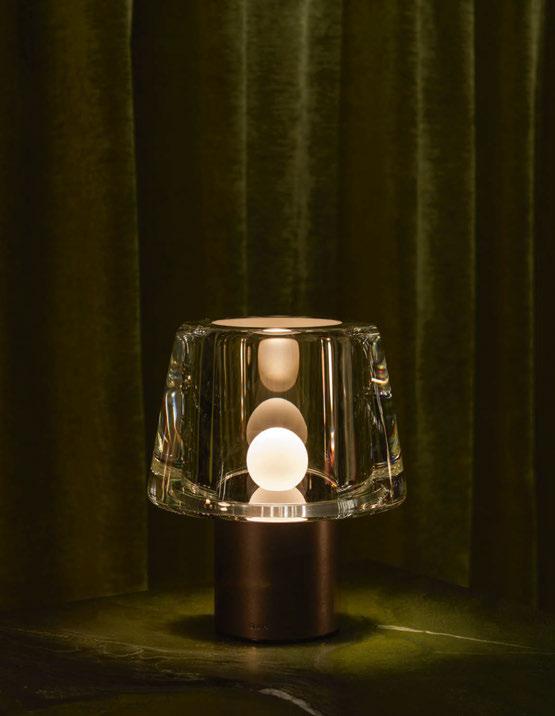
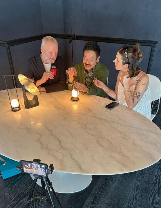
“There’s something romantic about how light was understood centuries ago, a sensibility in China and across Asia that, with the invention of electricity and artificial illumination, lost a certain quality. When the light bulb was invented, I’d say it was almost an intrusion into our lives because it wasn’t focused; it simply answered a practical need to help us find our way,” says George Yabu, Co-Founder of Yabu Pushelberg, talking about Moonbeam’s inspiration.
Fellow Co-Founder Glenn Pushelberg adds: “With this piece, there is of course a feeling of being Chinese, but it also feels worldly, which is lovely. As George says, there’s a friendliness and happiness to this lamp, the colour, the glow and the simple form. It’s essentially a double-sided cast glass disc with an LED light source at its core. But when you look at it, it’s like looking at the full moon: not just a perfect flat disc, but something with craters and terrain.”
Meanwhile, further down Corso Monteforte, Flos transformed its professional space into an enigmatic, sci-fi environment to introduce Nocturne, Konstantin Grcic’s latest modular system.
Referencing the quiet vastness of 2001: A Space Odyssey, luminous grid panels displaying iconic design pieces extended through space, situating the lamps within an abstract and cinematic landscape. An evolution of Grcic’s Noctambule, Nocturne offered a refined, discreet presence: controlled emission, no glare, and light that travelled through glass to produce calibrated reflections and transparencies. Together, these projects suggest an importance for sculptural art in the lighting world, rather than ostentatious pieces that demand your attention; these objects allow themselves to be in a space with presence but with softness, rather than a deliberate beam of light.
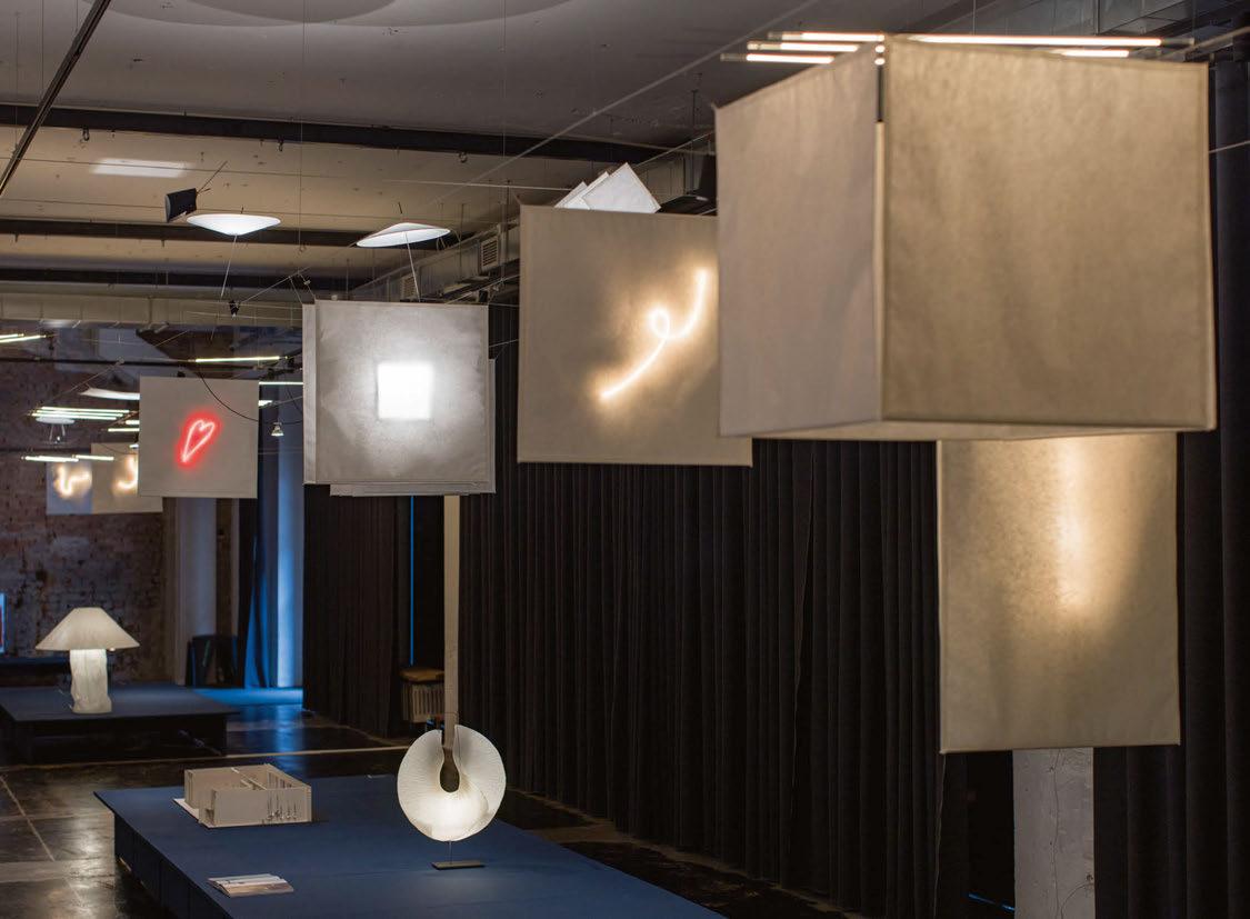
If lighting as atmosphere was about softness and presence, Ingo Maurer’s Here We YaYaHo Again demonstrated lighting as structure and fundamentally spatial. Installed at Via Varese 13, the project revisited the iconic YaYaHo system, which was first introduced in 1984, updating it for contemporary use without losing its original spirit.
The original YaHoHo was designed as a framework rather than a fixed object. Its tension wires allow luminaires to be positioned freely across the space, allowing the user to shape light freely.
Axel Schmid, Head of Design, presented the installation and explained the aim of the new interaction was never to separate the old and the new, but to allow them to coexist by keeping the former structure and updating it with new technologies such as discreet LED lines encased in glass to create a softer, more architectural light. The system can also move further than horizontal, enabling elements to rise and fall, or even use Japanese paper elements that can double up as room dividers. Japanese paper elements also transform the light to introduce a diffused look or even to ‘draw’ neon signs.
Crucially, the installation encouraged interaction and play, which guests experienced during the Ingo Maurer party while a DJ spun tunes and served YaHoHo-themed cocktails to boot. What’s interesting about the YaHoHo is that components can be refigured, adjusted, and mixed over time –reinforcing the idea that light is something to live with, mould, and reshape rather than a fixed place.
Alongside new products and systems, I have always had a keen interest in materials research, ever since starting the materials feature in the magazine. Several presentations moved away from finished products, favouring more open-ended investigations in which process and testing took precedence over immediate commercial outcomes.
The HYLETech installation, Light in Matter: Architectural Variations bridges the ideas of both light as a spatial tool and experimental materials; however, more technologically driven. Appearing at the Triennale Milano, the installation framed light and technology as active components of architecture. Exploring the concept of the “active wall”, the installation proposed architectural surfaces that integrate illumination, energy, and sensory functions into a single plane. Across its wider Milan presence, HYLETech Lab positioned itself less of a supplier and more as a design partner, operating between material research, spatial atmosphere and technical innovation. In contrast to the openness and play of Ingo Maurer’s YaHoHo, HYLEtech Lab suggests a future where light is increasingly absorbed into the architecture as embedded and continuous.
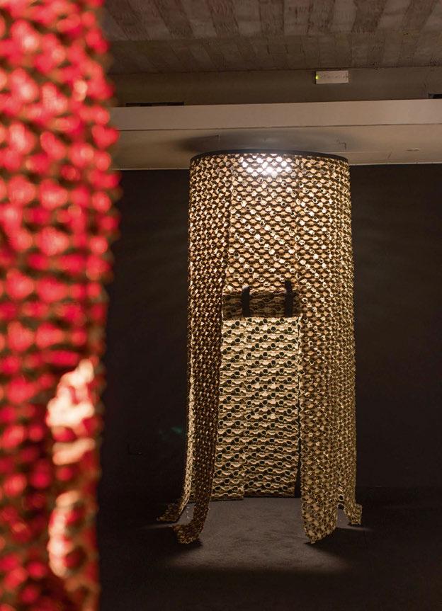
Moreover, Foscarini’s exhibition at the Spazio Monforte, which explored the interaction between light and 3D knitting. Rather than presenting a resolved collection, the showcase framed lighting as an experimental discipline, and examined how textile structures can diffuse light in new ways. The project was led by designers Jozeph Forakis and Lorenzo Palmeri, who worked on two different approaches to the territory of 3D knitting. Forakis, who collaborated with TexTech to generate unusual volumes through adaptations of machines and unconventional yarns, says:
“Traditional diffusers act like walls; they are barriers that light must either fight through or bounce off. A three-dimensional knit creates an entirely different dialogue. Because the material possesses genuine structural depth, varying densities, and deliberate voids, light doesn’t just hit a surface; it inhabits it.
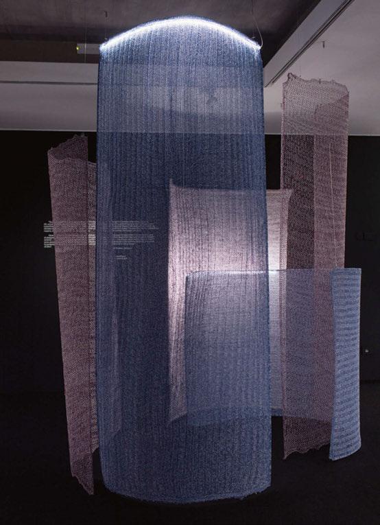
The light is gently caught, filtered, and sculpted by the micro-architecture of the stitches. The entire object transforms into a breathing volume, shifting the experience from a functional illumination source into a living, sensory atmosphere that softly redefines the space it occupies.”
Palmeri, meanwhile, worked with MAS Knit Factory and Arman Avetikyan, adapting techniques rooted in fashion craftsmanship. His investigation centred on the ability of flat textile surfaces to generate volume, using traditional tailoring strategies and carefully calibrated cuts to convert fabric into a kind of textile kirigami.
Speaking to Palmeri on his discoveries, he says: “I realised we were not simply creating decorative effects, but an entirely new behaviour of light.
At that point, the project began to open up broader scenarios, not only connected to these specific pieces but also to a possible design language.
The interesting aspect was that every variation in yarn, density or structure deeply transformed the luminous atmosphere, almost like working with a living material.
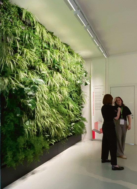
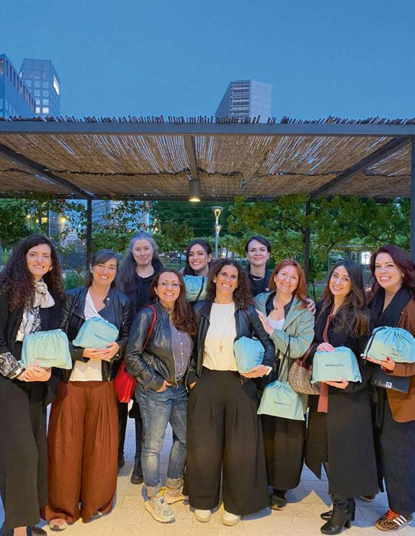
A quieter but equally material-led exploration appeared in Preciosa’s Drifting Lights, presented in an immersive installation at Tempesta Gallery in Brera. Composed of suspended panels of bubbled glass, the work explored how light and colour interact through texture and depth rather than form alone. Using the brand’s 3D patch light effect, the installation transformed the gallery into a slowmoving field of reflections, where light appeared to drift across and within the glass surfaces. Less concerned with spectacle, Drifting Lights reinforced the idea of lighting as a craft-driven and atmospheric medium, one rooted in material behaviour and emotional resonance rather than technological display. (Read more on page 52) Continuing the exploration of innovation, a notable mention would be formalighting’s installation, ORNAMENTALE, with design studio D’Alesio&Santoro. I encountered the installation during the Women in Lighting event hosted by formalighting’s Director of Operations, Sharon Maghnagi and Giorgia Brusemini, Women in Lighting Amassador for Italy. Designed around the real needs of indoor plants, ORNAMENTALE
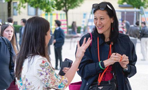
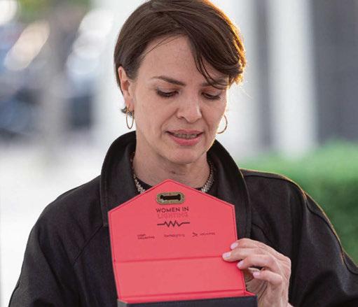
combined phytostimulating LED spectra with a high colour rendering index, allowing greenery to thrive without compromising the chromatic quality of the surrounding space. Rather than treating plant lighting as a technical add-on, the system positioned it as an integrated architectural layer, adaptable across walls, flowerbeds and vertical installations. Seen alongside the conversations unfolding during the evening, the project underscored how material research and technology were key in Milan’s wider lighting discourse.
Beyond the installation itself, the Women in Lighting (WIL) gathering foregrounded the social and professional networks that continue to shape the lighting industry. Hosted by Maghnagi and lighting designer and WIL ambassador, Giorgia Brusemini, the event at Ratanà offered a more informal yet meaningful counterpoint to Milan’s dense exhibition schedule. Conversations unfolded around long tables of delicious food and aperitifs rather than display plinths, reinforcing the
sense that lighting culture is sustained as much through mentorship and shared experience as through objects and installations. In a week often dominated by spectacle, the evening served as a reminder that progress in lighting design also needs to happen within the social sphere through community and gender equality.
Wrapping up my experience during Milan Design Week 2026, I would suggest there is a move of priorities from designers within the lighting world, one that shifted from atmosphere over assertion, systems over standalone products, and research over immediate solution. To me, interiors are starting to focus on comfort and innovation over spectacle; however, the design isn’t compromised in the process. Whether through nostalgic references, experimental craftsmanship, or sustainable innovations, this year’s Salone del Mobile suggested the future in lighting design lies in balancing technology with warmth and meaning. Milan doesn’t simply present trends, it offers a vision into a more thoughtful experience vision that will exceed 2025. www.salonemilano.it
Preciosa Lighting brought its signature design, Drifting Lights, to Milan Design Week, in a large-scale, experiential installation under the same name.
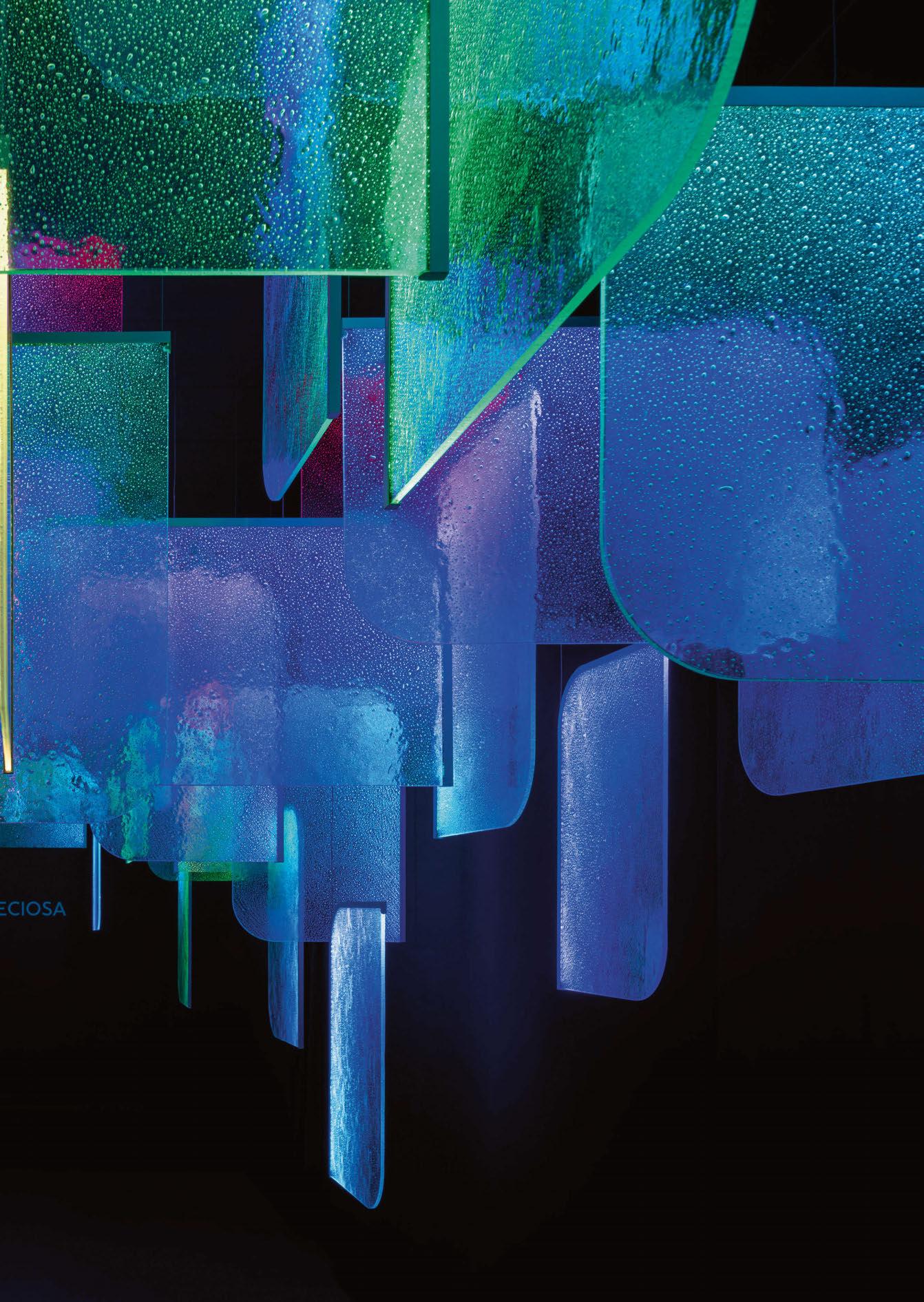
Showcased at the Tempesta art gallery in the Brera Design District, the latest expression of Preciosa’s Signature Designs programme unfolded both as a collection and as a site-specific project. The aim behind the installation was to showcase the product under Preciosa’s 3D light effect, exploring how light and colour interact with bubbled glass to express emotion and atmosphere.
Spanning approximately 30sqm, the installation comprised of 60 vertically and horizontally suspended glass panels to form an impressive structure that filled the gallery space.
As suggested by its name, the installation saw light drift from one glass panel to the next, changing colour and form along the way as
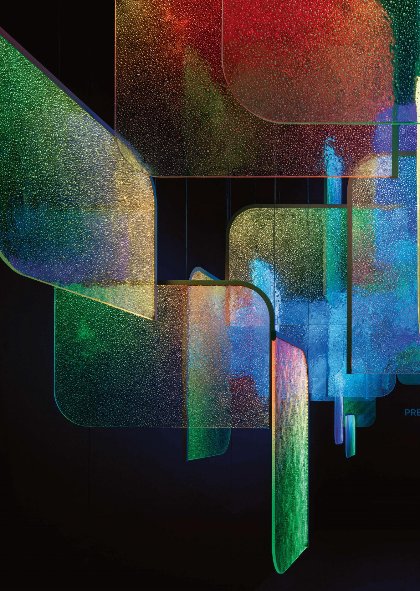
if ink dispersing in water. As the gradients bloom, soften and fade, and eventually recombine, the light projection unveiled the air bubbles and unexpected details within the glass.
Colour sequences played a central role in shaping the experience; transitions from red to pink to green formed a quiet, emotional narrative, referencing feelings of love, passion, and inner peace. As visitors moved around the space, a serene choreography unfolded to express calm, joy, wonder, and everything in between.
Designed by Preciosa’s Co-Creative Directors, Michael Vasku and Andreas Klug, the Drifting Lights installation encouraged slow exploration, creating a moment of consideration and quietude in the busy design week. www.preciosalighting.com
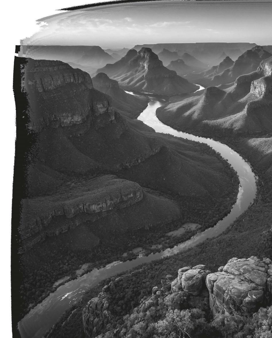
Honouring the lives of 272 people who tragically died following a dam collapse, the Memorial Brumadinho creates an atmosphere of sombre reflection, in part thanks to a quietly respectful lighting scheme from Atiaîa Lighting Design
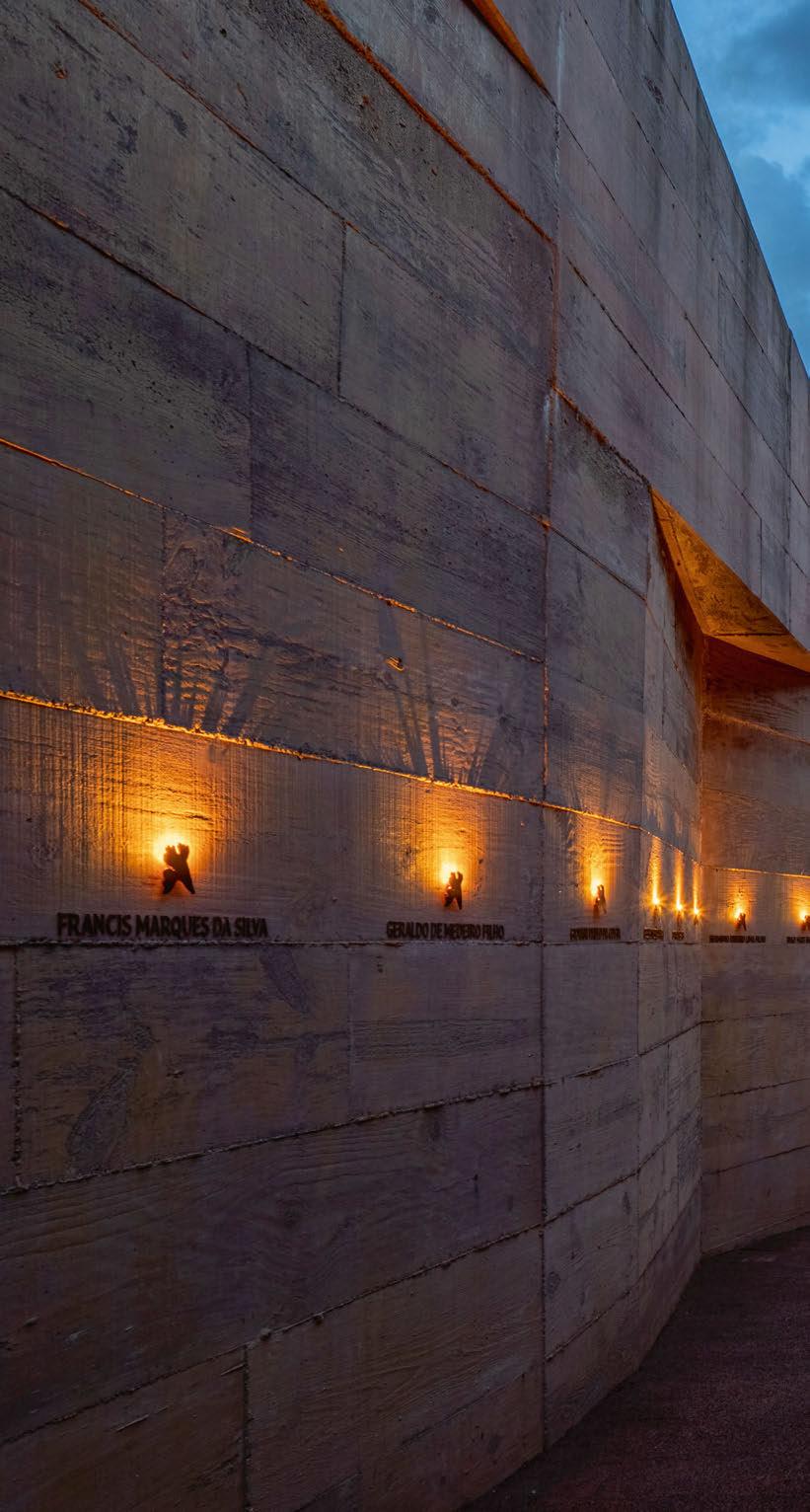
n January of 2019, a tailings dam at the Córrego do Feijão iron ore mine suffered a catastrophic failure. Located 9km east of Brumadinho in Minas Gerais, Brazil, the dam collapsed, releasing a toxic tidal wave of around 12 million cubic metres of tailings. This mudflow engulfed the mine’s headquarters, including its cafeteria, where many of the mine’s employees were enjoying their lunch break, before flowing more than five kilometres downstream towards the Paraopeba River, destroying houses, inns, farms and roads in the process.
The disaster killed 272 people – 250 of which were working in the mine – and affected 26 municipalities in the region, causing extensive damage to the local community, the water supply, and the environment in what stands as Brazil’s biggest workplace tragedy.
Following the disaster, the families of the victims formed an association to pursue justice for what happened. One of the compensations was the creation of a memorial that would commemorate those who lost their lives and honour their memory.
Brazilian architecture studio Gustavo Penna Arquitetos & Associados (GPAA) was chosen to design the memorial, doing so with close collaboration with the families throughout.
Situated on the site of the tragedy, one of the primary ambitions for the memorial was to transform the location into a space for reflection, learning, and transformation.
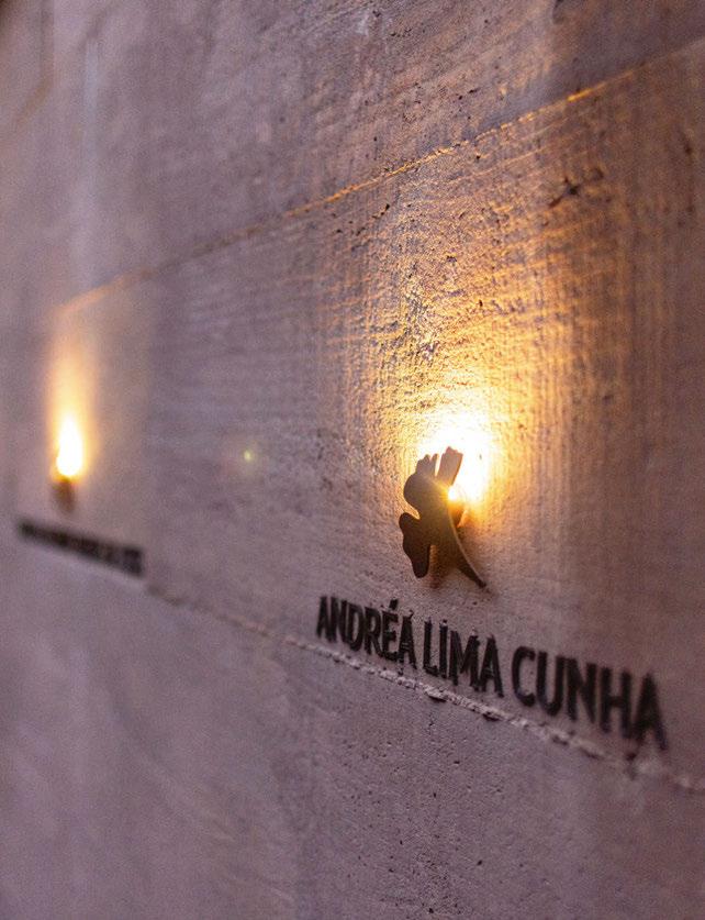
As well as presenting facts and figures about the day of the dam collapse and the history of mining in the territory, the memorial gives names and faces to the victims and tells their story.
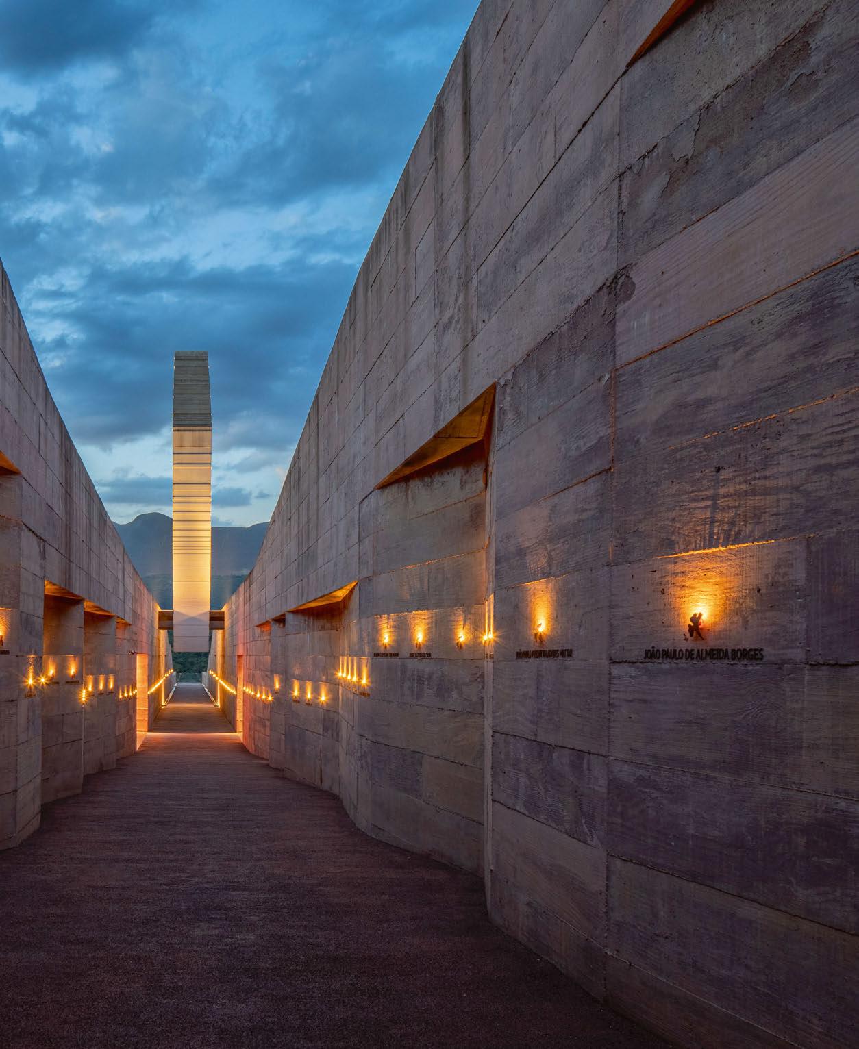
Throughout the memorial, visitors will find an entrance pavilion, which includes a lobby with crystal geodes (a symbol of the “lost jewels”), a meditation space, a café, administrative and support areas, a grove, pathways and outdoor spaces, a reflecting pool, two exhibition halls, and a space dedicated to the dignified safekeeping of the victims’ remains, as well as a vast “rift” – designed to represent and make eternal the rift that caused the dam to collapse – that leads to a sculptured monument.
Across the memorial, light plays an integral role in creating an atmosphere of sombre reflection.
Tasked with realising this was Mariana Novaes of Brazilian studio Atiaîa Lighting Design, who wanted to design a scheme that would be quietly respectful, inviting introspection and solemnity.
“I wanted to make people feel, that was the main idea – to feel the space, and feel the absence, but also to feel the presence as well. It was important to create a lighting scheme in which, hopefully, people would develop an emotional connection with the Memorial,” she tells arc.
“The architecture was designed in a way that people would experience different scales, and the contrast of daylight and darkness. The visitor enters from the outside into a small, dark room during the day, and then it opens out again, before entering the rift, which is a sensitive area of the project. Then this sense of different scales repeats during the journey through the rift until you access the Memorial and Testimony rooms. And later it ends in a viewpoint.
“I wanted to create something similar at night, and to balance light and darkness. I believe that when you allow darkness, you invite people to think, to reflect; darkness is a pause where you invite silence and introspection. The light is there to provide information, but through darkness, we stop seeing and we start thinking and feeling.”
Given the tragic story behind the memorial, and the input of the victims’ families, Novaes says that the reality of their pain placed the designers in a position of “profound humility”. “From the beginning, there was no I or we, but they. We were there for them. It was all about the victims and their families. The narrative belongs to those who can no longer speak, and those left immersed in grief. There is no consolation that can materialise in these circumstances. This was therefore our modest effort to honour the memory of those invaluable people whose lives and dreams were abruptly cut short.”
With this in mind, the lighting design is deliberately pared back, with low-level, warm lighting creating a soft, delicate glow where necessary. Each solution was designed to connect the visitor to the impacts of what happened, through a symbolic and sensitive interpretation.
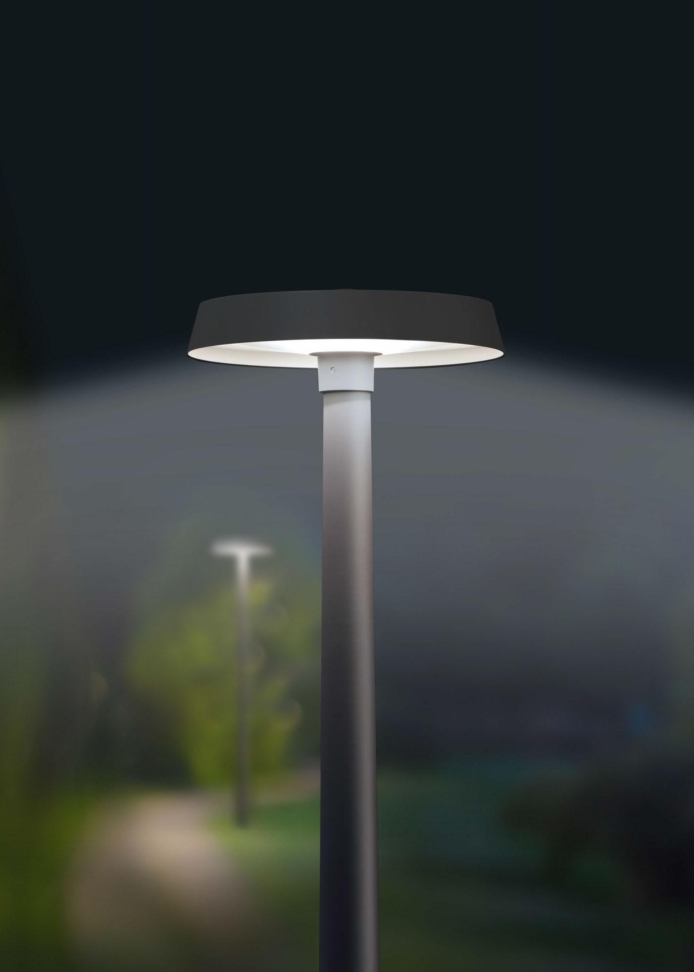
BEGA pole-top luminaires with Dark Sky technology direct the light in a highly efficient manner only where it is required. Light pollution of the night sky is avoided. bega.com/darksky
Lighting helps to guide the journey and the experience of the memorial, highlighting planes, emphasising elements and symbols, determining zones of light and darkness, and creating perceptible contrasts across each space, according to what they represent and present; striving not to distort the characteristics and colours of the architectural materials or hide imperfections.
“When the dam collapsed, all I could think about was candlelight,” Novaes explains. “What I wanted was to light a candle for everybody. I had this in my mind because it is the most precious tribute, and it is present in any culture. This was our idea, and the architects came with a lot of messages, symbols, and meanings for the architecture, and we worked together to illuminate these messages.”
The memorial was constructed out of concrete that had been mixed with a pigment extracted from the toxic iron ore waste. The front façade of the memorial was illuminated in a way that would show all of the textures, or “scars” of the material. The use of concrete throughout presented Novaes, on a technical level, with some difficulties, with regards to placement of lighting fixtures, as one of her main ambitions was for the light to feel “seamless”.
“We had to be very careful, because we didn’t want the fixtures to be present – we didn’t want people to see the luminaires,” she says. “We did a lot of research and tested many products, but the right answer was to use fibre optics, particularly in the rift, as these could be embedded into the walls, and the drivers, etc, would be hidden on the other side. There were also linear and grazing lights, and ellipsoidal projectors – there was a mix of products, but the most difficult part was to
make them invisible, but I think we managed to hide them well enough.”
Walking into the memorial, visitors enter a dark lobby space with the date of the tragedy displayed on the wall, and where the only light source present guides them to the crystal geodes.
On the lobby’s ceiling is a small rectangular skylight, perfectly positioned so that on 25 January each year, at exactly 12.28pm – the moment of the disaster – a beam of daylight cuts through the ceiling and strikes the geodes, filling the space with reflected light. These geodes, Novaes explains, are a further tribute to those lost during the disaster.
“The families refer to their lost ones as ‘jewels’. This comes from an interview at the time of the tragedy from the President of the mining company, who said that the company is a “jewel to the country”. Everybody thought, ‘you don’t say that. You never say that. The jewels are the ones that we lost, and this could have been avoided’.”
The contrast of the illuminated exterior to the darker interior spaces, Novaes feels, invites the visitor to take some time to adjust not only their vision, but also themselves, so that they can fully take in the different messages presented by the architecture.
From this lobby space, visitors then enter the “rift”, a 230-metre-long channel, in which the names of the 272 victims are displayed, each with an accompanying, illuminated Ipê flower. Through these flowers, the symbolism continues, as Novaes explains.
“272 Ipê-Amarelo (yellow Ipê) trees were planted at the site to honor the victims. It is a tree native to Brazil, and its flower is the symbol of the country. It is associated with resilience and resistance, because it loses all the leaves and blooms exuberantly during the driest and coldest season –it is so beautiful. Despite everything, life goes on.”
The decision to include these illuminated ipê flowers was made during the development of the project, as the authorisation process for including the victims’ names in the rift walls took a long time – some are still not authorised. At the time of the project, some of the victims’ bodies had not yet been found.
“The initial idea was to illuminate the names of the victims, but iIn the end, the architects and the communication designers came up with the idea that, if the names are there or are not there, by illuminating the flowers, we would still have a symbol to honour each person. This was very important so that people could see them and process their losses.
“Interestingly, when you are in the rift and you see the flowers, someone told me that they felt that it was like a procession where you carry a candle. “This never came to my mind when I was designing it – I was only thinking that every single person is present through light. But when you see all 272 lights together, he felt that he was in a procession. “But when you are in a procession, the person carrying the candle is the one paying the tribute, but that is not the case in the rift – the lost ones are the light, they are the ones carrying the candle. Symbolically, they are guiding us through this memorial.”
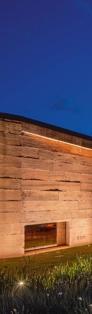
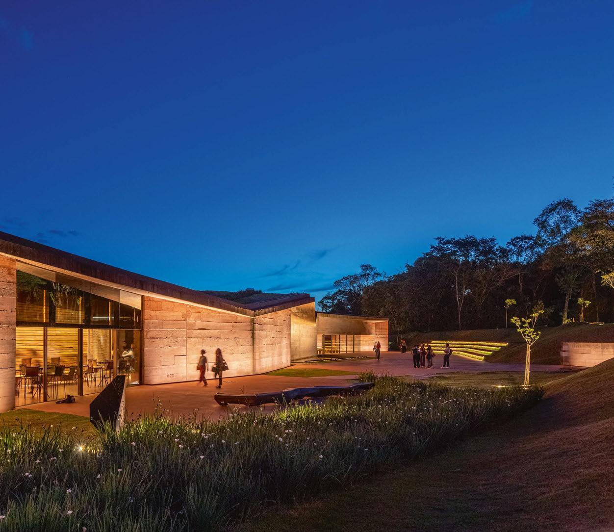
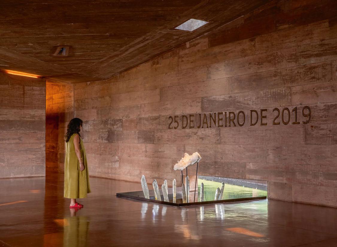
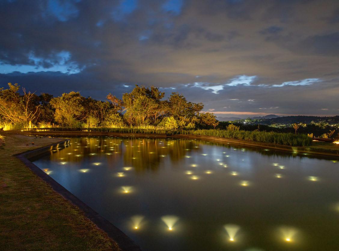
Halfway down the rift are three rooms, each further honouring those that lost their lives in this disaster.
In the first space, the Memory room, the families of the victims honour their loved ones; photos and selected objects that represent each person are present in this moving, emotional space.
The second room, Testimonial, presents facts and data from the tragic event that occurred on this site, while also providing some additional information on the territory, and the history of the space, and the mining history at Córrego do Feijão.
The third and final room is a sacred space that holds the recovered remains of the victims.
“What happened there is unbelievable – it is really, truly sad. And this room is very important. In this room there is almost no light, and you are not permitted to take pictures, it is a place to pay your respects.”
In the middle of the rift, right after these rooms, stands a tall monument. Designed to appear as an abstract head that “feels and cries”, Novaes says that the architect “had the idea of representing humanity and its failures”.
“When the project originally started, this was a simple white square, from which the tears would come, and then later, a map of Córrego do Feijão was added to the surface, where we could illuminate the territory, the history, and so on. And when this head cries, the tears are also illuminated.”
From the sculpture, water cascades down the remainder of the rift, leading to a viewpoint that is pointed towards the site of the dam collapse, before culminating in a lake that “collects the weeping”.
Novaes continues: “The original architectural proposal didn’t include lighting in the lake, but I felt we needed to add some lights to the lake. The mine lights are still on, and the lake would be in darkness. How do we deal well with darkness? How do we interpret and understand darkness in our culture? Would the darkness and the mine lights being on send a good message to those visiting the site? This is the last area open to visitors at the memorial, and it was our last chance to pay tribute to the victims. In Brazil, there’s a popular expression we use when we can’t explain death: we say someone has become a star in the sky. So, on the surface of the lake, we added 272 ‘stars’.
“As a basis for the design of the points of light, a map of the celestial sphere projected onto the site on January 25, 2019, at 00:01, the date of the dam rupture, was used, once again to represent the victims and convey the message that, even amidst this tragedy, there is a horizon, there is light, there is hope. Let’s think about what we can learn from this.”
Since the memorial opened, it has received widespread acclaim, garnering attention not only for the striking architecture, but also its beautiful, reflective lighting design. The project was recognised at the IALD Awards earlier this year, and was also the recipient of the SPACES Award at the [d]arc awards. However, despite this acclaim, Novaes is more hopeful that the attention the project has received will help to spread the message about the tragic event that occurred at the Córrego do Feijão mine.
“I feel very honored to be a part of this project,” she says. “I’m happy, of course, for the recognition of the work we did, but my motivation for applying for all these awards was how I, as a designer, could further honour these victims and their families, beyond doing the best possible work on the project. I felt that this project and this story needed to be heard, I wasn’t thinking about the results; I was driven by the desire to share the story so that it reached as many people as possible. There is no memory until you know what needs to be remembered. That was my motivation, and when I see the results emerging, I am very happy, because it’s much more than the work itself; it’s the meaning and relevance of the memorial being recognized as well.”
Memorial Brumadinho was intended to be a place to feel, to pause, and remember those lost by this tragic disaster. The combination of its architecture and lighting design creates an atmosphere of collective reflection – far from merely providing wayfinding or displaying information, light brings an additional, atmospheric, intangible quality. It adds presence, highlights symbolism, invites introspection, and, most importantly, honours the victims’ memory.
www.atiaiadesign.com.br
The full interview with Mariana Novaes will be available to view on the [d]arc discussions YouTube channel soon.
Client: AVABRUM
Lighting Design: Mariana Novaes; Atiaîa Lighting Design, Brazil
Architect: Gustavo Penna Arquiteto & Associados, Brazil
Landscape Design: Medra Paisagismo, Brazil
Lighting Specified: Arte em Cena (ETC), Fasa Fibra, Interlight, Lemca, Lightsource, Lumicenter, Luxion, O/M Light, Ótica
Photography: Pedro Mascaro; Leo Drummond
A sensitive relighting of Clifton Suspension Bridge by Hoare Lea reveals Brunel’s original masterpiece, balancing heritage, ecology and modern design to reaffirm its role as Bristol’s enduring night-time landmark.
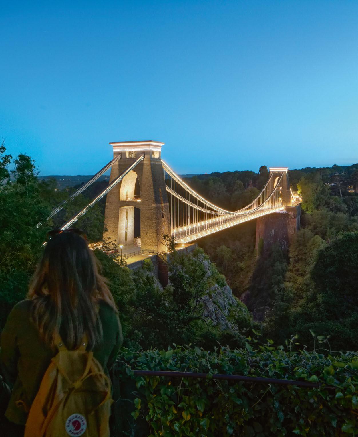
The Clifton Suspension Bridge has long existed not only as a feat of engineering but as a symbol woven into the identity of Bristol itself. Suspended over the Avon Gorge, its silhouette has become part of the city’s collective memory, which is recognised in darkness as much as it is in daylight. From the warm glow of the early tungsten bulbs to the evolving technologies of contemporary lighting, the bridge has long shared a relationship with light, acting both as a landmark and beacon for those returning home to the city.
The relighting of Bristol’s beloved bridge was approached with a careful balance of heritage conservation, environmental sensitivity, and contemporary lighting design. Led by the Hoare Lea team, including Principal Lighting Designer Harriet Davis and Director Juan Ferrari, the project sought not to renew the bridge but to reveal what was already there: the spectacle of Isambard Kingdon Brunel’s brilliant structure. As Davis explains: “It was about elevating the bridge, not making a big deal about the lights.”
Yet designing for a structure so deeply embedded within public life carried a huge responsibility beyond aesthetics alone.
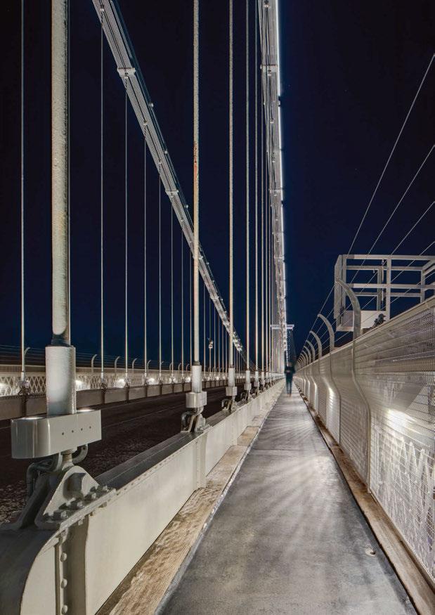
This bridge was not simply a historic monument but has been part of Bristol’s emotional landscape for over a century. Long before it became the icon of modern Bristol that we know it to be today, the Clifton Suspension Bridge was already an act of ambition cast in iron.
Conceived in the late 18th century and finally realised through a decade of interruption, redesign, and engineering risk, it emerged as one of the most extraordinary infrastructures of its time. Designed by Isambard Kingdon Brunel when he was only 23-years-old, the bridge was never simply a crossing point, but a huge leap in mankind’s technological development and structural possibilities. Dr Laura Hilton, historian and head of the bridge’s museum, explains the unprecedented ambition: “This was going to be the highest and longest bridge in the world,” she says. From the early days of the bridge’s completion, light played a role in how the bridge was experienced. In 1864, on the bridge’s opening, an attempt was made to illuminate the structure using electric light – a moment Hilton noted was a turning point for the city as its first encounter with emerging electrical light. Although the illumination failed in practice, the gesture itself established light’s enduring importance to the bridge’s identity, not just as decoration but as a way of revealing its form amongst the dark gorge.
In the decade that followed, illumination remained closely tied to civic celebrations – coronations, jubilees, and city-wide events – before gradually becoming a permanent presence in the late 20th century. By the 1960s and 1980s, the bridge was transitioning from occasional spectacle to nightly landmark, evolving each scheme as technology advanced. Yet with each new iteration came new challenges with reliability, maintenance and the question of how to illuminate a widely loved bridge without overwhelming it.
More significantly, the bridge has become far greater than just infrastructure within Bristol – it is a marker of homecoming and place. “People in Bristol today have grown up with the bridge being illuminated,” says Hilton, capturing how light has become inseparable from the collective and personal experience of the bridge in modern society.
Part of the bridge’s visibility is how it is recognised and remembered. This sense of shared ownership has been carried through generations. “It’s not our bridge – it’s Bristol’s Bridge,” Hilton adds.
A statement that encapsulates the importance and great responsibility that the lighting designers faced with every decision. Davis understood this responsibility all too well, being a fellow Bristolian herself. To alter the lighting didn’t just mean upgrading the system, which, of course, was how this project began; what it meant was to engage with a living and cultural artefact, one that is already formed in the public’s imagination. This context is more than just a technical timeline; it is the foundation upon which the new scheme was built. By the time the discussion came around to introduce a new lighting, the current system had become increasingly difficult to maintain.
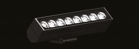
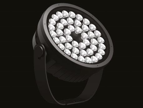
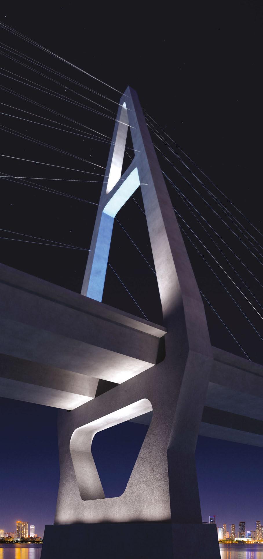

As Bridgemaster, Tristan Ralph, explained: “The previous systems were about 20 years old and had expired, which proved to be quite unreliable and, because of that, quite costly to run and be maintained.”
However, updating the system and fixtures was only part of the brief as several other key objectives were identified, including environmental protection, functional safety, efficiency, and flexibility, while creating a cohesive visual identity. These practical requirements were matched by a wider ambition to develop a scheme that Ralph described as “sympathetic” to the bridge’s heritage. The Avon Gorge beneath the bridge is designated as a Site of Special Scientific Interest, which required careful consideration of how light interacts with its environment and wildlife. The design team therefore avoided illuminating the entire structure, instead minimising light spill and unnecessary brightness. Darkness was intentionally preserved in selected areas, with soft gradients and precise beam control used to highlight only key architectural features while ensuring light reached only intended surfaces. Importantly, light was not found to be entirely detrimental to the ecosystem.
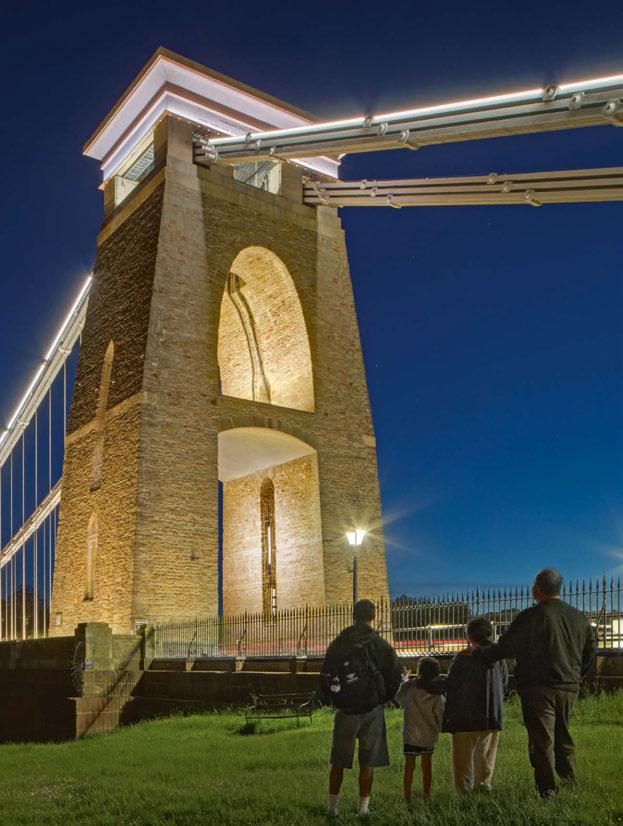
Surveys identified the bridge as a bat commuter route, where illumination attracts moths that provide a food source. In response, the team carefully balanced the lighting design to limit excessive spill while maintaining conditions that support both the bats and the wider ecology. To avoid excess illumination, the lighting design team highlighted several key architectural features, which included the chains, cornice details, tower elements, and the linear sides of the bridge. The inclusion of the chains was initially debated, as illuminating each individual link – like in the previous scheme – risked overlighting.
However, Davis maintained that the chains were fundamental to the bridge’s iconic structure. As a solution, they replaced the need for spotlighting on all the chains by introducing LED linear lights only on the top of each chain link.
The new illumination of the bridge towers was conceived to reveal their distinctive architectural features in a way they had never been seen before. Specifically, the cast iron crowns and cornices on top of the towers are now lit, which hadn’t been highlighted by previous illuminations. The lighting choices here are not only stylistically attractive but also pay homage to Brunel’s original architectural intent. The cornices on the tower were inspired by the Temple of Hathor in Egypt, giving the tops of the tower a flared-outlook. By illuminating these cast iron caps, the design brings back the original Egyptian aesthetic that had previously been invisible at night when the towers were lit. Details such as the Latin inscriptions were also highlighted, which was of particular interest to the Bridgemaster, who felt like this was an opportunity to uncover something new within the structure that is also so familiar.
At ground level, uplights have been carefully integrated to reveal the base of the towers.
However, as these sit within a busy footway, their positioning and intensity required particular sensitivity. The design ensures that light is controlled to prevent glare or discomfort for pedestrians, especially in wet conditions or for those with impaired vision, balancing legibility with safety.
“I often describe the approach as being a bit like Lego,” says Davis. “We looked at the bridge as a collection of individual pieces, considering each element in turn and asking what should be lit and what should remain unlit. The linear sides, guardrails, for example, already followed an established visual rhythm, so the question became how to reinterpret that in a more resolved way.”
“Working almost piece by piece, we assessed each component and identified the elements that would have the greatest impact. It became a process of elimination, refining the scheme until only the most effective interventions remained. From there, the design evolved more holistically, considering how each lit element would relate to the next. It was never about illuminating everything, but about being selective and intentional,” Davis adds. Working on a Grade I listed structure also introduced further complexity to the lighting scheme. With much of the original ironwork still intact, preserving the integrity of Brunel’s
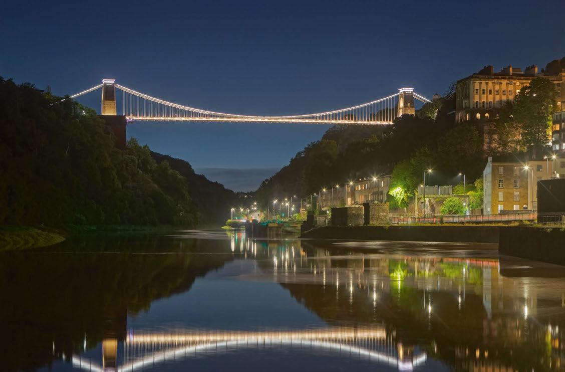
structure was fundamental to the brief; nothing could be drilled or fixed permanently to the metalwork. The lighting design team, therefore, approached the challenge almost archaeologically, carefully considering every fixture, bracket, and cable that could exist in dialogue with the historic structure. This meant developing fixtures that could visually recede into the architecture by selecting luminaires that blended with the bridge’s materials or were engineered specifically to echo its architectural language, appearing almost as an extension of the original Brunel detailing.
Beyond aesthetics, maintenance access on the bridge is inherently challenging; so, fixture locations had to consider longevity and repair. The team therefore sought to minimise visible clutter while consolidating equipment into accessible areas. As a result, the lighting feels remarkably unobtrusive and supports the architecture without imposing on it.
A project with such complexity had one secret ingredient that was fundamental to its success: collaboration. Working on a Grade I listed structure required coordination from multiple stakeholders, including lighting designers, engineers, bridge custodians, contractors, and historians, each bringing expertise to the process. It was reiterated
by both Davis and Ferrari that without continuous dialogue between all disciplines, the project couldn’t have reached the ambitious heights the outcome reached.
Hoare Lea’s design process was also defined by rigorous testing and refinement. Initial concepts for the scheme began as far back as 2020, with the team developing those core design principles (environmental protection, functional safety, efficiency, flexibility, and visual identity). From there, each element of the bridge, such as walkways, tower hangers, and chains, was studied separately before being considered as part of the wider composition.
As explained by Davis: “We studied them individually; however, it was important to understand the bridges as one, therefore it wouldn’t appear visually fragmented in the dark.”
Extensive on-site mock-ups and lighting trials then followed and became essential in understanding how the scheme would actually interact with the structure. While digital modelling and CGI visualisations provided an important starting point, the realities of the bridge’s materiality, scale and environmental conditions demanded further testing. “It’s not the same as putting fittings on the bridge next to the actual surface we’re going to light,” Davis explains, reflecting on the importance
of physically trialling the fixtures against the ironwork itself.
Much of this testing focused on achieving precision without visual intrusion. The narrow spaces available behind the bridge’s safety mesh, for example, significantly restricted the size and positioning of walkway lighting.
Beam angles had to be repeatedly adjusted to illuminate pedestrian routes safely whilst preventing excess glare from spilling into the roadway or reflecting too harshly from surrounding surfaces. Small technical adjustments became critical in shaping the final atmosphere of the scheme.
The collaborative nature of the project also helped resolve operational concerns surrounding the bridge’s day-to-day use.
Questions around maintenance access, driver distraction, visibility and pedestrian comfort were continuously raised throughout the design process. Dr Laura Hilton recalled concerns over whether illuminated hangers could create distracting visual effects for motorists crossing the bridge at night, whilst uplighting at the base of the towers needed careful testing to ensure pedestrians would not experience glare or discomfort.
“Every time we asked the question,” Hilton explains, “they went away, did some testing, and came up with an answer.”
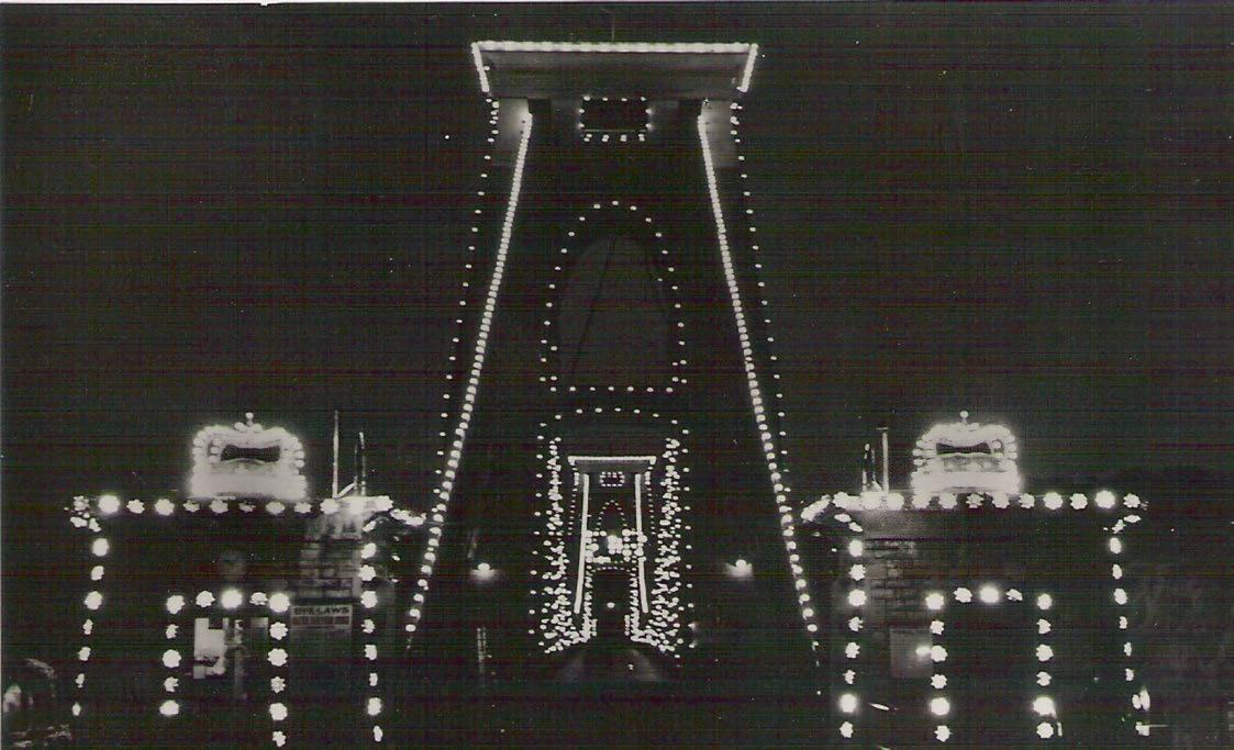
Reflecting on the process, Davis described the collaboration as unusually valuable, explaining that the design team “fed” from the depth of historical and operational knowledge held by the bridge trust.
The result of the scheme not only feels technically resolved, but also collectively shaped – a project that is a testament to the power of collaboration.
“As designers, we feed from that sort of knowledge, listening to them speak with the passion that they have, and the knowledge that they have is quite important for us to understand exactly what the drivers are to make a good homage to the building with the lights,” says Ferrari.
Client: Clifton Suspension Bridge
Lighting Design: Harriet Davis, Brad Joseph, Juan Ferrari, Dominic Meyrick; Hoare Lea, UK
Electrical Design: David Woolley; Hoare Lea, UK
Electrical Contractor: Darke & Taylor, UK
Main Contractor: Taziker, UK
Lighting Specified: Designplan, Griven, MyMesh, Optelma, Studiotech, Thorn
Photography: Dan Paton
Once completed, the bridge’s success truly lay in the hands of the public domain. Because the bridge occupies such a prominent place in Bristol’s identity and day-to-day commuting, it was understood from the outset that the change would be met with strong public opinion. “People had very strong opinions on what colour the white should be,” Hilton noted, recalling criticism of the previous cooler LED lighting scheme, which many felt lacked the warmth associated with the bridge’s earlier tungsten illumination. In response, the new scheme intentionally introduced warmer colour temperatures designed to evoke the softer character of the historic lighting while still benefiting from contemporary LED technology. According to Hilton, public reaction to this shift was “really positive”, with many people describing the lighting as feeling “more correct” and more in keeping with the bridge’s identity.
The relighting of the Clifton Suspension Bridge is not just an act of transformation but an act of preservation. Rather than competing with the bridge’s historic identity, the scheme carefully reinforces it, revealing the structure with greater clarity and sensitivity while respecting the architectural ambition that has defined it for more than 160 years. Ultimately, the success of this project is rooted in collaboration between Hoare Lea and the bridge trust, historians, engineers, and contractors. Through extensive refinement and testing, the scheme evolved into something timeless and contemporary, enabling the bridge to continue its enduring legacy of connecting Bristol’s communities.
Commenting on the success of the project, Ferrari says: “It’s not just down to years of experience; the reality is that communicating design through strong visual imagery is something we consistently excel at. As designers, we’ve become highly adept at using tools to express ideas clearly and convincingly. That’s why it’s so rewarding to hear the client’s feedback today. It reinforces the value of going into that level of detail, both from a design and environmental lighting perspective. Being able to show clients not only how a space will look, but how it will feel and transform its surroundings, is incredibly important. So, when we reach the end and hear clients say, ‘Yes, it’s exactly how we imagined it,’ that’s the most satisfying confirmation of all.” www.hoarelea.com

270 Park Avenue
New York, USA
The new home of JPMorgan Chase, 270 Park Avenue is the latest addition to New York City’s iconic skyline. Lighting designed by Tillotson Design Associates looks to emphasise the verticality of this new, 1,400ft-tall tower.
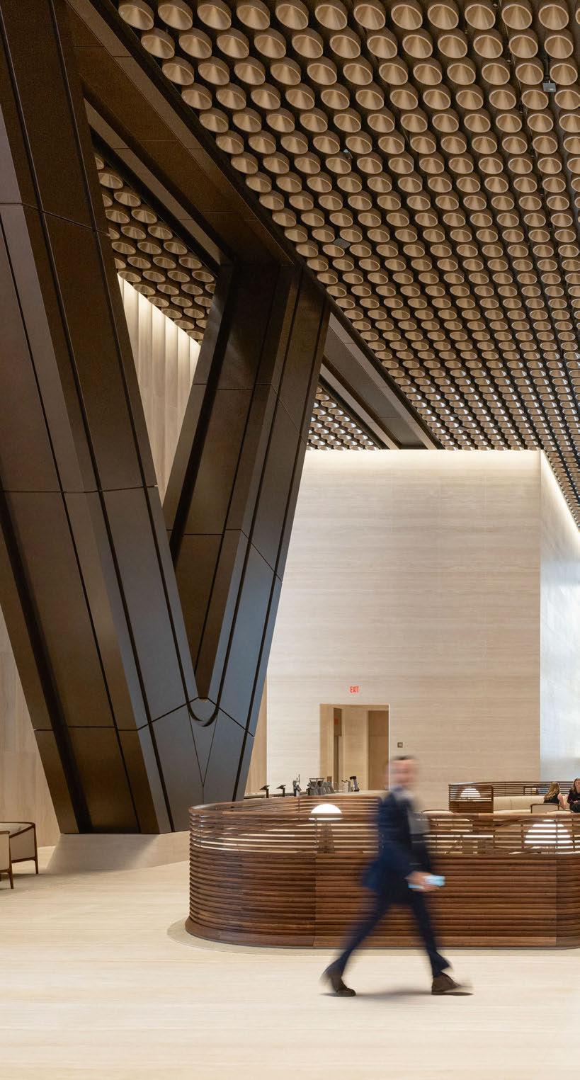
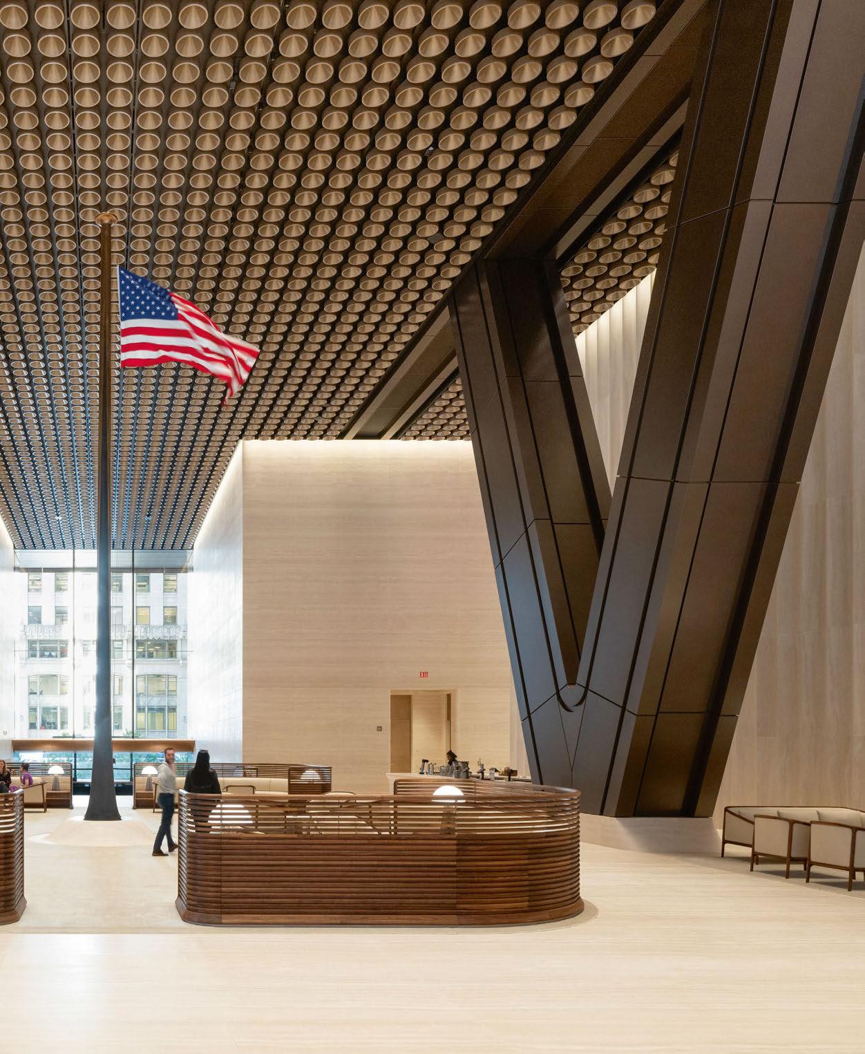
Rising nearly 1,400ft in the air, 270 Park Avenue is the latest addition to New York City’s already iconic skyline. Designed by Foster + Partners, the tower serves as the global headquarters of JPMorgan Chase, the largest banking institution in the United States. Matching its impressive scale, 270 Park Avenue has similarly lofty sustainability goals, and since opening has become New York City’s largest allelectric tower, with net-zero operational emissions and exceptional indoor air quality that exceeds the highest standards in sustainability, health and wellness. Alongside this, with 21st century infrastructure, smart technology, and 2.5 million gross square feet of flexible collaborative space, the project hopes to “define the modern workplace”. At ground level, the building is characterised by a state-of-the-art “fan-column” architectural structure and triangle bracing. Designed in the first instance as a means to navigate the site constraints both at and below ground level, in doing so, this innovative feature allows the building to “touch the ground lightly across the entire block”, underpinning the essence of Foster + Partners’ design, where the structure is the architecture, and the architecture is the structure.
At the opposite end of the building, its crown features bespoke, animated artistic content from visual artist Leo Villareal. Titled Celestial Passage, the artwork is a hypnotic, flowing cascade of light that gently dances across the top of the tower each night.
Complementing this fluid, custom light art installation, the broader lighting design for 270 Park Avenue was delivered by Tillotson Design Associates.
As well as the façade and site lighting, the New York-based design studio was responsible for all interior lighting of the tower, including core and shell, tenant fitout, amenities, and lobbies, working in collaboration with Foster + Partners, Gensler, Skidmore, Owings & Merrill (SOM), STUDIOS Architecture and Architect of Record, Adamson Associates, alongside sustainability consultant Socotec, and MEP engineers Jaros Baum & Bolles (JB&B).
Once hired onto the project, Tillotson Design Associates studied the architecture, materials, and details of 270 Park Avenue, and developed an overall concept that was informed by the tower’s exterior. Not wanting the tower to read black and in silhouette against the illuminated interior, while also keen to avoid it being too bright or graphic, a delicate balance was needed. The team therefore started with illumination of the tower’s bronze cladding.
“The idea was to emphasise the materiality of the warm bronze, as well as the verticality of the tower,” says Scott Baillie-Hinojosa, Principal of Tillotson Design Associates.
“We proposed a vertically-oriented lighting system at the top of the tower so that we could emphasise the setbacks with gradient dimming to soften the horizontality. Due to the elegant geometry and diagonal diamonds of the cladding, we didn’t want the interior lighting to compete, so it couldn’t be too bright or directional.”
Linear fixtures were therefore integrated into the column cladding, running from the top of the building all the way down to the base of the fan columns.
This, Baillie-Hinojosa believes, accentuates the optimised diagrid structure of the tower at night. The fixtures at the fan columns are RGBW enabled, and so can be tuned to match the special content displayed on the crown, creating a visual link between the top and base of the building. With the façade of the tower reaching 1,388ft in height, achieving a fluid, continuous line of light down the building was no mean feat.
Baillie-Hinojosa explains further the logistical challenges that such a design ambition presented: “The installation and maintenance strategies were topics that we discussed at length very early on in the project.
“Once we understood what products we were going to be using, the fixtures were installed on the cladding panels before they arrived at the site, meaning that all that was required was a connection. For ease, these connections were made on the interior, rather than having to suspend engineers off the side of the building.
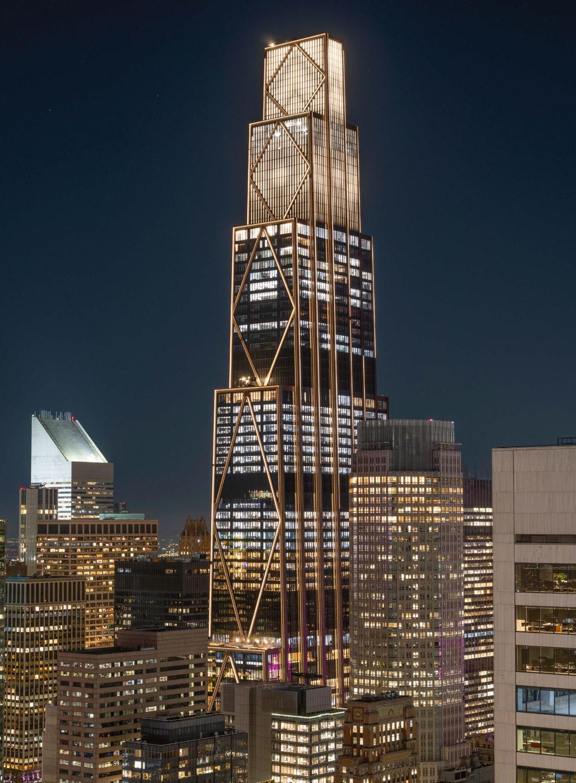
“We therefore had to understand the servicing requirements, the modules, how the lenses come off, what parts can be easily replaced, and where connections can or cannot be made. This was all reviewed and studied by the design team, the building management team, and the client; with a little under 23 miles of linear fixtures on the façade, it was a very ambitious lighting package, so we wanted to make sure that what we installed made the most sense.”
Because of the ambition and scope of the exterior lighting, the team at Tillotson Design Associates carried out extensive tests and mock-ups, even measuring the luminance levels of different tower tops around the city, to understand what would be most effective. This was all part of the team’s goal to ensure that the tower would tread that fine line between standing out on the skyline, and not appearing too ostentatious.
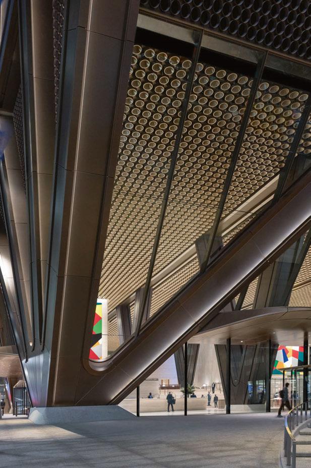
“It is such a big element that is so visible throughout the city, so we carried out a series of mock-ups on full portions of the façade. But it was all about testing it, understanding the light levels that we could get, how bright it was going to be.
“From previous experience, understanding the brightness levels in relation to the neighbouring towers is really important, because while you want it to be seen from a distance, you have to be mindful of it becoming an obnoxious source of light pollution when you are in its vicinity. Finding that balance is really important, and so doing those mock-ups was invaluable. It proved that you don’t have to over-light something for it to be impactful.”
That balanced yet impactful approach to lighting extends from the building’s façade into its vast lobby space – from the V-shaped columns that reflect the fan columns of the exterior, to the expansive ceiling of almost 11,000 light “cones” that wash the space with an even, homogenous light.
Each of these cones, created in collaboration with Specialty Lighting, features its own individual, threewatt light source recessed 12-inches inside, creating a crisp, clean cut off and even light distribution.
“One of the coolest experiences, for me, is how we developed the lighting in the lobby,” Baillie-Hinojosa says. “The light source is so well-shielded, that you don’t see it at all. It is a moment of magic, in that when you enter, although you feel the light in the space, you don’t register where it is coming from.”
Across the extensive interior spaces, lighting is used as a unifying element to tie each space together. While there may be some nuances throughout – layers of integrated cove lighting and decorative lighting were utilised as necessary to create a special sense of place in some areas –in spaces where ceiling heights change, such as atriums, the same aperture downlights and accent lights use varying beam spreads and wattages to ensure a uniform appearance.
Throughout the design of 270 Park Avenue, sustainability and wellbeing were core areas of focus. It has been designed to achieve LEED Platinum v4 and WELL Health-Safety ratings, while its focus on wellbeing responds to research from Harvard into the effects of fresh air on cognitive function, providing an outdoor air ventilation rate of 40 cubic feet per minute per person – double the standard-specified minimum outdoor air ventilation rate.
Perhaps unexpectedly, this design decision had an impact on Tillotson Design Associates’ approach to the exterior lighting. Baillie-Hinojosa explains: “One of the biggest factors that we ended up learning about is how much air needed to be passing through the façade. There is a lot of air exhaust, but air intake too, and so, understanding that porosity started to affect what we could do, and the type of louvring systems that you need in order to protect the interior spaces that are drawing in and exhausting the air. And so, we ended up with a more modularised façade panel.
“In developing this, we collaborated with Foster + Partners to ensure that the façade appears continuous all the way to the top of the building, while still having that ability to transform at night.
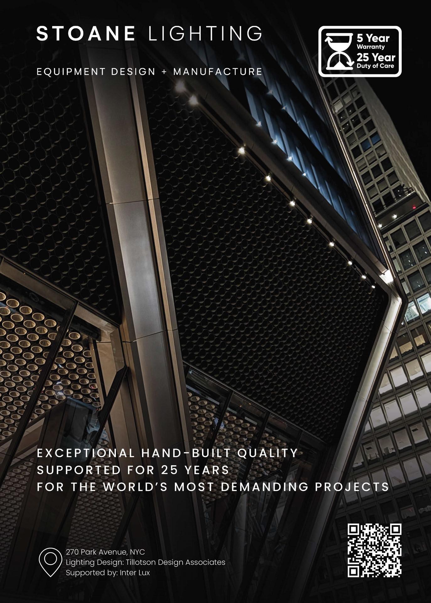
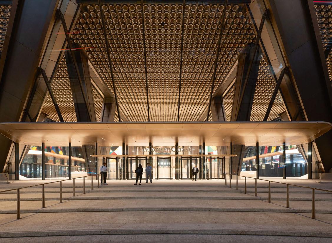
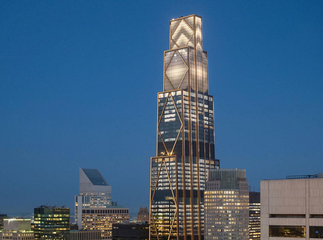
“Through this collaboration, we created lighting cassettes, where the lighting is integrated within each module.”
With regards to the sustainability efforts, for the interior spaces, the luminaires specified were those that not only performed the best in terms of distribution and shielding, but also those that had the highest lumens per watt. Daylight dimming was also incorporated, while the team at Tillotson Design Associates were very strategic about the placement and programming of light fixtures, so as not to over-illuminate spaces.
Accompanying the sustainability efforts, the lighting strategy for the interior workspaces was geared very deliberately towards user comfort, with low glare and excellent colour rendering that would complement natural circadian rhythms.
“The system automatically dims to save energy and allows flexibility in terms of light levels distribution, depending on the type of space,” Baillie-Hinojosa adds. “All of this combines to create a dynamic and exciting environment for occupants.”
This circadian focus, Baillie-Hinojosa explains, was one of the biggest challenges for the design team throughout this project. “The client was very ambitious about making this a living, breathing building where people would want to be working, and we always felt that circadian lighting is a great opportunity to create a general sense of wellbeing in a space, enhancing that connection to the outside world when you are inside all the time,” he says. “We knew that a typical interior office lighting solution would not have complemented the tower from the exterior. We wanted a non-directional, low-brightness solution that could be integrated into an Armstrong metal band with other systems. Circadian lighting eventually became one of the design criteria in order to promote a greater sense of wellbeing and connection to the outdoor environment. We wanted to ensure that everyone had access to the best lighting quality possible.”
To that end, Tillotson Design Associates researched many downlight fixtures, as the team needed a family of products with matching apertures –downlights, accent lights and wallwashers. “We started with products that met our shielding and lumens per watt criteria, and a maximum UGR of 19. From there we ordered samples and confirmed the shielding, distribution, colour tuning and cd/ sqm ourselves in our New York studio. These were done as “blind” tests so that we could maintain impartiality between manufacturers,” BaillieHinojosa adds.
“Part of our mock-up process was also used to have an independent UL tester assess our circadian lighting strategy. Since we had never done a circadian lighting solution on this scale before, it was invaluable to have the lighting pretested to ensure compliance with the WELL credit.”
Elsewhere, Baillie-Hinojosa says that the experience of working with Leo Villareal on the Celestial Passage installation was a unique opportunity –one that presented some new challenges that he had previously not experienced.
“The façade lighting was an awesome experience to work on, because there were so many iterations – I have worked on towers before, but nothing so complicated. Understanding something that looks simple on the surface, but is actually very complex, and collaborating with all the parties that are needed to execute it properly was a good learning experience. Working with Leo Villareal and his studio, and seeing all of the things that they are concerned about, spending more time with ETC and understanding all of its capabilities and programming was a really unique and special experience.”
The lighting system for Celestial Passage, designed by Tillotson Design Associates, features both direct (viewer facing) and indirect (building facing), lighting, deeply integrated with the façade. The direct and indirect fixtures together create an optical quality that exists on no other array of this scale. Two layers of light are utilised in tandem, which creates a complex layering of light and pattern upon the building. The artwork content, designed by Villareal, is made upon this bespoke canvas, and transforms the Crown into a sequenced light sculpture.
The installation is a jewel on the crown of a remarkable building – one that has instantaneously become a new icon on an already iconic skyline. Although Tillotson Design Associates are still working on some areas within the building, Baillie-Hinojosa reflects on the overall experience, and particularly the various collaborative aspects, incredibly fondly.
“We are extremely proud of this once-in-a-lifetime project. We were very fortunate to have an open-minded client that constantly challenged us, but at the same time, listened and provided constructive feedback. We are proud to say that our contribution is what makes everything “visible”, both inside and outside.”
www.tillotsondesign.com
Client: JPMorgan Chase
Lighting Design: Suzan Tillotson, Scott Baillie-Hinojosa, Eduardo Zepeda, Maria Gutierrez, Chandni Azeez; Tillotson Design Associates, USA
Architect: Foster + Partners, UK
Interior Architects: Gensler, USA; Skidmore, Owings & Merrill, USA; STUDIOS Architecture, USA
Architect of Record: Adamson Associates, USA
MEP Engineer: Jaros Baum & Bolles, USA
Sustainability Consultant: Socotec, USA
Lighting Specified: GVA Lighting, Lucifer Lighting, Specialty Lighting, Stoane Lighting
Photography: Nigel Young / Foster + Partners
Coinciding with the launch of The Seam Digital Campus, Barnsley has unveiled three new sculptures, dubbed the Yorkshire Roses.
Artin Light, alongside TLWS and artist Jamie House, have created a multisensory, immersive experience to bring these roses to life.
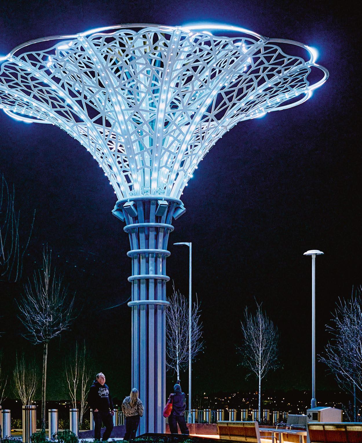
or those readers not based in the UK, you may not be familiar with the Yorkshire town of Barnsley. However, while often sat in the shadow of its larger neighbour, Sheffield, Barnsley has been through something of a resurgence in recent years, with several developments and initiatives designed to transform the town into a destination in its own right.
One such development is The Seam Digital Campus; part of the UK’s first Investment Zone, The Seam is a space that aims to bring public and private sectors together to innovate, stimulating the growth of technology and digital businesses in Barnsley, with the broader goal of positioning the town as a “forward-thinking hub for creative innovation”.
Phase One of this development was officially opened at the end of March 2026, and central to this phase was the unveiling of three stunning sculptures – dubbed the Yorkshire Roses – that now stand proudly above a curated, 4,700sqm urban park.
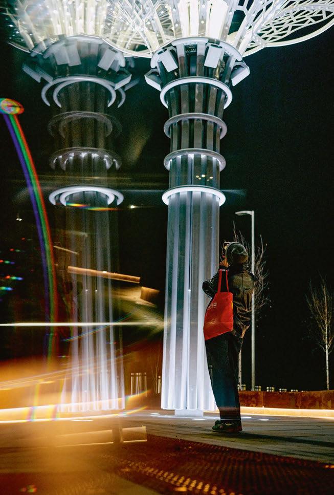
Standing at 15m tall, the central sculpture has been named the “Mater” (Mother) Rose, while the two 12m sculptures flanking it have been named the ‘Pruna’ (Glowing Coal) Rose and ‘Vitrum’ (Glass) Rose, paying homage to Barnsley’s industrial past.
Originally designed by artist Tim Ward, Barnsley Council hope that the sculptures will serve as both a “visual gateway and a powerful symbol of Barnsley’s pride, ambition, and investment in its future”.
Central to bringing these vast sculptures to life is a dynamic, immersive, multisensory audiovisual display, fusing light, sound, and art, coordinated by lighting design firm Artin Light, in collaboration with TLWS, and visual artist Jamie House.
Speaking to arc magazine about the project, Luke Artingstall, Director and Founder of Artin Light, says: “Yorkshire Roses is an amazing and ambitious project, particularly for the North of England. Prior to this project, I had never been to Barnsley personally, but it is a very passionate city, with some strong ongoing development to bring it back to life.
“For the Yorkshire Roses, our brief was to deliver a light and sound installation and artwork for the campus’ opening event. Through this, we wanted to go more in depth with the content to create something amazing for the town.”
Stuart Alexander, Founder of TLWS, adds: “Instead of just lighting these sculptures, we wanted to make something that Barnsley could be proud of, and that would reflect the town in an interesting and individual way. The council has put in so much hard work for so many years to change the experience and image of the town, and it was very inspiring to be a part of that.”
One of the primary ways in which the design team looked to create something that the town could take pride in, was to actively engage the local community in the design process – whether through consultations with residents, or inviting technology and digital media students at the nearby creative colleges to interface with the lighting – each step was designed to help foster a “positive moment for the town”.
Artist Jamie House adds: “I was doing a lot of work with the local people, interviewing them to figure out what some of the narratives could be that we could bring to the show.
“Barnsley has a really strong history of manufacturing coal and glass, and these were two things that were both present through those interviews, and so the roses themselves had names relating to those industries.
“We also managed to get hold of some glass that had been made in Barnsley over 100 years ago, and we filmed lights through that glass to then put on the sculptures, giving them a tangible link to the past.”
“The deepest moments come in the most interesting ways,” Alexander continues. “We took part in Barnsley Bright Lights, where we built an installation that looked at some of the threads and strands that we were interested in, and invited people to come and see what we were working on. Jamie built some amazing boards with projection mapping, integrated with the light through the Barnsley glass.

















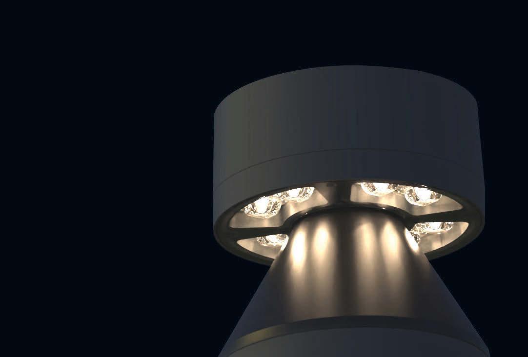




















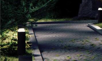
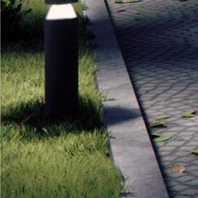









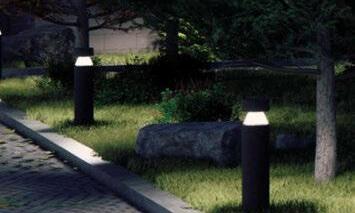






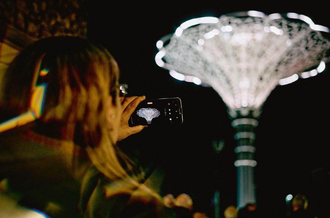
“Paired with this, we worked with a sound engineer, who made a really interesting, dynamic backdrop to all of the lighting to make more experiential moments of the things that we had been putting together, and this had a lot of Barnsley voices in it.”
This was something, Alexander explains, that further engaged and excited locals, inspiring them to get more involved in the development of these sculptures.
“People would say to us, ‘we’re so proud of this town, we’re proud of our accents’. So, we began to wonder if we should lean in on this aspect. It was a brave position to take because it could go many ways. We are trying to take these sculptures that are extremely vivid, wild, brave, and different to what anyone else is thinking about doing at the moment – making light art and light art festivals into a permanent fixture to be used throughout the year almost as a new cultural image for the town, akin to how the Angel of the North became that kind of image for Newcastle.
“So, the decision that we came to is that we give each of the roses its own voice, and that voice is going to be from the town, and as deep into the town as we can find to make people feel that closeness and connection to this place.”
Artingstall continues: “There were moments of surprise throughout the process. As designers, you have a preconception of what you think is the right thing to do, and that’s where you go.
But that engagement process really helped us to understand that we should be doing this for the people of Barnsley. And the only way to realise that is to go through that engagement process, and talk to the people. That was what it was all about, and how it became so successful.”
Through this process, the design team interviewed a broad scope of people from a wide range of backgrounds across Barnsley – from local historians and the mayor, to members of the town’s Youth Parliament Group, and school children.
“It was nice to get such a range of different backgrounds through that interview process,”
Jamie House adds, “because it meant that we could make sure that everybody watching the show when we launched it that felt like they had been heard and seen.”
The development of The Seam Digital Campus comes as part of Barnsley’s status as the UK’s first government-backed “Tech Town” – an initiative that is designed to position Barnsley as a “trailblazer” for the UK, acting as a national blueprint for the roll out of new technologies, such as AI, across public services, local businesses, and education, to boost productivity, and improve daily life.
In keeping with this improved focus on technology, the Yorkshire Roses incorporate “phenomenal and very high-end technology” throughout, and the design team was encouraged through its brief to try and show this off as much as possible.
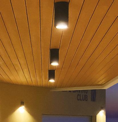




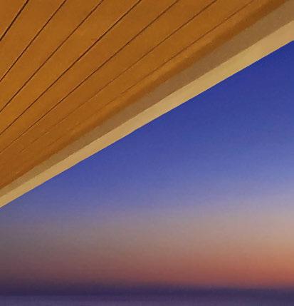
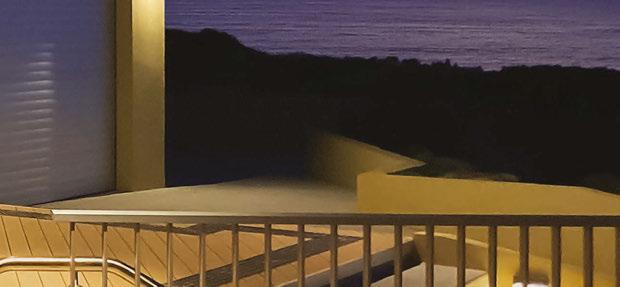
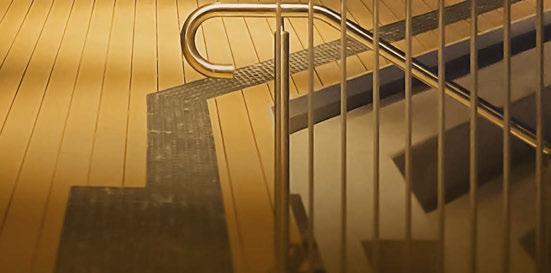













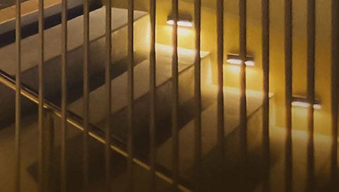









































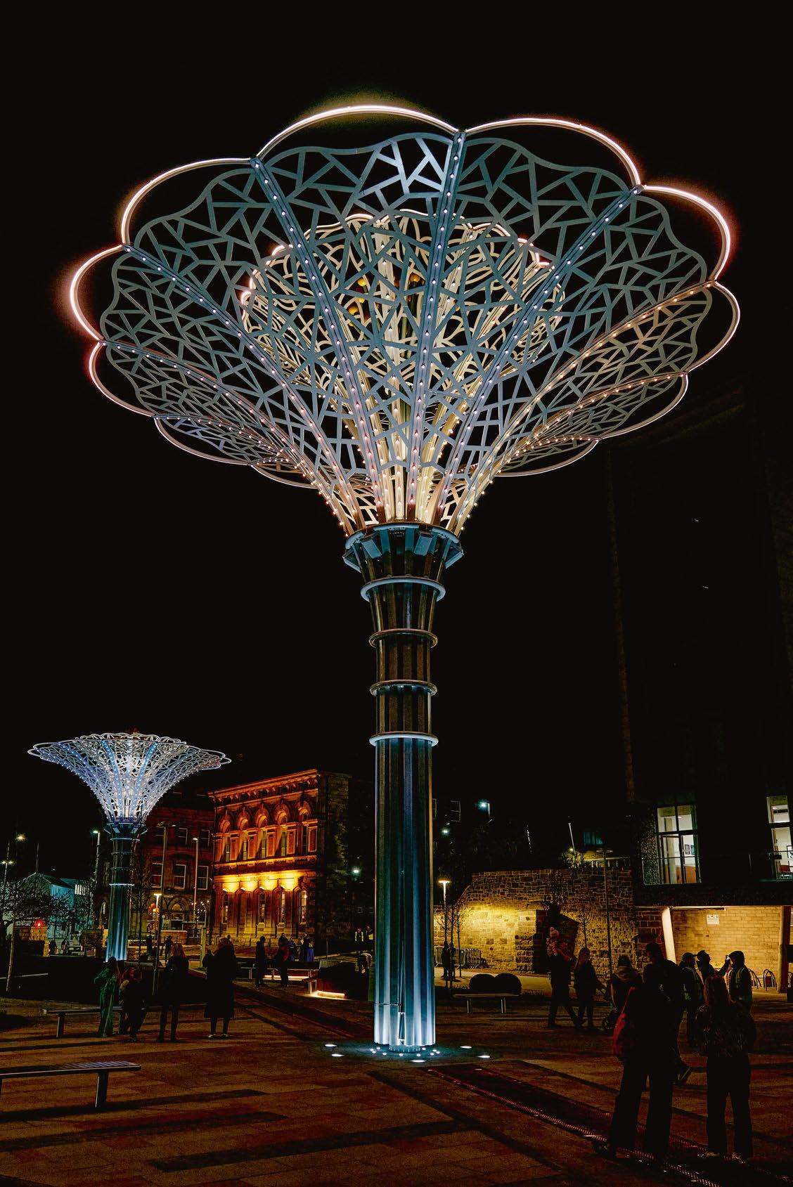
Utilising both House and Alexander’s experience of VJ-ing, the design team created visual loops and animations in the displays, using analogue processes to create show that was then projected through glass and prisms, and translating this content into the RGBW LEDs that were installed within the sculptures.
“What we did with the demo scenes left everyone in their tracks,” Alexander says. “We were watching from balconies thinking ‘goodness gracious!’. In lighting, you occasional have moments where you think ‘I haven’t seen anything like that’, this was one of those times.”
For the light display, Alexander and House built a system that would help them, in real time, to understand what the sculptures looked like, examine the different aspects of it and how the various outlines would animate, and how to control between all of these factors – a lot to consider, as Alexander says, “there were a lot of different lights and different things talking to each other”.
“There are also some interesting new tools that have come out to help you take strands of audio and translate these into light and sound in interesting ways. We ended up building a big Touch Design file that demonstrated all of this, with lots of different scenes and fades, and Jamie then build up a lot of the different backgrounds, almost like the patterns, styles, or tones that we put into that, and then we tweaked it for the performance.”
House adds: “We also worked alongside a sound design composer from Hazard Media to help us not only show what the sculptures are technically capable of, but also to communicate their narrative. It means that when the audience stands observing the roses, we can have a real, tangible movement of both sound and light simultaneously, which then introduces the personalities of each rose.
“Each rose has its own voice, which we recorded from the interviews with the locals, and each rose has its own personality in terms of colour and movement and the way it interacts with the show. The spatial element of it was really useful, and it was amazing to be able to play with equipment of that standard, because it helped to accentuate the personality of each rose.”
As a lighting design studio, Artin Light is no stranger to dynamic content, but Artingstall believes that the collaboration in play here, and the interplay of light and sound, takes things to another level.
“When we were approached, the sculptures were designed and the lighting was already incorporated into the structures, so we were effectively given a canvas and the tech to create the content, from a lighting perspective.
“Having gone through experiences like this on previous projects, content has always been absolutely critical from our perspective; you cannot underestimate the quality of content, because you can have the most amazing tech and infrastructure in there, but if the content is left to the last minute or it is ignored, you then tend to go down a more general route, which doesn’t explore the full opportunities of what that tech can offer.
“Going through that journey here, and creating the content to run through these systems, it takes it to the next level of design, which is what it should be. The colours and textures and depth that we have created here far exceeds anything that would have been delivered as part of a general system.
“As lighting designers, you respond to light. Everyone responds to light in their own ways, but there is something else about the vividness that comes with introducing different colours, it’s why we love it so much.”
While the Yorkshire Roses sculptures, and the larger redevelopment for the town of Barnsley, have largely been met with positive feedback from the local community Artingstall explains that, during the consultation process, there was some slight pushback on the impact of these illuminated sculptures.
“There is always going to be a little bit of conflict when the public see things of this nature, because they are so bold. But, no matter what you do in design and architecture and the world that we live in, there is always going to be elements of that. But you do need to be conscious about doing things in the right way.
“Effectively, these are beacons in the space, but we also know that they have to be controlled in the right way, so that they are not running throughout the night. We’re not doing silly things of that nature, but that is also down to the council and how they operate them and utilise them.
“I think there’s always going to be a little bit of conflict, but ultimately, there has to be a huge acknowledgement of the inspiration and determination and aspirations of a town like Barnsley to stand out from the crowd.”
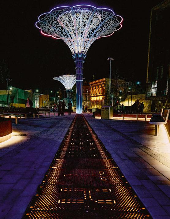
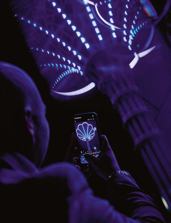
Indeed, when the Yorkshire Roses sculptures opened to the public earlier this year, the response to the pieces themselves, but also the immersive light and sound show, has been overwhelmingly positive.
Councillor Sir Stephen Houghton CBE, Leader of the Barnsley Council, said after the opening night: “The Yorkshire Rose sculptures are an incredible addition to our town centre, and will be a proud symbol of our new status as the UK’s first government-backed Tech Town. The technology involved is second to none, and will provide some excellent opportunities for everyone, including our children and young people, to connect art and technology, and explore new and emerging programmes that will help them to thrive in the modern world.”
The design team of Artingstall, Alexander and House were equally proud when seeing the installation come to fruition.
also quite emotional in terms of what it means to the town and the people who have been involved in the process – they all worked to that moment for so long, and to get to the launch night with the dignitaries from the council there, it was an amazing thing to see their reactions. And for a town like Barnsley, it is something to be proud of –it’s great for the town, because it will hopefully get utilised not just on this launch, but for many events.
“But what stood out, after the official VIP opening, when it opened out to the general public and people filtered into the landscape, and you saw families reacting and playing in the space, children dancing around these amazing sculptures – that moment is what it is all about. It’s such an amazing thing to see.”
Thanks to initiatives like the Yorkshire Roses installation, the sleepy Yorkshire town of Barnsley may just be waking up.
Client: Beam Arts
Lighting Design: Artin Light, UK
Content Creation: TLWS, UK
Visual Artist: Jamie House, UK
Sound Design: Matthew Williams, Hazard Media, UK
Engineering: Stage One, UK
Technical Production: DZA
Technical, UK
Lighting Specified: Advatek, Anolis
Photography: Adam Roberts
House says: “The moment it opened up, everyone was bathed in light, and you could see their reactions really stood out. Even though we did a lot of community engagement, with a project like this there are lots of times where you are on your laptop behind the scenes in a dark room, so to be in the space and see all the people loving it was really special.”
“When I saw the rehearsals for the opening show, it automatically put the biggest smile on my face, because it is so impressive,” adds Artingstall. “It’s
www.artinlight.co.uk
www.tlws.studio
www.micantia.studio
Watch the full interview with Luke Artingstall, Stuart Alexander, and Jamie House on the [d]arc discussions Youtube channel.
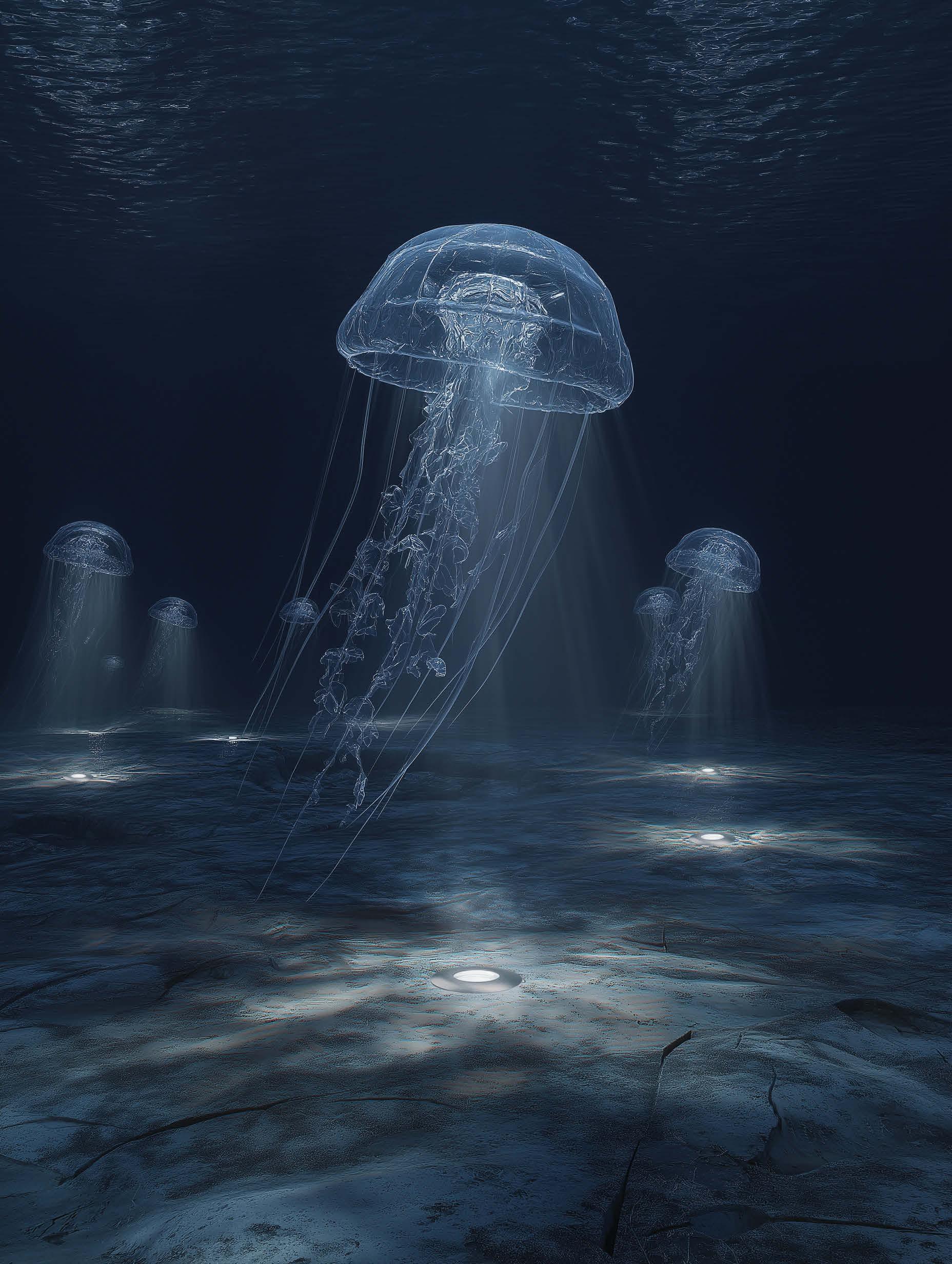

Castello di Miradolo Turin, Italy
has created a lighting scheme for a historic Italian heritage site that delicately balances heritage, ecology, and atmosphere, transforming the historic estate into an immersive nighttime landscape, while preserving the fragile natural ecosystem that defines it.
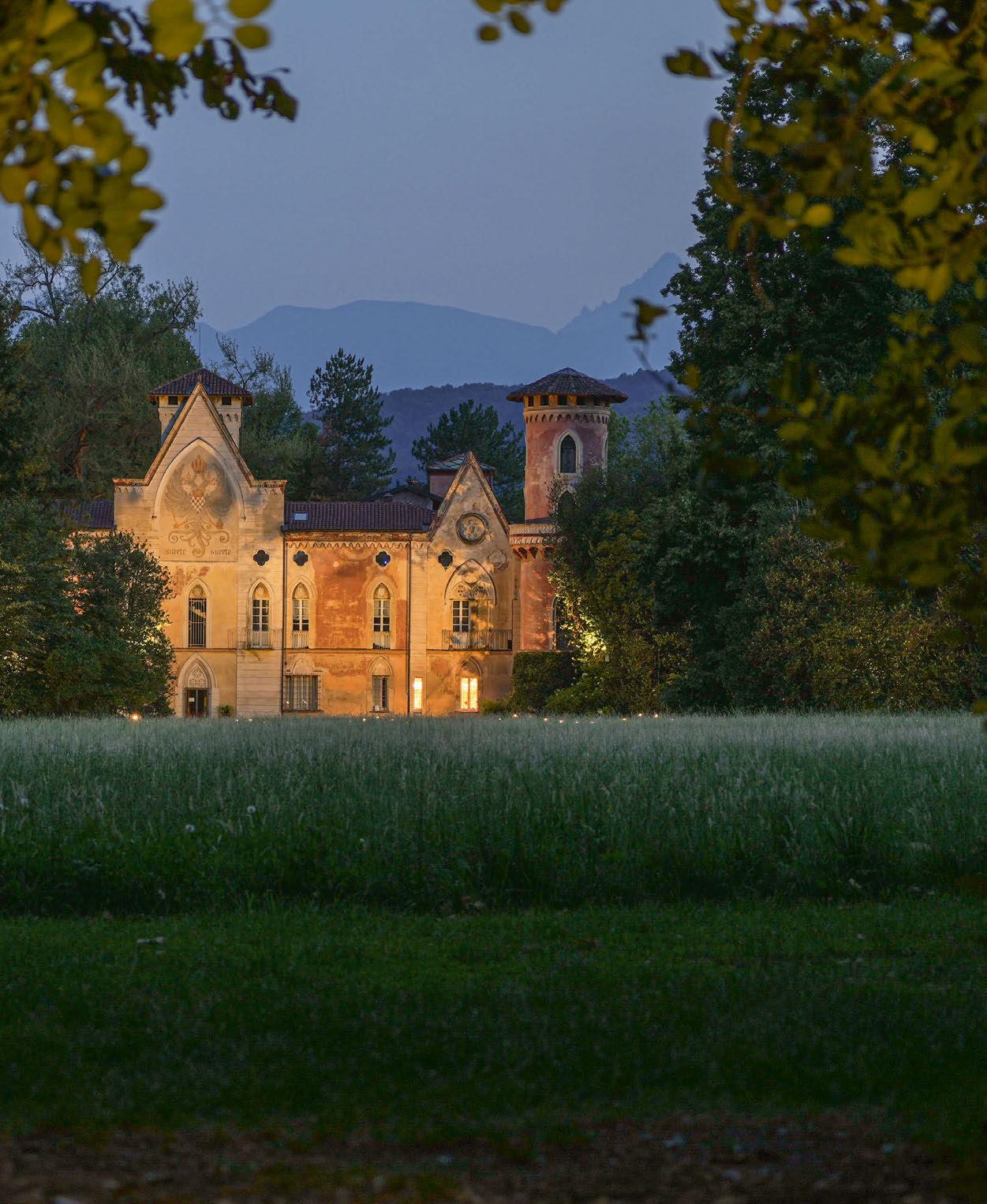
ituated in the mountainous Chisone Valley near Turin, Italy, Castello di Miradolo, a masterpiece of Piedmontese architecture, gradually emerges from the darkness. Surrounded by a vast English-style park, soft layers of light trace pathways through the landscape and into the centuries-old trees, which glow against the night sky. Through light, the landscape seems to whisper the castle’s history, from aristocratic residence to cultural landmark, and is home to hundreds of critters and creatures.
Originally constructed in the late 17th century and later expanded in the 19th century, Castello di Miraldo has long occupied an important place within the cultural and botanical heritage of Piedmont. Today, the castle belongs to and is managed by Fondazione Cosso, which has transformed the beautiful building into a cultural hub for art, concerts, and other educational programmes, where art, nature, and history intersect across the castle and its English-style park.
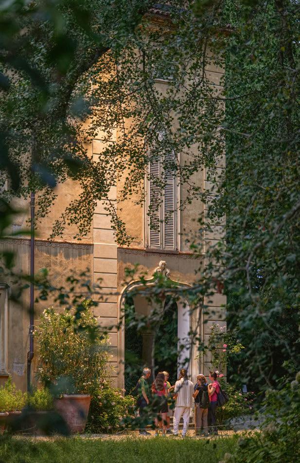
Recently, a new lighting scheme, led by UK-based lighting consultancy Light Follows Behaviour, has been implemented to bridge the historic architecture with its surrounding park.
Developed as part of a broader restoration programme, the new lighting intervention sought to unify the two spaces and establish a continuous nocturnal narrative, guiding visitors through carefully orchestrated moments. Crucially, the project was shaped with an ecologically sensitive approach due to the garden being home to large populations of fireflies, as well as other species of wildlife and plants.
In response, Light Follows Behaviour developed an adaptive lighting strategy that minimises light pollution, protects biodiversity, and preserves the natural darkness of the landscape – all while supporting the estate’s growing cultural programme. Lighting designer Argun Paragamyan, of Light Follows Behaviour, says: “We became involved in the project through a contact in the art world. During the initial conversation, the client underlined the importance of preserving the natural environment, especially during the summertime. We started from this principle and developed a light strategy that was highly respectful of both the natural context and architectural heritage.”
The concept was heavily informed by the principles of the garden itself. As a significant example of Romantic-style landscape, the park was originally designed to create moments of discovery where pathways, vegetation, and framed views gradually reveal themselves. Light Follows Behaviour translated this philosophy into the after-dark experience through layers of lighting and a hierarchy of light that carefully balances visibility and shadow while guiding the visitor’s movement.
“Rather than treating the castle and garden as separate elements, the approach aimed to create a continuous dialogue,” adds Paragamyan.
“During various site visits, we identified several viewing points where the castle and the surrounding landscape created strong connections. The lighting was designed to carefully enhance this relationship, reinforcing links between the park and architecture.”
Rather than uniformly lighting pathways or architectural features all at once, the scheme introduces pockets of interest that reveal themselves progressively as visitors journey through the estate. Meanwhile, background layers of light subtly emerge within the landscape with fixtures remaining mostly hidden; this allows darkness to become an active element of the scheme where illuminated elements can retain clarity.
From the earliest conversations with the client, it became clear that preserving the ecological character of the estate was just as important as enhancing its architectural and cultural identity after dark. During summer evenings, the gardens become home to large populations of fireflies alongside a diverse range of wildlife, requiring an approach that would minimise disturbance to the surrounding ecosystem. In response, Light Follows Behaviour developed a lighting scheme designed to preserve the natural darkness of the landscape

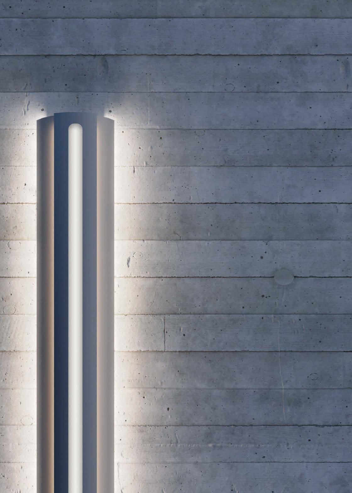
ALVA represents the intersection of architectural design and cra smanship with exterior wall sconces engineered and manufactured in North America.

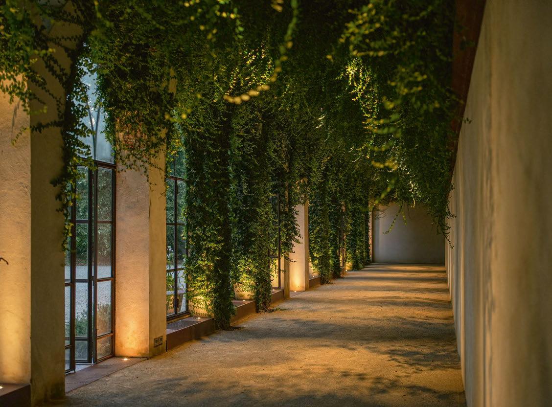
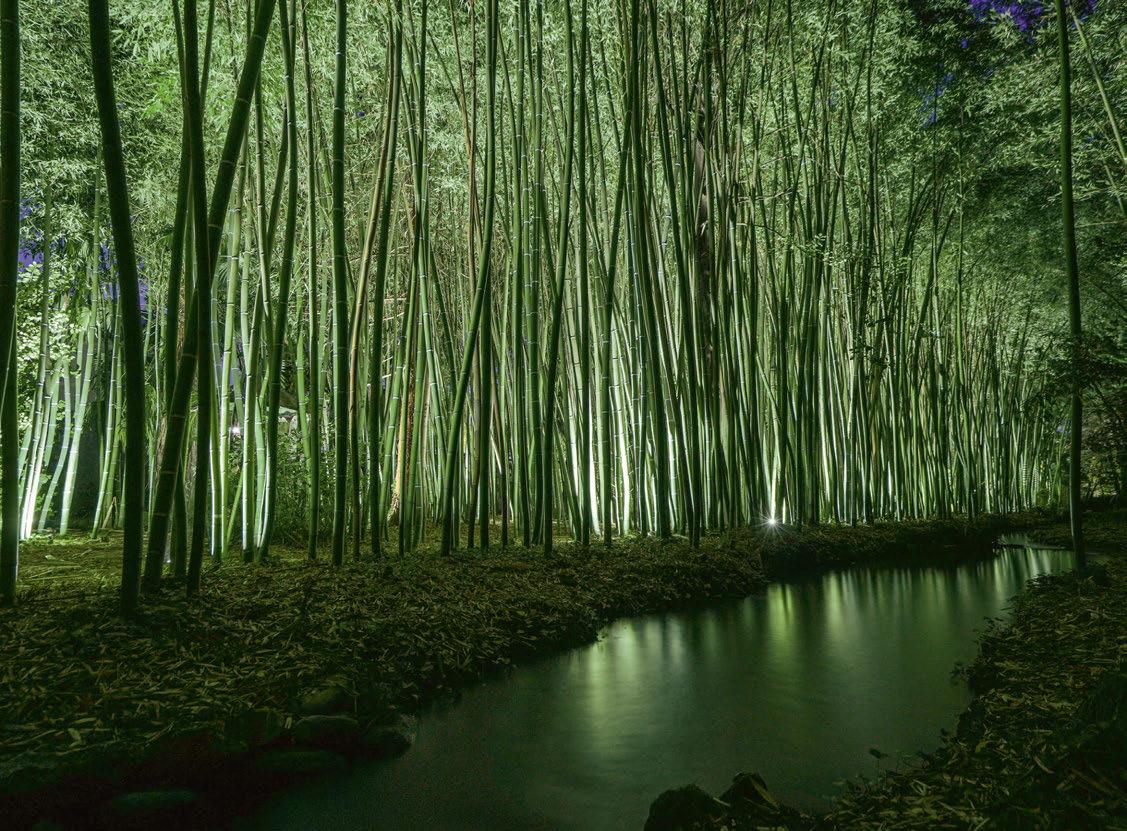
while still supporting nighttime use of the site.
Very warm light sources were selected throughout the project to reduce visual impact and minimise disruption to nocturnal fauna, while low-height bollards were discreetly integrated along pathways to contain light spill and avoid unnecessary illumination across the gardens.
“We wanted nature to be the main character of the after-dark experience throughout the visit. In close collaboration with the property, we identified a few primary trees, selected for their dimensions, age, and presence within the landscape. These elements became key reference points within the night-time composition. This approach was then extended across the garden, with gentle lighting of trees providing subtle orientation and supporting visitors’ movement through the space,” explains Paragamyan.
The ecological strategy extended beyond fixture specification into the operational behaviour of the lighting itself. A programmed control system was implemented to respond to seasonal changes, visitor presence, and periods of ecological sensitivity such as nesting season for birds.
Different lighting scenes can adjust output levels depending on the time of year, while curfews and reduced lighting modes help protect wildlife during nesting and breeding seasons.
One of the project’s most distinctive responses emerged from a request to illuminate the large open fields used for occasional outdoor activities. Rather than introducing permanent lighting infrastructure into these sensitive natural areas, the design team proposed the use of portable lanterns that visitors can collect from reception as part of the overall experience. This solution eliminated the need for intrusive cabling and uncontrolled illumination, while simultaneously creating a more interactive relationship between visitors and the landscape. The lantern strategy has since become one of the defining aspects of the project. Guided evening tours now invite visitors to light their own path through the gardens, encouraging a slower and more attentive engagement with the surrounding environment.
In addition to the scheme’s wildlife preservation efforts, the importance of dark sky preservation naturally followed. To understand the surrounding needs, the lighting team took a detailed analysis of how the garden transforms throughout the seasons in order to produce a sensitive and responsive approach. This was achieved through a combination of optical control and fixture specifications. All light fixtures used to uplight the trees are fitted with snoots, ensuring that light is tightly directed onto the intended surfaces, thus avoiding overspill into the sky.
“It was important to us that lighting would only be activated when people are present after dark,” adds Paragamyan.
The system is structured into multiple control groups, enabling each area of the estate to respond to seasonal conditions, visitor patterns, and ecological requirements.
This flexibility ensures illumination is only present when necessary and significantly reduces unnecessary operation, limiting overall environmental impact. Curfews and scheduled ‘off’ scenes can be introduced into specific areas, further protecting species that are prominent in different seasons.
One of the greatest challenges throughout the project was conveying the intended nighttime atmosphere before the lighting system had been installed. Unlike conventional architectural lighting schemes, the success of the Castello di Miradolo relied on subtle gestures and a careful balance between lightness and darkness – qualities that are often difficult to produce via renderings, drawings and calculations alone. This left the client unsure about the process without being able to visualise the effect. To help communicate the vision more effectively, the team organised a series of on-site mock-ups using sample fixtures, organising focus sessions with the client and the wider design team. This allowed them to directly evaluate light levels, beam angles, and visual impact within the actual landscape, while also helping the client better understand the intended atmosphere.
“Most importantly, these tests were carried out across the seasons, allowing us to observe how the lighting interacted with the garden as vegetation changed throughout the year,” says Elettra Bordonaro, founder and director of Light Follows Behaviour. “This iterative and collaborative process helped refine the lighting strategy and ensured that the final scheme remained sensitive to both the natural environment and the heritage value of the site.”
At Castello di Miradolo, Light Follows Behaviour has demonstrated how contemporary lighting design can work on a heritage site while mastering sensitivity and ecological awareness. Rather than imposing a dramatic nighttime identity onto the estate, the project carefully builds upon the qualities already present within the landscape. Through selective illumination, adaptive controls, and the poetic simplicity of portable lanterns, the scheme transforms the gardens into an immersive after-dark environment while remaining deeply respectful of the site’s ecological and cultural significance. Darkness is preserved as an essential part of the experience, allowing light to function not as spectacle, but as a subtle tool. The result is a lighting intervention that feels less like an addition to the landscape and more like a continuation of it. www.lightfollowsbehaviour.com
Client: Fondazione Cosso
Lighting Design: Light Follows
Behaviour, UK
Programming and Lighting Control
Consultant: Paranode
Electrical Consultant: Projecad
Electrician: Elettra Muris
Lighting Specified: iGuzzini, L&L Luce&Light, Linea Light Group, Platek
Photographer: Michele D’Ottavio
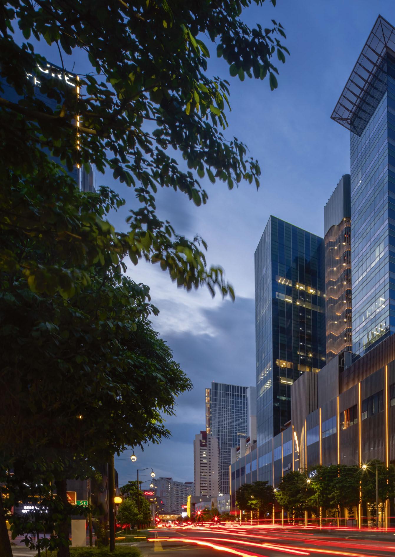
Strategically positioned between Singapore’s CBD and Chinatown, 18 Cross is a 66,680sqm mixed-use development that comprises a 15-storey office tower, a four-storey podium, restored conservation shophouses, and two basement parking levels.
Despite its prime location, the area had previously faced challenges, such as an oversized, industrially-styled podium creating a discordant atmosphere, low foot traffic and several unleased units.
However, a recent redevelopment project, led by architecture studio Benoy, alongside lighting consultants at Cundall, sought to integrate these disparate elements into a cohesive and vibrant urban quarter.
Lighting played a key part in this redevelopment. Built around its overall focus of “Darkplanning”, Cundall’s vision was to use indirect lighting to accentuate the materiality and texture, bring definition to the form and geometry of the space, and add in extra reference to architectural hierarchy.
The lighting design therefore looks to bring focus on the main thoroughfare and 45° intersection elements to captivate both pedestrians and peak-hour motorists from all angles.
Collaborating with Benoy, the lighting is seamlessly built into the aluminium cladding of the tower, casting dramatic shadows, highlighting textures, and bringing the façade to life at night.
By taking an indirect lighting approach, obtrusive light spill is minimised, aiding in reducing light pollution in the urban environment, while at the same time allowing for a more refined approach to the luminous intensity required to create impact overall, reducing power consumption of the façade installation.
The completed design transforms 18 Cross into a “luminous beacon” for Singapore’s CBD – transforming a previously underutilised space and successfully elevating the local urban landscape, while enriching the community experience. www.cundall.com
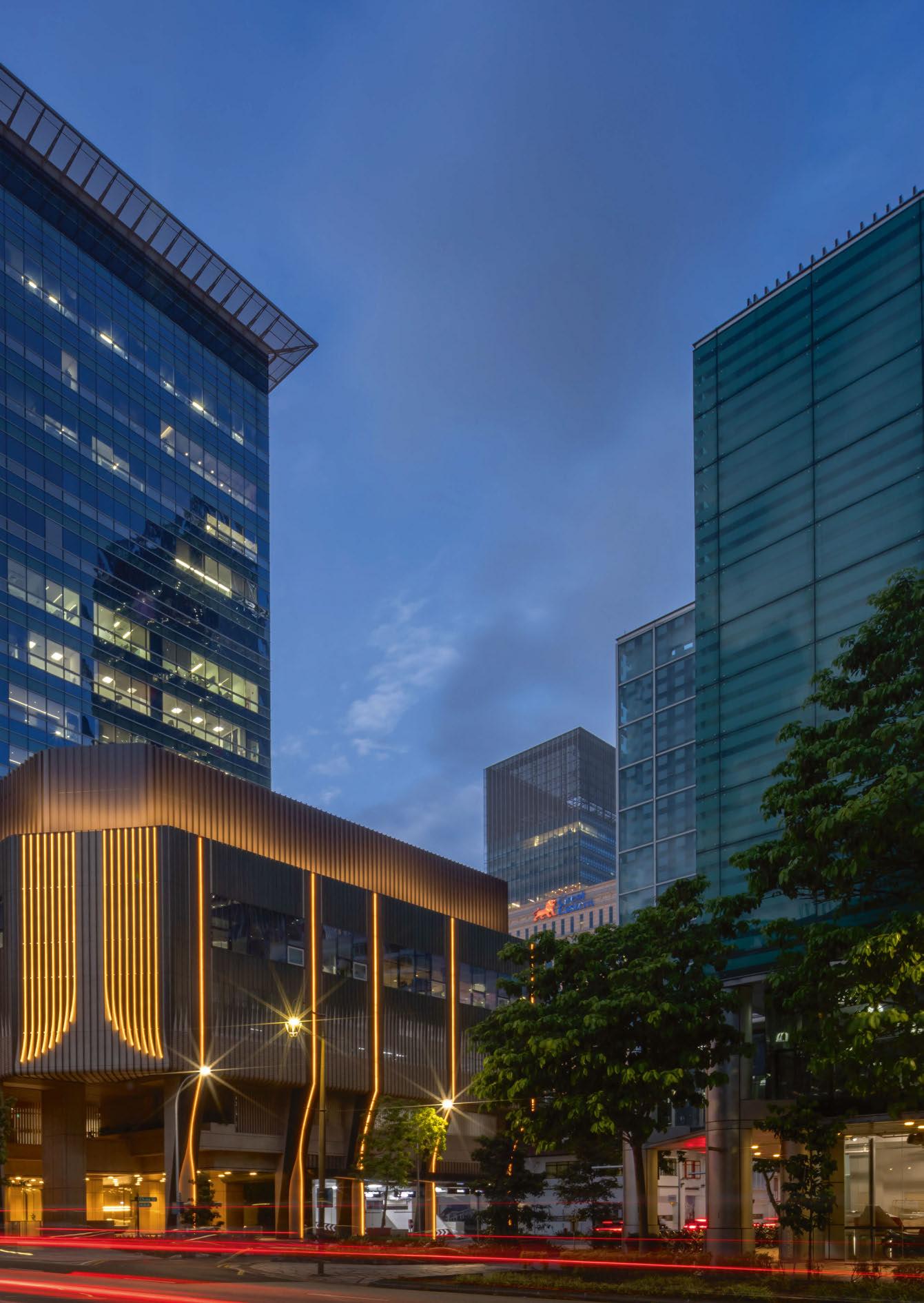
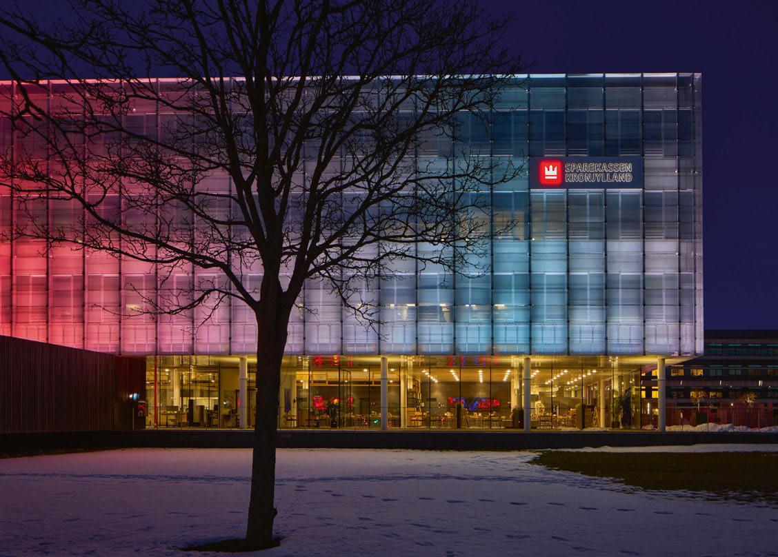
Financial institution
Sparekassen Kronjylland, engaged Danish design studio Kollision to create a distinctive nighttime brand identity for its headquarters, using SGM Lighting selected for its ability to deliver both powerful white light and vibrant colour from the same fixture.
At the headquarters of Sparekassen Kronjylland, architectural lighting transforms the building façade into a visual extension of the bank’s identity. Designed by the Danish design studio Kollision, the project demonstrates how light can elevate architecture while strengthening a corporate presence in the urban landscape.
By day, the building stands as a confident piece of contemporary architecture. After dark, the façade reveals a new dimension as dynamic lighting activates the building, allowing it to transition between calm white expressions and carefully composed colour scenes. The headquarters becomes a living surface – a communication platform capable of reflecting celebrations, events, and seasonal moments while maintaining a refined architectural identity.
The lighting solution is based on SGM fixtures selected for their ability to combine precise white light, saturated colour, high output, and precision optics in a single fixture – the POI Graze.
In total, the façade is illuminated by 100 linear grazing fixtures from SGM’s POI family, including 88 units of POI-100 Graze RGBW4K 10° and 12 units of POI-25 Graze RGBW4K 10°. Carefully integrated into the architecture of the façade, the fixtures deliver powerful grazing light that emphasises the building’s vertical rhythm while maintaining a clean and uniform expression across the façade.
Rather than simply lighting the building, the installation reinforces its role within the cityscape. After sunset, the headquarters becomes a confident landmark – a visible expression of the bank’s identity in the urban landscape.
“Lighting today is an integral part of architectural identity. With this project, the ambition was to create a façade that feels calm and elegant in its everyday expression, yet capable of transforming into something vibrant and communicative when needed,” says Design Studio Kollision.
For Sparekassen Kronjylland, the illuminated façade also reflects the institution’s connection to the city.
“Our headquarters is an important meeting place for customers, employees, and the local community. The lighting helps express who we are as a modern financial institution while creating a welcoming presence in the city after dark,” explains Brian Boldrup Nielsen, Project Manager at Sparekassen Kronjylland.
The result is a headquarters that evolves after sunset – a building that does not disappear in the dark, but instead becomes a confident presence in the city.
A reminder that today, architectural lighting is not only about illumination. It is about identity.
www.sgmlighting.com www.kollision.dk

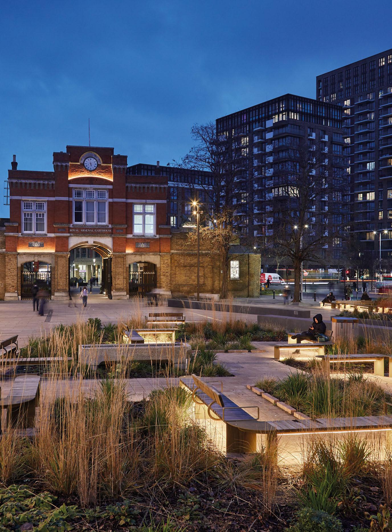
Public realm lighting transforms a historic urban centre into a vibrant destination after dark.
Woolwich Town Centre, London
Woolwich Town Centre has been transformed through an integrated public realm lighting scheme designed to support regeneration, improve accessibility and strengthen the area’s night-time identity. Working alongside Michael Grubb Studio, LDA Design and WSP, Urbis Schréder delivered a lighting solution combining architectural lighting, multifunctional columns and discreet integrated elements across Beresford Square and Powis Street. Get in touch at sales@urbis-schreder.com
View the full case study
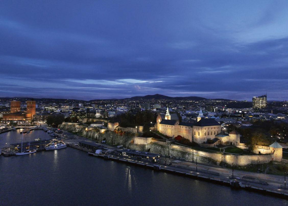
A lighting modernisation project for one of Norway’s most important historical landmarks has been completed using a suite of solutions from Pharos Architectural Controls
Built in the 13th century, Oslo’s Akershus Fortress has served as both a royal residence and a military facility, and today, is a landmark to attract domestic and international visitors.
Recognising that the after dark lighting system for the fortress was outdated and inefficient, owners of the site, Forsvarsbygg appointed Zenisk to create a contemporary lighting scheme, with LYSKONTROLL implementing the lighting control system.
The overhaul needed to address a number of needs, such as replacing outdated, inefficient lighting infrastructure, improving sustainability through energy-efficient LED technology, enhancing visibility, safety, and aesthetic presence at night, reducing light pollution, and minimising the impact on local flora and fauna.
The lighting project covered a large area across the fortress, which presented significant logistical and technical challenges. As it was not possible to install conventional cabling across the site, the entire control system was designed to operate completely wirelessly.
A system from Pharos was specified and commissioned to deliver the lighting control element of the upgrade works, with two Pharos Designer LPC controllers at the heart of the installation acting as the main control engines for all architectural scenes, dynamic timelines, triggers, and logic sequences. To deliver distributed DALI control across the fortress, the system incorporates multiple Pharos Designer RIO D4 devices to provide distributed DALI control for the luminaires, while simplifying installation and enabling precise local control across various locations.
All five DALI subnets operate fully wirelessly using LumenRadio W-DALI. This solution minimises physical impact on the historic structures while providing robust and reliable wireless performance. Pharos Cloud adds another essential layer of capability, providing secure remote access for monitoring, management, and troubleshooting. Local control was also a priority; custom interfaces allow employees to easily select and adjust lighting scenes, providing flexibility for both day-to-day use and special events – without compromising the centralised Pharos programming.
Together, the Designer LPCs, Designer RIO D4s, and Cloud platform – combined with LumenRadio’s wireless DALI technology – create a flexible, networked, low-latency system capable of smooth and synchronised lighting sequences for over 232 luminaires installed across more than 50 positions. The new lighting solution was created in close collaboration with cultural heritage and conservation authorities to ensure minimal physical and visual impact on the historic structures.
Extensive mock-ups, lighting tests, and on-site focusing were carried out to achieve a precise and balanced scheme that enhances the textures of the stone façades and castle walls without overwhelming them. The result is a system that respects the site’s history while enabling sophisticated architectural and ceremonial illumination, delivering a visually unified, lowlatency, and future-ready lighting experience.
www.pharoscontrols.com www.lyskontroll.no www.zenisk.com
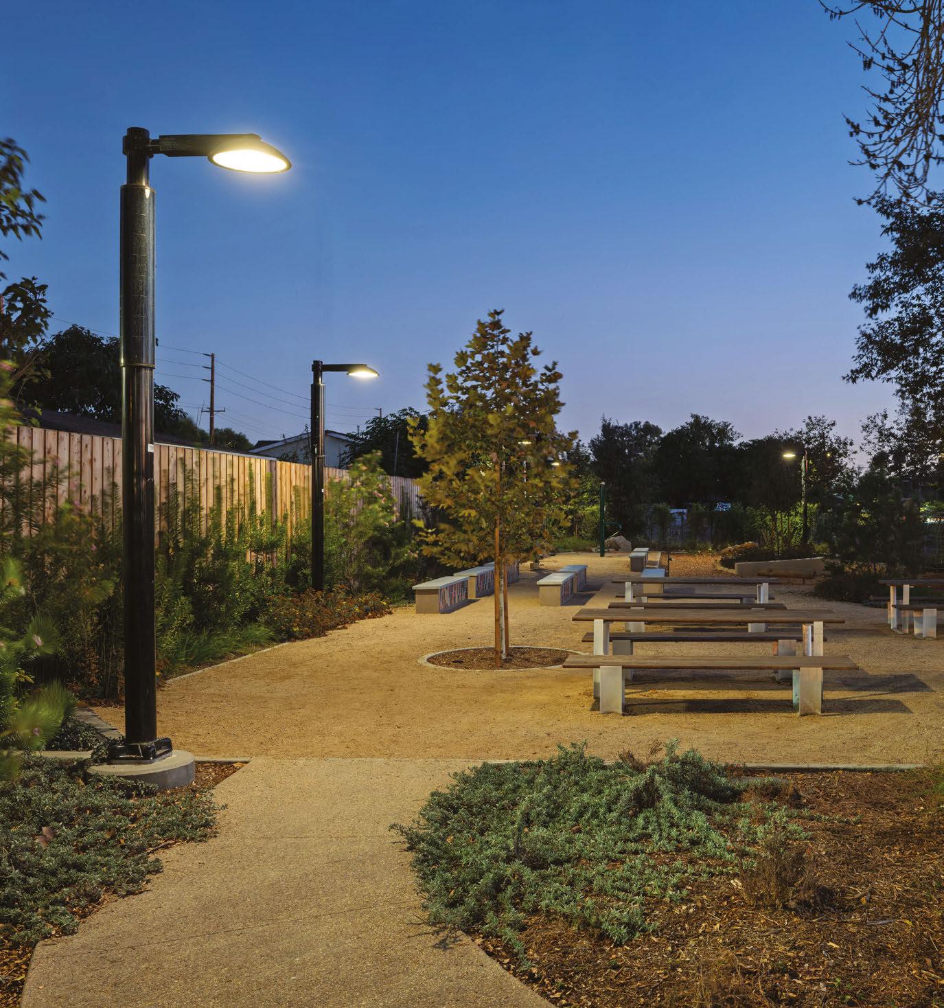
Light Inspires Connection
At Alondra Gateway Park, LEO 360 Solar Area Lights illuminate a new community space along Compton Creek, bringing warmth and off-grid lighting. Designed by Studio-MLA, the park transforms a vacant lot into a welcoming hub that shows how light sparks connection and renewal.
Landscape Forms | A Modern Craft Manufacturer
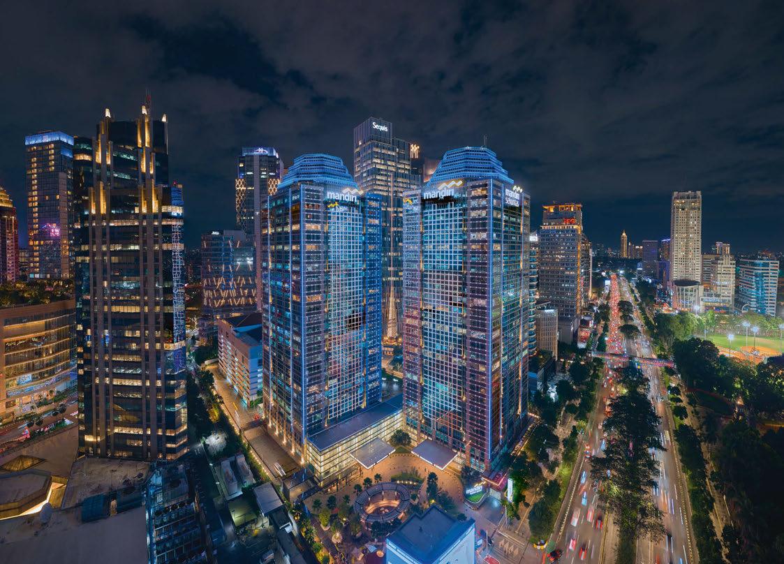
A dynamic façade lighting scheme from CDN Light gives the Menara Mandiri a new night-time identity.
Located on Jakarta’s Jalan Jenderal Sudirman, Menara Mandiri stands as a highly visible presence within the city’s financial district, forming a key part of its night-time skyline.
In 2025, Bank Mandiri initiated a façade lighting renewal for its headquarters. The brief was to give the towers a renewed night-time identity that could reflect the bank’s corporate character, digital transformation and long-term presence in the city.
The façade lighting design by Pavilion95 is developed around the concept of “Livin’ the Light as an Urban Beacon,” taking inspiration from Livin’ by Mandiri, the bank’s widely recognised digital platform. The idea translates the language of digital connectivity into architectural light, allowing the building to communicate with the city through rhythm, movement and visual clarity.
A key design consideration was how to transform the building after dark while preserving the architectural character of the existing façade. The lighting design avoids adding excessive decorative layers or unrelated visual patterns. Instead, it follows the vertical and horizontal elements already present on the towers, allowing light to become part of the architecture rather than an addition placed over it.
This approach also supports a more practical installation strategy. By aligning the luminaires with the existing façade elements, the design reduces unnecessary structural intervention and helps simplify long-term maintenance. The result is a lighting scheme that respects the original architecture while giving the building a clearer and more recognisable presence at night.
The façade composition is created through a combination of linear light, pixel points, wallwashing and selective floodlighting. Linear elements define the architectural outline of the towers, while pixel lights introduce detail, movement and a sense of digital responsiveness. Wallwashers and floodlights provide depth and balance, ensuring that the building remains legible from different viewing distances and urban angles. Together, these lighting layers form a subtle grid across the twin towers that expresses structure, order and connectivity. Animated lighting sequences, inspired by the flowing ribbon element of Bank Mandiri’s visual identity, introduce a measured sense of motion across the façade. The movement is designed to feel calm and controlled rather than theatrical, giving the building a dynamic yet professional night-time image. Sustainability and visual comfort were also central to the design. Light intensity, beam direction and fixture placement were carefully considered to reduce unnecessary spill light and limit disturbance to the surrounding environment.
The completed scheme transforms Menara Mandiri into a distinctive urban beacon within Jakarta’s skyline. Its presence is confident without being excessive, expressive without overwhelming the architecture. Through a controlled combination of linear definition, pixel animation and façade illumination, the project gives the towers a renewed identity after dark – one that reflects trust, progress and the evolving character of a modern financial institution.
www.cdnlight.com


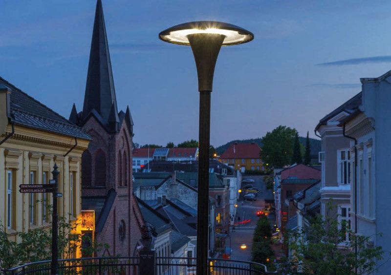
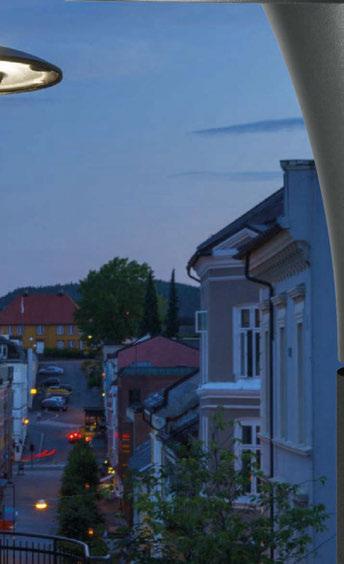






LUNIO and LUNIO-STREET combine optical precision, visual comfort and configurability to support lighting approaches across streets, pathways and architectural urban spaces.
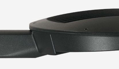
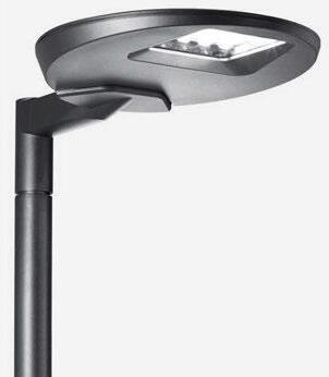




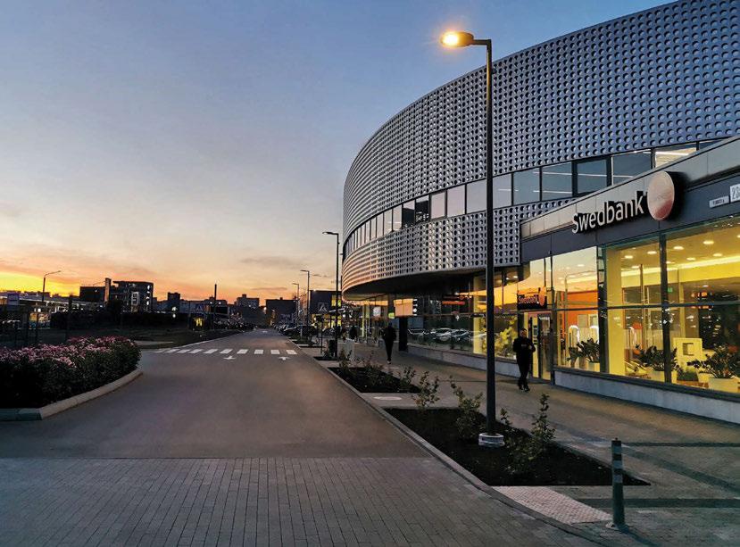

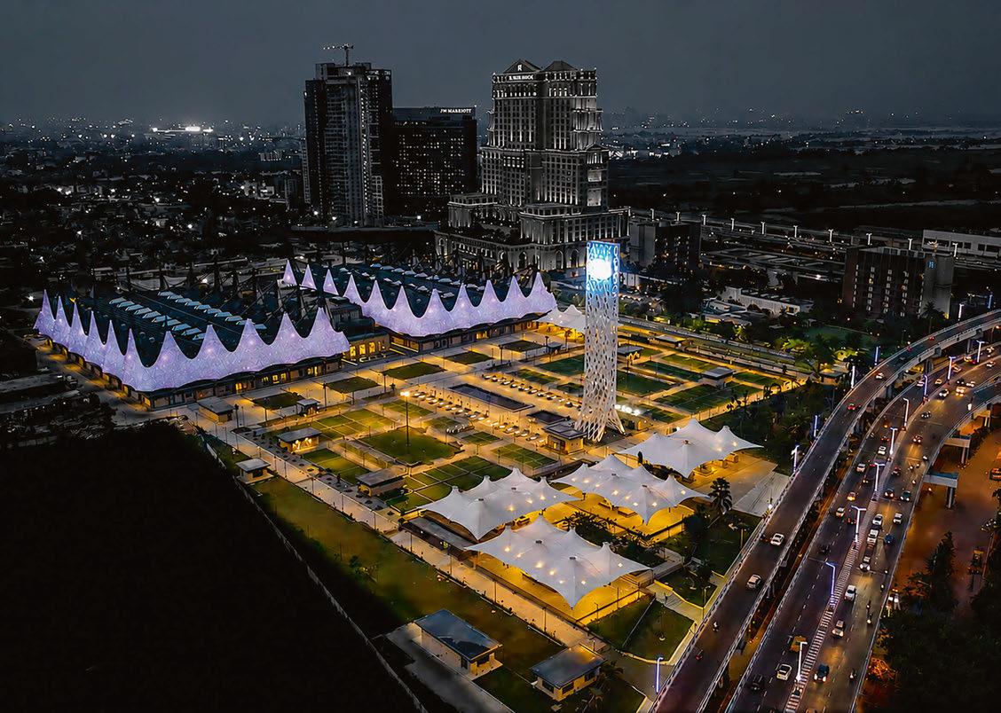
Fusing architecture, landscape, and urban movement, this largescale public realm project utilises a highly tailored lighting solution from Ligman
The newly redeveloped Biswa Bangla Mela Prangan (Milan Mela Trade Center) in Kolkata represents a transformative moment in contemporary civic infrastructure for Eastern India. Conceived as a large-scale exhibition and public gathering destination, the expansive development merges architecture, landscape, and urban movement into a cohesive civic experience capable of accommodating more than 250,000 visitors daily.
Designed by Salient Design Studio under the leadership of Vivek Singh Rathore and Anuradha Rathore, the project demanded an exterior lighting strategy that could operate at monumental scale while maintaining visual comfort, spatial clarity, and architectural restraint after dark.
The public realm is defined by expansive pedestrian corridors, civic plazas, and tensile architectural elements that required precise illumination without overwhelming the landscape with excessive brightness or dense infrastructure. Conventional lighting approaches would have resulted in closely spaced poles, visual clutter, and substantial increases in installation and maintenance costs.
To address these challenges, the design team collaborated with Ligman to develop a highly tailored lighting solution centered around the Light Linear Denver luminaire equipped with customengineered T4 optics. Specifically optimised for the project’s unusually wide pedestrian pathways, the forward-throw optical distribution delivers exceptionally uniform illumination with minimal glare while extending the effective lateral reach of each luminaire.
This precision optic strategy enabled significantly wider pole spacing across the campus, dramatically reducing the quantity of poles, underground cabling, and concrete foundations required throughout the development. The result is a cleaner and more visually disciplined civic environment that prioritises openness, safety, and pedestrian comfort.
Complementing the primary circulation lighting, carefully integrated architectural accent luminaires subtly highlight the pavilion structures and tensile forms, reinforcing the identity of the complex without competing with the surrounding public realm. The final nightscape achieves a delicate balance between functionality and atmosphere, transforming a high-capacity trade destination into an inviting urban environment that remains legible, efficient, and visually cohesive after sunset.
Today, Biswa Bangla Mela Prangan stands not only as a landmark venue for exhibitions and events, but also as a benchmark for how precision optics and thoughtful urban lighting can elevate civic infrastructure at scale.
www.ligman.com
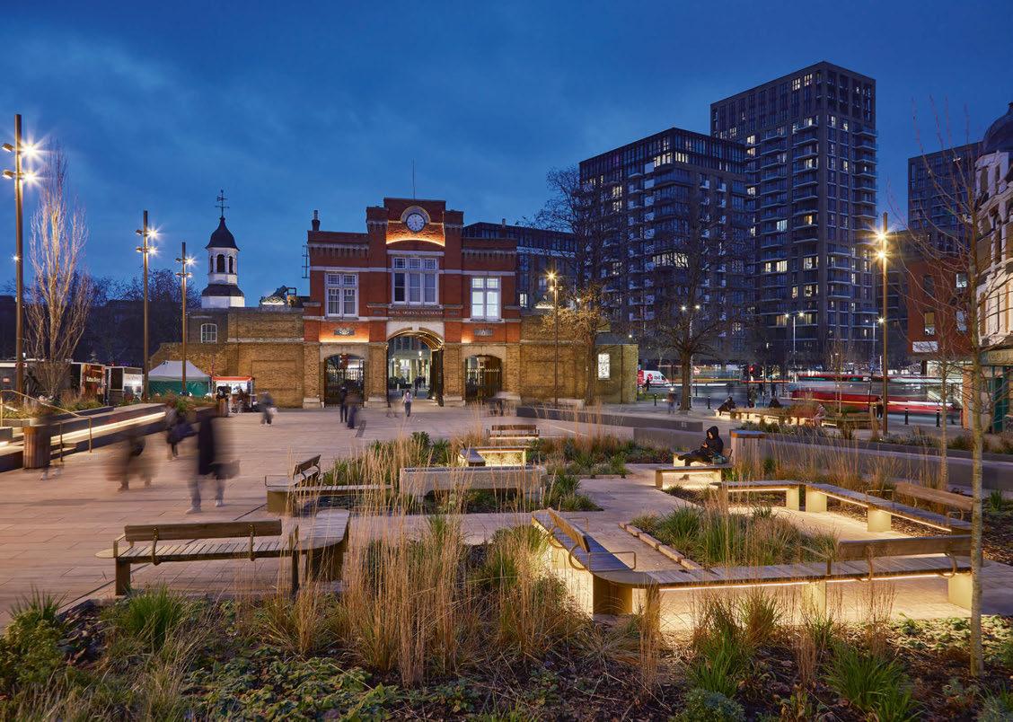
A range of exterior lighting solutions from Urbis Schréder help to revitalise the historic town centre of Woolwich into a more accessible and welcoming civic space.
With a rich history as a key military and industrial hub, Woolwich has long been a focal point in southeast London. At its core, Beresford Square has hosted the town’s market for more than 400 years, alongside Powis Street, the ‘Ramblas’ of Woolwich. Over time, both spaces became defined by movement, with limited opportunity to gather or experience the town centre beyond its functional role. To unlock the potential of Woolwich’s centre, The Royal Borough of Greenwich delivered a major public realm regeneration scheme focused on transforming Beresford Square and Powis Street into more accessible, welcoming and economically active civic spaces.
At Beresford Square, the design prioritised clearer movement patterns, reduced visual clutter, and stronger spatial connections. On Powis Street, the focus shifted towards creating a more coherent and pedestrian-friendly high street experience, improving legibility and comfort for visitors.
Lighting was central, helping define routes, reinforce arrival points, and unify the town centre after dark. Urbis Schréder was appointed through an established collaboration with the council and Michael Grubb Studio, working alongside LDA Design, WSP, and Elite Landscapes Limited, to deliver a coordinated lighting strategy aligned with the wider public realm vision.
On Powis Street, 16 custom parallel columns were introduced, each fitted with Flexia Maxi luminaires at 2700K. These columns also integrate 16A electrical sockets and selected CCTV mounting points, combining lighting and infrastructure needs within a single, uncluttered streetscape solution.
In Beresford Square, 13 custom 10-metre columns were installed, each supporting four Valinta Midi Curve luminaires, with one column adapted for CCTV integration. A further 50 Valinta Micro luminaires were used to softly illuminate trees and planting, adding depth and enhancing the reintroduced landscape character.
To support accessibility across level changes, seven Grade 316 stainless steel handrails were fitted with Alinea lighting modules, providing discreet, continuous illumination along key pedestrian routes.
The Valinta range enabled a consistent design language across multiple scales, while delivering precise optical control and flexibility. Alinea was specified for its discreet integration and robust performance in handrail applications.
The integrated column approach also reduced street clutter by combining lighting, power and surveillance infrastructure into single coordinated elements. Environmental performance was a key consideration throughout, with careful control of light spill to support a more sensitive night-time environment.
The completed scheme repositions Woolwich Town Centre as a more legible, inclusive and active civic space. Improved visibility and atmospheric quality now encourage greater evening use, supporting local activity and reinforcing the area’s identity as a destination.
Through collaboration, the project demonstrates how integrated lighting can define regeneration, strengthening place identity and long-term vitality. www.uk.schreder.com
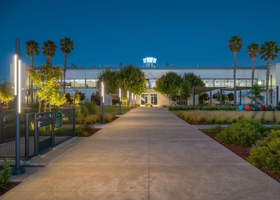
Thanks to luminaires from Landscape Forms, this public space on the site of a former Air Force base has been transformed into an inviting space for people to spend time and relax.
Built in the 1930s, Hamilton Field was originally an Air Force bombardment base. Decommissioned and vacated in 1975, The Landing has given new life to the site with businesses occupying the renovated hangars and a shared space for tenant and public use. Known as 8 Hamilton Landing, the one-acre public space is on a site originally intended to house a hangar that was never built.
Jackson Derler and Matt Aranda of siTe Landscape Architecture, the landscape design division of contractor TechCon, saw an opportunity to provide amenities for the tenants and Novato community in what they discovered was an active part of the city. Early in the project, they were onsite and noticed a lot of people walking through the site. They discovered The Landing is adjacent to a bay walk that is part of the larger San Francisco Bay Trail. They realised the plaza could be more than a walk-through and offer a place for people to stop and relax.
Today, the space has a dog park, bocce ball and lawn sport courts, lounge seating, picnic area, and a corporate break area with shade structures and conference spaces for tenant meetings.
With safety, egress, and evening events in mind, lighting became an important element for the shared space. Derler and Aranda were immediately drawn to Landscape Forms’ Typology Stick lights for an aesthetic that offered interesting ties to the history of The Landing.
“We played off the historic significance of the space by placing the lights along the central walkway that became analogous to a runway, but instead of beacons guiding planes to the runway, 10ft tall Typology stick lights serve as beacons to guide people into the space. The lights have a contemporary take on the classic jet age design with their curved corners and vertical emission of light,” says Aranda.
Aranda has been to the site on weekdays and weekends. On weekdays, people are casually eating lunch, and the dog park is active. And on the weekends, the space is crowded with people accessing the bay trail, playing games, and relaxing on the lounge chairs and lawn. “We’ve made it inviting for people to stop here and hang out,” he says.
www.landscapeforms.com
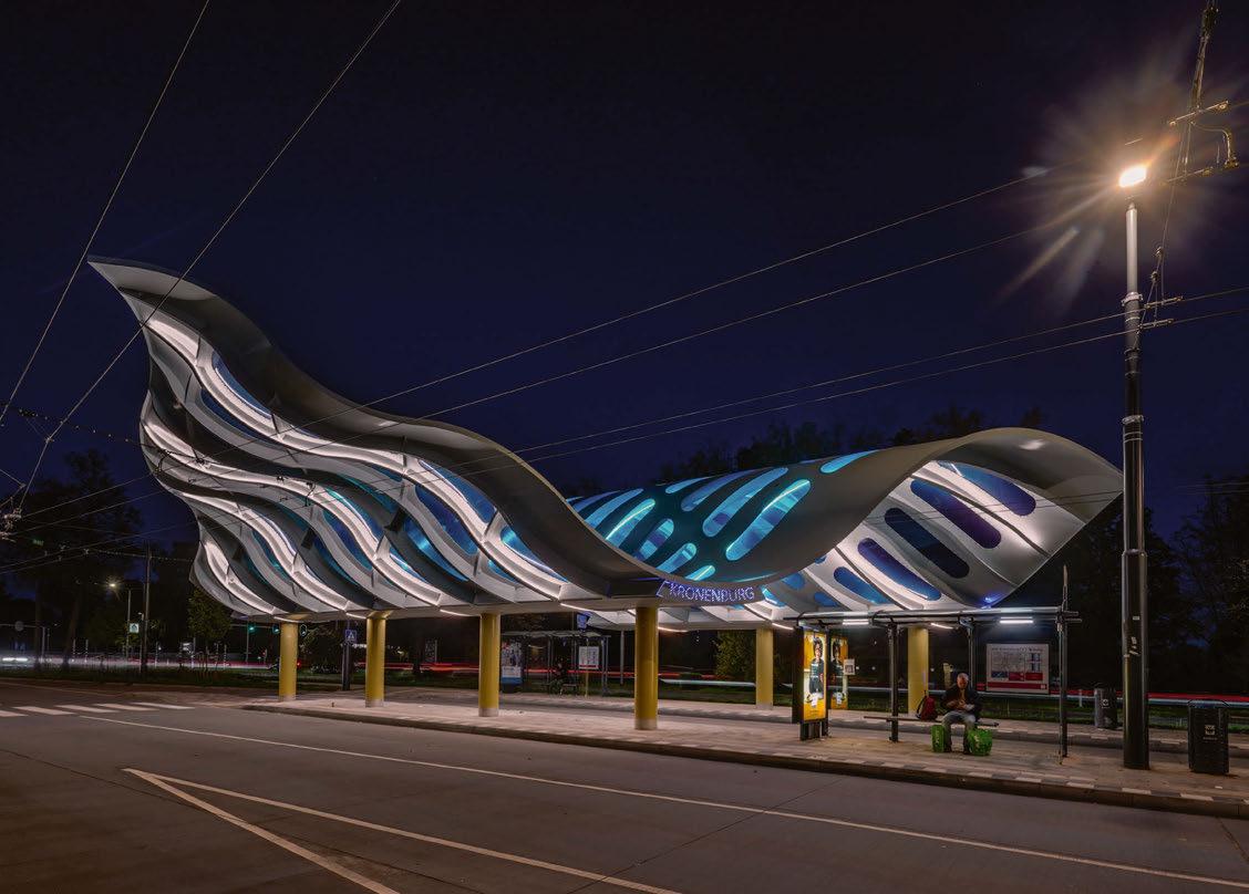
Arnhem-South, Netherlands
RXLight and UNLUMITED Lighting Solutions created a lighting concept for Kronenburg Bus Station that highlights its bold architecture and brings the structure to life after dark.
At Kronenburg Bus Station in Arnhem-South, Netherlands, light and architecture come together to create a public space that is both functional and visually memorable. Completed in September 2025 by RXLight in collaboration with UNLUMITED Lighting Solutions, the project transforms the station after dark through a carefully integrated lighting concept that follows and strengthens the bold architectural form.
The architectural design, created by renowned designer Ruud-Jan Kokke, was inspired by the flow and movement of daily commuters. This idea is expressed through two elegant canopies with a wave-like glass and steel structure, fabricated by Moors Constructie Bergharen. The result is a sculptural station environment that feels dynamic, open, and closely connected to the renewed character of Arnhem-South.
The lighting concept was developed to respond directly to this flowing geometry. Freebend Arcflex from Clear Lighting were selected for their durability, performance, and ability to support clean architectural integration. Through a considered balance of indirect and direct illumination, the lighting emphasises the canopy’s curves, rhythm, and depth without overpowering the structure itself.
Freebend Arcflex flex light traces the movement of the canopies, creating a smooth visual flow across the glass and steel surfaces. By day, the structure becomes an architectural landmark. By night, the lighting reveals its full sculptural quality, giving the station a strong identity and a sense of motion even when viewed from a distance.
The design also supports the practical needs of a busy public transport environment. The lighting improves orientation, visibility, and comfort for travellers, while creating a more welcoming atmosphere for waiting and movement through the space. Rather than treating illumination as a separate technical layer, the concept makes light part of the architectural experience.
Kronenburg Bus Station shows how architecture and light can work together as one design language. Through quality, innovation, and collaboration, the project adds lasting value to the renewed station area and demonstrates how public transport spaces can be both functional and inspiring.
www.kokke.com www.rxlight.nl
www.unlumited.com
www.robertkoelewijn.nl www.clearlighting.com
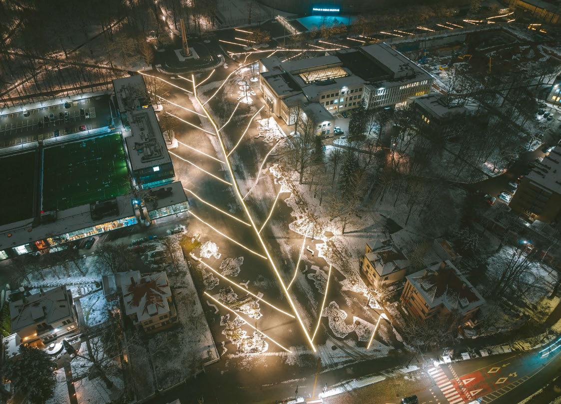
Paying homage to the surrounding Oak Grove Park, luminaires from Aldabra create a unique, symbolic lighting effect on Kaunas’ Perkūnas Avenue.
In many urban environments, lighting is used to organise, direct, and define space. Along Perkūnas Avenue in Kaunas, Lithuania, however, light takes on a different role: not imposing a new visual language onto the city, but revealing one already embedded within its natural identity.
Located at the edge of the Oak Grove Park, the largest urban oak forest in Europe, the redevelopment surrounding the Lithuanian Sports University and the Darius and Girėnas Stadium draws its inspiration directly from the landscape that defines the area. Rather than referencing the oak tree in a literal or symbolic way, the lighting concept developed by Paulius Leščiauskis of Mazgas focuses on one of its smallest and often unnoticed details: the vein structure of an oak leaf.
Expanded to an urban scale, this delicate natural geometry becomes the foundation of the public space. A network of illuminated lines extends across the pavement, reproducing the branching logic of leaf veins and transforming circulation paths into an organic visual composition. Seen from above, the intervention appears almost like a living structure spreading across the city fabric, less an infrastructure than a luminous landscape. What makes the project particularly compelling is the shift in scale. A detail that normally exists at the dimension of a human hand becomes a large-scale urban gesture, demonstrating how natural patterns can inform spatial design in ways that feel both intuitive and emotionally resonant. The result is not decorative mimicry, but an abstraction of nature translated into movement, rhythm, and perception. Within this approach, light becomes a medium
through which the surrounding environment expresses itself. Rather than illuminating the space uniformly, the linear elements carve visual trajectories across the ground, guiding pedestrians while simultaneously reinforcing the identity of the place. During the winter months, when snow partially covers the surface, the illuminated lines acquire an even stronger graphic presence, appearing like glowing traces emerging from the landscape.
To realise this concept, the project incorporates more than two kilometres of EK2, a recessed resinencapsulated linear system developed by Aldabra. The system’s ability to create continuous, clean lines of light while adapting to complex geometries allowed the organic pattern to be translated precisely into the paving design.
Ultimately, the project demonstrates how lighting can move beyond functionality to become a tool for reconnecting urban space with its natural context. By magnifying a hidden detail of the oak leaf into an immersive public experience, the intervention transforms a simple circulation area into a place of identity, memory, and atmosphere.
www.aldabra.it

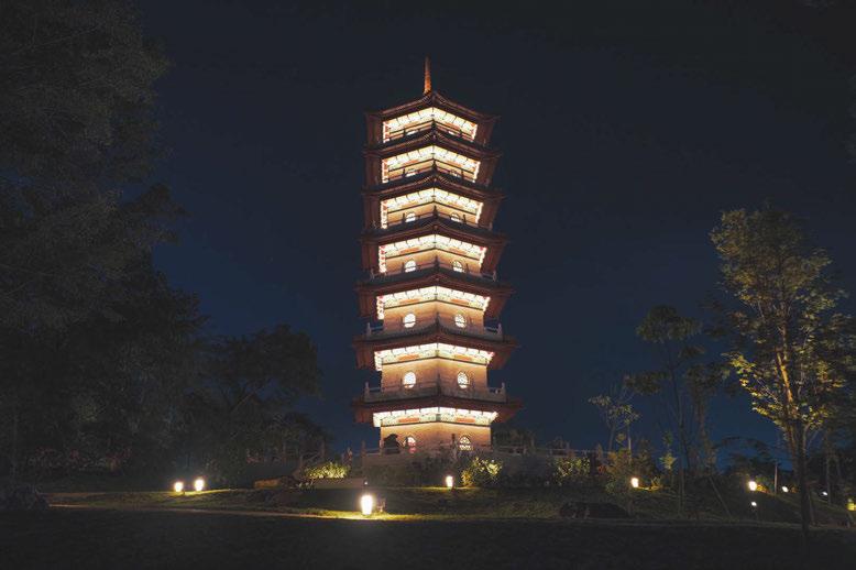
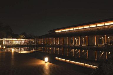

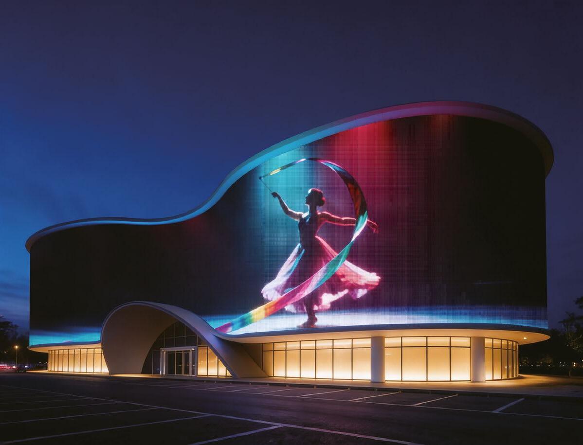
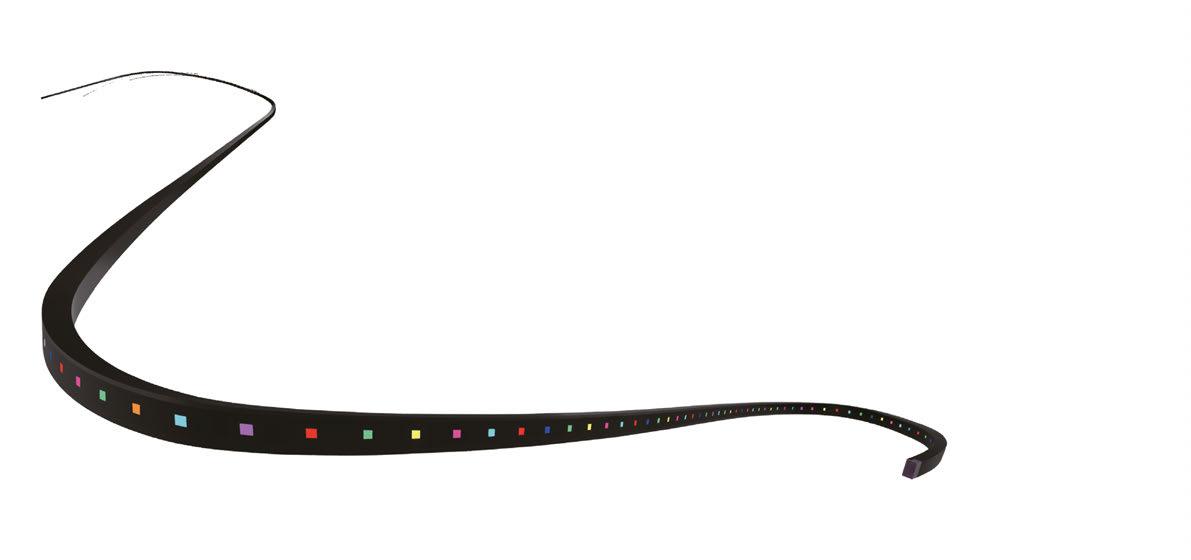

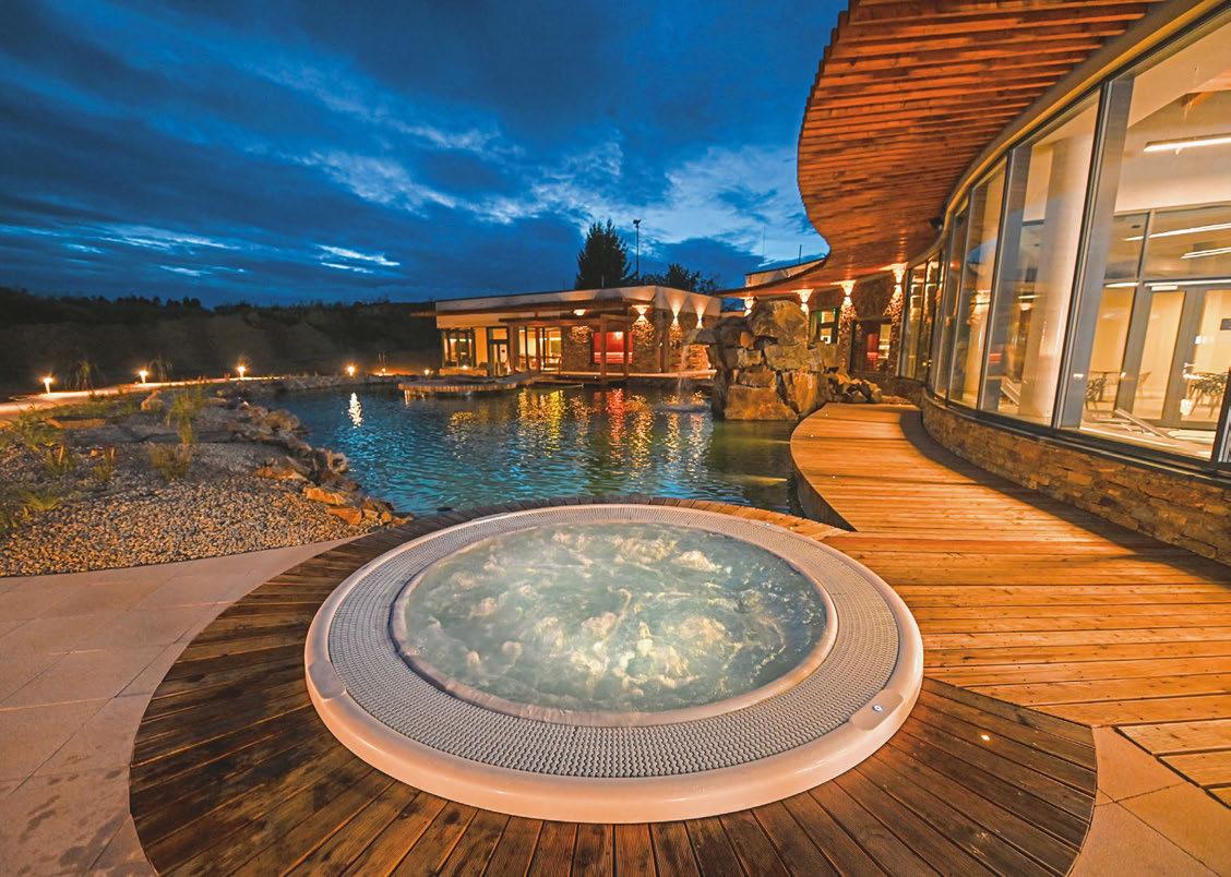
Outdoor luminaires from Neko Lighting bring an understated illumination to Brno’s Hotel Atlantis, enhancing the rhythm of the architecture.
Set beside the wooded shoreline of the Brno Reservoir, Hotel Atlantis approaches hospitality through stillness rather than spectacle. The architecture opens gradually towards water, wellness gardens and outdoor spa areas, allowing natural materials and softened transitions to shape the guest experience long after sunset.
Integrated along the stone façades and sheltered walkways, Neko Lighting’s Bay outdoor wall luminaires form part of the project’s restrained lighting language. Their clean edged illumination spreads evenly across the vertical surfaces, creating a softened geometric glow that enhances the rhythm of the architecture without introducing visual harshness. The light remains precise but never aggressive, warm against timber, quiet across textured stone, understated beneath the deepening blue of the evening sky.
Rather than overwhelming the resort with brightness, the wider outdoor lighting strategy embraces contrast, shadow and layered illumination to preserve atmosphere and visual calm throughout the landscape. Darkness is not eliminated, but carefully retained as part of the spatial experience itself.
A hierarchy of light guides movement across the site. Bollards trace pathways softly through the gardens, while recessed ground lighting introduces depth without increasing overall brightness. Reflections drift across water and glass, bringing subtle movement into the nighttime environment. Beneath the timber canopy structures, concealed architectural lighting creates moments of warmth at a more intimate, human scale.
Each lighting layer responds differently to the surrounding material palette. Stone absorbs and softens the glow; timber gathers warmth; water reflects shifting fragments of light back into the architecture. Rather than treating every surface equally, certain areas remain intentionally subdued, preserving contrast and allowing the resort to feel immersive rather than overlit.
Within this landscape driven environment, Neko’s outdoor lighting solutions contribute to a nighttime identity that feels calm, cohesive and enduring shaped not by dramatic gestures, but by measured layers of light moving gently with the architecture, the water and the night surrounding them.
www.nekolighting.com

. Patent-pending CoreSwap™ technology allows all fixture electronics to be removable and replaceable with just a few screws, driving sustainability.
. The very first area floodlights on the Acclaim Modular Systems platform , proudly assembled at our Los Angeles headquarters.
. Powered by our ultra-reliable ColorDrive, ColorSync calibration, and Aria Wireless technologies.
. Fully IP67-rated, delivering up to 26,000 lumens, achieving an output increase of up to 80%.
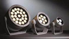


Please contact us for product information, demo samples, or to discuss your latest project

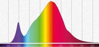


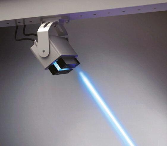
• Ultra-narrow 1.5 degree x 35 degree beam
• Up to 1,000 Lumens per projector with all LEDs on
• Each projector is individually
• IP66 rated for exterior
• Stretta projectors produce a series of vibrant colour changing blades of light
• For Nexus, the lit-effect changes colour based on the amount of footfall below
• The projectors are aimable and lockable thanks to the adjustable angle brackets
• Adjustable baffles allow the cut-off angle to be fine tuned on-site
Designers at 2x4 Environments, in collaboration with TM Light, have reimagined the exterior appearance of Prada’s flagship store on the corner of New York’s 5th Avenue and 56th Street with a bespoke, temporary wrapper.
The meticulously detailed design, built from standard commercial pipe scaffolding elements, reflects Prada’s long-standing interest in dualities: industrial yet refined, functional yet decorative, familiar yet uncanny. A double-layer, semitransparent scrim creates a moiré effect that constantly shifts with changing light, weather, and viewing angle. The offset fabrics carry printed variations of an abstracted construction fencing pattern. Differences in scale, transparency, and alignment create a surface that shifts with movement, light, and viewing distance.
As the sky darkens, a lighting grid, comprising integrated linear LED lighting aligned with the scaffold structure subtly dissolves the outer layer, revealing the framework behind and amplifying the perception of depth.
“We started from a fixed scaffolding system, with its rules and components shaped by efficiency and compliance, and pushed it toward something more considered, precise, and architectural,” says 2x4 Principal, Christopher Kupski.
“From a distance, the façade reads as monolithic, but as you move closer, the layers begin to register. The structure opens up, becoming lighter, more transparent, and more dimensional.”
B. Alex Miller, Founding Parter at TM Light, adds: “TM Light collaborated with Prada and design studio 2x4 to imbue a functional scaffolding with a lighting installation that speaks to the grand scale of the city as well as to the detailed filigree of a singular architecture.
“The lighting works with a patterned fabric weave that covers the scaffolding designed by 2x4 that allows the building to undergo a ‘state change’ from day to night. During the day, the double layered fabric and its pattern create a monolithic surface that maintains a texture of moire. As the night approaches, a ghostly framework of glowing led lines appears. The lines express the scaffolding’s inherent depth, occupying the zone in which humans do their work for the sake of the brand’s construction.
“In this, the project becomes a kind of “nonproject project”, where the temporary framework of scaffolding which is meant to be an element of concealment becomes an element of display. The design comprises familiar elements of New York City scaffolding, reinterpreted through a unique Prada lens.
www.2x4.org
www.tmtm.co
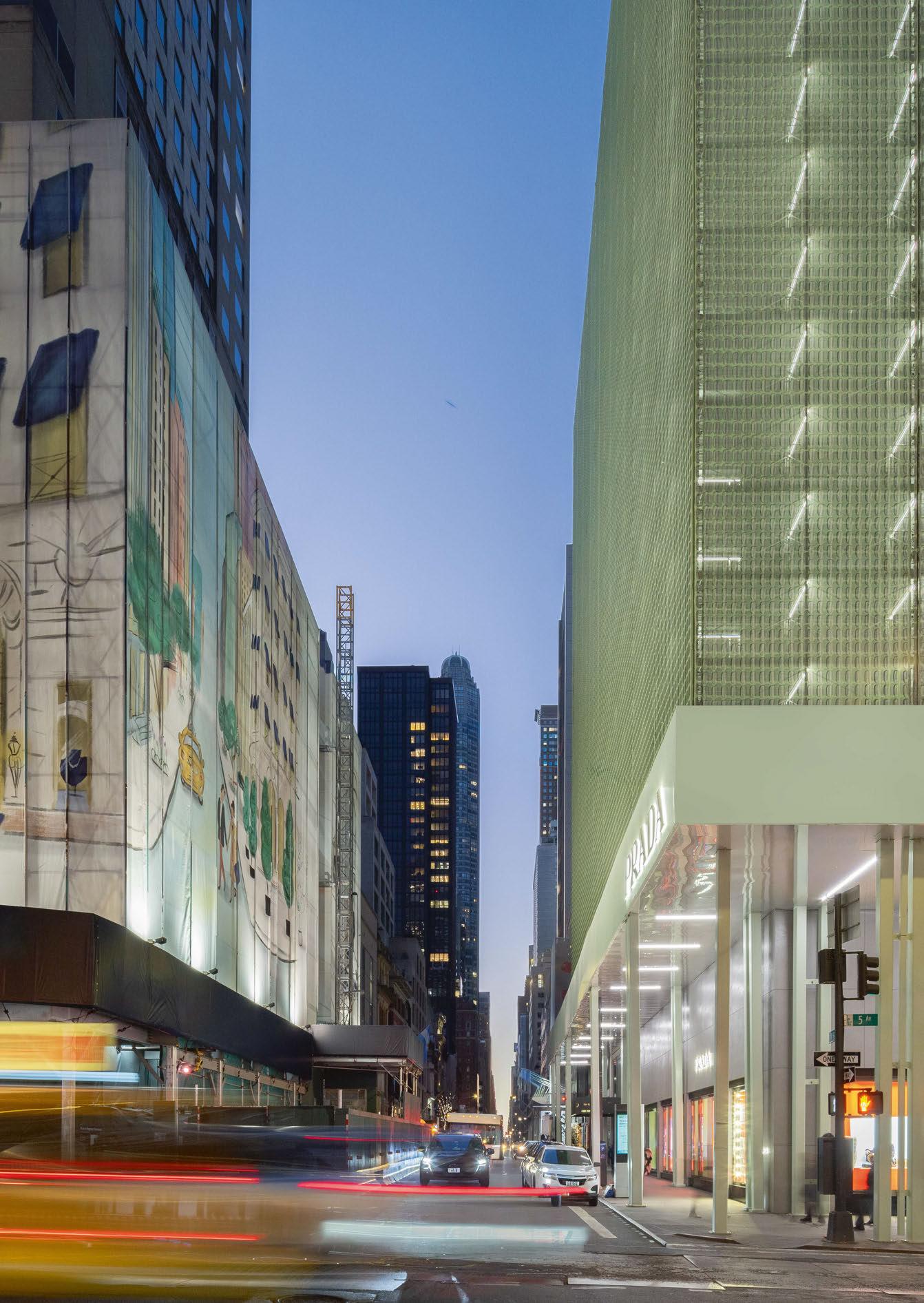
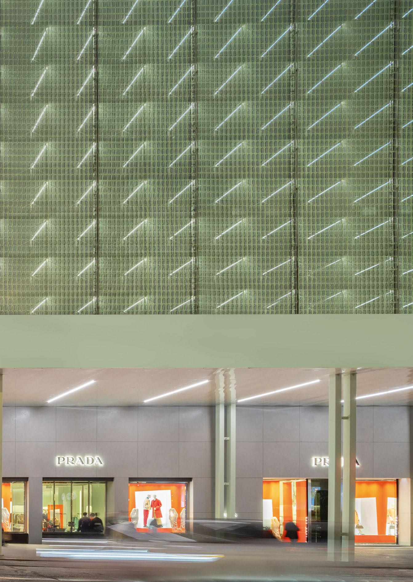

Born from fire, finished in light. Foscarini’s Eolie collection is a far cry from your parents’ lava lamp in the 80s. Created by father-and-son duo Alberto and Francesco Meda in collaboration with stone company Ranieri, the collection debuts a new patented material. made from recycled lava. Together, they transform discarded material into hanging landscapes that fuse sustainability with sculptural beauty.
There is something arresting about a light fixture made from volcanic rock: a material once molten and untamed, now suspended overhead and glowing quietly within a space. Developed in collaboration with Naples-based stone company Ranieri, the Eolie Collection transforms lava fragments from Mount Vesuvius into suspended lights whose forms retain the porous irregularity of volcanic rock. Rather than concealing the material’s unpredictability, designers Francesco and Alberto Meda chose to amplify it. Every pour produces subtle variations in texture, density, and pattern. The result sits somewhere between an industrial product and a geological artefact, preserving the material’s origins while being reshaped for domestic use.
The collection began with material curiosity rather than the request for a fixture design. The owner of Ranieri, Giovanni Raneiri, approached the company’s art directors, Francesco Meda and David Lopez Quincoces, to explore the possibility of using fragments and offcuts generated during lava stone production – material that would otherwise be discarded. For the designers, the appeal of lava extended beyond its environmental potential. Its geological origins and porous texture gave it a strong sense of place.
Foscarini became involved with the development after Ranieri reached out. Drawn to the potential of lava itself, from its porous texture and irregular surfaces, the material offered qualities that would be difficult to replicate through synthetic or highly industrial finishes. As a company with a reputation for experimental materials and creating sustainably led products, it’s no surprise that the Italianbased lighting manufacturer would quickly form a partnership to work with this unusual material. Foscarini’s interest lay not only in the patented lava compound itself but in the possibility of reengineering it. Volcanic stone is ground into granules and combined with a resin-based binder; the designers and Ranieri created a material that retained the porous tactility of natural lava while becoming light enough to cast into thin suspended forms. The innovation was not simply aesthetic, but structural: the binder transformed an otherwise heavy geological material into something capable of creating a beautiful diffusion of light. The addition of a binding agent allowed the material to move beyond its conventional architectural applications, transforming volcanic waste into a controllable yet still unpredictable composite suitable for industrial production.

Volcanic stone is ground into granules and combined with a resin-based binder; the designers and Ranieri created a material that retained the porous tactility of natural lava while becoming light enough to cast into thin suspended forms. The innovation was not simply aesthetic, but structural: the binder transforms an otherwise heavy geological material into something capable of creating a beautiful diffusion of light.

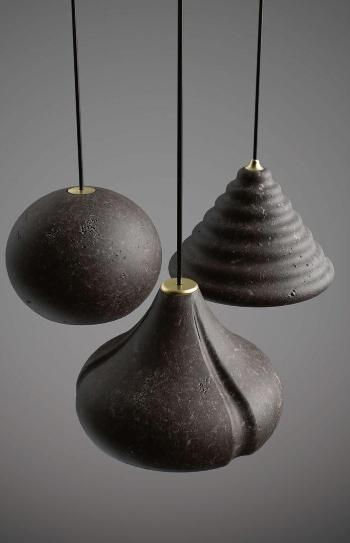
Once the reclaimed lava granules are combined with a resin-based binder, the material is poured into moulds, where variations in density, particle distribution, and curing create surfaces that can never be fully standardised. Hand-finishing further reinforces this individuality, allowing subtle differences in texture and tone to remain visible in each lamp.
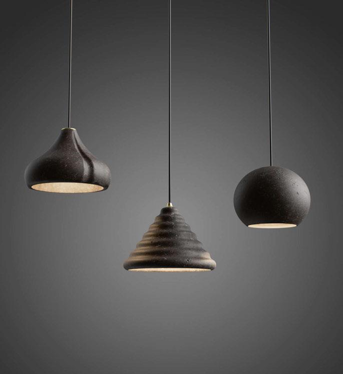

Through repeated testing, the designers refined how the material behaved once it was poured into moulds by learning how the lava particles settled, how the binder reacted once poured, and how surface texture emerged through different densities and mixtures. Variations in grain and curing produced distinct surface textures in every prototype, introducing unpredictability and uniqueness to every shade. As Alberto notes, “every pour produced a different texture,” meaning the prototyping phase was not simply about perfect consistency, but about understanding how much unpredictability the final production process could retain.
“The porosity of the surface is determined by the balance between lava scrap and binder. The more binder is added, the fewer pores are visible, as the binder fills the empty spaces between the stone fragments,” says Francesco. “The key lies in finding the right equilibrium: a mixture fluid enough to be poured, yet not so compact as to erase craters, irregularities, and imperfections, which is what we liked in the material.”
Achieving structural thinness became one of the project’s key technical breakthroughs.
Traditional lava stone is heavy, brittle and typically associated with architectural applications, yet the Eolie collection required suspended forms that felt visually light. Through repeated testing, the designers refined a process capable of producing shells measuring only a few millimetres thick while still preserving strength and surface integrity. This allowed the collection to move beyond the visual language of carved stone and towards something more atmospheric and suspended. The prototypes informed the eventual simplicity of the forms themselves.
Simple primordial forms were chosen for each shade, developed to emphasise the uniqueness of the material rather than compete with it.
Each pendant is named after one of the Aeolian islands north of Sicily – Alicudi, Filicudi and Panarea – reinforcing the collection’s connection to volcanic landscapes. Their forms range from softly rounded to more angular (onion, acorn and pyramid), each responding differently to the texture and weight of the lava compound and shaping a distinct relationship between light and surface. “It behaves like a living material: every pour produces different textures. You feel its history and natural irregularity in your hands,” says Alberto.
Although Eolie is industrially produced, the manufacturing process retains qualities more often associated with craft. Once the reclaimed lava granules are combined with a resin-based binder, the material is poured into moulds, where variations in density, particle distribution, and curing create surfaces that can never be fully standardised. Foscarini and Ranieri developed a process that ensures consistent form and structure while preserving the material’s natural irregularities, so no two pieces emerge exactly alike. Hand-finishing further reinforces this individuality, allowing subtle differences in texture and tone to remain visible in each lamp.
“This is serial production, but with the variability of craft. The only truly industrial element is the mould that defines the form, but the process of pouring and finishing is always different,” says Francesco. “The final texture shifts each time, depending on the heat and the angle at which the material is poured, so craters, bumps, and pores emerge.”
Materiality defines how the lamps interact with light. Unlit, the shades read as dark geological forms suspended in space. Once illuminated, a concealed LED spot casts a precise downward beam, while the porous surface absorbs and diffuses light organically. Visually striking yet easy to place in both residential and public interiors, their restrained glow creates intimacy without demanding attention. Best suited to tables, counters and islands, the lamps can be arranged in linear or clustered compositions, acting as quiet focal points or larger installations shaped by their setting.
At its core, the Eolie Collection reflects an ongoing fascination with light as an immaterial force made tangible through material interaction. In the designers’ words, the collection is “material, archaic, and sculptural” – a meeting of ancient geology and contemporary lighting design. www.foscarini.com www.ranierilavastone.com
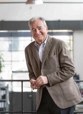
Exploring the connection between lighting and sleep patterns, in this issue the Good Light Group share an extract from a paper written for last year’s British Sleep Society conference.




In the last issue, we looked at compelling evidence of just how serious an impact inappropriate lighting can have on human health, and consequently, the economy. In this issue we look at sleep specifically. The extract to follow has been adapted from a paper written by Virginie Gabel, PhD (Clock&me), Kevan Shaw, BSc CEng MILP FIALD CLD MSLL, Marijke Gordijn, PhD (Chrono@ Work and University of Groningen), Roger Sexton, FSLL and James Sherman, Associate AIA, LEED AP BD+C (Foster + Partners), to accompany a poster display shown by The Good Light Group at The British Sleep Society conference, held on 5–7 November 2025. The BSS is a professional organisation for medical, scientific and healthcare workers dealing with sleeping disorders. The paper demonstrates vital considerations for the design of lighting within the built environment. Beyond this summary we urge readers to seek out the full paper and reinforcing references, and also to spend 45 minutes watching the associated CPD that is free to watch online, or sign up for the CIBSE accredited CPD (see QR codes).
‘circadian-aware’ lighting is no longer optional
A major cause of common sleep problems, such as difficulty falling asleep, bad sleep quality, and difficulty waking up is circadian disruption.
Light is the principle Zeitgeber (“time-giver”) that entrains our biological clock in the brain. Circadian disruption occurs when our exposure to light is too low during the day and too high in the evening. An insufficient daytime light exposure results in too weak a signal to keep our biological clock entrained.
This article covers an in-depth look at what sleep is, what circadian rhythms are and light’s entrainment of them, the effect of circadian disruption on sleep and the knock-on negative effects of sleep deprivation on general health.
Connected with the above, shortcomings of common indoor lit environments are discussed,
followed by a look at lighting recommendations that can go a long way toward solving these shortcomings.
Moving from the academic to the practicable, an integrative (i.e. looking at visual and non-visual needs) lighting design process is described with a case study as an illustration.
Sleep loss has become a defining health issue of modern societies. In Western countries, average sleep duration has dropped by around 90 minutes compared with a century ago, with consequences that ripple across cardiovascular health, metabolic disease, mental wellbeing, safety, and productivity. Road accidents linked to sleepiness alone account for nearly one in five serious crashes.
While many factors contribute to poor sleep, one stands out for designers of the built environment: circadian disruption caused by inappropriate light exposure.
Light does far more than enable vision. It is the primary Zeitgeber – the environmental time cue that entrains the body’s internal clock. When light exposure is too low during the day and too high in the evening, the biological clock weakens, drifts, or becomes misaligned. The result is difficulty falling asleep, poor sleep quality, and impaired daytime alertness. For lighting professionals, this represents both a challenge and an opportunity.
The human eye mediates two distinct responses to light. The first is visual: rods and cones transmit information to the visual cortex, allowing us to see. The second is non visual: a parallel pathway driven by intrinsically photosensitive retinal ganglion cells (ipRGCs).
Discovered only in the last 25 years, ipRGCs send signals directly to brain regions that regulate circadian rhythms, alertness, mood, and hormone secretion. Their sensitivity peaks in the blue region of the spectrum (around 480nm), aligning with the so called melanopic action spectrum. This response is distinct from photopic vision, which peaks in the green yellow range around 555nm.
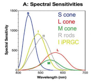
A key downstream effect of this system is the regulation of melatonin, the hormone that signals biological night. Under natural conditions, melatonin is suppressed during daylight and rises in darkness, initiating sleep. Exposure to light – particularly blue (around 480nm) weighted light – late in the evening suppresses melatonin, effectively pushing “bedtime” later.
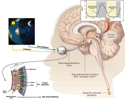
This system evolved under extreme contrasts: bright days (often exceeding 100,000lx outdoors) and very dark nights (typically under 1lx). Modern indoor environments flatten this contrast. We spend up to 90% of our time indoors, where daytime light levels are often too low and evening light levels too high to provide robust circadian signals.
The Problem with typical indoor lighting
Conventional indoor lighting tends to deliver the worst of both worlds:
• Too little light during the day, often ~500lx on the horizontal plane in offices
• Too much light in the evening, commonly ~100lx in residential settings
This inverted pattern weakens daytime entrainment while delaying nighttime melatonin onset. The issue is not simply brightness, but timing, spectrum, and vertical light at the eye – the parameters that matter most for circadian physiology.
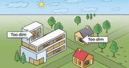
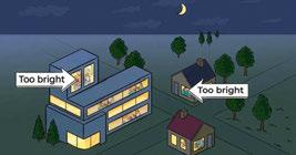
Evidence-based targets for Healthy Light Exposure
In response to decades of converging research, an international panel of neuroscientists and chronobiologists published expert consensus recommendations for healthy indoor light exposure.
These guidelines focus on melanopic equivalent daylight illuminance (m-EDI) measured vertically at the eye. These values reflect the natural day–night light cycle under which humans evolved and are now being embedded into lighting guidance, standards, and building certification systems, including drafts of ISO standards, IALD publications, and the WELL Building Standard.
Towards Integrative Lighting Design
Responding effectively requires Integrative Lighting Design – an approach that considers visual performance and biological impact together rather than treating “human centric” effects as an overlay. The process begins not with luminaires, but with people and their activities:
• At what times?
• For how long?
• And with what age related, neurological, or occupational sensitivities?
Older adults, for example, receive significantly less light at the retina due to age related changes in the eye. Neurodivergent individuals may be more sensitive to glare, contrast, or flicker. Shift workers and residents of care facilities have fundamentally different circadian needs from daytime office workers.
Daylight, views, and contact with the outdoors play a critical role, supporting mood, alertness, and psychological wellbeing. Yet daylight is rarely uniform across a floorplate and must be managed carefully to avoid glare and thermal discomfort. Where daylight is limited – or absent – electric lighting becomes the primary driver of circadian entrainment.
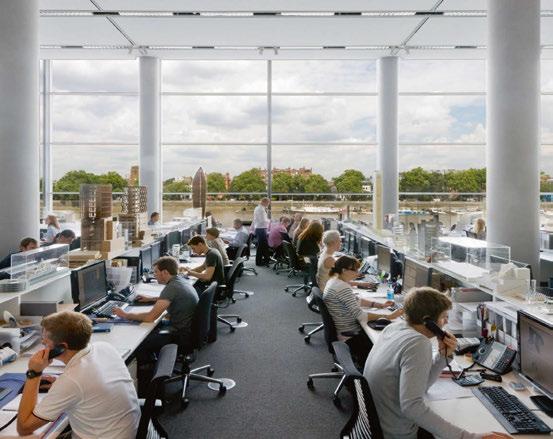
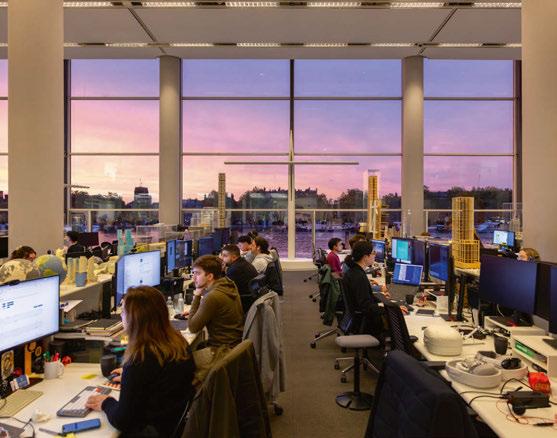
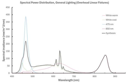
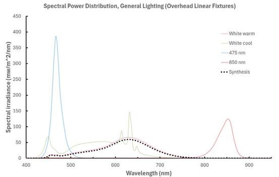
This is particularly critical in contained environments such as hospitals, prisons, military facilities, and care homes, where poor sleep is linked to agitation, falls, infections, cognitive decline, and increased hospital admissions. Only once user needs and daylight conditions are understood should designers define electric lighting strategies – selecting spectra, distribution, intensity, and controls that deliver the right melanopic stimulus at the right time, without compromising visual comfort or energy performance.
A clear example of integrative lighting in practice can be seen in the refurbishment of the Foster + Partners Studio. Original fluorescent luminaires were retained but retrofitted with a sophisticated four channel LED system, enabling precise spectral tuning across the day. (i.e. 2200K (full spectrum), 4000K (reduced blue peak), 480nm (melanopic peak) and 850nm (NIR)), the system delivers high melanopic stimulation in the morning and reduced melanopic impact in the evening, while maintaining excellent colour rendering at all times. Daylight sensors and custom algorithms allow the
artificial lighting to respond dynamically to external conditions, extending the influence of daylight deep into the space on bright days, or creating a warmer, more supportive atmosphere during overcast conditions. Crucially, manual overrides are provided where people need local control, ensuring the system supports human needs rather than dictating them.
The evidence is now clear:
• Sleep is fundamental to health
• Light plays a central role in regulating sleep and circadian rhythms
• Typical indoor lighting patterns undermine this regulation
• Integrative lighting design can correct it, today
For lighting professionals, this represents a shift in responsibility. Lighting is no longer just about visibility, aesthetics, or compliance. It is part of a building’s health infrastructure. Designing with circadian intent is not a niche add on, it’s needed now.
www.goodlightgroup.org www.sleepsociety.org.uk
Virginie Gabel, PhD Board Member, Good Light Group; Director, Clock&me
Kevan Shaw, BSc CEng MILP FIALD CLD MSLL Board Member, IALD; Board Member, Good Light Group
Marijke Gordijn, PhD Board Member, Good Light Group; Chrono@ Work and University of Gronigen, Netherlands
Roger Sexton, FSLL Past Board Member, Good Light Group
James Sherman, Associate AIA, LEED AP BD+C Environmental Design Analyst (SMG); Partner, Foster + Partners
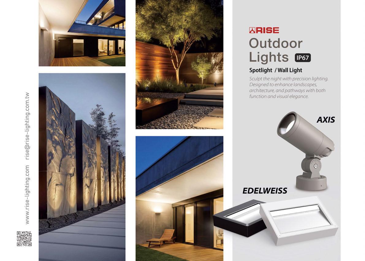
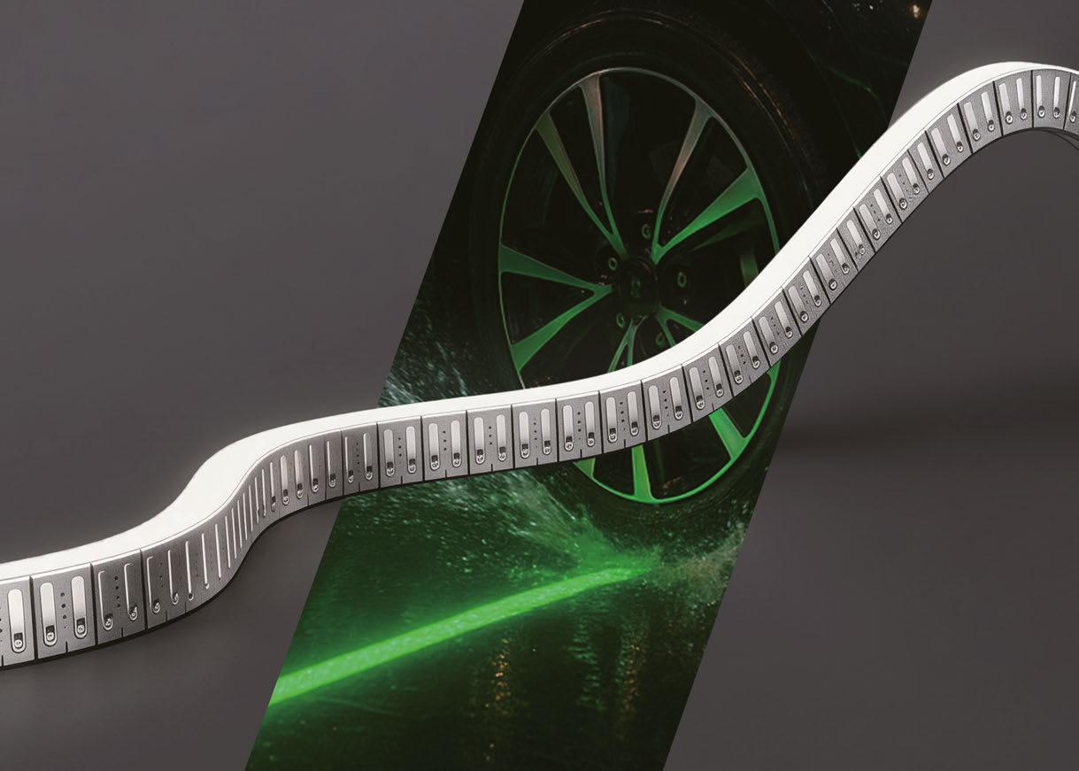



As luminaire manufacturers seek to implement more sustainable approaches, Fagerhult has launched its new Wrapped range - the world’s first cardboard pendant luminaire. Product expert David Morgan takes a closer look.
David
Web: www.dmadesign.co.uk
Most luminaire design projects start with some questions that eventually lead to the solution of a problem.
When the solution to the problem is a luminaire that looks like a question mark and was the first step in building a company with a turnover of £600 million it takes this process to another level.
The problem that the founder of Fagerhult, Bertil Svensson, solved in 1943 in rural Sweden was to create a luminaire for his mother Elisabeth, who struggled to do needlework in poor light during dark Swedish winters. He made a floor-mounted work lamp as a Christmas present for her, enabling her work to continue in the darkest months of the year. The lamp had a distinctive curved “question mark” shape and became known locally as ‘Lampen’ (‘The Lamp’). When he saw how much easier it made her work, he realised there could be wider demand for all kinds of mass-produced practical task lighting. His practical experience as an electrician led him to focus on functional lighting, which is still at the core of all Fagerhult lighting brands.
From these small beginnings, the company has grown through a strategy of buying technical lighting companies, starting in the 1970s with the acquisition of Ateljé Lyktan and, most recently, with iGuzzini in 2019, resulting in the creation of a major global group with more than 4,000 employees and 13 brands operating in 27 countries.
Fagerhult is committed to operating sustainably and made a formal commitment in 2022 to meeting net-zero goals by 2045, although the company was a pioneer in 1998 by creating a thirdparty reviewed environmental report.
In practical terms this means more focus on local manufacturing, reducing luminaire energy consumption, adopting a circular product design approach, designing for repairability and longer product life cycles, while also reducing embodied carbon.
The ‘Wrapped’ pendant is a recent product development by Fagerhult, and a great expression of its sustainable approach. It is understood to be the world’s first cardboard pendant luminaire, and achieves the lowest climate impact of any Fagerhult pendant produced so far at 11.7 kg CO₂e.
The Wrapped range incorporates a variety of material, construction and control details to reduce both embodied carbon, and also the energy consumption in use where 75% of the carbon impact is created.
The use of cardboard instead of aluminium for the body achieves 89% lower climate impact per kilogram than virgin aluminium, so this is the most significant contribution to reducing embodied carbon.
The organic solid board used for the Wrapped body is sourced locally in Sweden and includes 65% recycled material. The outer layers of the 2.25mm thick board are laminated with high quality white material, while the middle layer in the sandwich is made of lower density material. The board supplier stamps the material to the required profile and routs the V shaped grooves, which allows the board to be neatly folded into a 3D shape. At the end of life, the board can be fully recycled as part of the existing waste stream.
With a pleasing neutral appearance, the Wrapped range provides both up- and down-light distributions for use in a wide variety of education, commercial and general lighting applications.
The first Wrapped product to be launched in 2025 was the 900mm size with a 50:50 up/down output ratio. The lighting performance of the 900mm size was designed to match a 1200mm length luminaire, but being smaller, it has a 25% lower embodied carbon rating. The downlight incorporates a nicely detailed double parabolic aluminium louvre combined with an optical diffuser over the light engine to produce a comfortable low
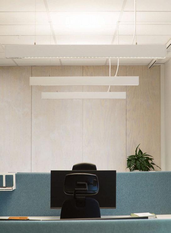
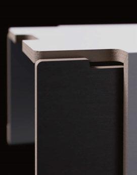
glare output. The uplight incorporates a moulded textured lens to achieve a very wide soft output. A PIR sensor module is included as standard: either the Fagerhult wireless Organic Response system or the wired e-Sense BrightSwitch system. The 1200mm size was introduced this year in response to market demand for a more standard luminaire length, and is available with both aluminium louvre and micro prismatic panel versions, with four distributions: 30/70, 50/50, 70/30 and 100/0.
The driver used is a CLO DALI / phase pulse control type configured to produce a constant lumen output over 100,000 hours of life. A starting wattage of 30W rises to 33W to compensate for the lumen depreciation of the LEDs over time. The 4000K, 80CRI version produces a lumen output of 4800K, an impressive 160lm/W. To achieve the high efficiency, Wrapped light engines incorporate Cree J series flip chip LEDs, which offer improved performance for 90CRI versions in all colour temperatures and a longer working life. Wrapped is available with 3000K and 4000K LEDs in both 80 and 90CRI.
When I first saw the Wrapped sample, my first thought was that layers of cardboard would act as an excellent insulator and that the driver and light engines would run hotter than with an aluminium body luminaire. Based on test figures provided by Fagerhult, it looks as though the temperature
levels are within typical operating levels and that life expectancy is not compromised by using cardboard. As LED efficiency rises and the power consumption of luminaires falls, thermal management considerations are likely to become less of an issue. In a video produced by Fagerhult, two members of the Wrapped design team, Fredrik Beckius and Martin Gustafsson, discuss the challenges of designing with a material that was unfamiliar to them and where traditional screw fixings could not be used. The range incorporates an ingenious series of components made from 100% recycled aluminium and recycled plastic components to hold the components into the two-part cardboard construction. The 100% recycled Polypropylene end caps snap into cut outs in the cardboard body, and the reflector assembly snaps into the inner housing with spring clips. The junction box and driver holding mouldings also snap into details in the cardboard housing. I could only spot three screws in the whole luminaire and, since no adhesives are used, all the components can easily be dissembled at the end of life.
The Wrapped range is an impressive piece of cardboard and sustainable engineering, and while it does need slightly more careful on-site handing than an aluminium luminaire to avoid damage, I think we can look forward to seeing this becoming a more common material in the lighting world. www.fagerhult.com
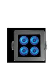
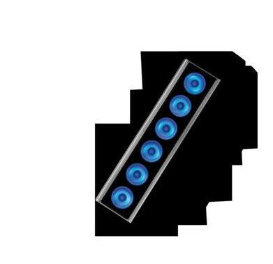
Graze fixtures, transforms architecture into dynamic visual experiences. Combining SGM TruColor, DynaMix and RGBW LEDs, it delivers consistent white, tuneable white and bright colours across all products. Made from recycled aluminium and backed by a six-year warranty, the range combines durability and consistency. www.sgmlighting.com
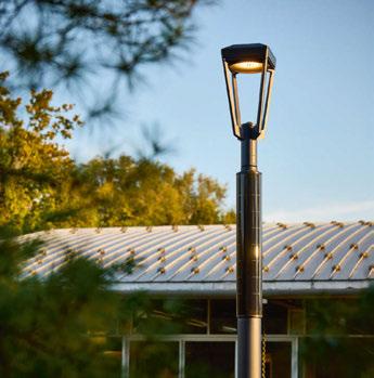
360 Solar Landscape Forms
360 Solar is an innovative off-the-grid solar lighting solution developed in collaboration with Netherlands-based FlexSol Lighting Solutions. 360 Solar represents a major advancement in solar lighting, seamlessly integrating cutting-edge technology with a refined aesthetic to bring high-performance illumination to virtually any location, without the need for grid power. www.landscapeforms.com
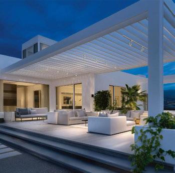
Outdoor X Track System
WAC Architectural
The Outdoor X Track system is designed to work with 12-volt low-voltage platforms, it can be integrated into landscape lighting systems or used as a standalone, adapting to layouts, spacing, and changing design needs. The Outdoor X Track features frictionless implementation, durable construction, and outdoor-rated components designed for long-term performance in demanding environments. www.wacarchitectural.com
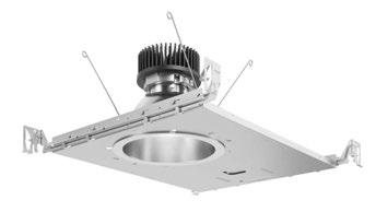
Prescolite LiteFrame Commercial Current
Designed to meet the needs of modern commercial spaces, LiteFrame Commercial delivers a balance of performance, flexibility, and clean aesthetic design. The fixture offers a wide range of lumen packages and beam distributions, including general illumination and wall wash options, allowing specifiers to tailor lighting across diverse applications. www.currentlighting.com
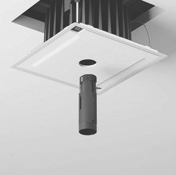
True 1
A compact 1-inch aperture downlight, True 1 utilises an advanced three-stage optical stack system, delivering more than 1,000lm with exceptional glare control. Its modular cartridge design allows for field-interchangeable optics and correlated colour temperature (CCT), while a serviceable DC-to-DC driver supports below-ceiling access for streamlined maintenance. www.dmflighting.com
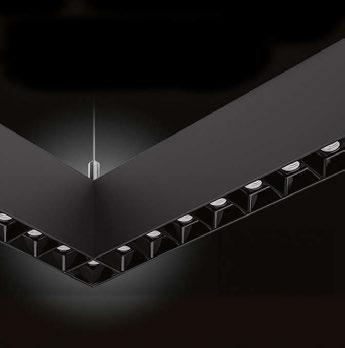
Comfort Vue Amerlux
Comfort Vue delivers industry-best visual comfort without sacrificing performance. By virtually eliminating glare, it creates visually quiet, sophisticated spaces where the architecture and its occupants are the focus, not the light source. By integrating louvered sections, lensed optics, and even blank plates into a single run, you can create tailored configurations to match the exact needs of the space. www.amerlux.com
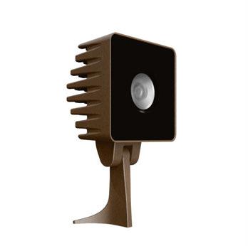
Luxor Mini explores how outdoor spots can combine visual discretion with architectural identity. Measuring just 6x6cm, the IP67-rated, 7W fixture integrates optical precision, durability, and thermal management into an extremely compact form. Its sculptural heat-dissipation fins define the product’s identity, creating a minimal yet distinctive presence. www.aldabra.it
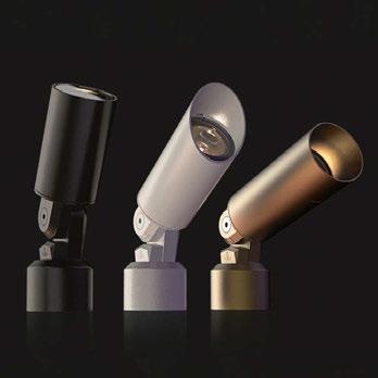
Lumascape
Dune D2 is a compact spotlight delivering up to 1,010lm from 10W for exterior architectural and landscape applications. With integrated glare control, adjustable aiming, and 11 beam distributions, it provides precise illumination across planting, façades, and public spaces. Dune supports low-voltage and mains-powered configurations with non-dim and DALI control options. www.lumascape.com
LEDucation celebrated its 20th anniversary at New York’s Hilton Midtown this April. Here, we look back at some product highlights from the fair.
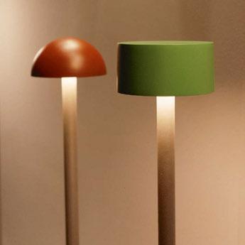
Poseidon
Neko Lighting
An outdoor bollard series designed for hospitality, landscape, and architectural environments, Poseidon features three geometric shade profiles, switchable CCT options, and multiple mounting accessories for flexible installation across different outdoor terrains and project requirements. Alongside standard finishes, the series also supports custom colour options. www.nekolighting.com
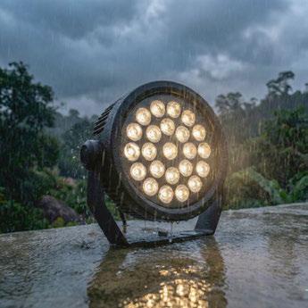
Dyna Drum Series 3
Acclaim Lighting
Dyna Drum Series 3 represents the next evolution of Acclaim’s high-performance exterior floodlighting. As the first Dyna Drum family built on the Acclaim Modular Systems (AMS) platform, the H3, E3, and S3 combine extreme output (H3 up to 26,000 lumens), reduced form factors, and CoreSwap Modular Electronics for field-serviceable modularity into a single IP67 rated, future-ready system. www.acclaimlighting.com

Nano Tini
DGA
With the Nano Tini miniaturised spotlight, DGA transforms light into pure emotion within retail and museum environments.
Measuring just 20x9mm, this gem embodies DGA’s passion for LED technology and inhouse miniaturisation. The patented 5mm nano lenses, equipped with anti-glare snoots, discreetly highlight details while seamlessly blending into the architecture. Three distinct beam angles offer exceptional versatility. www.dga.it
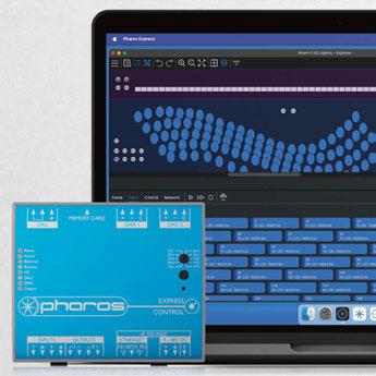
Pharos Express
Pharos Architectural Controls
Pharos Express is a straightforward, cost-effective, single-controller solution designed for typical architectural lighting control applications. With Express, users can enable integration with curated options to allow thirdparty systems to trigger the controller. Commissioning software is singleview and easy to use, with guided programming and curated lighting tools. www.pharoscontrols.com
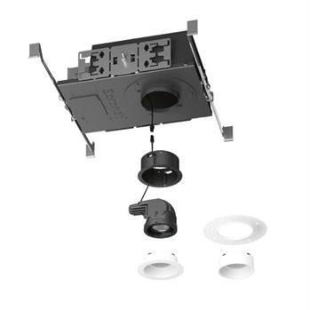
Coronet
The CDL3 Series is a family of highperformance architectural downlights designed to adapt over time. Across standard housing configurations, CDL3 features a 3-inch aperture with a 1-inch regress and a 40° cutoff to support visual comfort. Field-changeable optics allow designers to fine-tune distribution as project needs evolve. www.coronetled.com
Building on Cerno’s signature design language inspired by the mountains, beaches and culture of Laguna Beach, Stillo 16 interplays indirect light, leather suspension, spun metal, and thoughtful wood and metal detailing. The Stillo 16’s domed natural wood hub mirrors the spinning it nests within, while the light source casts glare-free illumination. www.cernogroup.com
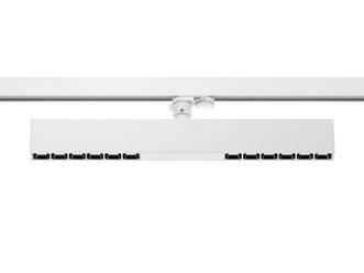
The new Compar linear track downlights unite the precision, efficiency and visual comfort of recessed luminaires with the flexibility of track systems. They deliver high output from a slim aluminium housing, thanks to powerful linear lighting technology and 12 highly efficient, latest-generation LEDs per luminaire. www.erco.com
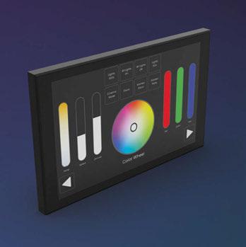
The NATOUCH-8 takes lighting control to the next level with its 8-inch display and enhanced customisation options. Seamlessly integrating with Slesa, Dina, and Stick controllers, it offers a versatile and high-resolution interface for effortless scene activation. Users can now design your their personalised layout. Tailor every button and slider to fit your project’s exact requirements for a truly professional finish. www.nicolaudie.com
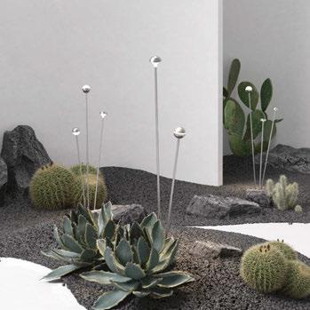
L&L Luce&Light
DoReMi is a collection of outdoor bollards in 316L stainless steel with AC19 treatment, designed to create soft accents in outdoor spaces. Available in multiple shapes, heights and finishes, they feature an opal diffuser for glare-free light, dimmable technology with 2200K–4000K options, and flexible installation. With IP66 and IK06 ratings, DoReMi ensures seamless integration into any landscape. www.lucelight.it
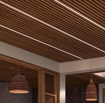
As the slimmest, low UGR architectural luminaires on the market, the Velino.0 family is engineered for total design freedom, seamless integration and advanced optical performance. The professional-grade optical solutions include high-performance glare control, ergonomic distribution, asymmetric optics and dark-optics technology, alongside value-driven diffuser options. www.optique-lighting.com





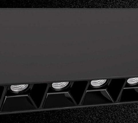









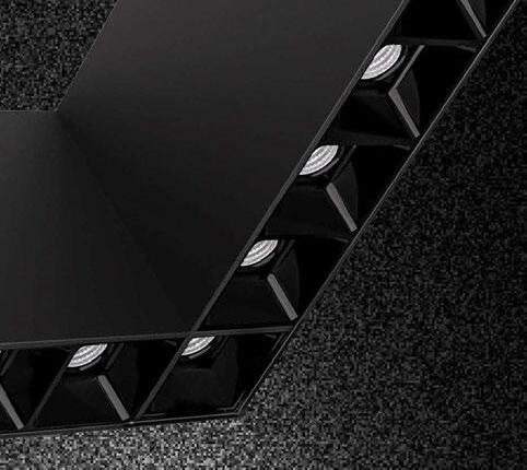



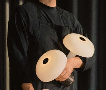
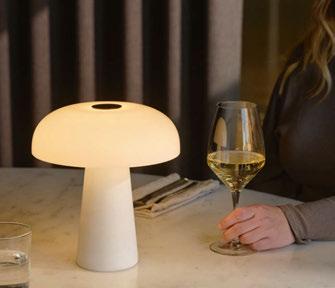
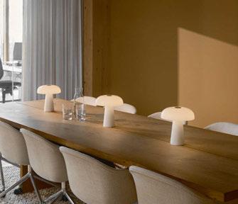
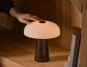
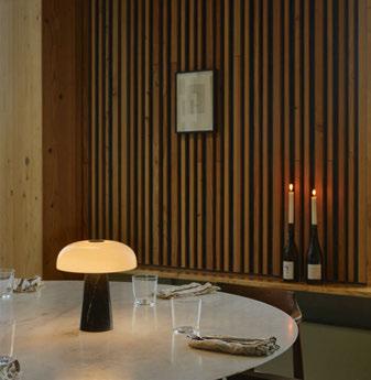
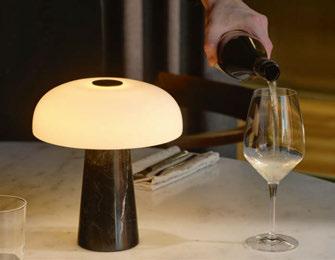



We are CBG Consultants, we Invest in People. CBG are an ambitious practice of building services consultants with more than 60 staff with offices in Oxford, London, Manchester, Birmingham and Cambridge. Our services include a wide range of building services solutions including specialist lighting design, a full range of MEP services, sustainability, building physics, and Passivhaus.
Our vision is to be a leading consultancy delivering excellence in design, building physics and engineering for better buildings that benefit their occupants and the environment.
We work with Architects and Developers, Private Clients, Project Managers and Cost Consultants, Major Contractors. Our main market sectors are, Heritage and Conservation, Hospitality, Education, Commercial and Private Developments, Rail and Transport Infrastructure, Healthcare, Public and Community spaces.
The opportunity.
We have an exciting opportunity for an experienced Principal Lighting Designer to join us in a permanent role with potential to develop an exciting career within and expanding CBG.
You will have experience of leading a strong team, managing resources efficiently, meeting deadlines across multiple projects, and have a proven track record of delivering substantial technical lighting projects at a senior level.
You will be confident attending face to face, and remote meetings with clients, architects, engineers and contractors on projects across the UK and occasionally overseas.
As a designer you will have well rounded experience across
all sectors although experience in heritage buildings would be a distinct advantage.
What will you do?
Our lighting projects span all market sectors, and many involve more than one discipline so collaborative working with colleagues across all teams will be an essential skill. You will be working closely with other team members seeing projects through from inception to completion and handover.
You will be capable of all the following – and more
• Leading team resources and commercial reviews
• Leading project surveys and establishing a clear client brief
• Producing feasibility study and concept design reports
• Producing project design documentation and technical specifications
• Carrying out on-site inspections and supporting contract administration
• Witnessing and overseeing the commissioning of completed schemes
• Managing client handover meetings
What we are looking for
Essential:
• A minimum of ten years’ experience in a professional lighting design role
• A knowledge of historic buildings work and common practices
• Positive track record of working with clients, architects, surveyors, contractors and other stakeholders
• Delivery of mixed scale projects semi-autonomously, with limited supervision
• Up to date knowledge of SLL Guidelines and common lighting standards
• A collaborative and inquisitive approach, with enthusiasm for new ideas, good initiative, and excellent communication skills
• Attention to detail
• Thorough technical knowledge of lighting design software, Microsoft office and AutoCad
• Driving license and vehicle is strongly beneficial due to the remote locations of many project sites
Desirable:
• Knowledge/use of Revit software is an advantage
• Experience completing Lighting impact assessments
The benefits
• 25 days paid holiday + bank holidays
• Career growth, training & development – we enjoy promoting from within!
• Excellent perks (but not limited to):
- Paid for social events such as summer parties, Christmas parties, team lunches, and activity days
- Private healthcare
- Bonusly reward scheme, Perks at work, platforms offering gift vouchers from top leading brands of your choice
- Additional holiday purchase
- Cycle to work scheme
We are an equal opportunities employer and always looking to enhance diversity within the company.
Please submit your portfolio and CV along with a suitable covering letter to jobs@cbgc.com
No agencies please.
What is your chosen feature?
A flat, half oval plate with dichroic glass shards, made for me by Dr. Jill Mulholland, while she was working for the IALD Education Trust.
Where can it be found in your home?
It sits on a West-facing window ledge.
When do you use/experience it?
During the afternoon, when the sunlight hits the glass at the right angle, our sunroom ceiling transforms. As the sun progresses, the dots reach farther and farther, softening in intensity.
How does it make you feel?
The ever-changing colours and patterns remind me that there is wonder all around us. More importantly, my Granddaughter loves the dots – she gets so excited when she sees them –and her joy brings me hope. As long as the sun is shining and the earth is turning, I know there will be colourful, little dots on my ceiling, and every day there will be a new opportunity for joy.
Why does it have meaning to you?
Jill Mulholland is a talented artist. She shared this piece with me because she knew I would appreciate its effect on a space and she knew it would make me happy. Every time I see those wonderful dots, it’s like getting a warm hug from a dear friend.