


SO MUCH MORE IN THE CITY’S BIGGEST GUIDE TO LIVING IN BRISTOL PLUS... MAGAZINE THEBRISTOLMAG.CO.UK £4.25 where sold THE Issue 220 I MARCH 2023 INSIDE STORIES March into Spring with our Homes, Interiors & Gardens special HEAVENLY HOMES Fresh ideas, inspiration & advice from the experts GLOBAL DESIGN Inside internationally renowned design studio Dash + Miller ADORING ARNOLFINI Photographer Garry Fabian Miller on Bristol homecoming LANSDOWN’S LEGACY Stephen Lansdown CBE talks Ashton Gate Sporting Quarter


The kitchen you’ve been searching for. German engineering | Quality | Craftsmanship BRISTOL - Clifton Down Shopping Centre, BS8 2NN - 0117 213 0680 BATH - Saracen Street, BA1 5BR - 01225 63402 Visit our showroom or request a brochure by scanning the QR code or see uk.kutchenhaus.com TheGermanKitchen
Award-winning
42 DINE IN STYLE
The Aqua Grand Café opens its doors on Whiteladies Road
48 EXPLORE THE SOUTH WEST LAKES
Find the perfect escape at one of South West Lakes’ picturesque locations
50 MUST-READS
Gloucester Road Books share their recommendations for the month of March
64 200 YEARS OF BRISTOL MUSEUM
Andrew Swift journeys back in time to celebrate Bristol Museum & Art Gallery’s bicentenary

66 INTERIORS SPECIAL
Fresh ideas, inspiration and advice from the city’s experts
76 INSIDE DASH + MILLER
Co-founder of Bristol-based woven fabric design studio on working for the global fashion and interior industries

82 MEET THE MAKER
Jake Ainsley of Fine Line Woodworks takes us behind the scenes of creating luxurious functional art
86 GARDENING
Elly West shares her top tips on how to achieve the perfect pallette for your garden
ON


Enjoy our Homes, Interiors & Gardens special on p. 68

Contents 10 CITYIST
Bristol-based digital illustrator, Lucy J Turner
LANSDOWN’S LEGACY
Meet
16
of Bristol Sport,
Lansdown
LET THERE BE LIGHT
Game speaks to three musicians from the Bristol Metropolitan Orchestra about their upcoming concert 22 A SPECTACULAR CELEBRATION
Simon Horsford meets co-founder of Hargreaves Lansdown and owner
Stephen
CBE 20
Daisy
actor
Robson on preparing for the lead role of Waldo’s Circus of Magic & Terror 24 WHAT’S ON Book your tickets! Discover all the great things to see and do 32 ADORING ARNOLFINI
Garry
returns to the city for his latest exhibition, ADORE 36 ARTS & EXHIBITIONS
showing at our local galleries MARCH
4 THE BRISTOL MAGAZINE | MARCH 2023 | No 220
Renowned Bristol-born artist Garry Fabian Miller
What’s
2023
THE COVER
20 16

EDITOR from the
his month seems to be all about celebrating creativity, whether it be in the world of interiors (p.66), music (p.20), art (p.32), theatre (p.22) or carpentry (p.82). This issue is brimming with some of Bristol’s finest designers, musicians and makers. Most notably, we had the pleasure of speaking to one of the world’s most progressive figures in fine art photography – Garry Fabian Miller. The Bristol-born artist reached international acclaim at the tender age of 19 after his first solo exhibition at Arnolfini in 1979. Having spent many decades away from the city, he’s returned to the gallery with his latest work, hoping people will have similar experiences to the ones he had at Arnolfini as a teenager, as he says: “it helped me become who I am today.”

Well known for not only his pioneering techniques but his thirst for collaboration, Fabian Miller recently teamed up with woven fabric design studio, Dash + Miller. The Bristol-based studio has been using experimental and innovative hand weaving techniques since its inception in 2009, which have made them one of the world’s leading woven concept specialists. Today, the all-female team provide ideas relevant for designers in couture fashion houses and high-street brands. We caught up with co-founder Juliet Bailey on p. 76 to find out more about their impressive portfolio.
A bit farther afield, Simon Horsford spoke to Stephen Lansdown CBE, co-founder of Hargreaves Lansdown and owner of Bristol Sport. As the plans for Ashton Gate Sporting Quarter get underway, Lansdown talked openly about his mission to use the power of sport to create active, healthy and happy communities. Enjoy the interview on p. 16. Elsewhere, we hear from award-winning actor Garry Robson about how he is preparing for his lead role in Waldo’s Circus of Terror & Magic, which is coming to Bristol Old Vic on 11 March. A partnership between Cirque Bijou and Diverse City, the new production is set to be a spectacular celebration of diversity and equity. It’s all happening in March. Have a good one …
Publisher Steve Miklos
Email: steve@thebristolmagazine.co.uk
Financial Director Jane Miklos
Email: jane@thebristolmagazine.co.uk
Editor Millie Bruce-Watt

Tel: 0117 974 2800
Email: millie@thebristolmagazine.co.uk
Assistant Editor/Web Editor Daisy Game
Email: daisy@thebristolmagazine.co.uk
Production Manager Jeff Osborne
Email: production@thebristolmagazine.co.uk
TAdvertising Sales Liz Grey liz@thebristolmagazine.co.uk
For advertising enquiries please contact us on: 0117 974 2800
Email: sales@thebristolmagazine.co.uk

The Bristol Magazine is published by MC Publishing Ltd. An independent publisher.
Every month The Bristol Magazine is hand delivered to more than 15,000 homes in selected areas. We also deliver direct to companies and businesses across the city. Additionally there are many places where we have floor-stands and units for free pick-up:
6 THE BRISTOL MAGAZINE | MARCH 2023 | No 220 Contact us: THE BRISTOL MAGAZINE The Bristol Magazine Tel: 0117 974 2800 www.thebristolmagazine.co.uk © MC Publishing Ltd 2023 2 Princes Buildings, George Street, Bath BA1 2ED Disclaimer: Whilst every reasonable care is taken with all material submitted to The Bristol Magazine, the publisher cannot accept responsibility for loss or damage to such material. Opinions expressed in articles are strictly those of the authors. This publication is copyright and may not be reproduced in any form either in part or whole without written permission from the publishers.
Millie Bruce-Watt
Artwork by Lucy J Turner. Discover more on p. 10

things to do in March 5
Discover
Find out all about the sensational silky wave moth at Wild Place’s wildlife talk on 29 March. This nationally rare and beautiful moth is a resident of the Avon Gorge that you’ve probably never even heard of. First recorded in the Avon Gorge in 1851, this unique geological site is now the only place in England where the silky wave moth can still be found. Jen Nightingale (a national rarity herself as the UK Conservation Manager at Bristol Zoological Society) tells us about its amazing life cycle and why the Avon Gorge is so essential to its survival. Monitoring the moth’s population forms part of the Zoological Society’s native species conservation programme.

Immerse yourself
The 41st Hotwells Pantomime returns to the Tobacco Factory Theatres from 15 –18 March for the first time since that evil villain Covid appeared. With a cast of 50+, as well as teenagers and children and a superb eight-piece band, this is the Bristol community panto. Written by members of the cast and packed with invention, colour, laughs and songs, this show is the perfect way to wipe away the winter blues.
Will wicked stepmother Corona, along with her ugly daughters Flatula and Vapora, triumph, or will Cinderella get to the ball? There is only one way to find out.

• Book your tickets at: tobaccofactorytheatres.com
• Book your tickets at: wildplace.org.uk
Learn
Some 40 years ago, John Palmer laundered £26 million worth of gold bullion, diamonds, and cash from the Brink’s-Mat Robbery, which occurred at the Heathrow International Trading Estate in London, through his North Street bullion company and his East Street Bank. It was Britain’s biggest robbery and the crime of the century.

Now, Show of Strength Theatre Company has created a ‘Blood and Butchery in Bedminster’ walking tour, which takes participants to Palmer’s business premises, the bank where millions were handed over, and the pub Palmer bought and converted to celebrate his success. Bedminster will never seem the same again. What’s more, the story of John Palmer is explored in the recent BBC One series, The Gold, and in the new GANGSTER podcast, available on BBC Sounds. Presenter Livvy Haydock came to Bedminster to record the tour, which features in the six part series.
• Tours occur weekly from £12; book now at stagestubs.com; showofstrength.org.uk. Image credit: BBC/Tannadice Pictures/Sally Mais
Watch
UK politics is in crisis and the country is in economic peril. Fights break out in the Houses of Parliament and the government whips can barely contain the chaos. Sound familiar? Well this time, it’s 1974 and in this not so distant past, Westminster is at war with itself again.

A hung parliament and the tiniest of margins mean that those in power will do everything to just keep going. Even if that means wheeling in someone on their last legs or direct from the maternity ward. In a time where every vote counts, James Graham’s explosive and biting political comedy-thriller This House – which premiered at the National Theatre in 2012 and is now running at Tobacco Factory Theatres from 10 –18 March – introduces us to the farcical and fanatical world of 1970s Westminster. Just how far will these parties go for political survival?
• Old Vic Theatre School, oldvic.ac.uk
Enjoy
Bristol Bach Choir will be performing at St Alban’s Church for the first time on Saturday 18 March at 7.30pm. The choir will start with Mozart’s Solemn Vespers, full of joyful music and including the well known Laudate Dominum with its lovely soprano solo. After Byrd’s popular Ave verum corpus, the concert will finish the first half with 5 Spirituals from A Child of our Time by Sir Michael Tippett. They include DeepRiver, Nobodyknows and other familiar spirituals, with thrilling contributions from the soloists. The second half contains charming, if less familiar, anthems by Stanford and W.H.Harris before finishing with Herbert Howells’ sublime setting of the TeDeum, composed for the choir of King’s College, Cambridge. The concert is conducted by the choir’s accompanist, Nigel Nash, with Andrew Kirk at the organ.
• bristolbach.org.uk

8 THE BRISTOL MAGAZINE | MARCH 2023 | No 220
ZEITGEIST

THE CITYist My
What’s your connection to Bristol and what makes the city so unique in your opinion?
First look inside We The Curious
Bristol educational charity and science centre We The Curious has set out details of the multi-million-pound repair programme underway. The fire on 9 April 2022 was an extremely rare occurrence. A solar panel damaged by birds triggered a fault in the electrical system, which then resulted in the fire. While all staff and visitors in the building were safely evacuated within minutes and the fire damage was contained to the roof and solar panels, it took thousands of litres of hose water to extinguish the fire, which caused significant water damage and means the building remains closed almost a year on.

While there is still uncertainty around timings, the We The Curious team are now planning for the worst-case scenario of a reopening in January 2024 and ensuring they can continue to deliver their range of activities at locations around the city until then.
Donna Speed, We The Curious chief executive officer, said: “It is disappointing, but also a great reminder that We The Curious is more than just a wonderful venue; it’s the people, the joy of connecting and exploring ideas together.

So we’re going to be carrying on delivering our Out and About activities, Stories from the Stars, and School Takeover days, and the team are working on more brilliant activities for the coming year with our partners across the city.”
Since the fire, the team delivered more than 100 events and 12 school takeover days, reaching around 18,000 participants. The Easter holidays programme of events will be taking place in communities across Bristol and May half term will see the team back on Millennium Square for drop-in family activities.
• Formoreinformation, visit: wethecurious.org
I moved to Bristol about eight years ago after a bad breakup and I needed to create a fresh start. I love Bristol’s vibrancy, it’s so eclectic in everything from the people, to the food, to the art. I’ve created such strong connections in Bristol and met some of my best friends –and my fiancé! I find people in Bristol to be so friendly and full of love. I can’t imagine living anywhere else.
Tell us about your career so far, including some of the projects you’ve worked on in Bristol over the years...
I began to use art as a way to heal from trauma after I was diagnosed with a rare cancer in my early 20s. I’m really passionate about teaching others how art can help heal.
I use my art as a storytelling tool. Creating art that is representative is hugely important to me too, as a child I never saw art featuring people who look like me, so it’s important that I do so.
I’ve been lucky enough to work with some amazing organisations over the years and to create some really meaningful pieces. My mural for Watershed is one of my favourite pieces as it’s on the waterfront and my characters are bright, bold and I love the message it sends about community. Another huge career moment for me was illustrating a book series. I love that it was written by a Black woman, about a Black woman and it was illustrated by a Black Woman. Shout out to Rising Arts Agency who have helped me innumerably.
Tell us about your main inspirations and the focuses in your work...
As a Digital Illustrator my work makes use of bold, bright, colourful designs and shapes. My main inspirations are Black bodies, in particular, Black women and that is the main focus in my digital work. We are often left out of mainstream narratives; however, the world would not move without Black women and I consider my work to ultimately be an homage to us.
Are you currently working on any Bristolbased projects? Can you tell us about anything coming up this year?
I’m doing a few illustrations for some magazines and newspapers in Bristol this
month and I’m also working on some exciting things that will be coming out later this year –watch this space.
Where in Bristol do you go to be entertained/inspired?
There is always something exciting going on in Bristol. I find it easy to be inspired in this city. My favourite places include Arnolfini, Spike Island and the RWA –I often take myself on “Art Dates” when I’m feeling uninspired. I love open mic nights and anything live music-based. The Social, The Gallimaufry, Pipe and Slippers are all really great places for that.
What are you reading, watching or listening to at the moment?
I’ve just finished reading The Light We Carry by Michelle Obama. It’s about how to stay hopeful in uncertain times and how to connect with yourself and your communities when we need it the most. I highly recommend it.
If you could have dinner with anyone from any era, who would it be and why?
Beyonce, Beyonce, Beyonce. She has always been a hero of mine and her music has gotten me out of a lot of dark places. She was the only artist I listened to during my cancer treatment and kept it me going.
What is your philosophy in life?
When in doubt, dance it out!
Meet Bristol-based digital illustrator, Lucy J Turner BRISTOL
• lucyjturner.co.uk Ú Continued on page 12 10 THE BRISTOL MAGAZINE | MARCH 2023 | No 220

W.E. Irish Culture Fest paints Bristol GREEN
W.E. Irish are inviting the city to join the St Patrick’s Day celebrations, with a calendar full of 35 events taking place between 10 –19 March. To close out the extensive programme of Irish cultural activities and events, the W.E. Irish CultureFest will parade through the streets of Bristol on St Patrick’s Day, culminating in an indoor and outdoor party to mark the occasion.
Meeting at Trinity Centre at 11:30am on Sunday 19 March, the parade will commence from 12:30pm, and make its way towards the city centre. The festivities will include a full day of music and dancing, featuring floats, dance performances, bands, street performers and more –continuing into the evening with a party shindig in and around St Nick’s Market.
From 2 –8pm at St Nicks, expect fiddles and folk to keep crowds entertained, with Irish jigs and river dancing encouraged. With 12 acts performing at 2pm in St Nick’s Market glass arcade, there will also be a heated and seated ticketed event later in the day, with live bands, dancers, musicians and more in Revolution Bar.
Ahead of the parade, a fringe festival of over 35 events will take place throughout the month, featuring a Ceilidh Dance night with the Perfect Cure Band at Bristol Folk House, dance classes, a Craic House comedy night and plenty more.

• For more information and to see the full programme, visit: weirish.org. Images courtesy of W.E. Irish Culture Fest
Bristol Beacon announces reopening date
Bristol Beacon’s highly anticipated reopening on Thursday 30 November will be a cultural highlight of the year, revealing stunning new performance spaces including the 2000+ capacity Beacon Hall, the 500 capacity Lantern Hall and the brand new 200 capacity Weston Cellar.

Following the staggering transformation of the historic building, it’s time to get the date in the diary for the landmark occasion, with the full reopening programme set to be announced later this year.
Louise Mitchell, Chief Executive of Bristol Beacon explains: “We’re delighted to be able finally to confirm the reopening date. The team are busy putting the finishing touches to our opening season, where we will be showcasing a number of commissions and UK Premieres, and inviting all of our city’s communities into the Beacon to explore the new spaces, celebrating creativity and inclusivity in a way that only Bristol can. In the meantime, we’re delighted to announce we’ll be welcoming back some fantastic artists and festivals and put our first tickets on sale.”
Channel 4 calling Bristol
Channel 4 is looking for Bristol-based contestants to appear on Come Dine With Me. The show has been one of the most popular daytime shows since it hit our TV screens in 2005 and is currently casting for its 21st series. The application form states: “A group of five contestants compete to host the best dinner party. At the end of each dinner party, each guest rates the party on a scale of one to ten inclusive. At the end of the last party, the host of that party gets the voting results, which they read to the other competitors. The competitor with the highest score wins £1,000. In the event of a tie, the £1,000 is split between the winning contestants.”

In order to be eligible to participate in the programme, you must be aged at least 18 years of age, be a legal resident in the United Kingdom, the Channel Islands or the Isle of Man and also be currently living in the United Kingdom, the Channel Islands or the Isle of Man.
• If you’re up for the challenge of hosting the ultimate dinner party, apply at: channel4.com/4viewers/take-part/come-dine-me
Images courtesy of Channel 4
Ahead of revealing the full reopening programme, some of the first events to take place in the transformed venue have been revealed, including the return of Simple Things Festival for its 10th edition after a five-year hiatus. The multi-disciplinary festival will be revealing line-up and ticketing details in the coming months.
Bristol favourites This Is The Kit will also play their first Beacon Hall concert on 3 February 2024, marking their biggest show in the city to date. Kate Stables, the brains behind the band, delivers intricate lyrics and plucky strings to create her own brand of folk that has won plaudits from BBC 6 Music and countless critics. The show represents a continuation of the ‘Bristol Beacon presents’ in-house programme that has seen the Beacon work with over 40 venues during the five-year refurbishment.
To keep up to date with more news and reopening announcements, including ticket details for these first shows, sign up to the Bristol Beacon newsletter at bristolbeacon.org and follow them on Facebook, Instagram and Twitter.
• bristolbeacon.org
12 THE BRISTOL MAGAZINE | MARCH 2023 | No 220


THEBRISTOLMAG.CO.UK | MARCH 2023 | THE BRISTOL MAGAZINE 13 for your home, conversion, renovation or extension Stunning lighting
Show Mum some love
Celebrate the one that brought you into this world.
Mother’s Day Sunday 19 March.
ANNA CAKE COUTURE SHOW SOME SWEETNESS
Make your mum’s day with macarons. Order one of these beautiful macaron gift boxes online now for click & collect or national delivery.


Prices from £23.95. The Mother’s Day range will be available from 1st March.
Use code BRISTOL-10 for 10% off.
Visit Anna Cake Couture at: 7A Boyce's Avenue, Clifton, Bristol BS8 4AA.
Tel: 0117 329 5959. Web: thisisanna.co.uk


A LOVING TWIST MUM’S HAPPY HEART
The Happy Hearts bangles from Chopard feature two hearts, each beautifully counterbalanced in harmonious closeness. One big heart is filled with a colourful, precious gemstone or even a diamond cluster; the other contains a freely floating diamond, sealed in a crystal glass case. The bangle is made from 18ct gold, also available in 18ct white, or 18ct rose gold. It’s an iconic and beautiful collection from Maison Chopard | Prices from £2,620 (Rose stone in 18ct rose gold). Available from Mallory in Bath.

1 -5 Bridge Street, Bath BA2 4AP. Web: mallory-jewellers.com
GRAYSON’S ART CLUB SILK SCARF BY GRAYSON PERRY,

Grayson Perry is one of the UK’s best-loved modern artists, with a global following for his eye-catching pottery and mixed media work. This silk scarf, which works for every season, is based on one of the pieces designed for his TV series, Grayson’s Art Club, featuring a tongue-in-cheek map laced with his typical wry humour and social commentary. The Grayson’s Art Club exhibition was a huge success at Bristol Museum in 2022, and Grayson’s work has also been seen at the Arnolfini. £85.
Bristol Museum & Art Gallery, Queens Road, Bristol BS8 1RL Web: bristolmuseums.org.uk
ANTHONY FEILER
CONTEMPORARY DESIGNS BY
Available from the Clifton Contemporary Art gallery this handcrafted reticulated silver jewellery by Bristol jeweller, Anthony Feiler makes a beautiful gift for someone that appreciates modern jewellery designs. The necklace is 45cm in length and priced at £195, while the drop earrings with coral beads are £68. See these and many more creations at Clifton’s coolest independent art gallery. Clifton Contemporary Art, 25 Portland Street, Clifton, Bristol BS8 4JB Web: cliftoncontemporaryart.co.uk

Your passport to a year of world-class art at the RWA. The RWA Art Pass (£15) or Friends of the RWA membership (£35) make the perfect gift for art lovers. Both allow free year-round access to exhibitions, the latter offers extra benefits, including discounts, special events and trips. Check out the RWA website to see which one works best for you. rwa.org.uk

BOTANICUM POSTCARD BOX
A beautiful set of 50 colour postcards featuring Katie Scott's botanical illustrations. Priced at just £12.99 they measure 175 x 128 x 34 mm, and are just one of many thoughtful and inspired gifts to be found at the gift shop at Arnolfini. bookshop.arnolfini.org.uk

GIFTING IT | MOTHER’S DAY
14 THE BRISTOL MAGAZINE | MARCH 2023 | No 220

Lansdown’s legacy
Stephen Lansdown CBE –co-founder of Hargreaves Lansdown and owner of Bristol Sport –has built an ever-lasting legacy in Bristol and beyond. Simon Horsford meets the businessman and delves into his mission to use sport to help change people’s lives for the better...
The former poet laureate John Betjeman famously suggested that Bristol was “the most beautiful, interesting and distinguished city in England”. It’s a sentiment that strikes a chord with Stephen Lansdown CBE, the owner of Bristol City, Bristol Bears and the Bristol Flyers basketball team, who believes it’s “one of the best places in the UK without a shadow of a doubt.” And yet there is qualifying note to his love of the place where he was born and lived for 57 years until moving to Guernsey 13 years ago.
“It’s a great city,” says, Lansdown, “it just doesn’t know it”. He reckons it’s all about self-belief. After pointing out Bristol’s high points – its university status, location in the south west, transport links and general quality of life, Lansdown adds the kicker. “Bristol should be really booming as one of the most vibrant, economically growing cities in the UK, but then it just mulls along and doesn’t realise its potential.”
Using a football analogy, Lansdown adds: “If I am honest that’s reflected by its sports clubs. When we look at it, we might ask why, for instance, have Blackburn or Wigan had their time in the Premier

League? Why have they been more successful than us at times? It’s because they’ve got chimney pots around them – it’s a strong working class environment, whereas Bristol is more of a white collar area,” with too many people “sitting back and taking it easy.”
“It is a bit of an enigma really,” says Lansdown, referring to the fact that Bristol has got more deprived areas than many other cities in the UK. “There are a number of areas which represent the poorer end of society that need help and jobs and I suppose part of my criticism is that it comes down to the council. If the council focused on bringing in new businesses and jobs into these areas rather than social matters, then I think the city would be far more vibrant and wealthy than it already is and this would help the deprived areas because those people would have better pay and the area would rise in status accordingly."
Lansdown also thinks the decision to scrap the mayoral system last May was a “massive backward step.” “Whether you like the person or the policies or not, you’ve got someone making decisions and driving the city forward. Marvin Rees has done a pretty good job. I don’t like
16 THE BRISTOL MAGAZINE | MARCH 2023 | No 220
everything he has come up with but he has come up with ideas. George Ferguson [the previous mayor] was a different kettle of fish, but again he was the leader and it’s a fact of life if you try and run something by committee everyone has got a different view and vested interests and nothing gets decided. Trying to come to a conclusion is nigh impossible. Having someone to make the decision allows that to happen.”
Lansdown cites the way Bristol City football club is run: “People might criticise me for lack of success at the club but the point is decisions have to be taken. Committees can just fob them off. [With the referendum about the mayor] that process has been taken away. You look at Bristol and what the future is and I can’t see anything apart from it going along in the same old way.”
I wonder then what changes he’d make to improve the city. Aside from trying to bring back an elected mayor, he says: “I’d work on a campaign to get Bristolians to believe in themselves. It’s got everything going for it apart from its attitude.”
He has been equally critical of the government and once claimed that all politicians should be sacked. “I’m not sure if they go into politics because they are not very good at business, or just want to seek power. It’s a mess at the moment and the situation is hard and uncomfortable. But I personally think it will be short-lived and it will ease in the middle of this year. Many are faced with the same problem and people are thinking twice about what they spend their money on.”
He suggests employers have a responsibility to make sure they look after their employees, whether that’s through salary increases, or benefits and ensure they are not suffering, adding: “I think the government should work more closely with the private sector. They come to see them as the enemy, rather than something that can help. From my point, I’ve invested a lot into the Bristol infrastructure and I’ve done it off my own bat and without any funding. I’m happy to do that and a lot of people in my position are happy to do the same as long as the money is spent wisely.”
Lansdown is a big believer in local community, of which Ashton Gate, in this area of south Bristol, is the hub – a fact illustrated when the pandemic lockdown was announced in March 2020. As the news broke, Lansdown called a directors meeting and asked what the stadium could do to help the local community and people who might be
struggling. To that end, Ashton Gate worked with FareShare, the charitable food network, which helps feed needy schoolchildren and adults, by providing a warehousing facility to store food and help distribute it. “Our chefs and everyone at the stadium produced food packages to go out to the community.” Ashton Gate was also used as a mass vaccination centre for the NHS, the first one to open in the country. “It showed what the stadium could be used for and everybody appreciated that,” says Lansdown.
His understanding of the importance of community may well be traced back to own his working class background – his father was a carpenter. “There were many years when we didn’t have much money, so now I do have money, I want to put it to good use.” His own route to success –one that has made him one of the richest men in Britain – stems from cofounding the financial advisory firm Hargreaves Lansdown in 1981 with Peter Hargreaves. Begun in the spare bedroom of a house in Bristol, it is Britain’s biggest independent private client brokerage.
It is around the sports teams in his stable, which numbers an impressive five with Bristol City men and women, Bristol Bears men and women and the Flyers men’s basketball team, that further work in the community is seen via various foundations: the Robins Foundation, the Bristol Bears Community Foundation and the Flyers Community Foundation. With a mission to use the power of sport to create “active, healthy and happy communities”, working with the central Bristol Sport Foundation, which acts as a conduit between the various group’s charities.
“We need to do as much as we can to give something back, so that’s my philosophy,” says Lansdown, “but the people that make it work are the individuals [at the various foundations]. I can’t speak highly enough for any of them and the players who give their support. That is my biggest source of pride.”
Lansdown, who started watching City in the 1980s with his son Jon (“football was my first love but I’ve grown to like rugby and basketball too.”) is also aware of the importance of the club to its supporters. “When I became chairman of Bristol City in 2002 [a role now held by his son], I went to an open day and as my wife and I arrived, a young girl with a baby was getting out of her car and the first thing she did was


EXCLUSIVE INTERVIEW
“We need to do as much as we can to give something back –that’s my philosophy...”
Stephen Lansdown CBE
Stephen Lansdown with Bristol City Football Club manager Nigel Pearson
put the baby in my arms and took a photo. It took me a little by surprise but it made me realise how important Bristol City Football Club was to her and her family. It was part of her life, it was like a place of worship if you like. So I always felt ever since that moment that whatever we do as a football club, or with the rugby or basketball that we must be central to the communities we exist within.” In an age of foreign ownership when so many clubs in the Premier League and the EFL Championship, having a local owner is almost a throwback to the past.
Lansdown describes himself as a “controlled watcher” when he attends City games, something which wasn’t necessarily always the case, but he had reason to be ecstatic when we met at the home game against Birmingham City in January. A sparkling performance saw Bristol City win 4-2. Being involved with five clubs does ensure that there is room for enjoying some success: “It’s sport isn’t it, but I do work on the principle that I’ve got so many sports clubs now that at least one of them should do well. It doesn’t always happen,” he jokes.
Lansdown’s desire to further invest in the area was confirmed when the council green-lit plans last October for the Ashton Gate Sporting Quarter to build a 3,626-seat sports and convention centre next to Ashton Gate, which will be the home of the Flyers. The plans also include a hotel and flats, while 500 new homes, some designated as affordable, are set to be built nearby at Longmoor. The idea stems from the redevelopment of the stadium, completed at a cost of £45 million in 2016, and to have people coming to Ashton Gate on a regular basis – creating a destination – thus generating revenue and footfall and boosting the local economy. He hopes it should all come on stream by 2025/26.

In the background, though, there has been talk that Lansdown might
be willing to sell Bristol City and his other sporting assets for the right deal – he has, after all, been involved in the club for more than 25 years. “I would sell yes. I’ve got to an age now where I’ve got to look at succession but what I’ve done is to have look at the overall package and if someone wants to come in and invest in all of it, or part of it, we can look at that. There is nothing imminent but we have talked to a number of people over the past year and we are always looking at how things can be better and how we can improve things.

“We have a Championship club, which is well respected and well run. It can be very expensive at times but effectively is debt-free. We have the Bears and the Ashton Gate development, the hotel and the sports and convention centre and the community aspects. There’s a significant asset there, or group of assets. But, he adds, whoever comes in has to look after the clubs and the community. It’s not about going for the highest bidder but “the right people to take it forward.”

Away from sport, Lansdown is involved in a handful of safari lodges in Africa with four in Botswana and one in Mozambique and he travels there three or four times a year. “I got involved in Botswana because I saw an advert in 2007 for a share in a safari lodge, which I ended up buying – now run under the name Mashatu – and I’ve grown to love the area and the people. Since then my passion for conservation has grown because of my involvement in protecting the habitat and wildlife and looking after the local communities.”
With his various clubs, the developments around the Ashton Gate Sporting Quarter and the lodges in Africa there is still much to occupy Lansdown, who turned 70 last year. It’s been quite a journey from that spare bedroom in Bristol, but then again Lansdown has never been one to just “mull along”. n
18 THE BRISTOL MAGAZINE | MARCH 2023 | No 220
“Last October, the council greenlit plans for the Ashton Gate Sporting Quarter to build a 3,626-seat sports and convention centre next to Ashton Gate. The plans also include a hotel and flats, while 500 new homes, some designated as affordable, are set to be built nearby at Longmoor.”
Ashton Sporting Quarter will be the home of the Flyers
Stephen Lansdown speaking alongside the ‘Lansdown Stand’ –the largest stand at Ashton Gate stadium, with a capacity of 11,000


THEBRISTOLMAG.CO.UK | MARCH 2023 | THE BRISTOL MAGAZINE 19
Let there be light
On Sunday 19 March, the Bristol Metropolitan Orchestra returns to St George’s Bristol for the first of its three annual concerts. Daisy Game meets Conductor Tim Harrison, soloist Luke Russell and orchestra leader (violinist) Anneka Sutcliffe to chat crescendo and connection...

Fact: on 1 March, the UK gets approximately 11 hours of sunlight per day. That’s three hours more than Deepest Darkest January. As the days grow longer and we edge ever closer to summer’s sublime 16 hours of sunlight, what better time to enjoy an orchestra concert programmed around the theme of light? On 19 March, the shining talent of the Bristol Metropolitan Orchestra will illuminate St George’s Bristol with a concert of radiant music. Ahead of their performance, I caught up with conductor Tim Harrison, soloist Luke Russell and orchestra leader (violinist) Anneka Sutcliffe to discover more about the ensemble, which boasts a well-established reputation for excellence.
Conductor Tim Harrison begins with the evening’s schedule. Kicking off the theme of light is Smetana’s Vltava, named after a river in the Czech Republic. “There are a few different types of light in the movement”, Tim says: “The first is the ‘glistening on the surface’ sort of light – you get these semiquavers and strings flowing – and then you get the more turbulent waters, which lend a sense of shadow to the music.”
Next on the programme is up-and-coming composer Dani Howard’s Argentum – “my three-year-old loves dancing along to Dani’s music,” Tim laughs – which will be followed by Mozart’s playful flute concerto. “Mozart was very cheeky with this particular composition,” he tells me. “It’s not an original; he actually rehashed it from his earlier oboe concerto because he hated writing for the flute.”
Mozart may not have relished the task of flute composition, but the
maestro wasn’t half bad at it, as Bath-born (and Bristol-raised) concert soloist (flute) Luke Russell says: “Mozart writes brilliantly for the flute, with both technical fireworks in the outer, faster movements and sublime long lyrical melodies in the second movement. The flute concerto brings sunshine, lyricism, and virtuosity to the audience.” Fireworks, sunshine –Mozart’s concerto seems set to bring some suitable sparkle to the evening. Is this the dream gig for a soloist, I wonder? Well, yes, says Luke – but he’s looking forward to stepping out of the limelight, too: “I love orchestral playing as it’s so immersive – being right in the middle of 60 musicians all striving for the same unity in the moment. Solo playing – where you stand up at the front –is much more interactive with the audience and conductor, and you are more intensely involved, being the centre of attention in a concerto. I enjoy doing both, but orchestral playing is where my heart lies, with the vast amazing variety of repertoire and working closely with amazing colleagues”.
The evening’s entertainment will come to a close with Tchaikovsky’s 4th Symphony: a generous composition that gives each and every section of the orchestra a bit of time to shine.
“It’s very democratic, very equitable”, Tim explains: “There’s something for everyone. The trombones get a real workout; the trumpets have lots to do; the horns are kept very busy; the strings have the most amazing part – and every woodwind player gets a solo. It is the epitome of a perfectly written piece for a symphony orchestra. It’s gorgeous: Tchaikovsky at his best”.
20 THE BRISTOL MAGAZINE | MARCH 2023 | No 220
Leader Anneka Sutcliffe is in total agreement, telling me that Tchaikovsky is bound to keep the strings section pretty busy: “His 4th Symphony is dramatic and passionate – and there’s a lot to do for the first violins.”


As for the venue itself: “St George’s is a stunning hall; the shoebox design makes the acoustics particularly sweet,” says Tim. “The space makes any group sound fantastic. There is a perfect blend of warmth in the sound, a bit of reverb, but not so much that it’s awash – you still have that clarity. It’s quite a unique space.”
It’s not just the accoustics that make St George’s so special, but the atmosphere of inclusivity generated in the hall. “St George’s has been working really hard to make their venue very accessible,” Anneka praises, before commenting on the similarly inviting nature of the Bristol Metropolitan itself: “The Bristol Met is made up of people from all across the city, with different jobs, of different ages and from different backgrounds – just a bunch of people who are united by their love of playing music. The orchestra has got an amazing community vibe and sense of togetherness.”
This sense of connection is something Anneka doesn’t take for granted, particuarly on the back of the pandemic. “Coming out of lockdown, we realised how much being part of the orchestra meant to people from a social and mental wellbeing perspective. That sense of community is the most important thing for me; music is powerful, especially at times when life is hard; we’re in the middle of multiple
crises and music can help us express our emotions.”
Crises or not, it can sometimes take a little encouragement to get people through the door of a classical concert. It has a reputation for being exclusive, I suggest: something fun for those in the know, but tricky to tap into as a musical outsider. When I ask Anneka, she acknowledges that it’s an issue – but one she’s determined to send packing: “All my career I’ve been trying to get people to come and see classical music, and particularly orchestral music. Some 60 musicians on stage, all making a sound. It’s an incredibly raw and intense experience.”
Tim makes a similar case, suggesting that audience members get more from orchestra concerts, like those put on by the Bristol Metropolitan, than the music alone: “I’d just encourage people to give it a go because it’s the whole experience people come along for. It’s not just individual pieces, or the particular orchestra; it’s about being with 400 other people at St George’s watching someone like Luke do something phenomenal on the flute. And to hear the absolute clarity in the oboe solo at the beginning of the second movement of Tchaikovsky’s 4th Symphony, and then to hear the applause at the end –that’s the experience you buy into.” Consider us convinced.
• The Bristol Metropolitan Orchestra will play at St George’s Bristol on Sunday 19 March at 7pm. Tickets available at: stgeorgesbristol.co.uk
FANCY JOINING?
The Bristol Metropolitan Orchestra is always interested in hearing from Grade 8+ musicians who are experienced orchestral players. We currently have vacancies for bassoon, trumpet and percussion. Visit bristolmetropolitanorchestra.com to find out more.

BRISTOL METROPOLITAN ORCHESTRA
THEBRISTOLMAG.CO.UK | MARCH 2023 | THE BRISTOL MAGAZINE 21
“All my career I’ve been trying to get people to come and see classical music, and particularly orchestral music. Some 60 musicians on stage, all making a sound. It’s an incredibly raw and intense experience...”
Orchestra leader (violinist) Anneka Sutcliffe Soloist Luke Russell
Conductor Tim Harrison
Spectacular celebration
As professional circus company Extraordinary Bodies takes to the stage at Bristol Old Vic this month to present Waldo’s Circus of Magic & Terror, award-winning actor Garry Robson tells us how he’s preparing for the lead role in this truly spectacular celebration of diversity and equity...

It’s 1933 Brandenburg and the Nazis are burning books and suspending civil rights. Many are desperate to escape, but for Waldo and his travelling circus of outcasts, acrobats and aerialists, ‘the show must go on’.
As Hitler’s dictatorship strengthens and oppression grows, the daring humanity and courage of this circus troupe stay hidden beneath the painted-on glamour of Waldo’s big top. Love, loyalty and risk-taking balance on the tightwire as the world outside becomes darker and more dangerous.
Waldo’s Circus of Magic & Terror is a brilliant new circus theatre musical by Extraordinary Bodies, which has been co-produced with Bristol Old Vic and Theatre Royal Plymouth. Written by Hattie Naylor (Ivan and the Dogs, The Night Watch) and Jamie Beddard (Messiah, The Elephant Man), with an original score by Charles Hazlewood (Paraorchestra), the production is a large-scale collaboration between D/deaf, disabled, and non-disabled artists and creators and is informed by historical research and the experiences of real performers.
Playing Waldo the Ringmaster is award-winning Disabled writer, actor and director Garry Robson. Robson has just completed a
national tour of Beautiful: The Carole King Musical playing Donnie Kirshner, having previously starred in Graeae's Reasons to be Cheerful and The Threepenny Opera, Pericles (National Theatre), Our Town (Regents Park), and the role of Arvide Abernethy in Sheffield Crucible's Guys and Dolls. He is also a familiar face on television for lead roles in CBBC's gameshow Crisis Control, BBC Wales Pitching In and BBC's Silent Witness. This month, Robson lets us in on the spectacular story of love and resistance that is showing at Bristol Old Vic from 11 March to 1 April...
Where did your love for acting, writing and directing first begin? Can you take us back to the moment you decided to pursue a career in performing arts?
My report card invariably read. ‘Would do better if he concentrated more. Acts the class clown’. It was my first good review and it gave me the taste for performance. My great grandparents were the Edwards travelling players, a pop-up theatre company operating between the first and second world wars. My Auntie Pearl had long retired from the family firm but still put on full make up every morning and would love to regale me with theatre tales. Her stage
22 THE BRISTOL MAGAZINE | MARCH 2023 | No 220
Professional circus company Extraordinary Bodies in rehearsals for Waldo’s Circus of Magic & Terror
All images by Steve Tanner
name was Pearl Blanchard and she had been a child star and had performed with Charlie Chaplin in a couple of silent shorts. So you could say it was in the blood. When the school told me I couldn’t be an actor because “there were no disabled actors” but that I should focus on becoming a clerk, the scene was set.
Can you tell us more about the production of Waldo’s Circus of Magic & Terror and what audiences can expect to see?
It’s a fabulous show that mixes up a heady stew of circus, music and theatre. It’s based upon the experiences of circus performers during the rise of Nazism in 1930’s Germany. Travelling circuses then and now can be surrogate families for people marginalised by society. As you can imagine, these people are proud of their differences and their culture did not sit well with the petty spitefulness of fascism and were gradually weeded out and their performers sent to the extermination camps. This is a story of one such company just as this storm is about to break. But these people didn’t go down without a fight. This is a story of resistance, love and romance and eventually, for some, survival. It’s packed with great circus performances, comedy and punchy powerful songs that drive the narrative. It’s a beautiful piece of new writing that tells a near forgotten story that has strident echoes for the world we seem to be drifting into today. Unmissable.
What first attracted you to the role of Waldo and how has it been slipping into his life?
It’s a great part first and foremost and tells a hidden history of deaf and Disabled people that I felt it was important for people to hear. He’s an arrogant, mouthy character with allegedly a heart of gold so some would say it fits me like a glove.
How have rehearsals been so far? What’s it like working alongside this cast of talented actors?
Busy! It’s a big show and, rather like a travelling circus, everyone’s mucking in and taking on a variety of roles –musician, actor, tumbler, aerialist, clown –which certainly keeps you on your toes. The skill levels are so high I’m proud to be part of this multi-talented ensemble. What do you hope audiences will take away from the show?
Most of all that they’ll have a good night. Also, maybe think a bit about the spectre of fascism and how it can destroy people because of some haphazard notion of who belongs and who doesn’t. And, of course, I have no doubt they’ll go away whistling the tunes.
How is the approach and attitude towards disability in mainstream theatre changing and improving?

I think the recognition that deaf and Disabled people are not seeking handouts but that they bring something fresh and new to the party and a unique way of looking at the world has finally sunk in. There’s still a way to go but the picture is improving all the time. We’re pretty damn good and have some amazing stories to tell. Come and see this show if you don’t believe me.
What’s next in the pipeline for you?
Well I’ve come to this show straight from a nine-month commercial theatre tour so a bit of rest and a chance to reintroduce myself to the kids would be good. I do also owe a couple of scripts to folk so I’ll incorporate that with writing time. n
• Waldo's Circus of Magic & Terror is showing at Bristol Old Vic from 11 March –1 April. Book your tickets at: bristololdvic.org.uk.
THEATRE
Playing Waldo the Ringmaster is award-winning Disabled writer, actor and director Garry Robson
WHAT’S ON
Bristol Symphony Orchestra
n 4 March, St George’s Bristol Conductor Robert Weaver and the Bristol Symphony Orchestra return to the stage after their sold-out performance of Dracula for this emotional rollercoaster of an evening. Prepare to be swept along in Tchaikovsky’s passionate fantasy-overture, which balances the hatred between the Montagues and Capulets, and the passion of the young Romeo and Juliet in a work of heartbreaking beauty, plus so much more. stgeorgesbristol.co.uk
Misplaced Theatre: Tender Napalm
n 7 –11 March, The Alma Tavern & Theatre
Misplaced Theatre returns to the Alma Theatre with Philip Ridley’s explosive, poetic and brutal play Tender Napalm. A compelling tapestry, re-examining the language of love and the politics of sexual attraction amongst the ruins of a relationship scarred by catastrophe. Starring Bristol actors Jack Bannell as Man and Nina Bright as Woman. Directed by Ben Jenkins. Tender Napalm contains sexual language and threats of violence. almatavernandtheatre.co.uk
English Symphony Orchestra: A Scottish Fantasy with Esther Abrami
n 9 March, The Mount Without
The English Symphony Orchestra is set to present popular works inspired by Scotland at The Mount Without. Bruch’s lively and lyrical four-movement Fantasy on Scottish
Folk melodies pays homage to Scottish tradition, giving a prominent place to the harp in the instrumental accompaniment to the virtuosic skills of violinist and Sony Classical artist, Esther Abrami. In Mendelssohn’s Scottish Symphony, inspired by the composer’s visit to the ruins of Holyrood Chapel in Edinburgh, it is possible to hear elements from Scottish Folk Dance and the characteristic Scotch snap rhythm. Book your tickets at: eso.co.uk
Lunana: A Yak in the Classroom
n 10 –16 March, Watershed
Bhutan’s first-ever Oscar® nominee for Best International Feature is an enchanting comedy-drama about a daydreaming (but discontented) young teacher who is posted to a remote school in the country’s picturesque Himalayan highlands. Shot in staggeringly beautiful locations, Lunana: A Yak in the Classroom explores the potential for finding contentment in unexpected places. Book your tickets at: watershed.co.uk
Easter by Candlelight
n 11 March, 7.30pm, St James Priory Exultate Singers performs a feast of beautiful Renaissance and Baroque choral music from Italy and Spain including Scarlatti’s virtuosic and dramatic StabatMater in the medieval church of St James Priory. exultatesingers.org
Ewan Mainwood
n 13 March, The Louisiana Ewan Mainwood’s debut EP Broken set in

motion a first wave of discovery for a young singer-songwriter with world-facing potential. It set him on a path that has already seen him support his childhood inspiration Ed Sheeran as well as Maisie Peters, earn praise from Declan J Donovan, and hit festivals including Latitude, Barn On The Farm and The Great Escape. Book your tickets at: thelouisiana.net
Talkers & Doers: Hamsters
n 15 –17 March, Hamilton House
Hamsters is a new play by Talkers & Doers centred around a small, round, furry, wideeyed hamster named Peanut –the catalyst for five characters’ journey through everything from romance to rage, chaos to love. This joyous comedy explores the importance of female friendship and celebrates how a group of individual oddballs can come together and find solace in each others company. Book your tickets at: eventbrite.co.uk
Tide Lines
n 18 March, Trinity Centre
Formed in folk and forged in rock, hailing from the Scottish Highlands, four-piece band Tide Lines bring old age folk into the new age. Mixed with driving undercurrents of drums, guitar, and keyboards, Tide Lines’ innate understanding of the elevational power of music allows them to drive their escapist lyrics into a unique respectful sound. Book your tickets at: trinitybristol.org.uk
Bristol Cabot Choir: Rutter Requiem
Ú Continued on page 26 24 THE BRISTOL MAGAZINE | MARCH 2023 | No 220
26 March
Rhys James at Bristol Old Vic
on

n 18 March, St Mary Redcliffe Church
The Rutter Requiem is a masterpiece of melodic inspiration, wonderful for the listener even as it is demanding of the singers. The Cabot Choir are keen performers of Rutter’s music and on this occasion they will be joined by the outstanding soprano soloist, Charlotte Newstead, to sing the beautiful and simply effective PieJesu. The Bristol Cabot Choir will be conducted by Rebecca Atherton and accompanied by Alison Howell in the magnificent setting and wondrous acoustic of St Mary Redcliffe Church. eventbrite.co.uk
Bristol Film Festival: The Great Gatsby n 19 March, 6:45pm, Loco Klub
Bristol Film Festival is turning the Loco Klub into a speakeasy this March for the Oscarwinning version of The Great Gatsby. Full of the grandiose spectacle you’d expect from both the director and an adaptation of this seminal novella, its emotional roots lie within Leonardo DiCaprio’s sublime performance as the eponymous, enigmatic man behind the parties. bristolfilmfestival.com
Elmwood’s: Bristol Valuation Day
n 22 March, 10.30am –6pm, The Club Room, The Clifton Club
On 22 March, Elmwood’s –a modern and accessible jewellery auction house –is hosting an event at The Club Room in Clifton. Receive a free, no-obligation expert valuation with Elmwood’s auctioneers for your fine jewellery, watches, designer handbags, fashion items and more, with zero fees for selling. For more information, visit: elmwoods.co.uk
That Friday Feeling
n 24 March, 7.45pm, All Saints’ Church
Inspiring choral music to invigorate, refresh and soothe the soul from the simplicity of Durufle’s plainsong-inspired Ubi Caritas and the beautiful harmonies of Harris’ Faireisthe Heaven to the soaring majesty of Howells’ Magnificat cityofbristolchoir.org.uk
Bristol Choral Society: Hymn to St Cecilia
n 25 March, Bristol Cathedral
Benjamin Britten’s Hymn to St. Cecilia is one of his most enduringly popular choral works. Cecilia is, of course, the Patron Saint of musicians, and coincidentally Britten was born on St. Cecilia’s Day. Under the baton of Hilary Campbell, Bristol Choral Society will also be singing the dances from Britten’s Gloriana, and RejoiceintheLamb. This is a real festival of Britten’s music, in all its immediacy and humour. You won’t be drifting away during this concert, but you will leave Bristol Cathedral with some fabulous melodies and rhythms in your head. bristolchoral.co.uk
Rhys James: Spilt Milk
n 26 March, Bristol Old Vic Rhys James is right back where he belongs: on tour around the country, with a markedly different schedule to Chelsea’s fixture list to prove he is not the footballer. One of the final Mock The Week regulars and star of Live At The Apollo, Rhys’s previous tour sold out over 70 dates nationwide. Since then he’s released a third, ARIA nominated, Radio 4 series; starred in The Great American Joke Off for US network The CW; and been hurled through the air on a bungee cord by Micah Richards on A League Of Their Own bristololdvic.org.uk
Archaeology Online: archaeology and recovery of military personnel

n 29 March, Bristol Museum & Art Gallery
Join the Bristol Museum in its next Archaeology Online and find out how the award-winning Operation Nightingale uses archaeology to aid recovery. This lecture will explore the success of the programme and look in detail at some of their most recent archaeological sites. It will move from the prison hulks around Portsmouth to the tanks of the Western Front, meet the men of the Band of Brothers’ and a Visigoth on Salisbury Plain. bristolmuseums.org.uk
COMING SOON
Antiques, Vintage & Collectables Fair
n 2 April, 10am –3.30pm, Ashton Court Mansion House, BS41 9JN
Over 40 stalls are coming to the mansion house lounge room and grand music hall. Look out for: fine jewellery, gold and silver, china, militaria, books, prints, paintings, vinyl, vintage clothing and accessories, furniture, clocks and watches, antique toys, plus cafe drinks, snacks and cream teas. £2.00 entry, under 16s free. Car park access: nearest car park to mansion Kennel Lodge Entrance via A369, Church Lodge car park off Ashton Road
Bach by Candlelight
n 5 April, 7.30pm, St George's Bristol Bristol Ensemble is joined by the virtuoso pianist Andrei Gavrilov to perform an all-Bach concert in the atmospheric setting of a candlelit St George’s Bristol. The programme features two of Bach's most famous keyboard concertos, along with the exquisite Air On The G String. Tickets £10 to £30 from 0117 929 4929 or online at: stgeorgesbristol.co.uk
Fisherman’s Friends: The Musical
n 3 –6 May, Bristol Hippodrome
Based on the true story of the charttopping Cornish singing sensations and their hit 2019 movie, Fisherman’s Friends: The Musical is a feel-good voyage about friendship, community and music which smashed box office records in Cornwall.
When a group of Cornish fishermen came together to sing the traditional working songs they’d sung for generations, nobody, least of all the fishermen, expected the story to end on the Pyramid Stage at Glastonbury. They are spotted by a fish-out-of-water music manager on a trip from London, who must learn that there is more to life than selling your sole for 15 minutes of fame. Book your tickets at: atgtickets.com n

26 THE BRISTOL MAGAZINE | MARCH 2023 | No 220
Lunana: A Yak in the Classroom is showing at Watershed from 10 – 16 March


THEBRISTOLMAG.CO.UK | MARCH 2023 | THE BRISTOL MAGAZINE 27
FAMILY DIARY
DISCOVER THE BEST THINGS TO SEE & DO WITH THE FAMILY THIS MONTH

Scribble and Sketch
n Once a month, various locations
Join the RWA’s Scribble and Sketch artists at locations across the city on Saturdays once a month for free family workshops. These sessions are designed for children and grownups to take part in together –everyone is welcome. Admission is free. No pre-booking required. Suitable for all ages, children must be supervised. rwa.org.uk
Sunday Market
n Every Sunday, Tobacco Factory Tobacco Factory’s bustling Sunday Market (10am – 2.30pm) is the perfect spot to meet with friends, relax with family and discover exceptional food, crafts and produce, made and grown in the local area. There are around 60 stalls to explore each week, featuring beautifully designed, sustainable and locally made produce – from clothes and jewellery to patisserie and freshly baked bread. tobaccofactory.com
Stories from the Stars
n 2, 9, 16 & 23 March, Bandon Hill
Why is Cassiopeia trapped in the sky? Why did the Moon and the Sun never get married? What does it take to become the Irish God of all Gods? Wrap up warm, look to the sky and join We The Curious’ team for these free events all about star mythology. Hear unique tales and imagine a beautiful picture of how humanity has interacted with the night sky for thousands of years. Book your free ticket at: wethecurious.org/event/stories-stars
Bristol Film Festival:
Muppet Treasure Island
n 15 March, Mount Without Bristol Film Festival’s second March 2023 date at the Mount Without focuses on swashbuckling adventure, starting with
Muppet Treasure Island, the classic Robert Louis Stevenson pirate tale told Muppet-style. Joining the gang on the quest for untold riches is a human cast including Billy Connelly, Jennifer Saunders, and Tim Curry on top form as Long John Silver. Book your tickets at: bristolfilmfestival.com
Delightful Dormice (Wildlife talk)
n 7 March, Conservation Education Centre
Journey through a year in the life of a dormouse with the Avon Gorge & Downs Wildlife Project. As the delightful dormouse is rarely seen due to its nocturnal habits and tree-dwelling lifestyle, this event offers an opportunity to see how this endearing, endangered inhabitant of Leigh Woods is faring in and around Bristol. Speaker Cathy Mayne, an ecologist and programme lead at Leigh Woods, will tell you how the woodland is managed to allow this iconic creature to thrive. wildplace.org.uk
COMING SOON
Zog
n 5 –16 April, Bristol Old Vic
Large in size and keen in nature, Zog is eager to win a golden star at Madam Dragon’s school, where dragons learn all the things that dragons need to know. The smash-hit stage adaptation from Freckle Productions (the team behind Zog and the Flying Doctors and Stick Man) is back and promises to be bigger, brighter and more roar-some than ever before. With lively songs from Joe Stilgoe and directed by Emma Kilbey, Julia Donaldson and Axel Scheffler’s much-loved Zog is a magical production for all ages. Book your tickets at: bristololdvic.org.uk

Sing-a-Long-a Encanto
n 10 April, Bristol Hippodrome
From the producers of Sing-a-Long-a Sound of Music and Sing-a-Long-a Frozen, the brand new smash hit film musical of 2021 about the Family Madrigal features lyrics on screen so that everyone can join in. Sing your heart out with Bristol Hippodrome’s live host, who will teach you some dance moves, help you create some magic and show you how to use your free props bag. Please note this is a screening of the movie not a live stage show. Book your tickets at: atgtickets.com
BOOK YOUR TICKETS
Zog at Bristol Old Vic © Julia Donaldson and Axel Scheffler
Tobacco Factory’s Sunday Market
The Watersmeet Hotel in Woolacombe, a four star hotel on the water’s edge. Indoor and outdoor pool & spa. Two restaurants to include a bistro and a fine dining option, both with stunning sea views.


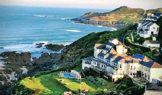
‘Ramblers Package - 3 nights’ Explore the coastal footpaths on our doorstep.
• Deluxe sea view room
• 3 course dinner
• Devon cream tea for 2 £990 per couple inclusive

‘Luxury Suite Offer’
• Luxury Suite
• Bottle of champagne
From £410 per night

‘3 Night Break’ (Sun-Wed)

• Deluxe sea view room B/B

£675 per couple inclusive Selected dates apply.

THEBRISTOLMAG.CO.UK | MARCH 2023 | THE BRISTOL MAGAZINE 29


A life well lived
As Bristol-born artist Garry Fabian Miller returns to Arnolfini almost 45 years after his first solo exhibition at the gallery, the artist looks back at his long and acclaimed career, celebrates those who have inspired him along the way and remembers “a life well lived”.

The word adore feels like a hug, which is fitting for an exhibition of work that feels a bit like a hug too,” write Jess Bunyan and Euella Jackson, co-directors of Rising Arts Agency – one of Arnolfini’s community partners. “From the way Garry Fabian Miller uses colour in his photography to make the small things in nature appear bigger – reminding us how small we are in comparison – to his tactile tapestries that make you want to wrap yourself in his art. His work pulls you in and says: 'no worries, I’ve got you, spend some time here.'”
Garry Fabian Miller has a deserved reputation as being one of the most progressive figures in fine art photography. Born in Bristol in 1957, Fabian Miller gained international acclaim for his series entitled Sections of England: The Sea Horizon (1976-77), which was shown in his first solo exhibition at the Arnolfini when he was 19.
After leaving Bristol first for Lincolnshire and then to Dartmoor, where he has spent the last 32 years, Fabian Miller abandoned making photography with a camera. Instead, he created a new, pioneering cameraless photography for which he is now known. The tools of his work became the darkroom and light, and his subject matter focused on nature, sourcing ingredients from his growing garden.
In 2017, Fabian Miller was awarded an honorary fellowship of the Royal Photographic Society, which is headquartered in Bristol. Today, his work is celebrated in museums and private collections all over the world, with the largest at The Victoria and Albert Museum (V&A) in London. The artist’s latest exhibition, ADORE, sees not only his return to his home city but to the gallery where it all started.
ADORE begins with Fabian Miller’s first series, The Sea Horizon (197677), which have been shown at the Arnolfini twice over the course of his career – first in 1979 and again in 1997. The photographs were taken from the roof of Fabian Miller’s home in Clevedon, overlooking the Severn Estuary. They recorded the changing conditions of the sea and sky throughout the seasons. “I witnessed the unfolding of days and I started to think about myself, the weather, the light, how the cycle of the sun controls every element of what I was seeing,” Fabian Miller explained. “As time passed, I suppose I was projecting my thoughts on to the horizon and imagining what lay beyond it. I was thinking about the purpose of life, where we were travelling, what we should do. The horizon is this very powerful agency or metaphor for trying to think
32 THE BRISTOL MAGAZINE | MARCH 2023 | No 220
Photography by Lisa Whiting Photography
Garry Fabian Miller: ADORE
Garry Fabian Miller at his latest exhibition ADORE
about the journey of my life.”
From The Sea Horizon, the exhibition moves through the many inspirations and influences, taking in the “lives lived” and “traces left” that have shaped Fabian Miller’s work. ADORE seeks to celebrate the many places that feature throughout the artist’s long and acclaimed career.
Pioneering process
Since the mid-1980s, Fabian Miller has worked without a camera, using the techniques of early 19th century photographic exploration to experiment with the nature and possibilities of light as both medium and subject. “Through cultivating plants and having an intimate relationship with them, observing their life cycle and relationship to the sun and the seasons and time, I began to figure out where I could make pictures, but I also began to realise that the camera was a problem. It was preventing me from having a direct relationship to the plant and to the light and I had to find a more direct way to do that. I put the camera away and I started printing a picture from the plant rather than using a negative as an intermediary. I tried it, I explored it and that was the beginning of life without a camera.”
Over the years, Fabian Miller has ‘photographed’ seed heads, petals, shoots and leaves by shining light directly through each found and treasured object. This has been achieved using light, time, and the muchtreasured Cibachrome chemical photographic paper – a material that is now no longer made. In the last 10 years, the artist has used up the last supplies of his Cibachrome paper and the months of lockdown, for Fabian Miller, represented the culmination of four decades of working without a camera. He experimented with longer and longer exposures to light, which led to surprising results as the paper itself had begun to deteriorate. Some of the images appear to drip like paint, dissolving in front of our eyes.
Brilliantly bold
Colour has been central to Fabian Miller’s practice since he first began extracting it from nature. In 2020, he produced The Ark, creating a family of red, yellow and blue pools of colour. These ‘pure’ colours were to become the ‘seeds’ of his most recent body of work the Colour Fields.


Fabian Miller’s work – whether capturing the moment where sea meets sky or golden yellow embraces the softest pink in his latest series – seeks to show us what is hidden in plain sight. “Days are spent imagining and walking the colour fields,” he says. “Here, the most intense moments of
pure colour are found, sensed and sometimes seen at the edges of vision. These places need to be cultivated and cared for.”
Fabian Miller’s life and art have been shaped by the artists, writers, makers and thinkers with whom he has surrounded himself and filled his home. He is inspired by the 20th century arts and crafts movement, and his heroes – the leading poets of the Romantic movement – Palmer, Coleridge and Wordsworth. Yet, he has also developed a thirst for collaboration, guided by the craft practices within which he has always aligned his work. Now, colour and light are brought to life within wool and yarn, and through film, music and poetry, as seen throughout ADORE
“As a young man I searched for people living life with purpose and meaning,” reads the words printed on the gallery wall. “Those actively trying to make a better world, in which love and care formed the core
THEBRISTOLMAG.CO.UK | MARCH 2023 | THE BRISTOL MAGAZINE 33
“Living life with purpose”
Fabian Miller’s collaboration with Bristol-based woven fabric design studio Dash + Miller
around which beauty and simplicity of living was cultivated... To my mind, the philosopher and the potter, the painter and the gardener shared an equality of purpose. There was no hierarchy of value.”
Most notably in recent years, Fabian Miller has teamed up with Bristolbased woven fabric design studio and textile trend consultancy Dash + Miller and its sister company, Bristol Weaving Mill. Together, they have been reinterpreting Fabian Miller’s unique abstract colour prints as tapestries, allowing him to re-invent darkroom exposures in different textile media. This series follows on from his work with world-renowned tapestry studio Dovecot, which was established in Edinburgh in 1912, with whom he re-made a number of his photographic exposures as tapestries and rugs.
Speaking of the collaboration with Dash + Miller in Arnolfini’s recently published book about ADORE, Garry said: “These [tapestries] have opened up a new colour world. I feel we are making something special together in the hybrid space between a Cibachrome exposure and tapestry weaving. It feels strange and wonderful.”

Skilled at working across various mediums, Fabian Miller has also been working with composer Oliver Coates. Together they created the film Last Evenings, featuring animated photographs and a soundtrack, which were performed live at the V&A. Coates has also released two new soundtracks for films made by Fabian Miller’s son, Sam, all of which are currently being shown on the second floor of the exhibition at Arnolfini.
Home has always been placed at the core of Fabian Miller’s work. Over the last three years, he and photographer Nicholas J R White have been working on a project called the Crucible. A name they have given to the small circle of Dartmoor that has been the site of Fabian Miller’s seen and imagined pictures for the last 32 years. As part of this project, White has been walking its paths, between ancient barrows and burial cairns,

recording the landscape across seasons and time.
White’s atmospheric images from the series are presented in ADORE for the first time. They are shown alongside a map of the eight-mile area that makes up this imagined circle. Walks and sites related to Fabian Miller’s work have been marked upon it. “I have lived a life of walking, looking and thinking. Concentrated in one place, on the north-east edge of Dartmoor. This is home. It is now surrounded by an imagined circle, eight miles wide. I think of this as the Crucible, within which my life has been lived.”
Fabian Miller’s work has certainly come full circle. From his early hope for a “life well lived” to a celebration of a life so clearly “full of joy”. In his own words, ADORE suggests that: “we walk, we pause, [and] we look at what we wish to understand long enough and with enough attention to find an aspect of it that has rarely been seen or shared before.”
As my time with Fabian Miller came to an end, he left me with his thoughts on returning to Bristol – a city that is clearly still of great importance to him and a major inspiration: “When I chose to move away from the area, I felt that Bristol was losing its radical traditions, it had sold its soul to gentrification. Then, in the last few years, Bristol has found itself again and it’s become a non-conformist independent city, whether it be in the music scene or in art or in politics. In 2020, Bristol became a beacon for the world – the most meaningful manifestation of Black Lives Matter happened here. When I was coming back to work with Dash + Miller, I was coming back at a time when Bristol was changing. For me, it’s very emotional because I am coming back to the city that I knew growing up.
“My exhibition hopefully is going to be a lot of fun and an empowering experience for people. I hope they find things in it that I found in my experiences coming to Arnolfini when I was a young person – it helped me become who I am today and so to be back here is just wonderful.” n
 • Garry Fabian Miller: ADORE is showing at Arnolfini until 28 May; arnolfini.org.uk. Read more about Dash + Miller on p. 76
34 THE BRISTOL MAGAZINE | MARCH 2023 | No 220
Full circle
Work by photographer Nicholas J R White
Tapestries by Dash + Miller and rug by world-renowned tapestry studio Dovecot, based in Edinburgh


THEBRISTOLMAG.CO.UK | MARCH 2023 | THE BRISTOL MAGAZINE 35
STATE OF THE ART
Belonging, Rainmaker Gallery, 7 March –6 May
In this solo exhibition, Rick Grimster explores his relationship to the country of his birth. A war baby, born in London in 1945 to a Mvskoke father and an English mother, his life is but one of the numerous unique stories that make up the Indigenous diaspora. Whilst Grimster’s abstracted landscapes fit firmly into the school of mid-century British modernism, they are elevated by an instinctive, unbridled joy of colour and love of nature aligned with his Native American heritage. Where we land on this earth is dictated by forces beyond our control –migration, colonialism and in this case World War II. How we make sense of our individual journeys is up to us. Rick Grimster has found peace and belonging through his lifelong love of painting and an unbreakable connection to land, wherever he may be.
• rainmakerart.co.uk;
140 Whiteladies Road, Clifton, Bristol BS8 2RS
Image below by Rick Grimster
Renewal, Clifton Contemporary Art, 3 –31 March


From March, Clifton Contemporary Art is featuring a range of exciting new work by regular gallery artists, which can be seen on its newly designed website. The work includes Carl Melegari’s layered, intricate and potent archetypal human studies, Elaine Jones’ shifting, elemental earthscapes, Andrew Hood and Tom Hughes’ entirely different visions of the city environment, and contrasting still life paintings by Stephanie Axtel and Lynne Cartlidge. As the light lengthens and the seasons shift, it’s time to see the world afresh.
• cliftoncontemporaryart.co.uk;
25 Portland Street, Clifton, Bristol BS8 4JB
The RWA presents a special exhibition by leading Bristol-born photographer Jem Southam. A Bend in the River displays a series of the same name structured in two parts representing arrival (at dusk) and departure (at dawn). The images were taken at a particular spot on a riverbank where Southam became lost in contemplation one December evening. He returned to the same spot each day during the rest of the winter. Over the following five years between 2015-2020, Southam continued creating the series in the same location. The ever-changing surface of the water, passing clouds, trees waving in the breeze, ducks gliding across the river and swans flying to roost caught Southam’s attention and what began as a passing digital photo led to powerful ongoing series of deeply affecting photography.
• rwa.org.uk; Queens Road, Clifton, BS8 1PX

EXHIBITIONS
Image: Jem Southam, A Bend in the River © Jem Southam
Jem Southam: A Bend in the River, Royal West of England Academy (RWA), until 1 May
36 THE BRISTOL MAGAZINE | MARCH 2023 | No 220
Image: Easter Sunday Flowers by Stephanie Axtell


THEBRISTOLMAG.CO.UK | MARCH 2023 | THE BRISTOL MAGAZINE 37
Akingbade: Show Me The World Mister, Spike Island, until 21 May

Show Me The World Mister is an exhibition by Ayo Akingbade comprising two new film commissions shot on location in Nigeria. The Fist is a portrait of the Guinness brewery in Lagos, where histories of colonialism, industrialisation and labour collide; while Faluyi follows protagonist Ife on a journey tracing familial legacy and mysticism in ancestral lands. Building on Akingbade’s interests in history, placemaking, legacy and power, these are her most ambitious productions to date.
Produced by Chisenhale Gallery and Spike Island, Bristol, and commissioned by Chisenhale Gallery; Spike Island; the Whitworth, The University of Manchester; BALTIC Centre for Contemporary Art, Gateshead; and John Hansard Gallery, Southampton. The exhibition is part of the West of England Visual Arts Alliance programme, supported by Arts Council England.
• spikeisland.org.uk; 133 Cumberland Road, BS1 6UX
Image:
Wildlife Photographer of the Year, M Shed, until 29 May
Wildlife Photographer of the Year is back at M Shed with a brand new set of images capturing the breathtaking diversity of the natural world.
From fascinating animal behaviour to remarkable species, 100 powerful photographs illustrate the precious beauty of our planet. The images shine a light on stories from all over the world and convey the impact of human activity in ways that words cannot.
Now in its 58th year, Wildlife Photographer of the Year is the most prestigious photography event of its kind, providing a global platform that showcases some of the best photography talent from around the world. Launching in 1965, today the competition receives entries from over 90 countries all over the world. Winning images are selected for their creativity, originality and technical excellence by a panel of international experts.
• bristolmuseums.org.uk; Princes Wharf, Wapping Road, BS1 4RN
Image: Heavenly flamingos by Junji Takasago, Japan | Winner, natural artistry

Junji Takasago/Wildlife Photographer of the Year
Public Art Project with Juneau Projects, Arnolfini, until 30 September
Running until September 2023, Arnolfini and UWE Bristol are producing a public art and nature project with artists Juneau Projects (Philip Duckworth and Ben Sadler), taking place in and around the university’s Frenchay campus.
Phil and Ben have been inviting UWE Bristol students and staff, local residents and schools to join them for Bryophyte Club*, a programme of free creative workshops, events and explorations of local nature, inspired by mosses, lichens and other overlooked but vital plants. These activities will lead towards the design and creation of a sculpture garden for a new student accommodation village on the campus, also to be used as a community space for people living and working in the area. The sculpture garden will become a place for students, staff and local residents alike to sit, rest, meet and enjoy for years to come.
Arnolfini is interested to hear from individuals and groups who would like to have a hand in the creation of the sculpture garden, meet new people and gain skills in making with clay, wood, print-making, plants and more. Get in touch with Phil, Ben or Alix to say hello at publicart@arnolfini.org.uk

*bryophytes (brai·uh·fites) are a group of plants that include mosses, lichens, liverworts and hornworts. In the UK there are around 1,100 species of bryophyte.
• arnolfini.org.uk; 16 Narrow Quay, Bristol BS1 4QA
38 THE BRISTOL MAGAZINE | MARCH 2023 | No 220
Ayo
EXHIBITIONS
Ayo Akingbade, The Fist (2022). Film Still. Courtesy the artist.
Photo by Richard Ponter, courtesy of Juneau Projects


THEBRISTOLMAG.CO.UK | MARCH 2023 | THE BRISTOL MAGAZINE 39
Expert opinion
From Chris Yeo, Valuer at Clevedon Salerooms and regular expert on BBC’s Antiques Roadshow


Moderne Love

Art Deco. Just mention it and images of sleek ocean liners, peopled by impossibly beautiful characters wearing Cartier jewels and sipping Manhattan cocktails spring to mind. Or maybe it’s the futuristic styling of Max Sterm’s Metropolis or even the gaudy delights of the Odeon cinema – those streamlined and chrome-plated ‘peoples’ palaces’ that brought Hollywood glamour to the depression-ravaged masses of the 1930s. Art Deco emerged as a style for the new century and an everchanging, fast-paced world of motor cars, air travel, flappers, and syncopated jazz. It’s the style of the Chrysler building, the Ziegfeld Follies and, as it happens, Victoria Coach Station; an intoxicating mix that continues to beguile us as much as it did in the Roaring Twenties. Has there ever been a style more luxurious, glamorous, more imitated and, perhaps, less understood? Let’s start with the name. ‘Art Deco’ was actually only first coined in the late 1960s as a sort of two-
hander to Art Nouveau which had preceded it. Also, far from being a single recognisable style, there were, in fact, many different strands, depending on when and where it popped up. Italy, Sweden and, of course, America all had their own particular ‘takes’ on it. But nowhere did the style emerge more coherently than in France where it was known as Moderne. Of course, the French have a long and proud history in the decorative arts – they virtually invented the idiom – but, more than any other, it was the Moderne look that truly encapsulated le style Francais.
For those on a Moderne mission, Paris is, of course, a mere hop and skip over the channel but for a taste of the style that’s a little closer to home, I normally reach for the cocktail shaker. If Paris was the spiritual home of Art Deco, then the cocktail was its tipple of choice and designers rose to the challenge of creating bar accessories that were every bit as exciting as the people who drank them. Art Deco cocktail shakers are now highly collectable and style conscious collectors will often pay over £1,000 for a rare example. Cheers! ■
• clevedonsalerooms.com; @chrisyeo_antiques (Instagram)
40 THE BRISTOL MAGAZINE | MARCH 2023 | NO 220
COLUMN | CHRIS YEO ON ANTIQUES
Keith Murray for Mappin & Webb; Art Deco style silver plated cocktail shaker. Sold for £650 at Clevedon Salerooms.
Sell your Fine Jewellery, Watches, Designer Handbags & Fashion with us


ZERO FEES for selling


BRISTOL VALUATION DAY


If you would like to receive a free, no obligation expert valuation, please bring your items along between 10.30am-6pm
Venue: The Club Room, The Clifton Club, 22 The Mall, Clifton, Bristol, BS8 4DS


Dates: 22nd March, 17th May, 19th July, 20th September, 22nd November
LUXURY AUCTIONS


101 Talbot Road, W11 2AT +44 (0)207 096 8933


valuations@elmwoods.co.uk www.elmwoods.co.uk



THEBRISTOLMAG.CO.UK | MARCH 2023 | THE BRISTOL MAGAZINE 41
www.masanauction.com Over 30 years experience • Competitive commission rates Direct contacts in Hong Kong and China • Sales every month 2 Princes Buildings, George Street, Bath BA1 2ED Tel: 01225 318587 Ma San Auction In Bath SPECIALISTS IN ORIENTAL WORKS OF ART Offering free valuations & home visitsNow consignmentsacceptingfor futuresales! A group of Chinese Famille Rose Porcelain items, Tongzhi Period (1861-75). SOLD £5208 incl. premium Pair of Chinese Huanghuali Horseshoe back Armchairs, Quanyi, 20th Century. SOLD £16,120 incl. premium A Chinese Celadon Jade Tripod Vessel, JIA Qing Dynasty. SOLD £22,320 incl. premium A Chinese Geyao Celadon Glazed Hexagonal Brush Washer. SOLD £12,400 incl. premium A collection of photo albums and correspondence from China, Circa 1930. £9362 incl. premium
Dine in style
As Aqua Grand Café opens it doors, boasting a menu packed full of delicious traditonal French dishes, we sit down with owner Ben Smithson to find out more about his latest venture...


Aqua Grand Café has recently swung open its doors on Whiteladies Road. Exuding opulence and style and emulating the grand cafés of Europe, the charming new arrival is offering Bristol a slice of local Parisian life. At the helm is Ben Smithson, owner of Aqua Grand Café. Aqua Restaurants have been an independent family-run business since Ben’s father, proprietor Richard Smithson, founded the first Aqua restaurant on Welsh Back in 1998 and, more recently, in Portishead. The eateries have gained a reputation for serving high-quality food in elegant settings and Aqua Grand Café is set to be no different.
Evolving throughout the day, from a bustling breakfast and brunch service to a leisurely lunch and afternoon tea to atmospheric dining until late, the Clifton café has the promise to become a mainstay for local residents.

Speaking about the original concept, Ben said: “The inspiration for Aqua Grand Café came from my time working as a head waiter at the Savoy Grill in London, where I worked alongside Gordon Ramsay, Marcus Wareing and Lee Bennett. I have a real passion for the French classical dishes and for creating a luxurious all-day dining experience. We want people to feel like they’re being looked after from the moment they step through the door. We want it to be more than just going out to a restaurant; we want it to be a magical, memorable experience.”
Open from 7.30am every day, customers can sit down with the morning papers and enjoy a freshly brewed coffee alongside a baked pastry or one of the chef’s finest omelettes.
Delving into the menu, Ben explains: “Our signature dish over brunch and lunch is our Omelette Arnold Bennett – it’s something that I’ve brought back from the Savoy; it’s absolutely delicious. [Omelette Arnold Bennett is a rich combination of smoked haddock, hollandaise
sauce and cheese cooked in a pan and finished under the grill. The dish was named after author Arnold Bennett, who ordered the omelette during his stay at The Savoy in the 1920s. The chefs perfected it to his taste while he was staying at the hotel, writing a novel.]
“In the evening, we’ve got the real showstoppers,” Ben continues. “The turbot to share is phenomenal – it’s the king of fish. Then we’ve got the traditional dishes like Dover sole meunière and boeuf bourguignon. Our coq au vin has got to be one of my favourites – it’s divine with a rich veal dew glaze. We also have a cocktail lounge for those who just want to relax with a drink and soak up the atmosphere.
As for sweet treats: “All of our desserts are handmade by our patisserie chef – they are beautiful. We’ve got lovely handmade salted caramel chocolate truffles, French macarons, Madeleines, chocolate salted caramel éclairs and an exquisite apple tarte tatin.”
With impeccable hospitality at the heart of Aqua Grand Café, Ben wants diners to feel welcomed and comfortable while they enjoy a theatrical dining experience. “We carve smoked salmon, make steak tartare, and fillet turbot and Dover sole at the table. If you want to go out for a real show, this is the place to come.”
Situated at 153 Whiteladies Road, there’s an authentic charm to the café’s interior. “Aqua Grand Café is something that I wanted to give to Bristol; there’s nothing like it in the city. You’re greeted by doormen, you’re whisked to your table, and you’ve got barmen, mixologists, and waiters keeping you entertained. The restaurant also compliments the architecture of the building. It’s got a beautiful arch above the entrance, high ceilings, chandeliers – it was just calling out to be a Grand Café.” n
• For more information, visit: aquagrandcafe.com
42 THE BRISTOL MAGAZINE | MARCH 2023 | No 220
Owner of Aqua Grand Café, Ben Smithson (right)
A Spring Artistic Soirée
Join Fluorescent Smogg and Harvey Nichols as they present Eric Haacht’s ‘Subject’ at an evening of food, art, and culture. Thursday 23 March, 7pm – Midnight
The latest collection by respected artist Eric Haacht will be unveiled at the Second Floor Restaurant, Harvey Nichols Bristol. The event is part of a series of art focused events, hosted by Harvey Nichols and curated by Fluorescent Smogg.


The launch dinner will include a welcome cocktail paired with a canapé, followed by a bespoke three-course menu, while Eric Haacht discusses the artworks within the show and the concept behind his work. After dinner guests will have the opportunity to meet Eric Haacht, whilst enjoying live DJ sessions. A cocktail menu will also be available.
Eric Haacht, who is represented by Smithson Gallery, is a self-taught artist hailing from the South West of England. His expressive paintings fall into the realm of portraiture yet remain ambiguous, features only emerging unintentionally through his swirling brush strokes and enfolding vivid colours. He describes his works as like diary entries, a repetitive daily process through which he captures certain moods or emotions. The production of ‘Subject’ will be showcasing at Harvey Nichols Bristol until 31 May 2023.

There will be an exclusive edition available on the evening of the event, along with the opportunity to purchase items fromthe show prior to general release.
The following ticket options are available and both can be upgraded with a wine pairing package

General Ticket, £50: Cocktail & Canapé, 3 Course Dinner and After Dinner Soiree


VIP Ticket: £150: – Cocktail & Canapé, 3 Course Dinner, After Dinner Soiree, Eric Haacht exclusive print and Fluorescent Smogg x Harvey Nichols exclusive gift bag

Following the launch event, the collection will be available to view and purchase at the Second Floor Restaurant on Wednesday to Friday: 12pm – 10pm, Saturdays: 10am – 10pm and Sundays: 11am – 5pm until 31st of May 2023.
To book please contact the Second Floor reception on: reception.bristol@harveynichols.com or Tel: +44 (0)117 916 8898

fluorescentsmogg erichaacht hnbristol_secondfloor
FOOD & DRINK
TASTY TIDBITS FROM THE CITY’S BEST RESTAURANTS, CHEFS AND PRODUCERS

Innovative new funding scheme awards £60k to help community projects fight food insecurity
Bristol Local Food Fund has awarded £60,000 to 18 community food projects across the city using a forwardthinking approach known as participatory grantmaking to ensure money reaches those most in need.

First conceived during the peak of the Covid-19 pandemic, Bristol Local Food Fund aims to create a new and more accessible source of funding for community food projects that are tackling food insecurity in the city.
BANK restaurant starts Spring afresh with all-new menu

Bristol’s much-loved restaurant BANK is starting Spring afresh with an allnew menu, offering fire-cooked sharing plates. The Totterdown-based, independent restaurant has welcomed a new and bespoke fire kitchen, which has inspired the refreshed menu.
BANK’s expert kitchen team, led by former head chef at The Ox, Seven Lucky Gods and Four Wise Monkeys, Jack Briggs-Horan, has been busy curating the new menu over several months. The addition of the fire kitchen has led to a delectable, seasonal menu, which will be available noon ‘til night. The new offering will focus on a single and curated menu of seasonal and local produce, cooked over roaring flames, imbuing the ingredients with a flavour, scorch and smoke that only comes from cooking with fire.
For the first time since opening, BANK will also be offering up delicious roast dinners with artisan ingredients sourced locally. Available every Sunday –roasts will be cooked over open flame on the bespoke kitchen setup. The new BANK menu will be available from 2 March and will be offering 25% off lunch on the first Thursday and Friday.
• bankbristol.com
Crosstown opens Bristol store
Crosstown has opened the doors to its fourth permanent location outside of London, on 21 Queens Street. Best known for creating the world’s first sourdough doughnuts, Crosstown has established itself as an award-winning premium sweet treat destination. The Bristol store gives customers the full Crosstown experience of eating in with an upstairs seating area, options to grab a doughnut and coffee to go, scoops of its smallbatch ice cream, pre-ordering for collection, and placing an order for on-demand delivery to their doorstep in under an hour.
What’s more, on Friday 3 March, Crosstown is giving back to the community by donating 50% of its trade from that day to local charity, Help Bristol’s Homeless.
• crosstown.co.uk
The volunteer team behind the project raised the money through a city-wide crowdfunding campaign which concluded at the end of 2021. The crowdfunder was supported by over 500 donors, with rewards offered by nearly 50 Bristol food businesses, including Harts Bakery, Better Food, Wiper and True, Bristol Squeezed and Essential Trading. The campaign was also boosted by some larger donations, including a £10,000 match-fund from international UK law firm Burges Salmon.
At the heart of the fund is its use of participatory grantmaking (PGM), which gives decision-making power over how and where the grants are distributed to people who have direct lived experience of food insecurity.
To deliver this, Bristol Local Food Fund recruited a Citizens Panel of people with lived experience of food insecurity. The panel developed the fund criteria, reviewed the applications and made the final funding decisions. There were 41 applications to the fund, totalling £178,000 out of which the panel selected 18 projects to offer support.
Organisers are now exploring opportunities with Bristol’s food and business community to grow the fund and help make a positive long-term impact on food insecurity in Bristol.
• bristollocalfoodfund.com
FOOD NEWS
44 THE BRISTOL MAGAZINE | MARCH 2023 | No 220


THEBRISTOLMAG.CO.UK | MARCH 2023 | THE BRISTOL MAGAZINE 45
Afternoons, teaspoons & treats
For celebrations, get-togethers or one of those Springtime treats that are just a sheer delight - the tradition of taking afternoon tea is tops - So raise a pinkie and indulge yourself with a trip to one of Bristol’s finest hotels or tearooms


ASHWELL & CO
32 Alma Vale Road, Bristol BS8 2HY
Tel: 0117 904 2898 Web: ashwellandco.com
Often described as one of the quirkiest places you can have afternoon tea in Bristol, Ashwell & Co pride themselves not only on their unique setting within a vintage boutique, but they also rate as one of the best afternoon teas in Bristol. Everything is handmade or locally made with love to create a proper, traditional afternoon tea experience. From the bread to the cakes, the scones and even the Ashwell & Co signature homemade clotted cream, everything is made with care and attention to give their lovely customers an experience to remember. Afternoon teas are served on Fridays and Saturdays and they also offer takeaway, delivery options and party packages. Prices start from £25 per person.
HARVEY NICHOLS
27 Philadelphia Street, Quakers Friars, Cabot Circus, Bristol BS1 3BZ
Tel: 0117 916 8898 Web: harveynichols.com
THE BRISTOL
The River Lounge and River Grille at The Bristol Prince Street, Bristol, BS1 4QF
Tel: 0117 923 0333 Web: doylecollection.com/bristol
The Bristol’s highly popular G&Afternoon Tea celebrates the best of Bristol creators and artisans in partnership with legendary street artist SP: Zero, Bird & Blend Tea and Bristol Dry Gin. Sink into a sumptuous armchair and watch the world go by as you indulge in classics like freshly-baked scones served with jam and Cornish clotted cream, finger sandwiches and sweet treats, alongside tea-infused cocktails. With vegan, diary-free & gluten-free options available on request, there is something for everyone to indulge in. Enjoy the classic offering with a wide range of herbal teas and barista coffee for £25 per person, or add a G & Tea Cocktail, or a glass of Rathfinny English Sparkling Wine for an additional £12 per person. Available Thursday to Saturday, 12:30 – 16:30
Decorated in decadent gold, the stylish setting of Harvey Nichols Bristol’s Second Floor Restaurant is the perfect place for an indulgent treat after a day of shopping. The traditional afternoon tea includes a trio of sandwiches, a selection of homemade cakes, homemade mini scones with clotted cream and a choice of Harvey Nichols preserves, all served with unlimited house tea. For an extra bit of indulgence, you can add a glass of Champagne, perfect to celebrate a special occasion in style. Champagne tea is priced at £35 per person; afternoon tea, £25 per person. Served Thursday-Saturday 3-4:30pm, Sunday from 2.30pm.
AFTERNOON TEA | BEST OF BRISTOL
46 THE BRISTOL MAGAZINE | MARCH 2023 | No 220
BERWICK LODGE HOTEL
Berwick Drive, Bristol BS10 7TD
Tel: 0117 958 1590 Web: berwicklodge.co.uk

A proudly independent and totally unique venue, on the outskirts of Bristol, which blends the spirit and romance of the arts and crafts movement with a touch of the East. Enjoy your afternoon tea outside in the 18 acres of magnificent gardens; or sink into the cosy sofas in the lounge, a beautiful wood panelled room with feature fireplace and views overlooking the grounds. An indulgent and seasonally changing menu is all handmade or locally sourced supporting nearby businesses, such as Wogan coffee. The traditional afternoon tea for £29.95pp includes sandwiches, cakes, and freshly baked scones, topped with lashings of fragrant jam and gooey clotted cream. Or upgrade to the signature Berwick afternoon tea for £36.95pp to include delicious savoury accompaniments. For extra indulgence, Champagne can be included for an additional £10pp. Gluten-free, dairy-free, and vegan options are available, as well as a children’s tea – there’s something for everybody to enjoy. Served Monday – Friday 12pm – 2:30pm, Weekends 12pm, 12.30pm, 3pm or 3:30pm.


THE AZTEC HOTEL & SPA
Aztec West, Almondsbury, Bristol BS32 4TS
Tel: 01454 201090 Web: aztechotelbristol.co.uk
DE VERE TORTWORTH COURT
Wotton-Under-Edge, Gloucestershire GL12 8HH
Tel: 01454 263000
Web: devere.co.uk/tortworth-court
Set within the picturesque countryside of South Gloucestershire, De Vere Tortworth Court is a Grade II listed Victorian mansion house, offering a unique setting to enjoy afternoon tea. Afternoon Tea is served in the 1853 Restaurant and Bar which features elegant oak panelling and ornate furnishings. In the summer months, take tea al fresco on the terrace with view over 30 acres of manicured gardens and Victorian arboretum. Enjoy a selection of finger sandwiches, including Severn & Wye smoked salmon with chive & lemon creme fraiche, sultana scones with clotted cream and fruit jam, and indulge in an apple tart, orange and thyme finger and a chocolate smores tart. Afternoon tea starts from £25 per person and sparkling afternoon tea starts from £34 per person. Available to book now.
Created by the hotel’s experienced pastry chef, the Aztec Hotel & Spa afternoon tea is a firm favourite for any celebration, occasion or treat. Served daily, it’s a treasured tradition of delicious and imaginative offerings full of great quality ingredients and tempting regional flavours. Beautifully presented and served on a tiered cake stand, the artisanal sandwiches include West Country Keens cheddar and chutney on rye, Severn & Wye smoked salmon, Devon caught white crab & mayonnaise on rye, Somerset cider glazed Wiltshire ham with Tracklements piccalilli and Burford brown free-range egg mayonnaise with Evesham watercress on freshly baked white bread. Get carried away with locally sourced Gloucester old spot, chorizo, black bee honey and caraway seed sausage rolls but leave room for heaven-sent desserts such as black bee honey and hazelnut custard tart, dark chocolate, almond and Evesham blackberry verrine and spiced rum, ginger & orange sticky loaf. The freshly baked Devon buttermilk scones served with strawberry preserve and Cornish clotted cream are the cherry on top. Spa packages including afternoon tea are also available.

AFTERNOON TEA | BEST OF BRISTOL THEBRISTOLMAG.CO.UK | MARCH 2023 | THE BRISTOL MAGAZINE 47
Explore the lakes of the South West
Whether your passion is watersports, angling, walking, cycling or simply enjoying nature with loved ones, you’ll find the perfect escape at South West Lakes’ picturesque locations in Cornwall, Devon and on Exmoor this spring...
Book your spring getaway now at one of South West Lakes’ five lakeside campsites. Choose between the majestic Wimbleball Lake on Exmoor (a two-hour drive from Bristol) and the idyllic Roadford Lake on the edge of Dartmoor or experience a different view of Cornwall at Tamar Lakes near Bude, Siblyback Lake near Liskeard or Stithians Lake near Redruth.
With footpaths and cycle trails to explore, woodlands to discover and play areas to enjoy, everyone can get involved and benefit from being outdoors. It's your outdoors – come and explore!

Wimbleball Lake, Exmoor
Nestled within the rolling hills of Exmoor National Park, this 530acre lake has something for the whole family to enjoy.
The family-friendly campsite has five bell tents, two wooden camping pods and a cabin as well as a choice of hard standings, electric and non-electric pitches for tents, motorhomes and caravans. You can hire a fire pit, purchase wood and charcoal made onsite, rent a telescope and discover why Exmoor National Park is a designated Dark Skies reserve.
Hire watersports equipment, launch your own or learn something new with the friendly and knowledgeable instructors. Tackle the high ropes course or hit the bullseye on the archery range. You’ll also find a packed programme of activities on during the school Easter, May half term, summer and October half term holidays.
Explore Exmoor and walk to Haddon Hill from Wimbleball. See if you can spot the great range of wildlife at the lake, such as the iconic Exmoor ponies and deer. The closest town to Wimbleball is Dulverton but it's also worth venturing slightly further to explore the popular towns and villages of Tiverton, Porlock, Minehead, Watchet, Wiveliscombe, Taunton and Wellington. Campsite opens 1 March.
Roadford Lake, Devon
Surrounded by countryside, and nestled amongst the beautiful surroundings of the Wolf Valley with the dramatic tors of Dartmoor as its backdrop, Roadford is the perfect location for your next family escape.
The scenic campsite offers a choice of spacious electric and nonelectric pitches for tents, caravans and motorhomes as well as a fantastic bell tent called Bertie. A new play area opened last year, next to Roadford Lake Cafe.
Hire watersports equipment, launch your own or learn to kayak, canoe, paddleboard or sail with the activities team. You’ll also find a packed programme of activities on during the school Easter, May half term and summer holidays as well as at weekends in June and July. Roadford is also one of the best brown trout fisheries in the UK, with 700 acres of fishing to explore by boat or bank.
Roadford is the perfect base to explore the spectacular Dartmoor National Park. Enjoy a day trip out and discover some more of South West Lakes' Dartmoor sites including Burrator, Fernworthy, Meldon, Avon Dam, Kennick, Tottiford and Trenchford.
Within easy reach of Roadford are the historic towns of Launceston and Okehampton and some of the best beaches in Devon and Cornwall are less than an hour away. Campsite opens 10 February.
Siblyback Lake, Cornwall
With the striking backdrop of Bodmin Moor, a designated International Dark Sky Landscape, Siblyback Lake lies within the Cornwall Area of Outstanding Natural Beauty.
Right next to the lake, the small campsite has a choice of electric and non-electric pitches for tents and motorhomes.
Watersports equipment hire and self-launch is available when the
48 THE BRISTOL MAGAZINE | MARCH 2023 | No 220
Roadford Lake
Activity Centre opens in May. Stithians is also renowned for its fly fishing. It is regularly stocked with rainbow trout and home to a large population of resident brown trout.

A must-do on your visit to Bodmin Moor is Dozmary Pool, where, according to legend, King Arthur rowed out to the Lady of the Lake and received the sword Excalibur. Campsite opens 28 April.
Stithians Lake, Cornwall
Surrounded by farmland and moorland, Stithians is the largest inland water in West Cornwall.
Stithians Lake’s family-friendly campsite has a choice of electric and non-electric pitches. If glamping is more your style, you can stay in one of the luxury bell tents, furnished with comfy double beds and the option of camp beds for up to two children. Everything you need will be in your tent, including storage for clothes, bean bags, fairy lights, lighting and a charging point for your gadgets. Each bell tent has an undercover outdoor cooking area with table and seating.
Hire watersports equipment, launch your own or learn to kayak, canoe, paddleboard or sail. You’ll also find a packed programme of activities on during the school Easter, May half term and summer holidays. The lake is open for fly fishing from March to November.

Cornish landmarks the Minack Theatre, Glendurgan Gardens and Pendennis Castle are all within easy reach. Campsite opens 1 April.
Tamar Lakes, Cornwall
Tamar Lakes are bordered by peaceful countryside and tucked away on the Cornwall and Devon border.
The campsite has a choice of electric and non-electric pitches for tents, caravans and motorhomes. Alternatively, the onsite four-berth glamping pod is perfect for families not wanting to travel with lots of camping gear. It’s furnished with two bunk beds, a table and chairs, cutlery and a cool-box. There is a solar powered light, but no other electricity supply – so it’s not really cheating, right?
Hire watersports equipment or launch your own. Upper Tamar Lake is also renowned for its carp and match fishing.

The Cornish coastal town of Bude, with its sea pool and popular beaches, is nearby. Under an hour’s drive from the lake are Dartmoor National Park and the ever popular beach resort of Newquay. Campsite opens 31 March.
South West Lakes is an independent charity dedicated to caring for and enhancing the region’s reservoirs and lakes. Your support helps us keep these places special for people and wildlife. n
• Find out more at: swlakestrust.org.uk/activities.
Images by GRW Photography

THEBRISTOLMAG.CO.UK | MARCH 2023 | THE BRISTOL MAGAZINE 49
Wimbleball Lake
Stithians Lake
March’s must-reads
The brilliant team at GloucesterRoadBooks suggest five new releases that need to be added to your must-read pile...
Anote from the team: “Our primary aim is that the shop be a fascinating place to explore. Some of the subject sections are a little broader than they might be elsewhere –for instance our ‘Time and Place’ section encompasses books on History, Travel Literature, Geography and Reportage. We also have a significant focus on titles published by small independent presses. There are lots of really brilliant small publishers putting out incredibly exciting books, and we want to help get these out into the world. The stock is carefully chosen and constantly changing, so even if you pop in every week there will always be new books to find.”
Visit Gloucester Road Books’ website: gloucesterroadbooks.com. Follow them on Instagram: gloucester_rd_books and browse the collection in store: 184 Gloucester Road, Bishopston, BS7 8NU. Open Monday –Tuesday 9.30am –5pm; Wednesday –Saturday 9.30am –6pm
Old Babes in the Wood
One Small Voice by Santanu Bhattacharya.


Published by Penguin Books and released on 23 February


Dr. No
by Percival Everett.
Published by Influx Press and released on 16 March
Those who read The Trees when it was Booker shortlisted have already been introduced to the wild imagination of Percival Everett. The Trees was one of my favourite books last year, and I have no doubt that Dr. No (a story about a supervillain, and an academic who is an expert on nothing, and does nothing about it) will be strange and brilliant.
Tomás Nevinson
by Javier Marías
and translated
by Margaret Jull Costa.
by
Margaret
Atwood. Published by Chatto & Windus and released on 7 March


This is Atwood’s first new work since 2019’s Booker winning novel, The Testaments. Old Babes in the Wood is a collection of stories that features a return of her characters Nell and Tig (from Moral Disorder). Atwood’s full range of storytelling talents are displayed here, in a collection that traverses the breadth of human experience.

A coming-of-age novel set amidst the political and social instability of 1990s Mumbai. Bhattacharya’s first book comes highly anticipated with The Observer naming it a ‘best debut novel of 2023’. We are also very much looking forward to an evening with Santanu on Friday 10 March. Limited tickets available, please get in touch with Gloucester Road Books for details.
Porn: An Oral History
by Polly Barton. Published by Fitzcarraldo Editions and released on 16 March

Published by Hamish Hamilton and released on 30 March
This is the last novel by the brilliant Spanish writer. Marías writes atmospheric literary thrillers full of intrigue and murky morality. Tomás Nevinson is set in Spain in the 1990s amid tension during Basque Homeland and Liberty’s campaign of terror. We’re big fans of his writing, and it’s a bittersweet occasion to have this final novel.
Through semi-formal conversations with friends and strangers Polly Barton unpacks the subject of pornography and its ubiquitous and often insidious presence in our relationships and daily lives. Barton brings an atmosphere of openness and warmth to each exchange in what feels like a long overdue discussion on this complex and murky topic.
50 THE BRISTOL MAGAZINE | MARCH 2023 | NO 220
BOOKS
March Beauty Social
Calling all beauty lovers
Join Harvey Nichols for an evening of beauty talks, masterclasses and makeovers. Elevate your spring beauty regime this March with this exciting Beauty Social event. Discover exclusive tips from beauty experts and learn how to wear the latest makeup trends. Plus, enjoy some surprises along the way.
REWARDS members are invited to take home a luxury goody bag.* Tickets cost £10 per person, fully redeemable on purchases made during the evening.
Ticket upgrade: Redeemable beauty event ticket, deli board and cocktail at The Second Floor Bar, £30 per person.
Thursday 16 March, 6.30pm – 9pm

Harvey Nichols, Bristol
To book: email: reception.bristol@harveynichols.com or scan the QR code to book online.

*T&Cs apply.

BRISTOL UPDATES
NEWS FROM LOCAL BUSINESSES AND COMMUNITY ORGANISATIONS
Dr. Zara Nanu joins Jessie May as new ambassador
Bristol-based children’s hospice-at-home charity, Jessie May, has announced Dr. Zara Nanu MBE as its newest ambassador. Zara is CEO of Gapsquare from XpertHR, as well as a passionate advocate for workplace gender equality and fair pay, and is looking forward to lending her skills and support to Jessie May.

“I am so pleased to work with Jessie May and support the incredible work they do with families throughout the south west. Their vision that all children and young people with life-limiting and life threatening conditions have the very best quality of life possible at home with their families is vital work. I am looking forward to getting to know the team over the coming months.”
Clare Pearce, Director of Funding Development at Jessie May comments: “We are delighted Zara is becoming an ambassador for us. Her different skills will bring fresh talent to the group of ambassadors, and we are excited to start working together. Zara joins us at an exciting time for the charity where we recently set out our 5 year plan to expand our services.”
• jessiemay.org.uk
Wildseed Studios joins Mediawan Kids & Family
Mediawan Kids & Family, the European independent multi-genre studio dedicated to the production and distribution of children’s and family content for audiences worldwide, has announced its first international acquisition for the division with the purchase of a majority stake in UK-based production company Wildseed Studios.

Multi-award winning Wildseed Studios is the leading UK destination for emerging and established talent looking to produce creator-led scripted live action and animated content for children, families and young adults, for the international market.
The company was founded in 2013 by Jesse Cleverly, former Head of coproductions and acquisitions at BBC Children’s and Miles Bullough, former Head of broadcast at Aardman Animations. It has produced worldwide hits such as the family live action series The Last Bus (Netflix), multi-award winning feature film Hungerford, children’s animation series Dodo (Sky Kids), kids 8-11 animated comedy Counterfeit Cat (Disney Channel) and soon-to-be-screened Special Ama’s Story (Sky Kids).
The new partnership will allow Mediawan Kids & Family to enrich its catalogue with new animation and live action content and extend its network of international talent. It will also provide a strong and complementary addition to its existing portfolio of studios. •
Comma Press publish The Book of Bristol
The Book of Bristol is the next anthology in Comma Press’ award-winning ‘Reading the City’ series, sharing short fiction from across the city.
Celebrated for its creativity, communal spirit, and culture of resistance, Bristol is a city with a loud voice and progressive reputation. But it’s also a city that has experienced division and inequality. In this anthology, 10 acclaimed and emerging writers portray a city full of secrets, scars, and stark contrasts. From the elusive angel who turns up at a stagnant café along the Malago River, to the jilted lover caught in the crosshairs of the police, the stories gathered here lean into the turbulent magic of Bristol and will leave readers with a renewed sense of the city’s complexity. The Book of Bristol was edited by Joe Melia and Heather Marks. Joe worked in several Bristol bookshops for 20 years before becoming Bristol Short Story Prize coordinator. Heather is a writer, editor and producer. She works across the arts sector, producing literary events and cultural programmes, and has written for The Bookseller and The Stage. She worked at independent press No Bindings, and won the 2018 Golden Egg Award.
• Published on 23 February, The Book of Bristol (£9.99) is available to buy at: commapress.co.uk

wildseedstudios.com NEWS FROM THE CITY
52 THE BRISTOL MAGAZINE | MARCH 2023 | No 220


THEBRISTOLMAG.CO.UK | MARCH 2023 | THE BRISTOL MAGAZINE 53
BRISTOL UPDATES
NEWS
FROM LOCAL BUSINESSES AND COMMUNITY ORGANISATIONS
Sugarbabes to grace the stage at Love Saves the Day
After 25 years of smash hits, Mutya, Keisha and Siobhan from one of the biggest girl groups of all time have delivered countless anthems. The Sugababes now join an impressive list of headliners including Fatboy Slim, Years & Years and Andy C, and are set to grace the stage at this year’s Love Saves the Day, which returns to Ashton Court on 27 and 28 May.
From the height of British girl band fame, the trio of original members from North London will be performing alongside fellow headliners Nia Archives, Kelis and Piri and many more. The long-standing Queens of pop will raise the roof with the nation’s favourite songs, including the emotive About You Now, LoveActually’s TooLostinYou or the upbeat classic, PushTheButton. After a triumphant return to their roots at the start of last year, the Sugababes celebrate the love, the only way they know how.
Tom Paine, director of LSTD said: “I’m thrilled for Sugababes to be joining us at Ashton Court in 2023, it’s been a remarkable comeback for one of the most loved British pop groups, and I hope everyone is as excited as I am to see their debut Love Saves the Day performance.”

• Tickets for Love Saves the Day are available at: lovesavestheday.org
BillyChip to be introduced in all central Co-op stores
BillyChip is being introduced across all 250+ Central Co-op food stores this March, allowing customers to spread kindness to those in need with a simple gift. Making a difference is easy with a BillyChip, as the chips –which are made from a biodegradable ceramic polymer –cost £2 and can be given to someone sleeping rough as a way to support them. This £2 goes straight to BillyChip who, through their foundation, help support other relevant local charities in the Society's trading area.
The simple act of giving a BillyChip allows someone to redeem the chip for a hot or cold drink of their choice at any Central Co-op store. Two chips can be redeemed for a meal deal in-store as well, including a snack, main, and a drink.
Tokens will be available for purchase in stores from 27 March, marking the fifth anniversary of the passing of Billy Abernethy-Hope, the creator and namesake of BillyChip.
Meg Abernethy-Hope, Co-Founder of BillyChip, said: “BillyChip is about giving someone who is sleeping rough compassion, connection, and choice. We are so proud to be partnering with Central Co-op, a business we know is built around supporting its community. This is an incredible partnership and we are beyond excited to see where it will take us in the future.”
• billychip.com

Leonardo offers golden opportunity for Bristol engineers
Aerospace engineering company Leonardo wants to give experienced Bristol engineers a golden opportunity to re-enter industry, to work on one of their most exciting projects to date – the Global Combat Air Programme (GCAP). GCAP is a joint project between the UK, Italy and Japan that will see an advanced new stealth fighter fly into service in 2035.
As part of the GCAP programme, Leonardo is leading the UK’s development of integrated sensor technology that will be vital to delivering the aircraft’s advanced capabilities.

The opportunity for engineers in Bristol comes through Leonardo’s work with STEM Returners to identify experienced engineers who could be the perfect fit for GCAP. Returners are described as those who have been out of the workplace for a period of time, often linked a career break, caring responsibilities or for health reasons.
Rachel Ruxton, Head of Inclusion and Diversity at Leonardo said: “This is an unprecedented opportunity for anyone who feels they would love to channel their hard won experience into technology that will shape the future of aviation. We have an urgent need to recruit experienced engineers right now, as we have to ramp up to deliver GCAP in half the time it took to produce previous-generation combat aircraft. Equally, we want to ensure diverse talent is front of mind, and our partnership with STEM Returners to support our recruitment is vital to help us do that.”
• uk.leonardo.com
NEWS FROM THE CITY
54 THE BRISTOL MAGAZINE | MARCH 2023 | No 220


THEBRISTOLMAG.CO.UK | MARCH 2023 | THE BRISTOL MAGAZINE 55
Available from early March


Dopamine dressing


Bright, bold and optimistic, the mood for Whistles SS23 is one of vitality, with dopamine dressing firmly on the agenda. The silhouettes are playful, the fabrics are tactile, and the shades are vivacious: this season is about putting emotion back into everyday closets. Shop the collection at: whistles.com


Available from late May

FASHION
Stripe Shirt, £99, Stripe Shorts, £89, Pink Jacket, £109 .
Turquoise Suede Jacket, £399
Responsible Bibi Shoulder Bag, £149
Limited Edition One Shoulder Sally Dress, £279
Responsible Sorbie Buckle Strap Clutch, £99
Limited Edition Selma Blazer, £199
Responsible Vertical Stack Jumpsuit,


Responsible Marie Slip-on Mule in


Responsible Vertical Stack Print Jacket in Blue/Multi,

Stripe Overshirt, £99 & Stripe Elasticated Trousers, £99 Available from early July
Tote Bag & Bucket Hat Available from early March


THEBRISTOLMAG.CO.UK | MARCH 2023 | THE BRISTOL MAGAZINE 57
Limited Edition Eleanor Tie Front Shirt in Blue, £179
£129
Lilac, £139
Limited Edition Sian Patchwork Bag, £199
Responsible Wide Leg Cropped Jean, £99
Chevron Beach Short, £59
Chevron Tie Sleeve Beach Shirt, £69
£139
Mother’s Day The beauty of giving


Want to make your mum’s day? From the latest in haircare to new beauty launches, Harvey Nichols’ range of luxury Mother’s Day gifts has got you covered. All products are available from Harvey Nichols Bristol or harveynichols.com


58 THE BRISTOL MAGAZINE | MARCH 2023 | NO 220
BEAUTY TREATS GHD Helios Hairdryer – Pink Charity Edition, £189 OLAPLEX, No. 3 Hair Perfector 100ml, £28 OTO CBD Night Face Mask 50ml, £89
HOURGLASS Unlocked Satin Crème Lipstick,
FENTY BEAUTY Bright Fix Eye Brightener,
NURSEM Caring Body Cream,
VIDA GLOWMixed Natural Marine Collagen Trial Pack –14 servings, £22 LA PRAIRIE, Skin Caviar Luxe Eye Cream 20ml,
SISLEY Soir d'Orient Eau De Parfum 50ml, £150
£37
£22
£17.50 AUGUSTINUS BADER The Leave-In Hair Treatment, £62
£335
Suffering from joint pain?
Are you looking for relief from pain and immobility caused by osteoarthritis, back conditions or a sports injury? We can help.
Cura: we use innovation to heal your condition
Here at CURA, we use the latest technologies: MBST Cell Regeneration Therapy and Deep Tissue Laser Therapy to heal and repair the damaged tissues. We combine these technologies with hands-on Chiropractic and Physiotherapy to ensure your body heals itself to its maximum potential.

‘I’ve been hugely impressed by the significant improvement in symptoms by my patients I have referred to CURA Clinical. The MBST technology is widely used in Europe with proven clinical benefit. Furthermore, this is a group of patients who, up until now, have few other effective options. I recommend it highly’ –Jonathan Webb, MB ChB FRCS (Orth), Consultant Knee Surgeon

An award-winning innovative treatment for: Osteoarthritis | Back & disc problems | Bone conditions & fractures | Cartilage damage | Ligament, tendon & muscle damage | Sports & accident injuries.
•Tired of having to wait for days or even weeks to be seen and get a minor illness or injury treated?
•Want instant access to private healthcare without having to pay the earth?
…We can help!
Stay registered with your NHS GP – we are open to all. You can continue to be registered with your NHS GP and use us whenever you needus.
Free private prescriptions (just pick up and pay for your medication at your local pharmacy).

Here at Bristol Health Hub, our aim is to prioritise your health and wellbeing by providing patients with affordable access to excellent healthcare through a top team of expert clinicians who have gained extensive experience working within the NHS and in the private sector.


We are offering a private minor illness service with face to face and online appointments. Appointment fee:£65 for 20 minutes and £100 for 30 minutes.
Clinic address: Low Barn, Sheepway, Portbury, Bristol BS20 7TF. 0117 452 5580 hello@bristolhealthhub.com
THEBRISTOLMAG.CO.UK | MARCH 2023 | THE BRISTOL MAGAZINE 59
Struggling to get an appointment with your local GP?
Talk to us today : 0117 959 6531 www.curaclinical.com
Bristol Flyers are All Smiles with CK Dental

The family-run dental practice that expanded their practice into Clifton last year has been supporting the local basketball team for eight years. And keeping the players smiling brightly seems to be doing wonders. The team is currently second in the BBL Championship standings.
The team at CK Dental ensures regular dental check-ups of players, providing them with the most up-to-date treatments. Principal dentist Cornelius Krause, who runs the clinic alongside his wife at 1 West Mall, as well as operating at the Nuffield Health Bristol Hospital, explains: “We are huge fans of the Flyers, so we’re delighted to support them. We really wanted to do something to support our local community. I enjoy seeing my favourite players happy and performing at their best.”
Cornelius’s wife and Practice Manager, Sheryl added, “We feel the CK Dental brand is a good fit with the healthy and energetic basketball players. It’s also great fun for our team and we really enjoy attending their games and cheering them on. It’s a great conversation starter with patients in the clinic too!”
Coach Kapoulas stresses the importance of oral health
As well as attending routine check-ups, the Flyers have also received more complex dental procedures during their visits, including having custom mouthguards fitted for added teeth protection.
Bristol Flyers BBL Head Coach Andreas Kapoulas looks after the team’s overall health, including their oral health. We asked Andreas about working with CK Dental...
Why is the relationship between the Bristol Flyers and CK Dental so important?
AK: We are delighted about the continuing support that our players get from CK Dental. We take their dental support as seriously as other physical therapies. It is also great that we have links with the local community and a family-focused business.
We’d love more young people to get involved in basketball as a great
and fun way to stay fit and healthy, and we want them to be safe when starting out in the sport. If a player wearing a mouthguard encourages the fans to do the same, then that’s a good result!”
Are tooth injuries common in basketball?
Dental injuries in basketball are common, so prevention and management of this is key! In fact, oral injury is one of the top five injuries in basketball games. This can happen when elbows hit the face accidentally or from heads colliding. More often than not, these injuries result in tooth damage.
How does tooth injury affect the players?
If not treated correctly, clashes that result in tooth damage can shatter a player’s confidence. That’s why it is important that the players get treatment quickly and professionally.
What about their general dental health?
General oral health can affect the team’s athletic performance. That is why all the players receive a comprehensive dental examination, at least twice yearly including pre-season.
Player and captain of the team, Mike Miller talks about his Root Canal Treatment
Mike Miller, currently in his second full season with the Bristol Flyers in Guard position, has attended the Clifton dental practice on a few occasions. As well as getting a personalised preventive plan, he has received more complex dental treatment in the form of a root canal treatment.
Luckily for Mike, the dentists at CK Dental have performed thousands of root canal treatments (also called endodontics), so were happy to offer this treatment on the Flyer’s star Guard player. In Mike’s case, the cause of the tooth infection was a previous injury that had led to inflammation around the tooth. The Bristol team had to act quickly to save the tooth…
60 THE BRISTOL MAGAZINE | MARCH 2023 | No 220
Local business CK Dental, is celebrating its continuing partnership with the Bristol Flyers...
We asked Mike about his experience. Tell us about your recent treatment at CK Dental?
MM: I was suffering with a tooth infection and it was affecting my health and my basketball performance. I had a check-up with Cornelius at CK Dental. He explained what was happening with my tooth and suggested root canal treatment to help save it, rather than removing the tooth. I was lucky that he caught it early.
I had to attend the clinic a couple of times. Firstly, to have the infection removed and the root cleaned up. I had a temporary filling for a while but I returned to have a permanent filling done.
How did they do?
I rate CK Dental 10/10! Cornelius is exceptionally professional, so I was fully confident in his hands. The clinic is also exceptionally clean and hygienic so this was reassuring. They gave me lots of advice on looking after my teeth and gums.

Were you a nervous patient? How did they help you to relax?
I always feel calm and relaxed right from when I walk in the door at CK Dental. The receptionists are always friendly and the whole place feels warm and inviting –not cold and clinical. I was nervous about the root canal treatment and how painful it would be but I felt at ease after my chat with Cornelius as he fully explained the procedure. I was given a local anaesthetic so I didn’t feel a thing. It was just like having a filling.
Have you changed your oral hygiene habits?
I’ve learnt a lot about better oral hygiene and I’ve taken on board advice they’ve given me about brushing and flossing regularly and properly, especially after the tooth infection that led to my root canal treatment.
How does your dental treatment affect your game?
I take all aspects of my health seriously as it all affects my performance. If the tooth infection had become worse, it may have led to other health problems so it was important to get it sorted quickly. I always take on board expert health advice and try to look after myself better.
What other dental treatments have you received at CK Dental?
They fitted a custom mouthguard that I wear in all of my games now to protect my teeth. It’s actually so comfortable I forget that I’m wearing it. The next step is a professional tooth whitening treatment!
A word on root canal treatments from the expert Endodontics special interest Dentist at CK Dental Dr Chris Hugh said: “There is a common misconception that root canal treatments hurt. I chat with my patients about root canal treatment prior to the appointment, taking time to explain the treatment. This reassures them.
“It is also nice to help patients maintain their teeth and return them to good health. In providing good quality root canal treatment this can help my patients to avoid having teeth removed.”
CK DENTAL
What’s new at 1 West Mall, Clifton?
It’s hard to believe that it’s been a whole year since the CK Dental team expanded their clinic into 1 West Mall. But they have been family dentists in Bristol for 14 years, previously based solely at Nuffield Health Bristol Hospital where they still operate in theatre. They have enjoyed a year being part of the vibrant Clifton community and welcoming patients into their own reception.
In the last year, the team added four new dentists to the team and now is looking to expand at 1 West Mall so that it can help more patients with their oral healthcare. They still utilise the facilities at Nuffield Health Bristol Hospital, so they can offer nervous patients treatments under general anaesthetic that is uniquely available at this setting.
As well as a highly qualified team of dentists, the clinic offers treatments that use state-of-the-art equipment. For example, the CT scanner allows the dentists to take high quality 3D images of jaw structure, teeth, and bone. These scans are quick and painless for patients and have a lower dose of radiation compared to traditional x-rays.
Meet the dentists at CK Dental
It’s important to choose a dentist you feel comfortable with. CK Dental sets itself apart by the quality of the people delivering its dental treatments. Principal dentist Cornelius Krause and every member of the CK Dental team is highly qualified and experienced, as well as passionate about providing the best quality dental care.
Dr Chris Hugh
Chris is highly skilled in both routine and complex dental procedures, including root canal treatments. Chris has worked in both private and NHS dental practices in Bristol and Cheltenham. He is passionate about helping patients to maintain their teeth and return them to good health. Chris is currently undertaking a master's degree in endodontics.


Dr Alex James
Alex completed his dental training in 2016 with distinction, whilst receiving awards for restorative dentistry and the prestigious BDA Medal. Alex is very accomplished in cosmetic dentistry, offering patients the most up-to-date, professional straightening and whitening treatments. He is also a certified Invisalign provider, helping patients improve their smiles.
Dr Josie Leach
Josie is a wonderful family dentist, bringing her experience working in private practices in both the UK and Australia. With a caring and friendly demeanour, she sets high standards for herself, and makes visiting the dentist fun and educational for children. She is about to embark on Paul Tipton’s Post-Graduate certificate in Aesthetic Dentistry covering topics such as ‘Designing a Beautiful Smile’.
Dr Nick Banfield
Get in touch to book an appointment with one of our expert dentists at CK Dental.
Please call 0117 472 1600 or email enquiries@ckdental.co.uk
www.ckdental.co.uk
CK Dental, 1 West Mall, Clifton, Bristol BS8 4BH
Nick has more than fifteen years of general dentistry experience, a practical approach and a strong passion for preventative care. Before studying dentistry, Nick held research positions in oral and dental science at the University of Bristol before undertaking a master’s degree in dental research. Nick is a firm believer that prevention is the path to good oral health and he fully supports his patients to achieve that.
PROMOTED CONTENT THEBRISTOLMAG.CO.UK | MARCH 2023 | THE BRISTOL MAGAZINE 61

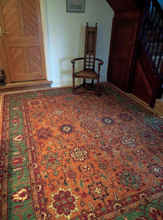


62 THE BRISTOL MAGAZINE | MARCH 2023 | NO 220 Silk Road Rugs Westway Farm, Bishop Sutton, Chew Valley, BS39 5XP silkroad-rugs.co.uk | 01275 319950 | info@silkroad-rugs.co.uk Get 40% off any non sale item with this ad offer valid until the end of March 2023 Vintage furniture given a new lease of life! Contact us for a full list of items & prices: jeffosbo@hotmail.com • 07875 129964

200 years of Bristol Museum

One afternoon in 1850, the artist and poet Dante Gabriel Rossetti was on his way out of the British Museum when he met its latest acquisition – a ‘winged beast’ from Assyria – being hoisted in. He was so struck by the encounter that he set to work on a poem, The Burden of Nineveh, imagining the centuries the sculpted figure had lain hidden in darkness before being rediscovered and brought to London. The poem ends with Rossetti looking forward to a time when Britain’s empire will, like the Assyrian, have crumbled into dust, and speculates on what those who rediscover the winged beast amid the ruins of London will make of it.
Although the poem is very much of its time, it neatly encapsulates the value of museums as places where we can step out of the present to convene not only with the past but also with the future. If you walk through the doors of Bristol Museum & Art Gallery, for example, and turn into a gallery on the right, you’ll be confronted – as Rossetti was –with a winged figure carved in Assyria almost three millennia ago, which was dug up and brought here in the 1850s.
Whether you’ll make as much of it as he did is another matter. Certainly, its enigmatic monumentality gives little hint of day-to-day life in the society that produced it. Walk into the next gallery, though, which houses the museum’s collection of ancient Egyptian artefacts, and you’ll find it packed with everyday objects, some of which – such as toys which parents placed in their children’s graves in the hope that they would play with them in the afterlife – it is almost impossible not to be moved by.
As far as looking backwards goes, though, this is merely scratching the surface. Climb the stairs to the first floor and you’re plunged back into deep time – the 4,600-million-year history of the earth itself,
explored through a dazzling collection of rocks and minerals, with skeletal remains of dinosaurs hovering in the background.
The museum is more than just a time capsule, though. The building that houses these treasures is arguably the most significant – and problematic – artefact of all. Although the museum celebrates its bicentenary this year, the current building only opened in 1905. That may not seem, in the grand scheme of things, that long ago – but you only have to look up as you walk through its doors to realise how much has changed since then, for there, high above, hangs a model of a Bristol biplane from 1910. It would have seemed an almost impossible vision of the future five years earlier.
That is one measure of how far we have come in such a short time, but there are many others. Carved in stone above its entrance, an inscription records that the building was ‘the gift of Sir William Henry Wills, Bart to his Fellow Citizens’. The grand hall that lies within looks as though it could have been designed as the trading floor of a great financial institution. Originally it was lined with classical statues which would have made it look even more forbidding. Its left-hand wall is dominated by a vast canvas depicting the Delhi Durbar of 1903, with the British Viceroy leading a procession of Indian Maharajas and British officials on richly decorated elephants. The overwhelming impression is one of unbridled pride in an empire at the top of its game. Hardly surprising, then, that when Edward VII and Queen Alexandra came to Bristol in July 1908 to open Avonmouth’s Royal Edward Dock, it was here that the Lord Mayor laid on a civic lunch for them.
Three years later, when the new king, George V, went hunting tigers out in India, one of those he potted was presented to the museum, where it was stuffed and mounted in an enormous mahogany case and given pride of place amid the museum’s collection of stuffed animals,
64 THE BRISTOL MAGAZINE | MARCH 2023 | No 220
Andrew Swift journeys back in time to celebrate the bicentenary of Bristol Museum & Art Gallery...
The Grand Hall c1910
where it still crouches today.
No one seems to have considered that tobacco, the empire and biggame hunting would one day be things that most people wouldn’t want to celebrate. Bristol – and the world – have moved on, and to say that the museum embodies attitudes and values now regarded as deeply problematic is something of an understatement. While this is an undeniable problem, it also provides an opportunity, which the museum has been proactive in taking up by involving individuals and communities in examining its legacy and seeking ways of addressing it.
In 2020, for example, the museum worked with students from the University of the West of England to create the Uncomfortable Truths podcast, exploring objects in the collection, considering the implications of putting them on display and suggesting ways of recontextualising them. One of the items considered, as a sign below it indicates, was the painting of the Delhi Durbar.
An even more uncompromising challenge to the world view enshrined in the painting faces it from across the hall – a wall drawing created by Jasmine Thompson in 2021. Entitled A Movement not a Moment, it celebrates the Black Lives Matter Movement, showing how people have come together to instigate cultural, political and institutional change not just in Bristol but around the world.
In the centre of the hall, meanwhile, a sign confronts visitors with three blunt statements: ‘The grand Edwardian architecture of this building was designed to celebrate the wealth and power of the city and by reflection its founders. Such ostensibly public-spirited projects masked the deep inequalities in British society and across the Empire. The connection between slavery and this building is an uncomfortable one.’

They are followed by a direct question – ‘How does it make you feel?’ – which not only invites a response but also opens up a dialogue, a dialogue which continues in the Curiosity Gallery. Here, objects are displayed with a range of opinions – not just from experts but also from visitors and others – about the propriety of displaying them and in some cases about issues surrounding their acquisition. This is where you’ll find a Benin bronze head, taken, along with thousands of similar objects, from the royal palace at Benin when it was sacked by British troops in 1897. They subsequently turned up in museums around the world. In
recent years, however, calls for their repatriation to Benin, now part of Nigeria, have grown ever more insistent. A few institutions have obliged. Most haven’t, and, while Bristol remains in the latter camp, museum staff are working with the Benin Dialogue Group and the Legacy Restoration Trust in Nigeria to resolve the issue. Elsewhere, objects from a range of periods and cultures are accompanied by views reflecting ongoing dialogues about how and why these objects were collected, and whose histories are being told when they are put on display.
The best-known dialogue instigated by the museum, though, was back in 2009 when Banksy was invited to provide his own spin on the objects displayed therein. Banksy versus Bristol Museum saw its hallowed halls given a playful post-apocalyptic makeover. Statues once again lined the grand hall – although these reimagined classical figures would have had the great and good who greeted Edward VII here a century earlier spluttering into their port. To add insult to injury, the centre of the hall was occupied by a burnt out ice-cream van with a giant ice-cream cone splattered on its roof, while nearby a cop clad in riot gear rocked gently on a child’s fairground horse.
Over 300,000 people visited the exhibition during its ten-week run, with queues over a mile long and some people waiting eight hours to get in. It put the museum on the map, not just in Bristol but internationally. Today, only one sculpture – Angel Bust, or the paint-pot angel – remains to remind us of those heady days. Their legacy, though, survives, not only in the thousands of people who were attracted to the museum for the first time, but also in its ongoing commitment to engage with communities across the city and address the history of the museum with honesty and openness.

Museums are not just about dialogue with the past, though. The spirit of enquiry that led to Bristol’s first museum being established in 1823, and the urge to inspire its visitors not only with ideas but also with beautiful works of art remains undimmed. Bristol Museum & Art Gallery is above all a treasure house of wondrous and beautiful things –and, despite the air of patrician exclusivity bequeathed us by its Edwardian benefactors, it is very much for everyone. n •

THEBRISTOLMAG.CO.UK | MARCH 2023 | THE BRISTOL MAGAZINE 65
akemanpress.com
Carved relief from Assyria
Inscription over the entrance of Bristol Museum & Art Gallery
The Grand Hall c1910
INTERIORS NEWS
LATEST NEWS FROM BRISTOL’S BEST DESIGNERS, RETAILERS AND BUSINESSES
Gardiner Haskins celebrates National Bed Month
March is National Bed Month and a good night’s sleep is important for mental and physical health. So, what do you do when your bed is causing you sleepless nights? The experts at Gardiner Haskins Interiors explain the four most important things to consider when purchasing a new bed.

BoConcept opens new Bristol store
The global furniture brand, BoConcept, has been designing, developing and making furniture in Denmark since 1952 and has celebrated its fifth anniversary in Bristol by opening a new store in Whiteladies Road, Clifton.
BoConcept helps consumers design a home that truly reflects their personality, with a highly-customisable collection and its exclusive Interior Design Service. Through in-store, virtual or at-home consultations, consumers can get personalised interior design advice, from how to style a sofa to designing an entire apartment, including mood boards and 3D visualisations.
“We're very proud to open our Bristol Whiteladies Road store, marking another important achievement in our company's regional development plan. Against the backdrop of a challenging retail landscape, BoConcept continues to inspire consumers, offering them extraordinary experiences and services through both our innovative stores and talented Interior Designers” says Brett Simpson, Managing Director, BoConcept Southwest.
BoConcept exists to transform living, leisure and workspaces into more extraordinary places, and with its regional development plan it aims to do that for many more consumers across the south and south west of the UK.
• boconcept.com

Builders Merchants Federation supports earthquake campaign
A trade body that operates across Bristol is calling on its membership and the wider construction community to support a fundraising drive to help the victims of the earthquake in Turkey and Syria. The Builders Merchants Federation, which has 870 merchant and supplier companies across the UK, has launched a JustGiving page to raise funds to go towards medical aid, emergency shelter, food and clean water. It has joined forces with event management company First Event to create the campaign. The move comes as both companies work to bring the BMF’s All Industry Conference to Istanbul later this year.
John Newcomb, CEO of the BMF, said: “While Istanbul is far away from the immediate damage, our hearts go out to out to Southern Turkey and NorthWest Syria and anyone who has suffered either directly or indirectly as a result of the earthquake.”
• For more information, visit: bmf.org.uk
“Generally, the easiest decision when choosing a bed is the size of bed you want. The bigger the bed, the more room you have to sleep. However, you must consider access to and from the bed and also any storage you’ve chosen. In Gardiner Haskins’ showroom, you can have beds in standard sizes or made to your measurements.
“There are many types of mattress filling with the most popular being a pocket sprung mattress. While it is important to consider your preferred filling of your mattress, it is best to try out a variety in the showroom. Innovation in mattress filling has come a long way in the past decade, meaning options may have changed since the last time you bought a new mattress.
“Getting the tension of your mattress right is crucial for good back support during the time you are asleep. If you lie horizontally on a good supportive mattress, your spine should be straight. You may find yourself and your partner prefer different mattress tensions. If this is the case, there are options available such as split tension mattresses or zip and link beds.
“When you visit a showroom, you will be faced with the option of bedsteads or divans. As the bed takes up so much space in your room it is worth considering what other functions you may need it for – like storage. Will you use boxes underneath a bedstead or would you prefer drawers in a divan? Whichever you choose it is crucial to try the correct bed base with the mattress in-store to ensure they are compatible and work well for you.”
• Visit the Gardiner Haskins Interiors Bedroom Showroom to speak to the experts about your new bed. Find the showroom at 1 Straight Street, Bristol, BS2 0FQ or visit their website for more information: gardinerhaskins.co.uk
FOOD NEWS
66 THE BRISTOL MAGAZINE | MARCH 2023 | No 220


Share your dreams, we’ll make them come true together! Mockridge Bespoke Carpentry Contact us on email - hello@mockridgebespokecarpentry.co.uk or telephone - 0117 990 2953 | 07946 037326 Mockridgebespokecarpentry.co.uk We’ve been working with homeowners, designers and builders all around Bristol, Bath and further afield for many years and, to create exactly the right bespoke design and finish, we’ll spend time understanding you and your lifestyle. Where dreams come true Let's build your dreams together
March into Spring
Whether you’re planning a do-it-yourself project or looking to hire a specialist designer, we’ve gathered together the city’s experts to help get your next venture off the ground in style...

GARDINER HASKINS
Brunel Rooms, 1 Straight Street, Bristol BS2 0FQ 0117 9292288; gardinerhaskins.co.uk
Gardiner Haskins Interiors has luxury interior showrooms that allow you to create your dream home space. Its knowledgeable and skilled team of design experts can help you design your own bespoke kitchen or bathroom, with wrap-around project management from start to finish. Create your perfect bedroom with over 40 beds on display from brands such as Harrison, Sealy, Hypnos and Relyon. Blend in beautiful bedroom furniture from Ercol, or wardrobe storage solutions from Wiemann and Nolte Möbel. The team has over 40 years’ experience, so you can guarantee exceptional customer service. Open six days a week with a free customer car park and less than 10 minutes’ walk from Cabot Circus.
BRACEY INTERIORS

15 Waterloo Street, Clifton, Bristol BS8 4BT 0117 9734664; braceyinteriors.co.uk
With over 50 years’ experience, Bracey Interiors has earned an enviable reputation for its design services. Working throughout the UK and abroad, the team creates unique and bespoke interiors for clients. Within the showroom in the heart of Clifton Village, Bracey showcases fabrics and wallpapers from all the major suppliers as well as a unique and eclectic mix of home accessories. Paints by Little Greene and Paint & Paper Library are also mixed to order in a matter of minutes. No matter how big or small your requirements are, Bracey Interiors has friendly staff ready to help. With their own workrooms they ensure all soft furnishings are made to their exacting standards, and offer an installation service. 2017 saw their Silver House project win three awards in the RSAW Welsh Architecture Awards.
GARDEN AFFAIRS
Garden Centre, 288 Frome Road, Trowbridge BA14 0DT 01225 774566; gardenaffairs.co.uk
Create space for home working, hobbies, a growing family or even a new business venture with a cost-effective, versatile, fully-insulated garden room. Garden Affairs offer a huge range of high quality, sustainable garden buildings and will help you get the design, the installation, the quality and the price spot on. Visit their extensive display centre at Trowbridge Garden Centre in Wiltshire to see garden offices, art and craft studios, teenage dens, granny annexes as well as a range of ‘posh sheds’ and summerhouses.

HOMES & INTERIORS | S/S 2023 GUIDE
68 THE BRISTOL MAGAZINE | MARCH 2023 | No 220
FIRE IRON ART
Underfall Yard, Cumberland Road, Bristol BS1 6XG 07966682140; fireironart@yahoo.com; fireironart.com
Joanna Williams A.W.C.B is a female artist blacksmith creating a wide range of hand-forged artistic and functional ironwork for the home and garden. Inspired by nature, she utilizes her design skills and traditional blacksmithing techniques to translate flowing forms and textures into sculptural metalwork. Creating garden sculptures large and small, interior design pieces, bespoke wrought iron gates and railings, each unique piece is individually handmade to the highest standards, crafted with passion, enthusiasm and attention to detail. Her floral ironwork has been curated for luxury cruise ships, including Ovation of the Seas, and is seen across the world. In between creating new pieces, she shares her skills through blacksmith experience days for those that want to try their hand at this ancient and exciting craft.

MANDARIN STONE
15 Regent Street, Clifton, Bristol BS8 4HW; 0117 9731552; mandarinstone.com
Renowned for its comprehensive natural stone collection, Mandarin Stone has gained quite a reputation for its on-trend and beautifully designed porcelain. Ranging from tiles that cleverly mimic materials such as wood, concrete and marble to striking glazed and patterned tiles, the collection has endless surface design possibilities. Established for over 25 years and with 14 inspirational UK showrooms, it offers dependable specialist knowledge as well as technical expertise. Almost the entire natural stone and porcelain collection is held in stock in the UK, so lead times are short. Check out the new ranges for 2023 such as the Zen Decor glossin porcelain –shown here.

LUMINATION LIGHTING

Lumination, within Gardiner Haskins, Broad Plain, Bristol BS2 0JP; 0117 922 6435; lumination.co.uk
Lumination Lighting is a leading specialist retailer of lighting products and services, stocking more than 20 of the leading industry suppliers from the UK, Europe and the Far East which includes their own exclusively designed and specified ranges. Lumination understand that lighting design is not only about the location, intensity and control, it is about the aesthetics and the ambience created. They provide a comprehensive service covering all aspects of lighting and offer a design service to help you achieve the best possible results. There are hundreds of products on display in the showroom and online and thousands more products available to order. The store is manned by trained and experienced advisors who actively ensure that they are in touch with latest trends and technological developments and are only satisfied when you have exactly the lighting you desire.
KUSTOM FLOORS & FURNITURE

Branches in Clevedon, Bedminster and Downend kustomfloorsandfurniture.co.uk
Operating in and around Bristol, Kustom Floors and Furniture are market-leading experts in the supply and installation of flooring as well as offering striking, quality furniture. The company supplies and fits carpets, vinyl, laminates, real wood, LVT and safety flooring in Bristol and the South West. Kustom tailor their service to fit with all your requirements in the belief that no two customers are the same. Whether you’re looking for a premium real wood flooring or you’re shopping for a new coffee table they have you covered. No job is too small and the friendly team are happy to help with your every need. Kustom proudly work alongside brands such as Karndean, Woodpecker, Cormar, Quickstep and many more. Think Kustom for all your flooring and furniture needs in Bristol and the South West.
THEBRISTOLMAG.CO.UK | MARCH 2023 | THE BRISTOL MAGAZINE 69
Photography by Peter Brisley
FIRED EARTH
65A Whiteladies Road, Redland, Bristol BS8 2LY; 0117 973 7400; firedearth.com
Renowned for its beautiful collections of tiles, paints and bathrooms, Fired Earth celebrates its 40th anniversary this year. Whether you’re looking to give a room a quick update or you’re planning a major renovation, Fired Earth has products for every style of home and for a wide range of budgets. Offering everything from hand-decorated wall tiles, glass mosaics, timeless marbles and inexpensive yet stylish porcelain flooring, to versatile and sophisticated paint shades and contemporary and traditional bathrooms that are a joy to spend time in, Fired Earth has been blazing a trail in the interiors world for 40 years.

TABITHA
TARLING
GARDEN DESIGN
34 Fairfield Road, Bristol BS6 5J 07811 169636; tabithatarling.co.uk
Tabitha is a highly experienced landscape designer with 15 years of designing and installing projects of all sizes, both in the UK and abroad. She offers a full garden design service, including design concept, construction management, planting and styling. She can also provide consultations, garden coaching and advice. Tabitha works collaboratively with clients, carefully listening to their needs, to ensure the end results are elegant as well as functional. She is keen to ensure her design solutions sit well within their surroundings, with beautiful, thoughtful planting schemes, and a sympathetic use of materials, whether it be it a tiny courtyard, a roof terrace or a large family garden. She works with a select group of landscape contractors and specialists so that the design process, from concept to completion, is smooth and seamless.

JUSTSHUTTERS

0117 3701594; justshutters.co.uk/bristol
Whatever your style –contemporary, modern, cosy or traditional –Just Shutters have the perfect fit for you. The shutters do not fade, warp or age and come with a lifetime guarantee. Rob and Linda Reeves are experts in the field, trained to the market-leading Just Shutters standard. They are passionate about shutters and transforming the homes of local people, with an understanding of outstanding quality, great value, and professional customer service. Work closely with Rob and Linda as they tailor Just Shutters to your tastes, giving you honest and impartial advice. The company has the largest range of material and finishes in the UK, granting you choice and options in terms of shutter style.
MARBLESUPREME
Unit 8, Bridge Road, Kingswood, Bristol BS15 4FW 0117 9563030; marblesupreme.com
Marble Supreme provides master craftsmanship in stone. Whether you’re looking for new stone worktops for your kitchen or bathroom, it offers a range of materials to suit your needs. With over 20 years of experience, the team produce a wide range of products from beautifully crafted granite kitchen worktops and flooring, right through to bespoke stone fireplaces, vanity tops, splashbacks and sink surrounds. Marble Supreme provides a complete service –from sourcing the perfect stone to crafting perfectly fitting, beautifully finished kitchen worktops. It also prides itself on delivering the very best in granite, marble and quartz stone, knowing its creations will play a part in family life for years to come. Whether you know what you want or are considering the options, the team is happy to discuss your plans so pop into the Kingswood showroom.

HOMES & INTERIORS | S/S 2023 GUIDE
KUTCHENHAUSBRISTOL
Clifton Down Shopping Centre, Whiteladies Road, Clifton, Bristol BS8 2NN 0117 213 0680; uk.kutchenhaus.com
Kutchenhaus Bristol is part of the Kutchenhaus German Kitchen family. Located in the heart of Clifton, Kutchenhaus supply, design and fit German kitchens, which with it bring innovation and the latest technology. Whether you are looking for a modern or traditional kitchen, the friendly team at Kutchenhaus Bristol has over 60 years of combined experience, so can guarantee a professional and five-star service. All Kutchenhaus kitchens are manufactured and put together in Verle, Germany and gets shipped directly to customers fully assembled, which means no flat-pack. The kitchens are also manufactured by intelligent machines, which completely eliminates the risk of human error, guaranteeing your kitchen will be right first time. The team in Bristol also designs spaces for bathrooms, bedroom and living areas too. So whatever your query may be, pop into the showroom today and put your dream project plans in motion.
BOCONCEPT

76-78 Whiteladies Road, Clifton, Bristol BS8 2QN 0117 363 7020; boconcept.com
Through Danish creativity and craftsmanship, BoConcept elevates spaces with iconic design that brings joy and inspiration, collaborating with some of the most respected designers in Denmark and further afield to be timelessly on trend. Live a life as individual as you are. You can change the size, colours and materials of nearly every design and the team at BoConvept are there to help you style your home, your way. Nothing beats having a face-to-face opinion you can trust, someone who understands your needs and can guide you to the right choice. BoConcept’s interior designers’ primary concern is getting to know you and your desires, problems and interior demands. Your interior designer will help unfold the potential of your home and help you discover your perfect solution, whether big or small. What’s more BoConcept Bristol offer a free interior design service. Just visit the store and ask.
THEKITCHENPARTNERS
102 Whiteladies Road, Clifton, Bristol BS8 2QY 0117 9466433; thekitchenpartners.co.uk
A provider of premium quality kitchens, designed and crafted with precision and care. Our passion for kitchen design, combined with our commitment to providing the best possible customer service, has helped us establish ourselves as one of the leading kitchen companies in the industry.


Our team of highly skilled and experienced kitchen designers work closely with each and every client to understand their requirements and bring their vision to life. Our designers are knowledgeable about the latest kitchen trends, and they can offer creative and practical solutions to any design challenges you may have.
The Kitchen Partners is proud to be a family run business that has been serving customers for many years. We take great pride in the quality of our work and the level of service that we provide to our customers. Our commitment to excellence extends from the initial consultation, through the design and installation process, and beyond. We are always here to provide ongoing support, ensuring that your kitchen remains functional and beautiful for years to come.
HOMES & INTERIORS | S/S 2023 GUIDE THEBRISTOLMAG.CO.UK | MARCH 2023 | THE BRISTOL MAGAZINE 71
PAUL WHITTAKER BATHROOMS AND WETROOMS
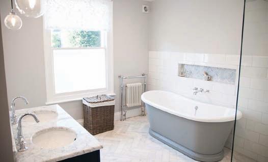
Showroom by appointment at Bathroom Solutions, 54 Redcliff Street, Bristol BS1 6LS; 0117 2230086 / 07879 666221; paulwhittakerbathrooms.co.uk
Paul Whittaker Bathrooms and Wetrooms is a design, supply and installation bathroom company with a huge reputation in the Bristol area. Working closely with his clients, Paul is able to deliver cleverly designed bathrooms and wetrooms, expertly installed by his experienced team of fitters. With 3D design layouts to help with decision making and project management through the course of the works, Paul Whittaker makes bathroom renovations easy and stress-free.
MOCKRIDGE BESPOKE CARPENTRY
mockridgebespokecarpentry.co.uk; 07946 037326; hello@mockridgebespokecarpentry.co.uk

Cory Mockridge and team have been working with homeowners, designers and builders all around Bristol, Bath and further afield for many years and, to create exactly the right bespoke design and finish, will spend time understanding you and your lifestyle. The company aim to build not only furniture but relationships. Recent testimonials confirm this: “Meticulous and paid lots of attention to detail.” – Barrs Court, Bristol. “Prompt, efficient, and with an excellent standard of workmanship.” – Trowbridge, Wiltshire. “Professional, efficient, honest and reliable… Very impressed, from designing the furniture and choosing the materials to the finished goods.” – Keynsham, Bristol. For more details and to discuss your next project call or email Cory.
COLOURFENCE BRISTOL
colourfencebristol.co.uk; 0117 259 1789
SOFAS & STUFF
80 –82 Whiteladies Road, Clifton, Bristol BS8 2QN 0117 213 0043; sofasandstuff.com
Blending contemporary creativity with the knowledge and experience of three generations of furniture makers, Sofas & Stuff make timeless sofas, chairs and beds, handmade here in Britain with love and for longevity.
Offering interior designers and individual customers a level of choice and customisation that sets it apart, Sofas & Stuff strives to create more sustainably, producing no more than what is needed through its truly bespoke service. Choose from Sofas & Stuff’s inspiring library of fabrics, which includes exclusive linens and collaborations with the Royal Horticultural Society (RHS) and the V&A.
Shown here: Kentwell three-seater sofa in RHS Lydia Penrose Design

Forget your fence worries for good this autumn. Choose ColourFence. The revolutionary metal garden fencing is both attractive and practical, meaning you don’t have to compromise. The ColorBond steel is virtually maintenance free, with no painting or treating required, meaning ColourFence will stay looking as good as the day it was installed for years to come. It is guaranteed not to rust, warp or peel for at least 25-years! You can find out more or book a FREE no-obligation quote using the contact details above.

72 THE BRISTOL MAGAZINE | MARCH 2023 | No 220
HOMES & INTERIORS | S/S 2023 GUIDE
SILK ROAD RUGS
1 Westway Farm, Bishop Sutton, Bristol BS39 5XP 01275 319950; silkroad-rugs.co.uk
Silk Road Rugs stock a beautiful and eclectic range of handmade rugs, kilims and furnishings from the Middle and Far East, accommodating for the traditional taste of period properties alongside contemporary design and modern living. Promoting centuries-old traditions and designs on display you’ll find Afghan tribal weavings, ornate Persian carpets and Chinese rugs alongside lots of beautiful gift items and furnishings.
The shop itself is nestled on a farm between Bath and Bristol and the very helpful team offer lots of guidance through the rug choosing process. Silk Road Rugs also offer a specialist cleaning, repair and valuation services and all stock can also be purchased online.

BONITI
Dunsdon Barn, West Littleton, Wiltshire SN14 8JA 01225 892200; boniti.com
Run by Giles and Simon Lunt, Boniti is a high-quality interiors (and exteriors) business. The showroom is a destination for all types of natural stone, porcelain and timber flooring as well as decorative tiles, stoneware, Kadai firebowls, and the highly desirable Everhot range cookers and stoves. For large and small projects, the Boniti team are masters of their profession and it shows in every detail. The showroom is easily reached from J18 of the M4.
ARTISANS OF DEVIZES
Stonebridge House, Nursteed Road, Devizes, Wiltshire, SN10 3DY 02033 029 996; artisansofdevizes.com
Artisans of Devizes is a heritage British brand based in the market town of Devizes, specialising in exquisite natural stone flooring, bespoke stone creations and luxury tiles. Their collection is filled with exclusive designs to satisfy every style and budget from starburst porcelain tiles to nature-inspired creations from their exclusive collaboration with the National Trust that honour some of Britain’s most historic properties.
Their bespoke stone services help to achieve your exact home requirements, from tailormade stone staircases to made-to-measure stone shower trays. Their specialist team of designers and masons are able to look after a bespoke stone brief from start to finish for a result that is unique and everlasting.


HOMES & INTERIORS | S/S 2023 GUIDE
THEBRISTOLMAG.CO.UK | MARCH 2023 | THE BRISTOL MAGAZINE 73
FINE LINE WOODWORKS
Studio visits by appointment: Unit 14, Douglas Road Industrial Park, Bristol BS15 8PD; finelinewoodworks.co.uk; 07931998169; hello@finelinewoodworks.co.uk
Fine Line Woodworks hand-craft unique, statement furniture pieces that exude luxury, featuring fine metals and bio resins seamlessly cast alongside beautiful timbers.
Located in Kingswood, a unique showroom allows customers to browse through the available timber collection and draw inspiration for their own bespoke commissions. Customers can also schedule an appointment to speak with Jake, the founder and creator of Fine Line, who will walk them through the entire process and provide guidance on how to bring their ideas to life.

Every piece is built with the utmost attention to detail, ensuring that each item is a unique functional art-piece that will add a touch of luxury to any space.
UNL STUDIOS
3rd Floor, Old Stock Exchange, St Nicholas Street, Bristol BS1 1TG 07703 575 289; unlstudios.com
UNL Studios are garden landscape designers. Pouring optimism, energy and enthusiasm into every project, the team are based in Bristol, but like to get around a bit –Bath, Somerset, North Devon and even sometimes as far as London. Designer Rob Mills comments: “We’re what’s known as a boutique landscape design studio. A bit posh (not really), a bit experimental and a bit bloody brilliant if you pardon the language. Basically, if you want something marvellous with three Ms, then you’ve found yourself in the right place. If you don’t, well we’re not for everybody to be honest.”
Townhouse courtyard, rambling country estate or hanging gardens of Winterbourne. However ambitious your brief, the aim is always the same –to blow your garden-loving socks off.

THE TILE AND BATHROOM WAREHOUSE

6 Eldon Way, Eldonwall Trading Estate, Bristol BS4 3QQ 01179 770011; thetileandbathroomwarehouse.com
With over 20 years experience in the bathroom industry, The Tile and Bathroom Warehouse has the expertise you need. Whether you are renovating your bathroom, looking for a simple update or have a large project on-hand, the team have the solution. A proud independent business with national buying power, The Tile and Bathroom Warehouse is your creative partner and can guide you through every stage of your bathroom fit-out. From measuring up through to choosing the right installer, The Tile and Bathroom Warehouse has you covered. Stocking a hand-picked range from only the best manufacturers, you can expect five-star quality product at an affordable price with industry leading guarantees, WRAS approval and BSi compliance.
HOMES & INTERIORS | S/S 2023 GUIDE


THEBRISTOLMAG.CO.UK | MARCH 2023 | THE BRISTOL MAGAZINE 75
INSIDE DASH + MILLER
Shortly after its inception in 2009, Bristol-based woven textile design studio Dash + Miller attracted the attention of couture fashion houses, which saw them become one of the world’s leading woven concept specialists. Following their recent collaboration with Bristol-born photographer Garry Fabian Miller for his latest exhibition at Arnolfini, we caught up with co-founder Juliet Bailey...


In 2009, woven textile designers Juliet Bailey and Franki Brewer founded Dash + Miller, initially opening their portfolio of experimental and innovative hand-weaving techniques to select manufacturers in the Italian textiles industry. The outstanding translation of their designs from hand-woven concept to industrial production caused a ripple effect, which soon saw the studio reaching out to clients in the USA and Europe, attaining global recognition as one of the best fabric design studios for woven fabric and textile trends.
The duo, through hand-weaving, struck upon a unique recipe for design, which provides usable and exciting ideas relevant for designers in couture fashion houses, sportswear brands and high-street fashion and homeware brands, to name just a few. The studio also regularly works with some of the most well-respected mills and fabric producers around the world; informs and inspires the creation of fabrics; and attends the Première Vision Paris –a biannual gathering place for creative fashion professionals.
The team’s experimental creativity combined with their deep level of technical understanding and access to the right technology allows them to realise their ideas in a way that makes them unrivalled as the world’s leading woven concept specialists. In the studio, the team of highly skilled weavers have assembled a remarkable range of equipment, including the latest Computer-Aided Design (CAD) weaving software, 8-24 shaft dobby hand-looms and a Norwegian Jacquard hand-loom. Outside of the studio, Dash + Miller employ a network of multi-disciplinary textile specialists with creative knowledge and expertise in embroidery, screen and digital print, lasercut, mixed media, and dyeing, all of which allow them to offer an exceptional design service relevant to an evolving and responsive creative industry.
What’s more, in 2015, Juliet and Franki founded the Bristol Weaving Mill – a micro-mill based in the heart of Bristol offering a noboundaries approach to the design, sampling, and manufacture of woven fabrics and soft accessories. Built by designers for designers, both creativity and craftsmanship lies at the heart of everything it does and the team marries traditional weaving methods with innovative and trend-led design. Juliet and Franki believe that good design and high-quality manufacture works together to maximise the lifespan and longevity of any possession.

The founders are dedicated to exploring local, sustainable, innovative, and traceable materials and processes, aiming to limit the impacts of textile manufacture on our planet wherever possible. Each client receives a tailor-made design and development service whether the outcome is hand-woven lengths for couture garments, creative solutions in transforming surplus/waste materials into luxury textile items or woven soft accessories made from the fleece of small herds of alpaca and rare breed sheep.
Three years ago, Dash + Miller and the Bristol Weaving Mill undertook a collaborative process with Bristol-born photographer Garry Fabian Miller, experimenting with colour, yarn, structure and the boundaries of the dobby loom to create a hybrid tapestry woven dobby-cloth. Hanging in the first floor of Fabian Miller’s ADORE exhibition at Arnolfini is three of four of the tapestry pieces that Dash + Miller have created with Fabian Miller. This month, we caught up with Juliet to find out more…

Tell us about your collaboration with Garry Fabian Miller and where the project began...
Collaborating with Garry has been a huge pleasure and privilege. We were thrilled when he approached us to work together, and as our relationship has progressed we have been astounded by his level of trust in our designs and our process. Due to the pandemic we didn’t have the opportunity to meet face to face until well into the design and production process. The projects have originated from Garry’s desire
TEXTILES
Co-founder of Dash + Miller Juliet Bailey

 Bristol-born artist Garry Fabian Miller cutting Colourfields tapestry off the loom at Dash + Miller’s studio in St Philip’s
to translate and interpret his processes into different textile mediums, and he’s allowed and encouraged us to push the boundaries of what is possible within dobby handloom weaving. The wide mixture of processes and materials we have explored during the creation of these tapestries has been incredible, and has really pushed the capabilities of our design team.
Can you describe the creative process for projects at Dash + Miller and how everything from the design concept to the production of fabric is created in-house?

Working on handlooms and drawing from an extensive catalogue of raw materials, our designers utilise their creative expertise and unique take on brand identity to develop innovative and showstopping fabrics. Our close links with mills in the UK and Italy allow us to see a fabric development through to production when required.
After founding Dash + Miller, what was your vision for the Bristol Weaving Mill?
Franki and I as Dash + Miller were awarded the first joint scholarship by the Queen Elizabeth Scholarship Trust (QEST) in Spring 2013. This allowed us to embark upon an extended research and networking tour within the UK textiles manufacturing industry, visiting some of the most historic and prestigious facilities for fibre processing, spinning, weaving, finishing and dyeing and learning about the processes and scope on offer. Encouraged by our new understanding and connections, this research planted the seed for a new design-focused sampling and smallproduction facility and, in 2015, after a successful bid to the ERDF West of England Growth Fund, Dash + Miller’s sister company The Bristol Weaving Mill was born. In 2016, we were proudly awarded the QEST Fattorini Medal of Excellence for outstanding contribution to our craft and the sector, while demonstrating our commitment to training and passing on skills to the next generation. The two companies are completely autonomous, however, we do sometimes have shared clients and partner together to deliver an outcome for a client.
Tell us about your local and global suppliers and the materials you use... Our unique placement as a small-scale and local manufacturing facility allows us at the Bristol Weaving Mill to explore and enable a great variety of sustainable projects and processes. We recognise the importance of limiting the environmental impact of our activities and are continually reviewing and improving our processes and resources.
Over the past five years, we have built strong relationships with pioneering regenerative fibre producers and sustainable closed-loop textile projects. We are a proud member of the South West England Fibreshed, and our clients have looked to us to propose creative solutions for their surplus materials and textile waste, often with beautiful, luxury outcomes.

Tell us about your sustainable practices and why they are so important to Dash + Miller and the Bristol Weaving Mill...
Core to the Dash + Miller and The Bristol Weaving Mill’s ethos is the concept of sustainable, responsible design. It’s our belief that it’s our responsibility to influence our clients and the wider textile industry through sustainable choices that are made at design level. The studio’s networks within UK sourcing and manufacture have allowed the team to unlock localised and traceable channels to textile production, facilitating circular development processes from raw materials through to the finished product. Both cutting-edge technology and traditional low-tech processes play a role in advancing this emerging area of the textile industry and we are working to connect the dots and create more futureproof outcomes. We believe that our positioning within the product development process bestows on us a responsibility to design sustainable outcomes. Our R&D in circular sourcing and localised, traceable textile solutions feeds our curiosity about how to deliver a more sustainable future for the industry. Our knowledge and networks support us in delivering research and consultation for sustainable textile solutions. n
• dashandmiller.com; bristolweavingmill.co.uk. Dash + Miller studio images by Alice Hendy Photography
THEBRISTOLMAG.CO.UK | MARCH 2023 | THE BRISTOL MAGAZINE 79 TEXTILES
Colourfields was made using Egyptian cotton and Italian Mohair, hand-woven by the team in Bristol.
Photography by Lisa Whiting Photography
Fired Earth; Timeless Style
As a season of new beginnings, spring is the perfect time to refresh your home and to give your interiors a bit of an update.
It’s amazing how something as simple and inexpensive as a change of paint colour or an inspiring new palette can revitalise a room, giving it a completely fresh look. The perfect paint will really tie a scheme together, and Fired Earth's paint range includes everything from hardworking neutrals to harmonious pastels and bold accent colours. In celebration of its 40th anniversary this year, Fired Earth has recently added six beautiful paint colours to the collection, and they’re sure to inspire you to reach for a paint brush. Ranging from the delicate, restful umber of Silver Needle to the vibrant and celebratory burnt terracotta of Taos House, and the lush teal of Hesper, these timeless shades are completely at home in contemporary and traditional interiors.
If you’ve never really ventured far from whites, Silver Needle is the ideal place to start since it’s warm, versatile and complex without being in any way strident. If you’re worried about bolder shades being ‘too much’ or being tricky to match with soft furnishings etc, then why not try them in a small area such as a cloakroom or hallway. You’ll probably be completely won over once you’ve had a chance to admire them several times a day! You could also try painting a tired piece of furniture, giving it a new lease of life and adding a dash of eye-catching colour to a room.
While a couple of coats of paint are one of the quickest, easiest and most inexpensive ways to achieve a spring makeover, a new splashback or floor can also have a dramatic impact on the look and feel of a room without breaking the bank. As with paint, if you usually play it safe with tiling, then a splashback can be a great place to start when it comes to being a little more adventurous. Fired Earth’s latest collections include a stunning Arts & Crafts-inspired tile range called Kelmscott that would be a wonderful addition to any home. The tile motifs are a perfect blend of contemporary and classic so they’re ideal for every style of interior, and the designs have an ageless feel that will really stand the test of time. The Kelmscott tiles are made from hardwearing porcelain – porcelain being a really lowmaintenance surface that’s ideal for busy homes – and can even be used outdoors, so they’re particularly versatile. Working brilliantly for everything from a fresh and pretty splashback behind a bathroom basin to a spectacular kitchen floor leading out onto a patio, the Kelmscott collection is a perfect choice if you’re planning a new look for any room of the home.

Although here in Britain we’ve tended to confine tiles to kitchens, bathrooms and hallways, collections such as the Kelmsott range are undoubtedly beautiful enough to grace living rooms and bedrooms too. Using tiles on, say, living room walls or bedroom floors can be a really contemporary way of introducing eye-catching pattern and texture to a scheme. Designs such as the bold geometrics in Fired Earth’s Azores and Urban collections can be used as a fantastic alternative to wallpaper, and they can be paired with paint in exactly the same way that you might select a paint colour to complement wallpaper. For example, you might choose to paint two or three walls and tile the remaining wall or walls, or you could tile the lower half of a wall and paint the upper half, using tile trims or pencil tiles to create a crisp dado that gives the wall a really finished look. This combination of lower wall tiling and painted upper walls works particularly well in hallways, protecting walls from inevitable scuffs and splashes. Take the tiling slightly above the height where people are likely to touch the wall to balance as they pull off shoes or as they carry in parcels. You’ll then be able to keep paintwork looking clean and fresh until you decide that it might be time for another spring makeover!


Fired Earth
65A Whiteladies Road (on Aberdeen Road), Clifton, Bristol BS8 2LY 0117 973 7400, Firedearth.com
80 THE BRISTOL MAGAZINE | MARCH 2023 | NO 220
Silver Needle
Hesper
Urban Axel tiles with Hoppers Hat
Kelmscott tiles


THEBRISTOLMAG.CO.UK | MARCH 2023 | THE BRISTOL MAGAZINE 81 THE KITCHEN PARTNERS DESIGN STUDIO www.thekitchenpartners.co.uk 102 Whiteladies Road, Clifton, Bristol BS8 2QY 01179 466433 MARBLE SUPREME | UNIT 8 BRIDGE ROAD | KINGSWOOD | BRISTOL | BS15 4FW T: 0117 956 3030 | E: INFO@MARBLESUPREME.COM | WWW.MARBLESUPREME.COM craftsmanship means FOCUSING ON FINE DETAILS AND TAKING THE TIME TO MAKE EVERY JOB OUTSTANDING
CHECK A TRADER AND GOOGLE REVIEW FOR ★★★★★ RATINGS
TIMES MONDAY –FRIDAY 8.00 AM –5.00 PM SATURDAY 9.00 AM –12.30 PM
SEE
OPENING
MEET THE MAKER
fine line woodworks
From his workshop in Kingswood, Jake Ainsley has been creating luxurious functional art, handcrafting statement pieces featuring cast metals seamlessly paired alongside character timbers. This month, Jake invites us into his workshop where the true wonders of Fine Line Woodworks await...
Tell us about your background in carpentry, how you came to found Fine Line Woodworks and why you decided to set up in Bristol...

My journey into carpentry began during my teenage years while working alongside my uncle in Canada. As I spent a summer restoring beautiful old timber buildings surrounded by the breath-taking Rocky Mountains, a seed was planted that working with wood could bring true fulfilment.
Years later, a close friend introduced me to composite materials and how to incorporate them in furniture design. I was instantly fascinated by the possibilities and used my spare time to experiment with basic tools and some wood acquired from Bristol Wood Recycling Project. The seed had set its roots and was beginning to grow.
Having a young family, however, meant spare time was limited so, taking a risk, I made the decision to leave my job in retail for the world of furniture design.
Focusing on a process that binds fine metals alongside beautiful timbers, I felt I had a product that was unique enough to get behind and Fine Line Woodworks was born.
Being from Bristol, I’m constantly inspired by the city’s artistic creativity and collaborative approach. Having our workshop in Kingswood integrates us into a close network of makers, with people willing to share ideas and encourage each other. We’re looking to establish further connections this year with some fantastic opportunities developing and I’m excited for what lies ahead.
Your foundation is rooted in respect for natural resources and your design has sustainability at its core, combining plant-based resins with locally sourced timber. Tell us about your sustainable practices and why these values are so important to Fine Line Woodworks...
At Fine Line Woodworks, we are dedicated to reducing our environmental impact while sourcing local materials in a sustainable way. This involves working with partners that share our values. We obtain our timber from well-managed forests or private lands where
trees may need to be removed for reasons such as disease or due to safety concerns. This not only gives our customers valuable insight into where our materials are sourced, but it builds trust in our process and helps them forge a deeper connection to the pieces that will eventually play a functional role in their daily lives.
We strive to minimise waste by utilising every aspect of the wood slab, such as turning small offcuts into serving boards and using scraps to heat our workshop during the winter. Designing with sustainability in mind helps to inform the process with better decisions and we can therefore reduce what we take from the planet’s generous but finite resources.
This year, we are exploring the use of PET –a recycled plastic bottle core that can be coated and used as table-base forms. We’re also looking at using discarded plywood that can be cut into unique shapes and coated with various metal finishes.
Our furniture is built to last, with hardwearing surfaces that can be maintained and re-finished if required. By incorporating sustainable methods into our furniture design, we can create high-end pieces that not only look beautiful but are also environmentally responsible.
82 THE BRISTOL MAGAZINE | MARCH 2023 | No 220 BRISTOL TALENT
Tell us about the designing and building process of your furniture pieces and how you pair beautiful wood grain and polished fine metals...

Each design process starts with the unique characteristics gifted to us by nature. The shapes, grain patterns and tones presented in the wood inspire subsequent material choices. With each aspect that is introduced, the goal is to further accentuate the natural beauty in the wood, while creating the desired piece.
Seamlessly pairing metals alongside timbers involves a complex casting process, where the right conditions are required and time is allowed for the elements to join as one. The result is a fusion of two widely used materials not often presented in this way.
With a hardwax oil composed of natural elements, a durable finish is built up to highlight the beauty of the wood grain while offering an easily maintainable surface.
Digital renders assist throughout the journey, from composing the initial concept to informing the process with the required steps towards completion.
 Ash and Gunsmoked Iron Dining Table
On average, how long does each project take from concept to completion?
We like to work closely with customers to fully form a concept before beginning the build. When starting with a clear vision, design aspects can be finalised quickly. However, if they require inspiration and guidance, we are happy to take the time necessary to help shape the idea. Once we have acquired the materials for the project, completion usually takes around six to eight weeks. Delivery day is often our favourite part, when we get to see our customer’s reactions as their functional art-piece is placed in their home.
As true works of art, what have been some of your favourite creations to date?
Our Molten Collection was born through years of research and development. Despite the difficulties and setbacks we encountered, we were determined to bring something special to the furniture world.
At the end of the experimentation phase, one of the proudest moments of our journey arrived with the creation of our first molten product, a coffee table crafted from English Walnut and Gunsmoked Iron. This piece found a home with a lovely family in London, who really appreciated its beauty and craftsmanship.

How can customers submit their commissions? How do you help people bring their visions to life?

Customers can submit commissions via our website or can give us call to discuss requirements for their project. Key aspects to consider are wood species, metal or resin, dimensions and base design.


With these elements as a starting point, I can use digital drawings to present realistic images of the finished piece. Being able to visualise the project helps the customer realise the design and how it will integrate with other aspects of their space.
We’ve also developed a range of samples showcasing different metal and wood pairings, from Burr Oak and Gunsmoked Iron, to American Black Walnut and Polished Bronze. These can assist customers in choosing materials for their own project. If customers are local, we can either deliver our samples to their home or post them.
From our Kingswood unit, we can welcome customers on an appointment basis. We have stock pieces that are ready to buy, including dining tables, desks and coffee tables, as well as various different species of timber that can be commissioned.


To receive a sample or arrange a viewing at our workshop customers can call ahead or email us at: hello@finelinewoodworks.co.uk. n
• For more information, visit: finelinewoodworks.co.uk. Studio visits by appointment at: Unit 14, Douglas Road Industrial Park, Bristol BS15 8PD. All images courtesy of Fine Line Woodworks and James Lawley
84 THE BRISTOL MAGAZINE | MARCH 2023 | No 220
Jake Ainsley, founder of Fine Line Woodworks
Cedar of Lebanon Dining Table
English Walnut and Gunsmoked Iron Coffee Table


THEBRISTOLMAG.CO.UK | MARCH 2023 | THE BRISTOL MAGAZINE 85 www.ellyswellies.co.uk ellyswellies@gmail.com 07788 640934 Turning your ideas into beautiful spaces Elly’s Wellies Garden Designs Elly’s Wellies Garden Designs will help you maximise the potential of your outdoor space and tailor it to your individual needs. Whether you are looking for a complete garden redesign, or just need advice on what to plant in a border, Elly’s Wellies will be happy to help. For a free initial consultation, contact Elly West
True colours
As the weather begins to brighten and temperatures rise, now is the time to start thinking about colour, says Elly West, who shares her top tips on how to achieve the perfect pallette...
One of the many pleasures of gardening is the opportunity to experiment with colour, and to enjoy the countless combinations that occur. Sometimes these are carefully planned, such as Vita Sackville-West’s white garden at Sissinghurst, full of whites, creams and greens, or the more vibrant ‘hot borders’ at Hidcote, but I also love the surprises that spring up in nature, such as the medley of colour in a summer meadow, or something self-seeded in the perfect spot in the garden. With the weather starting to warm up and the garden springing back into life, now is a good time of year to assess your borders and think about colour, and to make some deliberate choices about what to include and exclude.
It might just mean moving some plants around, or restocking a whole border, but a bit of planning and perhaps limiting the palette can make all the difference to the overall feel and style of your garden, and whether it has harmony or discord.

In terms of our senses, colour is perceived immediately and directly, with the power to affect our mood, so what we choose to grow in our garden can have a huge impact on our enjoyment of a space. It’s also a chance to personalise your plot so don't be afraid to experiment.
Looking at a colour wheel is a good place to start. Sir Isaac Newton created the first known circular diagram of colours in 1666, with seven main colours to fit in with the colours of the rainbow. A modern colour wheel groups colours into three categories, primary, secondary and tertiary. The three primary colours are red, blue and yellow. These are unique as they can't be produced by mixing other colours. The secondary colours are those that sit between the primary colours: orange, purple and green. Mix a secondary and a primary colour together and you get the tertiary colours, eg. blue-green or red-violet. One side of the wheel then has warm colours (reds, oranges and yellows) while the other has the cool colours (blues, greens and purples).
Harmonious colours are those that are similar and sit next to each other on a colour wheel. Blues, purples and pinks will create a beautifully calming colour scheme with a soft ‘modern-cottage’ feel, while vibrant oranges, reds and magentas together are invigorating and intense, but still harmonious. Complementary colours are opposite each other on the wheel, such as blue and orange, yellow and purple, or green and red. These can create some of the most striking of colour combinations with one making the other ‘pop’ in contrast. As the artist Marc Chagall said: “All colours are the friends of their neighbours and the lovers of their opposites.”
Then of course there are paler and darker shades of each colour as you add white or black, making as many as the 17 million colours that are thought to exist. And having just this week been to choose paint from a colour mixing range, and been overwhelmed by the numerous options, I can just about verify that number. The Royal Horticultural Society has also put together a colour chart, first published in 1966, as a way of standardising and recording plant colours. This has since been used extensively by growers, horticulturists and registration authorities to identify and describe plant colours precisely. This chart has 920 colours with unique letter codes and numbers, as well as a name, and the colours are all based on the natural world, so can be matched to flowers, fruits and other plant parts.
Light also plays a big part in how colours look in the garden. Reds have the longest wavelength, looking best in bright sunlight, and maintaining impact and visibility over a long distance. Blues on the other hand have the shortest wavelength in the visible spectrum, and readily blend into the background as you move further away, particularly darker blues. Whites and yellows brighten dark corners, and can be seen for longer in the evenings as the light fades.
Sticking to a colour scheme makes it easier to create a successful
86 THE BRISTOL MAGAZINE | MARCH 2023 | No 220
design. A good starting point is to find images in a magazine or on the internet, or even a piece of artwork that you like and create a mood board of plants, borders and colours. Take it with you when you’re plant shopping as it's easy to be distracted once you're there. Any given colour palette will change through the seasons as well. Vibrant yellow daffodils may work in spring alongside red tulips and blue muscari, when a fresh burst of primary-coloured zing is welcome, while your summer palette could be more harmonious pinks and purples, giving way to russet browns, whites, pale beige and orange in autumn and winter. The colour of a fence can also make a difference to how your plants look. Painting fences dark grey or black is a good trick to make the colours of your plants really stand out. A dark green yew hedge is also a perfect foil for most plants.
Generally speaking, strong, bright colours will create excitement and vibrancy while pastels and muted colours will bring a sense of relaxation. Greens and whites are cool and sophisticated, and perhaps the ultimate in simplicity and calm.

Creating a border can be like painting with plants but more fun, as your palette is ever-changing depending on the light, weather and the time of day. Plants present their colours in different ways as they grow; flowers open and fade, giving way to pale seedheads or vibrant berries. Leaves that unfurl fresh green in spring may turn red and golden in autumn. Their diversity of form is also unlimited. A blowsy pink dahlia will have a different impact to tiny sprays of pink dianthus. Nature presents us with an almost unlimited spectrum to play with, so have fun trying things out and see what happens. n
• ellyswellies.co.uk

Plant of the Month: Cornus
Complementary colours red and green are seen at their best as the new leaves of Cornus alba ‘Sibirica’ emerge against the vivid winter stems. Cornus, otherwise known as dogwood, is grown mainly for its colourful winter stems, in firework shades of red, orange, green and yellow. These deciduous shrubs are good planted in groups with early spring bulbs, or as fillers in a border. They aren’t particularly exciting in summer, but have good autumn colour and come into their own once the leaves have dropped and their colourful stems are revealed. Plants prefer moist soil and some sun. Coppicing produces the best winter colour –cut all the stems back to ground level in early spring at around 5cm from the ground. The new stems will then spring up from a permanent low framework. ‘Elegantissima’ has attractive green and silver-white variegated leaves and red stems, while ‘Midwinter Fire’ has unusual red, orange and yellow multi-toned stems.

GARDENING
THEBRISTOLMAG.CO.UK | MARCH 2023 | THE BRISTOL MAGAZINE 87
Spring clean
As warmer months draw near, Rupert Oliver of Rupert Oliver Property Agents looks at how a Spring clean, inside and out, can greatly improve your property’s kerb appeal...
In recent years, Spring and Summer have been notoriously popular times of the year to sell a property as prospective buyers begin their hunt for a new home. If you’re considering putting your house or flat on the market this season, it’s time to start thinking about making good on those minor repairs to let your home flourish to its truest potential. Here are some easy fixes to make sure your property stands out against the competition…
General maintenance
Research has shown that a well-kept exterior can boost the value of a property for sale. Remove any built-up dirt or rot, clear leaves from paths and gutters and replace any cracked or loose slates on the roof. Give external doors, window frames, garden gates, sheds and railings a fresh lick of paint. Be sure to bear in mind the colour of the stone or brickwork when choosing a shade for your front door so that the exterior is in-keeping with your property’s character. Polishing knockers and letter boxes can also create a positive first impression.
Get gardening
As more people add gardens to the top of their wish list, it’s important to keep your outdoor space looking its best. According to experts, a well maintained garden can add between £10,000 to £15,000 to the value of a home. That being said, Spring is a great time to trim any hedges, thoroughly weed parking areas, paths and patios, and add some floral decoration. For instance, plant some bright daffodils and tulips or a colourful flowerbed. For properties with limited green space, window boxes and planters on either side of the front door can work wonders.
If you can, jet-wash the patio and decking and take the time to give your garden furniture a good clean and a fresh coat of paint. If you want to take it a step further, add some lights or latterns to create an atmospheric outdoor space to enjoy day and night.
Deep clean
For the interior, take it room by room. Dust, wash and clean furniture, carpets and curtains to ensure everything is feeling fresh and ready for the warmer, brighter months ahead. Begin each room by cleaning the curtain rails, light fittings and the top of any cupboards first, then move onto furniture, and then the floor to sweep up any remaining dust.

Dirty windows are more noticeable when the sun is shining, so take this time to clean all windows, both inside and out. As temperatures rise, keep windows and doors open as much as possible to ensure rooms look and smell fresh. Maybe bring this season’s scent into your home with some fresh flowers, candles or diffusers.
Declutter
If you need to switch around and reorganise your clothes for the warmer seasons, this is a good opportunity to declutter your wardrobe and drawers. Why not take a look at smart storage solutions and multi-use furniture to help keep your spaces looking neat and tidy throughout your living spaces?
First impressions can heavily impact how a potential buyer sees and feels about your property so sprucing up your home this Spring will allow you to generate as much interest as possible.
• rupertoliver.co.uk; 14 Waterloo Street, Clifton, Bristol, BS8 4BT
88 THE BRISTOL MAGAZINE | MARCH 2023 | NO 220

FOR SALE – Former Seamen’s Church & Institute, Prince St.


A CHARACTER, FREEHOLD BUILDING OFFERING DEVELOPMENT POTENTIAL

building spread
the Gospel to the crews of the ships using the Bristol Channel. The building is of local historic interest and is located within the City and Queen Square Conservation Area.
• The property is available by way of a sale of the freehold with vacant possession.
• Suitable for a wide range of different uses to include residential or alternative commercial uses (subject to planning).
• Unconditional offers in excess of £550,000 are sought.
• Approximate GIA of 8,100 sq ft (752.5 sq m) (N.B these areas
Further information can be obtained via the sole agent:
Burston Cook: Finola@burstoncook.co.uk

TO LET (MAY SELL) - UNITY STREET, BRISTOL

AN ATTRACTIVE SELF CONTAINED OFFICE WITH REAR COURTYARD GARDEN

• The property comprises a self-contained, four storey, period building providing office accomodation throughout and benefitting from useful basement storage and an attractive courtyard garden to the rear.

• The office is well presented and fitted out to a contemporary standard.

• The property is available to let by way of a new lease as a whole, or on a floor by floor basis. Alternatively, consideration may also be given to a sale of the long 2,000 year lease.
• Approximate NIA of 2,750 sq ft (255.5 sq m), and an approximate GIA of 3,270 sq ft (303.8 sq m).
Further information can be obtained via the sole agent:
Burston Cook:
Finola@burstoncook.co.uk
BRISTOL & CLIFTON’S PREMIER COMMERCIAL PROPERTY AGENTS


Keep up-to-date with our latest news, deals, testimonials and market comment at our website: www.burstoncook.co.uk
Paintworks OFFICES TO LET

2 brand new commercial units currently undergoing a refurbishment. C 1,162 and 1,572 sq ft with 2 car parking spaces per unit. Never been occupied!
Former Seamen’s Church & Institute, Prince Street, FOR SALE
A freehold building with character and development potential. The property was formerly used as a church and Institute.
OIEO £550,000
Queen Charlotte Street, BS1 TO LET £17.50 psf pax 1,741 sq ft (161.65 sq m)
A modern, ground floor office suite located in Bristol’s Old Quarter. The suite is predominantly open plan and benefits from air conditioning, shower, bike storage, and car parking.

Queen Square, BS1 TO LET (MAY SELL)
313 – 2,106 sq ft (29 – 196 sq m)
An attractive, self-contained office building benefiting from a corner position on the Square, which is due to be fully refurbished to a high standard. Potential for two car parking spaces!


Queen Square, BS1 FOR SALE – POA
4,695 – 9,467 sq ft (436.17 - 879.50 sq m)
A rare opportunity to acquire a unique and substantial property on the Square with a rear elevation overlooking the water.
Hill Street OFFICE TO LET - POA


5,621 sq ft (522.20 sq m
Fantastic example of 1970’s brutalist architecture. The suite provides a modern open plan floor plate of 5,621 sq ft (522 sq m) with 6 car parking spaces & bike storage.
Unity Street, Bristol TO LET / MAY SELL
2,750 sq ft (255.52 sq m)
A most attractive period office building refurbished to a good standard with attractive rear courtyard garden.

Approx 2,750 sq ft NIA (3,270 sq ft (GIA)
Investment FOR SALE - £850,000 exl. 7,810 sq ft (729 sq m) on 0.4 acres
Situated in a stunning, rural setting with large parking. An income-producing commercial investment opportunity with future development potential, subject to necessary consents.

Coldharbour Road, BS6 TO LET / FOR SALE
1,841 sq ft (171 sq m)
A commercial retail unit over ground and basement benefiting from a return frontage offering excellent visibility for passing motorists and pedestrians. Class E- could suit many uses.
Whiteladies Road, Clifton TO LET £21.00 psf pax 495 – 1,072 sq ft

An attractive, Georgian office building with accommodation available on hall floor and first floor levels. The suites have been refurbished and offer excellent natural light and high ceilings with parking.

Julian Cook FRICS
The value a specialist property broker brings to your sale
Emphasis on the deal
There is more to negotiating a property than an offer being made by a buyer and the homeowners accepting, and yet all over the UK millions of homes are sold this way. A property brokers approach is to place considerable emphasis on the deal, we act differently reading the situation is key to thoroughly understanding how to approach negotiations. Our buyers and sellers often have personal circumstances and time frames that have to be considered, but beyond that, we wouldn’t be doing anyone justice if we didn’t negotiate effectively.
Confidence plays a huge part, you need to feel confident that the property partner you choose has the right skill set to broker you the best deal. Five easy questions to ask to help you decide who should sell your property….
•What is your pricing strategy and how does it work?
•Can you talk through any case studies?
•Who do you believe are likely buyers and budgets?
•How do you manage multiple offers?
•What is your negotiating style?
Another good test is to see how an agent or broker negotiates their terms to represent you and your property.
As Brits, we always love a deal, yet in many cases we are happy to pay the price of the product because it is a purchase we deeply desire. Yet when it comes to services, our mindset can often be a little different; we want to know that we are getting value for our money. That the electrician has done a wonderful job and there will be no issues, the accountant is proactively acting on your behalf and the shopping in your basket looks fruitful. When it comes to selling your home what value does a specialist property broker bring?
It's about selling houses
Today’s property market is about agility and versatility. The high-end property market works in a different way: not every seller wishes their home to be widely advertised. In fact, many prefer that it is marketed in a discreet way. Ensuring that the service we offer meets the needs of a particular client is essential, but in addition to that, as specialist property brokers, we have to adapt and create new avenues to attract the right potential buyers.
Unique homes all offer a particular lifestyle, whether that is a rural abode in a peaceful setting a distance from your nearest neighbour or a grand period home filled with striking original features and a wealth of fascinating stories, these homes are a jewel for those looking to snatch a piece of history. The buyers we need to attract may not be local, may not even be looking within our beautiful part of the world, but they know the property they wish to own.
We use a wide range of bespoke marketing methods personally curated for each property, employing a range of professionals including a videographer, luxury home photographer, PR expert, a storyteller who exquisitely captures the owners’ memories of their property, and a home stager. We don’t just rely on Rightmove, we have a a clear 3 staged approach that’s tried and tested. Have you probed your chosen property partner with regards to their strategy?
An asking price isn’t the end price: offers can vary and there’s often a 10% difference between the lowest and accepted sales price, and in extreme cases as much as 20%. To achieve this takes hard work, dedication and the ability to read the situation to prevent pushing it so far it breaks. Negotiation is an art form that we continually develop to meet the specific needs of the changing property market.
Value
When selling your home you have a choice, opt for the estate agent offering the lowest percentage fee, or a specialist property broker who will best represent you in negotiations. After all, it is ultimately delivering a great price is how an agent or broker can demonstrate the best value.
To discover more about the value we add to the sale of your property come and speak to Peter on 0117 325 2600.


Scan here and see what the market is like for your home

THEBRISTOLMAG.CO.UK | MARCH 2023 | THE BRISTOL MAGAZINE 93 www.petergreatorex.co.uk PROPERTY

How do we find our way through the new year property market maze?
There are areas of the British Isles, such as loftier parts of the Isle of Skye, where a compass doesn’t work. This anomaly is due to the local geology – a hard, abrasive, magnetic rock called gabbro. Not being able to trust one’s compass is always unnerving - and potentially dangerous.
At the moment the property market is like an untrustworthy compass. The needle should point accurately; instead it is going round and round, making the public uncertain about the correct way to go.

Many people are faced with the rotating needle of conflicting information from the Press and Social Media. Some commentators point to falling values, while others disagree. Headlines scream that higher mortgage rates will make it difficult for first time buyers, buy-to-let investors will be selling up en masse, or that in a few short months we will be in a pre-banking crisis, pre-Brexit and prepandemic property market Utopia.
Whether you are selling, buying a home, or buying to let, it’s challenging for most to know which way to go. Should one hold off buying or selling in the hope of a better market? But buyers and sellers will be piling in by then, which could mean losing the advantage of bold action now.
The answer to all these questions is to ignore the confused media compass and find a more reliable
pathfinder. Enter Howard Independent Estate Agents


You might be astonished to know how much Howard understands about our local property market. After all, our activities are seen in the main to consist of Social Media posts, newspaper ads and For Sale and Sold boards. But at Howard we are like icebergs: ninety per cent of what’s going on is unseen.
Author, Malcolm Gladwell, suggested it takes 10,000 hours (or approximately ten years) of deliberate practice to become an expert in anything.
Over ten years Howard has marketed, agreed the sales and seen through to completion thousands of property deals through markets good and bad, economies booming and busting, in Spring, Summer, Autumn and Winter.


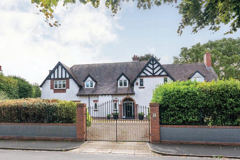

Howard has also helped families move during the good and the not so good times in their lives. We have advised landlords and investors, looked after their properties, and have secured good tenants regardless of market conditions. At Howard we have learnt what to do whatever the market, and we know what to do now.
So, if you want to know what direction is best for you in the prevailing property market, don’t trust a compass; ask the experts at Howard!
0117 923 8238 www.howard-homes.co.uk hello@howard-homes.co.uk 203 Whiteladies Road, Clifton, Bristol BS8 2XT
STOKE BISHOP GUIDE PRICE £1,700,000
An elegant detached four-bedroom family home. Situated in one of Bristol’s most desirable areas. Extensive and well-presented interior. South facing gardens incorporating woodland copse. Gated entrance and detached garage. Beautiful open outlook.
CLIFTON OIEO £575,000
A delightful two double bedroom mews house situated in the heart of Clifton Village. South facing open terrace to the front of the property. Shower room, utility room and en-suite to main bedroom. Situated on a private road with residents’ agreement for parking.
Cliftonwood, Bristol | Guide Price £695,000
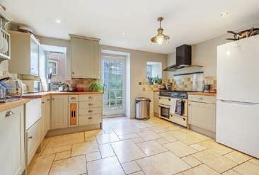


A superb period terrace house in popular Clifton Wood; with versatile accommodation over 4 floors, a current HMO License and opportunity to adapt to a new owner’s needs.


A fabulous circa 1700 sq. ft 4 bedroom period townhouse | Four double bedrooms and three bath / shower rooms | Full depth open plan kitchen and dining room | Separate sitting room with wood burning stove | Bedroom five / home office | Enclosed courtyard garden | Close to the harbourside, Lion Pub and Clifton village | Catchment area for Hotwells Primary School | No onward chain
In all circa 1700 sq. ft (157 sq. m)

City Centre, Bristol | Offers in Excess of £550,000


A superb two storey duplex penthouse apartment in a highly sought-after central Bristol location, with a private roof terrace, allocated off-street parking, private storage pod and concierge service.

Circa 1020 sq. ft duplex penthouse apartment | Iconic Grade II Listed Art Deco building | 7-day a week concierge service | Two double bedrooms | Well-appointed bathroom | Stunning circa 600 sq. ft open plan sitting room and kitchen with superb city views | Full width southerly facing paved roof terrace | Private and secure storage pod | Allocated underground parking | EPC: E
In all circa 1020 sq. ft (94.6 sq. m)


