TableWare $)B%3B$GB7DEOHZDUH,QWHUQDWLRQDOB2\VWHUV 6FDOORSVB [ PP SGI
Month: September/October 2026
Issue: 5
Volume: 148
&
0
<
&0
0<
&<
&0<
.
Oysters & Scallops
\HDUV RI KRVSLWDOLW\ DW WKH WDEOH
6DQ 0DUFR FXWOHU\
ZZZ VDPERQHW FRP
PD[ZHOODQGZLOOLDPV FRP DX
Editor's letter ContentsH September/October 2026
ello and welcome to the September/ its work. Also in this October issue of Tableware International. issue, Maxwell & We are just flying through 2026 at a Williams mark their 10 News HoReCa October 2022 frightening rate of knots – worryingly, there is already 30th anniversary and 14 Awards of Excellence talk of Christmas and Santa presents. My 7-year-old we speak with Max 16 Product News daughter has demanded her own pink Christmas tree Grundmann on page elcome to the latest issue of HoReCa, 10 News News 20 HoReCa while my 9-year-old is asking forbrought some outlandishly 32 to learn more about how he works in unison with to you from the Tableware Interall the latest expensive contraption and don’t even get me started his family. Likewise, on page 46, we speak with Ben national team. Now that we are officially 24 Editor’s Choice on the five-year-old! Needless to say, this all signals and Jan Dibbern as their family-owned brand marks 60 12 The Chef’s in Q4, it will be interesting to see how 2022 will end 28 Cover Story Table the fast approach of year-end and the Q4 buying years, learning how they have taken the legacy of their collections as they should be up comparing to 2021. Despite a cost-of-living crisis 64 Viewpoints season. In our last issue we looked at the importance father while developing unveiling itself (in the UK at least), there remains a their own unique take on the 14 Product News of gifting to the market and similarly, in this issue, Dibbern brand.will seek degree of optimism that we – actually – people perfect products for HoReCa Categories take a look at the decorative category on page 56 – all Of course, we also announce the opening of to escape the overhanging fruits of doom and gloom. 18 Cover story 34 Flatware this is relevant because gifting, decorative tabletop entries for the 2027 Tableware International Awards of And if they have extra money to spend, it will be we shine a light on Wilmax 48 Trends and the festive period are so intertwined and a vital Excellence, held annually at Ambiente. Turn to page spent on hospitality and entertainment. Good news 20 Glassware component of sales projections. One company who 14 for details but both Paul Yeomans and myself are for venues and good news for suppliers. But let’s 56 Decorative some HoReCa must haves have completely embraced gifting is Rosenthal with delighted to be able to bring you these awards once wait to see how the next few months transpire. After their Year of Gifting activation for 2026, on page 54 again, shining a much-deserved spotlight on the 22 Interview Interviews the trauma of the past number of years, the sector is Blandi,for chief marketingthe officer, industry at throw large. at it. master sommelier steeled whatever economy has to 32 Maxwell & Williams Matthieuwe speak with Matteo Arcturus Group explains the concept behind the Longuère Wilmot This issue of HoReCa, therefore,Mairead has lots of new 46 Dibbern activation and whyproducts, Rosenthal have made opinions it work industry and trends to sink your 24 Collection Dissection 54 Rosenthal so effectively for them. Meanwhile, on page 28 , our interview with master teeth into, including a super Bolsius Professional cover story celebrates the ongoing building of the sommelier Matthieu Longuère who is now wine 26 Column Columns Bordallo Pinheiro legacy. What a company and what development manager at the acclaimed Le Cordon ValdaColumn Goodfellow wants her stock 24 Retail a brand! Board member Nuno Barra talks us through Bleu London. He gives us some real insight into what 28 Ambiente the incredible way makes Bordallo wine Pinheiro approaches sing, and yes, the glass really does have a 74 Dave Turner
The Regulars
W
24
56
what’s happening in the HoReCa hall Front cover supplied by 30 Bordallo Viewpoints Pinheiro industry opinion For more information see the website international.bordallopinheiro.com 34 Column hospitality and India 36 Retail to HoreCa crossover collections 38 Trend a look at silver service
TableWare
$)B%3B$GB7DEOHZDUH,QWHUQDWLRQDOB2\VWHUV 6FDOORSVB [ PP SGI
Month: September/October 2026
Issue: 5
Volume: 148
part to play. One of the key things I wanted to know was, when it comes to the glass – does it really matter if its handmade or manufactured? “Not always,” Matthieu told me. “The main difference is financial. I first look at the thickness of the glass and the way the different parts are joined. Some manufactured glasses look very clumsy, some you would not even notice.” You can read more from him on page 22. We also hear some interesting sector opinions in our Viewpoints pages on 30, while Wilmax give us some insight into their vast assortments on page 18. Bolsius Professional bring us up to speed on one of their must-have collections for the hospitality sector on page 24 while our friends at Ambiente give us an update on the HoReCa hall on page 28. All this and much more!
24
54
&
0
<
&0
0<
&<
&0<
.
Oysters & Scallops
28
68
48
Mairead Wilmot
TablewareTeam International Team HoReCa EDITOR MAIREAD WILMOT mairead@lemapublishing.co.uk PUBLISHER PUBLISHER PAUL YEOMANS PAUL YEOMANS pyeomans@lemapublishing.co.uk pyeomans@lemapublishing.co.uk 0044 (0) 1442 289935
EDITOR MANAGING DIRECTOR MAIREAD WILMOT MARK NAISH mairead@lemapublishing.co.uk mark@lemapublishing.co.uk PUBLISHER DIRECTOR PRODUCTION PAUL YEOMANS NAISH pyeomans@lemapublishing.co.uk paul@lemapublishing.co.uk
The views of the contributors expressed in this journal are not necessarily those of the publisher or Lema Publishing Ltd. Comments, letters and criticism are welcome.
Published Published by by Lema Lema Publishing Publishing Ltd. Ltd. 1 Churchgates, The Wilderness Unit 1, Broomstick Industrial Estate, TheHigh viewsStreet, of the contributors e Edlesborough, Lema Publishing Ltd. Comm Berkhamsted Herts HP4or2UB Buckinghamshire 2JA Tel: 00 44 (0) 1442LU6 289930 www.tablewareinternational.com
News General
Italian prime minister Giorgia Meloni
Shoppe Object takes on Paris Shoppe Object Paris is joining the Jardin des Tuileries within Premiere Classe, from October 2 to 5, 2026. This capsule, composed exclusively of new brands, offers a premium selection spanning design, home, wellness, and lifestyle. Following its presence at Who's Next, Shoppe Object Paris finds in Premiere Classe a complementary space for expression. Through this sharp curation, the unmissable rendezvous for accessory and ready-to-wear designers is expanding its offering in response to new sourcing practices among concept stores, department stores, and multi-brand retailers. Bringing together around a dozen brands, this selection offers a premium reading of the Shoppe Object universe, designed to dialogue with the offering and identity of Premiere Classe. "Shoppe Object was built to spotlight what's next, and for more than 35 years Premiere Classe has done exactly that for fashion,” says Renata Bokalo, Shoppe Object's show director and founding team member. “Bringing our capsule into the Jardin des Tuileries lets us introduce hand-picked, exceptional new brands to a Fashion Week audience that's already rethinking what belongs alongside their edit. It's a natural next step for everything we've built in New York, and now in Paris."
visits Sambonet Paderno Industrie Italian prime minister Giorgia Meloni recently paid a visit to Sambonet, accompanied by the company’s chief executive officer, Giovanni Coppo. Also in attendance was Sambonet's founders, cavaliere Pierluigi Coppo and his brother engineer Franco Coppo, together with members of their families. The visit took place while the Prime Minister was in the area to inaugurate the second edition of “Risò” in Vercelli. The prime minister toured the production facilities, gaining firsthand insight into the manufacturing processes behind Sambonet cutlery and Paderno cookware, as well as the company’s showrooms and offices.
GlassCo Ltd brings
Skyberg Bohemia Crystal to the UK
In addition to representing Duralex Glassware in the UK and Ireland, GlassCo Ltd has also been appointed UK representative for Skyberg Bohemia Crystal, bringing the Czech crystal glassware brand to the UK trade with its Siena and Capri collections now landed and available for immediate purchase. Combining traditional Bohemian craftsmanship with contemporary design, Skyberg offers retailers and hospitality businesses a compelling mix of premium presentation, brilliant clarity and everyday durability. For UK trade customers, the launch also offers a significant supply advantage. With Siena and Capri stock already held in the UK, GlassCo can provide prompt fulfilment without the extended lead times associated with overseas ordering.
Portmeirion Group trading performance
“in line with expectations”
“We are delivering against the key milestones set out in our revised ‘Elevated’ growth strategy at the equity raise completed earlier in the period. We have significantly strengthened our leadership team and with a new organisational design now in place we are bringing external best practice to tackle and address legacy issues to ensure the business moves forwards from strong foundations, at the same time as accelerating our pace of execution on our long-term plans. This has included improving production quality and efficiency in our Stoke-on-Trent factory, significant activity developing our three hero brands Spode, Portmeirion and Royal Worcester, and entering Türkiye for the first time. We have been clear that our turnaround will take time as previous operational and strategic issues surface and are corrected. Our trading performance in H1 was in line with our expectations. Good sales growth in our core tableware business of 4.1 per cent and a strong performance in the USA, Malaysia and International was offset by weakness in the UK and South Korea.” Portmeirion Group’s CEO Michael Sheepers quoted as results for the Group’s first six months to 30 June 2026 were released. 10 TABLEWARE INTERNATIONAL
News General
Ambiente 2027: Hall 12 to provide central stage for Dining exhibitors Ambiente is refreshing its hall layout for 2027 with a new structure for Dining. Hall 12 is set to become the new and improved home for the Table sector while Global Sourcing takes up halls 10 and 11.
“Dining is a global market with a wide variety of distribution channels and target groups. For us, the key is to bring this diversity together in a way that creates new contacts and new business – from specialist retail and hospitality under the umbrella of Ambiente Projects to international sourcing,” says Thomas Kastl, director Ambiente dining. At Ambiente 2027, the Dining area will feature a new structure designed to reflect the requirements of the international market. Hall 12 will become the central home for the complete Table offering: in Hall 12.1, established Table Select brands will be presented alongside the HoReCa offering. Exhibitors with a hospitality focus will continue to be clearly identified through the HoReCa Special Interest.
Villeroy & Boch secures another EcoVadis Platinum medal Villeroy & Boch has been awarded the EcoVadis Platinum Medal for the second year. In doing so, the company has once again significantly improved its rating. With 94 out of a possible 100 points – an increase of nine points on the previous year – Villeroy & Boch is, according to EcoVadis, the world’s leading platform for sustainability ratings, once again among the top one per cent of all assessed companies and thus also at the very pinnacle of its industry. Sustainability performance is assessed across four areas: the environment, labour and human rights, ethics, and sustainable procurement, in each case based on verifiable evidence. Villeroy & Boch has improved in all four categories compared with the previous year. “For us, sustainability is a strategic value driver,” says chief financial officer Dr Markus Warncke. “Receiving the Platinum award once again and our further improvement in the ranking show that consistent ESG management pays off, both environmentally and economically. Particularly in a challenging economic environment, we are committed to responsible business practices in the long term. By consistently pursuing our climate targets, we are positioning ourselves for the future.” 12 TABLEWARE INTERNATIONAL
Designer Amanda Tong collaborates with ReCinder Designer Amanda Tong has reimagined her classic marbled collection, The Perfect Imbalance, recreating her signature functional objects using the recently developed ReCinder material. ReCinder is made in London from locally sourced ceramic waste, helping redefine traditional production methods while the offering the lowest-carbon ceramics. Born in Hong Kong, Amanda graduated with first class honours in Ceramic Design from Central Saint Martins. Her work has been exhibited in the UK, New York, Singapore, Japan and Hong Kong, and over the past five years she has dedicated her time to living and working in Japan. This limited-edition collection is complemented by an in-housedeveloped glaze, itself produced using local waste streams to further minimise the collection’s reliance on virgin materials. The Perfect Imbalance, Reimagined limited edition is now available online.
Focus on:
AkijBashir Group Ceramics brands Akij, which boasts a long-standing presence in the tiles and sanitaryware sectors, entered the tableware market in 2021. As recently as 2025, the AkijBashir Group was on the way to exceeding 45 tons per day of tableware made from hard porcelain - high-quality porcelain fired at high temperatures - with 80 per cent destined for export. Evolving from the extraordinary entrepreneurial vision of Mr Bashir Uddin ,the managing director, the AkijBashir Group has achieved and consolidated highly ambitious objectives across the various ceramics sectors; tiles, sanitaryware and, most recently, tableware. This development has been made possible thanks to a strategic collaboration with the SACMI Group; its technical and technological supplier and the world’s leading manufacturer of advanced systems for these industries. “We opened the first tableware plant in 2021,” explains Khourshed Alam, deputy managing director of AkijBashir Group, “with the specific goal of becoming the leading national player here in Bangladesh whilst also focusing on the high-end segment to immediately meet positioning and growth targets in international markets”. Shortly after starting up the brand-new plant at Trishal - completely fitted out with SACMI technology - Akij immediately went on to implement plant expansion to double output. There are currently four isostatic presses running (plus another four being installed), one NCC for cup forming, one PCM 200 GREEN/D for pressure casting with resin moulds; for glazing there are two TRIPLEX and two MONO 10-T lines in operation and, as regarding firing, there is one SACMI Forni TKA biscuit kiln plus two Riedhammer TST tunnel kilns for firing porcelain in a reduction atmosphere at 1.400 °C. “Our vision combines product quality, automation, attention to the environment and working conditions,” adds Khourshed Alam, “and, for this reason, our collaboration with a leading world manufacturer of cutting-edge technology like SACMI is a strategic choice.” Other significant investments are also planned for the coming year, in particular as regards isostatic pressing, together with expansion of the production mix from hard porcelain to bone china.
Elia International Ltd
Elia International Ltd Unit 3, Elia Close
Where form and function combine perfectly
High Wycombe
and quality is paramount.
United Kingdom
At Elia, innovation is second nature.
HP12 4FX
Tel +44 (0)20 8998 2100 Fax +44 (0)20 8997 5596 sales@elia.co.uk www.elia.co.uk
Meet us at the point 2027
of excellence
Entries for the 2027 Tableware International Awards of Excellence are now open! The ninth edition of the annual awards ceremony to be held during Ambiente 2027…
The categories open for entry are; Serveware serving pieces, platters, bowls Barware tools, drinkware, serveware: collection or specific pieces Flatware/Cutlery collections or individual items Casual Glassware everyday, machine-made The Tableware International team is delighted to announce entries are now open for our annual awards celebrating excellence in the tabletop industry. The 2027 Tableware International Awards of Excellence will celebrate the innovators and forward thinkers of our industry, the brands and manufacturers who continually move the industry forward with their design and manufacturing prowess. There is a very simple entry process via our special Awards of Excellence website (www. tablewareinternationalawards.com), and as always, we encourage ALL tableware manufacturers and suppliers to enter their
own products and collections into the mix for our 2027 programme. The 15 awards categories span the entire compass of our sector, giving credit to those who have made an Outstanding Contribution to the Industry, and a separate Designer of the Year category through to innovation, hospitality, glassware, flatware, sustainability and of course, dinnerware. Judged by a panel of industry specialists, the awards serve as a gateway into the fantastic work being done across the industry, both in retail and professional services. Entry deadline is no later than 26 November 2026.
Decorative vases, bowls, candlesticks, photoframes, figurines Coffee/Teaware full set and/or individual coffee/ tea pieces Hospitality Dinnerware HoReCa specific collections Hospitality Glassware HoReCa specific collections Casual Dinnerware everyday, informal
Have your say… This year, we are really encouraging the industry to supply their nominations for our Designer of the Year and Outstanding Contribution Award winners. Please send your suggestions and entries to editor Mairead Wilmot – maireadwilmot@ lemapublishing.co.uk or, as always, enter via our awards website www. tablewareinternationalawards.com.
Fine Dinnerware bridal, formal, premium, luxury Sustainability Products, collections or projects created in a sustainably responsible way, purposefully designed to reduce environmental impact
Date for your diary
The awards ceremony will be held on Sunday 31 January at Ambiente with venue location to follow. For all details on how to enter visit our website www. tablewareinternationalawards.com and contact maireadwilmot@lemapublishing. co.uk and pyeomans@lemapublishing. co.uk with any additional queries. 14 TABLEWARE INTERNATIONAL
Fine Glassware premium, crystal, mouthblown
Innovation Award collections or individual pieces with stand-out, innovative elements either in design or make 2027 Designer of the Year a designer whose work is considered excellent Outstanding Achievement Award someone who has made an outstanding contribution to the industry
AXIS
Your Creation. Centre Stage.
Let every dish make its own statement. With its white palette, Axis by ID Fine sets the stage for the colours, textures and details of each creation.
Define Dining
Discover Axis at idfine.com.tr
News Products
Meet Cabinet des Fleurs... Heinen Delfts Blauw is expanding its home décor offering with Cabinet des Fleurs, a new collection inspired by the art and curiosity cabinets that became symbols of wealth, craftsmanship and international curiosity during the Dutch Golden Age. The collection translates this historic tradition into a range of decorative ceramics, bringing together vases, tulip vases, wall plates and candlesticks. Each piece combines modern ceramic forms with richly detailed Delft blue decoration, drawing inspiration from Dutch floral stilllifes, botanical illustrations, ornamental motifs and the exotic birds that were once displayed as prized curiosities in 17thcentury interiors.
Rather than creating a series of standalone products, Heinen Delfts Blauw has developed Cabinet des Fleurs as a cohesive collection. The collection reflects a broader approach from Heinen Delfts Blauw to bringing Delft blue into contemporary interiors. For retailers, the collection also offers a flexible assortment concept. The different product categories and complementary designs allow Cabinet des Fleurs to be presented as a complete collection or introduced through individual hero pieces, while future additions can expand the range over time.
www.heinendelftsblauw.com
Vista Alegre celebrates the legacy of Oscar Niemeyer
Vista Alegre has launched Niemeyer, a new collection developed in partnership with the Oscar Niemeyer Foundation, paying tribute to the thinking and creative universe of one of the most influential architects of the 20th century. Comprising a set of six collectible decorative plates, the collection translates some of Oscar Niemeyer’s most emblematic illustrations onto porcelain, accompanied by brief texts written by the architect himself. Each piece has its own title: Eternal Feminine, Geography of Eden, Poem of the Curve, She Landscape, Concrete Poem and Latin Veins. In each of them, the architect gives expression to two ideas that profoundly shaped his work: the curve – a central element of his architectural language – and the celebration of women, a constant source of inspiration in his creative imagination.
www.vistaalegre.com
Poised to perform! From the Carrol Boyes brand, Tippy Toes is a new drinks trolley which pays tribute to the remarkable talent of South African ballet dancers. Four elongated figures become part of the trolley itself, each balanced on their toes. Look closer, and the figures become the structure. Sculpted hands curl around the vertical supports, while polished aluminium captures the elongated human form down to the smallest gesture. Dark tempered glass inlays provide a striking stage for bottles, barware and décor, while offering practical surfaces for serving.
www.carrolboyes.com 16 TABLEWARE INTERNATIONAL
Nude Glass and designer Tom Dixon unveil Splash Nude Glass has partnered with British designer Tom Dixon to create the intriguing new glassware collection, Splash. Bringing together Tom Dixon’s distinctive visual language with Nude’s years of experience in contemporary glassmaking, Splash explores the ritual of drinking through sculptural, yet functional, forms. At the centre of the collection is a signature ripple detail at the base of each glass, a reflection of the designere’s ongoing exploration of concentric forms, reinterpreted through Nude’s understated design philosophy. The collection includes wine, cocktail, highball, and lowball glasses designed for every kind of drinking occasion.
nudeglass.com
ECOMADE MADE IN EUROPE
Sustainable Process No Carbon Emission Durable Quality Hospitality Approved Locally Sourced Natural Porcelain Craftsmanship Made Accessible Proudly Made in Europe
@fine2dine | www.fine2dine.com | +32 14 24 29 00 | info@fine2dine.com
$GVB7:,QW (FR0DGH LQGG
News Products
Beauty in brown
ProCook launches new stoneware tableware range Inspired by relaxed, effortless dining, ProCook has introduced Madeira, a collection they say brings warmth and personality to the table with its organic shape and handcrafted feel. Each piece features a distinctive double reactive glaze, individually shaped to create a unique finish, ensuring every item has its own natural variation and oneof-a-kind detail. The collection is available in three versatile shades of sage mist green, midnight blue and a neutral linen stone.
www.procook.co.uk Porcel introduces two new collections inspired by the richness and warmth of natural brown tones. Maple embraces the character of warm, natural caramel tones, creating a welcoming and contemporary atmosphere, while Walnut explores the depth of dark brown tones, inspired by the richness of walnut wood, bringing a bold and sophisticated presence to the table. Coloured and decorated by hand, both collections reveal rich, luminous finishes, where the simplicity of the shapes allows each colour to take center stage. Designed to complement one another and pair effortlessly with other Porcel collections, Maple and Walnut open up new possibilities for creating distinctive tablescapes where contrast and refinement come together.
www.porcel.com
Villeroy & Boch introduces icy elegance “Manufacture Ice is an innovative extension of our successful Manufacture Rock blanc collection and at the same time an expression of modern design. The fusion of shiny glazed finishes and a striking matt slate-look porcelain area makes the collection unique and a real experience in terms of both look and feel,” Claudia Knaupp, executive vice president dining & lifestyle and global branding, speaking about Villeroy & Boch’s new Manufacture Ice collection. Inspired by the beauty and surfaces of ice, Manufacture Ice presents six items in a frosty matt surface which sits in unison with an ice-like central mirror. 18 TABLEWARE INTERNATIONAL
Serax presents Line-up With Line-up, Dutch designer Annebet Philips brings a new kind of serveware to Belgian design brand Serax. Following her sculptural Carte Blanche collection, Line-up moves in a different direction: lighter, faster, more direct. The serveware collection includes platters and bowls which hover between the flat world of the sketch and the physical world of the table, their edges traced by thick brushstrokes in vivid blue, a modern rereading of Delft Blue Thick brushstrokes in vivid blue trace the edges of each piece, the kind of mark a wide brush leaves in a single, committed sweep. The effect is graphic, energetic, and unmistakably hand made.
www.serax.com
WDEOHZDUH H\OXO SGI
&
0
<
&0
0<
&<
&0<
.
News HoReCa
LAV HoReCa launches new collections to market
Lav HoReCa has introduced four new glassware collections. Ravenna, Bonn, Modena, and Salerno, have all been developed under the brand’s “Make It Real” philosophy of turning ideas into experiences for hotels, restaurants, cafés, and bars. Ravenna combines a fine rim with three stacking capacities, finished with a mosaic-inspired texture drawn from the historic Italian city. Bonn pairs a fine rim with tempered options and a space-saving stackable design, its silhouette shaped by the calm character of its namesake German city. Meanwhile, Modena and Salerno are paired together as a coordinated stemmed-and-stemless system: Salerno defined by clean, conical lines, Modena by light-catching vertical striations, both built on a twopiece stem construction. In the United States, these collections are supported by a New Jersey warehouse for fast nationwide distribution and a showroom at 41 Madison Avenue in New York City, with production-to-shipment timelines as short as four weeks.
www.lavhoreca.com
Heinen Delfts Blauw creates specialist HoReCa lines for two of its collections Following the success of its design-led tableware collections Blauw Vouw by Romy Kühne and Blauw Bloesem by Debbie Wijskamp, Heinen Delfts Blauw is expanding both ranges with a dedicated HoReCa line. The two collections have proven popular with consumers, but demand from the hospitality sector highlighted a need for more specific capacities and practical features tailored to professional service. In response, Heinen Delfts Blauw has added a selection of espresso cups, coffee cups and cappuccino cups, each with a matching saucer. Unlike the existing handleless coffee cups in the collections, the new HoReCa cups feature handles, making them more comfortable to use when serving hot beverages in cafés, restaurants and hotels. The different capacities have also been selected with professional coffee service in mind. www.heinendelftsblauw.com
Creating refined tablescapes
“In professional dining, the plate is more than a decorative element, it is part of the creative expression of each dish. Today’s HoReCa sector seeks pieces that combine elegance, durability and versatility, giving chefs the freedom to create distinctive presentations. This philosophy comes to life through our collaborations with chefs and culinary professionals, where Porcel pieces came to complement and become part of the meal experience. In each dish, our pieces create a dialogue between cuisine and design, combining refined aesthetics with the performance required for professional service.” Porcel speaking about the dialogue between cuisine and design. 20 TABLEWARE INTERNATIONAL
At Azienda Vitivinicola Crola, a beautiful family-owned Italian winery and eatery, every element contributes to creating a refined and welcoming atmosphere. From the setting, to the table presentation, the guiding principle remains the same: transforming every occasion into an experience that combines elegance, conviviality and attention to detail. The establishment dresses its tables with Sambonet’s Flat collection and Arthur Krupp’s Neve, which have become an integral part of the story, accompanying wine tastings and dining with a language defined by elegance, functionality and meticulous attention to detail. www.sambonet.com
A moment for More Design by Erika Lagerbielke, More has been inspired by, and built on, insights from professional restaurateurs. The Orrefors collection is equally appreciated in Michel-starred restaurants as it is at at family gatherings. All curved lines and robust elegance, More Whiskey is part of the latest addition to the comprehensive More collection. It’s ideal for occasions when you want to treat yourself in all simplicity. www.orrefors.com
ÃËÙ¢
Inspired by the timeless craftsmanship of handmade production, the Amorf Collection is born not from the repetition of a single form, but from the harmony of pieces that choose to exist independently.
E\ERQH WU
ZZZ E\ERQH FRP
LQIR#E\ERQH FRP WU
Kim Seybert
Juliska
Vietri
Arte Italica
How to maximise on holiday spend
Retail Column
From her years of experience as a retailer, columnist Michele Trzuskowski has whittled down her holiday inventory to a fine art – for her, tabletop comes out front and centre… With the holidays around the corner, every shop owner needs to determine – if they haven’t already- how much they want to invest in holiday dinnerware and giftware. Customers can be fickle and where I used to spend much of my inventory dollars on holiday décor, I’ve reigned that back over the years to tailor it more towards tabletop and accessories. With increasing competition online for holiday décor, I find that holiday tableware and gifts offer a much better trajectory. I found that although not every customer wants to invest in 12 place settings of Christmas dinnerware, that they only use once a year, they will invest in special pieces that support their
holiday themes. Many of these pieces are great for tablescaping, while others are just great holiday gifts. Here’s what worked for me. Whether hand painted ceramic platters or beautiful porcelain serving bowls, I found both Vietri and Arte Italica, two Italian companies that have carried the Christmas tradition for many years offer a great array of holiday items. In Vietri’s case, their Old St Nick has been a tradition for over fifteen years, with whimsical, hand-painted table accessories and serve-ware that are perfect for the holidays. If your customer doesn’t want to invest in the dinnerware, use their platters, salt and pepper, cream and sugar, bowls and more to support a
About T is for Table
“I found that although not every customer wants to invest in 12 place settings of Christmas dinnerware, that they only use once a year, they will invest in special pieces that support their holiday themes”
T is for Table is a luxury independent boutique, with a focus on tabletop, in West Palm Beach, Florida. Open more than 20 years, it offers an experiential and inspirational space dedicated to helping customers tell stories, create traditions and celebrate life. The boutique offers everything from fine pottery, china, glass, serveware and table accessories, to home décor, jewellery and body products, and delivers a custom service with its custom engraving, home visits and gift registries.
www.tisfortable.com
holiday theme. I had one customer that purchased a number of their large serving pieces – used them for décor on their kitchen island and counter and then utilised
Vista Alegre
them for Christmas dinner. Likewise, Arte Italica has had their enduring and endearing Natale collection which outside of dinnerware has fabulous serve-ware or home decorations perfect for holiday traditions. From their dipping bowls, 22 TABLEWARE INTERNATIONAL
charcuterie platters, to their wonderful ceramic doves – perfect for a centerpiece accent on the table. They also have great gifts that embellish the spirit of the holidays with their spoon rest, and fabulous candles, as well as ceramic trinket boxes. If handpainted ceramics Versace aren’t refined enough for your customers, then look at Vista Alegre’s porcelain Christmas Magic pattern which offers great hand-
me-down pieces such as platters, trinket boxes, and canape plates, all in a wonderful and traditional Christmas motif. If nothing else, their cake plate/pedestal dish offers the perfect complement to holiday cookies or dessert. Finally, I can’t mention a holiday table without mentioning the Versace collection which brings the epitome of lux to the table at Christmas time. Adding any pieces from Versace’s Garland Red or Garland Green will immediately create a lavish tablescape; and then the ultimate is further mixing in Holiday Baroque. From a square serving tray, canape set, or even one of their exquisite ball or bell ornaments, they’re great gifts and perfect for your table. The other component
I’ve invested in is holiday accents for the table; primarily linens, placemats, and napkin rings. Where my customer might not invest in a whole set of Christmas dinnerware, they would invest in holidaythemed table linens. I am finding more of the primary tabletop manufacturers are producing complementary linens to go with their dinnerware collections. Juliska is one such company. They have increased their selection with holiday motifs from tablecloths to runners, napkins, and napkin rings. I love their Tartan Collection with matching bow napkin rings, as well as their Isadora placemat in Evergreen. Imagine setting your table with that! In addition, Kim Seybert has been another favourite of mine at Christmas with her beautifully beaded placemats and luxurious napkin rings. Most of her napkin rings come gift boxed in sets of four making them gift ready and easy to sell. I find some tabletop stores want to stay away from linens, and I’ve never understood why. In many cases they offer better margins than other tableware items. In addition, it allows you to provide the complete package or rather one stop shop for your customer, and using some of the pieces can help make powerful displays in the store – especially at the holidays. There are never the perfect one size fits all for a Christmas Inventory but if I could leave one piece of advice it would be how important it is to keep adapting to how your customer is changing. Even though I have found the niche for my customer base, it is a constant evolution as their needs change or as new trends emerge. Here’s wishing you all a great holiday season.
STEKLARNA ROGAŠKA d.o.o. and Rogaška brand are part of the Fiskars portfolio of brands and trademarks. www.fiskarsgroup.com
Editor’s
Choice At one with
nature…
We love artist Katie Scott’s dramatic décor for the Hermès Natures Marines collection. Screen printed and applied by hand; the 34-piece porcelain collection sports the most beautiful illustrations evoking an underwater garden scene. Interestingly, the artist took inspiration from illustrations by 19th-century English botanists, and from marine flora found on the shores of Wales. Note the handpainted gold trim on the contour of each piece. The colourways are of particular note; corals, greens and mineral beige decorate the plates, bowls, cups and saucers. This is, quite simply put; lovely.
24 TABLEWARE INTERNATIONAL
Two Characters. One Table. Dove’s white and Raven’s anthracite bring contrast and balance to the table. Two complementary collections from Roots by ID Fine, offering the freedom to create distinctive settings for hospitality spaces.
Sustainable Harmony
RAVEN Discover Su Sustainable ustainable Harmony — ID Fine’s approach to creating crea ating collections that work tog together.
DOVE
Explore the collections coll at idf idfine.com.tr
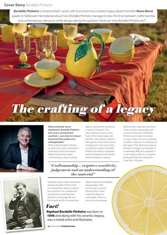
Cover Story Bordallo Pinheiro Bordallo Pinheiro is a brand which carries with it an enormous creative legacy. Board member Nuno Barra speaks to Tableware International about how Bordallo Pinheiro manages to tow the lines between craftsmanship and contemporary relevance, while always asking the question “what can only Bordallo Pinheiro do?”…
The crafting of a legacy Often imitated, never duplicated, Bordallo Pinheiro has such a strong brand aesthetic – just what is it about the brand that makes it so unforgettable? What makes Bordallo Pinheiro so distinctive is the combination of elements that have always defined the brand: nature, craftsmanship, colour, humour,
objects, giving them an almost sculptural character. That way of seeing remains at the heart of the brand today. Our identity is also deeply rooted in Portuguese culture and ceramic heritage, but it has never been confined by tradition. Bordallo Pinheiro has always combined technical expertise with artistic experimentation, creating
“Craftsmanship… requires sensitivity,
judgement and an understanding of the material”
creativity and a certain irreverence. Raphael Bordallo Pinheiro had an extraordinary ability to look at the world from an unexpected perspective. He transformed elements of everyday life and the natural world into expressive
Fact!
objects that are immediately recognisable while continuing to surprise. Perhaps that is what makes the brand so memorable. There is a strong visual language
Raphael Bordallo Pinheiro was born in 1846 and along with his ceramics legacy, was a noted artist and illustrator. 28 TABLEWARE INTERNATIONAL
behind every collection, but there is also emotion, personality and a sense of discovery. A Bordallo Pinheiro piece does not simply occupy a space or serve a purpose; it creates a reaction. It invites you to look again. That distinctive balance between heritage and irreverence is extremely difficult to replicate. It is not simply a style; it is a creative philosophy that has evolved for more than 140 years.
The brand often takes inspiration from its founder Raphael Bordallo Pinheiro – what a legacy for him to have left behind. How do you ensure his vision is upheld? Raphael Bordallo Pinheiro is much more than the founder of the brand. He remains a creative reference and a constant source of inspiration. His legacy is rooted in a remarkable combination of curiosity, artistic freedom, technical experimentation and an ability to challenge conventions. He worked across different disciplines – from ceramics and fine arts to illustration, caricature and literature – and always maintained a distinctly independent voice. The strongest expression of his legacy is perhaps our continued fascination with nature. His ability to transform natural forms into expressive and imaginative objects remains fundamental to the Bordallo Pinheiro aesthetic. At the same time, we continue to revisit traditional motifs and techniques, giving them new interpretations for contemporary lifestyles. For us, preserving his vision does not mean simply reproducing what he created in the 19th century. It means understanding the principles that guided his creativity and allowing them to evolve. That balance between continuity and reinvention is essential. We preserve traditional craftsmanship and techniques, while encouraging
designers and artists to explore new forms, materials, colours and perspectives. In this way, Raphael Bordallo Pinheiro’s spirit remains present without becoming a constraint. His legacy gives us a
technicalities of each piece? The detail on some of your vases, for example, is mind-blowing. The production of a Bordallo Pinheiro piece is a highly involved process in which craftsmanship and technical expertise are equally important. The apparent spontaneity of the finished object often conceals a considerable degree of precision and knowledge. Many of our pieces require individual moulding, modelling and hand-finishing, followed by painting and other stages of decoration. This is particularly evident in collections inspired by nature, where capturing the textures, reliefs, proportions and subtle variations of an oyster, a scallop, a grape or a lemon requires a very high level of technical skill. The human element is fundamental. Our artisans work
“A Bordallo Pinheiro piece does
not simply occupy a space or serve a purpose; it creates a reaction. It invites you to look again” foundation, but creativity allows us to keep moving forward. I’d love for you to touch on the production of Bordallo Pinheiro pieces. How involved is the process in terms of the
with techniques that have been developed and refined over generations, but craftsmanship is not simply about repeating established gestures. It also
requires sensitivity, judgement and an understanding of the material. This is especially important because no two handmade pieces are ever completely identical. Small variations are part of the character of the object and are evidence of its artisanal nature. At the same time, we have invested significantly in technology and modern production processes. Our approach is therefore not about choosing between tradition and innovation, but about bringing them together. Technology can support precision and consistency, while craftsmanship provides the individuality and expressive quality that are so central to Bordallo Pinheiro. The result is what we believe makes our ceramics special: technically demanding objects that retain a sense of spontaneity, personality and life. When you are producing a new Bordallo collection, because the themes are often so unique, what does the team first consider? Is it what retailers and buyers might want? What you think the consumer is looking for? Future trends? Or perhaps something altogether different? The starting point is always the Bordallo Pinheiro universe itself. We do not begin with a trend or with a commercial brief and then try to adapt the brand to it. The process starts with an idea, an observation or an element
TABLEWARE INTERNATIONAL 29
Cover Story Bordallo Pinheiro
of nature or culture that has the potential to be interpreted through the Bordallian language. Of course, we remain attentive to consumers, markets and the evolution of contemporary lifestyles. Understanding how people live, entertain and use their homes is important, as is listening to our retail partners and observing international
Pinheiro created hundreds of models, many of which offer extraordinary possibilities for reinterpretation. We can revisit those forms and ideas, not as historical replicas, but as starting points for something new. The new Oysters & Scallops, Grapes and Lemon collections are good examples of this approach. They are
Did you know?
The Bordallo Pinheiro factory in Caldas da Rainha was founded more than 140 years ago.
“We preserve traditional craftsmanship and techniques, while encouraging designers and artists to explore new forms, materials, colours and perspectives” market developments. But these considerations need to be balanced with the integrity of the brand. Our objective is not to follow trends for their own sake. It is to identify opportunities where contemporary relevance and the Bordallo Pinheiro identity can genuinely meet. Heritage is also an important source of inspiration. Raphael Bordallo
rooted in nature and in our heritage, but they have been interpreted for contemporary lifestyles, with new colour palettes, forms, applications and combinations of functionality and decoration. Ultimately, the question we ask ourselves is not simply, “What will sell?” It is also, “What can only Bordallo Pinheiro do?” That is a very important distinction. Finally, how have your new products and collections, such as Grapes, Lemon and Oysters & Scallops, been received so far? The response has been very positive, particularly because these collections demonstrate how 30 TABLEWARE INTERNATIONAL
recognisable Bordallo Pinheiro elements can be reinterpreted in a contemporary way. Lemon has been particularly successful in capturing the freshness and luminosity associated with Mediterranean landscapes. It’s remarkable realism, combined with its versatility, allows the pieces to move naturally between the table and the interior, which is increasingly relevant to the way consumers live today. Oysters & Scallops has generated interest for a slightly different reason. It revisits historic naturalistic motifs through a more contemporary aesthetic, with refined silhouettes, new colours and richly textured reliefs. The individual moulding and hand-painting give each piece a strong sculptural quality, making the collection equally compelling as tableware or as decoration. Grapes also reflects an important dimension of
the brand: our relationship with Portuguese culture and heritage. The vine is one of Portugal’s most enduring symbols, and translating it through Bordallo Pinheiro’s naturalistic language creates a collection that feels both deeply rooted and contemporary. What is particularly encouraging is that these collections are attracting consumers who appreciate the heritage of Bordallo Pinheiro but are also looking for objects that feel relevant to the way they live today. That is ultimately what we want to achieve: to remain faithful to the creative DNA established by Raphael Bordallo Pinheiro while continuing to surprise, engage and reach new generations. More than 140 years after the foundation of the factory in Caldas da Rainha, that ability to evolve while remaining unmistakably Bordallo Pinheiro is perhaps our greatest strength.
$'9 $ B6$&0,B7$%/(:$5( LQGG
Interview Maxwell & Williams Max, with Bill (William) Ryan
A family business; Maxwell & Williams celebrates 30 years As they mark 30 years as one of Australia’s most notable tabletop brands, Maxwell & Williams – founded in 1996 by Max Grundmann and his business partner the late Bill (William) Ryan – has established itself as a trusted provider of tabletop, not just in Australia but in more than 40 countries worldwide. Tableware International speaks with Max Grundmann to learn more about how he, and his family, work harmoniously together while also continuing to forge new paths What have been the biggest trends in homewares and dining over the last 30 years and what has been the biggest change on the Australian dining table? Over the last three decades we’ve seen dining become far more relaxed and casual. Thirty years ago people bought a dinner set for life and reserved it for special occasions. Today’s lifestyle is much more relaxed and informal. In fact, Maxwell & Williams was born to cater to this new and exciting
direction. We set out to create a fashionable, functional, affordable and a delightful homewares lifestyle brand which would enable consumers to express their own individuality and personality
everyday use. We realised that there was a huge shift towards open-plan living, where the kitchen and adjoining dining room was combining and becoming the epicentre of the home. Our
different international cuisines thus creating a different special occasion every time with little cost or fuss. International travel, cooking shows and social media and
“For more than three decades I’ve believed that the dining table is one of the most important pieces of furniture in any home. It’s where families celebrate, friends reconnect, ideas are shared and memories are created. If our products have played even a small part in those moments, then we’ve done our job.” Max Grundmann
in a way which had not been done before. The essential idea was to have a fabulous collection of dinnerware, serveware, cutlery, glass and even cookware which would be beautiful enough for entertaining and just as practical and affordable enough for
Did you know?
customer wanted flair that’s fair and functional and we delivered in spades. I wanted our customer to be able to have the same group of friends over for dinner very often and to have the dining table look different every time by having nuanced pieces often reflecting
The H.A.G company was formed by Harry and Anna Grundmann (pictured) in 1963, from that Maxwell & Williams was founded in 1996 by Max Grundmann with late business partner Bill (William) Ryan. Now, Max is supported by his sons Daniel as director of sales and head of product, along with Michael as head of strategy and operations. 32 TABLEWARE INTERNATIONAL
Australia multicultural society have transformed Australians’ tastes. People now entertain with influences from Italy, Japan, the Middle East and Southeast Asia all on the same table, so we made sure our ranges catered for all the varieties and cuisines. We wanted to enhance the way Australians cook, entertain and live. I believe as human beings no matter where, what race, religion, country or colour, we are more similar than we are different, and we should celebrate this beauty and humanity, however, we should also celebrate the differences especially
Long standing collaboration In 2005, Maxwell & Williams began working with Royal Botanic Gardens Victoria, which has grown into one of their longest and cherished collaborations. those of cuisine and celebration. In creating the diversity of range to every cuisine and culture we fulfil this philosophy. The dining table is where families reconnect and friends gather rather than simply where meals are served. What are the biggest lessons you’ve learned over the years? I’ve learned that nothing replaces integrity, we live in a very complex world which is constantly changing technology changes, consumer tastes change, attitudes and opinions move constantly, But trust never goes out of fashion. We’ve experienced recessions, the global financial crisis, COVID, major shipping disruptions and dramatic changes in retail. Every challenge forced us to become stronger, more innovative and more resilient. Perhaps the biggest lesson is that success is never permanent. You must keep listening, keep learning and never assume you’ve got all the answers. It’s been a family-run business for so long. What’s the secret? It’s not always easy, differences of opinion especially in family business can be extremely divisive and it is essential to find a way to harmonise the passion and commitment within a family business to ensure these differences make a positive rather than a negative contribution and so give family businesses a commercial advantage. We try to separate family
discussions from business decisions and always remember that relationships matter more than winning an argument. Where do you think the industry is heading over the next 10 years? Consumers will continue looking for products that combine aesthetic beauty, functionality quality, sustainability and value, so design is crucial and continues to be the fundamental driver in our industry. Our role isn’t simply to sell products; it’s to curate brands that genuinely improve everyday living. Do you have any routines that help you stay at the top of your industry game? I’ve always believed that curiosity is one of the most important business skills, it enables creativity and innovation. I make time every day to ensure I’m up-to-date with what’s happening in the news of world, observe trends and speak with customers, retailers and suppliers. The day you stop learning is the day you start falling behind. I exercise regularly and walk some 3.5 kilometres per day, I believe it is crucial to keep fit especially as you get older. Regular walking gives me time to think, solve problems and clear my mind. What’s the most underappreciated item in the kitchen, in your opinion? If you can’t dice you can’t cook, so for me it’s a slicer or dicer.
White Basics Edge
“Differences of opinion, especially in family business, can be extremely divisive and it is essential to find a way to harmonise the passion and commitment within a family business to ensure these differences make a positive rather than a negative contribution” Max Grundmann What’s your favourite dish to make? I love cooking dishes that bring people together, the more the merrier! A slow-cooked Italian meal like osso buco or a rich spaghetti Bolognese is always
a favourite because it fills the house with wonderful aromas and encourages everyone to gather around the table. Good food isn’t just about eating—it’s about sharing time, wine and dine together.
Royal Botanic Gardens Victoria
Fact!
Cashmere was introduced in 2004 and has gone on to become on of the brand’s most successful lines.
TABLEWARE INTERNATIONAL 33
Category Flatware
“Life is too short to use bad flatware!”
The table is never set without flatware, and with so many brands delivering quality products (and a few delivering cheap imitations, it has to be said) educating the consumer on what quality flatware can deliver has never been so important… Perhaps Mepra’s Luca Prandelli has summed up the thoughts of the entire industry when he says, “life is too short to use bad flatware”. He’s correct, of course. Life really is too short and there are too many quality manufacturers producing beautiful collections to waste time on the sub-par. But communicating quality to the consumer has never been more important. “Premium has to mean something,” says Jurgen Bresseel, global head of sales, Robert Welch Designs. “Consumers and hospitality customers are prepared
Zwiesel Fortessa From the Fortessa brand, Arezzo is a simple and straightforward cutlery series which fits seamlessly into any modern or classic table setting. Made of first-class 18/10 stainless steel in a shiny silver colour, it impresses above all with its modern, angular handle. Meanwhile, the Constantin collection, also from Fortessa, combines modern elegance with everyday functionality. With its sleek finish and distinctive tapered handles, it's designed to cater to various dining circumstances, providing a seamless transition from casual dinners to formal gatherings. Constructed from high-quality 18/10 stainless steel, this series is engineered to withstand the rigors of daily use in bustling restaurant environments.
www.zwieselfortessa.com/hospitality
management, at Zwiesel Fortessa says: “In general, there is a clear willingness to invest more in higher quality – especially when durability, functionality, and sustainability are guaranteed. Particularly in professional settings, this investment pays for itself over the product’s useful life – and restaurant owners are well aware of this.” Expanding on the hospitality sector, Luca adds: “In hospitality there are two patterns. A complete replacement usually happens when an operator refurbishes a restaurant or opens a new one, typically every
“Consumers and hospitality customers are prepared to invest when there’s a tangible difference in the product” Jurgen Bresseel, Robert Welch Designs to invest when there’s a tangible difference in the product. With flatware, quality is experienced rather than simply seen. It’s the balance and weight in the hand, the way a knife cuts, the finish, the feel of the edges and the way the product continues to look after repeated use.” Traditionally, flatware purchases have tended to happen during key life events, house moves, renovations, weddings etc, so they are not a highfrequency purchase, but when the purchase is made people tend to pay more for better quality. “Life is too short to use bad flatware!,” quips Mepra’s Luca Prandelli. “Cutlery is the first touch point in our relationship with food, and it matters so much to the dining experience that a discerning clientele is happy to pay more for quality. And quality here means several things at once: safety, functionality, durability and easy maintenance.” Agreeing, Dominique Rauh, head of professional marketing & product 34 TABLEWARE INTERNATIONAL
five to 10 years. Alongside that, there are annual reorders to cover wear and losses, generally around five per cent to 10 per cent of stock.” Pointing out that longevity and performance are particularly important for hospitality because the economics are based on total cost of ownership, Robert Welch’s Jurgen Bresseel says: “A slightly higher initial investment can be worthwhile if the flatware lasts longer and maintains its appearance.” He continues: “Hospitality is a different proposition because flatware is effectively a working tool. It’s used repeatedly, washed intensively and handled far more than it would be in a domestic environment, so replenishment is naturally much more frequent. The rate of replacement will vary enormously depending on the type and scale of operation, but durability is a critical consideration. “For a hospitality customer, the cheapest piece isn't necessarily the most economical piece. If a
8MQIPIWW WXEMRPIWW WXIIP XEFPI[EVI JSV IZIV] SGGEWMSR
UREHUWZHOFK FRP H[SRUW#UREHUWZHOFK FRP WUDGH#UREHUWZHOFK FRP
(-7'3:)6 136)
4VSHYGXW ERH XVEHI QEVOW SJ 6SFIVX ;IPGL (IWMKRW 0XH EVI TVSXIGXIH F] TEXIRX HIWMKR ERH XVEHI QEVO VIKMWXVEXMSRW *SV JYPP HIXEMPW TPIEWI ZMWMX VSFIVX[IPGL GSQ P4VMKLXW
Category Flatware product retains its finish, withstands commercial washing and performs well over a longer period, it can offer much better value over its lifetime. That’s where quality becomes particularly important. Hospitality operators need flatware that looks good on the table and performs consistently behind the scenes.”
Mikasa Mikasa brings elevated craftsmanship to the table with its new Forged Carving Set, thoughtfully designed for everything from holiday feasts and special occasions to everyday entertaining. Combining a sleek, contemporary silhouette with the strength and durability of forged construction, this collection delivers the performance expected from quality cutlery with the sophisticated style synonymous with Mikasa. At the Spring 2026 New York Tabletop Market, Lifetime also introduced new everyday Mikasa flatware including Wilder and Bellamy, showing that Mikasa is pursuing both premium and accessible price points.
“There is a clear willingness to invest more in higher quality – especially when durability, functionality, and sustainability are guaranteed” Dominique Rauh, Zwiesel Fortessa
Did you know?
Brasserie Roseaux in Lyon is one of France’s most sought-after new culinary destinations for classic French cuisine, elevated with meticulous craftsmanship and an unwavering commitment to authenticity. Chefs Tabata and Ludovic Mey have chosen the Exclusiv cutlery collection by HEPP – silverplated, timeless, and precisely balanced – to complete a table setting that reflects a distinct sense of sophistication and craftsmanship. Silverplated tabletop products from HEPP complement the Exclusiv cutlery on the table, creating a harmonious connection between the individual elements. Among the items used are serving trays in various sizes, a wine cooler with a matching stand, as well as a selection of additional serving pieces such as pastry stands, ice buckets and sauce boats, all of which enhance the table setting both functionally and aesthetically.
www.hepp.de
Beyond the norm… When the average consumer thinks of cutlery, understandably they go to the traditional dining set – knife, fork, dessert spoon etc – but these days, particularly in hospitality, more and more options are being presented to chef and restauranteurs. “What’s changed is the way people think about the dining table. Flatware is increasingly now part of the overall table setting and an expression of personal style, rather than a functional necessity,” explains Jurgen. Mepra’s Luca Prandelli adds: “In today's market, chefs are constantly looking for ways to elevate the dining experience and set themselves apart, and dressing the table with unique, professional tools is a big part of that. A few stand out: The right spoon for the dish, a tablespoon versus a soup spoon, which changes how a course is eaten and presented. The gourmet spoon, a refined piece for tasting menus and delicate plating. The Quarta Posata, our "fourth cutlery piece", a versatile tool created with chefs for modern plating. The mini fork and mini spoon, ideal for amuse-bouche, appetizers and small bites, fish knife and fork for serving and enjoying fish properly. We even have caviar spoons and bone marrow spoons! The point is simple: the more of these pieces you bring to the table, the more complete and distinctive the experience.” Pointing out there is significant opportunity beyond the traditional, Jurgen tells us, particularly when people want to build on an existing collection, think serving spoons, salad servers, cake servers and specialist knives which are all popular choices for consumers. “Serving pieces connect flatware with entertaining. You don't necessarily need to buy a whole new set to make a difference to the table. Adding beautifully designed serving pieces can elevate a meal and make the overall setting feel much more considered. We also see individual pieces 36 TABLEWARE INTERNATIONAL
as an important part of longevity. People don't always want to replace an entire collection when one piece goes missing or is damaged. Being able to replenish individual pieces is an important part of a quality cutlery proposition.” Challenges facing a mature category Although an obvious statement, flatware is considered a mature, established category but that doesn’t mean it is without its challenges. It is less dominated by trends and dramatic innovation is less common. “Striking a balance between design, functionality, and durability is a challenge,” points out Zwiesel Fortessa’s Dominique Rauh. “At the same time, this category is strongly influenced by brand loyalty.” Durability is another issue highlighted, by Mepra’s Luca Prandelli, particularly with finishes. Using the example of PVD, Luca says: “Our PVD is not inexpensive, but it is extremely hard-wearing. Much of the PVD on the market today is produced cheaply and simply doesn't last, and that ends up reflecting on the whole category. We think it's a finish worth doing properly.” Jurgen, meanwhile, points towards commoditisation. “To the untrained eye, two sets of stainless-steel flatware can look very similar, despite significant differences in the quality of the materials, manufacturing and finishing. The industry, therefore, has a responsibility to communicate quality better. Consumers should be able to understand what they are paying for — whether that is the grade of material, the manufacturing process, the design, the finish or the longevity of the product. “Another challenge is balancing fashion with longevity. We want flatware to feel contemporary and relevant, but it is also an object that consumers may use for decades. The best design, in our view, is design that feels right today but doesn't become dated tomorrow. “There is also a broader opportunity for the category to focus more strongly on quality and sustainability. If we are encouraging people to move away from disposable products and towards things designed to last, then the industry needs to make sure those products genuinely deliver on that promise.”
Enduring sharpness at the highest level
Craftsmanship
Art de la table
sknife ltd., Neuengasse 5, 2502 Biel/Bienne
Joaillerie
Precision www.sknife.com
Category Flatware
As it celebrates 170 years, Sambonet has taken from its extensive design archive to reinvigorate a celebrated, classic design…
Sambonet faithfully reinterprets classic San Marco collection
For 170 years, Sambonet has been synonymous with hospitality, table culture and Italian excellence. To mark this important anniversary, the brand celebrates its heritage by reintroducing an iconic early 20th-century design: the San Marco collection. Introduced in the mid20th century to some of Italy’s most prestigious homes and restaurants, the San Marco collection helped define the codes of table elegance, becoming a benchmark for post-war Italian silverware. The new collection is based on a 38 TABLEWARE INTERNATIONAL
faithful reconstruction of the original design, for which Sambonet still preserves the historic 1948 moulds. Inspired by 18th-century Venetian tradition, its elegant and balanced design is distinguished by unique details, including a wide handle, a three-tine fork and the elegant silhouette of the knife with its sabreshaped blade. Today, San Marco is available in its classic silver-plated version, a PVD gold finish and in a contemporary stainless-steel edition. San Marco embodies Sambonet’s entire industrial and artisanal
heritage, a legacy built on values, design research and innovation. This journey continues today thanks to the investments of the current ownership, which since 1977 has been promoting Italian craftmanship and manufacturing excellence on an international scale. In this 170th anniversary year, this legacy has been further recognised through the brand’s admission to the prestigious Altagamma association.
www.sambonet.com
Did you know? San Marco is based on a faithful reconstruction of an original design, for which Sambonet still preserves the historic 1948 moulds, inspired by 18th-century Venetian design
ƣƟ i UV
Category Flatware
As dining continues to veer towards more relaxed social encounters, using the example of their new collection Juntos, Amefa explores how flatware brands can respond to the trend, beyond the traditional knife and fork arrangement…
The joy in Juntos
The increase in popularity of shared dining presents an exciting opportunity for flatware brands to rethink traditional table settings. Consumers are increasingly looking for dining experiences that are interactive, social, and centered around togetherness, whether that is a tapas evening with friends,
Sharing platters, tasting menus, grazing-style starters, and communal side dishes are increasingly featured in both hospitality settings and at-home entertaining. This creates demand for flatware and serving pieces that complement sophisticated table settings while supporting
“Flatware needs to become more versatile, intuitive, and adapted to the way people eat today” a charcuterie board shared with family, or a more refined hosted dinner where dishes are presented for sharing at the center of the table. While shared dining is often associated with casual occasions, we are also seeing these concepts become part of more formal dining experiences.
40 TABLEWARE INTERNATIONAL
a more social way of dining. To respond to this shift, flatware needs to become more versatile, intuitive, and adapted to the way people eat today. Rather than focusing solely on the classic main table setting of knife, fork, and spoon, there is growing demand for pieces that support sharing, serving, tasting, and enjoying a wider variety of dishes. This
thinking was the starting point for the development of Juntos, our newest collection. The name itself means “together” in Spanish and reflects the spirit of bringing people together around the table. The collection has been designed to enhance shared dining occasions through a combination of functional pieces and contemporary design, helping consumers create memorable dining experiences while maintaining a cohesive and stylish table presentation, whether the occasion is relaxed or formal. Juntos was created specifically with modern social dining in mind. Small plate concepts often involve a variety of dishes, textures, and serving styles, which require more flexibility than traditional place
settings can offer. The collection combines practicality and contemporary design, providing pieces that work effortlessly across sharing platters, appetizers, tapas, and grazing-style dining. We wanted to create a collection that feels equally at home during a casual gathering with friends as it does during a more formal dining occasion. Aesthetically, Juntos is both sophisticated and decorative, while its functionality encourages interaction and sharing. It allows consumers to serve, sample, and enjoy food together in a way that feels natural and enjoyable, supporting the growing desire for experience-led dining.
www.amefa.com
About Juntos Designed with modern dining trends in mind, Amefa introduces a dedicated cutlery range for shared dining experiences such as tapas, mezze and charcuterie. This thoughtfully developed collection includes 10 unique items, each crafted for a specific function to elevate the presentation and enjoyment of small plates and shared appetizers. Whether it’s for fine dining, catering, or casual settings, these pieces deliver both style and practicality. Made from durable 18/0 stainless steel with a contemporary satin finish, the range is available in stainless steel, gold PVD, and black PVD variations to complement any tabletop concept.
Category Flatware
Bordallo Pinheiro Inspired by Raphael Bordallo Pinheiro’s endless creativity, the brand has expanded its legacy beyond ceramics, exploring new materials and forms of expression. This willingness to innovate is reflected in collections such as Brisa, which complement and enrich the Bordallo Pinheiro universe. The cutlery line is mostly produced using manual processes, with eco-friendly finishes and a delicate insect stamped on the handle of each piece — a tribute to naturalism and attention to detail. The new cutlery line is produced mainly using manual processes, with eco-friendly finishes and a delicate insect stamped on the handle of each piece — a tribute to Raphael’s naturalism and attention to detail.
international.bordallopinheiro.com
Vista Alegre Inspired by Vista Alegre’s iconic Bicos collection, Prism stands out for its striking geometric lines and distinctive design. Comprising 130 pieces, this sophisticated cutlery collection combines visual impact with exceptional craftsmanship. The contrast between high-gloss and brushed finishes enhances the collection’s architectural character, creating a contemporary interpretation of elegance. Made from premium 18/10 stainless steel, all pieces feature hollow handles, while the knives are tempered to ensure lasting sharpness and performance. Charm, meanwhile, introduces a distinctive new perspective to the art of cutlery. Its modern character is accentuated by the matt resin handle, which contrasts beautifully with the polished stainless steel of the cutlery, creating a striking visual distinction and a refined interplay of textures. At the same time, Charm pays a subtle homage to the forms and raw materials of the past, recalling an era when ivory and wood were the materials of choice for cutlery handles.
www.vistaalegre.com 42 TABLEWARE INTERNATIONAL
FANTASIA
A touch of color, crafted in Italy, designed to last.
Category Flatware
Robert Welch Designs The Robert Welch Palm collection brings together two stainless steel flatware ranges, and a contemporary salt and pepper mill set, each designed to create a bold, sophisticated statement at the table. Elegant and sculptural, Palm’s fluted design is inspired by the leaves of the tropical tree, bringing fluidity and movement to the table. The two flatware ranges include Palm Bright and the hollowhandled Palm Air. Part of Robert Welch’s Collection 5.0, Palm Bright is crafted from the finest 18/10 stainless steel. Its classically proportioned form is mirror-polished to capture and reflect the light, while long, inscribed flutes define each handle, creating a striking focal point for both fine dining and more relaxed settings. Perfectly balanced and tactile in the hand, the hollow-handled Palm Air flatware is sculptural and decorative. A masterpiece of modern craftsmanship and design, the profile brings grace and beauty to every occasion and is part of Robert Welch’s Master flatware collection.
www.robertwelch.com
Cristema Cristema, a leading Portuguese cutlery manufacturer commissioned Nick Holland in 2025 to design a new cutlery collection. The full range has now been launched to the international market. This distinguished modern design, made in finest quality 18/10 stainless steel, had a preview at Ambiente this year. Noble is a timeless and distinctive design that complements both modern and more traditional tableware ranges, whether in porcelain, bone china or stoneware. With a refined simplicity, the design has some characteristics of classic French silver cutlery from the 19th Century but interpreted in a thoroughly modern idiom. All the cutlery pieces are comfortable to use and hold, combining weight and balance perfectly to create a high quality feel for the dining experience. Manufactured in Portugal to the highest quality standards and available in mirror polished and satin finishes, Noble cutlery will grace any dining table.
cristema.com
Mepra Luce is Mepra’s most versatile cutlery yet, a collection built around the idea of light: pure, powerful and everchanging. Its harmonious lines and subtle reflections bring out the natural elegance of the steel, balancing simplicity with contemporary refinement, while each curve is shaped for both comfort and beauty. Crafted from 18/10 stainless steel with a reassuring 9 mm thickness, it pairs stability in the hand with meticulous detail, from the flawless inner polishing of the fork to the knife's enduring double serration for a clean, effortless cut. What truly sets Luce apart is its adaptability: finishes, colours, textures and engraving can all be personalised, right down to a custom design or logo, making every table setting a personal statement of style.
www.theluxuryartmepra.com
44 TABLEWARE INTERNATIONAL
Interview Dibbern DIBBERN marks 60 years since its founding by Bernd T. Dibbern in 1966. Now fronted by Jan and Ben Dibbern who were appointed joint managing directors in 2016, the porcelain brand has evolved creatively while maintaining its close historic ties with its founder’s creative legacy. Speaking with Gabriele Thiels, they talk leadership, changes in the industry and driving DIBBERN forward… When did you first decide you wanted to take on a leadership role at Dibbern? There wasn’t a single defining moment. We grew up with DIBBERN. The company, the factory, and the world of tableware have always been part of our everyday lives. As children, we were often known as “the ones with the colourful plates” – today, that memory is a natural part of our family history. Our childhood and youth were marked by many experiences that showed us the importance of design and porcelain – at home, while traveling, or later in high-end gastronomy. How did you end up stepping into the roles of MD? It actually developed quite naturally. We complement each other well, bring different perspectives to the table, and challenge each other’s ideas. Precisely because we’re brothers, we can speak to each other very openly and directly. This combination of trust and honest discussion remains one of our greatest strengths to this day. On top of that, we share an office. Those quick exchanges in between are incredibly valuable to us – they allow us to discuss and resolve many issues more quickly. As brothers and coleaders, how do
you manage to pull together even in difficult situations? Among ourselves as brothers, we maintain open communication, different opinions are part of the process and are important. We make decisions together and involve our employees. We’re united by the common goal of finding the best solution for DIBBERN – not by imposing our own opinions. And if a discussion ever gets a little heated, that’s just as much a part of it as the realisation that, in the end, our shared goal is more important than
are many partnerships that have been with us for decades – both in Germany and internationally. Our collaboration with “Lufthansa First Class” is a great example of this. When the same commitment to quality is shared, partnerships are formed that stand the test of time. The first – and to this day most successful – design in DIBBERN’S fine bone china collection is Classic. What must a new design offer to become part of the collection? We don’t develop a new design
“We’re united by the common goal of finding the best solution for DIBBERN – not by imposing our own opinions” having the last word. How does collaborating with the high-end restaurant and hotel industry influence the development of your product line? It has a major influence. They work with our products every day and have a trained eye for function, proportions, and presentation. This feedback is incredibly valuable to us. At the same time, many trends emerge earlier in the high-end gastronomy sector than in the home setting. We monitor these changes very closely, without chasing every trend. Our goal is to design products that not only work today but will also stand the test of time for many years to come. Which partnership is DIBBERN particularly proud of? There
simply because the market demands novelties and trends. A new series must meaningfully complement our collection and have its own design rationale. “Classic” remains a timeless classic. With our latest design, “Juno,” we didn’t set out to replace an existing design, but rather to consistently expand our design language. Our goal is to create products that will be a long-term part of our collection. How do we manage to further develop an icon like Solid Color? Over the decades, “Solid Color” has become a true DIBBERN classic – and that’s exactly how we want to continue developing it. That’s why we continually reevaluate our product range and focus on colors that will stand the test of time. Our goal isn’t to offer as many shades as possible, but to preserve a timeless, carefully curated color palette. This aligns with the Bauhaus philosophy that has always shaped DIBBERN: reducing everything to the essentials and create products that will last for generations. What does it mean today to carry on a long-established brand like DIBBERN as the second generation? Our father built DIBBERN and created a brand. We are very
46 TABLEWARE INTERNATIONAL
grateful for that. Our task today is to responsibly build on this legacy. However, the broader context has changed fundamentally. Digitalisation, rising energy prices, international markets, and shifting trade structures are issues we grapple with every day. At the same time, it’s becoming increasingly important to convey why quality, craftsmanship, and manufacturing in Germany are valuable. Especially in an era where so much has become faster and more interchangeable, we see this as one of our most important tasks. What do you consciously do differently from your father, and which values and principles remain unchanged? Our uncompromising commitment to quality remains the cornerstone of our business. So do our longterm mindset and the conviction that good products should last for generations. What has changed most of all is our approach to leadership. Transparency, a culture of open discussion, and the active involvement of our employees play an even greater role for us today. Openness, a modern and humane approach to working with one another, and a culture that encourages proactivity shape the way we collaborate. At the same time, it’s important to us to preserve what has been tried and true and to introduce new ideas only where they create genuine added value. Where will DIBBERN be in 20 years? In 20 years, DIBBERN should still stand for timeless design, the highest quality, and genuine craftsmanship. We want to continue manufacturing in Germany and demonstrate that quality, responsibility, and economic success are not mutually exclusive. Above all, we hope that DIBBERN will remain a natural part of many people’s everyday lives – at the breakfast table as well as on special occasions. Because that’s exactly why we develop our products: not for a moment, but for many years to come.
Family values
“Our father built DIBBERN and created a brand. We are very grateful for that. Our task today is to responsibly build on this legacy. However, the broader context has changed fundamentally”
TABLEWARE INTERNATIONAL 65
Trend Autumnal colourways A complete collection for visual impacy A shimmering dark look and the special surface make the stoneware series Nivo Mokka from Fortessa an eye-catching table companion. With different plates, bowls and mugs, the collection offers various possibilities for an extraordinary table setting. Whether used for refined fine dining or more intimate, relaxed settings, Nivo Mokka adds depth, elegance, and visual impact to every table. The collection is ideal for showcasing vibrant dishes and seasonal creations, enhancing the contrast between food and form.
www.zwieselfortessa.com/hospitality
Cosy season calling With the warm summer months a distant dream, we turn our attention towards richer tones; burgundy, deep chocolate brown, terracotta, autumnal yellows and burnt orange, while textured surfaces, wood and warm linens change tablescapes. Cosy season really is calling, and here is how suppliers are responding…
Autumnal tables with Porcel In order to reflect the cosy spirit of autumn Porcel has selected five collections that will a charming touch to tables. For an intense and bold setting, Tuareg is the perfect choice. Inspired by nature, it harmonizes the table with its organic textures with the delicacy of hand painted gold rim for a refined look. Inspired by the softness of caramel’s tons, Maple collection features a luminous finish where colour becomes the defining element. Its rich yet subtle colour creates an inviting atmosphere, bringing warmth, depth and balance to every table setting. In contrast, Walnut explores the depth and 48 TABLEWARE INTERNATIONAL
intensity of the dark brown tones of walnut wood, bringing character and sophistication. Apricot’s distinctive coral tone brings an unexpected touch of colour to the season. Pair it with warm neutrals, natural textures and golden accents for a sophisticated seasonal look. With soft beige tones, Flare can be a great choice for the upcoming season. The contrast between light and dark adds depth and rhythm, evoking the perfect balance between energy and serenity.
www.porcel.com
Opinion Corner Claire Budgen, commercial & marketing director, Lifetime Brands Europe shares the types of autumnal trends they are seeing emerging…
The textured table Arthur Krupp is delivering the perfect serving boards for a textured table. The rich tones of acacia wood bring warmth, perfectly complementing today’s most contemporary autumn colour palettes. Available in a variety of shapes and sizes, Arthur Krupp serving board are designed for sharing and presenting appetizers, tasting selections and informal dishes.
www.sambonet.com
“In terms of autumn trends, we’re seeing growing interest in pieces that support today’s more relaxed, sharingled style of dining. Our collections tap into this shift through a mix-andmatch approach, bringing together our serve and dine brands, Mikasa, Artesà and Farberware Build-A-Board, rather than relying on one uniform table setting. Global food culture is also having a real influence. Consumers are cooking and entertaining around international
Into the deep… From Atelier Europe, the deep, expressive tones and an organic finish give Rocha Abyss a strong presence on the autumn table. Crafted in Portugal from natural porcelain, the collection brings depth and contrast to seasonal settings, pairing beautifully with warm wood, tactile linen, amber glass and softer neutral tones. Its reactive glaze creates subtle variations from piece to piece, adding to the authentic character of the collection.
finediningandliving.eu
Picture this… Dunoon has captured the essence of winter warmth on its fine bone china mugs with its gloriously detailed cottage illustrations. Perfectly capturing a familiar, homely feel, the three mugs pictured each have their own character. One shows a thatched cottage, another features timber framing, while the third captures the detail of a stone house. Gardens and colourful planting surround the buildings, giving each design plenty to catch the eye. Together, the cottages make an inviting choice for the autumn months, whether it’s a cup of tea after a walk or coffee on a cool morning. Their countryside scenes are easy to enjoy throughout the year, while feeling especially at home as the season turns.
www.dunoonmugs.co.uk
flavours at home, creating demand for dinnerware and serveware suited to everything from sushi and tapas to charcuterie and sharing feasts. Artesà’s platters and serving stands play into this perfectly, alongside Build-A-Board, which makes serving and sharing simple all year round. The continued popularity of bowls is another part of this shift. We’ve seen this through the enduring appeal of our Mikasa Moments collection, with shapes for ramen, nibbles, pasta and everything in between. They’re informal, versatile pieces that make sharing effortless while still creating an Instagram-worthy table.” TABLEWARE INTERNATIONAL 49
Trend Autumnal colourways Dark beauty
A refined colour palette As cooler days arrive, Polskie Fabryki Porcelany Ćmielów i Chodzież S.A welcomes product with a richer, more mature palette: sensual burgundy tones, warm browns, and subtle touches of gold. Autumn table settings are all about creating a sense of comfort and intimacy, giving everyday meals a refined, warming atmosphere. At the heart of these autumn arrangements is the Alaska Circus Burgundy collection of Ćmielów Porcelain. Its deep burgundy, evoking velvet curtains and the emotion of the theatre, is finished with hand-painted details in gold. This is tableware designed to become the centrepiece of the table, bringing artistic refinement, luminous accents, and a warm, distinctive character to the interior. The autumn mood is beautifully completed by the Jenny Camilla and Jenny Kaspian collections from Ćmielów Porcelain. The cozy decorative tones on the mugs and cups perfectly capture the spirit of cooler days, transforming a morning coffee or evening tea into a beautifully considered ritual.
porcelana.com.pl
Fine 2 Dine’s EcoMade brand brings us the perfect autumn plate. Ferro combines deep black with terracotta, bringing together two of the strongest shades in this season’s palette. The contrast between dark tones and earthy warmth gives the collection an expressive, almost artisanal character. Its organic forms and distinctive surface add depth to the table and provide chefs with a strong visual base for autumnal plating.
A reason for resin This is fun! Beatriz Ball’s Tortoise Deep Bucket is made from resin with a tortoise-inspired finish for barware, serving, and display. Ideal for autumn entertaining, its deep shape is great for chilling bottles, holding ice, or presenting beverages for parties, bar carts, and entertaining spaces. Each resin piece is unique with its own swirled colour pattern, adding one-of-a-kind artistry to your table setting.
beatrizballwholesale.com
www.fine2dine.com
Creating a fantasy tablescape As the table turns towards warmer, cosier tones, Mepra’s Fantasia sets slip naturally into the season. Fantasia has always been about colour, a wide palette from which each piece can be chosen, and these ready-made mix-and-match sets bring complementary shades together around a single mood. The Desert range is made for autumn. Its handles move through the warm colours of arid landscapes: sun-baked terracotta, amber and mustard yellow, soft sand and sage, tones that echo the chocolate, rust and taupe shades defining the season's tablescapes. Set against Mepra's mirror-polished steel, it brings instant warmth to a place setting.
www.theluxuryartmepra.com
Inspired by… the Bohemian countryside
Inspired by the centuries-old tradition of hunting in the Bohemian countryside, Forest Folly Stag from Artěl brings a stylish, modern interpretation to a classic country theme. Each piece is 100 per cent handmade in the Czech Republic—mouthblown and individually hand-engraved by highly skilled Czech artisans. The stag is surrounded by an intricately engraved thicket of oak branches, creating a richly detailed design that is especially beautiful in Artěl's deeper autumnal crystal colours. Rustic yet elegant, Forest Folly is particularly suited to autumn tablescapes, country entertaining, and seasonal gatherings.
artelglass.com 50 TABLEWARE INTERNATIONAL
threads of the nilgiris by nishita design
$ '(6,*1 2'( 72 7+( 72'$ 75,%( 2) 7+( 1,/*,5, +,//6 ,1',$
^^^ UPZOP[HKLZPNU JVT
PUMV'UPZOP[HKLZPNU JVT
Trend Autumn Tables The PINE collection
FLOW MOON with its colour speckles, paired with MIRAGE
PINE CREAM is a new glaze
Good-mood designs Good vibes have become the season’s most important ingredient, BHS tabletop’s HEART&SOUL brand tells us how it serves them up with its soulful collections… The strongest trend of the cold season isn't on the menu; it's on the table. As the days get shorter and the grey sky sticks around, guests are looking for one thing above all: a place that feels warm, a place where you want to linger. That feeling is what makes the evening. And the fastest way there is colour. Good-mood designs are more than a pretty look, they're moodmakers. A rich green, a soft warm cream, a deep blue: colour shifts the whole atmosphere before the first dish is even served. The trend for fall and winter plays on the interplay of grounded, warm tones that radiate comfort and fresh shades that keep the winter blues from ever setting in. Add the craving for real texture: matte surfaces, natural finishes, a handmade look that creates closeness instead of staging it.
Cozy, but never heavy. That's exactly the balance HEART&SOUL brings to the table. The BALANCE collection sets the season's calm foundation. Soft colour worlds, reactive glazes, every piece one of a kind. BALANCE MATCHA lifts the mood with a fresh green, BALANCE FROST layers on a quiet light blue, and BALANCE SMOKE grounds it all with an elegant grey that makes food pop. The modern coupe shape turns the collection into a flexible building block that adapts to any winter setting. Where colour needs to shine, it needs a calm base. FLOW delivers exactly that with its organic, natural feel. Timeless FLOW WHITE holds back and gives everything else the stage. Matte FLOW MOON brings character of its own, with its finish and fine colour speckles, and puts desserts centre stage, from
MIRAGE INDIGO paired with PINE COAL, a look that’s both edgy and cosy
mousse to petit fours. The season's trend highlight comes in a brand-new tone: PINE with its new glaze, PINE CREAM. Soft, warm and still an instant standout, exactly the warmth fall is craving. Add the collection's striking texture, which brings not just style but a distinctive feel to the hand. Together with gentle PINE ALMOND and deep PINE COAL, it makes a palette that covers everything from light to dark that keeps the cold season cosy. For a moment of depth, there's MIRAGE INDIGO. A bold blue with a delicate decor and a handmade look: a standout that puts food creations centre stage while radiating calm. It's a colour made for long, dark evenings. But the real trend move is the mixing. Mix & Match has long replaced the perfectly matched uniform look, and playing with tones is genuinely fun in the cold season. Instead of a rigid colour scheme, HEART&SOUL mixes as the mood and the moment call for it, and it all still comes together in the end. MIRAGE INDIGO meets PINE in COAL for a look that's both edgy and cosy. FLOW MOON with its colour speckles next to MIRAGE, and it's all about good vibes only. And BALANCE MATCHA pairs beautifully with FLOW, the green instantly lifts the mood and the clock strikes sweet o'clock. A few pieces become 52 TABLEWARE INTERNATIONAL
A mix and match assortment brings a table to life
a building set every venue can use to put together its own fall mood: a warm table today, a fresh one tomorrow, both from the same palette. That the trend also works day to day is what really counts. Many items stack, which is worth its weight in gold in small kitchens. The glaze protects the designs, so everything goes in the dishwasher. Thanks to the reactive, handmade look, every piece is a true one-of-a-kind. In the end, every one of these trends feeds the same feeling good hospitality is all about: eating together, laughing, wanting to stay. Good-mood designs are the easiest way there. A little colour, a clever mix, and the greyest November evening suddenly feels cosy.
( 2 #
m
m7
3/,17+ 3/,17+
# # ) ,
?;?D >?N; n "DD
$ " P
Interview Rosenthal
Moments to Give: The Rosenthal perspective “We do not want to be self-referential, but rather capable of reading the times as they change while always bringing our own perspective”
54 TABLEWARE INTERNATIONAL
Rosenthal made a bold statement this year when they chose to focus on gifting. The ‘Year of Gifting’ activation saw the esteemed brand embrace porcelain’s role in the gifting market. Matteo Blandi, chief marketing officer, Arcturus Group explains the concept behind the activation and why Rosenthal have made it work… Matteo, thank you for speaking with Tableware International. I distinctly recall being introduced to Rosenthal’s Year of Gifting campaign and thinking it is quite a bold initiative for a tableware brand. Can you talk us through how the Year of Gifting campaign was conceived, what was the thought process behind it? The Rosenthal brand has built its century-old history on the development of excellent products that have always had the Table as their primary focus. With the Year of Gifting project, we wanted to bring our brand and design perspective to objects that become part of the gifting ritual, enter people’s everyday lives, and mark the most beautiful moments of their lives. Gifting is the perfect complement to the brand experience alongside the table, but above all, it is the opportunity to always find a Rosenthal product suitable for all the special occasions that life holds for us. Activating something like this must have led to many discussions internally – were there doubts or hesitations about how a gifting campaign from a brand such as Rosenthal might be perceived by retailers and the general public? To be honest, I must say that the project generated great enthusiasm right from the start within the company and among the commercial partners it was presented to. I believe the main element that reassured us from the
beginning was the care with which the products were conceived and developed. Everything was done in true Rosenthal style: selecting the most talented designers for the creative development and the best production techniques for the manufacturing phase, such as the artisanal production in Murano for the glass collection created with Michela Cattai. There has been a perception for a number of years now that tableware brands, particularly those with a strong retail presence, need to offer more than “just” tableware. We’ve
times and current consumption styles. We do not want to be selfreferential, but rather capable of reading the times as they change while always bringing our own perspective. Secondly, the need to understand the new consumer habits of today’s buyers, who have different needs and characteristics compared to the past and view the table as just one of several possible touchpoints with brands like ours. Today, the consumption of tableware is more closely tied to modern living—in smaller yet more dynamic spaces, and often with fewer essential elements. Meanwhile, new market segments
“The tableware sector is our defining element…however, there is also a world linked to interior decor and design to which we feel we belong just as much” seen it across multiple brands with so many line extensions – linens, fragrances etc etc. What is the foundation of this thought process? Is it in response to how consumers are shopping, or in response to retailers asking for more complete product offers? I believe there are two dynamics to consider in the tableware world today, especially when managing a brand of Rosenthal’s prestige and longevity. First of all, the need to continue offering a valuable product that is in line with our brand heritage while also keeping pace with the needs of the
that have become relevant are opening up, such as decorative vases or scented candles. The gifting aspect is really interesting because traditionally tableware has always been so closely associated with that sector – so how has Rosenthal worked to elevate the concept even further? As mentioned, the tableware sector is our defining element, which we certainly do not wish to neglect and whose very precise dynamics we understand; however, there is also a world
linked to interior decor and design to which we feel we belong just as much. For this reason, as Rosenthal, we decided to present the Year of Gifting project at the Milan Salone del Mobile in April 2026, to give a sense of continuity between design—which always guides our stylistic choices—and a broader audience open to welcoming new products from a brand like ours. Similarly, during the summer period, we had a popup store in Munich in collaboration with Table Desires to let people experience our products in a more lifestyle-oriented context, very close to the final public. What is the overall consensus towards the campaign now that we are fully in the swing of 2026? I must say that the choice proved to be the right one, both in terms of the commercial response to our products and the interest generated during the launch events with the end consumer. I believe this is what is expected from a brand like Rosenthal: a focus on tableware and tradition, but also a fresh, contemporary perspective on the porcelain and design market.
TABLEWARE INTERNATIONAL 55
Category Decorative
Sieger by Fürstenberg Porcelain brand Sieger by Fürstenberg is collaborating with Europe’s leading art platform Artsper and Italian artist Daniela Pasqualini on a limited capsule collection of ten pieces. What unites all three partners is their passion for creativity and openness to new perspectives. That’s encapsulated in a new decor for Michael Sieger’s Faces: a sculptural piece which he originally designed back in 2012 and now for the first time bears someone else’s signature. Paradise Found is Italian artist Daniela Pasqualini’s personal reinterpretation, inspired by the painting of the same name. The print decor now adorns a limited capsule collection of ten handcrafted porcelain pieces. Conceived as a meeting between contemporary creation and exceptional craftsmanship, the collection translates Pasqualini’s artistic practice into the world of designer objects. The capsule collection was exclusively unveiled at Paris Design Week in September 2026. The ten limited-edition pieces are available to buy on the Porzellanmanufaktur FÜRSTENBERG website at a price of 4,000 euros each.
www.fuerstenberg-porzellan.com
The expression
of self
The art of interiors has always been a case of personal taste triumphs over trends but somewhere along the way, trends became… well, trendy. Slowly, however, we are moving away from mass-market, and that is where porcelain and ceramic decoration comes into its own. Styling is a deeply personal pursuit and nowhere do you lay your heart on your sleeve as much as in your home… 56 TABLEWARE INTERNATIONAL
Opinion Corner Joanna Niedziela, director of domestic sales and marketing at Polskie Fabryky Porcelany “Ćmielów” and “Chodzież” S.A., on the return to authenticity in interiors... “Contemporary interiors are less and less reminiscent of interior design catalogues, and more often are becoming a reflection of the personality of the household. Ceramics and decorative porcelain play a key role in this process. Currently, we are observing a clear return to authenticity, noble raw materials and products with their own history. Consumers are moving away from mass decorations in favour of collectible craftsmanship. However, this is not chaos, but mature, controlled maximalism. Interiors are becoming private galleries, in which we break the subdued space with a distinctive, artistic accent. Although the market strives to offer complete lifestyle lines including fragrances or textiles, the heart of the offer of brands with traditions remains the exquisite material. A broad interior design concept is a strong trend today, but for us, porcelain always remains the main character of the arrangement. Our absolute bestsellers in the decorative category are iconic Ćmielów products – both legendary designs from the ‘50s and ‘60s, as well as innovative, avant-garde objects from Ćmielów Design Studio and sculptural vases. These are items are bought as an investment, a prestigious gift or an element of an original collection. Do decorative objects have to have a purely utilitarian function? Absolutely not. The most important role of decorative art is the emotional function, building the mood, evoking admiration and giving the space an individual touch. A porcelain sculpture or a unique vase do not have to serve purely practical purposes. Their greatest value is the beauty itself, the craftsmanship and the emotional charge they bring to the home.”
7,B6(37 B786&$1<681B)8//3$*( LQGG
ɐ30
Category Decorative
Rosenthal Monochrome is a timeless design in black and white, characterised by modern shapes and subtle elegance. Fine accents of real polished gold lend some pieces a precious touch. A subtle hint of luxury that resonates when giving and receiving gifts. Some ornaments are inspired by natural elements such as pebbles or waves, while others unfold in a clear graphic language. Elements of the Rosenthal logo are also reflected in some of the décor and shapes: the curved part of the crown forms a porcelain knob that adds an elegant finishing touch to the lids of tins and cups.
www.rosenthal.com
Viewpoint…
Beatriz Ball on curated decoration and more What is trending on the decorative market currently? I’m seeing a real fascination with the past, but in a way that feels fresh and relevant for today. It is shaping a new generation of interiors and tablescapes that feel collected, personal, and full of character. The trend shows up in linens, placemats, vases, pillows, frames, and decorative objects that work beautifully together without feeling too perfectly matched. There’s a wonderful mix of historical references, layered patterns, rich motifs, and varied colour palettes coming together to create spaces with atmosphere and meaning. Are we seeing more of a swing back towards maximalism, in your opinion? Maximalism may be a little too strong for what I’m seeing. The
look feels more thoughtful, curated, and layered, than simply “more is more.” It is certainly a reaction against the restraint of minimalism, but not an embrace of excess for its own sake. It feels more like a search for balance between old and new, along with a renewed interest in symbolism, patterns, color, and pieces that carry meaning. Is offering a complete collection with fragrance, linens and home décor products the norm now? I do think the idea of a complete, “one-stop shop” collection has become increasingly important in our industry. Along with newness and good design, what I try to offer customers is a consistent point of view and a reliable level of taste. Taste is something that develops over time. It comes from years of product knowledge, exposure to art and design, awareness of trends, and confidence in your own eye. Customers respond to that. They are looking for products that feel considered, personal, and distinctive, even when the collection itself is eclectic. Which of your decorative pieces are bestsellers? Frames have been consistent bestsellers for us. They are completely
58 TABLEWARE INTERNATIONAL
handmade and bring a refined artisanal touch to interiors, while also giving treasured memories a beautiful place to live. Our Vento Petal Vases in glass are also favorites. They have a graceful, curved profile and a lovely finish, making them perfect for fresh flowers, branches, or seasonal greens. The softly curved, playful rims let flowers cascade naturally, so it’s easy to create beautiful arrangements without too much effort. Our reversible placemats are another strong category. Sold in sets of four, they bring fresh color and timeless style to the table, with a supple, leather-like feel and linen texture. One side may feature a classic Jacobean motif, while the reverse offers a stylized floral in complementary pastel tones, giving customers plenty of variety.
They are an easy way to refresh the table for everyday dining or entertaining, and they also make wonderful choices for bridal registries, weddings, and hostess gifts. Do decorative pieces need to serve a function? Not always. People are looking for objects that feel personal, authentic, and full of character. Layered patterns, artisanal details, and eclectic influences can bring warmth and connection to a space, even when the piece is purely decorative. That said, versatility is always welcome. A decorative tray might hold mail on an entry table during the week, then be used to serve drinks or hors d’oeuvres when guests come over. Pieces that are beautiful and useful tend to earn a lasting place in the home.
" 3&'*/&% 8": 50 41"3,-& 5IF #SVT DBSCPOBUPS m BWBJMBCMF JO TUFFM BOE B SBOHF PG DPMPVST XJUI SFVTBCMF CPUUMFT JO UXP TJ[FT
#SVT GSPN 4UFMUPO JT B NJOJNBMJTU DBSCPOBUPS UIBU UVSOT TQBSLMJOH XBUFS JOUP BO FWFSZEBZ SJUVBM CSJOHJOH B RVJFU TFOTF PG MVYVSZ BOE XFMMCFJOH JOUP UIF IPNF "WBJMBCMF JO B XJEF SBOHF PG DPMPVST XJUI SFVTBCMF CPUUMFT JO UXP TJ[FT XIFUIFS ZPV BSF TFSWJOH TQBSLMJOH XBUFS BU UIF UBCMF PS UBLJOH JU XJUI ZPV PO UIF HP www.stelton.com
Category Decorative
Kosta Boda The Rocky Baroque collection from Kosta Boda is an equally rebellious and playful remix of the classic column. Monumental lines collide with pop colors and raw, angular surfaces in this unique series. Not least in this vase, looking to turn any twig or bouquet into art, or simply brighten your room on its own.
www.kostaboda.com
Opinion corner Marlies Vangeel, head of marketing, Fine Dining & Living on a return to authenticity...
Vista Alegre Vista Alegre presents the Palazzo N6 collection, the result of an exclusive partnership with Palazzo N6, a cultural space located in Florence’s Palazzo Pucci. The collection reflects the brand’s commitment to creative excellence, cultural heritage and innovation in porcelain design. Comprising three trays, a cachepot, Charleston jar, vase and centrepiece, Palazzo N6 combines functionality with a sophisticated contemporary aesthetic. Inspired by the history and mysterious character of Palazzo Pucci, the collection explores the dialogue between past and present. Its defining motif is Il Cancello, the Palace Gate, symbolising the boundary between the ever-changing exterior and the sheltered interior. Meanwhile, Vista Alegre strengthens its connection to art, design and leading figures in contemporary culture with the launch of Niemeyer, a new collection developed in partnership with the Oscar Niemeyer Foundation, paying tribute to the thinking and creative universe of one of the most influential architects of the 20th century. Comprising a set of six collectible decorative plates, the collection translates some of Oscar Niemeyer’s most emblematic illustrations onto porcelain, accompanied by brief texts written by the architect himself.
www.vistaalegre.com
60 TABLEWARE INTERNATIONAL
“The decorative market is moving towards warmer, more tactile and personal interiors. Consumers are layering ceramics, glassware, linen, wood and home fragrance to create an atmosphere that feels collected rather than perfectly coordinated. The boundaries between tableware and home décor are fading, and offering a broader lifestyle collection is increasingly becoming the norm. Atelier Europe takes this movement one step further. The brand was created around the belief that a complete interior story should not only look authentic but be authentic in the way it is made. Every collection celebrates European materials, craftsmanship and provenance: natural porcelain is crafted in Portugal, mouth-blown glass in Poland, linen and handcrafted wood in Lithuania, and home fragrance in France. Subtle variations, tactile finishes and the traces of the making process are deliberately allowed to remain visible, giving each piece its individual character. It reflects a shift away from mass-produced perfection towards objects with a story, a maker and a sense of place. Pieces that move naturally between function and decoration, and are designed to be lived with for years.”
In Focus Royal Goedewaagen The breadth and depth of Dutch ceramics is being celebrated in a new collaboration between Royal Goedewaagen and Urban Nature Culture as the latter marks its 10-year anniversary
Tribute to Dutch ceramics as Royal Goedewaagen collaborates with Urban Nature Culture
Did you know?
The collaboration between Royal Goedewaagen and Urban Nature Culture is entirely designed, and made, in the Netherlands. 62 TABLEWARE INTERNATIONAL
To mark the 10th anniversary of Urban Nature Culture Amsterdam, two Dutch ceramic brands have come together. The Amsterdambased design brand and Royal Goedewaagen present an exclusive collection of vases that brings together almost four centuries of ceramic craftsmanship and contemporary design. The collection is entirely designed, and made, in the Netherlands. The collaboration unites two brands, each with its own distinctive heritage. Royal Goedewaagen has been producing ceramics since 1610, making it one of Europe’s oldest ceramic manufacturers. Urban Nature Culture Amsterdam was founded in 2016 and, over the past decade, has grown into an international home & lifestyle brand with a distinctive contemporary signature. It is precisely the meeting of these two worlds that forms the foundation of the collection: centuries-old ceramic knowledge and craftsmanship combined with a contemporary perspective on form, colour and interiors. At Royal Goedewaagen’s factory in the Netherlands, each vase is carefully crafted by skilled artisans. Centuries of ceramic expertise provide the foundation for contemporary designs in which tradition and modern aesthetics come together naturally. For Pauline Spin, managing director of Royal Goedewaagen, the collaboration also holds a special personal significance. Early in her career, she worked with Anne Marie Hermans, CEO of Urban Nature Culture Amsterdam, from whom she learned a great deal during that time. Years later, their paths cross once again with this anniversary collection. “My career began working with Anne Marie, and I learned so much from her during that time. The fact that our paths are crossing again all these years later gives this
collection a very personal meaning for me. It feels completely natural that her world of contemporary design and our centuries-old ceramic craftsmanship should come together at this particular moment.” The collaboration has resulted in two new designs: Vase Kalin, available in Olive Oil and Brandy, and Vase Elin, available in Mayfly and Adobe. Sculptural forms and expressive colours give the vases a contemporary character, while each piece embodies almost four centuries of ceramic expertise.
When old meets new While Royal Goedewaagen has a nearly 400-year history in ceramic making, Urban Nature Culture is a mere youngster in comparison, with the collaboration marking 10 years of the brand.
The anniversary collection is not only a celebration of Urban Nature Culture’s first ten years, but also a tribute to Dutch craftsmanship: to both designing and making, to knowledge passed down from generation to generation, and to the ability to continually reinterpret tradition. The collection consists of Vase Kalin (€99.99), available in Olive Oil and Brandy, and Vase Elin (€89.99), available in Mayfly and Adobe. The anniversary collection will be available through Urban Nature Culture Amsterdam from October, as well as from selected retailers in the Netherlands and internationally.
®
+DQG 0DGH /HDG )UHH 0RXWK %ORZQ info@qualiaglass.com
Visit us at the Dallas Market Center William M. Lamont Showroom Suite TM 2400 January 6 - 12th, 2027
Visit us at the Americasmart, Atlanta Building 2, Level 8 Showroom 886A January 12 - 17th, 2027
Visit us at the Ambiente Messe Frankfurt, Germany Hall 12.0, Booth A43 Jan 29th - Feb 2nd, 2027
Opinion
Opinions that matter The voice of the industry matters, which is why each month we pose questions to the tabletop sector. This month we ask what impact the continued development and advancement of the online retail market has had on brick & mortar tableware sales, and we wonder how brands make their products stand-out online…
Zwiesel Fortessa What impact, beneficial or otherwise, has the continued development and advancement of the online retail market had on brick & mortar tableware sales? “We view the expansion of our digital business as entirely positive, as it allows us to achieve a significantly greater reach for our brands. We have additional touchpoints with our customers not only through our own online store but also through other online retailers and platforms. This, in turn, has a positive impact on our brick-and-mortar business. We view this as a holistic multichannel strategy.” Christian Seidel, head of e-commerce-sales.
Fine Dining and Living
How does your brand make products stand-out/ be more visible online?
How important is investing in good photography to the success of a collection? “For tableware, good photography is fundamental. Online, customers lose one of the most important parts of experiencing a product: the ability to touch it. They cannot feel the weight of a glass, run their fingers over a reactive glaze or experience the texture of linen. Photography therefore has to compensate for what the screen takes away: touch, weight, texture and scale. That requires more than a beautiful lifestyle image. We believe strong product communication needs different layers. Inspirational imagery creates emotion and shows how pieces live together, while closeups reveal materials, glazes and craftsmanship. Clear product photography then gives buyers the information and confidence they need to make a decision. This is particularly important as the distinction between tableware and interiors becomes less defined. We are no longer simply photographing a plate or a glass; we are communicating the atmosphere that can be created around it. For us, photography is therefore not something that happens after product development. It is part of building the collection and its identity.”
“We operate our own online store with over ten domains in Europe. At the same time, we maintain strong relationships with other major online retailers and platforms (such as Amazon). We also focus on targeted online marketing through Google and Meta Ads, and we concentrate on broad-reach strategies such as SEO and GEO optimization.” Christian Seidel, head of e-commerce-sales.
Meet the panellists
Beatriz Ball founder, Beatriz Ball
Marlies Vangeel Annette O’Shea
Luca Prandelli
marketing manager, Fine Dining and Living
managing partner, Mepra
64 TABLEWARE INTERNATIONAL
Senior Copywriter, Heinen Delfts Blauw
How important is investing in good photography to the success of a collection? “Good photography is essential to the success of a collection. Especially for premium products, strong visuals bring the design, quality and character of a collection to life and create the emotional appeal that ultimately drives purchase decisions. It also ensures a consistent and premium brand presentation across all channels – from retail and catalogues to social media and e-commerce.” Lisa Müller, head of consumer marketing & product management.
Heinen Delfts Blauw What impact has the continued development and advancement of the online retail market had on brick & mortar tableware sales?
Mepra What impact, beneficial or otherwise, has the continued development and advancement of the online retail market had on brick & mortar tableware sales? I see the two as complementary rather than opposed. Online has been hugely positive for reach and discovery: it lets people find us, compare, and get to know a collection before they ever set foot in a shop. But flatware is a deeply tactile product. Its real qualities, the balance of a knife, the weight of a spoon, the feel of a finish, are things you can only fully appreciate in your hand, and that is something a screen simply cannot replicate. It’s why the physical store still matters so much. If anything, the growth of online has raised expectations and widened the audience, which makes the in-store experience more valuable, not less. The most successful retailers today treat the two as one journey: discovery online, conviction in person, and a consistent brand story running through both. How does your brand make products stand-out/ be more visible online? It comes down to a few things we take very seriously. First, quality imagery: online, the image does the work the product would otherwise do in your hand, so we invest in photography that renders our finishes and materials faithfully. Second, product pages that tell a story rather than simply list dimensions. We want customers to understand what they’re looking at: the 18/10 stainless steel, the made-in-Italy craftsmanship, the thinking behind the design. And third, brand consistency across every channel, so that what a customer sees on our own platforms feels coherent with what they find on our retailers’ sites. A product stands out online when it’s presented with care and told in a clear, consistent voice, wherever it appears. How important is investing in good photography to the success of a collection? For us, it’s essential. A large part of the buying journey now begins on a screen, and online a product is only as good as the image that represents it. This is especially true for cutlery. Poor photography can flatten even the most beautiful collection, while great photography conveys the quality.
At Heinen Delfts Blauw, we see online and brick-and-mortar retail as complementary rather than competing channels. The continued growth of online retail has made it easier for us to reach new customers, build stronger relationships with existing customers and introduce them to new collections, products and ways of using Delft blue in the home. Our online channels also give us an opportunity to inspire customers before they visit a store. Through our webshop, social media and other digital content, we showcase new collections, share interior inspiration and communicate promotions and seasonal campaigns. This increased online visibility can encourage customers to discover the brand digitally and then experience it in person. At the same time, we make it as easy as possible to purchase online while actively connecting the webshop to our physical stores. For example, customers can order online and collect their purchase free of charge at one of our stores. This creates an additional reason to visit a physical location and offers an opportunity to see and experience more of the collection in person. We have found that being more visible online can actually lower the threshold for customers to walk into one of our stores. For us, the strongest retail strategy is therefore not choosing between online and offline but making the two channels work together. Online creates awareness,
Meet the panellists
Christian Seidel head of e-commerce-sales, Zwiesel Fortessa
Lisa Müller
Joanna
head of consumer Niedziela marketing & director of domestic product manage- sales and marketing, ment, Zwiesel Polskie Fabryky PorFortessa celany “Ćmielów”
and “Chodzież” S.A
Tyler Gabbay
Debbie Riley
vice-president, vice president of e-commerce sales business developand product dement, metals velopment, Gibson division, Lifetime Homewares Brands, Inc.
inspiration and convenience, while our stores provide the personal experience, craftsmanship and physical interaction with the products that digital retail cannot fully replicate. How important is investing in good photography to the success of a collection? Good photography is one of the most important investments we make when launching a new collection. Online shoppers are highly visual, and photography is often the first point of contact between a customer and a product. A strong image needs to communicate the quality and details of the product, but it should also create an atmosphere and spark inspiration. We want customers to look at an image and think, “I want this in my home.” Showing a collection in an appealing setting helps people visualise how the products can become part of their
own interior and lifestyle. In that sense, photography does more than showcase a product – it helps sell the idea and the feeling behind the collection. Consistency and repetition are also important. By introducing a new collection through beautiful photography across our webshop, social media, newsletters and other digital channels, we gradually build recognition and familiarity. The more often customers encounter the collection in an inspiring way, the stronger their connection with the products can become. For us, photography is therefore not simply a supporting marketing tool. It is an essential part of how we launch, position and ultimately sell a collection online.
TABLEWARE INTERNATIONAL 65
Opinion
Polskie Fabryky Porcelany “Ćmielów” and “Chodzież” S.A. What impact, beneficial or otherwise, has the continued development and advancement of the online retail market had on brick & mortar tableware sales? “E-commerce is not displacing stationary/ brick & mortar stores – it is forcing their evolution. The dynamic development of online retail has changed the rules of the game in almost every market segment. It is sometimes perceived as a threat to traditional trade, but from the perspective of our brands: Ćmielów, Chodzież, Lubiana and Ćmielów Design Studio, it is a stimulating phenomenon and ultimately very positive. Digitization does not kill stationary / brick & mortar stores but forces their transformation. Instead of competing with each other, online and offline channels begin to complement each other naturally, creating a mature omnichannel model. The key to understanding this relationship is the unique specificity of the product itself, which is porcelain. We must remember that we buy tableware not only by sight, but also by touch. Many customers, especially those investing in extensive dinner services or luxury gifts, still need physical contact with the object. Buyers want to feel the weight of the cup, test the ergonomics of the handle, and assess the precision of the decorations and the translucency of white up close. No photo, even the most perfect one, on the Internet can replace the ability to swipe your hand
over an elaborate relief or feel the smoothness of the enamel. As a result, the development of digital sales does not eliminate traditional brick & mortar stores but changes their main function. Today, stationary stores from traditional distribution points are becoming prestigious showrooms and experience spaces. Customers very often use the Internet to get acquainted with the offer and get inspiration, but it is in the physical showroom that they make the final decision. This phenomenon raises standards in traditional trade. In order to attract customers, brick-and-mortar stores must offer clear added value: boutique consulting, unique visual merchandising and relationship building. The synergy of both these channels allows us to fully respond to the needs of the modern consumer today. How important is investing in good photography to the success of a collection? “In the world of e-commerce, where the user is just one click away from the purchase decision, the key to success is the skillful translation of the tactile and aesthetic qualities of porcelain into the language of digital media. On the Internet, we do not compete only with price or technical parameters, but above all with emotions and visual experience. Our brands have unique DNA, which is why we do not use a single scheme online. We are distinguished by precisely tailored storytelling and rich graphic
design, which gives the dishes the right context. A key element of building brand visibility on the Internet is to move away from a strict catalog presentation in favor of inspirational content. Porcelain is a product that lives in the arrangement. Instead of limiting ourselves to traditional product photos on a white background, we focus on advanced visual content: atmospheric arrangement sessions, short video formats showing the details of reliefs and the work of light on the enamel, as well as table styling guides. We show consumers how to mix styles and create original sets. We make sure that the Internet user not only sees the plate or cup itself but also sees it in their own dining room with the eyes of their imagination. However, the quality of visual materials alone is only half
the battle. Equally important is the technology of their distribution. The high position in search results is the result of a consistent SEO strategy, content marketing and a constant presence in social media. We create expert articles on the art of serving dishes, the history of Polish craftsmanship and porcelain care. Thanks to this, Ćmielów strengthens its position in the luxury segment, Ćmielów Design Studio attracts enthusiasts of modern, avant-garde design and applied arts, Chodzież remains close to the hearts of lovers of home warmth, and Lubiana responds to the needs of modern lifestyle and the HoReCa industry. By combining craftsmanship with precise digital analytics, we make our porcelain naturally attract attention and stand out from the market competition.
Gibson Homewares What impact, beneficial or otherwise, has the continued development and advancement of the online retail market had on brick & mortar tableware sales? Choosing tableware is a tactile experience, it’s the kind of product people still want to touch and hold before they commit to a full set. Online gives you speed and convenience, but stores give you feeling. That’s why they’ve turned into showrooms, places people actually want to visit and linger, instead of fading away. The risk is treating the shelf like the whole story, the final destination, rather than 66 TABLEWARE INTERNATIONAL
one great moment in a longer, more engaging customer journey. How does your brand make products stand out or become more visible online? Nail the basics: product descriptions that match how people actually search, complete and accurate product info, and photos good enough to stop the scroll. Beyond that, Gibson is rolling out an AEO strategy to make our listings legible to AI shopping tools, since shoppers are now asking Rufus or ChatGPT for recommendations, not just Google. And we lean hard on
consistency, a listing that looks different on Amazon versus your own site erodes trust fast. How important is investing in good photography to the success of a collection? Massive. People buy tableware with their eyes, the photo is doing the job your hand would do in a store. Skip it and you pay twice, fewer clicks, more returns. One good shoot pays for itself across every listing, your site, and social. It’s not a marketing extra anymore, it’s basically the product.
Opinion
Lifetime Brands What impact, beneficial or otherwise, has the continued development and advancement of the online retail market had on brick & mortar tableware sales? The growth of online retail has created both challenges and opportunities for brick-and-mortar flatware sales. Online shopping has made it much easier for consumers to research patterns, compare prices, read reviews and discover new brands before making a purchase. This has increased price transparency and has put pressure on traditional retailers to offer compelling assortments and experiences. At the same time, we believe online and brick-and-mortar are increasingly complementary rather than competing channels. For Lifetime Brands, the growth of e-commerce has also expanded the reach of our brands and allowed consumers to shop collections that may not be fully represented in every physical store. Our strategy is therefore to support both channels: strong retail presentation and distribution paired with an equally strong digital presence. Lifetime has previously noted that its continued investment in e-commerce and enhanced content has helped differentiate its brands and products. How does your brand make products stand out / be more visible online? For our Lifetime Brands flatware portfolio, digital presentation starts with the product itself—design, finish, quality and brand recognition—but the way that product is presented online is equally important. We focus on several key areas: Strong, differentiated photography that immediately communicates the design and quality of the pattern. Lifestyle photography that shows the flatware in an aspirational, beautifully set table, helping consumers envision it in their own home. Clean product photography that clearly shows the shape, proportions, finish and details of each piece. Multiple views and detailed imagery so consumers can evaluate the product almost as if they were holding it in a store. Compelling product titles and descriptions that communicate the most important benefits— materials, finish, weight, durability, care and overall design story. Consistent brand presentation so brands such as Mikasa, Wallace, Towle Living, Gourmet Basics by Mikasa, Pfaltzgraff and International have a recognizable visual identity online. Rich digital content that helps differentiate our products rather than simply presenting a basic product-on-white image. How important is investing in good photography to the success of a collection? Photography is critical to the success of a collection online. In many cases, the photography is the consumer’s first—and sometimes only—interaction with the product before deciding whether to click, investigate further or purchase. We view photography as an investment in the product. For Lifetime Brands, where design and brand equity are central to the portfolio, this is especially important. Our company describes innovation, design and its portfolio of recognized brands as important competitive advantages, so the digital presentation needs to convey that same level of quality.
68 TABLEWARE INTERNATIONAL
Beatriz Ball What impact, beneficial or otherwise, has the continued development and advancement of the online retail market had on brick & mortar tableware sales? Despite the huge and wellpublicized growth of online sales, research still shows that physical stores account for the majority of retail spending, with roughly 84 percent of sales happening in brick-and-mortar and other offline channels. The smartest retailers today are making the most of both worlds. Their stores offer the tactile, personal, and community-driven experience that shoppers still love, while their online channels provide reach, convenience, and accessibility. Social media also plays an important role in connecting the two, keeping customers engaged and inspired wherever they shop. To help our wholesale customers grow their online business, we have long supported Shop Local (shoplocal.org), a platform that allows independent retailers to operate an online store, often with a wedding registry service included. With hundreds of leading tableware and lifestyle brands participating, Shop Local helps close the gap between independent stores that need digital content and the brands that already have those assets. Shoppers enjoy a polished online buying experience, with up-todate vendor-supplied product descriptions and photos, while still supporting local businesses.
How does your brand make products stand out/be more visible online? It can be difficult to stand out in such a crowded digital space. For us, it starts with strong, accurate, and engaging product photography. From there, we use those visuals across thoughtfully designed digital ads, emails, and social media, pairing them with copy that is clear, informative, and appealing. We’re always looking for fresh ways to bring variety and interest to our online marketing, while still keeping the look and voice of the brand consistent and recognizable. How important is investing in good photography to the success of a collection? Good photography is absolutely essential, especially online. When customers can’t pick up a piece, feel its weight, or see it in person, the images have to do a lot of the work. For every product, we shoot a clean silo image on a white background, a simple lifestyle image in an uncluttered setting, and several styled shots that show the piece in use. We also work with influencers to create photos and short videos in real homes and everyday settings, which helps customers imagine how the products might live in their own spaces. To keep things consistent and easy for our retailers, we make our product images available through Brandfolder, an online digital asset management platform.
www.arnolfodicambio.com
Distributed in the UK by Hard To Find Whisky
“Energy is
made of opposites” Michele De Lucchi
Butterfly cocktail set designed by Distributed in the UK by Hard To Find Whisky
In Focus Nishita Tableware Nishita Fine Tableware has launched its latest collection, Threads of the Nilgiris, a beautiful collection inspired by the Toda community, with a portion of proceeds going back into the community. Tableware International learns more…
A design ode to the
Toda people
Nishita Fine Tableware has launched its latest tableware collection, Threads of the Nilgiris, – an ode to Toda community, the indigenous guardians of the Nilgiri Hills. The collection is a contemporary reinterpretation of the texture of Toda textile work through tableware design with a portion of proceeds contributing to the education of the next generation of the Toda people. In her family home in Ooty, designer Nishita Thakurdas was inspired by an old black and white photograph showing five generations of a Toda family. Their graceful and dignified presence proved instantly compelling to the designer, but it was their distinguished attire that sparked a flame of interest. Nishita immersed herself in Toda culture — not only through books and monographs, but through visits to Toda settlements where she spent time with Toda women, observing the intricate Pukhoor embroidery and learning about the symbolism and rhythm of the Puthukuli shawl that lies at the heart of Toda identity. 70 TABLEWARE INTERNATIONAL
Pukhoor, the Todas’ traditional embroidery, and the Puthukuli shawl is most representative of a style central to the community’s identity with its symmetry and geometry symbolising a flow within the spirit of the Nilgiris – the ebb and flow of the hills’
the Puthukuli shawls back to life and give something meaningful back to the Toda community.” With Threads of the Nilgiris, this calling has been realised. A portion of proceeds from sales will go towards the Edhkwehlynawd Botanical
“When I first saw the old photograph of the Todas hanging on the wall, I felt a calling to bring the Puthukuli shawls back to life and give something meaningful back to the Toda community” Nishita Thakurdas, designer geography, the flora and fauna of their ecology and, of course, the long history and tradition of Toda society. While Threads of the Nilgiris is not a replication of Pukhoor, it is a contemporary reinterpretation. Reflecting on that initial photographic encounter Nishita recalls, “When I first saw the old photograph of the Todas hanging on the wall, I felt a calling to bring
Refuge (EBR) Centre Trust, supporting the preservation of Toda craft and culture through contribution to the Trust’s educational endeavours. With the Toda settlement adjacent to the Edhkwehlynawd Botanical Refuge being the site of Nishita’s first in-person engagement with the Toda people, the collection directly gives back to the community that nurtured
her learning. Furthermore, the project also involves collaboration with Toda women artisans who created hand-embroidered table runners and napkins inspired by the Puthukuli tradition. nishitadesign.com
Review Maison & Objet With September’s edition of Maison & Objet wrapped up, we shine a spotlight on one of the industry’s key design-led shows…
Moments at
Maison & Objet at Maison & Paul Yeomans
Objet
Tableware International at
Maison & Objet
Costa Nova’s founder and CEO Miguel Casal pictured with TI’s Paul Yeomans
Tableware International’s publisher Paul Yeomans was in Paris for Maison, describing the showcase as a “must attend industry event”. “Maison is a show we can’t afford to miss, the innovation, the products and the people we meet are central to what we do at Tableware International and this September’s event was a super demonstration of this,” Paul said.
Krosno’s exceptional display at MaisonObjet
Amefa’s glob al sales dire ctor Iwan Reuske n catches up with TI at the even t
Did you know? Fine Dining & Living presented its new premium lifestyle brand Atelier Europe at Maison. The brand, showcased their latest retail and hospitality collections across more than 100 m² of exhibition space. Likewise, the Zwiesel Fortessa team also debuted at Paris Design Week, which runs simultaneously to Maison & Objet. The company invited customers in the French capital to visit their newly opened showroom to experience their brands, collections, and innovations in a dedicated setting. 72 TABLEWARE INTERNATIONAL
“As always, Maison was a real pleasure. Trade fairs like Maison & Objet remain one of the most valuable moments in our calendar, precisely because nothing replaces meeting people face to face. Being there lets clients and newcomers alike see us in person, handle the products, and get a true sense of what Mepra is about. What we value most is the exchange. Every edition brings conversations with buyers, distributors and visitors from all over the world, and those discussions, about our pieces and about what people are looking for on their tables at home, are genuinely useful to us. They shape how we think and, often, what we go on to make. The response to our stand was warm, with strong interest across our retail collections, from everyday tableware to gift-ready sets. We came away energised, with new contacts, new ideas and a renewed appreciation of how much this industry thrives on real human connection.” Mepra’s Luca Prandelli on Maison & Object
$)B9$B$QXQFLRB7DEOHZDUH,QWHUQDWLRQDOB%ULGJHUWRQBVHW SGI
&
0
<
&0
0<
&<
&0<
.
A table where the most beautiful love stories are born.
Á( G^m_ebq' Lahg]ZeZg] Á Lahg]ZeZg]'
WJTUBBMFHSF DPN
Column Dave Turner The smallest of details can create the biggest of impressions, says our new columnist Dave Turner who explores the impact of barware, flatware, serving pieces and… well, a little surprise at the end
How to create an impression The last time we met here, we looked at a handful of tabletop products in the dinnerware and glassware categories - not simply because they were new, but because each seemed to say something about where tabletop is now and, perhaps more importantly, where it’s heading. This time, I’d like to move a little further around
the other product categories on the table; barware, flatware, serving pieces, and one other category that might come as a bit of a surprise. These product categories are often thought of as the finishing touches - the pieces added after the larger tabletop decisions have been made. That’s just not true anymore. And, if we
are really being honest, that hasn’t been true for quite some time. In both hospitality and in the home, these supposedly smaller details are increasingly helping define the entire dining experience. Small details nearly always create big impressions. Let’s start with barware.
About Dave Turner Dave Turner is a longtime tabletop and hospitality industry executive, entrepreneur, writer, and category advocate whose career spans more than four decades across consumer products, HoReCa, and luxury tabletop brands. Most recently, he served as CEO of Stölzle Lausitz Inc. USA, where he launched and led the U.S. subsidiary of the German glassware manufacturer. His tabletop experience also includes senior leadership roles with Villeroy & Boch and Woodmere/Castle China, where he served as President and equity partner. David is the founder of TabletopJournal, a highly respected digital platform covering the global tabletop and hospitality industry. Through his work, he has become known for championing the role tabletop plays in hospitality - that Tabletop Matters - not simply as product, but as an essential part of design, presentation, storytelling, and the guest dining experience.
Kyoto, Stölzle Lausitz
Barware There is something wonderfully tactile about great barware. We don’t simply look at it. We pick the glass up. We feel it’s weight, check the balance, look at the overall shape. Even before that first taste, the glass itself has already begun influencing the experience. When it comes to
minimalist base with thinner glass walls? Both styles have their place. For the thicker base, I love the new-look -but still traditional -
“The right barware can turn the preparation and presentation of a drink into a central cast member of the occasion” barware, I start with one basic detail - the base (or sham). Is it a thick, heavy bottom area designed to add weight and stability, or a thin, lightweight
etching of Stölzle Lausitz’s Soho collection, or the more classical look of Timeless by Paşabahçe. Both deliver a heavier feel and refined look, without overdoing the testosterone, and they both work equally well at the bar or on the table. For the thinner, more minimalist tumbler, I’d go with Top Class from Luigi Bormioli or Kyoto from Stölzle Lausitz. The lighter look and refined feel immediately communicates something different: contemporary, refined and slightly more sophisticated. When it comes to barware, I like to keep things simple. In my experience, simple just works better. And I always prefer reliable resources for resupply.
74 TABLEWARE INTERNATIONAL
Top Class, Luigi Bormioli
Barware gets used - and replaced – frequently whether at home or, especially, in a busy restaurant. For HoReCa, knowing you can replace that same glass six months or two years from now matters. Maybe that’s why tumblers and cocktail glasses have become such an interesting and important area of tabletop design. The glass is no longer something that simply holds whatever is being poured into it. In today’s dining world, the glass is an integral part of the presentation - and often part of the theatre - of the drink itself. And when the drink itself has become part of the experience, the glass carrying it must work harder, too. The right barware can turn the preparation and presentation of a drink into a central cast member of the occasion. The touch. The feel. The look. All help set the mood in a surprisingly big way. After all, what creates a mood better than a great martini glass? In fact, the martini glass may warrant an entire column sometime in the near future.
Soho, Stölzle Lausitz
Timeless, Paşabahçe
Royal, Sambonet
Flatware
spoon matter. And, with flatware, like most things in life – quality “Flatware is becoming another matters. Contour from Hepp and Flatware is tactile, too, of course, Royal from Sambonet set that but, when it comes to flatware opportunity for restaurants and hosts high standard beautifully. I’d add and cutlery, I think it works in the home to express personality and Broggi’s Rialto and Lucia from La slightly differently. Great flatware Tavola to that list. When I sit down can be almost subliminal. Weight. perhaps have a little fun along the way” and see flatware like this on the Balance. Proportion. How it feels in table, I already have a pretty good your hand. How it works alongside feeling about the meal the dinnerware. You may not ahead. But flatware immediately stop and think about does not always have any of those things - but get them to be part of the wrong and somehow the entire supporting cast. place setting feels a little less right. And leading with That’s the history - a supporting classic design doesn’t role of great flatware, and there mean everything has are some terrific collections that to behave itself. Some of continue to do exactly that. the most interesting new Flatware has taken a back - ok, a side collections and pieces I’m - seat on the dining stage for far too seeing seem quite happy long. I’ve always felt that what we to move toward the center place in our guests’ hands can make of the table. Different just as deep, if perhaps a more finishes, unexpected quietly noticed - an impression proportions, shapes as the dinnerware or glassware and design details give on the table. For me, it starts with Mulberry Mirror 4 Piece flatware a quality appropriate Textured Spoon Set, Studio William Everest Mirror Fork, Comas + Partners personality to the desired dining that experience. And while demands to be noticed. I understand and love the creativity Royal, Sambonet Studio William’s Textured happening in modern flatware design, Spoon sets are exactly the kind Mirrored Steak Fork and Steak Knife for the main pieces on the table I still of small surprise that I love. Fun, from Comas + Partners. Unusual, prefer the classics: simple, elegant beautifully made and relatively dramatic and more than just a little shapes that work with almost any inexpensive, they are pieces guests bit theatrical - exactly the kind of dinnerware and, most importantly, feel will remember long after dinner is dining tools a serious carnivore luxurious in the hand. Weight, balance over. And then there’s the Everest can appreciate. Who really believes and even the mouth feel of a fork or anymore that flatware has to sit quietly and well-behaved at the edge of the stage? But that doesn’t mean every Contour, Hepp fork, knife or spoon needs to shout for attention or top billing. No, not at all. What it does mean is that flatware is becoming another opportunity for restaurants and hosts in the home to express personality and perhaps have a little fun along the way. And, if flatware offers an opportunity to have a little fun, serving pieces may offer even bigger chance to lighten things Rialto, Broggi up a bit. TABLEWARE INTERNATIONAL 75 80
Column Dave Turner
Alhambra, Bonna
Serving pieces I absolutely love platters. Platters are versatile, practical and, perhaps best of all, made for family-style dining - which, to me, is what hospitality is all about. Whether at home, in a restaurant or in catering, put a great platter of delicious food in the middle of the table and good things start to happen. Colourful and unique platters are also perfect for mixing and matching. One of my favorite collections is Alhambra from Bonna, with its colourful, fullcoverage design with its wide range
Whittier, 10 Strawberry Street
Pet Serving Pieces Yes. You read that correctly. Pet serving pieces. Before you turn the page, hear me out. For many people today, pets occupy a very different place in the household than they once did. So, it shouldn’t be surprising that the same attention being paid to the design of our kitchens, dining rooms and tabletop is beginning to find its way to the bowls and accessories used by the four-legged members of the family. And, frankly, I am loving some of what I am seeing – after all, why should the humans have all the fun? With pet ownership and spending on our four-legged family members - continuing to grow, pet bowls are becoming
of oval and rectangular shapes. Inspired by the rich culinary heritage of Alhambra and Granada, these can be wonderfully and easily paired with undecorated dinnerware. Somehow, food just seems a bit more succulent when served on Alhambra. Another great resource
“If your serving presentation needs a little creative jump-start, I’d begin here to get my motor running” for platters and serving pieces you may not immediately think of is 10 Strawberry Street. The company’s Whittier collection includes a broad selection of
an increasingly interesting little corner of the tabletop world. There are plenty of inexpensive options out there, but if we’re going to talk tabletop that matters, let’s talk about something a little different that brings with it a little style. One of my favorites comes from Philadelphia-based Felt + Fat, makers of beautifully handcrafted tableware since 2013. Their Confetti pet bowl sets take one of the company’s best-selling dinnerware designs and bring it down to floor level - in the best possible way. Sets are available in two sizes and made with the same quality and care as their regular tableware.
oversized white platters, including the new 20” x 13” Stella Oval. But what really has my attention at this moment is their new Moab collection of metal platters especially the Gold Brushed Stainless Steel 14” Rectangular Tray. It looks terrific, serves beautifully and even plays nicely with your oven and dishwasher.
What’s not to like? So, if your serving presentation needs a little creative jump-start, I’d begin here to get my motor running. And before anyone jumps up and says, “What about melamine?” - I know. I get it and agree. But that’s another conversation for another day. Fortunately, my Tableware International colleague Michele Trzuskowski has already covered that territory quite nicely in a few of her recent columns. Which brings us to one final surprise category. It is a category I never expected to be writing about in a tabletop column.
Confetti, Felt + Fat
“We put the same materials, the same craftsmanship – and the same love – into our pet dishes that we put into our dinnerware for our
There’s a mixture of love and fun about all of this, certainly. But I also think there’s a larger point here. Tabletop has always reflected
“Pet bowls are becoming an increasingly interesting little corner of the tabletop world” Michelin-starred chefs,” says Nate Mell, founder of Felt + Fat. Will your dog appreciate the craftsmanship? Unlikely. But, will you? Of course! And tabletop retailers, if you’re not cashing in on the pet trend, are you really dog’s best friend?
the way we live. How we dine, how we entertain, what we value and increasingly, who - or perhaps what - we consider part of the dining experience. So maybe pet serving pieces aren’t quite as far off the tabletop stage as we might have thought?
Barware, flatware, serving pieces, even pet bowls. These are not simply finishing touches anymore that are sitting at the edge. Increasingly, they’re more centerstage, helping create and define the personality of the dining experience itself. And that’s why I chose the products in this column - not simply because I like them (although I do), but because each, in its own way, says something about how the table - and how dining - is changing. And perhaps how the people around it are changing too. So, what’s your opinion? 76 TABLEWARE INTERNATIONAL
Made by passionate people for passionate people.
COCOON SERIES
Editor’s
Choice
Paying tribute to its founder Therese Eisch, the Bavarian brand launches a particularly special collection comprising eight mouthblown tumblers with delicate cut-glass patterns, adorned with coloured décor or 24-karat gold and platinum…
In honour of
Therese... Eisch’s new collection Therese makes Editor’s Choice, not because of the collection (although it is outstanding) but because it is rooted in heart and soul, rooted in family, rooted in humanity and tradition. Therese’s story of resilience and determination is one that speaks to us all. Launched as part of Eisch’s 80th anniversary celebrations, the Bavarian glass manufacturer unveils a tribute to its founder, Therese Eisch. The collection comprises eight mouthblown tumblers with delicate cut-glass patterns, elaborately handcrafted with coloured decorations or 24-karat gold and platinum. Each one-of-a-kind piece acts as a tribute to the woman who 78 TABLEWARE INTERNATIONAL
started it all for Eisch. Therese Eisch was born in 1904 into a poor family of lumberjacks in the Bavarian Forest, and founded a glass finishing workshop in 1946 together with her husband Valentin – that workshop gave rise to today’s brand. When suppliers refused to sell glass to the fledgling business, the family built their own furnace in 1952, laying the foundation for their own manufacturing operation. The small workshop grew into a glassworks and it is thanks to Therese’s courage, her perseverance, her passion for craftsmanship, and her unwavering determination to provide her children with a better life post war that Eisch has made history.
Therese Eisch’s granddaughter and designer, Julia Eisch, says: “We owe our appreciation for the art of glassmaking, our belief in the power of love and solidarity, and the knowledge that courage can move mountains, to her. “The collection was created in collaboration with my father Alfons, who at the age of 96, still works with enthusiasm every day in the glass-finishing workshop that his mother founded 80 years ago. With my sons, the fourth generation is now carrying Therese’s dream into the future.” Therese launches end of October and more information can be found at www.eisch.de .
ÆřŻŅĊ CIJŻƀƇ ŻĒŌIJƑŌ řŻĄĒŅæIJŏ
):?):-
0HHW XV DW
XL .ER XS RH *IF +DOO _ %RRWK 1R ' ZZZ DULDQHILQHSRUFHODLQ FRP
1RYHPEHU
ƑƏƑѵ
* č 9"1, 6 - /
/8;(;32 7+( %2;
/8;(0%285*
8*" č-/° 1