FELLOWS READY TO KISS SOME DOTS?
HELLO
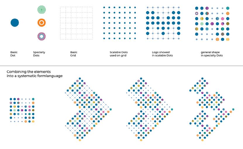
The design system
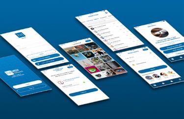
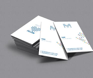
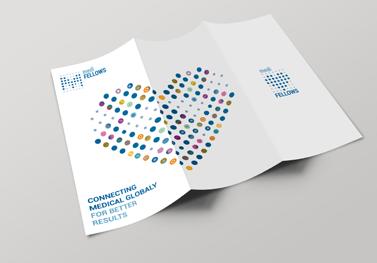
A systematic formlanguage combined with all the elements
Sub logo’s by playing with the grid
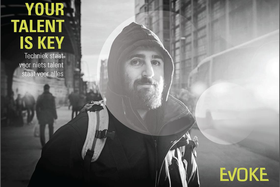
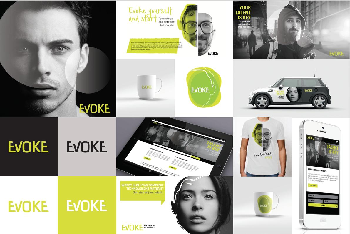
EVOKE FROM CONTRACTOR TO TECHNOLOGY COMMUNITY
Evoke is a Dutch secondment agency specialised in technological talent. The competition on that market is big and representing the very best talents is essential for that market.
QUESTION: How to become the biggest secondment agency specialised in technology representing the best technological talent?
ADVISE: With Total Identity we advised them to become a community for technological talent in order to attract those talents from university
OUTPUT: We developed a young brand: less corporate than it’s competitors, geared more towards a youth market. A brand with a recognizable own opinion. A brand that makes it clear from the start: You are important. You make your own choices, Evoke guides you in your way to the top.
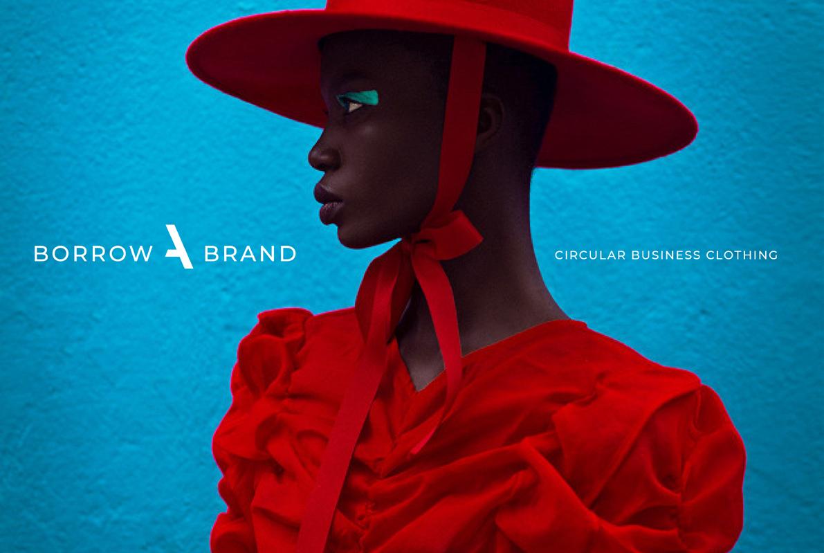
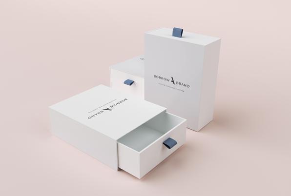
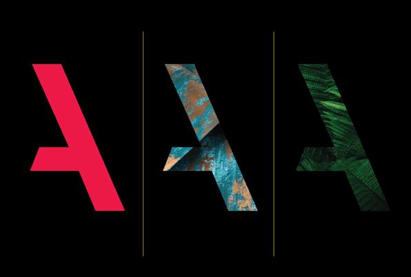
BOROW A BRAND
Borow A Brand stands for quality and consiousnes.
Here you can only find A labels for women who are taking their careers serious. If you want to be an A you have to wear top notch quality labels. They are well made from the finest fabrics, ecologic and by upcoming designers. As a member you have always excess to a wide collection of A class quality brands.
Together with the team of Hustle and Heart I developed their logo and Identity.
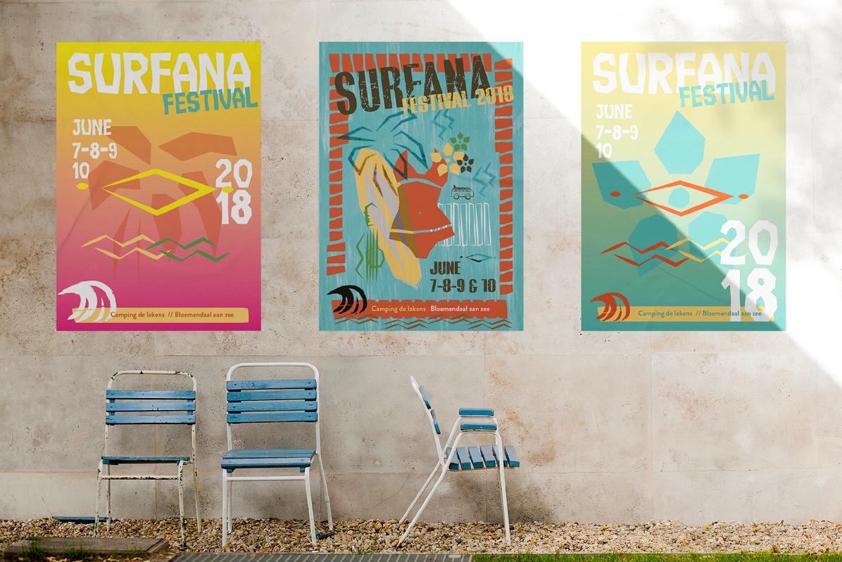
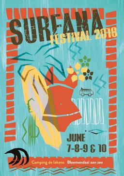
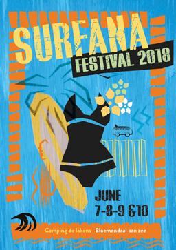
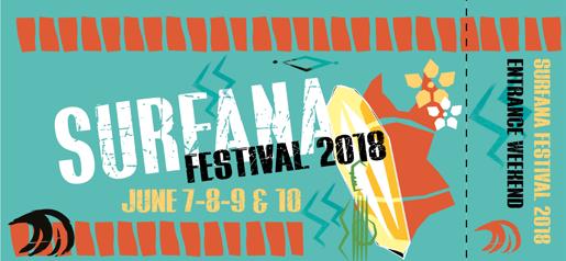
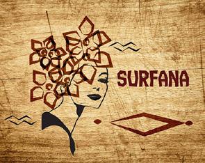
SURFANA
DO YOU READ SURFANA?
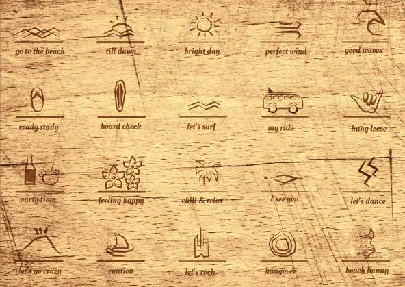
This concept is based on a very old but smart way of communication. The egypts adored their gods and made amazing structures full with hieroglyphics. This was their language to their gods.
To communicate this lifestyle I created a Surfana language. This language excists out of icons and signs. You can find these signs on all the items of the Surfana festival.
The whole Identity is made in a woodcarf style. This was the first technic how the surfboards were decorated.
 THE COTTON CASHMERE
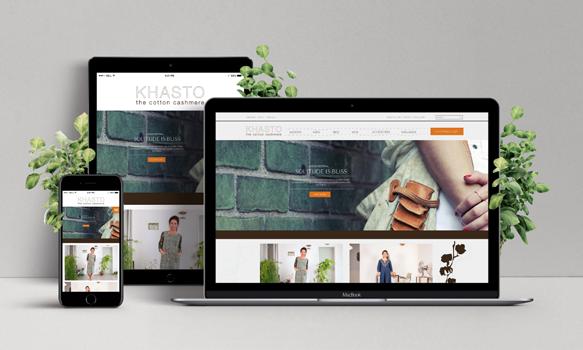
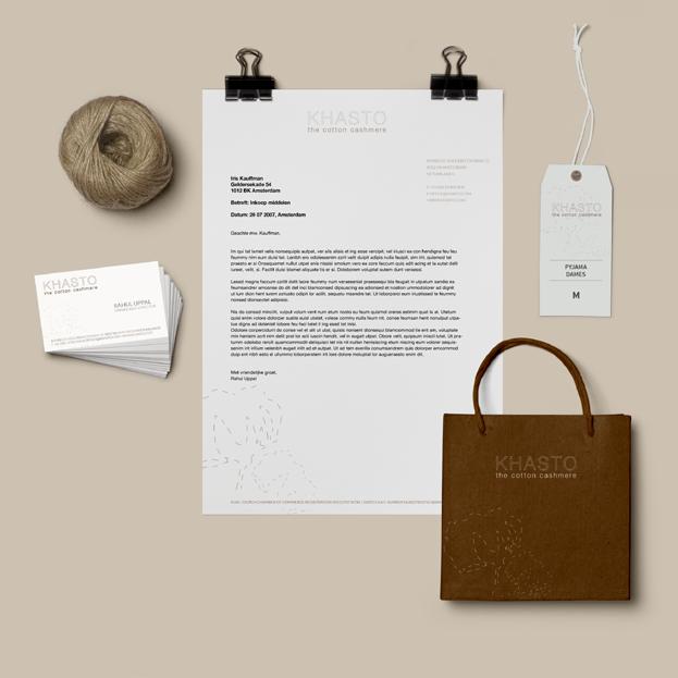
Khasto is a family business that has its origin in the 1980´s. The background of the family has its roots both in Holland and in North India.
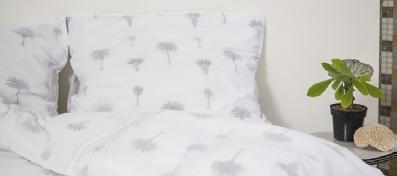
They offer a wide variety of traditional Northern Indian textile techniques in wool, cotton and silk products, and are closely involved with the production process that they keep and promote locally in North India. The design of their collection is 100% unique, and is kept in-house. Their staff has a long history of working in development projects in India and they donate to foundations such as Rumahedi Foundation and Duniya Foundation.
I created their corporate identity together with the owner of Khasto and we are still developing new ideas to share the ideologie of Khasto.
KHASTO

BRANDING PASS UNLEASH YOUR 360 STRATEGY...
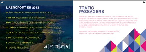
Branding Pass is a marketing agency from Paris with a focus on airports and aviation.
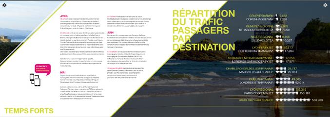
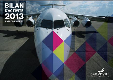
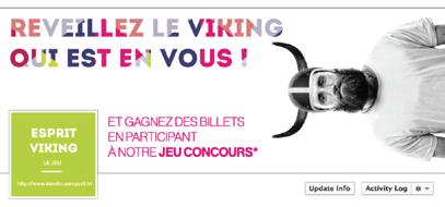
Together we approach companies specialized in aviation. I was involved with multiple projects and pitches like the pitch of Bahrain airport and a campaign for Biaritz airport.
cover summary


INSPIRATON INVITATION
YOU
summary
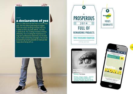
BRANDING PASS, A SMALL AND NIMBLE BOUTIQUE AGENCY HEADQUARTERED IN PARIS IS CELEBRATING ITS 2ND (AND A HALF) ANNIVERSARY. WE THOUGHT ABOUT FLYING YOU TO A PARTY IN AN EXCLUSIVE CAFE ON THE LEFT BANK, WITH POOLS FILLED WITH CHAMPAGNE, RUNWAY MODELS, AND FINE FRENCH PASTRIES. SOUND GOOD???
4
but instead, we revamped our website. It may be a little less fun, but this way you don’t have to take time away from your job. AND, it will give you a bit more insight into what we do. Well, we did think about it... www.brandingpass.net
banners campaign
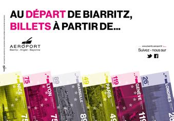
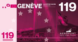
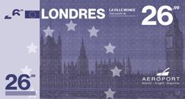



Bayonne N10 Tarif applicables du 1er avril 2014 au 31 mars 2015, pouvant être soumis modification sans préavis. Prices available from 1st april 2014 to 31th march 2015, wich may be subject to change without notice. Tarifas aplicables del 1er de abril hasta el 31 de marzo 2015, se puede modificar sin previo aviso. Loueurs Rental Car Alquiler de vehiculos Terminal Commercial Terminal para los pasajeros Passengers Terminal Terminal Aviation d’affaires Business Aviation Lounge Terminal aviación privada Tarifs/Prices/Tarifas P0 P8 P2 P3 30 mn gratuites/free/gratis jour/day/día 13,00 € 12,00 € 10,00 € 1h00 2h00 3h00 2,00 € 3,50 € 4,50 € 2 jours/days/días 21,00 € 20,50 € 18,00 € 3 jours/days/días 29,00 € 27,90 24,30 € 4 jours/days/días 37,00 35,70 30,60 € 5 jours/days/días 45,00 € 43,50 € 36,90 € Au-delà de 3 heures, 7,00 € par heure supplémentaire. Beyond 3 hours, 7,00 € per additional hour. Más alla de 3 horas, 7,00 € por hora adicional. 6 jours/days/días 53,00 € 51,30 € 43,20 € 7 jours/days/días 61,00 € 59,10 € 49,50 € 8 jours/days/días 69,00 € 66,90 € 55,80 € 9 jours/days/días 77,00 74,70 € 62,10 € 10 jours/days/días 85,00 € 82,50 € 68,40 € Abonnement/Subscription/Suscripción Trimestriel/Quaterly/ Trimestral 315,00 € 315,00 € 220,00 € Semestriel/Biannual/ Semestral 600,00 600,00 € 450,00 € Annuel/Annual/Anual 980,00 980,00 830,00 € +33 (0) 5 59 43 83 32 parc.auto@biarritz.aeroport.fr Parking Parking Parking Programme des vols hiver 2014/2015 Winter flight schedules 2014/2015 Programa de vuelos invierno 2014/2015 Suivez-nous sur En cas de dommage du véhicule, l’aéroport ne sera pas tenu responsable Vehicules owners park at their own risk El aeropuerto no se hace responsable de su vehículo en caso de daño ocasionado.
facebook campaign campaign
annual report
BAHRAIN INTERNATIONAL AIRPORT
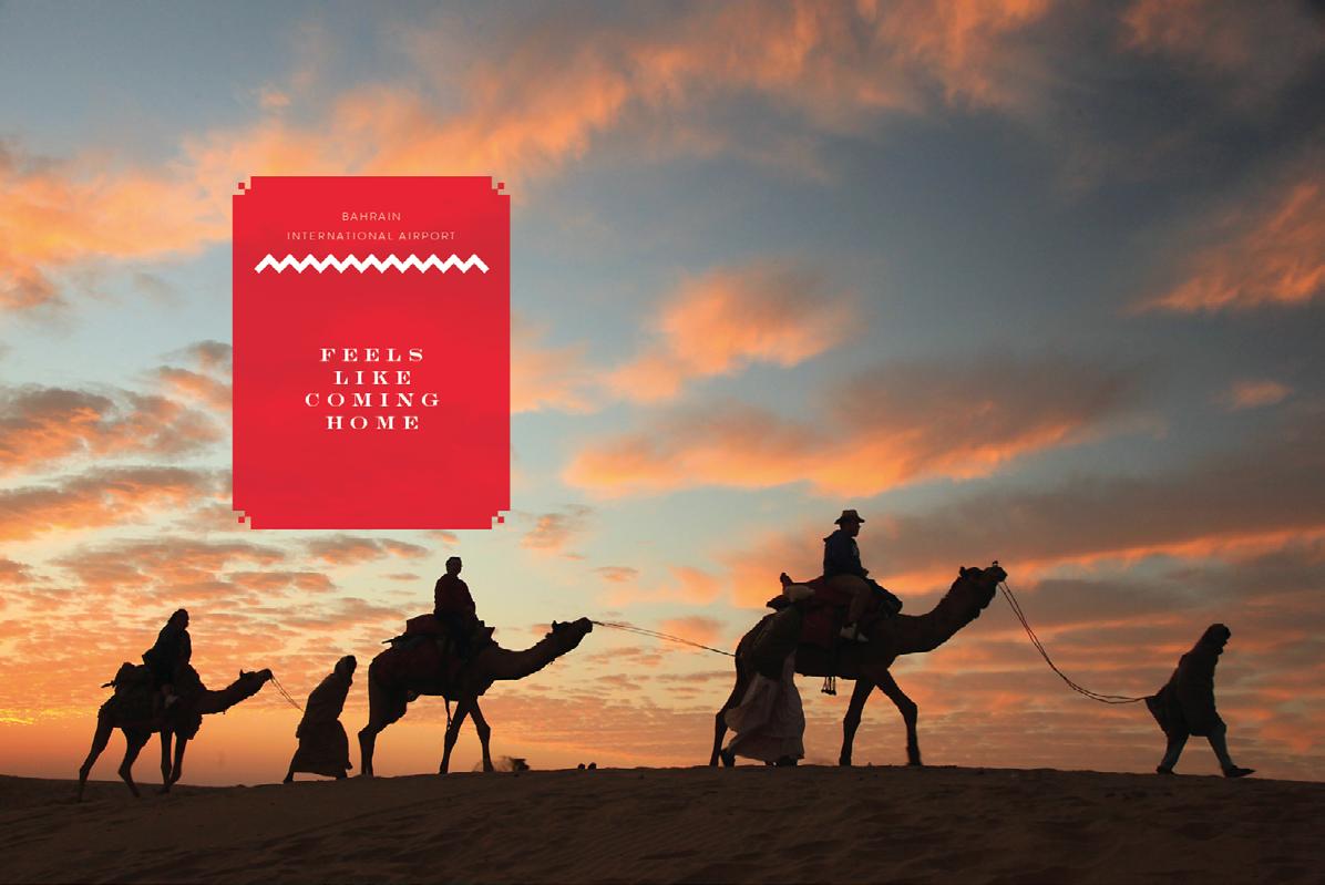
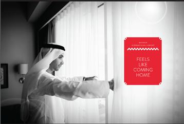
WELCOME CAMPAIGN - FEELS LIKE COMING HOME
Acting as advocates of the devil we tend to think that the B.I.A. doesn’t have a distinctive or strong USP. That’s why we like to suggest a more emotional approach. Focused on a feeling instead of a instrumental property of the airport. With this approach we also create a possibility to communicate about the country of Bahrain. Given this starting point we tried to imagine which positive emotions Bahrain could evoke by it’s potential visitors.
This is how we see it:
- Bahrain (and it’s airport) is a very hospitable country that gives you a warm welcome.
- It’s reliable and it offers it’s guests and inhabitants comfort and safety.
- It’s a small island, a small community, therefore it offers intimacy. Consider this and you can say that Bahrain gives you the same feeling like coming home. It may not even be your home, but it will give you the same feeling.
PITCH
key visuals
Welcome campaign proposal for the new airport of Bahrain
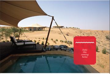
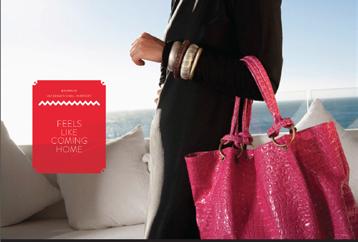
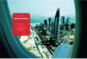
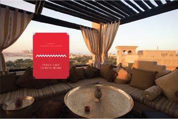
Campaign logo with space for slogan
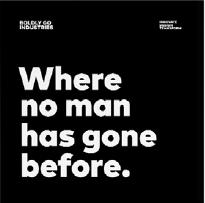
BOLDLY GO
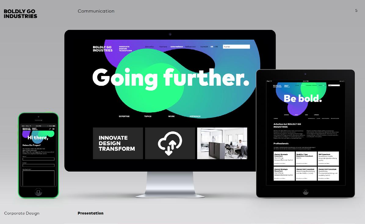
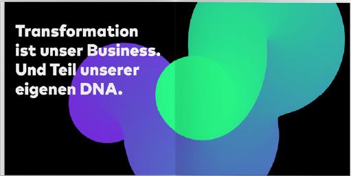
For the new consulting market, BOLDLY GO INDUSTRIES, we have designed and implemented a scalable, digital brand design within just three months.
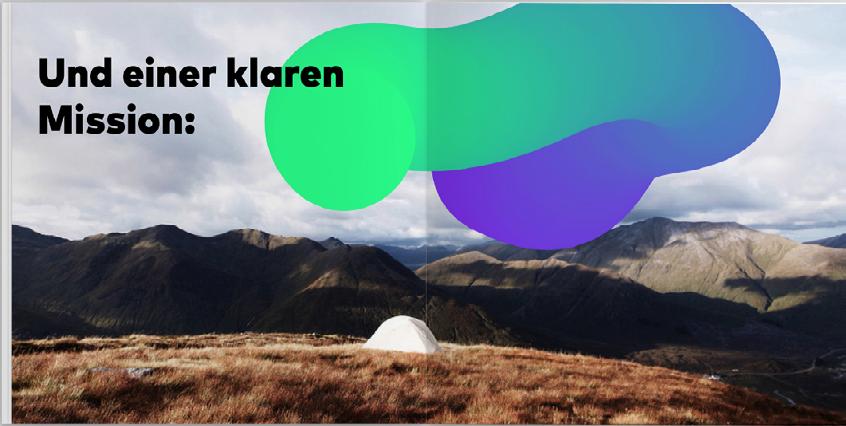
The start-up incubator BOLDLY GO INDUSTRIES has emerged as a new company from the strategic development of the BTEXX Group. To communicate adequately in different channels, we used clear, minimalistic basic components and a dynamic, eye-catching key visual that forms the basics for the brand.
For this Start-up, Wir design and BOLDLY GO INDUSTRIES developed the website and company presentation.

COLLEGEHOTEL ALKMAAR SERVICE FROM A TO Z
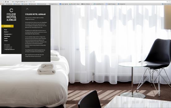
The Collegehotel is a 3 star hotel, located in Alkmaar. This hotel used to be an old school build entirely in the famous Amsterdamse School architecture.
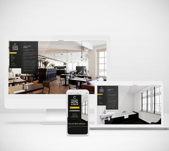
QUESTION: We want an identity with a high-end look & feel, a clear attractive website with a simple but effective booking system and a fitting concept for our interior.
ADVISE: Turn your visitors into loyal guests by giving your guests more than just a room. Deliver a 5 star hotel experience with an A to Z service.
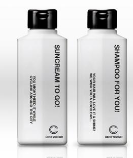
RESULT: I developed a new service package and created an high-end identity that’s clear and sober with a wink to the old days Together with the owner we decorated every room and public space with a school minded styling of the twenties.
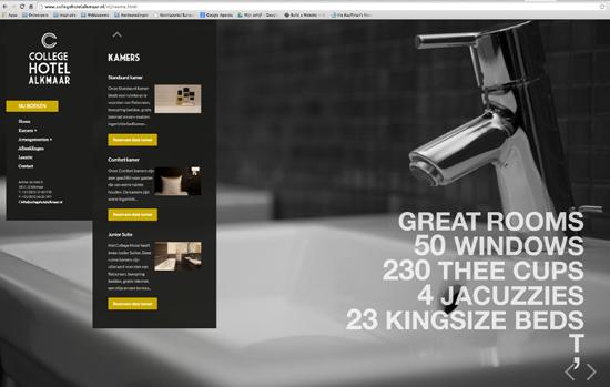
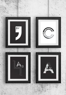
website cards shampoo
KONINGSOORD
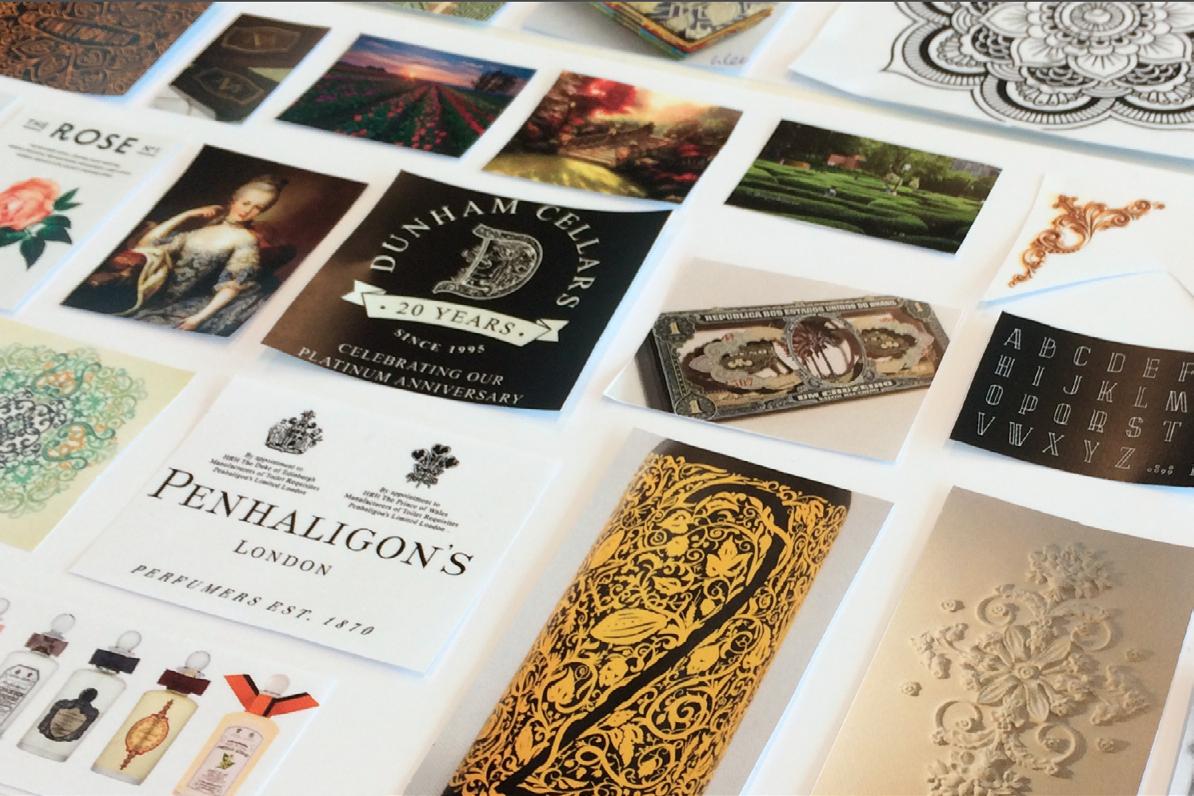
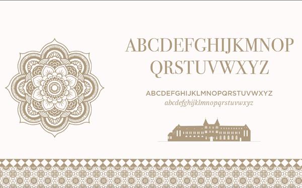
Koningsoord is a beautiful, versatile and adventurous residential and rural area located with a complete unique character, equipped with modern shopping facilities recreational facilities, where the mystique of the monastery is still daily visible and palpable. A generous place to live. A royal place.
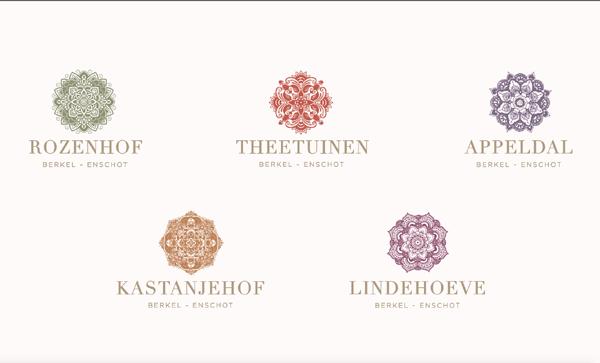
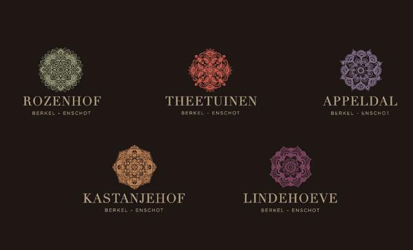
For this project we proposed a new logo with sub logo’s in a royal style.
At Koningsoord you feel like a royal.
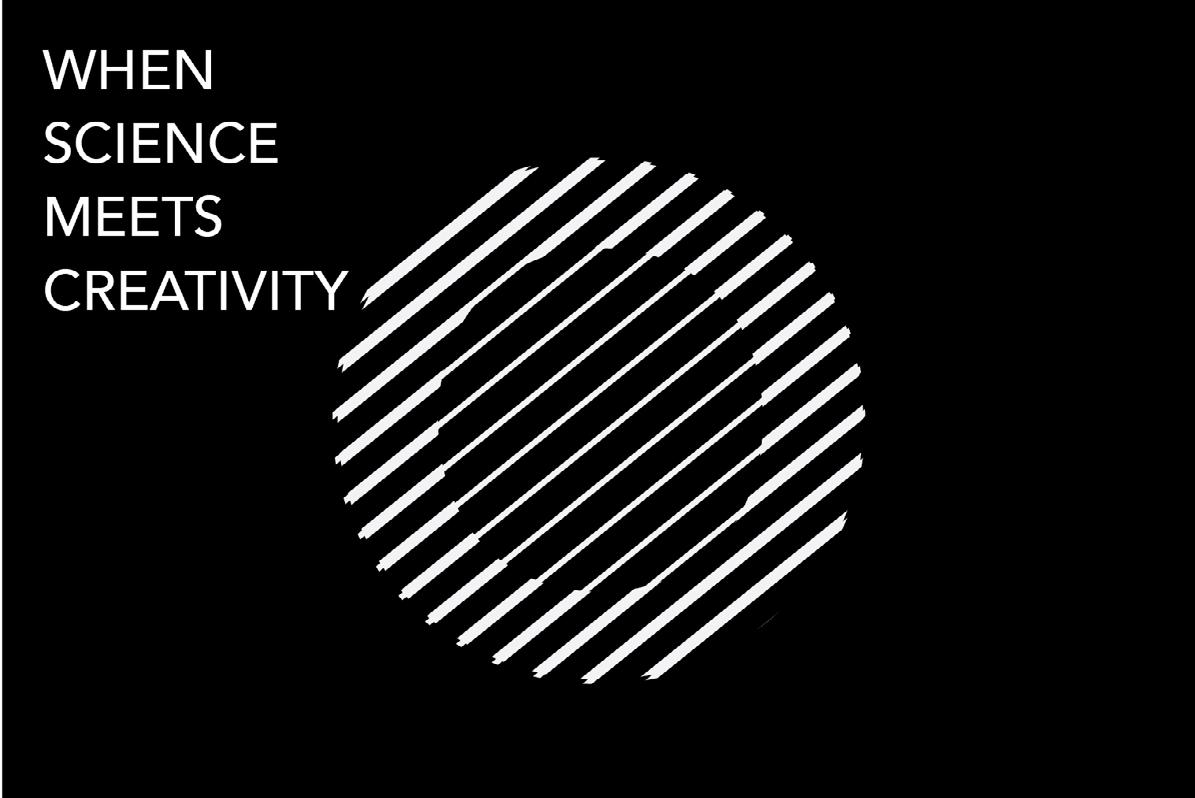
WE ARE TELESCOPE
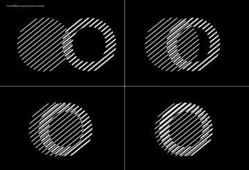
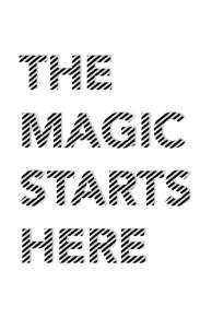
When you start to focus, magic happens! Combining two worlds will give you deeper insights.
Telescope is a young advertising agency in Amsterdam specialized in online campaigns. They look beyond the question and use science for this. As far as Telescope is concerned, creativity can’t work without science.
QUESTION: We need a new identity with our new name.
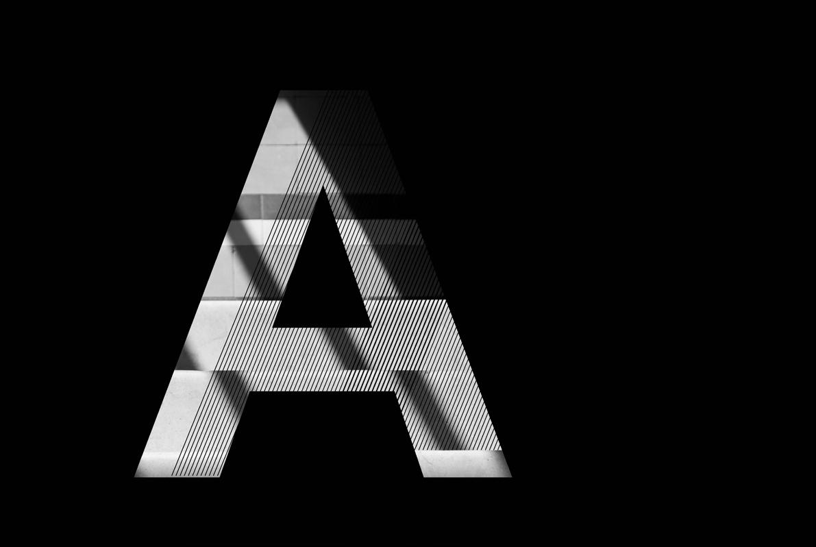
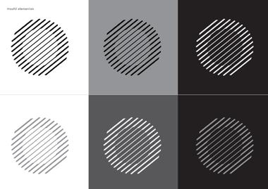
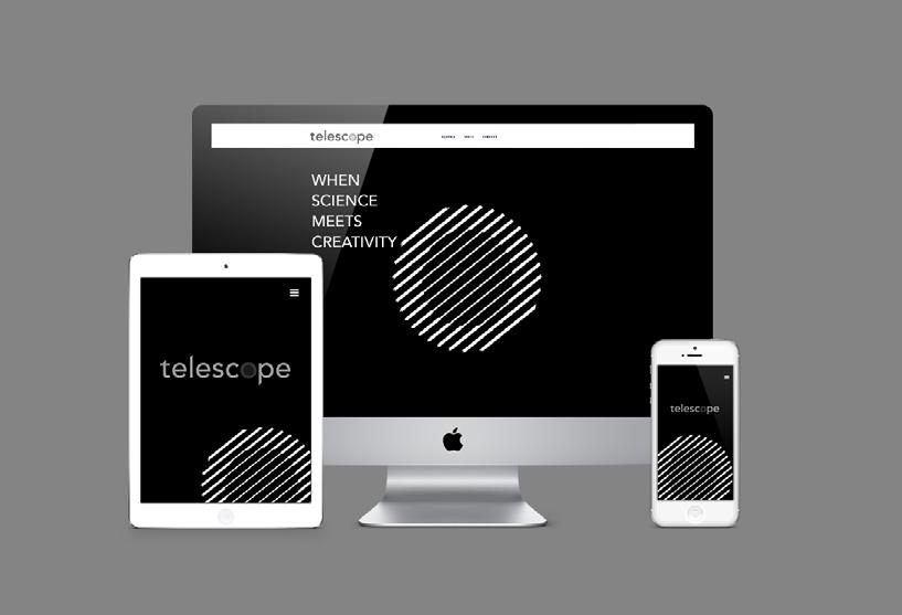
RESULT: For Telescope I have developed a complete black & white identity. The concept is based on a focussed and unfocused world. When you combine these two worlds and their characteristics, respective qualities are positively enhanced and magic will exist. The identity consists of a slanting play of lines based on the number of degrees.



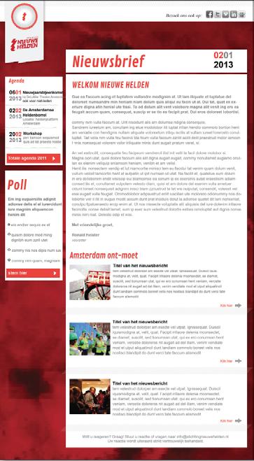
STICHTING NIEUWE HELDEN Create Connect Encounter: philosophy
In a world where there is no longer one truth, one overarching ideology and everyone has to decide for themselves what they stand for and what their ideas are. There is more need than ever for meeting in real time. Isolation is empowering for society.
St. Nieuwe Helden creates moments where you encounter yourself, someone else and the world around you so that it touches you in your own search, a moment where you should not must and therefore may be.
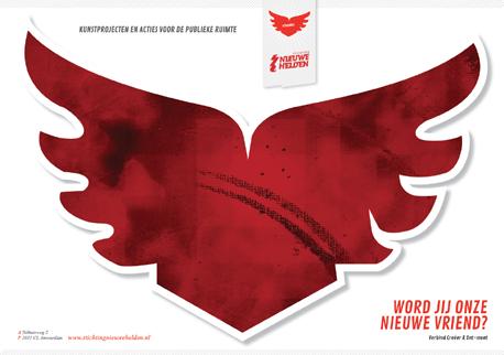
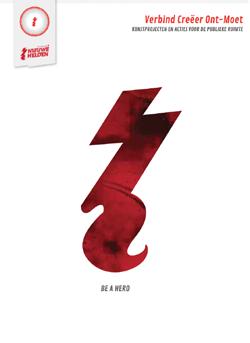
I restyled the entire identity into a kind of communistic political movement identity and developed a campaign to recruit more friends, heroes & members.
logo
corporate brochure
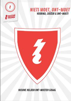
campaign
newsletter
material
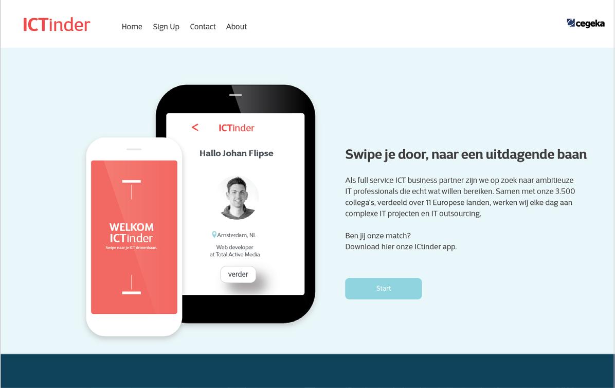
CEGEKA - RECRUITMENT CAMPAIGN
The perfect match
Finding a job is no problem for a IT person.
Finding the job that really suits you is against that. . . that is quite a challenge.
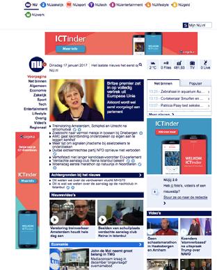
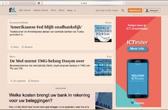
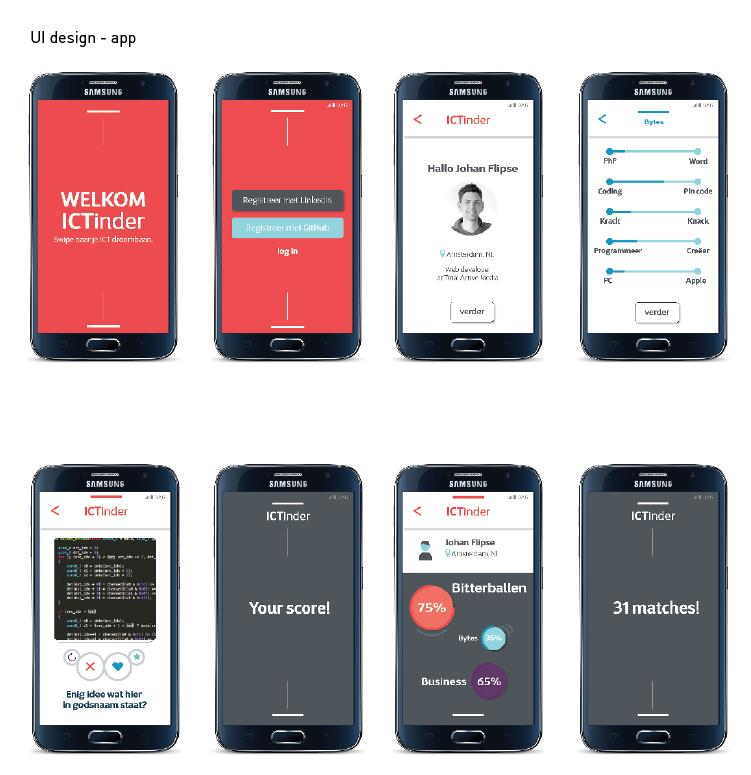
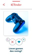
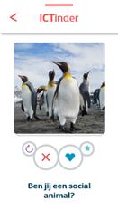
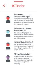
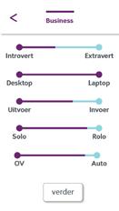
That is why we have set up a completely new platform based on Tinder. You make your profile based on your work experience. And you supplement that with your wishes for the future, in broad lines such as Tinder. Then ICTinder from Cegeka looks for the best “partner” for you.
AXA
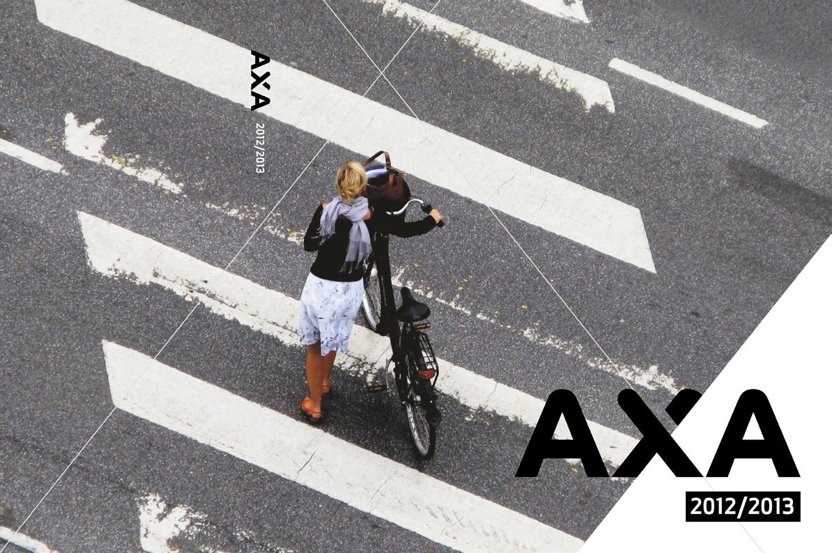
AXA had a positioning problem. The brand was visually too fragmented. Together with Anna Noyons we have developed a complete new identity and packaging line for them.
Now there is one line for the entire European market that makes the brand more visible in the market. We also designed a complete new icon set what made the communication on the packaging more cleare and created hereby more space for the product.
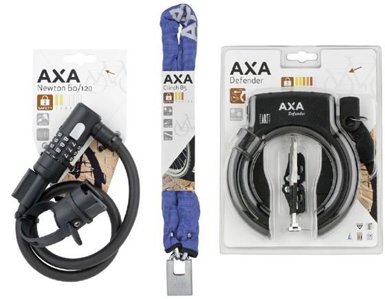
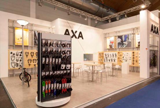
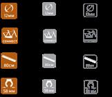
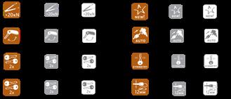
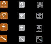
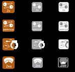
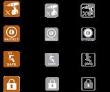
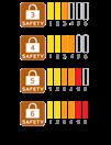
complete brand & packaging line fair stand Icon style
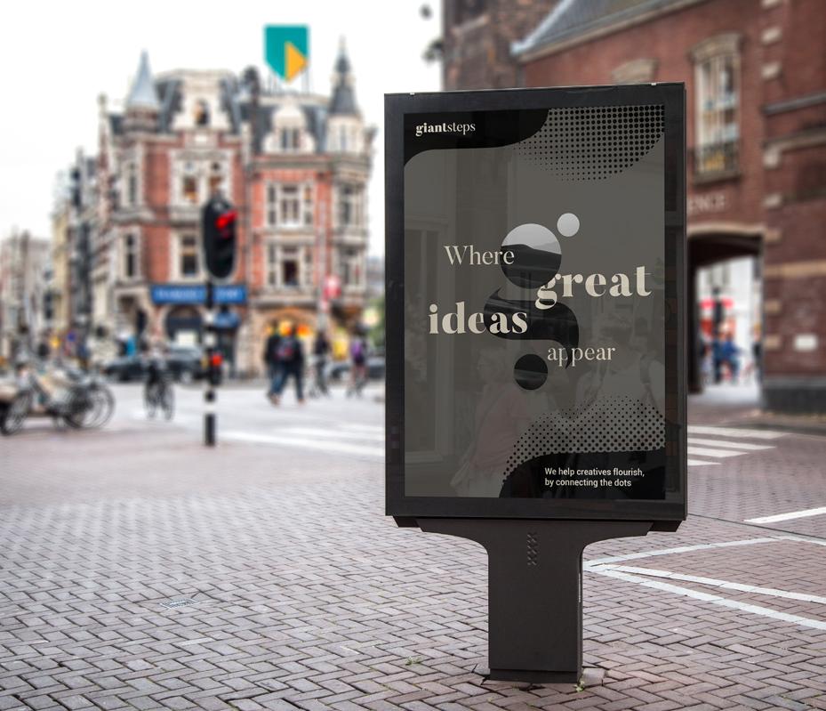


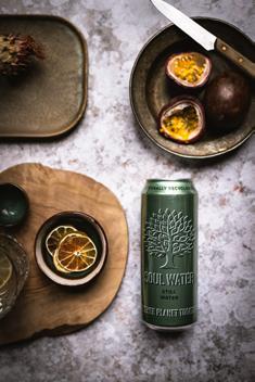
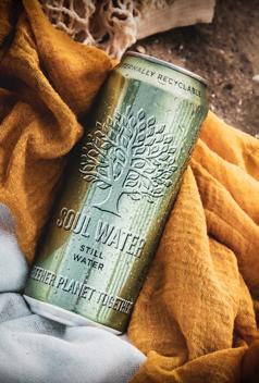
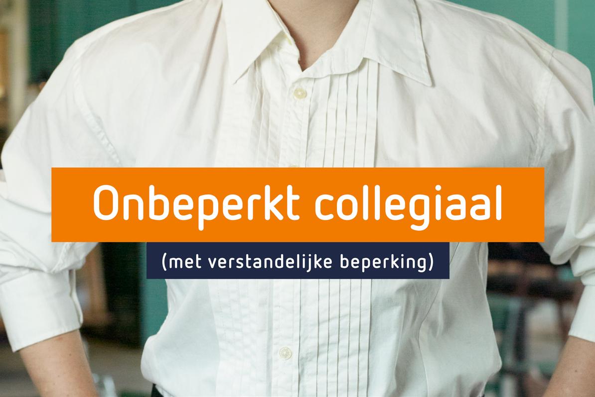
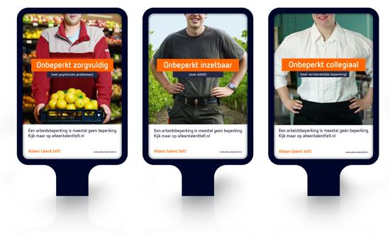
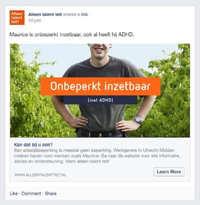
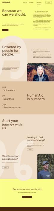
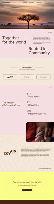
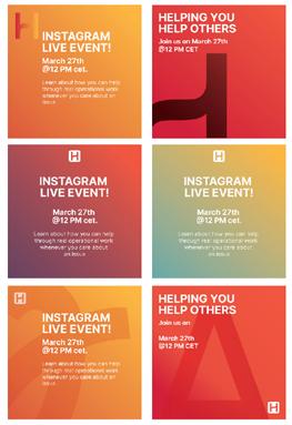
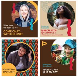
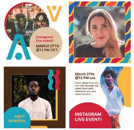
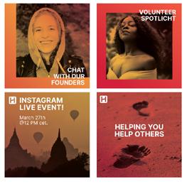



 Campaign instagram templates
Corporate instagram templates