Typography
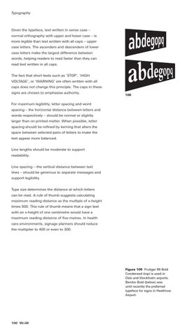
Given the typeface, text written in sense case – normal orthography with upper and lower case – is more legible than text written with all caps – upper case letters. The ascenders and descenders of lower case letters make the largest difference between words, helping readers to read faster than they can read text written in all caps. The fact that short texts such as ‘STOP’, ‘HIGH VOLTAGE’, or ‘WARNING’ are often written with all caps does not change this principle. The caps in these signs are chosen to emphasise authority.
106
For maximum legibility, letter spacing and word spacing – the horizontal distance between letters and words respectively – should be normal or slightly larger than on printed matter. When possible, letter spacing should be refined by kerning that alters the space between selected pairs of letters to make the text appear more balanced. Line lengths should be moderate to support readability. Line spacing – the vertical distance between text lines – should be generous to separate messages and support legibility. Type size determines the distance at which letters can be read. A rule of thumb suggests calculating maximum reading distance as the multiple of x-height times 500. This rule of thumb means that a sign text with an x-height of one centimetre would have a maximum reading distance of five metres. In health care environments, signage planners should reduce the multiplier to 400 or even to 300.
Figure 106 Frutiger 69 Bold Condensed (top) is used in Oslo and Stockholm airports. Bembo Bold (below) was until recently the preferred typeface for signs in Heathrow Airport.
100 W>W