Typeface comparison All three typefaces shown below, Raleigh, Garth Graphic and Breughel, have a unique look and feel. In all three typefaces we can find letters, such as the capital K with its curved diagonal, that lend a very special note to the design /30/. Additionally, all three typefaces have a rather sturdy appearance and pronounced, oblique serifs. In terms of shape, these serifs differentiate themselves from the usual, symmetrical ones. The origin of the asymmetrical serifs can be traced back to the use of a broad pen in the 15th-century handwritten minuscule, as well as to Jenson’s 1470 antiqua – a style that was soon to be replaced by the work of Aldus Manutius and Claude Garamont and that would only receive renewed attention with the 19th-century Arts and Crafts movement. The most obvious difference to Adrian Frutiger’s Breughel can be found in the straight downstrokes of Raleigh 17 and Garth Graphic 19 (named after Bill Garth,18 founder of Compugraphic and former president of Photon). But there are also differences in the slanted serifs. In Raleigh the transition from the stem to the serifs is curved and the base flat, whereas it is concave in Garth Graphic. The serifs are also flatter. In Breughel the serif transitions are not concave which results in the serifs having a less three-dimensional appearance. Additionally, the ascender height and the cap height are identical in Frutiger’s typeface /32/.
/29/
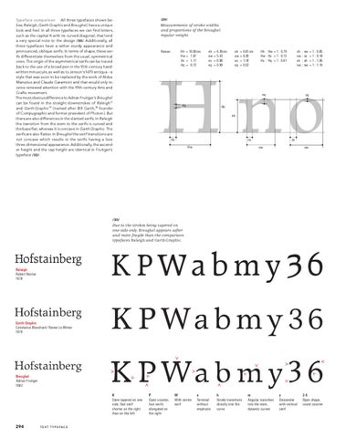
Measurements of stroke widths and proportions of the Breughel regular weight.
Roman
Hh = 10.00 cm Hw = 7.87 Hs = 1.17 Hq = 0.72
nh nw ns nq
= = = =
6.39 cm 5.43 0.98 0.99
oh ow os oq
= 6.81 cm = 6.30 = 1.18 = 0.53
Hh : Hw = 1 : 0.79 Hw : Hs = 1 : 0.15 Hs : Hq = 1 : 0.61
nh nw nh nw
: nw : ns : oh : ow
=1: =1: =1: =1:
0.85 0.18 1.06 1.16
H no nq
Hq
oq
Hh
nh
ns
Hs
Hw
os
nw
ow
/30/
Due to the strokes being tapered on one side only, Breughel appears softer and more fragile than the comparison typefaces Raleigh and Garth Graphic.
Hofstainberg Raleigh Robert Norton 1978
Hofstainberg Garth Graphic Constance Blanchard / Renee Le Winter 1979
Hofstainberg Breughel Adrian Frutiger 1982
K PWa b m y 36 K P Wa b m y 3 6 K P Wa b m y 36 K Stem tapered on one side, foot serif shorter on the right than on the left
294
P Open counter, foot serifs elongated on the right
W With centre serif
a Terminal without emphasis
b Stroke transitions directly into the curve
m Angular transition into the stem, dynamic curves
y Descender with vertical serif
36 Open shape, round counter
T E X T T Y P E FA C E
37 BREU_17_EN def_BL.indd 294
21.9.2008 21:05:17 Uhr