it, the character set in the die case just wouldn’t allow it. Some things were corrected in 1962, but it still wasn’t optimal /34/. Nevertheless Univers was influenced by Monotype in the end because many small foundries simply cast the Monotype matrices, used it for hand composition as well, even though it was a poor second-hand copy to start with. The Univers versions for the various photo- or lasersetting systems, be they Compugraphic, Linotype, Adobe or Bitstream, are all based on the inferior Monotype matrices. The best Univers adaptation is by Günter Gerhard Lange, initially for Diatype by Berthold. It comes very close to the original Univers, even though Lange allows himself some minimal liberties. Linotype’s early adaptations, on the other hand, were a catastrophe. I can vividly recall the fruitless discussions at D. Stempel AG when the first Univers adaptations for Linofilm were produced.The uppercase italics were just slanted uprights with no reworking whatsoever. There wasn’t enough room on the master for italics. The tilt angle, which was originally 16 °, became 12 °. The reduced tilt angle was for linecasting. The original angle of 16 °, however, came from Lumitype photosetting. The first time it didn’t matter technically whether there was an overshoot or not. I found that for photosetting, having no physical body, one could try a completely different slope, so that it would really show a clear contrast. Univers came about at the same time that PR and advertising agencies emerged – that’s why I wanted a snappy typeface, and that’s why there are so many weights and such a strong tilt angle. Maybe I went a bit too far, that’s arguable, 15 ° might have been sufficient, but it’s precisely the 16 ° that has become one of the features of Univers. At Deberny & Peignot I could also insist upon the 16 °. The sharp inclination was immediately criticised. They said it was on the verge of falling over, it was always a topic of discussion. Some of them thought it was fun, while to others it was a thorn in their side. I stuck to my opinion that there ought to be a real difference between an upright and an oblique. At Linotype Univers was for a long time a necessary evil, an orphan that nobody really cared for. I really suffered for it. Helvetica, however, was preened and constantly improved, so becoming a top successful product. It was only Bruno Steinert, managing director at Linotype, who initiated the reworked Linotype Univers in 1994, which actually went back to the hot metal originals. The impetus for renewal came from Deutsche Bank, who were changing their corporate design. The agency responsible for the corporate design chose the Univers – like Anton Stankowski – as their inhouse typeface. They choose the Berthold version, but that wasn’t available worldwide, so they turned to Linotype. Thereupon I was invited to work on it by Bruno Steinert and Otmar Hoefer. I was overwhelmed and felt a certain amount of satisfaction. They asked me to help determine the extreme poles. Interpolating was easy, but extrapolating was impossible. I corrected the slanted fonts by
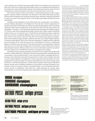
Antique Presse and Univad In the early 1960s, Antique Presse was made as foundry type after requests from the sales department at Deberny & Peignot. It is an extension of Univers. It says in the Antique Presse brochure that clients had complained they had no fonts for large scale newspaper headline setting, and so they had to make their own photographic enlargements and photo-engraved plates. An article about Ladislas Mandel in Etapes Graphiques states: “Antique Presse, 1964. This is the first creation by Mandel.” 26 A design from 1963 titled ‘Antique Presse, Mandel’ /40/ shows clear differences to later versions, for example S and C, and in the whole arrangement. Mandel explains that he designed non-classical shapes for a, S and G, so as to fill the empty spaces and achieve a homogenous colour.27 The design was rejected, and it was reworked along the lines of Univers. The undated ‘Univers bis’ sheet /40/ shows the reworked version. Antique Presse was made in three weights with upperand lowercase letters from 48 to 94 pt. The lowercase 69 and 89 were omitted after being transferred to the Haas’sche type library. The typeface disappeared altogether with the demise of hot metal setting. Linotype did not make it for photosetting. Adrian Frutiger included Antique Presse in a list of his own creations for the first and only time in 1988.29 In conversation dated 28 May, 2001 he has reaffirmed the attribution. Another relative of Univers is Univad /41/, a typeface designed by Ladislas Mandel in 1974 for photosetting on Photon in the smallest point sizes. The counters are as open as possible in order to be acceptably legible in such small sizes. Its increased stroke contrast and widening of letters also improved legibility. As a result, Univad 55 looks like Univers 55 but is strictly speaking a 53. The shapes of some letters were altered from those of Univers. R has a straight downstroke, W is steeper, 5, 6 and 9 are more open. Q, like Antique Presse, has a slightly downward offset cross-stroke. This typeface has been unavailable since photosetting stopped being used.
THE QUICK BROWN FOX JUMPS OVER THE LAZY DOG the quick brown fox jumps over the lazy dog ABCDEFGHIJKLMNOPQRSTUVWXYZ ÆŒ & 1234567890° £$% §†ßfiflæœ abcdefghijklmnopqrstuvwxyz [!?…’_.:-,;–‘—·] (¼½¾) Ç@©* Univers 55
THE QUICK BROWN FOX JUMPS OVER THE LAZY DOG the quick brown fox jumps over the lazy dog ABCDEFGHIJKLMNOPQRSTUVWXYZ ÆŒ & 1234567890° £$% §†ßfiflæœ abcdefghijklmnopqrstuvwxyz [!?…’_.:-,;–‘—·] (¼½¾) Ç@©* Univers 63
/41/
Univad (right), a Univers designed by Ladislas Mandel for agate sizes – here in 5 pt – was made in 1974 for photosetting on Photon machines.
Antique Presse 59 bis c. 60 / 48
Antique Presse 69 bis c. 60 / 48
/40/ Antique Presse 89 bis c. 60 / 48
102
Design by Ladislas Mandel, 1962 / 63 (top), Univers-style corrected version (middle), finished version of Antique Presse from an undated brochure (bottom).
T E X T T Y P E FA C E
11 UNIV_31_EN def_PS.indd 102
21.9.2008 13:24:07 Uhr