Stephen Ongpin Fine Art
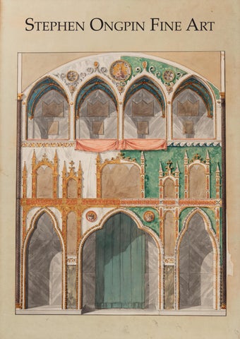
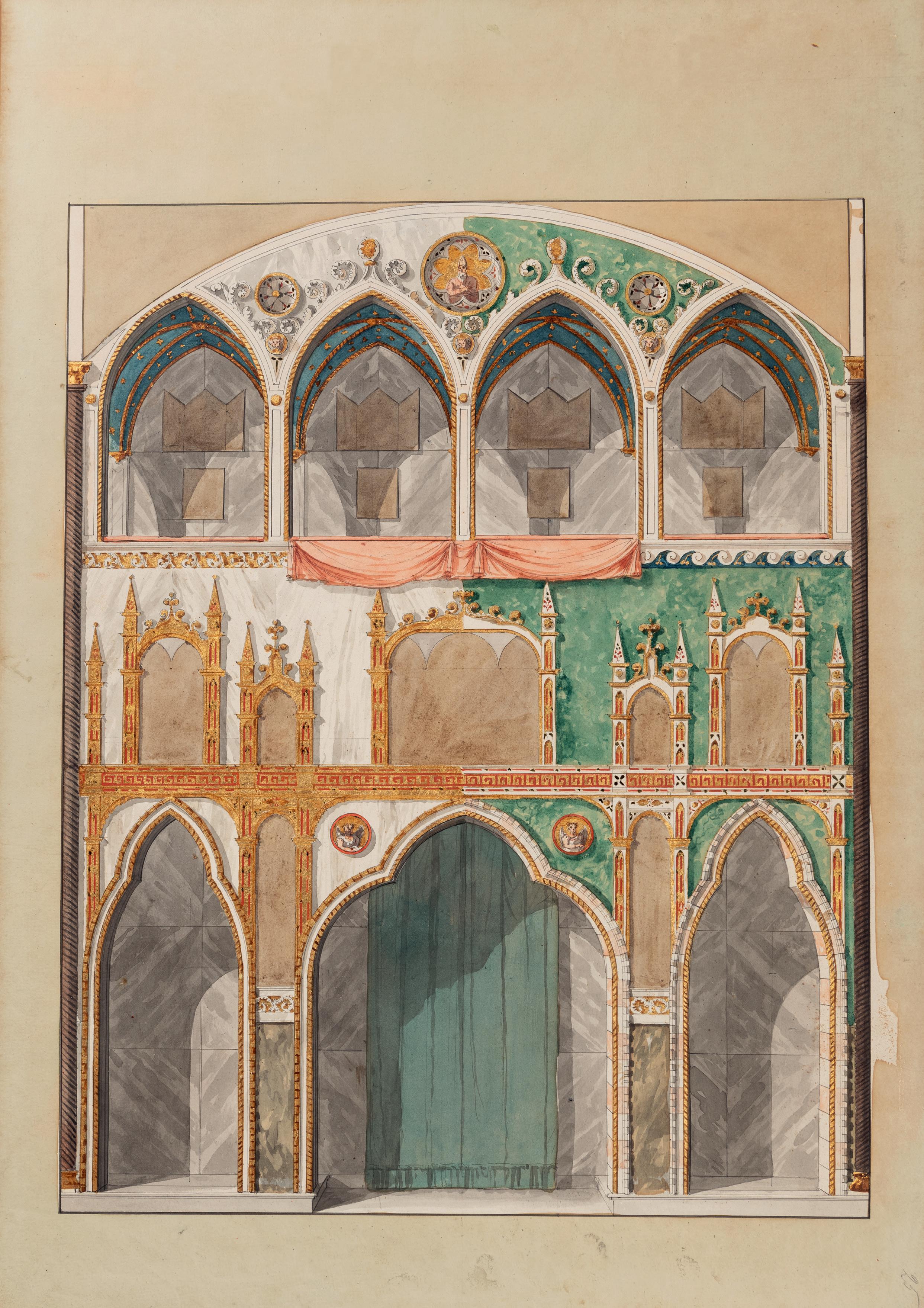
Front cover:
Antonio Basoli (1774-1848)
Design for the Side Elevation of a Private Chapel No. 43
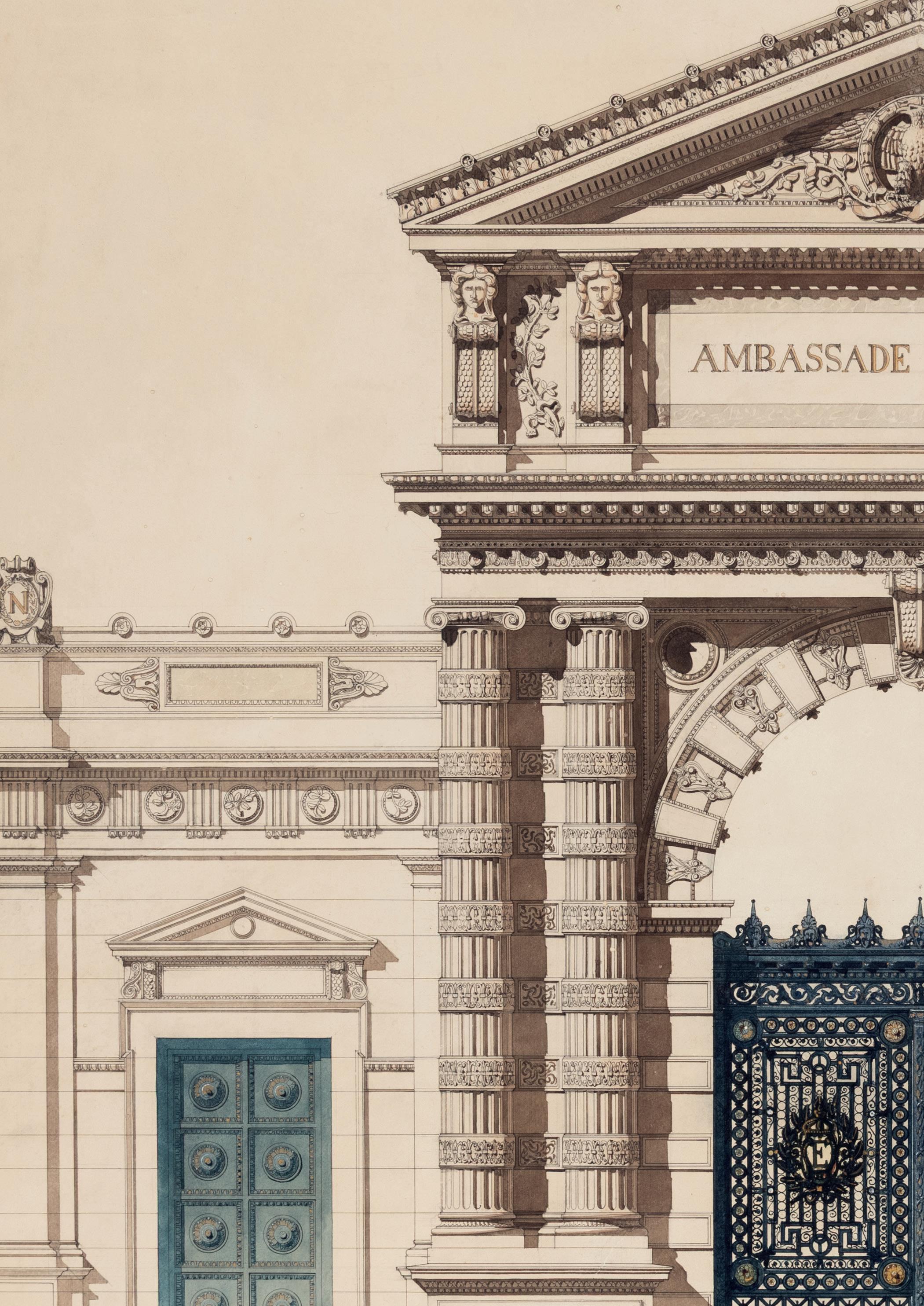
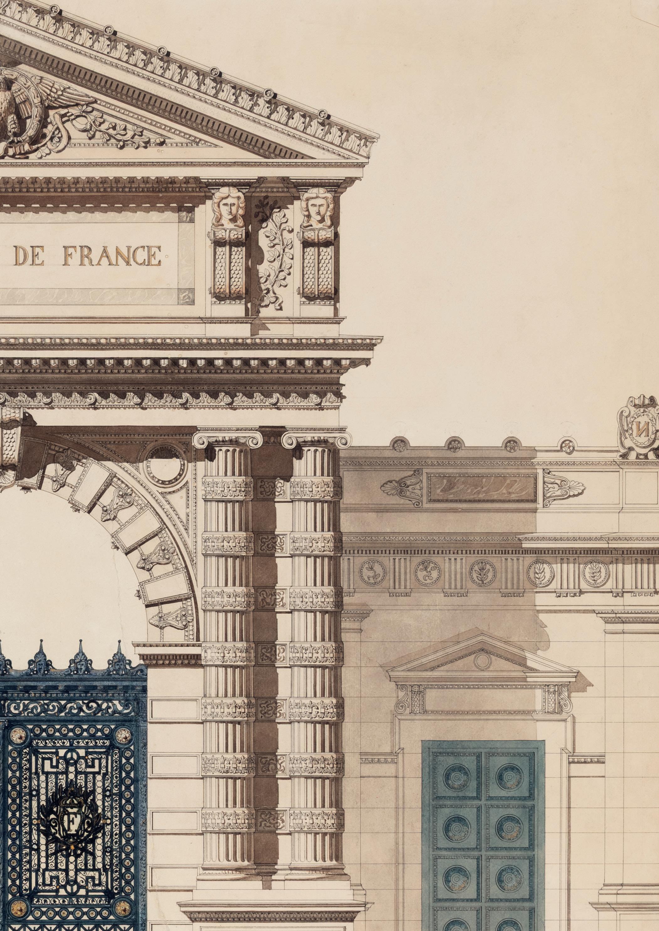
French School (c.1850-1870))
Design for an Entrance Gate for a French Embassy Building No.49
ACKNOWLEDGEMENTS
I am, as ever, grateful to my wife Laura for her wise counsel, encouragement and patience while I was working on this catalogue. I am also greatly indebted to the members of Team SOFA, namely Antonia Rosso and Emma Ricci, for their invaluable assistance in all aspects of this catalogue and the accompanying exhibition. In addition, I would also like to thank the following people for their help and advice in the research and preparation of this catalogue and the drawings included in it: Stephen Bann, Deborah Bates, Anna Bianco, Sarah Bowler, Alesa Boyle, Julian Brooks, Jane Carter, Isabella LodiFè Chapman, Chris Cook, Cheryl and Gino Franchi, Julie Frouge, Enrico Gatti, Catherine Monbeig Goguel, Diek Groenewald, Amanda Hilliam, Libby Horner, Laurie Marty de Cambiaire, Suz Massen, Bert Meijer, Jennifer Montagu, James Mundy, Victoria Sancho Lobis, Nicolas Schwed, Andrew Smith, Susan Tipton and Monroe Warshaw.
Stephen Ongpin
Dimensions are given in millimetres and inches, with height before width. Unless otherwise noted, paper is white or whitish.
High-resolution digital images of the drawings, as well as framed images, are available on request.
All enquiries should be addressed to Stephen Ongpin at Stephen Ongpin Fine Art Ltd.
82 Park Street
London W1K 6NH
Tel. [+44] (20) 7930-8813 or [+44] (7710) 328-627 e-mail: info@stephenongpinfineart.com
DRAWING BY DESIGN
DRAWINGS FOR ARCHITECTURE, ORNAMENT, DESIGN AND THE DECORATIVE ARTS
FROM THE 16TH TO THE 20TH CENTURY
Stephen Ongpin Fine Art
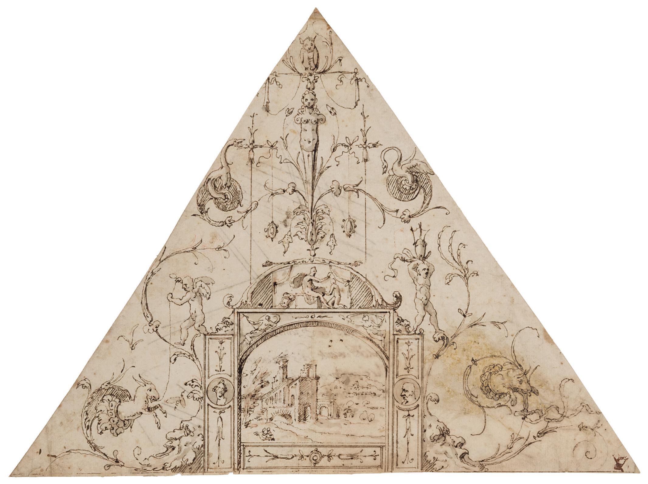
LUZIO LUZZI, called LUZIO ROMANO
Todi and Rome, active between 1528 and 1575
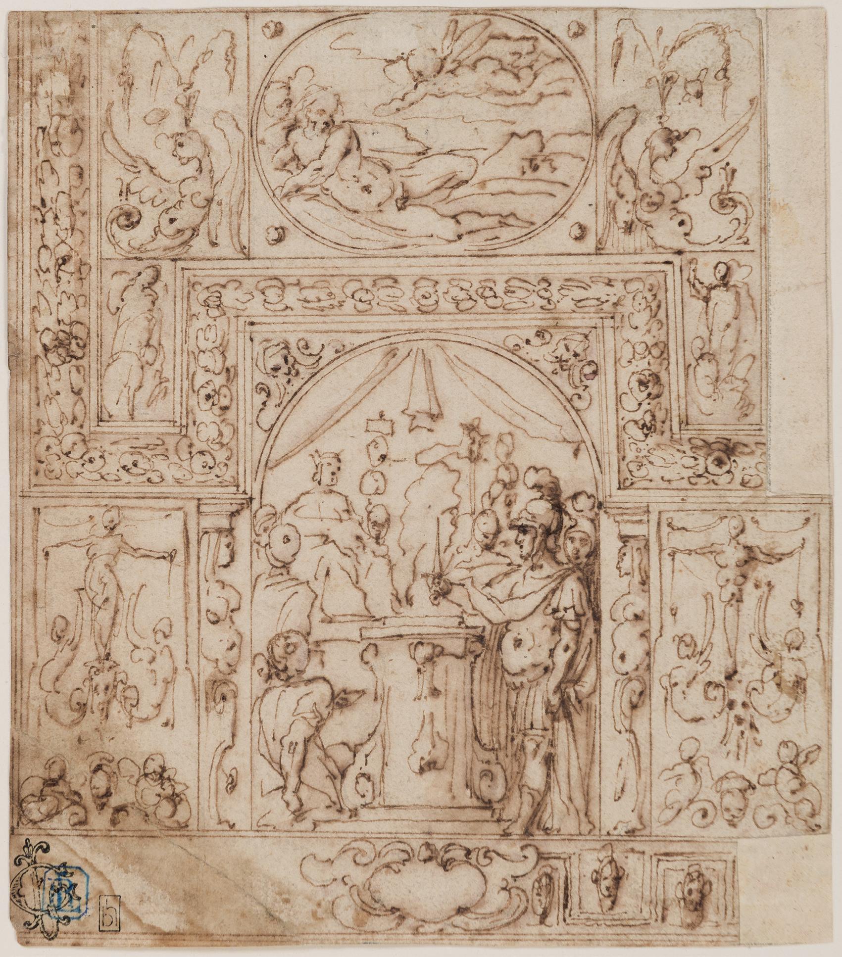
Design for the Grotesque Decoration of a Quarter Section of a Ceiling, with a Landscape
Pen and brown ink and brown wash. laid down on an old mount. Inscribed Io aucuno [...] confece / anc. recente a [...] ama / che si confiar […] di [...] / il mese […] o di […] in brown ink on the verso. 211 x 288 mm. (8 3/8 x 11 3/8 in.)
PROVENANCE: Major A. Merz; Bought from him on 13 May 1966 for £40 by P. & D. Colnaghi, London; Sold by them on 25 October 1966 to Lodewijk Houthakker, Amsterdam (Lugt 3893)1
LITERATURE: Roeland D. Kollewijn, ed., Wanden en plafonds: Tekeningen uit de verzameling Lodewijk Houthakker, exhibition catalogue, Nijmegen, 1985, p.15, no.9 (as Italian School, mid 16th century); Peter Fuhring, Design into Art: Drawings for Architecture and Ornament. The Lodewijk Houthakker Collection, London, 1989, Vol.I, p.165, no.130 (as Circle of Perino del Vaga, and dated c.1540-1550).
EXHIBITED: Nijmegen, Museum ‘Commanderie van Sint Jan’ and Haarlem, Frans Halsmuseum, Wanden en plafonds: Tekeningen uit de verzameling Lodewijk Houthakker, 1985, no.9.
The Roman painter, stuccatore and draughtsman Luzio Luzzi, called Luzio Romano, was born in Umbria and spent much of his career in Rome2. Active between c.1528 and 1575, Luzio is only briefly mentioned by Giorgio Vasari, as one of Perino del Vaga’s assistants. He was in fact one of the most important artists and stuccatori in the circle of Perino, with whom he worked on the stucco decoration and grotesques in the Palazzo Doria in Genoa in the late 1520s and early 1530s, and again at the Castel Sant’Angelo in Rome for Pope Paul III between 1544 and 1545. Known in particular for his expertise in all’antica decoration, Luzio painted a significant number of the frescoes, grottesche and stuccoes in the Castel Sant’Angelo, notably on the walls and ceiling of the Sala della Biblioteca and the so-called Cagliostra rooms. As Philip Pouncey and John Gere have noted, Luzio was ‘a specialist in grotesque and ornament, trained under Perino and apparently operating in the Castel Sant’Angelo with some measure of independence.’3 Luzio Romano also worked in a chapel in the Roman church of Santa Maria in Via in 1548, now destroyed, and, alongside Daniele da Volterra, decorated the ceiling of San Giovanni in Laterano from 1563 onwards. He is also known to have worked on the interiors of the Massimo di Pirro, Firenze, Cenci Maccarani and Strada palaces in Rome, as well as the Palazzo Odescalchi in Bassano di Sutri and the Palazzo Crispi in Bolsena. Luzio received payments for paintings and stucco work in the Vatican in 1565 and at the Palazzo dei Conservatori in 1575 and is also thought to have made designs for objects and silverware.
Drawings by Luzio Romano are characterized by a simplistic figure style and delicate penwork. This drawing for the decoration of a ceiling is very closely related to another sheet of similar dimensions – also triangular in shape, with the same decorative elements, and undoubtedly for the same project –that is part of a large group of decorative designs attributed to Luzio Romano in the Royal Collection at Windsor Castle4. The Windsor sheet is part of ‘a number of grotesque drawings…[which] form part of a whole collection of late Perinesque architectural and ornamental studies, some of which are connected with the Castel Sant’Angelo, while others cannot be earlier than the 1560’s.’5
As Peter Fuhring has further noted of the present sheet, as well as the related drawing at Windsor Castle, ‘The existence of two drawings of the same subject poses the problem of their relationship, as well as that of the designer and of their link with the executed work. Was one of the drawings the preparatory design for a frescoed ceiling decoration? Or were both drawings made after a now-lost, or not-yet published, painted ceiling decoration? Was one of the drawings made after the other, or were both made after an untraced original drawing?…The [present] drawing can be dated to the period 1540-50, it was executed in Rome and can be linked with the decoration of the apartment of Pope Paul III in the Castel Sant’Angelo by Perino del Vaga and his workshop.’6
SPANISH SCHOOL
Circa 1550
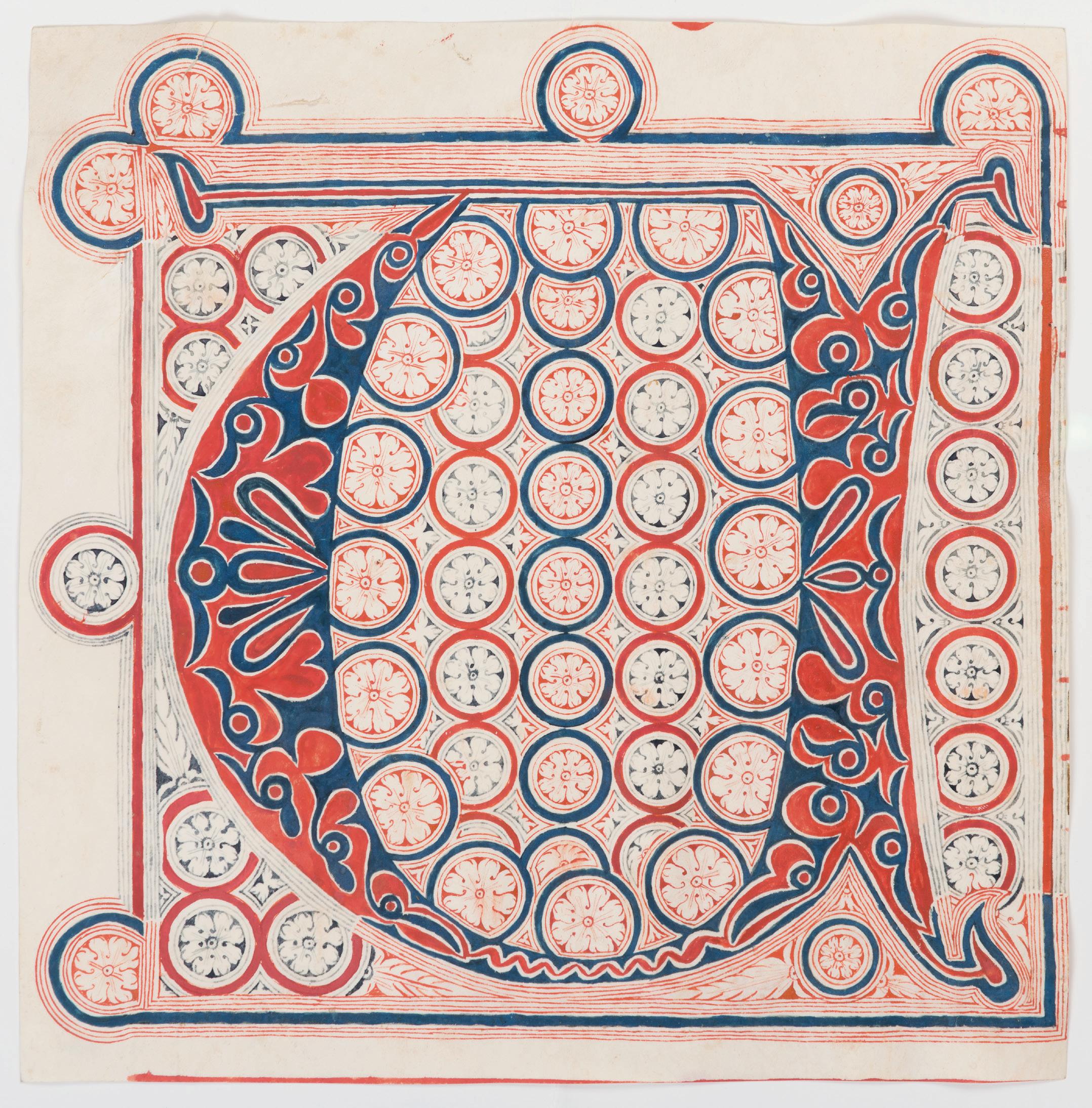
A Decorated Initial V from an Antiphonary
Manuscript in red, blue and grey ink on vellum. Inscribed with part of a rubric [As]censione dni in red ink on the verso.
288 x 285 mm. (11 3/8 x 11 1/4 in.)
PROVENANCE: Maggs Bros. Ltd., London, in 1967; Anonymous sale, London, Sotheby’s, 24 June 1980, part of lot 16 (‘Two Very Large Decorated Initials, “V” and “S”, in elaborately ornamented red and blue with very detailed infilling and surround in both colours, cut from vellum leaves of an Antiphoner, portions of text and music on the verso (each approx. 295 mm. by 290 mm.) [Spain, c.1550]’ bt. Maggs); Maggs Bros. Ltd., London; Stuart Cary Welch, Jr., New Hampshire1
LITERATURE: London, Maggs Bros. Ltd., European Miniatures and Illumination: Bulletin No.5, April 1967, pp.51-53, no.37 (as ‘Spanish Illuminator, c.1550’, priced at £25).
The present sheet is one of a group of four matching ornamental initials from a large 16th century Spanish antiphonal manuscript that were offered for sale by Maggs Bros. in London in 19672. This cutting of an initial V, with traces of text and ruling for music, incorporates a foliate pattern in red and blue outlined with white, surrounded by a repeated pattern of circles with flower heads inside them. While the ornament of the present sheet and another from the group, with the initial A, is based entirely on circles, the other two cuttings, with the initials C and S, also incorporated lozenges. Indeed, the initial S adds squares to the design, creating a pattern quite reminiscent of Islamic ornament, which in turn would suggest a possible origin in southern Spain for the parent manuscript.
The reverse of this decorated initial V includes the rubric ‘[As]censione d[omi]ni’ (‘Ascension of the Lord’), so it is likely that this initial was meant to begin the introit lines ‘Videntibus illis elevatus est’ (‘When they saw him, he was lifted up’) or ‘Viri Galilaei, quid aspicitis in caelum’ (‘Men of Galilee, why are you looking up to heaven?’) in the text of the antiphonary.
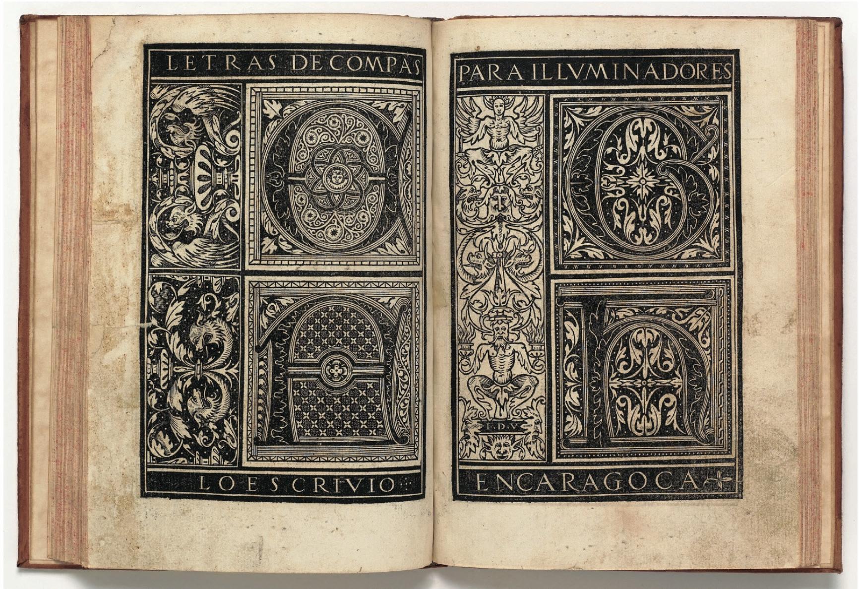
The large scale and repeated ornament of the present sheet, as well as the three related initials, is typical of late medieval and 16th century Spanish liturgical choirbooks. It may be likened in particular to the ‘letras de compas para illuminadores’ (or ‘casos quadrados’) illustrated by Juan de Yciar in his famous writing book Arte Subtilissima (fig.1), published in Spain in 15503, and may be tentatively dated to around the same time.
MARCO MARCHETTI, called MARCO DA FAENZA
Faenza(?) before 1528-1588 Faenza
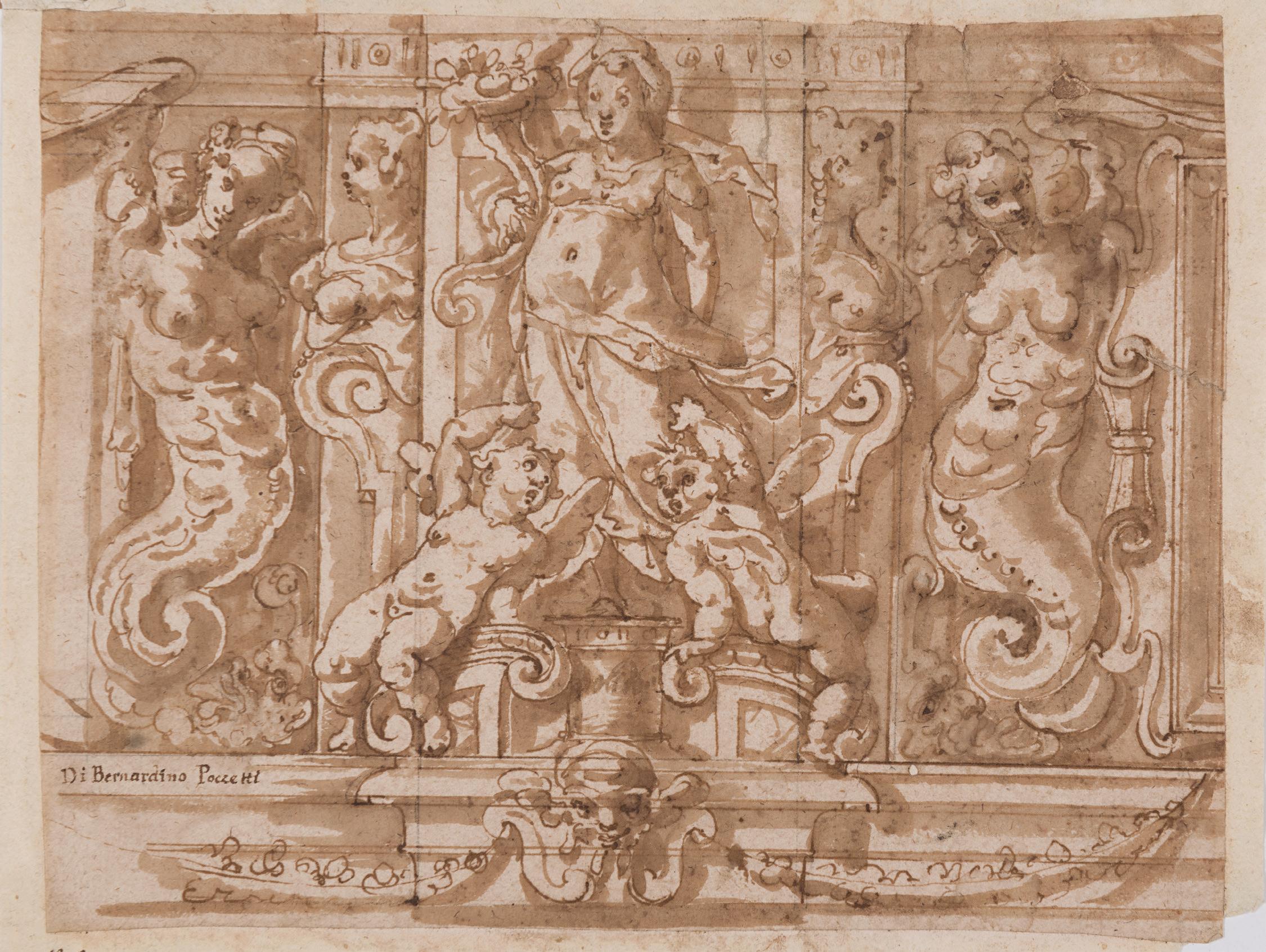
Study for a Wall or Façade Decoration, with an Allegorical Figure of Fortune Flanked by Two Mythical Figures (Melusine?)
Pen and brown ink and brown wash, over traces of an underdrawing in black chalk. Laid down. Inscribed Di Bernardino Poccetti in brown ink at the lower left, and further inscribed p.r. in brown ink in the lower left margin. Inscribed 31.6.s in brown ink on the backing sheet. 165 x 211 mm. (6 1/2 x 8 3/8 in.)
Marco Marchetti, known as Marco da Faenza after his birthplace, is best known as a designer and painter of grotesque decorations. The precise year of his birth is not known, and he is first mentioned in documents in 1528. The early years of his career were spent mainly in Rome, where around 1553 he decorated some of the rooms of the Palazzo Ricci Sacchetti. The artist and biographer Giorgio Vasari writes that he was in great demand as a painter of grottesche, and praises his work very highly1, as did the later biographer Giovanni Baglione, who described the artist as a ‘gran maestro’ in the field of decorative painting. By the middle of the 1550s Marchetti was working in Florence, where he executed an extensive series of grotesque decorations and ceiling paintings in the rooms of the Palazzo Vecchio, under the supervision of Vasari. As Rhoda Eitel-Porter has noted, ‘Grotesque decorations abound in Palazzo Vecchio, and it is almost impossible to pinpoint Marchetti’s exact contribution to various schemes. From his numerous drawings of this subject, however, it becomes clear that the most inventive motifs and those that are most convincingly three-dimensional in appearance are likely by his hand. Each painted figure, as well as the general architectural framework, has a convincing plasticity not apparent in the work of lesser masters.’2 The decorative grottesche of the rooms known as the Quartiere degli Elementi in the Palazzo Vecchio are perhaps the finest manifestation of Marchetti’s talents in this field.
After another period in Rome, Marchetti returned to Florence between 1564 and 1566 to work on the apparati celebrating the marriage of Francesco de’ Medici, and was elected to the Florentine Accademia in October 1565. He spent the latter part of his career in Rome, where one of his most important commissions was for the grottesche decoration of the Vatican Logge of Pope Gregory XIII. He was also active as a painter of religious subjects, including a series of paintings in the cloister of SS. Trinità dei Monti in Rome. Near the end of his life Marchetti settled in his native town of Faenza, where he worked on the decoration of the palace of the Cardinal Legate and painted scenes from the life of Saint Francis for the monastery of the Osservanti in 1585.
In the present sheet, the two fantastical serpentine creatures flanking the central figure of Fortune holding a cornucopia may represent Melusine, a character from European folklore with the torso of a woman and the lower body of a serpent or fish, who is sometimes (as here) also depicted with wings. The legend of Melusine, a female spirit of fresh water often associated with a holy well or river, is very rarely found in Italian art, however, and was much more common in medieval literature in France and Germany.
Very similar figures are found in a drawing for a mural decoration by Marco da Faenza that was formerly in the collection of Pierre de Charmant in Geneva and was sold at auction in 20023. Other comparable drawings for wall decorations by the artist are in the Princeton University Art Museum4, the Uffizi in Florence5 and the Fitzwilliam Museum in Cambridge6
FLORENTINE SCHOOL
Second half of the 16th Century
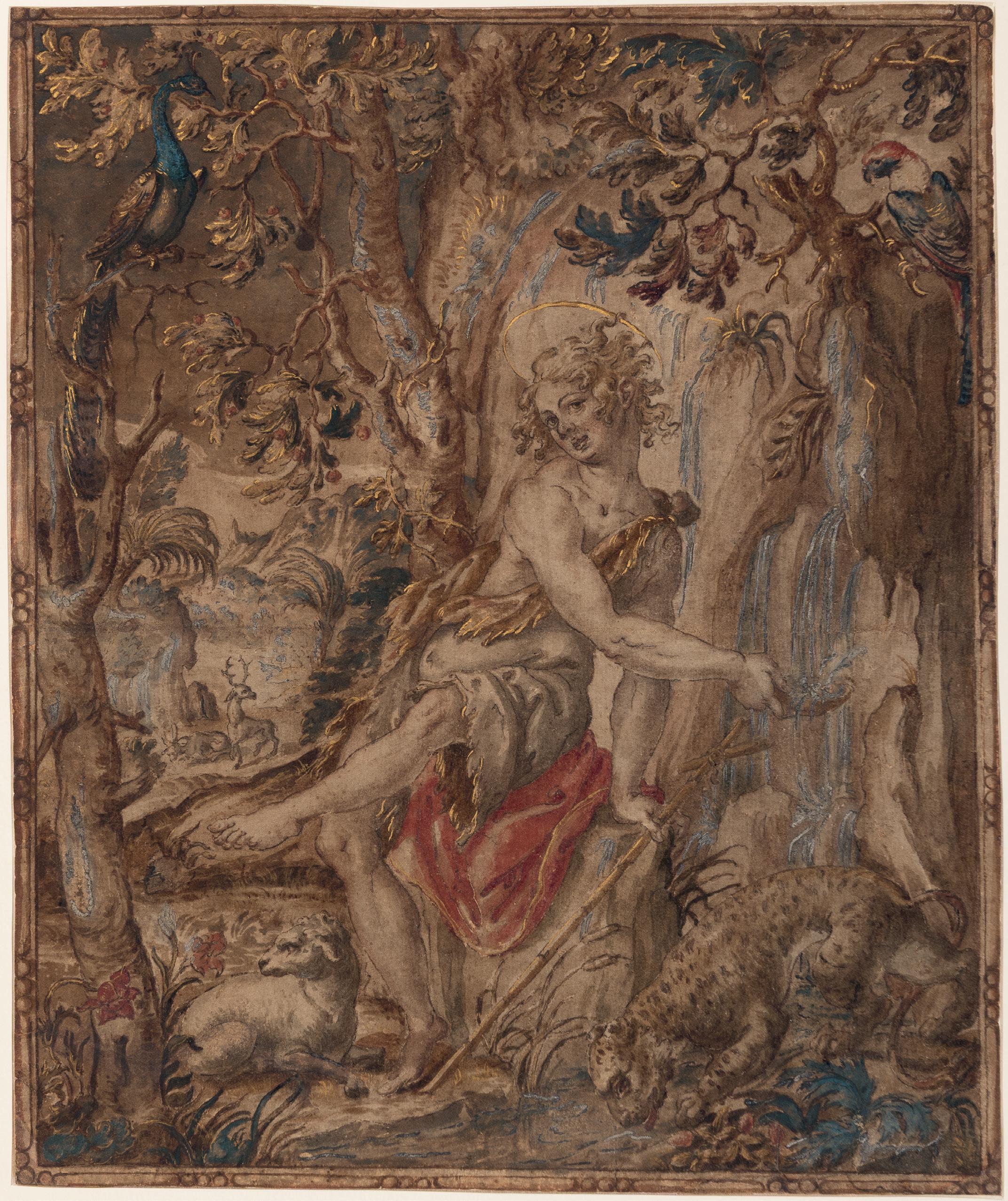
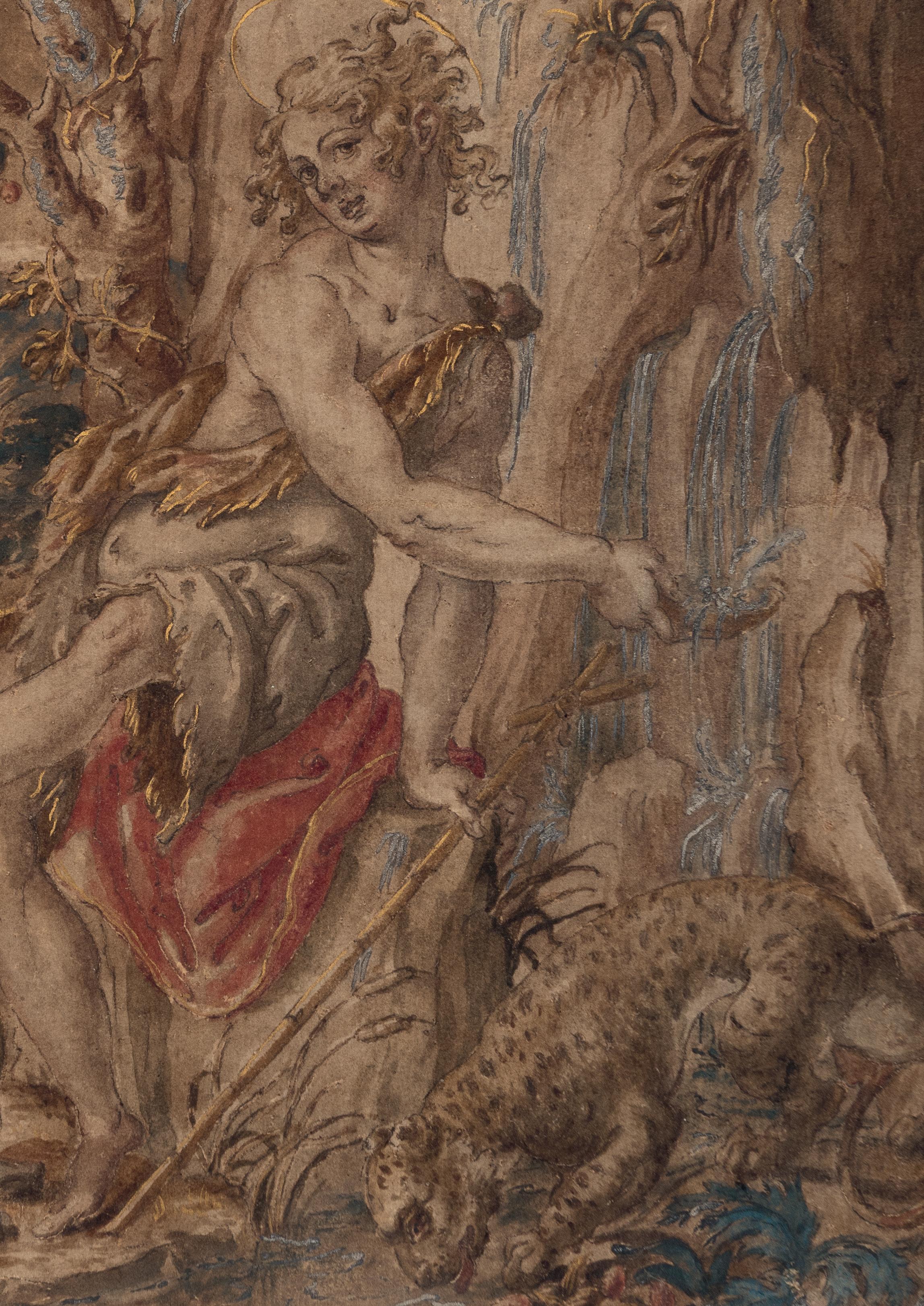
Design for a Tapestry: The Young Saint John the Baptist in the Wilderness
Pen and brown ink and brown wash, with touches of red and blue wash, heightened with gold and silver, with a drawn fictive, frame-like border on light brown paper, backed. Inscribed Salvator Rosa. in brown ink in a cartouche on the former mount.
322 x 268 mm. (12 5/8 x 10 1/2 in.) [sheet]
PROVENANCE: Private collection, England; Anonymous sale (‘Sold by order of the Executors of a Deceased’s Estate’), London, Bonhams Knightsbridge, 12 December 1996, lot 56 (as ‘Circle of Jan Soens, called Giovanni Fiammingo’); Jean-Luc Baroni Ltd., London, in 2006; Private collection, London.
EXHIBITED: New York and London, Jean-Luc Baroni Ltd., An Exhibition of Master Drawings and Oil Sketches, 2006, no.14.
Given its high degree of finish and colouring, as well as the fact that it is extensively heightened with both silver and gold, this beautiful drawing is almost certainly a design for a tapestry, a suggestion further supported by the decorative motif drawn as a border around the composition. The lavish appearance of the sheet suggests that it was produced as a presentation modello, to be shown to a patron for his approval before work on the actual tapestry cartoon was begun. While certain aspects of the present sheet suggest a Northern hand, the overall effect is more in keeping with Florentine draughtsmanship of the second half of the 16th century. As the patron saint of the city, Saint John the Baptist was a popular subject in Florentine art throughout the Cinquecento, and it is more than likely that the present sheet was intended not only as a modello for a tapestry commissioned by a Florentine patron but, in all probability, a tapestry woven in Florence itself.
The first tapestry workshops in Florence were established in 1545 by the Flemish weavers Nicolas Karcher and Jan Rost, both under the patronage of Duke Cosimo I de’ Medici. Unlike the tapestry workshops established earlier in Mantua and Ferrara, which were primarily concerned with providing the rulers of these city-states with furnishings for their palaces, the Rost and Karcher workshops seem to have been intended by Cosimo as the vanguard of a new Florentine industry. It appears that Cosimo wished to establish Florence as a major centre of tapestry production in Italy, and hence not only encouraged Karcher and Rost to undertake freelance commissions from other patrons, but also expected them to train local apprentices. Ducal commissions alone resulted in more than forty narrative tapestries woven in Florence between 1546 and 1553, for the most part intended for the Palazzo Vecchio. Although woven by Flemish masters, the design of the tapestries was entrusted by Cosimo to his favoured Florentine artists, notably Agnolo Bronzino and Francesco Salviati, as well as Jacopo Pontormo and Francesco Bacchiacca. The Karcher and Rost workshops, and the local artists who provided tapestry cartoons for them, also received numerous commissions from other private patrons in Florence.
In 1554 Cosimo established a new ducal tapestry factory in Florence, known as the Arazzeria Medicea, which was run by local Italian weavers and which used less complex materials and techniques than their Flemish predecessors. While Bronzino continued to paint tapestry cartoons in the early years of the Arazzeria, the leading designer of this period was the Flemish-born artist Jan van der Straet, known as Stradanus, who was to produce more than one hundred tapestry cartoons for the workshop, mainly intended for the various rooms of the Palazzo Vecchio and several Medici villas. In 1575 he was succeeded as chief designer at the Arazzeria Medicea by Alessandro Allori, whose tapestry designs were mostly for the Palazzo Pitti. After the death of Cosimo and the accession of Ferdinando I as Grand Duke of Tuscany in 1587, tapestries of religious subjects became more popular. Later artists entrusted with producing designs for the Medici tapestry factory included Ludovico Cigoli, Bernardino Poccetti
and Michelangelo Cinganelli, while later in the 17th century such artists as Baccio del Bianco, Agostino Melissi, Jacopo Vignali, Lorenzo Lippi and Vincenzo Dandini also worked for the Arazzeria, which continued to operate until 1745.
Giorgio Vasari, who had himself designed cartoons for tapestries, was well aware of the elements necessary for a successful tapestry design. As he wrote, ‘there must be fantastic inventions and variety of composition in the figures, and these must stand out from one another, so that they may have strong relief, and they must come out bright in colouring and rich in the costumes and vestments.’1 Most of the tapestries produced by the Florentine workshops in the 16th century are distinguished by elaborate borders, often with swags of fruit and foliage or other complex motifs.
The present sheet may be tentatively associated with the work of Jan Stradanus (1523-1605), known in Italy as Giovanni Stradano, who had settled in Florence in 1545 and worked there for the remainder of his career. Stradanus was the foremost designer of tapestries at the Arazzeria Medicea in the 1560s and 1570s. Comparisons may be drawn between the leopard in the right foreground of the composition, as well as the trees and foliage, with a tapestry of The Meeting of Dante and Virgil, commissioned by a member of the Salviati family of Florence and today in the collection of the Minneapolis Institute of Art2. Woven by Jan Rost after a design by Francesco Salviati, assisted by Stradanus, the tapestry may be dated to between 1546 and 1549. The edge of the composition is designed to look like a framed painting, rather than the more usual decorative border found in most Italian tapestries of the period. Also comparable to the present sheet are the animals in a tapestry of A Stag Hunt with Traps, woven by Benedetto Squilli in 1568 after a design by Stradanus, and today in the collection of the Amministrazione Provinciale in Siena3
Only a few coloured modelli for tapestries of the Florentine Cinquecento may be identified today. In its high degree of finish and colouring, the present sheet may be compared to two drawings for a tapestry design by Ludovico Cardi, called Il Cigoli, that were on the art market in 19914. The Cigoli drawing was intended for a never-executed tapestry of Pope Sixtus V at his Desk, Inspired by the Holy Ghost, commissioned around 1593 by Alessandro Peretti, Cardinal Montalto.
Apart from being an elaborate modello for a tapestry, this exceptionally fine sheet, with its rich colouring and the use of silver and gold heightening, was almost certainly intended as a finished presentation drawing in its own right. The non-narrative subject of the drawing, as well as the direct focus on the single figure of the saint and the relative intimacy of the composition, would suggest that the tapestry may have been intended for a private home, rather than a public setting such as a church. Indeed, the patron for whom this splendid drawing was made may have had a particular devotion to, or perhaps shared his name with, Saint John the Baptist.
FLORENTINE SCHOOL
Late 16th Century
Design for a Ceiling or Wall Decoration: Mucius Scaevola Before Lars Porsena Pen and brown ink. Irregularly trimmed and made up along the right edge. Inscribed Pierino del Vaga [crossed out] / Marco da Faenza and Bern. Poccetti in a modern hand in pencil on the verso. 161 x 141 mm. (6 3/8 x 5 1/2 in.)
PROVENANCE: Col. Count Raffaello Ettore Lamponi Leopardi, Florence and Turin (Lugt 1760); Probably his posthumous sale (‘Collection Lamponi de Florence’), Florence, Borgo Pinti [Jules Sambon], 10-19 November 1902; Luigi Grassi, Florence (Lugt 1171b); His anonymous sale (‘Drawings by Old Masters, mainly of the Italian School, From the G. L. Collection’), London, Sotheby’s, 13 May 1924, lot 104 (as Perino del Vaga: ‘Design for a scheme of Mural Decoration. Pen and bistre. 6 1/2 by 5 1/2 in. Collection: R. Lamponi.’); Walter Schrott, Mendola, Tyrol (Lugt 2383), his mark on the verso; His anonymous sale, Leipzig, C. G. Boerner, 19 February 1942, lot 571 (as Perino del Vaga: ‘Entwurf für eine Wanddekoration. F in Braun, ein wenig laviert. 16:14. Sammlungen: Lamponi und J. Grassi.’); Bernhard Himmelheber, Karlsruhe (Lugt 4035); Thence by descent to his son Dr. Georg Himmelheber, Munich, until 2016.
A design for the elaborate decorative scheme of a wall or ceiling, the present sheet would appear to be the work of an artist in the circle of Giorgio Vasari (1511-1574) in Florence. Vasari supervised a team of painters working on the extensive decoration of the various rooms of the Palazzo Vecchio in Florence, a Herculean project planned and designed by him and completed by the artist and his collaborators over a period of some seventeen years, from around 1555 until 1572.
The subject of the main scene depicted here is the story of the bravery of the ancient Roman hero Gaius Mucius Scaevola, taken from Livy’s History of Rome. In 508 BC, during the war between the Romans and the Etruscans, the city of Rome was besieged by Lars Porsena, king of the powerful Etruscan city of Clusium. The Roman youth Gaius Mucius Cordius, with the approval of the Senate, volunteered to steal into the Etruscan camp to assassinate Porsena. After killing the king’s scribe in error, Cordius was captured and led before Porsena.
As Livy recounts, the Roman stood before the king and declared, ‘“I am a Roman citizen,” he cried; “men call me Gaius Mucius. I am your enemy, and as an enemy I would have slain you; I can die as resolutely as I could kill: both to do and to endure valiantly is the Roman way. Nor am I the only one to carry this resolution against you: behind me is a long line of men who are seeking the same honour…Look, that you may see how cheap they hold their bodies whose eyes are fixed upon renown!” Mucius then unflinchingly thrust his right hand into a sacrifical fire and left it there to burn, without giving any sign of pain. Shocked at the youth’s bravery and fortitude, Porsena freed him. Mucius Cordius returned to Rome and earned the cognomen ‘Scaevola’, meaning ‘left-handed’, for himself and his descendants. Lars Porsena, impressed by the courage displayed by the citizens of Rome, decided to offer peace terms to the city.
This drawing has belonged to a number of interesting collectors. Its first recorded owner was the 19th century Florentine nobleman Count Raffaello Ettore Lamponi Leopardi, whose collection of paintings and drawings was dispersed at auction in Milan in 1902. The present sheet was probably acquired at the Lamponi sale by the noted Florentine conservator, art dealer and collector Luigi Grassi (1858-1937), who sold it at auction in London in 1924 as a work by Perino del Vaga. The next owner of the sheet was Walter Schrott (b.1878), an Austrian-born collector of Italian, French, Netherlandish and German prints and drawings who lived in South Tyrol. At the sale of part of Schrott’s collection of drawings in Leipzig in 1942 this drawing was acquired by the German architect and interior decorator Bernhard Himmelheber (1898-1966), whose collection comprised mainly Italian and German drawings dating from the 16th to the 19th centuries.
SPANISH SCHOOL
Late 16th Century
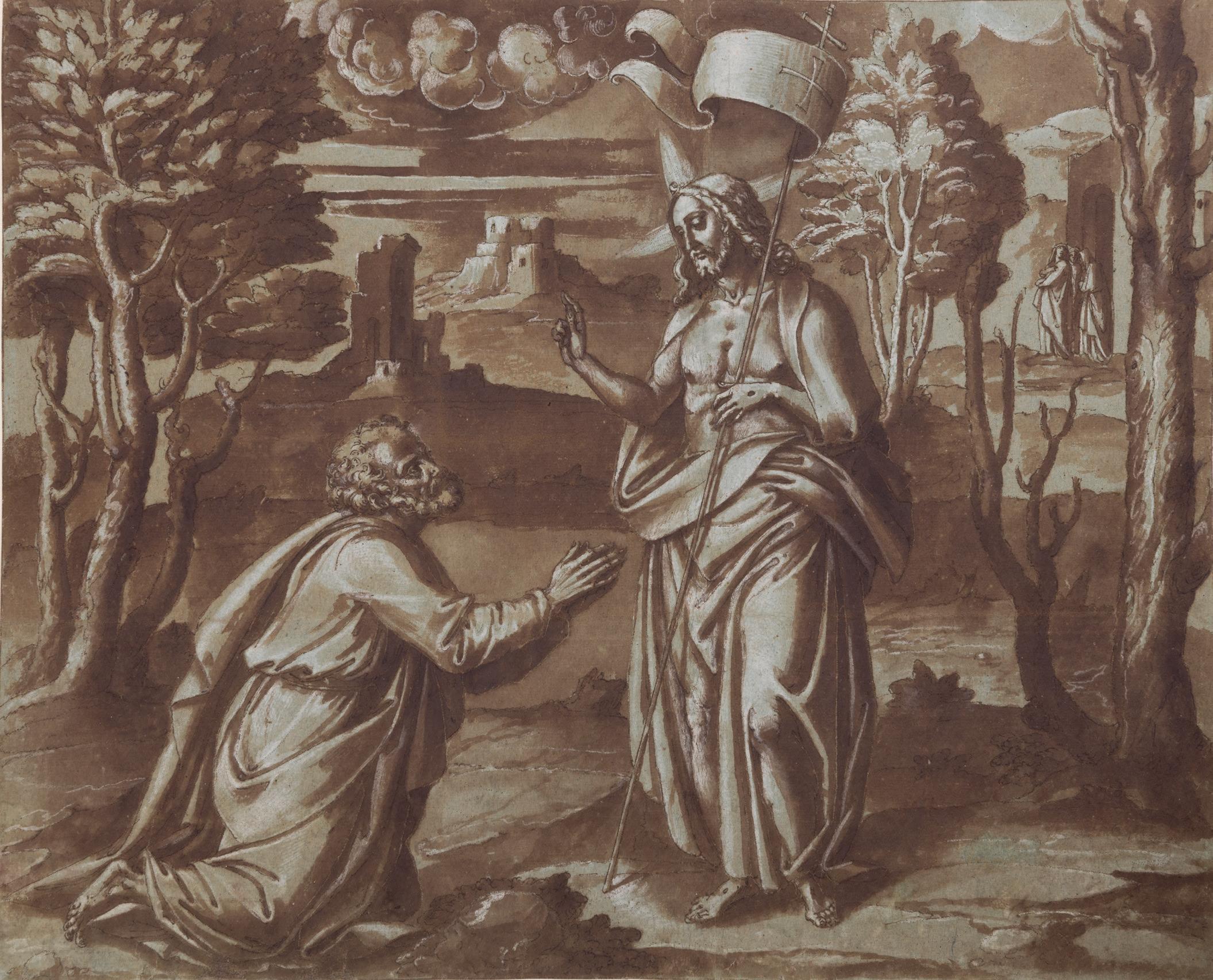
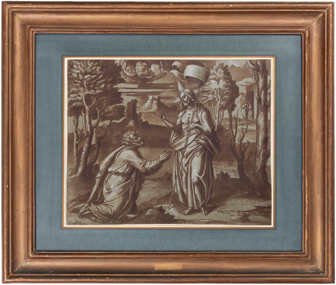
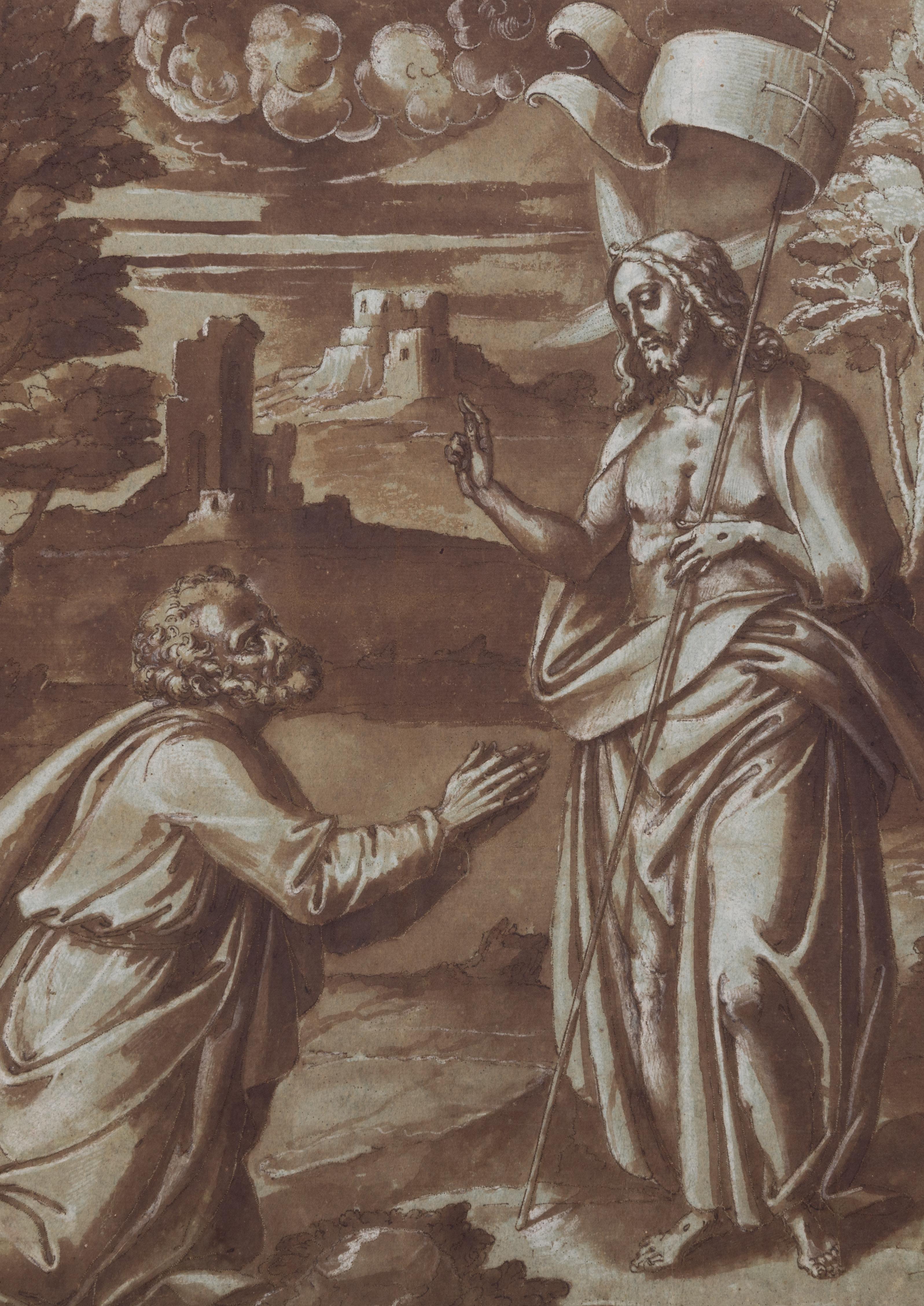
Design for an Embroidered Liturgical Vestment: The Resurrected Christ Appearing to Saint Peter Pen and brown ink and brown wash, heightened with white, on blue paper. The outlines pricked for transfer.
371 x 458 mm. (14 5/8 x 18 in.)
PROVENANCE: Probably from an album once in the library of the monastery of San Lorenzo de El Escorial, Spain, until dispersed in the 19th century; Anonymous sale, Monte Carlo, Sotheby Parke Bernet Monaco, 5 March 1984, lot 864 (as ‘Attributed to Paolo Moranda Cavazzola’); Anonymous sale, New York, Sotheby’s, 13 January 1989, lot 274 (as ‘Attributed to the Master A, late 16th Century’); P. & D. Colnaghi, London, in 1989; Private collection.
EXHIBITED: New York, Colnaghi, Master Drawings, 1989, no.4; Stanford, Stanford University, Cantor Center for Visual Arts, Classic Taste: Drawings and Decorative Arts from the Collection of Horace Brock, 2000.
This very large sheet is part of a fascinating group of drawings by Spanish artists working at the large monastery complex of El Escorial, northwest of Madrid, in the late 16th century. The monastery had been founded by Philip II in 1563, and the drawings of this distinctive group were executed as designs for embroidery (or bordaduría) intended for the liturgical vestments of the priests - chasubles, copes, dalmatics and so forth - or as ornamental coverings for the altars. (Each of the three main altars in the basilica at the Escorial had fifty sets of embroidered vestments and altar frontals, which were changed according to the religious calendar and the type of service. Many of the vestments and altar linen for which these drawings were produced survive today at the monastery1.) Drawn in pen and brown wash on blue, blue-green or blue-grey paper, these remarkable drawings for embroidery designs seem to have been the product of a large workshop at the Escorial. Depicting scenes from the Old Testament and the Gospels, they are among the most numerous and significant surviving examples of 16th century Spanish draughtsmanship. As has been noted by one recent scholar, ‘This collection of drawings [is] today the most abundant and the most harmonious [known] from Renaissance Spain.’2
The majority of the extant drawings from this group are still to be found in two albums in the library at the Escorial3. Numbering close to a hundred sheets, these drawings can in part be dated, on the basis of documentary evidence, to between 1587 and 1589. Many of the Escorial drawings are, like this Risen Christ Appearing to Saint Peter, finely and extensively pricked for transfer to the embroidery pattern. In common with most of the Escorial drawings, however, the present sheet does not show any evidence of pouncing. This would suggest that a second, substitute cartoon was used to transfer the design to the actual fabric, which would have been done by backing the original drawing with a second sheet of paper. The pricking of the outlines of the primary drawing would be transferred to the substitute cartoon beneath, which would then be pounced to transfer the design to the fabric, leaving the original drawing undamaged, and kept in an album for posterity4.
As Mark McDonald has noted of the Escorial embroidery designs, ‘most of the drawings in this group [are] executed in a carefully worked mixed technique: pen and brown ink, brush and brown wash, and white heightening over light black underdrawing on blue paper. The precision and regularity of the pricking is remarkable, demonstrating the importance of transferring an accurate copy of the image for the embroidery while preserving the original sheet.’5 Indeed, this large and finely-pricked drawing of The Risen Christ Appearing to Saint Peter remains in exceptional condition.
Apart from those drawings still remaining in the library of the Escorial, other examples of this distinctive group of Spanish embroidery designs are rare. A number of the drawings, perhaps part of the contents of one album, seem to have left the Escorial in the middle of the 19th century. These include four
sheets today in the Biblioteca Nacional in Madrid, as well as a small number of drawings in public collections outside Spain; examples are in the National Gallery of Scotland in Edinburgh, the British Museum in London, the Yale University Art Gallery in New Haven, the Metropolitan Museum of Art and the Pierpont Morgan Library in New York, the Musée des Beaux-Arts in Orléans, the Musée du Louvre in Paris and the Musée des Beaux-Arts in Rouen. The present sheet is likely to have come from the same source as these drawings.
It has been noted that there must have been several masters and their workshops, each with numerous assistants, working within the Escorial on the preparation of these embroidery designs, or bordados. The leading artists and chief designers of this group, and the only ones documented by name in records of payment, are Miguel Barroso (c.1538-1591) and Diego López de Escuriaz (died c.1623). As has been noted, ‘King Phillip II took great interest in the vestments that were to be used for the Escorial, and artists were well paid for their designs.’6 (In September 1587, for example, López de Escuriaz received 357 silver reales in payment for eight designs for vestments, and he was paid a further 297 reales for five more drawings in July 1589.) Among the body of embroidery designs still at the Escorial, the present sheet seems closest in style to the work of the as-yet unidentified 16th century artist known as the ‘Master A’7, by comparison with such drawings by him as The Healing of the Leper8, which, like several other drawings attributed to the Master A at the Escorial, is also on greenish-blue paper and pricked for transfer.
In the Italianate style and technique of these drawings, the Spanish artists working at the Escorial may have been influenced by the work of the Italian painters who were also active at the monastery in the late 16th century, notably Pellegrino Tibaldi and Federico Zuccaro. They may also have turned for inspiration, in terms of compositional ideas, to the extensive collection of Flemish, German and Italian prints assembled by Philip II and also kept at the Escorial. As Lisa Banner has noted, ‘More than mere documents of artisan production, the Escorial designs for embroidery reveal the impact of Northern European and Italian mannerism on Spanish art. This became the leading style of drawing at the Escorial embroidery workshop, and was later adopted by Madrid court artists.’9
The drawings and cartoons for embroidery produced at the Escorial, of which the present sheet is a particularly fine and sizeable example, make a significant contribution to scholarly appreciation of the still relatively little-known field of 16th century Spanish draughtsmanship. Furthermore, as one recent scholar has stated, ‘these embroidery designs are indispensable for our understanding of the functioning of a specialized workshop in the unique social and cultural milieu at the Escorial, which comprised a sort of autonomous city in which a wide variety of artisans contributed to a post-Tridentine ideology…In broad terms, this rare cache of primary material of great significance...might shed light on the drawing practice of Spanish artists and clarify the impact of foreign influences – or indirect ones through prints - upon a native tradition.’10
DOMENICO CRESTI, called IL PASSIGNANO
Passignano 1559-1638 Florence
Recto: The Medici Coat of Arms Flanked by Allegorical Female Figures
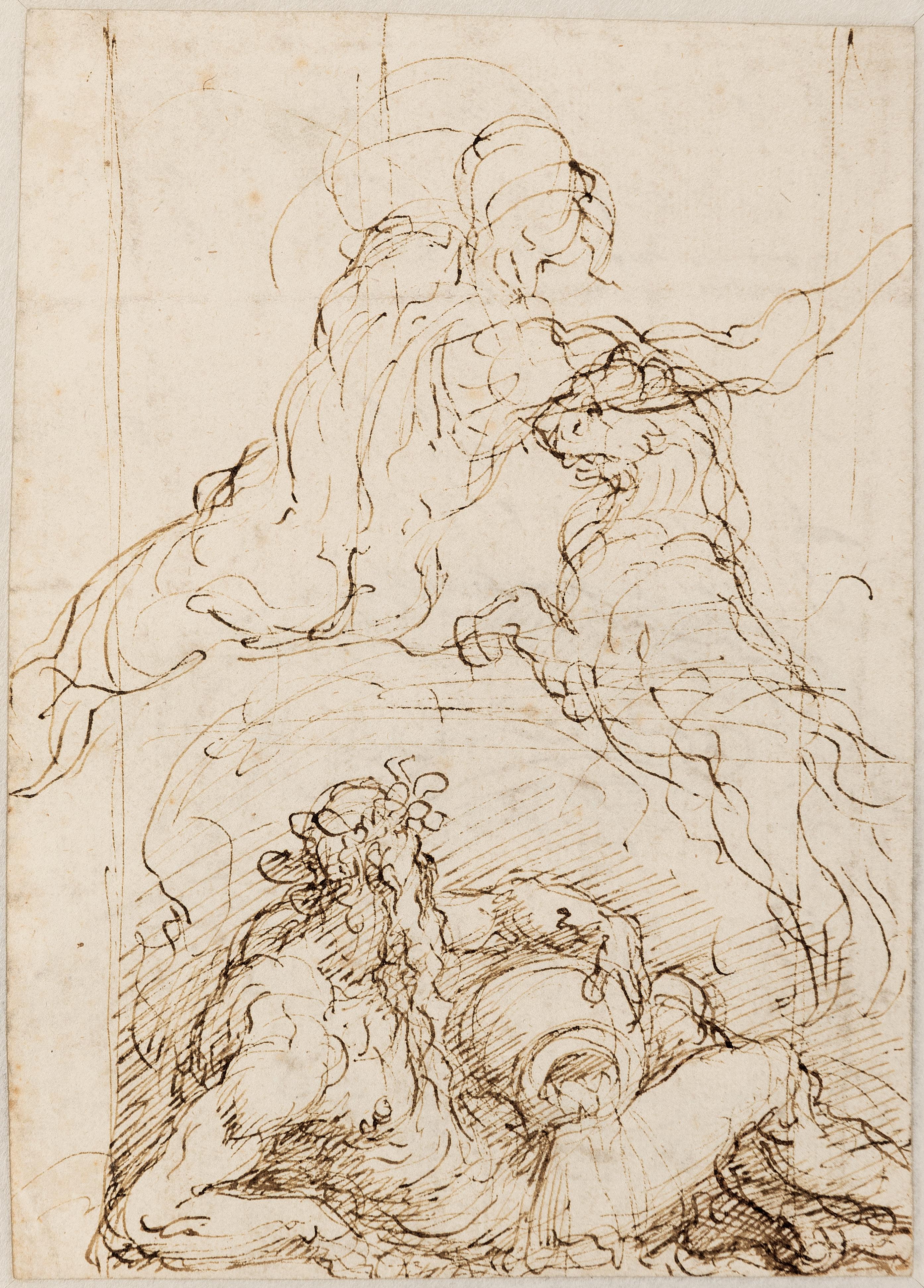
Verso: Studies of a River God, a Male Nude and a Lion
Pen and brown ink. Inscribed ‘[?] hor ch’ogni animal riposa e dorme / [?] d’ongni altro animal facto defor[me] / a meza note scopagiato e solo / vo sfogado elm io dulo / Stelle uoi che la note aluminate / uoi che per l’aria mormorando and[ate] / o uenti risvelgiate in cortesia / La bella donna mia’ in brown ink on the recto1. 146 x 207 mm. (5 3/4 x 8 1/8 in.)
PROVENANCE: Anonymous sale, Geneva, Hôtel des Ventes Piguet, 26 September 2018, lot 768 (as Roman School, Late 16th Century).
Domenico Cresti, known as Passignano after his birthplace in Tuscany, was sent to Florence at the age of nine to apprentice in the studios of Girolamo Macchietti and Giambattista Naldini. He completed his training with Federico Zuccaro, whom he assisted on the decoration of the cupola of the Duomo in Florence in the second half of the 1570s. Passignano accompanied Zuccaro to Rome in 1580, and there worked on his first independent commission; the decoration of the suburban Villa Montalto for Cardinal Felice Peretti, later Pope Sixtus V. Soon afterwards the young artist settled in Venice, where he spent several years in the 1580s. Passignano’s careful study of Venetian painters was to be reflected in his own work throughout his career; indeed, his paintings have often been characterized as a fusion of Tuscan draughtsmanship with Venetian colour. As the Passignano scholar Joan Nissman has pointed out, ‘the importance of his years in Venice should not be underestimated. The figure types of Tintoretto and particularly Palma Giovane, and the rich atmospheric paintings of these artists and those of Titian and Veronese, had a lasting effect on his style. He was to introduce a softer and darker style of painting as an alternative to the smooth, bright, and glistening colors favored in Florence.’2
Soon after his return to Florence at the end of the 1580s, Passignano contributed to the ephemeral decorations created for the wedding of the Grand Duke Ferdinando I de’ Medici and Christine of Lorraine, and painted a pair of frescoes in the church of San Marco which established his reputation as a fresco painter. Admitted into the Accademia del Disegno in 1589, over the next decade he earned a number of important ecclesiastical commissions, including paintings for the Florentine churches of San Michele Visdomini, Santissima Annunziata and Santa Maria Maddalena dei Pazzi. Among the secular works he completed towards the end of the decade were frescoes for the Medici villa at Artimino and two large history subjects, painted on slate, for the Salone dei Cinquecento in the Palazzo Vecchio. Passignano was summoned to Rome in 1602 to paint an altarpiece of The Crucifixion of Saint Peter for St. Peter’s. He remained in the city for thirteen years, receiving commissions from Popes Clement VIII and Paul V and several cardinals, and working in the major churches of Santa Maria in Vallicella (the Chiesa Nuova), Sant’Andrea della Valle, San Giovanni dei Fiorentini and Santa Maria Maggiore. He also provided decorations for the villas of Cardinals Scipione Borghese in Rome and Pompeio Arrigoni in Frascati. After his return to Florence in 1616 he was active with numerous projects for churches and palaces, including at the Palazzo Pitti and the Casa Buonarotti. Although Passignano again worked in Rome in the 1620s, he spent his last decade in Florence, painting relatively few works.
Although the 17th century biographer Filippo Baldinucci praised Passignano as a draughtsman, his drawings have remained less studied than those of other Florentine artists of the period. Nevertheless, as Annamaria Petrioli Tofani has observed, ‘An able as well as prolific draftsman, Passignano left numerous drawings of the most varied types…from rapid sketches of specific groupings or dynamic arrangements of a few figures to complete compositional elaborations to carefully completed bozzetti for approval by a patron. His drawings utilize all the instruments or materials available at the time: pen, chalk, wash, pastel and oil colors, and the blue paper favored by the Venetians as well as the white paper typical of the Florentine tradition. Because of his willingness to tackle graphic expression in all the range of its possibilities…Passignano’s creativity achieved its best results in drawing.’3
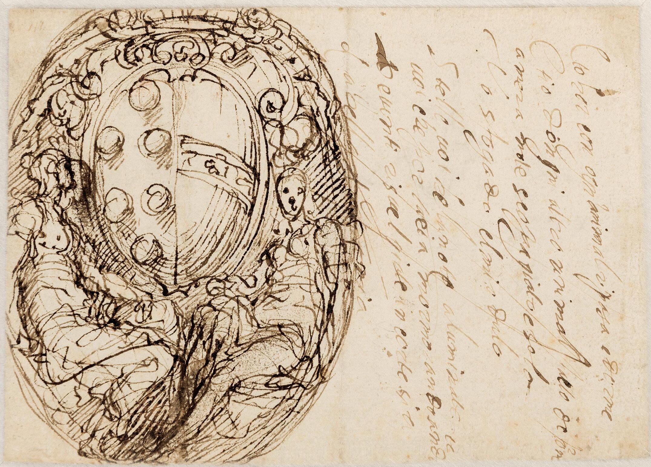
recto
The coat of arms on the recto of this double-sided sheet depicts the six palle (balls) of the Medici family impaled with the coat of arms of the House of Lorraine. This allows the drawing to be dated to c.1589, soon after Passignano had left Venice and returned to Florence to work on the preparations for the festivities surrounding the lavish wedding of Ferdinando de’ Medici and his distant cousin, the French princess Christine of Lorraine, granddaughter of Catherine de’ Medici. As Nissman has noted, Passignano ‘was inducted along with many other artists into the large work force necessary to produce the triumphal arches, spectacular machines, allegorical floats, and costumes required for the various wedding festivities.’4 Preparation for the event took about a year and involved most of the leading artists in Florence, while the celebrations and entertainments themselves began on 30 April and took up almost the entire month of May 1589.
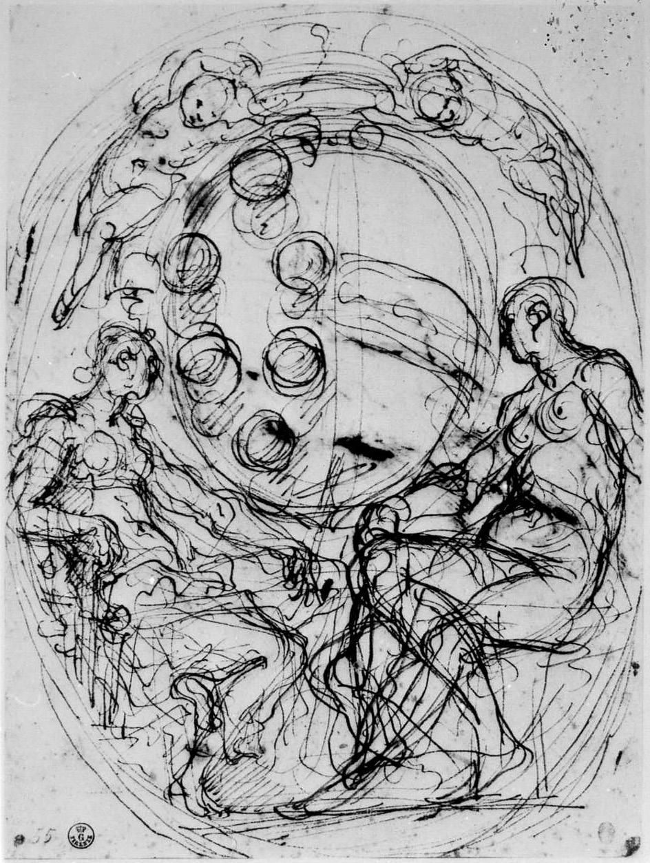
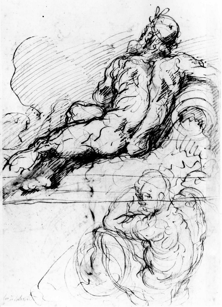
Both sides of the present sheet are closely related to a double-sided pen drawing by Passignano in the Uffizi, the recto (fig.1) of which depicts the same Medici-Lorraine coat of arms flanked by two female figures5, while the verso (fig.2) contains analogous studies of two river gods6. The rectos of both the Uffizi drawing and the present sheet are studies for a very large painted coat of arms on the facade of the Duomo in Florence commissioned from Passignano, for the sum of fifty-five scudi, as part of the decorations for the Medici wedding of 1589. Passignano’s painting of the combined MediciLorraine coat of arms, flanked by allegorical figures of Faith, Hope, Charity and Religion7, crowned the temporary architectural structure erected in front of the Duomo, as recorded in an engraving by Orazio Scarabelli8. Several months after the wedding the façade decorations were dismantled and the painting was eventually transferred to the entrance of the Palazzo Pitti but is now lost9
The verso of this drawing depicts a river god alongside a male nude and a lion. Similar river gods, representing the Arno and Moselle rivers, are found in another commission entrusted to Passignano for the 1589 Medici wedding; a pair of allegorical paintings of Tuscany and Lorraine that were installed as part of an elaborate temporary arch on the Ponte alla Carraia in Florence, through which passed the processional entry of Christine of Lorraine into the city. Passignano’s two canvases were later moved to the Palazzo Pitti, where they are recorded in a 17th century inventory but no longer survive10
A particular characteristic of this drawing is the stylistic influence of Venetian models, such as the freelydrawn pen and ink studies of Palma Giovane. A comparable pen and ink drawing by Passignano in the Uffizi – an elaborate compositional study of a Princely Wedding that may represent a design for a temporary stage set or the decoration of an ephemeral triumphal arch11 – is also likely to be related to the decorations for the 1589 Medici wedding. Among other stylistically similar drawings by the artist is a study of Paradise in the Staatliche Graphischen Sammlung in Munich12 and a sheet of studies of Tobias Healing His Father’s Blindness in a private collection13, while similar studies of male nudes are found in drawings such as a Crucifixion of Saint Peter in the Uffizi14
FEDERICO ZUCCARO
Sant’Angelo in Vado 1543-1609 Ancona
A Design for a Wall Monument with a Papal Coat of Arms Flanked by Allegorical Figures
Pen and brown ink and brown wash, heightened with white, over an underdrawing in black chalk, laid down on a backing sheet extensively inscribed with a (library?) inventory and the code S.B118 in brown ink on the verso1
263 x 200 mm. (10 3/8 x 7 7/8 in.)
PROVENANCE: Anonymous sale, New York, Sotheby’s, 8 January 1991, lot 134; Private collection.
LITERATURE: Cristina Acidini Luchinat, Taddeo e Federico Zuccari: fratelli pittori del Cinquecento, Milan and Rome, 1999, Vol.II, pp.2-4, fig.5, note 7; Edward Olszewski, A Corpus of Drawings in Midwestern Collections: Sixteenth-Century Italian Drawings, Turnhout, 2008, Vol.II, pp.506-507, under no.402.
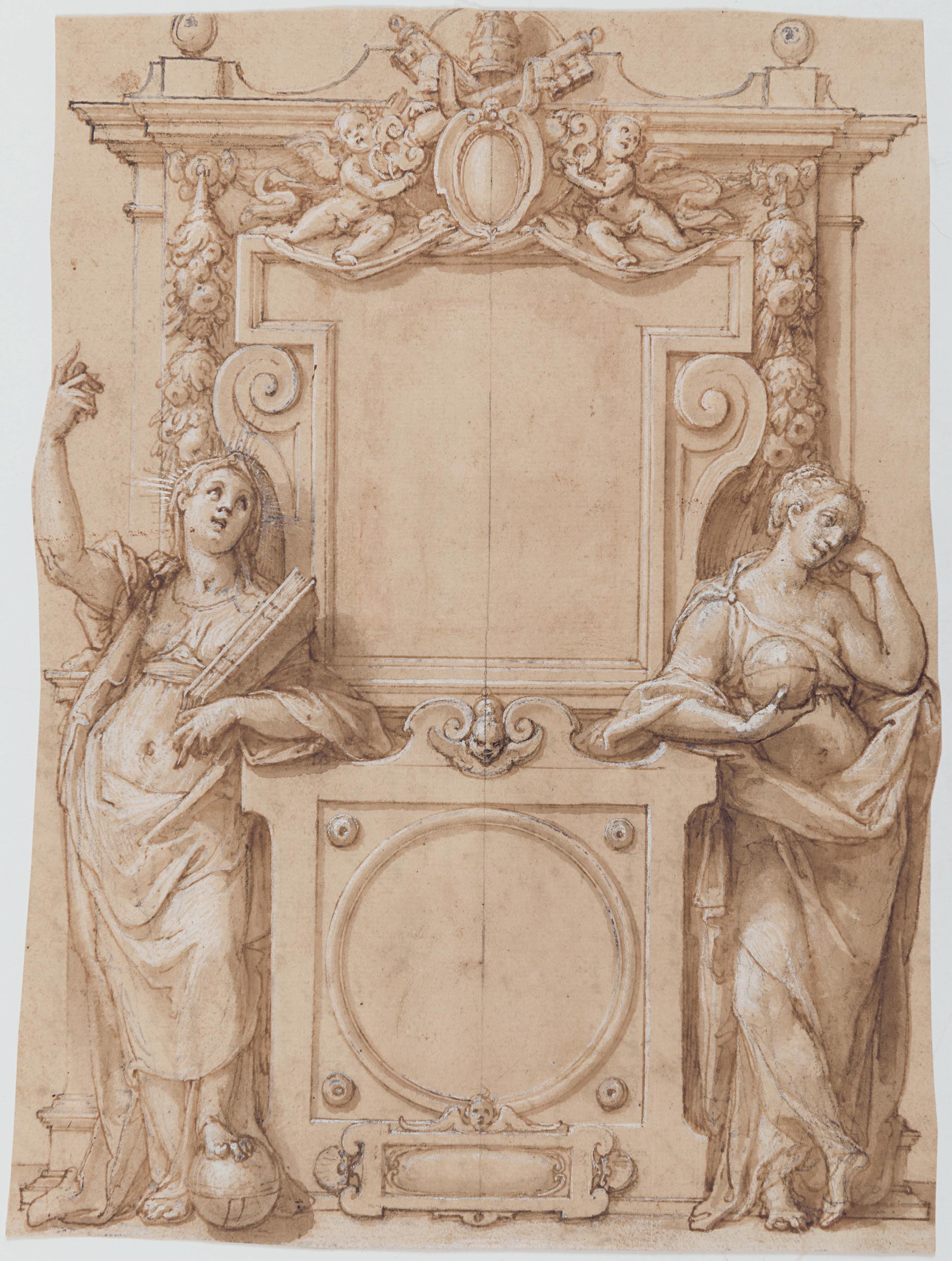
Among the most important and influential painters of the late 16th century in Italy, Federico Zuccaro was also a gifted and prolific draughtsman. The present sheet is probably a design for a funerary monument for a pope, although no finished work after this design is known to have survived. The Zuccaro scholar Cristina Acidini Luchinat has suggested that the two allegorical female figures – one joyful and the other melancholy – may represent Heaven on the left, who will receive the dead Pope, and Earth on the right, who mourns the loss of the Holy Father. The tomb is topped with a blank coat of arms surmounted by crossed keys and a papal tiara. This drawing has been dated by James Mundy on stylistic grounds to the end of the 1580s or the early 1590s, which would suggest that it may have been intended to commemorate one of the five Popes who died at around this time, namely Gregory XIII, who died in 1585, Sixtus V and Urban VII, who both died in 1590, or Gregory XIV and Innocent IX, who died within a few weeks of each other in 1591.
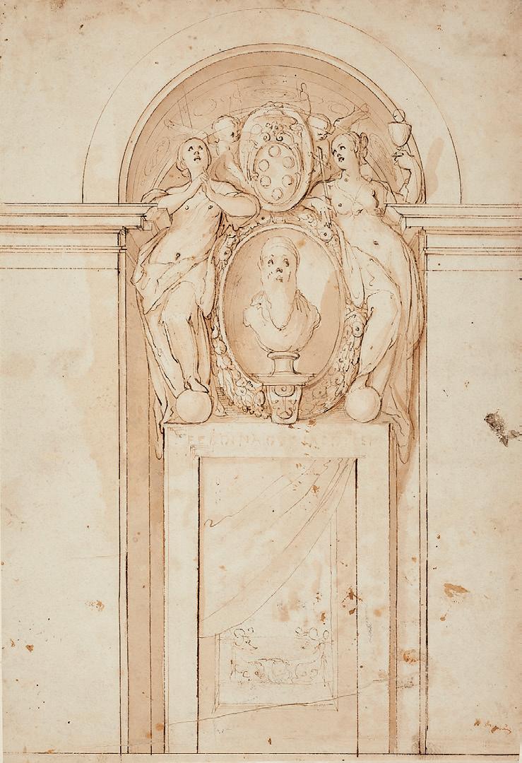
A similar composition is found in a drawing by Federico Zuccaro of a design for a wall monument to Ferdinando I de’ Medici (fig.1) in the Milwaukee Art Museum2, in which a sculpted bust of the Medici cardinal and Grand Duke is flanked by allegorical female figures representing Hope and Faith. In both pose and style, the two allegorical figures in the Milwaukee drawing are closely paralleled by those in the present sheet, even to the extent that, like both figures in the Milwaukee sheet, the left-hand figure in this drawing is shown with her foot resting on a sphere.
DANIEL LINDTMAYER THE YOUNGER
Schaffhausen 1552-c.1606/07 Luzern
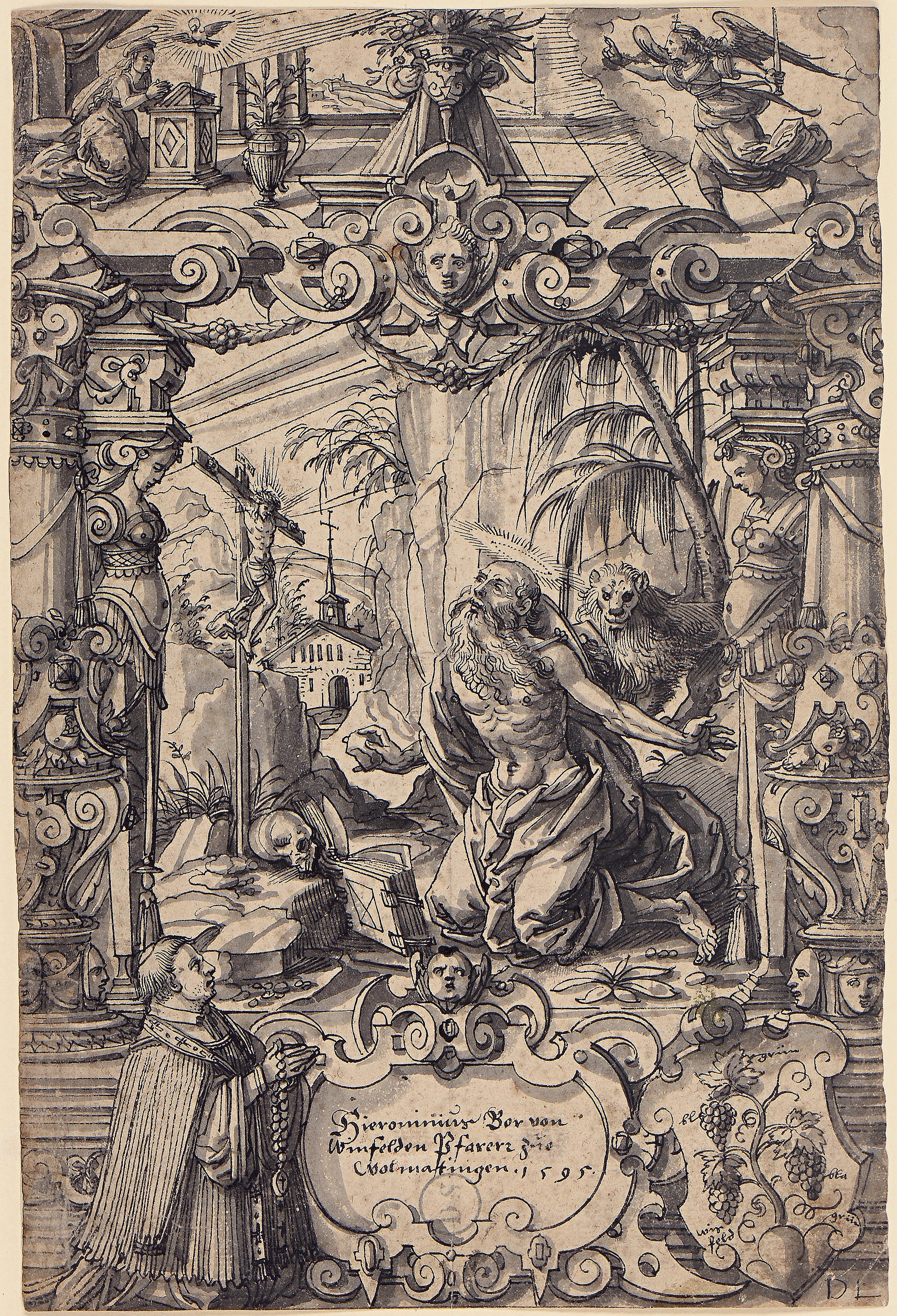
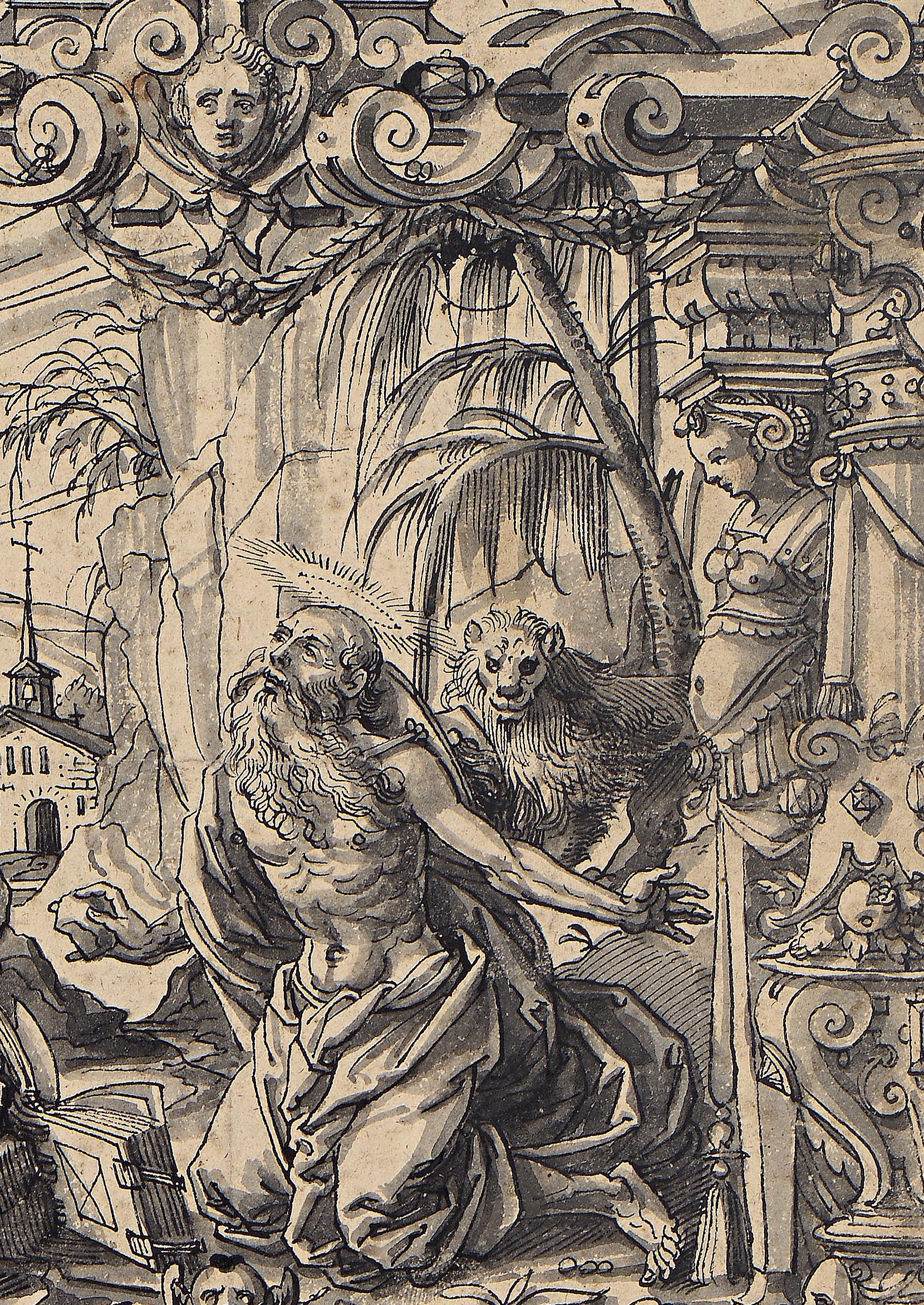
Design for a Stained-Glass Window, with Saint Jerome in the Desert with the Annunciation Above, and a Kneeling Donor and a Coat of Arms Below
Pen and black ink and grey wash. Signed with the artist’s monogram DL in black ink at the lower right. Inscribed and dated Hieronimus Bor von / Winfelden Pfarerr zu / Wolmatingen. 1595. in black ink in a cartouche at the bottom. Inscribed in a modern hand Der bussende Hieronymus / Daniel Lindtmayer and numbered 300- in pencil on the verso.
305 x 203 mm. (12 x 8 in.)
Watermark: Two towers (the coat of arms of the city of Ravensburg).
PROVENANCE: Johann Wilhelm Veith, Andelfingen and Schaffhausen; His posthumous sale (‘Kunstsammlung der verstorb. Hrn. Antistes und Dekan Veith in Schaffhausen’), Leipzig, Rudolf Weigel, 2 November 1835 onwards, probably lot 538 (‘Lindmeier, Daniel…Der heil. Hieronymus von dem Crucifix betend, mit reicher Einfass. Feder u. Tusche’) or else possibly part of lot 1051 (‘Eine Sammlung von 258 Bl. Wappen vielfältig mit reichen hist. u. sinnbildl. Umgebungen u. Scenen des lebens von Künstlern d. 16. Jahrh. als…D. Lindmeier…u. andern. Mit der Feder in Tusche, mehrere in Farben ausgeführt u. jedes Blatt auf starke weisse Pappe aufgebracht. Meist. roy. fol.’); Dietrich Schindler, Glarus and Zurich (Lugt 793), until after 1876; Friedrich Bürki, Bern; Probably his posthumous sale (‘Sammlungen des verstorb. Hrn. Akt-Grossrath Fr. Bürki’), Basel, Kunsthalle [Elie Wolf], 18 June 1881 onwards, probably part of Handzeichnungen lot 5 (‘Heft mit Entwürfen v. D. Lindmeyer, 30 Stück, 16 Jahrhundert.’); Anonymous sale (‘Entwürfe zu Glasfenstern in Original-Handzeichnungen Alter Schweizer Glasmaler des XVI. und XVII. Jahrhunderts’), Berlin, Amsler & Ruthardt, 24 April 1895, lot 14 (‘Reiche Architectur in deren Mitte der büssende Hieronymus vor dem Kreuze kniet, darüber die Verkündigung Mariae, unter der Darstellung eine Kartusche mit der Inschrift “Hieronimus Bor von Winfelden Pfarrer zue Uotmatingen. 1595.”, links und rechts derselben der Donator und sein Wappen. Bezeichnet D. L. Sehr ausgeführte Zeichnung in Feder und Tusche.’); An unidentified collector’s mark (Lugt 168, possibly Amsler & Ruthart or A. Rump) stamped in blue ink on the verso; A partial, unidentified circular mark, incorporating the word WIEN (not in Lugt) stamped in black ink on the verso; Possibly Paul Ganz, Basel, in the early 1920s; Dr. Hugo von Ziegler, Schaffhausen; Thence by descent.
LITERATURE: Rudolf Weigel, Kunstsammlung des verst. Hrn. Antistes und Dekan Veith in Schaffhausen, Teil I: Holzschnitte, Originalhandzeichnungen und di Kupferstiche der deutschen Schule..., Leipzig, 1835, no.538; G. K. Nagler, Neues allgemeines Künstkler-Lexicon, vol.VII, Munich, 1839, p.539, no.6; Paul Boesch, ‘Daniel Lindtmayers Scheibenriß für Pfarrer Hieronymus Bor von Weinfelden 1595’, Weinfelder Heimatblätter, 26 May 1952, pp.301-302; Hugo von Ziegler, Daniel Lindtmayer 1552-1606: Handzeichnungen, exhibition catalogue, Schaffhausen, 1952, no.160; Friedrich Thöne, Zeichnungssammlung Dr. Hugo von Ziegler, Schaffhausen, unpublished MS, 1968, no.78; Friedrich Thöne, Daniel Lindtmayer, 1552-1606/07: Die Schaffhauser Künstlerfamilie Lindtmayer, Zürich and Munich, 1975, p.64, p.109, p.218, no.289, fig.349 and p.217, under no.284.
EXHIBITED: Schaffhausen, Museum zu Allerheiligen, Tobias Stimmer 1539-1584: Gedächtnisaustellung zum 400. Geburtsjahr, 1939, no.207; Schaffhausen, Museum zu Allerheiligen, Daniel Lindtmayer 15521606: Handzeichnungen, 1952, no.160.
The art of stained-glass design in Northern Europe during the Renaissance may be said to have reached its apogee in Switzerland during the 15th and 16th centuries. Indeed, in Switzerland after the Reformation glass painting was arguably more important than painting on canvas or panel, and it was not until the advent of the Baroque, and the need for works on a much larger scale, that its significance declined somewhat. Long used only for ecclesiastical purposes, by the 16th century small-scale glass panels of secular subjects were also being produced in Switzerland and in the Upper Rhine areas of Southern Germany. Known as Kabinettscheiben, such stained-glass panels were generally intended for
public and civic buildings like town halls, and were also often found in private homes. Among the finest designers of stained-glass windows in Switzerland and Austria during this period was Daniel Lindtmayer, the last and most talented member of four generations of artists that specialized in such designs.
Daniel Lindtmayer’s first teacher was his father Felix, who was likewise a glass painter, and he also came under the profound influence of the drawings and woodcuts of Tobias Stimmer. The younger Lindtmayer rose to become one of the leading masters in the field of glass painting, working first in Schaffhausen and then in Basel, where he was established by 1574 and employed as a designer for the city’s glass painters. As has been noted of Lindtmayer, ‘Daniel’s work was far more complicated and ‘literary’ than his father’s. His designs for Kabinettscheiben are deeply influenced by developments in the representation of linear perspective in contemporary prints. The images are far more elaborate and incorporate Renaissance strapwork, Classical elements in the architectural frames and volumetric rendering of the human figure.’1 Lindtmayer’s later travels found him working in Feldkirch, Königsfelden, Lausanne, Schwyz, Wolfenschiessen and elsewhere, although he was for the most part based in his native Schaffhausen. In 1595 he was accused of the attempted murder of a goldsmith named Stülz in Konstanz, but escaped punishment on the grounds of insanity. He left Schaffhausen the following year and eventually settled in Luzern, converting to Catholicism. Lindtmayer’s last known dated work was executed in 1603, and he died three or four years later, leaving behind a large corpus of around 350 drawings – the majority of which are for stained-glass windows – as well as a number of prints and at least one painting. Only two windows designed by Lindtmayer have survived to this day, however.
This large sheet is a particularly fine example of Lindtmayer’s drawings for stained-glass panels, which are characterized by refined and elaborate compositions with prominent architectural elements and a vigorous handling of the pen. As noted in the artist’s inscription in a cartouche at the bottom of the sheet, the donor of the stained-glass window for which this drawing is a study was one Hieronymus Bor, who is depicted kneeling in prayer before his patron saint at the lower left of the composition. A native of Weinfelden, in the Swiss canton of Thurgau, Bor is first documented in 1588, serving as a curate in the village of Ermatingen until 1591. The following year he became pastor of a church in the nearby town of Wollmatingen, today part of the city of Konstanz in the German province of Baden-Württemberg. At the lower right of the composition is Bor’s coat of arms which, like that of Weinfelden, incorporated bunches of grapes. The present sheet was drawn in Konstanz in 1595, the same year that the artist attacked and attempted to kill a goldsmith working in the city.
This fine drawing has a long and illustrious provenance and has figured in several important collections of Swiss drawings. Its first owner was arguably the most important collector of his day in Schaffhausen, the Swiss pastor Johann Wilhelm Veith (1758-1833), who published religious treatises, poems and essays on art and science. As well as paintings and prints, Veith assembled a highly significant collection of around 2,500 drawings, of which stained-glass designs made up only a relatively small part. A large number of the drawings in his collection were purchased at the posthumous Veith sale of 1835 by the Zurich politician Dietrich Schindler (1795-1882), who collected prints and drawings by Swiss artists. Part of Schindler’s collection was exhibited in Munich in 1876, and not long afterwards his collection was acquired by the Swiss councillor Friedrich Bürki (1819-1880). Bürki had hoped to establish a Swiss national museum in Bern but died shortly after acquiring the Schindler drawings. A sale of his collection was held in Basel in 1881, and included some 450 drawings for stained-glass designs, almost all from the Veith and Schindler collections, including a folio or album containing thirty drawings by Daniel Lindtmayer. Ninety-two of the drawings from Bürki’s collection, including the present sheet, reappeared at auction in Berlin in April 1895.
The present sheet eventually entered the collection of the lawyer and art historian Hugo von Ziegler (1890-1966), who between the 1920s and the 1960s assembled a superb group of 16th century Swiss drawings, as well as coins and silverware. A native of Schaffhausen, von Ziegler collected in particular drawings by artists active in the city. He also organized an exhibition of drawings by Daniel Lindtmayer in Schaffhausen in 1952, to which he lent the present sheet. Other drawings of stained-glass designs from the von Ziegler collection are today in the collections of the Museum of Fine Arts in Boston, the J. Paul Getty Museum in Los Angeles, the Metropolitan Museum of Art in New York and the Museum zu Allerheiligen in Schaffhausen.
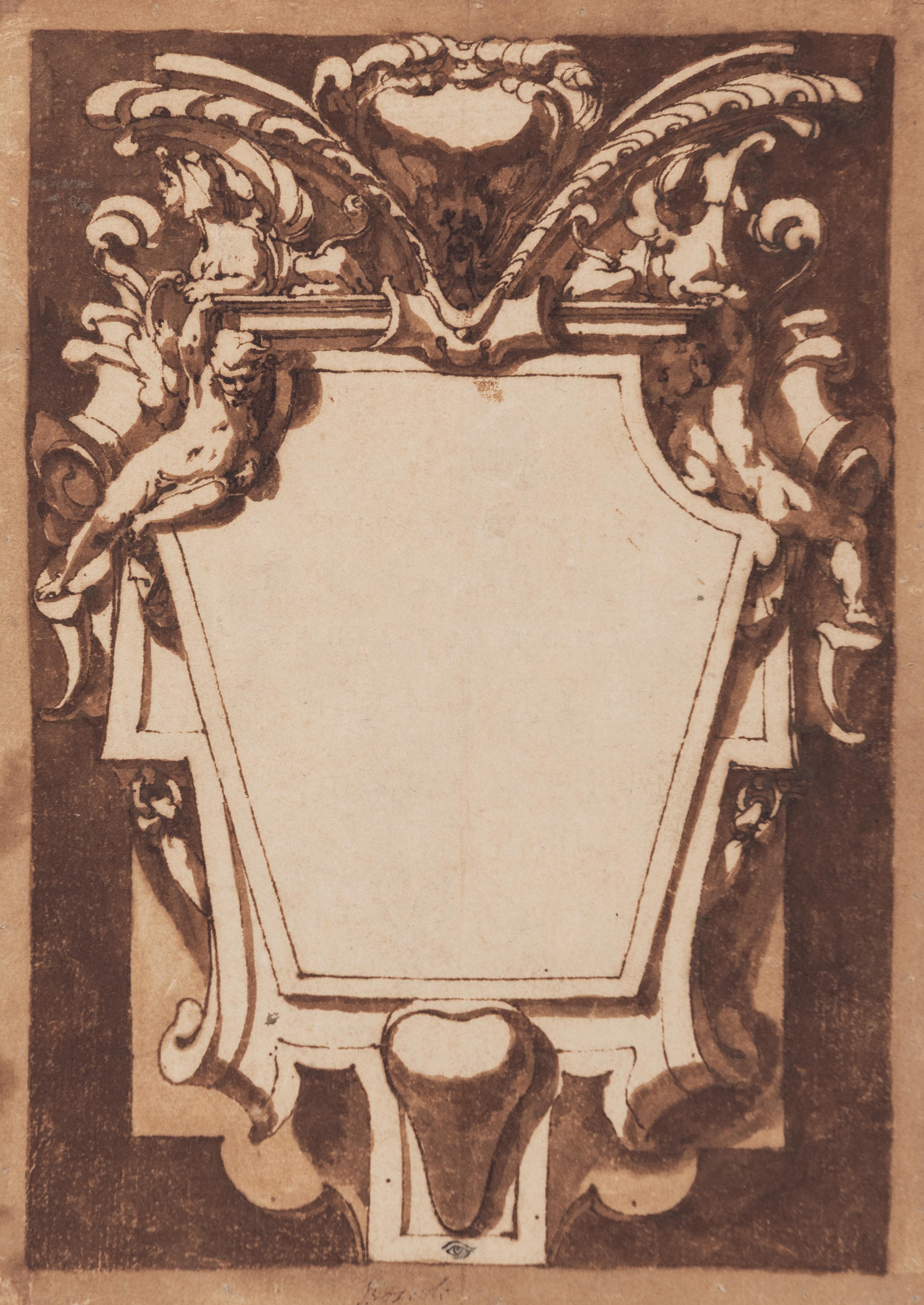
ANDREA BOSCOLI
Florence c.1560/64-1608 Florence
A Design for a Cartouche
Pen and brown ink and brown wash. Laid down on a 17th century mount. Inscribed Boscoli in brown ink at the lower centre and numbered 4 in brown ink at the upper right. 237 x 170 mm. (9 3/8 x 6 5/8 in.) [sheet]
PROVENANCE: Nathaniel Hone, London (Lugt 2793); Probably his sales, London, Christie and Ansell, 4-7 April 1781 or London, Hutchins, 7-15 February 1785; Part of an album of drawings belonging to William Armistead, Liverpool; By inheritance to Gordon Davies, London; His sale and others, London, Christie’s, 6 July 1982, lot 11 (bt. Holland for £648)1; Ralph Holland, Newcastle; Thence by descent until 2013; His posthumous sale (‘Galleria Portatile: The Ralph Holland Collection’), London, Sotheby’s, 5 July 2013, lot 246; W. M. Brady and Co., New York; Private collection.
LITERATURE: Nadia Bastogi, Andrea Boscoli, Florence, 2008, p.360, no.555 (as location unknown, not illustrated).
The Florentine painter Andrea Boscoli was trained in the studio of Santi di Tito and was admitted into the Accademia del Disegno in 1584. Between 1582 and 1600 he worked primarily in Florence, with brief stays in Siena and Pisa, painting altarpieces, easel pictures and fresco cycles, and was also involved in the apparati celebrating the marriage of the Grand Duke Ferdinando I de’ Medici to Christina of Lorraine in 1589. Between 1600 and 1605 Boscoli worked mainly in the Marches, for patrons and churches in Fano, Fabriano, Macerata, Fermo and elsewhere, while the last years of his career were spent between Florence and Rome.
Relatively few paintings by Boscoli survive, and it is as a draughtsman that he is best known today. His drawings, executed for the most part in pen and ink wash but also in chalk, were highly praised by the 17th century Florentine biographer Filippo Baldinucci – who noted that ‘he drew so well...without lacking a boldness and an extraordinarily skillful touch’2 – and were avidly collected in the Seicento. Boscoli also produced a handful of designs for the decorative arts, and his oeuvre as a draughtsman includes studies for silver ceremonial plates, chalices and other objects. Some six hundred drawings by Boscoli are known today, with significant groups in the Uffizi in Florence, the Istituto Centrale per la Grafica in Rome and the Louvre in Paris.
Traditionally and correctly attributed to Andrea Boscoli, this fine drawing is characteristic of the artist’s draughtsmanship in its bold use of dark brown wash and chiaroscuro effects. It has been tentatively suggested that the present sheet may have been intended as the frontispiece for a series of some twenty finished drawings by Boscoli depicting episodes from Gerusalemme Liberata, Torquato Tasso’s epic poem of the late 16th century. Datable to between 1604 and 1608, Boscoli’s Gerusalemme Liberata drawings are characterized by, as Julian Brooks has noted, ‘the rich and schematic effects of light and shade for which he was well known…it is easy to understand why the drawings in this series were recorded as storiette di chiaro scuro (‘little stories in light and shadow’) in an inventory of c.1611.’3 The present sheet is of approximately the same size as Boscoli’s Tasso illustrations, the purpose of which remains unknown. They may have been intended as studies for prints that were never executed or were perhaps produced as finished works for a collector.
Few architectural or ornamental drawings by Boscoli are known, and examples are in the Uffizi and the Biblioteca Marucelliana in Florence, the Victoria and Albert Museum in London and the Ashmolean Museum in Oxford. Among thematically and stylistically comparable drawings is a design for a decorative frame for a wall decoration, in the Ashmolean Museum4. The Ashmolean drawing, which also shows an elaborate framing scheme surrounding a blank space, likewise incorporates a very similar motif of a shield with long fronds to either side, at the very top of the composition.
BOLOGNESE SCHOOL
17th Century
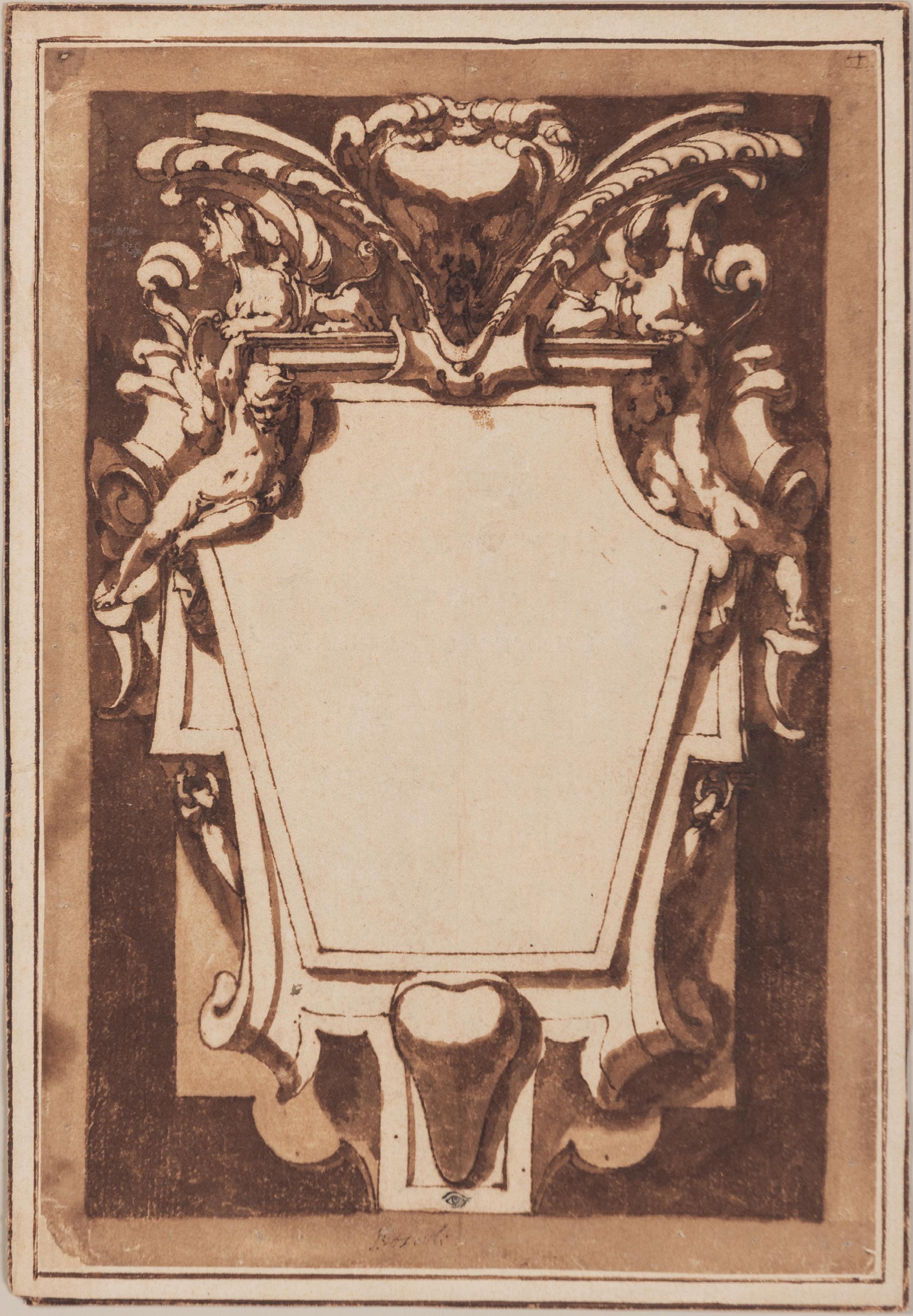
Design for a Family Tree
Pen and brown ink, over an underdrawing in black chalk, formerly attached with tabs to an album page. Inscribed Caraza and Annibale Carracci and numbered S. B. 66. in brown ink on the verso. Further inscribed S.B. no.75. in brown ink at the bottom of the album page. 507 x 375 mm. (20 x 14 3/4 in.)
PROVENANCE: From one of the so-called ‘Sagredo-Borghese’ albums, with the associated numbering on the verso and album page, and with provenance as follows: Possibly Doge Nicolò Sagredo, Venice; Zaccaria Sagredo, Venice (Lugt 2103a); By descent to his nephew, Gherardo Sagredo, Venice; His widow, Cecilia Grimani Sagredo; Thence by descent; Dispersed in a series of sales after 1743; Possibly Jean-Jacques de Boissieu, Lyon, by c.1802, and thence by descent to the Baron de la Chapelle, Mâcon; Dispersed with the rest of the ‘Sagredo-Borghese’ albums in Lyon in c.1919; Private collection.
This carefully constructed drawing depicts a large tree whose branches fan outwards to fill the sheet almost entirely, each branch supporting one of approximately thirty blank circular medallions. The tree rises from a naturalistic grassy mound at the lower centre. Its thick trunk is built up through parallel and cross-hatched pen strokes that give way to lighter, more fluid handling in the upper branches and foliage. The almost perfect circularity of the medallions suggest they might have been drawn with the help of a compass. These vacant medallions were clearly conceived as spaces to receive the names of family members or even, perhaps, portraits of them.
This drawing aligns with a long and well-established visual and literary tradition of representing genealogy through the metaphor of a tree. In Italian courts and noble households of the 16th and 17th centuries, such arbor consanguinitatis diagrams were commissioned to be used both as objects of display and as records, representing the depth, continuity and reach of a family’s lineage. The task of imagining such family trees required decorative skills that often combined heraldry, portraiture and design. Within the specific context of Bolognese draughtsmanship, the present sheet may be compared with a similar drawing by Agostino Carracci of the Carracci family tree, formerly in the collection of the 17th century biographer and art historian Carlo Cesare Malvasia and today in the British Museum1
The inscriptions and numbering S. B. 66. on the verso and S.B. no.75 on the backing sheet identifies this large drawing as having once been part of the renowned Sagredo collection of drawings. The provenance of most of the works in the Sagredo family collection – described by one modern scholar as ‘the most important collection of drawings in eighteenth-century Venice as well as one of the richest in Europe’2 – can be traced to the great Venetian collector Zaccaria Sagredo (1653-1729). Although the collection had been begun in the middle of the 17th century by his uncle Doge Niccolò Sagredo (16061676), it was Zaccaria Sagredo who was responsible for greatly expanding it. As has been noted, ‘Zaccaria was the most voracious of the Sagredo collectors, purchasing numerous drawings from every school and period, and making the Sagredo collection one of the most distinguished and certainly among the largest cabinets in Italy prior to his death in 1729.’3 The Sagredo drawings were kept in albums, mounted onto sheets of heavy white paper using tabs at each corner, as seen with the present sheet. Zaccaria Sagredo bequeathed the collection to his nephew Gherardo Sagredo (1692-1738), and at the latter’s death in 1738, an inventory of the collection noted some eight thousand drawings, almost all of which were assembled into fifty-seven albums. Gherardo’s widow tried to sell the collection en bloc but was only able to dispose of parts of it. At some point in the late 18th or early 19th century some of the Sagredo drawings were acquired by a collector in Lyon, thought to be the landscape draughtsman Jean-Jacques de Boissieu (1736-1810), and large groups of drawings from the collection were later dispersed in Lyon, just after the First World War.
SOUTH GERMAN SCHOOL
First half of the 17th Century
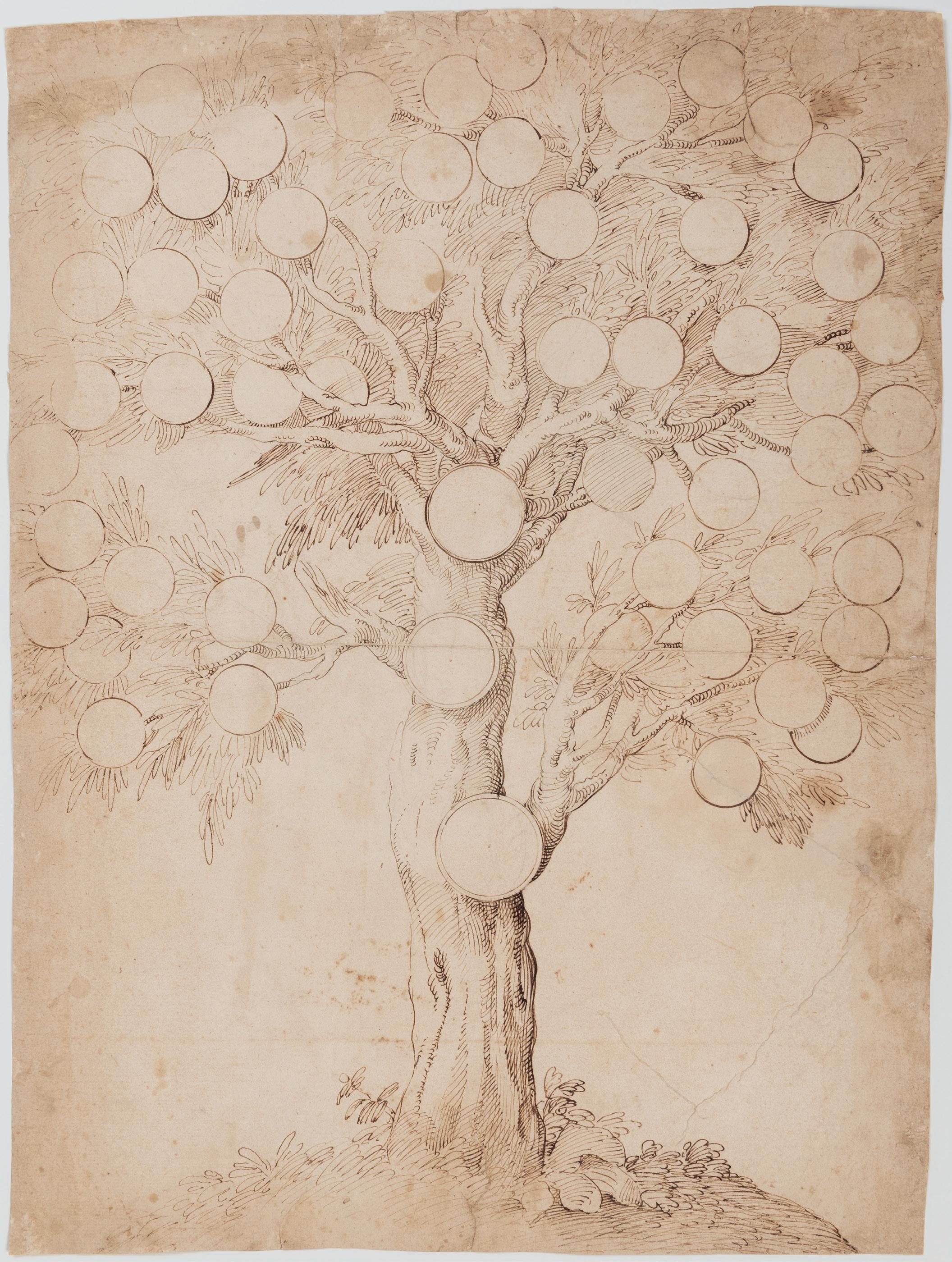
Design for a Frontispiece, with Allegories of Justice and Strength
Pen and brown ink and brown wash. The outlines partly indented with a stylus for transfer. Laid down. 240 x 166 mm. (9 1/2 x 6 1/2 in.)
PROVENANCE: Sir John Clermont Witt, London.
The present sheet would appear to be the work of a German artist who may have travelled and worked in Italy. The Florentine giglio – the lily of the coat of arms of the city of Florence – at the bottom of the composition suggests a Tuscan connection, while an ecclesiastical element is indicated by the bishop’s mitre above the lily. The fact that the outlines are partly indented with a stylus further suggests that this drawing may have been a design for a print.
The scholar Susan Tipton has recently suggested a connection with the work of the Augsburg draughtsman and etcher Hans Friedrich Schrorer (c.1585-c.1653/54), who was active in the first half of the 17th century. Born into a family of painters, Schrorer (sometimes Schorer) was trained by his father and was established as an independent artist by 1616. He is recorded in Augsburg until 1653, although the precise date of his death is unknown. Schrorer is only known as a draughtsman, and no paintings by his hand have survived. His first datable drawings were done around 1607-1608 and his last known dated sheet was executed in 1654. As well as landscapes, genre and mythological subjects and religious scenes, Schrorer produced a number of drawings of designs intended to be produced by craftsmen or goldsmiths, as well as finished drawings for collectors. He also made drawings after the work of other painters and sculptors who were active in Augsburg. Drawings by Hans Schrorer are in the collections of the Kunstsammlungen und Museen Augsburg1, the Kunsthalle in Bremen, the Kunstsammlungen der Veste Coburg in Coburg, the Hessisches Landesmuseum in Darmstadt, the British Museum in London, the Staatliche Graphische Sammlung in Munich2, the National Gallery in Prague, the Nationalmuseum in Stockholm and the Albertina in Vienna. A stylistically comparable design for a saltcellar by Schrorer is in the Art Institute of Chicago3.
This drawing was at one time in the collection of the collector and patron Sir John Witt (1907-1982), when it was thought to be the work of Perino del Vaga4.
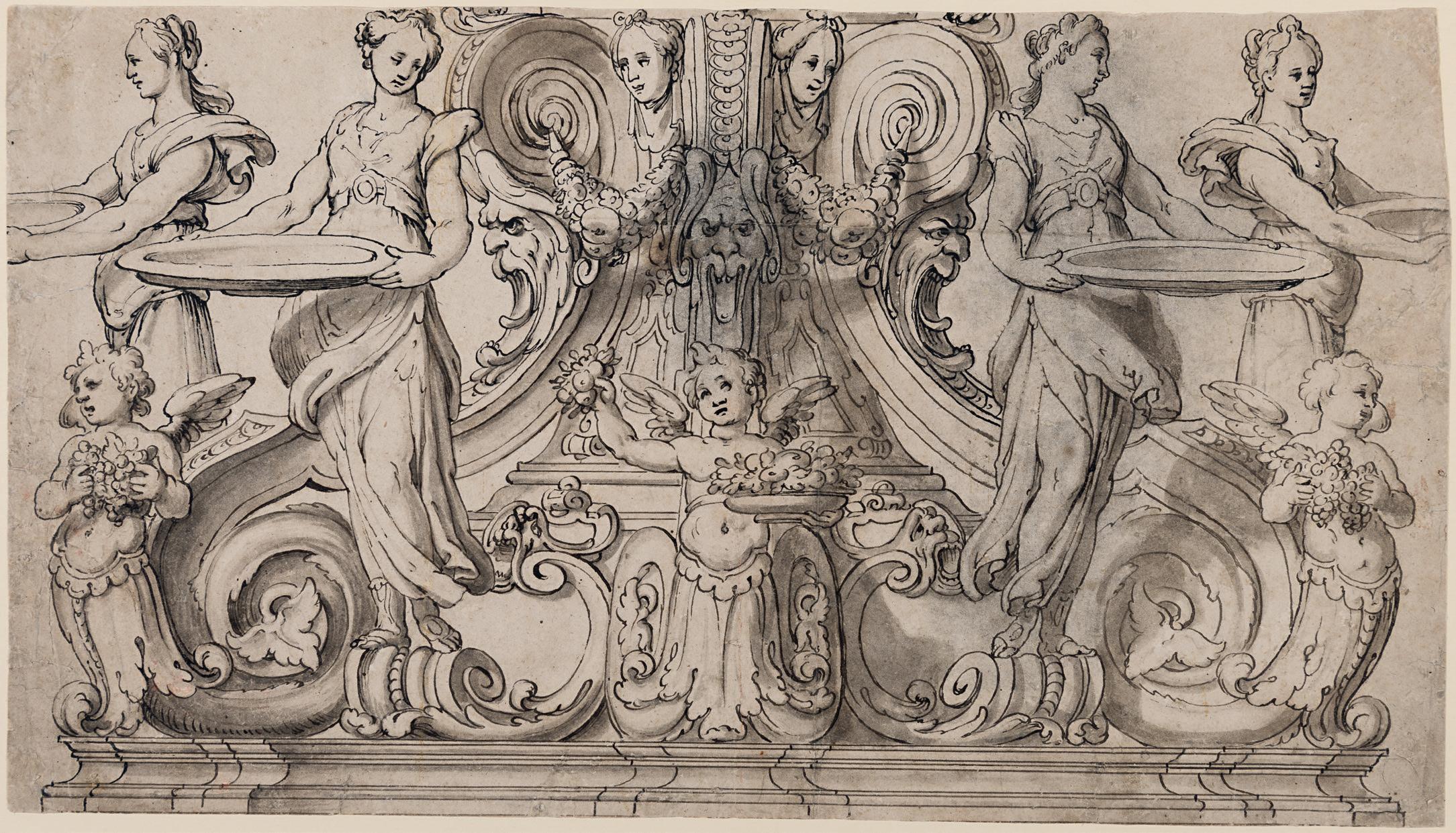
ERMENEGILDO LODI
Casalmaggiore c.1580/85-1630 Cremona
A Design for the Ornamental Base of a Table
Pen and black ink and grey wash, over traces of an underdrawing in black chalk; the sheet backed. The outlines of one of the female figures and the central mascaroon pricked for transfer. 241 x 430 mm. (9 1/2 x 16 7/8 in.)
Active in Cremona in Lombardy in the first quarter of the 17th century, Ermenegildo Lodi was a pupil of the Cremonese painter and architect Giovanni Battista Trotti, known as Il Malosso, and is documented between 1594 and 1630. Among his earliest works is a painting of The Virgin with Saints Peter and Jacob, signed and dated 1598, in the church of San Rocco at Bussetto, near Parma, while the following year he is recorded as working in the Duomo at Salò. Lodi’s independent career seems to have begun around 1604, when Malosso left Cremona for Parma. From 1608 onwards Lodi worked in the church of San Siro in Soresina, where he painted the right transept and the vault and dome of the presbytery with scenes from the life of the Virgin. Lodi also completed the extensive decoration of the vault of the church of San Pietro al Po in Cremona, a project begun by Malosso around 1587, although he had only completed the first bay of the nave. Despite the long period of time between Malosso’s work and Lodi’s eventual completion of the decoration, such was his familiarity with Malosso’s manner of painting that the younger artist was able to achieve a visual coherence in the appearance of the nave as a whole. This was arguably the most significant public commission of Lodi’s career, and the artist proudly signed and dated the work, which was completed in 1616. He also painted a Preaching of Saint John the Baptist for the baptismal font of the same church. Lodi’s father Manfredo and brother Giovanni Battista were also artists.
Ermenegildo Lodi’s draughtsmanship owes much to that of his master Malosso. Indeed, their drawing style is sometimes so close that, as the 17th Florentine biographer Filippo Baldinucci noted, ‘the work of one could be exchanged for the work of the other’, and many drawings now regarded as by Lodi have been previously attributed to Malosso. (Lodi also seems to have retained a number of drawings by Malosso after the elder artist’s death, from which he continued to derive inspiration for some of the figures in his later projects.) Several drawings by Lodi are today in the Uffizi in Florence and the Museo Civico Ala Ponzone in Cremona, and other examples are in the Ashmolean Museum in Oxford, the Metropolitan Museum of Art in New York, the Galleria dell’Accademia in Venice, and elsewhere.
Similar Mannerist decorative elements - including masks, terms, volutes and acanthus-leaf scrolls - are found in a large drawing by Lodi for the decoration of a ceiling, today in the Louvre1. Also somewhat similar is a small pen and grey wash drawing of an ornamental base with caryatids and masks, currently attributed to Malosso but more likely to be by Lodi, in the Uffizi in Florence2. The facial type of the figures in the present sheet is also typical of Lodi’s drawings, as seen for example in a study of a Sibyl in the collection of the University of Iowa Museum of Art in Iowa City3
FLORENTINE SCHOOL
17th Century
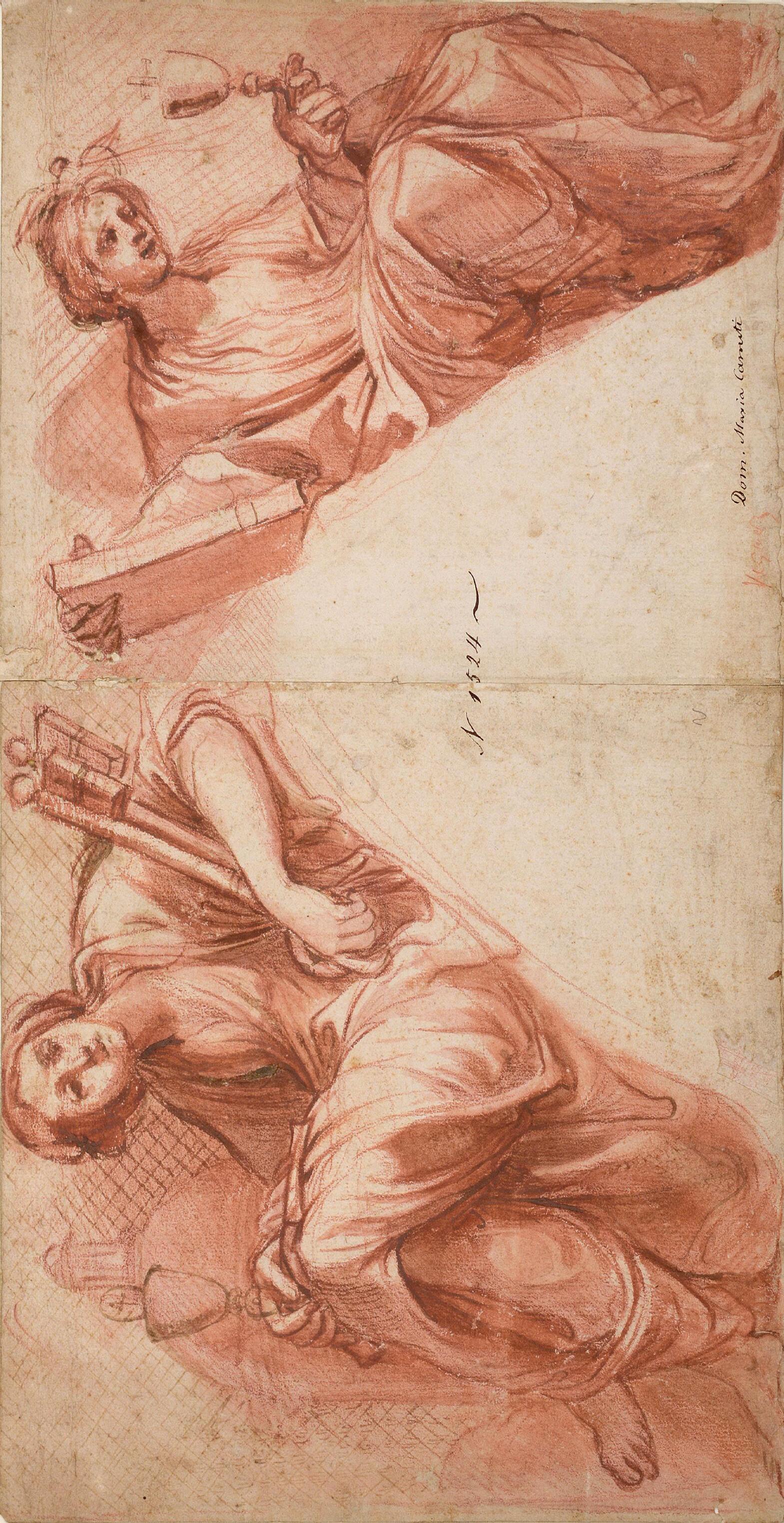
Design for Two Spandrels, with Allegorical Figures of Faith and the Church
Red chalk and red wash, over an underdrawing in pen and brown ink, on two joined sheets of paper, laid down. Inscribed Dom. Maria Canuti in brown ink at the lower right centre and numbered N1524 in brown ink in the centre of the sheet. Inscribed Vignali(?) in red chalk at the lower right centre. Further inscribed (in a modern hand) Domenico Maria Canuti / Very similar figures occur in fresco S.S. Domenico e Sisto, Rome. / One with book + one with cup, but more foreshortened and divided / from each other by decorative frame. in pencil on the old mount. Also inscribed (by Philip Pouncey) Giovanni da san Giovanni? P.P. in pencil on the old mount. 232 x 448 mm. (9 1/8 x 17 5/8 in.)
PROVENANCE: Hugh and April Squire, London and Woodbridge; Their anonymous sale (‘An Interesting Collection of Old Master Drawings, The Property of a Private Collector’), London, Sotheby’s, 4 July 1975, lot 115 (as Attributed to Giovanni da San Giovanni).
The author of this interesting and spirited drawing has thus far resisted a firm identification. The sheet bears a traditional attribution to the 17th century Bolognese painter Domenico Maria Canuti (16201684). As noted in the modern inscription on the former mount, similar allegorical female figures appear above an arch in Canuti’s extensive fresco decoration of the dome and apse of the Roman church of Santi Domenico e Sisto1, a project begun in 1673 and completed in 1675. Although he painted altarpieces and easel pictures throughout his career, it was as a fresco painter of such grand ceiling decorations that Canuti came to be best known.
However, this energetic drawing seems, on balance, more likely to be the work of a Florentine artist. The scholar and connoisseur Philip Pouncey had proposed a tentative attribution to Giovanni Mannozzi, known as Giovanni da San Giovanni (1592-1636), the leading fresco painter in Florence in the second quarter of the 17th century. Pouncey’s attribution would appear to have some merit, by a stylistic comparison with such vigorously-executed drawings by Giovanni da San Giovanni as an early red chalk study for a mural fresco composition in the Uffizi in Florence2, or with the figure types in a finished drawing of an allegorical subject of Peace, executed in red, black and white chalk, also in the Uffizi3
More recently, an attribution to another Florentine artist of the Seicento, Giovanni Maria Morandi (1622-1717) has been put forward. Although Florentine by birth, Giovanni Maria Morandi is unusual among his artistic compatriots in spending most of his career away from his home city, and his style reflects a combination of both Tuscan and Roman elements. Many of Morandi’s few surviving drawings are related to his religious commissions, although several remain unconnected to extant works. His draughtsmanship is characterized by a preference for a combination of red chalk with red wash and white heightening, as seen in the present sheet. As Erich Schleier has noted, ‘This technique, which the artist adopted from his teacher Giovanni Bilivert, is typical of many, indeed most, of Morandi’s composition drawings. He applies the red chalk with great delicacy, softness and looseness for transparent shadings. At the same time, with the combination of the red chalk with the white highlights, he achieves painterly effects similar to those he obtains in other drawings by the more extensive use of red wash.’4
It may be noted that a very similar treatment of hands is found on the verso of a drawing depicting a man holding a violin, executed in red chalk and red wash, in the Louvre5. Formerly attributed to Morandi and Canuti, the Louvre sheet is now given to the Florentine painter Pier Dandini (1646-1712).
JEAN-BAPTISTE TAVERNIER
Flemish(?); Active in the second half of the 17th century
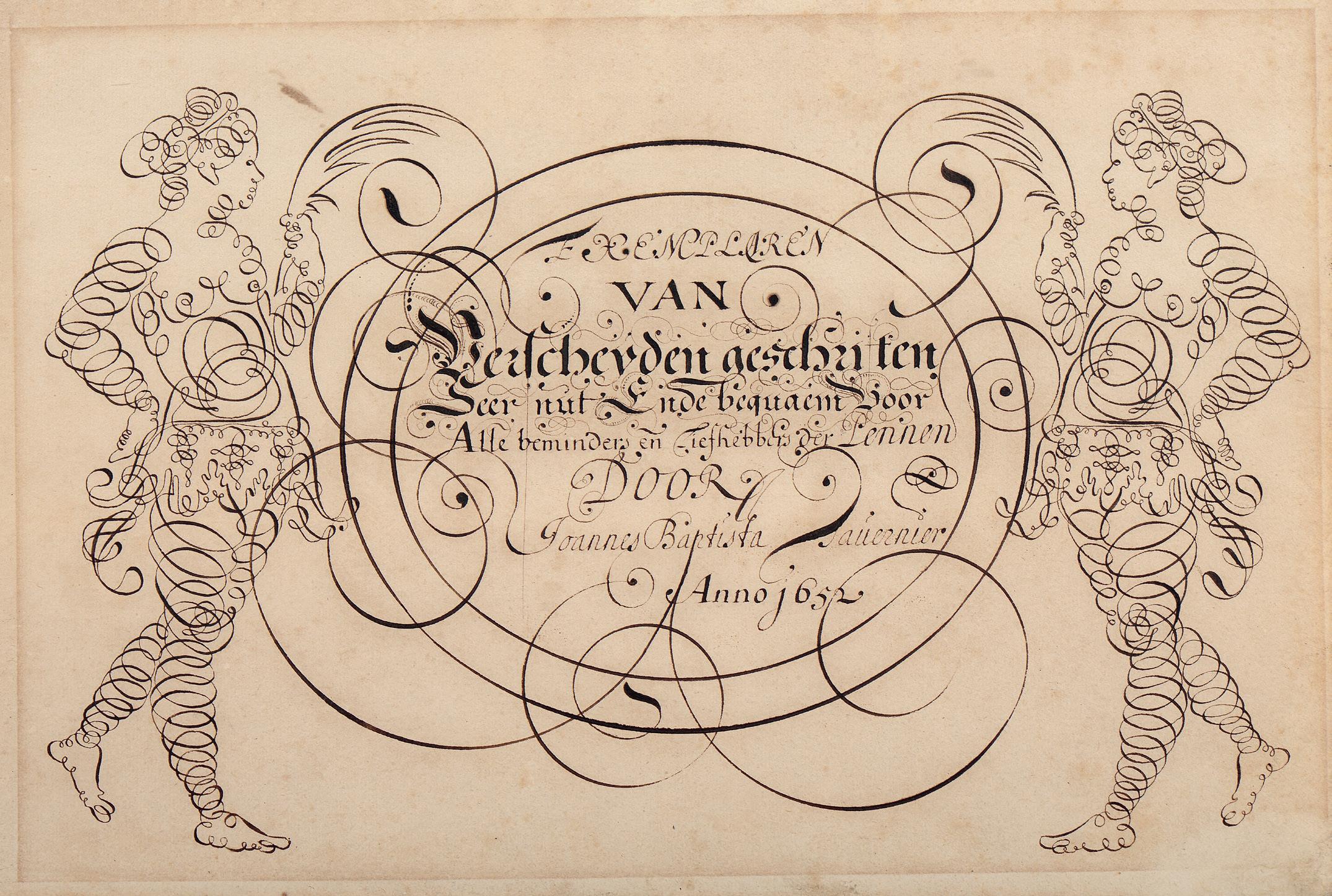
A Calligraphic Design for a Frontispiece
Pen and brown ink. Inscribed, signed and dated EXEMPLAREN / VAN / Verscheyden geschriften / Seer nut in de bequaem voor / Alle beminders en Liefhebbers der Pennen / DOOR / Joannes Baptista Tavernier / Anno 1652 in brown ink in the centre.
205 x 302 mm. (8 1/8 x 11 7/8 in.) [sheet]
PROVENANCE: Anonymous sale, Brussels, Les Nouvelles Galeries de Paris, 23-24 October 1995, lot 656; Jacques Hollander, Ohain, Belgium; Thence by descent; The Hollander sale (‘Le cabinet de curiosités de Jacques et Galila Hollander’), Paris, Christie’s, 16 October 2013, lot 91.
The inscription on this drawing may be approximately translated as ‘Examples of penmanship, very useful for all those who admire writing, by Jean Baptiste Tavernier, in the year 1652’.
Dated 1652, this fascinating drawing may have served as an unused design for the frontispiece of J. B. Tavernier’s Collection of Calligraphic Pieces, published in Bruges between 1651 and 1672. Intended as a guide to penmanship, a manuscript copy of this work is in the Newberry Library in Chicago, in the form of a vellum-bound volume of around fourteen sheets of calligraphy models – mostly signed ‘Tavernier’ – written in different languages and with various types of script. While the drawings in the Newberry album are stylistically closely comparable to the present sheet, the album has a different title page, which reads in calligraphy ‘Exemplaer-Boeck, inhoudende diuersche soorten ban gheschriften ... gheschrieven ende gemaeckt door J. B. Tauernier’.
The collection of the Newberry Library also includes a further group of loose sheets of calligraphy models by different hands, some of which are signed ‘Tavernier’, which were all apparently removed from an album. None of these can be related to the present sheet, however. It may be, therefore, that this drawing was intended as a frontispiece for another album of calligraphic studies by Tavernier that was never printed or published.
It remains uncertain whether the artist responsible for this drawing may be identified with the famous French gem merchant and traveller Jean-Baptiste Tavernier (1605-1689), who made six long voyages to Persia and India between 1630 and 1688. The son and nephew of cartographers, it is thought likely that he had some practice of both cartography and engraving. In the year 1652, however, Tavernier is known to have been in the midst of the fourth of his famous voyages, to India.
GIOVANNI FRANCESCO GRIMALDI
Bologna c.1605/06-1680 Rome
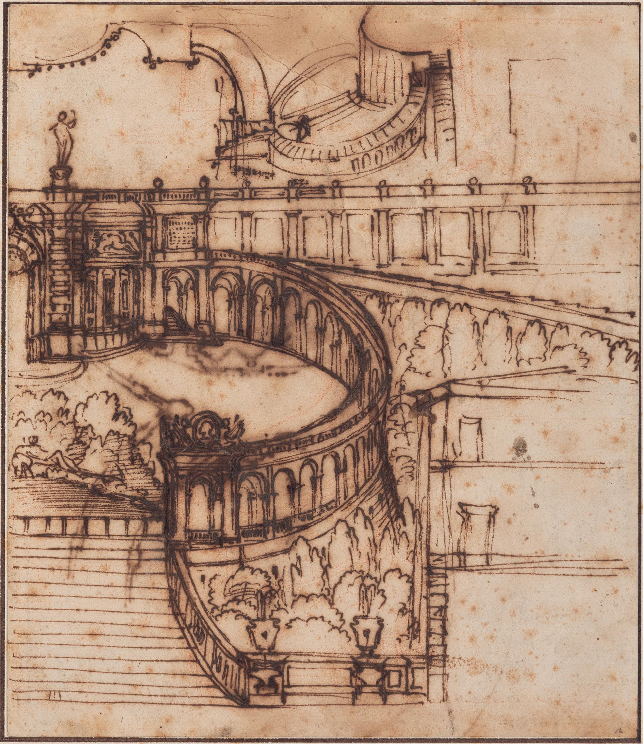
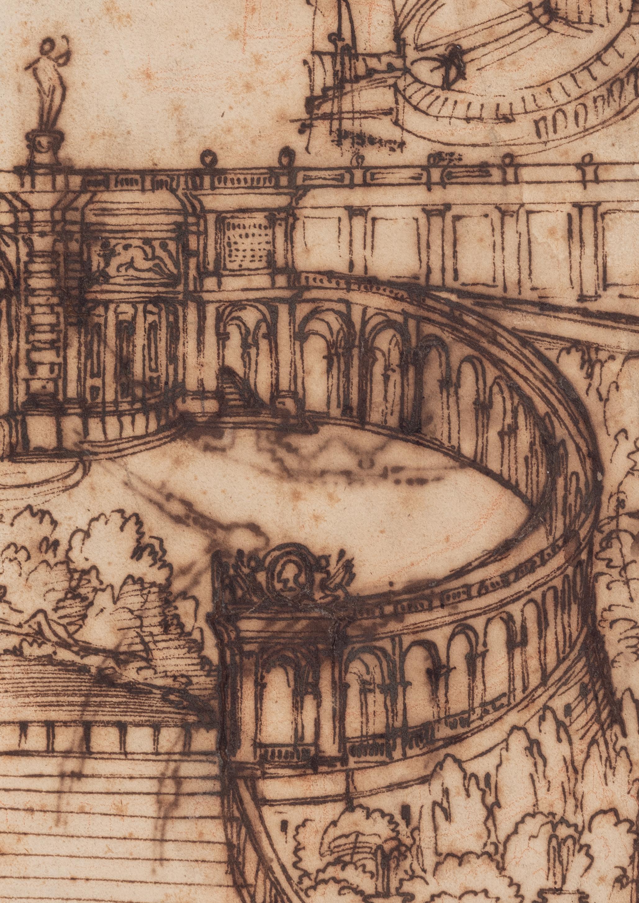
A Design for the Spanish Steps in Rome, with a Bird’s-Eye View of the Same
Pen and brown ink, over traces of an underdrawing in red chalk, laid down on another sheet of paper. Numbered 2 in brown ink at the lower right. A plan of a circular palace faintly drawn in brown ink on the verso.
259 x 223 mm. (10 1/8 x 8 3/4 in.)
PROVENANCE: Anonymous sale, New York, Christie’s, 30 January 1997, lot 51; Anonymous sale, London, Christie’s, 7 July 1998, lot 114; Jutta Kleinknecht, Bad Hönningen.
Active as a painter, draughtsman, architect, scenographer and printmaker, Giovanni Francesco Grimaldi, known as ‘Il Bolognese’, received his artistic training in his native city of Bologna, where he adopted the local interest in landscape drawing fostered by the Carracci and their Accademia degli Incamminati. By 1627 he was working in Rome, where he profited from his study of the works of the Carracci and their followers there. Grimaldi was to spend the remainder of his career in Rome, apart from a stay in Paris between 1648 and 1651. He was admitted into the Roman Accademia di San Luca in 1635, eventually rising to become principe of the institution in 1666. Grimaldi collaborated with Alessandro Algardi on the decoration of the Villa Pamphili for Cardinal Camillo Pamphili in 1646, and between 1656 and 1657 worked alongside Pietro da Cortona on the fresco decoration of the Palazzo del Quirinale. As the Grimaldi scholar Isabella Lodi-Fè Chapman has noted, ‘The key to Grimaldi’s success was his brilliant ability to assimilate and produce variations of the landscape prototypes that were so popular in Rome. He was therefore often asked to provide the landscape elements of important projects supervised by major artists such as Alessandro Algardi or Cortona, and also managed entire projects by himself.’1
Grimaldi’s reputation spread as far as France, where in 1648 he was summoned by Cardinal Jules Mazarin to work with Giovanni Francesco Romanelli on the fresco decoration of the Galerie Mazarin, part of a new wing of his Parisian palace commissioned from the architect François Mansart in 1644. Grimaldi also worked for the Duc d’Orléans and decorated the apartments of Anne of Austria in the Louvre before returning to Italy in 1651. The 1660s and 1670s found the artist at the height of his success, earning commissions from several noble Roman families, including the Barberini, Borghese, Chigi, Pamphili, Peretti and Santacroce. He established a thriving career as a painter of fresco decorations, working at the Palazzo Nuñez Torlonia, the Palazzo Santacroce, the Vatican and the Palazzo Quirinale in Rome, as well as at the Villa Falconieri at Frascati. For much of the 1670s Grimaldi worked at the Palazzo Borghese in Rome, supervising the interior decoration of the ground floor apartments, and also painted the gallery of the Palazzo Muti Papazzurri. Honoured throughout his lifetime, Grimaldi died on 28 November 1680, the same day as the sculptor Gianlorenzo Bernini.
Grimaldi was a prolific draughtsman, and, according to an anonymous Bolognese biographer, ‘studied so fervently that he always stayed up at night drawing instead of sleeping.’2 The artist is best known for his pure landscape studies in pen and ink. Only a very few of these, however, are signed or dated, and since his style as a draughtsman remained fairly consistent during his career such drawings can be difficult to date with any accuracy. While some of his landscape drawings were used to prepare the decorative murals that the artist painted for Roman palaces, others may well have been intended as works of art in their own right. An album of some 130 landscape drawings and decorative designs by Grimaldi, assembled in Rome by the Spanish painter Vincenzo Vittoria before 1701, is today in the British Museum, while a smaller number of drawings with the same provenance is in the Royal Library at Windsor Castle. Other significant groups of drawings by the artist are in the collections of the Statens Museum for Kunst in Copenhagen, the Teyler Museum in Haarlem, the Louvre in Paris,
the Nationalmuseum in Stockholm and the University Library in Warsaw. Grimaldi also produced more than sixty landscape etchings, which, like his drawings, reveal the influence of the Carraccesque tradition in which he was trained.
The present sheet, however, is more likely to be related to Grimaldi’s proposed design for the Spanish Steps in Rome, a monumental stairway which leads steeply down from the French church of the Trinità dei Monti on the Pincian Hill to the Piazza di Spagna at the bottom3. The design and construction of the Spanish Steps was among the most significant urban architectural projects of the Baroque period in Rome. In 1660 Grimaldi is known to have provided a finished drawing of his design for the steps for Cardinal Mazarin in Paris, who had taken charge of the project. Abbot Elpidio Benedetti, the Cardinal’s agent in Rome, sent Mazarin four different designs for the Scalinata di Trinità dei Monti; one by the young French architect François d’Orbay and another by Carlo Rainaldi, both sent to Paris on 19 August 1660, and a further two, one by Grimaldi drawn on blue paper (‘carta turchina’) and the other by Benedetti himself4, included with a letter dated 21 October 1660. In this second letter to Mazarin, Benedetti writes, ‘I am sending Your Eminence...a tin box containing two drawings for the staircase to be built at the Trinità de Monti. One, on blue paper, is by Giovanni Francesco [Grimaldi] Bolognese, who has already painted in Your Eminence’s palace, vague, sensational, and very expensive, more suitable for a garden than for a street…’5 It has been suggested the proposal by Grimaldi sent to Mazarin can be identified with an elaborate, finished drawing for the Scalinata and the façade of the church of the Trinità dei Monti, today in the Kunstbibliothek in Berlin6
This drawing appears to represent Grimaldi’s working design for the Scalinata di Trinità dei Monti, incorporating Mazarin’s specification of a pair of grand semicircular staircases, as well as a fountain with reclining river gods, presumably representing the Seine and the Tiber. The drawing only depicts one half of the design, since it would have been mirrored at the left side. Grimaldi’s aerial perspective view of the Steps is supplemented by a schematic sketch of the same, drawn at the top of the sheet.
From the bottom of the composition, a curved staircase flanked by trees leads up from the Piazza di Spagna to the first landing, where a prominent oval arcade leads further upwards to the next level. At the beginning of this arcade can be seen an oval portrait medallion of a man in profile, presumably King Louis XIV of France, supported on each side by putti. A sloping ramp leads from the right edge to the second level, where it meets the arcade in front of a curved façade next to an arched opening. Above this is a colonnade that runs in front of the façade of the Trinità dei Monti church, surmounted by a balustrade looking out over the city. This drawing also appears to depict two windows and the façade of the Keats-Shelley House, which sits at the base of the Steps at the bottom of the Pincian Hill, at the lower right of the composition. Built around 1600, the house, at Piazza di Spagna 26, was given a new façade around 1724-1725 by the little-known architect Francesco de Sanctis, who had also won the prized commission to build the Spanish Steps.
It has been suggested that one reason that Grimaldi’s design for the Scalinata was not adopted was that it may have been seen to echo too closely Bernini’s design for the square in front of the Basilica of St. Peter’s, with its monumental curving colonnades, which was under construction at the same time. Nevertheless, the present day appearance of the Spanish Steps, as eventually designed and constructed by de Sanctis in the first quarter of the 18th century, owes much to the visual concepts developed by Grimaldi in drawings such as the present sheet.
BALDASSARE FRANCESCHINI, called IL VOLTERRANO
Volterra 1611-1690 Florence
Two Variant Designs for a Cartouche
Black chalk. The verso with sketches of frames and cartouches in red chalk. 247 x 260 mm. (9 3/4 x 10 1/4 in.)
PROVENANCE: Probably part of a group of 410 drawings by Volterrano, mounted into four albums, sold Paris, Hôtel Drouot, 8 November 1922, lot 214; Anonymous sale (‘An Important Group of Drawings by Baldassare Franceschini, called Il Volterrano’), London, Sotheby’s, 3 July 1980, probably lot 2 (‘An ornamental frame, and a study of a face. Black chalk. 215 x 252. On the verso are red chalk studies of decorative carving.’); Brian Sewell, London.
LITERATURE: Lynn Roberts, ‘Il Volterrano and a Baroque Florentine frame: part of a thematic programme?’, www.theframeblog.com, 22 June 2021.
The leading fresco painter in Florence in the latter half of the 17th century, Baldassare Franceschini, known as Il Volterrano after his birthplace, was a prolific draughtsman who produced a significant number of drawings for architecture, decorative motifs and metalwork. As the frame historian Lynn Roberts has noted, ‘His drawings include studies for cupolas, escutcheons, pedestals, buildings, architectural mouldings, metalwork, tempietti, altarpieces, vases, cartouches…and picture frames.’1 A group of twenty-four drawings of this type is in the Kunstbibliothek in Berlin2, while several others were part of a large group of drawings by the artist sold at auction in 1980. As Charles McCorquodale has pointed out, ‘Volterrano...allowed his most robust, if controlled, drawing style to emerge in his designs for carving, stuccoes, metalwork and other decoration’3, while another scholar has noted that such drawings display ‘the elegance and sophistication [that are] always present in Volterrano’s decorations.’4 As has also been noted, ‘The florid baroque style evident in these drawings, and even the way numerous unfinished sketches are crowded on to the sheet, seem to be inspired by Bernini, whose work Volterrano knew from his two stays in Rome, but the condensed nature of the ornament is characteristically Florentine.’5
As Roberts writes of such drawings as the present double-sided sheet, ‘Volterrano’s drawings include a number of examples of frames, cartouches, or framed compartments for oval paintings or inscriptions, in which he is trying out both individual settings and methods of linking a series of ceiling paintings. These working ideas for frames…create a feeling of dramatic tension by opposing the clean curves of the sight edge with a much more dynamic outer contour. The ornament between the two may be made up of scrolling foliage, strapwork, clasps, shells, wings or putti, with exaggerated flutes adopted from earlier Mannerist borders; it is pulled into rough rectilinear and octagonal forms by the extension of the corners into swoops and volutes.’6 Volterrano is known to have designed a handful of picture frames, notably for a large painting of The Baptism of Christ by Paolo Veronese, now in the Palazzo Pitti in Florence, that is set into an elaborate gilt frame carved by Jacopo Maria Foggini to a design by Volterrano7
Comparable drawings by Volterrano for decorative details and ornament include two sheets of studies for the design of a frame, sold at auction in London in 19808, and several drawings in the Kunstbibliothek in Berlin9. The verso of this drawing, drawn in red chalk, depicts several designs for frames or cartouches, and may be compared with a drawing for an oval cartouche or frame in the National Gallery of Scotland in Edinburgh10
A previous owner of this drawing was the English art dealer, journalist, art critic and broadcaster Brian Sewell (1931-2015).
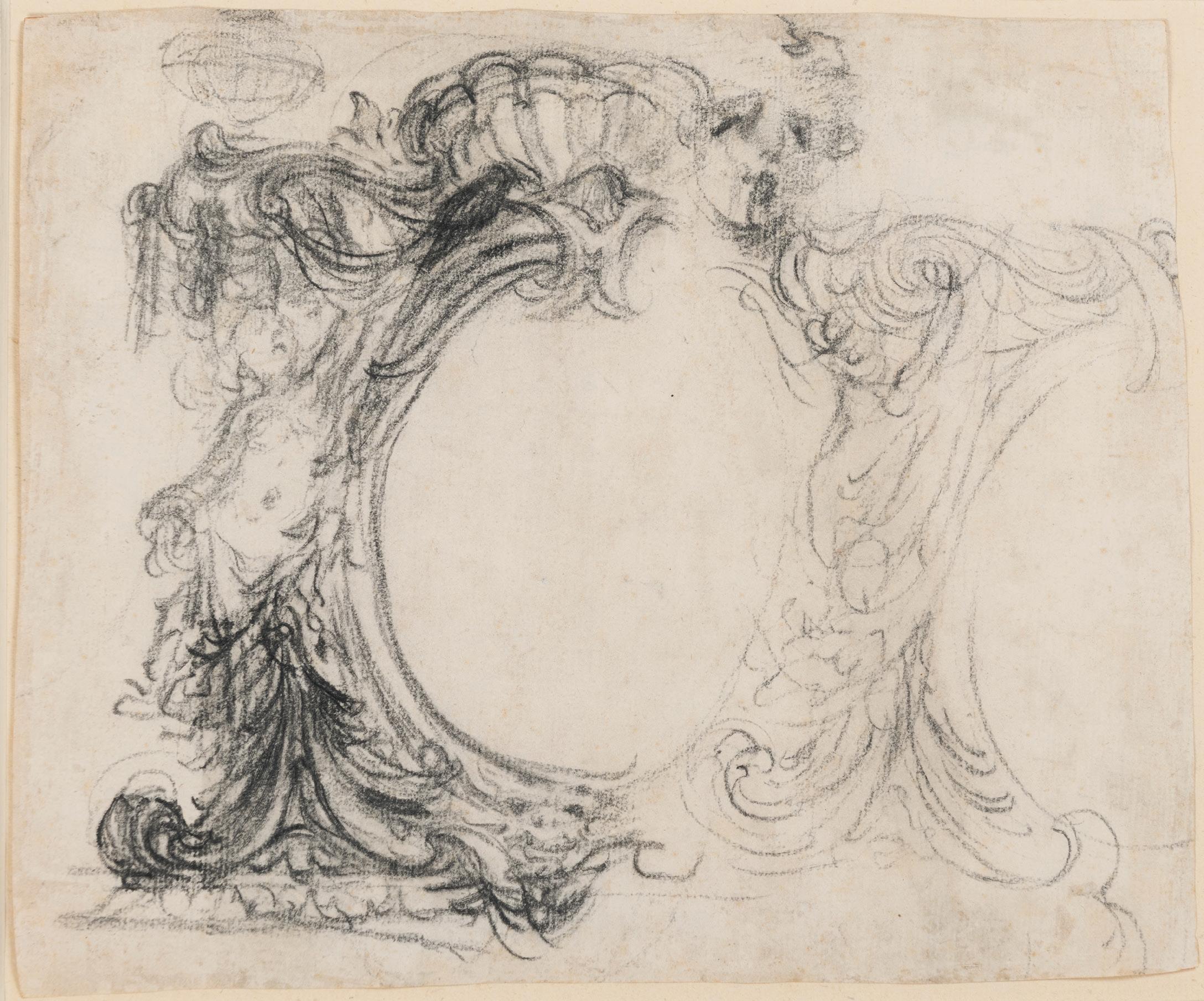
BALDASSARE FRANCESCHINI, called IL VOLTERRANO
Volterra 1611-1690 Florence
Design for a Theatrum Sacrum
Red chalk. Numbered 9 (or 6) in brown ink at the lower right. 571 x 439 mm. (22 1/2 x 17 1/4 in.)
PROVENANCE: Probably part of a group of 410 drawings by Volterrano, mounted into four albums and sold in Paris, Hôtel Drouot, 8 November 1922, lot 214; Anonymous sale (‘An Important Group of Drawings by Baldassare Franceschini, called Il Volterrano’), London, Sotheby’s, 3 July 1980, lot 102 (as Studio of Volterrano).
Volterrano was one of the finest draughtsmen of the Florentine Seicento and, as Charles McCorquodale has noted, ‘can take his place alongside the other major draughtsmen of the Baroque era; there is nothing provincial about any aspect of his drawing.’1 Both of the artist’s biographers, Filippo Baldinucci and Francesco Maria Niccolò Gabburri, owned several of his drawings, and they were also popular with collectors. An album with some four hundred drawings by Volterrano (‘un gran libro di circa quatrocento disegni’), for example, was in the collection of the Conti della Gherardesca in Florence, for whom the artist worked on several occasions. The largest groups of drawings by Volterrano are today in the collections of the Uffizi in Florence, the Louvre in Paris and the Albertina in Vienna, while a number of designs for architecture, decorative motifs and metalwork are in the Kunstbibliothek in Berlin.
This very large drawing is a design for a Theatrum Sacrum. Common in Italian art of the Baroque period, Theatrum Sacrum (Latin for ‘sacred theatre’) designs were produced for temporary ephemeral structures – usually elaborate in design and combining painting, sculpture and architectural elements to create a visually stunning ensemble – that were erected for religious festivals, processions and musical or theatrical performances, often held during ecclesiastical feast days, particularly during Easter and Holy Week. The present sheet depicts a large sculptural group centred by an allegorical figure of Faith holding a large cross, seated on a raised dais within an apse containing further statues of Hope and Charity. Above are two flying putti holding an oval inscribed IHS, while to the right is a further bay with a balcony and two statues of angels holding candlesticks.
The present sheet can be closely related, in stylistic terms, with a number of Theatrum Sacrum drawings by Volterrano that are studies for a catafalque in honour of Saint Mary Magdalene de’ Pazzi, whose canonization was celebrated in Florence in 1669. One of these drawings, showing three separate designs for the catafalque (fig.1), was formerly in the Steiner collection and is now in the Metropolitan Museum of Art in New York2, while a related study of a single altar and catafalque is also in the Metropolitan Museum3. A third sheet of studies by Volterrano for the same project was sold alongside the two Metropolitan Museum drawings at auction in London in 19744, while further related drawings in red chalk are in the Albertina in Vienna5 and a private collection in Milan6. The final appearance of Volterrano’s Theatrum Sacrum design of 1669 is recorded in a print by Theodor Verkruys7
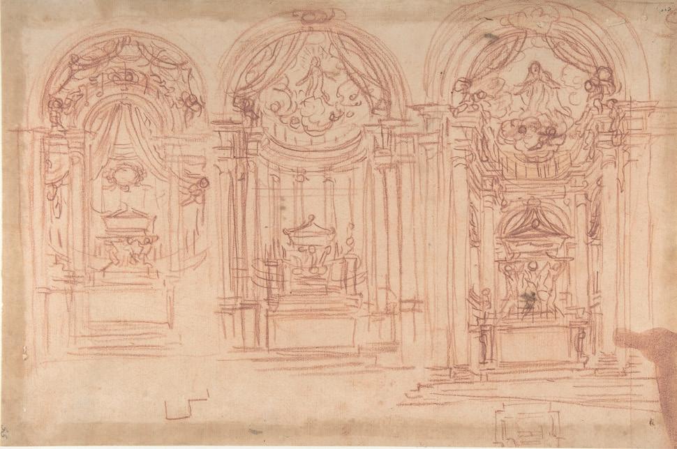
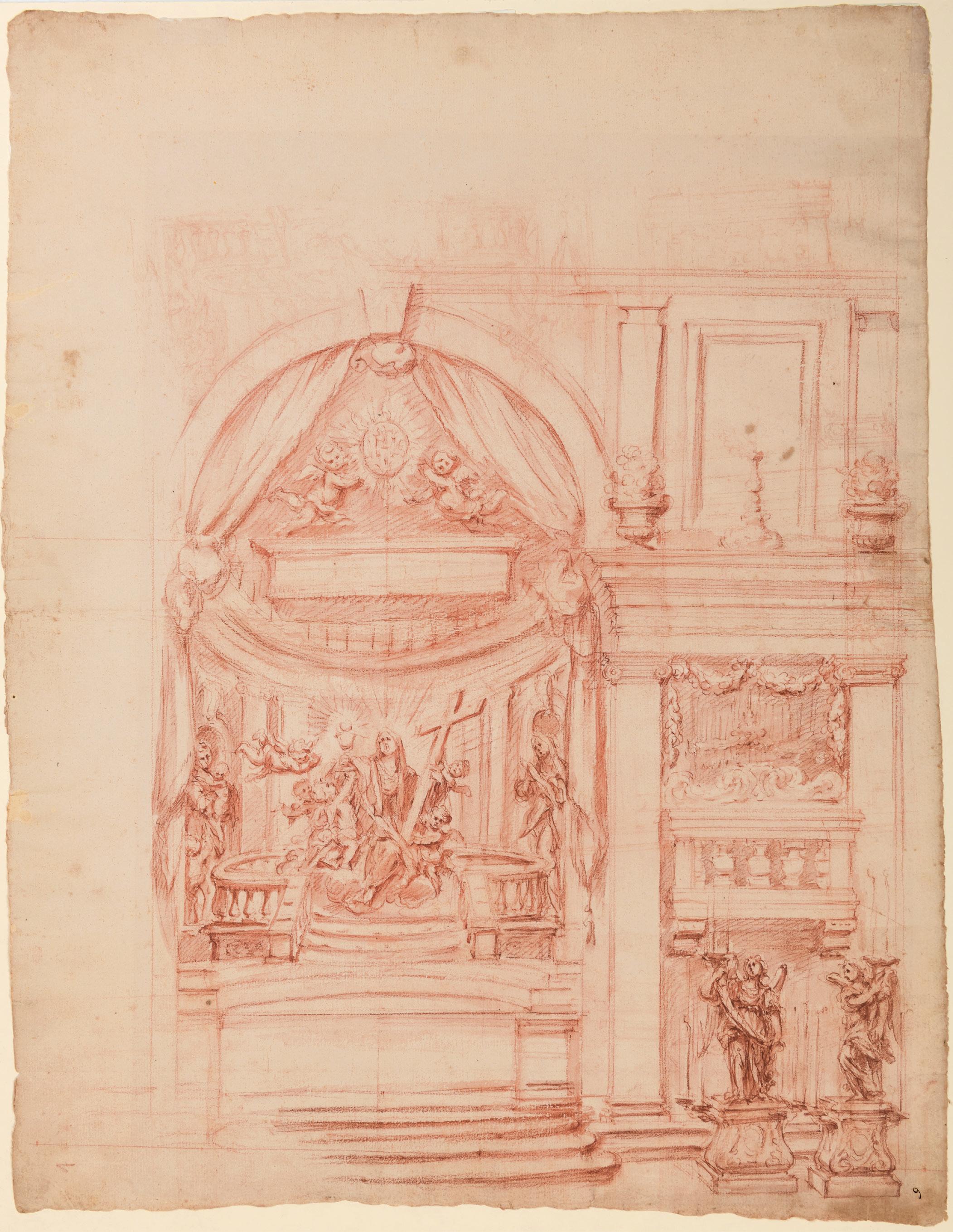
CARLO ANTONIO BUFFAGNOTTI
Bologna 1660-c.1717 Turin
An Elaborate Vase Decorated with Nymphs, Snakes, a Swan and a Musical Score: An Allegorical Composition for Giovanni Battista Bassani
Pen and brown ink and brown wash. Extensively inscribed on the musical scores at the centre and at the lower left.
195 x 130 mm. (7 5/8 x 5 1/8 in.)
PROVENANCE: Given by the artist to Giovanni Battista Bassani, Bologna and Ferrara, in c.1684; Bernard Quaritch Ltd., London, in 1996; Acquired from them by the Cattaneo collection; Hill-Stone Inc., New York; Galerie Paul Prouté, Paris, in 2004; Monica Streiff, Switzerland.
LITERATURE: London, Bernard Quaritch Ltd, Catalogue 1230: Art & Architecture, 1996, pp.5-6, no.7 (as Buffagnotti); ‘The Salon du Dessin, Palais de la Bourse, Paris, 17th-22nd March 2004’, The Burlington Magazine, March 2004, p.VI [advertisement] (as Stefano Della Bella); Paris, Paul Prouté S.A., Catalogue della Bella, 2004, pp.16-17, no.7 (as Stefano Della Bella); Anna Bianco, Images for the Music: Drawings and Secular Cantatas, unpublished Ph.D thesis, Leiden University, 2025, p.5, p.17, pp.426431, pp.438-441, p.449, no.4.01, illustrated p.449 (as Buffagnotti).
Previously attributed to the Florentine draughtsman and etcher Stefano Della Bella (1610-1664), this fine drawing is, as Anna Bianco has confirmed, by the late 17th century Bolognese printmaker, theatre designer and musician Carlo Antonio Buffagnotti. The present sheet is one of Buffagnotti’s earliest works and was presented by the artist to the composer Giovanni Battista Bassani sometime around 1684.
Buffagnotti received his training in the Bolognese studio of the painter and quadraturista Domenico Santi, known as Il Mengazzino, who provided the young artist with a grounding in ornamental design and illusionistic architecture. Buffagnotti came to be particularly known as a decorator of printed music, particularly in the early part of his career. Between 1680 and 1695 he provided engraved illustrations for a significant number of musical works, including the Concertino per violino e violoncello op.IV by Giuseppe Torelli, two collections of songs by Bolognese and Emilian composers, as well as Giuseppe Iacchini’s Sonate a violino e violoncello…opera prima and manuscripts of secular cantatas set to music by Giovanni Paolo Colonna and presented as gifts to such important patrons as Francesco II d’Este, Duke of Modena and Reggio, and Cosimo III de’ Medici, Grand Duke of Tuscany. Another work extensively illustrated with engravings by Buffagnotti was a Sonate per camera a violino e violoncello di vari autori, containing twelve sonatas for violin and cello by ten different Bolognese composers, including Torelli, Iacchini and Giuseppe Aldovrandini. Buffagnotti was himself an accomplished musician and composer. He became a member of the Accademia Filarmonica in 1695 and, also in the 1690s, published a number of original musical compositions as Menuetti, sarabande et varij caprici di Carlo Buffagnotti, illustrated by his drawings.
Towards the end of the 17th century Buffagnotti began working more as a scenographer, notably for a staging of Conte Pirro Albergati’s pastoral opera Gli amici in Bologna in 1699, and well as a designer of ornament, as can be seen in such works as the Soffiti inventati intagliati p. Carlo Buffagnotti of c.1694 and the Vari capricii di Carlo Buffagnotti dedicato al merito del si.re Filippo Pirotti, which appeared at around the same time. He worked closely with the architect and stage designer Ferdinando Galli Bibiena, and between 1703 and 1708 etched most of the seventy plates in Bibiena’s seminal Varie opere di prospettive. He is said to have worked as a painter and stage designer in Genoa and Ferrara and was also active as a drawing master to members of the Bolognese nobility. Buffagnotti is not documented after 1717. Only a handful of drawings by the artist, all in pen and ink, are known; examples are in the collections of the Metropolitan Museum of Art and the Pierpont Morgan Library in New York, as well as the Fondazione Giorgio Cini in Venice.
In a recent doctoral thesis on drawings related to musical manuscripts, Anna Bianco devoted much of an entire chapter to the present sheet. As she writes, ‘Buffagnotti aimed to impress his contemporaries
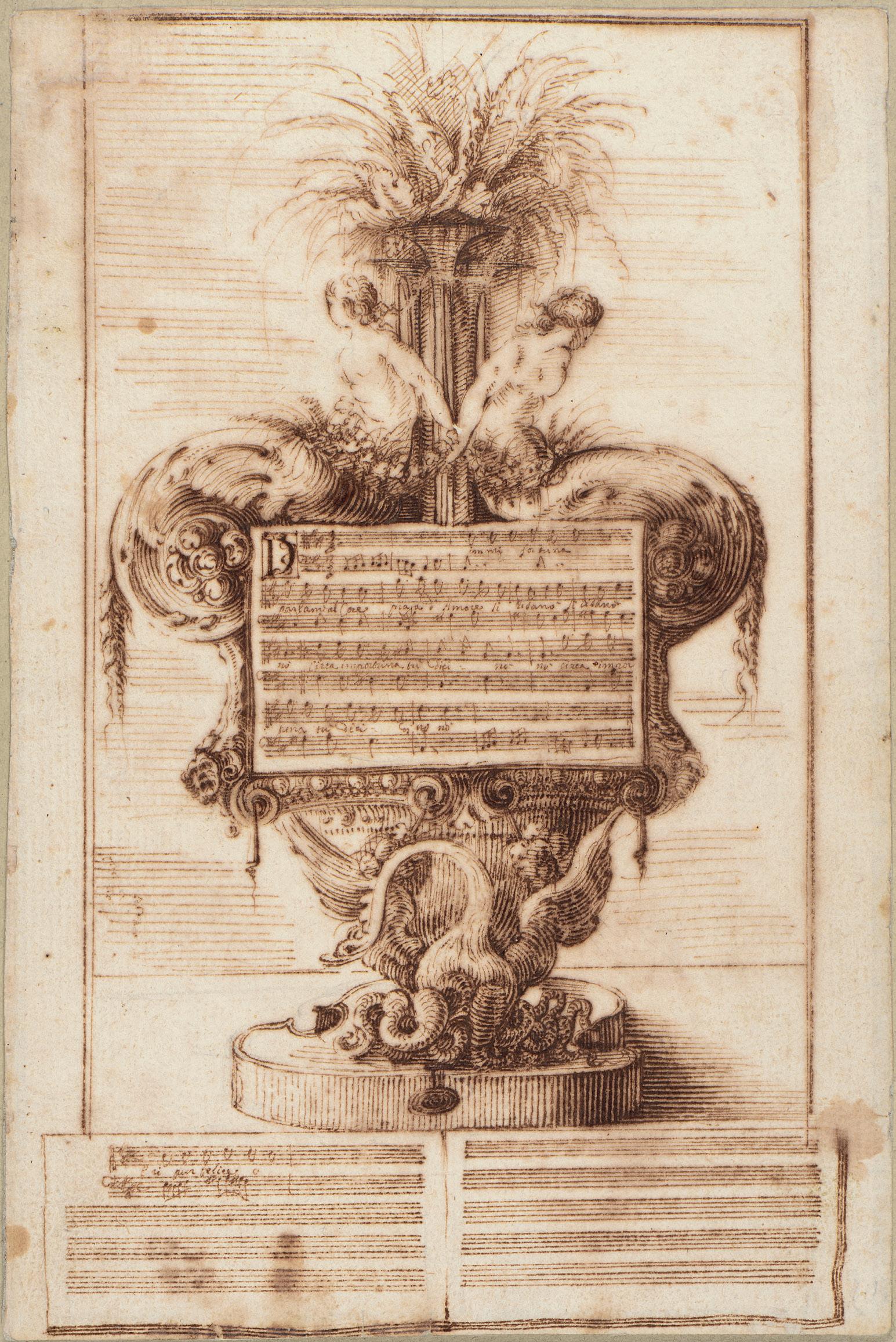
actual size
and secure patronage through meticulously crafted designs incorporating musical compositions. These compositions served as “artistic offerings” and strategic endeavors to gain recognition and further opportunities in the art world…Unlike the printed dedications of the period, which followed a set of codified rules, Buffagnotti’s manuscript presentations operated through a different logic: they were conceived as unique, richly decorated artefacts offered as gifts but with the clear expectation of financial compensation.’1
The lyrics of the music which form the central motif of this drawing (fig.1) are excerpted from the secular cantata Ardea di due begli’occhi by Giovanni Battista Bassani (c.1650-1716), to whom Buffagnotti presented the present sheet as a token of his friendship. The theme of the cantata is unrequited love, and, although the text is fragmentary, it can be read as ‘Dimmi fortuna / parlami al Core piaga d’Amore si risarò / cieca importuna tu dici nò nò cieca impor- / tuna tu dici cosi(?) nò nò’, while the text continues at the bottom of the sheet with a brief extract from a later passage in the cantata, with the words ‘eri pur felice o’2. The Ardea di due begli’occhi (also sometimes known as Amante non creduto) was published as part of a collection of Bassani’s cantatas in 1684, shortly before the composer left Bologna to settle in Ferrara, and Buffagnotti’s drawing must date to around the same time.
As Bianco writes, ‘Buffagnotti’s gift to Bassani reflects the tradition of presenting drawings as meaningful tokens, dating back to the sixteenth century. These drawings, considered autonomous works of art, offer a direct link to the artist’s creative process. Buffagnotti’s meticulous incorporation of Bassani’s cantata excerpts into the drawing mirrors this tradition, infusing the artwork with profound meaning: through deliberate symbolism and fragmented representation, he pays homage to the composer’s musical legacy while engaging in a nuanced dialogue between visual and musical expression.’3 Buffagnotti is known to have presented similar drawings or prints as gifts to his contemporaries; a comparable example, likewise indebted to decorative motifs originally invented by Della Bella, is found in an unpublished etching of a Musical Capriccio of 1693 (fig.2), dedicated by Buffagnotti to the Venetian singer Piera Ghei, in the collection of the Civico Museo della Musica in Bologna4.
Much of Buffagnotti’s work in the early part of his career reveals the influence of Stefano Della Bella, and in particular the ornament prints commissioned from the Florentine artist by Parisian publishers. The motif of the seated nymphs in the present drawing finds parallels in some examples from a set of decorative etchings by Della Bella, the Raccolta di varii cappriccii et nove inventioni di cartelle et ornamenti published in Paris in 16465, while the nymphs and the form of the vase itself are akin to those found in Della Bella’s suite of six etchings of several different designs for vases, published as Raccolta di vasi diversi in c.16466. Indeed, the nymphs in the present sheet are particularly close to those flanking one of the vases in one of the Raccolta di vasi diversi etchings7.
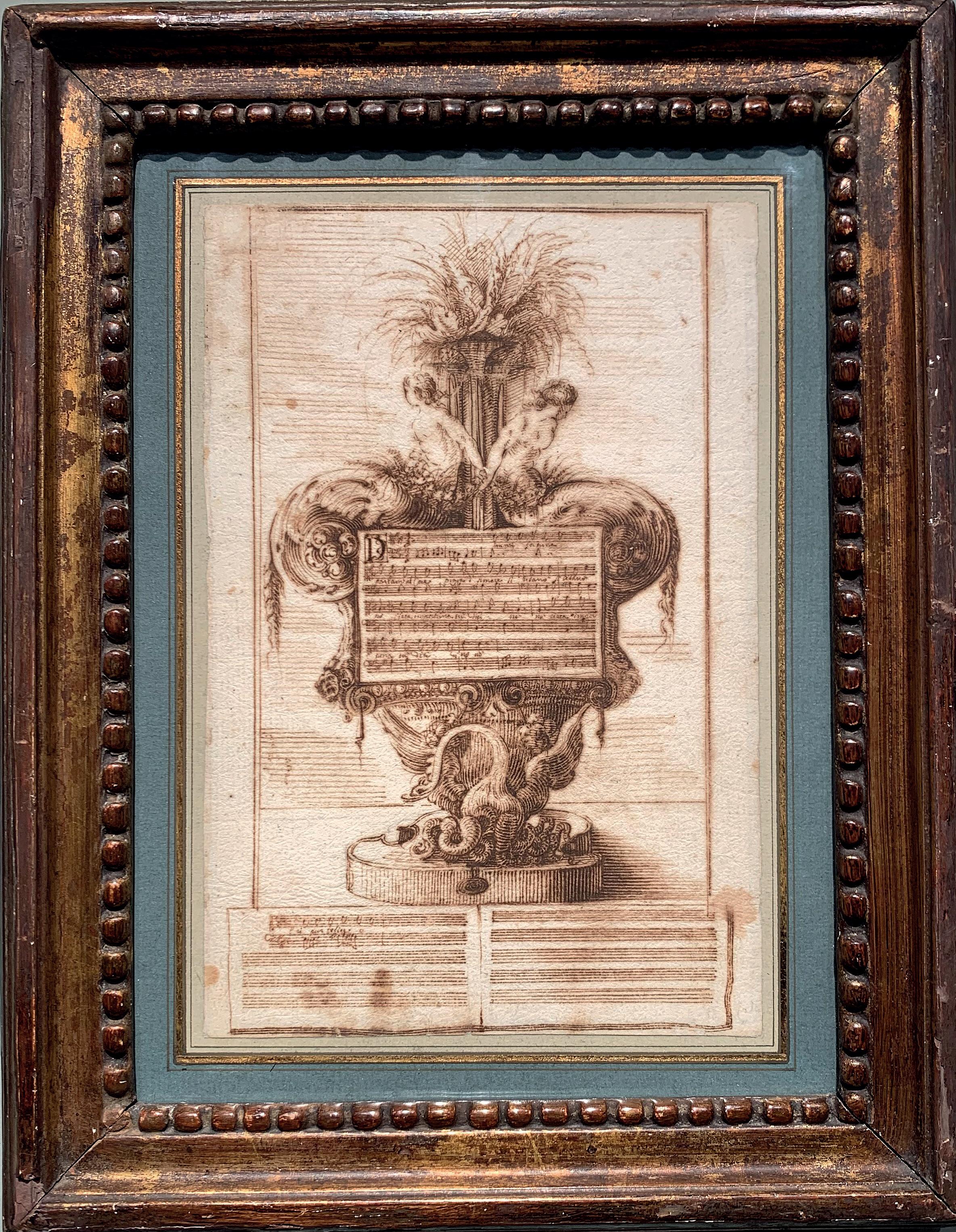
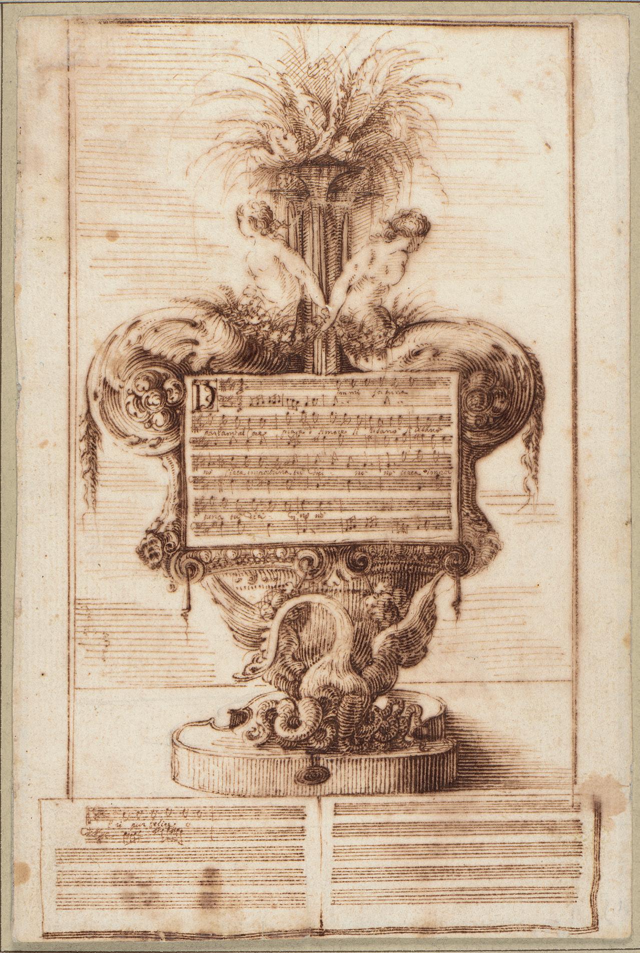
DOMENICO PIOLA
Genoa 1627-1703 Genoa
Study for a Ceiling Fresco with the Fall of the Rebel Angels
Pen and brown ink and brown wash, over an underdrawing in black chalk. 296 x 398 mm. (11 5/8 x 15 5/8 in.)
PROVENANCE: Anonymous sale, Milan, Sotheby’s, 12 June 2006, lot 53.
Working almost exclusively in his native Genoa, Domenico Piola can be counted among the most important and influential artists active in Liguria in the second half of the 17th century. He became the leading member of a local artistic dynasty in Genoa, and one of the most sought-after decorative fresco painters in the city. Indeed, the 18th century art historian Carlo Giuseppe Ratti, in his biography of the artist, notes that there were so many houses in Genoa decorated by Piola that it would be too tiring to list them all (‘son tanti di stancare qualunque penna’). Over a fifty-year career, Piola produced large-scale fresco decorations for numerous churches, palaces and villas in and around Genoa and elsewhere in Liguria. He occasionally collaborated with Valerio Castello, for example in frescoes in the churches of Santa Marta and Santa Maria in Passione, until the latter’s death in 1659, when he took over some of Castello’s unfinished commissions, notably the fresco decoration of the Palazzo Balbi-Senarega. Piola was also a gifted painter of easel pictures and altarpieces. As has been noted of the artist, ‘Piola developed a pictorial language grounded in solid draftsmanship and a precise rhetoric of gesture, resulting in a style that was almost as classicizing as it was baroque. His many canvas paintings from midcentury onward were of such quality and consistency that their style would be transmitted with little change to his numerous followers.’1
After the great plague of 1656-1657, in which nearly half of Genoa’s population perished, Piola became one of the most prominent and successful artists in the city. In the 1660s he worked as a fresco painter in the Palazzo Pantaleo Spinola and the churches of San Siro, Santi Gerolamo e Francesco Saverio and Santa Maria in Passione. At the height of his career, Piola was the undisputed leader of the Genoese school. The 1670s and 1680s mark the peak of his activity as a frescante in Genoa, although the French naval bombardment of the city in May 1684 led to the destruction of much of his work in several Genoese churches and palaces. (Piola’s frescoes in the monastery church of Santa Maria in Passione were similarly destroyed during the aerial bombardment of Genoa in 1942 and 1944, during the Second World War.) The rebuilding of many buildings in Genoa after 1684 provided numerous opportunities for Piola and his son-in-law Gregorio de Ferrari to paint decorative fresco cycles, and the two artists sometimes worked side by side, such as at the Villa Balbi dello Zerbino. Piola’s career as a fresco painter culminated in the allegorical ceiling frescoes of Autumn and Winter in the Palazzo Brignole-Sale (now the Palazzo Rosso), painted between 1687 and 1688. Among the most important commissions of his late years was the extensive fresco decoration of the Genoese church of San Luca, completed around 1695. Piola supervised a large and busy studio, known as the ‘Casa Piola’, which included his three sons Paolo Gerolamo, Giovanni Battista and Anton Maria. He left a significant body of work and, with the Casa Piola active until the 1760s, his influence remained paramount in his native city for many years after his death.
Domenico Piola was one of the most prolific Genoese draughtsmen of the 17th century, despite the fact that many of his drawings were destroyed in a fire in his studio caused by the bombardment of the city in 1684. (As such, a large number of the artist’s numerous surviving drawings can be dated to the last two decades of his career.) Many of his finished drawings seem to have been made for the collector’s market, or sometimes as designs for engravings, although other sheets were probably retained in the studio for the use of his pupils and followers. Piola’s facility as a draughtsman was described by his biographer Ratti, who notes that the artist ‘used to spend the whole evening drawing at the small table, setting down ideas on paper in pen with light shading in bistre...the facility of this method of drawing came no less easily to him than that of painting. Hence he made so many drawings that besides the largest number destroyed by a fire in his house and apart from those in the possession of foreigners and other painters in the
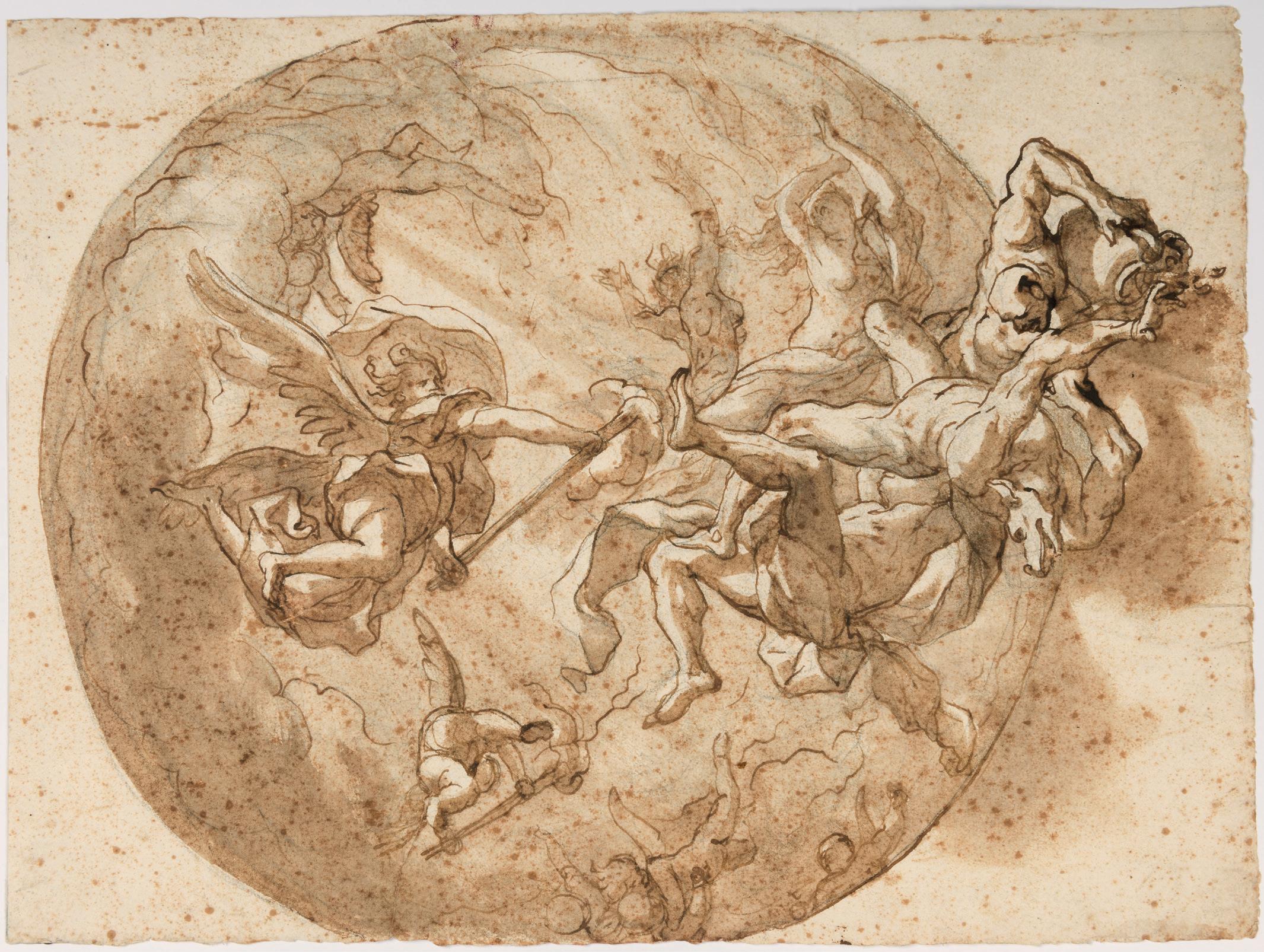
city, his heirs preserved more than four thousand of them. And the wonder is that in such a copious number, one never encounters in any one example an invention similar to others already executed by him.’2
A significant number of compositional drawings for ceilings by Domenico Piola are known, most of which are related to his work as a fresco painter. The present sheet may be a first idea for part of Piola’s cupola fresco of The Coronation of the Virgin and the Fall of the Rebel Angels in the dome of the small Genoese church of San Luca3. Piola began working in the church in 1681 and was eventually tasked by the Spinola family, which owned the church, with frescoing almost the whole of the interior. As Raffaella Besta has noted of the San Luca commission, for which several preparatory drawings are known, ‘The abundant surviving drawings document a complex preparatory process and demonstrate that Domenico acted as designer and director, as he did in the other major projects of the Casa Piola. Such systematic and detailed studies helped guide his numerous collaborators.’4 Aided by his son Paolo Gerolamo Piola and a large team of assistants, including the quadraturista Anton Maria Haffner, Piola completed the project in 1695. The San Luca frescoes may be regarded as the most complex and accomplished of Piola’s surviving fresco cycles.
According to the 19th century art historian Federigo Alizeri, Piola received the commission to decorate the cupola of San Luca in 1690 and was paid the sum of 15,000 lire to do so. As the late Mary Newcome Schleier has described the composition of the cupola fresco, ‘The band of figures surrounding the Coronation [of the Virgin] bends around to join with an area in the cupola that is less densely populated, less noticed by scholars, but which involves the drama of [Saint] Michael vanquishing the demons (fig.1)…A foreshortened putto riding the lantern edge directs attention to Michael, just as the rays of light from Paradise beam down from the lantern onto the Coronation figures. Two angels on clouds on the right of Michael and an elegant group of angels and putti on the left add to the brilliance of the flying forms.’5
Among comparable drawings by Piola is a very similar oval design for a ceiling, depicting Athena, Justice and other allegorical figures, that was sold at auction in London in 19836. Also similar is a quatrefoil drawing of The Triumph of the Church, formerly in the Brooke collection7, which appeared at auction in Paris in 2004 alongside a somewhat comparable Study for a Vault Decoration with the Immaculate Conception, God the Father and Prophets, now in the Blanton Museum of Art in Austin, Texas8. Another analogous work is a drawing for a quatrefoil ceiling composition of The Angel Appearing to Saint Joseph sold at auction in 19719.
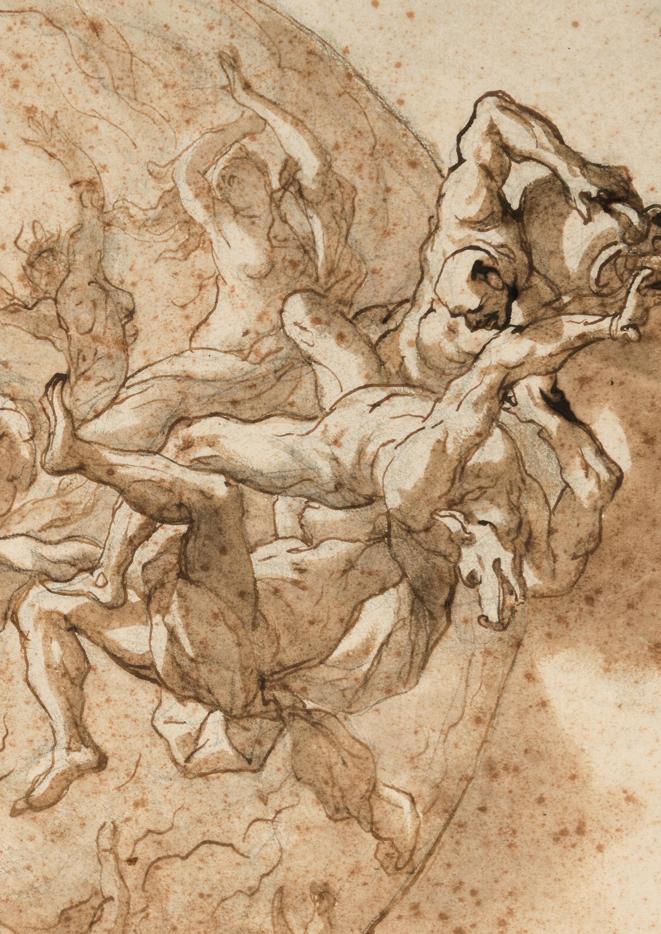
Attributed to THOMAS BLANCHET
Paris c.1614-1689 Lyon
A Design for a Funerary Monument or Catafalque
Pen and brown ink, with brown, grey, red and green wash and touches of white bodycolour. Numbered 2 in brown ink at the upper right. Inscribed V (or P?):10 in brown ink at the lower left and p: 9.5 0 in brown ink at the lower centre.
421 x 267 mm. (16 5/8 x 10 1/2 in.)
PROVENANCE: Lucien Solanet, Paris; His anonymous sale (‘Collection d’un grand amateur: Succession de Monsieur X.’), Paris, Hôtel Drouot [Piasa], 27 March 2008, lot 33.
An architect, sculptor and painter, Thomas Blanchet was trained in the Parisian studio of Simon Vouet and spent a number of years in Rome, between 1647 and 1653. There he produced designs for monuments and decorations for festivals and important public events. On his return to France, Blanchet chose to settle not in Paris but in his native Lyon, where he was soon established as one of the leading painters in the city. Between 1655 and 1672 he directed the extensive decoration of the town hall in Lyon, unfortunately destroyed by fire in 1674. In later years Blanchet contributed to the adornment of several Lyonnais buildings, notably the Abbey of the Dames de Saint-Pierre, on which he worked between 1675 and 1684, and the Palais de Justice, completed in 1687. A founder member of the Académie de Peinture et de Sculpture in Lyon in 1676, he painted canvases for several churches in the city and also designed ephemeral decorations for festivals and ceremonial occasions.
As Jennifer Montagu has noted, ‘It is [the] frankly baroque character of his work that makes Blanchet so interesting a phenomenon in the French art of the seventeenth century. In the provinces, in a city which had long served as a meeting-place on the route between Paris and Italy, a member of the Académie Royale de Peinture et de Sculpture could practise a style far removed from the orthodoxy of the capital…this provincial existence at the same time allowed them a greater freedom to develop in their individual ways, and their originality adds a variety and richness to the texture of French seventeenth century art.’1
This large and striking sheet is a design for a tomb or funerary monument, with angels supporting a crowned sarcophagus, flanked by skeletons as caryatids, and the whole surmounted by an oval portrait of the deceased personage. Only half of the decorative scheme is shown, since presumably many of the same motifs would be repeated at the left side, although the artist has presented variant designs for the arrangement of the candelabra. As Peter Fuhring has noted, ‘Elaborate funerary monuments…were in effect beds of state in a church on which to expose the bodies of the deceased or their coffins, surrounded by allegorical figures, inscriptions, arms, emblems of honour, candlesticks etc.’2
During his career, Blanchet designed a number of ephemeral decorations, as well as at least three tombs or funerary monuments. Indeed, one of his earliest datable projects was a proposed design for a mausoleum for René Voyer de Paulmy d’Argenson, the French ambassador to Venice, intended for the Venetian church of San Giobbe. (Executed in 1652, Blanchet’s drawing is today in the Bibliothèque Nationale in Paris3.) Another design by Blanchet for a monument to the Maréchal Nicolas de Villeroi, executed in 1686, is only known today from written descriptions and an anonymous drawing reproducing the finished work4. Two drawings of designs for monuments by Blanchet, now lost, are recorded in the possession of the 19th century collector Philippe de Chennevières5
A large and significant group of drawings by Blanchet, in the Nationalmuseum in Stockholm, includes a number of pen and ink studies of angels and allegorical figures that are stylistically similar to those in the present sheet6. Also somewhat comparable is a large-scale study for the decoration of an apse in the Louvre7, as well as an equally large and elaborate design for a ceiling decoration in pen and watercolour, attributed to Blanchet, which is likewise in the Louvre8.
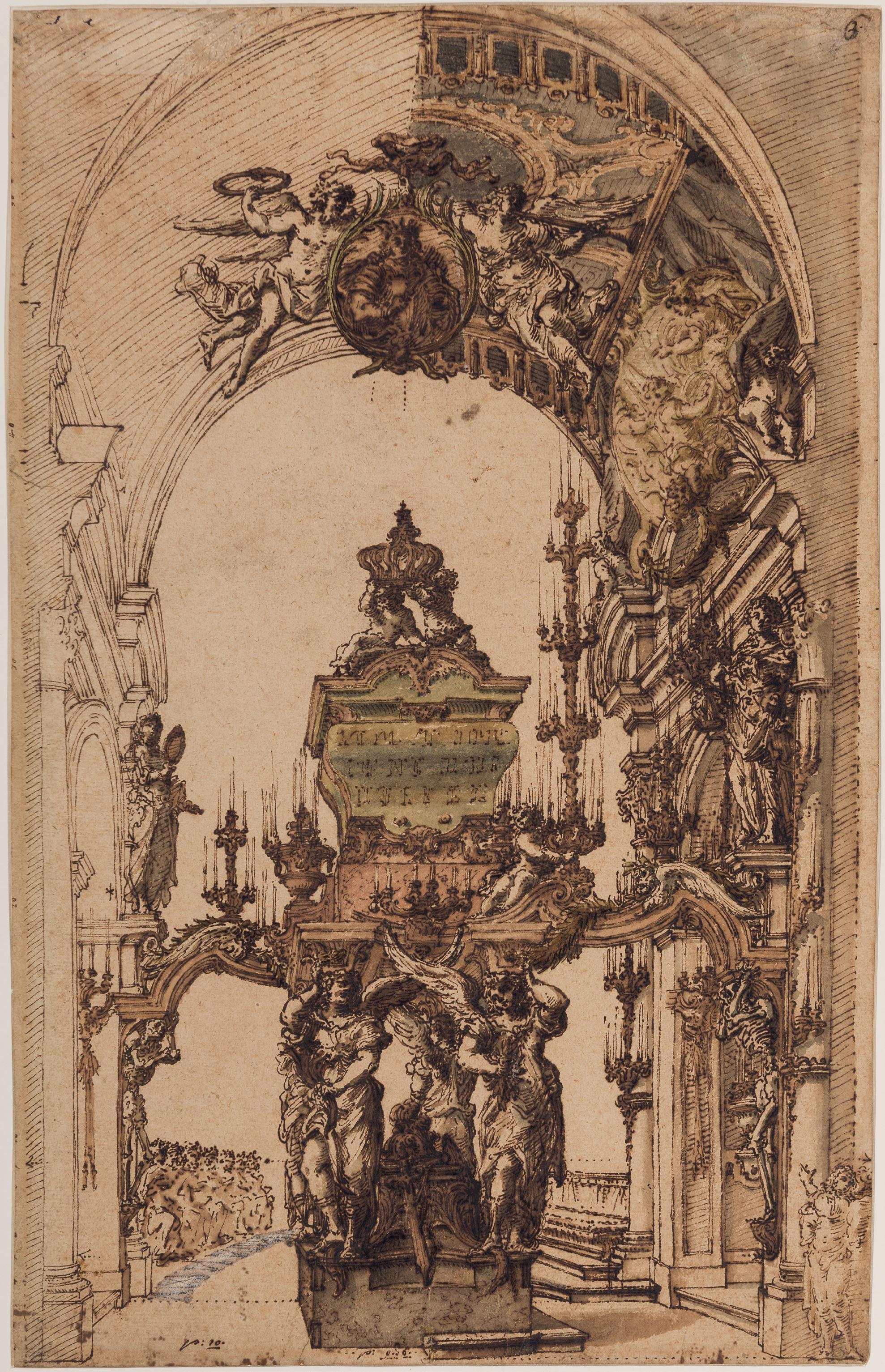
GIOVANNI BATTISTA TIEPOLO
Venice 1696-1770 Madrid
A Design for an Elaborate Vase with Allegorical Figures
Pen and black ink, over an underdrawing in black chalk. Several studies of decorative mouldings, numbered between 1 and 18, drawn in black ink over black chalk on the verso. 281 x 202 mm. (11 1/8 x 8 in.)
PROVENANCE: Giancarlo Baroni, Florence and Crans-Montana; His posthumous sale, New York, Sotheby’s, 30 January 2013, lot 107; Anonymous sale, Paris, Christie’s, 25 March 2015, lot 110.
LITERATURE: Bernard Aikema, ‘Some Early Drawings by Giambattista Tiepolo’, Master Drawings, Winter 2004, pp.365-367, figs.6-7.
The leading painter in Venice for much of his career, Giambattista Tiepolo was also one of the finest Italian draughtsmen of the 18th century. This is a rare youthful work by the artist, by whom relatively few drawings survive from the beginning of his independent career. Like many of Tiepolo’s drawings from the initial phase of his activity – between 1715, when he painted his earliest known work, and 1731, when he undertook his first commission outside the Veneto – the present sheet is characterized by strong pen hatching. Little is still known of Tiepolo’s draughtsmanship between 1715 and 1725, however, largely due to the paucity of drawings from this important formative period. Indeed, only around two or three dozen early drawings by the artist survive today, only a few of which may be connected with paintings or print designs of the period.
Datable to the beginning of the 1720s, the present sheet was first published by the scholar Bernard Aikema in 2004. As he wrote, ‘another drawing executed in the hatched pen technique over a sketch in black chalk, again, typical of the early 1720s, shows an ornamental vase, exuberantly decorated with various motifs, including male nudes in various poses…This design for a vase is a rare early example of a subject the artist would return to more often in the 1730s and 1740s.’1 Aikema further points out that the large ornamental vase in this drawing is similar to that found in Tiepolo’s monumental canvas of Massiva Before Scipio Africanus (fig.1) of c.1719-1721, in the Walters Art Museum in Baltimore, Maryland2. The decorative motifs and patterns drawn in black ink on the verso of the present sheet can likewise be related to those found on the steps of the base of Scipio’s throne in the same painting3. As Aikema suggests, therefore, it would seem reasonable to regard this drawing as a preparatory study for the Baltimore picture.
The nude male figures flanking the vase in this drawing are akin to those found on a sheet of figure studies by the young Tiepolo in the Wallraf-Richartz Museum in Cologne4. Several drawings of similar decorative vases by Tiepolo, although probably somewhat later in date, are in the Museo Civico Sartorio in Trieste5
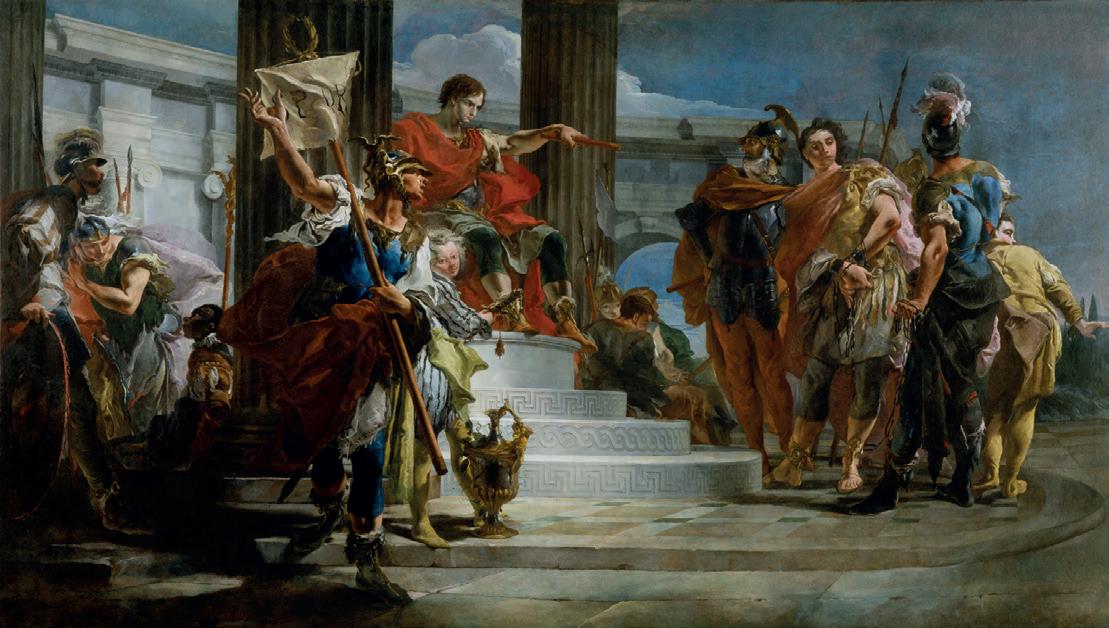
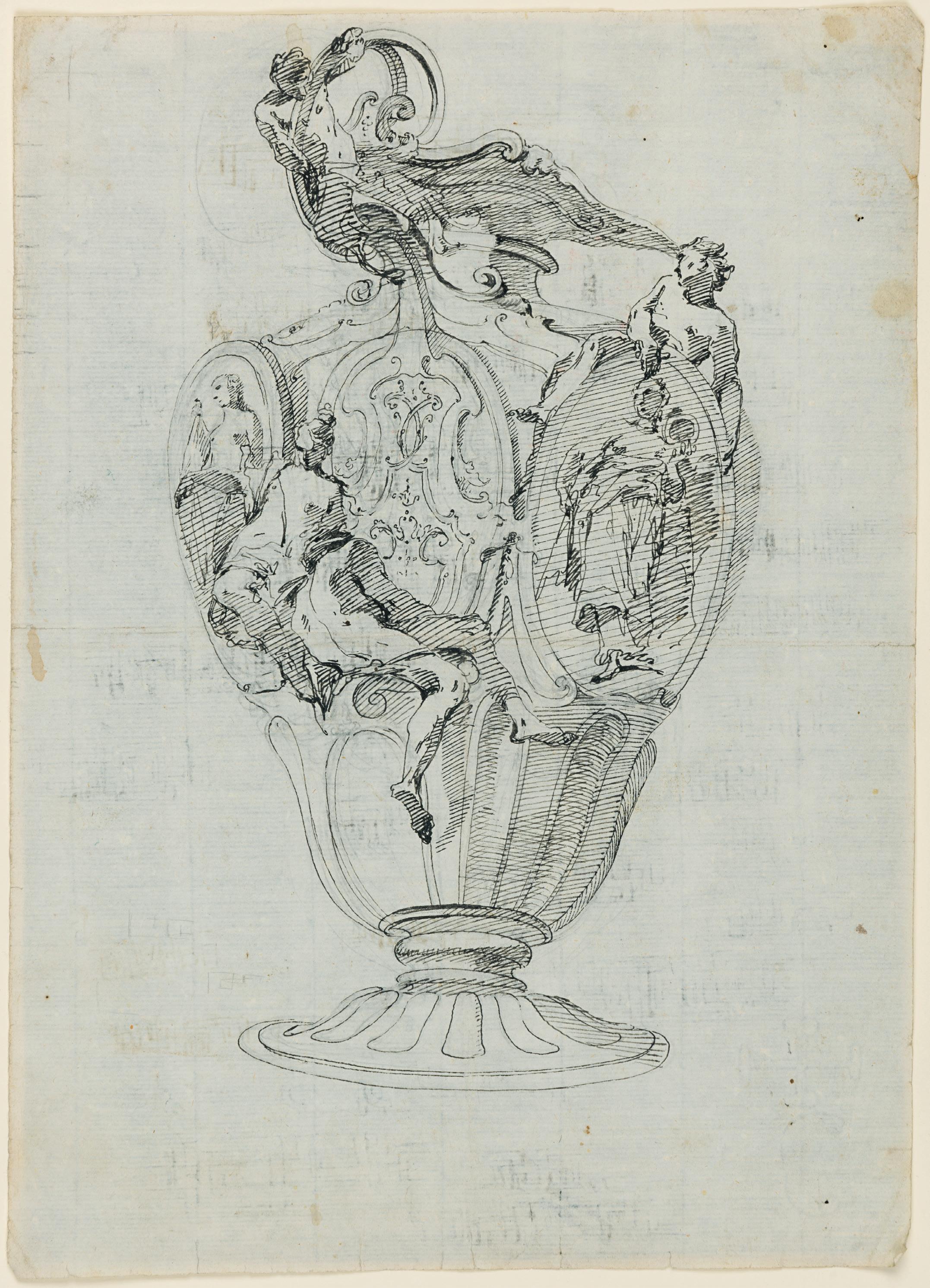
EDME BOUCHARDON
Chaumont-en-Bassigny 1698-1762 Paris
Design for an Elevation of a Chapel or Church
Black chalk. Inscribed module with a scale in pencil at the bottom. Laid down on a full Mariette mount, inscribed EDMUNDI / BOUCHARDON in black ink in a cartouche at the bottom. Further inscribed (by Eggimann) Montage de Mariette / 120- and Collection Rodrigues / par Edme Bouchardon / 1698-1762 on the reverse of the mount.
267 x 287 mm. (10 1/2 x 11 1/4 in.) [sheet]
521 x 408 mm. (20 1/2 x 16 in.) [mount]
Watermark: A fleur-de-lys within two circles with a V above.
PROVENANCE: Pierre-Jean Mariette, Paris (on his mount); His sale, Paris, Hôtel d’Aligre [F. Basan], 15 November 1775 - 30 January 1776, probably part of lot 1151 (‘Quinze sujets divers, dessinés à Rome, d’après plusieurs monuments anciens qui y existent.’, sold for 26 livres to the Abbé de Tersan); Probably Charles-Philippe Campion, Abbé de Tersan, Paris; Eugène Rodrigues, Paris; His sale, Paris, Hôtel Drouot [Lair Dubreuil], 25-26 February 1929, part of lot 138 (‘Tombeau du Pape Clément XI.Partie de façade d’un palais. 2 dessins à la mine de plomb. Montures de P.J. Mariette…H. 265 – L. 285’); Charles Eggimann, Geneva and Paris; Nicolas Schwed, Paris, in 2018.
LITERATURE: Pierre Rosenberg, Les dessins de la collection Mariette: École française, Milan, 2011, Vol.I, p.95, p.108, under no.F 357; Pierre Rosenberg, Les dessins de la collection Mariette: Écoles flamande, hollandaise et allemande, Madrid and Paris, 2022, Vol.II, p.478, illustrated under nos.F929 to F943 (as location unknown).
EXHIBITED: Paris, Nicolas Schwed, Dessins anciens et du XIXe siècle, 2018, no.15.
One of the most significant French sculptors of the 18th century, Edme Bouchardon was a pupil of Guillaume Coustou and won the Prix de Rome for sculpture in 1723. He spent the next nine years in Rome, receiving commissions for sculptures and portrait busts from British and French visitors to the city, and was admitted to the Roman Accademia di San Luca in 1732. He was also involved in several significant sculptural projects and competitions during his time in Rome, notably the design for the tomb of Pope Clement XI in St. Peter’s and that of the Trevi Fountain. Bouchardon returned to Paris in 1732 and in 1736 was appointed draughtsman to the Académie des Inscriptions et Belles-Lettres, with an annual income of 1,000 livres. Over the course of the next twenty-five years, from 1737 until a few months before his death, Bouchardon provided a large number of designs for both medals and tokens to be executed by various graveurs-médailleurs for the Royal Mint. Admitted into the Académie Royale in 1745, Bouchardon obtained prestigious Royal and public commissions throughout his later career - notably the Fountain of the Four Seasons on the rue de Grenelle in Paris and an equestrian monument to Louis XV, which stood on the Place de la Concorde until the Revolution - and his fame and reputation as a sculptor was unrivalled in the 18th century.
Bouchardon was regarded by connoisseurs, collectors and fellow artists as one of the finest draughtsmen of his day. He was as well known for his drawings as for his sculptural works and indeed chose to exhibit both sculptures and finished drawings (mainly historical and allegorical subjects, as well as portraits) at the annual Salons. Bouchardon worked almost exclusively in red chalk, and while many of his drawings were intended as preparatory studies for his sculptural projects, many more were done as independent works. That his drawings were greatly admired by his contemporaries is seen in the comments of the artist Charles-Nicolas Cochin, who described Bouchardon as ‘certainly the greatest sculptor and the
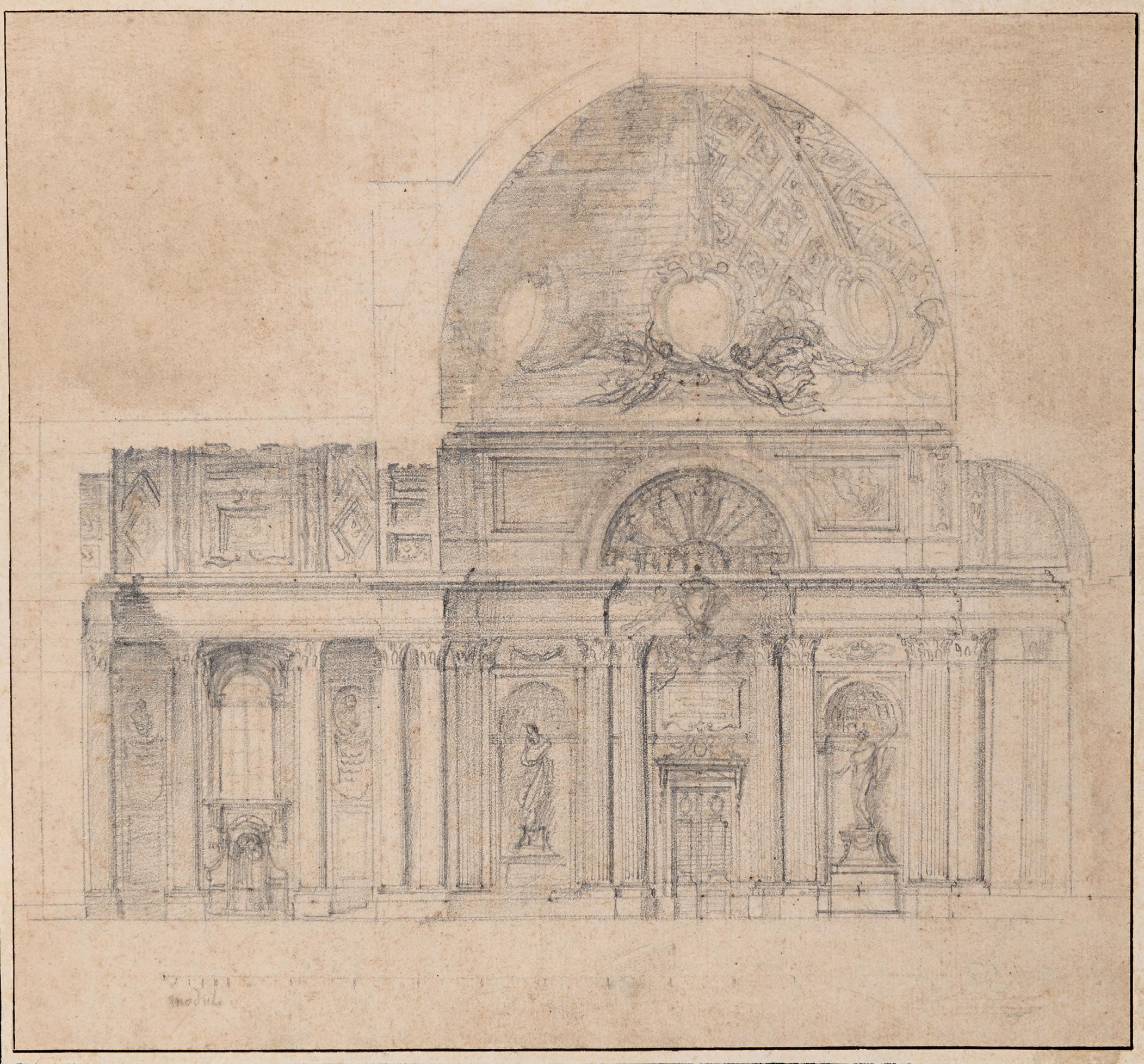
best draughtsman of his century.’1 The 18th century collector and connoisseur Pierre-Jean Mariette likewise rated Bouchardon very highly as a draughtsman and assembled the largest private collection of his drawings, which included the present sheet, while painters as François Boucher, Jean-Baptiste Deshays, Charles-Joseph Natoire and Jean-François de Troy all owned drawings by the artist. Around two thousand drawings by Bouchardon survive today, of which by far the single largest group –numbering around 1,300 sheets, mostly acquired by bequest from the artist’s descendants – is today in the Louvre.
Drawn during Edme Bouchardon’s time in Rome, the present sheet is a proposed design for an unidentified chapel or church, in which the artist seems to have included two different options for the vaulted dome. The use of black chalk, instead of the red chalk that Bouchardon preferred for almost all of his drawings, is a characteristic of 18th century architectural draughtsmanship, since it allowed for revisions and corrections to be made more easily. The artist also used black chalk for a handful of drawings of copies of other sculptor’s works2
Bouchardon’s extensive corpus of drawings includes very few architectural studies, such as a sketchy design in red chalk for the Trevi Fountain in Rome, today in a private collection3. That the artist was nevertheless capable of such ambitious architectural projects as seen in the present drawing is evident in the fact that his proposed plan for the renovation of the Trevi fountain in Rome involved the reconstruction of much of the building behind the fountain itself.
The present sheet once belonged to the celebrated connoisseur Pierre-Jean Mariette (1694-1774) and remains on his distinctive blue mount, although it does not bear his collector’s mark. Mariette was one of Bouchardon’s closest friends and most fervent admirers and also became the foremost collector of his drawings. As Mariette recalled of Bouchardon, ‘during his lifetime, he had distributed practically all of [his drawings] to his friends, and especially to me, as I have the greatest number of them.’4 Mariette came to own well over seven hundred drawings by the artist, which were dispersed at auction some two years after his death. At the Mariette sale the present sheet was likely to have been part of a lot of fifteen drawings by Bouchardon acquired by one of the major buyers at the auction, the engraver and collector Abbé Charles-Philippe Campion de Tersan (1736-1819).
A later owner of this drawing was the Parisian solicitor Eugène Rodrigues (1853-1928). Along with Etienne Moreau-Nélaton, Walter Gay and other connoisseurs, Rodrigues was a founder member of the Société de Reproduction des Dessins de Maîtres in 1909. His large collection of drawings dating from the 15th to the 19th centuries, which included numerous architectural and ornamental studies, was dispersed at several auctions in Paris in the 1920s. At one of the sales of Rodrigues’s collection in 1929 the present sheet was paired with another drawing by Bouchardon; a study in black chalk for the tomb of Clement XI. This drawing was acquired, probably at the 1929 sale, by the Genevan bookseller, publisher and art historian Charles-Jean Eggimann (1863-1948), who had settled in Paris in 1905. Eggimann’s collection, like that of Rodrigues, included a large number of ornamental and decorative drawings.
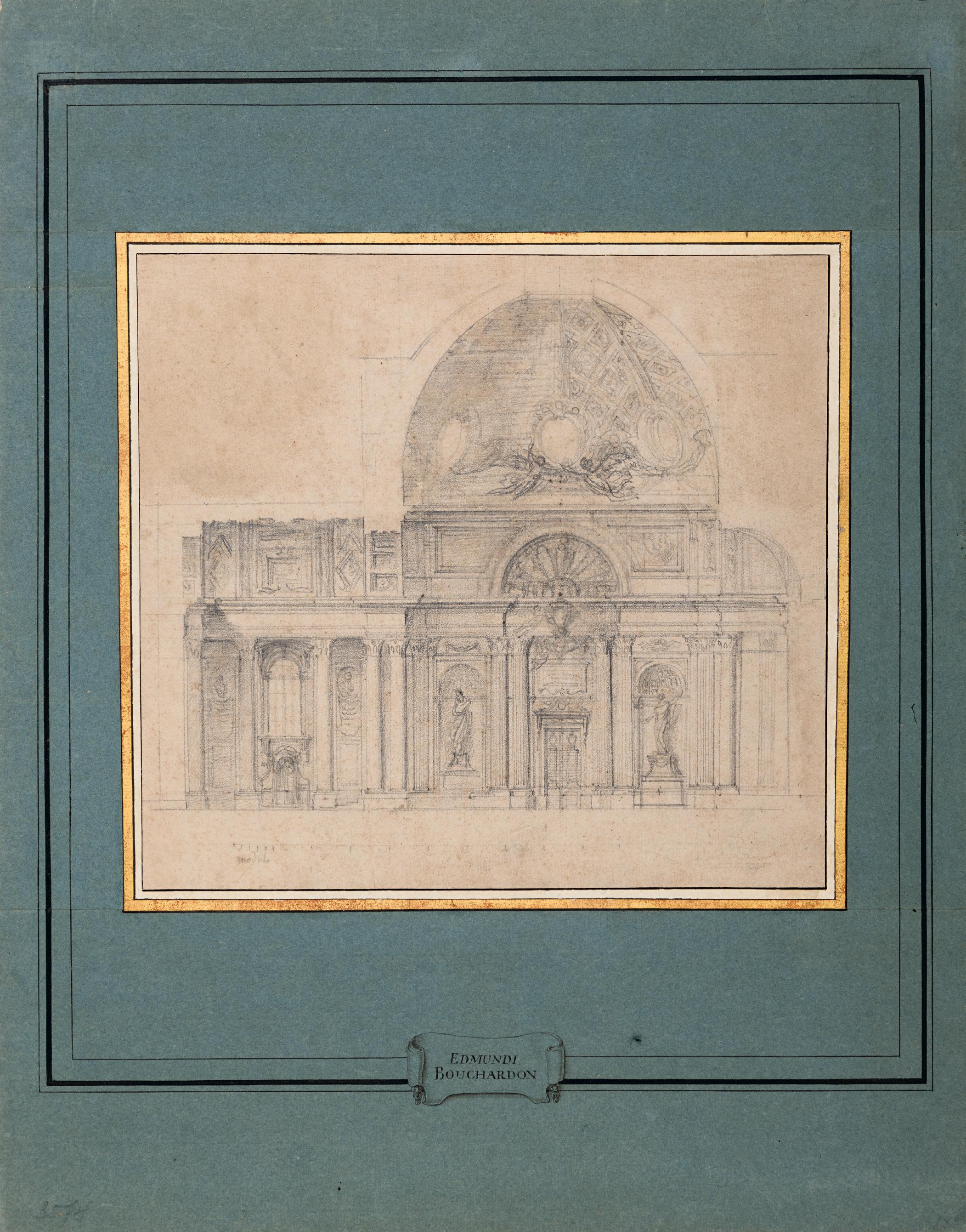
JACQUES-FRANÇOIS
BLONDEL
Rouen 1705-1774 Paris
a. Design for a Keystone with the Head of Flora Red chalk. The sheet hinged onto part of an album page. 169 x 226 mm. (6 5/8 x 8 7/8 in.)
b. Design for a Keystone with the Head of Mars and Attributes of War Red chalk. The sheet hinged onto part of an album page, numbered 15 in brown ink. 207 x 228 mm. (8 1/8 x 9 in.)
PROVENANCE: Armin B. Allen, Inc., New York and Hobhouse Ltd., London, in 1986; Private collection.
EXHIBITED: New York, Armin B. Allen, Inc. and Hobhouse Ltd., An Exhibition of Ornamental Drawings 1520-1920, 1986, nos.27 and 29.
One of the leading architects and theorists of the second half of the 18th century in France, JacquesFrançois Blondel was also, in the words of the late Alastair Laing, ‘an extraordinarily accomplished and delicate draughtsman of ornament.’1 A pupil of his uncle Jean-François Blondel and Gilles-Marie Oppenord, Blondel was tasked with writing many of the entries on architecture for Denis Diderot’s Encyclopédie, and also published several treatises of his own, notably L’architecture françoise in the 1750s and Cours d’architecture, which appeared in the 1770s. In 1746 Blondel established a private École des Arts, where among the teachers was the young Gabriel de Saint-Aubin, and in 1762 was appointed to a professorship of architecture at the Académie Royale. In both his teaching and in his later writings, as Mary Myers has pointed out, Blondel ‘strongly promoted the primacy of French classical architecture of the previous century…In championing French classicism in these works published from the 1750s on, he inveighed mightily against the Rococo and the work of Nicolas Pineau, [Jacques de] Lajoüe…and [Juste-Aurèle] Meissonier…whom he saw as the creators of the genre pittoresque and thus as subverters of the great French classical tradition.’2
Despite his later pronouncements, however, the particular influence of the Rococo can be seen in much of Blondel’s earlier work, notably the illustrations for his book De la distribution des maisons de plaisance et de la decoration des édifices en general, published in two volumes in 1737 and 1738. A guide to the construction, decoration and ornamentation of country houses and their gardens, the Maisons de plaisance and the ornamental designs depicted within it, illustrated in the form of engravings by Blondel himself, proved highly successful and influential. As Laing has noted, Blondel was ‘by aptitude a draughtsman and engraver perfectly attuned to the balanced symmetry of rocaille ornament’3 and his drawings for the Maisons de plaisance are fine examples of this.
Datable to c.1730-1735, this pair of drawings, as well as the following three sheets, are preparatory studies for engraved illustrations in Blondel’s De la distribution des maisons de plaisance et de la decoration des édifices en general. The first of these drawings appears on the lower half of plate 37 of the second volume, captioned TÊTE DE FLORE DANS UN CARTEL Formant le Claveau d’un Porte decorée de son bandeau. As Alastair Laing has pointed out, the head of Flora in this drawing is inspired by a similar design by the Rococo sculptor, woodcarver and ornémaniste Nicolas Pineau (1684-1754) for one of the rocaille ornaments above the doors of the Hôtel Mazarin in Paris4
The keystone drawing of Mars appears on the upper half of plate 38 of the second volume of the Maisons de plaisance, with the caption TÊTE DE MARS AVEC ATTRIBUTS DE GUERRE
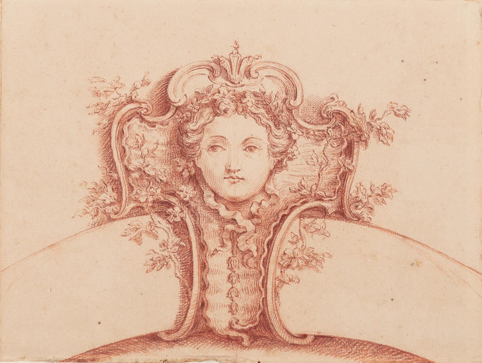
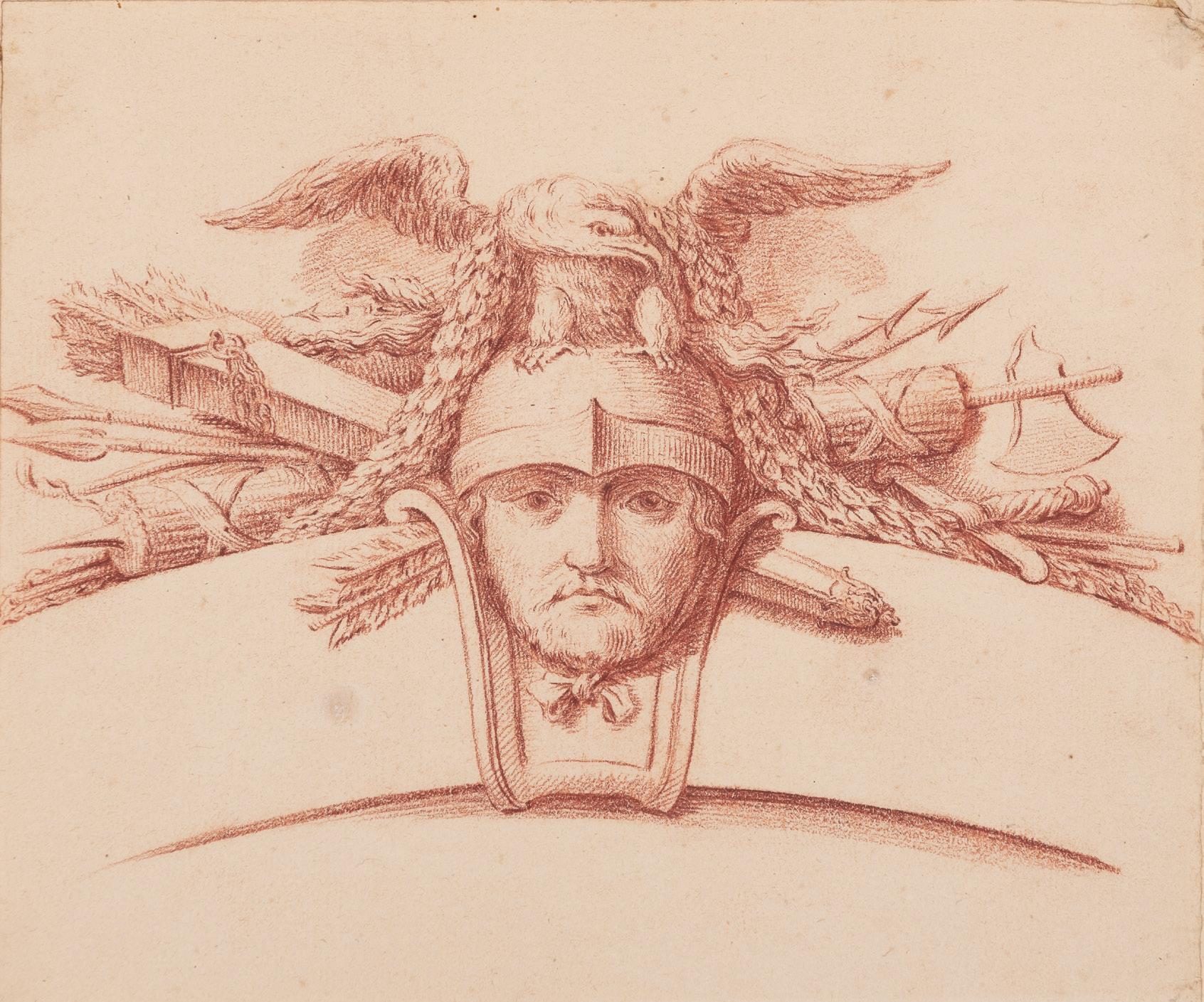
JACQUES-FRANÇOIS BLONDEL
Rouen 1705-1774 Paris
c. Design for the Crown of an Arch Representing Water with Aquatic and Marine Objects
Red chalk. The sheet hinged to an album page, numbered 23 in brown ink. 228 x 298 mm. (9 x 11 3/4 in.)
d. Design for a Keystone with the Head of a River God
Red chalk. The sheet hinged onto part of an album page, numbered 29 in brown ink. 193 x 224 mm. (7 5/8 x 8 3/4 in.)
e. Design for a Keystone with the Head of Diana and Attributes of the Hunt
Red chalk. The sheet hinged onto part of an album page.
198 x 230 mm. (7 3/4 x 9 in.)
PROVENANCE: Armin B. Allen, Inc., New York and Hobhouse Ltd., London, in 1986; Private collection.
EXHIBITED: New York, Armin B. Allen, Inc. and Hobhouse Ltd., An Exhibition of Ornamental Drawings 1520-1920, 1986, nos.35, 28 and 30, respectively.
All three of these drawings are datable to the first half of the 1730s and are studies for illustrations in the second volume of Jacques-François Blondel’s De la distribution des maisons de plaisance et de la decoration des édifices en general, published by Charles-Antoine Jombert in Paris in 1738. The first image appears on the lower half of plate 43, grouped with three other trophies representing Water, Air and Earth, and the plate is captioned TROPHEE REPRESENTANT L EAU Servant de Claveau à une croisée Bombée. The second image, depicting the head of a river god, appears on the upper half of plate 37 (fig.1), signed B inv. et f. and captioned TÊTE DE FLEUVE DANS UN CARTEL Servant de Claveau a un Arcade ornée de son Archivolte. The third drawing, with the head of Diana, appears on the lower half of plate 38, captioned TÊTE DE DIANE AVEC ATTRIBUTS DE CHASSE
Other red chalk studies by Jacques-François Blondel for the Maisons de plaisance, sharing the same later provenance as this group of drawings, are in the Metropolitan Museum of Art in New York, while a number of related drawings in graphite are in the Musée des Arts Décoratifs in Paris5.
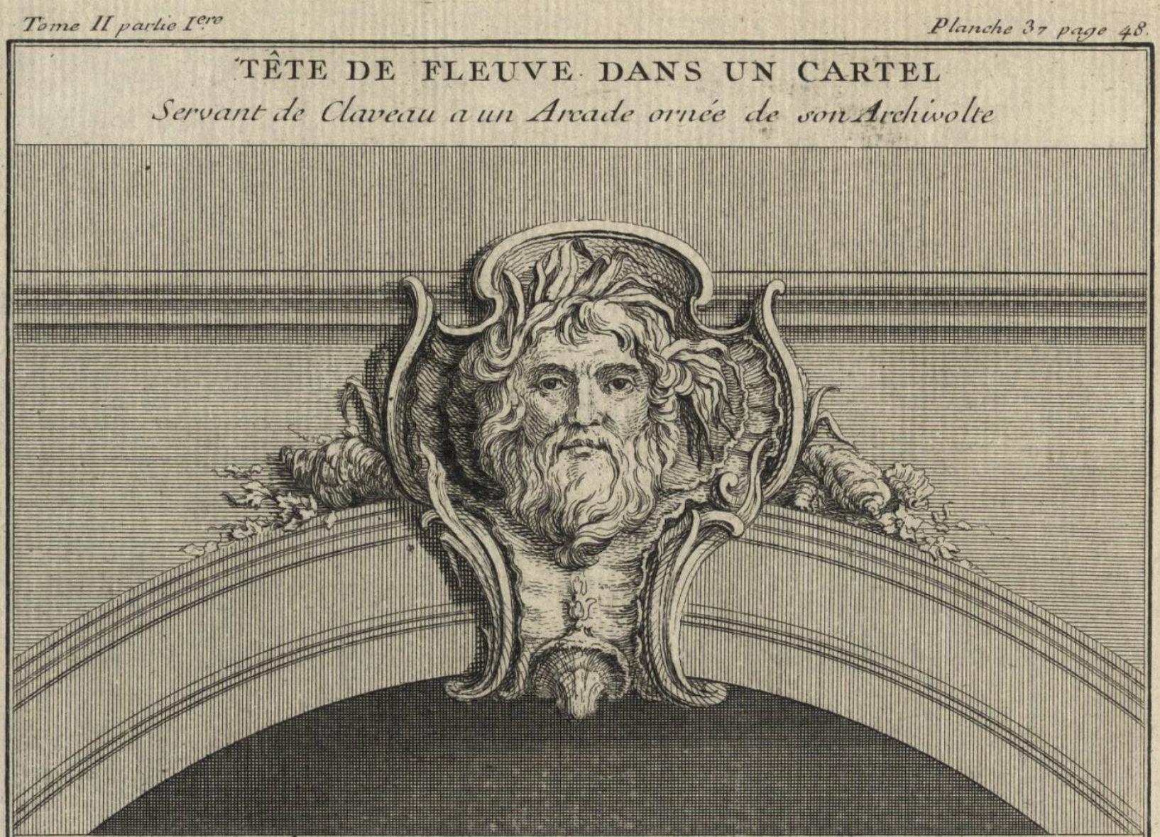
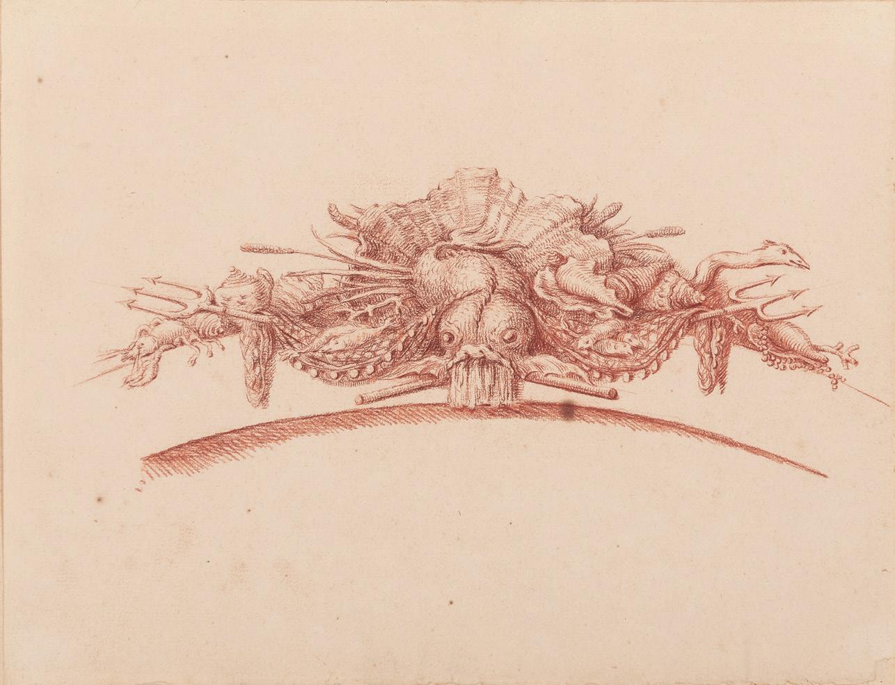
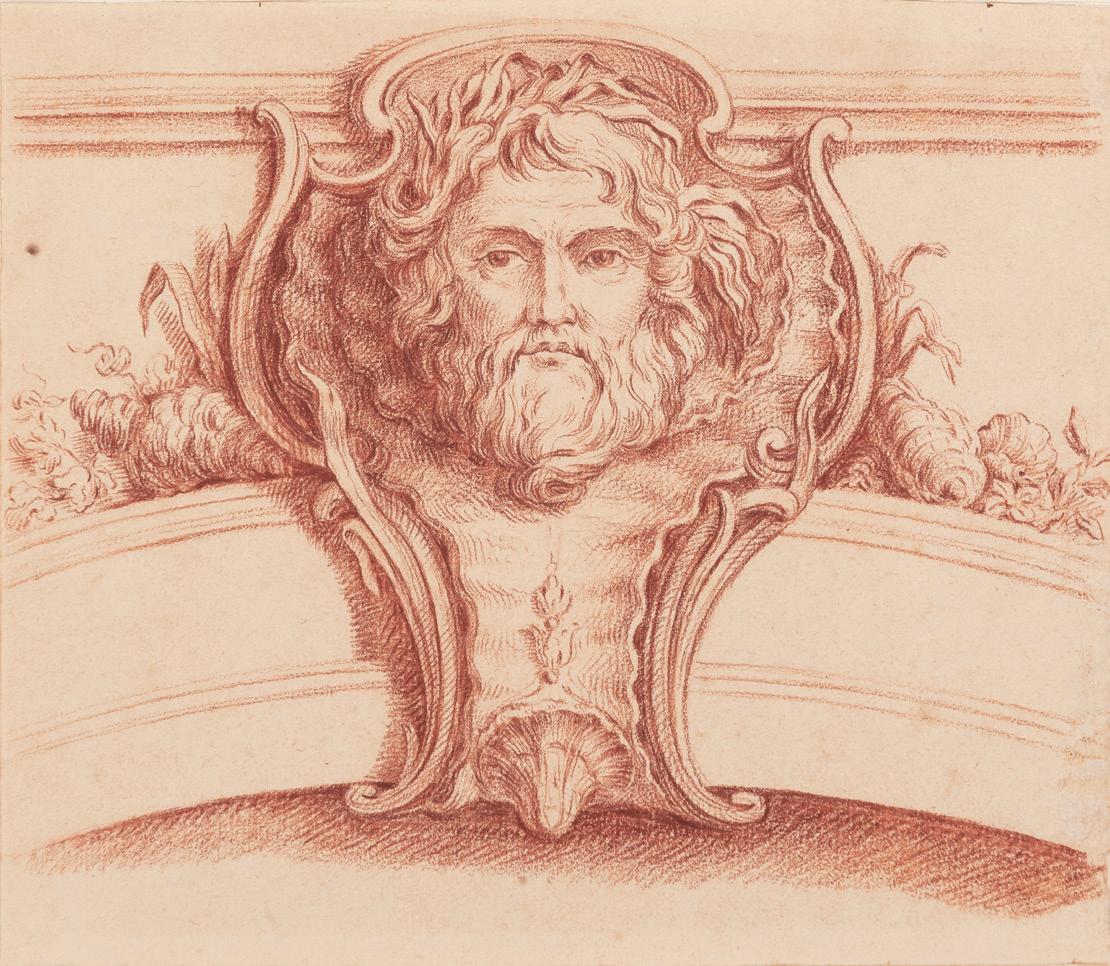
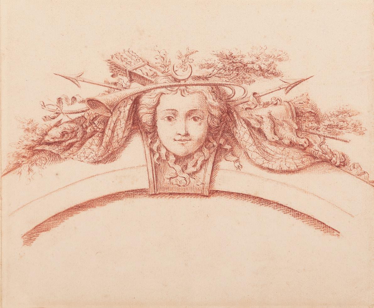
d.
c.
JOHANN WOLFGANG BAUMGARTNER
Ebbs 1702-1761 Augsburg
a. A Cellar
b. A Kitchen
Each pen and brush and grey ink and grey wash, heightened with white, on blue paper, within a fictive mount drawn with framing lines in black ink. The versos of each rubbed with red chalk for transfer. Both inscribed J: Holzer fecit. in brown ink on the old backing sheet.
a. 182 x 139 mm. (7 1/8 x 5 1/2 in.) [sheet]
b. 182 x 128 mm. (7 1/8 x 5 in.) [sheet]
PROVENANCE: Private collection, South Germany; Galerie Siegfried Billesberger, Munich, in 1995; Yvonne Tan Bunzl, London, in 1996; Private collection.
LITERATURE: Munich, Galerie Siegfried Billesberger, Johann Wolfgang Baumgartner: Zeichnungen, Munich, 1995, pp.12-14, nos.2 and 4, illustrated p.15; London, Yvonne Tan Bunzl, Master Drawings, 1996, unpaginated, nos.20-21; Gail S. Davidson, ‘Ornament of Bizarre Imagination. Rococo Prints and Drawings from Cooper-Hewitt’s Léon Decloux Collection’, in Sarah D. Coffin et al, Rococo: The Continuing Curve, 1730-2008, exhibition catalogue, New York, 2008, pp.70-71, figs.47-48.
EXHIBITED: Stanford, Stanford University, Cantor Center for Visual Arts, Classic Taste: Drawings and Decorative Arts from the Collection of Horace Brock, March-May, 2000; New York, Cooper-Hewitt, National Design Museum, Rococo: The Continuing Curve, 1730-2008, 2008; Boston, Museum of Fine Arts, Splendor and Elegance: European Decorative Arts and Drawings from the Horace Wood Brock Collection, 2009, nos.148-149.
Born near Kufstein in the Tyrol, Johann Wolfgang Baumgartner was one of the leading artists of the Rococo in Southern Germany. He began his career as a painter of hinterglasmalerei; a method of painting on the reverse of glass panels. After travelling as a journeyman in Italy, Austria, Hungary and Bohemia, Baumgartner settled in 1731 in Augsburg. At first he only worked as a Hinterglasmaler, achieving some measure of renown as the sole artist in the city working in the technique of reverse-glass painting. Although they were highly prized, however, very few of these precious works have survived. It was not until the early 1750s that Baumgartner began working in oil painting and fresco. His earliest known fresco dates from 1754, when he decorated the ceiling of the church of St. Jakobus in Gersthofen, for which he also painted several altarpieces. In 1756 he frescoed the Heilige Kreuz church in the village of Bergen, followed two years later by work in the Loretokirche in Augsburg. Established as one of the leading artists in Augsburg, Baumgartner painted numerous ceilings and frescoes for churches in Southern Germany, notably at Egenhausen, Bergen and Baitenhausen. He also worked in the garden pavilion of the Neue Residenz at Meersburg, on Lake Constance, although further work there was left unfinished by his death from tuberculosis in September 1761.
Baumgartner is best known today as a talented draughtsman and a designer of prints – ‘one of the most gifted designers for the print trade that Augsburg produced in a fertile period of graphic invention’1 – although unusually he does not seem to have worked as a printmaker himself. Around 220 of his drawings have survived, most of which served as designs for prints, book illustrations or calendars for the leading publishing houses in Augsburg. Baumgartner’s model drawings for engravings, often on blue paper, include allegorical, mythological and religious subjects, genre scenes, hunting themes and elegant pastoral subjects. As one scholar has noted, ‘[A] colourful blend of Christian and pagan themes, sacred and profane motifs, witty allegories and realistic genre scenes, is characteristic of Baumgartner’s entire drawn oeuvre…Baumgartner’s works impress with their wealth of ideas and innovations.’2

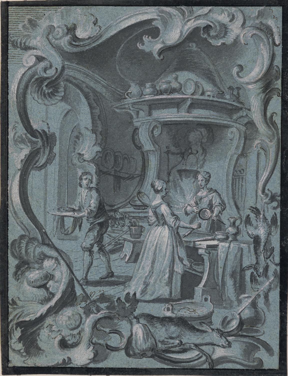
JOHANN WOLFGANG BAUMGARTNER
Ebbs 1702-1761 Augsburg
c. A Dining Room
d. A Bedchamber
Both pen and brush and grey ink and grey wash, heightened with white, on blue paper, within a fictive mount drawn with framing lines in black ink. The versos of both sheets rubbed with red chalk for transfer. Each inscribed J: Holzer fecit. in brown ink on the old backing sheet.
c. 185 x 137 mm. (7 1/4 x 5 3/8 in.) [sheet]
d. 184 x 140 mm. (7 1/4 x 5 1/2 in.) [sheet]
PROVENANCE: Private collection, South Germany; Galerie Siegfried Billesberger, Munich, in 1995; Yvonne Tan Bunzl, London, in 1996; Private collection.
LITERATURE: Munich, Galerie Siegfried Billesberger, Johann Wolfgang Baumgartner: Zeichnungen, Munich, 1995, pp.11 and 13, nos.1 and 3, illustrated p.15; London, Yvonne Tan Bunzl, Master Drawings, 1996, unpaginated, nos.22-23; Gail S. Davidson, ‘Ornament of Bizarre Imagination. Rococo Prints and Drawings from Cooper-Hewitt’s Léon Decloux Collection’, in Sarah D. Coffin et al, Rococo: The Continuing Curve, 1730-2008, exhibition catalogue, New York, 2008, pp.70-71, figs.45-46.
EXHIBITED: Stanford, Stanford University, Cantor Center for Visual Arts, Classic Taste: Drawings and Decorative Arts from the Collection of Horace Brock, March-May 2000; New York, Cooper-Hewitt, National Design Museum, Rococo: The Continuing Curve, 1730-2008, 2008; Boston, Museum of Fine Arts, Splendor and Elegance: European Decorative Arts and Drawings from the Horace Wood Brock Collection, 2009, nos.146-147.
Traditionally given to the fresco painter Johann Evangelist Holzer (1709-1740), the correct attribution of these four drawings of interiors was made by the Baumgartner drawings scholar Annette GeisslerPetermann in 1981. The drawings have been aptly described as ‘stunning examples of Baumgartner’s unique integration of figures, landscape, architecture, and ornament in a unified, sinuous rococo composition.’3 Like many of the artist’s drawings, the composition is enlivened by an ornamental rocaille drawn border. As Bruno Bushart has noted, ‘Like no other Augsburg artist, Baumgartner made rocaille decor central to his message. Along with [Gottfried Bernhard] Götz and Johann Evangelist Holzer, to whom he is particularly indebted, he relied on ornament to give structure to his picture[s].’4 Similarly, another scholar has stated that ‘Baumgartner’s designs play with Rococo ornamentation in a highly distinctive manner. He did not merely surround scenes as cartouches but rather gave a Rocaille quality to nature, buildings, forms, the figures and the whole image.’5
It has been suggested that these four drawings, depicting the various rooms in a house, may have been intended to be ‘read’ in a sequence beginning at the lowest level of the home, with the cellar, and rising through the different floors of the home to the bedroom at the top. As such, the drawings may describe the refinement of taste and the senses ‘from the lowest level up to the more elevated pleasures, like drinking coffee, reading and courtship.’ The fact that the versos of each of the drawings are rubbed with red chalk would suggest that they were designs for prints. Given their small scale, they may have been intended as book illustrations, although no related works are known today.
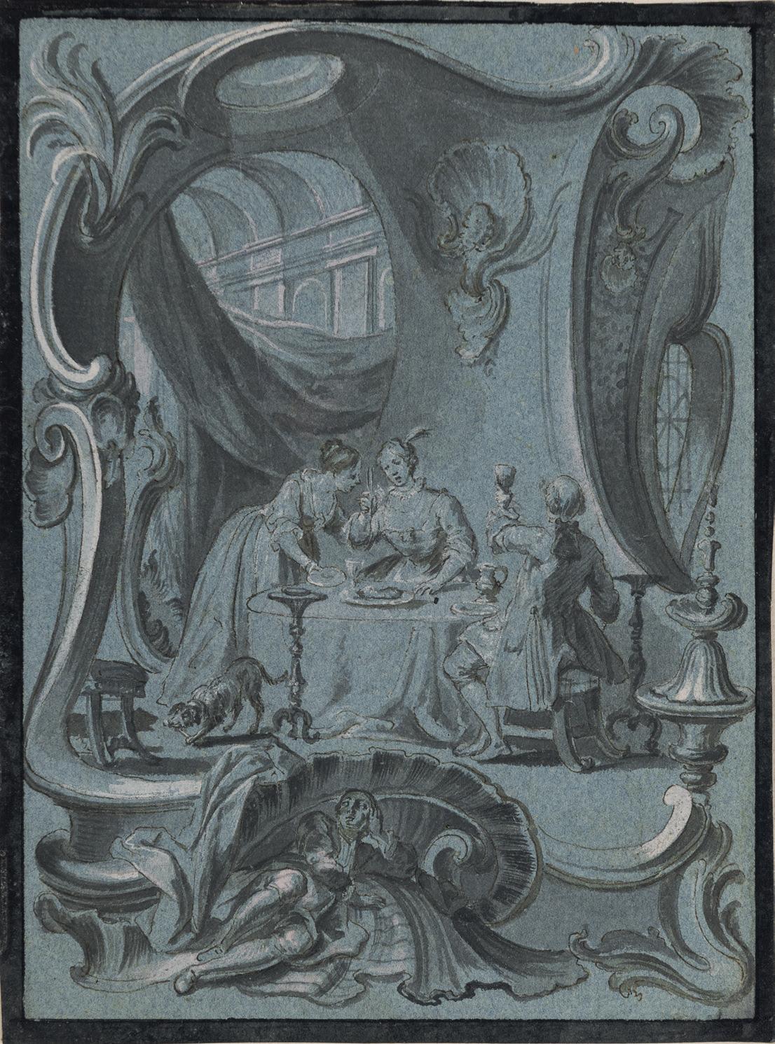
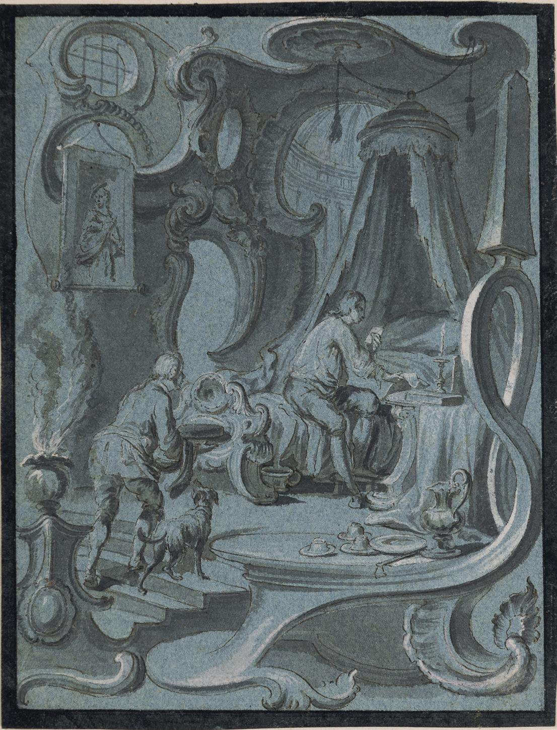
c.
c.1740-1760
The Coat of Arms of Charles Louis Auguste Fouquet, Duc de Belle-Isle, with Military Trophies
Pen and black ink and grey wash, within a fictive mount with framing lines in black ink and black wash.
250 x 188 mm. (9 7/8 x 7 3/8 in.) [image]
265 x 205 mm. (10 3/8 x 8 1/8 in.) [sheet]
The 18th century French military officer and statesman Charles Louis Auguste Fouquet, Duc de BelleIsle (1684-1761) began serving in the French army at an early age, rising to the rank of Maréchal de France in 1741 and serving with distinction in the Wars of the Spanish, Polish and Austrian successions. An influential voice in military and diplomatic matters, Belle-Isle was named a Peer of France in 1748 and was elected to the Académie Française in 1740. He was also closely associated with the northern French city of Metz for over thirty years, commissioning a number of civic buildings from the royal architect Jacques-François Blondel during his dukedom and governorship there. Belle-Isle served King Louis XV as Secretary of State for War from 1758 until his death in 1761, instituting several significant reforms to modernize the French army.
The composition of the present sheet is close to that of the Maréchal-Duc de Belle-Isle’s ex-libris bookplate (fig.1), which likewise shows his coat of arms surrounded by military banners and trophies1. The printed bookplate, which is inscribed ‘Dessiné et Gravé par Striedbeck à Strasbourg.’, is the work of the German engraver Johann Stridbeck III (1707-1772), who was based in Strasbourg and specialized in portraits and bookplates.
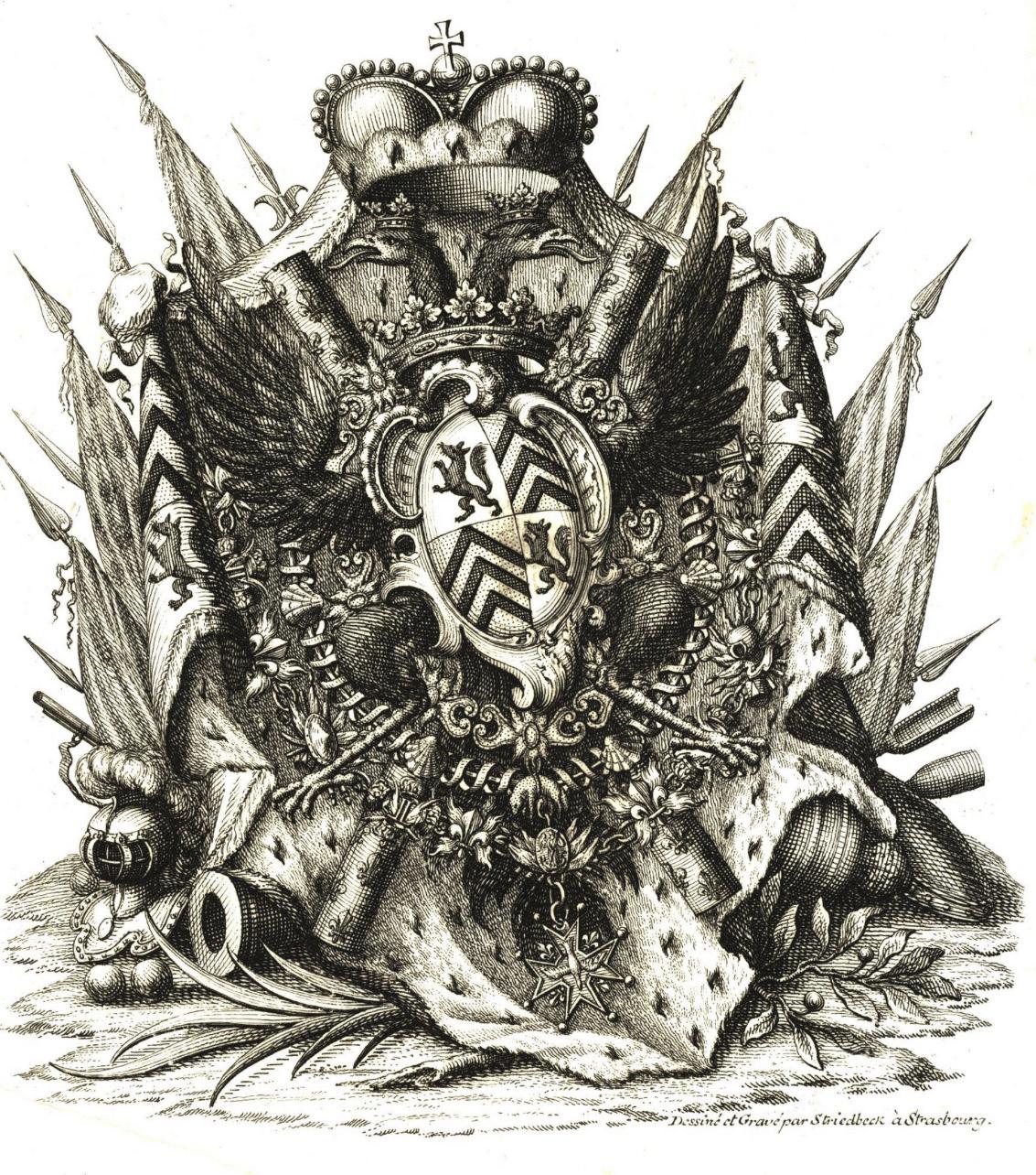
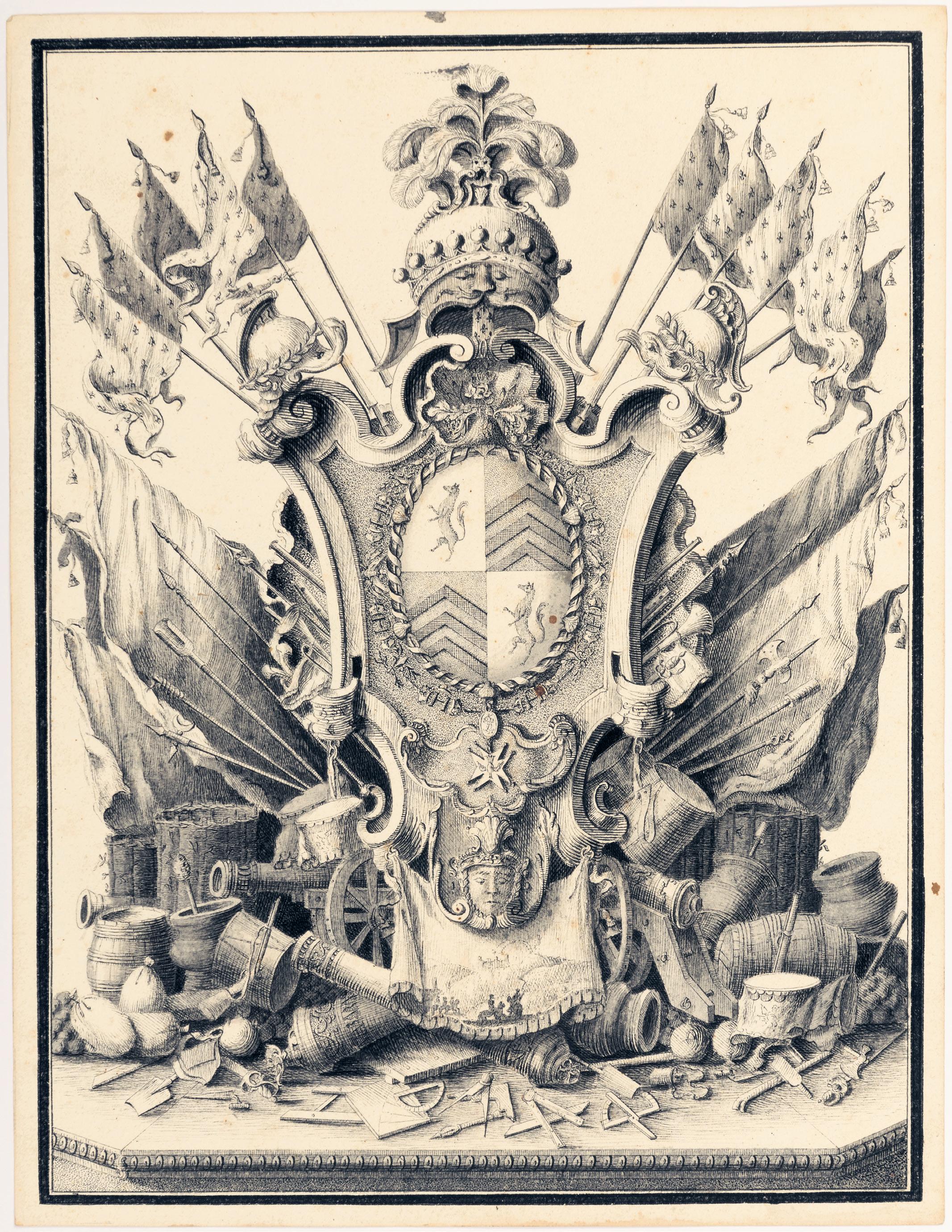
SOUTH GERMAN SCHOOL
18th Century
A Design for a Baroque Cupola
Pen and brown ink, with grey and light blue washes, over traces of an underdrawing in black chalk, with double framing lines in brown ink. Signed with a monogram and dated SC / 1747 in brown ink in the lower left margin. Made up at the upper left corner and with a number of paper patches on the reverse.
263 x 263 mm. (10 3/8 x 10 3/8 in.) [sheet]
Signed and dated 1747, this design for a cupola lit by windows was, in all likelihood, intended for a secular building, given the lack of any Christian iconography, as well as the prominent presence of flowers. The identity of the artist responsible for this elaborate architectural design remains a mystery, however.
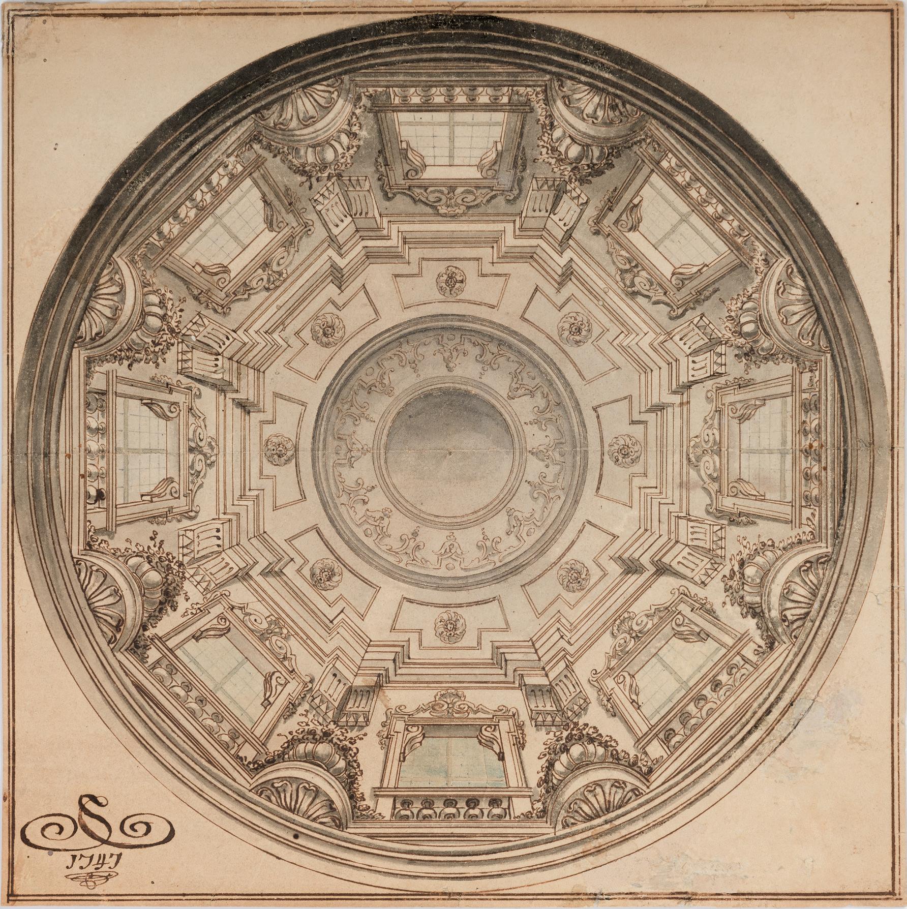
FRANÇOIS BOUCHER
Paris 1703-1770 Paris
Six Putti in Clouds Supporting a Cartouche with the Letters AN Black chalk, with stumping and touches of white heightening, on buff paper. 426 x 558 mm. (16 3/4 x 22 in.)
PROVENANCE: Michael Jaffé, Cambridge and Clifton Maybank, Dorset; His sale (‘The Property of Michael Jaffé, Esq.’), London, Christie’s, 29 June 1971, lot 58 (unsold?); Thence by descent.
LITERATURE: Paris, Galerie Heim, and elsewhere, Cent dessins français du Fitzwilliam Museum Cambridge, exhibition catalogue, 1976, p.5, under no.6; New York, Pierpont Morgan Library, and elsewhere, European Drawings from the Fitzwilliam, exhibition catalogue, 1976-1977, p.62, under no.97; Alastair Laing, ‘A group of Boucher’s designs for coach panels’, in Peter Fuhring, Design into Art. Drawings for Architecture and Ornament: The Lodewijk Houthakker Collection, London, 1989, Vol.I, p.118, fig.12; Jane Munro, French Eighteenth Century Drawings in the Fitzwilliam Museum, exhibition brochure, 2000-2001, unpaginated, under no.7; Françoise Joulie et al, Esquisses, pastels et dessins de François Boucher dans le collections privées, exhibition catalogue, Versailles, 2004, p.90, under no.40; Alvin L. Clark, Jr., ed., Tradition & Transition: Eighteenth-Century French Art from The Horvitz Collection, exhibition catalogue, Paris, 2017, p.142, under no.45 (entry by Françoise Joulie).
A gifted draughtsman, Francois Boucher was as productive as he was talented, and claimed to have produced ten thousand drawings over a career of some fifty years. He was, in fact, perhaps the most prolific French draughtsman of the eighteenth century. As has been noted, ‘Every medium served him: pen, pencil, watercolor, chalk, especially his favorite trois crayons, bistre wash, india ink, grisaille, and often a combination of several of these. No subject was too lofty or too humble to engage his attention. Whether he drew from life or from his fertile imagination…Boucher’s masterly touch is always present, always unmistakeable.’1 The artist’s drawn oeuvre includes all manner of subjects, including pastoral scenes, nudes, religious, historical and mythological subjects, book illustrations, chinoiseries, landscapes, genre scenes, studies of children and heads, as well as designs for tapestries, porcelain and fountains.
Pierre Rosenberg has succinctly noted that ‘Boucher’s love of drawing never waned with time and success. Admittedly, drawing was kept in its proper place, as a vital link between the conception or the idea of a work or composition, and its realization, its metamorphosis into a painting…To quote Mariette, Boucher “was a born painter”, but he placed great emphasis on drawing throughout his entire career.’2 Although most of his drawings were preparatory studies for his paintings, Boucher also produced finished drawings as independent works, often adapting and elaborating a head or figure from one of his paintings. While his preference was for black, red, and (particularly in his later years) brown chalk, he also made highly finished drawings in pastel. His drawings were greatly admired by his contemporaries, and were reproduced by engravers such as Gilles Demarteau, Gabriel Huquier the Elder or Louis-Marin Bonnet. Indeed, Boucher’s popularity as a draughtsman owes much to the fact that many of his drawings were reproduced and widely distributed as engravings.
Boucher often produced finished drawings of children and putti as autonomous works of art, which proved very popular with collectors. Often these groups of infants or winged putti were taken from his paintings and worked up into independent compositions, and several such drawings were engraved by different printmakers and included in five Livres des groupes d’enfans, published by Huquier. The Goncourt brothers wrote of these winged putti that ‘They appear everywhere in [Boucher’s] work…They are always a charming spectacle, with their fat little hands, their rotund stomachs and navels like dimples, their cupid’s bottoms, their chubby calves.’3 As the Boucher scholar Alastair Laing further noted, ‘There were two kinds of subject matter that Boucher made utterly his own, engraved images of which reached the remotest corners of Europe, and formed a repertoire upon which other artists and craftsmen could draw:
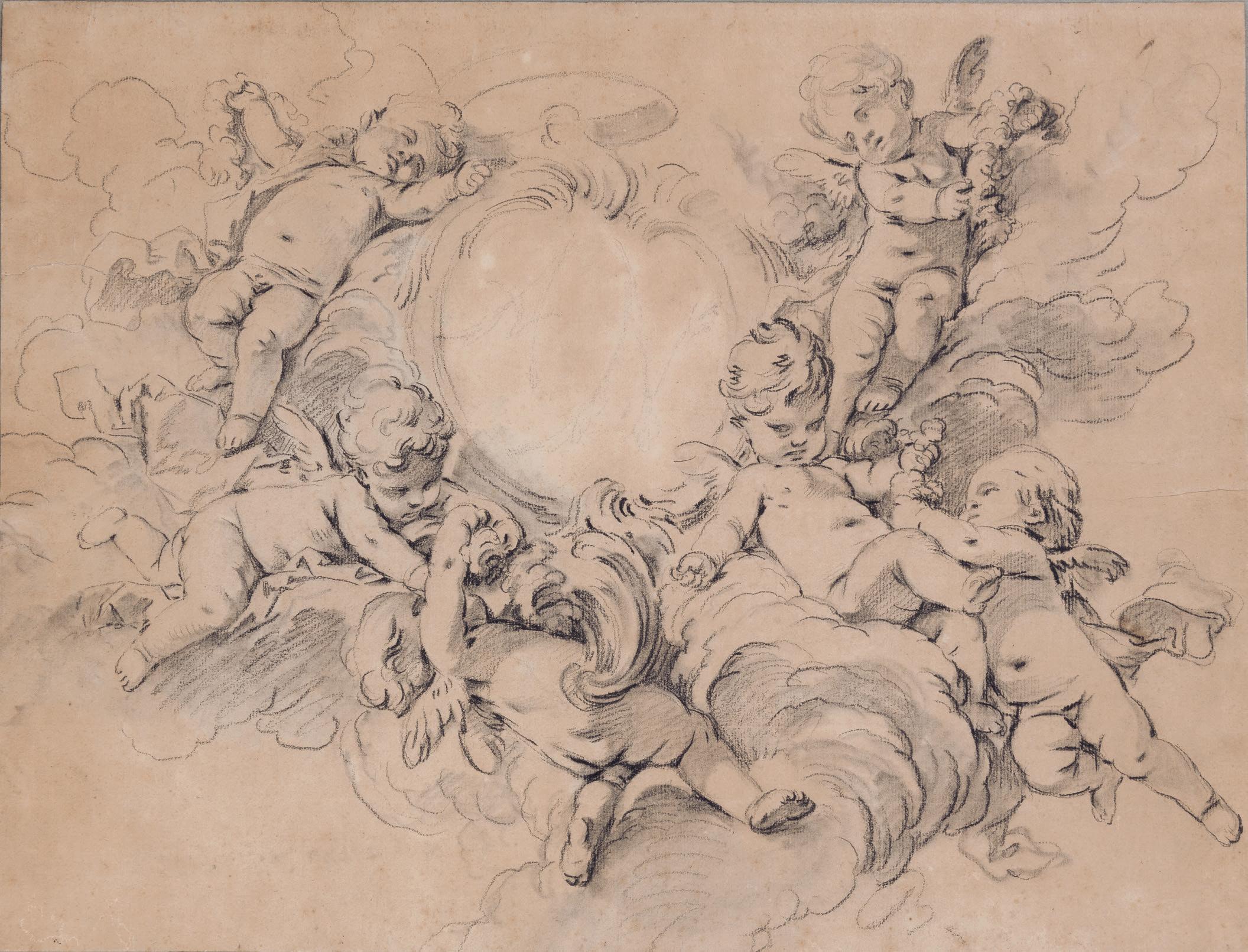
the pastoral and putti…The French call cupids amours, or “loves”, which makes their underlying message much plainer. Boucher was particularly good at showing cupids disporting in the air, since that gave his imagination the freest rein.’4
Comparatively few drawings by Boucher related to his ornamental designs have survived. As Françoise Joulie points out, ‘Boucher’s contributions to the decorative arts are well known, but drawings related to his work in this genre are rare. Those few extant drawings reveal his designs for andirons, chandeliers, clocks, musical instruments, screens and silverware, as well as schemes for porcelain for the manufactories of Sèvres and Vincennes. The earlier drawings are strongly marked by the Rococo mode – a style he helped to create – and the later works, especially those after 1760, are imbued with an elegant, discreet Neoclassicism.’5
This sizeable drawing aptly highlights Boucher’s abilities as a designer of cartouches and frames. It can be closely related to two equally large and stylistically comparable drawings of putti surrounding an ornamental shield surmounted by a ducal crown. Of a similar technique and scale to the present sheet but oval in format is a drawing formerly in the Houthakker collection and today in the Horvitz collection in Boston6, while another related drawing of a cartouche with a coat of arms supported by putti, with an inscription stating that it is a design for a door panel (fig.1), is in the Fitzwilliam Museum in Cambridge7
The late Alastair Laing was the first to suggest that the initials AN visible on the shield in the present sheet indicate that it may have been intended for a commission from Adrien Maurice de Noailles, 3rd Duc de Noailles and Maréchal de France (1678-1766). He also noted that the shield in the related Horvitz drawing incorporates the order of the Golden Fleece, and that the Duc de Noailles was one of the very few nobles in France who had earned that particular decoration, which he was awarded in 1702.
The scale of the present sheet, and of the two related drawings in the Horvitz and Fitzwilliam Museum collections, would suggest that all three may have been studies for the decoration of the door panel of the duke’s coach. (Indeed, the fact that the Horvitz drawing is pricked for transfer would also support such a connection.) As Laing further points out, ‘It is hardly likely that Boucher would have undertaken the actual task of painting coach panels himself, or even that his studio would have done so…They will instead have been executed by one of the specialist carriage-painters, capable of providing the brilliantly varnished finish that such works required...Thanks to these three drawings, we can see that Boucher was indeed capable of effortlessly turning to making designs for such bagatelles when occasion arose.’8
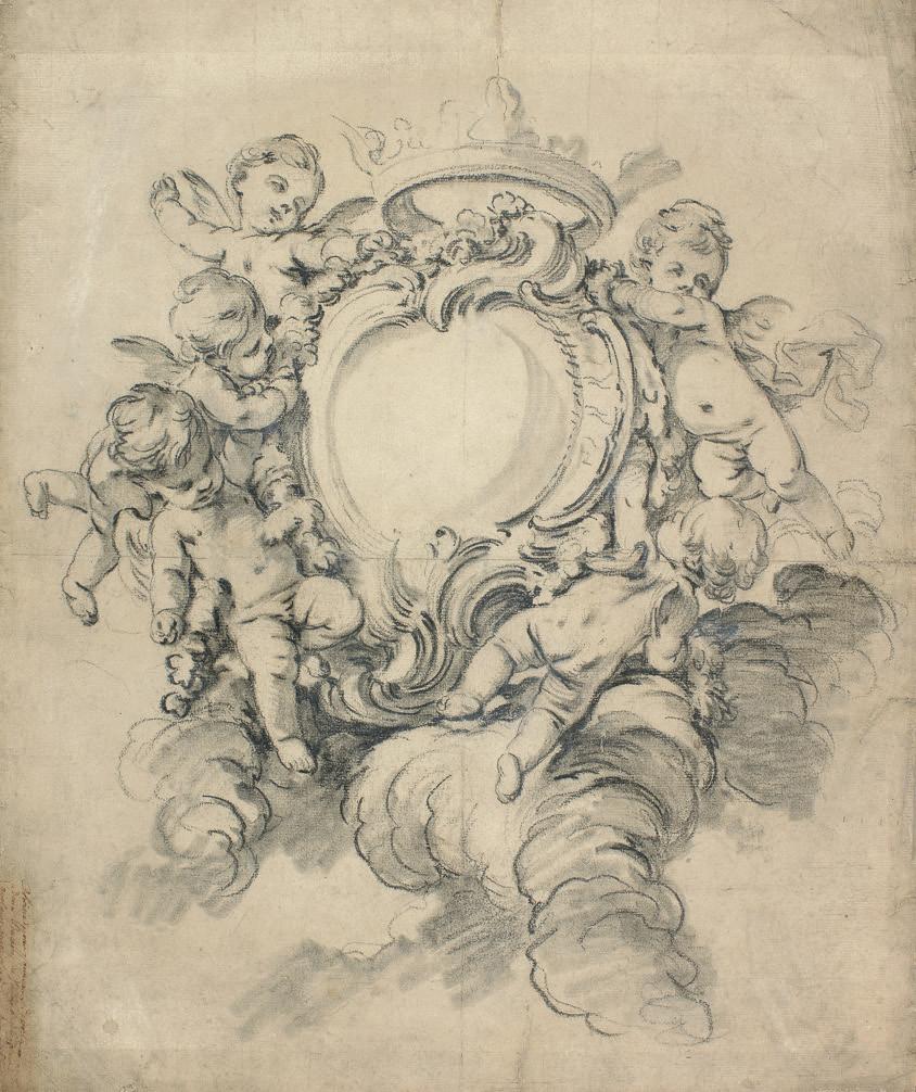
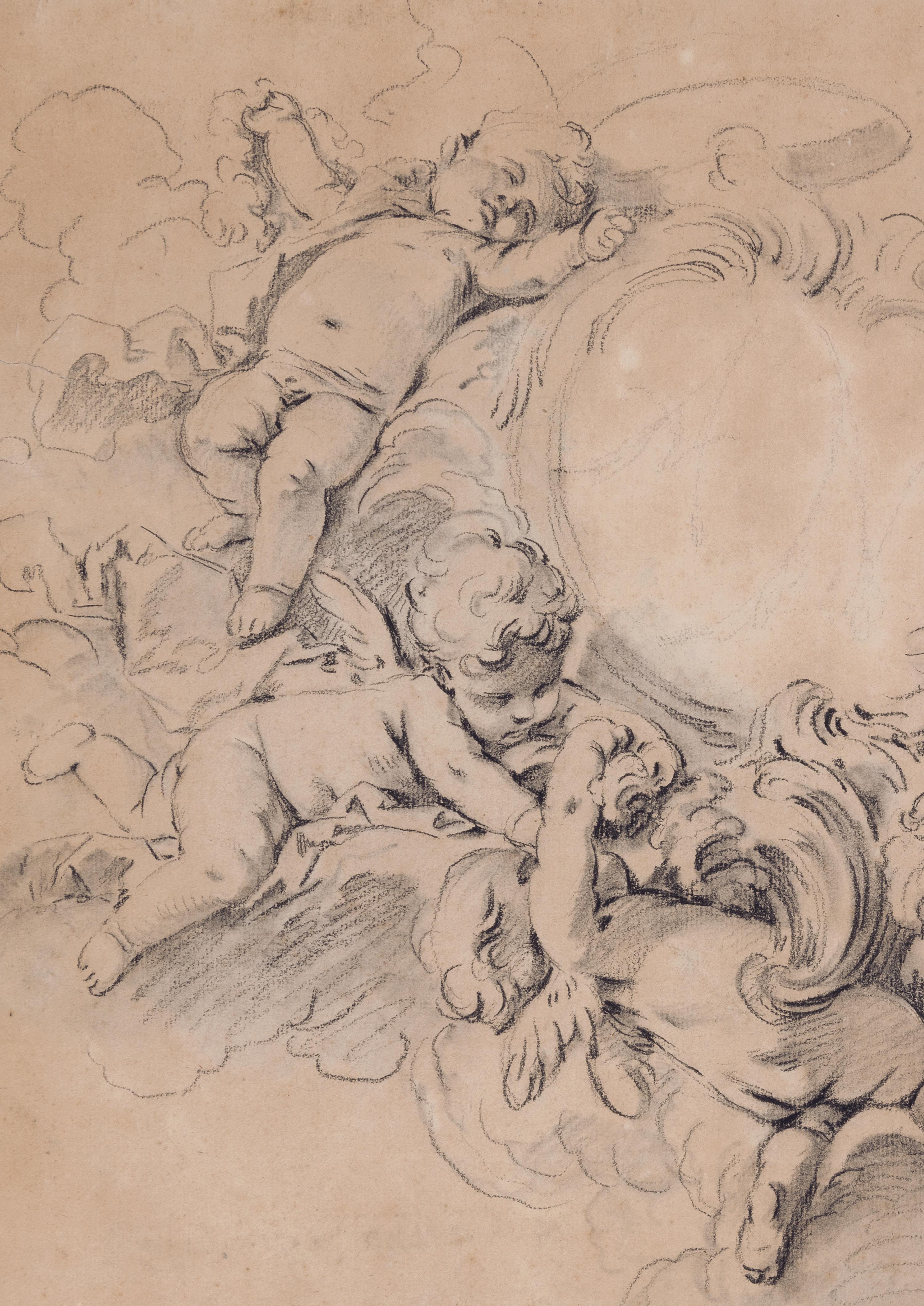
GERMAN SCHOOL
18th century
Design for an Ewer
Pen and brown ink and brown wash.
141 x 113 mm. (5 5/8 x 4 1/2 in.)
PROVENANCE: Anonymous sale, London, Sotheby’s, 15 June 1983, part of lot 78 (as German School 18th Century); Private collection.
EXHIBITED: Possibly Stanford, Stanford University, Cantor Center for Visual Arts, Classic Taste: Drawings and Decorative Arts from the Collection of Horace Brock, March-May 2000.
Datable somewhere between the late 1740s and the early 1760s, this design for a fanciful ewer, characterized by a shell-like form, may have been intended to have been engraved. Ornamental engravings were popular in Germany, particularly in and around Augsburg in the middle decades of the 18th century. Augsburg was a centre for goldsmith’s work and such Rococo designs as the present sheet would have been typical of the so-called Augsburger Geschmack, or ‘Augsburg taste’, during the late Baroque and Rococo periods.
Similar studies of ewers and vases were also produced in France in the 18th century by such artists as Edme Bouchardon, Louis-Joseph Le Lorrain, Jean Lepautre and Jacques Saly, often while working in Rome as pensionnaires at the Académie de France. As one scholar has noted, ‘Rococo decorative style, with its emphasis on asymmetrical forms and a fascination with shell-like motifs, was especially popular in France, South Germany and Austria. This genre pittoresque was applied to all kinds of architecture and decoration: panelling, furniture, porcelain, carved wood, table-silver etc. Its exuberance was particularly suitable for small objects and fitted in well with the new fashion for more intimate interiors.’1
The present sheet was one of a set of four pen and ink designs for rocaille decoration, all apparently by the same hand, that were mounted and sold together at auction in London in 1983.
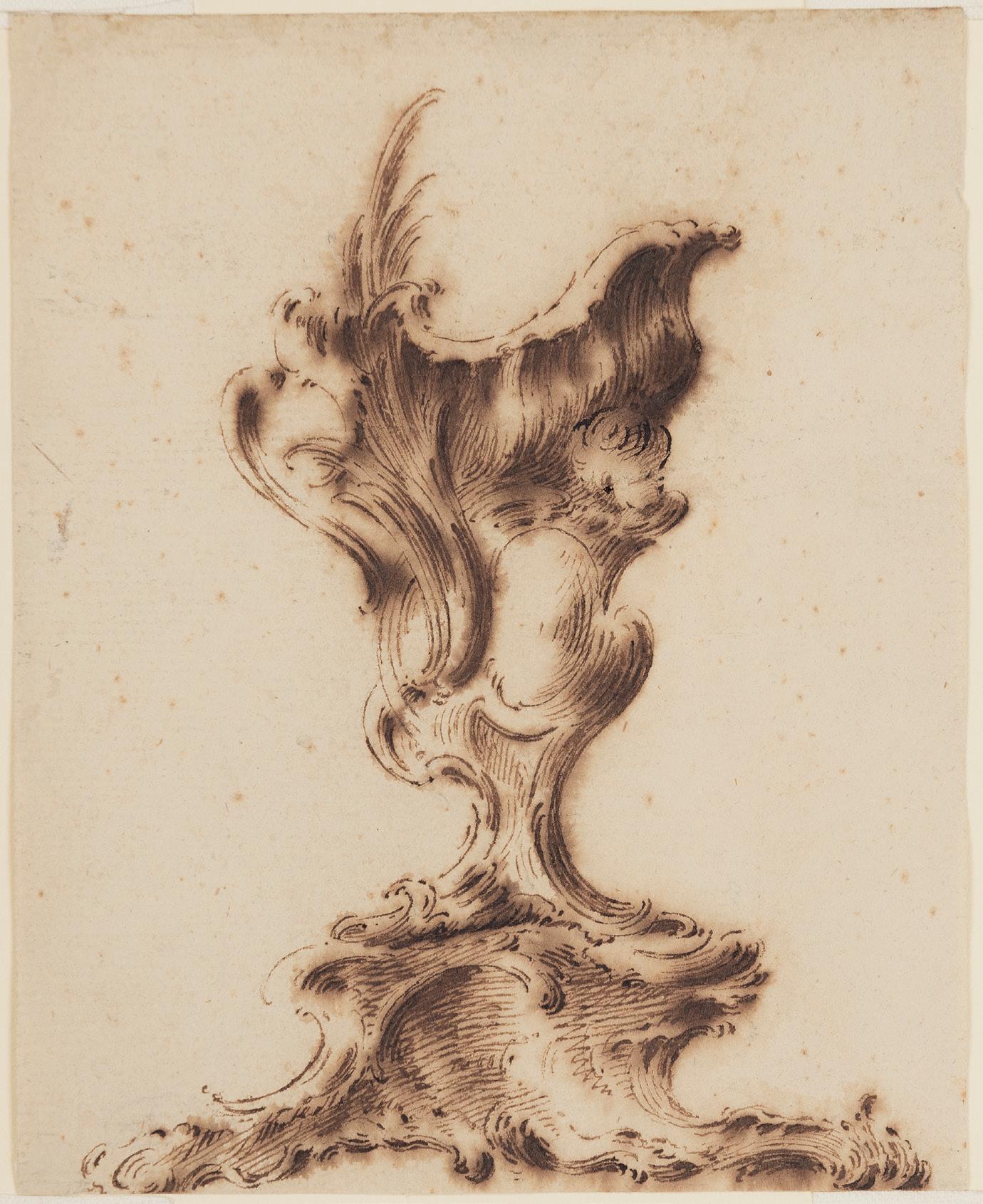
actual size
Porto San Giorgio 1723-1812 Bologna
Two Designs for the Left and Right Corners of a Decorative Scheme for a Ceiling
Each pen and brown ink and brown wash, with blue gouache, over traces of an underdrawing in pencil, on blue-grey paper. Each sheet laid down, with framing lines in brown ink. Signed with initials PP in brown ink at the lower left [a]. Signed or inscribed Pio Panfili in brown ink at the lower right centre [b].
a. 183 x 148 mm. (7 1/4 x 5 7/8 in.)
b. 183 x 145 mm. (7 1/4 x 5 3/4 in.)
PROVENANCE: Possibly Alessandro Maggiori, Faenza, Rome and Porto Sant’Elpidio.
Born near Fermo in the Marches and active mainly in Bologna, the painter and engraver Pio Bernardino Panfili studied at the Accademia Clementina in Bologna and established a successful career as a painter of ornament and perspectival decorations, as well as being a prolific printmaker and an occasional set designer. He received one of his first important commissions when he was tasked with the fresco decoration of the ceiling vault of the Sala dell’Aquila in the Palazzo dei Priori in Fermo, executed between 1760 and 1762. By 1767 Panfili had settled in Bologna, where he produced a series of largescale engravings of urban views of the city for the publisher Petronio Dalla Volpe, as well as numerous smaller city views published between 1770 and 1800.
In 1774 Panfili completed the ceiling decoration of the staircase of the Palazzo Comunale in Montegiorgio, and in 1783 he published a series of ornamental prints under the title Frammenti d’ornati per li giovani principianti nel disegno. Elected a member of the Accademia Clementina in 1786, the following year Panfili began work on the illusionistic fresco decoration of the ceiling of the Duomo in Fermo, which was completed in 1788. At around the same time he decorated the chapel and several rooms of the Palazzo Guerrieri in Fermo. He died in Bologna in 1812, aged almost ninety. A posthumous biography of the artist, entitled Memoria della vita di Pio Panfilj, was published by the Marchese Antonio Amorini Bolognini in 1835.
Architectural drawings by Pio Panfili are today in the Pierpont Morgan Library and the Cooper-Hewitt National Design Museum in New York, the Istituto Centrale per la Grafica in Rome and in several public collections in Bologna; notably an album of drawings and designs (including a self-portrait) in the Pinacoteca Nazionale in Bologna. Panfili also assembled a fine personal collection of drawings, including examples by Agostino Mitelli and Mauro Tesi.
A stylistically comparable signed drawing of a ceiling design by Panfili, in pen and brown ink and watercolour, was formerly in the collections of Alessandro Maggiori, Edmond Fatio and Lodewijk Houthakker1. Also similar is a preparatory drawing by Panfili for the ceiling of the Sala dell’Aquila in the Palazzo dei Priori in Fermo, signed and dated 1760, which was once in the collection of Richard Wunder in New York2, as well as a study for part of the decoration of the cathedral of Fermo, today in the Museo Civico d’Arte Industriale e Gallerie Davia Bargellini in Bologna3.
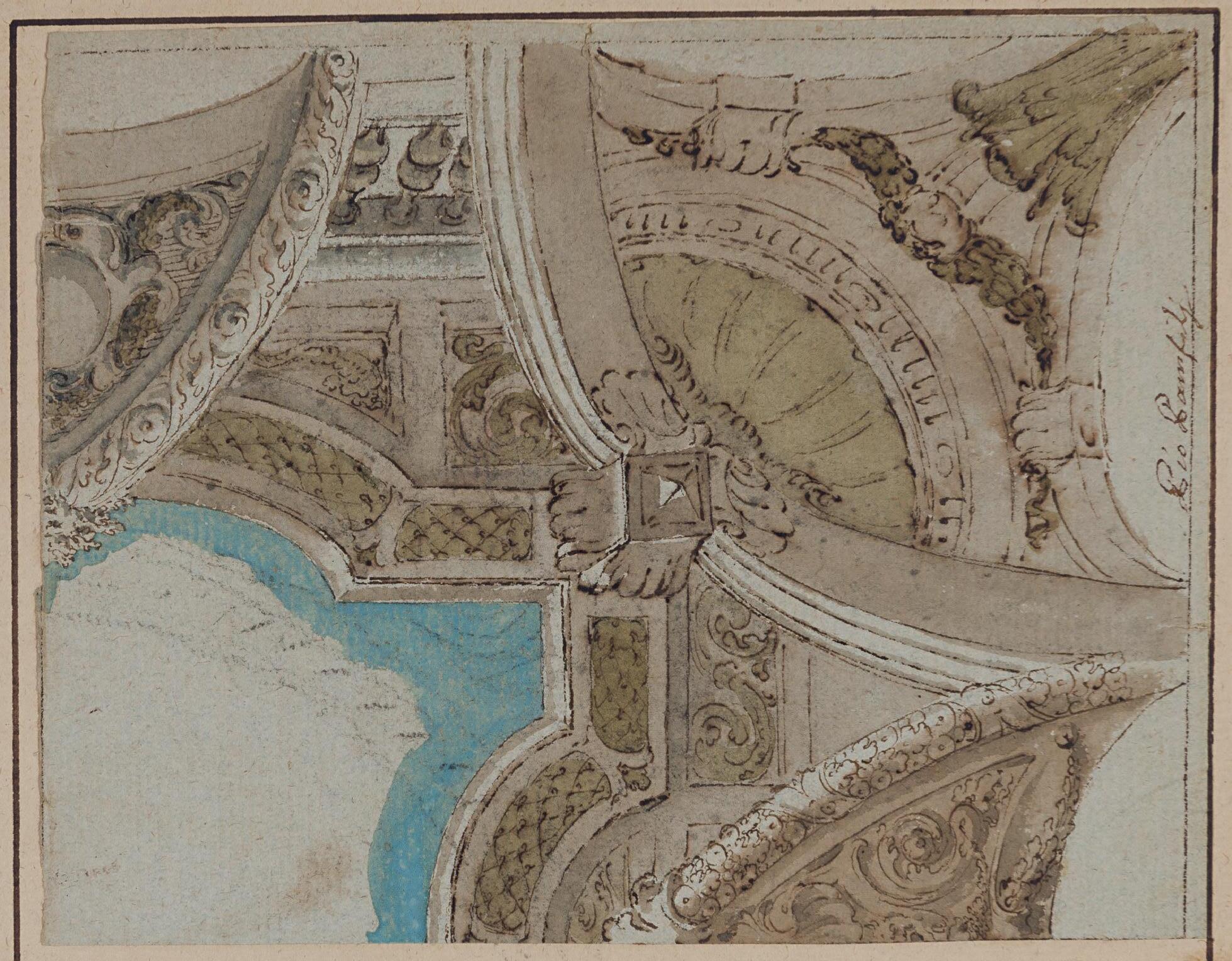
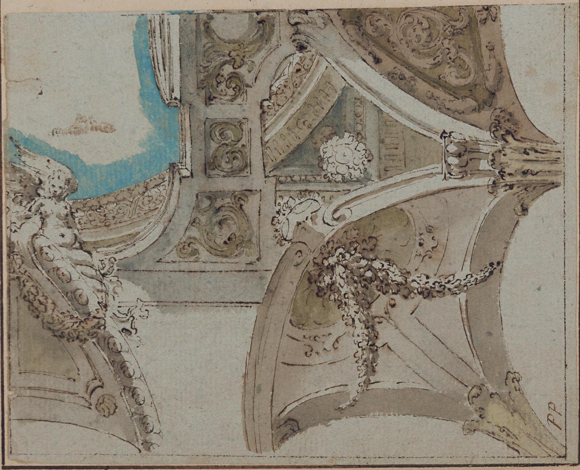
b.
Fermo 1723-1812 Bologna
a. Four Studies for Decorative Ceiling Designs
Pen and brown ink and grey wash and watercolour. Signed(?) and inscribed Pio Panfili / fol 56 in brown ink on the verso.
326 x 283 mm. (12 7/8 x 11 1/8 in.)
b. Design for a Corner Pendentive and Part of a Dome
Pen and brown ink and grey wash, over traces of an underdrawing in pencil. Signed or inscribed Pio Panfili fece in brown ink at the lower right centre. Inscribed Schizzo pel cabino nel Duomo di Fermo / comparato da Aless. Maggiori / anno 1795 in brown ink on the verso.
208 x 228 mm. (8 1/8 x 9 in.)
PROVENANCE: Acquired in Bologna in 1795 by Alessandro Maggiori, Faenza, Rome and Porto Sant’Elpidio, with his inscription (cf. Lugt 3005b) on the verso.
The second of these drawings, as the inscription on the verso suggests, would appear to be a preparatory study for part of Panfili’s illusionistic ceiling decoration of the Duomo at Fermo, executed between 1787 and 1788, when the interior of the church was renovated in a neoclassical style under the auspices of the architect Cosimo Morelli. Panfili decorated the vault of the nave with three fictive domes, divided by fluted pilasters with stucco capitals1
As the illusionistic scheme of the three painted domes has been described, ‘Starting from the entrance, only the first two share the same perspective features. Working with a square ceiling with rounded corners, designed to blend in with the intersections of the main arches, [Panfili] made use of specific effects of light and carefully adjusted the perspective proportions of the ornamental elements (cornice, finials, false stuccoes, etc.), succeeding in simulating a perfect curvature only for the observer standing exactly in the centre, while, for those looking from the side, the circumference of the dome does not appear ellipsoidal, but flattened in several places…The three false domes are decorated with a radiating pattern, featuring plant-like volutes and faux stuccoes; in the pendentives, within oval medallions framed by two branches with long leaves held in place by ribbons, one can see biblical symbols alluding to the Virgin…The design of the three-nave interior, with its rounded arches and the succession of sub-arches and domes, clearly reveals [Panfili’s] scenographic flair. All of the decoration is carried out with extreme rationality and balance, in order to achieve a perfect overall effect, taking care not so much with the appearance of the individual parts, but with their integration with the architecture: the painting, the sculpture, the marble and stucco ornamentation blend with the architecture to create a single vision and a single conception, perfectly responding to the spiritual needs of the Cathedral.’2 Another drawing for a cartouche in one of the pendentives of the Duomo in Fermo, also formerly in the collection of Alessandro Maggiori, is today in the Museo Civico d’Arte Industriale e Galleria Davia Bargellini in Bologna3
The lawyer and nobleman Count Alessandro Maggiori (1764-1834) assembled one of the most interesting and varied collections of Italian drawings formed in the late 18th and early 19th century. According to the notes that he added on the sheets he acquired, Maggiori seems to have bought most of his drawings in Faenza, Bologna, Naples and Rome between 1785 and 1810. At his death in 1834, the collection of nearly three thousand drawings was dispersed by his heirs.
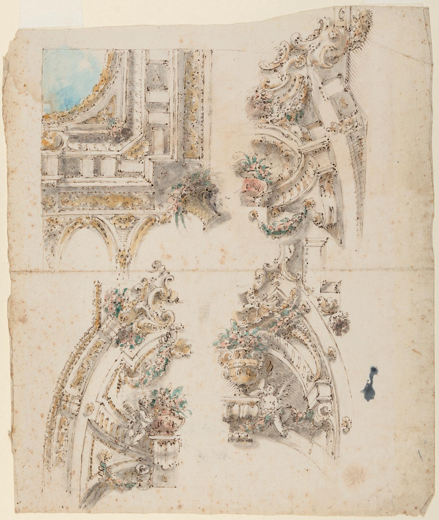
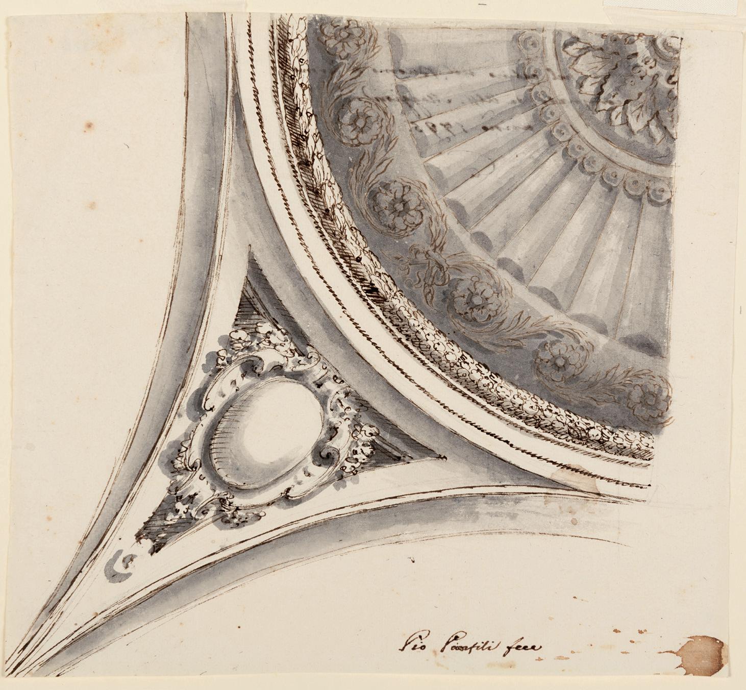
SOUTH GERMAN (AUGSBURG) SCHOOL
18th century
A Design for a Rococo Table Fountain with a Triton, a Dolphin and a Sea-Horse Pen, brush and grey ink and grey wash, over traces of an underdrawing in black chalk. 577 x 402 mm. (22 3/4 x 15 7/8 in.)
Watermark: A crown above a fleur-de-lys within a cartouche above the letters VDL (for Van der Ley); [Churchill no.405: c.1733].
PROVENANCE: Armin B. Allen, Inc., New York and Hobhouse Ltd., London, in 1986; Private collection.
LITERATURE: New York, Armin B. Allen, Inc. and Hobhouse Ltd., An Exhibition of Ornamental Drawings 1520-1920, exhibition catalogue, 1986, unpaginated, no.58, illustrated as frontispiece; Gail S. Davidson, ‘Ornament of Bizarre Imagination. Rococo Prints and Drawings from Cooper-Hewitt’s Léon Decloux Collection’, in Sarah D. Coffin et al, Rococo: The Continuing Curve, 1730-2008, exhibition catalogue, New York, 2008, p.70, fig.44 (as Circle of Franz Xaver Habermann, c.1750); Clifford S. Ackley, ‘The Intuitive Eye: Drawings and Paintings from the Collection of Horace Wood Brock’, in Horace Wood Brock, Martin P. Levy and Clifford S. Ackley, Splendor and Elegance: European Decorative Arts and Drawings from the Horace Wood Brock Collection, exhibition catalogue, Boston, 2009, p.92, no.88, illustrated p.93.
EXHIBITED: New York, Armin B. Allen, Inc. and Hobhouse Ltd., An Exhibition of Ornamental Drawings 1520-1920, 1986, no.58; Stanford, Stanford University, Cantor Center for Visual Arts, Classic Taste: Drawings and Decorative Arts from the Collection of Horace Brock, 2000; Boston, Museum of Fine Arts, Splendor and Elegance: European Decorative Arts and Drawings from the Horace Wood Brock Collection, 2009, no.88.
Probably produced by an artist working in Augsburg, this very large drawing appears to be a design for an elaborate table fountain, although whether such an object could realistically have been produced in metalwork is perhaps debatable. As one scholar and curator has described the present sheet, ‘In the seventeenth and eighteenth centuries, aristocratic circles required generous helpings of fantasy and luxury to lend dignity and status to daily living and to special occasions. A mid-eighteenth-century design for a fantastical Rococo vessel spouting liquid (water, wine?) from several apertures and ornamented with marine motifs (a triton, a fish, a sea horse) gives some idea of the richness of fantasy required to satisfy aristocratic appetites. This “table fountain”, undoubtedly intended to be fabricated in precious metals, has been associated with southern German designers and craftsmen in Augsburg.’1
As has also been suggested, however, ‘This exuberant ornamental drawing may well have been a design for stucco decoration as clearly no such three-dimensional object could have existed. The form of the vessel brings to mind the designs of F. X. Haberman, engraved by Ioh. Georg Hertel in Augsburg around 1750.’2 The extravagant form of this fountain is indeed akin to the numerous rocaille designs produced by the Augsburg sculptor and engraver Franz Xaver Habermann (1721-1796) and reproduced in prints by Johann Georg Hertel and Martin Engelbrecht3. Trained as a sculptor in wood, Habermann was a gifted designer of carved furniture, altars and pulpits, while his drawings were also translated into metalwork and ornament. As Valerie Hunter has observed, ‘Augsburg was the most important market for gold and silver in Germany in the eighteenth century. The influence of numerous pattern books loosely reflecting French taste were widely copied and sold here, resulting in a rapid spread of new designs. Habermann published over 500 prints covering a wide range of designs for decorative objects. He was also influential through his position as professor of drawing at the newly-founded School of Design in Augsburg, a post he held from 1781 until his death.’4 Many of Habermann’s designs were engraved and published, and, as Hunter also points out, ‘These prints show a boisterous Rococo design that could have been successfully adapted to suit a number of materials.’5
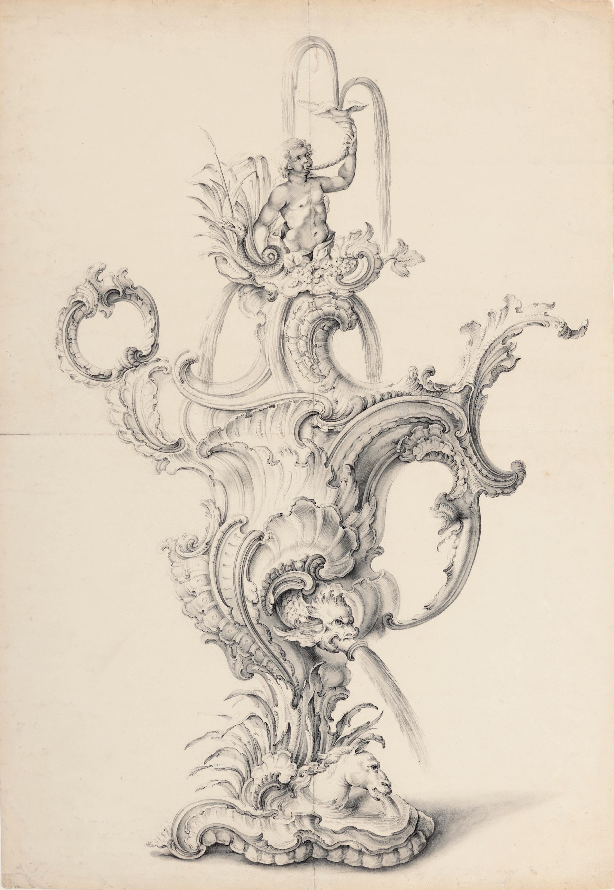
FRENCH SCHOOL
18th century
Two Designs for Pendant Trophies with Attributes of Music
Pen and grey ink and grey wash on buff paper.
263 x 211 mm. (10 3/8 x 8 3/8 in.)
Watermark: Coat of arms.
PROVENANCE: Private collection.
EXHIBITED: Stanford, Stanford University, Cantor Center for Visual Arts, Classic Taste: Drawings and Decorative Arts from the Collection of Horace Brock, March-May 2000.
As the scholar Peter Fuhring has written, ‘Since the mid-sixteenth century, trophies – originally composed of arms taken from the enemy and presented in victory parades – had become a standard ingredient of the decorative arts. As an ornament, trophies were adapted to circumstances and the choice of elements that were generally hung from a string or ribbon could illustrate a great variety of secular and religious themes…In the first half of the eighteenth century, numerous designers and sculptors such as Jean-Bernard Toro, François Roumier and Alexis Peyrotte took an interest in trophies. The presentation of the elements was adapted to the dominant style of ornamentation of the period, but the presentation of the trophy is astonishingly constant, conforming to the mid-sixteenth century formula first published by António Salamanca (c.1500-62) and copied in 1551-53 by the young Enea Vico (1523-67) for Antonio Lafreri (1512-77) in Rome.’1
The present sheet depicts a pair of trophy models, perhaps intended for carved wood boiserie panels, of a type that were especially popular in France in the 18th century. The first half of the century saw several artists create designs for elaborate trophies, including the sculptors François-Antoine Vassé and René Charpentier, the woodcarver François Roumier, the painter and decorator Christophe Huet, the draughtsmen Jacques Dumont le Romain and Jean-Charles Delafosse, and the decorator and ornamental designer Alexis Peyrotte. Many of these designs, which could be adapted to suit a room type or the specific requirements of a patron, were engraved and widely disseminated. The engraver and print publisher Gabriel Huquier, for example, issued a number of series of ornamental prints of such trophy motifs, notably the Livre de nouveaux trophées inventez par J. Dumont le Romain peintre ordinaire du Roi, which appeared around 1736. Around the same time Huquier also issued two other sets of engravings of trophy motifs, based on designs by Charpentier.
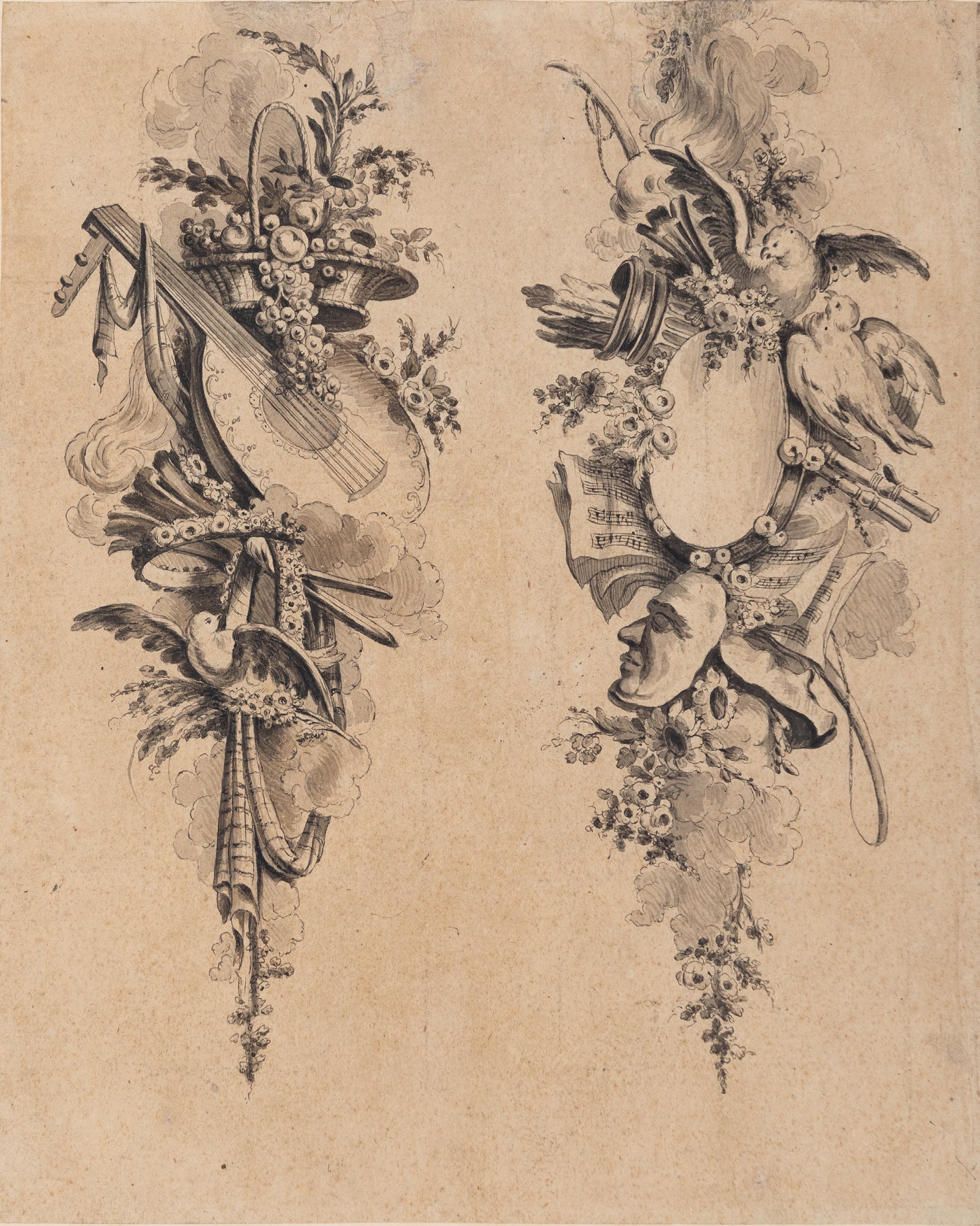
RENÉ-MICHEL SLODTZ, called MICHEL-ANGE SLODTZ
Paris 1705-1764 Paris
An Urn Flanked by Two Chained Lions
Pen and brown ink. A faint offset of a standing draped figure in red chalk on the verso. Signed M.a. Slodtz in black ink at the centre left and numbered 39 in brown ink on the verso. 208 x 144 mm. (8 1/4 x 5 5/8 in.)
PROVENANCE: Anonymous sale, Paris, Hôtel Drouot, 7 November 1997, lot 15; P. & D. Colnaghi, London, in 1999; Private collection.
LITERATURE: Clifford S. Ackley, ‘Master drawings from the collection of Horace Wood Brock’, The Magazine Antiques, February 2009, p.58, illustrated p.53, fig.3; Clifford S. Ackley, ‘The Intuitive Eye: Drawings and Paintings from the Collection of Horace Wood Brock’, in Horace Wood Brock, Martin P. Levy and Clifford S. Ackley, Splendor and Elegance: European Decorative Arts and Drawings from the Horace Wood Brock Collection, exhibition catalogue, Boston, 2009, p.92, no.89, illustrated p.93.
EXHIBITED: London, Colnaghi, Old Master and 19th Century Drawings: A selection from our current stock, 1999-2000, no.24; Boston, Museum of Fine Arts, Splendor and Elegance: European Decorative Arts and Drawings from the Horace Wood Brock Collection, 2009, no.89.
The youngest member of an artistic dynasty of sculptors, René-Michel Slodtz was known throughout his career by his childhood nickname of Michel-Ange. Although he only won second place prizes in the Prix de Rome competitions of 1724 and 1726, he was permitted to study as a pensionnaire at the Académie de France in Rome in 1728. The director of the Académie was the painter Nicolas Vleughels, of whom Slodtz sculpted a portrait bust in 1736. As Vleughels praised the young artist, in a letter of 1735 to the Duc d’Antin, ‘Slodtz is and will be a very skilled man, and draws better than sculptors usually do.’ After Vleughels’s death in 1737, Slodtz designed his tomb in the church of San Luigi dei Francesi. After leaving the French Academy, he established a successful studio in Rome, receiving important portrait commissions from Roman patrons and French visitors. His works were characterized by excellent craftsmanship and a particular fluency in the handling of marble. Around 1740 Slodtz received two of his most important commissions; one for a funerary monument to the Cardinal de La Tour d’Auvergne and his predecessor Archbishop Montmorin, intended for the Cathedral of Vienne, and the other for a marble statue of Saint Bruno for St. Peter’s in Rome. Between 1745 and 1746 Slodtz also sculpted a monument to Marchese Alessandro Gregorio Capponi for San Giovanni dei Fiorentini.
In 1746, after eighteen years in Italy, Slodtz left Rome and returned to Paris. He was never quite able to emulate his Roman success, however, partly due to the opposition of the influential Comte de Caylus, who favoured the sculptor Edme Bouchardon. Although he was agrée at the Académie Royale in 1749, Slodtz was never admitted as a full Academician. Among his few significant public commissions in Paris was the funerary monument dedicated to the curé Jean-Baptiste Languet de Gergy in the church of Saint-Sulpice, completed in 1757. Much of his later career was taken up with smaller-scale decorative commissions, including bas-reliefs for the portico of Saint-Sulpice and for the Place de la Concorde in Paris and the renovation of the choir of Bourges cathedral. Appointed dessinateur de la chambre et du cabinet du Roi in 1758, Slodtz provided designs for picture frames and furniture for the Menus-plaisirs du roi, as well as designing funerary monuments, though on a smaller and less elaborate scale than those executed at the peak of his career. Among his students were the painters Hubert Robert and Jean-Baptiste-Siméon Chardin, as well as the sculptor Jean-Antoine Houdon.
As one scholar has noted of the present design for a sculpted urn by Slodtz, ‘The motif of the captive lions is undoubtedly a flattering allusion to the might and power of the prince or monarch who commissioned the design.’1 A weak copy of this drawing appeared at auction in Germany in 2014 and 20152.
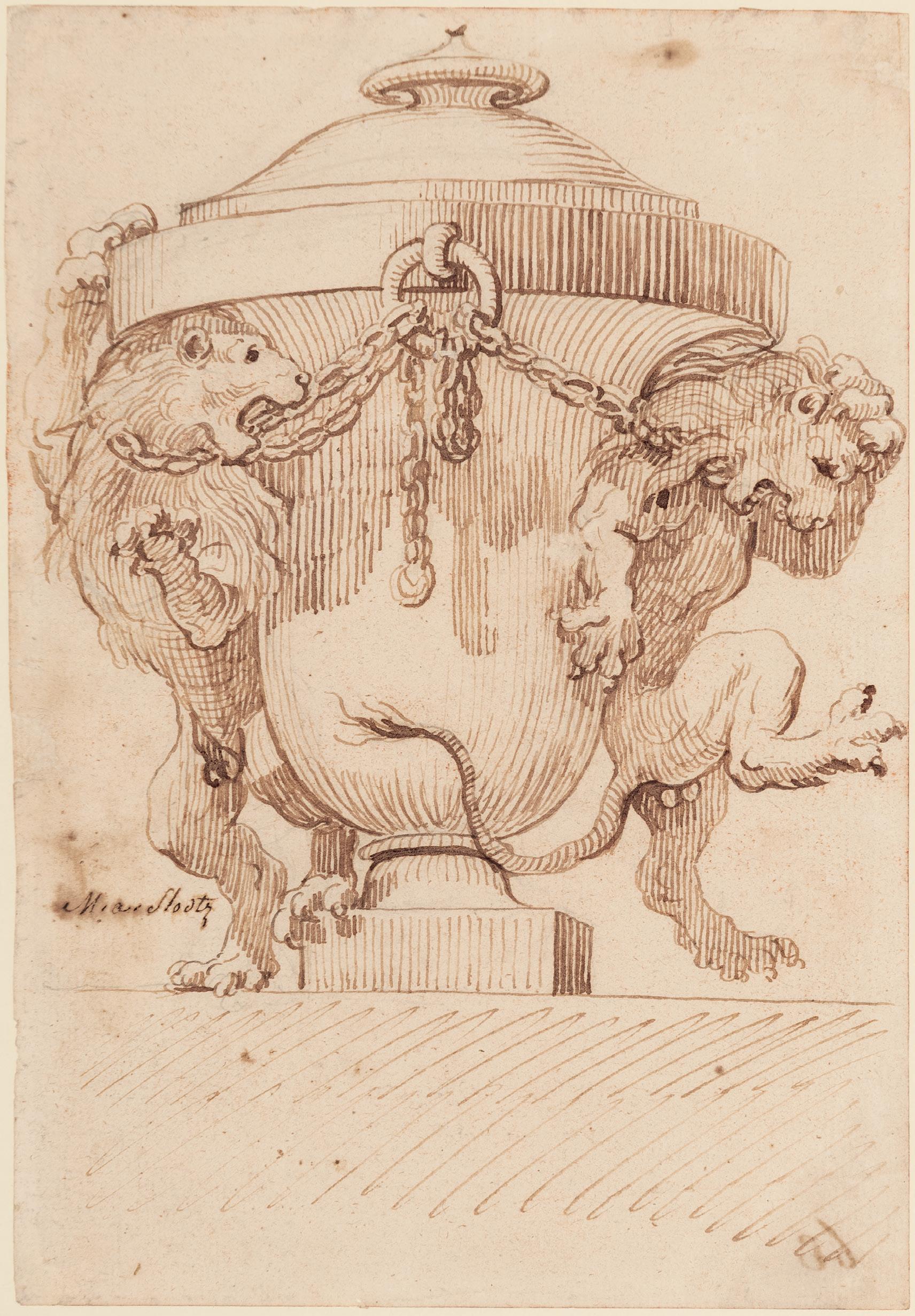
LUIGI VANVITELLI
Naples 1700-1773 Caserta
Design for an Altar or Reliquary Surround
Black chalk and brown ink.
314 x 232 mm. (12 3/8 x 9 1/8 in.)
Among the most significant Italian architects of the 18th century, Luigi Vanvitelli was the son and pupil of the Dutch landscape painter Gaspar van Wittel, who had Italianized his surname when he settled in Rome in 1674. Little is known of the younger Vanvitelli’s artistic education, but he seems to have begun his career as a history painter before becoming an architect around 1730. In 1732 he entered the architectural competition for the design of the façade of the Roman church of San Giovanni in Laterano. Although he did not win the commission, his designs were much praised and in 1733 he was admitted to the Accademia di San Luca. Vanvitelli was soon named by Pope Clement XII to the position of papal architect in the Marche region. He was active in the Marches for the next few years, notably in Ancona, where he worked on the cathedral of San Ciriaco, the local churches of the Gesù and Sant’Agostino, and the buildings of the port area.
The 1740s found Vanvitelli working mostly in Rome, notably at St. Peter’s, the churches of Santa Maria degli Angeli and Sant’Agostino, and the Palazzo Chigi-Odescalchi. Another significant commission was the design of the church of the Olivetan monastery of Montmorcino in Perugia. In 1750 Vanvitelli left Rome for Naples, where he had been appointed architect to Charles III of Bourbon, King of Naples and Sicily, and was entrusted with the construction of the Royal Palace of Caserta, outside the city. Work on the massive palace at Caserta, which contained over 1,200 rooms, was begun in 1751 and completed shortly after Vanvitelli’s death. During his time in Naples the architect was also engaged on the design of several churches, palaces and villas in and around the city, notably the Basilica of Santissima Annunziata, a project completed by Vanvitelli’s son Carlo, as well as the large hemicycle of the public square known as the Foro Carolino, now the Piazza Dante.
Vanvitelli produced numerous drawings for buildings, interiors, altarpiece surrounds, ephemeral festive architecture and stage designs, and the largest collections of drawings by the artist are today in the museums of Naples and Caserta, while a smaller but representative group is in the Metropolitan Museum of Art in New York. The present sheet may be compared, in stylistic terms, with a pen and ink drawing by Vanvitelli of Saint Peter Enthroned – a design for the chair or throne for a seated bronze statue of the saint in the Basilica of St. Peter’s in Rome, executed in 1754 – that is in the Metropolitan Museum of Art1. Also stylistically comparable is a design for a vase supported by a winged putto and a boy riding a dolphin, in the collection of the Palazzo Reale at Caserta2
As the scholar Jörg Garms has noted, ‘Throughout his career Vanvitelli made important designs for altars and tabernacles, notable examples of which include the high altar of Terni Cathedral (1751-4),…the high altar of S. Pantaleo in Rome (1752-6); and the altar of the Sampajo chapel in S. Antonio dei Portoghesi, Rome (1752-6)’. The artist’s oeuvre of drawings includes several designs for altar surrounds, such as a somewhat more elaborate but equally spirited sheet sold at auction in 19854
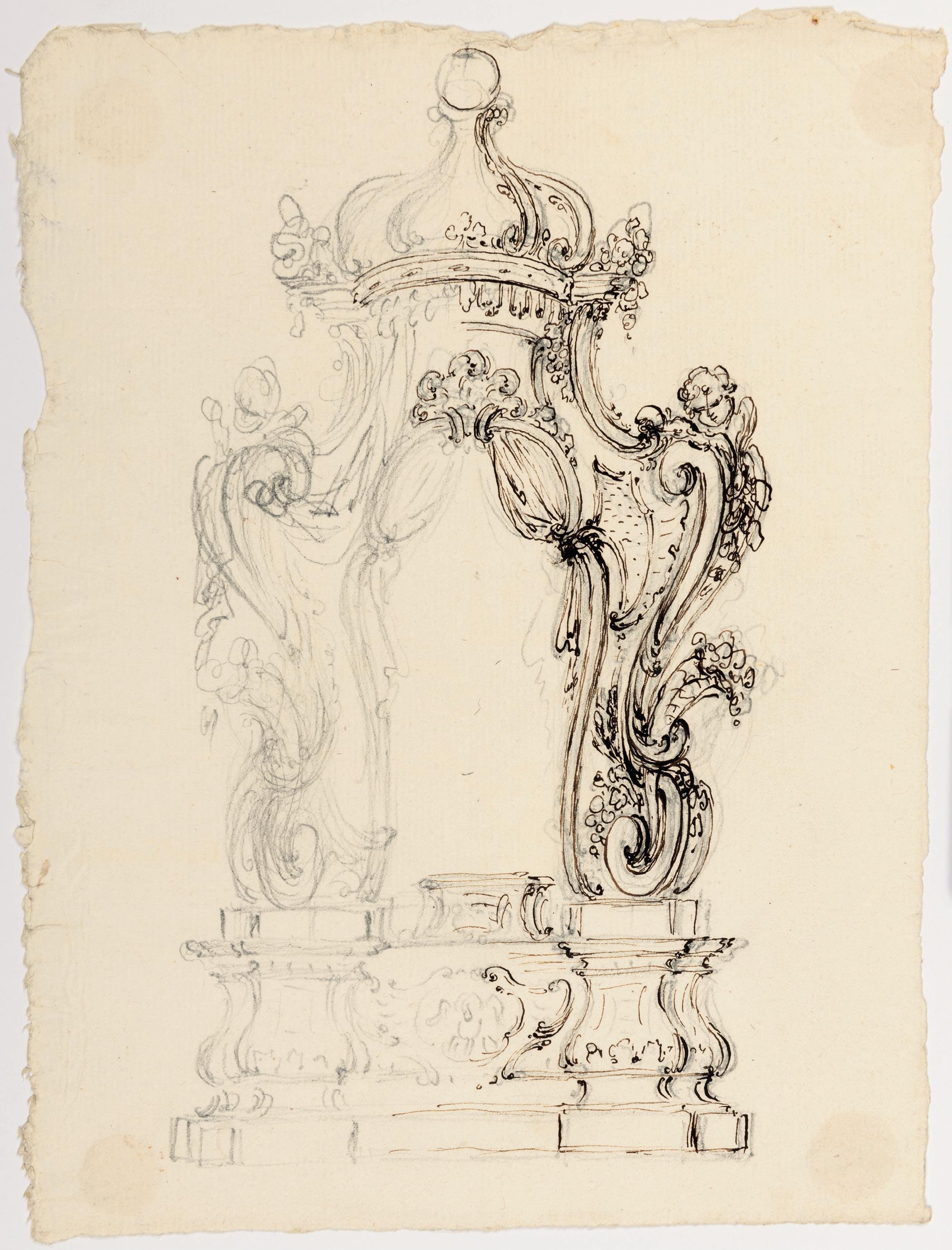
JEAN-DÉMOSTHÈNE DUGOURC
Versailles 1749-1825 Paris
La Beauté sacrifie aux Grâces, récompense les talents et est couronnée par l’Amour (‘Beauty Sacrifices to the Graces, Rewards Talent, and is Crowned by Love’)
Pen and black ink and grey wash, with framing lines in brown ink. Oval. Signed with the artist’s monogram and dated JDD / 1776 in black ink at the lower left. Laid down an 18th century mount, inscribed LA BEAUTÉ SACRIFIE AUX GRACES, RECOMPANCE LES TALENTS, ET EST COURONEÉ PAR L’AMOUR. in black ink in the outer margin, which is in turn laid down. The whole overmounted with a second, later mount decorated with flowers and ribbons in pen and black ink and grey wash, within framing lines in black ink, bearing the title LA BEAUTÉ / SACRIFIE AUX GRACES, / Recompance les talents & est couronnée par / l’Amour. in black ink at the bottom. Further inscribed Dessin Original / de Du Gourc. 1776 in black ink at the lower right of the overmount.
192 x 148 mm. (7 5/8 x 5 3/4 in.) [sheet, at greatest dimensions]
278 x 218 mm. (10 7/8 x 8 1/2 in.) [with mount, at greatest dimensions]
338 x 246 mm. (13 1/4 x 9 3/4 in.) [overmount]
PROVENANCE: An unidentified (19th century?) French auction, as lot 23 (according to an extract from a sale catalogue pasted onto the backing board), where possibly sold for 540 francs.
A hugely inventive and gifted artist and designer, Jean-Démosthène Dugourc was active as a painter, draughtsman, watercolourist, decorator, engraver and sculptor, while also producing designs for book illustrations and frontispieces, furniture, stage sets and costumes, and fabrics. Born to a wealthy and socially prominent family – his father was in the service of the Duc d’Orléans – the young Dugourc was permitted to study alongside the Duc’s son Louis Phillipe II, the future Phillipe-Egalité, who was two years older. He received a classical education at the Oratorian-run Collège de Jully and showed an aptitude for drawing and an interest in perspective and the study of architecture from an early age. At fifteen Dugourc made a brief trip to Rome, where he met the German art historian and archaeologist Johann Joachim Winckelmann, who inspired a fondness for antiquity in the young artist. Following the death of his mother and the loss of his father’s wealth after a lawsuit, Dugourc decided to devote himself to a career as a professional artist. In 1776 he married the sister of the architect François-Joseph Belanger, Inspecteur des menus-plaisirs and court architect to Charles-Philippe, Comte d’Artois and brother of Louis XVI, and the future Charles X. Dugourc began collaborating with his brother-in-law on the decoration of the chateaux of Bagatelle, Saint-Cloud and Maisons. He also designed country houses and gardens for two of the wealthiest men in France, the banker Jean-Joseph de Laborde and the financier Claude Baudard de Saint-James, Treasurer of the Navy, while other clients included the Duchesse de Mazarin and the Duc d’Aumont.
In 1780 Dugourc was appointed designer in the household of the King’s brother, the Comte de Provence, for whom he worked on the decoration of the Château de Brunoy, now demolished. Two years later he published a series of engravings entitled Arabesques. In 1784 he was named dessinateur du garde-meuble de la couronne; in this role he was responsible for the design of interiors, furnishings and objects for the various royal palaces and chateaux, until the Revolution. Dugourc was, one of the first artists to introduce arabesque ornamentation, as well as Etruscan motifs, into architecture, furniture and fabrics during the reign of Louis XVI. He also provided scenery for the Paris Opéra and worked for the Swedish, Spanish and Russian courts, as well as supplying designs for cabinetmakers such as Georges Jacob and for the Pernon silk manufactory in Lyon between 1774 and 1790. In 1800 he went to Spain, where he was appointed architect at the court of Charles IV. Dugourc worked in Spain for fourteen years, in Madrid and at Aranjuez and the Escorial, and among his patrons were such members of the Spanish aristocracy as the Duchess of Alba and the Duchess of Osuna. Within two years of his return to France in 1814 he was reinstated as dessinateur du garde-meuble, working at the Tuileries and for the tapestry manufactories at Savonnerie and Beauvais, as well as continuing to produce designs for Pernon. Dugourc died in Paris in 1825, at the age of seventy-five.
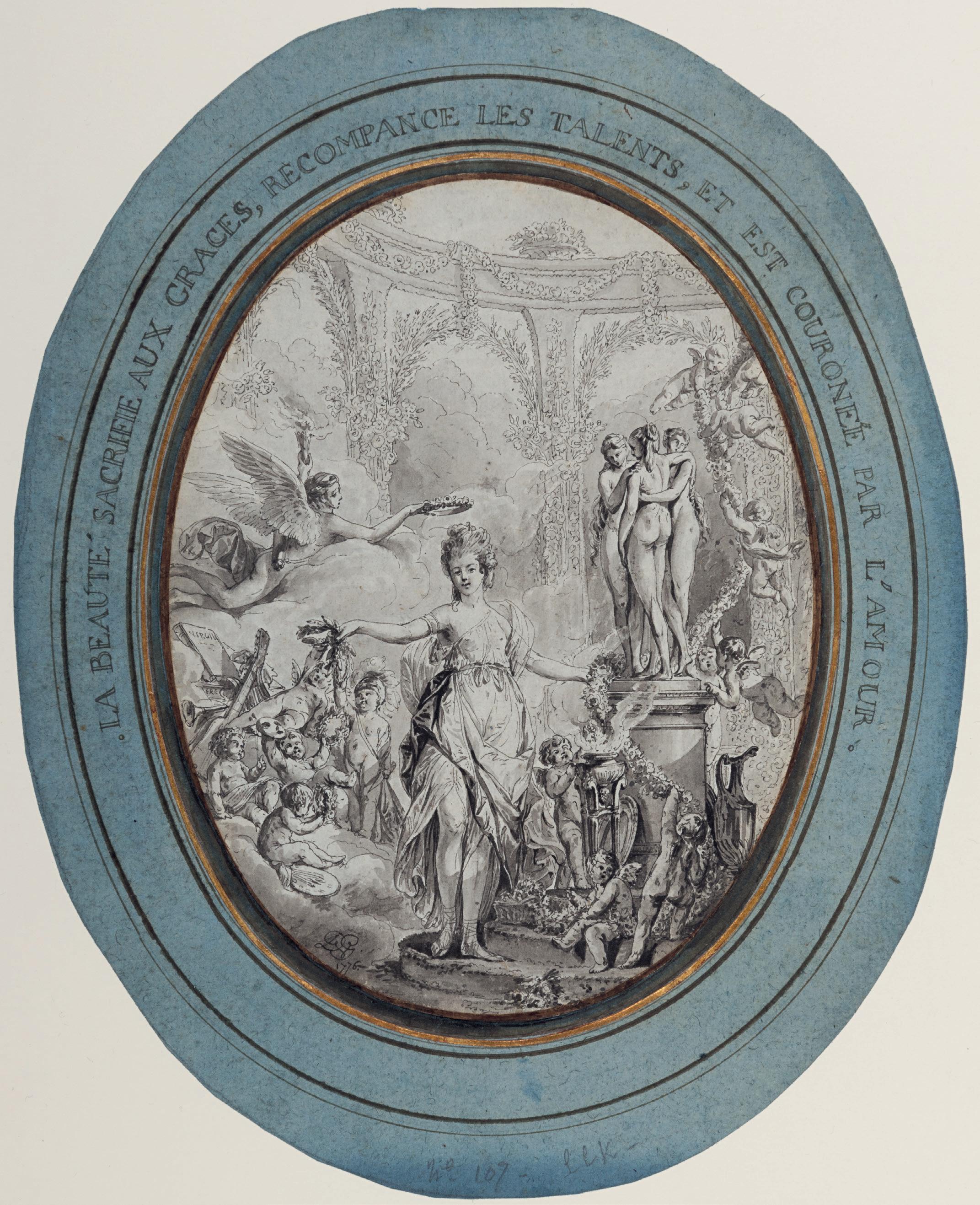
Large groups of drawings by Dugourc are today in the collections of the Musée des Arts Décoratifs in Paris – mainly designs for projects commissioned by the Royal family – and the Musée des Arts Décoratifs in Lyon. Other drawings by the artist are in the Rijksmuseum in Amsterdam, the Victoria and Albert Museum in London, the Cooper Hewitt Museum and the Metropolitan Museum of Art in New York and the Louvre.
Dated 1776, this highly finished drawing is an early work by Dugourc. It depicts Beauty, crowned by Love, who sacrifices herself to the Three Graces on the right, while she rewards Talent – personified by figures representing Music, Painting and Military Courage – at her feet. The present sheet remains unconnected with any known work by Dugourc and, with its elaborately decorated mount, may well have been intended as an autonomous work of art in its own right, for presentation or sale to a collector.
However, it has also been tentatively suggested that this drawing might be related to Dugourc’s designs for the interior of the Château de Bagatelle in the Bois de Boulogne, constructed by the artist’s brotherin-law Bélanger for the Comte d’Artois, brother of Louis XVI. Nicknamed the ‘Folie d’Artois’, Bagatelle was a Neoclassical-style small pleasure pavilion famously built over sixty-four days in the autumn of 1777. (The Comte d’Artois thereby won a bet that he had made with his sister-in-law Marie Antoinette, who had wagered that the new château could not be completed in less than three months. It may also be noted that the central figure of Beauty in this drawing bears a passing resemblance to both MarieAntoinette and the Comtesse d’Artois, Maria Theresa of Savoy, who had married the Comte d’Artois in 1773.) Some written descriptions of the decoration of Château de Bagatelle note a set of painted doors by Dugourc depicting the Progress of Love in the two boudoirs on the first floor of the pavilion, alongside a series of six large, vertical Italianate landscape paintings by Hubert Robert. However, almost all of the original painted decorations in the Château de Bagatelle are no longer in situ and much has been lost.
The present sheet can be grouped with a small number of stylistically comparable and equally highly finished oval drawings by Dugourc, each likewise signed and dated 1776. A group of five pen and ink drawings illustrating the story of Cupid and Psyche, with similarly inscribed mounts (figs.1-2), were formerly in the collections of Jean Masson and Florence J. Gould1, while a pair of oval drawings of L’Amour enchaîne par les Grâces and Les Grâces couronnées par l’Amour appeared at auction in Paris in 19192. The late 19th century French collector Jean Masson’s fine group of ornamental drawings and prints included two further oval drawings of this type by Dugourc, depicting Le Désir et le Mystère conduisant la Jeunesse à l’Amour and Les Grâces conduisant l’Amour à la Fidelité and both dated 1776, which were sold at auction in 19233. Like the present sheet, all of these drawings executed in 1776 may have been intended as designs for a now-lost decorative scheme in the Château de Bagatelle, completed the following year.
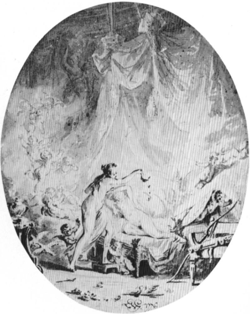
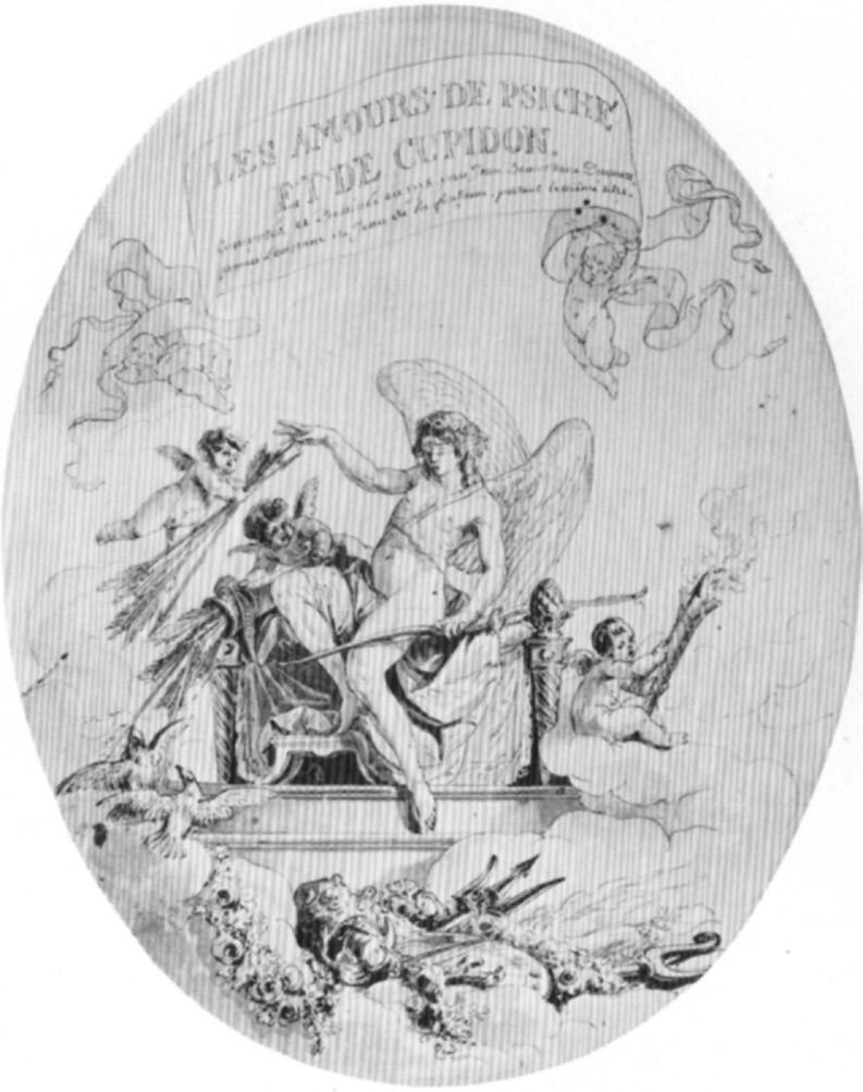
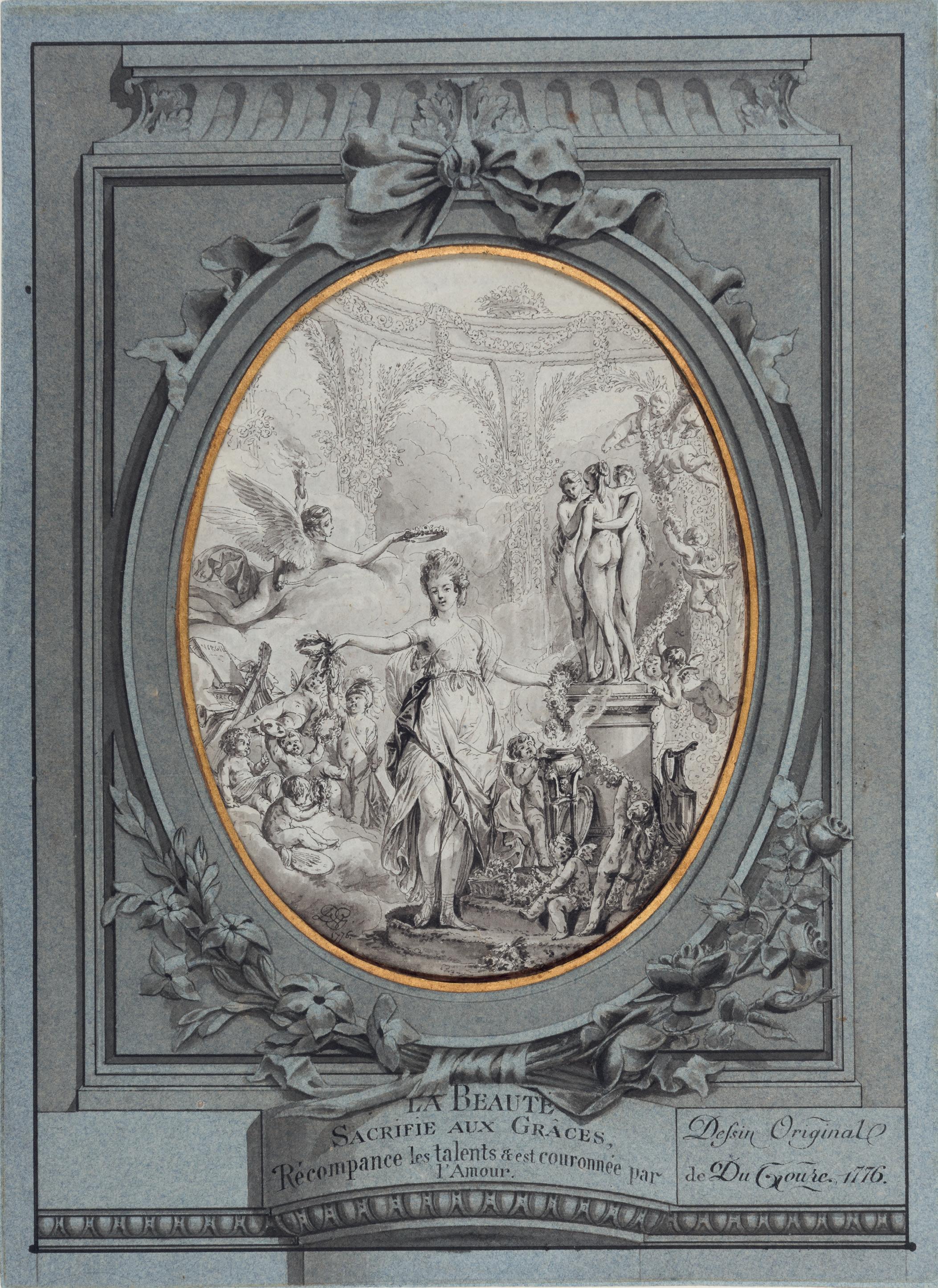
SICILIAN SCHOOL
Late 18th Century
Designs for a Trompe l’Oeil Wall Decoration for a Sicilian Villa
Watercolour, pen and grey ink and grey wash, with framing lines in brown ink. Inscribed with a scale labeled Scala di Palmi dieci Siciliani, in brown ink over pencil, at the upper left. 471 x 287 mm. (18 1/2 x 11 1/4 in.)
PROVENANCE: Anonymous sale, London, Sotheby’s, 22 April 1998, lot 336 (as Italian School, 18th Century); P. & D. Colnaghi, London, in 1998; Allan and Nancy Katz, Tallahassee, Florida; Stephen Ongpin Fine Art, London, in 2013; Rose Dubrowsky, London; John and Eileen Harris, London and Badminton, Gloucestershire.
This exceptionally fine and complete design presents a comprehensive decorative programme for the interior of a Sicilian aristocratic villa. The drawing comprises six different and separate elements. The upper third of the sheet depicts a ceiling design incorporating Pompeian grotesque ornament, an oval cartouche bearing a crowned coat of arms held by a winged figure and a perspective sketch of a courtyard, while the rest of the sheet is comprised of three designs for the decoration of a wall. Of these mural designs, one shows what appears to be the front of the villa with a formal avenue seen through the columns of a loggia, while another depicts a trompe l’oeil window onto the rear of the villa, which is dominated by an imposing single-flight external staircase, while an open doorway to the right leads into a dark space. In several places in the landscapes strolling figures are depicted.
The decorative vocabulary evident throughout the present sheet - Pompeian grotesques and trompe l’oeil architectural elements - is characteristic of the style of interior decoration in Sicily during the late 18th century, when the ornate elements of Baroque, Rococo and Neoclassical tastes were often combined. The heraldic cartouche with its crowned and quartered coat of arms would suggest a specific aristocratic patron. The double depiction of the villa within the painted panels, showing both the entrance and garden facades, suggests that the building shown is the very one for which these decorative schemes were intended. The scale and inscription ‘Scala di Palmi dieci Siciliani’ at the upper left corner of the sheet indicates that this drawing was a working design for rooms of determinable dimensions, rather than a purely imaginative exercise. It also firmly places the draughtsman within a Sicilian professional tradition. The palmo siciliano was a local unit of length used in Sicily which differed from the Roman or Neapolitan palmo, with a scale of ten Sicilian palmi equating to roughly 2.58 metres.
Tentative attributions to the 18th century Sicilian architect Andrea Giganti and the painter Elia Interguglielmi have been suggested for this drawing. The architect and Jesuit priest Andrea Giganti (1737-1787) was active for most of his career in and around Palermo. He was employed in the household of the Sicilian aristocrat Ercole Branciforte, 4th Prince of Scordia, and worked on several of the homes of the Scordia family, notably the Palazzo Branciforte di Scordia in Palermo. He also designed the Villa Galletti Inguaggiato at Bagheria in 1774 and the Villa Tasca at Mezzomonreale in 1780. In the later part of his career Giganti adopted French idioms with increasing liveliness and invention, reflecting a shift toward a more Neoclassical style.
The Neoclassical painter Elia Interguglielmi (1746-1835) was born in Naples and settled in Palermo in the late 1760s. Although his earliest commissions were for churches, he also worked as a fresco painter, creating elegant decorative schemes, often incorporating illusionistic perspectives, feigned loggias and countryside views, in several Sicilian palaces and villas, such as the Villa Valguarnera in Bagheria and the Palazzo Gravina di Comitini in Palermo. Between 1796 and 1797 Interguglielmi decorated the interior of the Villa Trabia in Bagheria, where he depicted dancing figures, fantastical animals, mythological creatures and playful cherubs. The project was carried out under the leadership of the architect Teodoro Gigante, the nephew of Andrea Gigante, who had bequeathed a large portion of his own drawings to Interguglielmi.
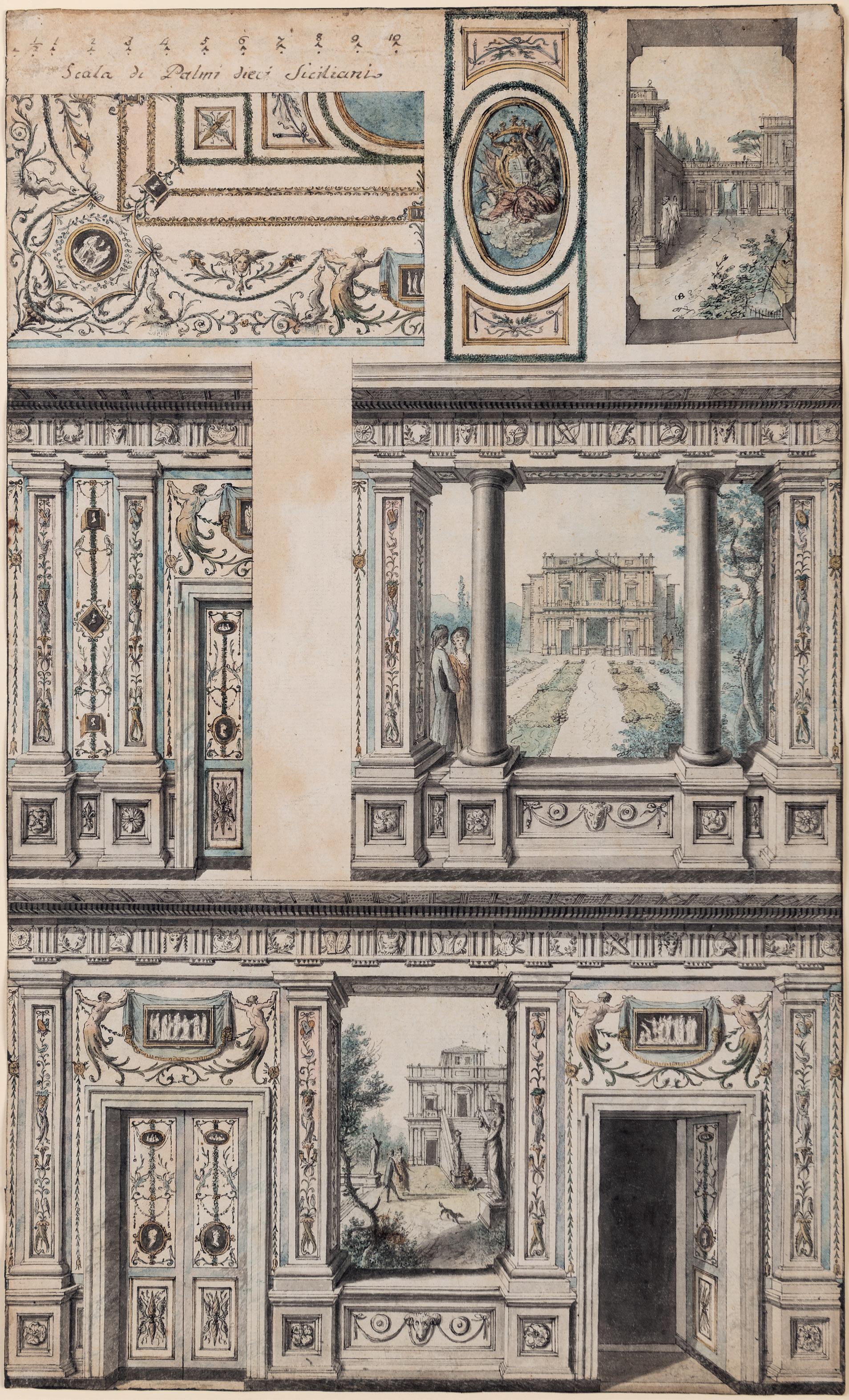
RICHARD DE LALONDE
Paris(?) 1735-1808 Paris(?)
Study for a Commode with the Monogram of Marie-Antoinette
Pen and black ink and watercolour, drawn on a large album page. A scale drawn in black ink and annotated with numbers in pencil at the bottom. Inscribed Meuble à etagère / à Trianon and numbered 24 in pencil on the verso.
184 x 318 mm. (7 1/4 x 12 1/2 in.) [image]
PROVENANCE: Probably Comte Octave de Béhague, Paris; By descent to his daughter Berthe de Béhague, Marquise de Ganay, Paris; Her sister, Martine-Marie-Pol de Béhague, Comtesse de Béarn, Paris; Thence by descent until 1995; Sale (‘Ancienne collection de la Comtesse de Béhague’), Paris, Hôtel Drouot, 29 November 1995, lot 53; Kate de Rothschild, London; Private collection.
EXHIBITED: New York, Brame & Lorenceau, Kate de Rothschild and Didier Aaron at Didier Aaron, Inc., Master Drawings, 1996, no.26; Stanford, Stanford University, Cantor Center for Visual Arts, Classic Taste: Drawings and Decorative Arts from the Collection of Horace Brock, March-May 2000.
Relatively little is known of the life and career of Richard de Lalonde, who was active as an architect, furniture designer, ornamental draughtsman and decorator in the late 18th century. Although a significant figure in the history of Neoclassicism in France, his work is known mainly through engravings. Active from about 1760, when his name is first recorded in the accounts of the Menus-plaisirs du roi, Lalonde was firmly established by the 1780s. (As early as 1781, the Parisian colour merchant and varnishmaker Jean-Félix Watin, in his L’art du peintre, doreur, vernisseur, praised Lalonde for his ‘perfect and modern taste.’) Lalonde enjoyed some Royal patronage and among his clients was the brother of the King, the Comte de Provence. He worked at the Garde Meuble de la Couronne and also for such Parisian marchands-merciers as Simon-Philippe Poirier and Dominique Daguerre, producing numerous designs for furniture, ornament and silver1. The range of the artist’s extensive oeuvre is thoroughly documented in two volumes of engravings after his designs, the Oeuvres diverses de Lalonde, décorateur et dessinateur, contenant un grand nombre de dessins pour la décoration intérieur des appartements à l’usage de la peinture et de la sculpture en ornement des meubles de plus nouveau genre, published between 1776 and 1788. The Oeuvres diverses was made up of twenty-six cahiers, each containing six plates, and its purpose was stated on the title page: ‘This collection is useful for artists and anyone wishing to decorate with good taste.’2 The drawings provided a large number of designs, including for such items of furniture as commodes and secrétaires, that were later used and adapted by cabinetmakers like Martin Carlin, Joseph Stockel and Adam Weisweiler. The wide dissemination of the Oeuvres diverses spread Lalonde’s reputation as a designer throughout France and the rest of Europe.
This drawing by Lalonde is a design for a type of commode sometimes known as an entre-deux, combining a chest of drawers with a low cabinet and intended to fill a space between windows, and is distinguished by the incorporation of the prominent monogram of Queen Marie-Antoinette. Lalonde’s design seems to have been used, with some slight variations, for a pair of meubles d’entredeux sideboards commissioned in 1786 from the maître-ébéniste Guillaume Beneman for MarieAntoinette’s Salon des jeux in the Château de Compiègne and now in the Louvre3
The present sheet was part of a large group of around seventy drawings – including designs for carved and upholstered furniture, doors, fireplaces, beds, chandeliers and carriages – by Lalonde and other designers that were in the possession of the de Béhague family in the 19th and 20th centuries. A closely related drawing by Lalonde for a commode, also with the monogram of Marie-Antoinette, was included in the de Béhague sale in 19954. A drawing for a mirror frame by the artist, likewise incorporating the Queen’s monogram, is in the Cooper-Hewitt Museum in New York5
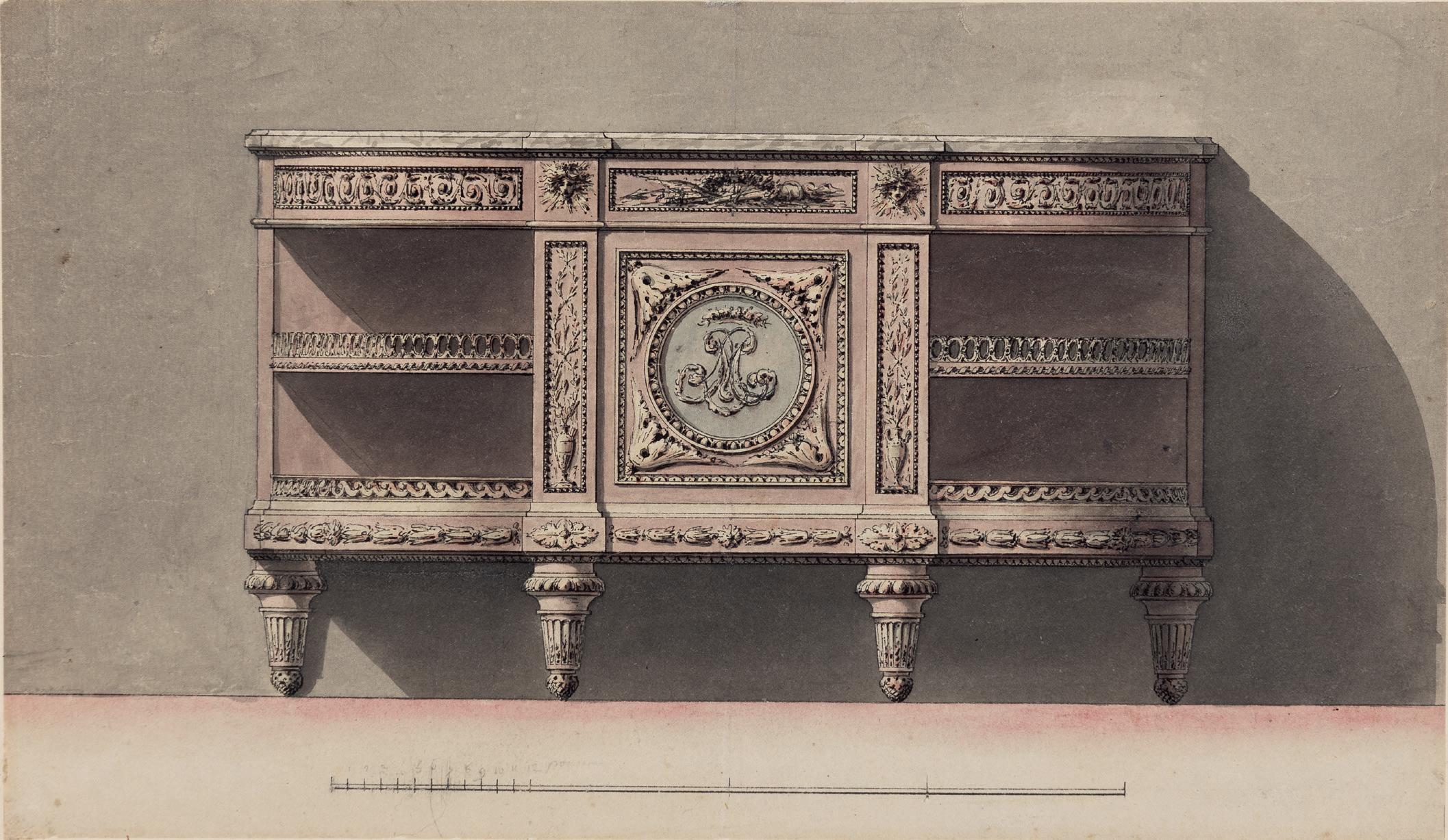
Circle of PIERRE-LOUIS MOREAU-DESPROUX
Paris 1727-1794 Paris
Project for a Temple of Hymen
Pen and black ink and grey wash, within a fictive drawn mount with a black border. Titled TEMPLE DE L’HIMEN. in black ink at the top of the sheet.
305 x 385 mm. (12 x 15 1/8 in.) [image]
320 x 403 mm. (12 5/8 x 15 7/8 in.) [sheet]
Watermark: D. & C. BLAUW with a crown and a fleur-de-lys.
PROVENANCE: The Clarendon Gallery, London, in 1987; Private collection.
EXHIBITED: New York, The Clarendon Gallery at Shepherd Gallery Associates, Architectural Drawings, 1987, no.38; Stanford, Stanford University, Cantor Center for Visual Arts, Classic Taste: Drawings and Decorative Arts from the Collection of Horace Brock, 2000.
Although the Neoclassical architect Pierre-Louis Moreau-Desproux competed for the Prix de Rome in architecture for three consecutive years between 1750 and 1752 without success, he was nevertheless able to go to Rome when his friend and fellow student, the architect Charles de Wailly, offered to share his prize. The two were in Rome between 1754 and 1756, where Moreau-Desproux took part, along with de Wailly and a fellow architect, Marie-Joseph Peyre, in the excavations of the Baths of Diocletian. After his return to Paris Moreau-Desproux gained his first architectural commission with the design of the Hôtel de Chavannes for the financier Jacques de Chavannes, completed in 1758. He was accepted into the Académie Royale de Architecture in 1762, and the following year was appointed surintendant des bâtiments for the city of Paris, a post he held until 1787. In this capacity, in which he succeeded his uncle Jean-Baptiste-Augustin Basire, Moreau-Desproux was entrusted with the supervision of a wide range of public works in the city, including the design of ephemeral decorations for important festivals. He was also charged with the rebuilding of the theatre at the Palais-Royal, on which he worked between 1763 and 1770, as well as the remodeling of the interior of the Hôtel de Luynes and the Hôtel Gontaut. Although he had retired to the country by 1793, Moreau-Desproux was arrested during the Terror and died on the guillotine that year.
Monique Mossère has suggested that this drawing may be related to the public celebrations honouring either the marriage of Louis XVI or the birth of the Dauphin. In his role as the surintendant des bâtiments of Paris, Moreau-Desproux was involved in the plans for the Fête celebrating the marriage of the future Louis XVI to Marie Antoinette in 1770, as well as the festival organized in 1782 in honour of the birth of the Dauphin. For the latter, Moreau-Desproux is known to have designed a fireworks decoration in the form of a Temple of Hymen standing on the base of a rock, surrounded by fountains and triumphal columns.
As Suzanne Boorsch has noted, ‘The last great fête of the ancien regime in France was for the birth of the dauphin, on October 22, 1781. Louis XVI and Marie-Antoinette had been married eleven years before a son was born, and the long-awaited event inspired lavish celebrations over several days, with no regard for difficulty or expense. The date chosen for the fireworks was January 21, 1782. The structure from behind which the fireworks would be shot off [was] erected on the Place de la Grêve in front of the Hôtel de Ville…following the design of the city architect Pierre-Louis Moreau-Desproux.’1 A large and highly-finished drawing for this project, attributed to Moreau-Desproux, is today in the Musée Carnavalet in Paris2, while another sizeable drawing of the same fireworks machine, attributed to Louis-Gustave Taraval following a design by Moreau-Desproux, is in the collection of the Metropolitan Museum of Art in New York3
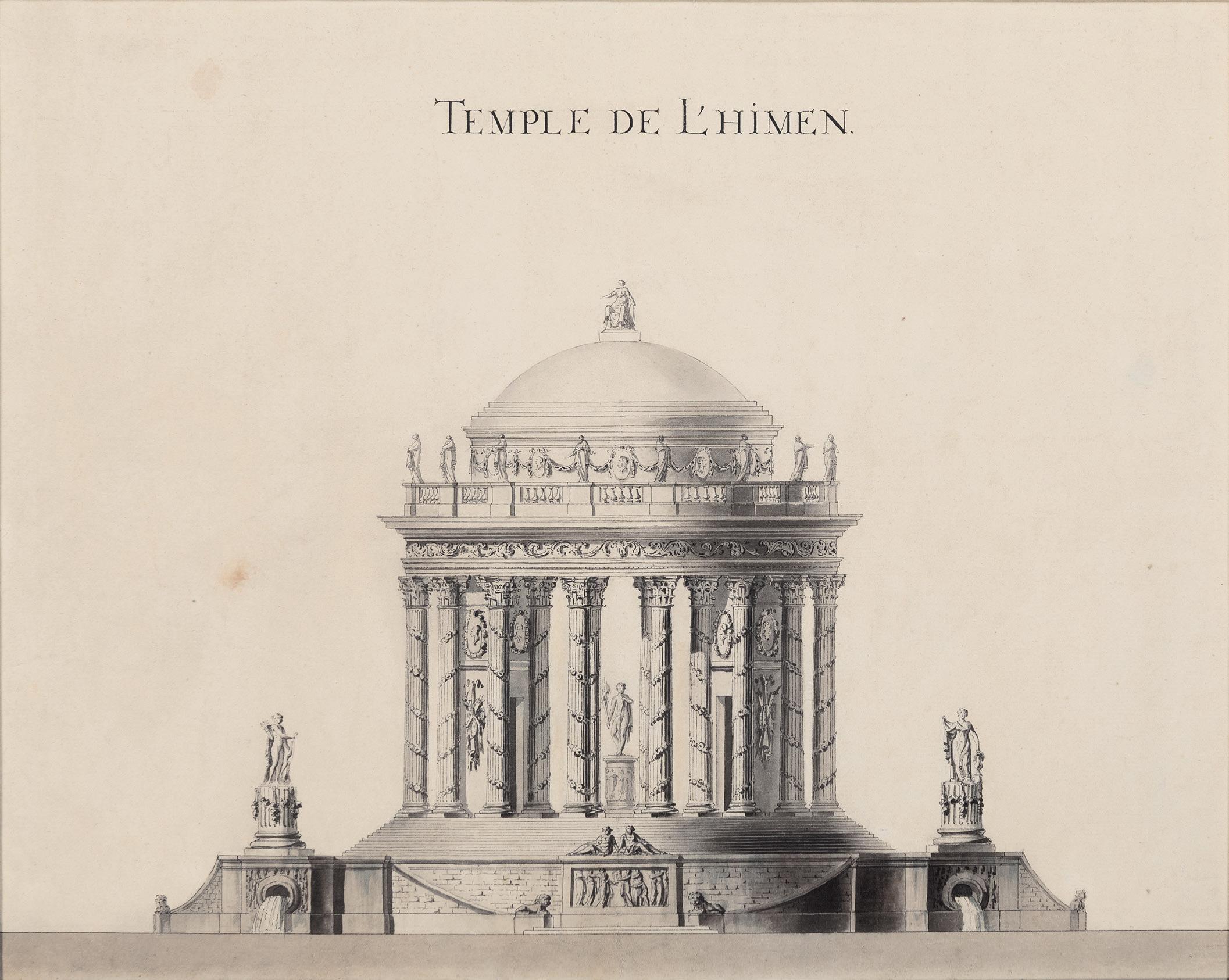
JEAN-GUILLAUME MOITTE
Paris 1746-1810 Paris
A Design for a Basin or Tazza with an Acanthus Leaf Rim
Pen and black ink and black wash. 229 x 568 mm. (9 x 22 3/8 in.)
PROVENANCE: Henri Auguste, Paris; Acquired by Jean-Baptiste-Claude Odiot, Paris; By descent in the archives of the Maison Odiot, Paris, until c.1979, with the Odiot collection mark (not in Lugt) stamped at the lower right, together with the associated number 355; Anonymous sale, Monaco, Sotheby’s, 22 February 1986, lot 185; Armin B. Allen, Inc., New York and Hobhouse Ltd., London, in 1986; Private collection.
LITERATURE: New York, Sotheby’s, Fine Silver, 8 April 1986, illustrated under lot 72; Monaco, Sotheby’s, Argenterie Européene, 24 June 1986, illustrated under lot 1601; Timothy B. Schroder, The Gilbert Collection of Gold and Silver, Los Angeles, 1988, pp.620-621, fig.135; Gisela Gramaccini, JeanGuillaume Moitte (1746-1810): Leben und Werk, Berlin, 1993, Vol.II, p.64, no.159.10, fig.219 (as location unknown).
EXHIBITED: New York, Armin B. Allen, Inc. and Hobhouse Ltd., An Exhibition of Ornamental Drawings 1520-1920, 1986, no.66; Stanford, Stanford University, Cantor Center for Visual Arts, Classic Taste: Drawings and Decorative Arts from the Collection of Horace Brock, 2000; Boston, Museum of Fine Arts, Splendor and Elegance: European Decorative Arts and Drawings from the Horace Wood Brock Collection, 2009, no.153.
Born into a family of engravers, the Neoclassical sculptor and draughtsman Jean-Guillaume Moitte was trained in the studios of the sculptors Jean-Baptiste Pigalle and Jean-Baptiste Lemoyne and won the Prix de Rome for sculpture in 1768. After a period of study at the Ecole Royale des Elèves Protégés, he arrived in Rome in 1771, although his stay was cut short, after about a year and a half, for reasons of ill health. Nevertheless, his study of ancient sculpture in Rome, and of Roman reliefs, vases and urns, was to be of great importance in his later work. One of Moitte’s first commissions upon his return to France was the decoration of the château of the Prince de Conti at L’Isle-Adam. Although he was admitted (agrée) to the Académie Royale in 1783, the year that he first exhibited at the Salon, he was never reçu as a full Academician. In 1784 he produced a number of sculptures and reliefs for the Hotel de Salm, and in the succeeding years worked on the decoration of the barrières or toll-houses of Paris, built by the architect Claude-Nicolas Ledoux. During the Revolution, Moitte took part in the decorations for the Fête de la Fédération in 1791, and the following year designed a new pediment for the Panthéon, since destroyed. Other public commissions included a pediment in the old Palais du Louvre and a bas relief in the Luxembourg Palace. In 1795 Moitte was made a member of the Institut de France and later received several important Imperial commissions from Napoleon.
Moitte was an exceptional draughtsman. In the middle of the 1780s he began designing projects for the noted Parisian gold and silversmith and orfèvre du roi Henri Auguste (1759-1816), including designs for dinner services and candelabra, in a collaboration that lasted for several years. As one contemporary author recorded, Moitte ‘drew in pen many large friezes in a beautiful style, that were much admired among artists. Although he had not been able to model and work marble in Rome, his head was full of ideas and his folders filled with drawings. M. Auguste, goldsmith to the King, employed him to make drawings that served as designs for his best works. Thus he obtained an enormous advantage over all the other goldsmiths. M. Moitte made perhaps over a thousand drawings of this kind, and he obtained a special reputation in this field, which he perhaps dismissed too much later on; he gave to a luxury genre a degree of merit which had not existed in France for over a century. The great masters did not hesitate to depict his designs.’1
Moitte’s drawings for Henri Auguste may be counted among the most refined designs for silverwork produced during the Neoclassical period, incorporating motifs inspired by those of ancient Roman
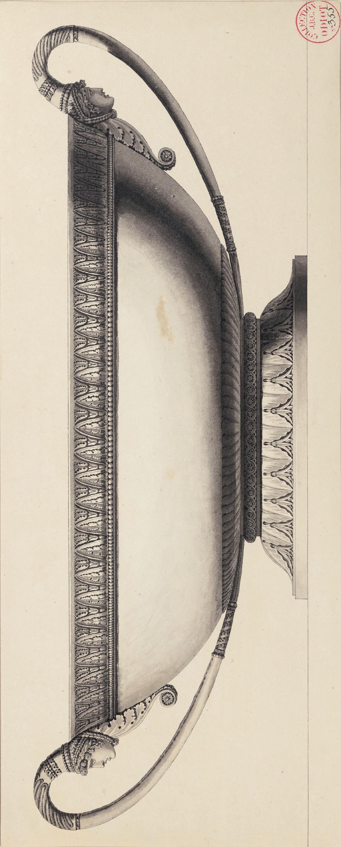
vessels. As Peter Fuhring has noted, ‘Simple geometrical forms, the use of friezes with acanthus scrolls, palmettes and other classical ornaments such as mascarons taken from vessels of Roman Antiquity are recurrent motifs in Moitte’s designs for silver. Moreover, the use of ornaments in bas-relief points to an excellent knowledge of the classical works that were excavated and studied in the eighteenth century… Moitte’s direct Roman experience, combined with his talent as a designer and draughtsman, were superbly complemented by Auguste’s talents as a silversmith.’2 The curator Reinier Baarsen has further pointed out that ‘Moitte’s designs were extremely modern for their time, showing as they do many characteristics that would become mainstream only during the Empire period.’3
The fame of the artist’s elegant designs for silver and gold objects spread even beyond France, and among the contemporary collectors who acquired silver designed by Moitte was the wealthy English writer and politician William Beckford, who purchased several items from Auguste. In 1806, however, Auguste was declared bankrupt, and three years later he fled his creditors and left France, eventually dying in a debtor’s prison in Haiti in 1816. Much of the contents of Auguste’s workshop, including many of Moitte’s decorative drawings – among them the present sheet, for a large tazza with Grecian masks on the handles – were acquired by the rival Parisian silversmith Jean-Baptiste-Claude Odiot (17631850), with whose descendants they remained until the late 1970s.
This very large sheet may be counted among the finest of Moitte’s designs for silver. In 1787 and 1789 Henri Auguste’s firm produced at least two, and possibly three, silver basins based on the present drawing by Moitte, together with accompanying ewers. Two of these are recorded in the collection of William Beckford at Fonthill Abbey in Wiltshire4, and one of these was described, in the catalogue of the Fonthill sale of 1822, as ‘A MAGNIFICENT HANDLED TAZZA, modelled after the antique, by the celebrated French Sculptor Moiette [sic] and executed by H. Auguste (Paris, 1802), in a style of superior excellence; the borders and masques most exquisitely chased, and worthy the best period of Grecian art.’5 These were among several pieces of silver acquired from Henri Auguste by William Beckford during his visits to France between 1788 and 1802, which also included one gold and three silver-gilt ewers, two basins, a pair of gold tazzas, a candelabrum, candlesticks and a jewel box. One of the Beckford basins of the type seen in this drawing was later with Jacques Kugel in Paris in 1965 and is now in the Gilbert Collection on loan to the Victoria and Albert Museum in London6, while another basin and accompanying ewer of the same design (fig.1) is in a private collection7
Another drawing by Moitte for the same basin, of similar dimensions and numbered 355 bis, was also in the Odiot archive collection and is today in the Gilbert collection at the Victoria and Albert Museum8 A very similar basin, but with a different base, appears on a table in a large signed and dated drawing by Moitte depicting several silver objects in a room, today in the Ecole des Beaux-Arts in Paris9. Other drawings of designs for silver by Jean-Guillaume Moitte are in the collections of the Rijksmuseum in Amsterdam, the Harvard Art Museums in Cambridge, Massachusetts, the National Galleries of Scotland in Edinburgh, the J. Paul Getty Museum in Los Angeles, the Metropolitan Museum of Art in New York, the Musée des Arts Décoratifs in Paris, and elsewhere.
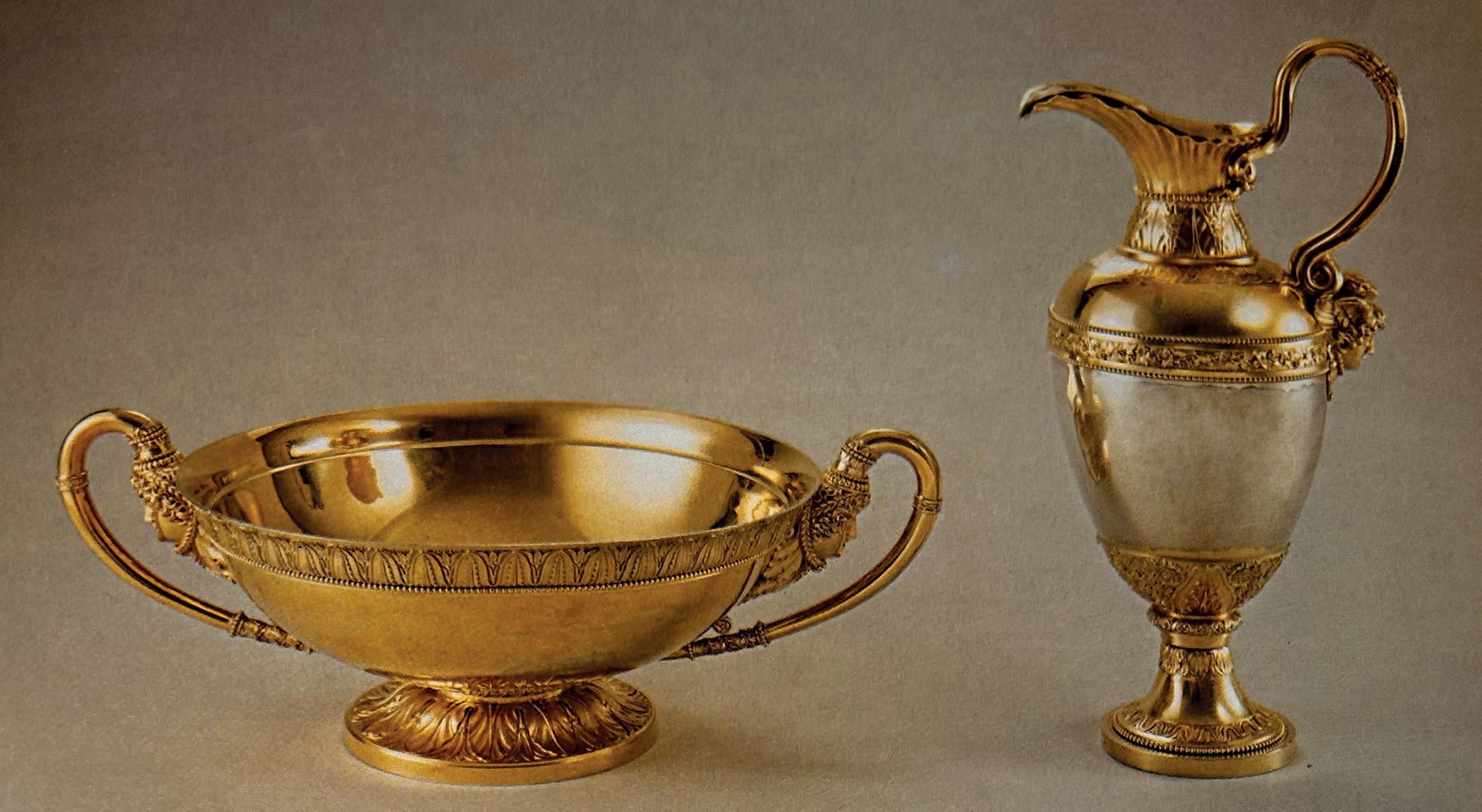
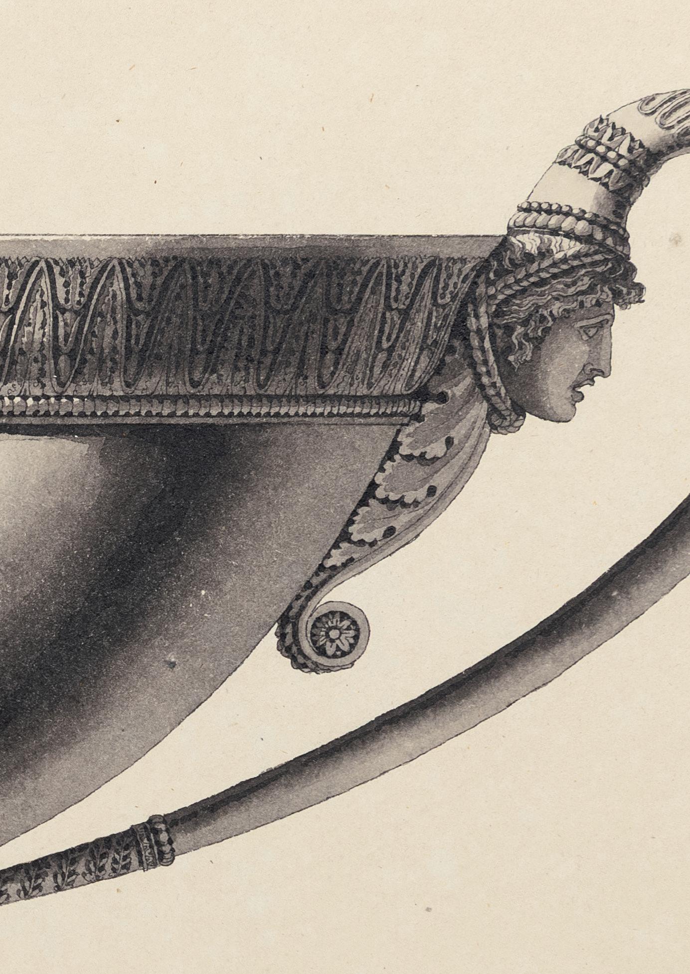
PIETRO GONZAGA
Longarone 1751-1831 St. Petersburg
Stage Design: An Architectural Capriccio with Classical Buildings Around an Obelisk Pen and brown ink and brown wash. 210 x 341 mm. (8 1/4 x 13 1/2 in.)
PROVENANCE: Alexandre Benois, Paris; By descent to his son Nicola Alexandrovich Benois, Milan; Flavia Ormond, London, in 1997; Private collection.
EXHIBITED: New York, Flavia Ormond Fine Arts at Adelson Galleries, Italian Old Master Drawings 1500-1850, 1997, no.14; Stanford, Stanford University, Cantor Center for Visual Arts, Classic Taste: Drawings and Decorative Arts from the Collection of Horace Brock, March-May 2000; Boston, Museum of Fine Arts, Splendor and Elegance: European Decorative Arts and Drawings from the Horace Wood Brock Collection, 2009, no.145.
Born in a town near Belluno, north of Venice, Pietro di Gottardo Gonzaga moved to Treviso in 1767 to study with Carlo Galli Bibbiena, one of the last members of a famous dynasty of scenographers. Two years later he was in Venice, where he trained with Antonio Visentini and Giuseppe Moretti, before completing his apprenticeship in Milan, between 1772 and 1778, with the Galliari family of stage designers. As an independent artist, Gonzaga produced numerous designs for stage sets for theatres throughout Italy, notably La Scala in Milan and La Fenice in Venice, as well as in Mantua, Parma, and Rome, and became one of the leading artists in this field. Indeed, as one modern scholar has opined, ‘the real initiators of neo-classical stage-design, free from all echoes of Baroque or Rococo, were Giacomo Quarenghi, Pietro Gonzaga and Paolo Landriani.’1
While Gonzaga also painted landscapes and architectural perspectives, it was as a stage designer that he came to the attention of Prince Nicolai Yusupov, the Russian ambassador, who brought the artist to the court of Catherine the Great in St. Petersburg in 1792. Gonzaga enjoyed a highly successful career in Russia, working in St. Petersburg and Moscow as chief scenographer for the State theatres as well as decorating several palaces with landscape and architectural paintings and creating designs for temporary ceremonial structures. He also collaborated with Giacomo Quarenghi on the design of the theatre at the Hermitage. Gonzaga worked occasionally as an architect, and was named court architect in 1827. It was in Russia that Gonzaga published two treatises on scenographic matters: La musique des yeux et l’optique théâtrale in 1800, and the more autobiographical Information à mon chef ou éclaircissement convenable du décorateur théâtral in 1807. Gonzaga was largely responsible for launching a new school of Russian stage design, and a large number of his drawings are today in museum collections in Russia.
As one scholar has noted, ‘Like Piranesi, Gonzaga built a few actual structures but had more success creating grand architectural proposals as drawings; in Gonzaga’s case they were frequently converted into etchings by others.’2 Gonzaga’s drawings of stage designs are characterized by an interest in complex perspective and a bold use of pen and ink washes, here used to bathe the scene in bright sunlight. Among stylistically comparable set designs by Gonzaga are two drawings of classical buildings; one, like the present sheet, formerly in the collection of Nicola Benois in Milan and the other at one time in the Kaufman collection in London3. Also similar are two stage designs, one dated 1814, that appeared on the art market in 2000 and 20064, and another stage design by Gonzaga that was sold at auction twice in the 1980s5
The present sheet belonged to the Russian artist, art critic and scenographer Alexandre Benois (18701960) and later passed to his son, the stage and costume designer Nicola Benois (1901-1988).
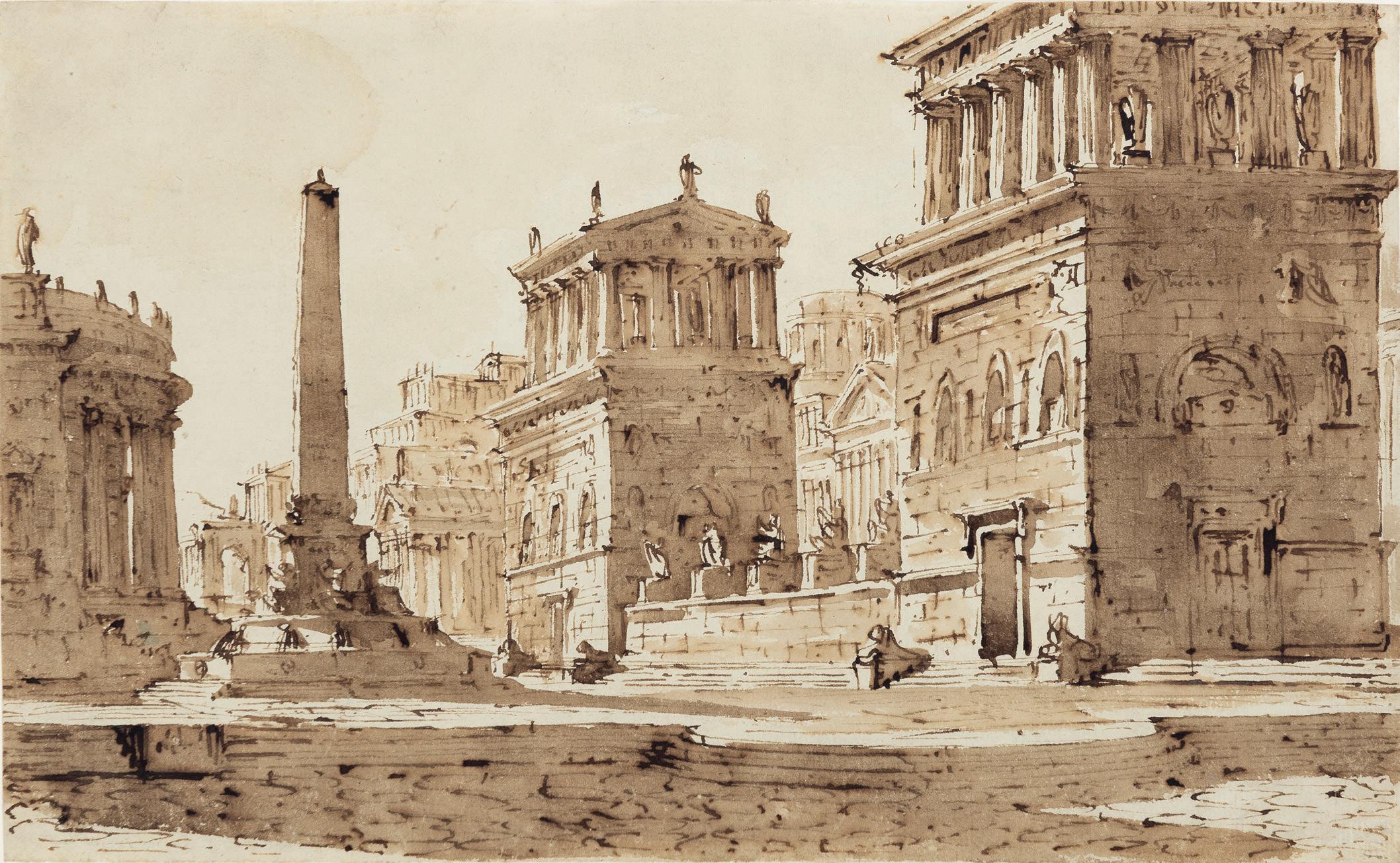
ANTONIO BASOLI
Castelguelfo 1774-1848 Bologna
Design for the Walls and Ceiling of a Room
Pen and brown ink and watercolour, over traces of a pencil underdrawing, with framing lines in brown ink.
368 x 486 mm. (14 1/2 x 19 1/8 in.)
PROVENANCE: John and Eileen Harris, London and Badminton, Gloucestershire, by 1972.
LITERATURE: London, Royal Academy and Victoria and Albert Museum, The Age of Neo-classicism, exhibition catalogue, 1972, p.728, no.1564 (entry by William Rieder).
EXHIBITED: London, Victoria and Albert Museum, The Age of Neo-classicism, 1972, no.1564.
Much of what we know of the life and work of Antonio Giuseppe Basoli is derived from an unpublished autobiographical manuscript, the Cattalogo delle opere di Antonio Basoli scritto da lui medesimo l’anno 1821, today kept in the Accademia di Belle Arti in Bologna. A painter, decorator and scenographer, Basoli is best known for his stage designs and elaborate drawings of architectural interiors; indeed, he described himself as a ‘painter of theatre and interior decorations and similar works’ (‘pittore di decorazioni da teatro, da camera e quadri di tal genere’). He received his early training, between 1786 and 1794, at the Accademia Clementina in Bologna, where he was particularly influenced by the work of the Gandolfis and the Bibiena family. Basoli was active in and around Bologna for his entire career, during the early part of which he worked on a number of decorative schemes in collaboration with the theatrical designer Pelagio Palagi. Some of his early projects never came to fruition, however, such as the restoration of the Teatro Formagliari in Bologna in 1796, which had not begun before the theatre was destroyed by fire in 1802.
Basoli was active in other theatres in Bologna, decorating the Teatro Marsigli-Rossi in 1808, the Teatro Comunale the following year and the Teatro Contavalli in 1818. He also worked at various palaces in the city, including the Palazzo Rosselli del Turco, Palazzo Sanguinetti and Palazzo Hercolani, as well as several villas in the surrounding province. Basoli served as a professor of ornamental design at the Accademia di Belle Arti from 1804 to 1826, and succeeded Antonio Sanquirico as the principal designer at the Teatro alla Scala in Milan. His numerous designs for the stage, including many intended for performances at La Scala, were engraved in two publications; the Raccolta di prospettive serie, rustiche e di paesaggio, published in 1810, and the Collezione di varie scene teatrali, which appeared in 1821. Basoli also produced designs for furniture, lamps and other household objects.
This large sheet is a very fine example of Basoli’s designs for interior spaces. A number of similar projects for wall and ceiling decorations are contained in several albums of finished watercolours, compiled by the artist himself, that are today in the collection of the Accademia di Belle Arti in Bologna. One of these albums, inventoried as ‘Libro 105’, contains various decorative schemes, datable between 1797 and 1809, for the interiors of such Bolognese palazzi as the Casa Monti, the Casa Muratori, the Palazzo Aldini, the Palazzo Levi and the Palazzo Albergati1, while another volume, ‘Libro 82’, includes watercolours executed between 1806 and 1808 for the interiors of, among others, the Casa Torri, the Casa Belvederi and the Casa Michelini, all in Bologna2. Basoli also included several similar designs for walls and compartmented ceilings in his Compartimenti di camere, published in Bologna in 1827.
The present sheet has been dated to c.1820. Among other comparable works by Basoli is a large design for a coffered ceiling and walls in the Metropolitan Museum of Art in New York3 and a watercolour of a stage design of an interior, in the Cooper-Hewitt, National Design Museum in New York4
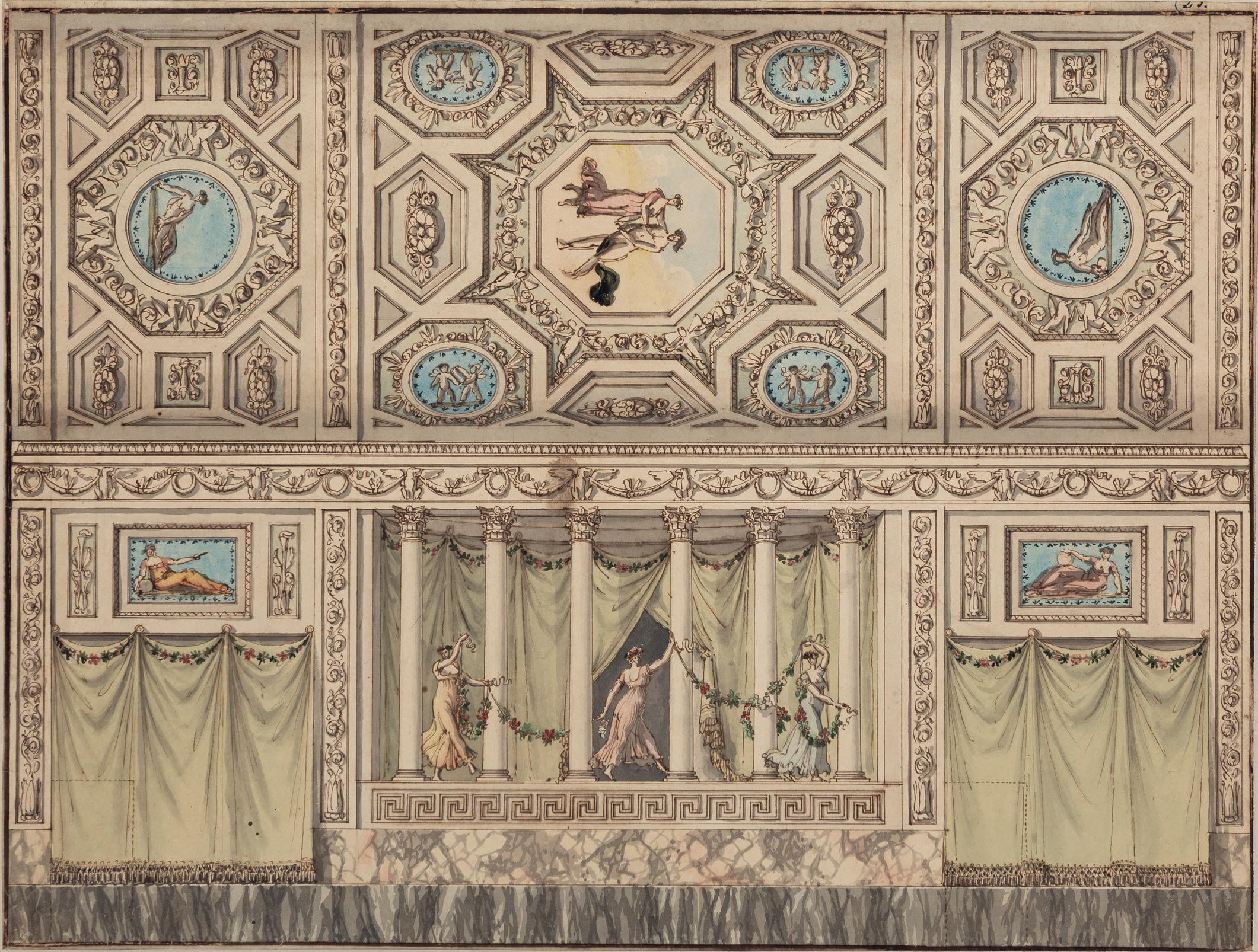
ANTONIO BASOLI
Castelguelfo 1774-1848 Bologna
Design for the Side Elevation of a Private Chapel
Pen and grey ink, watercolour and gouache, over traces of a pencil underdrawing, heightened with gold, within framing lines in brown ink. Inscribed Prospetto Lateralle in brown ink in the upper margin and numbered 25 in pencil in the lower right margin.
531 x 421 mm. (20 7/8 x 16 5/8 in.) [image]
708 x 490 mm. (27 7/8 x 19 1/4 in.) [sheet]
PROVENANCE: John and Eileen Harris, London and Badminton, Gloucestershire.
Antonio Basoli’s superb, large watercolours of stage designs and interior decorations may be counted among the finest and most appealing examples of architectural draughtsmanship of the late 18th and early 19th centuries in Italy. In his manuscript autobiography, written in 1821, Basoli discussed in considerable detail his designs for interior decoration projects, wherein he was able to translate his skills as a scenographer into numerous imaginative and varied treatments for a room or interior space. Sometimes the artist created a room in an ‘Egyptian’, ‘Etruscan’ or ‘Ottoman’ style, or else imagined exotic fabrics and curtains alongside precious materials, marble or wooden surfaces and fine furniture. Much of his work as both a scenographer and decorator was inspired by the buildings and forms of antiquity, which he carefully studied in books, many borrowed from the extensive library of the Marescalchi family in Bologna.
This fine drawing of a neo-Gothic design for the side wall of a chapel provides for different colour schemes and mouldings on the two halves of the sheet, with a monochromatic grey and white marble scheme at the left and a more vibrant green and gold arrangement at the right. It may be supposed, therefore, that this watercolour was used to present different options to a prospective patron.
Both this and the previous watercolour by Basoli formerly belonged to the noted English curator, scholar and architectural historian John Frederick Harris OBE (1931-2022). Harris served as the curator of the collection of architectural drawings at the Royal Institute of British Architects between 1956 and 1986, adding extensively to the collection to make it one of the finest in the world. He published numerous books, catalogues and articles on architectural and garden drawings, as well as organizing several exhibitions devoted to the subject in both England and America. As an obituary noted of Harris, ‘He lived in recent years in the old Laundry at Badminton…Curiously, given that he had such a developed aesthetic sensibility, his own drawings collection would often echo to the thumping sound of military band music, for which he had an unexpected taste.’1
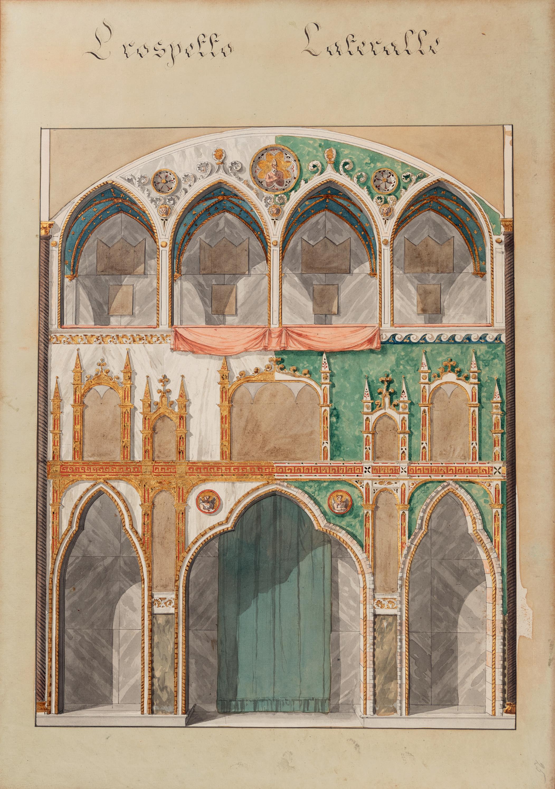
GIUSEPPE BERNARDINO BISON
Palmanova 1762-1844 Milan
Design for the Decoration of a Doorway or Spandrel, with an Allegorical Figure of Flora(?) and a Winged Putto Surrounded by Garlands
Pen and brown ink and grey wash, over an underdrawing in black chalk. Signed Bison in brown ink at the lower right. Numbered 8(?) in brown ink on the verso.
148 x 191 mm. (5 3/4 x 7 1/2 in.)
PROVENANCE: P. & D. Colnaghi, London, in 1982; Colnaghi, New York, in c.1988; Galerie Yves Mikaeloff, Paris; Crispian Riley-Smith, Yorkshire; Private collection.
EXHIBITED: London, P. & D. Colnaghi, Old Master Drawings, 1982, no.8.
One of the last exponents of the 18th century Venetian vedute tradition, Giuseppe Bernardino Bison received his artistic training in the studio of Anton Maria Zanetti in Venice, while at the Accademia di Belle Arti he won a prize for his drawings from the nude. The early part of his career was spent working as a decorative fresco painter at villas and palaces around the Veneto. Around 1800 he settled in Trieste, where among his more important works were the decoration of the Palazzo Carciotti and the Palazzo della Vecchia Borsa. In 1831 Bison moved to Milan, where he worked for the remainder of his career, and where he was particularly active as a scenographer, producing stage designs for the Teatro alla Scala and other theatres. Although his career lasted well into the 19th century, his style invariably retains something of the flavour of the previous century. As one modern scholar has written, ‘It cannot be denied – despite the fact that he lived well into the nineteenth century – that Bison is a fully eighteenth century painter, both in training and in spirit.’1 In 1842, two years before his death, an exhibition of around a hundred of Bison’s works was held in Rome.
Bison was an accomplished and prolific draughtsman, whose earliest works show the Venetian influence of Giambattista Tiepolo and Francesco Guardi, while his later drawings tend towards Neoclassicism. His preferred medium was pen and ink, and his drawings encompass a wide and varied range of subjects, from religious narratives to genre scenes, landscape capricci, and stage and ornament designs. As the contemporary writer Giuseppe Rossi noted of Bison, in a biographical account published in 1845, shortly after the artist’s death, ‘And even in the shadows of the night or by the pallid light of the oil lamp, he would go on sketching either with the pen or the pencil his varied and capricious subjects.’2 Few of Bison’s numerous drawings, however, were intended as preparatory studies for paintings, and he produced a large number of drawings as independent works of art for sale. Because of the stylistic consistency he maintained throughout his long career, Bison’s drawings are difficult to date precisely. Significant groups of drawings by the artist are today in the collections of the Castello Sforzesco in Milan, the Musei Civici in Trieste and the Cooper-Hewitt, National Design Museum in New York.
A similar signed study of an allegorical female figure reclining on the spandrel of an arch is in the collection of the Castello Sforzesco in Milan3, which also houses a number of stylistically comparable pen drawings by Bison4. Also somewhat comparable is a signed pen and wash drawing of putti on an acanthus scroll, formerly in the Lodewijk Houthakker collection5
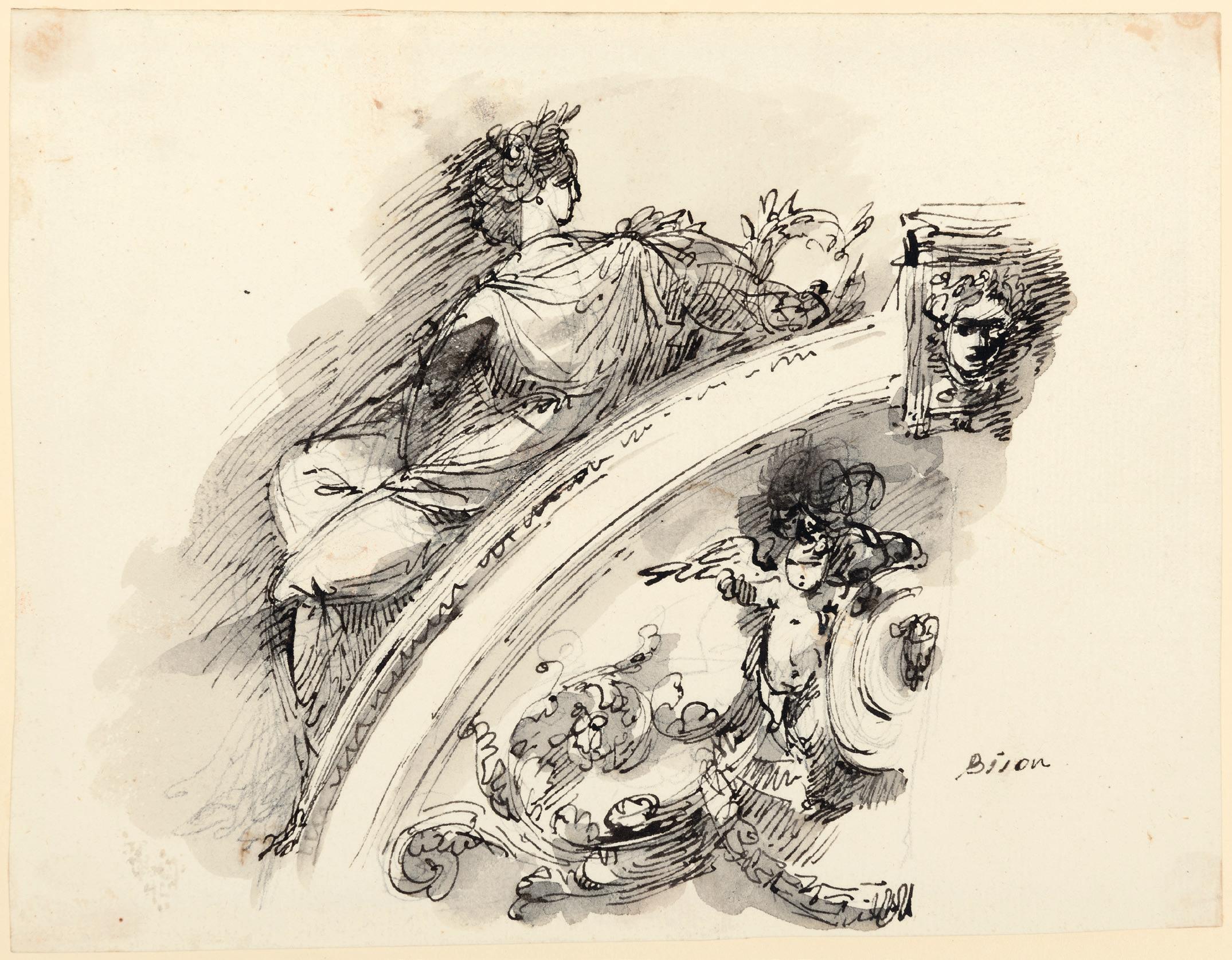
FRENCH SCHOOL
Early 19th Century
a. Designs for a Cogwheel for a Revolving Floor
Pen and black ink and watercolour, within a fictive drawn mount. Numbered PL-43.em in red ink at the upper left. Variously lettered and numbered in red ink, and with a scale in feet (piedes) in red ink at the centre.
366 x 497 mm. (14 3/8 x 19 5/8 in.) [image]
445 x 573 mm. (17 1/2 x 22 1/2 in.) [sheet]
b. Designs for a Wooden Drawbridge over a Canal
Pen and black ink and watercolour, within a fictive drawn mount. Numbered PL-39.em in red ink at the upper left. Variously lettered and numbered in red ink, and with a scale in feet (piedes) in red ink at the lower right.
364 x 495 mm. (14 3/8 x 19 1/2 in.) [image]
443 x 575 mm. (17 3/8 x 22 5/8 in.) [sheet]
PROVENANCE: Arthur Wellesley, 1st Duke of Wellington, Apsley House, London and Stratfield Saye House, Hampshire; Thence by descent to Brigadier Arthur Valerian Wellesley, 8th Duke of Wellington, Stratfield Saye House, Hampshire; His sale (‘Architectural Watercolours and Drawings Related to the Life and Residences of the 1st Duke of Wellington’), London, Sotheby’s, 11 December 1980, lot 112; Sir John Richardson, New York; Thence by descent.
The present pair of drawings may be included among a group of designs for elements of the refortification of Paris executed in the second decade of the 19th century. Several designs for a ring of detached forts surrounding the city were submitted to Napoleon in 1813 by the Central Committee on Fortifications, but the Emperor decided against implementing these designs for fear of causing undue alarm among the citizens of Paris. Napoleon’s decisive defeat at Leipzig in October 1813, and the subsequent occupation of Paris by coalition forces, led French engineers to further study ways of constructing defences at strategic points around the city in the future. These two large-scale drawings would seem to be the result of such studies.
The first of these drawings appears to show a novel design for a revolving, circular wooden floor that could be turned with a hand-operated cogwheel. Such movable floors would have been used within fortified towers, to allow cannons to be rotated in any direction to fire through embrasures in the walls of the structure. By the same hand as the present sheet, and of similar technique and dimensions, are two closely-related drawings that were likewise at one time in the collection of the 1st Duke of Wellington; one depicting a plan and section of a rotating wooden floor equipped with cannons1, and another showing a plan, elevation and section of a fortified round tower with a revolving floor2
The second of these two large watercolours depicts a design for a drawbridge leading to the gateway of a fortified tower. A related drawing showing a plan, section and elevation of a tower with such a drawbridge, sharing the same provenance from the 1st Duke of Wellington, was sold alongside this pair of drawings in 19803.
The military commander and statesman Arthur Wellesley, 1st Duke of Wellington (1769-1852), retired from the army after his decisive victory over Napoleon at the Battle of Waterloo in 1815. He then went into politics, eventually serving two terms as Prime Minister. The Duke assembled a large collection of fine and decorative arts, including paintings (mainly Dutch and Flemish Old Masters), furniture, sculpture, silver, porcelain and militaria, much of which was kept at his London residence of Apsley House.
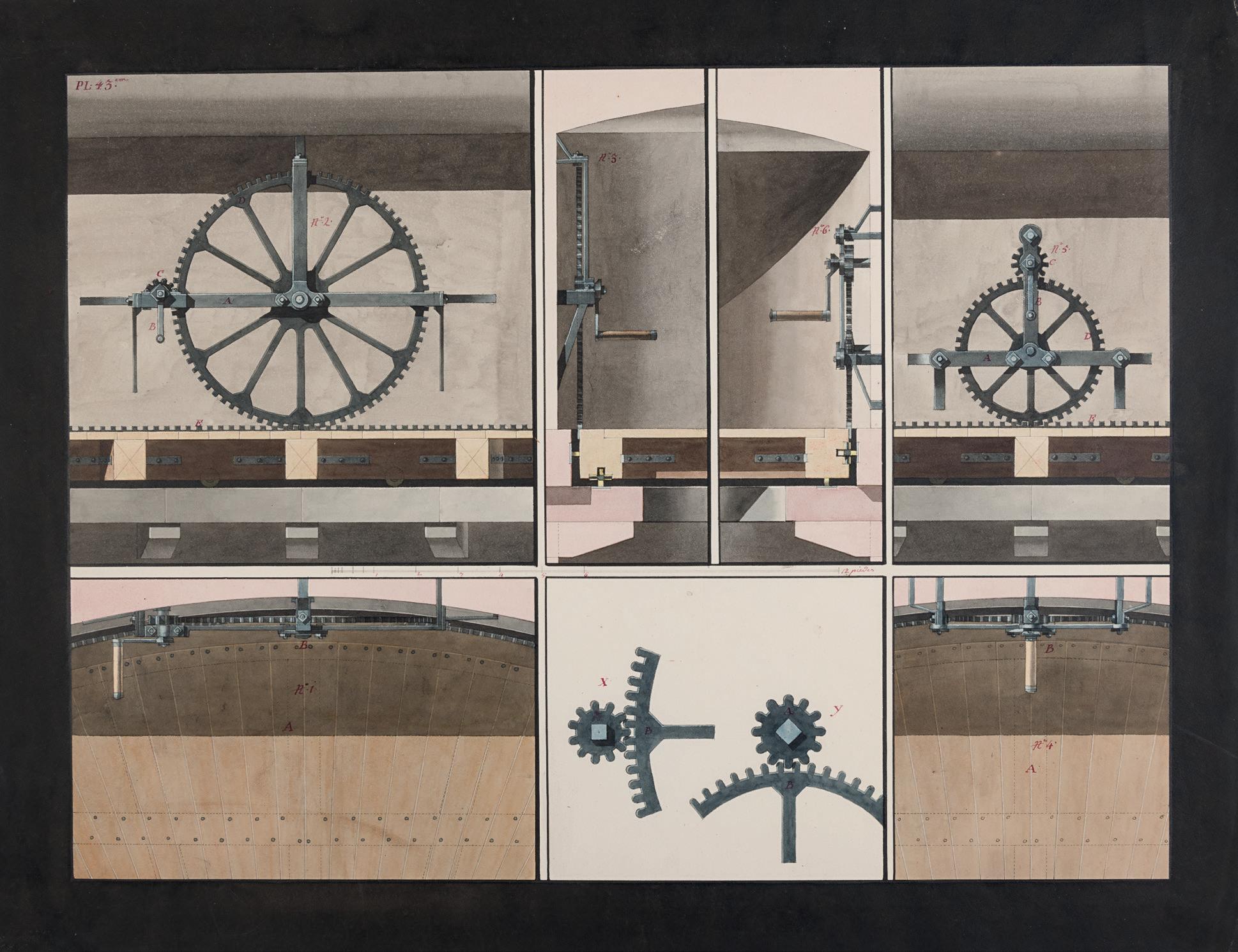
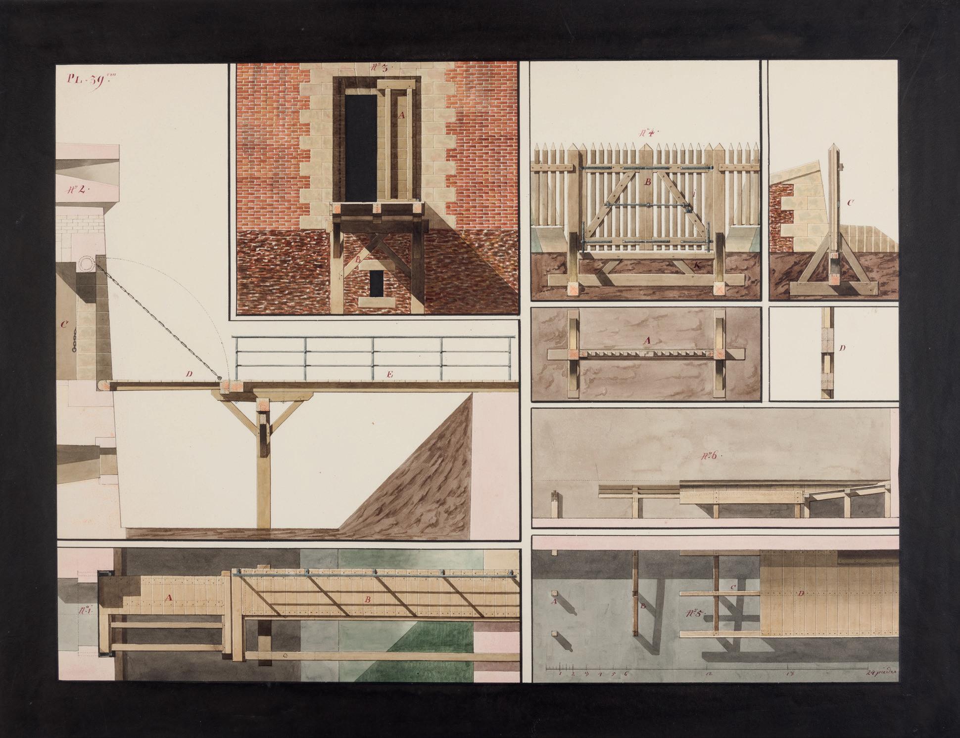
FRENCH SCHOOL
First half of the 19th Century
A Roman Funerary Altar Decorated with Ram’s Head and a Garland
Pen and grey ink and grey wash, over an underdrawing in pencil. An artist’s monogram or a collector’s mark PL(?) in brown ink at the lower left.
211 x 150 mm. (8 1/4 x 5 7/8 in.)
PROVENANCE: Muriel Spiro Butkin, Shaker Heights, Ohio; Bequeathed by her to the Cleveland Museum of Art, Cleveland, Ohio; Deaccessioned by the museum in 2021.
The small marble funerary altar or cippus depicted in this drawing, with a heavy floral festoon suspended from ram’s heads on the corners, is similar to Early Roman examples datable to the 1st Century AD, such as one in the British Museum and another in the Louvre. Such small, low pedestal-like pillars of rectangular form were used by the ancient Romans, Greeks and Etruscans as grave markers or tombstones.
Although the monogram at the lower left of this sheet is likely to be that of the as-yet unidentified artist, or perhaps a collector’s mark, it may be noted that it is very similar to the monogram employed by King Louis-Philippe I (1773-1850), Duc d’Orléans, who ruled as King of the French between 1830 and 1848. Louis-Philippe is known to have been an amateur draughtsman in his youth and even worked as a drawing master, as well as a teacher of maths, history and geography, at a school in Reichenau in Switzerland, where he lived in exile, under the assumed name of M. Chabos, in 1793, at the height of the French Revolution. As King, Louis-Philippe was known as a voracious collector, particularly of Spanish paintings for the Louvre and works of art for the Palace of Versailles.
The present sheet was at one time in the notable collection of over 450 18th and 19th century French drawings assembled by the American collector Muriel Butkin (d.2008), most of which was bequeathed by her to the Cleveland Museum of Art. As she was apparently fond of stating, “I collect drawings, not names”, and her collection was characterized by an appreciation of fine draughtsmanship, whether by well-known artists or more obscure or anonymous hands. Muriel Butkin began collecting French drawings in the 1970s, at the same time as her husband Noah was assembling a collection of 19th century French paintings. As the collector herself wrote, ‘I had always loved paintings but ignored drawings until one caught my eye…This drawing led to more; drawings proved addictive. When I told my husband I would like to collect drawings, he said, “I like paintings; I do not like drawings.” Therefore, I was on my own. My collection has always been very personal.’1
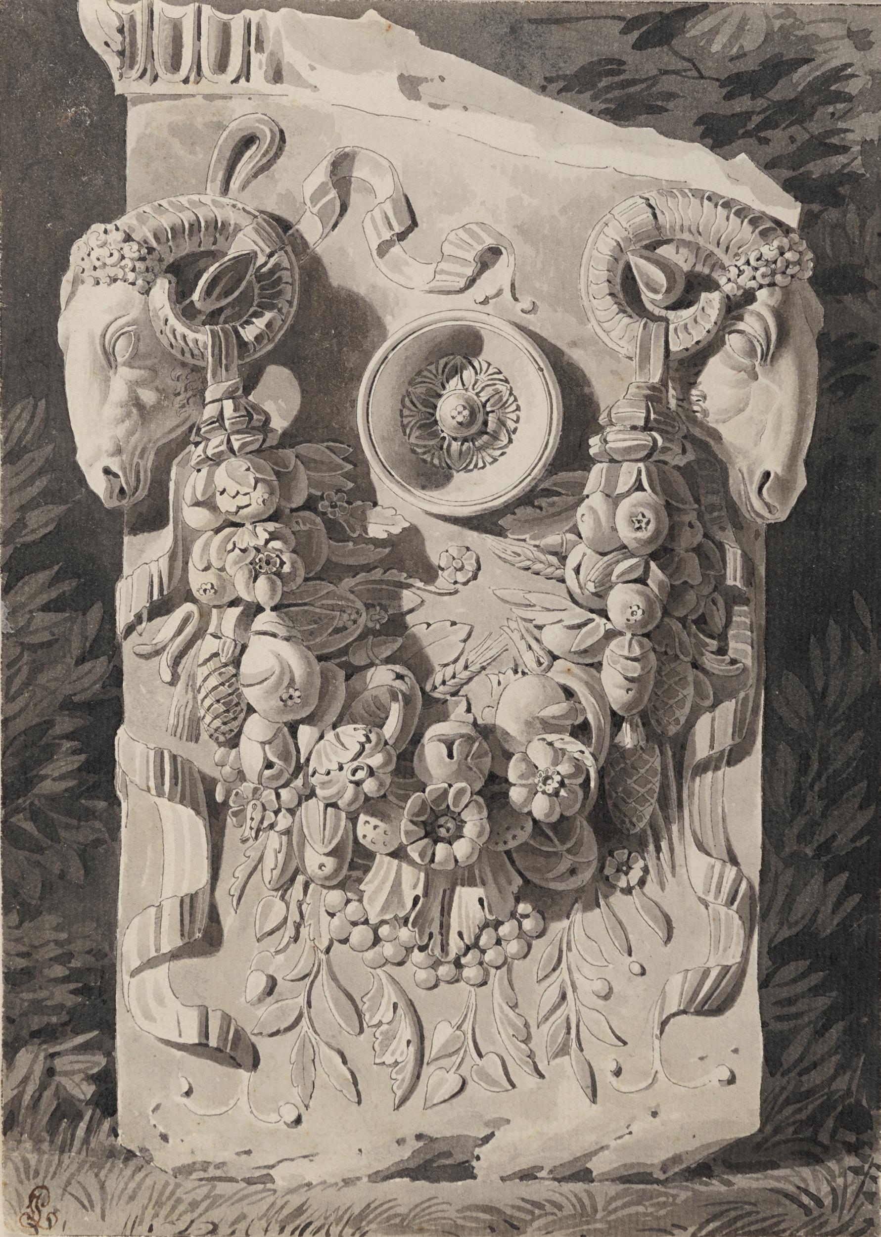
FÉLIX DUBAN
Paris 1798-1870 Bordeaux
A Plan and Section of the Villa of Diomedes at Pompeii
Pen and black and grey ink, watercolour and pencil. Inscribed Maison de Diomede. Pompeia / Sur une echelle de 0,005 P.M. in pencil at the upper left.
370 x 481 mm. (14 5/8 x 19 in.) [sheet]
PROVENANCE: Roger Rodière, Montreuil (his collection stamp, not in Lugt, on the verso); The Artis Group, New York, in 1985; Private collection, New York; By descent to a private collection, London.
EXHIBITED: New York, The Artis Group Ltd., Architectural Drawings 1700-1930, 1985, no.34.
Jacques Félix Duban entered the Ecole des Beaux-Arts in Paris in 1814, and in 1823 won the Grand Prix de Rome in the category of architecture. He spent the next five years as a pensionnaire at the Académie de France at the Villa Medici in Rome. Soon after his arrival in Italy he visited Pompeii with his friend, the architect Henri Labrouste, and was particularly interested in the houses which had been discovered at the beginning of the 19th century. He produced elaborate plans and drawings of several of these, as well as of ancient temples, theatres and baths. On his return to Paris, Duban exhibited architectural drawings at the Salons of 1830, 1831 and 1833, although he does not seem to have shown there in later years. He enjoyed a successful career as an architect, with perhaps his best-known work the main buildings and courtyard of the Ecole des Beaux-Arts, begun in 1830 but not completed until some thirty years later. Duban also worked on the restoration of the Sainte-Chapelle in Paris and the Galerie d’Apollon of the Louvre, as well as the Châteaux of Dampierre, Gaillon and Blois. In 1854 he was elected to the Institut and appointed inspector-general of public works.
Duban was a gifted draughtsman and produced a large body of drawings and watercolours. These included not only studies of ancient, medieval and Renaissance buildings, but also imaginative reconstructions of how these structures once looked. As has been noted, ‘His draughtsmanship is of exemplary quality and goes far beyond the realm of simple architectural drawing…The vacuum left by Duban in terms of theoretical writing seems largely filled by his body of drawings. He was, in every sense, a complete artist...’1 In 1872, two years after his death, a retrospective exhibition of Duban’s architectural drawings and watercolours was held at the Ecole des Beaux-Arts, to considerable critical acclaim.
The present sheet may be dated to Duban’s time in Italy, when he made numerous studies of the newly excavated buildings and houses of Pompeii between 1824 and 18262. As the contemporary critic Charles Blanc noted at the time of the 1872 memorial exhibition, ‘The impression that his studies at Pompeii made on Duban was vivid and profound, and it never faded.’3
The ancient Roman Villa of Diomedes lies just outside the walls of Pompeii, on the north side of the city near the Herculaneum gate. At around 3,500 square metres, it was one of the largest suburban villas of the Roman world. The front, or western side, of the building bordered the road leading to Pompeii’s Herculaneum gate, seen in this drawing at the left part of the sheet. One of the first parts of Pompeii to be excavated, the Villa of Diomedes was built on two levels. The main entrance led directly to a peristyle with a garden in the middle, with living spaces, bathing rooms and a kitchen around its four sides. A staircase led down to a large garden, enclosed by a peristyle with seventeen columns on each side, in the centre of which was a summer triclinium, or dining area, and a small pool of water. Duban made a number of drawings of the Villa of Diomedes, some of which, including a version of the present sheet4, are in an album in the Ecole des Beaux-Arts.
This drawing was formerly in the collection of the French architectural historian Roger Rodière (1870-1944), who owned at least one other drawing of Pompeii by Duban of the same period.5
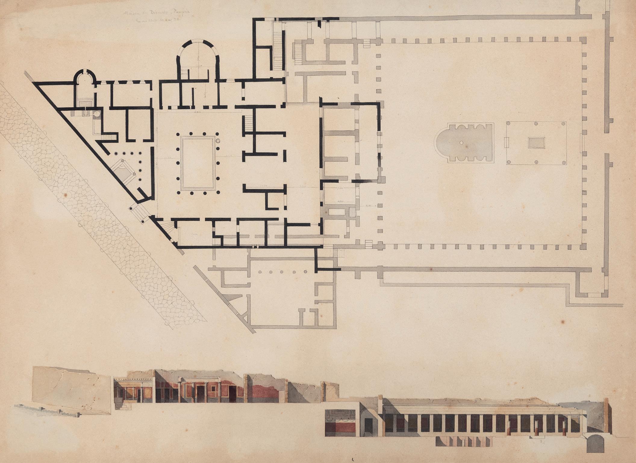
EUGÈNE EMMANUEL VIOLLET-LE-DUC
Paris 1814-1879 Lausanne
Studies of a Gothic Monument in Picardy, with the Tomb of a Knight
Pencil and two shades of grey wash. Inscribed and signed Picardie / 13eme Siècle / E. Viollet Leduc / ne pas copier au miroir / 6 eme in pencil in the centre of the sheet.
463 x 293 mm. (18 1/4 x 11 1/2 in.)
PROVENANCE: Probably Isidore Justin Séverin, Baron Taylor, Paris; Probably his posthumous sale (‘Catalogue d’environ 2000 dessins originaux pour les Voyages pittoresques et romantiques dans l’ancienne France par le baron Taylor...faisant partie de la succession de M. le Bon Taylor’), Paris, Hôtel Drouot [Dupont], 20 January 1883 (lot unidentified).
LITERATURE: Baron Isidore Taylor, Charles Nodier and Alphonse de Cailleux, Voyages pittoresques et romantiques dans l’ancienne France. Picardie, Paris, 1835, unpaginated.
An architect and restorer of medieval buildings, as well as a painter, watercolourist, illustrator and writer, Eugène Viollet-le-Duc is perhaps best known for his reconstruction and renovation of Gothic buildings and churches throughout France. Although he decided at an early age to become an architect, he chose not to follow the usual path of studying at the Ecole des Beaux-Arts in Paris, preferring instead to apprentice with the architects Jean-Jacques-Marie Huvé and François-René Leclère. He also travelled extensively around France, visiting the Auvergne, Provence, Normandy, the Pyrenées and Languedoc, as well spending several months in Italy. He taught at the Ecole de Dessin in Paris, and between 1836 and 1844 contributed over two hundred illustrations for Baron Taylor, Charles Nodier and Alphonse de Cailleux’s monumental Voyages pittoresques et romantiques dans l’ancienne France, published in twenty-four volumes between 1820 and 1878. In 1838 Viollet-le-Duc began working for the Conseil des Bâtiments Civils, which supervised work on buildings belonging to the State, and in particular the restoration of national monuments. Through the intervention of Prosper Merimée at the Commission des Monuments Historiques, he was commissioned to take charge of the restoration of the Romanesque abbey of Sainte-Marie-Madeleine at Vézelay in 1840. This was the first of several major renovation projects that Viollet-le-Duc was closely involved in, among the most significant being the restoration of Sainte-Chapelle and Notre-Dame in Paris, the abbey of Saint-Denis and the cathedrals of Amiens, Reims and Clermont-Ferrand, as well as the walls of Carcassonne and Avignon.
Viollet-le-Duc’s close study of Gothic architecture led to an interest in stained glass production, and between 1840 and 1847 he provided designs for stained glass windows for the Sèvres porcelain factory, while also designing liturgical objects and furnishings in a Gothic Revival style for many of the churches where he worked. He was equally as important as a theorist, and his writings had a significant impact on the understanding and appreciation of medieval architecture and were an influence on the 19th century practice of architectural restoration. Much of his subsequent fame also rests on his seminal Dictionnaire raisonné de l’architecture française du XIe au XVIe siècle, published in ten volumes between 1854 and 1868 and a highly influential work among such later architects as Antoni Gaudí and Victor Horta. Other important studies authored by Viollet-le-Duc include a comprehensive study of medieval and Renaissance furniture, jewellery, armour, clothing, musical instruments and interior decoration in France, published between 1858 and 1875 as the Dictionnaire raisonné du mobilier français de l’epoque carolingienne à la renaissance, and the two-volume Entretiens sur l’architecture, which appeared between 1863 and 1872.
During the Second Empire Viollet-le-Duc worked extensively for the Emperor Napoleon III, decorating the interior of Notre-Dame for the baptism of the Prince Imperial in 1856 and designing a monument to Napoleon in his birthplace of Ajaccio in Corsica, completed in 1865, as well as restoring the château of Pierrefonds in the Oise. He also designed a number of private homes in Paris, as well
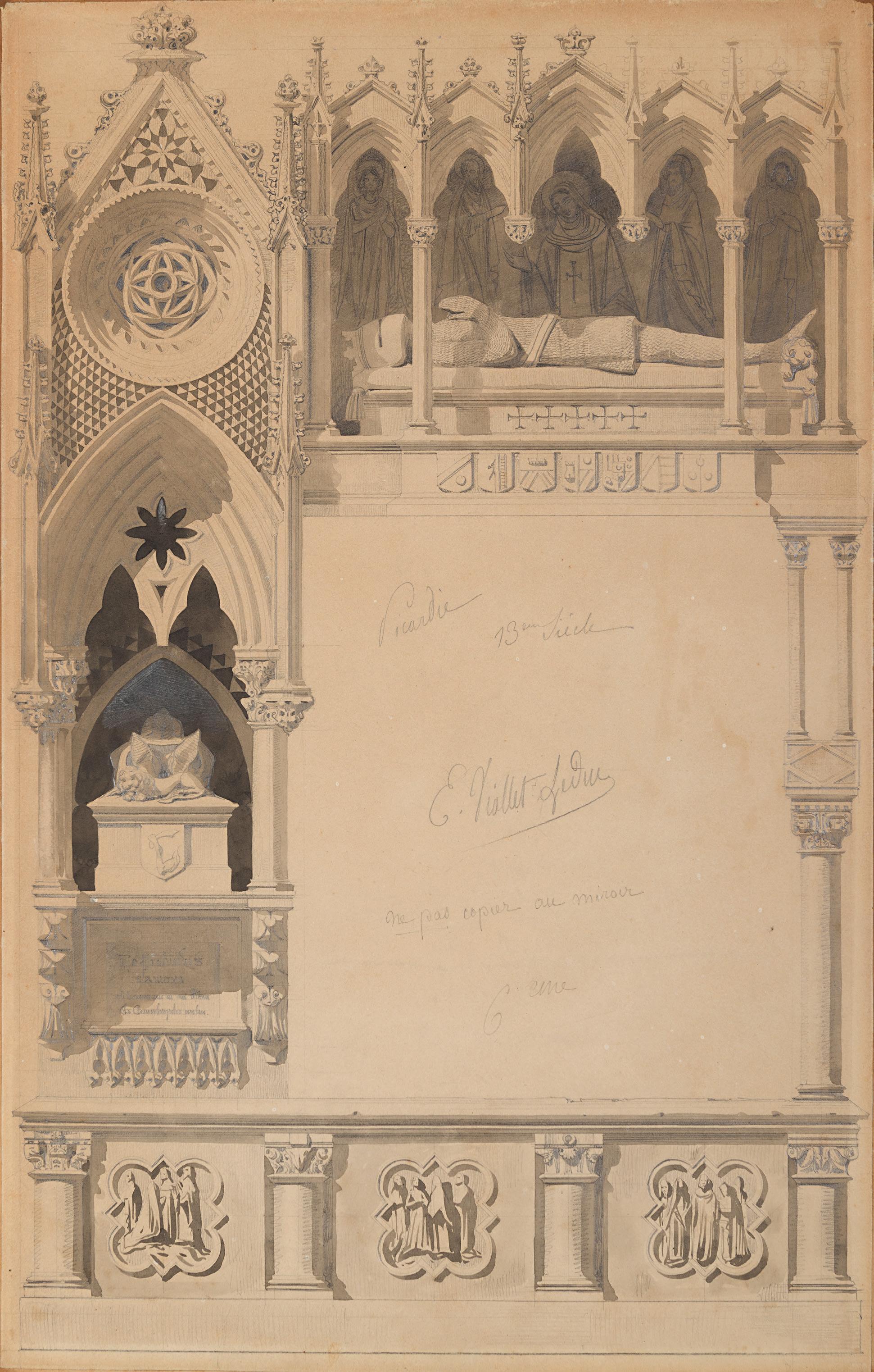
as several châteaux and three churches. The architect lived through the Siege of Paris – which he recorded in several drawings – during the Franco-Prussian war of 1870-1871, and the defeat of France and the events of the Paris Commune affected him greatly. An outstanding draughtsman, Viollet-leDuc’s remarkable watercolours of buildings and interiors are some of the most beautiful examples of architectural draughtsmanship of the 19th century.
This large drawing is a preparatory study for one of the full-page framing illustrations in the volume of Baron Taylor’s Voyages pittoresques et romantiques dans l’ancienne France devoted to the region of Picardy, published in three instalments between 1836 and 1845. The monumental publication of the Voyages pittoresques et romantiques dans l’ancienne France, illustrating the architectural and artistic heritage of the various regions of France, was issued in twenty-four volumes between 1820 and 1878. The text was the work of various authors and the accompanying illustrations were commissioned from several artists, notably the young Viollet-le-Duc, who produced over 220 of them for the book. As one modern scholar has noted of his work for the Voyages pittoresques et romantiques, ‘The invention that went into these astonishing specimens of the current medievalizing mania is striking, giving them a special quality that Baron Isidore Justin Séverin Taylor recognized. These ornamental exercises testify in great measure to Viollet-le-Duc’s unrestrained love for decoration, a type of work he considered “truly artistic”, and likewise the nature of his relationship with the Middle Ages, a world he believed to have been bursting with vitality. What distinguished his decorative borders from those of others was not only the inventive nature of the compositions, but also the choice of subject.’1
This particular drawing for an encadrement was used twice in the second of the Picardy volumes (fig.1) of the Voyages pittoresques et romantiques dans l’ancienne France. The printed text within the first of these full-page illustrations describes the village of Davenescourt in Picardy: ‘Davenescourt has a very pretty castle, belonging to the Count of La Myrre. The village church is a fine example of late Gothic architecture. The nave is beautiful: pillars, formed of delicate columns and topped with acanthus-leaf capitals, support a vault of small stones skilfully laid. The perimeter of the choir is decorated with oak panelling, the carvings of which are quite elegant. Beneath the bell tower lies the tomb of a man famous in his day, Jean de Hangest, known as Rabache, who served as Lieutenant General in Brittany, Saintonge and Angoumois for eighteen years, and died as a hostage of King John in England in September 1363. He is depicted lying on this tomb, his body covered by a tunic adorned with a few shells and his head resting on a cushion. Two angels appear to be pointing towards heaven, the reward for his generous devotion and loyalty to an unfortunate prince.’2 The tomb depicted by Viollet-le-Duc in the present sheet, however, bears only a tangential relationship to that of Jean V de Hangest, known as Rabache, seigneur of Hangest and d’Avenescourt (c.1350-1415), whose effigy in the church of Saint-Martin at Davenescourt is different3. Similarly, the biographical information given for Jean de Hangest in the Voyages pittoresques et romantiques is incorrect, as he died at the Battle of Agincourt in 1415.
As Stephan Bann has noted, ‘Viollet-le-Duc’s contributions to the Voyages pittoresques between 1836 and the early 1840s were not only a highly original achievement in themselves but also deserve to be studied as a revealing index of the development of contemporary modes of historical representation… Viollet-le-Duc’s experience in working on the Voyages pittoresques series not only helped him to develop a close familiarity with French architectural heritage but also equipped him to intervene in its restoration.’4 A number of similar drawings for the Picardy volumes of the Voyages pittoresques et romantiques are in the extensive archive of works by Viollet-le-Duc today in the Médiathèque du Patrimoine et de la Photographie in Charenton-le-Pont5
c.1850-1870
Design for an Entrance Gate for a French Embassy Building
Pen and black ink, with brown wash and two shades of blue wash. Laid down. 631 x 831 mm. (24 7/8 x 32 3/4 in.)
This very large sheet depicts a design for a monumental entrance to a French embassy building, with an ornamental vocabulary characteristic of the period of the Second Empire. (The wrought-iron gates are decorated with laurel wreaths within which are the initials E and F, for Empire Français.) This second period of Empire, replacing the French Second Republic, was established in 1852 by Louis-Napoléon Bonaparte, who proclaimed himself Emperor of the French as Napoleon III. A period during which France re-established its power in Europe, the Second Empire ended with the Franco-Prussian War and the death of Napoleon III in 1870, and was succeeded by the Third French Republic.
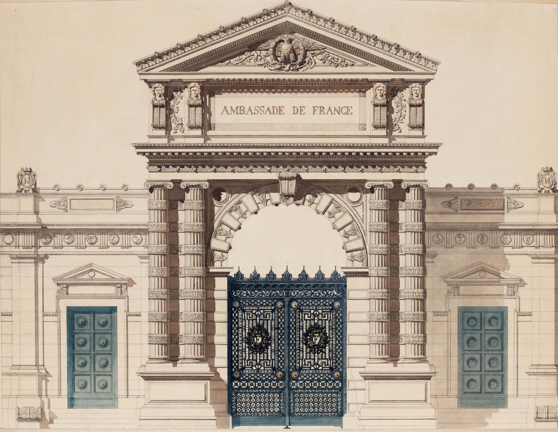
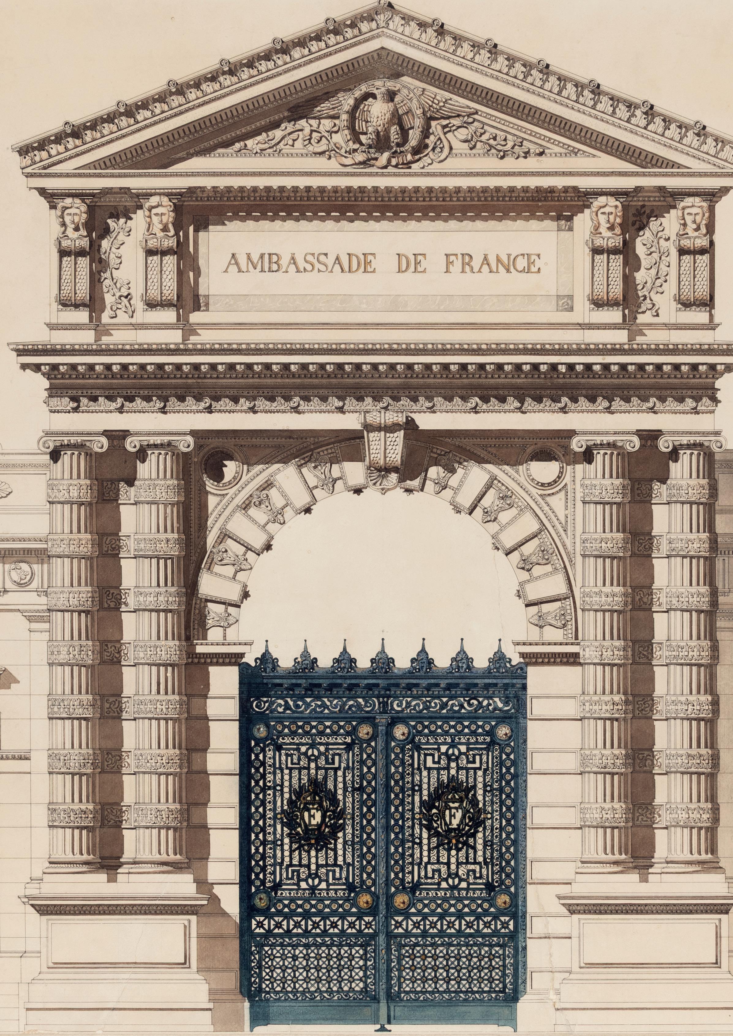
MOSÈ BIANCHI
Monza 1840-1904 Monza
Recto: Studies of Women
Verso: Two Studies of a Woman Holding a Laurel Wreath
Pen and brown ink, with touches of watercolour, over an underdrawing in black chalk, on laid paper. The verso in black chalk, and pen and brown ink. Numbered 61.18 in pencil on the recto, and 23 in pencil on the verso. Inscribed with a signature of a Bernasconi heir, dated 1977, in blue ink on the verso. 535 x 386 mm. (21 1/8 x 15 1/4 in.)
Watermark: A star-shaped object above the letters EGA.
PROVENANCE: Acquired from the artist by Juan and Felix Bernasconi, Milan; By descent to their sister Maria Bernasconi, Mendrizio, Canton Ticino, Switzerland; By descent to Alfonso Bernasconi Peluffo, Buenos Aires; His wife, Marià Elvira Celia Méndez de Bernasconi, Buenos Aires (Lugt 5374), by 1977, with her signature on the verso; The Bernasconi sale (‘The Bernasconi Collection of Italian Pictures and Drawings of the 19th Century’), London, Christie’s, 27 March 1987 (lot unidentified); Borghi & Co., New York, in 1987; Private collection, New York; P. & D. Colnaghi, London, in 1995; Private collection, London.
EXHIBITED: New York, Borghi & Co., Mosè Bianchi, 1987, no.45; New York and London, Colnaghi, Master Drawings, 1995, no.49.
A native of Monza, Mosè Bianchi received his artistic training at the Accademia di Brera in Milan. Even in his earliest works, which were academic history subjects and altarpieces, the lightness of touch and fluidity of handling for which he would become known is readily evident. In 1866 he went to Venice, where he was strongly affected by the work of Giambattista Tiepolo. The following year he was in Paris, where he met the art dealer Adolphe Goupil, who did much to spread the artist’s reputation outside Italy. In 1877 Bianchi completed his first significant decorative project; the fresco decoration of the Villa Giovanelli at Lonigo, near Vicenza. The artist continued to develop his distinctive, painterly style in his views of Venice of the 1880s and of Milan in the following decade. Bianchi’s oeuvre also includes many scenes of rural life, notably around Gignese on Lake Maggiore, and several superb portraits. In 1913, a few years after the artist’s death, an appreciation of Bianchi’s life and work in an English magazine noted that he ‘must be reckoned as one of the most important of modern Italian artists, though one of the least well known outside his own country…Bianchi’s pictures are rich in beauties, and posterity will surely recognise in the painter’s versatility and in the excellent work of his brush the power and splendour which the artist’s own modesty would not let him see.’1
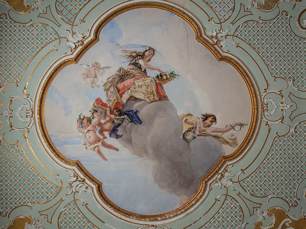
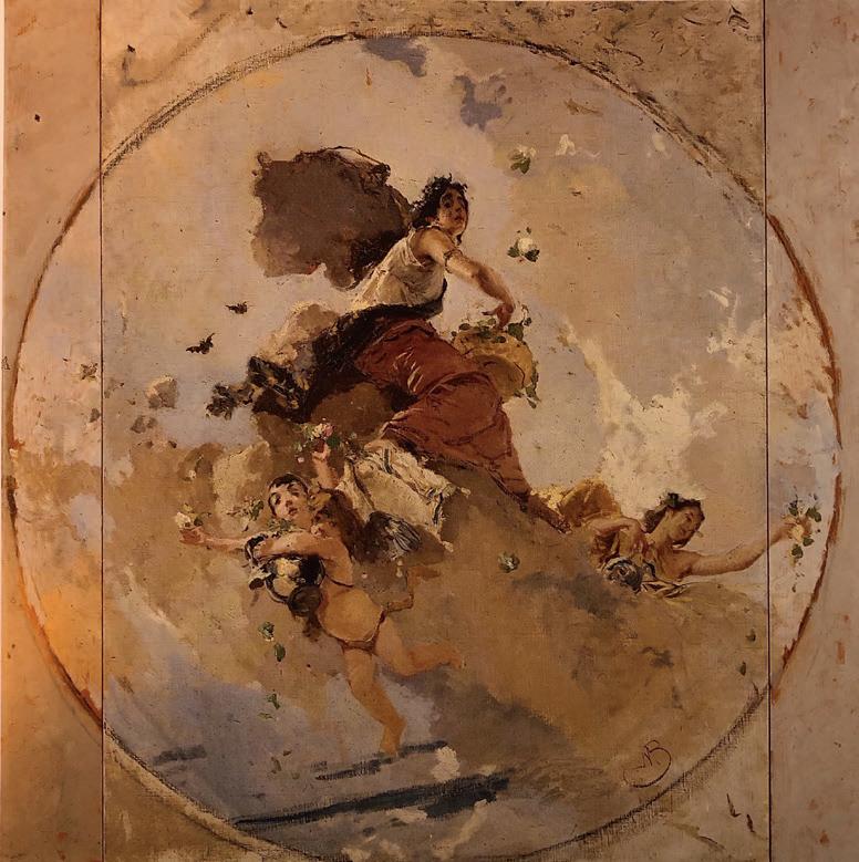
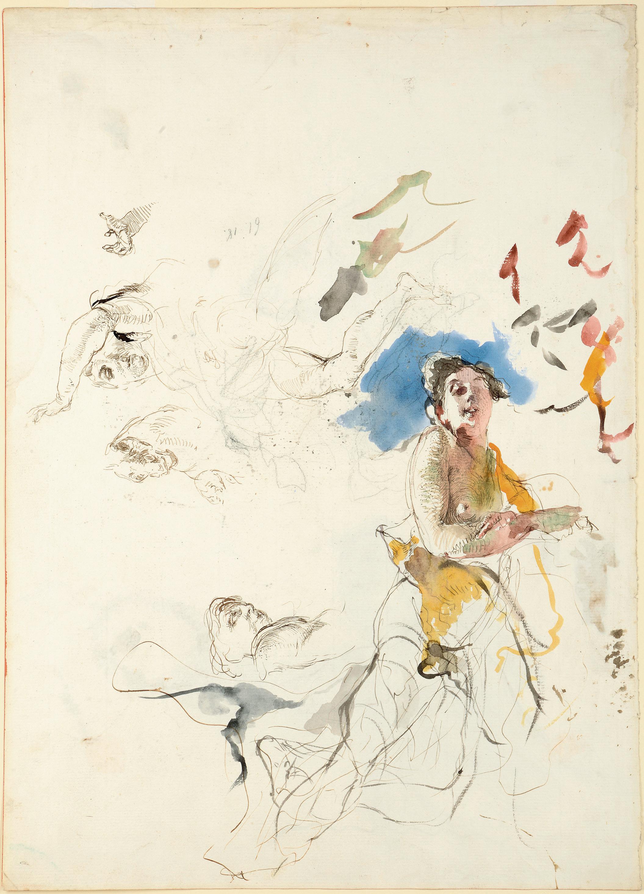
Both sides of this large drawing are related to the decoration of the Villa Giovanelli (now known as the Villa San Fermo) in Lonigo, where Mosè Bianchi was commissioned in 1877 to paint a series of frescoes for the ground floor rooms. A family of bankers and merchants, the Giovanelli were well known as collectors and connoisseurs, and their employment of Bianchi served to enhance the artist’s reputation, and led to further fresco commissions. Much of the effect of these ceiling frescoes, painted with a mastery of foreshortening and perspective in three rooms of the villa, has today been lost as a result of poor restoration and conservation, however. Bianchi produced numerous preparatory studies for the Villa Giovanelli frescoes, in the form of oil sketches, drawings, watercolours and even plaster models, and it is only through the surviving studies for the frescoes that a sense of their Tiepolesque freschezza can be appreciated.
The main figure on the recto of this large sheet would appear to be a first idea for the figure of Flora in the fresco of the same subject (fig.1) in the music room of the Villa Giovanelli2. The pose of the figure here is, however, somewhat closer to a preparatory oil sketch for the fresco, in an Italian private collection3 Another large oil sketch for the full composition (fig.2) was, like the present sheet, once in the Bernasconi collection and is today in the Pinacoteca Ambrosiana in Milan4, while an oil sketch for the figure of Flora alone, also from the Bernasconi collection, appeared on the art market in London in 19945
The verso of the present sheet contains two studies for an allegorical female figure holding a laurel wreath in Bianchi’s fresco of Glory and History in the sala degli arazzi of the Villa Giovanelli6, for which a large preparatory painting (fig.3) is in the Museo Godi Valmarana in Lugo Vicentino7. A chalk study for the entire figure, again from the Bernasconi collection, was on the art market in New York in 19878.
This large double-sided sheet was part of a significant group of paintings and drawings by Mosè Bianchi purchased from the artist by the brothers Juan (d.1920) and Felix Bernasconi (d.1914), prominent Milanese industrialists who formed an impressive collection of works by contemporary Italian painters of the late 19th and early 20th centuries.
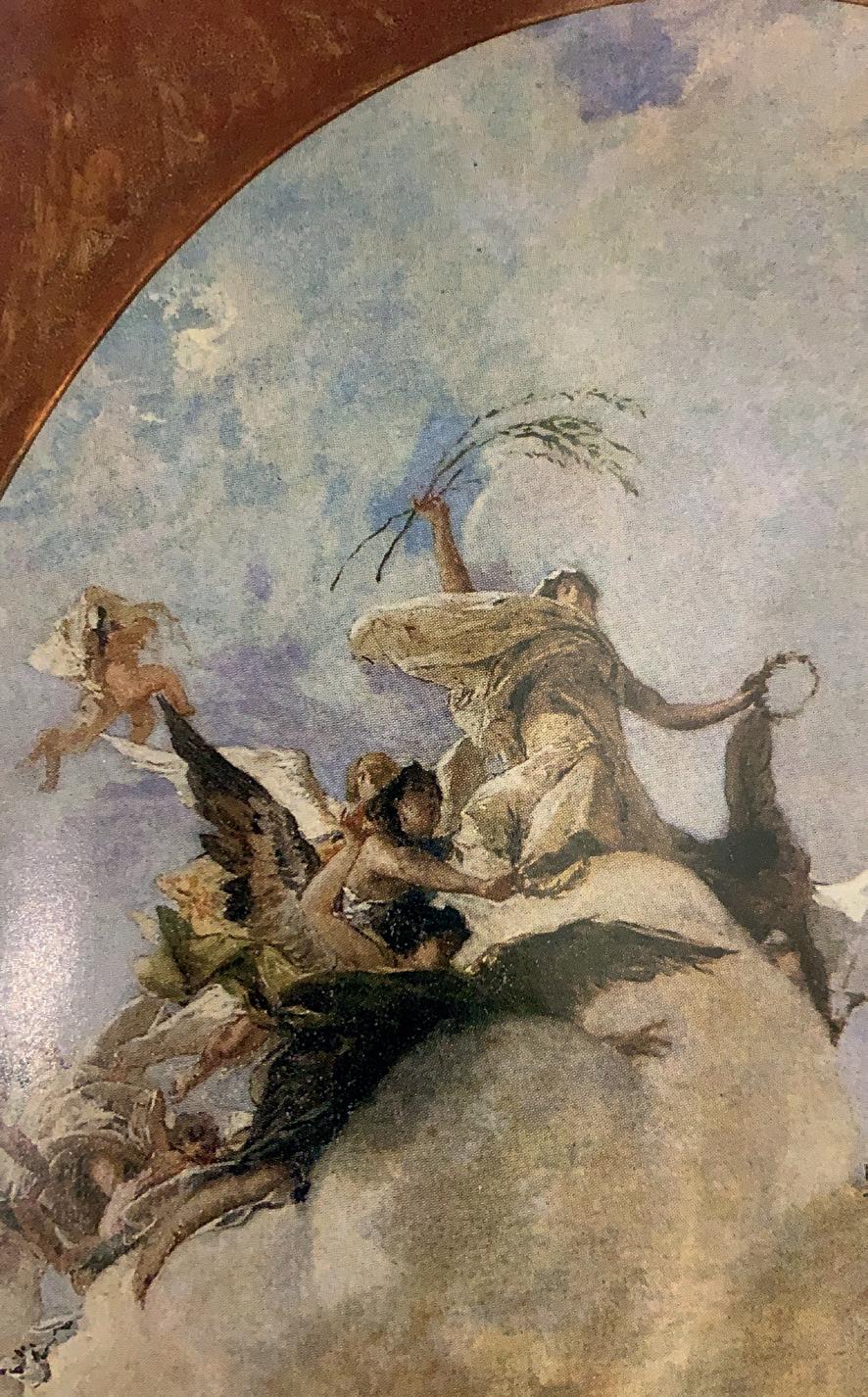
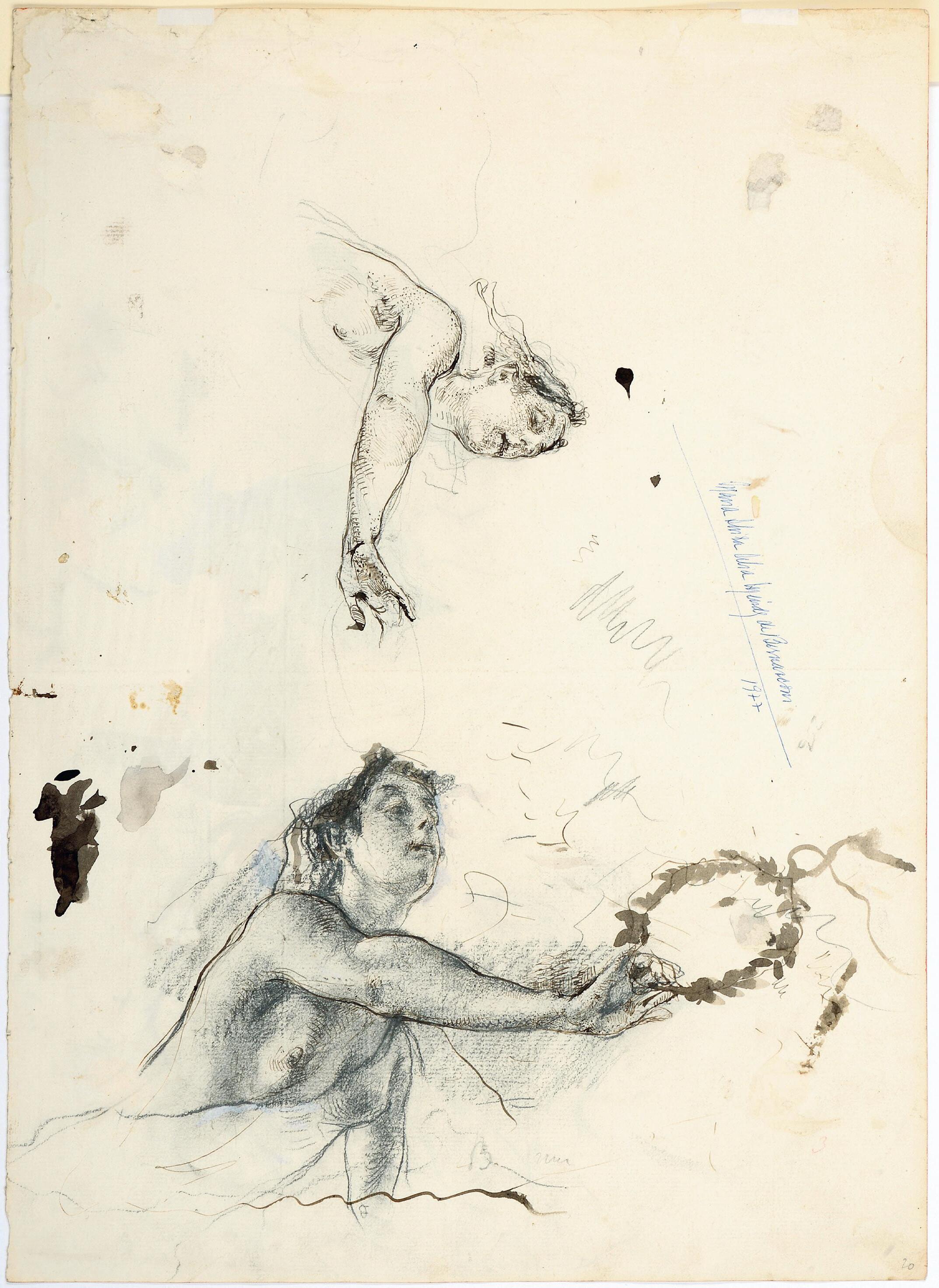
ARTHUR HEUN
Saginaw 1866-1946 Chicago
‘Frogner’: The House of Fredrik Herman Gade, 333 N. Green Bay Road, Lake Forest, Illinois
Watercolour and gouache. Stamped with the architect’s stamp AH (not in Lugt) at the lower right. 383 x 673 mm. (15 1/8 x 26 1/2 in.)
PROVENANCE: Mathieu Néouze, Paris, in 2022; Private collection, France.
EXHIBITED: Chicago, The Chicago Architectural Club at the Art Institute of Chicago, Thirteenth Annual Exhibition, 1900 [ex-catalogue]; Paris, Mathieu Néouze and Jacques Sargos at Galerie Mathieu Néouze, Un peu avant, un peu après 1900, 2022, no.11.
Arthur Heun studied architecture at the University of Michigan and was apprenticed to his uncle, the architect Ludwig Volusin Bude, in Grand Rapids. Heun began his career working as a draughtsman for the architectural firm of Francis M. Whitehouse in Chicago, one of the leading residential architects in the city at the end of the 19th century. When Whitehouse retired, soon after completing the Choral Hall for the World’s Columbian Exposition in 1893, Heun took over his clientele and established his own practice, likewise specializing in domestic architecture. Among his most significant early projects were several homes in the affluent Chicago suburb of Lake Forest, notably ‘Ardleigh’, an Elizabethanstyle house built for the merchant and philanthropist John V. Farwell in 1896, and the neighbouring ‘Edgewood’, commissioned by Farwell’s brother Francis, as well as Mellody Farm, a very large estate built between 1904 and 1908 for J. Ogden Armour, the second wealthiest man in America at the time.
Heun continued to work in Chicago and Lake Forest for much of his career and counted among his clients such prominent citizens as William McCormick Blair, Albert Loeb, Astor Street and Frank Stout. An active member of the Chicago Architectural Club, Heun was also associated with The Eighteen, a group of architects, including Frank Lloyd Wright, who met regularly to discuss common topics. In 1905 he joined Wright and several other local architects who took offices in the Steinway Hall building in Chicago, thereby coming into contact with the innovative ideas of Wright and the architects of the so-called Prairie School. Heun also designed the original buildings of the city’s Arts Club between 1916 and 1936. A member of the American Institute of Architects from 1911, Heun continued to enjoy a successful career, receiving residential commissions until the 1930s. In addition, he often designed the interiors and some of the furniture, lighting and windows in the houses that he built1. Heun died at the age of 79 and, according to an obituary, ‘After retiring from active architecture he devoted himself to painting.’2
This fine watercolour by Heun depicts his design for the Lake Forest home of the attorney and future diplomat Fredrik Herman Gade (1871-1943). Of Norwegian birth and upbringing, Gade settled in America in 1888. In May 1897 he married Alice Garfield King, and the couple settled in Lake Forest, where Gade served several terms as mayor between 1903 and 1906 and again between 1909 and 1910. Set on five acres of land at 335 North Green Bay Road in Lake Forest, Heun’s home for the Gades was built in the late 1890s, soon after their marriage. The house was named ‘Frogner’ by Gade, in memory of the area of his childhood home in Oslo in Norway. The Arts and Crafts style house remains largely unchanged today and is listed in the U.S. federal government’s National Register of Historic Places.
As noted by an exhibition label pasted onto the wooden backboard of its frame, the present sheet was included in the 13th annual exhibition of the Chicago Architectural Club in 1900, although it is not listed in the catalogue. Heun’s office address at this time – Suite 1300 in the Ellsworth Building at 355 Dearborn Street in Chicago – is also written on the same exhibition label3
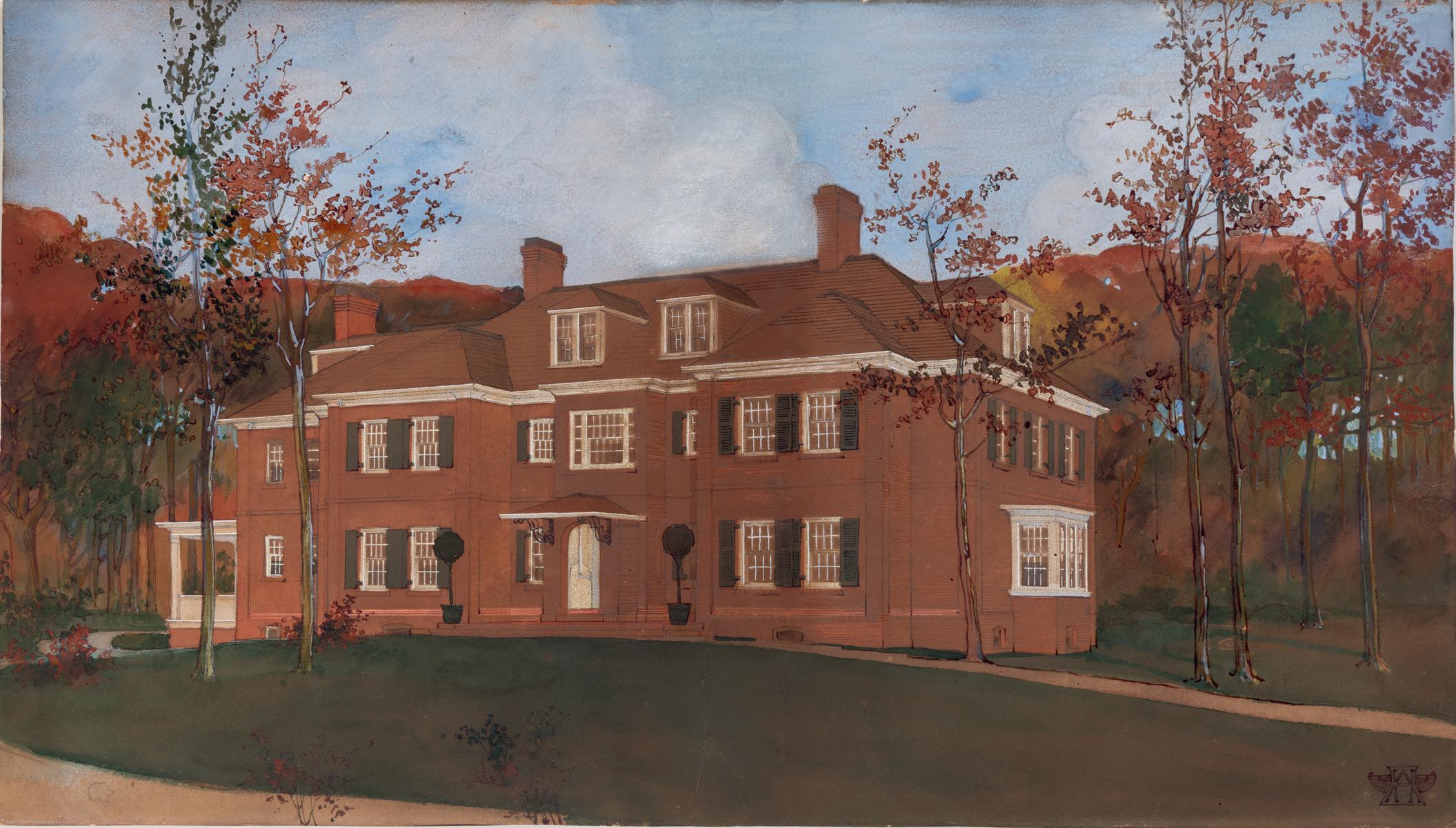
SERGIUS HRUBY
Vienna 1869-1943 Vienna
A Young Woman Contemplating a Portrait: Design for a Poster or Advertisement
Gouache and watercolour, with touches of gold, over a pencil underdrawing. Signed HRUBY in brown ink at the lower right.
405 x 281 mm. (15 7/8 x 11 1/8 in.) [sheet]
Almost nothing is known of Sergius Josef Hruby’s youth or early training as an artist. He is known to have joined the Austrian army in 1889, and by the end of the following year had been promoted to a lieutenant in the reserve. The first mention of his work as a painter is in 1891, when the young Hruby is recorded as having painted a large coat of arms celebrating the alliance between AustriaHungary, Germany and Italy for a room in a building in Teplitz. By 1896 he was studying at the Kunstgewerbeschule (School of Applied Arts) in Vienna, supported by a pair of small grants from the Freiherr Albert von Rothschild Foundation, and also at the Vienna Akademie der bildenden Künste, where he studied under portrait painter August Eisenmenger. In 1897 the artist was given the honour of illustrating the address of congratulation for the Archduke Rainer Ferdinand’s seventieth birthday. Two years later, in March 1899, Hruby was appointed a teacher at the local technical school in Teplitz, which trained artisans for the local pottery industry.
Hruby’s early work was of a classical aesthetic and was indebted to the example of artists such as Lawrence-Alma Tadema and Rudolf Jettmar. Around the turn of the century, however, he became influenced by the work of Alphonse Mucha, embracing the ornamental and decorative Art Nouveau style. From around 1910, Hruby became devoted to the Symbolist style, remaining true to its eerie and mystical figures for much of his later career, and by the 1920s and 1930s his work was reminiscent of the early work of Gustav Klimt. Though the artist was only just coming of age within the Viennese artistic community during the first foray of the Vienna Secession, Hruby was never formally associated with the group, and instead showed at the Wiener Künstlerhaus, which he joined in 1922. Although he participated in nearly every exhibition there between 1919 and 1938, his membership was terminated in 1941 because of his wife’s Jewish background. Hruby died in 1943, at the age of seventy-four. The following year the Kunstlerhaus purchased some drawings from Hruby’s daughter and also planned a memorial exhibition of his work; a project which never came to fruition. A group of over forty works by Hruby is today in the collection of the Albertina in Vienna.
An accomplished decorative artist and painter, Sergius Hruby also worked extensively as a graphic designer and illustrator, regularly contributing to the satirical weekly magazine Die Muskete between 1925 and 19331, as well as the magazine Faun. The present sheet, a design for a poster or advertisement, can be dated to around 1900, when the artist was particularly influenced by the Art Nouveau or Jugendstil aesthetic. Hruby designed similar posters during the same period, one of which was used to announce an exhibition of work by students at the Teplitz school in 1900. A comparable drawing of a design for an Art Nouveau poster by Hruby appeared at auction in Germany in 20212
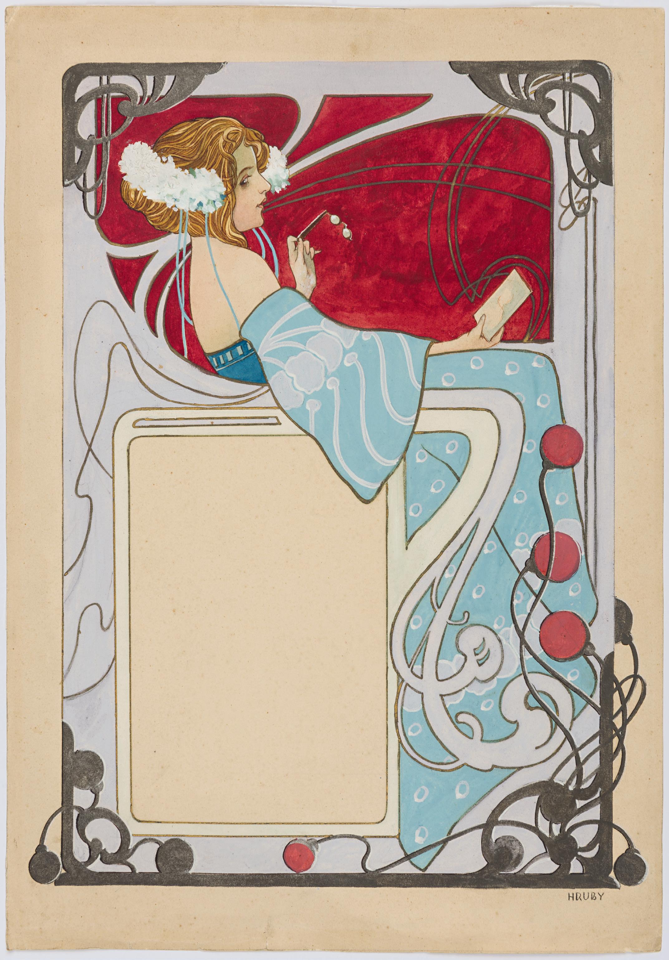
SIR FRANK BRANGWYN RA
Bruges 1867-1956 Ditchling
A Design for a Wall with a Fireplace
Watercolour, pen and brown ink and brown wash, with touches of white heightening, over a pencil underdrawing, on paper laid down on board. Inscribed Study for living room / for [?] [?] glass / [?] [?] in blue chalk on the backing board.
362 x 405 mm. (14 1/4 x 15 7/8 in.)
PROVENANCE: Bequeathed by the artist to Edgar Peacock, Ditchling, Sussex1; His posthumous sale, Eastbourne, Edgar Horn, 20 September 2000 [lot unidentified]; Haslam and Whiteway Ltd., London, in 2001.
LITERATURE: Charles Holme, ed., Modern British Domestic Architecture and Decoration [The Studio, Special Summer Number], 1901, illustrated in colour p.43, pl.2 (‘Design for a Fireplace in Cedar Wood, to be decorated with an enamel panel’); Libby Horner, Frank Brangwyn: A Mission to Decorate Life, exhibition catalogue, London, 2006, p.151, no.155 (where dated c.1900).
EXHIBITED: London, Haslam and Whiteway Ltd., Frank Brangwyn Exhibition, 2001, no.3; London, The Fine Art Society and Liss Fine Art, Frank Brangwyn: A Mission to Decorate Life, 2006, no.155.
The son of an architect, Frank Brangwyn was for the most part self-taught as an artist. He worked for a period of two years, between 1882 and 1884, at the workshops of William Morris in London, where he was tasked with copying tapestries and producing drawings for wallpaper and carpets. Brangwyn quickly established an international reputation, receiving numerous commissions from private individuals, companies and public institutions. He became particularly known for large-scale mural paintings as well as interior designs for private and public patrons. In 1895 he was commissioned by the Art Nouveau art dealer Siegfried Bing to decorate the exterior of his flagship store in Paris, the Galerie de l’Art Nouveau. Brangwyn subsequently worked on numerous decorative and mural schemes for buildings in Britain and abroad.
Although today best known as a mural painter, Brangwyn had a deep interest of all aspects of decorative design, from architecture and interiors to furniture, textiles, carpets, ceramics, jewellery, glassware and stained glass. As he once commented, ‘An artist’s function is everything: he must be able to turn his hand to everything, for his mission is to decorate life…he should be able to make pots and pans, doors and walls, monuments or cathedrals, carve, paint, and do everything asked of him.’2 Indeed, as the Brangwyn scholar Libby Horner has noted, ‘From the outset Brangwyn applied himself with rigour and equal success to every area of artistic production, becoming a polymath, a quintessential artist-craftsman. The sheer scale and variety of his artistic production daunted the critics.’3
From around 1899 onwards Brangwyn worked extensively on architectural and decorative projects for private interiors, for which he often planned and executed all of the decorative aspects, from furniture to marquetry, windows, doors and even electric light switches. In all the artist designed some forty decorative schemes for interiors, of which thirteen were realized. Each of Brangwyn’s interior designs are characterized by similar themes. As Horner writes, Brangwyn ‘could successfully design complete and harmonious interiors and demonstrated a technical understanding of each discipline…The defining features of Brangwyn’s interiors are, in general, restrained backgrounds which acted as a foil to areas of decoration or paintings, line as the pre-eminent form of expression and the coordination of all aspects of furnishing, producing an aesthetic whole (Gesamtkunstwerk)…a unified interior.’4
Datable to around 1900, this large sheet displays many of the characteristics of Brangwyn’s interior design practice, notably the use of wooden panelling and its division into squares and rectangles, the mottled tiles, and the insertion of a decorative enamel panel above the fireplace5
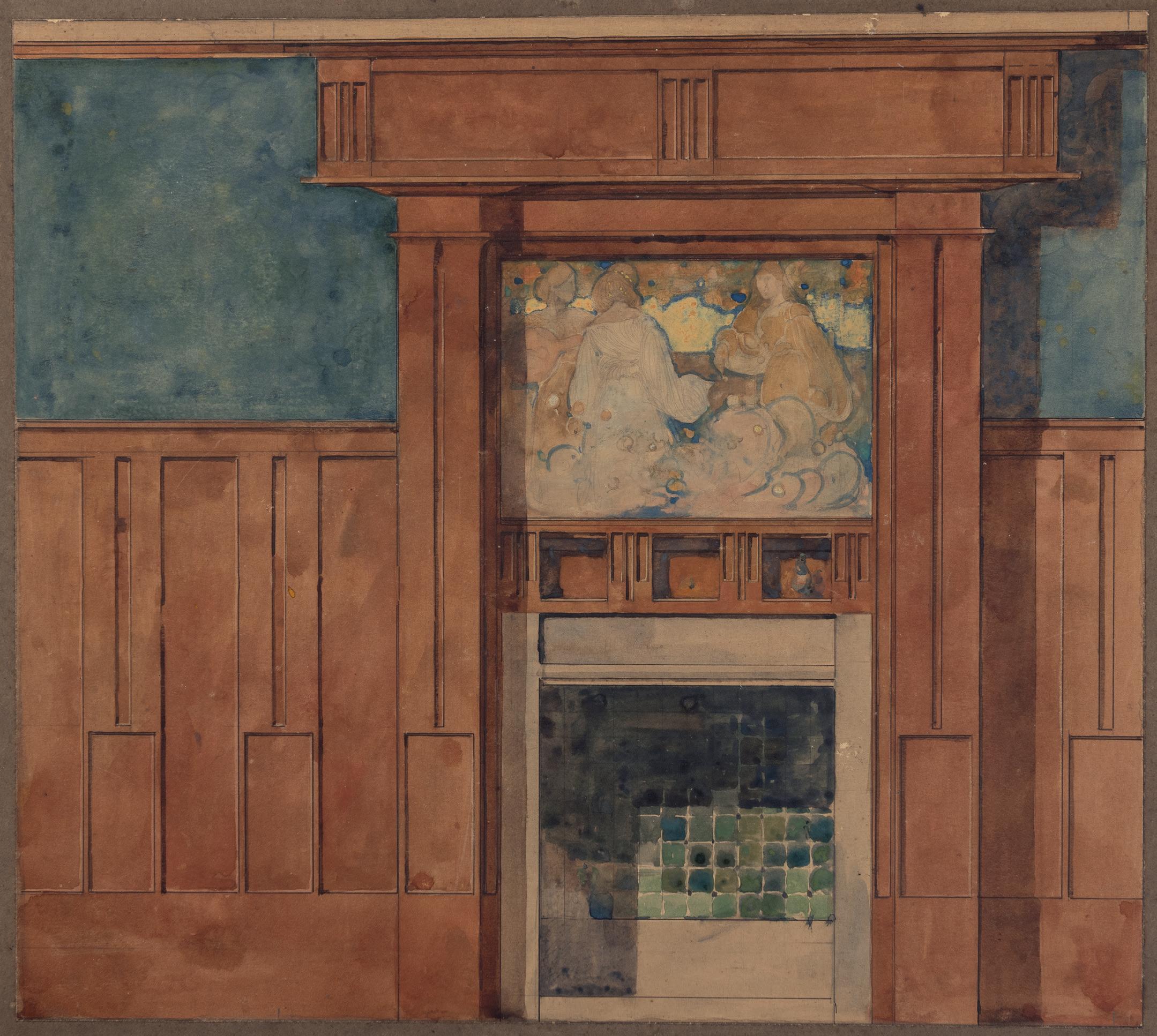
EMIL PIRCHAN
Brno 1884-1957 Vienna
Design for a Country House
Pen and black ink over a pencil underdrawing, with framing lines in black ink, mounted by the artist on cardboard. Inscribed ANSICHT / VON DER / OST- / SEITE in black ink at the lower left. Further inscribed Skizze 1906 and Architekt Pirch[an] / Studie in pencil on the backing board. 245 x 250 mm. (9 5/8 x 9 7/8 in.) [sheet]
PROVENANCE: The estate of the artist, and thence by descent to the Steffan/Pabst collection, Vienna.
One of the most creative and prolific artists of his day, working mainly in Munich, Berlin, Prague and Vienna, Emil Pirchan was a designer, scenographer, commercial graphic artist, costumer, book illustrator and architect, as well as a writer and teacher. Born in the Moravian city of Brno, he was a pupil of the architect Otto Wagner at the Academy of Fine Arts in Vienna. He was also much influenced by the work of his second cousin Joseph Hoffmann, an architect and designer who was a founder of both the Vienna Secession and the Wiener Werkstätte. Pirchan began his independent career in Brno before moving to Munich in 1908 and establishing a school for graphic design and applied arts. In 1912 an exhibition of fifty of his set designs was held at Heinrich Thannhauser’s Moderne Galerie in Munich, and five years later he was appointed director of set design and costumes at the Bavarian State Theatre. In the same year exhibitions of Pirchan’s work were held in Stuttgart and Hannover. After working in Munich for thirteen years, during which he won several prizes, Pirchan moved to Berlin in 1921. He worked as a scenographer at the State Theatre and oversaw numerous productions, winning a gold medal in the category of set design at the International Exposition in Barcelona in 1928. In 1932 Pirchan was employed as the head of set design at the German Theatre in Prague, returning to Vienna in 1936. He was appointed a professor at the Academy of Fine Arts and served as director of the newly established school of set design there, while also providing set designs for the Burgtheater and the State Opera.
Throughout his long and successful career Pirchan produced numerous designs for posters, advertisements, furniture, jewellery, arts and crafts objects and fabrics. In addition, he was a novelist and playwright, and published several books on art and artists, including one of the first biographies of Gustav Klimt. The full range of Pirchan’s oeuvre was only relatively recently brought to light in a retrospective exhibition held at the Museum Folkwang in Essen and the Leopold Museum in Vienna between 2019 and 2021, which established him as a leading figure of Central European Modernism.
The present sheet was drawn during, or shortly after, Pirchan’s period of study at the architecture school of the Akademie in Vienna, between 1903 and 1906. As he later recalled, ‘In Otto Wagner’s master class, I dedicated myself to modern architecture and was just getting to grips with the trends of the emerging Viennese Modernism’, and his studies with Wagner were to be of particular importance in his later career as a set designer. Most of Pirchan’s drawings for architectural projects can be dated between 1905 and 1910, and included designs for country homes, a mountaintop cemetery, a pilgrimage church, a monument to the writer Friedrich Schiller (for which Pirchan received the Akademie’s Füger-Medal), a restaurant and a recreational building for workers, among others. Around 1930 he also produced futuristic designs for a theatre in South America, a project about which little else is known. Although very few of Pirchan’s architectural designs were realized, many were illustrated in the Viennese magazine Der Architekt. Following his mentor Wagner, Pirchan stated his belief that architecture ‘is not just a dispensable extra, a decorative ingredient, but the formative fulfilment of functionality.’1
Among closely related drawings by Pirchan is a design for a country house which shared the same provenance as the present sheet2
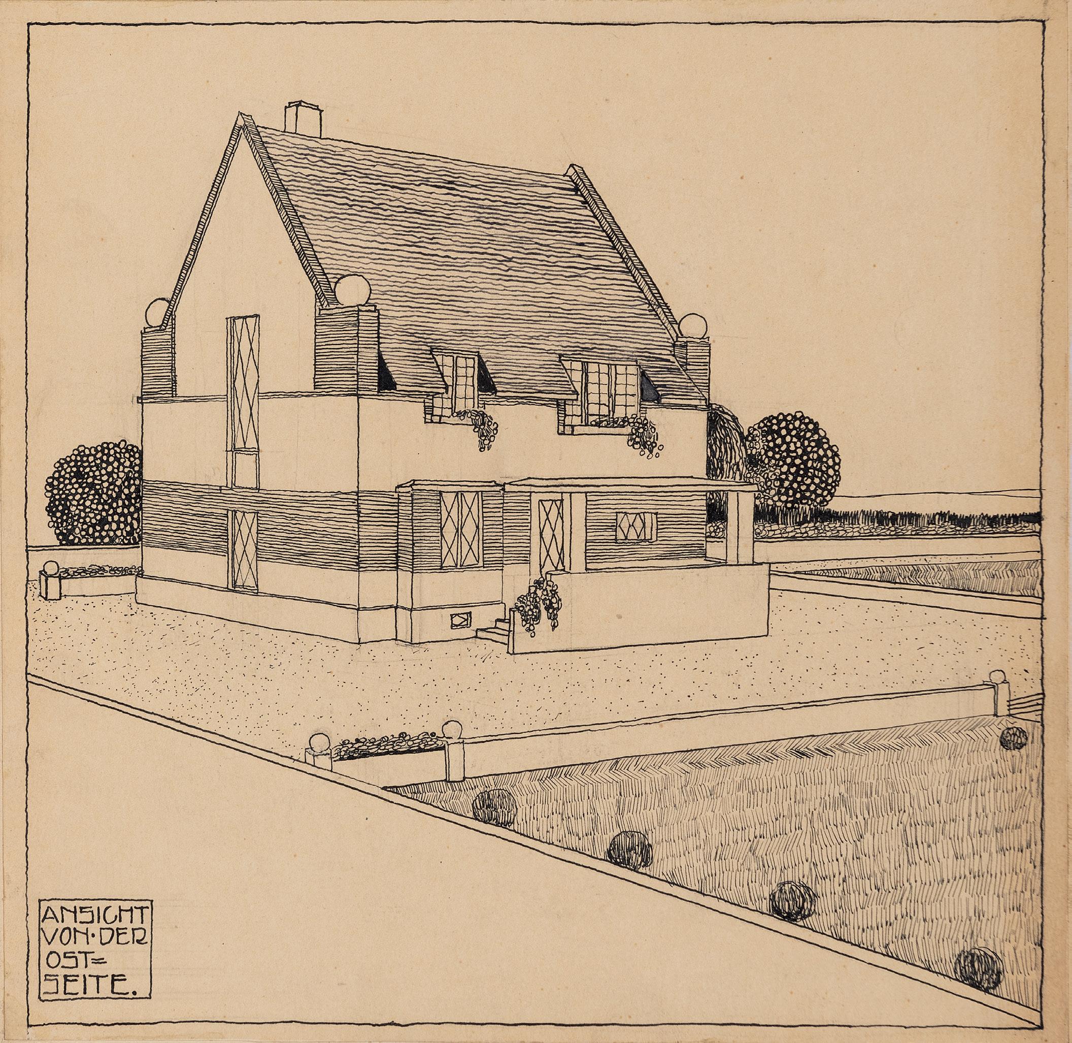
PAUL BONET
Paris 1889-1971 Paris(?)
Jeanne d’Arc: Design for a Bookbinding
Gouache and pencil, heightened with silver, on thick paper. Inscribed Jeanne / d’ARC in white gouache at the left. Inscribed 129 (1-2980) in pencil on the verso.
372 x 271 mm. (14 5/8 x 10 5/8 in.) [sheet]
PROVENANCE: Archives Paul Bonet; The posthumous vente Paul Bonet, Paris, Hôtel Drouot [Couturier-Nicolay], 1 June 1990, lot 129 (with the sale stamp, not in Lugt, on the verso); Anonymous sale, Paris, Christie’s, 4 December 2002, part of lot 28.
With a career that spanned fifty years, Paul Bonet’s work as a decorative bookbinder encompassed most of the artistic trends in France in the 20th century, including Art Nouveau, Art Deco, Cubism, Surrealism and Abstraction. Of Belgian parentage, Bonet worked as an apprentice in an electrical shop but harboured ambitions to be an artist. His father refused to let him enrol at the Académie Julian, however, and he instead worked as a modeller of wooden fashion mannequins. His earliest work as a bookbinder was in 1920 and the practice remained something of a hobby for him until 1924, when he showed some of his designs to Henri Clouzot, the curator at the Musée Galliera, who was organizing the exhibition L’art du Livre Français for the following year. A number of Bonet’s designs were included in the exhibition, while in the same year others were shown at the Salon d’Automne.
The critical success of these works encouraged Bonet to become a professional designer of bookbindings. He made his debut at the Salon of the Société des Artistes Décorateurs in 1926 and soon gained a major patron in a Parisian bibliophile and collector called R. Marty. When Marty was forced to sell his collection at auction in 1930, it included fifty-two Art Deco bindings by Bonet, which caused a sensation. A second major client was an Argentine collector of bindings, Carlos Scherrer, who commissioned most of Bonet’s major works of the 1930s, while the artist also worked for the Belgian collector René Gaffe. Known for his radical designs and the use of new techniques and materials (including nickel, steel, gold and duralumin) in his leather bindings, which were executed by expert artisans from his designs, Bonet dominated the field of bookbinding in the 1930s, though his output suffered during the economic recession of 1933-1935. However, commissions rebounded after his work was shown at the seminal Exposition Internationale des Arts et Techniques dans la Vie Moderne in Paris in 1937. A monograph devoted to Bonet was published in 1943, and his reputation continued to grow after the War.
Bonet often bound the same book title in several unique and innovative ways, for different clients. As one contemporary scholar noted of him, ‘He stood before the complete work each time as though it were a newly discovered book; he studied it anew, and each time he found in the work he had already bound, five, ten, fifteen times, a new emotion, a virgin idea, an unused decorative commentary. His is an extraordinary, magnificent fanaticism. Only a passionately enthusiastic book-binder and book designer could conceive of and reach that absolute. Only an artist so richly endowed with creative imagination could treat over and over again, without fatigue or boredom or repetition, the same problems constantly reappearing…When Bonet refused (as he often did) to repeat a binding, he was no doubt refusing the easy solution...’1
Bonet himself once stated that ‘The design of a book cover should be a decorative synthesis of the book itself, straddling the line between the abstract and the concrete, drawing on the highly spiritual aspects of the former whilst tempering them with the concrete, so as to avoid impersonality.’2 The present sheet is a design or maquette for a binding for the book Vie de Jeanne d’Arc by Anatole France, which was originally published in 1908. Bonet’s bold design incorporates the two-barred Cross of Lorraine, which by the 1930s had become a powerful emblem of French nationhood and patriotism. However, it appears that this particular binding may never actually have been made, since it does not appear in the catalogue raisonné of Bonet’s work as a bookbinder3
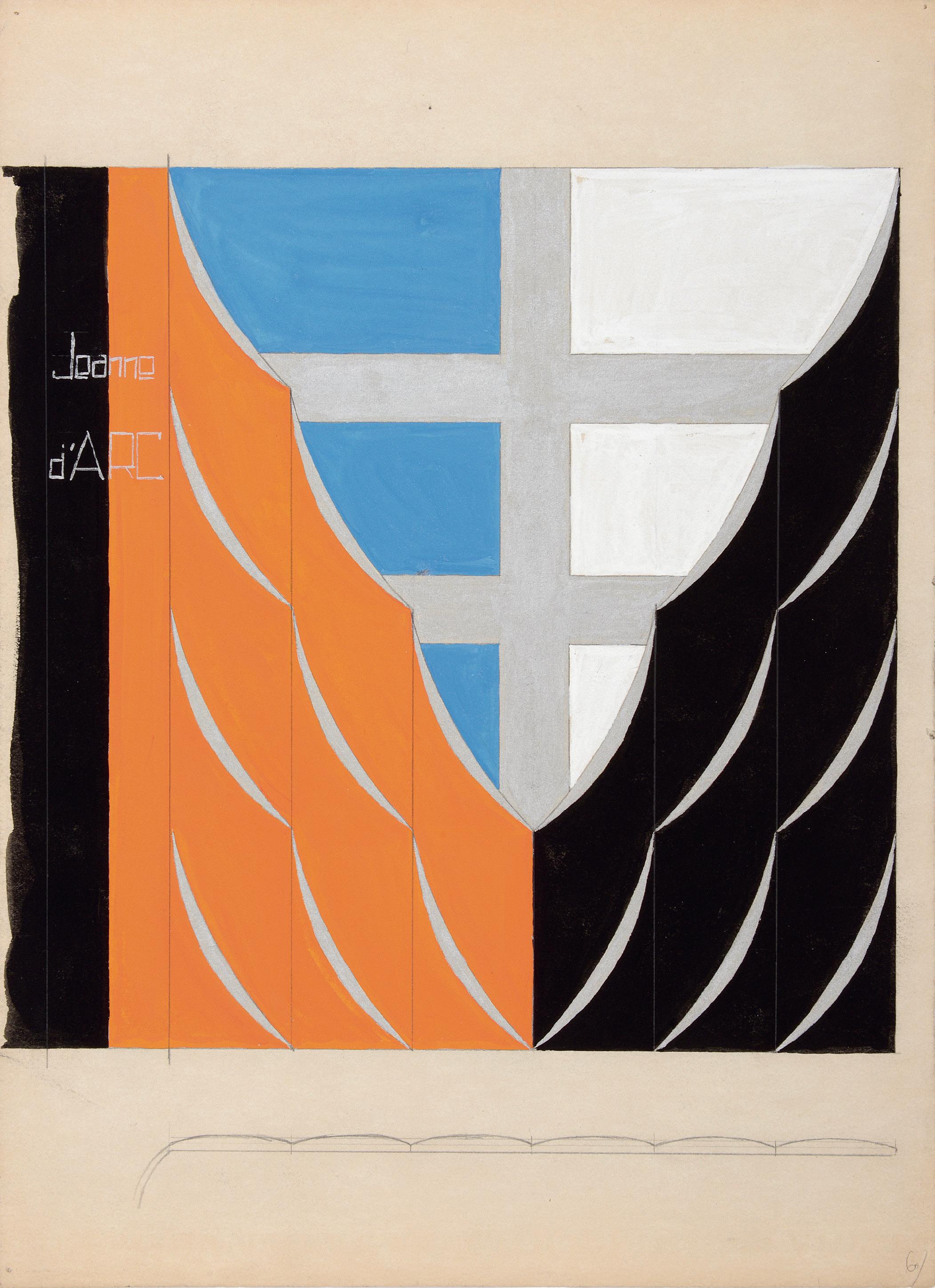
GEORGE BARBIER
Nantes 1882-1932 Paris
L’Île Mystérieuse: A Fabric Design for Bianchini Férier
Pen and black ink and gouache, over an underdrawing in pencil, with framing lines in pencil. Signed, dated and inscribed George Barbier . 1919 / 8 – L’Ile Mysterieuse in blue ink in the lower left margin. Stamped 14927 in the upper margin and again on the verso. Dated and inscribed 16.10.19 / L’Ile Mysterieuse in pencil on the verso.
167 x 261 mm. (6 1/2 x 10 1/4 in.) [image]
244 x 305 mm. (9 5/8 x 12 in.) [sheet]
PROVENANCE: Bianchini-Férier sale (‘Vente Archives Textiles De Mode, Collection Bianchini-Férier: Vente Historique 1900-1950’), Lyon, Hôtel des Ventes ‘Rive Gauche’, 14 December 1991, lot 96.
A painter and illustrator, George Barbier studied at the Ecole des Beaux-Arts in Paris and first came to public attention with an exhibition of his drawings at the Galerie L’Art Moderne in Paris in 1911. Characterized by a refinement and elegance which epitomized the Art Deco era, much of Barbier’s work took the form of fashion illustrations for such magazines as La Gazette du Bon Ton, Fémina, Costumes parisiens, Vogue, La Vie Parisienne and the Journal des Dames et des Modes. He provided fashion plates for some of the leading couturiers of the period, notably Paul Poiret, Jeanne Lanvin and Madeleine Vionnet, and also produced designs for stage sets and theatre costumes, fabrics, fans and wallpaper. As has been noted of Barbier, ‘Recognized as one of the master decorators of the time, he found his services in demand in many fields…Barbier was a supreme decorative designer.’1 As well as illustrating his own book Le bonheur du jour, ou les graces à la mode, a study of fashion and manners on which he worked from 1920 to 1924, Barbier drew illustrations for books by Charles Baudelaire, Théophile Gautier, Pierre Louÿs and Paul Verlaine, while in later years he designed advertisements for Cartier, Renault and other companies.
The silk weaving manufactory of Bianchini-Férier was founded in Lyon in 1888 by the designer Charles Bianchini and the financier François Férier, and the following year won a silver medal at the Exposition Universelle in Paris. Known for its innovative fabrics in bright colours, the firm became highly successful and soon expanded, opening offices in Paris, London, Brussels and, in 1909, New York. It also began working with such fashion designers as Poiret, Lanvin, Worth, Madeleine Vionnet and Jean Patou. Bianchini-Férier also employed several artists and illustrators - notably George Barbier, Robert Bonfils, Paul Iribe, Alberto-Fabio Lorenzi and Charles Martin - to create designs for its textiles. Perhaps most famously, in 1912 the firm signed a contract with Raoul Dufy, who produced some four thousand designs for fabrics until 1928. After the Second World War Bianchini-Férier continued to work closely with fashion designers, including Chanel, Cristóbal Balenciaga, Hubert de Givenchy, Christian Dior, Nina Ricci and Yves Saint-Laurent, among many others.
Drawn on the 16th of October 1919, the present sheet served as a design for a Bianchini-Férier textile entitled L’Île Mystérieuse. A swatch of the related fabric (fig.1) is sold with this drawing.
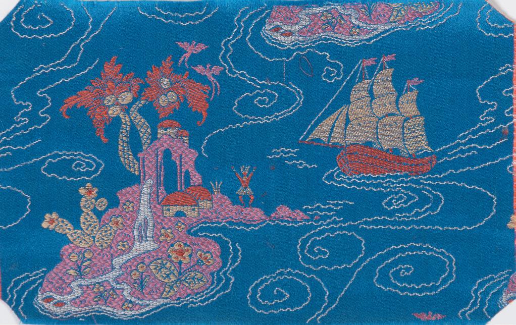
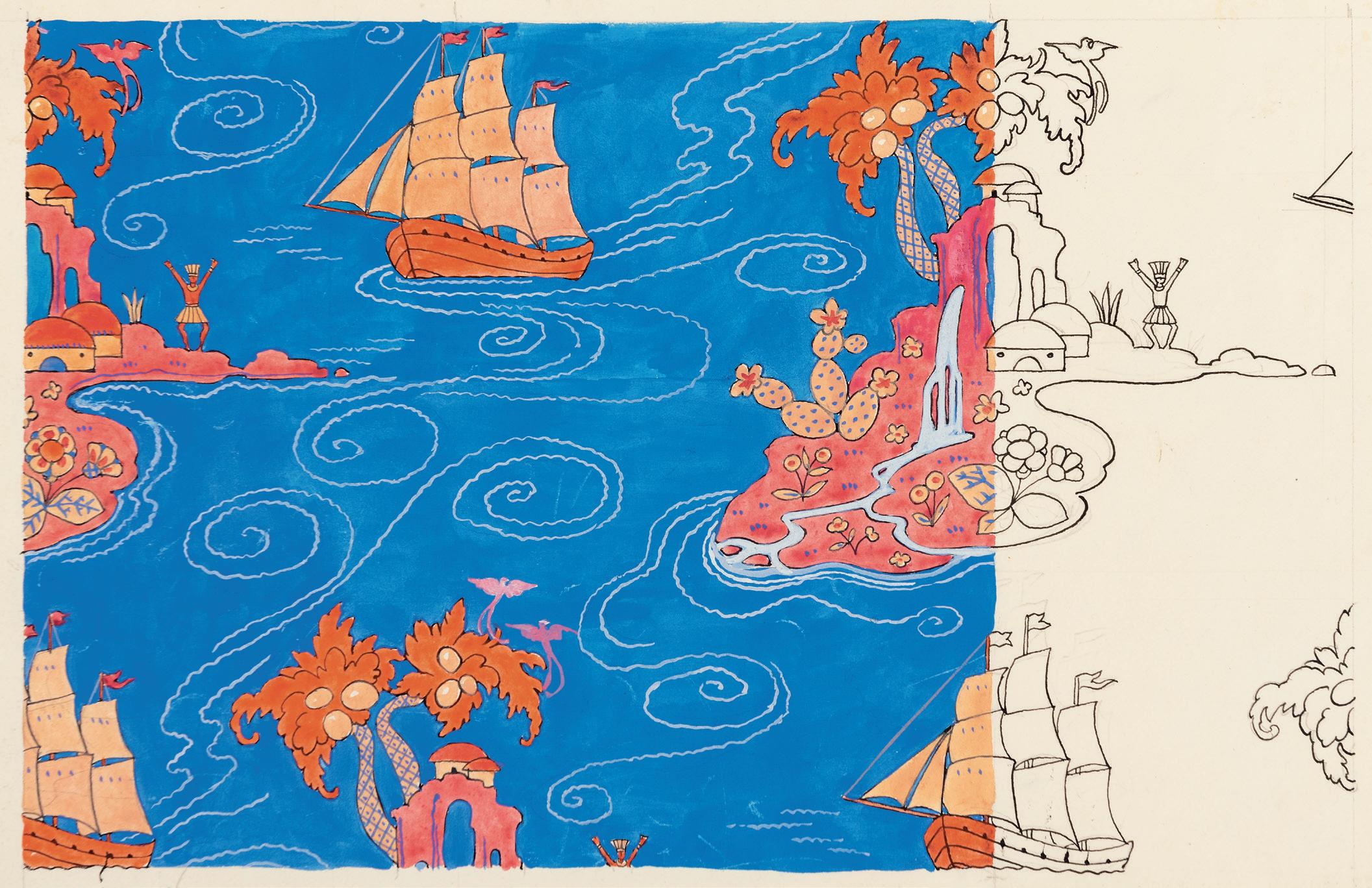
HENRI PRIVAT-LIVEMONT
Schaerbeek 1861-1936 Schaerbeek
a. Design for a Belgian Postage Stamp for the Red Cross: A Standing Angel Holding a Shield
Pencil, brown wash and watercolour, with framing lines in red ink. Signed with the artist’s initials LP in pencil at the lower right. Inscribed BELGIQUE in red ink at the top and dated 1934 in green ink in the centre.
105 x 75 mm. (4 1/8 x 3 in.) [image]
130 x 96 mm. (5 1/8 x 3 3/4 in.) [sheet]
b. Design for a Belgian Postage Stamp for the Red Cross: A Mother and a Child Looking at a Book
Pencil, brown wash and watercolour, with framing lines in blue ink. Signed with the artist’s initials LP in pencil at the lower left. Inscribed BELGIQUE in red ink at the top and dated 1934 at the upper right.
75 x 103 mm. (3 x 4 in.) [image]
96 x 104 mm. (3 3/4 x 4 1/8 in.) [sheet]
PROVENANCE: The estate of the artist; Private collection.
One of the leading artists of the Belle Epoque in France and Belgium, Henri Privat Antoine Livemont, known as Privat-Livemont, studied at the School of Decorative Arts in Sint-Josse-ten-Noode before earning a scholarship to complete his training in Paris, where he lived and worked for six years, between 1883 and 1889. He initially won a commission to work on part of the decoration of the Hôtel de Ville, but soon fell foul of a new law that prohibited non-French artists from working on official civic projects. Nevertheless, he was active in the studio of the scenographer Jean-Baptiste Lavastre, creating stage designs for a production of Hamlet at the Théâtre Français, where he also worked on the interior decoration of the theatre. On his return to Belgium in 1889 he settled in Schaerbeek, in the northern part of Brussels. He received several important commissions, notably the decoration of the provincial government building in the city of Hasselt. Privat-Livemont worked with several architects and designed the interiors of a number of private homes in Brussels, as well as painting murals for a theatre in Ostend. In 1900 his work was the subject of a laudatory article by the contemporary Belgian art critic and writer Octave Maus in the French journal Art et decoration
Privat-Livemont’s career as a painter, decorator, lithographer and commercial and magazine illustrator was a very successful one. (The artist’s letterhead noted that he was a purveyor of ‘Art posters and prints. Decorations for apartments. Traditional and modern styles. Sgraffiti’.) He became especially known as a designer of Art Nouveau posters, which he began producing in 1890, when he produced a striking poster for an exhibition in Schaerbeek, and this soon led to other commissions for posters, notably for the Cercle Artistique de Schaerbeek. By 1900 Privat-Livemont had designed some thirty posters, many published by the artist himself, and had also taken up lithography and printmaking. Among his best-known posters are those for the Casino de Cabourg and such products as Absinthe Robette or Van Houten cocoa, as well as for the Brussels International Exposition of 1897. Privat-Livemont’s poster designs were almost always based on striking images of beautiful dreamlike women, displaying a product for sale or engaged in some activity, often accompanied by floral motifs in their elegant borders.
As Octave Maus, writing in 1900, noted, ‘it was easy to discover certain analogies between the posters of Privat Livemont and those of [Alphonse] Mucha…Perhaps the enquiry, far from hurting M. Privat Livemont, would be in favour of the Brussels artist whose first posters go back to 1890, that is to say, to a period when the name of Mucha was unknown.’1 (Mucha created his first poster in 1894.) In his later years PrivatLivemont taught at the Académie in his native municipality of Schaerbeek.
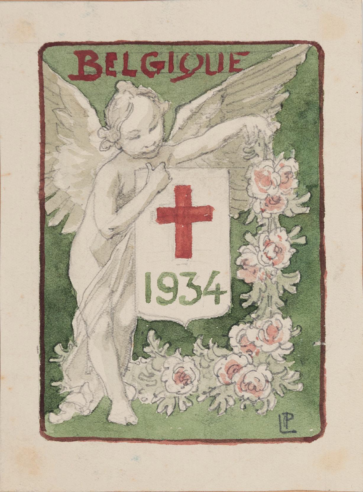
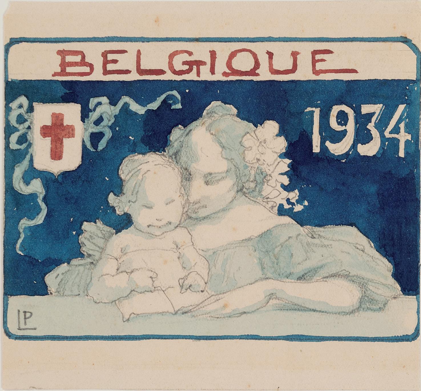
HENRI PRIVAT-LIVEMONT
Schaerbeek 1861-1936 Schaerbeek
c. Design for a Belgian Postage Stamp for the Red Cross: A Mother and a Praying Child
Pencil, brown wash and watercolour, with framing lines in brown ink. Signed with the artist’s initials LP in pencil at the lower left. Inscribed BELGIQUE in brown ink at the top and dated 1934 at the upper right.
92 x 121 mm. (3 5/8 x 4 3/4 in.) [image]
119 x 148 mm. (4 5/8 x 5 3/4 in.) [sheet]
d. Design for a Belgian Postage Stamp for the Red Cross: A Seated Child with a Garland of Flowers
Pencil, light brown wash and watercolour, with framing lines in brown ink. Signed with the artist’s initials LP in pencil at the lower left and again in white at the lower right centre. Inscribed BELGIQUE in brown ink at the top and dated 1934 in red ink at the lower right.
95 x 72 mm. (3 3/4 x 2 7/8 in.) [image]
165 x 148 mm. (6 1/2 x 5 3/4 in.) [sheet]
PROVENANCE: The estate of the artist; Private collection.
Postage stamps for the Red Cross first became widespread during the First World War, when over 47 countries, including Belgium, issued such stamps to raise money for the National Red Cross societies. The purpose of such stamps was two-fold; to serve both as postage and to raise funds for the relief work of the Red Cross. After the War, Belgium continued to regularly issue sets of postage stamps to benefit the Red Cross, and indeed the construction of the Belgian Red Cross headquarters building in Brussels in 1939 was financed by a series of issues that year.
These four small drawings are part of a group of seven different designs for postage stamps for the Belgian Red Cross produced by Henri Privat-Livemont in the last years of his career. Two other drawings from the same set, also with Stephen Ongpin Fine Art, are illustrated in a 2007 monograph on the artist2. It appears that none of these designs were ever actually produced as postage stamps, however.
As the scholar Benoît Schoonbroodt has noted, this was not the only time that Privat-Livemont produced designs for postage stamps. Almost four decades earlier, around 1895, the artist had designed a set of Belgian postage stamps in denominations of 5, 10, 20, 30 and 50 centimes and 1 franc, ‘where the central medallion bearing the value of the stamp is flanked by two lions facing away from one another.’3 Privat-Livemont’s design proved very popular, and the stamps were reissued numerous times, sometimes with different colours and denominations, between 1900 and 1953.
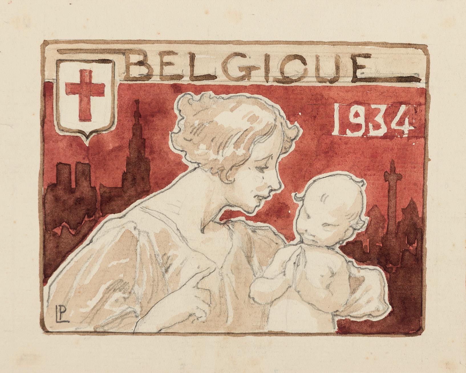
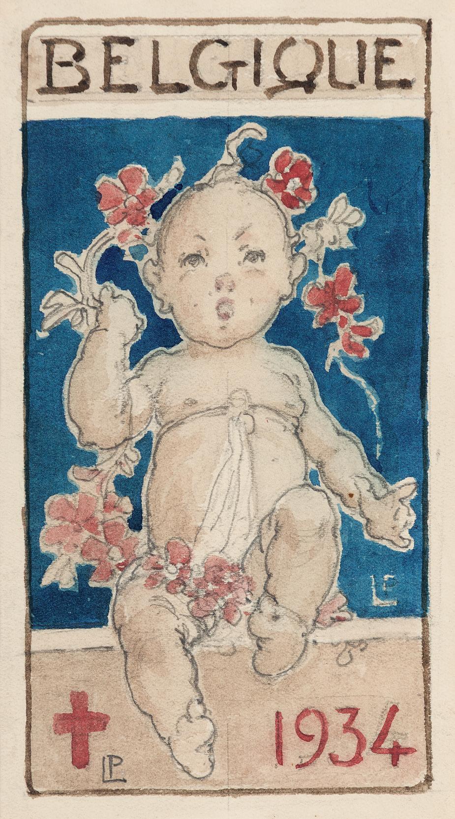
c.
BERND DAMS and ANDREW ZEGA
Born 1964 and Born 1961
A Bronze Garden Vase with Sphinxes, for the Parterre du Midi at Versailles
Watercolour. Signed, titled and dated Bronze Vase at Versailles / © 1995 Edward Andrew Zega / & Bernd H. Dams / - All rights reserved - in pencil on the verso. 333 x 346 mm. (13 1/8 x 13 5/8 in.)
PROVENANCE: Didier Aaron, Inc. New York; Pierre Durand, New York.
LITERATURE: Andrew Zega and Bernd H. Dams, Garden Vases, Paris, 2000, pp.16-17.
The architectural historians and illustrators Bernd Dams and Andrew Zega have collaborated on a series of remarkable watercolours depicting significant examples of architecture, garden architecture and ornament in France in the century and a half before the Revolution. As the late Charles Ryskamp noted of these works, ‘The paintings are brilliant and original. The author/artists, American and German, have captured the French genius of these buildings through the medium of watercolor, which enables the rendition of various building materials and surfaces with remarkable versatility and sensitivity. The illustrations overcome the special problems of recreating the appearance of each building. The paintings are abstractions of the elevations of the main facades of each building; yet they are also informative of the architectural peculiarities of the entire structure. The resulting illustrations both document the architectural past and are modern works of art in their own right.’1
A German architect and architectural historian whose doctoral thesis was on the Château of Marly, Dams met Zega, an American artist and writer, in the early 1990s, when both were employed at the architectural firm of Robert A. M. Stern in New York. The two began collaborating on detailed and historically accurate watercolours of buildings and ornament, with an emphasis on French architecture of the 17th and 18th centuries, notably the Palace of Versailles. Many of the buildings depicted no longer exist, and their splendid watercolours are thus based on contemporary accounts, descriptions and illustrations. Dams and Zega have written and illustrated four books: Pleasure Pavilions and Follies (1995), Garden Vases (2000), Palaces of the Sun King: Versailles, Trianon, Marly (2002) and Chinoiseries (2006). Watercolours by Dams and Zega are today in the collections of The New-York Historical Society and the Cooper-Hewitt, National Design Museum in New York and the Princeton University Art Museum, as well as the Musée des Arts Décoratifs in Paris, the Château de Versailles, and the Musée de l’Ile de France at the Château de Sceaux. Works by the pair are also in numerous private collections, including those of Brooke Astor, Robert Denning, Hubert de Givenchy, Oscar de la Renta and Jayne Wrightsman.
Thought to be after a design by the 17th century French sculptor and silversmith Claude Ballin the Elder (1615-1678), this large garden vase in the form of an urn was executed for the gardens of Versailles around 1665. Five of these ‘Ballin’ designs for vases were reproduced in etchings by Jean Le Pautre in the early 1670s, and through such prints, these garden vases became popular throughout Europe and were reproduced in numerous 17th and 18th century copies. As Gérard Mabille has written, ‘Great urns and vases in marble, bronze or lead are among the most handsome ornaments of classical gardens. They are to be found in particular abundance at Versailles, where they line parterres and bosquets or punctuate avenues and perspectives with their monumental silhouettes…in the gardens at the foot of the palace walls…[are] the celebrated set of twenty-six bronze vases attributed to Ballin…Arranged in pairs on the marble sills overlooking the Parterre du Nord and the Parterre du Midi, the ‘Ballin’ vases display imagination and poetry in equal measure in their interpretation of classical Greek and Roman sources. Decorated with antique medallions, gadroons, ova and frets, and garlands of laurel and oak, acanthus and ivy, they are enlivened by a throng of playful or pouting cupids, chimeras, sphinxes, dragons and satyrs… Of remarkably skilful workmanship, they were doubtless intended to be gilded, though this work was never carried out. Like their silver counterparts, they are imbued with a lyricism that is at once subtle, harmonious and consummately Virgilian in spirit.’2
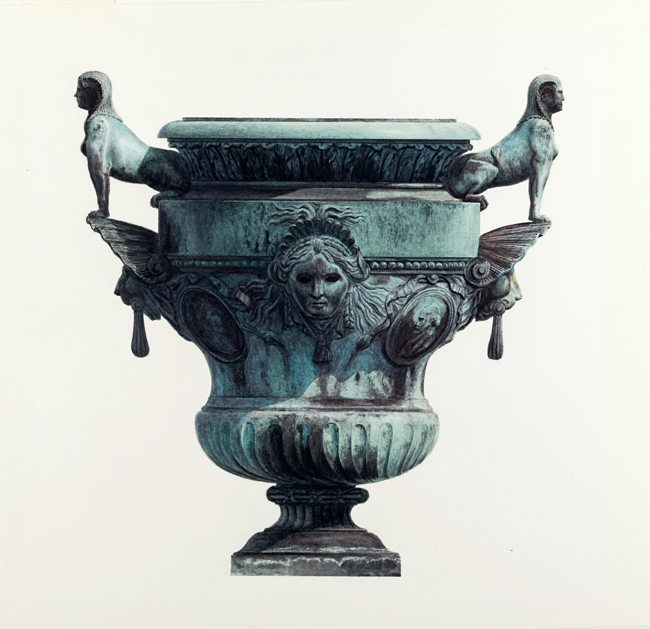
NOTES TO THE CATALOGUE
No.1
Luzio Romano
1. The Amsterdam art dealer Lodewijk Houthakker (1926-2008) assembled one of the largest private collections of architectural and decorative drawings formed since the Second World War. Fully catalogued in 1989, the Houthakker collection was dispersed not long afterwards.
2. The present sheet was first attributed to Luzio Romano by the scholar Bert Meijer.
3. Philip Pouncey and J. A. Gere, Italian Drawings in the Department of Prints and Drawings in the British Museum: Raphael and his Circle, London, 1962, Vol.I, p.112, under no.186.
4. Inv. Vol.191, no.10881; Edmund Schilling and Anthony Blunt, The German Drawings in the Collection of Her Majesty the Queen at Windsor Castle…and Supplements to the Catalogues of Italian and French Drawings with a History of the Royal Collection of Drawings, London and New York, 1971, p.125, no.480, pl.16 (as Follower of Perino del Vaga).
The drawing is executed in pen and brown ink and brown wash, over a black chalk underdrawing, and measures 203 x 283 mm. Like the present sheet, the Windsor drawing was associated, by A. E. Popham, with Giovanni da Udine (1587-1564) but was later attributed by Anthony Blunt to an artist in the circle of Perino del Vaga. Fuhring has noted that the Windsor drawing had also been attributed to Marco Marchetti, called Marco da Faenza (1520-1588), but on balance an attribution to Luzio Romano seems most probable. Other stylistically comparable drawings by the artist are in the Biblioteca Academiei Romî in Bucharest, the Uffizi in Florence, the British Museum and the Victoria and Albert Museum in London, the Metropolitan Museum of Art in New York and the Biblioteca Comunale in Palermo.
5. Pouncey and Gere, op.cit., Vol.I, p.110, under no.184.
6. Fuhring, op.cit., p.165, under no.130.
No.2
Spanish School c.1550
1. This manuscript cutting was once part of the collection of Stuart Cary Welch (1928-2008), a noted scholar and curator of Islamic and Indian art who had a long professional relationship with both the Harvard University Art Museums in Cambridge (MA) and the Metropolitan Museum of Art in New York. Much of his personal collection of Indian and Islamic paintings, drawings, manuscripts, arms and armour, sculpture and textiles was presented to Harvard over a period of several years.
2. London, Maggs Bros. Ltd., op.cit., pp.50-53, nos.34-37.
3. Juan de Yciar, Arte Subtilissima, Zaragoza, 1550; Facsimile ed. [trans. Evelyn Shuckburgh], London, 1958, unpaginated; Jane Morlet Hardie, ‘Juan de Yciar and Decorative Traditions in Spanish Cantorales of the Long Sixteenth Century: Some Manuscripts from the Sydney University Collection’, Acta Musicologica, 2013, p.164, pl.2(d).
No.3
Marco da Faenza
1. As Vasari writes, ‘But most rare among the other men of Romagna, in certain respects, is Marco da Faenza (for only so, and not otherwise, is he called), for the reason that he has no ordinary mastery in the work of fresco, being bold, resolute, and of a terrible force, and particularly in the manner and practice of making grotesques, in which he has no equal at the present day, nor one who even approaches his perfection. His works may be found throughout all Rome; and in Florence there is by his hand the greater part of the ornaments of twenty different rooms that are in the Ducal Palace, and the friezes of the ceiling in the Great Hall of that Palace…not to mention that the decorations of the principal court of the same Palace…were executed in great part by the same man.’; Giorgio Vasari, Lives of the Painters, Sculptors and Architects, Florence, 1568; trans. Gaston du C. de Vere, London, 1912 [1996 ed.], Vol.II, pp.779-780.
2. Annamaria Petrioli Tofani, Michelangelo, Vasari, and Their Contemporaries: Drawings from the Uffizi, exhibition catalogue, New York, 2008, p.97, under no.44.
3. Sale (‘La Collection Pierre de Charmant’), Paris, Christie’s, 21 March 2002, lot 17.
4. Inv. 1948-755 and 1981-119; Philippe Costamagna, Florian Härb and Simonetta Prosperi Valenti Rodinò, ed., Disegno, giudizio e bella maniera: Studi sul disegno italiano in onore di Catherine Monbeig Goguel, Cinisello Balsamo, 2005, pp.86-87, no.41 and fig.41a (entry by Alessandro Nova); Laura Giles, Lia Markey and Claire Van Cleave, Italian Master Drawings from the Princeton University Art Museum, Princeton, 2014, pp.86-89, nos.35-36, where dated c.1570-1575.
5. Inv. 95 0rn; Petrioli Tofani, op.cit., pp.96-97, no.44.
6. Inv. 3089; David Scrase, Italian Drawings at The Fitzwilliam Museum, Cambridge, Cambridge, 2011, pp.434-435, no.425.
No.4
Florentine School, 16th Century
1. Giorgio Vasari, Lives of the Painters, Sculptors and Architects, Florence, 1568; translated Gaston du C. de Vere, London, 1912; 1996 ed., Vol.II, p.571.
2. Inv. 15.35; Candace J. Adelson, European Tapestry in the Minneapolis Institute of Arts, Minneapolis, 1994, pp.384-394, no.24, illustrated p.384; Alessandra Baroni Vannucci, Jan Van Der Straet detto Giovanni Stradano: flandrus pictor et inventor, Milan, 1997, p.342, no.666, fig.666, illustrated in colour p.334; Lucia Meoni, Gli arazzi nei musei fiorentini: La collezione medicea. Catalogo completo. I: La manifattura da Cosimo I a Cosimo II (1545-1621), Livorno, 1998, p.47, fig.20. The tapestry, which can be dated to c.1546-1549, is the only early Medicean tapestry in a public collection outside Italy.
3. Meoni, ibid., illustrated p.212, under nos.46-58. Similar animals are also found in several prints of hunting scenes after designs by Stradanus, such as a Tiger Hunt, a Leopard Hunt and a Stag Hunt from the series of over a hundred engravings known as the Venationes Ferarum, Avium, Piscium (Baroni Vannucci, ibid., pp.374 and 377, figs.693.15, 693.16 and 693.33, respectively).
4. London, Katrin Bellinger Kunsthandel at Harari and Johns, Drawing in Florence 1500-1650, 1991, nos.18a (a design for the whole tapestry) and 18b (a study for part of the decorative border of the same tapestry).
No.6
Spanish School, Late 16th Century
1. Several are illustrated in Paulina Junquera de Vega, ‘El obrador de bordados de El Escorial’, El Escorial 1563-1963, Madrid, 1963, Vol.II, pp.560568 and pp.571-572.
2. ‘Cet ensemble de dessins, aujourd’hui le plus abondant et le plus cohérent pour l’Espagne de la Renaissance...’; Lizzie Boubli, Le dessin en Espagne à la Renaissance, Turnhout, 2015, p.231.
3. Diego Angulo and Alfonso E. Pérez Sánchez, A Corpus of Spanish Drawings. Vol.1: Spanish Drawings 1400-1600, London, 1975, pp.20-21, nos.15-26, pls. VI-VIII, pp.48-51, nos.182-201, pls.LIV-LVI, and pp.67-76, nos.309-385, pls.LXXX-LXXXVII. Nine of these are illustrated in colour in Lizzie Boubli, ibid., pp.244-246 and 250, figs.44-52.
4. A third album today in the Escorial library contains ninety-four substitute cartoons that are pricked copies of the primary drawings for the embroidered vestments. A concordance of the substitute cartoons in the album and the extant drawings from which they were made can be found in Carmen C. Bambach, Drawing and Painting in the Italian Renaissance Workshop. Theory and Practice, 1300-1600, Cambridge, 1999, pp.368-371.
5. Mark P. McDonald, Renaissance to Goya: Prints and Drawings from Spain, exhibition catalogue, London, 2012-2013, p.74.
6. Lisa A. Banner, ‘A Selection of Spanish Drawings from The Metropolitan Museum of Art’, Master Drawings, 1999, No.4, p.396.
7. Angulo and Pérez Sánchez, op.cit., pp.67-68, nos.309-318, illustrated pl.LXXX and LXXXI. The drawings by the ‘Master A’ in the Escorial albums were formerly attributed, by Paulina Junquera de Vega in 1964 to the artist Miguel Barroso
8. Angulo and Pérez Sánchez, op.cit., p.67, no.309, illustrated pl.LXXX.
9. Banner, op.cit., p.396.
10. Lizzie Boubli, ‘The State of Scholarship of Sixteenth- and Seventeenth-Century Spanish Drawings’, Master Drawings, 1999, No.4, pp.355-356.
No.7
Domenico Cresti, Il Passignano
1. The text transcribed on the recto of this sheet is taken from a light musical piece of a type known as a villanella alla napolitana that was popular in Italy in the second half of the 16th century. Villanelle were a form of secular or rustic vocal music that had originated in the Kingdom of Naples earlier in the Cinquecento. The full lyrics to the song ‘ora ch’ogni animal riposa e dorme…’ were first transcribed by the 16th century Florentine composer, musician and singer Cosimo Bottegari in his manuscript Arie e canzoni in musica, begun in 1574 and completed around 1602. A transcription of the same villanella was later printed in M. Menghini, ‘Villanelle alla napolitana’, Zeitschrift für romanische Philologie, 1892, p.489, no.XIX.
2. Joan Lee Nissman, Domenico Cresti (Il Passignano), 1559-1638: A Tuscan Painter in Florence and Rome, unpublished Ph.D dissertation, Columbia University, 1979, p.43.
3. Annamaria Petrioli Tofani and Graham Smith, Sixteenth-Century Tuscan Drawings from the Uffizi, exhibition catalogue, Detroit, 1988-1989, p.208, under no.90.
4. Nissman, op.cit., p.58.
5. Inv. 1125 S r; Anna Maria Petrioli Tofani, ‘C. Thiem. Florentiner Zeichner des Frühbarock’ [book review], Prospettiva, October 1979, p.76, illustrated p.74, fig.1 (recto only); Frankfurt, Frankfurter Kunstverein, Die Florentinischen Zeichnungen des Seicento, exhibition catalogue, 1988, p.82, no.34 (recto only).
6. Inv. 1125 S v. Previously attributed to Francesco Salviati, the Uffizi drawing was reattributed to Passignano in 1975 by Annamaria Petrioli Tofani.
7. Nissman, op.cit., p.226, no.7c.
8. Nissman, op.cit., p.226, under no.7c, fig.18; James M. Saslow, The Medici Wedding of 1589: Florentine Festival as Theatrum Mundi, New Haven and London, 1996, p.193, no.4. Two impressions of the Scarabelli print are in the British Museum (Inv. 1897,0113.35 and 1897,0113.46.
9. As Baldinucci writes, ‘[Passignano] painted the coat of arms of the Most Serene Republic, which was placed above the door of the cathedral; and once the festivities were over, it was moved to the German guardhouse at the entrance to the Pitti Palace.’ (‘Dipinse l’arme della serenissima casa, che fu posta sopra la porta di essa cattedrale, ed a quella, finita che fu la festa, fu dato luogo nel corpo di guardia de’ tedeschi all’entrare nel palazzo a’ Pitti.’; Filippo Baldinucci, Notizie dei profesori del disegno, da Cimabue in qua, Florence, 1846, Vol.III, p.434).
10. Nissman, op.cit., pp.223-224, no.7a, figs.16-17. These paintings may be those mentioned by Baldinucci in his biography of Passignano: ‘For one of the triumphal arches, he painted the beautiful figures of the Tiber and the Arno, which today hang in the hall of the apartments of Her Serene Highness the Grand Duchess Vittoria in the Pitti Palace.’ (‘Per uno degli archi trionfali colorì le bellissime figure del Tevere e dell’Arno, che oggi veggonsi appese nel salone degli appartamenti della serenis. granduchessa Vittoria nel palazzo de’ Pitti.’; Baldinucci, op.cit., p.434).
11. Inv. 874 F; Petrioli Tofani and Smith, op.cit., pp.206-207, no.89; Annamaria Petrioli Tofani, Gabinetto disegno e stampe degli Uffizi. Inventario: Disegni di figura 1, Florence, 1991, p.371, no.874 F.
12. Inv. 6541; Susanne Neuberger, ‘Paggi, Passignano oder Empoli: Ein Konkurrenzentwurf zum “Paradies” in San Remigio in Florenz’, Mitteilungen des Kunsthistorischen Institutes in Florenz, 1981, p.383, fig.1. The drawing represents Passignano’s design for a competition between himself, Giovanni Battista Paggi and Jacopo da Empoli for an altarpiece commissioned by Niccolò Gaddi for his chapel in the Florentine church of San Remigio, which was eventually won by Empoli.
13. Franco Moro, Viaggio nel Seicento Toscano: Dipinti e disegni inediti, Mantua, 2006, p.36, fig.23.
14. Inv. 3469 S; Miles L. Chappell et al, Disegni dei toscani a Roma (1580-1620), Florence, 1979, pp.91-92, no.40, fig.67 (entry by Joan L. Nissman).
No.8
Federico Zuccaro
1. The handwriting on the verso of the present sheet does not appear to be that of Federico Zuccaro himself.
2. Inv. M1990.87; Barry Wind and Joseph Ruzicka, Old Master Drawings from Area Collections, exhibition catalogue, Milwaukee, 1997, no.59; Olszewski, op.cit., pp.506-507, no.402. The drawing, which measures 322 x 221 mm., was formerly in the collections of Herbert List and Wolfgang Ratjen, Munich.
No.9
Daniel Lindtmayer
1. Virginia Chieffo Raguin, ‘Daniel Lindtmayer II’, in Jane Turner, ed., The Dictionary of Art, London, 1996, Vol.19, p.414.
No.10
Andrea Boscoli
1. At the time of the 1982 sale, the central cartouche of the present sheet was inscribed DISEGNI / DI / VARI PITTORI / ITALIANI / &C &C.
2. ‘…disegnò sì bene...senza mancare di una franchezza e bravura di tocco straordinario’; Filippo Baldinucci, Notizie dei professori del disegno da Cimabue in qua, Florence, 1846 ed., p.76.
3. Julian Brooks, Graceful and True: Drawing in Florence c.1600, exhibition catalogue, Oxford and elsewhere, 2003-2004, p.69, under no.20.
4. Inv. WA1944.102.46; K. T. Parker, Catalogue of the Collection of Drawings in the Ashmolean Museum; Volume II: Italian Schools, Oxford, 1956, p.68, no.128 (not illustrated); Bastogi, op.cit., p.360, no.552 (not illustrated). An image of the drawing is visible online at https://www.ashmolean. org/collections-online#/item/ash-object-71733 [accessed 27 April 2026].
No.11
Bolognese School, 17th Century
1. Inv. 1892,0411.6; Clare Robertson and Catherine Whistler, Drawings by the Carracci from British Collections, exhibition catalogue, Oxford and London, 1996-1997, p.87, no.43; Victor Hundsbuckler, Dessins des Carrache: La fabrique de la Galerie Farnèse, exhibition catalogue, Paris, 2025, p.29, fig.8. The drawing may be dated after 1595, as it includes the name of Francesco Carracci, who was probably born that year. The drawing was engraved by Vincenzo Fontana for Malvasia, who included the print in his Felsina pittrice: Vite de’ pittori Bolognesi, published in 1678.
2. Alice Binion, ‘Algarotti’s Sagredo Inventory’, Master Drawings, Winter 1983, p.392.
3. W. R. Rearick, ‘More Veronese Drawings from the Sagredo Collection’, Master Drawings, Summer 1995, p.132.
No.12
South German School, 17th Century
1. Gode Krämer, Peter Prange and Christof Trepetsch, ed., Die Grafische Sammlung im Schaezlerpalais: Deutsche Zeichnungen des Barock in Augsburg, exhibition catalogue, Augsburg, 2025, pp.320-323, nos.95-96.
2. Augsburg, Rathaus and Holbeinhaus, Augsburger Barock, exhibition catalogue, 1968, p.263, nos.349-350, figs.146-147, p.355, no.353, fig.145.
3. Inv. 1966.338; Thomas DaCosta Kaufmann, Drawings from the Holy Roman Empire 1540-1680: A Selection from North American Collections, exhibition catalogue, Princeton and elsewhere, 1982-1983, pp.110-111, no.37 (as Schrorer).
4. According to a mounted photograph of the present drawing in the Witt Library at the Courtauld Institute of Art.
No.13
Ermenegildo Lodi
1. Inv. 12031; Mina Gregori, ed., I Campi: Cultura artistica cremonese del Cinquecento, exhibition catalogue, Cremona, 1985, pp.314-315, no.2.20.1; Raffaella Poltronieri, Una grande bottega artistica nella Lombardia della seconda metà del Cinquecento: Giovan Battista Trotti detto il Malosso, unpublished doctoral thesis, Università Ca Foscari, Venice, 2017, p.267, fig.88.
2. Inv. 1576 E; Annamaria Petrioli Tofani, Gabinetto disegno e stampe degli Uffizi. Inventario 1: Disegni esposti, Florence, 1986, p.654, no.1576 E (as Malosso). The drawing measures 145 x 115 mm.
3. Inv. 1977.58; Marco Tanzi, ‘Qualche aggiunta al Malosso e alla sua cerchia’, Prospettiva, January 1985, p.82, fig.2 (as Lodi); Edward Olszewski, A Corpus of Drawings in Midwestern Collections: Sixteenth-Century Italian Drawings, Vol.II, Turnhout, 2008, pp.468-469, no.371 (as Malosso).
No.14
Florentine School, 17th Century
1. Simonetta Stagni, Domenico Maria Canuti, Rimini, 1988, p.179, fig.37o.
2. Inv. 1122F; Anna Banti, Giovanni da San Giovanni: Pittore della contradazzione, Florence, 1977, pl.1; Ilaria Della Monica, Giovanni da San Giovanni: Disegni, exhibition catalogue, San Giovanni Valdarno, 1994, pp.28-29, unnumbered.
3. Inv. 2379S; Della Monica, ibid., pp.640-65, unnumbered.
4. Heiko Damm and Henning Hoesch, ed., galleria portatile: Old Master Drawings from the Hoesch Collection, Petersberg, 2017, p.316, under no.77 (entry by Erich Schleier).
5. Inv. 13928; Catherine Monbeig Goguel, Musée du Louvre: Département des arts graphiques. Inventaire général des dessins italiens IV: Dessins toscans, XVIe-XVIIIe siècles, pt.2: 1620-1800, Paris, 2005, pp.112-113, no.79.
No.16
Giovanni Francesco Grimaldi
1. Suzanne Folds McCullagh, ed., Dreams & Echoes: Drawings and Sculpture in the David and Celia Hilliard Collection, exhibition catalogue, Chicago, 2013-2014, p.35, under no.6.
2. ‘…studiò così ferverosamente che la notte in loco di dormire sempre disegniava.’; Raccolta di vite di pittori, elogi della pittura, architettura et scoltura, ritratti di pittori, per le vite de’ pittori da farsi, copie delle pitture antiche di Bologna che mostrano lo stato barbaro nel quale tre arti erano, e frammenti veri per componere un trattato della scuola di Bologna, MS 245, Biblioteca Universitaria di Bologna, p.159.
3. In 1997, when the present sheet first appeared at auction, Isabella Lodi-Fé Chapman tentatively suggested that it might be related to the construction of the Villa Doria Pamphili, directed by Alessandro Algardi with the assistance of Grimaldi. However, as some contemporary biographers note, Algardi had little experience in architecture and relied to a large extent on Grimaldi’s help; indeed, some sources refer to Grimaldi, and not Algardi, as the architect responsible for the Villa Pamphili.
4. Benedetti’s drawing, which incorporated an equestrian statue of King Louis XIV situated at the top of the Scalinata, is today in the Vatican Library.
5. ‘Mando a Vostra Eminenza...un cannello di latta con dentro due disegni per la scalinata da farsi alla Trinità de Monti. L’uno in carta turchina, è di Giovanni Francesco Bolognese, che dipinse già nel palazzo di Vostra Eminenza, vago, strepitoso e di gran spesa, più proprio per un giardino che per una strada…’; Quoted in Cesare d’Onofrio, Scalinate di Roma, Rome, 1974, p.294.
6. Inv. Hdz 1098; Wolfgang Lotz, ‘Die Spanische Treppe: Architektur als Mittel der Diplomatie’, Römisches Jahrbuch für Kunstgeschichte, 1969, p.62, fig.28, p.64, fig.31 (as ‘Anonymous, 1660-1661’); Ekhart Berckenhagen, Architektenzeichnungen 1479-1979, exhibition catalogue, Berlin and Cologne, 1979-1980, pp.52-54, no.62, fig.59 (as ‘Anonymous Roman 17th century, probably Giovanni Francesco Grimaldi’); Anna Maria Matteucci and Rossella Ariuli, Giovanni Francesco Grimaldi, Bologna, 2002, p.193, fig.121 (as Grimaldi). The dimensions of the drawing are 384 x 323 mm.
No.17
Baldassare Franceschini, Il Volterrano
1. Roberts, op.cit. (https://theframeblog.com/2021/06/22/il-volterrano-and-a-baroque-florentine-frame-part-of-a-thematic-programme/).
2. Sabine Jacob, Italienische Zeichnungen der Kunstbibliothek Berlin: Architektur und Dekoration 16. bis 18. Jahrhundert, Berlin, 1975, pp.116-118, nos.542-565, pls.122-129.
3. Charles McCorquodale, An Important Group of Drawings by Baldassare Franceschini, called Il Volterrano; Sale, London, Sotheby’s, 3 July 1980, p.15, under lot 11.
4. Marilena Mosco, Cornici dei Medici: La fantasia barocca al servizio del potere / Medici Frames: Baroque Caprice for Medici Princes, Florence, 2007, pp.33-34, p.102, under no.7.
5. Reinier Baarsen and Esther van der Hoorn, ‘Acquisitions: Drawings for Objects’, The Rijksmuseum Bulletin, 2016, No.2, p.161, under no.5.
6. Roberts, op.cit.
7. The frame is illustrated in Mosco, op.cit., pp.33-34, pp.98-100, no.6, and in Reinier Baarsen, Process: Design Drawings from the Rijksmuseum 1500-1900, exhibition catalogue, Den Bosch and Paris, 2022-2023, p.47, fig.1, under no.9. Other drawings for frames by Volterrano are today in the Rijksmuseum in Amsterdam, the Kunstbibliothek in Berlin, the Library of the Romanian Academy in Bucharest and the Metropolitan Museum of Art in New York.
8. Anonymous sale, London, Sotheby’s, 3 July 1980, part of lot 5; Marta Privitera, ‘Considerazioni su alcuni disegni del Volterrano’, Paragone, July 1991, pl.22a.
9. For example, Inv. Hdz 4789 and Hdz 4792; Jacob, op.cit., p.117, nos.545 and 549, illustrated pls.124-125.
10. Inv. D5560; London, Jean-Luc Baroni Ltd., Old Master and 19th Century Drawings: A selection from our current stock, 2003-2004, no.20.
No.18
Baldassare Franceschini, Il Volterrano
1. Charles McCorquodale, An Important Group of Drawings by Baldassare Franceschini, called Il Volterrano; Sale, London, Sotheby’s, 3 July 1980, p.9.
2. Inv. 1983.517; Anonymous sale, London, Christie’s, 26 March 1974, lot 45; Konrad Oberhuber, ed., Renaissance and Baroque Drawings from the Collections of John and Alice Steiner, exhibition catalogue, Cambridge (MA), Fogg Art Museum, 1977, pp.97-100, no.37; Piero Pacini, ‘Firenze 1669: un “teatro sacro” per Santa Maria Maddalena de’ Pazzi’, Mitteilungen des Kunsthistorisches Institutes in Florenz, 1992, p.165, fig.35.
3. Inv. 1975.120; Anonymous sale, London, Christie’s, 26 March 1974, lot 46; Jacob Bean, 17th Century Italian Drawings in the Metropolitan Museum of Art, New York, 1979, pp.146-147, no.186; Pacini, ibid., pp.162-163, figs.32-33.
4. Anonymous sale, London, Christie’s, 26 March 1974, lot 47 (not illustrated).
5. Inv. 23912; Pacini, op.cit., p.167, fig.37; Veronika Birke and Janine Kertész, Die Italienischen Zeichnungen der Albertina: Generalverzeichnis, Vol. IV, Vienna, 1997, p.2282, Inv.23912.
6. Pacini, op.cit., pp.160-161, figs.30-31 and p.166, fig.36.
7. Pacini, op.cit., p.131, fig.1.
No.19
Carlo Antonio Buffagnotti
1. Bianco, op.cit., p.427. Bianco’s thesis is published online at https://hdl.handle.net/1887/4284360
2. A rough translation would be: ‘Tell me, Fortune, speak to my heart, it feels like the wound of love has healed, blind persistence you say no, no, blind persistence you only say no, no...you used to be happy, oh...’
3. Bianco, op.cit., p.431.
4. Inv. I-Bc 22419; Bianco, op.cit., p.453, no.4.02.
5. Alexandre de Vesme and Phyllis Dearborn Massar, Stefano della Bella: Catalogue Raisonné, New York, 1971, Vol.I, pp.156-158, nos.1027-1044; Vol.II, pp.224-228, figs.1027-1044. See, in particular, nos.1033 and 1036.
6. Ibid., Vol.I, pp.158-159, nos.1045-1050; Vol.II, pp.229-230, figs.1045-1050.
7. de Vesme and Massar, op.cit., Vol.I, p.159, nos.1049; Vol.II, p.230, fig.1049. As has been noted of the Raccolta di vasi diversi etchings, ‘Fantastic vases, often based on antique bronzes, were perenially favorite subjects with printmakers. Stefano outfantasied all of them, both in the vases themselves and their exuberant contents.’; Phyllis Dearborn Massar, Presenting Stefano della Bella: Seventeenth-century Printmaker, New York, 1971, p.71.
No.20
Domenico Piola
1. Piero Boccardo and Francesco Boggero, ‘Patronage and Artistic Production from Rubens to Magnasco’, in Jonathan Bober, Piero Boccardo and Francesco Boggero, A Superb Baroque: Art in Genoa 1600-1750, exhibition catalogue, Washington and Rome, 2020-2021, pp.33-36.
2. Carlo Giuseppe Ratti, Delle vite de’ pittori, scultori ed architetti genovesi..., Genoa, 1797, p.48; quoted in translation in Montreal, Montreal Museum of Fine Arts, Dessins italiens du XVIIe siècle du Musée des Offices de Florence / Italian XVIIth-Century Drawings from the Uffizi Gallery in Florence, exhibition catalogue, 1986, p.64, under no.13.
3. Ezia Gavazza, Chiesa di San Luca, Genoa, 1976, p.7, fig.7; Ezia Gavazza, Federica Lamera and Lauro Magnani, La pittura in Liguria: Il secondo Seicento, Genoa, 1990, illustrated p.330, fig.399; Mary Newcome, ‘Domenico Piola in the Church of San Luca, Genoa’, Paragone, May-July 1993, pl.119; Bober, Boccardo and Boggero, op.cit., p.294, fig.1, under no.100.
4. Bober, Boccardo and Boggero, op.cit., p.294, under no.100.
5. Newcome, op.cit., p.107.
6. Anonymous sale, London, Christie’s, 5 July 1983, lot 119 (sold for £972); Julien Stock, ed., Annuari di economia dell’arte: Il valore dei disegni antichi, Turin, 1984, p.157. The drawing is related to an oil sketch of an Allegory of the Republic of Genoa in the Palazzo Bianco in Genoa.
7. Brooke sale (‘Dessins anciens - L’ancienne collection de Massimo Brooke, provenant de Oldstead Hall, Yorkshire’), Paris, Christie’s, 18 March 2004, lot 22.
8. Inv. 2004.185; Brooke sale, ibid., lot 21.
9. Anonymous sale, London, Christie’s, 23 November 1971, lot 119 (bt. Baskett & Day for 300 gns.).
No.21
Attributed to Thomas Blanchet
1. Jennifer Montagu, ‘Thomas Blanchet: Some Drawings in the National Museum, Stockholm’, Gazette des Beaux-Arts, July-August 1965, p.112. It should be noted, however, that Montagu has rejected the attribution of the present sheet to Blanchet himself.
2. Peter Fuhring, Design into Art: Drawings for Architecture and Ornament. The Lodewijk Houthakker Collection, London, 1989, Vol.II, pp.666-667, under no.992.
3. Inv. Res Pe 13, fo 7; Lucie Galactéros-de Boissier, Thomas Blanchet (1614-1689), Paris, 1991, p.412, no.D34, illustrated p.54, fig.27.
4. Galactéros-de Boissier, ibid., p.193, fig.172.
5. Louis-Antoine Prat and Laurence Lhinares, La collection Chennevières: Quatre siècles de dessins français, Paris, 2007, pp.281-282, nos.221 and 222.
6. For example, Inv. THC 3809 and THC 4120; Galactéros-de Boissier, op.cit., p.396, nos.D13 and D15, illustrated p.169, fig.140 and p.171, fig.145, respectively. Both of these pen drawings are part of a group of studies by Blanchet for stucco figures sculpted by Nicolas Bidault for the grand staircase of the Abbey of the Dames de Saint-Pierre in Lyon, executed between 1675 and 1681.
7. Inv. 23784; Galactéros-de Boissier, op.cit., p.400, no.D22; Pierre Rosenberg, Les dessins de la collection Mariette: École française, Milan, 2011, Vol.I, pp.40-41, no.F61. The drawing, in pen and brown ink with green, blue and grey washes, measures 401 x 308 mm.
8. Inv. 23795. The drawing, which measures 211 x 432 mm., is visible online at https://arts-graphiques.louvre.fr/detail/oeuvres/1/9701Decoration-pour-un-plafond-max [accessed 23 April 2026].
No.22
Giovanni Battista Tiepolo
1. Aikema, op.cit., p.365.
2. Inv. 37.657; Antonio Morassi, A Complete Catalogue of the Paintings of G. B. Tiepolo, London, 1962, p.2, fig.302; Guido Povene and Anna Pallucchini, L’opera completa di Giambattista Tiepolo, Milan, 1968, pp.88-89, no.30; Rodolfo Pallucchini, La pittura nel Veneto: Il Settecento, Milan, 1995, Vol.I, p.321, fig.528; Keith Christiansen, ed., Giambattista Tiepolo 1696-1996, exhibition catalogue, Venice and New York, 1996-1997, pp.60-64, no.4.
3. Christiansen, ed., ibid., detail illustrated p.61; Aikema, op.cit., detail illustrated p.367, fig.9.
4. Inv. 1959/52; Corinna Höper and Uwe Westfehling, Tiepolo und die Zeichenkunst Venedigs in 18. Jahrhundert, exhibition catalogue, Stuttgart and Cologne, 1996-1997, pp.46-48, no.3 (where dated c.1720-1725).
5. Giorgio Vigni, Disegni del Tiepolo, Padua, 1942, pp.37-40, nos.36-53, figs.36-53. One of these is also illustrated in Aldo Rizzi, Giambattista Tiepolo: Disegni dai Civici Musei di Storia e Arte di Trieste, exhibition catalogue, Trieste and elsewhere, 1989-1990, pp.680-69, no.15, and others in Giorgio Marini, Massimo Favilla and Ruggero Rugolo, Tiepolo: I colori del disegno, exhibition catalogue, Rome, 2014-2015, pp.147-151, nos.81-85.
No.23
Edme Bouchardon
1. certainement le plus grand sculpteur et le meilleur dessinateur de son siècle.’; Charles-Nicolas Cochin, Mémoires inédites sur le comte de Caylus, Bouchardon, et les Slodtz, Paris, 1880, p.85.
2. An example of such a drawing is Bouchardon’s copy of a funerary monument by François Du Quesnoy in a church in Rome, in a drawing now in the Louvre (Inv. 24293; Edouard Kopp, The Learned Draftsman: Edmé Bouchardon, Los Angeles, 2017, p.43, fig.27).
3. Anne-Lise Desmas et al, Bouchardon: Royal Artist of the Enlightenment, exhibition catalogue, Los Angeles, 2017, pp.134-135, no.55.
4. Pierre-Jean Mariette, Abecedario de P. J. Mariette et autres notes inédits de cet amateur sur les arts et les artistes, ed. Philippe de Chennevières and Anatole de Montaiglon, Paris, 1853-1862, Vol.I, p.164; quoted in translation in Edouard Kopp, ‘Bouchardon’s Collectors’, in Desmas et al, op.cit, p.51.
No.24
Jacques-François Blondel
1. Alastair Laing, ‘Jacques-François Blondel’, in New York, Armin B. Allen, Inc. and Hobhouse Ltd., op.cit., unpaginated.
2. Mary L. Myers, French Architectural and Ornament Drawings of the Eighteenth Century, exhibition catalogue, New York, 1991-1992, p.24, under no.15.
3. Laing in New York, op.cit., unpaginated.
4. Émile Biais, Les Pineau: Sculpteurs, dessinateurs des bâtiments du roy, graveurs, architects (1652-1886), Paris, 1892, illustrated p.13.
5. Inv. 1986.1175.1 to 1986.1175.3; Myers, op.cit., pp.24-29, nos.15-17. However, Peter Fuhring does not accept the attribution to Blondel of the Metropolitan Museum of Art or Musée des Arts Décoratifs drawings (Peter Fuhring, ‘French Architectural and Ornament Drawings of the Eighteenth Century’ [book review], Master Drawings, Spring 1995, p.60).
No.25
Johann Wolfgang Baumgartner
1. Antony Griffiths, ‘Johann Wilhelm Baumgartner’ [book review], Print Quarterly, 2014, p.185.
2. Bruno Bushart. ‘Johann Wolfgang Baumgartner as Draftsman’, in Munich, Galerie Siegfried Billesberger, Johann Wolfgang Baumgartner: Zeichnungen, Munich, 1995, p.6.
3. Davidson in Coffin et al, op.cit., p.70.
4. Bushart, op.cit., p.6.
5. Gode Krämer, ‘Baumgartner, Johann Wolfgang’, in Jane Turner, ed., The Dictionary of Art, London, 1996, Vol.3, p.413.
No.26
French School, circa 1740-1760
1. An image of the bookplate is visible online at https://www.afcel.fr/fr/base-des-ex-libris/fiche/33116// [accessed 27 April 2026].
No.28
François Boucher
1. Regina Shoolman Slatkin, ‘Alexandre Ananoff: L’Oeuvre dessiné de Boucher, Catalogue raisonné, Vol.I.’ [book review], Master Drawings, Spring 1967, p.54.
2. Pierre Rosenberg, ‘Boucher and Eighteenth-Century French Drawing’, in Alastair Laing, The Drawings of François Boucher, exhibition catalogue, New York and Fort Worth, 2003-2004, p.16.
3. Edmond and Jules de Goncourt, L’art de dix-huitième siècle, Paris, 1880-1884, Vol.I, p.146; trans. Robin Ironside, French XVIII Century Painters: Watteau, Boucher, Chardin, La Tour, Greuze, Fragonard, New York, 1948, p.66.
4. Laing, op.cit., p.134, under no.46.
5. Joulie in Clark, Jr., ed., op.cit., 2017, p.142, under no.45.
6. Sale (‘The Property of Mrs. Nell Shelton’), London, Sotheby’s, 10 December 1968, lot 76; Laing in Fuhring, op.cit., p.116, no.65, illustrated in colour p.119; Joulie et al, op.cit., pp.90-91, no.40 (where dated c.1745); Gail S. Davidson, ‘Ornament of Bizarre Imagination. Rococo Prints and Drawings from Cooper-Hewitt’s Léon Decloux Collection’, in Sarah D. Coffin et al, Rococo: The Continuing Curve, 1730-2008, exhibition catalogue, New York, 2008, p.54, fig.21; Alvin L. Clark, Jr., Genius & Grace: François Boucher and the Generation of 1700, exhibition catalogue, Cincinnati and Chapel Hill, 2014-2015, no.9, illustrated p.103, pl.59; Clark, Jr., ed., op.cit., 2017, pp.142-143, no.45 (entry by Françoise Joulie, and where dated c.1750). The dimensions of the sheet, which is pricked for transfer, are 523 x 417 mm.
7. Inv. PD 52-1961; Paris, Galerie Heim, op.cit., p.5, no.6, pl.6; New York, Pierpont Morgan Library, op.cit., p.62, no.97, pl.97; Laing in Fuhring, op.cit., p.117, fig.11; Munro, op.cit., unpaginated, no.7 (not illustrated); Clark, Jr., ed., op.cit., 2017, p.142, under no.45, fig.1. The dimensions of the Fitzwilliam drawing, which is inscribed ‘Choisie pour panneaux de porte / a deux écussons… / quelques amour(s) portant [?] / des fleurs’ at the lower left of the sheet, are 571 x 470 mm.
8. Laing in Fuhring, op.cit., p.121.
No.29
German School, 18th Century
1. Valerie Hunter in Timothy Clifford, ed., Designs of Desire: Architectural and Ornament Prints and Drawings 1500-1850, exhibition catalogue, Glasgow and Edinburgh, 1999-2000, p.214, under no.101.
No.30
Pio Panfili
1. Roeland D. Kollewijn, ed., Wanden en plafonds: Tekeningen uit de verzameling Lodewijk Houthakker, exhibition catalogue, Nijmegen, 1985, p.56, no.74; Peter Fuhring, Design into Art: Drawings for Architecture and Ornament. The Lodewijk Houthakker Collection, London, 1989, Vol.I, p.279, no.327. The drawing appears to be dated 1756.
2. Wunder sale (‘The Dr. Richard P. Wunder Collection of Fine Architectural, Ornament and other Master Drawings’), London, Christie’s, 7 July 1976, lot 141; Maura Iacopini, Pio Panfili pittore e incisore, Fermo, 2006, illustrated p.25.
3. Annamaria Petrioli Tofani, Simonetta Prosperi Valenti Rodinò and Gianni Carlo Sciolla, Il Disegno: le collezioni pubbliche italiane, Vol.I, Cinisello Balsamo, 1993, p.184, fig.220.
No.31
Pio Panfili
1. Photographs of the nave and vault of the cathedral of Fermo are illustrated in Maura Iacopini, Pio Panfili pittore e incisore, Fermo, 2006, pp.44-49.
2. ‘Iniziando dall’ingresso, soltanto le prime due presentano le stesse caratteristiche prospettiche. Avendo a disposizione un soffitto quadrato con gli spigoli smussati, per raccordarsi con gli incroci degli archi principali, egli si servì di particolari giochi d’ombra e dosò le proporzioni prospettiche degli elementi ornamentali (cornice, girali, finti stucchi, ecc...), riuscendo a simulare una perfetta curvatura solo per l’osservatore posto esattamente al centro, mentre, per chi guarda lateralmente, la circonferenza della cupola non appare elissoidale, ma schiacciata in più punti... Le tre finte cupole sono decorate a raggiera, con volute vegetali e finti stucchi; nei pennacchi, all’interno di medaglioni ovali sottesi da due rami con lunghe foglie trattenute da nastri , si osservano i simboi biblici allusivi alla Vergine... La resa dell’interno a tre navate, con archi a tutto sesto e il successione dei sottararchi e delle cupole, rivela chiaramente il suo gusto scenografico...Tutta la decorazione risulta svolta con estrema razionalità ed equilibrio, al scopo di ottenere un perfetto effetto d’insieme, curando non tanto l’aspetto delle singole parti, ma la loro fusione con l’architetture: la pittura, la scultura, gli ornamenti in marmo e in stucco si fondono con l’architettura cosi di realizzare un’unica visione ed un’unica concezione, rispondendo perfettamente alle esigenze spirituali del Duomo.’; Iacopini, ibid., pp.45-49.
3. Annamaria Petrioli Tofani, Simonetta Prosperi Valenti Rodinò and Gianni Carlo Sciolla, Il Disegno: le collezioni pubbliche italiane, Vol.I, Cinisello Balsamo, 1993, p.184, fig.220.
No.32
South German (Augsburg) School, 18th Century
1. Ackley, op.cit., p.92.
2. Allen and Hobhouse, op.cit., unpaginated, under no.58.
3. Timothy Clifford, ed., Designs of Desire: Architectural and Ornament Prints and Drawings 1500-1850, exhibition catalogue, Glasgow and Edinburgh, 1999-2000, pp.214-215, no.101; Davidson in Coffin et al, op.cit., pp.68-70.
4. Clifford, ed., ibid., p.214, under no.101.
5. Clifford, ed., ibid., p.214, under no.101.
No.33
French School, 18th Century
1. Peter Fuhring, Designing the Décor: French Drawings from the Eighteenth century, exhibition catalogue, Lisbon, 2005-2006, p.249, under no.93.
No.34
Rene-Michel Slodtz, called Michel-Ange Slodtz
1. Ackley, op.cit., 2009, p.58.
2. Anonymous sales, Berlin, Galerie Bassenge, 28 November 2014, lot 6313, and 27 November 2015, lot 6566 (as Italian School, 18th Century).
No.35
Luigi Vanvitelli
1. Inv. 62.129.3; Mary L. Myers, Architectural and Ornament Drawings: Juvarra, Vanvitelli, The Bibiena Family, & Other Italian Draughtsmen, New York, 1975, pp.44-45, no.63; Jacob Bean and William Griswold, 18th Century Italian Drawings in The Metropolitan Museum of Art, New York, 1990, p.267, no.266; Cesare de Seta, ed., Luigi Vanvitelli, Naples, 1998, p.238, no.146.
2. Inv. 1671r; Jörg Garms, Disegni di Luigi Vanvitelli nelle collezioni pubbliche di Napoli e di Caserta, exhibition catalogue, Naples, 1973-1974, p.52, no.46, fig.46 (where dated after 1730); Paris, Ecole des Beaux-Arts, Dessins napolitains XVIIe XVIIIe siècles: collections des musées de Naples, exhibition catalogue, 1983, pp.244-245, no.88; de Seta, ed., ibid, pp.203-204, no.49; Cesare de Seta, ed., Luigi Vanvitelli e la sua cerchia, exhibition catalogue, Caserta, 2000-2001, pp.240-241, no.54.
3. Jörg Garms, ‘Luigi Vanvitelli’, Grove Art Online, 2003 [accessed 9 May 2026].
4. Anonymous sale, New York, Sotheby’s, 16 January 1985, lot 157.
No.36
Jean-Démosthène Dugourc
1. Masson sale (‘Collection de Mr J. Masson. Deuxième vente.’), Paris, Hôtel Drouot [Lair-Dubreuil], 6 December 1923, lots 26-30; Florence J. Gould estate sale, New York, Sotheby’s, 25 April 1984, lot 94 (two illustrated); Anonymous sale, New York, Sotheby’s, 28 January 1998, lot 199.
2. Anonymous sale, Paris, Hôtel Drouot [Desvouges & Baudoin], 26 November 1919, lot 30 (one illustrated). An image of one of the drawings is in the Witt Library at the Courtauld Institute of Art.
3. Masson sale (‘Collection de Mr J. Masson. Deuxième vente.’), Paris, Hôtel Drouot [Lair-Dubreuil], 6 December 1923, lots 24-25.
No.38
Richard de Lalonde
1. An album of nearly a hundred watercolour designs for furniture and various decorative elements by Lalonde, perhaps intended for a marchandmercier, is today in the Musée des Arts Décoratifs in Paris.
2. ‘Ce Recueil utile aux Artistes et aux personnes qui veulent décorer avec goût.’
3. Inv. OA 5442 and OA 5443; Lady Dilke, French Furniture and Decoration in the XVIIIth Century, London, 1901, illustrated facing p.192; Comte François de Salverte, Les ébénistes du XVIIIe siècle: Leurs oeuvres et leurs marques, Paris and Brussels, 1923, pl.4; Pierre Verlet, Le mobilier royal Français: Meubles de la couronne conservés en France, Paris, 1945, pp.36-40, no.15, pl.XX; Mathieu Caron, Du palais au musée: Le GardeMeuble et l’invention du mobilier historique au XIXe siècle, Dijon, 2021, p.297, fig.155. The two commodes are currently on loan to the Château de Compiègne.
4. Sale (‘Ancienne collection de la Comtesse de Béhague’), Paris, Hôtel Drouot, 29 November 1995, lot 52, illustrated p.31.
5. Inv. 1911-28-207; New York, Cooper-Hewitt Museum, Crosscurrents: French and Italian Neoclassical Drawings and Prints from the CooperHewitt Museum, exhibition catalogue, 1978, pp.70-71, no.54.
No.39
Circle of Pierre-Louis Moreau-Desproux
1. Suzanne Boorsch, ‘Fireworks! Four Centuries of Pyrotechnics in Prints and Drawings’, The Metropolitan Museum of Art Bulletin, Summer 2000, p.36.
2. Inv. D.6155; Alain-Charles Gruber, Les grandes fêtes et leurs décors à l’époque de Louis XVI , Geneva, 1972, p.199, fig.70.
3. Inv. 65.607; Mary L. Myers, French Architectural and Ornament Drawings of the Eighteenth Century, exhibition catalogue, New York, 1991-1992, pp.193-194, no.115 (as by an anonymous artist); Peter Fuhring, ‘French Architectural and Ornament Drawings of the Eighteenth Century’ [book review], Master Drawings, Spring 1995, p.62, fig.1 (as Taraval); Boorsch, op.cit., pp.36-37 (as Taraval).
No.40
Jean-Guillaume Moitte
1. Joachim Le Breton, Notice historique sur la vie et les ouvrages de M. Moitte, member de l’Institut impérial de France, Paris, 1812, pp.29-30; Quoted in translation in London, Hazlitt Gooden & Fox, Design: Drawings for Architecture, Costume and the Decorative Arts from 1570, 1989, p.95, under no.27a.
2. Peter Fuhring, Designing the Décor: French Drawings from the Eighteenth century, exhibition catalogue, Lisbon, 2005-2006, p.308, under no.121.
3. Reinier Baarsen, Process: Design Drawings from the Rijksmuseum 1500-1900, exhibition catalogue, Den Bosch and Paris, 2022-2023, p.160, under no.85.
4. One is illustrated in Michael Snodin and Malcolm Baker, ‘William Beckford’s Silver I’, The Burlington Magazine, November 1980, p.734, fig.15 (as present whereabouts unknown).
5. A Catalogue of the Magnificent Effects at Fonthill Abbey, Wilts., London, Christie’s, 1-11 October 1822, 8th day’s sale [9 October], lot 80.
6. Claude Frégnac, ed., Les Grands Orfèvres de Louis XIII à Charles X, Paris, 1965, p.270, fig.2, illustrated in colour p.249; Schroder, op.cit., 1988, pp.617-621, no.168; Timothy Clifford, ed., Designs of Desire: Architectural and Ornament Prints and Drawings 1500-1850, exhibition catalogue, Glasgow and Edinburgh, 1999-2000, p.280, under no.141, fig.71; Timothy Schroder, ed., The Gilbert Collection, London, 2009, p.43 pl.28.
7. Sale (‘Provenent de la succession Charles de Pauw’), Monaco, Sotheby’s, 24 June 1986, lot 1601; Derek E. Ostergard, ed., William Beckford, 1760-1844: An Eye for the Magnificent, exhibition catalogue, New York, 2001-2002, pp.333-334, no.51. Another set of the same ewer and basin, also from Beckford’s collection, was sold at action in New York in 1986; Anonymous sale (‘Property of a Private Collector’), New York, Sotheby’s, 8 April 1986, lot 72.
8. Inv. LOAN: Gilbert.1088-2008; Sale (‘West - East: The Niall Hobhouse Collection’), London, Christie’s, 22 May 2008, lot 112 (sold for £10,625); Schroder, ed., op.cit., 2009, p.43 pl.29. The dimensions of the sheet are 238 x 562 mm.
9. Inv. 1255; Richard James Campbell, Jean-Guillaume Moitte: The Sculpture and Graphic Art 1785-1799, unpublished Ph.D thesis, Brown University, 1982, fig.38; Fuhring, op.cit., pp.322-323, no.126; Emanuelle Brugerolles, ed., De l’alcôve aux barricades. de Fragonard à David: Dessins de l’École des Beaux-Arts, exhibition catalogue, Paris, 2016-2017, pp.316-317, no.122. The drawing is signed and dated ‘Moitte Sculpteur l’an trois’ (ie. between September 1794 and September 1795) and measures 226 x 360 mm.
No.41
Pietro Gonzaga
1. Mario Monteverdi, ‘Themes and Aspects of Neo-Classical Stage Design’, in London, Royal Academy and Victoria and Albert Museum, The Age of Neo-classicism, exhibition catalogue, 1972, p.xcvii.
2. Andrew Robison, La Poesia della Luce: Disegni Veneziani dalla National Gallery of Art di Washington / The Poetry of Light: Venetian Drawings from the National Gallery of Art, Washington, exhibition catalogue, Venice, 2014-2015, p.326, under no.119.
3. Maria Teresa Muraro, Scenografie di Pietro Gonzaga, exhibition catalogue, Venice, 1967, pp.48-49, nos.49-50.
4. Anonymous sales, New York, Christie’s, 28 January 2000, lot 46, and London, Sotheby’s, 5 July 2006, lot 171.
5. Anonymous sales, London, Sotheby’s, 11 December 1980, lot 61, and New York, Sotheby’s, 6 January 1985, lot 154.
No.42
Antonio Basoli
1. Fabia Farneti and Vincenza Riccardi Scassellati, Antonio Basoli: percorso nella sua Vita Artistica, Faenza, 2019, pp.30-47, pp.52-62, pp.68-69 and pp.82-84; Francesca Lui, ‘Felice Giani, Antonio Basoli e la “pittura di camere” a Bologna: idee, progetti, incontri’, in Elena Rossoni and Irene Graziani, ed., Felice Giani (1758-1823): Pittore e decoratore nell’età neoclassica, Milan, 2024, p.300, fig.2. A facsimile of the entire ‘Libro 105’ album is published in Vincenza Riccardi Scassellati Sforzolini, ed., Antonio Basoli: Decori e Arredi 1794-1809, Florence, 2020.
2. Farneti and Riccardi Scassellati, ibid., pp.74-78.
3. Inv. 67.689.11 (as Attributed to Basoli). An image of the work is visible online at https://www.metmuseum.org/art/collection/search/346372 [accessed 5 May 2026].
4. Inv. 1957-195-1; New York, Cooper-Hewitt Museum, Crosscurrents: French and Italian Neoclassical Drawings and Prints from the Cooper-Hewitt Museum, exhibition catalogue, 1978, pp.36-37, no.22.
No.43
Antonio Basoli
1. ‘John Harris obituary’, The Times, 20 May 2022.
No.44
Giuseppe Bernardino Bison
1. Filippo Pedrocco, Venetian Views, Milan, 2002, p.227.
2. Giuseppe Rossi, ‘Giuseppe Bison’, Cosmorama pittorico, 1845; Quoted in translation in Ann Percy and Mimi Cazort, Italian Master Drawings at the Philadelphia Museum of Art, Philadelphia, 2004, unpaginated, under no.59.
3. Aldo Rizzi, Disegni del Bison, Bologna, 1976, p.31, no.42, pl.42. The dimensions of the sheet are 265 x 204 mm.
4. Ibid., p.32, no.43, pl.43.
5. Peter Fuhring, Design into Art: Drawings for Architecture and Ornament. The Lodewijk Houthakker Collection, London, 1989, Vol.I, p.66, no.44; Houthakker sale (‘Drawings of Architecture and Ornament from the Lodewijk Houthakker Collection’), New York, Christie’s, 11 January 1994, lot 54.
No.45
French School, Early 19th Century
1. Wellington sale (‘Architectural Watercolours and Drawings Related to the Life and Residences of the 1st Duke of Wellington’), London, Sotheby’s, 11 December 1980, part of lot 112, illustrated p.21.
2. Ibid., part of lot 105, illustrated in colour p.9.
3. Wellington sale, op.cit., part of lot 111, illustrated p.19.
No.46
French School, 19th Century
1. Muriel E. Butkin, ‘Preface’, in Carter E. Foster, French Master Drawings from the Collection of Muriel Butkin, exhibition catalogue, Cleveland and New York, 2001-2002, p.viii.
No.47
Félix Duban
1. Benezit Dictionary of Artists, Vol.4, Paris, 2006, p.1196.
2. It is not known precisely how many trips Duban made to Pompeii. He was certainly there in the summer of 1825, as one of his Pompeii drawings bears a note by the artist stating that it was drawn in August of that year. However, other Pompeii drawings by Duban are on paper watermarked 1826.
3. ‘L’impression qui firent sur Duban ses etudes à Pompeii fut vive et profonde; elle ne s’effaça plus.’; Charles Blanc, ‘Duban’, Le Temps, 4 April 1872, p.4. Three albums of architectural drawings by Duban from this period, entitled Italie, Rome and Pompeii, are today in the library of the Ecole des Beaux-Arts in Paris.
4. Laura Vallet Masconi, ed., Pompeii: Travaux et envois des architects francais au XIX siècle, exhibition catalogue, Paris and Rome, 1981, p.213, pl.61.
5. A section drawing of one of the so-called Championnet houses at Pompeii, now in a private English collection (London, Stephen Ongpin Fine Art, Master Drawings, 2010, no.19).
No.48
Eugène Emmanuel Viollet-le-Duc
1. Martin Bressani, Architecture and the Historical Imagination: Eugène-Emmanuel Viollet-le-Duc, 1814-1879, Farnham, 2014, p.94.
2. ‘Davenescourt a un fort joli château, appartenant au comte de la Myrre. L’église de ce village est des derniers temps de l’architecture ogivale. La nef est belle: des piliers, formés de colonnettes délicates et surmontés de chapiteaux à feuilles d’acanthe, soutiennent une voûte en petites pierres appareillées avec goût. Le pourtour du chour est décoré de boiseries en chêne, dont les sculptures sont assez élégantes. Sous le clocher, on voit la tombe d’un homme célèbre en son temps, Jean de Hangest dit Rabache, qui fut lieutenant général en Bretagne, Saintonge et Angoumois, pendant dix-huit ans, et mourut otage du roi Jean, en Angleterre, au mois de septembre 1363. Il est représenté couché sur cette tombe, le corps couvert d’une tunique ornée de quelques coquilles et la tète appuyée sur un coussin. Deux anges paroissent lui montrer du doigt le ciel, récompense de son généreux dévouement et de sa fidélité envers un prince malheureux.’
3. Images of the tomb are visible online at https://archives.somme.fr/ark:/58483/sznfrjtmwkdh/93df9939-4849-4354-9cfc-f6092f4f3cb3 and https://archives.somme.fr/ark:/58483/5rfj6nbh390x/c3b69dc2-e2d0-4b5d-acf4-94c81fc12451 [accessed 25 April 2026].
4. Stephen Bann, ‘Illuminating Picardy’, in Barry Bergdoll and Martin Bressani, ed., Viollet-le-Duc: Drawing Worlds, exhibition catalogue, New York, 2026, pp.159 and 173.
5. For example, a drawing of a medieval tournament, dated 28 February 1843; Françoise Bercé, Viollet-le-Duc, Paris, 2013, p.26, fig.16. Other drawings by Viollet-le-Duc for the Picardy volumes of the Voyages pittoresques et romantiques are illustrated in Ségolène Le Men, ‘Genesis, Transposition, and Reproduction: The Diffusion of Viollet-le-Duc’s Graphic Work in Baron Taylor’s Voyages pittoresques’, in Bergdoll and Bressani, ed., ibid., pp.141-144, figs.6.11-6.14 and 6.16, p.146, fig.6.19, pp.148-152, figs.6.22, 6.24-6.26 and 6.28, and in Bann, ibid., pp.165166, figs.7.7, 7.10, p.168, fig.7.12, pp.170-172, figs.7.14-7.15 and 7.17-7.18.
No.50 Mosé Bianchi
1. Alfredo Melani, ‘Studio-Talk: Milan’, The Studio, September 1913, pp.317 and 320.
2. Francesca d’Arcais et al, Gli affreschi nelle ville venete dal Seicento all’ Ottocento, Venice, 1978, Vol.I, pp.179-180, no.88, Vol.II, fig.1457; Simonetta Coppi, ‘Gli affreschi di Mosè Bianchi (1877-1889): Documenti per la storia dell’ eclettismo’, in Monza, Villa Reale and la Rinascente, Mosè Bianchi e il suo tempo 1840-1904, exhibition catalogue, 1987, illustrated p.39.
3. Monza, ibid., p.315, no.69, illustrated p.121, no.69; Paolo Biscottini, Mosè Bianchi: Catalogo ragionato, Milan, 1996, p.216, no.221.
4. Inv. 1108; Monza, op.cit., pp.314-315, no.68, illustrated p.120, no.68; Biscottini, ibid., p.215, no.220, illustrated in colour p.57; Alessandro Rovetta et al, Pinacoteca Ambrosiana, Tomo quarto – Dipinti dell’Ottocento e del Novecento – Le miniature, Milan, 2008, pp.82-83, no.1058. An oil sketch bozzetto of the Flora composition, but in reverse, is in a private collection (Biscottini, ibid., p.217, no.224.)
5. Anonymous sale, London, Sotheby’s, 16 November 1994, lot 93 (sold for £32,200); Biscottini, op.cit., p.216, no.222. A similar but less finished study of the same figure of Flora was formerly in the collection of Giovanni Pin in Milan (Biscottini, op.cit., p.216, no.223, as location unknown.)
6. Coppi in Monza, op.cit., illustrated p.38.
7. Monza, op.cit., pp.313-314, no.65, illustrated p.117, no.65; Biscottini, op.cit., p.209, no.210.
8. New York, Borghi and Co., op.cit., no.44.
No.51
Arthur Heun
1. Decorative elements from a number of homes designed by Arthur Heun are today in the collection of the Metropolitan Museum of Art in New York.
2. ‘Arthur Heun; Chicago Architect Built Homes for Leaders in Society’, The New York Times, 21 June 1946, p.23.
3. Two further drawings by Arthur Heun were shown in the 1900 Chicago Architectural Club exhibition; both were for the ‘Villa Crest’, built as a summer home in Manchester, Massachusetts, for the Walter D. Denegre family.
No.52
Sergius Hruby
1. The magazine devoted a special issue to Sergius Hruby’s work in November 1927.
2. Anonymous sale, Berlin, Galerie Bassenge, 3 December 2021, lot 6798.
No.53
Frank Brangwyn
1. The present sheet was part of a large and important group of drawings by Brangwyn, for the most part representing his varied work as a designer and decorator, which the artist bequeathed to Edgar Peacock, the son of his longstanding housekeeper Elizabeth (Lizzie) Peacock. These drawings remained completely unknown to collectors and scholars until their dispersal at auction in 2000, following Peacock’s death, and their rediscovery has since served to shed much new light on Brangwyn’s extensive output as a designer.
2. Frank Brangwyn, ‘King of the Earth with Sixpence’, Daily Sketch, 17 October 1934.
3. Horner, op.cit., pp.12-13.
4. Horner, op.cit., pp.145-146.
5. A stylistically comparable design by Brangwyn for the wall of a billiard room for the firm of Thurston & Co., measuring 230 x 430 mm. and datable to c.1902, shared the same provenance as the present sheet (Horner, op.cit., p.150, no.154).
No.54
Emil Pirchan
1. Quoted in Beat Steffan, ed., Emil Pirchan: A Universal Artist of the 20th Century, Wädenswil am Zürichsee, 2018, p.109.
2. Ibid., p.105, fig.2 (where dated c.1905).
No.55
Paul Bonet
1. Georges Blaizot, Masterpieces of Modern French Bindings, New York, 1947, pp.xv-xvi.
2. Le décor d’une reliure doit être une synthèse décorative du livre, se tenir à la limite de l’abstrait et du concret, prendre au premier ce qu’il a de hautement spirituel, mais en le tempérant de concret, afin d’éviter l’impersonnel.’
3. Paul Bonet, Carnets 1924-1971: Répertoire complet, descriptif et bibliographique de toutes ses relieures, Paris, 1981.
No.56
George Barbier
1. Gordon N. Ray, The Art Deco Book in France, Charlottesville, 2005, pp.35-36 and p.46.
No.57
Henri Privat-Livemont
1. Octave Maus, ‘Privat Livemont’, Art et Décoration, January-June 1900, p.59; Quoted in translation in Yolande Oostens-Wittamer, La Belle Epoque: Masterworks by Combaz, Léo Jo and Livemont, exhibition catalogue, San Francisco and elsewhere, 1980-1981, p.48.
2. Benoît Schoonbroodt, Privat Livemont: Entre tradition et modernité au cœur de l’Art nouveau, Brussels, 2007, illustrated p.157.
3. ‘où le medallion central enfermant la valeur du timbre est encadré par deux lions se tournant le dos.’; Ibid, p.157.
No.58
Bernd Dams and Andrew Zega
1. Charles Ryskamp, ‘Foreword’, in Bernd H. Dams and Andrew Zega, Pleasure Pavillions and Follies, In the Gardens of the Ancien Régime, Paris and New York, 1995, p.7.
2. Zega and Dams, op.cit., pp.9 and 11-12.
PHOTOGRAPH CREDITS
No.7 Passignano
Figs.1-2
Domenico Cresti, il Passignano
The Medici Coat of Arms [recto], Seated Male Nudes [verso] Pen and brown ink.
Gabinetto Disegni e Stampe degli Uffizi, Florence (Inv. 1125).
Image courtesy of Ministero della Cultura – Catalogo Generale dei Beni Culturali, licensed under CC-BY 4.0.
No.28
Boucher
Fig.1
François Boucher Putti in Clouds Around a Cartouche
Black chalk and grey wash on paper. Fitzwilliam Museum, Cambridge (Inv. PD 52-1961).
Image courtesy of The Fitzwilliam Museum, Cambridge, licensed under CC BY-NC-ND
BARBIER, George; No.56
BASOLI, Antonio; Nos.42-43
BAUMGARTNER, Johann Wolfgang; No.25
BIANCHI, Mosè; No.50
BISON, Giuseppe Bernardino; No.44
BLANCHET, Thomas (attr.); No.21
BLONDEL, Jacques-François; No.24
BOLOGNESE School; No.11
BONET, Paul; No.55
BOSCOLI, Andrea; No.10
BOUCHARDON, Edmé; No.23
BOUCHER, François; No.28
BRANGWYN, Frank; No.53
BUFFAGNOTTI, Carlo Antonio; No.19
DA FAENZA, Marco; No.3
DAMS (Bernd) & ZEGA (Andrew); No.58
DUBAN, Félix; No.47
DUGOURC, Jean-Démosthène; No.36
FLORENTINE School; Nos.4-5
FRENCH School; Nos.26, 33, 45, 46, 49
GERMAN School; No.29
GONZAGA, Pietro; No.41
GRIMALDI, Giovanni Francesco; No.16
HEUN, Arthur; No.51
HRUBY, Sergius; No.52
INDEX OF ARTISTS
LALONDE, Richard de; No.38
LINDTMAYER, Daniel; No.9
LODI, Ermenegildo; No.13
LUZIO ROMANO; No.1
MARCO DA FAENZA, Marco Marchetti; No.3
MOITTE, Jean-Guillaume; No.40
MOREAU-DESPROUX, Pierre-Louis (circle); No.39
PANFILI, Pio; Nos.30-31
PASSIGNANO, Domenico Cresti; No.7
PIOLA, Domenico; No.20
PIRCHAN, Emil; No.54
PRIVAT-LIVEMONT, Henri; No.57
SICILIAN School; No.37
SLODTZ, Michel-Ange; No.34
SOUTH GERMAN School; Nos.12, 27, 32
SPANISH School; Nos.2, 6
TAVERNIER, Jean-Baptiste; No.15
TIEPOLO, Giovanni Battista; No.22
VANVITELLI, Luigi; No.35
VIOLET-LE-DUC, Eugène; No.48
VOLTERRANO, Baldassare Franceschini; Nos.17-18
ZUCCARO, Federico; No.8
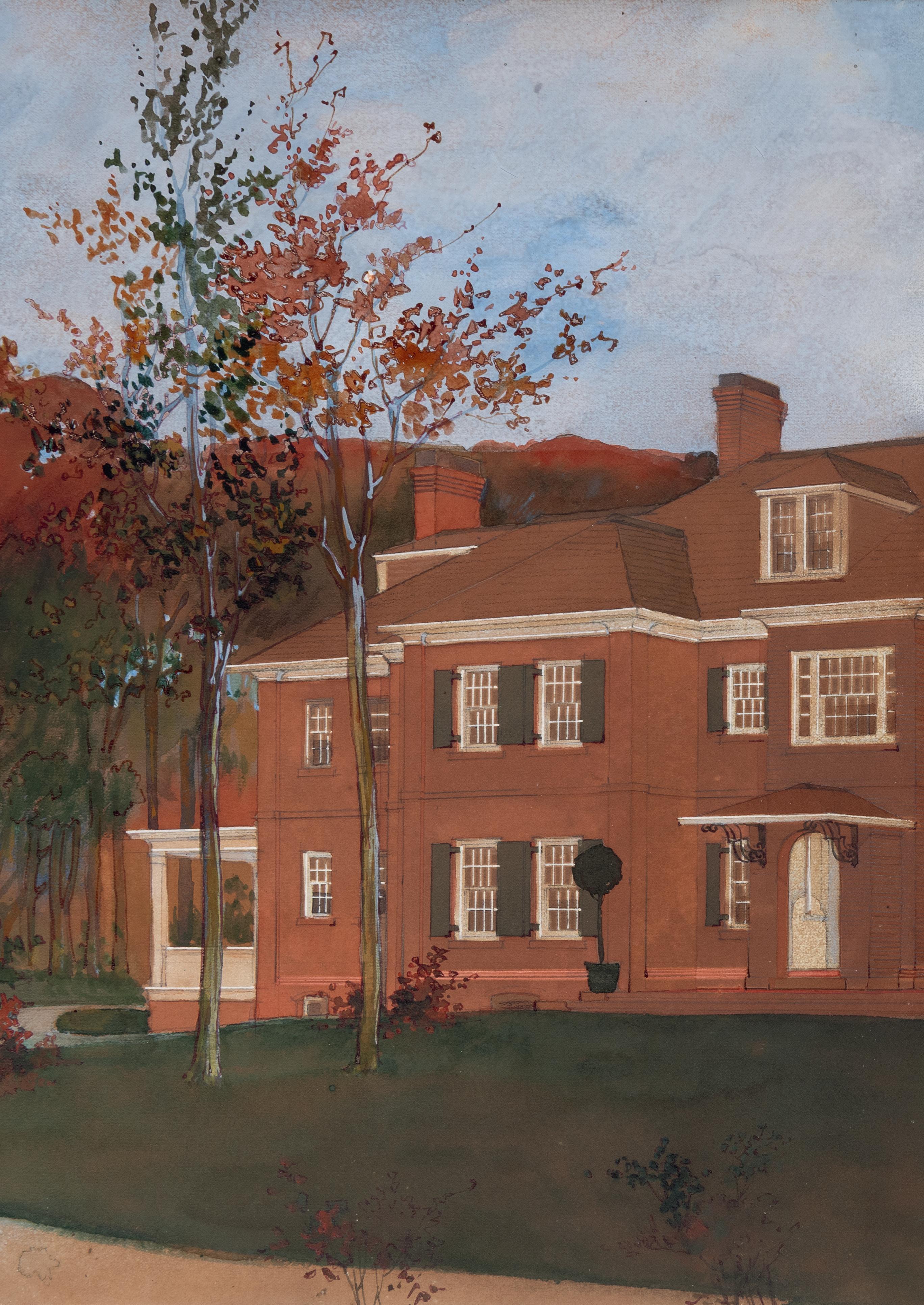
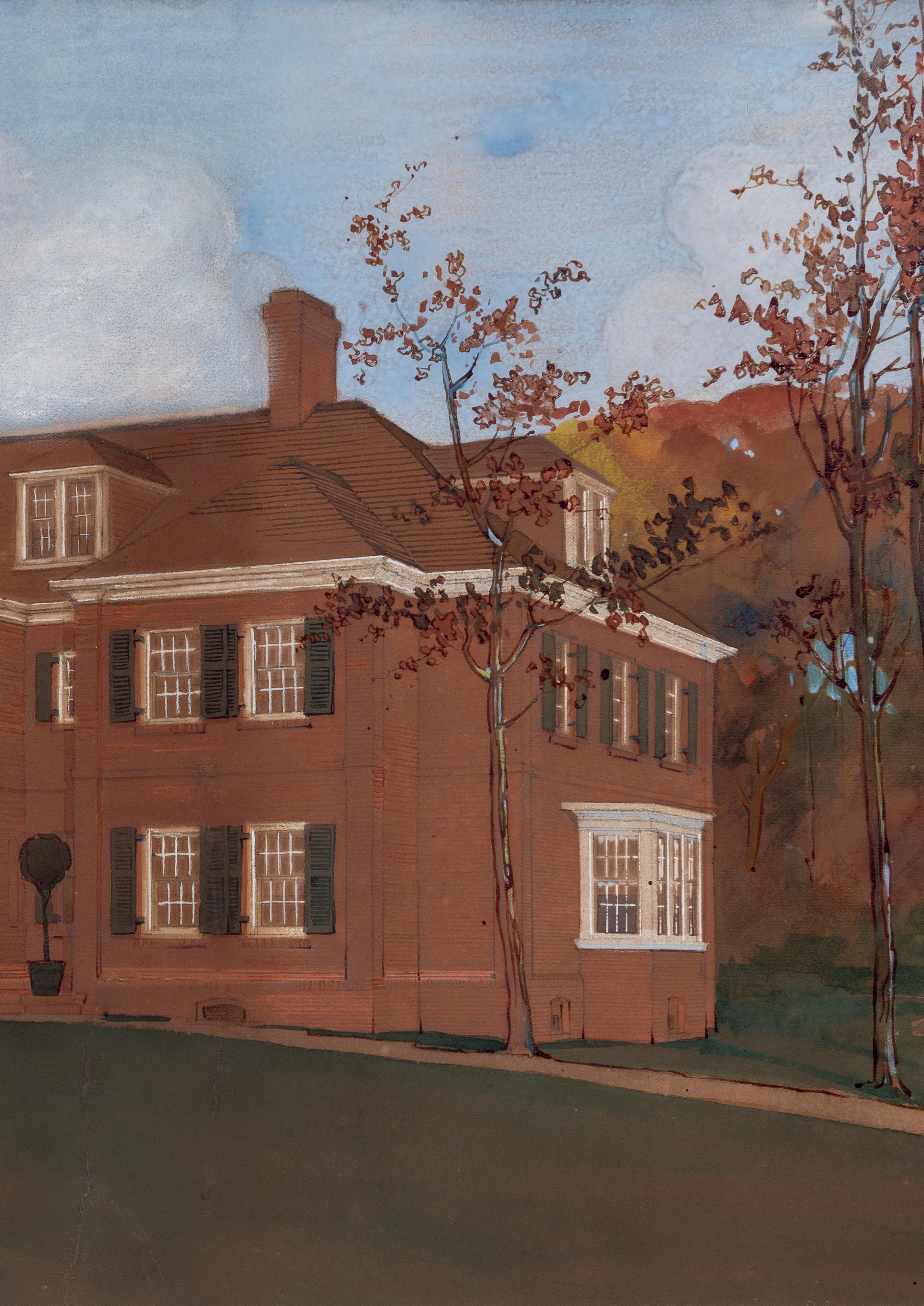
Arthur Heun (1866-1946)
‘Frogner’: The House of Fredrik Herman Gade, 333 N. Green Bay Road, Lake Forest, Illinois No.51
Back cover:
South German School (18th century) A Design for a Baroque Cupola No.27