Stephen Ongpin Fine Art
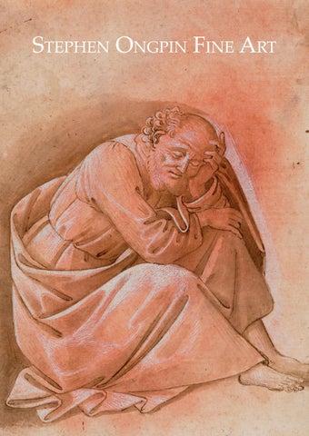
Front cover: Workshop of Sandro Botticelli (1445-1510) Saint Peter Asleep No.2
Giovanni Battista Tiepolo (1696-1770) Study for a Ceiling: A Seated Draped Figure, Seen from Below No.19
MASTER DRAWINGS 2026
Stephen Ongpin Fine Art
ACKNOWLEDGEMENTS I am, as always, very grateful to my wife Laura for her counsel, encouragement and patience, as well as her editing skills, during the period that I was working on this catalogue. I am also greatly indebted to the amazing members of Team SOFA, namely Alesa Boyle, Antonia Rosso and Emma Ricci, for their assistance in preparing this catalogue and the accompanying exhibition. (By my reckoning, this Master Drawings catalogue will be the 20th, and sadly the last, printed SOFA catalogue that Alesa will have worked on. As she now moves on to pastures new, we wish her all the very best.) Andrew Smith has photographed each of the drawings to very high standards and has been resolute in the task of repeatedly colour-proofing the catalogue images against the original artworks to ensure that they are as accurate as possible. At Healey’s printers, Sarah Bowler and Jane Carter have been splendid colleagues. In addition, I would like to thank the following people for their help and advice in the preparation of this catalogue and the drawings included in it: Angelamaria Aceto, Hannah Armstrong, Deborah Bates, Federico Bonezzi, Julian Brooks, Emma Cameron, James Clifton, Frank Dabell, Nelda Damiano, Cheryl and Gino Franchi, Laurel Garber, Virginia Graziani, Lavinia Harrington, Matthew Hollow, Alice Kim, Anne Varick Lauder, Megan Corcoran Locke, Rebecca Marks, Adina Mukhamejan, Guy Peppiatt, Paola Picardi Ricci, Nicolas Schwed, Rick Scorza, David Stone and Claire Van Cleave. Stephen Ongpin
Dimensions are given in millimetres and inches, with height before width. Unless otherwise noted, paper is white or whitish. High-resolution digital images of the drawings, as well as framed images, are available on request. All enquiries should be addressed to Stephen Ongpin at Stephen Ongpin Fine Art Ltd. 82 Park Street London W1K 6NH Tel. [+44] (20) 7930-8813 or [+44] (7710) 328-627 e-mail: info@stephenongpinfineart.com Between 25th January and 10th February 2026 only: Tel. [+1] (917) 587-1183 Tel. [+1] (212) 249-4987
MASTER DRAWINGS 2026 PRESENTED BY
STEPHEN ONGPIN
1 THE BRUGES MASTER OF 1482 Flemish, late 15th Century The Assault on the Chastel de Saint Forget Illuminated manuscript in tempera on paper, with extensive heightening in gold and a fictive border in black and gold leaf; a miniature cut from a French manuscript. The verso with two columns of fifteen lines of French text in a bâtarde script (beginning ‘taillart. Quant ces…’ and ending ‘occupoient que ce-’) in brown ink, and with paragraph marks in red and blue ink. Numbered 11 in black chalk and inscribed with Bruce Ferrini’s inventory / stock number VM 6523 in pencil on the verso. 98 x 170 mm. (3 7/8 x 6 3/4 in.) PROVENANCE: Peter Birmann, Basel; Acquired from him by Daniel Burckhardt-Wildt, Basel; Thence by descent until 1983; His posthumous sale (‘Miniatures from the Album assembled for Daniel BurckhardtWildt (1752-1819) (The Property of his Descendants)’), London, Sotheby’s, 25 April 1983, lot 159 (as ‘Possibly by the so-called Master of 1482’); H. P. Kraus, New York; Bruce Ferrini, Akron, Ohio; Ernst Boehlen, Bern. LITERATURE: New York, H. P. Kraus, Catalogue 172. Illuminations: Examples of the art of illumination from the thirteenth to the early sixteenth century in manuscripts and single miniatures, 1985, pp.8283, no.23 (as by a ‘Follower of Jean Fouquet. France (possibly Bourges) c.1485’); Sandra Hindman, Medieval and Renaissance Miniature Painting, exhibition catalogue, London, Tokyo and Nagoya, 19881989, pp.78-79, no.37 and p.139, no.37 (as by The Master of 1482). EXHIBITED: Akron, Bruce Ferrini Rare Books, and London, Sam Fogg Rare Books and Manuscripts, at London, Hazlitt, Gooden & Fox Ltd. and Tokyo and Nagoya, Maruzen Co. Ltd., Medieval and Renaissance Miniature Painting, 1988-1989, no.37. Datable to the 1480s, this is one of thirteen cuttings from an illuminated manuscript of the Chroniques de Jehan Froissart, a prose account of the Hundred Years’ War written in medieval French by the 14th century author, poet and court historian Jean Froissart (c.1337-c.1405). (The text of the Chroniques, which established Froissart’s fame, is preserved in over a hundred illuminated manuscripts.) The subjects of the dozen other extant miniatures from this particular manuscript of the Chroniques are mainly scenes from English and French history1. The author of this miniature of The Assault on the Chastel de Saint Forget is likely to be the anonymous Flemish illuminator known as The Master of Bruges or The Master of 1482, who was active at the court in Bruges in the 1480s and 1490s. As Sandra Hindman has noted of the present sheet, ‘Variously attributed to the Flemish Master of 1482, who worked in Bruges, and the French Mamerot Master, who worked in Bourges, this miniature comes from a chronicle of the Hundred Year’s War. In our opinion, the palette, the figures, and the composition support an attribution to the Master of 1482. One of the most striking features of this miniature is the bold palette with splashes of bright red paint, said to be a hallmark of the Master of 1482. Of the thirteen miniatures that come from the same manuscript and were originally bound into the Burckhardt-Wildt album, this one is among the finest; the delicate modelling of the faces, the sketchy treatment of the surface of the water, and the sophisticated organization of the composition point to a gifted artist.’2 The Bruges Master of 1482 is named for his frontispiece illustration in a manuscript of Bartholomeus Anglicus’s Livre de la propriété des choses, written in Bruges in 1482 and today in the British Library. As Georges Dogaer has noted of the Bruges Master, ‘His hallmark is a colourful palette, most fully deployed in the costumes of his figures. One might say he consciously pursued the greatest possible variety in them.’3 The Bruges Master of 1482 is known to have contributed illustrations to some ten different manuscripts, including at least four produced for the Flemish nobleman, courtier and noted bibliophile Louis de Bruges, Lord of Gruuthuse (c.1427-1492), who was one of the most significant patrons of illuminated manuscripts from Flemish workshops in the second half of the 15th century. The Bruges
actual size
Master seems to have worked for courtly patrons on secular manuscripts, on such subjects as hunting and chivalry, for the most part written in French rather than Latin. As other scholars have noted of the Master, ‘This artist specialized in scenes of courtly ceremony, rendering complex interiors and group scenes, as well as panoramic landscapes, in a distinctive linear style animated by bright, saturated colors.’4 The subject of this sheet, an assault on the Castle of Saint-Forget in 1384-1385, as described in the text on the verso of this sheet, is taken from Book III of Froissart’s Chroniques: ‘Because of the actions of such marauding and thieving people, who in the marches of Toulouse and Rouergue were carrying on the English war, Sir Gautier de Passac was sent with a large number of men-at-arms and Genevans to Toulouse to deliver the country from its enemies. And he came to Toulouse; and there he commanded the knights and squires of the surrounding area, and wrote to Sir Roger of Spain, the seneschal of Carcassonne, who came to serve him; for Sir Gautier had general authority over all the officers of Languedoc; so that those who were summoned and commanded came with as many men as they had. So the aforementioned Sir Roger came with sixty lances and a hundred pavise [shields], and the seneschal of Rouergue with as many, and Sir Hugues de Froideville with as many or more. When all these men-at-arms were gathered together, they numbered about four hundred lances and a full thousand pavise-bearers…They left Toulouse one day and came before Saint-Forget, where they were halted; it was held by a man-at-arms from Bern, a great pillager, who was called Bourg de Taillard. When these lords and their companies had come before Saint-Forget, they encamped. And soon they went on the attack, and the Genevans began to bombard so fiercely and so strongly that hardly any of the defenders dared to show themselves on the walls of the town and the fort; but the French did not take it on that first day, despite their assault. When evening came, they returned to their camp and spent the night in comfort; they had plenty to eat. The next morning, after drinking, they armed themselves, for the trumpets sounded the assault; the lords set themselves into order to attack, and advanced at full pace right up to the foot of the moats…The assault on the castle of Saint-Forget lasted so long, and was so fierce and determined, that those who were at the base of the wall to hew and pick at it brought down a great section. Then those inside were astonished and wished to surrender with their lives spared, but no heed was paid to this, for they had fallen into such determined hands that Sir Gautier commanded that they all be killed. After that order no one was granted mercy, but all were killed; not one escaped. Thus, the barons and knights of France who had come there took the castle of Saint-Forget at the first attempt...After the capture of the castle of Saint-Forget, and after Sir Gautier had returned it to the knight to whom it belonged, who had it repaired, which was necessary because the French had greatly damaged it during the assault and capture, those lords departed...’5 The first recorded owner of the present sheet, as well as the other twelve miniatures by the Bruges Master of 1482 from the same manuscript of the Chroniques of Froissart, was the Swiss landscape painter and occasional art dealer Peter Birmann (1758-1844). All thirteen cuttings were acquired from Birmann by the collector Daniel Burckhardt-Wildt (1752-1819), a wealthy Basel silk-ribbon manufacturer who assembled a collection of antiquities, paintings and illuminated manuscripts and miniatures. The thirteen Chroniques miniatures remained together with Burckhardt-Wildt’s descendants until 1983, when they were dispersed at auction. Five of these – one of which is similar in composition to the present sheet – are today in the collection of the Wadsworth Atheneum in Hartford, Connecticut6, while a further two have recently reappeared at auction7.
verso
2 Workshop of ALESSANDRO FILIPEPI, called SANDRO BOTTICELLI Florence c.1445-1510 Florence Recto: Saint Peter Asleep Verso: Study for a Figure of Saint Luke Pen and brown ink and brown wash, over traces of an underdrawing in black chalk, heightened with white, on paper washed a reddish-pink. The verso in pen and brown ink and brown wash. 197 x 149 mm. (7 3/4 x 5 7/8 in.) PROVENANCE: An unidentified collector’s mark (Lugt 619a), stamped in black ink at the lower right; Anonymous sale (‘Sammlung Dr. Hans Wendland, Lugano, mit einigen Beiträgen aus anderem Besitz’), Berlin, Ball & Graupe, 24-25 April 1931, lot 79 (as Florentine 15th Century, Circle of Filippino Lippi: ‘Figur eines Apostels. Zusammengekauert am Boden sitzend. Vermutlich Vorzeichnung zu einer Ölbergszene. Braune Federzeichnung, mit rötlicher und brauner Farbe laviert und mit dem Pinsel Weib gehöht. Höhe 19,1 cm, Breite 15,3 cm. Alter Sammlerstempel CP mit Löwen.’); Spencer A. Samuels & Co., New York; Acquired from them by the Sarah Campbell Blaffer Foundation, Houston, in May 1976. LITERATURE: Bernard Berenson, The Drawings of the Florentine Painters, Chicago, 1938, Vol.II, p.59, no.570C (as School of Botticelli, possibly by Raffaellino del Garbo); Ronald Lightbown, Sandro Botticelli, London, 1978, Vol.II, p.99, under no.B88; Terisio Pignatti, Five Centuries of Italian Painting 1300-1800 From the Collection of The Sarah Campbell Blaffer Foundation, Houston, 1985, p.40, illustrated p.42 (as School of Botticelli); Furio Rinaldi, ed., Botticelli Drawings, exhibition catalogue, San Francisco, 20232024, p.210, under nos.45-46, pp.214-215, no.47 and p.264, no.47 (as Workshop of Botticelli, and dated 1501-1504). EXHIBITED: San Francisco, California Palace of the Legion of Honor, Botticelli Drawings, 2023-2024, no.47. Alessandro di Mariano Filipepi was the son of a leather worker, and eventually took his brother’s nickname ‘Botticelli’, meaning chubby, as a family name. He was trained in the studios of Fra Filippo Lippi, Andrea del Verrochio and Antonio del Pollaiuolo, and his first documented painting is a Fortitude painted in 1470 for the merchant’s guild of Florence. Among his numerous patrons was Lorenzo (Il Magnifico) de’ Medici and members of many significant Florentine families, for whom he painted both secular and religious pictures, as well as portraits. Between 1481 and 1482 Botticelli was one of a number of Florentine and Umbrian painters engaged on the fresco decoration of the side walls of the Sistine Chapel in the Vatican, where he painted three large scenes and a number of papal portraits. His reputation enhanced by his work in Rome, Botticelli returned to Florence and throughout the 1480s received numerous important commissions for altarpieces, devotional easel pictures and oval tondi, as well as portraits and mythological subject pictures, notably the large paintings La Primavera, The Birth of Venus and Pallas and the Centaur. Apart from his time in Rome and a brief period working in the Camposanto in Pisa in 1474, Botticelli was to remain in Florence for his entire career. His last documented work, an altarpiece of The Pentecost for a church in the town of Montelupo, was completed in 1505. Despite Giorgio Vasari’s statement, in his biography of Botticelli, that ‘Sandro’s drawings were extraordinarily good, and so many, that for some time after his death all the craftsmen strove to obtain some of them’1, only a very few drawings by the master are known today. Apart from a series of ninetytwo largely unfinished silverpoint drawings on parchment intended to illustrate a manuscript of Dante’s Divine Comedy, executed in the 1490s and now divided between the Kupferstichkabinett in Berlin and the Vatican Library, less than thirty autograph drawings by Botticelli survive today.
actual size
This beautiful drawing, formerly attributed to Botticelli but today regarded as the work of an unknown but gifted member of his workshop2, was first published in 1938 by Bernard Berenson with a speculative attribution to the Florentine painter Raffaello Carli, known as Raffaellino del Garbo (c.1466-c.1528). Acquired by the Sarah Campbell Blaffer Foundation in Houston in 1976, this drawing of Saint Peter Asleep was included in the magisterial exhibition of Botticelli Drawings recently presented at the Fine Arts Museums of San Francisco. As Furio Rinaldi wrote of the drawing in the exhibition catalogue, ‘This double-sided sheet is proof of Sandro Botticelli’s graphic inventions and the role his workshop played in disseminating them. The drawing on the recto – a compact, elderly figure resting his head on his arm – is evidently based on the artist’s studies of the sleeping Saint Joseph in the Uffizi…and a later version in a private collection.’3 As Rinaldi has observed, the prototype for this type of sleeping figure appears in a drawing by Botticelli of The Adoration of the Christ Child of c.1480, executed in pen and brown ink and wash, in the Uffizi in Florence4. Even closer to the present sheet is an autograph drawing of a Seated Saint Joseph, Resting on His Right Hand (fig.1), sold at auction in 2014 and now in a private collection in New York5, which is a preparatory study for the same figure in Botticelli’s tondo painting of The Nativity with the Holy Family and Saint John the Baptist of c.1490-1495 in the Faringdon Collection Trust at Buscot Park in Oxfordshire6. It has been suggested that Botticelli’s drawing of Saint Joseph would have been kept in his studio as a sort of model to be reused and adapted by his assistants, as happened with the present sheet. Describing the present sheet, Rinaldi has pointed out that ‘Here, the workshop artist reprised Botticelli’s originals in the figure’s formal rendering and his exquisite drawing technique, which calibrates neat contours in ink, fine white heightening on and around the figure, and strokes of brown wash on the background, lightly tinted reddish-pink. The artist, while endowed with a degree of personal style, is nonetheless unable to fully realize Botticelli’s synthesis of fluid execution and clarity of form.’7 The use of red-tinted paper seen here is typical of Tuscan draughtsmanship of the late 14th and 15th centuries, when it was used mainly for figure studies. Botticelli adopted the practice in several of his drawings, as did artists such as Antonio Pollaiuolo, Domenico Ghirlandaio, Raffaellino del Garbo, Filippino Lippi and the young Michelangelo.
1
verso (actual size)
The present sheet can be related to a closely corresponding figure of a sleeping Saint Peter in a small devotional painting of The Agony in the Garden (fig.2) of c.1500, painted by Botticelli or possibly his workshop, in the Museo de la Capilla Real in Granada, Spain8. This was the only work by Botticelli known to have left Italy in the artist’s lifetime, as it belonged to Queen Isabella of Castile and was presented by her in 1504 to the Capilla Real, the funeral chapel of the Cathedral of Granada. As Rinaldi notes of the present sheet, ‘While closely matching the figure in the finished painting [in Granada], slight differences seem to confirm the drawing’s creative status, further established by a quickly drawn sketch of a similar crouched figure on the verso (identified as a Saint Luke by the bull)…While it is unknown if the painting’s commission came to Botticelli directly from the Spanish royal family or if it found its way to Granada autonomously, this drawing attests to how the artist increasingly relied on his assistants for the design and painting processes of his works, even for high-end devotional commissions.’9 Botticelli had a large and active workshop, although apart from Filippino Lippi (c.1457-1504), the illegitimate son of his own teacher Fra Filippo Lippi, his pupils and assistants were relatively minor artistic figures. As has been noted, however, ‘their drawings nonetheless played an important role in the workshop, regulating the production and dissemination of the master’s “brand”, his maniera. These workshop drawings also highlight Botticelli’s great reliance on his assistants, who were involved in both the design and execution phases of his works…Such creative contributions must lead today’s art historians to challenge the traditional canons of modern connoisseurship in terms of authorship, attribution, and the supposedly firm rules of workshop practices, in which the master provides the graphic ideas and the workshop executes them.’10 The unidentified collector’s mark with a rampant lion and the letters CP, stamped at the lower right corner of the sheet, is recorded by Frits Lugt as only appearing on one drawing known to him, by an artist in the circle of Rembrandt, and nothing at all is known of the collector. It may be noted, however, that the same collector’s mark is also found on a small self-portrait drawing in black chalk, attributed by several scholars to Titian, which is today in a private collection11.
2
3 BACCIO BANDINELLI Florence 1493-1560 Florence A Group of Eleven Putti at Play Pen and brown ink over traces of an underdrawing in black chalk, with framing lines in brown ink. Faintly numbered (by Crozat) 4 in brown ink at the lower right. Inscribed [Bacc]hio Bandinelli in brown ink on the verso. 232 x 404 mm. (9 1/8 x 15 7/8 in.) Watermark: A fruit(?) with two leaves below. PROVENANCE: Everhard Jabach IV, Paris; By descent to his widow, Anna Maria de Groote, and thence to his son, Everhard Jabach V; His son, Gerhard Michael Jabach, Livorno; Acquired with a large part of the Jabach collection by Pierre Crozat, Paris; His posthumous sale, Paris [Mariette], 10 April – 13 May 1741, probably part of lots 38-43; Gilbert Paignon-Dijonval, Paris; By descent to his grandson, Vicomte Charles-Gilbert Morel de Vindé, Paris; Possibly sold with the rest of the Paignon-Dijonval collection of drawings to Samuel Woodburn, London, in 1816; Possibly M. Barni; Possibly his sale (‘Catalogue de la collection de dessins anciens et de toutes les écoles, formée depuis 1808 par M. Barni, italien’), Paris, Hôtel des Ventes [Paillet], 5 December 1836 onwards, part of lot 441 (‘BANDINELLI (Baccio). Jeu d’enfants; dessin à la plume’); An unidentified collector’s mark(?) in pencil at the lower right; David Rust, Washington, D.C.; Adams Davidson and Co, Washington, D.C.; Purchased in June 1970 by Mrs. Evan M. Wilson, Washington, D.C.; Anonymous sale, New York, Christie’s, 30 January 1997, lot 10; P. & D. Colnaghi, London, in 1998; Mr. and Mrs. Marc Segan, New York. LITERATURE: M. Bénard, Cabinet de M. Paignon Dijonval, Paris, 1810, p.10, no.32 (‘BANDINELLI (Baccio)…Des jeux d’enfans: composition de onze figures; celui qui est au milieu tient un corne d’abondance, et est monté sur une tortue: d. à la plume sur papier blanc; l. 15 po. sur 8 po.’); Roger Ward, Baccio Bandinelli 1493-1560: Drawings from British Collections, exhibition catalogue, Cambridge, 1988, p.29, under no.10; Bernadette Py, Everhard Jabach collectionneur (1618-1695): Les dessins de l’inventaire de 1695, Paris, 2001, p.192, no.800; Roger Ward, ‘Regesto dei disegni preparatori’, in Detlef Heikamp and Beatrice Paolozzi Strozzi, ed., Baccio Bandinelli scultore e maestro (1493-1560), exhibition catalogue, Florence, 2014, p.612; Joachim Jacoby, ed., Raffael bis Tizian: Italienische Zeichnungen aus dem Städel Museum, exhibition catalogue, Frankfurt and Paris, 2014-2015, p.124, fig.23, under no.34; Bernadette Py, Les dessins italiens de Pierre Crozat (1665-1740). L’oeil de Mariette, online publication [https://minisite.louvre.fr/trimestriel/2015/Catalogue_Crozat/index.html], p.55. EXHIBITED: New York and London, Colnaghi, Master Drawings, 1998, no.3. One of the leading sculptors of the Cinquecento in Italy, Bartolomeo (known as Baccio) Bandinelli was profoundly influenced by the work of Michelangelo, a lifelong rival whose fame he sought to emulate throughout his career. Although he received several important Roman commissions, he worked in Florence for much of his life, where he enjoyed the patronage of the Medici court. His major public sculptural commissions there included a statue of Saint Peter for the facade of the Duomo, the Hercules and Cacus for the Piazza della Signoria and the monument to Giovanni delle Bande Nere outside the church of San Lorenzo. He sculpted a figure of Orpheus for the courtyard of the Palazzo Medici, as well as sculptures for the Sala dei Cinquecento in the Palazzo Vecchio and the high altar of the Duomo. Bandinelli also worked occasionally as a painter, notably receiving a commission from Pope Clement VII for two frescoes for the Florentine church of San Lorenzo, though the project was eventually abandoned. In Rome, he designed and executed the tombs of the Medici popes Leo X and Clement VII. In 1546 he began work on an elaborate marble choir screen, ornamented by statues and reliefs,
for the Duomo in Florence; an immense project that occupied him, on and off, for the remainder of his career. Like every sculptor of his age, however, Bandinelli remained in the lifelong shadow of Michelangelo, whose mastery of technique he was never quite able to equal. Bandinelli’s contemporary fame was based as much on his drawings as on his sculpture, and Vasari notes of him that he was ‘allora disegnatore molto stimato’. He was a prolific draughtsman, and more studies by him survive than by any other 16th century sculptor save Michelangelo. (He is also known to have made drawn copies after the work of such earlier sculptors and painters as Giotto, Masaccio, Desiderio da Settignano, Donatello, Fra Bartolomeo and Leonardo, as well as Michelangelo.) Indeed, drawing was the foundation of Bandinelli’s art, as was noted in the Memoriale – long thought to be the artist’s autobiography but recently identified as having been invented and composed by his nephew, Baccio Bandinelli the Younger – where the artist is claimed to have stated that ‘All my concentration was fixed on drawings...it is above all in that activity that I have prevailed.’1 Bandinelli valued his drawings highly, and he seems not to have parted with many of them. Indeed, according to his nephew, he insisted that his heirs retain them after his death: ‘the drawings, of which I leave behind almost a full cassone, should be guarded like so many jewels; do not let them slip through your fingers, for there will come a time when they will be regarded as treasures.’2 That Bandinelli’s drawings continued to be admired by collectors long after the artist’s death is seen in Pierre-Jean Mariette’s comments in the 1741 sale catalogue of drawings from the Crozat collection; ‘Baccio’s style of drawing is very skillful, as one would expect from a master who had a profound knowledge of the structure of the human body and all its movements; but this style is also overly austere, even savage... I prefer the drawings this master made in pen to those he executed in red chalk; they appear less resolute, but they are closer to the truth.’3 Over 560 drawings by Bandinelli are known today, with the largest and most significant groups in the Uffizi in Florence and the Louvre in Paris. The majority of the artist’s drawings are executed in pen and brown ink, although some are in black or red chalk. As the scholar Charles Avery has noted of Bandinelli, ‘The drawings are many, and vary enormously in technique and appearance: some are ferocious pen-sketches for figures or scenes of men in action, with cross-hatching applied so violently that the way the nib of the pen spreads under pressure resembles the strokes of a carver working a plane on a raw block of marble by driving a chisel with a heavy mallet. It was particularly useful for planning graphic scenes or narrative reliefs. One suspects that this technique may have been inspired by close observation of the drawings of Donatello, now lost but allegedly many. This is Bandinelli’s typical, slightly idiosyncratic style.’4 The present sheet – aptly described by the late Bandinelli scholar Roger Ward as ‘a large and exceptionally beautiful drawing’5 – provides an example of Bandinelli finding inspiration in the work of one of his illustrious Florentine predecessors, the Renaissance sculptor Donatello (1386-1466). The central section of this drawing is based on a small part of Donatello’s bronze reliefs on the two pulpits in
1
the Florentine church of San Lorenzo, executed between c.1461 and 1466 and one of the Renaissance sculptor’s final works, left unfinished at his death. The pulpits include a frieze of putti at play running above the main scenes, and Bandinelli has here freely adapted the central part of his composition from a section of Donatello’s putto frieze – showing a putto standing on a small support (here a turtle), flanked by other putti – that appears twice, once above the relief of The Resurrection of Christ on the north pulpit (fig.1) and again above the scene of The Lamentation over the Dead Christ on the south pulpit6. It is interesting to note that, in some of Bandinelli’s writings on art, he reserves particular praise for the beauty and grace of Donatello’s depictions of putti and children. Bandinelli made numerous copies after the works of Donatello, a practice in which he was apparently encouraged by Leonardo da Vinci, according to Giorgio Vasari. Although the Quattrocento sculptor’s San Lorenzo pulpits provided a rich visual source of motifs for later artists, they were only first assembled and displayed, on wooden supports, in the church some fifty years after they were done, in time for the visit of Pope Leo X to Florence in November 1515, and it is likely that the young Bandinelli drew them at around this time. Bandinelli seems to have made several studies from the San Lorenzo pulpits, including drawings by or attributed to the artist in the British Museum in London7, the Ashmolean Museum in Oxford8, the Musée Condé in Chantilly9 and the Museum Kunst Palast in Düsseldorf10. Similar studies of children at play appear in a drawing by Bandinelli of ten putti, arranged in two rows, in the Städel Museum in Frankfurt11, as well as in a drawing of Adam and Eve Beseeching God the Father in the Ecole des Beaux-Arts in Paris12 and on the recto of a drawing in the Fondazione Horne in Florence13. Also closely comparable are the angels that appear in another youthful pen drawing by Bandinelli that is likewise freely based on an earlier sculpture; a Virgin and Child with Three Angels in the Louvre14 that is an adaptation of a small marble relief of the Virgin and Child (known as the Dudley Madonna) of c.1440 by Donatello, today in the Victoria and Albert Museum in London. Stylistically similar pen and ink drawings of single putti by Bandinelli are in the Louvre15, the Uffizi16 and a private collection in Chicago17. This type of playful putti is also found in Bandinelli’s rare early painting of Leda and the Swan of c.1512 in the collection of the Sorbonne University in Paris18. The first recorded owner of this drawing was the German banker and collector Everhard Jabach IV (1618-1695), a native of Cologne who settled in Paris in 1638 and became a naturalized French citizen in 1647. It was in France that Jabach began to amass a formidable collection of paintings, sculptures, drawings and prints, creating arguably the greatest private collection in France in the 17th century. In 1662 Jabach sold most of his collection of paintings to King Louis XIV, followed in 1671 by the sale to the Crown of much of the rest of his collections, including 5,542 drawings. Jabach did not, however, sell all of his drawings, and chose to retain a number of significant works, including the present sheet. He also continued to collect drawings, so that by 1695, when a posthumous inventory of his collection was made, some 4,500 drawings, mostly by Italian artists, were listed. This drawing by Bandinelli was among a group of more than four hundred drawings purchased from the Jabach heirs, at an unknown date, by the eminent collector Pierre Crozat (1665-1740), whose famous collection of drawings numbered 19,201 sheets. The Crozat collection was dispersed at auction in Paris in 1741, in a sale catalogued by Pierre-Jean Mariette and held over a period of more than a month, which included around 120 drawings by Bandinelli, divided into six lots. The present sheet was then acquired by Gilbert Paignon-Dijonval (1708-1792), whose collection included some six thousand drawings and around 60,000 prints. Paignon-Dijonval’s collection was inherited by his grandson Charles-Gilbert Morel de Vindé (1759-1842), who had the collection catalogued in 1810 before selling it en bloc to the English art dealer and collector Samuel Woodburn (1783-1853). The present sheet later belonged to the American collector and museum curator David E. Rust (19302011), who worked as Curator of European Art at the National Gallery of Art in Washington D.C. for over two decades.
4 PIERFRANCESCO FOSCHI Florence 1502-1567 Florence The Virgin and Child with the Infant Saint John the Baptist Red chalk and red wash. A small sketch of the Virgin and Child(?) in red chalk on the verso. 134 x 108 mm. (5 1/4 x 4 1/4 in.) PROVENANCE: Anonymous sale, London, Sotheby’s, 25 April 1956, part of lot 3 (‘Baroccio. Madonna and Child, black chalk and grey wash; and three others’, bt. Scharf for £8); Myril and Phillip Pouncey, London; Their posthumous sale, New York, Sotheby’s, 21 January 2003, lot 3; Private collection, California. LITERATURE: Myril Pouncey, ‘Five Drawings by Pierfrancesco di Jacopo di Domenico Toschi’, The Burlington Magazine, May 1957, pp.158-159, fig.25; Florence, Palazzo Strozzi, Il primato del disegno, 1980, p.117, no.219 (entry by Anna Forlani Tempesti, not illustrated); Nelda Damiano, ed., Wealth and Beauty: Pier Francesco Foschi and Painting in Renaissance Florence, exhibition catalogue, Athens, GA, 2022, pp.80-81, no.5 (where dated 1530-1535); Cecilie Hollberg et al, Pier Francesco Foschi (1502-1567): Pittore fiorentino, exhibition catalogue, Florence, 2023-2024, pp.106-107, no.5 (where dated 1530-1535) and p.209, fig.7; Nelda Damiano, ‘Una figura enigmatica: Pier Francesco Foschi attraverso la sua produzione grafica’, in Hollberg et al, ibid., pp.77 and 79. EXHIBITED: Florence, Palazzo Strozzi, Firenze e la Toscana dei Medici nell’Europa del Cinqecento: Il primato del disegno, 1980, p.117, no.219; Athens, GA, Georgia Museum of Art, Wealth and Beauty: Pier Francesco Foschi and Painting in Renaissance Florence, 2022, no.5; Florence, Galleria dell’ Accademia, Pier Francesco Foschi (1502-1567): Pittore fiorentino, 2023-2024, no.5. The Florentine Mannerist painter Pierfrancesco di Jacopo Foschi (formerly, and incorrectly, known as Toschi) was a pupil of Andrea del Sarto, according to the brief mentions of him in Giorgio Vasari’s Vite, and indeed a number of copies by him of works by Sarto are known. He appears to have been working as an independent artist by around 1529, when he is recorded as sharing a studio with his father in Florence. Foschi was a younger contemporary of the painter Jacopo da Pontormo, whom he assisted on the frescoes for the loggia of the Medici villa at Careggi in 1536. He was also employed on some of the temporary decorations erected in Florence to celebrate the marriage of Cosimo de’ Medici to Eleanora of Toledo in 1539, and that of Francesco de’ Medici to Giovanna of Austria in 1565. Foschi received commissions from important clerics and members of the Florentine nobility – including, apart from the Medici, members of the Pucci and Torrigiani families – and also produced altarpieces for several churches in Florence, Pisa and elsewhere in Tuscany. As one modern scholar has observed, Foschi’s religious paintings are characterized by a ‘simplicity and directness…a didactic clarity which only increased over the course of his long career as his style became more severe, sombre and monumental.’1 Perhaps the artist’s best known works are three major altarpieces – an Immaculate Conception with Saints Jerome, Augustine, Anselm and Bernard, a Resurrection of Christ and a Transfiguration – painted between 1542 and 1546 for chapels in the Florentine church of Santo Spirito. Foschi may also be noted for his portraiture, of which he was among the finest exponents in Florence in the 1530s and 1540s. His portraits, which often display a particular psychological insight, reflect the influences of Pontormo, Agnolo Bronzino and Franceso Salviati. One of the founders of the Accademia del Disegno in Florence in 1563, Foschi counted among his pupils Maso da San Friano. Drawings by Pierfrancesco Foschi are very rare, and only some fourteen autograph sheets are known. Among the few compositional drawings by the artist in public collections are a Virgin and Child with Saints in the Ashmolean Museum in Oxford2 and a Design for a Tabernacle with God the Father and Saints at Christ Church in Oxford3, as well as a Creation of Adam in the British Museum4. A black chalk
actual size
study of two draped female figures is in the Louvre5, while another drawing of The Virgin and Child with Angels is in the collection of the Museo Nacional de Bellas Artes in Santiago, Chile6. A handful of other drawings by or attributed to Foschi are in the Uffizi in Florence, the Pierpont Morgan Library in New York and the Royal Collection at Windsor Castle. The composition of this drawing, as first noted by Anna Forlani Tempesti when it was exhibited in Florence in 1980, can be related to Foschi’s painting of The Holy Family with the Young Saint John the Baptist (shown in fig.1) in the Galleria dell’Accademia in Florence7. Indeed, the drawing may have been inspired by the painting, which has been dated to the early years of Foschi’s career, between 1526 and 1530. As Alessandro Cecchi has observed of the Accademia panel, ‘The composition, densely populated by figures ranged diagonally, reveals on the one hand its debt to the altarpieces of Andrea del Sarto, in the pose of St Joseph and in the typology of the Christ Child and the young St John. But it shows the unmistakeable style of Pier Francesco, who skillfully combines the sharp contours of faces and limbs with the ample masses of the bodies and draperies.’8 The present sheet was first published by a previous owner, Myril Pouncey (1907-2001), in her pioneering article on Foschi’s drawings in 1957. As Pouncey noted, ‘Pierfranceso di Jacopo di Domenico [F]oschi’s main claim to fame is that he is often mistaken for Pontormo. Yet this minor Florentine artist of the mid-sixteenth century has a personality of his own, even if it is somewhat limited in range and development.’9 Describing Foschi as ‘a sensitive and gifted draughtsman’10, Pouncey assembled a small group of five drawings that she attributed to the artist. Writing of the present sheet, she added that, ‘I would say that the little Madonna and Child with the Infant St John is the most attractive drawing of the group were it not that it belongs to me. The abandon with which the Child reclines on the Virgin’s lap contrasts delightfully with her somewhat tense mood as she prepares to suckle Him. Here, more than in the other drawings, we are reminded of Pontormo, by whom [F]oschi seems to be influenced in his vivacious handling of the red chalk and in the firm modelling of such passages as the Madonna’s left arm with its reflected lights. But only [F]oschi could have realized her peculiar egg-shaped head which we encounter again and again in paintings and drawings alike. In the general development of Florentine style in the field of drawings this little study takes its place in the succession that leads from Pontormo down through Maso di San Friano and on to Giovanni Balducci at the end of the century.’11 This drawing was included in two recent monographic museum exhibitions devoted to Pierfrancesco Foschi, held in Georgia in 2022 and in Florence in 2023-2024, where it was shown alongside the Accademia painting (fig.1). As discussed by Simone Giordani in the exhibition catalogues, ‘This small
1
drawing is part of a core group of sheets that helped establish Foschi’s graphic corpus. It is one of three examples known to represent a Marian subject and clearly intended for a painting for private devotion…we do not know of a [Andrea del] Sarto prototype that Foschi might have drawn from. It is instead probable that the painter revised his design for the Accademia’s Holy Family…This drawing reworks the general scheme of that composition (without Saint Joseph), the monumental pose of the Virgin and the gesture of her left arm, and the figure of the young Saint John.’12 The same scholar further describes the present sheet in some detail: ‘The composition of the sacred group is centered on the body of Jesus, who, almost slipping between his mother’s legs, constitutes the dynamic core of the image. The Virgin leans toward him and lifts his head with her right hand while with her left hand she gently brings him to her breast to suckle him. Standing behind and leaning on Mary’s shoulder, Saint John reaches out with his hand toward Jesus, effectively suggesting the depth of the space in which the scene takes place, a device seen in countless examples by Sarto. It seems that Foschi had by now a rather clear idea of the composition he wanted, and the only area in which changes produce a somewhat confusing result is in the position of Saint John’s lower body. For the rest, the elaboration of the image presents a good degree of fineness and is balanced and harmonious. Foschi focuses in particular on the study of light variations, which include a rich range of gradations, from restrained areas of dense shadow to halftones often rendered in a soft way and very light points that allow volumes to emerge. His typical broken outline sometimes takes on a tremulous quality, which, together with the play of light, produces an impression of greater vividness in the use of the graphic medium. This image is certainly freer than the youthful and analytical approach of the Uffizi drawing [of the same subject]…which leads us to date this sheet during a more advanced phase of the painter’s career…perhaps in the first half of the 1530s.’13 As noted by Giordani, the present sheet is likely to be somewhat later in date than a larger red chalk drawing by Foschi of the same subject, albeit different in composition; a Madonna and Child with the Young Saint John the Baptist of c.1528-1530 in the Uffizi14.
verso (detail)
5 SCHOOL OF RAFFAELLO SANZIO, called RAPHAEL Urbino 1483-1520 Rome Twenty-Two Putti at Play Among Trees Pen and brown ink and brown wash, extensively heightened with white, on buff paper. Laid down on a 17th or 18th century mount. Inscribed S fino in brown ink at the lower centre. Inscribed R: U: in brown ink and, in a different shade of brown ink, from vol. 2nd no.24 in the lower margin of the mount. 268 x 387 mm. (11 1/4 x 15 1/4 in.) Three of the putti in this early 16th century drawing – the seated figure at the lower left centre seen from behind and looking over his shoulder, as well as the pair of sleeping and seated putti at the base of a tree towards the right of the composition – are also found in a drawing of putti at play by Tommaso Vincidor in the Louvre1. Similarly, the flying putto at the upper centre of the present sheet recurs in a comparable drawing by Vincidor of frolicking putti in the British Museum2. (Of similar technique to the present sheet, both the Louvre and British Museum drawings were first attributed to Vincidor by John Gere and Philip Pouncey in 1962.) The putto climbing a tree at the upper right of the present composition is likewise found, albeit in reverse, in a Vincidor drawing today in the Albertina in Vienna3. The Bolognese artist Tommaso di Andrea Vincidor (1493-1536) spent much of his later career in the Netherlands. He is known to have collaborated with Raphael as early as 1517, working with him in the Logge of the Vatican, and after the master’s death settled in Flanders. By 1521 he was in Brussels working on the cartoons for a series of twenty tapestries of Giochi dei putti, or Children’s Games, commissioned by Pope Leo X and intended for the lower part of the walls of the Sala di Costantino in the Vatican, for which the painted decoration was completed by Giulio Romano and Gianfrancesco Penni. A stylistic comparison may also be made with a pair of drawings of winged putti at play in the Louvre4, both of which are studies for a pair of oval paintings on the vault of the garden loggia of the Palazzo Madama in Rome. (The decoration of the loggia, commissioned from Raphael by Cardinal Giulio de’ Medici in 1519, was executed, shortly after the master’s death, by artists from his studio between 1520 and 1523.) The two Louvre drawings have been variously attributed by scholars to Giulio Romano (c.1499-1546) or Gianfrancesco Penni (c.1496-c.1528), as well as to Baldassare Peruzzi (1481-1536) and Giovanni da Udine (1487-1561), all of whom worked at the Palazzo Madama after Raphael’s death in 1520. Two further drawings of groups of putti, one in the Uffizi in Florence5 and the other formerly in the Richard Schindler collection in New York6, appear to be by the same hand as the Louvre drawings and may likewise be related to the Palazzo Madama decorations. The theme and motif of the present sheet were popular in tapestry designs of the period, such as the aforementioned set of twenty tapestries designed by Vincidor and woven between 1521 and 1524 for the Sala di Costantino in the Vatican, or Giulio Romano’s Li puttini or Giochi di putti tapestries made for Cardinal Ercole Gonzaga in the 1540s. Indeed, an interesting comparison may be made with a drawing by Giulio Romano for one such tapestry, depicting Putti Playing among Fruit Trees and Vine Trellises, in the Victoria and Albert Museum in London7. These images of cupids and putti at play find their original literary source and inspiration in a text by the ancient Greek writer Philostratus the Elder, taken from his Eikones (or Imagines). This series of essays describing a gallery of mythological paintings includes a passage with a detailed description of a painting of the ‘Erotes’; a group of winged figures of children or Cupids playing, wrestling, gathering apples and hunting in a forested setting.
6 PIETRO BUONACCORSI, called PERINO DEL VAGA Florence 1501-1547 Rome A Female Nude with Putti Red chalk. A sketch of a standing putto in red chalk on the verso. 152 x 81 mm. (6 x 3 1/4 in.) PROVENANCE: Max de Beer, London; Acquired from him in March 1963 by Philip Pouncey, London; By descent to his widow, Myril Pouncey, London; Her posthumous sale, New York, Sotheby’s, 21 January 2003, lot 16; Jean-Luc Baroni Ltd., London, in 2009; Private collection, New York. EXHIBITED: New York, Jean-Luc Baroni Ltd. at Adam Williams Fine Art Ltd., Master Drawings and Paintings, 2009, no.2. Perino del Vaga’s career can be divided into three main periods: his training in Florence and early independent career in Rome until the sack of the city in 1527, a period spent in Genoa at the court of Andrea Doria between 1528 and 1537, and a final stay in Rome from around 1538 until his death in 1547. A precocious pupil of Ridolfo Ghirlandaio in Florence, Perino arrived in Rome at the age of fifteen or sixteen. He began his career as an assistant to Raphael on the decoration of the Vatican logge in 1518, and with Giovanni da Udine decorated the Sala dei Pontefici in the Vatican in 1521. In 1522 he was working in Florence, but had returned to Rome by 1524, when he worked on the fresco decoration of the Cappella Pucci in the church of the Trinità dei Monti, as well as a cycle of frescoes for the Palazzo Baldassini and paintings for San Marcello al Corso and Santa Maria sopra Minerva. Following the Sack of Rome in 1527, Perino settled in Genoa, where he was employed by Prince Andrea Doria on the extensive decoration of the Palazzo Doria on the outskirts of the city and also received several commissions for religious and secular paintings. Although he stayed less than ten years in Genoa, his influence on the local school of painters was significant. Perino returned in the late 1530s to Rome, where he gained the patronage of the Farnese Pope Paul III, working extensively on the decoration of the various rooms of the Castel Sant’Angelo and the Sala Regia of the Vatican. According to Giorgio Vasari, he spent much of the last few years of his career ‘having to draw day and night and to meet the demands of the [Vatican] Palace, and, among other things, to make the designs of embroideries, of engravings for banner-makers, and of innumerable ornaments required by the caprice of Farnese and other cardinals and noblemen.’1 By the 1540s he was supervising a large and productive workshop in Rome, for whom he provided drawings, designs and cartoons. Characterized by considerable inventiveness, range and skill, the drawings of Perino del Vaga firmly establish him as one of the most gifted draughtsmen of the 16th century in Italy. Giorgio Vasari rated him very highly (‘the best and most finished draughtsman that there was among all who were drawing in Rome’) and noted that he drew constantly. His drawings range from sheets of rapid sketches to elaborate and highly finished figure and composition studies. The majority of Perino’s surviving drawings are studies in pen and ink; a medium the artist seems to have preferred by virtue of its fluidity and expressiveness. His drawings often serve as the only record of large-scale damaged or destroyed commissions, and relatively few examples can be related to surviving works. Vasari noted that Perino’s drawings were dispersed after his death, and that he himself owned several sheets by the artist, which he pasted into albums: ‘Perino left many designs at his death, some by his hand and some by others…All these designs, with other things, were sold by his heirs; and in our book are many drawings done by him with the pen, which are very beautiful.’2 Many of Perino’s drawings were sold by his daughter after his death to the art dealer Jacopo Strada in 1556. These included copies after other artists and, according to another contemporary writer, drawings of an ‘endless number of funerary reliefs, statues, and grotesques copied from classical works.’3 This lively red chalk study by Perino del Vaga, with its swirling contours, suggests the artist’s search for a rhythmic composition before defining either narrative or anatomy with precision. The scholar Catherine Monbeig Goguel has aptly described Perino’s ‘ability to make even the slightest stroke vibrate,
actual size
whatever the purpose of the drawing or the material used’4 as one of his most striking qualities as a draughtsman. The style and subject of this spirited drawing would suggest that it dates from the final phase of Perino del Vaga’s career, when he was working on his last major fresco cycle; the extensive decoration of the papal apartments of the Castel Sant’Angelo in Rome, executed between June 1545 and his death in October 1547. In particular this drawing may be related to the frescoes illustrating the story of Psyche in a room in the Castel Sant’Angelo known as the Sala di Psiche, for which the final payment to the artist was made in May 1546. A somewhat comparable figure of a crouching female nude, albeit without the attendant putti seen in the present sheet, appears at the right of a fresco of Psyche Discovering Cupid and Cupid Fleeing in the Sala di Psiche5. A late pen and ink drawing by Perino in the British Museum, identified as Psyche Tormented by the Servants of Venus (fig.1), repeats many of the characteristics of the nude in this drawing, and shows the artist working in an equally spontaneous and animated manner6. Like the present sheet, the British Museum drawing, which depicts similar crouching female nudes, is only tangentially related to the Sala di Psiche frescoes, but must be of the same approximate date and may have served a similar purpose, when the artist was working out ideas for the fresco decoration of the room. If the present sheet was not intended to be used for a narrative scene, its narrow upright format, as well as the rough vertical lines drawn at the left and right edges of the sheet, suggest it may perhaps have been used to prepare a figure in a niche flanking a larger narrative composition, such as is found, for example, on the walls of the Sala Paolina of the Castel Sant’Angelo, painted in 15477. Certainly, the composition of twisting, animated figures set within a confined space would be appropriate to such a purpose. While the small study of an isolated putto on the verso of the present sheet was perhaps drawn to finalize the pose of one of the putti on the recto, it may be noted that similar putti also appear throughout the frescoes by Perino and his studio in the Castel Sant’Angelo, as for example in the Sala del Perseo8. Indeed, a similarly posed putto is found on both sides of a pen and wash drawing by Perino del Vaga in the British Museum9, which can be related to the frieze decorations in the Sala del Perseo. It has been suggested that Perino may have taken the complicated and sinuous pose of the female nude in this drawing from an antique Hellenistic bronze sculpture of Venus Binding her Sandal, known through several later sculpted copies as well as a drawing by the 16th century Dutch artist Maarten van Heemskerck, showing the statuette from three different angles, in a sketchbook of c.1532-153610. It may also be noted that the pose of this sensual figure is close to that of a satyress at the edge of a very large engraving of a Bacchanal by Marcantonio Raimondi of c.1510-1520, which records a relief sculpture on an ancient Roman sarcophagus that was at that time in the garden of the church of San Marco in Rome11. Just over half a metre in length, Marcantonio’s erotic engraving is known in two versions, one in the same direction as the sculpted Bacchic relief and the other in reverse12. The same satyress was copied or adapted by other artists, notably Giovanni da Udine and Amico Aspertini, and was also reproduced as an etching by the German printmaker Jacob Binck around 1530.
1
verso (detail)
7 BATTISTA FRANCO, called IL SEMOLEI Venice c.1510-1561 Venice Mucius Scaevola Before Lars Porsenna Pen and brown ink. Laid down on a Mariette mount, inscribed HIERONIMUS / CARPENSIS in black ink in a cartouche at the bottom. Numbered 948 in brown ink in the lower left margin and stamped 299 in black ink at the lower left corner of the Mariette mount. 277 x 349 mm. (10 7/8 x 13 3/4 in. [sheet] 380 x 486 mm. (15 x 19 1/8 in.) [including Mariette mount] PROVENANCE: Probably Pierre Crozat, Paris; Probably his posthumous sale, Paris [Mariette], 10 April – 13 May 1741, part of lot 378 (as Girolamo da Carpi: ‘Jerôme de Carpi…Trente-quatre Desseins de Frises, Presque toutes d’après des bas-reliefs antiques.’, bt. Mariette for 6 livres); Pierre-Jean Mariette, Paris (Lugt 2097 and on his mount); His posthumous sale, Paris, Hôtel d’Aligre [F. Basan], 15 November 1775 – 30 January 1776, part of lot 338 (as Girolamo da Carpi: ‘CARPENSIS, (Jérôme) Bolog, Deux Sujets en travers, faits à la plume, dont le Triomphe de Neptune, &c.’, bt. de Tersan for 9 livres, 10 sols); Charles-Philippe Campion, Abbé de Tersan, Paris; Count Moritz von Fries, Vienna (Lugt 2903); Presumably W. Mellish, London; Sir John Charles Robinson, London and Swanage; Acquired from him by John Malcolm of Poltalloch, Argyll and London; Given before 1876 to his daughter Isabella Louisa Malcolm and son-in-law The Hon. Alfred Erskine Gathorne-Hardy, London (with the latter’s bookplate, with associated number 28, pasted onto the reverse of the mount); His son, Geoffrey Malcolm Gathorne-Hardy; By descent to his cousin, The Hon. Robert Gathorne-Hardy, Stanford Dingley, Berkshire; His sale, London, Sotheby’s, 24 November 1976, lot 11 (as Battista Franco); Katrin Bellinger Kunsthandel, Munich in 1992; BNP and Finacor Art, Paris; Their (anonymous) sale (‘Cabinet Italien: Italian Old Master Drawings from two French Private Collections’), New York, Christie’s, 28 January 1999, lot 34; W. M. Brady, New York, and Thomas Williams, London, in 2000; Acquired by Christian and Isabelle Adrien, Neuilly-sur-Seine, in 2005; Their sale, Paris, Sotheby’s, 22 March 2018, lot 4; Private collection, Europe. LITERATURE: J. C. Robinson, Descriptive Catalogue of the Drawings by the Old Masters, forming the Collection of John Malcolm of Poltalloch, Esq., London, 1869, p.115, no.299 (as Girolamo da Carpi); A. E. Gathorne-Hardy, Descriptive Catalogue of Drawings by the Old Masters in the Possession of the Hon. A. E. Gathorne-Hardy, 77 Cadogan Square, London, 1902, p.17, no.26 (as Girolamo da Carpi); Elisabetta Saccomani, ‘Battista Franco alla corte di Urbino: Dai perduti affreschi del Duomo ai modelli per le maioliche istoriate’, in Valter Curzi, ed., Pittura veneta nelle marche, Milan, 2000, p.233, note 107; Anne Varick Lauder, Battista Franco: His Life and Work with Catalogue Raisonné, unpublished Ph.D dissertation, University of Cambridge, 2004, Vol.II, p.490, no.272 DA, Vol.III, p.1046, no.37A, Vol.IV, fig.481; New York, Sotheby’s, Old Master Drawings, 25 January 2006, p.69, under lot 42; Anne Varick Lauder, Musée du Louvre: Département des arts graphiques. Inventaire général des dessins italiens VIII: Battista Franco, Paris, 2009, p.138, pp.210-211, under no.43, and p.240, under no.70; Caen, Musée des Beaux-Arts de Caen, L’Oeil et la Passion: Dessins italiens de la Renaissance dans les collections privées françaises, exhibition catalogue, 2011, pp.140-141, no.39 (entry by Patrick Ramade); Pierre Rosenberg et al, Dessins de la collection Christian et Isabelle Adrien, exhibition catalogue, Rennes, 2012, pp.38-41, no.5 (entry by Anne Varick Lauder); Bernadette Py, Les dessins italiens de Pierre Crozat (1665-1740). L’oeil de Mariette, online publication [https://mini-site.louvre.fr/trimestriel/2015/Catalogue_Crozat/ index.html], n.d. [2015?], p.241, under no.378; Pierre Rosenberg, Les dessins de la collection Mariette: Écoles italienne et espagnole, Paris, 2019, Vol.II, p.529, no.I859. EXHIBITED: London, P. & D. Colnaghi, and Oxford, Ashmolean Museum, Loan Exhibition of Drawings by Old Masters from the Collection of Mr. Geoffrey Gathorne-Hardy, 1971–1972, no.57; New York, W. M. Brady and Co. and Thomas Williams Fine Art at W. M. Brady and Co., Old Master Drawings, 2000, no.6; Caen, Musée des Beaux-Arts de Caen, L’Oeil et la Passion: Dessins italiens de la Renaissance dans les collections privées françaises, 2011, no.39; Rennes, Musée des Beaux-Arts de Rennes, Une collection particulière. Les dessins de la collection Christian et Isabelle Adrien, 2012, no.5.
A painter, draughtsman and engraver, Battista Franco was born and raised in Venice (throughout his career he signed his paintings ‘Baptista Veneziano’) but spent the first years of his independent career in Rome, where he arrived at the age of twenty. In April 1536 he worked with Raffaello da Montelupo on the decoration of the Ponte Sant’Angelo for the entry of Charles V into Rome. Later that month Franco settled in Florence, where he was engaged on the ephemeral decorations for the wedding of the Grand Duke Cosimo I de’ Medici and Eleanora of Toledo in 1539. Franco was back in Rome by 1542, when he painted a fresco of The Capture of Saint John the Baptist for the Oratorio di San Giovanni Decollato; a work that, like much of his youthful oeuvre as a painter, shows the distinct influence of Michelangelo, whose drawings he studied. In 1545 Franco was summoned by Duke Guidobaldo II da Montefeltro to Urbino. He worked there for about six years, painting frescoes in the tribune and apse of the Duomo which were destroyed in the collapse of the cathedral in the 18th century. While in Urbino he also executed numerous designs for the majolica factory at nearby Castel Durante and trained the young Federico Barocci. In 1547 he received a commission to paint a polyptych for the high altar of San Leopardo in Osimo, which was dismantled in the 18th century. The last ten years of Franco’s career, from around 1552 onwards, were spent in his native Venice. Among his most significant works in the city are an altarpiece of The Baptism of Christ for the Barbaro chapel in San Francesco della Vigna, as well as the ceiling decoration of the Sala dell’Estate in the Fondaco dei Tedeschi. He also worked at the Biblioteca Marciana, the Palazzo Ducale and the Libreria Vecchia. One of his last projects was the fresco decoration of the Grimani chapel in San Francesco della Vigna, left unfinished at his death and eventually completed by Federico Zuccaro. Battista Franco is better known, and has usually been more highly regarded, as a draughtsman than as a painter, and scholars such as A. E. Popham have praised ‘Franco’s extraordinary skill as a draughtsman, with his rather scratchy but effective line, and his combination of Michelangelesque and Raphaelesque forms’1. Some five hundred drawings by Franco survive, of which the largest and most significant group, numbering just over a hundred sheets, is in the Louvre. Between 1545 and 1551 Franco produced a number of designs for majolica for his patron Guidobaldo II Della Rovere, Duke of Urbino, which were translated into majolica plates at the ceramics manufactory at Castel Durante (today called Urbania). As Giorgio Vasari, who knew the artist well, writes in his biography of Franco, ‘in truth, in making beautiful designs Battista had no peer and could be called an able man. Which recognizing, the Duke thought that his designs would succeed very well if carried into execution by those who were fashioning vases of clay [ie. earthenware] so excellent at Castel Durante, for which they had availed themselves much of the prints of Raffaello da Urbino and other able masters; and he caused Battista to draw innumerable designs, which, when put into execution in that sort of clay, the most kindly of all that there are in Italy, produced a rare result. Wherefore vases were made in such numbers and of as many kinds…and the pictures that were painted on them would not have been better if they had been executed in oils by the most excellent masters.’2 Around thirty drawings for majolica by Franco are known today3. The composition of the present sheet is close to that of a 16th century Venetian majolica dish (fig.1), of the same dimensions as the drawing and datable to c.1550, in the Herzog Anton Ulrich-Museum in Braunschweig, Germany4. The differences between the drawing and the majolica plate are minor, largely confined to the number of onlookers in the former and the presence of a landscape background in the latter. At the same time, the drawing does not take into account the circular form and concave shape of the dish. As the Franco scholar Anne Varick Lauder has noted of the present sheet, ‘This is a freehand drawing, sketched in pencil and pen in Franco’s refined and delicate style. It constitutes a preliminary phase in the design process, prior to any treatment of volume, depth and circular format. Franco arranged the main elements of the narrative in a clear composition, reminiscent of the friezes and reliefs of ancient sarcophagi, and perhaps deliberately simplified so that the majolica painter could copy or trace the final version without difficulty...Unlike the drawing, the majolica places the scene within a rocky landscape, with several soldiers having been repositioned or simply removed. However, the two protagonists are essentially identical to those in the drawing.’5 Two further drawings of this subject by Franco are known, both of which appear to postdate the present sheet. A highly finished pen and wash drawing in the Louvre6, of considerably smaller dimensions than either the present sheet or the majolica plate, is very close to them and may be a later refinement of
the composition, perhaps intended to prepare an easel painting. Also in the Louvre is another drawing by Franco of the same subject, of vertical format7, which shows a somewhat different composition but is still indebted to the present sheet in some respects. This fine sheet has a long and illustrious provenance, which can be traced back to the early 18th century. Although it does not bear his numbering, this drawing in all likelihood belonged to the French financier Pierre Crozat (1665-1740), who had travelled to Italy in 1714, acquiring large numbers of drawings in Bologna, Perugia, Rome, Urbino, Verona and Venice. The drawing is next documented in the famous collection of the Parisian connoisseur and collector Pierre-Jean Mariette (1694-1774), who acquired a number of important drawings from the 1741 estate sale of Crozat’s collection, which he catalogued. Mariette placed the drawing on one of his distinctive blue mounts, with a cartouche bearing its traditional attribution to the Ferrarese painter Girolamo da Carpi (1501-1556), in which it has remained to this day. Mariette’s enormous collection of over nine thousand drawings – more than half of them by Italian artists – was dispersed at auction in Paris over a period of forty-two days between November 1775 and January 1776. The present sheet was one of two drawings attributed to Girolamo da Carpi sold as one lot on the 9th of January 1776. In the margin of the French draughtsman Gabriel de Saint-Aubin’s illustrated and annotated copy of Mariette sale catalogue, the artist made a rapid thumbnail sketch of the present sheet when it came up during the sale8. In the early years of the 19th century, this drawing entered the collection of the Viennese banker Count Moritz von Fries (1777-1826), who assembled a very fine collection of around 100,000 prints and drawings. However, financial difficulties forced him to sell much of his collection from 1820 onwards, and the drawings were given to one of his creditors, a certain W. Mellish, and soon dispersed. The present sheet is next recorded in the collection of the scholar and curator Sir John Charles Robinson (1824-1913), a leading figure in the Victorian art world who served as superintendent of the South Kensington Museum (later the Victoria and Albert Museum) and Surveyor of the Queen’s Pictures. In 1860 Robinson sold his collection of drawings to the Scottish landowner John Malcolm, 14th Laird of Poltalloch (1805-1893), who continued to assemble a very fine collection of Old Master drawings, largely based on the advice of Robinson. While the majority of Malcolm’s collection of mainly Italian drawings and prints was inherited by his son John Wingfield Malcolm, 1st Baron Malcolm of Poltalloch (1833-1902), and was sold by him to the British Museum in 1895, the present sheet was among a number of drawings earlier given by the elder Malcolm to his daughter Isabella Louisa Malcolm (18421924) and son-in-law Alfred Erskine Gathorne-Hardy (1845-1918). The drawing thence passed by descent within the Gathorne-Hardy family until it was sold at auction in London in 1976. It was only at that time that the correct attribution of the drawing to Battista Franco was made by the scholar Philip Pouncey, whose opinion has since been universally accepted.
1
8 GIOVANNI BATTISTA NALDINI Fiesole 1535-1591 Florence A River God with a Lion Red chalk. The verso, depicting a draped figure with two children drawn in red chalk, by a different hand. Numbered 3376 in red chalk on the verso. 222 x 310 mm. (8 3/4 x 12 1/4 in.) PROVENANCE: Col. Count Raffaello Ettore Lamponi Leopardi, Florence and Turin (Lugt 1760); Probably his posthumous sale (‘Collection Lamponi de Florence’), Florence, Borgo Pinti [Jules Sambon], 10-19 November 1902 [lot unidentified]; Private collection. A pupil and assistant of Jacopo Pontormo, Giambattista Naldini inherited his master’s drawings after his death, according to the 17th century biographer Filippo Baldinucci, although opposition from Pontormo’s heirs meant that he never actually received them. Naldini is recorded in Rome between 1560 and 1561, when he produced a sketchbook containing drawings of views of the city and copies of ancient sculptures, now divided among several museum collections. Soon after his return to Florence he became a founder member of the Accademia del Disegno and was employed as one of the artists assisting Vasari on the decoration of the Salone dei Cinquecento and the Studiolo of Francesco I in the Palazzo Vecchio. In 1571 Naldini took over a commission for an altarpiece for the church of Santa Maria del Carmine, originally given to Maso da San Friano, after the death of the latter, and this was followed some years later by two further paintings in the same church; unfortunately, all three works were destroyed in a fire in 1771. During the 1570s Naldini painted four altarpieces for Santa Maria Novella and Santa Croce as part of Vasari’s renovation of these two Florentine churches, while in 1578 he completed a frescoed Pietà for the tomb of Michelangelo in Santa Croce, commissioned several years earlier. In the late 1570s he returned to Rome, where he worked with Giovanni Balducci on the fresco decoration of the Altoviti chapel in the church of Santa Trinità dei Monti. The two artists also worked together in the cathedral of Volterra, where in 1590 Naldini painted an altarpiece of The Presentation of the Virgin. Naldini’s influence on later generations of Florentine artists was expressed through the work of such pupils as Giovanni Balducci, Domenico Passignano and Francesco Curradi. In his seminal survey of Florentine drawing, first published in 1903, the art historian Bernard Berenson wrote that ‘drawings by Naldini are numerous, and so full of spirit, so pictorial, so lively in execution that an hour spent looking over his albums at the Uffizi must count among the pleasures of the student of Cinquecento Florentine draughtsmanship.’1 Like many of his Florentine contemporaries, Naldini was a committed draughtsman, whose paintings were developed with figure studies (often using studio assistants, or garzoni) and compositional drawings leading to finished modelli. In his drawings, Naldini was steeped in the Pontormismo of his master, as Baldinucci notes: ‘[Naldini] disegnò bravamente, ed alquanto in sul gusto del suo gran maestro Jacopo da Pontormo, ma con un tocco più replicato, con matita sputata, e in sull’appiccature fortemente aggravata’2. Naldini’s drawings also reflect his study of the work of Pontormo’s own teacher, Andrea del Sarto. As the scholar Annamaria Petrioli Tofani has further noted of the artist, ‘drawing formed the bedrock of Naldini’s figurative expression. He seems to have applied himself to this discipline with determination throughout his career, leaving an immense corpus of drawings…Naldini executed copies of works by the masters as well as drawings from live models, studies of individual figures and details thereof, and projects of entire compositions. This corpus, perhaps to an even greater extent than his pictorial output, has enabled us to chart his stylistic choices and the complex network of influences that combined to produce an expressive vocabulary that is assured, formally correct and often vividly brilliant.’3 This superb drawing represents the river god of the Arno, accompanied by the lion that was the symbol of Florence. It was common practice in the 16th century to illustrate the Arno as a river god
with an attendant lion, as can be seen in several frescoes in the various rooms of the Palazzo Vecchio executed by Vasari and his assistants4. The Naldini scholar Virginia Graziani has dated the present sheet to the middle or late 1560s, after the artist’s trip to Rome and at the start of his independent career in Florence. A related and closely comparable red chalk drawing by Naldini of a river god and lion – essentially the same composition seen from a slightly different angle – appears on the recto of a double-sided drawing (fig.1) formerly in the collection of Ian Woodner and with Colnaghi in 1994, which is today in a private collection5. The other side of the ex-Woodner sheet is a copy in black chalk after a figure from Michelangelo’s Last Judgement in the Sistine Chapel. As Rick Scorza has noted of that drawing, in terms equally applicable to the present sheet, ‘drawing directly from observation, Naldini produced a faithful but also dynamic copy of Michelangelo’s Last Judgement. Obviously, in the act of copying, an artist suppresses his own creativity. Turning Naldini’s sheet over, however, we see how the creative side of his personality literally explodes in his representation of the River Arno. This drawing clearly demonstrates [Vincenzo] Borghini’s opinion that only by recognizing ‘Michelangelo’s drawing, relief, grace and liveliness’ can one trace ‘the strength, the grace, the dexterity, the ease, the gentleness, the sound, the nerve, the spirit of that man’’6. Other stylistically comparable drawings by Naldini include a red chalk copy after Michelangelo’s sculpture of Victory, on the verso of a double-sided sheet formerly in the collection of Pierre de Charmant in Geneva and sold at auction in 20027, and a study of a male nude leaning forward in the Uffizi8. Also somewhat comparable is a study of a crouching male nude, likewise in the Uffizi9, while a similar study of a lion is found in a red chalk drawing of a lion attacking a horse, after Giambologna, which appeared at auction in New York in 199910. The drawing of a standing draped figure holding a book and supported by two putti, on the verso of the present sheet, is not by Naldini, and appears to be the work of a later, probably 17th century, Florentine hand. The first recorded owner of this drawing was the 19th century Florentine nobleman Count Raffaello Ettore Lamponi Leopardi, whose collection of paintings and drawings was dispersed at auction in Milan in 1902.
1
verso
9 GIORGIO VASARI Arezzo 1511-1574 Florence The Stoning of Saint Stephen Pen and brown ink and brown wash, lightly squared in black chalk. Inscribed in a 17th century hand (possibly Filippo Baldinucci) Giorgio Vasari in brown ink at the lower centre of the sheet. Laid down on an 18th century English (Richardson) mount, inscribed Giorgio Vasari in brown ink at the bottom, and further inscribed with a shelfmark H.45 in brown ink on the reverse of the mount. 307 x 211 mm. (12 1/4 x 8 1/4 in.) PROVENANCE: Possibly Filippo Baldinucci, Florence1; Jonathan Richardson, Senior, London (on his mount, with his attribution Giorgio Vasari and shelfmark H.45 [Lugt 2983] on the verso); David Hoffman Harry Felix, Philadelphia (his collector’s mark D.H.H.F., not in Lugt, stamped in black ink on the reverse of the mount); By descent to his wife, Claire Schoenberger Felix, Philadelphia; Her posthumous sale, New York, Christie’s, 12 January 1995, lot 6 (unsold); Sale, New York, Christie’s, 10 January 1996, lot 102; Herbert Kasper, New York; Thence by descent. LITERATURE: Maria Giulia Aurigemma, ‘Un corpus perduto? Sui disegni di Jacopo Zucchi’, Studiolo, 2007, p.138, note 23; Jordan Bear et al, Mannerism and Modernism: The Kasper Collection of Drawings and Photographs, exhibition catalogue, New York, 2011, pp.70-73, no.19 (entry by Rhoda Eitel-Porter); Suzanne Folds McCullagh, ed., Capturing the Sublime: Italian Drawings of the Renaissance and Baroque, exhibition catalogue, Chicago, 2012, p.65, under no.26 (entry by Florian Härb) and p.266, fig.26.1; Florian Härb, The Drawings of Giorgio Vasari (1511-1574), Rome, 2015, pp.559-561, no.376; Claire Van Cleave, The Farnese Drawings Collection, Rome and Naples, 2025, p.211, under no.47, note 5. EXHIBITED: New York, The Morgan Library & Museum, Mannerism and Modernism: The Kasper Collection of Drawings and Photographs, 2011, no.19. Active as a painter, architect, art historian and collector, Giorgio Vasari was also a gifted and prolific draughtsman. Around five hundred drawings by him survive today, most of which are compositional studies for paintings. This large and impressive sheet can be related to Vasari’s altarpiece of The Stoning of Saint Stephen (fig.1) of c.1570-1571 in the church of Santo Stefano (also known as the Chiesa dei Cavalieri) in Pisa1. Vasari had received the commission for the decoration of the church, dedicated to Saint Stephen and the home of the military Order of Santo Stefano, from the founder of the Order, Cosimo I de’Medici, Grand Duke of Tuscany, in 1569. The Florentine painter Agnolo Bronzino had earlier painted an altarpiece of The Nativity for the main altar of the church, but it was deemed to be too large for the position, blocking light from reaching the apse, and so was moved to a side altar. Vasari’s painting was to serve as a pendant to that of Bronzino, which it faced on the opposite side of the main altar. Although Vasari is known to have executed a preparatory drawing for the painting by January 1570, work on the actual panel was delayed by his commitments in Rome, and the painting was only completed and installed in the church in December 1571. Datable to the end of 1569 or the beginning of 1570, the present sheet is one of only two preparatory drawings by Vasari that can be connected with the Pisa altarpiece. A pen and ink sketch in the collection of Anne Searle Bent in Chicago2 is much less finished than this drawing and must have preceded it. Both drawings, however, show differences from the final painting. While the bottom part of the altarpiece follows the lower half of the present sheet quite closely, Vasari significantly altered the upper half of the painted composition. As Härb has noted, ‘in the upper register [of the Pisa altarpiece], dominated by the Holy Trinity in both [the Chicago drawing and the present sheet], Vasari introduced a new solution; he moved the Holy Trinity to the left, adding on the right a view of the façade of the Chiesa dei Cavalieri, which he had designed. The differences between the two drawings and the painting may also be due to the different dates of execution; both, however, were probably made at an early stage in the design process. Since the execution of the painting began in earnest only about a year and a half after Vasari had made the first preparatory drawing, compositional changes were probably introduced subsequently.’3
At around the same time that he was working on the Pisa altarpiece, Vasari painted another version of The Stoning of Saint Stephen, possibly with the assistance of Jacopo Zucchi, for a chapel in the Vatican; that altarpiece is today in the Pinacoteca Vaticana4. Although Vasari had received the commission for the Vatican painting sometime after that for the altarpiece in Pisa, he actually completed the former work earlier, around May 1571. While the compositions of the two paintings are somewhat related, with a handful of figures repeated in each, the present sheet is much closer to the painting in Pisa. The handwriting of the old inscription Giorgio Vasari at the bottom centre of this sheet is very similar to that found on several drawings in the Uffizi and has been tentatively identified as that of the 17th century biographer and art historian Filippo Baldinucci (1625-1696). Charged with assembling a collection of drawings for Cardinal Leopoldo de’ Medici, Baldinucci also acquired drawings for his own collection, eventually numbering over a thousand sheets kept in four albums. These volumes, which contained mainly drawings by Florentine artists – including at least six sheets by Vasari – were acquired in 1806 by Dominique Vivant-Denon for the Musée Napoleon and are now in the Louvre. This fine drawing was later acquired by the 18th century English portrait painter, author and connoisseur Jonathan Richardson Senior (1667-1745), whose extensive collection of nearly five thousand drawings, assembled over a period of about fifty years, was comprised mainly of Italian works of the 16th and 17th centuries. Richardson’s collection was organized by school and date, and the drawings were classified with a system of shelfmarks inscribed on the reverse of his mounts, as can be seen with this drawing.
1
10 FEDERICO ZUCCARO Sant’Angelo in Vado c.1540/41-1609 Ancona Recto: The Head of a Young Man Verso: Two Heads of Bearded Men Red and black chalk. The verso an offset or counterproof in black and red chalk. 130 x 88 mm. (5 1/8 x 3 1/4 in.) PROVENANCE: Anonymous sale, New York, Christie’s, 30 January 1998, lot 22; Private collection. One of the most important and influential painters of the late 16th century in Italy, Federico Zuccaro worked at the Vatican and the Palazzo Farnese at Caprarola, and completed the decoration of the cupola of the Duomo in Florence, begun by Giorgio Vasari. He was active in Venice, Orvieto, Bologna, Urbino, Pavia, Turin, Parma and Mantua, while also visiting France, the Netherlands and England. In 1585 he was summoned by King Philip II to Spain, where he worked at the Escorial. Elected the first principe of the reorganized Accademia di San Luca in Rome in 1593, Zuccaro continued to receive important commissions late into his career. Both sides of the present sheet are studies for the heads of onlookers in Zuccaro’s large altarpiece of The Raising of the Son of a Widow of Nain (fig.1), painted for the cathedral of Orvieto1. This was one of two altarpieces commissioned from the artist in November 1568 for the second chapel on the left in the Duomo, the other being The Healing of the Blind Man. Painted on slate, both works were completed in 1570 but were removed from the church in 1880 and are now in the Museo dell’Opera del Duomo in Orvieto. Zuccaro produced a large number of preparatory drawings for each painting, both overall compositional studies and drawings for individual figures2. The head of a young man on the recto of this sheet is found at the left edge of the composition of the Orvieto altarpiece, while the two heads on the verso are in reverse to their counterparts among the spectators in the same painting. As the two studies on the verso of this sheet are offset from another drawing, it would appear that the artist was interested in seeing how these two heads would appear in reverse, although he decided against it in the final painting.
1
verso
actual size
11 SANTI DI TITO Borgo Sansepolcro 1536-1603 Florence A Standing Male Nude Red chalk, with a slight framing line in black chalk. 365 x 242 mm. (14 3/8 x 9 1/2 in.) Watermark: Two crossed arrows with a star above (similar to Briquet 6291; Rome 1561-1562, and Briquet 6292; Florence 1509-1510). PROVENANCE: Anonymous sale, Milan, Sotheby’s, 22 June 2004, lot 6 (as Attributed to Santi di Tito); Jean-Luc Baroni Ltd., London, in 2005; Private collection, London. EXHIBITED: New York and London, Jean-Luc Baroni Ltd., Master Drawings and Oil Sketches, 2005, no.4. One of the leading artists of the Counter Reformation in Florence, Santi di Tito played an important role in the transition from Mannerism to the Baroque in the city. According to the Florentine biographer Filippo Baldinucci, the young Santi left his native town of Sansepolcro to study in Florence with Agnolo Bronzino and Baccio Bandinelli. Apart from six early years in Rome, between 1558 and 1564, he was to spend most of his career in Florence, where he painted numerous altarpieces for local churches that, in their emphasis on clarity of form and narrative content, served to challenge the excesses of the earlier generation of painters led by Giorgio Vasari. As one scholar has noted, Santi di Tito was ‘the only painter to break completely with Vasari’s manner…[and] managed to remain artistically independent of the precious, elegant, and often complex style of Vasari. Inspired by the art of Andrea del Sarto and Fra Bartolommeo, he strove towards more classical principles. His compositions are simple and clear, his figures are of normal proportions and often exhibit a quiet and pious sentiment.’1 Santi’s early works include three paintings for the Studiolo of Francesco I de’ Medici in the Palazzo Vecchio, painted between 1570 and 1572, which look somewhat out of place next to the more Mannerist works of the artist’s contemporaries in the same small room. Among several works painted by Santi for Florentine churches are two altarpieces in Santa Croce, a Resurrection of Christ and a Supper at Emmaus, both completed around 1574, as well as five lunette frescoes for the Chiostro Grande of Santa Maria Novella, painted in the late 1570s and early 1580s, and a Vision of Saint Thomas Aquinas for San Marco, executed in 1593. Santi also provided altarpieces for churches elsewhere in Tuscany, notably for the Duomo in his native Sansepolcro in c.1577, and another for Santo Stefano dei Cappuccini in nearby Arezzo, painted in 1601. Santi di Tito was a co-founder and very active member of the Florentine Accademia del Disegno throughout his career, and up until his death in 1603. His success as a painter led to the establishment of a flourishing studio, where he held informal life-drawing classes that were popular among younger Florentine artists. Indeed, his influence among his many students – including Andrea Boscoli, Agostino Ciampelli, Ludovico Cigoli, Gregorio Pagani and Cosimo Gamberucci – ensured that his Reformist style was a dominant influence on the work of the succeeding generation of painters in Florence. A talented and prolific draughtsman, Santi di Tito was, according to the 17th century biographer Filippo Baldinucci, ‘valorrisissimo in disegno’ and ‘tanto innamorato di questa bella facoltà di disegno’. He worked in a variety of media, techniques and styles, and Baldinucci goes on to note that the artist spent all his spare time making drawings, including, as he writes, studies of his wife, his children, the maidservant, the footstools and even the cat. Indeed, a recently discovered inventory of the contents of Santi’s house and studio, taken just after his death in 1603, list more than seven hundred drawings. A significant number of Santi’s drawings were purchased by Baldinucci from the artist’s grandson and are now in the collection of the Uffizi in Florence, which today houses the largest number of drawings by the artist,
amounting to some 250 sheets. Other significant groups of drawings by Santi di Tito are in the Louvre in Paris and the Istituto Centrale per la Grafica in Rome. This studi dal vero of a male nude may be included among a group of drawings, numbering almost two hundred sheets, described in the 1603 studio inventory as figure studies drawn from life (‘Centonovantasei disegni al naturale in mezzi fogli di mano di Santi Titi’2) and intended as academic exercises. As Julian Brooks has pointed out, ‘The real engine-room of life drawing in Florence seems to have been the studio of Santi di Tito…Santi and his pupils re-asserted the earlier Renaissance practice of making studies for each of the figures in a painting, and furthermore regularly drew from life as an exercise…Yet the sessions of life drawing in Santi’s studio were fairly informal. It is recorded that Cigoli, while he was working with the architect Bernardo Buontalenti, went to Santi’s studio ‘every day to draw from life, benefitting in the rendering of poses’’3. In his account of the artist’s career, Baldinucci reserved particular praise for Santi di Tito’s life drawings, of which he owned several examples, noting that ‘there come…from his hand an infinite number of drawings of particularly natural nudes…[which] are so marvellously proportioned, they are set on the page thus by design, so that the head can be placed at the summit of the page, with no waste or need for extra paper, just sufficient…to draw a very fine line.’4 Santi’s drawings of male nudes are characterized by firm contours and an interest in the fall of light across the forms of the body. As one modern scholar has commented, ‘The nudes drawn by Tit[o]... are characterized by insistent lines along the contours of the figures and a delicate play of light and shadow that induces graceful movement, but they always remain timid and disciplined in style, suspended on the page like mannequins, when compared to those of artists of the next generation...Santi’s drawings, in fact, in an attempt to move beyond ‘mannerist’ elaboration, return to a more ‘classical’ and structured practice, made famous by the masters of the early 16th century.’5 While the majority of Santi di Tito’s studies of male nudes were drawn in black chalk, a number of fine examples in red chalk, with which the present sheet may be stylistically compared, are known. These include a Standing Male Nude and a Study of a Nude Young Boy, both in the Uffizi6, as well as three red chalk drawings of male nudes (fig.1) in the Louvre7, which would appear to be studies of the same curly-haired model depicted in the present sheet. All of these drawings can be dated to the artist’s early maturity, in the decade of the 1570s.
1
12 OTTAVIO LEONI Rome c.1578-1630 Rome Portrait of a Young Woman Black chalk, heightened with touches of white chalk, with framing lines in brown ink, on faded blue paper. 214 x 140 mm. (8 3/8 x 5 1/2 in.) PROVENANCE: Lamberto Vitali, Milan; Anonymous sale, London, Sotheby’s, 10 July 2002, lot 141 (bt. Hazlitt); Hazlitt, Gooden & Fox, London; Private collection, London, in 2004; By descent to a private collection, USA. LITERATURE: Yuri Primarosa, Ottavio Leoni (1578-1630), Eccellente miniator di ritratti: Catalogo ragionato dei disegni e dei dipinti, Rome, 2017, p.380, no.213 (where dated 1607-1612). Although he painted a number of works for Roman churches, as well as small-scale cabinet pictures of mythological or allegorical subjects, Ottavio Maria Leoni is best known as a portrait painter and draughtsman, described by his fellow artist Federico Zuccaro in a letter of 1606 as an ‘eccellente miniator di ritratti’. He was the son of a miniaturist and medallist from Padua, and despite the fact that he himself was born in Rome he was often known as ‘Il Padovano’ in later life. While he painted at least two altarpieces for Roman churches and also produced a number of easel pictures, Leoni developed a particular reputation as a specialist in portraiture. However, while his biographer Giovanni Baglione states that the artist drew as many portraits as he painted, very few examples of his painted portraits are known today, and these are, on the whole, relatively modest in quality. Indeed, as one recent scholar has noted, ‘Had Leoni limited his career to painting, he would now be considered a mediocre artist. However, as a draftsman he was astonishing. His drawings possess all the complexity, refinement and exquisiteness that his paintings lack.’1 Leoni produced over seven hundred finished portrait drawings of his contemporaries in Rome, including not only members of the aristocratic and noble families of the city and leading figures of the papal court, but also writers, artists and scientists. As Baglione wrote, ‘He portrayed not only the Supreme Pontiffs of his time, but also the Cardinal Princes, and titled Lords, and others of quality, no matter how famous they were, both religious and secular alike, were at various times drawn by him…There is no Prince, Princess, Gentleman, or Lady, as much as private individual, who has not been portrayed by Ottavio.’2 Among Leoni’s patrons were members of such prominent Roman families as the Aldobrandini, Altemps, Borghese, Cesi, Colonna, Ludovisi, Medici and Montalto. Indeed, Leoni’s drawings present a fascinating record of Roman society in the first three decades of the 17th century. As Xavier Salomon has noted, ‘The artist recorded on his sheets the features of the personalities of his city: influential cardinals and aristocrats, attractive ladies, children, artists, and literary figures. Leoni’s work is a unique description of the human topography of Rome, thousands of sheets recording, in accurate detail and with extraordinary psychological acumen, the characters that inhabited papal Rome.’3 Elected principe of the Accademia di San Luca in Rome in 1614, Leoni also drew portraits of many of the contemporary artists working in the city, including Bernini, the Carracci, Caravaggio, Guercino, Guido Reni and Simon Vouet. Leoni began numbering his portrait drawings sequentially from January 1615 onwards, inscribing the month and year of execution on each sheet, and from around 1618 often drew in a combination of red, black and white chalks on blue paper. In his will of 1630, drawn up shortly before his death, Leoni left all his drawings to his stepson and pupil, Ippolito, who he hoped would find them useful in his own work: ‘I leave to Ippolito...all my drawings, which he may use to learn my profession.’4 Ippolito Leoni, however, seems to have sold the drawings almost immediately to Cardinal Scipione Borghese, one of the leading collectors in Rome and a longtime patron of Leoni’s. At the cardinal’s death in 1633 his collection was inherited by his cousin Marcantonio Borghese, Prince of Sulmona. The group of portrait drawings by Leoni is first mentioned
actual size
by Baglione in 1642 and 1649 as being in the Borghese collection: ‘And now the drawings are in the possession of Signor Principe Borghese, most of which are in black pencil on blue paper with very graceful touches of chalk, and very similar, and some have touches of red pencil, which appear coloured and fleshtoned; they are so natural and lifelike that nothing better could be done in that genre.’5 This large group is probably identical with an album of some four hundred portrait drawings by Ottavio Leoni that were later in the collection of a M. d’Aubigny before being sold and dispersed at auction in Paris in 1747, when they were commented upon by the collector Pierre-Jean Mariette. Significant groups of portrait drawings by Leoni are today in the collections of the Kupferstichkabinett in Berlin, the Fitzwilliam Museum in Cambridge, the Accademia Toscana di Scienze e Lettere ‘La Colombaria’ and the Biblioteca Marucelliana in Florence, the Palazzo Rosso in Genoa, the Metropolitan Museum of Art and the Pierpont Morgan Library in New York, the Ashmolean Museum in Oxford, the Louvre in Paris, and the Albertina in Vienna. The present sheet, characterized by an informality unusual in Leoni’s drawn oeuvre, may be grouped with a handful of less polished portrait drawings by the artist, some of which depict sitters of modest means and professions. Salomon has observed that ‘Not everyone depicted by Leoni was an aristocrat or an intellectual. It is charming to see that among the faces worthy of being recorded for posterity [among the drawings by the artist in the Accademia Toscana di Scienze e Lettere ‘La Colombaria’ in Florence], Ottavio chose to portray Anna, a “copertara” (a blanket maker/seller)6. Other drawings by Leoni in other collections also depict similarly humble sitters, such as Margherita “orzarola” (barley vendor)7, Giulia “cappellara” (milliner)8, and Angela “calzettara” (sock vendor)9, in Berlin, Cambridge, and Stanford, respectively.’10 Other drawings of female sitters of this type by Leoni are in the Staatliche Graphische Sammlung in Munich and the Albertina in Vienna. The Leoni scholar Yuri Primarosa, whose monumental catalogue raisonné of the artist’s drawings and paintings was published in 2017, has dated the present sheet to between 1607 and 1612. It is during this period that Leoni’s drawings reach the peak of their naturalistic expression, whether he was portraying members of the Roman nobility or people from everyday life and the lower middle class. In many of these drawings, it is evident that Leoni was working from of a genuine interest for the psychological depiction of his subjects. As Primarosa notes, ‘Leoni depicted people of humble origins with the same technical diligence, analytical attention and poetic sensitivity that he usually applied when portraying princes and influential prelates…The artist’s interest was primarily directed towards young female workers, whose attractive appearance he certainly appreciated, but also and above all their vitality – if not joie de vivre – which often shone in their eyes. Almost all of them belonged to the lower middle class of artisans and merchants, and lived in a state of moderate economic well-being. They were young, attractive and passionate...In his fragments of everyday life, Ottavio celebrated the Roman ‘people’ with extraordinary immediacy, offering for the first time a vivid and passionate, yet never folkloric, description of their proud and composed faces, sometimes joyful and carefree, sometimes ‘heroic’ or even happy.’11 According to a note on a photograph of this drawing in the files of the art historian Roberto Longhi, the present sheet was at one time in the collection of the Milanese print scholar, dealer and photo historian Lamberto Vitali (1896-1992).
13 ABRAHAM BLOEMAERT Gorinchem (Gorcum) 1566-1651 Utrecht Four Studies of the Head of an Old Man Red chalk, heightened with touches of white gouache, on buff paper, with double framing lines in brown ink. A study of a female nude seen from behind drawn in red chalk on the verso. 285 x 187 mm. (11 1/4 x 7 3/8 in.) PROVENANCE: With Coe Kerr Gallery, New York (according to a label on the old backing board); Possibly Philip Uzielli, London; By descent to Isabelle de Waldner de Freundstein; Thence by descent. Abraham Bloemaert received his artistic training in Utrecht and Paris but, unlike many of his contemporaries, never travelled to Italy. Indeed, apart from two years in Amsterdam in the early 1590s, he worked in Utrecht from 1583 until his death. Almost nothing is known of his work before 1590, however, and it is only after his time in Amsterdam that he began to establish a reputation as an artist of note. Together with Cornelis van Haarlem and Joachim Wtewael, Bloemaert came to be one of the last major exponents of the Northern Mannerist tradition. He enjoyed a very long and productive career of some sixty years, resulting in an oeuvre of around two hundred extant paintings, including landscapes, religious scenes, history subjects and genre scenes. A gifted and prolific draughtsman, Bloemaert produced numerous drawings for paintings and engravings as well as landscapes and studies of heads, hands, arms and drapery. Sheets of studies were an integral part of Bloemaert’s working method, and some were reproduced as engravings by his son Frederik and published in the 1650s as the Konstryk Tekenboek, a sort of model-book for students. As Stijn Alsteens has noted of the artist’s study sheets, ‘The dating of these drawings is difficult; it can be assumed that many were made from life, with a model posing. Some studies are preparatory for Bloemaert’s painted compositions or print designs…In most study sheets, however, the artist seems to have had no specific… narrative in mind, and these collages of heads, limbs and drapery should be considered as part of the tradition of model sheets…However, it cannot be excluded that Bloemaert made them to accommodate collectors with a taste for such examples of pure, and superior, draftsmanship.’1 The bulk of Bloemaert’s enormous corpus of drawings, numbering around 1,600 sheets, appears to have been retained by his descendants for over fifty years, and it is not until the first half of the 18th century that they began to be sold and dispersed. This unpublished sheet contains four studies of an old bearded man of a distinctive type and physiognomy that is found in many of Bloemaert’s religious paintings. Although none of the four heads can be identified as exact preparatory studies for specific figures in paintings, very similar heads occur in works of the 1620s and 1630s. The head at the upper left of the sheet, for example, is close to one in an Adoration of the Shepherds of 1623 in the Sint Jakobskerk in The Hague, while the head at the lower left is similar to that of Saint Joseph in The Adoration of the Magi of 1623-1624, today in the Musée de Grenoble. Similarly, the centrally placed head in this drawing is akin to that of the saint in a painting of Saint Paul at Prayer of 1631, in the Centraal Museum in Utrecht. The red chalk study of a posed female nude on the verso is a rarity among Bloemaert’s drawings, as most of the artist’s relatively few studies of female nudes are drawn in pen and ink. Similar female nudes seen from the back occur in a handful of paintings by Bloemaert, such as a Judgement of Paris of c.1592 in a private collection2 and The Flood of c.1590-1595 in the Yale University Art Gallery in New Haven3, as well as in a circular drawing of Lot and his Daughters of c.1600-1605 in a private collection4.
14 STEFANO DELLA BELLA Florence 1610-1664 Florence A Procession of Horsemen and Carriages Crossing a Bridge Pen and brown ink on vellum. 182 x 360 mm. (7 1/8 x 14 1/8 in.) PROVENANCE: Dr. Einar Perman, Stockholm1; Purchased from him on 1 October 1970 for £200 by P. & D. Colnaghi, London2; Dr. John Davidson Constable, Cambridge and Sherborn, Massachusetts; By descent to his wife, Sylvia Paine Constable, Seal Cove, Maine. EXHIBITED: London, Colnaghi, Exhibition of Old Master and English Drawings, 1971, no.20. A talented draughtsman and designer, Stefano della Bella was born into a family of artists. Apprenticed to a goldsmith, he received some training from the artists Giovanni Battista Vanni and Remigio Cantagallina, but nonetheless was mostly self-taught. He came to be particularly influenced by the work of Jacques Callot, although it is unlikely that the two artists ever actually met. Della Bella’s first prints date to around 1627, when he was seventeen, and he eventually succeeded Callot as Medici court designer and printmaker; his commissions included etchings of public festivals, tournaments and the banquets hosted by the Medici in Florence. Under the patronage of the Medici, Della Bella was sent in 1633 to Rome, where he made drawings after antique and Renaissance masters, landscapes and scenes of everyday life. In 1639 he accompanied the Medici ambassador to the Parisian court of Louis XIII and was to remain in France for ten years. Della Bella established a flourishing career in Paris, publishing numerous prints and obtaining significant commissions from Cardinals Richelieu and Mazarin, as well as other members of the court and the aristocracy. Indeed, the majority of his prints date from this fertile Parisian period and several include scenes of life at the French court. After his return to Florence in 1650, Della Bella continued to enjoy Medici patronage. Over the next few years he produced drawings of the gardens of the Medici villa at Pratolino, the port of Livorno and the Villa Medici in Rome, and became the drawing master to the future Duke, Cosimo III. He was also active as a designer of costumes for the various pageants, masquerades and ballets of the Medici court. After suffering a stroke in 1661, Della Bella appears to have worked very little before his death three years later. Only a handful of paintings by Della Bella survive to this day, and it is as a graphic artist that he is best known. A hugely talented and prolific printmaker and draughtsman, he produced works of considerable inventiveness, with an oeuvre numbering over a thousand etchings, and many times more drawings, which have remained popular with collectors from the 18th century onwards. Significant groups of drawings by Della Bella are today in a number of public collections, with around six hundred sheets in both the Uffizi and the Louvre, and approximately 150 drawings apiece in the Istituto Centrale per la Grafica in Rome and the Royal Collection at Windsor Castle. The present sheet may be included among a small group of genre scenes, drawn in pen and ink on vellum, dating from the early part of Della Bella’s career in Florence. As Stefano Rinaldi has noted, ‘Iconographically, Stefano’s most notable early compositions do not…belong to the field of landscape but rather to that of genre. In those works, the young artist portrayed the leisure and social life of the Florentine aristocratic beau monde, with a sense of detail and an amused bonhomie almost certainly inspired by Callot.’3 Comparable drawings on vellum include an oval Country Dance in the Istituto Centrale per la Grafica in Rome4 and a Halt of the Hunt in the Louvre in Paris5, as well as A Gentleman and his Huntsman in a Landscape in the Uffizi in Florence6 and a Battle Scene in the Royal Collection at Windsor Castle7. Somewhat more elaborate in design and conception is a drawing on vellum of the forecourt of the Palazzo Pitti in Florence, dated 1630, which is also at Windsor Castle8.
15 REMIGIO CANTAGALLINA Borgo San Sepolcro 1575-1656 Florence A Tree in a Landscape, with Farmhouses Beyond Pen and brown ink, over traces of an underdrawing in pencil, partially squared for transfer in black chalk, and with framing lines in brown ink. Oval. 280 x 381 mm. (11 x 15 in.) at greatest dimensions. A follower of the architect, stage designer and landscape draughtsman Giulio Parigi, Remigio Cantagallina was enrolled at the Accademia del Disegno in Florence in 1602 and the following year produced his earliest dated works, a series of landscape etchings. Relatively little is known of his life and career, which was spent mostly in Florence, although a trip to Flanders between 1611 and 1614 is documented by a sketchbook today in the Musées Royaux des Beaux-Arts in Brussels. Described by the Florentine biographer Filippo Baldinucci as ‘famous for his landscape drawings in pen’ (‘fu celebre in disegnar paesi a penna’), Cantagallina was an important influence on the later generation of landscape draughtsmen in Florence, including Ercole Bazzicaluva, Baccio del Bianco and the young Jacques Callot, whom Cantagallina seems to have befriended on his arrival in the city in the early years of the 17th century. Among the few public works commissioned from the artist were ephemeral decorations to celebrate the wedding of the Grand Duke Cosimo II de’ Medici to Maria Maddalena of Austria, executed in collaboration with Parigi in 1608. Cantagallina’s draughtsmanship was closely related to his work as a printmaker, and he produced over sixty etchings, mainly of pastoral landscapes and festival scenes. Only one oil painting by him is known; a very large canvas of The Last Supper painted in 1604 in collaboration with his elder brother Antonio, which was intended for a monastery in their native town of Sansepolcro and is now in the Museo Civico there. A prolific artist, Cantagallina produced a large number of topographical views of Florence and other sites in Tuscany that are among his finest achievements. Many of these drawings were almost certainly intended as independent works of art, and several are dated. As the scholar Stefano Rinaldi has pointed out, the artist’s ‘considerable oeuvre of highly linear pen-and-ink landscape drawings…evoke the Tuscan countryside with bucolic sentiment and topographical precision…skillfully rendered with mannered and elegant calligraphic penstrokes and hatching.’1 The largest extant collection of landscape drawings by the artist, numbering over two hundred sheets, is in the Uffizi in Florence; one of these, a drawing of 1655, is his last known dated work. This large sheet is a typical example of the work for which Cantagallina was praised by Baldinucci. The framing lines indicate that the drawing was always intended to be oval in shape, which makes it something of a rarity among the artist’s corpus of drawings. Another finished oval landscape drawing by Cantagallina, of similar dimensions to the present sheet, is in the Uffizi2, which also houses an additional oval drawing with a vertical orientation3. Trees are a common compositional motif in the artist’s corpus of drawings, and among comparable works is a large study of an oak tree, dated 1624, which was on the art market in New York in 20014 and another sheet, dated 1632, that appeared at auction in London in 19795. A number of similar pen studies of single trees, mostly vertical in orientation, are in the Brussels sketchbook, while several others are in the Uffizi. As Rinaldi has noted, ‘It is…with Cantagallina and the circle of draftsmen around Giulio Parigi that this kind of pen drawing achieved considerable success. Baldinucci, describing this phenomenon in a muchquoted passage, refers to “a beautiful, new way of drawing charming landscapes in pen.” Those artists… contributed to the establishment in Tuscany of a new kind of finished drawing. Far from the traditional concept of disegno as the spontaneous transcription of artistic thought, their highly elaborate calligraphic drawings were clearly intended as finished collectibles to be framed and displayed on the wall in the ultimate paragone between drawing and painting.’6
16 BERNARDO STROZZI Genoa 1582-1644 Venice The Head of Christ Black chalk, with touches of white chalk, on buff paper. Inscribed Prete Genovese in brown ink at the lower left. Numbered and inscribed P.G. n:o 61 in brown ink on the verso. 241 x 166 mm. (9 1/2 x 6 1/2 in.) PROVENANCE: From an album in the so-called ‘Sagredo-Borghese’ collection, with provenance as follows: Possibly Doge Nicolò Sagredo, Venice; Zaccaria Sagredo, Venice (Lugt 2103a); By descent to his nephew, Gherardo Sagredo, Venice; His widow, Cecilia Grimani Sagredo; Thence by descent; Dispersed in a series of sales after 1743; Possibly Jean-Jacques de Boissieu, Lyon, by c.1802, and thence by descent to the Baron de la Chapelle, Mâcon; Possibly Maurice de Marignane, Paris; Possibly Hubert de Marignane, Paris and Menton; Probably BNP and Finacor Art, Paris; Anonymous sale (‘Cabinet Italien: Italian Old Master Drawings from two French Private Collections’), New York, Christie’s, 28 January 1999, lot 10; Jimmy Younger, Houston; Thence by descent. LITERATURE: Mary Newcome, ‘Oil Sketches and Drawings by Strozzi’, Antichità Viva, 1993, p.22 (as in a private collection in Zurich, not illustrated); Ezia Gavazza, Giovanna Nepi Sciré and Giovanni Rotondi Terminiello, ed., Bernardo Strozzi Genova 1581/82-Venezia 1644, exhibition catalogue, Genoa, 1995, p.316, under no.109 (entry by Piero Boccardo) and p.324 (‘I disegni di Bernardo Strozzi provenienti dall’album Sagredo’); Camillo Manzitti, Bernardo Strozzi, Turin, 2013, p.173, under no.223, and ‘I disegni dell’album Sagredo’, p.285, fig. P.G. 61. Born Bernardo Pizzorno to humble parents, Bernardo Strozzi did not have a traditional apprenticeship as an artist and studied only briefly with the painters Cesare Corte and Pietro Sorri. He was ordained as a Capuchin monk about 1598, at the age of seventeen, and painted devotional pictures and altarpieces for his monastic community. After his father’s death around 1608, he received permission to leave the order to look after his mother and unmarried sister, although as a lay priest he retained the nickname ‘Il Cappuccino’ throughout his life. Strozzi developed a highly personal style as a painter, producing altarpieces, portraits and genre scenes characterized by brilliant brushwork. Among his important patrons were Marcantonio and Giovan Carlo Doria, from whom he received several significant commissions, notably the interior decoration of the Palazzo Doria in Genoa in 1618. Another Doria commission was for a ceiling fresco of The Vision of Saint Dominic for the Genoese church of San Domenico, executed between 1620 and 1622 and now destroyed. From 1623 to 1625, Strozzi worked concurrently on the fresco decoration of the Palazzo Nicolosio Lomellino in Genoa and at the Villa Centurione at Sampierdarena. After about two decades in Genoa, Strozzi spent the last part of his career in Venice, where he settled around 1633 to avoid having to return to the Capuchin order, and where he was known as ‘Il prete Genovese’ (‘the Genoese priest’). In Venice he gained fame as a painter of religious subjects and, in particular, portraits. Among his important commissions were paintings for San Niccolò da Tolentino and the Biblioteca Marciana, as well as a ceiling fresco for the church of the Ospedale degli Incurabili. An exuberant colourist, Strozzi reveled in the application of paint, often applied with a thick impasto, and his bold handling was to influence later generations of Venetian painters. Strozzi’s idiosyncratic manner is as readily evident in his drawings as in his paintings. The majority of the artist’s surviving drawings, which number less than a hundred sheets, are studies of heads, limbs or hands, drawn in black (and sometimes red) chalk, and often on toned paper. There are, however, relatively few extant compositional drawings by the artist, and almost no drawings that appear to have been intended as finished works of art in their own right. Most of Strozzi’s drawings can be related to his paintings, and he appears not to have produced drawings for sale to collectors. This fine drawing can be related to the head of Christ in one of Strozzi’s most successful compositions, The Supper at Emmaus, of which some fifteen versions are known, most of which are studio works. The earliest version of The Supper at Emmaus, probably painted in Genoa around 1630, is today in the
Musée des Beaux-Arts in Grenoble1. A few years later, soon after his arrival in Venice in c.1633, Strozzi produced a second version of the composition (fig.1), which is today in the Schönborn collection at Schloss Weissenstein in Pommersfelden2. The present sheet is a study for this later version, which differs in several respects from the earlier treatment of the subject; in the painting in Grenoble the resurrected Christ rests his hands, holding the loaf of bread, on the table, while in the later canvas in Pommersfelden Christ has broken the loaf in two and raises His arms to offer the bread to the disciples, who suddenly recognize Him. Another drawing of the Christ in the Pommersfelden canvas, showing the full seated figure, shared the same Sagredo provenance as the present sheet and was sold alongside it at auction in 19993. A smaller variant of the present sheet, likewise from the Sagredo collection and showing slightly more of the head and shoulders of Christ, was acquired by the British Museum in London in 19914. All of these drawings date from Strozzi’s Venetian period and are perhaps best regarded not as preparatory studies but as record drawings (or ricordi), to be retained in the studio for the use of assistants tasked with making copies of The Supper at Emmaus. The present sheet, like much of Strozzi’s surviving corpus of drawings, was formerly part of the Sagredo collection in Venice, and bears the inscription ‘P.G.’ (for ‘Prete Genovese’), together with a number, associated with that provenance. The drawings were probably acquired from Strozzi’s studio by a member of the Sagredo family, and it is thought that most, if not all, of the drawings marked with a ‘P.G.’ inscription and number were once part of a single album in the Sagredo collection. The album must have contained at least a hundred drawings, since extant sheets inscribed ‘P.G.’ bear numbers between 3 and 995. The provenance of most of the drawings in the Sagredo collection – described by one modern scholar as ‘the most important collection of drawings in eighteenth-century Venice as well as one of the richest in Europe’6 – can be traced to the great Venetian collector Zaccaria Sagredo (1653-1729). Although the collection had been begun by his uncle Nicolò Sagredo (1606-1676), the 105th Doge of Venice, it was Zaccaria who was responsible for greatly expanding it before bequeathing the collection to his nephew, Gherardo Sagredo (1692-1738). At the latter’s death in 1738, an inventory of the collection noted some 8,000 drawings, almost all of which were assembled into fifty-seven albums, as well as more than 22,000 prints. Gherardo’s widow, Cecilia Grimani Sagredo (b.1755), tried to sell the collection en bloc but was only able to dispose of parts of it, while the rest was inherited by her two daughters. At some point in the late 18th or early 19th century some of the Sagredo drawings were acquired by a collector in Lyon, thought to be the artist Jean-Jacques de Boissieu (1736-1810). Large groups of drawings from the collection were later dispersed in Lyon, just after the First World War.
1
17 FRANCESCO FURINI Florence 1603-1646 Florence Recto: Sheet of Studies of Lot and his Daughters Verso: Further Studies of Lot and his Daughters Red chalk. Inlaid on an old (18th or 19th century) mount, inscribed CORRÈGE in pencil and numbered No4 in black ink. 269 x 201 mm. (10 1/2 x 7 7/8 in.) PROVENANCE: An unidentified armorial collector’s mark (Lugt 3900) stamped in black ink at the lower left corner of both sides of the mount. Watermark: Partial with a six-pointed star. Born into a family of artists, Francesco Furini was a student of his father, the portrait painter Filippo Furini, who was known as ‘Pippo Sciamerone’. A precocious artist, the younger Furini worked in the Florentine studios of Domenico Passignano, Giovanni Bilivert, Cristofano Allori and, in later years, Matteo Rosselli. By the end of 1619 he was in Rome, where within a few years he was assisting Giovanni da San Giovanni on a fresco of a Chariot of Night for the Palazzo Pallavicino-Rospigliosi and paintings for the church of the Quattro Santi Coronati. Furini’s first known autonomous work is an altarpiece of The Crucifixion with Saints Mary Magdalene, Bartholomew and John the Baptist, signed and dated 1623, for a church in the Umbrian town of Todi. The following year he returned to Florence to embark on his independent career, while a brief visit to Venice in 1629 led to a lightening of his palette. Furini developed a distinctive style, characterized by a vaporous, sfumato handling of paint and a dreamy quality that is readily evident in paintings of such subjects as The Death of Adonis and Cephalus and Aurora. He was particularly admired for his sensual depictions of languid female nudes and, according to the 17th century Florentine biographer Filippo Baldinucci, the artist incurred significant debts by his insistence on using only the most beautiful, and expensive, female models, as well as his use of such costly pigments as ultramarine. Among Furini’s important patrons was Prince Don Lorenzo de’ Medici, an avid collector of paintings and drawings at whose Villa La Petraia, outside Florence, the artist worked and often stayed, while other Florentine patrons included Jacopo Salviati, Alessandro del Nero and Agnolo Galli. In 1629 Furini spent a period of six months in Venice, where he had been commissioned to paint a Thetis as a pendant to a Europa by Guido Reni. A few years later he joined the priesthood, moving to a parish church in the Mugello region in northern Tuscany and foreswearing female nudes and profane subjects in favour of religious pictures and altarpieces. By the end of the decade, however, Furini had renounced his vows, and in 1639 was commissioned by the Grand Duke Ferdinando II de’ Medici to complete the fresco decoration of the Sala degli Argenti of the Palazzo Pitti, left unfinished by Giovanni da San Giovanni. Unveiled in 1642, the large frescoes in the Sala degli Argenti were to be Furini’s crowning achievement as a mural painter. Among the artist’s disciples were Vincenzo Manozzi and Simone Pignoni, whose paintings are sometimes confused with his. Drawings by Francesco Furini are very rare outside of the large group of some seventy studies in the collection of the Uffizi in Florence, which had been acquired by Filippo Baldinucci for Cardinal Leopoldo de’ Medici. As has been noted by one modern scholar, ‘drawings were for Furini the most demanding and important phase in the creation of a work of art. From letters…we have Furini’s own description of his dependence on life drawings from the nude model.’1 Indeed, perhaps the artist’s best-known drawings are studies of female nudes, invariably drawn from the posed model in red chalk, although he also worked occasionally in pen and ink. Outside of the Uffizi, individual drawings by Furini are to be found in the collections of the Harvard University Art Museums in Cambridge, Massachusetts, the Museum Kunst Palast in Düsseldorf, the British Museum in London, the Metropolitan Museum of Art in New York, the Ashmolean Museum and Christ Church Picture Gallery in Oxford, the Louvre in Paris, and elsewhere.
recto
As another scholar has recently written, ‘An artist deeply embedded in the Florentine tradition, Furini obsessively created preparatory drawings for his works. A vast number of surviving sketches and drawings indicate his meticulous effort to discover ideal arrangements for his figures.’2 This double-sided sheet presents various studies for the composition of a painting of the Biblical subject of Lot and his daughters. Furini produced at least two autograph paintings of the subject of Lot and his Daughters, each different in composition; one canvas painted for the Grand Duke Ferdinando II de’ Medici (fig.1) and today in the Museo del Prado in Madrid3, and the other commissioned in 1645 by Duke Jacopo Salviati for the Villa Salviati near Florence (fig.2) and now in the collection of the Cassa di Risparmio di Firenze4. (A third version of the subject is mentioned by Filippo Baldinucci as having been ordered from Furini by the Marchese Francesco Ridolfi, but no longer survives, unless it can be identified with a large canvas of The Wife of Lot Turned into a Pillar of Salt in the Fondazione Horne in Florence). Although no preparatory drawings by Furini that can be definitively related to either extant version of Lot and his Daughters have thus far been identified, the present sheet may contain the artist’s initial ideas for the composition of one or both paintings. The pose of the seated female nude seen from the back and stretching out her arm, at the lower right of the recto of this sheet, is found in Furini’s painting of The Three Graces in the collection of the Hermitage in Saint Petersburg5, which is datable to the early 1630s. A similar figure is also seen in what is arguably Furini’s masterpiece as an easel painter, the Hylas and the Nymphs of c.1632-1633 commissioned by the banker Agnolo Galli and now in the Palazzo Pitti in Florence6. A preparatory drawing by Furini for the same nude figure is in the Louvre7. The same pose is repeated in the reverse orientation at the upper left centre of the present sheet and is also found in a red chalk study of a single female nude in the Uffizi, which has been attributed to both Furini and his pupil Vincenzo Manozzi8. As has been pointed out, ‘the repeated depiction of back views of nude women within Furini’s paintings suggest the erotic implication of such views.’9 As Catherine Monbeig Goguel has noted, ‘Furini shares with all of the artists who trained directly or through their own master at the school of [Ludovico] Cigoli (Cristofano Allori, [Giovanni] Bilivert, [Sigismondo] Coccapani, [Andrea] Commodi) the practice of multiple studies, accumulated on the same sheet. This way of working allows for the rapid juxtaposition of various arrangements of the same subject or subjects of a different nature, mixing the sacred and the mythological, but involving the same compositional canon. The ability to arrange figures dynamically, a gift for layout, the subtlety of corrections and revisions are all characteristics of these study sheets.’10 A number of comparable drawings containing red chalk studies of different compositions by Furini are in the Uffizi11. Both sides of the old mount on which the present sheet is inlaid are stamped with an as-yet unidentified collector’s mark – a coat of arms with a shield surmounted by a crown, all within a double oval – that has been found on a handful of Italian drawings.
1
2
verso
18 GIOVANNI FRANCESCO BARBIERI, called GUERCINO Cento 1591-1666 Bologna Saint Augustine Reading in an Interior Red chalk, with framing lines in red chalk. Inlaid on a 19th century album page and numbered N.27 in white chalk above the drawing and inscribed GUERCINO in white chalk below the sheet. Numbered (by Vallardi) L.145 in red chalk on the verso of the sheet. Further inscribed Guercino in pencil on the verso. 265 x 201 mm. (10 3/8 x 7 7/8 in.) PROVENANCE: Giuseppe Vallardi, Milan (Lugt 1223), with his stock number L.145 on the verso; Carlo Prayer, Milan (Lugt 2044, and on his mount with a black border). LITERATURE: David Stone, ‘Giovanni Francesco Barbieri, called Il Guercino (Cento 1591–1666 Bologna), Seated Bishop Saint Reading, facing towards the right (Saint Ambrose Reading Silently?)’, Unpublished text for Enrico Frascione Gallery, 18 March 2024, p.3, illustrated p.8, fig.4. Born in Cento, a small town situated halfway between the cities of Bologna and Ferrara, Giovanni Francesco Barbieri, known as Il Guercino (‘the squinter’) because he was cross-eyed, was one of the leading Italian painters of the 17th century. He was also among the most prolific and gifted draughtsmen of the Seicento, and his drawings were described by his friend and biographer Carlo Cesare Malvasia as ‘so witty, full of spirit, fanciful and dashing’1. The artist seems to have been highly regarded for his drawings from almost the very start of his career, and as early as 1615 his patron and promoter Don Antonio Mirandola chose to exhibit the young Guercino’s painting of Saint Matthew in Bologna alongside several drawings by the artist. Guercino produced numerous figural and compositional studies for each of his paintings, together with autonomous drawings of landscapes, academic nudes, genre scenes and caricatures, as well as designs for engravings and a small number of highly finished independent drawings. He worked in a wide range of media, notably in pen and ink and wash, as well as charcoal and both red and black chalk. Guercino appears to have assiduously kept his drawings in his workshop throughout his long career, and only parted with a few of them in his lifetime. Cesare Malvasia recorded that Guercino’s home contained an ‘infinità di disegni’, and on his death in 1666 all of the numerous surviving sheets in his studio passed to his nephews and immediate heirs, the painters Benedetto Gennari the Younger and Cesare Gennari. The two brothers, who had been Guercino’s chief assistants in the last years of his career, also inherited the master’s workshop in Bologna, which became known as the ‘Casa Gennari’. The huge corpus of Guercino drawings remaining in the studio was treasured by the nephews and remained largely intact throughout their lives. It was not until the 18th century that Carlo Gennari, the artist’s great-great-nephew, began to offer the drawings for sale, and the collecting of Guercino’s drawings began to flourish. Guercino’s drawings have since been admired by generations of collectors and connoisseurs. As the 18th century French amateur and collector Pierre-Jean Mariette wrote of the artist, ‘This painter has a very seductive pen, and when combined with a few touches of wash, it gives his drawings a charm that cannot be found in the drawings of any other master.’2 The use of red chalk, which he exploited with great skill to achieve refined and delicate nuances of texture and tone, was a fundamental part of Guercino’s repertoire as a draughtsman. As has been noted, ‘Guercino was…skilled in the use of red chalk, obtaining with it many outstanding effects. Red chalk limits the draughtsman to a narrower tonal range than black chalk or pen and wash, but it facilitates more subtle gradations within the range; it also provides an attractively warm hue, which Guercino exploited to the full to bring his figures to life in all their sensuousness.’3 It was after his return to Bologna from Rome in 1623 that the artist began to use red chalk regularly, most often to study the pose of a particular figure, or details of folds of drapery, once the initial compositional studies in pen and ink had been completed. As his career progressed, however, his use of red chalk became more frequent, especially from the later 1640s onwards.
The Guercino scholar David Stone has dated this drawing to the decade of the 1640s. As he has written, the present sheet ‘represents [Saint] Augustine in his study with a bookcase (one of the volumes is clearly inscribed De Trinitate, one of Augustine’s most famous works). Here he is shown standing (with the crozier resting on his chest), reading a book, and facing towards the left. A small desk on the right features an ink well with a quill.’4 Although unconnected to any known painting or print by the artist, this drawing may be associated with another red chalk drawing of the same subject (fig.1) today in the collection of the Real Accademia des Bellas Artes de San Fernando in Madrid5. The Madrid drawing depicts Saint Augustine kneeling in front of a bookshelf in a study, facing to the right and reading a book held up by a standing winged putto. Stone has further suggested that both the present sheet and that in Madrid may have been intended as studies for an altarpiece or easel painting of Saint Augustine in his study, although no such work survives or is recorded. Thematically related to the present sheet is a highly finished pen and ink drawing of a Seated Bishop Saint Reading, of the same approximate date, that was recently on the art market6. Likewise unrelated to any known painting, Stone has suggested that the drawing may depict Saint Ambrose, the teacher of Saint Augustine and, like him, one of the four Latin Fathers of the Church. Unlike the two red chalk drawings of Saint Augustine, however, the pen and ink drawing is of horizontal format and may have been intended for a print or book illustration. The present sheet bears the stamp of Giuseppe Vallardi (1784-1861), an influential Milanese dealer in prints, drawings, books, paintings and sculpture. Vallardi, who was also a print publisher, pioneered the practice of issuing catalogues of works for sale, and often added a stock code or numbering in red chalk on the versos of the drawings that he offered for sale, as is the case with this sheet. A large number of Italian drawings bearing Vallardi’s stamp, including the present sheet, were acquired by the 19th century Milanese collector Captain Carlo Prayer (1826-1900), who later sold part of his large collection of drawings to the dealer H. G. Gutekunst of Stuttgart.
1
19 GIOVANNI BATTISTA TIEPOLO Venice 1696-1770 Madrid A Study for a Ceiling: A Seated Draped Figure, Seen from Below Pen and brown ink and brown wash, over an underdrawing in black chalk. 170 x 199 mm. (6 3/4 x 7 7/8 in.) PROVENANCE: From an album (or albums) entitled Sole figure per soffiti in the collection of the Conte Algarotti-Corniani, Venice, until c.1852; Edward Cheney, London and Badger Hall, Shropshire; By descent to his nephew, Col. Alfred Capel Cure, Blake Hall, Ongar, Essex; His sale, London, Sotheby’s, 29 April 1885, part of lot 1024 (nine volumes of drawings, bt. Parsons for £15); E. Parsons and Sons, London; Possibly a private collection, Ireland; William Fagg, Sydenham; Messrs. B. T. Batsford, London; Their sale, London, Christie’s, 14 July 1914, part of lot 49 (three albums of drawings, bt. Parsons for £120); E. Parsons and Sons, London, until the 1920s; Possibly Philip Uzielli, London; Isabelle de Waldner de Freundstein; Thence by descent. Figures seen from below in steep, illusionistic perspective – ‘di sotto in su’, to use the Italian term – are characteristic of Giambattista Tiepolo’s work from the very start of his career. This fine sheet, never previously published or exhibited, is one of a large group of virtuoso studies by Tiepolo of figures viewed from below, which seem to have been done as compositional or figural exercises as much as to provide models for ceiling decorations. These drawings, each of which depicts a foreshortened figure who stands, sits or reclines on the edge of a cloud, usually represented by a single curved line, are among the artist’s most appealing works. As Jacob Bean has noted of such studies, ‘They must have formed a complete repertory, a kind of pattern book, recording poses for figures seated or standing on clouds; the sketches were probably made with no particular scheme in mind, but might be drawn upon when a ceiling decoration was undertaken by the studio.’1 However, although more than 170 drawings of such ceiling figures are known, very few can be definitively related to any of the artist’s paintings or frescoes. Tiepolo’s drawings of this type were eventually bound into one or two albums entitled Sole figure per soffiti (‘Single Figures for Ceilings’) that were originally in the possession of the Algarotti-Corniani family in Venice. Probably acquired there by the English collector Edward Cheney (1803-1884), at least one Sole figure per soffiti album was sold at auction in London in 1914. Purchased by the London firm of Parsons and Sons, that album seems to have remained intact until the 1920s, when it was broken up and the individual sheets sold piecemeal by the gallery. Drawings like the present sheet underscore the artist’s remarkable ability to achieve a sense of luminosity in his pen studies. As Marjorie Cohn has commented, ‘No student of Tiepolo drawings remains indifferent to their sheer virtuosity. Giambattista, in his wash drawings above all, achieved a new abstraction of illusionism through physical means that were direct, immaculate, and apparently effortless…No assemblage of drawings by another master would give such an impression of blinding light as Giambattista’s, where the wash, sparingly applied, only enhances the paper’s whiteness...Every drawing by Giambattista sharing the virtues of his genius at its best – an immaculate brilliance, a lively surface, a breadth of touch that makes each irrevocable stroke seem inevitable – draws some of its quality from the positive values of its medium, usually bistre.’2 Of Tiepolo’s foreshortened drawings for ceiling figures in particular, Catherine Whistler has noted that ‘Slight traces of swirling graphite lines pin down their place on the page, and Tiepolo’s few pen-strokes denoting limbs or clouds, with minimal washed shadows, create forms by sleight of hand. The tip of a nose, the underside of a foot, or a swinging leg, with some quick dabs of ink to suggest features or deep folds of drapery, convincingly evoke cloud-borne figures...Some turn up in paintings but many must have been inventive variations, made to refresh and test ideas and capabilities.’3 Characteristic of the grace and originality of Tiepolo’s spirited draughtsmanship, drawings such as this have appealed to collectors and connoisseurs since the late 18th century. As Bernard Aikema writes, ‘For many, the name Tiepolo is synonymous with virtuoso pen-and-wash drawings of figures who fly through the air…[which] are among the high points of the artist’s oeuvre…From the mid-1730s onward, hundreds of them issued from the artist’s pen, each more beautiful than the last.’4
20 FRANÇOIS BOUCHER Paris 1703-1770 Paris The Head of a Young Woman with a Headscarf, Looking Down Red chalk, with framing lines in brown ink. Laid down on a late 18th or 19th century French mount. 230 x 178 mm. (9 x 7 in.) PROVENANCE: Charles Marin de La Haye des Fossés, Paris; [François Roman?], Marquis d’Amat; Grawert collection, Frankfurt; Private collection. LITERATURE: Alastair Laing et al, François Boucher 1703-1770, exhibition catalogue, New York, Detroit and Paris, 1986-1987, p.148, under no.21; Françoise Joulie et al, Esquisses, pastels et dessins de François Boucher dans le collections privées, exhibition catalogue, Versailles, 2004, pp.120-121, no.55 (where dated c.1760). EXHIBITED: Versailles, Musée Lambinet, Esquisses, pastels et dessins de François Boucher dans le collections privées, 2004, no.55. ENGRAVED: By Jacques-Gabriel Huquier the Younger and Gilles Demarteau the Elder. ‘Boucher is the artist par excellence of the French Rococo, in which a perceptive wit, a sense of elegance and a conscious feeling for style were combined with a fluent imagination; this was art designed for a sophisticated audience, for an urban and country society.’1 A gifted draughtsman, François Boucher claimed to have produced ten thousand drawings over a career that lasted some fifty years. Although only a fraction of this number survives today, he was nevertheless perhaps the most prolific French draughtsman of the eighteenth century. Although most of his drawings were preparatory studies for paintings, Boucher also produced finished drawings as independent works, often adapting and elaborating a head or figure from one of his canvases. As Pierre Rosenberg has written, ‘Boucher’s love of drawing never waned with time and success…To quote Mariette, Boucher “was a born painter”, but he placed great emphasis on drawing throughout his entire career.’2 Boucher’s drawings were avidly collected in his lifetime. As was noted by one contemporary writer in 1771, not long after the artist’s death, ‘for a long time the most discerning art-lovers besieged his studio and fought over his fine drawings of one or two figures which, being always so well thought out, so gracious, so svelte and piquant, would be sure to attract every gaze in their Cabinets.’3 Many of Boucher’s drawings were also reproduced by engravers, and indeed his popularity as a draughtsman owes much to the fact that over a thousand of his drawings were reproduced and widely distributed as prints. As the French gazette Mercure de France noted in 1762, ‘Engravings after the famous Boucher are very sought after today, and his taste seems to have become that of all the Amateurs.’4 The present sheet was, in fact, used as the model for two different prints. It was reproduced, in reverse, in an etching (fig.1) by Jacques Gabriel Huquier the Younger5, while another print after the same drawing – a red-chalk manner engraving in the same direction as the present sheet, but with the composition extended at the bottom so as to depict a three-quarter length figure (fig.2) – was published by Gilles Demarteau6, a printmaker who specialized in this type of coloured engraving. When this drawing was included in a 2004 exhibition of works by Boucher from private collections, the scholar Françoise Joulie wrote of it at length: ‘Wearing a lace headscarf, the transparency of which is suggested by the white reserve of the paper, this woman in profile could not have been done before the 1760s. The red chalk chosen by the artist is that of his later years, ever darker and darker; it is treated extensively to suggest the folds of the kerchief falling over the throat or the curls of hair escaping from the headdress, finely hatched over the cheek to give it volume and suggest the roundness of this part of the face in shadow; on the other hand, it is used with precision to emphasise the crease of the lip and to detail one by one the eyelashes shading the eyes, in a process characteristic of the artist’s maturity. The face stands
out against a background of sober hatching, which Boucher was able to interrupt on the left-hand side of the sheet to show the light fabric running down the cheek; in so doing, he suggested a volume that the light illuminating the nape of his model’s neck confirms. The drawing is lit from the top left-hand corner, so that the top of the kerchief and the rounded forehead are left white, while the chin casts its shadow over the neck. This masterly illumination, the young woman’s pensive smile and the secrecy of a gaze that turns away give this seemingly simple head study, engraved by Demarteau and Huquier, a profound inner life.’7 The late Boucher scholar Alastair Laing observed an analogy between the present sheet, as reproduced in prints by Huquier fils and Demarteau, and the head of the kitchen maid in Boucher’s small painting La belle cuisinière, datable to c.1733-1734, in the Musée Cognac-Jay in Paris8. However, as he noted, in the drawing the head is ‘studied at a slightly different angle and in a more elaborate kerchief’9 than in the painting. The present sheet has a provenance that can be traced back to the artist’s lifetime. According to the caption on the red-chalk manner engraving of it by Demarteau, the first owner of the present sheet was Charles Marin de La Haye des Fossés (1736-1790), fermier general du roi and adminstrateur des postes de France. Marin de la Haye was one of a number of contemporary collectors who acquired drawings by Boucher, and he may have been encouraged to do so by his older sister, Catherine-Charlotte-Edmée de la Haye des Fossés, and her husband, Barthelémy-Augustin Blondel d’Azaincourt, who between them assembled a group of several hundred drawings by the artist. Marin de la Haye’s wife, Marie Adélaïde Victoire Bouret, also owned a number of drawings by Boucher, while another of his sisters was married to Jean-François Bergeret de Frouville, likewise a patron of Boucher and the younger brother of one of the artist’s greatest patrons and collectors, Pierre-Jacques-Onésyme Bergeret de Grancourt. As Laing has pointed out, ‘The four members of the de la Haye and Blondel d’Azaincourt families were thus not only between them the major collectors of Boucher’s drawings…and particularly of those that they lent to be engraved as chalk-manner prints, but they were also thus linked to two of Boucher’s major patrons for paintings in the latter part of his life, Bergeret de Grancourt…and Bergeret de Frouville.’10 Laing has further noted that, ‘In the case of the major makers and publishers of chalk-manner engravings, Gilles Demarteau the Elder and Louis-Marin Bonnet, their procurement of drawings to be engraved fed directly off [another] factor encouraging Boucher’s production of autonomous drawings: the rise of the dedicated collector…in the case of Bonnet and Demarteau many of their prints of Boucher’s drawings… specifically proclaim themselves as done after originals in the cabinet, or collection, of particular collectors. Evidently, in the case of certain collectors of Boucher’s drawings, it was not enough to enjoy the possession of them; their publication also boosted the reputation of their owner as a true connoisseur.’11 Marin de la Haye owned at least thirty-five drawings by Boucher that were reproduced as engravings.
1
2
21 THOMAS GAINSBOROUGH RA Sudbury 1727-1788 London Wooded Landscape with Cattle at a Watering Place Pencil and coloured chalks, watercolour, oil and varnish, extensively heightened with white lead, on brown prepared paper, laid down on a 19th century mount. 215 x 316 mm. (8 1/2 x 12 1/2 in.) PROVENANCE: Miss G. L. Young; R. H. Young; Anonymous sale, London, Christie’s, 11 June 1937, lot 52; P. & D. Colnaghi, London; Sold by them to J. Leslie Wright JP, Haseley House, nr. Warwick; By descent to Col. P. L. M. Wright, London; Thence by descent; Anonymous sale, London, Christie’s, 2 July 2013, lot 40; Jimmy Younger, Houston; Thence by descent. LITERATURE: Mary Woodall, Gainsborough’s Landscape Drawings, London, 1939, p.36, no.403 (not illustrated); London, Royal Academy, Catalogue of the Exhibition of Masters of British Water-Colour (17th19th Centuries): The J. Leslie Wright Collection, exhibition catalogue, 1949, p.15, no.91, illustrated pl.II; London, The Arts Council, Gainsborough Drawings, exhibition catalogue, York and elsewhere, 19601961, p.14, no.21; John Hayes, The Drawings of Thomas Gainsborough, New Haven and London, 1970, Vol.I, pp.50, 60 and 102 and p.189, no.345, Vol.II, pl.284; Jonathan P. Derow, ‘Gainsborough’s Varnished Watercolor Technique’, Master Drawings, Autumn 1988, p.271, note 26; Dena M. Woodall, Picturing Nature: The Stuart Collection of 18th- and 19th-Century British Landscapes and Beyond, exhibition catalogue, Houston, 2025, p.49, under no.9. EXHIBITED: Birmingham, City of Birmingham Museum & Art Gallery, Exhibition of Early English WaterColours from the Collections of J. Leslie Wright, Esq., J.P. and Walter Turner, Esq., 1938, no.92; London, Royal Academy of Arts, Masters of British Water-Colour (17th-19th Centuries): Exhibition of the J. Leslie Wright Collection, 1949, no.91; Aldeburgh, Aldeburgh Festival, Drawings by Thomas Gainsborough, June 1949, no.35; London, Royal Academy of Arts, European Masters of the Eighteenth Century, Winter Exhibition, 1954-1955, no.540 (lent by Col. P. L. M. Wright); York, York City Art Gallery, and elsewhere, Gainsborough Drawings, 1960-1961, no.21. Landscape drawings account for over three-quarters of Thomas Gainsborough’s output as a draughtsman and include some of his finest works. Overburdened with portrait commissions, the artist seems to have turned to the freedom of landscape drawing as a means of relaxation, and his landscapes evince a deeply personal, and often poetic, view of nature. The drawings exist in varying degrees of finish, and utilize a range of different techniques, and are in fact are among his most experimental works as a draughtsman. Writing some years after his death, the painter and etcher Edward Edwards noted of Gainsborough’s late drawings that ‘he struck out a vast number of bold, free sketches of landscape and cattle, all of which have a most captivating effect to the eye of an artist, or connoisseur of real taste.’1 This large, finished drawing may be dated to the early 1770s. At this time Gainsborough was living and working in Bath, and his landscapes, previously quite rustic in spirit, began to take on a more classical air, with echoes of the paintings of Rubens and Claude that the artist would have seen in private collections in the area. It was also at this time that Gainsborough was trying various combinations of ink, chalk, watercolour and varnish in his landscape drawings. As has been noted, ‘Gainsborough was constantly experimenting with media, especially in the last decades of his life, and at this period he was trying to give some of his drawings the force of oil paintings by means of unusually dramatic chiaroscuro and the use of varnish.’2 It has also been observed that ‘The practice of making varnished watercolor drawings…is unusual for the 1770s…the aim of his varnishing technique was clearly to give his watercolors some of the qualities of his oil paintings.’3 John Hayes has likened this Wooded Landscape with Cattle at a Watering Place, in stylistic terms, to a varnished landscape watercolour of the same period in an English private collection: ‘The treatment of the foliage, the tree trunks, and the rough highlighting in oil, are closely related to the rocky landscape with
a figure travelling up an incline formerly in the Northbrook collection.’4 As Hayes has further noted, ‘The composition, with the motif of the sloping tree trunk filling out the left of the drawing, is closely related to the picture entitled Repose, now at Kansas City, dateable to the late 1760s or very early 1770s.’5 The arrangement of the cows in the present sheet is indeed close to Gainsborough’s landscape painting Repose (fig.1) in the Nelson-Atkins Museum of Art in Kansas City, Missouri6. As Hayes has written, ‘In the canvas known as Repose, a painting of which [the artist] was especially fond, and could never be prevailed upon to sell, he produced his first heroic cattle piece…both sky and trees form an admirable background to these splendid beasts…this [was an] evidently personal work (he reserved it as a dowry for his daughter Margaret who, in the event, never married).’7 The Nelson-Atkins painting was in fact even closer in composition to the present sheet than it appears today. Sometime after he had first completed the picture, Gainsborough added a prominent tree at the left of the composition, leaning in towards the centre, such as is seen in this drawing. The appearance of Repose with this later addition by the artist is recorded in a lithograph published in 18248. Gainsborough, who only rarely made extensive later alterations to his paintings, painted the tree in a soluble medium, and it was removed when the picture was restored between 1912 and 1920. This fine sheet once belonged to James Leslie Wright, JP (1862-1954), who assembled a splendid collection of British drawings and watercolours, including numerous drawings and sketches by Gainsborough, from the 1930s onwards. As Kenneth Garlick has noted, ‘J. Leslie Wright belonged to what used to be called the ‘old school’; punctilious in manner and scrupulous in appearance, he was devoted to and perceptive about his hobby – the collecting of English water-colours. He knew much about them. Anyone who visited him at his home, Haseley House, near Warwick, will remember his enjoyment in talking about the pictures, which were kept in an upstairs room that had been enlarged to make a kind of gallery. If he had a favourite it was Gainsborough. More than thirty chalk, water-colour and wash drawings by this artist hung on the walls and he lingered over them with particular pleasure.’9 The vast majority of Wright’s collection of nearly four hundred drawings and watercolours were bequeathed to the Birmingham City Museum and Art Gallery in 1953. The present sheet, however, was one of a number of drawings retained by Wright’s descendants until 2013.
1
22 FRANCESCO GUARDI Venice 1712-1793 Venice A Capriccio of Ruins with an Architrave Pen and brown ink on light brown paper. A sketch of columns, arches and an architrave drawn in pen and brown ink on the verso. 139 x 146 mm. (5 1/2 x 5 3/4 in.) PROVENANCE: Anonymous sale (‘The Property of a Gentleman, consigned from abroad’), London, Christie’s, 5 July 1983, lot 74; John and Alice Steiner, New York; Anonymous sale, New York, Sotheby’s, 25 January 2006, lot 93; Galerie Eric Coatalem, Paris. As a draughtsman, Francesco Guardi was a prolific and spirited master of the pen. The latter part of his career found him producing numerous landscape capricci; imaginary views which often combined fantasy elements with recognizable Venetian motifs. Such works were part of a distinctly Venetian tradition; as Michael Levey has commented, ‘the whole concept of the ‘caprice’ compositions, etched and drawn, in addition to being painted, seems a thoroughly Venetian one in its mixture of the factual and the fanciful, of the serious and the whimsical, asserting the freedom of the imagination.’1 Guardi’s capriccio studies are perhaps his most individual works as a draughtsman. In his survey of the artist’s drawings, James Byam Shaw reiterated that studies of architectural capricci were ‘evidently more to the taste of Venetian collectors than of foreign visitors at the time…a Capriccio was something à la mode, a work of the imagination, a work of art…this particular category, which is so characteristic of Guardi, consists in the combination of motives taken from Venetian or other architecture, some of which are introduced with variations again and again…the Architectural Capriccio, whether in drawing or painting – and many of the drawings of this kind were adapted eventually on canvas or panel – is clearly distinct from the Venetian View in intention. It is a composition and not a view…even where a motive derives from the realities of the Venetian scene, the spirit is elsewhere, in the region of fancy.’2 The composition of this drawing is closely related to that of a late painting by Guardi (fig.1); one of a pair of small capricci formerly in the collection of Robert Hays Smith in Burlingame, California, and sold at auction in 20163. The present sheet may be likened to other bucolic landscape drawings of Guardi’s mature period, such as a Landscape with a Rustic House and Portico in the Museo Correr in Venice4. The architectural sketches on the verso of this sheet can be likened to similar sketches in a drawing with four studies of a man playing with a dog, also in the Museo Correr5.
1
verso
actual size
23 UBALDO GANDOLFI San Matteo della Decima 1728-1781 Ravenna The Finding of the True Cross Pen and brown ink and brown wash, with touches of stumped black chalk, with partial framing lines in brown ink. Laid down. 290 x 170 mm. (11 3/8 x 6 3/4 in.) PROVENANCE: Anonymous sale, Monte Carlo, Sotheby’s, 15 June 1990, lot 3; Private collection; Anonymous sale, Genoa, Cambi, 27 June 2023, lot 20. Over a career of some thirty years, Ubaldo Gandolfi was active as a painter of frescoes, altarpieces and mythological scenes for churches and palaces in Bologna and throughout Emilia-Romagna. One of his first independent projects was for the Palazzo Malvasia in Bologna, commissioned around 1758 by the nobleman Cesare Malvasia. The commission called for the decoration of at least four rooms with vault frescoes of Jupiter, Mars, Apollo and Mercury, and the work must have been completed by 1760, when the artist listed the frescoes among his accomplishments in his application for membership in the Accademia Clementina. Together with his younger brother Gaetano, Ubaldo visited Venice in 1760; a trip that was to have a significant impact on his later work, with its vigorous brushwork and expressive treatment of colour. Another of Gandolfi’s important patrons was the Marchese Gregorio Casali, who commissioned several works from the artist, notably two large paintings of Perseus and Andromeda and Selene and Endymion for the Palazzo Pubblico in Bologna. Apart from an Apotheosis of Hercules in the Palazzo Malvezzi in Bologna, however, relatively little of Gandolfi’s large-scale mural decorations survives. Although he never seems to have achieved the level of success enjoyed by Gaetano, he was never short of commissions throughout his career. His last major project, the fresco decoration of the cupola of the church of San Vitale in Ravenna, was left unfinished at his sudden death in 1781. The present sheet may be an early preparatory study, with several significant differences, for Gandolfi’s monumental altarpiece of The Finding of the True Cross (fig.1), painted in 1775 for the Cathedral of Sant’Eusebio in Vercelli1. The painting is believed to have been commissioned for the Duomo by Monsignor Giuseppe Maria Langosco di Stroppiana, Vicar General of Vercelli2. An oil sketch bozzetto for the Vercelli altarpiece is in an Italian private collection3, while a very large and finished compositional drawing in red chalk is also in a private collection4 and another compositional study, in pen and ink, is in the Pushkin State Museum of Fine Arts in Moscow5. An autograph replica of the present sheet is in the Palazzo Rosso in Genoa6. In 1792, over a decade after Ubaldo’s death, his younger brother Gaetano painted his own version of The Finding of the True Cross in a large canvas today in the Pinacoteca Nazionale in Bologna7, which also houses a bozzetto for the same painting8. While much of Gaetano’s composition is derived from his brother’s Vercelli canvas of 1775, some elements, such as the fact that Saint Helen is shown embracing the cross, are more akin to the present sheet.
1
24 CHARLES-DOMINIQUE-JOSEPH EISEN Valenciennes 1720-1778 Brussels Bacchanal with a Satyr, a Nymph and Putti Pen and black ink, with grey and black wash, over a pencil underdrawing, within a fictive drawn mount. Signed and dated Ch. Eisen. invenit. et fecit / 1777 at the lower centre. Numbered No 17. at the lower right. 160 x 248 mm. (6 1/4 x 9 3/4 in.) [image] 193 x 273 mm. (7 5/8 x 10 3/4 in.) [sheet] PROVENANCE: Anonymous sale, Paris, Christie’s, 1 April 2011, lot 99; Martin Moeller, Hamburg, in 2012; Private collection. The son of a painter, Charles Eisen moved to Paris in 1741 and there trained as an engraver in the studio of Jacques-Philippe Le Bas. One of his first significant independent commissions was for a series of illustrations for a volume commemorating the engagement of the Dauphin to Maria Teresa of Spain, published in 1745, while two years later he provided drawings for an edition of the poems of Nicolas Boileau-Despréaux. Eisen is indeed best known for his book illustrations and vignettes for such works as Jean-Baptiste Descamps’ four-volume La vie des peintres flamands, allemands et hollandois, published between 1753 and 1763, and his reputation was firmly established with his illustrations for a lavish edition of the Fables Nouvelles of Jean de La Fontaine, published in 1762. Other works illustrated by Eisen include Voltaire’s epic poem Henriade, which appeared in 1770, as well as Ovid’s Metamorphoses, published between 1767 and 1771. He was also active as a painter, exhibiting pastoral landscapes, religious and mythological scenes and genre subjects, as well as a handful of portraits, although very few of his works on canvas survive. Eisen became court painter and draughtsman to Louis XV and served briefly as drawing master to Madame de Pompadour1. Admitted as a history painter into the artist’s confraternity in Paris, the Académie de Saint-Luc, in 1750 – where three years later he is recorded as a drawing teacher and where he exhibited regularly until 1774 – Eisen never gained entry into the more prestigious Académie Royale. In 1753 he published a book of ornamental designs, while a book of engravings in the crayon manner appeared in 1757. His work is found in some four hundred books during his lifetime, and his pre-eminence as a book illustrator was confirmed with the publication in 1770 of the Recueil de divers petits sujets agréables d’après Eisen et autre maîtres. In 1777, heavily in debt and pursued by creditors, Eisen left Paris for Brussels, where he died a few months later, at the age of fifty-eight. As one early 20th century writer has opined, ‘The art of Charles Eisen overflows with grace, delicacy and ingenious handling of themes that would be inartistic but for a magic pencil…At the same time as some of his finest illustrations were executed, Eisen painted sacred, mythological, and other subjects in oil colours… small paintings in oil or water colours, etchings, drawings in Indian ink, or in sanguine passed from the artist’s hand to exhibition, engraver, publisher, author and patron, incongruous in media and so varied in subjects that they might easily have been by different artists, were it not for the uniform charm and beauty apparent in all Eisen’s good work...There is a grace and fascination in his work, especially in his small drawings, that would captivate any lover of the beautiful…Ingenuity, good composition, originality, life, soft gradation from silvery lights to dense velvety shades, are the characteristics of Charles Eisen’s art.’2 Held in great esteem as an illustrator, Eisen was also known for his finished drawings of allegorical and mythological subjects. Drawn in 1777, the year that Eisen settled in Brussels, this highly finished, signed and dated sheet is a very late work by the artist, who died a few days into the following year. Among stylistically comparable drawings is an Allegory of the Fine Arts Paying Homage to Louis XV of 1753 in the Fitzwilliam Museum in Cambridge3 and an Apollo Presiding over an Academy of Letters, signed and dated 1762, in the Witt Collection at the Courtauld Gallery in London4.
25 LOUIS-JEAN DESPREZ Auxerre 1743-1804 Stockholm The Church of the Madonna della Croce in Barletta, Puglia Pen and grey ink and watercolour, with framing lines in black ink. Inscribed Vue de Leglise de la Madona di Barletta dans / Pouille and numbered 13 in pencil on the verso. 147 x 219 mm. (5 3/4 x 8 5/8 in.) PROVENANCE: P. P. Stevens, Dover, in 19351; Private collection. LITERATURE: Nils G. Wollin, Desprez en Italie, Malmö, 1935, p.54, p.208, fig.51; Petra Lamers, Il Viaggio nel Sud dell’Abbé de Saint-Non: Il “Voyage pittoresque à Naples et en Sicile”: la genesi, I disegni preparatori, le incisoni, Naples, 1995, p.214, no.195b, fig.195b. ENGRAVED: By Karl Gottlieb Guttenberg for the Abbé de Saint-Non, Voyage pittoresque, ou description des royaumes de Naples et de Sicile, 1783. Following an apprenticeship with Charles-Nicolas Cochin, Louis-Jean Desprez was admitted into the Académie Royale d’Architecture in Paris in 1765. In 1776 he won the Prix de Rome for architecture, although soon after his arrival in Italy he seems to have abandoned the study of architecture in favour of landscape drawing. He was to spend almost all of his independent career outside France. Between 1777 and 1778 Desprez travelled throughout southern Italy, making topographical drawings for the Abbé de Saint-Non’s Voyage pittoresque, ou description des royaumes de Naples et de Sicile. In 1784 he was summoned to Sweden by King Gustav III, who engaged him on the design of theatrical decorations for the new Royal Opera House in Stockholm. Desprez worked in Sweden for the rest of his career, obtaining the position of court architect and scenographer. Buoyed by the patronage of the King, who shared with the artist a love of the theatre, Desprez enjoyed a position of some importance in Swedish artistic circles. Following the assassination of Gustav III in 1792, however, his star faded, and he eventually died in poverty and obscurity in Stockholm. This fine watercolour was reproduced as an engraved illustration in Saint-Non’s lavish Voyage pittoresque, ou description des royaumes de Naples et de Sicile. Published between 1781 and 1786, the five volumes of the Voyage pittoresque, with illustrations by Desprez, Claude-Louis Châtelet, Hubert Robert, JeanHonoré Fragonard, Jean-Pierre Houel and Pierre-Adrien Pâris, among others, is one of the finest books of the 18th century. Desprez drew a total of 136 watercolour illustrations for the Voyage pittoresque and was, alongside Châtelet, the most significant artistic contributor to the volumes. As Mary Tavener Holmes has noted, ‘Desprez, an architect with a talent for set design and an interest in classical antiquity…was a logical choice to provide drawings for the abbé de Saint-Non’s Voyage pittoresque…While Desprez may have been approached initially as an architect, it was his scenographic talents that prevailed. Far from being dry schematic renditions, his scenes are alive with action, the small figures…expressive and energetic.’2 This watercolour depicts the Servite church of the Madonna della Croce just outside the coastal town of Barletta, some sixty-five kilometres northwest of Bari in the Italian province of Puglia (Apulia), which in the 18th century was part of the Kingdom of Naples. The artists of the Saint-Non expedition arrived in Puglia in April 1778. Travelling south along the coastal road towards Brindisi, the party arrived at Barletta on the evening of April 20th. According to Saint-Non’s travel diary, there was relatively little of note in the town, apart from the castle. However, ‘A small church of Our Lady, called the Holy Cross of Barletta, which we came across on our way out of town, was the only place that merited a stop for a single moment. One of our draughtsmen portrayed a small view of it...’ Built between 1516 and 1526, the small, centrally planned church of the Madonna della Croce at Barletta no longer survives3. The related engraving, by Karl Gottlieb Guttenberg (1743-1790/2), appeared in the third volume of the Voyage pittoresque4. A squared pen and ink study by Desprez for this composition is in the Royal Swedish Academy of Fine Arts in Stockholm5.
26 GAETANO GANDOLFI San Matteo della Decima 1734-1802 Bologna An Allegory of Fortune Black chalk, with stumping, on buff paper. 417 x 302 mm. (16 3/8 x 11 7/8 in.) PROVENANCE: Émile Chambon, Geneva; Private collection, Europe. Aside from a brief trip to Venice, with his elder brother Ubaldo, in 1760 and another to Paris and London in 1788, Gandolfi seems to have worked almost exclusively in his native Bologna, where he established a prosperous career. He received numerous commissions for altarpieces for churches throughout Emilia-Romagna and elsewhere and also worked extensively as a fresco painter. One of his first important decorative projects was a ceiling fresco of the Four Elements, painted for the Palazzo Odorici in Bologna in collaboration with the quadraturista Serafino Barozzi. This was followed by work in several other Bolognese palaces, including the Palazzo Guidotti, the Palazzo Centurione and the Palazzo Montanari. In 1776 Gandolfi painted a massive canvas of The Marriage at Cana for the refectory of the Lateran convent of San Salvatore, which is now in the Pinacoteca Nazionale in Bologna. Another prominent commission was for the decoration of the cupola of the church of Santa Maria della Vita, painted between 1776 and 1779 with frescoes of The Virgin in Glory and The Sacrifice of Manoah. In the later years of his career Gandolfi also produced easel pictures of historical and mythological subjects, while a six-month stay in London and Paris in 1787 added a Neoclassical tinge to his paintings. Throughout his life he remained actively involved in the affairs of the Accademia Clementina, where he taught a class in life drawing. He was a gifted draughtsman, and his drawings were highly prized by contemporary collectors. In the last few years of his career, Gaetano Gandolfi produced a number of large, highly finished black chalk drawings of religious, classical and mythological subjects. These are all of approximately the same size and are often dated on the verso with dates between the late 1790s to 1802, the year of the artist’s death. The present sheet is a fine and characteristic example of this group of late drawings which, although occasionally related to small easel pictures, may well have been intended as independent works in their own right. Indeed, no painting related to this allegorical drawing is known. The subject of the present sheet, which is relatively uncommon in 18th century Italian art, is the blindfolded Fortuna, Roman goddess of luck and fate, spinning the wheel of Fortune (Rota Fortunae), symbolic of the capricious nature of destiny. She holds a cornucopia, from which she showers gifts indiscriminately on humankind, and balances on a globe, indicative of the fickleness of worldly success. Donatella Biagi Maino has kindly confirmed the authenticity of this drawing and has dated it to the very end of the 18th century. She further likens this finished drawing to one of Time Unveiling Truth by Gaetano in the collection of the Speed Art Museum in Louisville, Kentucky1. Among other stylistically comparable drawings by the artist are a Venus and Adonis, dated 1799, in the Pinacoteca Nazionale in Bologna2, and an equally finished drawing of Orpheus and Eurydice, signed and dated 1802, in the National Gallery of Art in Washington, D.C.3. This drawing was formerly in the collection of paintings and drawings assembled by the noted Swiss painter and illustrator Émile François Chambon (1905-1993), much of which was dispersed after his death. Chambon also collected African and Oceanic art, which he bequeathed to the Musée d’Ethnographie in Geneva.
27 THOMAS GIRTIN Southwark 1775-1802 London The North Front of Chalfont Lodge, Buckinghamshire, Seen from the Lake Watercolour, heightened with bodycolour, over traces of an underdrawing in pencil, on cartridge paper. Signed Thos. Girtin in black ink at the lower right. 420 x 549 mm. (16 1/2 x 21 5/8 in.) [sheet] PROVENANCE: Commissioned from the artist by Thomas Hibbert JP FSA, Chalfont House, Buckinghamshire; By inheritance to his brother, Robert Hibbert, Chalfont House, Buckinghamshire; Thence by descent to Leicester Hibbert, Misbourne House, Calverley Park Gardens, Tunbridge Wells; His posthumous sale, London, Christie’s, 6 December 1909, part of lot 14 (‘T. Girtin. Views of Chalfont Lodge - a pair. 16 in. by 21 1/2 in.’, bt. Palser for £13.13s); J. Palser & Sons, London; Acquired from them in April 1910 by Harry Littlewood CMG FRCS, Leeds and Erpingham Lodge, Norfolk; Thence by descent until 2018. LITERATURE: Thomas Girtin and David Loshak, The Art of Thomas Girtin, London, 1954, p.167, no.244 (where dated 1797-1798); Manchester, Whitworth Art Gallery and London, Victoria and Albert Museum, Watercolours by Thomas Girtin, exhibition catalogue, 1975, p.37, under no.32; Susan Morris, Thomas Girtin 1775-1802, exhibition catalogue, New Haven, 1986, p.40, no.42 (not illustrated). One of the founders of the 19th century watercolour tradition in Britain, Thomas Girtin had a very short independent career of only some ten years before his early death. In 1794, at the age of nineteen, he exhibited a watercolour for the first time at the Royal Academy; a view of Ely Cathedral. Between 1794 and 1797 he was one of the artists who attended the informal academy established by Dr. Thomas Monro, alongside his close friend from youth J.M.W. Turner, whose early career was paralleled and strongly influenced by Girtin. From the middle of the 1790s Girtin undertook sketching expeditions, sometimes accompanied by Turner, to the Midlands, Sussex, the Scottish borders, Devon, Dorset and Yorkshire, all of which resulted in a series of watercolours which established his reputation. He developed a particular penchant for architectural subjects, and produced many finished watercolours of notable churches, abbeys, castles and cathedrals in England, Scotland and Wales. Girtin became known in particular for his depictions of country houses, and among his clients were the Earls of Elgin and Essex, Sir George Beaumont, The Hon. Spencer Cowper and Lord Mulgrave, while from 1798 onwards his chief patron was Edward Lascelles of Harewood House in Yorkshire. Girtin died suddenly, possibly from an asthma attack, in 1802, at the age of just twenty-seven. Perhaps because he died so young, Girtin’s work was largely unappreciated throughout the 19th century. Writing almost a hundred years after the artist’s death, the English poet, dramatist and scholar Lawrence Binyon noted that ‘The name of Girtin has scarcely, I imagine, ever travelled beyond the borders of Britain. Even in his own country he is little more than a name. He suffers, doubtless, with other watercolour artists, from the lack of opportunity for being seen and studied. Let us hope that when the centenary of 1802 comes around, it may be found possible to organize an exhibition of his drawings. To many such an exhibition would be a revelation.’ In the end, however, it was another century before such a major exhibition devoted to Girtin’s work was held; at Tate Britain on the 200th anniversary of the artist’s death in 2002. As one writer has noted of Girtin’s late work, ‘By 1800…Girtin had successfully established himself as a professional artist. It is at this point that his art entered its final and perfect phase, which was to last for not much longer than two years: to this final period belong those masterpieces by which Girtin’s greatness has been measured, and on which all opinions of his powers must be based…the undoubted works which come to mind at the name of Girtin…were all painted between about 1800 and his death.’1 Datable to around 1800, this fine watercolour is one of a group of four large, finished views of the Chalfont estate in Buckinghamshire, commissioned from Girtin by its owner Thomas Hibbert (1744-
1819). Hibbert had the artist produce two views of his seat at Chalfont House, which had been recently remodelled, as well as a pair of views of the newly-built Chalfont Lodge on the estate. The first two watercolours, depicting Chalfont House from the Northeast, with Fishermen Netting the Broadwater and Chalfont House from the Northwest, are both in a private collection in Herefordshire2, while the pendant to the present sheet, depicting The South Front of Chalfont Lodge (fig.1), is in the Birmingham Museum and Art Gallery3. As has been noted of the Birmingham sheet, in terms equally applicable to this pendant watercolour, ‘This intimate study of a small country house is a comparatively unusual subject for Girtin, who has included touches of rural and domestic genre.’4 A wealthy merchant who established a successful West Indies trading firm in Jamaica before returning to England in 1780, Thomas Hibbert acquired the Chalfont estate in 1791. Designed by John Chute in 1755, Chalfont House had been built in the Gothic Revival manner but by the 1790s this style was somewhat old-fashioned, and in 1799 Hibbert commissioned the architect John Nash to remodel Chalfont. At the same time he had Nash’s colleague, the landscape designer Humphry Repton, adapt the grounds around the house, which had originally been designed by Lancelot ‘Capability’ Brown. An account of Chalfont, published in 1812, noted that ‘The great characteristic feature of the place itself, and of the surrounding country, is repose…the land, the water, the trees, and, indeed, the general system of the view, seem to partake of that placidity which is equally favourable to health and contemplation… and, we may add, from the picturesque embellishments with which it is surrounded, the progress also of plantation and cultivation, rendered extremely valuable; as both ART and NATURE seem now to have combined to encircle an elegant retreat with beautiful scenery, and consequently to form a perfect whole.’5 After the remodelling of the house and grounds had been completed, Girtin was commissioned by Hibbert to record the appearance of the estate. His four watercolours of Chalfont, each measuring about 420 x 550 mm., are among his largest works, and were almost certainly intended to be framed and displayed together at Chalfont House. In remarkably fine and fresh condition, the present sheet, drawn on Girtin’s preferred heavy cartridge paper, depicts Chalfont Lodge, a Gothic cottage built by John Nash around 1799 for Thomas Hibbert’s younger brother Robert. Since demolished, Chalfont Lodge was situated atop a hill several hundred metres to the northeast of the main house and was built to harmonize with the existing landscape of the estate, with its own ornamental lake and kitchen garden. Robert Hibbert lived at Chalfont Lodge until 1819, when he inherited the estate upon the death of his elder brother Thomas that year. As noted above, Girtin painted a pendant view of the south front of the Lodge (fig.1). He also painted a second, smaller watercolour of The South Front of Chalfont Lodge, probably commissioned by Robert Hibbert, which is today is in the Yale Center for British Art in New Haven6. All four large watercolours painted by Girtin for Thomas Hibbert remained together in the Hibbert family collection until 1909, when the present sheet, together with its pendant now in Birmingham, was sold at auction in London. The following year, this watercolour of The North Front of Chalfont Lodge was acquired by the eminent Leeds surgeon Harry Littlewood (1861-1921). It remained with Littlewood’s descendants, almost completely unknown to scholars apart from an old black and white photograph, for over a century, and is a superb recent addition to Girtin’s extant oeuvre as a painter of country houses.
1
28 FERDINAND-VICTOR-EUGÈNE DELACROIX Charenton-Saint-Maurice 1798-1863 Paris A Tiger Preparing to Pounce Pastel. Signed Eug. Delacroix in pencil at the lower right. A made-up area at the lower right corner of the sheet. 232 x 322 mm. (9 1/8 x 12 5/8 in.) PROVENANCE: Philippe Burty, Paris; Consigned by him to Hayashi Tadamasa, Paris; Acquired from him in 1887 by Henry and Louisine Havemeyer, New York; Purchased from them in March 1898 by the Galerie Durand-Ruel, New York and Paris; Joseph Durand-Ruel, Paris; By descent to his daughter Marie-Louise Durand-Ruel and her husband Jean d’Alayer de Costemore d’Arc; Their sale, Paris, Galerie Charpentier, 3 June 1954, lot 4; Anonymous sale, Paris, Hôtel Drouot [Bellier], 20 December 1956 (sold for 700,000 francs); Jean-Claude and Jacques Bellier, Paris; Acquired from them in April 1960 by Alexander and Elisabeth Lewyt, New York and Sand’s Point, Long Island; By descent from Elisabeth Roulleau Lewyt to a private collector in 2013; Gallery 19C, Westlake, Texas; Private collection, New York, since 2016. LITERATURE: Forbes Watson, ‘Cleveland Museum’s French Exhibition’, The Arts, January 1930, p.329 (illustrated); Raymonde Wilhélem, ‘Les grandes ventes’, Plaisir de France, February 1957, p.59 (illustrated); Eve Twose Kliman, ‘Delacroix’s Lions and Tigers: A Link Between Man and Nature’, The Art Bulletin, September 1982, pp.461-462, fig.33 (incorrectly stated as in the Cleveland Museum of Art); Lee Johnson, The Paintings of Eugène Delacroix: A Critical Catalogue 1832-1863. Vol.III (Movable Pictures and Private Decorations), Oxford, 1989, p.32, under no.209 (incorrectly as in the Cleveland Museum of Art); Alice Cooney Frelinghuysen et al, Splendid Legacy: The Havemeyer Collection, exhibition catalogue, New York, 1993, p.223, p.339, Appendix no.263; Lee Johnson, Delacroix Pastels, New York, 1995, pp.120-121, no.32 (where dated c.1863, and incorrectly as in the Cleveland Museum of Art); Arlette Sérullaz et al, Delacroix: The Late Work, exhibition catalogue, Paris and Philadelphia, 1998-1999, p.317, under no.132 (entry by Vincent Pomarède; incorrectly as in the Cleveland Museum of Art); Elizabeth Emery, ‘Hayashi Tadamasa in the United States (1887)’, Journal of Japonisme, 2022, pp.30-31, p.37, note 34, illustrated p.39, fig.5. EXHIBITED: Cleveland, Cleveland Museum of Art, French Art since 1800, 1929 (lent by DurandRuel); Philadelphia, Pennsylvania Museum of Art and School of Industrial Art, The Romanticists and the Realists: 1860, 1934 (lent by Durand-Ruel); Paris, Galerie Jean-Claude & Jacques Bellier, D’Ingres à nos jours: aquarelles, pastels et dessins, 1960, no.19. Eugène Delacroix has long been recognized as one of the finest draughtsmen of the 19th century. Adept in a variety of techniques – in particular, pen, pencil, watercolour, charcoal and pastel – he produced a large and diverse number of drawings of all types. As Arlette Sérullaz has noted, ‘For their number, variety and importance he attached to them, drawings are an essential, if not fundamental part of Delacroix’s oeuvre…they represent the most faithful testimonies of the man and the artist with his foibles but his greatness as well.’1 However, Delacroix’s output as a draughtsman remained almost completely unknown and unseen by scholars, collectors and connoisseurs until the posthumous auction of the contents of his studio held in February 1864, six months after the artist’s death, which included some six thousand drawings in 430 lots. The sale included not only preparatory compositional sketches and figure studies for Delacroix’s paintings and public commissions, but a myriad variety of drawings by the artist, including studies of wild animals, landscapes, copies after the work of earlier masters, costume studies, scenes from literature, still life subjects and the occasional portrait, as well as finished pastels. In the words of the Delacroix scholar Lee Johnson, ‘It came as a surprise to many that an artist who had been so consistently criticized throughout his career for incompetence as a draughtsman and laxity in composition was revealed by the many hundreds of graphic works, the fifty-five sketchbooks, and scores of
oil sketches at his sale to have been a draughtsman of extraordinary versatility and one who went to infinite pains to elaborate the compositions of his paintings through preliminary studies of many kinds, from the inchoate scribbles of an idea in germ, to more articulate designs, to detailed drawings of pose and gesture.’2 Delacroix had an abiding interest in the study and representation of wild animals, inspired by such earlier works as the paintings of lion hunts by Rubens and the drawings and prints of George Stubbs and James Ward. In the late 1820s, he began to make regular visits, often in the company of the animalier sculptor Antoine-Louis Barye, to the Jardin des Plantes of the Muséum d’Histoire Naturelle in Paris. There he made numerous studies of animals, and in particular the wild animals and beasts of prey that were kept there, while in the summer of 1829, the two artists were also given permission to draw from the carcass of a dead lion at the Jardin des Plantes. Delacroix continued to make study drawings of wild animals from life well into his later career. These studies of felines in particular became the basis for a number of lithographs, as well as for the paintings of lions and tigers that began to occur frequently in his work from the 1840s onwards, culminating in the remarkable paintings of lion hunts executed between 1854 and 1861. In the words of an anonymous contemporary art critic, writing of Delacroix in 1830, ‘This curious artist has never painted a man who looked as much like a man as his tiger looks like a tiger.’3 As the scholar Vincent Pomarède has noted, from 1840 ‘Delacroix tried his hand at a new genre, a sort of pictorial transposition of Barye’s animal sculptures enhanced by his imagination and his personal technical concerns…his aesthetic intentions [were] to render the animals’ physical demeanor, to paint their coats using bright and lively colors, to enliven compositions with anecdotal material – creating a serene effect when the feline is resting and a violent one when it is shown devouring its prey – and to blend the depiction of the animal into a richly elaborated landscape. The quantity and quality of these animal scenes made after 1850 indicate that they had become a veritable obsession – a consequence, undoubtedly, of Delacroix’s aesthetic motivations during the final phase of his career…’4 Another scholar has pointed out that ‘Delacroix’s animal drawings range from synoptic studies to more finished renderings...He was responsive to the full range of feline behavior, from the almost humanly affectionate interaction of a lioness playing with her cubs...to the predatory beast stalking and attacking its prey.’5 A closely related small painting of a Lioness Ready to Spring, signed and dated 1863 (fig.1), is in the Louvre6. The pose of the lioness in the painting, which was completed shortly before the artist’s death,
1
differs from that of the tiger in the present pastel mainly in the position of the creature’s tail. As has been noted, the Louvre painting ‘distills the essence of [Delacroix’s] animal studies…He sought a perfect synthesis between an austere treatment of the landscape…and the quiet power of the feline poised to spring. Simply and effectively, he depicted the animal’s physical stance, combining its power and agility with the beauty of its coat, over which his brush lingered without becoming mired in anatomical details… Purposefully eschewing gratuitous exoticism, Delacroix instead sought to paint the feline’s timeless beauty in a landscape of wild and eternal grandeur.’7 The Delacroix scholar Lee Johnson has written of the present pastel that ‘Being signed, it seems unlikely to have been made as a study for the [Louvre] painting. With no clue to the pastel’s date in the early sources, it is impossible to be sure which came first; but the pastel, being of a more compact design, with the tail curling around the hindquarters instead of snaking back into the landscape, may well follow closely from the canvas.’8 Although Delacroix’s work in pastel accounts for only a very small percentage of his output as a draughtsman, he made use of the medium throughout his career, from the 1820s to the 1860s. As Lee Johnson has noted of the artist, ‘he produced an impressive variety of textural and chromatic effects in exploiting pastel for his own creative ends. It is impossible to calculate precisely how many pastel studies he made…But he seems to have produced roughly one hundred pastels in various states of finish, out of thousands of drawings in other media.’9 Delacroix never seems to have exhibited his pastels and appears to have regarded them as private works, to be kept in the studio or presented to particular friends, and sometimes sold to collectors. As Johnson points out, ‘it seems probable that for Delacroix drawing in pastel was mainly a private activity and not practiced for public consumption or financial profit. Pastels made the most attractive and pleasing gifts…’10 Among stylistically comparable pastels is a study of a tiger licking its paw, drawn in 1850 and smaller in scale, in the Musée Bonnat-Helleu in Bayonne11. The first owner of the present sheet was the French journalist, art critic and collector Philippe Burty (1830-1890), who assembled a collection of Delacroix’s drawings and prints, as well as notebooks and letters. Although he may not have known the painter very intimately, having only met him once or twice, Burty seems to have rated his work above all other French artists of the period. As one scholar has noted of the writer and critic, ‘one artist dominated his career: Eugène Delacroix…Burty was essentially a late romantic who harbored deep feelings for this artist’s thoughts and paintings throughout his career. Delacroix became the center around whom Burty constructed his pantheon of contemporary painters…In championing Delacroix’s works and writings, Burty passed the romantic painter’s ideas onto a younger generation.’12 Burty was one of several scholars tasked with cataloguing the several thousand drawings in Delacroix’s studio after his death, as stipulated in the artist’s will, and wrote the preface to the catalogue of the auction of the contents of the studio in February 1864. He was also the editor of the earliest edition of Delacroix’s letters, first published in 1878 and in an expanded edition two years later. Burty consigned this pastel by Delacroix to the Japanese art dealer Hayashi Tadamasa (1853-1906), who had settled in Paris in 1878 and there established a career as a dealer in Japanese prints. The present sheet appears, as ‘Tigre prêt à bondir, pastel’, on the third page of a handwritten contract drawn up between Burty and Tadamasa, dated 13 January 1887, as one of fourteen French paintings from Burty’s collection that Tadamasa was to try and sell for him on a forthcoming trip to New York13. By late February 1887 this Delacroix pastel appears to have been acquired from Tadamasa by the celebrated New York collectors Henry O. (1847-1907) and Louisine Havemeyer (1855-1929). A few years later, around 1894, the Havemeyers consigned A Tiger Preparing to Pounce to the DurandRuel & Sons Gallery in New York, who purchased the work outright from them in 1898. The present sheet was retained in the private collection of Joseph Durand-Ruel (1862-1928), the son of Paul Durand-Ruel. At the time of his death a brief obituary in the New York Times noted that ‘The private collection of the son [of Paul Durand-Ruel] who has just died is said to be one of the most important in the world.’14 The present sheet passed by descent to Joseph’s daughter Marie-Louise Durand-Ruel (18971991) and her husband Jean d’Alayer de Costemore d’Arc (1895-1985), and was sold by them at auction in Paris in 1954.
29 RODOLPHE BRESDIN La Fresne 1822-1885 Sèvres A Battle in a Rocky Landscape (Hannibal’s Army Crossing the Alps?) Pen and black ink on Bristol board with an embossed border. Inscribed [word crossed out] inj / RS in brown ink and numbered 561 in red ink on the reverse of the board. 120 x 176 mm. (4 3/4 x 6 7/8 in.) [image] 145 x 200 mm. (5 3/4 x 7 7/8 in.) [with embossed border] 251 x 351 mm. (9 7/813 3/4 in.) [board] PROVENANCE: Emile Philippe Magadoux, called Philippe Mohlitz, Bordeaux1; His posthumous sale, Bordeaux, Blanchy-Lacombe, 12 October 2019, lot 416; Talabardon & Gautier, Paris. One of the most remarkable and visionary graphic artists of the 19th century in France, Rodolphe Bresdin seems to have been entirely self-taught. His oeuvre consists of drawings, etchings and lithographs, yet while his graphic work is relatively well-known today, his activity as a draughtsman has been less studied, despite being equally important to an understanding of his art. Like his prints, Bresdin’s drawings were never on a very large scale, but were almost always intricately drawn and minutely detailed. Many of his drawings were finished works in pen and ink, created as autonomous works of art for exhibition or sale. As a recent monograph on the artist has noted, ‘The pen and ink drawings would, particularly in the early days when he had no access to equipment, have been a main source of income and were always the cornerstone of his work. He used black, India ink on Bristol paper, administered with fine metal pens…Many of the drawings have certainly been lost, even some Salon exhibits. They were sold for a pittance and would therefore not have been regarded as items of value.’2 From a career spanning some fifty years, just slightly more than four hundred drawings by Bresdin survive today, however, alongside a graphic oeuvre of around 160 prints. Only rarely do his drawings appear on the market, and they remain particularly scarce outside important groups in a handful of public collections, notably the Bibliothèque Nationale in Paris, the Gemeentemuseum in The Hague, the Art Institute of Chicago and the Metropolitan Museum of Art in New York. As a draughtsman, Bresdin seems to have been fastidious in his choice of materials, preparing his tools – almost certainly using fine steel nibs – and mixing his inks with care, as well determining the surface on which he was to draw. The present sheet is drawn on an uncoated smooth paperboard known as Bristol board, which the artist often used for highly finished drawings made for exhibition or sale. As has been noted, ‘Bresdin used a smooth vellum, cream or ivory, for his finished ‘presentation’ drawings; and he often...used Bristols with decorative raised edges, perhaps originally made for mounting photographs or other souvenirs to be framed or placed in albums.’3 The present sheet, perhaps depicting Hannibal’s Army Crossing the Alps, may be grouped with a number of elaborate drawings and etchings of battle scenes and vast armies on the march, often placed in barren surroundings or against a rocky mountain landscape, produced by Bresdin in the 1850s and 1860s. Drawings of similar subjects, all on a small scale, are in the British Museum in London4, the Bibliothèque Nationale in Paris5, the Rhode Island School of Design Museum in Providence6, the Metropolitan Museum of Art in New York7 and the Museum Boijmans van Beuningen in Rotterdam8, as well as two sheets, one dated 1864 and the other 1865, that were in the Pierre Lafargue collection in Bordeaux in 19789. The print historian Maxime Préaud has pointed out that, while he was undergoing treatment in a hospital in Paris in April 1870, Bresdin wrote a letter to a newspaper editor in Bordeaux describing his medical condition, albeit somewhat fatalistically, in a tone which finds some echoes in his drawings and prints of crowded battle scenes: ‘The battle has lasted 48 years. Unless there is a miracle, it is going to end and there is going to be peace. The enemy’s last battalions are preparing to charge; probes, scalpels and lancets are about to rush into my body, which is already so tired and weary. The last combatants gather for a final and decisive effort. As if that’s all it would take to bring me down.’10
actual size
30 HILAIRE-GERMAIN-EDGAR DEGAS Paris 1834-1917 Paris A Seated Young Woman Plaiting her Hair, Looking into a Mirror Black chalk, with stumping. Stamped with the Degas atelier stamp (Lugt 657) in red ink on the verso. 305 x 241 mm. (12 x 9 1/2 in.) PROVENANCE: The studio of the artist, Paris, with the atelier stamp (Lugt 657) on the verso; The artist’s brother, René de Gas, Paris; By descent to his daughter, Odette de Gas, Paris; Her daughter, Arlette Nepveu-Degas, Paris; Her sale (‘Collection Nepveu-Degas’), Paris, Hôtel George V [Ader Tajan], 19 December 1994, lot 2 (sold for 120,000 francs); Private collection, Paris; Private collection, Germany; Anonymous sale, Paris, Artcurial, 10 April 2013, lot 80; Stephen Ongpin Fine Art, London, in 2015; Private collection, California. LITERATURE: Gerhard Finckh, ed., Degas-Rodin: Wettlauf der Giganten zur Moderne, exhibition catalogue, Wuppertal, 2016-2017, illustrated p.136. EXHIBITED: Wuppertal, Von der Heydt-Museum, Degas-Rodin: Wettlauf der Giganten zur Moderne, 2016-2017. This beautiful drawing, which does not seem to be related to any known painting, can be tentatively dated to Edgar Degas’s period of study at Académie de France in Rome between 1857 and 1860, or perhaps a few years thereafter. In the pose of the figure, Degas may here be seen to be reflecting on the example of his great hero Jean-Auguste-Dominique Ingres, and in particular the latter’s famous Valpinçon Bather of 1808 in the Louvre1, of which the younger artist produced a faithful copy in pencil in one of his sketchbooks, datable to around 1855, now in the Bibliothèque Nationale de France in Paris2. In the present sheet, as in Ingres’s painting, the model is turned away from the viewer. As Anne Roquebert has noted, ‘Degas was obsessed with the body observed in private, when the person is not conscious of being seen; moreover, when the face is turned away, attention is not diverted from the essential, which for Degas was the body, not the face. The principal issue here becomes how to express the emphatic contours of the pose with only the scope and simplicity of line.’3 The influence of Ingres is also seen in Degas’s handling of the pencil medium, with a fine hatching that creates a sense of volume in the drapery. Among comparable drawings by Degas is a study of a Young Woman Half Nude Resting on her Elbow in the Musée d’Orsay4. In such academic studies as these, ‘the artist offers a variety of forms for different types of nude models...line drawings focusing on the outline and shaded drawings that use fine hatching to give this graphic art a more pictorial, expressive effect. From supple, athletic silhouettes to meticulously finished drawings with fine, faint lines – veritable working drawings – Degas thus built up a formal vocabulary to use as he liked.’5 Echoes of this figure may also be found in the pose of a seated woman in a chemise, with a bared shoulder and turned away from the viewer, in Degas’s enigmatic painting Interior of c.1868-1869 in the Philadelphia Museum of Art6. This drawing does not appear in any of the four sales of the contents of Degas’s studio held after his death. A fifth and final sale was originally planned, but instead the remaining paintings, drawings, pastels and etchings in the Degas’s studio were divided among the artist’s heirs; some – including the present sheet – to his younger brother René, and the rest to the artist’s nephews and nieces. This drawing remained in the possession of Degas’s descendants for nearly eighty years after his death. Inherited by the artist’s brother Jean-Baptiste René de Gas (1845-1921), the drawing passed to his daughter Odette de Gas (1887-1932), who married Roland Nepveu (1885-1962). The drawing thence passed to their daughter, Arlette Nepveu-Degas, from whose collection it was sold at auction in Paris in 1994.
31 HILAIRE-GERMAIN-EDGAR DEGAS Paris 1834-1917 Paris Volcano (Le Vésuve: Souvenir de Naples) Pastel over a monotype in oil on paper mounted on panel. Stamped Degas in red ink at the lower left. 247 x 296 mm. (9 3/4 x 11 5/8 in.) [platemark] 269 x 319 mm. (10 5/8 x 12 1/2 in.) [sheet] PROVENANCE: The second Vente Degas, Paris, Galerie Georges Petit, 11-13 December 1918, lot 199 (bt Pellet for 2,000 francs); Gustave Pellet, Paris; Marcel Guérin, Paris; Private collection, Paris, in 1973; Eberhard Kornfeld, Bern (Lugt 913b); Thence by descent. LITERATURE: Arsène Alexandre, ‘Chroniques d’aujourd’hui: Degas’ in Paris, 9 November 1892 (‘Un volcan lointain et inconnu des géographes lance son panache bleu de fumée et de cendres.’); Paul-André Lemoisne, ‘A propos des Degas de la Collection de M. Marcel Guérin’ / ‘Les Degas de la Collection inédite de M. Marcel Guérin’, L’Amour de l’Art, July 1931, p.288, fig.53; Paul-André Lemoisne, Degas et son oeuvre, Paris, 1946, Vol.III, pp.614-615, no.1052; Douglas Cooper, Pastels by Edgar Degas, Basel, 1952, p.24, no.27, pl.27; Eugenia Parry Janis, Degas: A Critical Study of the Monotypes, Cambridge, 1968, unpaginated, no.310; Franco Russoli and Fiorella Minervino, L’opera completa di Degas, Milan, 1970, p.130, no.989; Jean Adhémar and Françoise Cachin, Degas: The Complete Etchings, Lithographs and Monotypes, London, 1974, p.283; Denys Sutton, Edgar Degas: Life and Work, New York, 1986, p.297, pl.282; Richard Kendall, Degas Landscapes, New Haven and London, 1993, p.201, fig.181, p.235; Ann Dumas, ed., Degas e gli italiani a Parigi, exhibition catalogue, Ferrara, 2003, p.53, p.364, under nos.80-81, illustrated p.56, fig.26; Hugues Wilhelm, ‘Les Critiques lors de l’exposition des monotypes de paysages de Degas chez Durand-Ruel en 1892’, Nouvelles de l’estampe, December 2003-February 2004, p.35, illustrated p.40, fig.3; Ann Dumas, Degas and the Italians in Paris, exhibition catalogue, Edinburgh, 2003-2004, p.24, fig.14; Jill DeVonyar and Richard Kendall, Degas and the Art of Japan, exhibition catalogue, Reading, 2007, pp.86-87, fig.85; Jonas Beyer, ‘Degas and Landscape: The Late Monotypes’, in Martin Schwander, ed., Edgar Degas: The Late Work, exhibition catalogue, Basel, 2012-2013, p.220, illustrated p.191; Michiko Kono, ‘Edgar Degas’ aufregendes Spätwerk’, Artinside: Das Museumsmagazin der Region Basel, Autumn 2012, illustrated p.10; Jodi Hauptman, Degas: A Strange New Beauty, exhibition catalogue, New York, 2016, p.199, no.148; Jane Munro, Degas: A Passion for Perfection, exhibition catalogue, Cambridge and Denver, 2017-2018, pp.132-133, fig.142, p.247, no.85; Rosalba Dinola, ‘Une nouvelle lecture de Degas et le monotype au XIXe siècle’ [book review], Nouvelles de l’estampe, 2018, pp.123-124, fig.2; Bernard Chambaz, Le terre en colère: Déluges, séismes et autres catastrophes, Paris, 2023, pp.174-175. EXHIBITED: Paris, Galerie Durand-Ruel, Paysages de Degas, 1892; Bern, Kunstmuseum, Degas, 1951-1952, no.49; Paris, Gazette des Beaux-Arts, Degas dans les collection françaises, 1955, no.11; Bern, Kornfeld und Klipstein, 112.5 Kunstwerke von 1440 bis zur Gegenwart, 1977, no.22; Tübingen, Kunsthalle and Berlin, Nationalgalerie, Edgar Degas: Pastelle, Ölskizzen, Zeichnungen, 1984, no.176; Paris, Centre Cultural du Marais, Degas: le modèle et l’espace, 1984-1985, no.6; Bern, Kunstmuseum, Von Goya bis Tinguely: Aquarelle und Zeichnungen aus Einer Privatsammlung, 1989, no.17; New York, Metropolitan Museum of Art and Houston, Museum of Fine Arts, Degas Landscapes, 1994, no.71; Bern, Kunstmuseum, and Hamburg, Kunsthalle, “Zeichen ist Sehen”: Meisterwerke von Ingres bis Cézanne aus dem Museum der Bildenden Künste Budapest und aus Schweizer Sammlungen, 1996, no.84; Davos, Kirchner Museum, Werke aus der Sammlung Eberhard W. Kornfeld, Bern – Davos, 1998-1999, no.7; Madrid, Fundación Juan March, Espíritu de modernidad: de Goya a Giacometti. Obra sobre papel de la colección Kornfeld, 2003, no.7; Rome, Chiostro del Bramante, Federico Zandomeneghi: Un veneziano tra gli impressionisti, 2005-2006, no.129; Brescia, Museo di Santa Giulia, Turner et gli impressionisti: La grande storia del paesaggio moderno in Europa, 2006-2007, no.1; Reading (PA), Reading Public Museum, Degas and the Art of Japan, 2007, no.52; Vienna, Albertina, Wege der Moderne: Aus der Sammlung
Eberhard W. Kornfeld, 2008-2009, no.5; Vienna, Albertina, Impressionism: Pastels, Watercolours, Drawings, 2012, no.59; Basel, Fondation Beyeler, Edgar Degas: The Late Work, 2012-2013; Giverny, Musée des impressionnismes Giverny, Degas, un peintre impressionniste?, 2015, no.49; New York, Museum of Modern Art, Edgar Degas: A Strange New Beauty, 2016, no.148; Cambridge, Fitzwilliam Museum, Degas: A Passion for Perfection, 2017-2018, no.85. Edgar Degas began to experiment with the medium of pastel in the early 1860s. At first he used the technique mostly for small works and studies, but by the 1880s his use of the medium had developed to the extent that he was creating fully-fledged pictures and large-scale compositions. He also found pastel to be an ideal means of capturing transient effects of light and atmosphere in a landscape. Indeed, from around 1895 onwards Degas seems to have worked almost exclusively in pastel, largely as a result of his failing eyesight. Many of Degas’s pastel drawings were made over a monotype base, a practice he seems to have begun around 1876 or 1877. A monotype is made by applying either black ink, oil paint, or oil diluted with turpentine to a non-absorbent surface such as copper or glass. The image is transferred onto a sheet of paper by laying it onto the plate and applying pressure, either by rubbing or by passing through a press. While usually only one impression of each print could be made (hence the term ‘monotype’), occasionally a second, fainter impression could be pulled before the ink was used up. It would be this second pull that would be extensively reworked in pastel by Degas, although he would occasionally retouch the first pull as well. As one recent scholar has noted, ‘He began to use pastel, gouache and distemper to colour the faint second impressions of monotypes...these opaque media, of optimum covering power, allowed him sometimes to build the prints into more elaborate compositions, often effectively masking the presence of the monotype base.’1 The artist himself seems to have avoided the term ‘monotype’, preferring instead to define these works as ‘dessins fait à l’encre grasse et imprimé’ (‘drawings made with greasy ink and put through a press’), which is how they were described when a group of them, depicting café and theatre scenes, were exhibited at the third Impressionist exhibition of 1877. Volcano (Le Vésuve: Souvenir de Naples) is one of a group of around three dozen pastel-worked monotype landscapes executed by Degas between 1890 and 18922. It was in October 1890, while staying at the home of the painter and printmaker Georges Jeanniot in the village of Diénay, near Dijon in Burgundy, that Degas began to produce a new series of colour monotype landscapes, many enriched with pastel. Although he had first made pastellized monotypes a decade or so earlier, the ones produced at Diénay, and in the months following, were in a larger format, and were more technically audacious. Degas worked on the plates using diluted oil paint, creating effects by rubbing the medium with cloths or brushes, sometimes using the end of a brush handle or his finger to create lines or other forms. Georges Jeanniot has left a fascinating account of Degas at work on the first of these monotypes in his studio in Diénay: ‘And now, take me to your studio’, Degas said to me as we were leaving the table…‘I have been wanting for so long to make a series of monotypes!’…Once supplied with everything he needed, without waiting, without allowing himself to be distracted from his idea, he started. With his strong but beautifully-shaped fingers, his hands grasped the objects, the tools of his genius, handling them with a strange skill and little by little one could see emerging on the surface a small valley, a sky, white houses, fruit trees with black branches, birches and oaks, ruts full of water after the recent downpour, orangey clouds dispersing in an animated sky, above the red and green earth. All this fell into place, coming together, the tones setting each other off and the handle of the brush traced clear shapes into the fresh colour. These lovely things seemed to be created without the slightest effort, as if the model was in front of him…Once the proof was obtained, it was hung on lines to dry. We would do three or four a morning. Then, he would ask for some pastels to finish off the prints and it is here, even more than in the making of the proof, that I would admire his taste, his imagination and the freshness of his memories. He would remember the variety of shapes, the construction of the landscape, the unexpected oppositions and contrasts; it was delightful!’3 Unlike his earlier monotypes, which were made using black printer’s ink, in the monotype landscapes of the early 1890s Degas used coloured pigments, in the form of oil paint, adding a second layer of colour
with the subsequent application of pastel. As Eugenia Parry Janis has noted of these landscapes, ‘the most dramatic spatial effect is not in the view represented but rather in the optical vibration set up between the two layers of color. These layers consist of two entirely different physical substances, necessarily handled by the artist in different ways. The matte striated monotype color always sits behind the crumbly light-catching, usually brighter taches of pastel, spaced with plenty of room allowed for the base to show through.’4 At other times, however, Degas chose to completely cover the monotype base with his reworkings in pastel. As Richard Kendall observes, ‘The relationship between this pastel restatement and the original printed image varies a great deal, from landscape to landscape…Degas allowed pastel to transform his first conception in certain prints, challenging outlines and swamping earlier forms, and even obliterating the monotype completely.’5 Degas is said to have referred to these pastellized monotypes as ‘imaginary landscapes’. The present sheet has long been regarded as inspired by the artist’s memories of Vesuvius. Degas first visited Naples, where his grandfather René-Hilaire De Gas had settled and established a successful career as a banker, in July 1856. The artist stayed with his Neapolitan relatives at the family home in the Palazzo Pignatelli di Monte e Leone in Naples. He returned again to Naples in 1886 and 1906 and, as Jane Munro has pointed out, ‘Although his visits were infrequent in later life, Degas remained very attached to the city most closely associated with his Italian roots, and as he aged was said to increasingly assume the bearing of a distinguished Neapolitan.’6 As Munro further notes of the present sheet in particular, ‘in 1892 Degas produced from memory a monotype of the city’s most distinctive landmark, Mount Vesuvius, a topographical feature that had been a magnet for European landscape painters since at least the seventeenth century…Distilled from a decades-old visual memory, Degas’s monotype of Vesuvius is predominantly rendered in warm tones of olive green and rust-orange pastel, which create a credible colouristic equivalent to the molten mountain as it spews forth burning lava and belches black smoke and ash from its cone. That Vesuvius occupied a special place in Degas’s affection is suggested by his acquisition in the 1890s of a group of works depicting the volcano by friends and fellow artists, including Giuseppe de Nittis and Ludovic Lepic…Visual stimuli apart, Degas’s thoughts might have turned to Naples in 1892 for more prosaic reasons, as he read reports in Parisian newspapers of the eruptions of both Vesuvius and Mount Etna that occurred that summer. Clearly his rough-hewn monotype is in no sense an ‘illustration’ of the volcanic event, but instead has elements in common with the barren, inhospitable terrain that contemporaries discerned in Degas’s other monotypes of this date: ‘landscapes’ that for one commentator evoked the ‘strangest, wildest country…mountainous land of volcanic formation. Strange, fantastic-shaped peaks show sharply against the sky’.’7 Some twenty-five of Degas’s landscapes executed in pastel over monotype, including the present sheet, were exhibited at the Paris gallery of his dealer Paul Durand-Ruel in November 1892. (This was to be, in fact, the only true one-man exhibition held in Paris in Degas’ lifetime.) Although the show was not a commercial success, with Durand-Ruel buying almost the entire exhibition for stock, the works themselves were greatly admired, in particular for the range of brilliant colours seen in many of them. One critic described the exhibition as ‘the most extraordinary event of the season’, while Camille Pissarro wrote to his son Lucien that ‘Degas is having an exhibition of landscapes; rough sketches in pastel that are like impressions in colors, they are very interesting, a little ungainly, though wonderfully delicate in tone... these notes so harmoniously related, aren’t they what we are seeking?...Let me add that the landscapes are very fine.’8 Writing of Degas’ monotype landscapes of the early 1890s, Jean Sutherland Boggs noted that ‘These landscapes are far from literal, the configurations of the terrain often fantastic, with monotype in color providing a mysterious background against which the pastels seem to glow. The romanticism of these works suggests more of an affinity with the works of Turner than any other artist’, adding that ‘they were not a countryman’s view of nature. Essentially they were visionary, romantic, often arrived at by accidents that took place in wiping, scraping, and printing the monotypes. They could be heightened or even covered by the highly controlled application of pastel, but this was done freely, emotively, and often theatrically. Even when Degas took two impressions of the same print and used different colors of pastel so that one would suggest autumn and one spring, those colors still seem more romantic than natural. But they are wonderfully evocative landscapes, nevertheless.’9
The scholar Ann Dumas has noted the possible influence of Degas’s friend, the Italian artist Giuseppe de Nittis, on his pastel landscapes in general, and on the present sheet in particular: ‘One of the most fascinating connections between Degas and De Nittis is to be found, surprisingly, not in the urban world at all, but in landscapes. De Nittis’s landscapes are a somewhat neglected aspect of his work that reveals a visual power quite different from his more familiar views of fashionable Paris. Similarly, Degas’s landscapes are a sporadic and a less familiar dimension of his work. In his remarkable series of monotype and pastel landscapes of 1890, the mysterious textures and veils of colour, in which topography blends with landscapes of the mind, suggests comparisons with De Nittis’s misty, mountain views. Degas had responded to the Neapolitan scenery in his youth, a fact that perhaps made him receptive to his friend’s Italian landscapes… He surely had De Nittis’s views of Vesuvius in mind when, in the 1890s, he produced his own monotype and pastel image of the volcano.’10 The particular influence of Japanese prints, which Degas is known to have collected, may also be noted. As Kendall has pointed out, ‘The extreme formal simplicity of Degas’ landscapes and their unorthodox, even exotic, colour had other resonances for his first audience…Though variously worked in pastel, Degas’ pictures conformed to the modest dimensions of framed prints and were generally, if erratically, identified with them. For many visitors at this period, such a display would have been accompanied by another, even more specific, association, and one that several of Degas’ contemporaries were at pains to point out. This was with the Japanese wood-block print, one of the most widely collected and influential art forms of the late nineteenth century.’11 As the same scholar further noted, with particular reference to the present sheet, ‘Degas’ landscapes were seen by his contemporaries in the context of Japanese art…The japonisme of Degas’ monotypes, which was so apparent to [contemporary writers such as] Philip Hale and Daniel Halévy, needs some elucidation today. At its most brazen, it provided the motif for Vesuvius, with its unmistakable echoes of Hokusai’s Thirty-six Views of Mount Fuji and of Mount Fuji in Clear Weather…Though slightly less wide than the Hokusai, Degas’ image is almost exactly the same height, and its similar purple-blue foreground and roseate volcano seem to offer a Europeanised version of this most celebrated of oriental icons.’12 As Kendall and Jill DeVonyar note elsewhere, ‘[Degas’] picture of a volcano, posthumously entitled Vesuvius, has a simplicity of color and structure, and a dominant conical form at its center that are irresistibly reminiscent of Hokusai’s iconic print of Mount Fuji, another recently active volcano. Like the Hokusai, Degas’ landscape resonates with a surprising warmth from the liberal use of reddish brown against its cooler tones, creating a depth and complexity within an otherwise stark design. A broad horizontal band at the lower edge of both works increases this resemblance, which is further strengthened by their similarity in scale…The Fuji-Vesuvius conjunction was surely a contrived and knowing gesture by the artist, inviting comment from his erudite friends and wittily testing the equivalence between some of his own conceptions and their Japanese beginnings.’13 The first owner of this pastel monotype was Gustave Pellet (1859-1919), a publisher of prints and art books, who acquired the work at the second Vente Degas in December 1918. Soon afterwards, Volcano (Le Vésuve: Souvenir de Naples) entered the collection of the noted Parisian amateur Marcel Louis Guérin (1873-1948), who assembled a superb group of 19th and early 20th century prints and drawings.
32 ISIDRE NONELL Barcelona 1872-1911 Barcelona Two Gypsies Charcoal, black chalk and coloured chalks on buff paper, with framing lines in black chalk. Signed Y. Nonell in black chalk at the lower left. 298 x 196 mm. (11 3/4 x 7 3/4 in.) A leading member of the second generation of Modernista artists in Barcelona, Isidre Nonell i Monturiol was born into an affluent Catalan family and studied at the Escola de la Llotja arts and design school in Barcelona from 1888. He also took lessons with the painter Lluis Graner, who encouraged him to find inspiration in the poor and destitute people of the city as his subjects. In 1893 he became a founder of the Colla del Safrà; a group of Barcelona artists that included Ricard Canals, Joaquim Mir, Juli Ramon Pichot, Juli Vallmitjana and others. Nonell worked as a graphic artist at the Barcelona daily newspaper La Vanguardia, where he exhibited his drawings in 1896, and also contributed illustrations to the Catalan publications Pèl & Ploma, L’Esquella de la Torratxa, Papitu, La Campana de Gràcia, Luz and Quatre Gats. In 1897 he travelled with Canals to Paris, where the two artists shared a studio on the Butte de Montmartre and exhibited at the Chez Doesburg gallery. Nonell’s work often focused on the downtrodden inhabitants and street life of Barcelona, with a particular emphasis on Roma gypsies, beggars and poor women. His particular interest in the gypsy life of Barcelona was partly inspired by his friendship with the Catalan painter, writer and playwright Juli Vallmitjana, who made an extensive study of gypsies, their language and customs. As the scholar Marilyn McCully has observed, ‘Nonell’s devotion to the sub-culture of gypsies – also appreciated by modernista writers such as Vallmitjana – preoccupied him personally (he increasingly lived most of his time among them), and their marginal lives were given great dignity in his canvases…His limited, fairly dark palette and thick, impasto brushstroke produce figures of striking beauty. Theirs is not a pathetic kind of isolation but a mysterious one.’1 Nonell had his first solo exhibition of paintings in 1898, at the artist’s café Els Quatre Gats in Barcelona. In 1899 he returned to Paris for an exhibition of his drawings at Ambroise Vollard’s gallery, which was not a success. He remained in Paris for about a year, and some of his works were purchased by the dealers Paul Durand-Ruel and Berthe Weill. Over the next few years Nonell developed a reputation in France, showing his drawings at the Salon des Beaux-Arts and the Le Barc de Boutteville gallery and exhibiting at the Salon des Indépendants between 1902 and 1910. Around 1901, following his return to Spain, Nonell began concentrating on paintings over drawings, with an emphasis on gypsy pictures and still-life subjects. Nonell was a founder member of the Barcelona artist’s association Les Arts i els Artistes and took part in their first group exhibition in 1910, the same year that he achieved his first real critical and commercial success with a one-man exhibition at the galleries of the Faianç Català. However, the artist’s promising career was cut short by his death from typhoid fever the following year, at the age of thirty-five, and his burial was preceded by a gypsy procession. Much of Nonell’s surviving work is today held in public and private collections in Barcelona. One artist who seems to have studied the work of Nonell particularly closely was the young Andalusian painter Pablo Picasso, who spent several years in Barcelona, and who is said to have described Nonell as the local artist he admired the most. As another scholar has noted, ‘Isidre Nonell…exercised a special influence on Picasso. The themes of people on the fringe of society which Nonell explored, especially in his strongly expressive gypsies, were developed by Picasso during his Blue Period, especially in Barcelona in 1902.’2 Datable to c.1897, the present sheet is closely related to a larger drawing by Nonell of the same couple, but with the addition of several other figures in the background, in a private collection in Barcelona3. Among stylistically comparable drawings is a study of gypsies, signed and dated 1897, in the Clark Art Institute in Williamstown, Massachusetts4.
33 MAXIME MAUFRA Nantes 1861-1918 Poncé-sur-Loire Sailboat near Morgat, Brittany Watercolour over a pencil underdrawing. Signed, dated and dedicated Il emporte le / Souvenir du bon séjour / passé à Morgat en 1899. / Maxime Maufra. / de juin à novembre / Paris fevrier 1901. in brown ink in the lower half of the sheet. An offset of a letter in brown ink on the verso. 280 x 225 mm. (11 x 8 7/8 in.) A native of Brittany, Maxime Maufra was not formally trained as an artist and at first worked in commerce, painting only in his spare time. In 1881, at the age of twenty, he spent some time in England, where his exposure to the landscapes of John Constable and J.M.W. Turner influenced his decision to concentrate on painting. Although he submitted two paintings to the Salon of 1886, which were singled out for praise by Octave Mirbeau, he did not take up painting as full-time profession until 1890. In that year he made his first visit to Pont-Aven, where he met Paul Gauguin and Paul Sérusier. Two years later he settled in Montmartre in Paris, taking a studio at the Bateau-Lavoir. He continued to spend a considerable amount of time in Brittany throughout the early 1890s, meeting several other painters working at Pont-Aven and Le Pouldu. Like Gauguin, Sérusier and Charles Filiger, Maufra contributed to the decoration of the inn of Marie Henry at Le Pouldu. Unlike many of these artists, however, he preferred to depict quiet, almost Symbolist landscapes devoid of figures. In an exhibition of his work at the Le Barc de Boutteville gallery in 1894, Maufra divided his landscapes into three different types, which he titled ‘Les effets’, ‘Les phénomenes’ and ‘Synthèses de la Bretagne’. Though the exhibition was well received by some critics, it did not result in many sales. In 1896 Maufra’s fortunes rose when he was given his first exhibition at the Galerie Durand-Ruel, who soon had the artist under contract; this provided him with a steady income for the remainder of his career. Maufra’s friendship with Gauguin remained a close one until the latter’s departure for Tahiti, and the elder artist encouraged him in his work. (On a visit to his studio, Gauguin is said to have told Maufra, “I know you defend my art, and I am grateful. Our ways are totally different; yours is good, and you must go with it.”) Maufra spent his summers working in Brittany, although he soon found Pont-Aven too crowded with artists and chose instead to live and work in more isolated communities, among fishermen and peasants. As Caroline Boyle-Turner has noted, ‘throughout his life, he retained his love of Breton subjects, exploring them again and again.’1 Maufra worked along the entire southern coast of Brittany, from his hometown of Nantes to the Pointe de Raz. He was particularly fond of the landscape around Quiberon and bought a house there in 1903. Like several artists of the Pont-Aven circle, Maufra was also active as a printmaker, working in etching and lithography. He died in 1918, at the age of fifty-seven. In his monograph on the artist, published in 1926, Arsène Alexandre aptly described Maufra as ‘a poet of the sea’. As was further noted in the introduction to a gallery exhibition of his work in London in 1951, ‘Never far from the heat of battle and keenly alive to the problems of his generation, Maufra himself an unobtrusive figure, remained until the end a solitary fighter. He was too concentrated to start a school of landscape and too independent to join any of the movements which sprang up during his life time. Yet his deep study of nature and thorough observation of the sea in all weathers and under every angle, made him one of the most forceful painters of land and seascapes of his time.’2 The present sheet was drawn at Morgat, a seaside resort on the Bay of Douarnenez, situated on the Crozon Peninsula in northwest Brittany. Maufra visited Morgat between 1899 and 1902 and painted a number of landscapes of the coast there.
34 OSKAR BERGMAN Stockholm 1879-1963 Saltsjöbaden Vorvinter: Between Winter and Spring in Tattby Watercolour. Signed, dated and inscribed TATTBY. 24 Feb. in pencil and OSKAR BERGMAN 1918. in brown ink at the lower right. Inscribed No.21 Vorvinter and Tillhör Lars Olof Bergman in pencil on the old backing board, along with a customs stamp. 351 x 494 mm. (13 3/4 x 19 1/2 in.) PROVENANCE: The studio of the artist, and by descent to his son, Lars Olof Bergman, Sweden. Today recognized as one of the most significant Swedish landscape artists of the 20th century, Oskar Bergman has until recently been little known outside his native country. The majority of his works are today in museums and private collections in Sweden, and it has only been very recently that his remarkable oeuvre as a draughtsman and painter has been rediscovered and appreciated by a wider international audience. Born into a working-class family, Bergman was the son of a tinsmith. By the time he was sixteen he was attending the evening art classes, although he never enrolled at the Academy of Fine Arts and was, in effect, an autodidact. His earliest known works date from 1901, the same year that he artist was introduced to the banker Ernest Thiel and his wife Signe, who were among the most prominent patrons of the arts in Sweden. Thiel took Bergman under his wing, purchasing his work and introducing him to the French Symbolist painter Armand Point who, recognizing his potential, invited him to study in his art school in Florence for a few weeks. In October 1905 Bergman took part in a group show at the Konstnärshuset (Artist’s House) in Stockholm, where he showed around a hundred works, earning him significant critical praise. The succeeding years found the artist exhibiting extensively in Sweden and abroad, culminating in an exhibition of twenty works at the Panama-Pacific International Exposition in San Francisco in 1915, when he was awarded a gold medal. In 1917 the Nationalmuseum purchased its first work by the artist, a large watercolour. Bergman began to travel by train or boat around Sweden and the Stockholm archipelago, and it from these trips that many of his most visually stunning works were created. As the artist once stated, ‘In this country the subjects literally flow over me. All you have to do is notice them.’ Bergman enjoyed a great deal of success between the two World Wars. In 1940 a biography of the artist was published and the same year a major retrospective exhibition of his work opened at the Svensk-Franska Konstgalleriet in Stockholm. Nevertheless, he continued to remain well apart from contemporary artistic trends in Scandinavia. A retrospective of his work was held at the Stockholm Academy in 1953, and four years later he was honored with the Egron Lundgren Medal, awarded to the country’s outstanding watercolourists. Nine years after his death in 1963, a major commemorative exhibition of paintings, drawings, engravings and tapestries was mounted at the Konstakademien in Stockholm. Today the most significant group of works by Bergman is held by the Thielska Galleriet in Stockholm, founded in 1907 to house Thiel’s impressive collection of modern Swedish art. Bergman absorbed a variety of artistic trends but was never associated with any movement and remained on the outskirts of Swedish Modernism. In a career that spanned over sixty years, the artist hovered between the influences of German Romanticism, Symbolism, Japonisme and a penchant for the masters of the Italian and German Renaissance. Condensing all these influences into a coherent artistic language, he created a unique and remarkable body of work. His paintings, watercolours and prints, almost entirely void of people and human interaction, celebrate nature and evoke an eternal and timeless quality. Executed in February 1918, this striking watercolour encompasses all the features that made Bergman a much-admired artist in his day; an idyllic representation of virginal landscape, an attention to detail influenced by Japonisme, and a reverence for nature. Bergman was particularly fond of depicting winter scenes, which allowed him to evoke a sense of preternatural calm. Located near the coastal resort of Saltsjöbaden in the Stockholm archipelago, just southeast of the city, Tattby is the site of a nature reserve where Bergman produced a handful of views of the surrounding countryside.
35 EDOUARD VUILLARD Cuiseaux 1868-1940 La Baule View from the Balcony at Closerie des Genêts at Vaucresson Pastel on blue paper. Stamped with the studio stamp (Lugt 909c) at the lower right. 305 x 235 mm. (12 x 9 1/4 in.) PROVENANCE: The estate of the artist, Paris (Lugt 909c); Galerie Bellier, Paris; Private collection, New York; By descent to a private collection, New York. LITERATURE: Antoine Salomon and Guy Cogeval, Vuillard: The Inexhaustible Glance. Critical Catalogue of Paintings and Pastels, Milan, 2003, Vol.III, p.1304, no.XI-8 (as location unknown, and dated c.1920). As a student at the Lycée Condorcet in Paris, Edouard Vuillard met his best friend and future brotherin-law, Kerr-Xavier Roussel, who convinced him to give up plans for a military career after school and instead take up painting. In 1887, after failing the entrance exams three times, Vuillard gained admittance to the Ecole des Beaux-Arts, and by 1890 had joined a group of young artists – including Roussel, Maurice Denis, Paul Sérusier and Pierre Bonnard – who called themselves the Nabis, after the Hebrew word for prophet. They were united by a desire to develop a new, more expressive pictorial language, inspired in particular by the work of Paul Gauguin. Along with Bonnard, Henri de Toulouse-Lautrec and Félix Vallotton, among others, Vuillard provided prints and illustrations for the art and literary magazine La Revue Blanche, at whose offices in 1891 he had his first one-man show. It was during the 1890s that Vuillard began receiving a number of private commissions for wall panels intended to decorate the rooms of private houses. This was a genre in which he was to become very successful, and between 1892 and 1901 he painted a number of these large-scale panneaux décoratifs, almost all the result of commissions from a small group of mutual friends and enlightened collectors. His work of this type remained largely unknown to the public at large, however, until several panels were exhibited at the Salon d’Automne in 1905. In the early years of the new century, enjoying the fruits of a commercial arrangement with the Galerie Bernheim-Jeune, Vuillard began expanding his repertoire of decorative panels and small, intimiste domestic interiors to include portraits and landscapes. Although his work as a peintre-décorateur was largely confined to private homes, he received a handful of public commissions, including the decoration of the foyer of the newly-built Théâtre des Champs-Elysées in 1912. The later years of his career found Vuillard working primarily as a portrait painter, often depicting his sitters within an interior setting. He rarely exhibited in public after 1914, and it was not until a large retrospective exhibition of his work was held at the Musée des Arts Décoratifs in Paris in 1938, two years before his death, that interest in Vuillard was renewed. Between 1917 and 1924 Vuillard and his mother spent part of each summer at the Closerie des Genêts, a small house on an L-shaped street in the town of Vaucresson, just to the west of Paris. The artist had begun to make seasonal visits to Vaucresson in 1918 – inspired by the example of his close friend and dealer Jos Hessel, who had purchased a villa there a year earlier – and he returned to the town regularly over the next seven years. Vuillard’s rented studio and home at the Closerie des Genêts, as well as the view from its windows and balcony, became a frequent subject of his pastels and drawings in the early 1920s.
36 EDOUARD VUILLARD Cuiseaux 1868-1940 La Baule The Garden at Vaucresson Pastel on reddish-brown paper. Stamped with the studio stamp (Lugt 909c) at the lower right. A repaired tear at the lower left centre. 301 x 230 mm. (11 7/8 x 9 in.) PROVENANCE: The estate of the artist, Paris (Lugt 909c); Anonymous sale, Paris, Hôtel Drouot [Ader-Picard-Tajan], 19 March 1983, lot 26 bis (as Le jardin); Galerie Bellier, Paris; Private collection, New York; By descent to a private collection, New York. LITERATURE: Antoine Salomon and Guy Cogeval, Vuillard: The Inexhaustible Glance. Critical Catalogue of Paintings and Pastels, Milan, 2003, Vol.III, p.1303, no.XI-5 (where dated c.1920). Edouard Vuillard was, in the words of one scholar, ‘in many ways the supreme graphic artist among the Nabis. He drew throughout his life, indeed daily...’1 Most of Vuillard’s drawings are small in scale and intimate in nature. As Belinda Thomson has noted of the artist, ‘He observed and recorded assiduously, not just, one senses, with a view to accumulating studies that would be of possible use at a later date, but also as a function of the role he played in the society in which he moved, and an essential expression of the pleasure he took in his day-to-day surroundings.’2 From around 1900 onwards the artist used mainly pastel for his drawings, and soon came to master the subtlety and vibrancy of this challenging medium. In one of the first monographs on the artist, the critic and art historian Claude Roger-Marx wrote that ‘Vuillard often found expression by means of pastels’3, and indeed he made more extensive use of the medium than perhaps any French artist since Edgar Degas in the previous generation. Pastel was to become an essential part of Vuillard’s working process until the end of his career, and was used for landscape and figure studies, compositional drawings and still-life subjects, as well as in preparatory studies for portraits. Datable to around 1920, this fine pastel landscape was drawn in the residential suburb of Vaucresson, west of Paris. Vuillard’s close friends, the Belgian-born art dealer Jos Hessel and his wife Lucy, had bought a villa at Vaucresson in 1917, and the artist and his mother began renting a small house, known as La Closerie des Genêts, in the same town the following year. Vuillard produced numerous drawings and pastels at Vaucresson, in particular of the well-tended garden outside his home and studio.
37 JOHN MINTON Great Shelford 1917-1957 London An Artist Sketching in a Landscape Pen and black ink and grey wash. 365 x 265 mm. (14 3/8 x 10 1/2 in.) PROVENANCE: Possibly the Lefevre Gallery, London, in 1949; Anonymous sale, London, Christie’s South Kensington, 6 December 2007, lot 53; Private collection, London. Although he had a relatively brief career before his death at the age of thirty-nine, John Minton was enormously prolific and achieved a great deal of success in his lifetime. Alongside his extensive output as a painter and draughtsman, he produced numerous illustrations for books, dust-jackets, magazines, and advertising, film and travel posters. Of independent means, he was able to support the work of several of his fellow artists, such as Lucian Freud, from whom he commissioned a portrait in 1952. Minton devoted much of his later career to teaching, in particular at the Royal College of Art, where he was a popular and inspirational figure among his students. By the 1950s, however, his work was becoming overshadowed by that of other artists in his circle, notably Freud and Francis Bacon. Suffering from intense melancholy and alcoholism, Minton died, by his own hand, in January 1957. As Minton’s biographer Frances Spalding has observed, ‘As a lyrical draughtsman, with the skill and dash of a latter-day Tiepolo, he produced a steady flow of illustrations, for books, magazines and advertisements, with a decorative talent second to none of his generation.’1 The present sheet has been related to Minton’s illustrations for the travel book Time Was Away: A Notebook in Corsica, written by the poet Alan Ross and published in 1948, although this image does not appear in the book and may have been an unused drawing for the project. Certainly, the landscape in this drawing is akin to the monochrome illustrations in Time Was Away, as is the handling of the pen and ink medium. The book was commissioned by the publisher John Lehmann, who dispatched Minton and Ross to Corsica with instructions to travel around the island and ‘come back with a book’. The ninety-five illustrations that Minton produced represent arguably his finest work as an illustrator, and indeed Time Was Away has been described as ‘one of the most significant illustrated books of the twentieth century.’2 Of Ross and Minton’s travels in Corsica, Spalding has written that, ‘After the greyness of war-scarred London, tired, shabby and impoverished, the Mediterranean came as a sudden shock…The exuberance [Minton] felt is manifest in his drawings: rarely have topographical subjects been treated with such freedom and energy. The glaring light of high noon encouraged his use of rich blacks. These convey not only shadow but also heat, his suns gaining in intensity from a surrounding ring of black. His scenes are never static but animated by his fast-moving line and by his attention to the life of the place…Time Was Away opened up a whole new repertoire. Minton’s drawings do not simply illustrate Ross’s text but, in their breadth and vigour, enlarge upon it…Though Minton’s illustrations to an extent derive from the stock-in-trade ingredients used by topographical and Romantic artists, they yet compose an inventive and original style. Time Was Away became a cult book among illustration students.’3 As one writer and collector has noted of the artist’s graphic work of the second half of the 1940s, ‘Minton’s use of solid areas of black in his illustrations, in particular for Time Was Away, was exceptionally skilful and powerful in its effect. The elegance of his pen and ink drawing gave the deceptive impression of being effortless…[Minton’s output] over those brief, heady post-war years has left us a body of graphic work that stands comparison with the best of British illustration. The very fragility of his draughtsmanship and quality of line, so assured and alive when he was at his best but falling away in his later years, contributes to the appeal that his work continues to hold.’4
38 SAM SZAFRAN Paris 1934-2019 Paris View of Rooftops, Paris Watercolour over a pencil underdrawing, on a page from a large sketchbook. Signed Sam Szafran in red chalk at the bottom centre. Laid down. 430 x 475 mm. (16 7/8 x 18 3/4 in.) PROVENANCE: Galerie Dietesheim & Maffei, Neuchâtel. Born Samuel Berger in 1934 to Polish Jewish immigrants and raised in the area of Les Halles in Paris, Sam Szafran was imprisoned as a child at the Drancy internment camp, northeast of the city, during the Occupation. Following the Liberation he lived for some years with his mother and sister in Australia before returning to Paris in 1951, at the age of seventeen. He attended evening drawing classes and became friendly with a number of artists, including Jean Arp, Henri Cartier-Bresson, Yves Klein, Joan Miro and Jean-Paul Riopelle, as well as Alberto Giacometti. Although he was briefly enrolled at the Académie de la Grande-Chaumière in Paris in the mid-1950s, Szafran was largely self-taught as an artist. He took the maiden name of his mother when he began to sign his works, exhibiting at the Salon des Indépendants in 1957 and the Salon des Réalités Nouvelles two years later. While his earliest works were based in abstraction, from around 1960 onwards Szafran began to depict representational subjects, drawn in pastel or charcoal and, from the late 1970s onwards, watercolour. Content with studying a limited range of themes – notably studio interiors, staircases and plant forms – he produced numerous drawings, each characterized by a very skillful handling of the medium and an abiding interest in perspectival effects. From 1965, when Szafran had his first solo exhibition, his work was exhibited extensively in France, and also in Switzerland, but only rarely elsewhere. Szafran contributed to the Nouvelle Subjectivité exhibitions curated by Jean Clair in Paris in 1976 and in Brussels in 1979. Throughout much of the artist’s career, his work was acquired by a coterie of enthusiastic and devoted collectors. A retrospective exhibition of drawings, pastels, watercolours and sculptures by Szafran was held at the Fondation Pierre Gianadda in Martigny and the Fondation Maeght in Saint-Paul de Vence in 1999-2000. Later exhibitions followed at the Max Ernst Museum in Brühl in 2010-2011 and at the Fondation Gianadda in 2013, where two years later a permanent gallery devoted to Szafran’s work was established. Four years after the painter’s death, a large commemorative exhibition at the Musée de l’Orangerie in Paris drew some 330,000 visitors. Works by Szafran are today in the collections of the Musée Cantini in Marseille, the Metropolitan Museum of Art and the Museum of Modern Art in New York, the Centre National d’Art Contemporain, the Musée d’Orsay and the Musée d’Art Moderne in Paris, the Hirshhorn Museum and Sculpture Garden in Washington, D.C., and elsewhere. Throughout his career, Szafran concentrated on a small range of subjects, notably views of the interiors of his studios and of staircases seen from above in steep perspectival foreshortening. The present sheet is part of a series of watercolours, mostly painted on silk, which are devoted to views of the rooftops of Paris. Szafran began painting urban scenes in the early 1990s, initially with exterior views seen through the windows of the staircases that he was so fond of depicting, and gradually expanding to views of interior courtyards and rooftops. For these subjects he chose to work almost exclusively in watercolour, and often on a very large scale. As Szafran later recalled of his initial experiments with the watercolour medium, ‘the extraordinary potential of this living material that is watercolour became apparent. This led to the creation of a first series of works on paper, which Claude Bernard exhibited in 1987 in New York and Paris. After thirty years of charcoal and pastel, watercolour proved to be a particularly fruitful new medium.’1
This large sheet, which may have been drawn from the window of the artist’s home and studio in a former foundry in the Parisian suburb of Malakoff, to which he moved in 1973, is one of a number of watercolours of urban views by Szafran incorporating a distorted, anamorphic projection. In these works, as the French art historian Jean Clair has noted, ‘Szafran...strives to draw not just a few objects grouped together in front of him from a limited angle, but the entire space of his studio or, better still, how the “normal” view of a window or wall in front of him, once the window and wall have been crossed, opens up to a spherical view that tends to encompass, at an angle of more than 200°, everything that presents itself to his eyes: the panorama of his street, his neighbourhood, his city...It is here that the artist’s skill transforms into artifice.’2 Among comparable works of a similar theme and composition by Szafran are a large watercolour Untitled (Malakoff), painted in 2013, which recently appeared at auction in Paris3, and a monumental Landscape in the Manner of Hokusai, executed in 1999 and today in the collection of the Fondation Pierre Giannada, Martigny4. Also similar are two watercolours on silk of Parisian rooftops, sold at auction in 20215, and a composition incorporating a staircase, urban views and a Japanese print, also executed in watercolour on silk6. The main part of the present composition is repeated in the upper section of a large pastel drawing of a distorted view of a staircase and views of Paris (fig.1), executed in 2005 and now in a private collection7, and again at the top of a pastel on silk drawing of c.2011 (fig.2), in the collection of the artist’s widow Lilette Szafran8.
1
2
39 BRIGID EDWARDS Born 1940 Chinese Cabbage Watercolour over pencil on vellum. 487 x 347 mm. (19 1/8 x 13 5/8 in.) [sight] PROVENANCE: Thomas Gibson Fine Art, London, in 2016; Robert Kime, London; Thence by descent. EXHIBITED: London, Thomas Gibson Fine Art Ltd., Brigid Edwards: New Works on Vellum, 2016. Born in London, Brigid Segrave Edwards studied illustration and graphic design at the Central School of Art in London and enjoyed a successful career as a television producer and director before turning to botanical illustration in the mid-1980s. She first exhibited her work at the Summer Exhibition of the Royal Academy in 1990 – an unusual honour for a botanical artist – and has also had her work shown at the Linnean Society in London, the Hunt Institute for Botanical Documentation in Pittsburgh and the Kew Gardens Gallery, as well as at commercial galleries in London and New York. Early in her career as a botanical artist, Edwards was commissioned to paint 115 watercolours of species of primulas from life as illustrations for the book Primula by John Richards, published in 1993; the watercolours for the project were later exhibited at Kew Gardens. She has won a number of gold medals for botanical illustration from the Royal Horticultural Society. Edwards also paints watercolours of insects (some of which were exhibited at the Smithsonian Institution in Washington, D.C. in 2003) and takes black and white photographs of plant forms. She lives and works in St. Just in Cornwall. Watercolours by Edwards are in the Hunt Institute for Botanical Documentation in Pittsburgh, the Royal Botanic Gardens at Kew and the Shirley Sherwood Collection of contemporary botanical art. This watercolour was completed in 2016 and, like most of Edwards’s work, is drawn on smooth, prepared vellum. As she has stated, ‘I get my vellum from William Cowley Parchment and Vellum Works who also mount and stretch the skins on board to my specific dimensions. A white gesso ground is applied which smoothes the surface but inevitably because it is a natural skin there remains an irregularity of texture and pigment. In the past I have made my own boards but it is very time-consuming and expensive if things go wrong…So far there have been no problems with splitting or cracking. I think I decided to “anchor” them because I found the wavy edges rather distracting…I use Winsor & Newton or Rowney & Schminke watercolours, depending on pigment. I choose vellum rather than paper because I have always found paper too absorbent and difficult to rectify. I use ophthalmic surgical blades to remove paint from vellum where necessary.’1 Like many botanical artists, Edwards works very slowly. As she has explained, ‘A large painting (and I mean volume and painted area as opposed to large but unpainted surface) can take up to twelve weeks to complete.’2 The noted collector and scholar of botanical art Shirley Sherwood has recently stated that ‘Brigid Edwards has already been recognized as a painter of the most potent images which have an arresting yet subtle impact.’3 As Sherwood has further noted of Edwards, ‘In 1994 she had a remarkable show at Kew Gardens Gallery where the critics compared her work with that of Rory McEwen, one of the standardbearers of today’s renaissance in botanical painting. Like McEwen she often works on vellum, painting with a glowing, quiet brilliance, sometimes framing her pictures like medieval treasures…Brigid Edwards is undoubtedly one of today’s finest botanical artists and I am particularly attracted to her work on vellum.’4 Similarly, in the catalogue of an exhibition of Edwards’s watercolours at a London gallery, Ian Burton noted of her work that ‘The fine painting of the detail on the vellum is uncanny, but when these single objects are arranged and suspended in a contemplative space, they achieve their greatest power, and as a result of this creative act of attention, they have an almost religious intensity.’5
40 LAVINIA HARRINGTON Born 1986 Neither from nor towards Soft pastel, DAS air dry clay and Golden Soft Gel on Japanese paper. Signed Lavinia and titled Neither from nor towards in pencil on the verso. 980 x 654 mm. (38 5/8 x 25 3/4 in.) An Italian-British artist, Lavinia Harrington received her MFA in Painting at the Slade School of Fine Art in London with a Distinction in 2024. She graduated from Oxford University with a degree in the History of Art in 2008, and two years later gained her MA degree at the Courtauld Institute of Art. She had fifteen years of experience working in arts education; delivering public talks for the National Gallery in London and teaching in museums, galleries and schools across the United Kingdom and Italy. In 20132014 Harrington also worked at Stephen Ongpin Fine Art, where she helped to mount an exhibition of 18th, 19th and 20th century pastels1. In 2022 she took part in the group show I Felt That at The Tub, an artist-run project space in Hackney in London. More recently, Harrington’s work was included in the group shows Somewhere In Between at the Hew Hood Gallery and Lost for Words at the Patrick Heide Gallery, both in London. In 2024 she was shortlisted for the Chadwell Award and the same year was awarded the Audrey Wykeham Prize for Painting at the Slade, while in 2025 she was shortlisted for the CASS Art Main Prize. Harrington works primarily on paper, using handmade papers to which she applies pastels, raw pigments and water-based materials, responding to the tactual sensation, fragility and intensity of the medium. Much of her process involves the folding and layering of paper, often applying the pastel or pigment directly onto the sheet laid flat on the floor, while collage and assemblage are also an important part of her method. As the artist has stated, ‘My pieces emerge over many unseen, unresolved layers and erasures, and are folded and unfolded in the process...I believe in, and am sensitive to, the inherent agency of colour and material…Working with paper has become integral to my practice for the intimacy and immediacy it elicits.’2 In a recent interview, Harrington has added that ‘Since I can remember, colours and music have provoked visceral and at times overlapping sensory experiences; with colours evoking vivid textures and sounds, and music feeling tactile as fabric. It’s hard for me to explain my process in words, as I work instinctively and often draw from entangled emotions and physical sensations in flux by fully immersing myself in the process. Each drawing, if I manage not to rip it up or overwork it, eventually finds its own rhythm. But getting to that stage can take a long time, the final marks emerge over many unresolved and unseen layers. I know a work is finished when it feels strangely familiar.’3 The curator and writer Josephine May Bailey has noted of Lavinia Harrington’s work that ‘There is a closeness and connection developed through…direct touch which is essential to Lavinia’s practice… Working with them both on the floor and on the wall, adding the pastel to the paper is a physical process. Often putting her whole body onto the paper, she rubs, etches and scratches away layers of paper and pastel alike, leaving it peeling and textured…For Harrington, the physicality and emotion imbued in the works are inseparable.’4 As the same author has recently observed, ‘Lavinia Harrington’s pigment-saturated works embrace fragility and materiality, creating surfaces that balance control and instinct…Her works explore the sensory possibilities of pigment and texture, revealing an ongoing dialogue between material process and poetic intent.’5 This large pastel and clay work was executed in December 2022, after Harrington’s first term at the Slade School of Fine Art. As the artist has recently recalled of Neither from nor towards, ‘[It was the] first time I worked with Japanese paper and the first time I also worked with paper and clay together…I was curious and drawn to how paper and clay interact [and] the paper’s ability to hold clay, a heavier material, how the paper responds and moves with the clay drying…’6
NOTES TO THE CATALOGUE
No.1 The Bruges Master of 1482 1.
The other twelve known miniatures from the manuscript, all by the same hand, depict The Funeral of the Constable of France, The Funeral of King Philip VI of France, The Kings of Portugal and England Crossing a River with Their Armies, The King of England in a Thunderstorm the Night before a Battle, The King of England Receiving a Herald from the King of France, King Edward III Conferring the Order of the Garter, An Ambassador Visiting the Counts of Brittany and Flanders, The King of Portugal Giving an Audience, A Battle Between France and Flanders, A Naval Engagement between France and England before a Walled City, The Peace Proposals between the Kings of France and England and The Arrival of the German Emperor.
2.
Hindman, op.cit., p.79, under no.37.
3.
Georges Dogaer, Flemish Miniature Painting in the 15th and 16th Centuries, Amsterdam, 1987, p.127.
4.
Walter Cahn and James Marrow, ‘Medieval and Renaissance Manuscripts at Yale: A Selection’, The Yale University Library Gazette, April 1978, p.258.
5.
‘Pour telles manières de gens pillards et robeurs qui faisoient en la marche de Toulouse et de Rouergue guerre d’Anglois, fut envoyé messire Gautier de Passac à une quantité de gens d’armes et de Gennevois à Toulouse pour délivrer le pays des ennemis. Et s’en vint à Toulouse; et fit là son mandement des chevaliers et escuyers de là environ, et escripsit devers messire Roger d’Espaigne, le sénéchal de Carcassonne, lequel le vint servir; car messire Gautier avoit commission générale sur tous les officiers de la Languedoc; pourquoi cils qui escripts et mandés étoient venoient à ce que ils avoient de gens. Si vint le dessus dit messire Roger à soixante lances et à cent pavois, et le sénéchal de Rouergue à autant, et messire Hugues de Froideville autant ou plus. Si se trouvèrent bien ces gens d’armes, quand ils furent tous assemblés, environ quatre cents lances et bien mille portant pavois…Si se départirent un jour de Toulouse et s’en vinrent devant Saint-Forget, et là s’arrêtèrent; et le tenoit un homme d’armes de Berne, grand pillard étoit, qui s’appeloit le Bourg de Taillard. Quand ces seigneurs et leurs routes furent venus devant Saint-Forget, ils se logèrent. Et tantôt allèrent à l’assaut, et commencèrent Gennevois à traire de grand’façon et si fort que à peine ne s’osoit nul des défendans, pour le trait, démontrer aux murs de la ville et du fort; mais les François ne l’eurent pas ce premier jour, pour assaut que ils y fissent. Quand ce vint au soir, ils s’allèrent loger et passèrent la nuit tout aise; ils avoient bien de quoi. À lendemain au matin, après boire, on se arma parmi l’ost, car les trompettes à l’assaut sonnèrent; et puis se mirent les seigneurs en ordonnance pour assaillir, et s’en vinrent tout le pas jusques au pied des fossés…Tant dura cil assaut au chastel de Saint-Forget, et si bien fut assailli et de si grand’volonté, que ceux qui étoient au pied du mur pour hoyer et pour piquer en abattirent un grand pan. Adonc furent ceux de dedans ébahis, et se voulrent rendre sauves leurs vies, mais on n’en ot cure, car ils chéirent en si bonnes mains que messire Gautier commanda qu’ils fussent tout occis. Depuis celle parole nul ne fut pris à merci, mais furent tous morts; oncques nul n’en échappa. Ainsi eurent de première venue les barons et les chevaliers de France, qui là etoient venus, le chastel de Saint-Forget…Après la prise du chastel de Saint-Forget, et que messire Gautier l’ot rendu au chevalier à qui il étoit devant, lequel le fit remparer, et besoin en avoit, car les François l’avoient grandement détruit à l’assaillir et au prendre, ceux seigneurs se départirent…’, Jean Froissart, Les Chroniques de Sire Jean Froissart, Paris, 1835, pp.439-440.
6.
Inv. 1983.41-1983.45. The five miniatures are The Funeral of the Constable of France, The Funeral of King Philip VI of France, The Kings of Portugal and England Crossing a River with Their Armies, A Battle Between France and Flanders and A Naval Engagement between France and England before a Walled City. The last of these (Inv. 1983.45) is similar in composition to the present sheet.
7.
Anonymous sale, London, Sotheby’s, 5 July 2011, lot 17 (The King of England Receiving a Herald from the King of France, sold for £12,500), and Anonymous sale, London, Christie’s, 15 December 2021, lot 43 (The Arrival of the Holy Roman Emperor, sold for £15,000).
No.2 Workshop of Sandro Botticelli 1.
Giorgio Vasari, Lives of the Painters, Sculptors and Architects, Florence, 1568; translated Gaston du C. de Vere, London, 1912; 1996 ed., Vol.I, p.541.
2.
As recently as 1976, however, the scholar Konrad Oberhuber is stated to have believed this drawing to be an autograph work by Botticelli.
3.
Rinaldi, ed., op.cit., p.214, under no.47.
4.
Inv. 209E; Anna Forlani Tempesti and Anna Maria Petrioli Tofani, I grandi disegni italiani degli Uffizi di Firenze, Milan, n.d. [1972], pl.16; Lightbown, op.cit., 1978, Vol.II, p.163, no.D6; Furio Rinaldi, ‘“The Rhythm of the Line,” or Botticelli’s Drawings’, in Rinaldi, ed., op.cit., p.22, fig.17.
5.
Anonymous sale (‘The Property of a Gentleman’), New York, Sotheby’s, 13 January 1988, lot 88 (sold for $88,000 to Barbara Piasecka Johnson); Anonymous sale, London, Sotheby’s, 9 July 2014, lot 27 (sold for £1,314,500); Rinaldi, ed., op.cit., pp.210-211, no.45 (where dated c.14901495), detail illustrated p.64. The dimensions of the sheet, which is in fact the only autograph drawing by Botticelli to have appeared at auction since the 19th century, are 129 x 124 mm. Photo credit: Image courtesy of Sotheby’s
6.
Inv. 47; Mark Evans and Stefan Weppelmann, ed., Botticelli Reimagined, exhibition catalogue, Berlin and London, 2015-2016, p.271, no.121 (as Botticelli and workshop); Rinaldi, ed., op.cit., pp.210-213, no.46 (as Workshop of Botticelli). Although regarded by most earlier scholars as a workshop picture, more recently Francis Russell, Everett Fahy and Laurence Kanter have argued in favour of it being substantially autograph.
7.
Rinaldi, ed., op.cit., p.214, under no.47.
8.
Carlo Gamba, Botticelli, Milan, 1936, fig.178 (as Botticelli); Yukio Yashiro, Sandro Botticelli and the Florentine Renaissance, London and Boston, 1925, Vol.3, pl.CCLII (as Botticelli); Lightbown, op.cit., 1978, Vol.I, pl.50, Vol.II, pp.98-99, no.B88 (as Botticelli); Ronald Lightbown, Sandro Botticelli: Life and Work, London and New York, 1989, p.257, pl.102 (as Botticelli); Rinaldi, ed., op.cit., p.214, fig.47.1 (as Workshop of Botticelli).
9.
Rinaldi, ed., op.cit., p.214, under no.47.
10. Rinaldi, ‘“The Rhythm of the Line,” or Botticelli’s Drawings’, in Rinaldi, ed., op.cit., pp.22-24.
11. W. Roger Rearick, Studi Tizianeschi I: Annuario della Fondazione Centro studi Tiziano e Cadore, 2003, illustrated as the frontispiece (as Giuseppe Porta, called Salviati); W. Roger Rearick, ‘Titian and Artistic Competition in Cinquecento Venice: Titian and His Rivals’, in Studi Tizianeschi II: Annuario della Fondazione Centro studi Tiziano e Cadore, 2004, p.36; Lionello Puppi, ed., Tiziano. L’ultimo atto, exhibition catalogue, Belluno and Pieve di Cadore, 2007-2008, pp.359-360, no.5, illustrated p.225 (as Titian); David Rosand, ‘Titian Draws Himself’, Artibus et Historiae, 2009, pp.65-71, fig.1 (as Titian); Lionello Puppi, ‘Tiziano Vecellio. Autoritratto’, in Lionello Puppi and Andrea Donati, Tiziano e Paolo III: Il pittore e il suo modello, exhibition catalogue, Padua, 2012, p.17, p.19, fig.29 (as Titian); Vittorio Sgarbi, ed., I volti e l’anima. Tiziano: Ritratti, exhibition catalogue, San Secondo di Pinerolo, 2013, pp.68-69 (as Titian); Luba Freedman, ‘L’Autoritratto disegnato di Tiziano quale dimostrazione della sua arte’ / ‘Titian’s Self-Portrait Drawing as Demonstration of His Art’, in Andrea Bellieni, ed., Tiziano: Un autoritratto. Problemi di autografia nella grafica tizianesca, exhibition catalogue, Venice, 2014, pp.10-67, figs.1, 10, 16-17, 22, 26 and 28 (as Titian); Jodi Cranston, ‘“Disegnando se stesso: funzione e contesto dell’Autoritratto a gessetto di Tiziano” / “Disegnando se stesso: The Function and Context of Titian’s Self-Portrait Drawing”’, in Bellieni, ed., ibid., pp.68-85 (as Titian); Joanna Woods-Marsden, ‘“Le autorappresentazioni di Tiziano” / “Titian’s self-images”’, in Bellieni, ed., op.cit., pp.87-117, fig.9 (as Titian). No.3 Baccio Bandinelli 1.
Arduino Colasanti, ed. ‘Il Memoriale di Baccio Bandinelli’, Repertorium für Kunstwissenschaft, 1905, p.433; Quoted in translation in Ward, op.cit., p.11.
2.
Ibid., p.12.
3.
‘La maniere de dessiner du Baccio, est très-savante, & telle qu’on le devoir attendre d’un Maitre qui étoit profonde dans la connoissance de la structure du corps humain, & de tous ses mouvements; mais cette manière est aussi par trop austere, elle est même sauvage…La touche est par tout la même, elle est ferme, mais elle est trop égale. Je préferois aux Desseins que ce Maitre a fait à la plume, ceux qu’il a executes à la sanguine, il y paroît moins de resolution, mais ils approchent advantage du vrai.’; Pierre-Jean Mariette, Description sommaire des desseins des grands maistres d’Italie, des Pays-Bas et de France, du cabinet de feu M. Crozat, Paris, 1741, p.3.
4.
Charles Avery, ‘Bandinelli. Florence.’ [exhibition review], The Burlington Magazine, September 2014, p.630.
5.
Ward, op.cit., 1988, p.29, under no.10.
6.
Artur Rosenauer, Donatello, Milan, 1993, pp.272-273; Françoise Viatte, Marc Bormand and Vincent Delieuvin, Musée du Louvre: Département des arts graphiques. Inventaire général des dessins italiens IX: Baccio Bandinelli. Dessins, sculptures, peinture, Paris, 2011, p.25, fig.8; Francesco Caglioti, ed., Donatello: The Renaissance, exhibition catalogue, Florence, 2022, pp.98-99, figs.65-66.
7.
Inv. 1946, 0713.261; Ward, op.cit., 1988, pp.28-29, no.10, illustrated p.94; Viatte, Bormand and Delieuvin, ibid., p.24, fig.9; Heikamp and Paolozzi Strozzi, ed., op.cit., pp.296-297, no.13, detail illustrated p.17 (where dated c.1515); Francesco Caglioti, ‘Donatello in the Mirror of the Modern Manner’, in Caglioti, ed., ibid., p.378, fig.4.
8.
Inv. WA.1863.635; K. T. Parker, Catalogue of the Collection of Drawings in the Ashmolean Museum; Volume II: Italian Schools, Oxford, 1956 [1972 ed.], p.51, no.87 (as Style of Bandinelli, not illustrated). An image of the drawing is visible online at https://www.ashmolean.org/collectionsonline#/item/ash-object-71398 [accessed 1 October 2025].
9.
Inv. DE 13; Caroline Lanfranc de Panthou and Benjamin Peronnet, Dessins italiens du musée Condé à Chantilly I: Autour de Pérugin, Filippino Lippi et Michel-Ange, exhibition catalogue, Chantilly, 1995-1996, pp.139-140, no.43. The composition of the Chantilly sheet is a continuation of that of the drawing in the Ashmolean noted above.
10. Inv. F.P.35. 11. Inv. 447; Lutz S. Malke, Städel: Italienische Zeichnungen des 15. und 16. Jahrhunderts, exhibition catalogue, Frankfurt am Main, 1980, pp.110111, no.53; Viatte, Bormand and Delieuvin, op.cit., p.27, fig.10; Jacoby, ed., op.cit., pp.124-125, no.34. 12. Inv. 27; Emmanuelle Brugerolles, Carnets d’études 13: Le dessin à Florence au temps de Michel-Ange, exhibition catalogue, Paris and Ajaccio, 2009-2010, pp.58-62, no.11. 13. Licia Ragghianti Collobi, Disegni della Fondazione Horne in Firenze, exhibition catalogue, Florence, Palazzo Strozzi, 1963, p.10, no.8, fig.14. 14. Inv. 104; Carel van Tuyll van Serooskerken, Louvre Cabinet des Dessins: Baccio Bandinelli, Paris and Milan, 2008, p.66, no.1, pl.1; Viatte, Bormand and Delieuvin, op.cit., pp.102-104, no.1, pl.1; Heikamp and Paolozzi Strozzi, ed., op.cit., pp.262-263, no.1, detail illustrated p.14 (where dated c.1510); Avery, op.cit., p.630, fig.74; Caglioti, ed., op.cit, pp.420-421, no.14.10. 15. Inv. 76; Viatte, Bormand and Delieuvin, op.cit., pp.109-110, no.5. 16. Inv. 514 F; Annamaria Petrioli Tofani, Gabinetto disegno e stampe degli Uffizi. Inventario: Disegni di figura. 1, Florence, 1991, pp.219-220, no.514 F. 17. New York, Charles E. Slatkin Galleries, Master Drawings, n.d. (1967), unnumbered, pl.2; Chicago, Kovler Gallery, An Exhibition of French & Italian Drawings 16th – 20th Centuries, 1968, no.2; Roger B. Ward, Baccio Bandinelli as a Draughtsman, unpublished Ph.D dissertation, Courtauld Institute of Art, University of London, 1982, pp.299-300, no.212; Anonymous sale (‘Property from a Charitable Institution’), New York, Christie’s, 24 January 2006, lot 8; New York and London, Stephen Ongpin Fine Art, Master Drawings, 2007, no.3. The drawing was formerly in the Flury-Hérard, Gigoux, Calando and Kenneth Clark collections. 18. Heikamp and Paolozzi Strozzi, ed., op.cit., pp.264-267, no.2 (where dated c.1512). No.4 Pierfrancesco Foschi 1.
Louis Alexander Waldman, ‘Three Altarpieces by Pier Francesco Foschi: Patronage, Context and Function (with notes on some assistants in the workshop of Botticelli)’, Gazette des Beaux-Arts, January 2001, p.30.
2.
Inv. 1950.57; K. T. Parker, Catalogue of the Collection of Drawings in the Ashmolean Museum; Volume II: Italian Schools, Oxford, 1956 (1972 ed.), p.246, no.495 (as Domenico Puligo?), not illustrated; Pouncey, op.cit., pp.158-159, fig.24; Florence, Palazzo Strozzi, op.cit., p.117, no.218; Damiano, ed., op.cit., 2022, pp.68-70, no.2; Hollberg et al, op.cit., pp.126-127, no.9 and p.208, fig.2.
3.
Inv. 1143; Pouncey, op.cit., pp.158-159, fig.23; James Byam Shaw, Drawings by Old Masters at Christ Church, Oxford, Oxford, 1976, Vol.I, pp.68-69, no.130, Vol.II, pl.83; Florence, Palazzo Strozzi, op.cit., p.117, no.216 (not illustrated); Damiano, ed., op.cit., 2022, pp.110-113, no.15; Hollberg et al, op.cit., pp.132-135, no.14a and p.209, fig.10.
4.
Inv. 1969, 0920.10; Pouncey, op.cit., pp.157-159, fig.19; Nicholas Turner, Florentine Drawings of the sixteenth century, London, 1986, p.159, no.116; Hollberg et al, op.cit., p.210, fig.14.
5.
Inv. 15048; Catherine Monbeig Goguel, ‘Baccio Bandinelli 1493-1560. Sixteenth-century Tuscan drawings from the Uffizi.’ [exhibition reviews], The Burlington Magazine, October 1989, pp.713-714, fig.41; Hollberg et al, op.cit., p.209, fig.8.
6.
Inv. De 217; Giulio Bora et al, I disegni del Codice Bonola del Museo Nazionale de Belle Arti di Santiago del Cile, Rome, 2008, p.102, no.18; Hollberg et al, op.cit., p.154, under no.21, fig.1 and p.210, fig.13.
7.
Inv. 235; Antonio Pinelli, ‘Pier Francesco di Jacopo Foschi’, Gazette des Beaux-Arts, 1967, p.89, fig.3; Franca Falletti and Magnolia Scudieri, Around the David: The Great Art of Michelangelo’s Century, Florence, 2003, pp.162-167, no.6; Damiano, ed., op.cit., 2022, pp.76-78, no.4; Hollberg et al, op.cit., pp.100-101, no.2. The dimensions of the panel are 105 x 87 cm.
8.
Cecchi in Falletti and Scudieri, ibid., p.163, under no.6
9.
Pouncey, op.cit., p.159.
10. Pouncey, op.cit., p.159. 11. Pouncey, op.cit., p.159. 12. Giordani in Damiano, ed., op.cit., 2022, p.80, under no.5. 13. Giordani in Damiano, ed., op.cit., 2022, p.80, under no.5. 14. Inv. 12123 F; Damiano, ed., op.cit., 2022, pp.82-84, no.5; Hollberg et al, op.cit., pp.104-105, no.4 and p.208, fig.4. The dimensions of the drawing are 260 x 200 mm. The Uffizi drawing is a preparatory study for a lost panel painting by Foschi that was based on a prototype by Andrea del Sarto. No.5 School of Raphael 1.
Inv. 11140; Nicole Dacos, ‘Tommaso Vincidor, Un élève de Raphaël aux Pays-Bas’, in Nicole Dacos et al, Relations artistiques entre les Pays-Bas et l’Italie à la Renaissance: Études dédiées à Suzanne Sulzberger, Brussels and Rome, 1980, illustrated between pp.98 and 99, fig.6; Roseline Bacou and Sylvie Béguin, Autour de Raphael: Dessins et peintures du Musée du Louvre, exhibition catalogue, Paris, 1984, pp.71-72, no.80; Dominique Cordellier and Bernadette Py, Musée du Louvre. Inventaire general des dessins italiens V: Raphaël, son atelier, ses copistes, Paris, 1992, pp.611-612, no.1009; Dominique Cordellier and Bernadette Py, ed., Raphaël: Autour des dessins du Louvre, exhibition catalogue, Rome, 1992, p.328, no.139.
2.
Inv. 1957,0413.5; Philip Pouncey and J. A. Gere, Italian Drawings in the Department of Prints and Drawings in the British Museum: Raphael and his Circle, London, 1962, Vol.I, pp.87-90, no.155, Vol.II, pl.121; Cordellier and Py, ed., ibid., Rome, 1992, p.329, no.140.
3.
Inv. 371; Veronika Birke and Janine Kertész, Die Italienischen Zeichnungen der Albertina: Generalverzeichnis, Voll.I, Vienna, 1992, pp.208-209, no.371; Liliana Cargnelutti and Caterina Furlan, ed., Zvan da Vdene Fvrlano: Giovanni da Udine tra Raffaello e Michelangelo, exhibition catalogue, Udine, 2020, pp.206-207, no.I.16.
4.
Inv. 614 and 615; Christoph Luitpold Frommel, Baldassare Peruzzi als Maler und Zeichner, Vienna and Munich, 1967-1968, p.101, no.58a.2 and 58a.3, illustrated pls.XLIXb and LIa (as Giovanni da Udine?); Cordellier and Py, op.cit., pp.579-580, nos.977-978 (as Giulio Romano); Cordellier and Py, ed., ibid., Rome, 1992, pp.338-339, nos.144-145. The first of these drawings is also illustrated in Laura Angelucci and Roberta Serra, Giulio Romano, Paris, 2012, p.66, no.4, pl.4 (as Giulio Romano?).
5.
Inv. 569 E; Frommel, ibid., p.101, no.58a.1, illustrated pl.XLIXa (as School of Raphael); Konrad Oberhuber and Achim Gnann, Roma e lo stile classico di Raffaello 1515-1527, exhibition catalogue, Mantua and Vienna, 1999, pp.274-275, no.193 (as Giovanni Francesco Penni?).
6.
Frommel, op.cit., p.101, no.58a.4, illustrated pl.XLIXc (as School of Raphael); Nicole Dacos and Caterina Furlan, Giovanni da Udine 1487-1561, Udine, 1987, p.247, no.13, also illustrated p.117.
7.
Inv. E.4586-1910; Frederick Hartt, Giulio Romano, New Haven, 1958, Vol.I, p.302, no.256, Vol.II, fig.516; Peter Ward-Jackson, Victoria and Albert Museum Catalogue: Italian Drawings, Volume One, 14th-16th Century, London, 1979, pp.73-75, no.151; Manfredo Tafuri, ‘Giulio Romano: linguaggio, mentalità, committenti’, in Mantua, Palazzo Te and Palazzo Ducale, Giulio Romano, exhibition catalogue, 1989, illustrated p.4; Peter Thornton, The Italian Renaissance Interior 1400-1600, London, 1991, p.336, fig.366; Margaret Schwartz, ‘Giulio Romano as Court Artist to Federico Gonzaga and Ercole Gonzaga in Mantua: Studies for Metalwork, Devices, and Tapestries, 1524-46’, in Janet Cox-Rearick, ed., Giulio Romano: Master Designer, exhibition catalogue, New York, 1999, p.56, fig.33.
No.6 Perino del Vaga 1.
Giorgio Vasari, Lives of the Painters, Sculptors and Architects, Florence, 1568; translated Gaston du C. de Vere, London, 1912; 1996 ed., Vol.II, p.184.
2.
Ibid., p.186.
3.
Giovanni Battista Armenini, De’ veri precetti della pittura, 1587, [1975 ed.], p.83; Quoted in translation in New York, Pierpont Morgan Library, Master Drawings from the Hermitage and Pushkin Museums, exhibition catalogue, 1998-1999, p.20, under no.10 (entry by Marina Maiskaya).
4.
‘…la sua capacità di far vibrare il benché minimo tratto, quali che sia la finalità del disegno o la materia utilizzata’; Catherine Monbeig Goguel, ‘Perino del Vaga o “la bontà di disegno”’ in Elena Parma, ed., Perino del Vaga tra Raffaello e Michelangelo, exhibition catalogue, Mantua, 2001, p.57.
5.
Filippa M. Aliberti Gaudioso, ed., Gli affreschi di Paolo III a Castel Sant’Angelo: Progetto ed esecuzione 1543-1548, exhibition catalogue, Rome, 1981-1982, Vol.I, p.156, fig.89; Elena Parma, Perin del Vaga: L’anello mancante, Genoa, 1997, pp.214-215, figs.256-257, p.231, fig.277; Parma, ed., op.cit., 2001, illustrated p.313, under no.179. A preparatory compositional study for the fresco, with the same kneeling figure, is in the Albertina in Vienna (Inv. 13560; Parma, ed., op.cit., 2001, pp.312-313, no.179).
6.
Inv. 1952,0229.10; Philip Pouncey and J. A. Gere, Italian Drawings in the Department of Prints and Drawings in the British Museum: Raphael and his Circle, London, 1962, Vol.I, p.106, no.177, Vol.II, pls.148-149; Aliberti Gaudioso, ed., op.cit., Vol.II, p.83, no.57; Parma, ed., op.cit., 2001, pp.312-315, no.180. Photo credit: © The Trustees of the British Museum
7.
Aliberti Gaudioso, ed., op.cit., Vol.I, pp.181-185, figs.123-131; Parma, op.cit., 1997, pp.214-215, figs.256-257, p.218, fig.262; Parma, ed., op.cit., 2001, illustrated p.318.
8.
Aliberti Gaudioso, ed., op.cit., Vol.I, pp.141-142, figs.67-69, p.146, figs.74-75; Paola Picardi, Perino del Vaga, Michele Lucchese e il Palazzo di Paolo III al Campidoglio: Circolazione e uso dei modelli dall’antico nelle decorazione farnesiane a Roma, Rome, 2012, p.30, fig.17.
9.
Inv. SL,5226.84; Pouncey and Gere, op.cit., Vol.I, p.107, no.179, Vol.II, pl.151; Aliberti Gaudioso, ed., op.cit., Vol.II, p.80, no.46.
10. Phyllis Pray Bober and Ruth Rubinstein, Renaissance Artists and Antique Sculpture: A Handbook of Sources, London, 1986, p.64, under no.20, fig.20a. 11. Ibid., pp.106-107, no.70, fig.70. 12. James Grantham Turner, ‘Marcantonio Raimondi’s Bacchanals: New Findings’, Print Quarterly, September 2017, pp.259-269, figs.180 and 182. No.7 Battista Franco 1.
A. E. Popham, ‘Battista Franco: Design for a Majolica Dish’, Old Master Drawings, September 1927; Reprinted in Old Master Drawings: A Quarterly Magazine for Students and Collectors, Vol.II, London, 1928, p.22.
2.
Giorgio Vasari, Lives of the Painters, Sculptors and Architects, Florence, 1568; translated Gaston du C. de Vere, London, 1912; 1996 ed., Vol.II, p.505.
3.
Drawings for maiolica by Franco are in the collections of the Kunstbibliothek in Berlin, the Hessisches Landesmuseum in Darmstadt, the Uffizi in Florence, the Teyler Museum in Haarlem, the British Museum and the Victoria and Albert Museum in London, the Pierpont Morgan Library in New York, the Louvre in Paris, the Nationalmuseum in Stockholm, the Royal Collection at Windsor Castle and elsewhere, as well as in a number of private collections. Surveys of Franco’s designs for majolica and the resulting earthenware plates are found in Johanna Lessmann, ‘Battista Franco disegnatore di maioliche’, Faenza, 1976, pp.27-30, and Timothy Clifford and J. V. G. Mallett, ‘Battista Franco as a Designer for Maiolica’, The Burlington Magazine, June 1976, pp.386-410.
4.
Inv.267; Johanna Lessmann, Herzog Anton Ulrich-Museum Braunschweig. Italienische Majolika: Katalog der Sammlung, Braunschweig, 1979, p.389, no.561 (as Venetian, c.1550); Angelica Alverà Bortolotto, Maiolica a Venezia nel Rinascimento, Bergamo, 1988, pp.64-65; Rosenberg et al, op.cit., illustrated p.39, under no.5. The dish, which measures 35 cm. in diameter, is signed ‘Mucio’ on the underside and is attributed to the ‘Master of Mazo’.
5.
‘Il s’agit d’un dessin à main levée, esquissé au crayon et à la plume dans le style raffiné et délicat propre à Franco. Il constitue une phase préliminaire du processus de conception, avant tout traitement des volumes, de la profondeur et du format circulaire. Franco a disposé les principaux éléments du récit selon une composition lisible, rappelant la frise et les reliefs des sarcophages antiques, et peut-être délibérément simplifiée afin de permettre au peintre de la majolique de recopier ou de décalquer la version finale sans difficulté…Contrairement au dessin, la majolique situe la scène au sein d’un paysage rocailleux, plusieurs soldats ayant été repositionnés ou tout simplement supprimés. Toutefois, les deux protagonistes sont sensiblement identiques à ceux du dessin.’; Lauder in Rosenberg et al, op.cit., p.38, under no.5.
6.
Inv. 4948; Saccomani, op.cit., p.225, fig.23; Lauder, op.cit., 2009, pp.210-211, no.43, p.101, pl.21 (where dated to the early 1550s); Rosenberg et al, op.cit., illustrated p.39, under no.5. The dimensions of the drawing are 251 x 274 mm.
7.
Inv. 4949; Lauder, op.cit., 2009, pp.239-240, no.70 (where dated c.1550-1552).
8.
La vente Mariette: Le catalogue illustré par Gabriel de Saint Aubin, Milan, 2011, p.55, next to lots 338-339. Saint-Aubin’s copy of the Mariette auction catalogue is now in the collection of the Museum of Fine Arts in Boston.
No.8 Giovanni Battista Naldini 1.
Bernard Berenson, The Drawings of the Florentine Painters, Chicago, 1938, Vol.I, p.321.
2.
Filippo Baldinucci, Notizie dei professori del disegno da Cimabue in qua, Florence, 1681-1728, Vol.V, p.518.
3.
Annamaria Petrioli Tofani, Michelangelo, Vasari, and Their Contemporaries: Drawings from the Uffizi, exhibition catalogue, New York, 2008, p.103, under no.47.
4.
For example, Stradanus’ frescoes of The Capture of Empoli and The Capture of the Castle of Lastra a Signa, both in the Sala di Clemente VII (Ugo Muccini and Alessandro Cecchi, Le stanze del principe in Palazzo Vecchio, Florence, 1991, pp.181-182) or his painting of The Capture of
Vicopisano in the Salone dei Cinquecento (Carlo Francini and Valentina Zucchi, ed., La Sala Grande: Giorgio Vasari per Cosimo I de’ Medici / The Great Hall: Giorgio Vasari for Cosimo I de’ Medici, Florence, 2024, illustrated p.83). 5.
Anonymous sale, New York, Christie’s, 11 January 1994, lot 412 (as Circle of Delacroix, not illustrated); New York and London, Colnaghi, Master Drawings, 1994, no.7; Rick Scorza, ‘Vasari, Borghini and Michelangelo’, in Francis Ames-Lewis and Paul Joannides, ed., Reactions to the Master: Michelangelo’s Effect on Art and Artists in the Sixteenth Century, Aldershot and Burlington, 2003, p.194, illustrated p.196, fig.9.8; Rick Scorza, ‘“Tutti l’ammiran, tutti honor gli fanno”. Borghini, Vasari e l’esempio di Michelangelo’, Annali Aretini XXIIII, 2015, p.49, illustrated p.VIII, fig.3. The dimensions of the drawing are 229 x 338 mm.
6.
Scorza, ibid., 2015, pp.48-49.
7.
Sale (‘La Collection Pierre de Charmant’), Paris, Christie’s, 21 March 2002, lot 16 (recto only illustrated); Christel Thiem, Das römische Reiseskizzenbuch des Florentiners Giovanni Battista Naldini 1560/61, Munich and Berlin, 2002, p.27, fig.14.
8.
Inv. 742 S. An image of the drawing is visible online at https://euploos.uffizi.it/inventario-euploos.php?invn=742+S&aut=naldini&cat=&sgti= &mtcm=&mtct=&u=1760445212#search-result [accessed 14 October 2025].
9.
Inv. 7678 S; Paola Barocchi, ‘Itinerario di Giovambattista Naldini’, Arte Antica e Moderna, 1965, p.264, fig.107d; Thiem, op.cit., pp.158-159, no.56.
10. Anonymous sale, New York, Christie’s, 29 January 1999, lot 52. No.9 Giorgio Vasari 1.
Laura Corti, Vasari: Catalogo completo dei dipinti, Florence, 1989, p.147, no.123 (not illustrated); Bear et al, op.cit., p.73, under no.20, fig.1; Härb, op.cit., p.561, fig.376.1. The composition of the Pisa altarpiece was quite possibly inspired by Giulio Romano’s famous painting of The Stoning of Saint Stephen of c.1524 in the church of Santo Stefano in Genoa, a work praised by Vasari in his biography of Giulio Romano.
2.
Härb, op.cit., pp.559-561, no.375. The dimensions of the drawing are 225 x 240 mm.
3.
Härb, op.cit., p.561, under nos.375-376.
4.
Paola Barocchi, Complementi al Vasari Pittore, Florence, 1964, fig.111; Corti, op.cit., p.140, no.117; McCullagh, ed., op.cit., p.266, fig.26.2.
No.10 Federico Zuccaro 1.
E. James Mundy, Renaissance into Baroque: Italian Master Drawings by the Zuccari 1550-1600, exhibition catalogue, Milwaukee and New York, 1989-1990, p.189, fig.27; Cristina Acidini Luchinat, Taddeo e Federico Zuccari: fratelli pittori del Cinquecento, Milan and Rome, 1998-1999, Vol. II, p.38, fig.79; Marcia B. Hall, After Raphael: Painting in Central Italy in the Sixteenth Century, Cambridge, 1999, p.199, fig.132; James Mundy, ‘Federico Zuccari’s Invisible Architecture’, in Matthias Winner and Detlef Heikamp, ed., Der Maler Federico Zuccari: Ein römischer Virtuoso von europäischem Ruhm. Akten des internationalen Kongresses der Bibliotheca Hertziana, Rom und Florenz, 23.-26. Februar 1993, Munich, 1999, p.40, fig.17; Surya Stemerding, ‘Federico Zuccaro at Rotterdam: Three New Drawings and One Remarkable Copy’, Master Drawings, Autumn 2021, p.383, fig.10.
2.
Other preparatory drawings by Federico Zuccaro for the Raising of the Son of a Widow of Nain are in the Rijksmuseum in Amsterdam, the Kupferstichkabinett in Berlin, the British Museum in London, the Pierpont Morgan Library in New York, the Louvre and the Fondation Custodia in Paris, the Art Gallery of Ontario in Toronto, the Albertina in Vienna, and elsewhere.
No.11 Santi di Tito 1.
Joan Lee Nissman, Domenico Cresti (Il Passignano), 1559-1638: A Tuscan Painter in Florence and Rome, unpublished Ph.D dissertation, Columbia University, 1979, p.15.
2.
Julian Brooks, ‘Santi di Tito’s studio: the contents of his house and workshop in 1603’, The Burlington Magazine, May 2002, p.287.
3.
Julian Brooks, ‘Drawing in Florence c.1600: The Studio and the City’, in Julian Brooks, Graceful and True: Drawing in Florence c.1600, exhibition catalogue, Oxford, Ashmolean Museum, and elsewhere, 2003-2004, pp.26-27.
4.
Filippo Baldinucci, Notizie dei professori del disegno da Cimabue in qua, Florence, 1681-1728; Quoted in translation in Annamaria Petrioli Tofani, Michelangelo, Vasari, and Their Contemporaries: Drawings from the Uffizi, exhibition catalogue, New York, 2008, p.149, under no.69.
5.
‘I nudi disegnati dal Titi...sono caratterizzati da un segno insistito lungo i contorni delle figure e da un delicato gioco di luci e ombre che induce la grazia del movimento, ma restano sempre di grafia timida e disciplinata, sospesi sul foglio come manichini, se paragonati a quelli degli artisti della generazione successiva...I fogli di Santi, infatti, si riavvicinano, nell’intento di superare l’elaborazione “manierista”, a una pratica più “classica” e strutturata, resa illustre dai maestri del primo Cinquecento...’; Florence, Galleria degli Uffizi, Puro, semplice e naturale nell’arte a Firenze tra Cinque e Seicento, exhibition catalogue, 2014, p.218, under no.33 (entry by Novella Barbolani di Montauto).
6.
Inv. 7728F and 7727F; Simona Lecchini Giovannoni and Marco Collareta, Disegni di Santi di Tito (1536-1603), exhibition catalogue, Florence, Gabinetto Disegni e Stampe degli Uffizi, 1985, p.80, no.77, fig.89, and p.85, no.85, fig.99, respectively. The latter drawing is illustrated in colour in Novella Barbolani di Montauto, ‘Lodovico Cigoli: I committenti figlinesi, l’amicizia col Pagani, e il “colorire naturale e vero”, in Novella Barbolani di Montauto and Miles Chappell, ed., Colorire naturale e vero: Figline, il Cigoli e i suoi amici, exhibition catalogue, Figline Valdarno, 20082009, p.26, fig.8.
7.
Inv. 1937, 1940 and 1941; Françoise Viatte, Musée du Louvre. Inventaire général des dessins italiens III: Dessins toscanes XVIe - XVIIIe siècles, Vol.I 1560-1640, Paris, 1988, pp.238-239, nos.495-497. One of these is also illustrated in Florence, Galleria degli Uffizi, op.cit., pp.218-219, no.33.
No.12 Ottavio Leoni 1.
Xavier F. Salomon, ‘Ottavio Leoni as Portrait Draftsman’ [book review], Master Drawings, Autumn 2015, p.386.
2.
‘E ritrasse non solo li Sommi Pontefici de’ suoi tempi, ma li Principi Cardinali, e Signori titolati, e d’ogni altra qualità, pur che famosi fussero, sì religiosi, come secolari, in diversi tempi da lui fatti…in disegni…Non vi è Principe, Principessa, Gentilhuomo, e Gentildonna, come anche persona private, che da Ottavio stata ritratta non sia.’
3.
Salomon, op.cit., p.385.
4.
‘lascio a Hipolito...tutti li miei disegni che per haver imparato la mia professione se li convenghono’.
5.
‘Et hora li disegni stanno in potere del Signor Principe Borghese, li quali per la maggior parte sono di lapis nero in carta turchina con molta gratia tocchi di gesso, e similissimi, & alcuni sono tocchi di lapis rosso, che paiono coloriti, e di carne; tanto sono naturali, e vivi si, che in quel genere meglio non si può fare.’
6.
Inv. 728; Primarosa, op.cit., p.520, no.437. The drawing is dated November 1620.
7.
Berlin, Kupferstichkabinett, Inv. KdZ 17118; Primarosa, op.cit., p.394, no.241 (where dated c.1605-1608), illustrated in colour p.196, fig.121.
8.
Cambridge, Fitzwilliam Museum, Inv. 1671B; Primarosa, op.cit., p.485, no.381 (as ‘Cecilia cappellara’). The drawing is dated May 1618.
9.
Stanford, Stanford University Museum of Art, Inv. 1979.66; Primarosa, op.cit., p.394, no.241 (where dated c.1610-1612), illustrated in colour p.195, fig.119.
10. Salomon, op.cit., p.388. 11. ‘Leoni raffigurò le persone di semplice condizione con la stessa diligenza tecnica, la stessa attenzione analitica e la stessa sensibilità poetica che era solito porre nel ritrarre principi e influenti prelati… L’interesse dell’artista si rivolse in primo luogo verso le giovani lavoratrici, di cui doveva certamente apprezzare l’aspetto avvenente, ma anche e sopratutto le vitalità - se non proprio la joie de vivre - che spesso brillava nei loro occhi. Quasi tutte appartenevano a un ceto piccolo-borghese di artigiani e commercianti, e vivevano in una condizione di discreto benessere economico. Erano giovani, attraenti e appassionate…Nei suoi frammenti di vita qualunque, Ottavio celebrò il “Popolo” romano con straordinaria immediatezza, offrendo per la prima volta una descrizione vivida e appassionata, e mai folcloristica, dei loro volti fieri e composti, talvolta gioiosi e spensierati, talvolta “eroici” o addirittura felici.’; Primarosa, op.cit., pp.195 and 201. No.13 Abraham Bloemaert 1.
Stijn Alsteens et al, ed., Raphael to Renoir: Drawings from the Collection of Jean Bonna, exhibition catalogue, New York, 2009, p.97, under no.45.
2.
Marcel G. Roethlisberger, Abraham Bloemaert and his Sons: Paintings and Prints, Doornspijk, 1993, Vol.I, p.69, no.17, Vol.II, fig.40.
3.
Inv. 1964.40; Ibid., Vol.I, p.68, no.16, Vol.II, figs.34 and 36.
4.
Jaap Bolten, Abraham Bloemaert: The Drawings, Leiden, 2007, Vol.I, p.23, no.20, Vol.II, p.17, fig.20.
No.14 Stefano Della Bella 1.
The Swedish physician and surgeon Dr. Einar Perman (1893-1976) assembled an interesting and varied collection of drawings, with a particular emphasis on landscapes.
2.
The Colnaghi stock book records the sale of this drawing to the Philadelphia Museum of Art for £375 on 30 June 1971, but the drawing seems never to have entered the museum’s collection and the sale must have been cancelled.
3.
Stefano Rinaldi, ‘Early Genre Scenes in Pen on Vellum by Stefano della Bella’, Master Drawings, Autumn 2022, p.343.
4.
Inv. FC 116967; Maria Catelli Isola, Disegni di Stefano Della Bella dalle collezioni del Gabinetto Nazionale delle Stampe, exhibition catalogue, Rome, 1976, p.20, no.7, fig.7; Rinaldi, ibid., p.343, fig.1 and p.349, fig.13.
5.
Inv. 292; Françoise Viatte, Musée du Louvre: Cabinet des dessins. Inventaire général des dessins italiens II: Dessins de Stefano della Bella, Paris, 1974, p.29, no.2, illustrated p.31.
6.
Inv. 308 P. An image of the drawing is visible online at https://euploos.uffizi.it/inventario-euploos.php?invn=308+P&aut=&cat=&sgti=&mtcm =&mtct=&dtz=&u=1723977180#opimages-24715ng1-1 [accessed 25 November 2025].
7.
Inv. RCIN 904555; Anthony Blunt, The Drawings of G. B. Castiglione & Stefano della Bella in the Collection of Her Majesty the Queen at Windsor Castle, London, 1954, p.94, no.2, pl.3.
8.
Inv. RCIN 904614; Anthony Blunt, The French Drawings in the Collection of His Majesty the King at Windsor Castle, Oxford, 1945, pp.18-19, no.22, pl.7 (as Jacques Callot); Edmund Schilling and Anthony Blunt, The German Drawings in the Collection of Her Majesty the Queen at Windsor Castle…and Supplements to the Catalogues of Italian and French Drawings with a History of the Royal Collection of Drawings, London and New York, 1971, p.77, no.154 (as Della Bella); Rinaldi, op.cit., p.345, fig.5 and p.350, fig.16. The Windsor drawing - which was inscribed by Della Bella ‘I Callot fecit 1630’ in homage to the French artist, who had left Florence in 1621 - was previously thought to be by Callot himself.
No.15 Remigio Cantagallina 1.
Stefano Rinaldi, ‘“Figure diverse del Vecchio Testamento”: Early Drawings by Remigio Cantagallina’, Master Drawings, Summer 2014, p.205.
2.
Inv. 6080 S; Anna Forlani Tempesti et al, Disegni italiani della collezione Santarelli, exhibition catalogue, Florence, 1967, p.71, no.62, fig.68. The dimensions of the drawing are 260 x 361 mm.
3.
Inv. 95113. An image of the drawing is visible online at https://euploos.uffizi.it/inventario-euploos.php?invn=&aut=cantagallina&cat=&sgti=& mtcm=&mtct=&u=1762442417#opimages-17854ng9-1 [accessed 6 November 2025].
4.
With L’Antiquaire & The Connoisseur, Inc., New York; illustrated in ‘New York – New Year 2001 – Around the Galleries’, The Burlington Magazine, January 2001, p.x.
5.
Anonymous sale, London, Sotheby’s, 27 March 1979, lot 59. Formerly in the John Barnard and Paul Wallraf collections, the drawing is dated ‘A di 18 cbre 1632’.
6.
Stefano Rinaldi, ‘Early Genre Scenes in Pen on Vellum by Stefano della Bella’, Master Drawings, Autumn 2022, p.351.
No.16 Bernardo Strozzi 1.
Inv. M. G. 46; Gavazza, Nepi Sciré and Rotondi Terminiello, ed., op.cit., pp.198-199, no.50 (where dated c.1629-1630); Luisa Mortari, Bernardo Strozzi, Rome, 1995, pp.137-138, no.243; Manzitti, op.cit., pp.172-173, no.222 (where dated c.1635).
2.
Inv. 556; Mortari, ibid., p.138, no.255; Manzitti, op.cit., p.173, no.223 (where dated c.1635).
3.
Pietro Scarpa, ‘A Venetian Seventeenth-Century Collection of Old Master Drawings’, in Walter Strauss and Tracie Felker, ed., Drawings Defined, New York, 1987, p.399 fig.18; Newcome, op.cit., p.22 (as in a private collection in Zurich, not illustrated); Anonymous sale (‘Cabinet Italien: Italian Old Master Drawings from two French Private Collections’), New York, Christie’s, 28 January 1999, lot 9 (sold for $68,500); ‘I disegni dell’album Sagredo’, in Manzitti, op.cit., p.283, fig. P.G. 33.
4.
Inv. 1991,0511.29; ‘I disegni dell’album Sagredo’, in Manzitti, op.cit., p.283, fig. P.G. 60. An image of the drawing, which measures 204 x 148 mm. and is numbered ‘P. G. 60’, is visible online at https://www.britishmuseum.org/collection/object/P_1991-0511-29 [accessed 9 December 2025].
5.
Alice Binion, ‘Algarotti’s Sagredo Inventory’, Master Drawings, Winter 1983, p.392.
6.
W. R. Rearick, ‘More Veronese Drawings from the Sagredo Collection’, Master Drawings, Summer 1995, p.132.
No.17 Francesco Furini 1.
Malcolm Campbell, ‘Francesco Furini Drawings at the Uffizi’, The Burlington Magazine, August 1972, p.571.
2.
Jena Mayer, Francesco Furini: “Paintings of Exceeding Beauty” in Seicento Florence, unpublished MA dissertation, University of Washington, 2016, p.26.
3.
Inv. P00144; Elena Toesca, Francesco Furini, Rome, 1950, pls.19-21; Piero Bigongiari, Il Seicento Fiorentino, Florence, 1982, pl.88; Giuseppe Cantelli, Repertorio della pittura Fiorentina del Seicento, Florence, 1983, pl.435; Florence, Palazzo Strozzi, Il Seicento Fiorentino: Arte a Firenze da Ferdinando I a Cosimo III. Vol.II – Pittura, exhibition catalogue, 1986-1987, pp.272-273, no.1.133; Rodolfo Maffeis, ‘La pittura di stanza’, in Mina Gregori, ed., Storia delle arti in Toscana: Il Seicento, Florence, 2001, p.71, fig.10; Mina Gregori and Rodolfo Maffeis, ed., Francesco Furini, Un’altra bellezza, exhibition catalogue, Florence, 2007-2008, pp.200-202, no.24; Giuseppe Cantelli, Francesco Furini e i Furiniani, Pontedera, 2010, pp.131-132, no.64, pls.XL-XLI, pl.64; Morten Steen Hansen, ‘“Pro Bono Malum”: Francesco Furini, Ludovico Ariosto, and the Verso of Painting’, The Art Bulletin, September 2017, p.72, fig.10.
4.
Gregori and Maffeis, ed., ibid., pp.234-235, no.40; Cantelli, ibid., 2010, pp.157-158, no.105, fig.26, pls.LXXVII-LXXIX, pl.105. The painting, which may have been left unfinished at the time of the artist’s death in 1646, is in poor condition.
5.
Inv. 5556; Maffeis in Gregori, ed., op.cit., p.71, fig.9; Rodolfo Maffeis, ‘Furini: trailer’, Paragone, March 2004, p.40, pl.35, illustrated in colour pl.II; Gregori and Maffeis, op.cit., pp.184-187, no.17; Cantelli, op.cit., 2010, pp.113-114, no.32, pl.XXIV. A reversed version or copy of the Hermitage painting, variously attributed to Furini himself or an artist in his studio, is in the National Gallery in London.
6.
Inv. 1890 n.3562; Toesca, op.cit., pls.3-4; Bigongiari, op.cit., pl.X; Maffeis in Gregori, ed., op.cit., p.70, fig.8; Gregori and Maffeis, op.cit., pp.178-181, no.15, and a detail illustrated in colour on the cover; Cantelli, op.cit., 2010, p.110, no.29, pl.XX, pl.29; Federico Berti, ‘After Michelangelo. Florence and the Path of Beauty in the Baroque Era’, in Federico Berti, ed., Beyond the Medici: The Haukohl Family Collection, exhibition catalogue, Augsburg and elsewhere, 2018-2021, p.51, fig.7.
7.
Inv. 1206; Catherine Monbeig Goguel, Musée du Louvre: Département des arts graphiques. Inventaire général des dessins italiens IV: Dessins toscans, XVIe-XVIIIe siècles, pt.2: 1620-1800, Paris, 2005, pp.253-254, no.330; Catherine Monbeig Goguel, ‘Francesco Furini dans le prisme du dessin’, in Gregori and Maffeis, ed., op.cit., p.66, fig.2; Cantelli, op.cit., 2010, p.115, no.32d, pl.32d.
8.
Inv. 1198F; Giuseppe Cantelli, Disegni di Francesco Furini e del suo ambiente, exhibition catalogue, Florence, 1972, pp.29-30, no.15, fig.10 (as Furini); Campbell, op.cit., p.574, fig.69 (as Furini); Monbeig Goguel in Gregori and Maffeis, ed., op.cit., p.54, fig.19 (as Manozzi); Cantelli, op.cit., 2010, p.130, no.61a, pl.61a (as Furini).
9.
Mayer, op.cit., p.41.
10. ‘Furini partage avec tous les artistes formés directement ou à travers leur propre maître à l’école de Cigoli (Cristofano Allori, Bilivert, Coccapani, Commodi) la pratique des études multiples, accumulées sur une même feuille. Cette manière de travailler permet la juxtaposition rapide de diverses mises en place d’un même sujet ou de sujets de nature différente, mêlant le sacré et la mythologie, mais impliquant le même canon de composition.
La capacité à disposer les figures de manière dynamique, le talent de la mise en page, la subtilité des corrections, des repentirs sont autant de caractéristiques de ces feuilles d’études.’; Monbeig Goguel in Gregori and Maffeis, ed., op.cit., p.77. 11. For example, Inv. 1148F and 17103 F recto and verso. The first of these is illustrated in Toesca, op.cit., p.15, Cantelli, op.cit., 1972, p.48, no.52, fig.47, Gregori and Maffeis, ed., op.cit., pp.268-267, no.56 and Cantelli, op.cit., 2010, p.126, no.55b, pl.55b. The double-sided sheet (17103 F) is illustrated in Cantelli, op.cit., 1972, pp.47-48, no.51, figs.45-46, Gregori and Maffeis, ed., op.cit., p.77, fig.17 (verso) and p.268, under no.56 (recto) and Cantelli, op.cit., 2010, p.126, no.55a, pl.55a. No.18 Guercino 1.
‘cosi spiritosi, guizzanti, bizzarri, e galanti’; Carlo Cesare Malvasia, Felsina pittrice: Vite de’ pittori Bolognesi, Bologna, 1678, supplemented and annotated by Giampietro Zanotti, 1841, Vol.II, p.273.
2.
‘Ce Peintre à outre cela une plume tout-à-faite séduisante’, & lorsqu’il y joint quelques coups de lavis, il met dans ses Desseins une Vaghesse qu’on ne trouve dans les Desseins d’aucun autre Maître.’; Pierre-Jean Mariette, Description sommaire des desseins de grand maistres d’Italie, des Pays-Bas, et de France, du cabinet de feu M. Crozat, Paris, 1741, pp.57-58.
3.
Nicholas Turner and Carol Plazzotta, Drawings by Guercino from British Collections, exhibition catalogue, London, British Museum, 1991, p.18.
4.
Stone, op.cit., p.3.
5.
Inv. D-0158. The drawing, which measures 263 x 191 mm, is visible online at https://www.academiacolecciones.com/buscador.php?q=guerc ino&cat=dibujos#&gid=1&pid=D-0158 [accessed 10 December 2025].
6.
Anonymous sale, London, Phillips, 2 July 1990, lot 220; Anonymous sale, Milan, Christie’s, 7 June 2023, lot 130 (as Circle of Guercino); Private collection; With Enrico Frascione Gallery, Florence, in 2023-2024; Stone, op.cit., pp.1-5, fig.1.
No.19 Giovanni Battista Tiepolo 1.
Jacob Bean, Italian Drawings in the Art Museum, Princeton University: 106 Selected Examples, exhibition catalogue, n.d. [1966-1968], p.54, under no.89.
2.
Marjorie B. Cohn, ‘A Note on Media and Methods’, in George Knox, Tiepolo: A Bicentenary Exhibition 1770-1970, exhibition catalogue, Cambridge (MA), 1970, pp.211-212 and p.216.
3.
Catherine Whistler, Venice & Drawing 1500-1800: Theory, Practice and Collecting, New Haven and London, 2016, p.132.
4.
Bernard Aikema, Tiepolo and His Circle: Drawings in American Collections, exhibition catalogue, Cambridge (MA) and New York, 1996-1997, p.103.
No.20 François Boucher 1.
Denys Sutton, ‘Frivolity and Reason’, in London, Royal Academy of Arts, France in the eighteenth century, exhibition catalogue, 1968, p.24.
2.
Pierre Rosenberg, ‘Boucher and Eighteenth-Century French Drawing’, in Alastair Laing, The Drawings of François Boucher, exhibition catalogue, New York and Fort Worth, 2003-2004, p.16.
3.
Antoine Bret, ‘Eloge de M. Boucher’, Paris, 1771; Quoted in translation in Jo Hedley, François Boucher: Seductive Visions, exhibition catalogue, London, 2004-2005, p.146.
4.
Mercure de France, April 1762, pp.156-157; Quoted in translation in Françoise Joulie, François Boucher: Fragments of a World Picture, exhibition catalogue, Holte, 2013, p.25.
5.
Pierrette Jean-Richard, Musée du Louvre. Inventaire général des gravures, École française I: L’Oeuvre gravé de François Boucher dans le Collection Edmond de Rothschild, Paris, 1978, pp.292-293, no.1189. The dimensions of the print, which is captioned ‘f. boucher. del.’ and ‘huquier fil. Sculp.’, are 234 x 184 mm.
6.
The print is captioned ‘F. Boucher inv. del.’, ‘Demarteau l‘ainé Sculp. CPR’, and ‘Tiré du Portefeuille de Monsieur de la Haye’. An image of the print, which is a three-quarter length composition showing more of the bust of the figure, is visible online at https://picryl.com/media/bustede-jeune-femme-de-trois-quarts-a-gauche-coiffee-dun-bonnet-le-corsage-8d4464 [accessed 21 October 2024]. A weakly-drawn copy of the Demarteau engraving appeared at auction in London in 1980 (Anonymous sale, London, Sotheby’s, 30 October 1980, lot 31).
7.
‘Coiffée d’un fichu de dentelle dont la transparence est suggérée par la réserve blanche du papier, cette femme de profil ne peut être antérieure par son écriture aux années 1760. La sanguine choisie par l’artiste est celle des dernières années, de plus en plus foncée; elle est largement traitée pour suggérer les plis du fichu retombant sur la gorge ou les boucles des cheveux qui s’échappent de la coiffure, finement croisée sur la joue pour en donner les volumes et suggérer l’arrondi de cette partie du visage dans l’ombre; au contraire, elle se fait précise pour souligner le pli de la lèvre et détailler un à un les cils ombrant le regard, selon un procédé caractéristique de la maturité de l’artiste. Le visage se détache sur un fond de hachures sobres que Boucher a su interrompre sur la partie gauche de la feuille pour montrer le tissu léger passant le long de la joue; ce faisant, il suggère une mise en volume que la lumière éclairant la nuque de son modèle vient confirmer. Le dessin est éclairé depuis l’angle supérieur gauche, le haut du fichu et le front bombé sont pour cette raison laissés en blanc, alors que le menton projette son ombre portée sur le cou. Cette magistrale mise en lumière, le sourire pensif de la jeune femme et le secret d’un regard qui se détourne donnent à cette étude de tête d’apparence si simple, gravée par Demarteau et par Huquier, une profonde vie intérieure.’; Joulie, op.cit., p.120, under no.55.
8.
Inv. J13; Alexandre Ananoff and Daniel Wildenstein, François Boucher, Lausanne and Paris, 1976, Vol.I, p.208, no.75 (as lost); Laing et al, op.cit., pp.145-148, no.21; Hedley, op.cit., p.61, fig.47.
9.
Laing et al, op.cit., p.148, under no.21.
10. Alastair Laing, Boucher’s Drawings: Who and What Were They For? - The Annual Thaw Lecture 2015, New York, 2016, p.18. 11. Alastair Laing, ‘Boucher – A Painter or Draftsman Born?’, in Laing, op.cit., 2003-2004, p.31. No.21 Thomas Gainsborough 1.
Edward Edwards, Anecdotes of Painters who have Resided or been Born in England, with Critical Remarks on their Productions, London, 1808, p.139.
2.
Hayes in London, Arts Council, op.cit., p.14, under no.21.
3.
Derow, op.cit., p.259.
4.
Hayes, op.cit., 1970, Vol.I, p.189, under no.345. The drawing referred to, formerly in the collection of Francis, 1st Baron Northbrook, is illustrated in Hayes, op.cit., 1970, Vol.I, p.188, no.341, Vol.II, pl.118.
5.
Hayes in London, Arts Council, op.cit., p.14, under no.21.
6.
Inv. 31-56; Hayes, op.cit., 1970, Vol.II, pl.332; John Hayes, Thomas Gainsborough, exhibition catalogue, London, 1980, p.148, no.141; Paris, Grand Palais, Gainsborough 1727-1788, exhibition catalogue, 1981, p.168, no.66; John Hayes, The Landscape Paintings of Thomas Gainsborough: A Critical Text and Catalogue Raisonné, New York, 1982, Vol.I, pp.135-137, pls.165-166, Vol.II, pp.469-471, no.119 (where dated 17771778). A preparatory compositional study for the painting Repose, executed in black and white chalks on blue paper, is also in the Nelson-Atkins Museum of Art (Inv. 32-211; Hayes, op.cit., 1970, Vol.I, pp.201-202, no.402, Vol.II, pl.331; Hayes, op.cit., 1982, Vol.II, p.470, fig.419a). Photo credit: Photo by The Nelson-Atkins Museum of Art
7.
Hayes, ibid., 1982, Vol.I, pp.135-137.
8.
Hayes, op.cit., 1982, Vol.II, p.470, fig.419b.
9.
Kenneth Garlick, ‘The J. Leslie Wright Collection of English water-colours’, Apollo, April 1968, p.282.
No.22 Francesco Guardi 1.
Michael Levey, ‘Introduction to 18th-Century Venetian Art’, in Jane Martineau and Andrew Robison, ed., The Glory of Venice: Art in the Eighteenth Century, exhibition catalogue, London and Washington, D.C., 1994-1995, p.22.
2.
James Byam Shaw, The Drawings of Francesco Guardi, London, 1951, pp.29-30.
3.
Antonio Morassi, Guardi: I dipinti, Venice, 1973-1975 [reprinted 1984], Vol.I, p.448, no.741, Vol.II, fig.687. The pendant canvas is Vol.I, p.494, no.997, Vol.II, fig.687. Both paintings were sold at auction (‘Property from the de Guigne Collection’), New York, Christie’s, 14 April 2016, lot 130 (sold for $197,000). The dimensions of the paintings are 21.3 x 17.1 cm.
4.
Inv. 689; Antonio Morassi, Guardi: Tutti i disegni di Antonio, Francesco e Giacomo Guardi, Venice, 1975, p.181, no.592, fig.585; Terisio Pignatti, Disegni antichi del Museo Correr di Venezia, Vol.III, Venice, 1983, pp.119-120, no.588.
5.
Inv. 1197; Morassi, ibid., p.123, no.262, fig.263; Pignatti, ibid., pp.108-109, no.574.
No.23 Ubaldo Gandolfi 1.
Donatella Biagi Maino, Ubaldo Gandolfi, Turin, 1990, pp.265-266, no.79, fig.141; Daniele Benati, Disegni emiliani del sei-settecento: Quadri da stanza e da altare, Cinisello Balsamo, 1991, pp.290-291, no.82; Prisco Bagni, I Gandolfi: Affreschi dipinti bozzetti disegni, Cittadella, 1992, p.168, no.154. The altarpiece, which is signed and dated 1775, has an arched top, like the present drawing.
2.
The commission for the altarpiece of The Finding of the True Cross has also been credited to Count Eusebio Avogadro della Motta, a member of one of the leading families of Vercelli, for his family chapel in the Cathedral.
3.
Alessandro Bettagno, ed., I Gandolfi – Ubaldo, Gaetano, Mauro: Disegni e dipinti, exhibition catalogue, Venice and Bologna, 1987, p.60, no.64, pl.64; Biagi Maino, ibid., p.265, no.78, fig.140; Benati, op.cit., p.292, no.82.1; Bagni, ibid., p.169, no.155. This may be the same oil sketch recently sold at Genoa, Cambi, 27 June 2023, lot 20.
4.
Bettagno, ed., ibid., p.60, under no.64 (not illustrated); Benati, op.cit., p.293, no.82.2; Bagni, op.cit., p.170, no.156. The drawing, which measures 753 x 400 mm., is inscribed ‘Disegno del Quadro fatto da S.r Ubaldo Gandolfi nel 1775 d’ordine del S.r Conte della Motta de Vercelli e messo in una cappella / nel Domo di detta città’ in the lower margin.
5.
Inv. 13392; Marina Maiskaja, I grandi disegni italiani del Museo Puškin di Mosca, Milan, 1986, p.64, fig.50; Benati, op.cit., p.293, no.82.4, illustrated p.8; Bagni, op.cit., p.171, no.157.
6.
Inv. 2327; Bagni, op.cit., p.172, no.158. The drawing, formerly in the collection of the Marchese Marcello Durazzo, measures 293 x 165 mm.
7.
Inv. 402; Bettagno, ed., op.cit., p.62, no.79, pl.79; Bagni, op.cit., p.406, no.382; Donatella Biagi Maino, Gaetano Gandolfi, Turin, 1995, p.403, no.222, fig.250.
8.
Inv. 400; Bettagno, ed., op.cit., p.62, no.78, pl.78; Bagni, op.cit., p.407, no.383; Biagi Maino, ibid., 1995, p.403, no.221, fig.249.
No.24 Charles Eisen 1.
Eisen appears to have been dismissed from this position due to his character, in particular what were later described as ‘rude manners, loose morals and a certain insolence’ (‘manières grossières, ses moeurs relâchés et une insolence certaine’.
2.
Vera Salomons, Charles Eisen, London, 1914, pp.32, 34-35 and 42-43.
3.
Inv. PD.1963-1961; Paris, Galerie Heim, and elsewhere, Cent dessins français du Fitzwilliam Museum Cambridge, exhibition catalogue, 1976, pp.17-18, no.27, pl.27; Jane Munro, French Eighteenth Century Drawings in the Fitzwilliam Museum, exhibition brochure, 2000-2001, unpaginated, no.16 (not illustrated). An image of the drawing is also visible online at https://data.fitzmuseum.cam.ac.uk/id/object/6363 [accessed 2 October 2025].
4.
Inv. D.1952.RW.1646; London, Royal Academy of Arts, France in the eighteenth century, exhibition catalogue, 1968, no.219 (not illustrated). An image of the drawing is also visible online at https://gallerycollections.courtauld.ac.uk/object-d-1952-rw-1646 [accessed 2 October 2025].
No.25 Louis-Jean Desprez 1.
The present sheet is one of a large group of around seventeen watercolours of Italian views by Louis-Jean Desprez, all related to the Voyage pittoresque, that were in the collection of a Mr. P. P. Stevens of Dover in the 1930s. Several of these are illustrated in Wollin, op.cit., 1935, pp.198-199, 204, 208, 212, 229, 250-251 and 253, figs.30, 32, 43, 51, 59, 94, 133, 135 and 139, and in Lamers, op.cit., pp.196-197, 210, 213, 221-222, 246-247, 260, 272-275 and 345-356, nos.166a, 190b, 194c, 205a, 239b, 258a, 271c, 272b, 273b and 399b.
2.
Perrin Stein and Mary Tavener Holmes, Eighteenth-Century French Drawings in New York Collections, exhibition catalogue, New York, 1999, pp.154-156, under no.66. Other watercolours by Desprez for the Voyage pittoresque are today in the collections of the Musée des Beaux-Arts et d’Archéologie in Besançon, the British Museum and the Victoria and Albert Museum in London, the Metropolitan Museum of Art in New York, the Hermitage in St. Petersburg, the Nationalmuseum in Stockholm, the Albertina in Vienna, the National Gallery of Art in Washington, DC, and elsewhere.
3.
The church was damaged by an earthquake in 1721 before being completely destroyed by another earthquake in 1830. Some fragments of the building, as well as the rose window, survive today in the Museo Civico in Barletta.
4.
Nils G. Wollin, Gravures originales de Desprez ou exécutées d’après ses dessins, Malmö, 1933, pp.95-96, no.2 (not illustrated); Lamers, op.cit., pp.214-215, no.195, fig.195; Vita Basile, Mario Cazzato and Vincenzo Cazzato, ‘Il Voyage pittoresque in Puglia e Basilicata: I tempi, le tappe, i temi’, in Tommaso Manfredi, ed., Voyage Pittoresque: Esplorazioni nell’Italia nel Sud sulle trace della spedizione Saint-Non, ArcHistoR, 2018, p.287, fig.54. The engraving is captioned ‘Vuë de l’Eglise de La Madona di Sta Croce di Barletta’.
5.
Inv. P49:1; Lamers, op.cit., pp.213-214, no.195a, fig.195a. The drawing, which measures 185 x 275 mm., is inscribed by the artist ‘la madonne de la croy a barleta’.
No.26 Gaetano Gandolfi 1.
Inv. 70.54; Mimi Cazort and Catherine Johnston, Bolognese Drawings in North American Collections 1500-1800, exhibition catalogue, Ottawa, 1982, pp.149-150, no.116, p.281, pl.116 (as Mauro Gandolfi).
2.
Inv. 3695; Marzia Faietti and Alessandro Zacchi, ed., Figure: Disegni dal Cinquecento all’ Ottocento nella Pinacoteca Nazionale di Bologna, exhibition catalogue, Bologna, 1998, pp.316-317, no.112a.
3.
Inv. 2006,138.1; Cazort and Johnston, op.cit., pp.147-148, no.114, p.279, pl.114; Prisco Bagni, I Gandolfi: Affreschi dipinti bozzetti disegni, Cittadella, 1992, p.449, no.425. The drawing measures 445 x 318 mm. and is a study for a small easel painting.
No.27 Thomas Girtin 1.
Jonathan Mayne, Thomas Girtin, Leigh-on-Sea, 1949, p.53.
2.
Greg Smith, Thomas Girtin: The Art of Watercolour, exhibition catalogue, London, 2002, pp.104, nos.184-185 (where dated c.1800 and c.1797, respectively); Susan Morris, ‘Mr. Girtin’s Views of Chalfont’, Country Life, 25 July 2002, pp.62-63, figs.1 and 3. The two watercolours are listed as Nos. TG1564 and TG1565 in the online Girtin catalogue raisonné and archive. Their dimensions are 406 x 552 mm. and 425 x 533 mm, respectively.
3.
Inv. 1953P226; Girtin and Loshak, op.cit., p.167, no.245ii; Smith, ibid., p.104, no.78 (where dated c.1800). The watercolour, which measures 400 x 540 mm., is No.TG1563 in the online Girtin catalogue raisonné. Photo credit: Photo by Birmingham Museums Trust
4.
Manchester and London, op.cit., p.37, under no.32.
5.
‘An Account of Chalfont House, Bucks, the Seat of Thomas Hibbert, Esq.’, The European Magazine and London Review, March 1812, pp.185186.
6.
Inv. B1986.29.528. An image of the watercolour, which measures 281 x 379 mm. is listed as No.TG1562 in the online Girtin catalogue raisonné.
No.28 Eugène Delacroix 1.
Arlette Sérullaz, “Delacroix’s drawing is to that of Ingres as fire is to ice”, in Arlette Sérullaz, Drawing Gallery: Delacroix, exhibition catalogue, Paris, Musée du Louvre, 2004, p.12.
2.
Lee Johnson, ‘The Art of Delacroix’, in New York, The Metropolitan Museum of Art, Eugène Delacroix: Paintings, Drawings and Prints from North American Collections, exhibition catalogue, 1991, p.11.
3.
Journal des Artistes et Amateurs, 7 November 1830, p.324; quoted in translation in Lee Johnson, ‘The Late Work: Continuity and Variation’, in Sérullaz et al, op.cit., p.32.
4.
Sérullaz et al, op.cit., p.78.
5.
Frank Anderson Trapp, Delacroix and the Romantic Image: Oriental Themes, Wild Beasts, and the Hunt, exhibition catalogue, Amherst, 1988, p.31.
6.
Inv. RF 1397; Alfred Robaut, L’oeuvre complet de Eugène Delacroix, Paris, 1885, p.390, no.1456 (not illustrated); Kliman, op.cit., p.462, fig.32; Johnson, op.cit., 1989, Vol.III, p.32, no.209, Vol.IV, pl.31; Johnson, op.cit., 1995, p.120, fig.30; Sérullaz et al, op.cit., p.317, no.132. The dimensions of the painting are 29.5 x 39 cm.
7.
Sérullaz et al, op.cit., p.317, under no.132.
8.
Johnson, op.cit., 1995, p.120, under no.32.
9.
Johnson, op.cit., 1995, p.9.
10. Johnson, op.cit., 1995, p.16. 11. Johnson, op.cit., 1995, pp.118-119, no.31. The dimensions of the pastel are 130 x 200 mm. 12. Gabriel P. Weisberg, The Independent Critic: Philippe Burty and the Visual Arts of Mid-Nineteenth Century France, New York and elsewhere, 1993, pp.166 and 171. Burty was also particularly interested in the arts of Japan, and in the early 1870s coined the term ‘Japonisme’ to describe the vogue for Japanese art then prevalent in France and Europe. 13. Emery, op.cit., p.30, fig.3. The list also included another work by Delacroix; a watercolour of an Oriental subject. 14. ‘Joseph Durand-Ruel, Art Dealer, Dies’, The New York Times, 1 January 1929, p.29. No.29 Rodolphe Bresdin 1.
The present sheet is one of a handful of drawings and prints by Rodolphe Bresdin owned by the 20th century French engraver Emile Philippe Magadoux, known as Philippe Mohlitz (1941-2019), who created a number of fantastical prints and drawings.
2.
Trevor Dance, Rodolphe Brèsdin: An Incorrigible Bohemian, London, 2016, p.244.
3.
‘Bresdin employait du vélin lisse, crème ou ivoire, pour ses dessins de “presentation” finis; et souvent,…il utilisait des bristols avec des bords décoratifs en relief, peut-être initialement faits pour monter des photographes ou d’autres souvenirs destines à être encadrés ou places dans des albums.’; David Becker, ‘Bresdin dessinateur’, in Maxime Préaud, Rodolphe Bresdin (1822-1885): Robinson graveur, exhibition catalogue, Paris, 2000, p.22.
4.
Inv. 1929,0608.1; Dirk van Gelder, ‘Rodolphe Bresdin et Odilon Redon. Réflexions sur les rapports d’amitié entre le maître et l’élève’, Nederlands Kunsthistorisch Jaarboek, 1966, p.268, fig.2; Dirk van Gelder, Rodolphe Bresdin, Monographie en Trois Parties, The Hague, 1976, Vol.I, p.35, fig.21; Dance, op.cit., illustrated p.113. The drawing is signed and dated 1865.
5.
Inv. RESERVE EF-362 (1)-FOL; van Gelder, ibid., 1976, Vol.I, p.24, fig.12; Louis Smart, Bresdin: dessins, Paris, 1975, unpaginated, pl.V (where dated c.1860); Dirk van Gelder and John Sillevis, Rodolphe Bresdin 1822-1885, exhibition catalogue, The Hague, 1978-1979, p.152, no.132 (where dated 1860); Préaud, op.cit., pp.152-153, no.122; Dance, op.cit., illustrated p.93.
6.
Inv. 35.267; van Gelder, op.cit., 1976, Vol.I, p.36, fig.24; van Gelder and Sillevis, ibid., p.153, no.134.
7.
Inv. 51.504.15 and 51.504.54. Images of both drawings are visible online at https://www.metmuseum.org/art/collection/search/343480 and https://www.metmuseum.org/art/collection/search/343484 [accessed 11 November 2024].
8.
Inv. MB 140 (PK); van Gelder, op.cit., 1976, Vol.I, p.32, fig.18.
9.
van Gelder, op.cit., 1976, Vol.I, pp.35-36, figs.22-23; van Gelder and Sillevis, op.cit., 1978-1979, pp.153-154, nos.135 and 133.
10. ‘La bataille a duré 48 ans. À moins d’un miracle, elle va se terminer, la paix va se faire. Les derniers battalions de l’ennemi se préparent à charger; sondes, scalpels, bistouris, s’apprêtent à se ruer sur mon corps déjà si las et si fatigue. Les derniers combattants se réunissent pour un dernier et décisif effort. Comme s’il en fallait tant que cela pour m’abattre.’; Letter from Bresdin to a M. Massicault, director of La Gironde de Dimanche in Bordeaux, quoted in Préaud, op.cit., p.147. No.30 Edgar Degas 1.
Inv. RF 259; Vincent Pomarède et al, Ingres 1780-1867, exhibition catalogue, Paris, 2006, pp.174-175, no.39.
2.
Inv. RESERVE DC-327D, Carnet 20; Anne Roquebert, ‘The Classical Body: Degas’s Beginnings’ in George T. M. Shackelford and Xavier Rey, Degas and the Nude, exhibition catalogue, Boston and Paris, 2011-2012, p.13, fig.8.
3.
Ibid., p.15.
4.
Inv. RF 31216; Rome, Villa Medici, Degas e l’Italia, exhibition catalogue, 1984-1985, pp.142-143, no.47; Roquebert, op.cit., p.22, fig.20.
5.
Roquebert, op.cit., p.21.
6
Inv. 1986-26-10; Jean Sutherland Boggs et al, Degas, exhibition catalogue, Paris, Ottawa and New York, 1988-1989, pp.143-146, no.84; George T. M. Shackelford, ‘The Body in Peril: Scene of War in the Middle Ages’ in Shackelford and Rey, op.cit., p.62, fig.67.
No.31 Edgar Degas 1.
Anne F. Maheux, Degas Pastels, Ottawa, 1988, p.28.
2.
A thorough account of these monotype and pastel drawings, and of their exhibition at the Durand-Ruel gallery in 1892, is given in Kendall, op.cit., pp.145-229. Kendall lists a total of fifty-five colour landscape monotypes, of which thirty-three were reworked in pastel by Degas (‘Appendix 1: The Complete Colour Monotypes’, in Kendall, op.cit., pp.273-274).
3.
Georges Jeanniot, ‘Souvenirs sur Degas’, La Revue Universelle, 1 November 1933, pp.291-293; Quoted in translation in Kendall, op.cit., pp.145-146.
4.
Parry Janis, op.cit., p.xxvi.
5.
Kendall, op.cit., p.190.
6.
Munro, op.cit., p.132.
7.
Munro, op.cit., p.133. The quote is from Philip Hale, ‘Degas’, The Collector and Art Critic, November 1906.
8.
Letter from Camille Pissarro to Lucien Pissarro, dated October 2nd, 1892; Quoted in translation in John Rewald, ed., Camille Pissarro: Letters to his son Lucien, 3rd ed., Mamaroneck, 1972, p.204.
9.
Jean Sutherland Boggs and Anne Maheux, Degas Pastels, London, 1992, p.14 and p.130, under no.46.
10. Dumas, op.cit., 2003-2004, p.24. 11. Kendall, op.cit., p.200. 12. Kendall, op.cit., p.201. 13. DeVonyar and Kendall, op.cit., pp.86-87. No.32 Isidre Nonell 1.
Marilyn McCully, ‘Introduction’, in London, Hayward Gallery, Homage to Barcelona: The city and its art 1888-1936, exhibition catalogue, 19851986, p.45.
2.
Cristina Mendoza, ‘Modernista painting’, in Ibid., p.167. Picasso also rented Nonell’s Montmartre studio, in the latter’s absence, soon after he first arrived in Paris in October 1900, at the age of nineteen.
3.
Enric Jardí, Nonell, Barcelona, 1962, p.15, fig.6 (where dated 1897, and as in the collection of M. Isern, Barcelona); Enric Jardí, Nonell, Barcelona, 1984, p.15, fig.8. The drawing measures 350 x 240 mm.
4.
Inv. 1955.822; Egbert Haverkamp-Begemann, Standish D. Lawler and Charles W. Talbot, Jr., Drawings from the Clark Art Institute: A Catalogue Raisonné of the Robert Sterling Clark Collection of European and American Drawings, Sixteenth through Nineteenth Centuries, at the Sterling and Francine Clark Art Institute, Williamstown, New York and London, 1964, Vol.I, pp.155-156, no.366, Vol.II, pl.244. A colour image of the drawing, which measures 388 x 268 mm., is visible online at https://www.clarkart.edu/ArtPiece/Detail/Gypsies [accessed 19 July 2025].
No.33 Maxime Maufra 1.
Caroline Boyle-Turner, Gauguin and the School of Pont-Aven: Prints and Paintings, exhibition catalogue, London and Edinburgh, 1989-1990, p.162.
2.
London, Gimpel Fils, Maxime Maufra 1861-1918: A Marine & Landscape Painter, exhibition catalogue, 1951, unpaginated.
No.36 Edouard Vuillard 1.
Richard Brettell in Richard R. Brettell et al, The Robert Lehman Collection, Vol.IX: Nineteenth- and Twentieth-Century European Drawings, New York, 2002, p.298.
2.
Belinda Thomson, ‘Vuillard as a Draughtsman’, in London, Wolseley Fine Arts, Edouard Vuillard (1868-1940): Pastels and Drawings, exhibition catalogue, 2003, p.7.
3.
Claude Roger-Marx, Vuillard: His Life and Work, New York, 1946, p.185.
No.37 John Minton 1.
Frances Spalding, John Minton: Dance till the Stars Come Down, Aldershot, 1991 [2005 ed.], p.1.
2.
Martin Salisbury, The Snail That Climbed The Eiffel Tower and other work by John Minton, Norwich, 2017, p.116.
3.
Spalding, op.cit., pp.110-114.
4.
Salisbury, op.cit., pp.30-31.
No.38 Sam Szafran 1.
‘Alors est apparu l’extraordinaire potential de cette matière vivante qu’est la couleur à l’eau. Ainsi est née un première série d’oeuvres sur papier, que Claude Bernard a exposées en 1987, à New York et à Paris. Après trente ans de fusain et de pastel, l’aquarelle a été un renouvellement particulièrement fécond.’; Quoted in Daniel Marchesseau, ed., ‘Le genèse des images. Documents et témoignages du peintre sur sa vie et son oeuvre’, in Julia Drost and Werner Spies, ed., Sam Szafran, exhibition catalogue, Brühl, 2010-2011, pp.182-183.
2.
‘Szafran...s’efforce de dessiner non pas quelques objets regroupés devant lui selon un angle limité, mais la totalité de l’espace de son atelier ou, mieux encore, comment la vision « normale fenêtre ou d’un mur devant lui, une fois franchis la fenêtre et le mur, s’ouvre sur une vision sphérique qui tend à englober, à plus de 200° d’ouverture, tout ce qui se présente à ses yeux du panorama de sa rue, de son quartier, de sa ville… C’est ici que l’art du dessinateur se mue en artifice…’; Jean Clair, ‘Poussières d’étoiles du chaos au cosmos: Szafran aux extrêmes’, in Daniel Marchesseau, ed., Sam Szafran: 50 ans de peinture, exhibition catalogue, Martigny, 2013, p.14.
3.
Julia Drost, Sam Szafran: Obsessions d’un peintre, exhibition catalogue, Paris, 2022-2023, p.131, no.76; Anonymous sale, Paris, Sotheby’s, 7 June 2023, lot 111 (sold for €69,850). Painted in watercolour on silk, the work measures 720 x 900 mm.
4.
Jean Clair, ed., Sam Szafran, exhibition catalogue, Martigny and Saint-Paul de Vence, 1999-2000, p.160, fig.106b; Drost and Spies, ed., op.cit., p.115, no.50; Marchesseau, ed., 2013, op.cit., p.159, no.77 and p.201, no.77. The dimensions of the watercolour, which is dedicated by the artist to Annette and Léonard Giannada, are 1700 x 980 mm.
5.
Anonymous sale (‘Property from a Prestigious Private Collection’), Paris, Sotheby’s, 8 July 2021, lot 113 (‘Vue des toits de Paris’, watercolour on silk laid down on paper, 790 x 820 mm., sold for €108,000) and lot 114 (‘Vue des toits de Paris’, watercolour on silk, 555 x 1198 mm., sold for €88,200).
6.
Clair in Marchesseau, ed., 2013, op.cit., illustrated p.17. The dimensions of the sheet are 480 x 745 mm.
7.
Drost and Spies, ed., op.cit., p.113, no.48; Marchesseau, ed., 2013, op.cit., p.169, no.87. The sheet measures 1360 x 950 mm.
8.
Marchesseau, ed., 2013, op.cit., p.171, no.89. The dimensions of the drawing are 780 x 480 mm.
No.39 Brigid Edwards 1.
Shirley Sherwood, A Passion for Plants: Contemporary Botanical Masterworks from the Shirley Sherwood Collection, London, 2001, p.78.
2.
Ibid., p.78.
3.
Shirley Sherwood, ‘The Renaissance of Contemporary Botanical Art’, in Shirley Sherwood, A New Flowering: 1000 Years of Botanical Art, exhibition catalogue, Oxford, 2005, p.15.
4.
Shirley Sherwood, Contemporary Botanical Artists: The Shirley Sherwood Collection, exhibition catalogue, Richmond and elsewhere, 1996, p.60.
5.
London, Thomas Gibson Fine Art Ltd., Brigid Edwards: Flora on Vellum II, exhibition catalogue, 1997; Quoted in Shirley Sherwood and Martyn Rix, Treasures of Botanical Art: Icons from the Shirley Sherwood and Kew Collections, exhibition catalogue, London, 2008, p.244.
No.40 Lavinia Harrington 1.
As the artist noted in an interview several years later, ‘I was drawn to pastels as a medium after handing one [of] Joan Mitchell’s breathtaking drawings in the gallery I worked for back in 2014.’; ‘An interview with Lavinia Harrington’; https://static1.squarespace.com/static/5ffdc5712a5c024fdfd23e3c/t/6 2c430303c0ea87b40203ed4/1657024561118/I+FELT+THAT+-+An+Interview+with+Lavinia+Harrington.pdf [accessed 23 November 2025].
2.
E-mail correspondence, 6 May 2023.
3.
‘An interview with Lavinia Harrington’, op.cit.
4.
Josephine May Bailey, ‘Artist Spotlight: Lavinia Harrington’, The Shared Drive: Issue 04, 28 March 2024.
5.
Josephine May Bailey, Face to Face, 8 Vine Yard, March 2025.
6.
E-mail correspondence, 28 November 2025.
INDEX OF ARTISTS
BANDINELLI, Baccio; No.3 BERGMAN, Oskar; No.34 BLOEMAERT, Abraham; No.13 BOTTICELLI, Sandro (workshop of); No.2 BOUCHER, François; No.20 BRESDIN, Rodolphe; No.29 BRUGES MASTER OF 1482; No.1 CANTAGALLINA, Remigio; No.15 DEGAS, Edgar; Nos.30-31 DELACROIX, Eugène; No.28 DELLA BELLA, Stefano; No.14 DESPREZ, Jean-Louis; No.25 EDWARDS, Brigid; No.39 EISEN, Charles-Dominique-Joseph; No.24 FOSCHI, Pierfrancesco; No.4 FRANCO, Battista; No.7 FURINI, Francesco; No.17 GAINSBOROUGH, Thomas; No.21 GANDOLFI, Gaetano; No.26 GANDOLFI, Ubaldo; No.23 GIRTIN, Thomas; No.27 GUARDI, Francesco; No.22 GUERCINO, Giovanni Francesco Barbieri; No.18
HARRINGTON, Lavinia; No.40 LEONI, Ottavio; No.12 MAUFRA, Maxime; No.33 MINTON, John; No.37 NALDINI, Giovanni Battista; No.8 NONELL, Isidre; No.32 PERINO DEL VAGA; No.6 RAPHAEL (school of); No.5 SANTI DI TITO; No.11 STROZZI, Bernardo; No.16 SZAFRAN, Sam; No.38 TIEPOLO, Giovanni Battista; No.19 VASARI, Giorgio; No.9 VUILLARD, Edouard; Nos.35-36 ZUCCARO, Federico; No.10
Oskar Bergman (1879-1963) Vorvinter: Between Winter and Spring in Tattby No.34
Back cover: Brigid Edwards (b.1940) Chinese Cabbage No.39
MASTER DRAWINGS
STEPHEN ONGPIN
Stephen Ongpin Fine Art Ltd.
www.stephenongpinfineart.com
2026
82 Park Street London W1K 6NH Tel. [+44] (20) 7930-8813 e-mail: info@stephenongpinfineart.com