
COUNTRYWINEHITLISTHOMEThereisnoplacelikeitChristoRemembered Running Fence in the ’70s OCTOBER 2022


e lake house was where the family felt most connected and now our father was selling it to keep from tearing the family apart. Better to let it go, he believed, than for his children to ght over it after he was gone. But one glimpse of a framed photo of my brothers and me at the house was all it took for Rebecca to see how it brought the family together. She showed us options to keep the house in the family that didn’t involve leaving it to any one of the kids. Rebecca could see the big picture because she stopped to take notice of the the little ones
— Molly, Lake Tahoe

“We

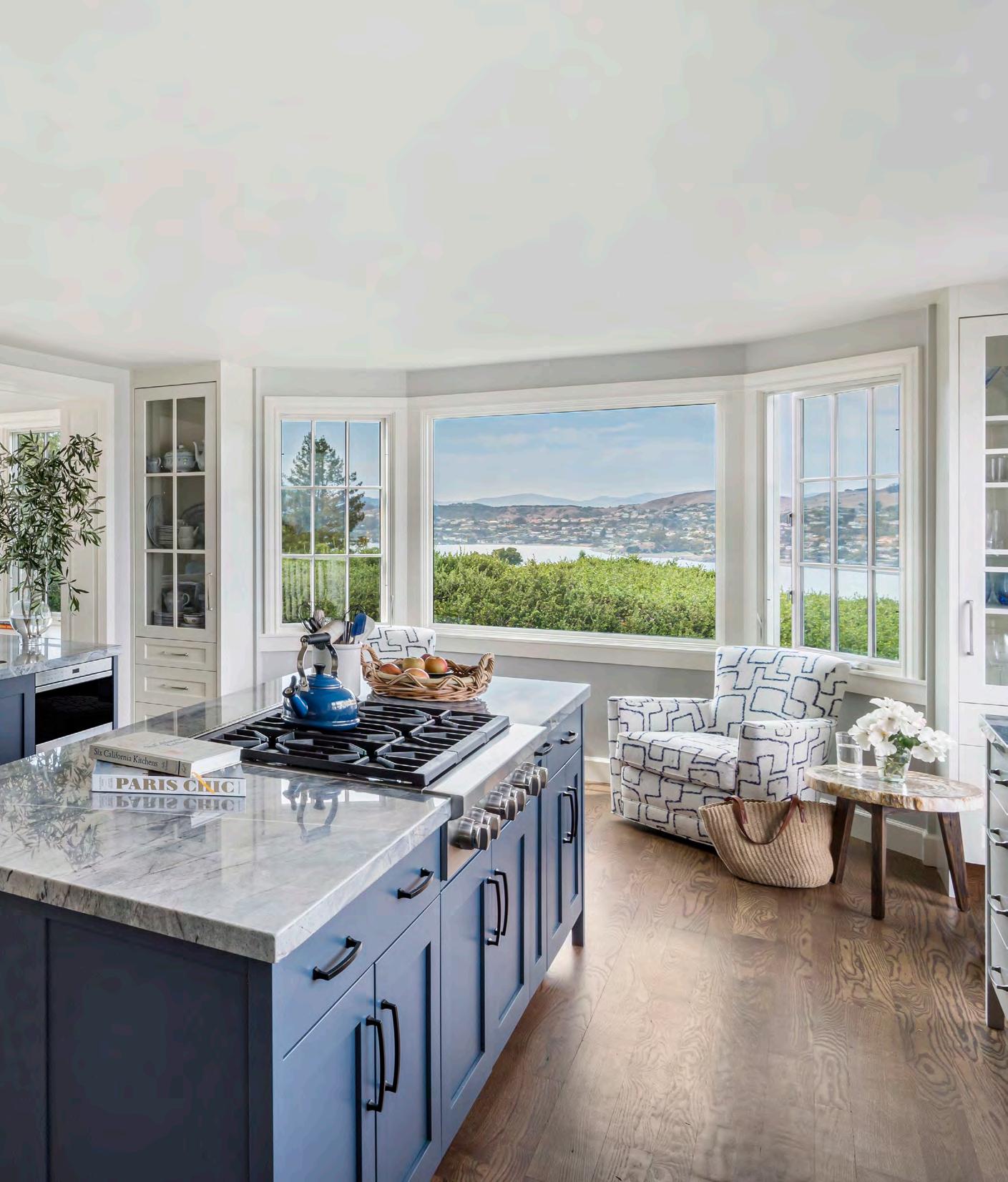 Architect: Daniel Castor
Photo: David Duncan Livingston
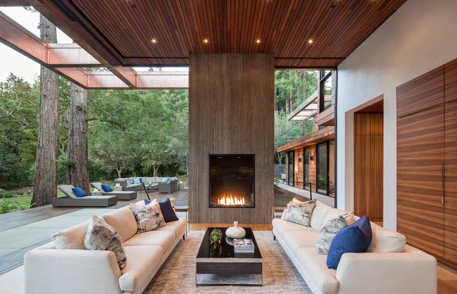
Architect: Daniel Castor
Photo: David Duncan Livingston


The American Medical Association designates the month of September as Women in Medicine Month to celebrate the accomplishments and contributions of women physicians. The MarinHealth ® Medical Network is proud to have a team of exceptional women on our roster, including the following physicians, nurse practitioners, physician assistants, and midwives.
Katherine Alconcel, DO
Nadine Aldahhan, DO
Hilary Allair, CNM
Sarah Ashland, DO
Annick Aubin-Pouliot, MD
Kimya Baradaran, PA-C
Michele Baron, MD
Melanie Baskind, MD
Anjuli Basu, MD
Amelia Baurmann, CNM
Madeleine Belizaire, CNM
Angela Bell, MD
Yamilee Bermingham, MD Nicole Betenia, MD
Hilarey Bhatt, MD
Liat Bird, MD
Robin Bitner, MD Julie Blanchard, PA-C Sally E. Boero, MD
Carly Bravo, CNM
Erika Brinson, MD
Elizabeth Brown, DO Alexis A. Cardellini, MD
Heather D. Carlberg, MD
Elizabeth Cedars, MD
Allison Chakrabarti, MD
Susan Cumming, MD
Wendy Davis, MD
Lisa R. De La Fuente, CNM
Tina Desai, MD
Amanda DeSon, DO
Renee Dettloff, CNM
Sujoya Dey, MD
Elizabeth L. Etemad, DO
Mary Rose Fabi, MD
Kerry Fellows, AGACNP-BC Barbara Finzen, MD
Jessica Flinders, FNP-BC Sylvia J. Flores, MD
Cheri J. Forrester, MD
Adrienne Fratini, MD
Jennie Garcia, MD
Melanie Garcia, AGPCNP-C
Merlienaida Garcia, AGPCNP-C Jane C. Gehring, CNM
Anne Geier, MD Amy Gin, MD Lana Gleckman, FNP-BC A. Yasemin Goksenin, MD
Cindy J. Greenberg, MD Hilary Grubb, MD
Madeleine Hanks, MD
Gurkamal Hans, MD Amanda Hoehler, MD Katey K. Hoffman, MD Susan Hollander, FNP-BC Jessica Holliday, MD Dana L. Jackson, DO
Denyse Jackson, WHNP-BC Amber Jaeger, MD
Emma Jamison, MD
Brittany Jang, PA-C
Ann K. Kao, MD
Gurmehr Kaur, MD
Leah M. Kelley, MD
Amanda Kelly, FNP Isabelle King, MD Megan Klenow, MD
Sindhura Kodali, MD Tarin M. Koehler, DO Hannah Kopp-Yates, CNM Allyson M. La Barbara, MD Erinn Burke Lance, CNM Rachel Latta, CNM Deborah Leal, NP-C Natalie C. Lee, MD Rebecca Li, MD Stephanie Lin, MD Melanie Lising, MD Meenal Lohtia, MD Liane MacPherson, CNM Geeta Malik, MD
Arundathi S. Malladi, MD Rina Marfatia, MD Grace Martin, MD Shalini Mittal, MD
Reagan Munson, PA-C Mary Newberry Davis, CNM Nicole Newhauser, PA-C Anoosheh Nikkar, PA-C
Laura K. Pak, MD Shelley A. Palfy, MD Lisa Park, MD Mignon Parsons, MD Sujatha D. Pathi, MD Catherine Platt, MD Megan Reeves, MD Katherine Reim, MD Heather A. Renz, CNM
Linda S. Rouda, CNM
Lauren Santiesteban, MD Sydney Sawyer, MD
Nicole Schroeder, MD
Tamar Segev, DO
Sarabenet Sequeira, MD Ripple Sharma, MD Karin Shavelson, MD
Ines Sherifi, MD
Justine Shum, MD
Sharleen Sidhu, MD Amy Stenback, MD
Kelsey Strand, FNP-C
Se Young Suh, MD
Erica Sutherland, FNP-C Anita D. Szady, MD
Lyndly Tamura, MD
Anum Tanvir, DO
Irene Teper, MD
Signy Toquinto, CNM
Ann Troy, MD
K. Jennifer Voss, MD
April Walter, AGACNP-BC
Elisa Washburn, DO
Elisabeth Regina Widman, MD
Mary Ellen Wilkosz, FNP-BC
Alison Willis, CNM
Kristin Wingfield, MD
Rachel L. Yang, MD
Alice Yee, DO
Kalle Yee, DO
Wanda W. Zhao, PA-C
“MarinHealth ” and the MarinHealth logo are registered servicemarks of Marin General Hospital and used with permission.



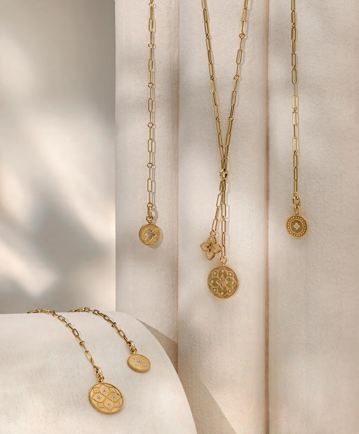
 OPENING THIS SEPTEMBER The Village at Corte Madera, Marin — castjewelry.com
29 Currents
Locally run classes to help you gain a new skill, a look into Sausalito’s Ocean Voyages Institute plus the shocking plight of the monarch butter fl ies (and how you can help them.)

32 New in Town Brandon RafaelnewArcherytoMamahuhuJiu’scomesMillValley,MarinopensalocationinSanandmore.
36 Q&A We chat with GoldAmericanofyoungestJaybasedSausalito-magicianAlexander,therecipienttheSocietyofMagiciansMedalofHonor.
37 Shop Local From loomedethically-sweaters to floral bath soaks, cozy up to fall these from local
Find a date, (calendar and person) and head north to experience these culinaryaward-winningexperiences.


90 Falling for Japan
102 What’s Hot: It’s Wine O’clock and San Francisco Home
111 Home Coming Designer Julie Rootes a for moving from Anchorage, Alaska, to


PRESIDENT Issue 10. Marin published in Marin County by 270 Media LLC. All rights reserved. Copyright©2022. Reproduction of Marin Magazine is prohibited without the expressed, written consent of 270 Media LLC. Unsolicited materials cannot be returned. Marin Magazine reserves the right to refuse to publish any advertisement deemed detrimental to the best interests of the community or that is in questionable taste. Marin Magazine is mailed monthly to homes and businesses in Marin County. Marin (USPS 024-898) is published monthly by 270 Media LLC, 4000 Bridgeway, Suite 105, Sausalito, CA 94965. Periodicals Postage Paid at Sausalito, CA, and at additional mailing offices. POSTMASTER: Send address changes to Marin Magazine, 4000 Bridgeway, Suite 105, Sausalito, CA 94965. this at least 70% a Forest Stewardship Council®-certified forest (FSC-C002420). The may be







270 MEDIA GROUP PUBLISHER
Nikki C. nikki@270-media.comWood
MARIN MAGAZINE PUBLISHER

Leah lbronson@marinmagazine.comBronson
SENIOR ACCOUNT MANAGER
Lesley lcesare@marinmagazine.comCesare
SENIOR ACCOUNT MANAGER
Sharon scoleman@marinmagazine.comColeman
ACCOUNT MANAGER


Jessica jhamilton@marinmagazine.comHamilton
ADVERTISING ART MANAGER
Alex French
MARKETING MANAGER
Mikalia mikalia@270-media.comWood
Regional Sales O ffices
TAHOE Leah lbronson@marinmagazine.comBronson
NAPA COUNTY Jessica jhamilton@marinmagazine.comHamilton
NEW YORK Karen Couture, Couture Marketing 917.821.4429

HAWAII Destination808.739.2200Marketing Services
MAILING ADDRESS 4000 Bridgeway, Suite 105, Sausalito, CA 94965


INQUIRIES: subscriptions@marinmagazine.comeditorial@marinmagazine.com|818.286.3111
LETTERS TO THE EDITOR: Please send letters to editorial@marinmagazine.com. Include your full name, city, state and phone number. Marin Magazine reserves the right to edit letters for clarity, length and style.

SUBSCRIPTIONS: Rates are $12 for out-of-state subscriptions or free for California subscribers. To subscribe, manage your subscription or change your address visit marinmagazine.com/subscribe.
BULK ORDERS
For information on bulk orders of Marin Magazine, please call 415.332.4800.


The passion we all felt for Marin when we first began back in 2005 was intense and has never wavered.
This is a time for celebration for all of us at 270 Media! As one of the original co-founders of Marin Magazine, I couldn’t be happier to be back at the helm of this incredible brand. As some of you know, I left the magazine as Publisher at the end of 2019, effectively to retire. That didn’t work out so well. I guess I’m not the retiring type.
The unprecedented situation with Covid19 in 2020 — when we were all forced to isolate — gave me much time to think. I realized I wanted to get back in the media world and coincidentally, another local publisher, Nikki Wood, formerly with Where San Francisco (yes, same name as me, and it does get confusing!) was also looking for her next adventure. To make it even more fun, my daughter, Mimi Towle (Marin Magazine editor) wanted to join us. In early 2021, the three of us formed 270 Media. In March of 2021 we launched
Local Getaways, a travel and lifestyle brand serving California and Hawaii markets with both print and digital products.
When the opportunity to purchase Marin Magazine was presented to us, we moved quickly to make it happen and were thrilled when Susan Noyes at Make It Better Media accepted our offer. Thrilled for many reasons. Marin Magazine is near and dear to our hearts. On some level, “it’s our baby.” The passion we all felt for Marin when we fi rst began back in 2005 was intense and has never wavered. Readers and advertisers embraced us from the start and the success of the magazine was due to our commitment to reflect the audience we serve, and to help build community in this very special place. We’re looking forward to bringing back the original essence of Marin Magazine and some of the popular departments’ readers loved. At the same time, we know it is a di fferent environment and innovation is crucial for us to stay relevant.
The world is changing, and as digital communication becomes more prevalent, we acknowledge that fact and at the same time are strong believers in the value of a good print magazine. One that you can curl up with on the couch or read with your morning coffee or take with you on your next plane ride.
So, once again as we start this journey we could not be more excited to work with the multi-talented Marin team: Leah Bronson, Alex French, Maeve Walsh, Lesley Cesare, Sharon Coleman, Jessica Gliddon and Jessica Hamilton. In addition, our amazing 270 Media team includes Mimi Towle, Nikki C. Wood, Kasia Pawlowska, Lisa Hilgers, Mikalia Wood, Paula Phommunivong, Michele Kuhns and Kelly Wagner. Bringing these two powerful brands and teams together is a dream come

Wetrue.look forward to your comments and suggestions. The future lies ahead!
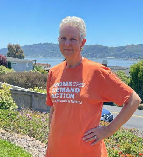
Nikki N. WoodOur mothers teach us to love, be kind to others, and participate as citizens in this world.
But not everyone experiences motherhood equitably. In Marin we have Moms enduring poverty, racism and classism which prevents them from living decent lives.
MCF’s guaranteed income pilot, MOMentum aims to change that. Learn more and support the moms directly at kindred.marinmomentum.org.

“I wanted to share a photo of my husband, Paul, at Louis Thomas wearing his new clothes, courtesy of the winnings from your contest! Thank you again!”

“I want to personally thank you for doing such an amazing job of capturing the essence of our group! Just wow, we are really grateful.”
— LAURA CULVER, BAYWOOD ARTISTS

“We all know Marin is a wonderful place to live... family-friendly towns, natural beauty, mild weather, and lots of recreational and cul tural activities. Marin Magazine just published its “Best of” list and I agree with many of the winners! Which ones have you been to?
— ALLISON FORTINI CRAWFORD, VIA FACEBOOK
Corrections: In the September 2022 issue, the individual pictured on the left of page 43 is Michael Lewis, author of Moneyball, who spoke at a Marin Academy conference on democracy this past year. On the top of page 44, the photo attributed to Denise Pope is inaccurate. We sincerely apologize for these errors.
LETTERS TO THE EDITOR Your comments may be edited for clarity and brevity. Send letters to Marin Magazine , 4000 Bridgeway, Suite 105, Sausalito, CA 94965, or email us at letters@marinmagazine com Please include the town where you live and a daytime phone number.
 — KATHRYN FITZGERALD, WINNER OF MARIN MAGAZINE ’S MAY 2022 TOWN CENTER CORTE MADERA SWEEPSTAKES
Paul Fitzgerald and owner Tom Malvino at Louis Thomas Fine Men’s Apparel
— KATHRYN FITZGERALD, WINNER OF MARIN MAGAZINE ’S MAY 2022 TOWN CENTER CORTE MADERA SWEEPSTAKES
Paul Fitzgerald and owner Tom Malvino at Louis Thomas Fine Men’s Apparel


“A Tree Grows in Napa” (page 62) was written by Wine Country resident Theresa Gonzalez, who raves about life in the town of Sonoma.
“I’m in awe every day of the stunning landscape and beautiful weather,” Gonzalez says. “Food and drink rival San Francisco, and there’s always something to do, even if it’s just taking a bike ride to a nearby winery. It’s a great community to raise kids, too.”
Bay Area fi lm and entertainment writer Bernard Boo, who wrote the articles in our special Mill Valley Film Festival (MVFF) section of the magazine (starting on page 69), never misses an opportunity to attend the screenings and festivities each year.

“The screening I’m most excited to see this year is Deconstructing Karen, hands down,” Boo says. “The fi lm touches on some extremely sensitive, uncomfortable topics, so watching it with a live audience is sure to be an unforgettable experience!”
While writing “A Climate of Change” (page 42), highlighting innovative winemakers, Novatobased writer Jonathan Cristaldi was inspired by the work of Raen co-founder Carlo Mondavi, who also co-founded Monarch Tractor, a line of 100% electric tractors. “Now that electric car technology exists, why wouldn’t it be applied to farm work, grape-growing in particular, where tractors that rely on diesel gas are in perpetual use?” Cristaldi says. “And, given that most of Northern California vineyards are in the migratory path of the monarch butter fly (which is on the endangered species list), drawing attention to the use of diesel and the spraying of chemicals to mitigate pest damage as a way of transitioning to cleaner, better alternatives, is high-minded and critically important.”

In the summer of 1976, Marin photographer Chris Coughlin (left) and his brother Jim Coughlin (right) flew over Christo and Jeanne-Claude’s Running Fence installation while they were getting their private pilot licenses, and Coughlin snapped the aerial photos seen in “Remembering Running Fence” (page 48). The images have never been published before now. “I have a bit of a reputation as a hoarder in my family, but I’m glad I held onto these slides and eventually found the right time to share them with people who may have never heard of the Running Fence project, as well as those who have fond memories of it,” Coughlin says.


Top Gram Subha Joshi moved to the East Bay almost six years ago from Delhi, India. “Although I got my first camera eight years ago, around four or five years ago I started taking photography more seriously,” Joshi says. “While I’ve done wildlife, weddings, and family and couple shoots, nature and landscape photography is truly my first love, and I consider it as meditation. The landscapes in the Bay Area have motivated me to get out more with my camera and be amazed by Mother Nature.”
Getting this Golden Gate shot was a serendipitous moment for Joshi. “I went to the city to capture Sturgeon Moon and its alignment with the Transamerica Pyramid, and while that happened in one corner of the sky, I turned around to see what bridge looked like,” she says. “I really couldn't believe my eyes. I have often seen burning skies or low fog, but I had never witnessed a moment where there were sunbeams coming through the haze and clouds. I think the word for this phenomenon is ‘crepuscular rays.’ This was pure magic and Mother Nature revealing herself — the pelicans were the cherry on the cake.” Follow Joshi on Instagram @subhajoshiphotography


Get
Is neck, back, shoulder, knee or hip pain keeping you from the activities

The team of orthopedic at Novato Community Hospital can help your and get you back in Our award-winning and
Connect with a and get your at one of a thousand things, and out more at sutterhealth.org/marin-webinars.
An
AT MOONSTRUCK , we’re a fan of the rare, bold and beautiful. We bring 30 years of experience and passion to this work that we love. Come by the studio to see our latest showstoppers.
MOONSTRUCK FINE JEWELRY

LOCAL & INTERNATIONAL JEWELRY ARTISTS| CUSTOM DESIGN 11 Bernard Street, Downtown Mill Valley, CA 415.383.0462 @moonstruckfinejewelry
VILLAGE CHILD is home to the best hand curated selection of children’s clothing in the Bay Area…and our Fall Collection has arrived! Our selection includes an array of intentionally designed styles in natural fabrics for newborns through elementary aged children.

VILLAGE CHILD 869 Grant Ave, Novato 415.493.6924 shopvillagechild.com
ICE POPPY, making hand-crafted accessories in Mill Valley since 2013. Tennis Ball Waistbands are a must have for tennis. The pull-up waistband is perfect when your leggings don’t have pockets. Ball will stay securely placed under the band while you play! Stylish and practical, available in multiple colors. Please indicate size at checkout.

ICE POPPY 415.608.1004,icepoppy@yahoo.com,icepoppy.com
BEHOLD THIS GORGEOUS natural unheated three-color (trichroic) tanzanite. We love the many colors in this gemstone and decided a minimalist setting of 18K rose gold with a satin finishcomplemented this one-of-a-kind gemstone ring. Jewelry by women for women.
CALIFORNIA GIRL JEWELRY Strawberry Village Shopping Center, Mill Valley, 650.504.0646 californiagirljewelry.com


A symbol of many towns throughout California, the majestic monarch butterflies are being wiped off the map. Learn how you can help these remarkable creatures.


 BY KASIA PAWLOWSKA
AS OF LATE JULY, THE ICONIC ORANGE-AND-BLACK MONARCH butter fly is a step closer to extinction, earning a non-coveted spot on the endangered list. It’s estimated that populations in North America declined between 22% and 72% over 10 years, depending on the measurement method.

The dazzling butter fl ies undertake the longest migration of any insect species known to science, flying from the mountains of central Mexico up to southern Canada, and then back to Mexico at the end of summer. Adult monarchs typically have four generations each season, and the ones born in September and October are biologically di fferent from the others. They live up to 8 or 9 months — compared to other generations that only live 2 to 5 weeks — and do not mate or lay eggs until the following spring after they fly north and reach areas with milkweed. The major culprits behind their demise? Loss of habitat, increased use of herbicides and pesticides, and climate change. There are ways to help — here are some below.
It is the only plant monarch larvae eat, and the only plant the monarch will lay its eggs in.

Buy FSC Certified Wood Illegal logging in Mexico reduces the amount of trees that monarchs rely on as a winter habitat, protect them as well.

Create a WaystationMonarch

These patches of habitat provide resources for monarchs to produce theirgenerationssuccessiveandsustainmigration.
BY NUMBERSTHE
It’s hard to imagine how to make a dent in cleaning up a 500,000-squaremile garbage patch — approximately twice the size of Texas. Located in the Pacific Ocean between the West Coast of the United States and Hawaii, the massive North Pacific Gyre is strewn with debris, including derelict fishing gear and consumer plastics.

Sausalito-based nonprofit Ocean Voyages Institute (OVI), however, has set an initial goal since launching their cleanup initiative in 2009 to remove and recycle 1 million pounds of debris using an envi ronmentally conscious sailing cargo ship called KWAI, which was purchased by the government of the Marshall Islands. They’re already well underway after recently returning to Sausalito from a trip to the gyre, where they unloaded nearly 100 tons of trash, ready to be recycled, upcycled and repurposed into building materials, furniture and more. “We have to clean it up. The plastics kill so much ocean life. They starve to death because their stomachs fill up with plastic, and they can’t digest it,” says Mary T. Crowley, president and founder of Ocean Voyages Institute.Along with the KWAI, OVI is in the process of designing two additional purpose-built sailing cargo vessels to allow the organization to remove even more debris from our oceans. Here are the numbers.
- LOTUS ABRAMS

Chef Brandon Jew drops a restaurant in Mill Valley; Left Bank slides into Tiburon; an expanded archery range finds a new home in San Rafael; and the former Sir Francis Drake Hotel gets a makeover and a new name, among other openings in Marin and around the bay. CHRISTINE MUELLER
MAMAHUHU “I’m out running trails in the Headlands or on Mt. Tam at least once a week, and Mill Valley is frequently my start and end point,” says co-owner Ben Moore of his desire to open a restaurant in the city. Chef Brandon Jew (Mister Jiu’s) with third partner Anmao Sun are open ing an outpost of their no-frills, family-friendly restaurant (the first is in San Francisco’s Inner Richmond) in the former Mill Valley Beerworks space in mid-September. Nostalgic ChineseAmerican fare the chef grew up eating, like kung pao chicken and crunchy cabbage salad, are the menu’s focus, reimagined with an eye on individual and environmental health and sustainability. Rice flour batter for sweet and sour chicken makes it extra crispy and gluten-free; only honey and organic pineapple juice are used as sweeteners; and sustainably grown, certifiedorganic palm oil is used in the fryer. The vegetable-forward approach means sweet and sour cauliflower and mushroom ma po tofu are given equal billing and care. 173 Throckmorton, Mill Valley; eatmamahuhu.com

› Petite Left Bank
Chef Roland Passot is at it again, opening his latest French café and bistro in downtown Tiburon in 415.910.1010;Blvd,after.arelunchtheandofAbeefsaladeescargottoMinnichExecutivemid-September.chefJustinwillbringlifeclassicslikeencroute,Niçoiseandbourguignon.morningmenucomposedplatespastriesisinworks,andandbrunchexpectedsoon1696TiburonTiburon; petiteleftbank.com
After eight years at the original location around the corner, Jennifer Fujitani quietly opened in the former Benissimo space in early July. Though the menu remains largely the same (that tea leaf salad! Those bao!), a new grill means Fujitani’s mom, Jenny, who still runs the kitchen, can make kalbi ribs and smoked salmon collars or grilled shrimp on a whim. A new family meal menu is in the works, as is a plan to open the large patio for
service. 18 Tamalpais Dr, Corte 415.985.5060;Madera; burmatown.com
› FitLab San Rafael resident Val Harbidge opened a fitness center near downtown Fairfax with a cycle room and other fitness modalities, includ ing Les Mills barbell classes, yoga, Pilates and a functional fitness floor with plentiful strength training options. 711 415.785.3026;Blvd.CenterFairfax; fitlabstrong.com
If you fondly remem ber Marin Archery’s small space along San Anselmo’s Miracle Mile, you’ll be thrilled to know that owner Scott Bullard has reopened with a full 12-lane, 20-yard indoor range, com bining it with an outdoor range, wellstocked pro shop and a lounge, this time located on the grounds of the Marin Rod and Gun Club. 3815 Redwood Hwy, Suite B, San 415.862.7769;Rafael; commarinarcheryshop.
Owner Jennifer Bloch seeks out obscure, well-made goods and vintage found items, includ ing grab-and-go floral bouquets and pre-made, curated gift boxes for her shop, opened in May in 415.891.8739;Ave,items.boardsture,foraalsoLarkspur.downtownBlochisatworkcreatinghousebrand—lookcustomfurnicharcuterieandpantry280MagnoliaLarkspur; shopheritage.com
Cast Jewelry
With a wish to inspire curiosity and discovery, cofound ers Rachel Skelly and Eric Ryan opened a jewelry store at the Village at Corte Madera that evokes Madera;RedwoodCorteguess.withoutrevealsing:approachaacomesThefeelingkid-in-a-candy-storeainSeptember.boutiquewelguestswithbeverageandhasstraight-forwardtopricaproductmenudetailsanyneedtoTheVillageatMadera,1536Hwy,Corte castjewelry.com
NEW! Mamahuhu








Neograft Hair transplant technology harvests hair follicles from the back of the head and transplants it to the area that needs it.
Does It Look Natural?
Yes. It is your hair, just transplanted to a different location. The harvest area at the back of the head is impossible to see after hair grows out.
What is the Recovery?

The procedure requires the harvest area to be shaved to properly transplant the follicles. There is no scar, unlike other technologies.
How Much Does It Cost?
The pricing is based on the follicles needed, and area to be treated. The best way to determine your needs is an in-person consult with our expert patient coordinator Julia and
Dr. Douglas, available during business hours. Use code MARIN to receive a special offer.
Plastic Surgery Specialists 350 Bon Air Road #300 Greenbrae CA 94901 p. 415.925.2880

Abstract artist Wassily Kandinsky never touched a paintbrush until age 30; Julia Child was in her late 30s when she en rolled at Le Cordon Bleu in Paris; and Toni Morrison was 40 when her first book, The Bluest Eye, was published — all a reminder that, as it’s been said many times, it’s never too late to learn something new. Even if you’re not seek ing fame and fortune, going “back to school” can be a rewarding, life-enrich ing experience. There are plenty of lo cally run classes (both in-person and virtual) to help you gain a new skill, pick up a new hobby or pursue your pas sions. Here are a few to try.

Helmed by Marin locals Nicholas Wil ton and Terri Froelich, Art2Life offers an annual 12-week online painting course in January for both budding artists and established painters, along with sevenday destination workshops in locations near and far, from Sonoma to Mar rakesh. From $2,400 for the 12-week online program, and from $3,000 for destination workshops; art2life.com
Jetting off to Latin America or Spain next summer? Prep for the journey by enrolling in the College of Marin’s be ginning Spanish language class, offered through the school’s community edu cation program. Two classes run Octo ber 17–December 3. $114; marin.edu
ART2LIFE Nick Wilton, Art2LifeChannel Your Inner Chef Prepare (and devour) culinary masterpieces at the Cavallo Point Cooking School, where classes include Oyster Experience, Let’s Talk Fried Chicken, The Art of Fusion and Intro to French Pastries. From $125; cavallopoint.com

It’s not too late to live out your childhood ballerina fantasy. Adults can learn the basics, from pliés to pirouettes, by taking beginning adult ballet classes at Marin Ballet, which has been “promoting the art of dance” for 60 years. $25 per class, or $22 with a class card; marinballet.org

Book Passage offers in-person and on line classes year-round for writers who want to get their work published. Up coming courses include Self-Editing for Fiction and Memoir Writers (October 1); How to Write a Query Letter (Octo ber 8 and 12); and How to Write a Fic tion Synopsis (October 22). $95 for classes listed here; bookpassage.com - LOTUS ABRAMS
 Cavallo CookingPointSchool
Magic is magical. And here in Marin we are lucky to have one of the most prolific and beloved magicians in our midst. When he eleven years old, Jay Alexander and his grandfather went to see a magic show and there was no going back to dreams of being a fireman. With the help of a magic kit purchased at the mall, Alexander was hooked — he’s been practicing close-up magic ever since. The magician has performed his tricks at corpo rate events, private parties with the likes of Robin Williams, backstage on the Rolling Stones tour and more. He’s also put on virtual shows, done Bay Area pop-ups, and held regular performances at his own Marrakech Magic Theater. The his toric jewel box theater has only 45 seats, but has an ample Middle Eastern-style lounge serving drinks and appetizers, and became the number one show in the city on Yelp and TripAdvisor soon after opening five years ago. Witnessing Alexander’s sleight of hand for yourself is a Marinite must. jayalexander.com

1 Marin Magazine: Tell us about the origins of your magic career. Jay Alexander: As a kid, the last thing I ever thought I would do would be magic. I have really bad dyslexia and the best way to learn magic, especially in those days, was to read magic books. I also had a speech impediment. But the magic kind of brought me out of my shell, gave me con fidence, and made me want to perform — for anyone who would watch. My mother had a children’s shoe store where I’d show off

MM: Do you perform at birthday parties?
JA: All the time. That was my fi rst show. It’s all I’ve ever done.
MM: Has a trick ever gone awry and how did you handle it?
JA: I spend a lot of time practicing to perfection to make everything in my show look seamless. That being said, unplanned things always happen. The trick is rolling with it and not letting it look like a problem happened. Audiences don't know what is supposed to happen so if you don't miss a beat and keep going, nothing was messed up. That is the real magic behind the magic.
4
MM: How did your virtual shows start?
JA: Days into the pandemic — when people were freaking out and not knowing what’s going on — I decided to put together a virtual show and offer it for free for anyone who had ever been to the theater. In 1994, I created a CD-ROM that taught magic to kids, so I had a long history of thinking about how to connect to people over a screen. I already had lights and enough experience with cameras and computers that I was able to do a three-camera shoot from my living room.
MM: What’s the most important element of close-up magic?
JA: I spend a lot of time trying to create something that’s actually just a lie. What I’m doing behind the scenes, hiding the quarter or the like, and what they see are two di fferent things. I spend a lot of time creating something that’s so flawless that audiences can’t see that distinction. Magic is all about the experience. It’s taking people to another world and allowing them to laugh and have fun during all of this. The trick is secondary. It’s not about me. I want to bring a group in, and I want them to feel like they had a special experience meant just for
JA: The fact that you can connect with people from all walks of life. It has opened up so many doors for me, but it’s all about the excitement that I see in people’s eyes that they didn’t know that they wanted or needed. It’s more than the magic, it’s how it connects with people so quickly. It gets them to open up and want to talk and laugh.
The Marrakech Magic Theater, 419 O'Farrell St, San Francisco; 415.794.6893 , sanfranciscomagictheater.com; jayalexander.com

 BY LOTUS ABRAMS
. Warm up with a cup of coffee made from this locally owned company’s custom-roasted arabica beans, which are imported from a single, womanowned farm in Peru. 4 Women’s Mediterranean Organic Room Shoes, $58; Coyuchi, Point Reyes Station; coyuchi.com. Inspired by Japanese Uwabaki house slippers, these comfy “room shoes” feature a flat-woven exterior, plush terry interior and a heel that folds down for slip-on convenience. 5 Vienna Throw Blanket , $399; Bella Notte, Novato; bellanottelinens.


com. Curl up on the couch with this elegant yet supremely soft chenille jacquard throw trimmed in silk velvet. The reversible blanket can be dyed in any of Bella Notte’s custom 18 shades.

Cozy up to fall with these products from local shops and brands.
During the volatile mid-1970s, Tiburon author Lee Darby’s family became caught up in some of the most tumultuous events in Bay Area history — the Patty Hearst kidnapping, the rise of San Quentin prison groups and an attempted assassination of the president. Her book, Stars in Our Eyes, recalls her sister’s untimely death.


 BY JESSICA GLIDDON
Although she has lived in Tiburon for over half a century, Lee Darby still fondly remembers her childhood growing up in Menlo Park with her younger sister, Sally Voye. “Sally and I were only one year apart, so we did everything together,” she says. Her recollections make up the start of her book Stars in Our Eyes, 40 years in the making, which recounts her sister’s life and attempts to unravel the series of events leading up to her death.
While the Bay Area famously gave rise to the hippie movement in the 1960s, with its rejection of violence and peaceful protests, in the 1970s, counterculture had evolved into more radical forms of resistance. The Bay Area was ruled by political groups, many of which originated out of San Quentin State Prison — groups battling against racism, the status quo and sometimes, with each other. The
most famous of them was the Symbionese Liberation Army (SLA), the group that kidnapped Patty Hearst.

Darby recalls her sister as being idealistic and wildly passionate about making a differ ence. The San Francisco Chronicle would later publish a description of her from a roommate at UC Santa Barbara: “She was sort of a notpolitical idealist, a good person — the kind more of us should be like.” Voye went on to get
 Patty Hearst
Sally Voye, 1968
Patty Hearst
Sally Voye, 1968


a teaching credential from UC Berkeley, and as soon as she graduated, she began volunteer ing with a literacy program at San Quentin. “When she went to Berkeley things kind of changed,” Darby says. “She became aware that she was a privileged person, and wanted to helpThisothers.”experience would change Voye’s life. At San Quentin she met the leader of the United Prisoner’s Union, Wilbert “Popeye” Jackson. “Popeye worked to improve prison conditions: he wanted better food, better medical care and better visitor facilities ,” Darby explains. But he was involved in a lot more than that.
Wilbert “Popeye” Jackson, and the Kidnapping of Patty Hearst Although Popeye had spent much of his life in jail, by the time he met Voye, he had been out of prison for a few years and was expect ing a child. According to the San Francisco Chronicle, Popeye’s jail sentences were for minor infractions: “He was arrested on charges of heroin and marijuana possession... but was acquitted after a jury trial... he was again arrested on a misdemeanor charge.’”
While researching her book, Darby spent time trying to uncover more about her sister’s relationship with the prison activist. “I began to see what must have drawn Sally to him when I read that in April 1974, the ‘charis matic’ Popeye went to a parole hearing at San Quentin and ‘150 supporters marched in the rain’ outside the prison walls… he could draw a crowd, he had charisma… he had achieved a certain status.”
The United Prisoner’s Union that Popeye headed up had been associated with George Jackson, a former inmate at San Quentin, also a Black Panther and one of the Soledad Brothers, famous for their 1970 uprising against the conditions at Soledad State Prison. George’s brother Jonathan Jackson would later storm the Marin County Civic Center in an attempt to secure his brother’s release, an incident also connected with Angela Davis, the legendary activist and professor at UC Santa Cruz.
In 1974, Popeye was instrumental in the negotiations that took place in the Patty Hearst kidnapping by the SLA. Following Patty’s capture, they demanded a $4 million ransom to be paid in the form of a food program benefitting the Bay Area’s poor,
called The People in Need program. Patty’s father, Randolph Hearst, the chairman of the board at Hearst, needed a liaison during the negotiation process. Although negotiations were being handled by the FBI and the San Francisco Police Department, the SLA wanted nothing to do with the authorities, so they relied on Popeye, who had created a rapport with the newspaper magnate.
The People in Need program was a massive undertaking that involved distributing food across the Bay Area. A woman named Sarah Jane Moore was put in charge of setting up distribution centers. “She made a mess of it,” Darby explains. “It was chaos: People were
Lee Darbyrunning off ith the money and overinflating prices, and many were getting mugged.”

A radical herself and rumored informant, Moore quicly became unhinged. Less than three weeks earlier, a follower of Charles Manson had attempted to shoot President Gerald Ford when he visited Sacramento. Now, when the president arrived in Union Square to give a speech, Moore made her own assassination attempt, which was thwarted. When she was asked later why she did it, her answer was, “Well, everyone was talking about it.”
It was in this climate that Voye volunteered at San Quentin. On June 8, 1975, she drove Popeye home from a fundraising party. The car was parked on a small side street in the Mission District in San Francisco. “They were sitting in her car chatting in front of his
apartment on Albion Street and someone came up and emptied their gun,” Darby says.
A flurry of contradictory stories surfaced in the following weeks. Rumors flew; some claimed there were actually two shooters, groups claimed responsibility then withdrew it, that the Aryan Brotherhood was respon sible and, that Voye could have herself been an informant — an article in Playboy even made this accusation. Darby empathetically denies this, and says disproving the allegation was part of what inspired her write her book. “There was no way she was an informant,” she says. “She was trying to help to help rehabili tate people.” It eventually came to light that the hit was ordered by a rival gang, Tribal Thumb, but the damage had already been done. “Every day there was something new and it was it was really upsetting,” Darby recounts. “We were horri fied that that her name was being dragged through the mud.”
Voye was passionate about her social work. Having grown up during the Civil Rights movement of the 1960s, she was particularly committed to helping the Black community. “I remember when she was in Berkeley and she got burgled and called me up in tears,” Darby says. “She was just furious, but not at the burglars — there were two Black youths that were seen running down her driveway — but that the government couldn’t do enough to help Black people. Today, she would certainly be carrying a Black Lives Matter placard. She would be pleased at the progress that’s been made, but there’s still a long way to go.”
Darby wrote Star in Our Eyes to honor the memory of her sister, who believed so strongly in equality. Years after the incident, Darby gave back in her own small way by working at San Quentin prison. “I felt like I played a small role in in furthering her goals,” she says. “I was a construction manager on a five-story $30 million healthcare facility built there. It just kind of closed that circle. I still wonder if she would have thought that was enough.” Darby answers her own question in her book. “[She would have wanted] better food, more childcare, improved visitor areas, a solution to overcrowding... I know the answer because I know the truth. She wanted to make a di fference.”
Plastic Surgery
(925) 567-9478, www.aycockmd.com (925) 856-4800, www.norcalsurgery.com
Dr. Robert Aycock is pleased to welcome Dr. Timothy Rankin of NorCal Plastic Surgery to their new partnership. With a vast background of training, experience and expertise, both doctors look forward to successfully helping patients to look and feel their absolute best. Dr. Aycock’s team works closely with each patient to develop their personalized plan from their initial consultation to post-procedure whether it be for non-surgical facial rejuvenation with lasers or injectables or body contouring with CoolSculpting. Dr. Rankin supports his patients throughout their medical journey and works closely to enhance the natural beauty of his patients while leaving them looking and feeling their best whether it be face, neck and eye lift, mommy makeover or rhinoplasty. Both physicians use state of the art technology and have a highly qualified team to support and provide expertise to create lasting relationships with each and every patient as they begin their journey to feel comfortable in their own skin.
Dr. Robert Aycock is pleased to welcome Dr. Timothy Rankin of NorCal Plastic Surgery to their new partnership. With an incredible amount of experience and expertise from both parties, they look forward to many years to come as they successfully help patients to look and feel incredible. Dr Aycock’s team works closely with each patient to develop their personalized plan from their initial consultation to post-procedure whether it be CoolSculpting, non-surgical facial rejuvenation with laser and injectables, or face and neck lift surgery. Customized skin care treatments and products are provided by Skin Presence Med Spa. Dr. Rankin supports his patients throughout their medical journey and works closely to enhance the natural beauty of his patients while leaving them looking and feeling their best whether it be for rhinoplasty, eyelid lift or mommy makeover. Both physicians use state or the art technology and have an incredible team to support and provide expertise to create lasting relationships with each and every patient as they begin their journey to feel comfortable in their own skin.
“We welcome Dr. Timothy Rankin! Dr. Rankin grew up in Marin County and now has brought his family back to join our practice in Marin and Walnut Creek. I have worked with him for two years and I am excited and confident in his ability.” —Dr. Aycock
 TIMOTHY RANKIN, MD, MS AND ROBERT AYCOCK, MD, FACS
Along with promoting sustainable agriculture and championing social justice, these forward-thinking California winemakers are also producing remarkable wines. BY JONATHAN CRISTALD i

Have you ever wondered how wine wa s first made? The origins aren’t definitive, but the earliest evi dence of ancient wine production points to Georgia around 6000 BC, with Iran and Sicily following suit shortly after. Later, due to the in flux of mass trading throughout the Mediterranean, the magic of winemaking reached most corners of the old world.
The science remained a mystery — even to the wine producers themselves — until French chem ist Louis Pasteur defined the biological process of fermentation in 1857. Pasteur found that yeast lived naturally on the skins of grapes, so when the first vintners used their bare feet to crush grapes to extract juice, natural sugar and yeast from the fruit worked together to start fermentation, thus creating wine.

How we stored wine also evolved through time. Ancient Egyptians used clay pots, while Romans discovered that wine could be kept in glass bottles. However, the design that we all know didn't come into fruition until the mid-1800s. For functionality’s sake, wine bottles were often green to prevent oxidation and UV light damage, and punts were included on the bottom to catch sediment. Now the patented punt design is a recognized icon for all wine enthusiasts around the world.
A new chapter in the wine industry — one focused on innovation and change — is being written right now by some of California’s most progressive winemakers. The pages aren’t perfect, but they’re great works in progress — perhaps some of the best progress that’s ever been made in the American wine industry in the areas of regenerative farming, sustainability and social equity. We’ve identified a shortlist of California wineries that are helping write the pages of this new chapter, while also pro ducing delicious wines that are entirely worth seeking out. We hope that in addition to discovering a new favorite house wine, you’ll be inspired to support their great causes.
 Carlo (left) and Dante Mondavi
RAEN WINERY AND MONARCH TRACTOR Carlo CofounderandMondavi, Winemaker; Chief Farming O fficer
Carlo (left) and Dante Mondavi
RAEN WINERY AND MONARCH TRACTOR Carlo CofounderandMondavi, Winemaker; Chief Farming O fficer
It’s never a given that the next gen eration follows in the footsteps of the previous, but in the case of the Mondavi family, farming and winemaking are truly all in the family. Carlo Mondavi, the son of Tim Mondavi and grandson of Napa legend Robert Mondavi, fell in love with wine while growing up around it at Robert Mondavi Winery and Opus One. Carlo says that his dad, Tim, is his great est teacher when it comes to wine. When Carlo decided to make a go at the family business, he set his own sights on pinot noir.
He worked at Domaine Dujac, a relative newcomer to Burgundy established in 1967 in Morey-St.-Denis, France, and learned the art of making polished, finesse-driven wines. Back stateside, Mondavi (and brother Dante Mondavi), began looking for true Sonoma Coast micro-climates that were capable of producing ethereal, delicate wines from
terroirs that might “sit alongside the grand crus of the world,” as Mondavi puts it. “It took us a decade,” he says, but they settled on sites in the Sonoma Coast, FreestoneOccidental and Fort Ross-Seaview AVAs. They established RAEN winery (an acronym for Research in Agriculture and Enology Naturally), and in 2013 introduced three pinot noir wines: Royal St. Robert, Bodega Vineyard and Sea Field Vineyard. Today, they continue to produce highly sought-after, complex,
structured, lovely wines.
In 2018, Carlo set his sights on another goal inspired by the plight of the monarch butter fly. The butter fly’s migratory path — straight through a large portion of California’s millions of acres of farmland — has run into decades of herbicidal sprays that have decimated its population from millions to thou sands and landed it on the endangered species list. Eyeing the innovations in electric, self-driving cars, Mondavi cofounded Monarch Tractor, a company that produces fully electric tractors with self-driving capabilities to “get away from fossil fuels in farming and stop the use of herbicides,” he explains. Most tractors run on diesel gas, and most farmers spray so they don’t have to mow. Mondavi’s solution is to have farms run electric tractors, which are quiet, don’t pollute the air, and can allow farmers to stop spraying, which will save farms millions of dollars spent on chemical sprays and could even make family farms profitable. “Biodiversity is how our planet thrives, and I believe that creating balance is important for our survival,” he says.
After an early career as a stage and film actress, Jaime Araujo segued to a life in wine. She attended the University of Bordeaux and then worked in the London wine scene. It was a natural shift. Her parents, Bart and Daphne Araujo, had moved to Napa in 1990, bought Eisele Vineyard, and established the iconic Araujo Estate (today, they own Accendo Cellars.)

Araujo, who is also a partner in Accendo Cellars, established St. Helena-based Trois Noix (which means “three nuts,” a reference to family) in 2013 with a single-vineyard cab ernet sauvignon from Coombsville. Her focus on producing “beautiful, delightful wines of

freshness and balance, with a light touch” extends to white, pink and red wines today.

Araujo credits winemaker Françoise Peschon (who makes Accendo) as one of her top mentors.
At Trois Noix, Araujo shines a light on inclusivity and diversity to fos ter a space “where everyone is welcome,” she says. “We support various initiatives each year and choose two specific ‘Possibility Partners’ with whom we work more closely.” In 2022, the team chose Batonnage, a forum focused on supporting women in wine and Hispanics in wine, which provides education and career resources to the wine industry community of Hispanic and Latinx workers. Trois Noix, a certified B Corp, is certified Napa Green as well, committed to positive climate action, regenerative practices and social equity.

Seventeen years ago, Dan Petroski took a sab batical from a publishing career in New York City to live in Italy and work on a vineyard in Sicily. He had no intention of becoming a winemaker, but in 2006, he ended up in Sonoma County working a harvest for Andy Smith at DuMOL. Smith recognized Petroski’s potential and hired him as the cellarmaster at Larkmead in Calistoga. Six years later, Petroski was named winemaker, on his way to fashioning 100-point cabernet wines of his own.

But that Italian obsession held sway, and in 2009, with the desire to create California white wine blends in a Mediterranean style, he launched Massican. Working with rare Italian varieties, chardonnay and sauvignon blanc, he began crafting fresh, floral, citrusy and salty wines in that quintessential Mediterranean white style. Today, Massican makes six white wines, including a unique bottling for Whole Foods, and Petroski is working on a global collaboration project with a handful of winemaking friends that are making their personal versions of Massican wine.
After the Napa fi res in 2017, Eric Asimov of The New York Times asked Petroski if he thought the fi res were a result of climate change. “I couldn't answer that question scienti fically,” Petroski says. But he began looking into it. What he looked into was three data points from Larkmead records — the vineyard, the climate during the vintage and the winemaker's in fluence — and he realized that the growing season at Larkmead shifted 45 days forward. Alarmed, he reasoned that “if climate alone can move the agricultural needle two weeks in a span of 10–12 years,” it was worth focusing on. Petroski has written op-eds, hosted seminars, joined the board of directors of Napa Valley Grapegrowers and Napa Green, and is “committed to creating awareness and solutions for preserving and protecting the vineyards of Napa Valley.”

Scheid Family Wines began as the Monterey Farming Corporation in 1972 when Al Scheid purchased land in Monterey and became a grape grower. The first wines under the Scheid Vineyards label rolled off he bottling line in 1989 with less than 100 cases of cabernet sau vignon. Today, the family portfolio includes roughly 12,000 cases of wine produced annu ally and features a host of fantastic names: Sunny With a Chance of Flowers (a zero-sugar, low-alcohol wine), Grandeur (an organically certified wine), VDR (Very Dark Red) and HOXIE (an artisanal dry wine spritzer), to name a few, along with their namesake label.
Winemaker Casey DiCesare joined as an assistant enologist in 2017 and was named winemaker in 2020. DiCesare oversees the production of nuanced and elegant wines with moderate alcohol, not overly oaked and true to varietal character. “We’re at the forefront of making wines with limited inputs, as well as offering greater label transparency regard ing nutrition facts and ingredients,” DiCesare
says.And
with winemaking in sound hands, Executive Vice President Heidi Scheid, Al’s daughter, has time to focus on the family’s numerous sustain ability initiatives. Between renewable energy and commu nity-focused programs, Scheid is a real thought-leader in these spaces. Their most visible work is a 400-foot wind turbine. Since 2017, the family has been powered by 100% renewable wind energy. In 2021, “Our turbine output resulted in 3,125 tons of avoided carbon dioxide emissions,” says Scheid. They supply enough energy back to the grid to power more than 125 homes in their community. The winery gives back, as well: Since 1988, the family has awarded $400,000 in scholarships to local high school students. through their annual Scheid Writing Contest.


 Fifty years after the inception of Christo and Jeanne-Claude’s monumental environmental art installation, local ranchers and community members who worked on the project recall it crossing both the North Bay landscape and cultural divides.
BY KIRSTEN JONES NEFF AERIAL PHOTOGRAPHY BY CHRIS COUGHLIN Christo and Jeanne-Claude, 1976
Fifty years after the inception of Christo and Jeanne-Claude’s monumental environmental art installation, local ranchers and community members who worked on the project recall it crossing both the North Bay landscape and cultural divides.
BY KIRSTEN JONES NEFF AERIAL PHOTOGRAPHY BY CHRIS COUGHLIN Christo and Jeanne-Claude, 1976

when rancher Joe Pozzi was 13 years old and milking cows in his fam ily’s dairy barn alongside his father and siblings, a green station wagon bumped down the road leading to the Pozzi’s Valley Ford property in Sonoma County. There was great excitement, Pozzi says, whenever anyone ventured down that rural road, so the children watched with intrigue as their father greeted the stranger who stepped out of the car. “Here was this guy, he had big glasses, bushy hair and an old green jacket, so he looked pretty rough,” Pozzi remembers. “After talking to him for a while my dad came back into the barn and said, ‘Damn hippy wants to build a fence for us. I told him we build our own fences.’”
That hippy, it turns out, was renowned Bulgarian artist Christo (Christo Vladimirov Javacheff, 1935–2020), and the fence he was referring to was Running Fence, a “public art event” he envisioned building across the North Bay landscape. Fortunately, Pozzi’s father was kind enough to invite Christo to come back by the Pozzi ranch later, when the family was not so busy with chores, to further discuss his strange request. When Christo and his French partner and co-creator, Jeanne-Claude (1935–2009), came back that afternoon, the Italian family invited them into their home for antipasti. The eccentric artists sat with the ranch family and shared a book about a project they had completed in Colorado called “Valley Curtain,” 200 square feet of bright orange fabric draped across a high mountain pass called Ri fle Gap. The Pozzi family looked through the photos in the book as Christo and Jeanne-Claude described their creative vision — a white cloth fence, almost 20 feet high and 25 miles long, meandering over the West Marin and West Sonoma hills, from the populated region along Highway 101 through semirural developments, across farmland, all the way to the Paci fic coast near the town of Bodega Bay, where it would spill into the ocean.
“They were both so polite and respectful,” Pozzi says. “My parents liked them immediately and agreed then and there to let Running Fence cross about 2 miles of our property. That was the beginning of a great relationship, let alone a great project.” The teenage Pozzi, intrigued from the start with this duo who might as well have come from another planet, would go on to get a summer job on the project, carrying stakes for Christo and the lead engineer and head contractor as they surveyed and marked the layout of the installation.
The Pozzis were just one of the ranching families Christo and Jeanne-Claude won over as they prepared to create a temporary artwork that would exist for only two weeks. “We all thought it was goofy at fi rst,” says Spirito Ballatore, whose family also owned a property critical to the project. “What? You’re going to build a 19-foot fence? But Christo was a straight shooter; he respected us. He was a man of his word, and my mom and dad became supporters. He very much

swayed the ranchers to his side.” According to Ballatore, once his parents and other ranchers had decided that yes, the project could happen, they didn’t want the government to get involved. In hindsight, some ranchers in the West Marin and Sonoma community believe that Christo and Jeanne-Claude understood from the start that ranchers would not appreciate governmental intervention, and that they banked on the agricultural community’s support. “We laugh about it now,” Ballatore says. “They knew, no one is going to tell ranchers what they can or cannot do on their property.”
Bill Bettinelli was the president of the Petaluma Chamber of Commerce and a lawyer representing the ranchers during that era. He met Christo and Jeanne-Claude in 1972 when they fi rst arrived in the area and came to his office to ask for his support in connecting to local property owners. “They were considering three di fferent spots along the California coast,” Bettinelli says. “They were impressed by the beauty of this area, and could imagine the whole layout done visually, through developments, over hills, around groves of trees — it was the visual impact. I told them it would never happen, that they might get government approval, but they would never get the support of the farmers and ranchers. And I was dead wrong.”
From 1972 to the early fall of 1976, when they stretched the fi nal panel of the fence into the sea between Estero de San Antonio and Estero Americano in Bodega Bay, Christo and Jeanne-Claude faced 18 public hearings and three sessions at the Superior Courts of California. They also drafted a 450-page Environmental Impact Report. All the while, a community of unlikely art activists grew around them. “Every hearing would fi ll up with farmers and ranchers — the panels or boards were amazed by the group that showed up,”
Left: Christo completed numerous drawings while planning the Running Fence project, including this one done in 1975 in pencil, charcoal and ball-point pen. Right: Skilled laborers and other paid workers constructed the 25-mile white cloth fence in 1976.Bettinelli says. “It became a friendly club of about 50 people who fol lowed them around, going to every hearing, staying late into the night. And Christo would always get a reservation at a restaurant for every one to meet up afterward.” This community went on until Christo and Jeanne-Claude both had passed away, decades later, says Bettinelli. Jeanne-Claude, whose English was quite good, was especially open and charismatic, according to Bettinelli. She had a contagious enthu
cultural and political lines. In the minds of the artists, Running Fence included the unfurling of civic and community experiences over time, the entirety of the years-long permit process, the antagonism as well as the friendships formed, and the relationships that endured, like an after-image of the billowy, winding cloth fence.

When construction finally began in 1976, it took five months of nonstop industry, employing skilled laborers as well as paid students
siasm and connected with families in a genuine way. The friendships became so strong that people from the ranching community, including Bettinelli himself, later traveled to attend the openings of the couple’s subsequent projects, such as “The Gates,” which was conceived in 1979 and opened in New York City’s Central Park in 2005. Christo and Jeanne-Claude also returned to the North Bay for gatherings, including Ballatore’s mother’s 98th birthday, which they attended in November of 2009, just four days before Jeanne-Claude passed away of a brain aneurysm. When Christo spoke publicly about Running Fence, he would reference not only the elaborate technical construction, but also the social dimensions — the surprising alignments that crossed
and other workers. Ballatore was 20 years old, just out of community college, when he joined the project putting up stakes and driving a service truck. Many local students joined the project because Christo and Jeanne-Claude paid them well. “Minimum wage was $1.75, and they paid me $7 an hour,” Ballatore says. “It was a good job. There was no place else where I could make that kind of money.” The estimated cost of the project was $3 million dollars, an extraordinary amount of money in the 1970s, and the artists paid for the project themselves. Christo would periodically return to New York to paint and sketch, and to sell his work to raise money for the project. In the end, the fence involved 200,000 square yards of white nylon fabric, 90 miles of steel
“
The project was majestic, and I thought, if someone can do this, you can do anything.”The installation of "Running Fence," which was nearly 20 feet high
cable, 2,050 steel poles, 350,000 hooks and 14,000 earth anchors. “It was fascinating to me as a kid, all the materials showing up, all the hus tle and bustle,” Pozzi recalls. “The project was majestic, and I thought, if someone can do this, you can do anything.”
On September 10, 1976, Running Fence was completed, connecting the Highway 101 corridor to the Paci fic Ocean, and stitching together the municipalities and the 59 families who allowed the fence to cross their property. An estimated 2 million people came to the region to witness the flowing white line that captured coastal light as it hugged the curves of nature and accented the trappings of human industry. Pozzi recalls terrible tra ffic clogging the unimproved rural roads during that brief period. And then, two weeks later, Running Fence was gone without a trace, the materials disassembled, the cloth, cables, pipes and clips all donated to the ranchers. “If you look at some of the cattle guards out here today, you’ll see they’re made out of those pipes,” Pozzi says.

“The temporal nature of the fence only added to the mystique,” says Mill Valley resident and photographer Chris Coughlin, who recently brought his aerial photos of Running Fence to light, two of which are
seen on these pages. In late June of this year, 50 years after Christo and Jeanne-Claude initiated the Running Fence project, members of sev eral of the farming and ranching families who made the fence possible came together for a panel at an event organized by Elizabeth Bishop of the Tomales Regional History Center. When Coughlin heard about the event, it spurred him to search through boxes of slides he had in stor age. Coughlin and his brother, Jim Coughlin, were taking flying lessons when the project was under construction, and he had snapped approxi mately 30 photos from the air, which he never shared publicly, before now. “We were flying out of Sonoma’s airport, flying over the area in a Cessna 152, so we had the best seats in the house to see the project and to feel part of the flow of the fence,” Coughlin says. From Coughlin’s perspective, then and now, the project was “incomprehensible.” He believes Christo and Jeanne-Claude found a unique moment in time when people were willing to put aside conventions and fears of liability and accept the audacity of a project like Running Fence. “Over time, the beauty of the project has only grown, and like any good art, it’s still percolating 50 years later,” says Coughlin of the view from his training flights. “It still feels like — what did I see? Was it a dream?”
After following the West Marin and Sonoma hills, Running Fence dropped down into the Pacific Ocean near the town of Bodega Bay.
WHAT ROLE DOES COLOR PLAY IN YOUR ENJOYMENT OF A RESTAURANT? We chatted with a few designers to get a sense of how color and restaurant design influence your eating experience. BY CHRISTINA MUELLER
STARTING A RESTAURANT IS A DAUNTING TASK: a quarter of them fail within a year, and most small establishments close within five years. Though there are many factors which account for a restaurant’s success — food quality, service and location, for example — design can be an impor tant consideration for a brand’s success. In an age when we are more attuned than ever to visual cues (thanks, social media!), restaurant design is more consequential than ever.
Back in 1961, Ray Kroc wanted to entice the public to eat at the burgeoning chain of hamburger restaurants he just purchased — McDonald's — and used the latest marketing science to design the iconic red and yellow restaurants. Red was chosen for its stimulating properties, a signal to your brain to kickstart your appetite. “Warm yet lively colors like red are energizing which helps to stimulate the appetite,” says Nathan Reed, Senior Interior Design Associate at Cass Calder Smith Architecture + Interiors. The pigment’s power is further charged with social and cultural meanings — think of a matador’s cape or a red fire truck — that excites eaters. Yellow, a happy color, signals joy. Yellow is also most visible in daylight, a beacon to drivers and the hungry kids in the back seat. “Warm and comforting colors like yellows, golds and orange cause people to feel relaxed and happy and have also been shown to increase metabolism,” says Reed. Considering the international success of the brand, with over 13,000 outlets in the United States, McDonald’s cultural color cues are enticing to many humans.

In the Bay Area, Michael Brennan has been designing fine dining restaurants for decades, including Fleur de Lys, Cliff House, Zero Zero, Baker & Banker, Bruno’s and many more. Since his first project painting murals for Pat Kuleto at the wonderscape of now-closed Farallon, Brennan, a trained painter, refuses to rely on a set color palette when design ing a restaurant. “That is the last question for me,” he says. “ I figure out all the other details first — architecture, lighting, how things are laid out — and make sure it works before I make decisions about anything.”
From the guest’s perspective, that often means lighting is higher in the design hierarchy than color. “You have to light the atmosphere, make people look in and say ‘wow, I want to be in that space,’ Brennan confirms. Lighting is a big part of a restaurant’s unique experience — people need to look good in the restaurant, and Brennan wants women to look great in the bathroom mirror, too. But when it is time to consider the color palette, Brennan searches for harmony. He starts with a trim color, usually something dark, and then figures out the food. “You can get away with brighter colors in some spaces,” Brennan says. “You want colors with the same tone — I try to keep things exciting and harmonic.”
It is a delicate balancing act. Subtle yet highly effective techniques deliver messages to denizens of social media
and the types of eaters a restaurant wants to attract. “Colors must be comforting first and foremost — there is not necessarily any one color that is wrong to use in a restaurant, but some colors do lend themselves to a more pleasant experience (which is important when the appetite should be stimulated),” says Reed. Blue, for example, is said to be relaxing, promoting a sense of calm in diners, much like the feeling one gets when near the ocean. Brown is thought to convey a down-to-earth message and a strong sense of security. Green signals abundance and health. Dark tones are often used to convey coziness or to make a space feel more intimate while lighter colors make a more welcom ing. “In general, colors of natural elements and colors found in nature give us an association with food that is healthy and delicious to eat,” Reed adds.
Balancing the psychological implications of color to make guests feel comfortable and hungry is a key ele ment in restaurant design. “Since everyone is different, people perceive and interpret colors differently,” Reed says. “Perception of color can vary greatly depending on sur rounding shades and hues as well as the color temperature of the light hitting it. Also, color blindness is a thing,” Reed remarks. Here is how design infl uence the eating experience at some Bay Area restaurants.
Inspired by the ancient palaces of China and led by Mr. Zhongxuan Hong, HHD Hong Kong Eastern Holiday International Design chose a mix of green and blue for iChina’s interiors. “The green that is used is the color of the precious jade that the owner loves and the designer took inspiration,” Hong wrote in an email. “The blue is in fluenced by the painting “A Thousand Miles of Rivers and Mountains,” gifted to Emperor Huizong of the Song Dynasty (960-1279 AD) by the renowned court painter Wang XiMeng.
Aiming for a feeling of refi ned elegance, the team created iChina’s signature color palette of green and gold with red toned accents for added warmth and style which nods to Chinese tradition and culture. From there, an Art Deco design aesthetic balances clean lines with geometric shapes — look at the grand lighting fi xtures or the turquoise blue leather walls and crystal pillars, or the detailed lanterns in the form of ancient Chinese architectural buildings.
But does it make you want to eat? “The design pulls from iconic landscapes, grand palaces, and the artistic excellence of imperial China,” Hong wrote. “A reflective water ripple ceiling resembling a mirage in the stars [among other details] is meant to create a sense of endless prosperity and a luxurious yet welcoming atmosphere.” I’ll take that as a “yes.”


“Traditional with a pop,” says Nadine Curtis, Vice President, Design Project Manager of Palisades Hospitality, who sought to reflect the cuisine of a modern tavern at a hotel’s stand-alone restaurant that skirts the Marin coast. That meant leaning into shades of blue. Together with vintage artwork, antique glass and a saloon-style mirror behind the bar, the goal was an interior that reflects the beauty of the abundant open space and California landscapes that surround the property. The blues shift with the time of day and the fog, creating a warm and cozy effect when days are chilly and a welcoming coastal vibe at other times.


Owner John Park with William Duff rchitects and Roy Design chose a balance of vibrant colors to represent South American culture and earth tones to represent the Amazonian in fluence in Peru. The result is a vivid green bar with angular designs baked into the bar tiles, perhaps to evoke Peru’s ancient Nazca Lines, above which cool coppery valences shade bar lights. “We wanted our guests to feel transported out of the hustle and bustle city life,” said Park, “a Nikkei oasis that brings a culinary experience and lush feel of Amazon together as one.”
But does it make you want to eat? “I understand certain colors evoke hunger and crave food [sic] but KAIYŌ is about the complete experience and not just food. Our colors represent the Nikkei culture in Peru.
Jennifer Dal Bazzo, owner and interior designer, designed the interi ors to complement the stunning views of San Francisco, visible across the bay from every seat. Dal Bazzo chose white as a dominant color for its very clean and fresh appearance. “It also allows the focal points

— spectacular views, bar, and fireplace — to become boldly displayed,” she says. Like Morrone, Dal Bozzo had a vision for the floor: terrazzo tile was chosen for its color schematic, which resembles a sandy beach. Complementary colors of beige and peach with walnut and maple woodwork reflect serenity and warmth.
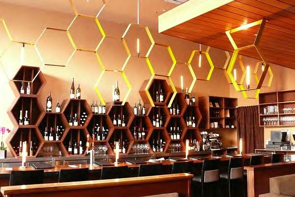
At Nectar, Brenna n fi rst imagined a hive, designing a set of hexagonal, interlocking bent light fi xtures to represent the sweet liquid secreted by flowers to attract pollinators. “I streamlined the color scheme around that,” he says. A neutral palette of warm-toned beiges and browns served to highlight the food as well as the architectural elements of the room.
Brennan often looks to art history as a foundation on which to build his designs. With Cortez, the Spanish surrealist painter and ceramicist Joan Miró, and the Dutch painter and art theoretician Piet Mondrian inspired bent pipe light fi xtures a ffi xed with colored bulbs and a color-blocked wall. The resulting room was infused with warmth from warm lighting and various tonal yellows and golds used throughout the space. “I thought a lot of deep yellows would work with the light fi xtures,” Brennan said.
If red, an energizing color, is supposed to stimulate the appetite, you should be starving after spending some time in 102-year-old Tosca. An icon of the North Beach dining scene, Tosca hews to its storied form with deep red leather banquettes, a mahogany bar (itself a sort of reddish-brown), red damask wallpaper and red chairs. It’s red in here.

Lily | Gold Reed chose gold as the dominant color for a Vietnamese restaurant for its positive effects on diners as well as for its association to good luck and prosperity in many Asian cultures. “We wanted to pay homage to the owners’ culture,” Reed said.

The design team sought inspiration from the Five Elements as well as an important piece of art called “Along the River During the Qingming Festival” which features a predominantly golden hue. Reed drew on design elements from East and West, ancient and 20th century, to help people experience the comfort of natural elements and a traditional space while being surrounded by familiar modern touches.
But does it make you want to eat? Reed said that the warm colors his team chose help people to feel relaxed and happy and they even increase metabolism. Adding in energizing colors like red are said to help to stimulate the appetite.









 The towering vintage oak tree serves as the focus of outdoor and indoor space.

THE MODERN UPGRADE OF A MID-CENTURY GOLF clubhouse located in the Carneros appellation of Napa Valley started with a vintage oak tree. “It was a building that didn't look out but looked in,” says San Francisco-based architect Karin Payson. Payson set out to transform the one-time public building into a private event space where the owners, who also have a home on the property, could host extended family and guests to gather by the fi re, play games and enjoy the view toward the natural environ ment. Known as Vineyard Knolls, the property includes 25 acres of pinot noir and chardonnay vineyards and the long-lived oak.

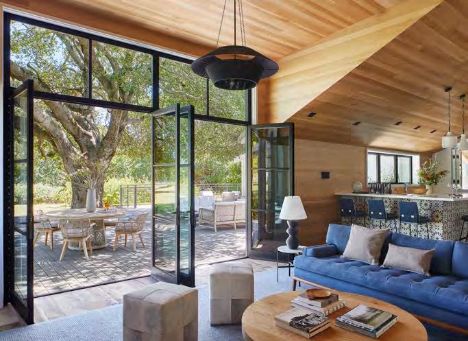
“That tree was my fi rst goal,” Payson says. She constructed a plan to reorient the center of the building and flow of the space so that the bar lounge and adjacent great room interacted with the tree out side. Inside, she elevated the bar’s low, fl at ceiling to invite in more light, warming it wit h a fi nished oak that echoed the landscape. New floor-to-ceiling steel-framed windows and doors opened up a broader view of the terrace, where the tree provides plenty of shade for hosting al fresco cocktails and a respite from a game of golf.
The old oak tree now provides a serene focal point from the
commercial building, which is now used exclusively for private golf clinics, special events and family time. “To me, it was just a nobrainer because the building was not looking at its own beautiful landscape,” Payson says.
The entrance, formerly obstructed by a faux stone wall that was designed to look like a chimney, was transformed into another wel come space to meet and entertain. “It was blocking the view from the entry out to the golf course,” explains Payson of the faux wall. She removed the stone wall and a storage structure that prevented any potential curb appeal and added a wooden awning to mark the entrance. The black composition shingle roof was also replaced with a more sustainable and aesthetically sound metal roof. “It’s really durable and reflective so it reduces heat gain over the more traditional roofi ng materials,” Payson says. “We don’t use black composition roofi ng anymore.”
The foyer was transformed from two separate and dark rooms into one open and well-lit space that naturally flowed into the bar’s comfortable seating area. Old, carpeted flooring was replaced with reclaimed oak throughout, and local interior decorator Erin
An oak wood ceiling adds to the feeling of harmony.


King played up the owners’ love of plaid in the furnishings, but in an elevated way. Soothing blues with subtle tartan accents complement Payson’s warm yet modernist design.
“I describe my work as ‘tactile modernism,’” Payson says. “I'm defi nitely a modernist architect, but I'm not interested in flying buttresses of concrete and geometric tricks with materials.” Instead, a clea n floor plan, minimal waste and natural materials are more her style.
Marin-based Plath & Company gutted the great room in favor of Payson’s choice materials like the reclaimed floors and oak wood ceiling, but the floor plan remained intact, save for one prominent detail. King convinced Payson to keep the original stone fireplace by simply bleach ing the dark and dated wood beams. In the end, it was the right decision, and a cost-saving one to boot. “There was no reason to rip it out and put in another one,” Payson says. “I’m glad we didn’t try to change it.”
The oak tree makes another appearance at the top of a new stairwell to the second floor, thanks to the addition of a dormer window. Payson, who is just over 5 feet tall, expanded the ceiling height to bring in more natural light and bring the unpermitted space up to code. “Even I felt like I had to duck,” she jokes. The unexpected view of the oak at the top of the landing, which leads to the upper offices, is a delightful design feature that nods to the intent of the remodel.
Limited by commercial permits and Napa’s unique zoning
requirements, Payson kept all renovations to the specs of a commercial property, including an up-to-code commercial kitchen and ADA bath rooms. She made sure, though, that the space still felt like home for two empty nesters and their large extended Napa family with the focus on casual spaces and indoor-outdoor living.
“It’s a really handsome building,” Payson says. “I love the way the bar area looks onto the tree now. But the best part was when we were photographing it, the husband came out to say hello and said to me, ‘Oh, you just really got us.’"
With our services, you can reset your home’s sustainability. Restore yourself to excellent health. And renew your interior design with healthy, non-toxic, chemical-free furnishings. We would love to work with you in the new year.We would love to work with you in the coming months.

ECO-TERRIC
• rowena@eco-terric.com Mon.–Fri. 10am-4pm
• 323 Pine Street, Sausalito, CA 94965 415.331.9323
• Sat. appt. only. • Sun. closed Email to schedule an appointment.
Floor-to-ceiling doors and windows blur the inside/outside line.


For its 45th anniversary, the Mill Valley Film Festival is back in full party mode. BY BERNARD BOO

have a good chance of bumping into filmmak ers, actors and actresses and have a chat over delicious food and drinks.
“I can’t promise everybody that if you buy a ticket, you get to put your arm around a handsome star or a beautiful actress,” Fishkin cautions with a laugh. “However, there is a chance. And the fact that these famous actors and actresses are there with you at these par ties really adds to the experience.”
Stargazing aside, discussing a powerful documentary or arthouse film with fellow fes tivalgoers at an afterparty is one of the most enjoyable aspects of the festival, but having the director join in on your conversation makes the experience absolutely unforgettable.
Marin County has a magical effect on people. “You could be the most jaded Hollywood producer in the world,” says Mill Valley Film Festival (MVFF) Executive Director Mark Fishkin. “But after 24 to 48 hours in Marin, you’re fine being stopped in the street by people congratulating you on your film, versus other festival cities where you’re taking a limo to go two
Whetherblocks.”it’sthe gorgeous backdrop of Marin County’s redwood forests, or the cozy, small-town vibes of Mill Valley and San Rafael, MVFF has history of inspiring even the most famous celebrities in the world to let their guards down at one of the festival’s famous parties and get up close and personal with fans.
“Felicity Hu ff man was here back in 2005,” Fishkin recalls. “There was a problem with her

flight, so she didn’t have a lot of time to stay. She stood there at one of our parties at the Outdoor Art Club and said, “I’m going to talk to and shake everybody’s hand who wants to talk to me and she did! She talked to everybody.”
Andrew Gar field also had a blast with beaming festivalgoers at an MVFF party in 2017. “He talked to all of the guests!” Fishkin says.

At the Cannes Film Festival, you’re lucky to catch a glimpse of a celebrity on the steps of the Palais des Festivals behind a wall of paparazzi. But at MVFF, festivalgoers
MVFF parties are as intimate as they are glamorous, but the health and safety of attendees is still top priority for Fishkin and his team. “We’re very conscious of protecting the health of all of our guests, so there will be an outdoor component to all of our parties, and we’ll encourage wearing masks,” he says.
Following the completely socially distanced festival back in 2020 and a limited in-person celebration in 2021, MVFF looks to finally be back in full party mode for its 45th anniver sary. Special guests from some of the most buzz-worthy movies in the festival lineup will be on-hand to mingle with MVFF faithful, and Fishkin has no doubt that this year’s parties will be a fun time for all. “This is the year we put the ‘festive’ back in ‘festival.’”
Nicole Kidman, MVFFShrouded in a cloak of anonymity since their debut in the early 1970s, the San Franciscobased art collective The Residents remains one of the most proli fic and enigmatic musical acts in the world. Known for experimental songs and albums accompanied by equally abstract imagery, the group performs exclusively in costume, their identities hidden behind signature masks, most notably resembling giant eyeballs. At this year’s Mill Valley Film Festival (MVFF), they bring the one-of-
a custom light show and of course, the group’s avant garde songs and soundscapes. “The Residents are, for many people, an acquired taste,” Flynn explains. “It’s not middle-of-the-roadpopmusic.”Whatallows
a-kind experience that is their live show to the Sweetwater Music Hall.
While the identities of the band members have never been revealed, Homer Flynn, spokesperson for The Residents and president of the group’s management company The Cryptic Corporation, spoke to Marin Magazine in anticipation of the band’s live show at MVFF. “Go in with an open mind,” he advises to those new to the live Residents experience. “It’s almost certainly going to be di fferent than any shows you’ve seen before.”
Like their music, The Residents’ live performances are trippy, atmospheric, mindaltering a ffairs featuring elaborate costumes,
The Residents’ to be so uncompromising in their work is their commitment to keeping their identities hidden in public. Musician Hardy Fox revealed prior to his death in 2018 that he was a founding member of the group, but beyond this, the rest of the band’s identity has largely been kept secret. Flynn has been rumored to be a member of the group himself, though he strictly identi fies as merely a spokesperson for the group in “Thereinterviews.isaveil,” Flynn says. “The Residents aren’t interested in celebrity. They would read in Rolling Stone that Mick Jagger couldn’t go out to dinner anywhere, and that didn’t look very cool to them. The veil gives them pro tection in a way and allows a bu ffer between their personal lives and public lives. For the most part, they just want to be regular people in their private lives, so the anonym ity serves them in that way.”

In addition to their show at the Sweetwater Music Hall, The Residents are screening their new narrative fi lm, Triple Trouble, as a part of the festival.
Incorporating footage shot by the group in the mid ‘70s with new media shot as recently as 2020, the fi lm is deeply embedded in the group’s iconography and mythos. The fi lm will be screening at the Roxie in San Francisco, but for those who want the full Residents experience, a trip across the Golden Gate Bridge to the Sweetwater will be a must.
“When you see something happening live and in front of you, it makes a di fference,” Flynn says. “The Residents are thrilled to be in Mill Valley, and they’re really happy to be performing at the Sweetwater.”
 One of the most enigmatic bands on the planet descends on the Sweetwater Music Hall during the Mill Valley Film Festival for a live experience like you’ve never seen before. BY BERNARD BOO
The Residents
Triple Trouble
One of the most enigmatic bands on the planet descends on the Sweetwater Music Hall during the Mill Valley Film Festival for a live experience like you’ve never seen before. BY BERNARD BOO
The Residents
Triple Trouble
The power of advocacy documentaries is on full display in this year’s Active Cinema program at the Mill Valley Film Festival.
 BY BERNARD BOO
Too often, issues regarding healthcare, the environment, politics and racism go unaddressed, drowned out in the deluge of news and information pouring out of our TVs and smart devices every day.
The power of call-to-action documen taries is that they offer shelter from the flood, giving us an opportunity to focus, turn off ur phones and learn about issues that a ffect us all in ways we might not even know. Cinema has the power to make real change, and the Mill Valley Film Festival’s (MVFF) Active Cinema program aims to harness that power and shed light on press ing issues in a way that’s both educational and entertaining.
A stunningly beautiful nature advocacy documentary, Path of the Panther tells the tale of the endangered Florida panther and the guardians fighting to save them. The panthers are photographed and recorded in their natural habitat of the Florida Everglades by National Geographic photographer Carlton Ward, Jr., who seeks to raise awareness about the harsh reality that they face extinction if we do not intervene. Far from melancholic, the fi lm ends on a hopeful note that, with a concerted effort on behalf of wildlife organizations and generous folks all around the globe, we can protect the Florida panther for generations to come.

“The quality of the imagery in this fi lm is just so beautiful,” Guevara gushes. “The people in the fi lm work so hard to save the panthers from extinction, and we’re going to fi nd ways for people in Marin County to help save the panthers as well.”
In Deconstructing Karen, two women of color host private events across the country called “Race to Dinner,” inviting white women to sit down for dinner, drinks and an unflinchingly honest discourse about white supremacy. The film isn’t for the weak of heart — the titular “Karens” are forced to reckon with the delu sions and points of ignorance that both benefit and cripple them in their day-to-day lives. The dinner is a difficult, intense and at times painful process for all involved. But the conver sation is nonetheless essential to the progress and evolution of our society as a whole.
“I’m a brown woman, but I felt how racist I’ve been watching the movie,” Guevara explains. “We’re trained to be racist in this country, and the subjects of the fi lm don’t hold anything back. White women being
Path of the Panther Deconstructing Karenasked why they are or aren’t racist reveals a big disconnect, particularly from the perspective of a woman of color.”
During the 2020 presidential election, a group of student activists from across the country show the power of civic engagement to a new generation of young voters in The Young Vote. Whether it’s a 24-year-old political organizer and scholar in Georgia, or two high school juniors fighting for Independent and “No Party A ffi liated” votes despite the fact that they aren’t old enough to vote themselves, the remarkable subjects of the fi lm fight to increase young voter turnout. Only 39% of registered young people voted in the 2016 presidential election, and fi lmmaker Diane Robinson hopes to change that with this incisive, jubilant documentary.

“It’s such an inspiring and uplifting fi lm,” Guevara says. “Most of our audience probably won’t need to go register to vote, but it’s still uplifting to see what younger generations are bringing to our politics in this country.”
Largely ignored and terrifyingly widespread, Lyme disease is one of the most misunderstood diseases in the medica l field. The Quiet Epidemic follows patients as they cope with the effects of Lyme disease and delve into its

history to understand why it’s been allowed to spread since its discovery in 1975. “For me, it was a huge eye-opener,” Guevara says. “It’s scary, too. This fi lm shows how this country has gotten Lyme disease wrong on the medical side, the political side, and the scienti fic side for many years. Unfortunately, there are many stories of people with Lyme disease who were never diagnosed, or were mistreated, or believe they didn’t get the assistance they needed from insurance companies that abandoned these patients for lack of evidence or diagnosis.”
As wild fi res continue to ravage communities in California and Oregon, revelatory documentary Elemental refocuses the conversation around wild fi res to encompass not just the forested areas of our communities, but the residential areas where citizens’ homes

remain largely unprotected against the growing threat of wild fi res. Climate experts, fi re survivors and native peoples are interviewed, providing insight into how we can better protect our homes against wild fi res and prevent more of our neighborhoods from getting burned to the ground.
“The festival gets a lot of fi re fi lms submitted, but this is one of the best executed,” Guevara explains. You typically hear about winds, PG&E, weather and climate change when wild fi res are discussed. But homes are lost, and according to the fi lm, a lot of that could be avoided if they were designed in a fi re-proof way. Marin is on a fi re-front area, and I hope that when people see this fi lm and think about their own homes, or they hear about other folks’ homes, they’ll join the conversation. The beautiful thing about these kinds of fi lms is that they start these conversations.”
The Quiet EpidemicIn a fraught year for women everywhere, the Mill Valley Film Festival’s Mind the Gap platform aims to amplify female filmmakers’ stories to instill hope, elicit empathy and provide support. BY BERNARD BOO
heated debates raging across the country.
“I remember the day that we found out that Roe v. Wade had been overturned,” Ibe recalls. “We showed up to a meeting and took a moment to reflect on how grateful we are to work in a space in which we have the ability to facilitate opportunities for people to be empa thetic. You watch a film, and it gives you insight into someone’s life who is nothing like you. You make the connection, and you’re open to a dif ferent way of living. I think that when people watch these fi lms it will energize them and make them feel seen.”
Women’s representation i n fi lm has never been more important than it is now. In a year rife with debate over women’s rights and gender equality, cinema offers a unique oppor tunity for women filmmakers to share their stories in the purest, most poetic way, in the pursuit of empathy and understanding.
“The films that we have in the festival very much feel like they’re speaking to the moment that we’re in,” says Osinachi Ibe, production manager for Mind the Gap, MVFF’s gender equity and inclusion platform. “Watching some of these films is cathartic because these artists are responding to what’s going on in our world and showing the way forward.”
Celebrating female, nonbinary and under represented filmmakers from across the globe, Mind the Gap amplifies women’s voices in a variety of ways. In addition to the dozens of female-directed films in the festival lineup, there’s The Directors Forum, a panel featuring
female directors engaging in thoughtful con versation and analysis about the film industry, a Film Financing Case Study panel demys tifying the process of financing independent films, and a focus on the evolution of AsianAmerican and Pacific Islander (AAPI) women’s roles
“Aonscreen.lotofth e films at the festival this year that fall under the scope of Mind the Gap really speak to what’s going on right now in the world,” Ibe says. “Some of the films look back in time at some things that happened in the past that feel a lot like what’s going on today, and some cover more contemporary issues around racism, abortion and a women’s right to choose.”Thisyear has been a particularly fraught year for women in the sociopolitical space, and the programming team at MVFF feel privileged to be able to feature female stories that hold up a mirror to society and address some of the more
Nanny, directed by Nikyatu Jusu This immigrant horror story stars Anna Diop as a Senegalese nanny in Manhattan who rubs the upper-crust white couple who employ her the wrong way, clinging onto her roots as she fights to make her American dream a reality.

The Unknown Country, directed by Morrisa Maltz This hybrid documentary/narra tive feature follows a young woman (Lily Gladstone) who goes on a road trip through the Midwest to the Texas-Mexico border, reel ing from the loss of her grandmother.
One Fine Morning, directed by Mia Hansen Løve Lea Seydoux stars as Sandra, a young single mother. She sparks a new romance with an old friend who happens to be married and struggles to find balance between her familial duties and her steamy affair.
Nanny


The filmmakers behind one of the most thought-provoking films at the Mill Valley Film Festival prepare to meet with local students for thoughtful discussions about art and censorship.
 BY BERNARD BOO
A heated debate emanating from San Francisco’s George Washington High School has been making national headlines for the past three years running. The controversy centers on a mural on the school’s walls depict ing the life of George Washington, including images of his history of owning slaves and overseeing the slaughter of Native Americans for their land. Should the mural come down, or should we be honest about the brutality of our nation’s

Town Destroyer, one of the fi lms that will be screened at this year’s Mill Valley Film Festival (MVFF), examines the debate from all angles and perspectives, presenting opinions from a diverse group of onscreen personalities. As a part of MVFF Education, co-directors Deborah Kaufman and Alan Snitow will be meeting with local students to discuss the fi lm. We spoke to Kaufman and Snitow ahead of their visit to MVFF.
Marin Magazine (MM): What do you have planned for your presentation with the Deborahstudents?Kaufman
(DK): We’re working with MVFF to put together a study guide to accom pany the film. We really hope that the film is something that students will discuss in terms of history, but also in terms of art and ques tions of censorship. The question raised in the film is, does the intent of the artist matter?
The film also covers the impact of generational trauma and the need for trigger warnings. All of these issues are being discussed among high school students anyway, so we hope the film can continue that.
MM: How do you expect the students to react to the DK:film?
We don’t want to recapitulate the argu ment at the center of the movie when we speak with the students. We hope they can, as a result of the fi lm, ‘break the binary’ and not look at debate as a zero-sum game. We hope that meeting with the students engenders critical thinking and opens up further inquiry from them. That’s what education is all about, right?
Alan Snitow (AS): We showed an excerpt to college students, and the teacher said that the discussion afterward was one of the most exciting she had had in the class all year. People really wanted to talk about it. One per son in the fi lm says that nuance is an old way of thinking and that it doesn’t exist anymore. We want to cre ate an atmosphere in which young people can think through the nuances and have two opposing ideas in their heads at the same time.
DK: “George Washington had all of these good ideas, and he was a slave owner. People can have good and bad within them. Young people feel pressure to take a position, but they can actually be open to multiple, opposing ideas. It’s okay!
MM: Issues of censorship reverberate throughout the movie. It’s a complex issue.
AS: There’s a long history of controversy over art. There were so many times throughout history when people tore out the previous regime’s imagery to move forward. Sometimes, when it’s Hitler, or Stalin, or Confederate monuments, there are really good reasons to do that. But there’s also what’s going on right now in libraries with LGBTQ+ books. The con fl ict over censorship is all around us right now.
KaufmanDeborahandAlanSnitow Filmmakers at GWHS


SEQUOIARAFAELSEQUOIASEQUOIARAFAELRAFAELRAFAEL
Glass Onion: A Knives Out Mystery 6:00
Searching for Sugar Man 2:30 Return to Dust 3:30 TÁR 3:00
Mother and Son 4:00 Turn Every Page 5:00
The Grab 6:00 Charcoal 7:00 BansheesInisherinof 7:00 Provo 7:30 OneShorts:andOnly 8:15
SEQUOIASEQUOIARAFAELRAFAELRAFAELBAMPFALARK
Oink 11:00am The Young Vote 12:00
The Quiet Epidemic 2:00 Santos–Skin to Skin 5:15
Lady Chatterley’sLover 7:00 Town Destroyer 8:00
TÁR 11:00am Whina 12:00 The Pupils 1:00 Charcoal 4:00 Freedom on Fire 11:00am
Call Jane 2:45 Descendant 3:00
One Fine Morning 4:00 Broker 7:00 Body Parts 3:00
Passengers of the Night 6:00 ArmageddonTribute: Time 6:30 Chile 1976 7:00 The Son 7:00
SEQUOIASEQUOIARAFAELRAFAELRAFAELBAMPFALARK
Shorts: Free to be Me 11:00am
DeconstructingKaren 1:45
Finding Her Beat 12:00 IntimacyMasterclassCoordinator 11:00am We Dream of Robots 12:00 Provo 1:00 The Young Vote 3:30 Call Jane 12:00
Passengers of the Night 3:00
Rodeo 6:00 Living 7:00
Corsage 1:30 Body Parts 4:00
MTG WomenAwardTalking 5:00 Descendant 7:00
One Fine Morning 4:00 The Pupils 5:45 Banshees of Inisherin 3:30
One Fine Morning 7:00 Home Somewhereis Else 7:00
SEQUOIASEQUOIARAFAELRAFAELRAFAEL
TBA 12:00 The Grab 1:00
The Young Vote 3:00
Sunnyland 7:00
The Quiet Epidemic 1:15 Alcarràs 2:00 Rodeo 4:00
Member Screening: The Unknown Country 5:15 We Dream of Robots 5:00 Argentina, 1985 6:45 Xalé 7:15
Shorts: The EnvironmentalistsNew 8:15
SEQUOIASEQUOIARAFAELRAFAELRAFAEL
Finding Her Beat 11:00am
TBA 12:00 Argentina, 1985 11:00am Unknown Country 2:30 DeconstructingKaren 3:00
Living 2:30 Freedom on Fire 3:30 Holy Spider 4:00 Xalé 6:30
Centerpiece:Till Faultline
The Art of Eating 7:00
Town Destroyer 1:00 Charcoal 4:00 Triple Trouble 7:00
SUNDAY OCT 16
Santos–Skin to Skin 4:00 Nanny 7:00
SEQUOIASEQUOIARAFAELRAFAELRAFAELBAMPFALARK
Our Father, the Devil 11:00am
My Policeman 2:30
Home Somewhereis Else 12:00
Town Destroyer 1:15 Sophia 2:00
Plan 75 4:00 Santos–Skin to Skin 7:30 Whina 1:00
Erin’s Guide to Kissing Girls 4:00 Tukdam 5:00 Bardo 6:00 Still Working 9 to 5 7:30
Close 6:00 Causeway 7:00
The Blue Caftan 4:00
Shorts: Strangers by Nature 8:15 Elemental 7:15
SEQUOIASEQUOIARAFAELRAFAELRAFAELBAMPFALARK
AnimationShorts:for All 11:00am

Elemental 2:00
Lost King 12:00
Boy from Heaven 3:15
Nanny 6:00 Hi De Ho Show 7:00
Path of the Panther 11:00am
Four Samosas 12:00
The Swimmers 2:00 Sophia 3:00
Shorts: Rolling in the Deep 1:00
Plan 75 4:00 The Pupils 12:00
Bonnie Blue 4:00 Fantastic Negrito 7:00
Erin’s Guide to Kissing Girls 2:00

White Noise 7:00 Close 8:00 Corsage 7:00
SUNDAY OCT 16
SEQUOIASEQUOIARAFAELRAFAELRAFAELBAMPFALARK
SEQUOIASEQUOIARAFAELRAFAELRAFAELBAMPFALARK
Shorts: Truths (and Spoofs) From Youths 11:00am
Shorts: Truths (and Spoofs) From Youths 11:00am Causeway 12:00
Causeway 12:00
EO 2:00 The Good Nurse 5:00
Four Samosas 11:00am Boy from Heaven 12:00
Four Samosas 11:00am Boy from Heaven 12:00 She Said 1:00
Turn Every Page 4:00 Still Working 9 to 5 11:30am
EO 2:00 The Good Nurse 5:00 Oink 2:00 The Good Nurse 5:00
Oink 2:00 The Good Nurse 5:00
Decision to Leave 7:00 Fantastic Negrito 3:00
SATURDAY OCT 8
SATURDAY OCT 8
SUNDAY OCT 9
SUNDAY OCT 9
THURSDAY OCT 13
THURSDAY OCT 13
SATURDAY OCT 15
SATURDAY OCT 15
SATURDAY OCT 15
SATURDAY OCT 15
SUNDAY OCT 16
SUNDAY OCT 16
TALK BACK: THEYOUNGVOTE 2:00pm
TALK BACK: THEYOUNGVOTE 2:00pm SATURDAY OCT 8
MIND THE GAP: THEUNKNOWNCOUNTRY An exploratory filmmaking pocess 12:00pm Free with ticket
MIND THE GAP: THEUNKNOWNCOUNTRY An exploratory filmmaking pocess 12:00pm Free with ticket
BEHIND THE SCREENS: ACCESSIBILTYSCORECARDINEXHIBITION 1:00pm
BEHIND THE SCREENS: ACCESSIBILTYSCORECARDINEXHIBITION 1:00pm
BEHIND THE SCREENS: STATEOFTHEINDUSTRY 10:00am
BEHIND THE SCREENS: STATEOFTHEINDUSTRY 10:00am
TALK BACK: ELEMENTAL 4:00pm
TALK BACK: ELEMENTAL 4:00pm
BEHIND THE SCREENS: MISREPRESENTATION:WHENTHEFILMINDUSTRY GETSITWRONG 1:30pm
BEHIND THE SCREENS: MISREPRESENTATION:WHENTHEFILMINDUSTRY GETSITWRONG 1:30pm
SATURDAY OCT 8
SUNDAY OCT 9
SUNDAY OCT 9
THURSDAY OCT 13
THURSDAY OCT 13
SATURDAY OCT 15
SATURDAY OCT 15
SUNDAY OCT 16
SUNDAY OCT 16
TALK BACK: THEQUIETEPIDEMIC 4:15pm
TALK BACK: DECONSTRUCTINGKAREN 3:30pm
BEHIND THE SCREENS: POWEROFPERSONALDOCUMENTARYFILMS 3:30am
POWEROFPERSONALDOCUMENTARYFILMS
BEHIND THE SCREENS: REELLIFE:HISTORYONFILM 11:30am
BEHIND THE SCREENS: VARIETY’STENSCREENWRITERSTOWATCH 11:00am
PLEASENOTE:
PLEASENOTE:
Times, dates, and venues are subject to change or adjustments. Consult mvff.com for up-to-the-minute information.
Times, dates, and venues are subject to change or adjustments. Consult mvff.com for up-to-the-minute information.


Find a date (calendar and person) and head north to experience these award-winning wines and bites, less than an hour’s drive away.
BY SABRINA TUTON-FILSONAh, California Wine Country. Sunny vineyards and a sense of European ease that doesn’t require a 10+ hour fl ight across the Atlantic. When peo ple hear “California Wine Country” they almost always think of Napa Valley and Sonoma County, and for a good reason. Between the two, there are over 100,000 acres of vineyards and countless award-winning wineries. But which should you visit? Answer: both,
eventually. If you’re more of a cabernet sauvignon, buttery chardonnay, or merlot drinker and you enjoy upscale, boutique wineries — Napa Valley is your place. Do you mostly drink zinfandels, pinot noirs, sparkling wines, red blends, or zesty char donnays? If yes, Sonoma County is for you.
Thankfully, we’ve done the “hard work” for you (you’re welcome and thank you) to find the best wine tasting experiences around.
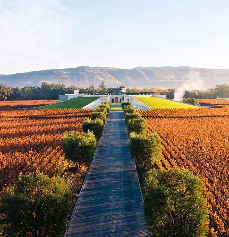
LOUIS M. MARTINI WINERY: Outdoor Cabana Experience + Underground Cellar Experience

Bask in the shade of your own private cabana or immerse yourself in the depths and history of the Louis M. Martini estate in their underground 85-year-old barrel cellar during lavish two-hour tast ings. Sip on four wines from their Lot 1 paired with Italian bites like flat bread lavash with olive tapenade, and small-lot releases paired with specialty food creations from Chef Aaron Meneghelli, respectively. Reservations are required. louismartini.com
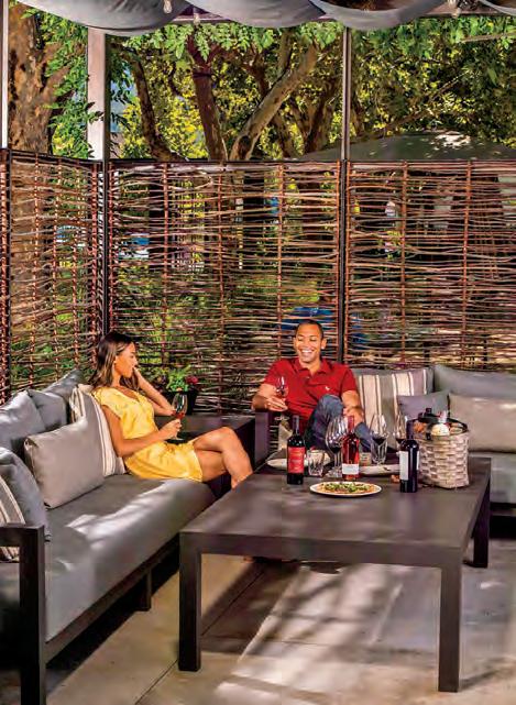
OPUS ONE Uniquely designed with a sophisticated earth house vibe, it’s no surprise that they are one of Napa Valley's certified Green wineries. As committed stewards of the environment, from conservation to consumption, they have implemented over 100 environmentally-friendly procedures that not only benefit the winery and their customers, but the surroundings longterm. Take in panoramic views of their serene estate vineyards and 120-year-old olive trees while sampling flights of wine on their courtyard veranda. opusonewinery.com


Bacon and wine? Divine. If you agree, or are the slightest bit intrigued, the Bacon Experience at Priest Ranch in Yountville is for you: four thick cuts of pork belly meticulously seasoned to enhance the notes in their respective wine pairings. Priest Ranch takes pride in their adventurousness and unique varietals, so expect wines like grenache blanc and brut rosé of syrah in addition to cabernet sauvignon and sauvignon blanc at this and their other tasting offerings. priestranchwines.com
SILVER TRIDENT: Chip Extravaganza
Antithetical to the old saying “chip off the old block,” this boutique Yountville family winery takes their spin on the ol’ wine tasting and it involves only the best kind of chips: small-batch, artisanal potato chips. The Potato Chip Extravaganza pairs five potato chip varieties from small producers throughout the country with Silver Trident’s rosé, sauvignon blanc, pinot noir, red blend, and cabernet sauvignon, respectively. Enjoy this novel approach to wine pairings in their elegantly casual home setting — their space is decked out with Ralph Lauren home décor and furniture. silvertridentwinery.com
TREFETHEN FAMILY VINEYARD: “Taste the Estate” Sometimes it’s easier to visit someone else’s family… especially if they’re a winemaking family. All tastings for this certified Napa Green winery and vineyard are held in the Villa, previously the family home. Take a gander around the grounds on their guided “Taste the Estate” tour. Savor expansive gardens along with wines from their Legacy Collection. Pairing menu features bites like chardonnay with caviar, merlot and lamb loin with roasted baby carrots, cumin yogurt drizzle, and a carrot top chimichurri. Read: they offer curated visits which are customizable to your interests — from private tastings to educational chef-led pairings and more. trefethen.com
THEOREM VINEYARDS Basking in ample sun light, facing both Mount St. Helena and Diamond Mountain, lives Theorem Vineyards, a 60-acre estate in Calistoga. Swirl one (or more) of their seven wines — cabernet sauvignon, merlot, sauvingnon blanc, chardonnay, and syrah — and float in the majesty of the landscape, the peacefulness of the grounds, and the reimagined and reborn 1878 historic site. theroremvineyards.com
Clockwise from left: Priest Ranch Bacon & Wine Trefethen,experience;Theorem;LouisM.MartiniWinery
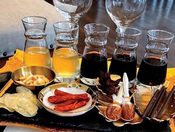

Get ready for a Snack Attack — a new way to try Barber Cellars’ wines that incorporates everyday snack foods. Held at the historic Hotel Petaluma tasting room, Barber Cellars’ family-owned winery is taking the stuffiness out of wine tastings. The best part: bring your favorite bottles back with you, and recreate the experience with snacks from the pantry in your own home. barbercellar.com
Experience Sonoma County through community, family, elegant wines, and fine food at Bricoleur Vineyards’ Rooted pairing. The vineyard’s Culinary Advisor, Chef Charlie Palmer, collaborated with our team to create a sampling of six wines along with perfect pairings for guests to enjoy. The menu is subject to change based on the Chef’s Seasonal Selection. bricoleurvineyards.com
Along with their signature and legacy lounge tastings, let us introduce you to the Bubble Room tasting — held in a spacious, glass-enclosed, elegant yet relaxed garden view room. Their menu highlights locally-sourced ingredients brought together by the J culinary team and paired with winemaker Nicole Hitchcock’s varietal and sparkling wines for a fivecourse tasting. jwine.com
JORDAN VINEYARD & WINERY This 1,200acre estate offers an array of tasting experiences that cater to your interests. Prefer to discover on foot? Meander through the Jordan chateau, marvel at the libraries and antiques, and finish with a seated wine tasting — complete with hors d’oeuvre and artisanal cheese pairings — in their French-inspired cellar. Looking to experience the vineyards firsthand? Hop in their Sprinter and ride through beautiful open spaces and forests, stopping to enjoy alfresco wine and olive oil tastings along the way. jordanwinery.com
MARIMAR ESTATE VINEYARDS & WINERY Chardonnay and pinot noir vines encom pass 60 of the overall 81-acre estate. Soak in Spanish-inspired design, foods and wines with an estate patio tasting that includes two red wines, two white wines and a selection of tapas from founder and cookbook author Marimar Torres’ cookbooks. Don’t miss notable club events such as the paella lunch, Catalan holiday feast and Pinot Noir blending & lunch, all held at Marimar and her daughter Cristina’s home patio overlooking the vineyard. marimarestate.com
MEDLOCK AMES: SingleThread Pairing Founded by Chris Medlock James and Ames Morison in 1998, this Alexander Valley winery is committed to the environment through practices like regenerative farm ing, reducing their carbon footprint, and preserving the biodiversity of the land. Feel the effects of mindful
cultivation and unwind in their olive grove with a tast ing experience highlighting their organically-farmed Bell Mountain Vineyard wines and Sonoma County’s only 3 Michelin Star restaurant, SingleThread’s chefcurated bento box. medlockames.com
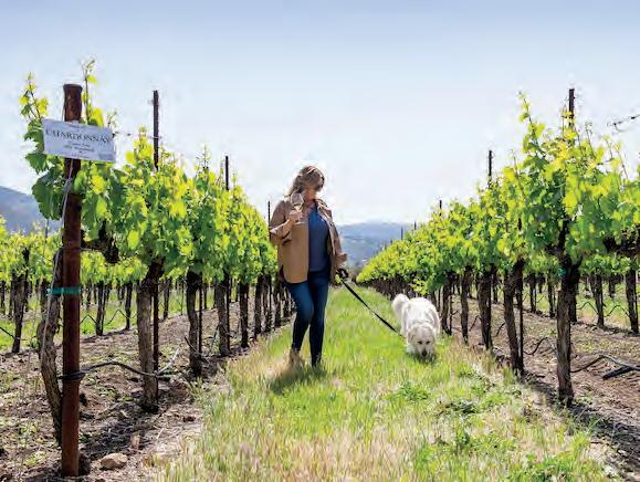

Stretching from the Pacific Ocean to the Mayacamas Mountains, Sonoma County encompasses coastal as well as interior valleys, and Three Sticks has captured this in their latest tasting offerings. In the spring of 2022, their Merroir & Terroir offering featured their chardonnays paired with fresh oysters from the Sonoma Coast. This winter, delight in a flight of chardonnays with caviar from The Caviar Company. Each experience is held in the historic landmark VallejoCasteñada Adobe that Three Sticks calls home. threestickswines.com
ST. FRANCIS WINERY It’s very apropos that the iconic winery in the heart of Sonoma Valley named for the patron saint of animals is very dog-friendly. There are other reasons to love this 40-year old winery. The team behind the wine (Katie Madigan, Chris Louton and Jake Terrell) work with executive chef Peter Janiak, who cre ates “rustic chic” tasting meals from the on-site two-acre organic garden. Every hour, you’ll hear the 1,000 pound bronze bell cast by the Marinelli Foundry in Italy — famous for making bells for the Vatican. stfranciswinery.com
Clockwise from bottom left: St. Francis Winery; Miramar Estate Vineyards & Winery; Jordan Winery Estate Tour Tasting; Barber Cellars Snack AttackWelcome to Elegance Hamilton Hill, a senior living community serving Marin County families. The thoughtfully repurposed landmark Hamilton Hospital now offers spacious apartments and boutique amenities, including a rooftop lounge with 270-degree views of San Pablo Bay.

Discover relaxed luxury with discreet support –where living is easier, surroundings are safer and together is better.

Studio, one- and two-bedroom loor plans available. Call 415.906.3467 or scan here to schedule a tour.
Where T ogether Is Bette r. One Hamilton Hill Dr | Novato, CA 94949 | 415.906 3467 | EleganceHamiltonHill.com

Autumn colors, new luxury attractions and relaxed entry beckon travelers yearning for adventure
Fall colors at To-ji Temple, Nara
BY JEANNE COOPERIt’s a new dawn for the land of the rising sun. After two years of some of the tightest travel restrictions in the world — including spectator-free Olympics in 2021 and a shutdown on all tourism through June of this year — Japan recently stopped requiring guided tours for international visitors and more than doubled the number of arrivals to 50,000 people a day. While entering the country still involves several key steps (see “Good to go”), this fall is an ideal time to ease your way in.
I love autumn in Japan, which brings brilliant red maple leaves, glowing yellow gingko trees and bright orange persimmons hanging out to dry. It’s still warm enough to be outside, where mask wearing is no longer expected, while seasonallyinspired menus and thermal pools can take any chill off. Bonus: The current exchange rate (approximately 140 yen to the dollar) makes the lower hotel rates this time of year even more favorable.
Here are some of my favorite fall destinations in Japan, plus new offerings and attractions of interest year-round.

Despite its iconic skyscrapers and bustling urban vibe, the capital city has many tranquil enclaves where you can soak in fall colors, typically peaking in mid-November. A great place to start is right around the Imperial Palace, including its maple-studded East Gardens. More momijigari (“maple leaf viewing”) lies within a 30-minute subway ride.
The 144-acre Shinjuku Gyoen National Garden, formerly owned by the imperial family, is next to busy Shinjuku Station. Its greenhouse and variety of formal gardens reveal beauty throughout the year, but the Japanese garden and Momijiyama (“maple mountain”) on the east side burst with crimson maples in fall.
It’s free to visit those gardens, but two private oases are also worth a visit. Admission to the Nezu Museum, a treasure trove of premodern Japanese and East Asian art, costs about $10 and includes
access to a large garden where moss-covered stone paths lead past a koi pond and several rustic teahouses. It’s under $3 to visit Rikugien, some 22 rolling landscaped acres around a central pond; created for a shogun in the early 18th century, its gardens were originally inspired by 88 scenes from Japanese poetry.
At Peninsula Tokyo, across from the Imperial Palace, you can view elegant arrangements of fall foliage and order seasonal, locally harvested vegetarian dishes from the new Naturally Peninsula menus inspired by Buddhist shojin cuisine. From $563, peninsula.com Tokyo Prince Hotel is a surprisingly quiet, affordable option close to Tokyo Tower and compact Shiba Park, which has its own momijidani “maple valley.”
From $112, princehotels.com
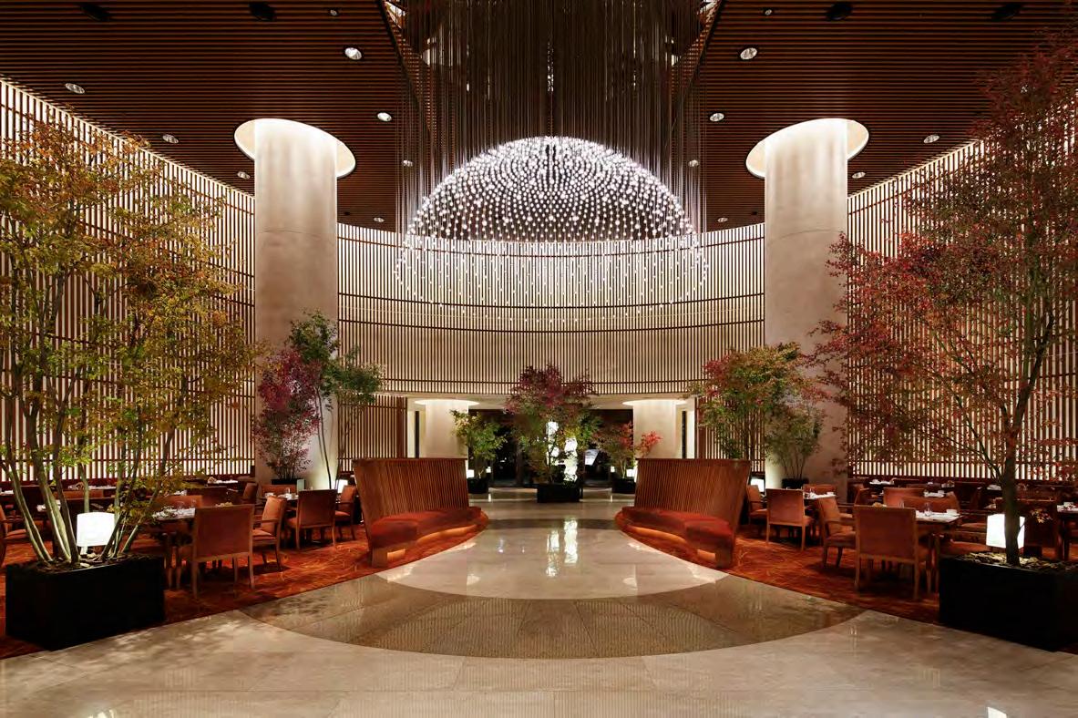
 Left page: The wooden tower of To-ji Temple in Nara; Right Page, clockwise from left: Penninsula Tokyo’s customized room service featuring ippudo ramen; Penninsula Tokyo decorated with fall foliage.
For smoothest sailing through Japan (or just a bucket-list blowout), consider traveling via a small cruise ship or private jet.
Coral Expeditions’ new cruises for fall 2023 ( from $8,092 per person, double occupancy; coralexpeditions.com) aboard the 120-passenger Cor al Adventurer bring Japan’s small coastal villages and remote islands into focus. The 14-night Journey to Japan starts in Guam and heads to Iwo Jima, the mostly uninhabited Ogasawara Islands and the Izu archipelago, where volcanic Hachijojima is known for its hot springs and distinctive taiko drumming; the 14-night Through the Heart of Japan cruise hugs the coast and visits hamlets from Tokyo to Fukuoka. The Australian cruise line’s 16-night Through Japan’s Ryukyu Islands itinerary visits intriguing ports in the Tokara, Kerama and Okinawa island chains before passengers disembark in Taiwan.

TCW World Travel’s private, all-inclusive 10day City to Shrine expeditions ( from $25,450 per person, double occupancy; tcsworldtravel.com) employ a roomy 52-passenger jet with overnight stays at luxury hotels. Several experiences take place amid scenery that’s particularly ravishing in fall, such as riding the Hakone Ropeway above the smoky plumes of Mount Owakudani and bicycling through picturesque villages in Nara Prefecture, renowned for its freely roaming deer and Shinto shrines. City highlights include an omakase dinner from a master chef in Tokyo and a guided walk through Gion, Kyoto’s geisha district.


It’s hard to think anything can top the gleaming reflec tion of gilded Kinkakuji Temple in its adjacent pond, but having your obligatory Instagram pic framed by scarlet maple leaves might just do that. Even more eye-catching fall colors await at hillside Kiyomizudera Temple, a UNESCO World Heritage Site, and Tofukuji Temple, where the nearly 700-year-old Zen gate is the country’s oldest.
About 1,000 trees around Kiyomizu-dera temple change hues starting in mid-October through early December; view them from the dramatic 43-foothigh deck or from nearby Koyasu Pagoda, which also overlooks the temple. The red and gold foliage takes on an additional glow during the last two weeks of November, thanks to lighting for extended evening hours. Don’t forget to sample the clear water from one of three streams diverted from Otowa waterfall, for whom this “Pure Water Temple” is named.
At Tofukuji, a major Zen temple, gaze across the colorful treetops in the valley toward the 328-footlong Tsutenkyo Bridge. You can also spring for admis sion (about $5) to walk along the ornately covered bridge, but if it appears too crowded, just take your time perambulating through the gardens of the mas sive complex.
The new 114-room Roku Kyoto is the first Hilton in the region, as part of its luxury LXR Hotels & Resorts brand, on the former site of an artists colony. Vistas of the Tagakamine Mountains and Tenjin River provide inspiration, while rooms with private onsen (hot spring) baths, the large outdoor onsen pool and Roku Spa provide relaxation. For fall, the hotel’s FrenchJapanese restaurant Tenjin’s 10-course Chef’s Table menu features Kyoto duck, Japanese mushrooms and salmon. From $421, hilton.com
Taiko drumming Chef’s Table menu from Roku Kyoto’s restaurant Tenjin Torii gates at the Fushimi Inari Shrine, KyotoCentrally located Hotel Okura Kyoto has comfy Western-style rooms and indoor pool, plus a variety of restaurants including Pittoresque, which pairs a French menu with superb mountain and city views. From $146, okura-nikko.com.
A charming, walkable mountain town west of the Olympic city of Nagano, Hida Takayama really goes for the gold at Hida Kokubunji Temple. There an enormous gingko tree said to be more than 1,000 years old turns bright yellow, roughly mid-October to mid-November, as it towers over ancient buildings.
A mix of evergreens and maples create a colorful quilt wrapped around Hida no Sato (Hida Folk Vil lage), an open-air historical museum with more than 30 traditional buildings, including many with steep, thatched gassho-zukuri roofs that resemble a hybrid
of Swiss chalets and Cotswolds cottages. From late October to early November, the museum illuminates the trees at night.
While there are more strenuous hikes through the Hida Mountains (nicknamed the Japanese Alps) that leaf-peepers will love, I’ve enjoyed Hida Takayama’s easier, 2.2-mile Higashiyama Walking Course, which meanders past temples and shrines through showy maples and sturdy pines. Afterwards, seek out one of the town’s seven sake breweries for tastings and try one of several restaurants serving grill-your-own Hida beef, the silky local version of Wagyu beef.
Spa Hotel Alpina Hida Takayama offers Western or Japanese-style rooms, dining, an indoor and outdoor onsen. From $65; see Japanese-only spa-hotel-alpina. com or booking sites like hotels.com.
As of press time, Japan still requires international visitors to:
• Book flights and hotels through a travel agency, which will provide a certificate to obtain a visa. There’s a list of Japan specialist travel agents at japan-travel-specialists.japan.travel/en/us/

• Have a certificate of vaccination (two shots plus booster) or negative Covid-19 test within 72 hours of departure.
• Install the MySOS app on their phones or use its related website.
• Register online at services/visit_japan_web-en.digital.go.jp/en/
For possible updates on travel restrictions, see japan.travel.
Daigo-ji Temple, Kyoto


 Dana Scruggs, Fire on the Beach, 2019, from The New Black Vanguard (Aperture, 2019)
Actress and playwright Vivien Straus admits that her favorite thing to do is talk to cows. This is not odd for Straus, the founder of the California Cheese Trail and manager of Straus Home Ranch in Marshall, her former childhood home. The child of Ellen Straus, cofounder of Marin Agricultural Land Trust (MALT) and innovative dairyman Bill Straus, she is also the sister of Albert Straus, who owns and operates Straus Family Creamery. Perhaps, then, it is in the Straus spirit that the title of her new play is “After I’m Dead, You’ll Have to Feed Everyone.” Straus, who had a terrific relationship with her mther, told her she was writing a play about her before she passed away in 2002. “When she died, many funny things happened, and I thought, ‘I have to write these down,” Straus says. “She was some one people really loved, and she had a tremendous impact on Marin County.” Straus calls the play a love letter to her mom, Marin’s dairy godmother. She plays the parts of herself, Ellen and, you guessed it, a cow. “I play 10 humans and one cow in the play,” Straus confirm. Performed in a barn at the Straus Home Ranch, the show is sure to be as unique as each Straus family member. vivienstraus.com

THROUGH OCT 5 Antony and Cleopatra
With a libretto adapted from centennialHollywoodstarryeryblendstorFranciscoclassicalVirgildrawnmentarytragedyShakespeare’sandsupple-passagesfromPlutarch,andothertexts,SanOperadirec-ElkhanahPulitzerthemythicimag-ofantiquitywiththeglamourof1930stoopentheseason. sfopera.com
THROUGH NOV 11
Renewal The Grand Opening art exhibition at the new BelvedereTiburon Library Art Gallery considers the act of becoming new again with 44 artworks that range from soul ful pastel portraits to watercolors while embracing nature as a new beginning or speaking to tran scendence. beltiblibrary.org
OCT 7–9 Fre!heit
After a four-month delay imposed by US Customs, repurposedsermonizesnarrates,allegorycupsbalancingdebutsMichellemezzo-sopranocollaborationBrandstätter,choreographerGermanDavidinwithJacques,“Freedom,”onporcelaintoenforcethewhileJacquessingsandfromapulpit. sfiaf.org
OCTOBER 19–23 On Beckett Conceived and performed by uteinwriterers’languageIrwin,Award-winnerTonyBilltheIrishwriter’sandperform-relationshiptothewillbeexploredanintimate90-minevening. act-sf.org
OCT 21–23 Astianatte
An opera from 18th-cen tury Italian composer Leonardo Vinci (no, not “da Vinci”) is based on legends from Homer’s Iliad and recounts the tragedy of Andromaca
THEATEROCT 27–JAN 28, 2023

Jota Mombaça The Brazilian interdis ciplinary artist and nonbinary travesti of color (Latin American slang reappropriated by

transfeminist activists as a local, political gender identity) pops up at San Francisco’s Kadist for a three-month residency with their show, “The Sinking Ship/ Prosperity.” kadist.org

OCT 28–30 Ni’Ja Whitson The experi mental performance artist from The NWA Project performs A Meditation on Tongues, an adaptation of Marlon
 (Andromache), widow of the Trojan hero Hector following their loss to the Greeks, with plenty of gender reversals and heaps of duty and honor at the expense of all. odc.dance
Afrobeats
Astianatte
(Andromache), widow of the Trojan hero Hector following their loss to the Greeks, with plenty of gender reversals and heaps of duty and honor at the expense of all. odc.dance
Afrobeats
Astianatte
T. Riggs’ Tongues Untied (1989), framing new questions about loss during the AIDS pandemic while chal lenging Black and queer masculinities. odc.dance
Three of Nigeria’s biggest acts, Wizkid, Burna Boy and Davido, coheadline a new music festival in San Jose alongside Ella Mai, Skepta, Kizz Daniel, Sean Paul, Tems and more. lostinriddim.com
Concerti Kicking off their 50th season with a new name, Chamber Music Marin, formerly known as the Mill Valley Chamber Music Society, invited harpsichordists Janine Johnson and Yuko Tanaka to lead a five-string ensemble and showcase Bach’s singular genius. chambermusicmarin.org


The band’s sixth album, Physical Thrills, came together in the depths of 2020 with what singer Brian Aubert calls “dream shanties,” enhancing the band’s sound with previously unexplored sonic fi xtures. thefoxoakland.com
The San Franciscobased indie rock artist best known for his 2007 breakthrough hit, “Come on Get Higher,” makes a stop in town in support of his freshest album, “Last of the Great Pretenders.” palaceoffinearts.org
OCT 14 Outlaw Music Festival Featuring the Avett Brothers, Black Pumas and Larkin Poe, headliner Willie
Nelson is joined on stage by his guitarplaying sons, Lukas and Micah, while he tours in support of his 72nd studio album, A Beautiful Time, released in April. amphitheater.commountainview
Berkeley Symphony launches its new season by exploring individual triumphs and chal lenges, including “Upon Daybreak,” a world premiere from Symphony.”Tchaikovsky’sPineviolinistFlorenceAmericanfrom“ViolinRaphaelposer-in-residencecomBrianNabors,andConcertoNo.2,”pioneeringAfrican-composerPrice,featuringRachelBartonandpairedwith“Fifth berkeleysymphony.org
OCT 26 Beethoven’s Cello Sonata Though it may be surprising that Beethoven was the fi rst composer to bring the cello into a solo voice, pianist Ian Scarfe and special guest cellist James Ja ffe will perform the 3rd Cello Sonata in A Major, from the composer’s “heroic” period, with discussion and history of the music, in an onlineonly live performance. marinjcc.org
The television host, best-selling author ( Are You There, Vodka? It’s Me, Chelsea) and comedian who recently released her fi rst stand-up special in over six years, “Chelsea Handler: Evolution,” takes to the stage for a live show in Saratoga. mountainwinery.com
OCT 6–16 Green Film Festival A mix of 40-plus independent feature and short-length fi lms from around the world, includ ing “For the Bees” from Oakland’s Chloë Fitzmaurice, focus on green and environmen tal issues in revealing ways, to view in-person at San Francisco’s Roxie Theater and online. sfindie.com
OCT 6–16 Mill Valley Film Festival For the first time in its 45-year history, the fi lm festival from the heart of Marin will screen movies at the Roxie Theater in San Francisco, in addi tion to screenings in Mill Valley, San Rafael, Larkspur, Berkeley and online, while continuing the tradition of celebrat ing the best in American independent and world cinema. mvff.com
OCT 28–NOV 7 Dance Film Festival The open ing night festivities celebrate dance fi lm shorts and many of the artists featured in the fi lms, a night of Bay Area Shorts is back, and more than 52 fi lms in eight programs are offered at theaters around the bay and online. sfdancefilmfest.org


THROUGH NOV 27 Faith Ringgold
Bringing together more than 50 years of work, including her experimental story quilts and paintings of her renowned American People and Black Light series, this retrospective of the American artist traces the artist’s evolu tion that expanded to consider the political and social changes tak ing place in the United States throughout her life. deyoung.famsf.org
THROUGH FEB 12, 2023 Ramses the Great and the Gold of the Pharaohs Exploring the life and accomplishments of Ramses the Great, more than 180 objects in this exhibition demonstrate the opulence and power of ancient virtual-realitycivilization,Egyptianwhileao
ffering, “Ramses and Nefertari: Journey to Osiris,” takes you on a tour of two of the Egyptian king’s most impressive monu ments, Abu Simbel and Nefertari’s Tomb. deyoung.famsf.org
OCT 5–MARCH 5, 2023 The New Black Vanguard: Photography Between Art and Fashion Curated by Antwaun Sargent, this
 JOIN
Dance Film Festival
JOIN
Dance Film Festival
program will take over all of the museum’s major galleries to high light 100 works from 15 contemporary fashion photographers whose images present radi cally new perspectives on race, beauty, gender and power in the medi ums of photography and art. moadsf.org
Contemporary artworks assert the signi ficance of Oakland’s Black feminism intellectual and engage with her as a historical participant in a larger narrative in a new exhibition focused on Davis and her image, “Seize the Time.” museumca.org

Organized into four acts, with photographs dating from 1999–2020, a solo exhibition of more than 60
photographs repsychologicalscapeLaub’sphotographercapturesGillianfamilyland-—emotionaland—and
flects the unfolding of a deeply con fl icted and polarized nation, tearing at family ties and asking, “What, in the end, really binds us together?” thecjm.org
SEPT 30–OCT 31
Unhinged A terrifying house tour with multiple “scare routes” is just part of the fun at Winchester Mystery House’s BarMystery,ing,games,Carnival,Nightshade’ssagedhauntedimmersivehouse,pre-byMadamSpiritwithmidwayaxethrow-Fortuna’sTentoftheSpookeasyandmore. winchesterunhinged.com
OCT 1 Imagine That With a repertoire of
enchantments, mind reading and magic tricks, illusionist David Gerard headlines the entertainment along side dinner from chef Catherine Venturini of Cuvée Wine Country Events, a mezcal tasting and more at Sonoma Valley Museum of Art’s annual gala. svma.org
OCT 7–NOV 5 The
Summoning The good folx at San Franciscobased Into The Dark are back at The Mint with an immersive experience that invites guests to a live seance where they may come face to face with demonic spirits while attempting to retrieve the severed head of an unethical vampire queen; plus the return of Fang Bang and CreepShop. terrorvault.com
OCT 8 Pinot on the River With proceeds benefiting Sonoma
County Pride, Santa Rosa’s Old Courthouse Square hosts a day of tasting more than 40 West Coast pinot noirs, including a Grand Tasting with artisan food vendors. pinotfestival.com
OCT 8 Piper on the Ridge Bring a picnic dinner and a fl ashlight to watch the sun set over Inverness Ridge and usher in a new season with the harvest moon while listening to a bagpiper’s evocative tunes at one of a slate of relaunched events from West Committee.EnvironmentalMarin’sAction eacmarin.org
OCT 14–16 New Roots Theater Festival Brava Theater Center returns with eight original

projects that center on BIPOC and LGBTQIA+ voices, including The Day the Sky Turned Orange, a theatrical concept album examining the events of September 9, 2020 and Sign My Name to Freedom: The Unheard Songs of Betty Reid Soskin, which explores the life and music of the Bay Area legend and America’s oldest living park ranger, among others. sfbatc.org
OCT 21–23 Anderson Valley Wine Harvest Celebration A new event honoring the season includes events at 27 wineries, a pig roast in the tradition of a French “boucherie” festival with renowned chef Scott Baird, and an evening of Cinema in the Vineyard hosted
New Roots Theater Festival Angela Davisby Mendocino Film Festival. avwines.com
OCT 22 Sandcastle Classic San Francisco’s Ocean Beach is once again taken over by architecture, design, technology, engineer ing and publicthaneducationartswhilebuildfromshipcompaniesconstructioninpartnerwithstudentslocalschoolstowhattheycanraisingfundsforandarchitectureformore8,500BayAreaschoolstudents. leapsandcastleclassic.org
OCT 22 Sound Summit
Staged at Mt. Tam’s Mountain Theater, a daylong festival of music returns to Marin with headliner The War on Drugs joined by Faye Webster, Fruit Bats and Bay
Area-based Wreckless Strangers; with KNBR’s Murph & Mac (aka Brian Murphy and Paul McCa ff rey) as masters of ceremonies, KPFA radio host Tim Lynch and DJ Andy Cabic of Vetiver fame. soundsummit.net

Not content to limit the thrill of France’s bubbly export to its anointed day (Oct 28), Auberge du Soleil is celebrating all week with a six-course prix fixe paired tasting menu from executive chef Robert Curry, courtyard wine tastings from iconic champagne producers, champagne cocktails and more throughoutbubblytheresort. aubergeresorts.com
 Champagne Week
Never have there been more intriguing places to catch up with friends over a glass of vino. These Bay Area wine bars stand out for their unique selection, fun vibe and more.


VINE & BARREL Sit on a wine barrel at the bar and let the Spanish tapas and interesting wines of the world flow. If owner Jason Jenkins is pour ing, spend some time downloading his ency clopedic knowledge of wine regions and styles — he’s got his favorites from around the globe and Sonoma County at hand — along with small plates of tuna paté or roasted artichokes with goat cheese. 122A Kentucky St, Petaluma; vineandbarrel.com
TIBURON WINE Dr. Champagne, aka Jerry Horn, knows a thing or two about the bubbly stuff rom France and stocks a large supply of it, plus a roughly 50-50 mix of Californian and imported wines, at his shop on Ark Row. A true wine merchant, Horn also hosts a small bar and 10 patio tables where you can sit and drink one of the 24 by-the-glass or 400 bottle selections, or enjoy one of the occa sional special dinners by local chefs. 84 Main St, Tiburon; 415.435.3499; tiburonwine.net
UNGRAFTED Dogfriendly patio tables are Dogpatch neigh borhood hotspots for caviar and pinot grigio at lunch or fried chicken and champagne at din ner. Owner and master sommelier Rebecca Fineman and owner and advanced somme lier Chris Gaither also offer classes and kits and a blind fl ight tast ing every Thursday, just to shake things up. 2419 Third St, San Francisco; ungraftedsf.com LOS MAYAS
SQUALO VINO A large boardcharcuterieandaglass of Regis Bouvier Vieilles Vignes 34CalifornianonTiburonbarrecentlyintheensconcedner,wouldBurgundyMarsannaypinotnoirmakeanicedinespeciallywhileononeofcozybanquettesthewindowattheopenedwineindowntownwithafocusEuropeanandwines.MainSt,Tiburon; squalovino.comSqualo Vino Half Moon Bay Wine & Cheese
Here's a few of our favorites, for a complete list go online: marinmagazine.com.
Blue Barn Gourmet
American The first Marin outpost of the S.F.-based eatery has proven very popular. The menu includes custom izable salads, toasted sandwiches, soups and more, prepared with locally harvested produce and proteins. A group order takeout menu is available. 335 Corte Madera Town Center, 415.927.1104
Boca Pizzeria Italian
The varietals.winemicrobreweriesandseasonalCalifornia’sVillageoutdoorpizzeriaItalian-inspiredwithacoveredpatioatTheutilizesNorthernbountyofingredientsshowcaseslocalandcountry’sboutique
1544 Redwood Hwy, 415.924.3021
Burmatown Asian
Though the menu remains largely the same (that tea leaf salad! Those bao!) at the new location down the street from the original, the addition of a grill boosts the menu with dishes like kalbi ribs or smoked salmon collars. 18 Tamalpais Dr, burmatown.com415.985.5060;
Cafe Verde Californian
This revamped cafe offers Neapolitan pizza, pasta, risotto and salads nearly all day long. Enjoy any of these items inside or out on the patio along with local and
international wines and beers. 502 Tamalpais Drive, 415.927.1060
Fieldwork Brewing Pizza The outpost of the original Berkeley draft house features pizzas, salads and shareable bites (think crispy Brussels sprouts and meatballs) to round out the day’s list of fresh IPAs, pilsners and more.
107 Corte Madera Town Center, 415.891.8273
Flores Mexican With an emphasis on regional Mexican dishes and flavors sourced from family recipes, the menu is based on California seasonality and revolves around gluten-free masa. There’s a full bar to boot and everything is easily enjoyed on their large, heated patio. 301 Corte Madera Town Center, 415.500.5145
Il Fornaio Italian Aside from pizzas and pastas, this upscale Italian fran chise serves a variety of salads and carb-free entrées. 223 Corte Madera Town Center, 415.927.4400
La Maison De La Reine Vietnamese Dine on family-style Vietnamese fare in the Town Center.
The crunchy cabbage chicken salad with peanuts, fresh spring rolls and pho options are popular picks. 346 Corte Madera Town Center, 415.927.0288
Marin Joe’s Italian A Marin mainstay for over 50 years, with a menu of soups, salads, seafood, mesquitegrilled or sautéed meats and a plethora of pasta options. prepared Caesar salad. Not looking for a meal? Enjoy a drink and hear local musicians at the well-known piano bar. 1585 Casa Buena Drive, 415.924.2081
Pacific Catch Seafood The Pacific Rim–inspired restaurant has a familyfriendly atmosphere. The menu, showcasing freshly caught seafood, includes tacos, poke, ceviche, sandwiches, salads, rice bowls, seasonal cocktails and daily specials. 133 Corte Madera Town Center, 415.927.3474
RH Marin American Ride up the golden-hued elevator to the top floor to a restaurant bedecked in RH style and linger over a shaved vegetable salad, a truffled grilled cheese sandwich on Panorama Bakery sour dough or a namesake RH Burger. 1750 Redwood Highway at The Village, 628.266.2040
Amelie French Stop in for a French breakfast of coffee and a croissant at this outpost of the origi nal San Francisco wine bar. A petite street-side patio features dining atop wine barrels. 71 Broadway, 628.253.5161
Mas Masa Mexican Chef and owner Patrick Sheehy focuses on the ancient technique of corn patio.towineries.microbrewerieshighlightThehandmadeblueusingnixtamalization,organic,non-GMOcorntomakeitstortillas.beerandwinelistslocalCaliforniaandIt’sallavailableenjoyontheshaded
31 Bolinas Rd, 415.529.5444
Sorella Caffe Italian Run by sisters Sonia and Soyara, Sorella, which means “sister” in Italian, serves fresh Italian with a northern influence. Customer favorites include the cioppino, butternut squash ravioli and Pollo alla Sorella. Another highlight is the giant wheel of Grana Padano cheese. 107 Bolinas Rd, 415.258.4520
Split Rock Tap & Wheel American The former Fairfax Cyclery space, which had been operating as just a bike shop, has been reconfigured and now also serves food and an assortment of beers. Menu items include pizzas and sandwiches, as well as snacks like pickles.olivescitrus-marinatedorhouse-made
2020 Sir Francis Drake Blvd, 415.721.7644
Stillwater Californian Fairfax native Margaret Ruiz and her life and business partner, David, joined forces with chef Cameron Myers to bring the bounty of the county to the table. Two
patios provide ample outdoor eating space. 23 Broadway, 415.524.8478
Gott’s Roadside American The Bay Area chain’sonly Marin outpost features the signature Californiainspired dishes Gott’s is known for (burgers — regular, ahi and Impossible — shakes, salads and fries) as well as a 30-foot-long pine table for communitystyle eating and an expansive patio out front. 302 Bon Air Center, Greenbrae, 415.785.4233
Guesthouse Californian Jared Rogers, the former executive chef of Picco, heads up the kitchen, partnering with mixolo gist Dustin Sullivan on this 110-seat space. Look for theorwithkurobutaasCaliforniawell-executedcuisine,suchminilobsterrollsorporkchopscrispypotatoes,savoraSlingshotatbustlingbar. 850 College Ave, Kentfield, 415.419.5101
Half Day Cafe American Tucked away in a setting of ivy and large open windows, this cafe is the quintessential breakfast nook and is also open for brunch and lunch, including coffee drinks, pastries and much more. Enjoy a casual daytime meal inside or out on the patio. 848 College Ave, Kentfield, 415.459.0291
Sweetgreen Californian No matter if your order is one of the patioonanditgoinmust),pestogoddessflower,bowlsplant-forwardsignaturewarmlikecurrycauli-asupergreensaladorchickenparm(ifmeatisaallarepackagedsustainableready-to-packagingthatmakeseasytoenjoyafastfreshmealinside,theumbrella-shadedortogo. 284 Bon Air Center, 415.874.0012Greenbrae,
Backstage Californian
The U-shaped bar makes a comfortable, sociable setting for wine tasting, light appetizers (warmed nuts, artichoke dip) and small plates (avocado toast, charcuterie boards) in downtown Larkspur. 295 Magnolia Ave, 415.898.6778
DJ's Chinese Cuisine
Chinese A great place to satisfy a craving for wonton soup before a show at the Lark Theater; the outdoor patio is a scene-stealer in itself. Lunch is popular here, too. 435 Magnolia Ave, 415.924.0717
Don Antonio Italian Antonio Volpicelli, of the former Don Antonio in Tiburon, runs this location in Larkspur. Look for the Maine lobster special on Tuesdays. 455 Magnolia Ave, 415.924.3332


El Huarache Loco Mexican The menu has gained quite a following for the authentic Mexico City dishes. You’re sure to get a true taste of a homemade meal with plenty of outdoor seating options at the Marin Country Mart. 1803 Larkspur Landing Circle, 415.925.1403
Emporio Rulli Italian Renowned for its Northern Italian specialties and treats, the Larkspur location (there are four others in the Bay Area) is a favored spot for lunch as well as coffee and a sweet treat. 464 Magnolia Ave, 415.924.7478
Farm House Local Californian A downtown Larkspur gem that is sure to please with simple, healthy food in a warm, cozy atmosphere, both indoors and on the covered patio. The seasonal menu, inspired by American classics, includes biscuits and gravy; a “BLAT” (with avocado) sandwich. 25 Ward St, 415.891.8577
Left Bank Restaurant French This authenti cally classic brasserie has been serving the Larkspur community for more than two decades. Whether on the patio, at the European-style bar or in the casually elegant main dining room with a huge fireplace, it’s a fun and French downtown experience. 507 Magnolia Ave, 415.927.3331
Perry's American Perry's on Magnolia has the grove.andklingdiningbuilding,ingthreefamousoriginalitybarAmericanquintessentiallyfare,bustlingandwarmpersonaltheSanFranciscohasalwaysbeenfor.Alongwithseparatedinroomsinahistoricthere’soutdoorunderthetwinlightsonthepatiointheredwood 234 Magnolia Ave, 415.927.1877
Farmshop American Located in the Marin Country Mart, Farmshop Marin is a top spot for people watching and earns raves for its avocado hummus and Neapolitan-style pizzas pulled from the beehive oven. Indoor and outdoor seating available. 2233 Larkspur Landing Circle, 415.755.6700

Hog Island Oyster Co. Seafood The fullservice Marin Country Mart location features a full bar with seasonal cocktails, beer and wine and the same bay-tobar philosophy as the Tomales Bay original. 2401 Larkspur Landing Circle, 628.253.5905
Picco Californian Popular since its inception, Picco has a seasonally driven menu featuring items such as risotto (made every half hour), mesquite octopus tostada and butterscotch pot de creme that keep attracting return visits. The warm wood and brick interior is fronted by a popular, six seat bar. 320 Magnolia Ave, 415.924.0300
Pizzeria Picco Pizza This able.outdoorserveandorganicthepulledFreshwood-burningpizzasinfluencedoffersinparlorfamily-friendlynextdoortoPiccodowntownLarkspurCalifornia-Neapolitancookedinaoven.mozzarellaisin-houseandmenualsofeaturessalads,antipastiStrausDairysoft-icecream.Heatedseatingisavail316 Magnolia Ave, 415.945.8900 Patricia.Oxman@sir.comLic.#01103895
R'noh Thai Thai This cozy place with a patio by the Corte Madera Creek has a reputation for fresh flavors. It’s all here, from curries and Thai barbecue to noodle dishes and the classic tom kha (coconut lemongrass soup). For an indulgent treat, try the fried sweet potato appe tizer. 1000 Magnolia Ave, 415.925.0599
Roma Antica Italian Pinza Romana, fried rice balls, burrata with artichoke hearts, and cacio e pepe pasta are just a few of the dishes that reflect the regional Roman ingredients and style of this sister restaurant to the San Francisco original. 286 Magnolia Ave, 415.896.4002

Rustic Bakery Californian The Maringrown bakery is known and loved the world over: Pope Francis famously requested Rustic Bakery flatbread and crostini when he visited the U.S. in 2015. Organic bread, crois sants and pastries baked fresh each morning and salads, sandwiches, and soups for lunch make Rustic a local staple. Marin Country Mart, 2017 Larkspur Landing Circle, 415.461.9900

Boo Koo Asian This locally owned restaurant creates healthy meals that blend equal parts California fresh with Southeast Asian–inspired street food. 25 Miller Ave, 415.888.8303
Bootjack Wood Fired Californian A transition back to a bakery means hearth-style breads (apple walnut), breakfast sandwiches and pastries (cinnamon
buns) from baker Cameron Esaryk are pulled daily from the built-in Alan Scott bread oven. 17 Madrona St, 415.383.4200
Buckeye Roadhouse American Oysters bingo, baby back ribs and chili-lime “brick” chicken are a few of the satisfying comfort-food menu items that have made this classic roadhouse a favorite since the ’30s. 15 Shoreline Hwy, 415.331.2600
Bungalow 44 American
The normally bustling bar is one of Mill Valley’s hot spots, ideal for savoring a seasonal cocktail or an order for their famous kickin' fried chicken. The $1 happy hour oyster program still operates from 5-6 p.m., Monday–Thursday and the heated outdoor patio remains a town hot spot. 44 E Blithedale Ave, 415.381.2500
Cafe Del Soul Californian Healthy options become addic tive at this eatery that has locations in both Tam Junction and San Rafael. Once you stop in for the deliciously fresh quinoa wrap, you’ll want to return to try the chipotle rice bowl. 247 Shoreline Hwy, 415.388.1852
The Cantina Mexican
The popular family restaurant serves tra ditional Mexican fare including soups, salads, sandwiches and sizzling fajitas in dinner-size portions at lunch-size prices. Stop by for a margarita — they are known throughout Marin. 651 E Blithedale, 415.381.1070

Equator Coffees
American Mill Valley boasts two Equator Coffee locations. At Tam Junction's Proof Lab, look for bacon and cheddar, steak and egg and vegetarian breakfast burritos made in house. Downtown's spot, kittycorner from Depot Plaza, serves up avocado toast, breakfast sandwiches and those gluten-freefamouswaffles. Both locations feature Johnny Doughnuts, Friday–Sunday and online ordering. 244 Shoreline Hwy and 2 Miller Ave, 415.383.4200
Floodwater Californian
Sip a “Gold Rush” (Old Forester bourbon, local honey, lemon) at the room-length bar while noshing on pork belly steamed buns or dive into Shorty's Tall Reuben in the TV-free front room. The patio features fire pits. 152 Shoreline Hwy, 415.843.4545
Gravity Tavern American ingredientsWithsuited to reflect modern tastes, American classics like grilled chicken Waldorf salad with pickled grapes; lobster roll with toasted challah and veggie slaw. Enjoy them on the popular patio. 38 Miller Ave, 415.888.2108
Harmony Chinese Enjoy a lighter, fresher take on Chinese at this restaurant in Strawberry Village. The barbecue pork bun is filled with house-made roasted meat in a savory sauce and signature prawns are wok-seared with scallions. Both the regular and to-go menus are available for takeout. 401 Strawberry Village, 415.381.5300
Hook Fish Co Seafood
The indoor, woodceilinged dining room feels like a boat’s galley, and the spot’s popular outdoor beer garden adjacent to Mill Valley’s Proof Lab at Tam Junction has 13 taps, but the draw at this counterservice joint is the seafood. 254 Shoreline Hwy
India Palace Indian
Known as “that great restaurant in the Travelodge,” India Palace is a favorite with the takeout crowd; eating on-site is also a treat for its well-regarded North Indian fare. 707 Redwood Hwy, 415.388.3350
and seafood dishes, wood-fired pizzas and gluten-free offerings, all house-made with organic and locally sourced ingredients. A back patio and newer front patio provide ample outdoor dining space. 22 Miller Ave, 415.388.2000
region for more than 20 years. The newer Angelino Pastry Bar features classic croissants, focaccia and a raspberry-polenta pop tart, among other treats, with pickup from 8 a.m. 621 Bridgeway, 415.331.5225
B
MIXT Californian The San restaurantsandwichfast-casualFrancisco-basedsalad,andbowlchainisa
Corp with legit local and sustainable ethos built into the brand. . 590 E Blithedale, mixt.com
Paseo Californian
The restaurant along “el paseo” exudes the same charm as its predecessors with an updated, New American menu from chef Brandon Breazeale. 17 Throckmorton Ave, 415.888.3907
Piatti Ristorante and Bar Italian A new fireplace lounge and open-concept format invites lingering over refreshed menu items, such as house-made ravioli with lemon cream and citrus gremolata, roasted mushroom pizza. 625 Redwood Hwy, 415.380.2525
Piazza D’Angelo Italian
Family owned for over 35 years, Piazza D’Angelo evokes a traditional trattoria din ing experience. Enjoy a variety of pastas, meat
Pizza Antica Italian Besides its popular thin-crust pizzas, this Strawberry Village restaurant serves sea sonal dishes like Tuscan fried chicken with spicy honey, burrata with crushed sweet peas and toasted focaccia, and ricotta gnocchi with sun-dried tomato cream. 800 Redwood Hwy, 415.383.0600
Playa Mexican With a chef from Mexico City, Playa's food offers traditional dishes with modern flavors and presentations. A little gem salad sparkles with tomatillo dressing and enchiladas shine from a glossy coating of house made black mole and micro greens. 41 Throckmorton Ave, 415.384.8871
Thep Lela Thai The kee mao noodles, pad Thai, and fresh rolls stuffed with beets and herbs have a dedicated following, as does the extensive bar menu (try the Amazing mai tai) at this spot tucked away in the back of Strawberry Village. 615 Strawberry Village, 415.383.3444
Angelino Restaurant Italian Multiple gen erations of the Arcona family create an authentic Italian eatery with handmade pastas and seasonal antipasti that has showcased the cuisine of the Campania
Avatar’s Indian If you’re on the hunt for innovative, multi-culti Indian fare, head to Avatar’s. Sip masala chai sweet ened with brown sugar before digging into Cajun-spiced shrimp on the heated and shaded patio. 2656 415.332.8083Bridgeway,
Bar Bocce American Food just tastes better on a bayside patio with fire pits and a bocce ball court. Order one of the sourdough bread pizzas, a shredded kale salad and a glass of wine and you’ll see why this casual, beachy eatery, overseen by Robert Price of Mill Valley's Buckeye and Bungalow 44, has become a local favorite. 1250 Bridgeway, 415.331.0555
Murray Circle American Cavallo locallyadinner.GarciafarefeaturesacclaimedPoint’srestaurantlocal,seasonalfromchefMikeatlunchandCocktailswithviewandthesamefocusedethos.
601 Murray 415.339.4750Circle,
Poggio Italian Vitello sliced excruciatingly thin and topped with lemon and tonnato sauce is a singular dish in the hands of executive chef Benjamin Balesteri, who creates Northern Italian fare using local and Italian ingredients. Private dining rooms the restaurant can accom modate larger parties (10 to 150 guests). 777 Bridgeway, 415.332.7771
Caffe Acri Italian The well-lit corner cafe in Tiburon is a go-to for bikers, city commuters and locals. Diners will find Italian roast espresso drinks, freshly baked pastries and eggs for breakfast and a selection of soups, salads and paninis for lunch. A market stacked with pantry items and coffee operates inside the café, and outdoor dining is available. 1 Main St, 415.435.8515
Luna Blu Italian Executive chef Renzo Azzarello serves Sicilian seafood and homemade pastas with a Californian touch. The seasonal menu incorporates fresh and organic produce, local naturally grown meat and poultry from small farms. 35 Main St, 415.789.5844
Rustic Bakery Californian This location of the beloved bakery offers the same menu as the other locations in Novato and Larkspur, as well as outdoor dining. Enjoy a wide array of fresh salads, sandwiches, and pastries on the boardwalk. 1550 Tiburon Blvd, 415.797.6123
Salt & Pepper American With its hardwood floors and blue-check ered tablecloths, the sun-filled, one-room restaurant is an area favorite. Scallops, ribeye steak, a beef burger and traditional crab cakes with jalapeño dipping sauce are some of the popular choices on the patio. 38 Main St, 415.435.3594
Sam’s Anchor Cafe American Reopened after an seafoodthecarttoast,whiletheremainpatio.thelasandtie-upshouseremodel,extensiveSam'sboatfeelandboatremainintact,spiffywhiteumbrel-anddeckchairslineexpansivewaterfrontAll-daycocktailsafixtureasdoessignaturecioppino,offeringslikecrabaroamingoysterandarawbarreflectmenu'senduringfocus. 27 Main St, 415.435.4527
The Bungalow Kitchen Californian A party lounge and restaurant from chef Michael Mina boasts epic views and a menu of California fare — crispy Liberty duck wings glazed with Grand Marnier and black pepper, garganelli Bolognese, jalapeño shrimp toast — at night. 5 Main St, 415.366.4088
The Caprice Italian Enhanced bay views from every seat are just one of many charms after an options.foodwell-craftedrevampedtheremodelextensivereworkedentirespace.Themenufeaturescomfortfromlandandsea 2000 Paradise Drive, 415.435.3400
Tiburon Tavern American Renzo and Crystal Azzarello of nearby Luna Blu took the reins in August for the Tiburon Tavern bar and restaurant with Chef Babak Nasser on board to handle the flow from breakfast and brunch through dinner. The same wide patio is back in service, too. 1651 Tiburon Blvd, 415.435.3133
Featuring keynote speaker, Leslie Sbrocco, award-winning author, speaker, wine consultant, television host, and founder of the new multi-media company, Thirsty Girl.

Executive Vice President, Accuchex Payroll & Workforce Management


Kim Fink, Award Recipient CEO, Sun First Solar
From breakfast lunch is also offer wonderful for Takeout open 8am-5pm Monday-Friday and 8am-3pm Saturday

COMFORTS
335 San Anselmo Ave, San Anselmo, CA 415.454.9840 comfortscafe.com


Date & Time
Sponsorships Available October 20, 2022 | 4:30 - 7:00 p.m.
Please contact lpiper@srchamber.com
Includes wine, appetizers, program Chamber Members $125 Non-Chamber Members $135
Bill & Adele Jonas Center 1800 Ignacio Blvd Building 19, Novato Location

srchamber.com | 415-454-4163
Cucina sa has now added brunch to their offerings on Saturday and Sunday mornings, from 10:30-3:00pm. In addition to the regular lunch menu, look for poached eggs with polenta, a breakfast pizza, zeppoles, french toast, and more. Stop in for our infamous Bloody Mary- the best in town! Full bar, woodfied pizzas, and housemade pasta. A staple in San Anselmo since 1998.
CUCINA SA 510 San Anselmo Ave, San Anselmo, CA 415.454.2942 cucina-sa.com
TO WORLD CLASS GROUNDS AND VIEWS On July 17, thousands of visitors from all over the Bay Area trekked out to the Presidio to be the first to see the highly anticipated, years-in-the-making Tunnel Tops — a new, 14-acre stretch of public parkland built atop the two tunnels leading to and from the Golden Gate Bridge.
Opening day at Presidio Tunnel Tops was a plethora of cul tural performances, food trucks with a diversity of cuisines and spots to explore, including a sweet new children’s playground.

The day’s events were co-curated by the Presidio Activator Council, consisting of local leaders, activists and artists who represent communities historically underrepresented in national parks, with the intention of making Tunnel Tops distinctly feel like a welcome space for all.
 SNAPSHOTS FROM SPECIAL EVENTS IN MARIN AND SAN FRANCISCO EDITED BY DONNA BERRY GLASS
Visitors enjoying opening day
Campfire area at the Tunnel Tops
SNAPSHOTS FROM SPECIAL EVENTS IN MARIN AND SAN FRANCISCO EDITED BY DONNA BERRY GLASS
Visitors enjoying opening day
Campfire area at the Tunnel Tops
• SAUSALITO BOOKSTORE HOSTS SIGNING WITH MARIN CITY HISTORIAN’S TRIBUTE COOKBOOK Historian and matriarch Felecia Gaston ’s new cookbook, Grandmothers Feed Us Love, is a Southern-style recipe collection and laudation of the grandmotherly love and soulful cooking of the many Black women she’s met in Marin City since the 1980s.

Cheryl Popp of Sausalito Books by the Bay hosted a signing party for the book on August 8, bringing in a standing-room-only crowd. At the center was Gaston, along with five of the grandmothers featured in the book, autographing copies and chatting with wellwishers, while Sausalito Woman’s Club members passed around desserts made from the book’s recipes, including pound cake and chocolate pudding cookies. Supporters snatched up all the available books that evening, with sales benefitting the Marin City Historical and Preservation Society.
“Grandmothers Feed Us Love is a reminder of the power of the human spirit to bring people together over a good meal,” Gaston says. “It also gives us a chance, as we do in various African traditions, to lift up our elders.”
Coming up at the bookstore in October: signing for The Midnight Library by Matt Haig on October 11; and a third anniversary party with live music, bites, libations and local authors at the Sausalito Yacht Harbor Marina Dock on October 16.
• MARIN ART AND GARDEN CENTER JOINS NATIONAL REGISTER OF HISTORICAL PLACES Ross’ famed, historic Marin Art and Garden Center is officially listed on the National Register of Historic Places. The center com memorated the new designation with a public ceremony on August 3, which coincided with its 77th anniversary and attracted more than 50 community members, donors and local offi cials. Amongst them was Sam Livermore, the grandson of Caroline Livermore who founded the center back in 1945 along with a small group of women from the Marin Garden Club.
Antonia Adezio, executive director of the Marin Art and Garden Center honored the 30-person team of historians, architects and center staff and board members who worked for six years to achieve the designation.
The Marin Art and Garden Center joined a prestigious list of more than 30 landmark sites in Marin, including the Angel Island U.S. Immigration Station, China Camp, the Dipsea Trail, Muir Woods National Monument and the Marin County Civic Center.
 Bill Kircher, Ross Town Council; Antonia Adezio, Executive Director Marin Art and Garden Center; Tom Perry, President Marin Art and Garden Center; Diane Doodha, President Emeritus, Board of Trustees; Supervisor Katie Rice; Julie McMillan, Ross Town Council
TO SEE MORE EVENT PHOTOS VISIT
Popp and Felecia Gaston
Bill Kircher, Ross Town Council; Antonia Adezio, Executive Director Marin Art and Garden Center; Tom Perry, President Marin Art and Garden Center; Diane Doodha, President Emeritus, Board of Trustees; Supervisor Katie Rice; Julie McMillan, Ross Town Council
TO SEE MORE EVENT PHOTOS VISIT
Popp and Felecia Gaston
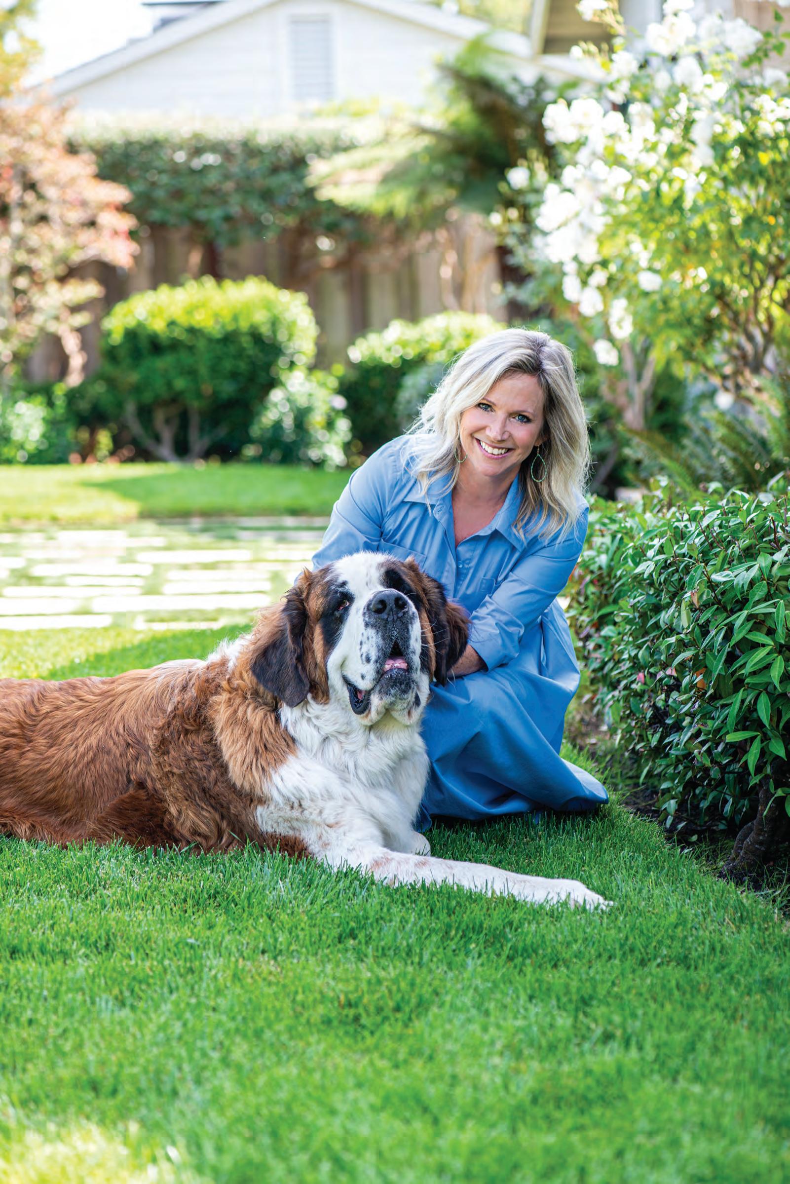

The homeowner loved this Missoni fabric from the moment she saw it, so designer Julie Rootes planned the guest bedroom around it.

Designer Julie Rootes customizes a house for a family moving from A nchorage, Alaska, to San Rafael.
BY LAURA HINE • PHOTOS BY SUZANNA SCOTTWHILE THEY CALLED ALASKA HOME FOR many years, a professional couple knew they eventually wanted to live in San Rafael, where the husband’s father had settled and where they visited yearly. In 2018, with both daugh ters attending colleges in California, they made the big move. “We had a Craftsman-style house in Anchorage that was beautiful,” the wife says. “We knew that the style here would be different, so we were ready to start with a clean
slate.” The contemporary house they found in the Peacock Gap neighborhood wa s filled with light and had the connection to the outdoors that they wanted, but once they moved in, they started seeing things they wanted to change and decided the house could use a style upgrade.
The couple interviewed four designers, but when they met Julie Rootes, who founded her eponymous desig n fi rm in Corte Madera in 2011, they knew they had someone who could
interpret their vision and make this house as beloved as their former one. “The house had great bones and light, but it was a little dated,” Rootes says. “It was built in 2005 and had a bit of a spec house feel to it.” The telling details included built-in cabinetry in the living, din ing and main bedroom that matched the white kitchen cabinets, and a textured fi nish on the walls that Rootes likened to an orange peel.
The entry was also a problem, with dated flooring and a pair of Grecian columns. “Once we removed the columns and changed the flooring, it was night and day,” Rootes says. “Now the entry is a big wow moment.” Rootes also suggested replacing the painted wood sur rounds of the house’s four fireplaces, and now the new marble fireplace surrounds are one of the wife's favorite details in the house.
Along wit h fi xing the fi replaces, Rootes implemented a few simple upgrades in the living and dining rooms that made big impacts. She had contractors smooth the textured drywall and repaint the walls throughout the house, but in the living and dining areas, she went a step further and had both ceilings lacquered — a multistep, laborintensive process — in a robin-egg blue.
Both rooms also shared those buildergrade built-ins on either side of back-to-back fireplaces along the common wall that divides the living and dining rooms. Rootes landed on an elegant solution: dark wood and brass detailed bookcases with glass backs that allow a glimpse into the adjacent room.
To further customize the house, the couple requested that the two en-suite bedrooms be styled into his-and-her bedrooms; an on-trend solution to differing sleep patterns. The wife’s bedroom has a more feminine, softer feel, while the husband’s picks up the blue colors that are used throughout the house.
When it came to furniture and accessories, the couple brought a few favorite pieces of art with them from Alaska, but needed some new elements to complement this more contemporary abode. “Julie presented us with three or four schemes for each room with samples for every detail,” the wife explains. “It was so organized and thoughtful; she’s spoiled us for anyone else.”
Rootes also enjoyed the process of working with these clients. “They wanted di fferent and unexpected,” Rootes says. “We gave the house a classic, timeless vibe, but it also has these elements that you don’t see everywhere.” m
 In the dining room, the blue lacquered ceiling by Willem Racke plays nicely with the custom navy dining table by artisan Keith Fritz.
Clockwise from top: The living room features window treatments by Lauren Hwang and chairs by Holly Hunt; the entry was completely redone with new flooring and the removal of two columns; the wife’s room has an upholstered bed by Dmitriy & Co; Saarinen Tulip chairs and table complete the sunny breakfast nook.

LOCATION Peacock Gap, San Rafael
DESIGNER Julie Rootes Interiors


CONTRACTOR Trinity Building Co.
STYLIST Yedda Morrison


8 Crest Road, Belvedere
$15,777,000 | 8CrestRoad.com (Co-listed with Dave DuPont, Compass)
7 BD | 4.5 BA | 5900 (+/-) sqft | 1/2 (+/-) acre
This captivating custom residence offers a rare combination of privacy and serenity, featuring an expansive level lawn and panoramic views of the Golden Gate Bridge, San Francisco, Sausalito, and Mount Tamalpais; the ultimate residence for grand-scale entertaining
48 Lagoon Road, Belvedere $7,977,000 | 48Lagoon.com
5 BD | 4 BA | 3820 (+/-) sqft | 8774 (+/-) sqft lot
Situated on one of the best sites on the Belvedere Lagoon, this thoughtfully designed waterfront residence offers luxurious and tranquil living; combining a contemporary design with an abundance of natural light this stylish home is an entertainer’s dream
88 Paseo Mirasol, Tiburon
$5,377,000 | 88PaseoMirasol.com
5 BD | 4.5 BA | 4268 (+/-) sqft | 3/4 (+/-) acre
Enjoy indoor/outdoor living at this spectacular Tiburon residence, the park-like grounds feature extraordinary landscaping and a multitude of exterior living spaces with a turf putting green, hot tub, bocce ball court, vegetable gardens, fruit trees, and meandering pathways
(Co-listed with Pattie Lawton, Sotheby’s Realty)
4 BD | 3.5 BA | Detached Office | 5175 (+/-) sqft | 1 (+/-) acre
This one-of-a-kind residence offers unparalleled sophistication and a seamless blend of contemporary architecture showcasing soaring ceilings, gallery walls, natural light, and the finest materials throughout
59 Meadowood Drive, Larkspur $3,877,000 | 59Meadowood.com
4 BD | 2.5 BA | 2845 (+/-) sqft | 8050 (+/-) sqft lot
Beautifully remodeled residence, light and bright with easy indoor-outdoor living sure to appeal to every lifestyle; the kitchen and family room open to the picturesque lushly landscaped yard and gardens; incredible culdesac location only blocks to downtown Larkspur’s gourmet restaurants and boutique shops
1865 Mar West Street, Tiburon

$2,777,000 | TheTiburonBarn.com
(Co-listed with Carolyn Adducci, Compass)

The Barn: 3 BD 1.5 BA | 2735 (+/-) sqft
Unit: 1 BD 1 BA | 965 (+/-) sqft
The forgotten past has come alive in the offering of one of Tiburon’s most historic homes, the iconic Northern Pacific Railroad’s ‘Red Barn’
87 Carnoustie Heights, Novato $2,700,000 | 87CarnoustieHeights.com

(Co-listed with Judith Axelsen, Compass)
4 BD | 3.5 BA | 3195 (+/-) sqft | 1/2 (+/-) acre
Located in the Marin Country Club with sweeping valley views this private renovated residence features multiple entertainment spaces, an inviting pool and hot tub, and an open and airy single level floorplan


100 South Street #213, Sausalito $817,000 | 100SouthStreet.com (Co-listed with Pat Montag,Compass)
1 BD | 1 BA | 810 (+/-) sqft
Enjoy waterfront living with unobstructed views of the bay, the Sausalito waterfront, Belvedere Island and Tiburon, the rolling hills of Marin, and Angel Island; community dock and fitness center


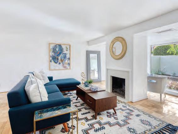





80 Keats Drive, Mill Valley: SOLD: Offered at $2,195,000
172 Lark Lane, Mill Valley: SOLD: $2,183,000
196 Esmeyer, San Rafael: SOLD: $2,021,000*


557 28th St, San Francisco: SOLD $1,968,000*


1 Lower Via Casitas, Greenbrae: SOLD: $1,188,000*
36 Mohawk, Corte Madera: SOLD: Offered at $1,695,000*
37 Plaza Drive, Mill Valley: SOLD: Offered at $1,495,000


306 Larkspur Plaza, Larkspur: SOLD: $595,000*
* Represented Buyer



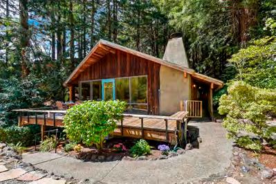



 LARKSPUR
Private & peacefully located 4br/3ba Downtown Larkspur retreat! Enjoy an outdoor livable area with views of the bay & lush private garden patio.
Eric Schmitt home including a separate large ADU with bedroom plus a bonus room & 1 car garage.
LARKSPUR
Private & peacefully located 4br/3ba Downtown Larkspur retreat! Enjoy an outdoor livable area with views of the bay & lush private garden patio.
Eric Schmitt home including a separate large ADU with bedroom plus a bonus room & 1 car garage.
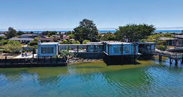








Gorgeous Property! Located in the highly coveted Strawberry Vista neighborhood of Mill Valley. This spacious home features 5 bedrooms, 5 ½ bathrooms, 4,400+ square feet, and boasts many fine amenities for modern living. Flooded with abundant natural light, featuring multiple indoor and outdoor living spaces, which were designed to take advantage of all that the area has to offer. Large, well-arranged interior rooms are augmented by high ceilings and great scale. The cul-de-sac location is perfect for neighborhood living and community spirit.







The year was 2005; it arrived in the mail — and it was a surprise. At the time, Marin had over a quarter of a million residents, was adjacent to a world-class city and possessed a nominal national presence (President George H. W. Bush referred to it as, “Mare-in County.”). What the county didn’t have was its own magazine.
Adding to the surprise of Marin Magazine’s first edition was the fact that its creators were newcomers to Marin. Having arrived only three years earlier, few in the county knew us; and we knew hardly anyone. When I say we, I mean my wife Nikki, who had a successful Southern California publication already to her credit; Lisa Shanower, a 30-something whiz of a national ad sales guru who was tired of traveling; and myself, an aging idealist who continued to believe the written word could change the world.
Where does one start when publishing a regional magazine? The first step was to hire our daughter, Mimi Towle, who had already been work ing with Bay Area magazines and lived in Marin for years and knew the lay of the land. And then, we identified Mount Tamalpais the “heart” of Marin County. “It is a symbol of strength and beauty,” we editorialized on page 24, “that all of us enjoy and can be inspired by.” How many recall that photo of Lisa, Nikki and me sitting on a slope of Mount Tam? Marin photographer Barbara Ries shot both that photo and also provided the beautiful California poppy cover image.
Stories in that initial issue included “Curtain Up,” announcing Lucy Mercer’s opening of 142 Throckmorton Theatre in Mill Valley; “On A Roll,” descriptions of paths in Marin that accommodate strollers; and “Dawn of a New Age,” a detailing of Novato’s hillside I. M. Pei structure that houses the Buck Institute for Research on Aging. To avoid being provincial, we added “Finding India,” my accounting of a month-long tour of the world’s sec ond most populous nation.
What did that first issue lack? We overlooked putting a date on its front cover. Other than that, Marin Magazine was off to an ideal start.

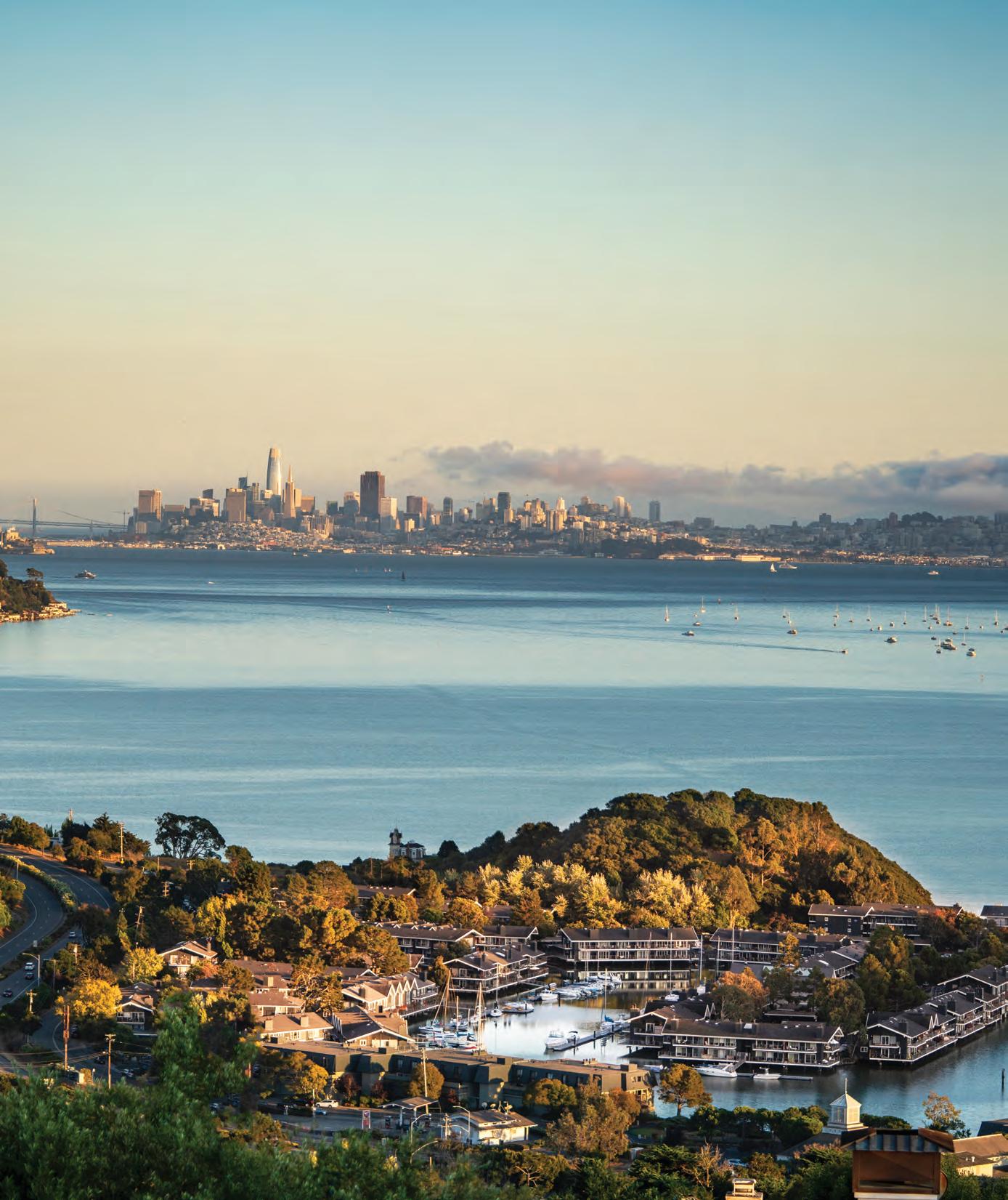





Robert Green Fine Arts presents a splendid and dramatic body of work by Post War World II Abstract Expressionist painter Ed Moses (1926-2018). A thoughtfully curated exhibition from the Ed Moses Estate with colorful large scale, powerful, gestural canvases. In a career that spanned 7 decades, Ed Moses was one of the pioneers of the Abstract Expressionist movement on the west coast. Moses’ work is in most major museums in the United States and he had his retrospective exhibit in 1996 at the LA Contemporary Museum. a rest of the world,"
Robert Green Fine Arts, established 1969, exhibits primarily painterly, abstract expressive work by painters that thoroughly take advantage of the sensually evocative nature of color and form. 94941 415 381 8776 ROBERT
 Bob Green & Charlotte Bernstrom, codirectors. Photography Douglas Sandberg © 2022