


IN PROGRESS READY FOR MORE EXCELLENT FINISHED NO SHOW READY FOR MORE NO SHOW IN PROGRESS IN PROGRESS READY FOR MORE EXCELLENT FINISHED NO SHOW READY FOR MORE NO SHOW IN PROGRESS IN PROGRESS IN PROGRESS READY FOR MORE EXCELLENT NO SHOW FINISHED IN PROGRESS IN PROGRESS READY FOR MORE EXCELLENT NO SHOW FINISHED
We are proud to present the fifth issue of Dinner + No Show, which showcases the talents of artists and writers in the School of Art + Art History at the University of Florida. We strive to create a supportive, inclusive community by encouraging art history and studio art students to bridge the gap between disciplines through collaboration. The publication is divided into two portions: Dinner focuses on the final product of a student’s work, while No Show explores the creative process.
Student artists and writers have produced an abundance of creative works throughout their time, and here we have collected their innovations and research into a formal body of work. Since the university does not have a public arts program, this publication provides art and art history students with the opportunity to share their work with a larger audience.
Dinner + No Show is filled to the brim with a diverse array of outstanding artwork and writing. Every year, we are amazed at what we are able to accomplish with the help and contributions of so many talented students. With utmost sincerity, we hope you enjoy our fifth issue, like a delicious meal paired with your favorite wine.
Warmly, Dinner + No Show Team

5
Martinis McDuffie 35 Sweet Tooth: Internalization, Ingestion, and Indulgence
Isabelle Stratton The Fortitude of Femininity
Stephanie Perez 47 The Environmental Impact of Distraction
Tanja Vuksanovic Thinking in Blue and White: The Representation of Plastic Pollution through Cyanotype

7 SUGGESTED PAIRINGS
127 Uliana V. Chembrovich A Collage of Personal Histories Sara Barnes 53 Por Colombia, De Columbiana
87
Evan Emmanuel 31 Cows and Catastrophe 123 Baylee Bell Overshooting Our Future 107
+
+
+ +
Metamorphosis: Emerging From a World of Despair into a World of Hope
“Seek Justice”: Graphic Design For a Cause
Emotional Evolution in PortraiturE
Cassidy Mandelbaum Rutz’s Latest Journey Through Art 25 Ellee Ruder Hymn of Self 41 Willow Rachels Fragile Construction; an Exploration of Impoverished Communities 59 Jose Rivera
Anthropomorphic Frogs
Emotions: Concrete and Abstract 99 Ian Switzer
Laura through the Looking Glass: Escaping through Art 79 Laura Haynes art as ritual 83 Sonia Consuelo Vera-Leon A REFLECtion of space 93 Wade Rubin Facilitating Conversation Through an Automatic Artistic Process
103 Kennedy Young The Whimsical World of Magical Realism
8 9
11 Valerie Luciow
17 Manna Robertson
21
75 Michelle Serafimovic
115 Caroline Crawford Where Function Meets Beauty 119 Kyleigh Bernstein The Complexity of Identity 131 Nadia Wooten “Was It All Worth It?”: An Exploration of Gray Areas in Grayscale Alex Kirkpatrick 67 63 What Lies Ahead for Me (And You?) Jessica Clermont
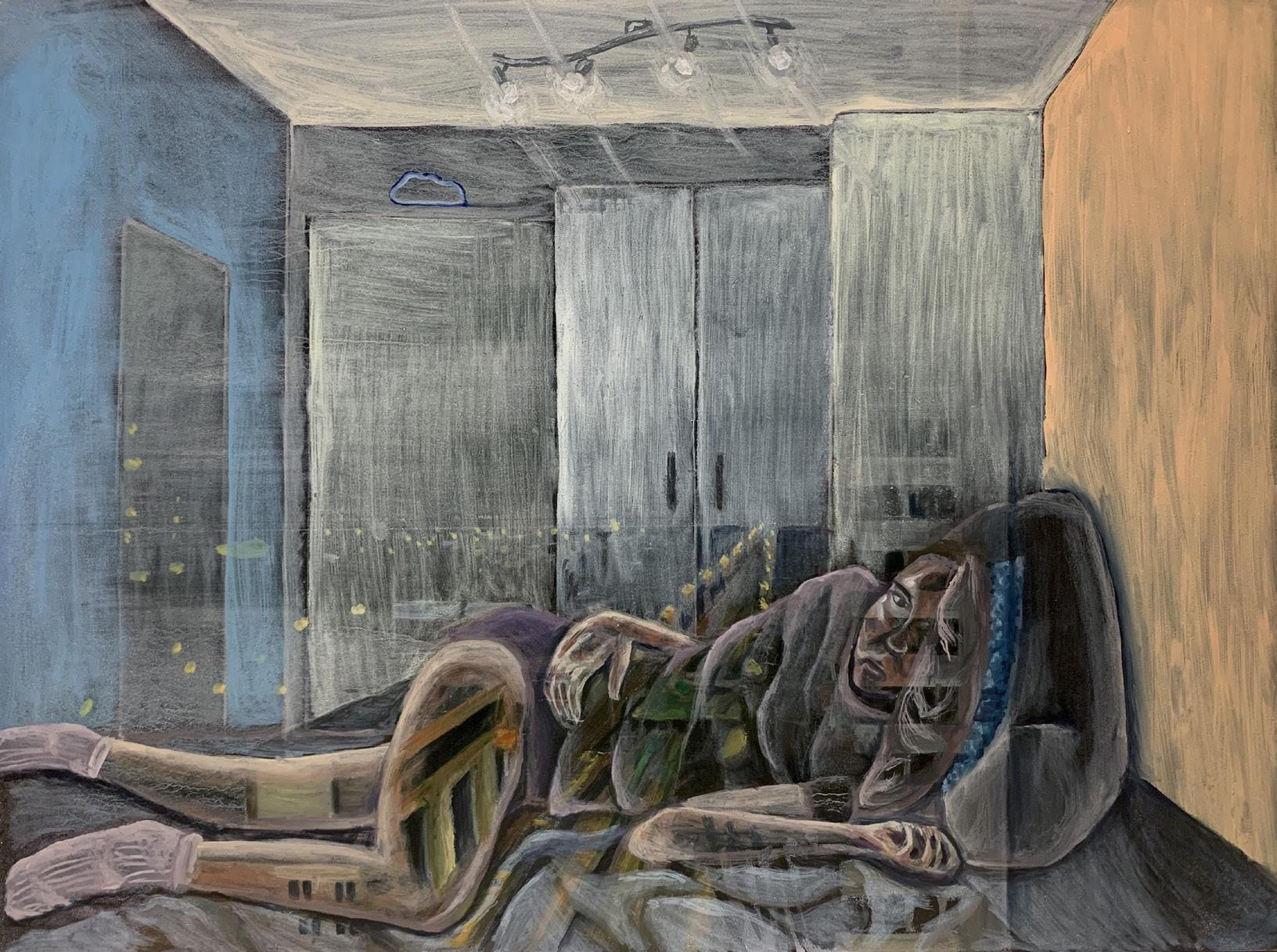
“As she lies down in her bed longing for a life outside of these four corners where she goes to school using Zoom and lacks human interaction, Luciow is able to engage the viewer and place them in a position where we realize the sadness of being in isolation.”
 Valerie Luciow
ART HISTORY & FINE ART + FRESHMAN + SHE/HER
Valerie Luciow
ART HISTORY & FINE ART + FRESHMAN + SHE/HER
Metamorphosis: Emerging From a World of Despair into a World of Hope
WRITER
ARTIST Evan Emmanuel
ART
HISTORY + SOPHOMORE + HE/HIM
11
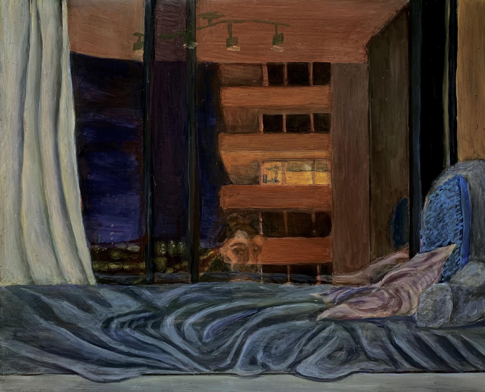
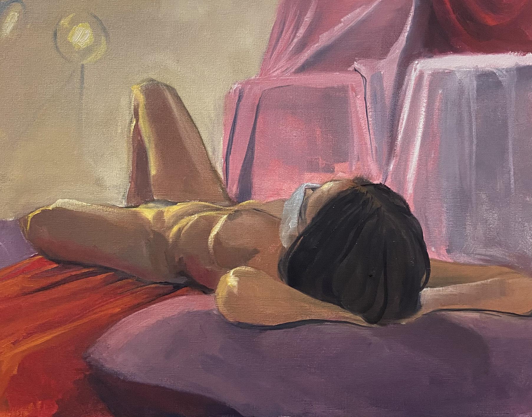
Valerie Luciow is a first-year fine arts and history of art student at the University of Florida. Much of her work comes from the loneliness and boredom of staying home during the quarantine period in 2020. Her experiences during quarantine influenced her to create two paintings using oil on canvas from her perspective and from the perspective outside of her window.
She titles the first composition Glass House because she is able to depict the reflection of the exterior world on her glass window. After having lots of time in isolation away from her friends and the outside world, she would always look outside her window because there was nothing else to do. The translucency of the window plane and the refraction of her overhead lights illustrate excellent attention to detail. The visible yet blurred reflection of the exterior streetlights and hotel lights are depicted in her thigh. As she lies down in her bed longing for a life outside of these four corners where she goes to school using Zoom and lacks human interaction, Luciow is able to engage the viewer and place them in a position where we realize the sadness of being in isolation.
In My Neighbor’s Window, Luciow paints the interior of her bedroom and the city skyline that she is able to see from her desk. Luciow would look out of her window at night and see this lone light from the building next to hers and was always intrigued on what this space could be. The ambiguous dark figure in the building is unknown both to the artist and viewer. Due to her having blurry vision, the figure in the back is unknown. Her impeccable use of one-point linear perspective leads us to the figure in the middle: her eyes and face that are reflected from her window. She had to use various layers with glazing to create this glass effect, which is accurately done. From her seat, she could also see the streetlights and hotel lights in the distance.
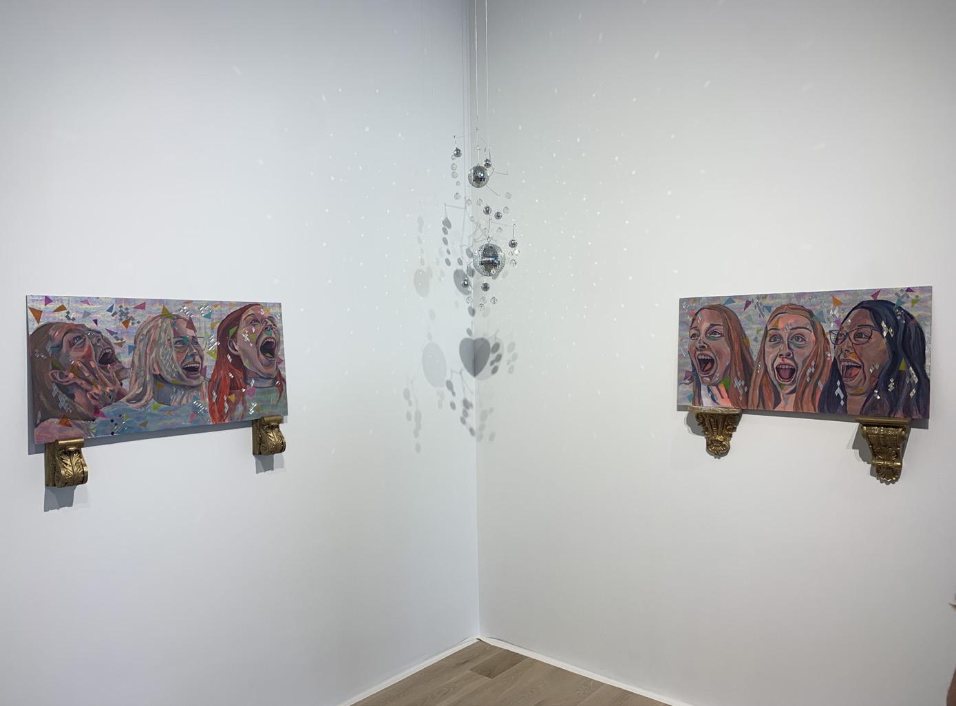
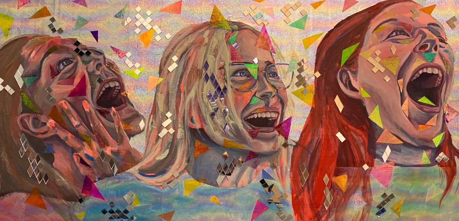
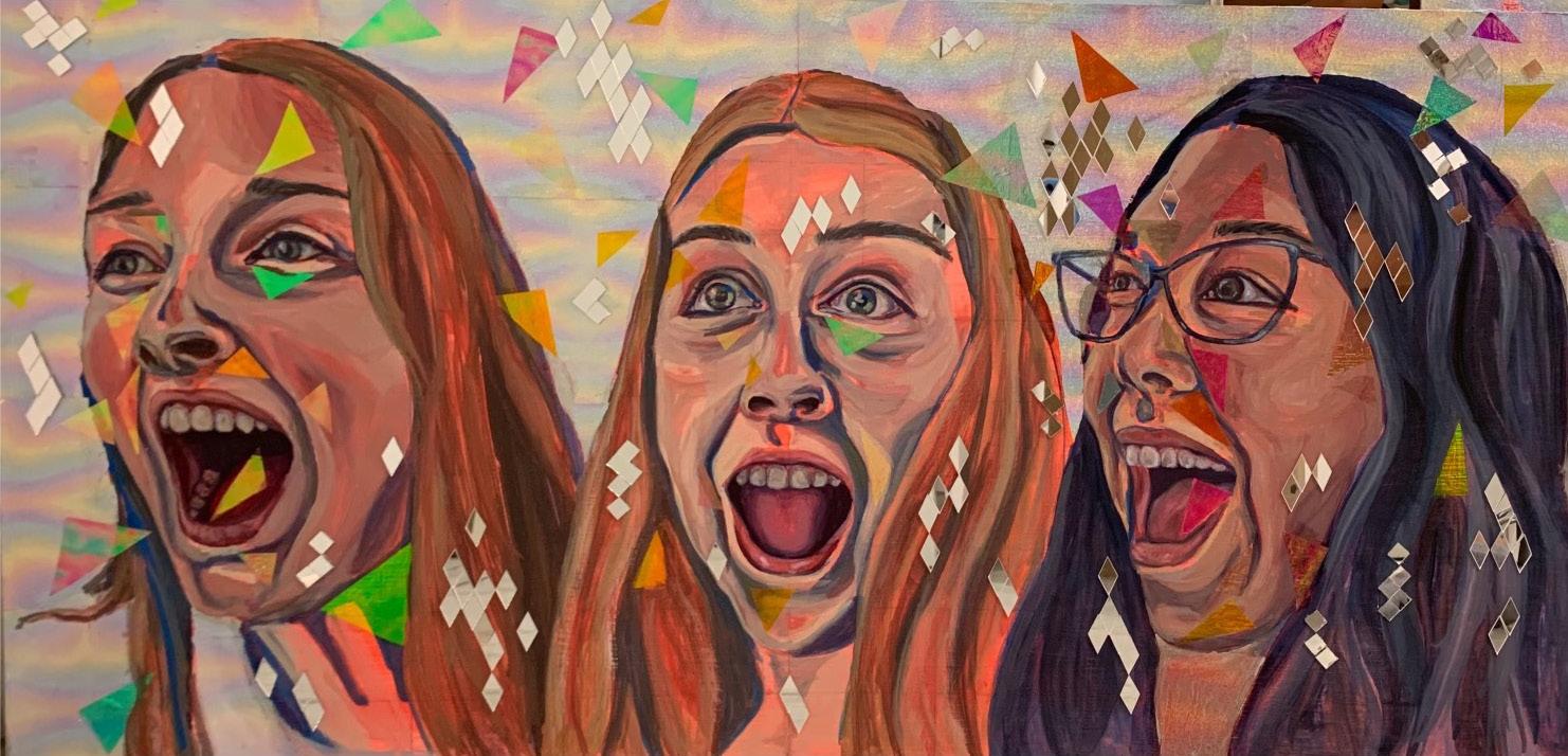
In her last composition, Kaleidoscopic, she turns to a new subject matter: herself, her sister, and her four best friends. These true-to-scale head figures are painted on two different canvases that are both 3’ x 5’. This mixed media composition includes a superb blend of oil, mirrors, and rainbow aluminum foil. These series of portraits are her favorite genre of painting and her main reason for painting this was because she knew that her friends make her happy. This piece evokes sound and joy and represents happiness and euphoria. Despite illustrating herself and her friends in a jovial mode, she notes that there are times when it can be too much and draining. While she represents joy in the beginning of a vaccinated world against Covid-19, she is apprehensive to how receptive people would be in getting the vaccine. Even though she was apprehensive, Luciow always knew that better times will come.
DINNER METAMORPHOSIS: EMERGING FROM A WORLD OF DESPAIR INTO A WORLD OF HOPE 12 13
Valerie Luciow, MY NEIGHBOR’S WINDOW, oil on canvas, 2021
previous spread Valerie Luciow, GLASS HOUSE, oil on canvas, 2021
The creative use of mirror shards and aluminum foil indicate that each person is unique but is able to capture connectedness by placing the two panels in a way that connects the gaze of one trio to the other.
Luciow’s desire to paint in manner that captures her feelings is excellently done in her compositions. As she reminisces on the painting process of these four different paintings, she prides herself on being able to take her feelings of boredom and loneliness from the four corners of her bedroom and her feelings of happiness and euphoria at the end of quarantine. A sensitive topic and one that many do not wish to remember has been immortalized by these paintings that show how much art is inspired by our daily lives.
DINNER
EMERGING FROM A WORLD OF DESPAIR INTO A WORLD OF HOPE 14 15
METAMORPHOSIS:
Valerie Luciow, KALEIDOSCOPIC, multi-media: oil on canvas, aluminum foil and mirrors, 2021
Manna Robertson
GRAPHIC
17 WRITER ARTIST Adriana Rivas MICROBIOLOGY & CELL SCIENCE MAJOR & ART HISTORY MINOR + SOPHOMORE + SHE/HER
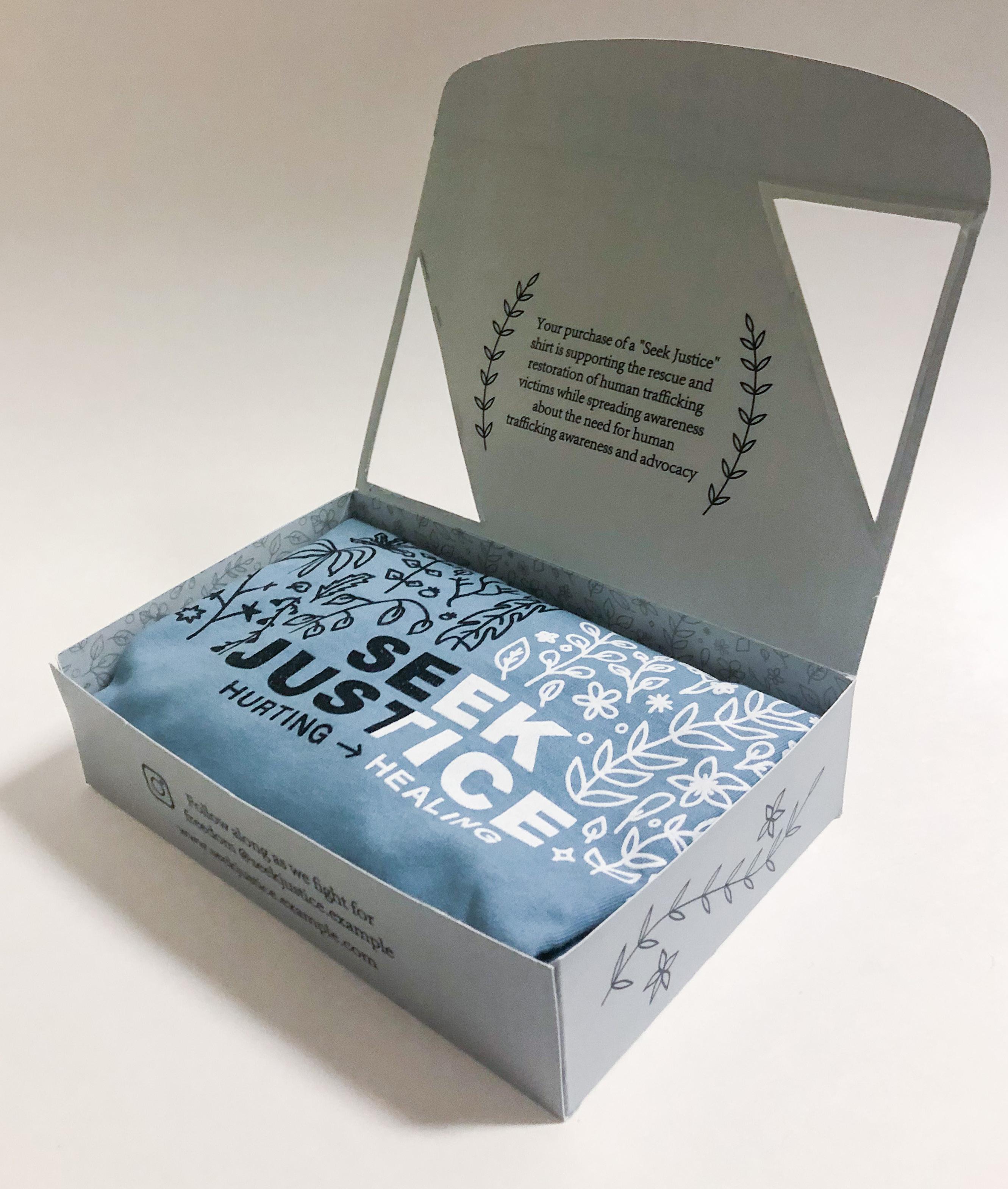
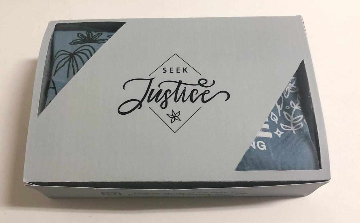
“Seek Justice”: Graphic Design For a Cause DESIGN + SOPHOMORE + SHE/HER
“By designing the “Seek Justice” t-shirt and packaging, she wanted to advocate for awareness on the issue of human trafficking while creating impactful yet sensitive dialogue about this issue.”
For Manna Robertson, engaging with meaningful issues in her art is an important as well as an exciting practice. As a second-year graphic design student, Robertson recently had a class project where she was asked to design a t-shirt and packaging to answer an open question: “what do you want the world to achieve in the next decade?” In response, Roberston began the “Seek Justice” project surrounding the issue of human trafficking. Similar to her project on fast fashion discussed in last year’s publication of D+NS, Robertson wanted to bring awareness to a topic she feels needs more attention. By designing the “Seek Justice” t-shirt and packaging, she wanted to advocate for awareness on the issue of human trafficking while creating impactful yet sensitive dialogue about this issue.
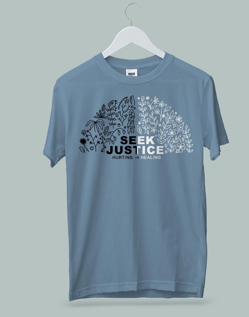
This project may have begun as a class assignment, but it is clear through the deliberate decisions made in the design process that Robertson was passionate about both her design and the issue it surrounds. The t-shirt is a soothing blue color, with the project’s namesake “Seek Justice” surrounded by stylized floral patterns. Split vertically, the left side of the design is black, while the other side is white. This color binary is included below in the word “hurting,” written with an arrow to its right and the word “healing” following it. Robertson explains that she drew inspiration from the contrast between the dead and the living, specifically plants like those that make up the line art on the shirt and packaging. This contrast between dark and light, as well as the imagery of plant growth, “can parallel somebody who is trapped in a situation they don’t want to be in, and then being able to be brought out of that,” Robertson explained while discussing her creative process. Moreover, the central theme of plants also symbolizes the ability for growth and perseverance in the face of challenges after such a traumatic situation.
previous spread Manna Robertson, SEEK JUSTICE T-SHIRT PROJECT, 2021
Inside the lid of the packaging, a message in small clean font notifies the consumer that their purchase of a “Seek Justice” t-shirt supports the rescue and rehabilitation of human trafficking victims. After creating this t-shirt, her professor gave her the opportunity to print and sell the shirts. Robertson took this as an opportunity to practice campaigning and create a platform to sell the t-shirts and further raise awareness about issues surrounding human trafficking. She went on to sell over 30 t-shirts and donated the proceeds to A21, an organization that works to reach, rescue, and rehabilitate victims of human trafficking. “It was really fun to be able to use social media to advertise the shirts,” Robertson said, “and see the support people that I knew had for these shirts and donating to this cause.” Reflecting on her project, she does note that it would have been great to also donate to a more local organization that supports human trafficking victims.
Through these t-shirts, Manna Robertson hoped to not only financially support a cause she feels passionate about, but also create awareness and discussion surrounding this social issue. By incorporating social justice into her work, Robertson can engage her art and graphic design skills in meaningful and impactful ways.
“SEEK JUSTICE”: GRAPHIC DESIGN FOR A CAUSE 19
“She sees their flimsy appendages and webbed feet as the perfect vehicle to play dress-up and to highlight the humorous aspect of our lives.”
Cassidy Mandelbaum
MARKETING + GRADUATE STUDENT (6TH YEAR) + SHE/HER
Anthropomorphic Frogs
WRITER
ARTIST Sophia Ramirez Peralta
ART HISTORY + JUNIOR + SHE/HER
21
Cassidy Mandelbaum’s frog series captures the daily lives of frogs in light and bubbly anthropomorphic settings. Ranging from busy malls to sunny pools and elegant homes, all of her settings are recognizable spaces that could be found in a person’s daily life. Mandelbaum utilizes these spaces and her frogs to draw attention to the brighter side of moments in our human lives through her watercolor paintings.
Mandelbaum’s practice began in October 2020 with the Inktober challenge that prompts artists to create a new ink drawing every day for one month. She grew so fond of the challenge that she continued it on her own and over the course of the following summer drew over one hundred drawings. Valuing self-motivation and persistence above all, Mandelbaum continued practicing every day. She admits that seeing her mistakes and the evolution of her work has been crucial to her growth as an artist and encourages her to create more.
The frog series was created in April 2021 as her own self-imposed challenge to use frogs as her sole subject matter for a number of works. Mandelbaum cites no specific reason as to why she chose frogs, just that she enjoys drawing them and admires their silly-looking features. She sees their flimsy appendages and webbed feet as the perfect vehicle to play dress-up and to highlight the humorous aspect of our lives.
Preferring art with comedic appeal, Mandelbaum enjoys centering her work around lighthearted themes like these. For example, Frog in the Shower presents the viewer with a back-end view of a nude frog leisurely scrubbing its back. It dons a shower cap, presumably to protect the imaginary locks of hair that a human would have but an amphibian, of course, does not. A pair of underwear and socks strewn haphazardly on the bathroom floor further creates an amusing narrative of the frog hurriedly undressing itself, perhaps in a rush to get to work or school on time.
previous spread
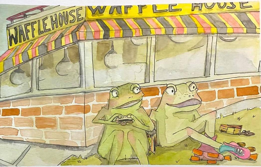
Cassidy Mandelbaum, FROGS AT WAFFLE HOUSE, watercolor, 2021
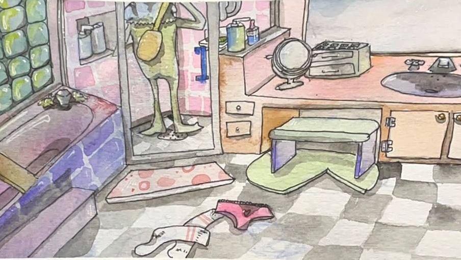
Mandelbaum’s choice in medium to create these paintings also contributes to her overall theme. Her choice to move from an ink medium to watercolor was based on her view of it as a fickle material producing a comical experience both in the creative process and in the visual effect on the viewer. She explains that painting with watercolor tends to create less consistency with the sharpness of the lines and color hue, forming a much looser image that lends itself to her subject matter.
Mandelbaum celebrates what it means to be alive through the metaphorical personas created by her frogs. To her, the human experience is characterized by the meaningful connections people make with one another and the wholesome experiences they share. By replacing people with frogs, Mandelbaum satirizes people’s stories to emphasize the playfulness in their lives and in her artwork.
DINNER ANTHROPOMORPHIC FROGS 22 23
Cassidy Mandelbaum, FROG IN THE SHOWER watercolor, 2021
Rutz’s Latest Journey Through Art
“Rutz embraces elements of ‘visual candy’ and Surrealism to present observations of the contemporary through a distinct artistic lens.?
25
PAINTING + SENIOR + SHE/HER
&
RELATIONS + SOPHOMORE + SHE/HER
WRITER ARTIST Ellee Ruder
Lee LaPlaca ART HISTORY
PUBLIC
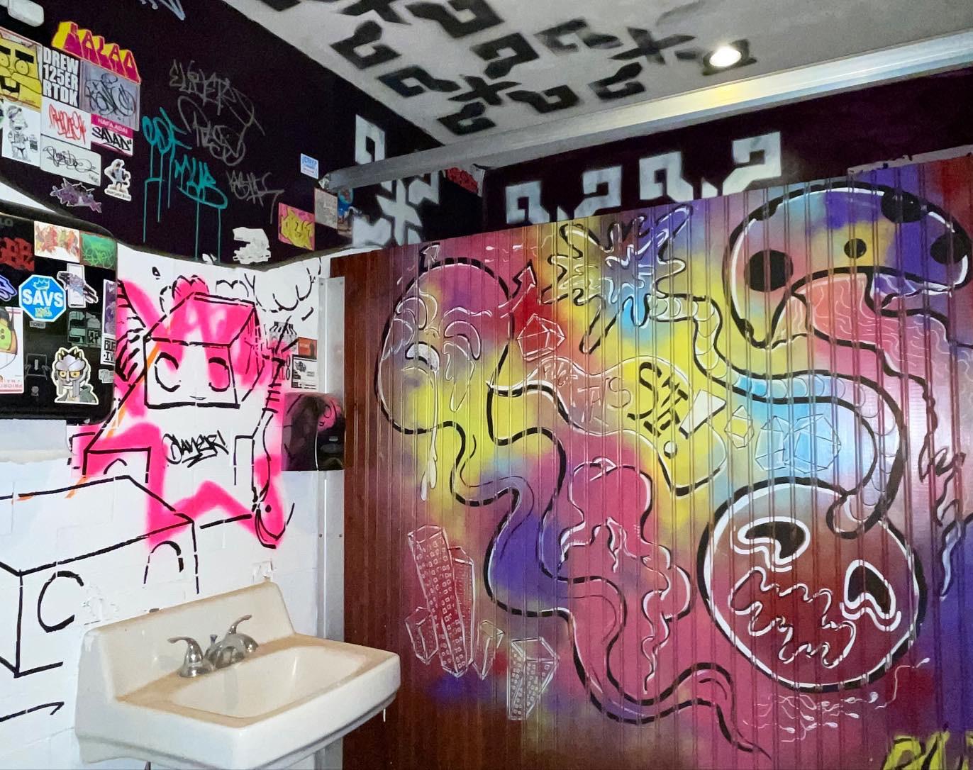
Gainesville painter Ellee Ruder, who goes by the artist name Rutz, uniquely expresses a range of personal observations about her surroundings through art. Her individual, eclectic style is a fresh approach to recording the world around her. Rutz’s earlier works appear chaotic and nearly sinister. Her more recent works have taken a different, more aesthetically driven route. These paintings often juxtapose a variety of symbols with fluid movement across the composition.
In October 2021, Rutz put on a solo art show, Cacophony In preparation, she meticulously wrote artist statements, took pictures of her work, and planned the show’s logistics. She spread the word through flyers around campus and even got creative with the dating app Tinder to advertise. Although the venue had to be changed at the last minute, the show was still a success. It wasn’t easy, but Rutz and a group of friends were able to host without any other issues. She looks back on it as a fond experience with friends and says, “I think more artists should show their stuff, even if it’s just at their house.”
One particular artwork in the show, Anthropocene (2021), explores Rutz’s ideas on the age of mankind and its impact on the environment. The Internet is a major factor, and she sees social media as an insatiable beast that everyone is contributing to. The 4x4 ft painting was partly inspired by the Grimes album, Miss Anthropocene. It was created using acrylic on canvas. Many of Rutz’s ideas come to her on a daily walk, where she takes in the world as an interconnected system. Anthropocene is the artist’s own playful interpretation of this and represents painting as an indulgence. Rutz wanted to make the work “visual candy,” allowing others to take in this ethereal composition with pleasure. Her method emphasizes the diagonal, motion, and color palette of the painting. Rutz began drawing organic, amorphous shapes, which has now become characteristic of her art. These representations, or lack thereof, are present in much of her work.
previous spread
Rutz, BATHROOM MURAL, spray paint and acrylic pen, 2022
Rutz, ANTHROPOCENE, acrylic on canvas, 2021
DINNER RUTZ’S LATEST JOURNEY THROUGH ART 26 27
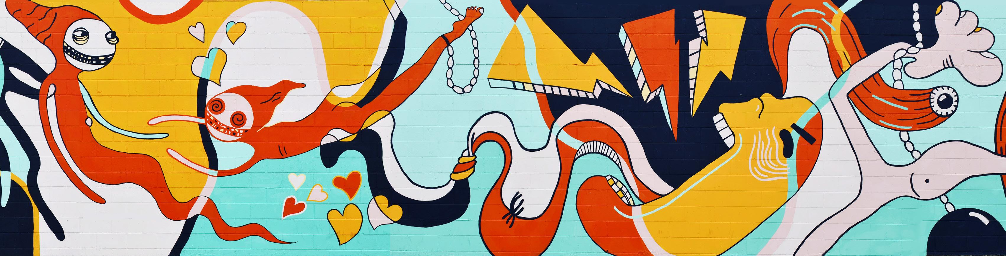
Life, Death, and Everything in Between (2021), is a mural by Rutz located at Tom Petty Park. The mural, which became a collaboration with 16 of the other artists, was chosen by the city as part of a local art competition. After creating a series of small model paintings, Rutz’s mural was selected out of five other designs. She chose a wave-like design that guides viewers’ eyes across the composition. The lines emphasize motion, as if the mural’s shapes are crashing into each other. The smaller paintings were created using canvas and acrylic. Rutz worked with a group to bring the mural wall to life with house paint. The linework was a conscious choice so others could easily paint her design onto the 84x10 ft mural. She utilized the grid technique to paint the design, and even had to adjust a composition error during the painting process. The mural was defaced last year, leaving evidence in the form of orange paint and two holes in the wall. Rutz chose to leave some of that paint in the composition. She kept orange paint on one tooth as a symbol of the mural’s repair. Rutz says, “Whoever did it really wanted to get their stuff up there. They’re embedded in the paint of my mural, the second layer.” Although Rutz is incredibly resilient, the journey through creating and exhibiting her work highlights some of the difficulties facing contemporary local artist. Her ability to overcome these challenges is a testament to her strength and a true passion for artmaking.
LIFE, DEATH, AND EVERYTHING IN BETWEEN, paint, 2021
RUTZ’S LATEST JOURNEY THROUGH ART 28 29
Rutz,
ARTIST Evan Emmanuel
ART HISTORY + SOPHOMORE + HE/HIM
“The late night expression of this fleeting artistic impulse may reveal deeper notions of Evan’s psyche- the cow, even when alone, continues to display is beaming smile- just as Evan believes that his innate trust in himself will help him be optimistic until the end of his life, even if there is no one else around.”
Cows and Catastrophe
WRITER
Valerie Luciow
ART
HISTORY
& FINE ART + FRESHMAN + SHE/HER
31
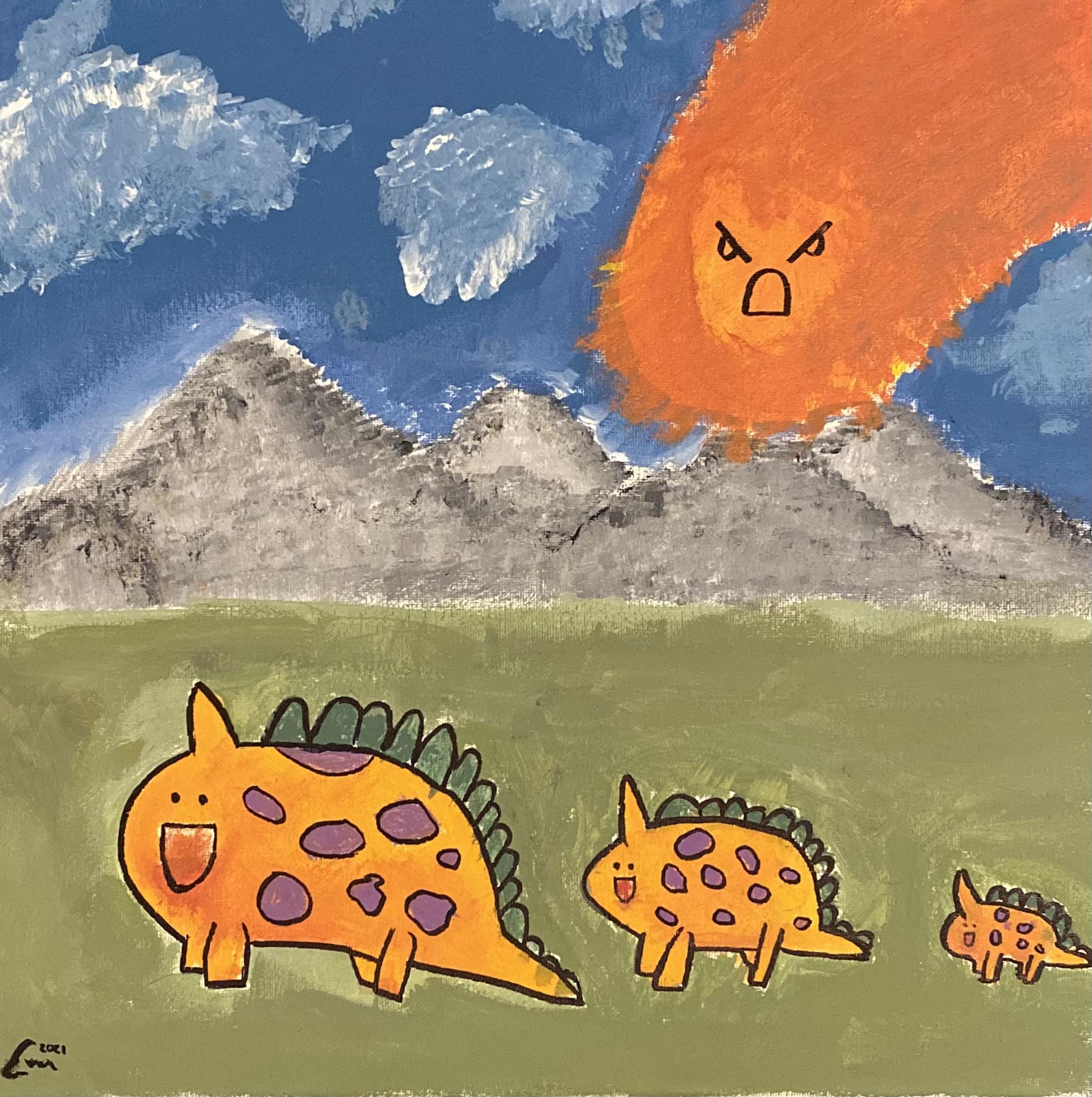
Medieval Cows, by Evan Emmanuel, explores themes of destruction and isolation embodied through rudimentary figures. Much of Evan’s artistic experience is rooted in his interactions with the study of art history and he occasionally engages in his own artistic practice when inspired to do so. The tryptic feature here was created by Evan out of acrylic paint and sharpie on a July night in 2021 when he felt particularly inspired to represent a unique cow. The artist began their work by depicting a family of three cow siblings, stylized to appear so though they belong in the prehistoric age as dinosaurs. In this first image, the three figures are depicted in profile view, happily standing in a row as an extremely furious comet, depicted by a frown created in one stroke, hurdles towards the family. Depicted over a landscape of greenery, gray mountains in the distance, and a blue sky spotted with clouds, it is as if the cows do not know of the enraged ball of mass spiraling in their direction.
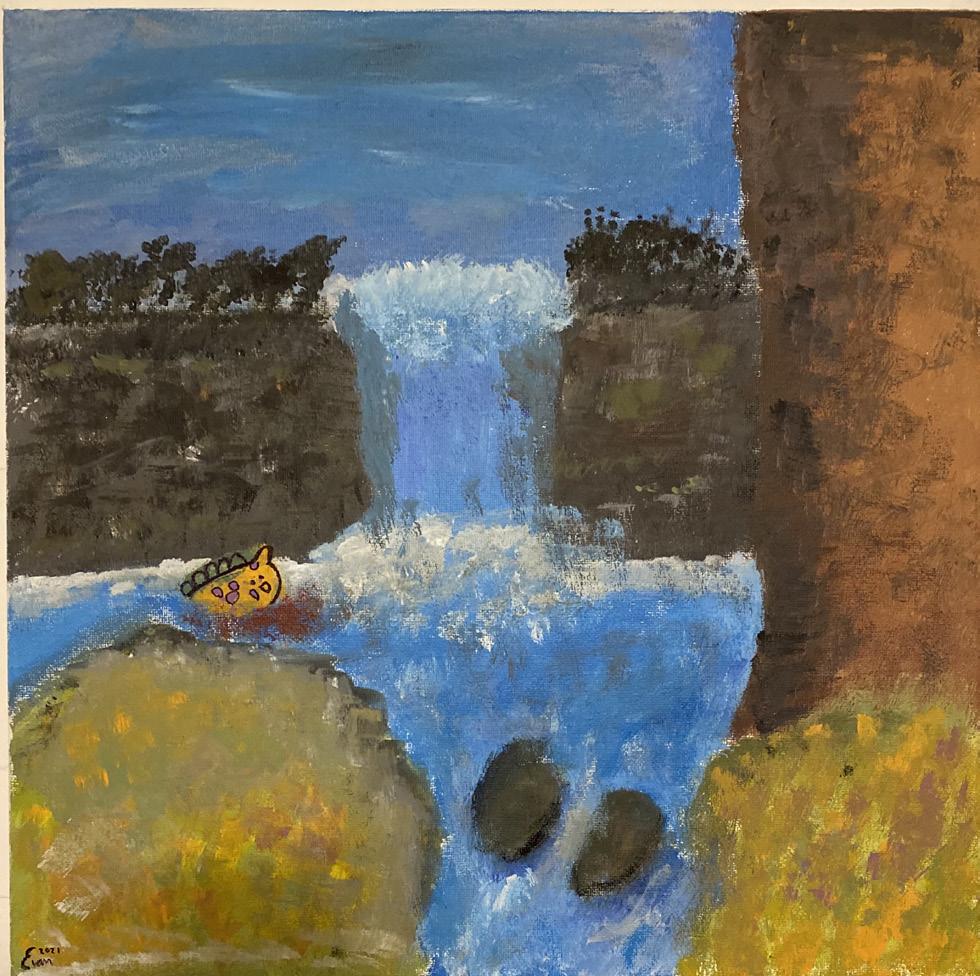
After Evan completed the first painting, he believed that the painting needed to tell a story and decided to elaborate the story with two more acrylic works of the same scale. In the second painting, the youngest cow is seen standing alone, as the comet had unfortunately wiped his older siblings from existence and caused the sky to burn up in an orange hue. In the third painting, the cow is seen dwarfed in comparison to its setting, the cow is a mere speck of orange in the blue stream that is engulfing its dead body.
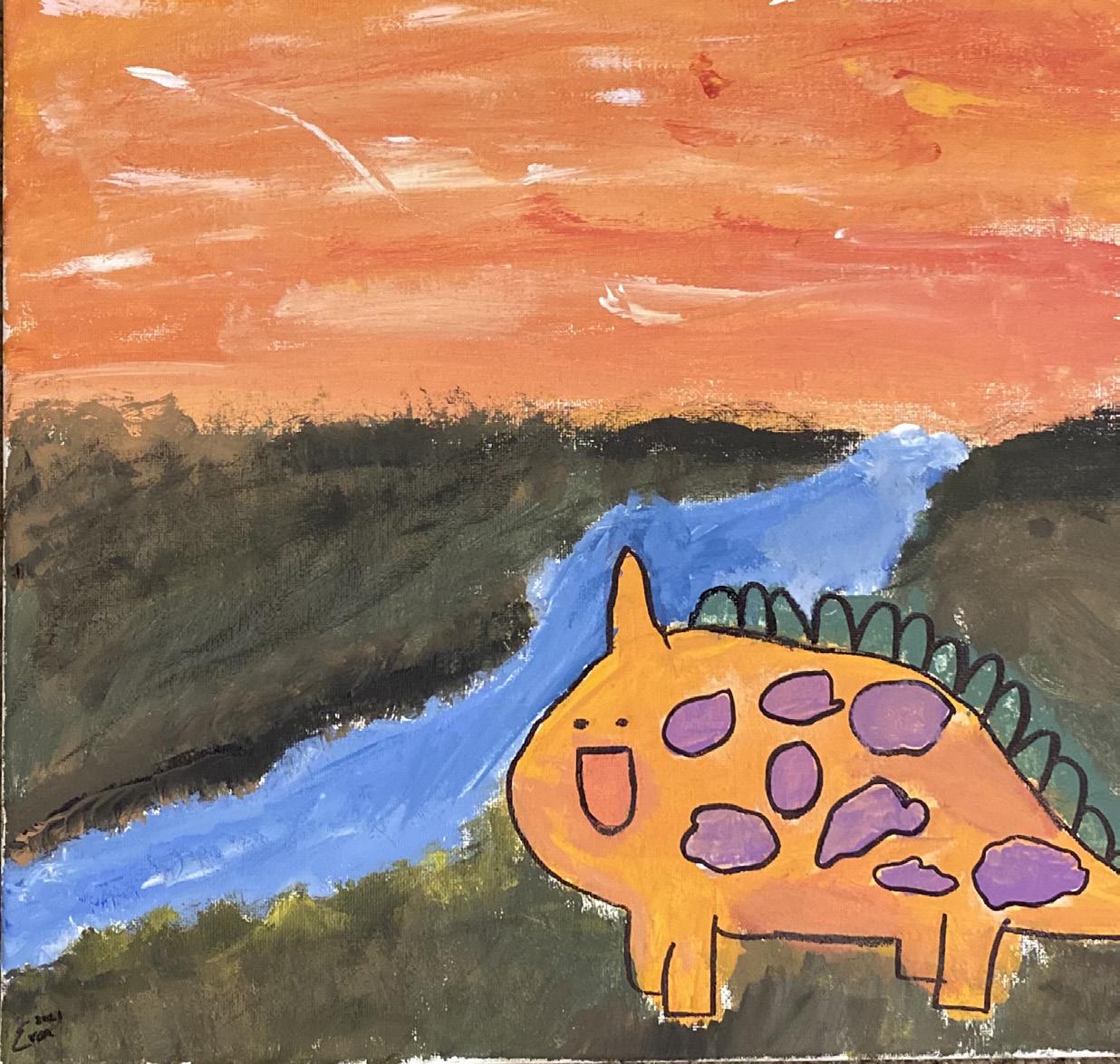
Evan Asuncion, MEDIEVAL COWS SERIES, acrylic on canvas with marker, 2021
The symbolism in the painting can be connected to Evan’s subconscious fears, as Evan revealed that his fear of abandonment by others is prominent in his life. The late night expression of this fleeting artistic impulse may reveal deeper notions of Evan’s psyche- the cow, even when alone, continues to display is beaming smile- just as Evan believes that his innate trust in himself will help him be optimistic until the end of his life, even if there is no one else around.
An artistic influence that Evan cited is Edvard Munch, particularly his 1893 painting The Scream. The proto- Expressionist style featured in The Scream appeals to Evan as he believes that it is able to capture the raw sensations of life. Direct influence from Much can be seen in Evan’s work though heavy use of saturated and complementary colors. Additionally, it can be analyzed that the primary colors featured in the works, especially in the second piece, blue and orange, directly allude to Evan’s fears of entering a new phase of his life as a student at the University of Florida. Being that Gators bleed orange and blue, it could have been that the anticipation of this new beginning directly influenced the color choices made in the work.
In creating art as a means to express his own creativity, Evan does not treat his art as precious, but rather something to have fun with and convey his emotions through. The silliness of his work underpins the idea that hope can be found in darkness.

COWS AND CATASTROPHE 32 33
READY FOR MORE? turn to page 123
ARTIST
Martinis McDuffie
ART EDUCATION + SENIOR + HE/HIM
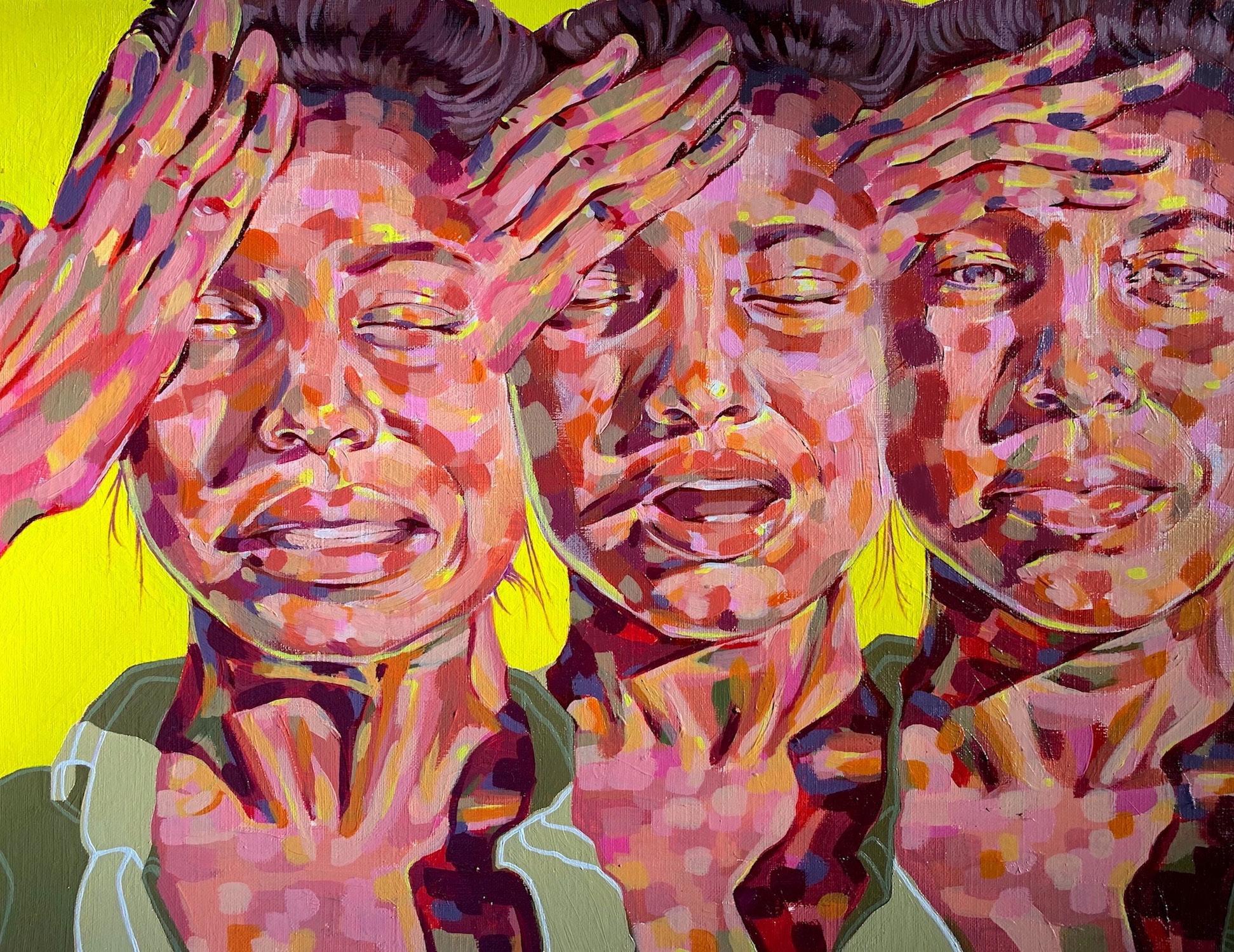
Sweet Tooth: Internalization, Ingestion, and Indulgence
WRITER
Adam Blahnik
ART HISTORY & CHEMISTRY + JUNIOR + HE/HIM
35
“What does it feel like to be born in a place where you are automatically viewed as a threat?”
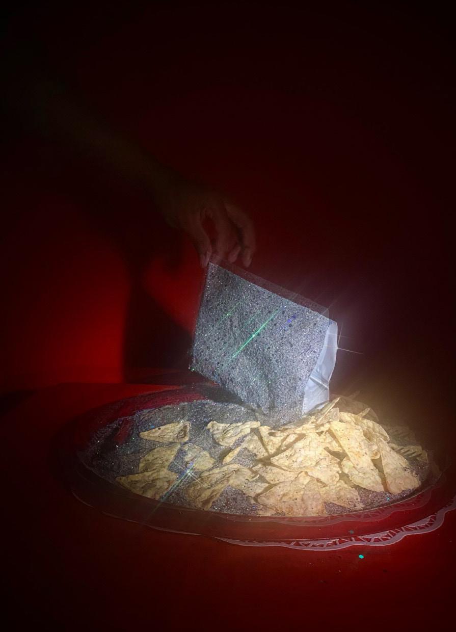
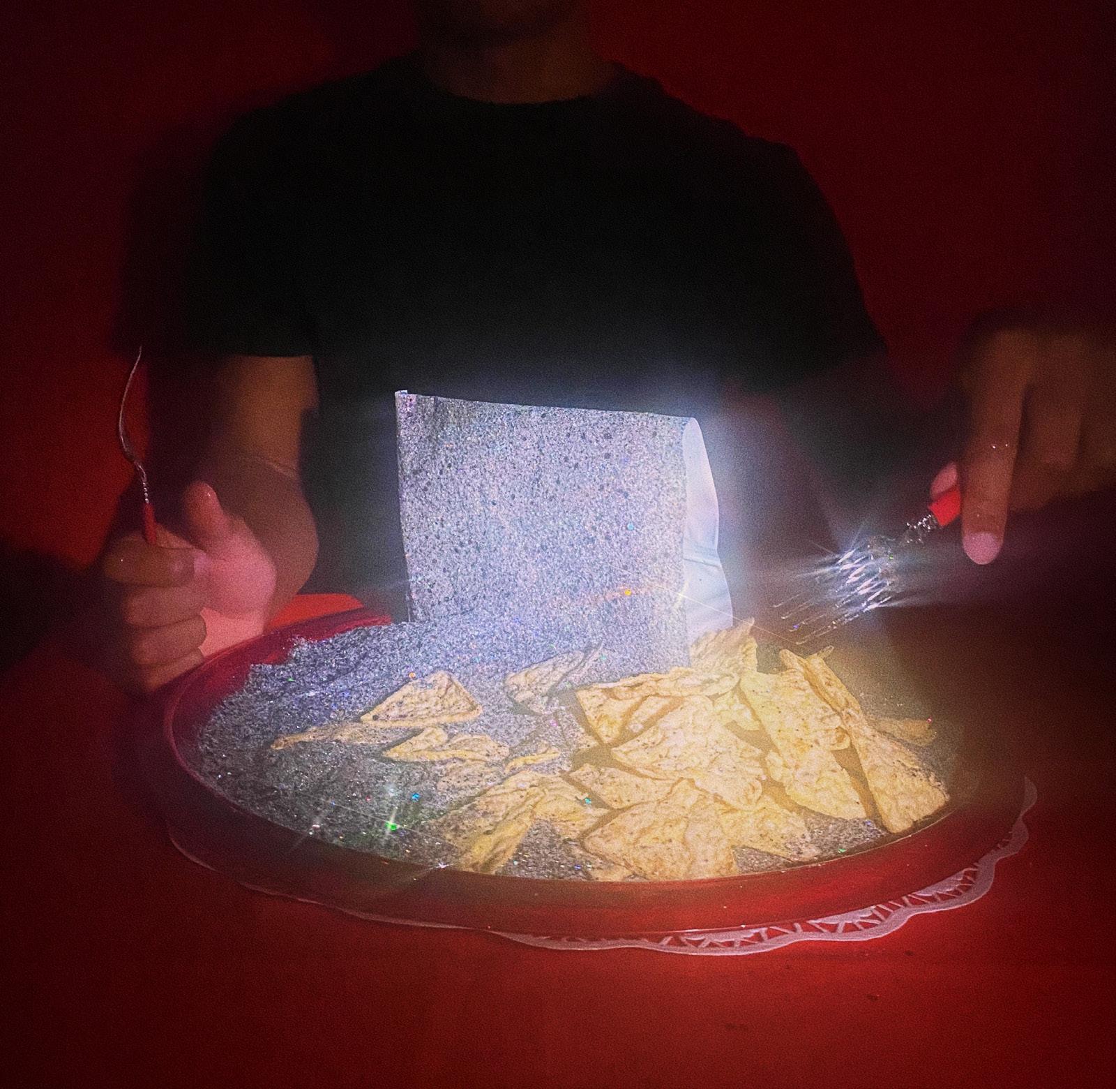
Contemplating the connections between nutrition and the body is often confined to the effects of food on physical health. Through his multidisciplinary practice encompassing ceramics, sculpture, photography, and more, fourth year Art Education student Martinis McDuffie expands this discussion to confront issues of the psychological, social, and economic influences on consumption. Investigating the relationship between nutrition and health, McDuffie’s series Sweet Tooth examines the motivations that influence consumption, both nutritional and commercial, exploring the internalized and externalized natures of social messaging, psychological stimulus, and food.
Much of his body of work is composed of ceramic sculpture that examines the bodily destruction resulting from malnutrition and unhealthy habits. In his ceramic pieces, he references his experience with medical issues rooted in diet, forming body parts that have decayed and decomposed. Drawing attention to the human body and physical markers of health, these works reflect the binary natures of internal and external. His 2021 series Sweet Tooth, however, diverges in both medium and subject matter from his earlier works. Experimenting with photography, McDuffie focuses not on the bodily harm inflicted by unhealthy foods, but on the food itself. The series depicts a glitter-encrusted, shimmering bag of chips resting on a plate. Situated against a theatrical red background, the series documents the central figure approaching, opening, and consuming the chips, lying atop a bed of sparkling glitter that seduces the sitter and viewer alike. Alluding to the glamorization and temptation of mass-produced, unhealthy food items, McDuffie creates a surreal scene that investigates the broader societal forces that influence consumption, both of food and of goods. He asserts that the allure associated with these foods derives not solely from the foods themselves, but also from marketing campaigns and commercial availability. These economic pressures give rise to a conflict between shortterm indulgence and long-term health, calling into question the longevity of satisfaction.
DINNER
TOOTH: INTERNALIZATION, INGESTION, AND INDULGENCE 36 37
SWEET
Martinis McDuffie, SWEET TOOTH, photographic series, 2021
McDuffie emphasizes an artistic process that is both experimental and experiential, learning through the course of conceptualization and execution. Inspired by the aesthetics of cinema and surrealist painting, he envisioned a composition symmetrically designed and immersively framed in the manner of filmmakers such as Wes Anderson, containing a surrealist depiction of everyday scenes as inspired by contemporary painters such as David Hockney and Zoey Frank. However, despite these artistic influences on the conception of the series, McDuffie emphasizes an implementation that incorporates unorthodox techniques and materials. The photographs themselves are taken with a phone camera, the lens covered in lip balm to give a blurred, dreamlike finish. The brilliance of the chip bag and plate is achieved through aggregates of glitter and craft glue, the sparkles enhanced with photo editing and filter apps. Even the dramatic, theatrical spotlighting is accomplished through a lamplight focused on the central scene through a toilet paper roll. This process of creation is informed by his philosophy of learning by doing. While incorporating academic perspectives on formal structure and compositional design, McDuffie emphasizes the importance of innovation and experimentation. As an Art Education major, he plans to incorporate this into his future interactions with students, encouraging artistic exploration outside of the traditional definitions of the “fine arts.”
Through the familiar concepts of diet and nutrition, Martinis McDuffie explores the positions that food occupies in matters of the economy, mental health, and physical health. Experimenting with fusing the mundane and the surreal, McDuffie’s work confronts the tension between various opposing forces: dualities of indulgence and satisfaction, of transience and longevity, of mind and body.
DINNER SWEET TOOTH: INTERNALIZATION, INGESTION, AND INDULGENCE 39
READY FOR MORE? turn to page 87
“This reference to both classical antiquity and Christianity reminds the audience of the inevitability of death and incites the viewer to contemplate what may come after, further emphasizing the impermanence that this painting depicts.”
ARTIST
Willow Rachels
VISUAL ART STUDIES + SENIOR + SHE/THEY
Hymn of Self
WRITER
Kaveri Jadav
ART HISTORY & BUSINESS ADMINISTRATION + FRESHMAN + SHE/THEY
41
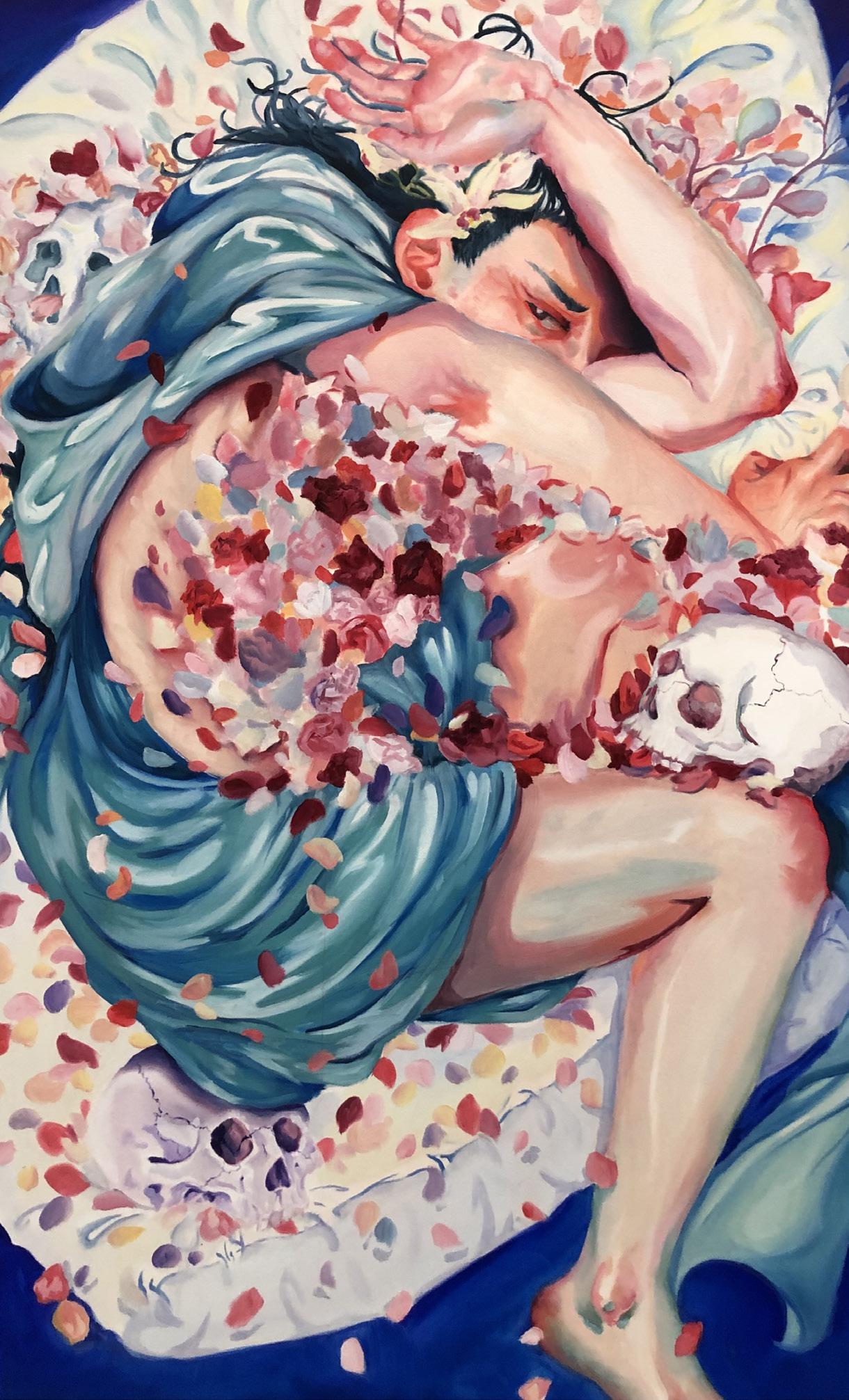
Willow Rachels is on the home stretch of completing her final year at the University of Florida with her BA in Visual Arts Studies. In her painting Drowning in Your Expectations (oil on canvas, 3’ X 4’), inspired by the composition of The Roses of Heliogabalus by Sir Lawrence Alma-Tadema, we see an anguished figure, drowning in a flurry of petals. Rachels explains that she painted the figure androgynous intentionally; the flower petals are used to represent the societal expectations that is associated with one’s assigned gender. The ambiguity of the figure’s gender, coupled with their anguished expression and form, shows the figure drowning in the oppressive expectations of what gender should be. The skulls surrounding the figure lead to an ominous conclusion: they are not the first victim. As the figure becomes encased by the flower petals and then trapped in a dream like void, the viewer can clearly see the expression on their face, framed by their hands. Though the figure does their best to protect themselves from this whirlwind of societal restriction, they fail to do so and fall into a fetal position. Though the thematic aspects of the work incite thought and introspection, and though the subject matter is morbid, the painting is created with bright colors. Rachels said one of their favorite historical periods was the impressionist period, and that she made her color selection after being inspired by the color palettes used in that era. The influence of the impressionist period is visible in many of her works. According to Rachels, this piece took about five weeks to create in total and captures the shared experience that many individuals face when confronting their gender identity.
previous spread Willow Rachels, DROWNING IN YOUR EXPECTATIONS, oil on canvas, 3’ X 4’
Willow Rachels, MEMENTO MORI IN BLUE, oil on wood, 1’ X 3’
HYMN OF SELF 42
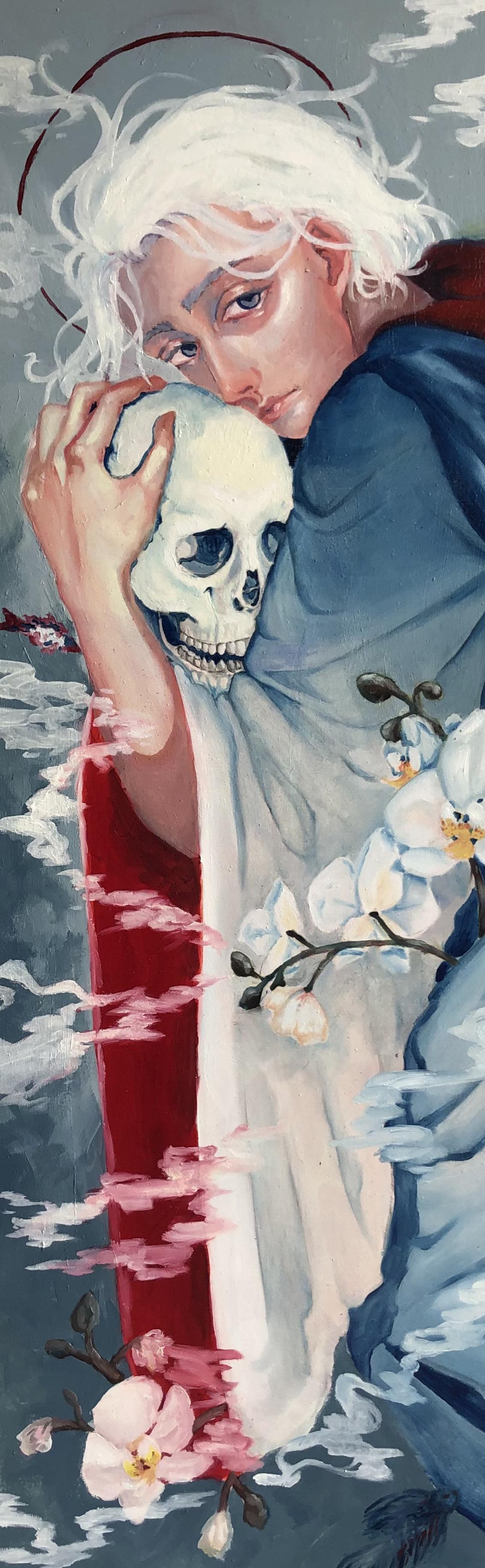
The second piece, titled Memento Mori in Blue (oil on wood, 1’ X 3’) was created as a self-portrait of Rachels. The portrait’s themes of impermanence and the progression of time is depicted by a few symbolic aspects. A standout characteristic of this painting is the orchids spaced across the canvas. Rachel said these orchids are representative of their high school art teacher who introduced them to oil painting and left a major impact on their art. In the painting, Rachels dons a robe to represent graduation from high school and the transition to college, the garment is also reminiscent of the historical figures that renaissance artists were so fond of. The smoke surrounding the figure, the skull they are holding, and the Halo around their head are all reminiscent of past memento mori paintings, with the skull motif being the most easily identifiable. This reference to both classical antiquity and Christianity reminds the audience of the inevitability of death and incites the viewer to contemplate what may come after, further emphasizing the impermanence that this painting depicts. As time moves, we are constantly looking to the future. Contrary to the previous painting, this painting was completed in only four days. Rachels also shared that much of her research is in reference to scroll paintings and she has great interest in nihonga painting. This is evident in the pieces depicted, with the handling of brushwork as well as the subject matter explored.
Rachels’ exploration of the self through her art comes through in both the works depicted here, as well as her other projects. Through her art, the viewer contemplates what the self is, personally and societally. We pose questions about our own identity, about who we are to ourselves and to those around. Her artwork’s darker tones speak to being defunded or controlled by others, of being denied ourselves. Through her own selfexpression, Rachels tackles what it means to express oneself.
HYMN OF SELF 44 45
Leilanee Taylor, LABYRINTH, relief print, 25” X 15”, 2019
“Perez hopes that viewers may reflect on their own habits, with this work serving as a warning for the long-term environmental and psychological consequences of indifference.”
ARTIST
The Environmental Impact of Distraction
WRITER
Ava Bender
ART HISTORY & ANTHROPOLOGY + JUNIOR + SHE/HER
47
Stephanie Perez
FINE ARTS WITH PAINTING FOCUS & SUSTAINABILITY MINOR + SENIOR + SHE/HER
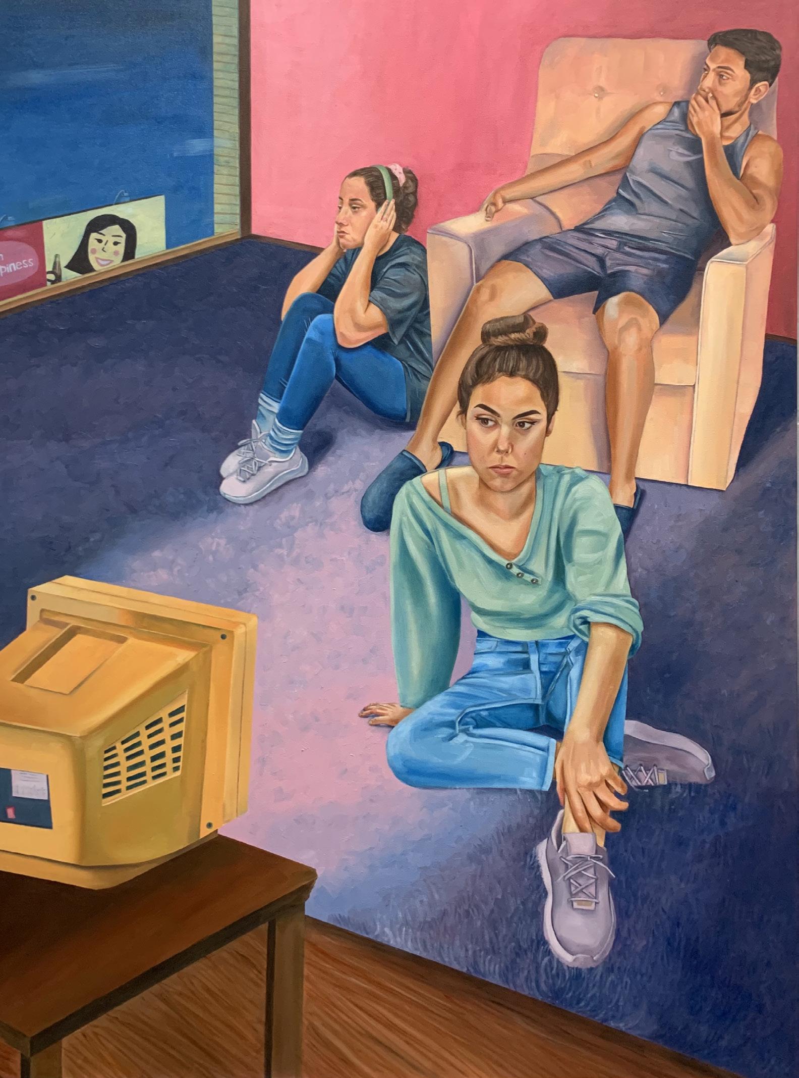
Stephanie Perez spreads climate-consciousness through her art. Since she began painting, Perez has explored the dynamic role of consumers in the global climate crisis. She investigates how consumer culture intersects with the routines of modern individuals. Her latest works in oil on canvas consider the obstructive role distracting media plays in the everyday lives of consumers. Preoccupied State of Being and Modern Diversions illustrate the disruptive impact of technology and advertising.
These works show certain material distractions within a timeless setting, and obscures contemporary technologies as past ones. Some forces of diversion: phones, televisions, and advertisements, have remained prominent for decades and have only grown in complexity. Visually; however, Perez emphasizes the simplicity of these material distractors to suggest that they aren’t so difficult to identify or manage. She shows a rotary dial phone, CRT television, and billboard instead of more contemporary iterations. With these old models, Perez hopes to make viewers more conscious of consumer culture, which drives people to buy the latest and greatest. Perez draws on the fact that the objects of distraction, whether old or new technology, are still legible in today’s terms. Viewers can only imagine how the subject’s absorbed state would be if holding a smartphone. Perez hopes viewers may then contemplate the images further and in terms of their own habits.
When sitting down with these canvases, Perez selected bright complementary or contrasting colors and softened them to complement the domestic atmospheres of these works. Perez knows that the attractive formal strategies, bright colors and minimal compositions, of advertising grab attention. Perez uses these formal qualities to enhance her own product, considering the aesthetic draws of advertisements within her larger criticism of consumer culture. In Modern Diversions and Preoccupied State of Being, Perez depicts moments of these intrusions that are built into routine, invasive parts of our personal lives.
previous spread Stephanie Perez, MODERN DIVERSIONS, oil on canvas, 2021.
DINNER THE ENVIRONMENTAL IMPACT OF DISTRACTION 48 49
Stephanie Perez, PREOCCUPIED STATE OF BEING, oil on canvas, 2021
Modern Diversions visualizes the maxim, “see no evil, hear no evil, speak no evil,” in a multi-figural composition. One figure covers her ears, the other his mouth, and the third might as well be covering her eyes as she stares into a television screen. Through this posing of her figures, Perez wishes to communicate the desensitization that accompanies today’s state of distractedness. This can be seen through the subjects which are grouped together physically but are clearly disinterested in one another. Viewers can again imagine these figures painted with smartphones in their hands, but Perez allows viewers to distance themselves from the subjects because she wants to spread encouragement more than criticism. Perez hopes that viewers may reflect on their own habits, with this work serving as a warning for the long-term environmental and psychological consequences of indifference. The smiling face of the Coke advertisement billboard outside the window seems to creep into their private lives, signaling the unavoidable nature of corporate-driven distractions. Perez’s clean and simple composition invites viewers to examine the figures and the warnings of her implied messages.
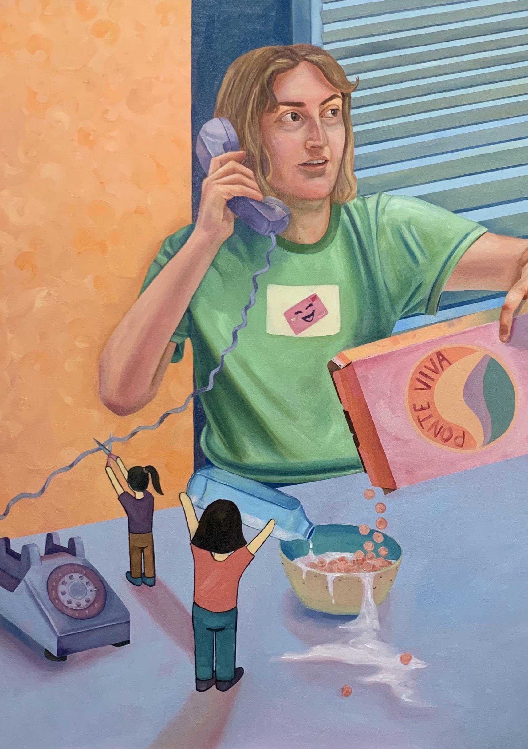
The meaning becomes clearer in Preoccupied State of Being, where the breakfast scene has been infiltrated by miniature twodimensional figures through which Perez says she personifies a bit of “consumerist mayhem.” These little figures cut the phone cable and spill the milk, creating obvious issues for the subject to notice, but she chooses to ignore the warnings. The subject looks off into the distance and is wearing a shirt with a smiling credit card, designating her, like a nametag, as the distractable consumer. She decides to ignore the mess in her personal space, suggesting that she would do the same for the wider environment as well. The cereal box advises viewers to pay attention, as stated in Spanish, “ponte viva.” Perez hopes that viewers will notice the warnings within her work, and then consider making changes in the real world.
Stephanie Perez has equipped herself with the skills to tackle environmental concerns through her artistic creations. She is a senior painting major, also obtaining a minor in sustainability. Unlike many of her past works, Modern Diversions and Preoccupied State of Being are less obvious in how they connect with environmental activism. Yet, with closer looking, Perez pushes viewers to reflect on their own power to improve the environment by moving beyond the appeal of distractions. Perez’s works are her expression of climate activism, calling viewers to action through critical self-reflection.
READY FOR MORE? turn to page 107
DINNER TITLE TITLE TITLE THE ENVIRONMENTAL IMPACT OF DISTRACTION 50 51
Ian Switzer, CONNECTED, acrylic on canvas, 9” x 12”, 2021
ARTIST
Sara Barnes
BIOLOGY + SENIOR + SHE/HER
Por Colombia, De Columbiana
WRITER
Dahlia Wrubluski
APPLIED
PHYSIOLOGY AND KINESIOLOGY & ART HISTORY + JUNIOR +
THEY/THEM
53
“It takes energy to educate people and dispel ignorance, she says, but she does so with grace.”
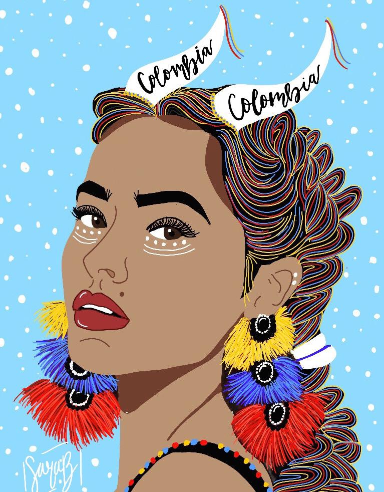
Sara’s work is rooted in her passions. I was surprised to learn she was not an art student; rather, she is a self-taught artist who studies biology with the hopes of attending medical school. Between studying for the MCAT, she jests, she creates digital art. Sara has a deep reverence for the healing power of art. She began making art to dispel anxiety while in high school. Her early works reflect her experiences working through and triumphing over this hurdle. She grew up in Colombia, a home she cherishes but recognizes as misunderstood by her peers. It takes energy to educate people and dispel ignorance, she says, but she does so with grace through her art. Her audience spans herself, other proud Colombians, and those who are uninformed about Colombian culture.
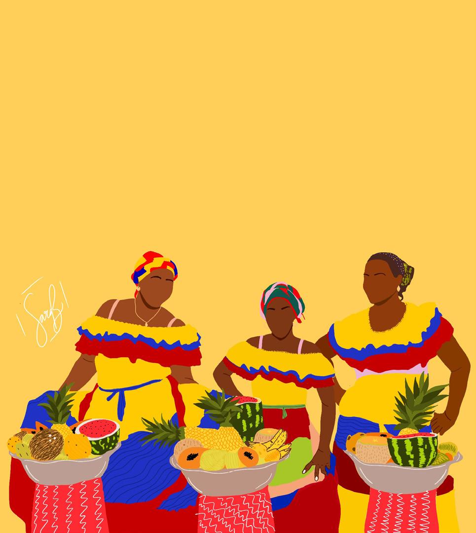
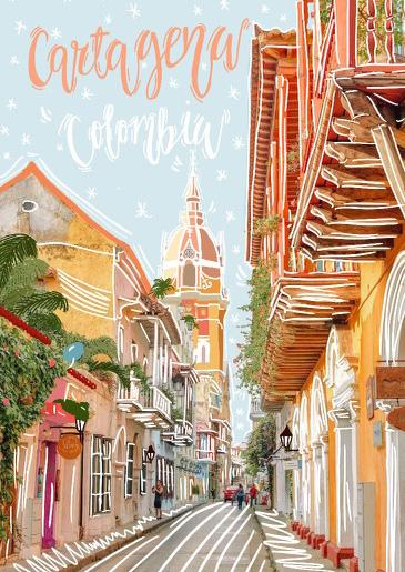
Her art began as a way to understand her mind, but it has blossomed into colorful works of cultural interest. Through strategic use of line and expressive color, she channels the kaleidoscopic dynamism of Colombian dance, architecture, and tradition into her digital works. Over lunch, she beamed about the beauty of Afro-Colombian culture and las palenqueras. The women in primary-colored, infinite skirts balance baskets of fruit and sweets on their heads with effortless grace. She depicts these women, often from Cartagena, with features that make them anonymous but individual. Their shifts in posture suggest unique personalities, but they are united in their heritage. The history of las palenqueras is rooted in a resilience against colonial powers in Colombia. Their elegance is imbued with historical triumph.
previous spread Sara Barnes, COLORES DE MI PATRIA, digital art, 2021
Sara Barnes, LOST IN CARTAGENA, digital art, 2020
In one piece from her astrology collection, Sara embodies the Capricorn sign through a Colombian woman. The woman stands in profile; her turned head, textured earrings, and curved horns give her a commanding presence. In another work, Sara celebrates cumbia, a traditional dance influenced by indigenous, African, and Spanish traditions. She highlights the joyful energy of the dance through the figures’ smiles and postures. Gentle lines signaling movement showcase the swinging of skirts and the tapping and shuffling of shoes. Here, she is proclaiming that this is Colombia—a land of joy and of boundless diversity.
POR COLOMBIA, DE COLUMBIANA 54 55
Sara Barnes, PALENQUERAS, digital art, 2021
Sara wants to channel the didactic and uplifting nature of her work into enhancing her future career environment. She wants to be a pediatric physician, a healer and caretaker of kids. Many children suffer from secondary emotional and psychological effects of having physical ailments. As a physician, she dreams of establishing a well-decorated practice that puts patients and their families at ease. Her ideal environment is one that emphasizes and teaches the hope of healing and medicine. The skills she developed to overcome her private tribulations will be put toward bettering the quality of life for her community.

POR COLOMBIA, DE COLUMBIANA 56 57
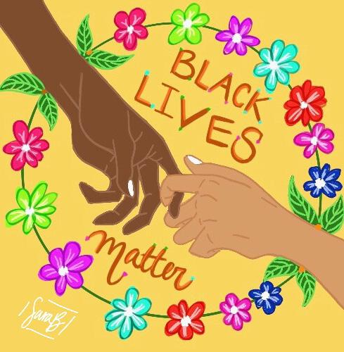
Sara Barnes, BLM, digital art, 2021
READY FOR MORE? turn to page 127
Sara Barnes, COLOMBIA, QUE ENCANTO, digital art, 2021
“You could build a shanty town in anywhere from a couple of weeks to a couple months. But together they create this group of people that is strong and unified.”
ARTIST
Jose Rivera
DRAWING + SENIOR + HE/HIM
Fragile Construction; an Exploration of Impoverished Communities
WRITER
Samantha Pruitt
ART HISTORY + FRESHMAN + SHE/HER
59
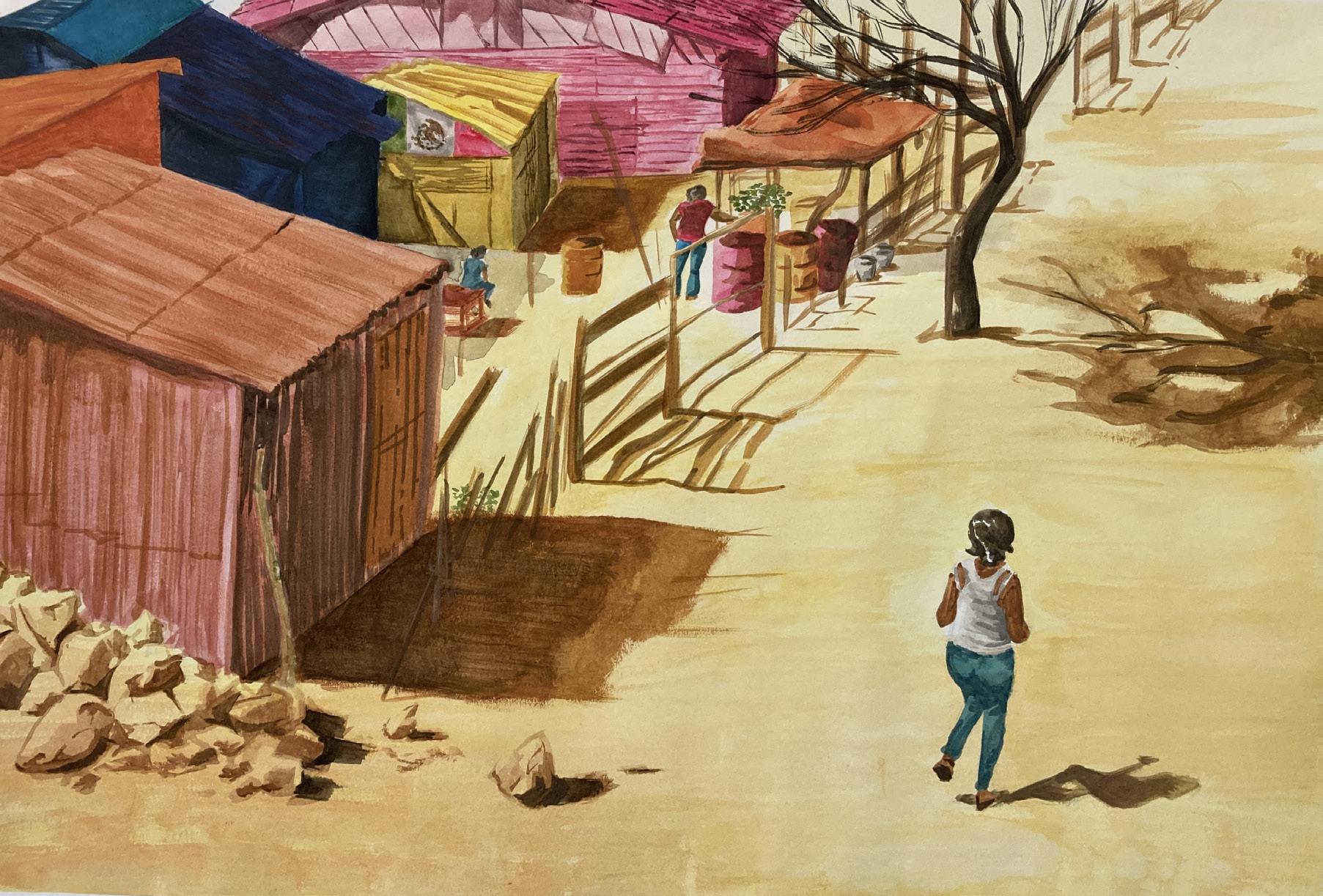
Jose Rivera is a Mexican-American artist from South Florida whose recent work has centered around the experience of poverty and hardship while highlighting the communities that are constructed out of these conditions. Taking personal inspiration from his own Mexican heritage and the stories of family members who have experienced life in the lowest classes, Rivera creates drawings and paintings that relay the true vibrancy of life that survives albeit unfavorable conditions. Due to not having reliable government institutions to rely on, the homes in these areas are constructed by hand as ordinary people are left with repurposed materials ranging from cardboard and recycled wood to tarps and scrap metal. Individuals are forced to build with only the scarcely available resources, leading to minimal options aesthetically. Thus, a single structure may include a wide variety of colors, not by design but by inevitability, leading Rivera to purposely depict a bright, vibrant architectural scene. However, he makes a firm point that he does not wish to aestheticize poverty nor merely seek to raise awareness. Rather, he is interested in the union of people that occurs in these spaces, depicting the architecture of poverty as a symbol for the close-knit groups of people that survive together. “I’m using the architecture of these spaces and these buildings as a kind of messenger, a symbol for these communities. Built out of scraps, all these homes and structures are fragile, and they are built fast. You could build a shanty town in anywhere from a couple of weeks to a couple months. But together they create this group of people that is strong and unified,” says Rivera.
In his work Destitute, Rivera provides a closely zoomed in view of these living situations, reminiscent of the real-world Barrios of Mexico. Depicted in a detailed but relatively unfinished style, Rivera emphasizes the instability and fragility of the structures. In this moment frozen in time, viewers take a third-person role in the scene which Rivera attributes to the voyeuristic nature of observation when discussing poverty. Rivera explains how many people are struck with this feeling when discussing poverty in other countries, stating “it’s ironic, but also interesting how hearing about all these deprived people feels so foreign, and the only way to truly relate would be to experience the situation firsthand, but instead we base our judgements and our opinions on these people, on these places by the images and texts we see on our screens.”
Rivera continues to explore these ideas in his work Shanty from a broader perspective and omits the use of figures, focusing on the architecture of poverty. The buildings are colorfully depicted in an open space, creating the illusion that the city is floating. Rivera
previous spread Jose Rivera, DESTITUTE, watercolor, 2021
Jose Rivera, SHANTY, watercolor, 2021
intentionally excludes a physical ground to enforce the idea that these communities are not tied to single locations but are rather a wandering concept driven by people and the structures they establish. This artistic choice is also a way to reference city planning and concept designs when developing proposals for new housing.
By creating a compact space in which the buildings almost appear on top of each other, Rivera comments on development decisions that were made out of necessity rather than efficacy.
Through Rivera’s exploration of the depiction of poverty, he ultimately focuses on the community behind these developments and seeks to humanize them. The vibrant colors parallel the vibrancy of life that inhabits these areas despite the harsh conditions, drawing the viewer into the scene. Rivera summarizes his intentions, claiming that poverty is everywhere, even in first world countries. That’s because people are everywhere and that means they need a place to live and a place to call their home. And no matter how crummy these places are, they are homes.
DINNER FRAGILE CONSTRUCTION; AN EXPLORATION OF IMPOVERISHED COMMUNITIES 60 61
ARTIST
Jessica Clermont
“It feels like we’re trapped in a different dimension…we’re merely observing their shadows as they move towards the light.”
What Lies Ahead for Me (And You?)
WRITER
Francis Cadavid
63
ART HISTORY & BUSINESS ADMINISTRATION + FRESHMAN + SHE/THEY
VISUAL ART STUDIES + SENIOR + SHE/HER
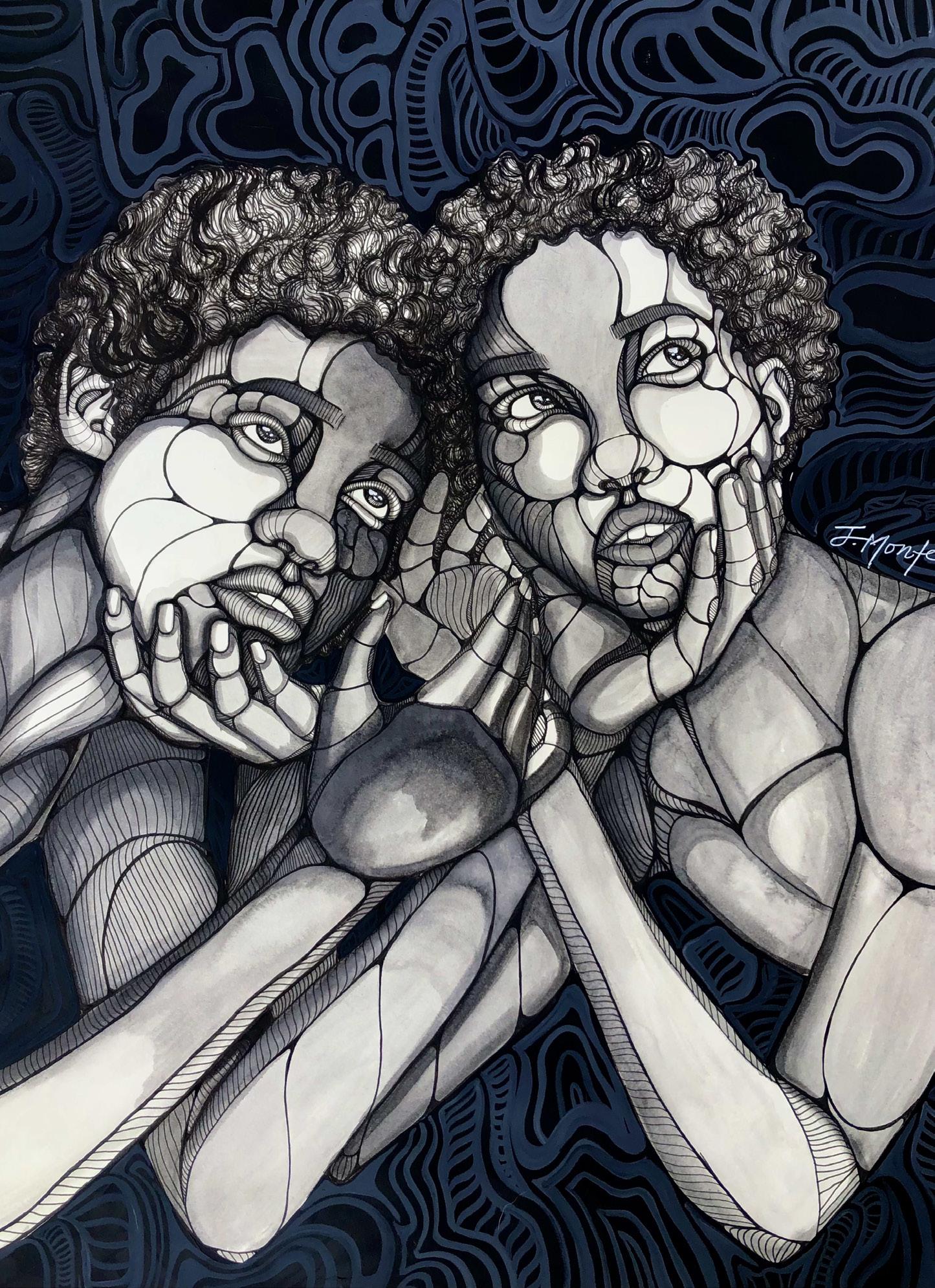
Jessica Clermont has shown me the importance of craft and deepening the relationship between you and your craft. Clermont has a foundational background in two-dimensional work and recently started exploring three-dimensional artworks. Through these different mediums, she finds and develops different artistic expressions. In her budding interest in three-dimensional work, her creative voice leans toward the experimental. In dealing with mediums like ceramics she explores the human experience in fun and unexpected ways. Clermont’s more established twodimensional ventures, reflect the dynamics of her identity, particularly her blackness. Through her two-dimensional expressions, she finds comfort in works like this with a background in drawing and graphic design to support this medium.
Clermont’s use of linework in this piece is characteristic of her style. Through the playfulness of each line a certain flow is created, that brings life to the content which she illustrates. This flow certainly ties in with her theme of what lies ahead. As she explores the unknown through each line. With different weight in each line we see the individual aspects of the face, body and hair. Not only does she incorporate the line work in the central figures of the display but as well as the background. With thicker lines and darker colors incorporated to the background a contrast is created between the foreground and background. The linework allows us to trace different aspects of the piece and truly is visually captivating. As she was showing me her other works, I could see the abundance of growth in this unique style and how truly passionate she was with her creative self.
In her two-dimensional piece Beyond, I see her emphasis on black identity and identity as a whole. The composition consists of two figures shown from the chest up, staring off into the distance and caressing each other’s faces. By having the figures stare off into an unseen distance Clermont brings attention to their gaze. Clermont wanted this “less intimate” portrait to bring attention to the introspective moment the figures are having. This disconnect is crucial and important to depict. As viewers, we question, what are they observing? Clermont seeks to evoke “wonder as a state of being.” Clermont is currently a third-year student at the University of Florida, wonder, uncertainty, and anxiety are all familiar sentiments. The wonder of what lies ahead, or beyond, is an exponential feeling in her, mine, and maybe even your college career. This is Clermont’s precise intention in her portrayal: the questioning of yourself, your journey, your craft, and all other important components of the self.
previous spread
Jessica Clermont, BEYOND, 24 “ x 18”, ink with acrylic, framed in a traditional gold frame, 2021
As Jessica was taking me through her creative process she told me the interesting role of approaching deadlines had on the creation of this artwork. Beyond was a piece featured at the “Lights and Shadows” show at the NOMA gallery. She had three days to finish the composition she had yet to start. In a matter of two and a half days of work, she found herself with the figures in Beyond. She notes that this was a “snapshot of a very stressful moment” in her life. I took great inspiration from her ability to take a stressful moment and create something into something she now deeply admires.
Beyond shows the importance of introspection and looking ahead. It shows me the productive qualities of working on a craft and growing it as Jessica has done so masterfully.
@clermont.studios on Instagram and jessicaclermont.com
DINNER WHAT LIES AHEAD FOR ME (AND YOU?) 64 65
ARTIST
Alex Kirkpatrick
“Was It All Worth It?”: An Exploration of Gray Areas in Grayscale
WRITER
67
“I want people to consider the experiences of American soldiers and how our government has used our military not for the justice we claim to pursue, but for geopolitical and economic gain.”
Skyler Dunbar ART HISTORY & POLITICAL SCIENCE + JUNIOR + SHE/HER
ART + TECHNOLOGY + JUNIOR + HE/HIM
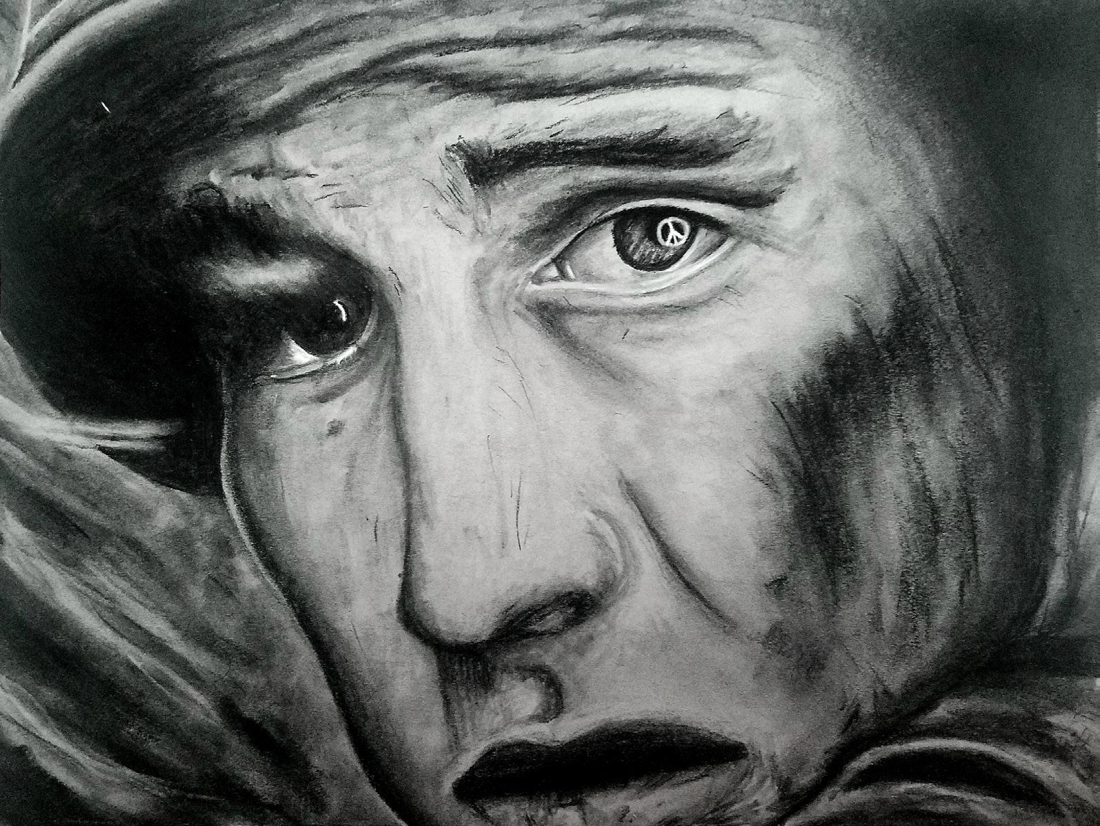
Third-year Art + Technology student Alex Kirkpatrick created an impressive and thought-provoking analysis of the Vietnam War in his untitled two-part drawing series depicting the transformation American soldiers endured through the period of political unrest that marked the 1960s and 70s. Untitled I, created in the Spring of 2020, depicts a petrified American soldier, capturing a look of utter terror and fear as the man’s face is frozen in an eternal scream. The close capture of the drawing shows only his face and the brim of his helmet, leaving viewers to wonder what lies in the darkness enshrouding him. Eyes wide with fear, a small peace sign glimmers in the corner of his right eye, the whitest and brightest portion of an image drawn completely in tones of charcoal gray and black. Untitled II, created in the Fall of the same year follows up its predecessor in an even more terrifying manner. A second soldier is displayed in the crux between life and death, a near-skeleton immortalized in an identical scream, reduced to bones and flesh pulled tightly across a skull with an equally, if not more horrifying look of terror painted across its face. The slightly wider perspective of this second drawing allows viewers to see that this man is in full military uniform, his helmet embossed with a peace sign, and he is tightly gripping his gun, though the background remains shrouded in darkness, leaving viewers to only assume what he faces.
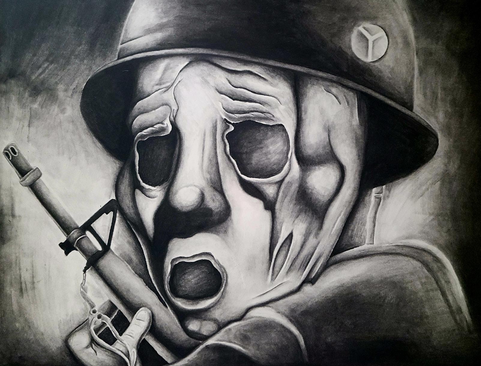
Kirkpatrick grew up with an early interest in American military history rooted in listening to his grandfather’s retelling of his experiences in World War II and reading military textbooks. He recalls WWII being portrayed as a distinctively black and white issue in which the United States is undoubtedly on the right side of history. As Kirkpatrick grew older, he began exploring the histories of more recent wars and saw the dissolvement of truly black and white, good versus evil dichotomies in war. Vietnam struck him as a moment of poignant moral grayness in American history. Kirkpatrick says he was particularly affected by the Ken Burns documentary series “The Vietnam War,” which did more to educate him on the war’s effects than his education ever had. “I watched it several times over and felt deeply affected by it,” Kirkpatrick recalled, mentioning that he was particularly struck by the documentary repeatedly featuring the stories of individual soldiers and retelling the horrors they suffered and endured, and how their experiences ultimately turned them against the effort and the word of the United States government. The documentary concludes by asking “was it all worth it?”, questioning the underlying motives and moral depravity that led to the U.S. government starting this war.
previous spread Alex Kirkpatrick, UNTITLED I, charcoal on paper, 9”x12,” 2020
Untitled I and II explore the lie that was sold to American troops during the Vietnam War – that they were engaging in another battle of “good versus evil” and spreading American prosperity – and displays the effects their experiences had on them. This transition from alive to undead, all the while gripped by fear, displays a movement towards death in multiple senses as the soldiers depicted confront a loss of innocence, morality, and ultimate loss of life.
“I was thinking about it in terms of the soldiers’ experience. WWII depictions of soldiers are typically very heroic and glorify the soldier, but to convey the soldier during the Vietnam War, I wanted to move away from that. I wanted to show the soldier as someone who has been taken advantage of. These soldiers were used for political gain for the leaders at the time, they were pawns in a game they couldn’t control.” The soldiers in Untitled I and II are valued only for their ability to propagate a hollow message of peacekeeping and prosperity and are robbed of their humanity in the process of promoting an American message they were sold and no longer believe.
“WAS IT ALL WORTH IT?” AN EXPLORATION OF GRAY AREAS IN GRAYSCALE 68 69
Alex Kirkpatrick, UNTITLED II, charcoal on paper, 18”x24,” 2020
Kirkpatrick hopes his drawings encourage viewers to engage with our past and political presence with a critical lens. “There’s a lot of trauma and morbidity surrounding war and embedded in American history. We need to understand our past and its complexity because what American soldiers endured in Vietnam was horrible, and the lessons we should have learned by now continue to escape us.” Kirkpatrick made specific reference to the recent evacuation of American soldiers from Afghanistan in 2021 to the evacuation of troops from Vietnam in 1975, pointing out how, despite clear signs of failure and a lost cause, American leaders then and now have tried to make it appear that these were successful missions, that we fully accomplished our goals. “Was it all worth it? I want people to continue to ask that question in our current military endeavors. I want people to consider the experiences of American soldiers and how our government has used our military not for the justice we claim to pursue, but for geopolitical and economic gain. The black and white, ‘good versus evil’ conflicts of WWII have been replaced by the interests of warmongers that will be fulfilled at any human cost.”
“WAS IT ALL WORTH IT?” AN EXPLORATION OF GRAY AREAS IN GRAYSCALE 70
Tabitha Cherubin, UNTITLED, digital photographic series, 2020
Dinner
No show

LEAVING
ENTERING
“Her main focus throughout her recent portrait has been to capture genuine emotion rather than accomplishing a flawless composition.”
ARTIST
Michelle Serafimovich
ART HISTORY & INTERNATIONAL STUDIES + SOPHOMORE + SHE/HER
Emotional Evolution in Portraiture
WRITER
Madison Morales
ART HISTORY + SOPHOMORE + SHE/HER
75
The idea of evolution saturates nearly every aspect of life: psychological, physical, scientific, religious, and even artistic. Michelle Serafimovich, a sophomore Art History and International Studies student at the University of Florida, adopts this widespread notion of evolution within her own subject matter and artistic style. From childhood to adulthood, creating art was, and is, a significant feature of Serafimovich’s life. Many of her recent works depict individuals with personal connections to her, as well as displaying her own artistic progression of skill. Additionally, the theme of emotional transformation undertones a variety of these pieces. After teaching art to young students, Serafimovich became inspired by the creative freedom that children had when approaching art and translated that into her own work. This artistic liberty, coupled with the theme of evolution, led to the artist’s emotionally charged and visually complex portraits, all of which are untitled.
Many of Serafimovich’s portraits utilize layers of acrylic paint and modeling paste on canvas paper. In regards to her untitled work depicting three images of a close friend, the artist challenged herself by rejecting the idea of ‘realism’ and solely capturing raw emotion by alternating between swift strokes of color and modeling paste. Additionally, there is nearly a complete absence of traditional techniques. Instead of using one singular brush to deposit a majority of the pigment onto the plain canvas, the artist employs multiple brushes assigned to each color within her palette. By incorporating complementary colors, such as greens and reds, Serafimovich facilitates the emulation of skin and the undertones that shift in the expressions. The tonal ranges in the muted color palette also contribute to the subtle depths and topography of the figure’s face. Although the primary palette consists of these muted shades, the fluorescent yellow background elevates the saturation of the subject. Furthermore, the artist chooses to represent each portrait as an extension of the other, which creates a frame by frame narrative depicting the shift in emotion. Not only does Serafimovich create a cohesive piece detailing the evolution of her friend’s emotions, she makes reference to divisionism, also referred to as pointillism, with minimal linework. The linework, while made sparingly in the piece, is meant to emphasize contrasting areas of highlights and lowlights of the subject: the crevices between the fingers, the nostrils, the wrinkles of the skin made by the subjects facial expressions (the lips and cheeks), the bone structure (the collarbone), etc.
previous
spread
Michelle Serafimovich, UNTITLED, acrylic & modeling paste on canvas paper, 2021
Although the artist achieves uniquely complex narratives in her work, Serafimovich does not explicitly outline her artistic course of action. Primarily, the artist begins her process by developing a general thematic scheme and choosing a specific subject, then, continuously building upon her piece as she goes. Her main focus throughout her recent portrait has been to capture genuine emotion rather than accomplishing a flawless composition. This is expressed through her adoption of multiple mediums, divisionist techniques, and deviation from traditional methods. Serafimovich develops a literal and representative three dimensionality in her works and actively aims to push past her own artistic limits. She fuses the rawness of human growth with her own creative journey.
NO SHOW EMOTIONAL EVOLUTION IN PORTRAITURE 76 77
“Forced back to the storyboard, our main character is forever doomed to repeat the cycle and experience perpetual disillusionment brought on by trying to live out a fairy tale”
ARTIST
Laura Haynes
Laura
WRITER
Hala Hachem
79
HISTORY
ART
+ CHEMISTRY + CLASSICS MINOR + JUNIOR + SHE/HER
ART & ANTHROPOLOGY + SENIOR + SHE/HER
Glass: Escaping
Art
through the Looking
through
Laura Haynes is many things: a senior about to take the next steps in her academic career, an artist who can stun her audience with any medium she chooses, and a teller of tales who makes even the Brothers Grimm proud that the tradition of storytelling lives on today.
Approaching graduation with a dual degree with a Bachelor of Arts in Art and Bachelor of Science in Anthropology, Laura’s goal is to work in visual science communication. Though this may seem like a betrayal to her artistic side, she described in our interview that in order to successfully communicate scientific topics, one needs to be an effective storyteller – isn’t storytelling a form of art? She has already started her journey by applying her artistic skill to her passion for primates with her summer internship at the Smithsonian and looking forward to graduate school next year.
A school assignment turned passion project, Wishing for aWay was not meant to fulfill academic validation or a capitalist need to produce for profit. This retelling of a generic fairy tale of a woman that can only be saved by the love from a man was meant to help those, including the artist, realize we must break the cycle of the unhealthy situations we may find ourselves trapped in.
The poses and emotions displayed by the heroine at the center of this piece, modeled by the artist herself, are meant to be read in a cyclical fashion while also taking into account the auxiliary details that refine the piece and its underlying message. Starting at the left corner, we see our main character succumbing to her anguish and looking for a way out of it. Hinted by the open window behind her, though the path is clear to find fulfillment, she turns her back away from a realistic solution to one made for fairy tales: finding a prince to rescue her. Framing a picture of a wedding scene, we are offered a look into her thought process and ultimate goal. The next stage in her journey, after an attempt at attaining some sort of romantic relationship, she mimics the pose of the princess behind her but with a face that reads of spite and disdain rather than satisfaction: she did not find her happily ever after. Forced back to the storyboard, our main character is forever doomed to repeat the cycle and experience perpetual disillusionment brought on by trying to live out a fairy tale.
previous spread Laura Haynes, WISHING FOR AWAY, digital photo collage, 2021
Inspired by her favorite childhood pastime, Laura took the reading material of her youth and the characters she saw as role models as the inspiration for this piece. Offering her audience a retelling of the stories they knew growing up, Laura wanted to show those who partake in this sort of escapism that the recurring tropes and archetypes directly impose harmful stereotypes on impressionable minds. Why must all women be rescued by a man? Is a woman’s worth measured only by her beauty and abilities to maintain a home? It turns out the books we turn to in times of comfort have been the source of our problems, preventing, instead of equipping, us from being our own hero in times of need.
Wishing for aWay is a modern retelling, open to all but dedicated to those whose safe space is a library and find familiarity in fictional friends. It is not meant to be a tribute but a lesson that not all readings are conducive to our character development so we must take it upon ourselves to step beyond the pages and roles assigned to us in order to reach our own potential.
Wishing for aWay is part of an ongoing series focused on retelling stories of our past through a modern lens. While this photo collage, inspired by surrealist photographers like Dora Maar, was done through Photoshop, Laura has been continuing her storytelling series with animation. Though technology of this magnitude was not around to inspire the art, the illustrations of these fairy tales has played an influential role in the aesthetics of these pieces. Laura finds it a fun challenge to try and achieve flat color, minimal shadows, and fine lines that portray a fantastical idea of the human form with technology that captures its stark reality.
Life is not always a perfect story: it can be full of insurmountable obstacles, forks in the roads with no right choices, and villains trying to tear you down at every corner. Even if all we want is a hero to sweep us off our feet and away from our problems, it may not lead to the happy ending we think it will. Wishing for aWay offers us this advice: fairy tales are not always what they are drawn to be, we must take charge of our own destinies and be the heroes of our own stories.
NO SHOW LAURA THROUGH THE LOOKING GLASS: ESCAPING THROUGH ART 80 81
“Engaging art as ritual, Sonia Consuelo Vera-Leon utilizes compulsion and destruction as a means of catharsis, and extends the process of artmaking into her community.”
ARTIST
Sonia
Vera-Leon
Art as Ritual
WRITER
Chanel Collison
ART HISTORY & VISUAL ARTS STUDIES (CERAMICS) + SHE/HER
83
Consuelo
CERAMICS MFA CANDIDATE + THIRD YEAR + SHE/HER
As a third year Ceramics MFA candidate, Vera-Leon notes that the process of artmaking has always been a personal ritual for the artist. The repetitive manipulation of plastic clay is a meditation, and often an opportunity for the mind to escape. In the artist’s work, Vera-Leon expands upon ideas of compulsion and habit in the creation process, and eventually finds catharsis in the destruction of her own pieces. Involving the community in her work allows myriad interpretations, drawing connections to physical destruction as psychological release, and even a symbolic gesture of decolonization.
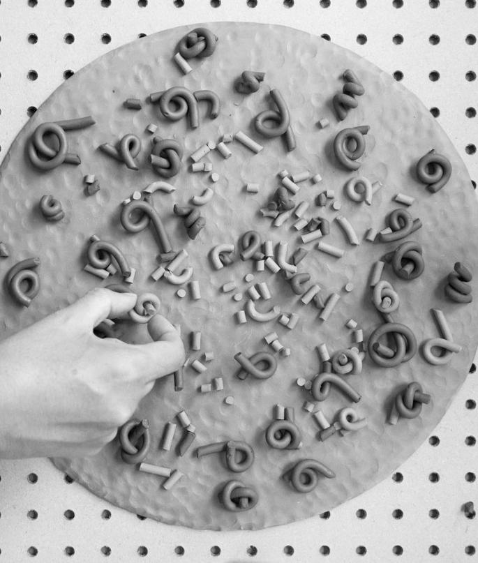
In her piece titled Again and Again, Vera-Leon utilizes clay coils as indexes of emotion. The dark, plastic clay coils lay whole, impending destruction, next to their dried and crumbling counterparts. The process takes place on a slab detailed with fingerprints and contrasted by the pegboard background. Here, the littered fingerprints lay way for the emphasis on the process, while the geometry displayed by the pegboard highlights the contrast between order versus destruction, pattern versus chaos. Oftentimes art is analyzed in favor of the end result, but the visual qualities of ceramic art allow for an emphasis on the artmaking process. In Again and Again, the artist’s focus on the process is clear. The spirals and fragments of clay lay in a spectrum of dryness, emphasizing the temporal quality and process-focused concept. Wrapping the clay around her finger and tying it into knots, Vera-Leon derived the coil gesture from her personal propensity to twirl her hair, a compulsion often associated with anxiety. In this piece, the artist is literally and figuratively breaking down that anxiety and actively seeking a means of catharsis through destruction.
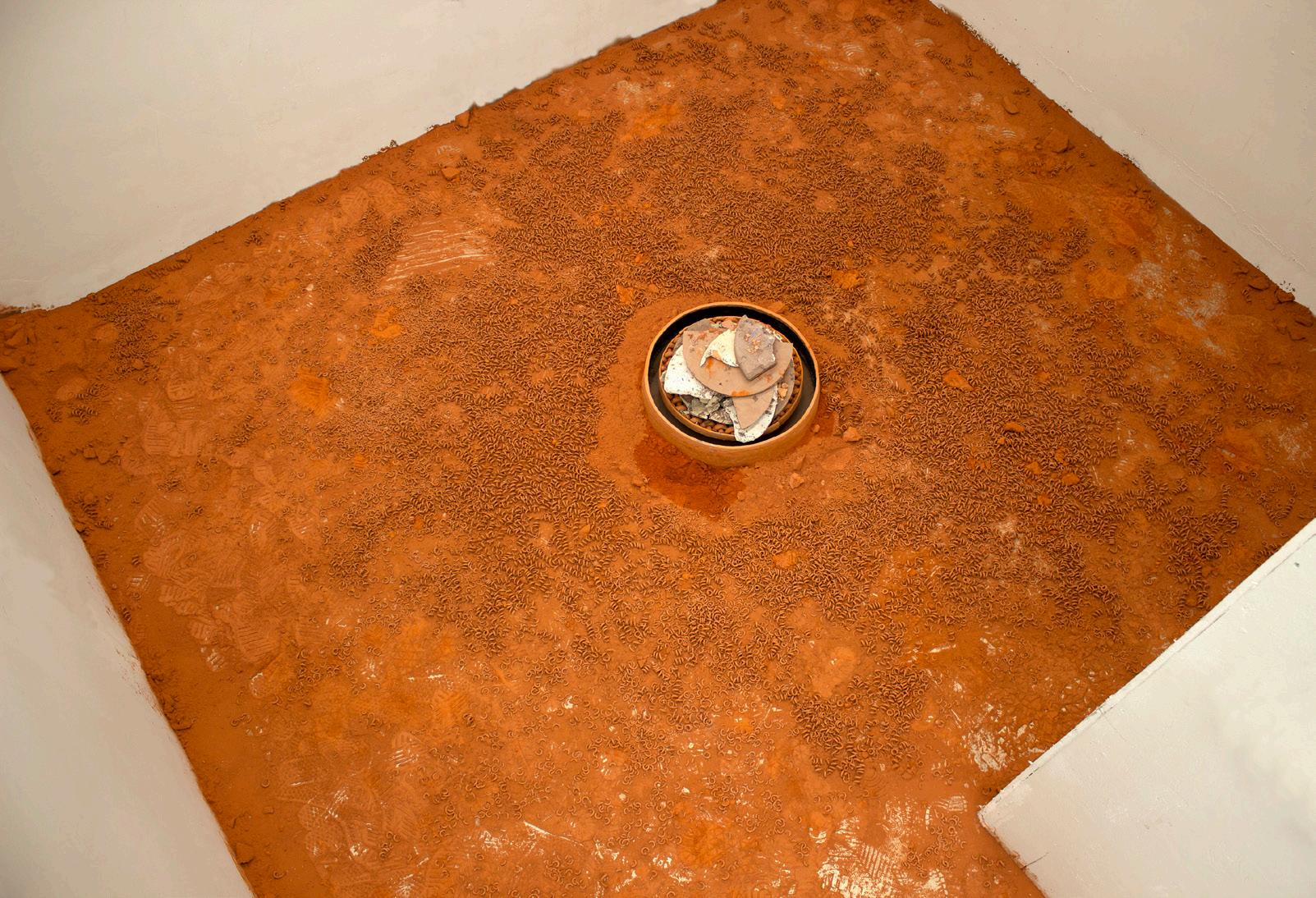
Vera-Leon’s installation piece titled Disintegration Loops continues the process of creation and destruction and invites the viewer to participate, highlighting the significance of community and connection. Expanding upon the notion of artmaking as ritual, the artist states that the participants are “encouraged to imbue the clay with their most pressing thoughts and emotions.” In this piece, the clay spirals envelop the floor in a red sheet, resting on top of the dust and fractured remnants of the past. The blanket of clay dust that the viewer must walk upon in order to participate serves as a memento mori, reminding the viewer of the recurring pattern of life and death while pondering the concept of our own mortality. The spirals surround ten circular discs of clay on woven lattices, referencing the cyclical nature of creation and destruction, and reiterating the interconnectedness
previous spread
Sonia Consuelo Vera-Leon, AGAIN AND AGAIN, earthenware on pegboard, 2021
Sonia Consuelo Vera-Leon, DISINTEGRATION LOOPS, earthenware, 2021
of life, death, and rebirth. The participants are invited to break the existing objects and make their own from the remnants, resulting in a collective reimagining of the initial piece. As the viewers move around the space, the old objects are broken simultaneously as new ones are created. Disintegration Loops is process-focused and community influenced, offering myriad interpretations based on the perspective of each viewer. For the artist, her personal history as the descendant of Cuban immigrants places importance on a reimagining of the past, a symbolic gesture of a collective effort toward decolonization and community building. Ultimately, Disintegration Loops intends to connect the community in a shared visual and cognitive experience.
ART AS RITUAL 85 84
ARTIST
Isabelle Stratton
PAINTING & MATH + JUNIOR + SHE/HER
“Stratton’s various artistic approaches accurately portrays femininity in its most hardy form: breathtakingly beautiful, but not for the sake of (misogynistic) aesthetics.”
The Fortitude of Femininity
WRITER
Sophia Salerno
ART HISTORY & POLITICAL SCIENCE + SOPHOMORE + SHE/HER
87
There is a certain inert sense of fearlessness in those willing to tackle the gender-normative structures of our society, whether it be through engaging in gendered occupations or challenging such norms through artistic self-expression. In the case of University of Florida’s third year Painting and Math dual-degree student Isabelle Stratton, she happens to be seizing both these pursuits at once. Upon first speaking with Stratton, I was immediately intrigued by her proud proclamation of her two chosen majors. Though the arts is seemingly dominated by women and STEM industry by men, there is still a perceptible, yet insidious prevalence of heteronormative discrimination within both hemispheres. To rephrase this, despite the fact that men and women both partake in the above fields, there is an innate reflex to appreciate an effeminate individual’s accomplishments not by virtue of their gender, but despite it. This is of course not a commentary on the persistence of sexism in the workforce of our society, but rather, it is a reminder that femininity can (and does) exist amidst spaces it is otherwise unexpected in, regardless of how objectively contradictory it may seem. With all of the above considered, Stratton intertwines the harsh realities of her prospective career with her relative womanhood across a diverse arrangement of artworks particularly attributed with “ugly femininity”.
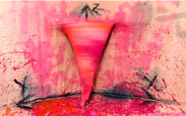
previous spread Isabelle Stratton, FIGURE STUDY, oil on canvas, 2021
Stratton stated early in our interview she prefers to steer away from constructing her works of art for the eye, or perhaps the lingering male gaze many girls are familiar with, as women do not deserve to endure the idealistic expectation of continued and consistent beauty. While she also said her chosen media is less important than prioritizing this concept, it is evident the two rely on one another to really impact the viewer and elicit a reaction– whether it is positive or perturbing. Stratton’s theme in focus, which she termed “Power in Softness”, is initially observable in her figure study oil painting picturing a foreshortened reclining nude (2021). With a history of painting with oils since the age of twelve, Stratton acknowledged her thorough familiarity with the medium. However, she similarly relayed the intimacies of oil painting and how although it sometimes can fail to convey a (physically tangible) idea, it regains its strength in reflecting reality solely based on the user’s skill. In other words, the pictured nude figure study succeeds in depicting light on the painted female subject, enabling the viewer to nearly feel the creaminess of the vibrant pastel pink cloth-draped furniture in the background, and ultimately utilizing tactility on a flat surface because of the artwork’s relationship with oils. Granted, this tactility highlights the female’s figure, but it does so in a manner quite the opposite from an objectifying one: she lies comfortably, presenting herself with full permission and consent for the viewer, all without challenging their observance. Stratton paints this study with the figure’s careful seal of approval, an action not all women are granted in the ravenously degrading society they exist within.
NO SHOW THE FORTITUDE OF FEMININITY 89 88
Isabelle Stratton, PINK TORNADO / VIOLENT FEMININITY, drill, copper wire and acrylic paint on canvas, 2021.
Nonetheless, Stratton recognizes making art should not come effortlessly. Gratitude in one’s craft often stems from making something out of the challenge it poses not only on a technical basis but a personal one as well. Exploring “how to execute a process physically” best describes Stratton’s goal in her larger scale, ductile, and interactive works. Two works of Stratton’s that present female hardiness as a sensory experience include her ceiling installation titled Cave and her sculpture of Pink Tornado / Violent Femininity. Cave derives influence from mind-boggling scientificfiction scenery, while Pink Tornado / Violent Femininity’s vivid fuschias and bloodied spurts call upon our environment’s naturally destructive tendencies. While the “violence” of the second of the two paralleled works and the emulative theme of fertility in the first resonate with viewers differently, both examine the strength of women in seemingly visible and palpable manners. Though it is fundamentally arbitrary to associate gender with degrees of strength, Cave reflects a domineering yet maternal presence as Pink Tornado / Violent Femininity hurdles by uncontrollably, fiercely, and unapologetically; all at once, Stratton has shown the turbulent, tender experience of femininity. As much as it is inexplicable to display society’s feminine collective drenched in the contaminations of a patriarchal domain, Stratton’s various artistic approaches accurately portrays femininity in its most hardy form: breathtakingly beautiful, but not for the sake of (misogynistic) aesthetics.
TITLE TITLE TITLE THE FORTITUDE OF FEMININITY 90 91
Isabelle Stratton, CAVE, sheet plastic, 2021.
“His worlds invoke of course happiness and joy with their fun color schemes, shapes, etc., but also a nostalgic comfort for familiar childhood imagery.”
ARTIST
Wade Rubin
CERAMICS + SENIOR + HE/HIM
A Reflection of Space
WRITER
Marie Fiemeyer
ART HISTORY + FRESHMAN + SHE/THEY
93
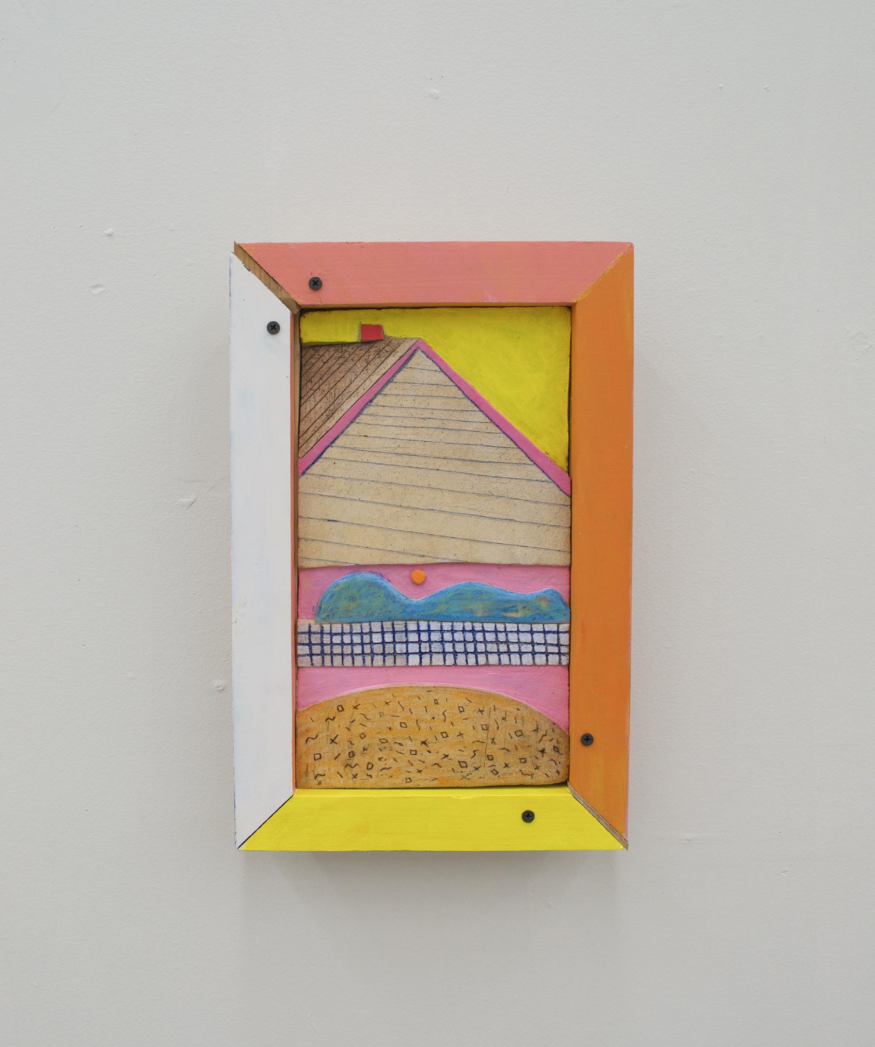
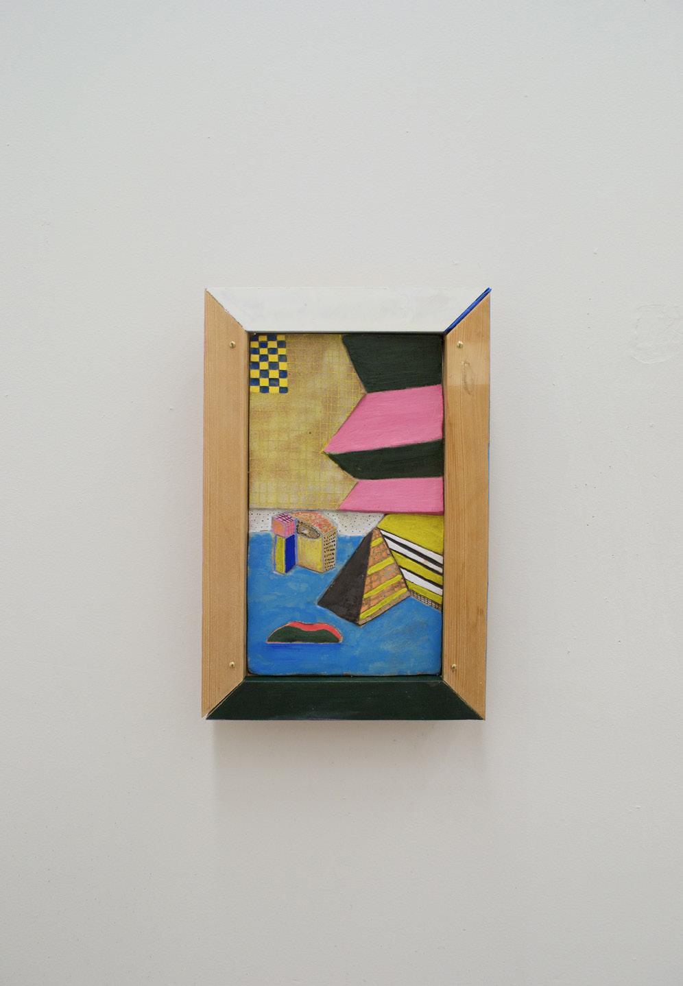
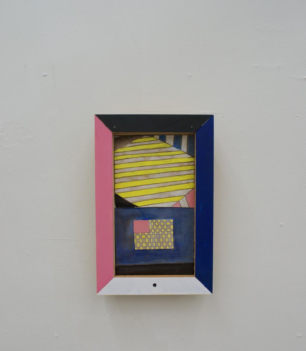
Few things force a ceramics major to reevaluate how they approach their work quite like a broken arm. When artist Wade Rubin faced this inquiry last year, he had to learn to work through and adapt with this roadblock. As a result, his pieces got smaller and the puzzles became more difficult, but for him, this is the compelling part of the art-making process. Regardless of the form that Rubin’s work takes, architecture remains a constant theme with scenes dominated by urban and suburban motifs. This series is no exception with concepts that delve deeper into the materiality and energy of his environments.
Starting with the initial stages, the artist gets under way by recording small sketches in a notebook, along with other thoughts and drawings that are captured on location and successfully preserve the spirit of a place in real time. Flipping through the pages, I was able to find carefully curated moments that the artist had chosen to translate into three- dimensional forms. Using clay, one of their prefered materials, to bring these ideas to life allowed for greater control over the fluidity of the final product. “I like the materiality of clay. It’s fun to carve away and it is meditative, a lot of clay practices are.” Indeed there was something rewarding about seeing all of the pieces lined up and being able to pick up and hold a physical outcome. The sculptor was able to explain the medium’s properties in an enlightening way due to his experience with it. It
previous spread
Wade Rubin, DRAWING NOTHING IN PARTICULAR 3, ceramic, wood, acrylic paint, glaze, 10.5” x 15.5” x 2.5”, 2021
Wade Rubin, DRAWING NOTHING IN PARTICULAR 1, ceramic, wood, acrylic paint, glaze, 10.5” x 15.5” x 2.5”, 2021
Wade Rubin, DRAWING NOTHING IN PARTICULAR 2, ceramic, wood, acrylic paint, glaze, 10.5” x 15.5” x 2.5”, 2021
was clear that he often utilizes the material’s quirks in order to enhance the works. One example of this was in Drawing Nothing Particular 1 where wedges of paper can be found in the gaps where the wood frame did not line up perfectly. Solutions like these highlight Wade’s resourcefulness and proclivity towards puzzle solving, traits that end up adding personality and a distinctive style to his pieces. These imperfections also parallel the patchworked nature of the border, and when paired with vivid colors, checkerboard, and stripes, adds to the overall visual aesthetic. From a design perspective, the flat washes of hue break up the competingpatterns to avoid overwhelming the eye. One result of this style is a loss of depth that can occur through photographs. In person, one can see the sculptures in the round and notice details such as the rooftop receding into space and indented outlines, all of which helps the viewer place themselves into the scenes. The advantage of the frame to the artist is its ability to shift the viewing experience into one of looking through the art, a quality that is difficult to translate with pictures.
A REFLECTION OF SPACE 95 94
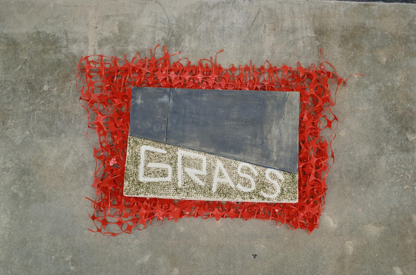
Have you ever Seen carries on this style in its depiction of urban architecture. Inspired by the construction zones of New York City, Rubin includes art within art through the titular question. Like many of his other works, this piece was based on direct observation of the city after a trip there, and while the digital medium seems like quite a change of pace, many of the artist’s hallmarks still wind up influencing the composition. The patterns, once again, add movement to the environment and help convey the busy moment. Another piece that utilized writing was Grass, which bluntly labels the division between sidewalk and lawn. This sculpture is a unique expansion on the series as it experiments with materials by incorporating Chia seeds and red fencing, another reference to how nature and the man- made interact in our surroundings. This was admittedly a new situation for the artist as this is the first time that they had to water an artwork. While this collection is certainly diverse and plays with new ideas, the artist’s goal remains constant. “A lot of this work is stuff that you overlook, the materials that you overlook, but stuff that I am focusing on all of the time. I love the grid, the colors, and I am presenting it in this new and different way that makes you think.” The pieces are flexible, they can “introduce play into your everyday life or it can be a nice little moment of joy for you.” His worlds invoke of course happiness and joy with their fun color schemes, shapes, etc., but also a nostalgic comfort for familiar childhood imagery. Not to be mistaken with childish, in fact, the scenes are rendered quite complex due to the way that they’ve been framed and detailed. It is the quiet neighborhoods and empty streets constructed of conceivable architecture and colors that bring these environments to life and ultimately soothes the audience. Work like this, when paired with such a soft format, invokes your more easygoing emotions, and while this ambition may carry on throughout his future projects, the manner that it’s delivered in is bound to change along with the artist as he continues to grow.
NO SHOW A REFLECTION OF SPACE 97 96
Wade Rubin, GRASS, ceramic, glaze, chia, plastic orange fence, 30” x 40” x 3.5”, 2021
ARTIST
Emotions: Concrete and Abstract
WRITER
“When creating these works of art, they are produced one day at a time, allowing my day-to-day life, emotions, thoughts, and relationships shape themselves into a body of grounded work.”
99
Carolyn Lightsey
ART HISTORY + SENIOR + SHE/HER
& DRAWING + JUNIOR
HE/HIM
Ian Switzer PAINTING
+
Ian Switzer has always felt drawn to the creative process. Ever since he was two years old, he remembers being fascinated with painting and drawing, and especially hypnotized by the calming strokes and colors in the popular television program The Joy of Painting with Bob Ross. Switzer has held onto this affinity for art throughout his life and academic pursuits. He has spent most of his life working on developing his artistic process and is now focused on perfecting his techniques while eliciting emotions from his audience. “When creating these works of art, they are produced one day at a time, allowing my day-to-day life, emotions, thoughts, and relationships shape themselves into a body of grounded work,” Switzer says. In his practice, he wants to show the emotional intelligence that art can hold, and reflect his belief that artwork is a window for conversation.
Switzer began with an interest in landscapes, citing again his childhood appreciation for Bob Ross, and recently he has focused on creating portraits both realistic and surreal. A surrealistic aesthetic allows him to fully explore a range of emotions in his work. He works from observation of either a reference photo or real life then puts his own abstract touches on the piece. His painting Open Wide (2017) embodies a sense of fear, specifically the fear of the dentist. He uses bright contrasting watercolors, and abstract dripping lines. The painting is vibrant with energy, the splashing drips adding a sense of chaos that intertwines with imagery of tears. This image captures a certain type of fear; there is a threatening element of tension. The sharp objects surrounding the head all point directly at the patient. The mouth is held open by metal tools but could easily be mistaken for a scream. While all this imagery is typical of a dentist: the open mouth, drills, blades, and even the brightness of the face from the medical lighting. This painting elicits a sense of panic that is not only relevant to a fear of having one’s teeth cleaned, but also relevant to the broad range of panic or terror one might feel when under close observation.
previous spread Ian Switzer, DESTRUCTION OF EVE, graphite on paper, 9” x 12”, 2019
In a pencil drawing entitled Destruction of Eve (2019), the artist embraces the feeling of loss. The girl, a representation of the biblical first woman, makes eye contact with the viewer. A tear drips from the corner of her eye while her face is in the process of cracking. The top of her head has already burst into shards. The imagery surrounding the woman ties the work to the garden of Eden. There is an apple with a missing bite, a hand reaching down alluding directly to renaissance portrayals of the hand of god, and in the bottom corner a scaly snake is a reminder of Eve’s broken promise and the allure of temptation. Switzer delicately portrays Eve’s face; there is a glimmer in her eye that gives off an air of innocence. The sense of loss is emphasized by his use of grayscale. This work fully captures the essence of regret and sadness and draws the viewer into this feeling. Switzer draws the viewer into this feeling through the eyes of his subject. One feels completely drawn into the emotional atmosphere of this work simply through looking. The viewer is thus able to naturally connect with the work Switzer produces through their own emotional spectrum.
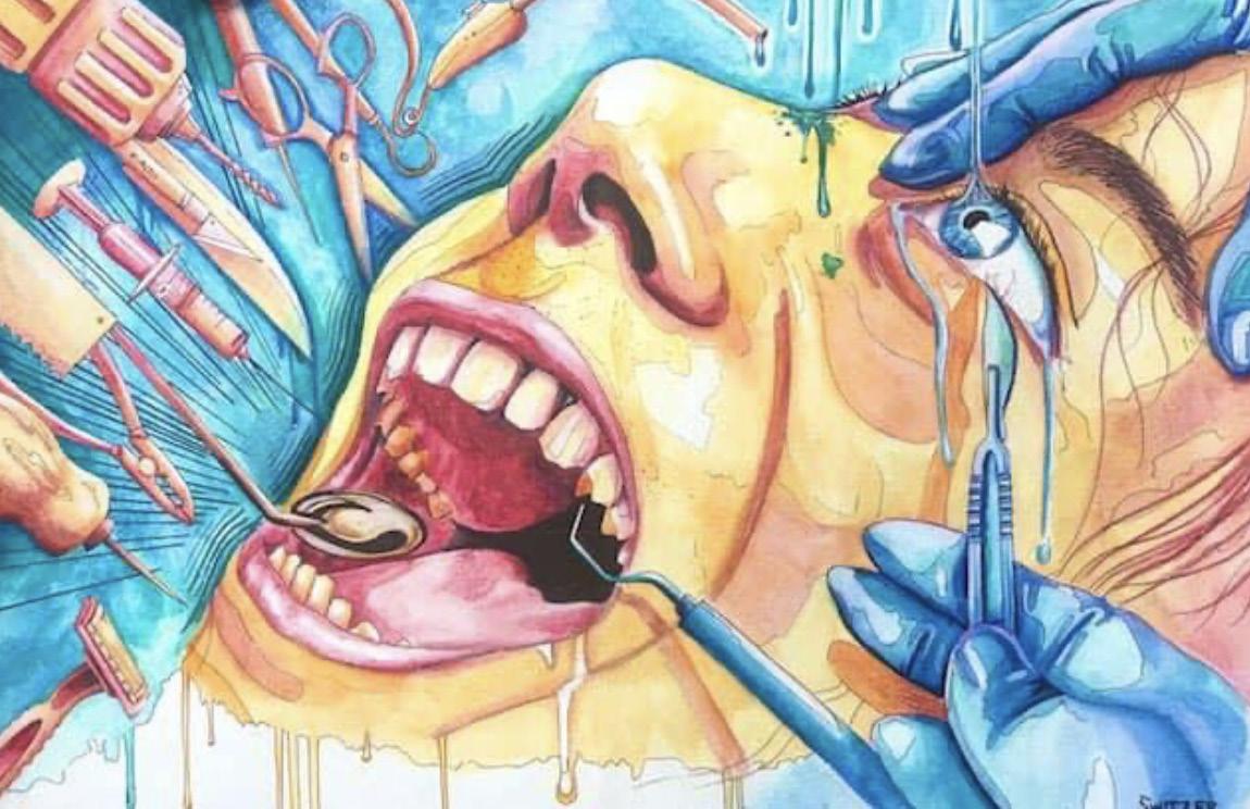
EMOTIONS: CONCRETE AND ABSTRACT 101 100
Ian Switzer, OPEN WIDE, watercolor & ink on paper, 24” x 18”, 2017
“Whether shooting stills in the park or inciting chaos within a digital artistic platform, Young as an artist facilitates colorful discourse within her audience while basking in the joy of creating art that does not need objectivity or planning to thrive.”
ARTIST
Kennedy Young
CREATIVE PHOTOGRAPHY + JUNIOR + SHE/HER
Facilitating Conversation Through an Automatic Artistic Process
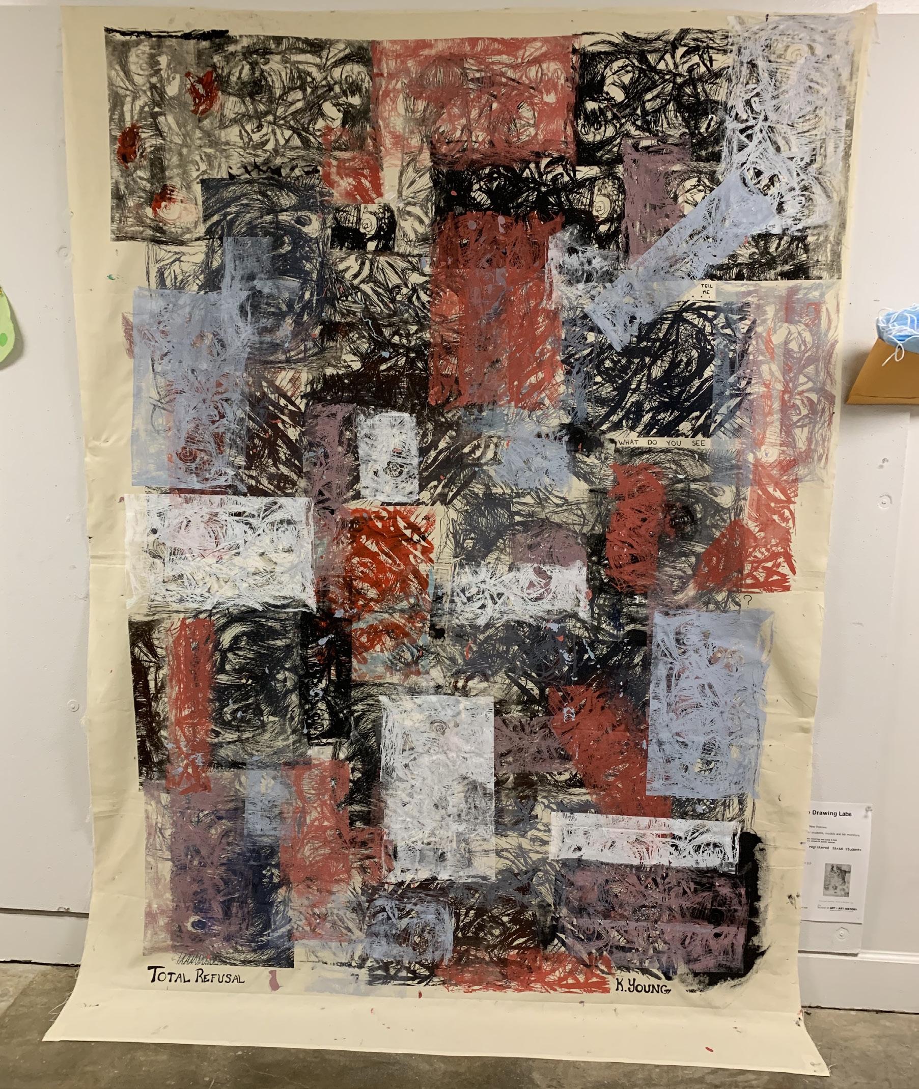
WRITER
Ayla Santos
ART HISTORY & PSYCHOLOGY + FRESHMAN + SHE/HER
103
Third year student Kennedy Young is working towards her bachelor in fine arts with an emphasis in Creative Photography, yet finds herself in the midst of numerous mediums; pen and paper, digital art, watercolor, screenprinting, and grand assemblages. However, even with drastically different ways of creating art, Young facilitates conversation in each, bringing into discourse universal emotional responses that remove pesky objectivity within her works. Whether capturing a little girl with wind in her hair, trees in dewy sunlight, or a dislocated eye coming out of a T.V (Vibes, 2021), Young is using abstractionism to facilitate a conversation about ideas rather than content in itself. Her most recent assemblage, Total Refusal, communicates these ideals of facilitation. Rather than illustrating universal responses by fixating on heroic existential expression (believing one is actively responsible for freeing mankind), like Bearden and Rauschenberg, Young uses a limited color palette and spontaneity to create something big and “overwhelming”. She insightfully uses the audience’s interpretations to create the works’ meaning in a gallery space.
Although she learned photography from her father at a young age and liked to draw, Young has struggled with creating a definite vision of art. Finding it too difficult to envision in her head, she has found that the only way to clear her mind is to draw her ideas out. Therefore when creating Total Refusal, automatic drawing and painting defined her artistic process. She was inspired by a group in Quebec called Les Automatistes in the 1940s. The groups’ founder, Paul-Emile Borduas, published a manifesto called Le Refus Global, which was a declaration of artistic independence and the need for expressive freedoms. They called for such liberations in order to communicate a universal human experience without bias. Total Refusal was Young’s own way of communicating this universal experience without bias, displaying her meditative process by facilitating conversation, connections, and her own sense of artistic liberation. The large assemblage, created by screenprint on fabric in 2021, consists of four main different colors: red, black, blue, and white. However, different colors emerge the further the artwork is analyzed. The viewer gets hints of purple and gray, even spotting the sentence “what do you see” at the far right of the work. With a loose but rugged drawing style, Young illustrates the 1940s anti-establishment manifesto by scorning traditional academic drawing and forcing people to analyze something that can seem confusing and frustrating. Total Refusal makes fun of complacency and focuses on modern artistic
previous spread
Kennedy Young, TOTAL REFUSAL, 6-color screenprint, 72 x 82”, 2021
liberation that is promoted to create discourse about the “actual” meaning behind this work.
When speaking to Young, she has a soothing tone when elaborating about her artwork. When she showed me her pieces, I was stunned at how the artist and the artwork communicate such utterly different tones in voice. While her photography speaks to her genuine personality by capturing abstract scenes in nature and natural poses in portraiture, her other mediums, such as painting and drawing, speak more about her difficulty to envision certain art in her head, manifesting her automatic process that in the end, serves as therapy. Whether shooting stills in the park or inciting chaos within a digital artistic platform, Young as an artist facilitates colorful discourse within her audience while basking in the joy of creating art that does not need objectivity or planning to thrive.
FACILITATING CONVERSATION THROUGH AN AUTOMATIC ARTISTIC PROCESS 104 105
“The interplay of tonal gradation, pattern, and textures in the images captures an atmospheric effect of transient beauty—shaky, ghostly “plants” that are almost incomprehensible.”
Thinking in Blue and White: The Representation of Plastic Pollution through Cyanotype
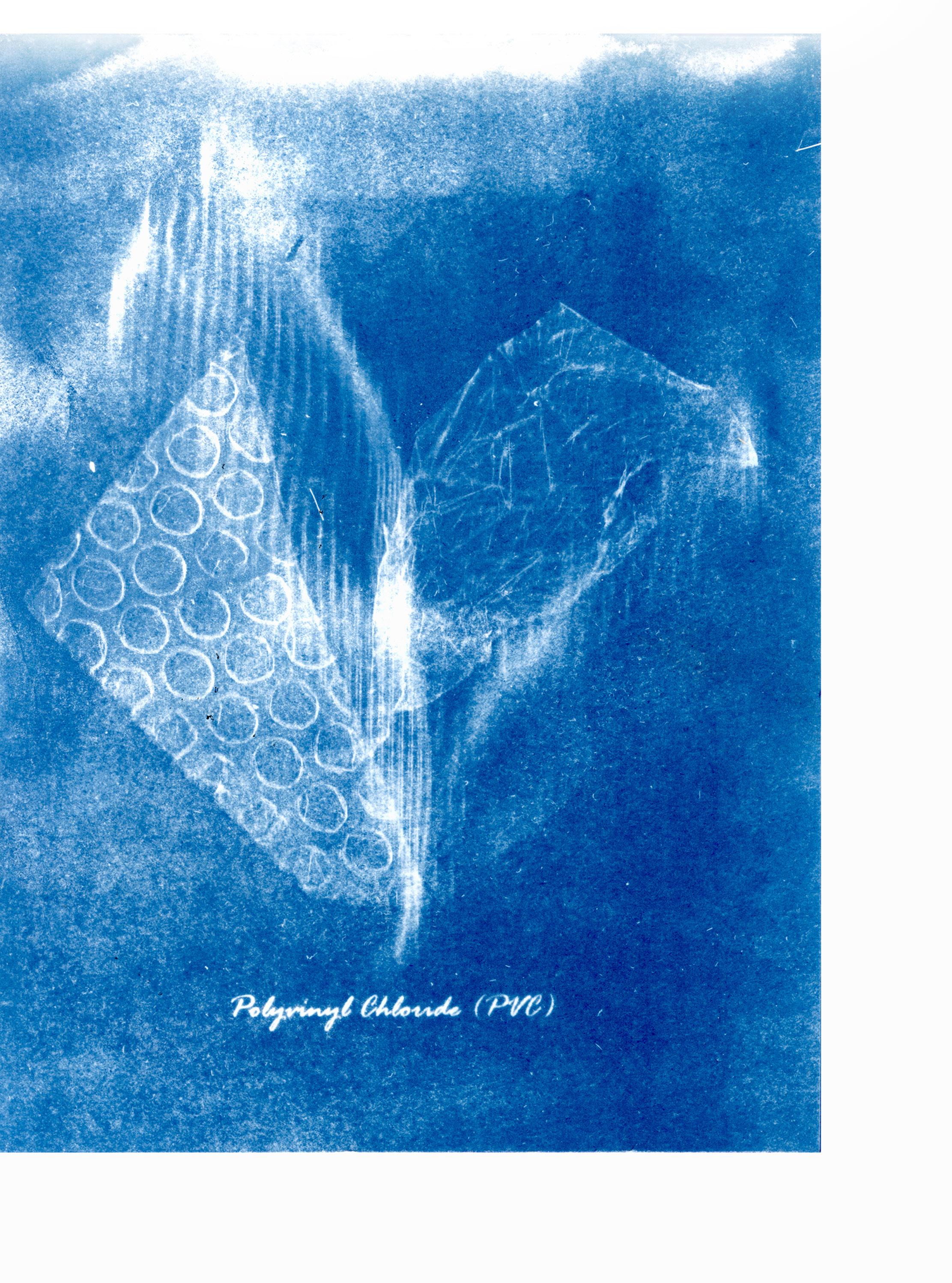 CHEN
CHEN
107
CREATIVE PHOTOGRAPHY + MFA STUDENT + SHE/HER
WRITER ARTIST HELENA
PHD STUDENT IN ART HISTORY + SHE/HER TANJA VUKSANOVIC
The pair of works in cyanotype shown above (Figure 1, Figure 2), created by Tanja Vuksanovic, present groups of halftransparent materials floating atop a Prussian-blue background. Mimicking the shape of plants, the material is delicately presented in a way that allows the blue to bleed through. Subtle networks of dots, cracks, and creases create a dazzling and dreamy effect. In Figure 1, the vertical hatching that appears in the left half of the image resembles the shape of a flower bud, which leads the viewers’ eyes toward the light leak on the top margin. The uneven distribution of color resulting from the non-standardized spread of cyanotype solution combined with the crimps, wrinkles, and the blurring of foreground/background distinction in Figure 2 create a watery, washlike surface. The interplay of tonal gradation, pattern, and textures in the images captures an atmospheric effect of transient beauty—shaky, ghostly “plants” that are almost incomprehensible. The small labels at the bottom of each image, written in meticulous penmanship, inform us that we are looking at polyvinyl chloride and polylactic acid (commonly known as the commercial plastics “PVC” and “PVA”).
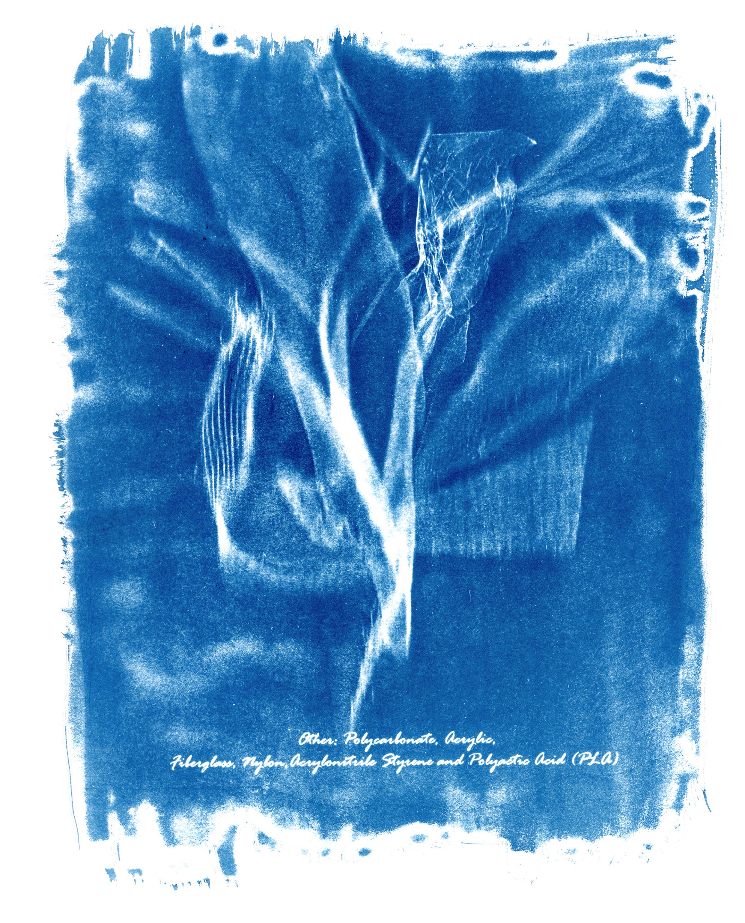
previous spread figure 1
Tanja Vuksanovic, POLYVINYL CHLORIDE (PVC), Cyanotype, 8.5” x 11”, 2021
figure 2
Tanja Vuksanovic, POLYLACTIC ACID (PLA), Cyanotype, 8.5” x 11”, 2021
THINKING IN BLUE AND WHITE: THE REPRESENTATION OF PLASTIC POLLUTION THROUGH CYANOTYPE 109 108
Tanja’s series of cyanotypes aims to remind her viewers about the excessive use of toxic plastic materials in everyday life, and its potential damage to our ocean ecosystems. Her works are largely inspired by the nineteenth-century female photographer Anna Atkins (1799-1871), who compiled Photographs of British Algae, the first scientific manual to be printed using photography. Strong visual resemblance could be found by comparing Tanja’s (C2H4)n Cyanotype Impressions #1 and Atkins’ Rhodomenia polycarpa (Figure 4). Not only does the translucency of the plastic materials echo the translucency of the alga, but the juxtaposition of specimens with slight changes in position approximates the experience of holding and examining the objects. Figure 3 also separates the given plastic specimen from its functional context; it singles them out and replaces them in an ocean-like background, where their life cycles are supposed to reach an end when being discarded. The work thus evokes a Heideggerian sense of “thingness of objects,” and encourages us to pay attention to the plastic materials we encounter everyday but seldom notice.
figure 4
Anna Atkins, RHODOMENIA POLYCARPA, Cyanotype, 9 15/16” x 7 7/8”, 1853, The Metropolitan Museum of Art
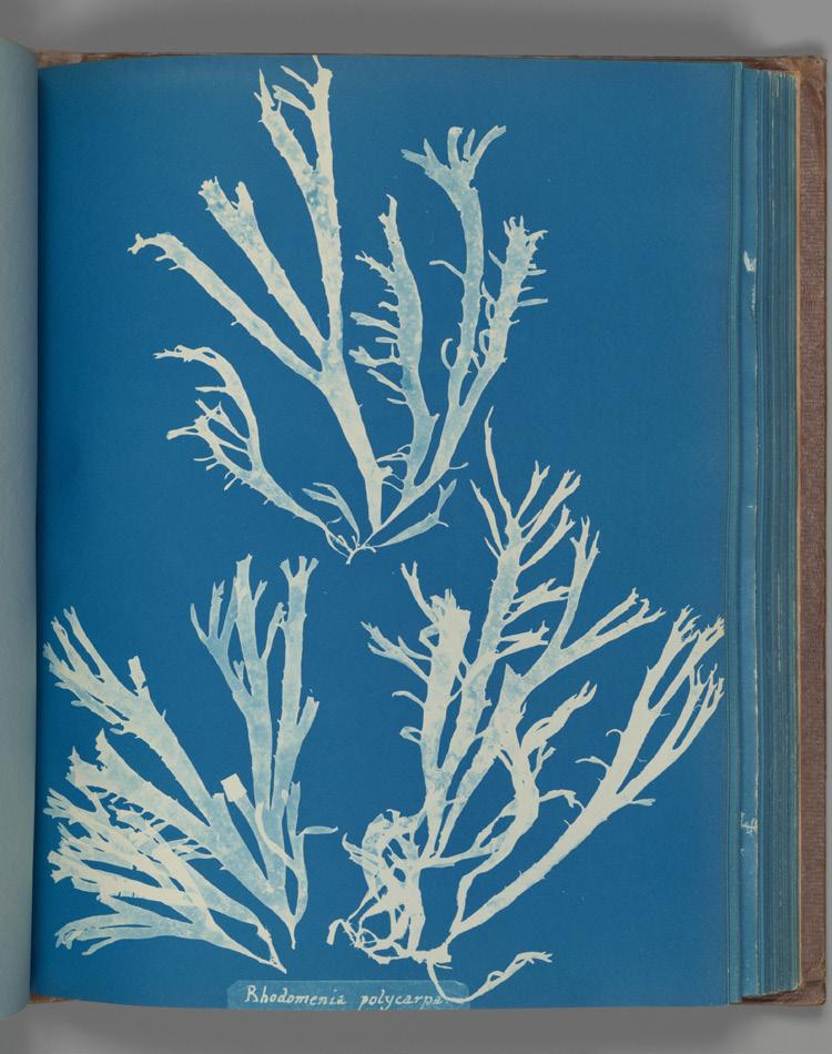
figure 3
Tanja Vuksanovic, (C2H4)N CYANOTYPE IMPRESSIONS #1, Cyanotype, 8.5” x 11”, 2021
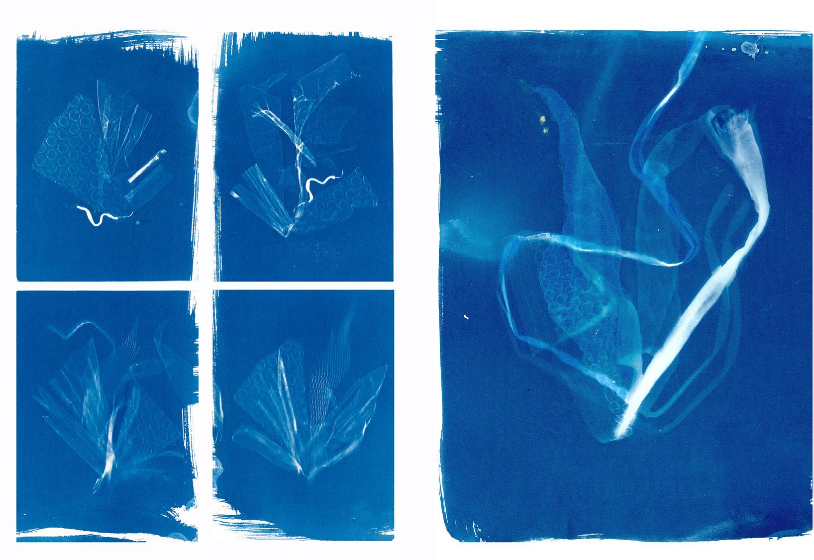
THINKING IN BLUE AND WHITE: THE REPRESENTATION OF PLASTIC POLLUTION THROUGH CYANOTYPE 111
Cyanotype is a kind of “photogram” technique invented by the chemist and astronomer John Herschel (1798-1871), a friend of Anna Atkins’ father. The technique produces cameraless images in blue and white by laying specimens directly onto paper that was previously treated with light-sensitive cyanide solution. As (C2H4)n Cyanotype Impressions #2 demonstrates (Figure 5), when applying chemicals onto plain papers, Tanja intentionally leaves the margin untouched in order to reveal either her brushstrokes or the random flow of the solution. The uneven rendition of background color on the left image echoes the piece of polypropylene plastic represented in the foreground, whose filaments evaporate into billowing clouds of smoke, dissolving into the white-tinged blue context that is itself melting and ephemeral. This unfinishedness helps emphasize the artistic touch in the creation of photography. Unlike the overarching belief that treats photography as a medium used to mass produce the unmediated, faithful representation of things with minimum human intervention, each of Tanja’s photographs is unique and involves the interaction between human practitioner, text, plastic material, and weather. The choice of cyanotype was deliberate. As Tanja’s main concern rests on the damage to the ecosystem of oceans caused by plastic products, the Prussian blue of cyanotypes take on a hypersaturated sealike quality that provides a background to materialize the plastic specimens.
figure 5
Tanja Vuksanovic, (C2H4)N CYANOTYPE IMPRESSIONS #2, Cyanotype, 8.5” x 11”, 2021
figure 6
Tanja Vuksanovic, HIGH DENSITY POLYETHYLENE (HDPE), Cyanotype, 8.5” x 11”, 2021
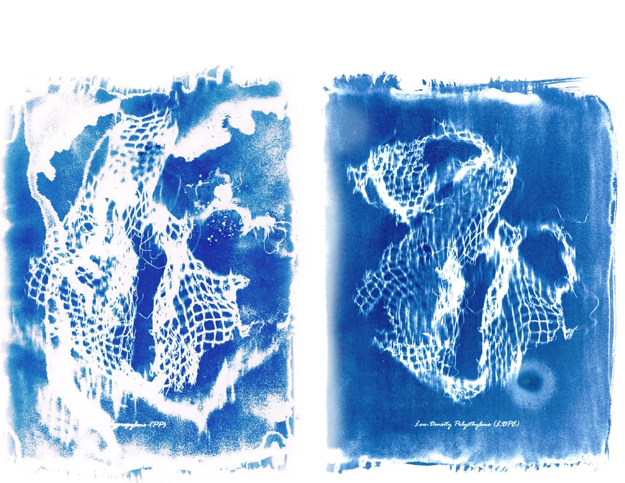
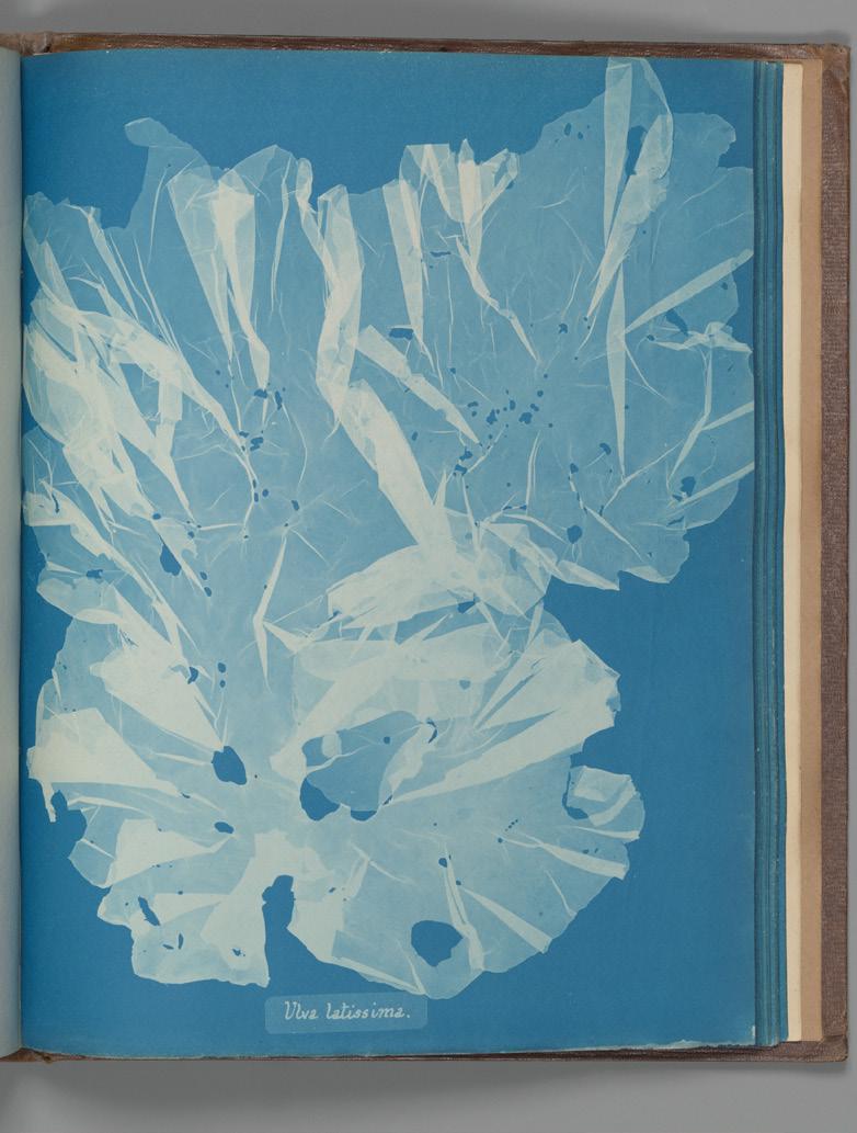
figure 7
Anna Atkins, ULVA LATISSIMI, 9 15/16” x 7 7/8”, Cyanotype, 1853, The Metropolitan Museum of Art
From a semiotic point of view, what is peculiar about Tanja’s cyanotypes is the conjuncture of the iconic, indexical, and symbolic signs—a combination of resemblance, trace, and coded meaning. The indexicality of the works is achieved through the direct contact between objects and the surface to which they are inscribed. In Tanja’s cyanotypes, the indexicality is immediate and subtle: the thickness or thinness of objects is rendered through its transparency, translucency, and opacity. In High Density Polyethylene (HDPE) (Figure 6), the change in the density of color and detailed wrinkling are indexes of the folding over of the specimen. The image is also iconic as it represents a form of alga, Ulva latissima, floating in the midst of the ocean (Figure 7). This cross-referencing of materiality opens a space of metaphor in which the relation between different materials and their respective associations—man-made for plastics, natural for algae—produces symbolic meaning. In substituting an alga with a piece of plastic, Tanja invites her viewers to contemplate the natural organism that was originally there, now absent, due to the overuse of plastic products and the improper ways in which they are disposed.
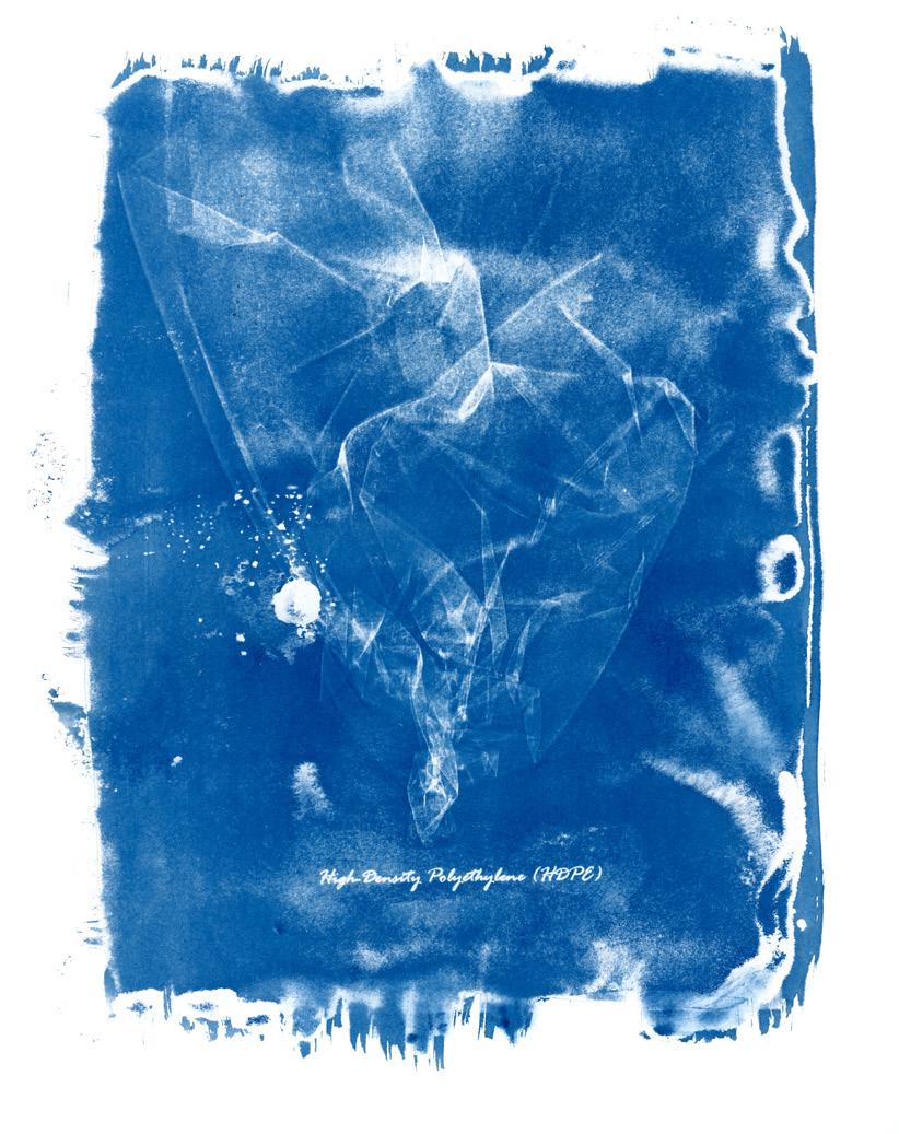
TITLE TITLE TITLE THINKING IN BLUE AND WHITE: THE REPRESENTATION OF PLASTIC POLLUTION THROUGH CYANOTYPE 113
The Whimsical World of Magical Realism
“Her playful conflation of photography and painting yields such technical skill which is almost reminiscent of the indexicality of the camera.”
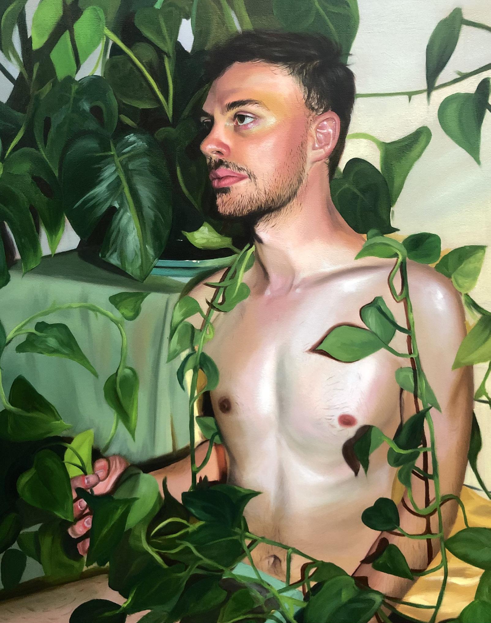
115 WRITER ARTIST ANNABEL SEVERNS ART HISTORY + SENIOR + SHE/HER CAROLINE CRAWFORD PAINTING + SENIOR + SHE/HER
The paintings of Caroline Crawford’s oeuvre are replete with an air of mysticism and intrigue, a proliferation of natural elements, and an intimate portrayal of her sitters. The senior painting major’s works toe the line between a reality defined by objectivity and tangibility and one of mysticism and subjectivity. These two facets of reality converge in Crawford’s work through her beautifully precise realist technique and her infusion of whimsical yet naturalistic subject matter. The result is a world shrouded in “magical realism,” a technique Crawford admires, and which is practiced by artists who inspire her- most notably Lauren Sanderfer. Close looking at her paintings illuminate precise shadows, contoured faces, and a plethora of detailed renderings. Interestingly, the precision of details and truthfulness to life is a product of Crawford’s interest in the relationship between photography and painting. Although a seemingly paradoxical combination, the artist loves finding new ways for the mediums to intersect and consequently create something unique and novel. Her playful conflation of photography and painting yields such technical skill which is almost reminiscent of the indexicality of the camera. In fact, the artist oftentimes photographs her friends and edits her photographs on photoshop; her google drive is full of photographs used for inspiration. She primarily photographs her close friends and strives to portray their genuine emotion in her paintings; it is for this reason she only paints portraits of people close to her.
Another element characteristic of Crawford’s work is the overwhelming presence of natural elements, which holds a great amount of significance for the artist. This is exemplified in her Entanglment, 2021, which depicts a man existing amidst sinuous vines and overgrown plants. The man gazes languidly out of the frame, while a vine drapes across his shoulders, highlighting the luminance of his skin. The sharp shadows of the leaves lend a materiality and presence to the scene. Although realistic details proliferate the painting, the sitter seems to occupy another worldone we are not quite familiar with. The figure is overwhelmed and tangled up in these plants; man is entangled with mystery and sensuality. The viewer is left to interpret the mysteriousness of the scene whichever way they choose, as they muse on the liminality of space which confronts them.
Crawford has always been interested in the human form and the relationship between people and their emotions. This interest is played upon in her 2021 painting Introspection, in which the viewer is transported into the depths of her sitter’s mind. This comment on our relationship with ourselves depicts
previous spread Caroline Crawford, ENTANGLEMENT, oil on canvas, 24x30 in, 2021
a woman (Crawford’s close friend) as she observes herself in three dimensions. An omnipresent face gazes upon the circuitous image of the woman inspecting a miniature version of herself in the palm of her hand- who consequently gazes right back at the woman and her omnipresent face. The beautiful monochromatic color palette and the whimsical details of golden hair, large green eyes, and detailed jewelry immerse the viewer in the scene, as if inviting them to step inside of their own heads. The artist strove to convey the act of deeply looking at and judging oneself; the woman, although aware of this fact, seems to be in an unbreakable trance within the depths of her mind. Interestingly, this work was made using oil paints and wood rather than canvas. The artist enjoys a rich relationship with her materials, and paints thinly in some areas so that the wood shines through. The beautiful relationships of elements in Crawford’s paintings, whether it be between photography and painting, whimsicality and actuality, or materiality and conception, is infatuating. Crawford’s genuine concern for her sitters, fantastical vision, and meticulous details continue to excite and entice viewers.
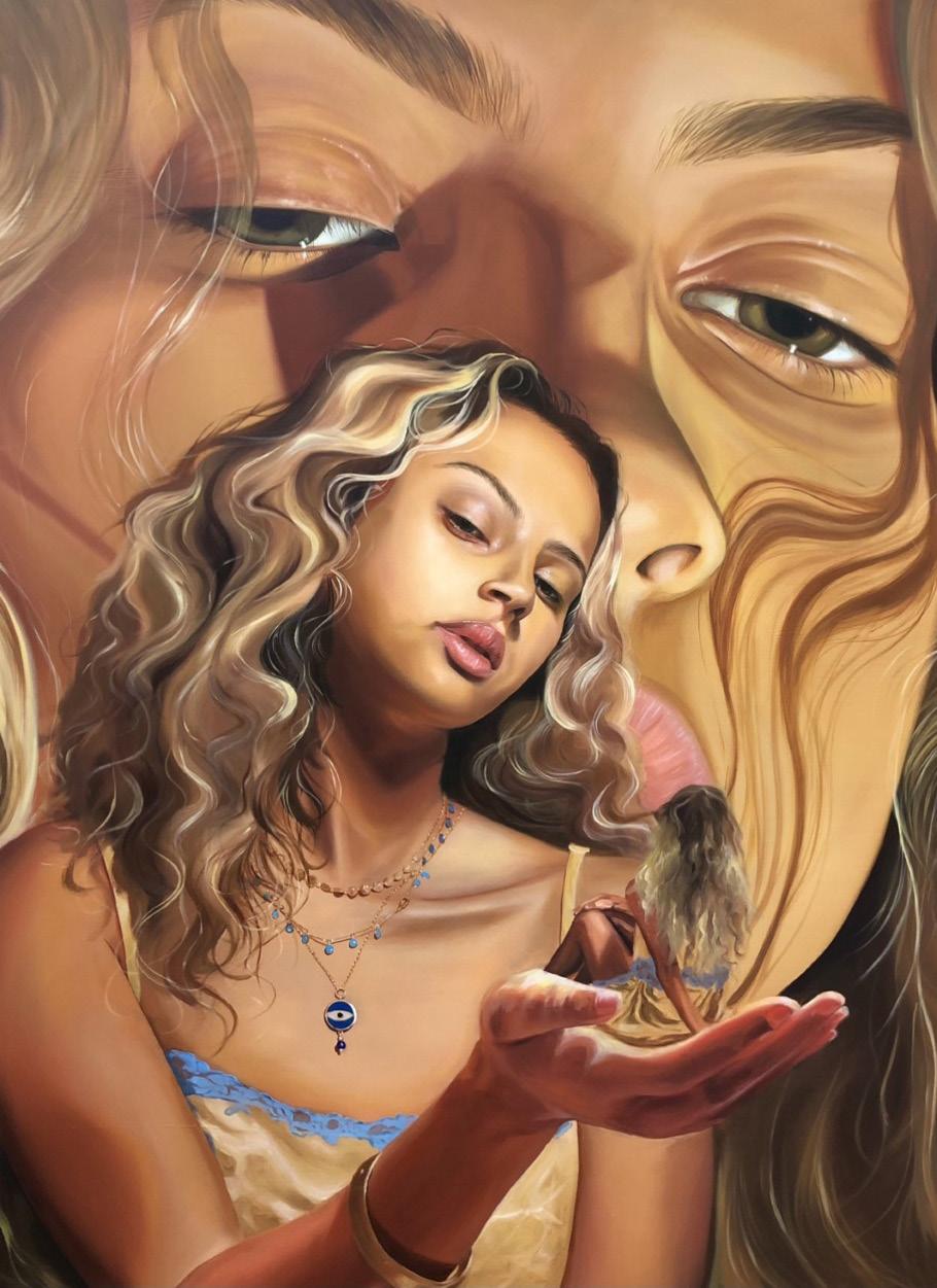
THE WHIMSICAL WORLD OF MAGICAL REALISM 117 116
Caroline Crawford, INTROSPECTION, oil on wood panel, 36x48”, 2021
Where Function Meets Beauty
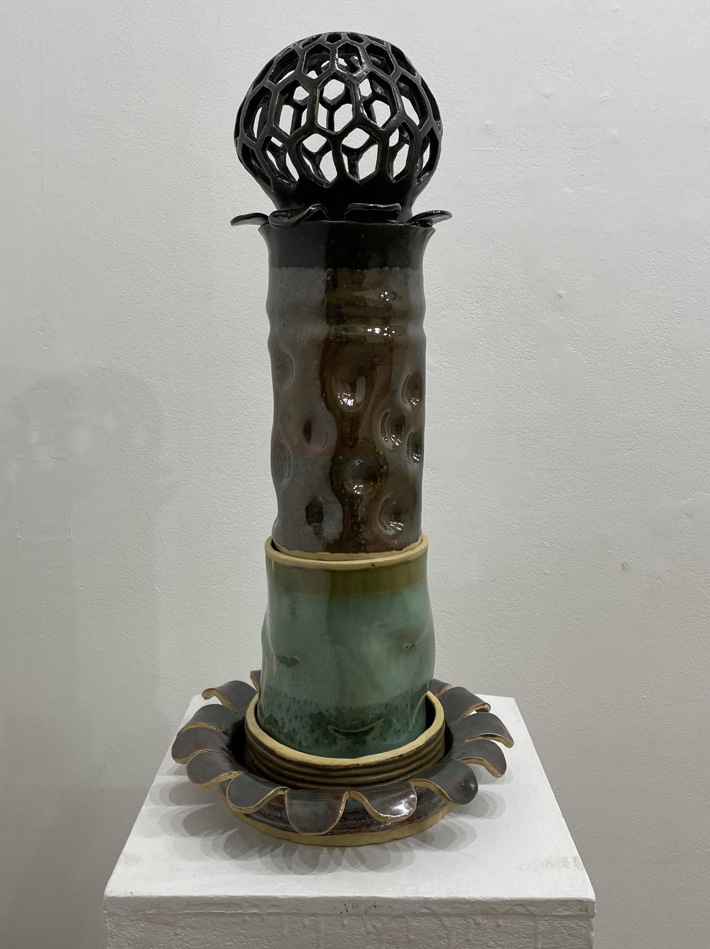
119 WRITER ARTIST CAROLINE LEVINE LINGUISTICS & DUAL LANGUAGE + JUNIOR + SHE/HER KYLEIGH BERNSTEIN SCULPTURE + JUNIOR + SHE/HER
“Every step of the ceramic process embodies flexibility and allows spontaneity.”
Which is better: aesthetic or function? Is the purpose of art for it to be useful to mankind or to be beautiful to mankind? Or, even better, is art even supposed to be useful at all? For Kyleigh Bernstein, the answer is simple: art is beautiful by being aesthetic and by being functional. Her ceramic piece, Growth, perfectly encapsulates this concept by being a rearrangeable, stackable pot able to hold multiple plants in separate vessels at once. And, when the plants have finished their lifecycle, the pots can be reassembled into a larger sculpture.
Bernstein is currently a third-year BFA student focusing on ceramic sculpture. According to Bernstein, creating ceramic art is symbolic of freedom. The process of rolling a slab of clay, handbuilding, and applying glaze are filled with endless creative choices. However, she not only loves the freedom that comes with handbuilding, but Bernstein also enjoys the experimentation that comes with the chemical reactions the glazes undergo. In order to form the perfect color, many factors affect glazes, such as temperature, layering, and chemical makeup of the glaze. Thus, even something as simple as color has a world of complexity that allows for another realm of creativity. In this sense, every step of the ceramics process embodies flexibility and allows spontaneity.
For the work featured in this publication, Bernstein detailed her creative process, beginning with the inspiration for the piece. Though Growth began as a project for her classes, Bernstein fell in love with the idea of drawing inspiration from plants, specifically fungi, and molds, and it became much more than an assignment-–it became a challenge. Bernstein pushed herself to create a piece that was creative in two senses: beauty and function. Inspired by the color and texture of molds and the shapes of fungi, Bernstein slowly crafted a funky and geometric sculpture reminiscent of the plants that it can hold, making it fun and functional!
After coming up with her idea, Bernstein began with the construction process. The first step was to handbuild the individual parts and cut out the shapes. Then she combined them together. The next step related to the coloring of the vessels, involving glaze tests to determine the most interesting layering of the glazes. The last step involved firing the five individual pieces that make up the larger sculpture. After completing the creation process, the unofficial last step is to arrange the pieces! This can be done in countless ways, making different shapes and structures. In a way, Bernstein explained, the structure itself can grow and change, just like the fungi and mold it represents and the plants it contains.
previous spread
Kyleigh Bernstein, GROWTH, ceramic, 2021
However, Bernstein’s sculpture is not the only thing that grew throughout the process. Growth, quite literally, represented the artist’s growth in the field of ceramics. Though Bernstein has been working with clay her whole life—even crafting with PlayDoh as a child—she saw significant progress in her artistic ability during this project. Because Bernstein handbuilt the sphere and cut out the shapes on the vessels, she feels that she has gone “back to basics,” so to speak, and refined the most essential and useful skill in ceramics: handbuilding. Additionally, Bernstein has gradually begun to feel more and more like a true artist and art student, feeling proud of her growth and the effort it took to get to this point. Thus, Growth represents a trio of symbolism: the beauty of sculpture, the functionality of sculpture, and the growth of an artist as seen through sculpture.
NO SHOW WHERE FUNCTION MEETS BEAUTY 121 120
“There will come a day that Earth’s population will have to reckon with the damage that has been done to the planet.”
BAYLEE
BELL
STUDIO ART (PAINTING) +SENIOR + SHE/HER + THEY/THEM

Overshooting Our Future
WRITER
ARTIST AMANDA ALVAREZ
ART HISTORY + JUNIOR + THEY/SHE
123
There will come a day that Earth’s population will have to reckon with the damage that has been done to the planet. While we may not see that day come, the ever-ravenous nature of consumption and capitalism has accelerated the destruction of the planet to a frightening rate. Earth Overshoot Day marks the date when our consumption for the year has exceeded the Earth’s natural ability to replenish those resources. In 2021, it fell on July 29th. For the last 5 months of 2021, the human population was stealing from their own future.
Baylee Bell is an artist that explores this concept of overconsumption leading to ruin. While not a usual subject in her body of work, thinking about climate change and the aesthetics of apocalyptic settings led them to explore what the Earth would look like without a human presence. In the series being discussed within this essay, the slow green creep of vines or moss is present, hinting at nature’s slow return, taking back what once was hers. According to the artist, “we push nature out of the way instead of working with her. I wanted to show how nature would take everything back.”
In her series, titled A Future We Created all by Ourselves (2022), three canvases explore the theme of environmental destruction fueled by capitalism. One canvas shows a lake at dusk, the sky flecked with pink and lavender, buildings reflected onto the water, the scene slowly being encroached upon by warm green plant growth. The second canvas shows a street that has been broken in half, most likely from some form of natural disaster, plant overgrowth crawling up the buildings that overwhelm the canvas and surround the focal point: an abandoned McDonald’s. The third canvas depicts a larger than life personification of the human population, a corporate entity with planet Earth for a head, standing in front of a billowing, oily cloud of ink-colored smoke, towering over the surrounding skyscrapers.
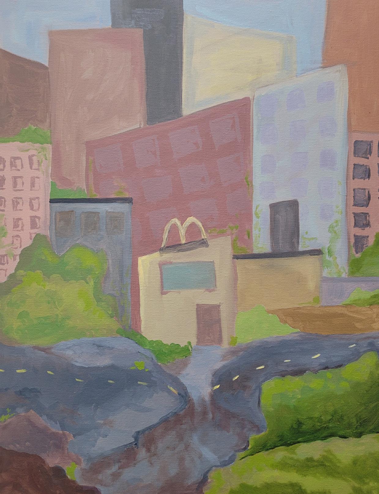
There is a juxtaposition of peace and devastation, the instinctual desire to dream about what an Earth sans humans would look like before the swift realization that we are the problem and it is too late. The lake scene evokes peace, streaks of lavender and pink rippling in the water, the light diffuse and soft. The buildings are distant reminders of what humans would leave behind, but don’t overtake the canvas. Contrasting this with the broken road, the buildings choke out the sky and any natural beauty that might have remained. Human impact is still felt long after extinction. The broken road amidst mass industrialization could symbolize broken human connection, bisected by the most American symbol of global consumption: a McDonald’s. The golden arches amidst the
previous spread Baylee Bell, A FUTURE WE CREATED ALL BY OURSELVES, Oil, 12x18’’, 2022
Oil, 22x20”, 2022
ruin show how capitalism can lead to our downfall and how even if we are no longer part of the Earth, our consumption has left it in ruins. The giant personification of Earth looms over the series, on the other side of the spectrum from the serene lake scene, evoking unease and the direct statement that we are responsible for whatever may happen to us. It is a result of companies that continuously pollute the Earth in order to turn a greater profit, any grass-roots level change becoming ineffective.
However, artists like Bell help raise public awareness of these issues. There is hope yet, as long as we heed the warning that our time is limited if our trajectory does not change. Becoming more mindful of our consumption and lobbying for change within Big Business are steps we can take to try and lessen the harm we have done and prevent the level of harm we do yearly from getting worse. We do not have to watch the world burn, but we cannot turn a blind eye when we start seeing wisps of smoke.
OVERSHOOTING OUR FUTURE 124 125
Baylee Bell, A FUTURE WE CREATED ALL BY OURSELVES,
“The best way to describe Toska is that one hasn’t felt something in so long that they’re glad to finally feel something, even if it’s sadness.”
ULIANA V. CHEMBROVICH
GRAPHIC DESIGN + FRESHMAN + SHE/HER
A collage of personal histories
WRITER
ARTIST GABBIE MARTINEZ
ART HISTORY + JUNIOR + SHE/HER
127
Uliana’s work depicts a Post-soviet influenced photograph form of art. This was the final product of an assignment given in class to focus on contrasting shallow and deep space and both photographs’ works were part of the same assignment. A black and white digital collage was required as a part of the assignment. Certified in photoshop, the artist manipulates different photoshop techniques. Uliana is passionate about both digital art and pencil sketching. The work featuring the guitar represents shallow perspective and depth whereas the work including the dots privileges deep space. The photograph with a guitar represents the past because the musician featured is a Soviet rock musician who was influential at the time. This is relevant to Russian people today specifically because his voice represents the heart of protest. The photograph with the dots features images of a reflection which encourages the viewer to question perspective and composition. The artist herself edited it together for a “good vibe”.
The artist wanted to create a personal connection to the works by using a photograph that pertains to something from her life and was inspired by photographic imagery. Uliana’s parents grew up in the Soviet Union which influenced her to absorb the iconography and culture of that location and period. In general, Uliana wants people to feel a sense of ominous energy. She discusses how there is a Russian emotion called Toska- which doesn’t have a direct translation- but translates to something similar to an idea of melancholy or depression. The best way to describe Toska is that one hasn’t felt something in so long that they’re glad to finally feel something, even if it’s sadness. Uliana manages to successfully put this all together in a collage with Russian influence.
The artist doesn’t recall having any challenges in the process of making the work. She mentioned how through her coursework at the University of Florida, she has gained so many experiences with computer graphics classes and is so proficient in the digital design world that she was able to complete these two works in approximately. She mentioned how she finds comfort in the collage method of putting all her ideas together in one place in organized chaos. The artist discusses how she came across a challenge in that the final product had to be solely black and white. Because all of the images were originally taken in color, keeping them distinct with contrast in black and white was something that she had to adapt to.
previous spread
Uliana V. Chembrovich, POST-SOVIET HEART
PART I, digital collage, 2021
Uliana’s favorite artist is Tove Marika Jansson who is a Finnish artist who dabbled in the creation of comics in addition to being a classical painter. Uliana is attracted to Jaansson’s life story and appreciates the significance of her art and how Jansson represents herself and her friends in this alternate universe. Uliana explained that she is inspired to create art simply by everything around her. When she was little, she used to watch Disney animated movies and loved how they expressed and depicted emotion. She enjoys studying and mimicking the emotion they capture. She loves to render the emotion of figures and capture their appearance. Uliana is truly inspired by anything that can be drawn and is willing to take on any risk to do so.
Uliana has been drawing since she can remember. She recalls drawing in her young life and wasting paper due to countless practice sketches. She would draw on the walls and any other surfaces that would allow her. She says it takes 10000 hours to truly master a skill. Uliana would like a career in graphic design wherever the job will take her. She is passionate about film, the psychology behind advertising, and visual arts in general. Uliana explains how in terms of perception, she has learned about acrylic painting- but admits she is not incredibly skilled at it. In addition, she learned about streamlining her ideas and making sure to develop them until they have fully progressed and have a final product. Uliana grew up surrounded by art and now has learned she needs to come up with an idea first, to then expand and deliver on it.
NO SHOW A COLLAGE OF PERSONAL HISTORIES 128
Uliana V. Chembrovich, POST-SOVIET HEART PART II, digital collage, 2021
“From the little girl who saved up her own money to buy her first camera at thirteen, Wooten has shaped her art to reflect personal, yet universal, experiences of the never ending processes of self exploration and forming one’s own identity.”
NADIA WOOTEN
PHOTOGRAPHY & PSYCHOLOGY + JUNIOR + SHE/HER
The Complexity of Identity
WRITER
ARTIST LEAH HARRELL
ART HISTORY & ANTHROPOLOGY + SENIOR + SHE/HER
131
The inspiration for this photographic series began with the work The Kitchen Table Series by Carrie Mae Weems. Weims designed this piece over a series of years that takes inspiration from the intersectionality of identities. This notion of the complexity of identity immediately stood out to Wooten, remaining in her mind for years. Recently, she began to think about how this idea could apply to depicting the intricacy of identities of her own life.
Identity has played a defining role in Wooten’s artwork, as it has had a considerable influence on her life. As a lighter-skinned African American woman, identity has been a recurrent issue for Wooten. She has experienced people telling her how she should identify or what she should be, and often doesn’t feel able to talk about being biracial as her experiences do not necessarily mirror that of others. Wooten thus uses this series to create a dialogue with the idea of identity, specifically of how identity is more than one thing.
The photographic series takes on the appearance of a scientific study through its repetition of similar photos all in black and white. Through this style, Wooten is able to create a dialogue with scientific documentations and the connotations surrounding them. She plays with the assumption of the validity of scientific documentations, as this form of photography is associated with reality, though this is not always the case. Presenting images as truth when the realities within them have actually been manipulated. Though this intimate view into private moments of her life is a staged illusion, it is still a documentation of the various seemingly mundane experiences that continue to shape her identity. “This doesn’t mean that the photographs do not depict the reality of my identity, but there is a sense of construction that happens with memory that is depicted in each image,” Wooten wrote.
The six photographs of this series thus act as a window into Wooten’s life. She allows the viewer an intimate look of moments taking place in the safety of her bedroom. Darkness cloaks the interior of her room, draping the bed and half of her form in shadows. Windows act as bookends to the scene. The rays of light flooding through are visible to the viewer. Both the dual windows and posters of the bed frame Wooten in the center of the composition engaged in quiet moments, such as staring up at her ceiling or gazing out the window stuck in her own thoughts. Two of the photographs include friends of Wooten in these intimate scenes. In one, Wooten props herself up to pick at a cake situated between her prone form and that of her friend’s who is seated casually on the edge of Wooten’s bed. Her friends also act as collaborators in her projects, as she
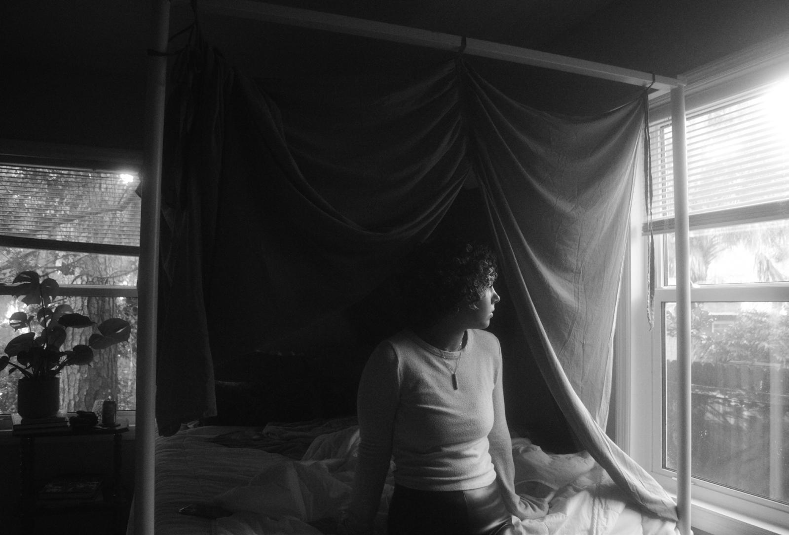
previous spread Nadia Wooten, UNTITLED , photographic series, 2021
utilizes their various strengths and backgrounds to bring her vision to life. Though the photos in the series where Wooten is alone tend to be darker visually, this was not done to reflect a sadder mood. In fact, Wooten views loneliness as a chance for reflection. This idea that her work presents differently depending on the viewer only carries an extra significance for Wooten, as she appreciates that there are opportunities for different meanings for each person.
From the little girl who saved up her own money to buy her first camera at thirteen, Wooten has shaped her art to reflect personal, yet universal, experiences of the never ending processes of self exploration and forming one’s own identity. Though Wooten noted each step in her artistic process is a risk, since she never knows how the end product will turn out, she has brought these complex notions to life within her images, letting others who are experiencing the same things know they are not alone.
DINNER THE COMPLEXITY OF IDENTITY 132 133
NO SHOW
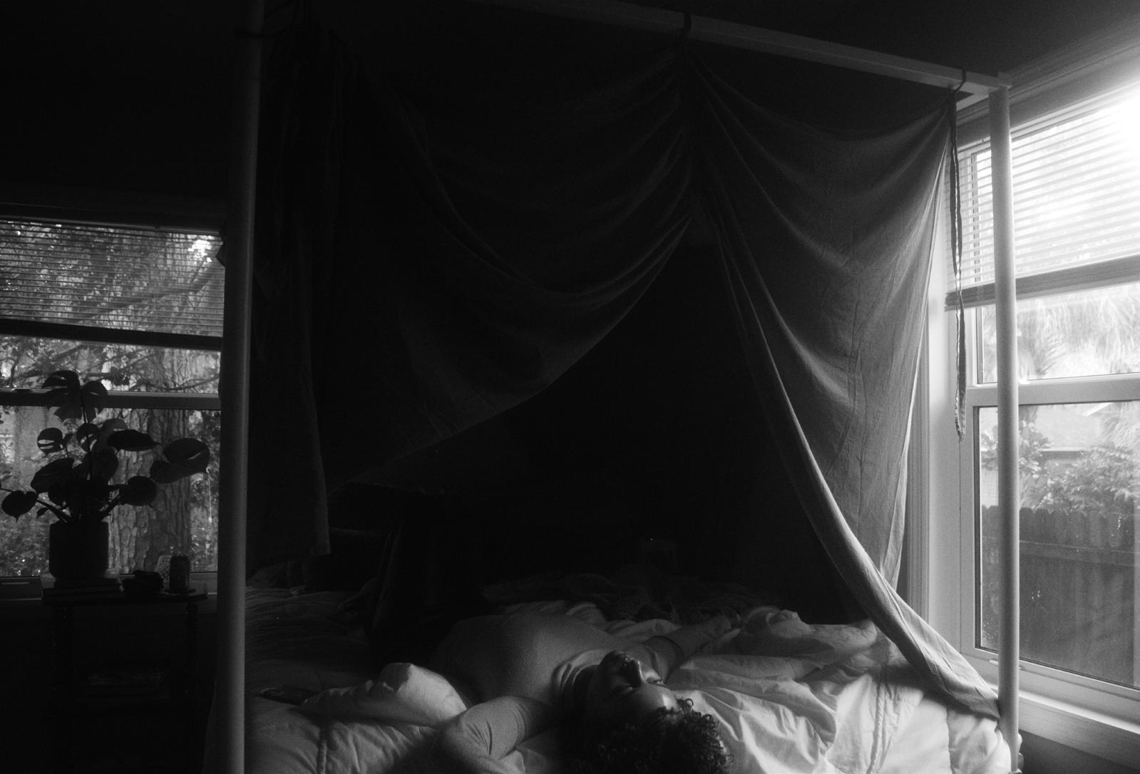
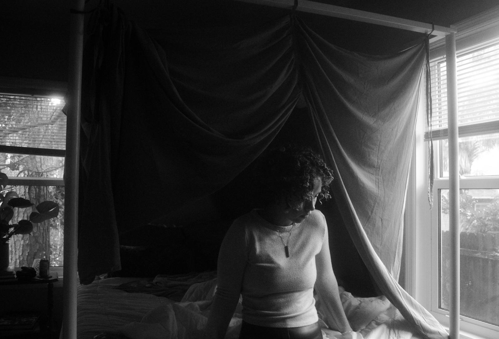
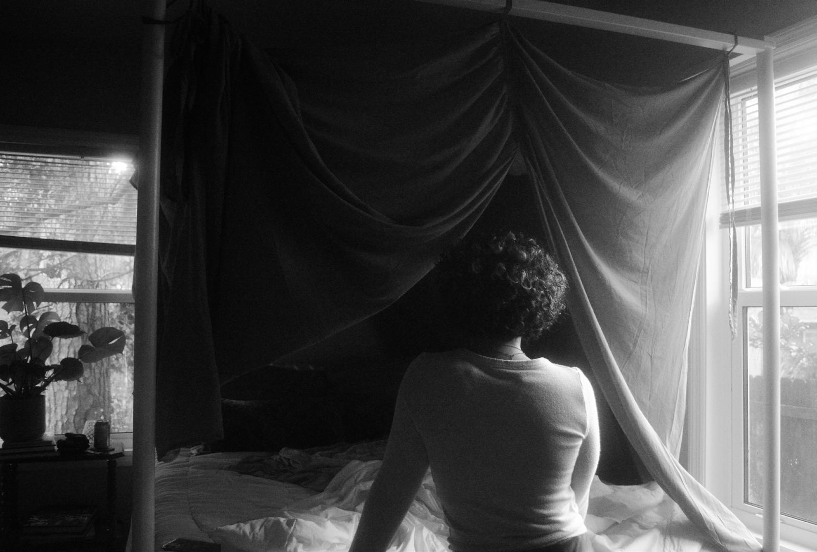
DINNER 134 135 NO SHOW
IndexARTISTS, IN ORDER OF APPERANCE
Valerie Luciow page 11
Manna Robertson page 17
Cassidy Mandelbaum page 21
Ellee Ruder page 25
Evan Emmanuel page 31
Martinis McDuffie page 35
Willow Rachels page 41
Leilanee Taylor page 45
Stephanie Perez page 47
Ian Switzer page 51, 99
Sara Barnes page 53
Jose Rivera page 59
Jessica Clermont page 63
Alex Kirkpatrick page 67
Tabitha Cherubin page 71
Michelle Serafimovich page 75
Laura Haynes page 79
Sonia Consuelo Vera-Leon page 83
Isabelle Stratton page 87
Wade Rubin page 93
Kennedy Young page 103
Tanja Vuksanovic page 107
Caroline Crawford page 115
Kyleigh Bernstein page 119
Baylee Bell page 123
Uliana V. Chembrovich page 127
Nadia Wooten page 131
WRITERS, IN ORDER OF APPERANCE
Evan Emmanuel page 11
Adriana Rivas page 17
Sophia Ramirez Peralta page 21
Lee LaPlaca page 25
Valerie Luciow page 31
Adam Blahnik page 35
Kaveri Jadav page 41
Ava Bender page 47
Dahlia Wrubluski page 53
Samantha Pruitt page 59
Francis Cadavid page 63
Skylar Dunbar page 67
Madison Morales page 75
Hala Hachem page 79
Chanel Collison page 83
Sophia Salerno page 87
Marie Fiemeyer page 93
Carolyn Lightsey page 99
Ayla Santos page 103
Helena Chen page 107
Annabel Severns page 115
Caroline Levine page 119
Amanda Alvarez page 123
Gabbie Martinez page 127
Leah Harold page 131
136 137
Acknowledgements
Our deepest gratitude to everyone who contributed to the publication in any capacity, whether they submitted their own artwork and writing or assisted our editorial and design team.

A special thank you to our faculty advisors Derek Burdette and Rachel Silveri for their assistance in editing and supervising this volume. We would also like to thank our amazing graphic designer Arlie Birket for all her help in making the magazine look beautiful.
Finally, we would like to thank the University of Florida’s Student Government for funding this publication; we greatly appreciate the support and contribution.

138 139
Production
EDITORIAL TEAM
Carolyn Lightsey
Leah Harrell
Amanda Alvarez
Sophia Ramirez-Peralta
Gabbie Martinez
DESIGN
Arlie Birket
no show
+
2022
Dinner

dinner
