INTERSECTIONS
2022
Tyler School of Art and Architecture
Temple University
1

2022
Tyler School of Art and Architecture
Temple University
2022
Tyler School of Art and Architecture
Temple University

INTERSECTIONS is an interdisciplinary collaboration produced by the 2022 Master of Fine Arts candidates in partnership with graduate art history students at the Tyler School of Art and Architecture, Temple University.
Chad D. Curtis
Associate Dean and Graduate Director
Wanda Motley Odom
Assistant Dean for Strategic Marketing & Communications
Kati Gegenheimer
Associate Director of Academic Enrichment Programs
Mariola Alvarez
Stephen Anderson
Kate Benisek
Gerard F. Brown
Douglas Bucci
Susan E. Cahan
William J. Cohen
Tracy E. Cooper
Chad D. Curtis
Delaney DeMott
Jeffrey Doshna
Linda Earle
Sasha Eisenman
Amze J. Emmons
Seher Erdogan Ford
Clifton R. Fordham
Jane DeRose Evans
Mark Thomas Gibson
Philip Glahn
Abby Ryan Guido
Marcia B. Hall
Sally W. Harrison
Jesse Harrod
David Herman Jr.
Kelly A. Holohan
Pauline Hurley-Kurtz
Renee E. Jackson
C.T. Jasper
Jessica J. Julius
Gabriel Kaprielian
Lisa Kay
Nichola Kinch
Jennifer Kowalski
Robert T. Kuper
Baldev S. Lamba
Scott R. Laserow
Kakyoung Lee
Roberto Lugo
Dermot Mac Cormack
Lynn A. Mandarano
Christopher McAdams
Pablo Meninato
Rebecca Michaels
Leah Modigliani
Dona R. Nelson
Emily Neumeier
Rachel Grace Newman
Odili Odita
Karyn Olivier
Michael Olszewski
Sharyn A. O’Mara
Eric W. Oskey
Pepón Osorio
Alpesh Kantilal Patel
Erin Pauwels
Jeffrey Richards
Fauzia Sadiq Garcia
Lauren Sandler
Bryan Martin Satalino
Paul E. Sheriff
Mark Shetabi
Robert Z. Shuman Jr.
Samantha Simpson
Hester Stinnett
Kim D. Strommen
Lolly Tai
Ulysses S. Vance III
Jessica Vaughn
Ashley D. West
Mallory Weston
M. Katherine Wingert-Playdon
Andrew John Wit
Byron Wolfe
William Yalowitz
Nathan William Young
I AM DELIGHTED TO PRESENT THE 10TH ANNUAL EDITION OF THE TYLER SCHOOL OF ART AND ARCHITECTURE’S MASTER OF FINE ARTS CATALOG, WHICH BRINGS TOGETHER THE WORK OF OUR MFA GRADUATES WITH ESSAYS BY STUDENTS IN OUR ART HISTORY MASTER’S AND DOCTORAL DEGREE PROGRAMS. IT IS A COLLABORATION THAT EMBODIES THE STRENGTH, VISION, AND SYNERGIES OF OUR COMMUNITY.
The intrepid MFA Class of 2022 entered graduate school in fall 2020 during the early months of the COVID-19 pandemic, uncertain of what to expect from Tyler and the world at large. As we all grappled with unknowns and hardships of the pandemic, these strong individuals navigated the challenges with determination, flexibility, and the benefit of their relationships with each other.
Our 2022 MFA graduates have another distinction. Two years ago, Tyler launched a new MFA curriculum that encourages our students to connect across disciplines, move freely among our broad range of studios, and engage in critical dialogue about the development of their practice with peers and mentors from our full range of studio art degree programs. The goal was to enrich the conversations about what art is today, why being an artist matters, and how to engage and communicate with a greater understanding of context.
Simultaneously, we updated our art history offerings and expanded our faculty expertise to support a more global, de-centered approach to the histories of art and culture. Students now have opportunities to pursue graduate degrees focusing on the art of Africa and the African Diaspora, Latin America, East Asia, the Islamic world, and the Ancient Near East as well Europe and North America. They study not only the art and culture of these regions, but also the interactions between them through global trade routes and migrations.
This 2022 catalog presents the work of the first students to benefit from these new opportunities, and the results are inspiring. I am struck by the range and sophistication of the artwork, from a critical intervention in the neo-colonial Vietnamese practice of replicating iconic Western European paintings to the creation of garments that parody the performance of homonormative identity. A photography student expanded into light installation and a ceramicist chose Styrofoam cups as the best vehicle to communicate her vision. It is nearly impossible to determine what program each student began in since most of their bodies of work defy allegiance to a single material practice in the pursuit of their visions. All the work is the result of deep exploration of materials and ideas.
Likewise, our art history students have written in ways that reflect an equally keen search for the best way to communicate with readers. Many of their texts embody something essential about the character of the work they discuss, whether it be the voice they use, how they structure sentences, or set a tone. These art historians have demonstrated an ease and facility with writing borne of close connection with the artists and their work. They write with sensitivity, insight, and open hearts. This flow of energy between our studio art and art history students is one of the hallmarks of Tyler today, and I am pleased to acknowledge the faculty and students who provided leadership in the creation of a catalog that demonstrates this spirit of collaboration. I express my profound appreciation to Mariola Alvarez, assistant professor of art history; Chad D. Curtis, associate professor of ceramics, associate dean, and graduate director; and Philip Glahn, associate professor of critical studies and aesthetics. Kati Gegenheimer, director of academic enrichment programs and a faculty member in painting, oversaw the production of the publication with exceptional creativity and perseverance. Our faculty and staff editors provided crucial guidance: Mariola Alvarez, Philip Glahn, Monica Anke Hahn, Leah Modigliani, Rachel Grace Newman, Wanda Motley Odom, Alpesh Kantilal Patel, and Erin Pauwels. For their excellent catalog design, I offer hearty thanks to Matt Bouloutian (BFA ’99), Emma Lindsay (BFA ’18), and Autumn Kitabjian (BFA ‘23). Finally, my deepest appreciation goes to the art historian and artist who led this project: Nicole Emser Marcel (PhD candidate) and Abbey Muza (MFA ’22).
Foreword | 6 Artists and Essays | 10-109
Artists
Authors
FLAVIA BARBARINI
QUINN RUSSELL BROWN
DANIELLE COOKE
NATALIE CRUZ
ANNEMARIE MAAG-TANCHAK
LI MACHADO
LIAM MAHER
MOLLY MAPSTONE
NICOLE EMSER MARCEL
MARÍA DE LOURDES MARIÑO
LAUREN M. MCCARDEL
RYAN J. MITCHELL
JOANNA PLATT
NOAH RANDOLPH
EMILY SCHOLLENBERGER
ALEXANDRA SCHOOLMAN
ASHLEY STAHL
Contributing Authors | 110-115
18 | Feather Chiaverini
14 | Chelsea Bonham
28 | Carmel Dor
40 | Lena Kolb
10 | Malene Djenaba Barnett
22 | Kyle Choy
46 | Ren Mahon
32 | L Autumn Gnadinger
36 | Maria Ah Hyun Stracke
50 | Stephanie Manzi
CERAMICS FIBERS & MATERIAL STUDIES GLASS GRAPHIC ARTS & INTERACTIVE DESIGN
METALS / JEWELRY / CAD-CAM PAINTING PHOTOGRAPHY PRINTMAKING SCULPTURE
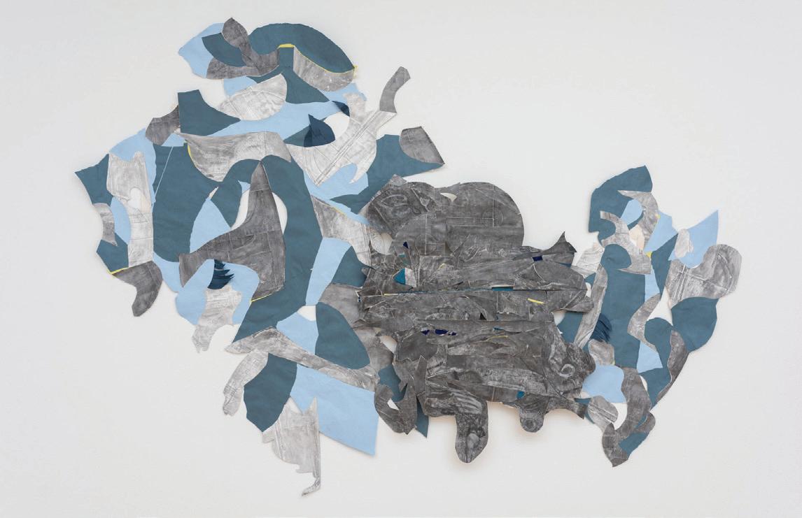
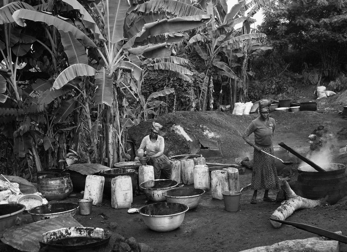
“Her spirit is in me,” Malene Djenaba Barnett says reflectively of her maternal grandmother, a designer who left her life in Saint Vincent to build a future for her family in 1950s New York. “Her creativity. Her ambition.” We’ve been discussing Barnett’s family history, how it drives her to grapple with the limitations and absences of histories of migration in her work in ceramics, collage, glass, woven paper, and textiles. Barnett creates portraits drawn from four photographs of four generations of Black women – her great-grandmother, grandmother, mother, and herself.
Central to much of Barnett’s work, through the many different media she constantly experiments with, is a cool blue/teal color palette, manifesting the rhizomatic significance of the sea in histories of migration and diaspora. The work is joyful, embracing beauty without apology or unnecessary explanation. We see the four subjects appear and reappear, reimagined in different forms, each imbued with a sense of care that feels unexpectedly generous, intimate. The process of transfer, of iteration across material, is a continuous, almost obsessive investigation; driven by the curiosity to see what is left behind when an image is reworked in paper, glass, or clay, Barnett questions who or what is made absent
in documented histories of the diaspora and the systems of capital and enslavement that led to it. In the spirit of the personal and poetic practices of writers Dionne Brand, Saidiya Hartman, and Christina Sharpe, Barnett carves her own path through the wake with a tireless curiosity to explore the possibilities of material and form, devices that hold knowledge and memory of her family's histories across the Caribbean and the United States.
But the telling and retelling in Barnett’s practice is more generative than commemorative. “To live in the Black diaspora is I think to live as a fiction,” Dionne Brand wrote, “– a creation of empires, and also self creation.”[1] Barnett’s process of self creation is also one of reclamation, seeking evidence of transferred versions of herself and her ancestors through her own prolific production and reproduction. She builds on the legacy of the African American experience to consider home, and belonging itself, as a process of making. Through examining her own experience, she invites us to reflect on our deepest-held beliefs about belonging to place and people, and to take agency over our own materials, stories, and histories – to take care with the culture we are responsible for keeping
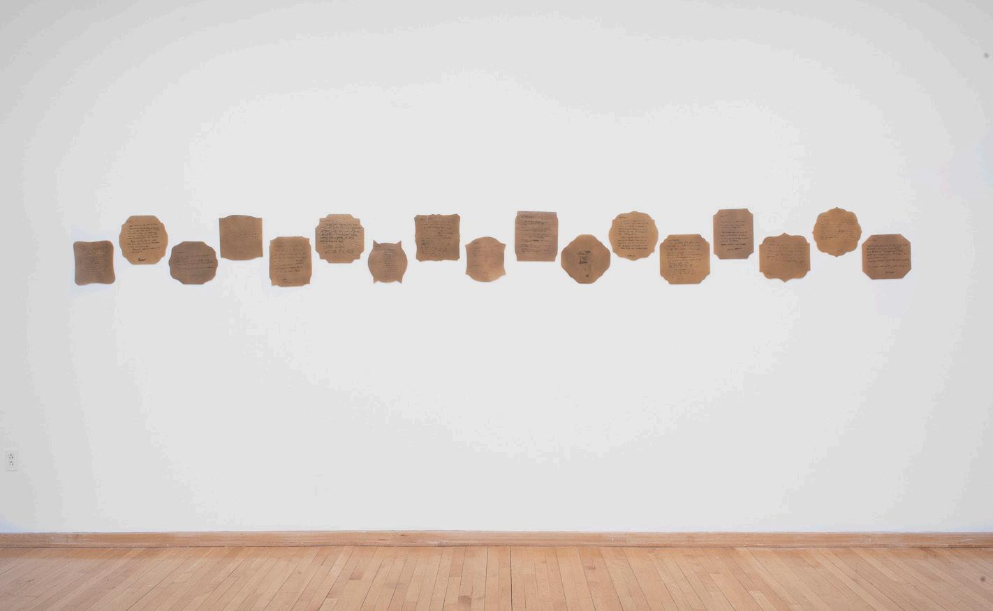
LEGACY WALL (left)
Color laser printouts. 10’ x 20’.
Installation view.
Photo credit: Neighboring States
MADE FOR MOM and WHAT’S LEFT BEHIND (L,R) (below)
Woven inkjet paper and clay.
Installation view.

Photo credit: Neighboring States

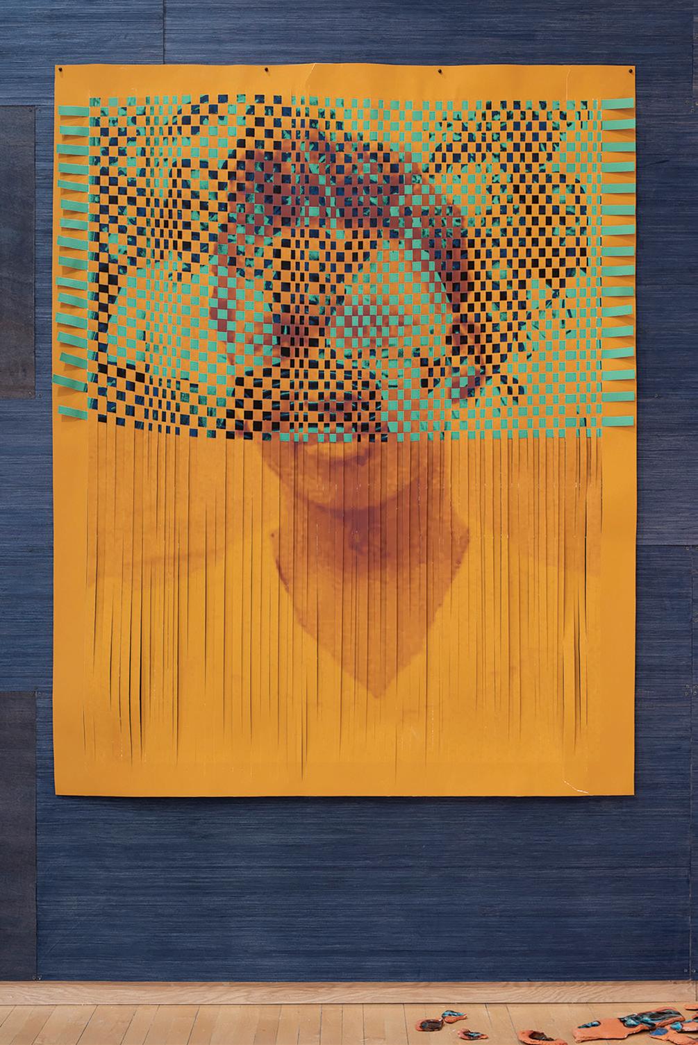
BARNETT’S PROCESS OF SELF CREATION IS ALSO ONE OF RECLAMATION, SEEKING EVIDENCE OF TRANSFERRED VERSIONS OF HERSELF AND HER ANCESTORS THROUGH HER OWN PROLIFIC PRODUCTION AND REPRODUCTION.

MOM’S SMILE, GRANNY’S EYES (left)
Woven inkjet paper. 90” x 60”.
Photo credit: Neighboring States
MADE FOR MOM (opposite page)
Woven inkjet paper. 90” x 64”.
Photo credit: Neighboring States
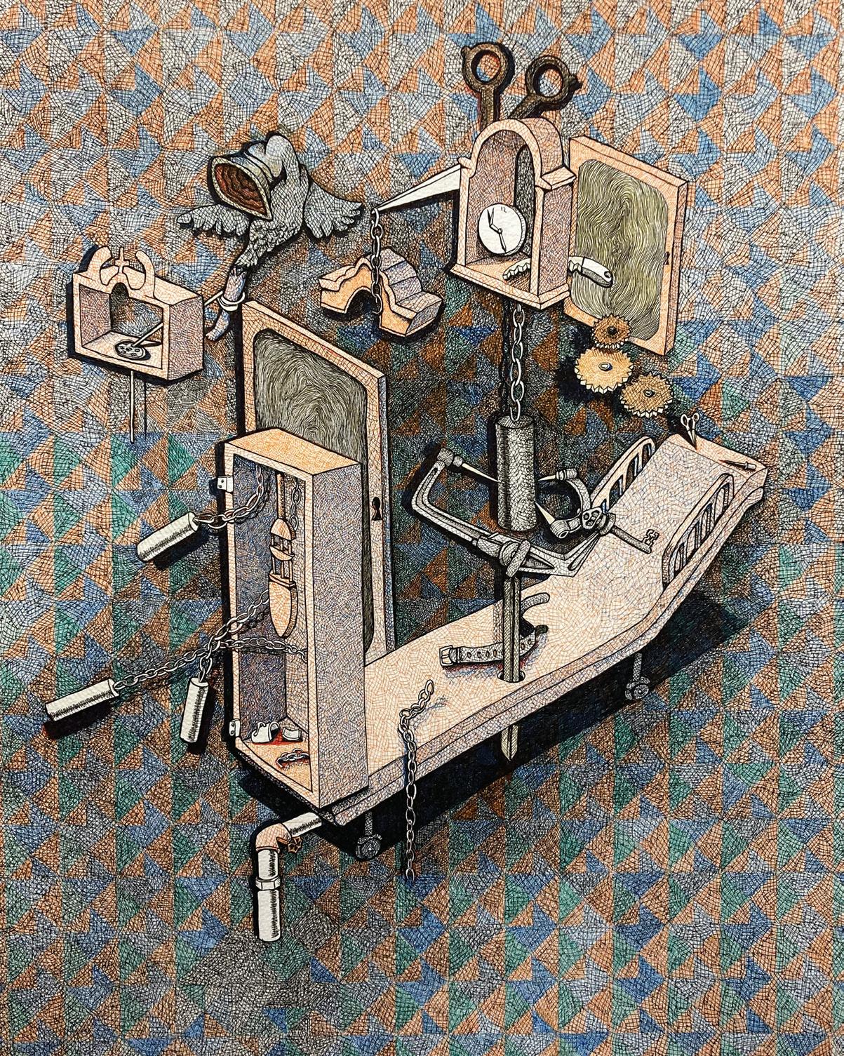
Combining meticulously detailed drawings with printed and sculptural elements, Chelsea Bonham’s work is inspired by her childhood experiences. Immediately identifiable objects such as scissors, household appliances, and clocks percolate to the surfaces of her drawings. However, it is clear that there is something cerebral bubbling up from below. Embedded within oftentimes boldly patterned domestic spaces are references to Bonham’s own trauma. As psychological landscapes, her works build toward a greater understanding of brain functions and memory writ large.
Blurring the boundary between reality and imagination, fantastical creatures zigzag throughout Bonham’s perplexing interior spaces. Staircases lead to nowhere while dryer lint ducts and sink hookups fail to attach to their logical connection points. Informed by her research on hospital equipment, in Bonham’s work grandfather clocks transform into beds and examination chairs are accompanied
by various nondescript medical tools. With a style that carefully considers fine details, Bonham’s works are treasure troves of hidden meaning. Discarded children’s toys, loose teeth, and everyday objects like books, jars, and lamps form a vibrant matter of sensorial touchstones throughout her work. These surreal elements all cohere to contend with the delicate, and sometimes tenuous, nature of memory and the brain itself.
Bonham also folds her flat drawings into miniature threedimensional sculptures with mechanical elements. With found objects like a discarded dollhouse as the setting for these works, Bonham’s paper sculptures highlight the animating qualities of her drawings. Despite the enigmatic themes present in Bonham’s work, the world she constructs serves as an index of brain function. Through the quagmire of memory, Bonham reveals a method of meaning making that can originate from even the darkest spots in the mind
NOT YET TITLED
NOT YET TITLED (previous
TEMPORAL CONSTELLATIONS
(above)
Installation view.

Photo credit: Neighboring States
BIRD (left)
Pens, cut paper, linocut print, cigar shavings in cigar box.

11.5” x 7”.
Photo credit: Neighboring States
WITH A STYLE THAT CAREFULLY CONSIDERS
FINE DETAILS, BONHAM’S WORKS ARE TREASURE TROVES OF HIDDEN MEANING.
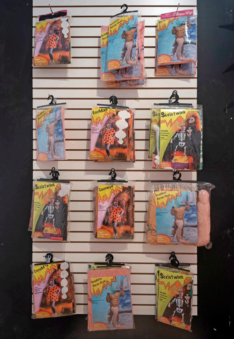
Imbued with pizzazz and playfulness, Feather Chiaverini’s repurposed garments come alive with the whirlwind energy of theater costume shops and hurried backstage scrambles to change between acts. Using soft found materials, including neoprene suits, old choir robes, blankets, and other costuming detritus, Chiaverini allows his garments to grow, continually adding extensions, alterations, and new markings. Each item corresponds to an identity played out with humor and idiosyncratic nuances—a rainbow Superman tattoo scrawled in marker on the bicep of a muscle man’s costume and polyfill abs made to look more chiseled with a casual sweep of paint. But Chiaverini’s soft-bodied hard men, skeletal twinks, and jocular jocks are more than just homages to the on-the-fly creativity and backstage theater preparations of costumers and actors. They also speak to a dissatisfaction with (and deconstruction of) what Chiaverini identifies as “homonormativity”: the ways in which gay men are increasingly pushed into stereotypical archetypes and sexual roles such as twinks and butches, daddies, bears, tops and bottoms. These labels and their visualization are hardly new— even Chiaverini’s macho men are partly drawn from Miami’s queer culture and popular depictions of buff gay figures in years past. The implicit expectation that men are to find,
and unfailingly align with, a stock identity that represents them is suggestive of a moment in which gayness becomes stratified and sanitized; they are ways of pushing people back into boxes that are fundamentally ill-suited to them.
The artist envisions his practice as thinking about identity inside and outside the box, quite literally. Suits taken off the costuming rack, so to speak, are meant to be worn by any person, regardless of gender identity, gender presentation, or physical build. Any body can grow or shrink to fill the role. In this sense, they are antidotes to the less detailed costumes aping the kinds one might find at Spirit Halloween or Party City stores. These appear as a simplified version of the aforementioned skele-twink, fashioned from a simple morphsuit and felt cutouts, or a gay caveman with Flintstones-esque animal print tunic. The overtly cheap, cartoonish look of these costumes, neatly folded in plastic packages that become increasingly dingier and more tattered as viewers flip through them, evokes a dystopian halloween shop where rainbow-washing becomes the norm and gayness becomes distilled into a series of textureless pastiches. Chiaverini draws a hard line between them and the lively, lived-in products of his would-be backstage shop, all of them tailor-made
(detail, above)
Mixed media installation.
Dimensions variable.
Photo credit: Neighboring States.
(detail, left)
Mixed media installation.

Dimensions variable.
Photo credit: Neighboring States.

CHIAVERINI’S SOFT-BODIED HARD MEN, SKELETAL TWINKS, AND JOCULAR JOCKS ARE MORE THAN JUST HOMAGES TO THE ON-THE-FLY CREATIVITY AND BACKSTAGE THEATER PREPARATIONS OF COSTUMERS AND ACTORS.
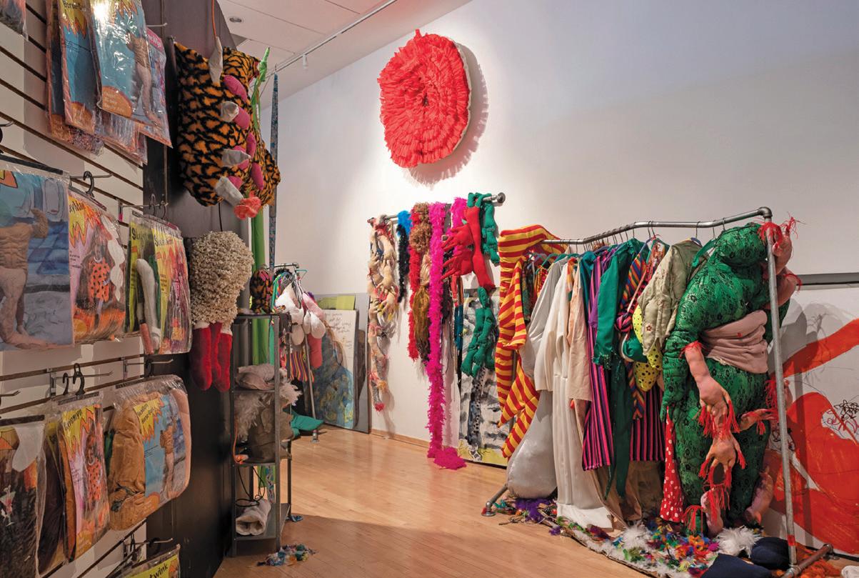
THROUGH THE LOOKING ASS
(detail, above)
Mixed media installation.
Dimensions variable.
Photo credit: Neighboring States.
THROUGH THE LOOKING ASS
(detail, opposite page)
Mixed media installation.
Dimensions variable.
Photo credit: Neighboring States.
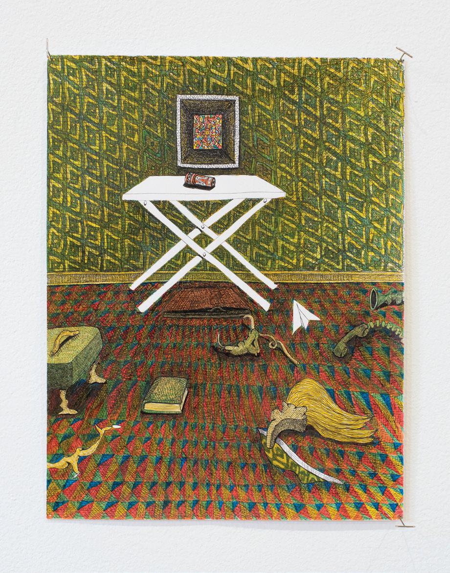
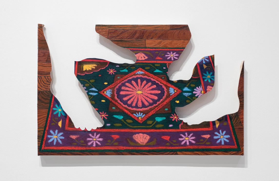
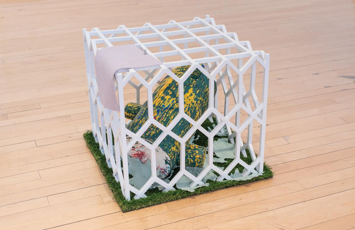
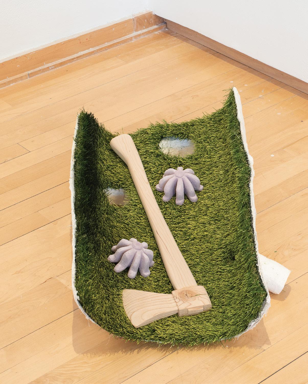
An internal reflexivity permeates the work of Kyle Choy. Each discrete element that composes a piece questions the nature of the work itself, asking viewers to investigate what it is they are actually seeing. A cast of a tree trunk, for example, appears true to its model until one notices a set of eyes etched into the bark. The folds of a bedsheet in disarray rendered in solid paint deceive the eye into believing they are fabric until one comes within inches of the sculpture. Choy situates his work between image and illusion, crafting scenes and objects that defy any singular defining narrative or material. His manipulations of wax, foam, and acrylic coalesce into phantasmagoric branches that ensnare a canvas, and seemingly mundane objects such as an unmade bed or a bedside table destabilize view
ers when they realize that the soft fabric of a mattress has been replaced with hard foam or a reading lamp is an inoperable imitation of some other object. This unpredictable quality draws viewers closer to the work and invites them to investigate its construction, its varied textures, the pieces rooted in reality and those drawn from a world of illusions. Choy seems to understand viewers’ desire to look their way through the process of defining his pieces and comprehending how each element creates the whole. The artist defeats their attempts at comprehension by changing the placement of a work’s different parts or grafting a section of one work onto another, thus ensuring that each piece remains undefinable, an occupant of spaces in-between with the ambiguity to provoke fascination and confusion
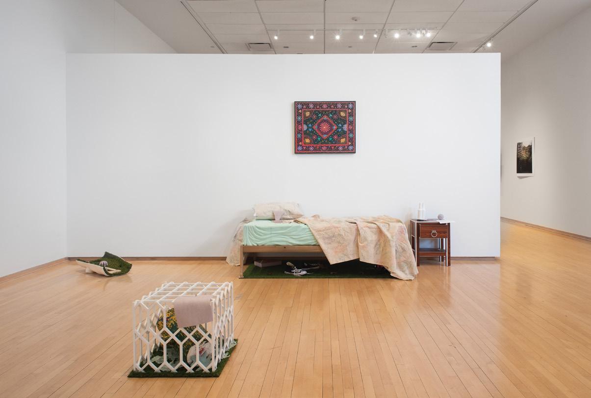
(right)
Foam, acrylic medium, artificial grass, MDF, metal. Dimensions variable.
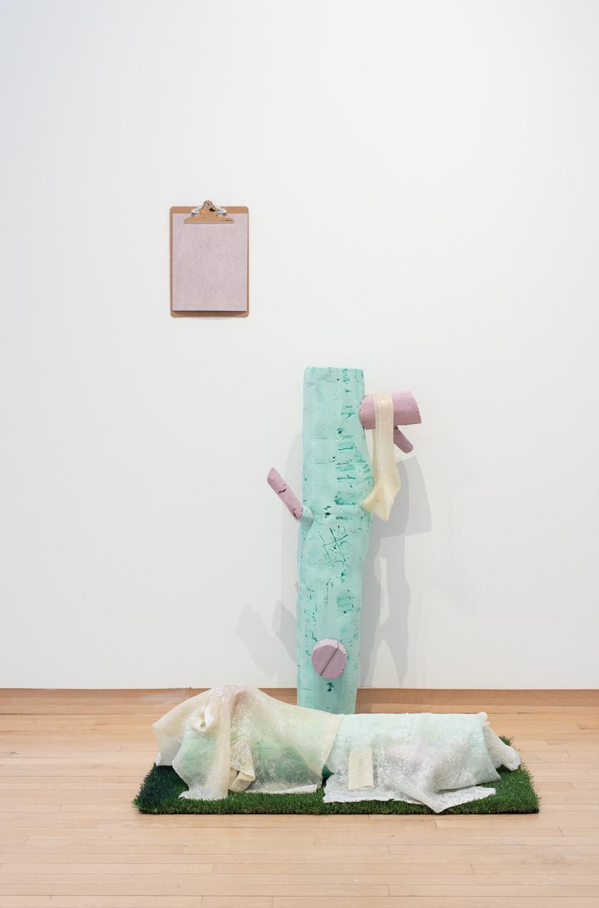
Photo Credit: Neighboring States
(opposite page, top)
Oil and oil pastel on canvas, wood, MDF. 21.5” x 34”.
Photo Credit: Neighboring States
(ARRANGEMENTS
(opposite page, bottom)
Foam, acrylic, acrylic medium, wood, leaves, artificial grass. 21” x 21” x 17.5”.
Photo Credit: Neighboring States
(ARRANGEMENTS
(following page)
Plaster, artificial grass, wood, foam, spray paint. 16” x 28” x 8”.
Photo Credit: Neighboring States
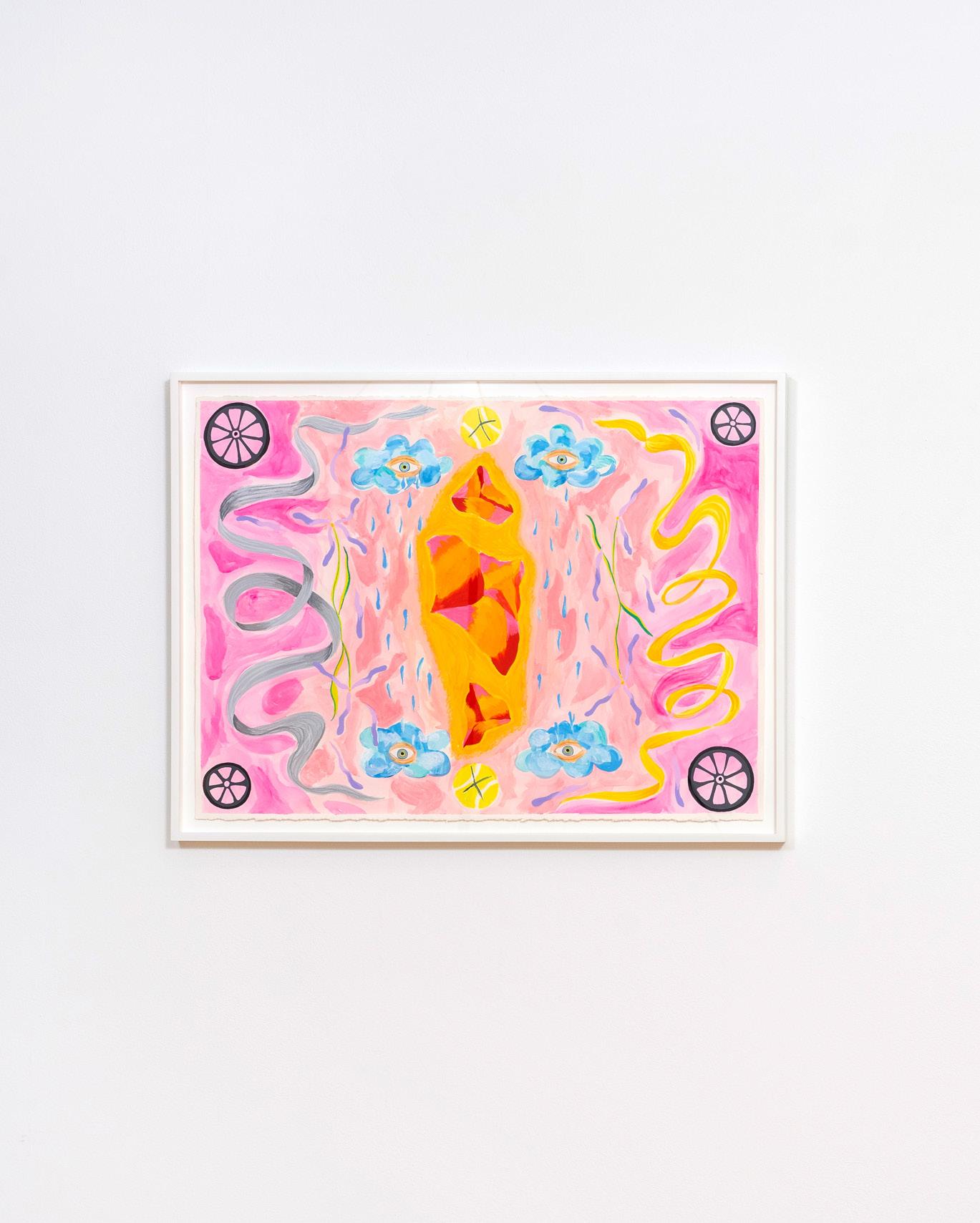
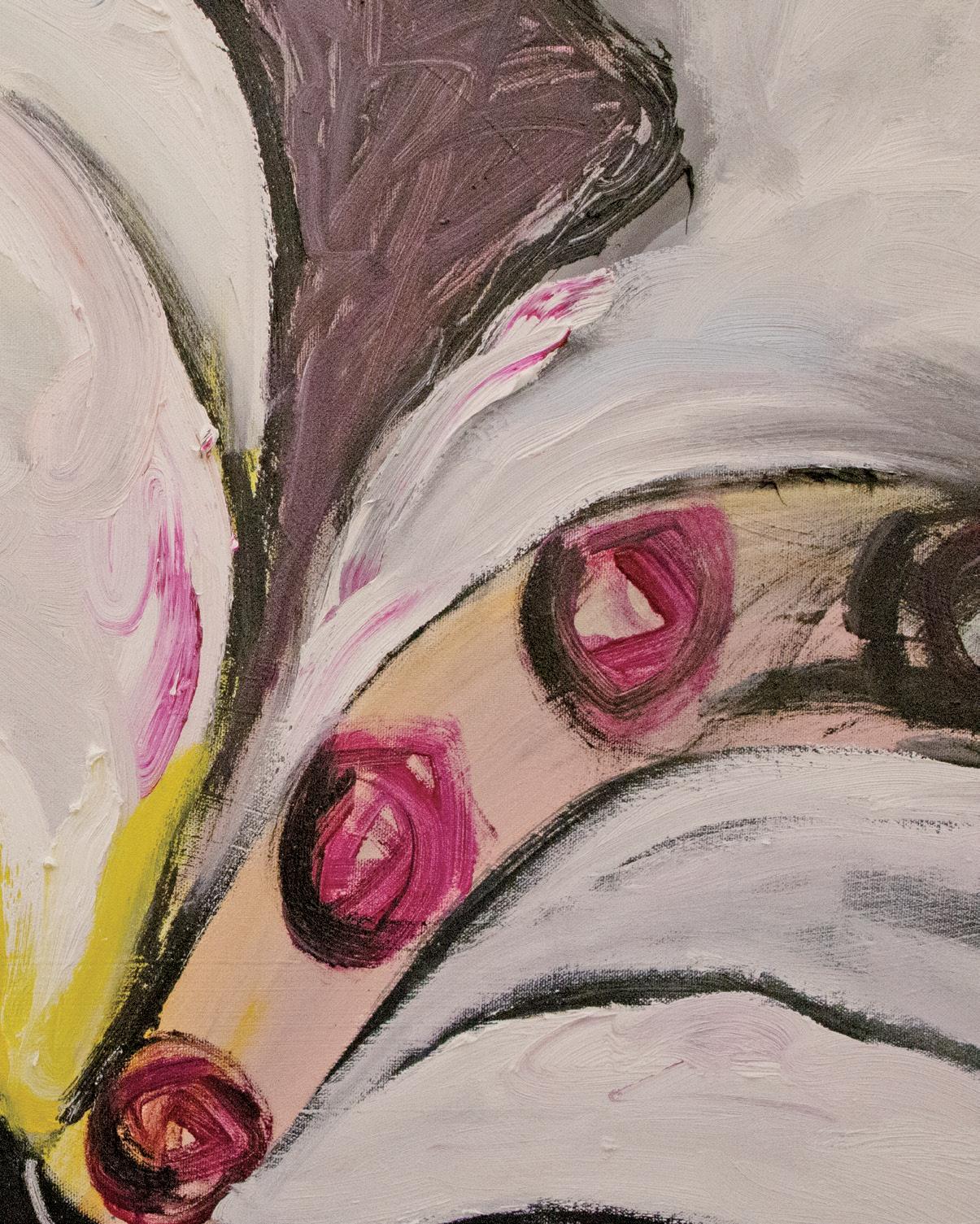
Carmel Dor’s work explores queer temporalities, Israeli national identity, physical manifestations of anxiety and duress, cycles of failure and recovery, and the unsettling qualities of change. Utilizing non-traditional media like zines alongside traditional media of painting, sculpture, and drawing, Dor’s practice meditates on the liberation of embracing the unknown as a first step in radically transforming our lives. Their oeuvre could be described as a hopeful, even lyrical, journey into the void, the unknown, and the uncertain.
Clocks make regular appearances in Dor’s work. Clock (Backwards and Forwards), for example, consists of a single clock set against a mirror. The numbers on the clock have been painted backward so their reflection presents as forward. Neither the reflection nor the reflected are quite right: while the reflection of the clock has legible numbers, the hands appear to move backward. The reverse is true of the reflected clock: illegible numbers contrast with the hands moving forward. The struggle to align one’s self-perception to reality is embodied in this dissonance.
Dor’s zine Economy of the Droplet revisits this theme of reflection with its drawings of rearview mirrors. One couplet of drawings is labeled “driver side” and “passenger side,” with the former described as “agency & stress” and the latter as “passive & nostalgia.” With the drawings set on facing pages, the viewer rests between these opposing reflections, a reminder of how these mirrors reflect a single being living simultaneous truths.
Dor’s versatility shines in their more playful paintings like Milk & Honey (Judgment of Solomon), a duo of symmetrical vaginas rendered in bright, warm hues. The paintings purposely hang askew against each other, forming a third vertical slit between them. Milk & Honey demonstrates Dor’s ability to remain inventive and light-hearted when contemplating complex realities of the world
DOR’S PRACTICE MEDITATES ON THE LIBERATION OF EMBRACING THE UNKNOWN AS A FIRST STEP IN RADICALLY TRANSFORMING OUR LIVES.
(WHAT HAPPENS WHEN YOU ASK A QUESTION?)

NOT YET TITLED


The following is an unedited interview between a reporter from the Philadelphia Art and Science Newsletter and L Autumn Gnadinger, head of the Department of Transdimensional Musicology and New Religious Practices; Workers’ Union (DTMNRPWU)*.
PASN: We should start at the beginning. When and how did the portal show up?
LAG: The portal, apropos of nothing, opened up about three weeks ago in what was then my studio – I formerly was an artist. In terms of how, well, that’s one of the many questions that DTMNRPWU is trying to get to the bottom of. While we have made extraordinary leaps forward in our understanding since day one…we still can only speculate as to how it functions. But, with the aid of some additional funding, we are very close to a breakthrough! Can you put the funding part in bold?
PASN: Surely this exposure will help. From what I understand, the portal produces objects. What are these, and what do you do with them?
LAG: Every couple of days a new object falls out of it. We’ve been calling them “instruments,” for the time being, as they resemble such things from our world and seem engineered to produce sounds, but who knows what
(or who) they really are for. To the end of understanding them better, we have been interacting with them in various “experiments.” In these tests, we attempt to recode the complex (otherworldly) auditory phenomena that are produced from the instruments in the more familiar, tertian harmony of our world. The results are inconclusive, to say the least, but importantly, there seems to be some activity from the other side in reaction to these efforts. The more we engage, the more we are met with engagement.
PASN: How would you describe your relationship with the objects?
LAG: I think my initial reaction to them was much the same as anyone else’s would have been: “Wow, holy shit!” Since then, of course, they have become objects of my utmost fascination. I spend all of my time with them, you know, and… [At this point, DTMNRPWU’s robot, Pete, ran over the tape recorder, stopping the transcript.]
*DTMNRPWUisanorganizationfoundedbyGnadingertostudy andmakesenseoftheobjectsemergingfromthetransdimensional portal in their studio, investigating the relationship between the objects' perceived utility and our collective understanding of tools, methods, and communication
DEPARTMENT OF TRANSDIMENSIONAL MUSICOLOGY

RELIGIOUS
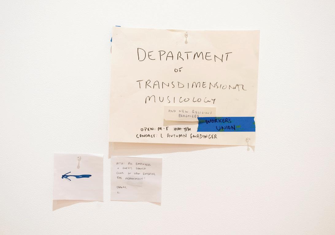
DEPARTMENT OF TRANSDIMENSIONAL MUSICOLOGY AND NEW RELIGIOUS PRACTICES; WORKERS UNION (above)
Multimedia installation. Dimensions variable.

DEPARTMENT OF TRANSDIMENSIONAL MUSICOLOGY AND NEW RELIGIOUS PRACTICES; WORKERS UNION (above)
WE’VE BEEN CALLING THEM “INSTRUMENTS,” FOR THE TIME BEING, AS THEY RESEMBLE SUCH THINGS FROM OUR WORLD AND SEEM ENGINEERED TO PRODUCE SOUNDS, BUT WHO KNOWS WHAT (OR WHO) THEY REALLY ARE FOR.
Subtle and large, delicate and strong, complex and simple – Maria Ah Hyun Stracke’s work unites opposites. Her materials, including the Korean mulberry paper hanji and silk, contain rich histories of both functional and decorative uses. Used to make household objects and to repair manuscripts, hanji’s criss-crossing fibers give it strength, enabling the paper to bind other materials, belying its delicate appearance. In Stracke’s work, strips of hanji connect arcs of watercolor paper into large, rhythmic assemblages, lending both structure and texture to the works. The smooth watercolor paper contrasts with the irregular surface of the hanji, whose ostensibly delicate mulberry filaments entice viewers to step close and examine the large works. Negative spaces within the designs reveal the wall behind the artwork and call attention to the works’ objecthood. This attention to space recalls hanji’s traditional use in making doors and screens, shaping and dividing space as well as repairing objects.
Stracke conceives of the large paper works as a form of drawing because in creating them, she prioritizes process and reworking. She frequently cuts up existing artworks and reassembles the parts into new works, using hanji to connect them again. The hanji-covered seams highlight this process of cutting and repair, deconstruction and new creation. These pieces bear the histories of their previous lives as other artworks. Individual works draw on designs ranging from Buddhist temples to bojagi, square Korean cloths used for wrapping gifts or covering food. Even in their original form, these references may not be legible to viewers, and the designs are frequently further obscured when Stracke cuts them apart and reassembles them. Yet remnants of the previous iterations of each individual piece and references to other histories are still present whether or not viewers can decipher them. Stracke’s work forms an archive of multilayered and only partially accessible traces of cultural histories and her own past actions
DRAWING WATER (above)
Hanji, graphite, silk, watercolor paper.
82” x 110”.
Photo credit: Bridget K. Rogers
MOUNTAIN WALK (MEMORY OF A BUDDHIST TEMPLE) (left)
Hanji, graphite, silk, watercolor paper.
75” x 92”.
Photo credit: Bridget K. Rogers
UNTITLED (VOTIVE) (previous page)

Hanji, graphite, silk, watercolor paper, mineral paint.
57.5” x 75”.
Photo credit: Neighboring States
THE HANJI-COVERED SEAMS HIGHLIGHT THIS PROCESS OF CUTTING AND REPAIR, DECONSTRUCTION AND NEW CREATION.

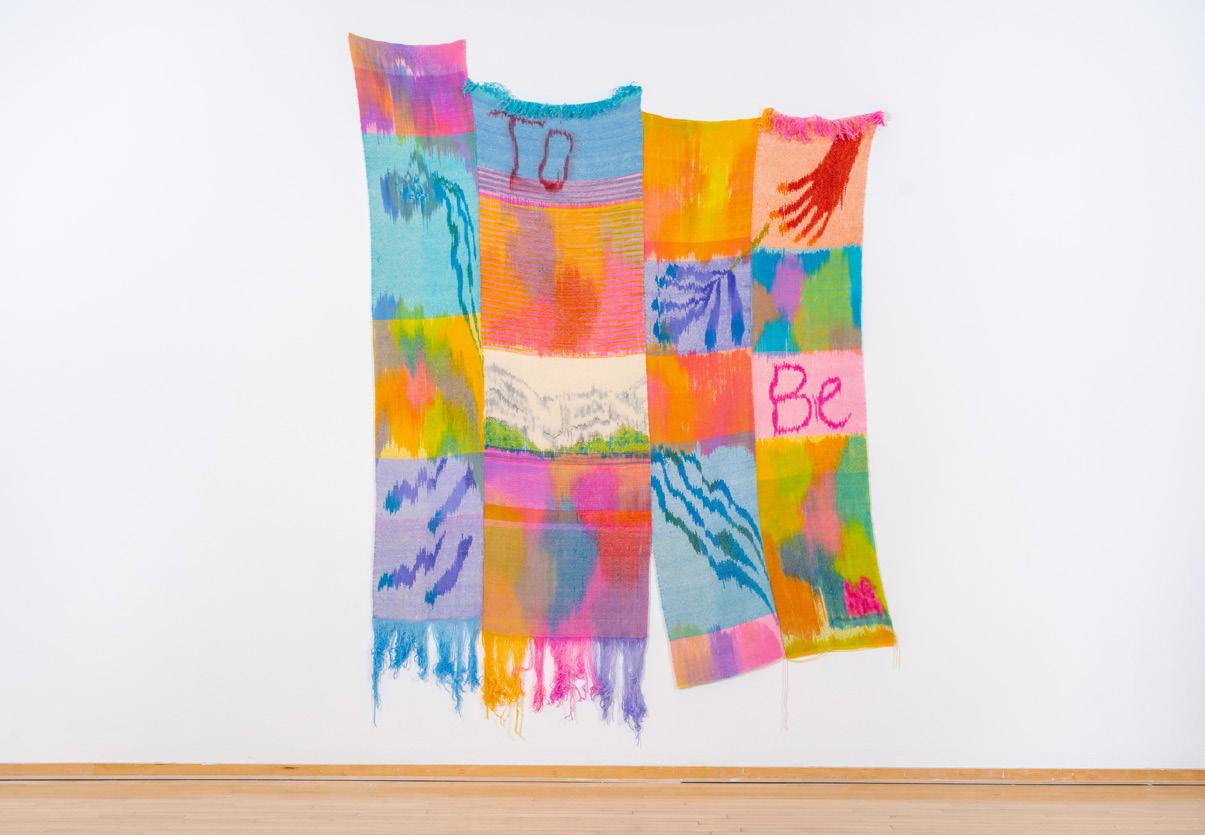
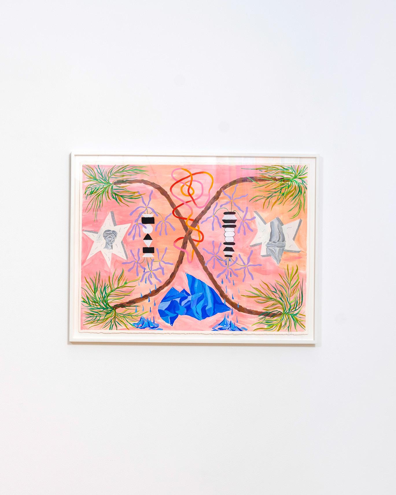
The act of ritual permeates all stages of Lena Kolb’s practice. She begins her process with a drawing or painting to give imagined ideas physical form, but primarily works in the medium of fibers, creating final works of woven hanging textiles. Weaving itself is an exercise in ceremony: the uniformity of the warp combines with the dedicated repetition of the weft to create compositions carefully imbued with patterns and symbols of personal importance to the artist. Through this process, Kolb is devoted to exploring the waxing and waning of grief long after a loss. Some of the symbols are drawn from the artist’s personal relationships—vessels with water pouring out of them call to the fact that she and her parents were all born under the sign Aquarius, the water bearer. Others come from her research of historical traditions related to mourning, such as flowers left at graves or carved into headstones. Among many other symbols are circular forms reminiscent of Möbius strips, a call to the cyclical nature of death and healing; flowing fabric and curtains are the veil between life and what comes after. Assigning meaning to each one and giving it careful placement creates an offering to those she has lost while maintaining a level of privacy, a simultaneous ritual of public memorial and personal intimacy.
Gentle hues of pinks and oranges together with bright blues and greens are purposely chosen to convey sympathy and care against an impulse to portray grief as exclusively painful. Through curved loops and flowing patterns, combined with the perceived dripping or distortion of objects, the interplay between representational and abstract forms signifies certainty about what we know in life and confusion about what we may not know about death and alternate forms of being. The initial visual impression of recognizable objects is both a protective layer above and an access point into the underlying symbolism and encoded narrative of the artist’s life experiences. Kolb doesn’t demand or expect the viewer to immediately interpret her work to be about grief and death. She hopes to communicate a much broader theme: by inscribing a new visual identity to loss and mourning, the unexplained is not something to be feared or avoided, and the unknowns in life become an opportunity for creation and remembrance
TO BE (detail, left) Wool, dye. 101”
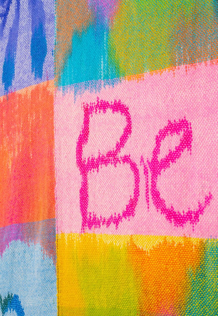
KOLB DOESN’T DEMAND OR EXPECT THE VIEWER TO IMMEDIATELY INTERPRET HER WORK TO BE ABOUT GRIEF AND DEATH. SHE HOPES TO COMMUNICATE A MUCH BROADER THEME: BY INSCRIBING A NEW VISUAL IDENTITY TO LOSS AND MOURNING, THE UNEXPLAINED IS NOT SOMETHING TO BE FEARED OR AVOIDED, AND THE UNKNOWNS IN LIFE BECOME AN OPPORTUNITY FOR CREATION AND REMEMBRANCE.

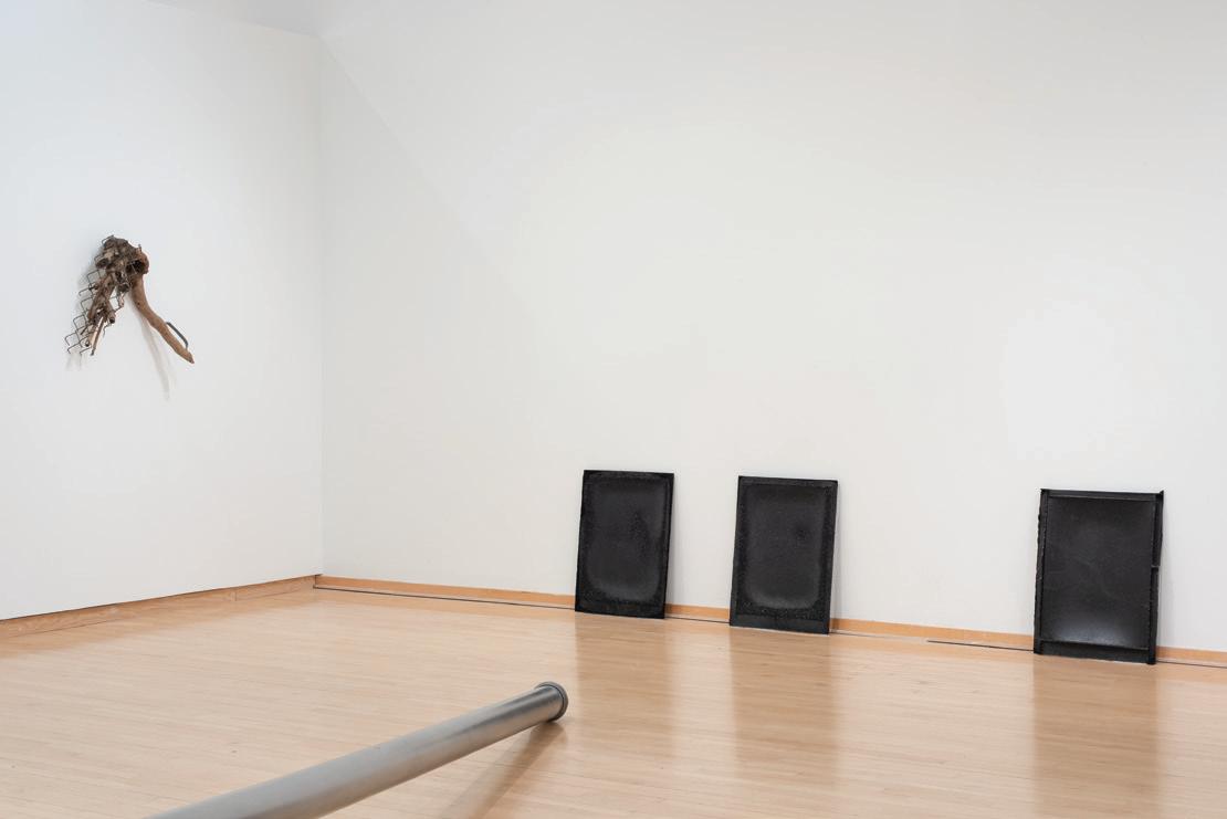
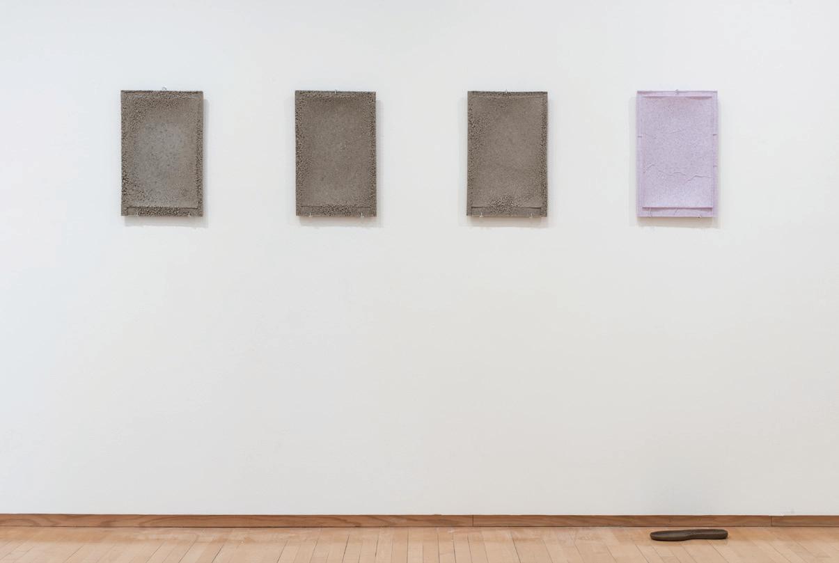
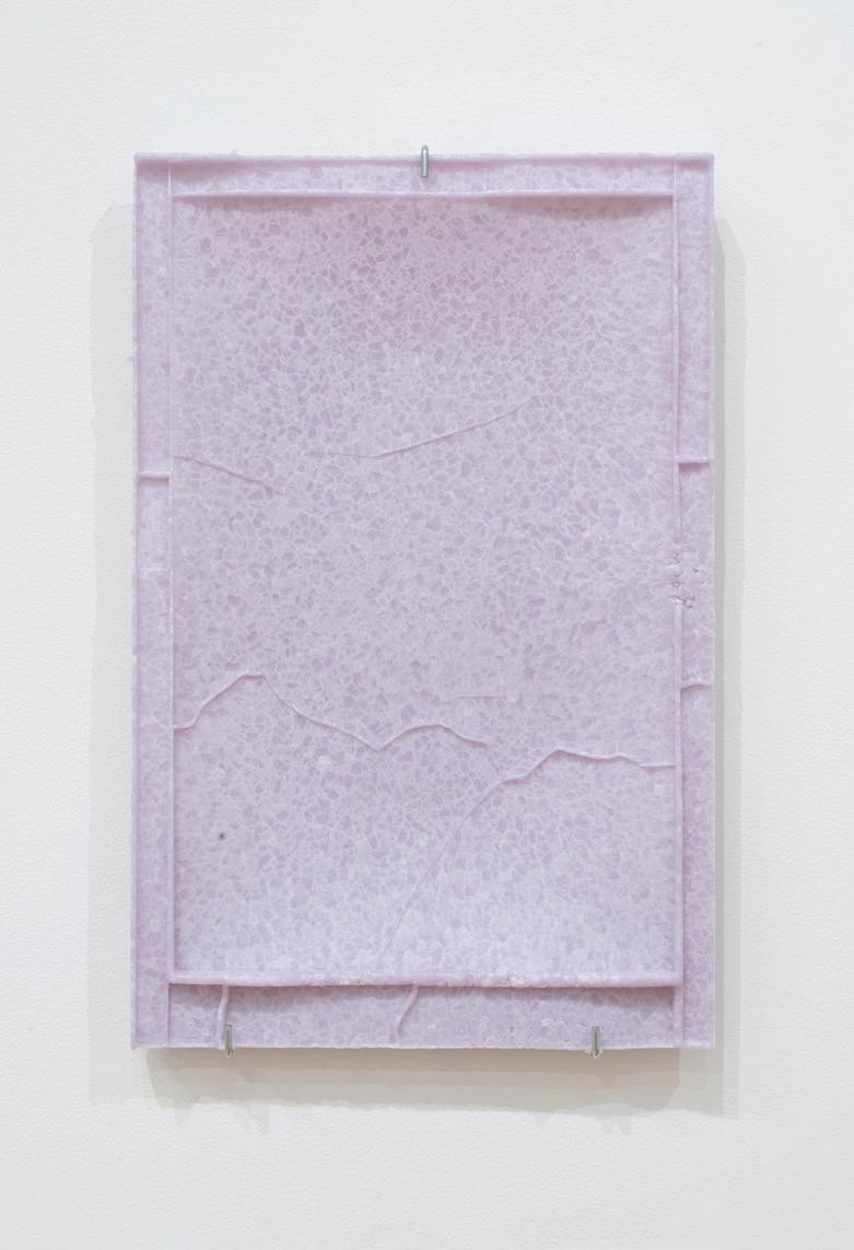
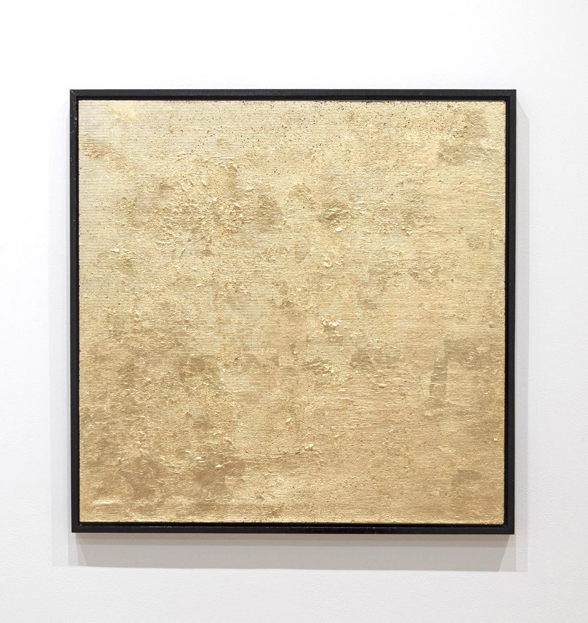
Ren Mahon creates lustrous documents in cast glass, records of heat and pressure. Found objects generate a framework for viewing the glass artifacts, pointing at their shared circumstances. On the wall an umbrella handle and a spray of plastic flowers bisect lavender and black glass panes, analogous colors resonating in formalist dialogue. The sole of a shoe converses with a pane of cast gray glass. A traffic pole transcribes the moment of impact; the notches inscribed on its surface are a memento mori, a measurement.
Mahon interrogates the dominance of the artist over the medium, transferring agency to the materials. The weight of plaster poured into stretched latex creates the mold, a collaboration with gravity. Heated to just below flow temperature, the fragments of glass bind together, yet retain their individuality. Jagged edges soften but do not liquefy, in both stasis and suspension. Black glass cats, bluebirds, a chipped purple pony – castaway relics from
the now-defunct Fenton Art Glass factory in West Virginia become raw materials for the castings. Transforming objects made for middle-class consumption, Mahon seeks to understand the energy within this shifting ecosystem. The barrels of glass arrive without technical instructions. Mahon observes, adjusts, and responds to each batch, a constantly modifiable feedback loop. The content is the condition of its making, the work a monument to its production.
In Mahon’s archive, materials and processes devoid of words or symbols catalog and reprocess the detritus of industry. A dossier for future viewers to decode otherwise untitled works contains parenthetical expressions that hint at their history. Two black panels are Untitled 1 and 2 (Fenton Witch and Scardey Cat Seconds). Another Untitled blue piece is parenthetically titled (Fenton Blue Bird of Happiness), a postindustrial canary singing coal country blues. Like the mutable molecular structure of glass, our ecosystem is inherently unstable; we are its causation and its casualties
WAS THAT (FACTORY DEFECTIVES SERIES)
IN MAHON’S ARCHIVE, MATERIALS AND PROCESSES DEVOID OF WORDS OR SYMBOLS CATALOG AND REPROCESS THE DETRITUS OF INDUSTRY.
(right)
Steel
(below)
Installation view.

02-09-22, FACTORY DROPS
USA PRESENTS LAVENDER
FOR
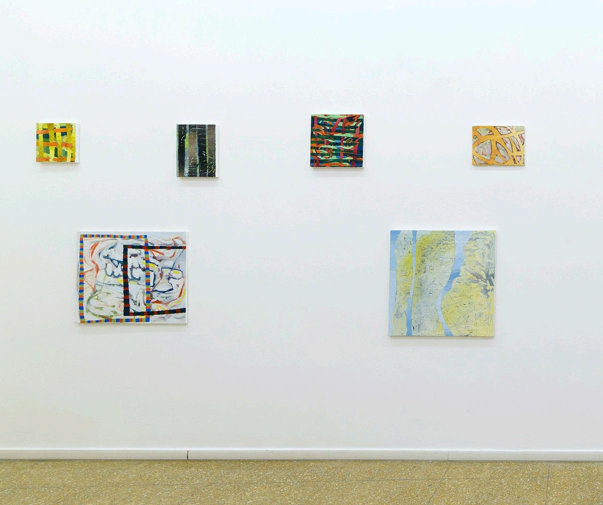
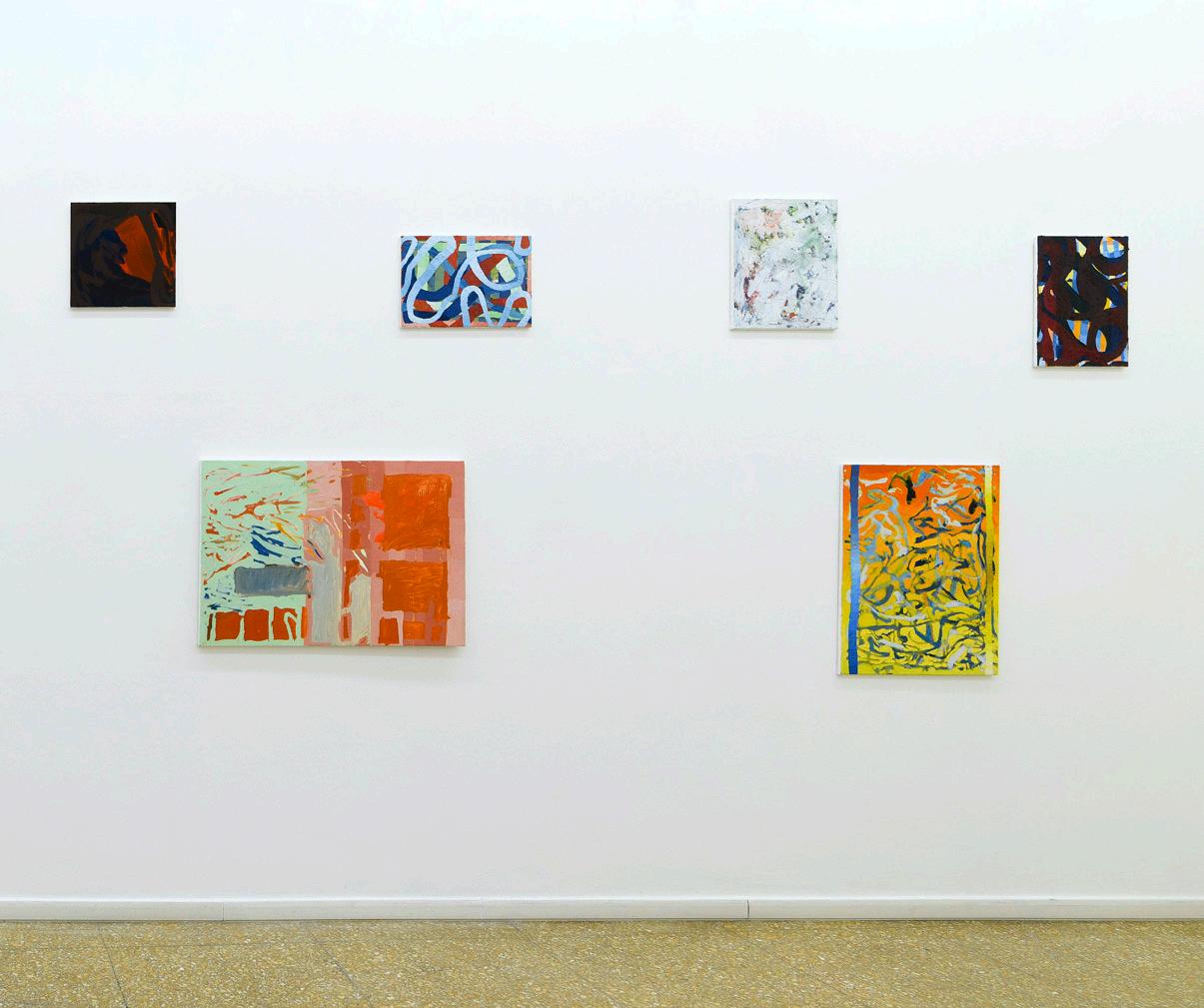
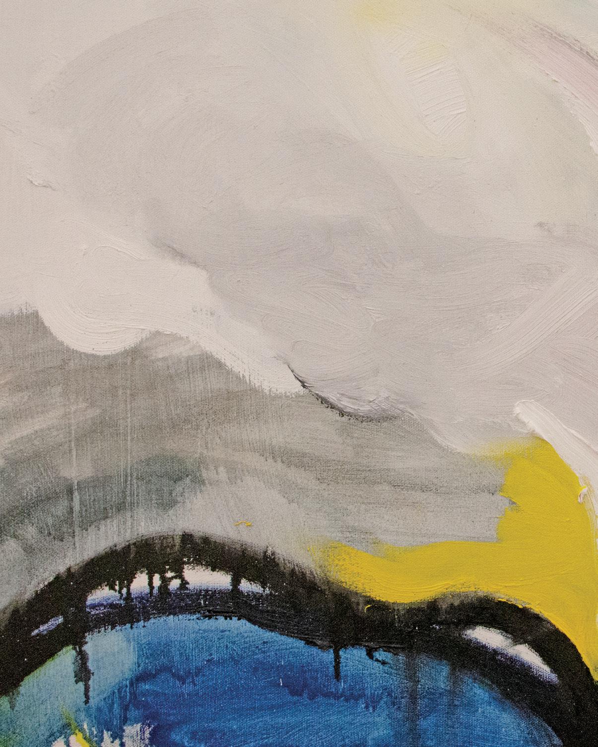
As an artist working amidst the unfolding environmental crisis, Stephanie Manzi asks, “What is the function of painting?” This existential question may seem overwhelming, but for Manzi it is an invitation to develop her own definitions of ecology and deepen her pictorial relationship to landscape. Play is an important method for her when engaging in these formal relationships. For Manzi, play involves a level of care and engagement; it is an open-ended process of improvisation, attention, listening, and reorganizing. She is inspired by the artist Hans Hofmann, who translated his experiences of being in nature into the forms and colors of his abstract paintings. She has also incorporated the philosophies of eco-theorist Timothy Morton, who calls for new language to understand nature in non-anthropocentric terms that can help redefine human relationships with the non-human world by highlighting their interdependence.
Although deeply reverential to the non-human world, Manzi’s landscape-based abstractions do not necessarily render what humans may recognize as “natural” forms. In her paintings, biomorphic shapes of bold pigment stretch and curl across the support, on top of which she layers canvas strips of square color blocks, creating surface textures and
optical interplays of depth. Manzi recycles and resuscitates canvas strips from other works, deepening the interrelations within her oeuvre. She frequently makes paintings in pairs and while the canvases engage in physical conversation with one another, they also enter into spatial conversation with the viewer. Like Manzi’s other experiments in materiality, ranging from handmade paper collages, hand-tufted tapestries, and three-dimensional weavings of found or discarded material, these works imprint onto the space of the viewer, suggesting haptic marks through their textural and sculptural qualities as they open themselves up to further consideration.
This viewing experience proposes tactility and intimacy despite the formality of the gallery setting; it is also a reminder that the surrounding space is not separate from this momentary relationship, but rather symbiotically connected. In this way, Manzi’s works assert a function in this epoch of profound environmental loss: they encourage awareness beyond the immediate self from the micro to the macro scale, echoing the deep interdependence that Morton stresses. Everything truly is interconnected, and this is what gives us hope
Oil on canvas. Dimensions variable.
Installation view.

SYSTEMS SO ORGANIZED
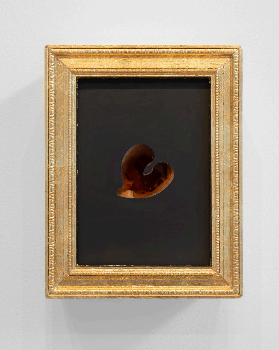
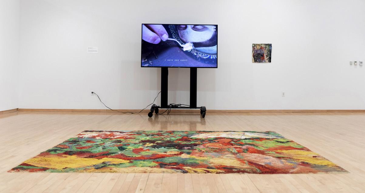
How do we remember treasured moments, milestones, people, and decisions that have influenced the course of our lives? Human beings hold an intrinsic method of memorialization through material mementos like photographs, newspaper clippings, letters, and videos. These legacy didactics, or personal archives, have long been used as resources for researching our genealogical and cultural histories—but what do they teach us about the phenomenology of remembrance itself? Working with glass, sound, and other media, sculptor Summer Lynn Moore investigates the tension between the duality of transience and permanence, the delicate and durable, and mortality and immortality.
The artist spent two years collecting piles of affectionate notes on paper holding sentiments like “thank you for being my first friend” and “you’re incredible.” Playing with archival materiality, she transferred the sweet messages onto delicate sheets of textured glass with varying border patterns mimicking vintage papyrus stationery, a delicate but permanent tribute to her friendships. In contrast to the paper notes, Moore’s archived memories of touch and dialogue were formerly incorporeal. Using both unstained and soft pink coral glass, Moore sculpts tactile moments like tender hand embraces and the fleeting grasp of an arm. At first glance, the sculptures
resemble metaphysical shapes that echo the mysterious hollows of warm-hued sandstone slot canyons. Upon closer look, discernable details of squeezed fingers, creased knuckles, and smooth nail surfaces reveal themselves. Moore centers the figures on painted-black plaster, adding weight, both literally and symbolically, to the structure. The juxtaposition of fragile representations of precious moments cemented into place illuminates the smooth, gleaming embraces and speaks to a dichotomy of the archive: permanence and fragility. She mounts the finished plastered glass into elaborate gold frames—an homage to Baroque still-life paintings that also memorialized the fleeting nature of sensory moments.
Moore’s soundscapes reverberate studio conversations with friends about their own oral histories and memories throughout the gallery space. Using black glass, the sculptor constructed a sound tunnel that serves both as an amplifier of sound and a mirror to bare the reflection of the viewers. This meta-sensory encounter invites us to consider our own practices of remembering and collecting while learning the stories of others. Moore hopes her work will ignite a renewed appreciation of our limited time together, our relationships with loved ones, and a deeper consideration for the memories we keep
REMNANTS OF LETTERS
(above)
Glass, ink, paint. Dimensions variable.
Installation view.

Photo credit: Neighboring States
ENDEARMENT OF BODY LANGUAGE
(stills, right)
Silent video, 2:29:47.
Photo credit: Neighboring States
TOUCH: KATIE
(previous page)
Cast glass, wood, plaster, paint, gold foil. 16” x 13” x 6.56”
Photo credit: Neighboring States
SUMMER LYNN MOORE INVESTIGATES THE TENSION BETWEEN THE DUALITY OF TRANSIENCE AND PERMANENCE, THE DELICATE AND DURABLE, AND MORTALITY AND IMMORTALITY.

TOUCH: CASSANDRA (above)
Cast glass, wood, plaster, paint, gold foil.
16” x 13” x 6.56”
Photo credit: Neighboring States
HOW WE REMEMBER (left)
Glass, wood, sound, speaker. Installation view.
Photo credit: Neighboring States

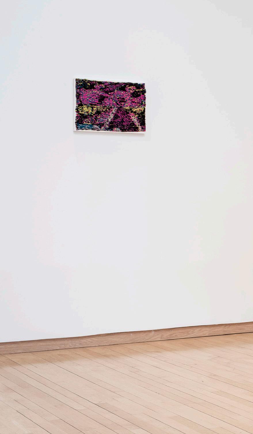
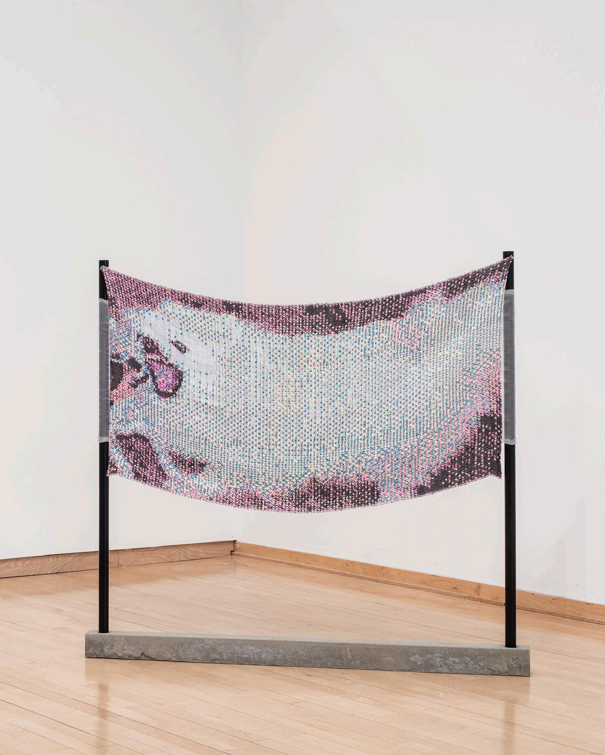
“Weaving is an act of masochism,” says Abbey Muza, for whom carefully layered subtleties far outweigh surface delights. Muza’s textiles field a dance of image and word, articulating a sensual, multilayered relationship between the poetic, the visual, and the tactile.
Inspired by the lives of early 20th century queer artists and the writings of French authors and philosophers, such as the poet Georges Bataille in Visions of Excess, Muza is interested in finding beauty and attractiveness among the uncomfortable, the grotesque, and the unexpected. In their textiles, images that are barely discernible at first glance seem to come into sharper focus the longer the viewer sits with the work. With sensuous and dreamlike wefts of pink, burgundy, purple, celeste, and hazy off-white, the works give rare moments of clarity to visceral, almost indescribable vignettes: fleeting images of play violence among pets, a glass of wine carefully and dutifully refilled, the feeling of falling in love.
Muza’s approach to weaving highlights and heightens the dimensionality of the textile. It is a medium that in other circumstances, the artist recognizes, could easily lend itself to “safer” modes of viewing and interpretation – hung on a wall like a painting, a flat surface where the topography of overlapping brush strokes strain all too often against the
limitations of canvases and frames. But that is not the case here. Though Muza begins the creation of each new object with a rough idea in mind, the initial step in their process is the digital encoding of a huge abstract pattern of black and white pixels, which oftentimes bears scant resemblance to the final product created using a Jacquard loom. The artist allows for the machine to select certain threads to be elevated during the course of the weaving process, altering the image. Abstract digital information turns into something analog, tangible, legible – but never quite in the same way twice.
Muza embraces these small moments of uncertainty and then frees the object from the wall itself, using the products from their loom almost as a scaffolding for more nuanced theorizations – borne out in their practice – on the capability of image, text, and weave to mutually support each other. To this end, one textile encoded with the image of a small, yappy dog also includes an excerpt from an interview with the Belgian fashion designer Martin Margiela in the magazine View on Colour, in which he muses on the evocative byproducts of the creative process: “What is red? A blush, a flush, a fever, a command… What is texture? A result of time”
DIVINE AND DARLING; INVERSIONS DEVIENT URANIA; SET OUT SAUCERS FOR ANIMALS AND I TOO WILL GROW CLAWS
(above, l-r)
Silk, wool, cotton, organza, enamel, wood, gesso on panel.
Dimensions variable.
Installation view.
Photo credit: Neighboring States
JUNKING PULSES; THE SEA; A BLUSH, A FLUSH, A FEVER, A COMMAND
(right, l-r)
Silk, wool, cotton, organza, enamel, wood, gesso on panel.
Dimensions variable.
Installation view.

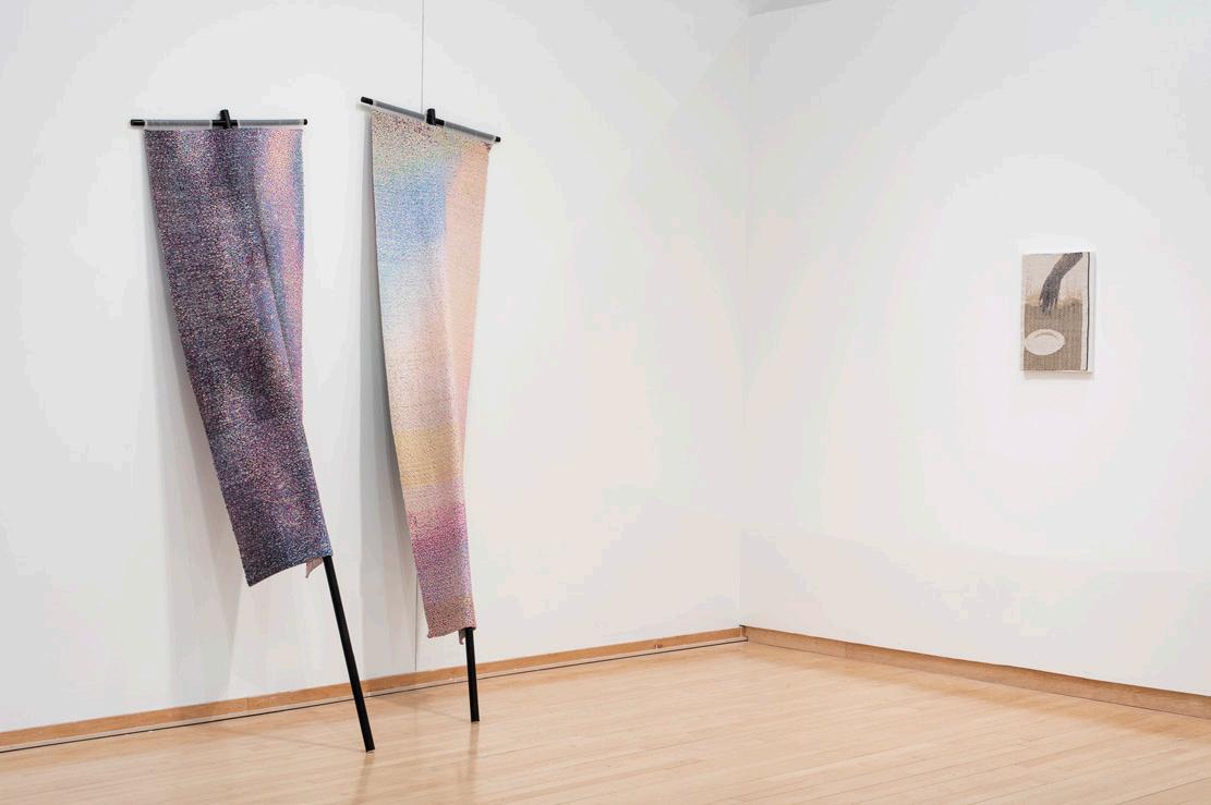
Photo credit: Neighboring States
FAR OUTWEIGH SURFACE DELIGHTS.
“WEAVING IS AN ACT OF MASOCHISM,” SAYS ABBEY MUZA, FOR WHOM CAREFULLY LAYERED SUBTLETIES
Dimensions variable.
Installation view.
 (right, l-r)
Silk, wool, cotton, organza, enamel, wood, gesso on panel.
Photo credit: Neighboring States
(right, l-r)
Silk, wool, cotton, organza, enamel, wood, gesso on panel.
Photo credit: Neighboring States
Casey Newberg believes her traumatic experiences belong on a gas station shelf, but she’s doubtful that anyone would want to buy them. As a young girl growing up in the Midwest, Newberg was often confronted with displays of eye-catching, colorful gas station products that she calls “horny pills.” In constructing her own “pill packs,” Newberg explores the conceptual packaging and consumption of trauma, addressing these oddly sensationalized medicinal items while commenting on the greater societal issues they represent. The cathartic process of making allows her to re-pack her past with the aim of ridding herself of her struggles with medical dependency and psychological pharmaceuticals. She recognizes the increasing universality of her experiences and hopes to connect with others through her works.
It’s not all doom and gloom though; Newberg laughs in the face of uncertainty and pain, for she recognizes that life is indeed both “funny and shitty.” She pays homage to this great divide, and the dichotomy is apparent in each of her
works. Her Corten steel pill packs, many of which are powder coated in neon hues and laser etched, are designed to self-destruct. Over time, the color is forced off the object’s surface by natural oxidation activated by the environment, echoing the chemical processes that corrupt the medicated human body. At times, the addition of salt water encourages this corrosion, symbolic of the tears shed for the body subjected to medical trauma. In this way, her works evoke a fragmented and unsteady nostalgia, a muddy conglomeration of memory activated by color and form.
Newberg’s “jewelry packs” similarly bring chintzy readymade jewels into the arena of “high art.” All of her packs are wearable, but their functionality is cheapened by the kitschiness of their forms, which taunt the viewer with brilliant gems sealed away beneath vacuum-formed plastic. Witty words decorate the packaging, but once the process of deterioration begins, their message becomes as fleeting as the object itself. Soon, the packs and their contents will be as fragmented as the memories that formed them
SPOILED ROTTEN (right)
Steel, powder coating, plastic, readymade materials.
Dimensions variable.
Installation view.
SPOILED ROTTEN (left)
Steel, powder coating, plastic, readymade materials.
Dimensions variable.

Installation view.

Photo credit: Sam Fritch
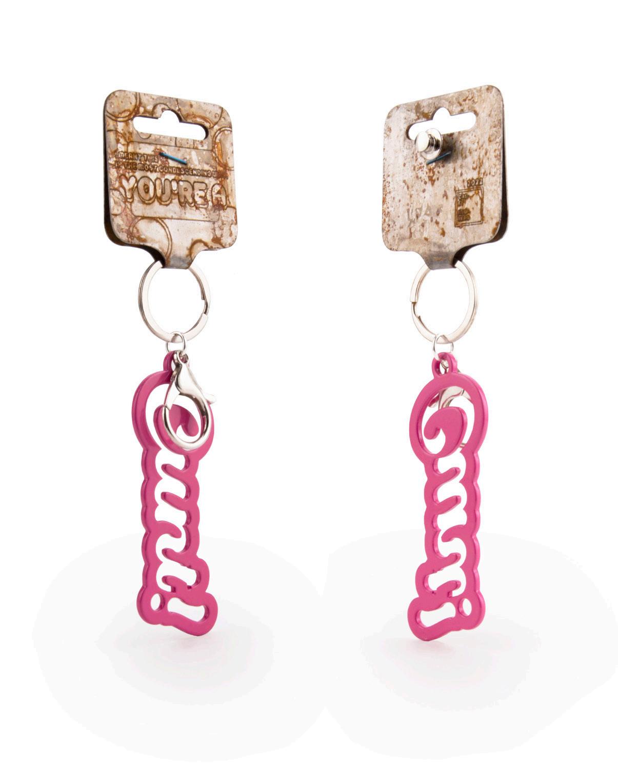
C U NT KEYCHAIN PIN (previous page)
Laser-etched & aged steel, steel keychain findings, powder-coated aluminum, stainless-steel tie tack, anodized titanium staple. 7” x 2.25” x .2”
IN CONSTRUCTING HER OWN “PILL PACKS,” NEWBERG EXPLORES THE CONCEPTUAL PACKAGING AND CONSUMPTION OF TRAUMA.Photo credit: Sam Fritch
“SAY YES” RING (02) (left)

Powder-coated, laser-etched & aged COR - 10 steel, vacuformed PETG, readymade “engagement” ring. 2” x 1.1” x .5”
ALONE STEEL KEYCHAIN PACK (bottom)

Laser-etched & aged steel, steel keychain findings, powder-coated aluminum, vacuformed plastic, stainless - steel tie tack and pins. 5” x 3.3” x .2”

Chau Nguyen’s paintings and sand installation overflow with texture, rendering hours of labor undertaken by the artist visible to the viewer. The work is centered around Nguyen’s childhood memories in Vietnam, more specifically, of artwork displayed in storefronts – Western masterpieces replicated by Vietnamese artists. In these replicas, the artist’s hand is visible, but it is obscured by the subject matter and the medium of oil paint, often associated with colonial influences. Nguyen’s paintings decolonize canonical European artworks by removing the image entirely. Nguyen pushes the Vietnamese artist’s presence to the forefront of the work instead of delegating it to the background, which leaves it eclipsed by the Western image. Through the strategic use of texture and color, Nguyen reclaims Vietnamese agency in these works.
Nguyen’s paintings are created by 3D scanning and printing technology to produce the texture on the surface. This creates a distinction between the artist’s labor and the formation of the piece using technological assistance. To reinstate it, Nguyen then paints them black and bright red, a color ironically named “Colonial Red” by paint manufacturers. However, for Nguyen, the bright red is not associated with colonial aesthetics, but with traditional Vietnamese red lacquer paint.
The large-scale sand installation is the ultimate manifestation of Nguyen’s labor rendered visible by their manipulation of the gallery space itself. The textured, imperfect nature of the sand image on the floor calls attention to the artist’s hand in the work. Its grand presence makes the viewer aware of the artist’s command over their work and the gallery. Thus, the prominence of texture in these works functions to lay bare not only Nyugen’s labor, but also their intervention in colonial art histories through the work
NGUYEN PUSHES THE VIETNAMESE ARTIST’S PRESENCE TO THE FOREFRONT OF THE WORK
INSTEAD OF DELEGATING IT TO THE BACKGROUND, WHICH LEAVES IT ECLIPSED BY THE WESTERN IMAGE.

SURFACE MEMOIRS (above)
Dimensions variable.
Installation view.
SURFACE MEMOIRS (right)
Dimensions variable.
Installation view.

POSTCOLONIAL PLAYGROUND (opposite page)
Sand
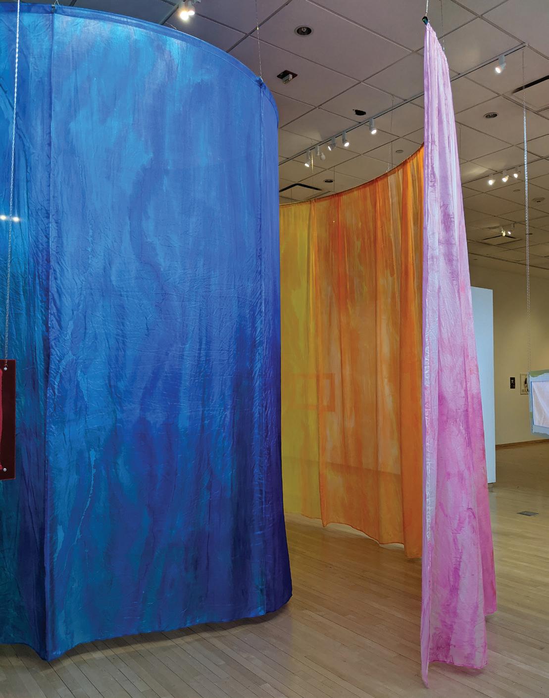
Clare Nicholls’ work is a summons, an invitation to observe and participate in rituals that explore the relationship between spirit and object. Deeply rooted in her personal practice of witchcraft, Nicholls draws influence from spirituality, mythology, and the histories of craft and domesticity that connect her to generations of makers who came before.
For Nicholls, objects are the matrices that can open the way to a more connected spiritual world. Her practice explores the ways in which made things can blur (or cross) the boundaries between intellectual and physical experience, urging us to reconsider the familiar. Embroidered lace handkerchiefs appear to contain traditional motifs of female culture and exchange…but their transparency, heightened by the ultra-neon acrylic frames they hang within, makes the stitching almost impossible to read until viewed up close. Then, monochromatic leaves, before nearly invisible, suddenly appear to look back with eyes of their own, while sinuously stitched vines unravel into previously unseen words (“ugh nothing again,” “miss you”). Are they poking fun at us for determining to decipher deeper meaning
in them? Or do they mirror thoughts and feelings we try hard to keep buried?
Nicholls’ painted silk offers a different, perhaps warmer point of entry to her viewers. An enveloping spiral of brightly hued silk softly encourages nonlinear, somatic engagement with deep-seated histories and cultural memories. There is no critique embedded here, only appreciation – of shared human experience and the possibility of a future built on collective action for the common good. Here Nicholls extends a welcoming hand to anyone willing to leave the cognitively familiar, to risk taking part in a communal questioning.
Flexible portals, Nicholls’ pieces are queer points of entry into untapped layers of consciousness and psychic healing. They are places of respite and renewal. But they also present a challenge – through the historic continuity of familiar signs, symbols, and modes of making, they ask us to imagine a different future, one apart from the collective trauma of capitalism and an increasingly mediated world. Ultimately, they are tools through which we can access not only our own deeper consciousness, but also a deeper awareness of our connection and responsibility to the world around us
FLEXIBLE PORTALS, NICHOLLS’ PIECES ARE QUEER POINTS OF ENTRY INTO UNTAPPED LAYERS OF CONSCIOUSNESS AND PSYCHIC HEALING.


Each day it gets a little harder to remember what the yard looked like.
She grew up in the house with her mom and her grandma, and it was just the three of them. Her dad would come over to clear the vines and cut back the branches. He worked the yard with his hands and he worked it with his eyes. He circled and surveyed the yard, and he dropped to the soil to dig and he rose back to his feet to meet the wheelbarrow. He grappled with and pinned the vines, and this quieted the wilderness, and in its place he painted a peaceful scene with shears and a shovel. And then he went home to a different yard, alone, as the sun fell and the yard faded away. Now he rises each day to meet the overgrown yard, fading more each morning, looking to him no more or less like any other.
Her dad’s eyes have broken down. They see only fragments of before. These were his eyes and his legs, but this is her anger: an anger that can only falter and fall apart like a flower that blooms too soon. She courts this anger, kneading it and grinding it into grief, a preemptive grief, and with her camera she takes pictures of the untamed yard. Her lens blurs and breaks down the wilderness like a kaleidoscope, cloning the branches and layering them into spiderwebs, and she lets them hold her here. Each time she comes to the garden it looks different, and in this way it is still growing, and still without her dad. But it is here that she talks to him, the way she can’t at his house, and she sows her grief into the soil. She knows this is where nature has planted her.
* This is an interpretive essay based on a conversation with the artist, rather than a direct reflection of the artist’s thoughts on the work
WHAT HAPPENS TO A FORGOTTEN SEED?
(left)
Six projected videos overlapping on walls and across a 14’ x 14’ polysilk curtain.
Dimensions variable.
Photo credit: Neighboring States
WHAT HAPPENS TO A FORGOTTEN SEED?
(below)
Six projected videos overlapping on walls and across a 14’ x 14’ polysilk curtain.

Dimensions variable.

Photo credit: Neighboring States
HER LENS BLURS AND BREAKS DOWN THE WILDERNESS LIKE A KALEIDOSCOPE, CLONING THE BRANCHES AND LAYERING THEM INTO SPIDERWEBS, AND SHE LETS THEM HOLD HER HERE.
SOMETIMES THERE ARE FLOWERS


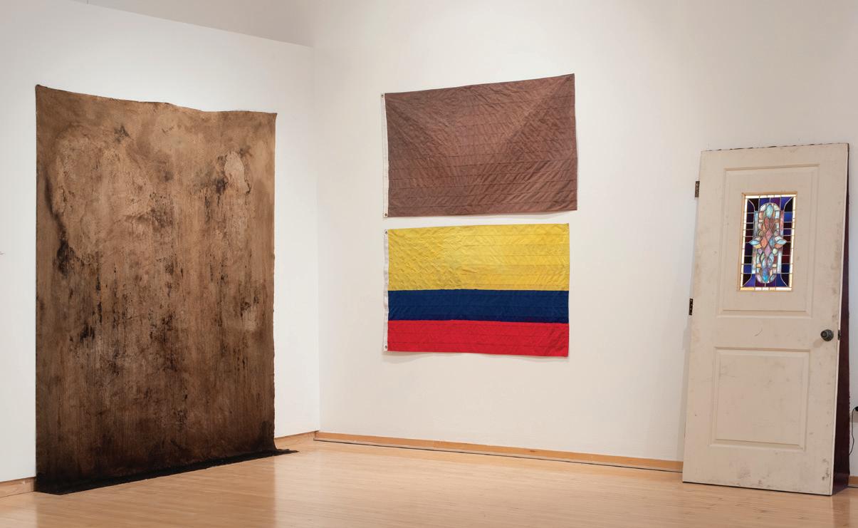
A neon sign flickers. Though it spells Colombia, the top of the second “o” fizzles to reveal “Columbia.” The former derives from the Spanish “Colombo” and is a country in South America, while the latter comes from the Anglicized “Columbus” and is the namesake of innumerous cities and institutions in the United States. Though both are etymologically linked to Christopher Columbus, the language in which the word is written is a sign of something greater. Of course, language is inextricable from identity. The way we describe ourselves, form our opinions, and gather our ideas depend on vocabulary. How then, can one negotiate an identity caught between two languages?
For Evan Rosato, entering his grandmother’s home in Miami was tantamount to a foreign language. Both the spoken words and the visual surplus of the space stood in difference to those of his parents’ home, dominated by white Anglo culture, the English language and where Rosato’s identity was crafted. But it was in his grandmother’s home that Rosato came to see himself within what José Esteban Muñoz calls “the brown commons,” or “the commons of brown people,
places, feelings, sounds, animals, minerals, flora, and other objects. How these things are brown, or what makes them brown, is partially the way in which they suffer and strive together but also the commonality of their ability to flourish under duress and pressure.”
The concept of the brown commons is at the center of Rosato’s practice, rendering Muñoz’s theory visual—literally investigating what makes brown. One of his main methods of investigation is flocking, a technique that adheres small nylon fibers to a surface. In time, Rosato found that the ultimate formula for brown flocking was a layered buildup of blue, yellow, and red—the colors of the flag of his grandmother’s homeland, Colombia. Applying these layers on top of the American flag, Rosato unifies the two sides of his identity while silencing the languages of both, leaving the ultimate signifier of heritage as a field of brown. The resulting texture, somewhere between velvet and rusted metal, is beyond language itself—somewhere between Colombia and Columbia
APPLYING LAYERS ON TOP OF THE AMERICAN FLAG, ROSATO UNIFIES THE TWO SIDES OF HIS IDENTITY WHILE SILENCING THE LANGUAGES OF BOTH, LEAVING THE ULTIMATE SIGNIFIER OF HERITAGE AS A FIELD OF BROWN.

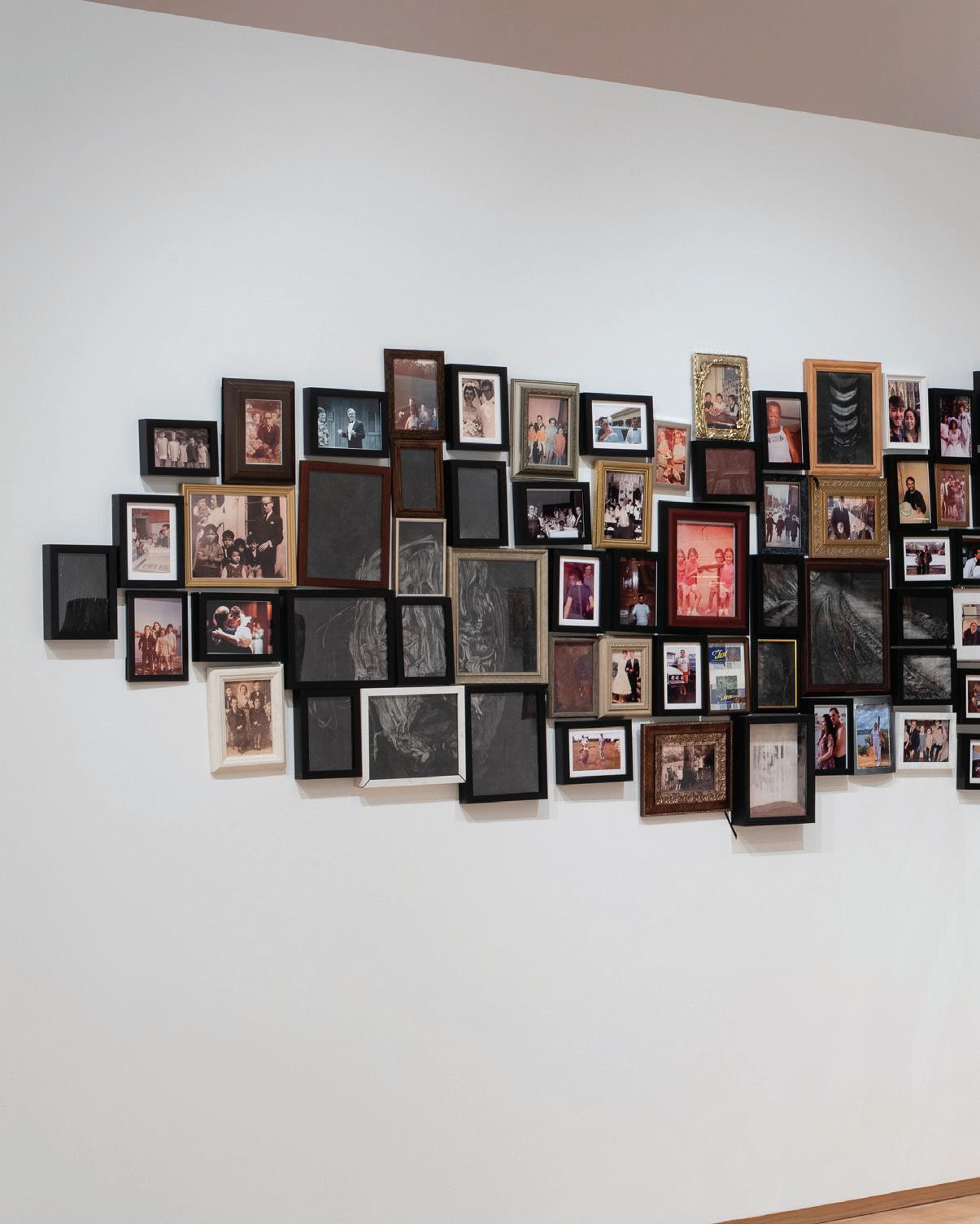
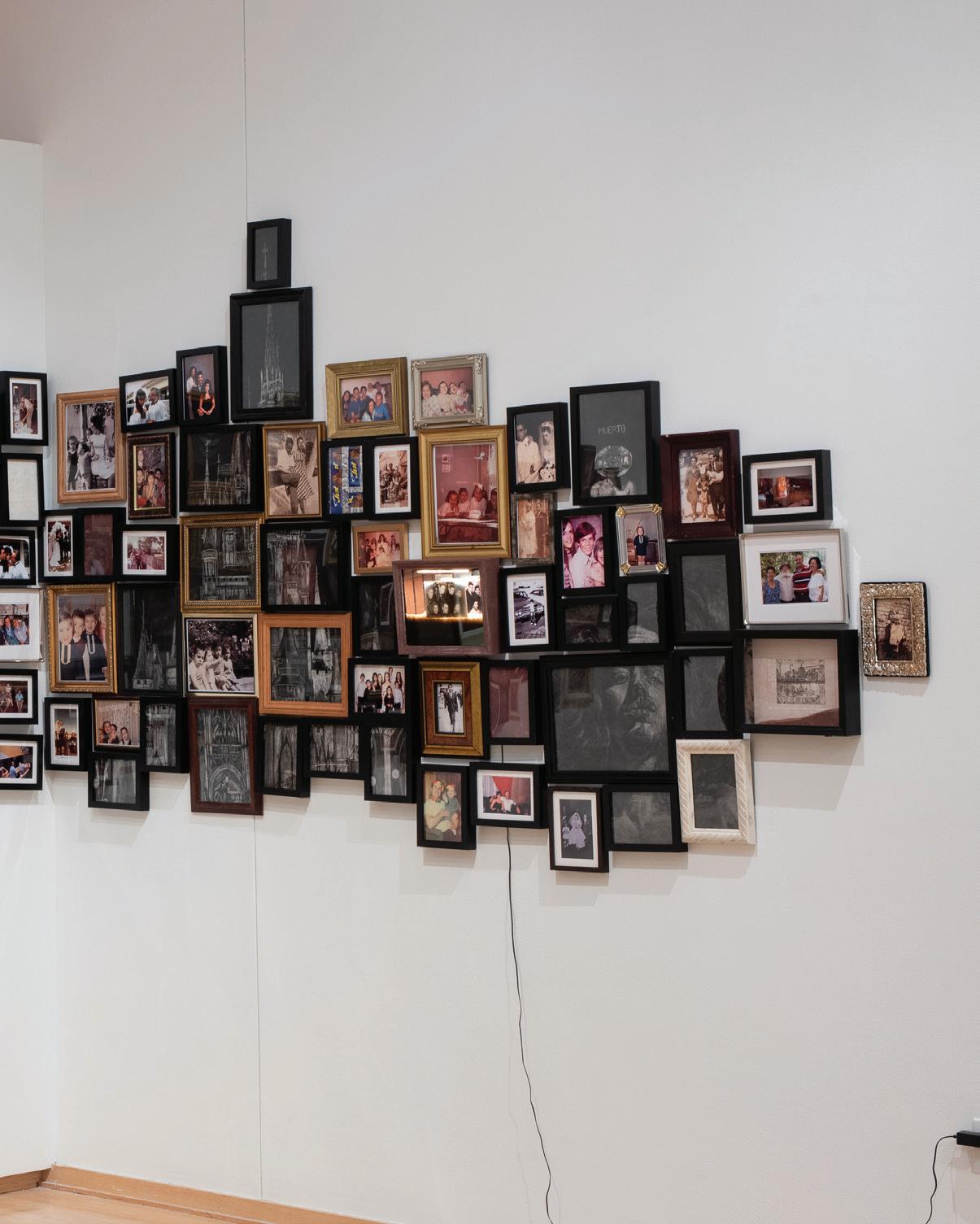
AIR FORCE ONES (ASSIMILATION)
(far left)
Charcoal on En-Tout-Cas paper. 68” x 52.5”.
AN ANALOGY FOR BICULTURALISM; GRINGO 2 (center, l-r)
DECAY OF LANGUAGE (RUST) (near left)
Rusted steel, Sharpie marker, etching ink, wood, and screws. 60” x 24.31”.
Installation view.
Photo credit: Neighboring States.
FAMILIA PATINA (L); LATINO AMERICAN AND COLOMBIAN AMERICAN (TOP, BOTTOM); WINDOW TO MIAMI (R) (below)
Installation view.

FRAGMENTOS
(following page)
Ikea frames, thrifted frames, charcoal on paper, mixed media.
Dimensions variable.
Photo credit: Neighboring States.
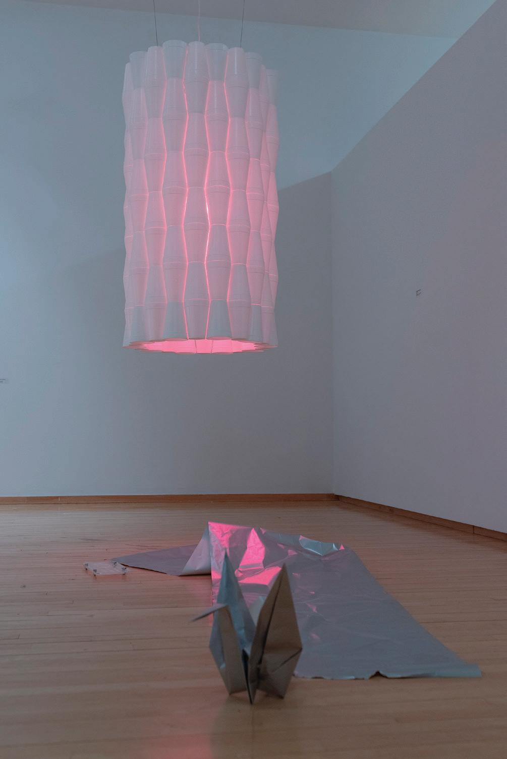
In Amy Shindo’s studio, a soft pink glow emanates from a large lamp. The elegance of its design is marked by the sharp undulating surface, which betrays its material: tessellated Styrofoam cups. Designed for easy disposal and transportation, the Styrofoam cup is a familiar object that is not often considered beyond its function as a vessel. These cups were a common sight in Madoka Japanese Restaurant, the restaurant owned and run by her parents. Indeed, this was the location of her first job, folding and creating fans out of cloth napkins. Out of the repetitive motion, the process was dedicated to memory – as was each object within the space.
Shindo’s work revolves around this remembrance, creating a memoryscape of her parents’ restaurant. As a ceramicist, chef, and the child of restaurateurs, Shindo attests to the commonalities between the ceramics studios and restaurants are not lost on her, as a shared set of tools and techniques bind the two. However, Shindo’s practice does not rely upon a single medium, embracing an archival engagement with her memories of objects from her youth that focuses on rendering them in a way that highlights their significance.
As with the dreamlike luminescence of the Styrofoam lamp, the innumerable small, fanned napkins are now a monumental foam sculpture. Its surreal nature is equaled by large wooden pieces of sushi grass painted green and pink, while a monochromatic painting of a single plate from the restaurant is displayed vertically.
In this way, these memory-objects are no longer reducible to their original function but are now precious works to be appreciated and adored, imparting the value that she has always felt for them. Indeed, the lamp Shindo created is a facsimile of those created by her father of leftover cups from the restaurant, though he never acknowledged the creativity of his work. For him, like his understanding of the restaurant simply as a means of providing for the family, the lamp was just a lamp; but for Shindo, it was invaluable despite its humility. As stated by the Japanese cooking instructor Tami Hiyama, “Pots aren’t as expensive as jewels. If I make tasty meals, everyone’s happy. If I want jewels, I have all I need in the sky”
ASIAN ACTION (BEIJU)
(above)
Acrylic.
6” x 11” x 1”.
Photo credit: Bridget K. Rogers
RELATIVE BRIGHTNESS (KOJI’S KINGDOM)
(previous page)
Styrofoam cups, wire. 53” x 28” x 28”.
Installation view.
Photo credit: Bridget K. Rogers
YOU’RE A RABBIT, NOT A DRAGON (THIS MAKES SO MUCH SENSE)
(below)
Polystyrene napkin fan. 45” x 82” x 47.5”.
Installation view.

Photo credit: Evan Rosato

THESE MEMORY-OBJECTS ARE NO LONGER REDUCIBLE

TO THEIR ORIGINAL FUNCTION BUT ARE NOW PRECIOUS WORKS TO BE APPRECIATED AND ADORED, IMPARTING THE VALUE THAT SHE HAS ALWAYS FELT FOR THEM.MADOKA PLATE (A PRIX FIXE) (right) Plywood. 34” x 34” x 1.5”
As I hold a bronze cast of the cup on the top of a candlestick that once belonged to Sharon Stampfer’s grandmother, I find myself contemplating gaps, weights, and memories. The cast, molded to fit in Stampfer’s own hand, does not exactly fit in mine. Yet, it feels right. The gleaming bronze softly spills over my thumb, belying the heft of the material. At first it is cool, even cold, but quickly acclimates to my body temperature. It momentarily transports me to my own hazy recollections and makes me nostalgic for a memory just out of reach. This is the power of Stampfer’s work. Her objects – made to be handled by the viewer – demand slow engagement and careful consideration of our interactions with each piece: how it looks, how it feels, (imagining) how it was used in the past, and perhaps most crucially, how its future use will be altered by our interaction with it.
Many of Stampfer’s works begin as experiments in either form or material. These improvisations are carefully documented and saved, forming an archival web of ideas and connections. Stampfer’s experiments are like seeds; each one may not grow into a fully formed work, but they all have a generative capacity. Her careful attention to everyday items points to the ritual aspect of our use of these objects, highlighting the ability for the seemingly mundane, such as a door handle or bowl, to serve as points of human connection. For Stampfer, this connection is cyclical. It begins with the artistic process of touch; the artist’s labor imbues the work with knowledge and feeling, which can then be imparted through our own visual and physical contacts. These interactions, between the artist and object and the viewer or the user and object, are intensely personal, richly collective, and always in flux


STAMPFER’S EXPERIMENTS ARE LIKE SEEDS; EACH ONE MAY NOT GROW INTO A FULLY FORMED WORK, BUT THEY ALL HAVE A GENERATIVE CAPACITY.
BOX #8 - BOX #17 (right)
Dimensions variable.

Installation view.

In his monotypes Gazing/Walking and Digging, Todd Stong reflects on the importance of a backward-looking gaze even as time propels us forward. The two works, depicting deep, dark holes and skeletons, are inspired by the archaeological excavation of the city of Rome and represent a manifesto on the search for in-depth awareness that is necessary for contemporary society to cope with its own past. At the same time, they are a timely reflection on the urgency of exploring multiple forms of history, including colonialism and racial studies. These striking symbols appear again in the monumental work Gardens (Archway), a fantasy where the viewer should not look for a moral, or for winners. In this work, Stong plays with how the idea of reversal, both on a conceptual and formal level, is highlighted in the process of printmaking itself. Meanwhile, the symmetrical and specular elements of the compositions are a manifestation of the reversal of contents and of fortune,
as they move from comic to tragic scenes. Through free associations and a personal re-elaboration of significant forms drawn from Western art history—including, for instance, Michelangelo’s naked figures and the skeleton of the Virgin Mary inspired by a drawing by Raphael for The Deposition of the Baglioni Altarpiece—the work invites us to meditate on themes of queer sexuality, the AIDS crisis, abortion rights and ecology. The natural world visually and thematically unifies the composition, which unfolds on multiple sheets: the snake grapples and binds together the naked figures in their fight against AIDS; the bees sting the skeleton of the Virgin Mary after having sucked the nectar from the yellow silphium, a plant used as a contraceptive by Ancient Romans, while the same bees are artificially inseminated by a skeleton; finally, the amphibians flee from a pond that has been reduced to a urinal. In Stong’s works, we can see an incessant transformation of meanings, messages and symbols that, through the apparent quietude of a fantastical garden, ultimately leads us to a bitter reality


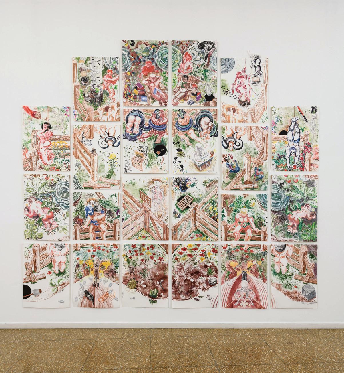
GAZING/WALKING (right)
Monotype with etching ink and flashe on paper. 39” x 26.5".
GARDENS (ARCHWAY) (opposite page)
22-panel monotype polyptych with etching ink, flashe, collage, and binder clips on paper. 156” x 168”.
Benni

STONG PLAYS WITH HOW THE IDEA OF REVERSAL, BOTH ON A CONCEPTUAL AND FORMAL LEVEL, IS HIGHLIGHTED IN THE PROCESS OF PRINTMAKING ITSELF.
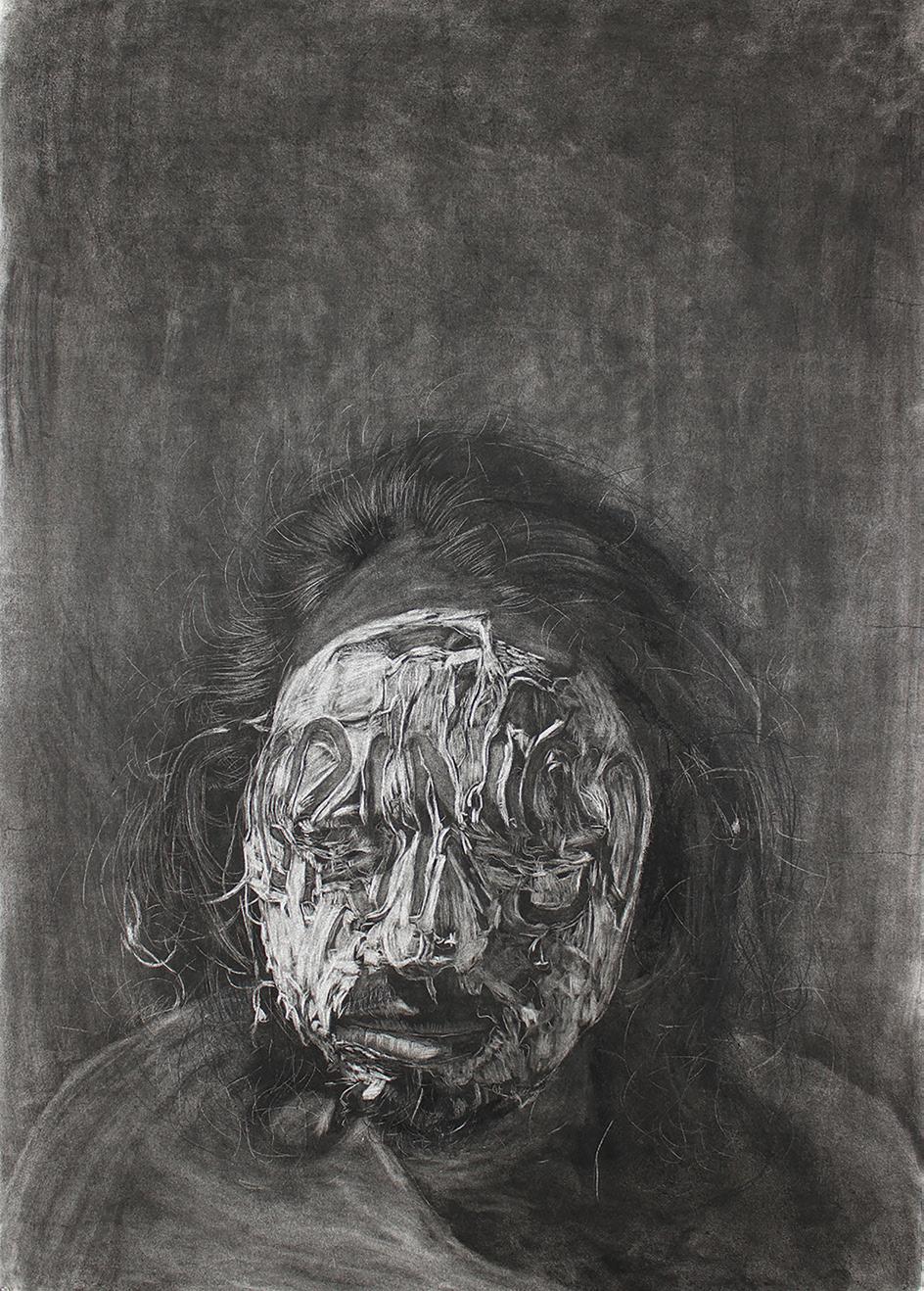
Idalia Vásquez-Achury's photographs inhabit an intermediate space. The in-between effect of having no directions, coming from nowhere, and heading who knows where is central to her visual imagery. This act of permanent transition is what her camera captures at different stages. Vásquez-Achury appears to have found out, like French writer George Perec, that there are “spaces of every kind and every size, and to live is to pass from one space to another, while doing your very best not to bump yourself.”
These images of transition and of perpetual becoming display the opacity of a sense of self captured in its transience. In this sense, the differentiation of intimate and public in Vásquez-Achury's photographs is irrelevant. Everything appears public and intimate at the same time. Maybe this is why her work feels like the documentation of a performance; we can see her there, capturing the moment of transition, attempting to address the performativity of being without getting trapped in exclusionary categories. And yet, as Maria Magdalena Campos-Pons remind us, “identity could be a tragedy,” and identity does feel like a tragedy here.
The experience of self-definition attached to an idea of wholeness in Western culture has become a question of affects and relationality in Vásquez-Achury’s work. As a result, subjectivity is bent, fragmented, feeble, inadequate. Knowing that Vásquez-Achury is not just photographing herself, but her own life, makes even more powerful the fact that her face is covered, blurred, pierced, and sewed in the creative process. It is a brown body that does not fit in, and the internal violence of its transition ends up disrupting its ability to speak. The racial performativity of affection becomes Vásquez-Achury's perfect armor; yes, it is about feeling brown, feeling down in the academic tradition of Cuban American writer José Esteban Muñoz. The politics of brownness in the intimate experience of displacement is essential to experience Vásquez-Achury's photographs, but that intermediate space of vulnerability is just the beginning, always the starting point
INTERSECTION # 1 (above)
Inkjet print on self-adhesive material. 10’


12,980 MASQUE (left)
Archival
THESE IMAGES OF TRANSITION AND OF PERPETUAL BECOMING DISPLAY THE OPACITY OF A SENSE OF SELF CAPTURED IN ITS TRANSIENCE.
 MARISMA
(below)
Photo book. 6” x 9”.
UNTITLED (opposite page, top) Archival inkjet print. 36” x 60”.
MARISMA
(below)
Photo book. 6” x 9”.
UNTITLED (opposite page, top) Archival inkjet print. 36” x 60”.
UNTITLED (above)


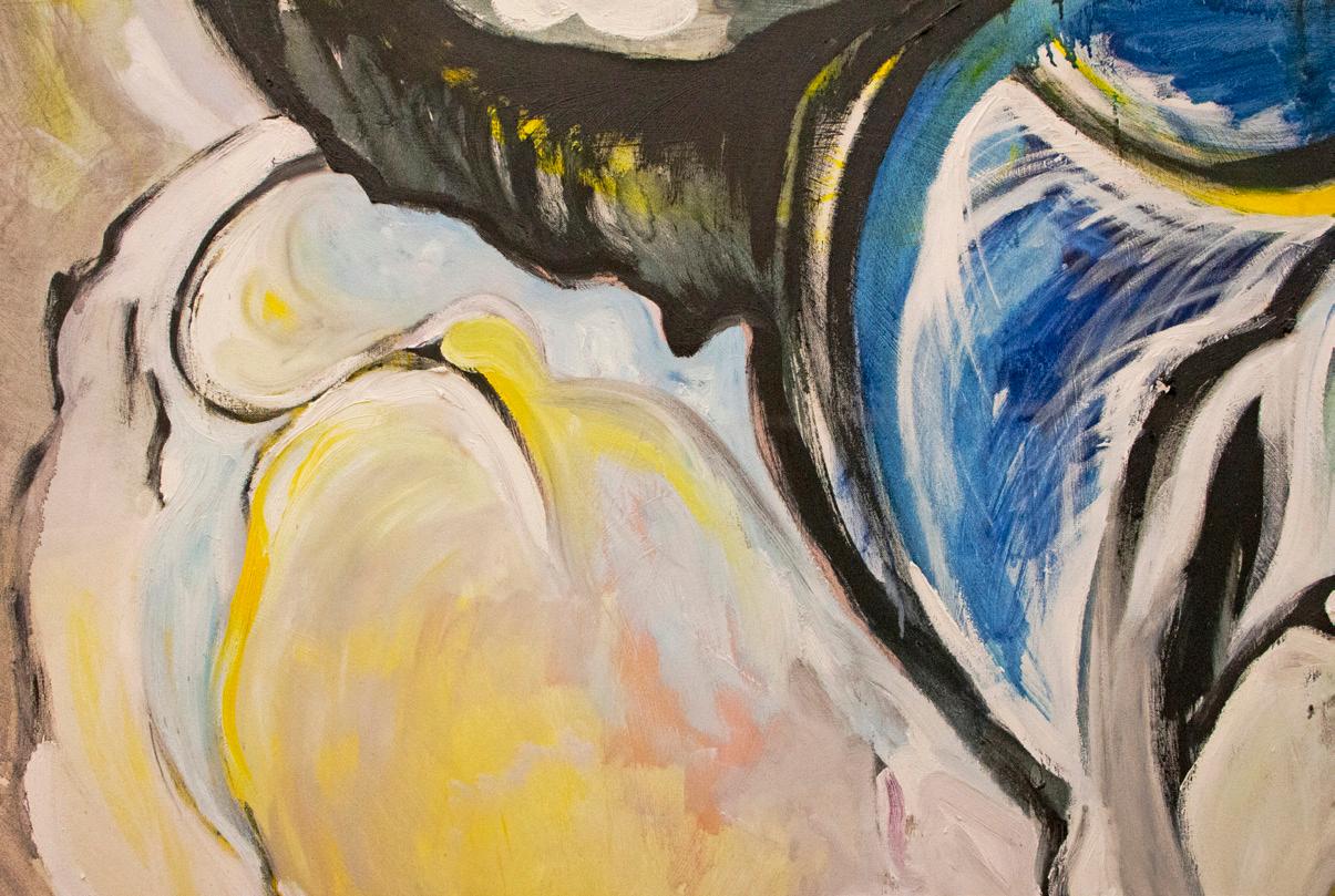
Zifan Wang understands her works as visual poems. She interacts with the canvas in large sweeping movements to create brilliant fields of color. The oil paint dances and dribbles about once applied, taking on a life of its own as she instructs bright color and brushstrokes to converse amongst themselves and utter their truths. This abstract poetry is the manifestation of the artist’s psyche – small spaces buried deep within Wang's mind that are translated and amplified onto her canvases. In this way, Wang engages in a visual translation of the intangible, and her large captivating works illustrate the greatness of these subtle inner workings. She is overall a poet, interpreter and artist. Despite the wealth of richly colored abstract paintings that Wang produces, she keeps no sketchbook and relies directly
on her materials to light a path in an improvisational and interactive process of making. Wang allows the material to guide her, acting as a blueprint upon which the whispers of her mind might be placed. Consequently, there are no traces of the work’s development beyond those found on the canvas itself. Wang mixes color directly on the surface, and the heavy application of yellow, red, and blue pays homage to the admirable qualities of the hues and their communicative properties.
Each of Wang’s paintings are largely informed by reflection and the careful application of afterthoughts gleaned from her past works. Her canvases stand as individual and complete, but they engage in playful conversation with one other. The artist’s preoccupation with a materially informed process of making means that she is constantly re-evaluating and shifting her technique in response to previous works
WANG ALLOWS THE MATERIAL TO GUIDE HER, ACTING AS A BLUEPRINT UPON WHICH THE WHISPERS OF HER MIND MIGHT BE PLACED.


LISTEN (detail, above)
LISTEN (detail, following page)
Griots are conventionally defined as West African storytellers, those who hold histories and knowledge meant to be shared orally. Art historian Candace M. Keller likens contemporary African portrait photographers to visual griots, linking the role of photographers to artists and historians who develop an archive of images documenting not only the personal, but also the social and historical. Neysa Hope Wellington describes herself as a visual griot in Keller’s sense, focusing her practice on creating spaces of dialogue and collaboration between the diaspora and Africa. A trip to Ghana in the summer of 2021 sparked an evolution in Wellington’s work, expanding her practice from portrait photography to incorporate research, film, and performance.
A central theme running throughout Wellington’s work is the documentation of the Black experience, with a focus on Black women. In her exploration of Black womanhood, Wellington often turns the camera on herself, exploring her own bonds forged through maternal lineage and a broadly defined concept of sisterhood. Wellington’s portraits of
herself and her family are just one component of her work, which relies on a community-based research practice known as photovoice, to explore the relationship between self and society and the societal and familial impact on identity formation. Using photovoice as a guiding principle allows Wellington to empower her subjects to participate as co-researchers in the project, prompting them to engage in reflection with her, rather than by her. Wellington further investigates familial dynamics through interviews she conducts with women in her communities, in which she interrogates the ideas of bonds through womanhood and notions of home. Her concept of home is not limited to the immediately physical; rather Wellington expands the idea of home to encompass those we have experienced in our past, as well as those we experience only through ancestral memory or those we hope to experience in the future. Through these multidisciplinary works, Wellington performs her role as a visual griot, documenting and creating an archive of Black women’s stories, relationships, and identities, explored through the lens of multiple and simultaneously experienced representations and perceptions of home
 AKWABBA (right) Inkjet print. 8.5” x 11”.
PALM WARRIORS (below) Inkjet print. 8.5” x 11”.
AKWABBA (right) Inkjet print. 8.5” x 11”.
PALM WARRIORS (below) Inkjet print. 8.5” x 11”.
IN HER EXPLORATION OF BLACK WOMANHOOD, WELLINGTON OFTEN TURNS THE CAMERA ON HERSELF, EXPLORING HER OWN BONDS FORGED THROUGH MATERNAL LINEAGE AND A BROADLY DEFINED CONCEPT OF SISTERHOOD.


Flavia Barbarini is a PhD candidate in Art History who previously worked as a curatorial assistant in the Department of Drawings at the Castello Sforzesco Museums in Milan, Italy. She earned her BA from the University of Bologna and her MA in Art History from the University of Padua. Her current research is dedicated to the history of collecting drawings and the art market in 16th century Italy.
Quinn Russell Brown is a first-year PhD student in Art History who researches 19th and 20th century American figurative art. He is also a photographer working in portraiture, and his portraits have been featured in publications such as The Wall Street Journal, TIME, and Wired, in addition to being shown at the Smithsonian’s National Portrait Gallery.
Danielle Cooke is a first-year MA student studying Latin American and Latinx art. Her research centers on the intricate relationships between diaspora, postcolonialism, femininity, religion, and queerness. She earned her BA in Art History and Spanish from Cleveland State University, where she embraced the opportunity to study abroad in both France and Spain and participated in the university’s Archaeological Field School. Before arriving at Temple, she also worked and interned at the Cleveland Museum of Art for several years.
Natalie Cruz is a first-year MA student studying modern and contemporary S.W.A.N.A. (South West Asian/North African) art. She earned her BA in Art History from Pacific University Oregon. Her capstone thesis, Memory in Diaspora: The Armenian Genocide and Cultural Resilience in Art, discussed the persistence of Armenian cultural memory in diaspora despite the trauma of the Armenian genocide. She is continuing this research on Armenians and other S.W.A.N.A. people in the diaspora.
Annemarie Maag-Tanchak is an Art History MA student on the Arts Management track. Her areas of study include the history of graphic design, German and American art and design of the Cold War, and the effects and future of digital technology. Her arts administrative work is concerned with the relationship between the arts and corporate philanthropy. She holds a BA in Art History from Binghamton University, SUNY (2019) with minors in Graphic Design and German.
Li Machado is a third-year PhD student specializing in Modern and Contemporary Latin American and Latinx Art. Their current research focuses on networks of queer sociability and desire in Chicanx communities in Los Angeles. They previously earned a BA in Art History from the University of La Verne, studying Brazilian modernist painting, and an MA in the same field from University of Oregon, where their thesis addressed the visual culture of the 1978 World Cup in Argentina.
Liam Maher is a Temple University Fellow and doctoral student in Art History studying Contemporary Latin American & Latinx Art. His research interests include intersections of queerness, Catholicism, and anticoloniality in art from Brazil, Haiti, and the United States. He received his MA in Art History from the University of Oregon and BA in Art History and political science from the University of Notre Dame.
Molly Mapstone is interested in materials new to the history of art. Her writings consider contemporary art through theories of materiality, process, visual culture, and social art history. Her master’s thesis at the Winterthur Program, The Materiality and Art History of Glitter, examined the origins of glitter and its power to convey meaning. She received her BA from the University of Wisconsin-Madison while working at the Chazen Museum of Art, where she curated exhibitions of works on paper.
Nicole Emser Marcel is a second-year PhD student studying modern and contemporary art of the Caribbean. Her research interests include iconoclasm, geography, feminist theory, and religion. She holds an MA in Art History from American University and a BA in History from Xavier University. She previously taught at Indiana University-Purdue University, Indianapolis and worked at the National Women’s History Museum in Washington, DC.
María de Lourdes Mariño is an art historian specializing in modern and contemporary art from Latin America, the Caribbean, and their diasporas from 1900 to the present. She holds an MPA in Nonprofit Management focused on art and culture institutions, and is currently a second-year Art History PhD student. Before attending Tyler, she was a professor at ISA, Universidad de las Artes and an independent art curator in Havana, Cuba.
Lauren M. McCardel is a PhD student focusing on 19th century art, design and material culture. Her research interests concern the social functions of art and architecture, exploring themes related to gender, labor, authorship and trauma. She holds an MFA in Architectural History from Savannah College of Art and Design and a BA in Art History from Messiah University.
Ryan Mitchell is a PhD student working on the Islamic art and architecture of the eastern Mediterranean. In 2021, Ryan completed a U.S. Student Fulbright Grant to Turkey, where he studied the architecture of late Ottoman-era schools in Istanbul and held an assistantship at the Istanbul Research Institute. He worked for several years in business development in New York after receiving his undergraduate degree from the Ohio State University in English Literature and History of Art.
Joanna Platt is a PhD student specializing in modern and contemporary Art History. With a background in bronze casting and fabrication, Platt balances an active studio practice with research into the representation of labor and the economics of art and production, especially regarding issues of class and social status. She earned a BFA from Mason Gross School of Art, Rutgers University and an MFA from the University of the Arts, Philadelphia, and is an assistant professor at Camden County College.
Noah Randolph is a PhD student specializing in modern and contemporary art and visual culture, with current research focused on the relationship between historical memory and memorialization in the Americas. His past experience includes positions at the Speed Art Museum, the Peggy Guggenheim Collection, and the Philadelphia Museum of Art. He received his BA in Art History from the University of Louisville followed by his MA from Temple University.
Emily Schollenberger is a fourthyear PhD student whose research interests include collective memory, the archive, trauma and colonial photography. She earned her BA in Art with a concentration in Art History from Covenant College, where her thesis focused on affect in Anselm Kiefer’s paintings. She interned at The Phillips Collection in Washington, DC and worked as a museum educator at the Creative Discovery Museum in Chattanooga, TN before moving to Philadelphia.
Alexandra Schoolman is a first-year PhD student whose research interests include human and environmental rights, Latin American conceptual art, and social practice. She graduated magna cum laude from Brandeis University, majoring in Hispanic Studies and minoring in Art History. She earned her MA in Modern and Contemporary Art History with distinction from the University of Glasgow. Her thesis focused on memory and historical legacy in the work of young Latin American artists. She was previously exhibitions manager of the Latin American art gallery Henrique Faria in New York City.
Ashley Stahl is a second-year MA student in Art History on the Arts Management track. Her interests and areas of study include modern and contemporary art, public art and cultural identity, environmental art, and institutional critique. She holds a BFA in Art History with a minor in Painting from Moore College of Art and Design (2009). Her professional experience includes curatorial project management at Whitestone Gallery and philanthropic fundraising at the Philadelphia Museum of Art and the College of Liberal Arts at Temple University. She currently serves on the Development Committee at the Center for Emerging Visual Artists and as a visiting board member at the Delaware River Waterfront Corporation.
MFA Catalog Advisors
Mariola Alvarez
Chad D. Curtis
Philip Glahn
MFA Catalog Coordinator
Kati Gegenheimer
MFA Catalog
Student Representatives
Nicole Emser Marcel
Abbey Muza
Faculty Editors
Mariola Alvarez
Philip Glahn
Monica Anke Hahn
Leah Modigliani
Rachel Grace Newman
Alpesh Kantilal Patel
Erin Pauwels
Copy Editor
Wanda Motley Odom
Catalog Design
Modern Good
Matt Bouloutian, Tyler BFA ‘99
Emma Lindsay, Tyler BFA ‘18
Autumn Kitabjian, Tyler BFA ‘23
Tyler School of Art and Architecture
Temple University
2001 N. 13th St. Philadelphia, PA 19122
tyler.temple.edu/mfa-at-Tyler
Copyright © 2022

Tyler School of Art and Architecture
All rights reserved
Copyright for individual images belongs to the individual artist as listed on each page.
No part of this book may be used or reproduced in any manner without written permission from the artist or the Tyler School of Art and Architecture.
