SUSAN SHEEHAN GALLERY


2023
OCTOBER 11TH (BY INVITATION)
OCTOBER 12TH-15TH (PUBLIC DAYS)
LOCATION:
THE REGENTS PARK
AT THE NORTHWEST CORNER, GLOUCESTER GREEN
LONDON
FOR SHOW INFORMATION: https://www.frieze.com/fairs/frieze-masters
SUSAN SHEEHAN GALLERY
146 Greene Street New York, NY 10012 +1-212-489-3331
info@susansheehangallery.com www.susansheehangallery.com
Cover: Josef Albers, EK Ia, 1970, from the complete portfolio of 10 screenprints
BOOTH F14
Josef Albers

Homage to the Square: Edition Keller Ia-Ik, 1970
Screenprints
Sheet size: 21 1/2 x 21 1/2 inches, each
Printer: Herbert Geier, Ingolstadt, Germany
Publisher: Josef Keller Verlag, Starnberg, Germany
Edition size: 125, plus proofs
Catalogue Raisonné: Danilowitz 203.1-203.10
Each sheet is signed, dated, titled, and numbered
The very rare complete portfolio of 10 screenprints that retains its original black linen-covered portfolio box, colophon, and interleaving sheets
Josef Albers (1888–1976) began his iconic Homage to the Square series in paint, but soon embraced print processes as they lent his images a greater evenness and purity of tone than oil or acrylic allowed. An experienced and dexterous printmaker whose graphic work began in the early 20th century and spanned a variety of techniques, the artist turned to screenprinting as the ideal method to attain the meticulous color relationships and distinctive flat surfaces that he was seeking. The visual clarity facilitated by the medium is manifested in Homage to the Square: Edition Keller Ia-Ik, a ten-part portfolio which Albers executed in 1970. Crisply articulated squares rendered in an array of brilliant color hover against specially made woven papers by Hahnemühle, a German fine art paper manufacturer. Illustrative of how screenprinting liberated Albers’s approach, this portfolio showcases the artist’s innovative use of optical progression to interrogate spatial form and visual experience.

Albers created his first Homage to the Square in the summer of 1949, by which he was already regarded as one of the most influential artists and teachers of his era. The remaining nearly 30 years of his life were devoted to the development of a single pictorial formula: three concentric squares, floating atop each other in a unique chromatic scale of hues, which saw the artist return to the basic compositional elements of color and form. Deceptively simple yet theoretically complex, this visual concept was conducive to endless variations through which Albers could explore color relativity and the nature of perception. “They are all of different palettes, and, therefore, so to speak, of different climates,” Albers explained. “Choice of the colors used, as well as their order, is aimed at an interaction— influencing and changing each other forth and back.”
This set is particularly noteworthy because of its exceptional overall condition and brilliant unfaded colors.
Josef Albers at Black Mountain College, 1944
Photo: Josef Breitenbach

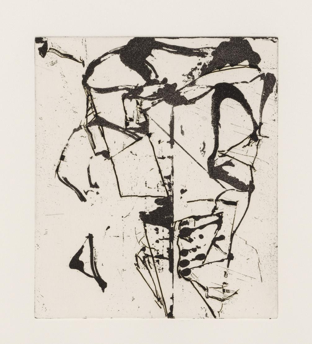
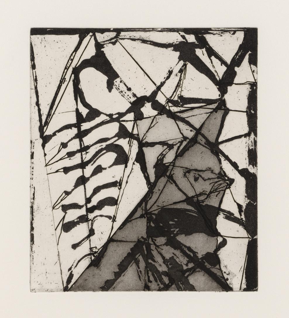
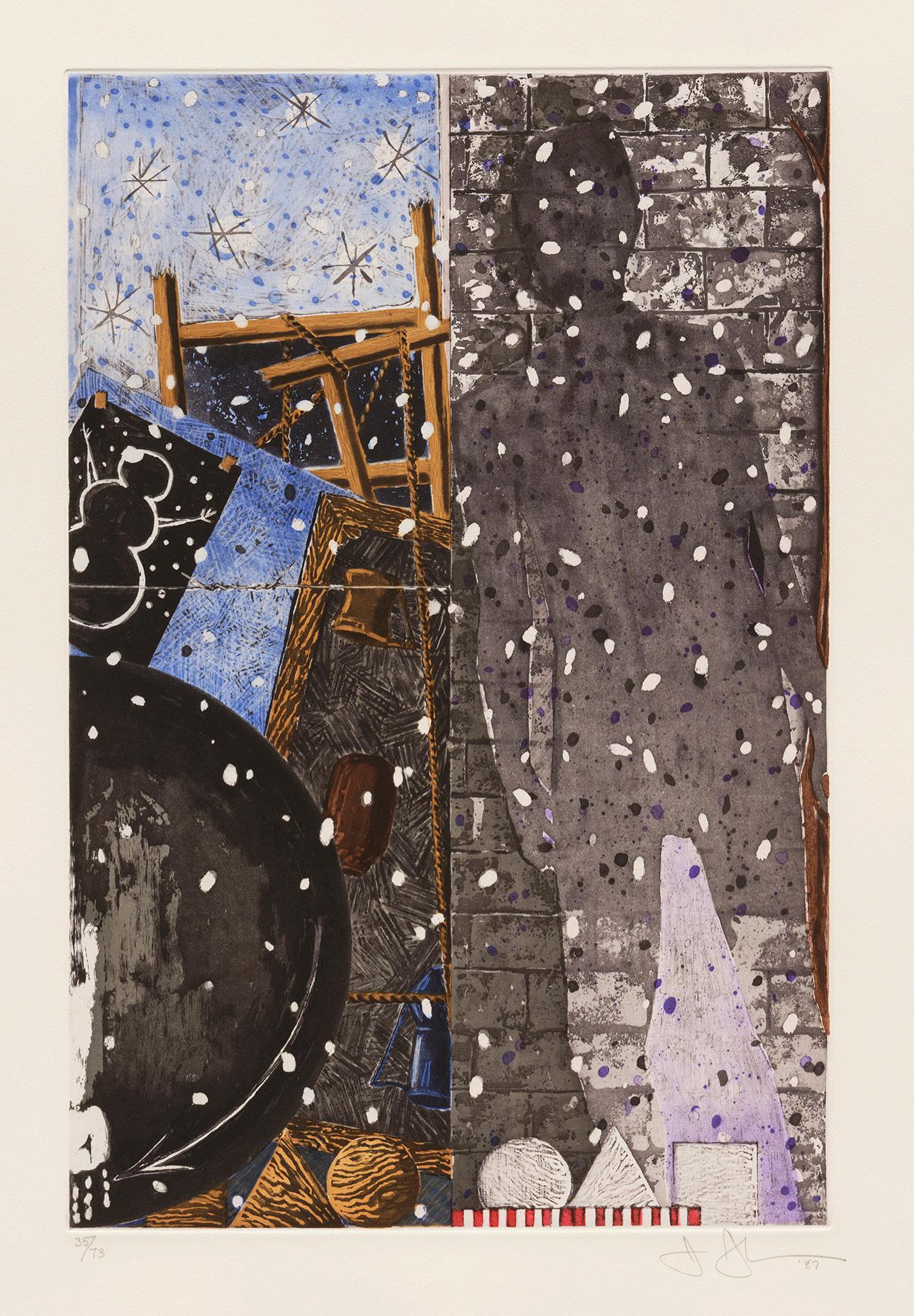
At the beginning of 1986, Brice Marden (1938–2023) reached a pivotal moment in his career. Increasingly dissatisfied with the varying configurations of flat color planes that had characterized his paintings, he shifted his attention to the natural, lyrical imagery that he was separately exploring in his graphic corpus. This culminated in a renewed approach that united his work in all media, exemplified by his Etchings to Rexroth A portfolio of twenty-five etchings, these prints trace the development of Marden’s signature mature style as the vertically-arranged triangular shapes gradually become more and more interlinked.

Marden’s favored print media, etching and aquatint, have long occupied a crucial role in the artist’s process. “For me etching becomes something between drawing and painting,” Marden elucidated. “I like to work etchings along with the paintings. Things have happened in the etchings that have gone back into the paintings.” Using as inspiration a notebook of drawings which Marden produced in Greece, he only used sugarlift—a form of aquatint using a sugar solution—on the initial copper plates. The artist’s gradual incorporation of further techniques, such as hardground etching with razor blades, and reworking as the series progressed, is testament to Marden’s mastery of printmaking. Executed between January and June 1986, the artist executed the portfolio with the renowned intaglio printer Jennifer Melby, with whom he had previously collaborated on an earlier print Etching for Parkett.
This body of work is also notable for its representation of the artist’s burgeoning interest in Chinese poetry and calligraphy. The title Etchings to Rexroth was intended to indicate that the series was an hommage to Kenneth Rexroth, whose translations of poems by Tang dynasty poet Tu Fu had captivated Marden. Following the organizing principle of written Chinese—vertically from right to left—the artist arranged the composition in a grid format before gesturally linking the forms to the plates’ edges. The resulting images embody an elegance and fluidity of line which are emblematic of Marden’s groundbreaking approach.
Brice Marden, 1986
Photo: Robert Mapplethorpe
Brice Marden


Etchings to Rexroth, 1986

Etchings with sugarlift aquatint
Sheet size: 19 5/8 x 16 inches, each
Printer: Jennifer Melby, New York
Publisher: Peter Blum Editions, New York
Edition size: 45, plus proofs
Catalogue Raisonné: Lewison 40/1-40/25
Each sheet is signed, dated, numbered and inscribed
The rare complete portfolio of 25 etchings that retains its original linen-covered portfolio box and title page


Brice Marden


Painting Study 1 and 2, 1974
Screenprint with wax and graphite
Sheet size: 29 7/8 x 22 1/4 inches, each
Printer: Styria Studio, New York
Publisher: Styria Studio, New York and Multiples Inc., New York
Edition: 50, plus proofs
Catalogue Raisonné: Lewison 26-27
Each sheet is signed, dated, and numbered
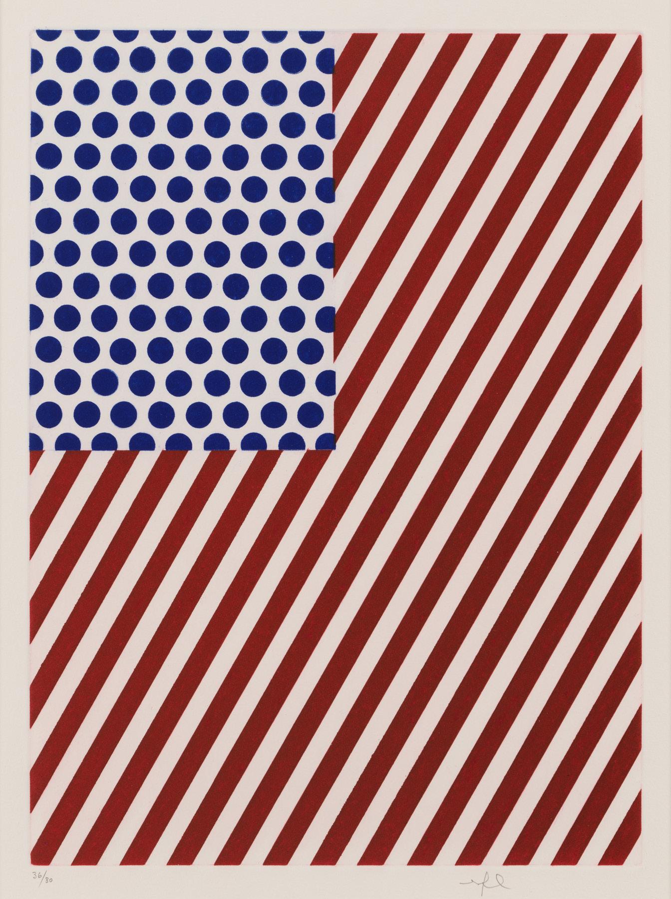
In 1991, the publisher Jean-Claude Meyer approached Roy Lichtenstein (1923–1997) with an extraordinary proposal: to provide illustrations for a forthcoming French edition of Allen Ginsberg’s The Fall of America: Poems of These States 1965–1971, which the legendary Beat poet had first published in 1972. Ginsberg chose eleven poems from the provocative collection—examining patriotism, travel, unrequited love, and war—to be translated into French, and Lichtenstein executed ten accompanying collages.

Representative of Lichtenstein’s iconic style, the collages were created using motifs and strips cut from printed paper, affixed in a manner evocative of comic book imagery. In the illustration accompanying “Bayonne Entering N.Y.C.,” a Cubist-inspired, explosive cityscape complements Ginsberg’s frenetic vision of Manhattan; another depicts the poet in a lotus pose, inspired by a Buddha image that Lichtenstein saw on a yoga class pamphlet. Etchings with aquatint were printed from the collages, and the following year in 1992, the eighty numbered copies of La Nouvelle Chute de l’Amérique were published.
Although this portfolio marked Lichtenstein’s only foray into illustrated books, printmaking had long played a significant role in his artistic output. Over the course of his career, his more than 400 prints jumped between woodcut and lithography, etching and screenprinting. Indeed, it could be said that Lichtenstein’s prolific printmaking efforts more naturally echoed his predilection for seriality and repetition than his work in any other media. His skill and confidence permeate the La Nouvelle Chute de l’Amérique etchings, which masterfully encapsulate the vividness and intensity of Ginsberg’s prose.
Roy Lichtenstein, 1964
Photo: Dennis Hopper
Roy Lichtenstein


La Nouvelle Chute de l’Amérique, 1992
Etchings with aquatint
Approximate sheet size: 18 7/8 x 13 15/16 inches, each, sheet sizes vary
Printer: Atelier Dupont-Visat, L’Inéditeur, Paris
Publisher: Les Éditions du Solstice, Paris
Edition: 80, plus proofs
Catalogue Raisonné: Corlett 267-276
Each sheet is intitialed and numbered
The complete portfolio of 10 etchings with aquatint, that retains its original paper folders in a red-cloth-covered folio cover filled inside a blue cloth covered slipcase, 11 printed poems by Allen Ginsberg, title page, and colophon


Printmaking formed a cornerstone of Roy Lichtenstein’s (1923–1997) practice as early as the 1940s, when he was a student at Ohio State University. He went on to explore virtually every printmaking technique and became an influential participant in the post-war print renaissance in America. The precise, almost mechanized style which Lichtenstein aimed to achieve was naturally suited to the cutting-edge technical experimentation offered at the workshop Gemini G.E.L. in Los Angeles. Working with the studio’s master printer Kenneth Tyler in its early years, Lichtenstein developed a close collaborative relationship with Gemini that began in 1969 and lasted until his death in 1997.
In 1970, Lichtenstein produced four large lithographs and one bronze relief at Gemini for the Peace Through Chemistry series which stylistically he had begun with the painting Preparedness, 1968. This process was typical for the artist, who preferred to develop a coherent group of images through efforts in various different media as opposed to individually. The resulting body of work appropriated the optimistic and distinctive language of American social realism through the artist’s signature BenDay dots and Pop idiom. “I’ve never seen any painting like the Peace Through Chemistry image,” Lichtenstein expressed in 1970. “There should have been images like this [in the 1920s and 1930s]; it’s a mixture of a kind of W.P.A. mural painting and Cézanne or Grant Wood, mixed with American precisionist use of city imagery.”
As with Lichtenstein’s paintings, the meticulous craftsmanship behind the creation of Peace Through Chemistry II betrays the illusion of mass production. Initially planned using a schematic collage, the artist executed the four-color print using six runs: first the yellow, blue, and three runs of red, and then the final screenprinted black image. The composition’s strong diagonals and industrial Art Deco motifs reflect the exactitude of the printmaking process, but its subject is the fusion of the organic and the scientific—men become machines, a branch grows out of a microscope. These counterbalancing balances, which form the heart of chemistry, promise the peace that Lichtenstein idealizes the future will bring.
 Roy Lichtenstein at Gemini G.E.L., Los Angeles, ca. 1980
Roy Lichtenstein

Peace Through Chemistry II, 1970
Lithograph and screenprint
Sheet size: 37 3/8 x 63 inches
Printer and Publisher: Gemini G.E.L., Los Angeles
Edition: 43, plus proofs
Catalogue Raisonné: Corlett 97
Signed, dated, and numbered
Andy Warhol Prints from the Cy Twombly Foundation
Susan Sheehan Gallery is pleased to present an important group of Warhol prints from the holdings of the the Cy Twombly Foundation. These prints were stored in their original boxes and had never been framed. They are notable for their overall excellent condition, pristine surfaces, extraordinary, unfaded original colors, and exceptional provenance.
 Andy Warhol, 1980
Andy Warhol


Marilyn Monroe (Marilyn), 1967
Screenprints
Sheet size: 36 x 36 inches
Printer: Aetna Silkscreen Products, Inc, New York
Publisher: Factory Additions, New York
Edition: 250, plus proofs
Catalogue Raisonné: Feldman and Schellmann II.24-27
Signed and letter numbered “G” in pencil, verso
Provenance: Collection of Cy Twombly, Rome
Cy Twombly Foundation
F&S II.24
F&S II.25

 F&S II.26
F&S II.27
F&S II.26
F&S II.27
Andy Warhol
Campbell’s Soup I, 1968
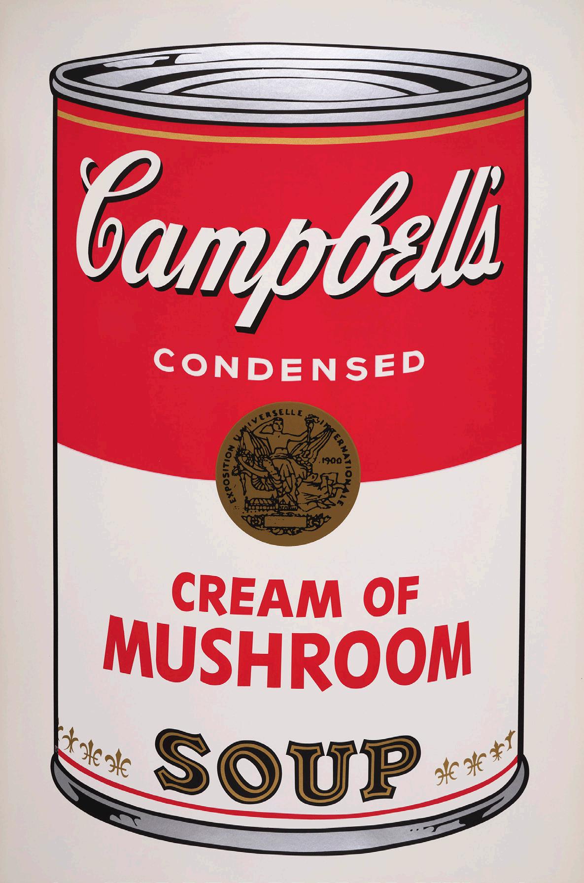


Screenprints
Sheet size: 35 x 23 inches, each
Printer: Salvatore Silkscreen Co., Inc., New York
Publisher: Factory Additions, New York
Edition: 250, plus proofs
Catalogue Raisonné: Feldman and Schellmann II.44, 47, 52, 53
Each sheet is signed in ball-point pen and stamp numbered, verso
Provenance:
Collection of Cy Twombly, Rome
Cy Twombly Foundation
F&S II.44
F&S II.47
F&S II.52
F&S II.53
Cy Twombly was not a prolific printmaker, which should not be surprising—he worked intuitively, and printmaking is by nature discontinuous and indirect. In other ways, however, he was a natural: the instincts of his hand were those of a graphic artist, and his intellectual affections were at home with printed matter. When he did turn to etchings and lithographs, it was to distill his central concerns: Western culture’s inheritance from the ancient Mediterranean, and the primordial physical and conceptual urge to make a mark. Or to put it another way, admiration for what has come before, and the desire to make something that remains after.

After visiting Robert Rauschenberg on Captiva Island in Florida, Twombly availed himself of the facility Rauschenberg had set up there with master printer Robert Petersen, Untitled Press, Inc.. Drawn on the stone in crayon, Twombly’s six Untitled lithographs have a crumbly density quite different from the spidery line of his etchings. Printed in different inks on different papers, they have the tenor, not of writing, but of furious weather.
Like Twombly’s concurrent “blackboard” paintings, his early prints are at once abstract and inconclusively referential—fevered jottings that might reflect the mind of a poet or a cosmologist. The portfolios he made with Swiss lithographer Emil Matthieu in the 1970s are lighter, chromatically delicate, and more overt in their paeans to Classical civilization. Natural History Part II, Some Trees of Italy (1975/1976) is a nod to Pliny the Elder, whose Naturalis Historia set the model for the western encyclopedia (and whose death in the eruption of Vesuvius marks another intersection of nature and history). Combining hand-drawn lithography, collotype and grano-lithography (a photolithographic technique with no visible dot screen), the eight prints have the look of sheets from a naturalist’s notebook: the title page with its faux pressed leaves offers an index to the loosely sketched, lobed and pinnate forms that follow, less a field guide than a collection of mnemonics.
For Twombly, as for Warhol, the portfolio was important. His prints echo the forms and ideas he was pursuing in painting, but where a painting series constitutes an impressive public display, the print portfolio is personal—a symposium on paper, where things talk to each while we listen and learn.
-Essay by Susan Tallman
Cy Twombly, Rome, 1994
Photo: Bruce Weber
 Nicola de Roscio, Robert Rauschenberg, Cy Twombly, and Robert Peterson at Untitled Press, Captiva Island, Florida, 1971
Cy Twombly
Untitled, 1971

Lithograph
Sheet size: 21 5/8 x 29 1/2 inches
Printer and Publisher: Untitled Press Inc., Captiva Island, Florida
Edition: 26, plus proofs
Catalogue Raisonné: Bastian 30
Signed, dated, and numbered
Cy Twombly
Untitled, 1971

Lithograph
Sheet size: 22 1/4 x 30 inches
Printer and Publisher: Untitled Press Inc., Captiva Island, Florida
Edition: 26, plus proofs
Catalogue Raisonné: Bastian 32
Signed, dated, and numbered
Cy Twombly
Untitled, 1971

Lithograph
Sheet size: 21 5/8 x 29 1/2 inches
Printer and Publisher: Untitled Press, Inc., Captiva Island, Florida
Edition: 26, plus proofs
Catalogue Raisonné: Bastian 33
Signed, dated, and numbered
Cy Twombly


Natural History Part II, Some Trees of Italy, 1975/1976

Lithographs, grano-lithographs, collotypes
Sheet size: 29 7/8 x 22 1/8 inches, each
Printer: Matthieu Studio, Zurich-Dielsdorf
Publisher: Propyläen Verlag, Berlin
Edition: 98, plus proofs
Catalogue Raisonné: Bastian 52-59
Each sheet is initialed and numbered
The very rare complete portfolio of eight mixed media prints that retains its original paper-bound portfolio and colophon


Cy Twombly
Note I, 1967

Medium: Etching
Sheet size: 25 1/2 x 20 inches
Printer and Publisher: ULAE, West Islip, New York
Edition: 14, plus proofs
Catalogue Raisonné: Bastian 6
Signed, dated, numbered, and titled
Of the eight sets of editioned sculpture which Donald Judd (1928–1994) executed between 1967 and 1992, this rare and elegant complete set of sugar pine works is unique in Judd’s oeuvre as the only edition made of wood. Although these woodblocks’ form and material share affinities with the functional woodblocks that Judd’s woodcuts were printed from, they were actually conceived as sculptures to be hung on a wall.
The clean lines, angular contours, and spatial configurations of the woodblock harmonized with Judd’s increasingly geometric aesthetic and this resonance is epitomized in this Untitled set which Judd created in 1991, during one of the final years of his life. Each set is the same configuration composed of horizontal rows, one painted red, one blue, and the third with a clear varnish. The blocks are emblematic of the artist’s signature investigations into the nature of perception. Working in sequences allowed him to probe the essential elements of form: the protrusions and recessions in Untitled interrogate the division of space and relationship between lines.

As with his industrially produced sculptures, Judd strove to eliminate from his woodblocks any vestiges of the artist’s hand. His primary concern was that any indication of personal labor might compromise an artwork’s status as an autonomous object, which was central to his theoretical approach. This led him to collaborate with the expert woodworker Jim Cooper, one of the many fabricators that Judd used throughout his career, first to carve woodblocks for printing and then later to build furniture. Cooper first met Judd when he made a kitchen for Judd and his family at their storied Soho home and studio on Spring Street. The body of work they produced together, including the present sculptures, effectively brought Judd’s visual and conceptual language into new realms.
“Perhaps Judd’s affection for prints has to do with the making of prints as the result of the making of an object—a wooden block in which actual lines and shapes are cut out...and looking at the impression of such an object on a sheet of paper,” the art historian Mariette Josephus Jitta surmised. “It is an object with its own precision, its own denseness and color, transferred to a piece of paper with a different texture...It also happens that such a woodblock becomes an independent object after the process of the printing.”
Donald Judd with Untitled, 1961 in his architecture studio in Marfa, Texas,
1993
Donald Judd


Untitled, 1991
Woodblocks
Size: 14 1/4 x 19 1/4 inches, each
Fabricator: Jim Cooper, New York
Publisher: Peder Bonnier, New York
Edition: 20, plus proofs
Catalogue Raisonné: Schellmann 14-16
Signed in pen, ‘Judd’ , by the artist, verso
Stamped signed JUDD, numbered and dated , verso
The rare complete set of three woodblocks that retain their original wooden boxes made by Jim Cooper. Each box is stamped with the corresponding edition number.
Dan Flavin’s fields of fluorescent tubes, deployed as sculptures and installations, are hallmarks of American minimalism—eschewing gesture, expressive touch, or implications of narrative, they concentrate attention on the phenomenological experience of light. It was not an approach that necessarily leant itself to printmaking. Visiting the Gemini G.E.L. workshop in Los Angeles in 1986, however, Flavin became intrigued—as many printshop visitors do—by the stacked tins of ink in their myriad colors, and the diversity of papers of various shades and textures. Rather than manipulate these things to make a picture, Flavin chose to treat them as a picture.
Though the seven resulting prints were made with lithographic plates and printed on a lithographic press, they are not lithographs in any conventional sense. He made no marks—the plate was simply inked edge-to-edge with an even application of straight-out-of-the-can color that overruns the papers’ deckled edges on three sides. Only at the top do we see a thin stripe of the substrate—a horizon of sorts, where one specific element meets another.
The title references Flavin’s friend Donald Judd, whose sculptures of repeated structures, often mounted on the wall in vertical stacks, were exemplars of early minimalism. Flavin did not dictate that his print series should be kept together (indeed full sets are now quite rare), nor did he indicate how they should be hung when a group, but given the right space, they could be arranged à la Judd, in a column.
 - Essay by Susan Tallman
Dan Flavin, ca. 1960s
- Essay by Susan Tallman
Dan Flavin, ca. 1960s
Dan Flavin
(to Don Judd, colorist) 1-7, 1987
Lithographs
Sheet size: 29 x 40 inches, each


Printer and Publisher: Gemini G.E.L., Los Angeles
Edition: 30, plus proofs
Catalogue Raisonné: Gemini 17.1-17.7
Each sheet is signed, dated, and numbered
The very rare complete set of seven lithographs, various edition numbers


Jasper Johns
Coat Hanger II, 1960

Lithograph with embossing
Sheet size: 36 5/8 x 27 1/8 inches
Printer and Publisher: ULAE, West Islip, New York
Edition: 8, plus proofs
Catalogue Raisonné: ULAE 6
Signed, dated, and annotated
An exceptional impression of this very rare print
Jasper Johns
Two Maps II, 1966

Lithograph
Sheet size: 34 x 26 3/8 inches
Printer and Publisher: ULAE, West Islip, New York
Edition: 30, plus proofs
Catalogue Raisonné: ULAE 26
Signed, dated, and numbered
Jasper Johns
Scent, 1976
Lithograph, linocut, and woodcut
Sheet size: 32 1/8 x 47 inches

Printer and Publisher: ULAE, West Islip, New York
Edition: 42, plus proofs
Catalogue Raisonné: ULAE 166
Signed, dated, and numbered
Jasper Johns

Corpse and Mirror, 1976
Lithograph
Sheet size: 30 3/4 x 39 3/4 inches
Printer and Publisher: ULAE, West Islip, New York
Edition: 58, plus proofs
Catalogue Raisonné: ULAE 168
Signed, dated, and numbered
Jasper Johns

Usuyuki, 1979
Screenprint
Sheet size: 29 3/8 x 46 3/4 inches
Printer and Publisher: ULAE, West Islip, New York
Edition: 85, plus proofs
Catalogue Raisonné: ULAE 216
Signed, dated, and numbered
Jasper Johns

Savarin, 1981
Lithograph
Sheet size: 50 1/4 x 38 3/8 inches
Printer and Publisher: ULAE, West Islip, New York
Edition: 60, plus proofs
Catalogue Raisonné: ULAE 220
Signed, dated, and numbered
Jasper Johns


The Seasons, 1987
Etchings with aquatint
Sheet size: 26 1/8 x 19 1/18 inches, each
Printer and Publisher: ULAE, West Islip, New York
Edition: 73, plus proofs
Catalogue Raisonné: ULAE 238-241
Each sheet is signed, dated, and numbered
The complete set of four etchings with aquatint
Adolph Gottlieb’s (1903–1974) compositions are almost always characterized by a visual polarity: the pairing of subjective, expressive mark-making and an ordered geometry. His signature approach, which would reach its most simplified form in the stacked planes of his Bursts series, was first developed in a radical body of work begun in 1941. Compartmentalized into dense grids of highly symbolic imagery, which Gottlieb called Pictographs, these pictures exemplified his masterly reconciliation of non-objective abstraction with Surrealism’s enigmatic themes.
During this period, Gottlieb began executing prints in the place of preparatory drawings, recognizing the potential of a blank plate to liberate intuition and free association. But printmaking was also an end in itself: of particular interest to Gottlieb was soft-ground etching’s velvety effect, which lent his images—such as the haunting Apparition—the dreamlike aura he was seeking. “When I make a print it is in the same spirit as when I make a painting…”, Gottlieb elucidated. “Mainly I am very much taken by an idea and very much enjoy developing it on the plate. When the time comes for pulling a proof, everything is terribly exciting.”

Executed in the midst of the Second World War, this graphic tactility complements Apparition’s evocative symbolism, which the artist intended to be interpreted not as a specific narrative but instead as a distillation of a broader theme. Mysterious eyes appear both alone and on the many ghosts throughout the composition, reflecting Gottlieb’s simultaneous attraction to Surrealism’s preoccupation with myth and his refusal of Dalí-esque illusionism. These forms—as well as the four-tiered column, redolent of a totemic shaft, in the center right—were also informed by his ardent interest in Native American pottery and art of the Ancient Near East. Constituting a pivotal moment in the artist’s career and the development of his visual idiom, examples from this edition are held in the permanent collections of the Museum of Modern Art, New York, and the Worcester Art Museum, Massachusetts.
A fine impression of this very rare print.
Adolph Gottlieb in his 23rd Street studio, New York, 1960
Adolph Gottlieb
Apparition, c. 1945

Etching and aquatint
Sheet size: 20 x 15 inches
Printer and Publisher: The Artist
Edition: 15
Signed and numbered
 Jackson Pollock with Black Painting (Number 22), 1950
Jackson Pollock
Untitled, 1951
Screenprint
Sheets size: 29 x 23 inches
Printed by the artist and his brother, Sanford McCoy, Deep River, Connecticut
Edition: 25
Catalogue Raisonné: O’C. & T. 1095
Signed, dated, and numbered
From the portfolio of six screenprints that the artist and his brother, Sanford McCoy, printed in 1951. The images were based on 6 of the 28 oil and enamel paintings that Pollock had executed between May and September of that year. This printing project was completed at McCoy’s commercial screen-printing establishment, and coincided with the opening of Pollock’s fifth and last solo exhibition at Betty Parsons Gallery, New York, which took place in November and December of 1951.

Working across painting, sculpture, drawing and print for six decades, Ellsworth Kelly (1923-2015) crafted a visual language that was immediately recognizable and indisputably his alone. His iconic body of work—at once playful and sincere, fluent and still, freeform and rigorous—breathed new life into American abstraction, which at the time was still very much rooted in the gestural intensity of Abstract Expressionism.

A dedicated printmaker for almost his entire career, Kelly’s earliest serious foray into the medium was in Paris in the mid-1960s. European modernism had made an indelible impact on him long before: the biomorphism that became a signature feature of Kelly’s oeuvre was informed by the enigmatic imagery he was introduced to as a young artist in the city in the ‘40s—such as the work of Joan Miró, Constantin Brancusi, and Jean Arp. After returning to America, when Kelly visited Paris again for an exhibition at the renowned Galerie Maeght in 1964, the gallery’s publishing arm helped him produce his first two bodies of prints: the Suite of Twenty-Seven Color Lithographs and the Suite of Plant Lithographs.
Among Kelly’s most remarkable achievements in the medium, these editions are today held in museum collections around the world. The compositions of the first series, characterized by their large planes of flat color, in many ways laid a blueprint for Kelly’s familiar aesthetic lexicon. Embodying the refined elegance and confidence of his line drawings, the Suite of Plant Lithographs are exquisite reflections of the vegetal life he encountered both in France and back home in New York.
Kelly often experimented with a single concept or image, reworking and transposing them between media. “His prints, no less than his paintings and sculptures, have their own distinctive voice,” the art historian Richard H. Axsom expressed. “While his paintings and sculptures assert their totemic presence and tangible physicality, his prints register equally important aspects of his vision: intimacy, delicacy, and ethereality. Varied in scale but consistent in their formal integrity, Kelly’s prints bear witness to his commitment to the phenomenal world.”
Ellsworth Kelly, 1967
Ailanthus Leaves II (Vernis du Japon II), 1966

Lithograph
Sheet size: 41 3/8 x 28 5/8 inches
Printer: Imprimerie Arte, Paris
Publisher: Maeght Éditeur, Paris
Edition: 50, plus proofs
Catalogue Raisonné: Axsom 59
Signed and numbered
Ellsworth Kelly
Catalpa Leaf, 1965-66

Lithograph
Sheet size: 35 1/2 x 24 9/16 inches
Printer: Imprimerie Arte, Paris
Publisher: Maeght Éditeur, Paris
Edition: 75, plus proofs
Catalogue Raisonné: Axsom 54
Signed and numbered
Ellsworth Kelly
By the time Tamarind Lithography Workshop invited John McLaughlin (1898–1976)
to produce two prints as a guest artist in October 1962, he was already regarded as a leader in Southern Californian postwar painting. His distinctive body of hardedge images is marked by a geometry and formal economy that is evocative of—but predated—the later generation of Minimalists, particularly Agnes Martin and Donald Judd. McLaughlin had arrived at his mature artistic vocabulary as early as 1948; his austere layered rectangles, typically rendered in unmodulated muted hues, are equally manifested in his paintings and prints, characterizing the remainder of his oeuvre.
Soon familiar with the remarkably versatile medium of lithography and the Tamarind team, McLaughlin returned to the studio with a fellowship grant for several months in the spring of 1963. Hugely influential not only in the Los Angeles print scene, Tamarind notably contributed to the widespread revitalization of lithography in the U.S. after 1960. Many of the artists working at Tamarind embraced a Pop, figurative, or gestural abstractionist style, and McLaughlin’s introspective imagery—inspired by Zen philosophy and Russian Constructivism— stood in stark contrast to that of his contemporaries. His second stint at the workshop was remarkably productive considering the exacting nature of his compositions: he produced fifteen separate editions of lithographs between April and the end of July. Although his time at Tamarind marked McLaughlin’s only foray into lithography, the prints he executed there showcase his confidence and assuredness, which is especially remarkable for an artist still new to the medium.
 John McLaughlin with one of his paintings at the San Clemente Men’s Golf Club, California, 1962
Untitled, 1963

Lithograph
Sheet size: 20 x 30 inches
Printer and Publisher: Tamarind Lithography Workshop, Los Angeles
Edition: 15, plus proofs
Catalogue Raisonné: Tamarind 792
Signed, dated, and numbered, verso
John McLaughlin
Untitled, 1963

Lithograph
Sheet size: 18 x 21 1/2 inches
Printer and Publisher: Tamarind Lithography Workshop, Los Angeles
Edition: 10, plus proofs
Catalogue Raisonné: Tamarind 784
Signed, dated, and numbered, verso
John McLaughlin
Untitled, 1963

Lithograph
Sheet size: 16 x 21 1/2 inches
Printer and Publisher: Tamarind Lithography Workshop, Los Angeles
Edition: 19, plus proofs
Catalogue Raisonné: Tamarind 786
Signed, dated, and numbered, verso
John McLaughlin
Untitled, 1963

Lithograph
Sheet size: 18 x 21 1/2 inches
Printer and Publisher: Tamarind Lithography Workshop, Los Angeles
Edition: 20, plus proofs
Catalogue Raisonné: Tamarind 788
Signed, dated, and numbered, verso
John McLaughlin
John McLaughlin
Untitled, 1963

Lithograph
Sheet size: 16 x 21 1/4 inches
Printer and Publisher: Tamarind Lithography Workshop, Los Angeles
Edition: 20, plus proofs
Catalogue Raisonné: Tamarind 810
Signed, dated, and numbered, verso
John McLaughlin
Untitled, 1963

Lithograph
Sheet size: 18 x 13 1/4 inches
Printer and Publisher: Tamarind Lithography Workshop, Los Angeles
Edition: 18, plus proofs
Catalogue Raisonné: Tamarind 811
Signed, dated, and numbered, verso
Untitled, 1963

Lithograph
Sheet size: 18 x 21 1/2 inches
Printer and Publisher: Tamarind Lithography Workshop, Los Angeles
Edition: 19, plus proofs
Catalogue Raisonné: Tamarind 815
Signed, dated, and numbered, verso
John McLaughlin
Frank Stella

Empress of India II, 1968
Lithograph
Sheet size: 16 1/4 x 35 3/8 inches
Printer and Publisher: Gemini G.E.L., Los Angeles
Edition: 100, plus proofs
Catalogue Raisonné: Axsom 28
Signed, dated, and numbered
Ed Ruscha’s Standard Station is one of the enduring emblems of American Pop art. Its subject was a lucky find: a dowdy gas station that he photographed on the drive between Los Angeles and Oklahoma City and included in his groundbreaking artist’s book, Twenty-six Gasoline Stations (1963). His ten-foot-long painting Standard Station, Amarillo, Texas (1963) glamourized the original with an elongated perspective “modeled after the way Bambi’s father stood in the forest,” he said. Many variations followed, none more famous than the Standard Station screenprint with its rainbow-roll sky— dyspeptic or paradisical depending on the viewer and the impression (the results of the “split-fountain” technique used were not entirely predictable). The idea for a screenprint had been proposed to him by a collector, Audrey Sabol, who offered to pay for the production and split the edition. Ruscha contacted a local screenprinter, Art Krebs, and the rest is history.

Three years later, Ruscha pressed those screens into service again to create the coffeehued Mocha Standard; the wan Cheese Mold Standard with Olive; and, with his friend Mason Williams, Double Standard. The last is an overt pictorial pun, but all invite us to ponder the double meaning of “standard” itself—the unexciting center of the bell curve, or a heroic banner unfurled in battle. (Decades later, Ruscha would return to the composition in the all-white Ghost Station (2011).
The same year he made his screenprinted Standard deviations, Ruscha had a two month fellowship at Tamarind Lithography Workshop in Los Angeles. Founded to establish an American footprint for artistic lithography, Tamarind had a reverential approach to printmaking that was a world apart from the commercial printing that Ruscha quoted in his paintings and employed in his artists books, but he quickly learned to play to the medium’s strengths, with crumbly pencil lines, liquid washes, and delicate color.
Ed Ruscha’s photograph of Standard Station, Amarillo, Texas, 1962
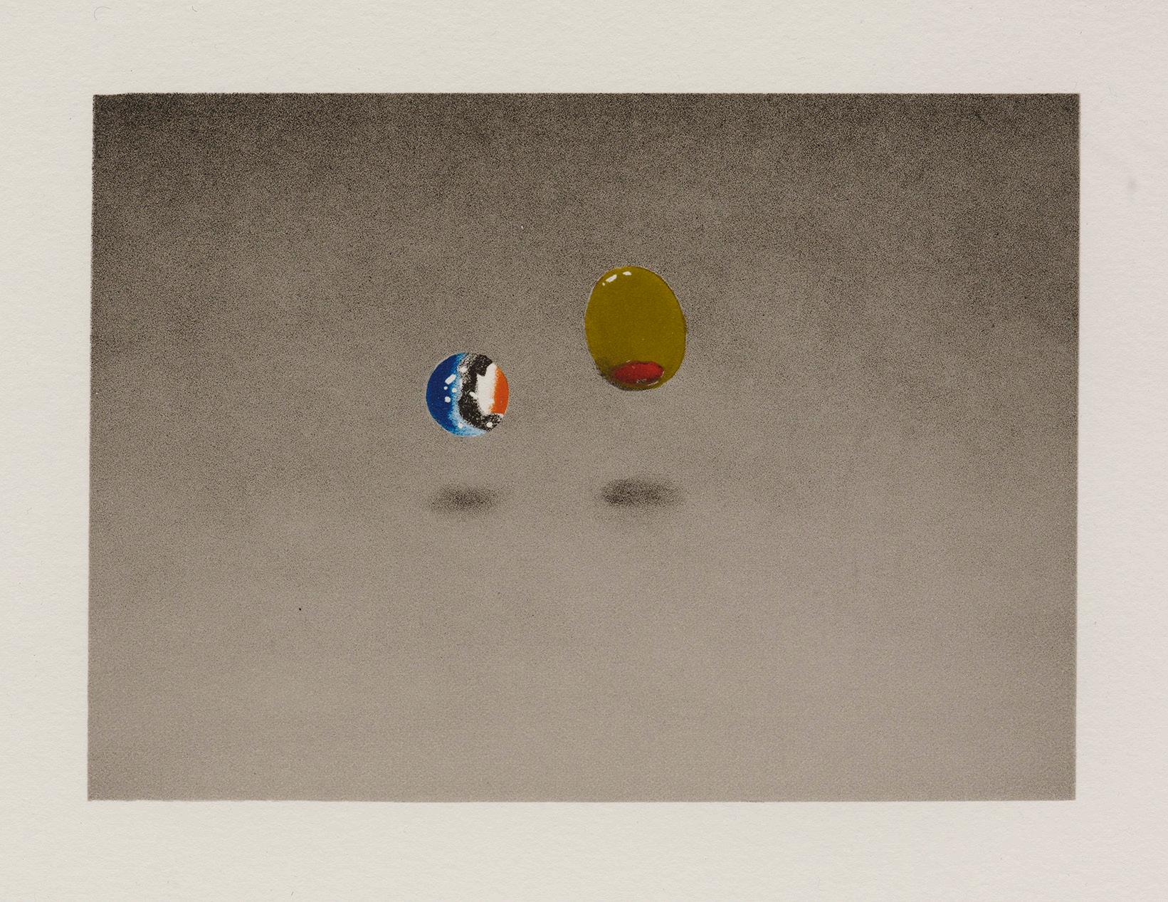
Most of the Tamarind prints picture a single word that seems to be dribbled on a surface (Anchovy) or constructed from curled and folded strips of white paper (Zoo) Sin takes form in tall sheets of paper balanced on end, alongside a pimento-stuffed olive looking for its martini, perhaps. Olives, marbles, and houseflies were among the trompe l’oeil props that Ruscha used to disrupt the cognitive habits that differentiate reading from examining illusion.
(Medieval manuscript illuminators had made similar use of insects and small fruits.) In Marble, Olive, the titular objects don’t rest on a surface but appear to float above an imaginary, receding plane.

Ed Ruscha at Tamarind Lithography Workshop, Los Angeles,1969
-Essay by Susan Tallman
Ed Ruscha
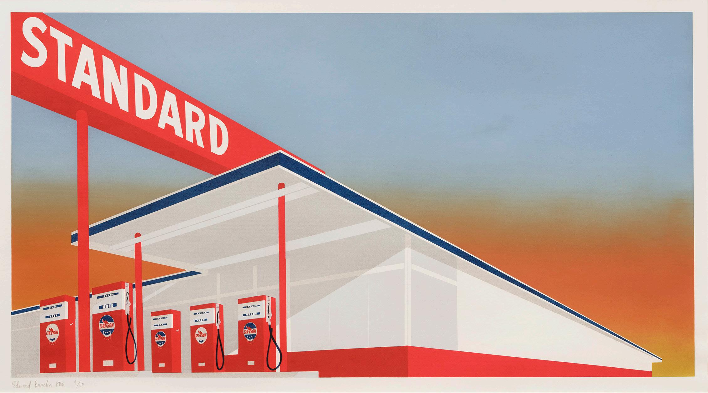
Standard Station, 1966
Screenprint
Sheet size: 25 5/8 x 40 inches
Printer: Art Krebs, Los Angeles
Publisher: Audrey Sabol, Philadelphia
Edition: 50, plus proofs
Catalogue Raisonné: Engberg 5
Signed, dated, and numbered
Ed Ruscha

Anchovy, 1969
Lithograph
Sheet size: 19 x 28 inches
Printer and Publisher: Tamarind Lithography Workshop, Los Angeles
Edition: 20, plus proofs
Catalogue Raisonné: Engberg 29
Signed, dated, and numbered
Ed Ruscha

Sin, 1969
Lithograph
Sheet size: 14 x 15 1/4 inches
Printer and Publisher: Tamarind Lithography Workshop, Los Angeles
Edition: 20, plus proofs
Catalogue Raisonné: Engberg 22
Signed, dated, and numbered
Ed Ruscha
Zoo, 1969
Lithograph
Sheet size: 9 3/4 x 12 3/16 inches
Printer and Publisher: Tamarind Lithography Workshop, Los Angeles

Edition: 20, plus proofs
Catalogue Raisonné: Engberg 23
Signed, dated, and numbered
Provenance: Irving Blum Gallery, Los Angeles
Ed Ruscha
Marble, Olive, 1969
Lithograph
Sheet size: 9 3/4 x 12 1/8 inches
Printer and Publisher: Tamarind Lithography Workshop, Los Angeles
Edition: 20, plus proofs
Catalogue Raisonné: Engberg 26
Signed, dated, and numbered
Provenance: Irving Blum Gallery, Los Angeles
Helen Frankenthaler’s foray into woodblock in 1973 was, print scholar Richard Field wrote, “a departure so profound that virtually all subsequent woodcuts incorporated the thinking it embodied.” Bypassing the energetic gouging, spikey line, and opacity that had made woodcut a favored instrument of expressionism earlier in the century, Frankenthaler turned to the techniques employed in the Japanese Ukiyo-e prints she loved—prints whose transparent inks, shaped blocks, and exploitation of natural woodgrain echoed the fusion of color and substance achieved in her paintings.
Working at ULAE, where she had made lithographs for many years, Frankenthaler used a jigsaw to shape sheets of luan mahogany, experimenting with form and color in an improvisatory, responsive process. Though assisted by master printers, she did not like to delegate: “Only I could cut the shapes, create the drawing with the jigsaw, do the piecing together, the eliminating, the adding, and mix and correct the colors,” she explained. An astonishing forty-four days were spent proofing possibilities on the press before settling on the eight blocks and seven colors of Savage Breeze.
Reviewing these trial proofs later, Frankenthaler reconnected with one that employed just four blocks. She recut one of these and inked the reassembled compositions in red, black, and a narrow strip of spring green to produce Vineyard Storm. Both editions are printed on a Nepalese paper of almost unmanageable delicacy, which contributes to the prints’ organic character—less an image imposed on a substrate than the trace of evanescent event.

Juda
Rosenberg, Tatyana Grosman, and Helen Frankenthaler at ULAE, West Islip, New York, 1973
-Essay by Susan Tallman
Helen Frankenthaler
Vineyard Storm, 1974
Woodcut
Sheet size: 31 1/2 x 27 inches

Printer and Publisher: ULAE, West Islip, New York
Edition: 4, plus proofs
Catalogue Raisonné: Abrams 49
Signed, dated, and annotated
An exceptional impression of this very rare print
Helen Frankenthaler

Savage Breeze, 1974
Woodcut
Sheet size: 31 1/2 x 27 inches
Printer and Publisher: ULAE, West Islip, New York
Edition: 31, plus proofs
Catalogue Raisonné: Abrams 47
Signed, dated, and numbered
Richard Diebenkorn

Ochre, 1983
Medium: Woodcut
Sheet size: 27 1/4 x 38 1/8 inches
Printer: Tadashi Toda, Shi-un-do Print Shop, Kyoto, Japan
Publisher: Crown Point Press, San Francisco
Edition: 200, plus proofs
Initialed, dated, and numbered
Richard Diebenkorn
Large Bright Blue, 1980

Spitbite aquatint and softground etching
Sheet size: 39 5/8 x 26 1/8 inches
Printer and Publisher: Crown Point Press, San Francisco
Edition: 35, plus proofs
Catalogue Raisonné: HFA 32
Initialed, dated, and numbered
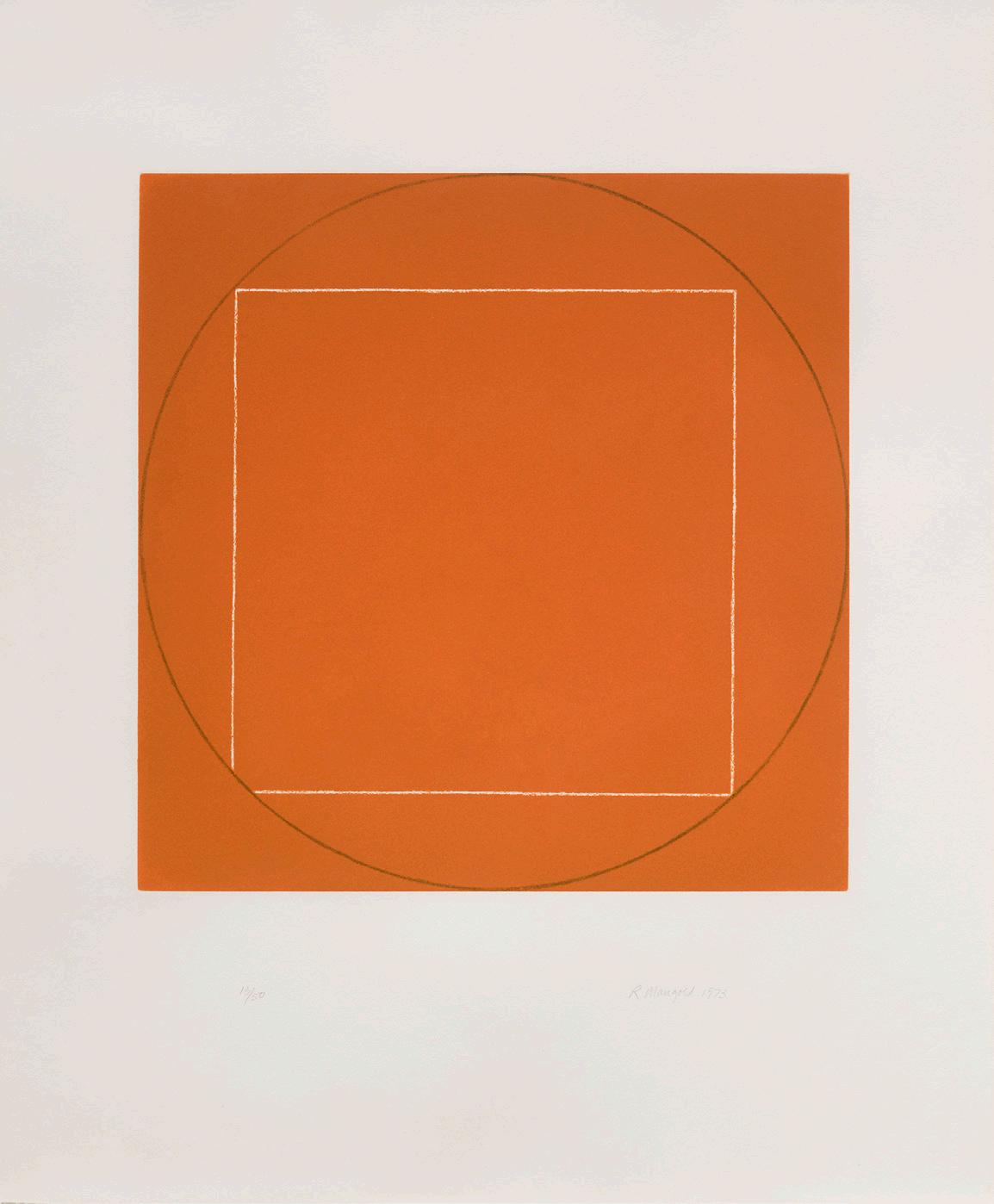
Robert Mangold
Seven Aquatints, 1973, published 1974


Aquatints
Sheet size: 26 7/8 x 22 1/8 inches, each
Printer: Crown Point Press, San Francisco
Publisher: Parasol Press Ltd., New York
Edition size: 50, plus proofs
Catalogue Raisonné: Parasol RM7
Each sheet is signed, dated, and numbered
The very rare complete set of seven aquatints


SUSAN SHEEHAN GALLERY 146 Greene Street New York, NY 10012 Tel: +1-212 489-3331 info@susansheehangallery.com www.susansheehangallery.com
