
The with illustrators.
A brief guide to collaborating with illustrators to visualise your research.


Introduction
In 2020, the need for clear and accessible science communication during the Covid-19 pandemic response inspired an unprecedented collaboration between The Spinoff’s creative director, Toby Morris, and leading New Zealand science communicator and microbiologist Associate Professor Siouxsie Wiles.

The animations and explainers the pair produced have been shared and viewed by hundreds of millions around the world, translated into multiple languages and used by official health agencies to spread awareness of critical public health concepts.
Drawing inspiration from this remarkable partnership, The Spinoff and The Science Media Centre, with support from NZ On Air, developed Drawing Science; a capability building programme for illustrators, animators and scientists.
Drawing Science was designed to give talented illustrators and animators the skills and understanding required to work creatively and productively with scientists, and to help scientists and illustrators develop collaborative tools to make their work sing.
In May 2021, the first Drawing Science event was held. An intensive one-day workshop paired freelance illustrators and animators with scientists from a range of fields. The workshop garnered a huge amount of support, with hundreds of applicants for both scientist and illustrator roles, eventually whittled down to 30 participants.
This guide has been developed to help you, a researcher, navigate the process of commissioning illustration and creative work to bring your research to the next level. It will explain the benefits of commissioning bespoke illustration and will help demystify the whole process of working with an illustrator in a harmonious way to get the best possible outcome.
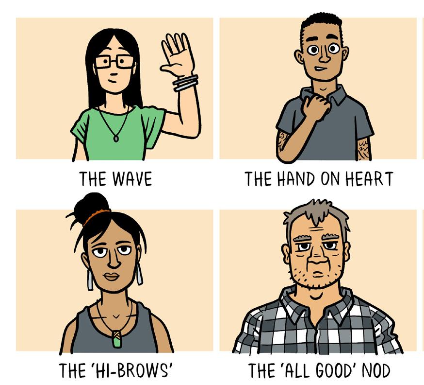
ALTERNATIVES TO HANDSHAKES, HUGS, HIGH FIVES AND HONGI
“Working with Toby Morris has been the most impactful and rewarding collaboration of my career. It’s been a privilege to see him turn important concepts into relatable images and watch so many of them translated and travel around the world. I’m excited by the prospect of sharing what we’ve learned with our fellow New Zealand scientists and illustrators.”

2
– Siouxsie Wiles
“I’m a huge believer in the power of illustration to communicate complex ideas. Anything we can do to help New Zealand’s science community explain important information to the public is really valuable.”
- Toby Morris
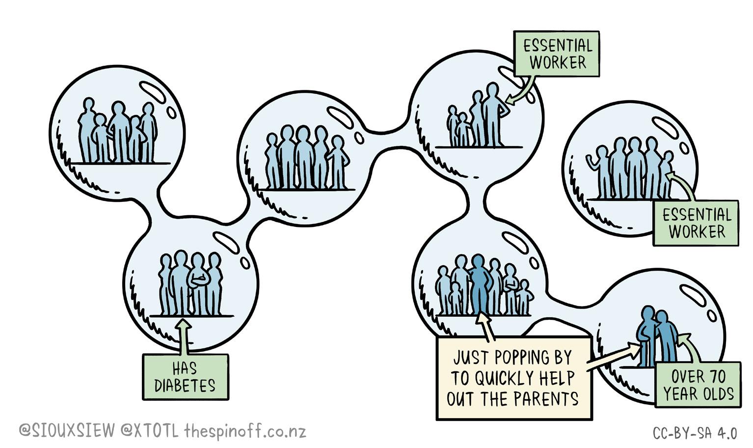
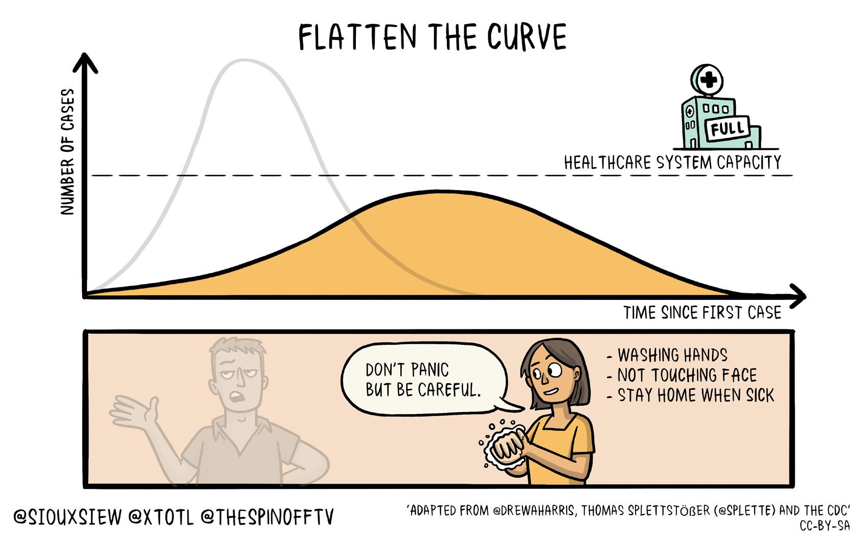
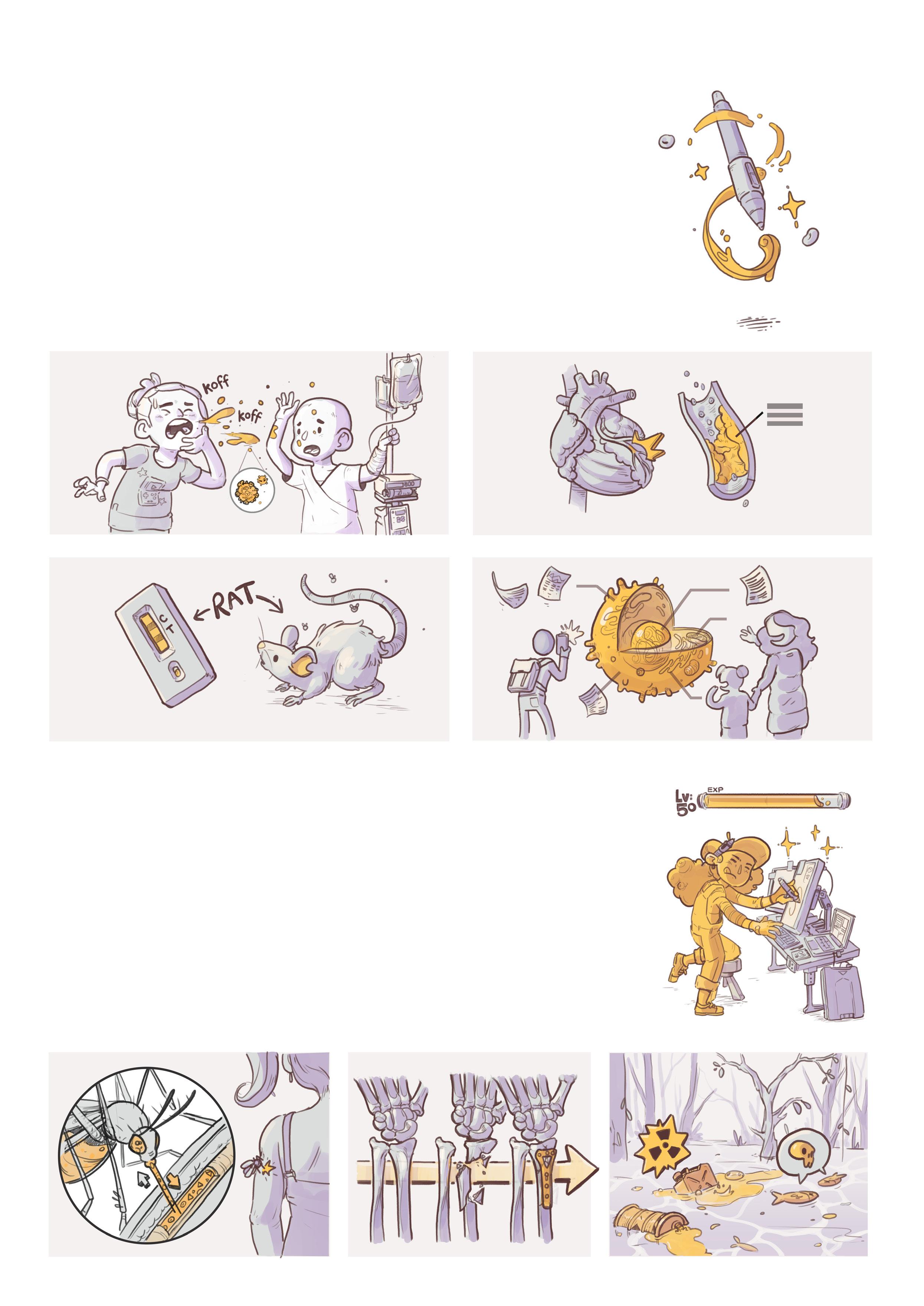
Examples of Toby & Siouxsie’s work

3
Why Work With An Illustrator?
Illustrated by Ciléin KearnsEveryone knows that a picture is worth a thousand words. That’s because, as humans, we understand visual cues in a far deeper way than written words. When we look at an image, we pick up a lot of information at once, mostly subconsciously. Because of this, visual ways of explaining complicated topics can be far more
Illustration can:
Humanise and add emotion to your work.
impactful for the average reader. Where a simple diagram can help us make sense of complicated information, illustration can take this many steps further, adding layers of context, emotion, metaphor, and an important human touch, which can be crucial to spreading important ideas.
Make complicated information easier to comprehend.
Add important contextual information.
I fancy myself as a bit of an artist...
Busting out pens and paper and tackling illustrations yourself might seem like a fun way to spend an afternoon and cut some costs, but it’s highly recommended that you seek out the expertise of a professional illustrator.
Create a more engaging experience for the audience.
A professional illustrator comes with years of experience and a level of skill and technical know-how that goes far beyond being able to draw a passable picture. Plus, collaborating with a creative thinker can truly level-up your science communication in innovative and imaginative ways.
How does it work? is it some sort of creative magic?
The world around us is brimming with visual cues that we pick up almost completely subconsciously.
Illustration is a way of using those visual clues intentionally to help reinforce ideas.
4
Harnessing the power of effective illustration.

If a picture is worth a thousand words...
Good illustration should work together with your written information.
...including both the picture and those words is redundant.
Use less text and let the visuals do as much of the heavy lifting as possible.
Text and illustrations should work together to tell 100% of the story.
The illustrations would not be being used very effectively.
Use less text and let the visuals do the talking (means you don’t double up on heavy lifting).
The most important thing is the message that you are trying to convey.
As scientists, the usual inclination is to present all the facts and information.
It is better to make one point clearly...
If an audience is bombarded with too much...
...they aren’t going to be able to take much in.Simplicity is key.
...than many in a way that no one will understand.
Creatives strive to find the most effective way to share a message. They may push back on content to make information more digestible.
Focus on information too confusing too simplifiedjust right
Focus on communication
The perfect result lies somewhere along this spectrum, depending on the audience.
Striking a balance between authentic information and effective communication can be difficult, but it’s crucial in order for your work to resonate with your audience.
5
Illustration Options
Illustrated by Isobel Joy Te Aho-WhiteSTATIC IMAGE
A static image is your stock standard illustration, illustration that has no movement.
DIAGRAM
ICON
A set of icons is a simple way to make information instantly more understandable.
They help to contextualise or reinforce information by tapping into pre-existing understandings that we, as humans, already comprehend.
Icons can range in complexity. Generally, they are a lot quicker to produce than a standard illustration...
...but bear in mind that sometimes more abstract concepts can take some ‘outside-the-box’ thinking to sum up in icon form.
They often get the idea across but can also be incredibly boring for an audience.
The idea of a diagram often brings to mind drab flowcharts.
There’s nothing that says a diagram can’t be fun, colourful and textural.
Including illustrated elements like characters and relevant objects can help bring a diagram to life.

6
SET
A comic is multiple illustrations put together to form a narrative.

A comic can vary greatly, depending on the content and intended message.
A four-panel comic is essentially the same as drawing four illustrations, so plan accordingly!
It can be neatly ordered and organised into boxes…
…loose and experimental…
This can be as long or as short as it needs to be to make the intended points.
…or somewhere in between.
Remember, a comic can be laborious to produce, so try and cut down or condense unnecessary information.
ANIMATION
If the format allows, moving images are a great way to bring ideas to life. The process of animating will vary hugely in terms of complexity and cost.
Adding simple movement to a static image can take as little as a few hours and can go a long way to make your graphic stand out on social media, for instance. A beautifully crafted 3-minute animation to go with your dissertation might take a couple of months.
If you are keen to commission animation work, make sure you have the right skills at your disposal. Illustration and animation are very different jobs. Many illustrators, but not all, will be able to create simple animations. A rare breed of creatives can do both well. To get a great result, you might need to work with both an illustrator, (who will create the static assets) and an animator (who will bring them to life).
When commissioning more substantial animations, bear in mind that there will be things to factor into costing and production such as getting a voiceover recorded, finding music and adding sound effects. If the animation requires complex character movements (walking, turning etc) this can add a lot of complexity to the process.
7
COMIC
Choosing the Right Illustrator
 Illustrated by Marc Conaco


Every illustrator will bring a completely unique style and skillset to a project. When engaging an illustrator, do your research and find an illustrator that you think will be right for the project.

The more you can understand what sort of work an illustrator typically creates, the more realistic your expectations will be of what the final result will look like. Here are a few key things to consider.


STYLE
The style of an illustrator can be easy to gauge by looking through examples of their work.


Tone?
Stylistic choices, such as the textures and colours of the final artwork can go a long way towards the overall feeling that the illustrations convey.
Broad or narrow?
Some illustrators work in a very specific visual style, whereas others can adapt their style quite widely.
Level of detail?
Some illustrators create highly detailed work, while others prefer a simpler, more minimal look.
Abstract vs representational?
Is the artwork that they create usually more abstract and expressive or does it show realistic objects and scenes? Are the characters they draw cartoony or are they more realistic in look and proportions?
8
Every illustrator will have their own particular skills. These can be a bit harder to understand from seeing their work and might require chatting to the prospective illustrator to learn more.


SKILLSET
Speed
Some illustrators take longer to complete work that is meticulously detailed. Others excel in delivering simple illustrations at record speeds.
Conceptual thinking
Some illustrators will be able to easily come up with ingenious concepts, whereas others will work better with a clear outline of what they are producing.
9
The Process
Illustrated by Yasmine El Orfi
The brief is a written document that clearly outlines expected deliverables and timelines for the project. It is meant to help manage expectations for both you and the illustrator. The clearer you can make this, the less room there will be for things to fall apart further down the line. You can find more on writing the perfect brief over the page.
The illustrator will start by providing a rough version of the artwork(s). Generally, this will be supplied as a sketch, or if the illustrator works entirely on computer, it might be a simplified version of the artwork. At this stage, the important thing is to make sure the illustration is working from a conceptual point.
It can be hard to visualise what the end result will look like once it has been finalised. Sometimes an illustrator can provide a stylistic example consisting of an image or portion of an image which has been finished to give an idea of the style for you to feed back on.
The important thing to note is that it is much, much easier to make changes to the illustrations at this stage, while it’s just a quick sketch. It becomes more time-consuming to make changes to an illustration the closer it gets to completion. Not only will a lot of time have been wasted finalising work that needs to be changed, but usually this will put a strain on timelines as things get closer to a delivery date.
The illustrator will deliver all artwork to you on time, and on budget (hopefully).
10
Giving good feedback is a skill that can be hard to master. Here are a few tips:
• Make sure you give feedback in a timely manner to avoid unnecessary hold-ups. Don’t seek the input of too many people, unless they have a definitive stake in the game. It will often result in a “too many cooks in the kitchen” scenario where you have to manage conflicting opinions.
• Don’t just focus on the things that need to be improved. If something is working well, let them know! A creative person will be much more receptive to making changes if you’ve also given them a bit of well-earned praise.
• Be honest, but be nice about it. It can be a difficult balance to maintain at times. At the end of the day, there will always be changes and improvements to make in the early rounds of feedback. Be as kind and direct as possible.
• Be concise and considerate with your feedback. Try and consolidate your notes into a clear, ordered email. Sending lots of different messages through different channels can be very difficult to follow, and talking through changes without providing a written summary will likely result in things being forgotten.
• If something isn’t working, explain your reasoning. If an illustrator doesn’t know the problem that they are trying to solve then it’s highly likely that they aren’t going to find a solution.
Once the sketches / rough artworks have been approved, the illustrator will work on finalising the artwork. This will be slightly different for each illustrator’s process. Sometimes it will involve an ‘inking’ stage where the outlines are drawn and signed off before colour is added. Sometimes the illustrator will send through illustrations that are in-progress to get feedback. The process will involve a bit of back and forth, with work being sent for a number of rounds of revisions (usually the number of revision rounds will be established as part of the briefing process).

11
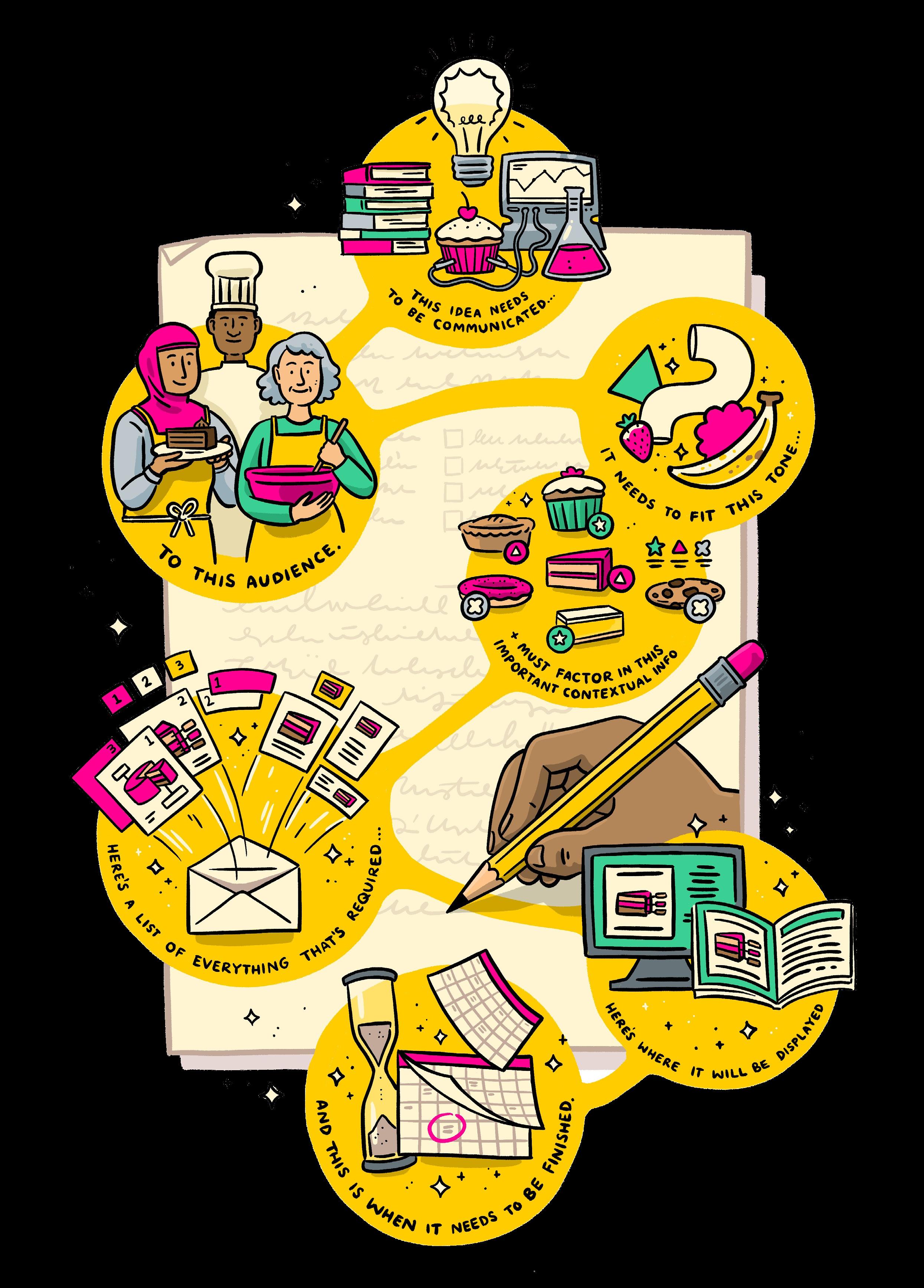
Writing a Great Brief
Illustrated by Ezra WhittakerObjectives
What is the purpose of the project? Try to answer as many of the following questions in order to give the illustrator the best possible understanding about what their goals should be:
What information needs to be conveyed through the illustration? What concept are you trying to communicate? Is the goal to visualise something abstract or beyond our range of senses?
Who is the intended audience? We often want our work to find the widest possible audience, so our instinct is to say that we want our audience to be everyone. However, this can often result in a final outcome that is trying too hard to appeal to too many audiences. Instead, try and think critically about who will actually be seeking out and benefiting from your project, and try and have their needs in mind.
What is the desired outcome? Are you trying to change perceptions? Persuade or build an argument? Call to action?
Are there any sensitivities that need to be addressed? Are there cultural factors that should be taken into consideration e.g. showing a diverse range of people, avoiding elements that some audiences might find offensive, etc.
What tone do you need the illustration to strike? Should it be serious, clinical, fun?

Where will the illustration be shared? Will this have any impact on the illustration?
Deliverables
A specific list of what you need the illustrator to create. Be specific about the sizes and formats you are going to need upfront (see the Technical Details section on page 17), as these things might cause headaches for the creative if they need to change things halfway through the project. Keep in contact with the illustrator if things change - often this won’t be a problem but be aware that extra costs might be incurred if you add things to the list.
Usage and rights
Generally speaking, any work that is commissioned will belong to the commissioner. However, many illustrators will have conditions about the usage of the images they create, and some will charge different rates depending on usage, so it pays to be as specific as possible when outlining where images will be seen. If this changes further down the line, it’s best practice to ask the artist if they are okay with their illustration being used in a different context.
Timelines
It’s good to define some key timeframes and an overall deadline at the start of the project. Allow plenty of time for your creative contractor to hit key milestones along the way and break up the process through a series of “revision rounds”. These will be points along the process where illustrations will be sent to you to review at various stages of completion. A project might involve between two and four rounds of revisions built into the timeframe, with the understanding that if further revision rounds are required it can incur additional costs and might push the timeframes back accordingly.
Top tip
Don’t be overly prescriptive when it comes to the creative side of things. You are paying a creative person for their skills as a thinker as much as a do-er, so let them bring some creative ideas into the mix. If you are stuck, get the illustrator to help you - it’s a process that they’ve likely gone through many times. Remember, it’s in everyone’s best interest for expectations to be clearly outlined upfront.
IN SUMMARY
12
• What is the main message? • Who is the audience? • Where will it be shared?
13
Timelines & Costs
Illustrated by Kim AndersonThe cost of commissioning illustration work can vary significantly depending on a few factors. It’s important to remember that illustration is a highly-skilled craft. Many illustrators working in the industry will have been honing their abilities for decades. Many people who aren’t from a

creative background often equate creative professions with hobby work, with the expectation that anything ‘fun’ isn’t really considered ‘work’. This can mean that far too often creative work is significantly undervalued. It’s a good idea to make sure you have a reasonable budget set aside.
So, how much will an illustrator cost me?


This generally comes down to the skill level of the illustrator, and how in-demand they are. For a well-seasoned illustrator, don’t be surprised if they charge $150+ per hour. Most illustrators with a few years’ experience would probably fall between a $50 and $120 hourly rate.
How quick will they work?
Illustrators can vary widely in terms of how quickly they deliver work. Paying a slightly higher hourly rate work out better in the long run if they can do the same amount of work in much less time!
How much are you commissioning?
Break your project down into bite-size pieces to get a good estimate of cost. For example, you are commissioning 6 images, and your illustrator estimates 10 hours to complete each image, then make sure you have enough budget to cover 60 hours of work.
Is it urgent?
It’s common for creative freelancers to charge an additional fee if they are being asked to turn work around quickly.
OTHER THINGS THAT CAN ADD TO THE COST:
detail to the illustration.

14
Additional agent fees (if applicable).
Outputting lots of different sizes and formats.
How illustrators charge
Illustrators will often either charge a set amount per project, or change an on-going hourly rate. Different illustrators have different preferences, but most are open to negotiation if need be.


Pay per project
If there is a set budget locked in at the start of the project, it’s good to negotiate one set project fee. Make sure all parties have a clear outline of what needs to be delivered as part of this cost at the outset. Any work on top of the expected deliverables, will incur additional costs. If a project is drawn out over multiple months, most illustrators will want to be paid in regular instalments.
Hourly rate
Paying an hourly rate can offer a lot more flexibility in terms of deliverables, but you should be upfront about how many hours you can afford.
15
IT ALL ADDS UP...
Glossary
Illustrated by Sophie TseThe creative industry can be difficult to navigate for those who are unfamiliar - it comes with heaps of jargon and insider knowledge. Most illustrators will help you understand things, but it pays to know some basic terms.


Illustration
Everyone knows what an illustration is, but what many people don’t understand is where the distinction is drawn between “art” and “illustration”. An illustration can be considered art
but, more specifically, an illustration is commissioned and drawn to a brief with the specific purpose of making a narrative or concept clearer. A piece of art explores personal thoughts and ideas of the artist and is expected to
elicit a response that is more subjective and openended from the viewer. An illustration is generally intended to convey very specific and intentional ideas. Art is a bit more like a question and illustration is a bit more like an answer.
Stylistic Elements
Texture
Texture can make a drawing feel more ‘handmade’, or evoke particular thoughts, emotions and vibes. It can be as simple as putting a transparent texture over the top of an image or as painstaking as adding in tiny dots of stippling to give the sense of tone.
Flat colour vs shading
Flat colour refers to twodimensional drawings that consist of blocks of uniform colour. Shading, on the other hand, is the use of various techniques such as gradients and shadows to create a more threedimensional look, to varying degrees.


Sketch / ink / colour
Illustrators might have different ways of referring to different stages of their process. Generally, a rough conceptual drawing will be a “sketch” or sometimes a “scamp”. “Inking” will be the process of drawing the final linework and “colouring” will be adding colour.
Hierarchy
In regard to composition, hierarchy refers to the importance of different elements in the illustration. If there are lots of bits of a composition that are vying for an audience’s attention then nothing really ends up standing out. It should be obvious as soon as someone looks at the illustration what the most important information is.


Line drawing
Line drawings are constructed using lines to give the sense of shapes, often just a simple black line on a plain background.
Stroke and fill
The outlines of a shape in vector drawings is called the stroke, where the inside colour of a shape is called the fill.
Palette
Is the set of colours that are used in the artwork. The right colour palette will go a long way to setting the right tone for an illustration.
16
Technical Details
Raster vs vector
There are essentially two ways that a digital image can be constructed, and it helps to know the difference as the process for each is very different:
Raster
( .jpg / .png / .tiff / psd )
Images are pixel-based, like a digital photo. Every individual dot will have defined values, (colour, opacity etc.) and these dots will add up to a complete image. Since each pixel has a defined value, raster images become pixelated when they are scaled up.
Vector
( .svg / .eps / .ai )
Images are constructed from shapes that are dictated by ccomputergenerated co-ordinates and stylistic values will be attributed to the shape as a whole. Raster images are generally more textural and usually look more hand-done. Vector images look cleaner and more computer-made, with perfect geometric shapes
and lines. Since vector images are constructed from computer-generated co-ordinates, they can be scaled up infinitely without any loss of quality. Vector images are often better suited to simpler artworks, as adding in complicated elements like textures can create many thousands of co-ordinates and can result in large file sizes and slow computers.
A few notes re: raster/vector
1) Some outputs will favour either raster or vector. For instance, when creating artwork that will be animated, supplying vector files to the animator will give them vastly more options for how they can animate.

2) It’s easy to convert a vector image into a raster image. It’s a lot harder to convert a raster image into a vector image, and there are always going to be slight losses in the quality of shapes. Bear that in mind!
Resolution / DPI & PPI
PPI (Pixels Per Inch) is a unit of measurement for pixel density. As mentioned in the section above, if raster images are scaled up, they can become pixelated. This will also happen when an image is printed, as each pixel is converted into a dot of ink which is measured in DPI (Dots Per Inch). It’s important to communicate the required dimensions for illustrations to avoid losing quality if images are scaled up beyong their original dimensions. A higher PPI will allow an image to be scaled larger without reducing quality.

Colours
There are two main colour models (RGB and CMYK) that most images will fall into. Within these are all sorts of specific colour profiles, but only incredibly nerdy colour enthusiasts will understand these.
CMYK
Covers most printed material, books, flyers etc. All colours are formed by combining tiny dots of Cyan, Magenta, Yellow and Black (which is represented as a K for some reason).
RGB
Is what your screen displays. All colours are formed from combinations of the tiny red (R), green (G) and blue (B) LEDs that form the pixels in your screen.
A few notes re: CMYK/RGB

While it’s easy to convert illustrations between the two, be aware that:
A) Some colours will not translate as well between the two, as CMYK colours will rarely be as vibrant.
B) If you are looking at a CMYK file on a screen, it’s still being shown in RGB as that is what all screens use. Your computer will be doing its best to approximate what the final colour will look like. It will always inevitably look a bit different when printed out so it pays to do plenty of test printing!

17
Drawing Science is a collaboration between The Spinoff and The Science Media Centre. The programme wouldn’t have been possible without generous funding from our friends at NZ On Air.

This work is licensed under the Creative Commons Attribution-NonCommercial-NoDerivatives 4.0 International License.


