slanted 40 experimental type 2.0
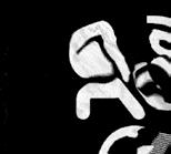
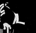
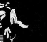
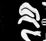
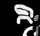
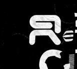
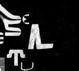
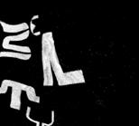
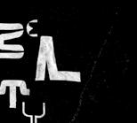
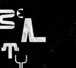
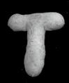
001——Jianping He——DEU—— LI BIN YUAN SOLO EXHIBITION
Poster for Cinema Paradiso-Solo exhibition of Li Bin Yuan at Pingshan Art Muse

Slanted 40—Experimental Type 2.0 0 1
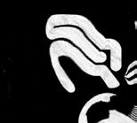
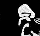
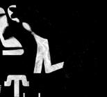
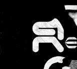
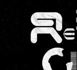
um, Shengzhen, China.

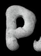
001——Jianping He——DEU—— LI BIN YUAN SOLO EXHIBITION
Poster for Cinema Paradiso-Solo exhibition of Li Bin Yuan at Pingshan Art Muse
The ability to touch typefaces is not a new concept. Egyptian hieroglyphs first appeared around 3000 BC, first painted onto plaster, then carved as relief. Until the development of paper, writing was done on stone. A few thousand years later, typography moved from print to the digital world—today’s typography is mostly conceived via two-dimensional screens. A flattened world.
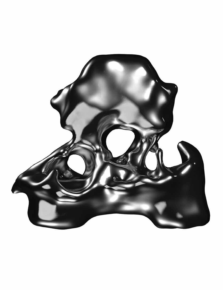
For those who love mountains, flatland is boring. However, like Gutenberg and generations of typeface designers who worked with casts, lead and physically shaped type, some artists return to the literal heft of physical letters, adding material properties to the typeface and give it a tactile character. “Lifting” the typography, which was always “laying” on the print media or on the screen seems to bring it alive “in front of us”—perhaps the most visually stimulating typography trend today. In doing so, the range of roles and functions expanded from rational communication to visual expression methods, revealing motion and emotion.
002——Studio WØT——SWE——LE REX
Poster for the brass band Le Rex for a design framework of Neubad. The idea was to create an abstract brass instrument forming the name of the band. The bulging bag was an attempt to visualize the sound of a brass instrument.

Playful attempt to create a digital sculpture with a focus on the material.

Students at Creative Coding class at Communication Design at Hof University were creating Typographic Cyborgs by remixing a 3D scan of themselves and a selected letter into a hybrid between human and font. In different variants the letter becomes part of their body, they are becoming a part of the letter or the letter will be the environment, architecture, or furniture.

The approach to working with type is to let the type become part of the image or object and let it contribute to the character of the image instead of hiding it in the corners.


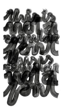
This e is knitted from TypeJockey, an alphabet system by Andrea Tinnes consisting of 14 freely combinable fonts with different patterns. It is part of the book Pixel, Patch and Pattern. Typeknitting published by Verlag Hermann Schmidt.


Legibility is the ease with which a reader can decode symbols. Readability is the ease with which a reader can follow and understand words, sentences, and paragraphs. While legibility refers to the visual clarity of individual symbols, readability is more about their arrangement (or even the choice of individual words in a sentence). So the theory goes …
But who tells what is legible? Who sets the standard for what is readable? Presumably, legibility is a question of time. With a little luck one might find someone who can still read Sütterlin (the historical form of German handwriting that evolved alongside German blackletter—most notably Fraktur— typefaces).
There is a magic in transforming letters to an illegible degree—to cause them to lose function in the sense of readability. It is a liberating process. Thereby, the function of “letters” is redefined. Much like Marcel Duchamp, who created “Readymades” (bicycle wheel 1913; Bottle Rack, 1914; Fountain, 1917), redefined the meaning of art. He looked for something that was neither art nor anti-art, something that was characterized by indifference to all aesthetic categories. “Anti-Reader-Friendly typography” becomes the “readymade” of the type world—and by this “… a form of denying the possibility of defining art.”
066——Dafi Kühne——CHE——KUNSTSTIPENDIEN DER STADT ZÜRICH
Poster for Kunststipendien der Stadt Zürich. How do you fit 36 names on a poster and make them big? You got to overlap them. Letterpress printed in a total of 23(!) print runs with many helpers. Mainly laser-cut MDF and a bit of metal type.

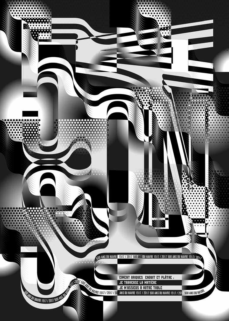
084—Simon Péter Bence—HUN——TYPE RASTER WAVE
This text is interrupted with a geometric grid sequence, which fragments the basic text, thus resulting a moving effect, something that resembles to the surface of the sea. Results are typographic experiment of waving text line fragments.

085——Teeline Fonts——USA——PLENAIRE SLOPPY
Up close its daubs appear chaotic and illegible, but at a distance its shapes resolve into elegant and readable italic letters, like the wondrous brushstrokes of Claude Monet or Georges Seurat. Plenaire Sloppy shows this variable font at its most scattered extreme, taking legibility to the brink.
Effectively communicates the message
CLEAR AS A BELL, CLEAN AS A WHISTLE
Distinct, sharp, coherent, well defined unreadable
NO ISSUES WITH LEGIBILITY WHATSOEVER VAGUE shapes coming together to make letters
Plenaire Sloppy, a typeface from Teeline Fonts
This work epitomizes the goal of the writer in attempting to expose language as a system built on rigid binaries and oppositions, where capturing true meaning becomes impossible—as soon as a word is uttered, it becomes lost in a world of differing significations. This series is an homage to Cortázar, and an exploration of those same ideas in the visual world.

Serendipity denotes an observation of something random, something not originally sought that turns out to be a new and surprising discovery. There are countless serendipities around us (Penicillin and Aspirin, which have freed many humans from suffering, are but one of these).
But isn’t everything merely based on coincidences? What if intentionally disassembling and assembling (a typeface) leads to a redefinition of it? Trial and error are interesting approaches to look for the new. Try one thing, then another, until success. So why not go the same way when it comes to letters and fonts? Disassembly and assembly of type may lead to great discoveries!
095——Bemir Bilalic——AUT——BEHIND THE LOOKING GLASS Poster created for an event at an University of Applied Arts with an effect of distortion with different pieces of the glass and bold typography.

DEU—COPY PASTE

Copy & Paste: efficient but boring.
121—studio muchogusto—CHE—“GESTÖRT ERZÄHLT”
Poster for the discussion series gestört erzählt at Neubad in Lucerne Switzerland. Mental health is not a taboo subject!

The Werkschau design draws inspiration from Marjory, the magical Trash Heap in The Fraggles. Marjory, a living compost heap with mystical powers and alternate genders, acts as an oracle to the Fraggles.
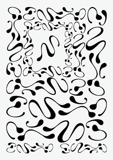
A display font inspired by the Netherlands, where water formations resemble letters due to the low-lying land.


If something happens accidentally, it’s just an accident.If something is done intentionally, it’s an experiment. While a child carries out basic experiments to understand its surrounding, teams of scientists take years of systematic investigation to advance their understanding of a phenomenon.
Same goes for the magic of the unintentional: that what happens when parameters are set before an accidental crash and leads to discover a new unpredicted form of expression.
The process begins on a typewriter made in ex Yugoslavia, called Biser 35, that uses a Courier M font. The repeat of number 9, with one line spacing, resulted with overlapping, creating a pattern in which the number became unrecognizable as a part of the abstract form. The second stage was to scan the pattern with the photocopier machine, with a unintentional move in the upper part of the display, which stretched the scanned form and gave a another experimental touch creating noise and interference both inside the lines and out, making the appearance more distant from the look that it had on the beginning of the process.

The adidas brand department asked for an analog letter set inspired by handwritten notes. They specifically asked for a feminine style. So the designer decided feminine is round, bold, strong, loose, dynamic, and exiting. A real woman is not perfect, which is the most interesting about her and so are the details (lines overlapping, splashes) of the letters.

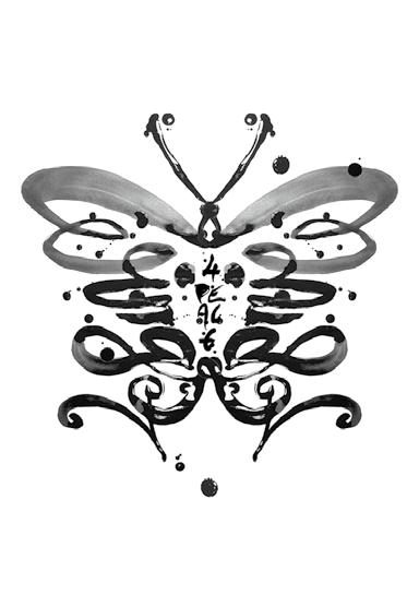
Feelthoughts,words,andletformsflow.Dipthe brushintoink,brushhairstouchthepaper,andletters appear.Head,Heart,Hand.Mirrored,abutterfly magicallyemerges,unfoldsitswings,andfliesforpeace.
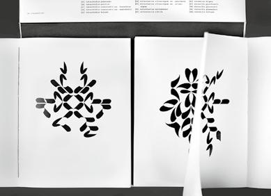
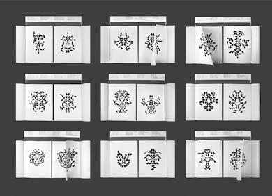
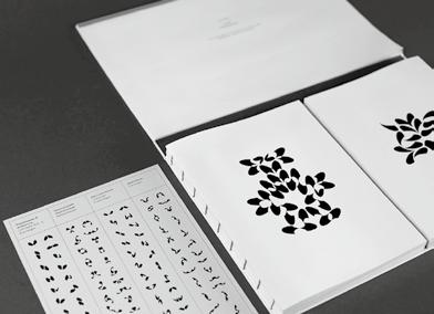
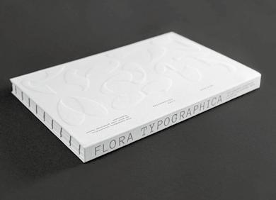
The work is a typographic interpretation of the Red List of Threatened Plant Species of Germany. There was the idea that writing systems and plants have one thing in common: a limited set of characters or shapes. By repeating and assembling the individual parts, an infinite variety of compositions is created.
The project The Alphabetical Room is a systematic exploration into the boundaries and limits of writing within a strictly calculated mathematical three dimensional grid within the flat digital space. Starting from Josef-Müller Brockmann’s grid proposal for the design of interior spaces in 1961, the perspective of the viewer changes throughout the pages of the leaflet as does the resolution of the three dimensional grids in which the hypothetical letterforms are displayed


205——Paula Heinrich, Daniel Jurkschat——DEU——SAUNA TALKS
“So, we should make friends with chaos, and in the whirlwind we should look for the superior order that chaos brings in itself.”
— Franco “Bifo” Berardi

Kinetic typography breaks away from its static state. It adds movement and a three-dimensional stereoscopicity, and the fourth dimension: time. Since the first appearance of kinetic typography in the film industry of the 1950s. Saul Bass, an award-winning film-maker and graphic designer first used the technique in Alfred Hitchcock’s film “North by Northwest” in 1959. In the opening sequence, credits fly in off-screen and fade out into the film itself. They evoke an intrinsic energy and suspense of the movie. Since, the technique was constantly developed and became a playground for many designers and visual artists. The fusion of aesthetics, emotions, and technology enables a wider sense of interaction—and surely, some fun.
206——Jonathan Nielsen——GBR——A REBEL CITY IN MOTION
A project for Nottingham Light Night 2022 where the city was showcasing various light-based projects. The project came to life as a projected piece, exploring the rebellious spirit of the city through type and animation.
219—Dennis Hoelscher—DEU—TRICKING THE EYE WITH WARPING TYPOGRAPHY
“Ultimately, I’m trying to capture things that physically can’t be captured in camera. I usually try to work photorealistically, that is, to create detailed textures and lighting conditions. In the best case, the viewer should be amazed and wonder how something like this can be visualized at all.”
220—Hannah Stollenwerk, Denny Eilert DEU—HEXAPODE
Hexapode is a modular typeface which was developed within the experimental typography course New Alphabet of the summer semester 2020 at the University of Applied Sciences Aachen in the Department of Design.


221—Ricardo Meyer—DEU—UNRUHE BEWAHREN
TheanimatedposterwascreatedasasubmissionfortheHeidelberg SymposiumwithitsannualfocusonthesubjectKeepRestless.Selfrotatingcuboidstrytoconnectandrepeleachother,seemingly atrandom,withinathree-dimensionalspace.Endlessintermediate andtransitionalimagesofdifferentconfigurationsarecreated.


Typographic forms, which were generated with the help of an AI by feeding it with information about appearance and shape. The shapes used were created collectively in a workshop on AI and typography by Jannis Maroscheck at the University of Art and Design Offenbach HfG.


230——Antonio Plasmati——ITA——HUMAN
AI-created “Human” font: blending 3 images to form letters resembling a human figure, born from human creativity.


Using words prompting an AI to generate shapes that remind of letters but resemble nothing, which can be used as inspiration for further design of or with typography. In this case, the pool of forms and molds illustrate and give name to a Riso printed poster calendar.
Technology changes always were a turning point in the history of typography. Today’s “perfection,” diversity, and practicality of typefaces is unthinkable without the power of personal computers. Ironically though, we are attracted to ’incomplete’ typefaces made by “state-of-the-art” technologies such as artificial intelligence (AI). The “experimental stage” of AI in typography produces incomplete and even sloppy results, they cause excitement and expectation.
As long as the experiment of technologies continues, the designer’s experiment will never be complete.
RUS—CODED TYPOGRAPHY
Most of these videos are the result of a collaboration with Type Today. In series of works the designer tried to unfold the potential of creative coding in type, animation, and interactivity.

A design enable character to speak for themselves, delivering loud phonic experience with a touch of playfulness.

This is a visual diary of a brief trip to Israel. Experiencing what it feels like to be in a completely foreign linguistic environment, where you cannot read a single letter, can be liberating but also overwhelming. It’s a free space where letters can be observed purely for their aesthetics, freeing you from the limitations of readability and linguistic conventions.


255——Sharp Type——USA——SORAIZ Soraiz is a parametric typeface generated by a Python script. Its visual grammar reflects the characteristics of digital fonts. The underlying skeleton is a work-in-progress font by Connor Davenport, combining a retro-futuristic impression with today’s technology. Overall, Soraiz evokes a retro-future that is still years away but won’t come to pass

256——Lukas Haider, Alexander Raffl——AUT——UNKNOWN Contemporary display typeface with 3 styles (RND, PX, MX). Adaptable alternates via upper-/lowercase. Organic appearance achieved through character variation, despite linear grid-based roots.

Yes! For good sake there is a world out of the box, beyond the monitor. Even if the digital is at the origin, the outcome goes far beyond mere zeros and ones. Today’s typography fuses, mixes, and combines all disciplines—music, movie, installation art, sculpture, street art, and … you name it.
Completely detached from content, words and letters become form. A vision of terror for all preachers of the “The Reinheitsgebot” (German “purity order,” a series of standards limiting the ingredients … in beer); a blessing for all those who delight in pure aesthetics, detached from ’meaning.’ A materialization of writing, so to speak. In the process, letters are purely created to be touched, to be worn (and thrown away). The physical space serves as a stage in which writing becomes image, material, object, and sculpture.
257——Aleksandra Zawistowska, Yon Matauko, Stefania Rigoni——NLD, ITA——FINALLY, THINGS ARE HAPPENING

Graduation show project of the class of 2021 of Studio for Immediate Spaces at the Sandberg Instituut, Amsterdam. The graphics were born out of a formal and material research on the aesthetic qualities of papers alien to the typewriter. All the different components were physically typed on toilet paper and later on scanned and reprinted. Toilet paper is a metaphor of the immediacy of the current times. A way to grasp the zeitgeist of the transition that humanity is experiencing. A time of uncertainty.


258——Alexis Mark——DNK——COLD FACTS (CAMPAIGN FOR GANNI)


The Cold Fact Popsicle is an awareness appetizer. It’s not meant to sweeten your day. It’s not meant to point fingers at you either. It’s a simple serving of ice cold facts, giving you a heads up on our planetary situation. And hopefully, a reminder to take part in cooling down the Earth together. Photos ©: David Stjernholm.


Tea is a popular drink in the world, and widespread consumption has resulted in a large number of tea residues. Therefore, I have tried to use tea residues as raw materials to explore how art and creativity can meet the challenges of waste. Tea residues are used to make five materials that have the potential to be made into objects. They are shown in five molds for this project, which are also made of tea residues.

301—Stéphanie Falcione—MAR—FORZA, FORZA NATURA.
Our world and societies are always changing. Migration, technology, science, and unpredictable economies and politics shape us. Yet, amidst this chaos, nature has shown tolerance. Forza (strength) represents nature’s presence under concrete. Nature is our foundation, and if it crumbles, everything above will too. If Earth revolts tomorrow with unprecedented disasters, nothing can halt it. FORZA reminds us that nature is invincible.
302—Alicia Schlenk—DEU—ANALOG IS THE NEW DIGITAL

The task was to explore analogue applications of already existing fonts to find new ways to look at old fonts and also find new characteristics.

303—Rüdiger Schlömer—CHE—TYPEKNITTING POSTERS


With Typeknitting, Rüdiger Schlömer explores the graphic potential of various hand knitting techniques, opening a dialogue between digital typography and the analog craft of knitting. In Typeknitting posters, he brings the knitted typography back to a visual surface, using the knitting as an image/type production tool.

304—Máquina estúdio—BRA—TYPOLVILHO/BISCUITYPE Typolvilho was born in 2022 as an action against Brazilian President Bolsonaro. After finding the letter K in a cookie cone widely used in Brazil, Kiko Farkas decided to use his cooking skills to create an alphabet and formulate his message. After the action was finished all the letters were eaten.


Thinking finitude differently and anew is a constant debate in science and philosophy. For Hegel, for example, finitude is not excluded but integrated into the absolute; for Heidegger, finitude is not subordinated but raised to the standard of thinking.
In design, many things seem finite. Yet, there is a constant strive to break down the limits of finiteness. Designers constantly push the limits. When the boundary of learned symbolisms is crossed, new codes emerge. Close to impossible to grasp for the untrained, but for sure a trigger of stimuli for others.
In fact, we are not interested in the answer to the question “Can we call them letters?.”
305——Ho Ting-An——TWN——ISLAND INVISIBLE Island Invisible is intended to insinuate Taiwan’s status in the international community, which is in a time of uncertainty. The artist used island and Invisible as visual elements to arrange the text into flattened islands and waves to create this image: “In an ocean of text, A lonely island that is always floating, even though it is vaguely visible.”

330—Dafi Kühne—CHE—WTF
A vibrating composition of dizzyness. WTF? Letterpress printed from hand-cut linoleum.

This poster was created for the concert of the Swiss band Prinz Kamal Khan at the Neubad Klub in Lucerne, Switzerland. The poster visualizes their wide and experimental soundscapes somewhere in-between Jazz, Psychedelic Rock, and Techno.
This poster is expressing a sci-fi theme by combining images of a vibrating bird, handwritten letters, and applying food characteristics to letters.
353——Lilli

who are you?
you you don’t feel yourself? is it because you are pretending to be someone else?

The font was inspired by the zodiac sign Virgo. Intricate, multilayered shapes smoothly flow into one another.


-> no shipping costs within Germany
-> special price for students
-> getthelimited special editions automatically

“Persistence
Dr. Nicholas Qyllwill achieve
The Armorer in boba Fett. Discussions of the Internet as a laboratory or World Wide Lab (Schmidgen et al. 2004) assume a networked digital space housing a variety of publicly accessible experiments. Actually, the results of extensive creative experiments with fonts and typography are there to be found, especially in the social media.
without insight
the same result.”
If you enter the hashtag #experimentaltype and peruse the search results, you will see all kinds of things involving typeface. Besides conventional typographic design, the results include e. g. randomly observed and photographed ‘finds’—phenomena drawn from everyday life and presenting unconventional manifestations of type: rusted characters on a mailbox, weathered numbers on a curb, or peeling letters on signs. These examples present indisputable aesthetic effects that can serve as inspiration for designers. Strictly speaking, however, they cannot be characterized as experimental typography or the results of typographic experiments. The quality of search results improves, incidentally, if one enters the hashtag #typeexperiments. Still, when it comes to fonts and typography overall, the term ‘experimental’ is used extremely arbitrarily— predominantly with a connotation of ‘unconventional.’
At this point, the following question comes to the fore: From a design-scientific point of view, what is meant by a typographic experiment in the actual sense of the term, and by experimental typography as its result? The aim of this text is to approach an answer to this question in a systematizing way. It will be referred to typographic experiments as creative explorations of, and test series with, type-related forms on a systematic basis and focusing particularly on acquiring knowledge through the result and the process itself. What this text factors out are experiments in the perceptual psychology of type, putatively unconventional standard typography and, specifically, merely ‘found’ examples of type that have not arisen through an experimental process. The systematizing approach proposed here seeks to provide clarifying information about specifically what an typographic experiment means, the course it should take in the ideal case and the parameters that should be taken into account. Furthermore this text seeks to create an awareness that the experimental approach to typography— systematically applied—influences the arc of a designer’s skill, creativity, and personality while contributing to discourse in the studies of design.
In science, an experiment is a method used to investigate facts and to document, uncover or demonstrate hypotheses and theories. Etymologically, then (Lat. experimentum: ‘the thing experienced; trial, proof, test, sample’), this involves an augmentation of the experience by systematically altering variables within a constant set-up, with results that are reproducible under the same conditions.
At its core, a design experiment can also be understood as a systematic approach, but it differs from a scientific experiment (see also Lindauer & Müller, 2015). This difference becomes plausible when one considers the concept of knowledge in design— especially when one understands that doing and thinking coincide in the act of design. Design research assumes that designers have their own type of knowledge and use their own methods to acquire knowledge about artifacts and their design. It refers to
In order to get an idea of the endless possibilities of experi- ments in art and design, it helps to remember what actually characterizes the experiment in the world of science. There, it is the empirical obtaining of results by repeatedly changing the various variables influencing the experiment. It is a process in which the forces at work are changed and the result is observed and documented.
One hears that in experimental design the “chains of convention are broken,” “something is dealt with playfully” or “something is tried out.”¹ But the experiment is not really just a creative mistake or the result of simply letting go. It is characteristic for experiments, that the outcome is open and the result is never just one thing, but always a series of results. The maker of experiments at work is unreserved in the search for true understanding, even if the results are not the ones he or she might have predicted. I suggest not to use the term ‘experimental’ lightly or too often. And yet I can only recommend every graphic designer to experiment more—and to play. There is an undreamt-of potential in experimentation that is becoming increasingly important for our work. In experiments, we find the new, or at least we find what we don’t know yet or have not seen before. And that is a really good thing, because it might be interesting and new for others as well. The moment we lose sight of the goal, the view of the new opens up. We go from being image-finders to image-inventors.
Experimentation in art finally accelerated on an unimagined scale in the modernism of the early 20th century. Once the Schwitters and Duchamps of their days had pushed open the door into the hall of modernism, there was plenty of room for new forms,
images and ideas to emerge for a small but noisy crowd of the artistic avant-garde. Here, the collection of artistic experimentation would be on display in all its diversity. And there was a growing and hungry audience that would be reached through ever new media over the next one hundred years. I wouldn’t be surprised if all the artworks produced during this epoch of experimentation far outnumbered those produced in all of human history before that. Once it was clear that a painting could be abstract (Kazimir Malevich) and a urinal was also a sculpture (Marcel Duchamp), there was no stopping it. Artists before 1900 literally stood on the shoulders of their ancestors, traveling to
Italy to understand and copy the Renaissance masters. The artists of our time should avoid copying the masters of modernity as much as possible. Not because they have not achieved great things in their respective disciplines and created works that will be remembered in many years to come. But because their work is distinguished less by the aesthetic result than by their radical methods and their reference to the time in which they worked. And so any attempt to take formal cues from Otl Aicher or David Carson in 2022 will likely fail because Aicher’s and Carson’s radical forms were the answer to their times and the result of their own experiments. When we today define our personal artistic reference points, the list should probably contain fewer strong images and more exciting concepts, methods, and processes.
When we talk about the immeasurable number of images that have been put into the world in recent history, it seems good news for the consumers of images, but for the producer of images it could be quite disillusioning. When we see everything in countless variations and when we find everything else with a simple Google image or video search, how can we manage to create something ourselves and call it our own? How
Stevie Wonder once said “You can’t base your life on other people’s expectations” and what he probably means is that you can not make your creative process the reliable supplier of your eager audience. Yes, your next client or collector will very likely ask you to reproduce your famous masterpiece and it is not easy to resist this temptation. But your work as an artist is only the best you can do at the time you are doing it. And unlike interchangeable, mass-produced products that have to conform to a consistent standard, the works of artists and designers are the result of their evolving personalities. It certainly is important not to look too much at one’s own audience and its expectations. Instead, all you can do is to develop your own personality in favor of a better and more diverse artistic output.
A creative process might carry you from a question to an answer. You might think you are done, but exactly when you have just brought your answer into the world, it is precisely this new piece of work that changes everything a little bit. From this small or larger change—and the many changes that other people make all the time, anywhere in the world—new questions arise. And I guess, as long as you don’t get tired or sick of it, you will be able to find a new question that is worth answering.
At what point is a text no longer perceived as merely a text? What are its limits to a “text-image” and an image? When designers deal with these questions, they can consciously take advantage of the boundaries for themselves and use them playfully in their work.
First of all, some terms should be clarified: A text is defined as a written sequence of statements relating to a certain content, whereas an image can be an impression, a visualization or an artistic representation such as a painting or drawing. Anything in-between, a “text-image” is the appearance of a text on a surface or even simpler the image of a text. Conversely, an image-text means an explanatory text attached to an image. The distinction between pure writing for the imparting of knowledge on the one hand and poetry on the other is a very subjective matter. Every text has a basic poetic potential, even if it is just a word, a letter or a sign. The visual presentation of a text on a surface becomes an essential element of the conception: “Text-images unfold the optical dimension of text, which is usually overlooked. The text reveals its elements, and the elements come together to form new orders stemming from the
written down. One never precludes the other, it is always both at the same time. A text becomes an image in its composition. As soon as the viewer or reader realizes that a text does not just follow the established form or reading, a text is also perceived as a form or rather an image. This does not mean that every typographic intervention leads to images instead of texts, but typography and composition play a large part in its visual appearance. Furthermore, the effect of a text as an image may be different for the viewer than for the writer, poet, or designer who created it, since everyone has a different perception. Mood, level of focus, the individual circumstances of the viewer, as well as many other factors come into play. In any case, these are highly variable factors. Klaus-Peter Dienst interprets and criticizes the supremacy of writing as well as the manipulation by writing in the media and stages literature. He is an example as how designers can consciously take advantage of the boundaries for themselves and use those playfully in their work. Decide for yourself what you want to see—a text, an image, or even a “text-image?”

²
³
Will Hill
Dichromate is a digital typeface which explores two concepts that have preoccupied me for some time. The first was the idea of the ‘chromatic’ letter, the second was the use of modularity in typeface design.
BACKGROUND: CHROMATICS
The bi-colored ‘chromatic’ letter is a 19th century phenomenon which reached its peak in the 1870s with key examples such as the William H. Page specimen books, before being largely superseded by chromolithography. As a consequence, it is rich in historical associations and most current digital examples tend toward the self-consciously nostalgic. In 2014, at the invitation of the Dutch design writer Jan Middendorp, I had produced some sets of multi-colored letters as part of a project proposal for Monotype regarding color fonts for mobile devices. This provided a context for re-appraising the historic concept of the chromatic in relation to the new possibilities offered by
The prototype design was presented at a special Cambridge symposium of Type Thursday* in April 2018, to an audience of type designers, typographers, and design students. A presentation specimen for the revised design was included in the exhibition Rock Paper Pixel at the Lettering Arts Trust Gallery, Snape Maltings in September 2019.*
The resulting two fonts are unique in the manner in which they articulate to form composite letters. Their decorative vocabulary is geometric and independent of genre associations—though I have found that detailed geometrically-based ornament will often evoke unintended suggestion of folk-art traditions. The design was accepted for publication by Richard Kegler at P22, who then advised on the final stages of production and the development of the character set, and it was released in November 2020 as P22 Dichromate. David Jury has said “I like Dichromate very much. It has an appearance somewhere between a bio-technical lab and a sweetshop.”
“Type” has many meanings, but “type” is also a verb, as in “to type.” The verb form is what I’d like to invoke in this piece of writing.
To summon.
To conjure.
To project.
To call forth.
To harness. And hopefully, with which to coalesce.
This approach to the verb form of “type” is important to me as a writer and a designer, but just as much as a teacher. My primary vocation these days is as a design teacher in a liberal arts institution, and this context—teaching the liberal arts alongside applied art—is super-important. While my title is Associate Professor of Graphic Design, I also teach history, semiotics, and General Education courses rooted in the arts. (I’m also telling you this because I am lucky to have one of the most interesting
How to make writing that is as experimental and expressive as your design. MY BODY
When you read this way, a sentence tells you what to do. You follow the rhythms of the text. You pause when you see this comma, and you pause longer when you see this period. You get a sense of a writer’s voice and style. You understand things. In short, you read. The other way to read a sentence that doesn’t involve language. It involves shapes and aesthetics. Go ahead and try it. Ignore the words and look at this typeface. Examine the curves in this capital letter: S. Now look at the straight lines in these lower-case letters: title. This kind of visual reading is what you do when you “read” a painting, or a photograph. For a typeface, visual reading means focusing on letterforms and ligatures. X-heights and ascenders and counters. You can do it without any real words at all. That’s the idea behind lorem ipsum. Fake, meaningless text lets a reader focus on shape, formatting, and typeface. It’s hard to read both ways at once, since each requires a different kind of focus. A person can pay close attention to the writing, or the design. Just not both at the same time. But even if you don’t focus on the typeface, you still notice it. Did you emphasize that word in italics? Does your eye pay a little more attention to these words in bold? Read this sentence in one typeface. Read this sentence in another. They’re different. They feel different in our head. Maybe it’s clearer to say that readers process the typeface “ in the background.” Or that we read through a typeface. We certainly don’t ignore it altogether. It’s there, and it’s shaping our experience. Even if it doesn’t get our full attention. For writers, it creates an interesting challenge. How do we balance both text and typeface? How do we make sure they work together to communicate? And when we’re writing something new, where do we even start? Here are three different techniques, each with their own benefits.
There are two ways to read every sentence. The first is what you’re doing right now. It involves processing words and sentences into ideas. You focus on the writing itself, following the rules of grammar and syntax as you go.
And choose it before you write a single word. The reason? A good typeface can guide and inspire. A modern sans serif pushes a writer toward modern words. An elegant font craves elegant sentences. A monospaced typeface might lead to quick bursts of clarity that match the hand-plucked prose of a typewriter. Sometimes a single letter can unlock a path forward. A few years ago, a startup approached me for writing help. The company needed a new name. They already had a typeface, one with a unique and memorable capital R. So we gave the startup a name that started with that letter. Good typefaces are also more pleasant to look at. That’s obvious. But important. Writers spend all day looking at words. It’s worth looking at something nice.
That likely means using your word processor default. Maybe it’s Arial. Or Times New Roman. The idea: make the typeface fade to the background by using something ordinary. It can help writers focus on the writing itself. Are these the right words? Is this phrased clearly enough? Does this sentence do what it needs to do? Conversations about the writing can be better, too. The discussion stays focused on the sentences and structure, not the kerning or type styles. A writer can reasonably say: ignore the font for now. I didn’t choose it, Google Docs did. Using a neutral typeface reveals something else important: good design can be a crutch. It gives mediocre writing a place to hide. Anything looks powerful and anthemic when it’s set in all caps Futura Extra Black Condensed. Put that same thing in sentence case Arial and see how it reads.
Typographic experimentation. The subject is vast. But what do we mean by “experimenting?” As the head of the 205TF type foundry for a number of years now, I have continued to ask myself this question in an attempt to clarify our vision of things and, hopefully, to enhance the debate.
When I look at the typefaces that 205TF has published over the past five years, along with other projects we’re currently finalizing, it’s clear to me that a number of the designers we collaborate with—Damien Gautier, Thomas Huot-Marchand, Federico Parra, Simon Renaud, and Roman Seban—have, each in their own way, an experimental approach.
Through the prism of a selection of typefaces, some already published and others currently in preparation, I will attempt to give some insight into the approaches adopted by their designers and the ways in which they question their technique: the intelligibility of their typefaces, how they challenge established canons, their relation to digital tools and the creative potential of their misappropriation, their take on the history of typography and its developments, etc.
The practice of type design sometimes confronts creators with fundamental, almost existential questions. Why does the letter a look the way it does? Has it always had the same shape? Is it still possible to develop it further? These are questions Simon Renaud asks when developing a new typeface, drawing on the history of writing and methods of cryptography to nourish his type design practice. The references and inspirations that fuel his work are multiple, as can be seen on the writing-system.tumblr.com site that he has been running for several years now. The typeface Augure is the result of his investigation into the Latin alphabet’s threshold of intelligibility. For example, if one looks at the letter a isolated from all other glyphs it is difficult to identify it as such: the sign seems abstract and meaningless. However, inserted into a word or a sentence, and viewed alongside other letters—some of which have equally atypical forms—it has an obvious meaning. Simon Renaud plays with mechanisms of reading and relies on how one generally perceives the silhouette of words in order to read them. His research thus demonstrates the possibility of questioning conventional forms of typographic signs.
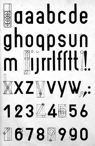
Since the rise of posters and advertising in the 19th century, typeface proportions have been a fertile playground for many adventurous type designers. It is now common for a sans serif typeface to be available in several set-widths, from the most condensed to the very widest. With Garaje, Thomas Huot-Marchand pushes this principle of variation to an extreme with no less than 44 set-widths in total!
Garaje is inspired by the Bauhaus’ rigorous alphabets and the vernacular inscriptions of Spanish garages as observed by Thomas Huot-Marchand. Two worlds that seem at first sight to be diametrically opposed, but that actually share a common goal: the reduction of typographical forms to simple geometric elements. In the case of the Bauhaus, geometrization stemmed from a rejection of tradition and the affirmation of

“Design education is primarily learned by doing,” begins Corrine Gisell’s epilog to her book “Taking a Line for a Walk”, a compilation of graphic design assignments co- edited with Nina Paim and Emilia Bergmark. “[…] Assign- ments, if written down at all, are rarely considered some- thing worth saving. Assignments are thus often overlooked, both as verbal statements and as a resource for how design can be taught.” A GREAT ASSIGN
Is that right, I wonder, when all indications suggest that the economy of preserving and re-circulating the assignment has always been alive and well, even thriving? The art of the assignment has been considered, protected, deconstructed, debated, and celebrated amongst artists, educators, and art theorists for a very long time; one need only to pick up Paper Monument’s “Draw It With Your Eyes Closed” (2012) to get a sense of reverence, even cultism, towards the art assignment, particularly within the last century. But if its intrigue had ever been circumscribed to the art institution
alone, we’ve seen it become something to be consumed by the mainstream as a tool for creativity to be applied in any and every sector. The business of creativity, once solely a Silicon Valley obsession, has become fully integrated into our society as a key force in the design of our modern world. Oblique strategies grace the article pages of Bloomberg and Forbes as strategies to learn from in business, artists perform creativity workshops for trendy companies and their employees, and students from art and design schools are increasingly desirable candidates for roles in the professional managerial class—designer, art director, creative director, creative strategist, the list goes on. Everyone seems to be hungry for an idea of creativity and the frameworks that generate it. The assignment is a commodity shared on Are.na channels, observed Instagram stories, conference talks, and design podcast interviews that cover design methodologies, processes, and studio prompts. It has never been easier to access an assignment and never been easier to be a designer.
The prompt to create a modular alphabet is a classic assignment known to all design students that has circulated not through its brief, but more through its completed results. The Internet is bursting with 26-letter posters made using only circles and squares—or only leaves for units, or pecans, flowers, pasta, gloves, keys, cables, bananas, even aerial views of buildings. The brilliance of the assignment lies in that one need not read a prompt to understand what to do; the beauty of modularity is that it
financial award for the reform of English writing system after Serbian Cyrillic alphabet and its one letter = one voice rule. Never the less, it took 50 years for Serbia to accept and begin implementing this reform, due to high resistance from within. I already mentioned that Karadžić introduced new letters and removed some. This actually means that there is not one Cyrillic alphabet but variation in different languages. Serbian Cyrillic has 30 letters including six completely unique ones because Karadžić imported letter J from Latin and created Љ, Њ, Ћ, Ђ, and Џ as completely new letters. Also, some of Serbian cursive letters completely vary from their counterparts in other Cyrillic alphabets like Bulgarian or Russian (fig. 2). This means that fonts for a small market of Serbia and neighboring countries need to have localized versions of Cyrillic. In early 2000’s this was not visible to major typographic foundries therefore professor Olivera Stojadinović, MA from Faculty of Applied Arts in Belgrade used local student talent to create tipometar.org as a lighthouse for emerging Serbian and regional
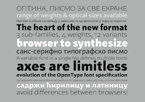
typo-thoughts and works. She and her team managed to create or mentor and publish 15 font families over the years. This was an altruistic endeavor led with a sharp typographic eye and strong desire to contribute to better communication and visual practice not only in Serbia but also in the surrounding countries. Since the typefaces are free to download and use, the project was financially supported by public institutions and lately by Serbian National Internet Domain Registry Foundation (RNIDS). Cyrillic and Latin in Serbian have the same looking letters. The catch is that some of those glyphs are actually just same letters (like vowels and M, T, J, etc.) while others actually represent totally different letters (e. g. H in Latin is N in Cyrillic, or P in Latin is R in Cyrillic). That is highly confusing for foreigners especially since we have two alphabets for the same language used simultaneously. Locals are so used to that so we read without noticing the difference or similarities since we adopt that divide at an early age and live submerged in it our whole lives. But for foreigners this creates a lot of confusion and frustration. In the early 1970s my uncle, a Britton, came to visit his new in-laws in Belgrade, then the capital of Yugoslavia. He was so confused since no one could explain to him what pectopah is even though it was all over the signage around the town. It turns out the signage PECTOPAH (Latin version RESTORAN) meaning and sounding a lot like English counterpart— restaurant and that could be read in Latin even if it was fully in Cyrillic. None of the locals could figure it out since we obviously have our conscious split between two alphabets.
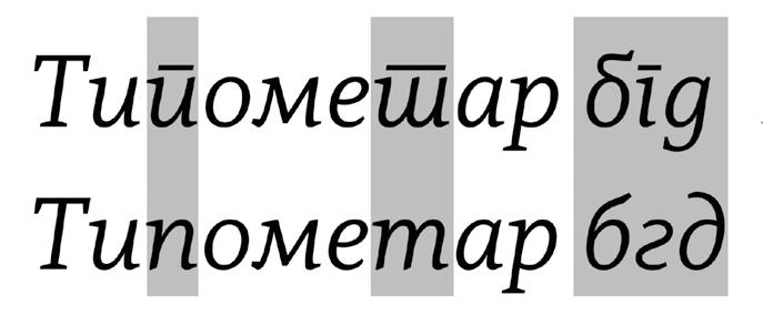
An excellent visual representation of this phenomenon is Balkan Typeface System, created by Croatian design duo Marija Juza and Nikola Đurek in 2012. This now renowned and awarded typographic masterpiece represents equivalent letters from both scripts with a single glyph. For example, one tall letter exists when the form is the same in both scripts, while two short letters are stacked when the form differs between the Latin and Cyrillic. In one version the Cyrillic is on top and in the other it’s the Latin. According to authors this hybrid was intended to decode Latin and Cyrillic but also to demystify, de-politicize, and reconcile them for the sake of education, tolerance and, above all, communication.
In the beginning of this article I mentioned that in Serbia, after elementary school, the usage of alphabet is a matter of personal choice. Yet, by the Serbian Constitution Serbian Cyrillic is the official script, while Latin has the status of script in official use. Confused yet? You were warned that Balkan has more issues than Vogue. Further on, the Republic of Serbia has recently adopted the “Law on the use of the Serbian language in public life and the protection and preservation of the Cyrillic script” colloquially dubbed as a Law on Cyrillic. This means that everything that is of national level and public interest must be written in Cyrillic while personal and corporate communication is open choice. Online and on screen, it is undeniable that Cyrillic is fighting a losing battle; hence the support of RNIDS to Tipometar makes sense. In print, it’s a close call and it hits very close to politics and identity. If you go to any newsstand in
Serbia, you might see that traditional newspapers and magazines are all Cyrillic while the pro-European ones are Latin. Same thing if you go to a supermarket—goods that have a traditional flavor and approach will be designed in Cyrillic while others, especially if they are going to EU markets, would switch to Latin.
To make this article a full circle, I’ll end on the same note as I started. If the purpose of contemporary typography is marking, providing information, and direction then having two alphabets simultaneously makes Serbia a much divided place for locals and confusing place for outsiders. If the quality of typographic landscape reflects the culture of the society, clarity of communication, and accessibility then Serbia would come off as a melting pot of diversity, completely understandable by the introverted locals, and inaccessible to foreigners.
SLANTED MAGAZINE TYPOGRAPHY & DESIGN CULTURE
40 EXPERIMENTAL TYPE 2.0
PUBLISHER
Slanted Publishers UG (haftungsbeschränkt)
Nördliche Uferstraße 4–6
76189 Karlsruhe Germany
T +49 (0) 721 85148268 magazine@slanted.de slanted.de
TEAM
Editor in Chief (V.i.S.d.P.)
Lars Harmsen
Co-Editor
Saehyeen Shin, Helene Hohmann (2.0)
Managing Editor
Julia Kahl
Creative Direction
Lars Harmsen
Art Direction
Saehyeen Shin, Graphic Design 2.0
Helene Hohmann
Final Design
Clara Weinreich, Julia Kahl
SLANTED WEBLOG
Editor in Chief (V.i.S.d.P.)
Julia Kahl
Editors
slanted.de/editors
VIDEO
Video Interviews slanted.de/videos
ISBN 978-3-948440-56-5
ISSN 1867-6510
Frequency 2 × p. a. (Spring / Summer, Autumn / Winter)
Copyright © Slanted Publishers, 2022, 2023
Nördliche Uferstraße 4–6, 76189 Karlsruhe Germany
All rights reserved.
Printing
Stober Medien GmbH
Eggenstein / Germany
stober-medien.de
Cardboard Cover
Maestro Print, 350 g/sm
Paper Inside
Multi Offset UPM, 80 g/sm
Fonts
TimesMonospace (original Times), 1985, 1987, 1989, 1990
Label: Adobe Systems Incorporated / adobe.com
brutally brought to a Monospace by Lars Harmsen
Elastik, 2017
Design: Benoît Bodhuin
Label: bb-bureau / bb-bureau.fr
Suisse Int’l / Neue, 2011
Design: Swiss Typefaces Design Team
Label: Swiss Typefaces / swisstypefaces.com
Subscribe to Slanted Magazine and support what we do. Magazines via subscriptions are at a reduced rate and get shipped for free within Germany directly at release. slanted.de/subscription
2-Issues-Subscription
€ 34.– + shipping
4-Issues-Subscription
€ 66.– + shipping
Student Subscription
2 issues for € 30.– + shipping
Gift Subscription
2 issues wrapped as present for € 35.– + shipping
2-Issues-Subscritpion + related Special Editions
2 issues + 2 special editions for € 66.– + shipping
4-Issues-Subscritpion + related Special Editions
4 issues + 4 special editions + free issue for € 128.– + shipping
SALES AND DISTRIBUTION
Slanted Magazine can be purchased online, in selected bookstores, concept stores, and galleries worldwide. If you own a shop and would like to stock Slanted Magazine or other publications from us, please get in touch:
Contact / Distribution DE
Julia Klose, T +49 (0) 721 85148268 julia.klose@slanted.de
Distribution UK
Antenne Books / antennebooks.com
Distribution US
Small Changes / smallchanges.com
Distribution EU & WORLD
Idea Books / ideabooks.nl
Slanted Shop slanted.de/shop
Retail & Distribution slanted.de/distribution
ADVERTISING
We offer a wide range of advertising possibilities online and in print. For advertising inquiries please get in touch with:
Julia Kahl (advertising management / sales) +49 (0) 721 851 482 68, julia.kahl@slanted.de slanted.de/publisher/advertising
ADC of Europe
ADC Germany
Annual Multimedia
Berliner Type
DDC
Designpreis der BRD
European Design Awards
Faces of Design Awards
iF communication design award
German Design Award
Laus Awards
Lead Awards (Weblog des Jahres & Visual Leader)
red dot communication design awards
Type Directors Club NY
Tokyo Type Directors Club
Werkbund Label
We would like to express our gratitude to everyone who participated in our call for submissions online in spring 2022 for the initial magazine, submitting over 1,400 experimental type works. The selection process was challenging, and when we decided to republish the issue with additional works, we ran another call for submissions and discovered even more fascinating projects. We received over 650 submissions, and 75 of them found a new place in the new edition. Regrettably, due to space limitations, we couldn’t include every work. We hope that those who didn’t make it into the magazine will have another opportunity in the future. Congratulations to the more than 320 participants from around the world whose work has been featured here!
A very big thank you to Saehyeen Shin, who oversaw, edited, designed, and so wonderfully understood the creative direction Lars gave this issue. Your friendly nature, ambition, and diligence have led to this extraordinary result. We miss you and your Asian cooking skills very much :)
A thousand thanks also to Helene Hohmann, who managed this new edition with the call for submissions and was in contact with all the new participants.
We would also like to thank Tom Barbereau for his text support on all the intro chapters and editorial.
A big thanks to Benoît Bodhuin for making such great typefaces, Elastik rocks!
Thanks to our long-standing printing partners at Stober Medien near Karlsruhe for the great production of the magazine!
Last but not least: A special thanks to our supporters and fans out there. You help a lot, sharing our work to the world, making Slanted a wonderful community of design interested people. We love you! Keep experimenting!
The publisher assumes no responsibility for the accuracy of all information. Publisher and editor assume that material that was made available for publishing, is free of third party rights. Reproduction and storage require the permission of the publisher. Photos and texts are welcome, but there is no liability. Signed contributions do not necessarily represent the opinion of the publisher or the editor.
The German National Library lists this publication in the German National Bibliography; detailed bibliographic data is available on the Internet at dnb.d-nb.de.