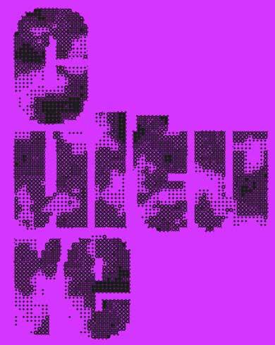
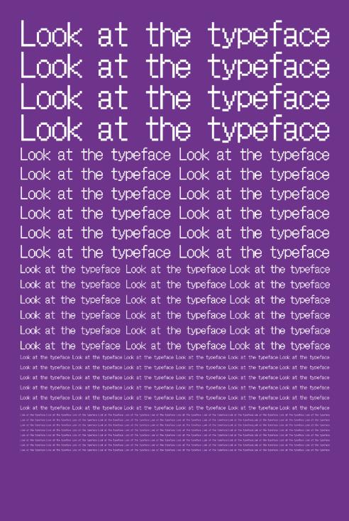
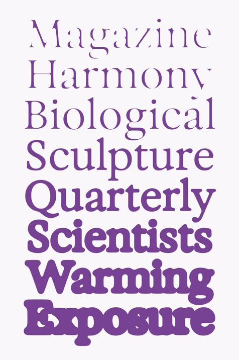
type


slanted 40 experimental
experimental type TACTILE REALISM ANTI-READER-FRIENDLY DELIBERATE IMPERFECTION & SERENDIPITY COINCIDENCE & INTENTION EVER-CHANGING CUTTING EDGE OFF THE SCREEN PUSH TO THE LIMITS

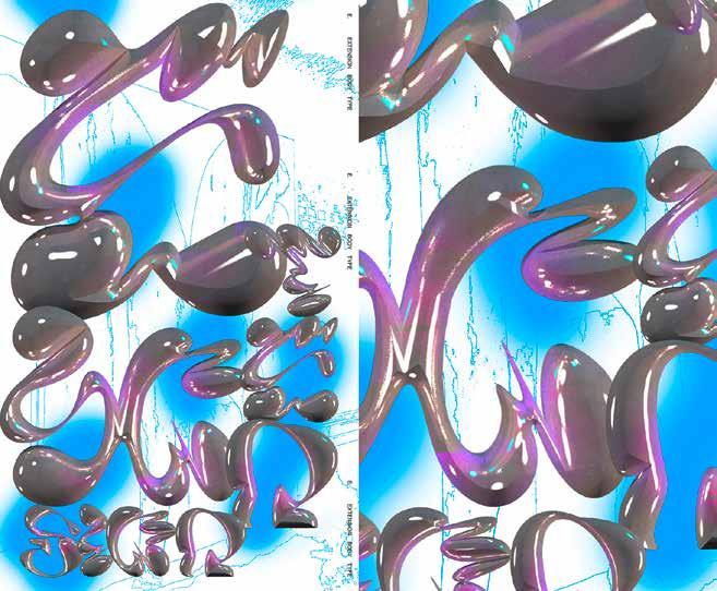
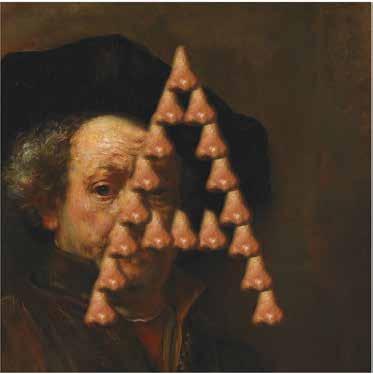
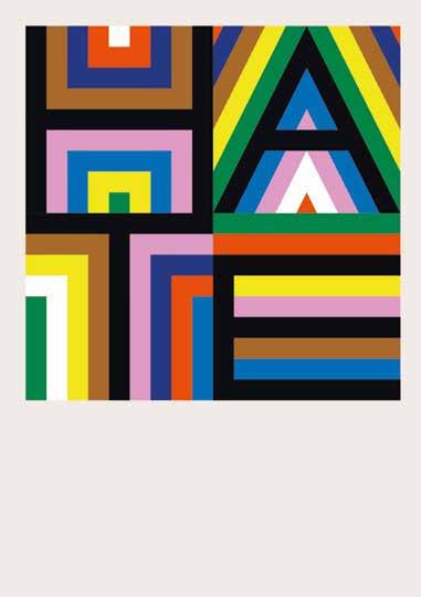
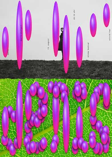
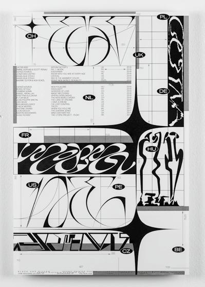
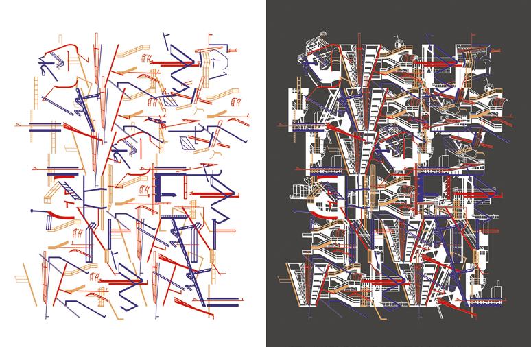
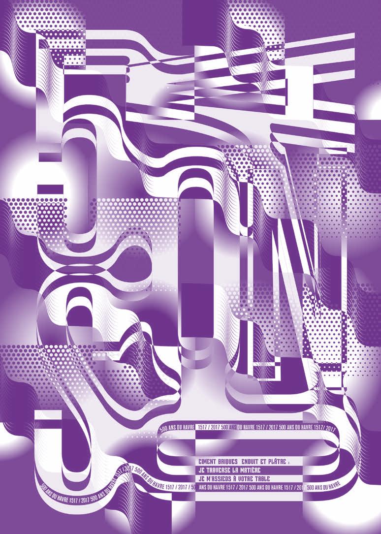
Slanted 40—Experimental Type0 1 001——Jianping He——DEU—— LI BIN YUAN SOLO EXHIBITION Poster for Cinema Paradiso-Solo exhibition of Li Bin Yuan at
Pingshan Art Museum, Shengzhen, China.
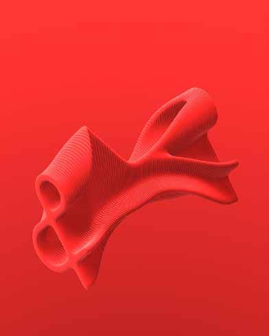
TACTILE REALISM
The ability to touch typefaces is not a new concept. Egyptian hieroglyphs first appeared around 3000 BC, first painted onto plaster, then carved as relief. Until the development of paper, writing was done on stone. A few thousand years later, typography moved from print to the digital world—today’s
typography is mostly conceived via two-dimensional screens. A flattened world.
For those who love mountains, flatland is boring. However, like Gutenberg and generations of typeface designers who worked with casts, lead and physically shaped type, some artists return to the literal heft of physical letters, add ing material properties to the typeface and give it a tactile character. “Lifting” the typography, which was always “laying” on the print media or on the screen seems to bring it alive “in front of us”—perhaps the most visually stimulating typography trend today. In doing so, the range of roles and functions expanded from rational communication to visual expression methods, revealing motion and emotion.
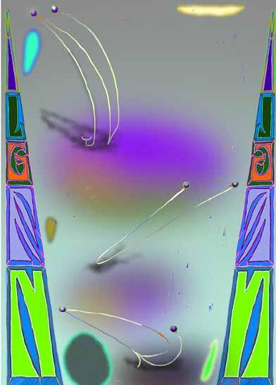
Slanted 40—Experimental Type0 2
1
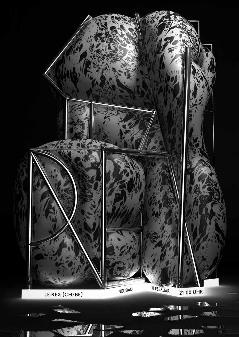
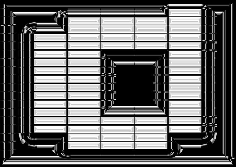
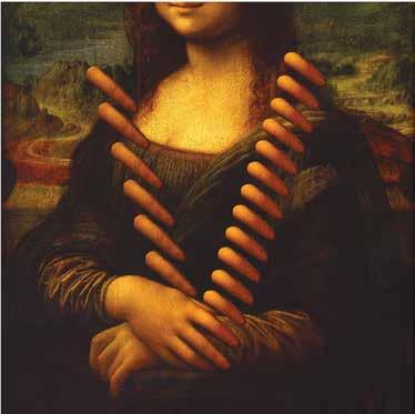
002——Studio WØT——NLD——LE REX
Poster for the brass band Le Rex for a design framework of Neubad. The idea was to create an abstract brass instrument forming the name of the band. The bulging bag was an attempt to visualize the sound of a brass instrument.
Slanted 40—Experimental Type0 3
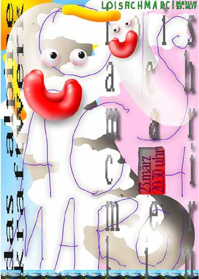
Stange
Experimental type poster for a design lecture. The task was to develop an experimental type with uncommon things or items nearby. By accident the designer dropped washing powder on the floor and it showed some interesting forms. Following that he created a typeface with a measuring cup out of washing powder and arranged it on paper. To highlight the structure he set up two lights and converted the colors of the image in just black & white (threshold).
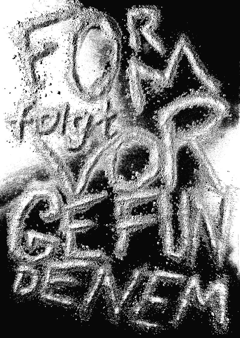
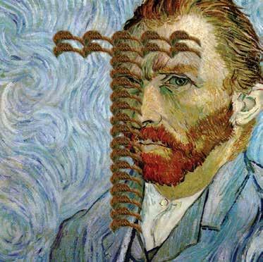
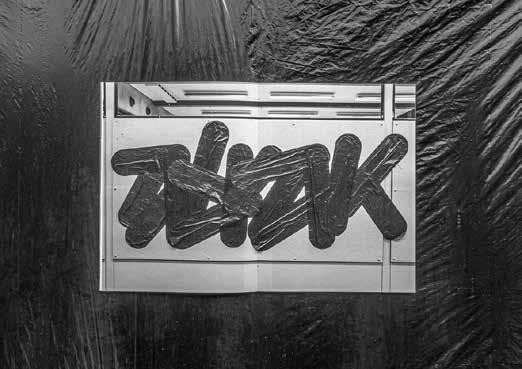
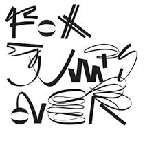
Slanted 40—Experimental Type0 8 008——Tim
——DEU——FORM FOLGT VORGEFUNDENEM
typography created in After Effects and Photoshop. All were made by duplicating and distorting the same word over and over.
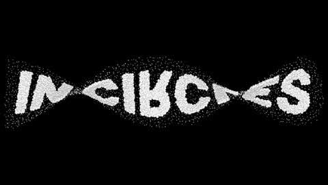
Slanted 40—Experimental Type0 9 009—Jen
Dodaro
—USA—IN CIRCLES Experimental
Slanted 40—Experimental Type1 0 010——Daniel Ludwig DEU——CLUMPED Playful attempt to create a digital sculpture with a focus on the material.
University— DEU— TYPOGRAPHIC CYBORGS
Students at Creative Coding class at Communication Design at Hof University were creating Typographic Cyborgs by remixing a 3D scan of themselves and a selected letter into a hybrid between human and font. In different variants the letter becomes part of their body, they are becoming a part of the letter or the letter will be the environment, architecture, or furniture.
Slanted 40—Experimental Type 11 011—Hof
Slanted 40—Experimental Type1 4 015—Leonie
Waidelich
—DEU—UNTITLED
Approach to work with type to let it become part of the image or object and let it contribute to the character of the image instead of hiding it in the corners.
014—Julia Fuchs—DEU—GAP D Typography format, which solely explores
the
aesthetic
value of a black and white gradient on the letter
D.
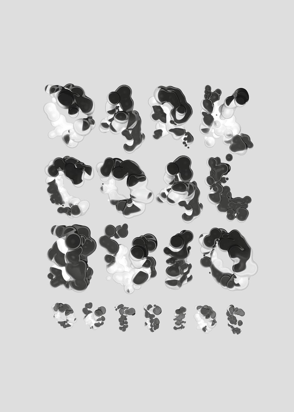
Slanted 40—Experimental Type1 5 D C B O U T S I D E U I O O A L A R K CHARCOAL 1.0 ISOMETRICSFRONT VIEW Destruction has always meant the change of an organised object into a relatively disorganised one, or the annihilation of the features which made it what it once was. Artistic creation has always meant a new order, the bringing into being something new, the translation of knowledge or idea into a new form. MIN AIR SPEED MAX AIR SPEED ELEMENTS: 120 SEED: 0 MAX AIR ACCELERATION MAX AIR ANGULAR VELOCITY SCALE RANDOM * 016——Sass Scimiro Studio——NLD——CHARCOAL Deformation and destruction were used as tools of creation. Charcoal is a 3D font where the number of bubbles, they size, and their position can be changed, thus the number of deformations is seemingly endless.
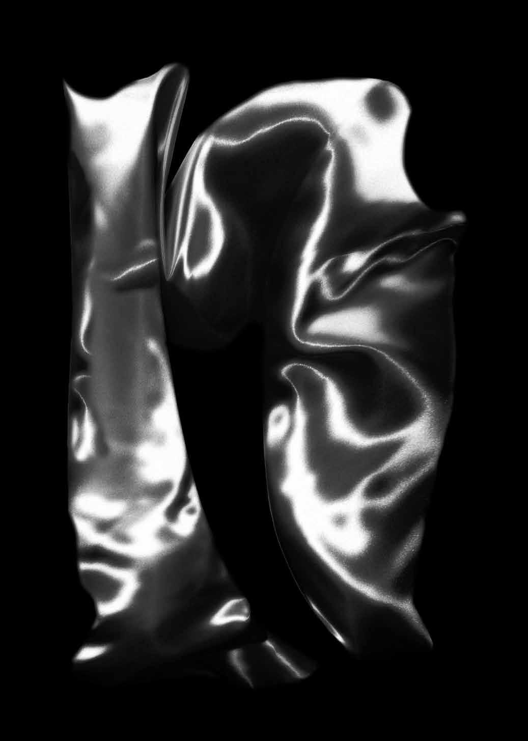
Slanted 40—Experimental Type1 6 017——Jonathan Körner——DEU——FABRIC N
The letter was made for a zine called alphabet of home office, with the goal was to create a letter with an experimental approach. Exploration of the material of fabrics to create a form which is influenced by the material itself.
Sleiman
Excerpt of a poster series about insomnia from the bookazine SOMNIA about sleep disorders. This poster clarifies the feeling of being unable to move, Feeling powerless, when you have a sleeping paralysis. The letters want to move, but the format won’t let them.
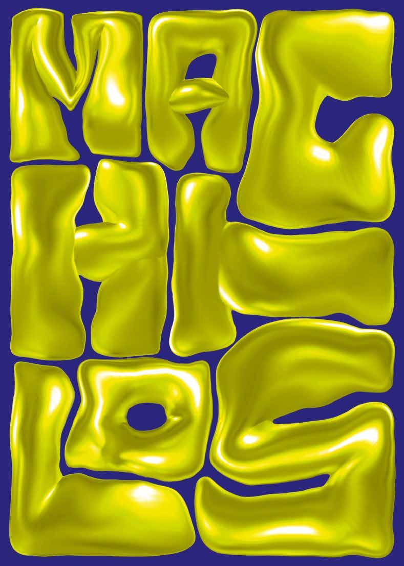
Slanted 40—Experimental Type 71 018——Nadine
——DEU——MACHLOS
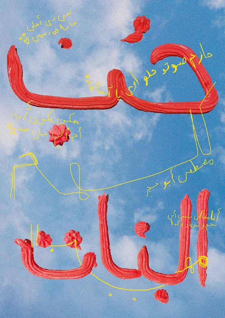
Literal description of the artist’s emotional states when using social media, specifically Instagram. “Ironically, once this piece was finished, the first thing I did was uploading it to Instagram and waiting for likes, comments and follows to come in. Still caught in the loop.”
“Using virtual reality tools as a means to create typographic work takes quite some time and effort to get used to. It feels very different to me than any other tool I previously used to create type. This is probably because working in VR is a rather new experience to me which I still have to familiarize myself with.”
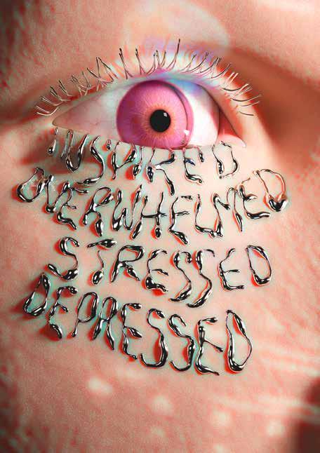
Slanted 40—Experimental Type 62 028——Vincent Wagner AUT——DOPAMINE CYCLE
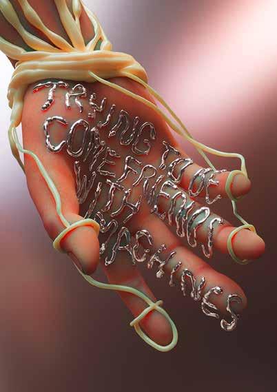
029——Vincent Wagner——AUT——TRYING TO BECOME FRIENDS WITH MACHINES
Veining is a design fiction comprised of a 3D text surgically implanted, integrated into the body’s circulatory system, and enhanced via a UV injection of a fluorescent liquid to create a living neon sign. In the Veining project the artist invites the viewer to dream about an alternative future for type—one where text is not confined to a two dimensional existence, viewed merely as an external record of human culture.
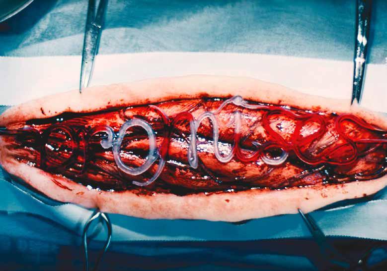
“Instead, I imagine type as an integrated part of ourselves and the living systems that surround us. These typographic transgressions fuse letters to animate, changeable and embodied systems in ways that give words a whole new communicative power.”
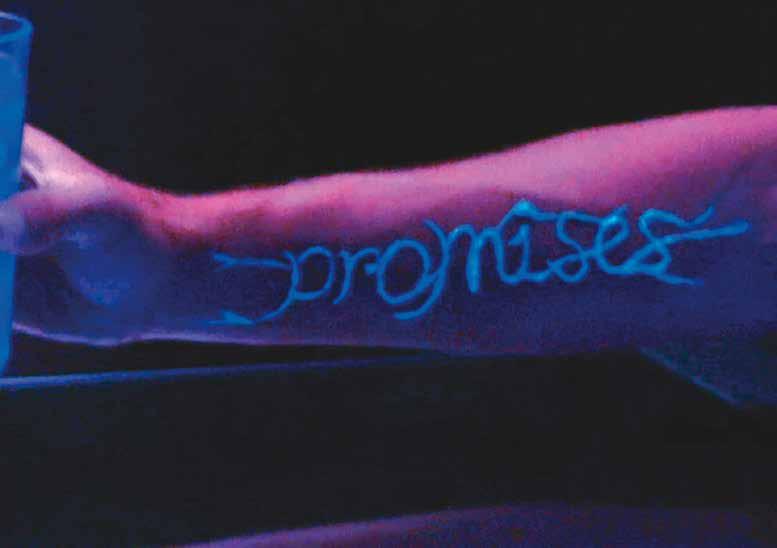
Slanted 40—Experimental Type 72 030——Oded Ezer——ISR——VEINING
Slanted 40—Experimental Type 82
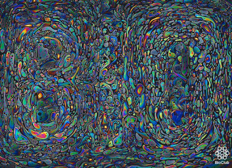
031—Miki Kudo—JPN—THE ORIGIN OF LIFE
Visual symbol made by programming and graphic design. The three types of BIO typography are inspired by the fact that a protocell, the origin of life, has a simple lipid membrane structure. Planning: SHA inc.. Art Direction: Kazushige Takebayashi. Design: Natsuki Isa, Shuhei Yokota. Visual Technologist: Miki Kudo. Programing: Junichiro Horikawa, (Orange Jellies),SHoya Dozono (Qosmo, Inc.), Ryosuke Nakajima (Qosmo, Inc.).
DARK SIDE
THE MOON
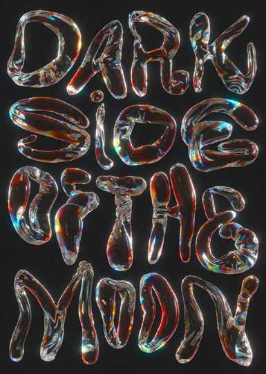
Slanted 40—Experimental Type 92 032—Marcel Kohler— DEU—
OF
Typographic reinterpretation of the iconic Pink Floyd cover.
038——Daniel Brokstad——USA——SPACE TO CREATE
A typographic series for Foundry 852–Agency: Ogilvy Hong Kong. Creative Direction: Michele Salati. Design: Daniel Brokstad. 3D Design: Edu Torres.
039——Haocheng Zhang——CHN——BODY EXPERIMENTAL TYPE
Breaking down traditional Western-type design constructs, the project explores types inspired by the human form. Choreography and performance were used to perceive how the type changes and how move ments convey the gravity and type emotion.
Slanted 40—Experimental Type 23

Slanted 40—Experimental Type3 3 040——Studio VIE——AUT—— TANZQUARTIER WIEN REDESIGN CAMPAIGN 2021 / 22 Redesigned of the campaign’s triptych. It’s now composed of a portrait, a 3D rendering and a combination of the two depicting the initials T, Q, and W.
Poster for the works exhibited by graduate students of Graphic Design under the direc tion of Koichi Sato at Tama Art University.
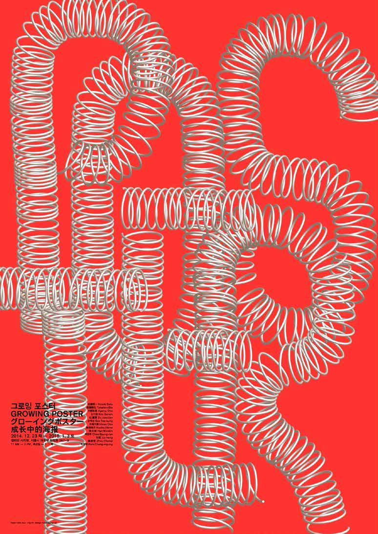
Slanted 40—Experimental Type 43 041—Byungrok Chae—KOR—GROWING POSTER
Slanted 40—Experimental Type 53 042—Mahynour El Sawa EGY—GIRLS LOVE Poster for the Egyptian movie Girls Love
ANTI READER FRIENDLY
Legibility is the ease with which a reader can decode symbols. Readability is the ease with which a reader can follow and understand words, sentences, and paragraphs. While legibility refers to the visual clarity of individual symbols, readability is more about their arrangement (or even the choice of individual words in a sentence). So the theory goes …
But who tells what is legible? Who sets the standard for what is readable? Presumably, legibility is a question of time.
With a little luck one might find someone who can still read Sütterlin (the historical form of German handwriting that evolved alongside German blackletter—most notably Fraktur— typefaces).
There is a magic in transforming letters to an illegible degree—to cause them to lose function in the sense of read ability. It is a liberating process. Thereby, the function of “letters” is redefined. Much like Marcel Duchamp, who created “Readymades” (bicycle wheel 1913; Bottle Rack, 1914; Fountain, 1917), redefined the meaning of art. He looked for something that was neither art nor anti-art, something that was characterized by indifference to all aesthetic categories. “Anti-Reader-Friendly typography” becomes the “readymade” of the type world—and by this “… a form of denying the possi bility of defining art.”
Slanted 40—Experimental Type4 4
058——Dina Issayeva——RUS——GO FOR QUALITY EXHIBITION DESIGN CONCEPT
The identity is based on a display font Raspustilsya Sans, which means unraveling threads in Russian. The letterforms resemble holes in fabric, like those that appear in synthetic fabrics after they have been worn more than a few times. The font is built by cutting elements (microfibers) from the grid (synthetic fabric).

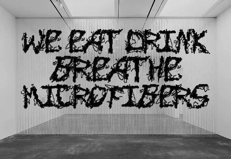
Slanted 40—Experimental Type 94
AUT—EINERSEITS
Compositionoftwonotationlevelscontaininga fragmentofatelephonecalltimelistplusa contextualizationofalogbook,bothdealingwith temporaldata,overlappingtypographically andvisually.Thecollagesymbolizestheflowing intertwiningofthoughtsandtheprocessual characterofartprojects.
Slanted 40—Experimental Type 05 059—Darja Shatalova—
(23M + 3M)
060—Les Mecanes—ESP—THE PROCESSING REVOLT
Result of a joint research in which the studio’s two graphic fields, mechanical layout such as typography and drawing based on creative programming, converge. It materializes when drawing with processing code and write with Revolta font.
The execution of the project using a Axidraw provides a subtle look full of elements of surprise, errors, and chaos created at that moment on the work that is being built as it is evolving.
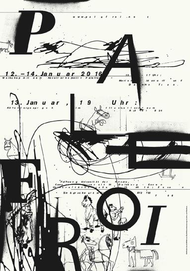
061—Thomas Kühnen—DEU— PALEFROI—SILKSCREEN WORKSHOP! Announcing poster for a screen printing workshop in collaboration with the artists collective Palefroi of Marion Jdanoff and Damien Tran.
Slanted 40—Experimental Type 15
ISR—ART VS. DESIGN
Slanted 40—Experimental Type9 8 127—Oded Ezer—
This work addresses the complex interaction between imagery and typography. How do we handle reading without reading, or deal with typography without typography?
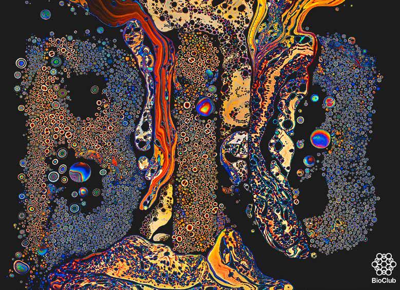
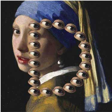
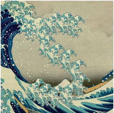
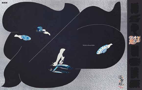
128—Miki Kudo—JPN—THE HIDDEN ESSENCE
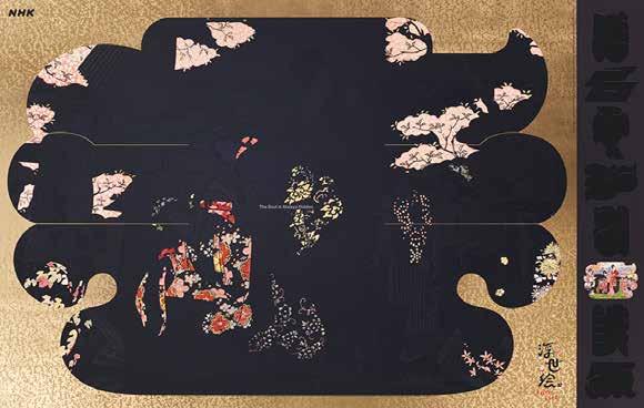
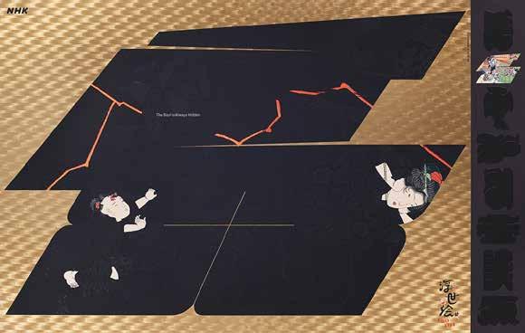
The show interprets Ukiyo-e as photographs documenting the everyday lives of Edo commoners, rather than works of art. These posters have succeeded in incorporating the essence of the show, by looking at both the details and the entirety of the print, that there is so much more to Ukiyo-e than meets the eye.
Slanted 40—Experimental Type9 9
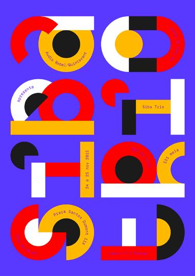
Slanted 40—Experimental Type1 18 163—In-House International—ESP—HEY YOU Fun experiment playing around with depth and isometrics. Nudging the words close to abstraction. 165—In-House International ESP—BURN YOUR IDOL Squares, circles, and triangles. Burn them all. 162—Thiago Lacaz—BRA—SIBA TRIO Poster for the concert of the Brazilian folk-rock singer and songwriter Siba at Casa da Gávea, Rio de Janeiro. Client: Quintavant / Audio Rebel bolder and more confident artist. 164——LaTigre ITA——LOVE AND HATE
Slanted 40—Experimental Type1 19 Disegno del Compasso d Oro tridimensionale con Alberto Rosselli su disegno di Albe Steiner 1954 K 1340 1964 MOD. 1102 1956 CONTROSOFFITTO E ARIANTE 1979 DONEY 1962 GRILLO 1967 166——LaTigre——ITA——COMPASSO D’ORO MARCO ZANUSO CELEBRATION POSTER The poster aims to celebrate the designer Marco Zanuso and his role within the field of design and architecture by transforming the letters of the name Zanuso in real objects. The simplicity of its shapes are reminiscent of components, molds, of part of an industrial production process.
Slanted 40—Experimental Type1 22 168——Jeonghyo Lee, Everyday Practice——KOR——SULWHASOO CULTURE PROJECT Video works, focusing on the project’s slogan We Create Culture and the values culture, people, tradition / heritance.
This is a combination of two simple ideas. One idea is using one letter to write a word by morphing through all required letters. Because you only see one letter at a time, you have to pay attention. Secondly, it imprints the transformation into the third dimension. It basi cally lets the morphing letter leave a trace in space.
Slanted 40—Experimental Type1 23 169——Sam Jay——DEU——Lettermorphosis
CUTTING EDGE
Technology changes always were a turning point in the history of typography. Today’s “perfection,” diversity, and practicality of typefaces is unthinkable without the power of personal computers. Ironically though, we are attracted to ‘incomplete’ typefaces made by “state-of-the-art” technologies such as artificial intelligence (AI). The “experimental stage” of AI in typography produces incomplete and even sloppy results, they cause excitement and expectation.
As long as the experiment of technologies continues, the designer’s experiment will never be complete. 6
Slanted 40—Experimental Type1 32
187—Anatoly Grashchenko RUS—CODED TYPOGRAPHY Most of these videos are the result of a collaboration with Type Today. In series of works the designer tried to unfold the potential of creative coding in type, animation, and interactivity.
This Project presents a journey through an imaginary take on the Mausoleum in Chandigarh, Le Corbusier’s modernist city in Northern India. A cross-sectional perspective is used to show the changing environments, revealing the building and the characters navigating the complex con crete structure.
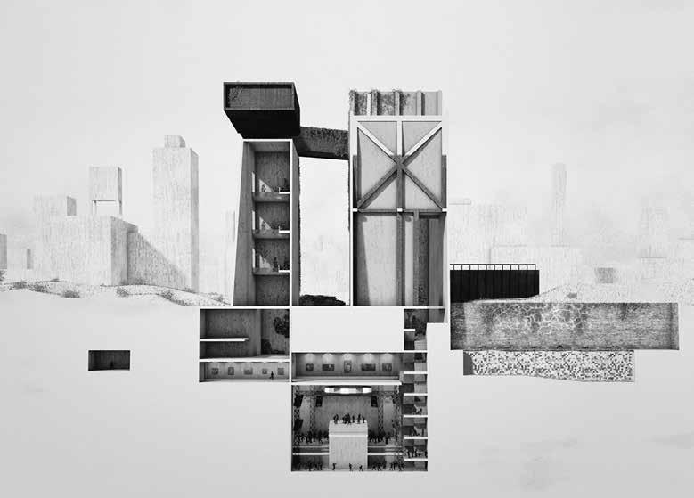
Slanted 40—Experimental Type1 44 200——Optical Arts——GBR——U-UTOPIA
201——Optical Arts——GBR——
LETTER
A-Aerial allows viewers to experience an immersive journey deep in the heart of an imposing city. The viewer is lost in the scale of the urban chaos, staring upwards at the never ending lines. Then, just for a fleeting second, the buildings align to form the letter
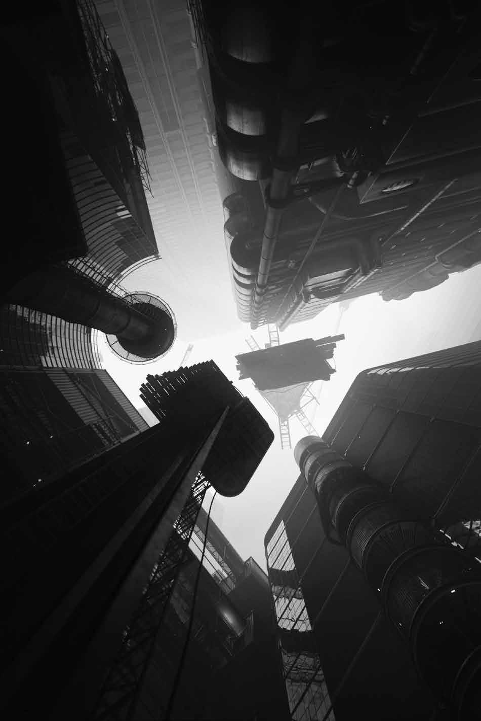
Slanted 40—Experimental Type1 45
A
A
After learning to do color prints from negatives in general, the designer did a lot of experiments in the darkroom and then eventually started to enjoy exploring subtractive color mixing on photo paper. Creating different tools, especially cutting stencils, as well as abstracting shapes, reminded her of street art. Finally Skopnik found a way of connecting different elements of graffiti with her darkroom work.
Slanted 40—Experimental Type1 66 227——Julia Skopnik——DEU——PHOTOGRAFF
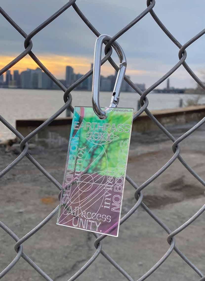
228——Sibylle Hornung——DEU——EARTHPASS 20XX
This luminescent keychain is made of laser-cut acrylic and reminds of official identity documents. Earthpass 20XX believes that no one should be excluded by its gender, race, ability, or anything other, and expects these values from its holders. NO GENDERS. NO BORDERS. As the world seems filled with horrific news every day, this seems like a far-away utopia of a speculative, yet hopeful future. The team of Earthpass 20XX donates its profits to Ukrainian Refugee Aid and Free Palestine. A project by Sibylle Hornung In collaboration with Typeworld.xyz.
Slanted 40—Experimental Type1 67
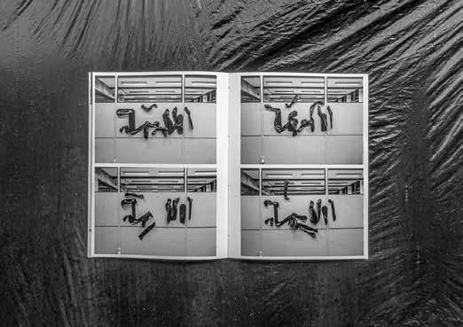
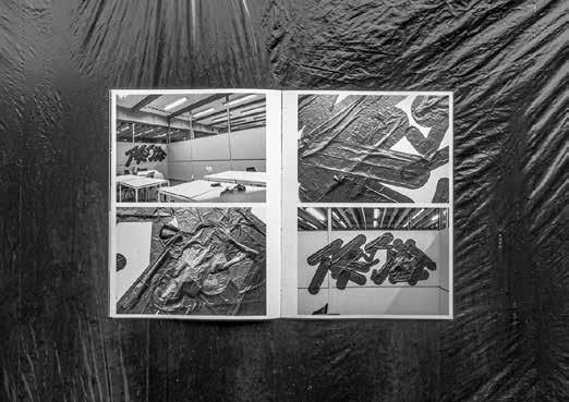
—HUN—TRASH BAG AESTHETICS
The aim of Trash Bag Aesthetics was to experiment with different materials and to create letterforms out of them. Using its electrostatic properties it was possible to stick the pieces on the walls (without any glue or pins) and turn them into typographic and non-typographic graffiti in the room. The whole process was very exciting and it led to a wide range of compositions which were documented in a book made in two copies.
Slanted 40—Experimental Type1 68 229—Bendegúz Batke
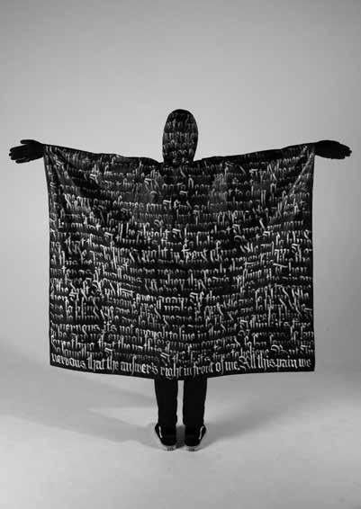
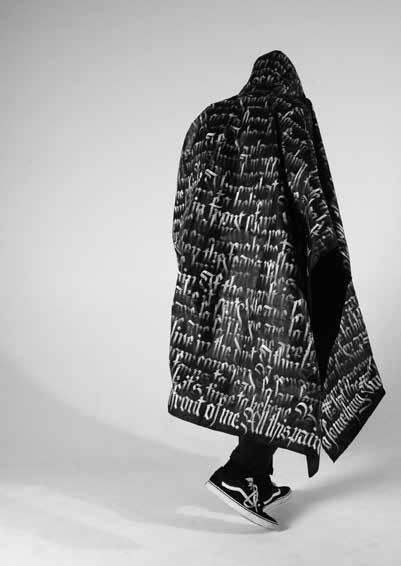
230—Ole Freytag—DEU—I’M NERVOUS
“IwritebecauseI’mnervous.Thelastoneandahalfyearshavegonebytooquickand slowsimultaneously.Anisolatedlifeinahailofinformation—everydayaccompanied bynewbadnews.IntheprocessofwritingIhavefoundpeaceinthesetimes.Thetext mirrorsmyownfeelingsconcerningthepandemic.Feelingoverwhelmed,personalloss, longingforafutureandthepast.Theuniversecarryingondespiteourinsignificance inthechaos.Thewritingisreachinguptomyneck—I’mcamouflagingmyselfinitand bringmynervousnesstotheoutside.Inwriting,Ihavefoundaplacewheremynervousness dissolves.Thewritingitselfhasbecomemyoutcry—apeaceofmindinhectictimes.”
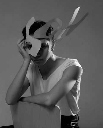
231——Nadine Ouellet——SGP——TYPOGRAPHIC MISE-EN-SCÈNE
The typeface in this photographic series has been generated by extracting forms from the famous Jean Dubuffet’s Hourloupe pictorial works. Named Type Brut it was created by Nadine during an interdisciplinary residency at Dubuffet’s former atelier in France in June 2019. The headdresses and masks were designed subsequently as a means to experiment with the letterforms—in space and in relationship to the body. They were imagined, not as fashion objects, but as visual elements of.
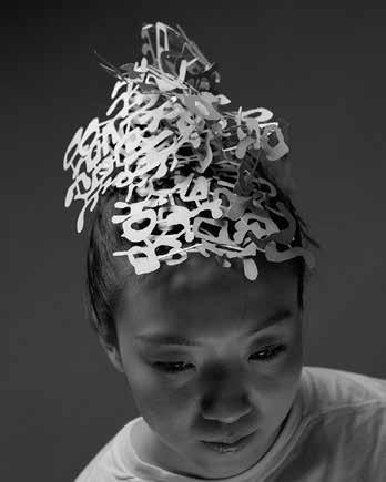
Slanted 40—Experimental Type1 69
Lacaz——BRA——
A waking dream
“To my child’s eyes, which had seen nothing else, Shanghai was a waking dream where everything I could imagine had already been taken to its extreme.”
— J.G. Ballard, The Kindness of Women Poster made for the invi tational exhibition Shanghai Design 10 × 10.
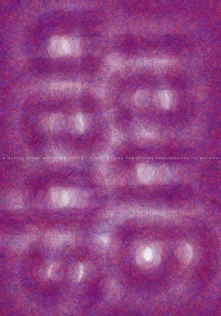
Slanted 40—Experimental Type1 78 242——Thiago
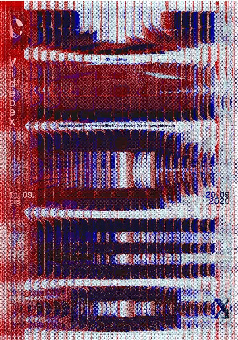
Slanted 40—Experimental Type1 79 243——Martin Woodtli—— CHE——VIDEOEX 2020
Slanted 40—Experimental Type1 96 270——Mark Bohle, Raffael Kormann ESP——TONIGHT AT MERLIN A series of 80 posters developed for event location Merlin in Stuttgart.
We Are Family is an interactive, typographic installation that make use of unsettling images and fragments from found online political, brutal, pornographic, and other videos to create a new kind of typographic visual language.

Slanted 40—Experimental Type1 97 271——Oded Ezer——ISR——WE ARE FAMILY
Yagmourian
USA——ECLECTIC Experiment borrowing from calligraphy and typography practices, forcing indi viduality in each letter form while trying to create a sense of wholeness.

273——Panama Papers Office——FRA——ENTERCOURSE OF THE NEW AGE
The new visual identity of the art publisher Entercourse Of The New Age. The graphic system fits itself in a modu lar logic, playing with architectonic figures, in response to fundamental operations mobilized by the publisher: reproduction, exhibition-space, and reinterpretation of their uses.


274——Xenia Wahl——DEU——RORSCHACH REGULAR Rorschach Regular is loud and as soon as one uses the font, a pattern appears for the eye which effect reminds of the psychological Rorschach procedure. Similar according to that the single letters mixed together are mirroring or even completing themselves, so one might recognize a whole new picture in it depending on the order of the letters.
Slanted 40—Experimental Type1 98 272——Gaston
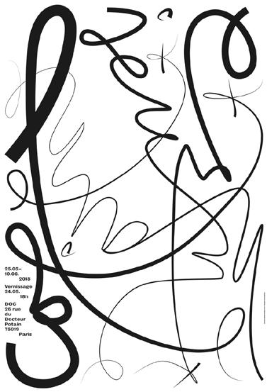
275——Toan Vu-Huu——FRA——DOC!
Exhibition posters for the artist-run space DOC!. As it is a voluntary work, the designer gets total freedom to propose whatever he feels is resonating the artist’s show. This Carte blanche frame gives him the opportunity to experiment without constraint writing and reading. Typography is the main element and can transmit a message even without being read.
Slanted 40—Experimental Type1 99
EXHIBITION POSTERS
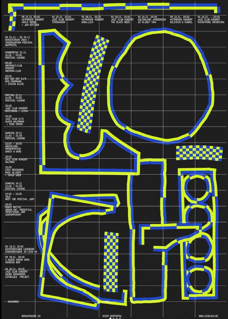
276——Studio Lennarts & De Bruijn——NLD——MONTHLY POSTER FOR LOCH
“We’ve developed a new concept ensuring LOCH to stand out more, but also assuring ourselves of crazy creative freedom to experiment and explore. The logo was already there, which is based on the building that LOCH resides in. In that exact shape you will find a bunch of tiny windows, so we wanted to give the poster the same level of LOCHness by implementing that same grid.”
Slanted 40—Experimental Type2 00
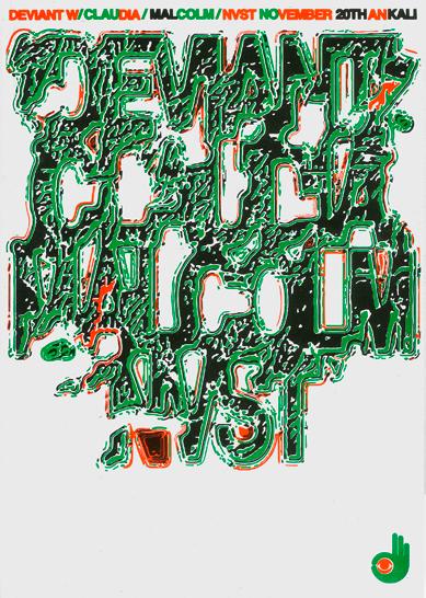
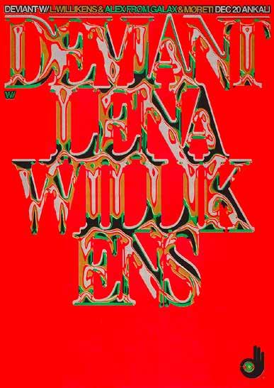
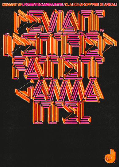
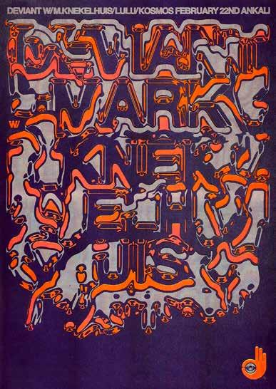
Slanted 40—Experimental Type2 01 277——Jiri Mocek——CZE——DEVIANT Series of posters for a regular club night in Ankali club, Prague. Each poster contains bespoke typography or lettering connected with the style of selected musicians or DJs from the line up. All printed matter are printed via a risograph printing machine and then scanned and used for digital space.
Slanted 40—Experimental Type2 02
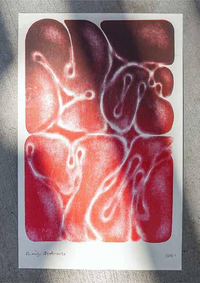
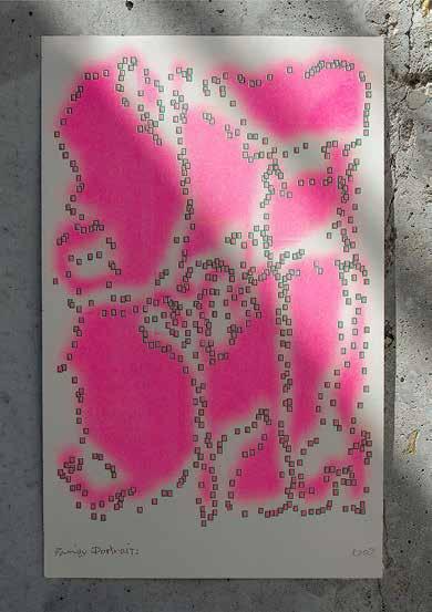
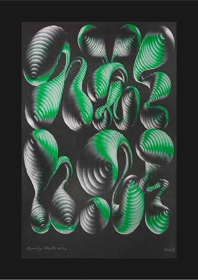
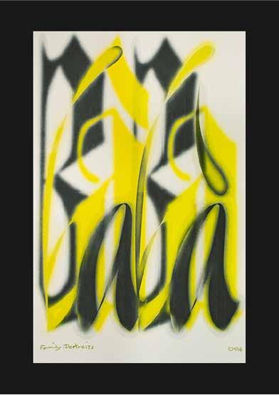
278——Eager Zhang——SWE——FAMILY PORTRAITS
Series of risograph prints with experimental typographic graphics, to explore the designer’s identity as part of the Chinese diaspora, her personal memories and how the family issue can project onto a queer body. The texts are sound of the words in Chinese: mama (mom), shushu (step father), baba (father), laolao( grandmother), and were interpreted through a exploratory method of typeface making and texture manipulation.
279——Sibylle Hagmann——USA——DIFFERENT, PLEASE GET IN TOUCH
In this work, the designer capitalizes on connotational power of letterforms to create various readings of a type-image that conveys altered visual messages. The objective is to make the viewer pause, disrupt expectations, and to spark ambivalence. She utilizes and experiments with found text fragments that are derived from the everyday.
Slanted 40—Experimental Type2 03
Slager——NLD——INDUSTRIAL TEXTURES
Isolating letter shapes from photographs was the first phase. These letters together form a text image. It shows resemblance to the structure of the industrial architecture it is derived from. Image becomes text. Readability is secondary. In the next phase, the industrial textures from the collages are translated into a typeface. In different layers, it is possible to vary and deepen the textures and depth in the textures.
Slanted 40—Experimental Type2 04 280——Peter
Slanted 40—Experimental Type2 05 281——YEOHYUN AHN——USA—— TYPE PORTRAIT: HANGUL ALPHABET This project investigates bilingual experiences between English and Korean as experiential typographic forms. Hangul Alphabet is an English typeface designed using Korean consonants and vowels for the translanguaging experience created by Taekyoem Lee. Hangul Alphabet explores generative self-portrait photographs. It portrays the typographer’s linguistic and typographic identity using the typeface as a Korean-American.
METHOD
Slanted 40—Experimental Type2 26
“Persistence without insight will achieve the same result.”The
Armorer
in boba Fett. Discussions of the Internet as a laboratory or
World Wide
Lab (Schmidgen et al. 2004)assume a networked digital space housing a variety ofpublicly accessible experiments. Actually, the results ofextensive
creative
experiments with fonts and typographyare there to be found, especially in the social media.
Dr. Nicholas Qyll TYPO
GRAPHIC EXPERI MENTS: A
BETWEEN RESEARCH AND PRACTICE
If you enter the hashtag #experimentaltype and peruse the search results, you will see all kinds of things involving typeface. Besides conventional typographic design, the results include e. g. randomly observed and photographed ‘finds’—phenomena drawn from everyday life and presenting unconventional manifestations of type: rusted char acters on a mailbox, weathered numbers on a curb, or peeling letters on signs. These examples present indisputable aesthetic effects that can serve as inspiration for designers. Strictly speaking, however, they cannot be characterized as experimental typography or the results of typographic experiments. The quality of search results improves, incidentally, if one enters the hashtag #typeexperiments. Still, when it comes to fonts and typography overall, the term ‘experimental’ is used extremely arbitrarily— predominantly with a connotation of ‘unconventional.’
At this point, the following question comes to the fore: From a design-scientific point of view, what is meant by a typographic experiment in the actual sense of the term, and by experimental typography as its result? The aim of this text is to approach an answer to this question in a systematizing way. It will be referred to typographic experiments as creative explorations of, and test series with, type-related forms on a systematic basis and focusing particularly on acquiring knowledge through the result and the process itself. What this text factors out are experiments in the perceptual psychology of type, putatively unconventional standard typography and, specifically, merely ‘found’ examples of type that have not arisen through an experimental process. The systematizing approach proposed here seeks to provide clarifying information about specifically what an typographic experiment means, the course it should take in the ideal case and the parameters that should be taken into account. Furthermore this text seeks to create an awareness that the experimental approach to typography— systematically applied—influences the arc of a designer’s skill, creativity, and person ality while contributing to discourse in the studies of design.
WHAT ARE TYPOGRAPHIC EXPERIMENTS?
In science, an experiment is a method used to investigate facts and to document, uncover or demonstrate hypotheses and theories. Etymologically, then (Lat. experimentum: ‘the thing experienced; trial, proof, test, sample’), this involves an augmentation of the experience by systematically altering variables within a constant set-up, with results that are reproducible under the same conditions.
At its core, a design experiment can also be understood as a systematic approach, but it differs from a scientific experiment (see also Lindauer & Müller, 2015). This difference becomes plausible when one considers the concept of knowledge in design— especially when one understands that doing and thinking coincide in the act of design. Design research assumes that designers have their own type of knowledge and use their own methods to acquire knowledge about artifacts and their design. It refers to
Slanted 40—Experimental Type2 27
CHOOSE TYPEFACE FIRST
And choose it before you write a single word. The reason? A good typeface can guide and inspire. A modern sans serif pushes a writer toward modern words. An elegant font craves elegant sentences. A monospaced typeface might lead to quick bursts of clarity that match the hand-plucked prose of a typewriter. Sometimes a single letter can unlock a path forward. A few years ago, a startup approached me for writing help. The company needed a new name. They already had a typeface, one with a unique and memorable capital R. So we gave the startup a name that started with that let ter. Good typefaces are also more pleasant to look at. That’s obvious. But important. Writers spend all day looking at words. It’s worth looking at something nice.
OR WRITE WITH A NEUTRAL TYPEFACE
That likely means using your word processor default. Maybe it’s Arial. Or Times New Roman. The idea: make the typeface fade to the background by using some thing ordinary. It can help writers focus on the writing itself. Are these the right words? Is this phrased clearly enough? Does this sentence do what it needs to do?
Conversations about the writing can be better, too. The discussion stays focused on the sentences and structure, not the kerning or type styles. A writer can reasonably say: ignore the font for now. I didn’t choose it, Google Docs did. Using a neutral typeface reveals something else important: good design can be a crutch. It gives mediocre writing a place to hide. Anything looks powerful and anthemic when it’s set in all caps Futura Extra Black Condensed. Put that same thing in sentence case Arial and see how it reads.
Slanted 40—Experimental Type2 57
Slanted 40—Experimental Type2 58
Slanted 40—Experimental Type2 63
Garagie Heliuum
Slanted 40—Experimental Type2 64
Minérale
Exposure
remains little explored by typographic designers, initially conceived for mechanical engraving, and in particular for machining: single-line typefaces. Using the structure of Bodoni, Thomas Huot-Marchand proposed to revisit a part of the history of typography and to play with it. By applying an outline to this frame, users can increase the thickness of the line and modify the typeface’s weight according to their needs.
While all of the typefaces in the 205TF catalog are systematically intended for a variety of uses, this handful of examples shows that research and experimentation do not run counter to a desire for wide distribution. On the contrary, they manage to propose res olutely new typefaces, rather than simple variations or revivals. It is not only a question of formal experimentation, but also of experimenting with techniques and uses. This plural and exploratory approach is based on the fact that the research is carried out by type designers who are also graphic designers who are acutely aware of the needs of typeface users and can also experiment with their limits: an asset for identifying new territories ripe for exploration. At the juncture between disciplines, they create an inno vative and stimulating dialog between type design and the use of typefaces: the effec tive encounter of innovation and the everyday lives of those who use typefaces.
Slanted 40—Experimental Type2 67
Mononi
ASSIGN MENT IS ALWAYS A METAPHOR FOR SOMETHING
Is that right, I wonder, when all indications suggest that the economy of preserving and re-circulating the assignment has always been alive and well, even thriving? The art of the assignment has been considered, protected, deconstructed, debated, and celebrated amongst artists, educators, and art theorists for a very long time; one need only to pick up Paper Monument’s “Draw It With Your Eyes Closed” (2012) to get a sense of reverence, even cultism, towards the art assignment, particularly within the last century. But if its intrigue had ever been circumscribed to the art institution
Slanted 40—Experimental Type2 68
“Design education is primarily learned by doing,” beginsCorrine Gisell’s epilog to her book “Taking a Line for aWalk”, a compilation of graphic design assignments co-edited with Nina Paim and Emilia Bergmark. “[…] Assign-ments, if written down at all, are rarely considered some-thing worth saving. Assignments are thus often overlooked,both as verbal statements and as a resource for how designcan be taught.”
A GREAT
Bo-won
Keum
alone, we’ve seen it become something to be consumed by the mainstream as a tool for creativity to be applied in any and every sector. The business of creativity, once solely a Silicon Valley obsession, has become fully integrated into our society as a key force in the design of our modern world. Oblique strategies grace the article pages of Bloomberg and Forbes as strategies to learn from in business, artists perform cre ativity workshops for trendy companies and their employees, and students from art and design schools are increasingly desirable candidates for roles in the professional managerial class—designer, art director, creative director, creative strategist, the list goes on. Everyone seems to be hungry for an idea of creativity and the frameworks that generate it. The assignment is a commodity shared on Are.na channels, observed Instagram stories, conference talks, and design podcast interviews that cover design methodologies, processes, and studio prompts. It has never been easier to access an assignment and never been easier to be a designer.
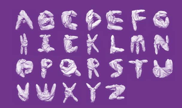
The prompt to create a modular alphabet is a classic assignment known to all design students that has circulated not through its brief, but more through its completed results. The Internet is bursting with 26-letter posters made using only circles and squares—or only leaves for units, or pecans, flowers, pasta, gloves, keys, cables, bananas, even aerial views of buildings. The brilliance of the assignment lies in that one need not read a prompt to understand what to do; the beauty of modularity is that it
Slanted 40—Experimental Type2 69
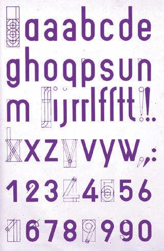
Joost Schmidt created this drawing made in 1924 to outline the construction of an alphabet using modular forms.
is visible, meaning that the results will always contain the tools for creating the alpha bet (its units). This assignment framework was used by Bauhaus tutors such as Joost Schmidt, an instructor of typography who taught foundation courses and was known for designing incredibly succinct assignments. Joost Schmidt’s alphabets are diagrams that demonstrate how each letter was formed. Its effectiveness as a prompt can be seen in the responses by his students, such as Reinhold Rossig, whose drawings offer a drawn alphabet created with his version of the grid.
At its core, the assignment is an exercise in developing pattern recognition, the alphabet being really only useful as a fungible system that has a fixed beginning and endpoint, comprised of forms that are universally recognizable, variable, and reconfig urable. The rules for the game are clear: how do you create a set of forms built from parts such that they are distinct from one another while still related to the rest of the set? How do you create a letterform that is unexpected and new while still maintaining legibility as that letterform? A modular alphabet is a compromise between the individual and the universal, the heterogeneous and the homogeneous, a practice in creating systems that are scalable, and a great exercise in negotiation.
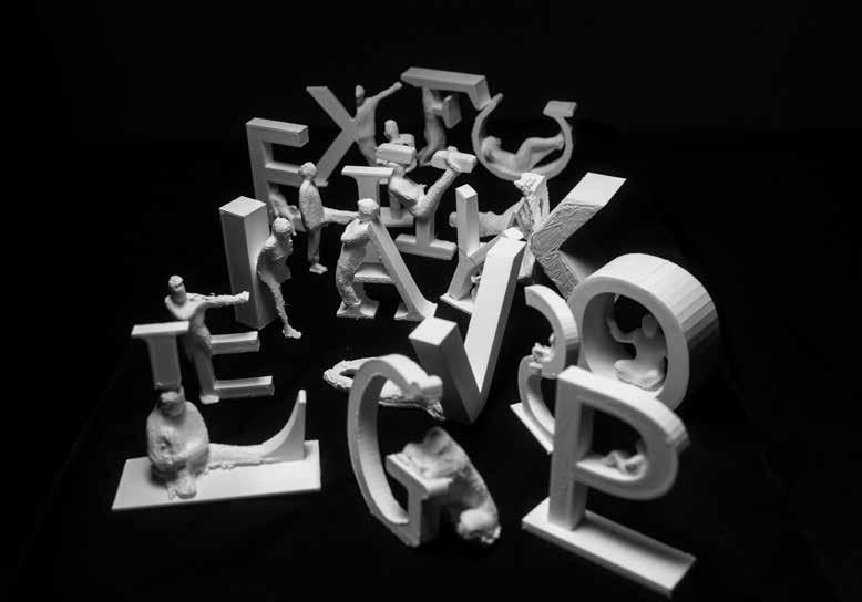
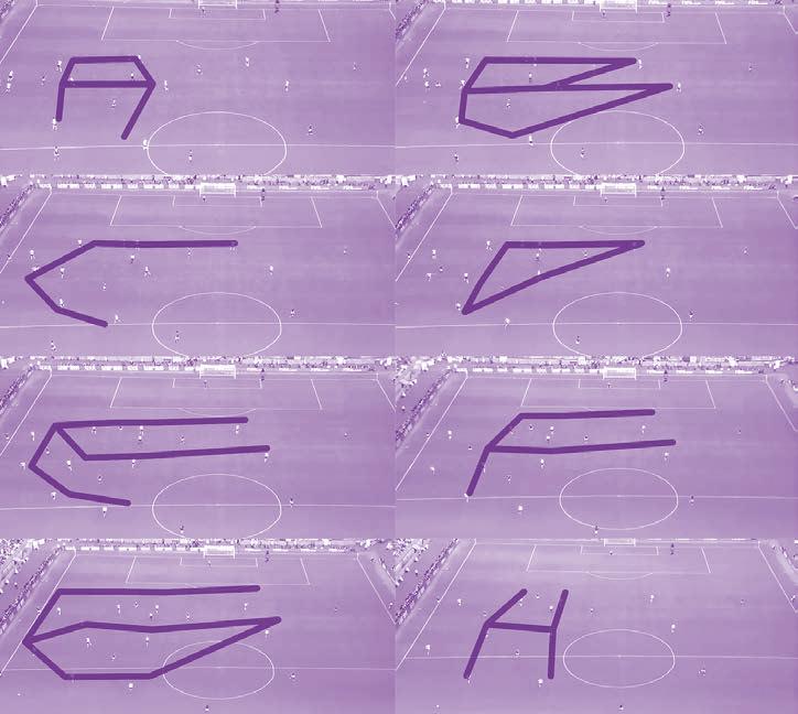
I teach my version of this assignment at Massachusetts Institute of Technology: MIT, where I teach visual communication fundamentals to students who are mostly engineers. The class is an elective course situated within the architecture school, granting me the considerable luxury and freedom of determining what foundational principles of graphic design can and should be meaningfully taught to students who see it as a curi osity, not a profession. The syllabus is set up to be a kind of survey course of imaging techniques, part intro to semiotics, part media theory grab bag. We read Plato and excerpts from The Phantom Tollbooth as we discuss the reproducibility of forms; we consider what it means to create meaning with letters; we break images apart into pix els and make infinitely looping gifs. The alphabet assignment that I assign is actually made up of three assignments that grow in increasing degrees of complexity. The first part is to find the complete alphabet in the wild, wherever one can find them; the second part is to form the complete alpha bet using one object; the third part is to draw the complete alphabet using an invisible grid derived from a specific activity or context—so, the repeated motions found in a conductor’s baton, for example, or the strumming patterns of a guitar. (The third part has always yielded the most interesting results—alphabets drawn from tactical formations in a soccer game, or drawn using the Strava app to track a neighborhood run.)
The conversations during the process are the most fun—it’s exhilarating to watch students work through the realization that language is a set of arbitrarily formed signs. Is there an a-ness to an a? (Aspects of this assignment might argue that there isn’t—or rather, an a is only an a in its relation to a b, e, and a g.)
But like with the conclusion of any large assignment in the applied arts, there is a moment when the alphabet has been completed, all other appropriate glyphs tackled,
Slanted 40—Experimental Type2 70
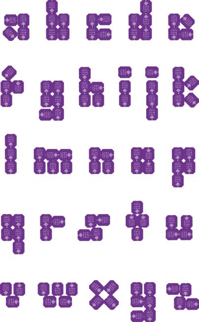
Slanted 40—Experimental Type2 71
The work of Alex Boccon-Gibod, who created an alphabet using tea bags.
The work of Alexa Gross, who created an alphabet out of surgical gloves.
The work of Diego Yañez-Laguna, who created an alphabet made from 20 seconds of tactical cam footage from Germany vs. Mexico, 2018.
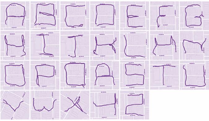
The work of Audrey Gatta, who created letters by running around her neighborhood block and recording the path using the Strava app.
Slanted 40—Experimental Type2 72
SLANTED MAGAZINE
TYPOGRAPHY & DESIGN CULTURE AUTUMN / WINTER 2022 / 23 40 EXPERIMENTAL TYPE
PUBLISHER
Slanted Publishers UG (haftungsbeschränkt)
Nördliche Uferstraße 4–6 76189 Karlsruhe Germany
T +49 (0) 721 85148268 magazine@slanted.de slanted.de
TEAM
Editor in Chief (V.i.S.d.P.)
Lars Harmsen Co-Editor
Saehyeen Shin Managing Editor
Julia Kahl Creative Direction
Lars Harmsen Art Direction Saehyeen Shin Final Design Clara Weinreich Proofreading Julia Kahl, Clara Weinreich
SLANTED WEBLOG
Editor in Chief (V.i.S.d.P.) Julia Kahl Editors slanted.de/editors
VIDEO
ISSN 1867-6510
2 × p. a.
/ Summer,
/
Copyright © Slanted Publishers, 2022 Nördliche Uferstraße 4–6, 76189 Karlsruhe Germany
All rights reserved.
PRODUCTION
Printing Inside Stober Medien GmbH Eggenstein / Germany stober-medien.de
Production Cover
Seismografics JK GmbH Markt Schwaben, Germany seismografics.de
Book Binding
Josef Spinner Großbuchbinderei GmbH Ottersweier / Germany josef-spinner.de
Cardboard Cover
Black Magic, 320 g/sm Paper Inside lona® art, 115 g/sm arto® gloss, 150 g/sm Pop’Set aqua, 120 g/sm
Stencils Limited Special Edition (exclusively available via slanted.de/shop) PRIPLAK OPALINE, 500µ Himbeere, Limone, Zitrone Distributed by Inapa Deutschland Hamburg / Germany inapa.de
Spot Color HKS Warenzeichenverband e. V. Stuttgart / Germany hks-farben.de HKS 37 N
Fonts
TimesMonospace (original Times), 1985, 1987, 1989, 1990 Label: Adobe Systems Incorporated / adobe.com brutally brought to a Monospace by Lars Harmsen
Elastik, 2017 Design: Benoît Bodhuin Label: bb-bureau / bb-bureau.fr
Suisse Int’l / Neue, 2011 Design: Swiss Typefaces Design Team Label: Swiss Typefaces / swisstypefaces.com
Slanted 40—Experimental Type2 86
Video Interviews slanted.de/videos
Frequency
(Spring
Autumn
Winter)
SUBSCRIPTIONS
Subscribe to Slanted Magazine and support what we do. Magazines via subscriptions are at a reduced rate and get shipped for free within Germany directly at release. slanted.de/subscription
2-Issues-Subscription € 32.– + shipping
4-Issues-Subscription € 62.– + shipping
Student Subscription
2 issues for € 26.– + shipping
Gift Subscription
2 issues wrapped as present for € 35.– + shipping
2-Issues-Subscritpion + related Special Editions
2 issues + 2 special editions for € 65.– + shipping
4-Issues-Subscritpion + related Special Editions
4 issues + 4 special editions + free issue for € 125.– + shipping
SALES AND DISTRIBUTION
Slanted Magazine can be purchased online, in selected bookstores, concept stores, and galleries worldwide. You can also find it at stations and airports in Germany, Austria, Switzerland, and the Netherlands. If you own a shop and would like to stock Slanted Magazine or other publications from us, please get in touch with us.
Contact Julia Klose, T +49 (0) 721 85148268 julia.klose@slanted.de
Slanted Shop (best!) slanted.de/shop Stores (all over the world) slanted.de/distribution
Distribution Airport & Stations IPS Pressevertrieb GmbH / ips-d.de
International Distribution Antenne Books / antennebooks.com
Distribution US Small Changes / smallchanges.com
ADVERTISING
We offer a wide range of advertising possibilities online and in print. For advertising inquiries please get in touch with: Julia Kahl (advertising management / sales) +49 (0) 721 851 482 68, julia.kahl@slanted.de
AWARDS (SELECTION)
ADC of Europe
ADC Germany
Annual Multimedia
Berliner Type
DDC
Designpreis der BRD
European Design Awards
Faces of Design Awards
iF communication design award
German Design Award
Laus
Lead Awards (Weblog des Jahres & Visual Leader)
red dot communication design awards
Type Directors Club NY
Tokyo Type Directors Club
Werkbund Label
ACKNOWLEDGEMENT
We would like to thank everyone who followed our call for submissions online in spring 2022 and submitted over 1,400 experimental type works. It was not easy to make a selection. Unfortunately, due to the limited scope, we could not depict every work. We hope that for those who did not make it into the magazine, there will be another opportunity in the future. Congratulations to the more than 250 participants from all over the world whose work found a place here!
A very big thank you to Saehyeen Shin, who oversaw, edited, designed, and so wonderfully understood the creative direction Lars gave this issue. Your friendly nature, ambition, and diligence have led to this extraordinary result. We miss you and your Asian cooking skills very much :)
We would also like to thank Tom Barbereau for his text support on all the intro chapters and editorial.
A big thanks to Benoît Bodhuin for making such great typefaces, Elastik rocks!
For this issue, we’ve teamed up with our longtime printing partner Stober Medien and Inapa Deutschland to produce three colorful stencils for you to experiment with typography yourself. This Special Edition is strictly limited and now exclusively available in the Slanted online shop: slanted.de/shop/experimental-type-stencils
We are very grateful for the support of Inapa Deutschland, who have provided us with fantastic materials for this issue— special thanks go to Michaela Deckelmann, Anna Boroday, Leila Nickel, and Marcus Grunvinck who made this possible.
Thanks to our long-standing printing partners at Stober Medien near Karlsruhe for the great production of the magazine and the experimental type stencils. Thank you, Thomas Appelius, Joachim Schweigert, and the whole team!
Last but not least: A special thanks to our supporters and fans out there. You help a lot, sharing our work to the world, making Slanted a wonderful community of design interested people. We love you! Keep experimenting!
DISCLAIMER
The publisher assumes no responsibility for the accuracy of all information. Publisher and editor assume that material that was made available for publishing, is free of third party rights. Reproduction and storage require the permission of the publisher. Photos and texts are welcome, but there is no liability. Signed contributions do not necessarily represent the opinion of the publisher or the editor.
The German National Library lists this publication in the German National Bibliography; detailed bibliographic data is available on the Internet at dnb.d-nb.de.
Slanted 40—Experimental Type2 87
Awards
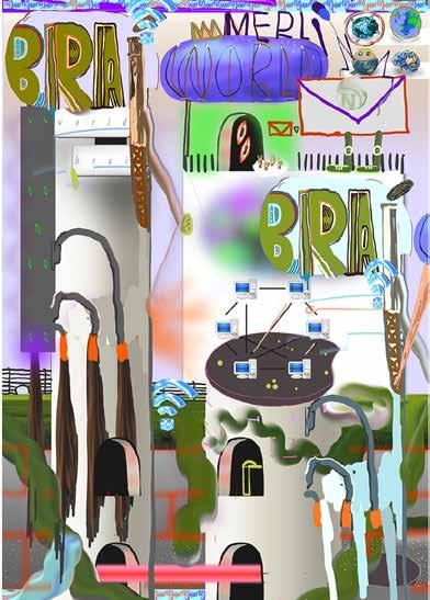
282—My Name is Wendy—FRA—Untitled Slanted 40—Experimental Type2 88
Mum probably told us, “The oven is a danger zone.” Still, we had to experiment our first burn to know how hot fire is. Our parents covered us with millions of kisses, long before we fell in love with somebody and experimented our first kiss. Even if we saw it before, nobody could really tell us how beautiful it is. Everyone must experience it by him or herself. In other words: by making experiments we gain experience and knowledge. Experiments open our horizon, let us enter the undiscovered, and feed our lust for more.
With Experimental Type we open eight doors, each one offering a glimpse into spaces that were explored by pushing conventions, limitations, and thoughts to the next level. We all know though, that the game is never over. The discovery of new areas, technologies, and thoughts are a constant source of inspiration, research, and experimentation for those that follow.
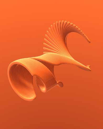
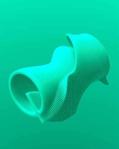
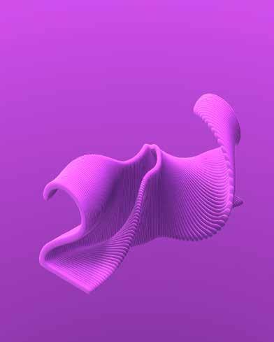
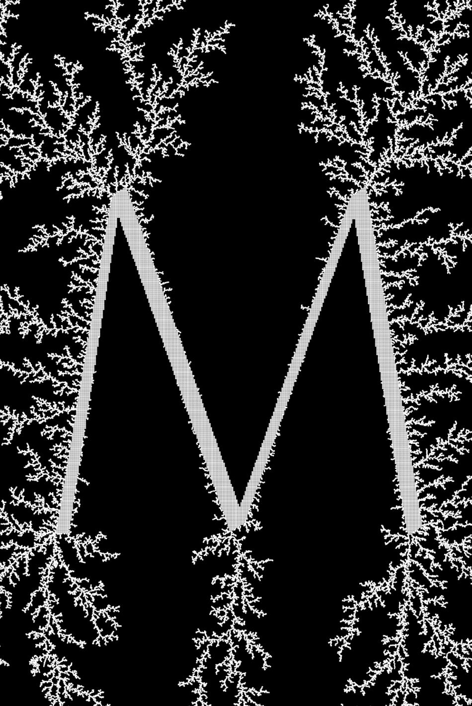
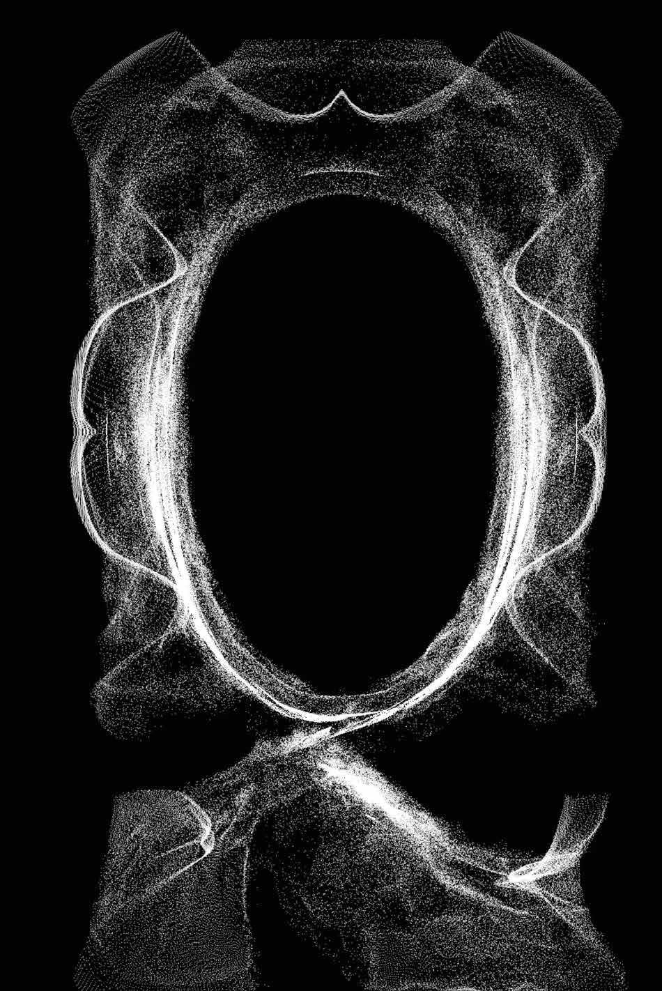
Tactile Realism shows works with tactile character, adding material properties to the typeface. The Anti-Reader-Friendly typography becomes the “readymade” of the type world—and in doing so, a form of denying the possibility of defining art. In the Deliberate Imperfection & Serendipity space, disassembly, and assembly of type leads to great discoveries. While Coincidence & Intention brings the accident into the design process and explores works based on mistakes and inaccuracy. The Ever-Changing room showcases experiments of kinetic typography breaking away from its static state by adding movement and a three dimensional stereoscopy, and the fourth dimension: time. Cutting Edge drives the attention to state of the art technologies and their impact on design experiments. Off the Screen explores physical space in which writing becomes material, object, and sculpture. Last but not least, Push to the Limits engages to think finitude differently, breaking boundaries of learned symbolisms and triggering new stimuli.
We very much enjoyed putting together this issue. Experiments are key to life.
All Slanted Magazines are accompanied by video interviews—with the exception of this issue. Have a look at the interviews from New York to Stockholm …
To watch the videos,
scan the QR code,
Enjoy!
please
or visit slanted.de/videos
slanted 40 typography & design culture autumn /winter 2022 / 23 issn 1867-6510 at eur 22 ch chf 25 de eur 18 uk gbp 25 us usd 28 others eur 21 slanted.de
