

MADE & FOUND IN/ON THE HILLS OF VALENCIA, CA
DATE
IKEA
EXERCISES MASKS & MOOD
S.01 N. 01 Notes: The Nest, an Origin Story.
Ethan A. Stewart & Scott Massey [002—004]
Illuminated Unstuck Souvenir Index. Denise Gonzales Crisp & Gail Swanlund [005–008] N. 02 Notes: Finding New Forms and Challenging Old Ideas.
E. 01 Essay: Cult Classic, Back to the End Times.
S.02 N. 03 Notes: Of Community and Creating.
Ed Fella, Martin Venezky & Scott Massey [009—014]
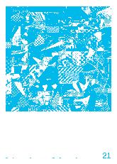
David Karwan [015—020]
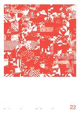
Bijan Berahimi, Stefano Giustiniani & Laura Bernstein [022—024]
GALLERY I: CONNECTIONS [025–040] S.03 E. 02 Essay: Leisure Labor; An Origin Story, aka: Run to the Hills, aka: Escape the Studio …
Ethan A. Stewart [042—044]
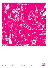
Louise Sandhaus & Juliette Bellocq [062—064]
GALLERY II: POST LABOR COLLAGES [045–060] S.04 N. 04 Notes: Sisters of the Heart. A Conversation about Sister Corita, Her Own Work, and Sister Magdalen.
GALLERY III: THE DYNAMIC SQUARE [065–095]
FULL FRAME
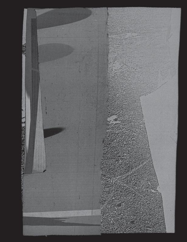
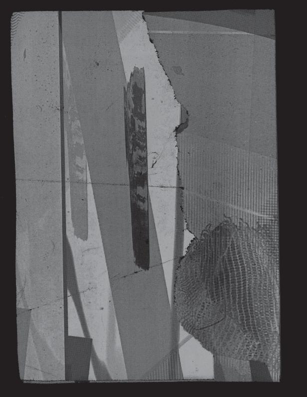
The Nest Structures at 100 % (Full Color Minus Fluorescents & Metallic Gold) [096–112] S.05
N. 05 Notes: On Processing. Ian Lynam [114—116]

S. 01 HARNESS YOUR HOPES AND ROLL W/ THE WIND FORMAL ANALYTICS & RISK ASSESSMENT S. 02 STARLINGS OF THE SLIPSTREAM REAL-TIME QUICKTIME DIGITAL ASSET MANAGEMENT S. 03 STEREO TRANSPORT IS ARRANGED ADDITIVE ELEMENTS
S. 04
WITH
IN A PASSAT DREAM QUASI-MODERNIST POSTMODERNIST


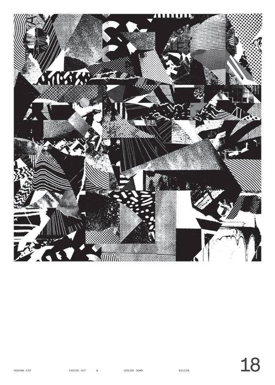
NOHAWK EXP UPSIDE DOWN 001 01 HARNESS YOUR HOPES AND ROLL W/ THE WIND FORMAL ANALYTICS & RISK ASSESSMENT 03 03 20
*
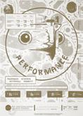
[001] Hirsch Perlman (It’s Written All Over My Face), designed by Scott Massey, poster for a Visiting Artist Series at CalArts, 2012. Black and white Xerox print with hit of fluorescent pink spray paint, 24 × 36
Appropriating words from one of Hirsch Perlman’s performances to talk about a broken relationship … and announce his event details (of course). Hirsch would use giant silkscreen prints of cats as a humorous tool to liven up the halls of a children’s hospital; therefore, a picture of my ex-girlfriend’s cat (Dexter)*was stolen from her Facebook page and blown up to be the centerpiece. D’s bowtie adds a formal nod to the event, which Hirsch ap parently felt was a classy touch to an otherwise absurd poster. This was one of a series of posters where the ac tual poster was subverted to fit my own personal needs, desires, and feelings. It was art school, and I needed a mask to say something that would usually be kept inside.
I needed to say it loud and make fun of it.
Patience prevails, Kim & I are a couple. Not to ruin the surprise, but this book is dedicated to her and the little nest that has developed over the process of making this book. This was coincidental, or maybe it was a manifes tation. Either way, I’m eternally grateful for her warmth, love, and understanding of me and my “process.” Much love to you, Bryton, and our Summer. — sm 06.07.22
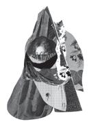
→ To organize is to put an action into motion. It’s the first part of making that allows for a survey and analysis of what is at hand. What’s available for later use, what’s lacking, and a critical analysis of what state the inventory is in for future use. To lay it out on the floor for an overhead view is a strategy that allows the eye to connect with head, heart, and hand without jumping to definite solutions. Consider this a survey of the graphic elements, thoughts, and moments that helped develop The Nest. The swirling scraps that were found and used to construct something a little different, a little newer, but based on a common solid ground. Seen from above to make connections between forms and conceptual thinking, finding pairings / groupings, cause and effect, mentor to mentee. Discover the flight plans that allowed us to find this odd but inviting place.

NOHAWK EXP INSIDE OUT 004
INDEX
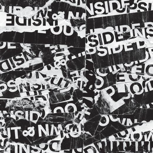
CalArtians have nearly always walked the halls of the school in the company of posters designed by graphic design students. We lived with so many of these posters at CalArts : taped to the walls in halls and stairwells, some becoming unstuck and found fallen, lying flat on the floor, unmoored.
The parts collected in this index were originally newly created, or scavenged and appropriated, to serve the designers’ intentions. Those of us who made them did so, sometimes, without sleep. We former CalArtians, and now indexers of an indeterminate past, recognize the origins of some of these images, embedded as they were in posters. We might have helped lift screens and tweaked the position of the paper under those screens. Some of the parts are so familiar that we can’t unhook them from the hand of the person who imagined and made them.
The fragments collected and shown neatly below are snippets captured from the originals, like souvenirs. Detached from any context but our own histories with CalArts, the images served as Rorschach inkblots. The result is an improvisational poem created through a process of action (statement) and reaction (response). This index, therefore, reveals a state of mind, a place in time, a string of moments that occurred somewhere in Southern California. We can’t help seeing things, and are susceptible to suggestion, to physical connections, the gravity of another body in the same room, the bits and remnants of our respective experiences and dreams.
NOHAWK EXP UPSIDE DOWN 005
Illuminated Unstuck Souvenir Index.
Denise
Gonzales Crisp & Gail Swanlund
[B056]+[B057]
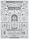
[003] Rachel Geller: Performer /Composer Graduation Recital, Bijan Berahimi,
2013
One-color silkscreen, red print ed on white paper.
[002] REDCAT: Rashaun Mitchell & Stephin Merritt, Jacob Halpern, 2014 Twocolor silkscreen, yellow and brown printed on yellow paper.
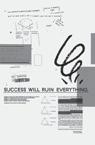
[001] Success Will Ruin Everything , Lu cas Quigley and Ryan Corey, 2005.
Two-color
silkscreen, yellow and black on white paper.
merging. [J034] This folds down to a single dot. I try not to place my coffee cup in the same spot every morning. [J037] Let’s end this cruel animal slaughterhouse industry. Someday we’ll look back and wonder why we did it. I’ll just have the mac’n’cheese, thank you. [J038] She couldn’t explain the pain in her back; she could only draw it. “What about snail rights?” [J044] I got my new Kryptonite library card and can now read four books simultaneously. The circulation desk kept reconfiguring; the library’s entrance vanished and later reappeared.
[J045] That bird was doing wheelies in front of the house. It’s odd that supergraphics sink as they sync. [J057] Since 1962, Frederick found it hard to move the bra-cone merchandise, but in the first tidepool, we found exceedingly complex starfish.
[M001] If you multiply 5 times 6 times 3, you get a rocket launcher. And if you put an elevator in the middle shaft, you should be able to reach the top floor of the N-leg. [M002] Alternate geographies under a starry sky. If Bitcoin were water, it would return to sound. [M005] Simple Gifts Fair Isle bit-knit pattern. There are many stairways to heaven if you know which direction to go.
[M006] Some prefer an argyle snake trellis, which always gets you much closer. [M007] Silver record message sent to protozoa proves that Carl Sagan was wrong. ●
[
B040 ] Poetic Explorers
The summer between MFA1 and MFA2 years at CalArts could be seen as a time spent in the woods. Two-thirds of it were spent in denial, pretending what I had just experienced didn’t rock me to my very core. A year had been spent roaming the halls of CalArts, often very late or very early depending on how your internal clock ticks. All of my learned principles of design were being tested on a daily basis. It began with a trainwreck of a crit with Ed Fella … and continued with constant internal debates about form, meaning, and theory. Why was I here? Why the hell was I doing what I was doing? And is that even a worthy question to ask, since in the end we all have to eventually leave the forest and join the rest of the world? Indeed, I had run back to the tall glass boxes of New York City to fill up a hopelessly drained bank account and pretend my life was “normal” for a while. All internal doubts and questions would be placed on pause for now …
The last third of the summer was actually spent roaming the woods. While still in the thick of academia, I decided it would be smart to sign up for a design retreat somewhere near a giant lake in Michigian. But at this point, it was probably the last place I should have been considering that my thesis was supposedly a work in progress. (WIP it was not ; I was lost AF). At the retreat, surrounded by eight inspired students and an extremely gifted staff, I found myself incredibly concerned about what to make, almost paralyzed with the question, why ? Questioning every step before the process was allowed to start. From various conversations, it seemed as if my temporary stuck-in-the-mud phase of making was noticeable to all those around, and this only added to my concerns.
Enter Denise Gonzales Crisp and her bagful of tricks … literally, she had a number of objects in a paper bag for a new workshop. Common household objects were distributed among the class, nothing shocking really, but in order to complete the exercise, the
students and staff were asked to take on another persona. Our writ ten statements were to be composed by a point of view of an explorer new to earth, naive to the customs and culture of this new land and oblivious to the tools of this current age.
My questions could be approached from another angle; my cur rent self could take a break while someone else deep inside could be given free rein to explore all that was around. I was given a free pass to be naive, to make ridiculous assumptions and just see where it could go for the moment. I’m not going to say that a screwdriver saved my creative career, but it offered a fresh strategy when every thing else seemed old and depleted. Whenever needed, a momentary break from the norm could be found by opening a shelf or cabinet in any environment I happened to find myself. Even better, a creative voyage could be taken while driving a car, riding a bike, or design ing a poster. Anything could be seen as a trigger to release this naive little explorer out into the once bleak world. The only goals: stretch the imagination; find amusement in the everyday; collect everything found, made, or stolen during the excursion; and report back to command control.
It’s easy to forget that we (as creative beings) have a very im portant role of bringing delight and humor into our lives and the lives of others. To have a thought regardless how silly and stretch it even further away from the norm, just to see where it might go, is something that I will never allow to be buried again. Hold on for dear life, snap back on that bruised and beaten space helmet, and grab another view of what’s below.
Thank you to Denise and Gail for your ability to explore, amuse, and delight. You are both incredibly thoughtful, creative, and pow erful explorers of the everyday and beyond! You’ve inspired all of us on multiple layers of thought and have allowed for pure creative freedom.
NOHAWK EXP INSIDE OUT 008
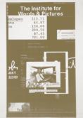
– sm [011] The Institute for Words & Pictures 2 , Tahli Fisher and Zak Kyes, 2005. One-color Blueprint. [010] New Day at 40, Scott Massey, 2012. Four-color silkscreen, cyan, fluores cent pink and yellow, plus a black gloss printed on white paper.
SHELTER
characters to continually work with. It is not unlike how a filmmaker will use the same cast of people that they like to work with in a variety of different films.
ef Or the same ideas over and over again.
mv Well, yeah. Exactly. There are people like director Robert Altman who never worked in the same genre of film twice, but, even so, he often worked with the same people each time. Or artists who use the same motifs over and over again even if the end result changes. There is always a fine line between repetition versus actually moving forward. I think that is a kind of danger zone for anybody who is trying to do creative work. Personally, I have certain techniques I like to use or certain kinds of forms that are already drawn that I prefer to revisit and re-explore. As a creative person, I think it is natural to start developing a kind of palette of things that you like to work with. I think it is really important to develop these personal palettes because then your process becomes this idea of iteration. Otherwise, ev ery single project is just a blank slate. That’s a standard commercial way of working, as op posed to an art way of work.
sm Did this methodology that you’ve both developed stem from Cranbrook?
ef For me, Cranbrook had nothing to do with it. I already had that studio practice for years before I went to grad school. If anything, I gave it to Kathy McCoy because she worked with me in the studio before taking over the program at Cranbrook. I got it from high school, as I mentioned earlier, from Bauhaus influences and this idea of having a constant alternative prac tice. A constant exploration, if you will. So, yeah, it did become a sort of “Cranbrook Model,” but it was already a model that I had been using for twenty-five years with good results. Kathy McCoy and Lorraine Wild were, respectively speaking, eighteen and twenty years old when I met them. They worked in the same studio I worked in in Detroit and were introduced to the process then. I had brought it there straight from high school.
mv Everything to me happened at Cranbrook. There were certain things that I liked already. Like, I already had an idea about amassing collections of stuff, but the no tion that I could take all of that and apply it professionally, that came from Cranbrook. Being given permission to shuffle your professional, personal, and hobby work all together, that was completely new to me. It was a total jolt. I didn’t have an art education. I didn’t have a design educa tion. I’d never taken any classes in design even as an undergrad, so I was incredibly naive about things. All I knew was that I needed to change.
Looking back, though, what I really wanted was to learn how to get from A to B with a design. I was doing horrible work at the time, but I could look across the street at Emigre and see all this great work. People like Rudy VanderLans. In fact, I went to a lecture that Rudy gave at CCA in Oakland, where I am teaching now, and
I didn’t know who he was — someone told me, “Just go ; it’s free.” I went, and I was just blown away. I had no idea about this world. I ran out to get the first issue of Emigre that I could find, and it was the one with Ed and Pete Schrouters on either side.
ef That was issue seventeen. Rudy already had seventeen issues of Emigre printed by that point!
mv Well, I mean, I just did not understand your work then. But I knew that it was difficult. Everything was wrong with it, but I also knew there was something important there. It just really confused me. Eventually, I had to take a year of adult education in design because my portfolio was full of coupons. That’s not going to get you into grad school, so I took a whole year to make my portfolio better.
ef When Kathy McCoy came to my studio in the late 1970s, she was a hardcore mod ernist. She had no clue about this kind of work. So, for her, it was the same thing. When she saw what I and the other com mercial artists were doing at the time — we were part of the so-called Pushpin Generation, so we were already into this idea of historicism and the exploration of various styles and all that — this was all a big revelation to her. Those influences were very much a part of what would be come Cranbrook. It’s funny because that’s a big reason I went to Cranbrook myself some fifteen years later ; I had to legitimize myself and my work by going to the very school that, in a sense, represented a con tinuation of the things I had helped intro duce Kathy to years before she was ever a faculty member there … But, again, I can’t stress this enough ; the work that came out of it, for me at least, all of it comes out of the Bauhaus and those experiments in contemporary art with Mohaly-Nagy and El Lissitzky that I was exposed to during high school. I didn’t invent any of this stuff. I just kept practicing it and passing it on. And, Martin, you are doing the same thing ; you’ve passed these ideas on to all of your students over the years.
mv Cranbrook helped me to take all of these disparate little interests and curiosities and put it all together into a trajectory that started to make sense. It’s funny, though, because I wasn’t initially convinced that I wanted to go there at all. I applied to a lot of different schools, and the Rhode Island School of Design (RISD) was one of them. I went to visit RISD to do an
Endnotes
1 László Moholy-Nagy. Hungarian painter and photographer as well as a professor in the Bauhaus school. He was highly influenced by constructivism and a strong advocate of the integration of tech nology and industry into the arts. The art critic Peter Schjeldahl called him “relentlessly experimental” because of his pioneering work in painting, drawing, photography, collage, sculpture, film, theater, and writing. He also worked collaboratively with other art ists, including his first wife, Lucia Moholy, Walter Gropius, Marcel Breuer, and Herbert Bayer. His largest accomplishment may be the School of Design in Chicago, which survives today as part of the Illinois Institute of Technology, which art historian Elizabeth Siegel called “his overarching work of art.” He also wrote books and articles advocating a utopian type of high modernism.
interview with Tom Ockerse, and he was run ning late for some reason. I had a half hour to kill, so I wandered into the RISD bookstore. The Cranbrook book, the New Discourse, had just come out, and I picked it up. I had never seen it before and started flipping through it. I didn’t understand anything in it — it all looked so diffi cult. But I knew right away that I needed to go to Cranbrook. I wanted to understand. I needed to go to the most difficult place I could to learn. It’s funny, though, because I eventually had the interview with Tom, and he accepted me to RISD. He kept calling me, but I was placed on the waitlist at Cranbrook and didn’t want to commit anywhere else, all because I had seen that book and had that half hour looking at it. I knew that Cranbrook was where I wanted to go because it looked like it was going to be difficult. I was on the waitlist for months but ultimately was accepted into the program, and, as they say, the rest is history.
ef Ha! That’s what I said to Allen Hori when he applied to Cranbrook in the late ’80s. He also had gotten into Yale, and I said to him, “Well, Allen, if you want to be history, then you go to Yale. But, if you want to make history, then come to Cranbrook.” mv Cranbrook was incredibly influential for me. Ultimately, it gave me the self-confidence I needed. I went there completely flummoxed. Because I had been on the waitlist forever, I assumed that I was the worst person at the school. I told myself that I had to work twice as hard as everyone else just to keep up. And, at the beginning, everyone was bonding about names of artists and designers and the like. This was all pre-Internet, mind you, so I had to write down every name and then go to the library to look it up just so I wouldn’t come off as some idiot. I didn’t know any of the names. Everyone was trying to show off for each other, and I was just clueless. But, you know, it was very much a tortoise and the hare type of thing. And, because I knew I was the tortoise, I kept my head down and worked day and night by myself instead of trying to impress everyone else. I simply kept making things and pushing myself to do more. I made so much stuff and just kept pushing myself to go further. ef Well … I’d say the results of your approach are pretty evident now. ●
2
A bit about Carl Toth. He’s been described by past students and faculty as a true genius and beloved educator at Cranbrook. Carl was one of the first to work with Xerox Machines. He believed the copy machine to be yet another type of instant camera. He created an entirely new vocabulary in the tradition of the photographic collage that has yet to be equaled. Everyone who studied under Carl walked away changed for the better. (His legendary lectures could go for six hours!) Carl has influenced an entire generation of great artists and photographers.
“A major goal of my work has been to incorporate aspects of the pho tographic process or phenomena as a central part of its meaning/ structure. These self-reflexive elements provide a counterpoint to the connections of unmediated transcription of reality that we associate with photographic depiction.” — Carl Toth
NOHAWK EXP INSIDE OUT 014
NOHAWK EXP UPSIDE DOWN 015 ARTIFACT [ 001 ]
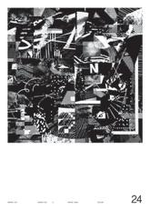
[011] Marks of Apocalyptic Cinema, Jesse Lee Stout, 2012. Extract from the End Times Reader, a survey of gang logos from contemporary cinema. Insight into the relevance of design in the not-so-distant future …

The aesthetic fashion of many dystopian films covered in Design for End Times was further explored by Jesse Lee Stout’s “Marks of Apocalyptic Cinema.” [fig.011] Jesse brought together the visual language of present-day motorcycle gangs with a series of emblems and marks of identification of many of the films covered throughout the semester. Relooking at Jesse’s project, one is hard-pressed to ignore the volume of graphic design present in doomsday cults, like the Heaven’s Gate patches, envisioning the end times.
It’s been over ten years since the Design for End Times class, but visual izing the apocalypse has always been relevant. From the infamous “Acropolis Now” cover of the May 2010 Economist to the constant present-day news footage of California wildfires, the effects of climate change, and a world wide pandemic, it’s impractical to ignore that our society is shifting away from the material and immaterial conditions that allowed extreme pros perity of the 20th-century. Cataclysmic shifts in technology and natural and ecological resources will be redefining how we live. This class was a call to action to collect, connect, and explore how design can respond. ●
[012] Post Radical Arrangements, Scott Barry, 2012. Extract from the End Times Reader, it takes a village. Illustration found in an essay dis cussing anti-design studios of the ’60s like Superstudio, Archizoom, and Sottsass. Where is the cultural cache for design?
Endnotes:
1 Design for End Times Syllabus
2 Design for End Times Reader, 2011, pp. 130–131
3 (Mark Owens, personal communication, May 26, 2021)
4 https://www.ssa.gov/ssnumber (accessed May 22, 2021)
5 Design for End Times Reader, 2011, p. 135
6 https://www.radiox.co.uk/artists/joy-division/cover-joydivision-unknown-pleasures-meaning (accessed May 29, 2021)
Student Reflections
Laura Bernstein: We were all really committed to the class and to the ideas that Mark was introducing to us. Everyone was deeply engaged with the content and in exploring their own practices and ideas through the lens Mark had developed. It was deeply collaborative in thinking and in practice. I know, personally, it was the first time I’d ever really seriously considered ideas around end times — I was particularly struck by Žižek’s conceit that we were already living in the apocalypse, that it had gone off with a whimper, and that present times were the end times. It’s something I’ve thought about regularly over the last decade and, of course, even more so since March 2020. It sounds very dark, but it’s also comforting to accept that we’re in the end times; they can last for much longer, forever even.
At the time of the class, in 2010, a lot of what we were talking about and working on seemed deeply theoretical and based in the imagination; it was hard to envision how soon many of the ideas would move from the speculative or conceptual realm to being ap plicable in our daily lives … or part of our quotidian considerations. I wonder if Mark had a better inkling to the applicability of the course? I don’t know that any of us considered the End Times Reader we produced as a manual that we’d be able to — or need to — refer to within ten years, I certainly didn’t.
Kate Johnston : This class was a portal. The way Mark put ideas together. It opened up a new pathway for me about what design could do — how design was a practice but also a narrative. Future primitive. I took the assumption of the syllabus as absolute fact because I knew it in my body to be true — the world is dying. What sorts of things do we need to do at the end of the world? For me it is to build communities. Collective relationships built around shared frames of reference. We need to support each other while capitalism’s frameworks bend in on themselves and move past consciousness of our fragile primate bodies. There is no outside of capitalism, but we can create secret pockets inside of it to nourish ourselves and others.
I never stopped thinking about this class. Silas and I named our Grad Seminar at Otis for spring 2020 Tools for Survival, the thinking on my end coming directly from the trajectory of Mark’s
syllabus nine years before. The pandemic hit a few weeks into that course, and suddenly all those ideas became concrete. And on an intellectual level, I felt weirdly prepared because I had already been thinking about pandemics and scarcity and protective fashion for the past decade thanks to Mark.
Thea Lorentzen: I still think about the class a lot, like a constant background music. The idea that we are in this gradual slide is hard to put aside. The themes we all circled around left me with a more confrontational curiosity about the future. In cleaning out my drawings from the class, I found one of Donald Trump. So weird. Last year LB and Julie’s siren sounds project was very real. These kinds of overlaps make it hard to tell what’s cyclical and what is really an end.
Eileen Hsu : I remember we discussed films — particularly Children of Men (2006), by Director Alfonso Cuarón, and Idiocracy (2006), by Director Mike Judge. We looked at how the secondary elements, the anecdotal and background events, were loaded with mean ing and prescience tantamount in importance to the main story. Through different tones, both films delivered a foreboding presage about society, in keeping with the “end times” theme of the class. Plus, each showed how strategies of delivering ideas become the ideas themselves. To me, that’s also the cornerstone of really good graphic design.
Pouya Jahanshahi : The pandemic of 2020 was a glimpse towards the future that may indeed hold a fast-forward to the volatile times ahead, considering the path that humanity has chosen thus far. When the value of a 99 cent bottle of alcohol had gone up to 99 dol lars, and a 3M mask normally found stepped upon in construction sites could in fact be a lifesaving device — indeed a paradigm shift was at hand. We questioned what is important to us, and woke up to the day when toilet paper had become the symbol of stability in the American psyche — if we can wipe, then all must be good. The End Times Barter-Chart was coming to life in front of my eyes — not as a mere design project — but as a real fact of life.
NOHAWK EXP INSIDE OUT 020
NOHAWK EXP UPSIDE DOWN 021 02 STARLINGS OF THE SLIPSTREAM REAL-TIME QUICK-TIME DIGITAL ASSET MANAGEMENT 03 03 20
NOHAWK EXP INSIDE OUT 034
NOHAWK EXP UPSIDE DOWN 035
Last Dance:
[014] Lined with Target towels, sky painted umbrellas, and held together by gradient string, our camp might not have been weatherproof but did offer a kaleidoscopic view and time to rest, TL.


[015] Thea doing her best to keep “the Thing” alive. When in doubt, add more gradients, CL.

[016] Cathy finding flaws in our design of the structure and immediately blinded by the light, SM.
[017] Masato resting in a bed of leaves, SM.
[018] An attempt at camouflage while the crew get restless, Fun Is Over (if you want it to be), CL.
[019] Powers of four, the crew prior to storming the field. Pictured here: Alex Pines, Scott Massey, Thea Lorentzen, and Calvin Rye, photographed by Cathy Lee. And, the last missing piece to the puzzle: Masato Nakada. Thank you for being part of this experiment on a beautiful day.
[020] Idea for an unrealized mixed-media presentation of Leisure Labor Day, SM.

of both machine

discovery through process and production.


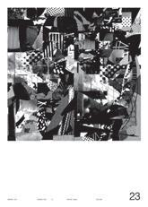
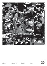
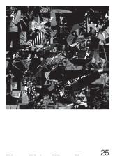
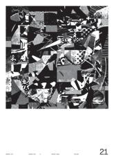
NOHAWK EXP INSIDE OUT 044 → Post Labor Collages. Physical pieces made from personal archive of Leisure Labor Day. [E.02] Thirty-four analog collages cropped within a 4×6" postcard format that are meant to be sent to collaborators. Source material is now eight years old, fragments from the studio experiments both in xerography, various lighting effects, and material manipulation. These collages allow time and events to collide with one another; they are a search for something nondescript, a semblance
and man-made. A journey taken to walk on your own … a reflection of things read, seen, and experienced. A second
[ 014 ] [ 017 ] [ 019 ] [ 015 ] [ 018 ] [ 020 ] [ 016 ]
NOHAWK EXP UPSIDE DOWN 045
NOHAWK EXP INSIDE OUT 046
NOHAWK EXP UPSIDE DOWN 047

NOHAWK EXP INSIDE OUT 060
NOHAWK EXP UPSIDE DOWN 061 04 DATE WITH IKEA IN A PASSAT DREAM Quasi-Modernist Postmodernist Exercises MASKS & MOODS 03 04 20
[001] Power Up: Sister Corita and Donald Moffett, Interlocking Installation View, Hammer Museum, Los Angeles, February 6–April 2, 2000. Photo: Courtesy of the Grunwald Center Collection at the Hammer Museum
Corita used everything around her as source material for her work — she didn’t see a distinction between “high” and “low” culture, or think that the visual chaos of urban life was a bad thing. Her work embraces and transforms even the most mundane things. In 1965, Corita took the advertising slogan of an oil corporation, “Power up,” to make a series of four prints that combine to form a spec tacular 3.5-meter work that inspires action.
[002] mary does laugh, Sister Corita, 1964, Serigraph, 39¼ × 29¾". Typographic experiments from found source materials, repositioned and ma nipulate physically before photographed and reproduced at enlarged sizes. So much to learn from the way Corita and class would experiment with type and derive new meaning from found elements.
Photo: The Corita Art Center
[003] Holiday Card, Juliette Bellocq with Handbuilt Studio, 2020, Offset Printing, 7× 10 In an email, Juliette mentioned the connection to Corita's practice, and as luck would have it, a brilliant connection to The Nest “This is one of our holiday cards, it was inspired by a site walk-through we did before our team got awarded an architectural project. I was walking behind my (architect) colleague and she was looking everywhere. Truly looking. And I heard her say out loud ‘What are your stories?’ to an empty campus. Space can contain so many traces of our identity. This idea that personal stories once shared can bring proximity and depth became a bit of a guiding notion in several projects afterwards.
This card was co-designed by Brooke Irish and me. The cardboard box is a Handbuilt box that normally car ries some of my stories. We collected other containers (spoons and ceramics, since it was becoming a personal interest of mine). Brooke found textures from CalArts, which is our common ground, and other imagery to play with in the composition. It became an allegory to what we all bring to a project (container) especially when the project is about a rich community.”
— Juliette Bellocq, 06.16.22 [004] Sister Magdalen Mary Martin (IHM) and Sister Corita Kent (IHM) from the Art Department of Immaculate Heart College L.A. enjoying a cam elback ride in Egypt, with the Great Pyramids in the early 1960s.
Photo: Patricks Mercy [005] Irregular Bulletin “The Gloria Issue” c. 1959–1964.
Source /credit: “Irregular Bulletin: 1958 The Impossible issue is Immaculate Heart College, 8" Found on eBay, August 2020 [006] Irregular Bulletin “The Gloria Issue” c. 1959–1964.
Source /credit: “Irregular Bulletin: 1958 The Impossible issue is Immaculate Heart College, 8" Found on eBay, August 2020 [007] May the Stories We Are Carrying Bring Us Closer, Juliette Bellocq with Handbuilt Studio, a design and silkscreen workshop for young artists in collaboration with Self Help Graphics. The event took place January 9, 2020.
→
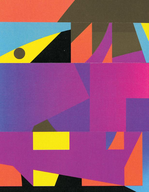
The Dynamic Square. Work within the square, destroy the mold, break the grid. Mutate forms together adding metallic and fluorescent pop colors, the gradient haze, the last stand of the democratic voice reduced to rubble? Where can you go with IKEA furniture? Looks cool, falls fast. Liz Lemon, never take a date to IKEA, the IKEA test … Meatballs? Run your designs through the mill of exploration (cropping, touching, overlapping, intersecting, posi tive / negative, and texture). Focus on working fast, constantly going through an additive and subtractive process. Once you’ve found a successful point in a composition, copy the page and move on; don’t get stuck! If you feel stuck, try mixing one design with another … rotate the composition, erase half, and add more.
NOHAWK EXP INSIDE OUT 064
NOHAWK EXP UPSIDE DOWN 065
NOHAWK EXP INSIDE OUT 076 01
NOHAWK EXP UPSIDE DOWN 077 29
FULL FRAME
at
speed racer collages made to render all vector molds with matter and material residues from the printing, slicing, tearing, and pasting process. Breaking down the perfect geometries of the grid to make them a little more lifelike and of this world. The softness that results from the misprints of a crappy HP laser jet printer, uneven dispersed halftone dots, and color channels that slip when the registration is off. The easy forms created by the slippage of a tired hand trying to move as fast as the eye and hand of the creator, or better yet a torn edge when the blade gets stuck. Time is moving too slow, and this process needs to be sped up. But nevertheless, the edges glow from a surface that feels more real. Not only did my fingers make these quick remixes, but there is microscopic and not-so-microscopic evidence of my interruptions. My moves have been traced, planted, and composed on these 4x6" compositions the old-fashioned way, and in some way, that makes my time feel well spent and tied to this work.
NOHAWK EXP INSIDE OUT 096 → Twenty
The Nest Structures
100 % FULL COLOR MINUS FLUORESCENTS & METALLIC GOLD 03 25 20
[001] Serialization of Norakuro stopped in 1941 for wartime austerity reason. After the war, due to the popularity of the strip, the character returned in various guises, including a sumo wrestler and a botanist.
Prewar animated films based on the military Norakuro, and two postwar animated series of Norakuro, in 1970 and 1987, have also been produced. In the 1970 series, the voice of Norakuro was played by Nobuyo Ōyama, also known as the voice of Doraemon. During the ’80s and early ’90s, Norakuro was the mascot of the Physical Training School ( Tai-Iku Gakko) of the Japan Self-Defense Forces.
[002] Mavo was a radical Japanese art movement of the 1920s. Founded in 1923, they were pro ductive during the late Taishō period (1912–26)
Mavo re-instituted the Japanese Association of Futurist Artists, the anarchistic artist group who displayed an outdoor exhibition in Ueno Park in Tokyo in protest of conservatism in the Japanese art world.
The group leader was Tomoyoshi Murayama (1901–1977)
The group deployed an interdisciplinary array of per formance art, painting, illustration, and architecture to communicate anti-establishment messages to the mainstream. Fueled by responses to industrial develop ment, the Mavo group created works about crisis, peril, and uncertainty. Art historian Gennifer Weisenfeld has written that Mavo sought to reintegrate art into daily life.
“Mavoist” artists sought to disrupt or blur the bound aries between art and daily life. They rebelled against the establishment by combining industrial products with painting or printmaking, usually in collage form.

Their performance art protests against social injustice deployed theatrical eroticism that mocked public norms for morality at the time.
→ B / W Collages. Animate these disparate forms by transformation of the Digital (flat, rigid, and pixelated bits) > Analog (textural, flawed, and physical) Construct ways to blend these forms, ideas, creators, contexts, and time. What does it mean to make the digital physical? Formally we’re adding depth to a flat surface ; cuts, scuffs, and rips add a layer of human contact over time ; a record of exchange is embedded into this new conglomerate. Maybe introduce a little chaos, a little deformity, a little life experience to build “character.” The great equalizer. A chance at self-realization. Meditate on that. Nurture / nature. Destruction > creation. Shadow & smudge, evidence of the real … a 72 dpi bitmap > 800dpi Frankensteins … collapse /collision of Lo-fi and Hi-fi. Expose and play with the bitmap as an element of design, learn from Frédéric.
NOHAWK EXP INSIDE OUT 116
NOHAWK EXP UPSIDE DOWN 117
NOHAWK EXP INSIDE OUT 126
NOHAWK EXP UPSIDE DOWN 127
NOHAWK EXP INSIDE OUT 132
NOHAWK EXP UPSIDE DOWN 133 06 BIRDS IN THE MAJIC INDUSTRY PLAY IN THE LAST DIGITAL AGE 03 13 20
George Bates
sm You guys both have some serious per spective on what it takes to make your way in a world of making. I’m curious, how do you think somebody goes about figuring that out for themselves?
gb For me, I’ve always had a deeply intuitive sense about my path and exploring what my own creativity actually looks like. This ap proach has opened up some really unexpected and wonderful doors. It’s about exploring the depths of your own intent. I am always surprised when I speak to adults who say things like, “I don’t know what I want to do with my life or career or whatever.” I don’t know how this is possible. From the beginning, you have to be curious about your own intent.
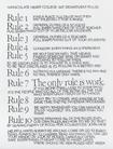
My wife always tells me that nobody thinks like me. That people don’t have this sort of in ner guiding star or manifesto that I have. I am a nonverbal guy who often operates from a place of intuition, so this can be hard for me to understand. But one of the first things I like to tell people who ask these questions is from Sister Corita’s rules. [fig.001] Rule number 4: “Consider everything an experiment.” Of course, experiments fail, so you kind of have to try and fail on purpose. You have to do bad work. Do it
place. But I found it impossible to do that within the boundaries of a nine to five. I tried, and it just didn’t work … At a certain point, just make stuff. Just keep making stuff. Make, make, make. It doesn’t fucking matter what you make ; just make it.
gb As an illustrator, it’s the Wild West. You graduate with a degree, but where do you go?
I got out of Parsons and started getting pub lished in these funky publications. Eventually, I landed a couple of really good clients. I did work for Viacom, and that became my bread and butter. It was super commercial work, but it landed me gigs doing Life cereal boxes and advertising during the infancy of the Internet.
I did a website for Altoids even though I didn’t have any computer skills. I’d make a New York Times piece or a Guitar Player piece or some thing like a funky poetry rag. I never had a real nine to five type thing. And that’s how it is for an illustrator. My friends who have become really successful designers, they all had to do these soul-crushing-jobs to get where they are today. I was lucky not to have that.
But I do think, regardless of what you’re doing, you have to become comfortable with
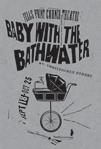
in time, my risky stuff has become my safe stuff, and now I am able to take even bigger risks. sm Paul, for you, were the Fells Point Theatre posters your version of that? Something you did, not for the money, but because you wanted to make them. Seems like, in the end, those posters created a platform that helped you break free and find new methods of making /thinking.
ps Yeah, it was in Baltimore where I kind of had to do work that wasn’t at the office. It’s funny because, as far as graphic designers go, in the 1980s the holy grail was getting a corporate design job where you did branding. It wasn’t called branding at the time. Instead it was “identity design” or “corporate identity.”
That was the main avenue for work, and there was not much work, for yourself out there. I’m not saying nobody was doing that. It just wasn’t really presented to me as an option. I did find a couple people that I gravitated towards. Art Chantry was a role model and inspiration, but that was really it. At the time, there just weren’t that many independent graphic designers out there constantly creating exciting work, for ex citing clients.
sm Art definitely managed to find a way to establish an exciting practice in Seattle, making silkscreen posters on a tight bud get of like a $ 100 a concert poster. But more importantly, he found a way to take his own stance on the design process.
That’s probably how he was able to firmly embed himself in the music scene at the right time, just as it was expanding and becoming internationally recognized.
badly, and then the pressure starts to dissipate a little, and then, maybe, you will be able to move on to doing something more interesting. ps I went to grad school right after undergrad. You do that, and you know how good it can be. You have a lot of freedom to explore. So when you get out into the real world and you get a job somewhere doing de sign or whatever, you’re like, this is not what I signed up for! You have to try and get back to that place of grad school a little. I think my personal studio has been that for me: a place where I am able to extricate myself from all that (work) stuff and really try to replicate the feelings of grad school. You know, where every day is an exploration. You’re kicking ; you’re twisting; you’re trying to figure things out. You’re making and playing and focused. It’s about the beauty of the whole thing and why we got into this work in the first
being uncomfortable. Obviously, that is easier when you are younger. Having kids, marriage — all that stuff changes things. I mean, there is a reason why there is such a low rate of success in this line of work. When you fully realize what it takes to be an entrepreneur or freelancer, most people don’t want to do it. What sustains you, or what sustains me, is this deep curiosity.
It’s like what I said before about exploring and discovering your own intent.
A few years ago, I was reading Antifragile by Nassim Nicholas Taleb. In it, he talked about something called a “barbell strategy” where you do something incredibly risky on one side and something incredibly safe on the other. For me, that was putting my sketchbooks out into the world any way possible while still doing the “safe” commercial stuff. It was a way of explor ing and discovering my own self. That was my risk while my safe stuff was my commercial work. Eventually, this opened doors for me, and,
ps Yeah, a little bit of luck was on his side, but he was also a super rare case at that time. I was married with two cats and a dog, and I was absolutely miserable on the job. I realized I had to do something more in Baltimore or I was going to lose it. There was a design com munity there, but it was really small and weird. Baltimore’s niche at that time was designing small publications for colleges and universities. There were a number of different studios that specialized in that, but they all grew out of one called Barton-Gillet. They had been around since the 1920s. Straight up, it was a corporate scene, and I worked for them. I was feeling, like, this just fucking sucks. I had been doing a lot of silkscreening at school and really enjoyed the process, so I got this idea that I was going to contact a theater and offer my services for free. I was already making a living at the studio, so I didn’t need to worry about making money from the posters. I just wanted to explore design in my own way and print the silkscreens on my own. [fig.002] I would go to work during the day and then come home and make silkscreen posters all night. No one gave a shit about any work that I was doing on the job for Barton.
But after a while, they did start to care about those posters. It’s crazy, but everything else that’s happened in my career since has hap pened from those posters. Because of those stupid posters, I became the Baltimore graphic designer. I was only twenty-five or something.
[ 001 ] [ 002 ] NOHAWK EXP INSIDE OUT 134
Notes: Developing a Designer’s Voice.
Paul
Sahre,
& Scott Massey N. 06
I
ulterior motives
the posters.
ambition
just wanted to make things.
me think a lot about the role technology
play in facilitating new creative paths.
the first Macs and desktop
processing,
the shift between new and old processes can often lead to finding innovative forms even with “obso lete” tools.
things getting any easier
each step, harder,
it just new versions of old questions /problems?
I know you guys both know this, but it was an epiphany for me at the time. Years ago, peo ple would ask me to print stuff for them, and I’d say no. I would only print for myself. There was nobody else doing this in Baltimore at the time. I mean, other graphic designers would see them and say things like, “Wait a minute. You don’t have a client?” I’d say, “Well, no, I have a client.” And they would come back, “But you don’t get paid. So you’re just printing them for yourself? Why would you do that?” It occurred to me that they saw silkscreening as a simple means to mass-produce something. Like, it
experience … like Paul was saying, there has often been this judgment thing with new technologies. I remember old teach ers of mine coming up to me and a couple of my friends who were making a living right out of school. They would say things like, “We didn’t think anyone could do this anymore in this era. How are you guys do ing it?” Our answer was like, “We’ve got this computer. It’s sort of a giant cutting and pasting tool, and we’re from fringe subcultures that are all about DIY, so we just do it and figure it out as we go.”
The point of the younger generation is to over throw the conventions that no longer work. In the classroom as a teacher now myself, the students may seem to get younger every year, but their attitudes are also entirely different and foreign. It is inspiring to see how these fringe ideas eventually come together at the center. I remember showing my sketchbooks in a class years ago, and there was this drawing that I did when I was stuck in a subway train. It was super detailed, and one of the teachers goes, “Wait a minute. You spent all this time and you didn’t get paid for that?” And my an swer was, “Yeah, I know I’ll use it for something.”
pushing that thing, you will go somewhere that these other people are not going to be able to go. I don’t know the overall consensus, but the individual button pushing that goes on today, creatively with some of the influencing stuff that you see … I still find it super disturbing.
I teach this class at the School of Visual Arts called Graphic Voice, and I’ve been doing it for a couple years now. It’s about trying to actively, consciously cultivating a way for someone to have more ownership of the work they create as a graphic designer. Almost every single week I am teaching it, I say to myself, this is a mistake. I shouldn’t be doing this.
gb I’m curious. Why do you feel that way?
ps I think it’s the conscious aspect of it. Like, literally putting these students through exercises that are meant to draw out originality. I think in some fundamental way this is counter to how it actually happens. I mean, can you will yourself? Is that even a good idea?
gb Yeah, I don’t think you can will it. I say it a lot to my students, the only people who are truly original are insane, and you don’t want to be that. It’s okay. The best advice that I got my freshman year was to not be afraid of letting your influences show. The point is to work through them … There is a pressure in pursuing originality that may be, in the long run, stifles your personal voice and viewpoint.
was just printing, and designers didn’t do that sort of stuff. But for me, the process itself was a way to rebel against that type of thinking. I realized that the design process could be continued through the printing process. The physicality and involved effort really mattered. Ultimately, the process of silkscreen affected what the design was. It really flattened things out and simplified the process, I realized this and that never would have happened if it wasn’t for me actually doing the printing my self. It’s funny, but I think the computer stuff and new technology is sort of the same. It’s a way for the new generation to say, “We are taking over. We want to use this.” It’s a way to rebel just like using silkscreens was sort of my way to rebel against the computer and take a path of my own.
gb Yeah, I would add, there is something about the physicality of making that adds to the aesthetic experience. [fig.003] What you are making is so much more than a statement; it’s an experience. It doesn’t matter what the medium is. It is the bring ing of that experience into your medium that matters. With my public art, my goal is always to reveal something that relates to the site’s specific nature to invite that
Sure enough, that drawing wound up becom ing the first public art piece that I ever did. We blew it up and made it into a glass art wall. I sold it to Phish, I sold it to the New York Times, and I sold it to a private collector. If I hadn’t taken the time to draw it and explore the depth of that wilderness, you know, I never would have been there.
sm Talk to me a little bit about artistic voice and originality.
ps I don’t know. I think it’s probably the same way for you guys; it’s probably generational … but I was taught that if too many people agree on it, it’s bad. It’s not a good thing. If people say it’s good, if people think it’s good, if too many people agree — that’s terrible! That’s the worst! You gotta get further with this thing be cause that’s the lowest common denominator; you have to push this further to somewhere uncomfortable. Well-received work was the worst thing. And now with social media and Instagram, that is the best thing, that’s the motivation. Now its a popularity contest. I just thought we left that in high school, and it was so refreshing to get away from that. If you care and you commit and work harder than anyone else, you’ll get somewhere, even if people think you’re … no matter what they think. You keep
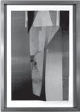
ps There’s a quote that I’m really fond of from an old composer. “All art is clever theft.” The ac tual art is covering your tracks. And so I have an assignment where I literally require students to steal. Steal! Don’t be influenced! Take this thing that you’re responding to, whatever it may be … and rip it off for some other purpose. Don’t try to cover your tracks at all. Really identify the theft, embrace it, and actually feel it. Then we have a discussion about it, and the next week it’s like, okay, now take it somewhere. Hold on to the aspects of it that you’re attracted to and make something new. Hide your tracks . [fig.004] Look, I’m sure you remember this from class, Scott. If you are designing and making decisions and you have all this other shit you have to deal with in life and you gotta make whatever it is you are working on bigger or make it red or do this with it or do that with it … Whatever it is, you have to ask yourself, Is there a way to make a change to this thing and turn it into something that brings me back to life? Is there a way to engage myself more in it? You have to want to keep making. You have to want it more than all those other things you have to do. You have to want it more than sleeping or eating or having sex or whatever the hell it is you think you have to do instead. [fig.005] Are you able to make decisions about your design not based on anything else but your engagement with the thing? ●

[ 005 ] [ 003 ] [ 004 ] NOHAWK EXP UPSIDE DOWN 135
didn’t have any
or
doing
I
sm This makes
can
From
publishing to
NFTs and Instagram … how
Are
with
or is
ps
24 NOHAWK EXP INSIDE OUT 150
25 NOHAWK EXP UPSIDE DOWN 151
FILM BREAK
CalArts
black marks will allow the emulsion to harden and block ink from being pushed through the mesh and on to paper. At 800 % the design can be seen as it will be printed on paper; all bits and blobs can be accounted for.
last look before burning image onto screen is to invert the
this section, I’d like to thank Frédéric Teschner for sharing his reflection on this process and for your kind notes that have made a lasting impression. “I’m using the pixel in its black-and-white bitmap version (in other words, in its most essential and lightest binary form). This process allows me to create fairly radical images with a striking economy of means. I actually play with the black-and-white version of the pixel as designers used to play with signs and type (traditionally rendered in black-and-white too). Using the pixel is a way for me to show the contemporary world in a particular view, as (in their own ways) the artists Sigmar Polke, Roy Lichtenstein, and Martial Raysse gave some
time
creating images
patterns.”
NOHAWK EXP INSIDE OUT 152 → Inverted. One
design. All
In
conceptions of their
by
from printed
— Frédéric Teschner, Designer/ Educator (1972 2016)
The
Poster Collages at 100 % PRINTED AS FILM AND THUS INVERTED 03 30 20
NOHAWK EXP UPSIDE DOWN 169
NOHAWK EXP INSIDE OUT 184 ↑ [001]
FLIGHT
NOHAWK EXP INSIDE OUT 186 Man is least himself when he talks in his own person. Give him a mask, and he will tell the truth. E. 03 Essay: This Is a Pencil. Ian Lynam [ 002 ]
1995 was weird.
There were days working in the print shop where I would get so bored that I would make high-contrast self-portraits by sliding my naked body over the photocopier in six-inch increments, then immediately shred them. Days when I was so bored that I’d smear nose oil over the security camera lenses so that the manager thought the cameras were broken and sent them in for repair. Days when I’d throw magnets and other small pieces of metal in the security system VCR so that when the cameras came back from being repaired, the recording device would seize up and the manager would have to start all over again. There were days when I would take handfuls of Valium and just stare at the walls, listening to repetitive music and pondering the words.
1995 was, for me, a year that felt disjointed from time — a young man in a large concrete box with digital presses and photocopiers and binding equipment and shelves and shelves of assorted papers. (In short, heaven for a designer, but I wasn’t a designer yet. I was just someone enthralled with zines and with printing.)
1995 has nothing to do with this essay, nor do these experiences other than being a part of a life lived. Life is accretive and iterative in that way, as is language — language that is spoken, recorded, and /or written. We repeat the words and build on them until we get them right — be it explaining your assorted rationales to lovers, explaining your modus operandi to yourself, or bashing through the draft of something for yet-unseen readers — these are all methods of trying to convince yourself of something. It takes time, and it builds up in layers.
Like bedrock.
We gather ourselves around millions of individual tiny campfires and try to make the stories that reconcile our existences.
We gather ourselves around millions of individual tiny campfires and try to make the stories that reify our lives and our decisions.
We gather ourselves around millions of individual tiny campfires and try to convince others that our ideas are valid and purposeful.
We talk and write ourselves into continued existence. We listen ourselves into the ground.
This is a mouth. This is a pencil. This is an ear. This is an eye. This is a reason for living.
This is a snatch of birdsong caught short in the mouth. This is a pedestrian stepping into oncoming traffic. It is the same with form languages. We build them iteratively, part upon part, casting and refining — a coital coaxing and prizing apart of elements and attributes, building something and building toward something. Building a language of form requires tenacity and stick-to-itiveness. Building a lan guage of form requires a surgical scalpel.
A trainwreck.
A metronome.
A half-inflated bicycle tube. Multiple outdated technologies.
Virgin tears.
Atlantis.
A brisk sprint around campus in the nude. And recycling. We work in form languages destined for mass communication — that is what separates us from most “artists.” (Also, the berets.) People go to art, but design comes to people.
[ 001] Stripped (Detail), true to size of the silkscreen print. Made and printed in 2005.
[ 002] Stripped, black-and-white collage, 4 x 6". From the series of collages, prints, and book called Extract. One of the first of many over steps or extra steps taken after a project was complete. With printouts and scraps left all over the floor from a branding project for a sound design studio, I was bored and still really excited about what might happen when all these dots, bits, and blobs were combined. At first it was an exercise to see if a design for personalized tape could be found, but I quickly took over the project and followed a path that was more personal. Mixing pop photos of the Stones clipped from Rolling Stone magazine and juxtaposing them with the regional acoustics from native peoples found in the Secret Museum, I was on a path and couldn’t stop until that last bit found a home. The collages were collated into a book and hand silkscreen printed for a show in New York City. There were a slew of firsts within the process, but I still get the same compulsive feeling when on a collage bender.
[004] No Man is an Island A series of collages made within a found book called Canyons in 2011. The series explored the dwindling connection we have to nature and our physical /spiritual selves. The above piece was used for a T-shirt, book illustration, and cover ; with each iteration slight additions were made.
NOHAWK EXP UPSIDE DOWN 187
[003] Nudes Strip. Part of the NYE experiment while at CalArts with Thea Lorentzen in 2011. Emulsified film strip that was manually exposed directly onto the film. This was a Leisure Labor exercise and a potential asset created for a film club at CalArts. An early look into experimental anima tion using analog processes and materials.
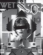
[
011] WET Magazine, designed by April Greiman in collaboration with Jayme Odgers, 1979. This cover uses a number of postmodern processes and tropes, including complexity, contradiction, appro priation, and hybridity. Their practice Made in Space subverted aspects of Greiman’s rigorous Swiss typo graphic training, deploying imagery and typography in new expressive forms that broke new ground both immediately prior to and during the initial surge of the use of computers for desktop publishing in North America.
and Jayme Odgers’s work for the magazine WET [fig.011] as much as their work for CalArts, the institution which is largely the initial springboard for the book you have in your hands right now. That work was an homage to space and spatiality, notably the 1979 cover for the magazine WET — a paean to Yokoo’s retro-redeployment of center-axis compositions as much as an Orientalist ode to both more contemporary and more historical Japanese vernacular motifs: the noh mask and flying fish set in contrast with a leaping feline having inadvertently donned an Ultraman mask before pouncing.
A sakura flower and a sword.
Orbital swooshes a few decades too early.
An earthrise.
It’s mimesis in action — simultaneously a collection of references to another culture, an imitation of stylistically Japanese approaches to composition, and a reimagining of the world, all with a male headshot at the center made seemingly anonymous with the addition of a censor bar over the eyes, sexu alized by the application of a black dot on the cheek (a nod to how different cultures would tattoo over or apply fake moles — often made from tanned mouse pelts — to cover the pockmarks and divots of smallpox and STD scars on their faces alike, as famously reiterated by Madonna at the start of her career — an implicit allusion to feral sexuality) and a slash of a mouth itself “made wet” with graphically applied lipstick. 3
These are some of the things I think about when considering form languages when I set to making and writing, or some conflation of the two: What’s the referent? What’s the anchor? What’s the buoy? Where’s the horizon and where will the sun be at its zenith? Are my children there? Why does the earth shake whenever I take a step? Did I forget to buy an avocado? Will there be a blood sacrifice? Why is someone with my name playing the bagpipes? Will I ever be held accountable?
This is a mouth. This is a pencil. This is an ear. This is an eye. This is a reason for living. ●
1
Endnotes
All Japanese names are presented in the Japanese fashion: family name first, personal name second.
2 Yokoo’s lettering and typography has been slapdash since the 1980s and the advent of digital technologies used in graphic design, sadly. It really is a shame, but he’s decided to devote his energies to imagery and image making in lieu of the connota tive historical form he used to give to lettering, and that’s what makes the past few decades of his work so inconsequential in comparison to his work in the 1960s and dawn of the 1970s. What came before was truly synthesized; what comes now feels ill-considered.
3 Yes, I am very aware that this paragraph is a run-on sentence. In the immortal words of Ed Fella, I am “painting my thesis ” To explain, as a faculty member in the CalArts MFA Program, he said that “you can paint your thesis,” alluding that the form that one’s the sis project might take didn’t matter so long as it was expansive and rigorous. Here, I am not referring to an MFA thesis, but the underlying thesis structure of an essay, which I am rendering with ornamented, ornamental language and destabilized structure.
Transformative Masks.
Masks allow for great risk-taking and allow the wearer to make connections that would not be able to be made when focused on a single object or dimension. Brown suggests that there is a debate about whether the transformation created by the mask is triggered merely by wearing the mask or rather the wearer reaches out to a particular mask because it unlocks their true self. A curiosity into topics or personalities that although foreign seem incredibly famil iar. Therefore, the wearing of this particular mask allows for the experimentation of ideas and practices while still being concealed by public scrutiny. The individual is given room to maneuver under disguise right before the eyes of all peers and public attention.
As with disinhibition, there are two sides to the process of trans formation: the loss of what was, and the acquisition of something new. It has been hypothesised that the wearing of a mask brings
References
Anderson, Margaret. “Practice Practice Practice ” CalArts Inform (May 2016). https://inform.design.calarts.edu/ 2016/05/jon-sueda
Ishihara, Yoshihisa, and Koichi Sato. “Koichi Sato.” Essay. In 1979 Nen Tōkyō Dezainazu Supasu = 1979 Tokyo Designers Space, 48–52. Tokyo: Seibundo Shinkosha, 1979.
Sato, Yoshiaki. “Spirit and Nature of Koichi Sato.” Idea, no. 375 (October 2016): 103–4.
Taguchi, Atsuko. “Koichi Sato in Tama Art University.” Idea, no. 375 (October 2016): 105–6.
about an attenuation of one’s previous self/identity, social identity, ego, personality, subjectivity, and behaviour. On the other side of the coin, it has been hypothesised that the wearing of a mask leads to the acquisition of new identities, subjective feelings, personalities, whole psychologies, voices, behaviours, and metaphysical entities. This latter belief — that the mask-wearer acquires the spiritual iden tity or “energy” of the mask — is also held by numerous traditional cultures. By wearing a mask we can access aspects of both the extraand intra-psychological life world that have been, hidden, forgotten and disregarded.
It is not the wearing of a mask that leads to transformation, rather the desire to transform which leads an individual to wear a particular mask, an activity that may facilitate the transforma tional process.
— Paul S.Wingert
NOHAWK EXP INSIDE OUT 190 ↑ [ 001 ]
[fig.012]
[012] Masks Studies 34, collage by Scott Massey, created June 12, 2018, at 5:40p.m. (PST )
TEST
between visuals, typography, and performance. It had a connection to Design as Dub because it required a performative element. Just as original dub records required a DJ /selector and also live vocals /toasting over the top of the sound system, Graphic Karaoke had to be performed to be complete. The inspiration was a video I made for “Love Will Tear Us Apart” for the L.A. Freewaves film festival, where guer rilla karaoke videos were shown in a Korean Nohrehbang (Karaoke) bar. I remember Brian Roettinger — an undergrad design student at the time — getting up and singing to it and do ing an amazing Ian Curtis impression! I made the video in two days with whatever imagery I had on my computer, and that became the model for Graphic Karaoke.
dk The Playlist poster assignment is absolutely a direct result of my experiences making that Graphic Karaoke video to “Blitzkrieg Bop” and seeing the visual out comes of the Design as Dub project. The Dub project happened after I had taken seminar class with you at CalArts, but I remember seeing Tom Kracauer’s [fig.005] bold, enormous white and brown silk screened posters and thinking “remix ing” typography is a robust conceptual strategy to generate unexpected form. Of course, the notion of remixing in graphic design has a familiar history too. Much of type design is predicated on assembling pieces from different times to create a new thing, the same way a DJ blends songs, often from different eras, to establish a new and imaginative vibe. For instance, Zuzana Licko’s Filosofia, a curvier take on the classic sharp, modern serif Bodoni. It’s definitely fair to say that graphic designers constantly repeat and alter known historical conventions the same way musician’s tinker with differ ent sounds to be presented in new ways. I often think both musicians and designers are at their best when using known ele ments unusually or using unusual pieces in normative ways.
mw I agree, and there are considerable overlaps in the terms, similes, and metaphors of music and typography. There are also the larg er concerns of audience and context, style and genre, expression and functionality / conformity versus experimentation as well as multiple parallels in terms of process and methodol ogy. There is a shared language to describe the complexities of both practices : composi tion, harmony, rhythm, contrast, volume, tone, analog / digital, sampling / remixing, etc. — that lends itself to reconsidering the creation of experimental typography as informed by the methodology of creating music.
You start from nothing but with a goal, an idea … a genre, a story, a mood … you allow it to develop into what couldn’t be envisioned, something complex and processed enough that it can’t be entirely replicated at the early stage … you build through process, iteration, experimentation, version … you set stages and
structures: the sketch, the rough, the devel oped piece, production, then present it to an audience, to the public … dk Michael, one thing you told me which has always stuck with me is “something looks the way it does based on the way you think about it and the processes you use to make it.” I think this is incredibly relevant given the tools, mainly digital, designers are using these days. Similar to musicians, designers have an innumerable amount of templates, stock behaviors / actions, and services all with the hopes of streamlin ing the act of making, which in turn often discounts the happy accidents you are alluding to in the process of discovery.
One element which I’m always focused on in my work and when talking to my students is, What’s the hook? Like a mesmerizing intro to a song, catchy chorus, or irresistible beat, I’m always obsessed with establishing that lockstep conceptual / visual move which draws in the audience and unites the content and form in an ap pealing “catch of the eye.” Structure and visual hierarchy in graphic design equates to a well-composed song that typically has a beginning, middle, and an end.
mw So where does that leave Scott Massey? He’s a masterful producer, a mad professor who twiddles the knobs on the desk to manip ulate the “texture” of the piece. That kind of intensity and endless reworking of the elements reminds me of someone like Lee Perry. Where the original music gets taken apart and reas sembled in such different ways that — while it still connects to the original — it becomes something totally different … something more expansive! The Upsetter takes a single track and investigates it endlessly: version, variation, remix, remake … a single starting point (say Max Romeo’s “Chase the Devil”) and expands it massively, in order to test it out, to try new things, and sometimes to document or show us the journey. I think Scott’s doing the same thing in making a book out of the process for a single poster (that itself is a “meta” endeavor since it’s a poster for an exhibition of other posters) dk The irony of all of this is Scott’s work can be so visually loud and raucous, but he’s a relatively quiet guy. Scott is absolutely at his best when he’s in the studio impro vising, by hand, fragments of type, tex tures, and colorful forms into vivid “walls of sound.” There’s a range of rhythm and progression to many of his posters, many
Endnotes
1 Design as Dub. The methodology that launched seventy unique covers for Inside Out & Upside Down, as well as impetus for The Nest. As noted before, this project started with a commission to design the poster for the exhibition Inside Out & Upside Down. The only ask from the curator Michael Worthington is that we used the same set of bitmapped excerpts from the CalArts Poster Archive. We took that as a mandate. Below is what Michael Worthington had to say about the end result.
“This book shows us design as dub. Using image instead of sound, where the process becomes the outcome. A set of predetermined graphic pieces that get manipulated, removed, amplified, and echoed into endless variations of visual landscapes. By the end of the process, the original is just a trace, an indexical mark; instead, the echo, the altered, the invisible is what becomes physical and real.”
feature a depth of regular or irregular warped elements, which heighten and hold the interest of the viewer. I loved this one poster he did for REDCAT (Martin Acosta: Timboctou, 2012) [fig.006] — which I believe was rejected by the client at the time — I thought it was the best represen tation of sound made visual. 2
mw I think what’s fascinating is not just the complexity of the form that gets made, but that we are shown a connoisseur’s view behind the scenes: it’s like we are being allowed into the studio to see the song being recorded, or to hear all the outtakes and versions of essen tially the same thing. It’s process being made visible. I just listened to the first take of “Dock of the Bay” by Otis Redding where he messes up the whistling and the producer makes fun of him, saying, “You’re not going to make it as a whistler”… which of course turns out to be one of the greatest pieces of whistling ever … then gets reborn and sampled by De La Soul … If it doesn’t work, you keep making, keep iterating, keep experimenting … the music never really has to stop. ●
[ 005 ]
the Design as Dub workshop, 2012. One-color silkscreen
Colors, Part 2 designed by Tom Kracauer, produced during
white printed on brown paper. 25 × 35". [ 006 ]
silkscreen (CMYK) printed on white paper. 20 x 30".
part of the REDCAT poster program, 2012. Four-color
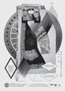
Timboctou , designed by Scott Massey, produced while
2 The Timboctu poster wasn’t necessarily rejected; it just wasn’t really accepted … the client for the posters was the REDCAT, but really the only person we needed approval from was the profes sor for the class, Shelley Stepp. Students had free rein to design whatever they could dream up within the loose confines of budget, time, and correct details.
Unfortunately, the director of the drama department didn’t agree with this arrangement or my chaotic and nonhierachical layering of type when it came to the director. In reality, this never would have happened, because of percentage rules and client meetings, but this was my poster and my take on the play. After the department head made a stink, I was angry and placed the order to all undergrads that they could and should steal all the posters. It was a silent strike, and within moments, they were all down.
NOHAWK EXP INSIDE OUT 194
↑ [ 001 ]
DEFEND
NOHAWK EXP INSIDE OUT 210 Inside Out & Upside Down Posters from CalArts 1970–2019 Inside Out & Upside Down Posters from CalArts 1970–2019 Inside Out & Upside Down Posters from CalArts 1970–2019 Inside Out & Upside Down Posters from CalArts 1970–2019 Inside Out & Upside Down Posters from CalArts 1970–2019
(THE
NOHAWK EXP UPSIDE DOWN 211 08 & THEN
ODDITY) FIN W/ B–SIDES An Endless Event COLOR TRIALS CLOSE-UPS AND REDOS 03 15 20


NOHAWK EXP INSIDE OUT 216
NOHAWK EXP UPSIDE DOWN 217 Inside Out & Upside Down Posters from CalArts 1970–2019 NOHAWK EXP INSIDE OUT UPSIDE DOWN 031220—070820&
[038] Fella Flyer : Two Lines Align, designed by Ed Fella, two-color print on yellow paper. An after-the-fact flyer to “announce” his exhibition at the REDCAT. Double sided, trifold so that it could be self-mailed, 11 x 17". According to Ed, “Graphic design ends at the event. Art begins at the opening, so they (the flyers) began after the event.” Well … not in this case ; the paradox continues.
“Two Lines Align: Drawings and Graphic Design by Ed Fella and Geoff McFetridge was the first exhibition of graphic design at the REDCAT Gallery in Los Angeles. The show presented a retrospective of the established ‘art-designer’ Ed Fella and a prospective of Geoff McFetridge, a young designer essentially at an early stage of his career. Curated by Michael Worthington, a design educator at California Institute of the Arts, it is both an examination of two careers and a reflection of the state of graphic design in the now.” — David Cabianca, Design Observer, 2008
[037] Cover design of the second issue of Heaven, a self-proclaimed “underground intellectual magazine” published from 1980 to 1981 designed by Harata Heiquiti. Heaven’s original form was a magazine initially published in 1979 called X-Magazine, and the same year was renamed X-Magazine Jam. These early issues were strictly sold in vending ma chines nationally, so that the content might not be censored or restricted, according to pornography laws of the day.
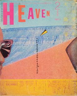
X-Magazine and X-Magazine Jam relied on the appearance of softcore pornography of the time with explicit covers and photographic features in order to fund the editors’ desired subcultural content, notably features on drugs, mysticism, Zen, cult cinema, punk rock, fantasy literature, the occult, parody, and professional wrestling, among other topics. Eleven issues of the precursor magazines were published before the magazine was relaunched as Heaven in 1980, with Harata jettisoning the overt sexual graphics for the appearance of a new wave magazine.
The Reading of Gender designed by Allen Hori for the Cranbrook Academy of Art and Detroit Institute of Arts, offset lithograph on paper, 1989. Photo Courtesy: Cooper Hewitt, Smithsonian Design Museum / Art Resource, NY. Gift of Katherine McCoy. Below is Allen’s memory of the flyer:
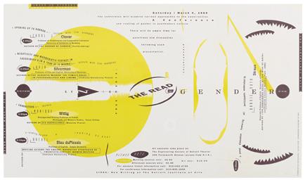
In crit and conversations with Kathy McCoy during its development, she proposed a vagina with teeth as a possible read of the image — a pretty accurate observation as the material being presented at the event were cutting-edge feminist writings and activism in Detroit of all places. Our crits were sometimes quite raw and following my description of the orb being the powerful female site / orifice or origin, next to a capsule-like form of the sanitary napkin being the prosthesis of hygiene determined by male marketing force, and then ending with an oscillating group of “teeth” / embrace to gather and support the power of these women who were gathering at the event.
Shortly after the event, Roy Slade, the then-president of Cranbrook Academy of Art, came to my studio, beaming and carrying a piece of hate mail he had received from a patron of the Detroit Institute of Art, where the conference was held. The letter went on a rant about how the flyer was an insult to communication on all levels and how could the school support such deviant work? Roy was very tickled to read the letter aloud in his Welsh-accented hilarity and then gave me the letter as a keepsake with the request to please continue with the kind of work that would elicit such responses. bateshori.com
NOHAWK EXP INSIDE OUT 248
[ 039 ]
NOHAWK EXP UPSIDE DOWN 249 [ 040 ]
Yokoo Tadanori remixed his original composition for A La Maison de M Civecawa , made in 1965, for the theatrical performance of Hangi Daito-kan by Tatsumi Hijikata in 1970. Ankokubuto-ha Garumera Shokai, 728 x 1,030mm, silkscreen on paper. Collection of the National Museum of Art, Osaka. By using overprinting, Yokoo is able to negate the forms from the original while still making powerful use of the original structure, adding colors, marks, and additional elements in order to update the design for its new purpose. Tadanori has made countless re-drawings, re-paintings, and re-releases of his older projects, but also mixing his work with that of late design legends such as Aleksandr Rodchenko and others to create new, speculative, hybrid historical designers as much as to prop up his own place in history. tadanoriyokoo.com
sometimes an unruly mess.
also
The collection
a
that
break rules,
With
The above cover was designed by Scott Massey. It was the precursor to The Nest, in which the designer took it as a mandate to use every bit the was provided by MW. This was Design as Dub in the most maximal sense. Seventy-four bitmapped files were provided to design with, and we’re more than positive that at least seventy found their way into the above design. It’s a symphony of color, scale, all colliding together for one last swan song. Without the
book and exhibit, there would be no real reason for The Nest in its current form. Thank you to MW Books and CalArts. posters.calarts.edu/book
NOHAWK EXP INSIDE OUT 252
[
048]
Inside Out & Upside Down: Posters from CalArts 1980–2019, softcover, 400 pages, full color, 7.25 x 10". The book was curated and designed by Michael Worthington.
A book featuring over 500 CalArts
posters from the
past forty years. Many of the featured posters were not meant to function purely as posters but were produced as experimental works. Produced for a narrow audience, most of the posters have existed outside the mainstream, barely engaging with the visible canon of design. Often produced in small — even singular — editions, they
were produced outside the traditional designer / client relationship. The posters
misbehave, and are
reflects
belief
the creative process is as important as the product, and outlines a history of pedagogy at CalArts.
essays by graphic designers Colin Frazer,
Sarah Gottesdiener, Ian Lynam, Jennifer McKnight, and Louise Sandhaus.
Also include
interviews with Mark Allen and Gail Swanlund;
Kary Arimoto-Mercer
and Shelley Stepp; Ed Fella, Jeffery Keedy, Lorraine Wild, and Michael Worthington; Yasmin Khan Gibson, Jérôme Saint-Loubert Bié, and Jon Sueda; Daniela Marx and Tuan Phan; Joe Prichard, Stuart Smith, Gail Swanlund, Scott Taylor, and Michael Worthington. Cover designs vary. Each book has one of seventy unique covers designed by CalArts students, alumni, and faculty. Published by MW Books, 2020.
IO&UD
NOHAWK EXP UPSIDE DOWN 253 END ROUTE The CalArts Poster Archive Print: FREEDOM TO FALL FLAT ON YOUR FACE OR THE SPACE TO CREATE A NEW HISTORY 10 13 21
Slanted Publishers UG (haftungsbeschränkt)
Nördliche Uferstraße 4–6
76189 Karlsruhe, Germany
T +49 (0) 721 85148268 info@slanted.de slanted.de @slanted_publishers
© Slanted Publishers, Karlsruhe, 2022 Nördliche Uferstraße 4–6
76189 Karlsruhe, Germany
© Concept and Design by Scott Massey
All rights reserved.
ISBN: 978-3-948440-11-4
1st edition 2022 Edition Size: 900
Concept and Design: Scott Massey
Editor: Ethan A. Stewart
Publishing Direction: Lars Harmsen, Julia Kahl
Production Management: Julia Kahl
Proofreading: Jackson Friedman Paper: Wibalin Selector, Kraft Paper, GardaMatt Art, and GardaGloss Art

Typefaces: Monument Grotesk (Dinamo)
& Self Modern (Bretagne Type Foundry)
Printer: Stober Medien GmbH
Disclaimer
The publisher assumes no responsibility for the accura cy of all information. Publisher and editor assume that material that was made available for publishing, is free of third party rights. Reproduction and storage require the permission of the publisher. Photos and texts are welcome, but there is no liability. Signed contributions do not necessarily represent the opinion of the publisher or the editor.
The German National Library lists this publication in the German National Bibliography; detailed bibliographic data is available on the Internet at dnb.d-nb.de
About Slanted Publishers is an internationally active inde pendent publishing and media house, founded in 2014 by Lars Harmsen and Julia Kahl. They publish the award-winning print magazine Slanted, which twice a year focuses on international design and culture. The Slanted blog www.slanted.de and social media have been publishing daily news and events from the interna tional design scene and presenting inspiring portfolios from around the world for 18 years. In addition to the Slanted blog and magazine, Slanted Publishers initiates and creates projects such as the Yearbook of Type, tearoff calendars Typodarium and Photodarium, indepen dent type foundry VolcanoType and others. Slanted’s publishing program reflects their own diverse interests, focusing on contemporary design and culture, working closely with editors and authors to produce outstanding publications with meaningful content and high quality. These publications can be found in the Slanted Shop alongside other extraordinary products by young design talents and established producers from all over the world. Slanted was born from great passion and has made a name for itself across the globe. Its design is vibrant and inspiring — its philosophy open-minded, tolerant, and curious.
→ This book is no longer a WIP or work in progress. It is now a finished, physical record of a slightly frenetic and fuzzy creative process. We’ve accomplished all our objectives. A print was made, a show finally happened, and people went home with something to remember the event. Possibly one or two couples placed the print in a frame and mounted on their wall. The wall might have been in the basement or bathroom, but regardless … we’ve done our job. It’s time to say our blessings and goodbyes. Acknowledge that this book’s pages are soon to be printed and in some ways close. It’s the end of this strange journey, but several others have already begun. What happens next is up to us. So for now, we say thank you and goodbye. Many thank-yous to the family, Kim, Dandy, Bryton, and Summer … thank-you to the Masseys, to Ethan Stewart and his family. To Ian Lynam, Laura Bernstein, and Jackson Friedman. To friends and family for not making me feel like a weirdo. Special thank-you to Michael Worthington for the prompt and to be a part of Inside Out & Upside Down exhibition. Thanks to Tom Kracauer and Tiffanie Tran for pulling me into this project: The Nest has brought back a spirit that I haven’t felt since running around in the hills of Valencia. Thanks to CalArts for letting us be weird and grow. Special Thanks: Lars Harmsen & Julia Kahl (Slanted) & Julian Brimmers (Kickstarter), without your guidance & support, this project would not be possible.
NOHAWK EXP INSIDE OUT 256
BACK PLATES
NOHAWK EXP UPSIDE DOWN 257 [001]
[001–5]
The five screens used to print the Inside Out & Upside Down Print, designed by Scott Massey, poster for an exhibition celebrating CalArts posters (1970–2019) Five-color silkscreen, CMYK + Gold (Pantone 871), printed in 2020 by Tom Kracauer and commissioned by Michael Worthington, 20 x 30"
This might be the beginning … The Nest started as a place for the poster design to “work itself out.” A builtin multi-paged container for ideas, forms, and voices to cross-pollinate, transform, and blend. The pages of this book were used to unpack and repack the various bits extracted from the CalArts Poster Archive. Layer upon layer, different strategies were applied to blur the collective energy of the institute and those that have helped shape the foundation.
[006] On Press Combinations. The IO&UD print was designed to deliver multiple variations depend ing on when and if all the screens were used.
Thanks to Tom’s skill, dillegence, and amazing (tested) patience, the printing process allowed for further explo ration when combining screens. There are prints that contain all five screens, as planned, but also a few oneoffs containing one, two, and / or three special design combinations. To shuffle the output a bit more, we also had two main masking screens for the black layer, adding more variety to the mix. Exploration … it never has to end!
→ Surrounded. Deeply embedded in my subconscious is the worshipping of the ’80s. But not just the normal ’80s : my brain is full of the moments that were made in California and usually about the lush California lifestyle on the fringes of the mainstream. Movies like Thrasher, Gleaming the Cube, Fast Times at Ridgemont High, Rolling Thunder, Big Wednesday, and even ESPN’s Hot Summer Nights provided that misty window for us to peep through (by the time Baywatch came around, there really wasn’t another state to care about). Magazines like Surfer and Thrasher sold us on the escapist lifestyle that was filled with the lure of perfect waves surrounded by unknowns, dangerous woman, and even more dangerous food. We were told that the only trips worth taking were the ones where you might never come back, either by choice or consequence. So we found the clothes (usually at Marshalls), borrowed the boards (sorry, Dan), and plastered ourselves with Zinka. Our moms dropped us off at the beach (we were rebels without a car or license), and we spent all day in the water (without eating our packed lunches or even drinking water). Every piece of clothing, head to toe, was much too bright to wear at school (or in public), but we wore it anyway so that everyone knew we surfed or skated or did something that others wouldn't dare. At some point in The Nest, I realized how deeply affected my life, ethos, and ethics were by these films, ads, companies, and people. To commemorate this time and place I had only dreamed about (until I moved there), we designed and produced super bright and geometrically composed towels. What's better than the comfort and warmth of a smooth beach towel, all wrapped up in Nostalgia! Thanks to Slowtide for making this come to life. And a special thanks to all the parents out there dropping their kids off at the beach, building ramps, and being weird!
NOHAWK EXP INSIDE OUT 262
[006]
NOHAWK EXP UPSIDE DOWN 263
NOHAWK EXP UPSIDE DOWN 267 THE NEST The CalArts Poster Archive Print: FREEDOM TO FALL FLAT ON YOUR FACE OR THE SPACE TO CREATE A NEW HISTORY 03 03 20 SCOTT MASSEY 03 15 20 07 15 22
by hand from a small stack of editorial publica tions, only to be undone and rebuilt via various digital tools “Anyone can make collages — they are the medium of the amateur — but it’s hard to make them with skill and even harder to make them with surprise and shock. Get them in the computer : that is your tool ; that is your time. Get in there and add to them until they are black, till they have changed into something wonderful. Then take them back to zero.” — Ed Fella, 2011
→ This Must Be the Place (Naive Melody). [Verse 01] Home is where I want to be. Pick me up and turn me ’round. I feel numb, born with a weak heart. I guess I must be having fun. The less we say about it, the better. We’ll make it up as we go along. Feet on the ground, head in the sky. It’s okay, I know nothing’s wrong, nothing. [Chorus 01] Hi-yeah, I got plenty of time. Hi-yeah, you got light in your eyes. And you’re standing here beside me. I love the passing of time. Never for money, always for love. Cover up and say goodnight, say goodnight. [Verse 02] Home is where I want to be. But I guess I’m already there. I come home, she lifted up her wings. I guess that this must be the place. I can’t tell one from another. Did I find you or you find me? There was a time before we were born. If someone asks, this is where I’ll be, where I’ll be. [Chorus 02] Hi-yeah, we drift in and out. Hi-yeah, sing into my mouth. Out of all those kinds of people. You got a face with a view. I’m just an animal looking for a home and. Share the same space for a minute or two. And you love me ’til my heart stops. Love me ’til I’m dead. Eyes that light up, eyes look through you. Cover up the blank spots, hit me on the head, I go. Ooh. — David Byrne
NOHAWK EXP INSIDE OUT 272
[001–4] No Man Is an Island (Meta Collages), a series of 60 collages by Scott Massey, 2011–2012. Built
[004]
not inspire the process of The Nest. They might have come on while I was working, but there wasn’t a search for words to use as titles, and there wasn’t a time where I was searching for inspiration ; to be honest, they jumped out from somewhere deep inside me and just started to make sense when writing them down.
My first introduction to this album happened while I was attending UNC Chapel Hill, a bright and sunny place with a campus full of beautiful, smart, happy people — often partying and painted Carolina blue (my favorite color, but I was blue AF) Music and art were my saving grace ; everything
else, unfortunately, seemed out of my control and was going sideways fast. Brighten the Corners was on repeat while I worked in the art studio well into the morning, drawing tiny, detailed all-over patterned designs on large pieces of paper. My professor flipped, my hands hurt, and to save me from further bodily damage, he showed me how to further explore smaller pieces of bigger puzzles. I’m realizing the deeper significance of this album as I type this …
Of course, none of these memories surfaced when I decided to use the song titles as section headers. They just made sense to me, and for a while they were there for placement only (FPO) But the more I worked with them, the more I re alized they were perfect. The process of naming matched the process used to make the work and now I can remember where this process was ac tually developed. One professor’s input, one way to change perspective, one way to consider a path forward. — sm,
FILM BREAK
Paul Sahre, George Bates & Scott Massey [134–136]
Ian Lynam [186–190]
David Karwan & Michael Worthington [192–194]
Joseph Conway [ 195–200]
Jon Sueda, Martin Venezky & Scott Massey [202–204]
TESTING, TESTING! [205–210] S.08
GALLERY VIII: FINAL, FINAL! [213–219]
FULL FRAME
The CalArts Poster Structures at 100 % Full Color Minus Black & Metallic Gold Screens [220–236]
Nested Moments: Connectivity Across Time, Space, and Creatives ; A Visual Map of Inspiration and Development. [237–252]
E. 05 Essay : An Absurd Journey Through Time and Form.
BACK PLATES
Scott Massey [254–256]
IO&UD Screen Breakdown, Contributors,
S. 05 SOUL FOOD 4 MAJOR BOREDOM PRINT SCALPEL TEAR GLUE SCAN RINSE REPEAT S. 06 BIRDS IN THE MAJIC INDUSTRY PLAY IN THE LAST DIGITAL AGE S. 07 WE ARE UNDERUSED TRANSPARENCY OVERLAYS KNOCKOUTS S. 08 & THEN (THE ODDITY) FIN W/ B–SIDES AN ENDLESS EVENT COLOR TRIALS CLOSE-UPS AND RE-DOS GALLERY IV: B/W COLLAGES [117–132] S.06 N. 06 Notes: A Designer’s Voice.
GALLERY V: WHAT IF? [137–151]
The CalArts Poster Collages at 100 % Printed as Film and Thus Inverted [152–168] GALLERY VI: /THEN [169–184] E. 03 Essay : This Is a Pencil.
N. 07 Notes: Music as Methodology, Design as Dub.
E. 04 Essay : Lines of Sight.
S.07 N. 08 Notes : Version Versus Variation.
GALLERY VII:
& Thank Yous [257–272] [––—] Brighten The Nest All the sections from this book were appropriated /collaged from the tracklist of Pavement’s fourth album, Brighten the Corners, originally released in 1997. The decision-making process was similar to that of a dream, in the sense that I wasn’t listening to the album on repeat and the songs certainly did
02.22.22