

From Posada to Isotype, from Kollwitz to Catlett: Exchanges of Political Print Culture. Germany–Mexico 1900–1968
Curated and edited by Benjamin H.D. Buchloh
Michelle N. Harewood
From Posada to Isotype, from Kollwitz to Catlett: Exchanges of Political Print Culture. Germany–––––Mexico 1900–––––1968

Graphic art has always been a marginal note in official histories of art. Regarded as a minor technique, antitechnological and almost anachronistic, it is nevertheless the central focus of the current exhibition. The result of extensive research, From Posada to Isotype, from Kollwitz to Catlett: Exchanges of Political Print Culture Germany–Mexico 1900–1968 reveals the way in which this popular and accessible language served as a powerful political tool for a large number of international artistic movements.
Curated by Benjamin H.D. Buchloh and Michelle N. Harewood, the show highlights the possibilities of graphic art for generating critical representations that are universally amenable and capable of functioning as emancipatory educational tools. It also analyzes the links between the graphic cultures of Germany and Mexico in the twentieth century, forged above all through German artists, critics, and intellectuals exiled in Mexico.
The exhibition examines different uses of engraving techniques through four case studies. In Mexico, José Guadalupe Posada mobilized political resistance against power and exploitation through the image of the skull, while the German Käthe Kollwitz situated the iconography of death in specific conditions of gender and class. In the meantime, the collective Taller de Gráfica Popular (Popular Graphics Workshop) held that graphic art was especially suited to represent its fight against Fascism and its support for causes like the nationalization of oil and mining resources, while the Afro-American sculptor and engraver Elizabeth Catlett adapted Kollwitz’s iconography and graphic technique in support of the feminist cause and the civil rights movement in the United States. The show ends with a section devoted to Isotype, the project initiated by the Austrians Otto Neurath and Marie Reidemeister-Neurath and the German artist Gerd Arntz, whose aim was to create a new universal sign code that would enable the straightforward transmission and assimilation of the economic, political, and sociological principles that, in their view, were essential for hastening the emancipation of the working classes.
This is an ambitious exhibition that offers us an opportunity to learn more about an enthralling but little-known episode in the history of twentieth-century art. It brings together more than 450 works, many of them on loan from important private collections and international artistic institutions such as The Metropolitan Museum of Art and the Museum of Modern Art in New York, the Art Institute of Chicago, the U.S. Library of Congress in Washington DC, the Centre Pompidou in Paris, and the Kunstmuseum in The Hague. I express our gratitude to all the institutions that have collaborated for their help in facilitating new readings of artistic creation.
Miquel Iceta i Llorens Minister of Culture and Sport
In a context where our lives are increasingly conditioned by the logic of algorithms and digitization, a tendency intensified by the pandemic, the Museo Reina Sofía has focused its gaze on a set of artistic practices and experiments articulated around the vindication and critical use of graphic techniques considered obsolete, such as xylography, woodcut, linocut, or lithography. We are doing so in two exhibitions conceived almost as a diptych: this one, more historical, which looks at a littleknown episode in the art of the first half of the last century, and Graphic Shift: Like the Ivy on the Wall, centered on Latin American political graphics from the 1960s to the present day. Our conviction is that these practices are equipped with a disruptive poetic and political dimension that leads us to confront our present situation critically.
The show revolves fundamentally around the Taller de Gráfica Popular (Popular Graphics Workshop, TGP), a collective founded in Mexico in 1937 that attained great international prominence in the 1940s and 1950s, when similar initiatives emerged in countries like Peru, Colombia, Brazil, and the Soviet Union. The objective of the TGP, which appeared in the context of postrevolutionary Mexico, was to place the graphic arts at the service of the working classes, as well as to provide support for progressivist political groups and contribute to the fight against fascism. To this end, they premeditatedly used traditional graphic instruments rather than more novel techniques like photomontage, with which artists like John Heartfield and Josep Renau were experimenting in those years, as they considered them more suitable for educational and communicative work of an emancipatory nature. With them they produced a huge amount of leaflets, posters, pamphlets, and prints centered on issues like the nationalization of mining and petroleum resources and the land rights of Indigenous peoples.
The founding kernel of this collective was a group of Mexican artists—Raúl Anguiano, Luis Arenal, Leopoldo Méndez, Pablo O’Higgins, Ángel Bracho and Alfredo Zalce—who came from the Liga de Escritores y Artistas Revolucionarios (League of Revolutionary Writers and Artists, LEAR) and were highly critical of muralism, since they saw it as an art that required the mediation of the state and was therefore remote from the people. By contrast with this institutionalized muralism, they conceived work in traditional graphic media as a “war machine,” to use the terminology of Félix Guattari and Gilles Deleuze, meaning militant materials produced quickly and cheaply and so able to be massively circulated and easily decoded.
From almost the beginning, artists from other countries collaborated with the TGP. These included both European exiles fleeing from Fascism and Nazism and Afro-American artists like the painter Charles White and the sculptor and engraver Elizabeth Catlett, who found a receptive attitude in Mexico that had been denied them in their native land. Special mention among the Europeans should go to Hannes Meyer, the director of the Bauhaus in Dessau from 1928 to 1930, under whose artistic direction El libro negro del terror nazi en Europa (The black book of Nazi terror in Europe) was published in 1943 with images by twenty-two TGP artists, and to the German critic, art historian, and publisher Paul Westheim, the central
figure of the artistic culture of the Weimar Republic. As Benjamin H.D. Buchloh tells us in the essay that opens this catalog, Westheim’s 1921 essay Das Holzschnittbuch (The woodcut book) was one of the fundamental sources of inspiration for the idea of this exhibition and the desire to hold it.
According to Buchloh, after the exhaustive genealogical study of the technique and medium of woodcut carried out by Westheim in his book, there was an attempt to define a German variant of modernism, a sort of autochthonous lineage whose culmination, in Westheim’s opinion, was the graphic production of postexpressionist artists like Max Beckmann, Otto Dix, and George Grosz, a large selection of whose portfolios can be seen in the exhibition. Years later, starting from an analysis of figures like José Guadalupe Posada and Leopoldo Méndez, Westheim was to suggest that wood engraving had played a similar role in the case of Mexico. He thus established a connection between two artistic and cultural traditions that, notwithstanding their obvious differences, shared a common tie to countries that arrived late to a national conscience.
We must not in any case forget that underlying the voluntary recovery of traditional engraving techniques during those years is a certain romantic search for universality and authenticity, as also found in the woodcuts made by Paul Gauguin in the Marquesas Islands at the end of the nineteenth century. As they were not mediated by industrial technologies, these techniques permitted a closer involvement with the work while furthermore endowing it with a more universal nature.
That romantic ideal is not the object of our interest, but we do wish to draw attention to the multifaceted dimension of the constant exercise of anachronistic appropriation on both a technical and an iconographic level that was carried out by the artists represented in the show. That appropriation interests us both because of its political implications, since it seeks, to put it in contemporary terms, to escape from the comfort zone of bourgeois art and establish an open dialogue with the working classes, and because it enables an alternative “bastard” reading of modernism. Contemporary art historiography—whose theoretical bases, with their linear conception of progress and fetishistic faith in formal innovation, were largely established during this period—has underrated if not directly ignored these artists. Illustrative in this respect is the disdain tinged with male chauvinism with which the American critic Clement Greenberg treats the German engraver Käthe Kollwitz in the obituary he wrote after her death in 1945. Not only does he recriminate her in the text for her complete lack of interest in technical innovation, but he also criticizes her overattachment to narrative and her inclination toward sentimentality.
Kollwitz, who never tried to stop being what modern critical terminology labeled a “backward-looking” artist, was the creator of an empathetic body of work with an explicit political content that exerted great influence on many later graphic artists, including several members of the TGP, especially Elizabeth Catlett. In the exhibition, the work of Kollwitz is confronted with that of the Mexican Posada, another major figure of engraving in the late late-nineteenth century and the first decades of the twentieth. Located almost at opposite extremes of the geopolitical
and artistic spectrum, since Posada’s oeuvre is caricaturesque and satirical while Kollwitz’s has a strongly dramatic dimension, both nevertheless share an unequivocal commitment to the underprivileged classes, and their legacy converges on the TGP.
In its singular genealogical survey of the history of political graphic art in the first half of the twentieth century, the show devotes a specific section, almost like a coda or dialectical counterpoint, to the Isotype project set up by the Austrians Otto Neurath and Marie Reidemeister-Neurath and the German artist Gerd Arntz a few years before the creation of the TGP. Fusing constructivist abstraction with the language of figuration, the promoters of this project hoped to create a universally legible graphic vocabulary that would permit the explanation of complex political, sociological, and economic principles. In other words, they shared the goals of pedagogy and mass diffusion of Posada, Kollwitz, and the TGP, though not in their case favoring the anachronistic.
The exhibition From Posada to Isotype, from Kollwitz to Catlett: Exchanges of Political Print Culture Germany–Mexico 1900–1968 therefore invites us to escape a hegemonic reading of art history by stressing, on the one hand, the historical importance of the cultural relationship established in those years between Germany and Mexico, a very different geographical connection from those traditionally emphasized; and, on the other hand, the continued relevance and political and aesthetic potential of practices carried out by artists with links to these two countries, often using anachronistic graphic techniques. In these practices, anticipating important trends in contemporary art, the collective played a central role, and an almost programmatic value was given to the militant, communicative, pedagogical, and empathetic function of art.
Manuel Borja-Villel Director
of the Museo Nacional Centro de Arte Reina Sofía
Table of Contents
José Guadalupe Posada Calavera revolucionaria (Adelita) [Revolutionary calavera (Adelita)] ca. 1910/1930
* Historical texts
From Posada to Isotype, from Kollwitz to Catlett: Exchanges of Political Print Culture Germany–Mexico 1900–1968
Benjamin H.D. Buchloh
1. From Posada to Kollwitz
Paul Westheim and Mexico: The Art Critic as Cosmopolitan
Peter Chametzky
Woodcut as Modernist Medium?
Paul Westheim’s Das Holzschnittbuch (1921)
Kirsten J. Burke
El nuevo grabado en madera mexicano: Posada*
Paul Westheim
Posada and the “Popular”: Commodities and Social Constructs in Mexico before the Revolution*
Thomas Gretton
Käthe Kollwitz*
Elizabeth McCausland
Käthe Kollwitz: On the Death of the Great German Graphic Artist*
Paul Westheim
Kollwitz and the Iconography of Death
Benjamin H.D. Buchloh
Kollwitz and Dix: War
Benjamin H.D. Buchloh
Beginning and End of Caricature: Beckmann, Grosz, Seiwert, and Arntz
Benjamin H.D. Buchloh
12 24 32 36 54 72 80 104 136 160
Page 3
2. The Taller de Gráfica Popular
Print and Struggle: Eighty Years of the Taller de Gráfica Popular, 1937–2017*
Helga Prignitz-Poda
La Liga de Escritores y Artistas Revolucionarios (LEAR)—Prints against Fascism, 1934–1938
Bay ByrneSim
Anna Seghers and Mexico
Peter Chametzky
Diego Rivera*
Anna Seghers
The Workshop for Popular Graphic Art in Mexico: Prologue*
Leopoldo Méndez
The Workshop for Popular Graphic Art in Mexico: Introduction*
Hannes Meyer
From the Bauhaus to the TGP and Back:
Léna Bergner and Hannes Meyer
Kristie La
Social Graphic Art in Mexico*
Georg Stibi
El nuevo grabado en madera mexicano: Méndez*
Paul Westheim
Impressions of Imprisonment:
David Alfaro Siqueiros’s 13 Grabados
Sarah C. Rosenthal
Francisco Mora’s Miners:
Excavating Print Histories
Sarah W. Mallory
Mariana Yampolsky
Helga Prignitz-Poda
Elizabeth Catlett and the Taller de Gráfica Popular
Helga Prignitz-Poda
3. Isotype
Gerd Arntz
Lynette Roth
From Revolution to Reformation: From the Figurative Constructivism of the Cologne Progressives to Léna Meyer-Bergner’s Isotype in Mexico as Anti-imperialist Strategy, 1920–1946
Sandra Neugärtner
Otto Neurath and Isotype*
Marie Reidemeister-Neurath
List of Works 390 400 418 449 170 200 204 208 240 242 254 258 302 342 348 356 374
From Posada to Isotype, from Kollwitz to Catlett: Exchanges of Political Print Culture
Germany–Mexico 1900–1968
Benjamin H.D. Buchloh
Among the many inspirations that triggered the idea and the desire for this exhibition and catalog, one is primary: an encounter with Paul Westheim’s Das Holzschnittbuch (The woodcut book), published in Potsdam in 1921.1 One of the central figures of Weimar artistic culture, not only as a critic but as an art historian and the editor and publisher of one of Weimar Germany’s most important art journals, Das Kunstblatt (The art paper), Westheim was until recently almost entirely forgotten, certainly far less known and studied than his friend and peer, Carl Einstein.2 Westheim’s history of the technique and the medium of the woodcut claims to trace the ancient graphic practice’s evolution from Chinese and Japanese sources to the beginnings of German woodcut culture in the fourteenth and fifteenth centuries all the way to the present. Yet, paradoxically, Westheim’s archaeology of the graphic medium seems to have been subliminally engaged in the peculiar project of establishing a specifically German variation of modernism, an autochthonous lineage he perceived as culminating in the woodcuts of German expressionism.
In spite of Westheim’s archaeology locating the woodcut’s origins in Asian practices, the critic tried to invest the manifestly transnational medium with qualities specific to the fiction of a particular nation-state culture. Even more astonishing is the fact that this recoding of print culture from an internationalist to a nationally specific character would also occur later in Westheim’s writings, when—after his forced emigration to Mexico in 1941—he expanded the horizon of the medium’s geopolitically determined characteristics and endowed them with the particular needs of an emerging postrevolutionary Mexican nation-state, discerning these in the most important figures of Mexican print production, from José Guadalupe Posada to Leopoldo Méndez. 3
To illuminate this somewhat perplexing subtext of Westheim’s book, one only has to look across the border to France, whose modernist painting and print culture were undoubtedly as familiar to Westheim in the 1920s as was the work of his German expressionist contemporaries.4 The woodcut had been practically absent from French nineteenth- and early twentieth-century modernism. Since Édouard Manet and Honoré Daumier, lithography had become the print medium of a technologically mediated modernity in France, allowing for accelerated production and increased quantities of distribution (soon to be followed by
12
industrial forms of steel engraving). Additionally, lithography’s iconic resemblance and procedural proximity to the photographic process communicated accessibility and an innovative referentiality to its urban spectators and readers. The most eminent exception to this regime of print culture principles in late-nineteenthcentury France would be Paul Gauguin’s series of woodcuts that he produced for his private journal Le sourire (The smile) in 1899 in the Marquesas Islands. This ostentatious resurrection of an antiquated artisanal technique confirms that the woodcut as a primitivizing medium responded to an emerging desire for a transhistorical universality of experience and a transcultural authenticity— the desire that subjects and images not be primarily mediated by industrial technologies but instead be grounded in a presumably deeper materiality, with the medium of the woodcut sustaining a mythical link to madera, matter, if not to nature as a fiction of maternity.
Not one of Gauguin’s most eminent painterly colleagues, however, from Georges Seurat to Paul Cézanne, from Pierre Bonnard to Odilon Redon, seems to have attempted to resurrect the woodcut as an intentional regression to mythical structures of perception, experience, and representation of universally accessible human experience. Most striking perhaps is the example of Seurat. Precisely because he had mapped the collectively ruling principles of technological reproduction (photography and digital deconstruction of iconic representation) onto the execution of his drawings and paintings, Seurat quite logically never produced prints at all. In the context of subsequent French artistic practices of the 1900–1910 period, the obsolete medium could be found only in the graphic production of manifestly retardataire figures such as Félix Vallotton and, later, André Derain and Maurice de Vlaminck, who attempted to resist an increasingly self-critical modernity they themselves could not attain. The most striking example of an avant-gardist’s reflections on the medium’s obsolescence can be found in Pablo Picasso’s early graphic practices. His most famous early print, Le repas frugal (The Frugal Repast, 1904), still embraced and celebrated the grand technical traditions of printmaking. Only the second etching the artist made, it demonstrates his mastery of the most refined tonal registers of etching and aquatint. Four years later in Still Life with a Fruit Bowl (1908), Picasso performed a shocking volte face in one of the most aggressive acts of the deskilling of graphic culture, producing a work that seems primarily directed at the artisanal marvels of his own prints of the Blue/Rose period in the way that his first cubist paintings had undone that painterly legacy. Reducing the graphic inscriptions and incisions to the almost mechanically distilled and literally dis-figured lines of the antiiconic drypoint etching, approaching the threshold of abstraction, the complement of the tonal refinement of aquatint qualifies at best as a self-critical reflection on the production processes of graphic mark-making itself. Picasso’s cubist prints precisely enact the awareness that the time had come not just to challenge conventions of drawing and painting but equally to challenge the whole apparatus
13
of learned academic forms of knowledge and artisanal competence that print culture had internalized and most solidly sustained. 5
Thus, when considering Käthe Kollwitz, one of the great retardataire artists of the twentieth century, and the contradictory reception of her extraordinary graphic work—both the failure to recognize her as one of the great European modernists and the considerable success of her practices as a model for artists emerging outside the perimeters of European modernist culture, from the Soviet Union in the 1920s to the People’s Republic of China in the 1950s, and, in the context of our exhibition project, her influence on Mexican printmakers and African American artists working in Mexico from the late 1930s to the 1950s—we have to clarify three intertwined strands of historical overdetermination. First, we must consider Kollwitz’s motivations, during the first three decades of the twentieth century, for insisting on the internalized apparatus of the manifestly outmoded iconographic and technical graphic traditions that had constituted her practice since the latenineteenth century.6 Second, we have to comprehend the motivations of some of the crucial critics and historians of modernism (whether so called AngloAmerican formalists such as Roger Fry and Clement Greenberg or French social art historians such as Pierre Francastel) to exclude Kollwitz from the discursive formations of their versions of modernist history.7 Third, and most important for our project here, we have to understand the factors that determined the emphatically positive dispositions and counteridentifications among the different geopolitical communities that engaged with Kollwitz’s work as an exemplary model and a point of departure for their own critical and artistic political print production. These range from Anatoly Lunacharsky’s enthusiastic response to her work, inviting her to visit the Soviet Union in 1924 and declaring her to be a model for the emerging aesthetics of socialist realism; to the emphatic embrace of Kollwitz’s work by American feminists of the first three decades of the twentieth century, articulated in Elizabeth McCausland’s brilliant early essay on Kollwitz, published in 1937 and followed by a second essay in 1941; and culminating in the almost programmatic adaptation of Kollwitz’s iconography and graphic procedures in the work of some of the members of the Taller de Gráfica Popular (People’s Graphics Workshop, TGP), from 1937 onward, in particular in Elizabeth Catlett’s work at the TGP in 1946.8
The most obvious reasons for the failure to recognize Kollwitz’s significance and the refusal to accept her within the modernist canon are undoubtedly to be found in a European (and American) art history writing that had been profoundly defined by both masculinist indifference if not outright discrimination toward women artists so as to sustain the ideological demands and hegemonic concepts of a masculinist modernist culture all through the twentieth century. One can find no better example articulating both the aggressive hierarchization of gendered criteria and the condescension of the hegemonic (male) doxa of a modernist aesthetic than the utterly disparaging obituary for Kollwitz written by Greenberg in 1945:
14
Apparently a strong talent, she was deflected as well as inspired by her sympathy with the suffering and the oppressed. The problems she proposes herself in her etchings and lithographs are solved sometimes with considerable success, but always within the academic framework, with light and shade used as much as Rembrandt would have used them—only more nervously. It is in her woodcuts, where silhouette and texture show Munch’s influence, that she tries to attain a greater intensity of expressiveness. Here the power is such that one is disappointed that it is not more. The passion inspired in her by her theme required a complementary passion for her medium, to counteract a certain inevitable excess. Because this excess remains—in our failure to be stirred as much as we feel we ought to be—her art never quite soars into that sphere where Goya and Daumier move. Nevertheless, Käthe Kollwitz will not be forgotten; her seriousness and moral passion suffice to create a lasting personality if not a lasting art.9
Greenberg is right in positioning Kollwitz within a historical trajectory of graphic mastery ranging from Rembrandt to Francisco Goya and Daumier. Considering herself to be a near autodidact in the graphic disciplines, Kollwitz had independently acquired an exceptional competence in etching and lithography. At the same time—probably due to the subtextual appeal of regional particularity and national specificity—Kollwitz was strangely attracted to, and even influenced by, the peculiar strands of relatively provincial yet technically accomplished nineteenth-century German graphic traditions, resulting from a brief tutelage by Karl Stauffer-Bern at the Berliner Künstlerinnenschule (Berlin School for Women Artists). Stauffer-Bern had introduced Kollwitz to the work and writings of Max Klinger, whose uncannily realistic prints (culminating in his portfolio Der Handschuh [The glove], 1879–1881) had shifted etching into more industrialized forms of steel engravings. Since the failure of a development of a truly critical bourgeois public sphere in Germany in the nineteenth century had caused the absence of genre conventions of radical artistic caricature (as in Daumier or Grandville), Kollwitz’s desire for oppositional political narratives was suspended from the start between the gravitas of meeting the authoritarian demands of the high-cultural, patriarchal traditions of printmaking from Rembrandt to Goya and the no-less-grave demands for a realism of pathos and empathy that would articulate a political critique engaging her imagined communities of the German working class in general and its women in particular.10 Thus we have to clarify further why Kollwitz resisted the radical projects of a modernist deskilling of print and painting by photographic means, as had emerged most vehemently in 1920’s Berlin Dada. Shifting at that very moment even further backward, as in her portfolio Krieg (War, 1922–1923, pp. 142–149), for example, Kollwitz returned to the woodcut as an agitational device to address working-class audiences, refusing to recognize that photography was in fact already challenging the political claims of traditional print culture.
15
Thus, a peculiar problem of multiple asynchronicities emerges, somewhat unusual perhaps in the history of modernism. First, we have to confront the paradox that Kollwitz on her own had mastered the masculinist apparatus of exceptionally accomplished artisanal printmakers’ techniques. Thus, she now inhabited and performed an excess of skills at precisely that historical moment when these had emerged as the epistemological and historical targets of subversive deskilling for all serious avant-garde artistic practices. Second, and an even greater paradox, was the fact that it was a woman who had successfully incorporated this most astonishing skill set of masculinist practices and artisanal competences. One need only to imagine the Picasso of the Repas frugal being confronted in 1905 with Kollwitz’s aquatint Beim Dengeln (Sharpening the scythe, 1905, p. 99) to easily imagine the menacing rivalry that this female artist, German at that, would have offered. Third, as modernism evolved with the rise of cubism, an aesthetic of empathy did not exactly become one of the avant-garde’s primary motivations. Imaginary revolutionary solidarity could be figured at all times: a call to arms, a progressive (male) brotherhood, clandestine coding systems to be shared only by the initiated—these were some of the key motivations of the radical avant-garde movements of the twentieth century. Given modernism’s spectrum, ranging from diffidence to indifference to outright rejection, the fact that Kollwitz’s aesthetics of empathy was ultimately met with rejection is hardly surprising.
1. Westheim was not the first major critic and art historian to address the specificities of the German graphic tradition. Wilhelm Worringer—one of his teachers—had already published a major study on the history of medieval and early modern book illustration in 1912, and Max J. Friedländer had published the first version of his study of the woodcuts in
the Berlin Graphic collections in 1917. See Wilhelm Worringer, Die Altdeutsche Buchillustration (Leipzig: R. Piper, 1912); and Max J. Friedländer, Der Holzschnitt (Berlin: Handbücher der Staatlichen Museen zu Berlin, 1917).
2. A first major study of Westheim’s activities as a critic and editor in Weimar Germany was written by Lutz
16
Windhövel, Paul Westheim und das Kunstblatt (Cologne: Böhlau Verlag, 1995). In the anglophone literature, it was Peter Chametzky’s essay on Paul Westheim that recovered details of the biography and the work of this eminent Weimar critic and later historian of Aztec and Mayan sculpture during his life in exile in Mexico. See Peter Chametzky, “Paul Westheim in Mexico: A Cosmopolitan Man Contemplating the Heavens,” Oxford Art Journal 24, no. 1 (2001): 23–44 (reprinted in a revised version in this volume).
3. Westheim’s Holzschnittbuch was translated into Spanish by his wife, Mariana Frenk-Westheim, and was published in Mexico in 1954 with extensive additions incorporating the work of the Mexican printmakers Posada and Mendez. See El grabado en madera (Mexico City: Fondo de Cultura Económica, 1954).
4. Evident, for example, in Westheim’s essay addressing precisely this question. See Paul Westheim, “Deutsche und Französische Kunstanschauung,” in Für und Wider: Kritische Anmerkungen zur Kunst der Gegenwart (Potsdam: Gustav Kiepenheuer, 1923), 33–48.
5. The historical culmination of printmaking’s selfannihilating critical reflections occurred in 1959 when Marcel Duchamp produced a drypoint intaglio simply spelling the word non in capital letters across the surface of the print. See the edition by Pierre André Benoit, Première lumière (Alès, France: PAB, 1959).
6. Kollwitz visited Paris in 1901 and again in 1904, discovering the works of late-nineteenth-century French artists, some older and some of them closer to her own generation, such as Théophile Alexandre Steinlen, Bonnard, Eugène Carrière, Edgar Degas, and Henri de Toulouse-Lautrec. Under the
impact of those discoveries, Kollwitz would soon transcend the confines of German art. Strangely, the question of whether she also discovered the work of Vincent van Gogh seems to have escaped scholarly attention. This is all the more surprising since van Gogh produced a series of eighteen major drawings of the weavers’ impoverished lives in the Dutch town of Nuenen, where he lived in 1883–1884, work that seems to anticipate Kollwitz’s commitment to this subject in her first major print portfolio, Ein Weberaufstand (A Weavers’ Revolt, 1897–1898).
7. For a comprehensive account not of the formalist modernist rejection but of the originary ideologically and politically motivated exclusionary responses by the imperial male authorities on the occasion of Kollwitz’s first exhibition of A Weavers’ Revolt, see Jay Clarke, “Kollwitz, Gender, Biography and Social Activism,” in Käthe Kollwitz: Prints, Process, Politics, ed. Louis Marchesano (Los Angeles: Getty Research Institute, 2020), 40–56: “When Kollwitz debuted A Weavers’ Revolt at the Grosse Berliner Kunstausstellung (Great Berlin art exhibition) in 1898, the jury voted for her to be given a gold medal. When Minister of Culture Robert Bosse saw the list of proposed medal recipients, he promptly wrote to Emperor Wilhelm II: ‘The suggested prize for Käthe Kollwitz gives me cause for concern.
. . . In view of the subject of the work and its naturalistic execution, entirely lacking in mitigating or conciliatory elements, I do not believe I can recommend it for explicit recognition by the State.’ Emperor Wilhelm II remarked on the award to a group of listeners: ‘I ask you gentlemen, a medal for a woman, that would be going too far. That would practically amount to a debasement of every elevated distinction. Distinctions and
medals belong on the breasts of deserving men’” (42). But the phobic disdain with which Kollwitz’s work was censored under the conditions of the Wilhelminian empire was no less evident in the response by the emperor’s spouse, Augusta Victoria, when confronted with the first poster Kollwitz published: “For her first poster, commissioned by the organizers of the Deutsche Heimarbeit Ausstellung in Berlin in 1906 Kollwitz illustrated a fatigued female proletariat. Empress Augusta Victoria, the wife of the kaiser, was so offended by the sympathetic picture of an overworked woman that every example on public display had to be covered before she agreed to attend the exhibition.” Louis Marchesano, “Introduction,” in Käthe Kollwitz, ed. Marchesano, 22.
8. Elizabeth McCausland, “Käthe Kollwitz,” Parnassus Magazine 9, no. 2 (February 1937): 20–25 (reprinted in this volume). McCausland’s second essay was published as an introduction to a portfolio of lithographic reproductions of Kollwitz’s work by the German émigré dealer Curt Valentin. See Käthe Kollwitz: Ten Lithographs (New York: Curt Valentin, 1941). For an excellent account of the reception of Kollwitz’s work and its changing fates in America, see Jean Owens Schafer, “Kollwitz in America: A Study of Reception,” Woman’s Art Journal 15, no. 1 (Spring–Summer 1994): 29–34. One notable exception to the modernist exclusion is the exhibition of Kollwitz’s prints side by side with those of George Grosz and Otto Dix, two great former Dada artists who became engaged in radical antiwar practices, in a 1936 show of antiwar prints by German artists curated by Jere Abbott at Smith College in Northampton, Massachusetts. In his introductory notes for the exhibition, Abbott confronts the issue of art and
propaganda: “We often feel, quite falsely, that great art is either descriptive or social, but when message and execution are fused to the same end the result is an artistic creation so completely moving that there is no room for separated elements to exist. Then we see the close bond between propaganda and art as its medium.” See Jere Abbott, “Note,” in War: Drawings, Water Colors, Lithographs: Grosz—Kollwitz—Dix, Smith College Museum of Art, November 11–December 6, 1936. Twenty-three Kollwitz prints were included in the show.
9. Clement Greenberg, “Art,” The Nation, December 15, 1945: 669, reprinted in Clement Greenberg: The Collected Essays and Criticism, vol. 2, ed. John O’Brian (Chicago, University of Chicago, 1986), 45–46.
10. A well-developed type of colloquial caricature was operative in Germany, fulminant in the second half of the nineteenth century, in all types of magazines and journals, of which Simplicissimus is the most famous. Kollwitz contributed to the German weekly (founded by Albert Langen in 1896) from 1908 to 1910, producing commissioned drawings—titled Portraits of Misery—that commented on the plight of impoverished women by showing poverty, starvation, infant mortality, and alcoholism. But this vernacular genre should be distinguished from the aesthetic and political trajectory of caricature that had been developed in France, ranging from Daumier to Grandville, but did not find a corresponding set of practices in Germany until the arrival of Grosz and John Heartfield in the second decade of the twentieth century.
17


18 18
Paul Westheim
Das Holzschnittbuch (The woodcut book), Potsdam, Gustav Kiepenheuer Verlag, 1921


19


20
Paul Westheim
El grabado en madera (The woodcut book), Mexico City, Breviarios del Fondo de Cultura Económica, 1954


21
1. From Posada to Kollwitz
23
Paul Westheim and Mexico: The Art Critic as Cosmopolitan
Peter Chametzky
1. Background
In 2001, I published an essay about the art critic, historian, and editor Paul Westheim and his position among Central European antifascist intellectual exiles in Mexico, discussing aspects of his German Jewish background and its significance for his productive exilic career.1 Other scholars were also researching Westheim’s Mexican career at that time. 2 In 2016, an exhibition organized by Natalia de la Rosa and Gonzalo Vélez at the Museo de Arte Moderno in Mexico City, La Colección Paul Westheim: El sentido de la forma (The Paul Westheim Collection: The sense of form), presented and interpreted works from the museum’s collection and others according to his formalist, psychologically empathetic aesthetic. The exhibition captured the essence of Westheim’s contribution and unusual career compared to other Central European exiles and earlier travelers in Mexico. 3 Instead of his Mexican experience influencing his work on European culture or allowing him an opportunity to expound on this “exotic” locale, he turned serious and sustained attention to Mexican art and culture.4 His work arguably had its greatest impact in his new homeland and across Latin America and the Spanish-speaking world, popularizing and providing a framework to appreciate both ancient and modern Mexican art.
Westheim (1886–1963) was born in Eschwege, a small town in Upper Hesse, Germany, the first of two sons of Jeannette Oppenheimer and the traveling salesman and bookbinder Aron Westheim. 5 Higher education took him first to Darmstadt and next to Berlin, to which he moved in 1906 to study art history under one of the founders of the discipline, Heinrich Wölfflin (1864–1945). Wölfflin’s two-part formalist comparisons— painterly/linear, closed form/open form—impressed themselves into Westheim’s approach, as they did to generations of art historians. In Berlin he might
also have attended lectures by Wilhelm Worringer (1881–1965), whose 1907 dissertation, Abstraction and Empathy (published in 1908), provided a key theoretical justification for the developing expressionist movement.6
In 1933, Westheim fled Berlin to France to escape Nazism. In Paris until 1940, he was deeply involved in antifascist organizations of exiled writers and artists, publishing in such exile journal as Die Neue Weltbühne (The new world stage), Pariser Tageszeitung (Paris daily newspaper), and Das Wort (The word).7 Unlike many of the writers and artists involved in Parisian exile organizations, Westheim was not a communist. Rather than interpreting fascism as the most developed form of Western imperialism and monopoly capitalism, Westheim preferred to describe it in terms of ignorance and opportunism.8 His publications included two satirical novels lampooning Nazi ideology and small-town petty-bourgeois opportunists exploiting anti-Semitism for financial gain. In the pioneering East German literature dealing with the German intellectual exile in general, Westheim is accurately characterized as a “bourgeois democrat.”9
After the fall of France in June 1940, Westheim fled to the south. Through the efforts of the Emergency Rescue Committee and Varian Fry, as well as the Mexican consul general in Marseille, Gilberto Bosques, Westheim obtained transit papers from Marseilles through Francisco Franco’s Spain to Lisbon.10 From Lisbon Westheim sailed on the Portuguese ship Serpa Pinto and arrived at Veracruz, Mexico, on December 16, 1941. According to his widow and translator, Mariana Frenk-Westheim (1898–2004), Westheim arrived in Mexico with not a cent in his pocket, speaking no Spanish, and suffering from glaucoma. On his second day in Mexico and first in Mexico City he visited the Museo Nacional de Antropología (National Museum of Anthropology), where he was awed by the collection of pre-Columbian art, and the Palacio
24
de Bellas Artes (Palace of Fine Arts), where he particularly admired the José Clemente Orozco murals. Sensing a productive relationship between past and present, which must have reminded him of German expressionism’s Gothic heritage, his response was to proclaim, “Dies ist ein Land in dem ein Kunstmensch leben kann” (This is a country in which an art-person can live).11 Within a few weeks, Frenk-Westheim claims, Westheim had learned to read Spanish—though his inability to speak it well prevented him from ever finding regular employment. Instead, he wrote and lectured. Over the course of twenty-two years he established himself as a leading authority on Mexican art, especially pre-Columbian, publishing hundreds of articles and at least ten books while in Mexico, all written in German and translated into Spanish by Frenk-Westheim.12
2. A Cosmopolitan Exile
Edward Said described exile as “the unhealable rift forced between a human being and a native place, between the self and its true home.” Yet Said went on to suggest a singular and potentially positive aspect to intellectual exile: simultaneous identification with more than one culture can endow a writer or artist with an originality of vision, which Said, also a music critic, characterized as “contrapuntal.”13 In Mexico, Westheim would have embraced Said’s musical analogy, as he wrote about Mexican art in counterpoint to European art and art theory. But he rejected the notion that one’s place of birth remains the self’s “true home.” In 1935, interviewed by the Parisian journal L’univers Israelite about intellectual and artistic exile, Westheim disparaged the idea that art flourishes best on native grounds, citing exiled German Jewish artists in France such as painters Jankel Adler and Gerd Wollheim and sculptor Elsa Fraenkel, who, he claimed, had been rejuvenated in their new surroundings—as he would be in Mexico.
Despite his cosmopolitan convictions, in his writings on contemporary Mexican art Westheim did offer interpretations linking art with ethnic roots, betraying his admiration for Worringer’s theories, especially those found in Form in Gothic 14 But Westheim did not think that Mexican art’s relationship to Mexican ethnicity made it an ethnographic curiosity or that it was a limiting condition of the work’s affective potential. His
outlook was that of a utopian, cosmopolitan modernist who saw in art the potential for the expression of dynamic and evolutionary identity, conscious of its own traditions but linked through its commitment to “make it new” to a broad international community. I believe Westheim would have concurred with the contemporary philosopher Kwame Anthony Appiah’s assertion that the “urge to migrate is no less ‘natural’ than the urge to settle”— and that the effects of migration and of exile can be fruitful.15
In the postwar period, Westheim felt settled in Mexico and had settled on its art as that with which he would henceforth be most concerned. Like most of the communist cohort of German exiles in Mexico, Ludwig Renn returned to Germany soon after the war, ultimately assuming a prominent position in East German culture. Westheim replied to an offer from him in May 1946:
Dear Friend Renn!
I thank you for your cordial offer to be part of an honorary committee for the propagation of German culture in Mexico. Much as I’d like to work with you personally, as you know, I must decline.
Since I’ve had the pleasure of being in Mexico, as you are aware, I’ve concerned myself above all with Mexican culture.
In my magazine [ Das Kunstblatt, 1917–1933] I worked on German culture for 17 years. The result: Hitler, “Mein Kampf”, Rosenberg, “Mythus”, the pornographic nudes by Ziegler that so many admired in the “House of German Art”. In the name of the German people I was stripped of German citizenship. I’m not one of those who offers up the right cheek to someone who’s just hit him on the left. In case the German people want to get in touch with me, my address is México D.F. Av. Michoacun 78bis.16
3. Mexico and the German Antifascist Emigration
During the presidency of Lázaro Cárdenas, from December 1934 to December 1940, Mexico pursued an explicitly antifascist foreign policy and a populist, leftist domestic policy.17 Under Cárdenas Mexico was the only country besides the Soviet Union to give support to Spanish Republican forces and the only Latin American country to condemn German and Italian involvement in the Civil War.
25
Cárdenas admitted Russian revolutionary leader Leon Trotsky in December 1936 and nationalized Mexican oil in March 1938, straining relations with the United States, Britain, and Holland. He later protested Germany’s annexation of Austria at the League of Nations, threatening what had become an important market for Mexican oil.18
Postrevolutionary Mexico, though, did not open its doors widely to immigrants. Indeed, whereas the prerevolutionary Díaz regime had favored immigration in order to reduce the percentage of the population with Indigenous roots, the more “populist” postrevolutionaries discouraged it. As elsewhere, in Mexico many looked upon immigrants as both an economic and a racial threat. In the words of Cárdenas’s successor, the more conservative Manuel Ávila Camacho, “regarding immigrants . . . we have always preferred those who by their culture and their blood are easier to assimilate into our nationality”; that is, Spaniards.19
In the era of the Second World War Mexico adopted an immigration policy that was numerically restrictive but politically open. Drawing judiciously on the memoirs of German writers in exile in Mexico such as Renn, the German literary scholar Fritz Pohle provides a detailed roadmap to this terrain.20 Renn became president of the organization of antifascist German exiles in Mexico, the Bewegung Freies Deutschland (Free Germany Movement). In his memoir of his Mexican period, In Mexiko, Renn notes that the preexisting German population in Mexico numbered about six thousand. Some of these owned land in the south, some were democrats, others Nazi sympathizers. Among the refugees, Renn estimates about sixty members of the German Communist Party, some of whom were important intellectuals and/or party functionaries. Together they formed “the second major pole [after Moscow] of the German Communist emigration in the wartime years.”21 Some of the most prominent were writers Anna Seghers (see catalog entry), Egon Erwin Kisch, Bruno Frei, and Bodo Uhse, as well as party functionaries such as Alexander Abusch, Otto Katz (aka André Simone), and the German Communist Party central committee member Paul Merker, the highest-ranking German communist outside Moscow. Merker, who had also been a Reichstag member, became the main organizational leader of the Mexican group. The journalist Abusch, who was aboard the Serpa Pinto with Westheim
and had been an editor of the Communist Party newspaper Die rote Fahne (The red flag), edited the major organ of the German exile community, the journal Freies Deutschland / Alemania libre (Free Germany).
All of the aforementioned German communists returned to Germany after 1945 and assumed prominent places in the intellectual life and institutions of the German Democratic Republic (GDR). The work they achieved in Mexico, especially Freies Deutschland / Alemania libre, became part of the “prehistory” of the GDR and evidence in its claim to be the true heir to the antifascist, democratic German tradition. Published in Mexico City from 1941 to 1946, Freies Deutschland / Alemania libre had a circulation of about four thousand, listed the Mexican literary scholar Antonio Castro Leal as publisher, and enjoyed the support of the intellectual and labor leader Vincente Lombardo Toledano. While most contributions were in German, it also contained statements and appeals in Spanish (the first issue included a poem by Pablo Neruda) demonstrating the German exile community’s solidarity with the Allied, antifascist cause and expressing its gratitude to Mexico for providing them haven. The journal was impressive in its strong and consistent condemnations of anti-Semitism and early identification of the mass murder of Jews as a central Nazi crime, though it also optimistically exaggerated the level of German internal resistance to Adolf Hitler and to Nazi atrocities. 22
In Mexico, Seghers chaired the Heinrich Heine Club, named for the German Jewish poet who was exiled to France. Along with the “Menorah” group, it sponsored readings, lectures, discussions, and performances. Westheim lectured there on both ancient Mexican and modern art. At one meeting he met the Hispanicist Mariana Frenk, who had arrived in Mexico from Hamburg in 1930. Frenk became Westheim’s translator, and, after the death of her first husband in 1957, his wife. Without this writer and translator’s work, Westheim’s Mexican career would not have been possible. 23
4. A Cosmopolitan Art Critic in Mexico
Thirteen articles in Freies Deutschland / Alemania libre (1942–1945) constituted some of Westheim’s first Mexican publications. Published in the January 1942 issue, his first essay included a familiar
26
anecdote: “Picasso is visited in his Paris studio by a German soldier, who says, ‘I’m a painter, good sir, and that has nothing to do with politics. Why did you make that Guernica abomination?’ ‘But, good sir,’ answered Picasso astounded, ‘I thought that was your work.’” Over the next four years, along with such articles as a Käthe Kollwitz obituary, an exposé of Josef Thorak, one of the Nazi’s favored sculptors of muscle-bound, monumental nudes, and a piece on the Renaissance painter Matthias Grünewald, Westheim began to turn his attention away from Europe and toward Mexico, as in his series of articles on the aesthetics of the preColumbian pyramid and an article on “death and the beyond in ancient Mexico.”24
Westheim also began immediately to support contemporary Mexican artists—both the wellknown and the obscure. In 1942 he lectured to the “Menorah” group on Diego Rivera’s and Orozco’s murals. 25 In 1944 he wrote a positive review of the exhibition of a young landscape painter, Juan Cisneros, in the Palacio de Bellas Artes, and of a show of an American expatriate painter, Mary Plaisted. He also wrote supportively of the left-wing graphics produced by the Taller de Gráfica Popular (People’s Graphics Workshop).
In a 1943 review in the newspaper Die demokratische Post (The democratic post), Westheim compared the “color visions” of the Guatemalan-born Mexican modernist Carlos Mérida to Georges Braque and Paul Klee but stated that “this so-called Surrealist’s color poems really derive from the Mexican tradition, from the pyramid frescoes and from folk art.”26 Mérida and Rufino Tamayo were artists particularly beloved by “indigenists,” as they were ethnically more Indian than European and produced works stylistically and thematically derived from preConquest art. Westheim, though, did not assert that their connection to this heritage was in any way biological. It was, instead, psychological, intellectual, and, in its connection to the Mexican Revolution, political. He also stressed the continual “contrapuntal” play of the Mexican and Europeanderived modern. 27 This was his consistent view of Mexican modernists such as Mérida and Tamayo, and also Rivera, Orozco, and Frida Kahlo, all of whom he portrayed as cosmopolitans. 28
By the mid-1940s Westheim was also publishing Frenk’s Spanish translations in the art magazine
ARS, in the magazine El hijo pródigo (The prodigal son), and in the cultural supplement to the newspaper Novedades (Novelties), called México en la cultura (Mexico in culture). 29 Working on México en la cultura from 1948 to 1961 with the publisher Fernando Benítez, he collaborated on graphic designs with the artists Miguel Prieto and, after 1956, Vicente Rojo. They selected and arranged reproductions juxtaposing modern European and Mexican art with ancient and medieval artifacts to create what Natalia de la Rosa characterizes as a form of photomontage and a personal “mnemonic tool,” employing photographs of works from Westheim’s lost personal collection. 30 The books that developed out of these creative journalistic collaborations—this musée imaginaire —included his general study of the art of ancient Mexico; a theoretical companion volume; books on preColumbian sculpture, textiles, and ceramics; and a study of skeletal motifs in Mexico and Europe, La calavera (The skull, 1953). De la Rosa identifies in La calavera some of Westheim’s most telling montages of the ancient and the modern, especially José Guadalupe Posada, and surmises that Westheim effectively leveled any “center-periphery” hierarchies between the art and culture of Europe and the Americas.
Much of Westheim’s thinking on pre-Columbian art, and on art in general, is concentrated into his most comprehensive study, Arte antiguo de México (The Art of Ancient Mexico). 31 After remarking on how he had “the good fortune to come to this country to see personally the masterworks of ancient Mexico,” Westheim declared in the preface that his goal was “to present a clear and methodical survey of the evolutionary course of pre-Cortesian art.” While the concept of evolution is Darwinian, Westheim’s synthesis was more indebted to his teacher, Wölfflin. Thus the art of Teotihuacan is “a classic art” by Wölfflin’s standards—characterized by frontality, closed form, symmetry, rhythmic repetition, and axial orientation. 32 He saw the Mayan south as producing an art that is “tropical rococo, anticlassic, capricious, exuberant” and characterized by “the undulating line.” Unlike Wölfflin, though, Westheim explicitly posited a social basis for artistic style. He saw Mayan art, like the rococo, as fundamentally aristocratic, as the expression and glorification of a ruling caste—in this case, of the Mayan feudal theocracy,
27
“immoderately avid for power” with that power assured by their people’s deep religiosity. 33
Another influence on Westheim was the Viennese art historian Alois Riegl (1858–1905). Riegl rejected the notion of “decadent” artistic periods and offered the idea instead that the art of any period and place expressed the characteristic artistic intention ( Kunstwollen) of a given culture. Westheim’s influence from Riegl came largely through the German art theorist with whom he had studied in Berlin, Worringer. Westheim dedicated The Art of Ancient México “A Wilhelm Worringer, admirado maestro y amigo” (To Wilhelm Worringer, esteemed teacher and friend) and is particularly indebted to his 1912 Form in Gothic, which describes Gothic art as “having nothing to do with beauty” but instead as expressing “the psychological condition of Northern medieval Europe.”34 Worringer’s approach could and has been construed to provide grounds for racial or biological theories of art’s sources. But that was not Westheim’s approach. 35 While in a Worringerian move Westheim interpreted contemporary Mexican artists as the heirs of the Aztecs and Mayans, he never asserted that this somehow locked them into a “primitive” level of production or that their work was solely the expression of this heritage. Rita Eder argues that Westheim was also influenced by surrealist leader André Breton’s concept of dépaysement—disorientation or strangeness (and also exile)—which allowed him to assess positively, as a monstrously sublime force, the great Aztec Coatlicue sculpture: “the more power and terror, the more aesthetic force.”36
Westheim also read widely in Mexican, German, and North American studies of preColumbian art in order to school himself in “the myth, the religion, the conception of nature, and the social structure of pre-Columbian peoples.”37 He carried on the tradition of German scholars of the Americas such as Eduard Seler (1849–1922) and Walter Lehmann (1878–1939), whose 1922 book on the art of ancient Mexico Westheim had edited for his Weimar-era series of art handbooks, Orbis Pictus. He was influenced by the Mexican scholar Alfonso Caso (1896–1970), and his own psychological, Worringerian approach relates to that of the Mexican Salvador Toscano (1912–1949), and influenced Mexican Justino Fernández (1904–1972)
and Spaniard José Alcina Franch (1922–2001), who wrote,
In my opinion, it is Paul Westheim who has developed most fully the aesthetics or theory of pre-Hispanic art. . . . [T]his disciple of Worringer attempted to apply the key postulates of his teacher to the Pre-Columbian art of Mexico. . . . Pre-Columbian culture became more accessible, thanks to some of Westheim’s more important contributions, including his emphasis on the fundamentally collective and magico-religious nature of the art, and his assertion that “pre-Hispanic art aspires not to beauty but to expressivity, to power of expression.”38
Westheim was not an archival researcher or an archaeologist, though he did visit major archeological sites. He made no significant “discoveries” and committed what later scholars regarded as mistakes in the areas of dating, attribution, and iconographic reading. 39 However, his essayistic style, combining scholarship with an aesthetic informed by Central European art history and theory, and by a cosmopolitan view of modern art, rendered pre-Columbian art more accessible to a larger audience, as Alcina Franch contends.40
In his catalog essay for the 1979 Guggenheim Museum exhibition Rufino Tamayo: Myth and Magic, Octavio Paz writes, “The reconquest of preHispanic art is an enterprise that would have been impossible without the intervention of two factors: the Mexican Revolution and the cosmopolitan aesthetics of the West.”41 Paz was asserting that following the Mexican Revolution of 1910–ca. 1920, which overthrew the dictator Porfirio Díaz in 1911, the search for an indigenous, authentic Mexican culture led to a deeper exploration of pre-Hispanic civilizations’ material and artistic remains. Paz writes in his classic study of Mexican history and character, The Labyrinth of Solitude, that after the end of Díaz’s oligarchic reign, favoring the wealthy landowners “from behind the mask of liberalism” and in the name of positivism, the revolution “was a movement attempting to reconquer our past, to assimilate it and make it live in the present . . . a sudden immersion of Mexico in her own being.”42
In crediting “the cosmopolitan aesthetics of the West,” Paz was also pointing out that Mexico’s
28
“own being” includes both Indigenous American and European components. Further, along with its colonialist expansion into much of the rest of the world, European culture also exported an identity that was itself mixed, mestizo, and “cosmopolitan.” Cosmopolitanism, as Appiah argues, offers a critique of essentialist conceptions of identity— among which would be included the colonialist assertion of the superiority of European culture to that of the Americas (and other colonized regions) so as to legitimate its claims to hegemony, and, ultimately, the Mexican indigenists’ claim to exclusive access to “authentic” Mexicanidad, or Mexicanness. Cosmopolitanism is the embrace of the attempt to communicate across the gulfs formed by national, racial, ethnic, religious, or other differences in an attempt to find common beliefs, interests, skills, and tastes.43 In his Tamayo essay Paz asserts this utopian moment in modernist aesthetics and modern life with a signal example: “No,” he states, “the understanding of pre-Columbian art is not an inborn privilege of the Mexicans. It is the fruit of an act of love and reflection, as in the case of the German critic Paul Westheim.”
At the end of the chapter “The Mexican Intelligentsia” in The Labyrinth of Solitude, Paz writes of Mexicanism as a mask “which, when taken off, reveals at last the genuine human being it disguised.”44 Westheim had identified the mask, along with the pyramid and the stepped fret, as one of the three main forms of expression in preColumbian art.45 “The legend of Quetzalcoatl,” Westheim wrote, “relates that in order to disconcert and ruin him, his enemy Tezcatlipoca made him a present of a mirror. When Quetzalcoatl saw his image in the mirror, his ugliness terrified him and he ordered a mask made for himself, without which he would not show himself to his people. It is the first flight of Quetzalcoatl, the flight from himself, the flight toward another personality, higher, more sublime.”
Westheim’s own flight was not so surreal or sublime. In 1945 he wrote, “Twice, first in Berlin in 1933 and again in Paris in 1940, the Gestapo robbed me blind, so that I couldn’t bring anything of value with me but my head.”46 It was that real head, and not a mask of some idealized essentialist identity, that sustained him. Finding himself as at home in Mexico as anywhere, Westheim returned to Germany just
once after 1933. In 1963 he accepted the invitation of the Ford Foundation and the Berlin Senate to be an “artist in residence” for a half year. He and Mariana arrived in Berlin on November and renewed friendships there and elsewhere in Germany before he suffered a heart attack and died in Berlin on December 21, 1963.47 His tombstone can be found in Berlin’s Heerstraße Jewish Cemetery, while Mexico City’s Instituto Nacional de Bellas Artes honors him with exhibitions in its Sala Paul Westheim.
1. Peter Chametzky, “Paul Westheim in Mexico: A Cosmopolitan Man Contemplating the Heavens,” Oxford Art Journal 24, no. 1 (2001): 23–44. The present essay abbreviates and updates the earlier one.
2. Dúrdica Ségota, “Paul Westheim (1886–1963): Expresionismo: Un potencial universal,” in El arte en México: Autores, temas, problemas, ed. Rita Eder (Mexico City: Consejo Nacional Para la Cultura y las Artes, 2001), 321–40; and Ines Rotermund-Reynard, “‘Dieses ist ein Land, in dem ein Kunstmensch leben kann’: Der Kunstkritiker Paul Westheim im Prozess der Akkulturation während der französischen und mexikanischen Emigration, 1933–1963” (PhD diss., Freie Universität Berlin and École des Hautes Études en Sciences Sociales, Paris, 2007). For Rotermund-Reynard’s other publications on Westheim,
29
see Bernd Fechner and YorkEgbert König, Paul Westheim: Kunstkritiker—Publizist— Sammler, Jüdische Miniaturen no. 172 (Berlin: Hentrich und Hentrich, 2017), 123–24.
3. See Natalia de la Rosa, ed., Paul Westheim: El sentido de la forma, exh. cat. (Mexico City: Museo de Arte Moderno, 2016); and Natalia de la Rosa, “Paul Westheim y México en la cultura: Circuitos críticos, teóricos y editoriales entre México y Alemania (1941–1961),” in I Jornadas Internacionales de Estudios sobre Revistas Culturales Latinoamericanas (Buenos Aires: Espigas, 2017), http:// publicaciones.espigas.org.ar /index.php/espigas/delarosa _paul.
4. On Mexico as an “exotic” locale for German writers, see Anna Lürbke, Mexikovisionen aus dem deutschen Exil: B. Traven, Gustav Regler und Anna Seghers (Tübingen: A. Francke, 2000).
5. See Ulla Böttcher, “Paul Westheim,” in Anna Maria Zimmer, Juden in Eschwege: Entwicklung und Zerstörung der jüdischen Gemeinde (Eschwege, Germany: selfpublished, 1993), 236–38.
6. Whether he actually “studied” with Worringer—or had any formal university education—has been called into question by Fechner and König, Paul Westheim, 77, in their short, archivally based biography.
7. See Keith Holz, Modern German Art for Thirties Paris, Prague, and London: Resistance and Acquiescence in a Democratic Public Sphere (Ann Arbor: University of Michigan Press, 2004); and Keith Holz, “Scenes from Exile in Western Europe: The Politics of Individual and Collective Endeavor among German Artists,” in exiles + emigrés: The Flight of European Artists from Hitler, ed. Stephanie Barron (Los Angeles: County Museum of Art, 1997), 43–56.
8. See, for instance, “Kulturbilder aus der deutschen Gegenwart” (1933), “Liebermann” (1935), “Kunst und Judentum” (1938), “Rassebiologische Ästhetik” (1938), “Die Geschichte von Rembrandt als Ghettomaler” (1942/1943), all in Paul Westheim: Kunstkritik aus dem Exil, ed. Tanja Frank (Hanau, Germany: Müller und Kiepenhauer, 1985).
9. See Wolfgang Kießling, “Alemania Libre,” in Mexiko: Ein Beitrag zur Geschichte des antifaschistischen Exils, 1941–1946 (Berlin: Akademie Verlag, 1974), 326; and Tanja Frank, “Paul Westheim: Antifaschistische Kunstkritik,” Mitteilungen der Akademie der Künste der Deutschen Demokratischen Republik 21, no. 3 (May–June 1983): 11–13. Westheim distanced himself from internecine conflicts among the communist cohort in Mexico, describing himself as being “for democracy.” Fechner and König, Paul Westheim, 66–68.
10. See Mary Jane Gold, Crossroads Marseilles, 1940 (Garden City, NY: Doubleday, 1980), 398; and Rita Eder, “Benjamin Péret and Paul Westheim: Surrealism and Other Genealogies in the Land of the Aztecs,” in Surrealism in Latin America: Vivísimo Muerto, ed. Dawn Ades, Rita Eder, and Graciela Speranza (Los Angeles: Getty Research Institute, 2012), 79.
11. Mariana Frenk-Westheim, interview, December 1, 1998. This line is published in Mariana Frenk-Westheim, “Paul Westheim,” in El alcaraván: Boletín trimestral del Instituto des Artes Graficas de Oaxaca 3, no. 9 (April–June 1992), 5; Fritz Pohle, “Ein Autor sucht seine Bücher,” in Fluchtort Mexiko, ed. Martin Hielscher (Hamburg: Luchterhand, 1992), 67; and La emperatriz de México: Retrato de un cosmopolita: Mariana Frenk Westheim, directed by Christiane Burkhard and
Anne Huffschmid (Mexico and Germany, FONCA, Prysma Communication with Cause, 2006), at 26:58, https://vimeo.com/231771752.
12. Westheim’s career in Mexico would not have been possible without Frenk, the German translator of the Mexican novelist Juan Rulfo and herself an author. See Mariana Frenk-Westheim: Homenaje, exh. cat. (Mexico City: Consejo Nacional para la Cultura y las Artes, Instituto Nacional de Bellas Artes, 1997); and La emperatriz de México.
13. Edward Said, “Reflections on Exile,” in Out There: Marginalization and Contemporary Cultures, ed. Russell Ferguson (Cambridge, MA: MIT Press, 1990), 357.
14. Natalia de la Rosa stresses Westheim’s debt to Worringer, as does Juan Cruz Pedroni, “Worringer en castellano: (Re)leer, traducir, editar,” Separata, 2nd ser., 18, no. 26 (September 2020): 103–29.
15. Kwame Anthony Appiah, Cosmopolitanism: Ethics in a World of Strangers (New York: W.W. Norton, 2006), xviii. See also Peter Chametzky, Turks, Jews, and Other Germans in Contemporary Art (Cambridge, MA: MIT Press, 2021).
16. Paul Westheim to Ludwig Renn, May 6, 1946, in Paul Westheim Archive, Stiftung der Akademie der Künste, Berlin.
17. See Haim Avni, “Mexico— Immigration and Refuge,” Working Papers of the Latin American Program No. 177, Woodrow Wilson International Center for Scholars, Washington, DC, 1989, 11.
18. Ibid., 4–7, 61–62; and Fritz Pohle, Das Mexikanische Exil: Ein Beitrag zur Geschichte der politisch-kulturellen Emigration aus Deutschland (1937–1946) (Stuttgart: Metzler, 1986), 76–80.
19. Avni, “Mexico,” 45.
20. Pohle, Das Mexikanische Exil. The first important scholarly publications on the Mexican emigration were Kießling, “Alemania Libre”; and Hans-Albert Walter, Deutsche Exilliteratur 1933–1950 (Stuttgart: Metzler, 1988).
21. Jeffrey Herf, Divided Memory: The Nazi Past in the Two Germanys (Cambridge, MA: Harvard University Press, 1997), 40.
22. Kathleen J. LaBahn, Anna Seghers’ Exile Literature: The Mexican Years (1941–1947) (New York: Peter Lang, 1986), 36–43.
23. See the catalog Mariana Frenk-Westheim
24. See, for example, Paul Westheim, “Die Götter Streiken: Götter und Pyramiden— Teotihuacan,” Freies Deutschland / Alemania libre 4, no. 1 (December 1944): 21–22, 24; and “Versuch einer Aesthetik der Pyramide,” Freies Deutschland / Alemania libre 4, no. 10 (September 1945): 19–21.
25. “Excursión artística: La realizó Paul Westheim,” Novedades, August 13, 1942; “Menorah: Excursión Artística,” Mizrah, July 29, 1942; and “Plática Sobre Clemente Orozco: La sustentó el conocido crítico de arte Paul Westheim en la Escuela Nacional Preparatoria,” Universal, July 29, 1942.
26. “Carlos Mérida,” Die demokratische Post, October 15, 1943.
27. This continues in his article “Carlos Mérida 70 Jahre Alt,” Die Weltkunst, December 1, 1961: 7, which begins with Mérida coming into contact with Picasso’s friend Jaime Sabartés in Guatemala in the 1930s.
28. Westheim lectured on Kahlo in February 1954. He invited her to attend his lecture but received a note from her friend Ella Panesce that she was unable to attend for health reasons. Ella
30
Panesce to Paul Westheim, February 20, 1954, in Paul Westheim Archive, AdK, Berlin. For Westheim’s evaluation of Tamayo in relation to pre-Columbian art and relativity theory, see Ségota, “Paul Westheim,” 335–36.
29. See Pohle, “Ein Autor sucht seine Bücher,” 67–68. 30. “Así como su crítica no olvidó el paso de los nazis por Alemania, el acomodo de sus imágenes remitió constantemente a este suceso, al publicar las proprias fotografias de su colección perdida, como una forma de herramienta mnemotécnica.” De la Rosa, “Paul Westheim y México en la cultura.”
31. Paul Westheim, Arte antiguo de México (Mexico City: Fondo de Cultura Económica, 1950); translated as The Art of Ancient Mexico (Garden City, New York: Doubleday, 1965).
32. Heinrich Wölfflin, Kunstgeschichtliche Grundbegriffe (Munich: Bruckmann, 1915); translated as Principles of Art History (various editions).
33. In the essay “Reflections of an Intruder,” Paz writes of his fascination with the civilizations of ancient Mexico. “I have concurred with the opinion of a number of specialists in Mexican history—Caso, Toscano, Westheim—who did not share, especially following the discovery of the frescoes of Bonampak, in 1946, the ideas of Thompson, Morley, and others as to the peaceful nature of the Mayan ‘theocracies.’” Octavio Paz, Essays on Mexican Art (New York: Harcourt Brace, 1993), 65.
34. Wilhelm Worringer, Form in Gothic (New York: Schocken, 1964), 11, 62. For Westheim and Worringer’s politely appreciative, formal, personal correspondence, see Fechner and König, Paul Westheim, 77–82.
35. See Chametzky, “Paul Westheim in Mexico,” n. 58. Eder attributes Westheim’s nonracist approach to the influence of Carl Einstein, with whom Westheim had coedited the 1925 Europa Almanach. Eder, “Benjamin Péret and Paul Westheim,” 89–92.
36. Eder, “Benjamin Péret and Paul Westheim,” 90–91.
37. Westheim, The Art of Ancient Mexico, vii.
38. José Alcina Franch, PreColumbian Art (New York: Harry N. Abrams, 1983), 45.
39. See George Kubler, Esthetic Recognition of Ancient Amerindian Art (New Haven: Yale University Press, 1991), 141–43.
40. See José Gomez Sicre, “Pre-Columbian Esthetics,” Americas, May 1951: 37–38; Nohemy Garcia Duarte, “Paul Westheim, benefactor de la cultura mexicana: Benitez,” Punto 7, no. 345 (June 12, 1989): 9–10; and Horacio Flores-Sanchez, “Paul Westheim: Un mexicano nacido en Europa,” Gaceta del Fondo Cultura Económica, undated clipping, in Westheim Archive, AdK, Berlin.
41. Rufino Tamayo: Myth and Magic, exh. cat. (New York: Solomon R. Guggenheim Foundation, 1979), 19.
42. Octavio Paz, The Labyrinth of Solitude (New York: Grove Press, 1994), 146–48.
43. Postcolonial criticism has pointed out that the privilege of border crossing granted to cosmopolitan, modern Europeans has generally been denied to colonized peoples, who are conceived of as being locked into what anthropologist James Clifford critiques as a never-changing “ethnographic present.” See Kwame Anthony Appiah, “Is the Post- in Postmodernism the Post- in Postcolonial?,” in Contemporary Postcolonial Theory, ed. Padmini Mongia (London: Arnold, 1996),
55–71; and James Clifford, The Predicament of Culture (Cambridge MA: Harvard University Press, 1988).
44. Paz, The Labyrinth of Solitude, 171.
45. Paz refers to Westheim’s discussion of the stepped fret (talud-tablero) in Octavio Paz, “The Art of Mexico: Material and Meaning,” in Essays on Mexican Art, 42.
46. Paul Westheim, El pensamiento artístico moderno (Mexico City: Secretaría de Educacíon Publica, 1945), p. 1; quoted from Pohle, “Ein Autor sucht seine Bücher,” 67.
47. Fechner and König, Paul Westheim, 88–105.
31
Woodcut as Modernist Medium?
Paul Westheim’s Das Holzschnittbuch (1921)
Kirsten J. Burke
Every medium motivates a different style of history.1 The history of European painting has Giorgio Vasari’s Lives of the Artists (1550), a narrative predicated on a notion of the medium’s ancient, quasi-mythical origin, its artists part of an illustrious history in medias res. Print, however, has its origin in a more matter-of-fact technical breakthrough. The press and its earliest products can be localized to a particular place in time, in Johannes Gutenberg’s Germany, yet its history has been shaped, much more belatedly, by modernity. The trajectory of the woodcut’s success or failure is complicated: it has been determined not only by its aesthetic qualities and its relation to individual artists but, in large part, by the replicative imperatives of print as a means of mechanization rather than as medium or matter. And although relief printing is the original form of mechanical reproduction, the rise of intaglio processes rapidly rendered the woodcut obsolete as a “mass” medium—until its reinvention as a modernist medium, celebrated for its very obsolescence and retrofitted with its own twentieth-century-style nationalistic backstory.
What motivated a return to the woodcut in the twentieth century? The appeal lies not in its longretrograde technical properties or reproducibility as a type of print per se but in a more intangible matrix of ideological constructions involving proximity to collective experience, nature-bound authenticity, and references to nation-state identity through a physical grounding in the unmediated matter of the image. In the first decades of the twentieth century, the woodcut medium emerged as part of a nationalistic art-historical context for progressive German printmakers. This emergence is the story of Das Holzschnittbuch (The woodcut book, 1921), a history of the woodcut by GermanJewish art critic Paul Westheim (1886–1963) that spans five hundred years from Gutenberg to German expressionism.2 Yet the woodcut does not feature
prominently in canonical accounts of modernism, and Westheim’s reclamation of the woodcut for a modernist enterprise seems paradoxical in projecting utopian ideals onto the retrograde aesthetic registers of an obsolescent medium, as well as a supposedly “national” history intercut by international exchange. This essay attempts the first in-depth analysis of Westheim’s Holzschnittbuch and its underlying question: why woodcut? Westheim saw in the woodcuts of late medieval anonymous artisans an authenticity representative of the people and an architectonic quality comparable to German Gothic cathedrals. A model of print history as national history thus emerges as Westheim locates the origins of the woodcut in Gothic culture, accords it an authenticity based in medium specificity, and celebrates German expressionism as an apotheosis of the late medieval woodcut tradition restored to universal legibility.
Best known as the editor of the Berlin journal Das Kunstblatt from 1917 to 1933, Westheim was a critic of modern art, a supporter of Neue Sachlichkeit and German expressionism, and a prolific author. 3 In 1933, he fled Germany for Paris, where he continued to publish essays and became a vocal critic of Nazi policies.4 From 1941 until his death in 1963, Westheim lived in Mexico City and gained acclaim as an expert on both ancient and modern Mexican art. 5 Westheim also returned to his 1921 work on woodcut, publishing a Spanish edition of the Holzschnittbuch in 1954 with a new chapter on the woodcut in postrevolutionary Mexico.6 Yet Westheim’s Holzschnittbuch remains virtually unknown among premodern and modern art historians alike. Arthur Hind’s Introduction to a History of the Woodcut (1935) was widely read as the first authoritative history of the medium and is still seen as the only synthetic treatment of print’s early history in English, following shorter surveys such as Max Friedländer’s Der Holzschnitt (The woodcut, 1921) in German-language scholarship.7 Westheim’s
32
expansive timeline, which extends from the Middle Ages into modernity, is remarkable.
Westheim begins Das Holzschnittbuch by framing the woodcut as a celebration of collectivity, claiming that printmaking arose in part out of social and ethical imperatives. Gutenberg’s goal, he asserts, was to provide an alternative to elite manuscript culture in the fifteenth century.8 Westheim also points to the proliferation of cheap printed playing cards around the same time as an example of the woodcut’s new accessibility to the masses, before focusing on one single-leaf woodcut—one of the earliest surviving woodcut images on paper—of St. Christopher carrying the Christ child (p. 18 top).9 This print remains a subject of art-historical debate due to two diverging opinions projected onto it: the so-called pragmatist view, which insists that early woodcuts resulted from the collaboration of an artist and a block cutter; and the “romanticist” argument that the blocks must have been cut by the same person who designed the image, as early artists could not have so successfully designed such a woodcut without a deeper material understanding.10
Westheim articulates an extreme version of a “romanticist” argument in his analysis of St. Christopher. He sees the image as nothing short of monumental: it looms large from only a few contour lines, while at the same time preserving the fundamental flatness and clarity of the woodcut surface. Every linear segment is functionally necessary without creating the impression of excessive rigidity or systemization—this is a work of art, not mere mechanics, Westheim emphasizes. The carver’s consciousness of the physical constraints of carving means that he must cut to the heart of the matter, and the stark contrasts and planar effects of the graphic medium make symbolic meaning instantly legible.11
Westheim turns then to the proliferation of fifteenth-century block books, a laborious process in which image and text were hand-carved directly into the surface of the wood prior to the widespread adoption of movable type (p. 18 bottom). He contends that such woodcut images were produced in the hands of simple artisans free from illusionistic impulses or “artistic, speculative designs.” The naivete of these early artists allowed them to embrace the woodcut’s powerful simplicity of expression through roughhewn tectonic surface effects, with no division
of labor between the designer and carver of an image. Westheim also locates this phenomenon as exclusively German. In Italy, he asserts, the woodcut did not have the same popular quality and served only a decorative function (Vignettenschmuck).12
Westheim’s fifteenth-century “golden age” of woodcut is unusually short-lived compared to traditional art-historical timelines. It collapses with the incursion of a so-called painterly approach in the world-historical illustrations of the Nuremberg Chronicle from 1493.13 In a fateful blow to woodcut’s authenticity, the “painters” responsible for the design of these woodcuts seem to no longer understand the printmaking process or the nature of the wood itself, trying instead to simulate effects of drawing, etching, or engraving. Westheim laments that this new kind of “artistic” thinking privileged technical displays of skill and reproductive potential over content. In his view, paragon of German Renaissance art Albrecht Dürer (1471–1528), the first printmaker to achieve international fame, debased the woodcut medium even further by being too “original” (p. 19 top).14 The flourishing of realistic effects undermined the unique expressive potential and lapidary quality of the medium. Thus, Westheim recasts Dürer, unusually, as the anti-hero of German art, marking the start of a decline that continued through the eighteenth century.
The penultimate chapter on nineteenth-century Japanese woodcut is a rare departure from the Germanic focus of the book. Westheim remarks that early woodcuts in East Asia began as “primitive” monuments to spiritual expression, not unlike the early German woodcut.15 Yet he insists that the rise of modern international woodcut culture did not contribute much to the nascent revival of the German woodcut, nor did foreign woodcutters achieve the same kind of authenticity. The Japanese, he claims, handled the medium superficially in terms of surface effects and juxtaposed flat planes, whereas the German woodcut achieved an architectonic sense of monumentality and depth of expression grounded in a northern understanding of the nature of the wood itself. First the Norwegian Edvard Munch (1863–1944) and then German expressionist artists such as Emil Nolde (1867–1956) and Ernst Ludwig Kirchner (1880–1938) began to recover primitive processes of woodcutting and printing by hand. They engaged the wood surface as more than a passive support or mechanical means, recognizing that every piece of
33
wood brings its own “inner life” to the composition through qualities of grain, porosity, and texture that could be incorporated into the subject matter.16
Coming full circle from the beginning of the Holzschnittbuch, Westheim describes Munch’s process in terms analogous to the anonymous artist of the early St. Christopher woodcut. Munch similarly adapts his choice of subject matter to the quiddity of the material with its lapidary, elemental forms and “dynamic life of the surface” (p. 19 bottom).17 After Munch, the artists of Die Brücke resuscitated not only the “originality and monumentality” but also the “folklorish simplicity” and accessibility of the early German block books, with their instructive legibility.18 Westheim’s rhetoric of nature-based authenticity paralleled metaphors of organic growth in Die Brücke’s handcarved manifesto from 1906—a shared vocabulary of art, nation, and nature. Itself mirroring a late medieval block book in design, Das Holzschnittbuch similarly unifies and homogenizes in creating a nationalistic genealogy of the woodcut, downplaying intermedial influences such as the prevalence of painted woodcuts in the fifteenth century and the later international influence of Japanese prints.
Narratives such as Westheim’s recast the retrograde qualities of the medium as part of a distinctly modernist nationalistic mythos. Other modes of printmaking such as wood engraving were dismissed either as serving only reproductive imperatives or as contaminated by effects of “painterliness,” a term that was associated with French art and signaled, as Robin Reisenfeld notes, “an elite, materialistic, artificial and imported aesthetic imposed upon, rather than emanating from, German society.”19 The notion of a “painterly” incursion is central to Westheim’s argument concerning the woodcut’s original loss of authenticity in the Renaissance until its revival with the German expressionists. Even as the woodcut flourished internationally, this woodcut history held fast to an autochthonous lineage of local ingredients—Germanic wood, line, planarity, architectonics, collectivity, spirituality.20 Roughly contemporaneously with Westheim’s project, art historians Wilhelm Worringer (1881–1965) and Heinrich Wölfflin (1864–1945) celebrated similar notions of expressive linearity and organic growth in their now-foundational attempts to articulate a distinctive style for German art, with Worringer also
linking the “abstract” qualities of the early woodcut, German national character, and the innovations of his own times, positing that “every genuine woodcut in its purest form is, in fact, a bit of a poster.”21 Similarly—an even lesser-known backstory—in 1924 the Weimar Republic’s federal commissioner of the arts, Edwin Redslob (1884–1973), saw the woodcut as providing powerful formal and ideological impetus for the renewal of advertising graphics, simultaneously embracing its national and international potential: “We should not believe, only because other peoples are less naturally inclined to the woodcut, that this medium has no future. Rather, we should recognize that precisely here is the opportunity for German artists to reach international prestige, through the formal expressive language of the woodcut.”22
Such mythologizing about the woodcut continues to inflect discussions of the medium, even when nationalistic aspects are downplayed in favor of a more anodyne version of its rhetoric concerning the woodcut’s elemental, expressive powers. For Westheim, the legacy of this anonymous-collective woodcut is historically and geographically localized yet also highly legible, allowing access to a level of truth beyond surface appearances or imitations of nature. Its surface, its medium, is nature—at the same time as its process is technologically and socially revolutionary, bringing art closer to “life” and to the people. Even the woodcut’s very obsolescence could be reclaimed as a primal register of materiality replete with both physical and metaphysical significance. Similarly, the authenticity that Westheim and the German expressionists located in the early woodcut goes beyond its formal vocabulary or the visuality of its facture. With its elemental grounding in nature and collective cultural genealogy, it also provided the blueprint for a “natural” authentication of nationalistic art history itself, a political story told in the guise of art’s seemingly most matter-of-fact mode of history—as a matter of medium history.
34
1. I am grateful to Benjamin Buchloh for the invitation to write about Das Holzschnittbuch and for thought-provoking conversations about Westheim and the history of the woodcut. Thanks also go to Joseph Koerner for his helpful suggestions and to Bay ByrneSim for her comments on earlier versions of this essay.
2. Paul Westheim, Das Holzschnittbuch: Mit 144 Abbildungen nach Holzschnitten des vierzehnten bis zwanzigsten Jahrhunderts (Potsdam: Gustav Kiepenheuer, 1921). For an overview of Westheim’s career, see Lutz Windhöfel, Paul Westheim und das Kunstblatt: Eine Zeitschrift und ihr Herausgeber in der Weimarer Republik (Cologne: Böhlau, 1995); and Peter Chametzky, “Paul Westheim in Mexico: A Cosmopolitan Man Contemplating the Heavens,” Oxford Art Journal 24 (2001): 25–43. The Holzschnittbuch has been referenced typically only in discussion of the Cologne progressivists and has not otherwise been examined on its own terms. See, for example, Lynette Roth, “The Cologne Progressives: Political Painting in Weimar Germany” (PhD diss., Johns Hopkins University, 2009), esp. ch. 3 (“Handwerk: The Role of the Craftsman”). Translations from the Holzschnittbuch are my own.
3. Windhöfel, Westheim und das Kunstblatt, 268–311.
4. Chametzky, “Westheim in Mexico,” 25.
5. Ibid.
6. Paul Westheim, El grabado en madera, trans. Mariana Frenk (Mexico City: Fondo de Cultura Económica, 1954).
7. Arthur M. Hind, An Introduction to a History of the Woodcut: With a Detailed Survey of Work Done in the Fifteenth Century (1935), 2 vols., rev. ed. (New York:
Dover Publications, 1963); and Max J. Friedländer, Der Holzschnitt mit 93 Abb. und 2 Tafeln (Berlin: De Gruyter, 1921). See also Hans Körner, Der früheste deutsche Einblattholzschnitt (Mittenwald: Mäander Kunstverlag, 1979). For a discussion of early print scholarship, see David S. Areford, The Viewer and the Printed Image in Late Medieval Europe (Burlington, VT: Ashgate, 2010), 5.
8. Westheim, Holzschnittbuch, 13.
9. Ibid., 10.
10. Richard S. Field, “The Early Woodcut: The Known and the Unknown,” in Origins of European Printmaking: Fifteenth-Century Woodcuts and Their Publics, ed. Peter W. Parshall and Rainer Schoch (Washington, DC: National Gallery of Art; New Haven: Yale University Press, 2005), 24.
11. “Es wird das Wesentliche gegeben [. . .] das Herz der Dinge.” Westheim, Holzschnittbuch, 35–36.
12. Ibid., 90–93.
13. Ibid., 95.
14. Ibid., 97–98.
15. Ibid., 147–149.
16. Ibid., 157.
17. Ibid., 179, 186.
18. Ibid., 177.
19. Robin Reisenfeld, “Cultural Nationalism, Brücke and the German Woodcut: The Formation of a Collective Identity,” Art History 20, no. 2 (1997): 299.
20. On German “wood ideology,” see Monika Wagner, “Wood—‘Primitive’ Material for the Creation of ‘German Sculpture,’” in New Perspectives on Brücke Expressionism: Bridging History, ed. Christian Weikop (Farnham, UK: Ashgate, 2011), 71–88.
21. “Vielmehr ist jeder ehrliche Holzschnitt in seiner
reinsten Gestalt ein Stück Plakat.” Wilhelm Worringer, Urs Graf: Die Holzschnitte zur Passion (Munich: R. Piper, 1923), 16. Quoted and translated in Kathleen G. Chapman, Expressionism and Poster Design in Germany 1905–1922: Between Spirit and Commerce (Leiden: Brill, 2019), 51.
22. Edwin Redslob, “Der Holzschnitt in seiner Bedeutung für die Gebrauchsgraphik,” Gebrauchsgraphik 1, no. 4 (1924): 10, quoted and translated in Chapman, Expressionism and Poster Design, 79.
35
El nuevo grabado en madera mexicano: Posada*
Paul Westheim
José Guadalupe Posada is so monumental because he has understood this [i.e., the work of Francisco Goya and Max Klinger in creating realistic, yet phenomenal descriptions of life]. He does not aggrandize the episode; he does not give it dimensions that would give rise to a false monumentality. His observations, astoundingly perspicacious, reveal a pristine and vigorous emotion that he fixes in the print [estampa], which allows him to lash out against present conditions, exhibit social miseries, and fight against injustice.
Mexican art, “on which the country’s social situation had necessarily imposed a “renovation of content,” discovered in the graphic arts the [most] fitting instrument to transmit these new subjects. The aspiration to fulfill his task forced him to develop his own style.
The artistic originality of the new Mexican woodcut is due to three factors:
1) to the Revolution, the most powerful transformation that has occurred in the country, thanks to which the Mexican people gained national consciousness for the first time since the collapse of the Aztec empire;
2) to a tradition, never interrupted since the 16th century, in which the print is the instrument of the education of the people;
3) to the phenomenon of José Guadalupe Posada, a creative spirit, who knew how to develop a highly personal and yet relatable style, which would become, in postrevolutionary Mexico, the basis of all artistic production, not only of graphic arts but also of murals.
A new type of artist emerged from the Mexican Revolution: Orozco, Rivera, Siqueiros, and, as a printer, Leopoldo Méndez, just as the French Revolution brought forth Jacques Louis David, inventor of a new artistic purpose: “social
utility,” to use his own expression. The Mexican Revolution, which changed every aspect of daily life, that shook the people in all their layers, provided artistic creation with new content, important to all and understandable to all. In the nineteenth century, the woodcut had achieved a relatively wide effect but only as illustrations in popular books—and in a sense, Posada’s engravings [ grabados] were also illustrations, illustrations of corridos printed on flyers [hojas volantes], although the illustration was in fact more interesting than what was illustrated. The new woodcut, when it seeks to enter into the problems posed by the Revolution, seeks above all to preserve its popularity, without which it cannot be sustained, least of all in Mexico.
No matter how energetically this new woodcut tries to be of its own time—to root itself in the present without recollection of the past or at least to emancipate itself from the past as a link and norm, this being the logical continuation of the Mexican graphic tradition—it is limited to the things of its moment and its epoch.
[…] It is said that Santiago Hernández published the first lithographed “calaveras”; according to others, Manuel Manilla is the inventor of the genre. It reached its artistic peak with José Guadalupe Posada, whose numerous “calaveras” are his masterpieces.
Here is the tradition from which the new Mexican printmaking [ grabado] of the 20th century emerges. The style has changed, the contents have changed. But these two tendencies toward the popular and the current, because of the revolution, have gained major energy and depth.
It has been said that thanks to the Revolution the Mexicans discovered themselves. In this sense, José Guadalupe Posada (1852–1913) is one of the greatest and most brilliant precursors of the Mexican Revolution. His twenty thousand engravings [ grabados], which have the authenticity
36
of the documentary, are a genuine encyclopedia of the Mexican.
Posada was an artisan. The trade—drawing, lithography, woodcut, printing—was learned in his hometown, Aguascalientes, in a small print shop whose owner, Trinidad Pedrozo, was a lithographer and wood engraver.
Trinidad Pedrozo edited a small progressive weekly journal, El Jicote, whose principal attraction was its lithographed caricatures. The newspaper’s oppositional stance provoked in Aguascalientes such a scandal that Pedrozo had to move his workshop to León, Guanajuato, where Posada followed him. His first drawings and caricatures appeared in El Jicote. In 1888, Posada went to the capital to try his luck. He found a job as an engraver [ grabador] at the Vanegas Arroyo publishing house. This publisher, the largest of its kind in Mexico, published cheap literature for the masses: prayers, stories of saints, descriptions of rare cases, accounts of lurid crimes, miracles, commentaries (sometimes humoristic) on events of the day, corridos [song sheets], and, for the Day of the Dead, the “calaveras.” [These were] single sheets, flyers [hojas volantes], in every color of the spectrum, for which the people paid one or two centavos. Posada became a great draw for the publisher. [As a result], he is the ideal artist for this public, who feel understood by him and, in turn, understand the clear and concise plastic language in which he speaks. For twenty-five years, until his death in 1913, that indefatigable worker made the illustrations that Vanegas Arroyo needed for his flyers and brochures, [and] made thousands and thousands of engravings, in which he found, intuitively, brilliantly, what is called “public opinion.”
The unique feature in Posada’s art—unique, too, within the boundaries of popular art—is not that his engravings are masterful descriptions of the world of impoverished people, of the different popular types, of destitute scenes, of the different popular types, of popular scenes from everyday life. The extraordinary [thing], the source of its social, its historical-cultural and also artistic importance, is that he has managed to show us that little world as seen by those who make it up: the man in the street and in the pulquería, the woman in the kitchen, the comadre of the markets. In those small-size engravings [ grabados] of his, the thoughts and feelings of the people are expressed. Of the Mexican people.
A very similar case is that of the Berlin cartoonist Heinrich Zille, his contemporary, as were Porfirio Díaz and Guillermo II. Keenly observant, as keen as Posada, he devoted his entire life to portraying the proletarian underworld of Berlin, the “fifth estate,” as it has been designated. “My medium,” Zille called it. Posada did nothing else. He also drew “his medium.”
But we do not do justice to Posada if we deal only with the documentary and traditional aspect of his work. This modest man, whom during his life no one considered an artist, who worked in his workshop as a craftsman, an old-fashioned craftsman, creating work after work without even suspecting that they were works of art, forged his own formal language, his own graphic style.
Only in his first years in León did he cultivate wood cuts [ grabado en madera], producing imagery [imaginería], cigarette packets, etc., in which he did not deviate from the style of the time. In the Posada catalog [produced for the exhibition] in Chicago, Fernando Gamboa affirms that “in Mexico wood engraving had practically been abandoned in the second half of the 19th century. Of the thousand original plates that have been preserved of Posada’s work, only a few are of this material. All the others are of the alloy that is used for printing type and which is soft enough to work with the gouge and hard enough to pull several thousand copies.”
But even this procedure is not quick enough to keep up with work at the publisher, [in terms of] the sheer number of flyers that must come out as soon as possible, before interest in the grisly case that just happened has disappeared. Posada has to renounce the gouge, [that is,] engraving in the strict sense of the word, just as Daumier abandoned the technique of woodcut in favor of lithography, a faster procedure, when in the political upheavals of the July Revolution his involvement with Caricature magazine imposed dizzying speeds on him.
Posada invents his own process for his express production. With a special chemical ink he draws directly on the zinc plates, gives them a bath of some corrosive, and the plate is ready for the press.
Posada’s starting point was the Mexican engravings of the 19th century, an instrument of propaganda for the Church and for political agitation. His concise and lapidary style, which has the energy and monumentality of a woodcut, is undoubtedly inspired by popular imagery. Many
37
elements of his engravings come from there: the devil with horns, claws, and a tail; the jaws of hell that burn flames, etc. His entire repertoire of forms and figures is rooted in representations of the people. The way to report facts about him is never a mere report; it is concentration of the essential, the simplification, and enhancement of the essential to achieve the most intense plastic effect. His objectivity corresponds always to the imagined world of the masses. Next to the social aspect, this is its aspect, [which], let us say, is poetic.
And since he knows the thoughts and feelings of the people, he also knows that what would be enough for educated people, the succinct communication of the fact, is not enough for the man of the humble class. The people need emotion to understand. Hence the artistic expression of Posada. He always chooses the moment of the highest dramatic tension and finds the form that converts it into an optical and sensitive experience. He takes advantage of all the resources engraving offers to produce within the surface, though a great distribution of blacks and whites, dynamic movement, contrast, rhythm, and tension. Let us contemplate once from this point of view, that of the formal structure, the Zapatista Skull: the vigorous diagonal of the horse’s body, which vehemently crosses the surface, cuts the vertical of the rider, a structural stroke of slightly less energy, which starts from the tip of the foot and reaches the hat, [which goes] almost to the edge of the engraving. They accentuate the diagonal movement, while simultaneously interrupting it, the rifle and the skulls stacked below. The mass of the flag above balances the pile of skulls at the bottom right. Without doubt, the fundamental impact of Posada’s art, and precisely its effect on the crowds, is due to this artistic structure, which is not the product of chance but conscious creation. When Posada got his job at the Vanegas Arroyo publishing house in 1888, Manuel Manilla already had been working there for many years. In 1892, Manilla stopped working, [and] in 1895 he died, approximately at the age of sixty. Some hundreds of his prints are known, engraved on plates of an alloy of lead and zinc. That all those attributed to him are his is as doubtful as it is certain that many of the anonymous engravings of the second half of the century are his. Born during the peak of romanticism, he is romantic because his time is. But while much of his extensive output
remains conventional, a considerable number of his works rise notably above the contemporary level. He manages to characterize with success, and many of his engravings [are] impactful because of their structure. Among them are his bullfighting and circus scenes and the sheet that we reproduce, one of his best engravings: a young man in love, holding on to the gate that blocks his way toward his beloved. The black and white masses are strongly contrasted; its gradation reveals a fine sensitivity. In his “skulls,” full of wit, he uses his own and personal writing. When Posada started working at the publisher, Manilla, [who was] much older, was for him the great master. [Posada] admired him, and it is very possible that pictures like the one in the love scene have taught him something.
* Paul Westheim, “El Nuevo Grabado en Madera mexicano,” in El grabado en madera, trans. Mariana Frenk, 4th ed., Breviarios del Fondo de Cultura Económica no. 95 (Mexico City: Fondo de Cultura Económica, 1954), 227–86.
38
1908/1930
Pages 40–41

39
José Guadalupe Posada Calavera “Las bicicletas” [“The bicycles” calavera] ca. 1900
José Guadalupe Posada Calavera “Poncianista”


El jarabe en ultratumba
[The jarabe from beyond the grave] ca. 1910
El purgatorio artístico, en el que yacen las calaveras de los artistas y artesanos
[The artistic purgatory, where the calaveras of artists and craftsmen lie]
1890–1909

42
José Guadalupe Posada
José Guadalupe Posada


44

45
1903
José Guadalupe Posada La calavera oaxaqueña [The Oaxaqueña calavera]
1905
José Guadalupe Posada La calavera clerical [The clerical calavera]

46
[Press
] 1907
José Guadalupe Posada Calavera de la prensa
calavera


47
José Guadalupe Posada Corrido “Las bicicletas” [Ballad “The bicycles”] ca. 1880–1910
José Guadalupe Posada Gaceta callejera: ¡Manifestación anticlerical! [Gaceta callejera: Anticlerical demonstration!] 1892
Los siete vicios
[The seven vices] ca. 1890–1910

Los 41 maricones encontrados en un baile de la Calle de la Paz el 20 de noviembre de 1901
[The 41 homosexuals found at a ball in Calle de la Paz on November 20, 1901]
1901

48
José Guadalupe Posada
José Guadalupe Posada

49
José Guadalupe Posada
La muerte de un soldado revolucionario caído desde su caballo [Death of a revolutionary soldier fallen from his horse] ca. 1910


50
José Guadalupe Posada Alegoría de revolucionarios [Revolutionaries’ allegory] ca. 1880–1910
José Guadalupe Posada Corrido “La muerte del general Manuel González” [Ballad “The death of General Manuel González”] 1893

51
José Guadalupe Posada
Un hombre ahorcado, escena de la Revolución mexicana [A hanged man, a scene from the Mexican Revolution] ca. 1910


52
José Guadalupe Posada Asalto de zapatistas [Zapatistas assault] ca. 1911
José Guadalupe Posada Corrido “Fusilamiento del Capitán Cloromiro Cota” [Ballad “Execution of Captain Cloromiro Cota”] 1943


53
José Guadalupe Posada Corrido “La coronela” [Ballad “The Colonel”] ca. 1880–1910
José Guadalupe Posada Emiliano Zapata ca. 1880–1910/1930
Posada and the “Popular”: Commodities and Social Constructs in Mexico before the Revolution*
Thomas Gretton
This essay argues that a reinterpretation of the printmaking techniques of José Guadalupe Posada (1852–1913), an illustrator of cheap broadsheets and magazines working in Mexico City in the period from 1888 to 1913, entails a reexamination of the cultural history of Mexico in the period.1 The essay concentrates on the blocks Posada made for the printer-publisher Antonio Vanegas Arroyo, and on the way these blocks were used, rather than on Posada’s plentiful work for illustrated magazines. It works in a hypothetical mode, reading the commodities on which Posada worked in terms of a theory of the popular. On the basis of a close examination of the materiality, style, and iconography of the prints Posada made, the essay constructs an interpretation of the cultural function of the prints, and of the publishing business to whose success they contributed. This interpretation is used to explore the way the idea of the People (and of the “popular” culture through which that idea was most significantly represented) functioned in the processes of class formation and nation building in modernizing Mexico.
The literature on Posada claims that he made images for Vanegas Arroyo in two linked ways. The first was to make relief printing surfaces by gouging directly into blocks of typemetal. The second was by drawing directly on a sheet of zinc with an acid-resistant medium, and then etching the sheet so that the drawn lines stood in relief on its otherwise lowered surface. Like the carved typemetal sheets, the block could then be made to print along with type-set text.2 The literature has constructed Posada’s work as laborious and direct, at a time when all-conquering photo-mechanical processes were reducing the labor of producing printed imagery and making it indirect. 3 Posada’s images, and the objects into which Vanegas Arroyo incorporated them, are generally taken to be renunciations of a homogenizing capitalist culture which “development” was forcing on Mexico.
Indeed, their status as “popular” prints has largely depended on this construction of their refusal to participate in the development of a modernized, capitalist, “mass” image culture.4
In another essay I have shown that this technical account is incorrect, and have demonstrated how Posada must have worked. 5 He made drawings of various sorts, on white card or card covered with compressed china-clay coated with indian ink, from which white lines could be scraped out (i.e. scraperboard). These images were then photographed on to sheets of metal coated with a light-sensitive acid resist, and turned, by etching the resultant acid-resistant photographic plate, into relief-printing lineblocks. Lineblock technology was not exactly new. It was under development from the 1860s, and became widely available in the 1880s. Scraperboard emerged as a way of making artwork for lineblocks from the 1870s. Posada seems to have been one of the earliest graphic artists to have embraced it as a direct substitute for woodengraving.6 Given that Posada was so quick to take up this facilitating new technology, his adoption of a set of style-features which gave the appearance the very antithesis of facility makes it necessary to rethink the relationships between assimilation of and opposition to dominant or “high” culture in his work, and thus in “popular” culture.
In the space of an article-length discussion, some things have to be taken as given. That Mexico was ruled by a Bonapartist dictator, that the country was feeling the pressures of informal American, British, and French imperialism, that it was nonetheless modernizing in a way which gave it considerable economic and political autonomy, including the development of a “modern” capital city and political culture, is taken for granted. So is the proposition that Posada’s work was addressed to the population of Mexico City and of the Federal District in the first instance, to those (about half of them) who could read and write, and to a market distinct from that
54
offered by the Mexican political, economic, and cultural elites. It is also assumed that the increasing population of the Federal District included a growing factory workforce, growing and changing artisan groups, a booming service sector, as well as a petty bourgeoisie, and a larger and larger army of casual workers, drifters, drunks, and criminals.
It assumes, more importantly, that these varied sorts of people in the capital, like the elite groups from whom they differentiated themselves, were having to work out their relationships to numerous axes of cultural classification and development: to the urban/rural polarity, to ignorance and education, to wealth and poverty, to respectability and disreputability, to national and regional and ethnic identity, and to the pressures of informal imperialism.7
The way in which literacy was distributed and the poor state of Mexico’s transport network suggests that Vanegas Arroyo’s market was located predominantly among the metropolitan population.8 His reliance on street vendors, the way he made his products, the sorts of product he made, all suggest that his wares sold primarily to men who were among the less wealthy and the less well-educated of his potential metropolitan customers.9 It is not easy to define this primary market more sharply, and calling it “popular” begs the question.10 Ernesto Laclau notes in an essay on populism that the concept is used in political discourse without any fixed meaning, and that the current literature on populism largely ignores this fact: “The people is a concept without a defined theoretical status; despite the frequency with which it is used in political discourse, its conceptual precision goes no further than the purely allusive or metaphorical level.”11 For Laclau the idea of the popular, and of populism, can only be understood as part of a process of interpellation, and the popular, specifically, as “synthetic-antagonistic complex with respect to the dominant ideology.”12 If I understand him correctly, I agree with him wholeheartedly, and I think that I am demonstrating the workings of such a complex in a concrete instance.
For though we can be confident in saying that Vanegas Arroyo’s customers came from the poorer majority of Mexico City’s literate population, we cannot be confident in thinking of these people as a group, as an already-existing target for marketing. Their primary shared characteristics may have been
most powerfully negative, their belonging-together a matter of residua: they were not for the most part either pure Native Americans or of pure “Spanish” stock, they were not peasant campesinos, they were not members of the political or landowning elite, and they were not members of the respectable and secure middle class. Nor, in as much as what they shared was leisure sociability and patterns of consumption, rather than a common experience of work-place relations and conditions, can they be thought of primarily as a working class. In these circumstances it is possible to think of the consumption of one of Posada’s images as an act constitutive of a position in culture, rather than as one which confirms an already-taken position. This discussion will use the attitudes toward the culture of the elite which are inscribed in these commodities to investigate the meaning and function of the “popular” in late-nineteenth-century Mexico. ***
Vanegas Arroyo claimed the status of editor popular;13 contemporaries acknowledged his “popularismo.”14 Posada worked in the 1890s for a periodical called El Popular, and from 1897 for its satirical offshoot La Risa. 15 For Vanegas Arroyo and for the milieux in which his products were made, sold, and consumed, both the idea of “popular” in the sense of “of the People” and the idea of popularism as a more or less conscious cultural position thus had a currency and a comprehensibility.
In Mexican culture of the period it is inadequate to think of “popular” as having primarily its strongest English sense, the opposite of unpopular.16 European discussions of popular culture have tended to work in one of two ways. Some have defined the popular in terms of difference from the elite, so that any belief, behavior or artifact that is not part of elite or “high” culture is described as popular.17 Others have identified a “people” as a group distinct from “everyone in a society” but also distinct from “everyone excluded from elite or high culture”: from this position, beliefs, behaviors, and artifacts which are properly “popular” are a subset of all those which are non-elite. This essay accepts the position that not all non-elite cultural forms are “popular,” but it rejects the notion that the specialness of “popular” comes from its relation
55
to the “people.” This essay sees the processes of exclusion from elite culture as being not merely technological or economic, but specifically cultural, and as producing a variety of differentiations between dominant and dominated cultures. It will develop a notion of the popular as a cultural process, rather than as an identifiable, cultural quality in products. “Popular” is here taken to be the name of a process of differentiation which might indeed work to exclude a group from a dominant culture, rather than as a set of forms and practices resulting from a prior exclusion.18 This version of the notion of the popular should become clearer as the paper proceeds.
But “popular” also has a political register, with its own ambiguities. In the Porfiriato (the period from 1876 to 1910 when Porfirio Díaz ruled Mexico either in person or, from 1880 to 1884, by proxy) the idea of the People defined a relation of difference between an established elite and those whom that elite claimed to represent, legitimizing itself by that claim: “the People” being, for that reason, also a relation of mutual dependence. Further, “the People” was a highly functional concept during the period when “new” forms of political relation and process grew up alongside and to some extent in place of the relations between landed elites and peasants. “Popular” worked to fashion a newly urgent coherence out of disparate forms of location in economic and political structures, and to replace a “natural order” ideology of social hierarchy with an ideology which transposed the idea of naturalness to the metaphorically organic body of the people, the nation’s corporeality. It thus provided a moral referent for nation-building rhetorics. This permitted elites, through the invocation of the people as the ethical body of the nation, to claim a relationship of community with those whom they governed.
The modernization which took place during the Porfiriato inserted Mexican men and women into a capitalist wage-paying commodity-producing (and commodity-consuming) economy, and into a “liberal” nation state. The transformations which were promoting the idea of the People were, of course, also promoting the idea of class. For large numbers of Mexican men and women struggling to make a life for themselves, class came to be an idea of the same obviousness that it had already become for the Mexican ruling elite.19 However, class was in
some ways an inappropriate concept through which to experience the reality of belonging in a capital city, in a political entity whose “nationhood,” thanks to the railway, the telegraph, and the capitalist transformation of even the domestic consumergoods market, was becoming much more of a dayto-day reality.20
This competition between ways of belonging brings the cultural and the political registers of the idea of the popular together. In this context it is significant that “the people” is a representation of belonging which functions through the insertion of men and women into the structures of the consumption rather than of the production of goods, through their insertion into leisure rather than into work. The emergence of a People was a vital element in both the political and the economic “modernization” of Mexico. It was not however one which could be much affected by policies. The State controlled far too limited a range of the tools of acculturation, given the fragmentary nature of elementary schooling.21 The Church was scarcely concerned to make a People.22 Individual employers could, by their employment policies and their use of work-place discipline, help to deflect or accentuate the development of a working class, but could not directly retard or accelerate the development of a People.
We are thus faced with a crucial element of “modernization,” which had only indirect causes, none of them willed as such. In the circumstances it is reasonable, perhaps even necessary, to think of periodicals such as Montes de Oca’s El Popular or the occasional broadsheets which Vanegas Arroyo produced as having made the Mexican People, in that these commodities enabled an otherwise unconstituted group to share a culture, to share, and to display the sharing of, aspirations, values, and hostilities.23
Identification (of the self or of others) with the People, rather than with a social class, is among other things a way of fashioning a relationship, at once hostile and dependent, to the emerging political and cultural reality of the nation state. Thus the idea of the People, and specifically its adjectival form, “popular,” came at the end of the nineteenth century to constitute a significant arena in which social conflict could be fought out, and social identity constructed. The arena was marked out with reference to at least four
56
vital elements. These were: the old and new social and political elites (and their culture); the human “waste products” of urbanization and the social groups designated as obsolete by modernization; the emerging working class; and the dominant new idealization of the totality, the “nation.” The idea of the popular functioned as a term of differentiation for existing and for emerging social groups, and as claim to legitimacy with reference to some of the contending concepts of “nation.” Membership of the People came to be a badge both of marginality and of centrality, in different ways for the dominant class coalition, for the emerging working class, and for rag-bags of social groups and forces not so easily classifiable.24 For an observer to seek a fixed meaning for the popular, to believe in any particular reification, is to miss the point.
The cultural aspirations and values of the groups which in Mexico were coming to be referred to as the People, and on occasions to think of themselves as such, were multifarious and contradictory. Respectability, and the constellation of values associated with it (continence, education, discipline, ambition), was emerging as an important aspiration of Mexico’s new working-class elite, in much the same way as it had done in industrializing Europe.25 Respectability, however, tends to entail respectfulness, and, as such, sits uneasily with the logic of the popular.26
Along with the desire for respectability came a widening of the scope, and a redefinition of the “political” ambitions of Mexico’s non-elite urban groups. Work-place struggles came to have an overtly political dimension.27 The Porfirian oligarchy blew hot and cold over this development, attempting sometimes to repress, sometimes to incorporate the emergent labor movement, in typical Bonapartist style.28 Both responses tended to increase the politicization of the groups concerned, though not necessarily their politicization as workers. 29
For those in the city excluded from access to wealth and power there was more than one possible basis for inclusion in the political nation. Acceptance of membership of the working class implied the acceptance of a cultural remaking in the disciplined, educated mold of the bourgeoisie. For those hostile to this particular route to incorporation, the beliefs, behaviors and artifacts associated with the “popular” offered an alternative. Yet the
emergence of the desire to participate in the life of the nation as People required the emergence of a double distinction from the discourse and the cultural values of the elite and from that of the new contenders for power. However, this distinction also had to permit the new participants to turn their backs on an old but by no means faroff acculturation into campesino ways of life. Thus “popular” groups had to find ways of being significantly different from three distinct cultural formations: from elite culture, from emergent working-class attitudes to dominant cultural practices and from the culture of rural poverty. This crucial complex of distinctions was inevitably worked out in the production and consumption of commodities, and in particular of those commodities which are vectors of “culture.” In important ways the purchase of Vanegas Arroyo’s commodities was a slavish imitation of the cultural comportments of the elite, and thus distinguished their consumers from the dispossessed. But these objects, and, I argue, the behaviors associated with them, were also antagonistic to the values of the elite. Through Vanegas Arroyo’s commodities their consumers could redefine their own disrespectfulness and disreputability, neither of them modes of hostility available to the working class, and develop a distance from elite culture based not on a critical consciousness of its oppressiveness and corruption but on contradictory mode of participation in it. Capitalist acculturation, we argue, dialectically produced both “proletarian” and “popular” cultural forms. ***
Posada’s earlier career in Aguascalientes and in León had established him as a professional lithographic draftsman, caricaturist, and printshop manager, well able to supply images to match those printed in illustrated periodicals anywhere in the West at the time. 30 In Mexico City from 1888, he supplied such imagery to the Capital’s journal and book trades, at least some of it direct from his own block-making business. He also found new clients. The most important of these was a printerpublisher of broadsheets and chapbooks. Between them Posada and Antonio Vanegas Arroyo had the necessary skills to exploit lineblock, a way of making images which gave editor, illustrator, and
57
designer very great stylistic freedom, since it could be used to imitate lithography, pen drawing or wood engraving. They did not use Posada’s facility and experience as an upmarket illustrator to produce cut-price imitations of the new trade in almost-free accurate visual information. Rather, they produced images which appeared to be crudely drawn, to be carved with evident ineptness, to have limited access to the codes of post-Renaissance picture-making, and no access to the more effective of contemporary graphic technologies.
Consistently, during all the quarter-century in which Posada collaborated with him, Vanegas Arroyo produced songsheets and flysheets which looked cheap. They were printed, often very badly, using broken type and jumbled fonts, on noticeably poor-quality paper. The small books which Arroyo made and published tended to be printed rather better than the broadsheets. The execution of the broadsheets might without the evidence of the books be thought of as mere incompetence. The way in which Vanegas Arroyo treated the blocks which were made from Posada’s artwork contributed to the self-devaluing of the broadsheets he made. Standard practice was to make a lineblock on a sheet of zinc slightly larger all round than the image. This margin would be lowered, and the zinc sheet nailed round the unseen edge on to a block of wood to raise the sheet type-high and make it ready for printing. Posada usually worked in this way when supplying blocks to the periodical press; a clear example is to be found in Murder and Suicide (R, 133), made for Arroyo. Over and over again however, when his work was to be used for occasional sheets, he and Arroyo ignored this trick. The blocks as printed instead draw our attention to the inky nailheads, or to sockets gouged in the image to countersink the nails. Suceso nunca visto (R, 170, nails removed from the restrike published in B&A, 59) is an example with a display of nailheads, La próxima ejecución de Francisco Guerrero (B&A, 71) flaunts countersunk excavations in the foreground. In some blocks, such as the Temamatla derailment (R, 76, p. 59 top), the nailheads seem to act as signifiers both of the worthlessness of the commodity and of the violent dislocation of the train smash. 31
The re-use of fractured blocks in this image, like the display of nailheads, was a matter of choice. Blocks broke after developing fatigue fractures due to careless make-ready and printing. Presumably
Arroyo would nail the surviving pieces back to the block to complete a planned print run. But he also reused broken blocks, or stereotyped them, nailheads, crack-lines, gaps, and all, and frequently reused images which carried the signs of their own devaluation. 32 He need not have done so. Posada could have produced a new block from old artwork, or have reworked the design, and at least sometimes did so. 33
Thus Vanegas Arroyo manufactured objects which drew attention to their rough-and-ready, “seconds” quality. He developed a way of inscribing in these objects their own lack of value in a many-layered sign system in which paper quality, typography, design, and printing combined with those aspects of the appearance of the block which were under his control to signify worthlessness. We thus have to think of this sort of appearance as part of a marketing strategy, an aspect of a product designed to meet a particular need. It is clear that the nailheads, cracks, and even gaps in blocks were accepted, even exploited, in Arroyo’s business, as part of the appearance of the image, part of the selfdevaluation of the commodity.
Arroyo’s attitude to periodical publication confirms this interpretation of the style of the occasional prints as displaying the opposite of dominant ideas of value and decorum. He did print some weekly periodicals, and was the named editor of one, El centavo perdido, for a while. 34 Yet the advertisements on the back covers of the chapbooks which he produced never mention his periodical business. Instead he promoted himself as the producer of news and other occasional broadsheets, song sheets, and small books, hiding from this public his continued close involvement in the prestigious and influential activity of newspaper publication. It seems at least possible that he publicized himself as a specialist in the nonperiodical mode because there were among his customers those who did not wish to associate themselves through their commodity consumption with the buying or regular reading of a newspaper, but who nonetheless felt the need to know about particular news items on a frequent, as opposed to a regular, basis. 35 In other words Vanegas Arroyo’s decision clearly to distinguish his nonperiodical work from the world of the journals may have been shaped at least as much by considerations of form as by those of content.
58
Corrido del descarrilamiento de Temamatla
[Ballad of the Temamatla derailment], ca. 1890

El lobo y la zorra
[The wolf and the fox], ca. 1880–1910

59
José Guadalupe Posada
José Guadalupe Posada
Cogida de don Chepito Torero
[Don Chepito the bull-fighter’s goring], n.d.


Muy interesante noticia
[Very interesting news], ca. 1907–1911
60
Arroyo promoted himself as marketing news in a form which rejected the cultural imperatives of the newspaper (regularity, seriousness, the taking of an identifiable and committed position as a participant in the political drama), and which deliberately aligned news, as embodied in a commodity, with its antithesis, with gossip, scandal, the cycles of life and death, and annual religious celebrations. This strengthens the suggestion that he was selling a commodity which used and benefited from the sorts of power which high-capitalist culture brought, and at the same time built up a many-layered appearance of rejecting that power and that culture.
This logic of apparent rejection of, and actual emergence from, a crucial aspect of the epistemic power of bourgeois culture also operated in the way the artwork (as distinct from the printing blocks and the commodities themselves) was made: its “facture.”) 36
Vanegas Arroyo first employed Posada after a loose “house-style” had already evolved, mostly associated in the scholarship with the name of Manilla. 37 From the early 1890s in his work for Vanegas Arroyo’s occasional publications, Posada chose to adapt his trained hand and eye to make images which counterfeited the appearance of an imagery hard-won against the difficulties of a limited cultural competence and a limited command of the techniques and material resources required for wood-engraving.
It is easier to hand-make “white-line” boxwood (or typemetal) images than it is to make reliefprinting images which mimic the appearance of drawings with black lines on white. Less material needs to be cut delicately from the surface, each movement of the tool can delineate a form (just as happens with a pen drawing), whereas with “facsimile” engraving each black-printing form-delineator has to be fashioned as a ridge, carved away from either side. But by 1889 such technological constraint on the production for letterpress printing of black lines on a white ground no longer operated, and pen drawings (and other black-on-white images), not least those by Posada, were widely reproduced as photomechanical lineblocks. Posada could have produced, and Arroyo reproduced, artwork in any graphic style which made black marks on white paper, or, using scraperboard, white lines on black. Why then did he begin to produce artwork which mimicked the
appearance of effortful hand-carved half-competent woodblocks, distinguishing themselves thus both from the new pen-drawing lineblocks and from the other dominant mode of graphic journalism, the wood-engraving which in this country we associated with the nineteenth-century Illustrated London News? We suggest that the function of the appearance of the Vanegas Arroyo commodity was to make his customers feel their distance from the dominant processes of induction into markets, “urbane” cultural comportments and “civilized” mental universes, at the same time ensuring that these processes took place.
Posada’s visual style, by which we mean the appearance of the images rather than of the objects, only makes sense as an element in such a process of masked, contested, and devalued acculturation. Look for example at Don Chepito Torero (B&A, 155, p. 60 top). In an image such as this Posada both conceals and betrays his facility and his command of hegemonic visual codes. The bull’s body is executed in a spare but stylish display of control of movement, contour, tonality and foreshortening. Don Chepito is on the other hand crudely caricatured. The bull’s near hind leg, and the ground beneath it, show the blockmaking stage contributing its own effects to the appearance of the block. The void carved out of the leg is presumably a wantonly positioned nail-hole, while the flocculent white spots on the ground seem likely to be the results of “foul biting” when the acid has attacked and removed parts of the image which the resist should have preserved. The combination of the crude, flat, and angular caricature of Don Chepito and the roughness of the blockmaking distract attention from the sophistication with which the presence and energy of the bull is invoked, and produce an appearance in which the facility on which the image depends for its power is masked.
Muy interesante noticia (p. 60 bottom) is another case in point. In its command of the fundamental skill of foreshortening, as demonstrated in the two corpses, it is impressive. Because of the roughness of the cutting, the frieze-like pose of the central figure and the resolute lack of pictorial realism in the depiction of the devils the skill hides itself; or at least it does until one looks carefully at the baby. The mastery of the anatomy, of the softness of the flesh and of its twisted foreshortening is evident. As a corollary to the stark savagery of the
61
rest of the scene, it is necessary for the particular effectiveness of the image, but attention is distracted from its sophistication by other aspects of the print’s appearance. Vanegas Arroyo used this block several times, with more and more of it missing, emphasizing the dismemberment which forms the subject of the image as well as inscribing lack of value in the object (R, 12–13; B&A, 82).
In La tierra se traga a José Sánchez (B&A, 76) the looped composition, the deft mixture of caricatural and theatrical representational modes in the background, and the varied and vigorous use of the multi-point scraper in the foreground, as well as the effective representation of the expression on the protagonist’s face shows Posada working almost in evident touch with the cultural competences to which all of Vanegas Arroyo’s production was in contradictory ways orientated.
This same tension between a command of gestural, reportorial, and expressive competence at the highest level and the appearance of hackedabout carelessness and coarseness can be identified in many of the most celebrated of Posada’s whiteline images, such as El motín de los estudiantes of May 1892 (B&A, 121, p. 63). Here it is particularly striking in the contrast between the rich and deft recording of the foreground spectators and the flag and the way the group of figures to the right of that flag are scratched in like cut-out dolls, and in the way the core of the image, between the flag and the speaker on the carriage, has been mutilated so that the reportorial realism of the whole is destroyed.
This analysis of the white-line work in terms of disguised virtuosity alongside disguised technological power can, with some modification, be applied to the black-line work, which came to be used increasingly after the turn of the century. Here Posada seems never to have tried to disguise his gestural facility. He reworked photographic originals in a manner which was recognizably his own, as in El ahorcado—Revolucionario ahorcado por los hacendados (B&A, 141) or Zapata (B&A, 131). 38 We also produced straightforward stripped down sketched “news” style reports such as El sacristán que se ahorcó en catedral (B&A, 104) or an unidentified Firing Squad (B&A, 1, 16). 39 In the figure on the far right in this last image, a tendency to combine reportorial with caricatural modes can be discerned. This mixing of the comic, the caricatural, the satiric and the “realistic” is perhaps one of the
most important features of Posada’s black-line work, and is in its own way “transgressional.” It can be seen in reportorial prints such as La nueva bejarano (B&A, 67), political prints such as Casa de enganches: Contratas voluntarias (B&A, 251) or the whole range of his black-line calaveras.
It is often combined with a transposition of the rough-hewn appearance of the white-line technique. There the roughness had been above all in Posada’s chosen gestures, reinforced by the use of broken blocks. Though there are some fractured white-line blocks (T, 187), the appearance of worthlessness is generally achieved in new ways. Whereas the process etching for Posada’s lineblocks had generally been relatively carefully carried out when he was working in white-line, over and over again his blackline prints show incompetent process work: see for example the insufficiently deep first etch in the foreground of the Calavera revuelta (B&A, 11, p. 64) or the evidence of carelessly controlled acid-resist resin, producing either foul biting, where pieces of black-printing lines are missing, or crumby specks of black in white areas; Corrido: La inundación de León (B&A, 39) is one example, Corrido: La suicida María Luisa (B&A, 100; R, 128) another. In many other prints the whites have not been lowered enough to prevent them printing, particularly around the edges of the plates: Emiliano Zapata (B&A, 131) is a good example.
Vanegas Arroyo had developed a cheap-style commodity, and we should not be surprised that this style should persist when the predominant way of making artwork evolved. Of course his commodities were actually cheap, but he made it evident that they were cheap, and called on Posada’s skills, including his skills as a blockmaker, so that his contribution worked with and reinforced, rather than disrupting, other features of the commodity and the marketing strategy. ***
An analysis of the subject matter of the prints makes it possible to develop the idea of the popular as the name of a relationship. The way these prints look, we have suggested, works most importantly to distinguish their consumers from the consumers of “polite” imagery and literature while giving them access to many aspects of that world. The iconography constructs a different set of distinctions
62
José Guadalupe Posada
“El motín de los estudiantes” [“Student unrest”]
Gaceta callejera, no. 7, May, 1892

63
José Guadalupe Posada

La calavera revuelta de federales, comerciantes y artesanos
[The revolutionary calavera of the armed federal police, the traders and the artisans], 1911
64
from different groups and values. It reminds its consumers both of their difference from and of their closeness to the impoverished campesinos and the violent urban underclass, reinforcing insecurities about status and about the fragility of the veneer of civilization.40
Posada’s single-sheet imagery for Vanegas Arroyo covered a limited range of subjects: crimes, executions, punishments not earthly but supernatural, disasters, low-life scandals and the deeds of bandits, and a restricted range of events from the national and international news.41 It was presented in a limited range of forms: corridos, ejemplos, occasional news-sheets, and calaveras. 42 The imagery of the calaveras has a greater symbolic resonance and iconographic range, but is not otherwise very sharply distinct from the rest of the work Posada produced for Vanegas Arroyo. It is, for example, predominantly urban in its setting, when a location can be specified.
Life in the countryside was represented largely via images of religious observance (B&A, 144, 148), and of the violent imposition of, and resistance to, the State’s authority (T, 5–6).43 In some images it is only the clothing which permits the suggestion of a rural rather than an urban setting. Elsewhere in Posada’s work it is perfectly clear that white trousers and shirt, sombreros, and sandals was the costume also of a large proportion of city dwellers, perhaps particularly of the most recent immigrants (T, 54, 100; B&A, 122, 251), so that such images may be as much about relations between different urban groups as between the city and the country. Significantly, there is no idealization of the countryside: Posada’s audience was not interested in arcadian myths, or in the village as the locus of certainty, security, and community.
Because the principal subject matters are so repetitive, and Vanegas Arroyo’s attitude to the reportorial accuracy of the imagery he used so casual, it is necessary to analyze this iconography in two distinct ways. One is to stress the weight of the obvious; the other is to look past the recurrences of disaster, mayhem, murder and retribution to the details of the world where these things happen.
It is obvious that the world is full of weaknesses, threats, and warnings. The secular world is constantly invaded by malevolent spirits.44 People behave in savage and brutal ways. Savagery and brutality will destroy the unfortunate and the
unwary; remorse and despair will destroy those who have torn away the mask of respectability, and if these do not, then hubris and the retributive State will. This then is an imagery which insists on the fragility of civil society. The outbreak of violence, associated with threats to the family for the most part, is the theme above all others which Posada’s work for Vanegas Arroyo represents. Very occasionally its perpetrators are urban dandycriminals (the jewelry-store cut-throats of El robo de la profesa [B&A, 89–96]), much more often it is violent disorder in the family, or crimes of passion or of madness which are portrayed, and in the overwhelming predominance of cases, those depicted are poor, criminal, debauched or otherwise marginal. The Gaceta callejera number 5, August 1892 (B&A, fig. H) exemplifies the mixture. A man wearing clothes which indicate that he is prosperous and a newcomer to the city has shot his reluctant mistress, whom the text specifies as a newcomer, from Pachuca. He wounds (with a 44 revolver) two policemen; the incident takes place on one of the new trams.
Many of the more horrendous of these family crimes staff the image not only with murderer and victim(s), and, as required, with horrified or petrified onlookers, but with devils, urging the perpetrator on, or carrying him or her away to hell. Almost without exception, devils appear only when a parent, brother or sister is murdered. Devils may intervene to carry a sinner to hell in other circumstances: the slandering child is an example (B&A, 57; T, 67), the deceitful small-town Don Juan (B&A, 58; T, 65) another. It is no easier to give a simple reading of these devils than it is of the relation between the secular world and the world of spirits in the Calaveras. Elsewhere in Latin America, a resurgence of “devil-worship” in situations where the behaviors and constraints of wage-labor and the market are being imposed with particular intensity and rigor has been demonstrated.45 So one may take Posada’s devils to be more “real” than metaphorical. But if we are to read them as symbolic, then they must surely symbolize the thinness of the veneer of rationality, secularization, respectability, and the constant threat of a resurgence of uncontrolled and unwelcome atavism.
We can read these dominant subject-matters as representing either the threat of what will happen to us or the threat of what might happen to us, either
65
as a memento mori or as a “there but for the grace of God” token, either as pessimistic or as anxious. Other aspects of the imagery may help us to explore this ambiguity. It offered mechanisms through which its consumers could see themselves not only as being the same as those who debauch their friends, kill their fathers or face the inexorable firing squad, but as being different. Thus the representation of social hierarchies was a key concern. Clothing was closely observed: white shirt and white trousers signified a particular moment in the process of urbanization. Hats and shoes were seldom neutral. The range of men’s clothing represented in La mujer de 100 maridos (B&A, 246), with its differentiation through face-hair and footwear, trousers, hats, spats, and cravats clearly shows Posada’s awareness of the social significance of the distinguishing marks men can carry on their bodies.46 Los patinadores (B&A, 245) shows that clothing could signify déclassement as well as class. Here the street-sweeper in bowlerhat and tattered suit shares his court-imposed task with a recent immigrant in white cotton, and with a man in the short, tight, dark jacket worn by the rich in the countryside, baggy dark trousers (whereas the caballero should wear tight trousers with decorated seams), and no shoes. These carefully constructed incongruities introduce an element of status-anxiety into a world in which appearances play a major role. La miseria reinante (B&A, 250), or Los dramas de la miseria: Un lanzamiento (R, 103) show miseria (poverty, hardship) envisaged as an urban phenomenon, and one which strikes at the well-dressed and relatively prosperous, rather than at those whose lives are in any case marginal; for Posada miseria was a representation of unemployment which could undermine the stable and respectable family, rather than of the daily grind of the peons or the urban underclass.
There is very little in the way of overt hostility to the Mexican elite; little, indeed, of any sort of iconography of that elite. One member of the bourgeoisie, however, is systematically ridiculed. Don Chepito Marihuano (roughly, Sir Joey Pothead), undersized, thin, bald, and haplessly horny, forms the focus for a series of comic songs, which see him beaten up for courting someone else’s wife, tossed by a bull, or reappropriated to be a generic bourgeois wimp, bullied by a huge drunken campesino. It is, surely, because he is insecurely a member of the cultural elite, and still seeks to
participate in nonelite forms of cultural activity, that Don Chepito can be mocked: the securely wealthy and well-behaved have a relatively neutral existence in Posada’s work. The imagery of Don Chepito functions to bar the bourgeoisie from participation in the behaviors of urban unruliness and disreputability; it suggests that movement across a cultural divide is not merely transgressional, it is self-devaluing.
The thrust of Posada’s social iconography is thus not so much to distinguish the “popular” classes to whom his images were sold, from the “Europeanized” elite, as to provide a set of images of the uprooted and the déclassé, the poor and the unruly, of the closeness of violence, poverty and desperation in the non-elite urban world. His imagery approaches these things without bourgeois restraint, gazing on them in appalled fascination. Iconography and commodity thus play distinct but mutually dependent roles. The commodity differentiates its purchasers from the elite and their “culture,” making their insertion into the world of news, of recreational commodities, of high-tech image-publishing seem both transgressional and self-devaluing. The main work of the iconography ambivalently differentiates its viewers from the underclass and its lack of “culture,” suggesting both the importance and the fragility of that difference. This double differentiation, both from a world above and from a world below is vital to our understanding of the work that the Posada–Vanegas Arroyo commodity carried out, the construction of an idea of the People.
Notwithstanding the predominantly urban relevance of Posada’s iconography, and his predominantly urban “popular” audience, when the idea of the People had to be given a visual expression, it was most often as a white-skinned campesino with a sombrero, which reminds us of the crucial ambiguity in the idea. It is both a totality, the souls who collectively make up a nation, and a sub-group of the nation: a contender for power, a source of morality or of moral danger, a particular uncorrupted or threatened fraction. When Posada used this peon figure as “the People” he put him in violent contact with exploitative forces, with the corrupt State, with expropriatory Capitalism, with “high” European culture.
The levels of meaning with which Posada was capable of working can be explored in one such
66
representation, Proyecto de un monumento al pueblo (R 159). In this Laocoon image, snakes labeled “miseria,” “cacicazgo,” “negreros y cabecillas” coil round a woman in Mayan costume, labeled “raza indígena,” round the central figure, the “pueblo,” a white-shirted, sombreroed figure, wearing black trousers, and round a man with the same trousers, a cap, a shirt with collar and tie, and an apron saying “proletariado.”47 This signifies that the pueblo, the People, was not the proletariat, but also not the native population. It was a non-elite entity distinct from, antecedent to, and more important than the proletariat, though not hostile to it.
The attitude to cultural respectability articulated in this personification was profoundly ambiguous. On the one hand the image uses one of the most powerful icons of classical culture, the Laocoon, as its formal source, but labels the plinth on which the “pueblo” figure stands “viva la penca.” “Penca” is the long fleshy leaf of the maguey or agave cactus, so the image signifies certain irreducible aspects of the Mexican table-lands. “Penca” is polysemic, however. It was a slang term for the company money paid to workers on the maguey plantations, so the developing impact of capitalism on the Mexican rural economy may be being celebrated with some irony. Penca also signifies the blade of any smallsword, knife or dagger, especially a machete, so peasant and urban underclass violence is being evoked. However, perhaps the central meaning of “viva la penca” in this context is, roughly, “long live malt,” penca standing for pulque (cactus beer), and signifying boozed-upness.
In this image, the People is evidently a concept in which dependence on elite culture and the capitalist economy and the threat of violence against them, respectability and disrespect, exist in necessary and contradictory symbiosis. The question of whether the People is to be thought of as a totality or as a fraction can be referred to the use of the Laocoon topos: Laocoon died with his sons. The People stands in his place: it is thus possible to think of the pueblo as being the entity from which both the raza indígena and the proletariado emerge; but on another level of cultural sophistication the three are clearly distinct entities of differing importance. Moreover, the figures here are not merely represented through the Laocoon topos; the topos, as a paradigmatic instance of the classical heritage, is, as it were, one of its own snakes. Had
the Hellenistic sculptor had the foresight to include a fourth (long-bodied) snake, it could have been labeled “aculturación capitalista.”
The national totality found relatively few direct representations in Posada’s broadsheet iconography. The State is most insistently represented in images of repression, particularly of the firing squad. The majority of the execution images seem to be derived more or less directly from Manet’s The Execution of Emperor Maximilian: another example of Posada’s integration of high-art sources into a culture in ways which evoke the violence of acculturating forces.48 The State is an agent of retribution, matter-of-fact, unceremonious. It is an institution with the will and the power to enforce its edicts, but there is no representation of the moral authority of the law.
The other way in which the State makes its presence felt in Posada’s later work is in the prominence given to political turmoil and revolutionary movements. It is not clear that this imagery should be read as being on the side of the Madero Revolution, or of Zapata’s uprising, but it does show quite clearly that the fate of the state was not a matter of indifference to Vanegas Arroyo’s customers. The images also make it possible to argue that what distinguished his customers’ attitude to the violence which began in 1910 from that to previous endemic armed conflict was that it was seen as a struggle for control of the state, rather than against its control, and thus a sign of their incorporation, as people, into the drama of the Nation.49 ***
The thrust of this enquiry has been to link Vanegas Arroyo’s business, and Posada’s part in it, to the processes of State-formation, nation-building, classformation, and the insertion of Mexicans into the relations of production and exchange necessary to the maintenance of national and international capitalism. The most significant role which the Posada–Vanegas Arroyo commodity played in these processes resulted from its delineation of the “People” and the “popular.” The emergence of “modern” national consciousness requires a “popular” consciousness, distinct from, but dependent on “elite” consciousnesses, just as proletarian consciousness requires the contradictory emergence of other, more “contemptible” forms of non-elite consciousness, and not just the residual existence of peasant, artisan or
67
servant ways of looking at the world. The Posada–Vanegas Arroyo commodity was a constitutive part of both these processes.
A fundamental aspect of our understanding of Mexican culture in the Porfiriato via Posada’s work is that developing awareness of the state, developing consciousness of the existence of a Mexican nation, and the ongoing insertion into the social and conceptual relations of commodity capitalism were inextricably linked in everyday throw-away cultural experience. It is however with the pedagogic project of capitalism in mind (the way capitalism must reproduce labor power, and the disposition to buy commodities, as a socialization into a particular culture), in particular the contradictory necessity of class relationships to capitalism, that the Posada–Vanegas Arroyo commodity takes on for me its greatest interest. The particular significance of the commodity which we have been investigating is that it was purchased, or otherwise consumed, as part of the disposal of “surplus” income; it was an object of what one might call expressive consumption.
This brings us back to the particular characteristics of the commodity in question, in its particular historical moment. Its brazen rejection of quality control, its choice of the less educated and educative visual code, its less finished visual appearance demands an explanation; referring them to a hypothetical popular aesthetic is simply circular. To find an explanation we have had to imagine the attitude of Mexican men and women faced with a very powerful new cultural form: almostfree accurate representations of the visual world structured by all the cultural conventions of postRenaissance picture-making, transmitted through a changing set of technologically determined coding systems, available, paradigmatically, in the illustrated journals. Responses to this new cultural force were varied. The dominant reaction was an eager acceptance of the power it brought, to which the success of a thousand cheap illustrated publications bears witness. But imitation was not the only reaction. As knowledge had been reinvented, so it was necessary to reinvent ignorance, and the Posada–Vanegas Arroyo commodity must be seen as an aggressive misappropriation of the civilizing power of the capitalist image technology, to produce an imagery which seemed to come from outside the pale of civilization.
The commodity was not thus primarily an instance of the primitive, a product of the dialectics between the “modern” and the “traditional,” between high and low culture, or between a rooted “Mexican” culture and rootless Europeanizing civilization. Rather it was an innovative moment in the process of class formation under capitalism, and of cultural differentiation despite and because of the universalizing cultural potentials of capitalist production. The advanced capitalist imageindustry of the last third of the nineteenth century offered to a huge new market almost-free visual representations of the appearance of the world. In doing this it demonstrated one aspect of its immense pedagogic power: it offered great power to see, to know and to understand to those who were prepared to see, to know and to understand on its terms.
Posada’s work shows that no pedagogic effect of capitalism is straightforward. Capitalism as a pedagogue has, despite itself, to produce a “third world,” one which neither securely accepts capitalism’s values nor fully rejects them. It cannot simply do what any pedagogic power seeks to do, namely, reproduce itself. This is because its defining characteristics (respectability, selfdiscipline, rationality, and consciousness of class, combined with belief in the ethicalness of competition and self-interest) produce political demands, criticism of the economic system, and mobilization of social forces determined on Capitalism’s destruction, inextricably with producing the forms of labor power it requires.
The resolution of this emerging contradiction in the Porfiriato was inevitably contradictory. The pedagogic project of capitalism must be made to fail in order to assure the future of capitalism, but the pedagogic process must never simply alienate. This outcome would equally be self-defeating, because the campesino or the urban worker who refused to be molded by the pedagogy of capitalism would simply make him or herself unavailable for work, and immune to commodity-consumption. The outcome which capitalist pedagogy must achieve, even to its own disgust, is that of dependent difference, something that Posada’s work for Vanegas Arroyo constructs and reproduces.
68
* Thomas Gretton,“Posada and the ‘Popular’: Commodities and Social Constructs in Mexico before the Revolution,” Oxford Art Journal 17, no. 2 (1994): 32–47.
1. The most satisfactory work on Posada is the 1979 catalog of an exhibition at the Library of Congress, edited by R. Tyler, Posada’s Mexico. Work in Spanish, in French, and in German is either slighter or less critical. In Spanish/Castilian (Anon), José Guadalupe Posada, ilustrador de la vida mexicana (1963; Mexico City: Fondo Editorial de la Plástica Mexicana, 1991), contains a wide and interesting range of Posada’s work, and the most extensive and reliable biographical information. In this essay, prints mentioned in the text but not illustrated are identified by reference to publications accessible to British readers in which they can be found. In alphabetical order, the abbreviations used are B&A, for R. Berdecio and S. Appelbaum, eds., Posada’s Popular Mexican Prints (New York: Dover, 1972); R, for J. Rothenstein, ed., J.G. Posada: Messenger of Mortality (London: Redstone, 1989); and T, for R. Tyler, ed., Posada’s Mexico (Washington, DC: Library of Congress, 1979). H. Jahn, The Works of / das Werke von José Guadalupe Posada (Frankfurt: Zweitausendeins, 1976/1978) claims to reprint everything identified to that date as by Posada. It does not do so, nor are its attributions reliable. Posada’s work needs a catalog raisonné; but because holdings are both widely scattered and unevenly documented, and because Vanegas Arroyo recycled so many of Posada’s images, the task will be very difficult.
2. The position is most clearly stated by Jean Charlot, in “José Guadalupe Posada, Printmaker to the Mexican People,” Magazine of Art, 38 (1945, most recently reprinted in Rothenstein, Messenger of Mortality, 173–77, esp. 175–77.
3. Following Charlot, a consensus has emerged: Diego Rivera gave it his help in “José Guadalupe Posada, the Popular Artist,” Artes de México 4 (1958); and J.C. Orozco in his Autobiography (1945), (Austin: University of Texas Press, 1962). The myth was reproduced in the Ilustrador of 1963 and remains untouched in its 1991 reprint. The otherwise thoughtful essays in Tyler, Posada’s Mexico, reproduce it.
4. I hope to discuss in another essay the ways in which the literature on Posada came to represent his practice as a printmaker, and why, in particular, Charlot’s implausible hypothesis about how he worked gained the status of gospel.
5. T. Gretton, “Posada’s Prints as Photomechanical Artefacts,” Print Quarterly 9, no. 4 (December 1992): 335–56.
6. Terminology, bibliographical references and the elements of a chronology can be gleaned from L. Nadeau, Encyclopedia of Printing, Photographic and Photomechanical Processes, 2 vols. (Fredricton, NB: Atelier Nadeau, 1989–1990).
7. My understanding of the social and political development of Mexico during Posada’s career is derived chiefly from R.D. Anderson, Outcasts in Their Own Land: Mexican Industrial Workers, 1906–1911 (DeKalb: University of Northern Illinois Press, 1976); J.H. Coatsworth, Growth against Development: The Economic Impact of Railroads in Porfirian Mexico (DeKalb: University of Northern Illinois Press, 1981), C.C. Cumberland, Mexico, the Struggle for Modernity (New York: Oxford University Press, 1968); J. M. Hart, Anarchism and the Mexican Working Class (Austin: Texas University Press, 1978); A. Knight, The Mexican Revolution, 2 vols. (Cambridge, UK: Cambridge
University Press, 1986);
R.W. Morse, ed., The Urban Development of Latin America (Stanford, CA: Stanford University Press, 1971); F.C. Turner, The Dynamic of Mexican Nationalism (Chapel Hill: University of North Carolina Press, 1968); and
M.K. Vaughan, The State, Education and Social Class in Mexico, 1880–1928 (DeKalb: University of Northern Illinois Press, 1982).
8. Vaughan, The State, Education and Social Class in Mexico, 41, 44. Vanegas Arroyo distributed his occasional broadsheets through a network of newsboys. Posada represented them calling for stock at the publishers (R, 179) or crying their papers on the streets (B&A, 2; R, 199).
9. To men in the first instance, because the street was more their space, because singing together, reading, and news were all gendered; but many of the consumers (if not the purchasers) of these broadsheets were undoubtedly women. That this essay offers a class analysis of Posada’s work does not mean that I think an analysis in terms of gender is inappropriate. Men are represented in genderrelations on polarities between macho and wimp, cuckold and conqueror; women as violent or as victims, revengeful or remorseful, their presence in the public realm transgressional or transcendental. However, it seems to me at the moment that the work these images did to construct “the people” repays close attention in a way that their deployment of ideologies of gender does not: here these images represent exactly the categories one might expect, in exactly the ways that one might expect.
10. My use of the concept of the popular comes from many sources, perhaps principally from an uneasy reading of P. Bourdieu’s brilliant La distinction:
69
Critique sociale du jugement (Paris: Éditions de minuit, 1979); and from R. Mandrou, De la culture populaire au XVIIe et XVIIIe siècles, 2nd rev. ed. (Paris: Stock, 1975); G. Bolleme, Le peuple par écrit (Paris: Seuil, 1986); and G. Fritz, L’Idée de peuple en France du XVIIIe au XIXe siècle (Strasbourg: Presses universitaires de Strasbourg, 1988). J. Rancière, La nuit des prolétaires (Paris: Fayard, 1981) has helped me form an idea of the relationship between the popular and the proletarian. Work in English which I have found useful includes G. Stedman Jones, The Languages of Class (Cambridge, UK: Cambridge University Press, 1983); and the summary of English traditions of discussion of popular culture in S. Hall, “Notes on Deconstructing the Popular,” in People’s History and Socialist Theory, ed. R. Samuel (London: Routledge and Kegan Paul, 1981), esp. 230. I have also used P. Stallybrass and A. White, The Politics and Poetics of Transgression (London: Methuen, 1986). A useful recent survey is C. Mukerji and M. Schudson, eds., Rethinking Popular Culture: Contemporary Perspectives in Cultural Studies (Berkeley and Los Angeles: University of California Press, 1991). In the Mexican context, a recent survey is Ana Ortiz Aguilar, Definición y clasificación del arte popular (Mexico City: I.N.A.H., 1990).
11. E. Laclau, Politics and Ideology in Marxist Theory: Capitalism, Fascism, Populism (London: Verso, 1979), 165.
12. Ibid., 172–73.
13. In the Calavera del Editor Popular whose first securely dated edition in 1902: see José Guadalupe Posada, ilustrador de la vida mexicana, no. 797; the image was also published in an amended version in 1904, as reproduced in R. Tyler, Posada’s Mexico, 118, where the text (on 119–20),
curiously, refers to the earlier version.
14. J. Waddell Bailey, “The Penny Press,” in Posada’s Mexico, 115, quoting from Martinez Carrion, ed., El colmillo público, May 29, 1904.
15. See Bailey, “The Penny Press,” 110–12, for a brief discussion of this paper.
16. For a discussion of the emergence of the idea of popular culture in nineteenthcentury Europe, see P. Burke, Popular Culture in Early Modern Europe (London: Temple Smith, 1978), 3–22.
17. French students of ancien régime identify a structure in which the elite could and did participate in popular culture, but the people, lacking the economic means and the specific cultural competences, did not participate in high culture. As part of the “attack on popular culture” the “low” was subjected to the attentions of police and of pedagogues, and it became increasingly transgressional for the elite to cross the boundary between high and low culture (P. Burke, Popular Culture, 270–82). The development of “mass” media in the last quarter of the nineteenth century required a reconstruction both of the boundaries between elites and others and of the ethics and esthetics of transgression. See Mukerji and Schudson, Rethinking Popular Culture, 4, for a similar point.
18. In The Painting of Modern Life: Paris in the Art of Manet and His Followers (London: Thames and Hudson, 1984, 233–34), T.J. Clark discusses the eagerness with which the café-concert crowd waited to join in the raucous chorus of one of Theresa’s songs: “La canaille, la canaille, j’en suis” (roughly: “Scum! scum! I’m one”). The important point to notice with reference to Posada’s work is the way that rejection of a dominant culture’s respectabilities is offered for embrace by consumers (as a defining
characteristic of the People) in the very spaces and processes of capitalist modernizing acculturation.
19. J . Cockcroft, Intellectual Precursors of the Mexican Revolution 1900–1913 (Austin: University of Texas Press, 1971), 13–36.
20. G. Stokes, “Cognition and the Function of Nationalism,” Journal of Interdisciplinary History 4, no. 4 (1974): 525–42.
21. The idea of acculturation is used in this essay as the name of a process, not a product. The notion of acculturation has been criticized for its assumption that the groups brought into a culture by the process are completely reconstructed by the process, and the culture to which they are brought utterly unchanged by their coming. In any understanding of culture which tries to see it as systematic such perfect passive assimilation would be inconceivable: in any historical understanding even marginally conscious of dialectical processes likewise. Although I take the Vanegas Arroyo commodity to have been an example of the impact of acculturating forces, it did change Mexican culture as a whole, and has had its impact even on international modernism.
22. Posada’s work had appeared in a periodical called El pueblo católico in León in the 1880s, but given the institutionalized (and real) anticlericalism of the regime, such a title was certainly not making a claim to represent a totality; significantly, it offers evidence of the ways in which the notion of the People could provide an “other” to the regime.
23. “Occasional” is used to describe the whole range of broadsheets and other single-sheet prints which Vanegas Arroyo published. A few of them were published in numbered sequences, many of them were published
according to various calendrical rhythms. For a discussion of these last, see J. Charlot, “José Guadalupe Posada and his successors,” in Posada’s Mexico, 36; but none of the works in question were published periodically
24. M. Canovan, Populism (London: Junction Books, 1981), passim, esp. 3–96; and G. Ionescu and E. Gellner, Populism: Its Meanings and National Characteristics (London: Weidenfeld and Nicolson, 1969). The Porfiriato does not seem to have produced any specifically populist political movement, perhaps because a certain element of populism is one of the defining characteristics of the Bonapartist dictatorship of men such as Diaz.
25. See, among many other places, for Britain, T. Laqueur, Religion and Respectability: Sunday Schools and WorkingClass Culture 1780–1850 (New Haven: Yale University Press, 1976); G. Stedman Jones, Outcast London (Oxford, UK: Clarendon Press, 1971); and D. Vincent, Bread, Knowledge and Freedom, a Study of Working-Class Autobiographies (London: Europa, 1981).
26. Anderson, Outcasts in Their Own Land, esp. 68.
27. T.E. Paniagua, president of the Gran Liga de Electricistas Mexicanas de Chihuahua, in 1909, quoted in ibid., 73. 28. Ibid , 223–72 passim, 300–302.
29. Ibid., 312.
30. Posada’s lineblock work for the illustrated periodicals is better represented in José Guadalupe Posada, ilustrador de la vida mexicana than in publications in English.
31. This image, in its shattered state, is also published in Posada’s Mexico, 209, as “El terrible choque y descarrilamiento del tren nº 2 [. . .] 1907.”
70
32. Photographs of reassembled or stereotyped cracked blocks in my Print Quarterly article (see note 5), 343, 346; or in Posada’s Mexico, 127.
33. Those which have been identified have a first block from a scraperboard original and the second in conventional black-on-white lineblock: examples in Posada’s Mexico, 10, 150
34. Ibid., 300. Joyce Waddell Bailey’s detailed and fascinating essay “The Penny Press” in this catalog shows how active was the Mexican cheap illustrated periodical business between 1890 and 1913, and how closely involved Posada was in all phases of its development.
35. The key instrument is the Ley orgánica de la Prensa of 4th February 1868: see I. Montiel y Duarte, Derecho público mexicano (Mexico City, 1882), appendix to vol. 4.
36. I am not here using the word “epistemic” to invoke the prestige of Foucault’s ideas. I want to stress rather that certain ways of behaving gave those who mastered them power to know things within a given socio-economy; I am not concerned to show how what was known was inevitably structured by a historically specific way of knowing.
37. On Manilla, see J. Charlot, “Mexican Printmakers: Manilla,” in Art from the Mayans to Disney (New York, 1939), pp. 77–84 (translated from an article in the Universal Ilustrada of 1925); and also Universidad Nacional Autónoma de México, Departamento de Comunicación Gráfica, Exposición homenaje a Manuel Manilla, grabador mexicano del siglo XIX (Mexico City, 1978).
38. The hanged man, from a photograph by George Grantham Bain of 1912, is cataloged in T, no. 162 as campesino ahorcado: Zapata is
taken from a photograph now in the Casasolo archive.
39. This image derives from a carte de visite photograph of the execution of Emperor Maximilian: see the catalog of the National Gallery exhibition Manet: The Execution of Maximilian: Painting, Politics and Censorship (London: National Gallery Publications, 1992), 59.
40. This is a selective discussion of Posada’s imagery. For the most part it ignores his work for the periodical trade, and it sets aside both his religious prints proper and the imagery for which he is perhaps most famous, the calaveras. An attitude to these last is sketched in my “Interpretando los grabados de Posada” in the proceedings of the seventeenth international conference organized by the Universidad Nacional Autónoma de México (in collaboration with CIHA) in September 1993, on the theme “Arte, historia e identidad en América: visiones comparativas” forthcoming). Other accessible sources are E. Carmichael and C. Sayer, The Skeleton at the Feast: The Day of the Dead in Mexico (London: British Museum Publications, 1991), and J. Lafaye, “From Here to Eternity,” in Posada’s Mexico, 123–40.
41. In this respect Posada’s imagery closely resembles that produced a half-century earlier in London or in Paris. See T. Gretton, Murders and Moralities (London: British Museum Publications, 1980); or J.P. Seguin, Les canards du siècle passé (Paris: Horay, 1969).
42. Calaveras are the sheets sold around the time of the days of the dead, November 1 and 2. These single halfor quarter-sheets could be printed on one or both sides, and very frequently carried several images along with a satirical verse or prose text.
Corridos were moralizing, comical or satirical verses; ejemplos were a sub-species, telling stories of examples to be avoided. Occasional news-sheets include the irregular Gaceta callejera (street gazette), and a host of other broadsheets telling of fires, floods, eclipses, earthquakes, murders, trials and executions.
43. B&A, 148, was also used to illustrate scenes of refugees from famine or flood in the countryside (see T, 51). Flood, drought, and pestilence form the subject matter of the only other major category of imagery with occasional identifiably rural settings.
44. To set against the host of images of ghosts and demons, not to mention the skeletal hordes of the calaveras, there are only a handful of images of the successful invocation of Christ, Virgin, or saints: (B&A, 60–61).
45. M. Taussig, The Devil and Commodity Fetishism in South America (Chapel Hill: University of North Carolina Press, 1980).
46. Of course, images of women carry similar signifiers; hats, shawls, aprons, skirts and fitted dresses, hemlines and necklines. However, the encoding of wealth and status is complicated by another form of social address (the availability of the woman for sexual pursuit) and by a concern with “sex-object” encoding of the bodies represented: ugly, beautiful, thin, fat, etc.
47. The cartoon appeared in El diablito rojo in 1909. Miseria is “poverty”; cacicazgo refers to the impositions of the local political chiefs, the caciques; negreros are slave-traders; cabecillas are bandits, especially bandit chiefs. The raza indígena are the native Americans. Note that the people who consumed papers like this and those who
consumed Vanegas Arroyo’s occasional commodities were not necessarily the same sort of people in terms of standard social measures such as income, employment, or education: the point is that both sorts of commodity interpellated their consumers as “People.”
48. For an extended discussion of the way in which Posada used sources from European high art, see my contribution to the UNAM/ CIHA colloquio, detailed in note 40.
49. E. Hobsbawm, Bandits (London: Weidenfeld and Nicolson, 1969), pp. 85–93, and E.R. Wolf, Peasant Wars of the 20th Century (New York: Harper and Row, 1973), p. 30–37.
71
Käthe Kollwitz*
Elizabeth McCausland
The work of Käthe Kollwitz is the greatest poem of this age in Germany, a poem reflecting the trials and suffering of humble and simple folk. This woman with her great heart has taken the people into her mothering arms with somber and tender pity. She is the voice of the silence of the sacrificed.
Romain Rolland
Poem of grief, bereavement and privation it is that Kollwitz recites in her prints. It is a poem as silent as those humble and simple sacrificed ones whose voice she is. It is a poem of anguished and desolated mothers and of children who starve for lack of bread. It is a poem written in the stark black woodcuts, Krieg (War, 1922–1923, pp. 142–149), and in the lithographic self-portraits where she has become, as one critic says, mankind itself, tortured and mutilated by suffering but not destroyed. But most of all it is a poem which has never been published and therefore a poem never read.
Käthe Kollwitz is seventy years old this year. Probably the greatest woman artist of modern times, she has created enduring masterpieces in the Ein Weberaufstand ( A Weavers’ Revolt, 1897–1898, pp. 87–93) cycle, the Bauernkrieg (Peasants’ war, 1903–1908, pp. 95–103) series, the woodcuts, Krieg, the self-portraits and the posters, Brot! (Bread!, 1924), Unsere Kinder hungern (Our children are starving, 1923), Helft Russland! (Help Russia!, 1921) and Nie Wieder Krieg! (Never again war!, 1923). In Germany she garnered, in difficult historical times, a recognition not equal to her genius. In this country she is little known. Yet her work is one of the great human documents of the twentieth century as well as great art.
Kollwitz’s fiftieth birthday was celebrated in Berlin, even in the midst of the World War, with a retrospective exhibition, a notable honor for an artist only turned the half century; usually retrospectives come closer to the hundred mark.
On her sixtieth birthday a supplement was issued for the catalogue published by Sievers in 1913. Her seventieth birthday no doubt will go unnoticed in her own country and unsung here. It must remain for later decades to recognize the important artistic creation of Käthe Kollwitz, who is not only a very great woman artist, but also one of the two or three outstanding German artists of this generation.
Käthe Kollwitz’s career is ironic, like a note in music which has come into the counterpoint of history a fraction of a beat too soon or too late. In her young womanhood her sympathies for the working class and her political affiliations militated against her so that in 1898 Wilhelm II vetoed the award of a gold medal to her for the Weberaufstand cycle. Again, in 1906, her poster for the Home Industries Exposition showing a working woman in realistic pose, exhausted and discouraged, was suppressed by the Kaiserin. Then the war came, interrupting her graphic arts work and bringing her profound awareness of the suffering of women and children to a bitter personal climax in the death of her younger son who was killed in action.
At the war’s close she had brief opportunity to carry on her work, being the first woman to be elected to the Prussian Academy (this in 1918) and becoming director of graphic arts in the Academy in 1928. But in the post-war years she was not free of the grief of simple and humble folk, mothers bereaved of their children, children starving. In these years she created the final masterpiece of her career, the wood cuts Krieg exhibited in 1923, which followed with inevitable and powerful logic the earlier series of etchings Ein Weberaufstand and Bauernkrieg. At the same time she was making the masterly posters in lithography which called upon the “sacrificed ones” to end war.
No wonder that the 1927 self-portrait, a lithograph, reveals Kollwitz at sixty with a worn and tortured face. She had since her youth vicariously borne the
72
burdens of working class women, inhabitants of the “Northeast Quarter” in Berlin where Kollwitz has lived for more than forty years with her physician husband. With her political beliefs (she has been a Socialist since her youth), she had the more bitterly endured the war. Citizen of a conquered nation, she knew the lean years of inflation and Ersatz bread, butter, cheese, and wurst. Then at sixtysix she received the crowning blow. The German Republic which she had seen born after the débacle of Versailles fell before the Hitler coup d’état. She did not have to go into exile. She did, however, lose her position as director of graphic arts in the Academy. And now at seventy she lives in Berlin, for all practical purposes silenced by her own country of whom she is, as Rolland writes, “the greatest poem.”
The irony in lives like hers is made more emphatic by the stature of the individual. This simple hermetical tale (to use Thomas Mann’s phrase) would be deeply moving were Kollwitz a humble working woman. But add genius to humanity and the irony becomes more pointed. Here is a great artist, ignored and suppressed in her fatherland, barred from participation in affairs, never well known outside Germany. To be sure, the gold medal refused by the Kaiser in 1898 was granted a year later at Dresden. A decade afterwards she was awarded the Villa Romana prize which enabled her to spend a year in Italy. After the War, under the Socialist regime, a school was founded in her honor, the Käthe Kollwitz Schule. But Kollwitz has never had the wide recognition she deserves. One must fall back on the irony of history to explain the paradox; justice does not.
Käthe Schmidt was born July 8, 1867 in Königsberg, East Prussia. The social ideas which oriented her work were a double inheritance. Her father, inspired by the 1848 revolutions, abandoned his law studies and allied himself with the working class becoming a master mason. He married the daughter of Dr. Julius Rupp, first pastor of the Free Church of Königsberg whom Kollwitz late in life described as a “religiöse Mensch” (religious man) and who unquestionably was a great influence in his granddaughter’s life. From the days of Marx and Engels and Lasalle, the era of social democracy, came the energies for Kollwitz’s creative life, energies recognized by one critic when he wrote: “She is probably the only one
in our time who has achieved the ideal medieval esthetic discipline through content—then religious, now social.”
Beginning her art education at thirteen in Königsberg, she studied engraving before she went at seventeen to Berlin to study with Stauffer-Bern. Here she saw Max Klinger’s cycle, Ein Leben (A life), exhibited in 1884; and Klinger, carrying on the century-old tradition of lithography, became the strongest artistic influence in her life. Greater forces however were the intellectual and social. Her brother Karl, later to become editor of the Vorwärts in Berlin, was studying literature and political economy at the same time she was studying art. He introduced her to Goethe’s philosophy and to Freiligrath’s political poems. Zola, Ibsen, Arne Garborg, Tolstoi, Dostoievski, Gorki, Gerhart Hauptmann, Arno Holz and Julius Hart were the spiritual sustenance of this period. A little later Kollwitz was to see a collection of Hogarth’s prints which had a strong effect on her. It is not strange that the first graphic work by which she established herself was inspired by Hauptmann’s Weavers, a social drama dedicated to the playwright’s grandfather, himself a weaver.
Meanwhile her formal education went on. Returning to Königsberg, she studied there a short while, of which later she wrote laconically, “Es war eine triste Zeit.” In 1888 she went to Munich to study with Herterich, where healthy, happy life and the companionship of her fellows, she wrote, was like “fresh water.” By now she knew the direction of her life. In her youth she had become aware of economic misery in a Germany where more than seventy-two per cent of the population lived on an average income of $75 a year. Her marriage in 1891 to Dr. Karl Kollwitz, a boyhood friend of her brother, practicing in a working class neighborhood, did not change the course of her life; it only deepened the channel.
The decade, 1890 to 1900, was a period of intensive experimentation whose technical research did not, however, interfere with the creation of Kollwitz’s first masterpiece, Ein Weberaufstand (1897–1898). During these years she worked with etching (and how strange those early efforts, for which most of the plates are lost and the prints rare!) then with variants of the etching process, with soft ground, aquatint, dry point, with those procedures bearing the composite names of Aussprengverfahren,
73
Durchdruckverfahren, Stoffdurchdruckverfahren, Schmirgeldurchdruckverfahren, and even with a combination of metal plate and lithographic stone. Among her experiments were drawing on the copper plate with pen and ink and then covering the plate with a soft ground before immersing it in water, which had the effect of removing the ground from the drawing; sprinkling the ground with sand; pressing a thin, finely textured cloth over the ground; later, using emery paper as a backing for the transfer paper on which she drew her lithographic designs. These experiments were sound training for a hand and an eye ever seeking greater truth to nature.
By 1896 Kollwitz had become interested in lithography, then experiencing a new popularity due to the centennial celebration of the medium’s invention. Before the war she had begun work in the plastic arts. And the decade after the armistice saw the artist turn to the powerful and somber wood cut as the inevitably right medium for defeat’s black mood, which could not but color the work of a German in those years. In this medium, as used by Kollwitz, post-war expressionism, even if unconsciously, reached perhaps its highest level. Not only did Kollwitz experiment with many forms of etching, she also had her plates printed on various colors and kinds of papers in different colored inks and with varied tints of toning.
The artist’s care to find the right physical expression for what she was saying also showed itself in the amount of work she did on the plate or stone after the first proof was taken. The etching, Losbruch (Outbreak, 1903, p. 101), from Bauernkrieg, exists in eight states and Schlachtfeld (Battlefield, 1907, p. 102) from the same series, in nine, the greatest number recorded in Sievers or the supplement. It is not uncommon to find six states. Occasionally a print shows up in a rare state, as the wood cut, Das Opfer (The sacrifice, 1922–1923, p. 143), in the Smith College Museum of Art, which the artist, not satisfied with the proof as printed, has touched up with Chinese white to guide her in further cutting of the block.
Technically speaking, this decade was a period of trying her wings. Significantly, as she went on, Kollwitz sought simpler forms and larger masses and areas. Her etchings increased from an early four and one-half by three and a quarter inches to the largest, Losbruch, twenty by
twenty-three inches. The lithographic posters are even larger, increasing from the banned Home Industries placard, twenty-seven and a quarter by nineteen inches, to the thirty-seven by twentyseven and one-half inches of Nie Wieder Krieg! The self-portraits also grow progressively larger, compared with the small plates of the 1890’s. These dimensions, however, give little real sense of the monumental effect, as the total area occupied by the dynamic tension of the composition is far greater than the actual space the drawing occupies. The final expression of the artist’s inner need for an epic scale is to be found in the sculptures for the Soldatenfriedhof in Belgium, dedicated to her son, Peter, killed at Dixmuiden in October, 1914, in which the figures of the sorrowing father and mother are portraits of herself and her husband.
This search for a form mated with its purpose is revealed also in the number of plates discarded. Some were put aside after the edition had been printed but a considerable number were abandoned because they did not meet Kollwitz’s standards. In Sievers’ catalog and the supplement there are listed about 100 etchings; of these forty-nine plates are not in existence, thirty being discarded at some stage. Of about eighty lithographic stones forty-six were destroyed, fifteen of them before they were finished. Of the wood cuts listed, thirty in all, five blocks were destroyed and four more abandoned. Showing infinite pains Kollwitz made many plates for the Weavers cycle and then discarded them. For Bauernkrieg, Kollwitz made a number of lithographic studies before she decided that lithography was not the medium for the subject and went back to etching.
Another evidence of her self-criticism is the way themes recur. At different periods of her work a subject would obsess her, notably the Mutter mit totem Sohn (Mother with Dead Son) or Tod, Frau und Kind (Death, woman, and child), as if in what she observed of working-class mothers in the Berlin slums she saw foreshadowed her own bereavement. This is true of two etchings dating from 1903 and another from 1910 which lead up to post-war prints, where a composition is used again and again, a composition originally set forth in the lithograph, Pietà (Sievers No. 70).
Kollwitz’s technical interests should be emphasized because it has been the custom to write as if she were an artist who let emotion take the
74
place of discipline. Now without question Kollwitz derives from the humanistic, metaphysical, sozialdemokratisch ideology. But she also derives from a national tradition of sound craftsmanship. Before she could create her greatest prints, she had to serve a rigorous apprenticeship to the print media. Besides a sincere love for the material aspects of print-making, she unquestionably also has had that relentless camera eye which makes an artist recorder and historian of the external world. Her approach to art is vastly different from the Düsseldorf and Munich styles which flourished in her student days, when an art magazine could write under the title, Children in Modern German Art, “The best art of Germany seeks escape from prosaic reality in the regions of the imagination; it clothes life in poetry.” With Kollwitz prosaic reality became the highest poetry. And through her imagination she was able to depict “the story of human life, from the cradle to the grave,” not sentimentally, but as millions of poor people exist, knocking at the doors of free medical clinics for prenatal advice, sitting huddled in unheated tenements, watching a beloved child slowly die for lack of proper food and care, searching the battlefield for a missing son.
To place Kollwitz in her historical context is to accentuate the paradox of her destiny. In that fin de siècle era of smugness and complacency, the more talented and creative artists had to form the “Secession” to open any avenues of opportunity. In England the Pennells, writing in the Fortnightly Review of lithography’s centenary, indulged dangerously in prophecy: “As an artistic profession, lithography will never be revived.” Across the British Channel a woman was creating work which disproves their words. A few years later, in 1901, the Grolier Club held an exhibition in New York City of engravings, etchings and lithographs by women, the most modern instances being Rosa Bonheur, Mary Cassatt, Maria Anna Angelica Kauffmann, and Queen Victoria, with Queen Christina of Sweden and Mme. de Pompadour close seconds. Yet already Kollwitz had established herself as a foremost contemporary graphic artist. “Berlin,” wrote a critic in Graphische Künste about this time, “was thrilled by the exhibition of the Weavers cycle.”
No wonder that the etchings, Ein Weberaufstand, should have thrilled Berlin, especially the “Secession,” of which she, with Max
Liebermann, Menzel and others, was a member. No wonder that Hauptmann, looking back thirty years, should write of her, “Her flowing line strikes home like a cry from the heart. Such a cry of pain was never heard in ancient times.” Looking at these etchings today, forty years after the needle last touched the plate, one does not think of their dates or periods, they have that dateless quality art possesses when it has passed from the topical into the universal, one is aware only of the urgency of what they say. And if the previous phrase should be construed by estheticians as a derogation of Kollwitz’s work, suggesting that it smacks of the literary, the answer is that today art has turned its back on unintelligibility and, having for a quarter of a century practiced non-communication, now seeks desperately to re-establish its lines of communication with the world which, after all, will be its final judge and jury.
Ein Weberaufstand is comprised of six etchings, Not (Need, 1897, p. 87), Tod (Death, 1897, p. 88), Beratung (Conspiracy, 1898, p. 89), Weberzug (March of the weavers, 1897, pp. 90–91), Sturm (Storming the gate, 1897, p. 92), and Ende (End, 1897, p. 93). A mother is watching beside her child’s bed in a dimly lighted, badly furnished room. Death is the next step from poverty and starvation. No words are needed to explain this print; its scenario is contained within the platemarks. But human beings will not forever submit to exploitation; this is Hauptmann’s thesis, a thesis Kollwitz took over. The weavers meet and plan a march of protest. In The March of the Weavers they are shown, the men armed with pickaxes, their wives marching too, going en masse to the factory-owner’s estate. In Sturm they reach the estate and are denied admittance. They clamor at the gates. The women, enraged by years of privation, tear up cobblestones. Then, last scene of all, the end, a weaver’s cottage where lie the bodies of two men killed by soldiers called out to quell the demonstration, and a scene of desolation into which the workers carry another slain weaver.
These etchings make their instantaneous appeal to the mind and to the emotions rather than to the senses. The suffering of the weavers, their sudden revolt, the brutal end to their uprising, are immediately significant. On further study, one observes how the artist achieves her effects. There is no precious emphasis on “print quality”
75
at the price of content; yet undeniably the etchings possess print quality, the quality of a tradition continuing into our time from the baroque chiaroscuro convention of Rembrandt, but still valid. This fact in mind, it is important to note how in the lithographs and wood cuts of the postwar period Kollwitz works in another convention entirely, having changed and grown as the esthetic zeitgeist altered.
Deriving from the same energies are two etchings, social in subject, Aufruhr (Uprising) and Die Carmagnole, dated 1899 and 1901. These have the savage elan which characterizes Weberzug and Sturm. In a sense they forecast the loosing of human passions in the World War. Die Carmagnole, based on the French Revolution theme, is a link between the historical themes of the Weavers cycle and those of Bauernkrieg, an interest paramount in Kollwitz’s work until the history of the present by its immensity and horror became more engrossing than any subject from the past.
But it is inexact to write of this period of Kollwitz’s growth as if only “social” themes interested her. On the contrary, she was devoting herself to realistic observation of the world about her as well as carrying on technical experimentation. At the same time she was making those self-portraits which, if she had never done any other work, would be a monument. Beginning in 1891, she continued until recently to make her remarkable record of the life of a woman, as if she were always coming back to peer at her face in a mirror and ask, “Why does life do this to me? Why does life do this to women?” Half a lifetime, from 1891 to 1927 (the years covered in the catalogues) is set forth in thirteen etchings, twelve lithographs, four woodcuts and drawings uncounted, a stream of remembrance pulsing like a heart’s beat, so that from the graph of the years in which she made self-portraits can be traced the progress of her interior life: 1891, 1892, 1893, 1894, 1898, 1901, 1903, 1904, 1905, 1909, 1910, 1912, 1915, 1919, 1920, 1921, 1922, 1924, 1925, 1927. Interpolated, where the pulse slowed and steadied, are those masterpieces of Sachlichkeit (Objectivity), Ein Weberaufstand, Bauernkrieg and Krieg.
Bauernkrieg, her second great etching series, carried out from 1903 to 1908, is based on the Peasants’ War of 1524–1526. This was a rising of German peasants and the poorer townspeople
against the feudal landlords. The revolt was the culmination of a movement begun in the late fifteenth century because of the nobles’ increasing extortions made possible by the introduction of Roman law reducing the peasants to servile status. The war began at Stühlingen near the Swiss border and spread to the districts around the Lake of Constance and to the Austrian districts. The twelve articles of Memmingen (1525) formulated the peasants’ demands: liberty to choose their own pastors, religious freedom, smaller tithes, abolition of serfdom, hunting and fishing rights, abolition of death duties, impartial courts and restriction of landlords to their feudal dues. The uprising spread all over Germany except for Bavaria and the north and the east. In most regions it was crushed in 1525 but not until 1526 in Austria, where alone some concessions were won.
The etchings in this series are Die Pflüger (The ploughmen, 1906, p. 95), Vergewaltigt (Raped, 1905, pp. 96–97), Beim Dengeln (Sharpening the scythe, 1905, p. 99), Bewaffnung in einem Gewölbe (Arming in a vault, 1906, p. 100), Losbruch (Outbreak, 1903, p. 101), Schlachtfeld (Battlefield, 1907, p. 102) and Die Gefangenen (The prisoners, 1908, p. 103). Epic of feudal exploitation, the Peasants’ War could end only in a violent outbreak of the oppressed. Human beings are shown yoked to the plow, young girls are raped by seignorial “right,” and the peasants begin to sharpen their scythes and to arm at night in a cellar. In the great print, Losbruch, the dams go out, outraged humanity sweeps forward with cyclonic force. But, as in Ein Weberaufstand, these toilers, unorganized and inferior in arms, were defeated. A mother searches the battlefield for her son. The peasants are overcome and imprisoned. In these etchings history lives again, tragic and turbulent with uncontrolled forces. For Bauernkrieg Kollwitz received the Villa Romana prize, entitling her to a year’s housing and maintenance at the Villa Romana in Florence.
In 1906 her poster for the HeimarbeitAusstellung, of which the Kaiserin was a patroness, was suppressed. Previously the Kaiser had referred to her work as “the art of the gutter,” even though the Weavers etchings had been acquired for the imperial print collection in Berlin. A little later, in 1912, a poster “in behalf of playgrounds for children” was forbidden by the police. So Kollwitz’s life went, a seesaw of hard work, of recognition
76
among the more cultivated and of suppression by the authorities, until the war years came “like a long dream.” The younger of her sons fell on the Flanders front almost as soon as the ink was dry on the declaration of war. One of the numerous volumes published in German about Kollwitz’s work is dedicated to him. Almost no work came from this time; later there were the magnificent woodcuts, Krieg, as well as the posters, transforming her grief into a powerful indictment of war. Meanwhile she had turned experimentally to the plastic arts. Of late years, however, when failing eyesight has handicapped her for the close work of printmaking, has she executed sculptures in a professional sense. The Soldatenfriedhof sculpture is really her first finished work in the new medium. A duplicate cast is in the Kronprinzen Palace in Berlin. Last year she was working on a sculpture Mother and Child.
The woodcut is a medium inherently so capable of expressing wild emotion that it is not strange Kollwitz should have adopted it in the years after the war. The first catalogued woodcut, dated 1918 and inscribed to Romain Rolland, is called Feinde (Enemies) and represents two soldiers, no doubt of enemy armies, dead in a fraternal embrace. Her second listed woodcut (1920) is the Gedenkblatt für Karl Liebknecht (In Memorian Karl Liebknecht, p. 113), the German Socialist leader, killed in the Spartacist revolt. This theme she attempted first in etching and in lithography before deciding that its dramatic nature required the woodcut medium. Showing how her thoughts ran to peace is the woodcut, Verbrüderung, for Barbusse. Also in woodcuts is the series, Proletariat.
But her great work in this medium is Krieg (1922–1923) seven prints, Das Opfer (The sacrifice, p. 143), Die Freiwilligen (The volunteers, p. 144), Die Eltern (The parents, p. 145), Die Witwe I (The widow I, p. 146), Die Witwe II (The widow II, p. 147), Die Mütter (The mothers, p. 148) and Das Volk (The people, p. 149). The mother offers up her child as a sacrifice to the powers that cause war. The volunteers fight and are killed. The parents mourn. The widow laments her bereavement. The widow herself dies, perhaps of starvation. The mothers join in a tight-locked circle against the intruder, war-death. The people look with bitter eyes at the havoc of war. As simple as that, the themes Kollwitz uses. But these words do not suggest the
power and passion cut into the wood blocks or the damned-up pain which breaks forth in this cry from the artist’s heart. The woodcuts are without doubt a masterpiece of humanist art.
The posters should be considered. They are fine graphic works and have all the virtues of Kollwitz, the power, the dynamic line, plus the monumentality to which she had been drawing nearer throughout her evolution. Deutschlands Kinder hungern! (Germany’s children are starving!, 1923, p. 79 top), Wien stirbt! Rettet die Kinder! (Vienna is dying! Save its children!, 1920, p. 79 bottom), Brot!, Helft Russland!, and Nie wieder Krieg! are among the finest works of art growing out of a practical purpose. If they do not have the chic of the mammoth Cassandre posters for Dubonnet, they have what is vastly more important, passionate necessity behind them. No report of Kollwitz’s art would [be] complete without mention of her drawings. Unfortunately no catalogue for them exists, though a number have been reproduced in various books. From these and from the originals it is clear that in this medium she is a master, as in the print media. If there is any question remaining of the conscious control exercised by the artist over her work, the drawings clinch the matter. They are more spontaneous and more emotional; in the prints the artist has recollected her emotion in tranquillity and found a suitable plastic form for the feeling which in the drawings pours out in a great flood.
Kollwitz’s work is not precious: that is its basic quality. She has never been too proud to do anything needed, as to illustrate books, design posters, even popularize graphic arts by having her prints reproduced as postcards. Her prints have never been restricted to the small edition which creates an artificial rarity in the object; large unsigned editions have been struck off from many of her stones and from steel-faced plates after smaller, signed editions had been pulled. Fortunate indeed that with her social and political ideas, she had an approach to art which saved her from estheticism. Living in the Berlin slums, she saw life as it is for the great mass of human beings. Trained in the iron-clad German technical discipline, she observed minutely and recorded meticulously. In her early years the national romantic inheritance occasionally led her astray as in a symbolic design (No. 29 in Sievers) planned as a frontispiece for
77
Ein Weberaufstand but luckily not used. The figure of death in many of her compositions also is somewhat disturbing, except that (even if stereotyped in conception) it is used with real linear and tonal skill, as in the Abschied und Tod (Farewell and death) series.
Kollwitz as an artist has synthesized her emotions, her ideas and her observation of life into a form increasingly monumental and plastic. It is not strange, therefore, that at sixty-five she should have completed sculptures for a war memorial. On the contrary, one cannot but wonder if Kollwitz might not have turned sooner to sculpture had there not been a crying social need for the graphic arts, both for documentation and for propaganda. There are critics who say that Kollwitz is a great human being but not a great artist. These people should study the prints; careful scrutiny shows that they have been designed to create lines and tones equivalent to the emotion or idea stated. Because of this identity between form and content, it is easy to overlook the fact that the form was created by the conscious volition of the artist. The power of her line and the varied texture she obtains in the lithographic medium are not accidents; they are what the artist wills. And this factor of deliberate intention is certainly one of the desiderata by which the false Ananias may be eliminated.
As a footnote, a few facts about American appreciation of Kollwitz may be added. As early as 1912 the Print Room of the New York Public Library had in its collections some of her prints; at present it boasts fifteen etchings, two lithographs and seven woodcuts. The Metropolitan Museum of Art own ten lithographs, four etchings and one woodcut. In 1925–6 an exhibition of etchings, woodcuts and lithographs was held at the Civic Club, 14 West 12th Street. In 1933 a selection of prints was circulated throughout the country and shown among other places at the Worcester Art Museum and the Springfield Museum of Fine Arts. Three prints were included in the international print show in Chicago in 1934. In 1935 the College Art Association circulated an exhibition of prints from the collection of Erich Cohn. The Smith College Museum of Art assembled from the collection of Erich Cohn of New York City and from the Weyhe Gallery, an exhibition of anti-war prints by Kollwitz, George Grosz and Otto Dix, which was opened Armistice Day, 1936. A German motion
picture, Creative Hands, showing the hands of Liebermann, Corinth, Kollwitz, Belling, Kandinsky, Pechstein, Kolbe, Renee Sintenis, Grosz and others, at work, was exhibited at the 55th Street Playhouse some years ago. Printed discussion of Kollwitz’s work has been almost non-existent in this country, although German periodicals have devoted volumes to praise of her attainments and criticism of the esthetic values involved. A handful of newspaper and magazine entries are all that can be found in the English indexes; and most of these refer to the reproductions of her work, rather than to factual or critical material. Such is the inconsiderable apparatus for study of an artist who in her work has created a by no means inconsiderable monument.
78
* Elizabeth McCausland, “Käthe Kollwitz,” Parnassus 9, no. 2 (February 1937): 20–25.
Deutschlands Kinder hungern!
[Germany’s children are starving!], 1923

Wien stirbt! Rettet seine Kinder!
[Vienna is dying! Save its children!], 1920

79
Kathë Kollwitz
Käthe Kollwitz: On the Death of the Great German Graphic Artist*
Paul Westheim
In early October, Käthe Kollwitz1 died in a small Harz village at the age of seventy-eight. She was a great artist and, what is even more exceptional, a great human being: a woman who had stood on the side of the dispossessed and the disenfranchised for her entire life, a comrade who consciously and determinedly used her talent in the service of the struggle against social and political injustice.
She was born in East Prussia. Her grandfather Rupp was a pastor, as was her father, Schmidt. Her father was a man of strong ethics, filled with a deep inner faith, and the Prussian state church, which served the state more than it served God, no longer satisfied him. He renounced his function and income and placed himself at the forefront of the Free Church movement. This strong sense of ethics, one could almost say this innate Protestantism, was instilled in the blood of his daughter, who combated social injustice in the late nineteenth century.
She married Dr. Kollwitz, a doctor for the poor in Berlin whose consultations were always crowded with the doubly afflicted: poor people who were also sick. What she saw and witnessed there became the content of her oeuvre, which in addition to her social awareness also conveyed a plea, an ardent plea to society to put an end to the situations that led to this poverty and distress, and a plea to the disenfranchised to stand up for their rights, their rights as human beings.
Käthe Kollwitz was a graphic artist and illustrator. Her best-known print is Tanz um die Carmagnole [Dance around the Carmagnole].2 Just as famous is her etching series Ein Weberaufstand (1897–1898, pp. 87–93), 3 inspired by a play written by Gerhart Hauptmann before he succumbed to portly and decadent opportunism. A hundred years ago the poverty of the Silesian weavers and their starvation wages drove them to desperation, strikes, and finally to open rebellion—violently repressed rebellion—and she depicted this poverty in scenes that are social counterparts to the works of Callot
or to Goya’s Disasters of War. Zola’s great epic novel about the life of the miners, Germinal, inspired her to commence another series.4 Above all, however, she depicted with compassion and empathy the life of proletarian women and mothers, their woes and their hardships, their day-to-day struggle for their own existences and for the miserable existences of their poverty-stricken, sick, underfed children.
She lost two sons in the First World War. As a sculptress she had sometimes created sculptures in a spirit of monumentality, shaping in memory of these fallen sons the monument, the memorial, of a mother, a memorial raised for all mothers and for all women grieving for their fallen sons or husbands. 5 The workers admired and loved her work. They instinctively grasped that it was their lives that she was validating and defending.
The Nazis, who made such a big noise about culture and art but in reality tolerated only the glorification of their barbaric, bloodthirsty regime, were fond of saying that art should be “close to the people.” Now, if there was an oeuvre during this period that in the truest and most genuine sense was close to the people, to their lives and their suffering, to the woes and the hopes of the broad mass of the people—as the work of Zille had been—then it was the work of Käthe Kollwitz. But in the eyes of the master race of the Third Reich, the worker longing for social justice and human rights was simply a “subhuman” to be brought to heel by the controlling power using all the means at their disposal.
It is therefore hardly surprising that the Nazis repressed Kollwitz’s art; that art, I repeat, which was so close to the people. She was forbidden from exhibiting, and reproductions of her works could not be published in Hitler’s Germany. The first thing that the Nazis did when they came to power was to have Käthe Kollwitz and Heinrich Mann ejected from the Berliner Akademie der Künste [Berlin Academy of Arts]. Not one of the high-ranking gentlemen academicians, for fear of losing their
80
titles, their positions, and the patronage of their new masters, had raised any objection. Well, except for one, the former head of Berlin city planning Martin Wagner, who declared himself in solidarity with Kollwitz and Mann and turned his back on an Academy that had done so little to defend artistic and human freedom.
In 1937 the workers of Berlin refused to let the Nazis’ exhibition ban deprive them of the celebration of Käthe Kollwitz’s seventieth birthday. Kollwitz’s friends had hung her prints in her studio, tacked to the wall in a makeshift way using drawing pins. Then the Berlin workers arrived in throngs and filed silently through the studio.
Käthe Kollwitz’s creative power was as strong as her principles. Despite the efforts of the Wotan worshippers—who had also tried to dismiss Rembrandt as a “ghetto painter”—to muzzle Kollwitz, her work and the significance of her work will never cease to exist so long as there are individuals and peoples who refuse to relinquish the spirit of freedom and social justice.
* Paul Westheim, “Käthe Kollwitz: Zum Tode der großen deutschen Graphikerin,” in Kunstkritik aus dem Exil (Hanau: Verlag Müller & Kiepenheuer, 1985), 253–55. Originally published in Demokratische Post / El correo democrático / The Democratic Post (Mexico City), 5, no. 7 (1945): 4.
1. German graphic artist and sculptress, born 8th July 1867 in Königsberg, died 22nd April 1945 in Moritzburg near Dresden. Since 1919 member of the Preußischen Akademie der Künste (Prussian Arts Academy), from which she was forced to resign in 1933, banned from exhibiting her work in 1936, continued to work in her studio house at Klosterstraße 75, 1943 moved to Nordhausen and in 1944 to Moritzburg.
2. The etching “Carmagnole” by Käthe Kollwitz, 1901.
3. Ein Weberaufstand (A Weavers’ Revolt) by Käthe Kollwitz, three lithographs and three etchings, realized from 1893 to 1897.
4. Series conceived by Käthe Kollwitz ca. 1893 but discontinued after the first etching.
5. “Die Eltern” (The parents), erected in 1932 in the war cemetery of Roggevelde (today, VladslooPraetbosch [Vladslo Praatbos]), Belgium.

81
Kathë Kollwitz Selbstbildnis [Self-portrait], 1927
Selbstbildnis am Tisch [Self-portrait at the table]
1893

82
Kathë Kollwitz

83
1923
Kathë Kollwitz Selbstbildnis von vorn [Frontal self-portrait]
Kathë Kollwitz
1924
Selbstbildnis [Self-portrait]

Käthe Kollwitz
Ein Weberaufstand [A Weavers’ Revolt]
1897–1898
Aquatint, drypoint, and lithograph
Berlin, Alexander von der Becke, Verlag des graphischen Werkes
6 prints

87 Not [Need] 1897

88 Tod [Death] 1897

89 Beratung [Conspiracy] 1898

Weberzug [March of the weavers] 1897

91

92 Sturm [Storming the gate] 1897

93 Ende [End] 1897
Käthe Kollwitz
Bauernkrieg
[Peasants’ War]
1903–1908
Drypoint, aquatint, and soft-ground etching
Dresden, Emil Richter
7 prints

95 Die Pflüger [The ploughmen] 1906

 Beim Dengeln [Sharpening the scythe]
1905
1907
Pages 96–97 Vergewaltigt [Raped]

99
Bewaffnung in einem Gewölbe [Arming in a vault]

100
1906

101 Losbruch [Outbreak] 1903
Schlachtfeld [Battlefield] 1907

102

103
Gefangenen [The prisoners] 1908
Die
Kollwitz and the Iconography of Death
Benjamin H.D. Buchloh
The literature on Käthe Kollwitz has consistently foregrounded the traumatic biographical details of her life as the primary source of her iconographic program; that is, the fate of women in Wilhelminian and Weimar Germany, the perpetually worsening conditions of the proletarian industrial labor force, and, permeating almost all of her portfolios and numerous individual images, the iconic and at times rather literal representations of death—either in the form of an eerily activated skeleton approaching a mother protecting her child, or in the form of the corpse of a rape victim, or in the presence of a skull amid several eager young war volunteers, among them her own son Peter, who would die in 1914 in the first months of World War I. While the relative validity of these biographical causations is not in question, this exhibition proposes tracing a different lineage, one that could complement and augment the biographical readings.1
Kollwitz would have been deeply familiar with the iconography of skeletons and skulls that was being reclaimed in mid-nineteenth-century German visual culture from late medieval and early German Renaissance origins, drawing on numerous sources from Hans Holbein to Hans Baldung Grien to Albrecht Dürer, serving an equally contradictory ideological and political spectrum.
During Kollwitz’s early formation, one of the most popular recent references would have been Alfred Rethel’s reactionary, antidemocratic, yet universally celebrated portfolio of six woodcuts, Auch ein Todtentanz (Also a dance of death) from 1849, in which the artist had violently (and melancholically) defended the ruling hierarchical social order against the people’s uprising in 1848 (i.e., Germany’s failed bourgeois revolution).2 Another, hardly less prominent example emerging from the numerous skeleton and skull variations in late-nineteenth-century German symbolist painting would have been Arnold Böcklin’s notorious Selbstbildnis mit fiedelndem Tod (Self-Portrait with Death Playing the Fiddle, 1872). To this painting’s self-aggrandizing, mythologizing pomp, Lovis Corinth had responded with Selbstbildnis mit Skelett (Self-Portrait with a Skeleton, 1896), hardly a less pompous masculinist artistic statement but one that at least transfigured the ominous presence of the skeleton in the studio into a semblance of secularity, a mere anatomical prop.3
Ernst Toller, younger but still a contemporary of Kollwitz, is an important witness for our attempt to trace the rapidly changing iconography of mortality and the death devotion of a particular social class from larmoyant to critical reflection in the shift from imperial to democratic German culture. One of the great German expressionist poets and playwrights, Toller had participated as a political activist in the Munich Council government in 1919 and had spent five years in jail after
104
its bloody repression. While studying law at the university in Berlin and auditing the lectures of Heinrich Wölfflin, Toller had become passionate about the history of the woodcut and the graphic arts after being introduced to the print culture of late medieval and early Renaissance Germany, with Dürer’s Ritter, Tod und Teufel (Knight, Death, and the Devil) of 1513 and Holbein’s Totentanz (Dance of Death) of circa 1526 leaving the strongest and most lasting impressions.4
Holbein’s Totentanz and Rethel’s Todtentanz must have been spellbinding for Toller’s generation (and we must assume for Kollwitz as well), since they had clearly sustained the skull and skeleton’s deeply embedded dialectics. For some, the triumphant universality of death was an authoritarian message emitted by the inconsolable, melancholic king and the masculinist regimes of power (in German, Death is always a he; in French it is a she), a narcissistically condescending advocacy to the people to yield all claims to any earthly rights, belongings, and delights. Yet for others, the negation, the grotesque skeletal images, and the gestures of the danse macabre appeared as the messengers of imminent subversion, political and economic equalizers, literally embodying the coming erasure of social hierarchies and power, of differences of class and wealth.
Within the context of late Wilhelminian and Weimar culture’s attraction to a wide variety of apotropaic representations of death, Toller’s is of particular significance since he seems to have synthesized precisely these dialectical opposites. Given the poet’s political history, his fondness for Rethel’s woodcut series Auch ein Todtentanz is, despite his friendship with Rethel’s brother and other family members, surprising. Rethel encoded his elegant Nazarene romantic drawings as a program of violent antidemocratic propaganda, and his authoritarian celebration of death, like the feudal and aristocratic rule and regimes he defended, would not tolerate the life of collective liberation and emancipation. Rethel’s association of death and democracy served the Wilhelminian empire well, all the way until 1918. And when the German petite bourgeoisie of the 1920s became increasingly uncomfortable with the democratic progress of Weimar culture, the emerging crypto-fascist tendencies cherished Rethel’s Todtentanz once again. In 1921 the necrophiliac portfolio was revitalized as a national treasure and reprinted in an edition of twenty thousand copies. Yet Toller, paradoxically, also appears to have embraced the sublime opposite of Rethel’s authoritarian skeletons by collecting the most irreverent of late-nineteenth-century adaptations of the danse macabre, the calaveras of the Mexican printmaker José Guadalupe Posada. Not only does Toller appear to have been one of the first Europeans to have assembled a collection of Posada’s populist prints in the 1920s; he also introduced Sergei Eisenstein to Posada’s cabaret of subversive skulls and bones, apparently contributing to, if not triggering, Eisenstein’s subsequent infatuation with Mexico. 5 Nothing could be more opposed to Rethel’s sanctimonious and foreboding Todtentanz than the grotesque universal irreverence of Posada’s calaveras. These defy Rethel’s melancholic message by mobilizing the skeletons to “make the existing conditions dance,” as Karl Marx had stated, turning the tables to finally erase all social hierarchies and establish a radical equality that would transcend
105
power and possessions. Yet Posada’s humorous, antiauthoritarian danses macabres had rarely acquired the specific precision of nineteenth-century French caricature with which they have often been associated. His print production clings to the mythical figurations of skulls and bones as though the fundamental equality of all beings could be achieved and sustained only in the regressive register of universal mortality, protecting the image of the collective from the necessary specifics of any historical transformative enactment. Only with the reception of Posada’s work by the Taller de Gráfica Popular (People’s Graphics Workshop) from 1937 on did particular forms of politicization in the projects of Mexican graphic print culture sever its bonds to these mythical forms of depiction and initiate a new type of historical figuration to implement social critique and political opposition.
Kollwitz’s works from the first decade of the twentieth century onward—most strikingly in Vergewaltigt (Raped, 1907, pp. 96–97) from the portfolio Bauernkrieg (Peasants’ war, 1903–1908, pp. 95–103), Tod und Frau (Death and woman, 1910), and Tod, Frau und Kind (Death, woman, and child, 1910)—generate a fundamentally different and oppositional iconography of mortality by anchoring the experience of death in the concretely gendered and specific socioeconomic conditions causing incidents of fatal suffering. Kollwitz’s renderings of death and mortality further intensified during World War I, particularly after she suffered the loss of her son early in the war. As she came to understand her tragic mistake in supporting her son’s eagerness to join the army as a volunteer, she began to distance herself from the Sozialdemokratische Partei Deutschlands (Social Democratic Party of Germany, SPD) and its support of Germany’s war efforts. These political and historical revisions seem to have culminated after the artist had to confront the murder of Rosa Luxemburg and Karl Liebknecht at the hands of the Freikorps and the Berlin police, who acted on behalf of the SPD government. The killing of Luxemburg and Liebknecht was essential in triggering Kollwitz’s decision to abandon her exquisite mastery of etching and lithography and dramatically alter the techniques of her graphic production. Attempting to condense and articulate her recent encounters with social and personal trauma, Kollwitz produced one of her first woodcuts, Gedenkblatt für Karl Liebknecht (In Memoriam Karl Liebknecht) in 1919–1920. Simultaneously, the artist began work on her first portfolio of woodcuts, entitled Krieg (War, 1919–1923).6 In an important letter to her friend Annie Karbe, Kollwitz explicitly linked the transition to the new medium to the recent political events, in particular the oppression of the Spartakusaufstand (Spartacist uprising) in Berlin in 1919:
I would like to give you something completely different . . . my first woodcut. In January 1919 Karl Liebknecht was murdered, and I drew him on his deathbed. As you know I was politically opposed but his death gave me the first tug towards him. Later I read his letters with the result that his personality appeared to me in the purest light. The immense impression made by the hundred thousand mourners at his grave inspired me to work. It was begun and discarded as an etching. I made an attempt to do it anew and rejected it as lithograph. And now finally, as a woodcut, it has found its end.7
106
Kollwitz’s change of the very print techniques that had established her as one of the most acclaimed artists in the graphic arts of the turn of the century thus calls for a more complex understanding than that offered by the art-historical literature, which has tended to explain the shift primarily as a response to her encounter with the work of Ernst Barlach. In a well-known entry from her diaries, written a year after she had already adopted the woodcut technique, Kollwitz reflects extensively on this encounter:
I saw something that knocked me over: Barlach’s woodcuts. Today I have looked at my lithographs again and seen that almost all of them are no good. . . . I can no longer etch. I am through with that for good. . . . But why can’t I do it anymore? And yet, the prints lack real quality. What is the reason? Ought I do as Barlach has done and make a fresh start with woodcuts? . . . Will woodcutting do it? If that too fails then I have proof that the fault lies only within myself. Then I am just no longer able to do it.8
Since Kollwitz initiated this shift just after having reached her fiftieth year—not generally a moment when artists disassociate themselves from all previously acquired and fully mastered techniques—we must assume that other major factors determined her astonishing decision. The encounter with Barlach alone cannot sufficiently explain the dramatic change; rather, it seems likely that the general pressures of an unconscious competitive dialogue with the rise of the German expressionists’ woodcut culture should be considered as one factor contributing to Kollwitz’s decision. All of the expressionists were about a decade younger, and they were increasingly visible in Berlin and Dresden, and Paul Westheim, one of the most powerful critics in Germany, would soon canonize them as the new generation of master printers in his Holzschnittbuch (Woodcut book) in 1921.9 We can only speculate whether Kollwitz would have read this major account of German print culture at the time and whether she would have wondered about her absence from Westheim’s parading of the expressionists. That expressionist artists other than Barlach preoccupied her is evident from an entry in her diary on December 4, 1922, when—in yet another moment of self–doubt—she ultimately reaffirms her artistic position and explicitly distances herself from Karl Schmidt-Rottluff, one of the most prominent expressionist printmakers, who was amply represented in the Holzschnittbuch: “I agree with the notion that my art serves a purpose: I want to exercise an influence in my own time, in which human beings are so helpless and destitute. Certainly my art is not pure art in the sense of, for example, Schmidt-Rottluff’s. But art nonetheless. Everyone works as one can.”10 Yet, further questions appear to be necessary to comprehend Kollwitz’s belated adaptation of the presumably more authentic and primitivizing formal structures of the woodcut. Even if her exceptional artisanal skills had served her perfectly well to render her narratives from the past (revolutionary uprisings such as the Weavers’ Revolt or the Peasants’ War), her attempts to depict current political events and figures would force her to rethink the viability of those legacies. One striking example of such a discrepancy between Kollwitz’s political ambitions and the actual effects of political
107
agency engendered by her work is evident in her commemoration of Liebknecht and Luxemburg in 1919–1920. Given Kollwitz’s general devotion to contemplating the fate of women, both as heroic figures and as victims (as in the depiction of Black Anna, who is celebrated as the instigator of the uprising in Bauernkrieg (Peasants’ war) in 1908, or the victim of rape in the same cycle of prints), the artist’s decision not to represent Luxemburg as either the heroic female protagonist or as the political martyr is still bewildering. After all, from Kollwitz’s perspective, a commemoration of Luxemburg should have been compelling, not only because she was a victim of brutal state persecution but, primarily, because when she was murdered alongside Liebknecht she was already an eminent philosopher, a heroic activist, and the cofounder of the German Communist Party.11 Kollwitz’s choice to depict a male corpse, however, likely had less to do with any enduring affinity for the problematic politics of the SPD and far more to do with her explicit citation of the late medieval and early Renaissance iconography of the Lamentations of Christ, which provided the memorial’s pictorial framework and therefore demanded the choice of a male corpse. Mapping Liebknecht’s body onto the figure of Christ, Kollwitz must have hoped to address and appeal to a primarily male working class and activate its future identification with Liebknecht’s political program. Concerning the possible (or impossible) representation of the proletarian classes in the present and—even more unimaginable until the moment of 1918—the devastation and trauma of the experiences of the first fully industrialized war, Kollwitz recognized that she now also had to challenge her own traditional skills and endow them with a new set of formal and perceptual propositions. This discrepancy between her political mode of address and the actual perception by the proletarian receiving subject had already been identified succinctly in an essay in 1931 by the art historian Wilhelm Worringer, citing once again the term Armeleutekunst (art for the poor people), which would haunt Kollwitz until the end of her days.12
Kollwitz’s populist appeal to poor people does reach its proper limits, which we should not conceal from our discussion. . . . But there are also limits in the downwards direction. The question should be asked whether Kollwitz became truly popular among those people to whom she devoted her battle with every fiber of her heart. Here doubts should be permitted. Doubts which become focused in the question whether the proletariat can truly recognize itself in Kollwitz’s rendering of that class? If that does not occur with utter immediacy, what is the cause if a quiet veil of estrangement remains between the painter of the proletariat and her subjects? It would probably be caused by the fact that Käthe Kollwitz, in all of her realistic rendering still invests too much compassion within the lines with which she traces the proletarian misery. After all, it is not the misery or the proletariat which she draws, but her feelings for both. This quiet but insistent sentimentalization might flatter those concerned, but instinctively they will also sense the distance. These are also the limits of Käthe Kollwitz’s art serving as a document of the times. She does not offer us an authentic document of the actual social conditions, but a document of the
108
compassion with which the social consciousness of the bourgeoisie accuses itself as it turns to the miserable living conditions outside of its class.13
Thus, yet another insight, possibly even a more important one, contributed to Kollwitz’s decision to deploy the medium of the woodcut in 1920. Her realization, belated yet self-induced, that if she truly wanted to generate communicative bonds with audiences heretofore deprived of access to bourgeois subject formation and its cultural differentiations, she too—like most major artists of the first decade of the twentieth century—would have to divest herself of the apparatus of the grand European traditions of printmaking from Rembrandt to Goya and would instead have to handicap her own means and her own standards. Her insight furthermore acknowledged that these exceptional techniques of illusionistic representation in painting or in printmaking by now implicitly carried outright reactionary claims to sustain the past’s masculinist masteries. Thus, when adopting the woodcut technique, Kollwitz followed a historical and an aesthetic mandate—one she had previously staunchly resisted—to forfeit voluntarily all the illusionistic splendors that etching and lithography had provided: modeling and chiaroscuro, plasticity and perspectival spatial recession, all culminating in the supreme accuracy of the physiognomic and physiological depiction of anthropomorphic figures.14
Yet Kollwitz’s process of deskilling not only disfigured her own traditional excellence at figuration; more important, the process initiated her own disidentification from the bourgeois masculinist skill set, the principles that had initially formed her and enabled her to acquire a position of widely celebrated mastery. Positioning the newly emerging image of the people in a monochromatic black opacity, she suspended figuration between primitivizing physiognomic forms and standardized, almost typological features. Especially in the figures of the Krieg, and even more so in her final portfolio, Proletariat (1925), her graphic depictions reach the thresholds of an organic (rather than a technologically or scientistically derived) abstraction. Whatever additional causes might have driven Kollwitz at that moment to an almost total disavowal of her former artisanal and artistic competences, her woodcuts’ tendencies should be compared to other, equally or even more radical, negations of representation occurring around 1915 in the international shift to abstraction.
What appears at times as an almost monolithic blackness in Kollwitz’s woodcuts stills the primitivizing animations of the expressionists, yet it expressively voices the silence of the speechless. At the same time that these reductivist forms approach the silence of abstraction, their refusal to represent acts as a form of mourning. Placing her skills sous réserve, so to speak, Kollwitz performs an act of aesthetic and epistemological critique as much as an act of political solidarity. Her primitivization of means does not invoke lost idealized communities (embedded in dreams of unification with nature) or even social utopias promising reconciliation of the conflicts of classes. Rather, Kollwitz’s critical contestation of skills recognizes that painterly abstraction, and its promises of a universal legibility of technologically mediated sign systems, fails to communicate with those to whom
109
she wants to address her work. Thus Kollwitz’s deskilling was—pace Worringer—not a condescending pretense of class solidarity, or a populist compromise respecting deficiencies of learning, or a sociopolitical discrepancy of reading competences, but was rather driven by a different conception of the functions of representation. If the triumph of modernist abstraction had promised a transition from speechlessness and a lack of access to signification toward a universally legible sign system, Kollwitz retains the universally suffering body as the base and the reason for her system of representation. That is, she sustains the paradox of a somatically and traumatically grounded representation versus an abstraction that had always claimed to have transcended the specifics of body and race, site and place, having left class and state behind in order to achieve a triumphant imaginary universality.
This complex set of divestments and disidentifications from the parameters of European bourgeois culture would endow Kollwitz’s work soon thereafter—and for quite a period of time—with the status of an exemplary model for international working-class audiences and communicative print cultures from Mexico to China, from the Soviet Union to Peru. Kollwitz’s political concretization of mortality in many ways prepared the ground for far more aggressive appearances of skulls and skeletons; for example, in 1920 in the annihilating wit of George Grosz’s portfolio Gott mit uns (God with us, pp. 126–135) and four years later in one of John Heartfield’s earliest photomontages, called Nach zehn Jahren: Väter und Söhne (After ten years: Fathers and sons), the skulls and skeletons no longer meditate on the transhistorical longevity of art but rather document the deaths delivered to others by the imperialist war-mongering and sanctimonious ideologies of 1914–1918. Another four years later, the German cult of the skull would have to be even more strikingly adjusted to the needs of the present when Heartfield morphed Benito Mussolini’s mask of political power into the death head of the rise of the coming murderous fascist regimes.
1. Important examples of this scholarship on Kollwitz can be found in Claire C. Whitner, ed., Käthe Kollwitz and the Woman of War: Femininity, Identity and Art in Germany during World Wars I and II (New Haven: Yale University Press, 2016); Amy Stacey Curtis, “Käthe Kollwitz,” in Women, Trauma and Visual Expression (Portland, ME: Amy Stacey Curtis, 2005); and Dora Apel, “‘Heros’ and ‘Whores’: The Politics of Gender in Weimar Antiwar Imagery,” Art Bulletin 79, no. 3 (September 1997): 366–84.
2. The portfolio of six woodcuts acquired such prominence among the antidemocratic segments of the German population that it was frequently reissued, and a mechanical reprint, published in 1921 by the publishing house Der Kunstwart / Callwey Munich, sold twenty thousand copies. For a more complex historical evaluation of the politics of Rethel’s portfolio, see Peter Paret, “The German Revolution of 1848 and Rethel’s Dance of Death,” Journal of Interdisciplinary History 17, no. 1 (Summer 1986): 233–55.
3. Böcklin was a Swissborn painter, but his presence and impact was felt primarily in the context of late-nineteenth-century so-called German symbolist painting—in particular (and typically) in the backwaters of Munich, where Death Playing the Fiddle caused an utter sensation. The painting is now in the collection of the Alte Nationalgalerie in Berlin. From Böcklin to Corinth, painters placing themselves next to the skeleton one more time in the manner of late medieval and
110
early Northern Renaissance artists were posing the question whether the artist’s fame (or at least his work) would outlast the timeless presence of the skeleton (only James Ensor would signal the obsolescence of the pompous pose, his skeletons and skulls travestying the painters’ grotesque obsession with eternal fame). This iconographic program seems to have been a distinct feature of painterly practices mainly in Northern Europe, as representations of skeletons are all but absent from the major figures of later nineteenth- and early twentieth-century French painting. The skeleton’s cephalic fragments, however, continued the presumably ageless and timeless trope of the painter’s meditations on death in the studio. They retain a prominent yet exceptional presence in Paul Cézanne’s still lifes, and one can find later resuscitations in Pablo Picasso’s post-cubist painting. Still remarkable, however, is the extent to which French popular imagery, cartoons, and caricatures of the second half of the nineteenth century are devoid of the presumably transhistorical signifiers of decline and death or the eternally overpowering depictions of inevitable demise, while in the northern countries, particularly the German-speaking countries, the age-old retrieval of the skeleton and the skull remained alive; not only that, both were increasingly rejuvenated in the second half of the nineteenth century.
4. Alison Beringer, “From Pictures to Text: The Dance of Death in Ernst Toller’s Masse Mensch,” Seminar: A Journal of Germanic Studies 48, no. 2 (May 2012): 146–63.
5. See Peter Wollen, “Introduction,” in J.G. Posada: Messenger of Mortality, ed. John Rothenstein (New York: Moyer-Bell, 1989), 14–23. Generally the literature on Posada credits the French
artist Jean Charlot with having been the first to “discover” the extraordinary oeuvre of Posada after moving to Mexico and publishing one of the first essays on the Mexican master in 1925. See Jean Charlot, “Un precursor del movimiento de arte Mexicano,” Revista de revistas 23 (1925). Under what circumstances Toller would have encountered and acquired Posada’s prints is not clear. However, he traveled to Mexico in 1937 to lecture and attempt to have his theatrical work performed. He then returned to his exile in New York, where he committed suicide in 1939. Jean-Michel Palmier credits Toller with having initiated the foundation of the Liga Pro Cultura Alemana (League for German Culture) in Mexico City in 1937 in his Weimar en exile: Le destin de l’émigration intellectuelle allemande antinazie en Europe et aux États Unis (Paris: Payot, 1988), 346. However, Fritz Pohle, in his extensive study of the German exile artists and writers in Mexico, attributes the foundation of the Liga to the initiatives of Heinrich Gutmann, a Berlin journalist and photographer who started the organization in the spring of 1938. See Fritz Pohle, Das Mexikanische Exil: Ein Beitrag zur Geschichte der politisch-kulturellen Emigration aus Deutschland 1937–1946 (Stuttgart: Metzler, 1986).
6. The woodcut Zwei Tote (Two Dead ), which Kollwitz produced after attending a theater performance of a pacifist work by Romain Rolland, is generally understood to have preceded the production of In Memoriam Karl Liebknecht, which should therefore be considered Kollwitz’s second woodcut.
7. Käthe Kollwitz to Annie Karbe, January 21, 1921, quoted in Louis Marchesano and Natascha Kirchner, “Prints and Drawings from the Dr. Richard A. Simms Collection at the Getty Research Institute,” in Käthe Kollwitz: Prints, Process, Politics, ed. Louis Marchesano
(Los Angeles: Getty Research Institute, 2020), 127.
8. See Käthe Kollwitz: Diaries and Letters (Evanston, IL: Northwestern University Press, 1988), 97–98.
9. The time span between Kollwitz’s first woodcut in 1919 and the publication of Westheim’s study in 1921 is rather short to have allowed for a late entry of Kollwitz’s woodcuts into the Holzschnittbuch. But given the fact that Westheim was the major critic and expert on contemporary art in general and print culture in particular in Berlin at that time, as well as the editor of one of Berlin’s most important art magazines, Das Kunstblatt (The art paper), it is equally unlikely that he would not have been aware of Kollwitz’s shift into the graphic technique he was so ardently attempting to resuscitate, historicize, and canonize. On the occasion of Kollwitz’s passing in 1945, Westheim published a grand homage to Kollwitz in the Mexican exile paper Freies Deutschland / Alemania libre (Free Germany), identifying her as one of Weimar Germany’s greatest artists. Paul Westheim, “Käthe Kollwitz: Zum Tode der großen deutschen Graphikerin,” reprinted in Paul Westheim, Kunstkritik aus dem Exil, ed. Tanja FrenkWestheim (Leipzig: Müller und Kiepenheuer; Weimar: Akademie der Künste der DDR, 1985), 253–55 (and published in a new translation in the present volume).
10. Käthe Kollwitz, Die Tagebücher 1908–1943 (Munich: btb Verlag, 2012), 542.
11. Liebknecht was a central figure in the SPD until he voted against its war credit legislation and support of entering WWI in December 1914. His vociferous public opposition to the war not only forced him out of the party but landed him in jail for an extended period of time. After the war, Liebknecht and Luxemburg cofounded
the Kommunistische Partei Deutschlands (Communist Party of Germany) in 1919, and his participation in the Spartacist uprising in 1919 led to his prosecution and murder on behalf of the first SPD government.
12. The term was apparently coined by the critic Hugo Heller in Die neue Zeit 27, no. 2 (1902/1903): 59, a review of Max Lehr’s essay on Kollwitz in Die graphischen Künste 26 (1903): 60–67. The term would be deployed in statements of solidarity just as much as it would voice the utter disdain with which the bourgeoisie has traditionally discredited any cultural practice that challenges its hegemonic claims for political, economic, and cultural control.
13. Wilhelm Worringer, “Käthe Kollwitz,” in Bilderhefte des Deutschen Ostens, vol. 10, ed. Heinrich Wolff (Königsberg: Gräfe und Unzer, 1931). Author’s translation.
14. Marchesano and Kirchner describe this major shift with great precision but without attempting to clarify Kollwitz’s individual motivation or the historical necessities to induce such a change: “Here, twenty-one drawings, working proofs, and prints document the evolution of this cycle from rejected etchings and lithographs to the final woodcuts. Like the ten sheets for In Memoriam Karl Liebknecht, this remarkable grouping of images documents the virtual end of her work as an intaglio print-maker and reveals her struggle toward a new graphic language with lithography and woodcut. . . . the shift from one technique to another in the War series was accompanied by dramatic changes in expression and form, which she abbreviated to bare essentials.” Marchesano and Kirchner, “Prints and Drawings,” 147.
111
Kathë Kollwitz
Gedenkblatt für Karl Liebknecht
[In Memoriam Karl Liebknecht] 1920

113
Max Beckmann
Die Hölle [Hell] 1919 Lithograph

Berlin, I.B. Neumann
11 prints
“We ask the honored audience to come closer. It has the pleasant prospect of not being bored for maybe ten minutes. Those who are not satisfied get their money back.”

115 Selbstbildnis
Titlepage]
- Tittelblatt [Self-portrait -

116 Der Nachhauseweg [The way home]

117 Die Strasse [The street]

118 Das Martyrium [The martyrdom]

119 Der Hunger [Hunger]

120 Die Ideologen [The ideologists]

121 Die Nacht [Night]

122 Malepartus

123 Das patriotische Lied [The patriotic song]

124 Die Letzten [The last ones]

125 Die Familie [The family]
George Grosz
Gott mit uns


[God with us]
1920 Lithograph
Berlin, Der Malik Verlag
9 prints
Dieu pour nous [God with us]
Gott mit uns [God with us]
God for Us

127
Les boches sont vaincus / Le bochisme est vainqueur [The German are defeated / Germanism wins]
Für deutsches Recht und deutsche Sitte [For German right and morals]
“The Germans to the Front”

128
L’Angélus à Munich [The angelus in Munich]
Feierabend [Quitting time]
“Ich Dien” [“I serve”]

129
Liberté, Égalité, Fraternité [Liberty, equality, fraternity]
Licht und Luft dem Proletariat [Light and air of the proletariat]
The Workman’s Holiday

130
Le triomphe des sciences exactes [The triumph of exact sciences]
Die Gesundbeter [The healers]
German Doctors Fighting the Blockade

131
Les maquereaux de la mort [The pimps of death]

Zuhälter des todes [The pimps of death]
The Pimps of Death
132
L’État, c’est moi [I am the state ]

Die vollendete Demokratie [Full democracy]
“The World Made Safe for Democracy”
133
Écrasez la famine [Crush hunger]
Die Kommunisten fallen – Und die Devisen steigen [The communists fall and foreign exchange rises]
Blood Is the Best Sauce

134
Honni soit qui mal y pense [Shame on anyone who thinks evil of it]
Den macht uns keiner nach [No one imitates us]
“Made in Germany”

135
Kollwitz and Dix: War
Benjamin H.D. Buchloh
In August 1924, on the occasion of the tenth anniversary of the beginning of World War I, numerous commemorative events were staged in Weimar, Germany, generating a constellation of important graphic and photographic works that are of particular interest for our attempts to trace political communication in the print culture of that period. The first of these events was Käthe Kollwitz’s portfolio entitled Krieg (War). The artist had begun Krieg as a series of etchings and lithographs in 1918–1919 and had finally completed the project as a group of woodcuts, first exhibited in the fall of 1923 and again in 1924.1 The second, and by now far more notorious event of commemorative print culture, was the publication of Otto Dix’s cycle Der Krieg (The War), consisting of fifty extremely complex prints combining drypoint, etchings, and aquatint. Dix produced the technically and iconographically bewildering portfolio in 1923–1924. His publisher, the dealer Karl Nierendorf, who inaugurated the cycle’s exhibition in Berlin, had encouraged the artist to complete the series in time for the Great War’s tenth anniversary on August 1, 1924, undoubtedly also in the hope of supporting the opposition against revanchist ideologies emerging in the Weimar Republic. Both Dix’s and Kollwitz’s pacifist portfolios were exhibited together in 1924 in Ernst Friedrich’s Krieg dem Kriege Museum (War against War Museum) in Berlin, an institution founded in 1923 by the anarcho-pacifist Friedrich, who soon expanded his own antiwar agitation by publishing a book also titled Krieg dem Kriege (War against War). Nowadays the least known of the three pacifist publications, its extensive photographic documentation of the horrors of WWI appears to have struck a resounding chord in its day. The book sold seventy thousand copies in the first few months after its release, and it was republished in ten further editions through 1930, becoming one of the most efficient instruments of anti-military propaganda in Weimar Germany.2 Even Dix appears to have drawn on the book’s photographic reportage. The fortuitous constellation of these three components in one exhibition defined one of the most important public protests against the forces that, in violation of the terms of the Versailles Peace Treaty, were voicing revanchist and protofascist requests for the remilitarization of the German state. But this constellation also conjoined three fundamentally different practices of political image production and thus offers an exceptional opportunity to reflect upon the seemingly incompatible strategies and differences between graphic and photographic techniques that has challenged all politically active artists in Europe since the 1920s. And since these differences would again define similar debates concerning the tasks and tools of
136
public criticism and political opposition in Mexican print culture from the mid1930s onward, to distill the specific features distinguishing Dix, Friedrich, and Kollwitz is of particular importance for our historical project.
As the biographically based literature on Kollwitz has told us over and over again, the iconography of her portfolio traces trauma, loss, and mourning after she had to confront the death of her son Peter. While undoubtedly a major motivation, my hope is to develop a reading that complements the foregrounding of biography in order to understand the significance of the fundamental changes in Kollwitz’s processes of printmaking. Kollwitz’s portfolio Krieg was defined by the consequential, almost programmatic deskilling of all of her previous achievements as an eminent printmaker and graphic artist. To respond to the traumatic experience of the war, the artist had to sacrifice her exceptional competences as a master of iconic representation and of highly differentiated printing techniques, so that her intense, primitivizing, figurative reductions could become readable as inscriptions of loss and as acts of mourning.3 Kollwitz herself emphasized how important—and excruciatingly difficult—the work on the War portfolio had been for her, writing to an artist friend, Erna Krüger, at the end of 1922, “I have now almost completed the series of woodcuts on the subject of war. Nobody would ever imagine that these seven woodcuts of medium size are the results of many years of work, but that is actually the case. They imply a confrontation with the part of life comprised by the years 1914–1918 and these four years were indeed hard to comprehend.”4 In 1919, the very year Kollwitz rediscovered the woodcut, Dix had just executed his last series of expressionist woodcuts in his portfolio Neun Holzschnitte (Nine woodcuts) before abandoning this particular technique of the graphic crafts altogether. 5 In extreme contrast, in an almost operatic resuscitation of the skills of the presumably lost arts of advanced intaglio printmaking, Dix’s print cycle Der Krieg now confronted the visitors to the exhibition at the Krieg dem Kriege Museum (and no less us as contemporary spectators) with the dialectical opposite of Kollwitz’s strategies. Mobilizing all of his artisanal and technical resources, Dix uses a range of intaglio techniques, etching on soft and hard ground, aquatint, and drypoint—apparently, as Frank Whitford observes, to exploit “the corrosive qualities of aquatint to suggest physical and moral decay.”6 Already a year before, in his painting Schützengraben (The Trench), the utter devastation of the human physiognomy and physiology had been the subject of one of Dix’s major post-WWI achievements and one of the greatest scandals his work would ever provoke.7
The histrionics of Dix’s reskilling strike us all the more if we remember that only four years before, in 1920, the artist had been one of the key figures in the Dada Messe in Berlin. Displaying some of the most aggressive assemblage and collage paintings of the moment, such as Kriegskrüppel: 45% Erwerbsfähig (War Cripples: 45% Fit for Service, 1920) and Kartenspielende Kriegskrüppel (Playing war cripples, 1920), Dix had not only ostentatiously signaled his decisive departure from the aesthetics of expressionism but also his strategy to follow the post-cubist—or, rather, post-WWI—mandate of extreme deskilling of artistic talent and artisanal mastery.
137
However, when returning to printmaking in 1924 for the production of the portfolio Der Krieg, Dix reversed the course of these avant-garde practices and literally, in a dramatic retour à l’ordre, shifted to the most elaborate combination of the classic intaglio print techniques, engaging and mobilizing the entire apparatus of the great printmakers of the past, from Rembrandt to Francisco Goya, for his graphic spectacles of traumatic memory, the very lineage that Kollwitz at the same moment had publicly decided to leave behind.
Dix now positioned himself as the heir to the eighty-two prints constituting Goya’s Los desastres de la guerra (The Disasters of War, 1810–1815), even paraphrasing Goya’s “I have seen this” when he claimed, affirming his status as an eyewitness, “no one else has seen the reality of war as I have.” The posture of the eyewitness is furthered by Dix’s captioning of his prints with references to exact locations and dates (e.g., Die Trümmer von Langemarck [The ruins of Langemark] and Verwundeter [Herbst 1916, Bapaume] (Wounded Man [Autumn 1916, Bapaume], p. 156) or with the phrases “seen on” or “found on.”8
In the deeply ambiguous cover sheet, carrying the dedication to his publisher Nierendorf, Dix depicts himself as a worn-out frontline soldier with an oversize machine gun in an image that hovers between self-deprecating caricature and heroic self-aggrandizement.9 But Dix had studied the horrors of industrial and chemical warfare not only at the front but also in the photographic collection of Friedrich’s Krieg dem Kriege Museum and its publications. Thus, Dix’s Der Krieg confronts us with a heretofore unknown fusion of two utterly opposed practices of image conception and production. On the one hand, the artist’s retour à l’ordre enacts a return to the hallowed grounds of European print culture and its elaborate skills, affirming the viability of these traditions of representing subjectivity, the innate telos of asserting the mastery of the maker as much as that of the depicted subjects. After all, the highlights of print culture from Albrecht Dürer and Rembrandt to the beginning of the nineteenth century—with few exceptions—had ascertained and disseminated the formation and the image of European bourgeois subjectivity. In the prephotographic era they had equally served as the most reliable resources for bodily depiction, for modeling anthropomorphic volumes and physiognomic veracity, and for constructing spatial recessions and depths, even generating exceptional gradations of illusionary luminosity. Never before—at least not until the arrival of Goya—had these exquisite artistic and artisanal skills been tasked with rendering the potential annihilation or actual physiological and psychological destruction of that very subjectivity, the utter fragmentation of bodily wholeness, the putrefaction of flesh, the corrosion of skeletons.10
The conflicts represented in Dix’s paradoxical resuscitation of exquisite graphic skills become even more bewildering when we recognize to what extent the artist was synthesizing two utterly opposite epistemes of representation and technology, a dialectics that challenged Dix literally on all fronts. On the one hand, his extreme graphic depictions operate in the mode of the excessive verism of a Neue Sachlichkeit turned calamitous and traumatic. On the other hand, Dix confronts
138
the epitome of recovered artistic and graphic virtuosity with an almost neutral photographic veracity. After all, the most advanced and differentiated examples of the graphic arts had emerged from the height of West European bourgeois culture and had celebrated the subject as both an agent of representation and as an image of representability. By contrast, the photographic image had evolved from a historical situation that was not only primarily defined in terms of industrial technology but whose sociopolitical agenda had been to record precisely those phenomena that had previously been omitted or had remained outside the field of depiction. This would include not only the social classes that had been previously excluded from political representation but also precisely those morphologies and spaces that had been inaccessible to sight, such as micro- and macroscopic structures, and, as in the case of war photography, the most concrete possible details of the chemical or machinic destruction of the body and the most horrific disfigurations of the subject itself. This collision, or rather fusion, of painterly verism and photographic veracity generates one of the cycle’s innate powers to utterly subvert if not detonate the melancholic appeasement that both the photographers of Neue Sachlichkeit (think of the photography of Albert Renger-Patzsch and August Sander) and its painters were about to establish as the new ruling parameters of representation in the first decade after WWI.
If one of the ambitions of Dix’s prints was to acquire the precision of the photographic image, then it is precisely photography’s neutralizing indifference that has caused critics such as Whitford to wonder whether Dix’s work actually even attempts to instigate protest and opposition against war.11 Ultimately, the histrionics of Dix’s high-strung performance of the medium’s potentials never allow us to resolve the question of what these images actually represent. Is it the renewed mastery of the medium, achieved at a moment of its all too obvious historical delegitimization? Or is it the mastery of the master’s personal trauma, trying to overcome the artist’s post-traumatic stress disorder with a hypertrophic mobilization of all the registers that graphic print culture once had held? Yet faced with the actual degree of murderous and machinic horror of war, these graphic skills paled and failed by comparison with the photographic accounts now widely available and disseminated. Dix’s retour à l’ordre is in fact also a retour à l’ordure, the prime paradox being that the chasm between the resuscitation of the mastery of the skills of the past, which had served as a principle of authoritarian reconstitution, now served to depict previously unknown and unseen degrees of destruction and horror, the actual physical and psychological annihilation of the subject.
Thus Dix’s ostentatious performance of reskilling also serves as the compensatory restitution of a deeply traumatized masculinity, as has been extensively argued by Paul Fox.12 But to what degree was Dix’s graphic project thus also a deeply gendered one? After all, its emphatic display confronts us not just with images of extreme horror and suffering. Dix also delivers images of a triumphant recuperation of the identity of the male artist. Yet not only the artist’s exceptional qualifications have been restored; perhaps more important, national trauma has
139
been overcome, since the excellence of the work itself attests to the rebirth of the male artist and national culture.
In an astonishing essay, Kristie La fundamentally redefines the discussions that compared Kollwitz’s and Dix’s graphic cycles in response to WWI.13 La’s primary distinction focuses on the question of whether either artist actually reflected on the need to transcend the viewers’ scopic sadistic pleasure, increasingly understood as an apparently inevitable effect in the display of the suffering of others. Basing her arguments on more recent theorizations of trauma and the specular reception of the representation of traumatic experiences, La makes a convincing case that Kollwitz’s strategy of extreme iconic reductions in her primitivizing woodcuts served precisely to prevent these very effects of scopic pleasure in the depiction of suffering. Unlike Dix, Kollwitz not only refrained from any attempt to incorporate images of physiological destruction; she also prevented the spectacularization of suffering that Dix needed to compensate for the loss of his virility as a soldier and as an artist. Finally, Kollwitz also recognized that the process of mourning and social compassion could not be initiated or mediated by the display of the trauma of others but required precisely the opposite set of artistic practices—that is, the negation of supreme virtuosity, including her own, to correlate spectators of catastrophic loss and pain not in a display of refound mastery but within the spatial and iconic registers of loss itself.
1. Kollwitz’s portfolio was published by Emil Richter in Dresden in 1923 in several editions printed on different types of paper. The woodcuts are titled as follows: Das Opfer (The sacrifice), Die Freiwilligen (The volunteers), Die Eltern (The parents), Die Witwe I (The widow I), Die Witwe II, Die Mütter (The mothers), and Das Volk (The
people). For discussions of the Krieg portfolio that were developed in comparison with Otto Dix’s Der Krieg (The War), see, in particular, Dora Apel, “‘Heroes’ and ‘Whores’: The Politics of Gender in Weimar Antiwar Imagery,” Art Bulletin 79, no. 3 (September 1997): 366–84; Claire Whitner, “Käthe Kollwitz and the Krieg Cycle,” in Käthe Kollwitz and
140
the Women of War: Femininity, Identity, and Art in Germany during World Wars I and II (New Haven: Yale University Press, 2016); and Ingrid Sharp, “Käthe Kollwitz’s Witness to War: Gender, Authority, and Reception,” Women in German Yearbook: Feminist Studies in German Literature and Culture 27 (2011): 87–107. My essay has benefited greatly from these works, even though I have attempted to complement the model of Kollwitz studies that is largely based on biographical references. As with the transition of her work on the image for Gedenkblatt für Karl Liebknecht (In Memoriam Karl Liebknecht), Kollwitz completed the Krieg portfolio only after having shifted to the woodcut medium. As Marchesano and Kirchner state, “in the War series, the style and composition change with each technique as if different print matrices—copper and stone, which she rejected, and finally wood—compelled Kollwitz to unearth their distinct languages. Taking advantage of the planar character of the woodblock, she materialized horrific despair as dense fields of black that dominate her compositions in the early 1920s. . . . With an economy of means, realized with extraordinary effort, her woodcuts quietly convey overwhelming physical and psychological oppression. ”
See Louis Marchesano and Natasha Kirchner, “Artistic Quality and Politics in the Early Reception of Kollwitz’s Prints,” in Käthe Kollwitz: Print, Process, Politics, ed. Louis Marchesano (Los Angeles: Getty Research Institute, 2020), 3. Kollwitz’s Krieg portfolio spans two crucial moments: the beginning and end of the Weimar Republic. In January 1919, she had just been elected the first woman to the Prussian Academy, which added to the public impact of the Krieg portfolio as a major pacifist manifestation. The portfolio’s indictment of those revanchist
ideologies that glorified the experience of war and solicited a new nationalism to prepare for another war likely motivated the National Socialists to remove Kollwitz in 1933 from her position in the academy and to interdict any further exhibitions of her work.
2. Friedrich had refused military service, and his controversial Krieg dem Kriege Museum in Berlin presented photographs, postcards, and other war paraphernalia. The museum, already the site of assaults by members of the Freikorps before 1933, was closed immediately after the rise of the Nazis that year, and the publication and distribution of Krieg dem Kriege was instantly prohibited.
3. Ingrid Sharp describes the process: “For the cycle she chose the hard, practically grainless pearwood, working over several months at achieving a coherence of line, images, form and shape in order to communicate with her audience as directly and clearly as possible. . . . Unlike Dix’s sprawling account, Kollwitz’s woodcuts are lean, reducing all she has come to understand about the war into seven starkly iconic images. With none of the specificity or narrative detail of Dix’s account, unencumbered by particulars that would restrict them to a specific time or place, Kollwitz’s War with its generic titles and pared down expressive images makes claims to a more universal truth about the nature of war.” Sharp, “Käthe Kollwitz’s Witness to War,” 91.
4. See Käthe Kollwitz, Briefe der Freundschaft und Begegnungen (Munich: List Verlag, 1966), 136.
5. Dix’s last woodcut portfolio, Acht Holzschnitte (Eight woodcuts), was conceived in 1919 but not published until 1922.
6. Frank Whitford, “The Revolutionary Reactionary,” in Otto Dix: 1891–1969, ed. Frank Whitford et al. (London: Tate Gallery, 1982), 184.
7. When Dix’s Schützengraben was first exhibited in 1923 at the Wallraf-Richartz Museum in Cologne, whose director had acquired it, the painting had to be protected by a curtain. A year later in May and June at the Berlin Akademie der Künste (Academy of Arts), it caused a scandal, with protests escalating nationally. Julius Meyer-Graefe, one of the most important critics of the time, wrote that the painting was “a public scandal . . . not only badly but infamously painted with a penetrating joy in detail that made the viewer want to puke.” Julius MeierGraefe, “Die Ausstellung in der Akademie,” Deutsche Allgemeine Zeitung, July 2, 1924. For Westheim, who wrote a positive review of the painting for the Frankfurter Zeitung (for which he had been chief art critic for about twelve years), the encounter would have unpleasant consequences. The publishers of the paper terminated their contract with Westheim, writing to him, “you have practiced a certain radicality in matters of modern art which undoubtedly has had an impact on the life of modern art in Germany. However, the heart of the matter is that in the course of many years this narrow devotion to an unconditional radicality has overtaken your writing. . . . But you would undoubtedly understand that such explicit positions, consistently argued within the pages of a daily paper, inevitably would insert an unforgiving and harsh tenor which cannot be reconciled with the liberalism that a newspaper mirroring the totality of the cultural life should uphold.” Bernd Fechner and York Egbert König, Paul Westheim: Kunstkritiker— Publizist—Sammler (Berlin: Hentrich & Hentrich / Centrum Judaicum, 2017), 45–46.
8. Quoted in Otto Conzelmann, Der Andere Dix: Sein Bild vom Menschen und vom Krieg (Stuttgart: KlettCotta, 1983), 187.
9. In September 1915, Dix volunteered for the front from his machine gunner training camp at Bautzen. Seven plates of the cycle show soldiers in combat, nine depict soldiers engaged in frontline battle, and four present life behind the lines. Eight are of the landscapes at the front, while twenty-two deal with suffering and death.
10. Dix’s extraordinary pathos in depicting the mutilated body prefigures a challenge that painting would again face after WWII, when it had to make itself the medium of bodily decomposition, as is evident, for example, in the work of Jean Fautrier’s Otages (Hostages), aptly identified by Rachel Perry as a retour à l’ordure. Rachel Perry, “Jean Fautrier’s Jolies Juives,” October 108 (Spring 2004): 51–72.
11. Whitford, “The Revolutionary Reactionary.”
12. See Paul Fox, “Confronting Postwar Shame in Weimar Germany: Trauma, Heroism and the War Art of Otto Dix,” Oxford Art Journal 29, no. 2 (2006): 247–67.
13. Kristie La, “Käthe Kollwitz’s War without War,” unpublished seminar paper, 2019.
141
Käthe Kollwitz

Krieg [War]
1922–1923
Woodcut
Dresden, Emil Richter
7 prints

143 Das Opfer [The sacrifice]
[The volunteers]

144 Die Freiwilligen

145 Die Eltern [The parents]
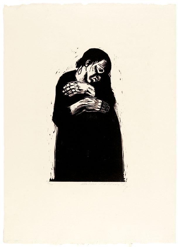
146 Die Witwe I [The widow I]
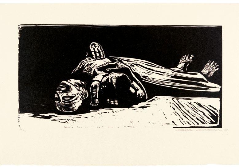
147 Die Witwe II [The widow II]

148 Die Mütter [The mothers]

149 Das Volk [The people]
Otto Dix

Der Krieg [The War]
1924
Aquatint, etching, drypoint, and rotogravure
Berlin, Karl Nierendorf
50 prints

151 Sturmtruppe
geht unter Gas vor [Shock troops advance under gas]

152 Schädel [Skull]

153 Pferdekadaver [Horse cadaver]


Pages 154–155
Trichterfeld bei Dontrien, von Leuchtkugeln erhellt [Crater field near Dontrien, lit by flares]
Verwundeter (Herbst 1916, Bapaume) [Wounded man (Autumn 1916, Bapaume)]

156

157 Lens
mit
belegt
wird
Bomben
[Lens being bombed]

158 Leiche im Drahtverhau (Flandern) [Corpse in barbed wire (Flanders)]

159 Tote vor der Stellung bei Tahure [Dead men before the position near Tahure]
Beginning and End of Caricature: Beckmann, Grosz, Seiwert, and Arntz
Benjamin H.D. Buchloh
Numerous coincidental (and some intentional) references, drawn from or phrased by artists in the first two decades of the twentieth century, allow us to connect Käthe Kollwitz’s print production both with the graphic culture of the slightly younger artists who emerged in the 1920s as central figures of the postexpressionist aesthetic, and also with its extreme opposites, traditionally defined by Dadaism and Neue Sachlichkeit. Thus, George Grosz, a key figure for our considerations, called Kollwitz’s work “teary eyed art” in a letter to Bertolt Brecht.1 And Franz-Wilhelm Seiwert, the painter and critical force of the Cologne Progressives, redeployed from a radical leftist position the insult Armeleutekunst (poor people’s art), first leveled at her in 1906 by an arch-conservative critic. Corresponding in the registers of historical and critical writing are Paul Westheim’s Holzschnittbuch (Woodcut book) and some other key texts by critics that were explicitly cited by the artists of the following generation as points of departure. Gerd Arntz, for example, who became one of the most important figures in the politicization of print culture in the mid-1920s, explicitly cited Westheim’s study as having determined his decision to abandon easel painting and to engage almost exclusively with the graphic arts, initially wood and eventually linocuts.2
However, both the manifest distinctions and the latent similarities are far more subtle and complex than the merely stylistic identifications of postexpressionism have allowed us to recognize. To elaborate on the interrelationships between these generations and stylistic formations, we begin once more with a comparative approach. In 1919, the very year Kollwitz depicted Karl Liebknecht, Max Beckmann would portray Rosa Luxemburg, the eminent philosopher who—like Liebknecht—had become a victim of the Freikorps’ murderous violence on January 15, 1919. Beckmann’s image, entitled Das Martyrium (The martyrdom) is the fourth of ten lithographic plates in his portfolio Die Hölle (Hell), which Beckmann produced after his first postwar visit to Berlin, in March 1919, and which was published by I.B. Neuman in Berlin later that year.3 In manifest opposition to Kollwitz’s emphatically primitivizing woodcut of mourning and its intonation of an idealized humanist—not an actual political solidarity—Beckmann’s gestural lithographic drawing oscillates provocatively between pathos and bathos, between the sobriety of a dispassionate eyewitness account and the callousness of caricature. It is not easy to determine whether this conflict between modes of graphic inscription results from an aesthetic of ironic distanciation that promised
160
to lift Beckmann’s spectators above the fray of everyday politics, or from the artist’s refusal (or inability) to lift the myths of bourgeois independence from the conditions of collective suffering and his insistence on artistic autonomy. This attitude of an apparently cynical ambivalence is perfectly phrased in a motto inscribed in Beckmann’s ostentatiously chauvinist yet utterly derisive Sütterlinschrift (Sütterlin script) on the front of the portfolio, inviting, in the manner of a circus barker, the “Honored ladies and gentlemen of the public, pray step up. We can offer you the pleasant prospect of ten minutes or so in which you will not be bored. Full satisfaction guaranteed, or else your money back.”
The comparison with Kollwitz’s depiction of Liebknecht is not only productive—Beckmann refers to the same historical event in a different graphic gesture and medium—but intriguing since, unlike Kollwitz, Beckmann depicts the female political martyr. In a scene of grotesque cruelty, the figure of Luxemburg is displayed as literally suspended between a crucifixion (in front of a cathedral silhouette) and a Weimar-style rape, simultaneously murdered by soldiers following their own sexual and anti-Semitic obsessions as much as the orders given by the tuxedoed bourgeois who splays her legs. Both the social space where the event is staged and the physiognomies of the actors are hard to fathom. Unlike Kollwitz’s Liebknecht, Beckmann’s hastily drawn mock-up of Luxemburg’s portrait lacks even the slightest effort to mimetically achieve a physiognomic resemblance, let alone to endow the face with heroic features. The historical event appears to be too tragic to devolve into caricature, yet it is apparently also too unfathomable to merit the emphatically primitivizing textures of Kollwitz’s graphic compassion or Dix’s exorbitant resuscitations of the full spectrum of ancient print culture. Rather, Beckmann’s application of Kreidelithographie (chalk lithography) endows these images with the succinct precision and rapidity of an observer’s sketch, and the technique’s relative diffidence or expressive indifference seems to ruefully acknowledge the ultimate inefficacy of any artistic intervention within these political and social realities.4
Another brief comparison—in this case with one of the key tropes seen in Dix’s Der Krieg (The War, 1924, pp. 150–159) portfolio—allows us to recognize even more clearly Beckmann’s profound differences from the graphic gestures and techniques of his peers. When depicting the violently lacerated and fragmented face of a war veteran in the portfolio’s first plate, Der Nachhauseweg (The way home, p. 116), Beckmann renders the heretofore unimaginable degree of bodily mutilation in an almost detached manner, utterly different from the histrionic graphic spectrum with which Dix would confront his spectators four years later in his spectacularized renderings of bodily destruction. Even in the depiction of trauma, juxtaposing the fragmented face of the veteran with his own self-portrait in civilian bourgeois garb, the artist retains a modicum of equivocal distanciation. Beckmann’s drawing style tries to sustain a balance between mordant sarcasm and elementary empathy, but it is an empathy that is fettered by the aspiration that artistic mastery could still transcend the political and by the assumption that
161
a class position of solidarity with the suffering of the oppressed and exploited would always remain incompatible with the hope for an eternally accessible artistic autonomy.5 And while both Kollwitz and Dix had literally resurrected the skull and the skeleton as icons of death in very different ways to endow their representations with the weight—if not the fright—of a traditional mythical iconography, Beckmann never once crosses this line, since his loyalty to even the weakest remnants of bourgeois enlightenment culture would not tolerate such a relapse into mythical thinking.
The iconography of the skull and the skeleton does, however, reappear with a vengeance a year later in Grosz’s graphic cycle Gott mit uns (God with us, 1920), printed in a more industrialized photolithographic technique (as opposed to Beckmann’s still rather artisanal Kreidelithographien) that would have, at least theoretically, permitted a very large, if not unlimited, distribution.6 The series took its title from the inscription on the belt buckles of German WWI soldiers. Drawn with a morbid cynicism and provocative agitation, the portfolio’s images often depict scenes of domestic misery and urban poverty that might even mock Kollwitz’s social realism. Notoriously emulating the full spectrum of deskilled drawing practices, from bathroom graffiti to funfair displays, Grosz’s newly resurrected icons of death do not operate, however, only as subversions of the decorum of drawing and the hypocrisy of bourgeois standards of sublimation. Rather, the caricaturist invests these apparently ineradicable transhistorical icons of mortal certitude with extreme historical specificity, offering skeletons and skulls in the streets or the courts of Berlin as the grotesquely living evidence of a society dominated by the state—and oppressed by military authorities. Unsurprisingly, the portfolio was confiscated and prohibited from public display and distribution shortly after its release. The artist’s garrulous skeletons enact their mythical potential only to exacerbate the present horror of actual reality, a present from which the utopia of universal equality seems to be imaginable solely through the mythical equality of death. Was Grosz—like Ernst Toller and Sergei Eisenstein at that time—familiar with José Guadalupe Posada’s deployment of the mechanical agitations and the endless variations of the negative utopia of a classless society of skeletons?
Both Beckmann’s and Grosz’s print portfolios situate themselves at the dawn of a new democratic German culture in the first decade of the twentieth century, a radicalized public sphere where political cartoons and artistic caricature could finally assume critical and subversive public functions, comparable to those that had been performed by artists such as Honoré Daumier and Grandville (Jean Ignace Isidore Gérard Grandville) in France in the second half of the nineteenth century. Typically at this moment, political cartoons and artistic caricature—and this, too, merits a study of the significance of historical asynchronicity—no longer had a place or public artistic function in France, since the radical Enlightenment projects ranging from cubism’s phenomenology to Marcel Duchamp’s and abstraction’s painterly semiotics had both expanded and differentiated the actually
162
available conditions of subject formation, of public communicative access, of reading competences, and of collective self-determination. Thus, out of the belated development of a democratic German state evolved a latecomer in the history of the genre of caricature. A latecomer, if not a stillborn one, since the technological advances in the conditions of photographic image production and print reproduction opened and necessitated a fundamental redefinition of how and what political caricature should and actually could now represent, and in what technological modes those new dimensions could be optimally transmitted. These expanded historical options and necessities were fully grasped with the emergence of John Heartfield, the first—and most likely only—extraordinary artist of real caricature in the lineage of Daumier in the twentieth century.7
This is the historical, epistemological, and technological spectrum with which Mexican artists from the late 1920s onward were confronted as well, even though their responses, determined by fundamentally different sociopolitical challenges, were bound to be drastically different from the developments in Weimar Germany. Nevertheless, numerous conditions allow not only for a comparison of central features but also intensify the task of differentiating what might appear at first sight to be comparable agendas or even actual “influences.” Both countries began the first decade of the twentieth century with a liberation from their imperialist past, even if one had been sustained by the legacies of centuries of colonialist imperialism, whereas the other had only recently adopted the fiction of the nation-state in order to become an empire. The primary distinctions between Mexican and German print culture—that is, between the two opposing figures of Posada and Kollwitz with whom we have initiated the exhibition—thus originate from the fundamentally different and specific inflections of the dialectics and politics of myth and enlightenment. The most important distinction to emphasize might be the fact that the sociopolitical desire in the formation of nation-state identity in Mexico was driven by the progressive, at times even revolutionary, forces aiming for the evolution of a post- and anticolonial national identity, whereas the nationalist identitarian politics prior to the creation of post-WWI Weimar Germany in 1918—and continuing throughout the Weimar Republic—was inevitably and irreparably devoted to the nationalist fascistization of a barely established democratic state. A primary task of this exhibition has been to trace these historical interrelationships, not only between two fundamentally different political cultures but also the peculiar frequency and intensity of their interactions and interdependency.
Whereas France’s actually existing bourgeois public sphere had sustained a culture of caricature (a regular critical contestation by artistic and writerly means) throughout the second half of the nineteenth century, both Mexico and Germany had, at best, only vernacular traditions of popular image production that offered relatively literate or outright illiterate populations small-time relief from oppression by controlled mockery and valves of entertainment. The frequent assertion that Posada’s position as a caricaturist would make him the
163
Mexican Daumier should be disputed, since Posada’s eminence as an artist was defined by a fundamentally different constellation of historical forces. More like a Walt Disney than a Daumier of his time and place, his scope of suturing publics ranged from rallying for a national identity as a popular mythical formation, passed through his divine travesties of the ruling classes, and went as far as mere commercial opportunism and artisanal quackery. By contrast, Kollwitz—in every way the opposite of Posada—while equally distant from the traditions of political caricature, still aspired to agitate for a utopian equivalence between classes and genders, between subjectivity and collectivity. Her attempts to uphold class solidarity and socialist empathy were articulated and radicalized by a regression to anterior printing technologies and primitivizing forms of physiognomic and physiological depiction, but not by the critical derision and the annihilating antagonism of caricature. But both Posada and Kollwitz were concerned primarily with representations of newly emerging social collectives and subjectivities and with their transformation from being subjected to hierarchical regimes to developing elementary relations of social, legal, and economic equality. In the field of figurative representation, these historical negotiations were conducted primarily in the conception and depiction of the face and the body or— paradoxically in Posada’s case—their absence.
But our exploration is equally concerned with tracing how the dialectics of subjectivity and collectivity and their changes were figured (and sometimes even anticipated) in the changes of the graphic techniques themselves. These would become evident in the sudden adoption of presumably obsolete printing technologies by some artists (e.g., Kollwitz’s late turn to woodcuts); or in the rigorous exclusion of the very same techniques from the work of other artists (e.g., the total absence of woodcuts from Grosz’s oeuvre or the singular woodcut in Beckmann’s); or, as in the case of Posada, in the deployment of advanced technical procedures to feign woodcuts so as to simulate an antiquated populist image production. Another variation was to give obsolete technique a new political assignment, but its primitivism asked neither for empathy nor for the abrasion of populist caricature. Such an assignment was declared in the work of the Cologne Progressives Seiwert and Arntz in the early 1920s shortly after the examples by Beckmann and Grosz discussed earlier. And if the first part of our account focused on the shift from social realism in Kollwitz to political caricature in Grosz, the second part must engage with its dialectical counterpart, the contradictory synthesis of reductivist figuration and diagrammatic abstraction in the primitivizing mediums of wood and linocut. Initially identified by the deeply contradictory term of figurative constructivism, Seiwert’s and Arntz’s figurations contributed to the evolution of the Isotype project of Otto Neurath and Marie Neurath.
The first major reorientation, Seiwert’s Sieben Antlitze der Zeit (Seven faces of our time) was published only a couple of years after Beckmann’s and Grosz’s print series, and typically it was not conceived as a print collector’s portfolio
164
but as a series of seven ink drawings, reproduced as full-page illustrations in the final issue of the left-wing anarchist journal Der Ziegelbrenner (The brick burner), edited and published by Ret Marut in December 1921 in Munich.8 Even at first glance, the differences in graphic gesture and iconographic types between Seiwert’s neutralizing typological physiognomies and Beckmann’s fusion of pathos and bathos or Grosz’s amalgam of graffito and caricature are striking. And if Grosz and Beckmann still emulated the liberating jolts of antiphysiognomic distortions (in Grosz’s case borrowing from the graffito; in Beckmann’s case, an almost parodic hypertrophy of the expressionist graphic gesture), Seiwert and Arntz actually distill distortion and comical relief from the features of the victims and leave only traces of disdain in the schematic depictions of the rulers. Both artists formulate an emerging apprehension that lapidary social typologies would become politically more productive than either the pathos of empathy or the derision of caricature (from whatever privileged positions either one of these might have been enunciated). Even Seiwert’s conception of the title as Sieben Antlitze der Zeit is remarkable in several ways. First, its neutral tone of mere enumeration stands in manifest opposition to the dramatic titles of Beckmann’s Die Hölle or Grosz’s Gott mit uns. And the purely quantificatory, antihierarchical, and antinarrative principle would find its echo only a few years later in Arntz’s Zwölf Häuser der Zeit (Twelve houses of the time) and in 1929 would still reverberate in August Sander’s monumental portrait project Antlitz der Zeit (Faces of time).9
One of the great paradoxes of modernity is the fact that the license to return to figuration (the figuration that would then quickly be reclaimed by the various factions of leftist modernists from Neue Sachlichkeit to Dada) was actually provided by an arch-reactionary antimodernist, Giorgio de Chirico, whose mannequins offered the blueprint for the figurative constructivism that the German painters in the context of both Neue Sachlichkeit and the Cologne Progressives deployed to legitimize and design images of a new subjectivity and a new collectivity. One of the crucial features of the paradox (quite a few others are also operative in this transfer), is that de Chirico’s figures of extreme alienation (the melancholically cathected wooden models of the studio, drafted from the history of academia and the museum, or the tailors’ and shopwindows’ dummies advertising the new fashions) all pointed to the longevity of the painterly traditions facing the decisive and terminal challenges brought about by cubism and the ensuing consequences of abstraction. Thus de Chirico’s figuration, which had served as a profound meditation on the longing for tradition and continuity, would suddenly become the point of departure for the radical figurative constructivism of the Cologne Progressives, in particular Seiwert and Arntz, and of former Dadaists like Grosz. Their dialectical inversion of de Chirico’s melancholic mannequins transformed this aphysiognomic, featureless mechanoid into the prototype of the new proletarian subjectivity. Unlike Beckmann and Grosz, Arntz and Seiwert would hence no longer exaggerate or exasperate the features of the bourgeois
165
subject, since caricature was now understood to be the system of the exacerbated bourgeois physiognomy. As the new subject was by necessity a featureless subject— since proletarian identity could no longer be defined by physiognomy—it could also no longer be depicted via caricature. Arntz and Seiwert could rightfully leave behind the impulses of derision and ridicule that had been integral to the tasks of the political cartoon. By contrast, the new subject—whether situated in terms of class or gender or situated and defined in terms of its actual participation in the collective processes of economic, social, and political formation and production— would no longer aspire to the marks of physiognomic distinction.
1. George Grosz to Bertolt Brecht, May 22, 1925, quoted in Barbara McCloskey, George Grosz and the Communist Party (Princeton, NJ: Princeton University Press, 1997), 212.
2. See Benjamin Benus, “Figurative Constructivism, Pictorial Statistics and the Group of Progressive Artists 1920–1939” (PhD diss., University of Maryland, College Park, 2010), 29: “In this regard these artists were also inheritors of the notion, popularized by Wilhelm Worringer’s 1906 text, ‘Abstraktion und Einfühlung’ (Abstraction and Empathy) that the art of ‘primitive’ cultures, in its higher degree of abstraction and its disregard for the world’s external appearance, comes closer than naturalistic approaches to representation in visualizing its ‘absolute value.’ . . . Indeed, many of the formulations provided within Seiwert and his colleagues’ art-theoretical texts reiterate Worringer’s distinction between essence and appearance in art, advancing formal simplification and geometric reduction as the primary strategy in distilling essence from appearance. These ideas also formed the basis for Westheim’s 1921
Holzschnittbuch which Arntz later cited as an important influence upon artists of his generation. . . . Westheim could offer contemporary artists a model of pure and direct expression. More than this, German artists of the period were attracted to the medium of woodcut on account of its perceived social dimension. In addition to Westheim’s book, Arntz cites a lecture by Georg Schmidt, director of the Kunstmuseum in Basel, which suggested a historic correlation between ‘technically primitive media’ and ‘artistic expressions of the revolutionary classes.’”
3. Israel B. Neuman, Beckmann’s publisher, reported that the portfolio generated an excited reception among spectators but failed to make any sales. The chronology of print portfolios responding to the traumatic experiences of WWI begins with Beckmann’s Die Hölle (1919), followed by Grosz’s Gott mit uns (1920) and Heinrich Hoerle’s Die Krüppel Mappe (The cripple folder, 1920), all preceding the publication of Kollwitz’s Krieg (War, 1922–1923), which was followed by Otto Dix’s Der Krieg (The War, 1924). Dennis Crockett gives a somewhat reductive but probably not
166
utterly inaccurate economic explanation for the frequency of print publications during this period: “In general the art of the inflation [economy] was made on paper rather than canvas. Otto Dix, for example, in 1919 produced his first postwar woodcut prints under the advice of his commercially successful friend Conrad Felixmüller. Graphics were cheaper to produce and easier to sell. . . . And the woodcut, due to its dramatic black and white contrasts, was the Expressionists’ medium of choice. In 1920, however, Dix and many of his contemporaries abandoned the woodcut in favor of engraving, a linear medium demanding a more deliberate handling. Between 1920 and 1924, as Expressionist idealism came to seem increasingly out of synch with the times, and the young artists increasingly abandoned Expressionism’s abstractions, engraving and lithography came to replace the woodcut as the print medium of choice. George Grosz owed his public fame largely to the new market for works on paper, and he regularly capitalized on the inflation-era frenzy for print collecting by publishing sets of his polemical prints for collectors. His set of photolithographs dealing with the army and the counterrevolution, Gott mit uns, was published in 1920. . . . Soon after its appearance Gott mit uns was banned. . . . Dix’s set of fifty etchings, The War, which Nierendorf published in 1924, was to be the last of the major print portfolios of the period. But, despite the promotional blitz undertaken by Nierendorf and the excellent reviews it received, the portfolio sold poorly. The end of the speculative art market brought about an end to the explosive production of graphics and watercolors. Dix, Kokoschka, Max Beckmann, and many other artists abandoned printmaking altogether in 1924.” See Dennis Crockett,
Post-expressionism: The Art of the Great Disorder 1918–1924 (Pittsburgh: Penn State University Press, 1999), 28–32.
4. Beckmann only once engaged in the technique of the woodcut, his Selbstbildnis (Self-Portrait) from 1922, which both features the aggressive crudity of a bourgeois physiognomy bordering on a proletarian subject and seems to want to seal the chapter of the expressionist—if not specifically Kollwitz’s— newfound cult of the woodcut.
5. Beckmann stated his views concerning the conflicted relations between art and politics in a well-known, if programmatic, speech given in 1938 on the occasion of the Exhibition of Twentieth Century German Art at the New Burlington Gallery in London: “Painting is a very difficult thing. It absorbs the whole man, body and soul— thus I have passed blindly many things which belong to the real and political life. I assume, though, that there are two worlds: the world of spiritual life and the world of political reality. Both are manifestations of life which may sometimes coincide but are very different in principle. I must leave it to you to decide which is the more important.”
See Sean Rainbird, ed., Max Beckmann: On My Painting (London: Tate Gallery Publishing, 2003), 11.
6. Also in 1920, at the time of the Dada Messe, Grosz performed his self-chosen Dada role of Dada-Death (as opposed to Johannes Baader’s Oberdada, Richard Huelsenbeck’s Huelsendada, and John Heartfield’s Monteurdada), wearing a papier-mâché skull. To intensify his mockery of the German fixation on Thanatos and the pomposity or pathos with which artists from Arnold Böcklin to Max Slevogt and from Max Klinger to Kollwitz had deployed the skeleton
and the skull as devices of mobilizing spectatorial attention, if not awe, Grosz would even acquire a skulland-bones stamp and deploy it as his personal insignia. His artistic adaptation of the emblem of the pirates’ freewheeling lawlessness uncannily prognosticated the emblem’s return a decade later in the uniforms of the most unforgiving criminal ranks of the murderous SS units of Nazi Germany.
7. Grosz, Heartfield, and many others came to know the complex history and political potential of caricature thanks to their friendship with Eduard Fuchs, the eminent historian and publisher of multiple volumes amassing the various histories of the genre and its media.
8. I am indebted to Helga Prignitz-Poda, who first suggested I return to the literature on the Cologne Progressives, especially Uli Bohnen’s dissertation Das Gesetz der Welt ist die Änderung der Welt (Berlin: Karin Kramer Verlag, 1976) and his catalog Franz W. Seiwert 1894–1933: Leben und Werk (Cologne: Kölnischer Kunstverein, 1978). Bohnen traveled to Mexico in the course of his research on Seiwert and visited the widow of Ret Marut (aka B. Traven) to interview her about Traven’s relationship to the Cologne Progressives. Seiwert had rescued Traven from imprisonment, if not a death penalty, when Marut/ Traven was prosecuted by the Weimar government for having served in the Munich council government (Ernst Toller would serve a five-year prison sentence for the same “offense”). With Seiwert’s assistance, Marut/Traven escaped to the Rhineland, which at that time was occupied by the British military forces and thus was outside the control of the Berlin government. Upon his return from Mexico, Bohnen brought with him
several works by Seiwert (and possibly some by Arntz) that Traven’s widow had entrusted him to bring back to Cologne as a donation in Seiwert’s honor to the Ludwig Museum, a generous gift that Bohnen promptly passed on to the museum.
9. One could even speculate that this rigorously anticompositional and antihierarchical principle of simply aligning and enumerating a sociological sample of relations of class power and possessions as evident in physiognomies and architectures predates subsequent antihierarchical forms of presentations and subject collections such as Andy Warhol’s 32 Campbell’s Soup Cans (1962) and Edward Ruscha’s Twentysix Gasoline Stations (1963).
167
2. The Taller de Gráfica Popular
Print and Struggle: Eighty Years of the Taller de Gráfica Popular, 1937–2017*
Helga Prignitz-Poda
Preface
The Taller de Gráfica Popular (People’s Graphics Workshop, TGP) stands out as one of the most representative and successful artistic associations in the history of graphic arts, thanks to the collective nature of its organization and production. It was formed in Mexico in 1937 as a workshop within the Liga de Escritores y Artistas Revolucionarios (League of Revolutionary Writers and Artists, LEAR), a group of artists and intellectuals active during Lázaro Cárdenas’s government who identified with progressivist causes and the left-wing ideals of the time.
The founding members of the workshop were Leopoldo Méndez, Raúl Anguiano, Luis Arenal, and Pablo O’Higgins, who were joined shortly afterward by Ángel Bracho and Alfredo Zalce. The TGP’s first statutes, published in 1938, state that its objective was to foment graphic production “in the benefit of the interests of the people of Mexico” through a system of collective work. By then, the TGP had separated from the LEAR, which was starting to disintegrate.
Members of the workshop customarily met on Friday afternoons to discuss current issues, decide which organizations in the workers’ movement needed support, and democratically determine whether and how the TGP could assist them. Every project was carried out collectively, with several members collaborating to produce, assess, and optimize each graphic work. Often, one member would do the design, another would correct it or transfer it to stone, linoleum, or wood in accordance with the group’s agreed decisions, and a third would take charge of printing it. Finally, the work would be signed with the initials “TGP.”
One of the TGP’s guiding principles was that production could go ahead “so long as it does not tend . . . to favor reaction or fascism.”1 Another was not to accept financial support from the state, which allowed the group to preserve its independence. To
cover the workshop’s expenses, each member paid a membership fee.
From the foundation of the TGP to the present day, thousands of prints have been created by more than one hundred artists. As a collective body, these works constitute a unique testimony to the history of Mexico, reflect everyday life in both the city and the country, form an encyclopedia of events, and illustrate the struggle of laborers for better working conditions. They also reflect their creators’ convictions, their love of life, and their profound desire to live in peace. Today, many of the group’s ideals seem to belong to the past, although the yearning for fairer living conditions remains constant. [. . .]
1. The Foundation of the Taller Editorial de Gráfica Popular and the Artistic Collectives That Preceded It [. . .]
The idea of strengthening individual creativity through collective work emerged within the Mexican muralist movement, which sought to carry out monumental projects that were too demanding for a single individual. Murals were painted in public buildings, markets, and schools to steer social conscience in the direction desired by the person or institution that had commissioned them. Originally, these murals were painted by several artists. One of the principal objectives of art in Mexico in the first half of the twentieth century was to instruct the population through propaganda and win its enthusiasm for the numerous reforms of the postrevolutionary governments. Artists soon realized the great advantages of graphic art over muralism. It was cheaper and more up-to-date, and large print runs offered the chance to reach a larger public. Moreover, it was independent of government commissions and so less corruptible.
From the beginnings of the muralist movement, artists and intellectuals gathered in workshops
170
and unions like the Sindicato de Obreros Técnicos, Pintores y Escultores (Union of Technical Workers, Painters, and Sculptors), which from 1923 to 1926 represented the interests of artists working to engage Mexico’s cultural scene in progressive projects. In particular, David Alfaro Siqueiros, a painter whose work was avant-garde in form and content, declared himself in favor of organizing the artists who took part in the painting of murals. Under his direction, the Bloc of Mural Painters was formed in Los Angeles in 1932, and the Siqueiros Experimental Workshop opened in New York in 1934. In these two groups, both ephemeral, Siqueiros promoted the use of innovative techniques and the rejection of traditional ones.
Collective work is the organic form corresponding to monumental painting and to subversive art. It is the only way the mechanics of plastic art can be applied. It alone is capable of giving the proletariat the ample agitation and propaganda material it needs for its daily struggle.2
Siqueiros held to this position all his life and never ceased to insist that engravers should not lapse into stagnancy in their use of traditional techniques. In Mexico, he took part in the founding of the LEAR in 1934, and the following year the organization incorporated a workshop-school of revolutionary and collective mural painting and graphics. However, the LEAR initially supported the production of murals and cultural missions in which artists were sent by the government to country villages to support literacy campaigns and help to solve their principal problems. The support of the engravers became increasingly important in this work. The workshop-school of the LEAR was in charge of illustrating textbooks and pamphlets. At the same time, it furthered the antifascist struggle when, after the initial successes of the Mexican Revolution, the forces of the conservative far right began a counterrevolution that threatened to erase the achievements of the first. The disputes and struggles that followed were intense, and the artists took part by creating pamphlets to support the union of artists and writers with the workers against capitalist exploitation and fascist terror.
Arts promised workers free painting, drawing, engraving, stage design, sculpture, and art history lessons based on Marxist principles. Printed in vigorous black and red, the poster shows four men—whose headgear identifies them as workers— enthusiastically walking to the LEAR’s school along a route denoted by various signposts. The school’s teachers included Ignacio Aguirre, Arenal, Bracho, Méndez, O’Higgins, and Antonio Pujol, all future members of the LEAR’s direct successor, the Taller Editorial de Gráfica Popular (People’s Graphics Publishing Workshop, TEGP; the initial name of the TGP).
At thirty-three, Méndez was the most experienced artist in this group. After studying at the Academia de San Carlos, he produced illustrations for the magazine Horizonte (Horizon), published by the stridentists in Xalapa, and after the founding of the TEGP he devoted himself exclusively to engraving. Inspired by the work of the renowned engraver José Guadalupe Posada, Méndez’s goal was to turn the art of engraving into an instrument of popular propaganda. At the LEAR’s workshop-school, he was the director of the engraving section.
Aguirre was the oldest member of the group and the only one to have taken part in the revolution as a soldier in Venustiano Carranza’s army. He had been a miner and discovered an artistic calling through the theater group Ulises. Later he studied artistic pedagogy and worked as an art teacher at cultural missions in various villages. Aguirre may have taught stage design at the workshop-school.
Pujol was, at age twenty-one, the youngest member of the group. A shepherd, he had worked on the murals of the Mercado Abelardo L. Rodríguez (a market in Mexico City named after the former Mexican president) and been a delegate of the LEAR at the Congress of American Writers in New York, where he joined the Siqueiros Experimental Workshop. He probably taught mural painting at the workshop-school.
[.
. .] Julio
Prieto’s October 1935 posterinvitation to the LEAR’s Workshop-School of Plastic
Arenal was slightly older than Pujol and had recently been appointed general secretary of the LEAR. He met Siqueiros after training as a temporary worker in Los Angeles. Arenal shared with Pujol an enthusiasm for the so-called insurrectionists and for the muralist’s impassioned discourse, and they would assist as collaborators on Siqueiros’s future murals and political actions.
171
Bracho, just twenty-four, was also a temporary worker. He was introduced to art at the evening courses of the Academia de San Carlos, where he joined the group of muralists who painted the Mercado Abelardo L. Rodríguez. Bracho also took part in the government’s cultural missions.
Originally from the United States, O’Higgins was thirty-one when he became one of the founders of the LEAR. As a child, his parents had encouraged his artistic vocation with piano lessons and academic courses. At the age of twenty he arrived in Mexico, where he joined Diego Rivera’s team of assistants and was active in the cultural missions. He formed part of the group working on the mural decoration of the Mercado Abelardo L. Rodríguez and subsequently was a member (together with Méndez, Zalce, and Fernando Gamboa) of the group that painted the murals of the Talleres Gráficos de la Nación (Graphic Workshops of the Nation). Afterward he collaborated in the production of artworks for the Centro Escolar Revolución (Revolutionary Educational Center), an enterprise notable for its collective nature. None of the works made there were individually signed. The intention was to oppose the collective to the individual, and works were thus signed with the group’s initials, “LEAR.” In 1936 and 1937, the LEAR organized several exhibitions. Those dedicated to painting and sculpture were not well reviewed, but the exhibitions of engravings were a success.
While working together, Méndez and O’Higgins started a great friendship. Because of their physical appearance, one with black hair and the other blond, they were dubbed “Café con Leche” (Coffee with Milk). Their enthusiasm was such that they eventually set up a graphic workshop of their own because they wanted a press that would be available to artists practically day and night. With the LEAR having lost some of its impetus as members dispersed across Mexico to organize events, cultural missions, and exhibitions, Méndez and O’Higgins decided to concentrate fully on engraving and thus encourage its development as a tool for propaganda work.
The LEAR played an active part in political events both nationally and internationally. It ratified its friendship with the Communist Party of the Soviet Union and organized trips to Moscow. During the Spanish Civil War, many members of the
LEAR traveled to Spain to fight in solidarity with the Republicans against the forces of fascism. In 1937, several members of the LEAR went to Valencia to attend the Second International Congress of Writers for the Defense of Culture, an occasion Méndez took advantage of to gather the engravers who had remained in Mexico to build a new project. He asked artists interested in collaborating to contribute fifteen pesos toward basic materials. Méndez and the artists he recruited had no intention of following in the tracks of the LEAR or of concocting grand schemes; rather, they planned to work independently, without government support, and to place their creative work at the service of the public, concentrating particularly on the medium of engraving.
Initially, Méndez described the idea as a way of concentrating talent and protecting artists after the fall of the LEAR:
The LEAR died of the worst disease: opportunism. A lot of people joined it because it was a way to get a job or two. But some of us were unwilling to attend the funeral of the LEAR. . . .
I thought it was very serious that the group should disband and that all those youngsters should more or less be doing any odd jobs they could find, and I proposed to them that we should gather around a workshop, even if a small one, but where we would have our tools and do some work. 3
The TEGP was founded in the summer of 1937 without a great deal of fuss. The engravers simply began to meet and work. During the transitional phase, which lasted until the TEGP approved its statutes, set up its facilities, and finally mounted its own press, the first members continued to work on the premises of the LEAR at number 5, Calle Allende, near the recently built and inaugurated Palacio de Bellas Artes (Palace of Fine Arts) in the historic center of the city. There the workshop’s first commission was completed: a calendar for the year 1938 requested by the Universidad Obrera de México (Workers’ University of Mexico). In addition to work by Méndez, the calendar included lithographic prints by Arenal, Jesús Bracho, and O’Higgins. The themes of the twelve plates of the calendar were centered on the revolutionary
172
movement in Mexico, independence, the great workers’ movements, the nationalization of the railroads, and the omnipresent threat of fascism. All the works were lithographs in two inks. As they did not have a press of their own, the artists went to the workshop of Jesús Arteaga, a former printer and collaborator with Posada, who placed his machines at the disposal of the group:
He generously gave us the largest room, where there was a machine that engraved clouds and arabesques for what was called “security” paper. There, among other things, we worked on the originals of a calendar for the Workers’ University, and a folder hailing the constitution for the Mexican Federation of Workers. Señor Arteaga’s studio had a tradition. . . . That room would merit a detailed description, with its dusty curtains of faded red satin that seemed to have been motionless for centuries. That studio, with its two good hand presses and piles of cardboard sheets between which he would carefully place the lithographic prints, gives an idea of what a craftsman was in the good days of the graphic arts in Mexico.4
Today, individual leaves of the calendar are hard to find. They were used at the time and most likely were thrown away at the end of each month. However, at least one full calendar for 1938 survived and was included (along with the 1939 calendar) in the exhibition Estampa y lucha (Print and Struggle), held to celebrate the eightieth anniversary of the TGP. The 1938 calendar is signed with the acronyms “TEGP” and “LEAR,” which indicates that it was created during the transitional period when the artists were still members of the LEAR but the project to found the TGP was already underway.
A pamphlet mentioned by Méndez in an interview with Elena Poniatowska is identifiable as the leaflet ¡Viva la unidad del proletariado en provecho de la cultura del Pueblo! El Taller de Gráfica Popular saluda a todos los delegados al Primer Congreso de la Confederación de Trabajadores de México [. . .] (Long live the unity of the proletariat for the benefit of the culture of the People! The People’s Graphics Workshop salutes all the delegates at the First Congress of the Mexican Federation of Workers [. . .], p. 175). At this
congress, held in February 1938, the TGP offered its services to the gathered trade union representatives, specifying that it could provide “posters, popular pamphlets, monographs, graphic histories of the struggles of the workers’ organizations, illustrations of the active life of the unions, illustrations for leaflets, dust jackets, etc., etc.” Méndez’s lithograph, printed on a sheet folded into a triptych, shows a worker distributing leaflets in the center; on the left, a man points at a poster and comments on it to a woman next to him; on the right, two men read another poster. The image eloquently illustrates how and to what ends the prints and engravings of the TGP could be used.
One month later, in March 1938, the members of the TGP approved the first version of their statutes:
This Workshop is founded with the purpose of stimulating graphic production in the benefit of the interests of the people of Mexico, and to this end it is proposed to gather the largest possible number of artists around a constant endeavor, principally through the method of collective production.
Every production of the members of the Workshop, whether individual or collective, will be permissible so long as it does not tend in any way to favor reaction or fascism. 5
Xavier Guerrero designed the first emblem of the TGP, which symbolizes collective work: a hand raising a flagpole with five pennants pointing in two directions, all framed by the name of the group. In the background are the figures of the sun and the moon above and the earth below. This emblem was used for nearly ten years. At first, the TGP was called the Taller Editorial de Gráfica Popular (People’s Graphics Publishing Workshop), indicating that the group intended to commercialize the work it produced.
In July 1939, the members of the workshop finally moved into their own premises on Calle Belisario Domínguez and secured their own lithographic press. It was the start of a special period for the workshop. “In three small rooms off the courtyard,” twelve artists ran what American art collector and writer MacKinley Helm described as “a tight shop where today, taken as a whole, the most wonderful prints to be found in the entire Western Hemisphere are produced.”6
173
2. The Members of the Collective
In the course of the eighty-year history of the TGP, many members and guest artists from Mexico and other countries contributed to the collective’s success. The exhibition [ Estampa y lucha] held at the Museo Nacional de la Estampa (National Museum of Graphic Arts) included the most comprehensive collection heretofore assembled (based on available information) of names, portraits, and biographical data of TGP members and guest artists.7 The goal was to show that a collective is made not only of stars and leaders but of all the people who have collaborated with or been a fundamental part of it.
In the early years, working collectively meant that every Friday night the members of the TGP would meet to debate matters of current interest. At these sessions, for example, members discussed which workers’ organizations needed support, whether the TGP was prepared to collaborate with them, and how. Every proposal was worked on jointly. Several members would collaborate to produce, critique, and optimize the design of each work. Often, one member would do the sketch, while another would correct it and transfer it to stone, linoleum, or wood, following the group consensus. Afterward, a third member would take charge of the printing. Finally, the work was signed collectively with the initials “TGP.” Minutes of the weekly sessions summed up the key points discussed. Everything was well organized.
What factors coincided to guarantee the TGP’s success for so long? Frequently only external circumstances are mentioned; namely, the political development of Mexico, the popular front against fascism, the government of President Cárdenas, the workers’ movement and its strengthened trade unions, and the arrival of large numbers of refugees and their organizations-in-exile. All of these factors influenced the TGP and offered it a broad field of action. Nevertheless, another crucial factor was the diversity of the group’s members and organization. For collaboration to function smoothly, the TGP had to have reliable statutes.
The Standards of the TGP
The first statutes of the TGP were signed on March 17, 1938, and were relatively brief. Later modifications specifically addressed collaboration. [. . .]
The declarations of principles reflect changes in the workshop’s function. The first declaration
states that the group’s graphic production should benefit the interests of the Mexican people and in no way support fascists or reactionaries. By 1940, this imprecise formulation was seen as a limitation, however, and a new declaration was approved that focused on artistic work and sought to organize the collective by means of statutes [. . .].
The third declaration of principles, written in 1945 and published four years later in a book edited by Hannes Meyer on the occasion of the TGP’s twelfth anniversary, was in force for longer than the first two.8 Regarded as the quintessential statement of the TGP, it reads,
The TGP is a center of collective work for the functional production and study of the different branches of engraving and painting.
The TGP continually endeavors for its works to benefit the progressive and democratic interests of the Mexican people, especially in their fight against fascist reaction.9
The third declaration remained in force until 1956, when it was replaced by a declaration that redefined the TGP’s function:
The Taller de Gráfica Popular is a center of collective work for the functional promotion and study of the different branches of engraving and painting and the different reproductive media . . . The Taller de Gráfica Popular will work continually to ensure its production helps the Mexican people defend and enrich the national culture, which cannot be achieved without the independent existence of Mexico in a peaceful world.10
In this fourth declaration, the workshop’s function was thus reoriented from the fight against fascism to a defense of the national culture and participation in the peace movement.
As the TGP’s declarations changed, so, too, did the rules on internal discipline and on the rights and obligations of members. The rules became increasingly strict and eventually included a full range of expulsion procedures.
The Members
One important factor in the fruitful collaboration among members of the TGP was their diversity.
174
Leopoldo Méndez
Viva la unidad del proletariado [Long live the unity of the proletariat], 1938


175
Leopoldo Méndez
Incidentes melódicos del mundo irracional [Melodic incidents of the irrational world], 1944

176
Theirs was a multifaceted group respectful of the most diverse characters and origins and based not on dogmatism but tolerance. Discussions about the quality of the group’s work were ongoing, but the workshop’s objective—to benefit the interests of the Mexican people—was never in doubt. Nevertheless, opinions differed about how to achieve this objective. A small fraction of TGP members always identified with the [Mexican] Communist Party, which tended to consider its point of view as the only valid one. A larger fraction was less radical and took part in trade union movements or identified with the Partido Popular (People’s Party) founded and led by Vicente Lombardo Toledano. From the various ideological tendencies, interesting work emerged. In later years, however, as the collective became more ideologically uniform, the quality of the work diminished.
From 1940, the collective distinguished regular members from temporary members and guest artists. When the TGP became famous in the United States and around the world, many artists arrived from abroad (and from other regions of Mexico) to learn the group’s model. The artists would spend a month in Mexico City taking part in classes taught by members of the TGP. Class fees brought in considerable income for the workshop. Many of the guest artists then stayed on to work with the collective for several months. They were given the right to vote in the general assemblies and to use the TGP’s machines and tools for their own work. They were required to attend meetings and adhere to the principles of the workshop. Regular members were also obliged to take part in collective projects and donate two copies of each individual work to the TGP archives.
The collective system of work was a successful model and, over the years, had more than one hundred members. In addition to its members (who are mentioned in the exhibition Estampa y lucha), the minutes of the TGP’s assemblies record the names of many guest artists and others whose biographies have proved impossible to ascertain. That is, not all are as well-known as the great muralists Siqueiros and Rivera, who thought highly of the quality of the work of the TGP’s printer, José Sánchez, and often sent print jobs to the workshop.
Méndez, the most experienced engraver, was always a recognized leader of the group he had founded. His style, his vigorous engraving
technique, and his absolute command of composition long marked the artistic direction of the group. He was also influential on a personal level, although he would always accept the majority opinion in debates. Never an authoritarian, Méndez kept up friendly relations with all the members, and for many years he upheld the group’s interests on the committee that determined its artistic orientation. His authority was the product of his work and infinite creativity. He was the most frequent participant in the workshop’s collective engravings. Politically, he identified not with the radical communist sector but with the group linked to Lombardo Toledano’s Partido Popular.
Méndez’s production was surpassed in number only by Alberto Beltrán, who joined the group in 1944 after qualifying as a tailor. (Both men would leave the TGP in 1960.) Beginning in 1948, Beltrán assumed various functions for the TGP. In 1958, he traveled as the group’s president to the Stockholm Peace Conference. Beltrán was incredibly productive and devoted himself wholeheartedly to newspaper illustrations, trade union propaganda, and pamphlets for literacy campaigns and for the Instituto Nacional Indigenista (National Indigenist Institute). For many years he acted as editor-in-chief of the cultural supplement of the newspaper El día (The day). His light, fluid drafting style makes his work unmistakable. Like Méndez, Beltrán took an active part in the administrative tasks of the TGP committee.
The longest-lasting member of the TGP was Bracho, who remained with the workshop from its founding in 1937 until his death in 2005. His large number of works denotes a tireless enthusiasm. He was president of the TGP from 1952 to 1953 and again from 1961 to 1963 after the departure of the group that had formed around Méndez. The TGP was his life. Bracho participated prolifically in its collective works, and the number of works he produced at the TGP is the third highest after Beltrán and Méndez.
O’Higgins had been Méndez’s closest friend since the days of the LEAR. As a founding member of the TGP, he maintained close connections with the group until he left with Méndez in 1960. In 1944, he served for a year as TGP secretary general. However, rather than devoting himself to engraving like Méndez, he continued to work as a painter and muralist. He won many commissions in his
177
native land and took advantage of his trips north to establish links between the North American trade union movement and the TGP. Many of the TGP’s exhibitions in the United States and many of its commissioned works were the result of O’Higgins’s initiatives. With their picturesque style, the prints and lithographic posters he produced at the workshop are masterpieces of graphic art.
Adolfo Mexiac joined the TGP at the age of twenty-three and was a member until 1959, when he withdrew from the circle shortly before the departure of Méndez. He was enormously productive, creating many works for the trade union newspaper CeTeMe and for textbooks published in indigenous languages. When he was not in Chiapas, where he worked for the Instituto Nacional Indigenista, he would work in support of the committee of the TGP. [. . .]
Francisco Mora was even younger than Mexiac when he joined the TGP at the age of nineteen. With his work he supported the magazines of the schoolteachers and their union, as well as the [Mexican] Communist Party. From 1947, Mora was married to the American artist Elizabeth Catlett, who was a guest artist of the TGP along with her ex-husband Charles White. Mora and Catlett were members of the collective until 1965. During the years they remained with the workshop, Mora and Catlett attempted to give it a new orientation, and Catlett served as general secretary.
The list of most-productive TGP artists would not be complete without Aguirre, who was active in the LEAR until joining the TGP at its founding. Like Mora and Catlett, Aguirre was a member of the [Mexican] Communist Party and remained in the TGP until 1965. He was one of the most experienced artists to join, and he soon had solo exhibitions and started to travel frequently. In the 1950s, he was active in the Frente Nacional de Artes Plásticos (National Front of Plastic Arts, FNAP), which sent him to Eastern Europe and China to present that organization’s great traveling exhibitions.
Many of the TGP’s guest artists either were or would become famous in their countries of origin. As participants in the meetings of the workshop, where they had full rights to express their opinions, they provided a significant impulse for the group’s activities. After their stay in Mexico, they returned home with new ideas, and many of them organized exhibitions of the TGP in their home
countries, thus helping to spread its concept. Each of the following artists worked at the TGP: Jean Charlot, from France, who later lived in Hawaii; Jim Egleson, from Canada; Juan Antonio Franco, from Guatemala; Galo Galecio, from Ecuador; Luis García Robledo and Julio Girona, from Cuba; Moshe Gat, from Israel; Miguel Marshall Goodman, Gloria Heller, Jules Heller, Max Kahn, Seymour Kaplan, Misch Kohn, Robert Mallary, Rini Templeton, Margaret Burroughs, Frank Vavruska, White, and John Woodrow Wilson, all from the United States; Josep Renau, from Spain; Koloman Sokol, from Czechoslovakia; and Albe Steiner, from Italy. All of them worked temporarily at the TGP, made their engravings, and left two copies of each piece with the workshop’s archives.
3. The Liga Pro Cultura Alemana and the Exiles’ Organizations
The success of the TGP was due not just to its statutes and the collective work of its members but also because of its administrative organization. Largely, this was left in the hands of the guest artists.
During the years of the Spanish Civil War (1936–1939), Mexico received many sympathizers of the Second Spanish Republic who were fleeing the advance of troops led by Francisco Franco. After the rise of the National Socialist Party in Germany, many refugees from that European country also fled to Mexico. The Liga Pro Cultura Alemana (League for German Culture, LPCA), the first organization of exiled Germans to be established in Mexico, was founded by Heinrich Gutman, who had held administrative positions in the LEAR, including that of editor of the magazine Frente a Frente. 11 In Berlin, Gutman had edited a sensationalist newspaper, and he was one of the first to emigrate in 1933 after Nazi sympathizers began burning books. In Mexico, Gutman met Méndez and the group of engravers at the LEAR and witnessed the early development of the TGP. The LPCA was formed in Mexico in the spring of 1938. From the autumn of 1938 through the spring of 1939, the Liga organized several talks on Nazism and fascism with the goal of informing the Mexican public about the crimes being committed by the Nazi regime. This task was by no means an easy one, as the German embassy at that time fully supported Adolf Hitler’s policies, as did many among the colony of German traders and adventurers who had long been
178
established in Mexico. At first, the circle of exiles was small. The LPCA had only twenty members, and fewer than half a dozen of the German colony in Mexico joined the valiant anti-Nazi group. Nevertheless, with the support of the Secretaría de Educación Pública (Secretary of Public Education), the group organized a series of talks by Mexican scientists and intellectuals on German culture. These were held at the Palacio de Bellas Artes and broadcast nationwide by Mexican radio stations. The German embassy criticized the initiative and accused it of Marxism, leading to tensions in diplomatic relations.
Nonetheless, the LPCA soon organized a second series of talks, also with the support of the Mexican government. These talks included direct political criticism of the Nazi regime. The members of the TGP designed the posters for these events, which not only appeared in the streets but were even distributed in schools by the Secretaría de Educación Pública. With thick blocks of text framing spaces for images, the posters and the typographic fonts used in their design recall the graphic features often seen in Frente a Frente, the magazine Gamboa directed for the LEAR.
The first talk in the series was organized on short notice, and a poster could not be produced in time.12 For the second talk, “La tragedia del campo” (The tragedy of the countryside), given at the Palacio de Bellas Artes on September 21, 1938, Aguirre produced a poster showing the arm of a man, identified as a Nazi by a swastika armband, greedily appropriating a sheaf of corn. The other side of the image showed two emaciated hands barely managing to hold a broken stalk of wheat.
Balas en vez de pan (Bullets instead of bread), a lithographic illustration by Egleson, was produced for the promotional poster for the third talk, entitled “Totalitarian Economy.” The illustration shows a crowd of hungry people reaching toward a loaf of bread that is held in front of them on a bayonet. Instead of sustenance, the starving people receive only munitions, thrown at them by a huge hand. The poster for the fourth lecture, “Juventud perdida” (Lost youth, p. 219 top), was produced by two artists invited to take part in this collective work, Mallary and José Luis Franco.13 Their astutely rendered depiction of a humanized machine includes a small robot emerging over the silhouette of a man’s head. With guns on its head and bayonets for hands,
the robot is warlike in appearance. The futuristic image seems to be inspired by Fritz Lang’s 1927 film Metropolis and ingeniously criticizes toys that allude to war and subject children to militarism.
The lithograph made by Méndez for the fifth lecture, dedicated to Nazi espionage and propaganda, illustrates the threat of the German propaganda machine in Mexico. A figure whose head is a loudspeaker enfolds the map of Mexico in its arms while holding a bomb in one hand. Through an effect of perspective and modified proportions, the machine with a human body has an extremely menacing appearance.
For the sixth talk (p. 210 center), Jesús Escobedo criticized the Nazis’ ambivalent stance toward the Catholic Church by using the symbols of the cross and swastika. The poster shows a figure in a Nazi armband destroying a cross with its claws, a representation of the subjugation of the church to the Nazi order.
For the poster announcing the talk entitled “El hombre en la sociedad nazi” (Man in Nazi society), O’Higgins showed a man tied to a swastika, an image that recalled a powerful photomontage by the German artist John Heartfield.
Zalce’s illustration for the poster of the eighth lecture, “La mujer en la sociedad nazi” (Woman in Nazi society), shows a woman lying with a baby in her arms as she gazes in terror at the horrifying phalanx of child soldiers, guns with bayonets on their shoulders and gas masks on their faces. Women, the poster suggests, are treated by the Nazis as mere machines for producing troops.
By this point, the German embassy in Mexico had already vigorously protested the series of talks, claiming that Mexican civil servants were committing an offense against the German state. This prompted General Heriberto Jara to cancel his lecture, “Alemania bajo bayonetas” (Germany under the bayonets), scheduled for October 28, 1938, out of consideration for the German authorities. The TGP had designed two posters for this talk, one by Francisco Dosamantes and the other by Bracho. Both were great designs. Dosamantes showed the stylized image of a code of justice destroyed by bayonets, a clear representation conveying a precise message. Bracho’s design featured the highly symbolic image of a man in a steel helmet and boots marked with Nazi insignia crushing a group of people while striding toward a ravine and his downfall.
179
In addition to Jara’s cancelled lecture, a second talk was also scheduled for October 28, titled “Razas de primera y de segunda clase” (First- and second-class races, p. 210 bottom). The poster commissioned for this lecture is less expressive than the two by Dosamantes and Bracho, and to this day the artist responsible for it has not been identified. It shows a soldier—identified as a Nazi by his uniform and salute—astride a map of Mexico drawn on a globe. The lithograph appears to have been hastily executed.
Having secured the participation of another speaker, the lecture on “Germany under the Bayonets” was rescheduled as the ninth lecture in the series. The image for the poster was the work of Everardo Ramírez. In it, a giant swastika leans against tanks and guns, crushing the people who move under its enormous weight.
The image Dosamantes produced for the cancelled lecture by General Jara was eventually used in the poster for the talk entitled “Justicia y ley” (Justice and law), arguably a more eloquent and fitting pairing. The final lecture in the series was Lombardo Toledano’s talk entitled “El Tercer y el Cuarto Reich” (The Third and the Fourth Reich). The powerful image on the poster, the work of Anguiano, shows a proletarian fist destroying a swastika with a hammer.
A few months later, in 1939, a new series of talks on fascism was initiated. Once more, everything was planned at short notice, so no poster was designed for the first lecture, “Génesis y crisis del fascismo internacional” (Genesis and crisis of international fascism), given by Mexican historian Jesús Silva Herzog. For the second talk, a lecture by Francisco Frola on fascism in Italy (p. 211 top), Dosamantes drew a fasces with a bloodstained ax and a murdered man lying in the lower left corner of the image. Zalce completed the scene by drawing two women fleeing the terrifying spectacle.
For the third lecture, on the subject of German fascism, Arenal and Pujol created an exceptional poster (p. 211 center) that used resources from expressionist collages and photomontages. A ruined city, its inhabitants in flight, is outlined in stencil. Above the city a bayonet and two steel helmets float menacingly in the air. One helmet crowns the figure of a condor and the other a skull, a representation of the aerial attack on the Spanish town of Guernica
by German warplanes of the Condor Legion, which had taken place two years earlier, on April 26, 1937.
The poster for the lecture on “El antisemitismo como arma del fascismo” (Antisemitism as a weapon of fascism) was designed by Isidoro Ocampo and features a brutal image of a Jew tied by the neck to a post, where he is being tortured to death.
The next three talks were devoted to the different manifestations of fascism in other countries. Ocampo showed Franco behind a row of bayonets, confronted by the Spanish people (p. 211 bottom). José Chávez Morado referenced fascism in Latin America by showing the human form as a pre-Hispanic sculpture in a loincloth, its fist clenched and a star on its breast.14 A crocodile, its huge jaws open and its scales formed by dozens of swastikas, threatens to devour the valiant warrior but evidently fails. Japanese fascism was illustrated by Ocampo, who represented it as a spider with the head of Emperor Hirohito. The spider menaces the Republic of China, whose map is laid out beneath it, as though Hirohito were spreading his web across Asia.
Finally, the series of talks was again brought to a spectacular close with a lecture that proposed strategies for “how to combat fascism” (pp. 212–213). The poster, designed by Escobedo, shows four men—a bourgeois, a soldier, a worker, and a peasant—walking in a line, their arms linked, symbolizing the popular front of that period. The lecture, by Lombardo Toledano, was attended by a large audience and was enthusiastically received and applauded, prompting fresh protests from the German embassy, which demanded Lombardo Toledano’s indictment for an offense against another country’s head of state.15
The series of eighteen posters produced for the two lecture series is a masterpiece of the first two years of the TGP. Two thousand copies of each poster were printed on thin paper and put up on walls and in schools. They are difficult to find today, and few have been preserved in archives. [. . .] They remain outstanding for their modern concept, their use of resources (including photomontage and collage), their highly expressive images, and their relationship to certain influences and elements of surrealism, Dadaism, and expressionism.
At the beginning of 1939, the Swiss architect Meyer, who had directed the Bauhaus in Dessau from 1927 to 1930, arrived in Mexico at the
180
invitation of President Cárdenas to direct the Instituto de Urbanización y Planeación (Institute of Urbanization and City Planning) in Mexico City. Meyer established links with the LPCA. As more and more communists arrived from Germany, many of them found the LPCA excessively soft. In early 1941, they therefore founded the Club Heinrich Heine and the journal Alemania libre (Free Germany), institutions that thenceforth formed the cultural core of the German exile community in Mexico. For Alemania libre, Méndez contributed two versions of his engraving La carta (The letter), a piece rich in contrasts. Both versions show a woman hunched over a letter in an attitude of mourning, a powerful antiwar metaphor. In the style of the pacifist works of Käthe Kollwitz, the image is a moving illustration of the sadness of a mother who has lost a son in the war.
Through Alemania libre, the Alemania Libre en México (Free Germany in Mexico) movement was founded in 1941 with a more radical communist orientation than the LPCA. The goal was to set up a movement among exiled Germans who could construct a free Germany after the anticipated end of the war. The movement soon had more members than the LPCA, the magazine was printed with a circulation of 3,500 copies, and the publications reached other antifascist circles on the American continent.
A publishing house, El Libro Libre, was founded in 1942. Méndez designed the cover for La séptima cruz (The Seventh Cross, p. 340), a successful novel by Anna Seghers that was published by El Libro Libre in January 1943. In the novel, Seghers relates the flight of seven prisoners from a concentration camp, of whom only one, the seventh, survives. Seghers wanted to show the world that it was possible to escape from a concentration camp, that people were fighting against fascism in Hitler’s Germany, and that the National Socialists were not omnipotent. Méndez’s cover illustration features a striking image: the last of seven topless trees on which, symbolically or literally, the seven fugitives were to be hanged. Because the seventh has managed to escape, his cross remains empty. In the background, Nazi henchmen brutally beat a victim while another Nazi, his face hidden, searches for the escaped prisoner behind the seventh tree. The soldier’s boots, armband, and pistol symbolize the cruelty of the regime.
In April 1943, with the support of President Manuel Ávila Camacho, El Libro Libre brought out the significant Libro negro del terror nazi en Europa (Black book of Nazi terror in Europe) for the Mexico City book fair. Illustrated with images by the artists of the TGP, the book documents evidence of the terror imposed on Europe by the Nazi regime. The project was unique, involving fifty-six writers and twenty-four artists and had an initial print run of ten thousand copies, far larger than usual. The edition sold out within two weeks of publication. A second edition came out in September 1943.16
Meyer was the artistic director for Libro negro del terror nazi en Europa, and it was he who invited the members of the TGP to collaborate on the book. The twenty-two engravings and illustrations produced by the TGP undoubtedly contributed to its great success. Some of the works had originally been designed for the LPCA’s lecture series, while others were new creations. Among the latter were several works by Méndez—including Deportación hacia la muerte (Tren de la muerte) (Deportation to death [Death train], p. 309) and La Gestapo, asesinos de comandita (Tortura) (The Gestapo, hired assassins [Torture])—that were the first artistic documents to address the subject of the persecution and extermination of the Jews.17
4. The Collective Work, the Meetings and Protocols, the Graphics, the Engravers, and the Engraving Techniques
The TGP’s weekly meetings established the course of its collective work. At these meetings, the members discussed, planned, argued, and modified their views. Opinions often clashed, but the meetings were also opportunities to mediate and search amicably for solutions. Besides the discussions, which are mostly recorded in the group’s minutes, the practical work and printing process on the machines were also important.
The TGP was a workshop, not just a discussion chamber. At first, in 1937, the TEGP had no space of its own in which to print its works, so it turned to the master engraver Arteaga. Only lithographs could be produced in his workshop, however. The TGP’s characteristic linotypes would come later.
Through Arteaga, the members acquired an old press, and in July 1938 they moved into their own premises, where the printing press was
181
installed. The members dubbed the press the “Paris Commune,” since it bore a label identifying its origin as “Paris 1871.”
Old as it was, it had all its teeth. The cogs looked as though they had just come off the milling machines. What good metals, and how excellent was the casting done then! Not like today’s, so expensive, and made to need repairs owing to rapid wear, like the automobiles of today, which boast an “aerodynamic” line but need a garage as soon as they turn a corner. Our “Paris Commune” was very heavy, but it was driven by a second-hand (at least, as it was quite old) three-phase motor. The poor press made quite a lot of noise, and lived on with us only while we lasted at Belisario Domínguez. Afterward, it wasn’t possible for it to work. It was used only for making proofs or small runs of engravings.18
In Calle Belisario Domínguez, the TGP had three rooms: one for the press, another that served as an atelier for the artistic designs, and a third that was used as a meeting room and gallery.
In 1938 the photographer Josefine Vollmer helped to fit out the workshop’s premises. She had good friends who helped the group obtain a secondhand machine. Méndez later said repeatedly that, without Vollmer’s help, founding a print shop— especially one as long-lived as the TGP—would hardly have been possible. Vollmer never asked for any recompense for her work. Unfortunately, little more is known about this woman whom Méndez saw as so important to the early years of the TGP.
At the end of 1939, Sánchez joined the workshop as printer. He was twenty-eight and was an enthusiastic worker. Unfortunately, he was one of the people arrested and imprisoned for a few days when the TGP found itself involved in Siqueiros’s attempt on the life of Leon Trotsky—the muralist, together with Arenal and Pujol, had used the print shop to prepare the assassination attempt. When he was released from prison, Sánchez resumed his work and over the years became one of the best and most reputed printers in the country.
In 1943, the TGP moved to rooms that were more economical, as Mariana Yampolsky later recalled:
In Regina we had three very dark rooms, and we always worked with electric lighting. As
the door was always shut, the comrades would whistle so that someone would open up for them; we had a characteristic whistle. At that time, José Sánchez printed so many posters on the large machine that it was left in tatters. The meetings lasted until midnight, and the rooms would fill up with smoke because the comrades smoked a lot, especially Alfredo Zalce. In the middle of the discussions, it was impossible to see who was speaking because the smoke was so thick. I think discussions among the comrades were more frequent then than they are today.19
In 1944, when the storm over the attempt to assassinate Trotsky had died down, Siqueiros came back from exile. In his publications and talks, he spoke once again of the renovation of Mexican realist art. He thought the TGP had stagnated with its old techniques and that it was essential to renew them. For some time, he had demanded and practiced the modernization of muralism through the use of spray guns and acrylic colors. He now exhorted the members of the TGP to replace their old machines with new ones—or at least to buy an offset press. He published his critique in the magazine Hoy:
The Taller de Gráfica Popular needs to make determined inroads in the terrain of new techniques . . . such as offset and many other plastic materials used for mechanical multi-reproduction in the industrial present. This stagnation in craftsmanship . . . stems fundamentally from the fact that the Taller de Gráfica Popular has not amply fulfilled its historic destiny during the almost five years the war has already lasted.
It is because of the drift into elitism of Mexican engraving over the last five years . . . that the State and the country’s antifascist organizations have not gone to the Taller de Gráfica Popular for the production their pro-democratic activities required.20
At the TGP, Siqueiros’s proposals were subjected to intense debate. Despite his criticism, members agreed to allow him to make prints in the workshop, where he preferred to use the classic machine worked to perfection by Sánchez.
In 1948, Sánchez suffered a terrible accident at another print shop and lost his right arm. From
182
hospital, after learning to write with his left hand, he wrote to inform O’Higgins of the accident. In a splendid message, far from requesting help, he asked whether he was needed at the TGP: “Pablo, I send you greetings and inform you that having suffered an accident, I am in bed at the Italian Sanatorium of the IMSS, Calzada de Tlalpan 930. If something crops up with regard to work, come and see me and warn the boys. Mexico City, May 12, 1948.”21 Méndez described the accident in a letter to Georg Stibi:
I’m going to put all the bad things that have happened to us first, and here’s the second one, which is sad and serious for us at this time, because we can’t now replace what we’ve lost: José Sánchez, our lithographer, lost his right arm in an accident at the press where he worked during the day. Fortunately, however, this young worker has shown exemplary mettle: all he wants is to have the best mechanical arm so as to be able to keep doing the same work, which, as he says, he likes very much and has done since he was a boy. I think he really does love his job. A few details will give you an idea of this boy’s character, although you already know him. When the machine severed his arm at the elbow, he didn’t pass out. With his left hand, he held his arm, which was hanging from some tendon, and while the owner of the press, who was behind him, ran off to hide in his office like a rat, and another worker fainted and others didn’t know what to do, he very calmly set about giving himself some first aid, asking one of his workmates to tie his arm to staunch the bleeding, and in that way he remained fully conscious until the operation. Pablo and I see him nearly every day, and at the TGP we’re planning the best way to help him.
In a gesture of solidarity, all the artists who had printed their works with Sánchez gave money to help cover the cost of a prosthesis. After a few months, Sánchez resumed his activities despite his handicap, working the press with his left hand. From then on, his wife, María Luisa Plata, assisted him on all printing jobs. In 1959, he went with Méndez to Haarlem in Holland to supervise the publication of La pintura mural de la Revolución Mexicana (The Mural Painting of the Mexican Revolution). After the group centered
on Méndez had left the TGP, Sánchez opened his own lithographic print shop and worked there for several years.
Many of the engravings printed in higher numbers, like the Estampas de la Revolución Mexicana (Prints of the Mexican Revolution), were not reproduced by hand but run off on an ordinary press at the Imprenta Galatea. In these cases, one of the TGP artists was always present to supervise the process.
In an interview with Poniatowska published in 1963, Méndez, who had by then left the TGP, responded to Siqueiros’s criticism of the TGP’s “anachronistic” methods and need for an offset press:
The TGP has produced its work with “anachronistic” materials like lithographic stones. . . . A lithograph, as everyone knows, is a drawing done on a stone. It is useful in that a lot of things can be done with a lithograph that perhaps could not be done on a piece of paper. It is also possible to work directly on a zinc plate instead of on the stone—something that has been done for many years, since Toulouse-Lautrec. There has been an interest expressed by most of the members of the TGP in using or owning an offset press so as to work with a modern procedure, the main purpose being to print large editions. The idea has always seemed a praiseworthy one to me, and still seems so, but it does not fit inside the reality and the possibilities of the workshop. A machine of this type prints four thousand copies an hour. In a working day, it could run off a large number of drawings because five, six, or seven drawings can be printed on the same plate. This means that in one hour, if there are four engravings on a plate, 16,000 copies of an engraving can be printed. This requires a very efficient distribution system of the sort any large business has, whereas we’ve never even remotely resembled businessmen! Besides, a machine can’t be stopped. It needs to work constantly to justify its existence and also so that it can pay for itself. The artists aren’t going to work it, either. It would be absurd to ask the artists to manipulate it themselves. That’s why I have been against the mechanization of the workshop as it is today!22
In the 1960s, after the departure of Méndez and his group, the TGP decided to buy an offset press.
183
From then on, the TGP’s annual greeting cards were printed on this machine, and so were the calaveras (skulls) and some portfolios made with old plates under the direction of Jesús Álvarez Amaya. The quality of the prints had by this time regrettably deteriorated and cannot be compared with the beautiful lithographs and manual impressions of the previous years. The offset impressions were frequently overladen with black ink and lost the fineness and detail characteristic of linoleum plates. Moreover, as Méndez had said, the machine generated high running costs, and the enormous number of poor-quality engravings it produced proved difficult to distribute. The members of the TGP made various attempts to secure financial support from the state to cover their expenses. These attempts, which included inviting the expresident Adolfo López Mateos to breakfast in August 1965, failed to achieve the expected results and led to divisions within the group, since many members still remembered that López Mateos’s government had been responsible for repressing the schoolteachers’ and rail workers’ strikes and for imprisoning Siqueiros.
As no minutes or agendas are available for the meetings held in the latter years, pinpointing the moment when the TGP began to decline and became dependent on official funding is not possible. Years later, the group persuaded the authorities of Mexico City to provide them with a house and even pay its electricity bills.
The TGP archives are no longer open to the public. Since 1981, Francisco Javier Calvo Sánchez has been in charge of the TGP’s prints, and today he is the coordinator of the group. The offset machine purchased in the 1960s is no longer used and appears to be out of order.
The disused machine is the clearest evidence that Méndez was right: it is better to produce small runs of high quality, which can be sold to cover the workshop’s few expenses, than to have a large machine that increases operating costs that are impossible to pay off because the larger runs are of poor quality and thus difficult to sell.
5. La Estampa Mexicana: The Importance of Good Organization
Meyer’s first contact with the TGP was to produce the works for El libro negro del terror nazi en Europa. He used his own peculiar system to get to know the
members, interviewing them with questionnaires to glean information about their working and production methods, their contacts and personal affairs. He thus identified weak points and started to develop solutions. From his experiences at the Bauhaus in Germany, he was convinced that art needed a good marketing strategy, because the artist, apart from requiring income, has to strive within the bounds of social responsibility to produce work that is valued. The Bauhaus attempted to link art with craftwork and ultimately with industrial commercialization to give the humbler classes access to art. The objective was to adapt designs to the industrial process. A return to craft processes was meant to help with the development of a new language of forms that would be a match for mass production. Meyer consequently proposed that the TGP should found an editorial venture of its own that could publish its works in portfolios produced using modern graphic design. His idea was to publish signed and numbered editions, meticulously printed and bound, to be offered to wealthy collectors, museums, and libraries, especially in the United States.
The TGP, while still known as the TEGP, had published two calendars for the Universidad Obrera de México and two smaller leaflets with excellent lithographs but more rustic standards of production. The calendars were printed on thick paper and the leaflets on extremely thin paper, which prevented them from generating income, despite the fact that the lithographs—especially those for En nombre de Cristo . . . (In the name of Christ . . .)—were true masterpieces. All the workshop’s first lithographic editions were republished on paper of better quality and sold separately or included in other collections, examples being Homenaje a la Revolución (Homage to the Revolution), the 1939 calendar for the Universidad Obrera de México, and Méndez’s series En nombre de Cristo . . . .
In 1942, after these first publications of the TGP, Meyer worked to establish La Estampa Mexicana as the workshop’s publishing house. The goal was to create an editorial venture that would permit the organized sale of the, mainly original, work of the artists who were members and friends of the workshop.23 Establishing it as a legal company proved difficult, however, since it initially had too few members and no capital. The lawyer Luis Córdova summarized the legal problem:
184
Hannes Meyer
La Estampa Mexicana presenta algunas obras del TGP / Mexihkanantli / “Río Escondido”
[La Estampa Mexicana presents some of the works by the TGP / Mexihkanantli / “Hidden River”], 1948


185
Elizabeth Catlett

Niño Otomí: Taller de Gráfica Popular desea a sus amigos Feliz Navidad y Año Nuevo
[Otomí Child: Taller de Gráfica Popular wishes its friends a merry Christmas and a happy New Year] ca. 1960
186
La Estampa Mexicana is a de facto company, formed by fewer than ten people, who propose the publication of books of various kinds, and which has an extremely limited capital that is barely recovered after each of its publications. Its gains do not even permit it to amortize that capital, since all it recoups through a job goes mainly into a new investment. . . . In conclusion, as the group of people who make up La Estampa Mexicana cannot form a corporation, the only resort they have left is to register themselves legally as a Civil Association for cultural ends, which functions for commercial purposes as a profit-sharing association.24
Once established, La Estampa Mexicana published its first two editions under Meyer’s direction. The pamphlets Homenaje a la Revolución and En nombre de Cristo . . . counted as the first publications, although they came out before the official founding of La Estampa Mexicana. [. . .] The third and fifth editions of La Estampa Mexicana, both from 1943, were portfolios of twenty-five images, one based on a selection of original engravings by Posada, the other a set of prints by Méndez, both of 1943.
With the publication of the first album, dedicated to Posada, Méndez realized one of his principal dreams, as the great master of Mexican graphics was a figure of enormous significance for him and his colleagues. Méndez repeatedly expressed his admiration for the engraver from Aguascalientes and regarded the TGP as his successor. Just as Posada used popular engravings to illustrate current events and everyday life, Méndez wanted the TGP’s imagery to do likewise, unpretentiously but with a social commitment to serve the Mexican people.
The editors wanted the TGP’s first portfolio to pay tribute to their great idol, and at the beginning of 1943, after obtaining Posada’s original plates from Arteaga’s studio, La Estampa Mexicana published the first fifty copies of its album dedicated to Posada. Zalce, Kahn, his wife (Connie Kahn), and Sánchez were the primary collaborators. A shortage of paper during the years of the Second World War meant that the planned run of one hundred copies had to be halved. Neither Chinese rice paper nor money was available for more copies. However, the edition was finished
years later as funds became available. In the early years, La Estampa Mexicana lived on dreams and a shoestring budget.
One hundred copies were printed of the second portfolio, which contains twenty-five woodcuts created by Méndez for the magazine Horizonte and for the LEAR. Few copies are extant today. The author Juan de la Cabada, who, like Méndez, had been a member of Lucha Intelectual Proletaria (International Proletarian Struggle) and of the LEAR, wrote the prologue for this edition: “Here I voice my praise and the honor it does me to speak of Leopoldo Méndez, a great artist, the best engraver in Mexico, and one of the most extraordinary human beings I have met.”
Small, carefully designed brochures were published for promotional purposes. This was a novelty for the graphics market and an idea typical of Meyer, who regarded the commercialization of the group’s works as a matter of particular importance. Thanks to good administration, optimum handling of the balance sheet, the transparency of income and expenses, and continual contact with trade unions and museums to market its albums in the United States, the TGP and La Estampa Mexicana soon made considerable profits, which allowed them to function successfully for several years.
As Meyer still hoped to make sufficient income from his profession as an architect, he gave up his job at La Estampa Mexicana and left it in the hands of a new director, Stibi:
In July 1943, it was decided to employ a paid administrator. It was at that time that Georg Stibi started to collaborate with La Estampa Mexicana, having been proposed and accepted by the administration, with a salary of 100 pesos a month, which was later increased in November–December 1943 to 150 pesos. In January 1944, the premises at Artes #9 were rented for La Estampa Mexicana.25
In Germany, Stibi had been imprisoned for his activities as editor-in-chief of the communist newspaper Die Freiheit (Freedom) and had therefore sought refuge in Mexico. From 1943 to 1946, he handled the affairs of La Estampa Mexicana scrupulously and meticulously, generating considerable financial profits for the publishing
187
house. In the TGP, the Jews, communists, and antifascists who had taken refuge in Mexico found the propaganda support they needed to express their plight. For its part, the TGP found that the newly arrived refugees, who hoped to find new jobs and duties, offered the potential to optimize their organization. The situation proved perfect for close collaboration but lasted only until the war ended and the refugees returned to their homeland.
Seven editions were created during Stibi’s administration: Rito de la tribu Huichol (Rite of the Huichol tribe, 1945), by Bracho; Dichos populares (Popular sayings, 1944), by Anguiano; Incidentes melódicos del mundo irracional (Melodic incidents of the irrational world, 1944), by Méndez and Cabada, plus an album of Méndez’s forty woodcuts for the book (1945); Estampas de Yucatán (Prints of Yucatán, 1946), by Zalce; El sombrerón (The big sombrero, 1946), by Zalce with a text by Bernardo Ortiz de Montellano; and Bajo la línea del Ecuador (Under the Equator, 1946), by Galecio.
Rito de la tribu Huichol, with four lithographs by Bracho, was produced in an edition of only ten copies. In fine gradations of gray tones, the pages show the sun dance and peyote ritual of the Huichol Indians. The cardboard cover has an interesting and typographically modern design.
The art historian Justino Fernández wrote the prologue for the edition of twenty copies of Anguiano’s Dichos populares. In his text, Fernández relates the popular sense of Anguiano’s images, which the artist had endowed with a new language, to certain aspects of medieval art and to fantasy in modernist art.
At 1,200 copies, Cabada’s Incidentes melódicos del mundo irracional was La Estampa Mexicana’s largest project during this period. Like Anguiano’s album, this magnificent volume tells of the irrational world of the present using satirical figures from the animal kingdom. It is illustrated with forty woodcuts by Méndez, some of which were published in a special edition of twenty-five high-quality copies that was awarded a prize at the 1946 Mexico City book fair. Carl O. Schniewind, a curator with the Art Institute of Chicago, made the following remarks on this work:
His woodcuts and lithographs have long been known outside Mexico, but the illustrations of this work, which [Méndez] has just finished,
are in my view a sign of an important step in his artistic career. The splendid technique is not sufficient to explain the force of these illustrations, which is due to the powerful simplicity of a composition that despite its small size has the monumental impact of a mural. Méndez has freely used ancient and recent Mexican sources with the assuredness of one who recognizes they are part of him and he of them.26
Zalce’s album of eight lithographs, Estampas de Yucatán, was published with a run of one hundred copies. Méndez wrote of it,
The force of Alfredo Zalce’s lithographs in his Estampas de Yucatán resides and becomes clearest, in my opinion, in what pertains to the plastic arts, which Zalce handles with profound expertise. The so-called black style in which he has made these prints is, I think, especially difficult to apply while preserving plastic emotional freshness, but Alfredo Zalce manages this, and achieving it requires true mastery. Nevertheless, what most draws my attention, what most seduces me, is the genuine realism he produces, human realism, which has nothing to do with naturalist realism.27
Also published in 1946 was Montellano’s book El sombrerón, another story from the world of the fantastic, with illustrations by Zalce. The last work published during Stibi’s administration of La Estampa Mexicana was the volume of thirty linocuts by the Ecuadorean artist Galecio. This edition was awarded a prize at the Mexico City book fair. Méndez wrote the prologue, and the publication drew praise from the press:
These small works of art present different aspects of life in the land of cocoa, of the cold mountains of the Andes and the hot coasts of the Pacific. Under the influence of Mexican artistic circles, Galecio has evoked scenes and typical figures of his country with the expressive force refined by the memory of distant models.28
When Stibi returned to Germany in 1946 after administering La Estampa Mexicana for three years, he left the publishing venture in good
188
financial shape. The balance sheet showed a credit of more than thirteen thousand pesos, a great success in view of the initial balance of one hundred pesos. Back in Germany, Stibi became the editor-in-chief of the newspaper Neues Deutschland (New Germany) and was later appointed minister of foreign relations of the German Democratic Republic. However, he always kept in touch with the TGP, as he remembered his years of exile in Mexico with nostalgia.
After Stibi’s departure, Meyer retook the helm of the publishing house he had founded and remained in the post of director until his return to Switzerland in 1949. Another five portfolios were produced under his supervision, as well as four complete series of postcards, a dozen brochures designed in the Bauhaus style, and El Taller de Gráfica Popular: Doce años de obra artística colectiva (The Taller de Gráfica Popular: Twelve years of collective artistic work).
His wife, Léna Meyer-Bergner, who had graduated in textile design from the Bauhaus, helped him with the graphic design. She was responsible for the beautiful linen-lined folders of the TGP’s portfolios. The first of these was Mexihkanantli by the French artist Charlot, which was published in 1947 in an edition of 150 copies. This beautiful symphony of lithographs in harmonious colors is a tribute to mothers and their children. The blue portfolio designed by Meyer-Bergner provided the perfect frame for the chromolithographic prints.
That year, Meyer finished the edition of prints by Posada, as he finally managed to obtain enough high-quality rice paper in Chicago to print copies fifty-one to one hundred.
To sum up, under Meyer’s direction, the following publications were brought out by La Estampa Mexicana: Mexihkanantli: Mexican Mother—10 Chromolithographs (1947), by Charlot; the collective portfolio Estampas de la Revolución Mexicana, 85 grabados del Taller de Gráfica Popular (Prints of the Mexican Revolution, 85 engravings by the Taller de Gráfica Popular, 1947, pp. 262–301); Río Escondido (Hidden River), with ten linocuts (1948), by Méndez; Vida en mi barriada (Life in my neighborhood), with fifteen prints (1948), by Ramírez; the collective portfolio CTAL 1938–1948: Diez grabados de los artistas del Taller de Gráfica Popular (CTAL 1938–1948: Ten engravings by the
artists of the Taller de Gráfica Popular, 1948); four series of postcards (1948); and El Taller de Gráfica Popular: Doce años de obra artística colectiva (1949). Meyer also created a photographic collection with photographic reproductions of the TGP’s best work for distribution to the press and interested clients. Used for publicity, the catalog also allowed the workshop to avoid sending original graphics when, for example, it was asked for an image to illustrate a newspaper article.
La Estampa Mexicana’s biggest project was the edition Estampas de la Revolución Mexicana, to which the artists of the TGP dedicated many hours of work. Meyer wrote of this edition,
It seems to us that the last of these three editions merits our full enthusiasm and heralds a new phase in the 10-year life of the TGP; for it is the first work of a truly collective nature in which nearly all our artists have taken part, without its being easy to distinguish each one. The 75 prints are of virtually the same artistic quality and technique, and reflect the high artistic discipline acquired in 10 years of collective training. It is a collective work of Mexican realism, profoundly linked to the revolutionary sentiments and memories of the people, and artistically it speaks in their language, it is comprehensible to all, and it is illustrative, like Posada, like “Les misères de la Guerre” by Callot, or “Les images d’Epinal” (in France) and the “Neuruppiner Bilderbogen,” colorful engravings that were popular in Prussia in the last century.29
With the brochures designed in the Bauhaus style, a new market was opened for the collective’s portfolios. Moreover, thanks to its beautifully produced editions, the TGP emerged from years of financial crisis. Now, for the first time, it was in a position to hire a treasurer. Ruth Covo started to look after the finances and acted as administrator of La Estampa Mexicana. New Year’s greeting cards started to be published once more, helping to popularize the TGP’s work.
The portfolio with ten linocuts by Méndez, originally created for the intertitles of the film Río Escondido, was published in 1948 in two editions, rustic and deluxe. The linen-bound deluxe edition was offered to museums, galleries, and the wealthiest clients. Ramírez’s Vida en mi barriada,
189
was brought out in no fewer than three editions: twenty-five copies on Chinese rice paper, twentyfive on Corsican paper with gray binding, and twenty-five on ivory-colored cards.
Meyer’s greatest legacy is the black-bound Doce años de obra artística colectiva celebrating the twelfth anniversary of the TGP. For this project, Meyer carefully drafted biographies of all members of the workshop, dedicating a double-page spread to each. He also recounted the first ten years of the TGP, describing its various collective projects, posters, and albums. A unique work, Doce años is the most complete edition of the TGP’s and La Estampa Mexicana’s first decade to have been published and has served as the basis for numerous studies.
When Meyer departed Mexico, he left the TGP’s accounts with a positive balance of 10,300 pesos and a complete inventory of engravings, albums, and plates. Unfortunately, the work of La Estampa Mexicana came to an end almost immediately. No further portfolios or special editions of the same quality were produced, as the income generated was insufficient, and without professional administration the TGP struggled to cover its operating costs.
6. The Frente Nacional de Artes Plásticas and the Civil Association
The TGP’s achievements in the 1940s—especially the wonderful Estampas de la Revolución Mexicana and the Doce años de obra artística colectiva —gave it a solid foundation on which to confront the initial phase of the Cold War. The artists then devoted themselves mainly to work connected with the International Peace Movement. They also won new commissions thanks to their close links with the trade union movement in the United States.
One of the most outstanding works of this period was the set of transparencies for the project Who Wants War? Who Wants Peace?, carried out for a peace conference in the United States. Designed for a slide presentation, the images came from lithographs and drawings reproduced photomechanically, a technological innovation at that moment. Since its foundation, the TGP had created telones (curtains), stage backdrops or large posters for display on a curtain or wall behind speakers at public events. Nobody kept them, and all have now disappeared. By 1950, the TGP was
already producing conference presentations with sequences of images that provided supporting material for speakers trying to rouse an audience with antiwar slogans.
The artists, and above all Méndez, made use of the modern technique of photo reproduction, but they also employed the resources of cinematography. For films by the director and actor Gabriel Figueroa, Méndez made several engravings that have the look of backgrounds used in the credit and title sequences of silent films. The engravings were projected on the cinema screen in a monumental ten-meter format. Ten of these engravings made for the cinema were subsequently published in the album that bears the film’s title, Río Escondido, in a special edition produced by La Estampa Mexicana. For the artists, seeing their delicate engravings transferred to a large format was a dream come true. Engravers and muralists had long engaged in a kind of subliminal competition, as the latter tended to be regarded as more important. For this reason, the reproduction of the engravers’ works in a monumental format was an opportunity they seized with enthusiasm.
The TGP created many large posters for the different peace conferences held during the 1950s. The posters, along with various prospectuses and small pamphlets—including, for example, Queremos vivir (We want to live, 1950, p. 193 top right), illustrated with nineteen woodcuts made collectively by the members of the TGP—were created as propaganda against the new arms race. The trade union movement, which had found a charismatic leader in Lombardo Toledano, also enjoyed the continual support of TGP artists.
During this period, the TGP’s posters were no longer illustrated with lithographs but almost entirely with linocuts. Many were made into wonderful multicolored prints, such as the collective work for the poster La mortandad de niños por hambre y enfermedades en Rosita y Cloete, es grande. Ayudemos a los que quedan (Child mortality owing to hunger and disease in Rosita and Cloete is great. Let us help those who are left), by Méndez, Escobedo, and Catlett. The image is regarded as a successor to Kollwitz’s important sculpture Mutter mit totem Sohn (Mother with Dead Son), also known as Pietà, which the German artist created after the loss of her son in the First World War. Both works are of a similar monumentality.
190
Other important examples of realist graphics in the style of the TGP are the engravings sent by Arturo García Bustos from Guatemala, where he had founded a graphics studio during the government of Jacobo Árbenz. The studio functioned until Árbenz’s democratically elected administration was deposed in a military coup led by the United States, thus preventing the workshop from continuing its practice in that Central American country. García Bustos’s magnificent and highly proficient series of eleven engravings, entitled Testimonio de Guatemala (Testimony of Guatemala), shows not only how much he had learned from Méndez but his ability to apply that knowledge independently.
Guatemala was not the only nation where a political shift to the right occurred. The peace movement, which the TGP supported so enthusiastically, was soon deemed by the U.S. government to have been infiltrated by communists supported by the countries of the socialist bloc and their sympathizers. During the smear campaign waged against communists in the United States, the TGP was also declared a “Communist front organization.” Its members were blacklisted and denied the right to travel to the United States. Working exclusively for peace organizations thus limited the possibilities of the workshop and its artists throughout the continent.
In those years, however, the artists gathered to defend their interests, as they had done in 1934 in the LEAR. A call went out on March 18, 1952, inviting all Mexican artists to convene a national assembly, which was held on May 22. Over the course of three days and thirty speeches, various cultural associations, the TGP among them, denounced the grave deficiencies in the cultural policies of the time and demanded greater commitment from the government. In a paradoxical change of direction, the artists even voiced their opposition to artistic freedom and their support for more planning and control by the state. This, however, led them into cul-de-sac. The TGP, for example, demanded that a government delegation meet with delegates from the FNAP to organize effective propaganda within all government departments and official and semiofficial organizations and to use all available means to address nationwide industry, trade,
and banking so that when these organizations need (any) work related to the plastic arts, they will know where to go. . . . This committee must work to exert total control over all the plastic artworks the government needs to execute. 30
To ask for the arts to be organized and controlled by the state—a situation common in the socialist countries of that time—was highly unusual. In other publications, criticism was increasingly leveled at artists who tried to avoid state controls, who practiced another kind of art, and who did not adhere to the realist tradition of the muralist movement.
When the FNAP was founded, its demands were neither left-wing nor radical but rather aspired to moderation, to collaboration between artists and the state. Nevertheless, some members hoped for closer collaboration and more support. The fact that many of the members of the FNAP were simultaneously members of the TGP must have influenced the FNAP’s decision to organize a series of major art competitions, such as the graphics competitions held in 1952 and 1953 on the themes of “Interpretation of the program of hydraulic works of the six-year term 1946–1952” and “Second centenary of the birth of the liberator Miguel Hidalgo y Castillo.” In both competitions, the works submitted by the TGP received the best reviews and the largest number of prizes.
During this period, the TGP wanted to improve its internal organization and decided to approve new statutes and acquire the status of a civil association. The new declaration of principles, approved in January 1956 after lengthy discussion, introduced several changes to the workshop’s functions. “The defense of the national culture” was declared to be the TGP’s central function, but artists who set themselves such a lofty goal are doomed to failure. The full scope of this contradiction becomes more apparent in light of the TGP’s demands for greater support from the government—support needed to acquire an offset machine, for example, or to assist with competitions—while also claiming to defend freedom of opinion and the professional interests of artists, ignoring the tendency of the government to suppress artistic freedom.
The TGP’s new declaration of principles was derived from three resolutions taken at the Continental Congress on Culture, held in Santiago de Chile in 1953:
191
1. To protect and foster the national cultures of America.
2. To strengthen cultural exchange.
3. To defend the free expression of opinion.
The central points of the new declaration of principles were thus:
1. The Taller de Gráfica Popular is a collective work center for the functional promotion and study of the different branches of engraving and painting and the different means of reproduction.
2. The Taller de Gráfica Popular will make a constant effort to ensure its production helps the Mexican people to defend and enrich the national culture, which cannot be achieved without the independent existence of Mexico in a peaceful world.
3. The TGP considers that an art at the service of the people must reflect the social reality of its time and requires the union of realist content and forms. Applying the foregoing principle, the TGP will work for the constant enhancement of the artistic capabilities of its members in the conviction that the goal of art at the service of the people is reached only with the finest artistic quality.
4. The TGP will cooperate professionally for other studios or cultural institutions, workers’ organizations, and all progressivist movements and institutions in general.
5. The TGP will defend freedom of expression and the professional interests of artists.
With its new statutes and declaration of principles, the TGP became a civil association under the name “Taller de Gráfica Popular, A.C.” The group decided to end its administrative negligence, which had left the balance sheet in the red since the departure of Stibi and Meyer, and efforts were thus made to manage the accounts and protocols with special care. However, these were difficult times.
7. The Exhibitions, the International Peace Prize, the Twentieth Anniversary
On the occasion of the twentieth anniversary of the TGP, the group’s great achievements were celebrated with numerous publications, interviews,
and other events. However, some criticisms also emerged.
In its twenty years of existence, the TGP had exhibited works in nearly five hundred exhibitions, an average of about two exhibitions per month. The volume of work implied by such a schedule is difficult to comprehend. The figures are most comparable to those of a large museum, with the difference that the workshop had far fewer personnel. Calculating how many engravings were damaged or worn, how many prints were lost, and how much was spent on their transport and delivery is impossible. Entire exhibitions never came back, either because they were lost in transit or simply because they were never returned. An extensive exhibition administration would have been needed to maintain control over the huge volume of works going in and out; however, only one member of the workshop took charge of this area. If the TGP had charged a small amount to defray the expenses occasioned by the exhibitions, as is done today, its economic problems might have diminished.
The first great wave of TGP exhibitions to be held in the United States took place under the direction of Meyer and Stibi, even before the exhibitions in Mexico became popular. 31 From the late 1940s, following the onset of McCarthyism in the United States, hardly any exhibitions of the group’s work were shown there. Concurrent with this development, the countries of the communist Eastern bloc discovered the work of the TGP and were enthused by its combative style of realist art.
During the World Peace Council’s Congress of the People for Peace, held in Vienna in 1952, the TGP was awarded the council’s International Peace Prize. The wording used at the award ceremony, which took place the following year, was ambiguous: the prize was awarded “to Leopoldo Méndez and his collaborators.” This led to considerable disagreement among the members of the TGP, as the prize was to be placed on the lapel of a jacket, and that jacket belonged to Méndez. Although some members were upset and disappointed, the award increased the TGP’s popularity in Europe, leading to a series of exhibitions there, particularly in the countries behind the Iron Curtain, which regarded the art of the Mexican Revolution and its successor state as confirmation of the existence of a realist art with social and revolutionary commitment. The first
192
Leopoldo Méndez
El sembrador: Órgano popular del PNR [The sower: Popular organ of the PNR], 1931


¡Queremos vivir! [We want to live] 1950
México está en peligro [Mexico is in danger], 1958

193
Francisco Dosamantes
Taller de Gráfica Popular: Exposición 20 litografías
[Taller de Gráfica Popular: 20 lithographs exhibition], 1939

194
works from the golden era of the TGP adhere less to this line, however, showing instead the influences of surrealism, avant-garde photomontage and collage, expressionism, and the Bauhaus. After the success of the TGP’s exhibitions in Poland, Romania, Czechoslovakia, and the Soviet Union, its style grew more uniform. Details were rendered more through the contrast of black and white than through scales of gray.
The TGP held an extraordinary number of exhibitions in Eastern Europe from 1948 to 1963, and they were tremendously successful. For example, Aguirre went to China, Bustos to Cuba, and Méndez and Arenal to Vienna. The fame of the TGP even reached China, where its engravings found favor with both the people and the leaders of the Chinese Communist Party.
Special exhibitions were sometimes accompanied by members of the TGP, to the great benefit of its artists. The TGP’s representatives abroad expanded the group’s horizons while sharing its ideas with other countries, so that the concept of an artistic collective served as an example for other groups. After returning to Mexico, the artists related their experiences to the group, and the writings on art of Mao Tse-tung, for example, were then studied and published in Materiales de estudio del Taller de Gráfica Popular (Study materials of the Taller de Gráfica Popular). Some of the TGP’s exhibitions remained abroad if museums bought the exhibited works. Other exhibitions were reciprocated with gifts—for example, Polish and Soviet posters and albums of work by artists such as Maria Hiszpańska-Neumann and Alfred Hrdlicka—were used to organize exhibitions in Mexico.
The TGP’s reception in Poland merits special attention, since that country’s own graphic tradition gives it a special affinity with engraving. The TGP’s 1949 exhibition in Poznań was such a resounding success that four other Polish cities decided to show the works that same year. The following year, another TGP exhibition toured six Polish cities. A third exhibition followed in 1951 within the framework of the World Peace Council’s international peace conference, and another in 1954. Finally, in 1955, a large exhibition of Mexican art, organized by the FNAP, was held in Warsaw before traveling to Kraków and Wrocław. The artists who accompanied the show also gave talks in Łódź,
Lublin, Gdańsk, Kraków, and Wrocław. The Polish government even published an album— Grafika Meksykańska (Mexican graphics)—of twenty-four large-format engravings by artists such as Aguirre, Anguiano, Arenal, Beltrán, Roberto Berdecio, Fernando Castro Pacheco, Catlett, Dosamantes, Gabriel Fernández Ledesma, and Andrea Gómez.
An extensive book by Norbert Frýd, Mexická grafika (Mexican graphics), was published in Prague in 1955, and in 1956 Gerhard PommeranzLiedtke wrote Mexikanische Grafik (Mexican graphics), a book published in Berlin by the Akademie der Künste (Academy of the Arts).
Another surprising success was the presentation in China of the exhibition The Graphic Art of Mexico in Struggle, shown in March and May 1956 in Beijing and Guangzhou respectively. This was followed by another major exhibition organized by the FNAP, which opened in Beijing in July. The artist who accompanied the July exhibition, Aguirre, taught several courses in graphics in the Chinese capital, with large numbers of pupils enrolled. This influenced the later opening in China of several centers dedicated to graphics and operated with a system resembling that of the TGP.
In short, the TGP’s international reputation swelled considerably during the 1950s. On the occasion of the twentieth anniversary of the workshop, several exhibitions were held in Mexico. Both in the nation’s capital and in its various states, celebrations were organized, and numerous catalogs and reviews were published.
That this growing popularity abroad was not reflected by the atmosphere within the TGP is regrettable. The arguments over the group’s orientation that began with the disagreements over the International Peace Prize led to a crisis in the group’s productivity. Possibly the frequent absence of its most important members—those chosen to accompany the TGP’s overseas exhibitions— undermined the working spirit of those who remained in Mexico. As a result, the exhibitions of the 1950s almost exclusively showed production from earlier years, with little new work included.
The artists’ popularity even prompted the nomination of Beltrán and Méndez as parliamentary candidates for the Partido Popular in the 1955 elections. Neither artist was elected, but the electoral campaign occupied considerable time that would otherwise have been devoted to artistic
195
work. For this reason, even minor jobs were left incomplete, as Méndez lamented in his notebook. With great effort over the course of several years, the workshop managed to finish one major portfolio in 1960, 450 años de lucha: Homenaje al pueblo mexicano (450 years of struggle: Homage to the Mexican people). Partly a reprint of Estampas de la Revolución Mexicana (sixty-five engravings were drawn from that earlier work), supplemented with sixty-nine new images, the volume had the highest print run of any TGP album: five thousand copies. The new works were partly taken from old contexts and significantly reduced in size, and the images, reproduced in litho-offset, were of an inferior quality. The resulting publication was less homogenous than Estampas de la Revolución Mexicana of 1947, and the impressions made using the litho-offset technique fell short of the quality of the original album.
8. The Division in 1960, the Archive, the TGP Today
On August 9, 1960, Siqueiros was arrested, accused of “social dissolution,” and detained in the Palacio de Lecumberri, at that time still a prison northeast of Mexico City. Méndez was still in Europe overseeing the printing of La pintura mural de la Revolución Mexicana.
As repression grew in Mexico, with restrictions on the right to strike and an increasing number of political prisoners, the factions within the TGP approached an irreparable rupture. Those who identified with the [Mexican] Communist Party protested against the arrest of Siqueiros and refused to participate in the Second Inter-American Biennial of Mexico. The faction headed by Méndez won the First Prize for Engraving at the same biennial and soon ceased to cooperate with the TGP. Mexiac, Gómez, Carlos Jurado, Yampolsky, Iker Larrauri, Anguiano, Berdecio, and Méndez himself all left the workshop at this time.
After the government of López Mateos nationalized the electrical industry in 1961, a new political party, the Movimiento de Liberación Nacional (National Liberation Movement, MLN) emerged from a successor to former president Cárdenas’s Comité Impulsor de la Paz (Committee to Promote Peace). By this time, the TGP’s active members were Mora, Catlett, García Bustos, Aguirre, and Xavier Íñiguez, who collaborated with
the MLN. Pujol and Guerrero had also returned to the group. The following year, Adolfo Quinteros was elected general secretary of the TGP, and O’Higgins, Alberto Beltrán, Fanny Rabel, and Íñiguez left the collective. Méndez, Guillermo Bonilla, Yampolsky, Alberto Beltrán, Luis Beltrán, and Íñiguez then tried to recover their plates, which were in the custody of the TGP. Only a modest exhibition was held at the Universidad Obrera de México to commemorate the TGP’s twenty-fifth anniversary.
In 1963, for the first time in its history, the TGP’s directorial posts were occupied by women— Catlett, Celia Calderón, and Mercedes Quevedo— who created numerous posters and engravings for the feminist movement.
During the electoral campaigns of 1964, the MLN split in two. The Frente Electoral del Pueblo (People’s Electoral Front, FEP) was created in opposition to both the government and the socialist Partido Popular. The division of the MLN led to a new division within the TGP and to endless arguments within the group. Bracho, Catlett, and the women directors renounced their responsibilities to the workshop, which decided to pause its activities for one year. During this time, no meetings were held, and no work was produced.
Many additional members left the TGP after 1965 in protest of a breakfast that the group’s workshop coordinator, Arenal, organized for ex-president López Mateos with the purpose of “thanking him for benefiting the organization” during his mandate and asking him for additional support. This initiative, according to its critics, was taken without consulting the group and, if successful, would have meant the loss of its financial independence. As internal divisions grew, a gradual but relentless decline of the TGP unfolded. Mora, Guerrero, Catlett, Quevedo, Calderón, Franco, María Luisa Martín, and Alberto Rovira, among others, left at this time, never to return. Quinteros was expelled, and Sarah Jiménez left in 1965. At this point only Bracho, Francisco Luna, Ramón Sosamontes, and Álvarez Amaya remained in the TGP.
In 1968, a year marked by the violent repression of the student movement in Tlatelolco, Álvarez Amaya was appointed general coordinator of the TGP, a function he continued to fulfill until his death in 2010. From then on, the workshop
196
Libertad de expresión [Freedom of expression], 1968

197
concentrated on poetry readings and on the organization of sales and auctions of works from the archive. In 1975, the government of President Luis Echeverría Álvarez provided financial support for the TGP’s move to a new location on Dr. Carmona y Valle, paid all its maintenance costs, and gave the group a new offset machine. Nevertheless, the TGP’s main source of financial support at this time was the sale of works by former members.
The only collective editions published since 1970 by the TGP are three portfolios dealing with topical issues of the day: Zapata (1972), Chile (1974), and Vietnam.
In the late 1990s, the government of the federal district granted the TGP, then under the direction of Álvarez Amaya, a building to house its workshop.
Thanks to its numerous exhibitions abroad in the 1950s, the TGP had years of splendor, followed by a gradual decrease in the creation of collective projects and of posters referring to political issues of the day. The only collective works that continued to be produced regularly were the calaveras. Made every November by the TGP since its founding, the calaveras in time became a highly popular classic. Drawing inspiration from a retrospective analysis of political, social, cultural, and economic events, the TGP’s artists caricatured the most important personalities and happenings of the previous months. In league with Mexican and immigrant writers, the artists devoted themselves enthusiastically to inventing rhymes and poems, turning this activity into a feast of collective creativity.
Fortunately, this practice is still ongoing at the TGP. The genre employs a great deal of humor to portray the decadence of national politics and the problems of contemporary Mexican society. However, many of the works of the latest generations are not the result of working with traditional engraving techniques but with offset impressions taken from drawings.
Since the TGP was founded, its statutes have laid down the guidelines for its organization, group dynamics, and creative methods. One key requirement was that two (later three) copies of every work printed at the TGP be handed in for inclusion in the group’s archive. Thanks to the resulting collection, the TGP was able to organize its many exhibitions in Mexico and abroad.
In May 1972, thirty ex-members of the TGP and Méndez’s widow filed suit with the attorney general of the republic against the Taller de Gráfica Popular, A.C., for continuing to sell works from the archive, which the plaintiffs argued should be deemed “cultural assets of the Nation.” The plea, ratified in August 1972, was ultimately unsuccessful.
In 1973, the TGP deposited 3,558 prints and sixty-two posters from its archive at the Academia de Artes. Three years later, the TGP inaugurated the Museo de la Estampa Militante (Museum of the Militant Print), which ceased to exist shortly after opening. What remains in the archive today is in the custody of the Taller de Gráfica Popular, A.C. The contents are neither inventoried nor available for public consultation.
198
* Helga Prignitz, Estampa y lucha: El Taller de Gráfica Popular 1937–2017, exh. cat. (Mexico City: Instituto Nacional de Bellas Artes / Museo Nacional de la Estampa, 2018), n.p.
1. “Estatutos del Taller de Gráfica Popular,” March 17, 1938. See Appendix 1 in Estampa y lucha, n.p.
2. David Alfaro Siqueiros, “Los vehículos de la pintura dialéctico-subversiva” (lecture at the John Reed Club, Los Angeles, September 2, 1932), published in Siqueiros, ed. Rafael Carrillo Azpeitia (Mexico City: Secretaría de Educación Pública, 1974), 160.
3. Leopoldo Méndez, quoted in Elena Poniatowska, “Los 60 años de Leopoldo Méndez,” Artes de México (Mexico City) 11, no. 45 (July 1963): 11.
4. Méndez, quoted in ibid., 16.
5. “Estatutos del Taller de Gráfica Popular,” March 17, 1938. See Appendix 1 in Estampa y lucha, n.p.
6. MacKinley Helm, Modern Mexican Painters (New York: Harper and Brothers, 1941), 189.
7. [ Estampa y lucha: El Taller de Gráfica Popular 1937–2017, Museo Nacional de la Estampa, Mexico City, December 8, 2017, to March 11, 2018.—Ed.]
8. Hannes Meyer, ed., El Taller de Gráfica Popular: Doce años de obra artística colectiva (Mexico City: La Estampa Mexicana, 1949).
9. Ibid., n.p.
10. Ibid., n.p.
11. Fritz Pohle, Das mexikanische Exil: Ein Beitrag zur Geschichte der politischkulturellen Emigration aus Deutschland (1937–1946) (Stuttgart: J.B. Metzler, 1986), 83. [In Spanish, Frente a Frente has a double meaning, both “Face to Face” and “Front to Front.”—Ed.]
12. For detailed information on the talks, see ibid., 94. All the posters are listed in Helga
Prignitz, El Taller de Gráfica Popular en México, 1937–1977, trans. Elizabeth Siefer (Mexico City: Instituto Nacional de Bellas Artes, 1992), 309–12.
13. In the archive of the Academia de Artes are two sheets with the same motif, one signed by Mallary and the other by Franco.
14. The star is not clearly identifiable as the Star of David because it is missing one or two points. It could also be the communist star.
15. Pohle, Das mexikanische Exil, 98.
16. Ibid., 277.
17. See also Deborah Caplow, “El Libro negro del terror nazi en Europa: An International Artistic and Political Collaboration in Mexico City,” in El Taller de Gráfica Popular: Vida y arte, exh. cat. (Athens: Georgia Museum of Art / University of Georgia, 2015),
18.
18. Méndez, quoted in Poniatowska, “Los 60 años de Leopoldo Méndez,” 16.
19. Yampolsky, quoted in “Asamblea gráfica,” in Raquel Tibol, Gráficas y neográficas en México (Mexico City: Casa Juan Pablos; Secretaría de Cultural del Gobierno del Distrito Federal, 2002), 122–23.
20. David Alfaro Siqueiros, “Exposición Trascendental: La actualidad de litografías y grabados en el Taller de Gráfica Popular,” Hoy (Mexico City), no. 391 (August 19, 1944):
14, 82. In 1952, Siqueiros repeated his criticism of the TGP’s traditional methods in “Con el muralismo también avanzará el arte para reproducción mecánica: Saludable inconformidad técnica y sobre la función se empieza a manifestar en el Taller de Gráfica Popular,” Arte Público, no. 0 (October–November 1952): 7.
21. José Sánchez to Pablo O’Higgins, May 12, 1948, in TGP Archive.
22. Méndez, quoted in Poniatowska, “Los 60 años de Leopoldo Méndez,” 17.
23. Report on the founding of La Estampa Mexicana, Mexico City, December 14, 1944, in TGP Archive.
24. Luis Córdova Ruiz, “Memorándum sobre La Estampa Mexicana,” Mexico City, November 23, 1943, in TGP Archive.
25. Ibid.
26. Schniewind, quoted in La Estampa Mexicana presenta: Incidentes melódicos del mundo irracional, por Juan de la Cabada con 35 [sic] grabados a color de Leopoldo Méndez . . . (Mexico City: TGP, 1944).
27. La Estampa Mexicana presenta un álbum de ocho litografías de Alfredo Zalce . . . (Mexico City: TGP, 1946).
28. Alardo Prats, “Bajo la Línea del Ecuador,” Hoy (Mexico City), n.d. [June 1946]: 46–49.
29. Hannes Meyer, “Informe sobre las actividades de la editorial Estampa Mexicana,” Mexico City, ca. 1947, in TGP Archive.
30. Ignacio Aguirre, Ángel Bracho, and Francisco Mora, “Ponencia que el Taller de Gráfica Popular presenta a la H. Asamblea Nacional de Artes Plásticas” (Mexico City, 1952), in the archive of Leopoldo Méndez.
31. For a detailed list of each exhibition held around the world up until 1975, see my El Taller de Gráfica Popular en México, 1937–1977, 449–73.
199
La Liga de Escritores y Artistas Revolucionarios (LEAR): Prints against Fascism, 1934–1938
Bay ByrneSim
A dead child, framed by an array of bombers, stares up from the March 1937 cover of Frente a Frente, the journal of Mexican artists’ collective Liga de Escritores y Artistas Revolucionarios (League of Revolutionary Writers and Artists, LEAR). “What Europe tolerates or protects is what your children can expect,” the caption threatens.1 The dark eyes, unruly curls, and small gleam of a milk tooth inspire pathos at once complicated and intensified by the anonymity of the numerical identificatory tag. 2 This small, anonymous victim of the Spanish Civil War bombings first confronted viewers as one of many murdered children in a poster produced in Valencia, then became the central figure in a pair of photomontage posters published for Englishand French-speaking audiences. 3 These posters explicate through montage: bombs killed this child. As the aggressive title of their magazine promises, the LEAR appropriated this photomontage to bring readers face to face with fascist violence.4
LEAR artists worked with gouges, scissors, and cameras to create and disseminate prints that localized anti-fascism. They fought fascism as part of a transnational leftist coalition. The 1934 manifesto appears under a section of news from around the world. 5 Members participated in international congresses, corresponded with other organizations, and distributed Frente a Frente abroad.6 LEAR’s artworks lambast not only local fascist organization Acción Revolucionaria Mexicanista (Revolutionary Mexicanist Action, ARM) but also Adolf Hitler and Benito Mussolini in media ranging from photomontage to relief carvings. The majority of LEAR scholarship considers media separately. Woodcut is valorized as a direct, expressive medium, characterized as in conflict with photography and photomontage.7 Yet all were printed in the pages of Frente a Frente as relief prints: locked into the bed of the press, inked, and printed together.8 Considering the LEAR’s antifascist art as an oeuvre reveals a set of
interdependent formal strategies of appropriation, composition, incision, indexicality, and reversals.
Como pretenden (As they pretend, p. 261), a broadsheet illustrated by Leopoldo Méndez, describes a fascist attack on protestors at the Santo Domingo Plaza on March 2, 1935.9 In the print, members of ARM attack two workers.10
The subheading prioritizes victims—“the working people”—over perpetrators. Méndez gives the majority of his print to the workers and their banner. He crowds the ARM vigilantes into the left corner and uses the edge of the plate to prune their weapons. The gun, though at the center of the image, is almost lost in the mob’s confused tangle. The fascists’ faces are hidden, indistinct, and exaggerated, while the bare heads of the workers accentuate stoic features. Méndez uses thin, scratched lines for the attackers and the background. The heroic protestors are modeled with clean, bold lines. Méndez carves a deep gouge around the standing worker’s head and fist to create a stark black-and-white contrast that draws attention to his humanity just as he is shot. In carved relief prints, the artist works the most on the areas that print as blanks. Negative space indexes labor. Through composition, line differentiation, and careful use of negative space, Méndez emphasizes the humanity of the victims, a set of aesthetic choices that would also impact the LEAR’s photomontages.
The May 1936 issue of Frente a Frente presents a photomontage in which Hitler, Mussolini, and former Mexican President Plutarco Elías Calles loom over a worker.
LEAR member Manuel Álvarez
Bravo photographed the murdered man in 1934.11 In the montage, his body comes to represent victims of government-sponsored violence, just as the child’s body symbolized bombing fatalities. The white space of the page cradles the worker’s silhouetted profile, similar to Méndez’s strategy in Como pretenden. In contrast, the photographs of the
200
leaders are irregularly cut: the image avoids contact with their faces, dividing them from one another, the worker, and the background. This distinct strategy of incision foregrounds the worker’s humanity. From carving tools to scissors, LEAR artists freighted their incisions with meaning. In the same issue, Méndez created a print to accompany a satirical account about ARM. Two workers, wielding a saber and a hammer, defend themselves against growling, snarling fascists. Méndez stacks the fascists along the edges and compresses their undefined bodies in a shallow space. The workers stand firm in a more illusionistic space. He offers a rebuttal to the cover—the workers loom over Hitler, ready to avenge their fallen comrade. The photograph of two ARM members in conversation, situated above a mocking caption, near a print that manifests ARM brutality, divorces the image from its intended purpose.12 Either man might open his mouth to reveal fangs.
The issue illustrates the fascist presence in Mexico City through photomontages that import Hitler to the Via Madero. Hitler salutes an ARM parade marching under a banner proclaiming their autarkic, xenophobic slogan “Mexico for the Mexicans.”13 Again, the paste-up-artist’s scissors avoid close contact with Hitler, emphasizing not his bodily presence in Mexico but ideological congruence and, perhaps, control. ARM’s Mexico would be Hitler’s Mexico. The issue’s center spread links German institutions in Mexico, antiSemitic propaganda, rival publications, riots between the ARM and leftist protestors, and other fascist infiltrations.14 This is a different type of photomontage—not illusionistic or surreal but diagrammatic. Assembled from newspaper clippings, photographs, and other papers, the collage was then photographed to be reproduced as a halftone relief print. Recent events and recognizable buildings are defamiliarized. The LEAR’s photomontages lay bare their constructed

201
LEAR, “El pulpo pardo sobre México,” in Frente a Frente 2, no. 3 (May 1936): 16–17
nature yet retain an aspect of photographic reportage to articulate previously invisible or unrealized relationships.
The LEAR’s appropriation practices often reveal their transnational commitments, as in the photomontage with which this essay began. The July 1936 issue brings together two appropriated photomontages. The montage on the lower left arrived in Mexico from Germany through Spain. In her work on Josep Renau, Cristina Cuevas-Wolf describes how the artist modified a montage created by German artist John Heartfield in 1932; Renau replaced the scrawled German with a Spanish caption (“Hitler: the new messiah of capitalism”) and added photographs of Hitler, corpses, and gas-masked soldiers, who aim a Gatling gun at the viewer.15 From one magazine page to another, this type of supplemental appropriation was common.16 On this cover, the LEAR adopted a different method, shrinking two photomontages in order to juxtapose them. A Gustav Klutsis poster (1931) challenges the Heartfield-Renau.17 The powerful, anti-racist Soviet worker defeats capitalist fascism. Historically, this gesture might have read as a recognition of genius—the transmission of images indexing the influence of European modernism on the Global South. But the LEAR transforms both scale and surroundings, fitting the montages into the LEAR’s matrix. This is not photomechanical reproduction. This is printerly appropriation. Each photographic image is locked into place, separated by the metal spacers that print as voids, preserving the distance between the visions of the violent present and idealistic future. In translucent red, “Frente a Frente ” hovers above the appropriated artworks, bridging the gap and bringing those two visions face to face. Marginalizing the group’s photomontages provincializes the LEAR’s politics— the group considered itself part of a transnational antifascist coalition.
The final issue of Frente a Frente defies the narrative that the defection of several printmakers, including Méndez, to form the Taller de Gráfica Popular (TGP) in 1937 precipitated an abandonment of direct prints and a retreat to photography.18
For the cover, Lola Álvarez Bravo created a photomontage of a statue shattering a swastikamarked column. This is the only photomontage in Frente a Frente credited to a Mexican artist. Álvarez Bravo first published photomontages
in a government-sponsored teaching magazine in 1935 while a staff photographer; unlike many photomonteurs, she primarily created montages from her own negatives.19 As in the photomontage with which this essay began, a figure rises against a clouded sky. The statue crushes the column, evoking Pere Català i Pic’s Aixafem el feixisme (Let’s crush fascism), but Bravo’s choice of a statue, rising on a modernist geometric pedestal above vertiginous modern skyscrapers, conjures a future in which this monument commemorates the defeat of Nazism—a distant dream in January 1938. 20 On the penultimate page, accompanying an article on global anti-fascism, a woodcut depicts protestors. The roughly carved workers jostle one another in the shallow space. Their raised fists echo the statue’s. Industrial architecture crowds both backgrounds. The woodcut and photomontage ground the central figure in illusionistic space, reduce enemies to symbols and the margins, and deploy a disjointed approach to composition.
LEAR artists worked to inspire workers to oppose local and global fascism. Their engagement with multiple media had a lasting influence on Mexican art. One of the TGP’s greatest works
El libro negro del terror nazi en Europa (The black book of Nazi terror in Europe), produced in 1943 when anti-fascism had become a national endeavor—mixed manual and photographic prints to document fascist atrocities. The LEAR’s rejection of a singular style or medium recalls the 1934 manifesto, in which the organization had only one membership requirement: to support and promote the proletarian struggle against capitalism and its inevitable consequences of fascism, imperialism, and war. 21 “Adelante,” the woodcut banner urges—go forth and fight.
202
1. “Lo que Europa tolera o protege lo que a vuestros hijos puede esperar.” LEAR, Frente a Frente: Órgano central de la Liga de Escritores y Artistas Revolucionarios 2, no. 8 (March 1937): cover.
2. The child’s identity remains unknown. See Imogen Bloomfield, “Photographs of Child Victims in Propaganda Posters of the Spanish Civil War,” Modern Languages Open, no. 1 (2018): 9.
3. Rafael Pérez Contel and Aliança d’Intel·lectuals Antifeixistes per a la Defensa de la Cultura, ¡¡Asesinos!! ¿Quién al ver esto, no empuña un fusil para aplastar al fascismo destructor? (ca. 1936–1937), offset lithograph, 100 × 77 cm, Valencia: Gráficas Valencia, U.G.T.-C.N.T. See also Bloomfield, “Photographs of Child Victims,” 9–12.
4. “Frente a Frente” also evokes the ideology of “class against class” adopted at the 6th World Congress of the Comintern. LEAR, “Editorial,” Frente a Frente, no. 1 (November 1934): 5. See also Alicia Azuela, “El Machete and Frente a Frente: Art Committed to Social Justice in Mexico,” Art Journal 52, no. 1 (1993): 86.
5. “Síntesis de los principios declarativos de la LEAR” and “EN EL MUNDO PASA ESTO,” Frente a Frente, no. 1 (November 1934): 3; Helga Prignitz, TGP, ein Grafiker-Kollektiv in Mexico von 1937–1977 (Berlin: R. Seitz, 1981), 38–41, 46–47; Deborah Caplow, Leopoldo Méndez: Revolutionary Art and the Mexican Print (Austin: University of Texas Press, 2007), 107–8, 117–20; and Elizabeth Fuentes Rojas, “La Liga de Escritores y Artistas Revolucionarios: Una producción artística comprometida” (PhD diss., Universidad Nacional Autónoma de México, 1995), 62–76.
6. Fuentes Rojas, “La Liga de Escritores y Artistas Revolucionarios,” 2–19,
62–76; Sureya Alejandra Hernández del Villar, “‘Frente a Frente’: La revista como herramienta de lucha,” Reflexiones marginales 41 (2017); John Lear, Picturing the Proletariat: Artists and Labor in Revolutionary Mexico, 1908–1940 (Austin: University of Texas Press, 2017), 183–84; and Stephanie J. Smith, The Power and Politics of Art in Postrevolutionary Mexico (Chapel Hill: University of North Carolina Press, 2017), 153–54.
7. All issues of Frente a Frente contain photographs. During the first epoch, the cover of the third issue (May 1935) was a photomontage. Azuela, “El Machete and Frente a Frente,” 86; Francisco Reyes Palma, “La LEAR y su revista de frente cultural,” in Frente a Frente, 1934–1938, Edición facsimilar (Mexico City: Centro de Estudios del Movimiento Obrero y Socialista, 1994), 16; and Carlos Alberto Sampaio Barbosa, “A revista mexicana Frente a Frente: Ambiguidades e tensões entre fotomontagens vanguardistas e gravuras,” Artelogie, no. 7 (2015): 14.
8. Frente a Frente demonstrates a variety of relief processes, from letterpress (type) to relief halftone (including photographs, photomontages, and prints captioned as “lithographs”), while the wood engravings, woodcuts, linocuts, and other line blocks appear to be printed directly from blocks.
9. Deborah Caplow, “Leopoldo Méndez: A Revolutionary Spirit in Art,” in El Taller de Gráfica Popular: Vida y arte (Athens: Georgia Museum of Art, University of Georgia, 2015), 107.
10. Reyes Palma, “La LEAR y su revista de frente cultural,” 5; Hugh G. Campbell, La derecha radical en México, 1929–1949, SepSetentas 276 (Mexico City: Secretaría de Educación Pública, 1976), 51; and John W. Sherman, The Mexican Right: The End of Revolutionary Reform, 1929–1940 (Westport,
CT: Greenwood Publishing Group, 1997), 55–62.
11. Striking Worker Murdered (1934) was also printed in Frente a Frente 2, no. 2 (March 1936); Azuela, “El Machete and Frente a Frente,” 86; and Caplow, Leopoldo Méndez, 116.
12. “Nicolás Rodríguez y uno de sus mozos de estoques, cual Mussolini criollo, se retrata sobre la plaza de armas de México, proyectando la implantación del paraíso ‘dorado.’” (Nicolás Rodríguez, like a creole Mussolini, and one of his bullfighter’s assistants, is depicted on the Zócalo planning the implementation of the ‘Dorado’ [gold] paradise.) Members of ARM were also known as “Dorados” for their gold shirts, adopted in homage to Pancho Villa’s elite soldiers. See Campbell, La derecha radical en México, 51; and Sherman, The Mexican Right, 55–62.
13. Sherman, The Mexican Right, 55.
14. Reyes Palma, “La LEAR y su revista de frente cultural,” 11.
15. John Heartfield, “In diesem Zeichen will man euch verraten und verkaufen” [In this sign you will be betrayed and sold!], Arbeiter-Illustrierte Zeitung, July 3, 1932, 627; Josep Renau, [untitled photomontage], Orto, March 1933, facing page 16; and Cristina Cuevas-Wolf, “John Heartfield’s Thälmann Montages: The Politics behind Images of International Antifascism,” New German Critique 44, no. 2 (131) (2017): 199–200.
16. The LEAR also engaged in this type of appropriation: Frente a Frente 2, no. 7 (January 1937) reproduces Heartfield’s Madrid 1936: No Pasarán, Pasaremos, a photomontage published in Volks-Illustrierte 1, no. 15 (1936): 240.
17. John Lear, Picturing the Proletariat: Artists and Labor in Revolutionary Mexico,
1908–1940 (Austin: University of Texas Press, 2017), 201.
18. Azuela, “El Machete and Frente a Frente,” 86; and Caplow, “Leopoldo Méndez: A Revolutionary Spirit in Art,” 116.
19. Her work for El maestro rural (The rural teacher) has not received extensive scholarship. See Deborah Dorotinsky, “El Maestro Rural and the Photographic Education of Mexicans,” in Lola Álvarez Bravo and the Photography of an Era, ed. James Oles (Mexico City: Consejo Nacional para la Cultura y las Artes, 2012), 144–45; and Johanna Spanke, “The Photomontages of Lola Álvarez Bravo,” in ibid., 138–39.
20. Cristóbal Andrés Jácome identifies the building as La Nacional (1932), a modernist skyscraper in Mexico City designed by Manuel Ortiz Monasterio. See Cristóbal Andrés Jácome, “Model Kit Architecture,” in Lola Álvarez Bravo and the Photography of an Era, 140. But the montage includes another building in the lower left corner: the Centro Escolar “Revolución,” a school Bravo photographed for the September 1936 issue of El maestro rural (9, no. 4), for which she also created a montaged cover with her photographs.
21. LEAR, “Síntesis de los principios declarativos de la LEAR,” Frente a Frente, no. 1 (November 1934): 3.
203
Anna Seghers and Mexico
Peter Chametzky
On November 21, 1941, more than one hundred German-speaking exiles from Central Europe gathered in Mexico City for the first meeting of the Heinrich Heine Club.1 The Heine Club’s readings, lectures, discussions, and performances formed a cultural refuge for Central European intellectuals who had escaped German fascism by fleeing to Mexico. At this first meeting the celebrated author Anna Seghers (1900–1983) read from her works and was elected Heine Club president.
Born Jewish in Düsseldorf in 1797, Heine’s advocacy of liberal democratic principles and his literary satires of German tendencies toward authoritarianism and small-minded provincialism earned him exile to France, where he died and was buried in Paris in 1856. But Heine never lost his love of the German language or his ambivalence toward Germany, making him an apt namesake for the Mexico City group. “He could hate and love better than any of us,” Seghers stated in her 1946 Heine Club farewell speech.2
In Paris in 1935 Seghers had participated in the first Congrès international des écrivains pour la défense de la culture (International Congress of Writers for the Defense of Culture). Attended by thousands, the speakers, in addition to Seghers, included Ernst Bloch, Bertolt Brecht, André Gide, André Malraux, Boris Pasternak, and the German communist writer and Spanish Civil War veteran Gustav Regler, who would also go into Mexican exile and whom Gisèle Freund photographed at the conference sitting with Seghers.
Like the Paris conference, the Heine Club was concerned with preserving culture against the onslaught of fascism. German-speaking intellectuals were especially concerned not to concede the German language, German history, and German cultural expressions to Adolf Hitler and his henchman or to his intellectual supporters. In Paris, Seghers had delivered the speech “Vaterlandsliebe” (Patriotism). Like Heine, she maintained great love
for Germany’s language, literature, landscape, and, as a communist, its laboring classes—even as she attacked its current rulers. Having argued in Paris that culture is what creates a Volk and not the Nazi’s blood and soil, she found in Mexico a model for a diverse, mestizo society defining itself culturally, particularly through its visual art.
Seghers and the Heine Club sought to create bonds with intellectuals and activists in Mexico and elsewhere in Latin America, such as Antonio Castro Leal, publisher of the exiles’ journal Freies Deutschland / Alemania libre (Free Germany); labor leader Vicente Lombardo Toledano; and Chilean poet Pablo Neruda. In the first issue of Freies Deutschland (November 1941), Seghers published “Deutschland und wir” (Germany and us), in which she reiterated many of the ideas of her Paris address—beginning with reclamation of such terms as Vaterland (fatherland) and Volk (The folk)—while also rejecting the claims of the British lord Robert Gilbert Vansittart and German-American Emil Ludwig that Nazism and war were fundamental expressions of the German character that needed to be obliterated. 3
Like many in the Bewegung Freies Deutschland (Free Germany Movement), Seghers was a communist, having joined the party in 1929. She remained committed to the international communist movement throughout her life, though not to the repressive aesthetic policies emanating from party headquarters in Moscow and later Berlin. Like philosopher Ernst Bloch, who took a contrary position to Georg Lukács in the 1938 “Expressionism Debate,” Seghers accepted the potential for modernist art to communicate progressive political content even as it experimented with form, as she did in her writing. In a long 1938 letter to Lukács, she juxtaposed Heinrich von Kleist to Johann Wolfgang von Goethe, asserted she never understood El Greco as a realist until she went to Spain during the Civil
204
War, and, like Bloch, referenced Franz Marc’s expressionist blue horses before stating that “all genuine artworks have an element of Realism, in their tendency to bring reality into consciousness.”4
Among the intellectuals who fled to Mexico to escape fascism, Seghers was unusual in several ways. First, and to state the obvious, she was a prominent woman writer. While other women were involved in the Mexican exile community, such as the translator and writer Mariana Frenk and the photographer Tina Modotti, the majority of writers and organizers were men. Her two children, Peter (b. 1926) and Ruth (b. 1928), accompanied Seghers and her husband, the Hungarian philosopher László Radványi (1900–1978), on their three-month exilic journey from Marseilles to Martinique to Santo Domingo to Ellis Island, New York, before the family landed in Veracruz in July 1941. 5 Her gender and status as a wife and mother no doubt motivated Seghers’s exploration of Mexican women as wives, mothers, and workers, such as in her 1951 story Crisanta. 6
Seghers was further unusual in having earned widespread acclaim as an author, first in Germany, where she won the Kleist Prize for emerging writers in 1928 for her 1927 short story “Grubetsch” and her first novel, Aufstand der Fischer von St. Barbara (Revolt of the Fishermen of Santa Barbara) and then internationally with the novel The Seventh Cross (fig. 4). Written during her French exile and while her husband was interned in concentration camps, The Seventh Cross was first published by Boston’s Little, Brown and Company in 1942 in an English translation by James Galston. According to Seghers, several versions of the manuscript had been lost—in flight, in battle, and in fire—while one was preserved by a friend in the United States.7 An abridged version became a Book of the Month Club selection, a bestseller, and the basis for the 1944 MGM feature film directed by Austrian-born Fred Zinnemann and staring Spencer Tracy as George Heisler. The Seventh Cross tells the story of Heisler and six other escapees from a Nazi concentration camp. It includes but does not emphasize the persecution of Jews and communists and became an early and successful attempt at alerting the world to Nazi crimes and the fellow-travelers enabling them. In a 1938 letter Seghers called it “a small novel . . . a fable that presents the opportunity to get to know the many layers of fascistic Germany
through the fate of a single man.”8 For art critic Harold Rosenberg, “the jail break in a totalitarian state turns into a social struggle,” with George’s fate determined not by his guile, of which he has little, but by others’ choices to help him or not, to be “an informer or an accessory.”9 The first German edition, Das siebte Kreuz, was published in Mexico in 1943 by the exile press El Libro Libre (The Free Book). Translated into more than forty languages, the novel absolved her and her family of financial hardship, another unusual aspect of her exilic life.
Finally, so far as I know, she was the only university-trained PhD art historian among the Mexican exiles. Just as her personal situation made her sensitive to the position of women in Mexico, her art-historical background and training provided her with an appreciation, indeed a love, of the visual qualities of the landscape and built environment, and the light and colors animating both, as well as the appearance of the people of Mexico and of the art she saw as emanating from and speaking to them.10
Seghers was born Netti (later Netty) Reiling to a Jewish family in Mainz, an ancient city on the western bank of the Rhein at its confluence with the River Main. Her father, Isidor, and uncle Hermann were proprietors of a prominent dealership in art and antiquities that they inherited from their father.11 Her mother, Hedwig, encouraged her daughter’s intellectual and artistic development, especially her deep reading of German and Russian classic literature. Both Isidor and Hedwig were murdered in the Holocaust.
Netty Reiling studied at Heidelberg from 1920 to 1924. She earned her PhD with the dissertation Juden und Judentum im Werke Rembrandts (Jews and Judaism in the works of Rembrandt). Her adviser, Carl Neumann, promoted progressive Rembrandt scholarship to counter the racist Germanic claptrap that Julius Langbehn propagated in his wildly and bizarrely popular 1890 Rembrandt als Erzieher (Rembrandt as educator).12 Her dissertation constituted her last art-historical publication and the last before she adopted her pen name, first Antje and then Anna Seghers, derived from Rembrandt precursor and contemporary Hercules Seghers (1589–1638), creator of atmospheric land and seascape etchings and paintings. In Heidelberg she met Radványi, then a student of Karl Jaspers. Radványi had been the youngest member of the
205
Budapest “Sunday Circle” around the communist theorist Lukács. Seghers would engage throughout her life with both men’s ideas, including not only Lukács’s mature “reflection theory”—which has been construed as hostile to modernist experimentation—but also his early thought, which was imprinted with the expressionist ethos of the 1910s and early 1920s.13 In the same year as her dissertation, Reiling, as Antje Seghers, published her first short story, “Die Toten auf der Insel Djal” (The dead on the island of Djal). From the start, while Seghers was a realist writer and storyteller, her work did not conform to party-line socialist realism. The best-known short story she wrote in Mexico, “Der Ausflug der toten Mädchen” (The Excursion of the Dead Girls, 1943–1944), tinted darkly by the murder of her parents and her own recuperation from a traffic accident, reveals surrealist or magical realist tendencies in its temporal and spatial discontinuities and the estrangement of the everyday into the fantastic. In her definitive study of Seghers’s work and its influences and influence, literary scholar Helen Fehervary argues that Seghers derived her realism from her understanding of Rembrandt and what she termed his “overreal” (überwirklich) depiction of Jews and Jewish life.14 Rembrandt’s work, Seghers argued, denied both the Jewish stereotypes and the reality of Jewish life of his time. The telling details in a Rembrandt etching might be the facial expressions of ancillary characters, such as the grieving mourners’ faces that contrast to those who seem unaffected by the drama depicted in his greatest drypoint, The Three Crosses (perhaps an inspiration for The Seventh Cross?), thus depicting variety rather than uniformity in human responses to tragedy. When depicting Christ as a Jew, Rembrandt was not interested in depicting a “typical” Jewish face but in capturing elements of expression that would render the Jewish Christ as an individual.
Her art-historical background, as well as her politics, determined Seghers’s response to art in Mexico. In her 1949 essay on Diego Rivera, in addition to remarking that his 1947 mural Sueño de una tarde dominical en la Alameda Central (Dream of a Sunday Afternoon in Alameda Central Park) was made to decorate a hotel bar catering to “spoiled American tourists” and recounting the controversy that arose over the inscription on a piece of paper
depicted in a philosopher’s hand—“Dios no existe” (God does not exist)—Seghers praised the artist’s collapse of time and space into a grand tableau that connects history with myth and with Rivera’s own conscious and unconscious desires.
In Mexico she became friendly with Rivera and fellow muralist Xavier Guerrero, as well as with museum director Fernando Gamboa.15 In her Rivera essay she described exiting a crowded Friedrichstrasse train station in bombed-out postwar Berlin, spotting in the ticketing hall the 1948 mural by East German painter Horst Strempel, and feeling in this “brown and gray” environment “homesickness” for Mexico’s colors, “the colors in its air and on its walls.”16 Writing in postwar Germany, where debates about abstract and representational art were heating up, she praised the Mexican muralists for creating works that could be understood by the largely illiterate masses. In a 1947 essay, “Die gemalte Zeit” (The painted time), she pointed out that Guerrero had learned commercial painting from his father and so had “useful, practical knowledge.” She began both essays with the idea that if fascists ever took control in Mexico, rather than burn books they would have to destroy murals. For Seghers, the Mexicans’ clear and imaginative renderings of a postcolonial society, informed by native arts and the history of European and “maybe even Chinese” art, transcended the divide between “pure and topical” art. By addressing their times and time in general, she argued while comparing José Guadalupe Posada to Honoré Daumier, both men had created an art that was timeless and timely, unifying and revolutionary.17
Seghers was granted Mexican citizenship in 1946 but returned to Germany in 1947. After the founding of the German Democratic Republic (GDR) in 1949, she was persuaded to move to the East, join the Socialist Unity Party, and help to build the cultural infrastructure of the new Communist nation. She became president of the GDR’s Writers Union and was awarded the International Stalin Peace Prize in Moscow in 1952. She continued to produce a prolific stream of novels, stories, and essays and skillfully negotiated the precarious cultural politics of the GDR, maintaining a tenuous relationship to party orthodoxy.18 Her friendship with Brecht, also in East Berlin, continued, as did her correspondence with Lukács. She exercised
206
considerable influence on the writer Christa Wolf, who published numerous interviews with and essays about Seghers, wrote the forward to the 1983 paperback edition of Seghers’s dissertation, and wrote the screenplay for the East German film based on Seghers’s 1949 novel Die Toten bleiben jung (The dead remain young).
In 2018 the Berlin School filmmaker Christian Petzold filmed Seghers’s 1944 novel Transit—a follow-up to The Seventh Cross that was less successful commercially but is generally held in higher regard literarily—adapting the narrative to pertain to the plight of today’s migrants and exiles. Fehervary characterizes Seghers as “the greatest German woman writer of the twentieth century” and states that “she takes her place in history alongside such women contemporaries as Hannah Arendt and Simone de Beauvoir.”19 Mexico contributed essential elements to Seghers’s achievement and legacy.
1. Kathleen J. LaBahn, Anna Seghers’ Exile Literature: The Mexican Years (1941–1947) (New York: Peter Lang, 1986), 6. For a complete listing of Heine Club events, see Christian Kloyber, “Der Heinrich-Heine-Club und der österreichische Exilsalon von Irma Römer” (2001), http:// www.literaturepochen .at/exil/multimedia/pdf /heinrichheineclub.pdf. See also “Die Gruendung des Heinrich Heine-Clubs in Mexico,” Freies Deutschland / Alemania libre 1, no. 2 (1941): 2.
2. Anna Seghers, “Abschied vom Heinrich-Heine-Klub,” in Über Kunstwerk und Wirklichkeit, vol. 1, Die Tendenz in der reinen Kunst (Berlin: Akademie Verlag, 1970), 207.
3. LaBahn, Anna Seghers’ Exile Literature, 33–47; and Anna Seghers, “Deutschland und wir” (1941), in Über Kunstwerk und Wirklichkeit, vol. 1, 186–91.
4. Anna Seghers, “Briefwechsel mit Georg Lukács,” in Über Kunstwerk und Wirklichkeit, vol. 1, 173–81, esp. 178–79 (on Marc and realism).
5. Fritz Pohle, “Das Rätsel um das wirkliche Blau,” in Fluchtort Mexiko: Ein Asylland für die Literatur, ed. Martin Heilscher (Hamburg: Luchterhand Literatur Verlag, 1992), 57; and Marcus G. Patka, Zu nahe der Sonne: Deutsche Schriftsteller in Mexico (Berlin: Aufbau Taschenbuch, 1999), 168–70.
6. Anna Seghers, “Christa Wolf spricht mit Anna Seghers” (1965), in Über Kunstwerk und Wirklichkeit, vol. 2, Erlebnis und Gestaltung (Berlin: Akademie Verlag, 1971), 38.
7. Ibid., 40; and Patka, Zu nahe der Sonne, 173.
8. Anna Seghers, “Bemerkungen zum ‘Siebten Kreuz,’” September 23, 1938, in Über Kunstwerk und Wirklichkeit, vol. 2, 16.
9. Harold Rosenberg, “On the Art of Escape” (1948), in Discovering the Present: Three Decades in Art, Culture, and Politics (Chicago: University of Chicago Press, 1973), 300.
10. See Helen Fehervary, Anna Seghers: The Mythic Dimension (Ann Arbor: University of Michigan Press, 2001.
11. Ibid., 19.
12. Netty Reiling [Anna Seghers], Jude und Judentum im Werke Rembrandts (Leipzig: Verlag Philipp Reclam jun., 1983). On her course of study, which also included significant study of sinology and philosophy (with Karl Jaspers), see Fehervary, Anna Seghers, 20.
13. Fehervary, Anna Seghers, 7.
14. Ibid., 59.
15. Patka, Zu nahe der Sonne, 173.
16. Anna Seghers, “Diego Rivera” (1949), in Über Kunstwerk und Wirklichkeit, vol. 2, 86–87. For the Strempel mural, see https://www .mural.ch/index.php?kat _id=w&id2=2938.
17. Anna Seghers, “Die gemalte Zeit: Mexikanische Fresken” (1947), in Über Kunstwerk und Wirklichkeit, vol. 2, 69–73.
18. Christiane Zehl Romero, “Anna Seghers: 1900–1983,” in The Shalvi/Hyman Encyclopedia of Jewish Women, Jewish Women’s Archive, https://jwa.org/encyclopedia /article/seghers-anna. Her collected works run to twentyfour volumes. Helen Fehervary and Bernhard Spies, eds., Anna Seghers—Werkausgabe im Aufbau-Verlag (Berlin: Aufbau Verlag, 2000–2014). For a listing, see https://www.anna -seghers.de/buecher.php.
19. Fehervary, Anna Seghers, 3.
207
Diego Rivera*
Anna Seghers
“If a fascist government in Mexico wanted to eradicate all aspiration to a better, happier future on the part of the people and to obliterate any recollection of a desire for progress, they would not organize a burning of books as Hitler did in Germany. They would have to scrape all the frescoes from the walls of public buildings. For the Mexican painters have incorporated in these frescoes everything that has played a part in the revolutionary history, the feelings and the thoughts of their people.”
About a year ago I began an article about Mexican frescoes in the magazine Athena. At the same time, an event was reported in the Latin American newspapers that concerned the frescoes Diego Rivera had completed in Mexico a short while ago. In the previous year, on one of the main streets in Mexico City, a luxury hotel had been built to meet the needs of pampered American tourists. To further enhance their well-being, the great painter had been commissioned to embellish the hotel dining room with frescoes. The room was fifteen meters long and four-and-a-half meters high. The guests would be able to taste the light and the air of the “Alameda” with their first-rate breakfast. The “Alameda,” today a large park, had always been at the center of Mexican life. It was here that the Inquisition took place during the Spanish conquest. Here there were demonstrations and public trials. Elegant passers-by, the famous and the infamous, occasionally molested by pickpockets and vagabonds, were entertained by the vision of delightful women and by the burning of candles and of Jews.
The theme Diego Rivera chose for his mural was: Mexico, past and present. He entitled it: Sunday Reverie in the Mexican “Alameda.” The life in the shade of the trees in the real “Alameda” would harmonize with the painted life of the frescoes. And so the hotel guests would become even more inquisitive, even jollier and even thirstier. Time, flowing as freely as the pure and fluid light, would
effortlessly reveal all that Diego himself had seen there during his childhood, as well as everything that his forebears had seen there before him and described to him. Idle strollers and confidence tricksters, Indian peasant farmers, their wives and children beaten by the police, soldiers, women frozen in their own elegance, their elegance under their feathered hats crystallizing them into refined skeletons. The idiosyncratic and outlandish pimps and flunkies. The perpetually familiar, unknown faces of yesterday and today, lawyers, civil servants . . . and in and over the mass of the people hovered the faces, unique and deeply familiar to each and every one of these people, of the beloved men who had established their nation and guided its revolutions. The crowned head of Maximilian looks sadly and dully out from the throng while, larger and more solemn, Juarez towers over the multitude; Juarez, the Indian who achieved social and national emancipation simultaneously. He had Emperor Maximilian, who had been imposed upon his people by Napoleon III with the help of foreign powers, executed by firing squad in Queretaro. He did away with the greed for land and the corruption of domestic and foreign agents and landowners, and the Indians finally obtained some land.
Amid the gun barrels and the crowned, the hatted, the bare, the black and the gray heads surrounding Juarez’s torso appears the goatee beard of the philosopher Ramirez. In his flexible, meticulously painted fingers he holds a piece of paper on which his doctrine is printed. At the very top, clearly legible to the beholder, the sentence: Dios no existe [God does not exist].
Probably, nobody had taken the trouble to study the text within the compact, colorful mass of the picture. Once Diego had completed his mission and the hotel was prepared to receive guests, the director, in keeping with the custom of the country, asked the archbishop of Mexico to consecrate the dining room. The archbishop agreed. He commenced his speech, surrounded by hotel guests and employees: then
208
his eyes fell upon the inscription. He immediately interrupted his speech and refused to bless a room in which such words were written on the wall. The celebration was cut short. The archbishop went home. The hotel management had not achieved the success on which they had been reckoning.
They beseeched Rivera to paint over the offending writing. Surely he would not quibble about a few square centimeters when he had decorated a surface that was fifteen meters long and four meters high? When Rivera refused, the dining room that had promised to be such a great success and had cost so much money was closed. A group of clerical students broke in during the night and scraped the inscription off. Then Rivera’s students broke in and repainted the inscription. The squabble seemed to be endless. The “Alameda” was again the focal point of turbulence, and the police had to cordon off the big, modern hotel.
I remembered this story, which I had already learned about months back from newspaper reports and letters, when, after a long absence, I emerged from the overcrowded and dingy Friedrichstraße train station and saw Horst Strempel’s wall paintings. Standing before the brown and gray and russet colors of the expanse of ruins, where a small trace of energy and hope had been summoned up on a surviving section of wall, I was foolish enough to think with fresh nostalgia of the colors of that country, the colors in its air and the colors on its walls. I think life is easier for painters in Mexico precisely because life is more difficult. Certainly their disputes are constant, as they are everywhere. They argue in the streets and on the high scaffolds in the courtyards of the ministries they are supposed to be painting. But does the question of what the painter has to paint or not paint play any role in these disputes? Since the year 1810, when the village priest Hidalgo gave the signal for the uprising against the Spanish by the tolling of the bells of his village, Dolores (and ever since they have been tolled annually to commemorate the national holiday from the president of the republic’s roof in Mexico), one uprising has followed another. Barely a generation has been spared martyrdom in the struggle against external and internal oppressors, and certainly no generation has been spared the harrowing and indelible recollections of this struggle. No parcel of land and no face does not bear its traces.—And even if they do not carry the marks of struggle, then they
bear such excruciating imprints of the centuries of oppression that any person who is not completely indifferent must wonder: when will these faces, too, this young woman, too, or this field, breathe the air that is theirs? How could a Mexican painter find any subject matter that is not impacted by the history of his people? Even if he is painting a courting couple or a tree, even then, whether he is gifted or not, whether or not this is his intention he becomes an “activist,” because he calls his country and his people to the mind of the beholder and thus implicates the aloof and uninformed beholder in their history.
The letters in which my friends related the halfserious, half-funny story of the Rivera frescoes contained a further anecdote. Another mutual Mexican friend, Gamboa, was sent to Colombia in his capacity as museum director and exhibition organizer to accompany a collection of works by contemporary Mexican painters. He had just begun to exhibit them in Bogotá when an uprising broke out. Gamboa’s consulate advised him to interrupt his work and to repair immediately to a place of safety. He refused to abandon the paintings that his painter friends had entrusted to his care. Laden with his precious material, he made his way through the streets under shell fire. The workers recognized him and called out, in their understanding of his feelings and those of the artists who had sent him: “Hurrah for the brave Mexican painters!”
Upon Gamboa’s return, a party was held for him a short distance from the very “Alameda” to which we were referring. Poetry was read and a song was sung in his honor in keeping with the custom of the country, a cross between a commemorative speech and a drinking song. The performer was the beautiful woman whom the Russian film director Eisenstein had chosen to play the female lead in his film about Mexico, and who was not unknown in Europe. The festivities were so turbulent that the participants later wrote that they had not noticed the police cordon that had materialized around the hotel decorated with Rivera’s frescoes a few minutes’ walk away from there.
These two small incidents show how rapidly good art, when it is truly “pure,” becomes a “trend” that is then “applied.”
209
* Anna Seghers, “Diego Rivera,” Bildende Kunst 3, no. 3 (1949): 90–91.
José Luis Franco and Robert Mallary
El nazismo: Juventud perdida [Nazism: Lost youth]

1938
Jesús Escobedo
El nazismo: Cruz y swastica [Nazism: Cross and swastika]

1938
Anónimo
El nazismo: Razas de 1ª y de 2ª clase [Nazism: Races of the 1st and 2nd class]
1938

210
Francisco Dosamantes and Alfredo Zalce
El fascismo: El fascismo italiano [Fascism: Italian fascism]

1939
Luis Arenal and Antonio Pujol
El fascismo: El fascismo alemán [Fascism: German fascism]
1939
Isidoro Ocampo
El fascismo: El fascismo español [Fascism: Spanish fascism]

1939

211
Jesús Escobedo
El fascismo: Cómo combatir el fascismo

[Fascism: How to fight fascism ]
1939

213
Taller de Gráfica Popular
La España de Franco [Franco’s Spain]
1938 Lithograph
15 prints


215
Leopoldo Méndez, Franco, man of honor, swears to defend the Republic

216
Xavier Guerrero [attributed], Franco, the generals, the bishops, and the bankers conspire and shout: “Long live slavery”
Luis Arenal, Franco calls his “nationals”

217
Raúl Anguiano, The first thing is to get on good terms with God, his motto being: “God and crime”

218
Raúl Anguiano, With the cross on their breast and their heart without God, they begin their work of extermination

219

220
Xavier Guerrero, The swords are dented in the hands of the monster . . .

221
Xavier Guerrero, Franco prepares “his offensives”


Pages 222-223
Leopoldo Méndez, The “taking” of Madrid in November 1936

225
Xavier Guerrero, The invader collects payment for his help

226
Xavier Guerrero, An end is put to teaching

227
Raúl Anguiano, The children are made ready to serve the Fatherland

228
Raúl Anguiano, The foreigners, masters
Luis Arenal, But worthy men conspire against oppression

229

230
Raúl Anguiano, Franco and his cronies fear even their own “triumph” . . .
Leopoldo Méndez, Learn, America: Fascism threatens the American countries!

231
Leopoldo Méndez
En nombre de Cristo . . . han asesinado más de 200 maestros
[In the name of Christ . . . they have murdered more than 200 schoolteachers]
1939
Lithograph

Mexico City, Editorial Gráfica Popular 7 prints


233
The teacher Ramón Orta del Río, murdered in Barranca del Oro, municipality of Amatlán de la Caña, Nayarit, 4 June 1938

234
The teacher Juan Martínez Escobar, murdered in front of his pupils in Acámbaro, Guanajuato, in June 1938

235
The teacher Arnulfo Sosa Portillo, murdered on 6 April 1937 in San Andrés Xochimilca, Puebla

236
The teacher José Martínez Ramírez, murdered in Cuatomatitle, Tochimilco, Puebla, on 28 February 1938

237
Massacre of peasants and schoolteachers in San Felipe Torres Moches, Guanajuato

238
The teacher Ildefonso Vargas, murdered in Cuahuigtic, Chignahuapam, Puebla, on 12 July 1938

239
The teacher María Salud Morales, murdered in Rancho de Santa Rita, Tenencia de Tecario, Michoacán, in February 1938
The Workshop for Popular Graphic Art in Mexico: Prologue*
Leopoldo Méndez
In some corners of Mexico, corners that do not easily change customs for those of any second rate town on the other side of the northern border, ambulating photographers habitually come with their “props”: a painted backdrop, a wooden horse and a chair. The simple people of Mexico goes [sic] to these photographers, people who could not pay to have photographs made in a regular “Studio” where they could change the traces of Indian blood of a country girl from Ixtapalapa to resemble the Hollywood artist.
Without technique or superfluous details, this photographer for a few pesos can give you the “people’s” face. He is the photographer of the fairs and the parks. To him comes the godfather who wishes to imprison the fugitive moment of infantile happiness on the birthday of his godson. The photographer uses all his props and soon gives back a picture of what the godson will be in the future, an aviator flying over the valley of Mexico. The ambulating photographer may make many mistakes, but he would not change a face into a mask.
The Estampa Mexicana in planning this album resembles the ambulating photographer. In this edition you will find the TGP as it really is. There is no retouching or make-up. There are no reflectors to spotlight any detail that appears positive or to shadow a mistake. This is an attempt to present the faithful image of the TGP on its twelfth anniversary.
It is an attempt, I would say, to present a catalogue of works done and work realized. As the above mentioned photographer, so does the Estampa lack resources. Because of necessity the Estampa Mexicana could not waste paper by having large margins; to work in the proportions of the album it needed a format adequate to the needs of the material that had to be included. In spite of this, many pages were omitted because of the raised standard of the dollar. Nevertheless every artist and his work of [sic] the TGP has been represented equally in this album.
In spite of the limitation of resources, this album-catalogue will satisfy all those who are interested in knowing what the TGP has done in its twelve years of existence.
Above all, it will serve as an example to plastic artists who are interested in joining together so as to work progressively and collectively. It will help those artists who form groups that they can’t give life to in spite of all good intentions.
Another purpose of this album, is to show the working class that art and artists are not strangers to it; that some artists faithfully fight beside them, faithful also to the traditions of Mexican plastic realism, trying always to put their creative capacity at the service of the people, conscious that thus they raise the desire of the development of art to the heat and height of the daily battle that the workers fight for their well being and progress. Thus, the workers can also realize that art is a career and a social activity that is useful, and not the idle pastime that the bourgeois philosophers pretend it is. The artists and the workers will understand that the artist can be a useful collaborator with whom it can acquire an effective, solid and permanent collaboration.
Finally, with the edition of this album, the Estampa Mexicana puts into the hands of the artists and all people interested, the experiences of the TGP of Mexico as a living contribution, the study of several problems of art for a cause; and at the same time it will be an answer to the greetings that the TGP has received like the one in 1948 from Los Angeles, California, containing as many signatures as will possibly fit on a piece of paper ten yards long, which said: “We have seen an exhibition of your work at the CIO Freedom Fiesta in Los Angeles the week of the 18 of September, 1949. We send our best wishes to the artists of the TGP. Long live the TGP. Long live the people’s struggle so faithfully reproduced in your art.”
240
Note: The numbers of the illustrations correspond to those used in our archives and photographic files. We invite anyone interested in TGP’s graphic works to use these numbers in their correspondence with “LA ESTAMPA MEXICANA”.
* Leopoldo Méndez, in The Workshop for Popular Graphic Art: A Record of Twelve Years of Collective Work (Mexico City, La Estampa Mexicana, 1949), iv.

241
The Workshop for Popular Graphic Art in Mexico: Introduction*
Hannes Meyer
It is surely no coincidence that the birth of the TGP falls within the presidency (1934–1940) of Lázaro Cárdenas. In this six-year period, he was able to realize the popular demands expressed in the Mexican Revolution that began with the fall of the dictator Porfirio Díaz, and to rally his people behind a program which carried out agrarian reform, with the accelerated break-up of the great haciendas and their re-assembly into collective “ejidos” run by the farmers, the expansion of the network of schools around a socially oriented curriculum, the systematic encouragement of cooperative production through the establishment of credit banks, the fostering of the workers’ drive towards greater unity in the labor movement, the transference of railroad management to the railroad workers themselves, the foundation of the Talleres Gráficos de la Nación (National Printing Shop)—the most important publishing house in the hands of the workers—, and finally, in the decree of March 1938, the bold expropriation of all foreign oil companies in the greater interests of the nation. In the international field, Mexico started the flow of arms to the heroic defenders of the Spanish Republic—the first burnt offering of fascism in Europe—and was the first to give them asylum.
This social and economic transformation catalyzed the Mexican people into mighty farmers’ and workers’ unions for the defense and advancement of their Revolution’s aims. The effort to unify the workers’ movement gave birth to the Mexican Federation of Labor (CTM), established in 1937 under the leadership of its first executive secretary, Vicente Lombardo Toledano, and opened the way for the creation of the Latin American Federation of Labor (CTAL) in 1938. There can be no doubt that Cárdenas created an atmosphere conducive to a re-formation of the culture and structure of Mexican society which, in turn, gave fresh impetus to the arts.
It was at this time that Mexico’s progressive intellectuals formed the League of Revolutionary Writers and Artists (LEAR, 1933–1938) in order to depict the socialist desires of the people in type, paint and ink. Here it was that artists first found a way to collaborate by means of fresco-paintings, and when, after heated disagreements, the LEAR was dissolved in 1937, they decided to establish a new center for the graphic arts, to be known as the Workshop for Popular Graphic Art (TGP), which would serve the progressive movements of Mexico. The charter members, led by Leopoldo Méndez, Luis Arenal and Pablo O’Higgins and encouraged by David Alfaro Siqueiros, were Ignacio Aguirre, Raúl Anguiano, Ángel Bracho, Jesús Escobedo, Everardo Ramírez, Antonio Pujol, Gonzalo de la Paz Pérez and Alfredo Zalce, and soon their circle comprised sixteen. In their midst stood a lithographic press boasting the label “Paris, 1871,” which is said to have served the Paris “Commune.” This press, witness to a venerable tradition, was more effective in banding together the artists than any theoretical program. A three-room studio of about 500 square feet, entered from a dim court in which the lithographic stones were prepared, was located at Belisario Domínguez No. 69, in the old quarter of Santo Domingo. The space was divided into an exhibition and sales-room, a studio with individually lit desks, and a machine-room containing the mechanical press and a hand-press for lithographs and other types of printing. The monthly rent came to 50 pesos, or about 14.00 Dls. (American money), and the landlady filled the patio with her imprecations if she did not receive it on time, which was the case rather often.
While the typically 19th Century life of the workers’ quarter circulated in the street outside, inside, artists and machinery began to move. Their work at once became an outlet for the manifold stimulus of the daily needs and sometimes harsh truths of Mexican life. It reflects the people’s views
242
on current issues in domestic and foreign policy, their hunger for bread and for knowledge, their fight for land and freedom: “Tierra y Libertad! ” All production has been critically reviewed by the whole circle of artists from the start, and has always been characterized by the absence of abstract techniques, which would not be understood by the masses. The usual art “isms” and cliches are missing here, and the objectives to which each member is bound are as simple as can be. There is room for every point of view save fascism.
In 1937 the first poster appears: an illustrated felicitation to the newly founded Federation of Workers of Mexico (CTM). The first caricatures deal with the expropriation of the oil fields in 1938. Three illustrated popular calendars come out of a joint project for the Workers’ University (UOM). Hundreds of rural schoolteachers were assassinated in the course of [the] “Cristero” movement; the TGP strikes back in a portfolio of seven lithographs entitled, “In the Name of Christ ” (pp. 232–239). A little later, L. Méndez, R. Anguiano, X. Guerrero and L. Arenal transfix the spectre of Franco Spain on stone; this portfolio of twelve prints, “The Spain of Franco ” (pp. 214–231), is the first to show up fascism in Europe. In the fall of 1938 the walls of the capital display the first of a series of eight pointed cartoons in two-color lithograph, keyed to the eight weekly lectures of the “Liga pro Cultura Alemana” against Nazism. In the spring of 1939 a second poster campaign was undertaken: eight lithographs condemning “El Fascismo,” with a run of 2,000 each, or a total of 32,000 posters in sixteen short weeks. Most romantic of all, the artists themselves, working night and day, turned to, and printed their lithographs in their “Paris Commune press.” In the meantime, the first backdrops for popular assemblies employing color sketches several times life-size in scale with the hall were carried out as team projects. The largest of these paper hangings, for the Palace of Fine Arts, measure 12 × 8 meters (about 40 × 28 feet). All the while a constant stream of thousands of lithographed handbills is pouring out among the people. Witty “corridos ” (topical songs) and biting “calaveras ” (what might be called Skeletons’ Follies or Dances of the Dead) caricature the exploiters, the machine politicians, the oil-trusts and false, selfmade (!) “Revolutionaries.” These footnotes to the news are often, as the favorite Mexican tradition has
it, laid in the hereafter, where the actors on today’s public scene may be found performing as skeletons.
In Mexico, where half the population is still all but illiterate, the cartoon, understood by all, is the best medium of communication and of resistance to man’s humanity. It may be accusing, as in Callot’s “Misères de la Guerre,” devastating, as Goya’s “Caprichos,” critical of society as a sketch of Daumier’s, illuminating as the “Images d’Epinal,” or all of these together, as in the newspaper cuts of the Mexican master of popular graphic art, José Guadalupe Posada
The artistic heritage of our artists and their utilization of it is deeply rooted. Although the relationship of their graphic expression to the pre-Hispanic past lies more in feeling than in form, the present-day black-and-white art would not exist without the collective spirit of those ancient Indian arts, and without this spirit there could be no TGP! Again and again, the Indian subconscious emerges in their best work. For instance, there is Ángel Bracho, who blends a vague melancholy with sparkling, elusive whimsy. Take Leopoldo Méndez, who sometimes will use a restrained symbolism to illustrate an idea for the man-in-the-street. Or take José Chávez Morado, whose acid critique of society is shot through with diabolic fantasy. Again, there is Francisco Mora, whose figures are distorted in a quite natural manner resembling the primitive Indian clay figurines. And above all, there is the profound sadness of their race, which pervades the fine engravings of Everardo Ramírez, the Indian from the Pedregal of Coyoacán. The simplified and symbolical presentation of current events is often reminiscent of the old Códices which, be it noted, were not hieroglyphs for the priests and the initiated alone, but were meant to be read and understood by all—just as are the best prints of the TGP.
While certain ideas are rendered in the preHispanic spirit, others, particularly when critical of the milieu or narrative, remind one, rather, of the “retablos ”—those primitive paintings that the faithful offer to the Virgin Mary in testimonial of miraculous rescue from accident or disease. Such a story is reproduced with crude literalness and in the harsh local color of the physical and social setting— just as the true TGP artist likes to do.
While searching for the precursors of popular graphic art, our artists rediscovered their spiritual forebears, whose pens and brushes recorded and
243
accompanied the struggle for freedom in the first century of Mexico’s existence as a state, 1810 to 1910. It is the century which opened with Father Hidalgo’s shout of independence, “El Grito de la Independencia,” which saw Don Benito Juárez (1806–1872) unite the nation of Mexico and defeat the French invasion, which drew to a close in thirty years of agony under the dictator Porfirio Díaz, who drowned the people’s cry for “Tierra y Libertad!” in the blood of forced labor, mass murder, and execution, of potential leadership, and which ended in the eruption of the Mexican Revolution. Our artists leafed through the periodicals of the liberal and anti-clerical movements of the day: “La Orquesta,” “El Ahuizote ” and “El Hijo del Ahuizote,” and through the output of publisher Antonio Vanegas Arroyo which is bursting with the peppery sketches of Hernández, Villasana, Escalante, Manilla and of the greatest of them all, José Guadalupe Posada (1852–1913). The foundation of the magazines “EI Machete ” in 1923 and of “El Libertador ” already belongs to the period of the Mexican Revolution. These two graphic arenas of the Revolution are where the revolutionary artists of today first formed a nucleus and fought their way towards a realistic and aggressive graphic expression appropriate to the times.
Of the living old masters of Mexican art, none has had as strong an influence on the artists of the TGP as José Clemente Orozco. This admirer of the “Pulquería” (bar) murals, who became so important to both Mexican fresco-painting and drawing indirectly guided the way to the groping search for the creation of the TGP’s own style, and, although he never worked in the TGP himself, he set the pace for most [of] its members by the example of his plastic style, the wealth of his imagination, his apocalyptic power, his genuinely revolutionary and revolutionizing temperament, and by the universal value of his art.
In 1937, during the establishment of the TGP, L. Méndez and P. O’Higgins formed a friendship with the old master-lithographer Jesús Arteaga, who pulled lithographs for José Clemente Orozco and Julio Castellanos and who represented the best tradition of his craft in Mexico. It was in his humble workshop in the then red-light district of the Calle Cuauhtemotzín that the first lithographs of the TGP were printed. From him our artists learned the basic techniques of lithography, and from him came the
tips on economy of operation. One day, after the lithographic presses has been installed in Belisario Domínguez No. 69, the young worker-lithographer, José Sánchez walked in, and “José” had [sic] been the link between the artists and the stones and presses ever since. His prints reveal high technical ability, a skilled hand, and a talent for the interpretation of each artist’s desires.
In the search of [sic] faster and cheaper duplication methods, our members increasingly came to prefer the linoleum cut for every day use. Really good wood blocks are hard to find and hard to finance. Big lithograph stones are scarce, so posters of large format are generally cut in linoleum. Leopoldo Méndez has the following professional comments to make about these technical developments:
From the moment that the camera turned its glass eye on the field occupied by the graphic professions, hand-engraving lost much of its original purpose. Nonetheless and in spite of this phenomenon, artists all over the world, using the same technical base, but exploiting new tools and material wherever possible, continue to practice the several branches of engraving. Pablo Picasso etches, Siqueiros draws lithographs, José Clemente Orozco does both, Alfredo Zalce works in every branch of graphics. . . . Incredible that such intelligent men should ignore progress!” one might exclaim. But no, the issue is a very different one, and, the explanation, in my opinion, will be simple to anyone with an open mind.
Engraving was largely a technical profession, but was also and still is an art. Engraving as art is simply, like painting, a direct medium of expression. The hack professional engraver left us hundreds of thousands of illustrations of machines and cientific [sic] apparatus, of birds and insects, all executed in impeccable technique, exactly portrayed—and devoid of the smallest breath of life. Motionless machinery, desiccated fauna. The engraver who was also an artist, on the other hand, left us a living man set in his living space and time. He captured the very light of his time; he left us its palpitating matter.
We welcome the appearance of the photomechanical process of graphic reproduction because it
244
releases the artisan from the thankless chore of copying that which he does not care about and has not created. Creation is a desire inborn in man. The true artist has always been one whose senses were all awake; he creates with his mind, his eyes, his hands—with his whole being. Because of this, art is a direct expression of the whole man. It is this and nothing less which differentiates an engraving of Posada’s from a cut in a scientific textbook. Clearly, then, artists have continued to see engraving as a direct means of expressing their art. Nothing mechanical remains; when looking at their work, one cannot doubt that they have put all their emotion into its execution. Would ‘The Disasters of War’ or ‘The Lies and Delusions of Franco’ have been possible if the technical possibilities of the medium which even allowed the interpretation of color values had been underrated? Would the incomparably magnificent quality of Alfredo Zalce’s engraving been attained?
But engraving holds in itself a property with a high strategic function in the political and social scene, and that is the fact that it can be reproduced. This has given the engraving its well-earned fighting reputation of the past and present which will be multiplied in the future when machines serve art and not vice versa; that is to say, when the infantile bewilderment at the machine-age has passed and the men who run the machines do so to satisfy actual cultural and material needs. In spite of the confusion from which we suffer, in spite of the imperialistic character of production, in spite of patent monopoly, this new day is already dawning.
Among all the TGP’s dreams, one has stood out: that of having a completely equipped offset press at our disposal, so that we might explore its possibilities in the course of our work. We want a good one, but have not the funds to acquire it and set up the enterprise. Without good equipment and a good operating organization, the task is multiplied a hundred-fold. This does not imply, however, that we will quietly retreat and paint portraits to the taste of ladies and gentlemen who would pay well for them, nor that we’ll pause, bedazzled by the manifold facets of abstract art. Our work will never be of use to owners of the reactionary press who would
like to drape themselves in the (invisible) mantle of culture, nor will critics find it a convenient filler for the column left empty because articles and news were thrown into the ashcan lest they displease the honorable ladies and gentlemen. Our protest against fascism—fomenter of wars, enemy of the people—is not so easily hushed!
The outbreak of World War II in 1939 multiplied the activities of the TGP also: illustrations for the anti-fascist press, backdrops for rallies, graphic exhibitions against the Nazi terror, etc. Under the slogan, “Mexico’s first line of defense is on the Soviet front,” a broadly conceived poster campaign was spread throughout the country. In order to defray the cost of each series of 5,000 posters, we sold a special edition of 200 copies on good paper to sympathizers. For the “Libro Negro del Terror Nazi” (The Black Book of Nazi Terror), ten members sketched a series of 32 indictments, and Robert Mallary lithographed a poster for the AntiTerror Exhibition. The rally which massed in the “Zócalo,” the capital’s central square to listen to the President’s Declaration of War on the Axis in June, 1942, was greeted by the TGF’s allegorical floats, and the war’s end was hailed by Bracho’s poster, “Victoria” and A. Zalce’s graphic announcement of the official victory celebration.
A more peaceful period began for all. Zalce flew to Yucatán, returning soon with studies for his portfolio, “Prints of Yucatan,”—a master work of contemporary lithography.
Before discussing the current output of the TGP, we should draw up the critical balance-sheet of our production in recent years. Without doubt, the TGP has demonstrated its vitality in the hard field on the side of the people. In spite of the disorganization of the inner politics of Mexico’s revolutionary and leftwing circles, it has always proved possible to unite members and sympathizers around immediate, central tasks. The more projects we can work out together, the stronger and more active the TGP will become!
In the meantime, the series of “85 Prints of the Mexican Revolution” (pp. 262–301) was undertaken by a group of sixteen artists and, under the strict supervision of all concerned, was completed in two years. Of the total edition of 550 portfolios and 46,750 prints, 2/3 were sold within a year. 10% were presented to progressive cultural organizations all over the world—Capetown [sic],
245
The Workshop for Popular Graphic Art: A Record of Twelve Years of Collective Work (Mexico City, La Estampa Mexicana, 1949)

“Art for the people: Murals in a rural school of Michoacán (Photo: Mayo)”
“The new site of the TGP: Netzahualcoyotl 9, 2nd floor, Mexico, D. F. (Photo: M. Yampolsky)”

“Mexico’s old master lithographer Jesús Arteaga († 1948) with (at left) P. O’Higgins and (at right) L. Méndez (Photo: Jules Heller)”


“TGP artists on a sketching trip in the Valley of Mexico, 1949. (Left to right) J. Escobedo, P. O’Higgins, R. Berdecio, L. Bergner, R. Anguiano, L. Méndez, H. Meyer (Photo: R. Berdecio)”

“Hannes Meyer, architect-urbanist, with his son Mario (Photo: R. Berdecio)”

246
Buenos Aires, Jerusalem, Montreal, Moscow, New York, Lisbon, Berlin, Geneva—. In spite of the differences in quality in the work of the sixteen artists, the collection is firmly held together by a common technique—22 × 30 cm, linoleum cut—and a common patriotic and revolutionary spirit. A wealth of emotion—heroic, lyrical, passionate; cruel, cynical, criminal—, distinguishes it.
The campaign for literacy, begun in the spring of 1944 under the direction of the Minister of Education, and the concurrent program of school-building—over 700 schools inside of three years, costing 60,000,000 pesos—afforded new opportunities for collectively practiced art; all sixteen active artists took part in the illustration of a big “Memoria, C.A.P.F.C.E. 1944–1946,” a record of the accomplishments of the National School Construction Board) and later, in the design of individual primers (“cartillas ”) which were given mass distribution by the Department of Public Education (SEP).
There are many signs of the TGP’s desire to extend the field of graphic action. Individual artists had long taken part in the so-called “cultural missions,” which the SEP sends out to the remotest Indian minority groups of Mexico for such varied projects as painting a mural in the school or studying the folklore of the region. Alberto Beltrán, for one, joined several anthropological expeditions whose latest fruit is a book about the Totzil Indian, “Juan Pérez Jolote” by Ricardo Pozas A., enlived [sic] by Beltrán’s scholarly illustrations. A TGP member and expert archeologist, Agustín Villagra Caleti, and a colleague from Guatemala were the first to copy, and to copy extremely well, the famous Mayan frescoes of Bonampak, discovered in 1947 in the jungle of Chiapas. Apropos of the UNESCO Conference in Mexico in the fall of 1947, Leopoldo Méndez first showed his “engravings,” enlarged to a height of 7.50 meters (about 50 feet) which were used as murals and backdrops in the Assembly Hall. Since then, in collaboration with the screen photographer Gabriel Figueroa, he has brought his graphic art to the scale of the motion picture screen in two series of ten engravings each for the films “Río Escondido” (1948) and “Pueblerina” (1949).
For years, the TGP has been haunted by the idea of superseding the single, fixed fresco by a “composite-mural” which could be put together
piece by piece and reproduced in color by means of silkscreen. Such murals could then be sold at a low price to schools, “ejidos,” workers’ and farmers’ organizations.
Among the most recent attempts at widening the field of action must be counted the scripts for 32-mm. educational films on social themes, which are worked out in collaboration with the Bryant Foundation in Los Angeles, Cal., including also the 1948 documentary on the TGP itself.
Objectively, however, we must admit that, with the exception of the “calaveras,” fliers and primers, we have not yet been able to produce really cheap popular editions of our graphic work. Another difficulty is the lack of an efficient distribution system. One step on the way to popularization was taken in 1948 by the wide distribution of a selection of graphic art by means of 24,000 postcards arranged in 4 series of 12 cards each. The government official organ, “El Nacional,” daily for three months at the beginning of 1949 published a print from the portfolio of the “Mexican Revolution,” and thus did much to promote its distribution. Truly popular editions, however, of our picture-book series which would have such outstanding educational value for rural schoolteachers, ejidos and unions are still checked by our economic weakness.
Even now, after twelve years of operation, the arrangement of the studio is as simple as can be. A cut for a new street forced the TGP out of its rooms in Belisario Dominguez No. 69 and in the fall of 1948, after one stop-over in Calle Regina No. 114 and another in Calle Quintana Roo No. 127, the TGP moved into its present well-lit quarter of 180 square meters (about 2,000 square feet) on the second floor of the business building at Netzahualcóyotl No. 9. The old mechanical press has been dismantled, end an excellent handpress with manual control for engravings and proofs of all kinds up to 58 × 68 cm, stands next to the handpress for lithographs. The dream of an offset press of our own has long since evaporated. Experience has taught that it is best for the TGP to have its work mechanically reproduced at a well equipped press, under the direct supervision of a TGP representative. The typographically and artistically outstanding “Incidentes Melódicos del Mundo Irracional,” (p. 176) a very fine book by Juan de la Cabada, was produced in this manner
247
The Workshop for Popular Graphic Art: A Record of Twelve Years of Collective Work (Mexico City, La Estampa Mexicana, 1949)

248
in the Talleres Gráficos de la Nación, under the eye of the illustrator, L. Méndez, and in the Book Fair of 1945 it was awarded first prize as “the best illustrated book of Mexico.”
All TGP publications that have appeared since 1947 were produced in the press of the medium sized publishing house, Editorial “Galatea,” under the technical guidance of Hannes Meyer, supported by the enthusiasm of the organized employees and by the understanding cooperation of the owner, Sr. Higinio Arias Urzay. This method of production seems to us at the present time the most natural and economical one. Skillful, individually controlled printing of linoleum and woodcuts on the mechanical vertical press, “Victoria,” achieve a higher standard than the old hand-pulled prints with all the accidents so highly prized by the collector. This new method, however, calls for a fresh approach to popular graphic arts which will deliberately discard the 18th Century and reevaluate the social role of the art of today.
The TGP’s mastery of graphic technique cannot be fully understood without reference to the fraternal guidance of [a] certain foreign guest—the Czech master of graphic arts, Koloman Sokol. The US couple Max Kahn and Coney Cohen of Chicago, experts in all fields of graphics, Jean Charlot, who drew the gaily colored lithographs of his “Mexihkanantli” on stone in our workrooms in 1947, and Albe Steiner, graphic artist from Milan. The Swiss couple, Hannes Meyer and Léna Bergner, put their talents for organization and their technical and artistic experience to work for the TGP and are responsible for the relatively high quality of the design and representation of our last publications.
Examination of the TGP’ s social structure quickly reveals the central bond: poverty forces the artists to join in the use of the indispensable technical installations and of the space, light and quiet so many lack at home. The workshop offers them all these and, in addition, their colleagues’ experience and helpful criticism. A new generation is being fostered that no longer desires to wait alone in a corner for inspiration.
In the course of its twelve years of existence, the TGP has had 26 active members and approximately as many guests, so that the circle of affiliated artists comprises 50. The number active at any one time is remarkably constant: a nucleus of twelve to fifteen has always been on hand to
continue the normal activity of the workshop. Another striking fact is that almost all of the nine founders of the TGP are still with it. It is equally striking that most of the active members stem from the lower classes: L. Méndez’ father was a shoemaker, A. Zalce’s a photographer, F. Mora’s a band musician, I. Ocampo’s a lighthousekeeper. Many are rooted in indian [sic] peasant stock on their mothers’ side. Several made detours before turning to graphic art. A. Bracho was a hairdresser, ticketseller and butcher’s helper. Monroy was a lacquerer in a furniture factory. A. Pujol herded his father’s sheep. E. Ramírez, a pure-blooded Indian, still lives in the self-same hut on the lava deposit of Coyoacán where he was born. At the age of fifteen Ignacio Aguirre fought in the army of Venustiano Carranza against Pancho Villa and fought again, when he was twenty under Alvaro Obregón. For the rest, however, the Mexican Revolution was but an impression of their youth.
Almost all of the members of the TGP, insofar as they have had any artistic schooling at all, received it either at the San Carlos Academy or at the national art school, “La Esmeralda,” in Mexico City. Few have the specific training as graphic artists L. Méndez, A. Zalce and I. Ocampo have; in this field, the majority are self-taught. They have picked up the tricks of the trade from each other in the daily give-and-take, and have, by joint effort and under the review of all achieved technical and artistic command over the graphic representation of everyday life. No mannerisms, no formalisms, no castration of individual creative power! A glance at the comparative tables of graphic techniques . . . shows the full variety of personal expression in the works of the TGP.
All the members need the income from the joint sale of their work, for the salaries which most of them earn as drawing teachers, etc., in the public schools are miserable: 90-120-150 pesos a month (about $19-25-37 US 1946). The economic relationship between, the workshop and the artist has been gradually adjusted so that upon the sale of loose prints 1/3 goes to the TGP and 2/3 to him. The compiler of a portfolio receives 20% of the gross income after deduction of the dealer’s discount of 33%, and then 33% of the net after expenses. The workshop treasury keeps 20% of the net on commissions, e.g. posters or illustrations, whether entrusted to an individual or to a team. The TGP,
249
in trying harder than ever to improve the material position of its members, is doing the best thing for its own reinforcement, because, along with the opportunity for ideological and technical development, the financial help induces the individual artist to work cooperatively.
It is significant that up to now the TGP has existed as a free association without legal form. There have been repeated efforts from the very beginning to put the organization on a formal basis, but in vain: the stark poverty of the members sets a limit to their contribution and the unpredictable demands of the day are apt to overrule all bylaws. In the end, organization rested on recognition by all the members of a “Declaration of Principles.” The fully democratic weekly membership meeting makes all major decisions regarding jobs, commissions, elections, finances, etc., and a three-man executive board— the technical manager, treasurer and export manager, each with an alternate, and assisted by the lithographer José.
Ordinarily a special team is set up under its own foreman for each job. This team is subject to review by a full membership meeting which will rule on the main proposals. From then on the team is on its own: It turns out the job, confers with the client, buys materials, divides the commission, and, at the end, hands 20% of the net over into the treasury.
From 1937 to 1939 the TGP displayed its prints and paintings in a little art gallery under the direction of the photographer Josefina Vollmar. From 1943 to 1946 the TGP employed an ideal administrator in the person of George Stibi, a German political refugee who won the members’ confidence by his understanding work with the TGP and its publishing house. Since the beginning of 1947 the publishing house, “La Estampa Mexicana,” has been an economically independent organ under the technical direction of Hannes Meyer. It is administered by a committee of three, on which the TGP is represented by Leopoldo Méndez. The Estampa handles all editions of the TGP and their distribution, accounts with clients and artists, the publicity (in part) and the assembling of exhibitions to go abroad. The sale of individual prints remains the business of the TGP. The list of publications during the 2½ years from Jan. 1, 1947 to June 30, 1949 is as follows:
Total Volume: 1,500 copies of lithographs; 24,000 postcards; 61,375 copies of engravings.
Total Net Value: $87,550 pesos.
The Estampa has also built up a “fototeca,” a file of photographs of the best works of all the TGP artists for use in publicity releases and by others interested. At the present time there are about 700 photographs recording the format, medium and Spanish-English title of each work under an index-number for easy filing and preparation of exhibitions.
The TGP is no longer alone in its determined fight for survival and growth; it is constantly being reinforced by new friends from progressive circles at home and abroad. In 1945 the Association of American Artists (AAA) published a portfolio of 12 lithographs by ten artists, in effect an ode to Mexican labor, entitled “The Mexican People.” There are large collections of TGP prints in the Museum of Modern Art in New York, the Art Institute of Chicago, the Museum of Western Art in Moscow, and a very comprehensive one in the National Museum in Mexico City. In addition to exhibitions in Mexico City and the provinces there have recently been others in Buenos Aires (1948), New York (1946), Boston (1947), Chicago (1946), San Francisco (1947), Los Angeles (1948) and Hollywood (1949). A large “Traveling Exhibition of the TGP ” was sent to Poland and Czechoslovakia by government invitation. Gratifying though this is, the members of the TGP are pleased most especially by the attempts of their former guests to found similar workshops at home in New York, San Francisco, Los Angeles and Portland (O[regon]). Imitation is indeed “the sincerest flattery”!
Epilogue
The question of the TGP’s future is in practice identical with that of the Mexican nation and of the revolutionary forces within. An art that is true to the life of the people is inseparably bound to their destiny. Mexico, along with the other Latin American countries is exposed to economic and cultural invasion from their “good neighbor” to the north. 80% of Mexico’s trade is with the United States.
This is a threat to the Mexican national economy on all fronts, to industry, education and
250
art—to the entire achievements of the Mexican Revolution, in short. The very existence of the type of life-reflecting art that has found a home in the TGP, and is one of the people’s weapons, is perforce also in danger. What use can world imperialism have for an art that would inspect Wall Street’s evil exports—race-hatred and antiSemitism, ignorance and bigotry, war-mongering and the atom bomb? The amount of gold and surrealist painting that has turned up in fashionable 42nd Street, in New York, “displaced” by the war, is surely significant. Hailed as the sum and end-all of Art, mistical [sic] and abstract form has been used to camouflage social injustice and existentialism has been made to furnish the artificial fog. The TGP has nonetheless seen through them, and has drawn what it sees.
On the basis of the TGP’s twelve years experience, it seems advisable to continue to preserve its organic unity and economic independence in the future. The current confusion in all of revolutionary Mexico—seven distinct workers’ and farmers’ central organizations and three national parties, all laying claim to the label, “Revolutionary”!—make it especially hard just now for the artist to orient himself. In view of this, the TGP cooperative should strengthen its own (and always voluntary!) inner discipline and do all it can to offer technical and financial help to each member. And every member should learn there to master the common technical problems of graphic art! This calls for the development of the TGP into a training shop where the artist can expect to receive methodical instruction in place of the now mostly haphazard interchange of experience. The occasional conspicuous neglect of workmanship in execution must be replaced by the slogan, “Every lithographer back to his stone! ” Everyone should be capable of supervising the execution of his designs, the format, type, paper, composition and the printing itself—only then will crudity give way to craftsmanship.
The TGP is to be praised for its stand to date, well oriented in spite of the bewildering times and for the great popular art that it has developed in close relationship with mighty popular organizations in the face of the social conflicts from which Mexico suffers. It has made an invaluable contribution to realistic art of this type everywhere.
251
* Hannes Meyer, “Introduction,” in The Workshop for Popular Graphic Art: A Record of Twelve Years of Collective Work (Mexico City, La Estampa Mexicana, 1949)

252
Hannes Meyer, Los volcanes de Santa Clara [The volcanos of Santa Clara], 1945

253 Hannes Meyer, Los Remedios, 1949
From the Bauhaus to the TGP and Back: Léna Bergner and Hannes Meyer
Kristie La
In 1949, the Taller de Gráfica Popular (People’s Graphic Workshop, TGP), the artistic collective based in Mexico City that mobilized figurative prints for leftist causes, published an album in Spanish and English celebrating the group’s work since its founding in 1937. The Swiss architect Hannes Meyer and German artist Léna Bergner, partners in art and life who resided in the Mexican capital from 1939 to 1949, selected and organized the album’s hundreds of illustrations—documentary photographs, prints by workshop members, and contributions by affiliates. Near the end of this “record of twelve years of collective work,” the couple, frequent collaborators of the TGP, included four of their own designs interspersed across two pages (p. 256).1 A drawing of a tree by Meyer and a print of a landscape—The Ajusco Mountain, Seen from the Valley of Contreras —by Bergner appear on the first page, while her drawing of a tree and his print of another landscape ( Los Remedios, p. 253) divide the next. Alternating in medium and subject matter, the four works share a realist approach. They reveal the extent to which both Bergner and Meyer departed from their earlier experiences, areas of specialization, and high modernist practices—the literal and metaphorical distance traveled to arrive in Mexico and ultimately ally with the TGP.
Meyer and Bergner first met at the Bauhaus in Dessau in the late 1920s, where she studied in the weaving and graphic design workshops and he served as the inaugural head of the architecture department and then, from 1928 to 1930, as the second director of the school itself. Under his leadership, Meyer oriented the Bauhaus away from exploring traditional artistic media and aesthetic concerns in favor of utilizing technocratic methods for the fulfillment of social needs. In the weaving workshop, for example, Bergner and others pursued the development of functional fabrics made with new materials. In 1930, she graduated
with a diploma in weaving, and Meyer was fired allegedly for his communist sympathies. 2 Both had moved to the Soviet Union by 1931, where they participated in Joseph Stalin’s Five-Year Plans and witnessed the rise of socialist realism. During their time in the country, Bergner designed furniture fabrics for a Moscow factory that employed mechanical jacquard looms and more than six hundred workers, while Meyer worked in several capacities, including as an urban planner in the Soviet Far East. 3 In 1936, Meyer and Bergner left the Soviet Union, narrowly escaping Stalinist repression.
Initially, the pair planned to relocate to Republican Spain, but the outbreak of the Spanish Civil War forced them to seek refuge in Switzerland, where they remained until 1939. That year, enticed by Mexican President Lázaro Cárdenas’s progressive policies, Bergner and Meyer immigrated to Mexico City. At first, Meyer served as the director of the Institute for Planning and Urbanism within the newly founded National Polytechnical Institute, while Bergner worked on establishing a modern textile education program for the indigenous Otomí in Ixmiquilpan. But the election of President Manuel Ávila Camacho and changes in the country’s political climate eventually cost both artist and architect their positions. Through their participation in various antifascist groups in Mexico, Meyer and Bergner developed an increasingly close relationship with the TGP. They collaborated on several exhibitions and publications—the most extensive project being the 1949 album, which was completed just before the couple returned to Europe.4
One way to read the pair’s illustrations in the album specifically and their engagement with the TGP more generally would be to characterize Meyer’s and Bergner’s aesthetic journeys as regressive, dismissing the couple’s later practices as an abandonment of their earlier modernist
254
convictions in favor of a return to figuration, skill, legibility, genre, and traditional graphic media. Meyer’s own introduction for the TGP album could support such a reading, as he criticizes abstract art and the cold precision of photography while affirming the power of realistic, “lifereflecting,” socially committed prints. 5 Quoting Leopoldo Mendez, Meyer argues, “‘Engraving as art is simply, like painting, a direct medium of expression.’”6 This is a far cry from his and Bergner’s stances at the Bauhaus, where they privileged the functional rather than expressive qualities of architecture and weaving, respectively.
Bergner’s and Meyer’s practices in Mexico also sometimes succumbed to primitivizing and/or colonial views. The latter’s landscape of Remedios showcases the Mexican symbols of cacti and agave in the foreground, while also featuring an arched aqueduct and water tower, Spanish colonial artifacts, and classical emblems, in the background. Snaking their way from the agave toward the arches is a family—first a child, then the father in a sombrero leading a donkey, and finally the mother carrying a baby in a rebozo sling. Not only does the print deploy stereotypical representations of Mexicans, but it also suggests an unsettling progression from foreground to background, indigenous flora to colonial landmarks, hunched mother to unencumbered child. In his introduction, Meyer also makes several questionable claims about how “the Indian subconscious emerges in [the TGP’s] best work.”7
To characterize the couple’s partnership with the collective as exclusively problematic, however, is to fail to recognize some of its complexity. In his introduction, Meyer is adamant that prints have a particular efficacy in the Mexican context. He explains, “In Mexico, where half the population is still all but illiterate, the cartoon, understood by all, is the best medium of communication and of resistance to man’s inhumanity.”8 Furthermore, he states that the goal of the TGP is to achieve the technical and economic capacity to produce and distribute affordable prints throughout the country.9 The group’s name, “People’s Graphics Workshop,” emphasizes that the form and content of their works should emerge from and contribute to mass culture. Their prints took the form of street posters, critical broadsheets, educational portfolios, press illustrations, and postcards. They
also often tackled national themes. For example, Bergner, Meyer, the historian Alberto Morales Jiménez, and the TGP worked together to produce the 1947 portfolio Estampas de la Revolución Mexicana (Prints of the Mexican Revolution; pp. 262–301), which documented key events of the Mexican Revolution from the reign of Porfirio Díaz to the then present day.
In Imagined Communities, Benedict Anderson explicates the critical role that print capitalism played in laying the cultural basis for national consciousness—the sense of belonging to the invisible but imagined community of a nation. He pinpoints how capitalism and the technology of print joined together to yield newspapers in vernacular languages, uniting individuals previously divided by distance and spoken dialects. As Anderson states, “These fellow-readers, to whom they were connected through print, formed, in their secular, particular, visible invisibility, the embryo of the nationally imagined community.”10 With their prints’ approachable format, popular imagery, and relatively affordable prices, the TGP attempted to address broad audiences that were not necessarily literate or even Spanishspeaking. Dozens of indigenous communities call Mexican territory home, despite their complicated relationship to national identity. By 1949, the Mexican Revolution was at least three decades old. Yet Meyer, Bergner, and the TGP insisted with their portfolio that it was still ongoing. Their prints imagine another community—one not bound by written language, inclusive of non-Spanishspeaking populations to some extent, and still committed to and in the midst of revolution.
Although the TGP often addressed national concerns, it also cultivated an international network, especially with Meyer and Bergner’s influence. The workshop exhibited internationally and welcomed many non-Mexican artists—several of whom feature in the 1949 volume. One worth highlighting is the Black printmaker and sculptor Elizabeth Catlett, who traveled to Mexico with her then husband, Charles White (also included in the album), in 1946, joined the TGP the next year, later married one of the collective’s members, Francisco Mora, and eventually renounced her American citizenship after the government labeled her an “undesirable alien.”11 In the workshop’s album, Catlett’s prints focus
255
on the plight of African Americans from slavery to Jim Crow, depicting themes such as lynching, segregation, and labor organizing across gender and racial lines. For the TGP, realism and political commitment always went hand in hand but not necessarily under the banner of nationalism or socialist realism. The collective’s works were more often small and critical than monumental and idealizing. However romantically and ultimately unsuccessfully, the TGP attempted to find a third way between modernism and socialist realism. This is significant considering the context of the early Cold War, which increasingly divided aesthetic production into the two camps.


The question of a third way was of utmost concern to Bergner and Meyer. At the same time they were working on the TGP album, they were also planning one on the Bauhaus under Meyer’s directorship. From 1947 until Meyer’s death in 1954, the couple not only contacted dozens of Bauhäusler all over the world to collect photographs, notes, and other materials, but they also assembled a maquette laying out the book’s structure.12 Though the album was never published, it reveals how Meyer and Bergner viewed their work with the Bauhaus and the TGP as compatible rather than contradictory.
The couple did not plan to produce an album exclusively focused on the Bauhaus’s past activities and accomplishments. Instead, the book was also to include later works by Bauhäusler to demonstrate
the school’s continued significance. In addition, Bergner and Meyer were adamant that the volume should critically reflect on the Bauhaus from the standpoint of the present. As Bergner explained in a 1947 letter to the architect Arieh Sharon, the album should address “what of our previous activities we would find important in today’s actuality, what we would build on further, and what we would today find obsolete and anachronistic.”13
Bergner and Meyer’s experience with the TGP did not lead them to abandon their Bauhaus views but to reevaluate and adapt them. That is, it changed what they would “find important of [their] previous ideas.” In a letter to Sharon from 1948, Meyer further explained, “Now for the Bauhaus-Album: it should not be a sentimental memory book but an instructive work of discussion about our past and present production in the service of a ‘social architecture and a socially oriented, realistic, and plastic art movement.’”14
The TGP was central to how Meyer and Bergner conceptualized their new position on realism. As Meyer stated in the same letter, “We are sending you a prospectus and postcard series from [the TGP] press, so that you can see with what type of realism we are busying ourselves.”15
Though the couple apparently finished a maquette for the Bauhaus album in 1950, the extant maquette located in the ETH’s History and Theory of Architecture Archive in Zurich is incomplete. It shows only a few works from after the Bauhaus
256
The Workshop for Popular Graphic Art: A Record of Twelve Years of Collective Work (Mexico City: La Estampa Mexicana, 1949), 137
period—four posters by former student Theo Ballmer from the 1930s. Using simple graphic elements and sans serif type, the posters protest war, fascism, and the prohibition of legal abortion. They employ elements typical of modernist graphic design, but their social commitment and figurative language also link Ballmer’s posters to TGP prints. For Bergner and Meyer, modernism could learn from realism and the Bauhaus from the TGP. A third way was not just necessary but possible.
1. Hannes Meyer, ed., TGP Mexico: The Workshop for Popular Graphic Art, a Record of Twelve Years of Collective Work (Mexico City: La Estampa Mexicana, 1949).
2. María Montserrat Farías Barba, Marco Santiago Mondragón, and Viridiana Zavala Rivera, “Lena Bergner— From the Bauhaus to Mexico,” trans. Lawrence Nunny, in “Learning From,” special issue, Bauhaus Imaginista, no. 2 (2018), http://www .bauhaus-imaginista.org /articles/2485/lena-bergner -from-the-bauhaus-to-mexico; and Éva Forgács, “Between the Town and the Gown: On Hannes Meyer’s Dismissal from the Bauhaus,” Journal of Design History 23, no. 3 (2010): 265–74.
3. Bernd Grönwald, “Zum Tode Lena Meyer-Bergners,” Wissenschaftliche Zeitschrift (HAB Weimar) 28, no. 1 (1982): 24; and Daniel Talesnik, “The Itinerant Red Bauhaus, or the Third Emigration” (PhD diss., Columbia University, 2016), 185–88.
4. Barba, Mondragón, and Rivera, “Lena Bergner”; and Raquel Franklin, “Of Art and Politics—Hannes Meyer and the Workshop of Popular Graphics,” in “Learning From,” special issue, Bauhaus Imaginista, no. 2 (2018), http://www.bauhaus-imaginista .org/articles/2771/of-art-and -politics/en.
5. Hannes Meyer, “Introduction,” in TGP Mexico, xi–xiii, xxiii.
6. Ibid., xiii.
7. Ibid., ix.
8. Ibid.
9. Ibid., xvii.
10. Benedict Anderson, Imagined Communities (New York: Verso, 2006), 57.
11. Melanie Herzog, Elizabeth Catlett: In the Image of the People (Chicago: Art Institute of Chicago, 2005).
12. Ursula Muscheler, Das rote Bauhaus: Eine Geschichte von Hoffnung und Scheitern (Berlin: Berenberg, 2016), 143–44; and Hannes Meyer and Lena Bergner, “Maquette for a Bauhaus Album, ca. 1947–1953,” in Geschichte und Theorie der Architektur Archiv, ETH Zürich, Zurich. The album is often attributed solely to Meyer, but evidence suggests that he and Bergner worked on the project together.
13. Lena Meyer-Bergner to Arieh Sharon, July 9, 1947, in Letters from Lena and Hannes Meyer—1930s–1950s, Arieh Sharon Digital Archive, https://www.ariehsharon.org /Archive/Bauhaus-and-Berlin /Letters-from-Hannes -and-Lena/i-Q8ZMHSH/A. All German-to-English translations are my own.
14. Hannes Meyer to Arieh Sharon, April 27, 1948, 2, in Letters from Lena and Hannes Meyer—1930s–1950s, Arieh Sharon Digital Archive, https://www.ariehsharon.org /Archive/Bauhaus-and-Berlin /Letters-from-Hannes-and -Lena/i-PFsV3Hj.
15. Ibid., 1.
257
Social Graphic Art in Mexico*
Georg Stibi
Had the attempt by Mexican artists to surmount the artistic decadence and its repercussions that emerged with the end of the Italian Renaissance originated not in a half-colonial country but in one of the political and economic centers, “its global influence would today be absolutely predominant.” David Alfaro Siqueiros, one of Mexico’s most acclaimed painters and most perspicacious theorists and critics, passed this provocative judgment in his text “There is no way but our own” (No hay más ruta que la nuestra, Mexico 1945). No critical assessment of this judgment could ignore the fact that, up to now, consciousness in Europe of the Mexican revival movement in the visual arts has been extremely incomplete and fragmentary. With regard to the ideological content of this movement, almost no attempt has as yet been made to undertake a sociological analysis.
It would be impossible to expose the reasons and motives behind the powerful dynamic of renewal that occurred in almost every branch of the visual arts in Mexico if one tried to extract this phenomenon from its intimate connections with the country’s social and political movements. As for why it happened precisely in Mexico and not in some other Latin American country, and why, chronologically, this revival occurred (principally) in the period after 1910, or why it finally (a well-known fact) found its strongest expression in wall painting, but also (a less well-known fact) in graphic art—these and other questions can only be answered satisfactorily with reference to social conditioning.
In the last century, Mexico occupied the dominant position in the national struggles for independence from the Spanish colonial rulers. This struggle was more intense on Mexican soil and lasted longer than in other parts of South America and was embodied particularly by the reform movement under the leadership of the Indian President Benito Juárez. At the same time, it also had a more fundamental social basis as a militant protest against
both foreign and domestic feudalism. Mexico’s immediate proximity with the USA, which by the middle of the century had appropriated almost half of Mexico’s territory (Texas, New-Mexico, etc.), lent these internal struggles the character of a confrontation between pro- and anti-imperial powers, between reactionary forces bent on the preservation of the feudal order and inspired by the model of foreign (especially American and English) imperialism on the one hand, and the democratic, anti-imperialist forces of the people on the other.
This confrontation—which of course is by no means concluded today but on the contrary gaining in intensity—was reflected in contemporary Mexican art to an exceptional degree, providing subject matter for some the most significant frescoes by Diego Rivera, José Clemente Orozco, Siqueiros, Pablo O’Higgins, Alfredo Zalce, Leopoldo Méndez, and others. Militant anti-imperialism is thus one of the fundamental attributes of modern Mexican art in that it has remained its principal driving force.
The great social movements in Mexico during the last century, much as they provide subject matter for many of today’s artistic representations, could not at the time create the conditions necessary for their full expansion. In terms of the structure of Mexican society, these movements usually ended in a compromise and finally in the reinforcement of feudal domination. The 1910 Revolution, which extended over several years and had a profound impact on the Mexican people, was the only one that culminated in the victory of the more liberal elements of the Mexican bourgeoisie and in the creation of a state power in which the influence of the industrial working classes and the revolutionary peasant movement was at least partially present. Only then was it possible to provide the material conditions without which the creation of the epochmaking Mexican mural paintings would have been impossible: the state allocation of the walls of large public buildings and of financial resources.
258
The Mexican artistic revival, then, is a direct consequence of the Revolution.
Alongside the wall frescos, other branches of the visual arts in Mexico gained strong momentum from the Revolution; least of all sculpture (Mexico is a poor, half-colonial country), and most of all graphic art, which was perhaps of equal importance to painting. Unlike mural painting, whose evolution was dependent upon the consummation of the revolutionary victory and which therefore could only become an effective implement of revolution a posteriori, graphic art was the medium par excellence of the revolutionary process itself. The revival movement in Mexican art did not emanate from painting but rather from graphic art, especially lithography and steel engraving.
In the 1850s and 1860s, the works of several important lithographers were already appearing in publications of Mexico’s anti-feudal and anticolonial opposition. During the combat under Juárez’s leadership against the French invasion, when Napoleon III sought to impose the Austrian Maximilian as emperor of Mexico, the newspaper “La Orquesta” (The orchestra) appeared each week over a period of several years with a full-page lithograph in every issue. The French influence (Daumier and others) was predominant. One of the most important Mexican lithographers of this period is C. Escalante.
In Mexican art of the last century (and, it is no exaggeration to say, the four centuries of vandalistic destruction of the greatest Indian works of art by the Spanish Conquistadors), one figure towers above all others: José Guadalupe Posada. Independent of all external influences, a pure product of his own people, Posada accomplished an oeuvre that was vast both in terms of its scope and of its originality, an oeuvre that makes him a major artist. Diego Rivera said of him that he was “as great as Goya and Callot, he was an artist of inexhaustible fecundity, he produced art as a spring produces hot water.”
“Posada, exponent of the hardships, the joys, and the innermost desires of the Mexican people, produced more than 15,000 engravings. . . . An analysis of Posada’s oeuvre would constitute a complete analysis of the social life of the Mexican people. His oeuvre incorporates the most significant and the most enduring values of artwork.” (Forward to “Monografía de 400 Grabados de José Guadalupe Posada” [Monography of 400 engravings by José
Guadalupe Posada], Mexico 1930). Like the graphic artists of the 1850s and ’60s, Posada (1852–1913) worked for publications associated with the democratic opposition to the dictatorship of Porfirio Díaz. He was a revolutionary artist in the widest and fullest sense of the word, a brilliant and unwavering combatant against reactionary feudalism, corruption and oppression.
Posada’s oeuvre has inspired the best of Mexico’s present generation of graphic artists, even if their creations break new grounds in terms of content and form. The Revolution created new conditions and set new objectives. In opening up wider perspectives for frescoes requiring immense surfaces, the “small” works of lithography, woodcuts, and linocuts were far from redundant; on the contrary, graphic art made even higher demands on itself. Graphic art shares an essential point in common with the fresco (or Duco): it is addressed, unlike the unique work of art, not to an individual buyer but rather to a multitude of beholders. Graphic works can be reproduced on demand and can convey their message to a broad range of social classes; they are “popular” in the noblest sense of the word, provided that commercial interests do not inhibit their fundamental purpose. As long as the impetus for the democratic popular uprising remained alive, the great majority of Mexican graphic artists served the revolutionary movement through their work, and, in return, the revolutionary movement left a fundamental imprint upon their art. The importance of Mexico’s contemporary art resides precisely in the fact that it does not elude the social conflicts, nor does it take refuge in nebulous abstractions but participates actively as a comrade-in-arms in the struggle for the noble cause.
The Mexican artists were not satisfied with simply registering or reflecting more or less faithfully the mounting political and social agitation; they became themselves a driving force of the Revolution. 1922 saw the formation of the “Sindicato de Pintores, Escultores y Grabadores Mexicanos” (Union of Painters, Sculptors and Graphic Artists of Mexico), a veritable coordination center for the artistic revival movement. From this union emanated the impetus for collective artistic actions that delivered solitary artists from their isolation and detachment. The union was also at the origin of the newspaper “El Machete” (The machete) (a machete is a blunt-ended tool for cutting corn, sugar cane, etc.),
259
which obtained not only political but also artistic recognition, thanks to the woodcuts and linocuts it published. Many newspapers in the same spirit would appear later. In addition, a torrent of flyers and other writings with militant political or educational content was published to address questions of workers parties, trade unions, agricultural reform, housing conditions, healthcare, illiteracy, etc. Much of the best contemporary Mexican graphic art has been created for this specific purpose, thereby fulfilling an indisputably social function that is becoming lost almost everywhere else.
The social and artistic legacy of this great movement is perpetuated and is being revived today principally by an artists’ group formed at the end of 1937 under the leadership of Leopoldo Méndez in the “Taller de Gráfica Popular” (People’s Graphics Workshop) in Mexico City. The cofounders or more or less permanent collaborators of the “Taller” include, besides Méndez, many of Mexico’s bestknown painters and graphic artists: Alfredo Zalce, Pablo O’Higgins, Ángel Bracho, Raúl Anguiano, Ignacio Aguirre, Isidoro Ocampo, Everardo Ramírez, Jesus Escobedo, Francisco Dosamantes, etc. Younger artists include Fernando Castro Pacheco, Francisco Mora or Alberto Beltrán, and other artists such as Gabriel Fernández Ledesma, Luis Arenal, Antonio Pujol, Feliciano Pena, Carlos Mérida, José Chávez Morado. Emilio Amero, Xavier Guerrero, Agustín Villagra have also occasionally participated in the “Taller”’s projects. Almost all of the country’s significant artists were involved in an exhibition presented in the “Taller” in 1944 to protest against the refusal of one of Leopoldo Méndez’s lithographs by a commercial gallery. This exhibition constituted the most impressive show of Mexican art ever. Artists of other North- and SouthAmerican nationalities gravitated toward the “Taller de Gráfica Popular,” unique in its kind on the entire American continent.
In addition to producing hand-printed lithographs, woodcuts, and etchings in limited editions on special paper, the “Taller de Gráfica Popular” also printed mass editions of posters and flyers. As a general rule its limited editions of art folders (most of which were realized by “La Estampa Mexicana” (The Mexican Print) the publishing house affiliated with the “Taller”), produced for museums and private collectors, were of works that had originally been produced for concrete
purposes motivated by social objectives; and so the functional character of this art was also conserved in a collector’s edition. In the immediate prewar period and during the war, thirty different posters left the “Taller,” mostly lithographs, printed on a primitive printing press from Paris dating from 1870. These posters informed the Mexican people about the nature of fascism and urged them to resist. The “Taller” printed other posters for trade unions or similar organizations, using artistic means to support workers’ demands for wage increases or teachers’ demands for improvements in the school system. Nine years ago the “Taller’s first important publication was a booklet containing seven lithographs by Leopoldo Méndez, Mexico’s most significant contemporary graphic artist, with the title “En nombre de Cristo han sido asesinados mas de doscientos maestros” (More than twohundred teachers have been murdered in the name of Christ). This publication forced the state institutions to intervene against the terror campaign that the Mexican fascists—the so-called Cristeros—had unleashed against progressive educators. The lithographs . . . bear eloquent witness to the fact that the participation of artists in the social struggles of their people and of their time was not detrimental to their work but, on the contrary, their work is lasting because of the authentic expression with which these struggles imbued it.
Will Mexican art continue on the path to revival for which the catalyst was the 1910 Revolution? This question is a subject for much discussion in Mexico today. The bourgeoisie have partially achieved their objectives and are now no longer interested in continuing social reform but rather in consolidating their domination. They have become rich, and some have become individual art buyers. Certain artists now work for this market, adapting their work in accordance with the imported taste of the bourgeoisie and relinquishing popular subjects. Hence the affirmation that Mexican art is in crisis; it is the crisis of the Mexican Revolution or—if we prefer—the crisis of society per se. There is no doubt, however, that in this crisis the most important representatives of Mexican art and of the Mexican intellectuals are on the people’s side.
260
* Georg Stibi, “Soziale Graphik in Mexiko,” Bildende Kunst 2, no. 3 (1948): 10–16.
Leopoldo Méndez Cómo pretenden [How they try], 1944

261
Taller de Gráfica Popular Estampas de la Revolución Mexicana [Prints of the Mexican Revolution]

1947 Linocut
Mexico City, La Estampa Mexicana
85 prints


263
Francisco Mora, The Indigenous of Mexico Are Dispossessed of Their Land Leopoldo Méndez, Plundering the Land of the Yankees (The Army of Don Porfirio, at the Service of American Companies)
Arturo García Bustos, Forced Laborer

Arturo García Bustos, The Peasants’

264
Discontent Receives a Reply
Alfredo Zalce, “Kill Them Immediately!” Veracruz, 25 June 1879


Jesús Escobedo, Acordada Women
Alfredo Zalce, Forced Labor in Valle Nacional, 1890–1900
265
Mariana Yampolsky, The Youth of Emiliano Zapata: Objective Lesson Leopoldo Méndez, Freedom of Press [“We Adopt a Patriarchal Policy,” Porfirio Díaz] Alberto Beltrán, Persecution of the Liberal Party by the Porfiriato


266


267
Pablo O’Higgins, The Cananea Strike: Mexican Workers Call for Equal Rights Opposite Yankee Workers, June 1906 Everardo Ramírez, Lots of Pulque and Little Ink: The Method of Porfiriato Despotism
Fernando Castro Pacheco, The Río Blanco Strike: Textile Workers Take Up the Fight, 7 January 1907


Fernando Castro Pacheco, Epilogue of the Río Blanco Strike, 8 January 1907
Alberto Beltrán, Porfirio Díaz Makes Declarations to Mr Creelman about the People’s Civil Liberties, 1908

268


269
Ignacio Aguirre, Emiliano Zapata Is Taken Prisoner for His Fight in Support of the Peasants, 1908 Ignacio Aguirre, Prison and Death for the Discontented in the North, 1909
Alfredo Zalce, An Anti-reelection Demonstration Is Broken Up Alfredo Zalce, The Porfirio Díaz Dictatorship Demagogically Extols the Indigenous, 1910


270


271
Isidoro Ocampo, Francisco I. Madero Writes the Plan of San Luis in Prison, 5 October 1910 Everardo Ramírez, The Plan of San Luis Terrorizes the Dictatorship


272
Fernando Castro Pacheco, Aquiles Serdán and His Family Ignite the Armed Revolution in Puebla, 18 November 1910 Alfredo Zalce, The Revolution and Strategists


273
Francisco Mora, Emiliano Zapata, Leader of the Agrarian Revolution Ángel Bracho, Emiliano Zapata (1877–1919)
Alfredo Zalce, The “Ipiranga”: The People Bid Farewell to “30 Years of Peace,” 31 May 1911


274
Leopoldo Méndez, León de la Barra, “The White President,” 1911 Isidoro Ocampo, Francisco I. Madero Enters Mexico City, 7 June 1911


275
Julio Heller, Francisco I. Madero, Popular Candidate Isidoro Ocampo, Francisco I. Madero (1873–1913)


276
Francisco Mora, Francisco I. Madero Is Surrounded by the Old Porfiriato Entourage Alfredo Zalce, Ten Tragic Days, 9–18 February 1913


277
Leopoldo Méndez, Ambassador Lane Wilson “Fixes” the Conflict Alfredo Zalce, The Criminal Victoriano Huerta Seizes Power, 19 February 1913


278
Francisco Mora, The Murder of Abraham González, 7 March 1913 lgnacio Aguirre, Venustiano Carranza Rallies the Constitutionalist Leaders
 279 Alberto Beltrán, The Great Guerrilla Fighter Francisco Villa (1877–1923)


280
lgnacio Aguirre, The Constitutionalist Troops Carry Out the First Distribution of Land in Matamoros, 6 August 1913 Fernando Castro Pacheco, The Assassination of Congressman Serapio Rendón by Victoriano Huerta, 22 August 1913


281
Ignacio Aguirre, Congressman Belisario Domínguez Protests against the Military Uprising, 1913 Alfredo Zalce,Victoriano Huerta Shuts Down the Government Chambers, 10 October 1913


282
Fernando Castro Pacheco, Victoriano Huerta, the Standard-Bearer of the Reaction Alberto Beltrán, Guerrillas against the Victoriano Huerta Dictatorship Alberto Beltrán, Attempts by the Victoriano Huerta Dictatorship to Wipe Out “Zapatismo”


283
Fernando Castro Pacheco, The Yankee Intervention, 21 April 1914 Francisco Mora, Venustiano Carranza Protests against the Yankee Invasion of 1914


284
Pablo O’Higgins, The Constitutionalists Take Zacatecas, 23 June 1914
Pablo O’Higgins, General Álvaro Obregón with the Yankees


285
Mariana Yampolsky, Revolutionary Bivouac Alfredo Zalce, Military Woman


286
Fernando Castro Pacheco, Victoriano Huerta Leaves the Country, 20 July 1914 Isidoro Ocampo, The Constitutionalist Army Enters Mexico City, 20 August 1914


287
Alberto Beltrán, The Convention of Aguascalientes, 10 October 1914 Leopoldo Méndez, Hunger in Mexico City, 1914–1915
Jesús Escobedo, Revolutionary Workers

Alfredo Zalce, Venustiano Carranza, Promotor of the Constitution of 1917 (1859–1920)

Isidoro Ocampo, The Death of Emiliano Zapata, 10 April 1919

288
Ignacio Aguirre, The Nation Is Sovereign Fernando Castro Pacheco, Carrillo Puerto, a Symbol of the Revolution of the South-East Alfredo Zalce, Schools, Roads, Dams: The Programme and Implementation of the Álvaro Obregón (1920–1923) and Plutarco Elías Calles Governments


289


290
Alberto Beltrán, The “El cubilete” Hill: The Beginning of the Cristero Unrest, 11 January 1923
Arturo García Bustos, The Result of a Pastoral: The Cristero Uprising, 1926–1927


291
Mariana Yampolsky, Attack on the Guadalajara Train, Led by the Priest Angulo, 13 April 1927 Fcrnando Castro Pacheco, The Murder of General Álvaro Obregón, Led by the Clerical Reaction, 18 July 1928


292
Alberto Beltrán, Plutarco Elías Calles, the Commander-in-Chief Arturo García Bustos, The Death of the Agrarian Leader José Guadalupe Rodríguez


293
Luis Arenal, Lázaro Cárdenas and the Agrarian Reform, 1934–1940 Alfredo Zalce, Drivers against the “Gold Shirts” in the Zócalo of Mexico City, 20
November 1935


294
Alfredo Zalce and Leopoldo Méndez, Plutarco Elías Calles Is Deported under the Orders of the Government of General Lázaro Cárdenas, 1936 Francisco Mora, Schools Are Built and Education Is Provided


295
Fernando Castro Pacheco, The Cristeros against Teaching in the Countryside Ignacio Aguirre, President Lázaro Cárdenas Receives the Support of the Mexican People for His Measures in Favor of the Country’s Progress


296
Alberto Beltrán, Lázaro Cárdenas and the Spanish Civil War, 1936–1939 Francisco Mora, Contribution of the People to Oil Expropriation, 18 March 1938 Alfredo Zalce, The Traitor Saturnino Cedillo, an Agent of the Oil Companies, 1938


297
Fernando Castro Pacheco, The Demands of the People and the Threat of Reaction lgnacio Aguirre, The Sinking of the “Potrero del Llano” Vessel by the Nazis, 13 May 1942


298
Antonio Franco, The Declaration of War against the Axis Powers, 1 June 1942 Leopoldo Méndez and Alfredo Zalce, Mexico in the War: The Braceros Head to the United States


299
Alfredo Zalce, Let’s Remove the Blindfold! (Literacy Campaign) Arturo García Bustos, Sinarquism


300
Alfredo Zalce, The Press and the Mexican Revolution Alberto Beltrán, The New National Army

301 Arturo
Industrialization
García Bustos, The Country’s
El nuevo grabado en madera mexicano: Méndez*
Paul Westheim
If Posada is the faithful interpreter of the sorrows and joys of the Mexican people, of their soul and spirit, Leopoldo Méndez is undoubtedly his spiritual and artistic heir. And what Orozco represents as a muralist painter, Méndez represents in his field, that of graphic arts. Méndez says, in his preface to the little album of Posada edited by the Taller de Gráfica Popular (which has for the bibliophile the special attraction that the prints were pulled from the original plate), that the master worked like a watchmaker: his works “mark the hours and moments of the life of the people of Mexico. . . . Posada convinced his people, as is it possible to convince all people of the earth, with his art [which had] high technical quality and identified with their aspirations.” It seems to me that in these sentences he [Méndez] expresses the goal that he himself pursues: an art that is at the same time Mexican and universal, [art that is] identified with the aspirations of the people and [is] of the highest technical and artistic quality. Siqueiros once wrote: “Méndez is potentially the most representative and valuable printmaker [ grabador] of the modern movement of the plastic arts in our country.”
Méndez was born in Mexico City in 1902. When the dictatorship of Porfirio Díaz collapsed, he was eight years old. It is up to his generation to preserve and defend the conquests of the Revolution. Posada, a brave fighter against the Porfiriato, had devoted most of his work to the small events of the day. But in the meantime, many things occurred. Humanity went through the First World War and then the Second. The Mexicans carried out their Revolution; they knew the tremendous sacrifices, the many hopes, and the many disappointments. It is natural that Méndez—son of the times that with horror we call “our time”—, a political temperament whose fundamental attitude is nonconformity and rebellion against all types of injustice, expresses this attitude of his also in his work, with all the force of his creative power. Écrasez l’infâme [Crush the infamous], Voltaire’s catchphrase,
is also his. What Goya, in his preface to Los Caprichos [The caprices], formulates as the aim and meaning of his work as a printmaker [ grabador]—“to stigmatize the prejudices consecrated by time, hypocrisy, and prudishness”—is also the aim and meaning of Méndez’s art. It is taking sides, with all resolution, with the enthusiasm of a warrior. Schiller, in the early nineteenth century, in the era of neoclassicism, was still able to demand that the poet rise “above the battlements of the party.” Romantic illusion of the day before yesterday, as romantic as the sound of the postilion (which does not exist anymore)! Whoever regrets—and many regret it—that a great artist is on the barricade, in the trench, should not blame him but rather the time that dug those trenches. His work, like Voltaire’s, is a work of illumination. Only in the dark is it necessary to illuminate.
Méndez is an artist for whom form is experience; for whom the experience of the form is the assumption and legitimation of all his creation. He himself has once said: “I link my work with the social struggle. But since my main weapon in this fight is this work of mine, I take it very seriously and do everything to ennoble it [the fight].” This is what distinguishes him from so many artists of our time, painters, printmakers [ grabadores], writers, [who are] blameless in the sincerity of their ideology but are unable to transmute it into creative spiritual energy. In 1920, Méndez was for a brief time a student at the Academia de San Carlos, evidently without learning much. He himself, by himself, had to forge his graphic style and even his graphic technique. It seems that in his beginnings he seriously strove to adjust his woodcuts and linoleum [ grabados en madera y en linóleo]—his preferred material—to the style of Posada; there are works of his from that time that undoubtedly recall his great precursor. He soon realized that this attempt to apply Posada’s style directly was a mistake; that he would have to look in other directions, another artistic orientation, another mode of representation.
302
Leopoldo Méndez
La revolución, hecho viviente [The Revolution, a living fact], 1940

303
Posada could still give himself the pleasure of narrating, of describing the events placidly, calmly— although certainly with a lively and convincing diction—, of resorting to suggestive detail to characterize the environment and atmosphere. His prints [estampas] tend to [have] an intimate effect. The audience he was addressing, those people who spent two or three cents for a corrido, after having listened open-mouthed to the man who had sung the chilling story, those many who could not read gazed with great attention at the pictures, which gave them an impression of what they heard and were, for them, the type of report [that was] the most interesting. Mendez can no longer count on this attitude. It is true that he also wants to narrate, to describe events, but they are events such that there is no longer room for placidity, or calm, or intimate effect. “[A] Political song, [is an] ugly song,” Goethe says in Faust. In his [Méndez’s] prints [are] the injustices, the horrors that have happened and those that are threatening us, and that tomorrow may be a reality for each one of us. And for him it is not just about narrating. He feels it his duty to shake up consciences, to fight against the indifference and apathy of the people, to make them active and militant. It is essential not only that the theme contribute to this end but also, and in the first place, [that] the formal expression [contributes], which in order to achieve a profound and immediate effect on the masses must be concise, precise, and aggressive. Compared to the artistic experiments carried out in Europe, to the prints [ grabado] of Munch, to the painting of Picasso, his technique is rather traditional. Despite being of a revolutionary temperament, or precisely because he is one, because he feels himself the bearer of a message for the crowds, because he aspires to the broadest and most universal effect, he believes himself obliged to resort to a conventional perspective, to a form accessible to all, to comprehensible [and] basic spatiality. It is natural that, in the case of large runs—for example, of flyers [hojas volantes]—in which it is not possible to count on printers educated to respect the peculiarities of artistic writing, the printer is obliged to renounce the subtle effects that a print [created] by hand can produce in favor of the plate and to stick exclusively to what the plate itself can offer. It is very likely that Méndez drew on this practical experience to develop his graphic style. [Through] a style that avoids large surfaces, [which are] dangerous because they easily produce the
effect of a sandwich board; that works with strong contrasts of black and white areas and [then] softens this contrast in the black areas by introducing small stripes—fine or bold lines—and small white areas. Looking at his compositions we understand how great an artist is Leopoldo Méndez, who, possessed by the ambition of a master craftsman, feels—as he has once said himself—the fruition of carving and engraving, the joy of graphic creation.
* Paul Westheim, “El nuevo grabado en madera mexicano,” in El grabado en madera,trans. Mariana Frenk, 4th ed., 236–87, Breviarios del Fondo de Cultura Económica no. 95 (Mexico City: Fondo de Cultura Económica, 1954), 270–76.
304

Leopoldo Méndez Construyendo escuelas [Building schools] 1931
Leopoldo Méndez
El mexicanismo de los fachistas
[The Mexicanism of the fascists]

306
1934
Leopoldo Méndez
Frente único de todos los explotados
[United front of all the exploited]

307
1935
Leopoldo Méndez
Deportación hacia la muerte (El tren de la muerte)
[Deportation to death (Death train)]
1942

309

310 Leopoldo Méndez Fusilado [Executed] 1950

311
to
1953
Leopoldo Méndez Rumbo al mercado [Heading
market]
Leopoldo Méndez
La revolución y el petróleo [The revolution and the oil]

312
1961

313
1961
Leopoldo Méndez Guardias blancas [White guards]

Leopoldo Méndez
Lo que puede venir (México, 1945)
[What may come (Mexico, 1945)]
Leopoldo Méndez
Posada en su taller (Homenaje a Posada) [Posada in his workshop (Homage to Posada)]

315
1945
1953
Leopoldo Méndez
25 Prints
1945
Woodcut
Mexico City, La Estampa Mexicana
25 prints


317 Sudor de sangre [Sweat of blood]

318 Sueño de
los pobres [Dreams of paupers]

319 Jinetes [Horsemen]

320 Casateniente [Landowner]

321 Concierto de locos [Fools’ concert]

322 El “Juan” [Soldier]

323 Accidente [An accident]
Concierto sinfónico de calaveras [The symphonic concerto of skeletons]

324

325 Establero [Stableman]

326 El preso [Prisoner]

327 Papeleros [Newsboys]

328 Mitin improvisado [Street meeting]

329 Ilustración
para un corrido [Illustration for a ballad]

330 Niñas tejedoras
weavers]
[The

331 Chiclero [Chicle gatherer]

332 El rayo
[The thunderbolt]

333 Juárez

334 El nido del buitre [The vulture’s nest]

335 Fachismo (1) [Fascism (1)]

336 Fachismo (2) [Fascism (2)]

337 La carta [The letter]

338 Por enseñar a leer
teaching them to read]
[For

339 Protesta [Protest]

340 Portada de un libro [Book cover]

341
La venganza de los pueblos [The people’s revenge]
Impressions of Imprisonment: David Alfaro Siqueiros’s 13 Grabados
Sarah C. Rosenthal
David Alfaro Siqueiros created the woodcuts of 13 Grabados (13 engravings) in 1930 while incarcerated in Lecumberri Prison, and the printed images reflect a state of imprisonment.1 They present constrained, isolated moments set in box-like spaces, and they focus on human figures trapped in rigid bodies. The binary visual system of the woodcut medium makes each image appear stark and simple, unwilling and unable to transcend into illusionistic realism. And yet, when one views the prints together, the series is almost unwieldy. The individual sheets have no indicated order, and the artist represents different bodies and spaces in dramatically different ways. In some images, a small group of nearly identical figures, presumably prison guards, appears stiff and robotic, with helmets replacing facial features (p. 346 left). In others, female figures stand tall and dignified. Their long garments, whose folds are rendered in sharp, angled cuts, conceal their limbs, but their faces in profile invoke their agency (p. 345 right). In a few prints, figures’ arms and legs are clearly articulated and show moments of action or boundedness. Elsewhere in the series, the human body becomes nearly unrecognizable. In one print, two figures rendered in black shrivel behind a stoic, upright figure whose body takes on the color of the paper. And in another, three figures appear flat and nearly unrecognizable as human beings (p. 346 right).. They are presumably shrouded female figures bent over and carrying babies on their backs, but their forms resemble abstracted animal faces or raised fists. In one image, Siqueiros leaves out the human body entirely, presenting a hammer and anvil, as though inviting the viewer to action. With this series, Siqueiros thus tests the possibilities of representation, seeking a fluid, visual language that reflects a social state lacking stability. For Siqueiros, artistic practice was a political practice, and under the political conditions of Mexico at this moment, no single, most accurate
representation of the human body was possible. This was and is especially true for the image of incarcerated individuals, who retain the potential for empowerment and liberation despite living under oppressive conditions. But for Siqueiros, the project of making art that could itself create radical political change was more complex than a matter of abstraction. An aesthetic project could devise images that reflect states of agency and subjugation. But such a project needed to engage with the terms of viewership and consumption to spur direct political action. As a set of prints, 13 Grabados is reproducible and distributable, but one wonders how its revolutionary potential compares to that of Siqueiros’s main artistic production in murals.
To understand how Siqueiros conceived of art as a political tool, one must position it in relation to his political action more broadly. His imprisonment was the result of years of political activism in lieu of artistic practice: from 1926 until 1929, Siqueiros had concentrated on labor activism, specifically focusing on organizing the miners of the state of Jalisco. His revolutionary ideology gained the negative attention of the Mexican state and led the artist-turned-activist, like other Mexican communists, into hiding in late 1929 and early 1930. He was then arrested when he appeared in public for an unauthorized May Day march in 1930.2 The arrest does not seem to have been prompted by any specific action of the artist. Rather, it reflected general, long-standing political tension in Mexico, exemplified by a 1930 assassination attempt against the freshly elected President Pascual Ortiz Rubio. Siqueiros was never questioned about this attempted violent insurrection and likely was not directly involved. 3 But the event was seen as a pretext to intensify the imprisonment and deportation of communists for their government opposition, indicating the degree to which communist uprising was seen as a threat to the existing social order in Mexico.4
342
Like other political prisoners, Siqueiros was sent to the Palacio de Lecumberri, also known as the “Black Palace.” In this panopticon-like prison in Mexico City, he was kept apart from the other imprisoned communists and was reportedly held for ten days in solitary confinement. 5 That he had access to the materials needed to make any art, let alone woodcuts, is perhaps surprising. But letters written by his partner of the time, the Uruguayan writer Blanca Luz Brum, mention his making woodcuts and paintings.6 Though the letters do not state so explicitly, some believe that Luz Brum brought him the painting supplies (and perhaps a knife) and that for the woodblocks Siqueiros used wood from crates or other scrap wood found in the prison.7 In a letter dated May 28, Brum offers a concrete motive for the project, mentioning her hope that some of the artist’s former friends now working in government might provide financial assistance in exchange for prints or paintings made from prison.8 However, it is unclear whether Siqueiros printed from the blocks while in Lecumberri or only after leaving the prison. After his release toward the end of 1930, he was forced to the town of Taxco, where he connected with an international network of individuals involved in the arts, including American designer and silversmith William Spratling. Spratling, an agent for the Weyhe Gallery, took an interest in Siqueiros’s work and published the woodcuts carved in Lecumberri as a portfolio titled 13 Grabados in an edition of one hundred.
Siqueiros’s primary artistic concern was whether and how art could function as a tool for political revolution. In his theorization of the most effective radical art, images’ formal program, technical mode of production, and means of distribution to the masses all play a role. As his work and writing into the 1930s indicate, he identified the following as the most effective characteristics of revolutionary art: it should move away from “traditional” forms that appeal to a touristic mode of consumption, it should be made with the most current techniques, and it should enable collective viewing.9 The last characteristic led him to favor murals, provided they were on buildings chosen for their visibility to the masses rather than for the aesthetic qualities of their architecture. But from the 1920s, he also expressed the importance of the graphic arts,
understanding ephemera and publications like broadsheets to function like portable murals. One sees this potential exemplified in works such as the illustrated newspaper El machete, which in the 1920s was pasted on city walls, supposedly reaching “all corners of the country, to areas where workers, peasants and Indian tribes were concentrated, [and] to labor unions and agrarian committees.”10 With 13 Grabados Siqueiros even appealed to the longer history of Mexican political prints, as the bright orange and pink tissue-like paper of the prints (mounted on cardstock for the portfolio) recall José Guadalupe Posada’s popular works. Yet murals, if perfected, seemed to remain Siqueiros’s ideal art form for revolution. Siqueiros’s art tends toward dynamic abstraction, but in works from throughout his career, one can see how it continually grapples with what Carla Macchiavello calls “an impossible reconciliation between the human figure, pure plastic forms, and ‘revolutionary’ social content.”11 Siqueiros’s attempts to resolve this “impossible reconciliation” resulted in abstract, “disintegrated” human figures.
The formal program of 13 Grabados presents a dialectic on the question of whether abstract figures are dehumanized or liberated. And such a dialectic had international resonance at this time: Kazimir Malevich confronted it as well, especially with his figural paintings of the late 1920s and early 1930s. In these ambiguous works, perfectly geometric bodies, rendered voluminous through stark color gradients, appear at once distinctly human and eerily machinic. The figures’ status as agent and subject in modern society is therefore unclear. In contrast, the status of human beings in Siqueiros’s 13 Grabados is more legible. The artist used the marks created by carving the wood blocks and an iconography of prison bars and bound wrists to inscribe abstract forms with legible markers of human suffering, subjugation, and resilience. However, the relationship between abstract human form and social content is here more legible partially because the series includes such a variety of human forms. This diversity reflects the contingency of different individuals’ agency and social standing. And the ability to gather figures in this way, with their relative positions remaining dynamic, is uniquely possible in a portfolio of separate, loose-sheet prints. For Siqueiros’s political aspirations, however, this was potentially
343
David Alfaro Siqueiros
Dos mujeres mirando hacia las vías del tren [Two women watching a railroad track], 1930–1931

Cinco mujeres haciendo fila de pie [Five women standing in a row], 1930–1931

344
David Alfaro Siqueiros
Tres hombres sentados frente a dos filas de hombres de pie
[Three seated men facing two rows of standing men], 1930–1931


Tres mujeres llevando a sus bebés a cuestas
[Three women carrying their babies on their backs], 1930–1931
345
a problem for the image of a revolutionary world. The subjects scattered across the series remain cordoned off from one another and unable to unite, even if small groups exhibit solidarity or conformity within individual prints.
While collectivity may prove impossible for the represented figures, it may still be a goal for viewers. Seeing the world split apart into cells of imprisoned people, some of whom remain eager to act, may inspire a goal of corrective unification. However, other characteristics of the portfolio may explain why Siqueiros returned to making murals rather than creating more prints after his release from prison. First, the woodcut technique is regressive. For Siqueiros, a technical experimenter, the medium would not have reflected the conditions of modern life and work, despite its associations with printed newspapers. Second, the actual production and marketing of the series, despite the small edition size, brought it into the realm of tourist art. Spratling, who facilitated the portfolio’s publication, had made a career appealing to touristic interest in folkish-looking Mexican art and crafts. But Siqueiros spoke out against the commercial appropriation of important cultural heritage. While “Mexican curious” painting, he said, “is one of the effects of Yankee imperialist penetration” and a “popular art fetish,” authentic Indigenous art holds genuine artistic value.12 In 13 Grabados, one print perhaps reflects an interest in finding less problematic ways to borrow from Indigenous practices: in the image of two women and a railroad track (p. 345 left), the profile view of the figures, their flat (or shallow, relief-like) presentation on the page, and the sequential presentation of each form evokes Aztec or Mayan hieroglyphic systems. This might also be an appeal to the utopic idea of a universally legible writing system based on pictorial units. Yet ignoring this gesture toward an appropriate, subdued artistic borrowing, Spratling’s preface to 13 Grabados positions Siqueiros as “reaching further than others toward something that is purely Mexican and powerful as such.”13 More troubling is the rejection of a universal audience in favor of the assertion that the portfolio “will attract the serious attention of all who are interested in modern Mexican art and, most certainly, collectors thereof.”14 Spratling’s support was likely of great help to Siqueiros in a period of limited geographic mobility and does not detract
from the artist’s revolutionary formal project. But it nonetheless frames the series as a bourgeois art commodity incompatible with Siqueiros’s revolutionary artistic project.
Siqueiros never again made woodcuts after 13 Grabados, and he ultimately focused on murals rather than prints as the most effective form of radical, revolutionary art. Still, 13 Grabados demonstrates the potential of a flexible, contingent, and legible approach to abstraction in a medium associated with popular, mass viewership. For an artist in prison, creating these prints and working through the question of how to represent humanity in various states of liberation might itself have been an act of self-emancipation and self-determination. And the intimate viewing experience of handling these small images on fragile, colorful paper allows individuals to interrogate themselves in relation to the figures they see, whether compressed into sharp, humanoid trapezoids or lost in a robotic army. But these figures stop short of giving viewers a way forward, beyond the confines of their prisons. They therefore lack the impact of murals, which can vanish the very structures of an oppressive society and replace them with images of collective liberation.
346
1. I thank Benjamin H.D. Buchloh, Mary Schneider Enriquez, and Jennifer Roberts for their insights and guidance as I wrote this essay. Thank you as well to the editor and translator of the text, as well as the staff of the Museo Reina Sofía.
2. Olivier Debroise, “Action Art: David Alfaro Siqueiros and the Artistic and Ideological Strategies of the 1930s,” in Portrait of a Decade: David Alfaro Siqueiros, 1930–1940 (Mexico City: Instituto Nacional de Bellas Artes, 1997), 32.
3. Philip Stein, Siqueiros: His Life and Works (New York: International Publishers, 1994), 67.
4. Ibid. Siqueiros was expelled from the Communist Party in the months preceding the assassination attempt due to his involvement with Brum, whose uncle was Uruguay’s democratically elected prime minister (and former president) Baltasar Brum, deemed an enemy of the party because he was a government official.
5. Ibid.
6. Blanca Luz Brum, Un documento humano: (Penitenciaría-Niño Perdido); Segunda edición corregida (Montevideo: Impresora Uruguaya, 1933).
7. Raquel Tibol, “David Alfaro Siqueiros: Woodcuts,” in Siqueiros: 13 Grabados = 13 Woodcuts (Mexico City: Ediciones Toledo, 1992), 13. See also John W. Ittmann et al., Mexico and Modern Printmaking: A Revolution in the Graphic Arts, 1920 to 1950 (New Haven: Yale University Press, 2006), 160. The origin of the belief that Siqueiros used found wood is unclear; I have found no clear documentation to support it.
8. “Ayer he ido de arriba abajo con esas cartas que me has dado para pedirles dinero a tus antiguos amigos, pero todos ellos ocupan altos puestos de
Gobierno y ha sido para mí muy difícil verlos y explicarles que tú sólo quieres de ellos una pequeña ayuda económica en cambio de un trabajo tuyo, de un grabado en madera o un cuadro que tu pintarás desde la cárcel, porque el niño y yo nos estamos muriendo de hambre.” Luz Brum, Un documento humano, 17.
9. David Alfaro Siqueiros, “The Role of Mexican Art in Functional Revolutionary Art,” American Friends of the Mexican People, no. 1 (February 1937).
10. Stein, Siqueiros, 47. Stein’s hyperbolic language about the newspaper’s reception makes me question his account, but it is possible that the newspaper reached as many demographics as he says.
11. Carla Macchiavello, “Between Abstraction and Figuration: The Contradictions of David Alfaro Siqueiros’ ‘DialecticSubversive Painting,’ 1932–1942,” Art Criticism 22, no. 2 (2007): 51.
12. David Alfaro Siqueiros, “New Thoughts on the Plastic Arts in Mexico (1952),” in Art and Revolution (London: Lawrence and Wishart, 1975), 31.
13. William Spratling, “13 Woodcuts by Siqueiros: Preface by William Spratling,” in 13 Grabados (Taxco, Mexico, 1931).
14. Ibid.
347
Francisco Mora’s Miners: Excavating Print Histories
Sarah W. Mallory
Francisco Mora’s (1922–2002) printed depictions of miners are among the Taller de Gráfica Popular’s (People’s Graphics Workshop, TGP) most consummate critiques of the cultural, social, and political legacies of North American and European imperialism in Mexico. His works reveal exploitative labor conditions and are often (rightly) characterized as examples of the TGP’s earnest use of the print medium to advocate for social reforms. Reinforcing this linkage between printmaking and social justice, Mora’s depictions are thought to be informed by the artist’s eyewitness accounts and thus are understood as guerilla reportage.1 Such historiography overlooks other influences shaping Mora’s miners. The artist drew upon a wide range of sources and practices, from early modern European prints to surrealism and other modes of abstraction. In bringing these references to the fore, he expanded the scope of the TGP’s social reform: his miners explore both the legacies of abusive labor practices and the role prints had played in inflicting Indigenous and enslaved African peoples with the social ills he and his colleagues sought to address.
Mora was not the first Mexican printmaker to explore the paradox of political prints in colonial contexts. From the time José Guadalupe Posada (1852–1913) introduced his subversive calaveras skeletal figures informed both by Indigenous and early modern European artistic precedents—prints had for Mexican artists been an especially nimble medium for critiquing imperialist values espoused by the ruling elite and their bourgeois supporters. Posada’s prints became an emblem for Mexican revolutionaries. At the close of the war, radical social change ensued in fits and starts; popular prints produced by the TGP (the self-professed inheritors of Posada’s legacy) remained vital tools for change. Rather than simply accepting printmaking as a medium of violent revolution, the TGP’s politically progressive, pacifist agenda
revolutionized the medium itself, transforming it into a tool of education, governance, and advocacy for marginalized groups.
Mora’s artistic formation in the wake of such events inevitably shaped his depictions of miners, who were some of Mexico’s most exploited laborers. His generation was among the first to experience postrevolutionary educational reforms that dramatically increased access to education for underserved populations, that supported the arts, that valued local and Indigenous art and history, and that eschewed the Catholic Church’s imperialist governance. Moral reforms, particularly temperance movements often led by women in rural agrarian and mining communities, frequently accompanied anticlerical campaigns. 2 Behind many of these efforts was Lázaro Cárdenas (1895–1970), a general in the revolutionary army who would later become president of Mexico from 1934 to 1940. From 1928 to 1932, he was governor of the state of Michoacán, which was where he first implemented changes he would instrumentalize more broadly as Mexico’s president and then as secretary of national defense. Mora, born and raised in Michoacán, attended regional schools and no doubt benefited from these developments. As an adult, Mora, a devoted communist, produced a print portrait of Cárdenas that extolled the leader’s acceptance of the Stalin Peace Prize awarded by the Soviet government. The portrait, done in linocut and rendered in three-quarter profile, reveals a stoic man whose distant gaze emphasizes his collective vision and his singularity among his peers. Here we see the coalescence of Mora’s artistic telos with an actualization of Cárdenas’s vision for social and educational reforms first implemented so many years before in Michoacán.
Born in 1922 in the city of Uruapán, Mora came from humble beginnings. 3 He showed a talent for art from a young age, perhaps encouraged by his mother (a textile maker) and his father (a musician
348
and artist). As a child he “decorated the hallways of his primary school” and was known as “the school’s best artist.”4 In 1933, he began his studies at the Escuela Técnica Industrial (Technical School of Industry) in Morelia (a city known as a stronghold for revolutionaries), and in 1936 enrolled in the Escuela Agrícola “La Huerta” to study drawing and painting. In 1940 he studied art at the Universidad Michoacana de San Nicolás de Hidalgo. While there, the young artist perhaps knew of Philip Guston, Reuben Kadish, and Jules Langsner’s large wall mural The Inquisition (1935), which was painted in the university’s Museo Michoacano, formerly the baroque palace of Emperor Maximilian. 5 Commissioned by Diego Rivera and (soon-to-be) TGP members David Alfaro Siqueiros and Pablo O’Higgins, the monumental work depicts various forms of torture at the hands of Klan-like figures. Though covered up shortly after its debut, the subversive sentiment behind an antifascist mural painted onto the walls of a colonial palace was likely not lost on Mora. His depictions of miners would similarly enfold an imperialist past into present-day inequities.
By 1941, Mora had moved to Mexico City. In his prints Mi primera visión de la metrópoli (My first impression of Mexico City, 1941) and La gran ciudad (The haves and have nots, 1945), we see what a shock it must have been for him to leave rural Michoacán.6 In Mi primera visión, the page is covered in a sea of bodies knotted together (some in a state of undress) in an orgiastic party. La gran ciudad features party revelers in a tall apartment building oblivious to unhoused individuals— women, children, and barefoot men clad in farmers’ overalls—gathered around a fire in a dark alley. In Michoacán, policies promoting ostensibly modern living relied on a certain understanding of moral decorum, which included curbing the consumption of alcohol. Mora’s prints suggest that such ideas had been cast aside along with the impoverished laborers who lived in the shadows of the nation’s largest and wealthiest city. A later self-portrait from 1944 depicts the artist’s face half in light and half in shadow, as if he were a marginal figure receding into the darkness of his surroundings.
Ideological quandaries did not deter the artist from living in the city, though they perhaps spurred him to create art that resonated with his own sensibilities. He was awarded a scholarship
to study at La Esmeralda under the tutelage of the like-minded Rivera. There, Mora delved further into the study of European art. He once remarked, “Since my student days with Diego Rivera I have always used the golden section of the Italian Renaissance.”7 Mora’s painting of a miner, with prominent profile and donning a red hat and neckerchief, set against a cubist landscape with blue sky, is a contemporized iteration of an early fifteenth-century Italian portrait and betrays its influences. The artist reclaims this European mode of envisioning to ennoble his subject via a genre that traditionally depicted elites, including those who had already accrued mining wealth from the so-called New World.8
Mora became a member of the TGP in 1941 and remained active until 1965.9 He produced linocut and lithographic prints and posters, drawings, easel paintings, and murals. He married fellow member Elizabeth Catlett (1915–2012) in 1947, and the two worked from their studios in Cuernavaca until his death in 2002. Catlett’s struggles, as a Black woman and communist, to achieve personal and artistic autonomy beyond the suffocating overreach of the U.S. government no doubt crystalized Mora’s sense of purpose in his selection of subjects.10
The mining industry wielded one the most enduring and oppressive imperialist legacies in Mexico, even after the revolution. Since the sixteenth century, foreign mining ventures had exploited Indigenous and enslaved African labor to extract untold wealth from vast tracts of land. By the 1940s, the mining industry accounted for at least 36 percent of Mexico’s exports and for 20 percent of all foreign investment.11 Most mines were owned by North American companies, who were concerned neither with the rights of miners nor with the general social, cultural, and economic welfare of their communities. For the TGP, revealing the hardships of these laborers demonstrated the need for social and political reforms that ensured the welfare of miners and by extension the welfare of the nation.
While various artists within the collective took up the subject of miners, Mora’s depictions differentiate his works from those of his colleagues who were guided by the social realist aesthetic milieu led by Rivera, Siqueiros, and José Clemente Orozco. These artists eschewed abstract forms
349
in order to unambiguously depict the work of disenfranchised laboring classes. Hannes Meyer, director of the TGP during part of Mora’s tenure, wrote that the printmaking collective, too, “has always been characterized by the absence of abstract techniques, which would not be understood by the masses,” and, moreover, that “abstract form has been used to camouflage social injustice.”12 Such an approach, however, often made stage sets of landscapes, producing choreographed scenes in which the laboring body is heroized, glamorized, metaphorized, or merely mimed. The compositional and chromatic harmony so often demonstrated in these beguilingly serene works belies the physical, mental, and environmental trauma experienced by laborers. Moreover, these depictions fail to reckon with the role that representational art historically played in inflicting trauma on Indigenous and enslaved African miners. Since the advent of Spanish occupation, some European figural woodcuts and engraved prints had been tools of oppressive colonial governance masquerading as administrative, religious, or educational images and texts. In an effort to further subjugate non-European bodies in the Americas, prints were also used to perpetuate grotesquely false stereotypes about Indigenous and enslaved African peoples.
While some of Mora’s oeuvre does include works that trade in social realism’s visual tropes, his printed depictions of miners are entirely devoid of idealistic yens. Using various visual references that teeter between realism and abstraction, he implicates the history of the medium in the contemporary struggle of miners. Mora seemingly dismantles their bodies, merging the figure and landscape to produce fractured forms that betray a brokenness born from centuries of oppression. In these bodies, abstraction makes evident labor’s fracture of the individual and the collective sense of humanity.
Two of Mora’s best-known lithographic depictions of the subject, Minero (Miner, 1946, p. 355) and El minero (The miner, 1945), present wiry, sharp bodies that are bent, crumpled, crushed, and squeezed within tunnels and caves. Heads with hollow cheeks and blank stares are juxtaposed at odd angles with arms and shoulders. The viewer, as if seeing through the eyes of a miner in a dimly lit tunnel, is rarely afforded a sweeping or grand
compositional vista. Rather, we see men entombed within landscapes, their bodies and movements bound to the land.13 These collapsing figures are rendered in a variety of scratching, chipping, and digging marks, the work of the artist’s tools echoing the blows of a miner’s pick or the flickering flash of shadow cast by fugitive lamp light. In conjuring forth the vision of a miner from the lithographic stone, Mora unites materials with meaning, excavating once invisible bodies from the long history of mining images that had for centuries trapped workers inside a stony matrix of tunnels.
Mora draws upon this visual history to formulate his compositional and iconographic formulas. Theodore de Bry’s sixteenth-century depiction of mining in Potosí, Bolivia, a watershed moment in the documentation of colonial labor practices, provides Mora with an array of precedents he absorbs into his own work. Laborers depicted within a cross-section of the mine, men climbing ladders, halos of light around candles, and the miners’ stiff postures so characteristic of early modern European prints depicting American and African bodies—all appear in Mora’s works. While de Bry’s mine, however, is set within a larger landscape, Mora claustrophobically closes in his miners and shows only the insides of tunnels. This compression of space is also illustrated in the 1842 British report on child labor that depicts men and children crawling through darkened tunnels.14 These prints circulated in books and newspapers that Mora might have studied. The artist was also likely aware that in the first half of the nineteenth century thousands of British laborers immigrated to Mexico to work in various mines throughout Hidalgo.15 The visual resemblances between the UK report, de Bry’s work, and Mora’s mining images also suggest the artist’s linkage of twentiethcentury Mexican miners with nineteenth-century British laborers and sixteenth-century Potosí miners. This visual continuum presents a history of mining that not only speaks to the confluence of peoples who worked in Mexico but also aligns with the broader aims and communist philosophy to which Mora and the TGP were dedicated: to achieve peace and equality for all peoples through unified advocacy for laborers’ rights the world over.
Mora’s depictions of miners also take up decidedly more modern artistic influences. He
350
turns to geometric abstraction with elements of surrealism, the latter a global artistic movement that had by the 1940s developed a strong following in Mexico City.16 Such impulses are apparent in several of Mora’s linocut prints depicting the life of miners. In La olla (The pot, 1948), for example, we see from above the crouching body of a miner with bare feet nestled into a bucket as he is lowered down a vertiginous mine shaft. While the form of the bucket and rope are clearly visible, the miner’s body is less apparent: it comprises merely a circle (the top of his hat) and toes formed from a series of tiny, white, shard-like forms. As if falling into a nightmare, the viewer peers into a bottomless pit that also resembles a giant eye—the curve of the bucket’s handle arcs like a sleepy eyelid over a pupil formed by the miner’s compact, round body. Mora constructs a vision of hopelessness and helplessness so deeply inhabited by the miner as to become a part of his subconscious, a place here visually likened to the deep, dark underground world the laborer is forced to inhabit for endless hours. Mora’s La olla digs deep into the miner’s and, by extension, the nation’s darkest unconscious, bringing it to the surface of the printed page for collective contemplation. In what might be understood as an insightful critique of the TGP’s foregoing linkage between alienation and abstraction, Mora’s abstract forms render visible true alienation—the long history of injustices suffered by the often unseen miner. Using the print medium, the artist exhumes underground laborers to create a unique array of images whose production and replication fights the invisibility that had for so long terrorized miners. Mora’s prints are a vitally important though often overlooked contribution to both the global history of art and the visual history of labor.
1. Helga Prignitz notes that “Mora and Castro Pacheco toured Hidalgo and made sketches of the workers in the silver mines and also of the Otomi.” Helga Prignitz, El Taller de Gráfica Popular en México 1937–1977 (Mexico City: Instituto Nacional de Bellas Artes, 1992), 105. See also Dawn Adès and Alison McClean, Revolution on Paper: Mexican Prints, 1910—1960 (London: British Museum Press, 2009), 148; and Francisco Mora, Unidad y variedad: Palacio de Bellas Artes, Salas 3 y 4, del 11 de Octubre al 22 de Noviembre de 1974 (Mexico City: Instituto Nacional de Bellas Artes y Literatura, 1974), 48.
351
2. Jocelyn H. Olcott, Revolutionary Women in Postrevolutionary Mexico (Durham, NC: Duke University Press, 2005), 73–75.
3. Theresa Avila, “Chronicles of Revolution and Nation: El Taller de Gráfica Popular’s ‘Estampas de la Revolución Mexicana’ (1947)” (PhD diss., University of New Mexico, 2013), 27. For further bibliographic information about Mora, see Dawn Adès, “Francisco Mora,” British Museum, https:// www.britishmuseum.org /collection/term/BIOG39328; Alisa W. Terry and John Arledge, eds., A Courtyard Apart: The Art of Elizabeth Catlett and Francisco Mora (Biloxi, MS: Mississippi Museum of Art, 1990), 38–40; Mora, Unidad y variedad; and Prignitz, El Taller de Gráfica Popular en México 1937–1977, 296–97.
4. Terry and Arledge, Courtyard Apart, 38.
5. For further information about the mural, see Ellen G. Landau, “Double Consciousness in Mexico: How Philip Guston and Reuben Kadish Painted a Morelian Mural,” American Art 21 (1): 74–97.
6. My First Impression of the City of Mexico is included in Hannes Meyer, El Taller de Gráfica Popular: Doce años de obra artística colectiva (Mexico City: La Estampa Mexicana, 1949), 99. An impression of La gran ciudad was sold in lot 214 at the Brand/Werthan auction held in Philadelphia on April 30–May 1, 2016. Sale information indicates a date of 1945.
7. Terry and Arledge, Courtyard Apart, 38.
8. His master’s admiration for Parisian avant-garde is also apparent in Mora’s print Las regaderas (The showers, 1944)—included in Meyer, El Taller de Gráfica Popular, 98—which handily references Paul Cézanne’s Les grandes
baigneuses (The Large Bathers, ca. 1898–1905).
9. Mora and Catlett left the TGP around 1965 for pollical reasons. See Prignitz, El Taller de Gráfica Popular, 198–99.
10. Mora produced throughout his career several print series addressing peoples of African descent in Mexico using the designation “los negros.” He was also heavily influenced later in his career by the arts of Africa.
11. Stephen R. Niblo, Mexico in the 1940s: Modernity, Politics, and Corruption (Wilmington, DE: Scholarly Resources, 1999), 209.
12. Lowrey Stokes Sims, “A Life in Art and Politics,” in Elizabeth Catlett Sculpture: A Fifty-Year Retrospective, ed. Lowery Stokes Sims and Michael Brenson (Purchase: Neuberger Museum of Art, Purchase College, State University of New York), 35.
13. Mora’s entombed miners likely refer to Karl Marx’s concept of entombment, also used to refer to miners. As Alan Sekula notes in his richly detailed essay on the history of mining images, Marx in the thirty-first chapter of the first volume of Das Kapital observes, tongue firmly in cheek, “The discovery of gold and silver in America, the extirpation, enslavement and entombment in mines of the aboriginal population . . . signalised the rosy dawn of the era of capitalist production.” Allan Sekula, “Photography between Labour and Capital,” in Mining Photographs and Other Pictures 1948–1968, ed. Benjamin H.D. Buchloh and Robert Wilkie, 193–264 (Halifax, NS: Press of Nova Scotia College of Art and Design; Sydney, NS: University College of Cape Breton Press, 1983), 212n42.
14. Condition and Treatment of the Children Employed in the Mines and Collieries of the United Kingdom (London:
William Strange, 1842). Sincerest hanks to Sarah Rosenthal for bringing these images to my attention.
15. Robert W. Randall, Real del Monte: A British Mining Venture in Mexico (Austin: University of Texas Press, 1972).
16. A recent exhibition and accompanying catalog at the Metropolitan Museum of Art also elaborate the community of surrealists in Mexico City. See Stephanie D’Alessandro and Matthew Gale, eds., Surrealism beyond Borders (New York: Metropolitan Museum of Art, 2021).
352

353
1944
Francisco Mora La galería [The gallery]

354
1947
Francisco Mora Mineros [Miners]
1946
Francisco Mora Minero [Miner], in Mexican People

Mariana Yampolsky
Helga Prignitz-Poda
Mariana Yampolsky (b. September 6, 1925, Chicago; d. May 3, 2002, Mexico City) was just seventeen years old when, in 1945, she courageously knocked on the door of the Taller de Gráfica Popular (People’s Graphics Workshop, TGP). As she did not know the house number and spoke no Spanish, it had taken her a long time to find the workshop. The daughter of art-loving parents, in 1944 she had completed her bachelor’s degree at the Art Institute of Chicago. There she attended a lecture by Max Kahn and Conny Kahn in which they spoke of their period as guest artists at the TGP. The TGP artists’ social aspiration—to use their art in the service of people struggling against oppression—struck a chord with Yampolsky. Both her parents had fled the Nazi regime. Her father had just died, and she was seeking a fresh start.
José Sánchez opened the door to me. He was the TGP’s printer. He didn’t speak a word of English and I didn’t speak a word of Spanish. But he understood what I wanted, he let me in and conveyed to me that somebody would be there later. . . . The first person to arrive was Pablo O’Higgins. A great mango of a man, large and robust, with thick hair that he always combed with his fingers. I don’t believe he ever had a real comb but only ever made this gesture of simply pushing his hair back. I spoke to him in English and he answered, beaming: “¡Cómo No! Pase Usted. . . . ¡Quédate! Hoy en la noche hay una reunión del taller. . . . ¿Y dibujas? Sí. Has de ser muy buen dibujante.” [Of course! Come in. . . . Stay! We have a workshop meeting tonight. . . . And do you draw? Yes. I am sure you are excellent at drawing.] He immediately saw everything so positively. Everything about this man was joyful. I was very relieved that I could speak to somebody there. And soon his twin arrived: a big man like him, but with brown skin and dark hair. Pablo was blond and almost white,
and in came this second mango with brown skin and black hair. Both were outstandingly beautiful. They were like night and day; everyone who knew them called them Café con leche. That was my introduction to the TGP. It was one of the most significant experiences of my life. Aside from their immense artistic talent in drawing and painting, they were also extraordinarily friendly and intelligent people. . . . They immediately accepted me, and a few months later I became a member.1
Yampolsky became the youngest member and, initially, the only woman in the group.
Everyone agreed that the TGP was not an art academy, neither was it a workshop which enabled the most talented artists to shine. It was effectively a cooperation between all the members. There was a common desire, which in the best of times was very sincere, to progress, to learn everything. This was the great experience of the workshop and its great value. Everyone consciously worked to improve themselves, both artistically and politically.2
Although she had initially planned to stay in Mexico for only one year, Yampolsky was quickly seized by the group’s enthusiasm and ended up staying for the rest of her life. She taught at the art school La Esmeralda (from 1944 to 1948) and subsequently, from 1949 onward, at the Escuela de Artes del Libro (School of the Arts of the Book).
From July 1945 to 1960, Yampolsky was an active member of the TGP, participating regularly in the weekly meetings and contributing enthusiastically to collective projects.
After she had become acquainted with graphic techniques, she also became a member of the directive committee, which changed every year, and by 1948 she was on the TGP’s managing
356
committee. In 1949, the TGP celebrated its twelfth anniversary by publishing an important album by the former Bauhaus director Hannes Meyer, exiled in Mexico, who had become the TGP’s director. Meyer motivated Yampolsky to contribute to the illustration of the book. He asked her to photograph all the members of the group and reproduced many of her portraits in the album (p. 243). 3 Meyer thus sowed the seeds of Yampolsky’s future photographic career. She would study at the San Carlos Academy with Lola Álvarez Bravo, then the most important woman photographer in Mexico.
In parallel with her photographic studies, Yampolsky remained an active member of the TGP. During excursions and hikes organized by the group, she became acquainted with Mexican landscapes and country life, experiences that shaped her vision of the world and her love of Mexico. Sometimes the members of the TGP did not even have enough money to buy bus tickets for these excursions, so they walked instead, sleeping in huts or barns.
Alberto Beltrán took Yampolsky under his wing during these excursions. “In the Art Institute of Chicago we drew nudes, but the model always remained immobile. In Mexico, it was thanks to Alberto Beltrán that we learned how to draw directly nature, objects and human subjects.”4 Yampolsky always took her camera, a Rolleicord, on trips to the countryside, where such apparatuses were then largely unknown. “Nobody will ever forget,” she later recalled, “in the Sierra de Puebla, a group of children who gathered to look at my camera and a ten-year-old boy who said to his friend: ‘Look, with that thing she is holding you can look all the way to Mexico City.’”5
In 1953, Yampolsky served as accounts manager for the TGP, and from 1955 to 1957 she was responsible for organizing the numerous exhibitions celebrating the TGP’s twentieth anniversary. For example, she organized the important exhibition Vida y drama de México: 20 años de vida del Taller de Grafica Popular (Life and drama in Mexico: 20 years of the People’s Graphics Workshop) at the Palacio de Bellas Artes (Palace of Fine Arts), as well as numerous exhibitions in the Mexican provinces, in other Latin American countries, in the United States, and in Europe. In an interview by Raquel Tibol with several TGP members on one of these occasions, Yampolsky explained,
The TGP print has imposed itself decisively because large sectors of the Mexican population prefer political prints to descriptive or traditional ones. . . . In the last few years there has been a revival of interest in prints, not only in Mexico but also in most other countries; there have been innumerable exhibitions throughout the world dedicated exclusively to prints; for this reason, the Mexican print has consolidated its international prestige. Mexican print artists have received many prizes, and monographs have been published in Switzerland, Czechoslovakia, Germany, Poland, the USSR, the United States, China and Japan.6
According to Francisco Reyes Palma, “As curator of the workshop, Yampolsky played an essential role in establishing the international prestige of the group by organising collective exhibitions that were seen on three continents during the 1950s.”7
A subject that was always close to Mariana’s heart was music, and some of her best graphic works from the TGP period represent Mexican musicality. In 1944, she created a print depicting the composer Silvestre Revueltas, Revueltas violinista (Revueltas violinist). In 1947 she produced the linocut Vivac de revolucionarios (The bivouac of the revolutionaries, p. 285), depicting a group of male and female soldiers from the revolutionary period playing music. The print was published in the TGP’s great collaborative work, the album Estampas de la Revolución Mexicana (Prints of the Mexican Revolution, pp. 262-301).
In 1949, in collaboration with Leopoldo Méndez, she published the pamphlet Oratorio menor a Silvestre Revueltas (Minor oratory to Silvestre Revueltas, p. 359), illustrating the poem Pablo Neruda composed on the occasion of Revueltas’s death. Mariana’s print shows the body becoming one with nature, as celebrated in Neruda’s text.
Two of her pamphlets illustrating corridos, a type of ballad widely sung in Mexico, appeared in 1954. In “Adiós mi chaparrita” (Farewell, my little woman, p. 960), the peasant farmer Pancho lauds the wife he has left behind and reassures her that he will soon return. But she is sad and weeps bitter tears. Yampolsky depicts the campesino’s wife with great compassion. Her illustrations for Jorge Negrete’s “México lindo,” a classic song by one of the country’s most popular singers, refer to the singer’s death in December 1953. Yampolsky illustrates the following passage from the song: “México lindo y querido, Si
357
muero lejos de ti, Que digan que estoy dormido. Y que me traigan aquí. [Beautiful and beloved Mexico, if I should die far away from you, tell them that I am sleeping. And tell them to bring me here.]” In another print she depicts Negrete holding a cockerel in his arms, a gesture typical of the singer while singing “El gallero” (The cockfighting aficionado).
Yampolsky was also an enthusiastic organizer of festivities. In a long conversation with me, she described how musicians, mariachi groups, and singers would be invited to the TGP and how everyone danced until dawn. She loved Mexican folk dance.
Yampolsky also shared the TGP’s other preoccupations and participated in its work for the peace movement, for striking workers, for the improvement of the situation of poor farmers, against the atom bomb (with the brochure México está en peligro [Mexico is in danger, 1958], p. 193 bottom), and by collaborating on books for literacy campaigns. In these early works and later in her photographs, she was attracted more to themes of everyday life and rural labor than to the pathos that often characterized the TGP’s productions. The sectarian partisanship exhibited by some TGP members was foreign to her nature. As time went on, Yampolsky was attracted to photography, and, after completing a three-to-fouryear apprenticeship with Lola Alvarez, she devoted herself exclusively to that medium.
In the early 1950s, Méndez, the TGP’s most prominent member, turned away from the group. After he and the TGP were awarded the International Peace Prize in 1953, disagreements arose as to who owned the prize. When the celebrated muralist David Alfaro Siqueiros was arrested in 1960 because of his advocacy for political prisoners, divisions within the TGP became even more pronounced. Méndez’s group did not join the boycott of the Segunda Bienal Interamericana de Pintura, Grabado y Escultura de la Ciudad de México (Second Inter-American Biennial of Painting, Engraving and Sculpture of Mexico City), instead arguing, in defense of their decision to exhibit, that Siqueiros had been arrested not because of his art but because of his political stance. The print Méndez exhibited at the biennale took first prize, and this cemented the breach with the TGP.
Yampolsky, who had already turned away from printmaking, was always on the lookout for novelty. She was curious and did not persist in practicing old techniques. After her time with the TGP, she devoted her energies to publishing books about Mexican
art in collaboration with Méndez. Her photographs illustrated some of the most significant books on the history of Mexican folk art issued by the publishing house Fondo Editorial de la Plástica Mexicana (Mexican Fine Arts Editorial Collection). These include a delightful book about children issued by the Mexican Ministry of Education, a monograph of José Guadalupe Posada, and two beautiful volumes of Lo efímero y lo eterno del arte popular mexicano (The Ephemeral and the Eternal of Mexican Popular Art). This publishing house, cofounded by Méndez, had set itself the task of creating a Mexican art archive of unprecedented quality. The number of books on which Yampolsky collaborated as photographer is almost too great to list. Alongside this work, she also developed an international photography career. She had exhibitions all over the world and published various monographs of her photographs. A foundation set up during her lifetime now administers her legacy of more than seventy thousand photographs. The subjects of that work testify to a village folk art and architecture that has today largely been lost, particularly the art of the Mazahua. Yampolsky’s eyes and heart belonged to this Indigenous people whose culture has been destroyed by city life.
1. Mariana Yampolsky in a conversation with the author, 2001, a few months before her death.
2. Ibid.
3. Hannes Meyer, ed., TGP México, el Taller de Gráfica Popular, doce años de obra artística colectiva (Mexico City: La Estampa Mexicana, 1949).
4. Elena Poniatowska, Mariana Yampolsky y la Buganvilla (Mexico City: Plaza Janes, 2001), 26.
5. Ibid., 30.
6. Raquel Tibol, “En el Grabado luchan dos tendencias,” in México en la cultura: Suplemento de novedades, October 19, 1958: 7, 10.
7. Francisco Reyes Palma, quoted by Poniatowska, Mariana Yampolsky, 69.
358

359
1949
Mariana Yampolsky and Leopoldo Méndez Oratorio menor en la muerte de Silvestre Revueltas [Minor prayer on the death of Silvestre Revueltas]
Mariana Yampolsky
Adiós mi chaparrita [Goodbye my chaparrita]

360
1954

361
Mariana Yampolsky A nosotros no [Not to us] n.d.

362
Mariana Yampolsky
n.d.
Me quedo sin escuela [Am I out of school?]

363
Mariana Yampolsky Queremos nuestra escuela [We want our school] n.d.


364
Charles Wilbert White Untitled (Bearded Man) ca. 1949
Charles Wilbert White Untitled (Man with Pointing Finger) 1949–1950
Charles Wilbert White

365
Charles Wilbert White
1950
Bessie Smith

366
Charles Wilbert White
1951
Frederick Douglass
 Charles Wilbert White
1958
Solid as a Rock (My God Is Rock)

368
Margaret Burroughs
1952
Mexican Boy
Margaret Burroughs

369
1952
Margaret Burroughs Sojourner Truth

370
Us from
1943
John Woodrow Wilson
Deliver
Evil
John Woodrow Wilson

371
1947
John Woodrow Wilson Straphangers


372
1951
John Woodrow Wilson Worker
1955
John Woodrow Wilson Dialogue

373
1951
John Woodrow Wilson The Trial
Elizabeth Catlett and the Taller de Gráfica Popular
Helga Prignitz-Poda
Art is important only to the extent that it helps in the liberation of our people. It is necessary only at this moment as an aid to our survival.
Elizabeth Catlett1
Elizabeth Catlett (b. April 15, 1915, Washington, DC; d. April 2, 2012, Cuernavaca, Mexico) counts among the most important artists of the Taller de Gráfica Popular (People’s Graphics Workshop, TGP). She arrived in Mexico as a fully trained artist who had already had her first solo exhibition. 2 After her period with the TGP, she gained widespread international recognition. This can be said of few TGP artists and of almost none of the other women in the group.
I had many discussions with Catlett and her husband, Francisco (Pancho) Mora, in the 1970s, when I was a young, clueless student researching my doctoral thesis on the TGP. They untiringly answered all of my questions and, during several long conversations, recounted the history of the group. Catlett was also a fantastic cook, and I was often invited to share their meals. She showed interest in my work and supported me. I am very grateful to her for this.
Her grandmother had been a slave, and her father was a mathematics teacher. She was born in 1915 in Washington, DC, where she attended school. She studied for her bachelor’s degree in art history and art pedagogy with James Vernon Herring at Howard University, then for her master’s degree with Grant Wood at the University of Iowa.
In 1940 she received her first distinction, first prize at the American Negro Exposition in Chicago for her sculpture Mother and Child (1940). She was then only twenty-five years old and appeared to have found her expressive form: austerity within voluminous simplicity.
By 1942 she was chair of the art department of Dillard University in New Orleans, where she met the artist Charles White. She spent the summer in
New Orleans, living with Margaret Burroughs and studying ceramics and lithography in the city’s art schools. She spent three years traveling from one city and art school to another with White. They taught at Prairie View College, Dillard University, the Hampton Institute (today Hampton University), and the Carver School in New York, founded in Harlem for the district’s underprivileged inhabitants. She and White participated in various Works Progress Administration projects. But as the climate for socially engaged art in the United States became more difficult and the racism grew more unbearable, African-Americans found it increasingly hard to work as artists. For this reason, both Catlett and White sought scholarships in Mexico.
In April 1945 Catlett was awarded a Rosenwald Grant to create the linocut series The Negro Woman, an homage to African-American women who had played a role in the struggle for civil rights. When the grant was extended for another year, she traveled with White to Mexico, where in 1946 she taught at La Esmeralda (Escuela Nacional de Pintura y Escultura; National School of Painting and Sculpture) and joined the TGP.
In Mexico City she found support for her work, support that had been lacking in the United States, where policies regarding artists had grown restrictive under the House Un-American Activities Committee (HUAC). White later remembered this time: “México was a milestone. I saw artists working to create an art about and for the people. That had the strongest influence on my whole approach.”3
In the 1940s, the TGP supported the goals of the Mexican Revolution, the worker and peasant movement, and literacy projects. White and Catlett felt a close affinity with the radical mode of expression that characterized the TGP’s print reproductions. In 1947, the couple divorced in New York, and Elizabeth returned alone to Mexico, where she would remain. In Mexico, Elizabeth
374
finally felt that she was recognized and accepted. She was determined to make it her home. She married Mora, a graphic artist and painter whom she had met in the TGP.
In 1938 HUAC had begun its work in the United States. Socially engaged artists with communist connections were pursued, and the realist graphics of the TGP, which supported trade unions and communism, were no longer tolerated. Personal links to the TGP were viewed critically, and entry visas for its members were refused.
Within the TGP Catlett found the encouragement she had so long been lacking. Here, she found kindred spirits who wanted to support the workers’ movement and the trade unions through their art. Here, a collective art would emerge in the service of the progressive and democratic interests of the people. This principle was written not only into the group’s mission statement but also put into practice in the weekly group meetings at which assignments were distributed and discussed collectively before works could be delivered to customers as products of the TGP.
In Mexico, Catlett completed her epic Negro Woman series. The fifteen linoleum cuts emphasize the discrimination suffered by African-American women and show their courage in the struggle against racism. Even in small format, these women appear monumental.
Catlett participated frequently in the weekly meetings when she was a member of the group, from 1946 to 1965. When one considers that she also had three children (after Francisco in 1947 came David in 1949 and Juan in 1951), that she taught, and that she continued to sculpt, the regularity of her participation is astonishing. Numerous meeting minutes attest the volume of her constructive comments, project proposals, and feedback on works presented by other members.4
In the years 1950–1952 the Partido Comunista de México (Mexican Communist Party) and the Partido Popular Socialista (Popular Socialist Party) under the leadership of Vicente Lombardo Toledano joined forces to support the mineworkers striking in the towns of Nueva Rosita and Cloete. Catlett’s poster La mortandad de niños (Child mortality), highlighting the problem of high infant mortality rates among the families of the now unemployed miners who had undertaken a 1,200-kilometer-long hunger march to the capital, was printed by the TGP.
Catlett had learned the silk-screen technique used for this poster in the United States and introduced it to the TGP. The composition, which shows a mother holding her dying child in her lap, is a poignant cry for help. 5
Catlett participated in all of the TGP’s communal tasks. In 1953, when the political situation in Mexico (and simultaneously within the TGP) became conflictual and various factions threatened to split, she regularly proposed projects that might reunite the group.
In her sculptures she eliminated all that was superfluous from the wood or marble, and her graphic works are likewise characterized by great clarity and conciseness. She carved the volumes of her linoleum cuts as if she were sculpting. Her round, tranquil forms lent a new countenance to the work of the TGP. In their subject matter, limited to women, children, African Americans, and Indigenous peoples, her works build bridges between African and American cultures.
In November 1953, Catlett returned from a trip to New York with a project for twelve prints illustrating the history and the heroes of the Black people of North America, commissioned by the New York newspaper Freedom. One drawing was to be published each month. Ultimately, however, the works, which had been prepared months before, were not published in Freedom because TGP members were not prepared to implement the changes demanded by the publication; for example, changing a lithograph by Pablo O’Higgins into a linocut. Catlett explained to the newspaper “that we had some strong print artists and some weaker print artists, that we worked more or less collectively, and that in my opinion it was an insult to ask the artist who had done [the lithograph] to repeat it [as a linocut]. That they had either to use it as it was, or do without.”6
Collaborations in the United States became ever more complicated as oppression of the workers’ movement increased. To avoid deportation from Mexico, Catlett renounced her U.S. citizenship and took Mexican citizenship.
In January 1963, Catlett and Elena Huerta of the TGP were appointed delegates to the American Women’s Congress in Cuba. The subject of women’s rights had always been present in Catlett’s work, and now it became a central concern for the TGP. At the TGP meeting on February 1, 1963, she reported
375
enthusiastically on the congress and the struggle for women’s rights. Printmaking offered the possibility of addressing issues such as housekeeping, nutrition, and literacy. As these were the most important subjects for contemporary women, a special TGP commission was set up to deal with them.7
In the same year, Elizabeth created one of the TGP’s most attractive posters of this period: Congreso Mundial de Mujeres, Moscú 24–29 Junio de 1963 (International Women’s Congress, Moscow 24–29 June 1963), created for the eponymous congress. The poster presents four joyful portraits of women from four continent, working together in sisterhood irrespective of skin color.
As the work of the TGP had substantially decreased by this time and many members had left, the group was on the threshold of a new beginning when Catlett was elected secretary general in August 1963 and Celia Calderón was elected president. The two women made numerous changes during their time in charge of the TGP. They restructured the group’s finances and developed new graphic works for exhibitions in Mexico City and the Mexican provinces. The feminist movement became an important target audience for their work. The workshop produced posters and individual works for traveling exhibitions that they sent to women’s congresses. This auspicious period lasted only for a short time, however.
The Mexican left had split after the elections of 1964, and this had led to disagreements among the various political factions within the TGP. Catlett left in 1965. She retained bitter memories of this last period with the TGP, when opportunism became widespread within the group and government support was sought. Many former members of the group removed their printing blocks from the archives, and a long legal struggle began over the works that remained.8
After the decline of the TGP and her departure in 1965, Catlett directed her energy toward her sculptures and works for the Black arts and civil rights movement in the United States. In her sculptures, she achieved a harmonious balance between cubism/abstraction and realism. She was the first woman to teach sculpture at the National School of Visual Arts at the Universidad Nacional Autónoma de México (National Autonomous University of Mexico).
Catlett often spoke of her admiration for the work of the German artist Käthe Kollwitz, who integrated expressionism into a realist aesthetic. In 1995, Catlett visited Berlin with the desire to see all of Kollwitz’s works. She spent hours in the Käthe Kollwitz Museum, an experience that moved her profoundly. She also visited the memorial at the Neue Wache (New Guardhouse) in Berlin, where the enlarged Kollwitz sculpture Mutter mit totem Sohn (Mother with Dead Son) has been on display since 1993. She gazed at the monumental sculpture for a long time, in tears and in silence, and then bowed before it. The sculptures of both artists, irrespective of the decades that separate them, testify to the close kinship between Kollwitz, German expressionism’s most important lithographer and female sculptor, and Catlett, North America’s most important African-American female sculptor.
1. Elizabeth Catlett, Elizabeth Catlett Sculpture: A Fifty-Year Retrospective, exh. cat. (New York: Neuberger Museum, 1998). See also Melanie Anne Herzog’s seminal biography, Elizabeth Catlett: An American Artist in Mexico (Seattle: University of Washington Press, 2000).
2. That first exhibition, Paintings, Sculpture and Prints of the Negro Woman by Elizabeth Catlett, opened in December 1947 at the Barnett Aden Gallery, Washington, DC, and ran through January 1948.
3. Sarah Kelly Oehler and Esther Adler, eds., Charles White, a Retrospective, exh. cat. (Chicago: Art Institute of Chicago, 2018), 197.
4. Author’s personal archive, Berlin.
5. Catlett described how she created the poster during her pregnancy, how Maria Luisa, José Sanchez’s wife, sat as a model, and how Leopoldo Méndez and Pablo O’Higgins became involved and revised the preliminary sketch. The printing was also carried out collectively. More details in Herzog, Elizabeth Catlett, 95.
6. Conversation with Elizabeth Catlett, 1977.
7. “We call upon the women of this Congress, to demand that artists in their countries resolutely campaign for . . . better conditions in the people’s interest. Only an art based on reality can be the foundation of a true cultural emancipation from pervasive imperialism.” Elizabeth Catlett and Elena Huerta, speech at the Women’s Congress in Cuba, 1963, HPP typescript.
8. For more details, see Helga Prignitz, TGP, ein GrafikerKollektiv in Mexico von 1937–1977 (Berlin: Verlag Richard Seitz, 1981), 209–16.
376

377
Elizabeth Catlett
1946
In Harriet Tubman I Helped Hundreds to Freedom

378
I
1947
Elizabeth Catlett
Am the Black Woman

379
1947
Elizabeth Catlett My Right Is a Future of Equality with Other Americans

380
Elizabeth Catlett
1945
Sharecropper
Contribución del pueblo a la expropiación petrolera: 18 de marzo de 1938 [People’s contribution to the oil expropriation: March 18, 1938] ca. 1950


381
Elizabeth Catlett Civil Rights Congress
1949
Elizabeth Catlett
Elizabeth Catlett
1952 (print ca. 1952–1957)
Sharecropper

383

384
Elizabeth Catlett
1954
El derecho al pan [The right to bread]

385
Elizabeth Catlett
1958
Cabeza de indígena [Indigenous head]
Elizabeth Catlett Survivor

386
1983

387
Elizabeth Catlett
Negro es bello II [Black is beautiful II]
1969/2001
3. Isotype
388
389
Gerd Arntz
Lynette Roth
In March 2008, signposts and utility boxes in Berlin were papered in solidarity with striking workers of the BVG, the city’s transportation system. One xeroxed flyer, captured at the time in snapshots by artist Andreas Siekmann, features an image of a bus surrounded by demonstrators. From the crowded mass a sign emerges. It boasts a single word in all caps: STRIKE. That same month an exhibition I curated at the Museum Ludwig, köln progressiv 1920–33, opened in Cologne.1 It examined the work of Franz Wilhelm Seiwert, Heinrich Hoerle, and Gerd Arntz, the three main protagonists of the loosely organized Cologne Progressives, an artist group formed nearly a century earlier whose members addressed issues concerning the revolutionary working class. The events in both German cities—on the street and in the art museum—were united by the work of Arntz (1900–1988). One of the foremost graphic artists of the interwar period, in 1936 Arntz had made Strike, the woodcut featured in the contemporary protest imagery.
The popular nature of prints—their inherent potential to reach a wider, more diverse audience, the relative ease of their multiplication and subsequent dissemination when compared to other artistic media—no doubt attracted the politically engaged Cologne Progressives to printmaking. And yet Arntz, the most dedicated graphic artist of the leftist group, typically limited his woodcut editions to five, ten, or fifteen prints. Though Arntz was never a member of a political party, like Seiwert and Hoerle he published his artwork in journals and newspapers of the socialist, communist, and labor movements. 2 He often significantly altered these works from those printed and signed in limited editions, however. In the 1920s, Arntz even made wooden reliefs not intended for printing at all. In an autobiographical statement for his first solo
exhibition in Cologne in 1925, he went so far as to claim, “Printing is secondary for me.”3 One aim of the exhibition köln progressiv in 2008 was thus to consider how to reconcile the political aims of these German artists with their artistic practice. If printing was “secondary” for Arntz, what was first? And why?
Since the rediscovery of Arntz’s oeuvre amid growing political radicalization in Europe after 1968, the answer has often been that Arntz’s art was not his primary contribution. That would be the design language of simplified symbols he developed for the Viennese Gesellschafts- und Wirtschaftsmuseum (Social and Economic Museum). This institution was founded by economist and social reformer Otto Neurath in 1924 to support reform policies and disseminate information on housing, health, and education. Intended to replace statistical graphs and numbers, Arntz’s work for Neurath formed the basis of universally recognizable pictorial statistics ( Bildstatistik), which were later called Isotype (after the International System of Typographic Picture Education).4 Universally recognizable, they form the basis of the pictogram as we know it today, ubiquitous in its application in everything from transportation signs to product labels. Owing to the success of the Viennese pictographic project, historians since the 1970s have often projected its aims back onto Arntz’s earlier oeuvre and onto the art of the Cologne Progressives as a whole. 5 This results in an emphasis on the more functional aspect of the standardized form of the worker or the factory. It also willfully ignores the material processes at the core of Arntz’s graphic art and the interest the artist and his close contemporaries had in the artistic tradition of the preindustrial age. If printing was secondary for Arntz, first for him was the act of carving the woodblock itself. In light of debates about art
390
and radical politics during the Weimar period, this inclination might lend the Progressives a reputation as anti-technological. Yet, the Cologne Progressives rejected the dichotomy of avantgarde and traditional media. Arntz’s emphasis on carving thus need not be seen as at odds with the notion that politically motivated artists prized printmaking for its popular potential. For Arntz, the woodcut offered legibility in the depicted content and the material qualities inherent in the medium.
The son of iron manufacturers in Remscheid, Arntz served in the field artillery in World War I and then entered the family business as a factory worker trainee—experiences he would later draw on in his artwork. Briefly also studying to be a drafter, he halted these studies in 1920, the same year he met Seiwert and Hoerle and realized that “art could also be employed politically.”6 With this new purpose in mind, he embraced the woodcut as his primary means of expression. The artist’s scrapbooks and library, the latter of which includes key texts such as Friedrich Blau’s manual Holzschnitttechnik (Woodcut technique) and Paul Westheim’s Das Holzschnittbuch (The woodcut book), reveal an autodidactic study of art and art history with an emphasis on the woodcut.7 In the wake of the expressionist revival of the medium as of 1905, Arntz’s earliest woodcuts reveal a similarly detailed, all-over hatching and minimal differentiation between figure and ground. In 1921, however, he abandoned these more frenzied, expressionist forms and began drastically simplifying his compositions. According to the artist, the material properties of wood forced him to simplify his formal vocabulary to more reduced, planar forms. Carved into soft (likely scrap) wood and commercially printed, Im Mondschein (In the moonlight, p. 396) depicts two nearly identical heads whose rough-edged eyes at center turn toward one another as if morphing into a single rectangular surface. Such a simple, playful illusion heightens awareness of the variations between black and “white,” carved and uncarved, inked and uninked surfaces. Such rudimentary oppositions are at the very heart of the series, scenes both threatening and playful: up and down as in Aufgeschnürt (Laced up, p. 397 right), male and female in Das Männchen (The little man, p. 397 left). The simplified figures
and legible contrasts seen here would come to dominate Arntz’s formal language for the rest of his career.
In 1924, following heightened contact with Seiwert and Hoerle, Arntz focused his subject matter more explicitly on the everyday life of the worker in a class-based society. While maintaining the oppositional structure he established in the 1921 woodcuts, these works were larger in format and addressed more complex social themes. This shift can be seen in both Arbeiterkolonie (Worker’s colony, p. 398) and Vorstadt (Suburb, p. 393 bottom). Each uses the street as a commentary on social class and (when understood as pendants) the disparity in living conditions that, in Arbeiterkolonie, blur the line between public and private. Exterior courtyards like the one shown in this work often served as playgrounds for the children of working-class families. Made in editions of eight ( Arbeiterkolonie) and fifteen (Vorstadt), the woodcuts were now also printed by the artist himself using the thin tissue paper ( Japanpapier) recommended by Blau’s manual for its ability to absorb ink. After inking the plate, Arntz would press the plate onto the paper, tapping the reverse with an instrument made of bone.
In 1925, Arntz exhibited Arbeiterkolonie and other recent works alongside woodcuts made in 1921, including all three discussed above, in Cologne in his first solo exhibition at Der Neue Buchladen (The New Bookshop), an official, albeit short-lived branch of the publishing company of the communist International Arbeiter Hilfe (International Workers’ Aid), a transnational propaganda and relief organization that raised funds to support impoverished workers. Seiwert wrote an essay for the exhibition pamphlet. It began with a description of the process of carving the wood block, linking the value of craft and a specifically German heritage: “Gerd Arntz has a sure hand. When he makes his woodcuts, the knife continues the straight line all the way through, sharp to the very end. The black planes are worked out and are hard and stable. The wooden printing plate is worked like a good relief. The blood of old families of craftsmen who built precise functioning tools runs through his veins.”8 Seiwert thus transforms Arntz, the
391
son of factory owners, into the direct descendant of the craftsmen Arntz observed growing up on the hilltops above the Wupper River.9 Seiwert then stretches the inherited tradition even further back in time: “In the Middle Ages, he would have been in Brabant carving large panels in choir benches and altarpieces.”10 In his catalog essay, Seiwert equates the physical struggle of the artist in the act of carving the firm surface of the wood to the difficulties of the subject matter itself. For him, these formal characteristics, which include a haptic understanding of the artwork, were inextricable from a desire to participate in the formation of a future socialist society.
Around the time of the 1925 exhibition, Arntz began to convert his wood printing blocks into artworks in their own right after making a small edition of five to fifteen prints. These painted wood blocks became increasingly important for the artist, often replacing his prints in exhibitions. Both products of the printing process, the two-dimensional print and the sculpturally “plastic” picture were vehicles for Arntz’s artistic and political project: “good means to show the events of our lives re-formed, succinct and rigorous.”11 The artist took his dual emphasis one step further with Vorstadt by gluing a found wooden figure onto the surface of the block over the shape of his own carved, uniformed figure. The plasticity and tactility of the relief was heightened, the block rendered unprintable.
Neurath, director of the Viennese Gesellschafts- und Wirtschaftsmuseum, first saw Arntz’s work in 1926 at the Grosse Kunstausstellung (Grand Art Exhibition) in Düsseldorf. Just one year after Arntz’s solo show in Cologne, which had featured his woodcuts, the exhibition in Düsseldorf did not include a single one. As art historian and photographer Franz Roh recounts, Arntz’s painted woodblocks distinguished him from his contemporaries and made him the ideal candidate for Neurath’s institute.12 Arntz made his first drawings for Neurath that same year and left the Rhineland for Vienna in 1929 to work full-time at the institute as its artistic director. Produced under Arntz’s creative guidance, a collection of one hundred visual statistics, Gesellschaft und Wirtschaft (Society and economy, pp. 432–439),
was published in 1930. Notably, the work at the Gesellschafts- und Wirtschaftsmuseum was done in linoleum, which, while yielding similar results as a woodcut, is easier to cut and thus more efficient. The result is also less revealing of the process by which it is made. In these and other ways, Arntz distinguished his work for Neurath from his “free” (freie) artistic production, which was done during this same period not in wood but with oil on canvas.
Even after Arntz’s move to Vienna, he remained close to his Cologne circle and was a major contributor to a bis z, the organ of the Progressives group.13 When Arntz returned to working in wood in 1931, he did so with a vengeance, planning to release more than twelve woodcuts as a series called Klassengesellschaft (Class society). The woodcuts address the aftereffects of the First World War, the economic crisis, and the rise of Nazism in Germany. Due in no small part to its extreme political stance, the portfolio was never published during the Weimar period, and the woodcuts were rarely exhibited at the time. The Viennese Institute closed in 1934 following clashes between fascist and socialist forces, and Arntz went into exile in The Hague. Despite ongoing censorship, Arntz continued to make anti-capitalist and antifascist prints until 1938. Just as his “free” work informed his Isotypes, signs and symbols developed for Neurath appear in these narrative works. For example, on the lap of the industrialist in Strike sits a factory building with three windows and a smokestack taken directly from Arntz’s Bildstatistik. 14 While wood remained his preferred medium—as his pseudonym from this period, “A. Dubois” (“of the wood” in French), attests—Arntz employed a range of media to stay active. Das dritte Reich (The Third Reich), a drawing depicting the capitalist hierarchy of the Nazi regime, was confiscated from a 1936 Amsterdam exhibition for being potentially offensive to neighboring Germany. The drawing was a larger-scale version of a woodcut that had also been published in De Arbeidersraad (The Labor Council), the organ of the Dutch workers’ movement for which the artist also produced linoleum prints, some of which were further reproduced and pasted to fences.15 With the German invasion of Holland, Arntz destroyed
392
Gerd Arntz


Amerikanisches [Americans], 1924
Vorstadt [Suburb], 1925
393
letters about his political prints, along with his personal Marxist library. He continued making linocuts rather than woodcuts until he was forcibly drafted into the Germany army in 1943, finally returning to his home in The Hague three years later.
In an interview a year before his death, Arntz was asked whether, for him, art and politics had always been intertwined. In response, he remarked, “from the beginning I always thought very black and white.”16 Graphic art offered a way to simplify forms into planes of black and white. Like many of his left-wing contemporaries, Arntz’s approach to politics was also black-andwhite. The demands he made in the public or political sphere possessed a radicalness that was then made legible through his handling of the medium of wood. Arntz’s artworks resonated profoundly with a younger generation—that of 1968—who not only rediscovered the artist’s Weimar-period work but often adopted his style or appropriated his work directly for its own political causes.17 Indeed, so effective was his formal language that fifty years later, in 2008, while his work hung in the museum in Cologne, it was again appropriated for strike imagery in the German capital.
The Cologne artists’ interest in the artistic tradition of the preindustrial age was not merely a nostalgic turn to primitive media, nor was it motivated by a lack of understanding about the working conditions of the modern-day proletariat. In an age of new technologies, the Cologne Progressives sought to connect with viewers in the service of radical politics in ways that differed from the verism of Neue Sachlichkeit or the photography and photomontage or realist painting sanctioned by the German Communist Party.18 Artists such as Arntz, whose resistance aligned with the very nature of his medium, were thus as much at odds with the dominant strains of politically engaged art as they were products of the issues of the day. Indeed, in the persistent legibility and relevance of its subject matter across nations and decades, Strike gets at the heart of Arntz’s artistic practice, one that originated in the collaborative atmosphere of the Rhineland in the 1920s. “The art of today looks very different,” Arntz wrote in a text to his publisher friend
Wilhelm Ehglücksfurtner in 1968 just as his work was being rediscovered. “The problems of our time have also changed from earlier, or perhaps only partially?”19 From the vantage point of 2022, Arntz statement is again prescient. While the system may look different in today’s global world (and in light of the rapidly expanding gig economy), socioeconomic inequality, class disparity, political polarization, and threats to democracy remain the problems of our time.
1. Lynette Roth, köln progressiv, 1920–1933 (Cologne: Verlag Walther König, 2008). Englishlanguage title: Painting as a Weapon: Progressive Cologne, 1920–1933.
2. Seiwert has been associated with anarchosyndicalism and held fast to the revolutionary ideals of 1918, including council communism, until his death in 1933. Although he rejected the German Communist Party (KPD) on principle, Seiwert found it politically expedient to collaborate with the KPD and a variety of splinter organizations in the 1920s. By the early 1930s, Moscow’s control of the party had increased, and KPD cultural policy had become increasingly hostile to artistic styles other than party-sanctioned realism in painting.
394
3. Gerd Arntz, autobiographical statement, in Ausstellung Arntz Holzschnitte (Cologne: Ortsgruppe Köln der Künstlerhilfe, 1925), n.p.
4. For a selection of Arntz’s circa four thousand pictorial symbols, see the Gerd Arntz Archive online at Memory Database, https://geheugen .delpher.nl/en/geheugen /results?query=gerd+arntz +archive&page=1&maxper page=36&coll=ngvn. For more on Neurath, see, for example, Helena Doudova, Stephanie Jacobs, and Patrick Rössler, eds., Image Factories: Infographics
1920–1945: Fritz Kahn, Otto Neurath et al. (Leipzig: Spector Books, 2017); and Nader Vossoughian, Otto Neurath: The Language of the Global Polis (Rotterdam: Nai Publishers, 2008).
5. Two early, definitive examples include H.U. Bohnen, Das Gesetz der Welt ist die Änderung der Welt: Die rheinische Gruppe progressiver Künstler (1918–1933) (Berlin: Karin Kramer Verlag, 1976); and Richard Pommer, “August Sander and the Cologne Progressives,” Art in America 64 (1976): 38–39.
6. Gerd Arntz in an interview with Marie Hüllenkrämer, “Die Kraft der einfachen Form,” Kölner Stadtanzeiger, no. 189/37 (August 15/16, 1987). In 1920 Arntz participated in his first overtly political action, a Dusseldorf workers’ demonstration against the Kapp Putsch, an attempted coup to overthrow the fledgling democracy of the Weimar Republic, thwarted by a general workers’ strike.
7. Arntz’s three scrapbook albums, culled from an array of contemporary art publications and journals, trace the history of art from medieval altarpieces to Jan
Vermeer and Paul Cézanne to Pablo Picasso, Marc Chagall, and George Grosz.
8. F.W. Seiwert, “Gerd Arntz,” in Ausstellung Arntz Holzschnitte (Cologne: Ortsgruppe Köln der Künstlerhilfe, 1925), n.p. The text was also published in the local German Communist Party newspaper, Die Sozialistische Republik, for which Seiwert frequently wrote articles and exhibition reviews aimed at a proletarian audience.
9. According to the artist’s son, Peter Arntz, and his longtime friend Tineke Bonarius-van Os, in early childhood in Remscheid Arntz was drawn to the sound of local toolmakers who hand-manufactured files with hammers and chisels, groove by groove. Tineke Bonarius-van Os and Peter Arntz, interview, June 15, 2006, The Hague.
10. Seiwert, “Gerd Arntz.”.
11. Gerd Arntz, autobiographical statement, Jankel Adler, Gert [sic] Arntz, Max Ernst, Marta Hegemann, Heinrich Hoerle, Anton Räderscheidt, Franz W. Seiwert, Gert H. Wollheim (Cologne: Richmod – Galerie Casimir Hagen, 1925), n.p.
12. Gerd Arntz: Zeit unterm Messer. Holz und Linolschnitte 1920–1970 (Cologne: C.W. Leske Verlag, 1988), 21. Franz Roh recounts his impressions in “Zur jüngsten niederrheinischen Malerei,” Das Kunstblatt 10, no. 10 (October 1926): 363–68.
13. For more on a bis z, see my “Cologne: The Magazine as Artistic and Political Imperative: Der Ventilator (1919); Bulletin D (1919); die schammade (1920); Stupid (1920); and a bis z (1929–33),” in The Oxford Critical and Cultural History of Modernist
Magazines, vol. 3: Europe 1880–1940, Part II, ed. Peter Brooker, Sascha Bru, Andrew Thacker, and Christian Weikop (Oxford, UK: Oxford University Press, 2013), 925–46, esp. 941–46. As the journal’s title suggests, its contents reflected a broad range of interests (“from a to z”), considering everything from local art production to the films of Sergei Eisenstein to the art of Viking Eggeling, Willi Baumeister, and Theo van Doesburg, thereby situating the Progressives and the local Rhenish tradition within a broader avantgarde community.
14. See the online collection of the Kunstmuseum Den Haag for this and other examples of Arntz’s factory symbols (object number 1027519): https://www .kunstmuseum.nl /en/collection/untitled -1414?origin=gm.
15. Flip Bool, Kees Broos, and Haags Gemeentemuseum, Gerd Arntz: Kritische grafiek en beeldstatistiek / Kritische Grafik und Bildstatistik (Nijmegen: Sunschrift 1976), 136; and Gerd Arntz: Zeit unterm Messer, 37.
16. See Hüllenkrämer, “Die Kraft der einfachen Form.”
17. See köln progressiv, 14–16, for additional examples, including a photograph of the artist encountering an “unauthorized” example of his work.
18. In his definition of craft ( Handwerk) as the visible process of artmaking, Seiwert also rhetorically situated his project in opposition to what he saw as the formal values of Neue Sachlichkeit (commonly translated as New Objectivity), a popular term for representational painting in the 1920s characterized in large part by smooth surface finish.
19. Gerd Arntz, “Zu meiner Graphik” (unpub. doc.), 1968, in the Gerd Arntz estate. Ehglücksfurtner published Anna Seghers’s Aufstand der Fischer von St. Barbara with a cover by Arntz. See Gerd Arntz: Zeit unterm Messer, 195.
395

396 Gerd Arntz Im Mondschein [In the moonlight], 1921
Das Männchen [The little man], 1921

Aufgeschnürt [Laced up], 1921

397
Gerd Arntz

398 Gerd Arntz Arbeiterkolonie [Worker’s colony] 1925

399 Gerd Arntz Krise [Crisis] 1931
From Revolution to Reformation: From the Figurative
Constructivism of the Cologne Progressives to Léna Meyer-Bergner’s Isotype in Mexico as Anti-imperialist Strategy, 1920–1946
Sandra Neugärtner*
the more clearly a thing is worked out, the more clearly it proves that in the end it has its meaning only in its application for the general public, and the more open this meaning becomes through its good form, the more it urges the overturning of its position in today’s life. with statistics it is also like this.1
—Gerd Arntz, a bis z 2, no. 8 (1930)
Meyer-Bergner’s Pictorial Statistics for the Federal School Construction Program
From 1944 to 1946 the German textile designer Léna Meyer-Bergner (1906–1981) created pictorial statistics for a report of the Mexican federal school-building committee, when she and her husband, Hannes Meyer (1889–1954), who was engaged by the committee as “coordinador de ilustraciones,” lived in Mexican exile. The graphic language was intended to communicate social and economic facts to a general audience and to empower by imparting knowledge. “Don’t forget that . . . we are working in an illiterate country, where people cannot read, but they understand illustrations,” Meyer emphasized when in 1948 he explained to his Bauhaus friends Ernst Mittag and Etel Fodor what he and his wife were working on while in exile in Mexico. 2 For both Meyer-Bergner and the architect, their projects in communication media did not lie in their fields of professional expertise but were rather the result of their failed efforts to find work in those professions in Mexico. A no less decisive factor, however, was that Meyer and Meyer-Bergner had come to Mexico with the intention of furthering an ideological mission—as agents pursuing the strategic goals of the Comintern in the colonial and dependent countries. This included support of government reform initiatives in the field of media and communications.
Meyer’s report to the Bauhaus textile artist Margarete Dambeck-Keller illustrates the wide
range of topics encompassed by Meyer-Bergner’s new field of activity:
Throughout the war, Léna was busy with exhibitions, mostly cultural subjects on the USSR, anti-terror initiatives, anti-Nazi initiatives, etc. She organized over eighteen exhibitions on Russian culture, each with a quantity of around 50–75 standard plates of 96 × 72 cm, and each with about 600–700 photos, drawings, ornamentations, etc. We made a large traveling exhibition campaigning against the Nazi terror in Europe (1942). . . . Two years ago, we organized a comprehensive show in the Palace of Fine Arts in Mexico on the new school buildings in this country, with over 150 panel units of 122 × 183 cm, and complete classrooms; Léna painted a statistical map of school constructions nationally. 3
While these media and exhibitions do not have much in common at first glance, what unites them is their underlying ideological mission. Together, they bear witness to how Meyer-Bergner and Meyer supported the struggle for the unity of the working class against world imperialism and how they set different levers in motion. Even though Meyer had been rejected by the Soviet Communist Party in 1933 and had not only received a warning from the party (due to his architectural concept, which was not compatible with Soviet dogma) but also lost all of his professional offices within a short period of time and was, so to speak, excommunicated from the world of architecture, he was still inducted into the world of the Comintern and its international machinations. As can be seen from newly evaluated letters, during the last year and a half of his time in the USSR Meyer was trained by both the Comintern and the Soviet Political Directorate (GPU, the forerunner of the KGB). He left the Soviet Union in 1936 after this lengthy training,
400
Léna Meyer-Bergner, Memoria del Comité Federal de Construcción de Escuelas de México [Report of the Federal School Construction Committee of Mexico], 1944–1946, p. 244

Léna Meyer-Bergner, First Exhibition of the Federal School Construction Committee of Mexico in the Palacio de Bellas Artes (Palace of Fine Arts), 1945

401
apparently with a special Soviet mandate.4 We can therefore assume that Meyer and Meyer-Bergner were aware of the strategies that the Comintern was discussing in the mid-1930s and that Meyer and Meyer-Bergner were part of a group tasked with implementing these strategies. 5 Mexico’s state reform programs offered them an opportunity to do so via the field of media communications.
The 1940 Mexican census revealed the tragic situation of public education in the country: among a population of over twenty million (one-third of which was Indigenous, comprising speakers of eighteen Indigenous language groups) were 7,161,000 adults who could not read or write, including about half of all adult Indigenous peoples.6 In 1944, of the more than five million school-age children in Mexico, just 2,765,000 were enrolled in primary school.7 To promote the construction of schools across the nation, including in rural regions, Manuel Ávila Camacho, the president of Mexico from 1940 to 1946, set up the Comité Administrador del Programa Federal de Construcción de Escuelas (Administrative Committee of the Federal School Construction Program) in February 1944. In August 1945, Meyer received a short-term contract to organize the committee’s Exposición Anual del Programa Federal de Construcción de Escuelas (Annual Exhibition of the Federal School Construction Program) in the Palacio de Bellas Artes (Palace of Fine Arts):
At the beginning of August some Mexican architects surprised me with the decision to entrust me with the first annual exhibition of the Federal School-Building Committee in the Palacio de Bellas Artes. The only condition was that the inauguration would be on August 21. In fact, I had fourteen days to display an exhibition of this committee’s activities, which built 720 school buildings around the country from 1944 to 1946, including million-buildings [ Millionenbauten —the term refers to the amount of financing], and very small country schools with one classroom. The total was for 172,000 students with a construction sum of 56,000,000 pesos (50,000,000 Frs). We had to collect the work of twenty-eight states and mount them on around 120 Celotex plates, each 122 × 186 cm. Léna and two assistants made a pictorial
statistical map of the national construction of schools, which was 7.88 × 4.88 m.8
Meyer-Bergner’s colossal “pictorial statistical map of the national construction of schools” contained statistical diagrams, albeit without pictographs. For each state, the graphs listed in two sections how many schools existed in 1945 and how many schools were to be built by 1946 (p. 401 bottom).
The exhibition granted Meyer recognition and follow-up jobs: “Last week the president visited this show, and I became a kind of propaganda architect for the school committee . . . it has now been decided that it will be turned into a traveling exhibition and sent to the states of Mexico. . . . and I am now supposed to take over the committee’s publications.”9 In the end, only one other exhibition took place, in Monterrey, Nuevo León.10 The work on the committee’s publications turned out to be more extensive. Meyer was commissioned to work with an editorial team to create a three-year report on the school program as a “Memoria.” In this report, which was more than 420 pages long, he completed “the illustrative part; Léna [took] care of all the pictorial statistics” (p. 401 top).11
All of Meyer-Bergner’s statistics share the same format, with the same sideways and frontal iconic presentation of pictographic figures, arranged in symmetrical rows. This configuration enabled her to be extremely efficient not only in comparing the number of schools, as in the exhibition at the Palacio de Bellas Artes, but also in depicting the respective school populations and in comparing current and future quantities. She supplemented the pictorial statistics with easy-to-read calculations, such as “cada símbolo = 50 alumnos” (each symbol = 50 students). Such strict standardization made it easy to compare information across the individual states. MeyerBergner also acknowledged gender differences by including both female and male figures. In addition, her pictograms used not only multiplication but also division to adequately represent the data. All these features suggest that the generation of pictorial statistics was based on the Wiener Methode der Bildstatistik (Vienna Method of Pictorial Statistics), developed by the Austrian social scientist Otto Neurath (1882–1945), the German illustrator Marie Reidemeister (1898–
402
1986), and the German artist and graphic designer Gerd Arntz (1900–1988) in the late 1920s.
Meyer-Bergner succeeded in getting to the crux of the deficiencies in the school situation: the discrepancies between urban and underdeveloped areas. The critical insight provided by her clear illustrations was a record of where schools were being built and for whom. Using pictorial statistics, Meyer-Bergner presented facts that previously could be known only to specialists, and she did so in a way that could be grasped by everyone. She thereby joined the tradition Neurath had begun to pursue almost twenty years earlier in Vienna, perhaps most forcefully through the wide publication of the popular elementary pictorial statistical work Gesellschaft und Wirtschaft (Society and economy, pp. 432–439) from 1930. Containing hundreds of pictorial plates, the book, which Jan Tschichold called an “Orbis pictus,” answered questions for a general audience such as, “Where do the large world market products come from, where do they go to . . . ? What are the real wages in Europe, America, Asia? Division by occupation, class struggles . . . how is it with us and with the others?”12 Did Meyer-Bergner’s plan to communicate the school construction situation broadly succeed?
This essay examines Meyer-Bergner’s use of the Isotype as a strategic tool in the international proletarian class struggle by relating it to the moment of its origin in interwar Germany—a moment likewise determined by volatile economies and a highly unstable political milieu. The narrative therefore begins not with the Vienna Method but with its formal and strategic roots; namely, the perspectives of a radical leftwing group of artists, the Cologne Progressives around the German artist Franz Wilhelm Seiwert (1894–1933), who from about 1920 had been treading the path of class struggle, especially with the group’s typographical work. In doing so, the analysis illuminates the structural distinction between revolutionary and reformist strategies to fathom how Meyer-Bergner’s Isotype relates to the strategic meaning of Seiwert’s drawings.
Proletarians as Economically Conditioned Schemas (Soziale Grafik)
In late 1921, a rare type of diagram made an appearance in the literary world: a sequence of
images, originally pen drawings on cardboard, entitled Sieben Antlitze der Zeit (Seven faces of our time), that placed the proletarian at the center of an agitprop composition.
These line drawings by Seiwert supplemented the last issue of Der Ziegelbrenner (The brick burner), an anarchist magazine published in Munich since 1917 and edited by Ret Marut and Irene Mermet. Seiwert was a core member of the loose Rhineland-based Gruppe progressiver Künstler (Group of Progressive Artists) founded after the First World War, when art experienced a new dawn as expressionists, Dadaists, and constructivists attempted to build new utopian worlds. In Cologne, however, the new generation around Seiwert worked for a new “progressive” art because they had consciously experienced the war and the revolution, and the common struggle for existence prompted them to show solidarity with the labor movement. As the connection between Seiwert and Marut demonstrates, the Progressives sought ties to figures who had been involved in the Munich Soviet Republic. After the republic’s defeat, Marut and Mermet had to flee; thanks to Seiwert, they found shelter in Britishoccupied Rhineland.13 Marut became Seiwert’s closest connection to the sphere of revolutionary action. Seiwert’s pen drawings for Sieben Antlitze der Zeit mark a turning point in his graphical artistic production, as they contrast with the expressive mode of the prints he had designed up to then, such as the woodcut booklet Rufe (Shouts) published in 1920 and Welt zum Staunen (World to marvel at) from 1919.
As a result of his orientation toward revolutionary events, Seiwert not only turned away from expressionism but also distanced himself from the Cologne Dadaists (he had been a member of “Gruppe D” in 1919).14 The plain precision, maximum reduction to essentials, and richness of symbol at which he arrived via the single-line drawing formed a starting point toward a new, clear-cut style already suggestive of the pictogram—from the outline to the geometric formal imagery (p. 404 bottom).
Seiwert’s subsequent template-like linocuts from around 1922 clearly take up this direction, which might generally be described in terms of simplification, divisibility, flatness, and combinability. His work exemplifies his tendency
403
Franz W. Seiwert, “Gegensatz,” in Der Ziegelbrenner, no. 6 (December 1921)
Franz W. Seiwert, Die Arbeitslosen [The unemployed], 1922


toward figurative constructivism combined with geometric abstraction: human anatomy is reduced to simple shapes; figures are composed along vertical and horizontal axes and depicted in frontal or profile views—they refer to professional types or social classes rather than to specific individuals; and facial features, where they do occur, lack individualizing characteristics. Similar features dominated the work of other Cologne Progressives.
The Cologne Progressives shaped what would later be called “soziale Grafik” (social graphics), which Břetislav Mencák defines, in a 1932 publication bearing the same name, in such a way that “its forms are far removed from the formal material of bourgeois realism.” In the introduction to his forty-page publication, which contains graphics by the Progressives from the 1920s, Mencák maintains that “its content and thematic starting point is the more important reality of mechanization, rationalization, collectivization, the overcoming of individualism.”15 The Progressives did not want to express their socially critical convictions in the context of high art (i.e., in front of a bourgeois audience); rather, they were concerned to develop a new, general contemporary stylistic idiom. “We had become so accustomed to seeing in a picture or a sculpture something other than a sublimated experience of the retina,” Carl Jatho writes in a swan song to bourgeois art: “Visual art could once again become an interpreter of the essential in the straightest, but also suddenly the steepest way, could make the structure of the social and cosmic tangible and visible and try to become again what it once was . . . interpreter of signs of universal forces and orders.”16
The Progressives realized a symbolic language as a sign of the oppressed—the proletarian as an economically conditioned schema—and beginning in 1928 this idea and essential stylistic and iconographic features of these figurative-constructivist graphics were transferred to pictorial statistical diagrams developed by Arntz and other Progressives under Neurath’s direction at the Gesellschafts- und Wirtschaftsmuseum (Museum of Society and Economy) in Vienna.17 Although Arntz asserted that the pictograms he designed in Vienna carried his own stamp, he also noted that their shape
404
could clearly be traced back to a form known as the “standard figure”—the earliest manifestation of figurative constructivism—and that Heinrich Hoerle’s drawings and linocuts in his first “figurative-constructivist phase” were particularly formative.18
Neurath, a representative of the Vienna Circle, combined his theoretical reflections on logical empiricism with efforts to transform society in the socialist sense. Although the exact coloration of his Marxism remains unknown to this day, many basic ideas of Karl Marx and Friedrich Engels can be found in Neurath’s theories.19 In his article “Geld und Sozialismus” (Money and socialism) from 1923, he laid out his idea of a socialist economic system that he had tried to implement as head of the Munich Central Economic Office, where he was responsible for drawing up a central economic plan for Bavaria from March to May 1919. 20 Neurath’s political commitment found expression in the pictorial statistics project. In line with his interest in participating in the situation of the proletariat, he pursued pictorial statistics with a leftist agenda—as a means of class struggle—just as the Cologne Progressives would later strive to do with their graphics. Both aimed for a symbolic language of signs and took advantage of the dissemination possibilities of the print medium.
As early as 1918, Seiwert, together with Jatho, Karl Zimmermann, and Franz Nitsche, cofounded the Kalltal-Gemeinschaft, a settlement for collaborative working and printing in Simonskall, Rhineland, whose members later became key initiators of the Cologne Progressives. 21 After the turn to figurative constructivism, their works were increasingly widely distributed in political journals, especially in Franz Pfemfert’s Die Aktion (The action). From 1922 to 1926, Seiwert’s graphics were featured on nine covers of this leading political organ for those to the left of the Social Democratic Party, while Hoerle’s work appeared four times on Die Aktion’s covers.
Soziale Grafik, whose subtitle is Ein Bilderbuch mit internationaler Auswahl (A picture book with international selections), served to consolidate and, above all, to disseminate the soziale Grafik as an international form. Notably, the addresses of the artists were given on the last page of the booklet, so that not only could orders be placed
but contacts could be established. The official organ of the Progressives, a bis z, which appeared from 1929 and presented figurative constructivism as a common international tendency, also included numerous soziale Grafiken in the course of its three-and-a-half-year run.
In Arntz’s article “bewegung in kunst und statistik” (movement in art and statistics) for the eighth issue of a bis z, as he introduces the pictorial statistics created in Vienna, he explains (as he would also do in the ninth issue) the discrepancy between art and scientific work, whereby his understanding of art in the traditional sense refers to the category of fine art. “Statistics has other laws than painting,” he concludes. 22 Due to its ability to be reproduced and disseminated, qualities fundamental for strengthening the discursive tool, the graphic art of the Progressives corresponded clearly (and better than their paintings) with the functioning of the pictorial statistics. Because this group’s artistic output—drawings, woodcuts, and linocuts—has been mostly downplayed, connections between their work and Neurath’s pictorial statistics project in Vienna have largely been overlooked. 23
Synthesis of Artistic Graphics and Science (Graphics with a Compelling Force)
Neurath and Arntz met in Düsseldorf in May 1926, when Neurath was involved in the GeSoLei exhibition, while Arntz was exhibiting work at several Düsseldorf venues. Art critic and photographer Franz Roh, who considered Arntz’s work suitable for improving pictorial statistics, introduced Neurath and Arntz to each other. 24 Arntz later recounted that Neurath showed particular interest in those of his works wherein identical figures were presented in horizontal registers and vertical sequences, a typical feature of his work. 25 From September 1928 onward, members of the Cologne Progressives increased their use of this visual language. Arntz became the graphic designer responsible for implementing the pictorial statistics, collaborating in this effort with two additional members of the Progressives group, the Czech artist Augustin Tschinkel and the Dutch artist Peter Alma, who worked for Neurath until 1934, while Arntz continued his work until 1940.
405
While the first publications related to the work of the museum, such as Bildstatistik: Führer durch die Ausstellungen des Gesellschafts- und Wirtschaftsmuseums (Pictorial statistics: A guide to the exhibitions of the Museum of Society and Economy), the aim soon shifted to the communication of political and socioeconomic correlations to a broader audience; that is, to providing the means of self-education to all sections of the population. Of one such effort, the monumental volume Gesellschaft und Wirtschaft, the typographer Tschichold stated, “What all science must strive for, to become folk art, is easily solved here.”26
Tschichold, who was involved in the design of several publications for Neurath, summarized the essence of the underlying method as follows:
The Vienna Method of pictorial statistics gives for the first time a completely systematic and direct view of quantitative relationships. It is based on the strictly implemented principle of dividing all large quantities into equal-sized subsets and using for each subset descriptive, symbolic, uniform pictures arranged in rows. The symbolic signs are the same for the same objects on all panels of this pictorial work. Deviations in form also mean deviations in content. A sign always means a certain quantity. A larger quantity is visualized by corresponding repetition of the sign. . . . In this way, the most complicated facts are made accessible to the simplest observer, even to children. 27
The radical form of the pictorial statistics project in Vienna cannot be viewed in isolation from the emergence of modernist graphic design in the mid- and late 1920s, represented by members of the international circle known as the Ring neue Werbegestalter (Ring of New Advertising Designers) and by the artists of the Bauhaus. At the Bauhaus, however, according to Ute Brüning, Neurath’s method was not associated with the New Typography, which was promoted until 1928, especially under Herbert Bayer, but rather with the new Werkstatt für Druck und Reklame (Workshop for Print and Advertising) under Joost Schmidt. 28 The workshop, established in 1925 and brought in line with guidelines issued in
1928 by Meyer, the new Bauhaus director, merged the subjects of typography, commercial art, and sculpture into a large production department. Neurath’s ideas found their way into this workshop, as his empirical scientific approach offered a ground for design. Meyer invited Neurath to give a lecture at the Bauhaus when they met at the Austrian Werkbund conference in Vienna in March 1929. On May 27, 1929, Neurath spoke in Dessau on “Bildstatistik und Gegenwart” (Pictorial statistics and the present). 29 As a result of this talk, three Bauhäusler—Walter Heinz Allner, Lotte Beese, and Fritz Heinze—went to Vienna as interns to work on Gesellschaft und Wirtschaft, on which Tschichold also collaborated during this time. Neurath’s contact with the Bauhaus continued in 1930. On May 19 he lectured on “Geschichte und Wirtschaft” (History and economy), and on June 20 he spoke on “Voraussage und Tat” (Prediction and action). Whether pictorial statistics played a role in these talks is unclear. In any case, his project had far-reaching consequences. As with the subject of pictorial statistics, the topics “society” and “economy” envisaged in the curriculum were now presented for the first time to the students in Schmidt’s workshop. In the winter semester 1929/1930, an order for the Internationale Hygiene-Ausstellung (International Hygiene Exhibition) in Dresden was to be implemented with pictorial statistics. 30 Schmidt himself also used Neurath’s method in the Dessau Bauhaus’s 1930 Prospekt der Stadt Dessau (Prospectus of the city of Dessau, p. 407 bottom).
Meyer-Bergner, who studied at the Bauhaus in Dessau from 1926 to 1929, had many opportunities to learn about Neurath’s method. She is likely to have attended his lectures and learned about her fellow students’ participation in Neurath’s publication and Schmidt’s Prospekt der Stadt Dessau. Her figure design in the report for the federal school-building committee in Mexico resembles the primitive aesthetic of the pictorial statistics in the exhibition guide of the Gesellschafts- und Wirtschaftsmuseum in Vienna (p. 407 top) and bears a strong similarity to Schmidt’s style. 31
Meyer-Bergner was trained not only in weaving but also in advertising and technical subjects as the study program expanded. In her first year of study,
406
Pictorial statistic by Jan Tschichold for Bildstatistik: Führer durch die Ausstellungen des Gesellschafts- und Wirtschaftsmuseums in Wien [Pictorial statistics: Guide to the exhibitions of the Society and Economy Museum in Vienna] (Leipzig: Dürerbund, Schlüter, 1927), 4–5

Design by Joost Schmidt for Dessau Prospekt (Dessau: Dept. Verkehrsbüro, 1930)

407
she attended Schmidt’s course Schrift (Typeface), which reinforced her interest in Neurath’s lectures. She also took classes in descriptive geometry with the engineer Friedrich Köhn and in technical drawing with the architect Carl Fieger. This additional training in new representation techniques and commercial graphics benefited her in Mexico, where she turned away from her textile work to focus on communications media. To what extent she had understood the art–science synthesis of pictorial statistics during the Bauhaus years as a means in the class struggle is, however, difficult to deduce.
Without question, however, Neurath and Meyer shared a high level of agreement regarding the socialist transformation of society through art and design, as reflected, for instance, in Neurath’s discussion of Meyer’s merits in urban planning issues and his sense of mission at the Bauhaus:
Public housing moves into the center of public interest, not only as a means of meeting housing needs, but also as a basis for new lives and reorganization. . . . Hannes Meyer is a typical representative of this new building approach. Neither as an architect nor as a teacher did he shy away from the extreme consequences of the principles he represented. . . . From the beginning he was closely connected to the labor movement, which he always showed the greatest interest in. He also tried to arouse interest in it among his students, as the most modern mass movement. 32
Neurath was convinced that technical innovations could be used to change people’s living conditions. His commitment to technology was not a specifically left-wing phenomenon. 33 The Bauhaus had been oriented toward industrial production since around 1923, when Walter Gropius postulated art’s unity with technology, which was recognized as the determining force of the time. Meyer, however, dissolved this unity to expand the concept of technology to include social competence as a method. His level of agreement with Neurath was thus striking: both shared the view that the designer should have a technical social function. Neurath referred to this type of designer as a “social engineer” who was supposed
to reshape the world through scientific work—that is, through the systematic analysis of modern statistics. Meyer formulated this idea with an analogy: “Building is not an aesthetic process . . . the functional diagram and the economic program are the decisive guidelines for the building project . . . building is just organization: social, technical, economic, psychological organization.”34
Correspondingly to Meyer’s understanding of constructing, Neurath viewed pictorial statistics as part of a process that affects society as a whole. He found a sympathetic ear in Meyer, who had relied on statistics since his earliest projects. The common ground between Neurath and Meyer was the demand to reform life using not anthroposophical, nationalist, or Nazi maxims but modern scientific principles.
In fact, the Vienna Method was instrumentalized in the planning of major European cities. Meyer and Neurath were involved in the Congrès Internationaux d’Architecture Moderne (International Congresses of Modern Architecture, CIAM), an organization that manifested itself as an interest group for architects and urban planners in congresses from 1928 to 1959 but that also functioned as an institution between these congresses, mainly managed from Zurich. 35 In the summer of 1933, Neurath and his assistant Marie Reidemeister took part in the fourth congress, which dealt with the so-called functional city. Meyer, meanwhile, was not present. He was in the USSR, where the congress was originally supposed to take place. Instead CIAM IV was held on the Greek Mediterranean cruise ship SS Patris II. Although CIAM’s leadership was partly responsible for the failure in Moscow, the change in venue was primarily the result of Joseph Stalin’s politics. With internal Soviet debates about the right way to industrialize and modernize the USSR coinciding with the congress, Stalin used architecture and urbanism—specifically, the cancellation of the congress—to legitimize his rule. 36
CIAM, for its part, also sought to legitimize its power, and Neurath’s participation in the fourth congress unquestionably falls under this register. In the CIAM logic, pictorial statistics were important as a visual aid, since they made comparability possible and a claim to interpretation could be connected with them.
408
Quite a few delegates had already prepared their analytical maps for the congress according to the Vienna Method.
In his lecture on August 4 on the topic “L’urbanisme et le lotissement du sol en représentation optique d’après la méthode viennoise” (Urban development and settlement construction in visual representation according to the Vienna Method), Neurath explained how pictorial statistics could be used to discuss the functional conceptions of the city, in particular its division into the components of housing, transportation, work, and leisure. 37 Crucially, this functional division could be accomplished in an almost scientific manner, so that the same functions could be worked out for all cities around the world from certain basic principles. The desire to compare cities also coincided with Neurath’s interest in internationalization, but it was at odds with Stalin’s quest for national hegemony. For Stalin, urban planning was of no use unless it was based on ideological values: the city was to represent life under socialism, and the functional city had little to contribute to the creation of such a city. 38
IZOSTAT and the Turn to Realistic Stylistic Devices
While Meyer-Bergner and Meyer went to the Soviet Union in the early 1930s to help build socialism, Neurath committed in 1931 to spend two months per year in Moscow until 1934 to set up a new institute for pictorial statistics, the All-Union Institute of Pictorial Statistics of Soviet Construction and Economy (Всесоюзный институт изобразительной статистики советского строительства и хозяйства), commonly abbreviated as IZOSTAT (ИЗОСТАТ). The institute produced statistical graphics for the USSR’s Five-Year Plans and, with the support of a team of experts from Vienna, among them Arntz, trained Soviet draftsmen and linoleum cutters. 39 Neurath and Arntz came into conflict, however, with the ever-increasing official demands for “realistic” representation.
The final decree from 1933 on art and artists’ associations now also had an impact on the Isostat Institute. Why our characters have no faces was asked. “Facelessness” was an
unwanted attitude in the [Communist] party. The Western, constructivist, degenerate design was also no longer in line with the socialist realism now prescribed. This was followed by some discussions with the management, who had samples made with more Russian figures. After our contract expired, it would not be long before the Vienna Method came to an end in the Isostat Institute; a different shape became crucial.40
Meyer possessed two IZOSTAT albums from 1938. They were therefore published at a point when he and Meyer-Bergner, as well as Neurath and Arntz, had already left the Soviet Union. In both albums, pictograms were largely offset by naturalistic illustrations in the style of “socialist realism” (p. 410). Nonetheless, the graphic artists, including El Lissitzky, Mikhail V. Nikolaev, and Alexander S. Grigorovich, employed the principles they had learned while training under Arntz, whose influence is particularly noticeable when comparing the work of this period with the pictorial and photographic statistics that Alexander Rodchenko had designed fourteen years earlier. Rodchenko had scaled his real or realistic (instead of pictogram-like) figures to illustrate different quantities.
Neurath rejected any national style. Instead, he wanted to internationalize the transfer of information and knowledge by supporting institutions with similar goals, such as the Mundaneum in Brussels. Furthermore, he established branches of his Vienna museum in The Hague, Prague, Berlin, Amsterdam, London, and New York; founded (in 1932) the International Foundation for Visual Education, which also had offices in several European capitals; organized (also in 1932) the International Unity of Science movement; and in 1934 renamed the “Vienna Method of Pictorial Statistics” the “International System of Typographic Picture Education” (Isotype). At the beginning of 1937, he traveled to Mexico City for six weeks to familiarize the newly founded Museum of Science and Industry’s employees with the Isotype method.41 As a result of Neurath’s instruction, Seis años de gobierno al servicio de México, 1934–1940 (Six years of government in the service of Mexico: 1934–1940) was published in 1940 (p. 412). While Meyer-Bergner’s
409
USSR: An Album Illustrating the State Organization and National Economy of the USSR (Moscow: IZOSTAT, 1938), 66

410
figures are relatively dissimilar to the Isotype pictograms in Seis años and can best be described as primitive, they at least demonstrate that MeyerBergner rejected the realistic stylistic devices.42
Conclusion: Reform and Revolution as Anti-imperialist Strategy in Mexico
From 1927 to 1934, the Comintern moved closer to the communist labor movement in the colonial and dependent countries, and a breeze of real proletarian internationalism began to blow. But this touch of internationalism was shattered several times after 1934. From the perspective of the Comintern, the greatest difficulty in the international class struggle was that the working class and its trade-union movements were split—not into a communist and a social-democratic camp, as was the case in the capitalist countries, but into “a revolutionary and a national-reformist section.” The workers did not understand how to organize themselves, as Georgi Dimitrov, a member of the Bulgarian Communist Party and secretary general of the Comintern from 1935 to 1943, stated, using the example of Mexico. In particular, Mexican workers underestimated the importance of a united front and trade-union unity. Instead, workers left the initiative to the reformists and even to the national-reformist government.43 At the seventh (and last) World Congress of the Comintern on August 7, 1935, Dimitrov gave a speech on “The Offensive of Fascism and the Task of the Communist International in the Struggle for the Unity of the Working Class against Fascism.”44 He stated, “the colonial countries are currently the most dangerous section for the front of world imperialism.” The most important task was therefore the expansion and consolidation of the anti-imperialist united front in those countries.45 According to Dimitrov, the demarcation between revolution and reform at the national level in Mexico should be abandoned in favor of world revolution.46
Meyer and Meyer-Bergner consequently took part in all possible initiatives in the field of art and media for people’s liberation without making this distinction between revolution and reform: “The main thing, however, is our cooperation over the years, with the labor movement in Mexico, with the peasant movement, with the rural teachers’ associations, with all kinds of government
institutions in educating the people, with the trade-union headquarters, in the war with the antifascist organizations, etc.”47 Meyer-Bergner’s and Meyer’s action on both fronts reached into the sphere of anarcho-syndicalism, which cannot be treated as a curious fringe phenomenon in Mexico. Mexican anarchism was found not only in the existence of trade unions and cooperatives of landless smallholders; as an idea, it had also inspired Mexican politicians and even the military. The roots of Mexican anarchism as a political theory and a current within the workers’ and peasants’ movement extend to the mid-nineteenth century, from which Meyer’s and Meyer-Bergner’s engagement with the Taller de Gráfica Popular (People’s Graphic Workshop, TGP) follows. According to Meyer, their aim and the task of the TGP were
to keep the people’s memory alive of the people’s liberation, which began in 1910 and has continued (in certain zones) with Zapata the peasant liberator, the expropriation of foreigners’ petrol companies (1938), etc. . . . all at a time when US imperialism wants to consolidate itself by all means in the country. . . . I don’t suppose that Léna and I will spend our lives like this, but we wanted to get the barrel rolling and prove to our Mexican friends that despite the primitive technical means, some organizations can get their work done with the people.48
From this description and the reference to Emiliano Zapata, the protagonist of the Mexican Revolution, Meyer and Meyer-Bergner clearly were interested in perpetuating the revolutionary moment. When, through the creation of communications media, they began to participate in several federal reform programs aimed at building the social and institutional infrastructure of the young nation-state, they sought to restart the more radical reform initiatives aligned with the revolutionary character of Lázaro Cárdenas’s earlier policies. While the radical program of Cárdenas had envisaged, in particular, land reform (the system of haciendas was replaced by small farms and collective and semi-collective ejidos) and the expropriation of the oil industry, the successor government of Ávila Camacho,
411
Seis años de gobierno al servicio de México. 1934–1940 [Six years of government in the service of Mexico. 1934–1940]
(Mexico City: La Nacional, 1940), 295

412
elected in 1940, pursued a more moderate course, and, despite pressure from the mining and electrical workers, no further expropriations took place. To reintroduce the radical phase of the revolution, Meyer and Meyer-Bergner contrasted the institutional consolidation of social reforms in Mexico with the positive example of the Soviet Union and activated the potential of the media.
Eventually, these revolutionary and reformist areas merged.49 The revolutionary artists of the TGP, who had been closely linked to the labor and peasant movement in Mexico (without being politically active) since the collective was founded in 1937, joined Cárdenas’s Frente Popular (Popular Front). 50 The workshop collective, whose core consisted of sixteen active artists who came from “all classes, including Indians, petty bourgeoisie from the provinces, peasant sons, workers and also intellectuals,” painted the murals in many of the newly built schools and—on Meyer’s initiative— produced propaganda for the president’s literacy campaign. 51 For example, Meyer had TGP artists create the drawings for the “Memoria” of the federal school-building committee.
Meyer and Meyer-Bergner had no authority in Mexico to play a formative role in the reform programs, however. The shaping of these programs—that is, the conception and setting of guidelines—was reserved for others, as in the case of the school-building committee for state authorities and the “Mexican architects (zone bosses),” while Meyer’s scope was limited to that of “coordinador de ilustraciones.”52 However, this work gave him and Meyer-Bergner the opportunity to implement a design function at least in the area of the committee’s print media and exhibitions. 53 Neurath and Meyer agreed on the technical social function of the designer: the pictorial statistics were no less a part of the overall social process than the creative solution of urban planning issues. With the Isotype, Meyer-Bergner adopted a strategic, highly efficient means of combining reform and revolution. 54 On the one hand, pictorial statistics gave a systematic and direct view of quantitative relationships, which is why those who wanted to push through reform programs used it as a tool for argumentation. On the other hand, the Isotype implicitly drew a revolutionary mode of operation from the print media of the Cologne Progressives, who established with the soziale
Grafik a discursive tool not for the bourgeois class but for the proletariat. In the context of the Vienna Method, through the standardization and establishment of the comparability of quantities, combined with its universal readability as a language of signs, the symbolic language as a sign of the oppressed became a means of knowledge and argumentation with compelling force for those who were previously excluded due to their lack of expertise. Crucially, its legibility dissolved class boundaries, thus helping to empower the working class.
What Arntz prominently stated—that “further application and training depends not least on the one who uses it [i.e., the Vienna Method] to activate the process of transformation of the world view”— came to fruition in the USSR. 55 The utilization of the universal media of communication, education, and argumentation would help to shape society according to the ideas of the person who used them in a specific context. In case of the USSR, for example, the method was put into practice by an authoritarian, totalitarian state. MeyerBergner and Meyer also deviated ideologically from the initiators of the Isotype. Even though they agreed that “realistic” representation needed to be rejected, Neurath, unlike Meyer and MeyerBergner, had also declared himself critical of Soviet policy. 56 By the time of the Hitler-Stalin pact of 1938, Neurath had abandoned the idea of collaborating with communists. 57 In addition, he never recognized the Comintern as the leader of international socialism. 58 The socialism advocated by Neurath and the Cologne Progressives was not party communism; they firmly rejected the centralist and authoritarian Soviet system. A change of the world, as the group and Neurath had in mind, should have the individually free human being as its goal.
At the same time, however, the form found by Meyer-Bergner deviates from the dogma of socialism that took hold of the Isotype in the USSR. Meyer-Bergner’s form is rather a rudimentary variant of the later Isotype; that is, the form before Arntz and Tschichold that was used, for example, in the guide to the exhibitions of the Gesellschafts- und Wirtschaftsmuseum in Vienna from 1927 and in Schmidt’s Prospekt der Stadt Dessau. The various forms make clear that the functionality of the form (for whatever
413
purpose) was less decisive than adequate application of the method (e.g., that a larger quantity be visualized by a corresponding repetition of the sign). All protagonists mentioned in this essay adhered to the method (in the case of the USSR, after Neurath taught within the IZOSTAT). Regardless of formal variations and differing political-ideological intentions, the Isotype was a strategic means of empowerment and, in the form and context that Meyer-Bergner implemented it in Mexico, this was so because it pursued a symbiosis of revolution and reform.
In Mexico, Meyer-Bergner had adopted Neurath’s idea of the project for visual education and socioeconomic elucidation because it harbored a transformative value of change. Meyer-Bergner, like Neurath, wanted to reduce the distance between peoples and language groups. Her use of the Vienna Method in the “Memoria” allowed her to undermine colonial authority; that is, what in a colonial or postcolonial situation is needed to empower the other who is discursively marginalized. In the class hierarchies–destroying potential and international dimension lay a claim about the pictorial statistics that went beyond the narrow context of providing school building data. The Isotype as a medium of empowerment opened up new conditions for discourse. The value of the pictorial statistic is that it gives interpretive authority to the viewer, regardless of language or nationality. For Meyer-Bergner, adoption of the Isotype was about introducing a suitable means for enacting the anti-imperialist, anticolonial, and antifascist strategy of the labor movement. 59
In Meyer’s words, Mexico was “too much a country riddled with rip-offs.”60 He observed “difficult political conditions. [There are] sharks everywhere behind the Indians here. In the civil servants and upper class, everybody can be bought and bribed.”61 That the Mexican government changed every six years constituted an additional challenge to implementing national reform programs.62 As early as 1939, Meyer pointed out the “diversity of the socioeconomic systems, of which there are probably four: precolonial, colonial, imperialist and a transition stage to socialist.”63 Each president, depending on his political affiliation, suspended the previous government’s programs and terminated employment.64 In numerous letters, Meyer
vented his anger at the corrupt elements that led to funds being lost, salaries cut, and contracts disregarded. For example, he wrote to Tibor Weiner, “The Cárdenas government is riddled with corrupt elements . . . write again within at least ten years. In this thoroughly corrupt state, a decent letter is a noble plant.”65 In a letter to the former Bauhaus student Hilde Cieluszek, Meyer hints at grievances associated with a publication by the school-building committee, testifying to the tensions between the classes: “Do not forget that we live in a semi-colonial country and not blissfully in Motschi’s [nickname of Meyer’s first wife] famous innocuous glass construction kit from the year ‘Dessau 1930’! Now that a strike has broken out again in our print shop, I don’t know when the last sheets will be printed.”66 Neither the incumbent president, Ávila Camacho, at the end of his legislative term, nor Miguel Alemán Valdés, who replaced Camacho in 1946, showed any interest in an enlightenment and empowerment strategy to benefit the working class or the Indigenous population. In 1945, Meyer wrote to his colleague Kay B. Adams of his experiences. Like a premonition, he mentioned the “Memoria” of the school-building committee: “There is one risk in this work (as there is in every work in Mexico). You never know how it will finish.”67 In 1949, he finally summed it up: “Two weeks ago, a truck drove from our print shop and the 3,000 unfinished albums from the school-building committee were loaded onto it and taken to an old warehouse for destruction: three years of work and 150,000 pesos of expenses, abandoned to be destroyed. This is what the change of government in Mexico means for me and my colleagues.”68
* This text was developed in consultation with Benjamin H.D. Buchloh and it benefited greatly from feedback from Yve-Alain Bois. My sincere thanks also go to Christian Bartsch.
414
1. All translations are the author’s, unless otherwise noted. Gerd Arntz, “bewegung in kunst und statistik,” a bis z 2, no. 8 (May 1930): 1.
2. Hannes Meyer to Ernst Mittag and Etel Fodor, February 8, 1948, in Deutsches Architekturmuseum, Frankfurt (DAM), Estate Hannes Meyer (EHM), 164103-023.
3. Hannes Meyer to Margarete Dambeck-Keller, May 5, 1947, in DAM, EHM, 164-103-017.
4. To help understand Meyer’s political affiliations, Flierl evaluated documents from the files of the Zentrale Parteikontrollkommission (Central Party Control Commission) of the East German Sozialistische Einheitspartei Deutschlands (Socialist Unity Party of Germany) for the first time in 2018. Until then, based on detailed evaluations of the partial estates of Hannes Meyer in Frankfurt, Zurich, Dessau, and Weimar, Meyer’s political activities had been rated as insignificant. See Thomas Flierl, “Zwischen den Fronten, Exilquerelen, Rückkehr nach Europa, ohne Ankunft,” in Hannes Meyer und das Bauhaus: Im Streit der Deutungen, ed. Philipp Oswalt and Thomas Flierl (Leipzig: Spector Books, 2018), 449–78; and Thomas Flierl, “Hannes Meyer: Der Unbekannte Direktor,” in Henselmann—Beiträge zur Stadtpolitik: Bauhaus, Vorschau 100, no. 1 (Berlin: Henselmann Foundation in cooperation with the Rosa Luxemburg Foundation, 2018): 16–17. In particular, prior to Flierl, Meyer’s activities for the Comintern had not been recognized. See, for example, Prignitz-Poda: “He was not a Comintern agent and never a leading member of any communist party. Nevertheless, he sympathized with the
left movement, the trade unions and communists and never made a secret of this attitude, his MarxistLeninist worldview.” Helga Prignitz-Poda, Taller de Gráfica Popular: Plakate und Flugblätter zu Arbeiterbewegung und Gewerkschaften in Mexiko 1937–1986 (Berlin: Sammlung des Ibero-Amerikanischen Instituts, Preußischer Kulturbesitz Berlin, 2002), 13.
5. Meyer’s correspondence shows that Meyer and MeyerBergner shared the same political and ideological goals.
6. Hannes Meyer, “Schulbau in Mexiko,” Bauen und Wohnen 1 (1951): 10.
7. Hannes Meyer, “Vom Schulbauwesen in Mexiko,” unpublished manuscript, February 15, 1950, in DAM, EHM, 164-202-014.
8. Hannes Meyer to Paul Artaria, October 2, 1945, in DAM, EHM, 164-101-001.
9. Meyer to Artaria, October 2, 1945.
10. Hannes Meyer to Kay B. Adams, November 18, 1945, in DAM, EHM, 164-901-001; and Hannes Meyer, “Analyse der Situation in Mexiko,” unpublished manuscript, n.d., in DAM, EHM, 164-201-075.
11. Meyer to Keller-Dambeck, May 5, 1947.
12. Jan Tschichold, “Buchbesprechung,” manuscript, 1929, in Getty Research Institute (GRI), Jan and Edith Tschichold papers, 1899–1979, 930030.
13. An encounter between Meyer-Bergner and Ret Marut or the mysterious B. Traven, who was identical to Marut and had been living in Mexico since 1924, is unlikely and unverifiable. Erich Mühsam, Oskar Maria Graf, Egon Erwin Kisch, and others suspected that Traven was identical with the missing Soviet republic functionary Ret Marut. The identity of
Marut-Traven was also clear to Seiwert relatively early on. However, Marut-Traven behaved discreetly, and in May 1932, in a bis z, Seiwert offered the “Friends of Traven” the remaining copies of Der Ziegelbrenner just as discreetly. See Jan-Christoph Hausschild, B. Traven—Die unbekannten Jahre (Vienna: Springer, 2012), 25, 456.
14. Walter Vitt, Heinrich Hoerle und Franz W. Seiwert: Die Progressiven (Cologne: Stadtnachrichtenamt, 1975), 17.
15. Břetislav Mencák, Soziale Grafik: Ein Bilderbuch mit internationaler Auswahl (Kladno, Czechoslovakia: Naše Cesta, 1932), 1.
16. C.O. Jatho, “zu den arbeiten franz wilhelm seiwerts,” a bis z 1, no. 1, ed. Heinrich Hoerle (October 1929): 4.
17. Neurath directed the museum from 1924 to 1934.
18. Gerd Arntz, manuscript, July 3, 1972, in University of Reading, Otto and Marie Neurath Isotype Collection. See also Benjamin Benus, “Figurative Constructivism, Pictorial Statistics, and the Group of Progressive Artists, c. 1920–1939” (PhD diss., University of Maryland, 2010), 31.
19. See Nancy Cartwright, Jordi Cat, Lola Fleck, and Thomas E. Uebel, Otto Neurath: Philosophy between Science and Politics (Cambridge, UK: Cambridge University Press, 1996), 144.
20. Otto Neurath, “Geld und Sozialismus,” Der Kampf 16 (1923): 45–157. According to Neurath, the socialist economy should be oriented only toward society, and living standards should be formed through an economic plan, without profit calculations and without the circulation of money. After suppression of the Soviet republic by Prussian troops, Neurath was imprisoned for
eighteen months for aiding and abetting high treason. After his release he was extradited to Austria.
21. Of the ten publications of the Kalltal community, however, only one was produced on their own hand press, a series of Seiwert’s woodcuts called Welt zum Staunen (World to marvel at, 1919).
22. Franz W. Seiwert, “die kultur und das proletariat,” a bis z 3, no. 21 (January 1932): 3.
23. In his dissertation. Benjamin Benus argues that, while the efforts in print media were almost neglected, the case of the Cologne Progressives served primarily to provide an alternative model to artistic-political engagement in interwar Germany, where reproducible media superseded traditional media. See Benus, “Figurative Constructivism.” Lynette Roth has sought to counter earlier studies, which, in her estimation, place too much emphasis on the Progressives as graphic artists. Central to her work is the reevaluation of the relationship between traditional craft—painting, in particular—and leftist politics in the Weimar period. See Lynette Roth, Painting as Weapon: Progressive Cologne 1920–33: Seiwert—Hoerle—Arntz (Cologne: Walther König, 2008); and Lynette Roth, “The Cologne Progressives: Political Painting in Weimar Germany” (PhD diss., John Hopkins University, 2009).
24. For a detailed reflection on how Arntz and Neurath met, see Lynnette Roth’s study in this volume. See also Benus, Figurative Constructivism, 133–35.
25. Gerd Arntz, Zeit
unterm Messer: Holz- und Linolschnitte 1920–1970 (Cologne: Leske Verlag, 1988), 21.
415
26. Jan Tschichold, untitled manuscript, n.d. (ca. 1929), in GRI, Jan and Edith Tschichold papers, 1899–1979, 930030. Publications of the Gesellschafts- und Wirtschaftsmuseum in Vienna in 1929 also included Die bunte Welt: Mengenbilder für die Jugend (Vienna: Arthur Wolf, 1929), with forty-eight pages of colorful plates; and Mengenbilder und Kartogramme: 16 graphische Darstellungen (Vienna: Verlag des Gesellschafts- und Wirtschaftsmuseums, 1929). In addition, the museum published periodicals such as Das Zahlenbild (Leipzig: Verlag des Dürerbundes, Schlüter) and the monthly journal Formunterricht (Vienna: Hess), which featured ongoing pictorial statistics.
27. Tschichold, “Buchbesprechung.”
28. Ute Brüning, “Joost Schmidt: Bildstatistik und Reklame,” in Hannes Meyers neue Bauhauslehre: Von Dessau bis Mexiko, ed. Philipp Oswalt (Basel: Birkhäuser, 2019), 221.
29. Günther Sandner, Otto Neurath: Eine politische Biographie (Vienna: Zsolnay, 2014), 195.
30. Brüning, “Joost Schmidt,” 223–33.
31. After a semester of practical work at the dyeing school in Sorau during the winter of 1928–1929, MeyerBergner had returned to the Dessau Bauhaus in April 1929 to manage the dyeing section at the textile workshop. At the time of the lecture, she was therefore in Dessau.
32. Josef Frank and Otto Neurath, “Hannes Meyer,” Der Klassenkampf, September 15, 1930, manuscript, in DAM, EHM, 164-802-007.
33. See Peter Galison, “Die Gastlehrer des Wiener Kreises: Rudolph Carnap, Herbert Feigl, Otto Neurath, Hans Reichenbach,”
in Hannes Meyers neue Bauhauslehre, 346.
34. Hannes Meyer, “bauen,” bauhaus, Zeitschrift für Gestaltung 2, no. 4 (1928): 2, reprinted in Hannes Meyer, Bauen und Gesellschaft: Schriften, Briefe, Projekte, ed. Lena Meyer-Bergner (Dresden: Verlag der Kunst, 1980), 47–49.
35. Meyer was a founding member of CIAM and was part of the Swiss delegation that made up CIAM’s largest national group.
36. On the history of the preparation and subsequent failure of the fourth CIAM Congress in Moscow, see Thomas Flierl, “The CIAM Protest: From Moscow to Patris II (1932),” in bauhaus imaginista: A School in the World, ed. Marion von Osten and Grant Watson (Zurich: Scheidegger und Spiess, 2019), 194–201; and Thomas Flierl, “The 4th CIAM Congress in Moscow: Preparation and Failure (1928–1933),” Quaestio Rossica 4, no. 3 (2016): 19–34. Flierl explains that Stalin’s rejection of CIAM is understood as a reaction to the group’s protest against the outcome of the competition for the Palace of the Soviets. From CIAM’s perspective, the rejection, in turn, marked a turning point for the organization, in that CIAM members who were in the Soviet Union—in addition to Meyer, these included Mart Stam and Hans Schmidt—were put on the defensive.
37. Eric Mumford, The CIAM Discourse on Urbanism, 1928–1960 (Cambridge, MA: MIT Press, 2000), 84.
38. Flierl, “The 4th CIAM Congress in Moscow,” 21.
39. See Julia Köstenberger, “Otto Neurath und die Sowjetunion,” in Update! Perspektiven der Zeitgeschichte, ed. Linder Erker (Innsbruck: Studienverlag, 2012), 104. The IZOSTAT was founded
on the initiative of the Österreichische Gesellschaft zur Förderung der geistigen und wirtschaftlichen Beziehungen mit der UdSSR (Austrian Society for the Promotion of Intellectual and Economic Relations with the USSR). According to Köstenberger, the mediation activities of the Soviet AllUnion Society for Cultural Relations with Foreign Countries (Всесоюзное общество культурной связи с заграницей) also played a decisive role in establishing this Austro-Soviet cooperation.
40. Arntz, Zeit unterm Messer, 35. Arntz is probably referring to a decree, adopted on April 23, 1932, of the AllUnionist Communist Party/ Bolsheviks on the ultimate reorganization of literary and artistic organizations.
41. Sandner, Otto Neurath, 244.
42. Although the Vienna Method had found its way to Mexico through Neurath himself, pictorial statistics that corresponded to his standardization of pictorial language were hard to find outside the projects in which Neurath was involved. With the exception of MeyerBergner, pictorial statistics in Mexico followed the socialist style. In the journal Futuro, for example, which discussed authoritative national and international news and analysis on politics and economics, including numerous pro-Soviet articles, and used various means of statistical or visual data communication to this end, these data were not visualized according to the Vienna Method of representing quantities.
43. Wan Min, VII. Weltkongress der Kommunistischen Internationale: Die revolutionäre Bewegung in den kolonialen und halbkolonialen Ländern und die Taktik der kommunistischen Parteien
(1935; Milan: Feltrinelli Reprint, 1967), 40–42.
44. This speech is printed in ibid.
45. Ibid., 10.
46. This was a strategic departure from the principles of the orthodox Marxists, who, according to their materialistic view of history, believed that political structure is derived from society’s economic basis and so the engine of social change is a change in the productive forces. Those who have the means of production possess the power in society, which means the leeway that a political system leaves for decisions is limited by economic factors. Marxist theories apply this view to political strategies. According to the orthodox Marxist view, attitudes to questions of the ownership of the means of production and the control of production were to be decided in line with a reformist or a revolutionary concept of socialization. According to this view, the transformation of society into a socialist one in Mexico in the 1930s and 1940s was not promising, since the initiative for the upheaval did not come from the workers and peasants; it was left by the working class to the reformist forces in the government.
47. Hannes Meyer to Ernst and Sasha Morgenthaler, April 10, 1948, in DAM, E-HM, 164-102-011.
48. Ibid.
49. For example, as when Eric Hobsbawm suggested in 1987 in Marxism Today that the labor movement should seek to forge a socialist alliance between progressive forces that are widely dispersed and spread across a range of classes, cultures, and professionals— with no unified sense of “class as such.” The labor movement should be able to rely on the approval of
416
both “the left-of-centre and progressive middle classes.” Eric Hobsbawm, “Out of the Wilderness,” Marxism Today, October 1987, 15.
50. Hannes Meyer to Willi Baumeister, March 30, 1948, in DAM, EHM, 164-102-005.
51. Meyer to Ernst and Sasha Morgenthaler, April 10, 1948.
52. Hannes Meyer to Hilde Cieluszek, January 30, 1949, in DAM, E-HM, 164-103-008. Besides the federal schoolbuilding committee, Meyer was also involved in other national reform programs. From 1942 to 1944 he was “technical director of the sector for workers’ housing in the Ministry of Labor,” and from 1944 to 1945 he was chairman of the planning mission for the hospitals and clinics of the Instituto Mexicano del Seguro Social (Mexican Institute of Social Security). See Meyer-Bergner, Bauen und Gesellschaft, 284.
53. The state reform programs were not the only field of action in the area of communications media. At first, Meyer participated in the journalistic activities of the German-speaking communist exile group, such as its magazine Freies Deutschland (Free Germany) and El Libro Negro del Terror Nazi en Europa (The black book of Nazi terror in Europe), published in 1943 by El Libro Libre, the publishing house of the Germanspeaking antifascist émigrés in Mexico. But when Meyer and Meyer-Bergner came into conflict with the exile group, they began to disseminate their pro-Soviet propaganda elsewhere. With the support of the Comité de Ayuda a Rusia en Guerra (Committee for Aid to Russia in War), they produced agitprop pamphlets on the economic superiority of the USSR, such as the hundred-page album La URSS en paz y guerra (The USSR in peace and war), which appeared in 1943.
Gradually, Meyer and MeyerBergner began to organize and shape—if not subversively infiltrate—publication activity within the framework of government programs and initiatives.
54. This argument is supported by the fact that Neurath had never promoted or even endorsed the great distinction between reform and revolution that the Marxist faction of the labor movement had made since its beginnings in the First International. See Cartwright, Cat, Fleck, and Uebel, Otto Neurath, 41.
55. Gerd Arntz, “zur methode des gesellschafts- und wirtschaftsmuseums in wien,” a bis z 2, no. 9 (July 1930): 2.
56. Margarete SchütteLihotzsky, an acquaintance of Neurath from his time in Vienna who had settled in Moscow, claims that Neurath was extremely critical of Soviet policy during her visit with him in The Hague in 1937. Margarete Schütte-Lihotzsky, “Mein Freund Otto Neurath,” in Arbeiterbildung in der Zwischenkriegszeit: Ausstellungskatalog mit Forschungsteil, ed. Friedrich Stadler (Vienna: Österreichisches Gesellschafts- und Wirtschaftsmuseum, 1982), 42.
57. Heinrich Neidler, “Gespräch mit Heinrich Neidler,” Conceptus 28, no. 30 (1977): 41.
58. Cartwright, Cat, Fleck, and Uebel, Otto Neurath, 145.
59. As passionate internationalists, Marx and Engels never thought within the boundaries of a country or continent. As capitalism was an international phenomenon according to Marx and Engels, it could be defeated only by the joint effort of all opponents of exploitation and oppression worldwide.
For this reason, Marx and Engels fought against the rise of nationalism in the labor movement. Instead of allying themselves with the national bourgeoisie to share in the profits of the colonies, they argued that laborers should unite with the oppressed in the colonies. The Marxist-Leninist theory of imperialism was based on Lenin’s interpretation of imperialism as the highest stage of capitalism, of nationalism as the domestic justification for imperialism, and of its transition to fascism as an extremely aggressive form of imperialism.
60. Hannes Meyer to Tibor Weiner, October 26, 1939, in DAM, E-HM, 164-103-034.
61. Hannes Meyer to Ernst and Sasha Morgenthaler, 1948 [no precise date], in DAM, E-HM, 164-102-011.
62. The pathos of the revolution lay in the demand for “Sufragio efectivo—no reelección” (Effective suffrage—no reelection); that is, direct election of the president but with no opportunity for reelection. This basic demand became a dogma (also reflected in the Mexican constitution, especially articles 83 and 85), and since 1934 the office of president had regularly changed hands.
63. Hannes Meyer to Dr. R. Grosheintz-Laval, October 12, 1939, in DAM, E-HM, 164105-012.
64. One example is MeyerBergner’s planning of textile centers for the Departamento de Asuntos Indígenas (Department for Indigenous Affairs) set up under Cárdenas in 1936 in Hidalgo, one of the poorest regions in Mexico. The initiative failed when the anti-communist Ávila Camacho replaced Cárdenas as president at the end of 1940. Meyer-Bergner’s plan included the integration of “cooperatives” to help
the Otomí people achieve economic autonomy. With the takeover of government, all the “Cárdenas people” soon lost their positions, however, and these and other left-wing initiatives were given up.
65. Hannes Meyer to Tibor Weiner, March 12, 1940, in DAM, E-HM, 164-103-034.
66. Meyer to Cieluszek, January 30, 1949.
67. Meyer to Adams, November 18, 1945.
68. Hannes Meyer to Heinrich Starck, June 1949, in DAM, Estate Lena Meyer-Bergner, 164-901-012.
417
Otto Neurath and Isotype*
Marie Reidemeister-Neurath
German Economic Museum; Museum of Housing and Town Planning
The story of ISOTYPE (International System Of Typographic Picture Education) began long before this name came into use. It is closely connected with the story of Otto Neurath, the Austrian social scientist and teacher. His special interest in visual education began years before I met him.
Here is what one of his friends in those early years stated: Neurath received a Carnegie Foundation scholarship, to enable him to do research on problems of war and peace without any limitations in the scope of his project. His studies of war economy had begun in 1911 when he collected material from many sources. During the Balkan wars he travelled in its area and learned much about war and reporting. From these experiences his theory of war economy was developed. It broke new ground and essentially influenced his ideas about social planning.
Toward the end of the first world war when Neurath worked at the War Ministry in Vienna, he was appointed director of a new Museum for War Economy in Leipzig by the Chamber of Commerce there. Models and charts were soon in the making. This was the beginning of activities in visualisation which Neurath continued and fully developed at his Social and Economic Museum in Vienna.
Together with the friend who wrote this, Neurath planned a series of pamphlets under the title ECONOMIC AND SOCIAL ORDER, published by the museum, now called the “German Economic Museum.” In Nr. 1 (January 1919) they give the following explanation:
The German Economic Museum; in 1917, its section “War Economy” was founded at Leipzig. Aims: general education and research in political economy. Means: comprehensive collection of objects of economic importance, samples, models, photographs, statistics, graphic
representations and documents, printed matter, cuttings etc. Sections: exhibitions and travelling exhibitions, archives, lecture service, scientific and educational publications.
The general collapse in Germany after the first world war put an end to the museum too. I have never seen any of its exhibits and cannot show anything of them. But the plans sketched above remind me very much of what Otto Neurath actually organised in his “Gesellschafts- und Wirtschaftsmuseum in Wien” (Social and Economic Museum in Vienna) from 1924 onwards.
I first met Otto Neurath in 1924. At that time he was General Secretary of a Housing Association in Vienna. He was very active in arousing public interest in the problem of housing, by lecturing; he had also organised a large open air exhibition in 1923 and had rescued the main exhibits for a Museum of Housing and Town Planning which he founded with the support of some public personalities. He showed it to me, and I was greatly impressed by some simple black and white statistical charts. It was then, or some days later, when he showed the museum to the head of the financial department of Vienna and explained what could be done for the social and economic education of the general public, if one created a museum with a wider scope. This idea was accepted, by this important councillor and then by the mayor, and the city fathers, decided to give it financial support.
Social and Economic Museum in Vienna
On 1 January 1925 the first employee joined Neurath, and I started as the second on 1 March 1925. We had a small office to begin with, and the Housing Museum to look after. A few designers did occasional free lance work in black and white, with pen and ink. Pictures 2, 3 and 7 are examples.1 Work was going on quietly. But soon its volume increased. First there was an exhibition on public health in Vienna, then
418
a very much larger one in Germany in which many Austrian institutions took part, as many statistical charts were required, so we were commissioned to do much work; we became something like a semiofficial exhibition service for the municipality. It became necessary that we moved into larger premises and occupied many more people from time to time, finding among them the most suitable for further employment.
For such work we had to use colour. We painted and sprayed. We also used coloured paper on the back of which the symbols were stenciled and then cut out. Picture 4 is an example. The rows of men were blue, and the women red. The shapes had to be very simple to make this process possible.
Only where few symbols were needed could they become more elaborate. We were still groping for a technique and a style. It was still noticeable to us which artist had made which chart, in shapes as well as in choice of colour.
Examples of the changes which took place in these first years are given by pictures 2 to 10. It is interesting to compare charts which use the same data, as in the groups of pictures 7 and to. Picture 7 was drawn in pen and ink, 8 cut out of coloured paper. An even greater change can be noticed in the layout: to show surplus and deficit of births, picture 7 needed a footnote supplement, but in picture 8 these can clearly be seen without such an addition. 9 shows another change: instead of columns, horizontal rows are now used; as this is nearly always the more natural arrangement, we gave it preference. 9 became our final solution, in layout and design; the symbols have remained in our dictionary of symbols to the present day (see picture 38). A block is made from lino, wood or metal, and printed; the lettering is also printed, from Futura type. Chart 9 was made in 1928.
Exhibition work was always under pressure. In spite of this, Otto Neurath never allowed things to run the easiest way, he never lost sight of a rather demanding educational purpose. He asked himself and us: what is it that we want to express, and do we express it clearly enough? So he drove himself and us to further improvements. For any arrangement, choice of symbol and colour we had to have a sound reason. We could not see all possibilities from the beginning, but went on step by step. At the same time Neurath clarified his object and described the principles of our work; he compared our ways of representation with others; he expressed clearly
why certain ways had to be rejected and were devoid of educational value. At that time a number of geographical and statistical publications used visual representations in a variety of methods: they used larger and smaller circles, squares and other shapes in sizes proportional to the represented quantities, sometimes also large and small pictures; Neurath rejected all these methods and gave his reasons; bar graphs came off best because relative lengths can be judged. We found that curves are often used where they do not make sense. Neurath wrote many articles in Austrian and German journals, and later in American and others too.
In this way our “international picture language” developed; at first we stammered, then we spoke, and then we described how we spoke; our “language” had a “vocabulary”—the symbols—and a “grammar”—the rules of our method. (12, 13, 14) Any language can be used in many different ways and styles. Words and grammar are not sufficient to create a literature. The same is true for a picture language. We hoped to create something like “visual literature” one day.
A growing number of people worked together, drawing and painting, making lino cuts and printing, cutting out and pasting on, setting letter type and captioning the charts. Under pressure of urgent work, we developed a stream-lined team. From the data which had to be represented, a rough was made first—this became the specialized task called “transformation.” Each rough was first submitted to Neurath who often thought of another and better way; when finally agreement was reached the rough was handed over to the artist and he gave, together with his assistants, each chart the final shape, in close contact with us of the “transformation department.” From the beginning, Neurath paid keen attention to the design of symbols too. In Vienna there were many artists—but few could be found who were willing, or able, to restrict themselves to such stern and rigid discipline. A Swiss artist (Erwin Bernath) worked with us for many years and was a reliable member of our team. In 1926 Neurath saw some woodcuts by a German artist in an exhibition and went to see him: here at last was a man who worked, on his own inclination, in a style which would suit our purpose exactly. This artist was obviously the right man: Gerd Arntz. In the initial stages he made some designs for us by correspondence, but soon moved to Vienna and joined our team. This was the time when we worked
419
on our first colour book “Die bunte Welt” (“the colourful world”). Pictures 9 and 17 are from this book and designed by Arntz; picture 10 was made at the same time by another of our artists.
11 is Arntz’s design of the same subject for our big folder of 100 charts (12 by 18 inches), and 30 text charts, which appeared under the title GESELLSCHAFT UND WIRTSCHAFT (society and economy, pp. 432–439) at Leipzig in 1930. We worked on it for a whole year; scholars met in our office for discussion which I had to attend being responsible for the “transformation” of the charts. Our team was then of considerable size and we now had two stories of offices. Several artists had come from abroad (Peter Alma, August Tschinkel, Jan Tschichold) and some more from the Bauhaus. When the book was published the world crisis had set in, and the sales were poor. But it received praise from critics and had considerable influence on designers.
In all these years, Neurath had asked to be allowed to display charts which came back from exhibitions, in our own museum. Soon the space of our original museum was insufficient; in 1927 the Vienna City Administration offered us a large assembly hall in their New Town Hall. Our architect, Josef Frank, succeeded by the arrangement or the lighting and the use of bright carpets to make the visitors forget the gothic gloom of the place and to direct all attention to the charts and models displayed. (See pictures 25, 26, 27, 28.) Many people from many countries visited this museum, and again and again we heard from some one in later years, how he had been impressed. One of them told me so only a few weeks ago and asked me to write this article. Another visitor, a mayor of a district in Berlin, asked us how much it would cost to make a museum for his town; and some members of the Soviet Embassy reported home, and as a result we were asked to give instructions of our method in Moscow.
Mundaneum
For the growing international activities a separate organisation was needed, for which Neurath used the name “Mundaneum Vienna” (in later years a Mundaneum The Hague was added). This word was introduced by the Belgian Paul Otlet with whom Neurath had discussed common world embracing plans, and he allowed us to use the name.
The small museum which was created in Berlin was like a branch of our own: we produced the charts for it in Vienna and even sent the same kind of exhibition stands; we were in permanent contact. I remember a railway journey from Vienna to Berlin via Prague, while the last pre-Hitler elections were going on; I kept buying newspapers for the most recent results and worked on the corrections which would be needed on a map of the state of the parties in the regions of Germany. This was my last visit to Germany until after the second world war. The Berlin museum was closed by the Nazi regime at once.
Our work in Moscow went on a little longer. Always 5 of our team had to be there to help and give instructions; a great many charts were produced on the five year plans and other development. The idea to create educational centres with museum, library, reading rooms, lecture halls and visual archives went so far as looking for a location (on the great square opposite the Bolshoi Theatre) and asking our architect for a museum design, but never further. Our own educational contribution remained inside the walls of the Institute Isostat itself: we gave instruction for each step in the production, and we showed how teams should cooperate. There were about 75 people working together finally, subdivided into several teams.
While we were still there, a separate group inside the office made a different kind of symbolism, men with ears and eyes, according to “Soviet Realism.” Otto Neurath had foreseen that certain things might be asked from us which were against our convictions; in the negotiations on the contract he had therefore insisted on a clause that we could not be forced to execute work which we thought to be against our principles; to counterbalance this, the Soviet Institute would not exhibit or publish any of our work of which they did not approve. I have seen little of the work which was done after our contract came to an end in 1934; but what I have seen looked indeed like Soviet Realism.
This Russian interlude, 1931–1934, was an exciting experience for all of us and an antidote against the great depression which sank on the world. Unemployment was enormous, all enterprise slackened, the political scene became frightening. I have never seen Otto Neurath so depressed as about 1932, when everything seemed to go to pieces, with himself looking helplessly on. Vienna was still a little happy island in a world of turmoil in which
420
Otto Neurath, International Foundation for Visual Education
International Picture Language: The First Rules of Isotype, Psyche Miniatures General Series, no. 83 (London: Kegan Paul, Trench, Trubner, 1936)


421
Gesellschafts- und Wirtschaftsmuseum
T859 (Symbols of Pictorial Statistics), 1933

422
it had no chance to survive for long. But then Otto took action; he discussed the situation with several friends in several countries. Where could we find a new home? The final choice was Holland. One wise friend in Prague advised Otto to get out of Central Europe and settle near a western coast. How right he was. After our cooperation at an international congress in Amsterdam on social planning and a peace exhibition in The Hague, we had good friends in Holland. With their help Otto Neurath founded the INTERNATIONAL FOUNDATION FOR (the Promotion of) VISUAL EDUCATION there, in 1933. The foundation stone for a new home was laid.
The final departure was rather dramatic. In February 1934 there was street fighting in Vienna, in the course of a steady deterioration of the political situation. Neurath was at that time in Moscow. In anticipation we had arranged a certain wording of a cable, should we need to advise him not to return to Vienna. I sent such a cable, and we met in Prague and later in Brno to discuss our moves. A Dutch friend and board member joined us and came with me to Vienna to give us legal support. In this way it became possible to save some of our basic material. Otto Neurath travelled to The Hague via Poland and Denmark. I and three others of our team—among them Arntz and Bernath—joined him there. The office of the Vienna museum was by this time closed and put under an official seal. When it was later re-opened it was under a direction which conformed to the one-party-system which now ruled in Austria. None of our long-standing collaborators agreed to work under the new regime, and even in Vienna, a new style appeared, this time Austrian peasant realism.
Holland
So we started on a difficult existence in Holland. In the beginning there were still the dollars from Moscow, but only for half a year; then the end of payments was sudden and painful. It took a long time for us to be accepted in Holland; only the last years, 1938–1940, were good and successful. But up to then, it was a struggle, and Bernath left for Switzerland. Board members of Our International Foundation arranged for us to go to the United States for new contacts. A director of the National Tuberculosis Association (USA) who had come to see us earlier, also wanted us to come to New York to discuss and work out plans for travelling exhibitions; we did
produce a series of coloured charts which were reproduced in 5,000 copies and sent throughout the country. Booklets were also produced, of which a few examples are pictures 18, 19, 20.
Among other new contacts was Compton’s Pictured Encyclopedia published in Chicago whose editors had noticed our work and wanted us to make illustrations for them. Each year a new edition was printed, and every year until the beginning of the second world war we made a number of new charts. An unforgettable experience was that we were invited to Mexico City to give consultation to a team formed to build up a museum of science and industry. We spent 6 weeks in this glorious city and enjoyed working with a group of gifted people under the director who was a professor of archaeology. We made an excursion together to a mining town; on the way the professor showed us the ancient temple city of Teotihuacan. Afterwards Neurath had to give a lecture, about the ways how the technical and human problems of mining could be represented visually, to an audience of people interested in education assembled in the stalls of the Great Theatre of Mexico City. and my little sketches were projected onto a large screen.
After this American trip we had much interesting work to do, partly for America. partly for Holland. In 1938 Queen Wilhelmina had ruled for 40 years, and there were exhibitions and publications to show the progress during this time. Public health and public transport were some of the subjects in which we were asked to cooperate. At the same time we were also invited to suggest exhibitions to a department store which wanted to offer an additional attraction to the public. One of the subjects chosen was “Around Rembrandt.” Of course we could not show any original, but every visitor to the department store could easily go to a museum nearby. Maybe some were stimulated to do so. We showed photos of all of Rembrandt’s self-portraits in chronological order on one large chart, dividing his working life into four main periods, youth, early manhood, ripe manhood, old age, represented by green, red, blue, brown. This gave us a main sequence to which the events of his life and family and the development of his style and achievement could be attached. Enlarged photos showed the characteristics of his way of painting, his brush stroke, in earlier and later years. Maps, pictures and time charts illustrated historical events, contemporaries, general background of war and
423
peace. As a special attraction we constructed certain boxes putting questions with the help of pictures; the answers had to be given by pushing the appropriate buttons, and a voice from a record told whether these were right or wrong. Some statistical charts showed how flourishing the country was, in this golden era when Rembrandt lived. A booklet was produced at the same time. Pictures 22, 23, 21, 24 (p. 426) are from it.
In the first years in Holland we had continued some work already started in Vienna, two little illustrated booklets for C.K. Ogden in his Basic English. One of them is called “Basic by Isotype” which is a primer in the Basic English language; the other is called “International Picture Language-the first rules of Isotype” (p. 421). It was in fact during the preparation of these booklets that we felt we must think about a name for our method. Up to that time Otto Neurath had called his method “Vienna Method,” and even an entry under this heading was included in a German encyclopedia. Neurath did this—against the advice of some friends who thought he should call it Neurath Method—because he felt he owed it to Vienna’s support to make its development possible. But in Holland, this name lost its sense. We looked for a new name by applying the same approach that Ogden had used for his name
BASIC (British American Scientific International Commercial). International System Of Teaching In Pictures led to the awkward name ISOTIP; but with a little pressing and pushing we arrived at the more appropriate word ISOTYPE (see beginning of this article).
Pictures 32 and 33 are a few more examples of Dutch charts. During these last pre-war years we were, however, mainly busy with three projects: Otto Neurath’s book “Modern Man in the Making” (pp. 440–447) for the publishers Alfred A. Knopf in New York; research for another book to follow this, a universal history of persecution and its opposite, toleration, or, put more positively, brotherhood, in which we were financially supported by an American friend; and preparation of a second series of charts for the National Tuberculosis Association in New York (they were pleased with the teaching value of the first series, because it had led to questions and answers and serious discussions in the most different areas). “Modern Man in the Making” appeared in 1939, and a contract with a Dutch publisher for a translation was made (later also a Swedish translation appeared, and a reduced
version appeared in Japan too). Persecution and Brotherhood remained unwritten, though much material was collected for it (now in the hands of Otto Neurath’s son Paul, who is also a sociologist). The charts for the Tuberculosis exhibition were finished before Holland was invaded in 1940 but not yet dispatched. Fortunately we had sent photos of all charts to New York for final approval.
“Modern Man in the Making” is, I think, the best Isotype literature we have produced. In pictures and text it describes mankind in its total existence and history in neutral terms. How much our present habits depend on the past, how future habits will depend on the present, and which of our habits are perhaps early indications of things to come, had interested Neurath as long as I knew him. He needed little research for the general content of this book, except for bringing certain statistical data up-to-date; the main task was to find the form of representing the facts. In this book we used our “picture-text style” which is characteristic of many later Isotype books, too. Text and pictures are intimately interlinked (see picture 31). It is a bit like a tailor’s job to make this possible, to make charts and text fit exactly, and to arrange those charts which should be compared or coordinated on a page or double page. In addition, varying use of colours had to be taken into account. Neurath, Arntz and I worked closely together to achieve this, and the American printers followed Arntz’s layout most conscientiously.
The last peaceful evening (9 May 1940) in The Hague, Otto and I spent reading about persecution and toleration in the Royal Dutch Library. Why we saw soldiers in the streets was a puzzle to us. But early next morning the sky was full of noise from aircraft and gun fire. For the last time we met our collaborators in the office, but as aliens, we were ordered off the streets and could not meet again. When the fighting ended in the evening of 14 May and the German army was expected to enter and occupy the whole country, we left our home without any luggage but our passports and the little cash we had at home and looked for some possibility to escape. We went to the harbour of Scheveningen and after some searching found a small lifeboat full of people. We had a chance to join because the students who had occupied it had not yet found out how the engine could be started. But soon they understood— they were technical students. We left, 51 passengers
424
International Foundation for Visual Education
Booklet That Introduces Isotype Name and Symbol, 1935


425
International Foundation for Visual Education Rondom Rembrandt, 1938


426
together, and were picked up 20 hours later by a British destroyer on coast guard duty. In Dover we were taken into police custody, and men and women were taken to separate prisons. Otto and I met again during internment 2 months later. We were released in February 1941 and were offered hospitality in Oxford. Our little cash helped us to cable American friends. They helped us in our initial difficulties; then regular monthly payments arrived from the American benefactor who had already supported our research on the history of persecution before. For some weeks we worked quietly in the Bodleian Library. Then some Englishmen heard of our arrival, and new chances came.
England
Our first steps to re-establish a working team were made because we wanted to re-produce our tuberculosis charts for the National Tuberculosis Association in New York who had sent us the photos (eventually, it was found easier to remake the charts in New York). We got in touch with the Oxford Art School and found the headmaster and another teacher willing to help us. Soon, they also brought some of their pupils to assist us (John Ellis, the first of them, is still with me). From the photos, from “Modern Man in the Making” which had also been published in England, and from “International Picture Language,” we redrew hundreds and hundreds of Isotype symbols. Soon new symbols were needed and added, and so we have gradually recreated a dictionary. We also founded, with friends, the Isotype Institute Limited which got permission from the Home Office to employ Otto and Marie Neurath as Secretaries and Directors of Studies (this permission was needed for “enemy aliens” like us, during the war); it was non-profit-making and limited by guarantee, and similar to all our previous organisation.
The first Englishman who approached us was Paul Rotha, of documentary film fame. He knew “Modern Man in the Making” and believed we could help him in the design of difficult animated diagrams which he needed for a Ministry of Information film on blood transfusion. We had to explain blood groups, their incompatibility, the danger of clotting etc. Another, even more urgent film was commissioned while we were working together, and so the first film we made together was one on saving waste, in Isotype scenes from beginning to end.
We designed the main stages of a sequence, and the symbols; but the many drawings needed to simulate movement were done by a special firm. Many more Rotha films were made with Isotype animated diagrams in the course of years. Some of them became internationally known or were even used by United Nations Agencies, as “World of Plenty” (see picture 35, p. 430).
We had already experimented with statistical films in Vienna, but not more than our limited resources allowed us. Now only part of our diagrams were of a statistical nature, many showed sequences of events or stages in processes. Some were simple and some had to explain complicated processes to specialised students. This all became possible as a well-working routine had developed in the cooperation of the Isotype team and the Rotha team. The end of all this was rather sad. When the War ended, the need of the Ministry of Information for this special type of film shrank and Paul Rotha lost the main basis for his work.
We had some exhibition work to do, for the Belgian Embassy, for Health Education, especially a travelling exhibition on population growth. But the most decisive development for us was in book publishing. A publisher with whom we had worked during the war for series of publications sponsored by the Ministry of Information, launched several new schemes after the war, an illustrated magazine, illustrated textbooks for use in schools, and illustrated children’s books. Also a series “Around Rembrandt,” “Around Cicero,” etc. was planned, but came to nothing. The magazine work brought ever new contacts and ever new subjects to deal with. But the most responsible task was put by the series “Visual History of Mankind,” to consist of three volumes with 20 charts each, and an extra volume for the teacher with useful information and book references. The war was over and a wish for international understanding widely spread. Together with some leading personalities in the academic and educational sphere, we agreed on a selection of subjects and on the general approach. The charts were to be accompanied by questions which should be answered in the classroom after close study of the charts (see picture 30). To tell the history of men in general, not of singled out personalities, a “world history without names,” had been one of Neurath’s favourite ideas, and also “Modern Man in the Making” was on these lines.
427
I remember my first hesitant attempt to make a sketch for a historical chart. I had to find a new discipline. From the research material which gave me rich information I had to extract the essential facts and find ways to put them down on paper in visual terms. I had to apply the old routine in a new way. Again I had to ask myself: what are the essential things we want to show, how can we use comparison, direct the attention, through the arrangement and use of colour, to bring out the most important things at the first glance, and additional features on closer scrutiny. Details had to be meaningful, everything in the picture had to be useful for information. The facts to be represented were not so hard and fast as when statistical or other scientific data had to be represented; a wide historical knowledge is needed to single out certain parts for comparative representation. Otto Neurath was immersed in historical knowledge, and I drew from it using his power of selection with utmost confidence. We had finished about two thirds of the 60 roughs for these charts, when Otto Neurath suddenly died in December 1945.
Beside these history books, there were other projects left half finished. One was the difficult diagrammatic film mentioned previously; another was an exhibition to support the success of a slumclearance and housing scheme in an industrial town. To be involved in housing affairs was one of the great pleasures of Otto’s last months; at that time an article about his approach in social problems appeared under the title “The man with a load of happiness.” He had got on extremely well with the town clerk, and so I felt I must offer to continue the work if the town clerk wished. We did indeed produce an exhibition.
Paul Rotha and W. Foges, the book publisher, both came to see me in the first week after Otto’s death and expressed the wish and the confidence that I should continue the work with them. The Board of the Isotype Institute expected my carrying on in the same way. Otto had in our contracts anticipated such a situation: our joint directorship could change over to single directorship without any hitch.
Among the unfinished manuscripts which Otto left behind was one on the sociological aspects of visual education. It was still in a stage of unassembled short bits, which he called “bricks.” Unfortunately the editor with whom he had planned this book died soon after him, and the successor
had never met Otto and could not be won over for such an unorganised manuscript. I have now used a condensed version of it for the book “Empiricism and Sociology—the Life and Work of Otto Neurath” which is to be published in 1971. It is part of a series concerned with the “Vienna Circle” of philosophy (logical positivism) and is mainly concerned with Neurath’s writings and activities as a founder member of the Vienna Circle and the Unity of Science movement.
The scene changed in many ways after the war. The isolation was broken, visitors came from abroad, also from Holland and Austria, and contacts between separated members of our old institutes were renewed. To our horror we heard that our Dutch board had sold the use of the Isotype symbols and trademark to another foundation for a nominal sum. What now? They gave us to understand that this had only been done to help the members of our team (there were only two, and soon only Arntz) to earn a living. In fact, we soon solved this problem amicably; Arntz stayed in Holland, but the work was signed with a new trademark and a Dutch name, and the sole use of “Isotype” was reserved to us. A new museum was founded in Vienna under the name “Austrian Social and Economic Museum.” The question of my return to Vienna was raised, it was even tempting for some time when there was a crisis within the firm of our publishers. But I decided for England and do not regret it.
We moved to London in 1948 and had much work to do, for the magazine and for several book series. It was difficult for me to finish the last third of Visual History without Otto’s help, but very much easier to design the six small volumes of “Visual Science” as I had studied science. (See picture 29, 34, 36.) The first children’s book design which won the publisher’s favour was “If you could see inside.” A similar plan had already been made under Otto’s direction which he called “Just Boxes”; these were unexciting outside but interesting inside. By giving up the idea of boxes we avoided getting into difficult subjects like cameras and wireless sets, and it could be kept simple and easy. Another early book was on the London Underground and showed many technical diagrams, for example, of escalators, lifts, changing lights, ticket machines, etc. Afterwards the firm “Cable and Wireless” got in touch with our publishers to offer their support if we would make a book to explain their equipment in a similar
428


429
Paul Rotha Blood Transfusion 1941


430 Paul Rotha World of Plenty 1943
way, as they got many inquiries from schools. It was hard but interesting work. We also had much assistance from the Fire Services when we worked on a book “Fire!” Later when we moved into even more specialised fields, we always found help, from the Natural History Museum, from the British Museum, from university professors and authors. We asked for criticism and advice only at the very last stage; first we tried our best to master a subject with the help of libraries, and designed a representation; only then we asked an authority to get it right. We worked on nature subjects and on technical subjects (series “Wonder World of Nature” and “Wonders of the Modern World”). Some books seem out of place in either series, “Inside the Atom” and “Wonders of the Universe,” for example.
Already during the war Paul Rotha had suggested that we try to produce filmstrips together (these are sequences of still pictures for lantern lectures, mainly for schools). But we never got down to it, and we had no bright ideas how to do it. Only later, when we were approached by a firm specialising in publishing filmstrips did we make our first attempts to redesign certain charts of Visual History for this new medium, and add some photographs which would give historical evidence. In filmstrips we can use any number of colours and any mixture of techniques. On the other hand, each frame has to serve as a good basis for class work and discussion. Slowly we acquired a certain routine in this type of work. I was specially asked for historical subjects, and this started me on years of research into the history of ancient civilisations.
I was fascinated by Mesopotamia and its cylinder seals, by Egypt and its wall reliefs and paintings. I tried for a long time to interest our book publisher in a series of ancient civilisations. But it took many years of attempts with various publishers before we could start our series “They lived like this” for which we have produced 20 titles. (See picture 41.) These books are in our “picture-text style”; many of the illustrations are copied from pictures made by the people themselves of whom the book deals, for what they show as well as for the way in which they show it; here and there, diagrams in Isotype style are added.
During nearly 50 years of work we have treated many subjects, of sociology, economy, history, geography, biology, physics, chemistry astronomy, engineering, organisation, medicine, etc. Scientific
statements of any kind lend themselves to visual treatment. Things in time and space are the elements of scientific statements as well as of visual statements. Otto Neurath envisaged an encyclopedia of human knowledge with a supplement which he called Visual Thesaurus. They belong together.
The Isotype symbols are the elements of visual statements. They can be used as words are used in scientific statements. Our man symbol can be used in any connection where man comes in: population, tribes, families, travel, migration, education, work, biological processes, etc. There can be composite symbols as there can be composite words 12 and 38. The number of symbols cannot be foreseen: new tasks and subject matters often require new symbols. The method and approach are, I think, more universal than the symbols are. I had to discover this when I worked for Africans for some time (see picture 42). I had to make things clear to them, and I could not force our “international symbols” on them. Many symbols, of man, woman, house, tree, field etc. had to be specially designed for them. Where things are equal all over the world the symbols can be the same. In time, uniformity may grow, and then more symbols can also be uniform.
Otto Neurath felt indebted to the Egyptian artists who had decorated the walls of royal tombs as well as to the Chinese caligraphists and their age-old tradition of expressing meaning in visual terms. He collected charts of the French Encyclopedia and other early encyclopedias, old and new maps and atlasses, illustrated books on plants, animals, architecture, costumes and picture books for children (see pictures 37, 40, 39). What he and his team did, was another small contribution in a long history of visual representation. May it be used by those who carry on from here.
* Marie Reidemeister-Neurath, “Otto Neurath and Isotype,” in Graphic Design (Tokyo), no. 42 (June 1971): 11–30.
1. Figure numbers refer to images included in the original text, which are not reproduced here in full. Ed
431
Gesellschafts- und Wirtschaftsmuseum
Gesellschaft und Wirtschaft [Society and economy]

1930 Linocut
Leipzig, Bibliographisches Institut AG
100 prints
Wirschaftsformen der Erde [World’s economies]

433 Altamerikanische Kulturen um 1500 [Ancient American cultures around 1500]
Mächte der Erde

[Powers in the world]
Einfuhrhandel nach West- und Mitteleuropa
[Import trade to Western and Central Europe]

434
Großstädter unter je 25 Personen [Big cities under 25 people each]

435


436 Kraftwagenbestand der Erde [Number of automobiles in the world] Peking [Beijing]


437 Rom [Rome] New York


438
Wohndichte in Großstädten [Density of occupants in big cities]
Verbreitung der Sklaverei in der Gegenwart [Distribution of slavery in the present day]

439 Gessellschaftsgliederung in Wien [Social subdivision in Vienna]
International Foundation for Visual Education and Otto Neurath

Modern Man in the Making
1939
New York, Alfred A. Knopf

441

442

443

444

445

446

447

448
José Guadalupe Posada
¡Con espolón, contra navaja libre! [With spur, against free knife!] ca. 1880–1910
List of Works
Ignacio Aguirre
El nazismo: La tragedia del campo
[Nazism: The tragedy of the countryside]
1937
Lithograph
71.1 × 84.4 cm
Seattle Art Museum, Eugene Fuller Memorial Collection, 95.82.9
Ignacio Aguirre
El regreso del bracero [The return of the laborer]
1947
Linocut
50 × 65 cm
Bibliothèque Kandinsky, gift of Madame Nora Vitorge-Cassin, 2017
Centre Pompidou, Paris Musée national d’art moderne / Centre de création industrielle
Ignacio Aguirre
Emiliano Zapata
1948
Linocut
66 × 50 cm
Bibliothèque Kandinsky, gift of Madame Nora Vitorge-Cassin, 2017
Centre Pompidou, Paris Musée national d’art moderne / Centre de création industrielle
Ignacio Aguirre Nacimiento de la federación [Birth of the federation]
1948
Linocut
22 × 29.7 cm
Bibliothèque Kandinsky, gift of Madame Nora Vitorge-Cassin, 2017
Centre Pompidou, Paris Musée national d’art moderne / Centre de création industrielle
Ignacio Aguirre Tren revolucionario [Revolutionary train]
1956
Linocut
50 × 66 cm
Bibliothèque Kandinsky, gift of Madame Nora Vitorge-Cassin, 2017
Centre Pompidou, Paris Musée national d’art moderne / Centre de création industrielle
Peter Alma Wendingen, Series 11, No. 9
1930
Magazine
33.4 × 33.7 cm
Otto and Marie Neurath Isotype Collection, University of Reading
Jesús Álvarez Amaya Soldado revolucionario [Revolutionary soldier]
1948
Linocut
Not available
Bibliothèque Kandinsky, gift of Madame Nora Vitorge-Cassin, 2017
Centre Pompidou, Paris Musée national d’art moderne / Centre de création industrielle
Jesús Álvarez Amaya
18 de marzo [March 18]
1958
Linocut
34.7 × 45.5 cm
Bibliothèque Kandinsky, gift of Madame Nora
Vitorge-Cassin, 2017
Centre Pompidou, Paris
Musée national d’art moderne / Centre de création industrielle
Raúl Anguiano
Sin título (Tres féretros) [Untitled (Three coffins)]
1940
Lithograph 36 × 41 cm
Bibliothèque Kandinsky, gift of Madame Nora
Vitorge-Cassin, 2017
Centre Pompidou, Paris
Musée national d’art moderne / Centre de création industrielle
Luis Arenal and Antonio Pujol
El fascismo: El fascismo alemán [Fascism: German fascism]
1939
Lithograph in black and red on tan wove paper 47 × 67.8 cm
The Art Institute of Chicago, William McCallin McKee Memorial Endowment, 1944.882 p. 211 (center)
Luis Arenal Zapatistas
1948
Lithograph 44 × 58.5 cm
Bibliothèque Kandinsky, gift of Madame Nora Vitorge-Cassin, 2017 Centre Pompidou, Paris Musée national d’art moderne / Centre de création industrielle
Luis Arenal Caballo [Horse]
1949
Lithograph 50.2 × 65.1 cm
Los Angeles County Museum of Art, gift of Electa Arenal, Julie Arenal and Rose Arenal M.2001.200.7
Gerd Arntz Aufgeschnürt [Laced up]
1921
Woodcut 28.9 × 23.8 cm
Harvard Art Museums/BuschReisinger Museum, purchase in memory of Eda K. Loeb p. 397 (right)
Gerd Arntz Das Männchen [The little man]
1921
Woodcut 21.3 × 15.5 cm
Harvard Art Museums/BuschReisinger Museum, gift of Galerie Claudia Glöckner, Cologne p. 397 (left)
Gerd Arntz Im Mondschein [In the moonlight]
1921
Woodcut
17 × 13.2 cm
Harvard Art Museums/BuschReisinger Museum, gift of Galerie Claudia Glöckner, Cologne p. 396
Gerd Arntz Amerikanisches [Americans]
1924
Woodcut
27.7 × 30.3 cm
Kunstmuseum Den Haag, The Hague, The Netherlands p. 393 (top) and back cover
Gerd Arntz Arbeiterkolonie [Worker’s colony]
1925
Woodcut
21.3 × 30.5 cm
Harvard Art Museums/BuschReisinger Museum, purchase in memory of Eda K. Loeb p. 398
Gerd Arntz Ausstellung Arntz Holzschnitte [Arntz woodcuts exhibition]
1925
Woodcut 13 × 11 cm
Kunstmuseum Den Haag, The Hague, The Netherlands
Gerd Arntz Vorstadt [Suburb]
1925
Woodcut 23.7 × 31.1 cm
Harvard Art Museums/BuschReisinger Museum, purchase in memory of Eda K. Loeb p. 393 (bottom)
Gerd Arntz Arbeitslose [Unemployed]
1931
Linocut
45 × 34.5 cm
Prignitz Collection, Berlin Gerd Arntz
450
Krise [Crisis]
1931
Woodcut
38 × 28.6 cm
Kunstmuseum Den Haag, The Hague, The Netherlands p. 399
Gerd Arntz Oben und Unten [Above and below]
1931
Woodcut
36.9 × 26.7 cm
Kunstmuseum Den Haag, The Hague, The Netherlands
Gerd Arntz Kolyma
1952/1981
Linocut
24.7 × 46.5 cm
Kunstmuseum Den Haag, The Hague, The Netherlands
Arte Vivo Mexicano “Arte Vivo Mexicano” rinde homenaje a: Leopoldo Méndez [“Arte Vivo Mexicano” Pays tribute to: Leopoldo Méndez]
1956
Print on paper
47 × 70 cm Prignitz Collection, Berlin
Max Beckmann
Die Hölle [Hell]
1919
Lithograph Kunstsammlung Klaus und Erika Hegewisch
Selbstbildnis – Titelblatt [Self-portrait—Title page]
86.5 × 61 cm p. 115
Der Nachhauseweg [The way home]
77.3 × 48.8 cm p. 116
Die Strasse [The street]
67.3 × 53.5 cm p. 117
Das Martyrium [The martyrdom]
54.5 × 75 cm p. 118
Der Hunger [Hunger]
62 × 49.8 cm p. 119
Die Ideologen [The ideologists]
71.3 × 50.6 cm p. 120
Die Nacht [Night]
55.6 × 70.3 cm p. 121
Malepartus 69 × 42.2 cm p. 122
Das patriotische Lied [The patriotic song]
77.5 × 54.5 cm p. 123
Die Letzten [The last ones]
75.8 × 46 cm p. 124
Die Familie [The family]
76 × 46.5 cm p. 125
Alberto Beltrán Cabeza de indígena [Indigenous head] n.d.
Linocut
50 × 32.5 cm
Bibliothèque Kandinsky, gift of Madame Nora Vitorge-Cassin, 2017 Centre Pompidou, Paris Musée national d’art moderne / Centre de création industrielle
Alberto Beltrán
Cantor de la caravana minera [Singer of the miners demonstration]
n.d.
Linocut
32.5 × 28 cm
Bibliothèque Kandinsky, gift of Madame Nora Vitorge-Cassin, 2017 Centre Pompidou, Paris Musée national d’art moderne / Centre de création industrielle
Alberto Beltrán Disyunta obrera [Worker’s dilemma]
n.d.
Linocut
32.5 × 50 cm
Bibliothèque Kandinsky, gift of Madame Nora Vitorge-Cassin, 2017
Centre Pompidou, Paris Musée national d’art moderne / Centre de création industrielle
Alberto Beltrán
Manifestación por la paz [Peace demonstration]
n.d.
Linocut Not available
Bibliothèque Kandinsky, gift of Madame Nora Vitorge-Cassin, 2017
Centre Pompidou, Paris Musée national d’art moderne / Centre de création industrielle
Alberto Beltrán Niños trabajando [Children at work]
n.d.
Zincograph
27.5 × 43 cm
Bibliothèque Kandinsky, gift of Madame Nora Vitorge-Cassin, 2017 Centre Pompidou, Paris Musée national d’art moderne / Centre de création industrielle
Alberto Beltrán
No más sistemas anticuados de la producción industrial en México [No more outdated industrial production system]
1947
Print on paper
35 × 23.3 cm
Prignitz Collection, Berlin
Alberto Beltrán
¿Ya viste esta nota . . .?
[Have you seen this note . . .?]
1947
Linocut
35 × 23.4 cm
Prignitz Collection, Berlin
Alberto Beltrán Los colgados [The hanged ones]
1949
Linocut
32.5 × 27 cm
Bibliothèque Kandinsky, gift of Madame Nora Vitorge-Cassin, 2017 Centre Pompidou, Paris Musée national d’art moderne / Centre de création industrielle
Alberto Beltrán
Cover for Que despierte el leñador, by Pablo Neruda
1950
Linocut
29.8 × 20 cm
Prignitz Collection, Berlin
Alberto Beltrán
A correr gallinas . . . [To run chickens . . .]
1952
Print on paper 30 × 19.3 cm
Prignitz Collection, Berlin
Alberto Beltrán
Saludo al 20 aniversario de la Expropiación [Greeting to the 20th anniversary of the expropriation]
1958
Paper on newsprint
17 × 11 cm
Prignitz Collection, Berlin
Guillermo Bonilla Jugando canicas [Playing marbles]
n.d.
Linocut
45 × 35.5 cm
451
Bibliothèque Kandinsky, gift of Madame Nora Vitorge-Cassin, 2017
Centre Pompidou, Paris
Musée national d’art moderne / Centre de création industrielle
Ángel Bracho
Madero n.d.
Linoprint
51.2 × 64.3 cm
The Museum of Modern Art, New York. Inter-American Fund, 1968
Ángel Bracho
El puente y el tilichero [The bridge and the peddler]
1944
Lithograph
58.5 × 71.5 cm
Bibliothèque Kandinsky, gift of Madame Nora Vitorge-Cassin, 2017
Centre Pompidou, Paris
Musée national d’art moderne / Centre de création industrielle
Ángel Bracho
El puente sobre el río Consulado [The bridge over the Consulado River]
1945
Lithograph 50 × 65.5 cm
Bibliothèque Kandinsky, gift of Madame Nora Vitorge-Cassin, 2017
Centre Pompidou, Paris
Musée national d’art moderne / Centre de création industrielle
Ángel Bracho ¡Victoria! [Victory!]
1945
Linocut 80.3 × 60 cm
Museo Nacional Centro de Arte Reina Sofía, Madrid. Long-tern loan of the Fundación Museo Reina Sofía, 2017
Ángel Bracho
El polvo [The dust]
1950
Linocut 50 × 65 cm
Bibliothèque Kandinsky, gift of Madame Nora Vitorge-Cassin, 2017 Centre Pompidou, Paris Musée national d’art moderne / Centre de création industrielle
Margaret Burroughs Mexican Boy 1952
Linocut
32.7 × 29.5 cm
Lent by The Metropolitan Museum of Art, gift of Reba and Dave Williams, 1999, 1999.529.26 p. 368
Margaret Burroughs Sojourner Truth
1952
Woodcut
32.7 × 22.2 cm
Lent by The Metropolitan Museum of Art, gift of Reba and Dave Williams, 1999, 1999.529.24 p. 369
Margaret Burroughs Bessie Smith, Queen of the Blues
1953
Lithograph 46.5 × 40 cm Prignitz Collection, Berlin
Celia Calderón de la Barca Alfarero Chamula [Chamula potter] n.d.
Linocut
50 × 32.5 cm
Bibliothèque Kandinsky, gift of Madame Nora Vitorge-Cassin, 2017 Centre Pompidou, Paris Musée national d’art moderne / Centre de création industrielle
Celia Calderón de la Barca Cabeza de mujer del porfolio
Mexican Life [Head of woman, from the portfolio Mexican Life]
1953
Photomechanical print Prignitz Collection, Berlin
Celia Calderón de la Barca Cinco muchachas [Five girls]
1955
Linocut
35 × 44.5 cm
Bibliothèque Kandinsky, gift of Madame Nora Vitorge-Cassin, 2017 Centre Pompidou, Paris
Musée national d’art moderne / Centre de création industrielle
Celia Calderón de la Barca Hilandera de Cosoleacaque [Cosoleacaque spinner]
1955
Linocut
63 × 49.5 cm
Bibliothèque Kandinsky, gift of Madame Nora Vitorge-Cassin, 2017 Centre Pompidou, Paris
Musée national d’art moderne / Centre de création industrielle
Celia Calderón de la Barca Corrido de Diego Rivera [Ballad of Diego Rivera]
1956
Linocut
40.6 × 30.5 cm
Yale University Art Gallery, gift of Monroe E. Price, B.A. 1960, LL.B. 1964, and Aimée Brown Price, M.A. 1963, Ph.D. 1972, 2015.14.5
Fernando Castro Pacheco Doliente [Woman in pain]
1947
Linocut 35 × 24 cm
Bibliothèque Kandinsky, gift of Madame Nora Vitorge-Cassin, 2017 Centre Pompidou, Paris
Musée national d’art moderne / Centre de création industrielle
Fernando Castro Pacheco Peones de la construcción [Construction laborers]
1947
Linocut
35 × 24 cm
Bibliothèque Kandinsky, gift of Madame Nora Vitorge-Cassin, 2017 Centre Pompidou, Paris Musée national d’art moderne / Centre de création industrielle
Pere Català i Pic Aixafem el feixisme [Let’s crush fascism]
1936
Photomechanical print 100 × 70 cm
Museo Nacional Centro de Arte Reina Sofía, Madrid
Elizabeth Catlett Sharecropper
1945
Linocut
22.4 × 24.1 cm
Yale University Art Gallery, Leonard C. Hana, Jr., Class of 1913, Fund 1995.5.1 p. 380
Elizabeth Catlett In Harriet Tubman I Helped Hundreds to Freedom
1946
Linocut 46 × 38.1 cm
Collection of The Elizabeth Catlett Mora Family Living Trust
p. 377 and back cover
Elizabeth Catlett
I Am the Black Woman
1947
Linocut 24 × 22.1 cm
Collection of The Elizabeth Catlett Mora Family Living Trust
p. 378
452
Elizabeth Catlett
I Have Given the World My Songs
1947
Linocut 34.2 × 23.8 cm
Collection of The Elizabeth Catlett Mora Family Living Trust
Elizabeth Catlett
My Reward Has Been Bars between Me and the Rest of the Land
1947
Linocut 21 × 21.5 cm
Collection of The Elizabeth Catlett Mora Family Living Trust
Elizabeth Catlett
My Right Is a Future of Equality with Other Americans
1947
Two-color linocut (brown and black)
34.9 × 22.9 cm
Yale University Art Gallery, Leonard C. Hana, Jr., Class of 1913, Fund 1995.5.3 p. 379
Elizabeth Catlett
Tu hogar es lo primero [Your home comes first]
1947
Print on paper
35 × 23.4 cm
Prignitz Collection, Berlin
Elizabeth Catlett
La Estampa Mexicana y el Taller de Gráfica Popular desean a Ud. muchas felicidades para 1950 [La Estampa Mexicana and Taller de Gráfica Popular wish you a happy 1950]
1949
Linocut 16 × 15.8 cm
Prignitz Collection, Berlin
Elizabeth Catlett
Civil Rights Congress
1949
Linocut
44.4 × 28.6 cm
Collection of The Elizabeth Catlett Mora Family Living Trust
p. 381 (left)
Elizabeth Catlett
Contribución del pueblo a la expropiación petrolera: 18 de marzo de 1938 [People’s contribution to the oil expropriation : March 18, 1938] ca. 1950
Lithograph 30.4 × 21.2 cm
Colección Andrés Blaisten, Mexico p. 381 (right)
Elizabeth Catlett
Sharecropper
1952 (print ca. 1952–1957) Color linoleum cut on cream paper
55.8 × 49.8 cm
Minneapolis Institute of Art, The Ethel Van Derlip Fund p. 383
Elizabeth Catlett
El derecho al pan [The right to bread]
1954
Lithograph
39.6 × 30.2 cm
Collection of La Salle University Art Museum, 13-G-3547 p. 384
Elizabeth Catlett Mis niños [My kids]
1955
Linocut 33 × 50.5 cm
Bibliothèque Kandinsky, gift of Madame Nora Vitorge-Cassin, 2017
Centre Pompidou, Paris Musée national d’art moderne / Centre de création industrielle
Elizabeth Catlett
Cabeza de indígena [Indigenous head]
1958
Linocut
58.5 × 45 cm
Bibliothèque Kandinsky, gift of Madame Nora Vitorge-Cassin, 2017 Centre Pompidou, Paris Musée national d’art moderne / Centre de création industrielle p. 385
Elizabeth Catlett
Niño Otomí: Taller de Gráfica Popular desea a sus amigos Feliz Navidad y Año Nuevo
[Otomí child: Taller de Gráfica Popular wishes its friends a merry Christmas and a happy New Year] ca. 1960
Print on paper
22.3 × 16 cm
Prignitz Collection, Berlin p. 186
Elizabeth Catlett Negro es bello II [Black is beautiful II]
1969/2001
Lithograph
85.1 × 64.1 cm
Private collection, Berlin p. 387
Elizabeth Catlett Negro es bello [Black is beautiful]
1970
Lithograph 78 × 57 cm
Prignitz Collection, Berlin
Elizabeth Catlett Survivor
1983
Linocut
48.5 × 28.4 cm
Collection of The Elizabeth Catlett Mora Family Living Trust p. 386
Jean Charlot
Cover for Urbe: Super-poema bolchevique en 5 cantos, by Manuel Maples
1924
23.5 × 17 cm
Archivo Lafuente
Jean Charlot
El nazismo. Economía totalitaria [Nazism: Totalitarian economy]
1938
Lithograph
71.1 × 84.4 cm
Seattle Art Museum, Eugene Fuller Memorial Collection, 95.82.6
Jean Charlot Mexihkanantli (Madre mexicana) [Mexihkanantli (Mexican mother)]
1947
Series of 10 color lithographs 40.5 × 34 cm
Prignitz Collection, Berlin
José Chávez Morado
Cover for Las montañas y los hombres, by M. Ilin
1939
19.9 × 15.3 cm
Archivo Lafuente
José Chávez Morado
Desfile de la prensa [Parade of the press]
1939
Linocut
32 × 24 cm
Bibliothèque Kandinsky, gift of Madame Nora Vitorge-Cassin, 2017 Centre Pompidou, Paris Musée national d’art moderne / Centre de création industrielle
José Chávez Morado
El clero y la prensa [The clergy and the press]
1939
Linocut 24 × 32 cm
Bibliothèque Kandinsky, gift of Madame Nora Vitorge-Cassin, 2017
Centre Pompidou, Paris
Musée national d’art moderne / Centre de création industrielle
José Chávez Morado
El fascismo: El fascismo en Latino-América
453
[Fascism: Fascism in Latin America]
1939
Lithograph in black and red on tan wove paper
47.5 × 67.5 cm
Prignitz Collection, Berlin
José Chávez Morado
Campesino de Coahuila [Peasant from Coahuila]
Print on paper
1942
34 × 23 cm
Prignitz Collection, Berlin
José Chávez Morado
Campesino de Jalisco [Peasant from Jalisco]
1942
Print on paper
34 × 23 cm
Prignitz Collection, Berlin
José Chávez Morado
Campesino de Puebla [Peasant from Puebla]
1942
Print on paper 34 × 23 cm
Prignitz Collection, Berlin
Otto Dix Der Krieg [The war]
1924
Etching, drypoint, rotogravure and aquatint
The Museum of Modern Art, New York, gift of Abby Aldrich Rockefeller, 1934
Soldatengrab zwischen den Linien [Soldiers’ grave between the lines]
35 × 47.3 cm
Verschüttete (Januar 1916, Champagne) [Buried alive (January 1916, Champagne)]
34.7 × 47 cm
Gastote (Templeux-La-Fosse, August 1916)
[Gas victims (Templeux-LaFosse, August 1916)]
35 × 46.8 cm
Trichterfeld bei Dontrien, von Leuchtkugeln erhellt [Crater field near Dontrien, lit by flares]
34.9 × 47.3 cm
pp. 154–155
Pferdekadaver [Horse cadaver]
35 × 47.3 cm
p. 153
Verwundeter (Herbst 1916, Bapaume) [Wounded man (Autumn 1916, Bapaume)]
35 × 47.4 cm
p. 156
Bei Langemarck (Februar 1918) [Near Langemarck (February 1918)]
35 × 47 cm
Relaisposten (Herbstschlacht in der Champagne) [Relay post (Autumn battle in Champagne)]
34.8 × 47.1 cm
Zerfallender Kampfgraben [Disintegrating trench]
47.2 × 34.8 cm
Fliehender Verwundeter (Sommeschlacht 1916) [Wounded man fleeing (Battle of the Somme, 1916)]
47.2 × 34.5 cm
Verlassene Stellung bei Neuville [Abandoned position near Neuville]
47.4 × 34.9 cm
Sturmtruppe geht unter Gas vor [Shock troops advance under gas]
34.8 × 47.3 cm
p. 151
Mahlzeit in der Sappe [Lorettohöhe]
[Mealtime in the trench (Loretto Heights)]
35 × 47.3 cm
Ruhende Kompanie [Resting company]
46.8 × 35 cm
Verlassene Stellung bei Vis-en-Artois [Abandoned position near Vis-en-Artois]
35 × 47 cm
Leiche im Drahtverhau (Flandern) [Corpse in barbed wire (Flanders)]
47.2 × 35 cm
p. 158
Leuchtkugel erhellt die Monacu-ferme [Flare illuminates the Monacu-ferme]
34 × 46.6 cm
Toter Sappenposten [Dead sentry in the trench]
47 × 34.5 cm
Totentanz anno 17 (Höhe Toter Mann) [Dance of death 1917 (Dead Man Heights)]
34.8 × 46.6 cm
Die II. Kompanie wird heute Nacht abgelöst) [The Second Company will be relieved tonight]
35 × 47 cm
Abgekämpfte Truppe geht zurück (Sommeschlacht) [Battle-weary troops retreat (Battle of the Somme)]
35 × 47 cm
Nächtliche Begegnung mit einem Irrsinnigen [Nocturnal encounter with a lunatic]
47.3 × 34.7 cm
Toter im Schlamm [Dead man in the mud]
35 × 46.8 cm
Granattrichter mit Blumen (Frühling 1916)
[Shell crater with flowers (Spring 1916)]
34.6 × 47 cm
Die Trümmer von Langemarck [The ruins of Langemarck]
47.3 × 34.7 cm
Sterbender Soldat [Dying soldier]
47.2 × 34.5 cm
Abend in der WijtschaeteEbene (November 1917) [Evening on the Wijtschaete Plain (November 1917)]
35.1 × 46.6 cm
Gesehen am Steilhang von Cléry-sur-Somme [Seen on the escarpment at Cléry-sur-Somme]
47 × 34.7 cm
Gefunden beim Grabendurchstich (Auberive) [Found while digging a trench (Auberive)]
35.2 × 46.6 cm
Drahtverhau vor dem Kampfgraben [Tangled barbed wire before the trench]
47.2 × 34.7 cm
Schädel [Skull]
46.4 × 34.8 cm
p. 152
Matrosen in Antwerpen [Sailors in Antwerp]
35.2 × 47 cm
Lens wird mit Bomben belegt [Lens being bombed]
47.2 × 35 cm
p. 157
Frontsoldat in Brüssel [Front-line soldier in Brussels]
47.3 × 35 cm
Die Irrsinnige von SainteMarie-à-Py [The madwoman of SainteMarie-à-Py]
46.8 × 34.7 cm
454
Besuch bei Madame Germaine in Méricourt [Visit to Madame Germaine’s in Méricourt]
47 × 35.3 cm
Kantine in Haplincourt [Canteen in Haplincourt]
35.2 × 46.6 cm
Zerschossene [Shot to pieces]
35 × 46.8 cm
Durch Fliegerbomben zerstörtes Haus (Tournai) [House destroyed by aerial bombs (Tournai)]
47 × 35 cm
Transplantation [Skin graft]
47 × 34.6 cm
Maschinengewehrzug geht vor (Somme, November 1916) [Machine-gun squad advances (Somme, November 1916)]
35.2 × 47.2 cm
Toter (St. Clément) [Dead man (St. Clément)]
47 × 34.5 cm
Essenholer bei Pilkem [Ration carrying near Pilkem]
35.2 × 46.9 cm
Überfall einer Schleichpatrouille [Surprise attack]
47.2 × 34.7 cm
Unterstand [Foxhole]
35.2 × 47 cm
Die Schlafenden von Fort Vaux (Gas-Tote) [The sleepers of Fort Vaux (Gas victims)]
35.2 × 46.9 cm
Verwundetentransport im Houthulster Wald [Transporting the wounded in Houthulst Forest]
35 × 46.6 cm
Die Sappenposten haben nachts das Feuer zu unterhalten
[The outposts in the trenches must maintain the bombardment at night]
35 × 47.2 cm
Appell der Zurückgekehrten [Roll call of returning troops]
35 × 47.2 cm
Tote vor der Stellung bei Tahure [Dead men before the position near Tahure]
35.3 × 46.8 cm p. 159
Jesús Escobedo
El nazismo: Cruz y swastica [Nazism: Cross and swastika]
1938
Lithograph in brown and black on buff paper backed with linen
50 × 64 cm
Lent by The Metropolitan Museum of Art, gift of Jean Charlot, 1939, 39.16.15 p. 210 (center)
Francisco Dosamantes
El nazismo: Derecho sin justicia [Nazism: Law without justice]
1938
Lithograph
71.1 × 84.4 cm
Seattle Art Museum, Eugene Fuller Memorial Collection, 95.82.3
Francisco Dosamantes and Alfredo Zalce
El fascismo: El fascismo italiano
[Fascism: Italian fascism]
1939
Lithograph in red and black on buff paper backed with linen
46.5 × 67.5 cm
Lent by The Metropolitan Museum of Art, gift of Jean Charlot, 1939, 39.16.15 p. 211 (top)
Jesús Escobedo
El fascismo: Cómo combatir el fascismo [Fascism: How to fight fascism]
1939
Linocut 46.8 × 67.8 cm
Museo Nacional Centro de Arte Reina Sofía, Madrid. Long-term loan of the Fundación Museo Reina Sofía, 2017 pp. 212–213
Francisco Dosamantes Taller de Gráfica Popular: Exposición 20 litografías [Taller de Gráfica Popular: 20 lithographs exhibition]
1939
Lithograph 44 × 59.8 cm Prignitz Collection, Berlin p. 194
Jesús Escobedo Discriminación [Discrimination]
1947
Linocut 65 × 49.5 cm
Bibliothèque Kandinsky, gift of Madame Nora Vitorge-Cassin, 2017 Centre Pompidou, Paris Musée national d’art moderne / Centre de création industrielle
Jesús Escobedo
La rebelión del mundo colonial [The rebellion of the colonial world]
1948
Linocut 30.5 × 40 m
Bibliothèque Kandinsky, gift of Madame Nora Vitorge-Cassin, 2017 Centre Pompidou, Paris Musée national d’art moderne / Centre de création industrielle
Emilio Fernández
Río Escondido [Hidden River]
1948
Black and white, sound, 110' Cineteca Nacional México
José Luis Franco and Robert Mallary
El nazismo: Juventud perdida [Nazism: Lost youth]
1938
Lithograph
71.1 × 84.4 cm
Seattle Art Museum, Eugene Fuller Memorial Collection, 95.82.4
p. 210 (top)
Arturo García Bustos El sembrador [The sower]
1958
Linocut 35 × 47.5 cm
Bibliothèque Kandinsky, gift of Madame Nora Vitorge-Cassin, 2017 Centre Pompidou, Paris Musée national d’art moderne / Centre de création industrielle
Gesellschafts- und Wirtschaftsmuseum Gesellschaft und Wirtschaft [Society and economy]
1930
Print on paper University of Reading, Special Collections
Altamerikanische Kulturen um 1500 (Diagramm 13) [Ancient American cultures around 1500 (Chart 13)]
46 × 31 cm
p. 433
Einfuhrhandel nach West-und Mitteleuropa (Diagramm 32) [Import trade to Western and Central Europe (Chart 32)]
31 × 46 cm
p. 434 (bottom)
Kraftwagenbestand der Erde (Diagramm 56)
[Number of automobiles in the world (Chart 56)]
31 × 46 cm
p. 436 (top)
455
Großstädter unter je 25 Personen (Diagramm 67) [Big cities under 25 people each (Chart 67)]
46 × 31 cm
p. 435
Peking (Diagramm 68)
[Beijing (Chart 68)]
31 × 46 cm p. 436 (bottom)
Rom (Diagramm 70) [Rome (Chart 70)]
31 × 46 cm p. 437 (top)
New York (Diagramm 71)
[New York (Chart 71)]
31 × 46 cm p. 437 (bottom)
Wohndichte in Großstädten (Diagramm 72)
[Density of occupants in big cities (Chart 72)]
31 × 46 cm p. 438 (top)
Verbreitung der Sklaverei in der Gegenwart
(Diagramm 79)
[Distribution of slavery in the present day (Chart 79)]
31 × 46 cm p. 438 (bottom)
Gesellschaftsgliederung in Wien
(Diagramm 81)
[Social subdivision in Vienna (Chart 81)]
31 × 46 cm p. 439
Gesellschafts- und Wirtschaftsmuseum
T846 (Standard of Living 1930 in India)
1933
63 × 94.5 cm
Print on paper
Otto and Marie Neurath
Isotype Collection, University of Reading
Gesellschafts- und Wirtschaftsmuseum
T847 (Comparison of Quantities)
1933
Print on paper
63 × 84 cm
Otto and Marie Neurath
Isotype Collection, University of Reading
Gesellschafts- und Wirtschaftsmuseum
T849 (Infant Death Rate and Income)
1933
Print on paper
63 × 94.5 cm
Otto and Marie Neurath
Isotype Collection, University of Reading
Gesellschafts- und Wirtschaftsmuseum
T852 (Unemployment in Great Britain)
1933
Print on paper
126 × 63 cm
Otto and Marie Neurath
Isotype Collection, University of Reading
Gesellschafts- und Wirtschaftsmuseum
T854 (Shipbuilding of the World)
1933
42 × 63 cm
Print on paper
Otto and Marie Neurath
Isotype Collection, University of Reading
Gesellschafts- und Wirtschaftsmuseum
T855 (Rationalization and Reduction in the Number of Workers)
1933
63 × 94.5 cm
Print on paper
Otto and Marie Neurath
Isotype Collection, University of Reading
Gesellschafts- und Wirtschaftsmuseum
T856 (The World’s Motor Car Industry in 1929)
1933
Print on paper 63 × 94,5 cm
Otto and Marie Neurath Isotype Collection, University of Reading
Gesellschafts- und Wirtschaftsmuseum
T859 (Symbols of Pictorial Statistics)
1933
Print on paper 63 × 84 cm
Otto and Marie Neurath Isotype Collection, University of Reading p. 422
Andrea Gómez Cantadores de corridos [Ballad singers] n.d.
Linocut 33 × 50.5 cm
Bibliothèque Kandinsky, gift of Madame Nora Vitorge-Cassin, 2017 Centre Pompidou, Paris Musée national d’art moderne / Centre de création industrielle
Andrea Gómez El campesino [The peasant] n.d.
Linocut 65 × 51 cm
Bibliothèque Kandinsky, gift of Madame Nora Vitorge-Cassin, 2017 Centre Pompidou, Paris Musée national d’art moderne / Centre de création industrielle
Andrea Gómez Las dos Españas [The two Spains] n.d.
Linocut
48.5 × 64 cm
Bibliothèque Kandinsky, gift of Madame Nora Vitorge-Cassin, 2017 Centre Pompidou, Paris Musée national d’art moderne / Centre de création industrielle
Andrea Gómez ¡Viva Lombardo!
1952
Print on paper
31 × 21 cm
Prignitz Collection, Berlin
Andrea Gómez
La calandria [The lark]
1954
Print on paper 34 × 23 cm
Prignitz Collection, Berlin
Andrea Gómez
Madre contra la guerra [Mother against the war]
1956
Linocut 65 × 50 cm
Bibliothèque Kandinsky, gift of Madame Nora Vitorge-Cassin, 2017 Centre Pompidou, Paris Musée national d’art moderne / Centre de création industrielle
George Grosz Gott mit uns [God with us]
1920
Lithograph 47.8 × 39 cm
Archivo Lafuente pp. 126–135
Lorenzo Guerrero Clemente Orozco
1955
Linocut 25 × 32.5 cm
Bibliothèque Kandinsky, gift of Madame Nora Vitorge-Cassin, 2017
Centre Pompidou, Paris Musée national d’art moderne / Centre de création industrielle
Lorenzo Guerrero
Emiliano Zapata
1954
Linocut 65.5 × 50 cm
Bibliothèque Kandinsky, gift of Madame Nora
Vitorge-Cassin, 2017
456
Centre Pompidou, Paris
Musée national d’art moderne / Centre de création industrielle
Lorenzo Guerrero
Lázaro Cárdenas
1955
Linocut
33 × 25 cm
Bibliothèque Kandinsky, gift of Madame Nora Vitorge-Cassin, 2017 Centre Pompidou, Paris Musée national d’art moderne / Centre de création industrielle
Xavier Guerrero
El Taller de Gráfica Popular . . . [The Taller de Gráfica Popular . . .]
1938
Print on paper 34 × 23 cm Prignitz Collection, Berlin
International Foundation for Visual Education Booklet That introduces Isotype Name and Symbol
1935
Otto and Marie Neurath
Isotype Collection, University of Reading p. 423
International Foundation for Visual Education (design), Otto Neurath (author) Modern Man in the Making
1939
Otto and Marie Neurath
Isotype Collection, University of Reading pp. 440–447
Xavier Íñiguez
La Ciudad de México [Mexico City]
1956
Linocut
50 × 65 cm
Bibliothèque Kandinsky, gift of Madame Nora Vitorge-Cassin, 2017
Centre Pompidou, Paris Musée national d’art
moderne / Centre de création industrielle
Xavier Íñiguez Manifestación [Demonstration]
1957
Linocut
44.5 × 71 cm
Bibliothèque Kandinsky, gift of Madame Nora Vitorge-Cassin, 2017 Centre Pompidou, Paris Musée national d’art moderne / Centre de création industrielle
Xavier Íñiguez Agresión [Attack]
1958
Linocut 46 × 71 cm
Bibliothèque Kandinsky, gift of Madame Nora Vitorge-Cassin, 2017 Centre Pompidou, Paris Musée national d’art moderne / Centre de création industrielle
Isotype Institute (design), Norman Crosby (author) Full Enjoyment (The New Democracy)
1948
Otto and Marie Neurath Isotype Collection, University of Reading
Isotype Institute (design), Sir Ronald Davison (author)
Social Security: The Story of British Social Progress and the Beveridge Plan
1943
Otto and Marie Neurath Isotype Collection, University of Reading
Isotype Institute (design), His Majesty’s Stationery Office (author)
Social Insurance
1944
Otto and Marie Neurath Isotype Collection, University of Reading
Isotype Institute (design), K.E. Holme (author) Two Commonwealths (The Soviets and Ourselves)
1945
Otto and Marie Neurath Isotype Collection, University of Reading
Isotype Institute (design), Eric Knight, Paul Rotha (authors)
World of Plenty: The Book of the Film
1945
Otto and Marie Neurath Isotype Collection, University of Reading
Isotype Institute (design), Maurice Lovell (author)
Landsmen and Seafarers (The Soviets and Ourselves)
1945
Otto and Marie Neurath Isotype Collection, University of Reading
Isotype Institute (design), Charlotte Luetkens (author)
Women and a New Society (The New Democracy)
1946
Otto and Marie Neurath Isotype Collection, University of Reading
Isotype Institute (design), Marie Neurath (author) If You Could See Inside
1948
Otto and Marie Neurath Isotype Collection, University of Reading
Isotype Institute (design), Marie Neurath (author)
I’ll Show You How It Happens
1949
Private collection, Berlin
Isotype Institute (design), Marie Neurath (author)
The First Great Inventions
1951
Private collection, Berlin
Isotype Institute (design), Marie Neurath (author)
The Wonder World of Insects
1953
Otto and Marie Neurath Isotype Collection, University of Reading
Isotype Institute (design), Marie Neurath (author) Around the World in a Flash
1954
Private collection, Berlin Isotype Institute (design), Marie Neurath (author) Machines Which Seem to Think
1954
Otto and Marie Neurath Isotype Collection, University of Reading
Isotype Institute (design), Marie Neurath (author) Speeding into Space
1954
Private collection, Berlin Isotype Institute (design), Marie Neurath (author) The Wonder World of Long Ago
1954
Otto and Marie Neurath Isotype Collection, University of Reading
Isotype Institute (design), Marie Neurath (author)
The Wonder World of the Deep Sea
1955
Otto and Marie Neurath Isotype Collection, University of Reading
Isotype Institute (design), Marie Neurath (author) Building Big Things
1958
Private collection, Berlin Isotype Institute (design), Marie Neurath (author)
Man-Made Moons
1960
Otto and Marie Neurath Isotype Collection, University of Reading
457
Isotype Institute (design), Marie Neurath (author)
A New Life Begins
1961
Otto and Marie Neurath
Isotype Collection, University of Reading
Isotype Institute (design), Marie Neurath (author)
From Telegraph to Telstar
1964
Otto and Marie Neurath
Isotype Collection, University of Reading
Isotype Institute (design), Marie Neurath (author)
Keeping Clean
1964
Private collection, Berlin
Isotype Institute (design), Ralph Parker (author)
How Do You Do Tovarish? (The Soviets and Ourselves)
1947
Otto and Marie Neurath Isotype Collection, University of Reading
Isotype Institute (design), Lella Secor Florence (author)
Only an Ocean between (America and Britain)
1943
Otto and Marie Neurath Isotype Collection, University of Reading
Isotype Institute (design), Lella Secor Florence (author)
Our Private Lives (America and Britain)
1944
Otto and Marie Neurath Isotype Collection, University of Reading
Isotype Institute (design), K.B. Smellie (author)
Our Two Democracies at Work (America and Britain)
1944
Otto and Marie Neurath Isotype Collection, University of Reading
Isotype Institute (design), Stephen Taylor (author)
Battle for Health
(The New Democracy)
1944
Otto and Marie Neurath Isotype Collection, University of Reading
Isotype Institute (design), Gertrude Williams (author)
Women and Work (The New Democracy)
1945
Otto and Marie Neurath Isotype Collection, University of Reading
Isotype Institute (design), Michael Young, Theodor Prager (authors)
There’s Work for All (The New Democracy)
1945
Otto and Marie Neurath Isotype Collection, University of Reading
IZOSTAT
The Struggle for Five Years in Four
1932
Print on paper
19 × 23 cm
Otto and Marie Neurath Isotype Collection, University of Reading
Title page
Growth of Capital Investments in the Socialized Sector of National Economy of the USSR (Chart 2)
Coal Output in the USSR (Chart 5)
Growth of Total Sown Area and Increase in Sown Area of State and Collective Farms (Chart 23)
Social Origin of Industrial Trade Union Members Who Joined during the First Half of 1931 (Chart 52)
Growth in Number of Students Attending Universities (Chart 62)
Sarah Jiménez Cambiavías [Pointsman] n.d.
Linocut 65 × 50 cm
Bibliothèque Kandinsky, gift of Madame Nora Vitorge-Cassin, 2017 Centre Pompidou, Paris Musée national d’art moderne / Centre de création industrielle
Sarah Jiménez Obreros [Laborers] n.d.
Linocut 50 × 32.5 cm
Bibliothèque Kandinsky, gift of Madame Nora Vitorge-Cassin, 2017 Centre Pompidou, Paris Musée national d’art moderne / Centre de création industrielle
Sarah Jiménez Beneficio del henequén [Benefit of henequen]
1955
Linocut 32.5 × 25 cm
Bibliothèque Kandinsky, gift of Madame Nora Vitorge-Cassin, 2017 Centre Pompidou, Paris Musée national d’art moderne / Centre de création industrielle
Sarah Jiménez Hombre de Mezquital [Man from Mezquital]
1955
Linocut 46 × 70.5 cm
Bibliothèque Kandinsky, gift of Madame Nora VitorgeCassin, 2017
Centre Pompidou, Paris Musée national d’art moderne / Centre de création industrielle
Sarah Jiménez
Tejedor [Weaver]
1955
Linocut
70.5 × 46 cm
Bibliothèque Kandinsky, gift of Madame Nora Vitorge-Cassin, 2017
Centre Pompidou, Paris
Musée national d’art moderne / Centre de création industrielle
Käthe Kollwitz
Selbstbildnis am Tisch [Self-portrait at the table]
1893
Line etching, drypoint, aquatint and brush etching
17.8 × 12.9 cm
Käthe Kollwitz Museum Köln
p. 82
Käthe Kollwitz
Ein Weberaufstand [A Weavers’ Revolt]
Käthe Kollwitz Museum Köln
Not [Need]
1897
Crayon and pen lithograph with scratch technique
15.4 × 15.3 cm
p. 87
Tod [Death]
1897
Crayon, pen and brush lithograph with scratch technique
22.3 × 18.5 cm
p. 88
Beratung [Conspiracy]
1898
Crayon lithograph with scratch technique
27.4 × 16.8 cm
p. 89
Weberzug [March of the weavers]
1897
Line etching and sandpaper
21.6 × 29.5 cm
pp. 90–91
Sturm [Storming the gate]
1897
458
Line etching and sandpaper
23.8 × 29.5 cm p. 92
Ende [End]
1897
Line etching, aquatint, sandpaper and burnisher
24.7 × 30.7 cm p. 93
Käthe Kollwitz Aufruhr [Revolt]
1899
Etching
29.9 × 32.9 cm
Käthe Kollwitz Museum Köln
Käthe Kollwitz Bauernkrieg [Peasants’ war]
Käthe Kollwitz Museum Köln
Die Pflüger [The ploughmen]
1906
Line etching, drypoint, aquatint, reservage, sandpaper, needle bundle and soft ground with imprint of Ziegler’s transfer paper
31.5 × 45.4 cm p. 95
Vergewaltigt [Raped]
1907
Line etching, drypoint, sandpaper, reservage, and soft ground with imprint of fabric and Ziegler’s transfer paper
30.8 × 52.8 cm p. 96–97
Beim Dengeln [Sharpening the scythe]
1905
Line etching, drypoint, sandpaper, aquatint, and soft ground with imprint of laid paper and Ziegler’s transfer paper
29.7 × 29.7 cm p. 99
Bewaffnung in einem Gewölbe [Arming in a vault]
1906
Two-color etching with line etching, drypoint, aquatint, and soft ground with imprint of Ziegler’s transfer paper
49.7 × 32.7 cm
p. 100
Losbruch [Outbreak]
1903
Line etching, drypoint, reservage, and soft ground with imprint of two fabrics and Ziegler’s transfer paper
51.5 × 59.2 cm
p. 101
Schlachtfeld [Battlefield]
1907
Line etching, drypoint, aquatint, sandpaper, and soft ground with imprint of ribbed laid paper and Ziegler’s transfer paper
41 × 53.1 cm
p. 102
Die Gefangenen [The prisoners]
1908
Line etching, drypoint, sandpaper, and soft ground with imprint of fabric and Ziegler’s transfer paper
32.7 × 42.8 cm p. 103
Käthe Kollwitz Arbeitslosigkeit [Unemployment]
1909
Line etching, drypoint, aquatint, sandpaper, and soft ground with imprint of Ziegler’s transfer paper
44.4 × 54.4 cm
Käthe Kollwitz Museum Köln
Käthe Kollwitz Arbeiterfrau (mit dem Ohrring) [Working woman (with the earring)]
1910
Etching and soft ground etching in black on cream wove paper
32.8 × 24.8 cm Private collection, Cologne, Germany
Käthe Kollwitz
Gedenkblatt für Karl Liebknecht [In Memoriam Karl Liebknecht]
1920 Woodcut
35.5 × 50 cm
Käthe Kollwitz Museum Köln p. 113
Käthe Kollwitz Wien stirbt! Rettet seine Kinder! [Vienna is dying! Save its children!]
1920
Crayon lithograph into two colors (transfer, text on ribbed laid paper) 94 × 66 cm
Käthe-Kollwitz-Museum Berlin/Association of Friends of the Käthe-KollwitzMuseum Berlin p. 79 (bottom)
Käthe Kollwitz Krieg [War]
1922–1923 Woodcut Private collection, Cologne, Germany
Das Opfer [The sacrifice]
47.6 × 65.9 cm p. 143
Die Freiwilligen [The volunteers]
47.6 × 65.9 cm p. 144 and front cover (bottom)
Die Eltern [The parents]
47.6 × 65.9 cm p. 145
Die Witwe I [The widow I] 65.9 × 47.6 cm p. 146
Die Witwe II [The widow II]
47.6 × 65.9 cm p. 147
Die Mütter [The mothers]
47.6 × 65.9 cm p. 148
Das Volk [The people]
65.9 × 47.6 cm p. 149
Käthe Kollwitz Selbstbildnis von vorn [Frontal self-portrait]
1923
Woodcut
27.1 × 21.4 cm
Private collection, Cologne, Germany p. 83
Käthe Kollwitz Deutschlands Kinder hungern! [Germany’s children are starving!]
1923
Crayon lithograph (transfer) 44.8 × 68.5 cm Private collection, Cologne, Germany
Käthe Kollwitz Nie wieder Krieg! [Never again war!]
1923
Crayon and brush lithograph (transfer)
94.4 × 71.4 cm Kupferstich-Kabinett, Staatliche Kunstsammlungen Dresden
Käthe Kollwitz Selbstbildnis [Self-portrait]
1924
Lithograph
46.5 × 34.8 cm
Private collection, Cologne, Germany p. 85
Käthe Kollwitz Ein Ruf Ertönt [A call sounds]
1927
Archivo Lafuente
Käthe Kollwitz Selbstbildnis [Self-portrait]
459
1927
Crayon lithograph
32 × 29.7 cm
Käthe Kollwitz Museum Köln p. 81
Käthe Kollwitz
Social Kunst, No. 3, 1931
Magazine
Archivo Lafuente
LEAR (Liga de Escritores y Artistas Revolucionarios) [League of Revolutionary Writers and Artists]
Frente a Frente, No. 8, November 1937
Magazine Prignitz Collection, Berlin
Francisco Luna Llevando desayuno [Carrying breakfast]
1955
Linocut
50 × 32.5 cm
Bibliothèque Kandinsky, gift of Madame Nora Vitorge-Cassin, 2017
Centre Pompidou, Paris
Musée national d’art moderne / Centre de création industrielle
María Luisa Martín Oda a la juventud [Ode to youth]
n.d.
Linocut
33 × 25 cm
Bibliothèque Kandinsky, gift of Madame Nora Vitorge-Cassin, 2017
Centre Pompidou, Paris Musée national d’art moderne / Centre de création industrielle
María Luisa Martín Pepenadores [Waste pickers]
n.d.
Linocut
65.5 × 50 cm
Bibliothèque Kandinsky, gift of Madame Nora Vitorge-Cassin, 2017
Centre Pompidou, Paris
Musée national d’art moderne / Centre de création industrielle
María Luisa Martín Recogiendo firmas en España [Collecting signatures in Spain]
n.d.
Linocut
65.5 × 50 cm
Bibliothèque Kandinsky, gift of Madame Nora Vitorge-Cassin, 2017
Centre Pompidou, Paris
Musée national d’art moderne / Centre de création industrielle
Frans Masereel (illustrator); Henri Barbusse (author)
Algunos secretos del corazón
1921
Archivo Lafuente
Frans Masereel
Geschichte ohne Worte
1927
Book
Archivo Lafuente
Frans Masereel
Die Idee
1927
Book
Archivo Lafuente
Frans Masereel
Das Werk [The work]
1928
Book
Archivo Lafuente
Frans Masereel
Die Passion eines
Menschen
1928
Book
Archivo Lafuente
Frans Masereel
Du noir au blanc
/ Von schwartz zu weiss
Book
1939
Archivo Lafuente
Frans Masereel
Remember!
1946
Book
Archivo Lafuente
Leopoldo Méndez Discurso de paz [Peace speech]
n.d.
Linocut
39.5 × 61 cm
Bibliothèque Kandinsky, gift of Madame Nora
Vitorge-Cassin, 2017
Centre Pompidou, Paris Musée national d’art moderne / Centre de création industrielle
Leopoldo Méndez Sin título (Dos hombres torturados por las S.S.)
[Untitled (Two men tortured by S.S.)]
n.d.
Linocut 45 × 58 cm
Bibliothèque Kandinsky, gift of Madame Nora
Vitorge-Cassin, 2017
Centre Pompidou, Paris Musée national d’art moderne / Centre de création industrielle
Leopoldo Méndez
Sin título (Persona muerta sobre la alfombra) [Untitled (Dead person on mat)]
n.d.
Linocut 63.5 × 48.5 cm
Bibliothèque Kandinsky, gift of Madame Nora Vitorge-Cassin, 2017
Centre Pompidou, Paris Musée national d’art moderne / Centre de création industrielle
Leopoldo Méndez Varsovia [Warsaw]
n.d.
Linocut 51 × 65.5 cm
Bibliothèque Kandinsky, gift of Madame Nora Vitorge-Cassin, 2017 Centre Pompidou, Paris Musée national d’art moderne / Centre de création industrielle
Leopoldo Méndez
Construyendo escuelas [Building schools]
1931
Woodcut
28 × 12.5 cm
Colección Carlos Monsiváis / Museo del Estanquillo p. 305
Leopoldo Méndez
El sembrador: Órgano popular del PNR [The sower: Popular organ of the PNR]
1931
Etching on wood
33 × 22.8 cm
Colección Andrés Blaisten, Mexico p. 193 (top left)
Leopoldo Méndez Cover for La ciudad roja, by José Mancisidor
1932
19.4 × 12.9 cm
Biblioteca y Centro de Documentación. Museo Nacional Centro de Arte Reina Sofía, Madrid
Leopoldo Méndez
Cover for Los corridos de la revolución, by Celestino Herrera
1934
23.4 × 17.2 cm
Archivo Lafuente
Leopoldo Méndez
El mexicanismo de los fachistas [The Mexicanism of the fascists]
1934
Linocut
40.3 × 30 cm
Collection Mercurio López Casillas p. 306
460
Leopoldo Méndez
Frente único de todos los explotados [United front of all the exploited]
1935
Linocut 44.5 × 29 cm
Collection Mercurio López Casillas p. 307
Leopoldo Méndez El gran obstáculo [The great obstacle]
1936
Linocut
34.5 × 48 cm
Bibliothèque Kandinsky, gift of Madame Nora Vitorge-Cassin, 2017 Centre Pompidou, Paris Musée national d’art moderne / Centre de création industrielle
Leopoldo Méndez
Cover for 22 de diciembre (Diario de un estudiante), by Lorenzo Turrent Rozas
c. 1937
17.5 × 12 cm
Archivo Lafuente
Leopoldo Méndez . . . Llevar a la consciencia de las masas populares la convicción [. . . to bring the conviction to the conscience of the popular masses]
1937
Lithograph 24 × 16.6 cm
Prignitz Collection, Berlin
Leopoldo Méndez
18 de marzo de 1938: Expropiación de las empresas petroleras imperialistas del petróleo [March 18, 1938: Expropriation of the imperialist oil companies]
1938
Lithograph 24 × 35 cm
Bibliothèque Kandinsky, gift of Madame Nora
Vitorge-Cassin, 2017 Centre Pompidou, Paris Musée national d’art moderne / Centre de création industrielle
Leopoldo Méndez Maestro, tú estás solo contra . . . [Teacher, you are alone against . . .]
1938
Print on paper
34 × 23 cm
Prignitz Collection, Berlin
Leopoldo Méndez Viva la unidad del proletariado [Long live the unity of the proletariat]
1938
Lithograph 30 × 50 cm
Prignitz Collection, Berlin p. 175
Leopoldo Méndez
En nombre de Cristo . . . [In the name of Christ . . .]
1939
Lithograph 36.6 × 24.1 cm
Brooklyn Museum, legacy of Richard J. Kempe
Bibliothèque Kandinsky, gift of Madame Nora Vitorge-Cassin, 2017 Centre Pompidou, Paris Musée national d’art moderne / Centre de création industrielle pp. 232–239
Leopoldo Méndez
Con una piedra se matan muchos pájaros . . . [With a stone you can kill many birds . . .]
1940
Print on paper 34 × 23 cm
Prignitz Collection, Berlin
Leopoldo Méndez
Corrido de Don Chapulín [Ballad of Don Chapulín]
1940
Print on paper
34 × 23 cm
Prignitz Collection, Berlin
Leopoldo Méndez
La revolución, hecho viviente [The revolution, a living fact]
1940 Linocut 30.5 × 22.4 cm
Collection Mercurio López Casillas
Leopoldo Méndez
Luchamos en el mismo frente: ¡Unidos venceremos! [We are fighting on the same front: United we will win!]
1941
Lithograph 64 × 90 cm
Prignitz Collection, Berlin
Leopoldo Méndez Campesino de Morelos [Peasant from Morelos]
1942
Print on paper 34 × 23 cm
Prignitz Collection, Berlin
Leopoldo Méndez
Cover for Anna Seghers’s Siebte Kreuz
1942
Linocut
Akademie der Künste, Berlin, Signatur: SB as A 21
Leopoldo Méndez
Deportación hacia la muerte (Tren de la muerte) [Deportation to death (Death train)]
1942
Linocut in black on tan wove paper 41.9 × 58.7 cm
The Art Institute of Chicago, William McCallin McKee Memorial Endowment, 1943.1362 p. 309
Leopoldo Méndez
La carta 2 [The letter 2]
1942
Woodcut
24.4 × 20 cm
Prignitz Collection, Berlin
Leopoldo Méndez
Mariscal S. Timoshenko: Sus triunfos son los nuestros [Marshal S. Timoshenko: Your triumphs are our triumphs]
1942
Lithograph
46.5 × 68 cm
Prignitz Collection, Berlin
Leopoldo Méndez
La Estampa Mexicana presenta . . . 25 grabados de Leopoldo Méndez [La Estampa Mexicana presents . . . 25 prints by Leopoldo Méndez]
1943
Linocut
8.7 × 31.4 cm
Prignitz Collection, Berlin
Leopoldo Méndez
25 Prints Portfolio
1943
Woodcut
24.6 × 20 cm ea.
Museo Nacional Centro de Arte Reina Sofía, Madrid. Long-term loan of the Fundación Museo Reina Sofía, 2017
Sudor de sangre [Sweat of blood] p. 317
Sueño de los pobres [Dreams of paupers] p. 318
Jinetes [Horsemen] p. 319
Casateniente [Landowner] p. 320
Concierto de locos [Fools’ concert] p. 321
El “Juan” [Soldier] p. 322
Accidente [An accident] p. 323
Concierto sinfónico de calaveras
461
[The symphonic concerto of skeletons]
p. 324
Establero [Stableman]
p. 325
El preso [Prisoner]
p. 326
Papeleros [Newsboys]
p. 327
Mitin improvisado [Street meeting]
p. 328
Ilustración para un corrido [Illustration for a ballad]
p. 329
Niñas tejedoras [The weavers]
p. 330
Chiclero [Chicle gatherer]
p. 331
El rayo [The thunderbolt]
p. 332
Juárez
p. 333
El nido del buitre [The vulture’s nest]
p. 334
Fachismo (1) [Fascism (1)]
p. 335
Fachismo (2) [Fascism (2)]
p. 336
La carta [The letter]
p. 337
Por enseñar a leer [For teaching them to read]
p. 338
Protesta [Protest]
p. 339
Portada de un libro [Book cover]
p. 340
La venganza de los pueblos [The people’s revenge]
p. 341
Leopoldo Méndez Cómo pretenden [How they try]
1944
Woodcut on paper
33 × 47 cm
Colección Carlos Monsiváis / Museo del Estanquillo
p. 261
Leopoldo Méndez
Incidentes melódicos del mundo irracional [Melodic incidents of the irrational world]
1944
Linocut
38.4 × 21.9 cm
Collection Mercurio López
Casillas p. 176
Leopoldo Méndez Lucha por el carbón [The fight for coal]
1944
Lithograph 16 × 18.5 cm
Bibliothèque Kandinsky, gift of Madame Nora Vitorge-Cassin, 2017
Centre Pompidou, Paris
Musée national d’art moderne / Centre de création industrielle
Leopoldo Méndez Mercado negro [Black market]
1944
Linocut 50 × 32.5 cm
Bibliothèque Kandinsky, gift of Madame Nora Vitorge-Cassin, 2017
Centre Pompidou, Paris
Musée national d’art moderne / Centre de création industrielle
Leopoldo Méndez
Lo que puede venir (México, 1945)
[What may come (Mexico, 1945)]
1945 Wood engraving in black on grayish-ivory China paper 42.1 × 32.6 cm
The Art Institute of Chicago, gift of the Print and Drawing Club, 1945.672 p. 314
Leopoldo Méndez
Taller de Gráfica Popular y La Estampa Mexicana desean a Usted un Feliz Año Nuevo 1948 [Taller de Gráfica Popular and La Estampa Mexicana wish you a happy New Year 1948]
1947
Linocut
17.8 × 18.5 cm Prignitz Collection, Berlin
Leopoldo Méndez
El asesinato de Jesús R. Méndez en Cuba [The murder of Jesús R. Méndez in Cuba]
1948
Linocut
30.5 × 40 cm
Bibliothèque Kandinsky, gift of Madame Nora Vitorge-Cassin, 2017
Centre Pompidou, Paris Musée national d’art moderne / Centre de création industrielle
Leopoldo Méndez Lucha entre los provocadores de una guerra [Fight between the agitators of a war]
1948
Linocut 30.5 × 40.5 cm
Bibliothèque Kandinsky, gift of Madame Nora VitorgeCassin, 2017
Centre Pompidou, Paris Musée national d’art moderne / Centre de création industrielle
Leopoldo Méndez Calaveras Televisiosas [Televicious calaveras]
1949
Print on paper
45 × 60 cm
Colección Carlos Monsiváis / Museo del Estanquillo
Leopoldo Méndez
Sin título (Campesino arrestado) [Untitled (Peasant taken away)]
1949
Linocut
44.5 × 58 cm
Bibliothèque Kandinsky, gift of Madame Nora Vitorge-Cassin, 2017
Centre Pompidou, Paris Musée national d’art moderne / Centre de création industrielle
Leopoldo Méndez Fusilado [Executed]
1950
Linoleum engravings
30.5 × 28 cm
Colección Carlos Monsiváis / Museo del Estanquillo p. 310
Leopoldo Méndez Salud y Paz para todos, 1951 [Health and peace for all, 1951]
1950
Print on paper
17.6 × 12 cm
Prignitz Collection, Berlin
Leopoldo Méndez
Sin título (de la película El rebozo de la soledad) [Untitled (from film Soledad’s shawl)]
1952
Linocut
36 × 45 cm
Bibliothèque Kandinsky, gift of Madame Nora Vitorge-Cassin, 2017 Centre Pompidou, Paris Musée national d’art moderne / Centre de création industrielle Leopoldo Méndez Rumbo al mercado [Heading to market]
1953 Linocut
462
26 × 28 cm
Colección Carlos Monsiváis / Museo del Estanquillo p. 311
Leopoldo Méndez
Posada en su taller (Homenaje a Posada) [Posada in his workshop (Homage to Posada)]
1953
Linocut in black on cream wove paper
49.8 × 87 cm
The Art Institute of Chicago, Print and Drawing Club, Fund 2014.58
p. 315
Leopoldo Méndez
Paul Robeson ca. 1960
Linocut
50 × 32.8 cm
Prints and Photographs Division, Library of Congress, Washington, D.C.
Leopoldo Méndez
Guardias blancas [White guards]
1961
India ink on paper
34.5 × 60 cm
Colección Carlos Monsiváis / Museo del Estanquillo p. 313
Leopoldo Méndez
La revolución y el petróleo [The revolution and the oil]
1961
Gelatin silver print 33 × 60 cm
Colección Carlos Monsiváis / Museo del Estanquillo p. 312
Leopoldo Méndez
Cover for Exaltación, by Emiliano Zapata
1965 (6th edition)
Woodcut
19.4 × 13.9 cm
Collection Mercurio López Casillas
Leopoldo Méndez, David Alfaro Siqueiros
1946
1946
Magazine
Prignitz Collection, Berlin
Leopoldo Méndez, Mariana Yampolsky Oratorio menor en la muerte de Silvestre Revueltas [Minor prayer on the death of Silvestre Revueltas]
1949
Print on paper 34 × 23 cm
Prignitz Collection, Berlin p. 359
Leopoldo Méndez and various artists La España de Franco [Franco’s Spain]
1938
Lithographs 32.5 × 28.8 cm
Museo Nacional Centro de Arte Reina Sofía, Madrid. Long-term loan of the Fundación Museo Reina Sofía, 2017 pp. 214–231
Leopoldo Méndez and various artists Río Escondido [Hidden River]
1948
Series of 10 linocuts 39 × 50.5 cm
Museo Nacional Centro de Arte Reina Sofía, Madrid. Long-term loan of the Fundación Museo Reina Sofía, 2017
Adolfo Mexiac La casilla electoral [The electoral box]
1952
Print on paper
31.5 × 20 cm
Prignitz Collection, Berlin
Adolfo Mexiac
Libertad de expresión [Freedom of expression]
1954
Linocut 50 × 64 cm
Bibliothèque Kandinsky, gift of Madame Nora Vitorge-Cassin, 2017 Centre Pompidou, Paris Musée national d’art moderne / Centre de création industrielle
Adolfo Mexiac Animales que se ven y animales que no se ven [Animals that are seen and animals that are not seen]
1957
Print on paper
16.4 × 23 cm
Prignitz Collection, Berlin
Hannes Meyer
Los volcanes de Santa Clara [The volcanos of Santa Clara]
1945
Linocut
63.5 × 48.3 cm
Yale University Art Gallery, gift of Monroe E. Price, B.A. 1960, LL. B. 1964, and Aimée Brown Price, M.A. 1963, Ph.D. 1972 p. 252
Hannes Meyer
La Estampa Mexicana presenta: Algunas obras del TGP / Estampas de la Revolución / “Río Escondido” [La Estampa Mexicana Presents: Some of the works by the TGP / Prints of the Mexican Revolution / “Hidden River”]
1948
Print on paper
Three units of 49 × 16.5 cm ea.
Prignitz Collection, Berlin p. 185
Hannes Meyer Los Remedios
1949
Linocut
63.5 × 47.7 cm
Prignitz Collection, Berlin p. 253
Hannes Meyer (editor)
El libro negro del terror nazi en Europa
Book
1943
Biblioteca y Centro de Documentación. Museo Nacional Centro de Arte Reina Sofía, Madrid
Hannes Meyer (editor)
Taller de Gráfica Popular. Doce años de obra artística colectiva
[Taller de Gráfica Popular: A record of twelve years of collective work]
1949
Private collection, Berlin Biblioteca y Centro de Documentación. Museo Nacional Centro de Arte Reina Sofía, Madrid pp. 241, 246, 248, 256
Francisco Mora
Bajo la bandera de “Lenin”: Adelante hacia la Victoria [Under the flag of “Lenin”: Onward to victory]
1941
Lithograph in black and red on yellow paper backed with linen
67 × 47 cm
The Metropolitan Museum of Art, The Elisha Whittelsey Collection, The Elisha Whittelsey Fund, 1946, 46.46.508
Francisco Mora La galería [The gallery]
1944
Linocut
48 × 64 cm
Bibliothèque Kandinsky, gift of Madame Nora Vitorge-Cassin, 2017 Centre Pompidou, Paris Musée national d’art moderne / Centre de création industrielle p. 353
Francisco Mora Sin título (Minero) [Untitled (Miner)]
1945
Linocut
45 × 38 cm
463
Bibliothèque Kandinsky, gift of Madame Nora Vitorge-Cassin, 2017
Centre Pompidou, Paris
Musée national d’art moderne / Centre de création industrielle
Francisco Mora Mineros [Miners]
1947
Linocut
23.7 × 21 cm
Prignitz Collection, Berlin p. 354
Francisco Mora Mineros de noche [Miners at night] ca. 1947
Linocut
24 × 31.5 cm
Prignitz Collection, Berlin
Francisco Mora Benito Juárez ca. 1950
Linocut
36 × 23,7 cm
Prignitz Collection, Berlin
Francisco Mora
Sueño y realidad [Dream and reality]
1958
Linocut
44 × 36 cm
Bibliothèque Kandinsky, gift of Madame Nora Vitorge-Cassin, 2017
Centre Pompidou, Paris Musée national d’art moderne / Centre de création industrielle
Otto Neurath, Christopher Burke
From hieroglyphics to Isotype: A visual autobiography
2010
Biblioteca y Centro de Documentación. Museo
Nacional Centro de Arte
Reina Sofía, Madrid
Isidoro Ocampo
El fascismo: El antisemitismo como arma del fascismo
[Fascism: Antisemitism as a fascist weapon]
1939
Lithograph
47.5 × 67.5 cm
Prignitz Collection, Berlin
Isidoro Ocampo
El fascismo: El fascismo español
[Fascism: Spanish fascism]
1939
Lithograph in black and red on tan wove paper
47 × 6.5 cm
The Art Institute of Chicago, William McCallin McKee Memorial Endowment, 1944.880 p. 211 (bottom)
Isidoro Ocampo
El fascismo: El fascismo japonés
[Fascism: Japanese fascism]
1939
Lithograph
46.9 × 67.7 cm
Museo Nacional Centro de Arte Reina Sofía, Madrid. Long-term loan of the Fundación Museo Reina Sofía, 2017
Isidoro Ocampo
Alfarero, del porfolio Mexican People [Pottery Maker, from the portfolio Mexican People]
1946
Lithograph
38.4 × 45.1 cm
Museo Nacional Centro de Arte Reina Sofía, Madrid. Long-term loan of the Fundación Museo Reina Sofía, 2017
Pablo O’Higgins
El capataz [The foreman] n.d.
Lithograph
50.5 × 66.5 cm
Bibliothèque Kandinsky, gift of Madame Nora Vitorge-Cassin, 2017 Centre Pompidou, Paris Musée national d’art
moderne / Centre de création industrielle
Pablo O’Higgins
Sin título (Hombre en el campo con una pala) [Untitled (Man in field with shovel)] n.d.
Lithograph 35 × 24 cm
Bibliothèque Kandinsky, gift of Madame Nora Vitorge-Cassin, 2017 Centre Pompidou, Paris Musée national d’art moderne / Centre de création industrielle
Pablo O’Higgins
El nazismo: El hombre en la sociedad nazi [Nazism: Man in Nazi society]
1938
Lithograph 71.1 × 84.4 cm Seattle Art Museum, Eugene Fuller Memorial Collection, 95.82.2
Pablo O’Higgins Albañiles [Builders]
1940
Color lithograph 49 × 36 cm
Bibliothèque Kandinsky, gift of Madame Nora Vitorge-Cassin, 2017 Centre Pompidou, Paris Musée national d’art moderne / Centre de création industrielle
Pablo O’Higgins
La CTAL por la industrialización [The CTAL for industrialization]
1940
Lithograph 30.7 × 40.3 cm
Bibliothèque Kandinsky, gift of Madame Nora Vitorge-Cassin, 2017 Centre Pompidou, Paris Musée national d’art moderne / Centre de création industrielle
Pablo O’Higgins
Workshop School of Painting and the Graphic Art
1940
Print on paper
23 × 47.2 cm
Prignitz Collection, Berlin
Pablo O’Higgins
Campesino de Nayarit [Peasant from Nayarit]
1942
Print on paper
23 × 34 cm
Prignitz Collection, Berlin
Pablo O’Higgins
El frente soviético es nuestra primera línea de defensa. ¡Sostengámosla!
[The Soviet front is our first line of defense: Let us support it!]
1942
Lithograph 48 × 63.5 cm
Prignitz Collection, Berlin
Pablo O’Higgins
Retrato de Don Lupito [Portrait of Don Lupito]
1943
Lithograph 66 × 50.8 cm
Bibliothèque Kandinsky, gift of Madame Nora Vitorge-Cassin, 2017 Centre Pompidou, Paris Musée national d’art moderne / Centre de création industrielle
Pablo O’Higgins
Haciendo un arado, del porfolio Mexican Life [Making a plow, from the portfolio Mexican Life]
1953
49.5 × 42 cm
Photomechanical print Prignitz Collection, Berlin
Gustavo Ortiz Hernán Chimeneas [Chimneys]
Book
1937
Private collection, Berlin
464
Máximo Pacheco, Francisco Dosamantes Homenaje a la Revolución (S.T.E.R.M.)
[Tribute to the Revolution (S.T.E.R.M.)]
1938
Lithograph
30.2 × 23.2 cm
Prignitz Collection, Berlin
José Guadalupe Posada Alegoría de revolucionarios [Revolutionaries’ allegory]
ca. 1880–1910
Woodcut
34.4 × 22.7 cm
Colección Andrés Blaisten, Mexico
p. 50 (top)
José Guadalupe Posada Corrido “La coronela” [Ballad “The colonel”]
ca. 1880–1910
Woodcut
34.4 × 22.7 cm
Colección Andrés Blaisten, Mexico
p. 53 (left)
José Guadalupe Posada ¡Con espolón, contra navaja libre!
[With spur, against free knife!]
ca. 1880–1910
Woodcut
34.4 × 22.7 cm
Colección Andrés Blaisten, Mexico
p. 448
José Guadalupe Posada Corrido “Las bicicletas” [Ballad “The bicycles”]
ca. 1880–1910
Engraving
35 × 23.8 cm
Colección Andrés Blaisten, Mexico
p. 47 (top)
José Guadalupe Posada El lobo y la zorra [The wolf and the fox]
ca. 1880–1910
Zincograph
23.4 × 16.8 cm
Colección Andrés Blaisten, Mexico p. 59 (bottom)
José Guadalupe Posada
El purgatorio artístico, en el que yacen las calaveras de los artistas y artesanos [The artistic purgatory, where the calaveras of artists and craftsmen lie]
1890–1909
Print on tan ground wood paper: relief etchings and relief cuts, with text in letterpress
60 × 40.5 cm
Prints and Photographs Division, Library of Congress, Washington, D.C. p. 43
José Guadalupe Posada Los siete vicios [The seven vices] ca. 1890–1910
Engraving
35 × 23.8 cm
Colección Andrés Blaisten, Mexico p. 48 (top)
José Guadalupe Posada Emiliano Zapata ca. 1880–1910/1930
Woodcut
34.4 × 22.7 cm
Colección Andrés Blaisten, Mexico p. 53 (right)
José Guadalupe Posada Esta es de Don Quijote la primera, la sin par la gigante calavera
[This is about Don Quixote the first, the matchless, the giant calavera] Post 1891
Broadside with relief
engraving and letterpress
59.8 × 40.7 cm
The Museum of Modern Art, New York. Inter-American Fund, 1965
José Guadalupe Posada
Gaceta callejera, ¡Manifestación anticlerical!
[Gaceta callejera: Anticlerical demonstration!]
1892
Engraving
35 × 23.8 cm
Colección Andrés Blaisten, Mexico
p. 47 (bottom)
José Guadalupe Posada Corrido “La muerte del general Manuel González” [Ballad “The death of General Manuel González”]
1893
Woodcut
34.4 × 22.7 cm
Colección Andrés Blaisten, Mexico
p. 50 (bottom)
José Guadalupe Posada Calavera “Las bicicletas” [Calavera “The bicycles”] ca. 1900
Woodcut
34.4 × 22.7 cm
Colección Andrés Blaisten, Mexico
pp. 40−41 and front cover
José Guadalupe Posada Los 41 maricones encontrados en un baile de la Calle de la Paz el 20 de noviembre de 1901 [The 41 homosexuals found at a ball in Calle de la Paz on November 20th, 1901]
1901
Zincograph
29.2 × 23.5 cm
Colección Andrés Blaisten, Mexico
p. 48 (bottom)
José Guadalupe Posada La calavera oaxaqueña [Calavera from Oaxaca]
1903
Print on colored paper: lithograph with letterpress 43 × 30 cm
Prints and Photographs Division, Library of Congress, Washington, D.C. p. 44
José Guadalupe Posada La calavera clerical [The clerical calavera]
1905
Woodcut
40.1 × 29.8 cm
Colección Andrés Blaisten, Mexico
p. 45
José Guadalupe Posada Calavera de la prensa [Press calavera]
1907
Woodcut
40.4 × 29 cm
Colección Andrés Blaisten, Mexico
p. 46
José Guadalupe Posada Calavera “Poncianista”
1908/1930
Woodcut
34.4 × 22.7 cm
Colección Andrés Blaisten, Mexico
p. 39
José Guadalupe Posada Calavera revolucionaria (Adelita) [Revolutionary calavera (Adelita)]
ca. 1910/1930
Woodcut
34.4 × 22.7 cm
Colección Andrés Blaisten, Mexico
p. 3
José Guadalupe Posada Un hombre ahorcado, escena de la Revolución mexicana [A hanged man, a scene from the Mexican Revolution]
ca. 1910
Metal engraving
34.3 × 23.5 cm
Colección Andrés Blaisten, Mexico
p. 51
José Guadalupe Posada El jarabe en ultratumba [The jarabe from beyond the grave]
ca. 1910
Engraving
465
35 × 23.8 cm
Colección Andrés Blaisten, Mexico
p. 42
José Guadalupe Posada
La muerte de un soldado revolucionario caído desde su caballo [Death of a revolutionary soldier fallen from his horse]
ca. 1910
Etching on zinc
35 × 23.8 cm
Colección Andrés Blaisten, Mexico
p. 49
José Guadalupe Posada
El mosquito americano [The American mosquito]
1910
Zincograph on yellow colored paper
29.7 × 19.5 cm
Prints and Photographs
Division, Library of Congress, Washington, D.C.
José Guadalupe Posada Asalto de zapatistas [Zapatistas assault]
ca. 1911
Woodcut
34.4 × 22.7 cm
Colección Andrés Blaisten, Mexico
p. 52 (top)
José Guadalupe Posada Valentina nuevo corrido [Valentina new ballad]
1915
Print on yellow ground wood paper: relief etching, with text in letterpress
29.7 × 19.5 cm
Prints and Photographs
Division, Library of Congress, Washington, D.C.
José Guadalupe Posada
Corrido “Fusilamiento del Capitán Cloromiro Cota” [Ballad “Execution of Captain Cloromiro Cota”]
1943
Engraving
23.8 × 35 cm
Colección Andrés Blaisten, Mexico
p. 52 (bottom)
Máximo Prado Danzantes [Dancers]
n.d.
Linocut
50 × 65.5 cm
Bibliothèque Kandinsky, gift of Madame Nora Vitorge-Cassin, 2017 Centre Pompidou, Paris Musée national d’art moderne / Centre de création industrielle
Fanny Rabel
Sin título (Grupo reunido por la noche) [Untitled (Group gathered at night)]
n.d.
Lithograph
45.5 × 58.5 cm
Bibliothèque Kandinsky, gift of Madame Nora Vitorge-Cassin, 2017 Centre Pompidou, Paris
Musée national d’art moderne / Centre de création industrielle
Fanny Rabel
Frances Ellen Watkins
1954
Linocut
32 × 25.5 cm
Prignitz Collection, Berlin
Everardo F. Ramírez
Sin título (Hombre frente al sol)
[Untitled (Man before sun)]
n.d.
Lithograph
35 × 23.5 cm
Bibliothèque Kandinsky, gift of Madame Nora
Vitorge-Cassin, 2017
Centre Pompidou, Paris
Musée national d’art moderne / Centre de création industrielle
Everardo F. Ramírez
Sin título (Mujer cosechando)
[Untitled (Woman harvesting)]
n.d.
Lithograph 32 × 23.5 cm
Bibliothèque Kandinsky, gift of Madame Nora Vitorge-Cassin, 2017 Centre Pompidou, Paris Musée national d’art moderne / Centre de création industrielle
Everardo F. Ramírez
El nazismo: Alemania bajo bayonetas [Nazism: Germany under bayonets]
1937
Lithograph
71.1 × 84.4 cm
Seattle Art Museum, Eugene Fuller Memorial Collection, 95.82.10
Everardo F. Ramírez Vida en mi barriada [Life at my city’s edge]
1948
Series of 15 linocuts Variable dimensions Prignitz Collection, Berlin
Guillermo Rodríguez Camacho Campesino [Peasant]
n.d.
Linocut 50 × 33 cm
Bibliothèque Kandinsky, gift of Madame Nora Vitorge-Cassin, 2017 Centre Pompidou, Paris Musée national d’art moderne / Centre de création industrielle
Paul Rotha Blood Transfusion
1941
20' © Crown, Courtesy of the BFI National Archive p. 429
Paul Rotha
World of Plenty
1943
44' © Crown, Courtesy of the BFI National Archive p. 430
Unknown
El nazismo: Razas de 1ª y de 2ª clase [Nazism: Races of the 1st and 2nd class]
1938
Lithograph
71.1 × 84.4 cm
Seattle Art Museum, Eugene Fuller Memorial Collection, 95.82.5 p. 210 (bottom)
Unknown
En todos los pueblos . . . [In all the towns . . .]
1938
Print on paper 34 × 23 cm
Prignitz Collection, Berlin
Unknown
TGP Assembly. From Left to Right: Leopoldo Méndez, Alberto Beltrán, Mariana Yampolsky, Castro Pacheco, Pablo O´Higgins, Unidentified, Andrea Gómez, Betty Mora, Fanny Rabel, Ignacio Aguirre, Unidentified, Raúl Anguiano, and Ángel Bracho ca. 1940
Photograph
Colección Carlos Monsiváis / Museo del Estanquillo
Various artists Corridos [Ballads]
1938
Print on paper
Prignitz Collection, Berlin
Various artists
Yes the People!
1948
10 photomechanical prints
37 × 24 cm
The Charles White Archives
Various artists
Cuadernos de la Cultura
Popular:
No. 1. El crédito Ejidal [Ejido credit]
No. 2. El Crédito Agrícola [Agricultural credit]
466
No. 3. Azúcar de Caña [Cane sugar]
No. 4. Petroleum [El petróleo]
1949
Print on paper
25.5 × 20 cm
Prignitz Collection, Berlin
Various artists
¡Queremos vivir! [We want to live]
1950
Woodcut
19 × 12 cm
Prignitz Collection, Berlin p. 193 (top right)
Various artists
Calaveras Ciclónicas, special issue of the magazine Ahí va el Golpe
1955
Linocut
27.5 × 21.5 cm
Prignitz Collection, Berlin
Various artists
México está en peligro [Mexico is in danger]
1958
Print on paper 20 × 12.5 cm
Prignitz Collection, Berlin p. 193 (bottom)
Paul Westheim
Das Holzschnittbuch
1921
Book
Private collection, Berlin pp. 18–19
Paul Westheim
El grabado en madera
1967 (2nd edition in Spanish)
Book Biblioteca y Centro de Documentación. Museo Nacional Centro de Arte
Reina Sofía, Madrid pp. 20–21
Charles Wilbert White
Untitled (Man Embracing Woman) n.d.
Lithograph 62 × 50 cm
Bibliothèque Kandinsky, gift of Madame Nora
Vitorge-Cassin, 2017 Centre Pompidou, Paris Musée national d’art moderne / Centre de création industrielle
Charles Wilbert White
Untitled (Bearded Man) ca. 1949
Linocut
26.7 × 21.1 cm
The Museum of Modern Art, New York. John B. Turner Fund, 2013 p. 364 (left)
Charles Wilbert White
Untitled (Man with Pointing Finger)
1949–1950
Linocut in black on cream Japanese paper
30.5 × 22.8 cm
The Charles White Archives p. 364 (right)
Charles Wilbert White Bessie Smith
1950
Linocut in black on cream Japan imitation paper
30.5 × 22.8 cm
The Charles White Archives p. 365
Charles Wilbert White Bessie Smith
1950
Linocut in cyan/violet on cream Japan imitation paper
30.5 × 22.8 cm
The Charles White Archives
Charles Wilbert White Frederick Douglass
1951
Lithograph in black on cream wove paper
58 × 42.5 cm
The Charles White Archives
p. 366
Charles Wilbert White
Gideon
1951
Lithograph in black on greenish ivory wove paper
50.7 × 39 cm
The Charles White Archives
Charles Wilbert White
I’ve Known Rivers
1951
Linocut
96.52 × 50.8 cm
The Charles White Archives
Charles Wilbert White
Solid as a Rock (My God Is Rock)
1958
Linocut
104.5 × 45.2 cm
The Museum of Modern Art, New York. John B. Turner Fund with additional support from Linda Barth Goldstein and Stephen F. Dull, 2010
p. 367
Charles Wilbert White
Harvest
1964
Lithograph in black on tan wove paper 57 × 76.7 cm
The Charles White Archives
John Woodrow Wilson
Deliver Us from Evil
1943
Lithograph, artist’s proof
38.7 × 49.2 cm
Lent by The Metropolitan Museum of Art, gift of Reba and Dave Williams, 1999, 1999.529.191
p. 370
John Woodrow Wilson War Machine
1944
Lithograph
16.1 × 21.6 cm
Lent by The Metropolitan Museum of Art, gift of Reba and Dave Williams, 1999, 1999.529.199
John Woodrow Wilson Straphangers
1947
Lithograph
37,5 × 26.7 cm
Lent by The Metropolitan Museum of Art, gift of Reba
and Dave Williams, 1999, 1999.529.189
p. 371
John Woodrow Wilson Worker
1951
Lithograph
49.5 × 34.3 cm
Lent by The Metropolitan Museum of Art, gift of Reba and Dave Williams, 1999, 1999.529.193
p. 372 (left)
John Woodrow Wilson The Trial
1951
Lithograph
40.8 × 32.4 cm
Brooklyn Museum, Emily Winthrop Miles Fund, 1996.47.3
p. 373
John Woodrow Wilson Dialogue 1955
Lithograph
42.5 × 20.3 cm
Lent by The Metropolitan Museum of Art, gift of Reba and Dave Williams, 1999, 1999.529.188
p. 372 (right)
Mariana Yampolsky
A nosotros no [Not to us] n.d.
Linocut
32.5 × 50 cm
Bibliothèque Kandinsky, gift of Madame Nora Vitorge-Cassin, 2017 Centre Pompidou, Paris Musée national d’art moderne / Centre de création industrielle
p. 361
Mariana Yampolsky
¿Me quedo sin escuela? [Am I out of school?]
n.d.
Linocut
50 × 32.5 cm
Bibliothèque Kandinsky, gift of Madame Nora Vitorge-Cassin, 2017
467
Centre Pompidou, Paris
Musée national d’art moderne / Centre de création industrielle
p. 362
Mariana Yampolsky
Adiós mi chaparrita [Goodbye my chaparrita]
1954
Print on paper
34 × 23 cm
Prignitz Collection, Berlin p. 360
Alfredo Zalce
Sin título (Hombres alrededor de una mesa) [Untitled (Men at table)]
n.d.
Linocut
31 × 40.5 cm
Bibliothèque Kandinsky, gift of Madame Nora
Vitorge-Cassin, 2017
Centre Pompidou, Paris
Musée national d’art moderne / Centre de création industrielle
Alfredo Zalce Sin título (Los azotadores) [Untitled (The whippers)]
n.d.
Linocut
35.5 × 48.5 cm
Bibliothèque Kandinsky, gift of Madame Nora Vitorge-Cassin, 2017 Centre Pompidou, Paris Musée national d’art moderne / Centre de création industrielle
Alfredo Zalce
El nazismo: La mujer en la sociedad nazi [Nazism: Woman in Nazi society]
1938
Lithograph
47 × 67.5 cm
Prignitz Collection, Berlin
Alfredo Zalce
Corrido de la expropiación petrolera [Ballad of the oil expropriation]
1940 Print on paper 34 × 23 cm
Prignitz Collection, Berlin
Alfredo Zalce
La URSS defiende las libertades del mundo: ¡Ayudémosla!
[The USSR defends the freedoms of the world: let’s help it!]
1941
Lithograph
47 × 67.5 cm
Prignitz Collection, Berlin
Alfredo Zalce Campesino de Durango y Zacatecas [Peasant from Durango and Zacatecas]
1942
Print on paper 34 × 23 cm
Prignitz Collection, Berlin
Alfredo Zalce El henequero [The henequen worker]
1945
Linocut 40 × 45.5 cm
Bibliothèque Kandinsky, gift of Madame Nora Vitorge-Cassin, 2017 Centre Pompidou, Paris Musée national d’art moderne / Centre de création industrielle
Alfredo Zalce La prensa [The press]
1945
Linocut 47 × 63.5 cm
Bibliothèque Kandinsky, gift of Madame Nora
Vitorge-Cassin, 2017
Centre Pompidou, Paris Musée national d’art moderne / Centre de création industrielle
Alfredo Zalce
La bomba atómica de Bikini [The Bikini atomic bomb]
1947
Linocut 62 × 50 cm
Bibliothèque Kandinsky, gift of Madame Nora Vitorge-Cassin, 2017
Centre Pompidou, Paris Musée national d’art moderne / Centre de création industrielle
Alfredo Zalce
La confrontación entre el Frente Único de Trabajadores del Volante y la caballería de las Camisas Doradas en el Zócalo de la ciudad de México, el 20 de noviembre de 1935 [The confrontation between the Frente Único de Trabajadores del Volante and the cavalry of the Camisas Doradas in Mexico City’s Zócalo on November 20, 1935]
1947
Linocut 43.5 × 50 cm
Bibliothèque Kandinsky, gift of Madame Nora Vitorge-Cassin, 2017 Centre Pompidou, Paris Musée national d’art moderne / Centre de création industrielle
Alfredo Zalce
La escuela normal [The normal school]
1947
Linocut
37 × 45 cm
Bibliothèque Kandinsky, gift of Madame Nora Vitorge-Cassin, 2017 Centre Pompidou, Paris Musée national d’art moderne / Centre de création industrielle
Alfredo Zalce
Firmando por la Paz, presidente Miguel Alemán
Valdés
[Signing for peace, President Miguel Alemán Valdés]
ca. 1950
Linocut on laid paper
74 × 58.5 cm
Prignitz Collection, Berlin
OTHER WORKS IN THE CATALOG
David Alfaro Siqueiros
Dos mujeres mirando hacia las vías del tren [Two women watching a railroad track]
1930–1931
p. 344 (left)
Cinco mujeres haciendo fila de pie [Five women standing in a row]
1930–1931
p. 344 (right)
Tres hombres sentados frente a dos filas de hombres de pie [Three seated men facing two rows of standing men]
1930–1931
p. 345 (left)
Tres mujeres llevando a sus bebés a cuestas
[Three women carrying their babies on their backs]
1930–1931
p. 345 (right)
Harvard Art Museums/Fogg Museum, permanent transfer from the Fine Arts Library, Harvard University, Transfer from Tozzer Library
Gesellschafts- und Wirtschaftsmuseum Gesellschaft und Wirtschaft [Society and economy]
1930
Print on paper University of Reading, Special Collections
Mächte der Erde (Diagramm 23) [Powers in the world (Chart 23)]
31 × 46 cm
p. 434 (top)
Wirtscftsformen der Erde (Diagramm 97) [World’s economies (Chart 97)]
31 × 46 cm
p. 432
468
Otto Neurath, International Foundation for Visual Education
International Picture
Language: The First Rules of Isotype, Psyche
Miniatures General Series, no. 83 (London: Kegan Paul, Trench, Trubner)
1936
Otto and Marie Neurath Isotype Collection, University of Reading p. 421
International Foundation for Visual Education Rondom Rembrandt
1938
Book Otto and Marie Neurath Isotype Collection, University of Reading
p. 426
IZOSTAT USSR: An Album
Illustrating the State Organization and National Economy of the USSR Moscow, 1938
Archiv der Moderne, Weimar p. 410
LEAR
Guía parda de México [The fascist guide to Mexico]
Frente a Frente 2, no. 3
May 1936
Magazine University of New Mexico, Center for Southwest Research, Oversize HX 113 F73 c.1.
p. 201
Léna Meyer-Bergner Memoria del Comité Federal de Construcción de Escuelas de México [Report of the Federal School Construction Committee of Mexico], p. 321
1944–1946
gta Archiv, 28-5-BBR-1 p. 401 (top)
Léna Meyer-Bergner
First Exhibition of the Federal School
Construction Committee of Mexico in the Fine Arts Palace
1945
Photograph Archive of the Bauhaus Dessau Foundation, gift of Kay B. Adams, E LMB I 7730 F p. 401 (bottom)
Francisco Mora Minero [Miner], from the portfolio Mexican People
1946
Lithograph 38.4 x 45.1 cm
Museo Nacional Centro de Arte Reina Sofía, Madrid. Long-term loan of the Fundación Museo Reina Sofía, 2017 p. 355
José Guadalupe Posada Cogida de Don Chepito Torero [The goring of Don Chepito the bullfighter] n.d.
9 × 15.7 cm
Mexicana. Repositorio del Patrimonio Cultural de México
p. 60 (top)
José Guadalupe Posada Corrido del descarrilamiento de Temamatla [Ballad of the Temamatla derailment]
ca. 1890
Oxford Art Journal, vol. 17, no. 2 (1994), p. 36 Magazine
p. 59 (top)
José Guadalupe Posada “El motín de los estudiantes” Gaceta callejera, No. 7
May 1892
Prints and Photographs
Division, Library of Congress, Washington, D.C.
p. 63
José Guadalupe Posada Muy interesante noticia [Very interesting news] ca. 1907–1911 Mexicana. Repositorio del Patrimonio Cultural de México p. 60 (bottom)
Joost Schmidt
Dessau Prospekt
1930
Gemeinnütziger Verein der Stadt Dessau e.V., Dept. Verkehrsbüro
1931
Archive of the Bauhaus Dessau Foundation, I 18084 L p. 407 (bottom)
Taller de Gráfica Popular Estampas de la Revolución mexicana
[Prints from the Mexican Revolution]
1947
Linocut 40 × 27 cm
Museo Nacional Centro de Arte Reina Sofía, Madrid pp. 262–301
Unknown Seis años de gobierno al servicio de México: 1934–1940 [Six years of government in the service of Mexico
1934–1940]
1940
Mexico City, La Nacional p. 412
Franz W. Seiwert “Gegensatz”
Der Ziegelbrenner, No. 6, December, 1921 Magazine
p. 404 (top)
Franz W. Seiwert
Die Arbeitslosen [The unemployed]
1922
Woodcut Private collection p. 404 (bottom)
Jan Tschichold
Pictorial statistic for Bildstatistik: Führer durch die Ausstellungen des Gesellschafts- und Wirtschaftsmuseums in Wien
[Pictorial statistics: Guide to the exhibitions of the Society and Economy Museum in Vienna]
(Leipzig: Dürerbund, Schlüter, 1927), 4–5 Getty Research Institute, Jan Tschichold Papers, 930030 p. 407 (top)
469
AUTHORS OF ORIGINAL CONTRIBUTIONS AND OF RECENT ESSAY REPRINTS
Kirsten Burke, Kristie La, Sarah Mallory, Sarah Rosenthal, and Bay ByrneSim, are doctoral candidates in the Department of the History of Art and Architecture at Harvard University, Cambridge, MA.
Peter Chametzky
Professor of Art History at the School of Visual Art and Design of the University of South Carolina. Among his most recent publications are Turks, Jews, and Other Germans in Contemporary Art (Cambridge, MA: MIT Press, 2021); and Objects as History in Twentieth Century German Art: Beckmann to Beuys (Berkeley and Los Angeles: University of California Press, 2010).
Thomas Gretton
Head of the Department of the History of Art at University College London (2003–2008), he has published extensively on “street literature” in the United Kingdom and Mexico. Among his most important publications is Murders and Moralities: English Catchpenny Prints 1800–1860 (London: British Museum Publications, 1980).
Sandra Neugärtner
Art historian and academic councilor at the Institute for Philosophy and Art History of Leuphana University, Lüneburg, Germany. Her most recent publication is Statt Farbe: Licht; Das Fotogramm bei Moholy Nagy als pädagogisches Medium (Berlin: Gebrüder Mann Verlag, 2021).
Helga Prignitz-Poda
Independent art historian and curator living in Berlin and Istanbul. In 1981 she completed the catalog raisonné of the prints of the Taller de Gráfica Popular, published as T.G.P: Ein Grafiker Kollektiv in Mexico von 1937–1977 (Berlin: Seitz, 1981). Spanish edition: Estampa y lucha: El Taller de Grafica Popular 1937–2017 (Mexico City: Museo Nacional de la Estampa, 2018). Among her many publications on the work of Frida Kahlo is Frida Kahlo: A Retrospective (Berlin: Prestel, 2010).
Lynette Roth
Art historian specializing in German art of the twentieth century, serves as Daimler Curator of the Busch-Reisinger Museum and head of the Division of Modern and Contemporary Art at the Harvard Art Museums, Cambridge, MA. Among her most recent publications are Inventur: Art in Germany 1943–1955 (Cambridge, MA: Harvard Art Museums, 2018); and Painting as Weapon: Progressive Cologne 1920–1933; Seiwert, Hoerle, Arntz (Cologne: Walther König, 2008).
Elizabeth McCausland (1899–1965), American art historian, critic, and writer, a friend of Alfred Stieglitz and Marsden Hartley, and the life partner of Berenice Abbott. As a socialist feminist, she was the first American critic to fully recognize the importance of Käthe Kollwitz (in the essay for the magazine Parnassus reprinted in this catalog). In 1939 McCausland wrote the text for Abbott’s Changing New York.
Leopoldo Méndez (1902–1969) was the key figure among a small group of artists who founded the Taller de Gráfica Popular in Mexico City in 1937. Having emerged from the Liga de Escritores y Artistas Revolucionarios, Méndez not only organized one of the most productive collectives of political artists of the twentieth century, but he also produced one of the most compelling oeuvres of social and political agitation, opposing popular print culture to the ruling myths of the Mexican muralist painters.
Hannes Meyer (1889–1954) served as the second director of the Bauhaus in Dessau from 1928 to 1930. After being dismissed for his leftist politics, Meyer emigrated to the Soviet Union, where he worked as an urban planner and taught architecture. Evading the increasing pressures of Stalinization, Meyer left the Soviet Union to accept an appointment to direct the Institute of Town and National Planning in Mexico City. As of 1942, Meyer served as the administrative director of the Taller de Gráfica Popular and its publishing house, Estampa Mexicana, editing El libro negro del terror nazi en Europa (The black book of Nazi terror in Europe) in 1943 and the Taller’s first history, El Taller de Gráfica Popular: Doce años de obra artística colectiva (The Taller de Gráfica Popular: Twelve years of collective artistic work), in 1947. His essay from the latter volume is reprinted in this catalog.
Marie Reidemeister-Neurath (1898–1986) was a German mathematician, social scientist, and designer who collaborated with Otto Neurath in Vienna from 1925 on the development of a new international sign language system, the Wiener Methode der Bildstatistik (Vienna Method of Pictorial Statistics), which she later identified as Isotype (International System of Typographic Picture Education). After fleeing from Austrofascism to Holland in 1934, and from the German invasion of Holland in 1940 to England, Reidemeister-Neurath cofounded the Isotype Institute in Oxford with Otto Neurath. After Neurath’s death in 1945, Reidemeister-Neurath expanded the Isotype project by producing a large number of successful didactic books for children and by personally introducing Isotype as a system of teaching and public communication when traveling to the newly founded African democratic nation-states.
Anna Seghers (1900–1983) was a major German novelist and writer who joined the Communist Party in 1929. Emigrating to Paris in 1933, Seghers visited Madrid during the Spanish Civil War before escaping fascist prosecution by going to Mexico, where she lived until 1947. A cofounder of the Heinrich Heine Club in Mexico City, she was a central figure of anti-fascist resistance in exile. One of her most important novels, Das Siebte Kreuz (The Seventh Cross) was written in Mexico, published by El Libro Libre in 1941. In 1947, Seghers returned to East Berlin and was recognized in the German Democratic Republic as one of the most important writers in the genre of socialist realist literature.
Georg Stibi (1901–1982) was a German politician and journalist. In 1922 he joined the Kommunistische Partei Deutschlands (German Communist Party, KPD), serving as a correspondent for the KPD’s central organ, Die Rote Fahne (The red flag) from 1932 to 1936 in the Soviet Union. From 1937 to 1939 he took part in the Spanish Civil War. In 1941 Stibi emigrated to Mexico, joining the Bewegung Freies Deutschland (Free Germany Movement) and the Heinrich Heine Club. From 1943 to 1946 he directed La Estampa Mexicana, the publishing house of the Taller de Gráfica Popular. In May 1946, Stibi returned to East Berlin, where he worked as editor in chief of the party newspaper Neues Deutschland (New Germany) from 1955 to 1956 and as deputy foreign minister of the German Democratic Republic from 1961 to 1974.
Paul Westheim (1886–1963) was a German art historian and critic who published one of the most important art magazines of Weimar Germany, Das Kunstblatt (The art paper). His study of the history of the woodcut, Das Holzschnittbuch (The woodcut book, 1921) had a considerable impact, leading artists such as Gerd Arntz to employ the medium as a new tool for political agitation. Escaping from Nazi persecution to Paris, Westheim continued his antifascist publications until 1941, when he had to flee to Mexico. Westheim was close to the members of the Heinrich Heine Club and equally engaged with the artists of the Taller de Gráfica Popular. The Spanish translation of his study of the history of the woodcut, published as El grabado en madera in Mexico in 1953, included new chapters on the Mexican artists José Guadalupe Posada and Leopoldo Méndez.
AUTHORS OF HISTORICAL DOCUMENTS
CHAIRMAN OF MUSEO NACIONAL CENTRO DE ARTE REINA SOFÍA
Minister of Culture and Sport
Miquel Iceta i Llorens
DIRECTOR OF THE MUSEUM
Manuel Borja-Villel
ROYAL BOARD OF TRUSTEES
Honorary Presidency
Their Majesties the King and Queen of Spain
President Ángeles González-Sinde Reig
Vice President
Beatriz Corredor Sierra
Ex Officio Trustees
Víctor Francos Díaz (Secretary General of Culture)
Eduardo Fernández Palomares (Undersecretary for Culture and Sports)
María José Gualda Romero (State Secretary for Budgets and Expenditure)
Isaac Sastre de Diego
(Director General of Fine Arts)
Manuel Borja-Villel (Museum Director)
Julián González Cid (Museum Deputy Director of Management)
Marcos Ortuño Soto (Regional Minister of Presidency, Tourism, Culture and Education of Murcia)
Pedro Uruñuela Nájera
(Regional Minister of Education and Culture of La Rioja)
Vicent Marzá Ibáñez
(Minister of Education, Culture and Sport of the Regional Government of Valencia)
Pilar Lladó Arburúa
(President of Fundación Amigos del Museo Nacional Centro de Arte Reina Sofía)
Elective Trustees
Pedro Argüelles Salaverría
Juan-Miguel Hernández León
Carlos Lamela de Vargas
Isabelle Le Galo Flores
Rafael Mateu de Ros
Ute Meta Bauer
María Eugenia Rodríguez Palop
Ana María Pilar Vallés Blasco
Ana Patricia Botín Sanz de Sautuola O’Shea (Banco Santander)
Ignacio Garralda Ruiz de Velasco (Fundación Mutua Madrileña)
Antonio Huertas Mejías (fundación mapfre)
Marta Ortega Pérez (Inditex)
Honorary Trustees
Pilar Citoler Carilla
Guillermo de la Dehesa
Óscar Fanjul Martín
Ricardo Martí Fluxá
Claude Ruiz Picasso
Carlos Solchaga Catalán
Secretary
Guadalupe Herranz Escudero
ADVISORY COMMITTEE
Zdenka Badovinac
Selina Blasco
Bernard Blistène
Fernando Castro Flórez
María de Corral
Christophe Cherix
Marta Gili
MUSEO NACIONAL CENTRO DE ARTE REINA SOFÍA
Director
Manuel Borja-Villel
Deputy Artistic Director
Mabel Tapia
Deputy Managing Director
Julián González Cid
Director’s Office
Head of Office
Nicola Wohlfarth
Head of Press
Concha Iglesias
Head of Protocol
Diego Escámez
Exhibitions
Head of Exhibitions
Teresa Velázquez
General Coordinator of Exhibitions
Beatriz Velázquez
Collections
Head of Collections
Rosario Peiró
Head of Restoration
Jorge García
Head of the Office of the Registrar
Maria Aranzazu Borraz de Pedro
Editorial Activities
Head of Editorial Activities
Alicia Pinteño Granado
Head of Digital Projects
Olga Sevillano
Public Activities
Director of Public Activities
Germán Labrador Méndez
Head of Cultural Activities and Audiovisual Program
Chema González
Head of the Library and Documentation Centre
Isabel Bordes
Head of Education
María Acaso
Deputy Directorate Management
Acting Deputy Director of Management
Bárbara Navas Valterra
Head of Area of Support to the Managing Office
Guadalupe Herranz Escudero
Head of Strategic Development, Business and Audiences
Paloma Flórez Plaza
Head of Human Resources
María Esperanza Zarauz Palma
Head of Security
Luis Barrios
Head of IT
Sara Horganero
EXHIBITION
Curators
Benjamin H. D. Buchloh
Michelle N. Harewood
Head of Exhibitions
Teresa Velázquez
Exhibition Coordinator
Rafael García
Carlos González
With the assistance of Belén Chico
Head of Exhibition Management
Natalia Guaza
Registrar
Iliana Naranjo
Conservation
Juan Antonio Sáez, conservator in charge
Eugenia Gimeno
Rosa Rubio
Lucía Martínez
Exhibition Design
Silvia Sánchez
This publication is published on the occasion of the investigation From Posada to Isotype, from Kollwitz to Catlett: Exchanges of Political Print Culture, Germany–Mexico
1900–1968, presented in the homonymous exhibition organized by the Museo Nacional Centro de Arte Reina Sofía from March 23 to August 29, 2022.
PUBLICATION
Publication edited by the Editorial Activities
Department of Museo Reina Sofía
Head of Editorial Activities
Alicia Pinteño
Editorial Coordination
Mercedes Pineda
Translations
From German to English: Carolyn Wooding
From Spanish to English: Philip Sutton
Copyediting and Proofreading
Christopher Davey
Graphic Design
gráfica futura
Production Management
Julio López
Plates
Museoteca
Printing and Binding
Estudios Gráficos Europeos, S.A.
© Museo Nacional Centro de Arte Reina Sofía, 2022
The essays, BY-NC-ND 4.0 International
© All images, their authors
© Max Beckmann, Otto Dix, Leopoldo Méndez, Raul Anguiano, Arturo García Bustos, Alfredo Zalce, Alberto Beltrán García, Pablo O’Higgins, David Alfaro Siqueiros, Gerd Arntz, VEGAP, Madrid, 2022
© Estate of George Grosz, Princeton, N.J. / VEGAP, 2022
© Catlett Mora Family Trust/VAGA, NY/VEGAP
We are committed to respecting the intellectual property rights of others. While all reasonable efforts have been made to state copyright holders of material used in this work, any oversight will be corrected in future editions, provided the Publishers have been duly informed.
ISBN: 978-84-8026-637-6
NIPO: 828-22-006-X
D.L.: M-10584-2022
Catalog of official publications
https://cpage.mpr.gob.es
This book has been printed in Arena White Rough 120 gsm / Woodstock Giallo 80 gsm (inside) & Sirio Color Rough Flamingo 210 gsm (cover)
205 x 260 mm
pp. 480
PHOTOGRAPHIC CREDITS
© 2021. Digital image, The Museum of Modern Art, New York/ Scala, Florence, pp. 364 (left), 367
© 2021. Image copyright The Metropolitan Museum of Art/Art Resource/Scala, Florence, pp. 210 (center), 211 (top), 368, 369, 370, 371, 372
© 2021. The Art Institute of Chicago / Art Resource, NY/ Scala, Florence, pp. 211 (center, bottom), 308, 314, 315
© 2022. Digital image, The Museum of Modern Art, New York/ Scala, Florence, pp. 142, 151–159
Brooklyn Museum, Bequest of Richard J. Kempe, pp. 232–239
Brooklyn Museum, Emily Winthrop Miles Fund, p. 373
© Centre Pompidou, MNAM-CCI Bibliothèque Kandinsky, Dist. RMN-Grand Palais / image de la Bibliothèque Kandinsky, pp. 353, 361–363, 385
Colección Andrés Blaisten, Mexico, pp. cover (top), 3, 39–42, 45–53, 59 (bottom), 193 (top left), 381 (right), 448
Colección Carlos Monsiváis, Museo del Estanquillo, pp. 261, 305, 310–313
Collection of La Salle University Art Museum, p. 384
Collection of the Gemeentemuseum Den Haag, pp. 393 (top), 399, and back cover (top)
Collection of The Elizabeth Catlett Mora Family Living Trust, Juan Roberto Mora Catlett, pp. 377, 378, 381 (bottom), 386, and back cover (bottom)
Cologne Kollwitz Collection © Käthe Kollwitz Museum Köln, pp. 79 (top), 81, 82–103, 113
Courtesy Eric Kindel, p. 438
Enrique Macías Martínez, pp. 176, 303, 306, 307
© Käthe-Kollwitz-Museum Berlin/Association of Friends of the Käthe-Kollwitz-Museum Berlin, p. 79 (bottom)
Mexicana. Repositorio del Patrimonio Cultural de México, p. 60
Minneapolis Institute of Art, p. 383
Museo Nacional Centro de Arte Reina Sofía, Joaquín Cortés/ Román Lores, pp. 20–21, 126–135, 175, 185, 186, 193 (top right), 193 (bottom), 194, 212–213, 215–231, 241, 246, 253, 256, 262–301, 316–341, 354, 355, 359, 360
© President and Fellows of Harvard College, pp. 345, 346, 393 (bottom), 396–398
Prints and Photographs Division, Library of Congress, Washington, D.C., pp. 43, 44, 64
© Sammlung Hegewisch/courtesy Hamburger Kunsthalle. Photo: Christoph Irrgang, pp. 114–125
Saša Fuis Photographie, pp. 143–149
Seattle Art Museum, Eugene Fuller Memorial Collection, pp. 210 (top), 210 (bottom)
© The Charles White Archives, Glen Wilson, pp. 364 (right), 365, 366
University of Reading, Special Collections, pp. 419, 420, 423, 424, 430–437, 439–447
Yale University Art Gallery, pp. 252, 379, 380
ACKNOWLEDGMENTS
The Museo Nacional Centro de Arte Reina Sofía thanks the following people and institutions who have helped this project to materialize:
Akademie der Künste, Berlin
Archivo Lafuente, Santander
Bibliothèque Kandinsky, Centre Pompidou, Paris
Brooklyn Museum, New York
Colección Andrés Blaisten, Mexico
Colección Carlos Monsiváis / Museo del Estanquillo
Colección Mercurio López Casillas
Harvard Art Museums, Cambridge, MA
Käthe-Kollwitz-Museum, Berlin
Käthe Kollwitz Museum, Cologne
Kunstmuseum Den Haag, The Hague
Kunstsammlung Klaus und Erika Hegewisch
La Salle University Art Museum, Philadelphia
Library of Congress, Washington, D.C.
Los Angeles County Museum of Art
Minneapolis Institute of Art
Seattle Art Museum
Prignitz Collection, Berlin
The Art Institute of Chicago
The Charles White Archives
The Elizabeth Catlett Mora Family Living Trust Collection
The Metropolitan Museum of Art, New York
The Museum of Modern Art, New York
University of Reading
Verónica González
Yale University Art Gallery, New Haven, CT
And to those who wish to remain anonymous
Finally, we thank the authors of the texts in this catalog for their contribution to the project.
This exhibition project was first developed in a graduate seminar on “Posada, Kollwitz and the Taller de Gráfica Popular in Mexico” and a tutorial on “Dada and Bauhaus History” that I taught in the fall semester of 2018 at Harvard University. I therefore first thank the seminar and tutorial students—Kirsten J. Burke, Kristie La, Sarah W. Mallory, Sandra Neugärtner, Sarah C. Rosenthal, and Bay ByrneSim—who contributed not only to the progress of the courses but also to the exhibition and to some of the catalog essays.
Further support evolved from the many conversations and dialogues in the Harvard Department of History of Art and Architecture. I am especially grateful to Thomas Cummins, Maria Gough, Joseph Koerner, and David Roxburgh, who listened and responded early on to the slowly evolving outlines of the seminar and the exhibition project.
The many supportive lenders to the exhibition are acknowledged separately in this catalog, but we owe particular thanks to several exceptionally generous individuals who ultimately made the exhibition possible in its current form. Thanks first to Helga Prignitz-Poda, the authority on all aspects of the history of the Taller de Gráfica Popular ever since she wrote her dissertation on the subject in Berlin in 1981 and established the catalog raisonné of the manifold print productions of the Mexican collective. Dr. Prignitz-Poda was also a constant and generous advisor to all additional challenges posed by the planning of the exhibition and the catalog and a most gracious host in her garden in Berlin. Nicolas LiucciGutnikov, the director of the Kandinsky Library at the Centre Georges Pompidou in Paris, was immensely generous in offering us access to the heretofore mostly unknown holdings of the extraordinary collection of the history of the Taller de Gráfica Popular donated by Madame Nora Vitorge-Cassin and her daughter Maya Vitorge.
Some of my best friends patiently listened over the past two years to what might have appeared to them initially as a rather odd project. For their patience and curiosity, I thank YveAlain Bois, Gabriel Orozco, Julia Robinson, André Rottmann, Friedemann von Stockhausen, and Christian Xatrec.
And while the curatorial staff of the Museo Reina Sofía explicitly instructed me that their honor code would not permit me to thank anybody in charge at the museum, it is impossible for me not to be most grateful to the extraordinary generosity with which Manuel Borja-Villel, the director, has singlehandedly supported this exhibition project from the earliest moments. Borja-Villel and his exquisitely devoted curatorial and editorial team have not only allowed for the exhibition to become a reality in a tireless devotion to often unexpectedly complicated loan requests (and their not infrequent surprising refusals), but they have most generously supported and facilitated the publication of this catalog and its ambitions to contribute in numerous ways to a multitude of intersecting artistic and historical subjects.
Finally, and most emphatically, I thank my cocurator, Michelle Harewood, who not only inspired the project from the beginning but also expanded the initial framework by conducting additional research into heretofore almost unknown intersections between various American and Mexican artists. When it came to actually transforming the theoretical and historical potential of the project, her devotion, powered by her inexhaustible patience and enthusiasm, overcame all obstacles and doubts.
Benjamin H.D. Buchloh


